Articles

The purpose of a website is to reach new customers and keep current ones engaged. Therefore, customer-first should be at the top of your list for design features. After all, without your clients, your business won’t grow or succeed.

Customer-first has been a buzzword for a few years now. In a nutshell, it’s easy to imagine what customer-first design means. The needs of consumers come before anything else. However, the concept isn’t quite as simple in practice. A lot of nuances enter the equation.

Just what does it mean to have a customer-first web design? What are the must-haves to reach users on their level and keep their attention for the long haul?

Embracing quality customer experiences has driven loyalty for as long as anyone can remember. However, we now live in a time of uncertainty, and when people leave companies on a dime if they’re dissatisfied with any aspect. So you must hit the high notes on every song – your website is your purest online persona and must engage users and keep them entertained.

Whether you embrace causes that matter to your customers and share information on them or tweak your design to meet accessibility guidelines, many factors come into play with a customer-centric design.

In a recent report, researchers found that about 88% of company leaders feel customer engagement impacts revenue. You can’t control every variable, but you can ensure your website hits all the strong points for a customer-first web design that grabs them and keeps them on your page.

Here are our favorite tips to create a customer-first approach. You may already be doing some of these things. Pick and choose what makes the most sense for your business model. Even small changes can have a big impact.

1. Know Your Customers

Before creating a website centered around your customers’ needs, you must know who they are. What are the demographics of your typical clients? Survey them and find out what their needs and expectations are. How can you best help them?

You may also want to survey them about your website. What’s missing that might help them? Is there anything they love? What do they hate? The more you know, the better your design can match their expectations. Create buyer personas based on their preferences.

At the same time, buyers will sometimes say one thing but actually feel another way. No one is quite sure why people do this when being surveyed. One way around that issue is to do some A/B testing to see how they actually feel about various changes. Do they respond the way you thought? What other adjustments need to be made?

2. Find the Right Color Palette

Different industries trend toward various hues. For example, businesses in the banking industry trend toward blues and occasionally reds. Blue elicits trust from users and has a calming effect. On the other hand, the fashion industry might tap into brighter shades, such as lime green. Think about what colors people expect in your industry, and then find your color palette.

Each hue has its emotional impact. For example, red is a color of power and can elicit excitement in the viewer. Choose your shades accordingly to get the most emotional punch possible.

3. Accept Feedback

One of the best ways to improve your site over time to match the needs and preferences of your audience is by allowing feedback. Add reviews, place a feedback form in your footer, and even send out requests for feedback to your mailing list.

It’s also a good idea to find a mentor who has been successful at running a business. Ask them to look at your site and give you advice. You might also enlist the help of a marketing professional.

4. Stick With the Familiar

Have you heard of Jakob’s Law? The rule of thumb states that people prefer common design patterns they’re most familiar with. So when they see a pattern they know, such as a navigation bar layout, it boosts their mood and improves their memory of the site.

When making edits, don’t make significant changes. Instead, implement minor adjustments over time to give your followers a chance to acclimate to the shift.

5. Cut the Clutter

If you want users to feel wowed by your page and engage, you have to limit their choices. Add in too many options, and they may not know where to go first.

Start by choosing an objective for the page. Cut anything that doesn’t point the user toward the goal. Ideally, you’d have a little info, an image, and a call to action (CTA) button. However, this may vary, depending on where your buyer is in the sales funnel and how much information they need to decide to go from browser to customer.

6. Choose Mobile Friendliness

Recent reports indicate about 90% of people use mobile devices to go online at times. With phones gaining greater capabilities and 5G bringing faster speeds to communities, expect people to use their mobile devices even more frequently for internet browsing.

Making sure your site translates well on smaller screens makes sense for your company and for your customers. Be sure to test everything. Click through all links. Fill in forms. Ensure images and text auto-adjust to the correct size, so people don’t have to scroll endlessly.

7. Make Multiple Landing Pages

Like most businesses, you probably have several buyer personas as you segment your audience. Don’t just create a single home page and expect it to fulfill the purpose of every reader. Instead, create unique pages for each persona to best meet their needs.

Make sure each landing page speaks in the natural language patterns of your specific audience. Think about the unique needs of each group. How do their pain points differ? How can you best meet their needs?

8. Keep Important Info Above the Fold

People are busy. They work, have families, and might visit your site on the 15-minute break they get in the afternoon. Most consumers want the information they need to decide and don’t want to dilly-dally around with other things.

Place the essential headlines and info they need above the fold, so they see it first. Make it as readable as possible by using headings and subheadings. Add in a few bullet points. People also absorb information easier in video format, so add a video highlighting your product’s or service’s main benefits.

You should also place a CTA button above the fold if it makes sense for your overall design. Keep in mind people may have visited and already read some of the information. Some users return just to sign up and want to find the CTA quickly.

Step Into Your Customers’ Shoes

Look at your site through the eyes of your audience. What works well? What needs to be adjusted? Over time, you’ll develop a customer-first web design that speaks to those most likely to buy from you. Then, keep making changes and tweaking your site until it hits the perfect balance for your customers.


Featured image via Freepik.

Source

The post What Customer-First Web Design Looks Like first appeared on Webdesigner Depot.

Source de l’article sur Webdesignerdepot

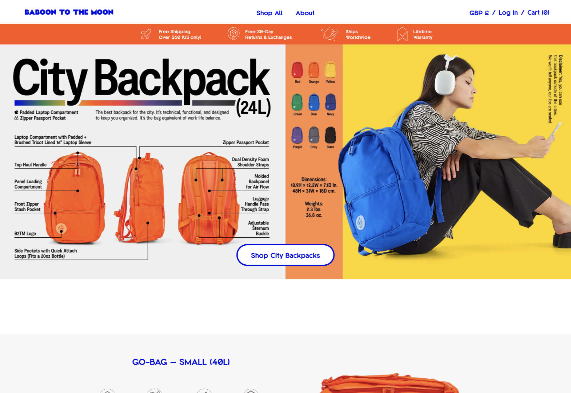
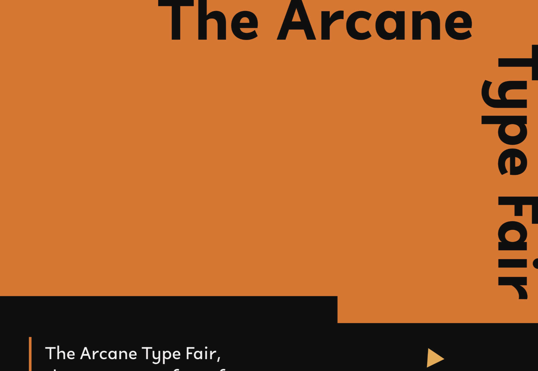
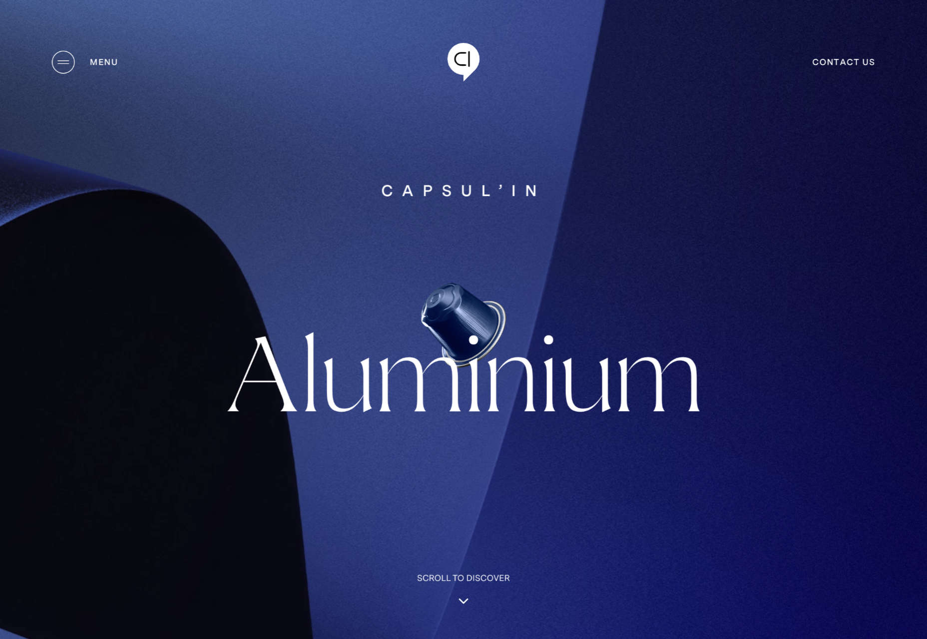
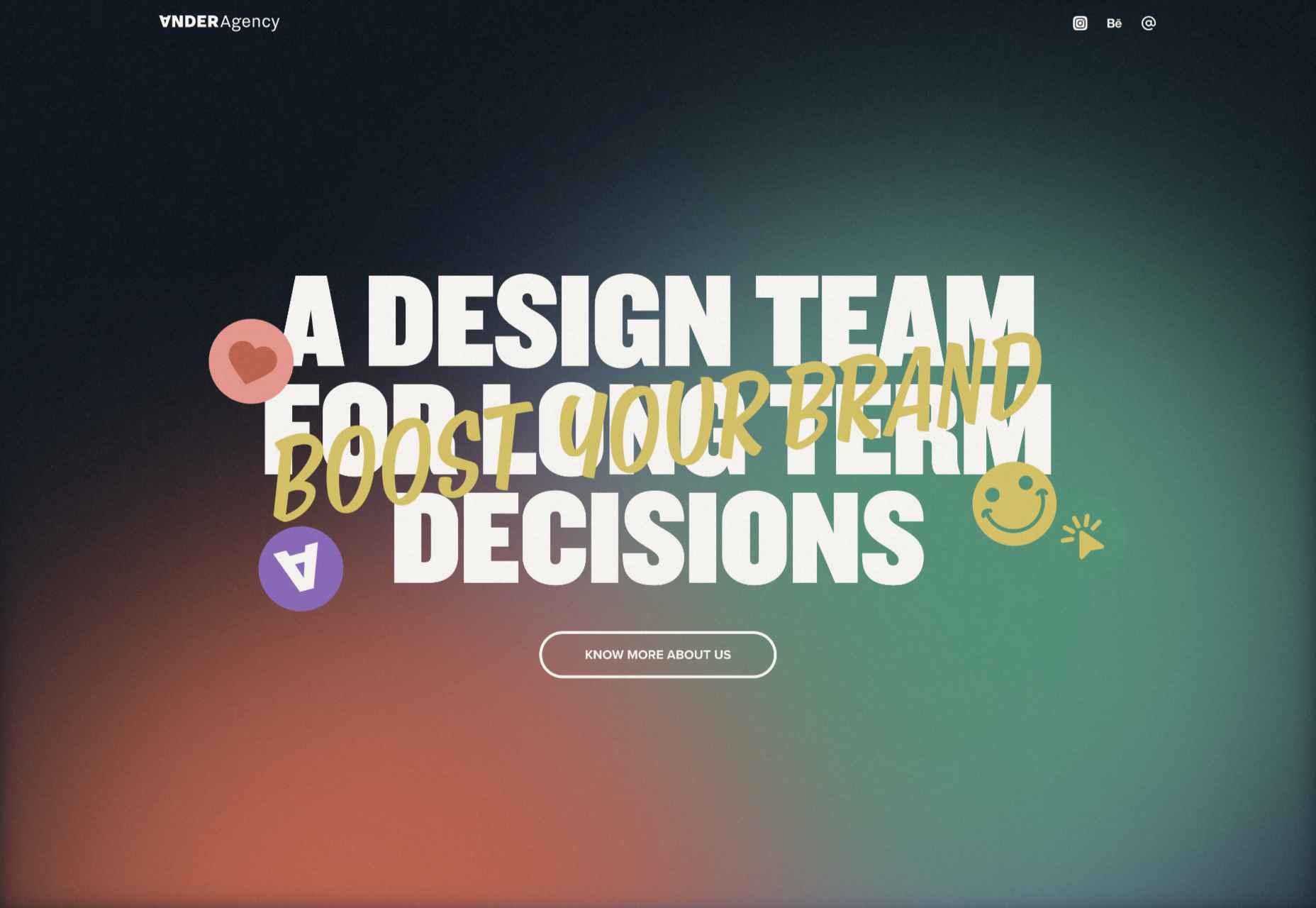
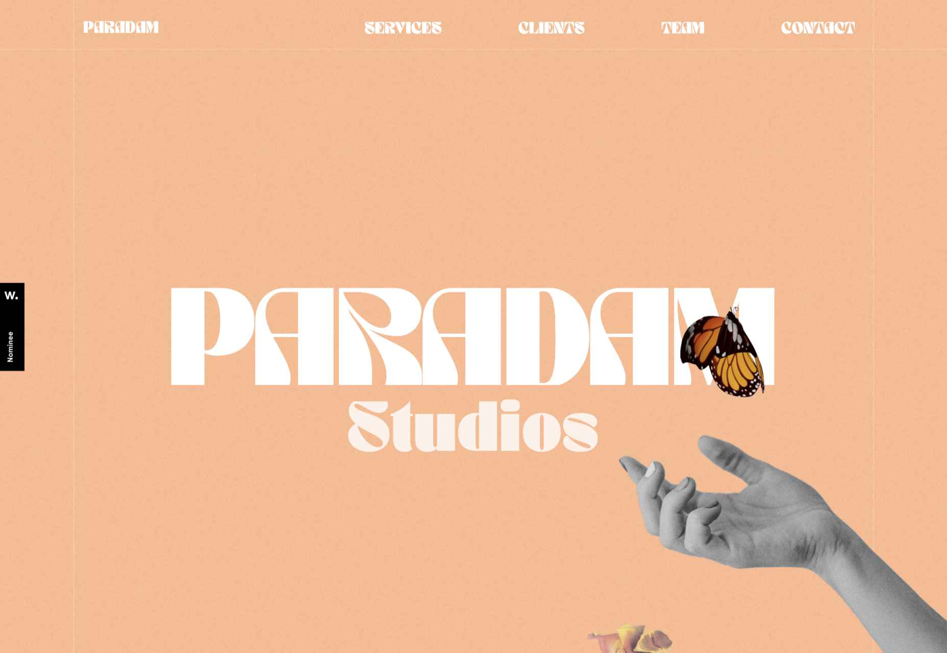
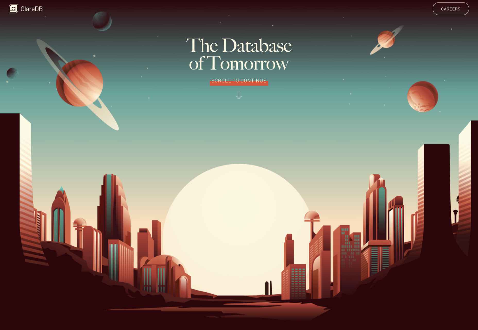
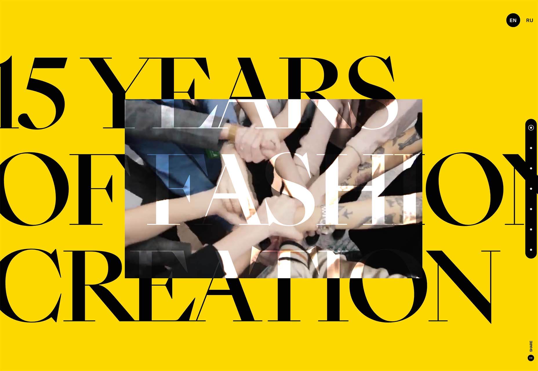
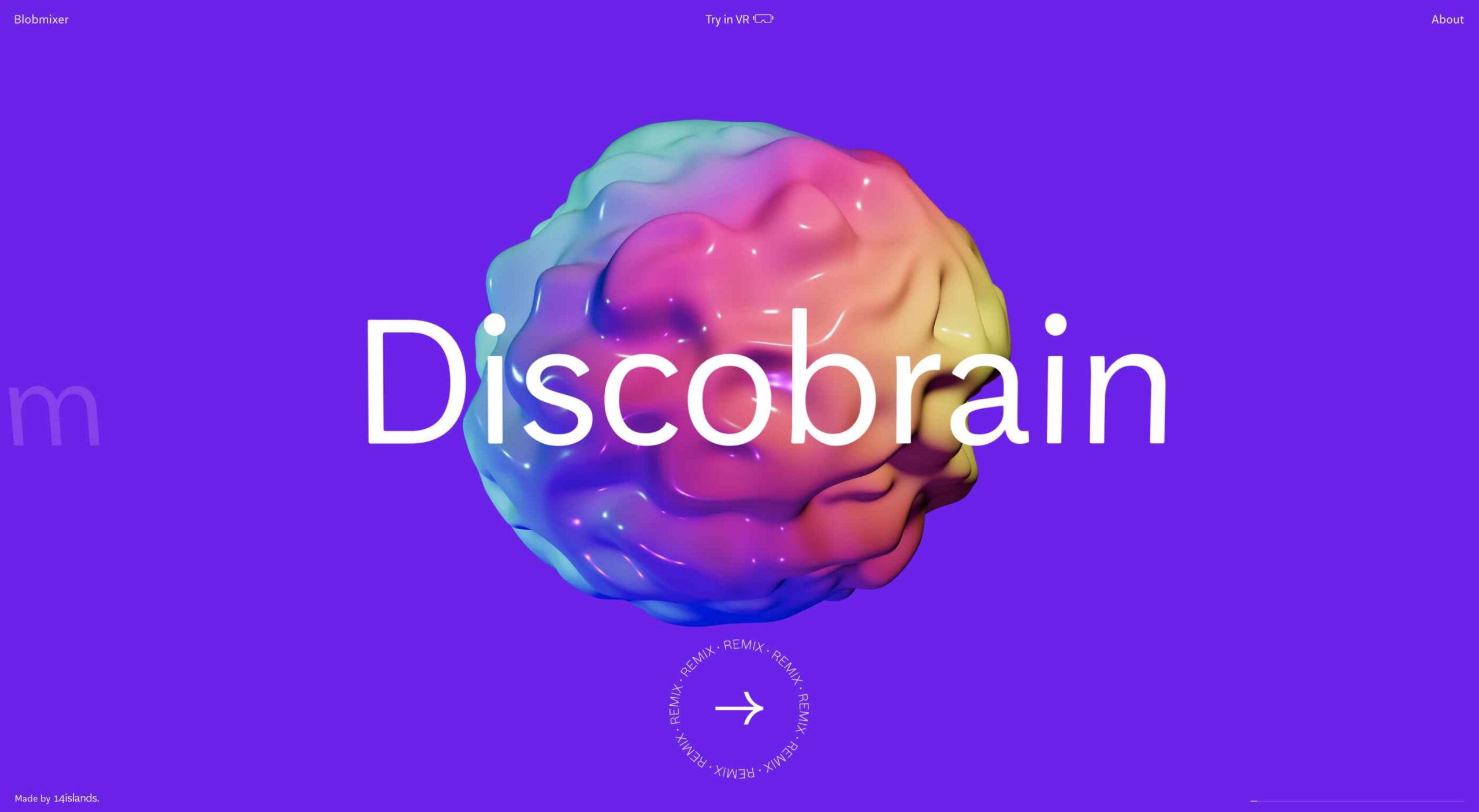
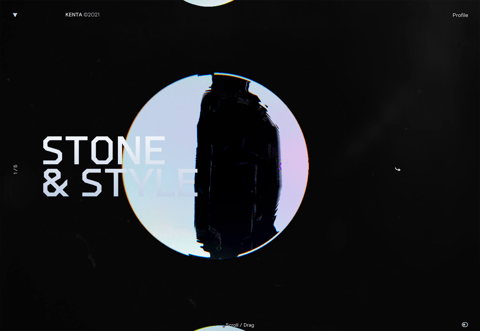
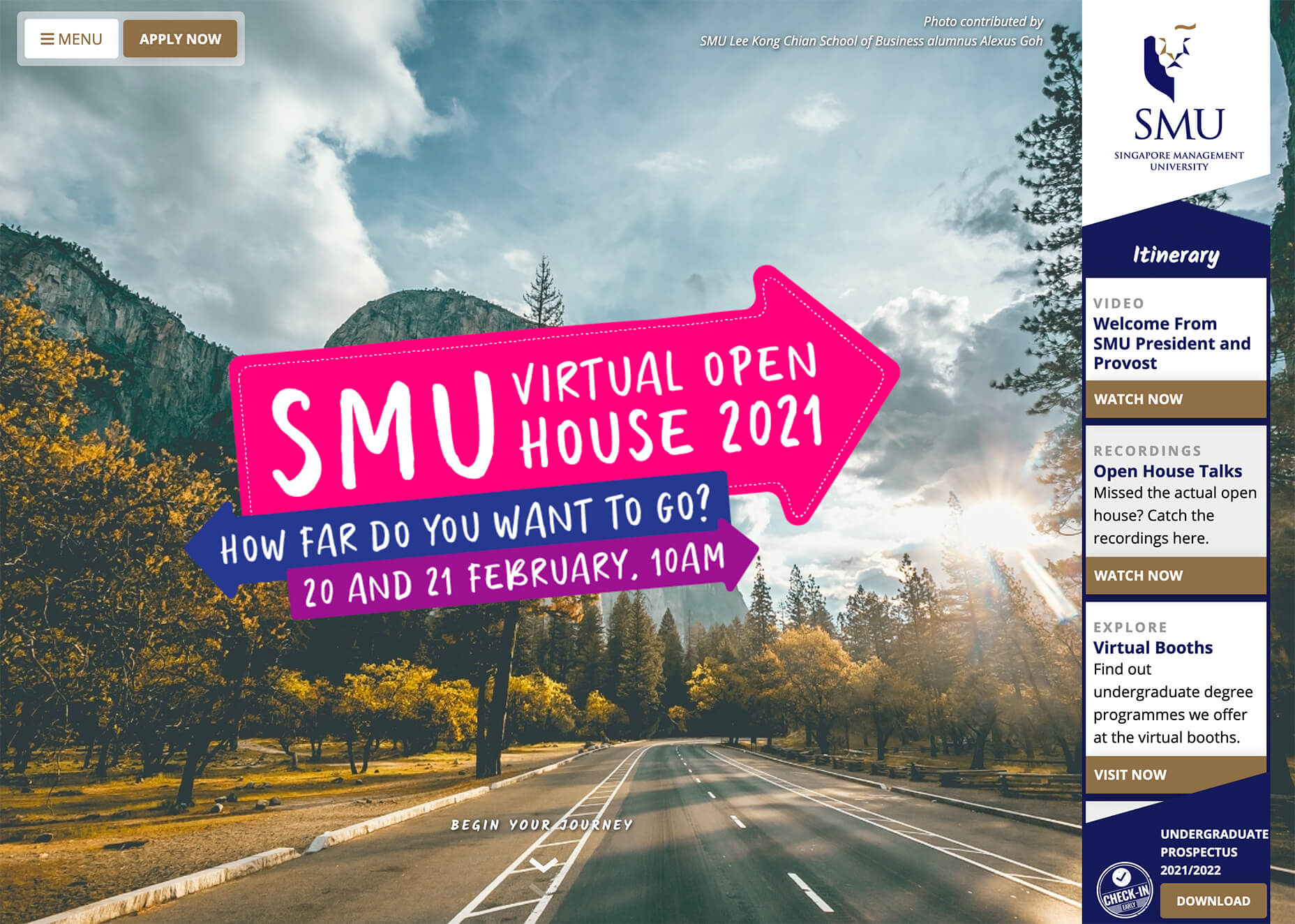
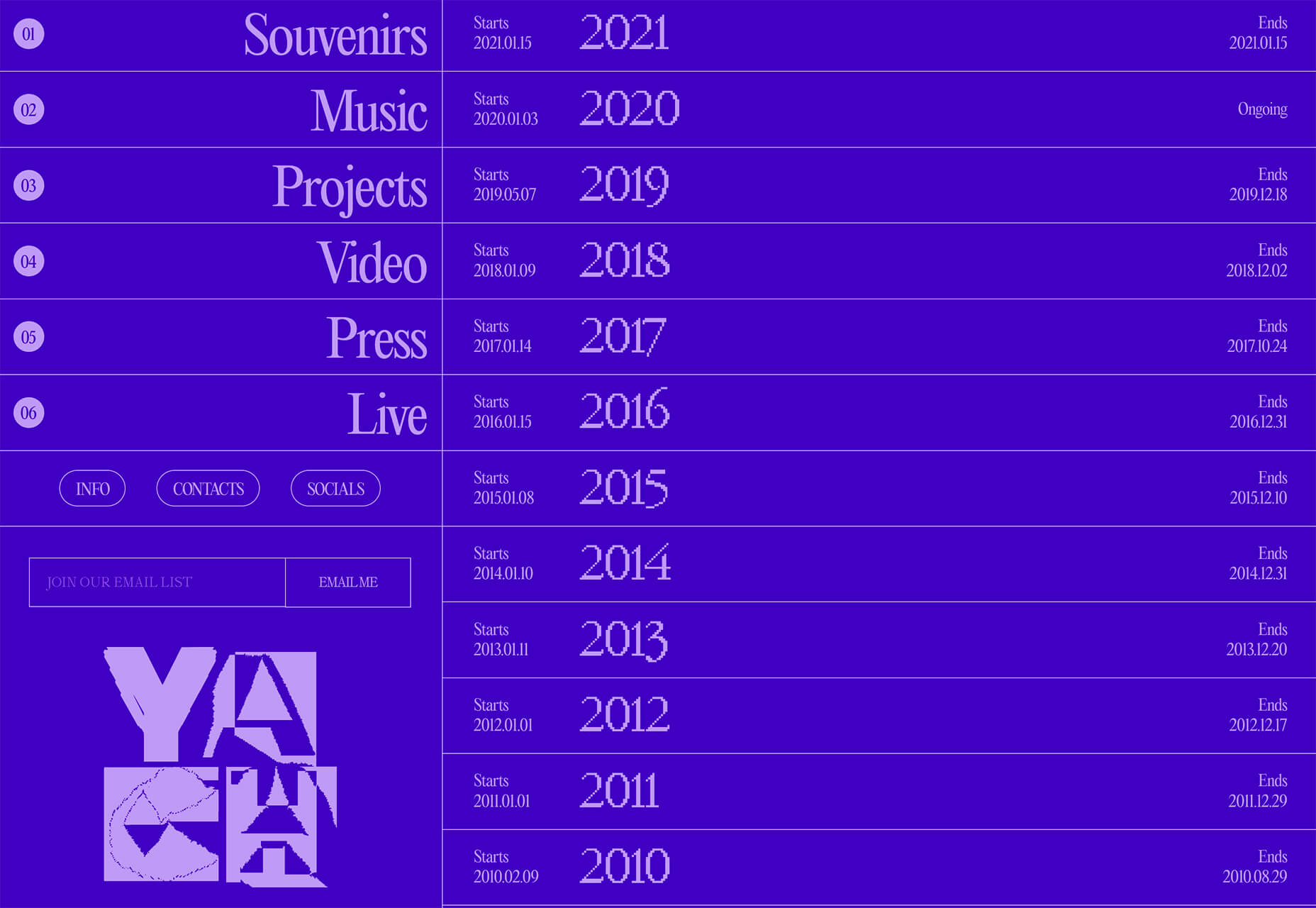
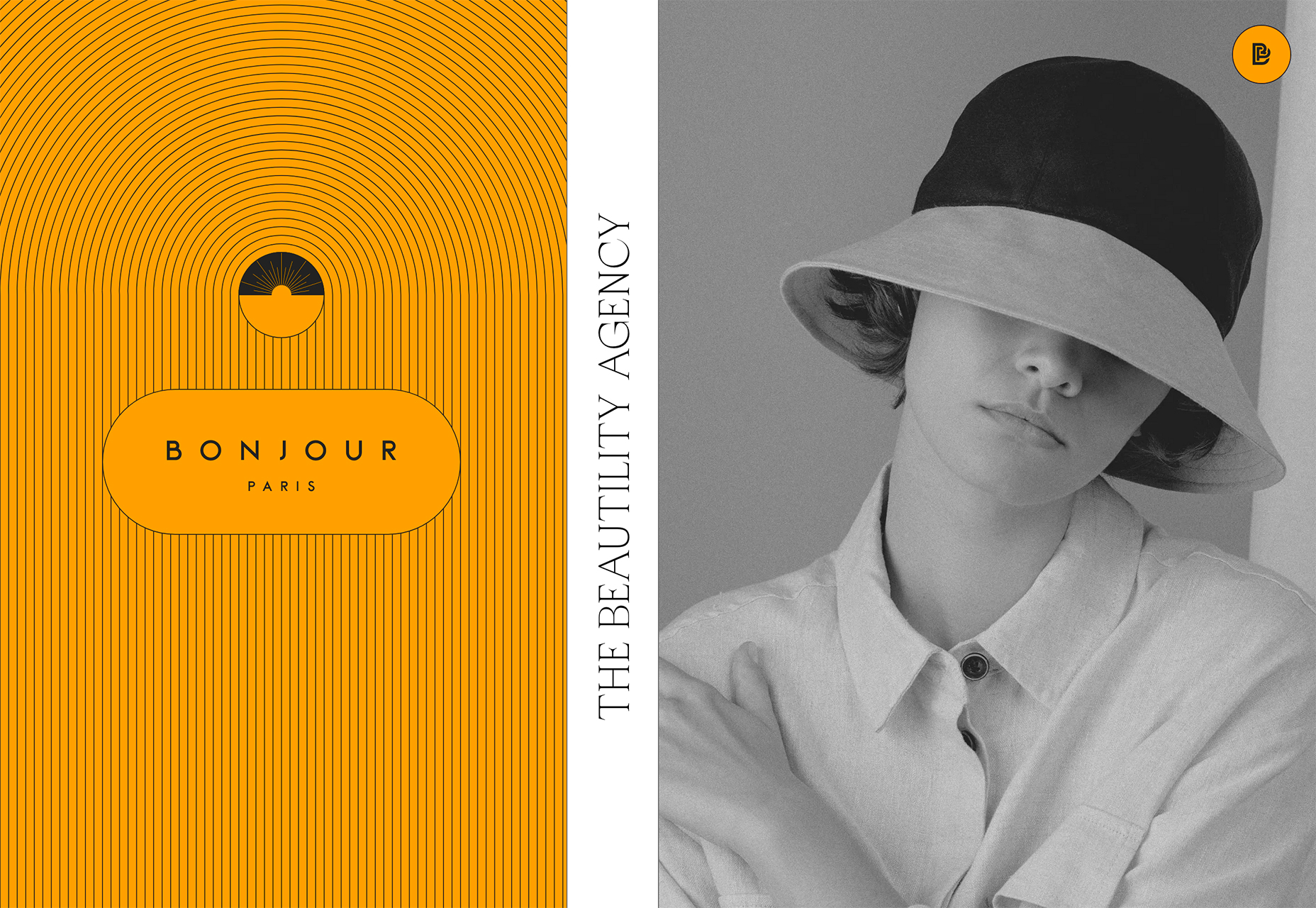
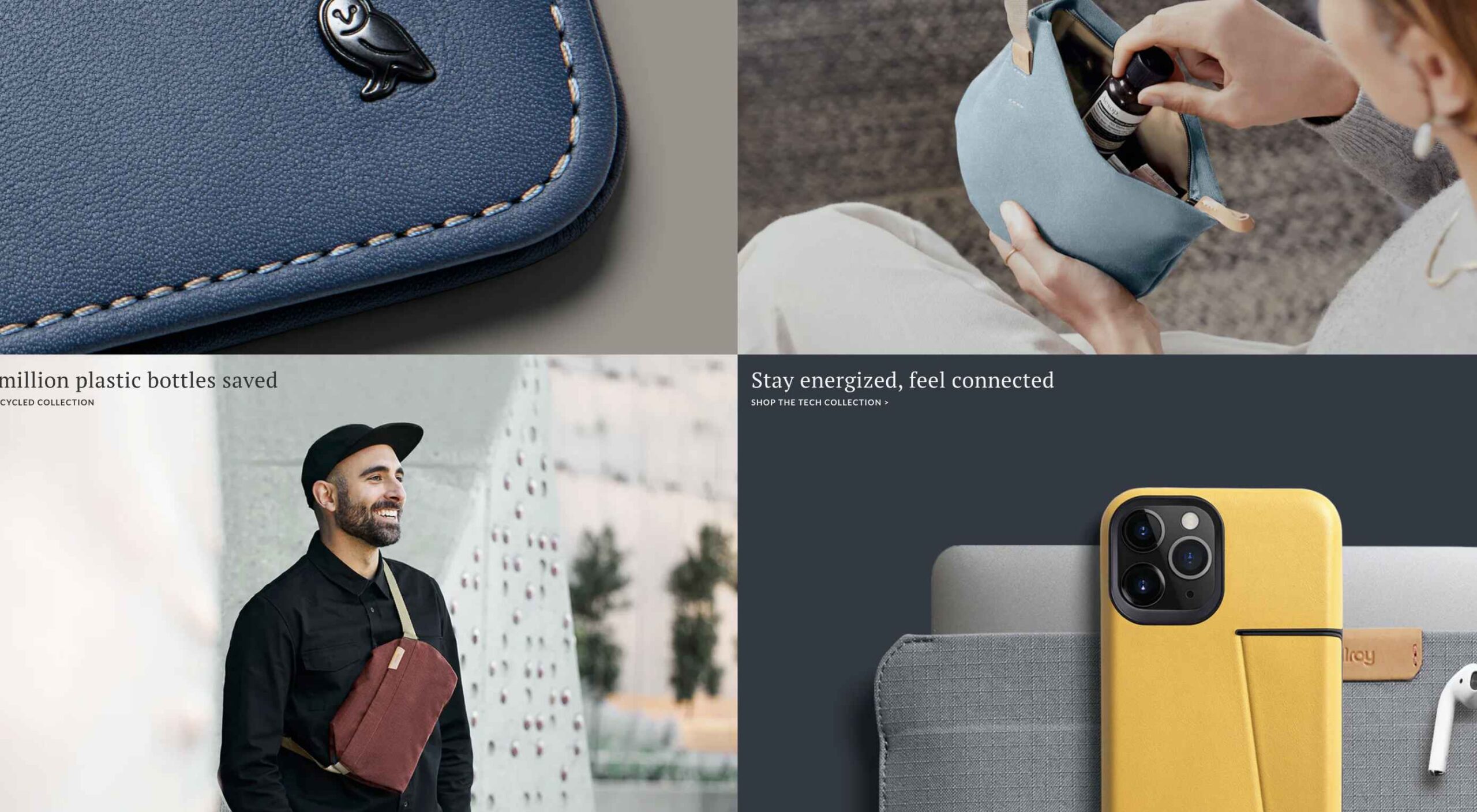
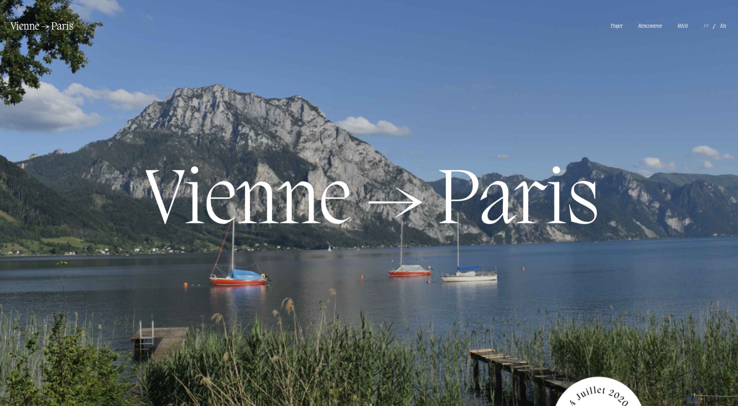
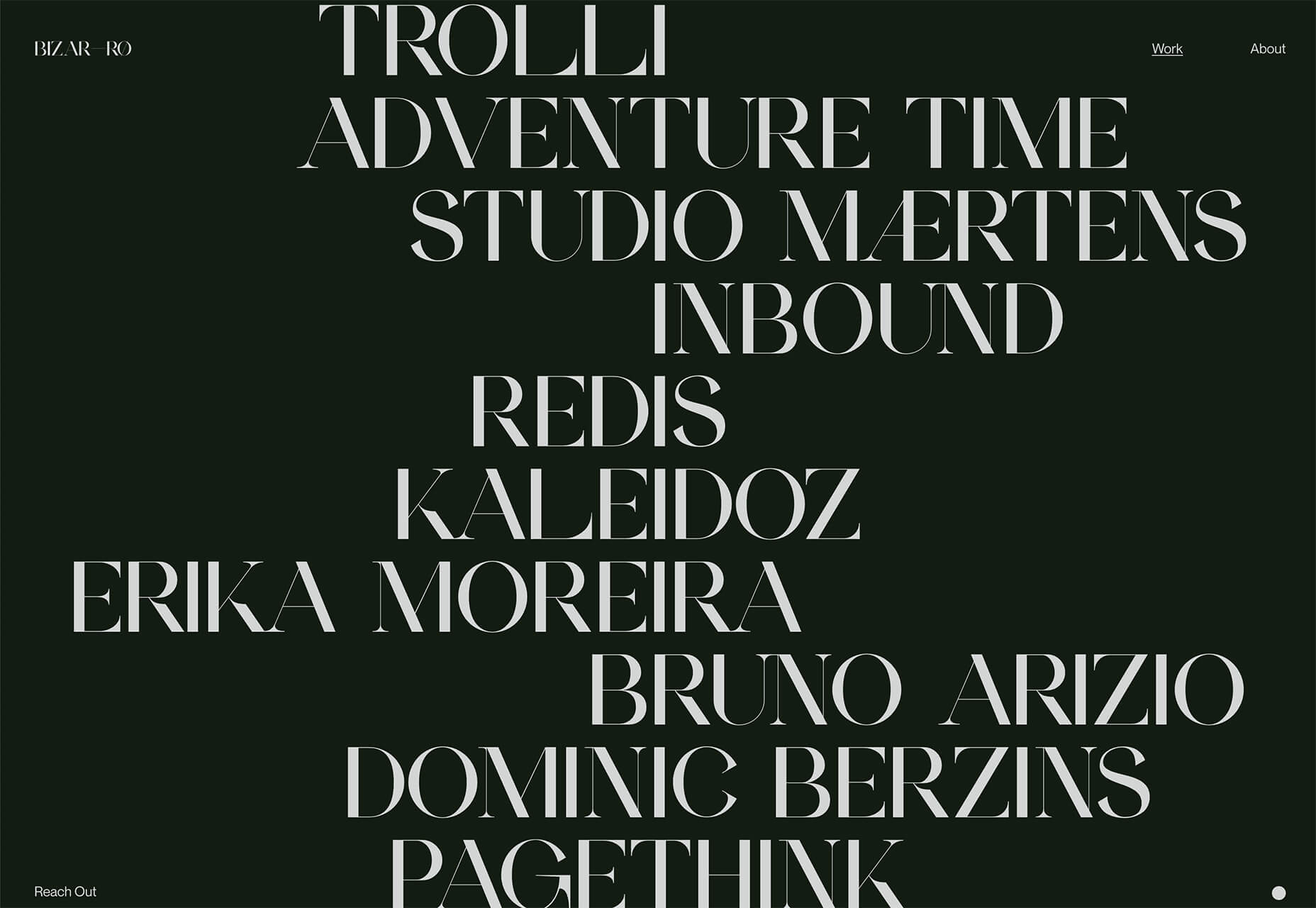
This month we’re seeing websites that are very conscious of the design trends they’re following. Designers are making conscious choices to adopt styles, and opting out when it doesn’t suit the site. What we end up with is a crop of sophisticated, well-designed websites that use style as a technique to further their aims.

Here are the sites that caught our eye this month, enjoy!

Seen

Seen uses conversations to explore themes surrounding ethnicity and racism in creative fields. Displaying these conversations as online chats creates a sense of intimacy.

Baboon to the Moon

There is a lot of color in Baboon to the Moon’s product shots, so the rest of the site is kept simple, with good clear navigation too.

Fleava

There is a strong sense of luxury to digital agency Fleava’s glossy brochure portfolio site.

Baunfire Portfolio Review 2022

This site for Baunfire digital agency’s creative networking event is bold, personable, and fun.

Laesk Kombucha

There is more than a touch of Wes Anderson’s style to this site for Laesk Kombucha; somewhere just out of sight is Bill Murray in a red beanie.

Viso Haus

Viso Haus doesn’t do anything hugely groundbreaking here with their brutalist-style portfolio site, but they do it very well.

Mario Carillo

Artist/programmer Mario Carillo has opted for a minimal approach, allowing the work to do the talking.

Symbol

There is a warmth to Symbol’s site, created by the color tones and combinations used here.

Contekst

Interior architects Contekst favor a brutalist visual style for their site, but with some nice little animated extras.

Arcane Type Fair

No, you haven’t missed the font lover’s answer to Comic Con: the Arcane Type Fair is fictitious and a clever showcase for Rain Foundry’s Conacher typeface.

Capsul’in Pro

With lovely scrolling animation and soothing colors, this site for Capsul’in Pro manages to turn coffee pods into objects of desire.

Wanderful Chalet

Random illustrations and a quirky display type add character to Wanderful Chalet’s brochure site.

Stone Cycling

Bricks made from rubbish don’t sound like the most exciting thing ever, but this site evokes a lovely clean feel: like an old building gleaming in the sunlight after all the soot has been scraped off it.

Lazarus Forms

Lazarus Forms is an API for AI document processing. This site succeeds in being transparent in its explanation without being overly technical and pleasing visually.

Nathan Riley

An excellent example of masonry combined with variable scrolling speeds creates tension in digital artist Nathan Riley’s portfolio.

Evi O. Studio

Sometimes the simplest things, like this full-screen image transition for Evi O. Studio’s portfolio, can be so well done it’s an absolute pleasure to scroll through.

Sundo

Sundo has created SMOTSpots – smart sunscreen dispensers for public areas. The tone of the site is suitably utilitarian with a soft edge.

Blue

The Blue experience from Rossinavi luxury boat builders is a pleasing immersive microsite showcasing their new hybrid-electric boats.

Cased in Time

This site is an excellent example of how to make a single product commerce site that doesn’t feel lacking in content.

Educated Guess

Educated Guess is a podcast for creatives by creatives. The accompanying website is pleasing to use, easy to navigate, and allows the user to focus on the content.

Source

The post 20 Best New Websites, September 2022 first appeared on Webdesigner Depot.

Source de l’article sur Webdesignerdepot

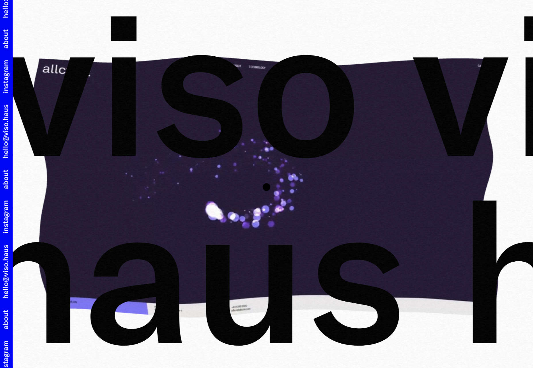
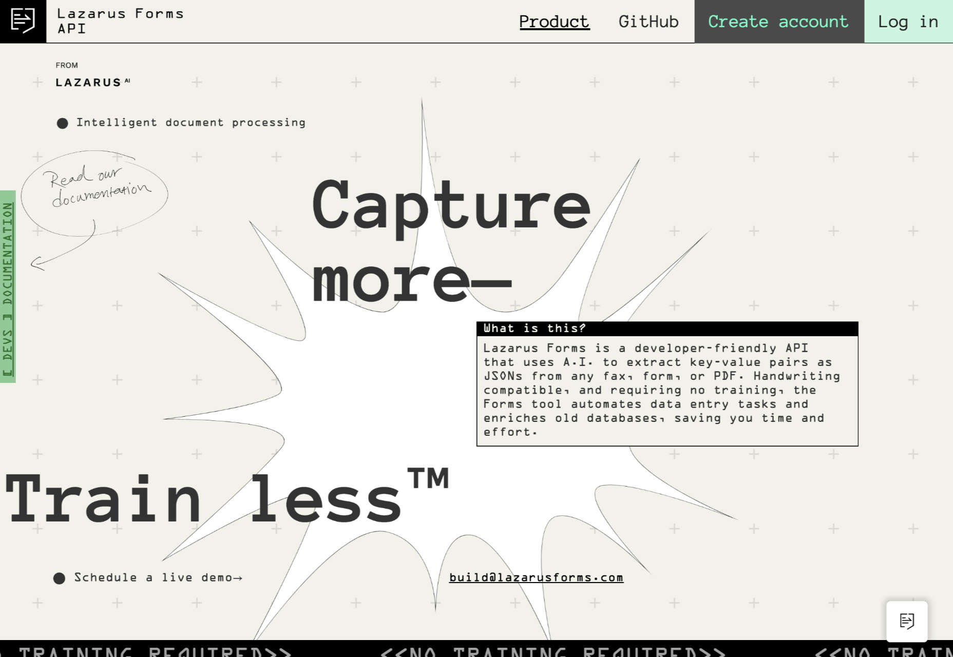
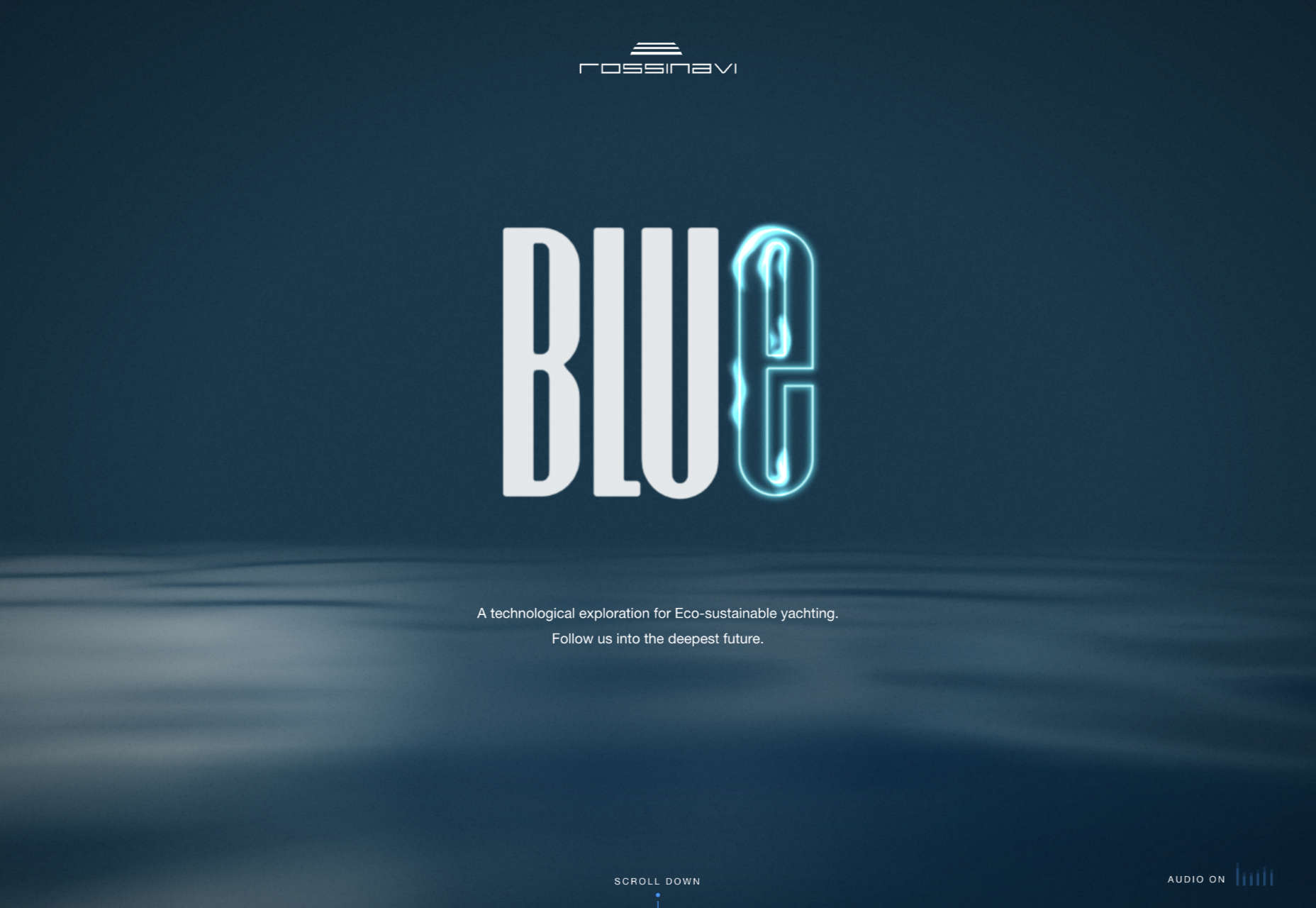
Web design is often stagnant because designers look at the same work and follow the same trends. Unfortunately, algorithms promote work that is liked, and designers produce content to get likes, which leads to a self-feeding cycle.

We’ve been talking about the dribbblization of design for years, but Behance is just as guilty of promoting and encouraging homogenous design.

It’s not that Dribbble and Behance don’t have value; they are both excellent resources for designers. But they’re victims of their own success, and it’s healthier for them, designers, and the industry if we broaden our sources of design inspiration.

And so, today, we’re presenting this list of the best places to find design inspiration for web designers that aren’t Dribbble or Behance. (OK, you can check them out too, if you really want to!)

Awwwards

Awwwards is the top site for web design inspiration. The best agencies in the world post here, and a ‘Site of the Day’ award is a coveted accolade. So if you’re looking for design inspiration, this should be your first stop.

Admire The Web

Admire The Web is an excellent collection of curated sites. It’s more selective than sites like Awwwards, so you don’t have to dig through so much to find the best web design.

One Page Love

One Page Love is one of the best resources for designers seeking inspiring new ideas. It’s devoted to one-pagers, which means it leans towards apps, tech start-ups, and smaller independent projects.

Godly

Godly is another excellent collection of web design inspiration. Godley uses animated thumbnails, so you can get a sense of a site before you look at it in detail. As such, it’s perfect for animated landing pages.

Hoverstat.es

Hoverstat.es is a collection of curated websites that often finds little gems other sites miss. Unlike most roundups, it doesn’t go into much detail on each site, and new sites are infrequent, but it’s always worth a browse.

Siteinspire

Siteinspire is one of the most established design inspiration sites. The collection is carefully divided into different styles; if you find your own site listed, you can add your contact details.

Land-book

Land-book is a curated collection of the best sites on the web. The site does a great job of presenting screenshots clearly, and the similar sites feature is great for browsing a particular mood.

Savee

Savee is a fantastic site for browsing all kinds of design inspiration. It’s like Pinterest for designers as it leans towards art direction and photography. It’s easy to scan for mood boards.

UIJar

UIJar is a nicely designed collection of hand-picked websites. Unlike most other sites on this list, UIJar also features a collection of branding that’s great for identity designers.

Brutalist Websites

Brutalist Websites is the perfect inspiration site if you’re a fan of the Brutalist design trend. There are plenty of designs that show why Brutalism is so popular right now, but the site itself is probably short-lived.

Minimal Gallery

Minimal Gallery is a collection of sites that embrace minimalism. Like Brutalist Websites, the quality of the collection is very high, but the site’s lifespan is probably short-lived thanks to being tied to one trend.

Ello

Ello is a platform for showcasing excellent design work. It’s solid on illustration and artwork. There’s also a great deal of photography on show. You’ll also find regular opportunities tied to creative briefs.

DeviantArt

DeviantArt is still the largest, and arguably the best, showcase for illustration, with dozens of styles from Anime to classicism. It’s easy to lose a few hours browsing DeviantArt.

Figma Community

Figma Community is a collection of the best work from the Figma community. But you don’t need to be a Figma user to grab some inspiration from the UI work on show.

Lapa

Lapa is a collection of 5000+ landing pages. The collection is headhunted from around the web, so if you only have time to check out one site, Lapa could be a good choice.

Source

The post 15 Inspiring Alternatives to Dribbble & Behance first appeared on Webdesigner Depot.

Source de l’article sur Webdesignerdepot

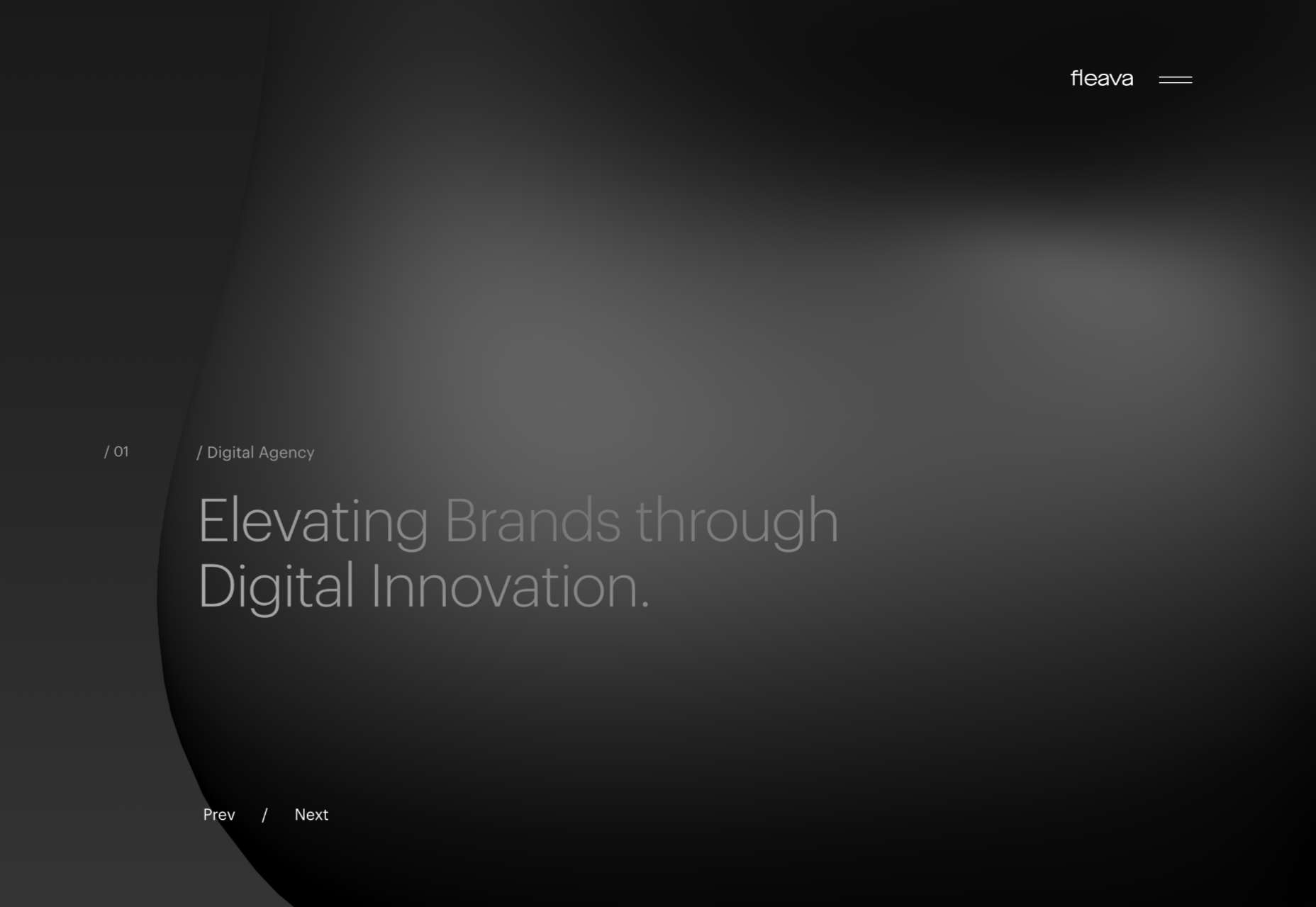
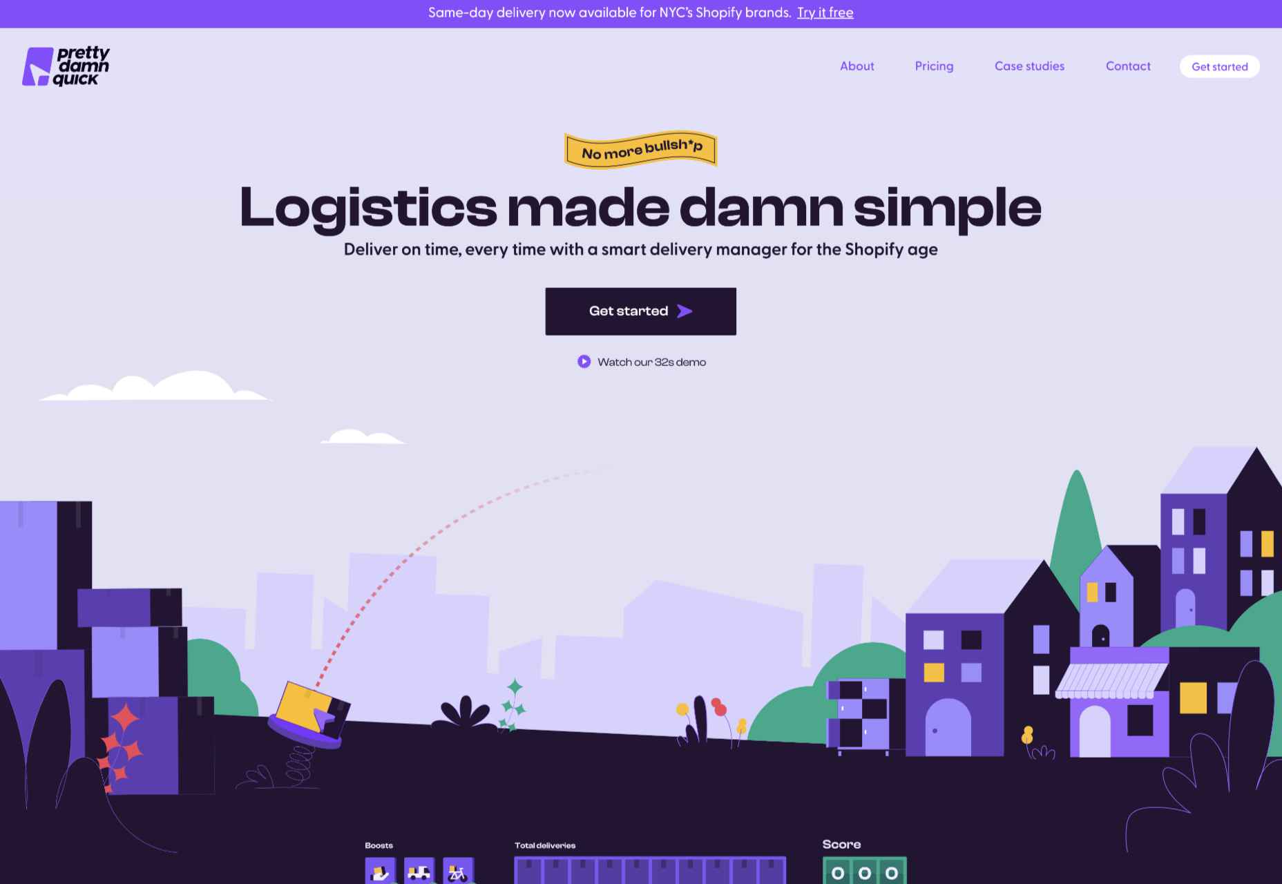
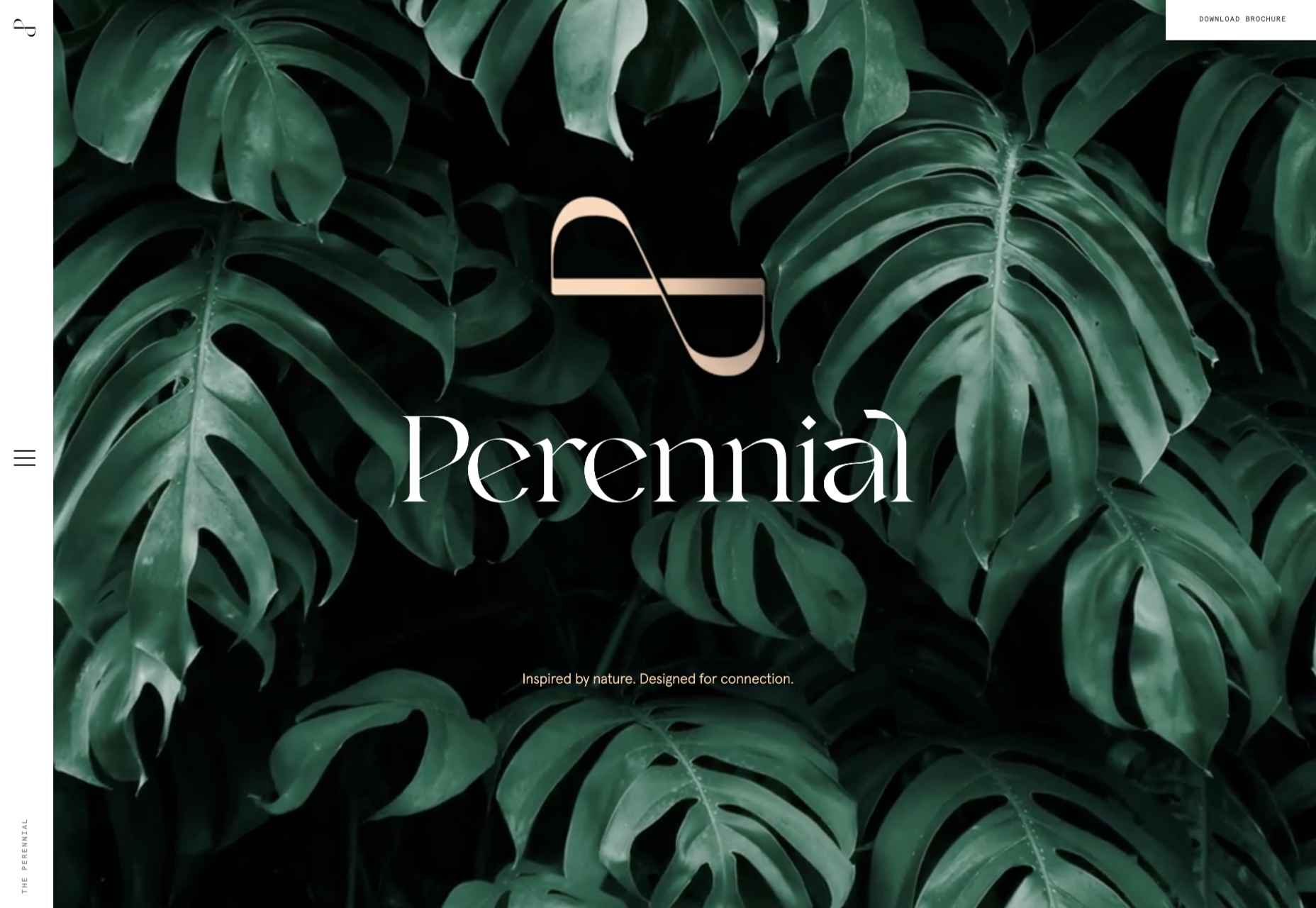
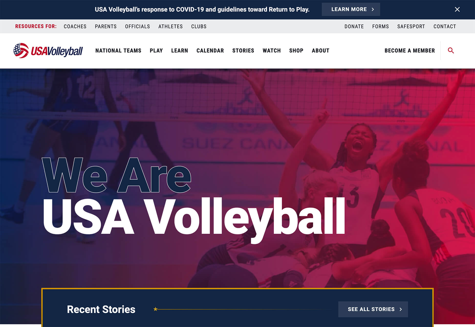
Welcome to our guide to the best new websites this month. If subtle, minimal sites are your thing, either look away now or prepare to have your preconceptions challenged because this month, we are going maximalist.

Lots of elements fill up the screen, lots of color, lots of big fonts, lots of illustration, and plenty of in-your-face personality. This is a tricky style to get right: if elements are not chosen and placed well, the result is simply annoying clutter. If done well, the result can be impactful and memorable.

[And Happy Independence Day to all of our American readers!]

screenagers & the incredible machine

screenagers & the incredible machine’s site puts illustration front and center, creating a look that evokes various mystic ideas. It sounds strange, but it works.

Anna Jóna

This prelaunch teaser site for Anna Jóna café and cinema has an elegant yet modern feel.

Hardpops

This site for Hardpops (alcoholic) ice pops takes its cue from the product flavors, and the bright, fruity colors give it a real zing.

Daniel Spatzek

Daniel Spatzek’s portfolio site takes the rules-are-made-to-be-broken approach. The result has attitude and a nice touch of humor.

Ander Agency

Plenty of color, large type, and illustration make a bold statement for Ander Agency’s single-page site.

Pretty Damn Quick

Colorful illustration on this site for Pretty Damn Quick’s Shopify app creates an impression of friendliness about the company and ease of use of the product itself.

Know Your Beetle

Know Your Beetle is a showcase page for Kaploom creative studio. Color and type combinations make a big impact.

WTFFF

While many of the sites featured here have a sense of fun about them, WTFFF tackles a somber subject: online sexual abuse and harassment. Artwork and audio create an immersive experience in which five young people share their experiences with the aim of helping others.

BelArosa Chalet

Full-screen illustrations with a hint of vintage style create an ideal impression of what future guests can expect from the currently under construction BelArosa Chalet.

Paradam

The color scheme on the Paradam site is on the pastel end of the scale, but there is still lots going on to entrance the eye.

Tilton Group

The scrolling color panels on the Tilton Group site are a thing to behold.

Fresco

Fresco uses a standard layout design, but the colors and quarter-circles instantly lift it.

Museum of Pink Art

Museum of Pink Art is an immersive experience celebrating the color pink. Undoubtedly worth a virtual wander around.

Icons by Menu

OK, this somewhat more minimalist site slipped through the net, but Icons by Menu is so pleasing to look at and use that we had to include it.

GlareDB

With an illustration that could be ideally at home on an Arthur C. Clarke book jacket and that rich, deep red background, this site for Glare DB is a world away from what might be expected.

Alex Beige

While the overall style and accent illustrations are pleasing on Alex Beige’s site, the Our Team section is guaranteed to raise a smile and stick in the user’s mind.

Snickerdoodle

Careful spacing means busy elements (like on scroll animated illustrations) don’t become overwhelming on the Snickerdoodle site.

Grisly’s Cosmic Black

The site for Grisly’s Cosmic Black is fun, bright, and joyful. Plus, it’s nice to see an alcohol site going a bit further than the usual ‘drink responsibly’ and actually providing helpful links.

The Perennial

Not just floorplans and (lots of) images, but virtual walkthroughs too. The Perennial doesn’t feel like a standard office building.

Source

The post 20 Best New Websites, July 2022 first appeared on Webdesigner Depot.

Source de l’article sur Webdesignerdepot

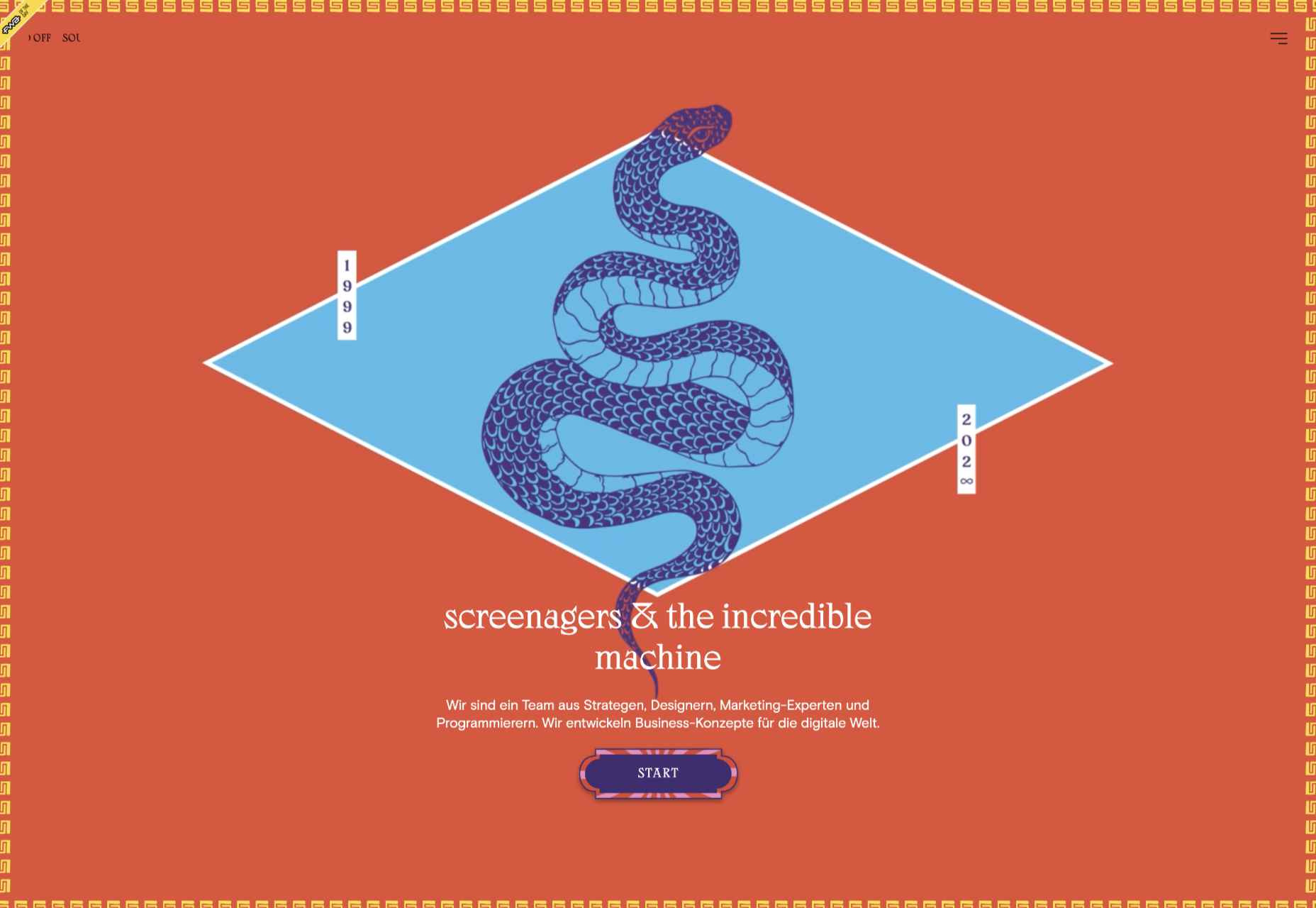
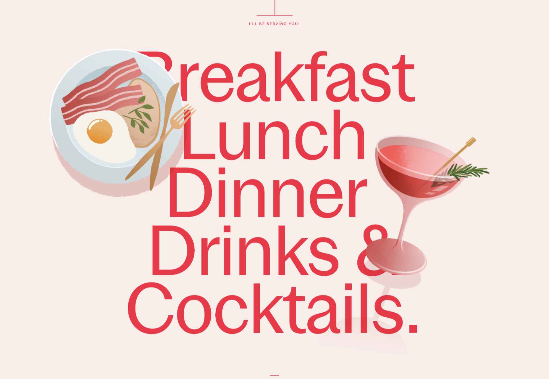
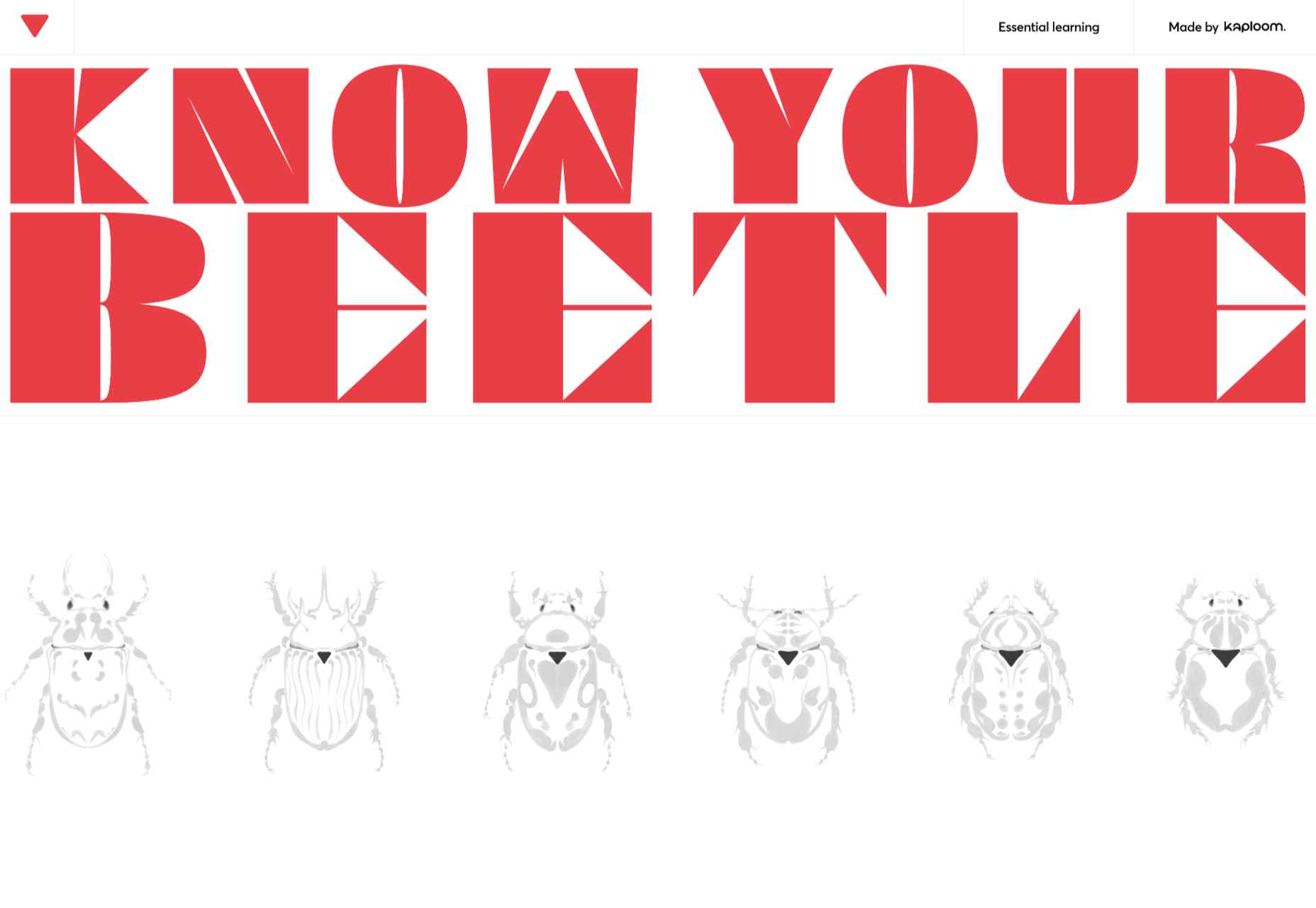
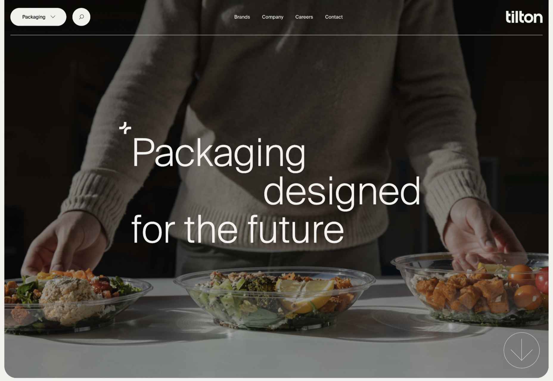
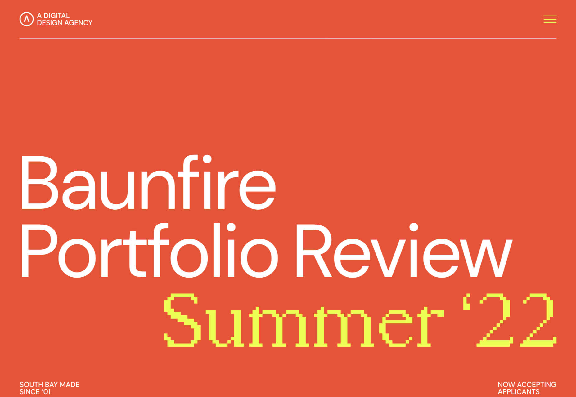
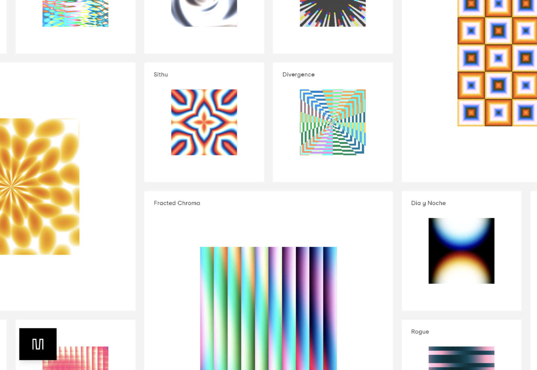
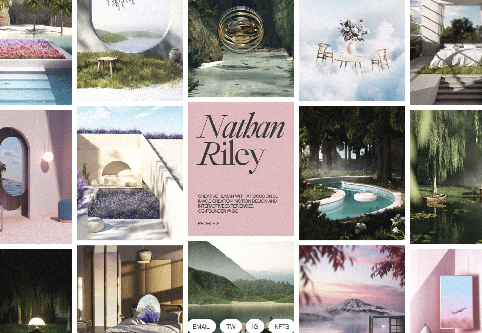
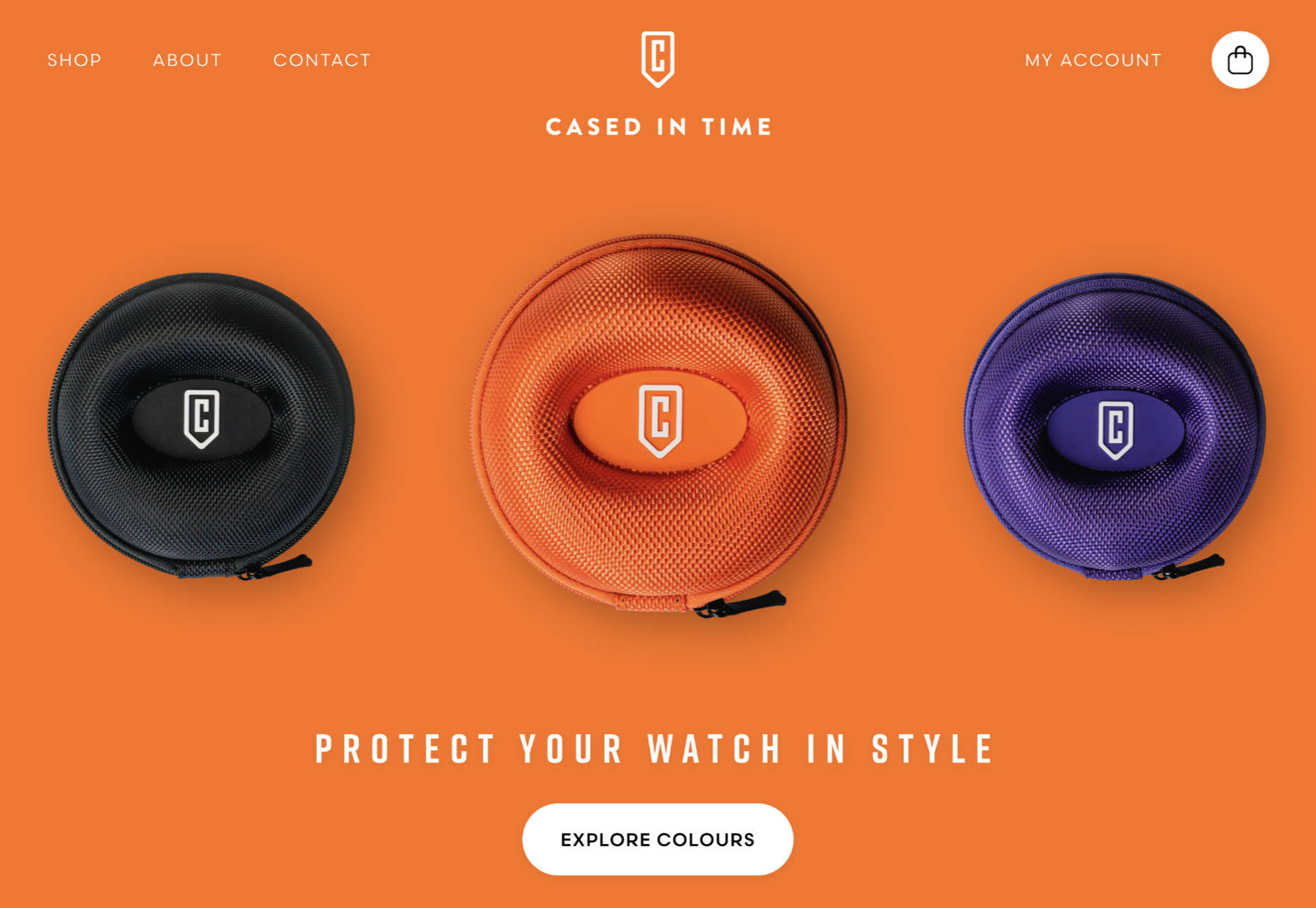
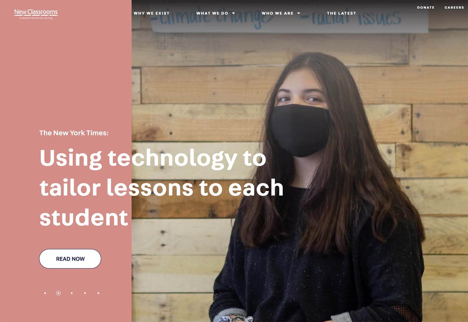
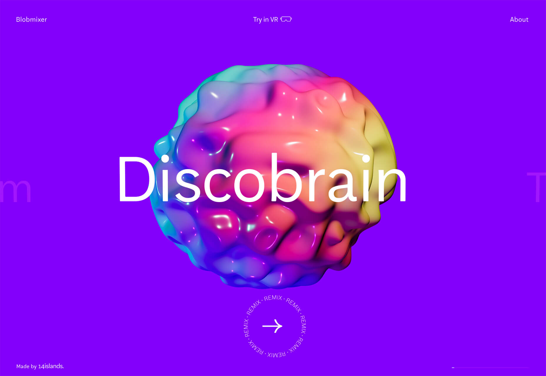
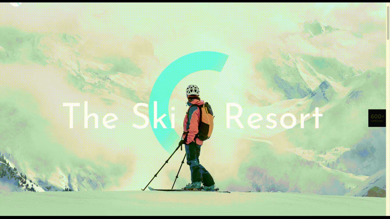
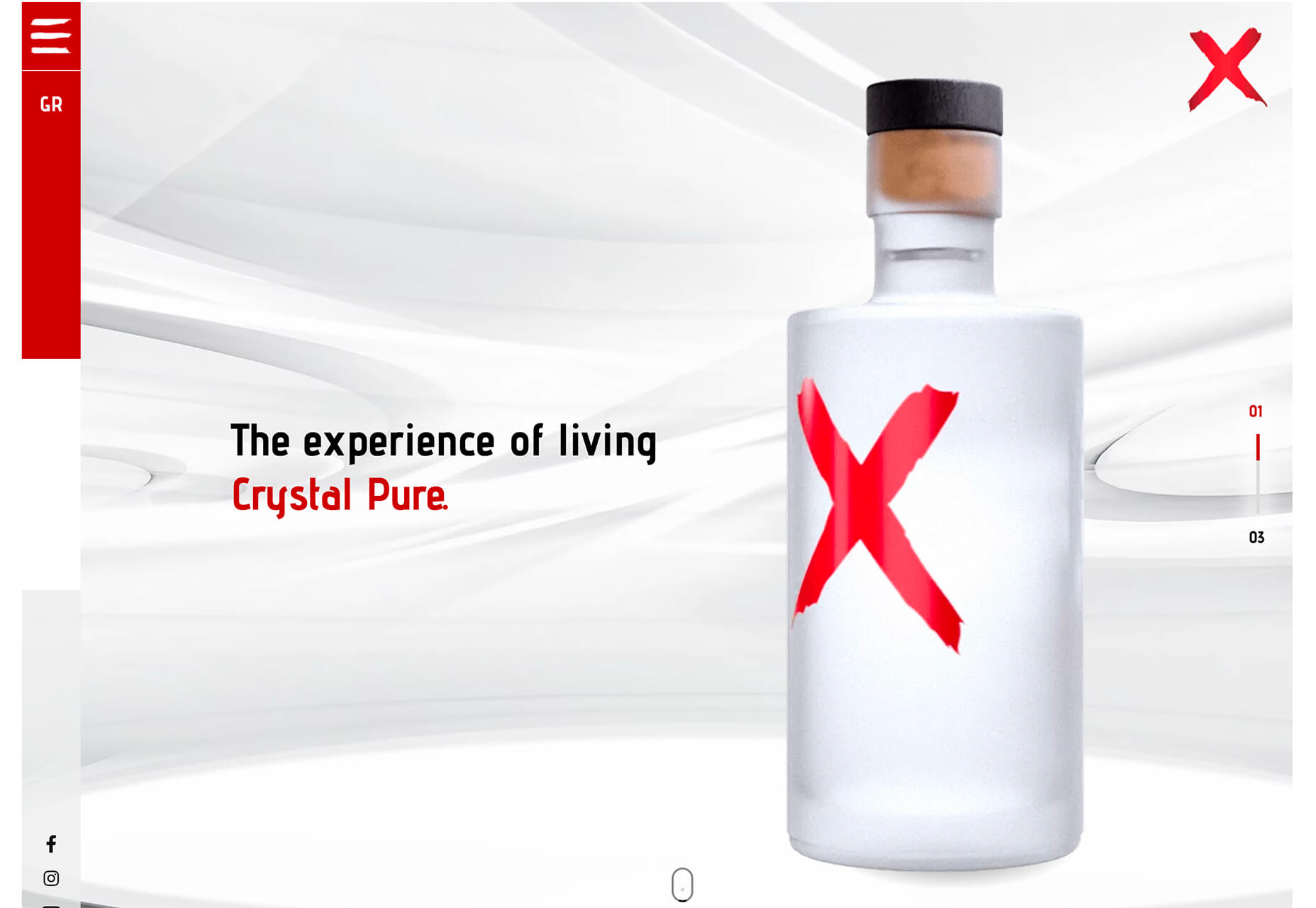
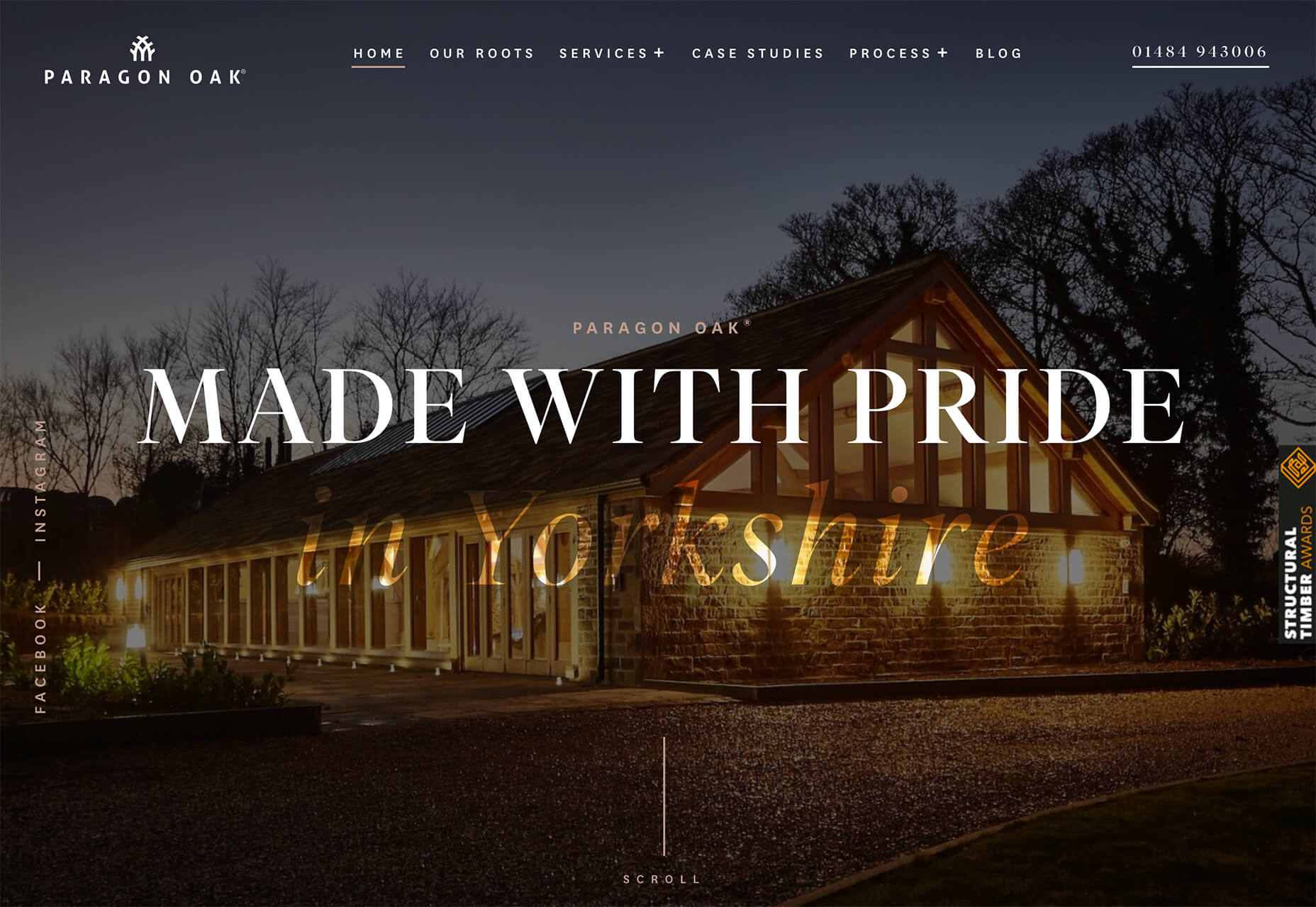
As the year begins to wind down, there are still plenty of new and evolving website design trends going strong. Much of what you’ll see this month carries over from things we’ve been seeing all year but with fresh touches.
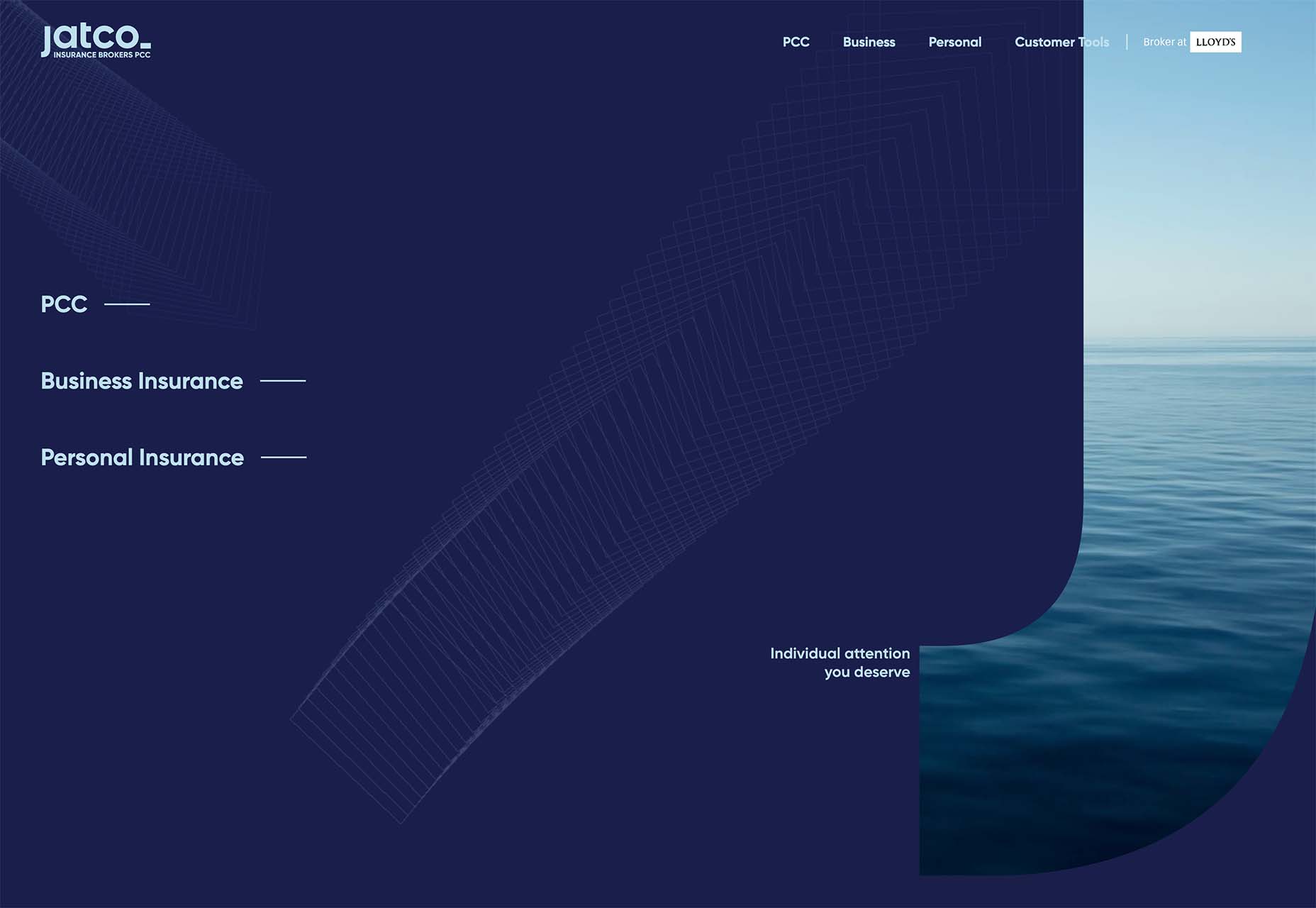
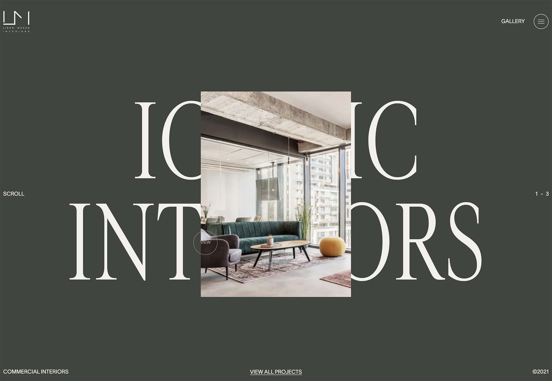
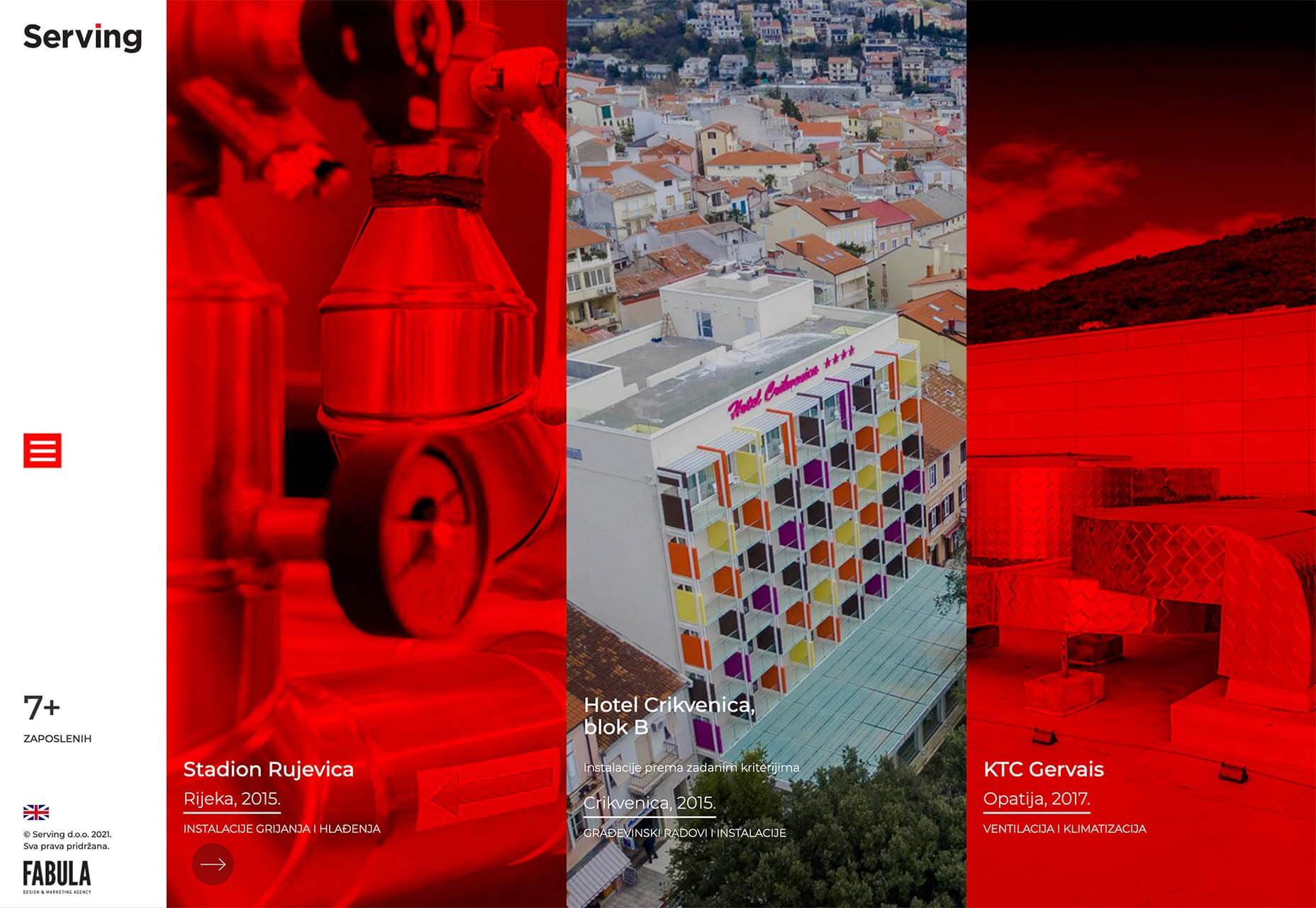
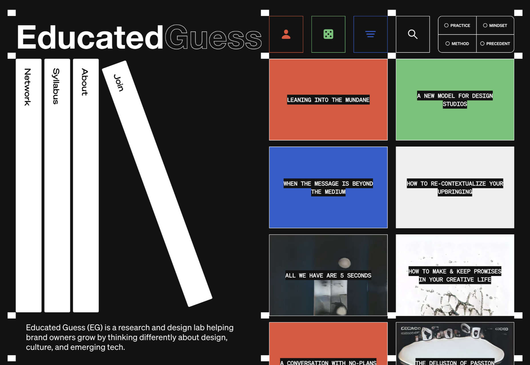
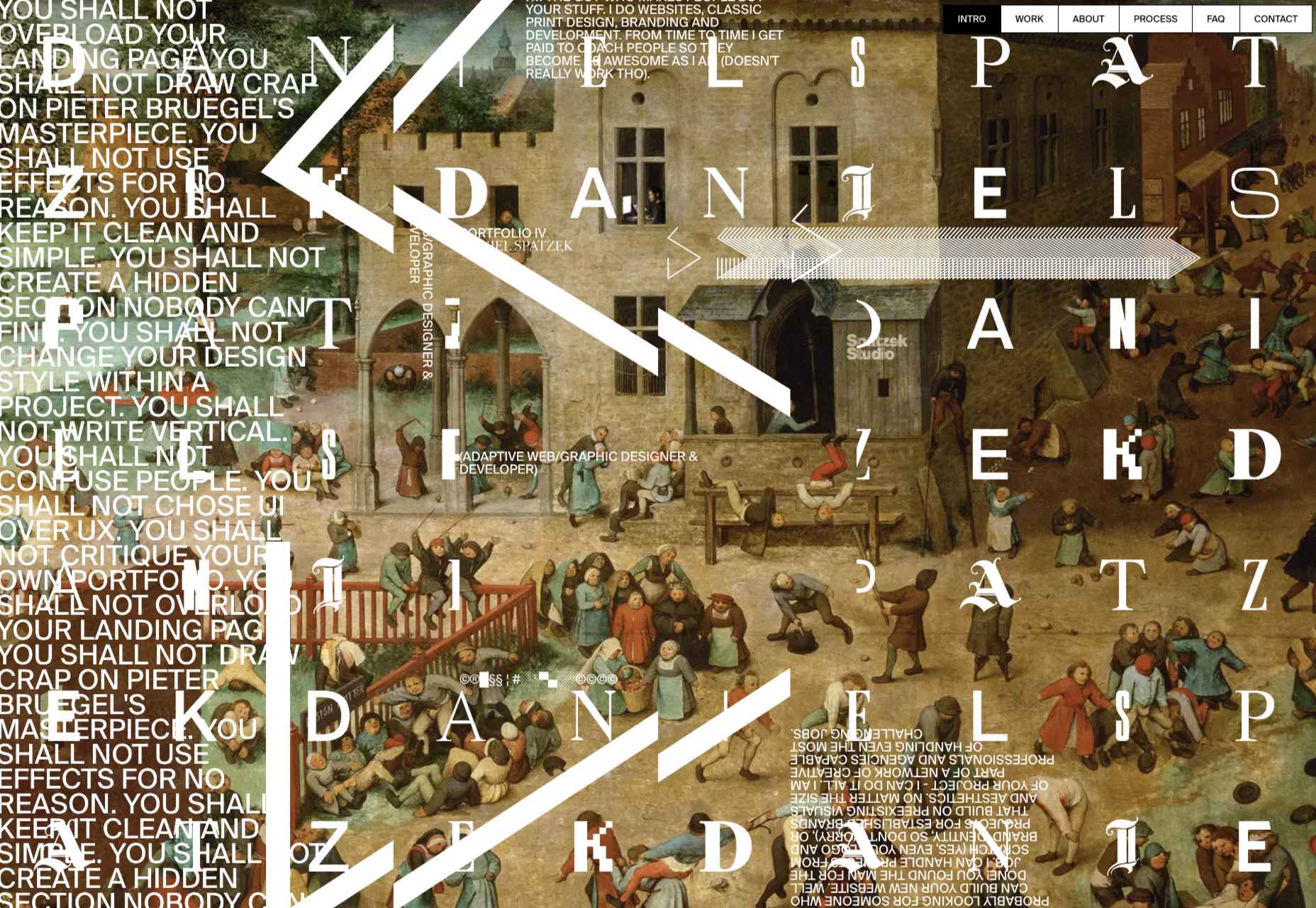
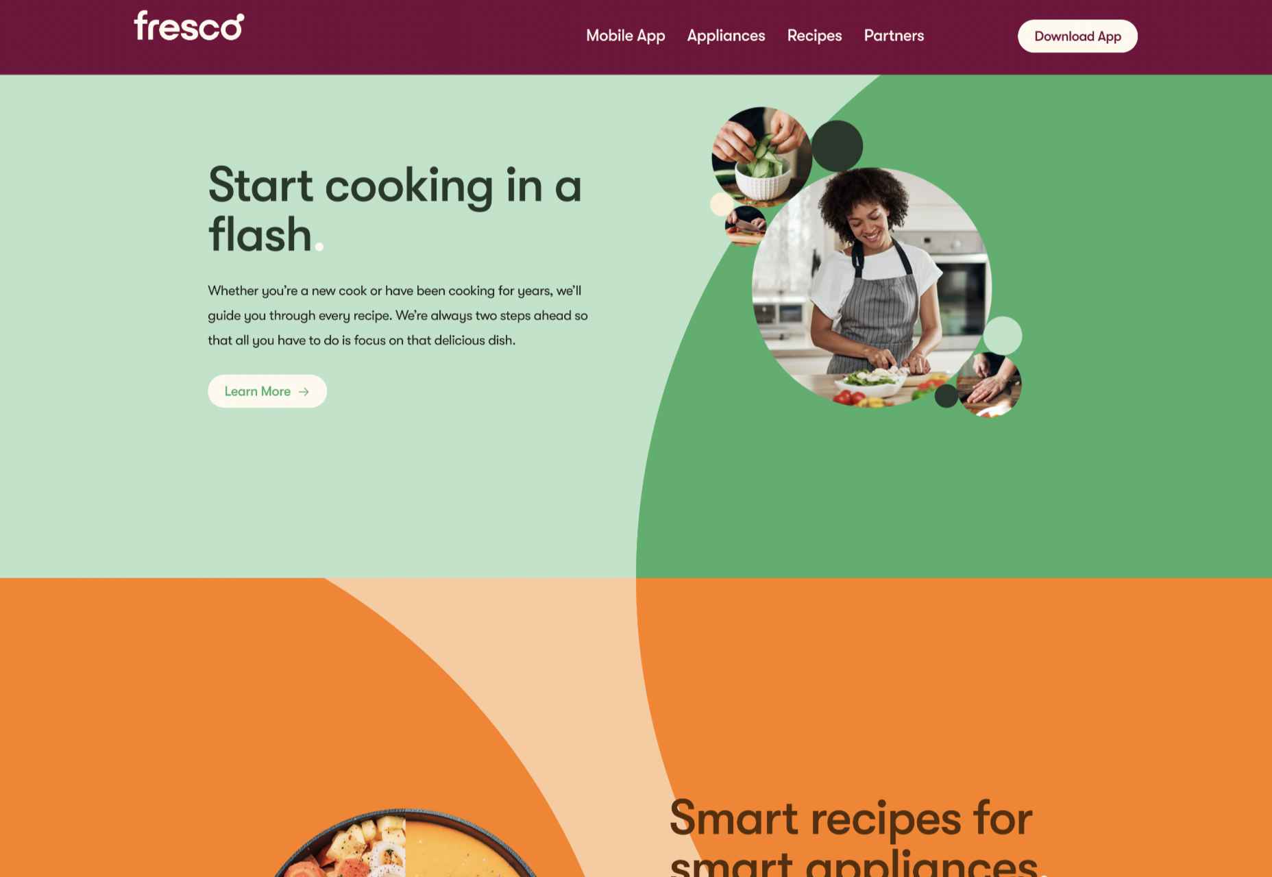
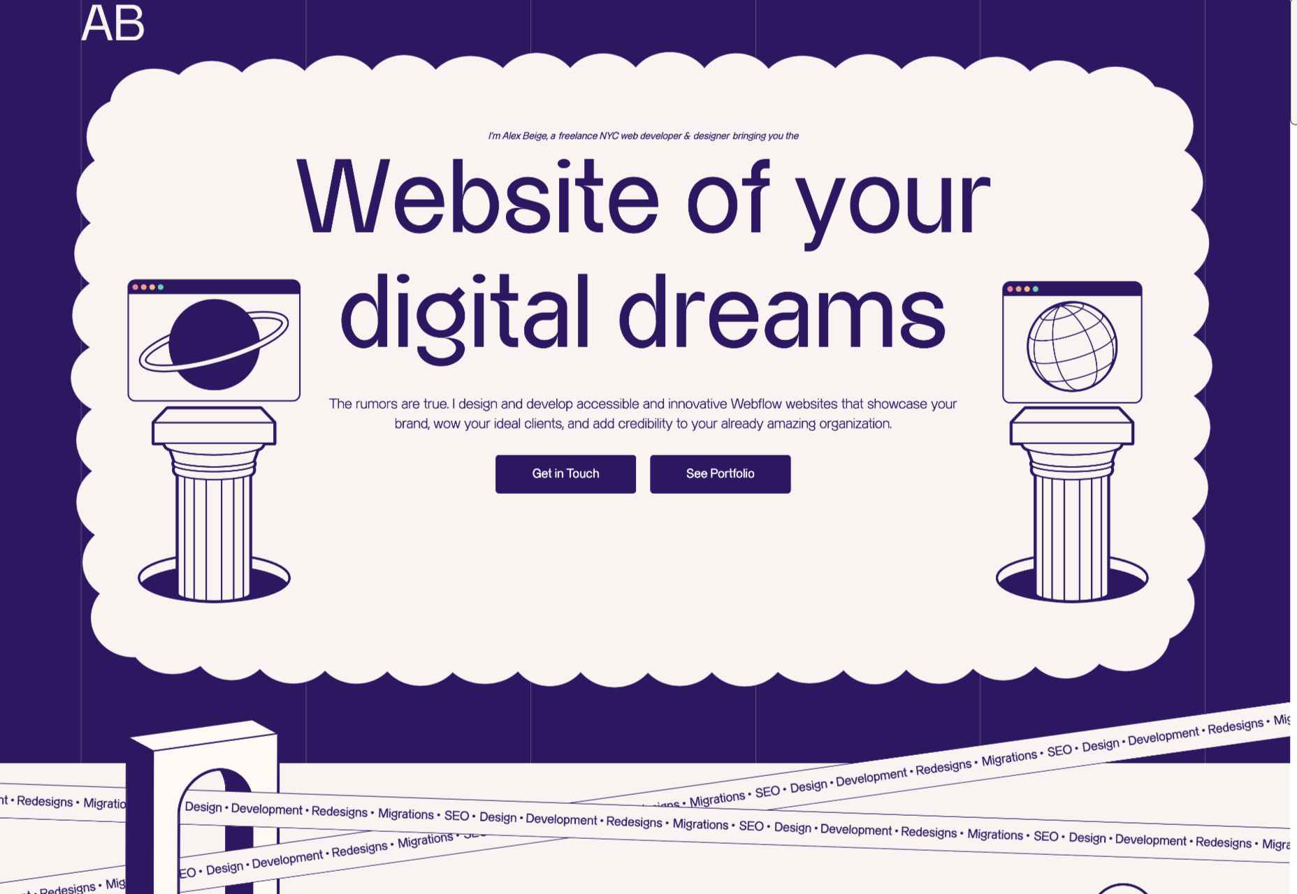
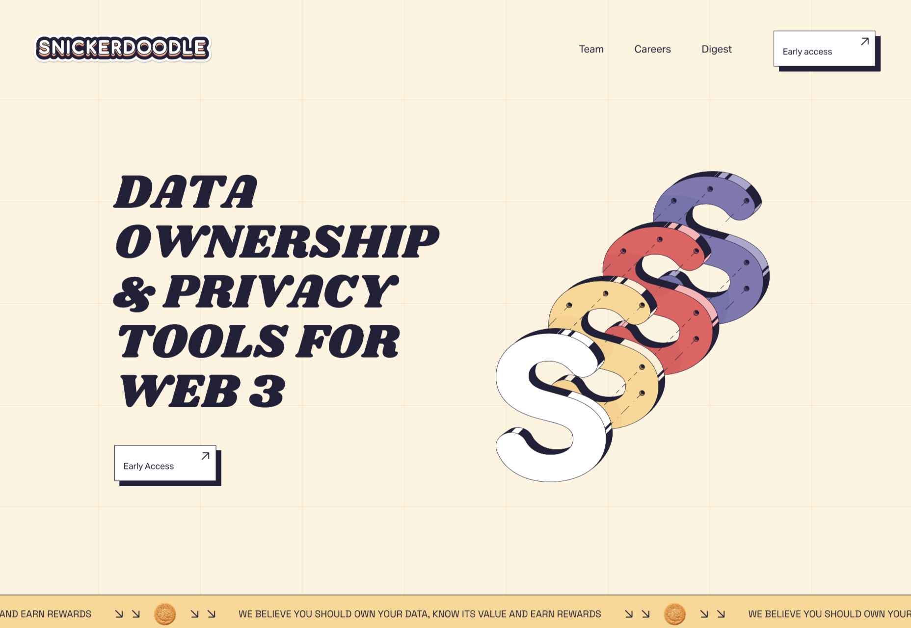
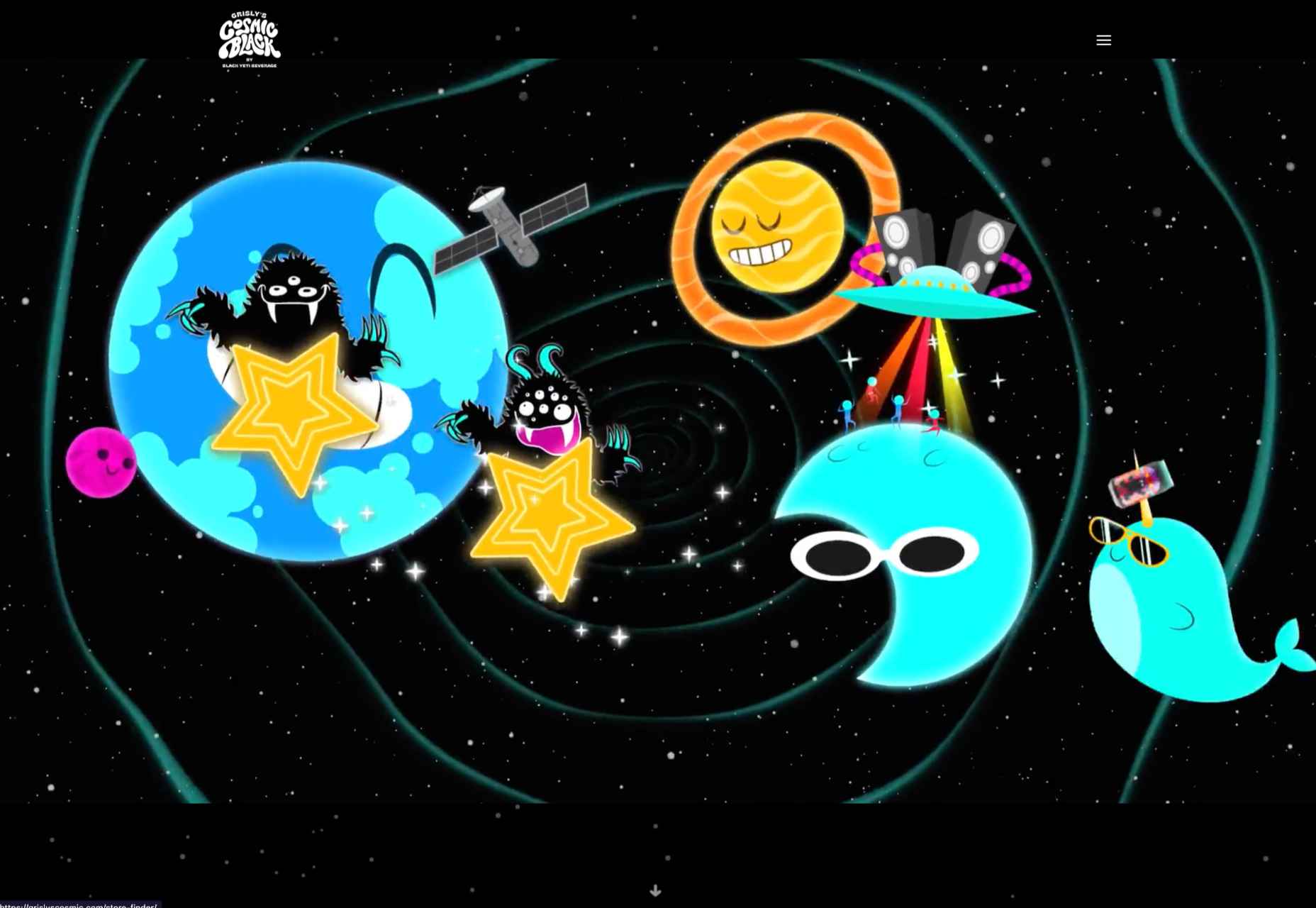
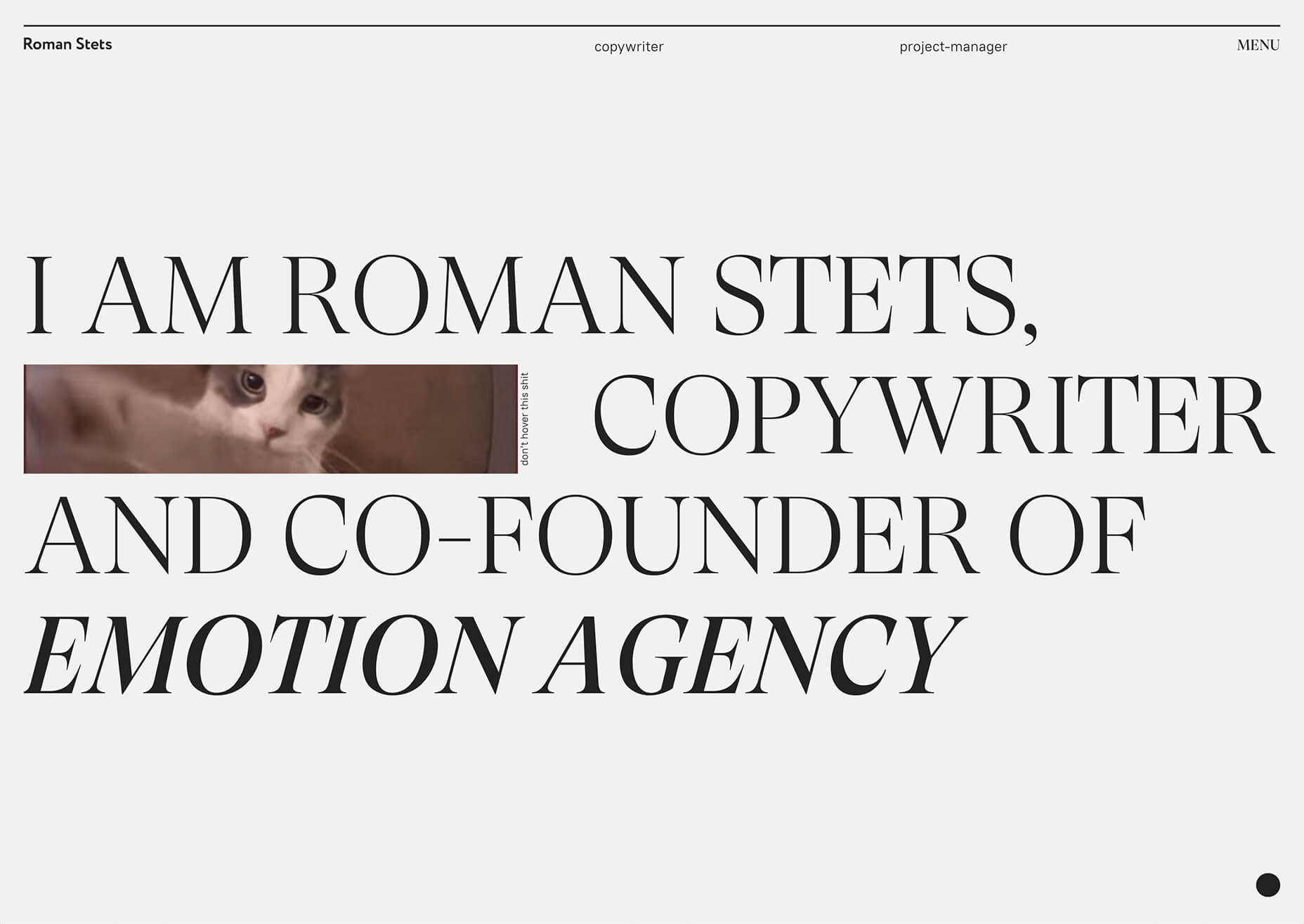
From peek-a-boo designs with neat animated elements to vertical bars to brutalist blocks, there are a lot of highly usable trends to work with.

Here’s what’s trending in design this month.

Peek-a-Boo with Animation

Designers have been experimenting with cut-out and layering elements with animation for some time, which has evolved into full peek-a-boo styles with a lot of visual interest.

How each design comes together is a little different. Some have the animation in the back, others in the front, and some include text as part of the style. There’s almost no set of actual rules to how to make this design trend work.

Each of the examples below does it somewhat differently with varying degrees of success. The commonality here is that it is almost one of those visuals that you either see and love or hate.

Jatco Insurance is the most stunning example here, with a bold color choice and a peek-a-book element inside the oversized “J.” The overall effect is soothing and interesting and naturally draws the user across the screen from the top left to the background video layer. The small tagline, “Individual attention you deserve,” is perfectly placed.

Liron Moran Interiors takes a different approach with the peek-a-boo concept with the letters peeking out from behind an image. The animation is restricted to a hover and scroll effect that adds a liquid element to the image as well as changes to the image and color background. The challenge here is in readability. More of the words show on wider screens, but is it enough?

Melon Fashion also layers text and animated effects for a neat peek-a-book style that almost seems cut out from the background. The overall look appears to have three layers: background video, middle layer for the yellow color block, and text on top. The opacity of text elements with the peeking video is interesting and well pulled together without sacrificing too much readability.

Vertical Bars

Vertical color bars are a design element that keeps popping up in different ways. Designers can use it as a standalone element or container for content, such as navigation or other click actions.

Vertical elements are helpful because they can help create a more consistent and unified user experience from desktop to mobile screens. This shape can also be somewhat disruptive because you don’t see it featured that often. (Although with this style trending that might become less true over time.)

New Classrooms uses a vertical color bar on the left to help you move through the design. The color actually changes as each slide progresses on the homepage.

Serving uses multiple vertical bars as links to different content entry points. Clickability is emphasized with a change from a red overlay to a full-color image. The navigation is also tucked inside a white bar on the left side of the screen with a hamburger menu therein.

TechnoAlpin goes with a skinny vertical navigation menu on the right side of the screen. The icons with menu elements make navigation highly visual and intuitive. The color, which significantly contrasts with the rest of the design, also helps.

Brutalist Blocks

Not many people thought brutalism would stick around when it started trending. Elements of brutalism keep sneaking in, though, although they are much less stark and harsh than some of those original trending website designs.

This version of brutalism focuses on block elements that contain images or text and often click to other pages in the design. The blocks themselves are essentially the buttons that help you navigate to additional content.

The critical question about this design technique is whether this click action is intuitive enough. Will users interact without buttons?

The answer likely depends on your audience base, but if you opt for a style like this, it is essential to keep a close eye on analytics to ensure that users know and understand how to engage.

Milli Agency might be the most intuitive example of the brutalist blocks trend. The homepage is essentially a giant navigation menu. Each block changes from white to yellow on hover and expands, further encouraging clicks.

Sick Agency uses brutalist blocks with experimental typefaces and bold color for an in-your-face design. You can’t help but look at all the different things happening here. The biggest question might be, where should you focus and click next? The cursor provides some visual cues, but it’s not quite as intuitive as you might want it to be.

Mawo mixes brutalist blocks with a big blue cursor to help users click through the design to see more clothing options. Even the images here have a rather stark feel, which isn’t typical for e-commerce. Every block element above the scroll on the homepage includes a click action from the navigation blocks across the top to the “Shop Women” and “Shop Men” images. Further, the blue cursor dot helps show where users can click, and text buttons change to blue on hover as well.

Conclusion

Most of the examples here show trends as homepage elements, but you aren’t limited to that application. Try some of these techniques on landing pages or interior pages that you want to add a little something special to.

This can be an excellent way to test the design and see if your users like the style and know-how to interact with it. If it works, then you can extend the aesthetic to more of the design.

Source

The post 3 Essential Design Trends, November 2021 first appeared on Webdesigner Depot.


Source de l’article sur Webdesignerdepot

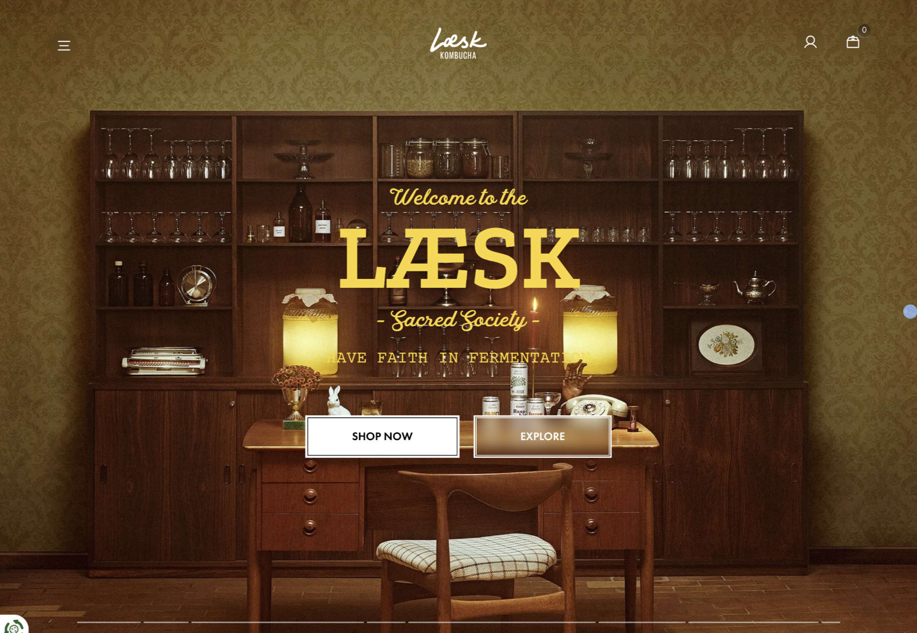
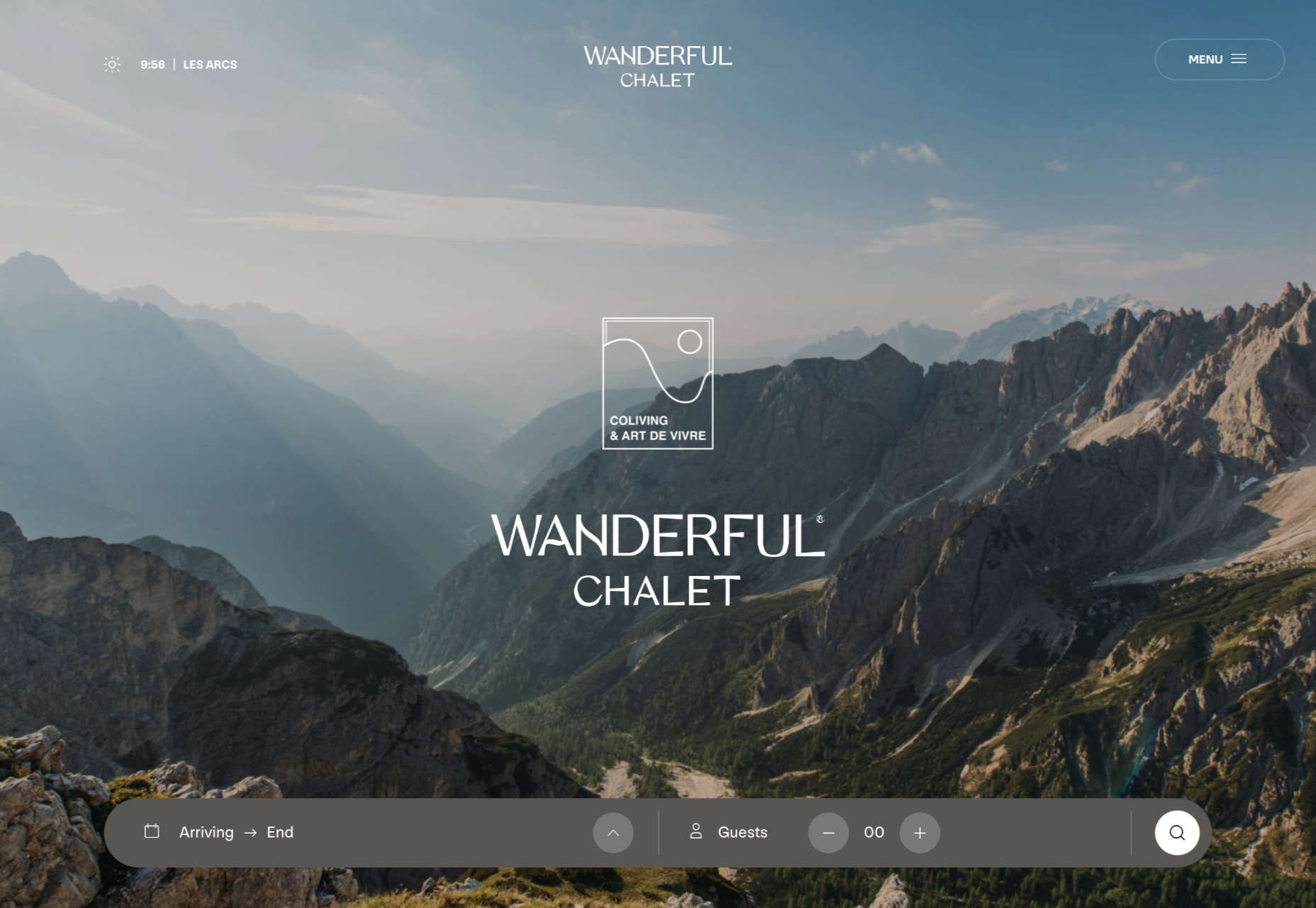
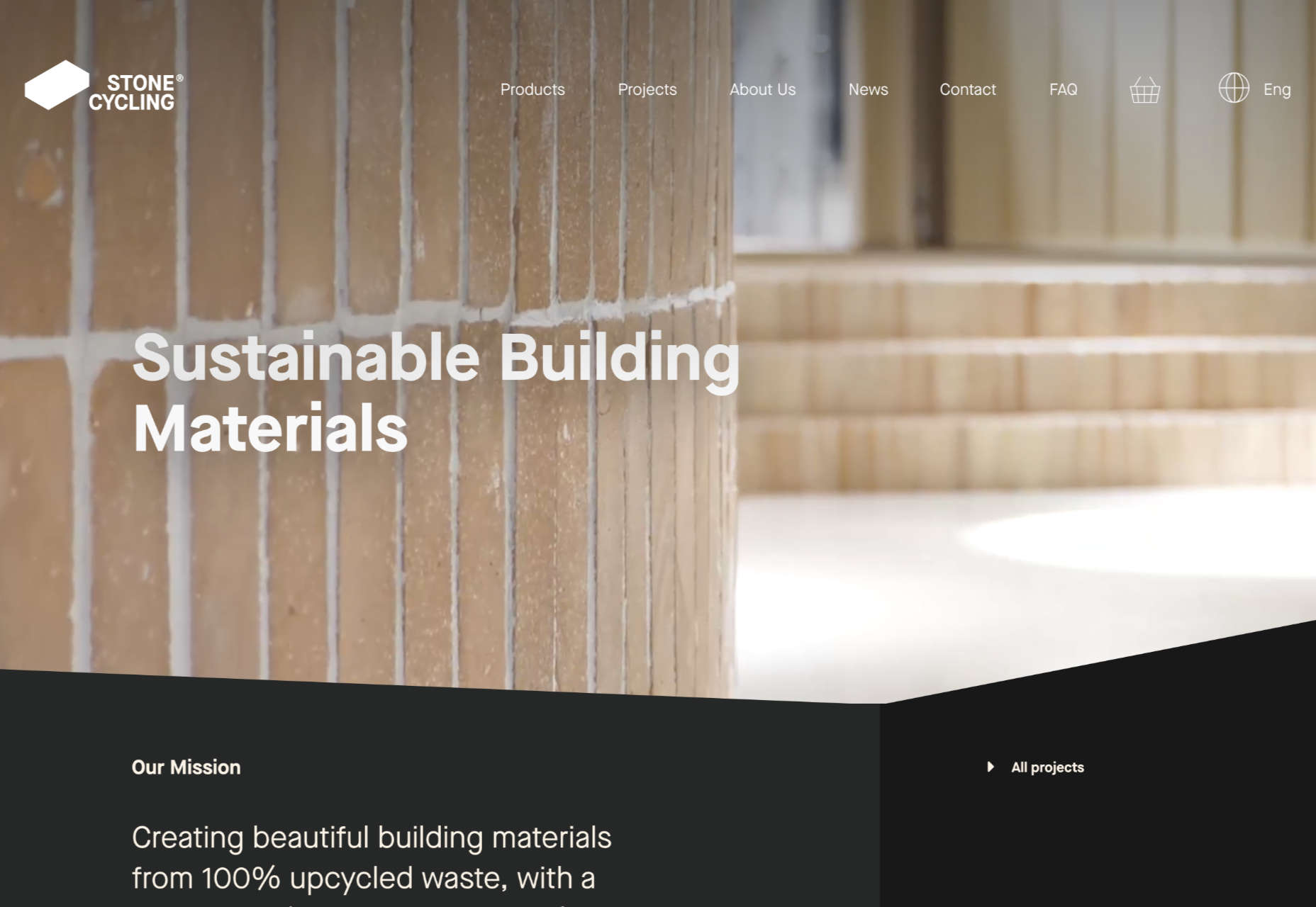
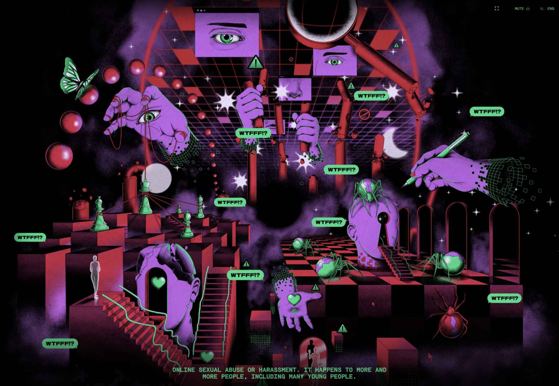
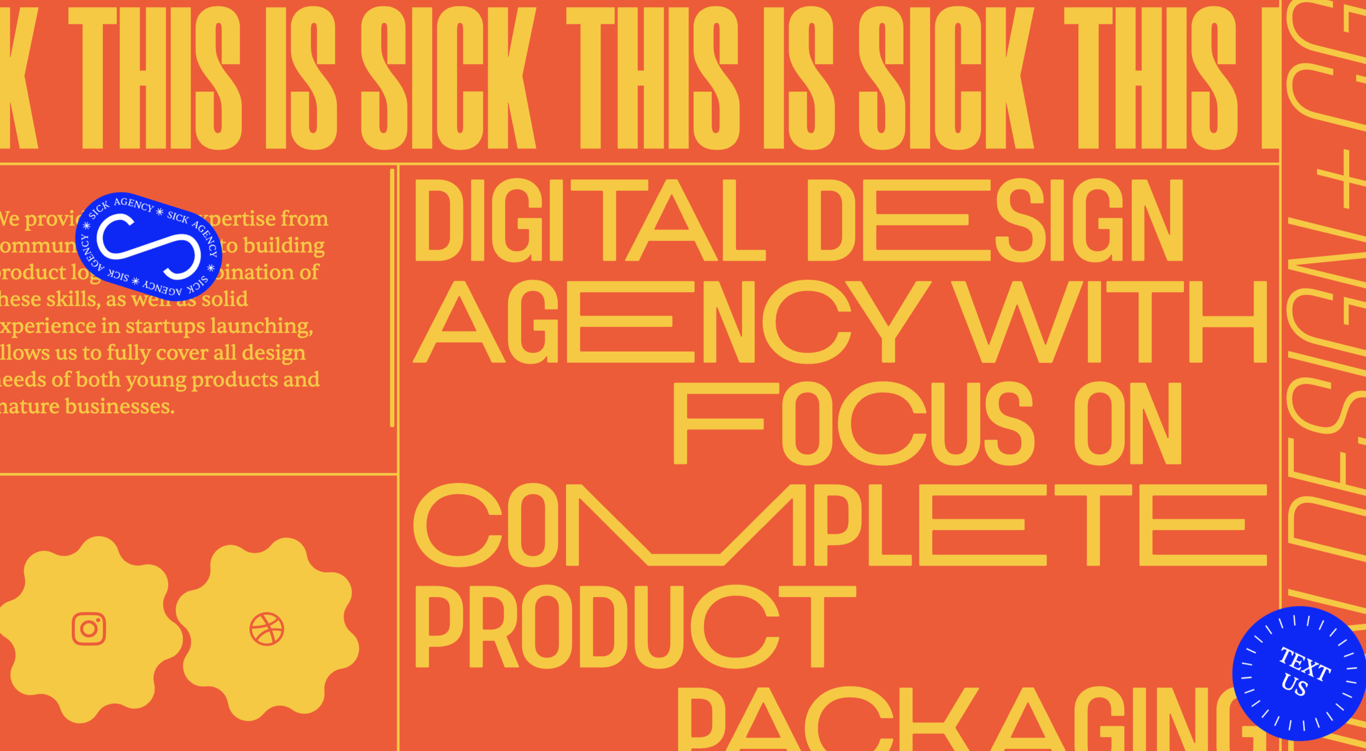
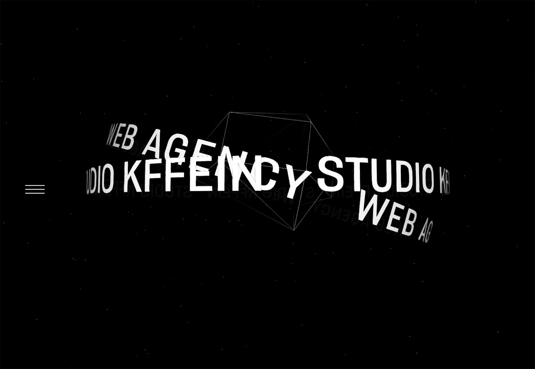
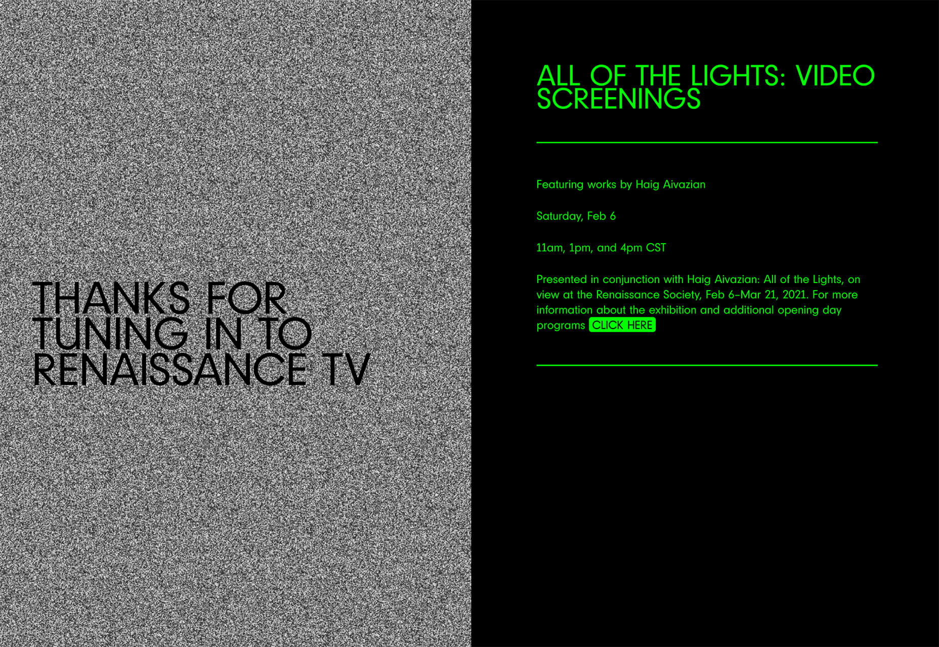
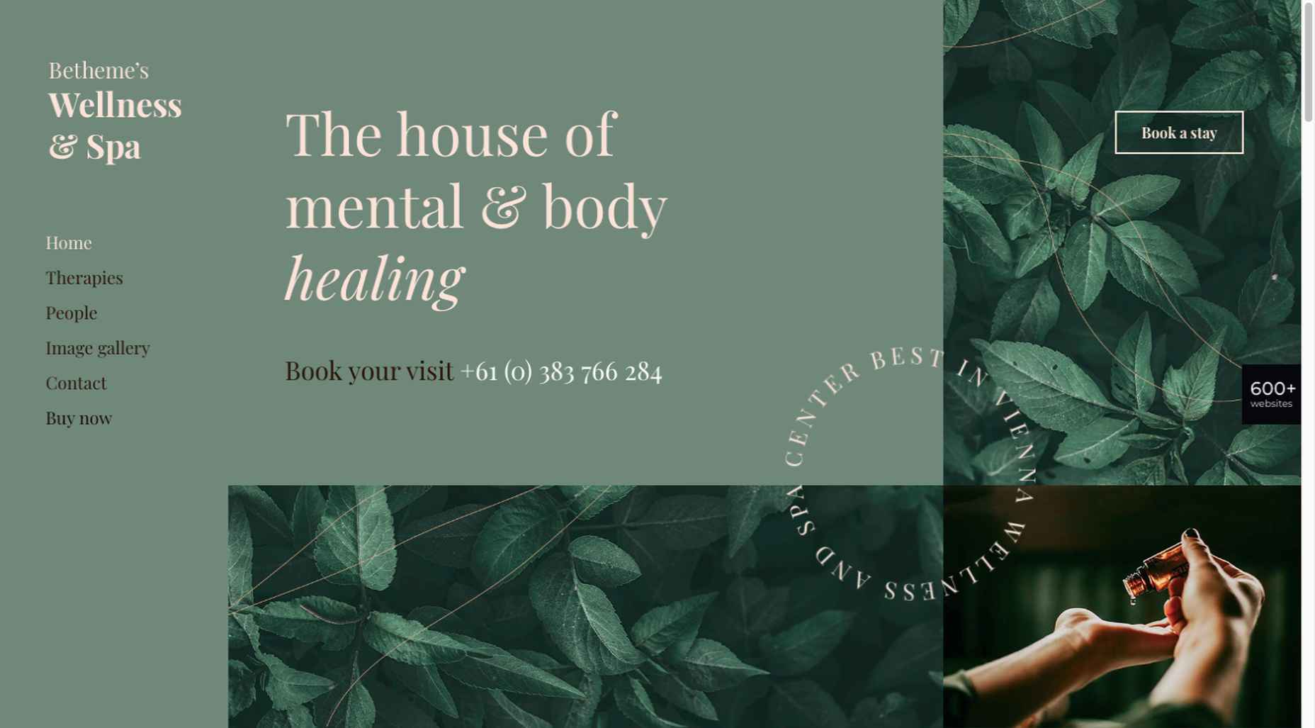
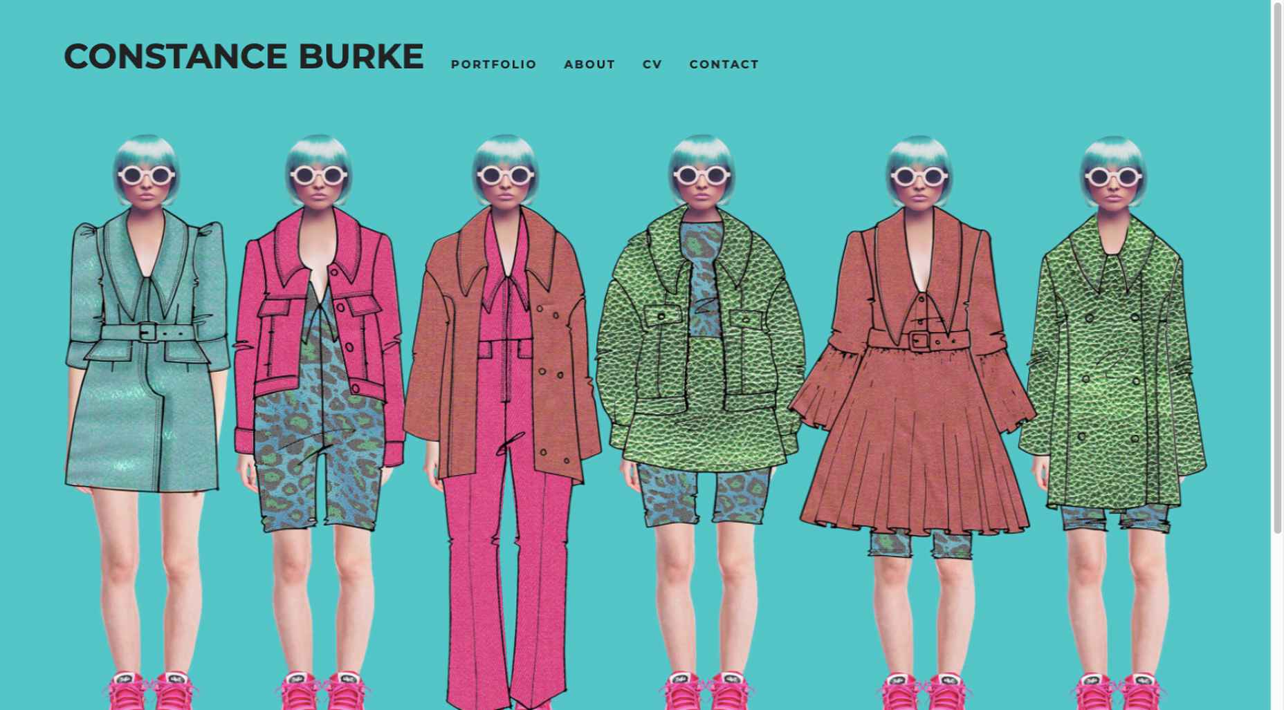
This month we have a variety pack for you. There are all sorts, from the most conservative layouts and structures to more experimental navigation. And we see how even the most traditional and functional websites can connect with users through mood-enhancing color schemes, clever font choices, and illustrations.

Non-functional–that is, purely decorative–details can really improve the user’s reaction to a site when applied sparingly. Constant movement gets tiring, and adding too many elements can feel fussy and unfocused. Getting the balance right so that things are kept simple but not bare and boring can be difficult, but it is a skill worth mastering.

Enjoy!

Laboratorio Permanente

The site for this multi-disciplinary architecture studio makes very nice use of a scrolling concertina effect.

Sometimes Always 

Wine sellers Sometimes Always have gone for a retro vibe with their color scheme and type.

Empty State 

Split-screen contraflow scrolling and the pop of bright blue against neutrals give Empty State’s home page impact, while the clean layout and clear navigation make the rest of the site pleasant to use.

Kibana 

Quirky display type and illustrations give this single-page site for Kibana lodge a friendly, welcoming feel.

For Good Design Lab

For Good Design Lab’s site is simple and bold; it makes a strong statement. And its design works even better on mobile.

Levitate

Levitate is a sports brand that makes an affordable running blade. Their site has a clean minimal feel, contrasting spaciousness with a sense of movement in the photography used.

Sunst-studio 

Multidisciplinary creative agency Sunst Studio keeps things simple but impactful with oversized black type on white and smaller images.

Made By Nacho 

Strong colors and illustrations, with the occasional subtle animation, work well for Made By Nacho.

Flexe 

Flexe are logistics experts, not the first industry that springs to mind when we think of great website potential, but this one is very appealing.

Friesday 

This site for Friesday restaurant/takeaway is lively, colorful, and fun.

Go out{side}

This offshoot site from B.A.S.S. (Bass Anglers Sportsman Society) aims to promote angling as part of an outdoor lifestyle. Earthy colors and a lively visual rhythm create energy.

Protos Car Rentals

Illustration brings a touch of personality to this site for Protos Car Rentals, while attention to detail pays off in the usability.

21wallpaper 

21wallpaper offers downloadable screen savers from different illustrators (7 artists, 3 designs each) regularly, which at the same time acts as a showcase for the artists.

Elon’s Toilet 

This is a brilliant and vital piece of marketing that succeeds in presenting a serious subject in a lighthearted and engaging way. You’ll have to find out for yourself what it’s about.

Pa’lais

A fresh feeling color scheme, a distinct lack of straight lines, and a scattering of illustration work well for the site for this vegan food producer.

Benjamin Righetti

Using a primarily visual medium to effectively promote an artist whose medium is sound is not always easy. This website for organist Benjamin Righetti does an outstanding job.

Wavemaker

Wavemaker is a creative media agency. Their site is strong and confident but with a playfulness that is engaging for the user.

Dpt.

This site for Dpt. throws out the usual menu concept and has its navigation arranged around the screen. It can be a risky strategy, but here it works well.

Plunt.co

Plúnt sells mix and match plant and planter combinations. The site’s core functionality is the combination chooser, which is pleasingly reminiscent of an animal flipbook.

Kingdom & Sparrow

Branding agency Kingdom & Sparrow have gone for a fairly standard approach, but the little hand-drawn details here and there add just enough individuality without overdoing it.

Source

The post 20 Best New Websites, July 2021 first appeared on Webdesigner Depot.


Source de l’article sur Webdesignerdepot

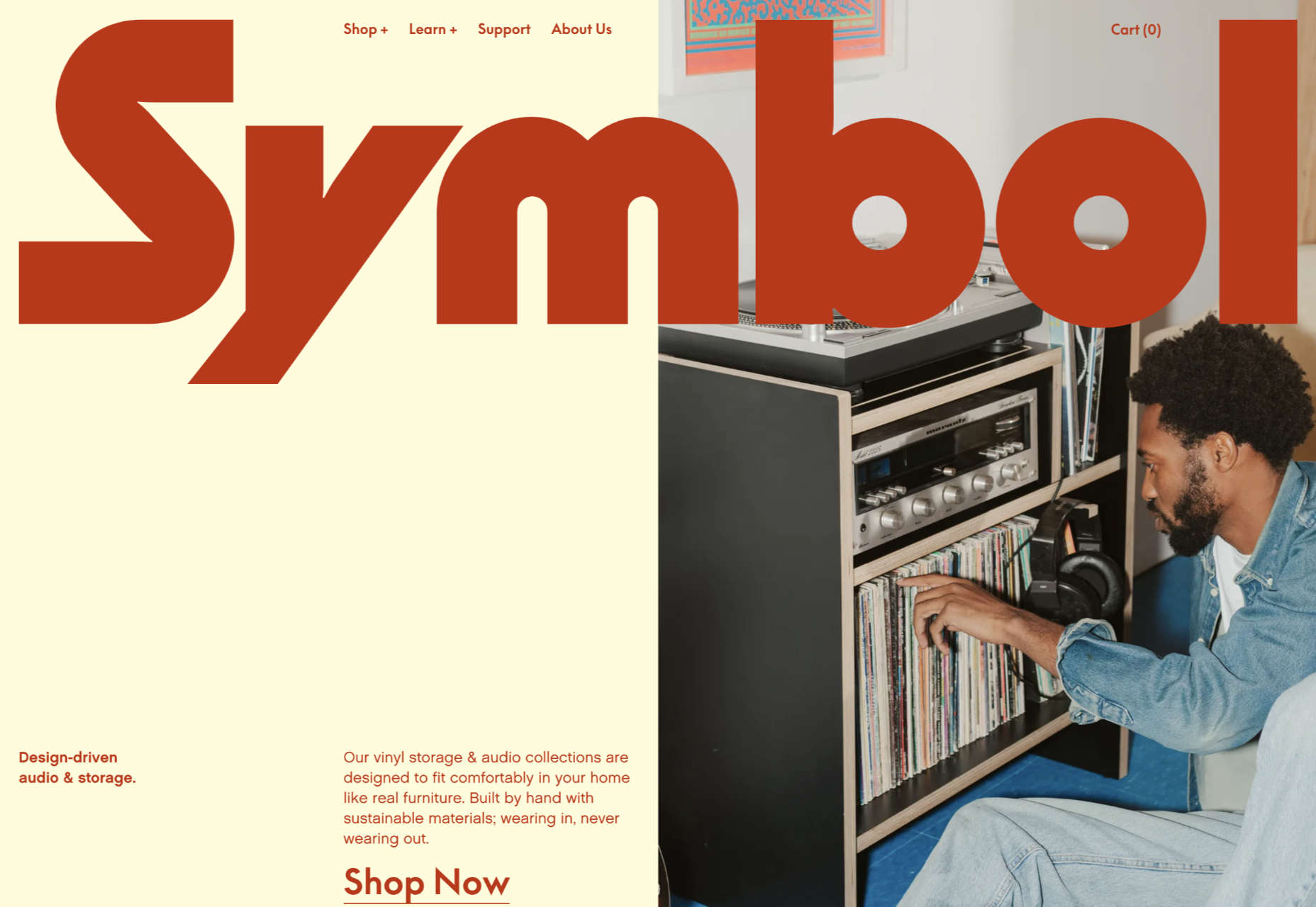
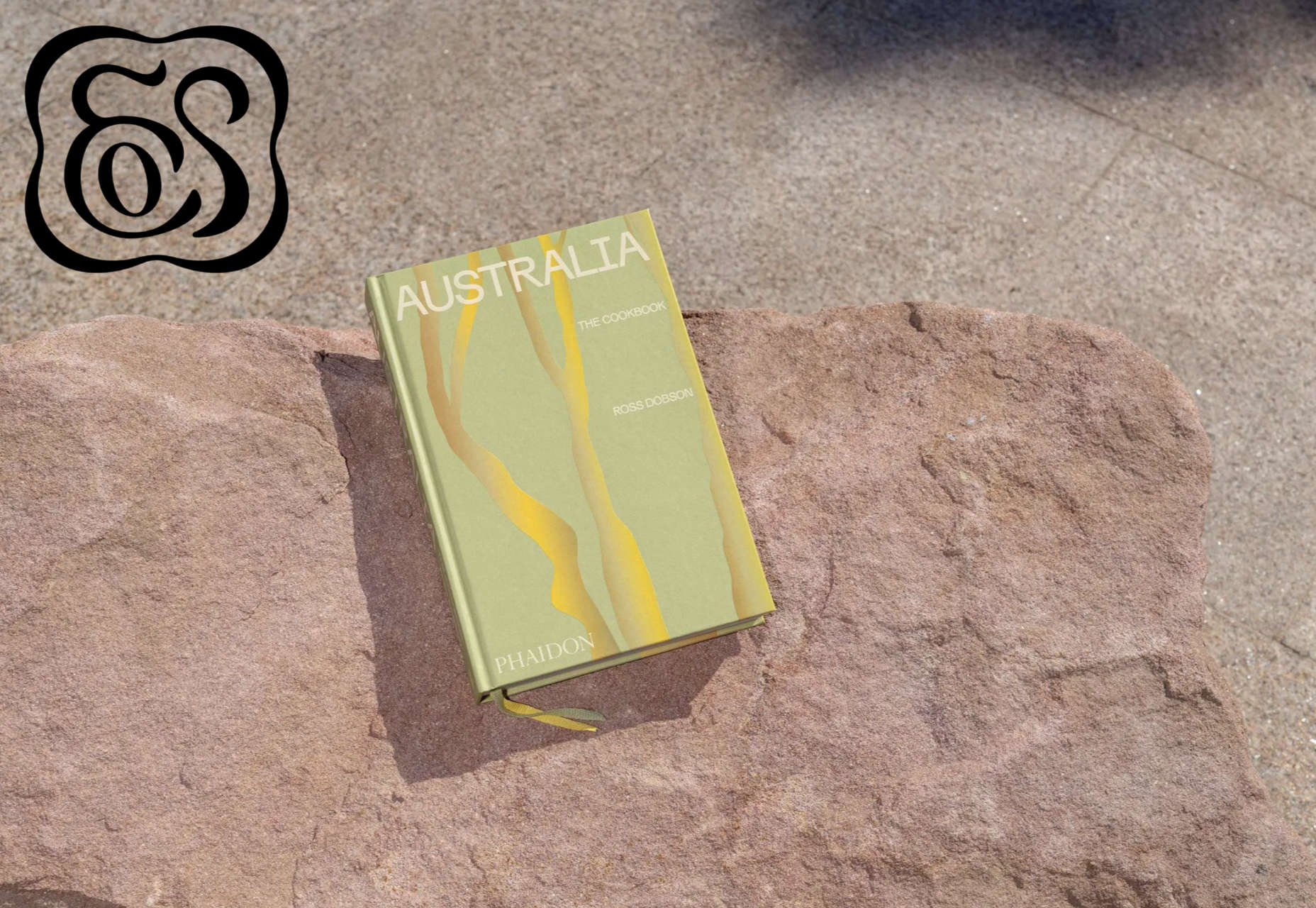
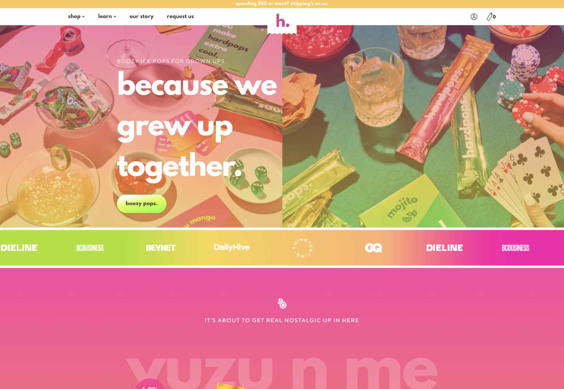
March is that time of year where the feeling of newness starts, from the first Spring days to fresh design projects. These trends are no exception, with fun new takes on some classic concepts.

Circles are always popular, but the top trend is an animated take on the traditional element; plus, fun pink and purple color palettes and a few faux split screen designs round out trending styles.

Here’s what’s trending in design this month.

Circle Animations

Circles are one of those shapes that never leave the design sphere. They have a lot of classical meaning and are flexible in terms of design options.

Designers are having a lot of fun with this shape right now. From animations to text circles to image frames, they seem to be all over the place.

More recently trending is more circle-shaped animations. This trend maintains a circle’s properties as a unified and harmonious element with movement to create more engagement and make you look at the design just a little bit more.

Each of these examples uses circles in a different but equally interesting – and animated – way.

Universal Favourite uses a circular blob. It’s almost like a giant bubble. It wiggles and flows, and stretches within the space without any help from the user. It has a smoothly quality that makes you want to stare at it. The color here helps, with the circle and background not having an immense amount of contrast. Also, note the cute little circle button in the bottom corner.

Kenta Toshikura put most of the subtle animation for this design inside the circle. With a hover state, the entire circle moves on the screen with a second layer of animation, and the cursor is also a circle that hops around the black background.

Kffein takes a totally different approach with a circle made from the primary test elements. Identifying website information rotates in a circle around another geo shape on the main plane. Not only is there a circular animation, but an almost three-dimensional effect that happens due to the way elements are layered here.


Pink and Purple Palettes

The prevalent pink and purple color combination isn’t for everyone – although you wouldn’t know it from the number of designs using similar colors.

This bright combination almost screams “spring” and has a lightness to it that almost seems to lift the mood of any project. (Maybe color selection is a reflection of how we all want to feel.)

What’s nice about these colors is that they flow into one another nicely. They can also be expanded to fall into neighboring hues on the color wheel, such as red from pink and blue from purple.

Maybe the most popular use of this color pair is as a gradient. You can find pink to purple everywhere, from background gradients to image overlays to buttons and user interface elements. There’s no lack of use here.

Each of these examples shows opportunities with this color combination.

SMU uses bright pink, blue, and purple to create a giant “road sign” in the design that jumps out from the rest of the project. The sign almost seems out of place and doesn’t fit as part of the normal color palette. This is what draw you right to it.

USA Volleyball uses the popular gradient option and extends the pink to the purple palette to hints of blue and red. What’s great about this design is that it uses a super trend element and color option and makes it work with their current color palette. You can almost imagine the design conversation when someone wanted to use a pink to purple gradient for a brand that features red, white, and blue. The gamble paid off, and it works beautifully without being off-brand.

Blobmixer uses purple, pink, and a few other bright colors – note the animated circles, too – to draw users into the design. The entire project is a fun, customizable experience that you can play with, and the color choices are what make you interested enough to try. This design also offers a great example of tactile animation and elements that feel real even when you interact with them using a mouse on the screen.


Faux Split Screens

Split-screen designs were a huge trend for about two years. The aesthetic was also functional for content that required a this or that choice on the part of users.

Now, we see the design elements but without the function. (Maybe because it just looks nice and creates a sense of balance without a symmetrical design.)

These projects look like they might offer multiple gateways to content, but there is only one call to action on the dual-screen aside from navigation elements.

What this design option does is help draw the eyes across the screen. One side will immediately appeal to you, and when done well, you’ll feel a subtle push of pull from the color, text, and images to look at the other side as well.

Renaissance TV does it with heavy animation with “dancing dots” from an old TV that doesn’t work. But then you need to look at the green text to understand what is happening.

Yacht uses text weight and space to push the eyes across the screen. Almost everyone will go to the heavier areas first and then gaze across the screen through blocks of space to the final small text on the right side. And it all happens in a fraction of seconds.

Bonjour Paris pairs bold color with black and white images. You may look at either side first, depending on personal preference, but the other half of the screen is necessary for a complete understanding of the website.


Conclusion

While all of these design trends are evident in new and recent projects, the use of pink and purple color palettes – particularly with a gradient – seems to be everywhere you look. These color choices are popular and come in a lot of forms.

Maybe the most obvious is with brighter pink and purple gradients, but other variations are also trending. It’s definitely one to watch in the longer term.

Source

The post 3 Essential Design Trends, March 2021 first appeared on Webdesigner Depot.


Source de l’article sur Webdesignerdepot

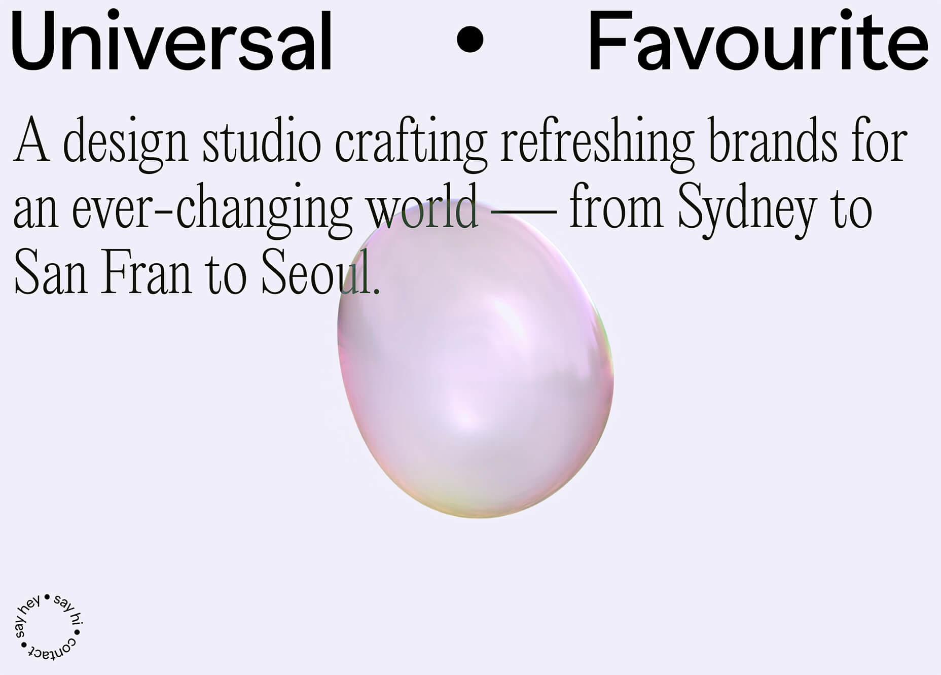
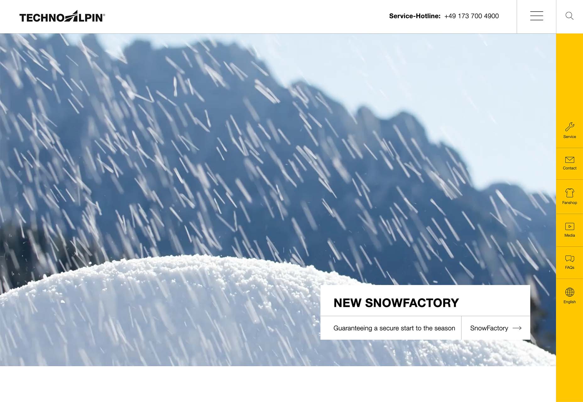
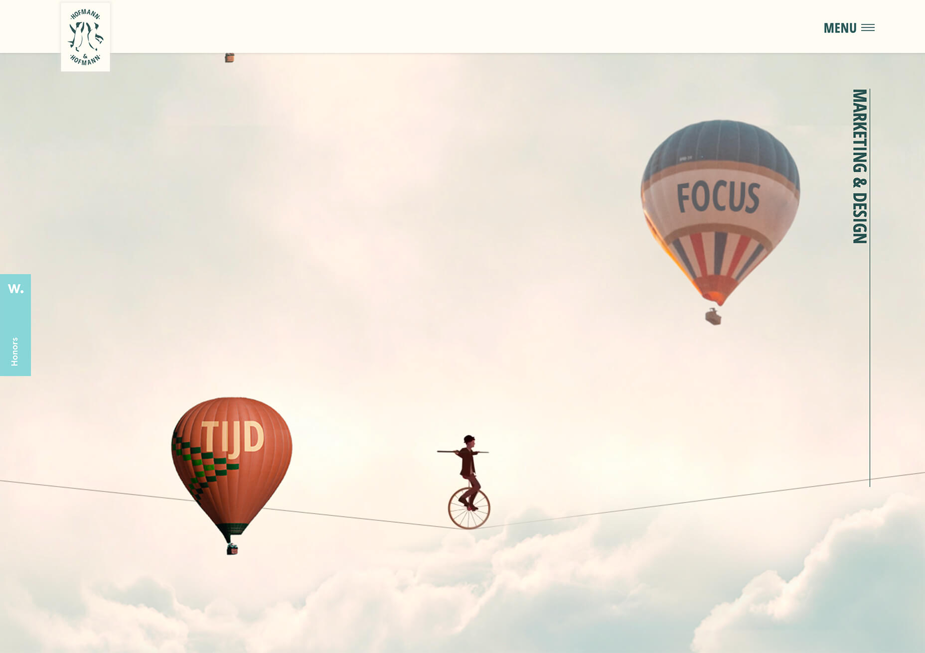
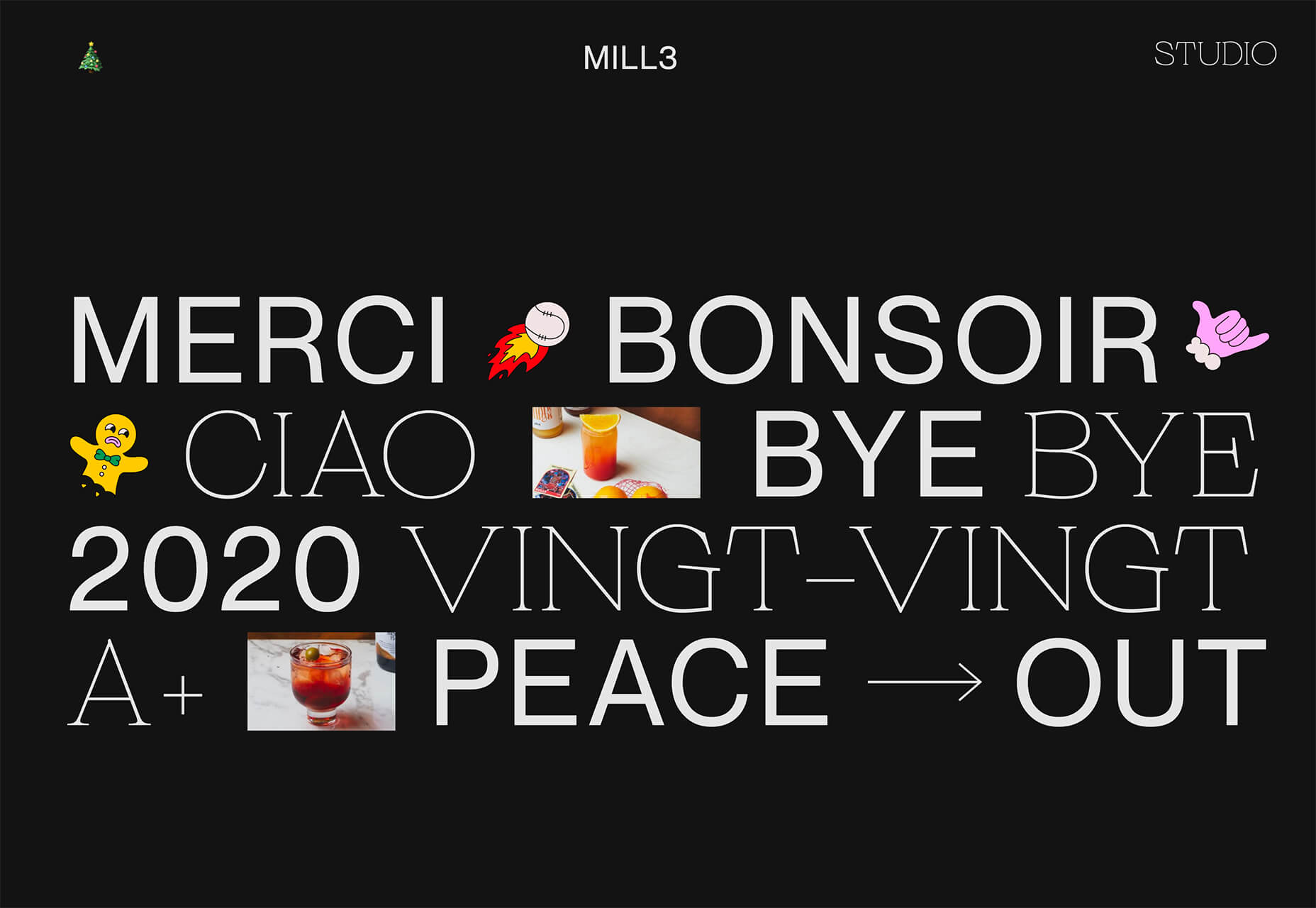
One of the few bright spots in 2020 has been the creativity companies and individuals alike have exhibited in dealing with what, at times, seemed to be overwhelming problems.

The world of web design was no different. Designers and agencies had to adapt and implement new color schemes or design new shopping experiences, which made some of the previous design trends not fit for the current design problems.

We’ll take a look at these newest design trends and the rationale behind them. As we do so, we’ll also take a look at some of BeTheme’s 600+ pre-built sites that have already put them to good use.

1. Comforting Color Palettes Lighten the Load

In years past, bolder color schemes were one of the hallmarks of web design trends. Their purpose was to quickly engage a visitor and prompt him or her to respond emotionally.

Given all the drama and turmoil we were subjected to through most of 2020, we’ve come to welcome the use of toned-down colors in marketing instead of the bolder, brasher, and more “in-your-face” color schemes. 

Bellroy’s website puts toned-down colors to good use. This company’s product line of wallets, bags, and the like, are designed to keep people’s belongings organized, safe, and secure. A wild color scheme simply wouldn’t be fitting.

How, then, are brightly-colored products dealt with? Thanks to judicious uses of white space and background photos, this website still emphasizes a toned-down color palette.

The BeSpa pre-built website is another example of a color scheme that almost immediately puts the mind at ease.

Calm and soothing? Yes.

Boring? Definitely not.

Comfort and security are the emotional drivers in this example.

2. Seamlessly Intermingle and Balance Physical and Digital Imagery

People confined to their homes because of Covid-based restrictions spent many more hours looking at their screens in 2020. Online programming began to take on the appearance of a reality show that blurred the boundaries between the real and the digital.

Whereas web designers tended in the past to rely on either photos or illustrations in their designs, these same designers have started to integrate these blurring effects into their designs, with results that range from amusing and quirky to highly informative.

Check out this example from fashion designer Constance Burke

It’s not every day you see real models wearing hand-drawn fashion sketches. But it’s just one example of how the physical can be blended with the digital.

The BeSki pre-built site does the same blending of the two, but in a totally different way:

The sections’ designs switch from predominantly physical to largely digital and back again, an excellent approach that provides a maximum amount of useful information.

It’s also worth noting how snowbanks are effectively used to seamlessly transition from one section to the next.

3. Create Well-Organized and Helpful Shopping Experiences

More people spending more time at home has created a surge in online shopping. As a result, many online store owners are now feeling the effects of increased competition.

Consumers look for brands they believe they can trust. At the same time, they want their online shopping experiences to be as quick and painless as possible. They look for (and expect) quick and effective product search capabilities, helpful and effective product displays, one-page product descriptions, and the like.

Walgreen’s product page design is especially well-suited for 2021 ecommerce shoppers: 

Everything shoppers usually need to know is presented above-the-fold. They can easily proceed to the next step or scroll down for reviews or additional product specifications. 

BePestControl’s pre-built website uses a similar product design approach: 

In this example, the main selling points are up-front and are kept short and sweet. The shopper can either hit the ‘Add to Cart’ button or look below the button for additional information.

In both examples, a visitor doesn’t have to mull over what step to take next since one of the design objectives is to make the shopping experience as easy and as satisfying as possible.

4. Take Advantage of the Benefits of User-Controlled Video Content

Once upon a time, video content was “the thing” to incorporate in a website. Hero background videos proved to be particularly engaging, and “how-to” videos presented much more useful information than illustrations or blocks of text could.

On the other hand, Auto-play videos, those that started on their own, all too often had a tendency to irritate rather than inform, especially when their content didn’t address a visitor’s immediate concern.

Thanks to Zoom and similar video platforms that came into widespread use in 2020 and to website designs that include video “Play” buttons, users have become much more comfortable with the medium. As an example, Shoppers have been given total control over if or when they want to view a given video. 

This is the design approach Payoneer has taken: 

The white “Pay” button is impossible to miss, and while it is designed to encourage a visitor to watch a testimonial, doing so is completely optional.

The BeOptics pre-built website cleverly slips in a video play option as well: 

In this example, when visitors hover over the “See More” button, it lets them know that they have the option to watch the video if they want to learn more.

5. Trust Builders Should be Non-Negotiable Web Design Elements

There are various ways in which products are organized or showcased in brick and mortar businesses to instill trust. Helpful and friendly staff also contribute to instilling trust.

Some of these trust-builders are easily incorporated into eCommerce designs. Others, though more difficult to fit in, can usually be satisfactorily addressed.

Digital trust builders can include.

  • Logos (familiar, whimsical, innovative, engaging)
  • Portfolios and/or product pages
  • Customer reviews, product ratings, and client testimonials
  • Case studies and product or price comparisons
  • Safety and security seals, e.g., Better Business Bureau, PayPal checkout
  • Charts, graphs, counters, and other data visualization techniques
  • Proof of social, charitable, or community-related actions and contributions

Put, trust-building content will beat hard-sell techniques every time, especially if you would like your customer base to include referred and repeat customers.

Omaze, for example, gives people entries for prizes based on their donations while at the same time highlighting the good things it and its donors have brought about.

To help build trust, the site devotes space to highlighting publications that have featured Omaze and the work it has done and is doing.

Plus, it puts data visualization and non-profit testimonials into play to give visitors an added insight into what is going on behind the scenes: 

As you can see, it doesn’t have to be difficult to incorporate genuine trust-building content into your website designs.

BePortfolio is a great example of how you might go about doing this for a portfolio site, whether it’s your own or a site for a client:

The home page alone has plenty of space for including trust-building content:

  • A satisfied customer counter
  • Product usage case studies and testimonial
  • Portfolio highlights
  • Client and partnership logos

And it can only get better as a visitor moves through the site, but only if you’ve chosen to make that happen.

Have You Started to Take These New Web Design Trends to Heart?

We’re not suggesting that you throw the baby out with the bathwater, but some trends will need to be discarded to enable you to adjust to a new normal. Other 2020 design trends, like minimalism and headline topography, are likely to remain popular for years to come.

New trends that incorporate calming color palettes, image blending, more efficient eCommerce UX designs, user-controlled video, and trust-building elements should give your customers the feeling of comfort and security they will be seeking in 2021.

If you want to implement some or all of these new trends in your 2021 website designs, BeTheme’s 600+ pre-built sites make doing so an easy task.


[– This is a sponsored post on behalf of BeTheme –]

Source

The post 5 Web Design Trends and Ideas for 2021 first appeared on Webdesigner Depot.


Source de l’article sur Webdesignerdepot

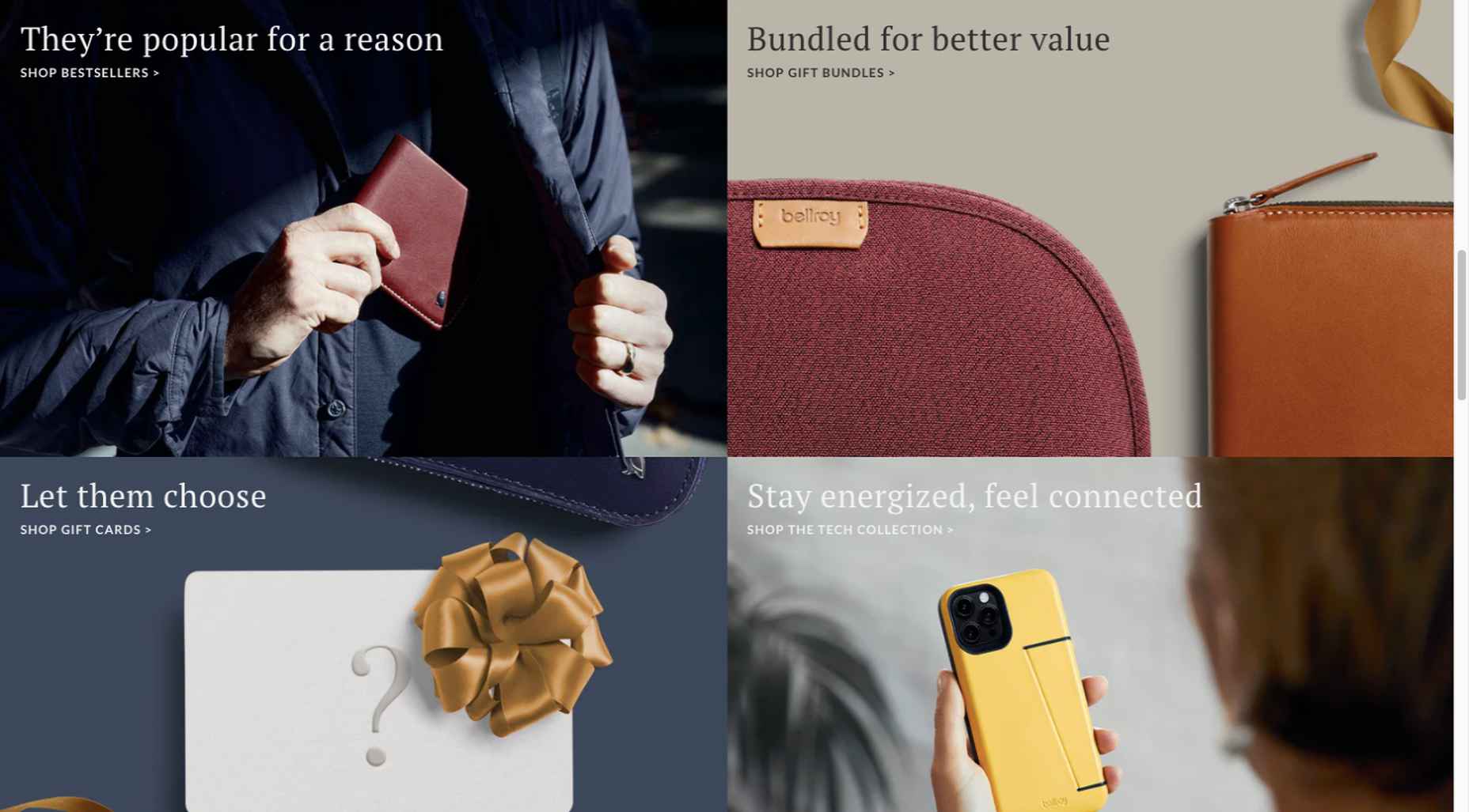
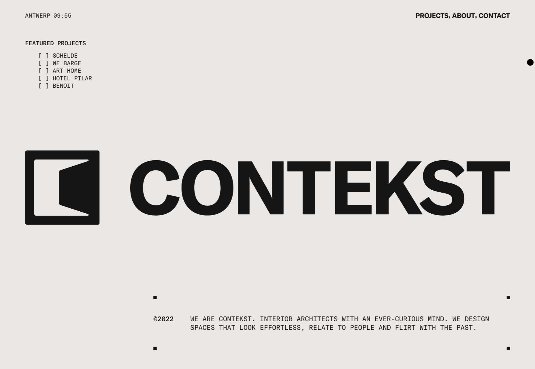
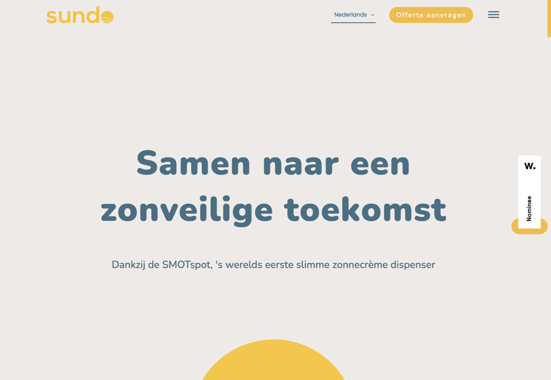
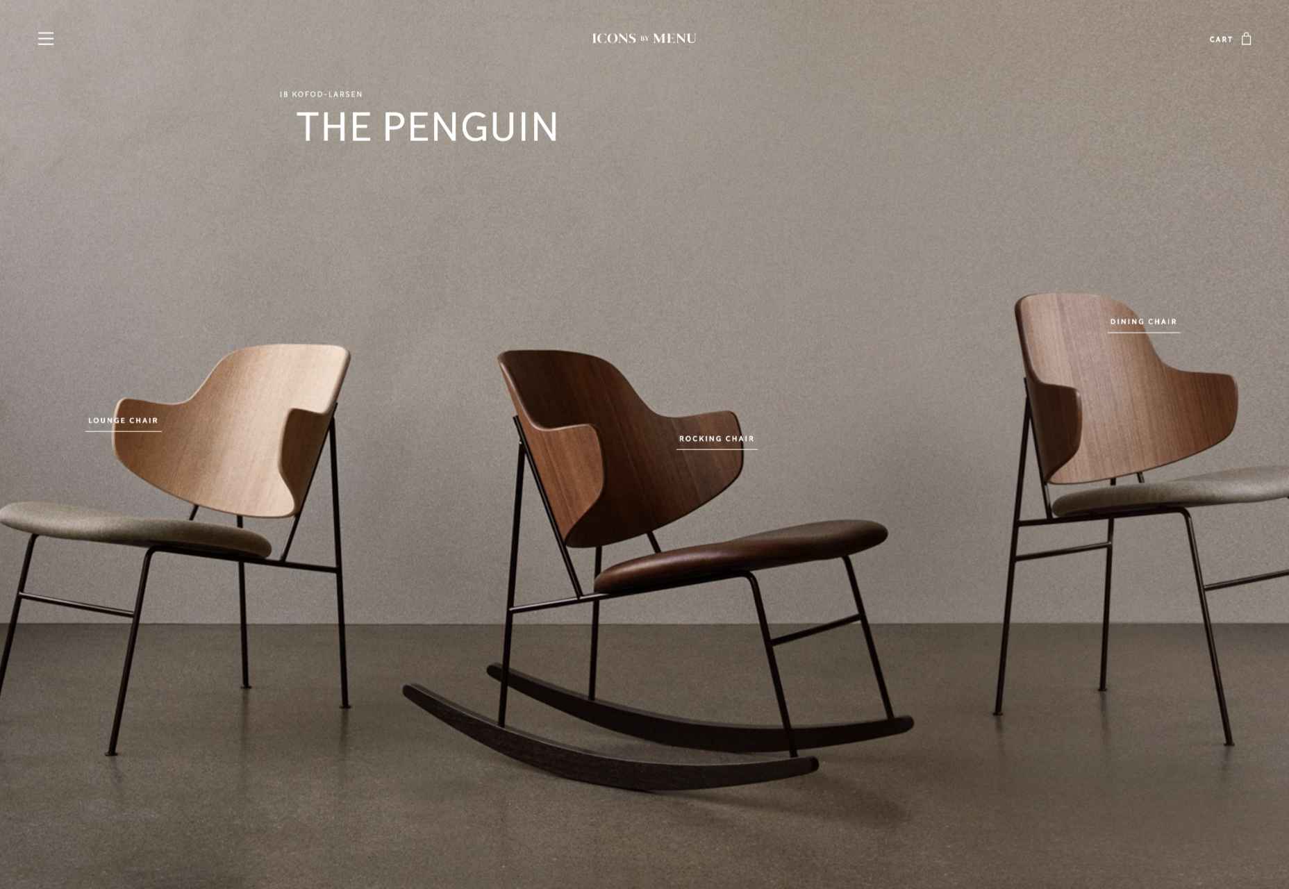
Don’t drop the ball on these website design trends for the new year. All of the trends featured here this month are visual in nature – not as many user interface elements as previous months, but all just as stunning and usable.
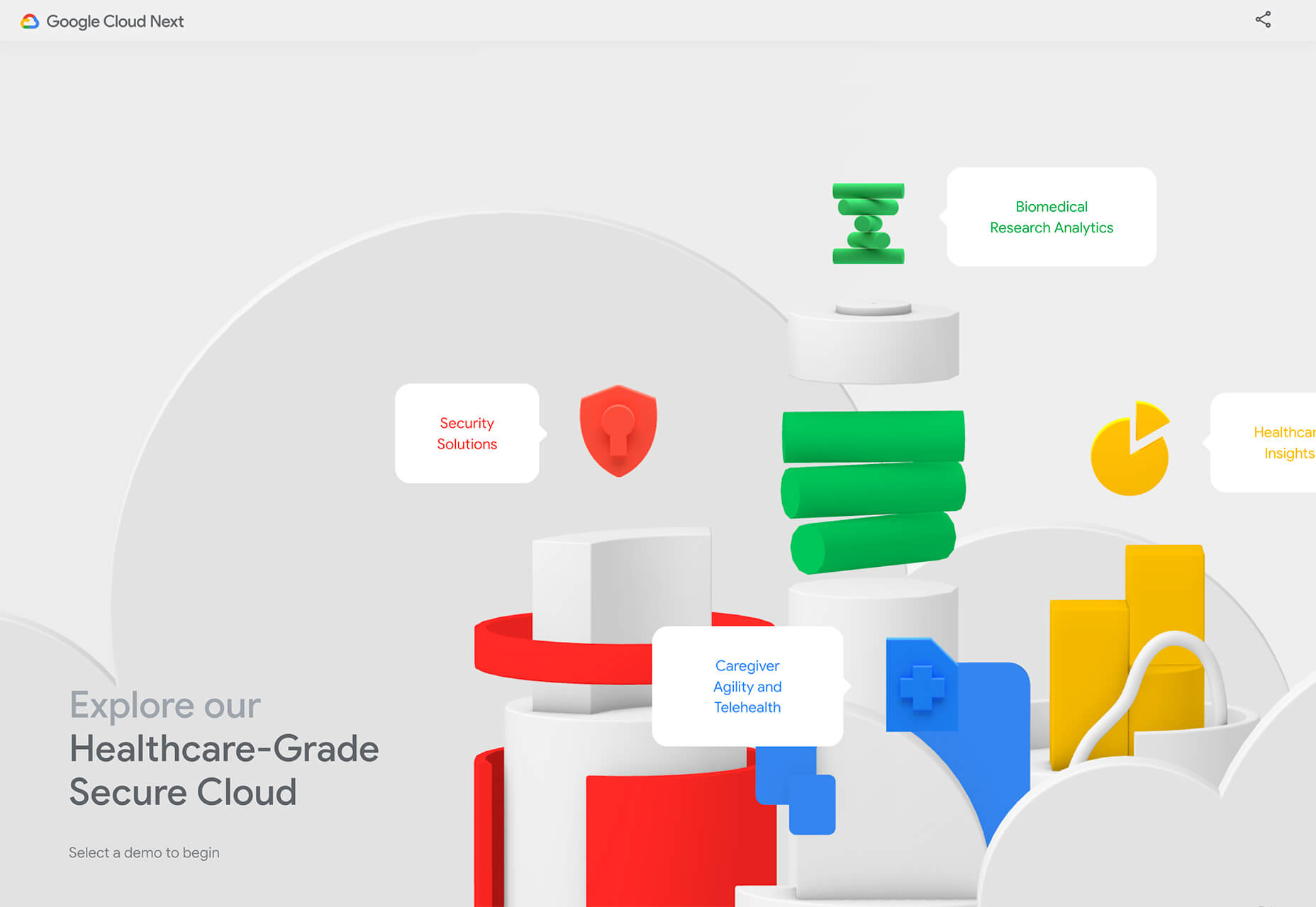
Here’s what’s trending in design this month.

1. 3D Scenes on White (Light)

Three-dimensional scenes are not just a trend this month but are likely to be one of the biggest website design trends that you see all year.

They offer a great way to show off product imagery, design something with illustrations or animation for visual impact, and provide usability and understandability cues for users.

It’s a versatile technique that can work with real or created images and are also “COVID-friendly,” something designers have had to think a lot about in the past few months. (Appropriate imagery in design is a real concern, as is trying to design projects without the ability to produce traditional photoshoots.)

What’s neat about all of these projects – and plenty of others – is that they root the design in white or light backgrounds. The light effect creates an easier visual mood that’s clean and emphasizes the imagery.

This website design trend solves a lot of those problems and looks good doing it.

Google’s Cloud design uses 3D illustrated animation on a white background with plenty of depth elements. The primary color palette of illustrated objects pulls it all together and guides the eye through each of the callout labels.

The red words on the screen Crystal Pure fit perfectly with the white-on-white 3D imagery of this design. Red accents pull you into different places on the screen, and it all has a clean feel.

Hofmann & Hofmann uses the same concept with a slightly different approach. The background is still light with a realistic feel and 3D objects, but it is a lot less stark and white. The feel is a little warmer and more inviting than a flat white aesthetic.


2. So Many Stacked Capitals

If you don’t have great artwork or imagery, make your own with typography.

This trend seems like it might be yelling at you just a little, but it still works for the most part — well, as long as you don’t land on too many of these website designs in a row!

What’s interesting about this trend is that many of the designs feature all caps type and serifs. These styles have been making a bit of a comeback, but this use is interesting for many reasons.

The hardest part when using all caps is maintaining readability. That’s why you see some variances in regular, italics, and bold weights, as well as the use of multiple typefaces. The goal is to create a good reading flow with a stunning visual presence.

This trend works best when you have “easy” words on the screen to facilitate scanning. Too many long or complicated letter combinations can get challenging quickly.

Make sure to look for the Easter eggs in each of these projects:

Emotion Agency has tiny “waving” illustrations next to each word (which doubles as the navigation) when you hover over them.

Mill3 Studio has a few animations, from the text flying in and out on load and scroll to subtle movements in the emojis.

Bizarro has this fun little cat video with a tiny warning not to hover over it, but you definitely should.


3. Empty Places

The final trend in this roundup is a stark reminder of current times. Each of the website design features empty places or locations.

This style of imagery would have been avoided pre-pandemic because tourism locations would want visitors to feel like a part of a bustling environment. Not today. If you travel, chances are you may feel safer or want to be in a more secluded environment.

All of the images and videos from these locations show just that.

Designers are doing this with new stark imagery that stands alone for the design or inserting a few empty place frames into video clips or among images that show more populated times. Even scenes that contain people show very few people and focus on more solitary activities.

Paragon Oak does this by showing a beautifully lit location at night. Note that using a nighttime photo eliminates questions about where the people are or what they are doing. (This is a clever option when showing imagery of an empty place.)

Vienne to Paris shows boats on the water with a beautiful background. While you assume there are people on the water vessels; you don’t see them and get the feeling that everyone is separated in their own “pod,” a pandemic-friendly option for travel.

The Maryculter House shows various images without people – the resort’s location on beautiful grounds; empty, but immaculate rooms, and a few images of a person alone on the grounds. Again, the empty nature of the place feels more appropriately welcome for the time we live in.


Conclusion

One of the things that we’ve seen with design trends in the past year is pandemic-related. The composition of images to the way elements are arranged on the screen influences every aspect of our lives.

While the empty place image and video trend is big now, it may fade post-pandemic. Although, it could still be relevant for quite some time. It will be interesting to see what happens as the year progresses with this trend – will it hold on or fade away?

These trends might continue to hold well into 2021.

Source


Source de l’article sur Webdesignerdepot