 Don’t drop the ball on these website design trends for the new year. All of the trends featured here this month are visual in nature – not as many user interface elements as previous months, but all just as stunning and usable.
Here’s what’s trending in design this month.
1. 3D Scenes on White (Light)
Three-dimensional scenes are not just a trend this month but are likely to be one of the biggest website design trends that you see all year.
They offer a great way to show off product imagery, design something with illustrations or animation for visual impact, and provide usability and understandability cues for users.
It’s a versatile technique that can work with real or created images and are also “COVID-friendly,” something designers have had to think a lot about in the past few months. (Appropriate imagery in design is a real concern, as is trying to design projects without the ability to produce traditional photoshoots.)
What’s neat about all of these projects – and plenty of others – is that they root the design in white or light backgrounds. The light effect creates an easier visual mood that’s clean and emphasizes the imagery.
This website design trend solves a lot of those problems and looks good doing it.
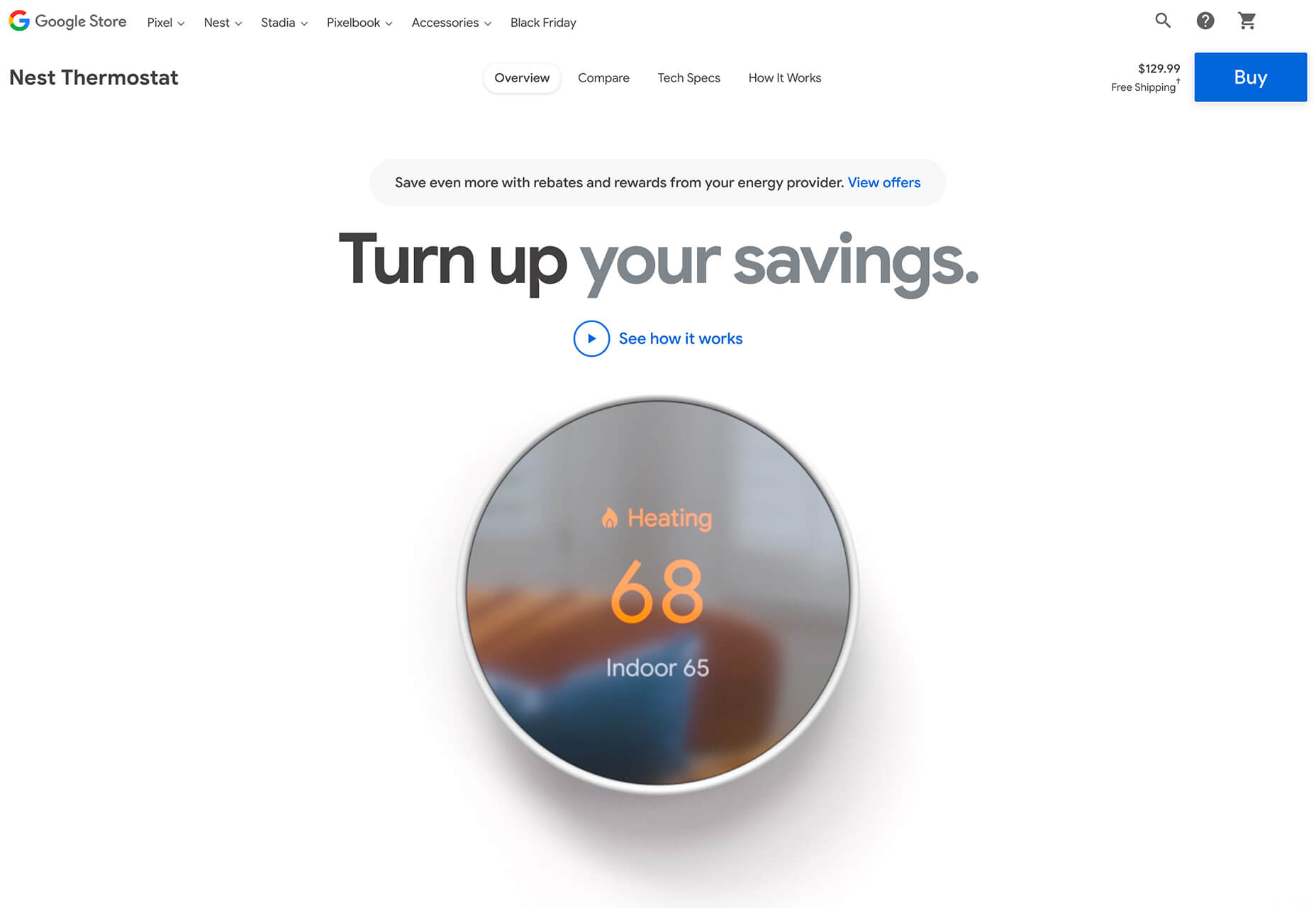
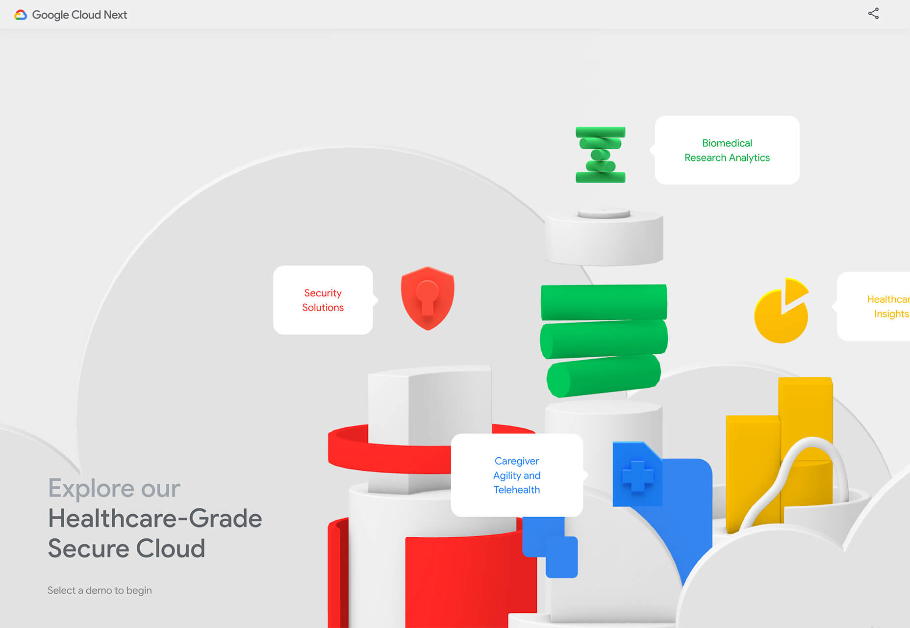
Google’s Cloud design uses 3D illustrated animation on a white background with plenty of depth elements. The primary color palette of illustrated objects pulls it all together and guides the eye through each of the callout labels.
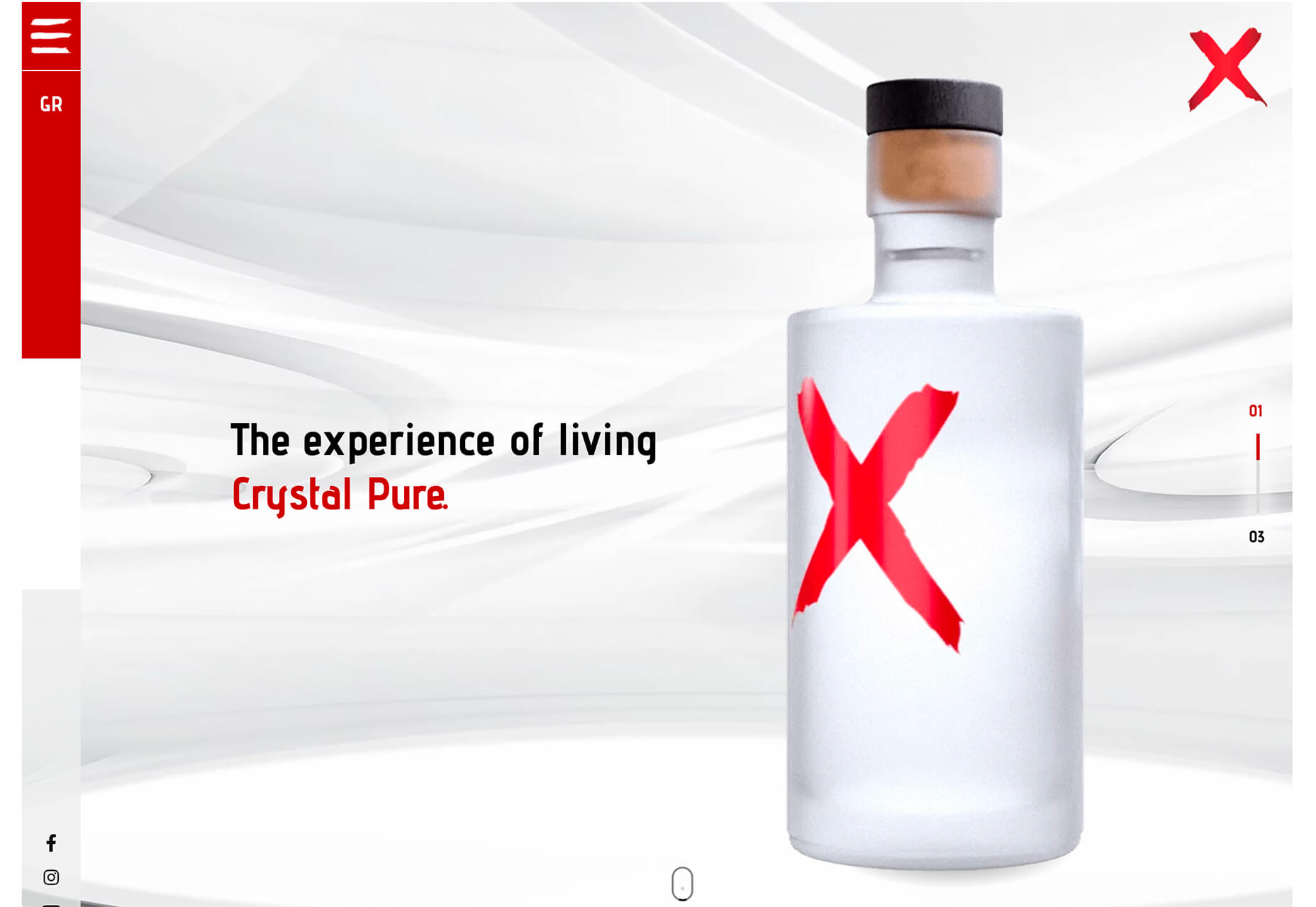
The red words on the screen Crystal Pure fit perfectly with the white-on-white 3D imagery of this design. Red accents pull you into different places on the screen, and it all has a clean feel.
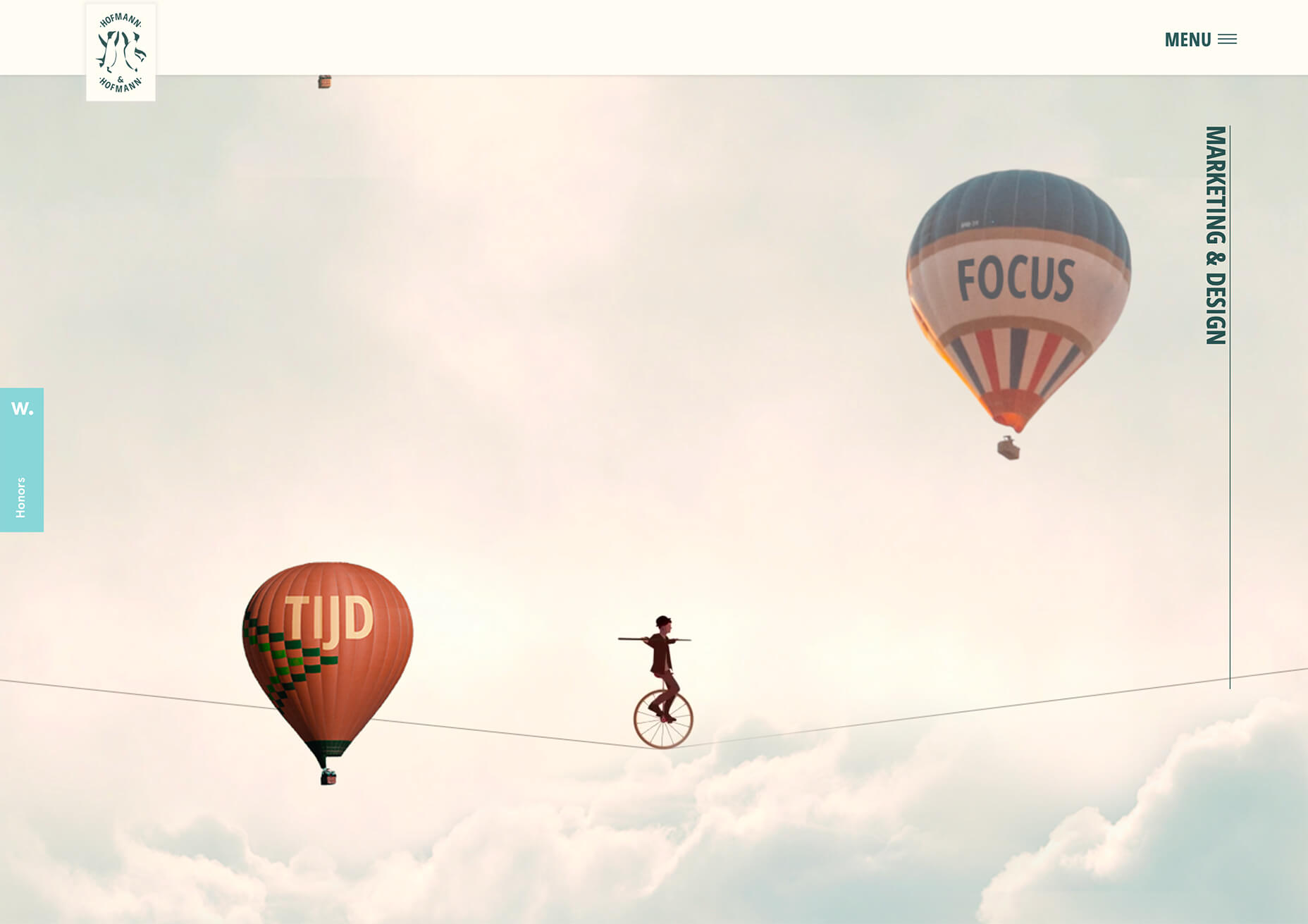
Hofmann & Hofmann uses the same concept with a slightly different approach. The background is still light with a realistic feel and 3D objects, but it is a lot less stark and white. The feel is a little warmer and more inviting than a flat white aesthetic.
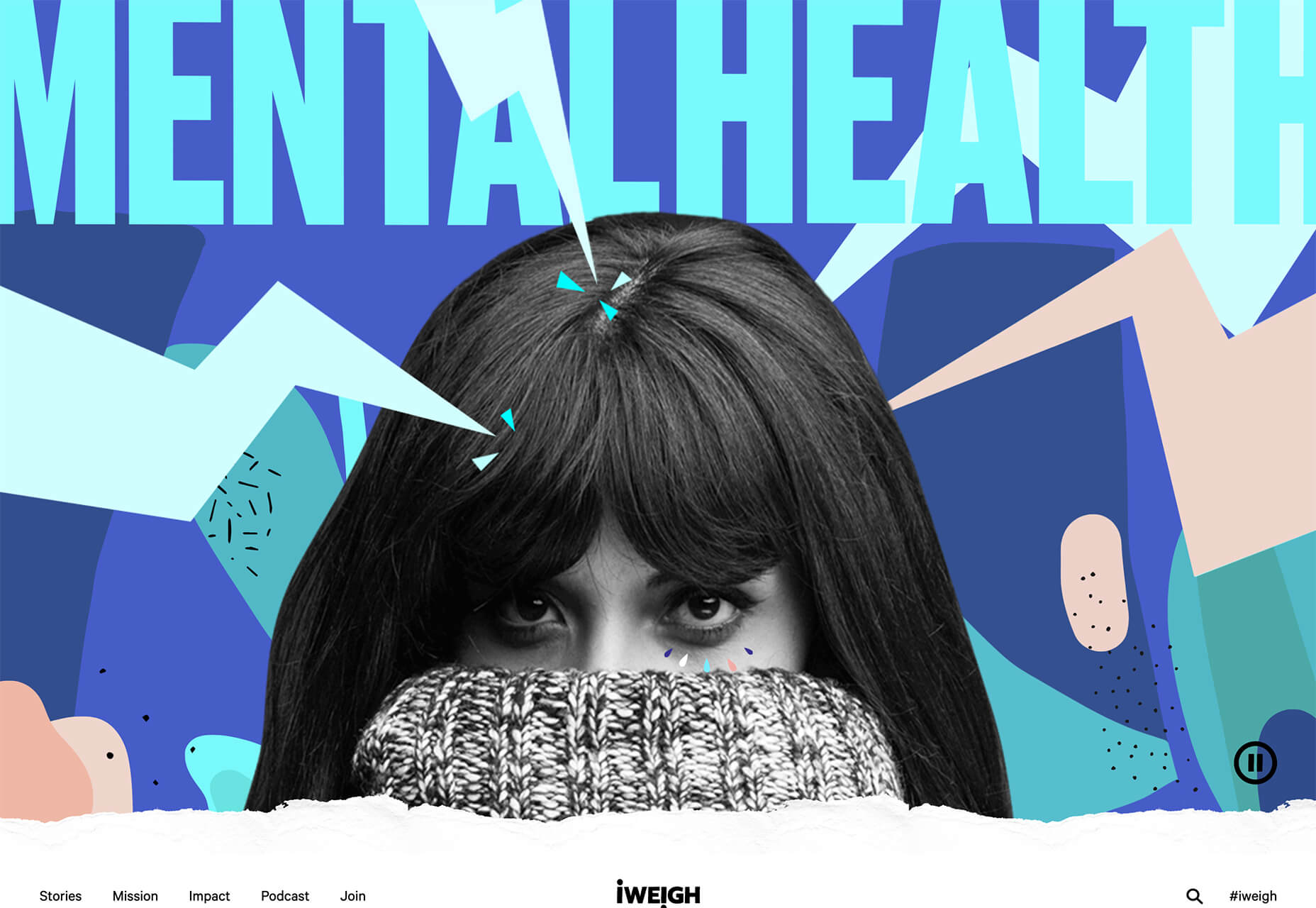
2. So Many Stacked Capitals
If you don’t have great artwork or imagery, make your own with typography.
This trend seems like it might be yelling at you just a little, but it still works for the most part — well, as long as you don’t land on too many of these website designs in a row!
What’s interesting about this trend is that many of the designs feature all caps type and serifs. These styles have been making a bit of a comeback, but this use is interesting for many reasons.
The hardest part when using all caps is maintaining readability. That’s why you see some variances in regular, italics, and bold weights, as well as the use of multiple typefaces. The goal is to create a good reading flow with a stunning visual presence.
This trend works best when you have “easy” words on the screen to facilitate scanning. Too many long or complicated letter combinations can get challenging quickly.
Make sure to look for the Easter eggs in each of these projects:
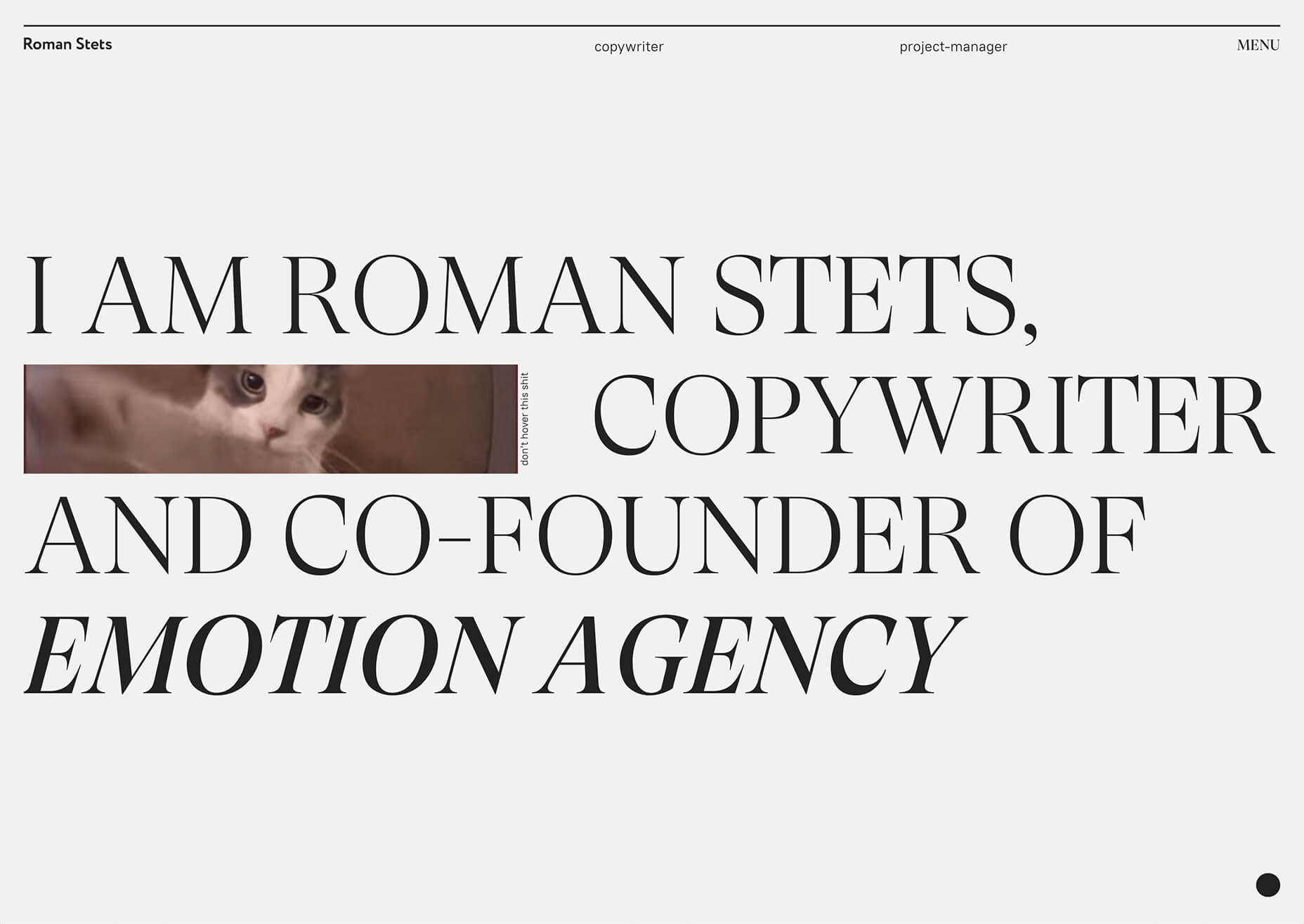
Emotion Agency has tiny “waving” illustrations next to each word (which doubles as the navigation) when you hover over them.
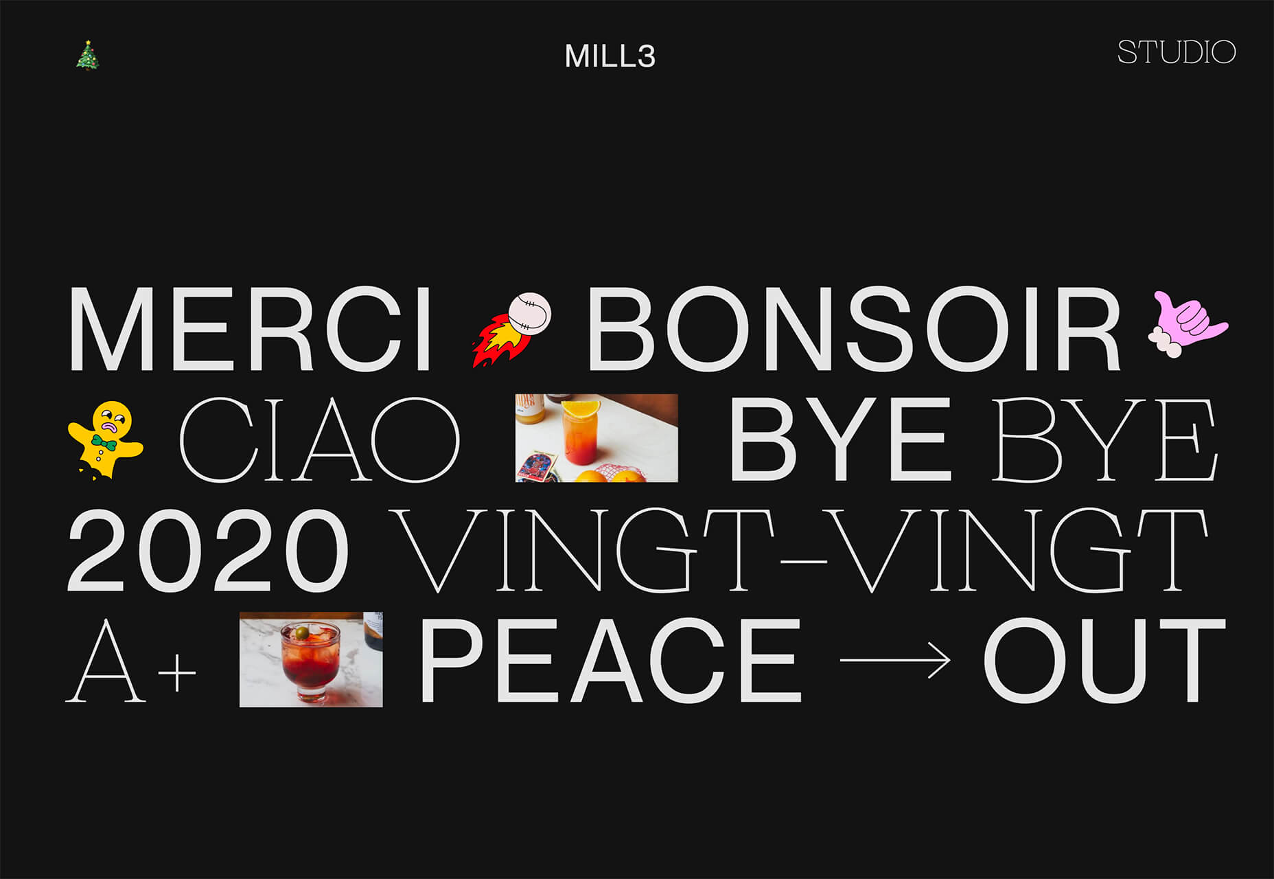
Mill3 Studio has a few animations, from the text flying in and out on load and scroll to subtle movements in the emojis.
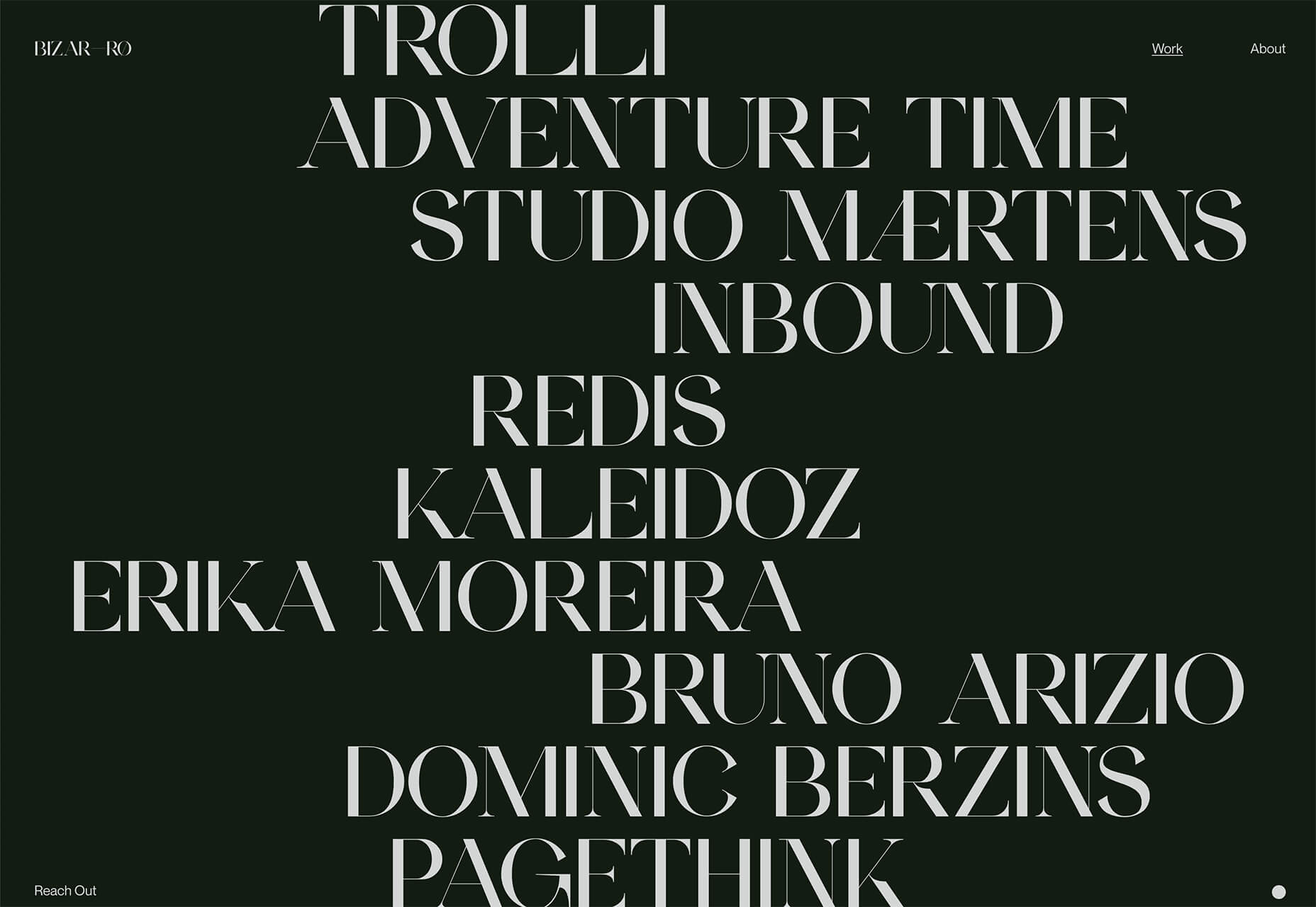
Bizarro has this fun little cat video with a tiny warning not to hover over it, but you definitely should.
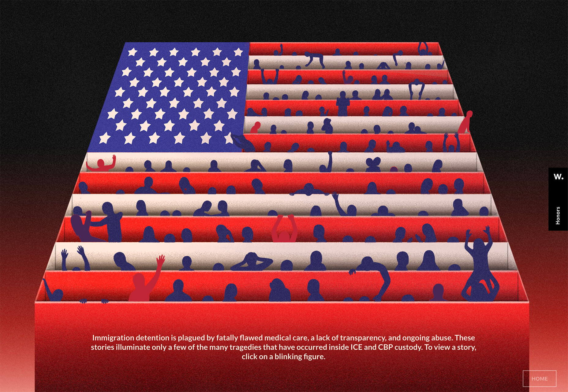
3. Empty Places
The final trend in this roundup is a stark reminder of current times. Each of the website design features empty places or locations.
This style of imagery would have been avoided pre-pandemic because tourism locations would want visitors to feel like a part of a bustling environment. Not today. If you travel, chances are you may feel safer or want to be in a more secluded environment.
All of the images and videos from these locations show just that.
Designers are doing this with new stark imagery that stands alone for the design or inserting a few empty place frames into video clips or among images that show more populated times. Even scenes that contain people show very few people and focus on more solitary activities.
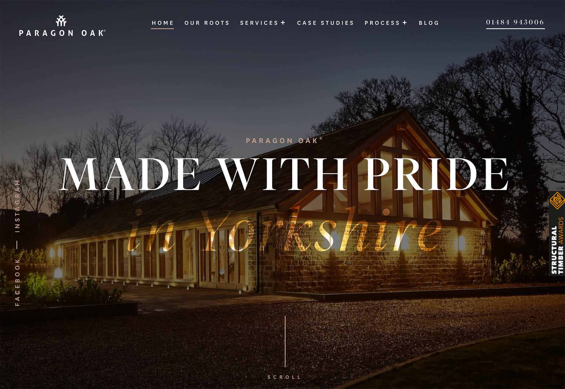
Paragon Oak does this by showing a beautifully lit location at night. Note that using a nighttime photo eliminates questions about where the people are or what they are doing. (This is a clever option when showing imagery of an empty place.)
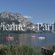
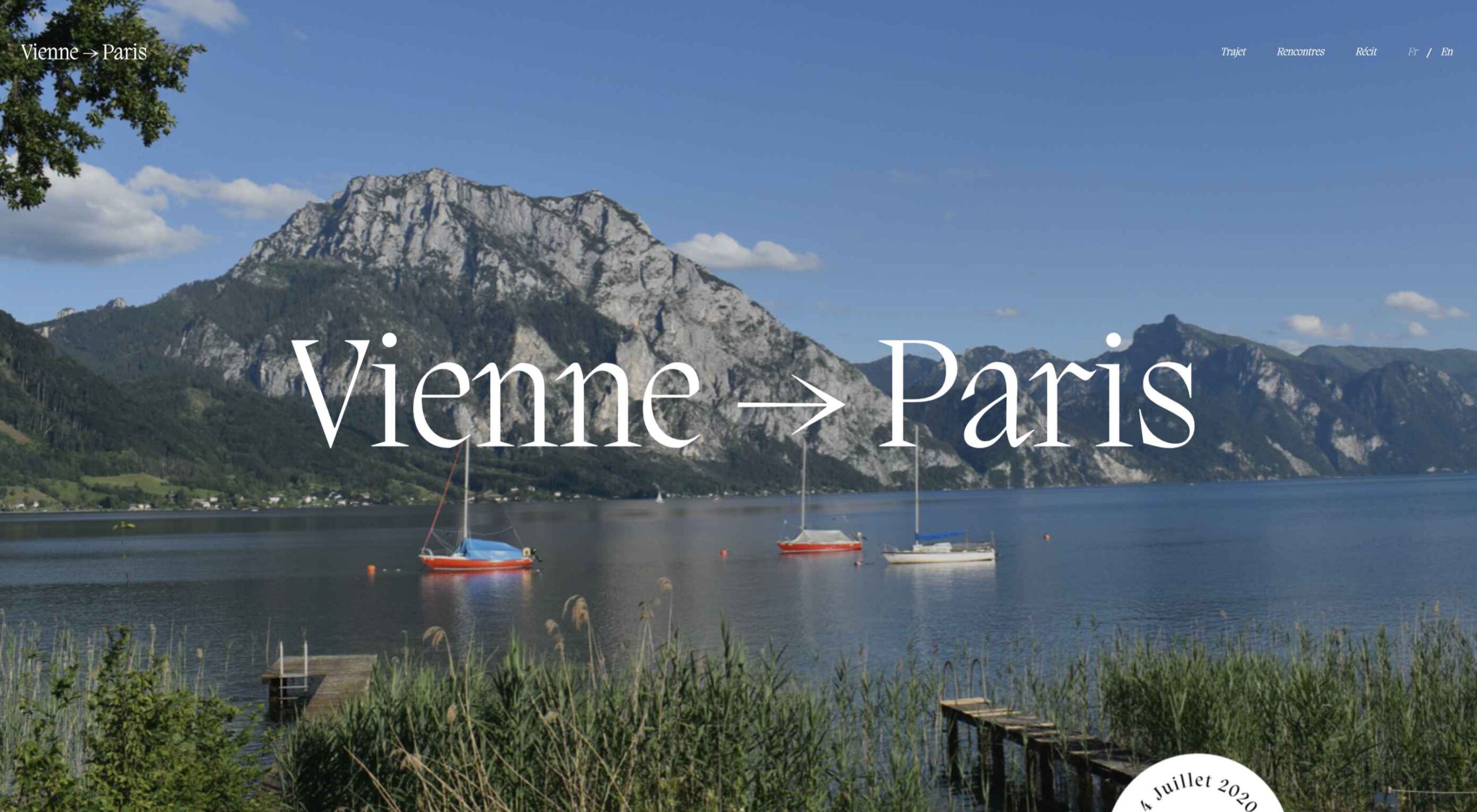
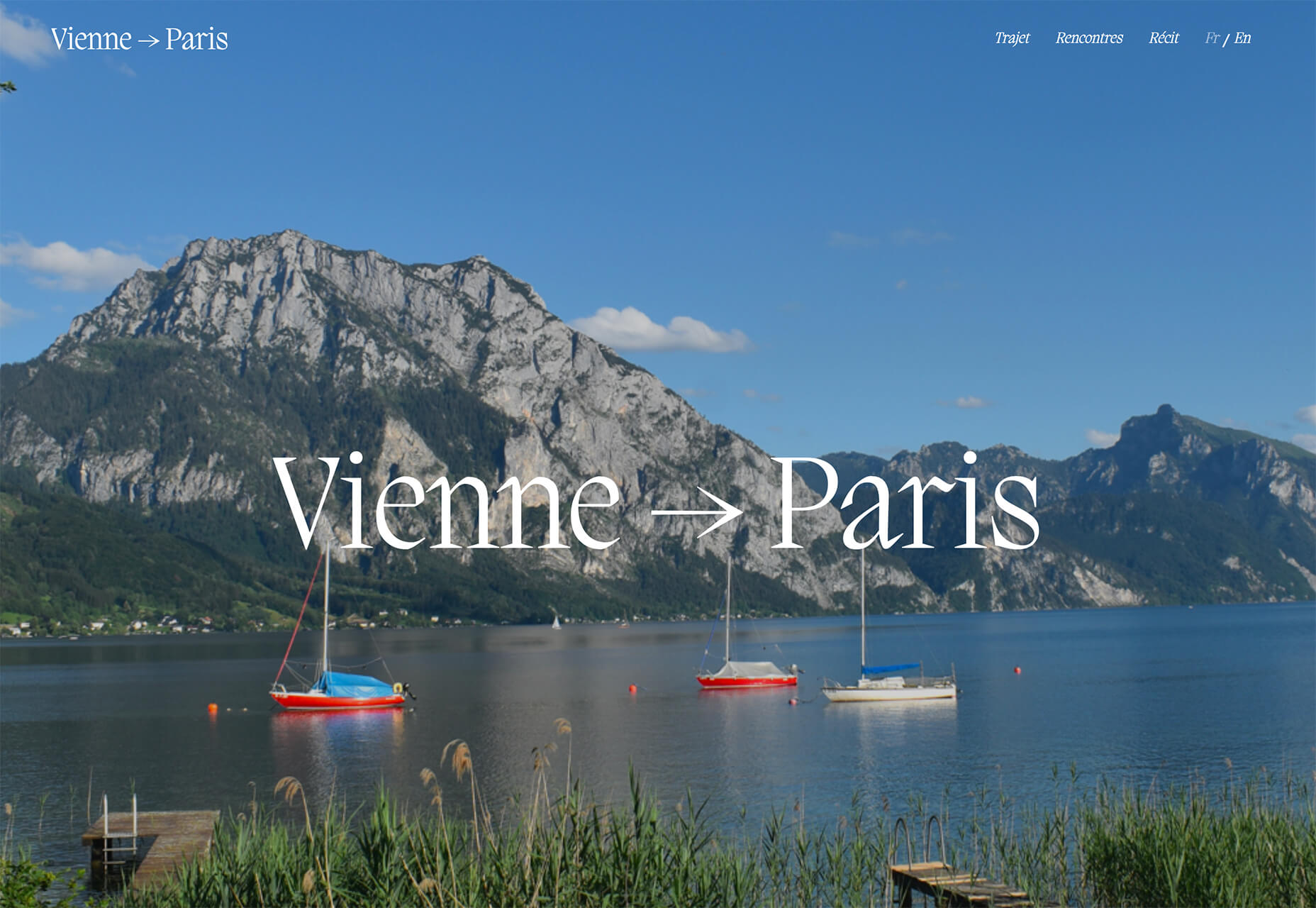
Vienne to Paris shows boats on the water with a beautiful background. While you assume there are people on the water vessels; you don’t see them and get the feeling that everyone is separated in their own “pod,” a pandemic-friendly option for travel.
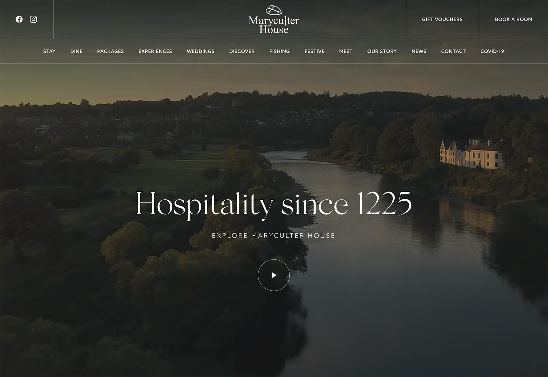
The Maryculter House shows various images without people – the resort’s location on beautiful grounds; empty, but immaculate rooms, and a few images of a person alone on the grounds. Again, the empty nature of the place feels more appropriately welcome for the time we live in.
Conclusion
One of the things that we’ve seen with design trends in the past year is pandemic-related. The composition of images to the way elements are arranged on the screen influences every aspect of our lives.
While the empty place image and video trend is big now, it may fade post-pandemic. Although, it could still be relevant for quite some time. It will be interesting to see what happens as the year progresses with this trend – will it hold on or fade away?
These trends might continue to hold well into 2021.

 The end of the year tends to be busy for a variety of reasons and it can limit some of the freshness we see in designs during much of the year. Regardless, there are a few trending design elements.