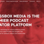
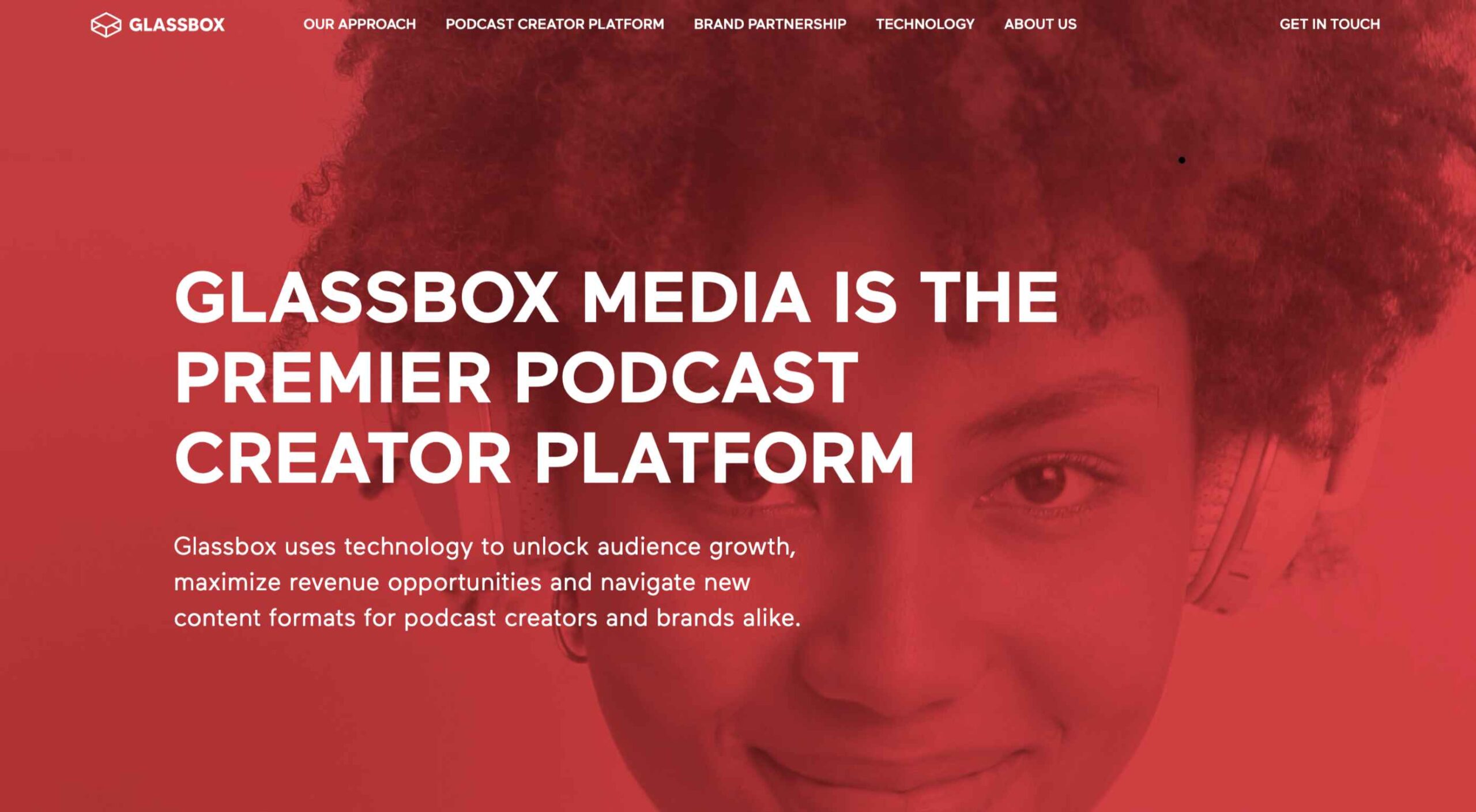
 As we head into the final month of 2022, plenty of new ideas and website design trends are still emerging. The evolution throughout the year has been exciting and designed to help website designers and developers create greater engagement and interactivity while pushing the envelope. These trends are no exception.
Here’s what’s trending in design this month.
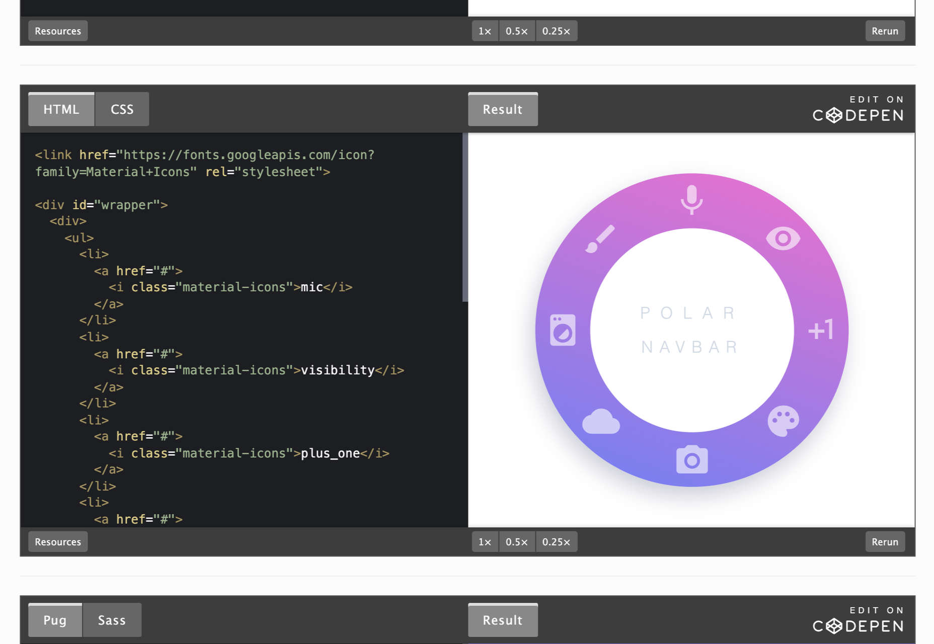
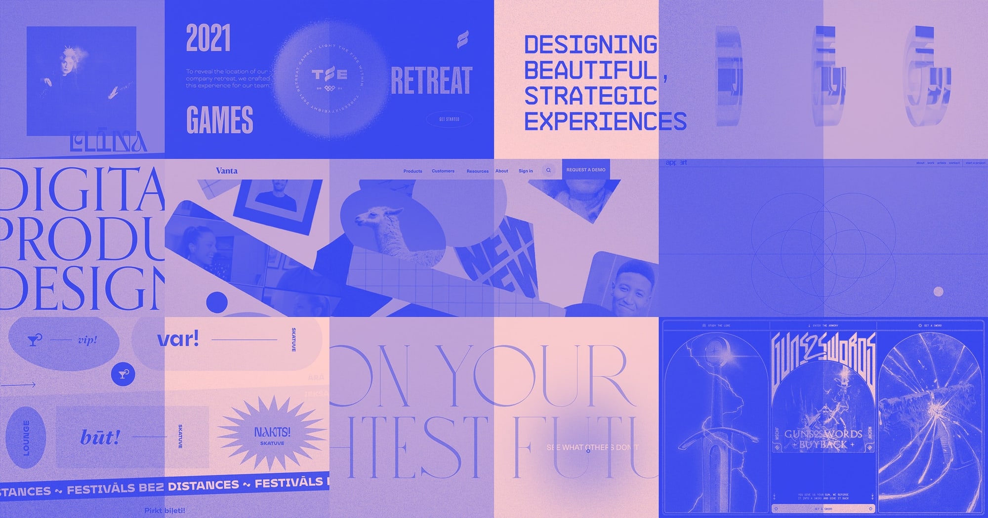
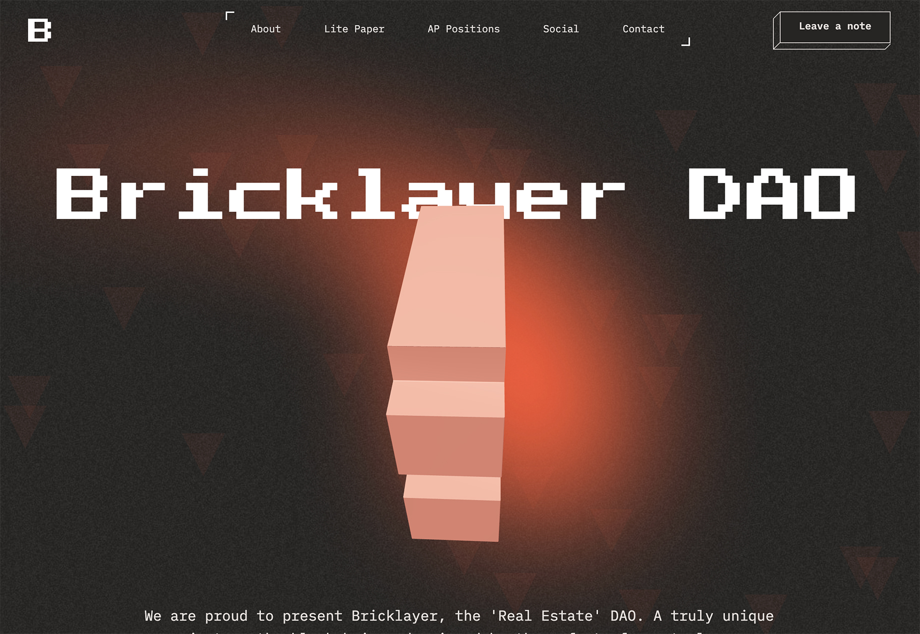
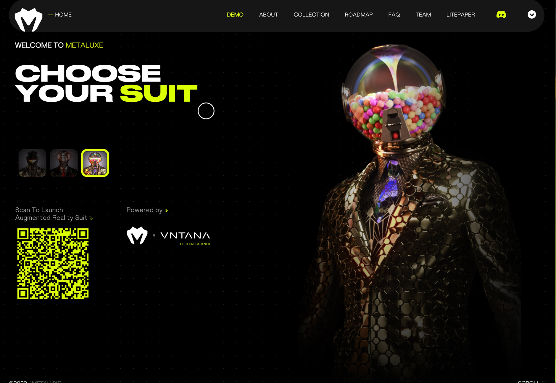
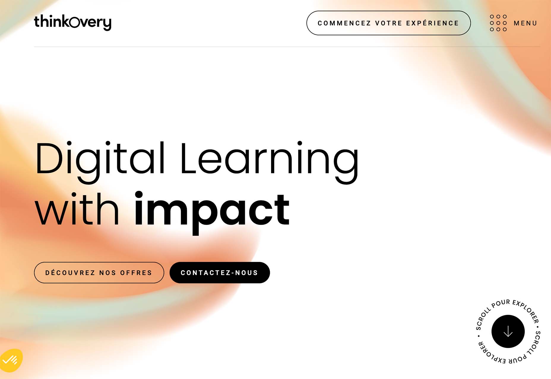
1. Video Game Inspiration
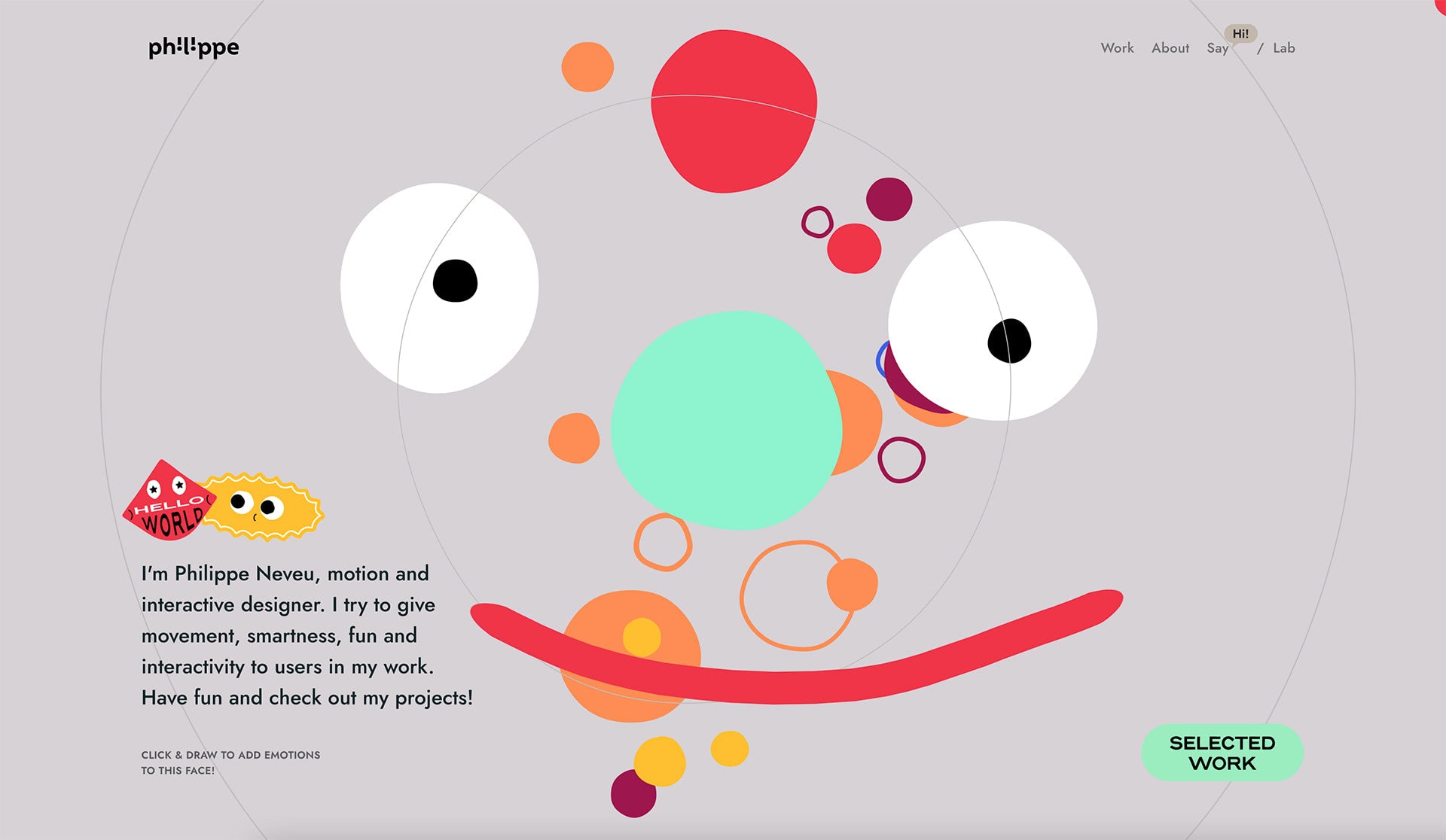
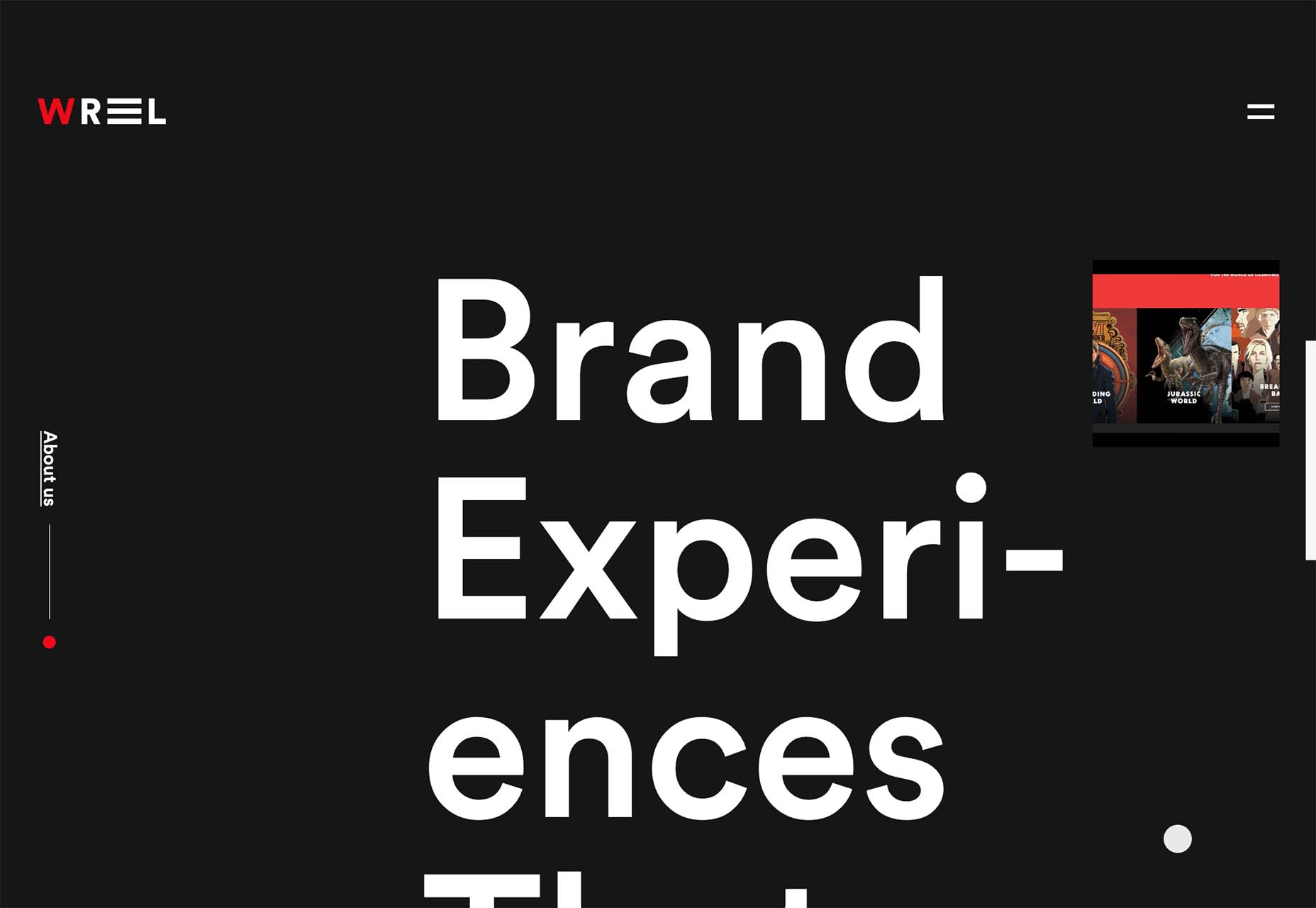
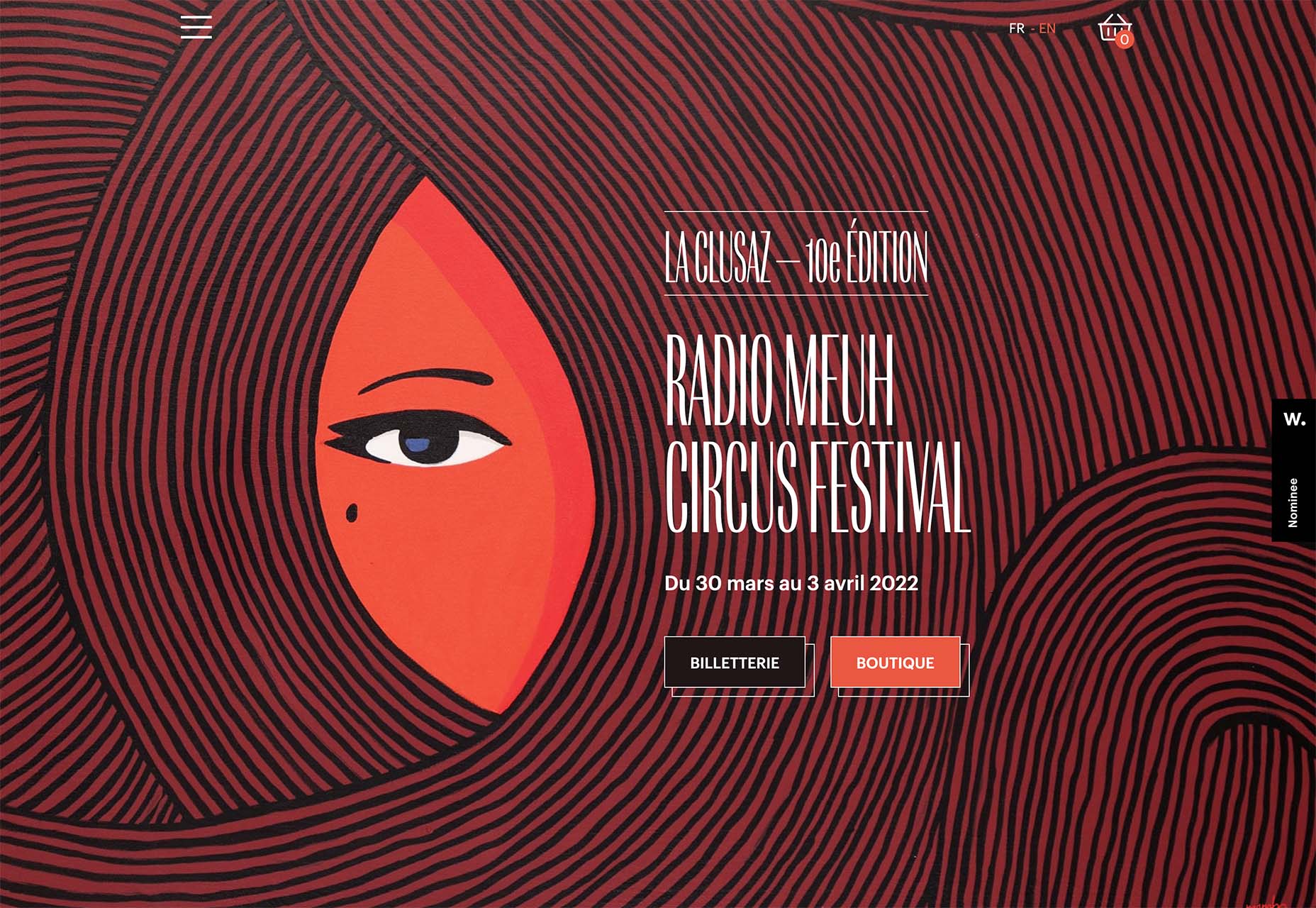
That space where reality and virtual reality merge is popular for website design. Trending are design elements and themes with a pseudo-video game style that looks interactive, somewhat real, and much imagined.
These websites can have a variety of looks and themes but have a few key elements in common:
- Plenty of animation
- Interactive elements, real or perceived
- Fast motion that puts the user in the scene
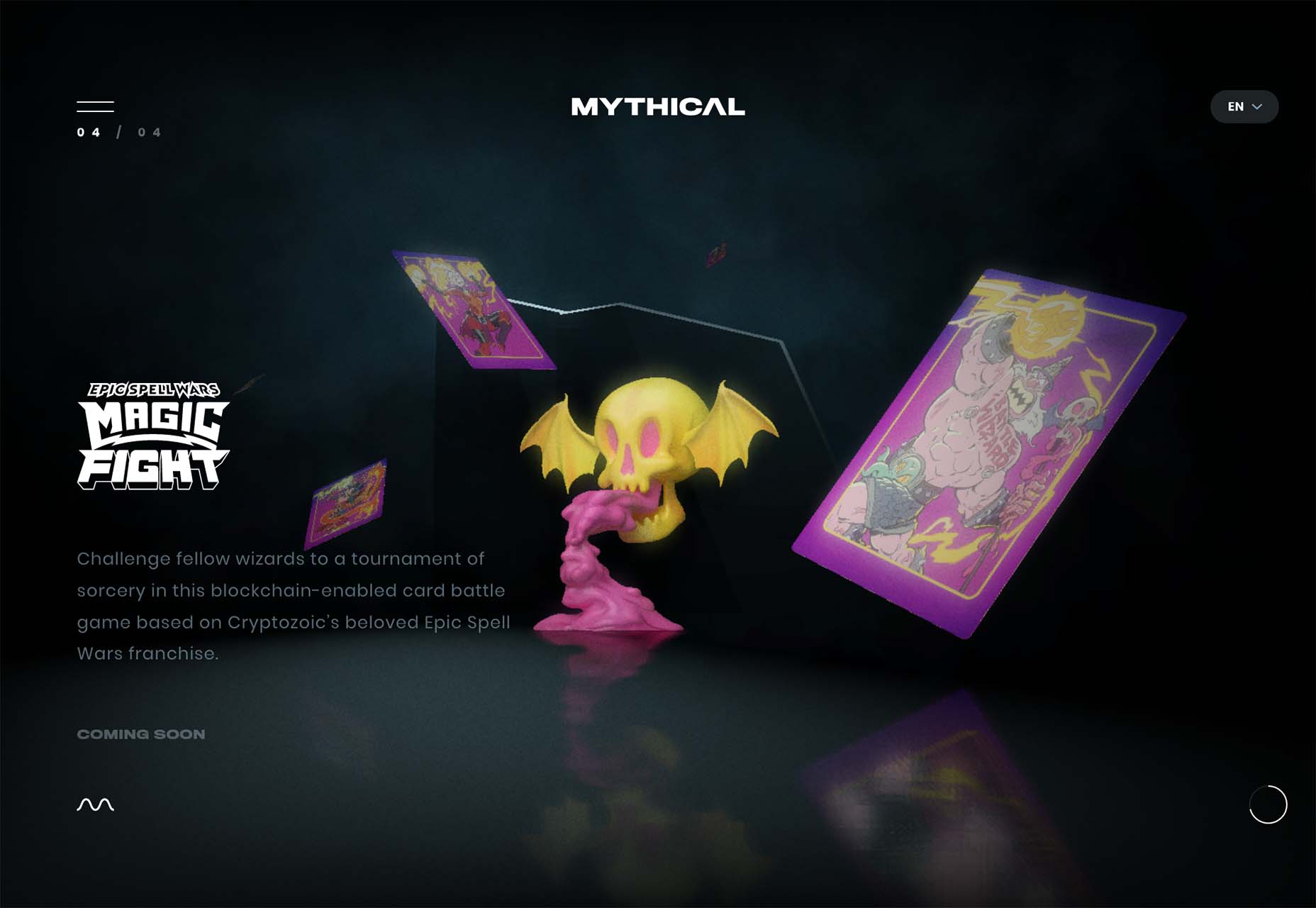
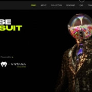
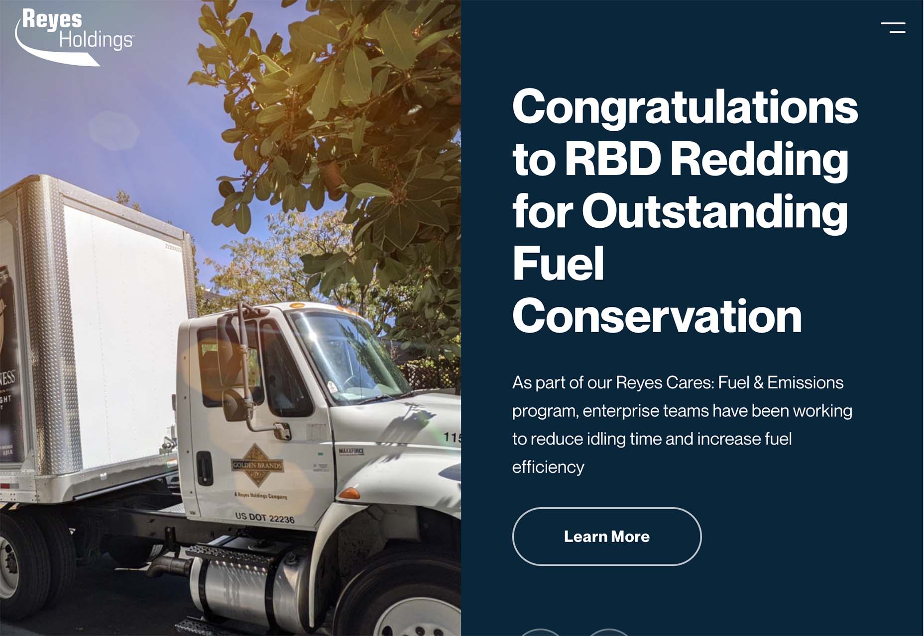
- ”Unreal elements” such as the bat-skull for Mythical Games
- Dark color schemes
- Often lack traditional navigation or calls to action so that the “game” is the whole screen
- Leading text or design elements to help you move through interactions
Each of these examples takes a similar but different approach with their video-game-inspired design styles.
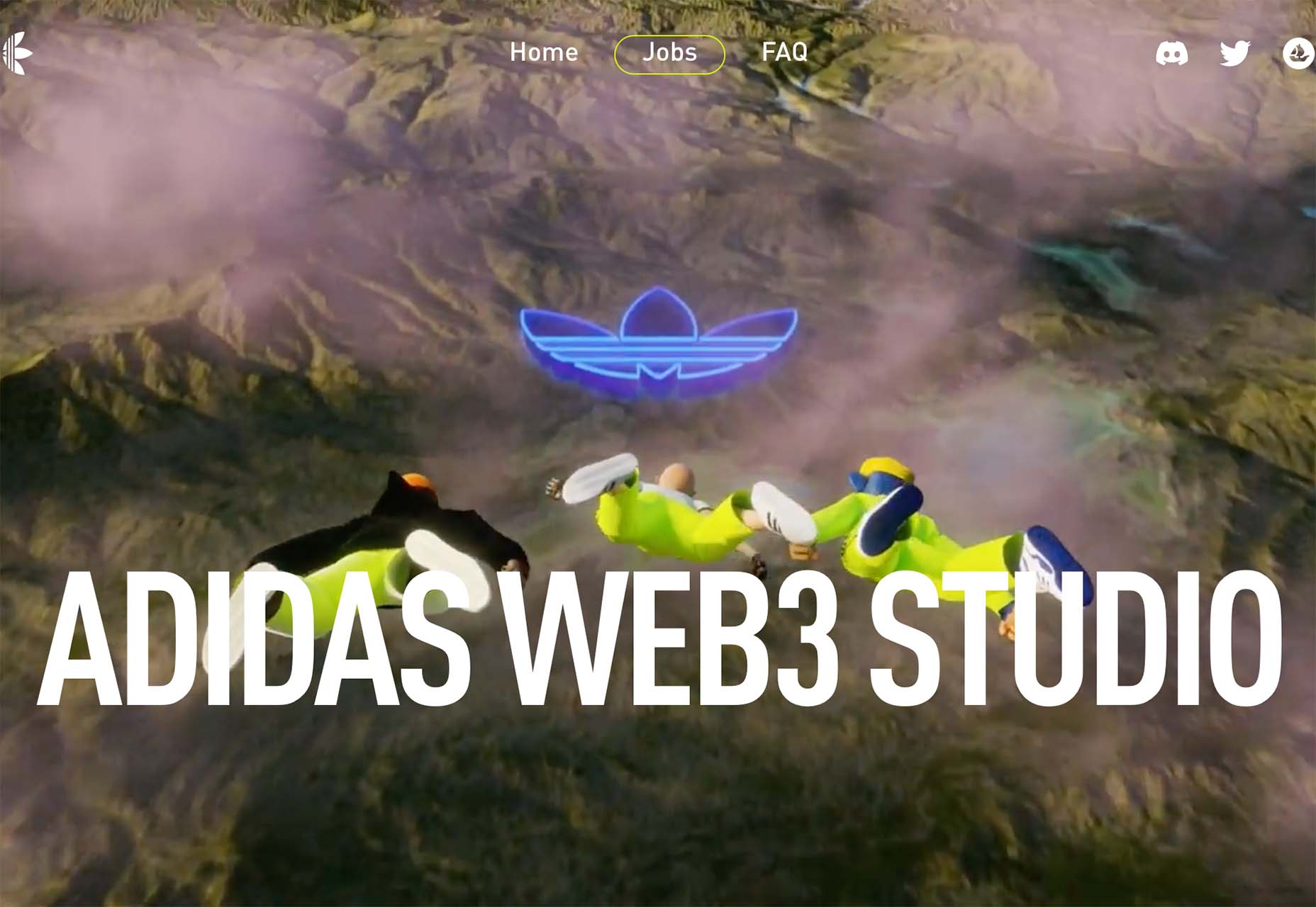
Adidas uses a three-dimensional trio of people in flight to get you interested in jobs at their animation studio. The point of view makes you feel part of the action, but traditional design elements, such as navigation, help you know what to do next.
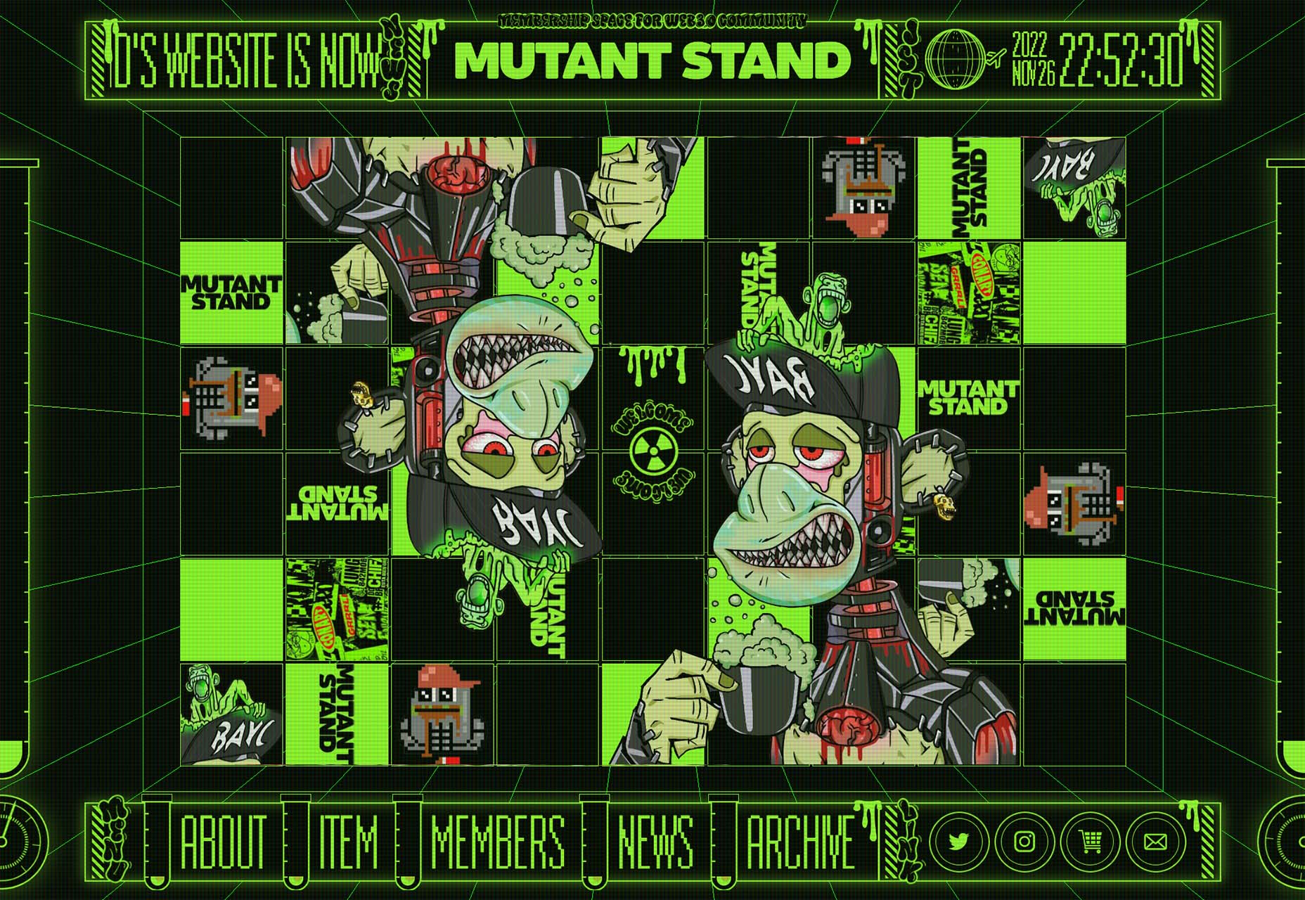
Mutant Stand looks like an old-school video game and moves between a home screen with navigational elements to more of an in-game experience. The motion creates an interactive feel even before you dive into the design.
Mythical Games is an actual gaming website design, so you would expect video game inspiration here. Interestingly, this site takes the most subtle approach, although the design elements of fantasy are strong here.
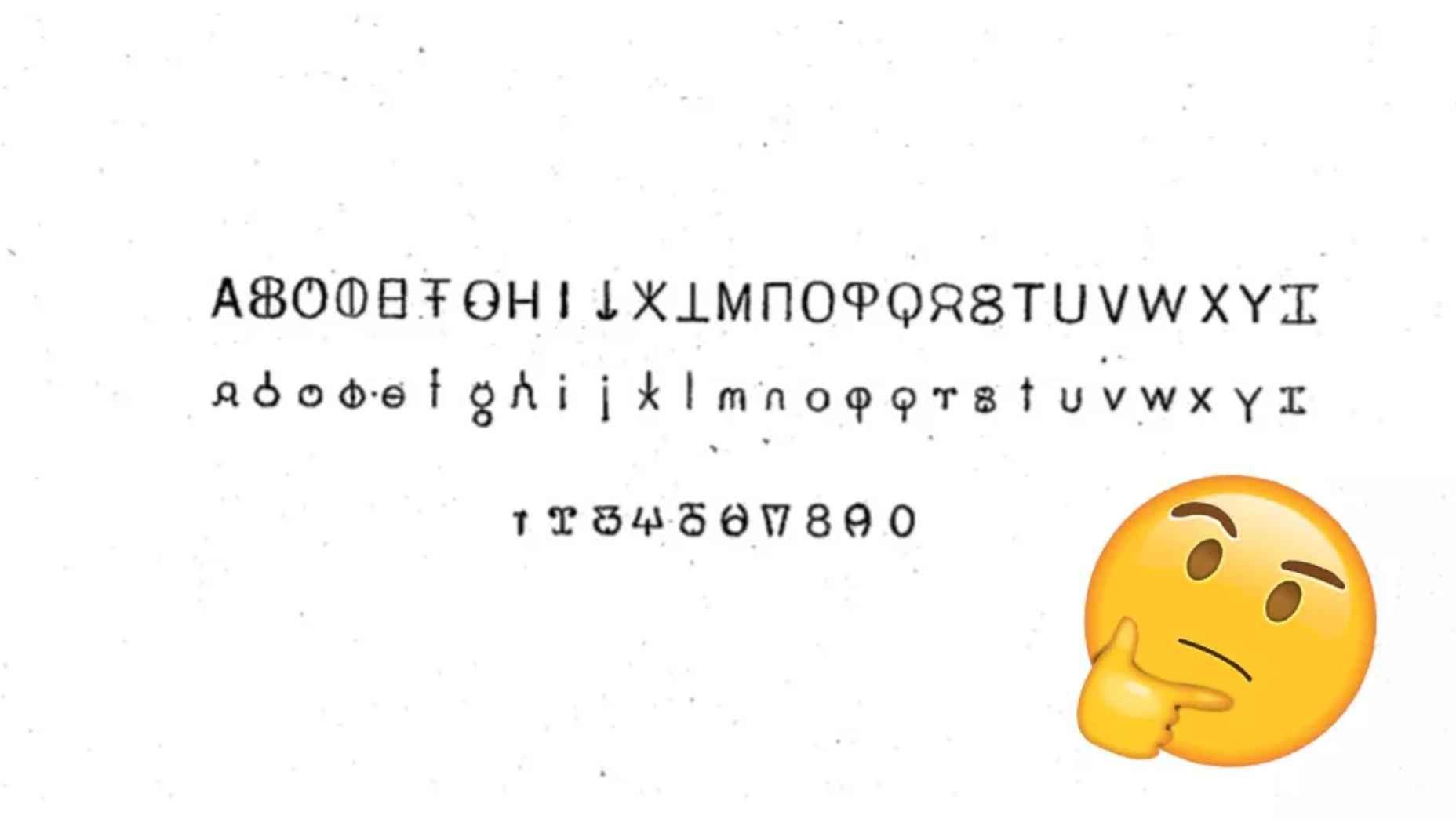
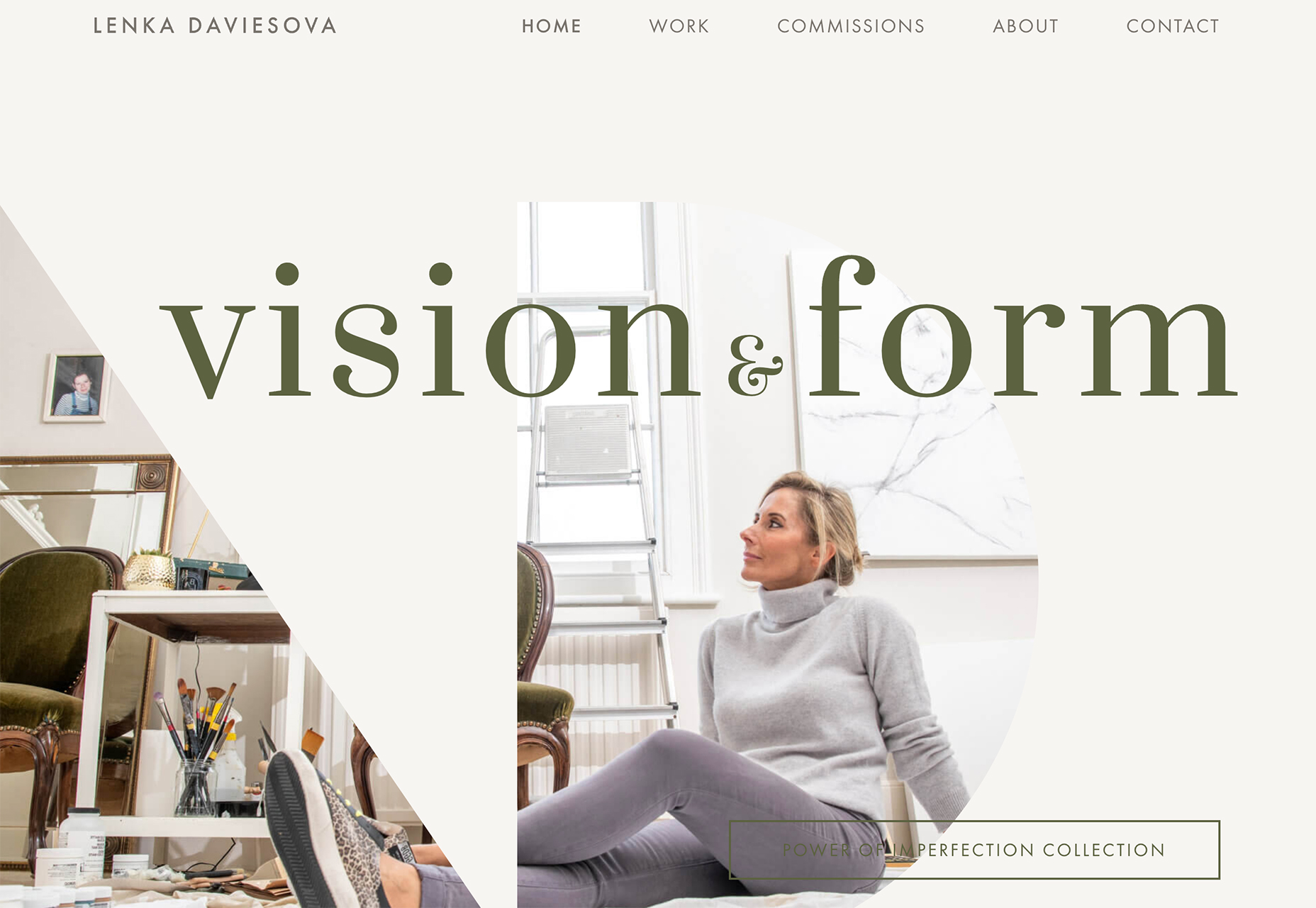
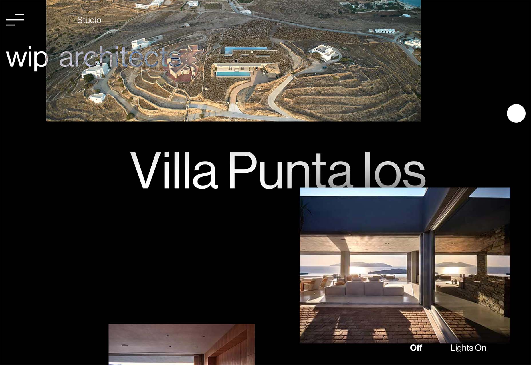
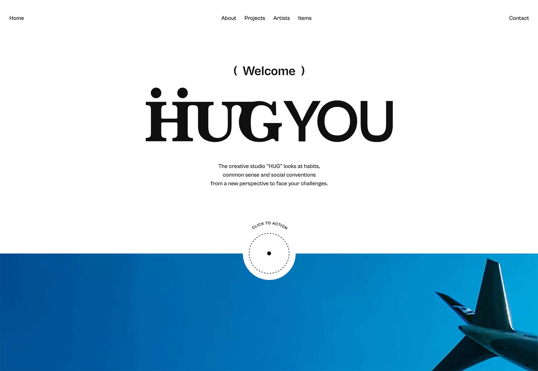
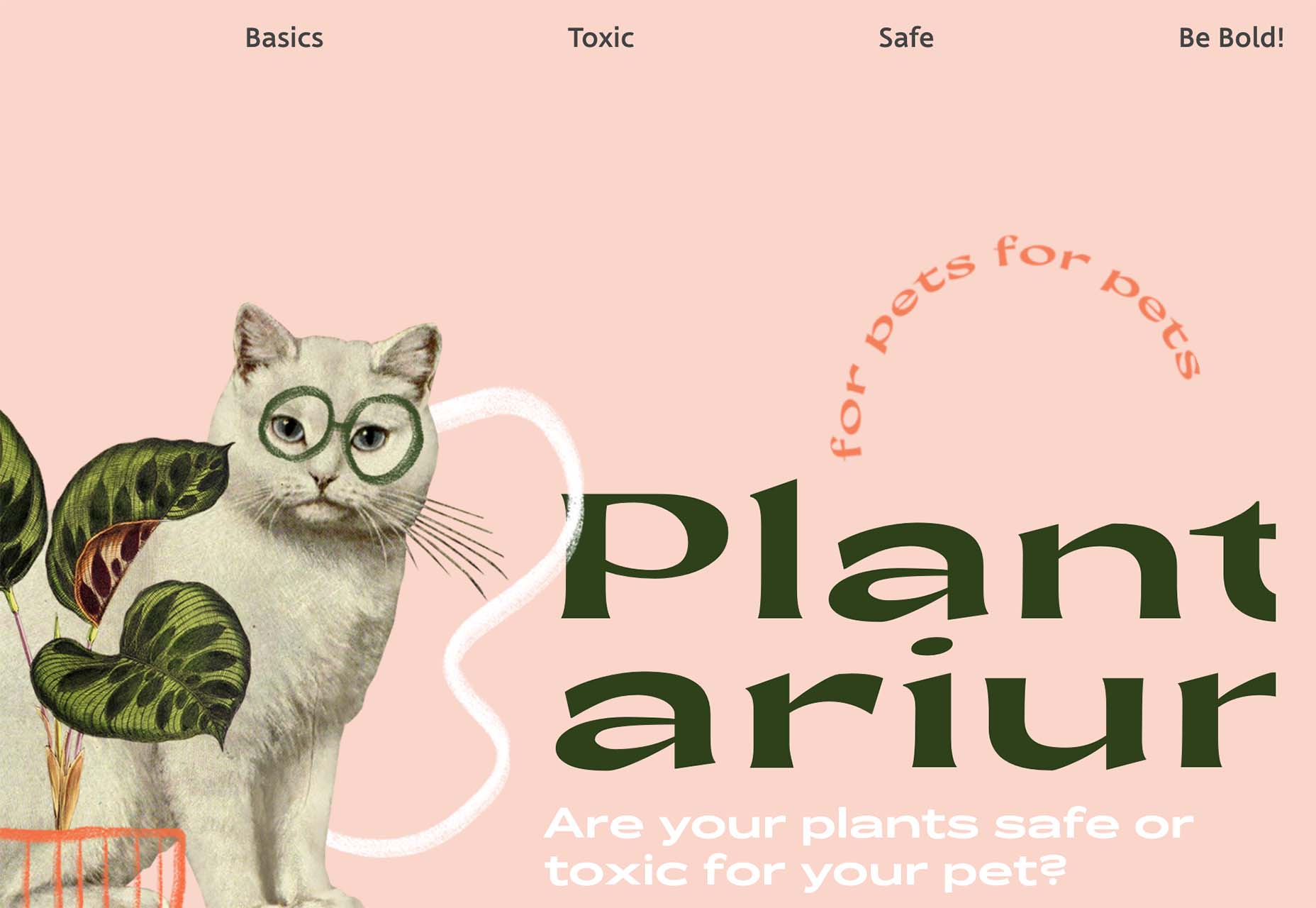
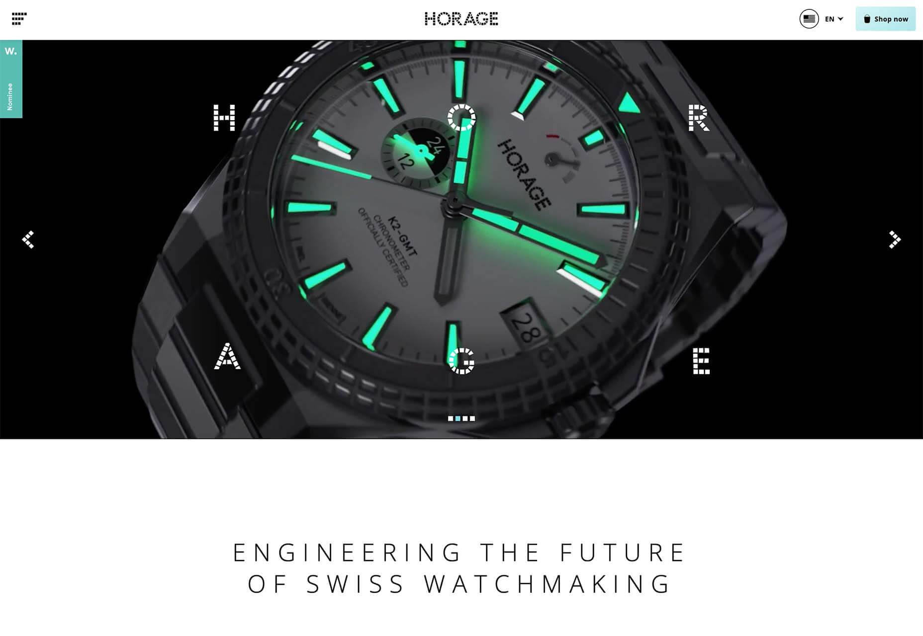
2. Difficult Typography
Sometimes website design trends can be tough to explain. That’s the case with this one, where designers are experimenting with very difficult typography styles. What’s difficult about the text in these projects is readability.
Difficult typography is somewhat subjective but is emphasized by designs that have a lot of words. The reading challenge extends to mobile design, particularly when these fonts are smaller and can present even greater readability issues.
There are a lot of different styles and combinations of typefaces that can cause readability challenges. Some of the most common for website design include:
- Condensed or thin typefaces
- Unusual character styles or strokes
- Modern or thick serifs
- Old world styles
- Scripts or cursive styles
All of this, though, is somewhat in the eye of the beholder. While these examples all present some reading challenges, the designs are still interesting and visually sound. Whether to make these font choices is a personal choice, but you should pay attention to your audience base and website analytics to make sure it works for you.
Here’s where you probably see a lot of this trend outside of website design. Pay attention to the typefaces used for World Cup broadcasts. Difficult typefaces are paired for all on-screen text elements.
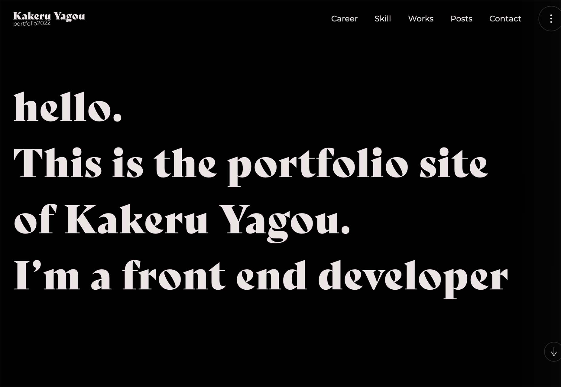
Kakeru Yagou uses an interesting modern serif with a bit of a tilted style. As a logotype, the typography works pretty well. It is when there’s a lot to read that the challenge comes into play.
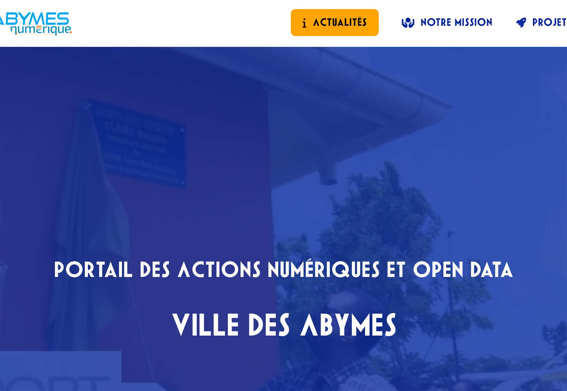
Abymes Numerique uses a condensed typeface in an all-caps style. Either of these options alone might create less of a readability concern than when paired.
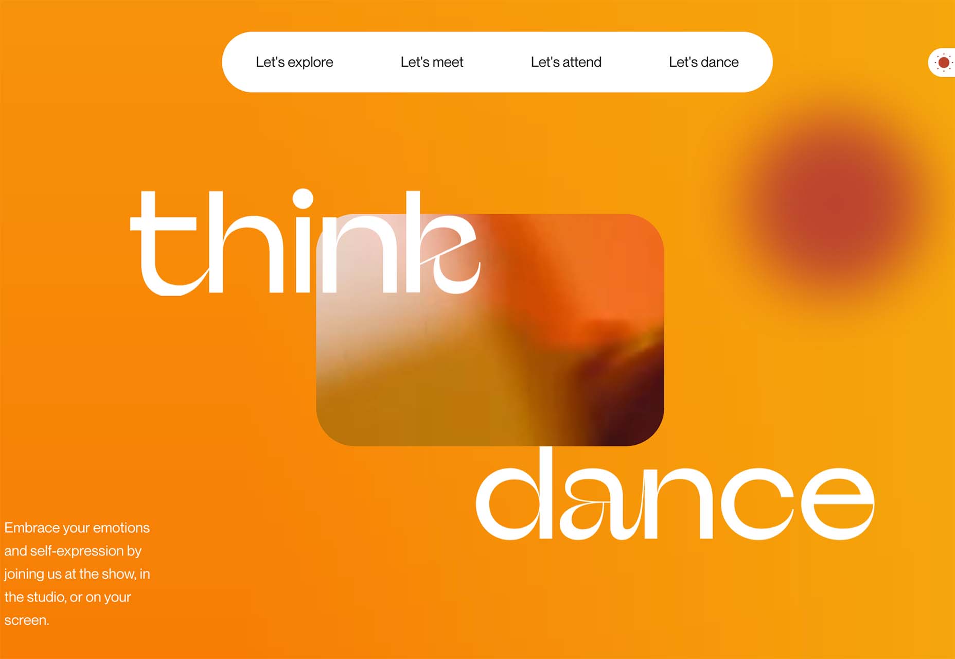
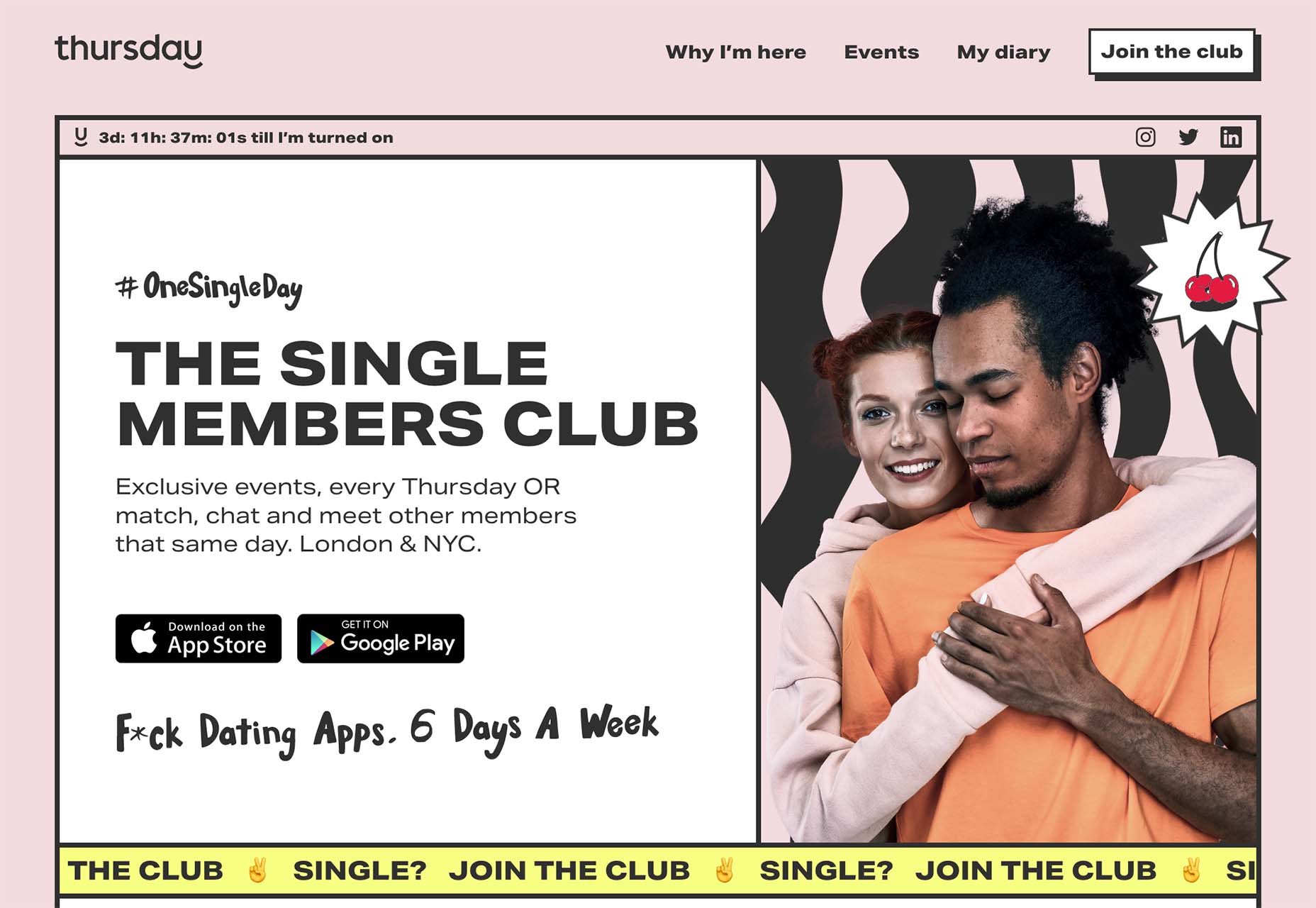
Think Dance uses an incredibly interesting but difficult typeface for the two keywords on its website. They do an excellent job by using only two words and pairing them with easy-to-read options everywhere else. But it still takes a minute to think about and comprehend the words, so you can argue the effectiveness of the font choice.
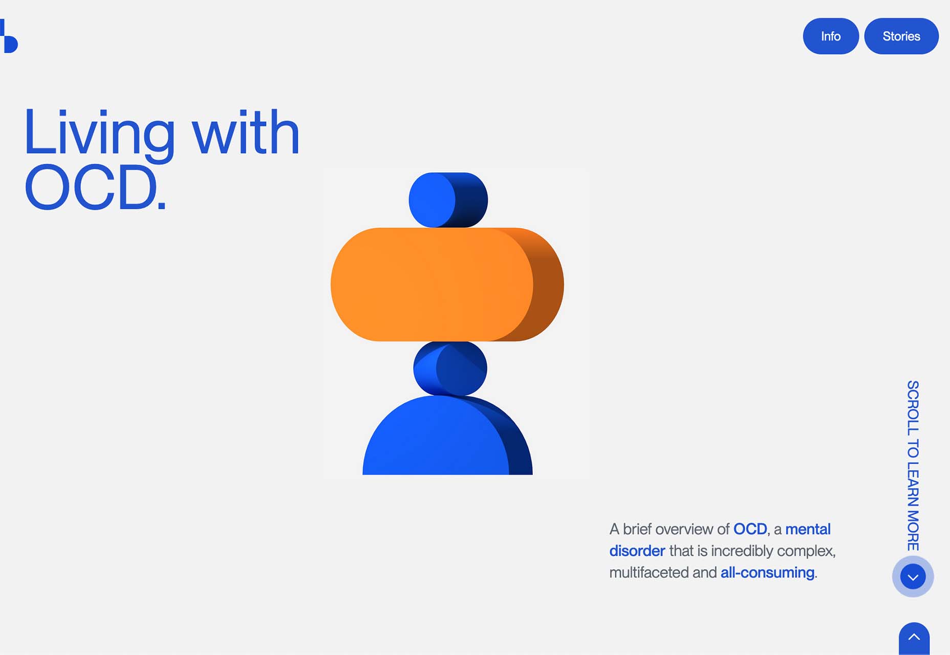
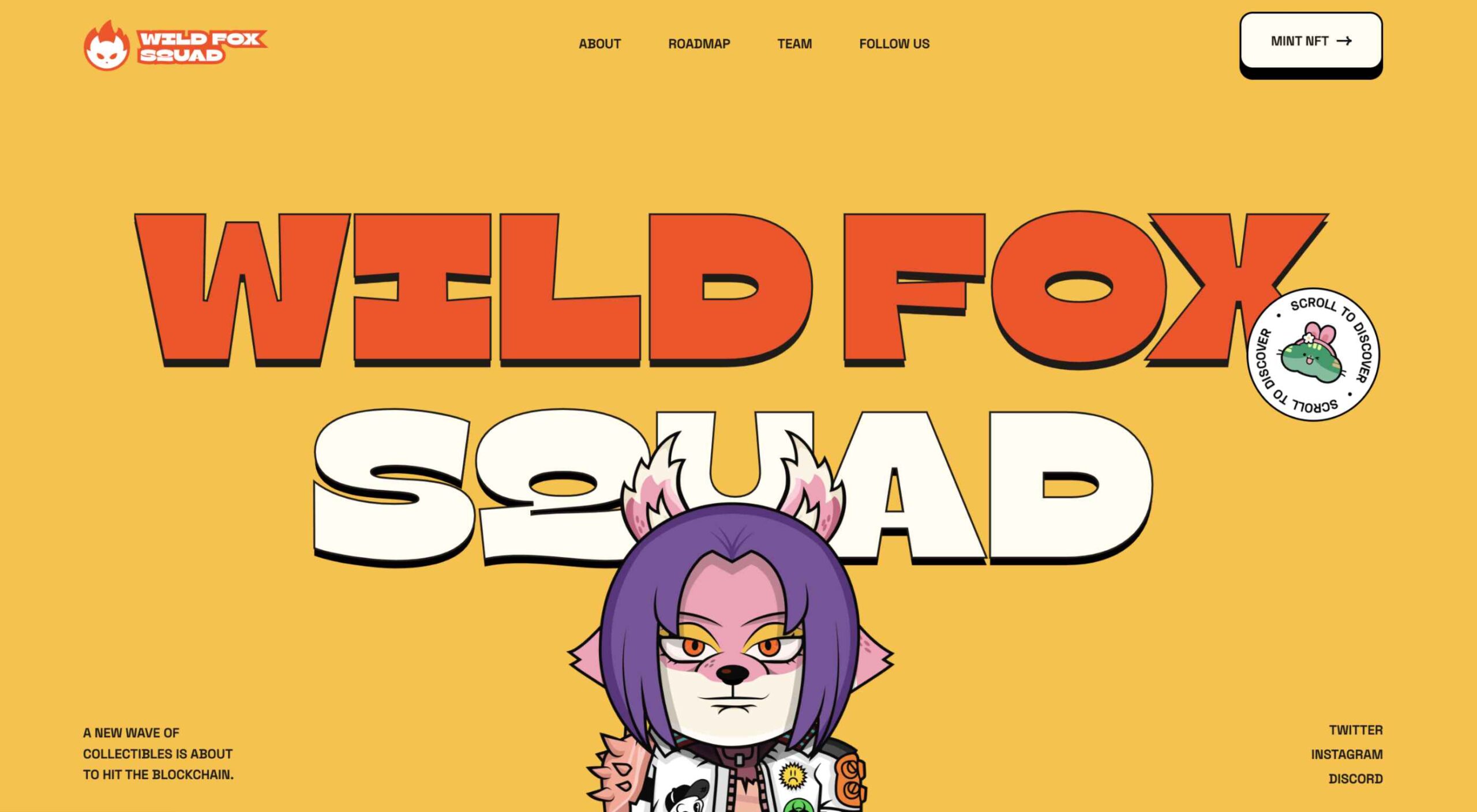
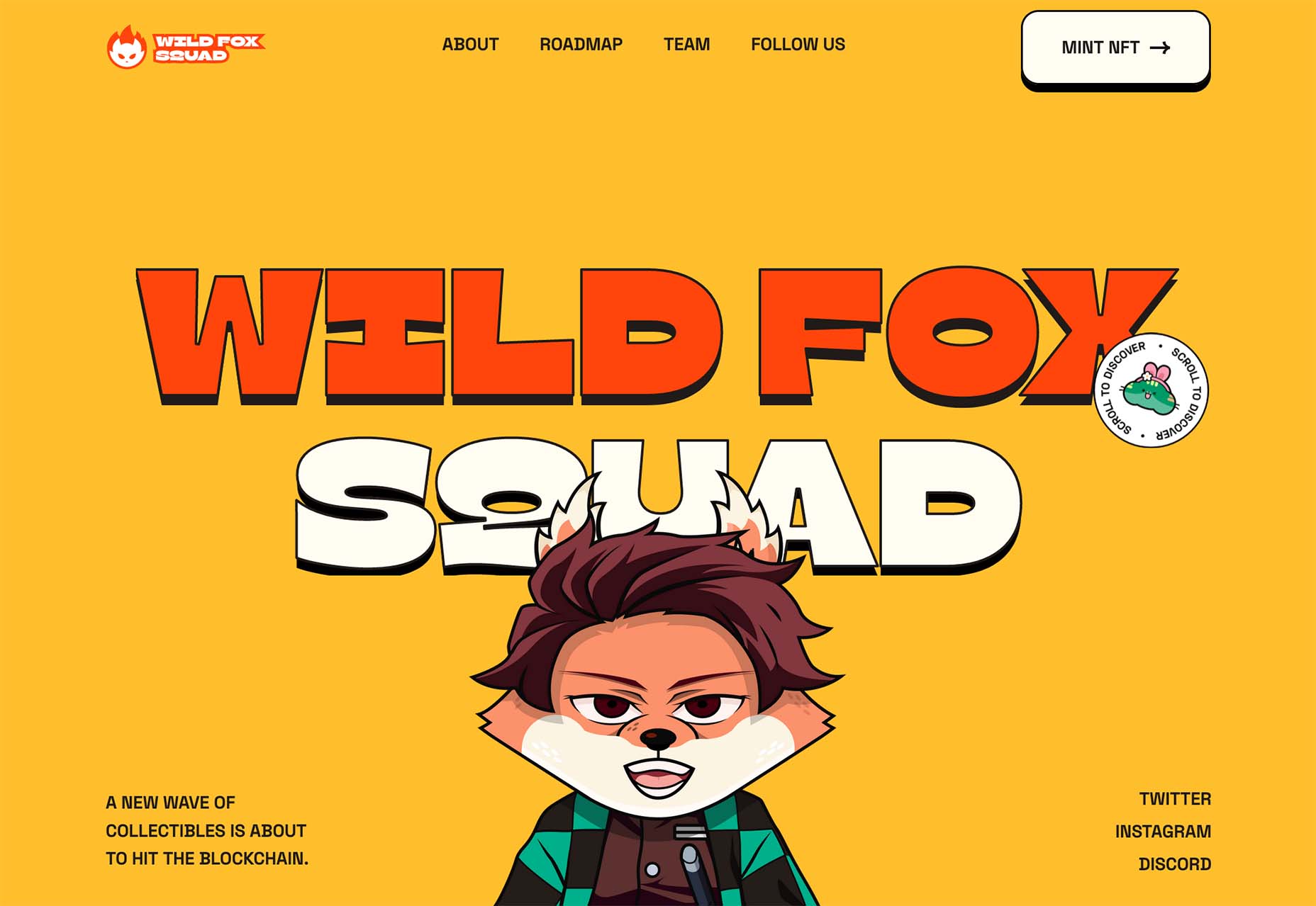
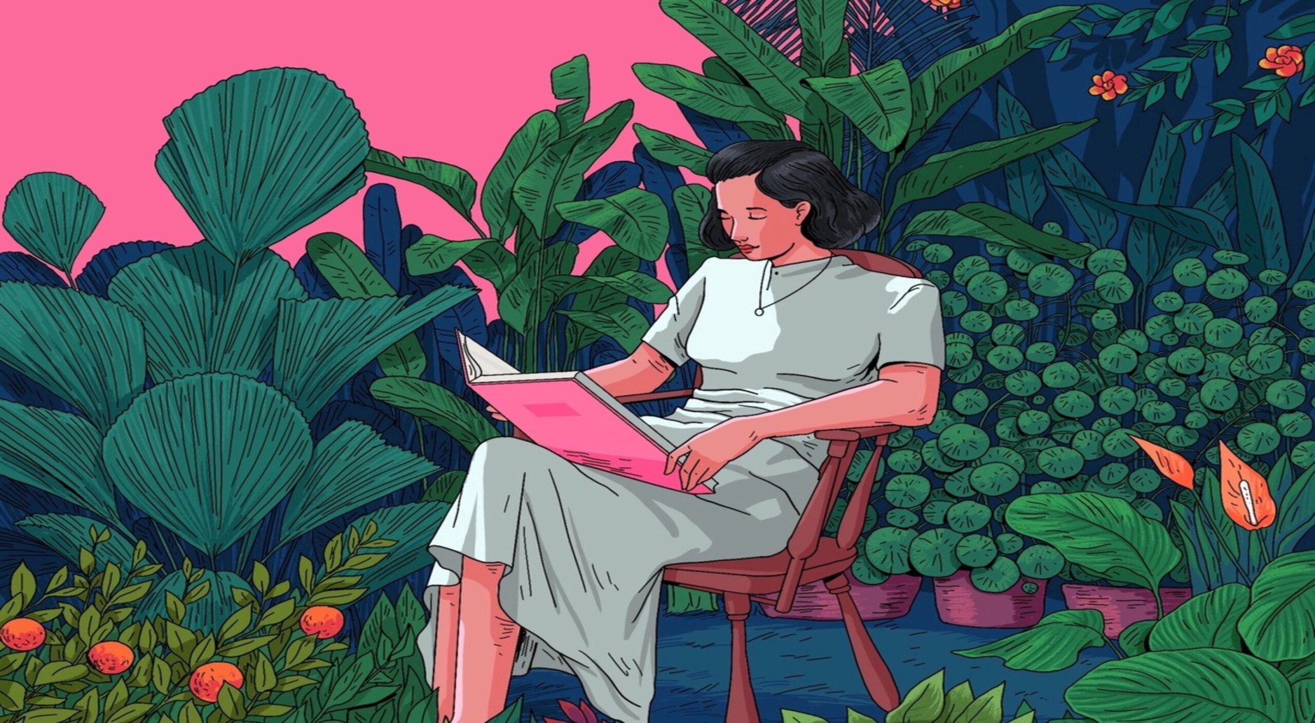
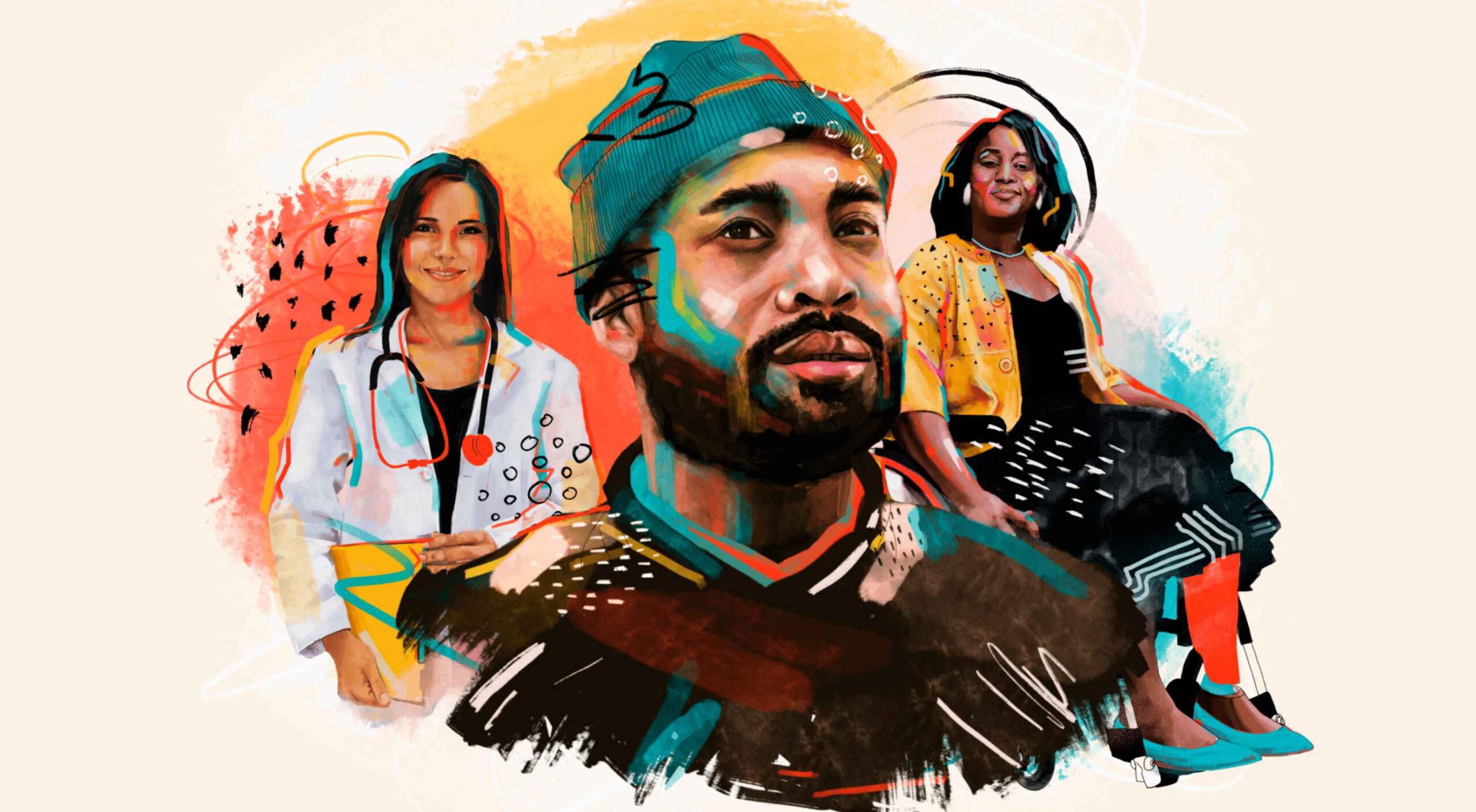
3. Avatars
Already popular on social media platforms such as Snapchat and Facebook, avatars are having a pretty big moment in website design as well. The big difference is that website avatars aren’t just cartoon heads, they can include full-body designs and animated effects.
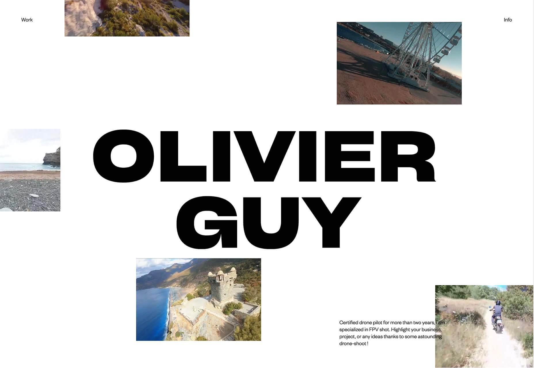
Avatars can have an extremely personal look and feel, such as when they are used for portfolio websites or be more character-oriented. Both are an excellent way to use faces and incorporate somewhat of a personal element when you don’t have the right photography for the job or want a greater element of whimsy in the design.
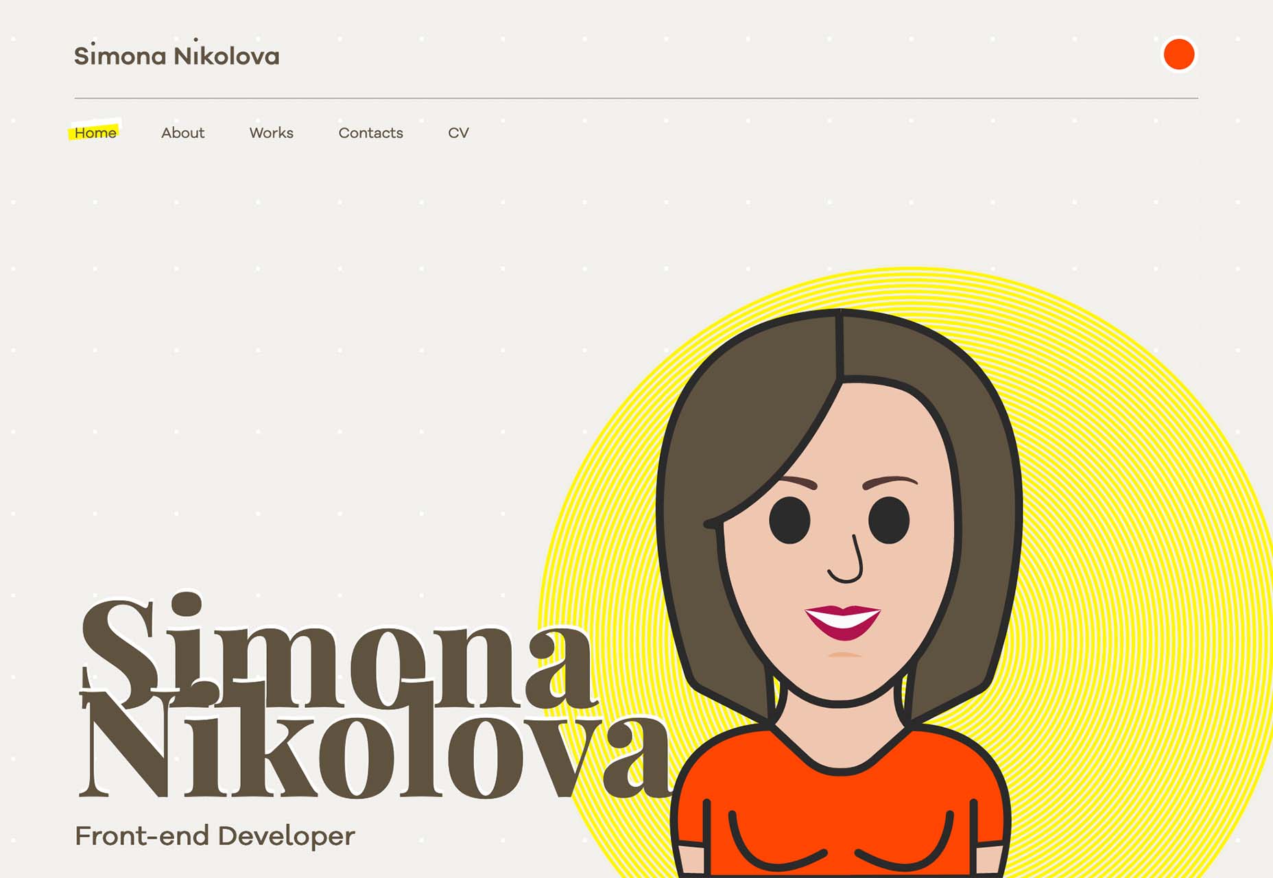
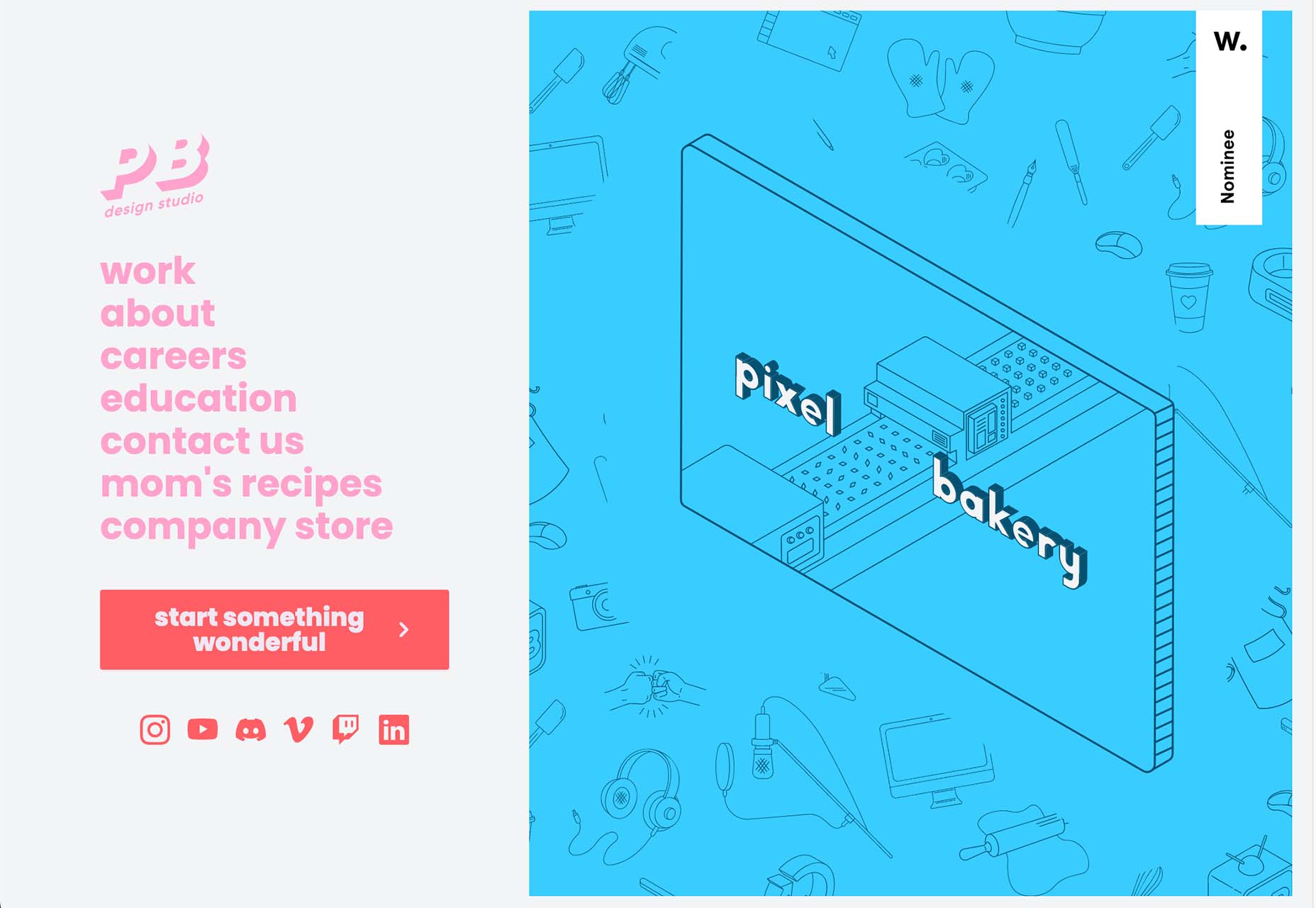
Simona Nikolova uses an oversized avatar for her portfolio site. She pairs it with her name to create a connection with users, and the style shows her creativity as well. An avatar is a good way to “show yourself” in a portfolio without the privacy concerns that might come with an actual photo.
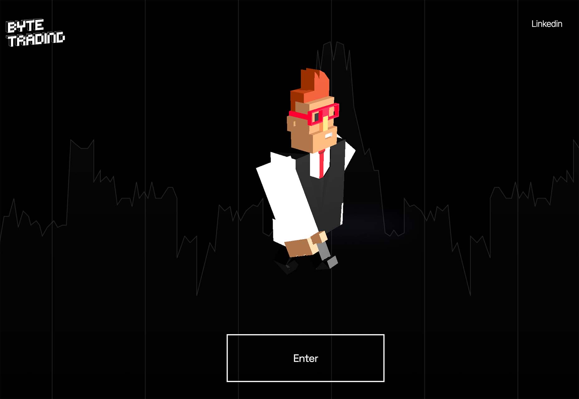
Byte Trading uses “Lego-style” avatars to get you interested enough to “enter” the website. Each avatar moves and changes clothing to get you ready to enter the website for the crypto marketplace. Avatars are a popular option for crypto and NFT websites.
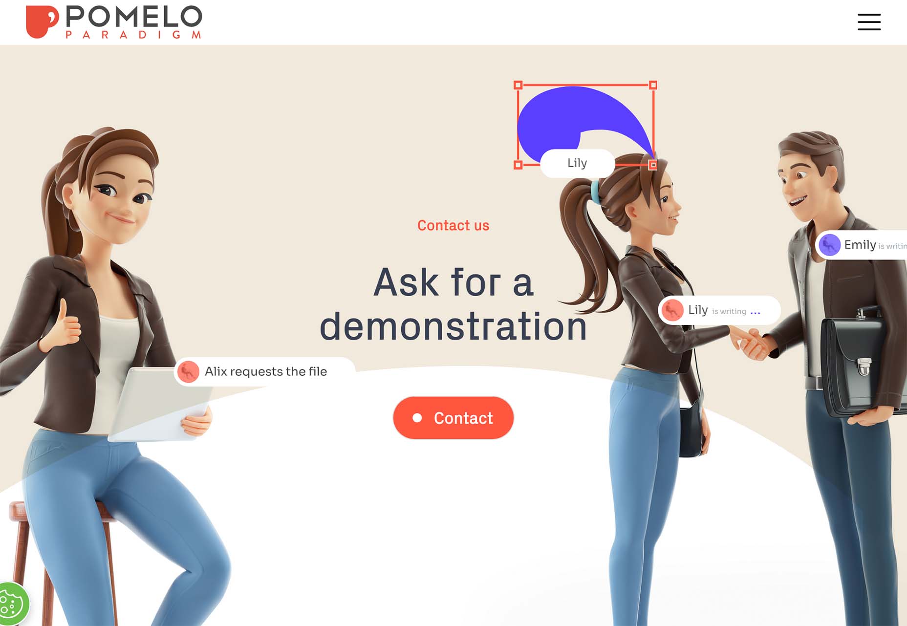
Pomelo Paradigm uses three-dimensional avatars to create scenes throughout its website. These created characters help explain what the company does and interactions people should have with the design. They have very human looks, and you almost don’t miss that they aren’t actual photographs.
Conclusion
As we head into a new year, what website design trends are you most excited for? Do you plan to try new things with projects in the new year? Hopefully, these trends give you some ideas and jumpstart that inspiration heading into 2023.
The post 3 Essential Design Trends, December 2022 first appeared on Webdesigner Depot.
 As the season starts to change, so do some of the trends that web designers are using in projects. From a return of blur to interesting frame edges for images to neon color, there’s a lot to get excited about.

 Are you bored with some of your current design projects? This month’s collection of website design trends can help break you out of that rut with some fun and funky alternatives.
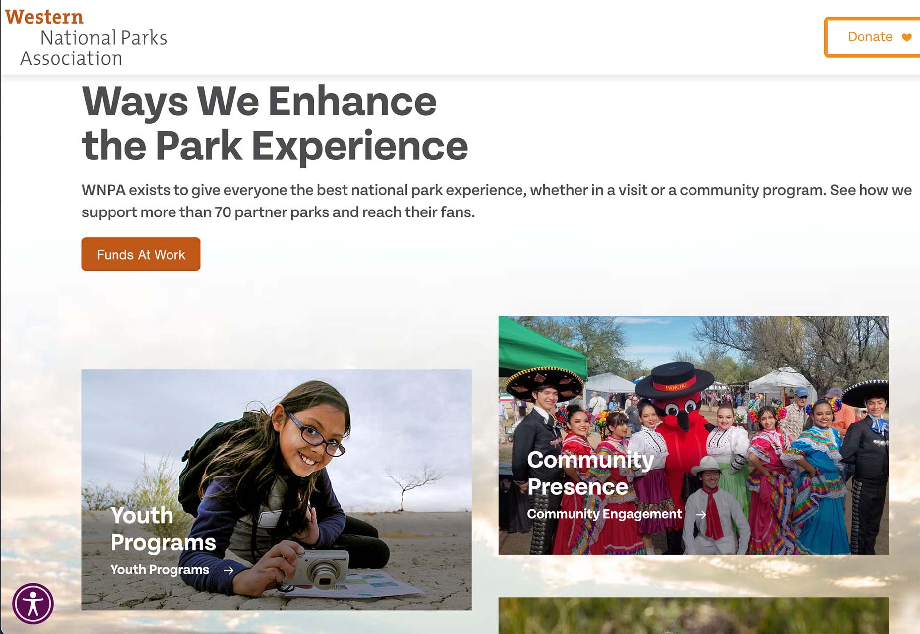
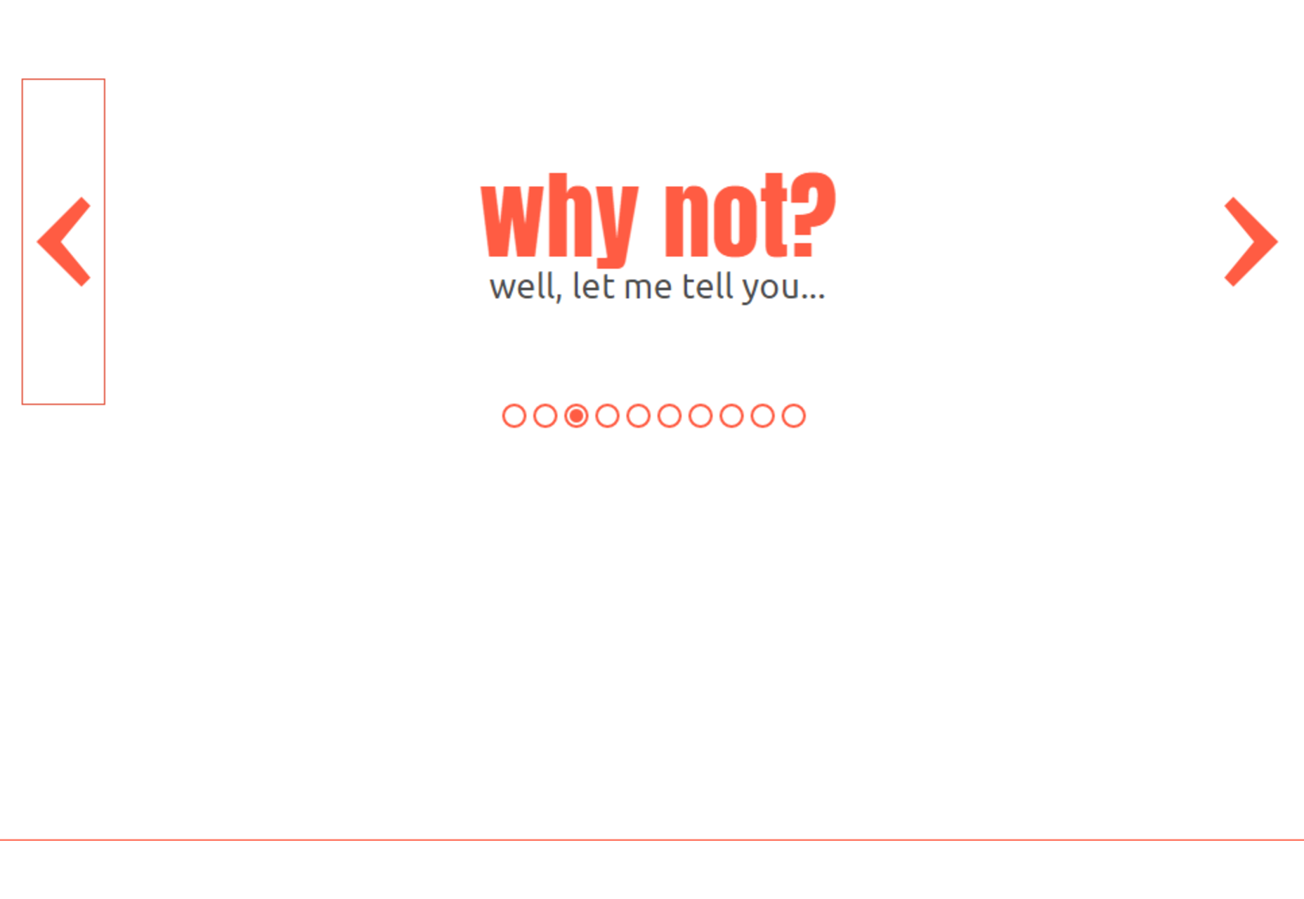
 Do you ever look at a website and think, why did they do that? Sometimes with website design trends, that’s the exact thought that can come to mind. What about an element works (or doesn’t) and why did it get so popular so fast? That’s the theme of this month’s roundup.
 Every day design fans submit incredible industry stories to our sister-site, Webdesigner News. Our colleagues sift through it, selecting the very best stories from the design, UX, tech, and development worlds and posting them live on the site.
 Every day design fans submit incredible industry stories to our sister-site, Webdesigner News. Our colleagues sift through it, selecting the very best stories from the design, UX, tech, and development worlds and posting them live on the site.

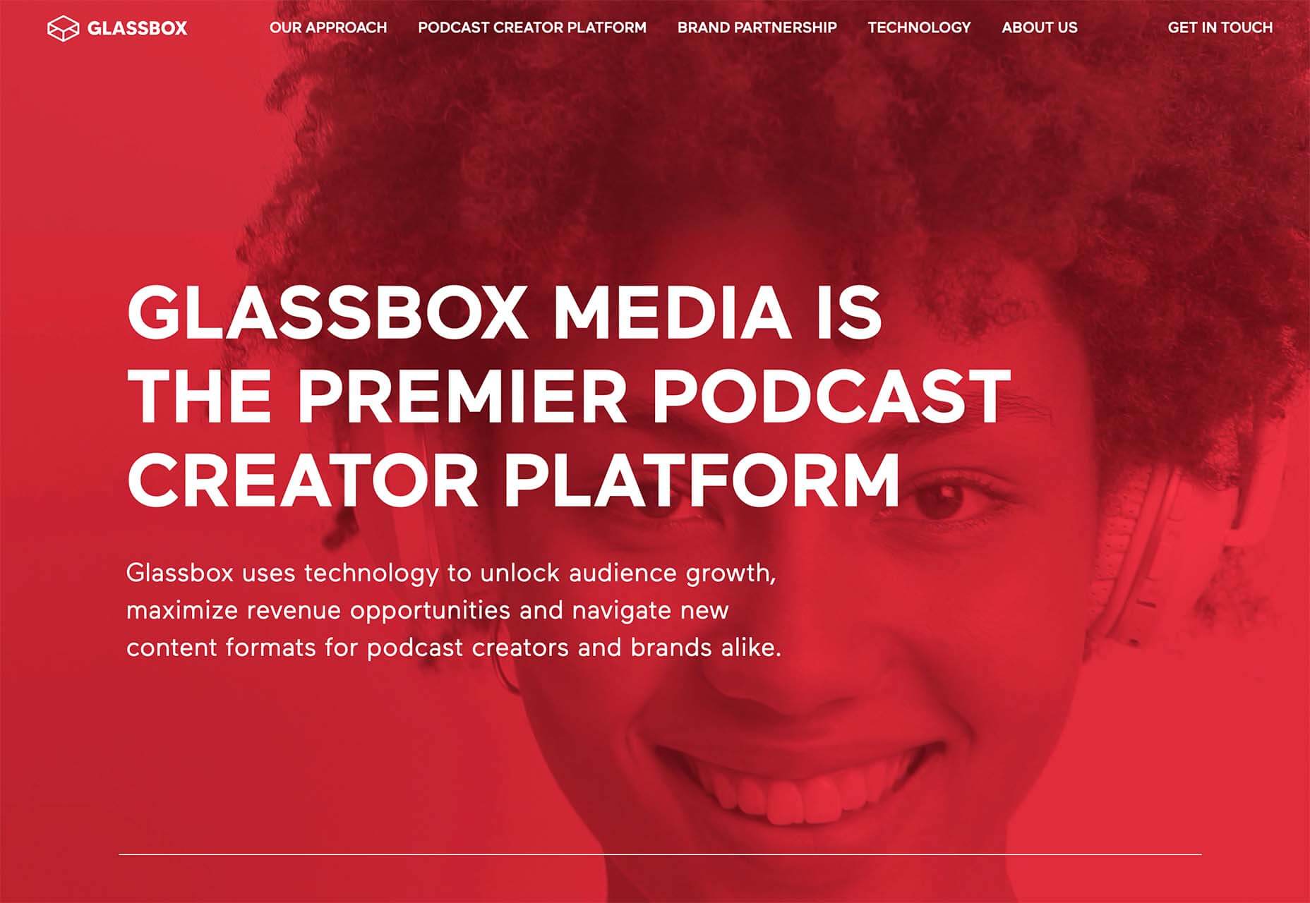
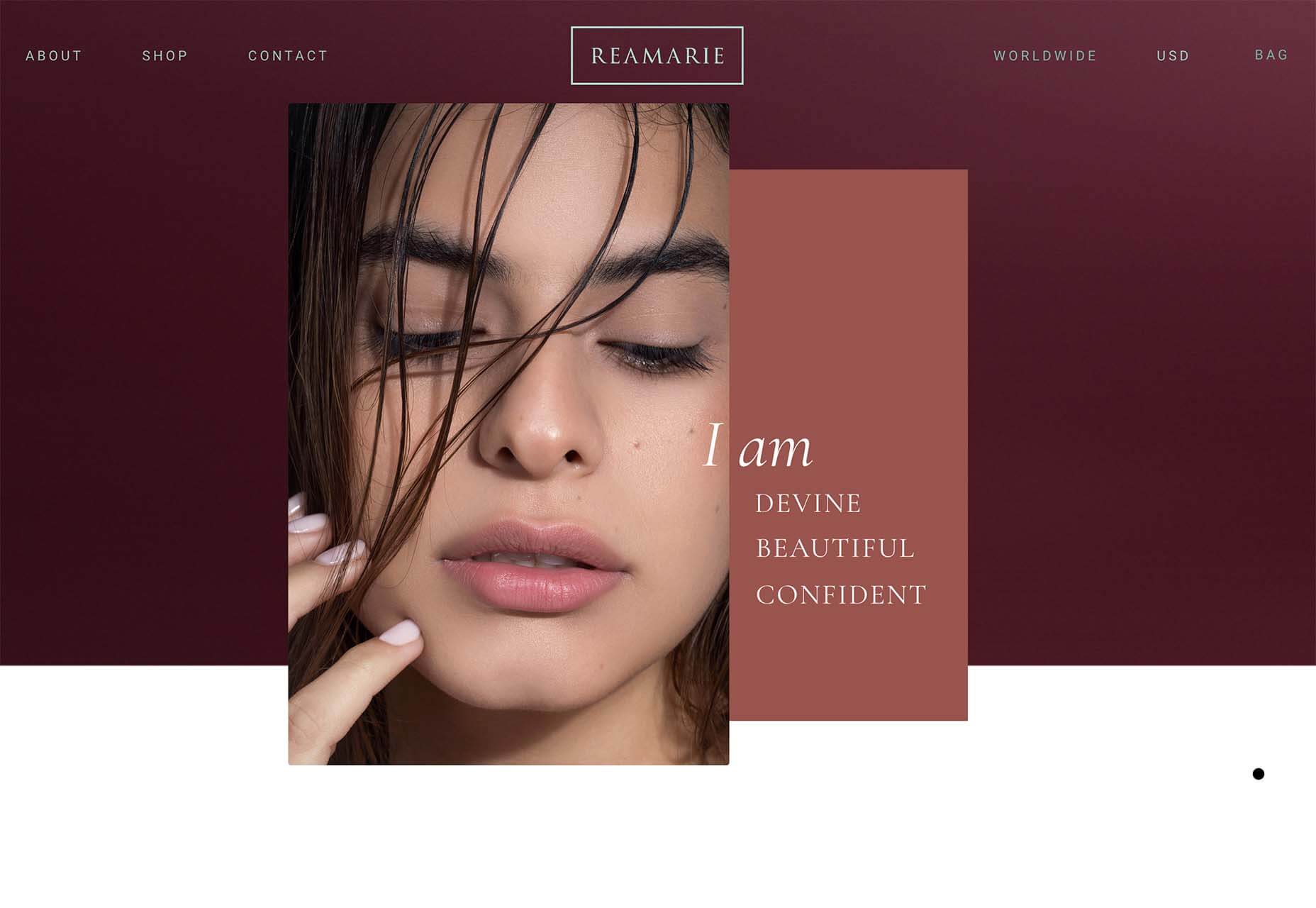
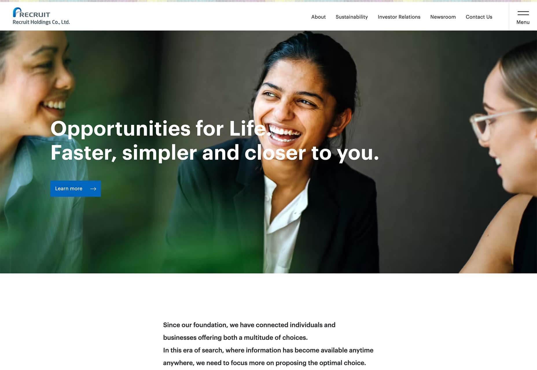
 This month all of our web design trends have a common theme – imagery. Whether it’s seasonal or just coincidence, there’s a shift in the styles and types of images on many designs right now. One thing that might push these design trends is a relaxation of COVID-spurred rules worldwide or even fatigue from the pandemic.
 Every day design fans submit incredible industry stories to our sister site, Webdesigner News. Our colleagues sift through it, selecting the very best stories from the design, UX, tech, and development worlds and posting them live on the site.

 Happy New Year, fabulous new website design trends!
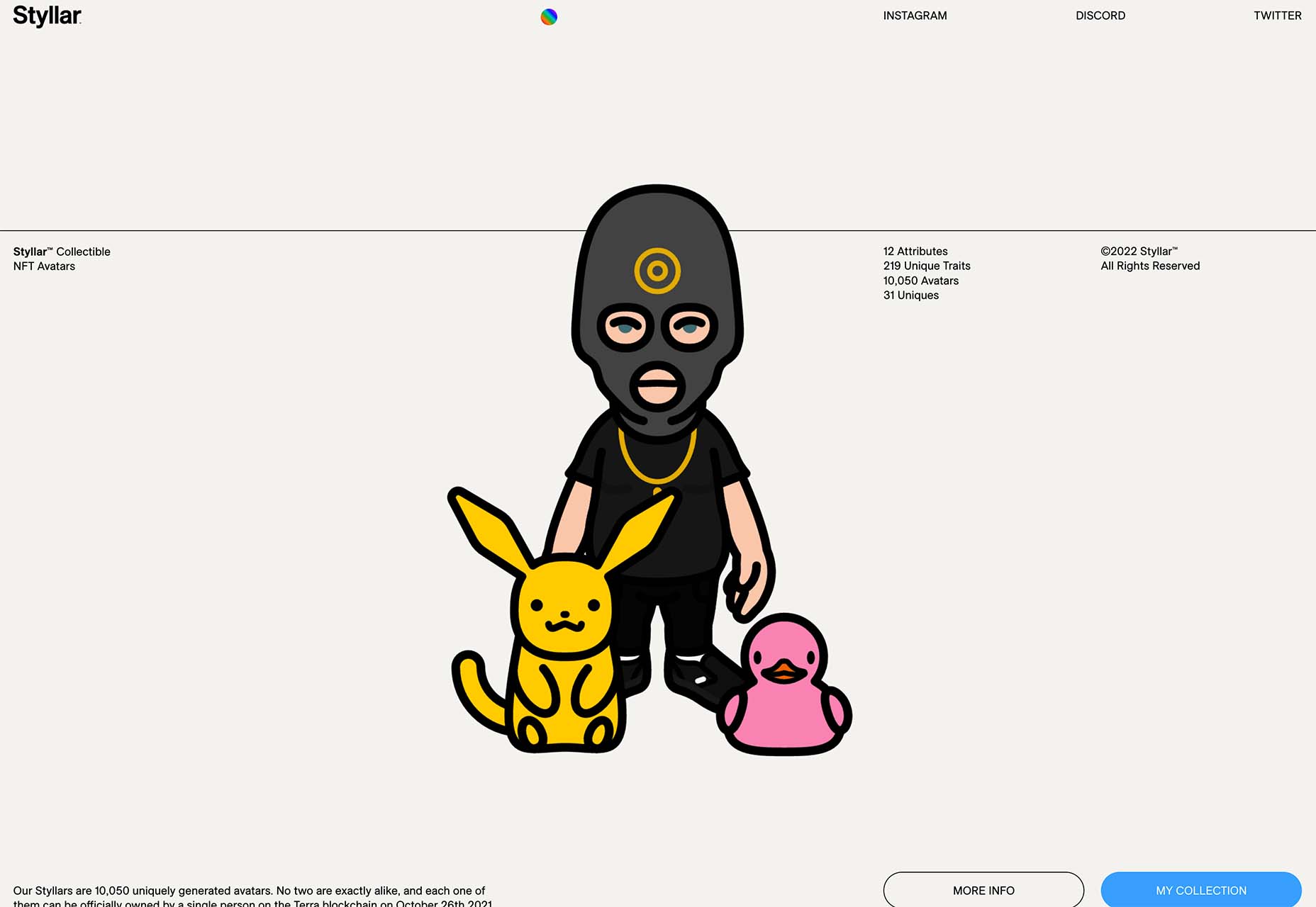
 Every day design fans submit incredible industry stories to our sister-site,