Articles

Web design is often stagnant because designers look at the same work and follow the same trends. Unfortunately, algorithms promote work that is liked, and designers produce content to get likes, which leads to a self-feeding cycle.

We’ve been talking about the dribbblization of design for years, but Behance is just as guilty of promoting and encouraging homogenous design.

It’s not that Dribbble and Behance don’t have value; they are both excellent resources for designers. But they’re victims of their own success, and it’s healthier for them, designers, and the industry if we broaden our sources of design inspiration.

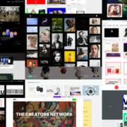
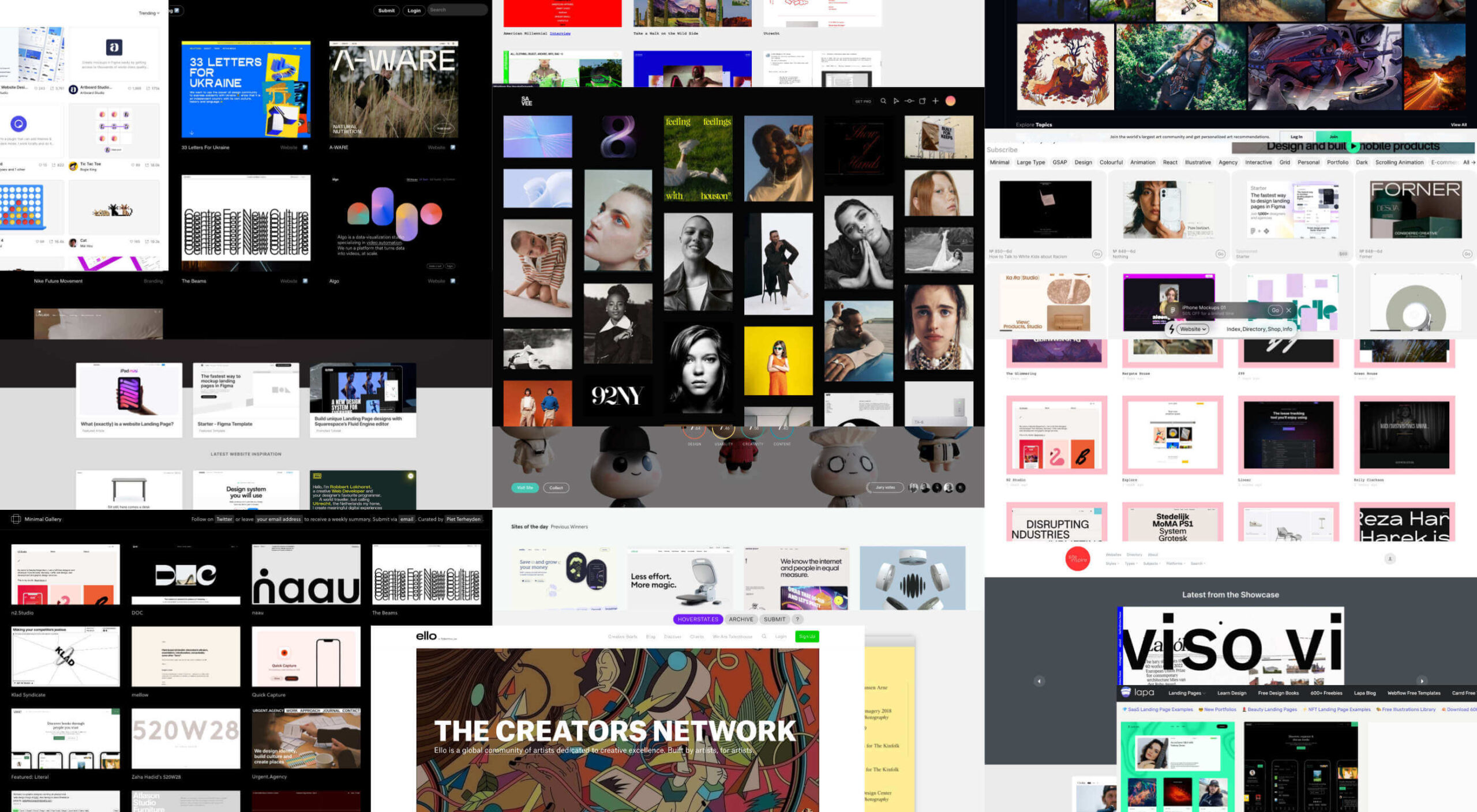
And so, today, we’re presenting this list of the best places to find design inspiration for web designers that aren’t Dribbble or Behance. (OK, you can check them out too, if you really want to!)
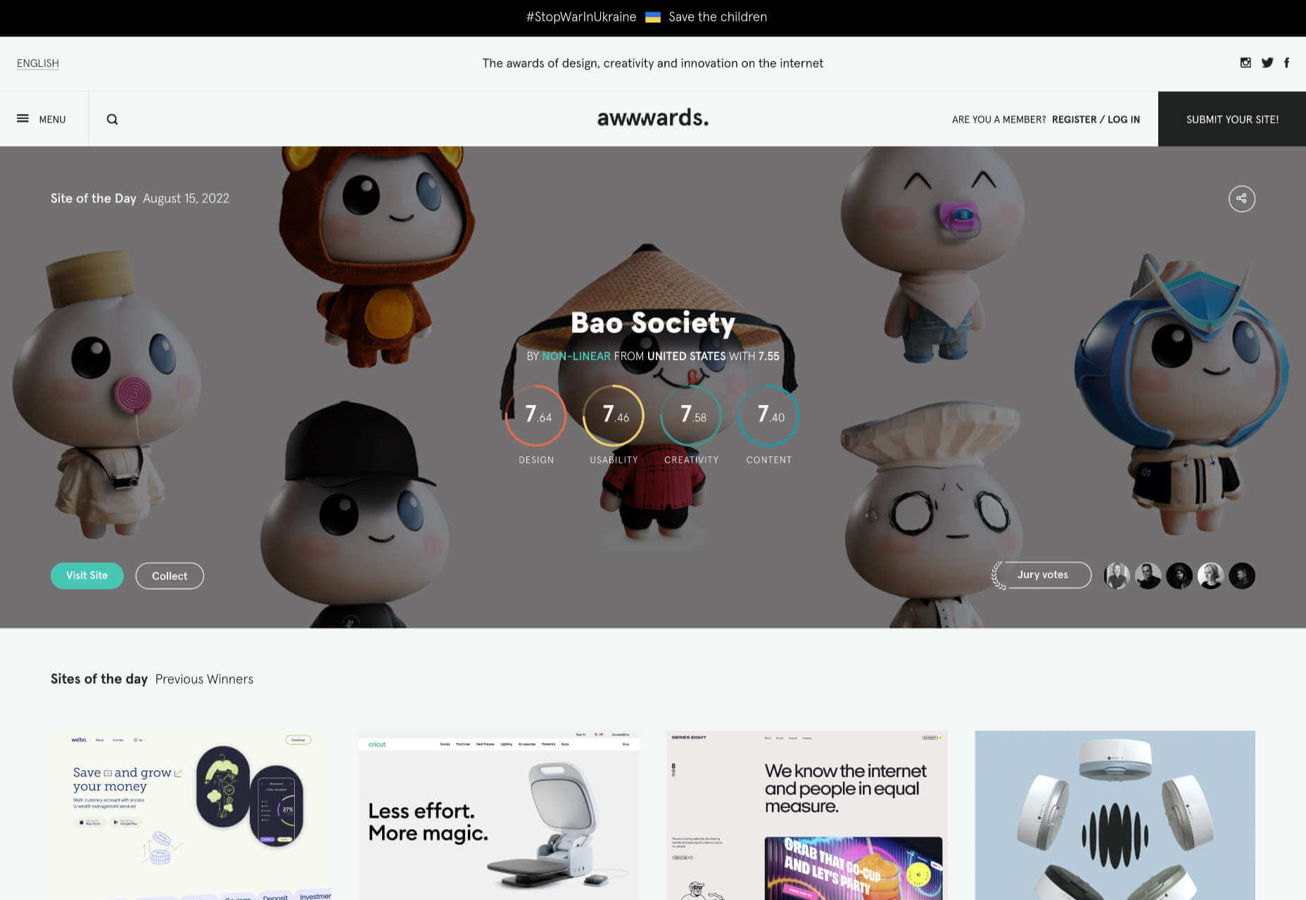
Awwwards

Awwwards is the top site for web design inspiration. The best agencies in the world post here, and a ‘Site of the Day’ award is a coveted accolade. So if you’re looking for design inspiration, this should be your first stop.
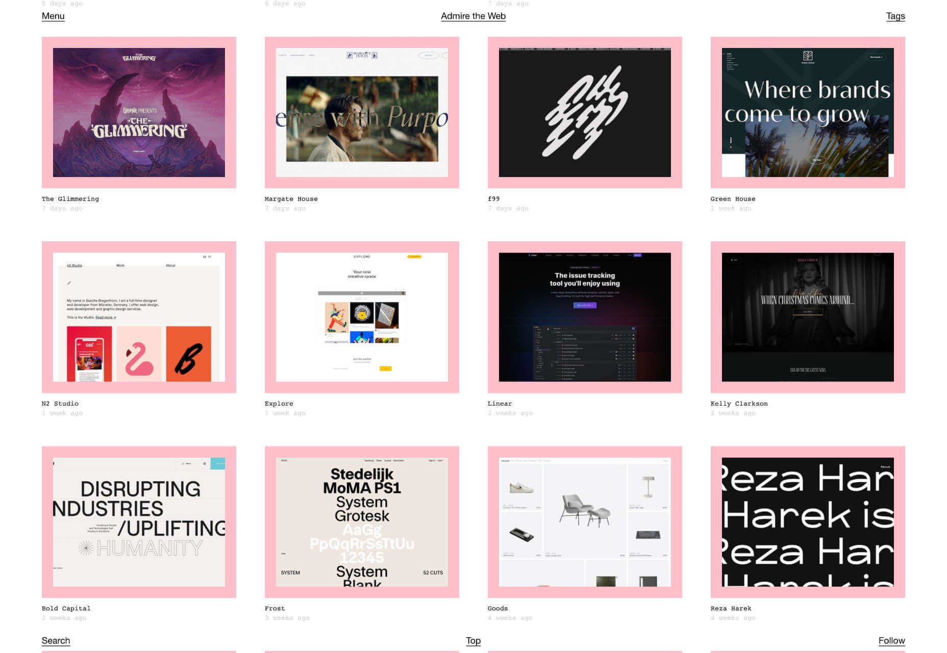
Admire The Web

Admire The Web is an excellent collection of curated sites. It’s more selective than sites like Awwwards, so you don’t have to dig through so much to find the best web design.
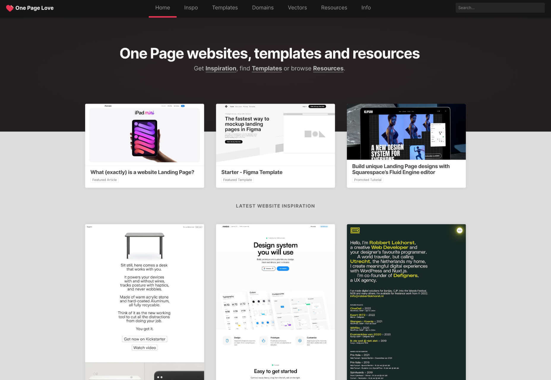
One Page Love

One Page Love is one of the best resources for designers seeking inspiring new ideas. It’s devoted to one-pagers, which means it leans towards apps, tech start-ups, and smaller independent projects.
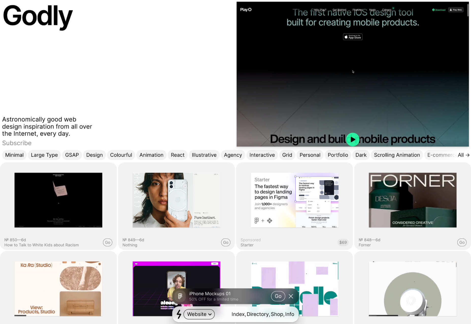
Godly

Godly is another excellent collection of web design inspiration. Godley uses animated thumbnails, so you can get a sense of a site before you look at it in detail. As such, it’s perfect for animated landing pages.
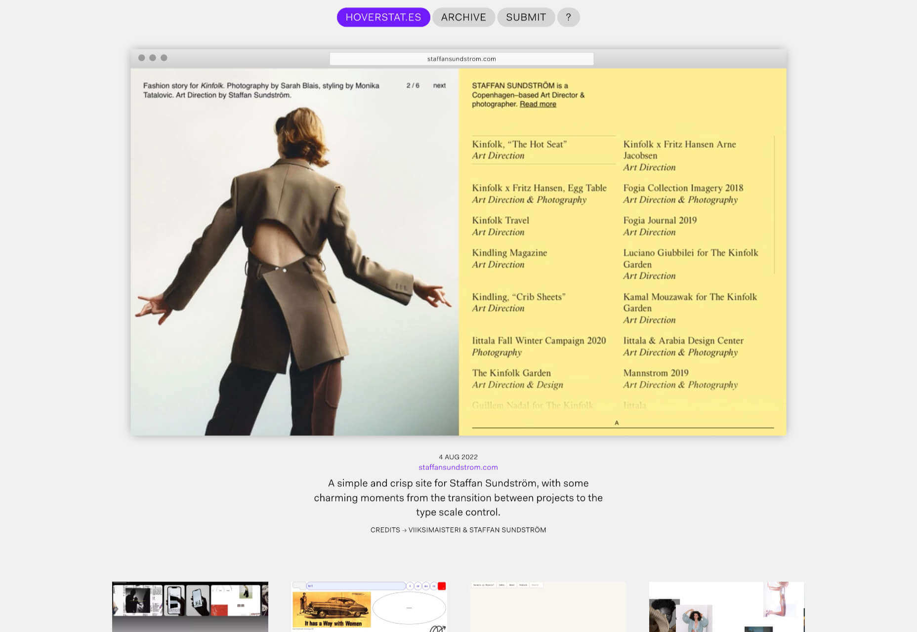
Hoverstat.es

Hoverstat.es is a collection of curated websites that often finds little gems other sites miss. Unlike most roundups, it doesn’t go into much detail on each site, and new sites are infrequent, but it’s always worth a browse.
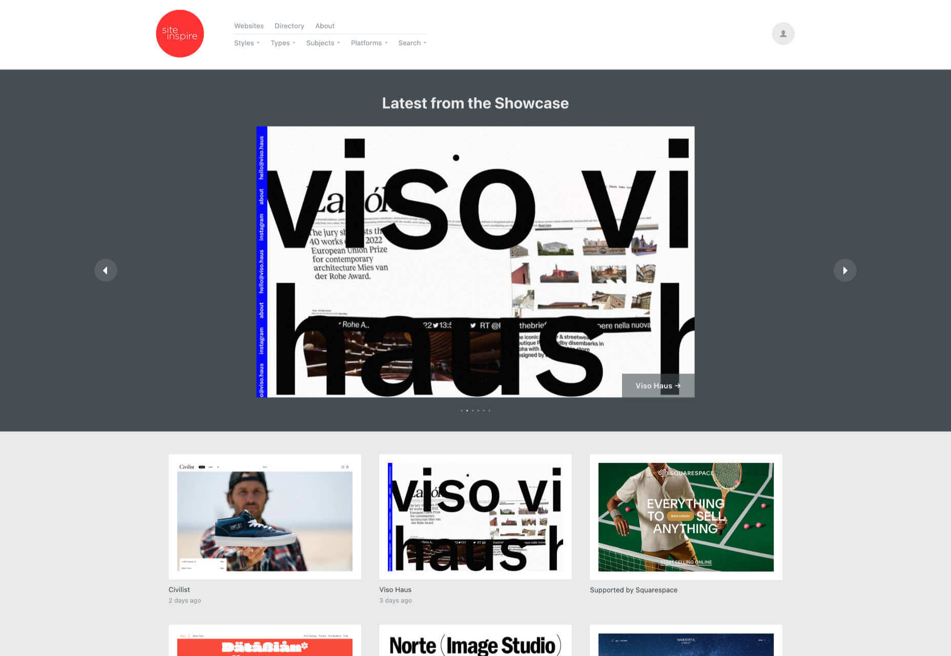
Siteinspire

Siteinspire is one of the most established design inspiration sites. The collection is carefully divided into different styles; if you find your own site listed, you can add your contact details.
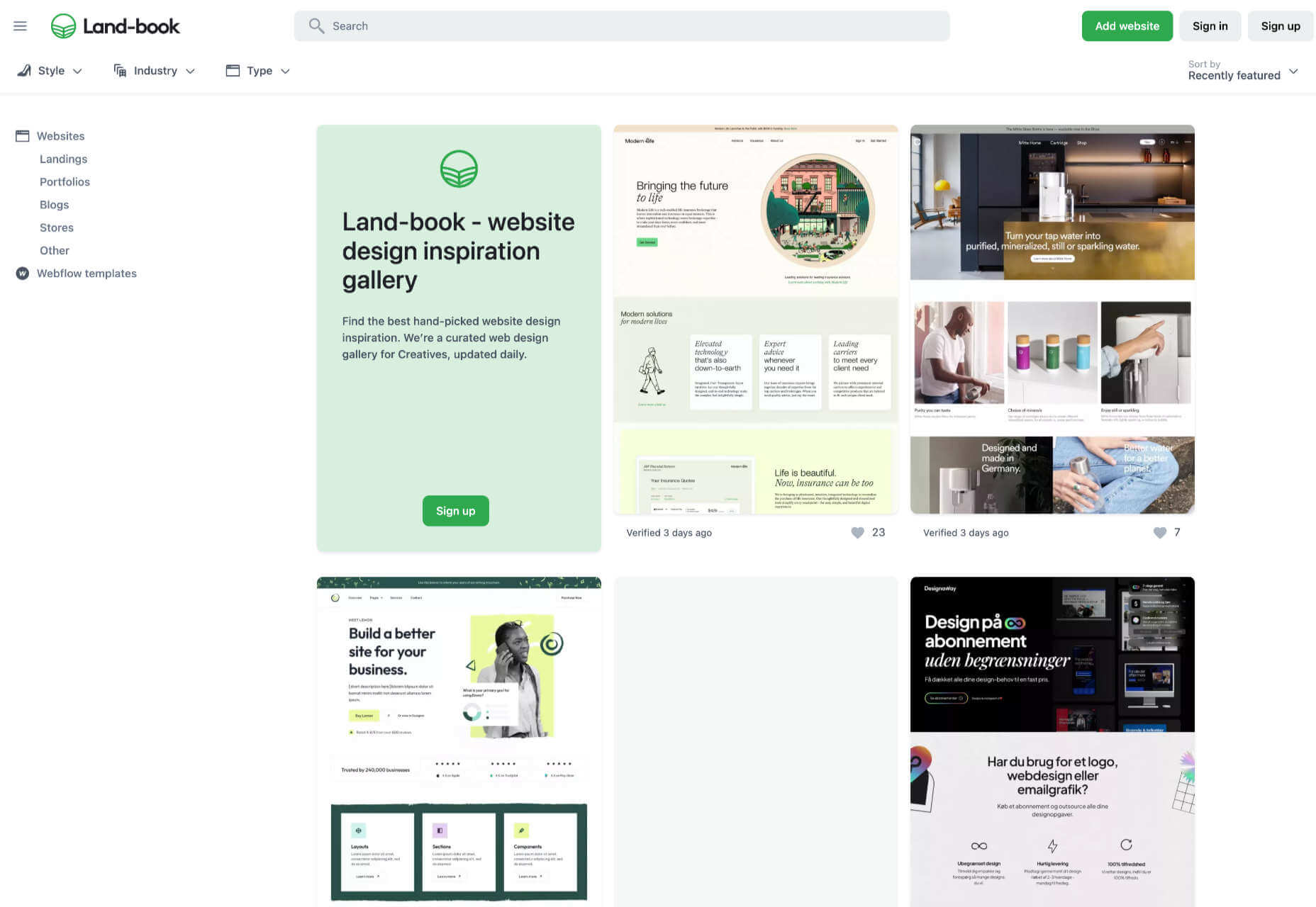
Land-book

Land-book is a curated collection of the best sites on the web. The site does a great job of presenting screenshots clearly, and the similar sites feature is great for browsing a particular mood.
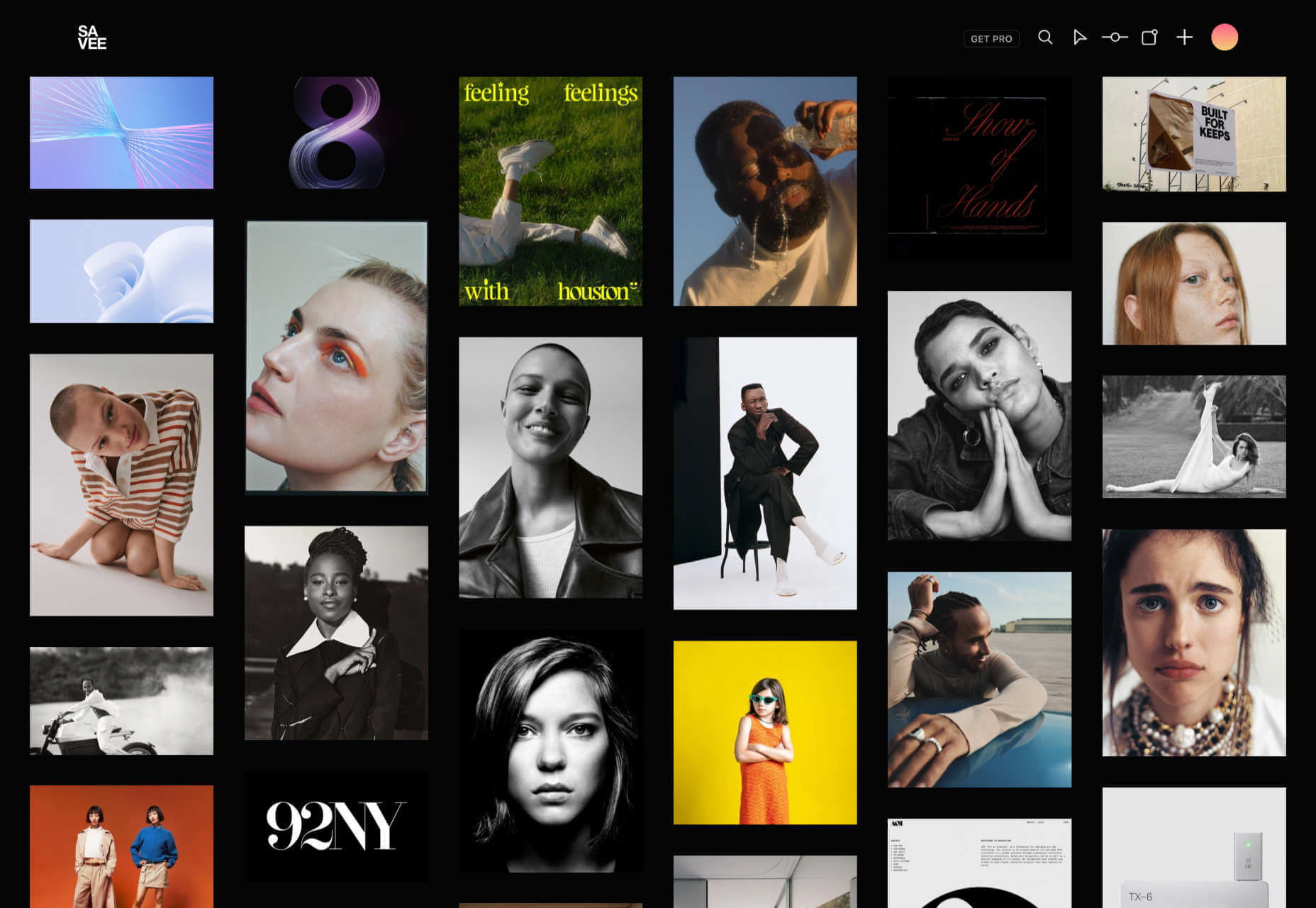
Savee

Savee is a fantastic site for browsing all kinds of design inspiration. It’s like Pinterest for designers as it leans towards art direction and photography. It’s easy to scan for mood boards.
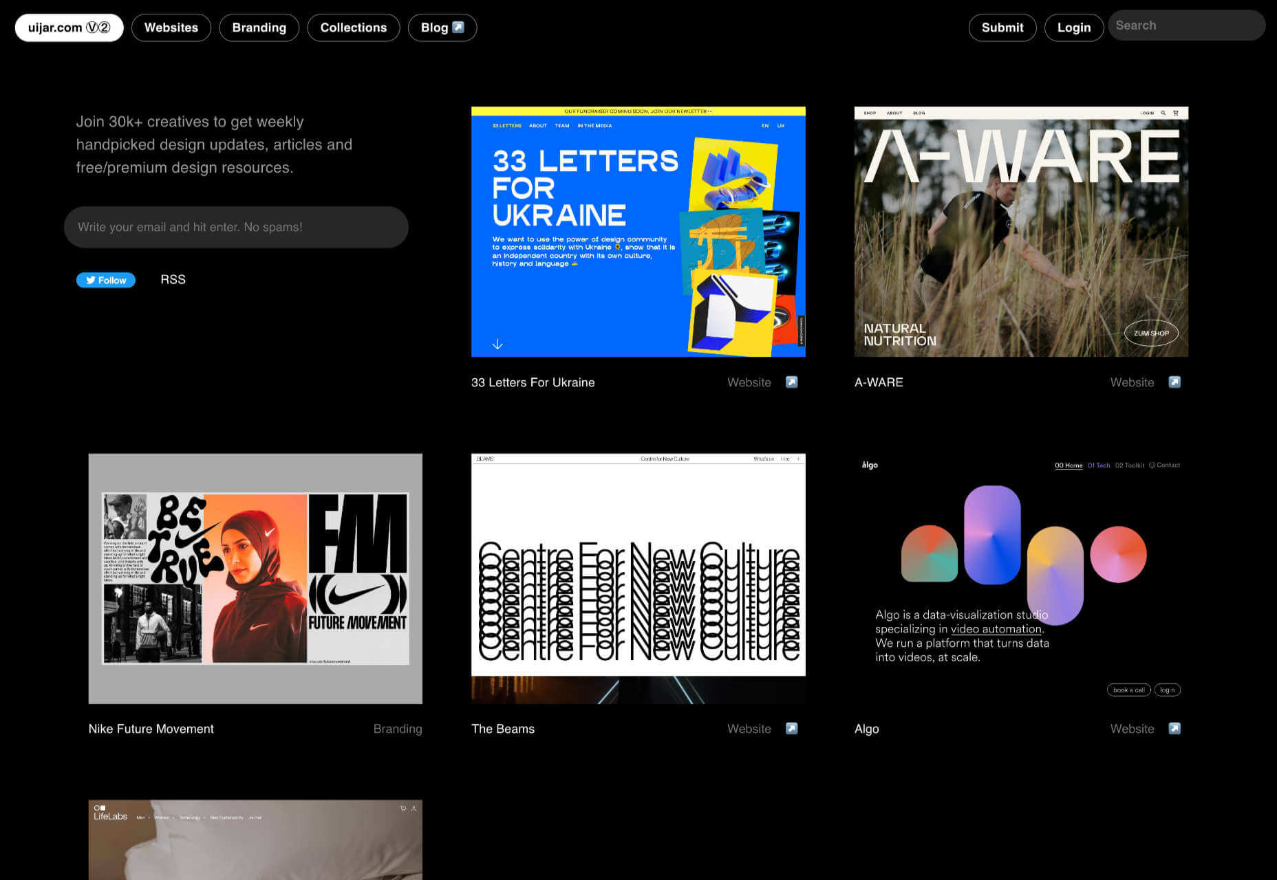
UIJar

UIJar is a nicely designed collection of hand-picked websites. Unlike most other sites on this list, UIJar also features a collection of branding that’s great for identity designers.
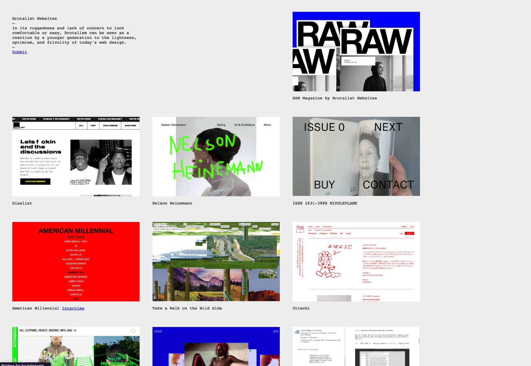
Brutalist Websites

Brutalist Websites is the perfect inspiration site if you’re a fan of the Brutalist design trend. There are plenty of designs that show why Brutalism is so popular right now, but the site itself is probably short-lived.
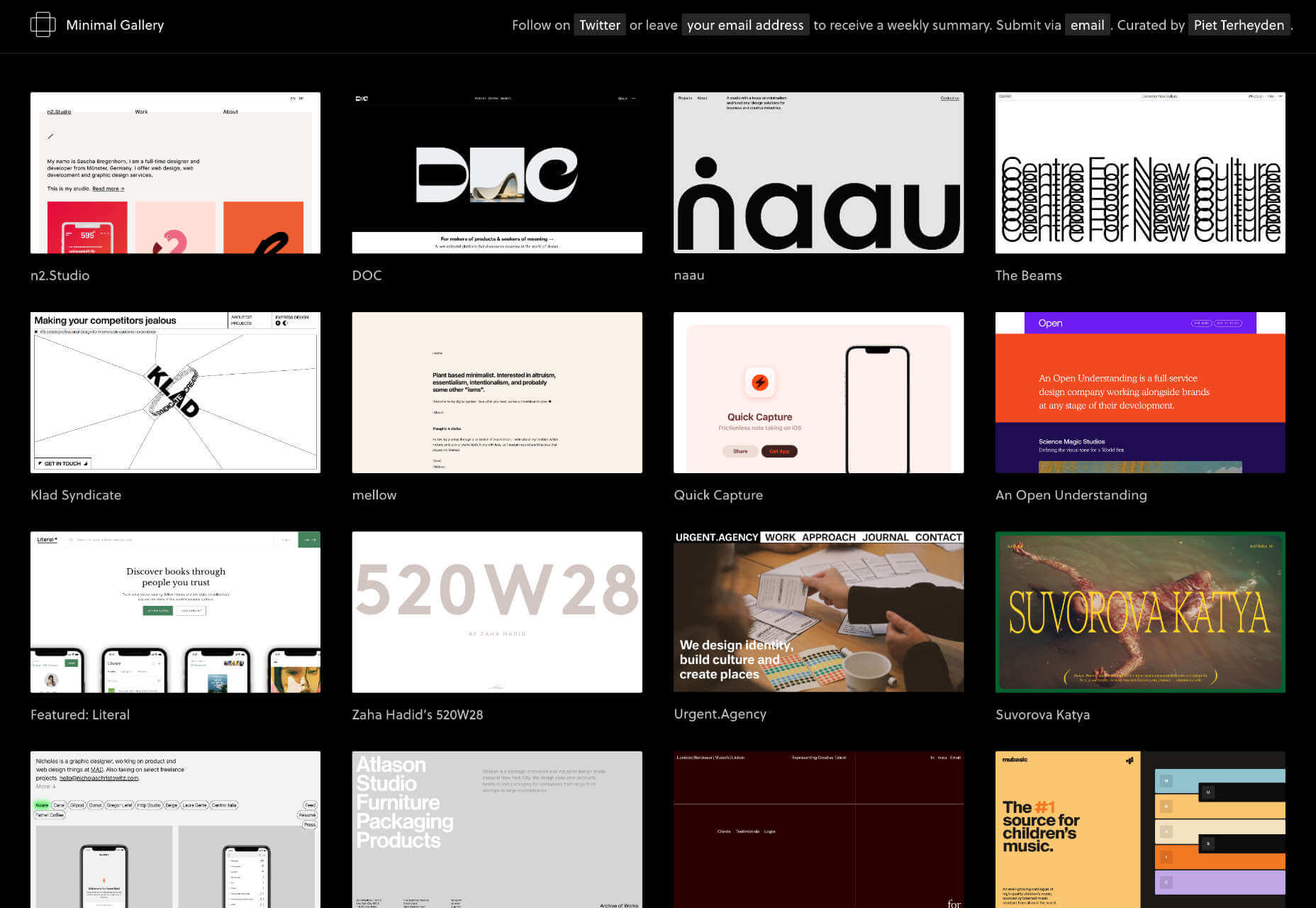
Minimal Gallery

Minimal Gallery is a collection of sites that embrace minimalism. Like Brutalist Websites, the quality of the collection is very high, but the site’s lifespan is probably short-lived thanks to being tied to one trend.
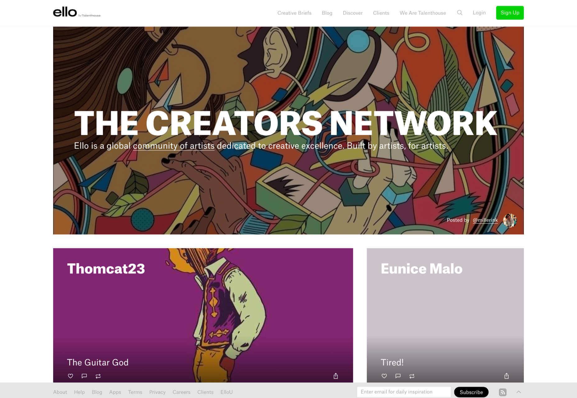
Ello

Ello is a platform for showcasing excellent design work. It’s solid on illustration and artwork. There’s also a great deal of photography on show. You’ll also find regular opportunities tied to creative briefs.
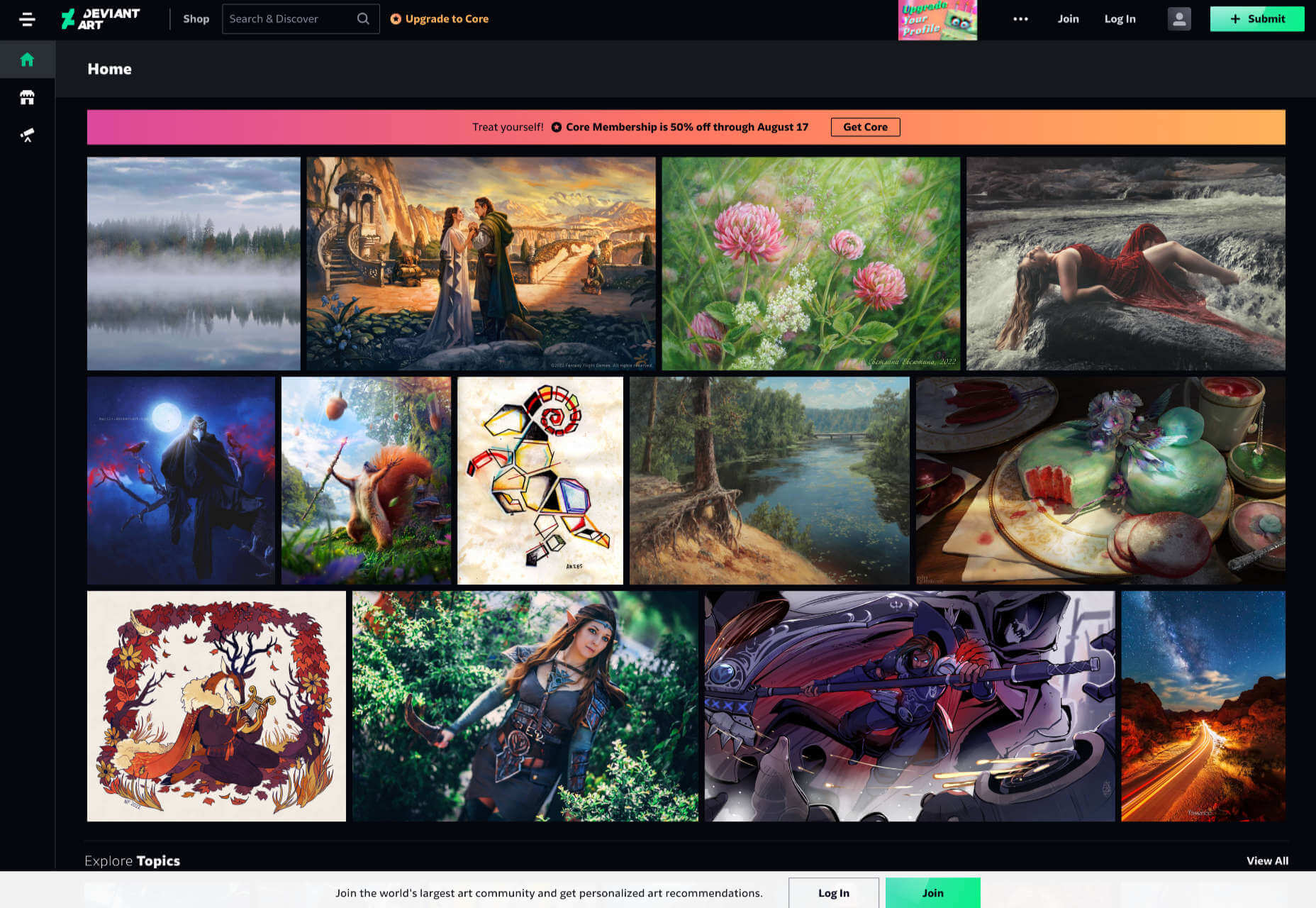
DeviantArt

DeviantArt is still the largest, and arguably the best, showcase for illustration, with dozens of styles from Anime to classicism. It’s easy to lose a few hours browsing DeviantArt.
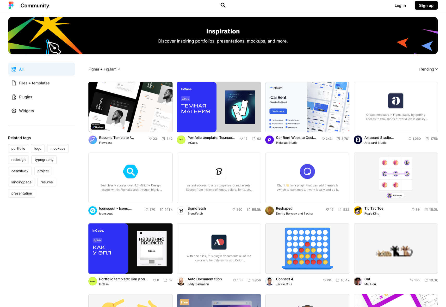
Figma Community

Figma Community is a collection of the best work from the Figma community. But you don’t need to be a Figma user to grab some inspiration from the UI work on show.
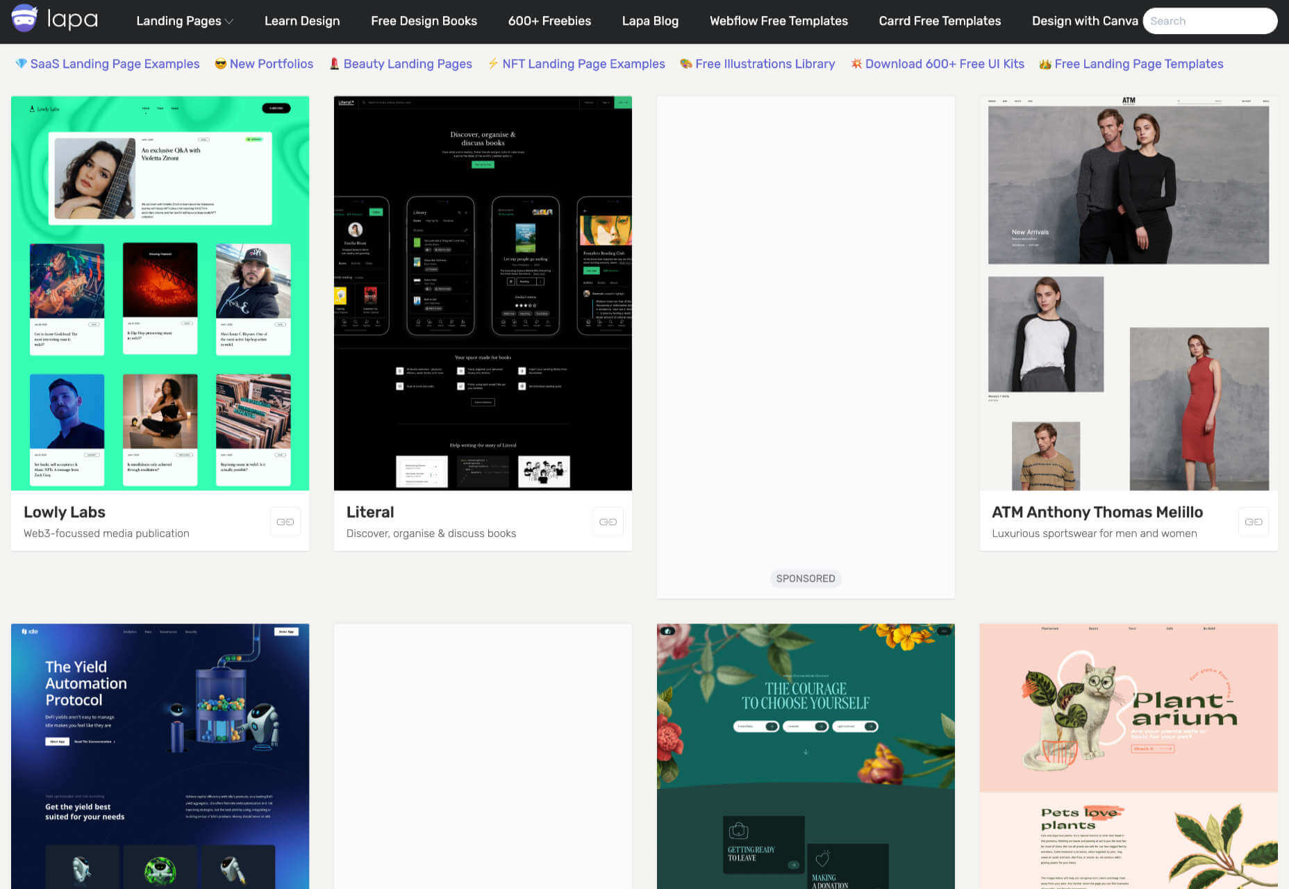
Lapa

Lapa is a collection of 5000+ landing pages. The collection is headhunted from around the web, so if you only have time to check out one site, Lapa could be a good choice.

Source

The post 15 Inspiring Alternatives to Dribbble & Behance first appeared on Webdesigner Depot.

Source de l’article sur Webdesignerdepot

The hardest part of designing websites for a living is setting your prices. Setting a fair price for your services is something that nearly all of us struggle with.

If you’re lucky, you’re part of an agency that has experienced design leads who can assess projects objectively. But if you’re a freelancer — or if you’re one of those design leads — you have to set your own rate.

It’s a challenge to find a sweet spot in the market. You want to be competitive or you’ll price yourself out of jobs. But you also want to be able to live the lifestyle you aspire to.

The truth is there is always someone cheaper. There is always someone who believes the ‘exposure’ myth and will do a project for free. You can’t compete on price, and you really shouldn’t try. If you have been competing on price, you are almost certainly undercharging for web design. Where you should compete, is on quality and results.

When you’re no longer competing on price, you can put your rates up.

How Much Do You Charge for Web Design Services?

To find out what most professional designers charge, we’re asking you to answer the following two questions (anonymously).

We’d like to know how much you charge for web design services per hour. (We don’t necessarily recommend you charge by the hour, but with projects varying in scope this is the best way to compare pricing.)

Because the value of the dollar varies a great deal — $1 goes a lot further in Patagonia than it does in Norway — we’d also like to know how much you charge per hour as a percentage of your monthly housing cost (your rent or mortgage).

Remember, most experts in the field agree: No matter how much you’re charging for web design services, you’re probably undercharging. Perhaps it’s time to put your prices up.


Featured image via Pexels.

Source

The post Are You Undercharging for Web Design Services? first appeared on Webdesigner Depot.

Source de l’article sur Webdesignerdepot

Starting your own business is a process with a fair share of challenges. Even in the web design world, where you can potentially minimize costs by working from home and collaborating with freelance contractors, many expenses exist. 

To run a successful web design business, you need enough money to invest in everything from skilled colleagues to resources (like fonts and themes), software subscriptions, and technology tools. Finding a way to fund your company can be the most complicated part of ensuring its success.

For most new companies, the easiest option to generate opportunities is “bootstrapping.” Learning how to bootstrap a web design business means knowing how to bring your business to life with virtually no starting capital. 

Here’s how to get started.

What is Bootstrapping? 

Successful bootstrappers take an idea, such as creating a web design company and create a fantastic company without the backing of investors. It takes significant dedication, commitment, and single-mindedness to accomplish your goals, but some of the world’s greatest entrepreneurs, like Steve Jobs and Sam Walton, got their start this way. 

The term “bootstrapping” comes from the phrase “to pull yourself up by the bootstraps,” which indicates overcoming challenges on your own without any external support. 

The pros and cons of bootstrapping include:

Pros:

  • Full control: Bootstrapping allows entrepreneurs to retain full ownership over their business. Alternatively, engaging with investors means allowing other professionals to own a portion of your company or make a share of the decisions. 
  • Innovation: Business owners in a bootstrapping model are forced to invest in agile and innovative business models. You must develop processes to produce immediate, lasting cash flow from day one. 
  • Accomplishment: Building something from the ground up creates a powerful sense of satisfaction and accomplishment. 
  • Ownership: You won’t have to sell any equity in your business to other investors, which means you can benefit fully from the company as it grows.

Cons:

  • Risks: Self-funded businesses generally run out of funds faster and struggle to scale as quickly as other companies, limiting the brand’s ability to reach its potential.
  • Limited support: Traditional financing methods (like working with investors) also provide networking opportunities and support from specialists who want to see your company succeed. 
  • Pressure: Bootstrapping businesses need to be meticulous about everything from keeping books to making the right decisions for brand growth. 
  • Hard work: With limited resources, connections, and options, bootstrapping entrepreneurs need to work harder than most and take on more roles.

How to Bootstrap Your Web Design Business: Step by Step

Bootstrapping a web design business can be complicated, but it works for many companies if you follow the right strategy. The good news is web design companies generally don’t require as much initial capital as some other types of companies, like standard retail brands or companies with a need for brick and mortar offices.

However, there are still steps you’ll need to follow to ensure success.

Step 1: Source Some Initial Funds

While you might not work with investors when bootstrapping your web design business, you’ll still need some essential initial funds. To run a web design business, you won’t necessarily need a massive initial investment, but you will need something. 

To determine how much capital you need to raise from your income, savings, a line of credit, or other common bootstrapping sources, think about:

  • Where you’re going to work: The upfront costs of operating your own web design business will be a lot lower if you choose to work from home and with remote specialists. The less you have to pay for office space, the better.
  • Business fees: You may need to pay fees for registering your business name, hosting your own website for advertising, and dealing with any registration costs.
  • Equipment and software: Think about what you will use daily for web design. Subscription-based services like Adobe Creative Cloud can cost quite a bit to access. You’ll also need a good computer, and perhaps a tablet for sketching.

Step 2: Find a USP 

The easiest way to ensure a bootstrapped web design business is a success is to ensure you are offering specific clients something they genuinely need. In a service-based landscape like web design, you need to know what your customers want and offer something they can’t get elsewhere.

For instance, can you differentiate yourself from other web design companies by helping with modern trends like 360-degree video and XR-ready design? Can you build apps for companies from scratch and provide ongoing maintenance for the websites you make?

An excellent way to find your USP is to examine your competitors. Find out what other companies in your area are offering their customers, and listen to consumers in your industry when they talk about what they need from a website designer. 

Step 3: Choose a Cash Flow Optimized Model 

Since you’re relying only on your cash and the money you make from your web design business to fuel its growth, choosing a model optimized for consistent cash flow is essential. Bootstrapping a business often means you place most of the profit you gain from your company back into the development of the brand. 

With this in mind, consider how you’ll offer services and charge your customers. Are you going to ask for a portion of the fees up-front before starting a web design project? Can you provide your customers with subscription models to improve your revenue consistently?

For instance, you could provide help with ongoing maintenance, development, and support rather than just offering to build websites for companies. Another way to make additional income is with professional services, like consulting. 

Make sure there’s a market for the services you’ll offer before launching your business by examining the surrounding environments and services your competitors provide.

Step 4: Keep Costs Low and Profits High

Keeping costs low will be essential to ensuring your success when bootstrapping a business. Fortunately for web designers, it’s relatively easy to cut down on fees. For instance, WordPress is free to use for your development projects, making it an excellent choice for many web design strategies. 

You can also look into common free and cheap alternatives to web design tools online, like GIMP. Shop around for the things you will be paying ongoing fees with. For instance, it’s best to check out multiple vendors when looking for web hosting and marketing support. 

While keeping your costs low, it’s also essential to accelerate profits as much as possible. You can look for ways to boost customer retention by building stronger relationships with your clients and offering them deals on long-term subscriptions. 

If you have time outside of your web design business, you can also try taking on some side hustles. Options include:

  • Selling web design assets on sites like ThemeForest
  • Offering your services on a freelance basis with sites like Dribbble and Toptal
  • Designing and selling NFTs for the metaverse
  • Teaching web design or selling webinars

Step 5: Grow Cautiously

Finally, while the goal of successfully bootstrapping your web design business will be to grow as rapidly and consistently as possible, it’s important to be cautious. For instance, you’ll need to be able to afford the fees of every new designer you bring onto your team, so consider looking for freelancers and contractors rather than permanent hires.

Use organic channels for marketing your services, like blogging and content marketing which can help improve your SEO standing and attract attention among clients. Plus, encourage your customers to recommend your services to other brands. 

As new clients approach your business, ensure you only take on as many customers as you can reasonably handle. Compromising on quality will damage your relationships with customers and harm your reputation. 

Good Luck Bootstrapping Your Business

When you’re bootstrapping a business, you get the benefit of being able to eliminate any outside influences from your growth. You’re free to focus on building relationships with companies of your choice, and you get to make decisions about your growth. However, there are downsides, too, like significant stress and limited financial opportunities.

While bootstrapping your business is tough, if you manage to complete the process successfully, the results can be fantastic. 


Featured image via Unsplash.

Source

The post How to Bootstrap a Web Design Business first appeared on Webdesigner Depot.

Source de l’article sur Webdesignerdepot

UX laws are an invaluable tool, providing guidelines for designers that ensure we don’t have to continually reinvent the wheel when crafting experiences for the web.

However, UX laws tend to be devised by scientists and psychologists — people who are more than comfortable with the exceptions and allowances of academic language. By the time they filter down to us in the trenches, the language has invariably been over-simplified, and the wisdom behind the idea diluted.

Today we’re going to look at seven well-known and commonly cited rules of UX design that too many designers get wrong.

1. Jakob’s Law

Jakob’s Law, named for the UX researcher Jakob Nielsen, states that users spend most of their time on other sites and as a result prefer sites that work the same way as the sites they already know.

Jakob’s Law has often been used to limit experimentation and encourage the adoption of common design patterns in the name of usability.

However, the word ‘prefer’ is hugely loaded. While it’s true that a user will more easily understand a familiar design pattern, they do not necessarily prefer familiar experiences.

It has been widely proved that new experiences boost our mood and that new experiences improve our memory. If your goal is a memorable site that leaves users with a positive impression, introducing novelty is a sound decision.

2. Goal Gradient Hypothesis

The Goal Gradient Hypothesis assumes that the closer users are to their goal, the more likely they are to complete it.

It’s an attractive theory, especially in e-commerce, where it is often used to justify simplifying the initial purchase process and postponing complexity to move users along the funnel — a typical example is leaving shipping charges until the final step.

However, anyone who has studied e-commerce analytics will know that cart abandonment is a huge issue. In North America, shopping cart abandonment is as high as 74%.

We don’t always know what the user’s goals are, and they may not match ours. It may be that users are treating your shopping cart as a bookmark feature, it may be that they have a last-minute change of heart, or they may be horrified by the shipping charges.

While providing a user with an indication of their progress is demonstrably helpful, artificially inflating their proximity to your preferred goal may actually hinder conversions.

3. Miller’s Law

Never in the whole of human history has any scientific statement been as misunderstood as Miller’s Law.

Miller’s Law states that an average person can only hold seven, plus or minus two (i.e., 5–9) items in their working memory. This has frequently been used to restrict UI navigation to no more than five items.

However, Miller’s Law does not apply to items being displayed. While it’s true that too many options can lead to choice paralysis, a human being is capable of considering more than nine different items.

Miller’s Law only applies to UI elements like carousels, which have been widely discredited for other reasons.

4. Aesthetic-Usability Effect

Edmund Burke once said, “Beauty is the promise of happiness.” That belief is central to the Aesthetic-Usability Effect, which posits that users expect aesthetically pleasing designs to be more usable.

Designers often use this as a justification for grey-on-grey text, slick animations, and minimal navigation.

Critical to understanding this is that just because users expect a design to be usable does not mean that it is or that they will find it so. Expectations can quickly be dashed, and disappointment often compounds negative experiences.

5. Peak-End Rule

The Peak-End Rule states that users judge an experience based on how they felt at the peak and the end, rather than an average of the experience.

Designers commonly use the Peak-End Rule to focus design resources on the primary goal of each experience (e.g. adding an item to a cart) and the closing experience (e.g. paying for the item).

However, while the Peak-End Law is perfectly valid, it cannot apply to open experiences like websites when it is impossible to identify a user’s starting or ending point.

Additionally, it is easy to see every interaction on a website as a peak and even easier to make assumptions as to which peak is most important. As such, while designing for peaks is attractive, it’s more important to design for exceptions.

6. Fitts’ Law

In the 1950s, Paul Fitts demonstrated that the distance to, and size of a target, affect the error rate of selecting that target. In other words, it’s harder to tap a small button and exponentially harder to tap a small button that is further away.

UX designers commonly apply this law when considering mobile breakpoints due to the relatively small viewport. However, mobile viewports tend not to be large enough for any distance to affect tap accuracy.

Fitts’ Law can be applied to desktop breakpoints, as the distances on a large monitor can be enough to have an impact. However, the majority of large viewports use a mouse, which allows for positional corrections before tapping.

Tappable targets should be large enough to be easily selected, spaced sufficiently, and tab-selection should be enabled. But distance has minimal impact on web design.

7. Occam’s Razor

No collection of UX laws would be complete without Occam’s Razor; unfortunately, this is another law that is commonly misapplied.

Occam’s Razor states that given any choice, the option with the least assumptions (note: not necessarily the simplest, as it is often misquoted) is the correct choice.

In an industry in which we have numerous options to test, measure, and analyze our user interfaces, you shouldn’t need to make assumptions. Even when we don’t need extensive UX testing, we can make decisions based on other designers’ findings.

Occam’s Razor is a classic design trap: the key to avoiding it is to recognize that it’s not your assumptions that matter, it’s the users’. As such, Occam’s Razor applies to a user’s experience, not a design process.

Source

The post 7 UX Laws You’Re Probably Getting Wrong first appeared on Webdesigner Depot.

Source de l’article sur Webdesignerdepot

Moving from studying design into the big wide world of web design is a daunting process. It’s a competitive and dynamic industry that’s growing all the time. It’s estimated that between 2020 and 2030, web designer jobs in the US will increase by 13%. One of the most challenging aspects of starting a career in web design is getting hired, especially as a freelancer. 

The first thing that most clients and agencies look for is usually your level of professional experience. They want to work with someone who, while perhaps not a veteran, has at least a few years of experience. This can lead to a lot of frustration for new designers. After all, how are you supposed to get experience if nobody hires you? 

Moreover, clients and agencies miss out on promising candidates when they pass up on skilled designers just because they don’t have experience. 

Here’s why we should all give zero-experience designers a chance.

1. Price

Professional web design doesn’t come cheap, and for a good reason. Most freelancers who have been in the business for many years have built a solid reputation for themselves and have no shortage of work. Web design agencies have a higher degree of accountability and a quality guarantee, which is why hiring their services can cost more. 

If you’re looking to get design work done on a tight budget, you’ll have better luck contacting someone with little or no experience. However, they’re most likely looking to build up their portfolio and will gladly offer you competitive rates.

2. No Experience Doesn’t Mean No Skill

Clients often assume that anything produced by an inexperienced designer will be sub-par or unusable. While it is true that an extensive portfolio is a good sign, it isn’t the only reason to hire someone. 

New web designers may not be as well versed in business, but many of them are still highly skilled and motivated individuals with a lot to offer. 

Whether self-taught or college graduates, they have devoted countless hours to becoming good at what they do. Instead of passing on a zero-experience candidate, give them a chance to show you what they can do with a mock-up. If you’re still dubious, then go with someone else. But you never know what someone has to offer until you put them to the test.

3. They Will Prioritize Your Job

As we’ve already established, finding work as a fresh-faced web designer can be challenging. This means that those with little to no experience are more likely to have time to devote entirely to your project, as they won’t be splitting their focus.

Agencies and well-established freelancers usually juggle several different projects at a time, meaning they will take longer to produce a result. If they happen to be working on a higher-paying job simultaneously with yours, you can guess which one they’ll prioritize. 

It’s always comforting to know that the person handling your design work is focused on you and you alone. You know your project won’t be on the back burner or forgotten about. 

4. You Will Foster Loyalty

This applies more to big web design agencies. New designers know their lack of experience counts against them, even for entry-level positions. If you choose to look past that and hire them anyway, they won’t forget it in a hurry. 

Once you’ve hired them, you have all the time in the world to help them learn the ropes. Include them in projects headed up by more experienced designers, give them lower priority jobs, and create an environment where their technical skills can flourish. 

Everyone has to start somewhere, and you can bet that they will remember who decided to give them an opportunity when nobody else would. A few years later, when they’ve found their feet in the industry, you’ll have a skilled, experienced designer with something you can’t buy: loyalty. 

5. They’re Eager to Learn

Industry veterans eventually become somewhat set in their ways. They develop their unique style and way of doing things, and while this isn’t bad, it’s different from someone freshly entering the industry for the first time. 

New designers are ‌much more eager to take instruction and expand their repertoire according to your needs. They have the time, energy, and motivation to learn new skills and may have a different approach to projects simply because they have not yet learned otherwise.

6. No Project Is Too Small

Not every job is going to be massive and high paying. People need web designers for small business sites, event pages, small ad campaigns, and other similar projects. Established designers looking for bigger fish will often pass up these kinds of jobs. But they are ideal for new designers who need to build their portfolio website.

On the other hand, new designers will usually take any opportunity to make money and gain experience. If your project isn’t massively complex or high stakes, use it as an opportunity to give someone a chance to showcase their skills. 

7. Everyone Starts Somewhere

No designer starts their career with experience, and many work in other design-related jobs for some time before they begin to do what they’re genuinely passionate about. Industries that make it hard for entry-level professionals to find work often discourage them from pursuing their goals. While philanthropy might not be high on the list of priorities for clients or agencies who want the best in the business, it’s always good to remember that growing industry means recognizing potential. 

Not every newbie will ‌be a prodigy. But without people out there willing to give them a chance, even the most gifted designer will eventually lose heart. 

Summary

In short, experience isn’t everything. While it is a vital asset to any designer, there is certainly room in the industry to allow those with potential to grow. 

So, next time you’re looking for new hires or someone to take on a freelance gig, remember what it’s like to be the new guy and consider hiring someone less experienced. You will sometimes find the brightest gems where you least expect them.


Featured image via Pexels.

Source

The post Why Zero Experience Designers Need A Chance first appeared on Webdesigner Depot.

Source de l’article sur Webdesignerdepot

As a website designer, your professional life revolves around crucial questions that might help you to deliver better results for your clients.

Which widgets are essential to driving conversions? What kind of checkout page elements do you need to include? Should there be a video or slideshow on that product page?

One of the biggest queries that we face when building landing pages to encourage sales is whether a CTA (call to action) button needs to be above or below the fold. 

Answering the question: “Where should the CTA go?” correctly could make or break your client’s chances of a sale. Unfortunately, this particular concern has been the source of a raging debate for many years now. Everyone has their own opinion about CTAs and where they belong.

Today, we’re going to cover the benefits and issues with placing a CTA above the fold.

Should You Place a CTA Above the Fold? 

Starting with a quick refresher, the term “above the fold” refers to any area of a website seen on a screen when a user arrives on a webpage. The content that appears above and below the fold may differ depending on the device you’re visiting a website with. 

Experts in the design and digital marketing world have frequently claimed that if you want to get the best results with a CTA, you need to place it above the fold. 

This strategy makes a lot of sense. If your CTA is above the fold, then your chances of it being seen are significantly higher. Some customers might not want to scroll to the bottom of a page to find out what they need to do next in their buyer journey. 

Additionally, according to the NN group, the 100 pixels that appeared above the fold were seen 102% more often than the pixels underneath the fold. Eye-tracking technology learned that more often than not, you’ll get more engagement above the fold. 

Just look at this landing page from Lyft, for instance, you immediately see what you need to do next:

It’s not just a single study that has touted the benefits of an above-the-fold CTA, either. 

Another report into the “importance of being seen” found that above-the-fold ads and CTAs had a 73% rate of visibility compared to only 44% for those below the fold

So, with stats like that to think about, why would you ever consider using a below-the-fold CTA? 

When to Place a CTA Below the Fold

As with most things in web design, there is an exception to the rule. 

Yes, above the fold, CTAs will be better for you most of the time. However, there are times when you might need to think outside of the box. 

Most people think that placing a CTA below the fold practically guarantees that it won’t be seen. However, if you’re creating a website page or landing page that includes a lot of vital information, your audience will need to scroll. 

For instance, if you’re creating a page where someone can download an app to engage with a business they already know about, it makes sense to speed the journey along with an above-the-fold CTA. However, if you’re trying to convince someone to sign up for your webinar, you might need to tell them what that webinar is all about first. That’s where a below-the-fold CTA comes in handy. 

Customers might not have a lot of time in their busy schedules for scrolling these days. However, they still need the right information before they can make a decision about what to do next with your brand. According to Marketing Experiments, below the fold, CTA buttons can result in a 20% increase in conversions. However, this conversion boost only happens when you’re providing valuable, engaging, and persuasive content.

Check out this example from the Boston Globe, for instance:

The Fold Isn’t Everything in Web Design

The fold is often an essential consideration in web design. 

However, it’s not all you need to think about when you’re deciding where to place sign-up forms and valuable CTA buttons. 

According to the Nielsen Norman group, the content that appears at the top of the page will always influence user experience. However, that doesn’t mean that you need to place your CTA there. What you do need to do is ensure that whatever you have above the fold is promising enough to engage your visitor and make them scroll. 

Put simply, what’s above and below the fold does matter, but your focus should be on taking advantage of customer motivation, rather than worrying exclusively about an imaginary line. 

When deciding where a CTA belongs, you need to think about motivation. 

How motivated is your prospect to click on a button? How desirable is your offering at that time, and how much does your visitor already know about the thing they’re being offered?

If you’re going to need to provide more information before your customer wants to convert, then a below-the-fold CTA makes more sense. 

If you’ve already provided all the information that your customer needs and a prospect is visiting from an advertisement or another page on the website, then above the fold should be exceptional. 

The Truth About Designing for The Fold

The reality for web designers today is that achieving higher conversion rates doesn’t really have that much to do with whether a CTA is above or below the fold.

What’s important is whether your buttons come under the right amount of copy that answers the correct questions for an audience. 

Remember, when visitors come to a website, they’re looking for different things. There are visitors that:

  • Already know your brand and value your offering: These people are often clicking into your landing pages from other marketing campaigns where they’ve learned about the brand or offer. You can give these prospects a CTA immediately so they can continue down the buyer’s funnel as fast as possible. 
  • Are uncertain about your offering and need to know a bit more: These people need some extra information. They might have a concern that needs to be addressed before they’re willing to spend their money. You might not need much copy here, which means that a CTA may still appear above the fold. 
  • Are brand new to your website: These prospects need a reasonable amount of copy. They don’t know what you’re offering or why it’s valuable to them. Because of this, you may need to wait to push them into action until you’ve delivered the right copy. 

In some cases, you may even place multiple CTAs on the same page. Some people will have a general understanding of the technology and what it does. This means that they’ll be happy to click on the button at the top of the fold. 

On the other hand, there could also be visitors arriving on the same page that don’t understand what the benefits of real-time personalization are. This means that you need to elaborate a little on what you have to offer. A simple one-line explanation isn’t enough here.  

Figuring Out Where to Place a CTA

Deciding where to place different elements of a website is a common challenge for web designers. Despite tons of blogs out there, that claim “above the fold” is always the best option for any conversion rate optimization, the truth is a little more complicated. 

The critical thing to remember as a web designer is that a CTA button asks a customer for commitment. Even if the CTA allows someone to download a free demo or sign-up for a newsletter without spending any money, it requires a customer to start a relationship with a brand. 

In a world where customers are less trusting of companies than ever, it doesn’t make sense to push them into a relationship too quickly. Asking for a commitment from a target audience before they’ve had the chance to see what’s “in it for them” is not a good idea. 

Jump in too quickly, and you’re likely to rub people the wrong way. 

Go Out and Master the Fold

The issue for today’s designers isn’t figuring out whether a button needs to be visible from the moment someone arrives on a page. Instead, you need to think about whether visitors are finding the CTA at a time when they’re ready to take action. 

You can only answer the question “where should the CTA go?” after you’ve carefully analyzed the project that you’re working on. 

Remember, above the fold isn’t always the answer. 


Featured image via Pexels.

Source

The post Perfect CTA Placement: Above-The-Fold Vs. Below-The-Fold first appeared on Webdesigner Depot.

Source de l’article sur Webdesignerdepot

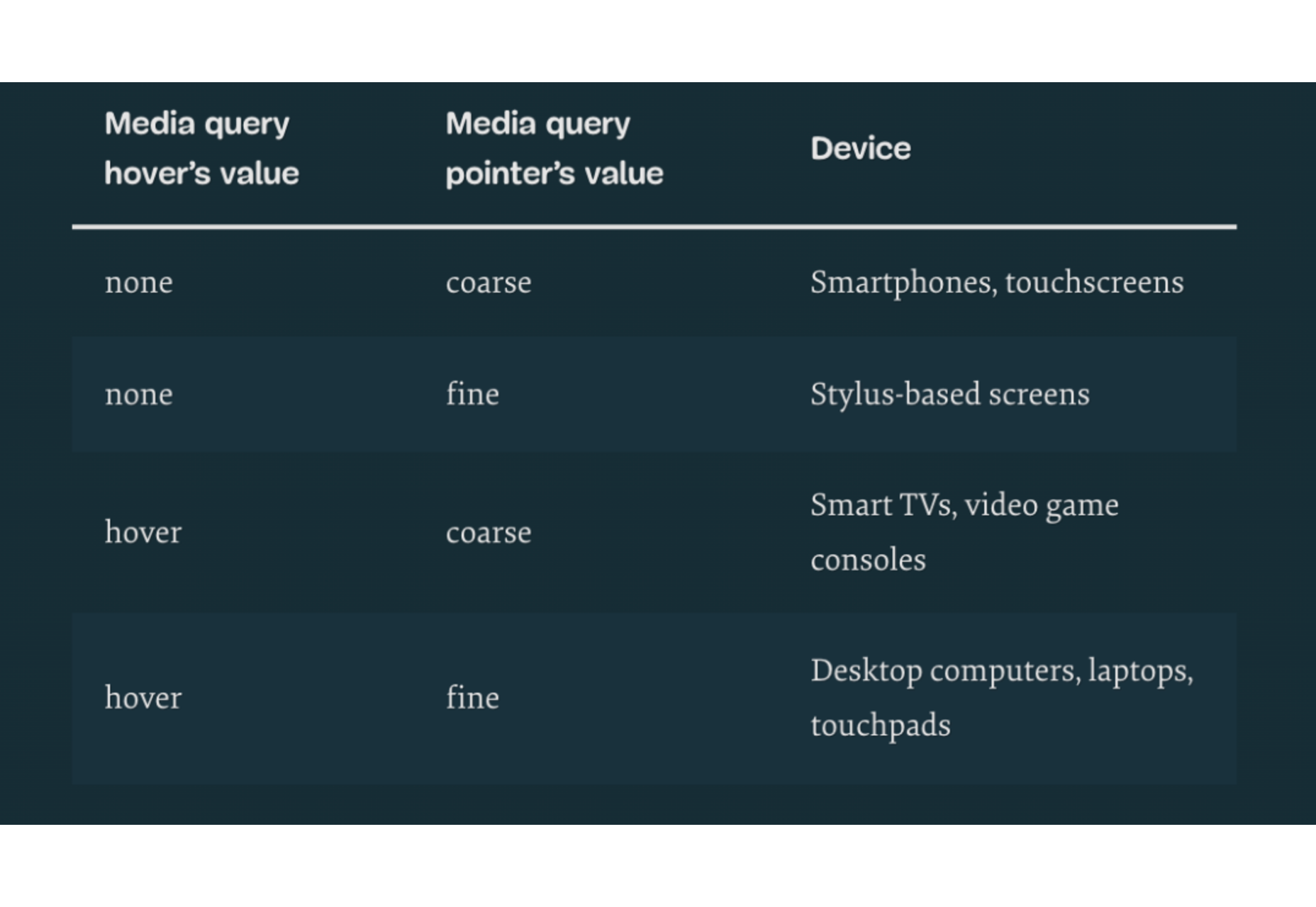
Websites haven’t always been as adaptable as they are today. For modern designers, “responsivity” is one of the most significant defining factors of a good design. After all, we’re now catering to a host of users who frequently jump between mobile and desktop devices with varying screen sizes. 

However, the shift to responsive design didn’t happen overnight. For years, we’ve been tweaking the concept of “responsive web design” to eventually reach the stage we’re at today. 

Today, we’re going to take a closer look at the history of responsive web design.

Where Did Web Design Begin?

When the first websites were initially created, no one was worried about responsivity across a range of screens. All sites were designed to fit the same templates, and developers didn’t spend a lot of time on concepts like design, layout, and typography.  

Even when the wider adoption of CSS technology began, most developers didn’t have to worry much about adapting content to different screen sizes. However, they still found a few ways to work with different monitor and browser sizes.

Liquid Layouts

The main two layout options available to developers in the early days were fixed-width, or liquid layout. 

With fixed-width layouts, the design was more likely to break if your monitor wasn’t the exact same resolution as the one the site was designed on. You can see an example here

Alternatively, liquid layouts, coined by Glenn Davis, were considered one of the first revolutionary examples of responsive web design. 

Liquid layouts could adapt to different monitor resolutions and browser sizes. However, content could also overflow, and text would frequently break on smaller screens. 

Resolution-Dependent Layouts

In 2004, a blog post by Cameron Adams introduced a new method of using JavaScript to swap out stylesheets based on a browser window size. This technique became known as “resolution-dependent layouts”. Even though they required more work from developers, resolution-dependent layouts allowed for more fine-grained control over the site’s design. 

The resolution-dependent layout basically functioned as an early version of CSS breakpoints, before they were a thing. The downside was developers had to create different stylesheets for each target resolution and ensure JavaScript worked across all browsers.

With so many browsers to consider at the time, jQuery became increasingly popular as a way to abstract the differences between browser options away.

The Rise of Mobile Subdomains

The introduction of concepts like resolution-dependent designs was happening at about the same time when many mobile devices were becoming more internet-enabled. Companies were creating browsers for their smartphones, and developers suddenly needed to account for these too.

Though mobile subdomains aimed to offer users the exact same functions they’d get from a desktop site on a smartphone, they were entirely separate applications. 

Having a mobile subdomain, though complex, did have some benefits, such as allowing developers to specifically target SEO to mobile devices, and drive more traffic to mobile site variations. However, at the same time, developers then needed to manage two variations of the same website.

Back at the time when Apple had only just introduced its first iPad, countless web designers were still reliant on this old-fashioned and clunky strategy for enabling access to a website on every device. In the late 2000s, developers were often reliant on a number of tricks to make mobile sites more accessible. For instance, even simple layouts used the max-width: 100% trick for flexible images.

Fortunately, everything began to change when Ethan Marcotte coined the term “Responsive Web Design” on A List Apart. This article drew attention to John Allsopp’s exploration of web design architectural principles, and paved the way for all-in-one websites, capable of performing just as well on any device. 

A New Age of Responsive Web Design

Marcotte’s article introduced three crucial components developers would need to consider when creating a responsive website: fluid grids, media queries, and flexible images. 

Fluid Grids

The concept of fluid grids introduced the idea that websites should be able to adopt a variety of flexible columns that grow or shrink depending on the current size of the screen. 

On mobile devices, this meant introducing one or two flexible content columns, while desktop devices could usually show more columns (due to greater space). 

Flexible Images

Flexible images introduced the idea that, like content, images should be able to grow or shrink alongside the fluid grid they’re located in. As mentioned above, previously, developers used something called the “max-width” trick to enable this. 

If you were holding an image in a container, then it could easily overflow, particularly if the container was responsive. However, if you set the “max-width” to 100%, the image just resizes with its parent container. 

Media Queries

The idea of “media queries” referred to the CSS media queries, introduced in 2010 but not widely adopted until officially released as a W3 recommendation 2 years later. Media queries are essentially CSS rules triggered based on options like media type (print, screen, etc), and media features (height, width, etc). 

Though they were simpler at the time, these queries allowed developers to essentially implement a simple kind of breakpoint – the kind of tools used in responsive design today.  Breakpoints refer to when websites change their layout or style based on the browser window or device width.

Viewport Meta tags need to be used in most cases to ensure media queries work in the way today’s developers expect. 

The Rise of Mobile-First Design

Since Marcotte’s introduction of Responsive Web Design, developers have been working on new ways to implement the idea as effectively as possible. Most developers now split into two categories, based on whether they consider the needs of the desktop device user first, or the needs of the mobile device user. The trend is increasingly accelerating towards the latter. 

When designing a website from scratch in an age of mobile-first browsing, most developers believe that mobile-first is the best option. Mobile designs are often much simpler, and more minimalist, which matches a lot of the trends of current web design.

Taking the mobile first route means assessing the needs of the website from a mobile perspective first. You’d write your styles normally, using breakpoints once you start creating desktop and tablet layouts. Alternatively, if you took the desktop-first approach, you would need to constantly adapt it to smaller devices with your breakpoint choices.

Exploring the Future of Responsive Web Design

Responsive web design still isn’t perfect. There are countless sites out there that still fail to deliver the same incredible experience across all devices. What’s more, new challenges continue to emerge all the time, like figuring out how to design for new devices like AR headsets and smartwatches. 

However, it’s fair to say we’ve come a long way since the early days of web design. 


Featured image via Pexels.

Source

The post A Brief History of Responsive Web Design first appeared on Webdesigner Depot.

Source de l’article sur Webdesignerdepot

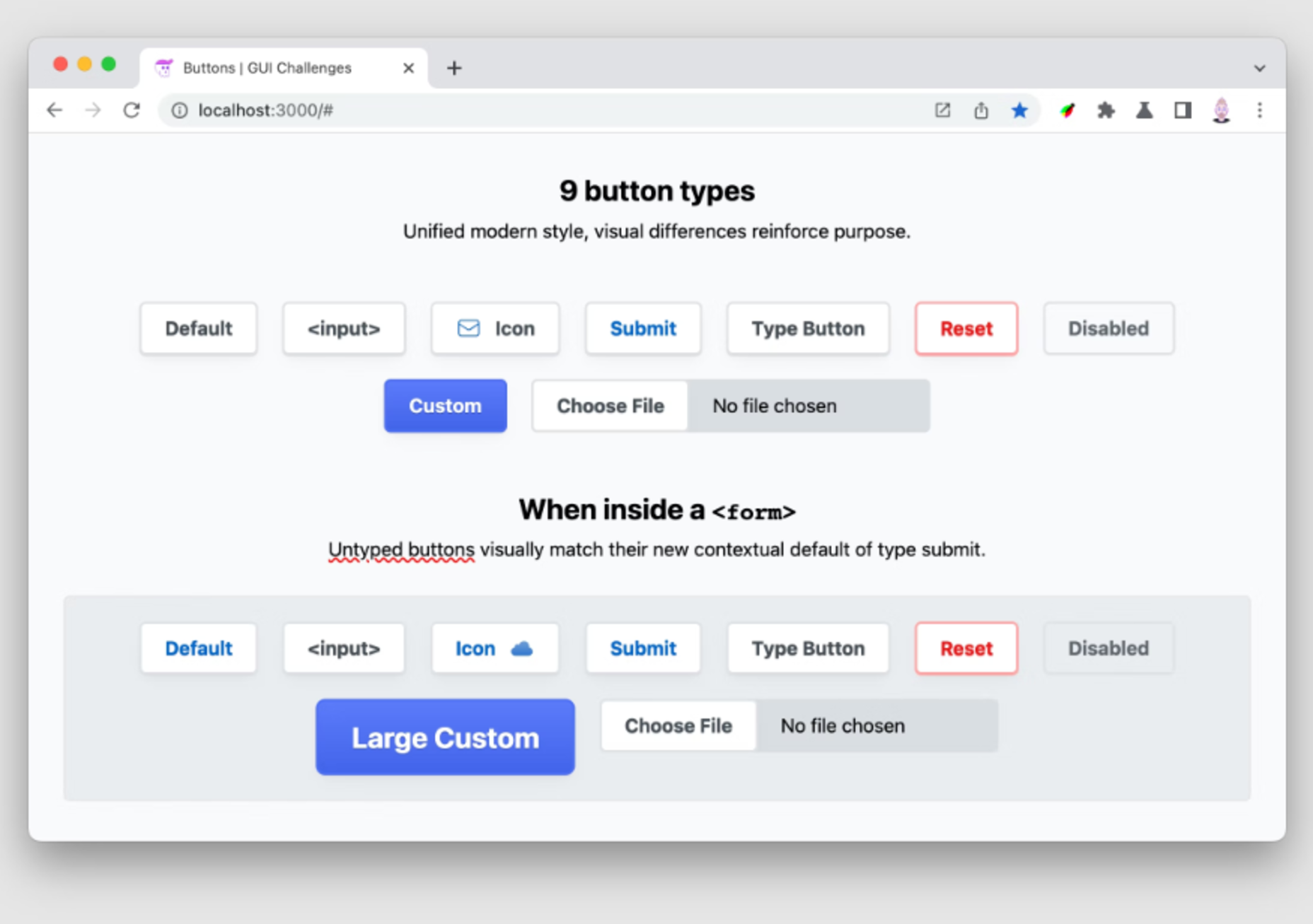
Every day design fans submit incredible industry stories to our sister-site, Webdesigner News. Our colleagues sift through it, selecting the very best stories from the design, UX, tech, and development worlds and posting them live on the site.
The best way to keep up with the most important stories for web professionals is to subscribe to Webdesigner News or check out the site regularly. However, in case you missed a day this week, here’s a handy compilation of the top curated stories from the last seven days. Enjoy!”

What’s New in WordPress 6?

From PHP to Next.js: What Trivago Learned

4 CSS Progress Bars You Can Use on your Website

Lesser-Known and Underused CSS Features in 2022

Responsive Forms with CSS Flexbox

20 Best New Sites, June 2022

Building a Button Component

15 Web Design Principles for a Customer-Friendly Website

How I Created a Minimal Linktree Page in Just 2 Hours

Pixelarticons

Source

The post Popular Design News of the Week: May 23, 2022 – May 29, 2022 first appeared on Webdesigner Depot.

Source de l’article sur Webdesignerdepot