Articles

Starting your own business is a process with a fair share of challenges. Even in the web design world, where you can potentially minimize costs by working from home and collaborating with freelance contractors, many expenses exist. 

To run a successful web design business, you need enough money to invest in everything from skilled colleagues to resources (like fonts and themes), software subscriptions, and technology tools. Finding a way to fund your company can be the most complicated part of ensuring its success.

For most new companies, the easiest option to generate opportunities is “bootstrapping.” Learning how to bootstrap a web design business means knowing how to bring your business to life with virtually no starting capital. 

Here’s how to get started.

What is Bootstrapping? 

Successful bootstrappers take an idea, such as creating a web design company and create a fantastic company without the backing of investors. It takes significant dedication, commitment, and single-mindedness to accomplish your goals, but some of the world’s greatest entrepreneurs, like Steve Jobs and Sam Walton, got their start this way. 

The term “bootstrapping” comes from the phrase “to pull yourself up by the bootstraps,” which indicates overcoming challenges on your own without any external support. 

The pros and cons of bootstrapping include:

Pros:

  • Full control: Bootstrapping allows entrepreneurs to retain full ownership over their business. Alternatively, engaging with investors means allowing other professionals to own a portion of your company or make a share of the decisions. 
  • Innovation: Business owners in a bootstrapping model are forced to invest in agile and innovative business models. You must develop processes to produce immediate, lasting cash flow from day one. 
  • Accomplishment: Building something from the ground up creates a powerful sense of satisfaction and accomplishment. 
  • Ownership: You won’t have to sell any equity in your business to other investors, which means you can benefit fully from the company as it grows.

Cons:

  • Risks: Self-funded businesses generally run out of funds faster and struggle to scale as quickly as other companies, limiting the brand’s ability to reach its potential.
  • Limited support: Traditional financing methods (like working with investors) also provide networking opportunities and support from specialists who want to see your company succeed. 
  • Pressure: Bootstrapping businesses need to be meticulous about everything from keeping books to making the right decisions for brand growth. 
  • Hard work: With limited resources, connections, and options, bootstrapping entrepreneurs need to work harder than most and take on more roles.

How to Bootstrap Your Web Design Business: Step by Step

Bootstrapping a web design business can be complicated, but it works for many companies if you follow the right strategy. The good news is web design companies generally don’t require as much initial capital as some other types of companies, like standard retail brands or companies with a need for brick and mortar offices.

However, there are still steps you’ll need to follow to ensure success.

Step 1: Source Some Initial Funds

While you might not work with investors when bootstrapping your web design business, you’ll still need some essential initial funds. To run a web design business, you won’t necessarily need a massive initial investment, but you will need something. 

To determine how much capital you need to raise from your income, savings, a line of credit, or other common bootstrapping sources, think about:

  • Where you’re going to work: The upfront costs of operating your own web design business will be a lot lower if you choose to work from home and with remote specialists. The less you have to pay for office space, the better.
  • Business fees: You may need to pay fees for registering your business name, hosting your own website for advertising, and dealing with any registration costs.
  • Equipment and software: Think about what you will use daily for web design. Subscription-based services like Adobe Creative Cloud can cost quite a bit to access. You’ll also need a good computer, and perhaps a tablet for sketching.

Step 2: Find a USP 

The easiest way to ensure a bootstrapped web design business is a success is to ensure you are offering specific clients something they genuinely need. In a service-based landscape like web design, you need to know what your customers want and offer something they can’t get elsewhere.

For instance, can you differentiate yourself from other web design companies by helping with modern trends like 360-degree video and XR-ready design? Can you build apps for companies from scratch and provide ongoing maintenance for the websites you make?

An excellent way to find your USP is to examine your competitors. Find out what other companies in your area are offering their customers, and listen to consumers in your industry when they talk about what they need from a website designer. 

Step 3: Choose a Cash Flow Optimized Model 

Since you’re relying only on your cash and the money you make from your web design business to fuel its growth, choosing a model optimized for consistent cash flow is essential. Bootstrapping a business often means you place most of the profit you gain from your company back into the development of the brand. 

With this in mind, consider how you’ll offer services and charge your customers. Are you going to ask for a portion of the fees up-front before starting a web design project? Can you provide your customers with subscription models to improve your revenue consistently?

For instance, you could provide help with ongoing maintenance, development, and support rather than just offering to build websites for companies. Another way to make additional income is with professional services, like consulting. 

Make sure there’s a market for the services you’ll offer before launching your business by examining the surrounding environments and services your competitors provide.

Step 4: Keep Costs Low and Profits High

Keeping costs low will be essential to ensuring your success when bootstrapping a business. Fortunately for web designers, it’s relatively easy to cut down on fees. For instance, WordPress is free to use for your development projects, making it an excellent choice for many web design strategies. 

You can also look into common free and cheap alternatives to web design tools online, like GIMP. Shop around for the things you will be paying ongoing fees with. For instance, it’s best to check out multiple vendors when looking for web hosting and marketing support. 

While keeping your costs low, it’s also essential to accelerate profits as much as possible. You can look for ways to boost customer retention by building stronger relationships with your clients and offering them deals on long-term subscriptions. 

If you have time outside of your web design business, you can also try taking on some side hustles. Options include:

  • Selling web design assets on sites like ThemeForest
  • Offering your services on a freelance basis with sites like Dribbble and Toptal
  • Designing and selling NFTs for the metaverse
  • Teaching web design or selling webinars

Step 5: Grow Cautiously

Finally, while the goal of successfully bootstrapping your web design business will be to grow as rapidly and consistently as possible, it’s important to be cautious. For instance, you’ll need to be able to afford the fees of every new designer you bring onto your team, so consider looking for freelancers and contractors rather than permanent hires.

Use organic channels for marketing your services, like blogging and content marketing which can help improve your SEO standing and attract attention among clients. Plus, encourage your customers to recommend your services to other brands. 

As new clients approach your business, ensure you only take on as many customers as you can reasonably handle. Compromising on quality will damage your relationships with customers and harm your reputation. 

Good Luck Bootstrapping Your Business

When you’re bootstrapping a business, you get the benefit of being able to eliminate any outside influences from your growth. You’re free to focus on building relationships with companies of your choice, and you get to make decisions about your growth. However, there are downsides, too, like significant stress and limited financial opportunities.

While bootstrapping your business is tough, if you manage to complete the process successfully, the results can be fantastic. 


Featured image via Unsplash.

Source

The post How to Bootstrap a Web Design Business first appeared on Webdesigner Depot.

Source de l’article sur Webdesignerdepot

Whether you’re new to the job or are an experienced designer, the anxiety of a new project can sometimes – often unexpectedly – cause us to freeze in our tracks. This creative paralysis sees us staring at a blank page, unable to come up with ideas, and the knowledge that time is slowly ticking away.

We’ve all been there. So we thought it would be helpful to share our tips and tricks for overcoming the tyranny of the blank page and help you get back to doing great work.

The first thing to know is that you are not alone; blank page syndrome has a basis in science, with a clearly identifiable set of symptoms that consistently occur together. 

The first thing to know is that you are not alone; blank page syndrome has a basis in science

It starts when you become stressed. Stress causes your brain to produce hormones that slow down neural functions, which only serves to increase the feelings of inadequacy over a lack of creative spark – and fuel anxiety. Understandably, this causes a spiral as your mind seems to get emptier and the blank page more threatening.

But don’t fear! Because there are ways to move past blank page paralysis and get back to productivity. 

Just Relax

Once you’re in a negative spiral, it’s notoriously difficult to get out of. The best solution is to avoid the spiral entirely – by starting in the right frame of mind. This means setting up a calm work environment before you even sit down. 

Do your best to avoid major distractions – such as young children who need your attention or colleagues who like to play music that vexes your soul. We’re not saying that you need a sound-proofed home office – the kitchen table might be fine – but schedule your work time for when the kids are at school or with a minder, or work from home if the office is likely to be noisy. A pair of noise-canceling headphones can be handy, too.

Avoid Distractions

Seemingly small things can also get in the way of your work. Chat and email notifications are the digital equivalents of a person calling your name from across a room. Try to avoid or silence anything that stops you getting into the creative mindset, even if you just mute things for a few hours. It’ll help you mentally separate your creative workspace from everything else.

all of those notifications will still be there when you resurface

Ultimately, you need to create a mood that you subconsciously associate with being productive. But even when the space around you is perfect, it can still take a while to get into the zone. Brains don’t just flip into creativity at the flick of a switch, so be kind to yourself. And remember – all of those notifications will still be there when you resurface later in the day. 

Do a Warm-Up

Studies have shown that a blank page is particularly stressful because it makes the task in front of you feel bigger than it really is. Gazing at an empty page is like seeing the whole project stretching out before you. The stress comes from the feeling of having to fill the whole journey, all the way from A to Z.

So don’t start with A! Instead, begin with a warm-up. Just as dancers always start with a series of exercises to warm up their muscles, creative designers can benefit from something similar. You could start by talking things through with colleagues or sketch some ideas using pen and paper, before opening your design app. 

Alternatively, you could start by planning your content hierarchy. You don’t need all the final words – but it can be helpful to work out how many headings you’re going to have, where images will sit, and whether your copy will be in paragraphs or lists. 

By doing this, you’ll have elements to place and a rough idea of their relative importance. It’s easy to get overawed by the importance of actual content – so start by getting a grip on the type, density, and length of content. 

Take Inspiration

The world around us is filled with inspiration and according to an icon designer Yannick Lung:

It helps to observe things in the real world and play around with them.

It can also help to borrow an idea. Obviously, we never condone copying someone’s work, but using existing work as a reference or jumping-off-point can help. Think of it as putting your own twist on an existing idea.

“I sometimes find it useful to reverse engineer a good example of the sort of thing I’m trying to write (and this works for design too). I usually break down a successful example into its constituent parts and swap them out for things more relevant to the project at hand, then refine from there,” says Harvey, one of Sketch’s brand storytellers.

Let Templates Take the Strain

Instead of putting pressure on yourself to instantly start designing, begin by creating templates or wireframes. This isn’t an avoidance tactic. Spending time creating an outline template saves time in the long run – plus, doing practical work that doesn’t need lots of detail will act as a warm-up. It might even help you catch potential issues in your designs earlier. 

Be Collaborative and Welcome Early Feedback

In general, people don’t work well in isolation – so collaborating with colleagues is a great way to get design ideas flowing. At the start of a project, reach out to your colleagues to let them know what you’re going to be working on and set up a session to collaborate on ideas and ask for direct input.

Never wait until the end of a project to ask for feedback. Involving your colleagues in the process early helps counter blank page paralysis and involving stakeholders can help you manage expectations. Aim to get regular and consistent feedback rather than waiting for it – which could cause a delay in your project. 

And of course, you should always choose a design software that enables real-time collaboration so that everyone working on a project can avoid version conflicts.

Avoid Burnout

When work isn’t physical, it can be hard to judge how much it takes out of us

When work isn’t physical, it can be hard to judge how much it takes out of us. If you’re suffering from blank page paralysis, it’s probably a sign that you’re starting to get burnt out. Try setting an alarm on the other side of the room so you have to get up to turn it off regularly – or just scheduling some time into your day to take a break, stretch, or even take a walk. Stepping away from your screen is good for your brain and your body.

In the end, the most important thing to remember when it comes to blank page syndrome is that you have to be kind to yourself. Nobody can be productive 100% of the time – we’re only human, after all. What matters is that you do whatever you need to get your creativity flowing.


Featured image via Pexels.

Source

The post Overcoming Blank Page Paralysis first appeared on Webdesigner Depot.

Source de l’article sur Webdesignerdepot

Have you been feeling a little unproductive lately? Well, you are not the only one. Of course, we all want to be as productive as possible at work, but that’s not always the case.

According to recent research, we are fully productive for less than 3 hours a day. Stress and poor planning are just two of the reasons why. And this is true in all work environments. No one is exempt from this problem, from employees in central offices to freelancers or managers working from home.

That’s why we have researched and selected the eight best ways to increase your productivity at work. In our search for solutions to boost creativity, we have come across numerous promising approaches and tips that you can use. Here are the best tips you can follow to get the most out of a workday:

1. Plan your Tasks

I can safely say that there is nothing more important than efficient task planning. Planning your tasks can free you from stress and procrastination. Planning everything before the day even starts is probably the best approach.

This is also where time management comes into play. Think about it. How often have you been more productive after setting a specific time frame for a task? You need to plan for the project at hand and then map each workday.

The more you plan your projects and workdays, the more productive you will be. However, it would help if you tried not to spend hours and hours planning.

2. Minimize Distractions

So you have successfully planned your tasks. That should be enough to be productive, right? Well, unfortunately, no. Whether you work in the office or from home, numerous things can distract you daily.

Distractions are ubiquitous, from a colleague wanting to chat about last night’s game to TV at home. When you minimize such distractions, you become better at what you do.

Of course, it’s not always easy to resist temptation. But if you do, you’ll spend more hours focused and engaged in your task. The same goes for leadership positions. You can ask your employees to turn off their cell phones and minimize chats.

We all feel the need to check our phones or chat with our colleagues. This is precisely why the next tip is crucial to your productivity.

3. Take Regular Breaks

According to psychologists, taking regular breaks at work will help you minimize stress and thus improve your performance. Whether you work from home or at headquarters, relaxing and social breaks are necessary. But that’s not all.

As we mentioned earlier, regular breaks are a smart way to avoid distractions. If you know your next break is coming up, you will not need to chat or look at your phone.

This will help you maintain a high level of concentration. On the other hand, if you do not take regular breaks, your performance will continue to decline throughout the day.

4. Stop Multitasking

Once you have scheduled your tasks and breaks, it’s time to think about the actual work process. Contrary to what many believe, multitasking does not make you more productive.

Conversely, multitasking can decrease your performance, drain your energy faster, or even damage your brain. This is another reason why planning is so important. You should always try to engage your brain with one task at a time.

5. Optimize Workplace Conditions

This is one of the most efficient but often underestimated ways to increase productivity. Ensuring that the working temperature is between 20-24 degrees C (68 and 76 degrees F) will help you stay concentrated for more extended periods.

This will also save you a lot of time, whether at home or in the office. On the other hand, if you feel cold or hot, you will be distracted. Therefore, you should think about the working temperature before you start working.

6. Enough Sleep is Key

It’s not news that sleep deprivation can affect our performance. And that’s not just it. Lack of sleep leads to a massive decrease in:

  • Ability to concentrate
  • Working memory
  • Mathematical capacity
  • Logical reasoning

So sleep is crucial to our overall well-being. According to the National Sleep Foundation, you should try to get between 7 and 8 hours of sleep a night (for adults between 18 and 65).

It becomes evident that getting enough sleep is one of the best ways to increase your productivity at work.

7. Communication is Crucial

Communication is essential, especially for those of you who work from home. You should always have a conversation with the people you live with during your breaks. This can also help you avoid distractions during your work hours.

Try to make everyone around you (including yourself) understand what closed, and open doors mean. This will help you increase your productivity while communicating sufficiently with your loved ones.

The same goes for people who work in offices. You should always try to engage with your colleagues during breaks. Remember that feeling part of a group and sharing your experiences is the key to increasing your productivity.

8. Avoid Social Media

Our last tip is one of the hardest to follow, especially working from home. You may think that this is not a problem for you. Recent studies show that we spend an average of 145 minutes on social media every day. Of course, it’s not a bad idea to cut down on that time.

But, even if you do not, you should try to keep any engagement with social media outside of your work hours. This will help you focus on your tasks and get you one step closer to your goals.

Wrap Up

Keep in mind that we all get stuck at times when working on a project. The more you worry about it, the more stressed you will be. It’s essential to take care of yourself and your mental health. In any case, we hope you will find it easier to increase your productivity now that you have read our tips. All you have to do is follow them.

Featured image via Pexels.

Source

The post 8 Proven Ways to Turbo-Charge Your Productivity first appeared on Webdesigner Depot.

Source de l’article sur Webdesignerdepot


As we cross 2020, most of us are still functioning remotely and preparing for a hybrid work environment where we will be expected to work from homeHow can an organization determine productivity? What can we expect from remote working in 2021? How can leaders motivate their employees who are low on motivation? Read this article as I dissect the remote working environment of 2021.

In 2020, this digital revolution was accelerated due to the pandemic outbreak, when most of the global workforce was forced to work remotely from the safe boundaries of their homes. We can witness the change in the work environment when we look at the introduction of various collaboration software, which helps employees connect virtually over a meeting and streamline their processes, to cloud-based connectivity, and a data-centric approach to strategic decision-making powered by the synergy between artificial and human intelligence. These have helped organizations reimagine the way to work.

Source de l’article sur DZONE

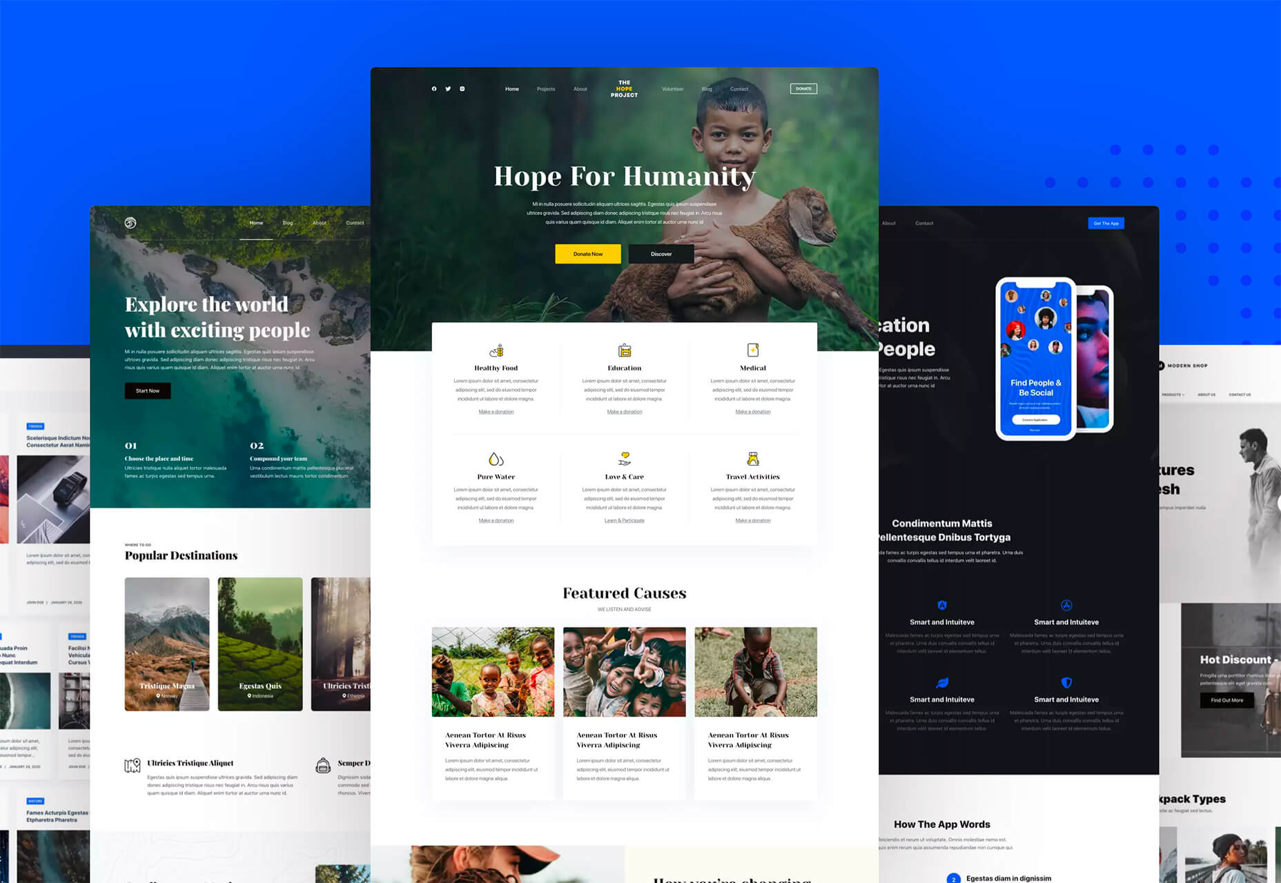
Looking to give your homepage a well-needed design update in late 2021 or 2022? Not a bad idea; first impressions are crucial when it comes to business websites. But, fixing your homepage and website design is no easy feat.

Web design trends are evolving faster. Blame the ever-decreasing user’s attention span. The average visitor now spends just 0.5 seconds scanning your homepage to form an opinion about your brand and decide whether to click through or bounce.

Increased user expectations and uncertainty in the user’s response, which is highly impacted by the site’s first impression, are other reasons to consider. This is why the designs which were trending in 2019 are no longer viable in 2021 or 2022.

We have curated the ten best examples of homepage designs to inspire your business in 2022, including a rundown of the best strategies and tips.

Let’s start by highlighting why homepage optimization is necessary for 2022:

Why Your Homepage Will Be So Important in 2022

Your website — especially your homepage — is your brand’s first chance to attract, build trust with, and connect with visitors.

According to recent statistics on why website design is important:

  1. 38% of visitors will stop interacting with a website if they think the layout isn’t visually appealing or intuitive. This creates a higher bounce rate and fewer conversions.
  2. 94% of a visitor’s first impression is based on website design (including colors, fonts, layout, navigation menus, etc.).
  3. 46% of people base a business’s credibility on the aesthetics of its website. Brands with less-than-stellar homepage designs are seen as less trustworthy than companies investing in the visitor experience.

Think of it the same way as walking into a brick-and-mortar store. Visitors are more enticed by a carefully curated ambiance of neatly stocked shelves and welcoming employees than a store that’s dark, messy, or seemingly unfriendly.

Using this logic, your homepage’s above-the-fold section is where you’ll greet visitors and reel them in for more.

10 Homepage Design Comparisons (2019 vs. 2021) To Inspire Your Business Website Design in 2022

Homepage design has come a long way since 2019. In this section, you will explore how.

These homepage designs crush it above the fold. Take just a few of these tips to heart, and your website will be poised to attract leads and conversions — no matter which industry you’re in.

1. Netflix – Crafting The Perfect Call To Action That Reduces Friction With An Additional FAQs Section

Most businesses make the mistake of adding a CTA button that first persuades the user to click on it and then asks for the visitor’s email address.

Netflix also did the same in its 2019 design.

However, Netflix combined both steps in its 2021 homepage design.

The new, improved 2021 homepage design asks for the user email address right up front along with the CTA button.

Here is a good comparison of both the designs:

2019 homepage design

vs.

2021 homepage design

Key Takeaways:

  • The design encourages visitors to enter their email address right when they land on the homepage. As a result, form submission is much easier when the user has started the process. Hence, Netflix makes it easier for visitors to move along their conversion funnel nicely by reducing the friction.
  • The 2021 design also has a nice FAQ section that provides quick information about the company’s services and improves the overall user experience.
  • FAQs also help increase the organic presence of the website in the search engines because Google presents snippets from the FAQ section in the form of an answer box in the search results.

2. Spotify – Revamped Color Combinations For Improved CTA Visibility And Using The ‘Rule of Three’ For Heading Text

The older 2019 Spotify homepage design used light pink and orange colors in its home page main area. The CTA color was green, but if you look closely, the CTA lacks visibility.

The new 2021 design uses blue and green colors with a much larger font size for the main heading. The colors are attractive, and the CTA is visible clearly.

Here is the comparison of the Spotify homepage 2019 design vs. 2020 design:

2019 homepage design

Vs.

2021 homepage design

Key Takeaways:

  • Blue is the most versatile color, and green is the perfect choice for the CTA button. Spotify used universally accepted color combinations to redesign its homepage and made the CTA more visible.
  • The main heading is also made larger than it was in the 2019 design, and it follows the rule of three in writing which is effective and satisfying. It uses just three words in the main heading to allow the human brain to process information as a pattern that is more memorable.

3. Hulu – Give Priority To Your Brand Name And Hide Pricing

If you compare the Hulu 2019 vs. 2021 Hulu homepage, the brand name has been prioritized and shown as the main heading.

Moreover, the older homepage had pricing information everywhere, which has been reduced intelligently in the new design.

2019 homepage design

vs.

2021 homepage design

Key Takeaways:

  • The brand name ‘Hulu’ is displayed as the main heading of the homepage, which helps to build audience trust.
  • The older design persuaded the users to pick a paid plan even though they had a free trial option—this discouraged users from trying their service. The new 2021 design encourages users to try the platform for free. In addition, the packages have prominent CTAs that mention “try for $0”. This design move improves conversions on the website.
  • The new design makes it easier for the visitors to select a viewing plan with easy comparison of the three available plans. The best part is, customers can start all the plans for $0. It’s a win-win situation for the users, and they can quickly pick a plan to start watching Hulu.

4. Nextiva – Reduce Visual Noise And Add Pictures In Menu To Improve UX

Nextiva realized the importance of reducing visual noise in its newly designed 2021 homepage. Visual noise happens when you use too many colors to attract user attention. Different colors compete with each other resulting in diluted customer observation.

In the old 2019 homepage, Nextiva used orange, blue, and green as the primary colors, while in the 2021 revamped design, they have used blue as the main color.

Here is a comparison of the two designs:

2019 homepage design

vs.

2021 homepage design

Moreover, the older homepage didn’t have an image in the product menu, but the new 2021 homepage improves the UX further.

Below is a comparison:

2019 homepage design

vs.

2021 homepage design

Key Takeaways:

  • Nextiva used blue as their base color for the homepage design and removed orange and green colors to reduce visual complexity. This is an excellent change to keep the user’s attention focused. Notice the green colored bar at the top of the homepage in the 2019 version now replaced with blue.
  • The 2021 design has a clean look compared to the 2019 design, which looks scattered with too many different elements, including CTAs that confuse the users.
  • The product menu does an excellent job of linking intelligently to service pages such as phone systems and video meetings. The image of a smiling lady attracts users to click on Nextiva’s products to learn more about them. Improving UX is an impressive way to reduce bounce rates and increase time on site.

5. GoToMeeting – Avoid Lengthy Sign Up Form, Educate Users About Your Products, and Add Images That Depict The Current Needs of The Audience

GoToMeeting does a great job educating the users about their product by adding more content on the homepage that comprehensively explains their product features.

Moreover, they have replaced the older hero image with a new picture that portrays the changing needs of their audiences. Nowadays, there is a rise in work from home culture due to Covid-19. Hence, the photo and the heading text clearly target the needs of their users.

Here is a comparison of the 2019 vs. 2020 homepage of GoToMeeting:

2019 homepage design

vs.

2021 homepage design

Key Takeaways:

  • The 2019 homepage design had a sign-up form on the homepage, which GoToMeeting removed in the 2021 design. People hate to fill in so much information right when they land on the home page. Hence, GoToMeeting did the right thing by removing the signup form from their homepage.
  • The hero image steals the show of the 2021 redesign because the picture of a working mom with her kid playing studying in front of her is a great way to portray the current needs of the society when over 60% of the employees are working from home. Audiences can quickly relate their working environment with the hero image leading to more sign-ups.
  • The older 2019 design was confusing, and it made little effort to help the users understand the different features of the product. The new 2021 homepage design has a product features section that explains the different features of the software. When users are educated about the product, they earn the confidence to try the product.

6. Zillow – Apply Hick’s Law To Allow Visitors To Take Faster Decisions

Zillow does an impressive job of applying Hick’s Law in allowing visitors to make faster decisions. Hick’s law states that the more options you present to the users, the faster they will decide. Therefore, it is a major factor in improving website usability.

The old 2019 homepage design of Zillow offered too many options to the users, like they want to buy, rent, or sell a property. The users first select either one of the three options and then enter the zip code to start their search.

The new 2021 homepage design changed that. Now, Zillow offers users a single option. They only need to enter the zip code to get started.

By reducing the number of actions that users need to take to just one, the homepage design eases the overall decision-making process of the site visitors.

2019 homepage design

vs.

2021 homepage design

Key Takeaways:

  • The new homepage design has a simple search bar that persuades visitors to take prompt action.
  • The Hero image is placed smartly behind the search bar to depict the needs of the users accurately.
  • The homepage does have three different panels for buying, renting, or selling a home when the users scroll below. The old design is missing that. The new design removed so many options above the fold and kept just a single option for the users to encourage more users to search properties on the site.

7. Plex – Placement of Prominent Calls-to-Action On Homepage

The CTA is a key element of every website. It helps the users decide on their next action and helps to convert the visitors into leads.

Plex lacked an optimized CTA placement in its 2019 home page design. Hence, the 2021 design received an uplift to better place the CTA for increased visitor engagement.

Take a look at the home page designs of Plex from two different years. If you compare the two home pages of 2019 vs. 2021, the primary difference that will grab your attention is the CTA.

2019 homepage design

vs.

2021 homepage design

Key Takeaways:

  • The call-to-action buttons are more prominent and have actionable texts.
  • The number of CTA buttons is increased to two to encourage users to take action.
  • The additional CTA button is wisely placed at the center to get immediate attention.
  • Note that the color choice for the button is also bright and highly contrasts with the background yet matches the color theme.
  • The old heading text ‘Stream Smarter’ was confusing because it didn’t help the users understand what Plex does. Hence it is now revised to ‘Watch Free Movies and TV on Plex.’ The new text is easy to understand and has the word ‘Free’ to increase the number of visitors clicking on the CTA.

8. Dropbox – More Above The Fold Content And Change of Fonts

Dropbox has significantly worked on its main content, which is clearly visible in the comparison homepage design images of 2019 vs. 2021.

The 2021 homepage is seen fixing faded, minimalistic, and less engaging content in the older homepage.

2019 homepage design

vs.

2021 homepage design

Key Takeaways:

  • Sans serifs, with their clean readability, are included for longer bouts of the homepage.
  • Bold sans text is doing the job of drawing user attention effortlessly.
  • The color contrast of the text with the background is increased, which improves the visibility.
  • The right side image of a laptop is replaced with a screenshot of the software, which intrigues users to know more.

9. Cisco – Moving Blocks To Outsmart Competitor Websites

The homepage design of American technology company Cisco has seen a drastic change in 2021; it deserves to appear on this list. The company website smartly represents an appeal for future development through its killer homepage design.

Here is a comparison of the old 2019 homepage design vs. the new moving block design of 2021:

2019 homepage design

vs.

2021 homepage design

Key Takeaways

  • The home page contains moving blocks with news from the blog. As you hover over the image, it widens up, and a CTA button appears. The blocks represent a design of the future which the competitors might find hard to replicate.
  • Every block has a CTA, which was missing in the 2019 design. Each block represents a specific Cisco service and caters to the different needs of the visitors.
  • The new design is elegant and cleaner with lots of information.

10. Slack – Product Video On Home Page For More Conversions

Slack has made it easier for the users to understand the product well by using a video on the homepage.

The 2019 design has an image, while the 2021 design has a video that helps the visitors understand how the product works.

Here is a comparison of the 2019 design vs. 2021 design:

2019 homepage design

vs.

2021 homepage design

Key Takeaways

  • The inclusion of a product video leaves a great impression in the minds of the visitors and shows them what your product does.
  • Video helps Slack to make its value proposition clear and super fast.
  • Video has a strong correlation to conversions, and they work well as compared to hero images. Slack used a hero image on the homepage in 2019, but they replaced it with a video in 2021.

Final Thoughts on Using These Homepage Designs for Inspiration in 2021

By making it to this point in our guide, you now have plenty of inspiration to run with when upgrading your homepage. You should also have a better understanding of how powerful this tool may become for your brand.

So now it’s time to brainstorm how to use these ideas for your own 2021 homepage design. First, jot down the key points from this guide and honestly assess how your website currently compares.

Accomplish this task, and your brand might see an uptick in website traffic and conversions. It may even earn a spot in a roundup of killer website designs just like this one.

Source

The post 10 Homepage Design Comparisons to Inspire Your Business in 2022 first appeared on Webdesigner Depot.


Source de l’article sur Webdesignerdepot

For a few years now, remote software development has become quite the trend and favorite. Remote software development teams who constitute remote development are usually a team of designers, product engineers, scrum masters, developers, and product managers. All of them work individually over the project cumulatively, resulting in a product’s delivery. 

Generally, in outsourcing, the concerned remote software development company will have dedicated managers overseeing the projects. But post the outbreak of the dreaded pandemic, things are changing. Due to work from home, remote teams operate from different locations. For Business Owners, it is a tedious task to ensure the management of these teams. If you happen to be outsourcing your product development or hiring a remote team to design, develop, and deliver projects, here are a few coolest tips to help you manage them. 

Source de l’article sur DZONE

This week on the Dev Interrupted podcast, I spoke with Cate Huston, Director of Engineering at DuckDuckGo. She’s an expert in asynchronous development and shared tons of interesting ideas: 

  •  How DuckDuckGo utilizes transient and permanent spaces differently
  •  How product feedback sessions are completed asynchronously
  •  How to help new remote employees feel a sense of belonging and accomplishment. 
  •  The unique relationship between asynchronous managers and developers  

Cate is really smart and has a super-awesome sounding accent so check it out! 

Source de l’article sur DZONE

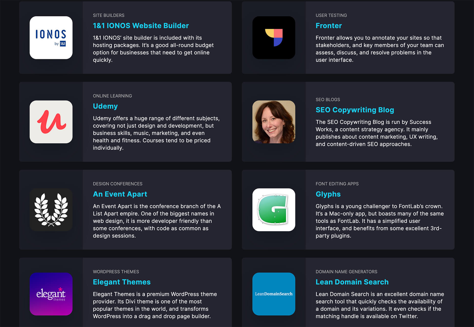
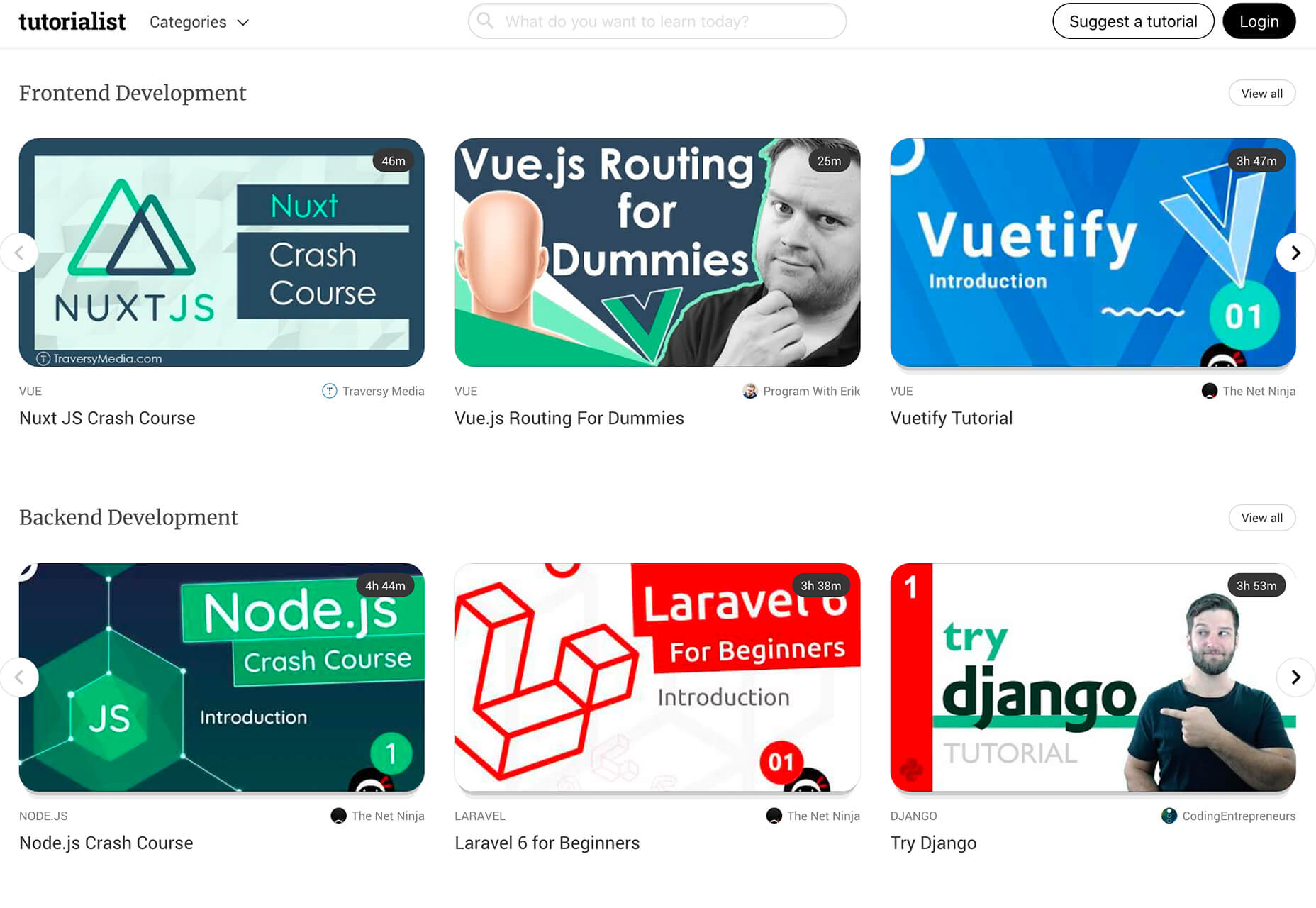
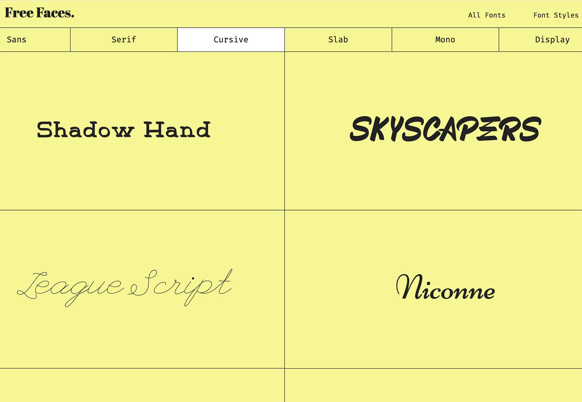
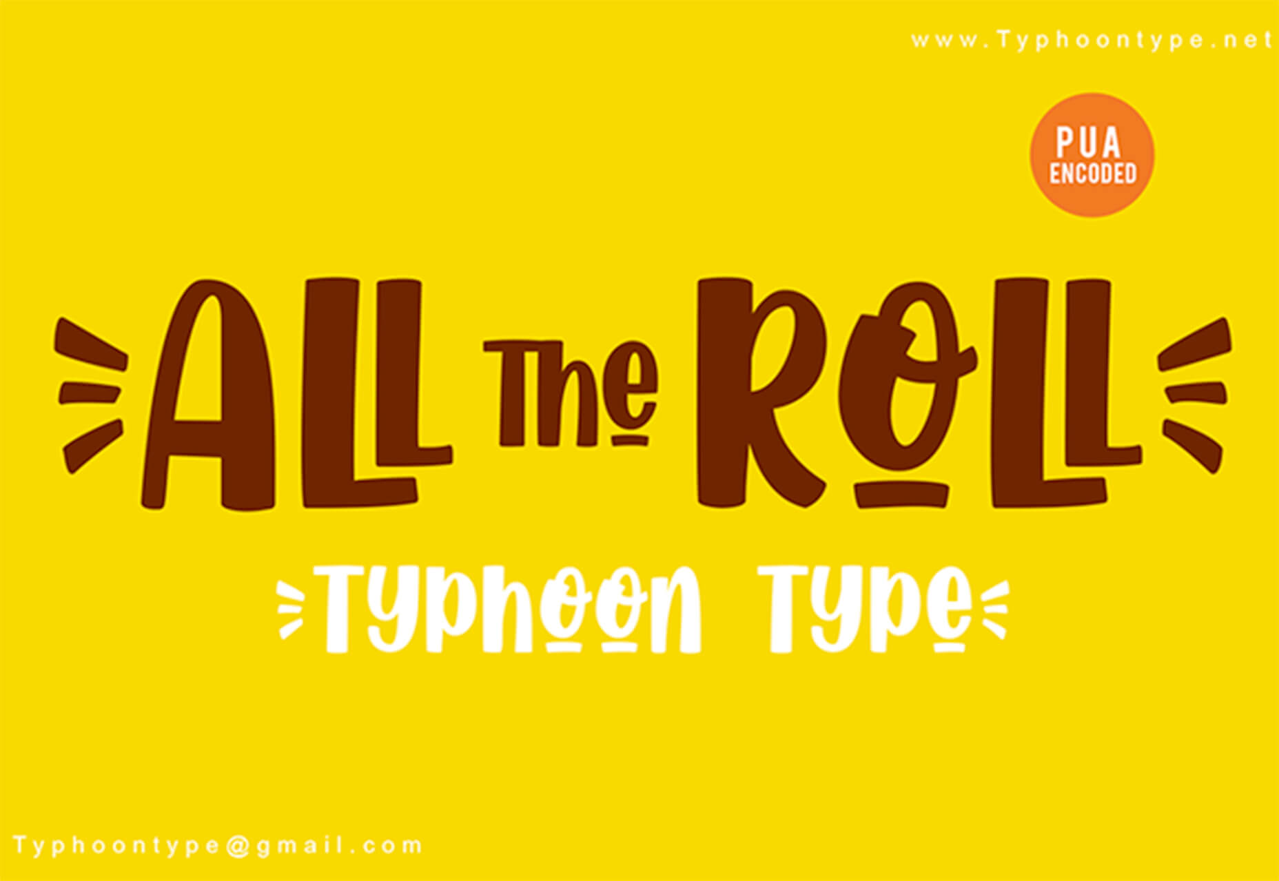
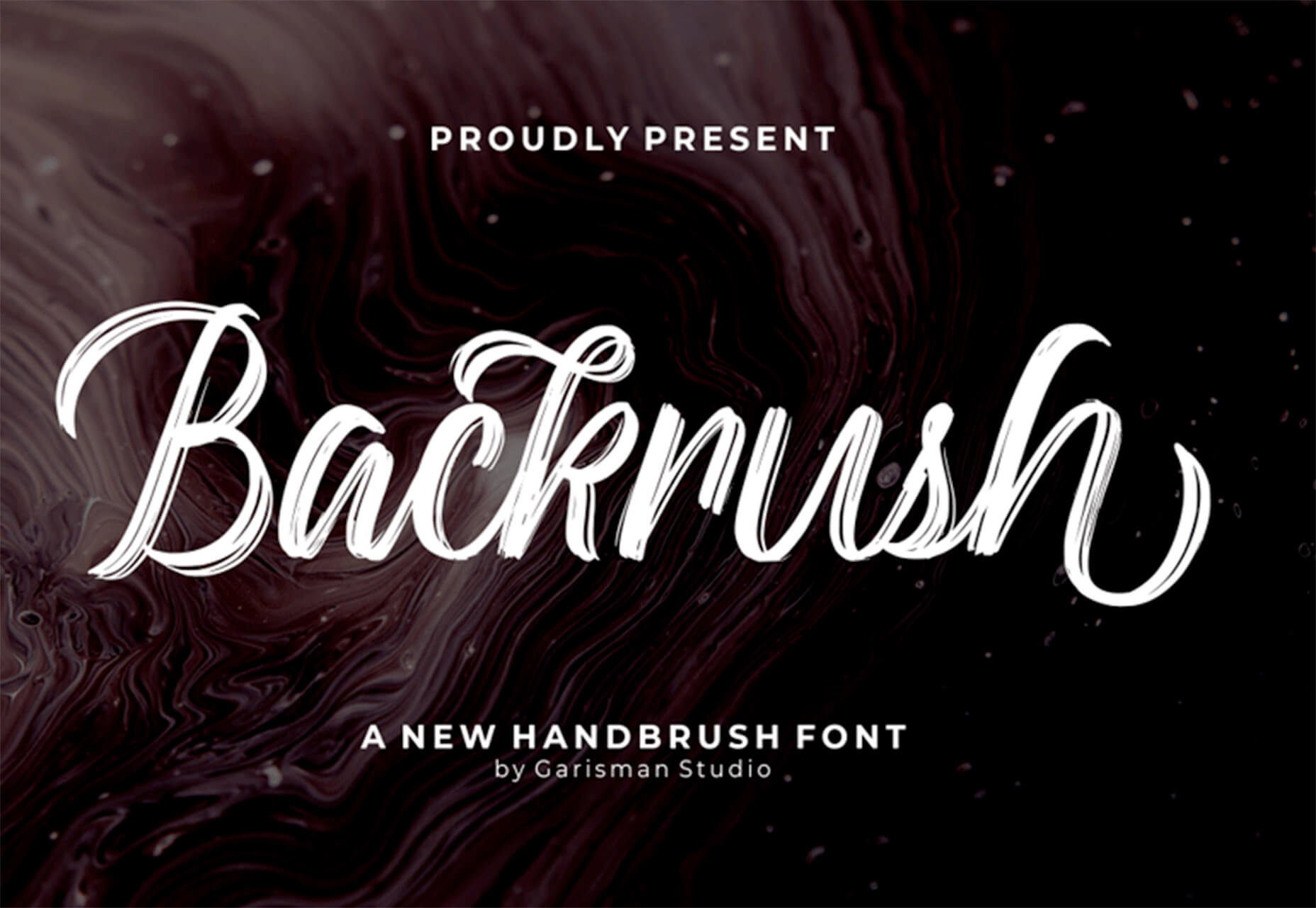
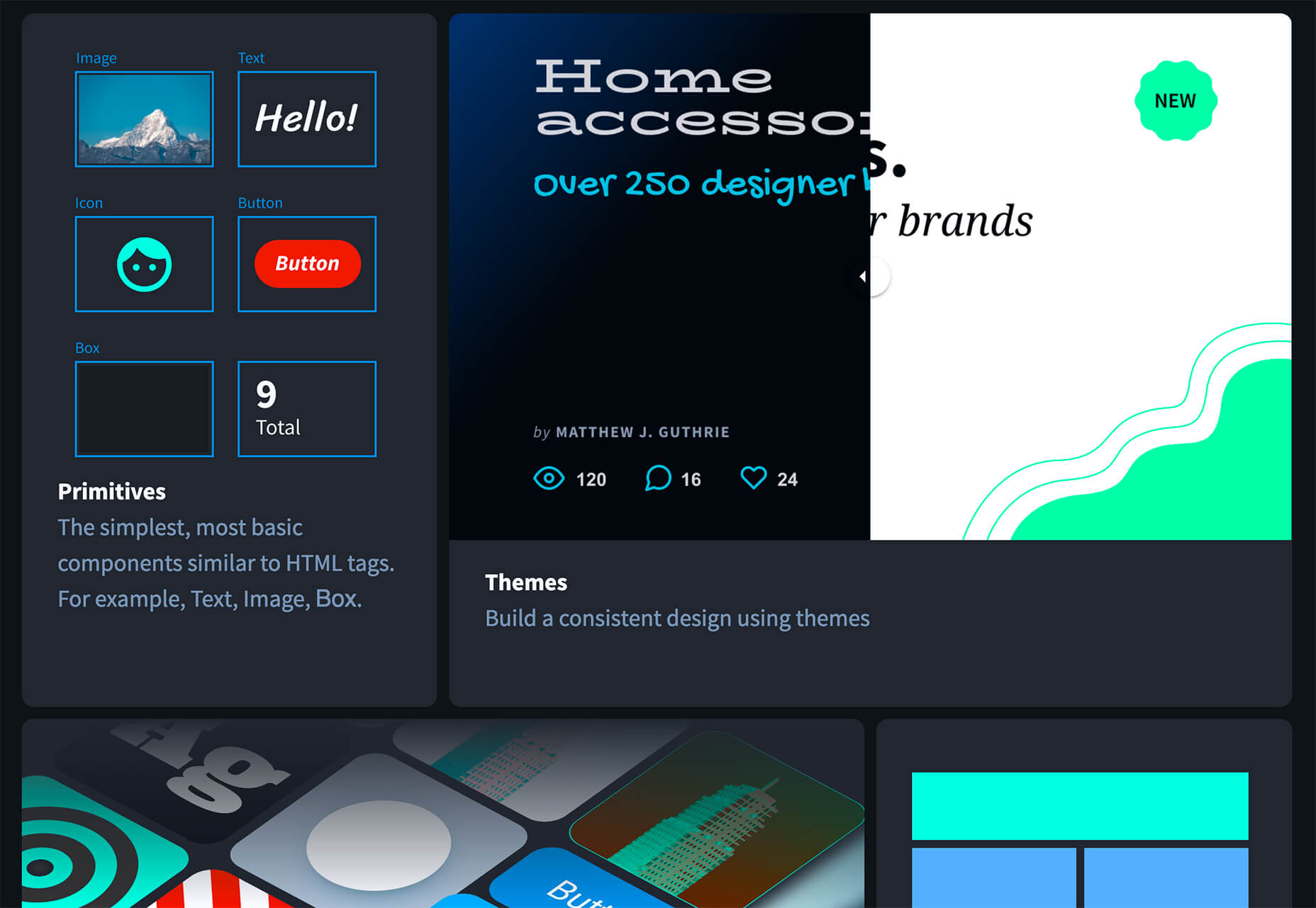
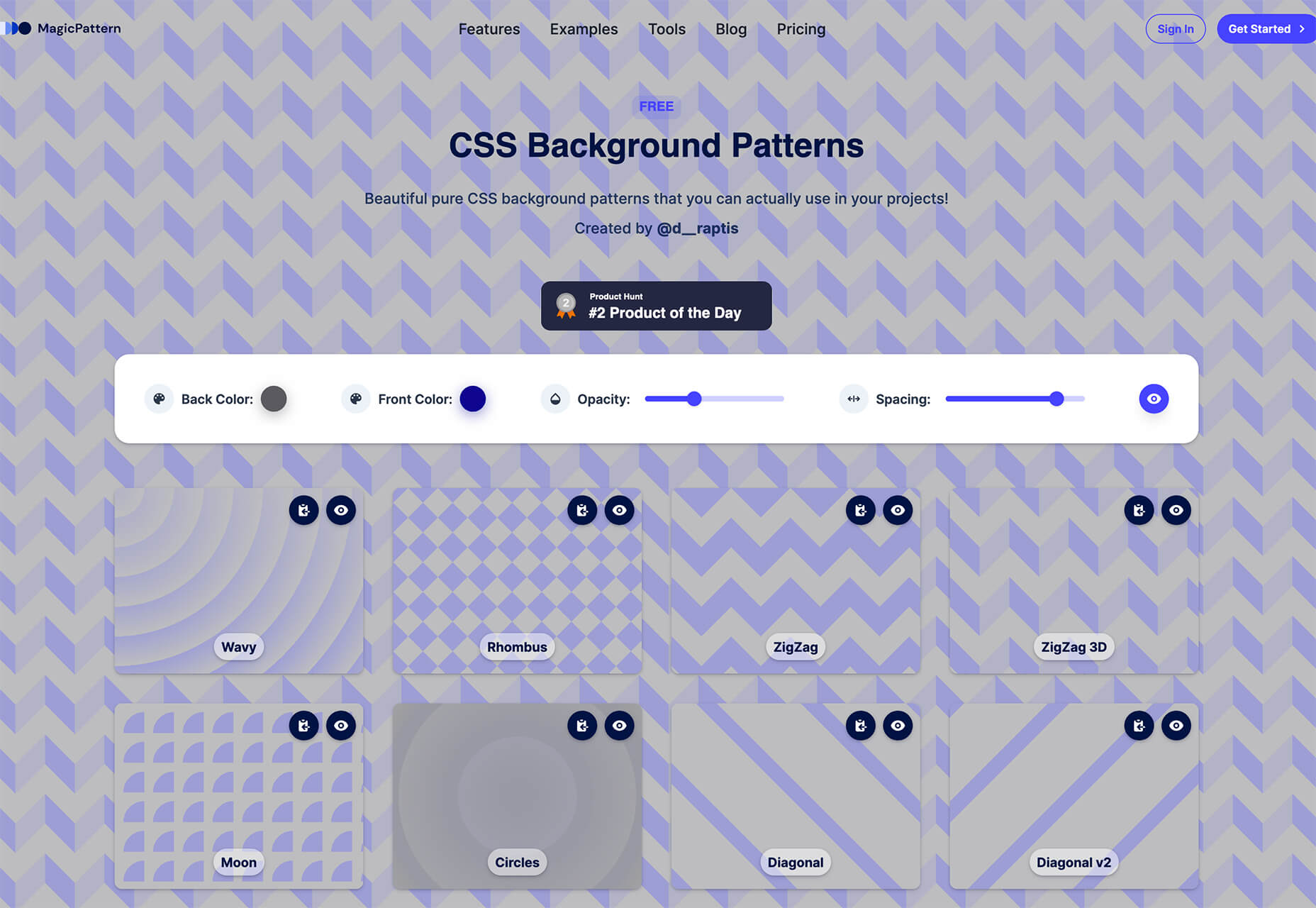
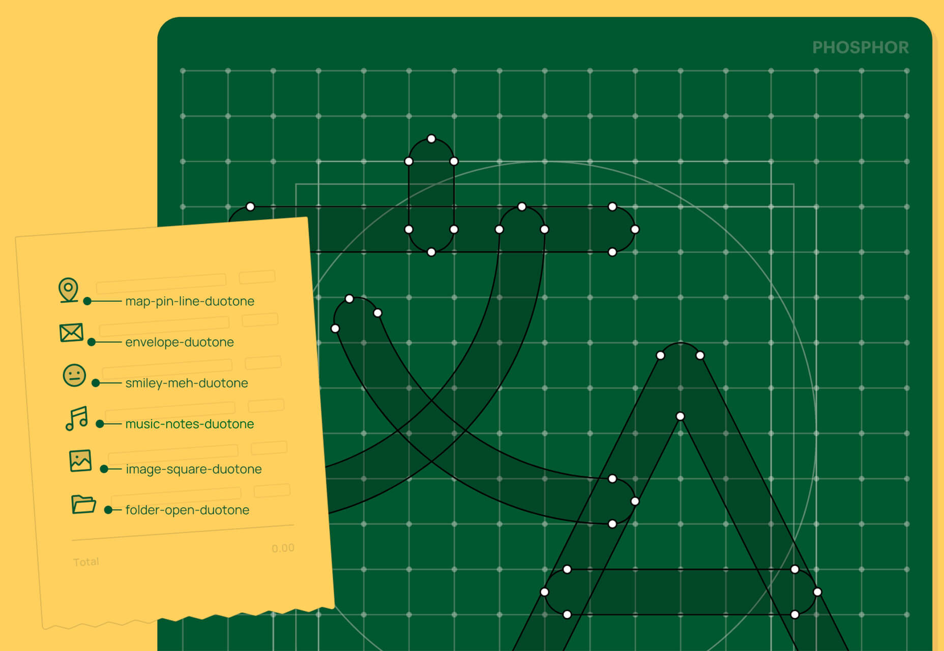
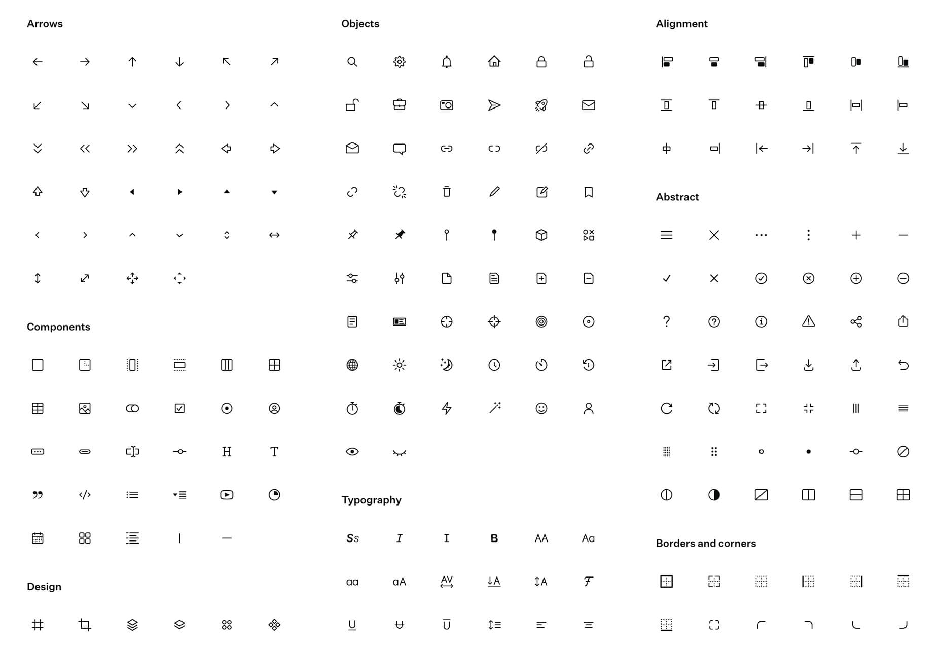
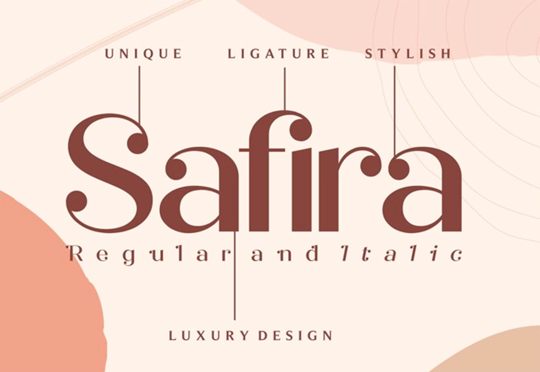
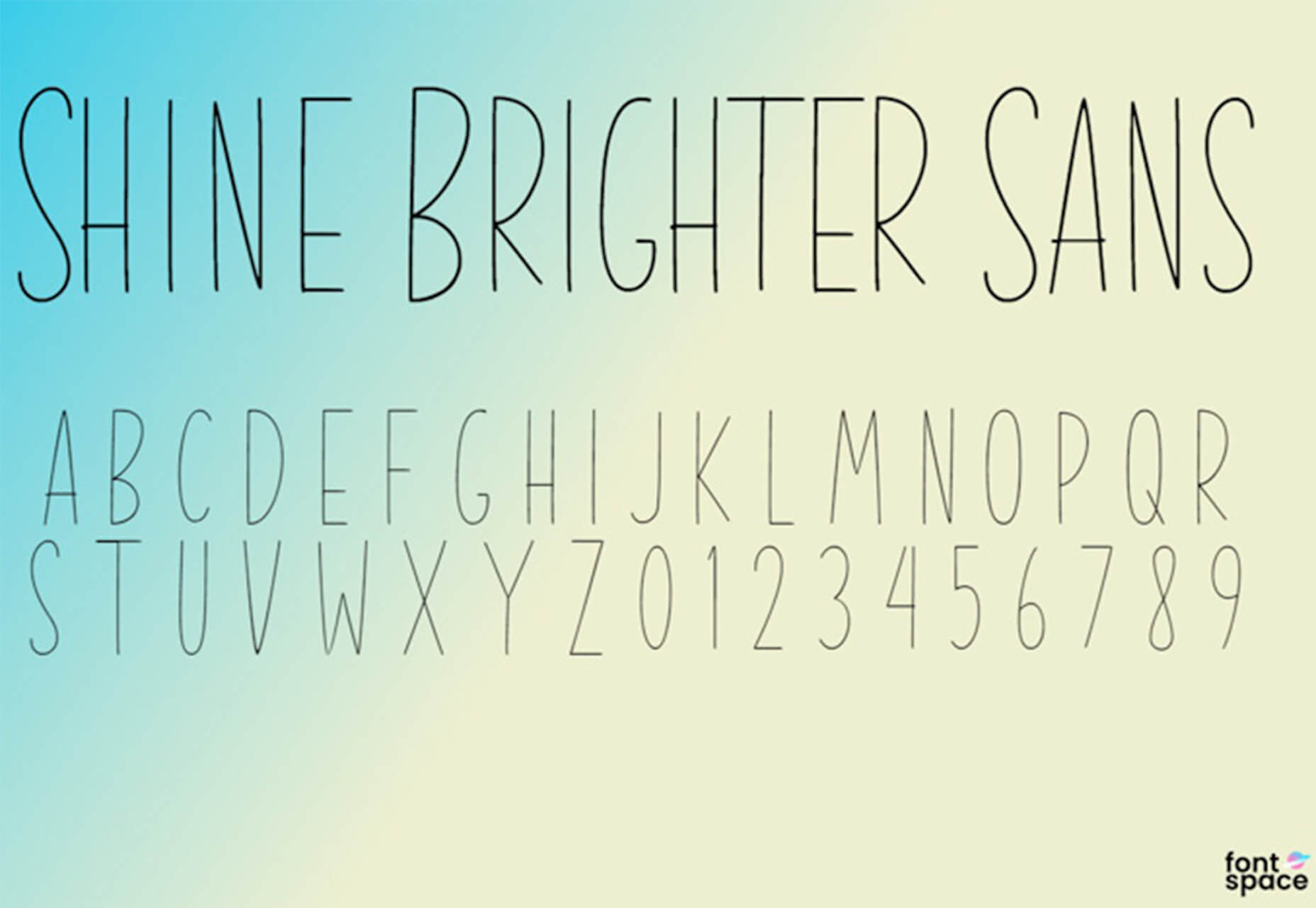
In the spirit of fall feasts, this month’s collection of tools and resources is a smorgasbord of sorts. You’ll find everything from web tools to icon libraries to animation tools to great free fonts. Let’s dig in.

Here’s what new for designers this month.

The Good Line-Height

The Good Line-Height is the tool you won’t be able to live without after using it a few times. The tool calculates the ideal line-height for every text size in a typographic scale so that everything always fits the baseline grid. Set the font size, multiplier, and grid row height to get started.

Link-to-QR

Link-to-QR makes creating quick codes a breeze. Paste in your link and the tool creates an immediate QR code that you can download or share. Pick a color and transparency, plus size, and you are done.

Quarkly

Quarkly allows you to create websites and web apps both using a mouse and typing code – you get all the pros of responsive editing, but can also open the code editor at any time and manually edit anything and it all synchronizes. The tool is built for design control and is in beta.

UnSpam.email

Unspam.email is an online spam tester tool for emails. Improve deliverability with the free email tester. The service analyzes the main aspects of an email and returns a spam score and predicts results with a heat map of your email newsletter.

Filmstrip

Filmstrip allows you to create or import keyframe animations, make adjustments, and export them for web playback. It’s a quick and easy tool for modern web animation.

CSS Background Patterns

CSS Background Patterns is packed with groovy designs that you can adjust and turn into just the right background for your web project. Set the colors, opacity, and spacing; then pick a pattern; preview it right on the screen; and then snag the CSS. You can also submit your own patterns.

Neonpad

Neonpad is a simple – but fun – plain text editor in neon colors. Switch hues for a different writing experience. Use it small or expand to full browser size.

Link Hover Animation

Link Hover Animation is a nifty twist on a hover state. The animation draws a circle around the link!

Tint and Shade Generator

Tint and Shade Generator helps you make the most of any hex color. Start with a base color palette and use it to generate complementary colors for gradients, borders, backgrounds, or shadows.

Pure CSS Product Card

Pure CSS Product Card by Adam Kuhn is a lovely example of an e-commerce design that you can learn from. The card is appealing and functional.

Free Favicon Maker

Free Favicon Maker allows you to create a simple SVG or PNG favicon in a few clicks. You can set a style that includes a letter or emoji, font and size, color, and edge type and you are ready to snag the HTML or download the SVG or PNG file.

Ultimate Free iOS Icon Pack

The Ultimate Free iOS Icon Pack is a collection of 100 minimal icons in an Apple style. With black and white version of each icon and original PSD files, you can create sleek icons for your iPhone screen in minutes. And it’s completely free! No email address or registration required.

Phosphor Icon Family

Phosphor is a flexible icon family for all the things you need icons for including diagrams and presentations. There are plenty of arrows, chats, circles, clocks, office elements, lists, business logos, and more. Everything is in a line style, filled, or with duotone color. Everything is free but donations are accepted.

3,000 Hands

3,000 Hands is a kit of hands that includes plenty of gestures and style in six skin tones and with 10 angles of every gesture. They have a 3D-ish shape and are in an easy to use PNG format. This kit has everything you need from a set of hand icons.

Radix Icons

Radix Icons is a set of 15px by 15px icons for tiny spaces. They are in a line style and are available in a variety of formats including Figma, Sketch, iconJar, SVG, npm installation, or GitHub.

Deepnote

Deepnote is a new kind of data science notebook. It is Jupyter-compatible with real-time collaboration and running in the cloud and designed for data science teams.

ZzFXM Tiny JavaScript Music Generator

ZzFXM is a tiny JavaScript function that generates stereo music tracks from patterns of note and instrument data. Instrument samples are created using a modified version of the super-tiny ZzFX sound generator by Frank Force. It is designed for size-limited productions.

Image Tiles Scroll Animation

Image Tiles Scroll Animation is a different type of scrolling pattern using Locomotive Scroll. The grid creates a smooth animation in a fun and modern style.

Bubbles

Bubbles is a Chrome extension that allows you to collaborate by clicking anywhere on your screen and then dropping a comment to start a conversation with anyone. This is a nice option for work from home teams.

Tyrus

Tyrus is a toolkit from the design team at Airbnb to help illustrators make the most out of their design businesses. It is broken into sections to help you with design briefs, originality, deadlines, and feedback.

PatchGirl

PatchGirl is an automated QA tool for developers. You can combine SQL and HTTP queries to build any possible state of your database.

Apparel

Apparel is a beautiful premium typeface family with plenty of versatility in a modern serif style. It is a contemporary, classy, and fresh serif typeface with a laid-back. Its medium-large x-height makes it ideal for headlines and brand identity design.

Christmas Story

Christmas Story is a nice solution if you are already starting to think ahead to holiday projects or cards. The long swashes and tails are elaborate and fun.

Nafta

Nafta is a fun handwriting style font that has a marker-style stroke. It’s a modern take on the popular Sharpie font. It includes all uppercase letters.

Safira

Safira is a wide and modern sans with ligatures and a stylish feel. The rounded ball terminals are especially elegant.

Shine Brighter Sans

Shine Brighter Sans is a super-thin sans-serif with a light attitude. The limited character set combined with its light weight is best for display use.

Source


Source de l’article sur Webdesignerdepot

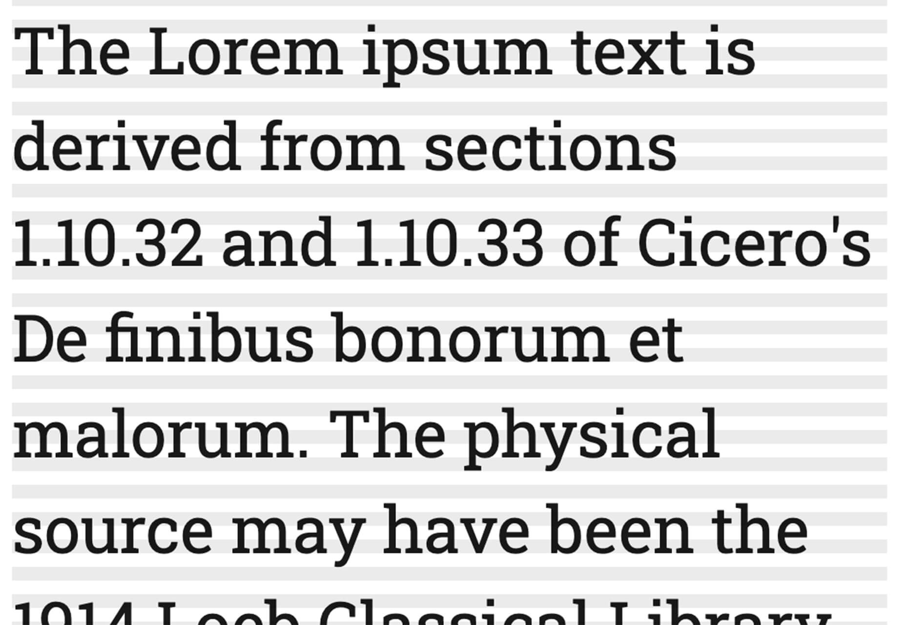
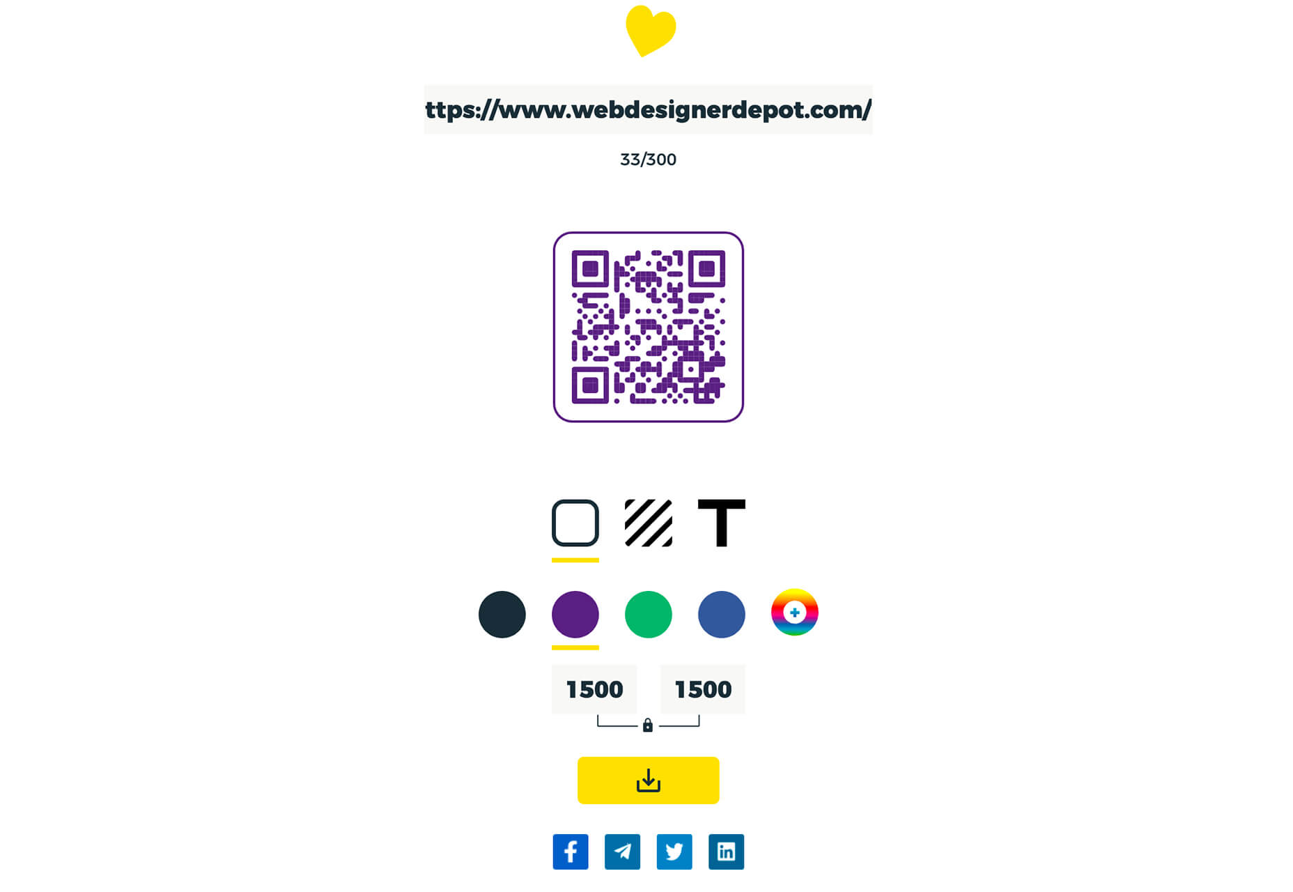
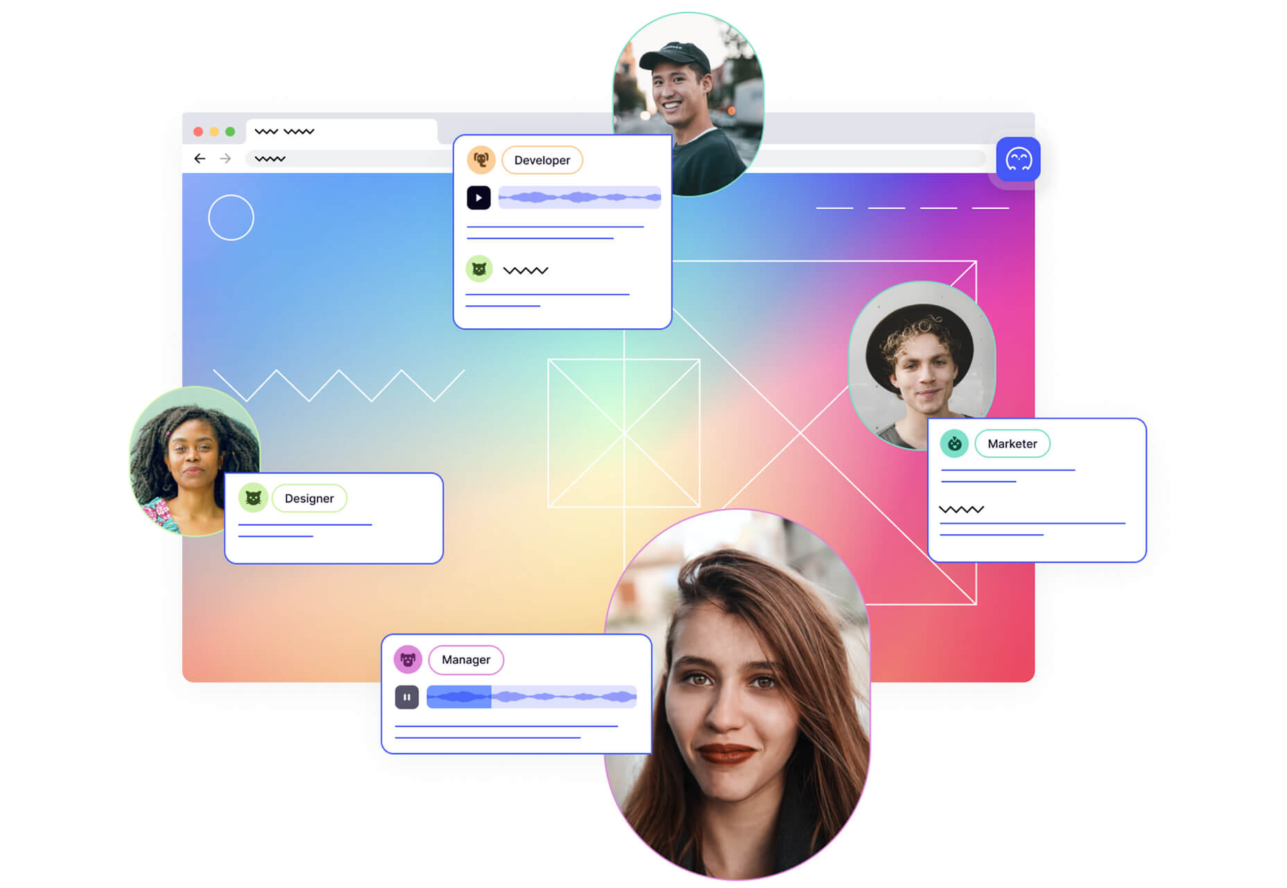
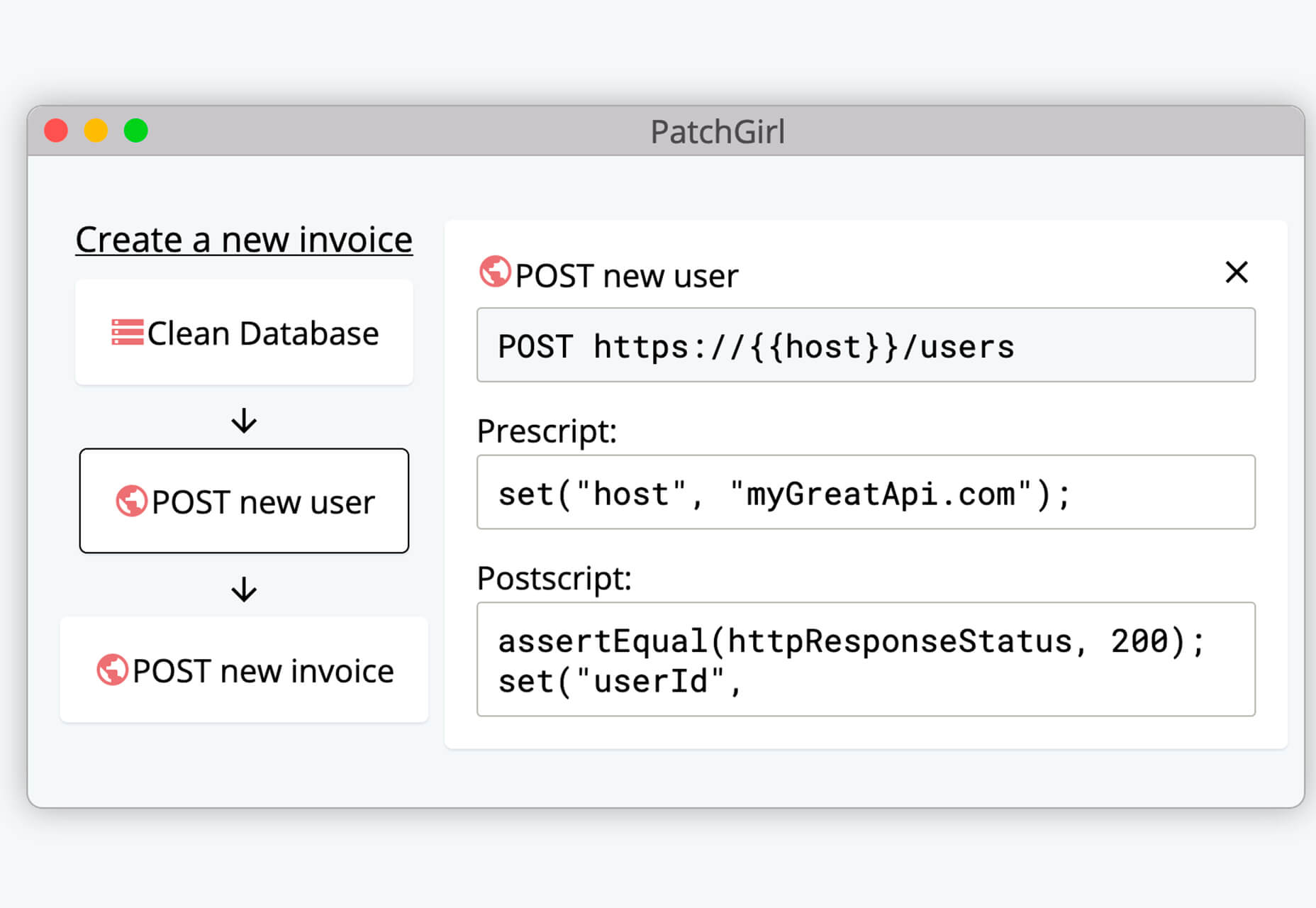
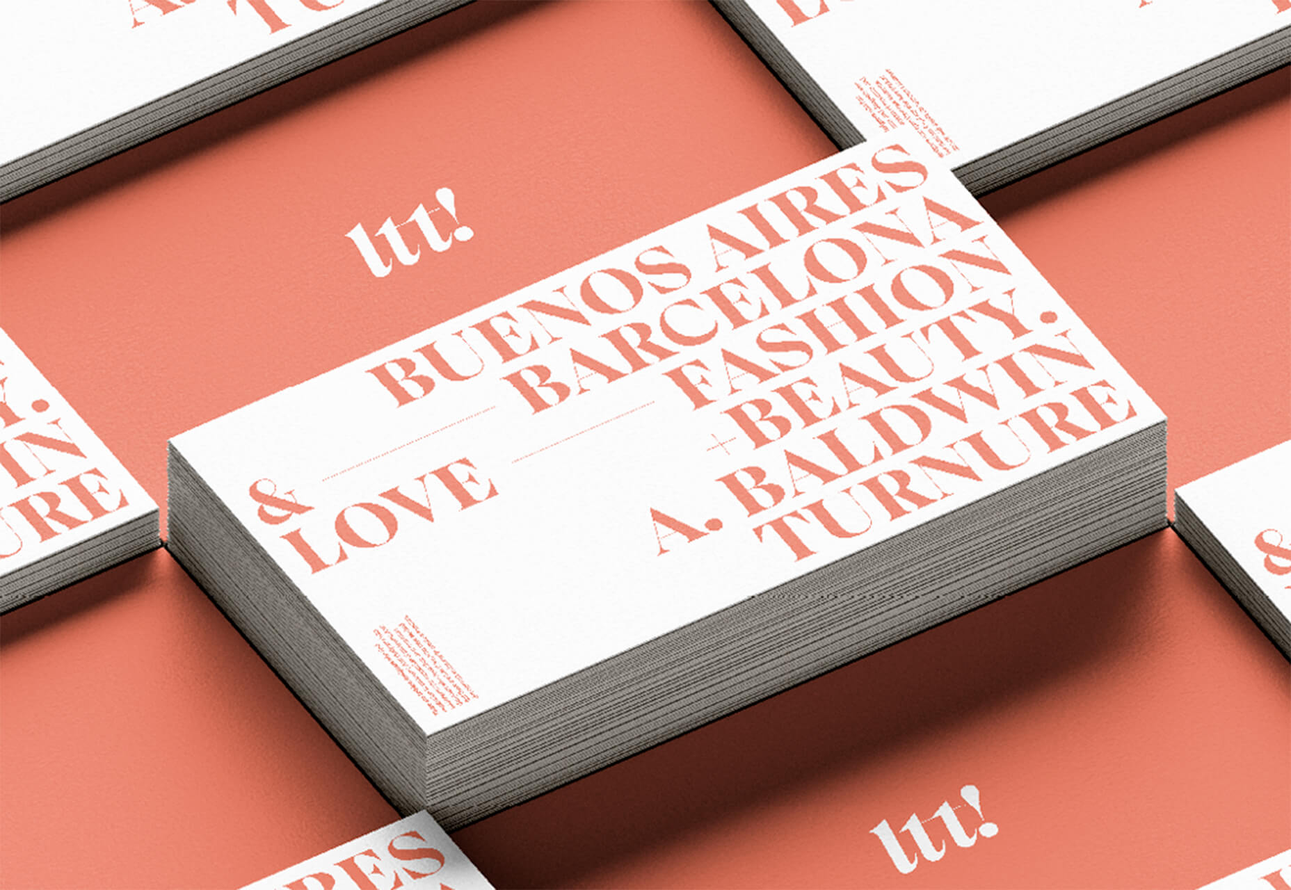
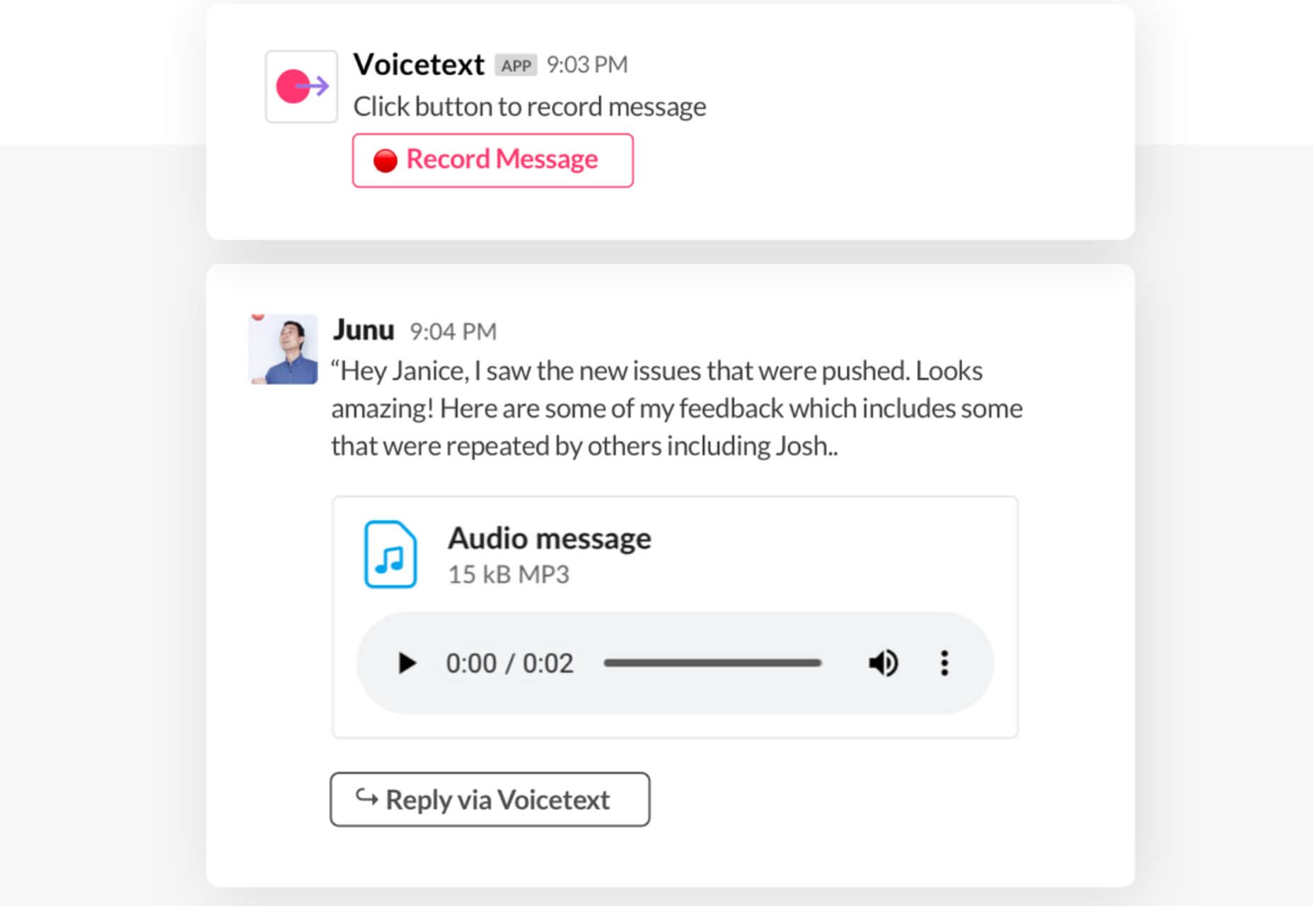
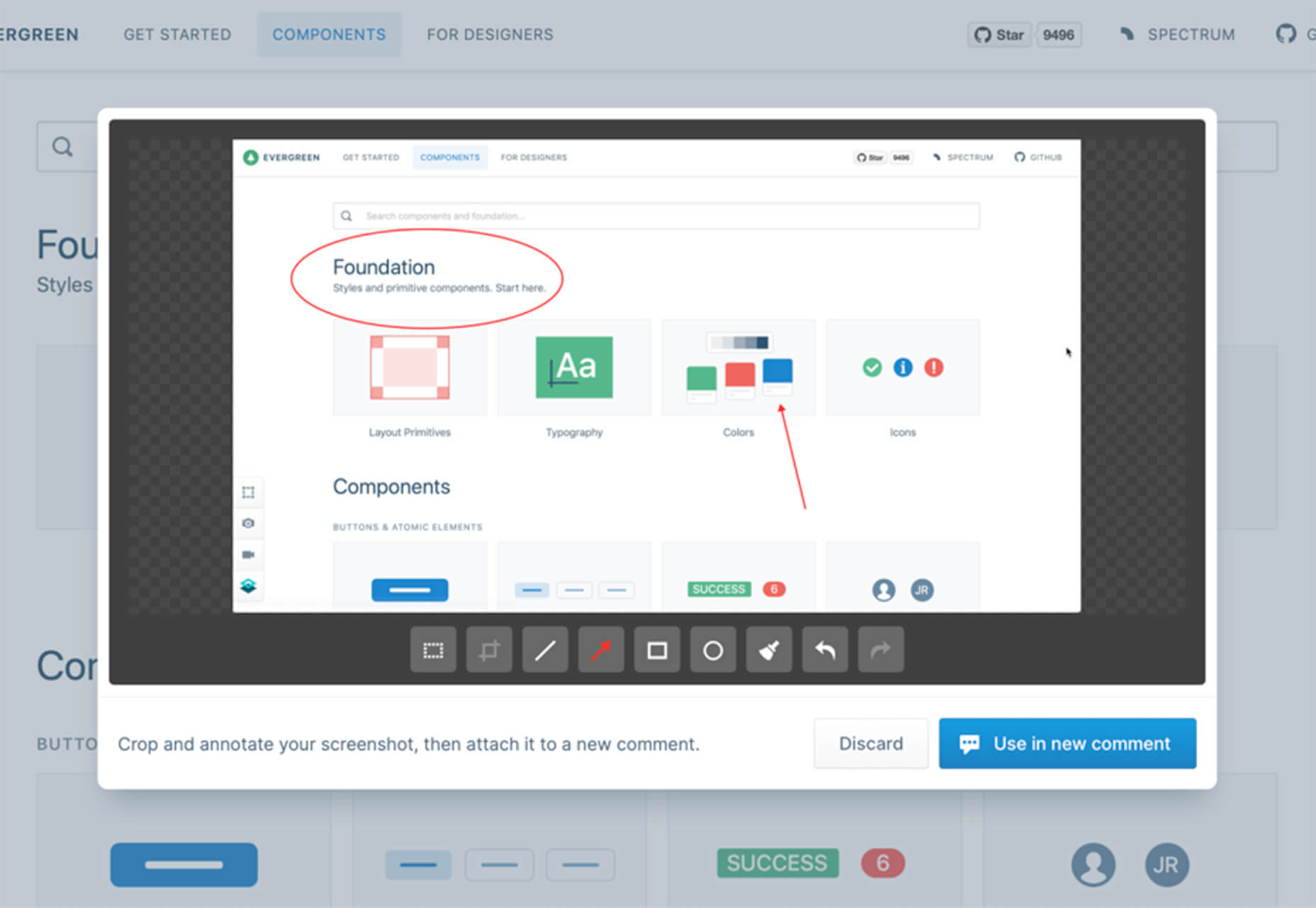
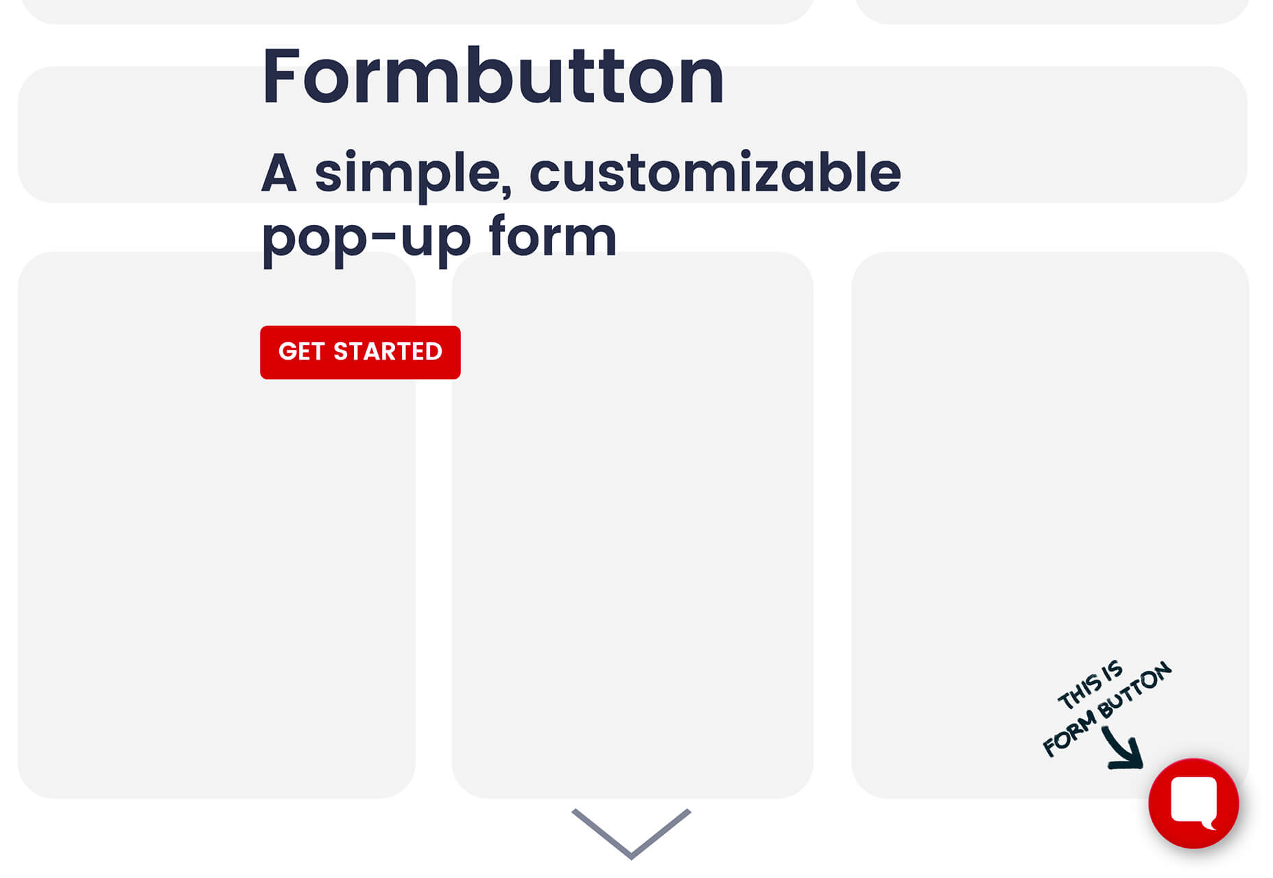
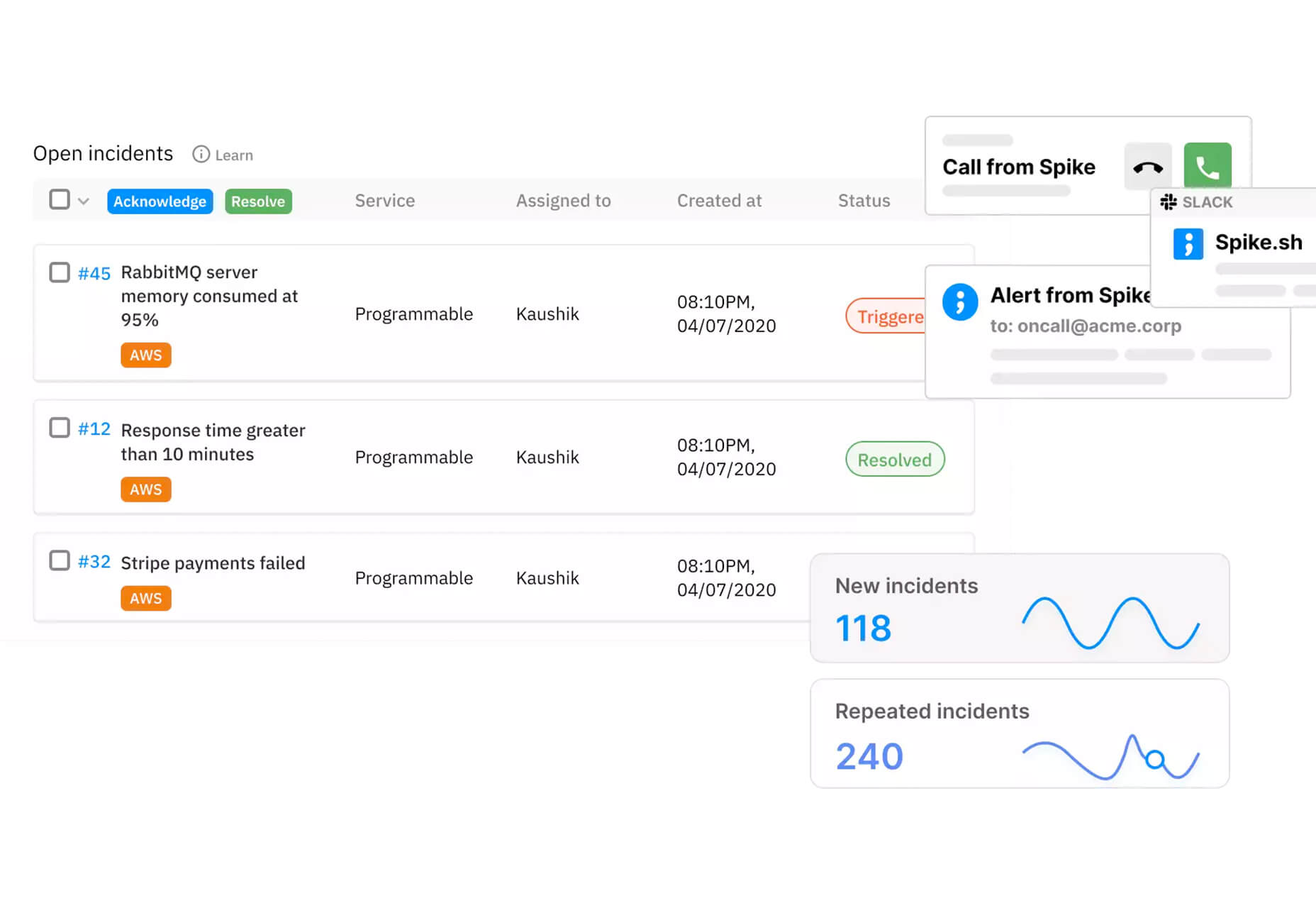
Some of the changes we are seeing with where we work are starting to pop up in the type of new tools made for designers and developers. More tools with remote collaboration as a key feature are increasing in popularity. (You’ll find a few of those here.)

Here’s what new for designers this month.

Webdesign Toolbox

Webdesign Toolbox is a collection of tools, apps, and resources all in one location for designers and developers. The best part of this resource is that it is human-curated, so every tool is quality checked and makes the list because it has been tested and researched. Search the collection by design, dev, stock, typography, UX, or workflow tools (and more) and use them to help create more efficiently. The collection is constantly growing, too.

CodeStream

CodeStream might be the new-world workflow tool for web designers and developers. It is made for remote teams to review code right inside your IDE without breaking from development flow. You can post and review changes and comments are all independent of the code itself, even though they link to it.

Litur

Litur is a color management app for iOS. Use it to find and collect color swatches, create custom palettes, and even check color combinations against accessibility standards. The app can even generate color codes for you from swatches you find from a photo or image upload or create. The app works on mobile and desktop Mac devices and is a paid app.

Editor X

Editor X, which is still in beta, is a website building tool that combines advanced design and prototyping capabilities with secure web hosting and integrated business solutions. Go from an idea straight to production in a highly intuitive design workspace. The best feature might be exact design precision tools.

Grid Cheatsheet

Grid Cheatsheet is a visual and code-based set of “cheats” based on the W3C CSS Grid Specifications. What’s nice is it makes these guidelines easier to understand and use if reading through them makes you a little uneasy.

Tutorialist

Tutorialist brings together some of the best development tutorials on the web. All of the tutorials are free videos available on YouTube, and this project collects them all in one place.

Pure CSS Halftone Portrait from JPG

Pure CSS Halftone Portrait from JPG is a beautiful pen from Ana Tudor that shows how to change the visual representation of an image. The examples are brilliant and in true halftone fashion. The code snippet works with color, or black and white images as well.

VoiceText for Slack

VoiceText for Slack is another work from home productivity tool. Integrate it with Slack and send messages with text that’s transcribed right in your channels. It’s a free integration and supports 18 languages.

Feature Peek

Feature Peek is a developer tool that helps you get frontend staging environments on demand and gather team feedback earlier in the development process. It’s made for use with GitHub and works with a variety of other tools as well.

Formbutton

Formbutton is a simple and customizable pop-up form. (And we all know websites have plenty of them right now.) It connects to other services you already use, such as Google Sheets and MailChimp, and is simple to set up.

Blocksy Theme

Blocksy is a WordPress theme that’s made for non-coders. It’s a zippy and highly visual theme made for Gutenberg. It works with other builders and allows the user to customize pretty much everything visually. (There’s even a dark mode.) The theme is packed with tools and options and is a free download.

Oh My Startup Illustrations

Oh My Startup Illustrations is a set of vector illustrations in several categories featuring a popular style on many projects. Use the characters and scenes to create a semi-custom story for your startup project.

1mb

1mb is a code editor and host where you can create a static website with a custom domain and SSL included. The editor works in-browser and everything is saved in the cloud.

Linear

Linear is an issue tracking Mac app for teams. It’s designed to help streamline software projects, sprints, and tasks, and can integrate with standard tools such as Github, Figma, and Slack.

Hosting Checker

Hosting Checker solves a common issue – a client wants you to work on their website, but has no idea who hosts it. Hosting Checker shows the user hosting provider and IP address the website uses, along with where its server computers are located and the host’s contact details. It also claims to be 82% faster than other similar tools.

Spike

Spike alerts you to website incidents before customers. Create alerts and get a phone call, text message, email, or Slack notification right away. The tool provides unlimited alerts and integrations to you can stay on top of issues before they become real problems.

Magnus UI

Magnus UI is a framework that helps you building consistent user interfaces in React. It comes with plenty of components ready to use and you can customize the theme.

SpreadSimple

SpreadSimple uses data in Google Sheets to create styled websites with features such as filtering, search, sorting, cart, order collection via forms, and much more. Update the sheet and instantly see changes on the website.

WebP vs. JPEG

Google is starting to suggest using it’s WebP image format to decrease load times, because of the lighter file size. But is WebP better than the traditional JPEG? Developer Johannes Siipola tested the file types at different sizes to answer the question. The answer is a bit complicated, but sometimes it might be better; read the full analysis for more.

Oh Dear

Oh Dear is a website monitoring tool that can help you keep a check on websites. Monitor uptime, SSL certificates, broken links, and more with notifications that come right to you if there’s an issue.

Airconnect

Airconnect is a Zoom video conferencing alternative that you can use for your brand with a custom header, colors, and portal for clients. The tool includes video calling as well as the ability for customers to access their data and automate your onboarding process.

Free Faces

Free Faces is a curated collection of free typefaces that you can browse and use in projects. Search by type style with visual results that include a download link.

All the Roll

All the Roll is a fun novelty font for just the right type of project. It includes 167 characters with swash characters that can be added before or after certain letters.

Backrush

Backrush is a handwriting-style typeface with easy strokes and a pen-like feel. It includes thicker letterforms with nice swashes and a full character set.

Thuner

Thuner is a slab display font with interesting quirks. It’s made for larger than life designs. It includes a full uppercase character set and numerals.

Source


Source de l’article sur Webdesignerdepot

Commuting to work has been the worst for a long, long time.

The opening scene from the 1993 Michael Douglas film Falling Down (above) could very well have been shot yesterday. No, I’m not talking about the 90s buzz cut or the short sleeve collared shirt, but I am talking about its spot on depiction of the hell that is gridlock.

Traffic is at a standstill, the weather is sweltering, and Michael Douglas just can’t even — to the point where he actually abandons his vehicle under an overpass to alleviate the stress of it all. And let’s be honest, we’ve all dreamt about doing the exact same thing at one time or another.

Source de l’article sur DZONE