Articles

The biggest trend we’re talking about this month started at WWDC as Apple provided a glimpse of what’s coming next for their operating systems. This time around there’s a distinct design element. Did you catch it?

Here’s what’s trending in design this month.

1. Text Highlights and Underlines

There’s always been an unwritten rule in website design that text uses more plain styles. Bold is acceptable, italics are OK from time to time, but underlining is seldom used.

This design trend bucks that concept with text elements that use highlighter or underline elements to emphasize key words. And it works rather nicely.

What it takes to make this work is plenty of contrast and a design style that fits with underline or highlighted elements.

This design trend works thanks to clear intention. The words are obviously important to the overall meaning of the design or what visitors should take away from the content.

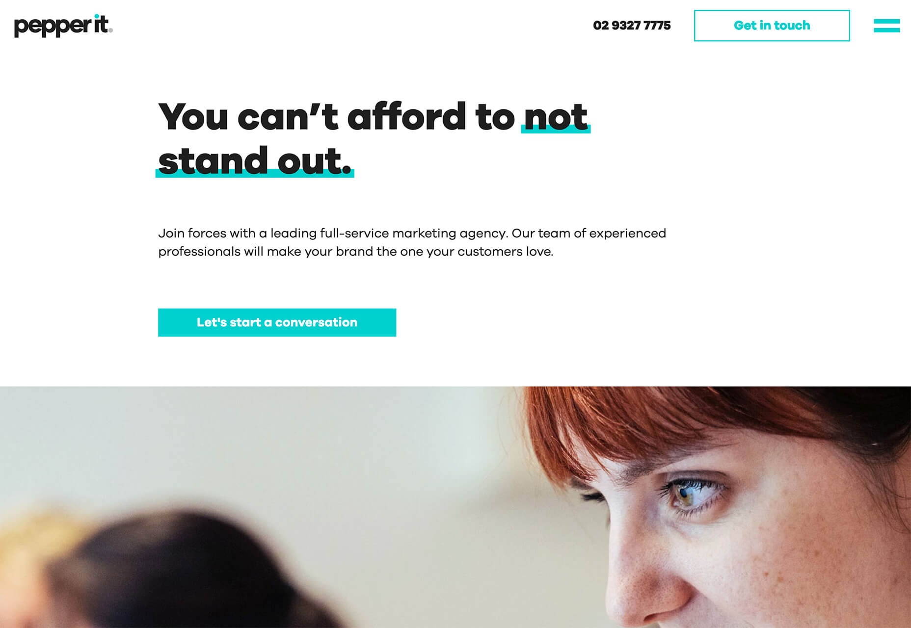
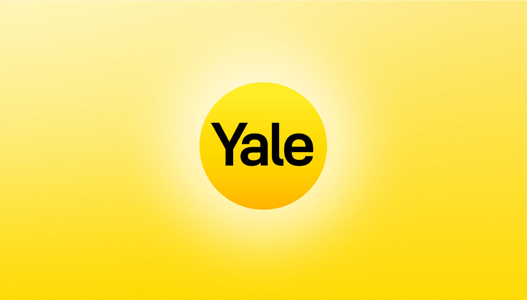
Pepper It uses a nifty underline that the letters seem to rest inside of to highlight a key phrase. The shape and color also mimic that of the larger button below, helping the eyes move from one element to the next. It’s an effective use of an underline (or maybe you could call it a highlight) effect in conjunction with brand colors.

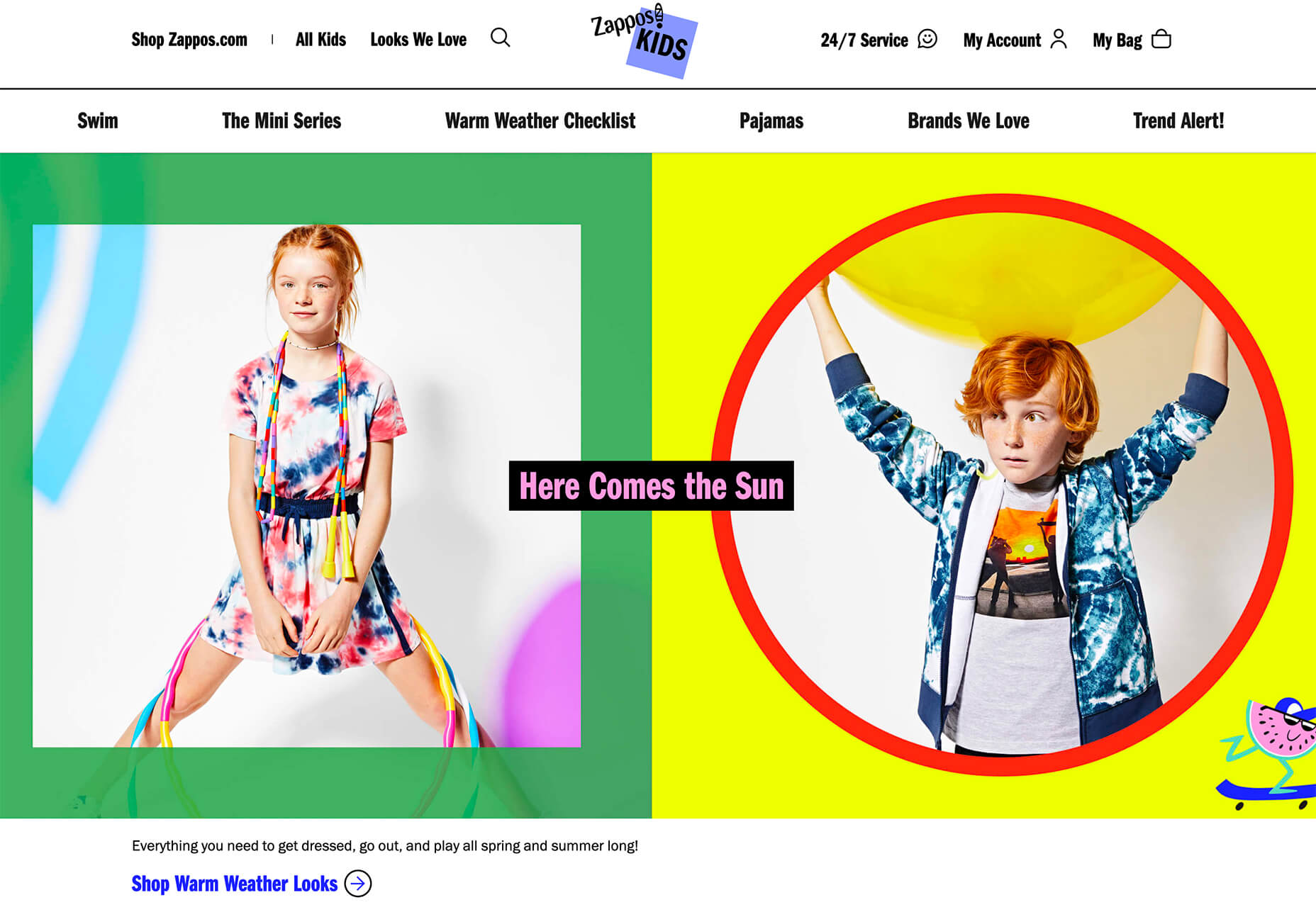
Zappos Kids uses a fun highlight in a colorful scheme to highlight a key text element. It almost looks like a button and helps website visitors understand that the entire hero image area is clickable. The highlight serves to make the text more readable and the interactive element more functional.

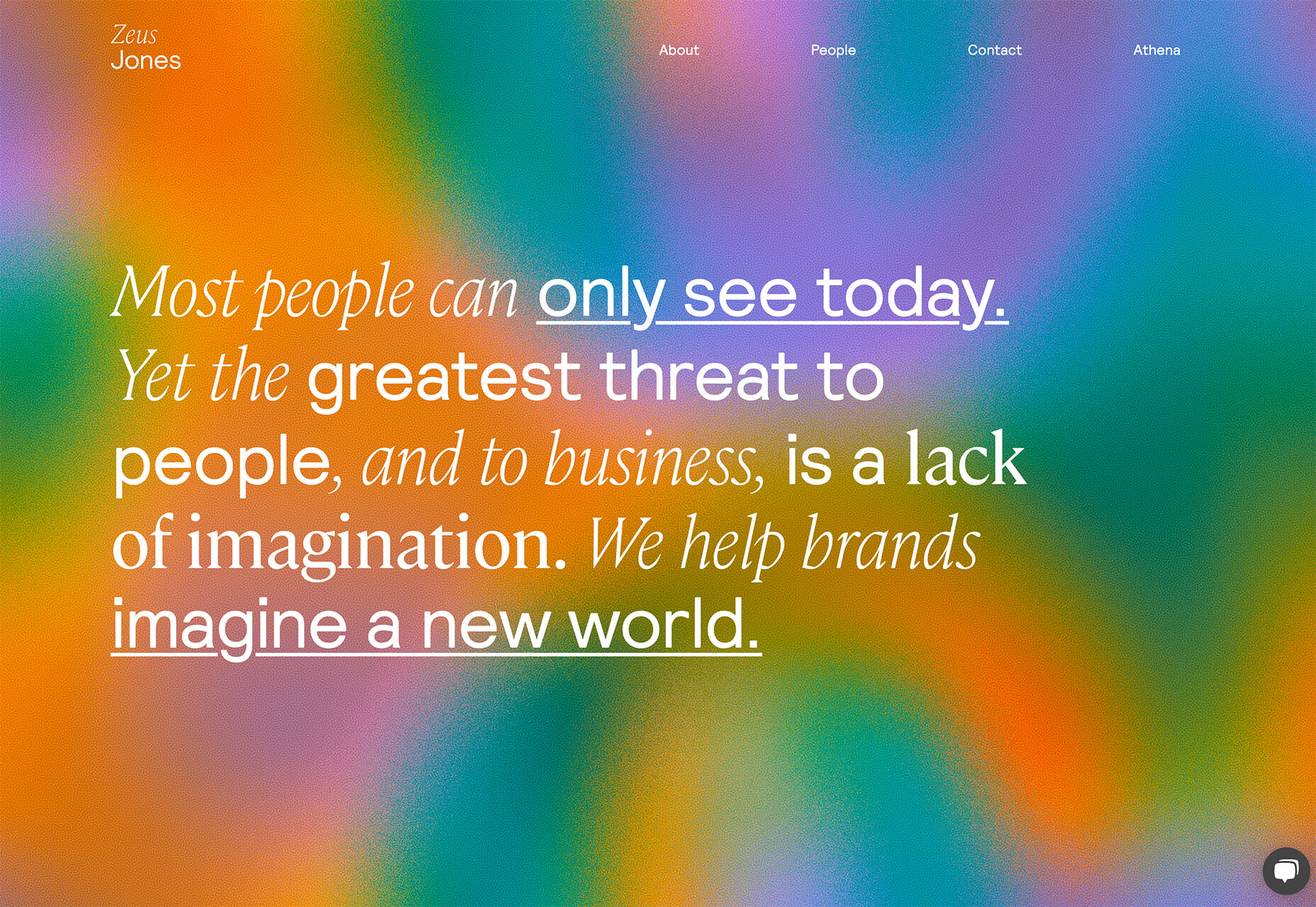
Zeus Jones uses a variety of text treatments on the homepage, but arguable the underline is most noticeable, likely because it is the most unfamiliar in the context of website design.

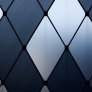
2. Distinct Geometry

Geometric shapes in website design have popped up as trending elements in a variety of forms. This iteration is pretty simple: Use of distinct geometry as part of the overall aesthetic.

Geometry might pair with illustrations, photos, text, or in the background or foreground. What’s great about shapes is that they are versatile and work with a lot of other design patterns.

What can be the most challenging about shapes and design is that distinct geometry requires some space and thought. Just tossing a few triangles or rectangles in a design without reason can look rather strange.

So how can you add geometric shapes to a design so that they look intentional? These examples do it well (and in three different ways).

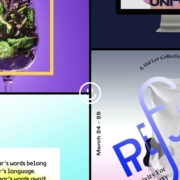
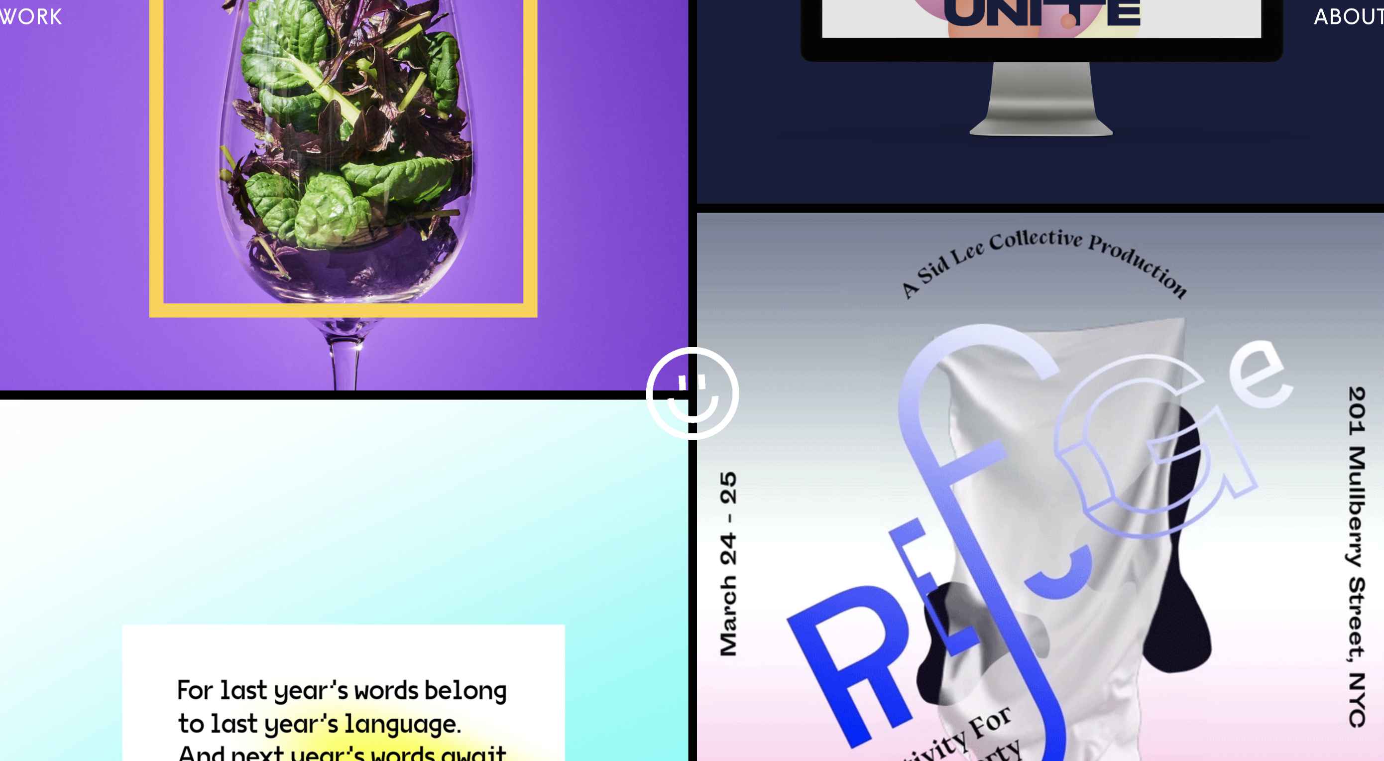
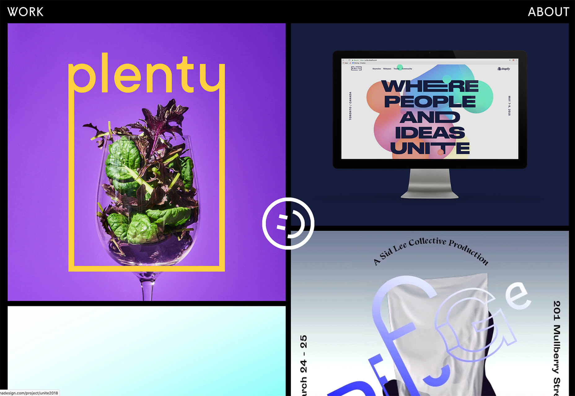
Rui Ma uses square and rectangular containers in a modular grid with portfolio projects inside each. This is one of the most common and applicable uses of geometry – as a container element. What makes it stand out is the circle, smiley wheel (also a geometric shape) that never leaves the center of the screen. The black background for the grid is also a nice contrast element for content blocks.

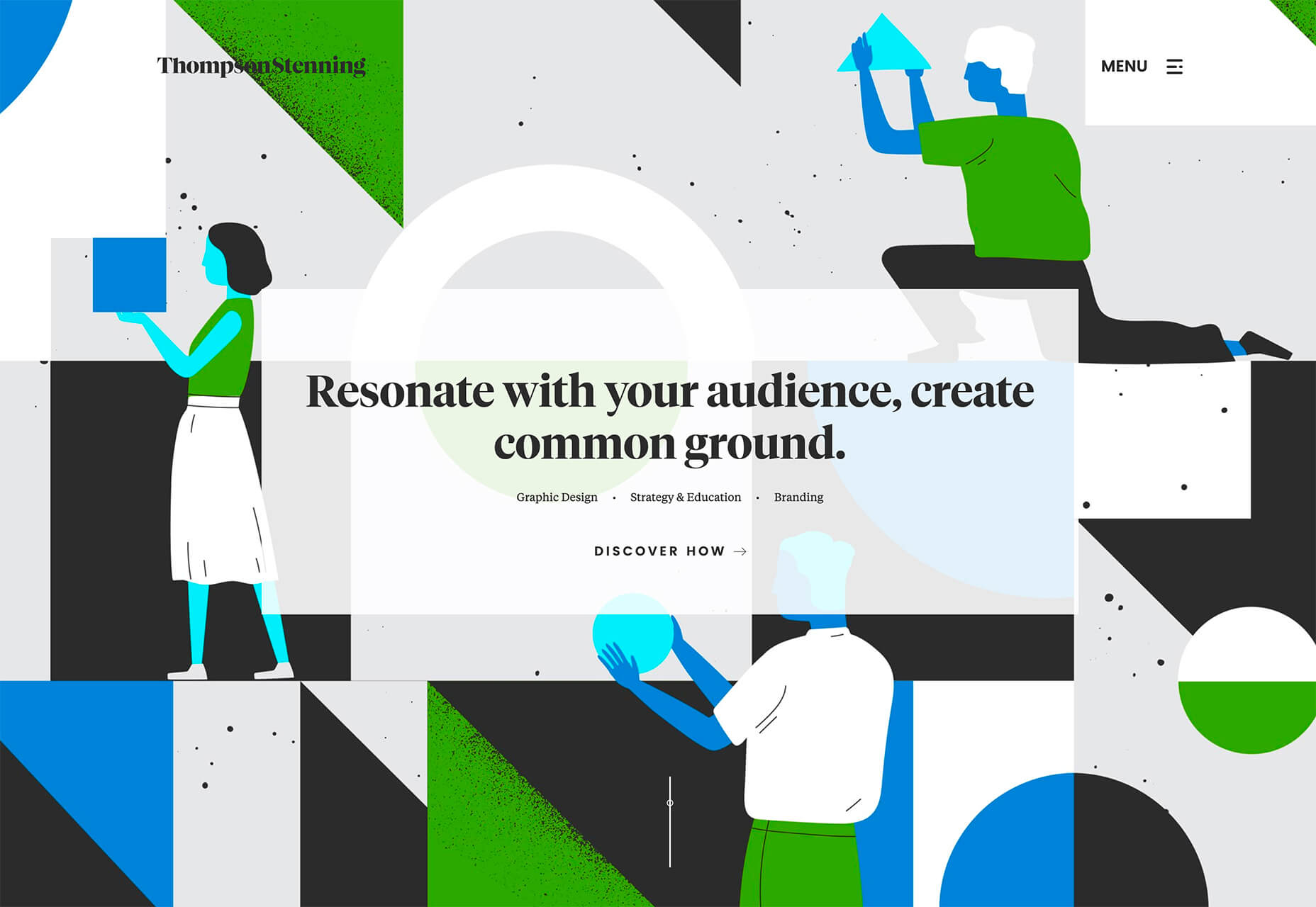
Thompson Stenning uses shapes in the background and with illustrations to create a stunning homepage visual. It’s big and bold and has just enough going on that you want to look at it and figure out the scene. Maybe what’s most intriguing about the visual concept is that it uses lots of geometric shapes – rectangles, squares, triangles, ad circles – whereas most projects pick one shape to focus on.

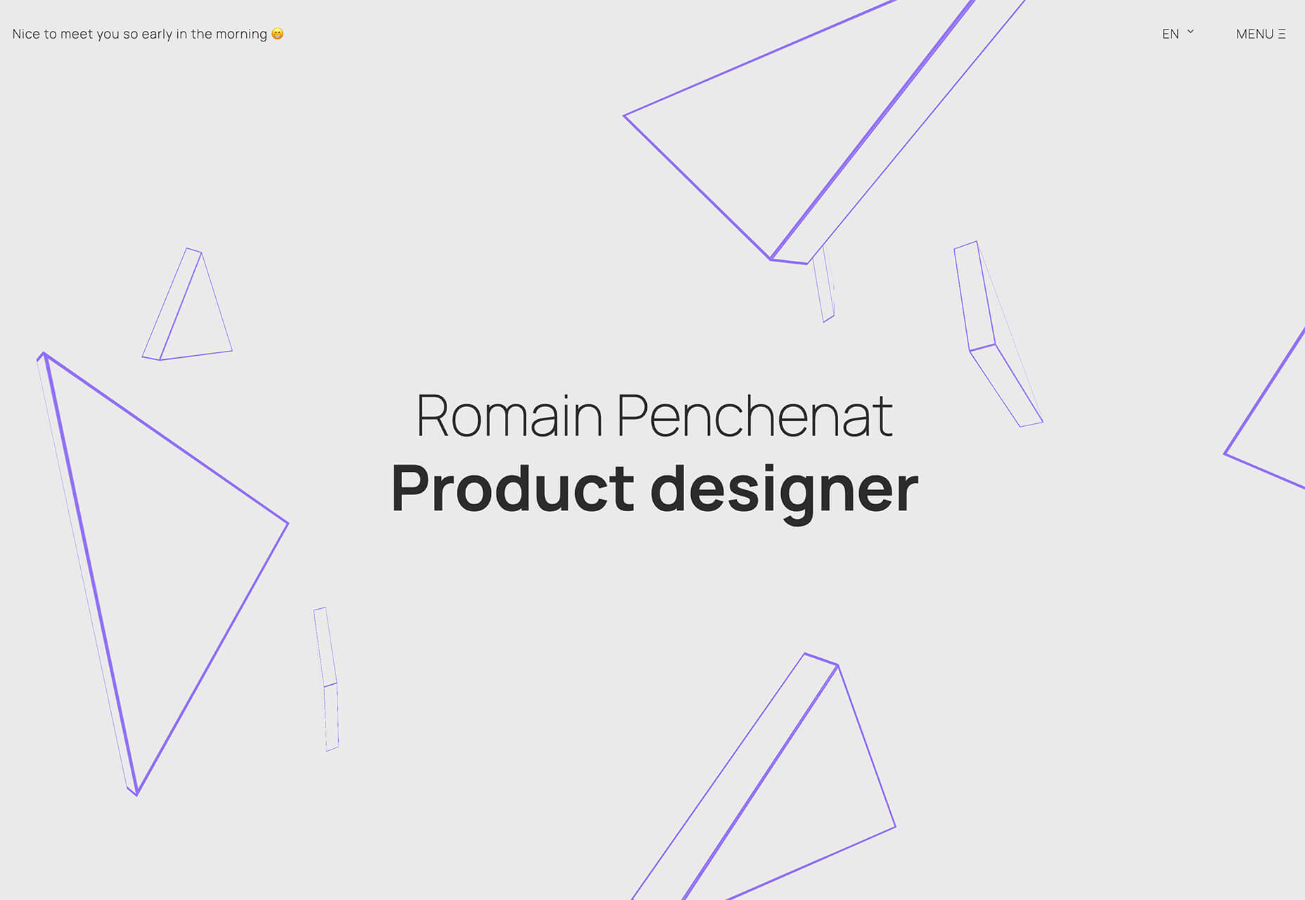
Romain Penchenat uses three-dimensional style angles to draw you into the portfolio website. They use a simple animation that “floats” on the homepage and follows the scroll with other geometric elements.

3. Shadow and Gradient Icons

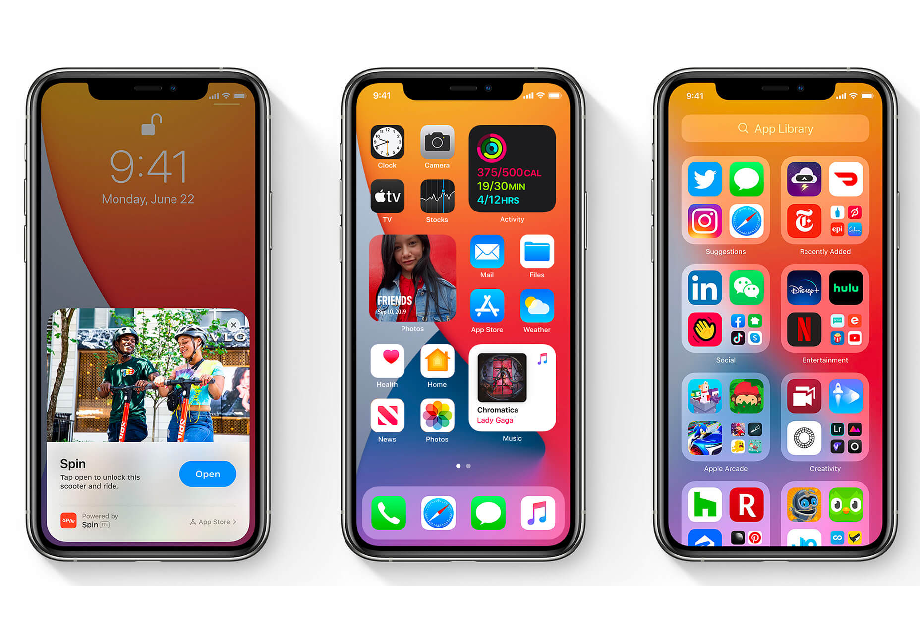
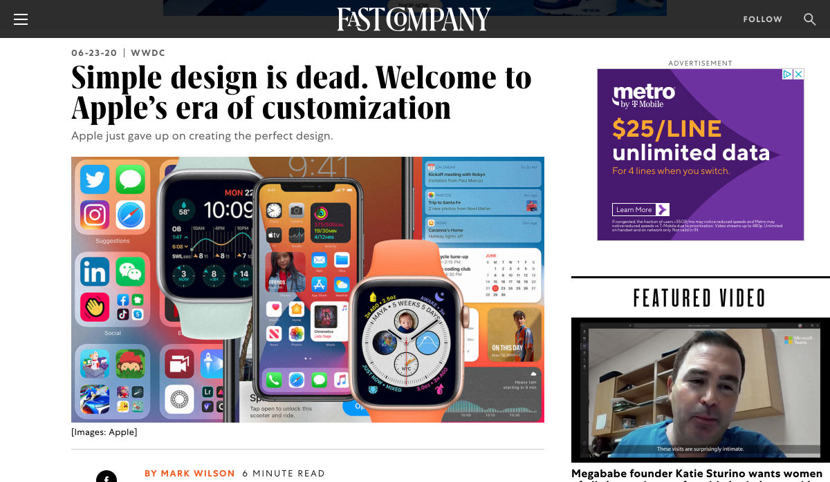
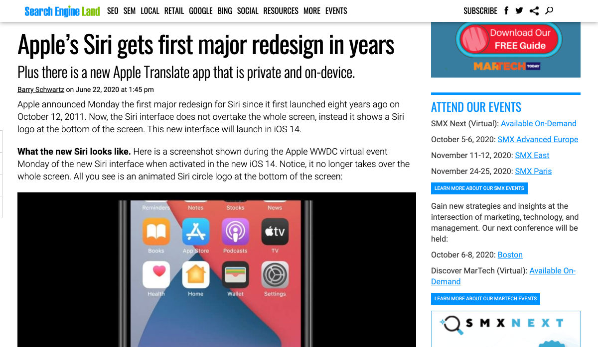
Did you notice all the gradients and subtle shadows in icons in the images previewing iOS 14 or were you just looking at other changes (such as widgets) on the iPhone screen?

We’ve been seeing more designers incorporating more shadows and depth into icons for a while, but this move by a major player in design will push it to the forefront fast. Each of the icons moves from a flat style to one with a background gradient color as well as more shadows within icon elements for depth.

Don’t worry, the design still looks very much like Apple, but is a little more reminiscent of the skeuomorphism style icons from earlier versions of iOS.

It’s nice that the color and shadow elements are contained within each icon. This creates more visual interest and depth for each element without getting cluttered or junky. The gradients are also super simple, using a darker version of the main color in a monotone element.

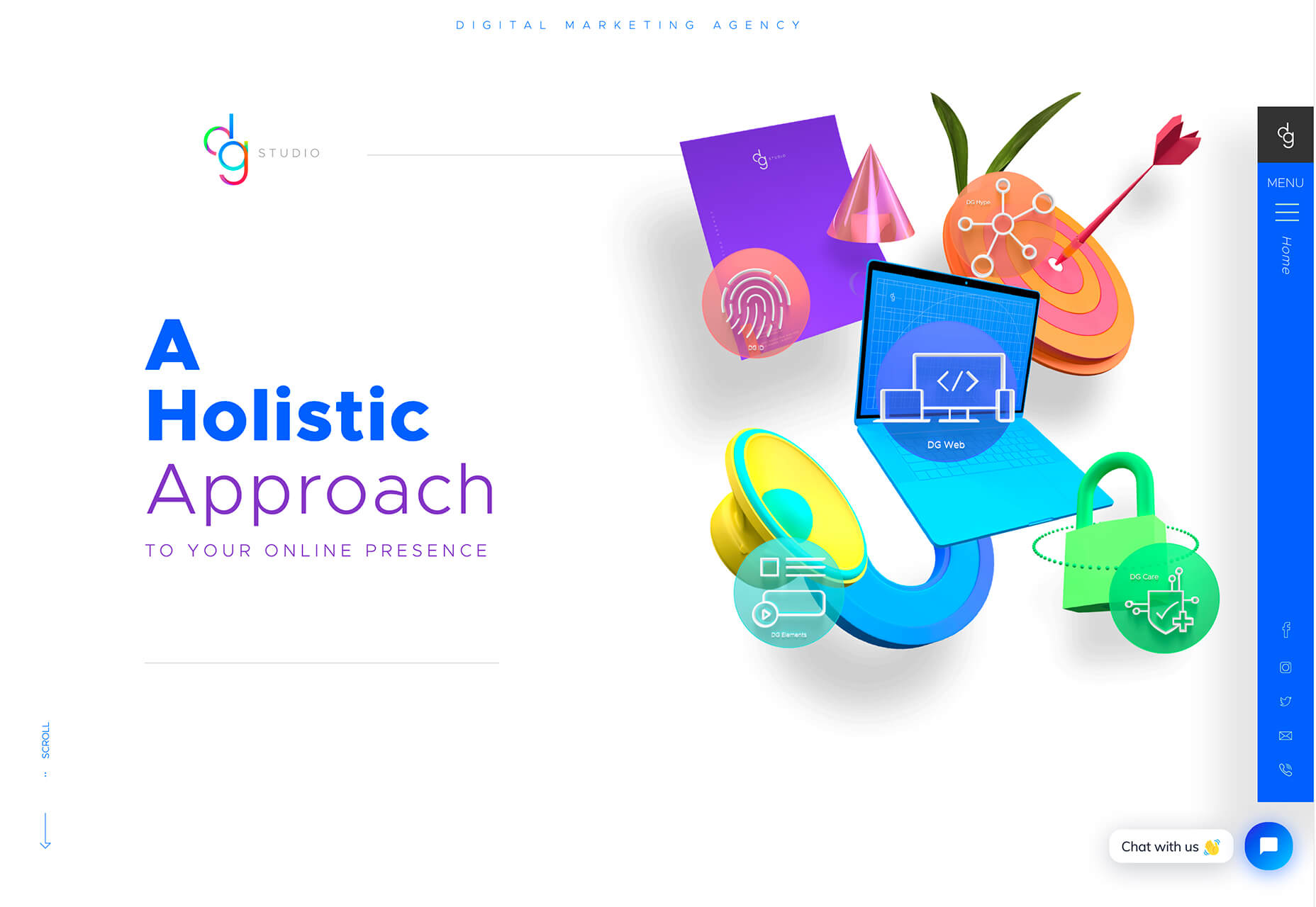
It’s an iconography style that others are already using. DG Studio has a collection of icons on its homepage with subtle gradients and shadowing in the designs. Again, what’s nice about this trend is that it adds depth to visuals without tricks that get in the way of visual comprehension.

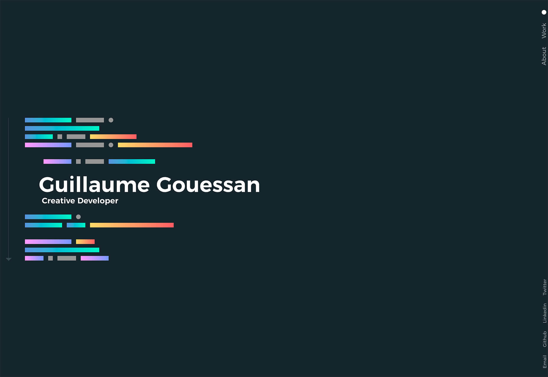
Guillaume Gouessan uses gradients in image icons in much the same way as the previous examples but with a little more color variation. Here, you can see what the gradient looks like when using a color change that’s not super drastic, but more dramatic than a monotone option. You can find some use of the more monotone gradient on his site below the scroll in the large desk image. (It’s definitely worth a few clicks to check it out.)

Love it or hate it, gradients and shadows seem to be here to stay for a while.

Conclusion

How often do you find yourself looking to major brands and companies for design inspiration? While a lot of web design trends start as experiments with smaller sites, the big players can really shape what gets popular (or not).

The example of Apple moving to icons with more shadows and gradients is a prime example. We’ve been seeing more of these elements creeping in for a while, but this style is about to get very big again.

Source

p img {display:inline-block; margin-right:10px;}
.alignleft {float:left;}
p.showcase {clear:both;}
body#browserfriendly p, body#podcast p, div#emailbody p{margin:0;}

Source de l’article sur

Every week users submit a lot of interesting stuff on our sister site Webdesigner News, highlighting great content from around the web that can be of interest to web designers.
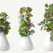
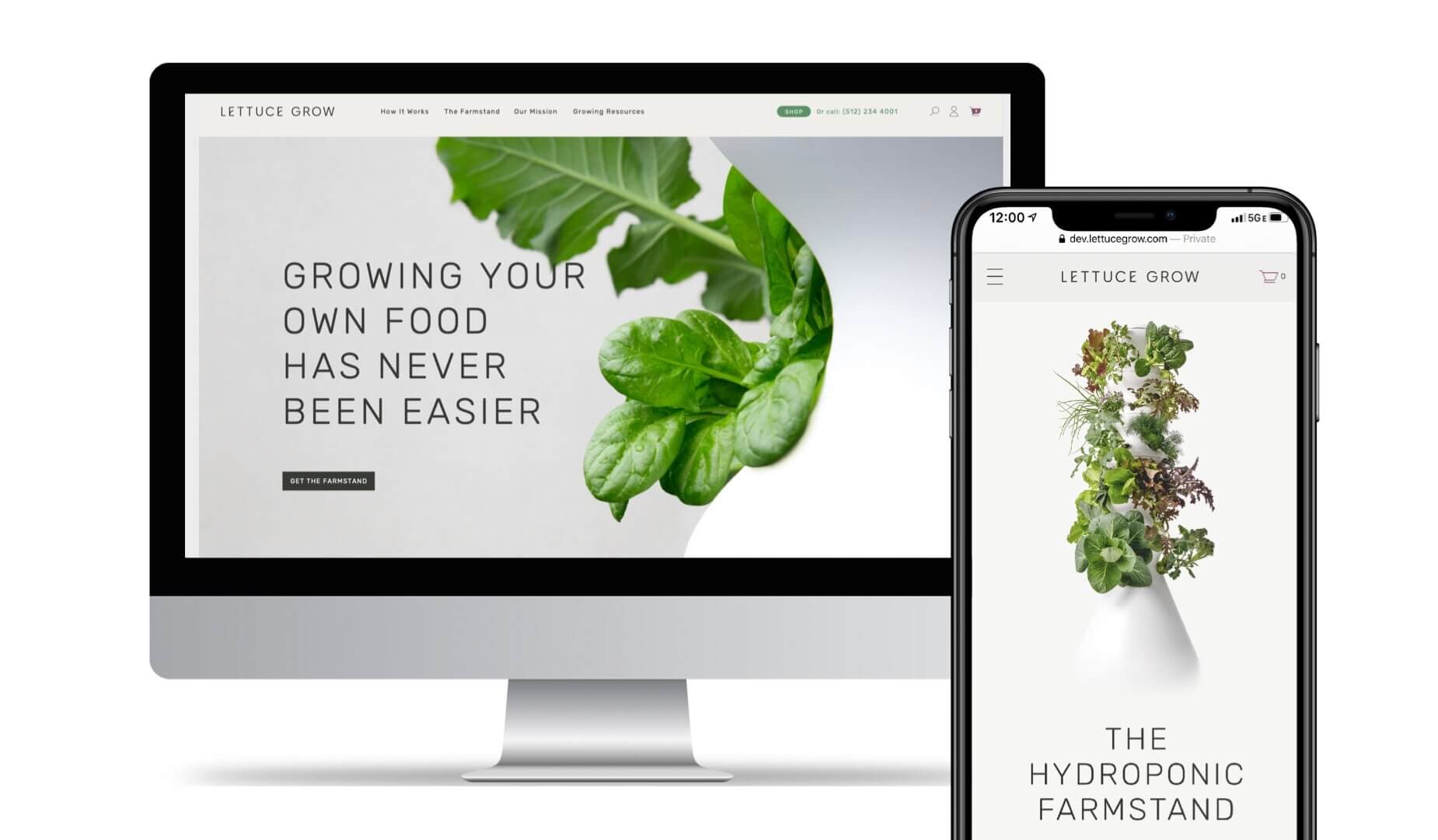
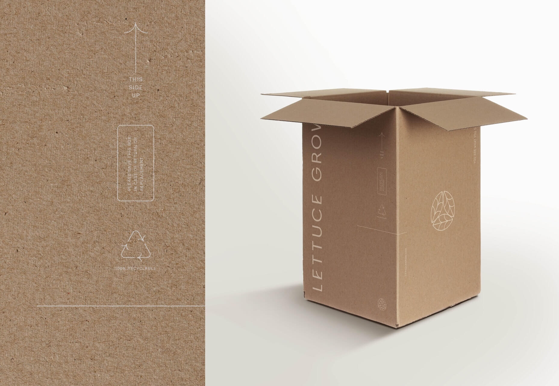
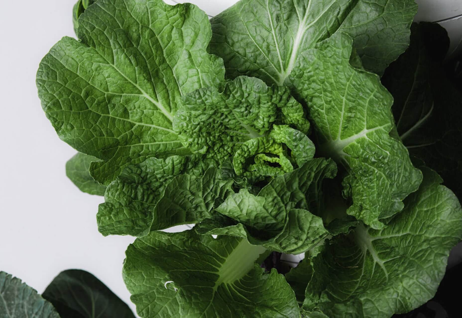
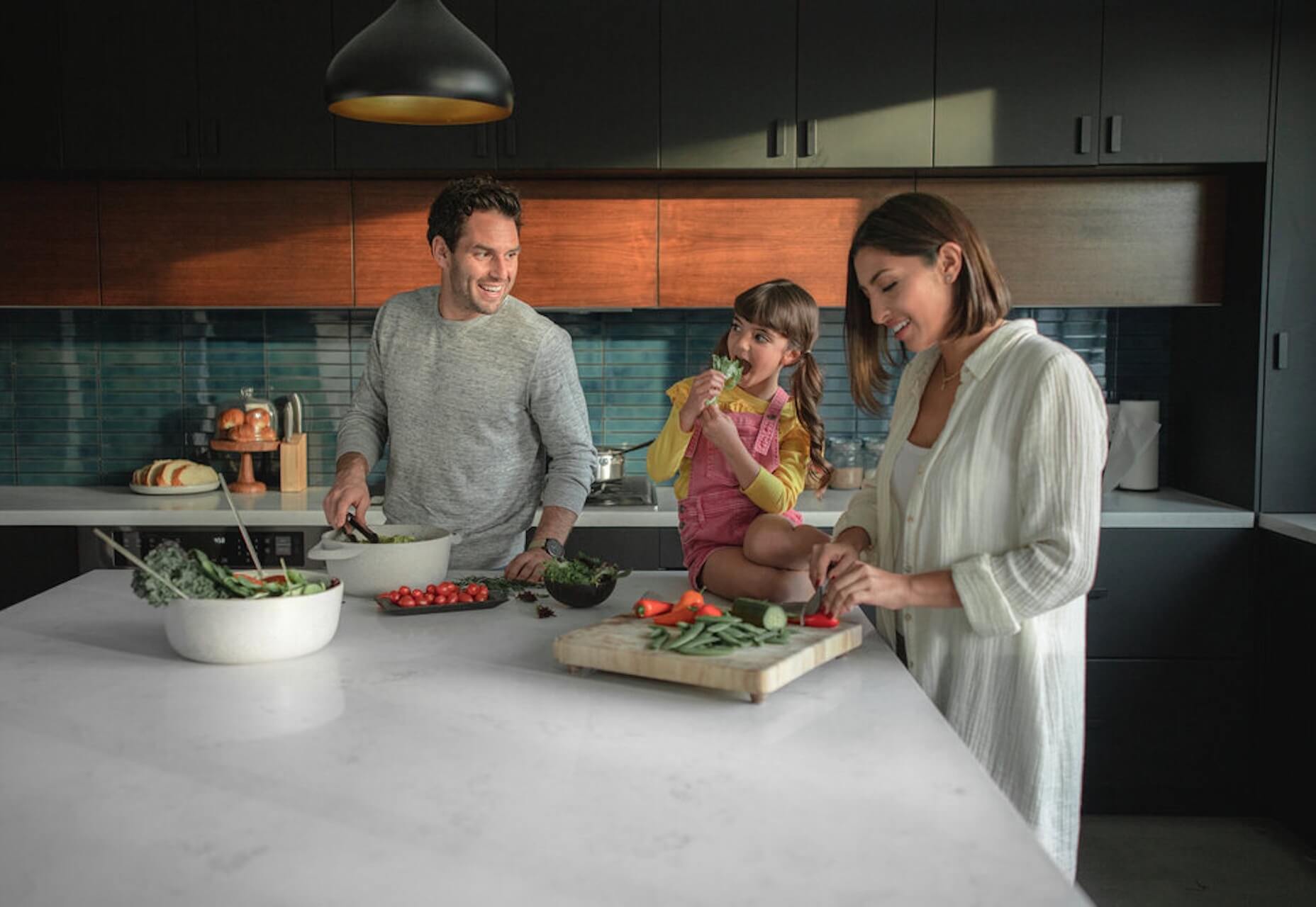
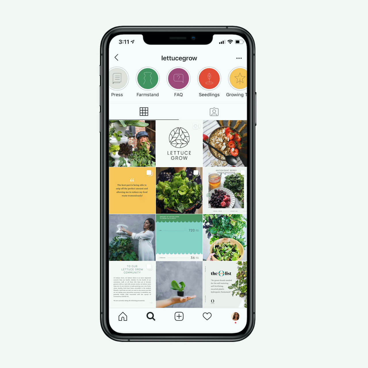
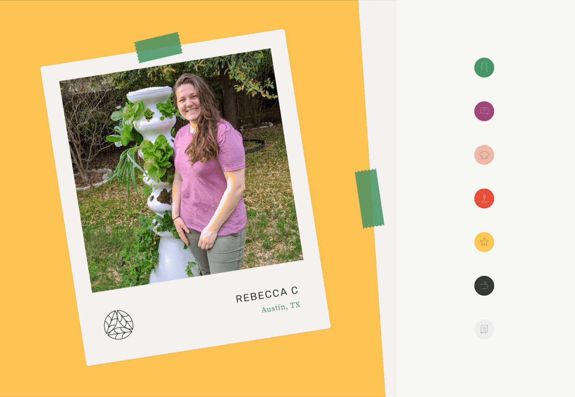
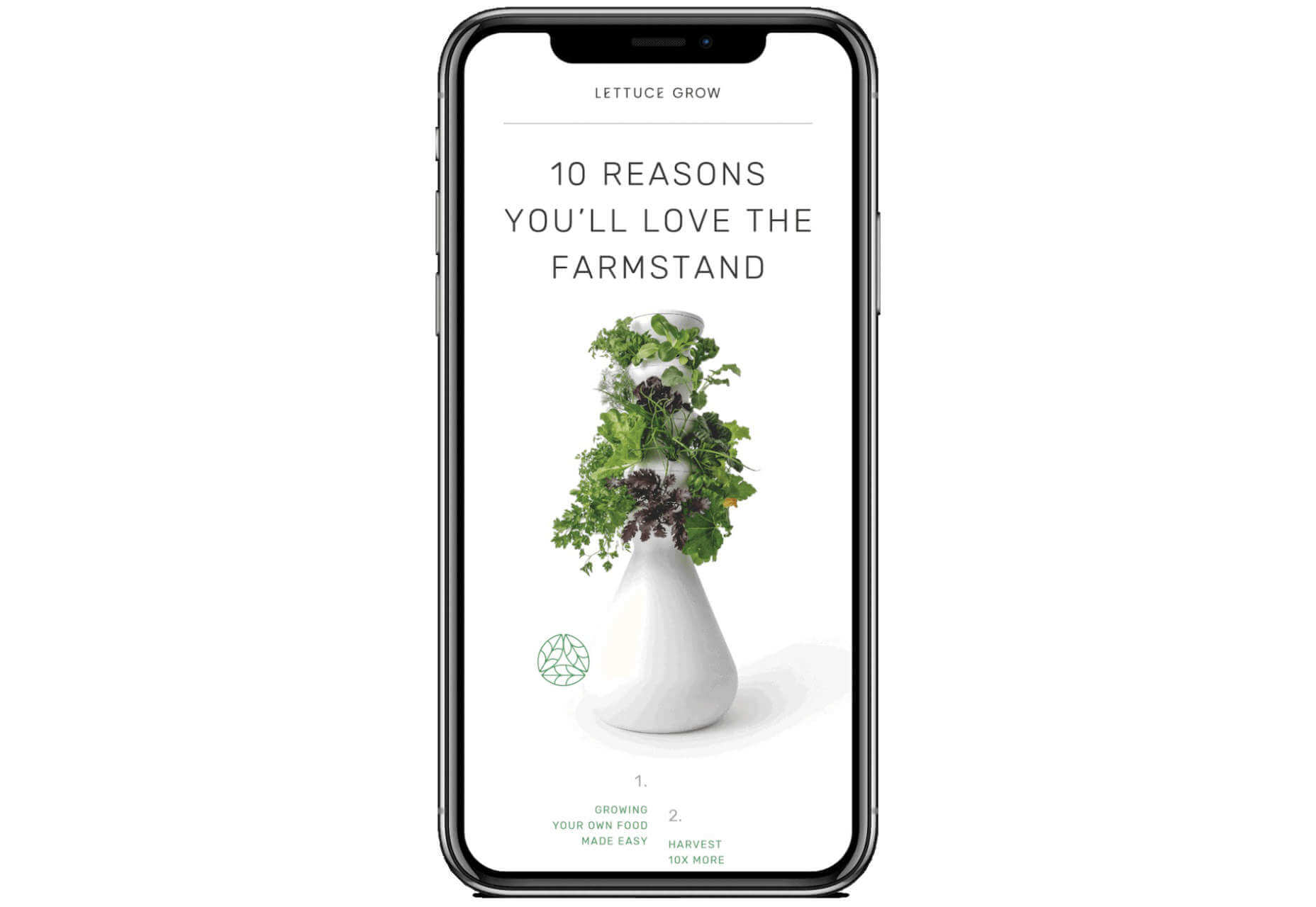
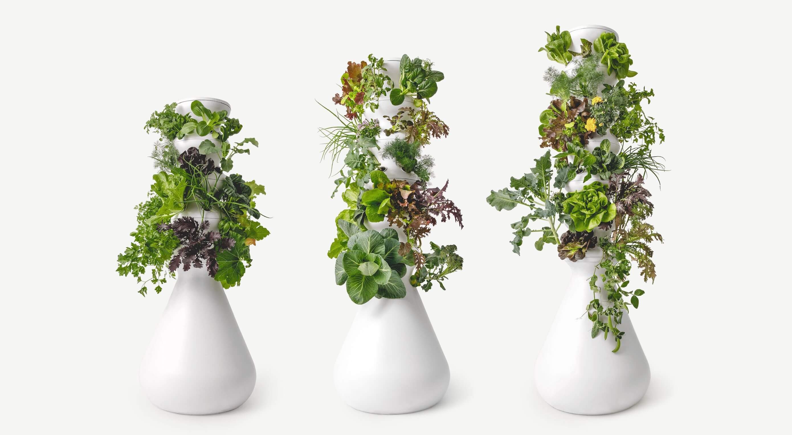
The best way to keep track of all the great stories and news being posted is simply to check out the Webdesigner News site, however, in case you missed some here’s a quick and useful compilation of the most popular designer news that we curated from the past week.

Elevator.js – A “back to Top” Button that Behaves like a Real Elevator


Redesigning Airbnb for the New Normal – a UX Case Study


My Experience Making an App Using a No-Code Tool


Simple Design is Dead. Welcome to Apple’s Era of Customization


Making the Brand: Redesigning Spotify Design


Neon Mode: Building a New Dark UI


The Return of the 90s Web


Design Roundup June 2020


Google Quietly Launches an AI-powered Pinterest Rival Named Keen


Apple’s Siri Gets First Major Redesign in Years


Perfection will Kill your Design


Using 6 Google Analytics Features to Improve UX and Website Metrics


Yale Rebrands for Warmth and a Digital Future


3 Awesome Digital Marketing Strategies to Boost your Web Presence


Onboarding is Dead, Here Comes Noboarding


User Experience (UX) Testing: 4 UX Best Practices


8 Ways to Promote your Business Without a Marketing Budget


10 Interaction Design Rules You Must Never Break


On Racism and Sexism in Branding, User Interface, and Tech


Staying Creative During Hard Times


Serious UX Mistakes that Might Be Sabotaging your Sales


10 Key Things a Small Business Website Must Have


22+ Horizontal Timeline CSS Examples


How to Write an Effective Design Brief in 9 Easy Steps


Creative Exercises to Help You Through your Anxiety


Want more? No problem! Keep track of top design news from around the web with Webdesigner News.

Source

p img {display:inline-block; margin-right:10px;}
.alignleft {float:left;}
p.showcase {clear:both;}
body#browserfriendly p, body#podcast p, div#emailbody p{margin:0;}

Source de l’article sur

SAP propose depuis une quinzaine d’années une solution de gestion d’entrepôt appelée SAP Extended Warehouse Management, qui s’est enrichie pour répondre aux besoins des clients, quel que soit l’industrie ou le marché adressé : gestion avancée des vagues, mobilité, pilotage intégré de la mécanisation, Labor Management, pré colisage, intégration avec la production … Le tout dans une approche ‘Digital Supply Chain of One’, visant à fournir à nos clients une chaine logistique agile, unifiée et ‘end to end’.

Dans cette démarche d’amélioration et d’innovation continue, un nouveau module a vu le jour l’année dernière pour apporter un niveau supplémentaire d’optimisation aux clients qui le souhaitent.

SAP Warehouse Insights est un module basé sur la plateforme SCP (SAP Cloud Platform), et dédié à l’optimisation des entrepôts et de leurs ressources. Basé sur les dernières technologies : algorithmes, cloud computing et machine learning, cet outil complète les fonctions déjà avancées de la solution SAP Extended Warehouse Management. Les principaux domaines sont : la cartographie des entrepôts, des fonctions supplémentaires d’analyses et de monitoring de KPIs, la simulation de l’utilisation des ressources, et l’optimisation en temps réel.

SAP Warehouse Insights a été conçu pour tout type de clients et d’industries. Il apporte un niveau ultime dans l’optimisation des ressources et des missions en proposant les meilleurs scénarios possibles. Si le module s’enrichit en permanence de nouvelles fonctions, à ce jour il faut retenir 3 principaux sujets :

  • Visualisation dynamique de la cartographie entrepôt et des parcours des opérateurs,
  • Analyse des opérations, basées sur les données historiques comme la charge de travail et les distances de déplacement des ressources,
  • Optimisation / ré optimisation des missions (Warehouse Orders) affectées aux ressources pour réduire les déplacements à vide.


Cartographie entrepôt

Les utilisateurs peuvent interroger la cartographie d’un site de façon dynamique et interactive. Cela se traduit par une visualisation précise et aisée des différentes zones, avec la capacité d’aller jusqu’à la granularité la plus fine  (emplacement), et de s’assurer de l’adéquation de la configuration avec les besoins du terrain, ainsi qu’aux fonctions d’optimisation des déplacements.

Exemple d’écran de visualisation de différents types de zones de stockage :

‘Travel distance Network’ : Configuration simplifiée des chemins

La configuration des chemins est utilisée pour l’optimisation des déplacements. Les utilisateurs peuvent visualiser rapidement sur la carte, la complétude et la bonne configuration des chemins et segments paramétrés. En cas de rupture ou de mauvaise configuration, il est alors aisé de ‘réparer’ ou créer de nouvelles connexions à partir des nœuds existants. Exemple d’écran :

Configuration assistée

SAP Warehouse Insights facilite par ailleurs la création et la maintenance de la cartographie des sites. Il est possible d’importer des plans ‘CAD’ (Computer Aided Design) sous format PDF et de les utiliser directement dans le système. L’opérateur va ensuite pouvoir enrichir les informations avec les données ‘business’ comme les allées ou types de stockage. Le système va alors automatiquement propager ces paramètres de configuration sur les emplacements éligibles.

Exemple d’écran :

Fonctions de simulation

Cette première approche repose sur une optimisation ‘Off Line’. Il s’agit d’utiliser les données historiques pour comprendre et remédier à une situation insatisfaisante. SAP Warehouse Insights va ainsi utiliser les missions (Warehouse orders) et les ressources dans un processus avancé de simulation, pour proposer des scénarios réoptimisés, visant à limiter les déplacements, le nombre de ressource et par conséquent permettre une meilleure productivité tout en réduisant les couts d’exécution.

Le système offre une représentation simple et claire des gains potentiels d’optimisation, à travers une représentation des déplacements modélisés et comparables en un simple coup d’œil (avant optimisation / après optimisation).

Exemple d’écran de visualisation et comparaison des chemins :

Heatmap intégrée

SAP Warehouse Insights propose également une fonction de heatmap, très utile à l’analyse des flux dans l’entrepôt et à l’identification des goulets d’étranglement au sein d’une zone, d’une allée ou d’une gare de préparation. La ‘chaleur’ est déterminée en fonction du nombre de tâches réalisées sur chaque emplacement.

Exemple d’écran :

Optimisation temps réel et continue

Le processus de ré optimisation présenté plus haut est alors réalisé en temps réel, avec la possibilité de configurer des règles différentes en fonction par exemple des types de flux ou zones.

Exemple d’écran de configuration :

Principe de fonctionnement :

Les Missions ‘ouvertes’ sont récupérées et traitées en lien avec le système de destination, comme SAP EWM, à une fréquence configurable (ex : toutes les 10 minutes).

La ré optimisation des missions et des ressources associées est alors réalisée et une nouvelle séquence est déterminée suivant les critères souhaités d’optimisation des déplacements ou de dates/heures « au plus tard ».

Les missions ré optimisées sont ensuite remontées vers le système de destination pour exécution par les opérateurs en mode ‘dirigé’ par le système.

Un écran de monitoring permet également de suivre et visualiser les résultats de l’optimisation proposée par le système, avec notamment pour chaque ressource les missions associées, séquences, trajet à vide et en charge … Exemple d’écran :

Indicateurs de performance

En complément, SAP Warehouse Insights inclut des indicateurs offrant une vue analytique sur les opérations et la performance :

  • Utilisation par ressources
  • Charge par groupes de ressources
  • Charge des ressources par groupes de missions (‘queues’)
  • Temps de déplacements à vides par type de ressources
  • Temps total de déplacement par ressource

Exemple d’écran de consultation des opérations en entrepôt

The post Nouveaux enjeux d’agilité et d’excellence opérationnelle : vers l’entrepôt 4.0 appeared first on SAP France News.

Source de l’article sur sap.com


As promised, the just-released Java, JavaFX theme in JMetro version 4.6 brings a new style for the Progress Bar.

The Progress Bar has two possible states: determinate and indeterminate, and the new JMetro version has different styles for these two. In this post, I’ll go into greater detail about some API design principles I abide by in JMetro.

Source de l’article sur DZONE

Web design domain is thriving with the help of technological advancements. It has passed through a paradigm shift from static magazine layouts to “digital machines” that have hundreds of thousands of coordinated and moving parts of different sizes.

Simply put, it is the need of the hour that quality UI designers be great animators with a working knowledge of web animation technology.

Source de l’article sur DZONE

Working in the design business taught me to pay attention to the organization, the system, the country — the “Big.” At the same time to have an ear for the individual, the person — the “Small,” To work successfully, I have to harmonize what the “Big” wants and what the “Small” wants. I believe, that bringing together the Small helps facilitate and create the Big. And that’s what microinteractions are all about.

Design can solve small, universal and overlooked problems and these really little things have a huge amount of impact. Microinteractions are the small moments in UX that can be boring and easy to forget, or exciting and engaging. They are everywhere: in the gadgets we carry, the appliances in our house, in the apps on our phones and desktops.

Source de l’article sur DZone

User experience design (UXD or UX) is a process of using a product to improve user satisfaction. It can be done by improving the usability of a product or making it more accessible to them easily, and sometimes it involves making the product pleasurable to a user by helping create an interactive link between a user and the product.

The main goal of implementing and developing user experience is to help solve an end users’ problem and this ties the success of the process to communicating the design to both the developers and the stakeholders.

Source de l’article sur DZone

Occupé depuis 2015 par la réalisation du campus Apple Park et l’iPhone X, le maître à penser du design de la marque, Jony Ive, reprend son rôle opérationnel couvrant le matériel et les interfaces logiciels.
Source de l’article sur ZDNet