
 From 45,000-year-old cave paintings to 21st-century space rocket diagrams, illustrations have long played a significant role in human communication.
Pictures cross-language and literacy barriers, allowing people to understand and communicate complex moods and feelings that they cannot in words. When we were little, we could understand and appreciate E.H. Shepard’s illustrations of Winnie the Pooh and friends long before we could read A.A. Milne’s words.
The word ‘to illustrate’ has two main meanings: to create a picture of; and to demonstrate or provide an example of. In the context of the web, illustration is part decoration, part emotional signal, helping to create a particular impression to the user by painting a metaphorical picture.
Why Use Illustrations on a Website?
Illustrations provide a useful shorthand means to convey mood or tone, the voice of a brand.
You could argue that icons are illustrations because they are pictorial, but they are symbols. Icons may, and usually should, fit stylistically with illustrations, but they are not illustrations themselves. A symbol is a simplified representation of an object, idea, or action. For example, ‘search’ is usually represented by a magnifying glass shape.
Illustrations, on the other hand, are more complex. They transmit an underlying emotional quality that connects with the intended audience. Illustrations can create a narrative about the subject without the need to add more text. It gives even the most basic, functional website a sense of personality when used properly.
Popular Types of Illustration Online
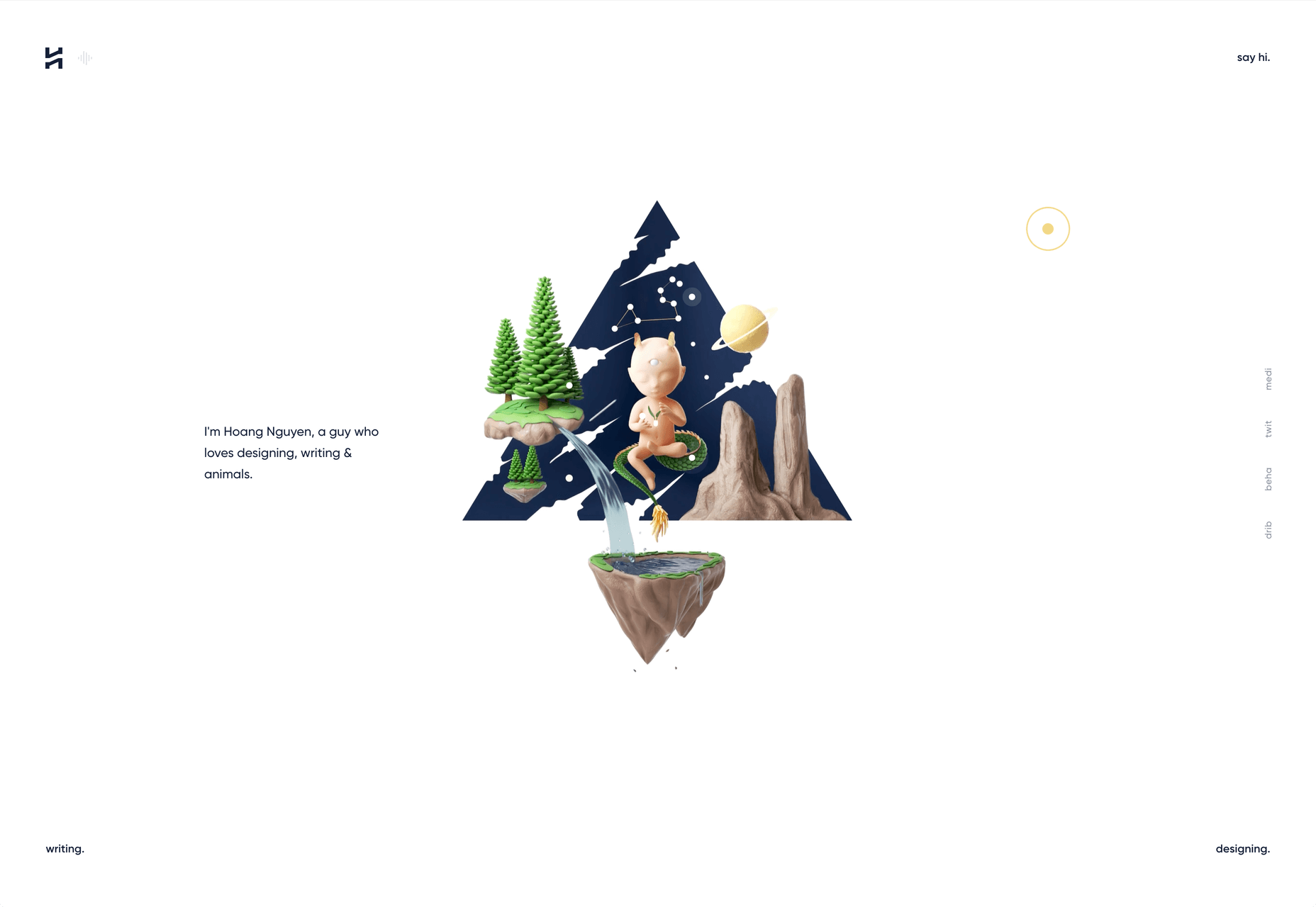
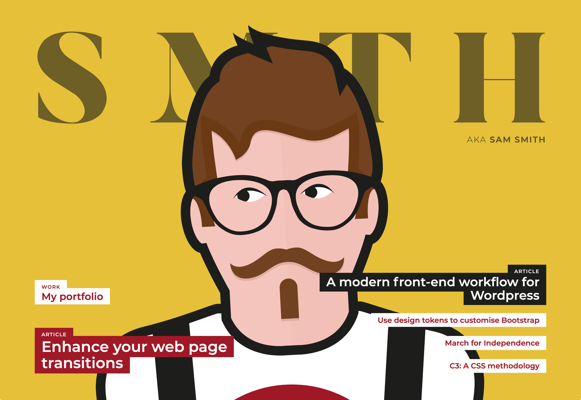
Illustration styles are many and varied, ranging from simple outlines to detailed, full color, realistic images. And the amount of illustration used varies greatly across sites.
Different styles evoke different feelings and provoke different responses, so it is important to think carefully when choosing an illustration style. There are two major factors to consider: what the site is for and what sort of character do you want to give it.
It is possible to break things down into broad categories to see what works best in different areas. We’re going to look at how designers can use illustration to good effect across four categories…
Financial & Corporate
Financial services, fintech, enterprise software, and larger corporate sites tend to use illustration as a way to humanize themselves.
The style tends to be minimal, using simple shapes and sparingly. Acorns uses a simple oak leaf motif to go with its acorn logo. Other illustrations are tied in by keeping to shades of green.
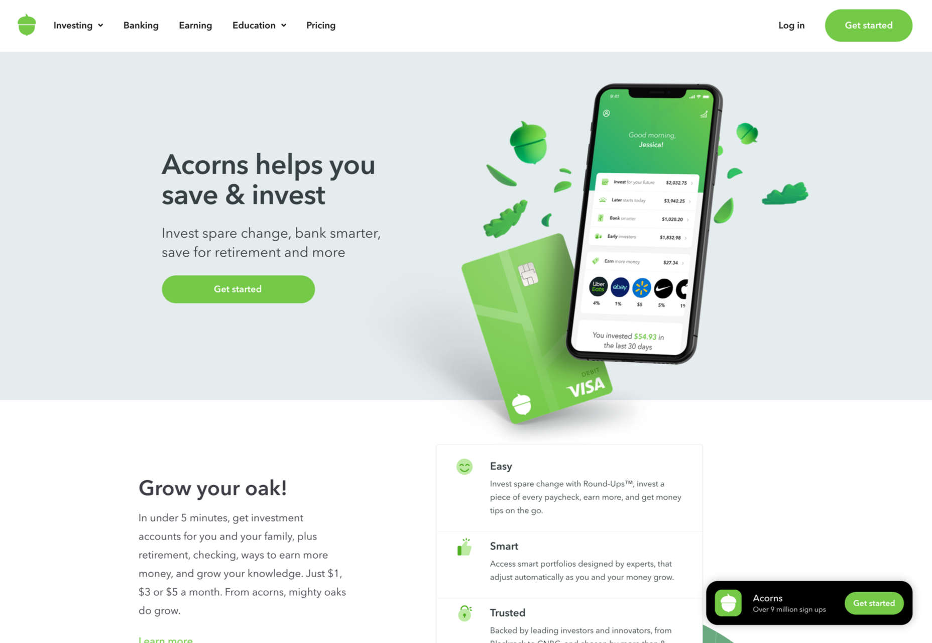
This creates a feel typical of newer companies (Acorns was founded in 2014), especially those that are primarily web-based.
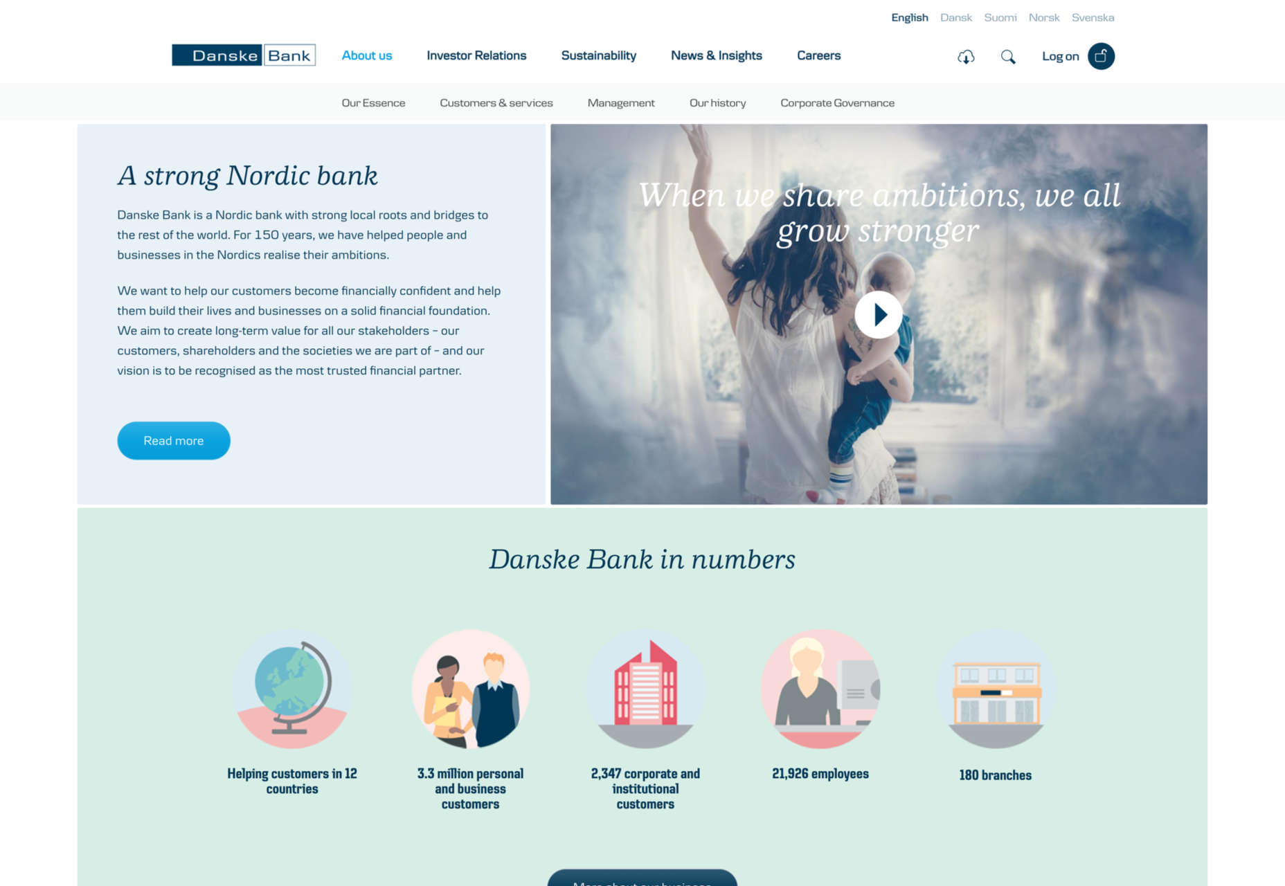
Longer established, more traditional organizations use illustration for the same purposes, although they may be restricted to certain areas only, where they want to emphasize approachability. Danske Bank, for example (founded in 1871), has illustration on its corporate site in the ‘About’ and ‘Sustainability’ sections.
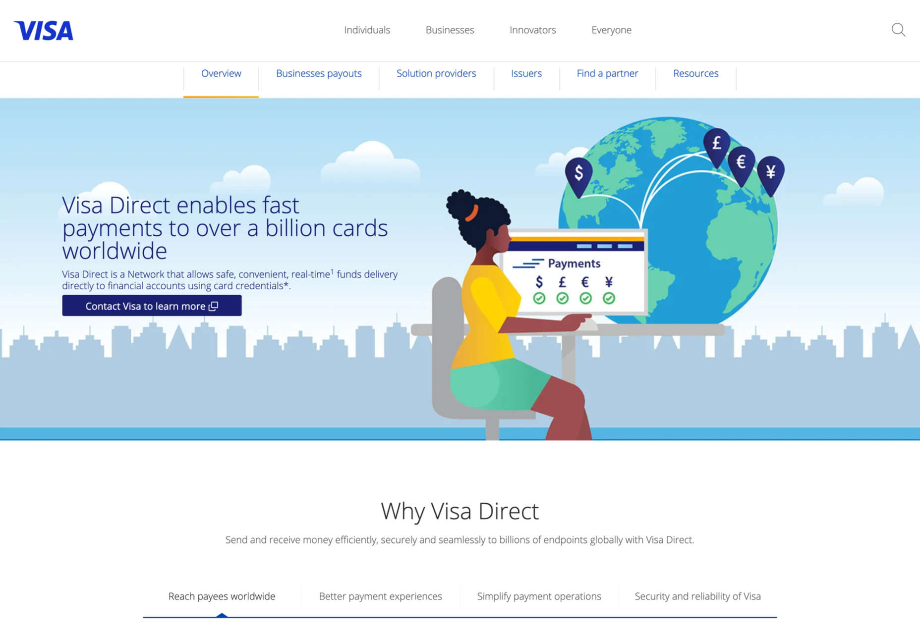
Visa also limits illustration to a specific area, the section on Visa Direct. This has the effect of separating this particular (newer) service from the rest of what Visa offers.
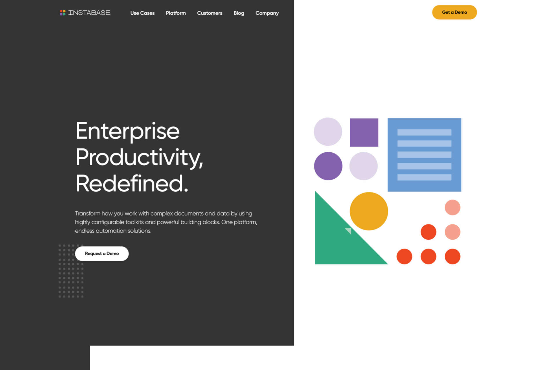
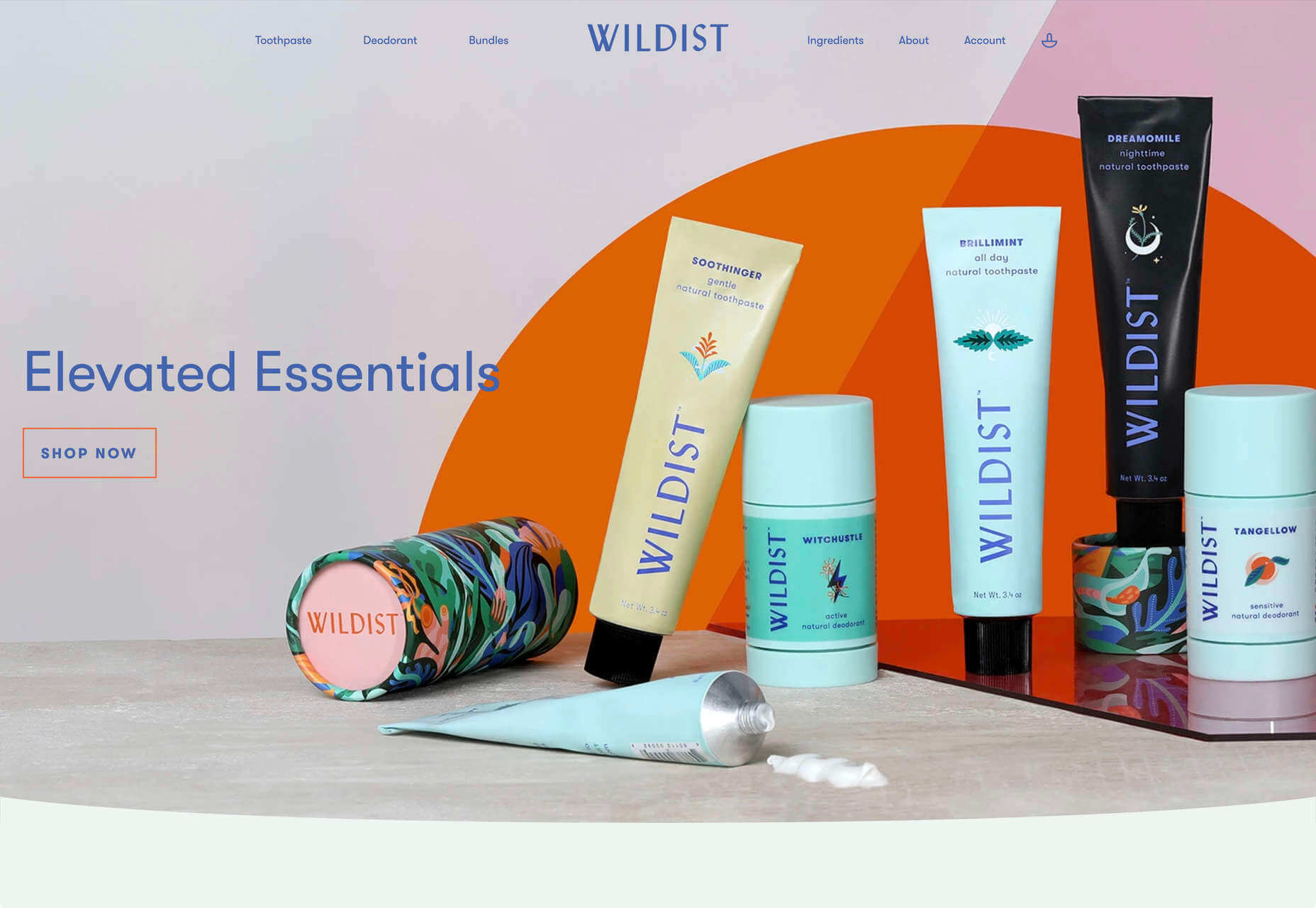
Another increasingly popular approach in this category is abstract graphics. This is particularly useful when it is difficult to show what is being promoted. For example, Instabase adds arrangements of geometric shapes for visual interest, using the same color palette as the site icons.
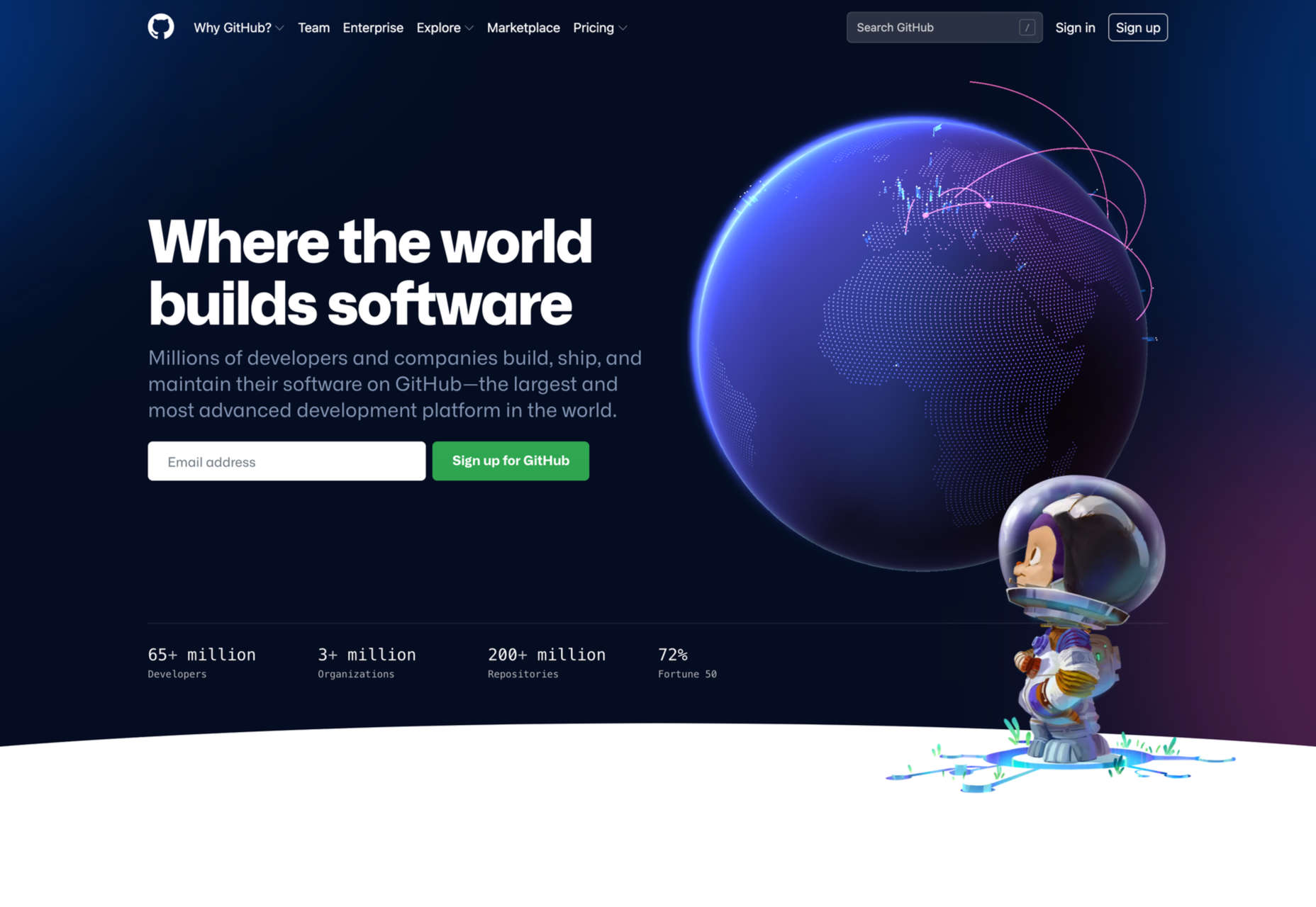
One of the key points with illustration in these types of sites is getting the balance right between friendly, human and approachable on the one hand and serious, trustworthy, and secure on the other. Get too cutesy, and potential customers won’t take you seriously. Github’s enterprise page does have some illustration, but the color is less vivid, and Octocat is only alluded to, unlike the home page which is illustration-rich.
Food & Drink
Things get a little freer when it comes to food and drink. Styles vary much more, and the personality conveyed can be stronger and more individual. Some still go for a light peppering of illustration, with aspects such as color and type made stronger, while in other cases, the illustration becomes much more prominent.
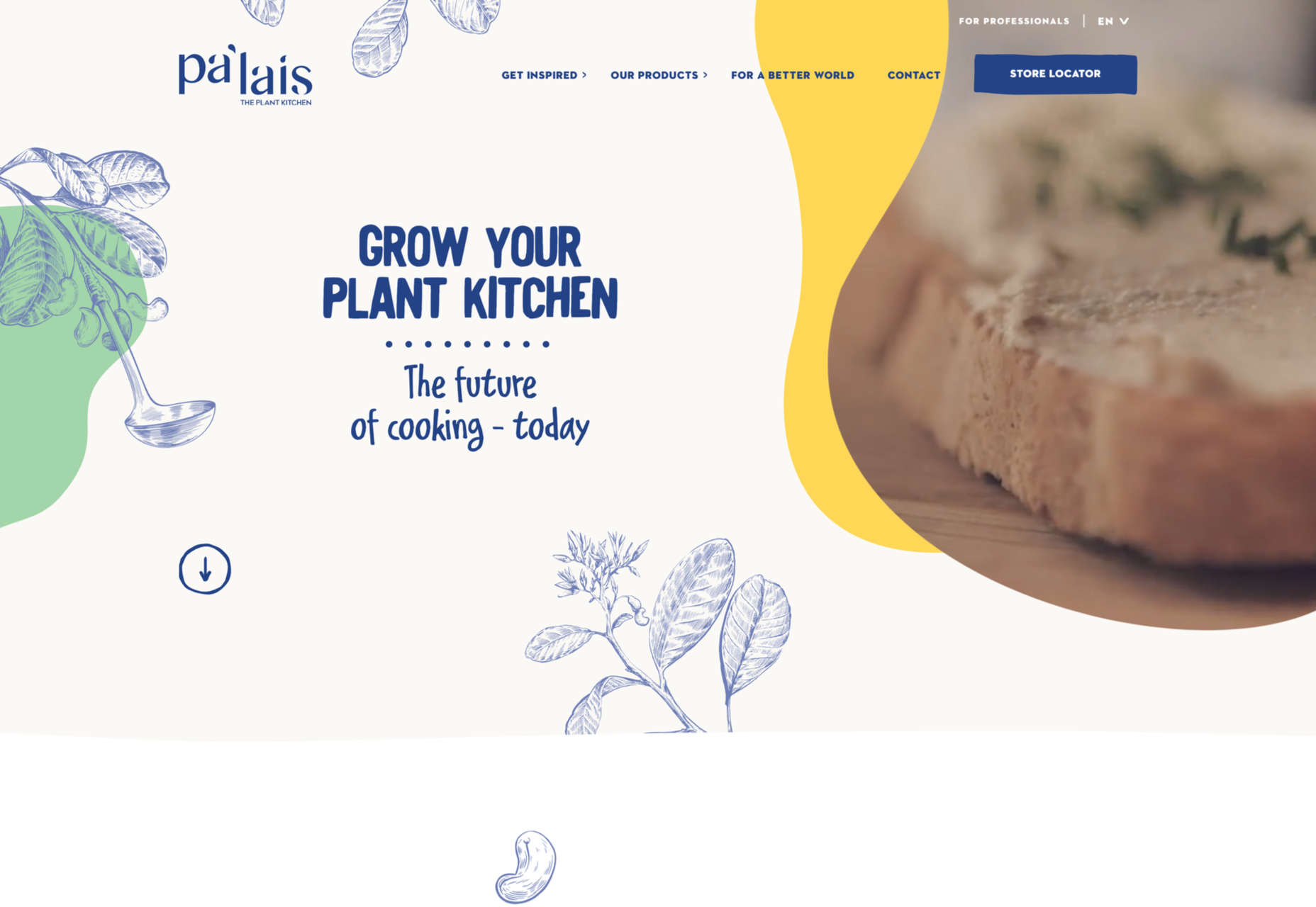
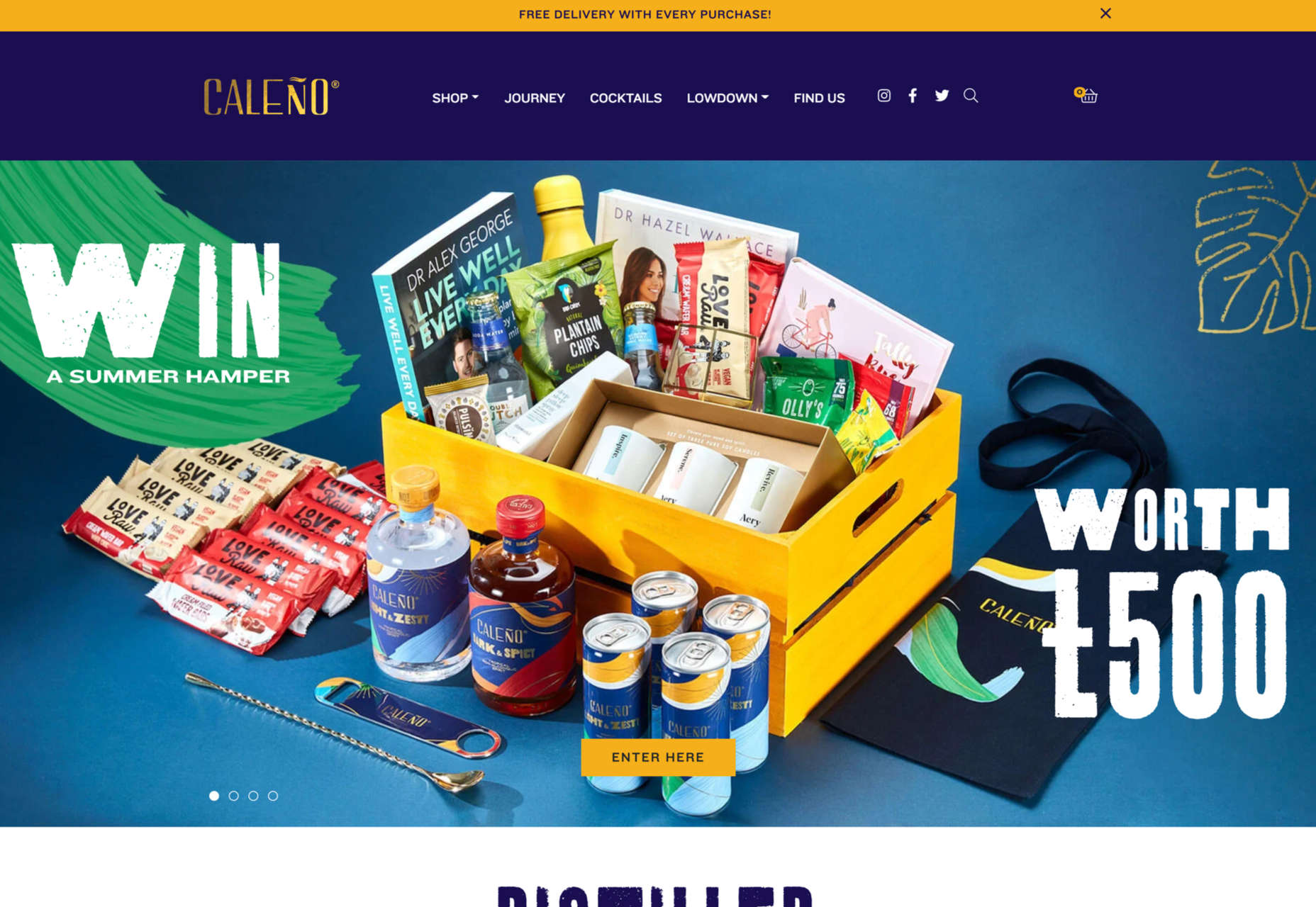
Palais Kitchen and Caleño both do the former, with brand-appropriate line drawings.
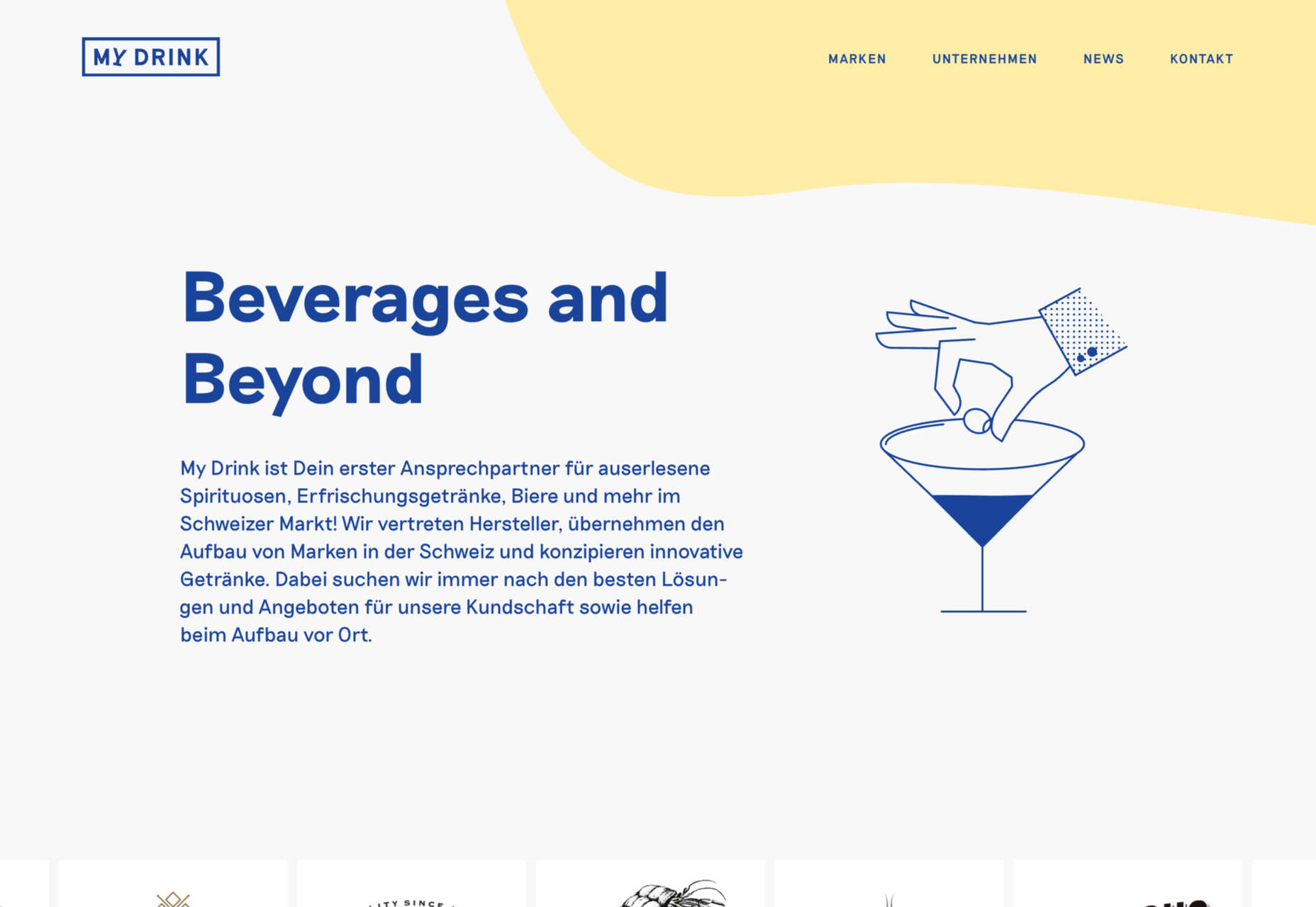
My Drink’s vintage-style animated illustrations take the place of photographs to balance the text on its home page.
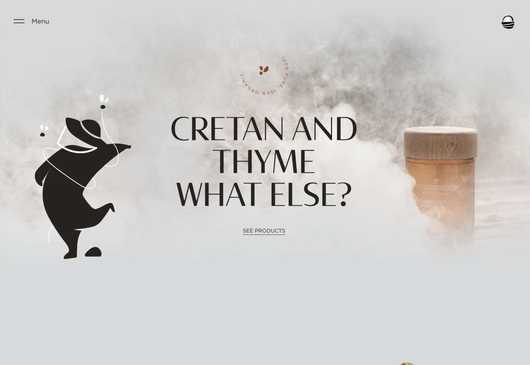
Melopeion Honey doesn’t use very many illustrations, but what it does use is large.
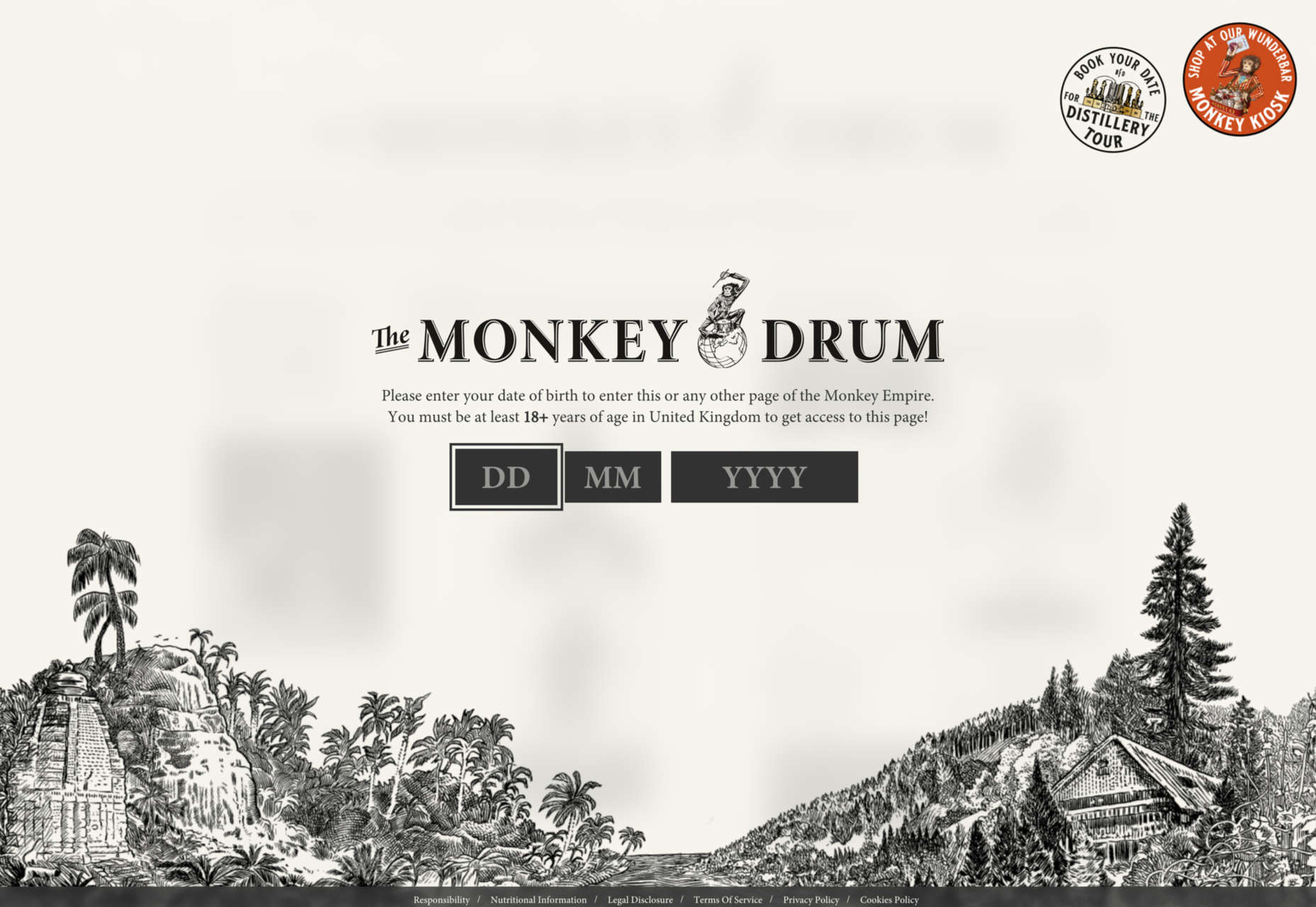
Monkey47 could be described as a concept website, and the illustrations play a key role. (The social media menu is really rather charming.)
Hospitality & Leisure
In this category, what users really want to see is photographs, but illustration can help too. A photograph can only show what something looks like, while illustration can add the extra emotional dimension connected to an experience.
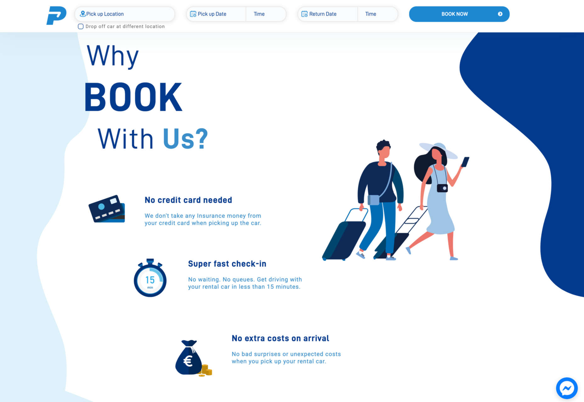
At the minimal end of the scale, Protos Car Rental uses some nice, simple illustrations to emphasize the holiday aspect of its business.
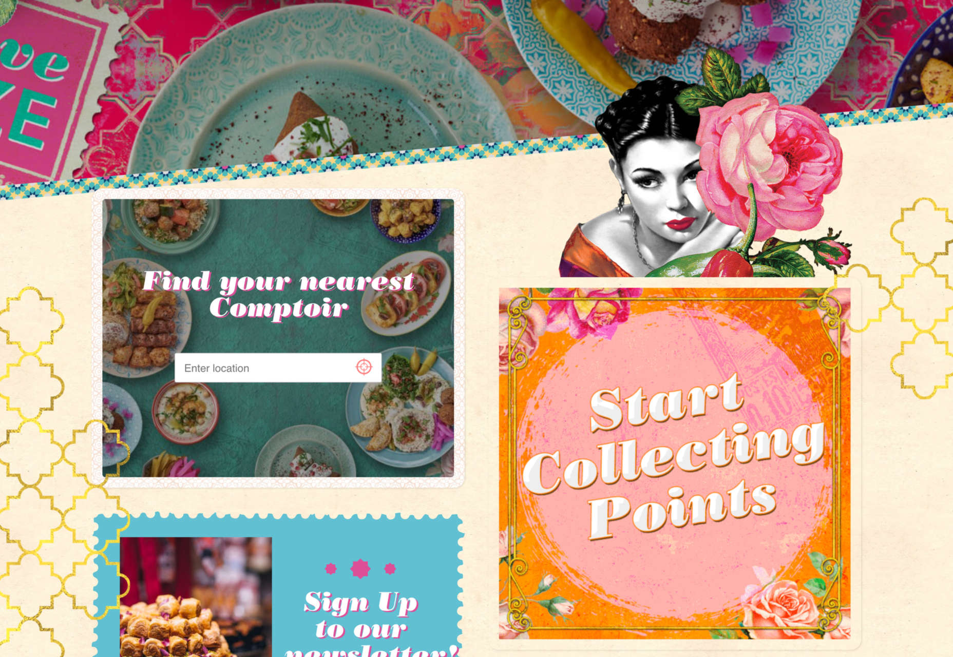
Comptoir Libanais blends photographs with illustration to create a very distinct identity.
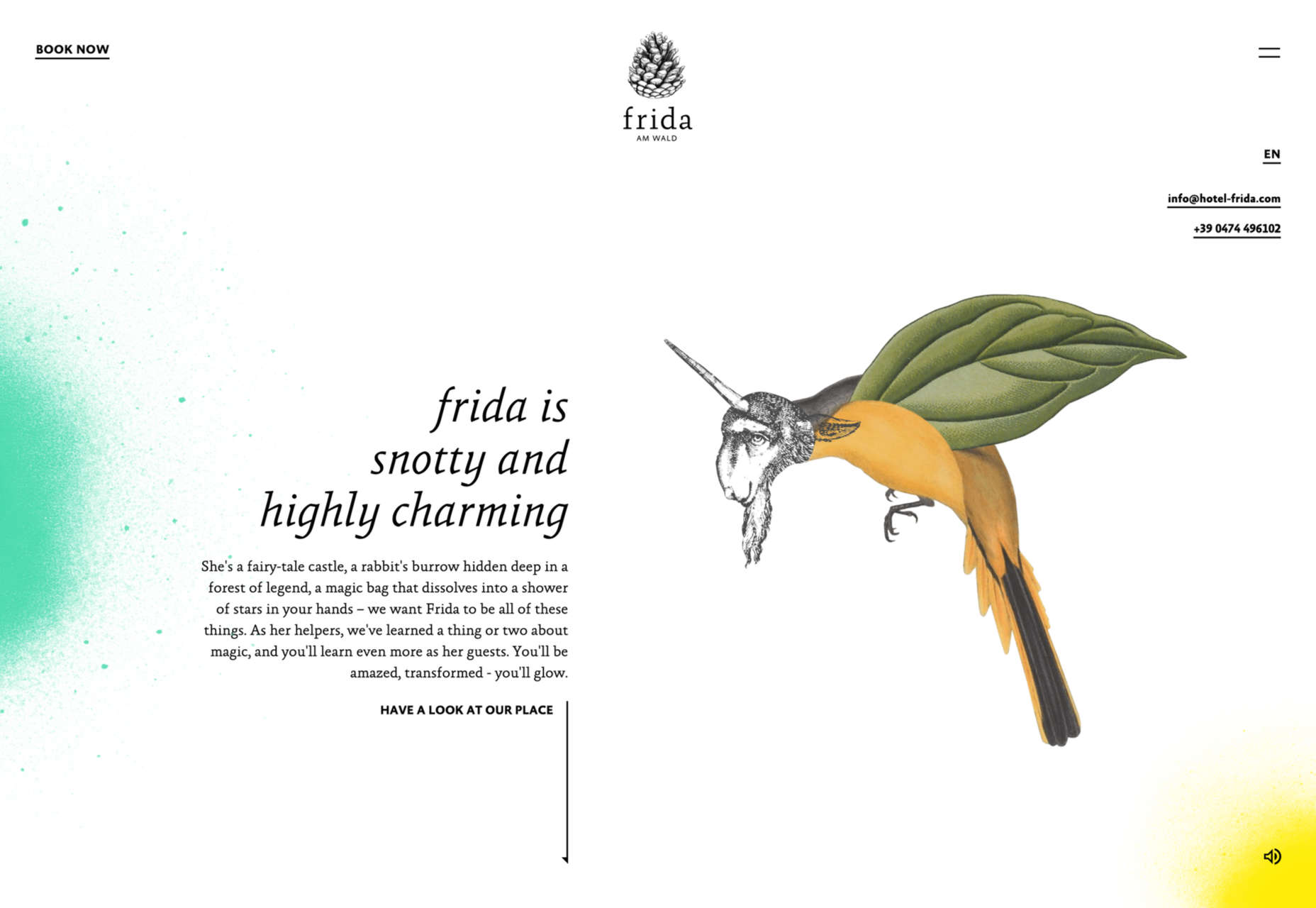
Hotel Frida is also about character, and the victorian-style fantastical animal illustrations help create a quirkiness.
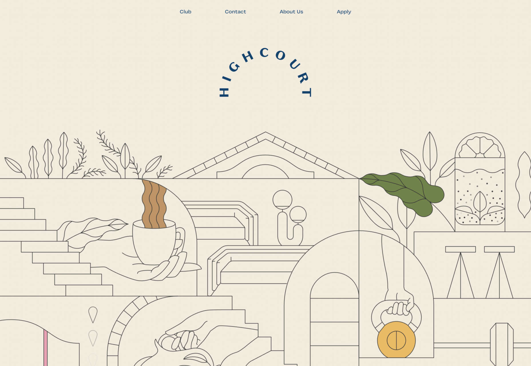
Highcourt uses simplified and stylized layout illustrations to give a complete overview of the building’s interior than photographs could.
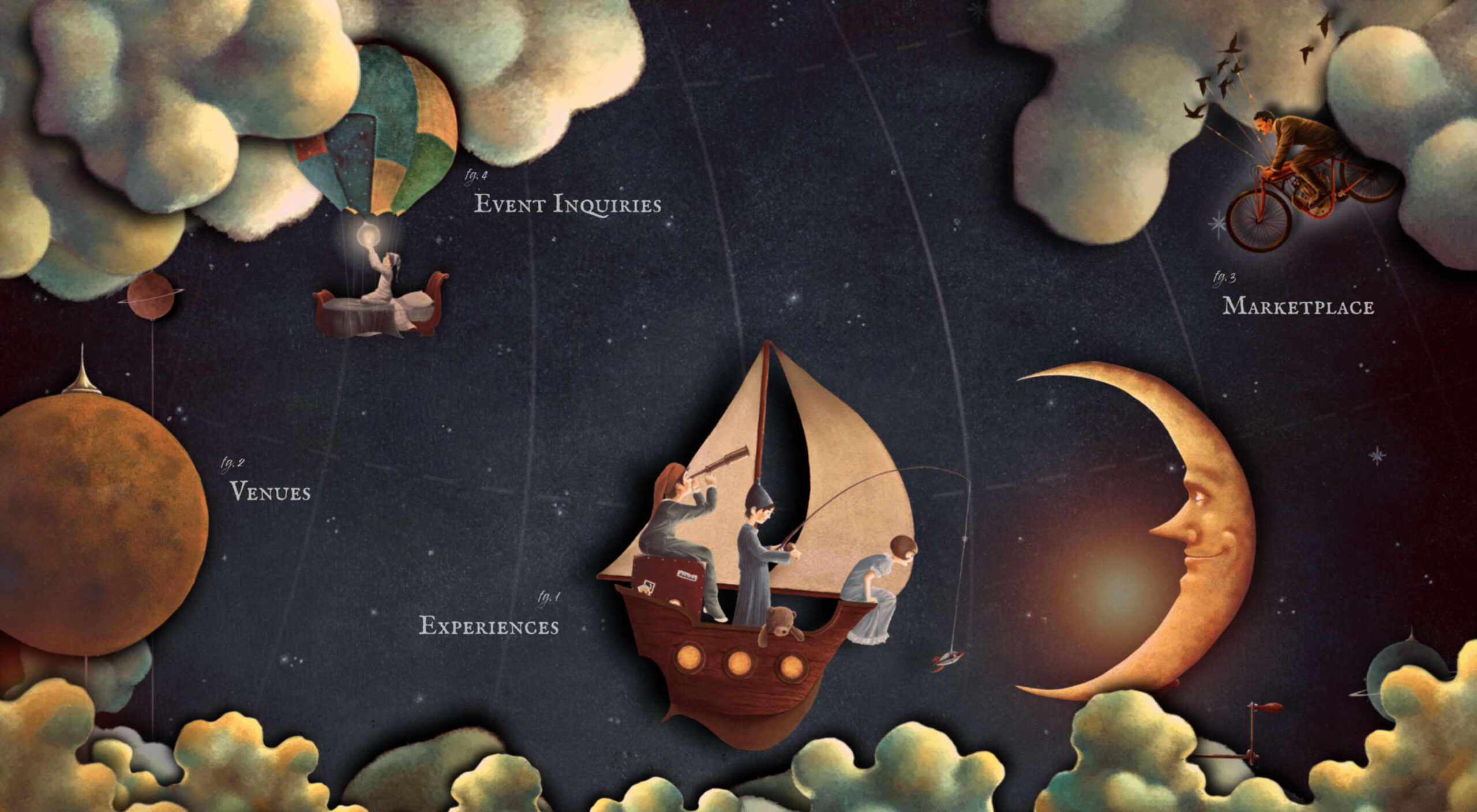
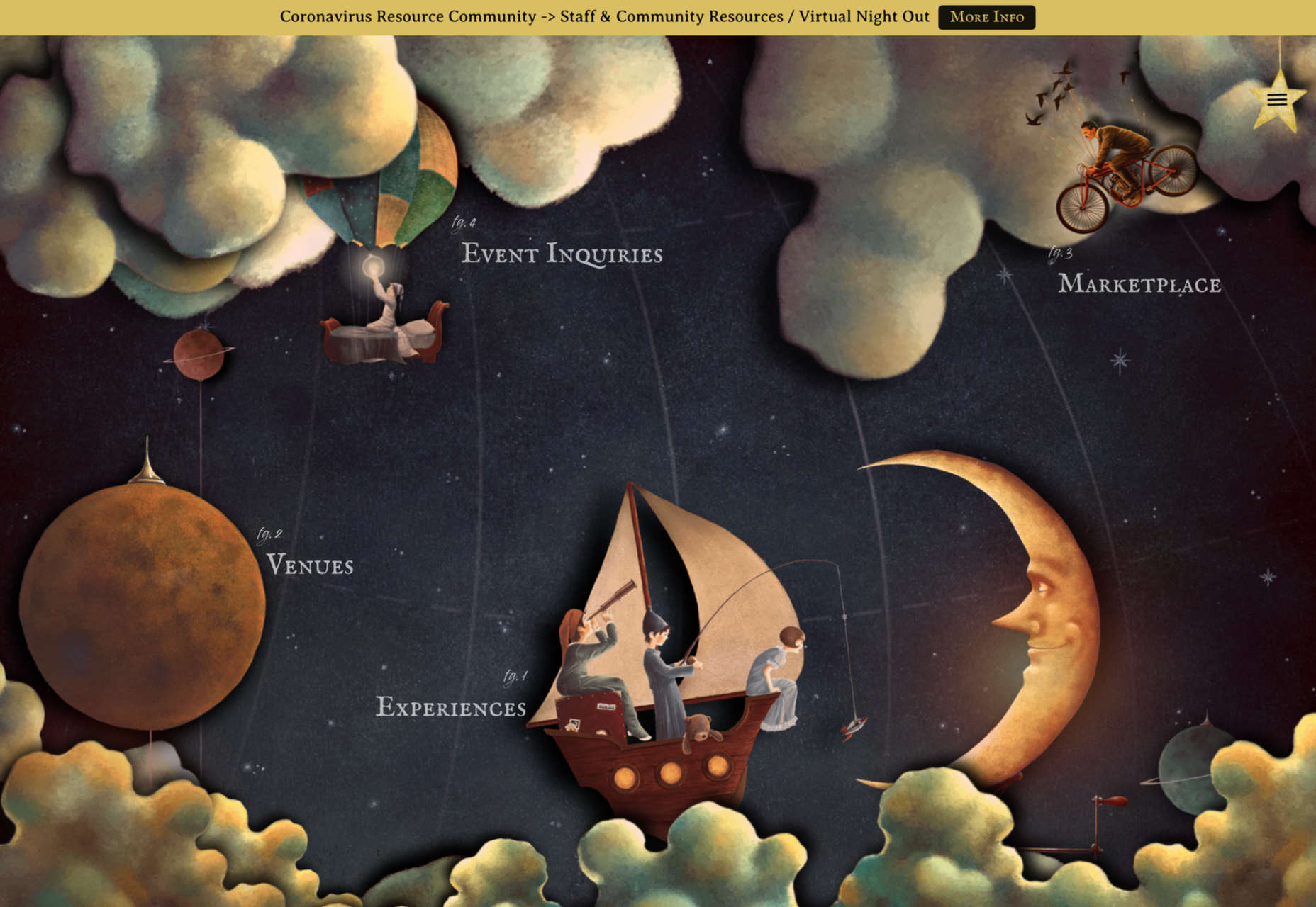
The Neverlands doesn’t just use illustration; the whole site is an immersive experience based on illustration.
The Responsible Web
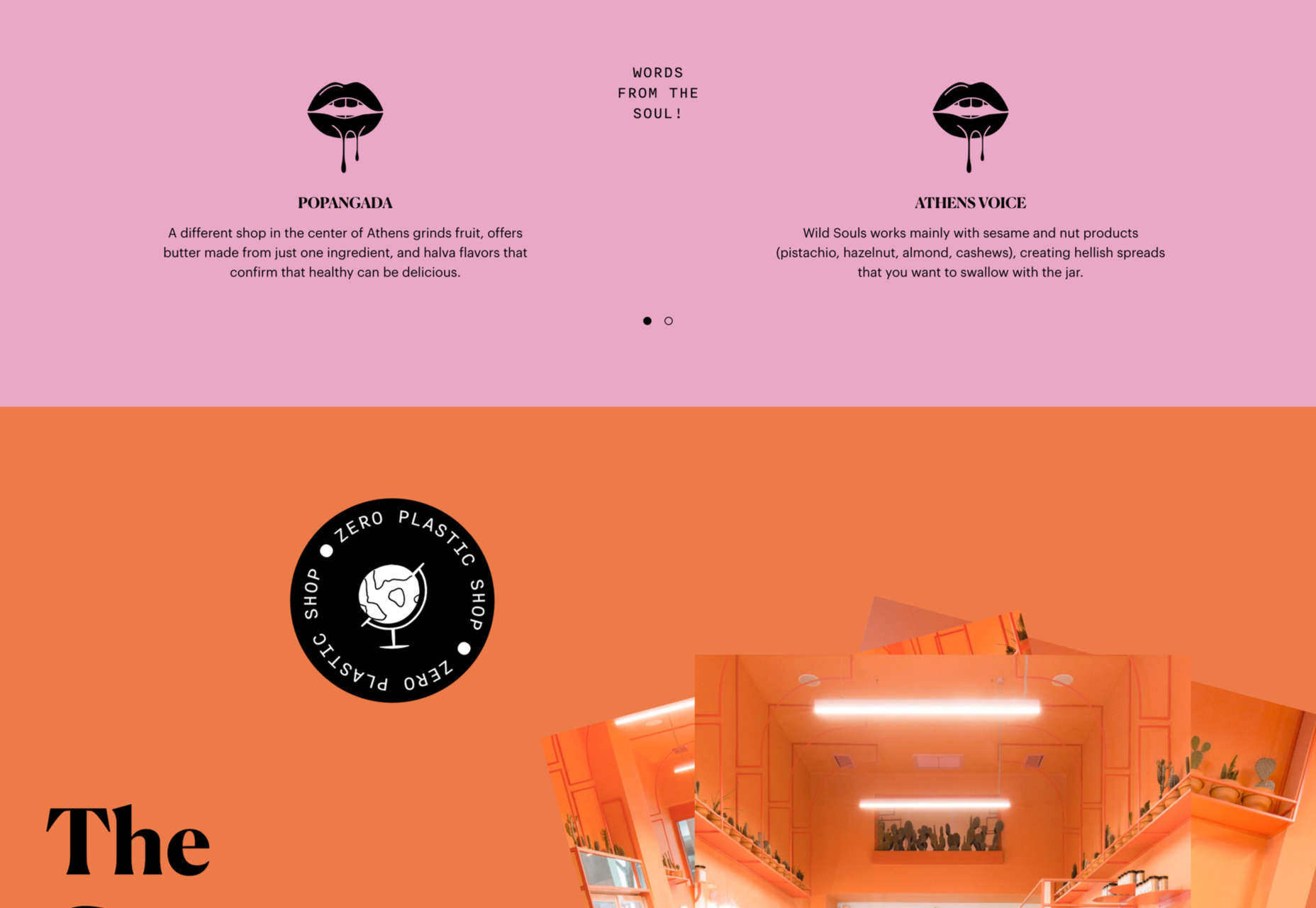
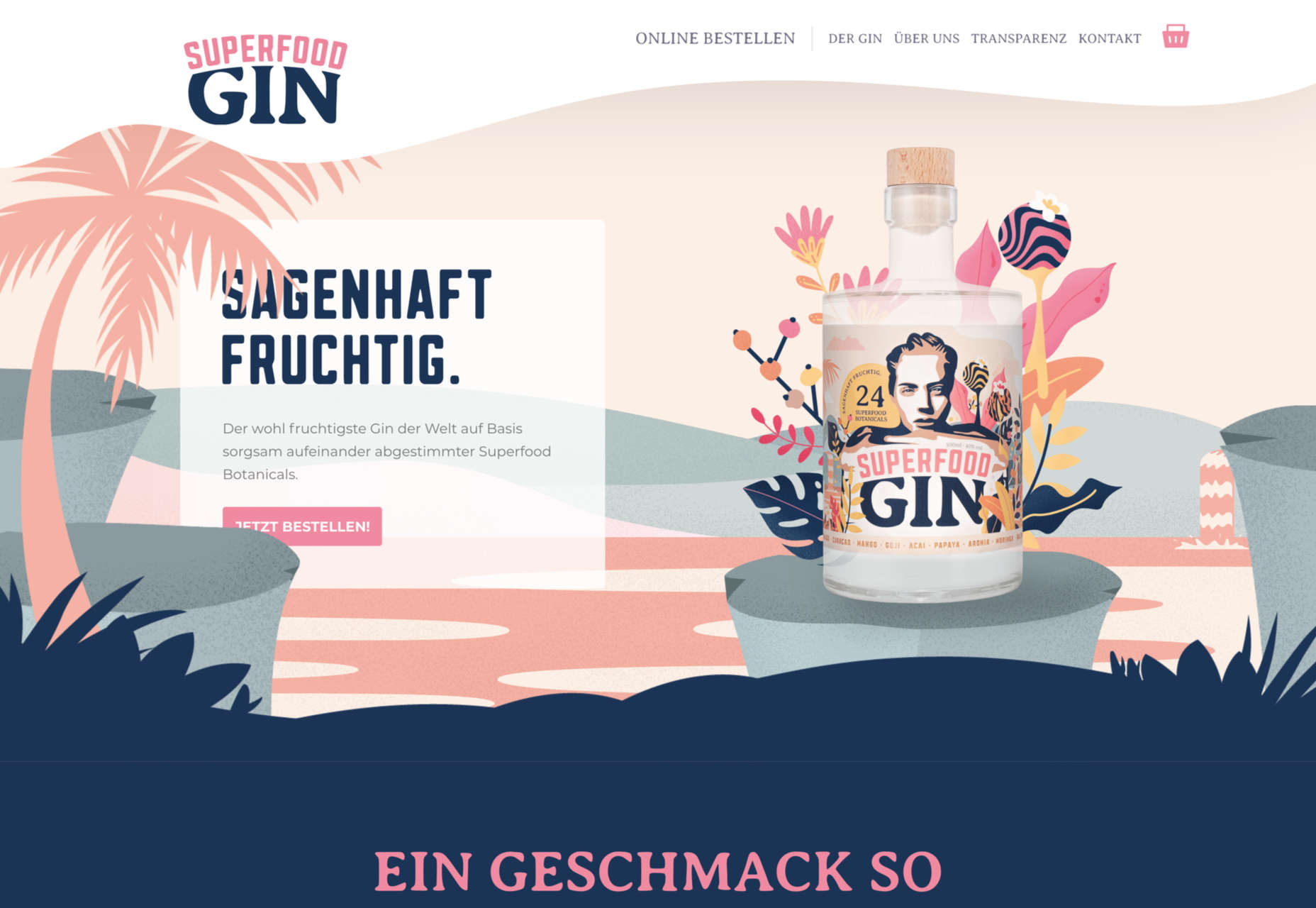
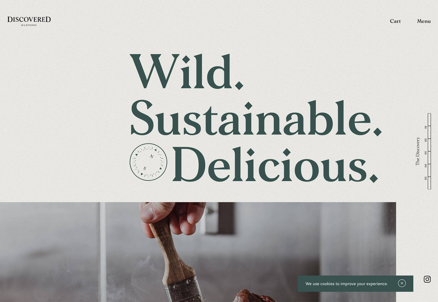
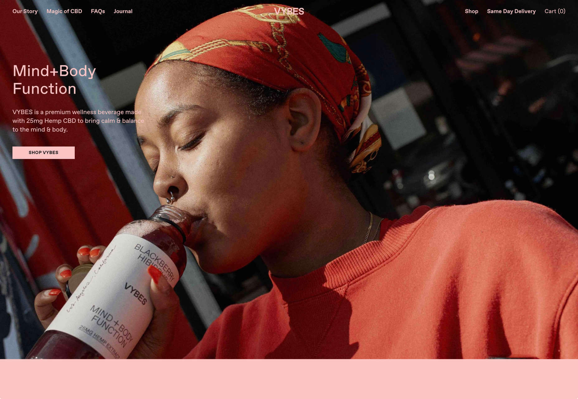
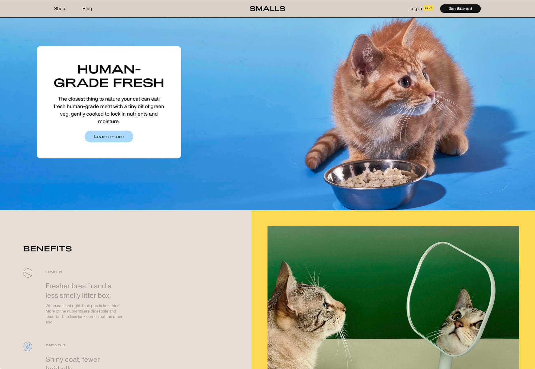
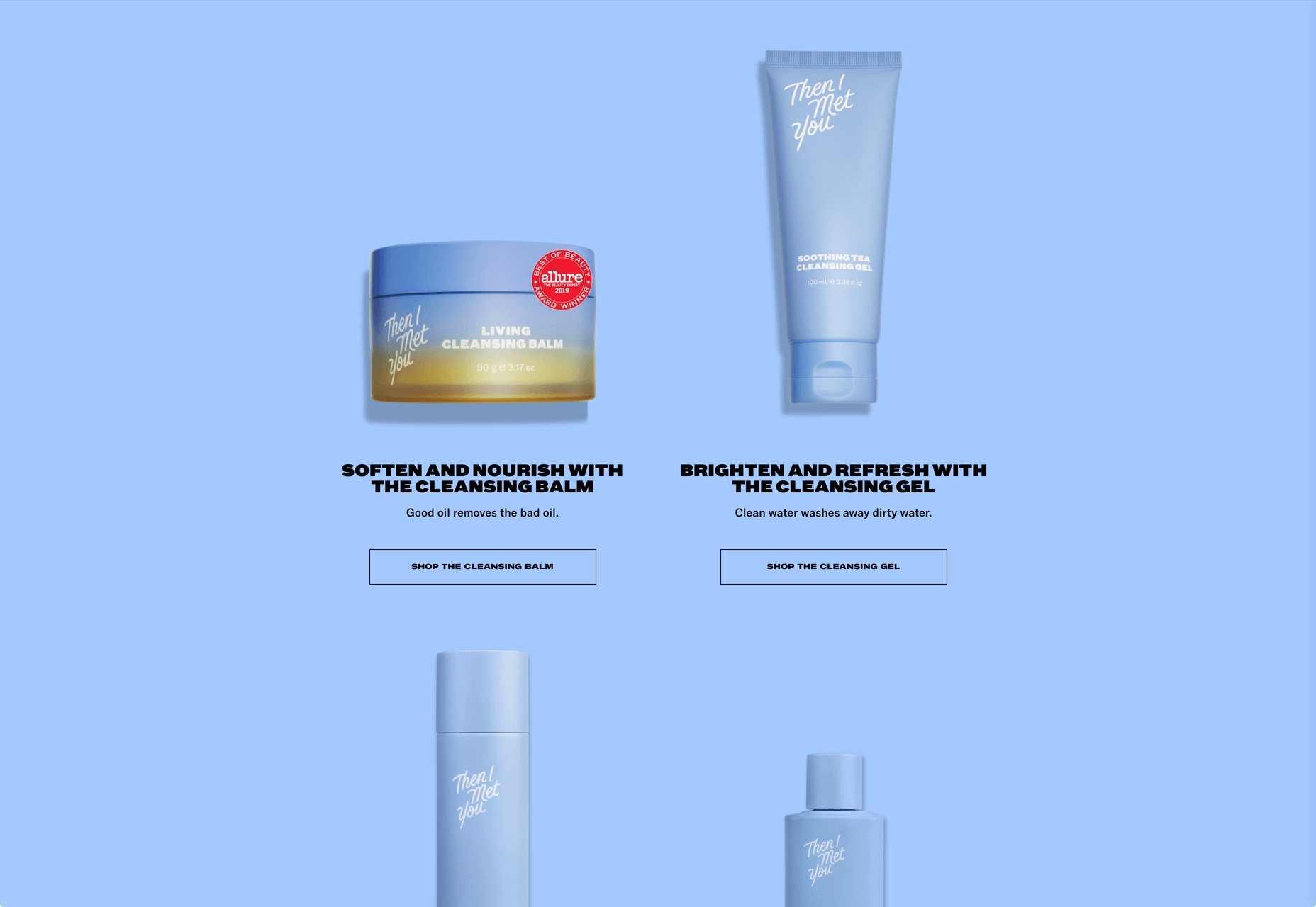
Sites promoting ethical and or sustainable companies, natural skincare, natural and/or organic food and drink, vegan products, social responsibility, and so forth tend to rely heavily on illustration, particularly if they are reasonably new.
Quite often, this is in the form of plant drawings that make a lazy allusion to nature, but it can also involve conveying information in a way that doesn’t come across as lecturing.
Wild Souls steers clear of any hint of hippiness, with a sense of randomness to its illustration placement.
Superfood Gin does the plant thing, but it is in reference to the botanical ingredients here, so it is very relevant.
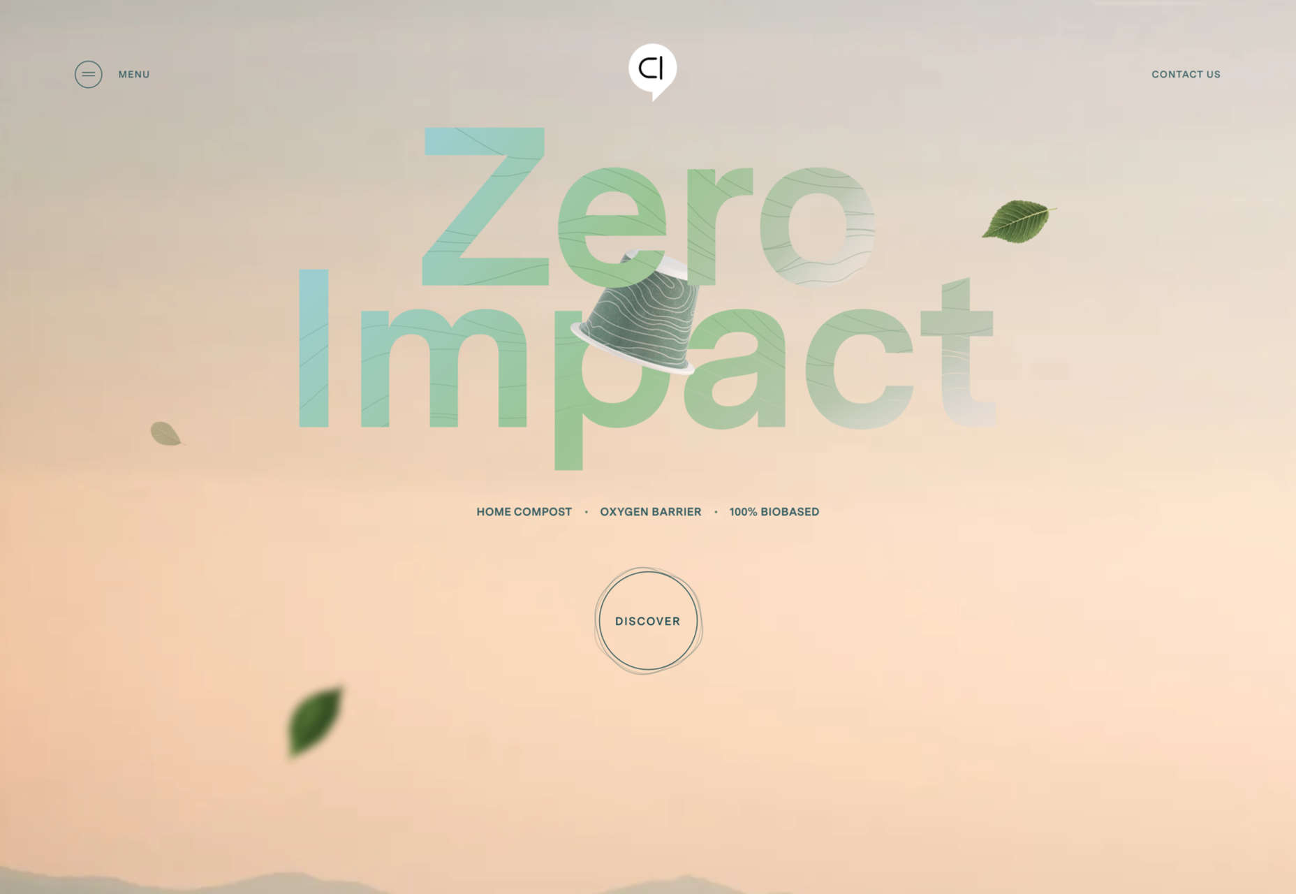
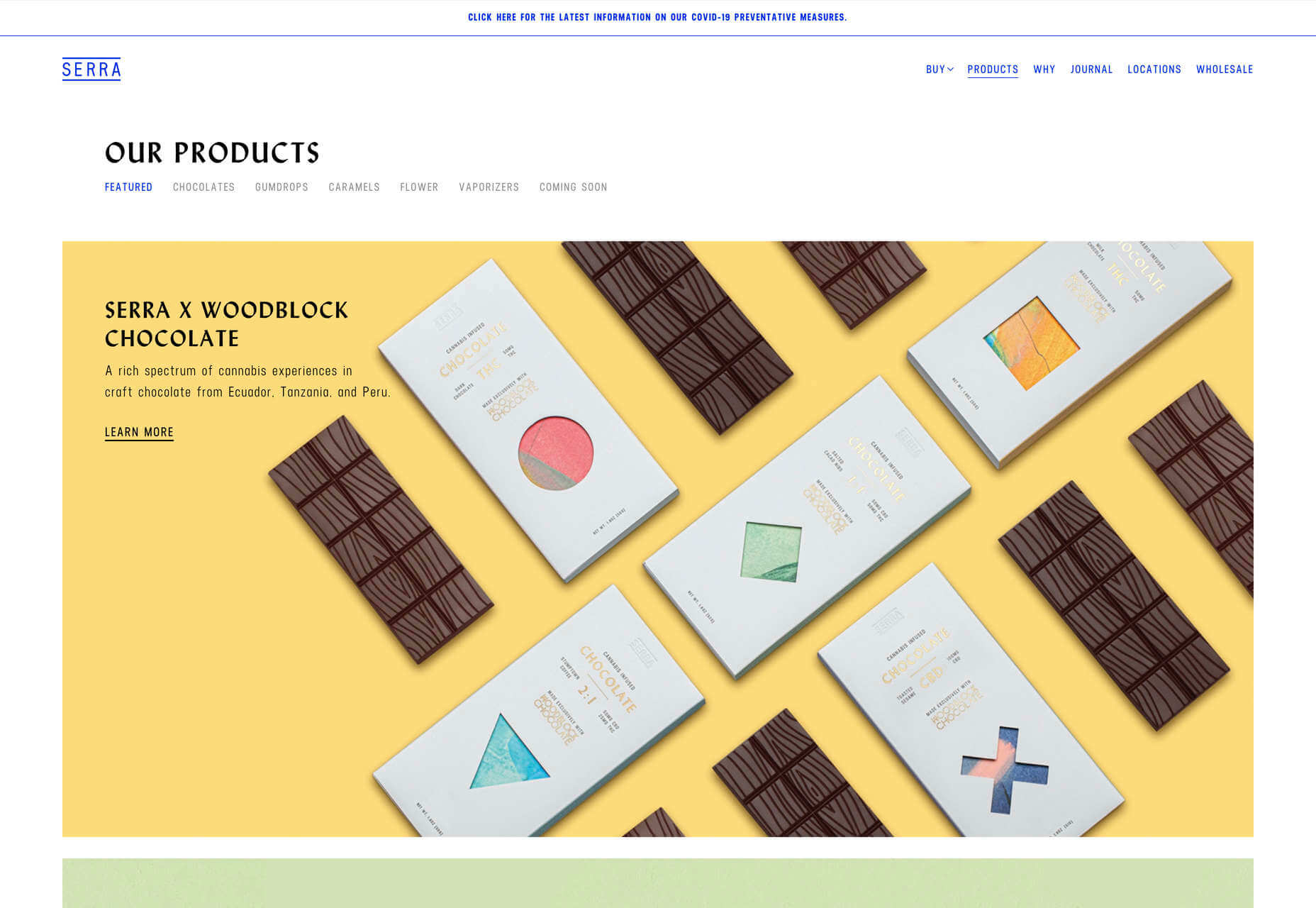
Capsul’in’s main company page is a fairly standard offering, but for its Zero Impact product, it has a separate section with illustrations to help explain the product’s features.
Donate Responsibly uses illustration to explain how well-meant action can be inadvertently damaging without appearing to scold or patronize.
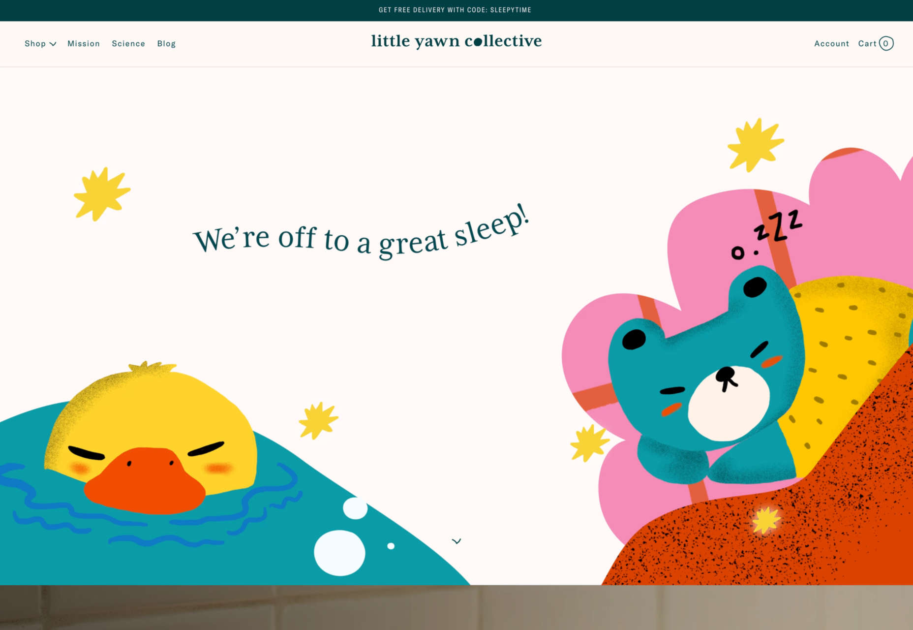
A variety of children’s brands will use illustration — even when it is parents or guardians who are really the target — and Little Yawn Collective combines the child-friendly, and natural product approaches with its sleepy animal illustrations.
Using Illustration on The Web
Illustration can be a powerful tool in a designer’s arsenal, but it can be difficult to get right because it invokes emotion, and emotion is subjective.
Just like type or color, it needs to be used appropriately and with care. Sometimes less is more, and sometimes getting the placement absolutely right can make the difference between a successful design and a flop.
This is just a selection of the wide range of illustration styles and usages out there on the web, but we hope it will give you a starting point when you are considering whether and how to use illustrations in your next project.
The post How Illustration Adds Emotion To UX first appeared on Webdesigner Depot.


 Sass – the extended arm of CSS; the power factor that brings elegance to your code.
 Design can make a statement. It evokes feeling and can encourage thought and conversation. That’s the common theme among the three trends in website design this month.
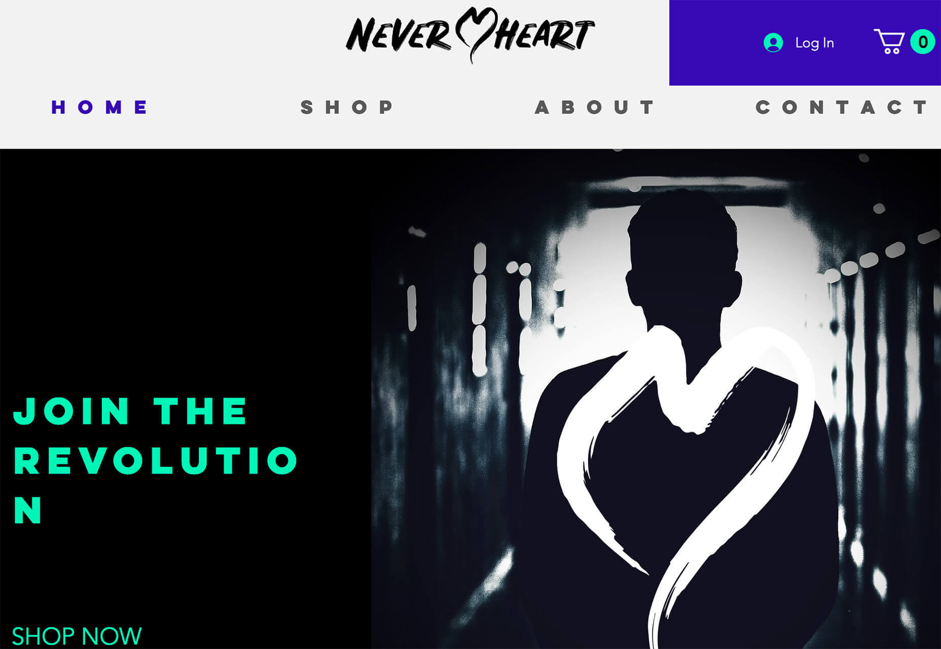

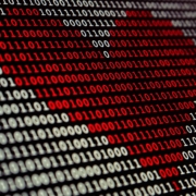
 Artificial intelligence. Just hearing the phrase has been a trigger for many in the technology world since that creepy Haley Joel Osment film circa 2001. But more recently, artificial intelligence and machine learning strike fear into the hearts of skilled workers for an entirely different reason: job security, or lack thereof.
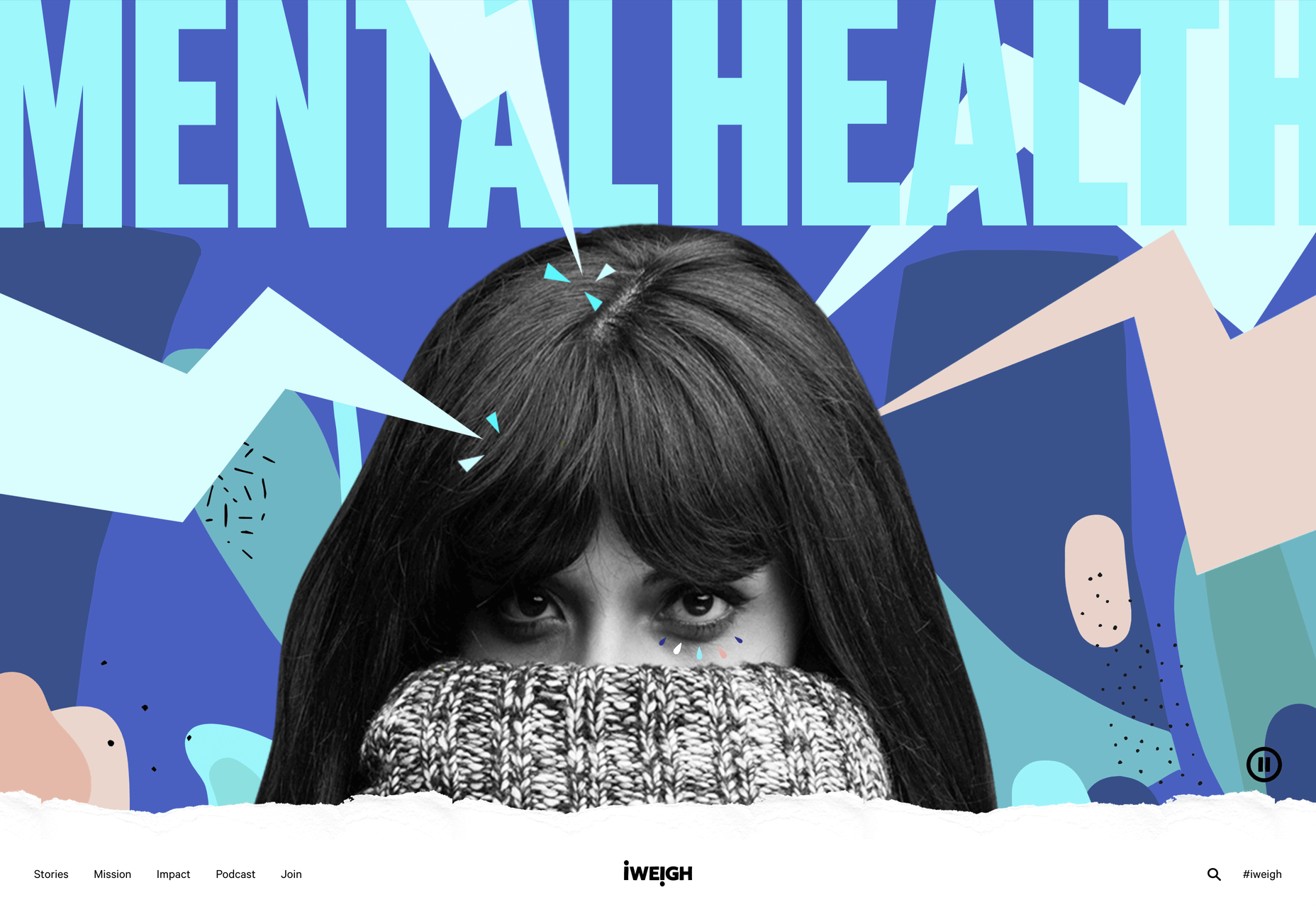
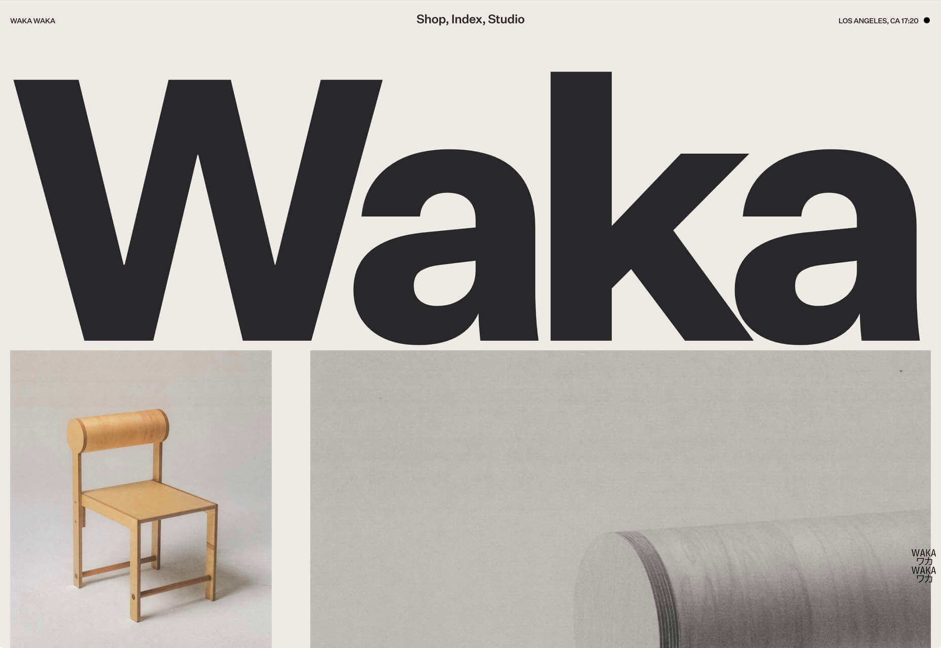
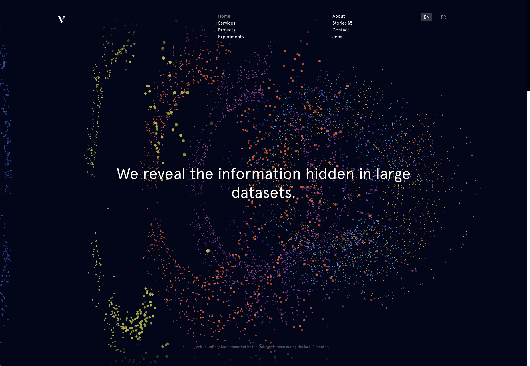
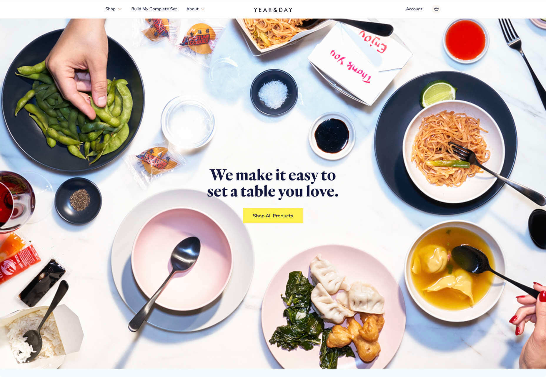
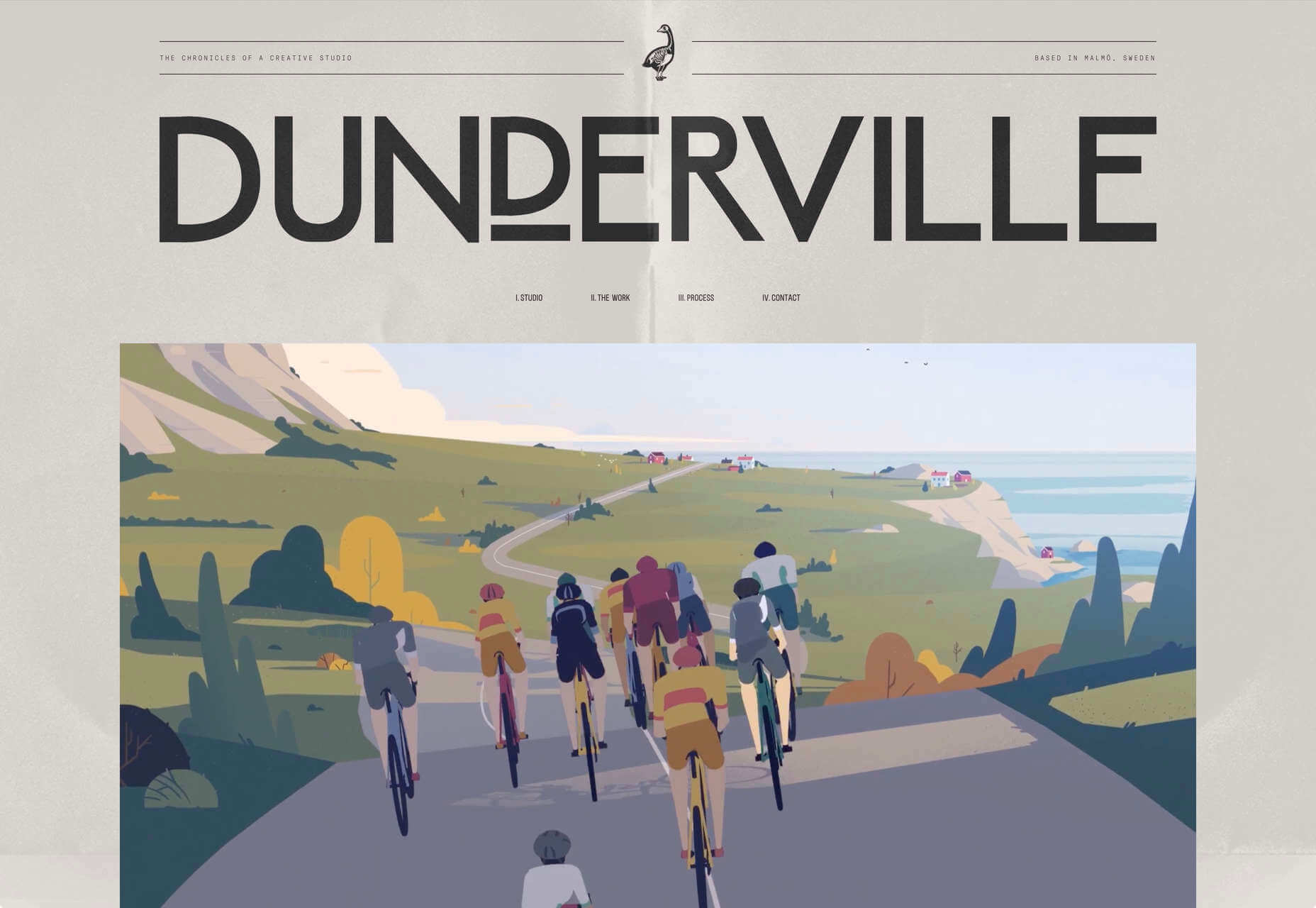
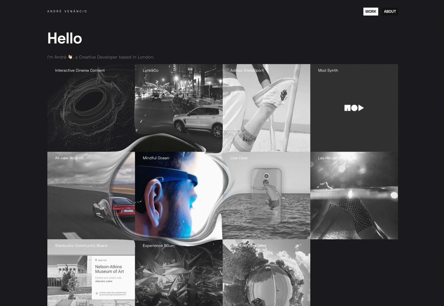
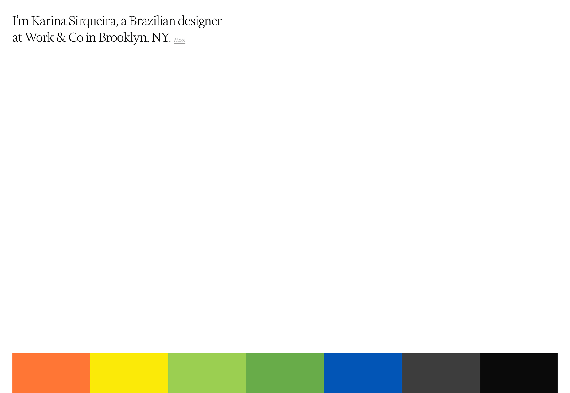
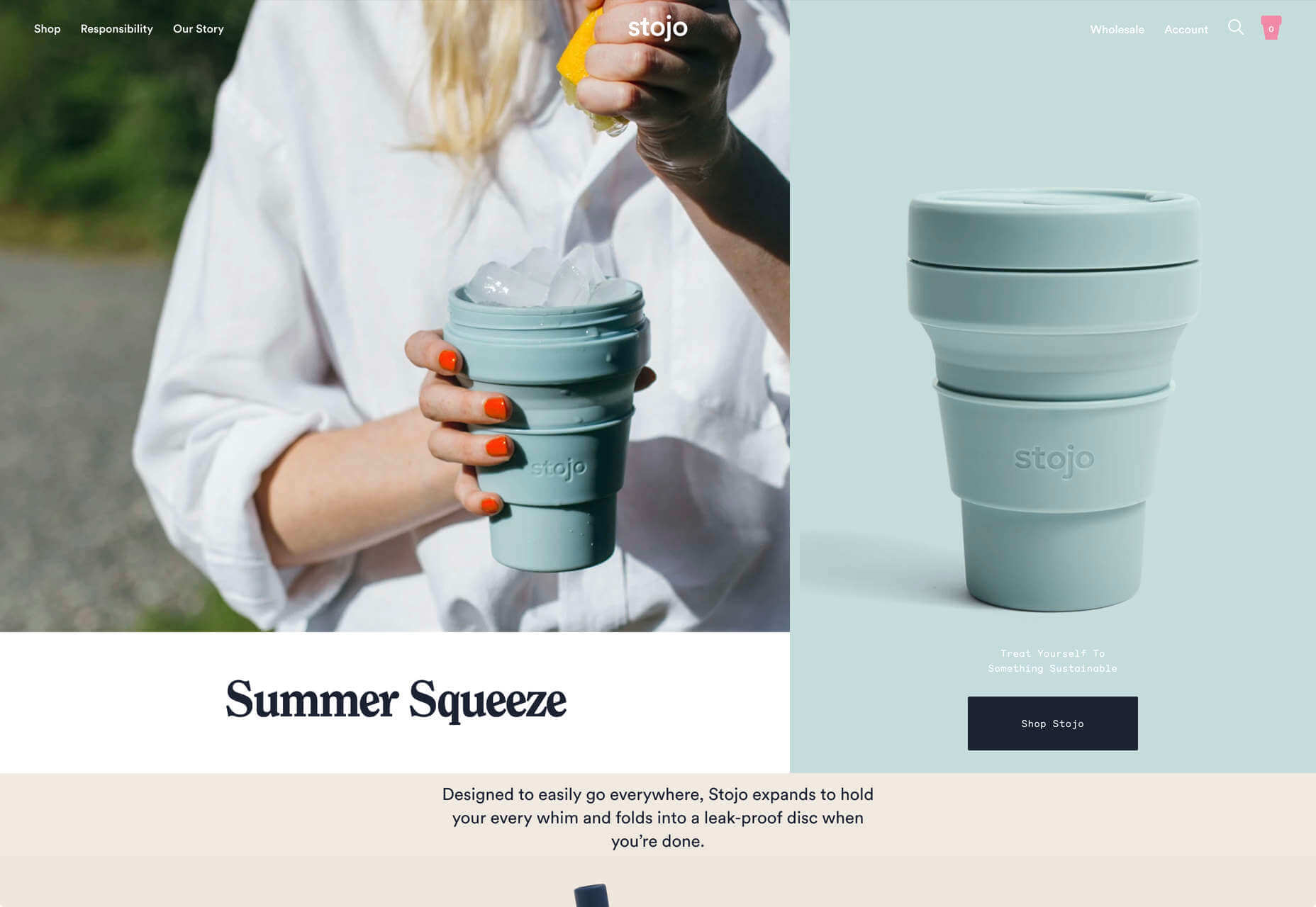
 After six months of uncertainty 2020 is finally beginning to find a style of its own. There are nods to Brutalism, a delightful blending of 80s pastels with 90s primaries, and the font style of choice is anything but geometric sans-serif.
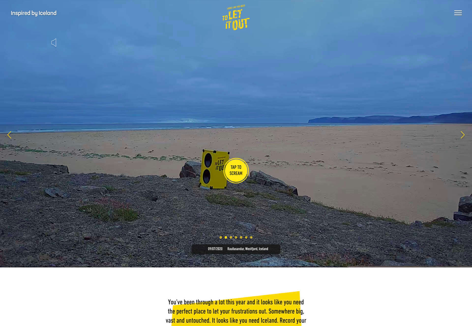
