 Whether you’ve worked with a few WordPress themes to design websites or worked with many of them, you’ll no doubt agree that plenty of WordPress themes that are visually gorgeous on the front end can be terribly unattractive and extremely awkward to use on the backend.
Working with a WordPress theme can sometimes be difficult, but it can be different.
Want proof? Look no further than with BeTheme.
BeTheme, with 260,000+ sales and counting and a 4.83-star user rating, is one of the top 5 best-selling WordPress themes of all time.
In this article, we’ll show you one of the many reasons why this is the case by focusing on how BeTheme’s backend is designed to make web design tasks more manageable.
Enhance your workflow experience with a WordPress theme backend that won’t stress you out
Once you install BeTheme, you’ll almost immediately notice it’s different. Instead of a drab and often unintuitive WordPress backend, you’ll suddenly be confronted with a clean, well-organized dashboard and toolset.
You haven’t actually lost anything. WordPress, with its impressive assortment of content management tools, is still there. Be’s backend is a visually appealing space in which you will take pleasure to work.
If only the rest of WordPress could follow suit.
If you haven’t worked with BeTheme recently (or at all), why not let us walk you through several of its most helpful backend features.
Starting with:
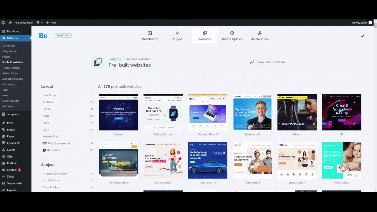
1. Dashboard Design
BeTheme’s dashboard is conveniently located directly beneath the main WordPress Dashboard link. So you won’t waste time sifting through the sidebar trying to find your theme’s settings, and everything displayed in the dashboard is designed to help you get the most out of your WordPress theme.
Clicking on the BeTheme or the Dashboard link gives you immediate access to the following:
- Theme registration information
- BeTheme’s step-by-step website creator
- A Navigation bar that directs you to BeTheme’s frequently used tools
- Plugin status and updates and new features announcements
- The latest additions to BeTheme’s ever-growing library of pre-built websites
- Beloved BeTheme integrations
It takes a minute to fully appreciate how helpful this dashboard will be.

2. Dark/Light Mode
Research on dark mode benefits is inconclusive. But since so many people seem to like it, it is offered as an option in many popular apps and devices.
Dark mode users will tell you that they experience less eye strain, they sleep better, and their device’s batteries last longer than is the case with light mode.
BeTheme’s backend offers a dark mode option, and you are encouraged to try it.
If you feel it beneficial, so much the better, and you needn’t concern yourself with what the research indicated, or didn’t indicate.

3. Step-by-Step Website Creator
When you first install a WordPress theme, it’s not uncommon to spend some time trying to figure out what to do next. The theme’s advertisements may highlight a selection of impressive demos, but where are they more exactly?
Of course, you’ll eventually find them, but is whatever difficulty you may have encountered necessary?
BeTheme removes that impediment.
You will notice the Setup Wizard under BeTheme (and in the dashboard as well.) Click on the wizard, and with its step-by-step website, you can:
- Give your website a name.
- Select the page builder you want to work with and choose your preferred editing mode.
- Pick an ideal pre-built website based on your new website’s industry or niche.
- Easily replace existing content with your own.
The entire process of loading your brand-new site and page builder into WordPress takes a minute (or more like 30 seconds once you are used to it).

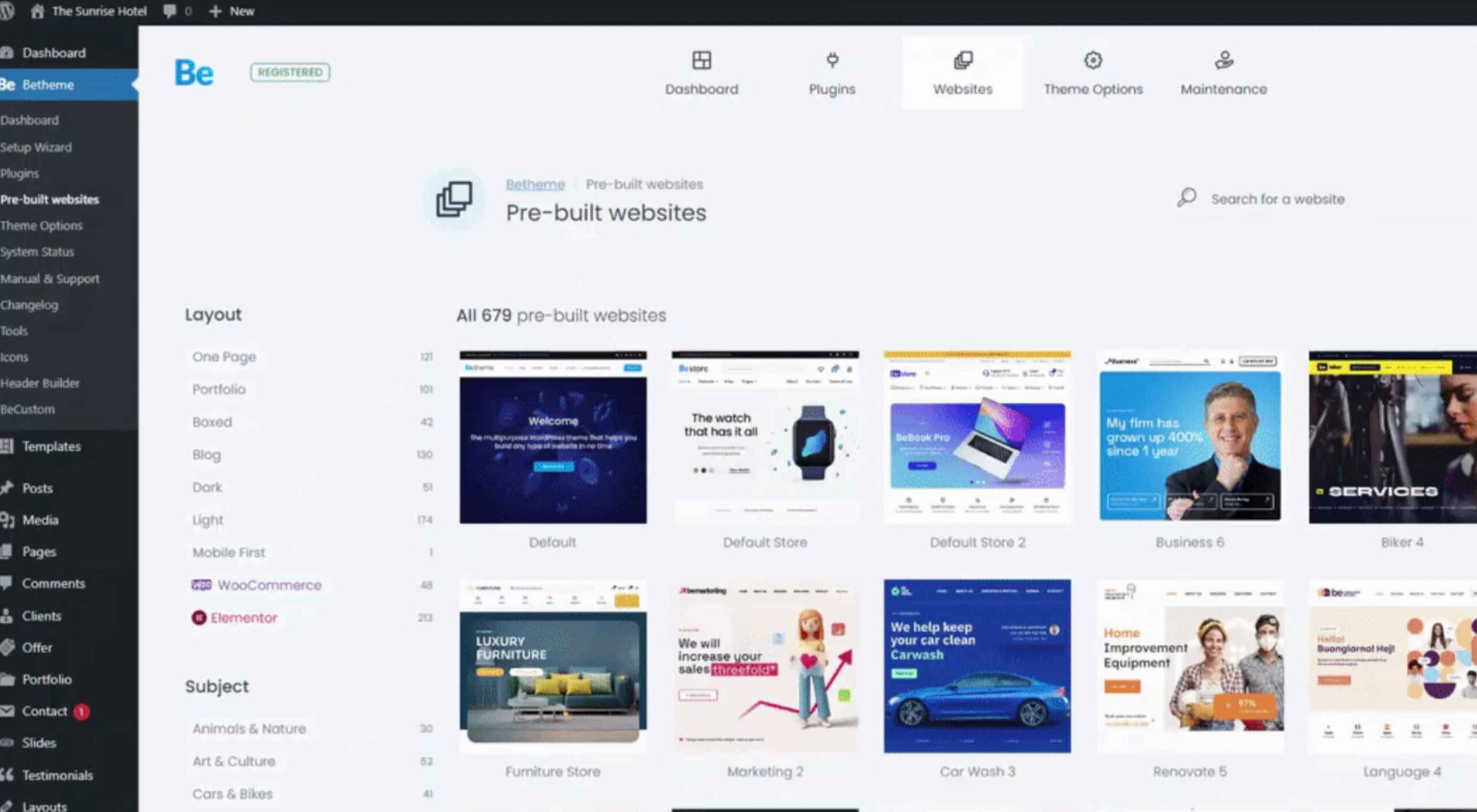
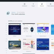
4. Pre-Built Site Previews
With BeTheme, you can choose from more than 650 pre-built websites. New ones are being added as we speak, and they’re delightfully easy to find. Just look under the dashboard’s Websites link or Pre-built Websites in BeTheme’s sidebar menu, and there they are!
You’ll be familiarized with the available design aids and options in no time, and you’ll find it easy to incorporate the latest design trends into your websites. BeTheme has even placed previews of its newest pre-built websites in your dashboard to help you along.
You may choose one of the latest pre-built websites to work with, or you might find one or more others you particularly like. Pre-built sites you do not plan to work with can still be sources of inspiration.
Whatever your choices, you’ll find it easy to incorporate the latest trends into website designs.
5. Plugin Manager
BeTheme’s Plugins area differs from what you see in the WordPress plugins area. You’ll find several of these differences to be particularly helpful in that BeTheme’s plugins manager enables you to:
- View the active plugins you’ve installed.
- Update plugins when necessary.
- Install and activate plugins only when it’s required.
The last item is essential in that plugins do not appear in the WordPress plugin manager until you have installed them. Not having to install plugins you will not need will help keep your website operating at a high level of performance.

6. BeTheme Support
WordPress is a powerful content management system and an extremely popular one. It may, in fact, be the most powerful and popular system of its type.
WordPress is also community-driven to a considerable extent, which can sometimes create user inconvenience. As a user, you might sometimes have to dig to find answers to your questions or get help when needed.
You don’t have to experience that inconvenience to get support from BeTheme.
To gain access to BeTheme’s support center, you need go no further than BeTheme’s sidebar or dashboard to access self-support options or open a ticket for direct assistance.
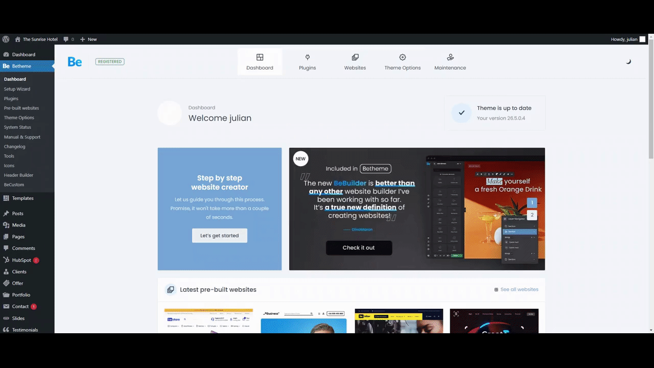
7. Theme Options
Plenty of well-known WordPress themes have theme settings customization capabilities. With BeTheme, it’s easy to set brand colors, choose custom fonts, and establish global layouts. The same holds for configuring responsiveness, performance, and accessibility, all of which are essential for optimizing UX and search engine functionalities.
The problem with most theme options is that they can only be modified from the main WordPress dashboard. So if, while designing on a page, you suddenly realize a portion of its design hasn’t been configured correctly, or you’re dissatisfied with any design segment, you’ll have to save your changes and go to your theme’s backend to make the necessary fixes.
From the BeTheme dashboard inside the BeBuilder BeTheme, you can modify your Theme Options without having to interrupt your workflow.
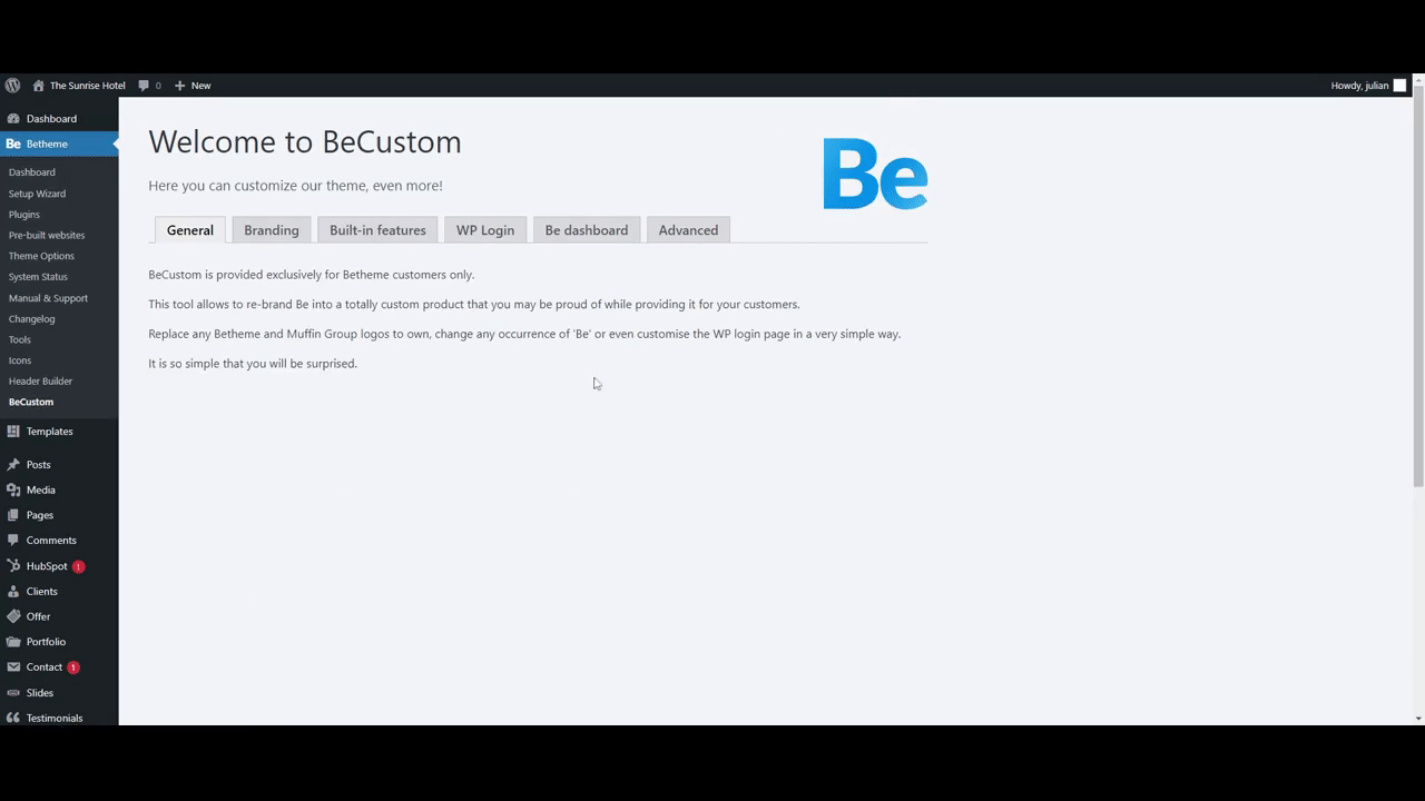
8. White-Label Mode
A final feature of the BeTheme WordPress theme’s backend you should become familiar with is BeCustom. This critical feature is located under BeTheme in the sidebar.
BeCustom enables you to access some white-label regions in BeTheme.
You can use BeCustom to:
- Substitute Be’s branding with your business’s branding to reinforce your name with your clients.
- Disable any features your clients have no use for and deny access to any features you do not want them to modify while at the same time making the WordPress theme’s backend easier to work with.
- Create an extra user-friendly and secure WordPress login.
- Customize the dashboard’s “Welcome” message.
Make Your WordPress Design Projects Simple to Handle With BeTheme
Is there anything BeTheme doesn’t do?
Most likely, but nothing that would adversely impact your design effort.
This multipurpose WordPress theme’s hundreds of pre-built websites will help you get virtually any website project off to a rapid start and headed in the right direction.
BeTheme features the fastest and most powerful page builder for WordPress.
You will have total control over every feature and facet of your website’s UI.
In short, BeTheme offers the finest way to manage any web design project within WordPress.
[- This is a sponsored post on behalf of BeTheme -]
Source
The post Why Do WordPress Theme Backends Have to Suck? (Hint: They Don’t!) first appeared on Webdesigner Depot.
Source de l’article sur Webdesignerdepot


 Jakob Nielsen’s
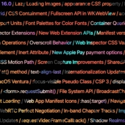
 Apple has released an OS update. Packaged in with it is the latest version of Safari, 16.


 The purpose of a website is to reach new customers and keep current ones engaged. Therefore, customer-first should be at the top of your list for design features. After all, without your clients, your business won’t grow or succeed.
 WordPress 6.0 has been released, and another niche jazz musician will be enjoying extra Spotify royalties next month.
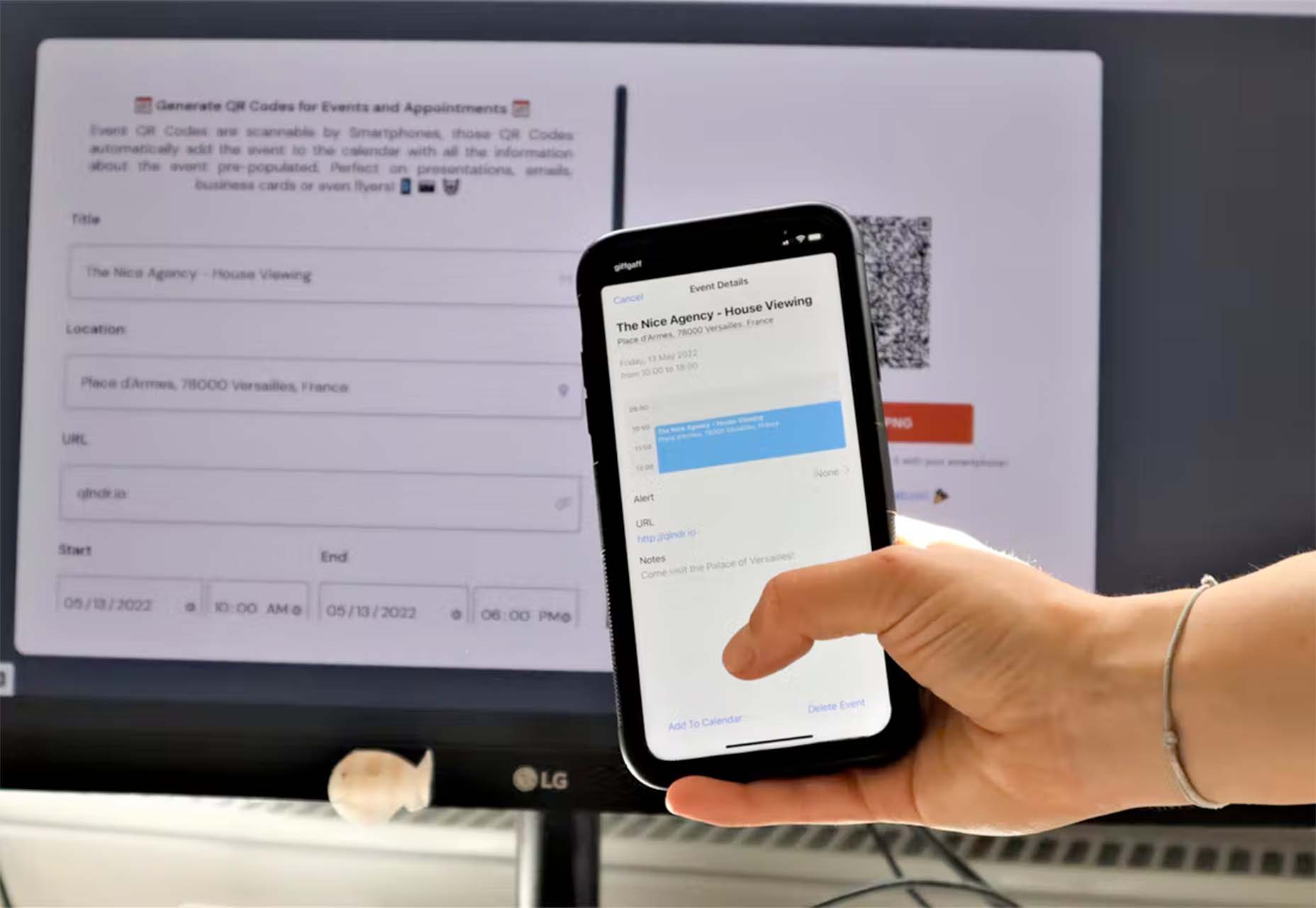
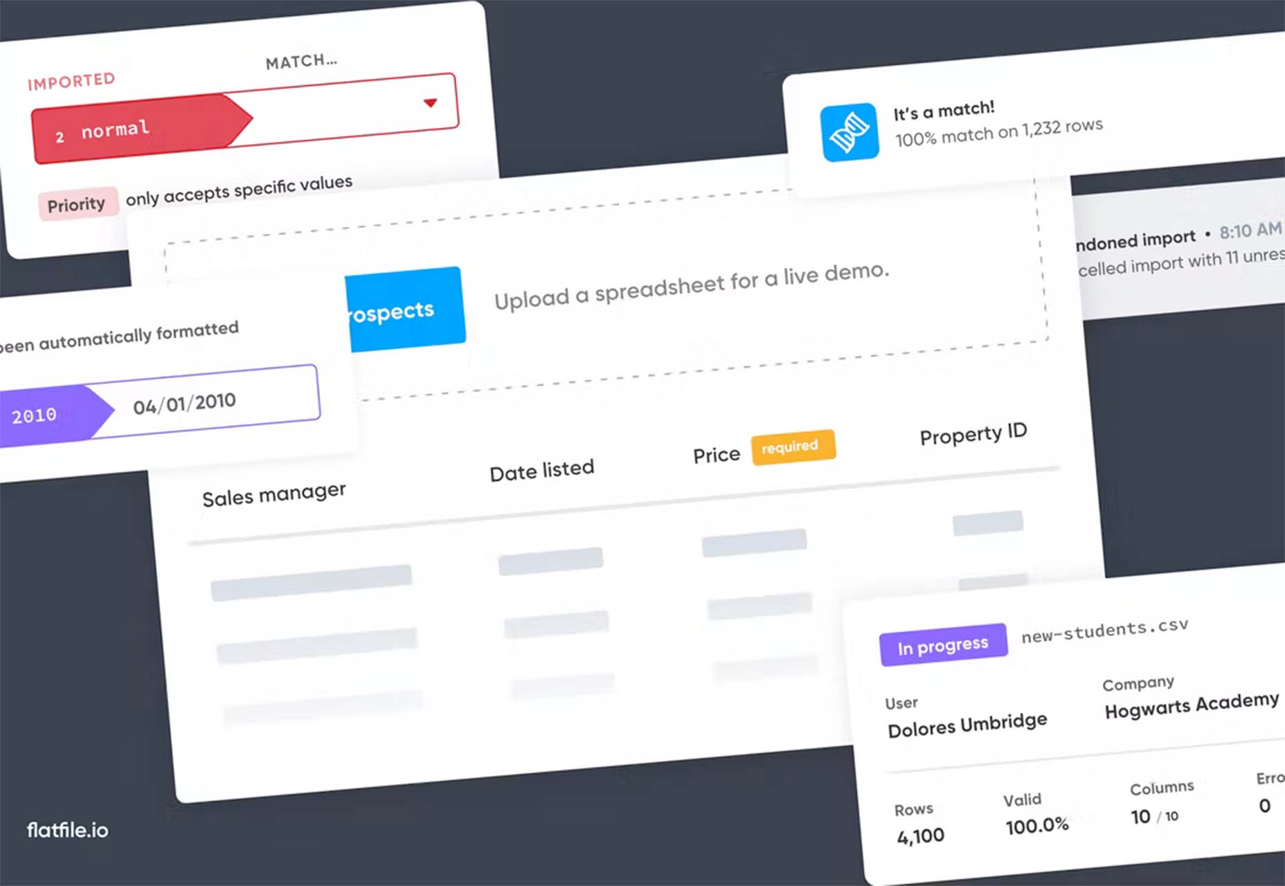
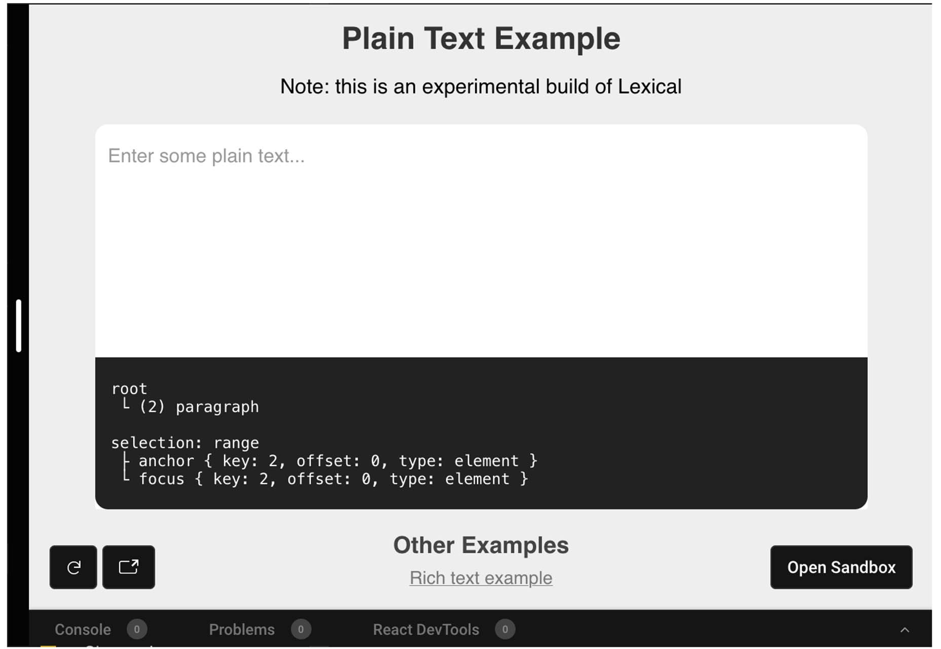
 The underlying theme of this month’s collection of new tools and resources is development. Almost every tool here makes dev a little easier, quicker, or plain fun. There are a few great tutorials in the mix to help you get into the spirit of trying new things and techniques.


