 I think of a creative practice as a combination of an approach (a design philosophy) and a series of techniques (craft skills); a good tool facilitates a technique, which in turn supports an approach.
It wasn’t until I sat down to write a list of tools I can’t design without, that I realized just how many tools I rely on as an integral part of my creative process. The danger of tools is that they promote certain techniques, and that bias can alter your approach.
First and foremost a good tool does no harm, it does not dictate, or obstruct your approach. Secondly, a good tool offers flexibility in the techniques you choose. Thirdly a good tool is invisible, it leaves no marks on the end product.
If I’d written this post a year ago the list would have been different, and I hope that in a year it will be different again. These are the tools that I currently find enabling, that have contributed to my craft, and supported my approach.
Affinity Designer
I’ve always used Adobe products. Photoshop and Illustrator were the de facto graphic tools for half my life. I’ve never had an issue with the subscription licensing of Creative Cloud, which I think is proportionate for a professional set of tools. Then, around 18 months ago I got very frustrated with how sluggish Illustrator had become.
I’d written an early review of Affinity Designer, I’d been impressed at the time, so I decided to give it another try expecting the sojourn to last an hour or two before I gravitated back to Illustrator. Running the latest version of Affinity Designer was a revelation, I’ve simply never wanted to switch back.
Why not Sketch? Well, I do occasionally jump into Sketch, especially for pure vector wireframing. I was an early adopter of Sketch, but the reliability issues (long since resolved) poisoned my relationship with it. Why not Figma? Well, Figma’s real strength is in collaboration, something that I get with Sketch, and personally I find some of Figma’s features unintuitive.
Affinity Designer isn‘t perfect. I dislike the color tools, especially the gradient tool, which I find clunky. But it’s the first design app I’ve used in years that syncs closely with my creative process.
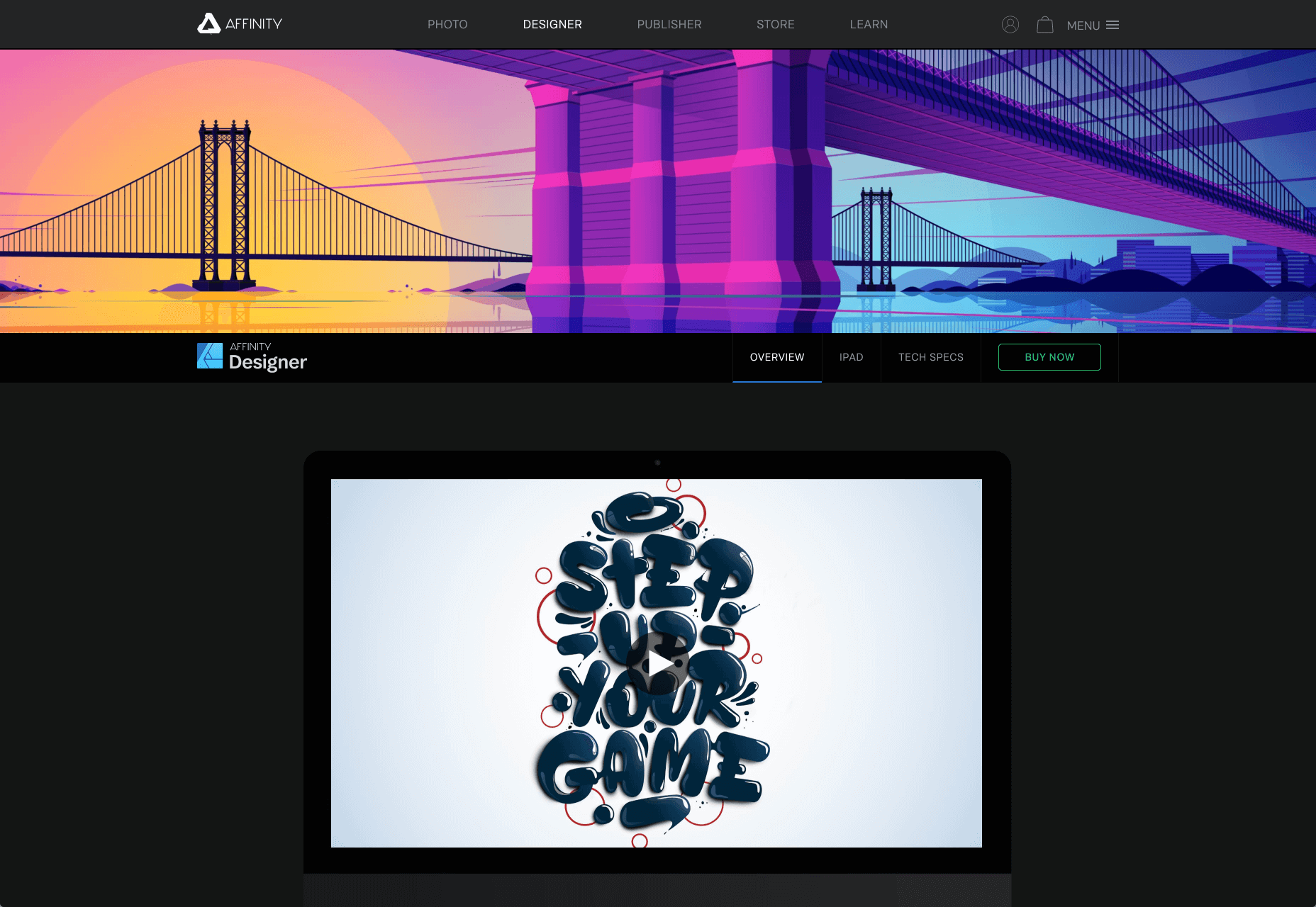
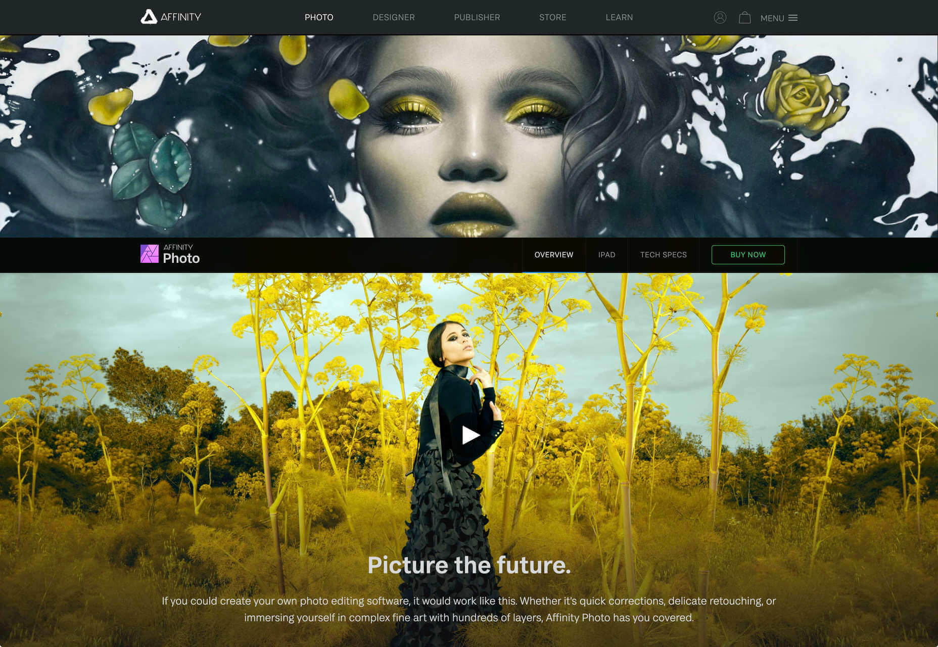
Affinity Photo
I don’t do a lot of photo manipulation, so when I switched away from Creative Cloud for design work, I was relaxed about switching from Photoshop to Affinity Photo.
In my experience, Affinity Photo is stronger than Photoshop in some areas, and weaker in others. Affinity Photo’s bitmap scaling is much better than Photoshop’s, largely due to Lanczos 3 sampling.
Affinity Photo also solves a lot of little irritations that Adobe has chosen not to address for legacy or philosophical reasons, such as the toggleable ratio setting when resizing the canvas — I’ve lost track of the hours I’ve spent in Photoshop manually calculating vertical whitespace so that it’s proportionate to the horizontal.
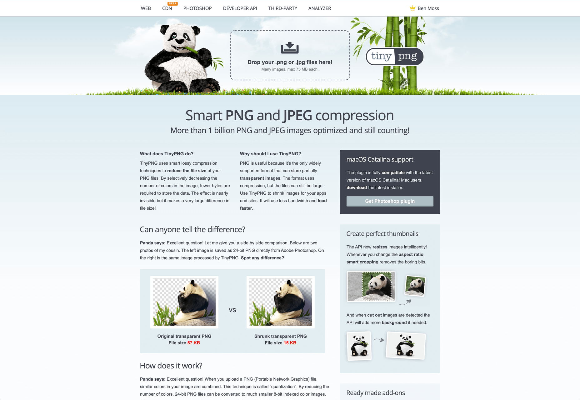
TinyPng
Both Affinity Photo and Photoshop are poor at web format optimizations. Photoshop perhaps has the edge, but its output certainly isn’t acceptable for production.
I run bitmaps through TinyPng, which on average halves the size of the file without any appreciable loss of quality. (It stripped 66% off the images for this post.)
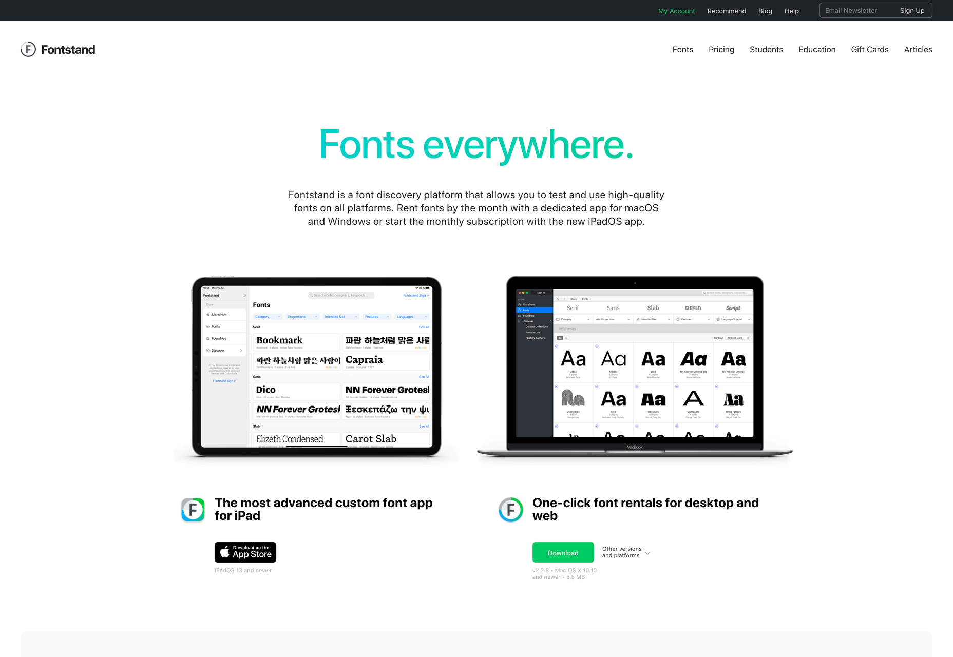
Fontstand
When I started to drift away from Creative Cloud, the one service that delayed me was Adobe Fonts (née Typekit). Not so much for the webfonts — which are faster and more reliable self-hosted — but for the ability to sync desktop fonts into my design apps.
I tried Fontstand when it was first released, and I loved the concept, but was worried about the small library. When I took a second look and discovered the library is now substantial for both workhorses and experimental typefaces, it was an easy decision to switch.
Fontstand is a desktop font rental service. Once you’ve found a typeface you’re interested in, you can activate an hour-long trial, then choose to rent the font for a small fee. You can auto-renew the rental if you need to, and if you rent the font for 12 months it’s yours forever.
If there’s one tool on this list I genuinely could not design without it’s this one. Fontstand makes working with fonts from independent foundries affordable for freelancers, and it’s enriched the typographic palette available to me.
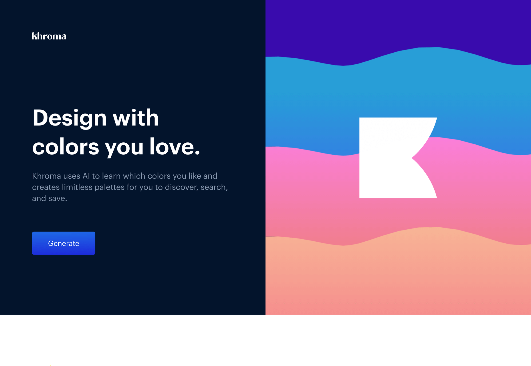
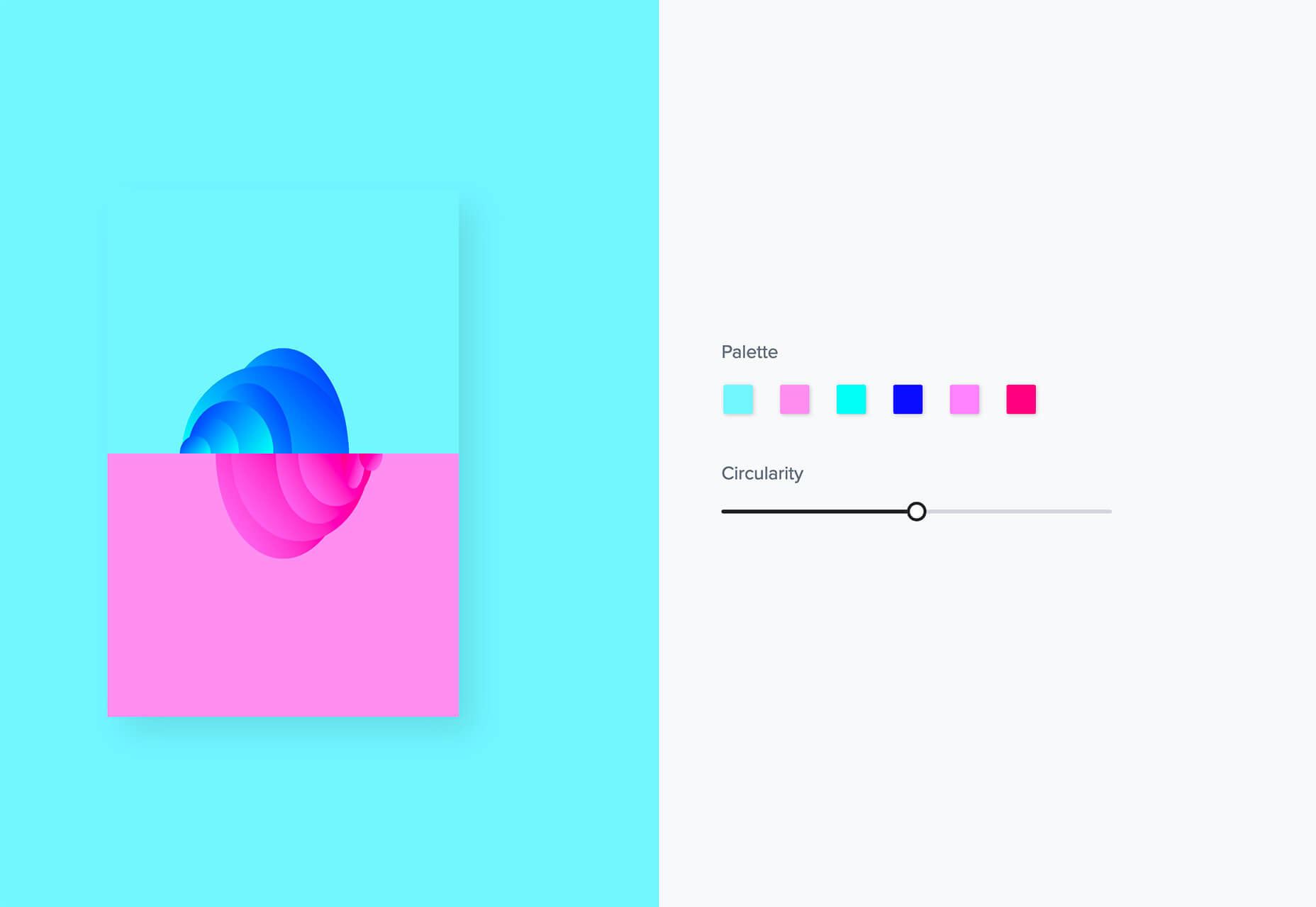
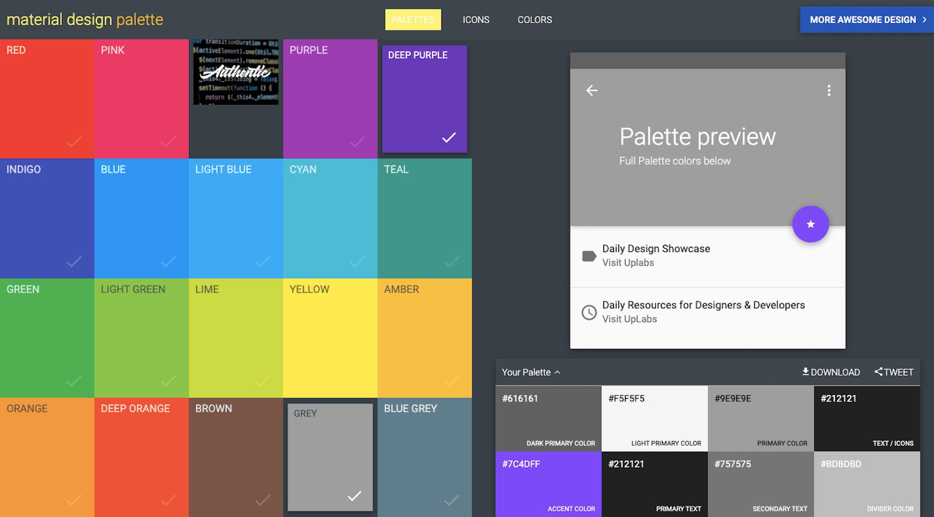
Khroma
Every designer has strengths and weaknesses. Since day one of art school, my weakness has been color. It just doesn’t come naturally to me, and I have to work quite hard at it.
An incredibly helpful tool that I’ve been using for a few months is Khroma. It helps my eyes warm up before approaching color, and helps me find a starting point that I can then refine. Comparing my design work before, and after Khroma, the latter color choices are cleaner, more vibrant, and more interesting.
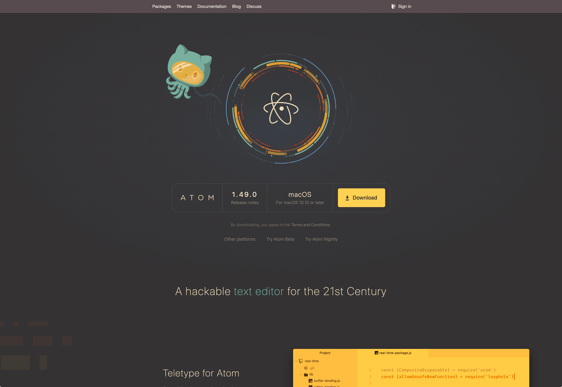
Atom
A good code editor is essential, and I’ve never found one that I’m completely happy with. For years I’ve flitted back and forth between Brackets, Sublime Text, and BBEdit. I think that probably reflects the changes in the type of coding I’m doing.
For now, I’ve settled on Atom. It’s fast, reliable, and it’s not biased to front or back-end code.
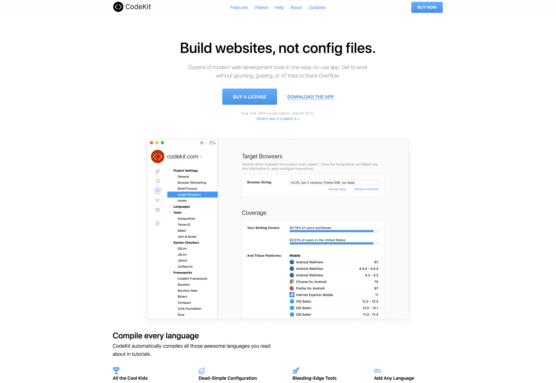
CodeKit
I held out on compilers longer than I should have, using apps like Minify to minify CSS and JavaScript, and the command line to process Sass (see below). Then I found CodeKit and it’s been essential to my workflow ever since.
What I like best about CodeKit is that it’s a GUI. Which means I can change settings while coding, like toggling off the JavaScript linting, without switching mental gears into another language.
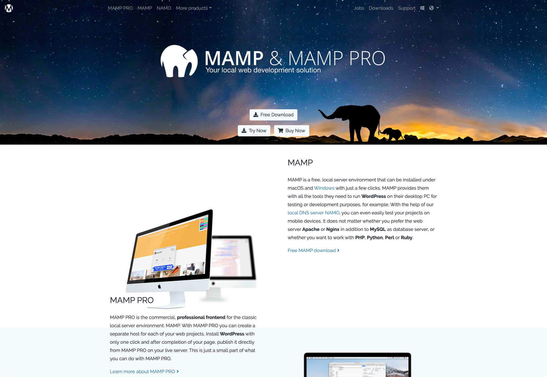
MAMP
MAMP is a tool that allows you to run a local server environment, meaning I can run PHP and MySQL without the tedious process of FTPing to a server to test a change. Mac comes with Apache, so this isn’t strictly necessary, but it’s simple to use and works well with both CodeKit and Craft (see below).
There’s a pro version of MAMP, which allows you to switch seamlessly between projects, but it’s heavily geared towards WordPress. I’m still trying to find the time to evaluate Laravel Valet.
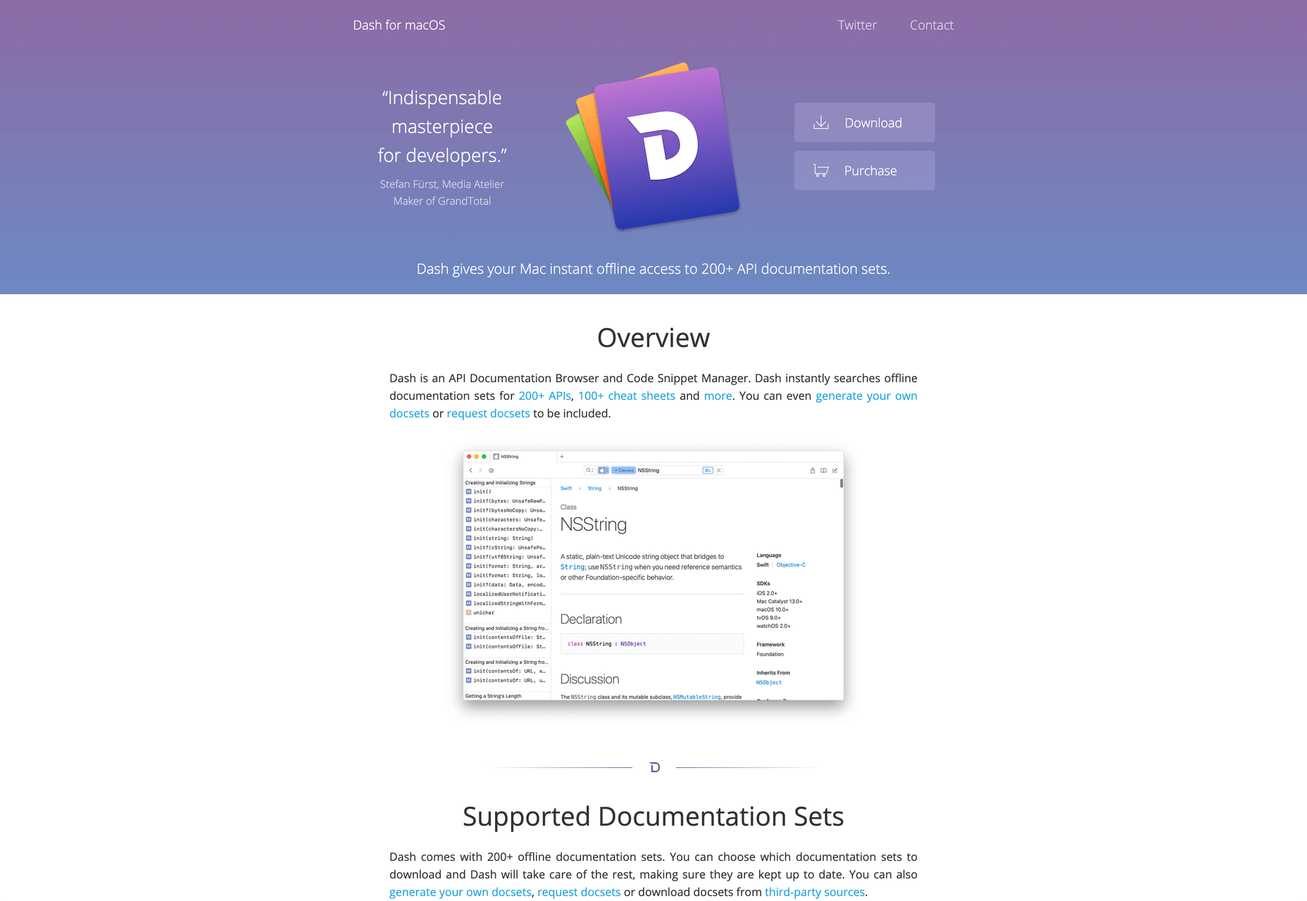
Dash
When you first start coding you try and memorize the entire language. It’s very possible to become fluent in the core of a language, but there are always nuances, defaults, and gotchas that you miss. As you grow more experienced, you realize that all professional coders Google the answer at least once per day.
When I got tired of Googling I started using Dash which is a superb app that combines the docs of numerous different languages into a searchable window. I use it daily for everything from SVG to Twig.
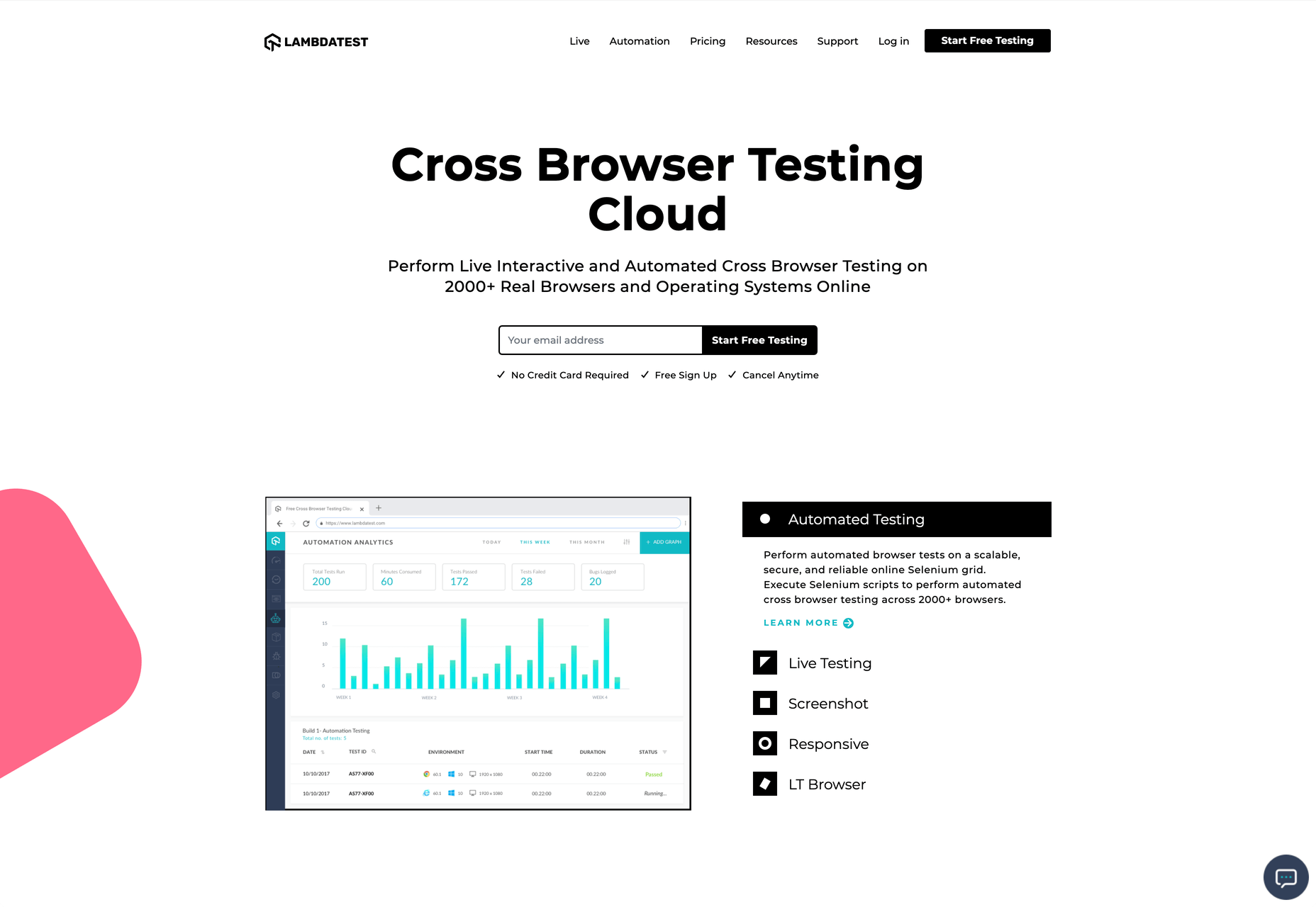
LambdaTest
It doesn’t really matter what you’re building, even the indy-web needs to be tested. Ideally you’ll test on real devices, but if you can’t afford a device library — and who but the largest agencies can — you need a live testing solution.
There are a few upstarts, but your choice is basically between BrowserStack and LambdaTest. I went for LambdaTest because I prefer the style of the UI, but that’s entirely subjective. If you’re not sure, toss a coin, you’ll get the same results with both.
Sass
I can’t write CSS without Sass — and I mean that literally. If I try and write vanilla CSS I guarantee I’ll nest something with @at-root and it will throw an error.
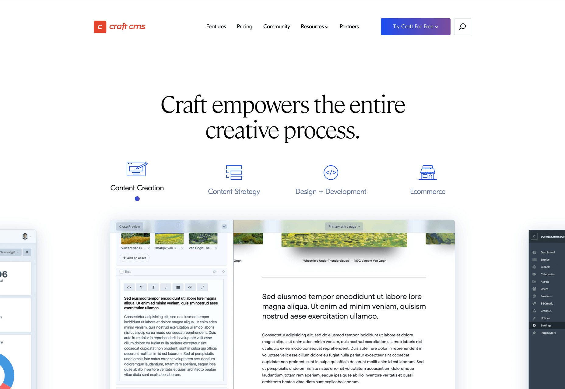
Craft CMS
Stating any preference for a CMS online that is not WordPress inevitably invites impassioned protests from developers whose career is built on the WordPress platform. So let me say preface this by saying: if WordPress works for you, and more importantly for your clients, then more power to you; I think it’s a dog.
Shopping around for a CMS is challenging, and I’ve gone through the process several times. A good CMS needs to be in sync with your mindset, and it needs to be appropriate for your clients — all of them, because unless you’re in a large agency with multiple coders, you need to commit to a single solution in order to master it.
I have looked and looked, and finally settled on Craft CMS. Craft makes it easy to build and maintain complex, high-performance sites. It has a shallow learning curve that grows exponentially steeper, making it easy to get started with plenty of room to grow.
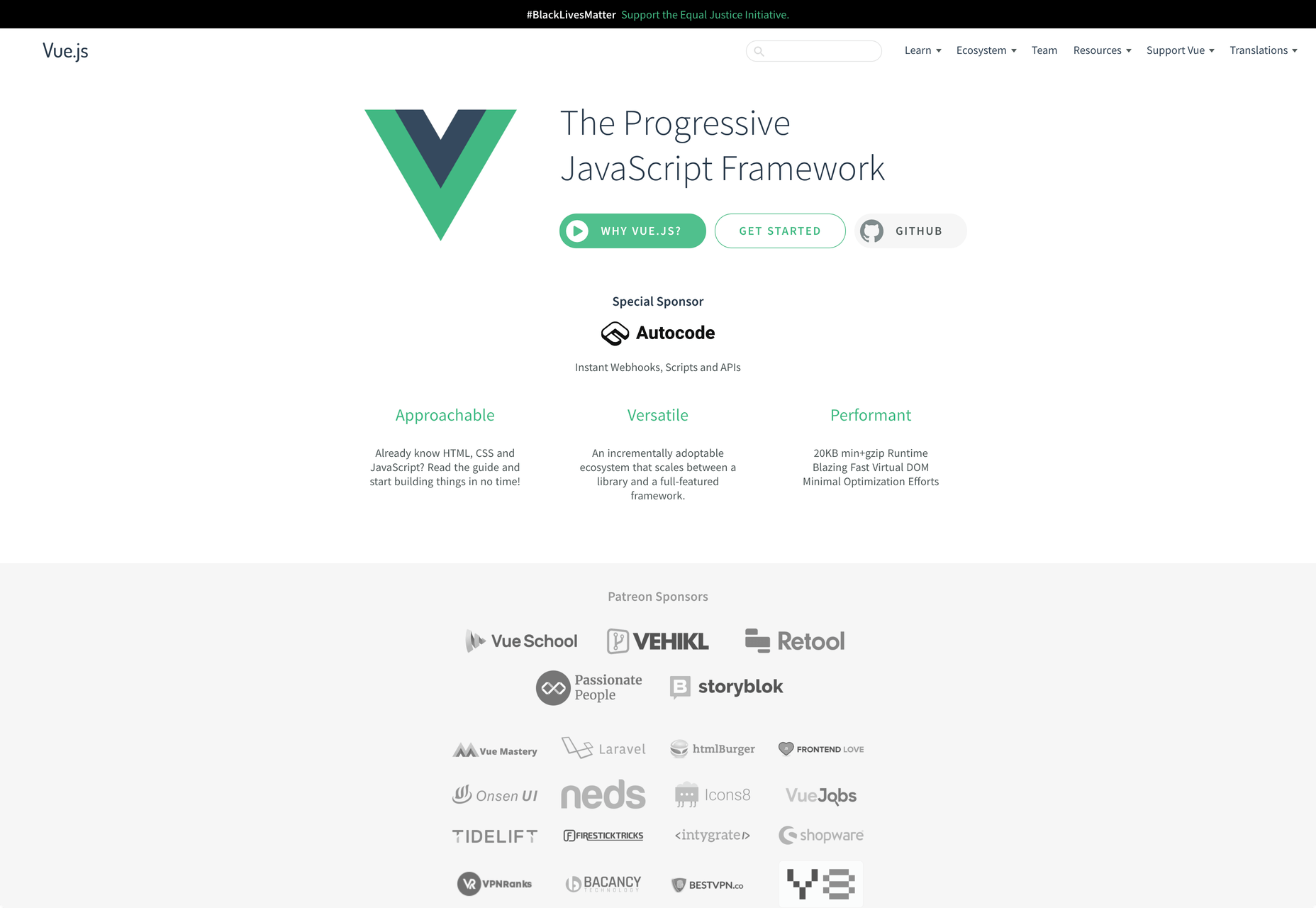
Vue.js
Way back when Flash went kaput I switched to jQuery, and that was a really easy route into JavaScript — ignore the people who tell you to master the core language first, do whatever it takes to start using a language, that’s how you learn. But jQuery is heavy, and I found I needed it less and less.
These days 90% of the JavaScript I write is progressive enhancements in vanilla JavaScript to keep the dependencies low. Occasionally I encounter a job that requires complex state management, and then I fall back on Vue.js. JavaScript developers are as partisan as CMS aficionados, so let’s just say I favor Vue.js because it’s not controlled by a mega-corp and leave it at that.
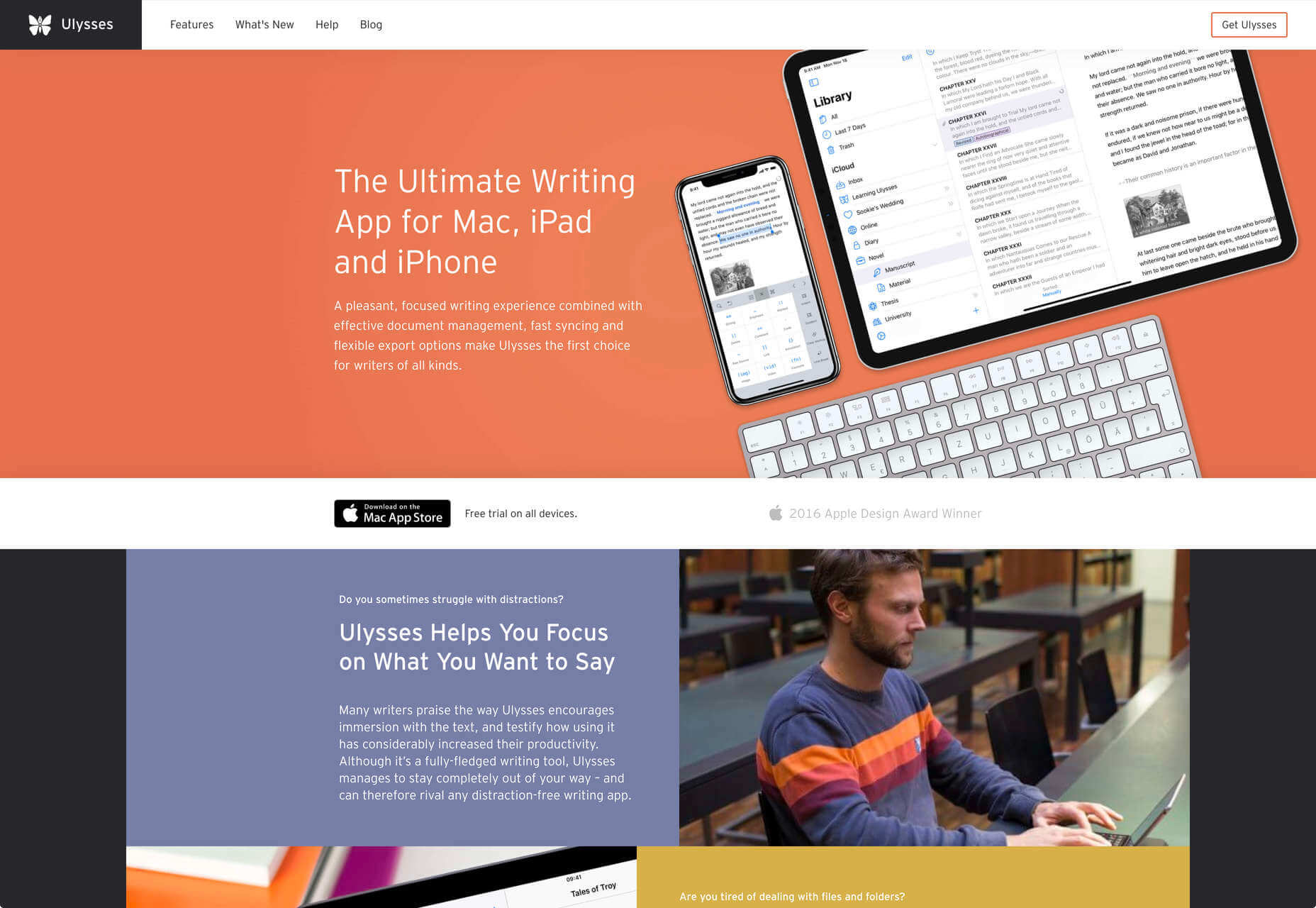
Ulysses
As editor at WDD, I cannot emphasize enough that the right way to write copy for the web is markdown.
Markdown is faster to write so you don’t lose the thread of your thought process, and it doesn’t impose formatting so you can easily migrate to a CMS. If you’ve ever spent 20 minutes stripping the class, id, and style tags out of a file created in Word, Pages, or (by far the worst offender) Google Docs, then you don’t need to be sold on this point.
There are a few markdown-based writing apps available, I tested half a dozen, and the one I settled on was Ulysses. I like its distraction-free mode, I love its clean exports. Everything I write, I write in Ulysses.
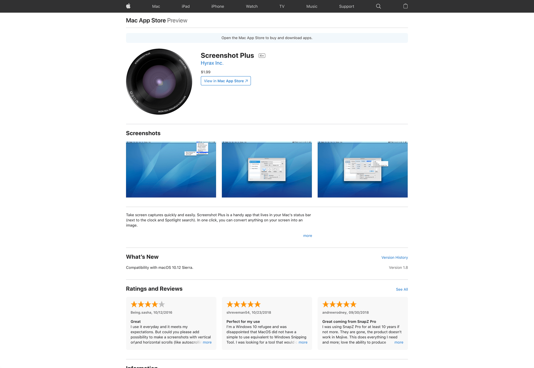
Screenshot Plus
Much like markdown editors, there’s no shortage of screenshot apps. My current favorite is Screenshot Plus.
Screenshot Plus has one feature that makes it standout for me, and that is its Workflows. It sounds like a small problem, but when you’re taking screenshots of a dozen sites, the extra clicks to save, switch to your editor, and open the file are laborious. I have several workflows setup in Screenshot Plus that allow me to take a screenshot, save it to a specified folder on my local machine, and then open it in Affinity Photo, all with a single click.
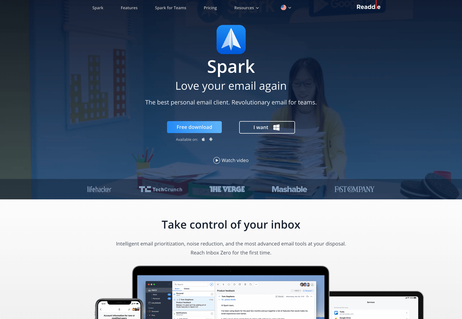
Spark
I get a lot of email, a lot. At one point the influx was so bad I was using multiple email apps to segment it. Yes, I use Slack daily, but it doesn’t eliminate the need for email.
I‘ve been using Spark for around six months and it’s radically sped up my workflow. I’m a big fan of the smart inbox that allows me to compartmentalize email like newsletters, and email that warrants a reply. I like that I can switch to a chronological list if I’m looking for something specific. I love the ability to pin, or snooze messages, which helps me triage my inbox.
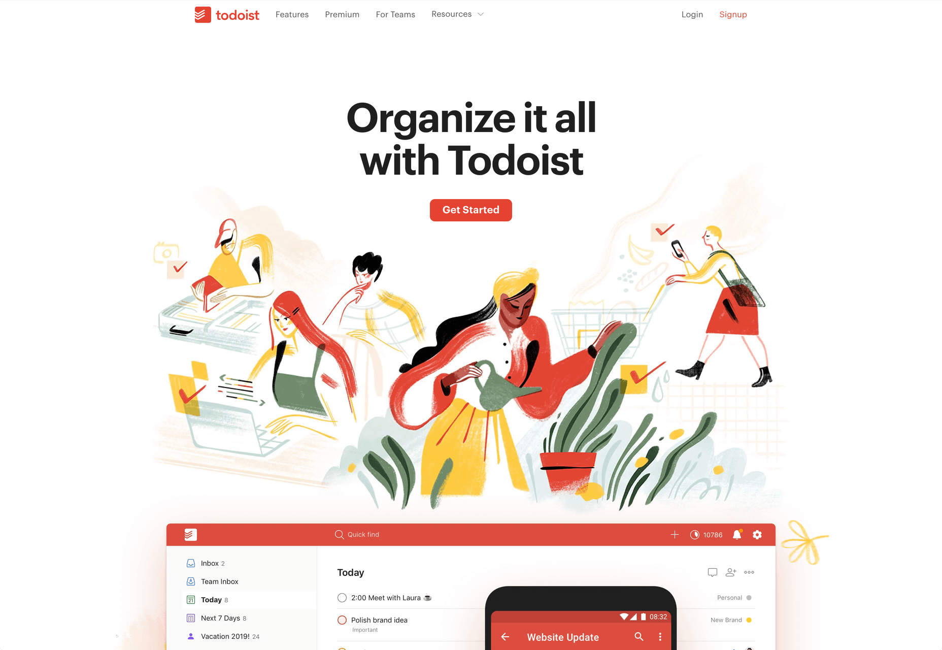
Todoist
I’m one of those people who can’t make it through the day without being organized. I need lists and sublists, and I need something native that opens automatically when I boot my Mac, and something that sits on the home screen of my Android.
There are as many to-do apps as there are things to do. When I’m working in a team I’ll use whichever task-tracking system it prefers. But by choice I always use Todoist thanks to its balance of simplicity and power. At this point it’s something of a meta-tool, and the app I open first every morning.
Source

Source de l’article sur Webdesignerdepot
 The new year is often packed with resolutions. Make the most of those goals and resolve to design better, faster, and more efficiently with some of these new tools and resources.

 The start of the year is always a good time to reassess priorities and consider new approaches, but 2021 is more of a reset than we expected this time last year. 2020 is unlikely to go down in anyone’s autobiography as the best year of their life, but it has done something positive: it’s prepared the ground for rapid change in the next 12 months.
 In the spirit of fall feasts, this month’s collection of tools and resources is a smorgasbord of sorts. You’ll find everything from web tools to icon libraries to animation tools to great free fonts. Let’s dig in.
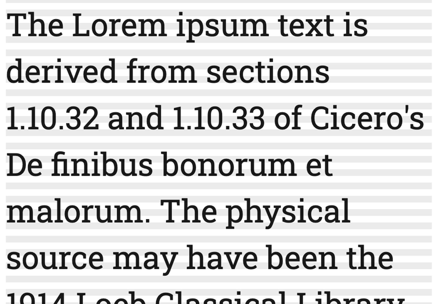

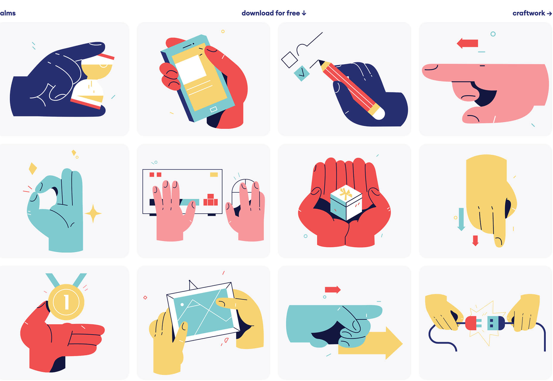
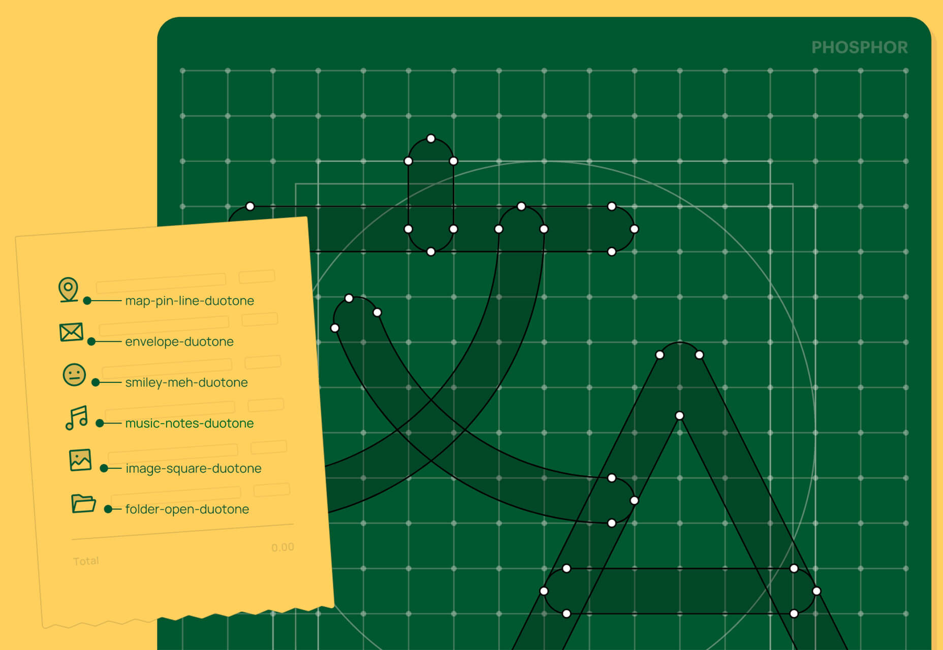
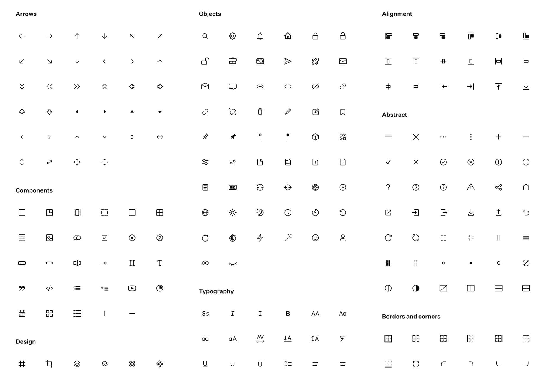

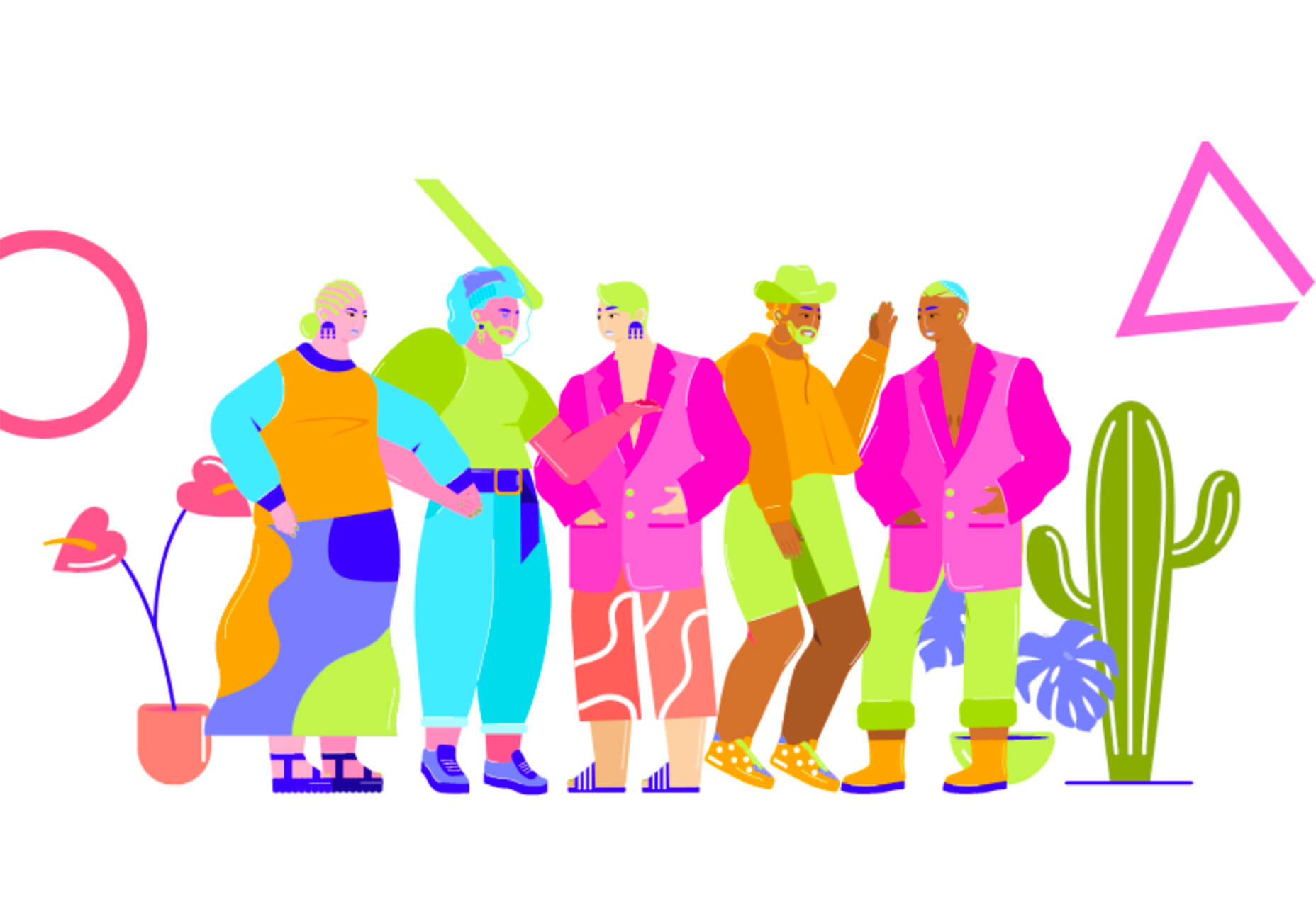
 There are so many things to think about when first starting a business. What will your business offer? How will this differ from existing solutions? Who will benefit most from your offering? And why are you so passionate about this?

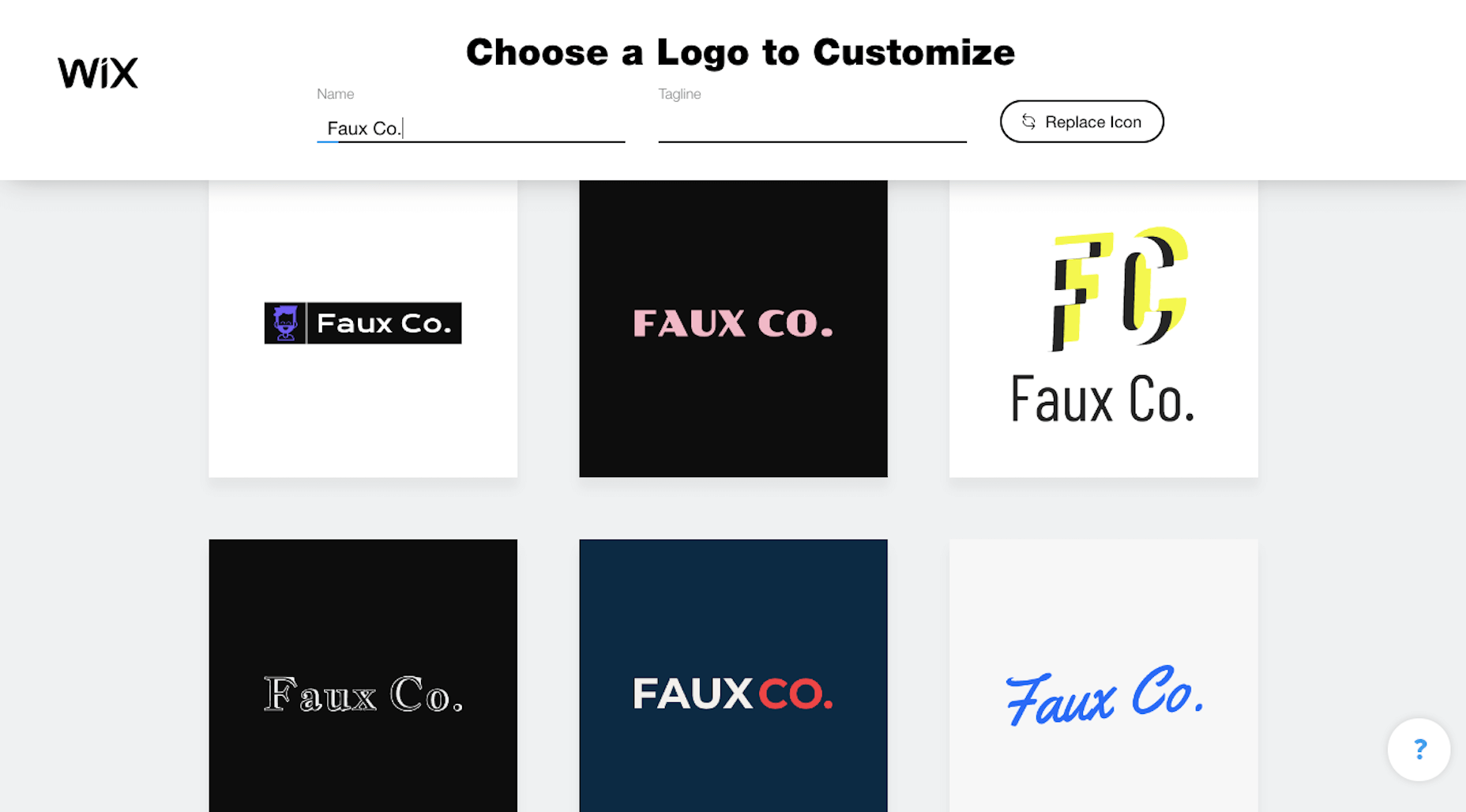

 Dark themes are everywhere these days.

 Artificial intelligence. Just hearing the phrase has been a trigger for many in the technology world since that creepy Haley Joel Osment film circa 2001. But more recently, artificial intelligence and machine learning strike fear into the hearts of skilled workers for an entirely different reason: job security, or lack thereof.
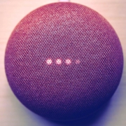
 Voice is one aspect of technology that is getting bigger and bigger, and showing little sign of relenting. In fact, 2019 data revealed that 22% of UK households owned a voice-controlled digital home assistant device such as an Amazon Echo or Google home. This is double the figure recorded in 2017 and it is predicted that over the next five years nearly 50% of all homes will have one. Smart home adoption rates are increasing, and it shows how voice control is something we are all becoming more accustomed to.
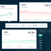
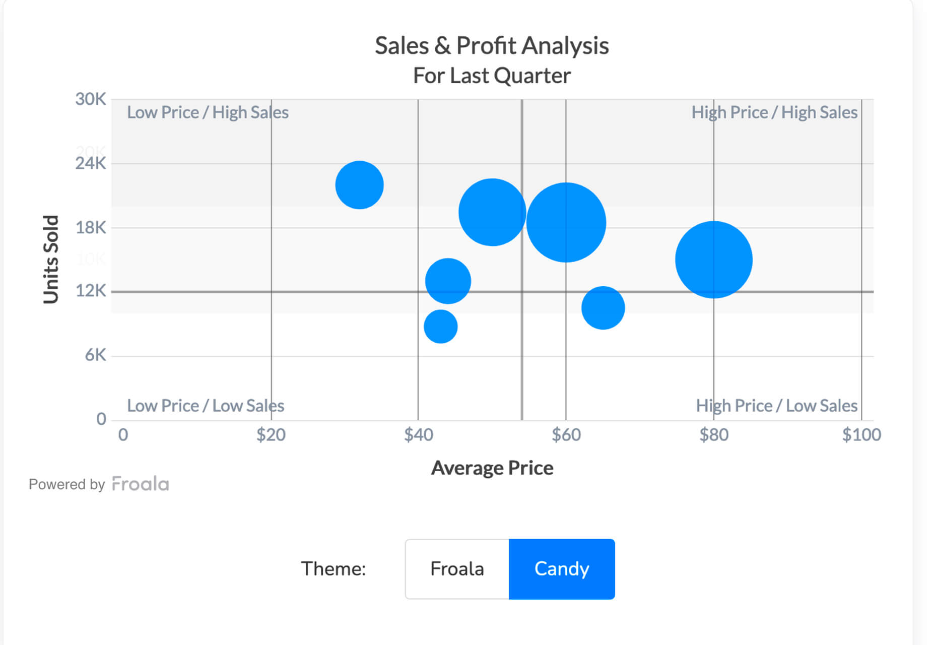
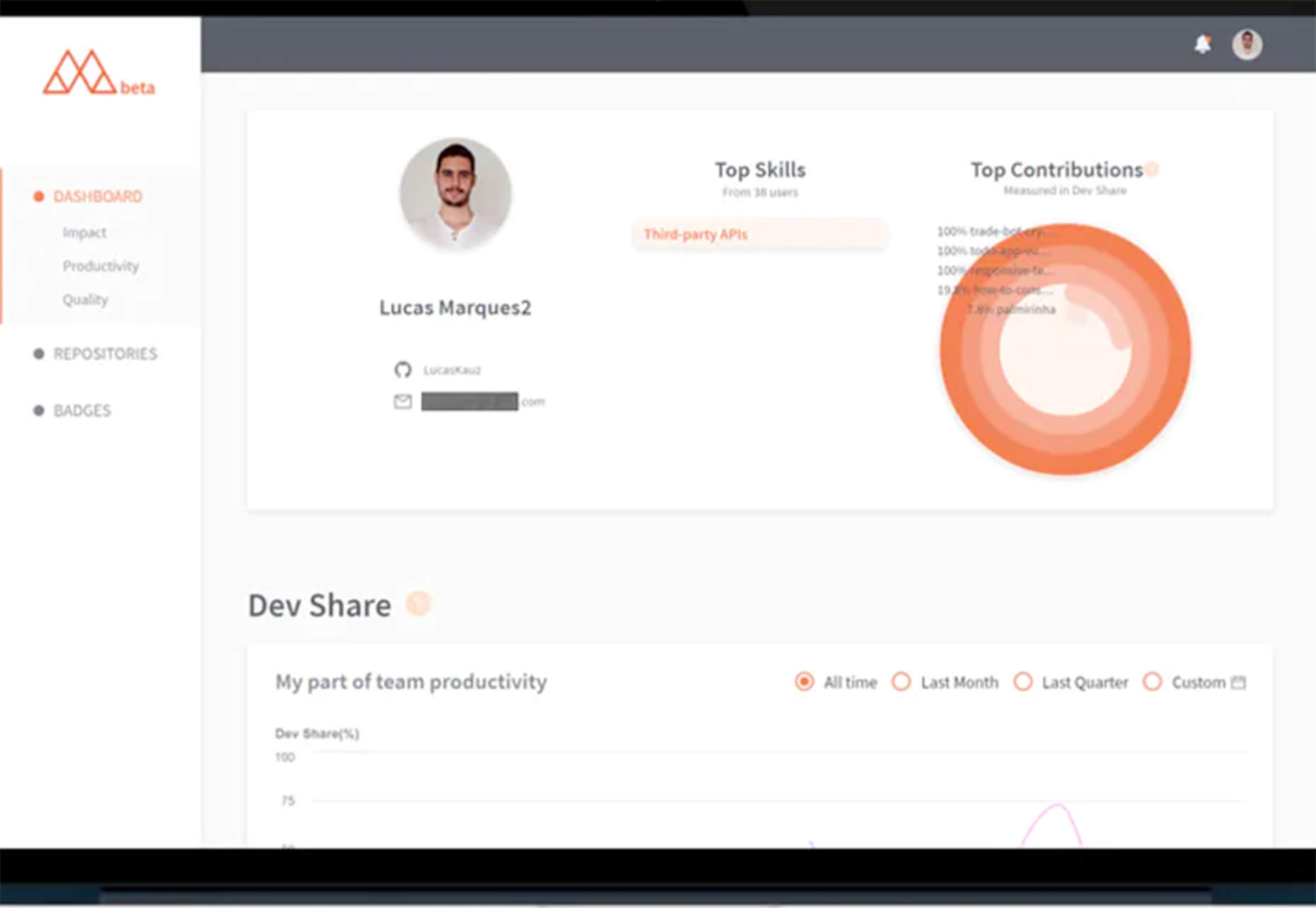
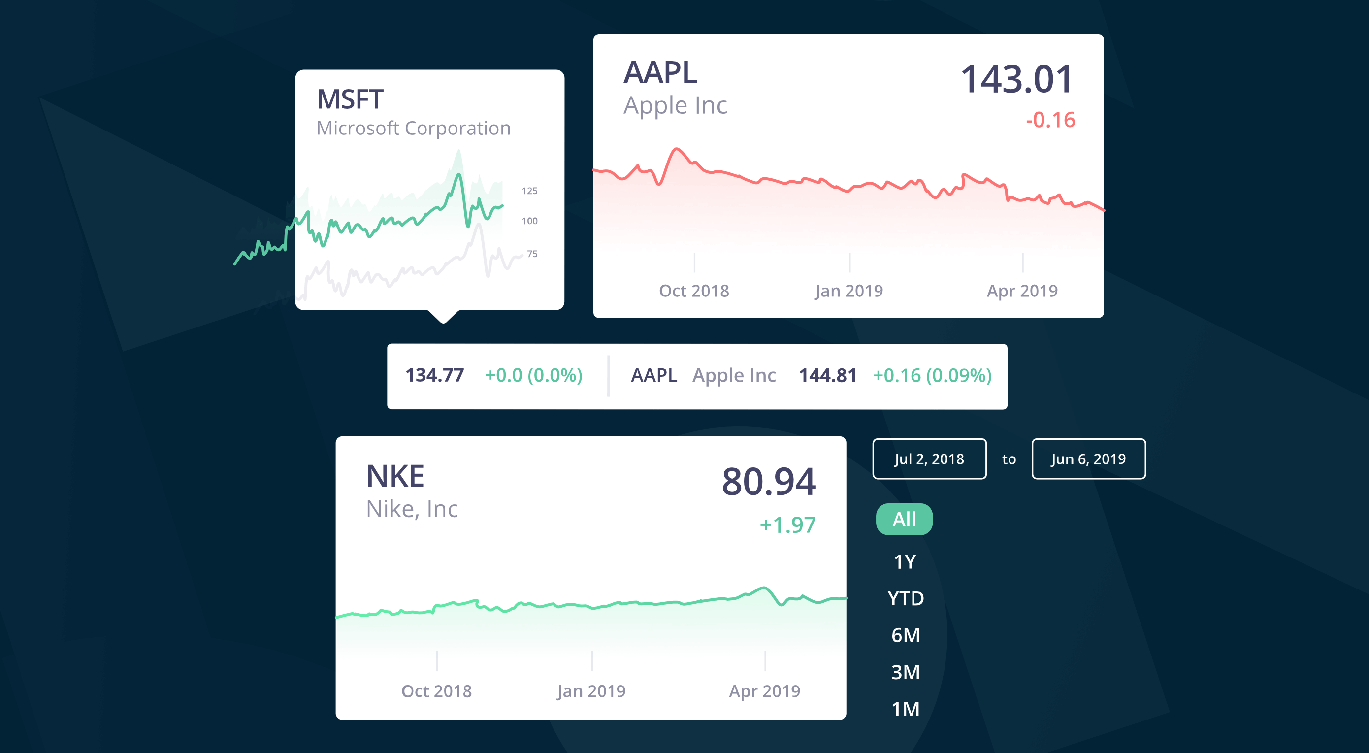 In this time of global economic turmoil, it’s more important than it’s ever been that your financial decisions are based on accurate, up-to-date, market information.
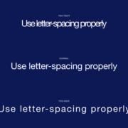
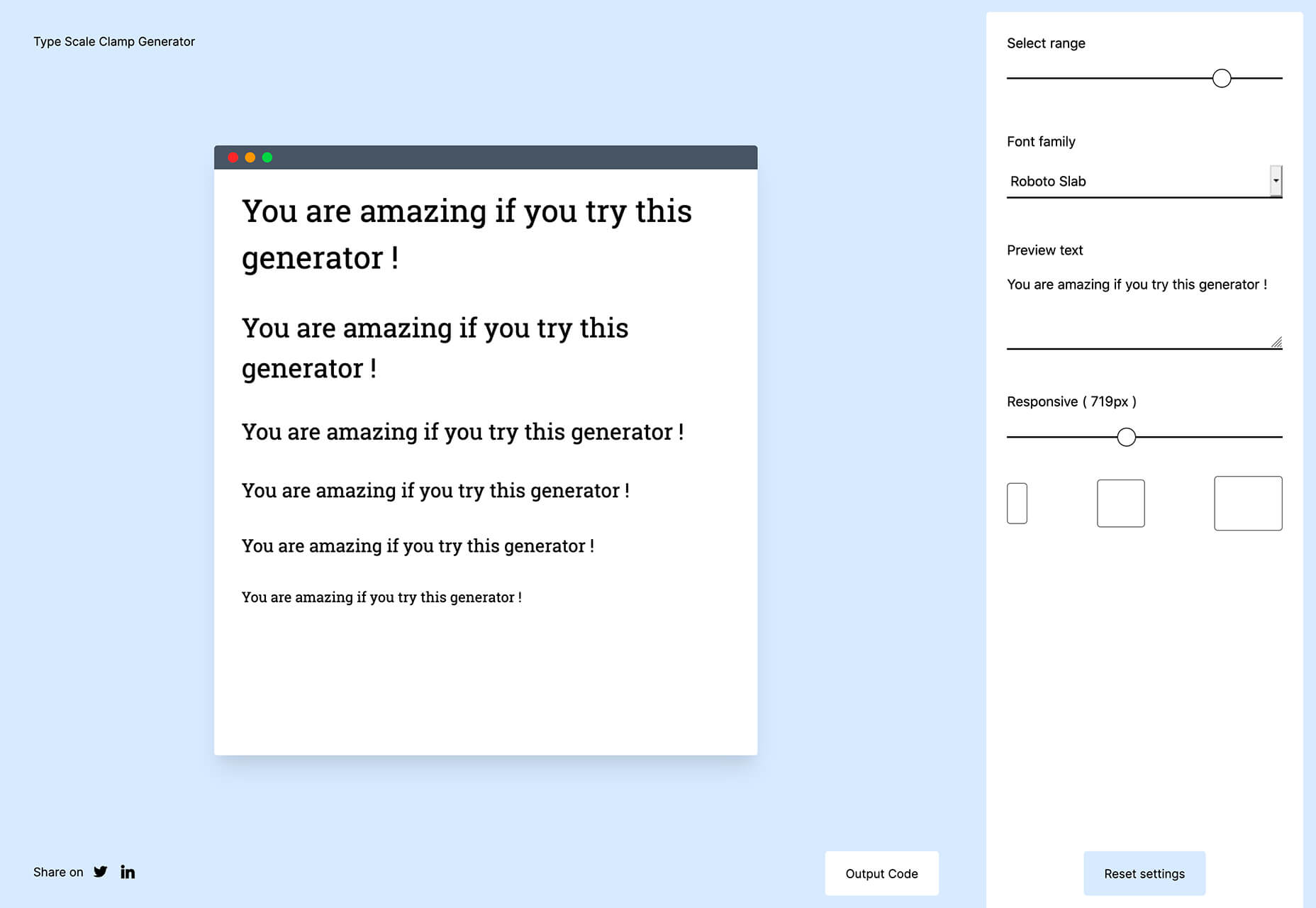
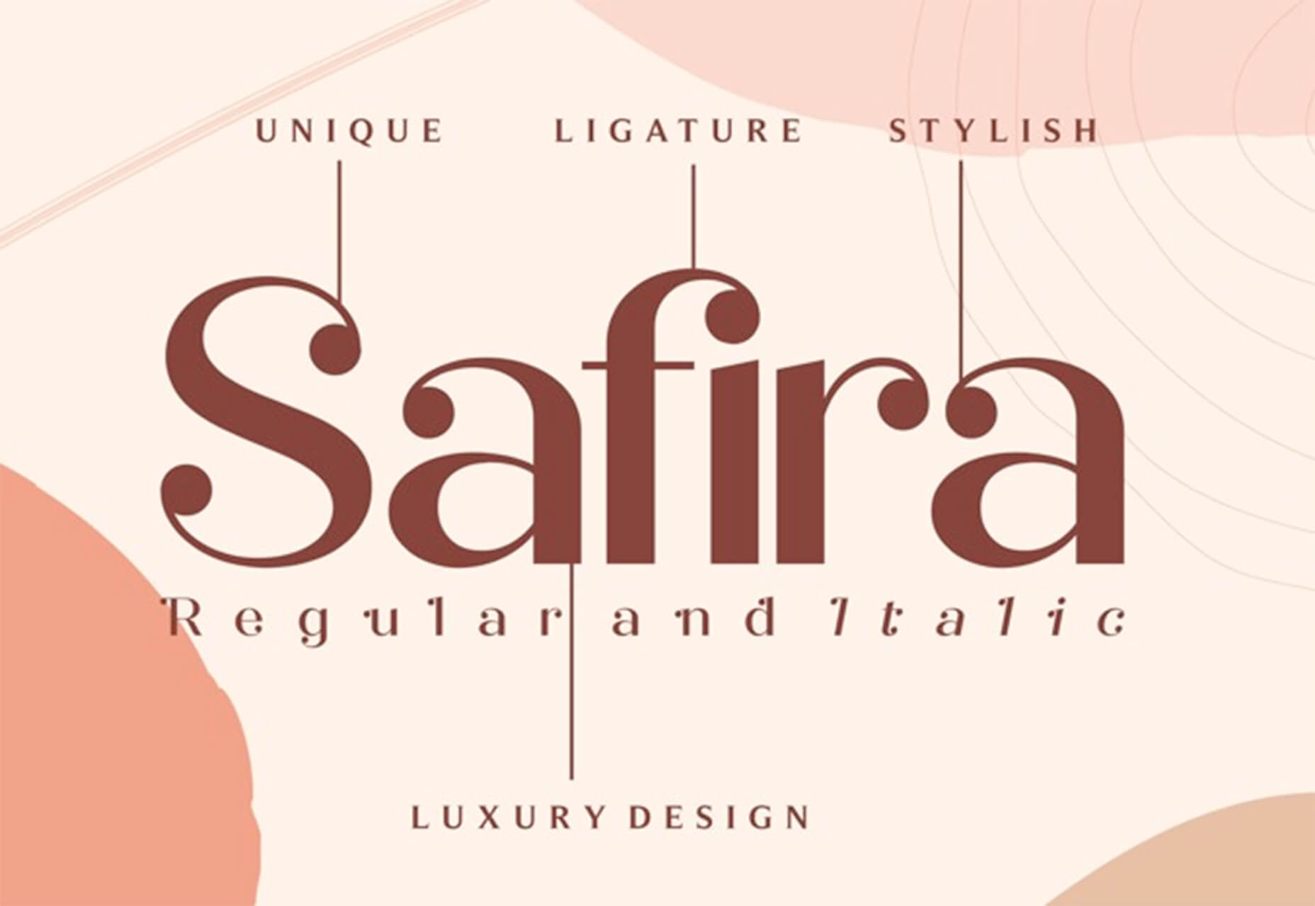
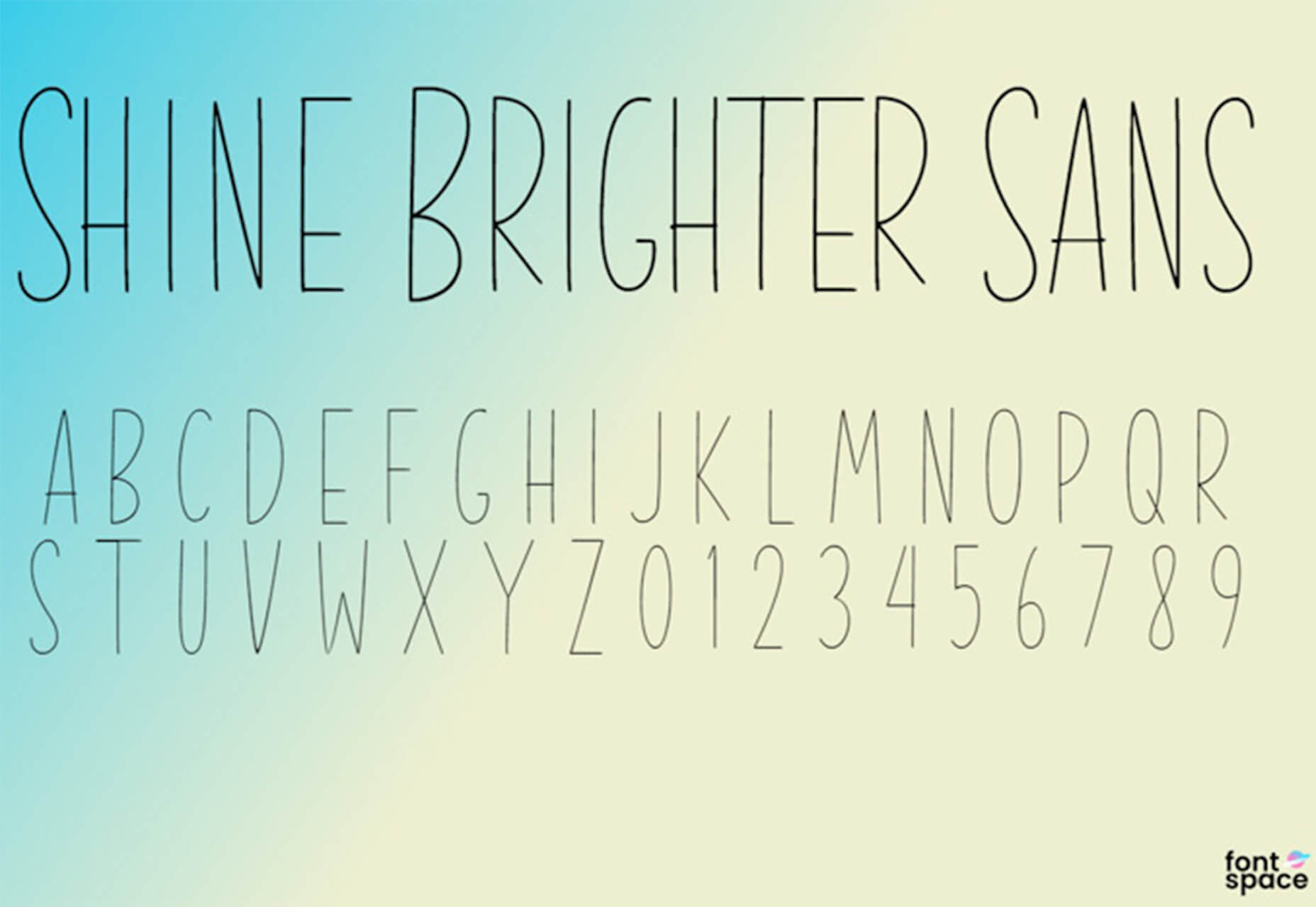
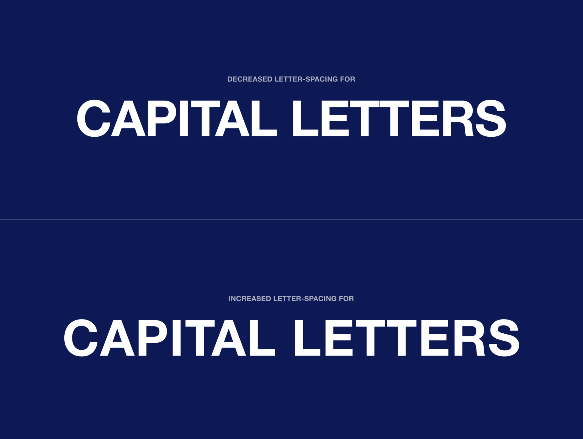
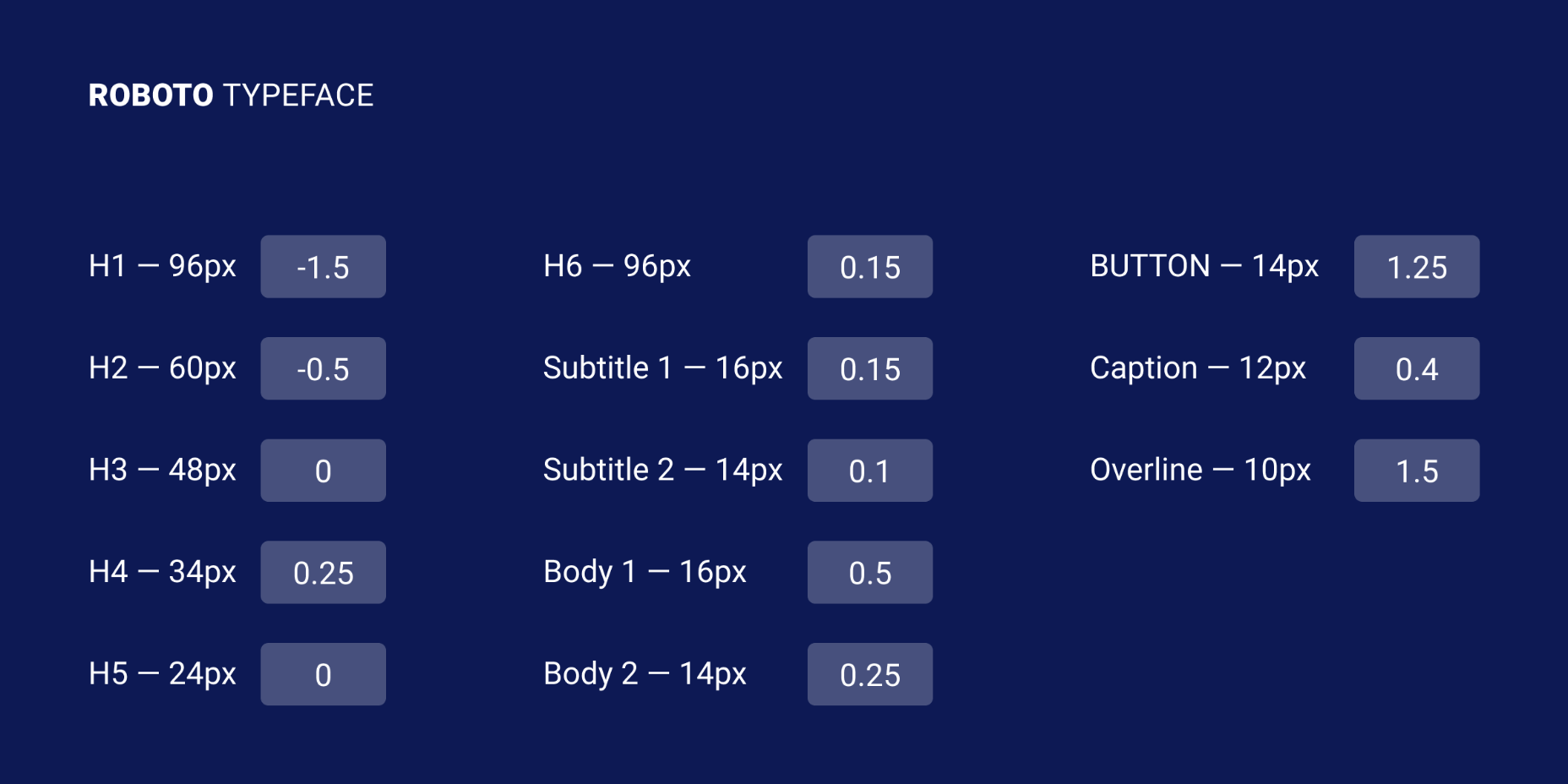
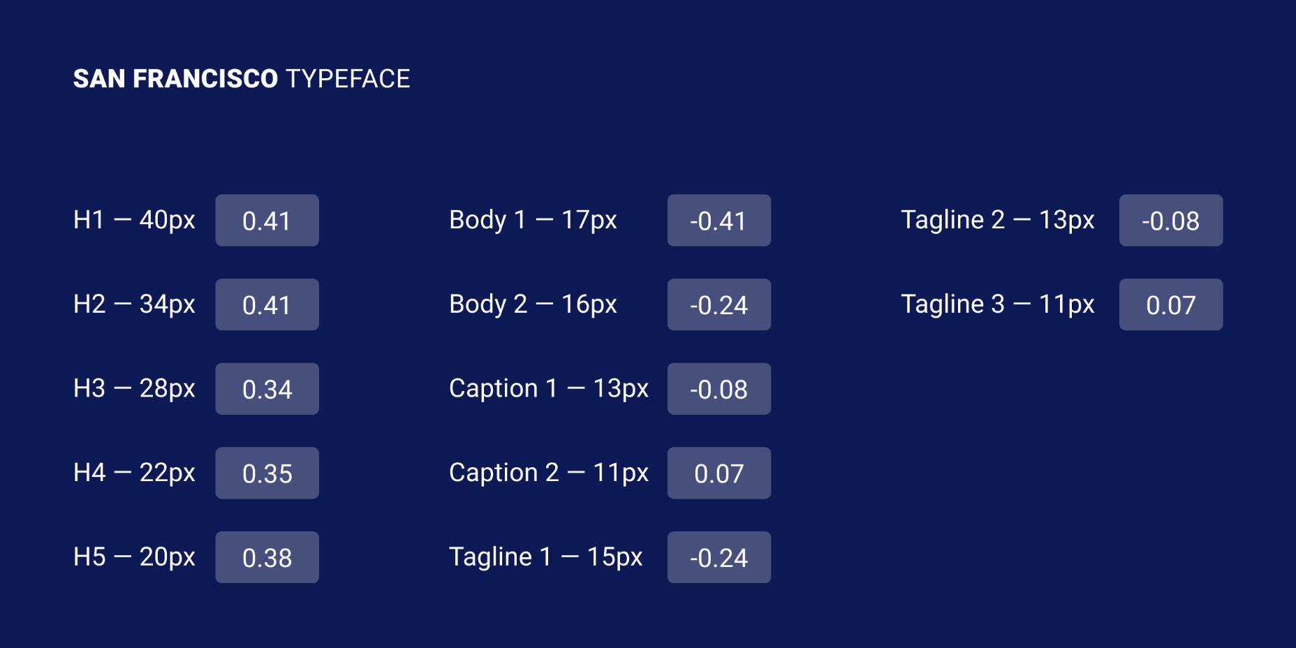
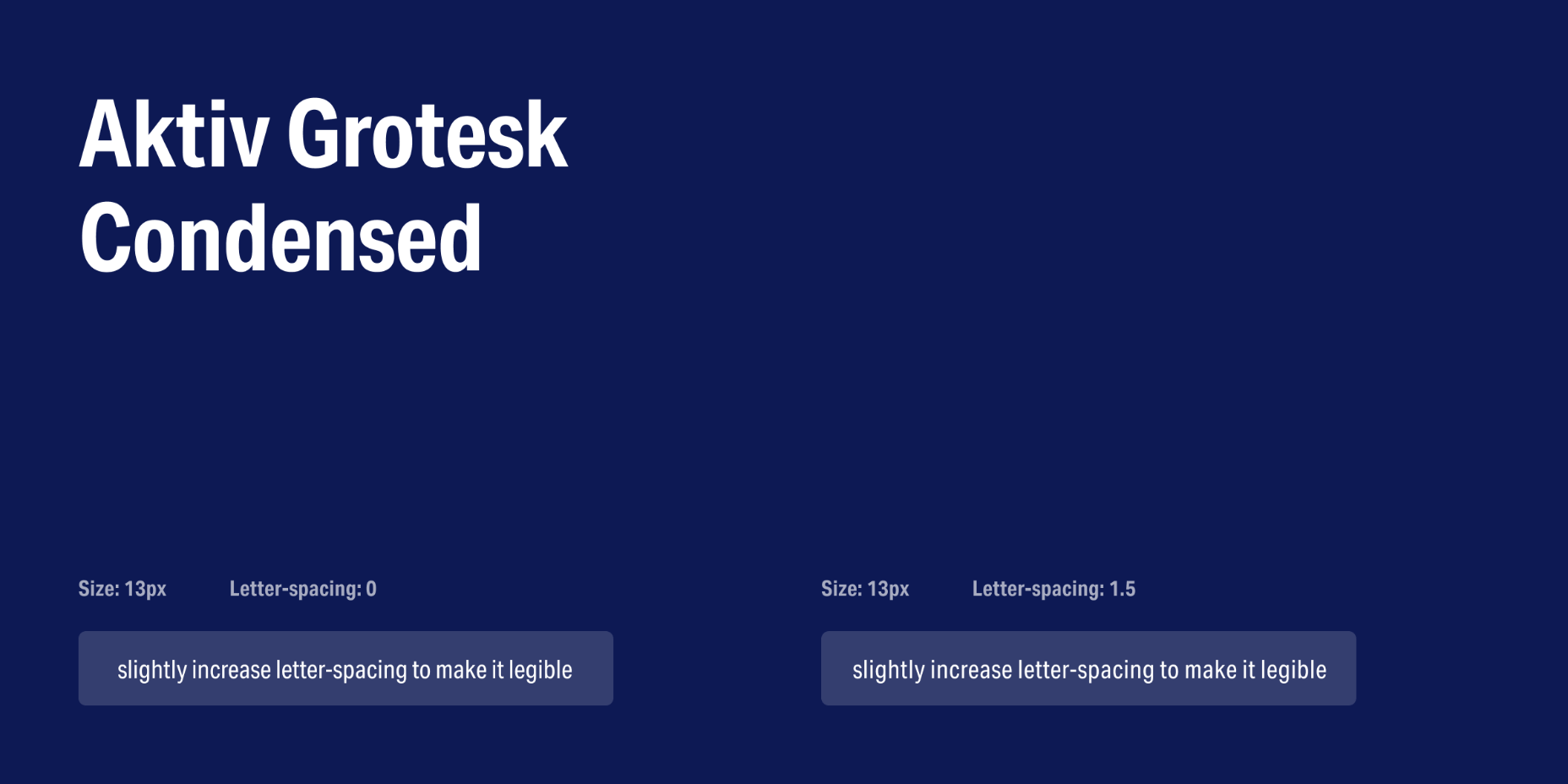
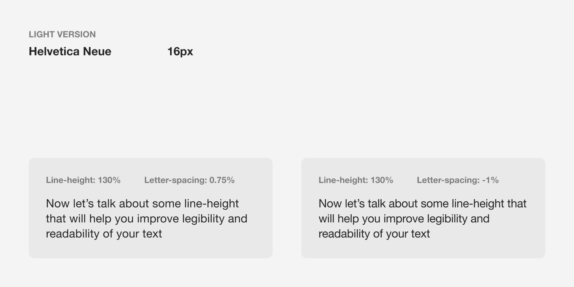
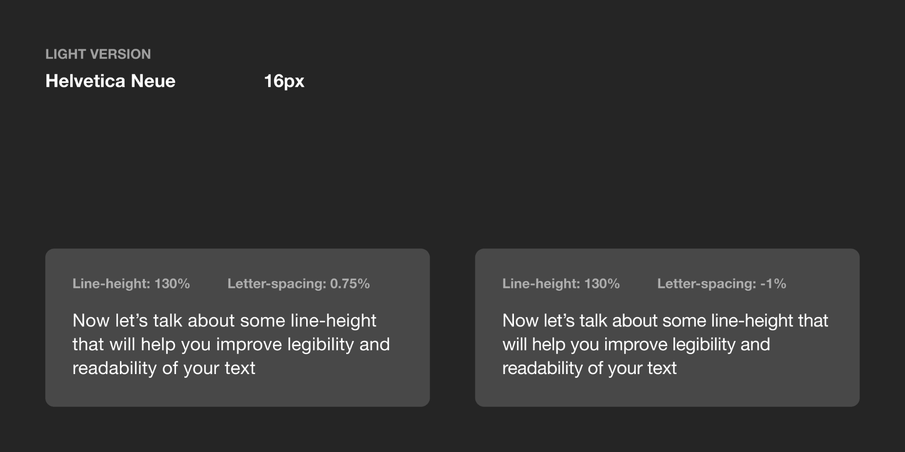
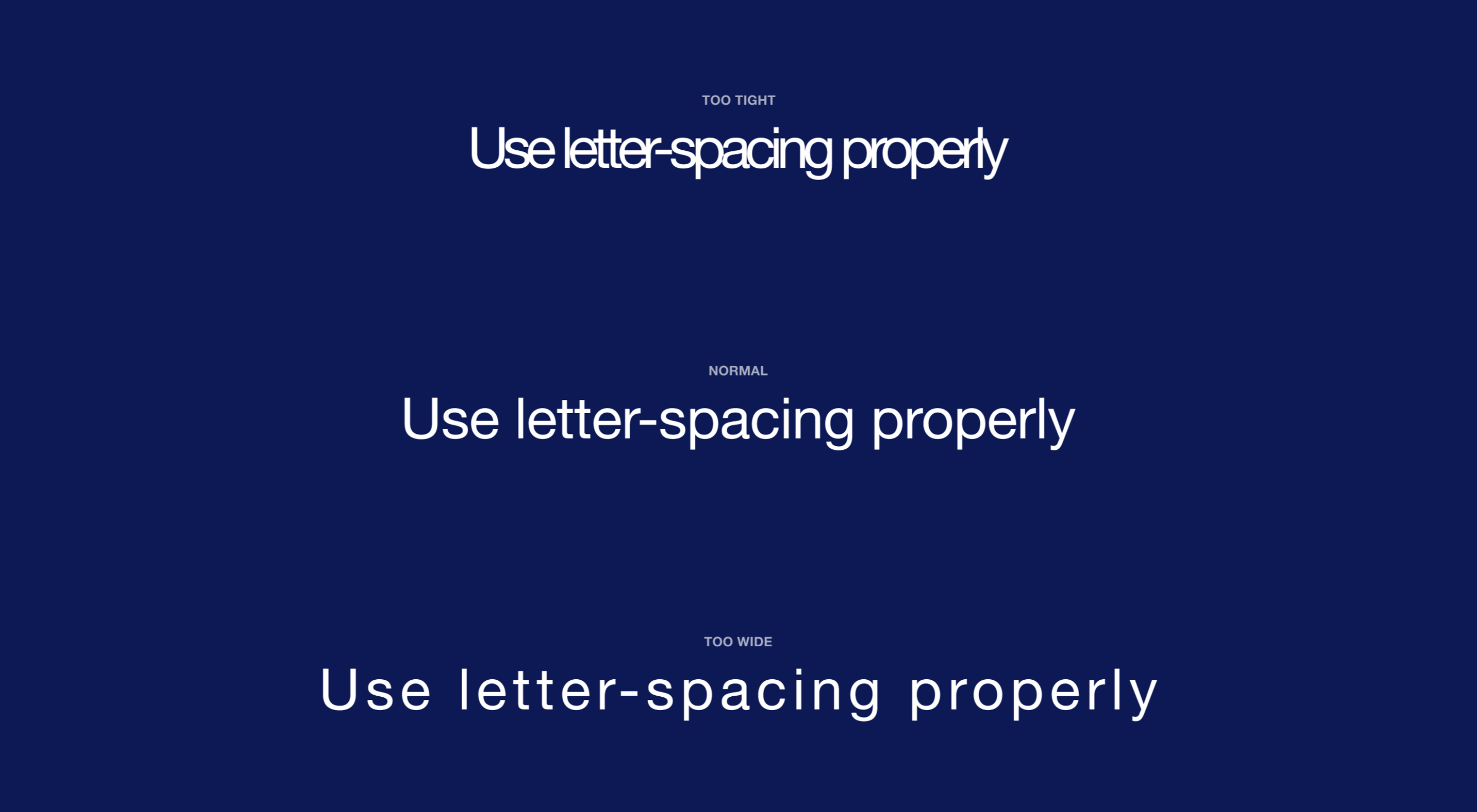 Most of the information we consume happens through reading, so it makes a lot of sense to pay attention to the words when designing. There are many aspects to typography, but one of the things that helped improve the quality of my design was letter-spacing.
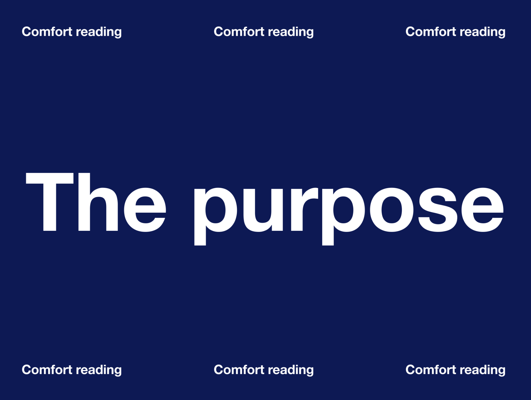