Articles

Every week users submit a lot of interesting stuff on our sister site Webdesigner News, highlighting great content from around the web that can be of interest to web designers.

The best way to keep track of all the great stories and news being posted is simply to check out the Webdesigner News site, however, in case you missed some here’s a quick and useful compilation of the most popular designer news that we curated from the past week.

Minimal CSS Loader Collection


Webdesign Toolbox: Find the Perfect Web Development Tools


Facebook: Free as in Bullsh*t


New Year Edition: Top UX/UI Design Trends Rushing to Us In 2021


Our 50 Favorite CSS Libraries, Frameworks and Tools from 2020


404 Page Inspiration – The Best 404 Pages from Around the Web


7 Best Instagram Tools for Designers in 2021


HTML New Tab for Chrome – Design your own New Tab Page


48 Incredible Ways Designers Responded to COVID-19


QR.New – Make a New QR Code with Text


Hotwire – HTML Over the Wire


Entry.dev – Entry-level Developer Jobs


The Dribbble Shots that Defined 2020


Convert Web Pages into PDFs with Puppeteer and NodeJS


Best Practices for Building Offline Apps


Axel – Powerful Rituals to Drive your Team to Success


Sorry, but We are not all Designers


Zecoda – The Easiest Way to Build Websites Without Code


Nebula – A Fully Featured Particle System Designer for the Web


Write Code. Not Too Much. Mostly Functions


How to Favicon in 2021: Six Files that Fit Most Needs


5 Years of Design – Time Travel Through Handpicked, Beautiful Designs


How the Web is Really Built


How to Be a 10x Developer


Why this Forgotten Punctuation Mark Should Be Revived for 2021


Want more? No problem! Keep track of top design news from around the web with Webdesigner News.

Source


Source de l’article sur Webdesignerdepot

Every week users submit a lot of interesting stuff on our sister site Webdesigner News, highlighting great content from around the web that can be of interest to web designers.

The best way to keep track of all the great stories and news being posted is simply to check out the Webdesigner News site, however, in case you missed some here’s a quick and useful compilation of the most popular designer news that we curated from the past week.

The Best Design Tool of 2020 is not What You Expect


14 Top Design Trends to Watch Out for in 2021


UI Trends for 2077


Firefox was Always Enough


Wavelry – Create & Customise Wavey Svg and Png Backgrounds


Design Documentation


The Best 25 Black and White Web Design Inspiration


2020 Design Tools Survey


Web Design in 2021 – What to Expect


How to Accelerate your Online Presence Using SEO


Email Signature Design Guide, Best Practices, and Examples


Lavender – Write More Confident, Effective, and Thoughtful Emails


Buy Don’t Build


Glorify 2.0: Create High-Quality Product Images at Low Cost


5 WooCommerce Design Mistakes to Avoid


15 Best Free Christmas Fonts to Design Gift Cards


How to Create a Full Width Page in WordPress (Beginner’s Guide)


For the Fans: How to Make and Sell your own Merch


How to Build a Strong Design Team Structure


A Designer’s Guide to Receiving Criticism and Managing Feedback


It’s Always Year Zero


How to Design Better Pinterest Graphics and Attract Clicks


Dropover – Easier Drag & Drop on your Mac


7 Fantastic Youtube Videos on Web Typography


Colour Contrast Checker – Check the Contrast Between Different Colour Against WCAG


Want more? No problem! Keep track of top design news from around the web with Webdesigner News.

Source


Source de l’article sur Webdesignerdepot

Every week users submit a lot of interesting stuff on our sister site Webdesigner News, highlighting great content from around the web that can be of interest to web designers.

The best way to keep track of all the great stories and news being posted is simply to check out the Webdesigner News site, however, in case you missed some here’s a quick and useful compilation of the most popular designer news that we curated from the past week.

Web Typography Rules: What You Need to Know


How Microsoft Crushed Slack


Graphic Design Trends for Social Media in 2021


UX Christmas


Traxr – Monitor Links with 100% Accuracy


Hexometer 2.0: Monitor Website Issues and Performance Actively


Designing Data Science Tools at Spotify


Cow Pilot – The Deadline Driven To-Do List


Roy – A Simple & Delightful Color Picker for Designers


5 New SEO Tools for Marketers


21 Unique Web Design Trends for 2021


Newsletter Spy – A Database of 20,000+ Substack Newsletters


Visme 2.0 – All-in-one Design Platform


2020 Year in Review


How to Build a Web App: Key Steps for Starters


How to Create a Style Guide to Enhance your Brand’s UX


WordPress 5.6: New Features, Changes, and What Else to Expect


The Dos and Don’ts of Creating your Product Roadmap


Pantone Reveals Two Choices for its Colour of the Year 2021


Headlime 2.0 – Professional Marketing Copy for Anyone


Design for Sales: 10 Creative UI Designs for Ecommerce


How to Build a Strong Mobile App Brand


10 New Rules of Design


Remake 2.0: Make Web Apps with Just HTML and CSS


A Step-by-step Guide to Designing a New Feature for a Popular Product


Want more? No problem! Keep track of top design news from around the web with Webdesigner News.

Source


Source de l’article sur Webdesignerdepot

By the end of the year, the number of global smartphone users is expected to reach 3.5 billion. That’s a significant 9.3% increase over the last 12 months.

In a world where everyone is constantly connected to their mobile devices, it makes sense that web developers and designers would need to consider new rules for how they create engaging experiences. After all, most of us find browsing from our smartphones to be much more convenient than sitting down at a laptop each day.

With a little luck, you’re already taking steps to mobile optimize your website but standards are changing all the time. To make sure your website is up to scratch, here’s your guide to prioritizing your site for mobile, ready for the new year.

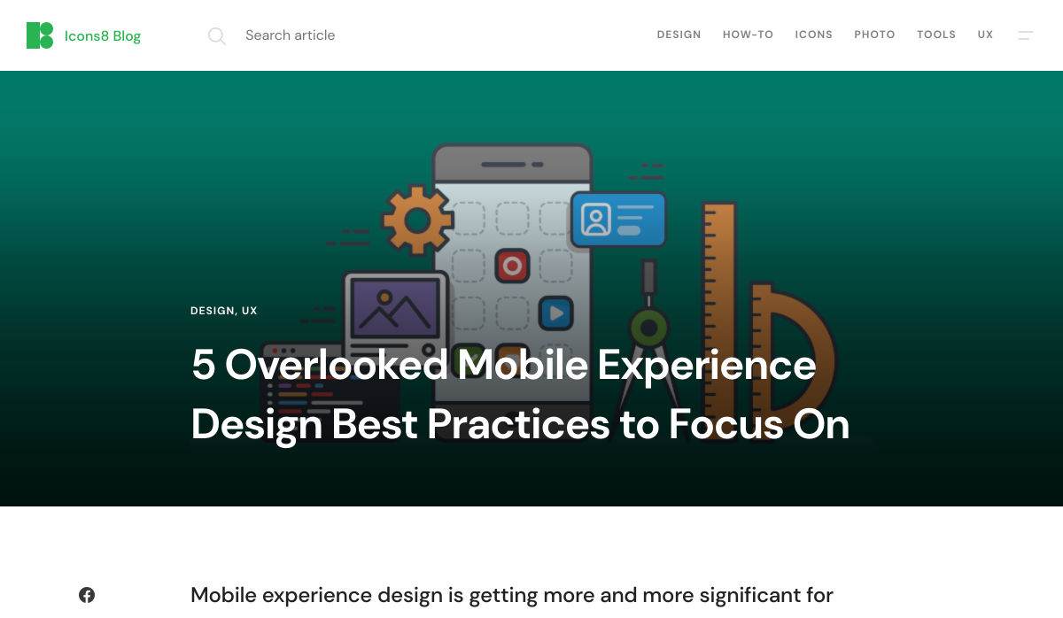
Understanding Mobile-First Design

The first step in updating your web design and development principles, is understanding the concept of mobile first design, and how it’s changed.

With a responsive website, you create something that adjusts to the screen size of any device; with a mobile-first site, you’re focusing first-and-foremost on the user experience that people get when they’re on mobile, taking that as your starting point, and building from there. Instead of building your website for the desktop and using mobile as an afterthought, you start with a consideration of mobile.

Even Google is highlighting the demand for this process lately, with the mobile-first indexing algorithm. If you can’t design for mobile-first, then you could risk your clients being unable to rise up the search engine ranks.

So, how do you get started?

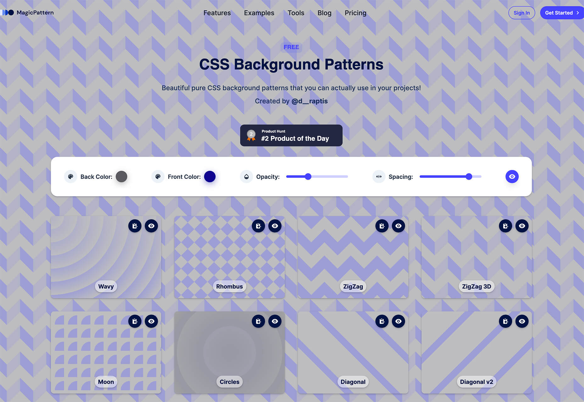
1. Start With the Right Tools

Web developers and designers are nothing without a great toolkit.

The good news is that there are solutions out there that can help you to master the right skills for a mobile-focused user experience. For instance, Skeleton is excellent for small-scale projects that require fluid grids and minimal compiling.

Alternatively, Bootstrap can offer a one-size-fits-all solution for the front-end development for mobile devices. There’s a default grid system available, plenty of components, and JavaScript plugins to work with.

With the right tools, you can minimize and prioritize the content that’s most valuable for your website projects. This is crucial for maximizing website speed and creating clarity when it comes to content and imagery.

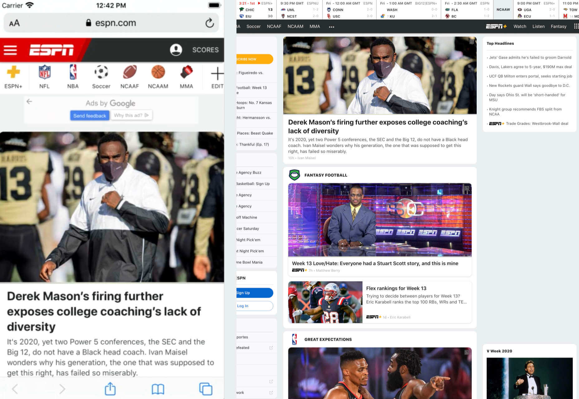
For instance, check out the ESPN website; it’s split into very easy-to-follow categories of content that are perfect for scrolling on a smartphone. The grid of videos makes it feel like you’re using a tool like YouTube.

2. Prioritize Mobile-First Elements

Once you have the right tools to assist you, it’s time to begin building your mobile-first website from the ground up. Rather than jumping straight into considerations of the latest design trends, it’s important to start with the foundations.

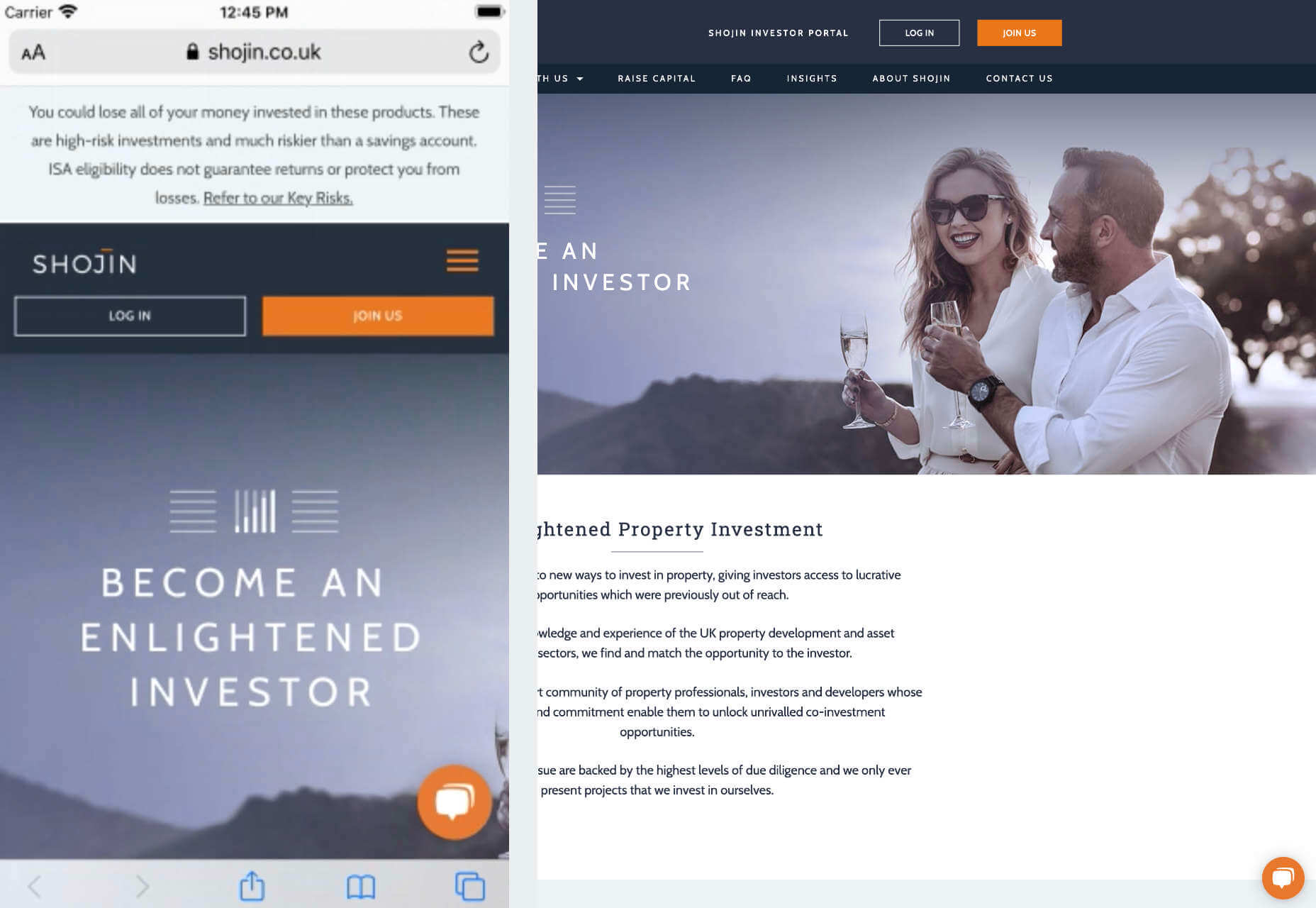
For instance, navigation within a mobile page is usually hidden under a hamburger button. However, you can take this concept to the next level too. For example, the Shojin mobile website only demonstrates the most important website options within the navigation bar to avoid overwhelming users.

The key here is to keep things as simple as possible, without restricting what your audience can do when they visit your website. Although you want to keep the number of interactive elements on your site small, you also need to ensure that those elements are easy to find and use.

All buttons and CTAs should be clear and tappable. Fonts need to be large enough to read from any screen, and your navigation system needs to be 100% simple, without slowing anything down.

On average, we recommend making all clickable elements at least 48 pixels in height.

3. Use Responsive Imagery and SVGs

Images are a crucial part of any website. They add context and appeal to your design. However, they can also seriously slow down your website if you’re not careful.

Remember, different devices have different demands when it comes to imagery. A desktop page may need a 1200px wide image, while a mobile-only needs the image to be 400px wide at most. The old way of making your images work was to load a large resolution image and use the same file on every platform. Unfortunately, this slows downloading time significantly.

Instead, it’s better to have at least two different versions of the same image for your mobile and desktop solutions. You can also consider SVG.

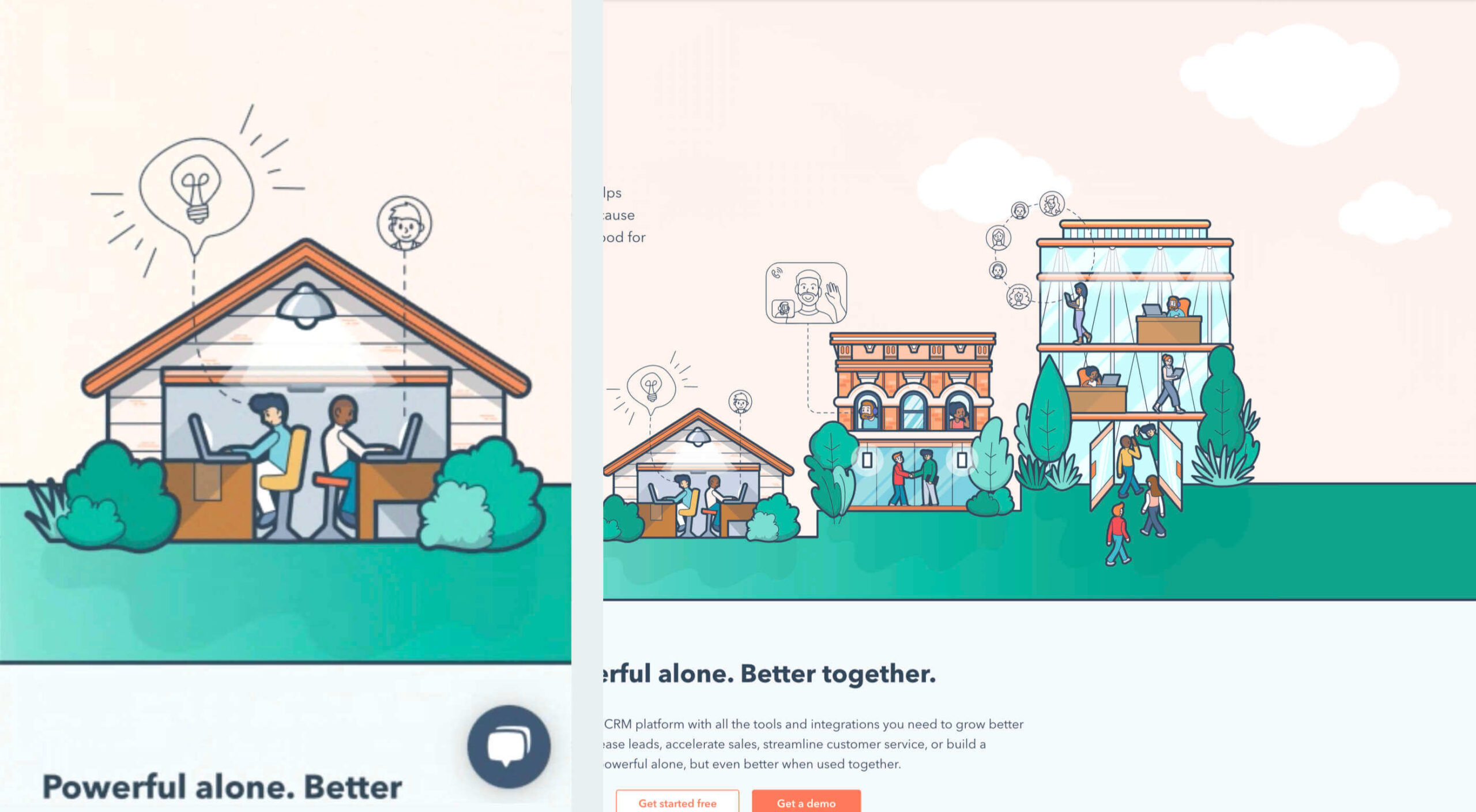
SVGs are incredibly scalable – more so than bitmaps. With SVG, you can ensure any icon or graphic continues to look sharp and clickable across all devices. Because these files are often smaller, your site loads quicker too! Hubspot is great at using SVGs.

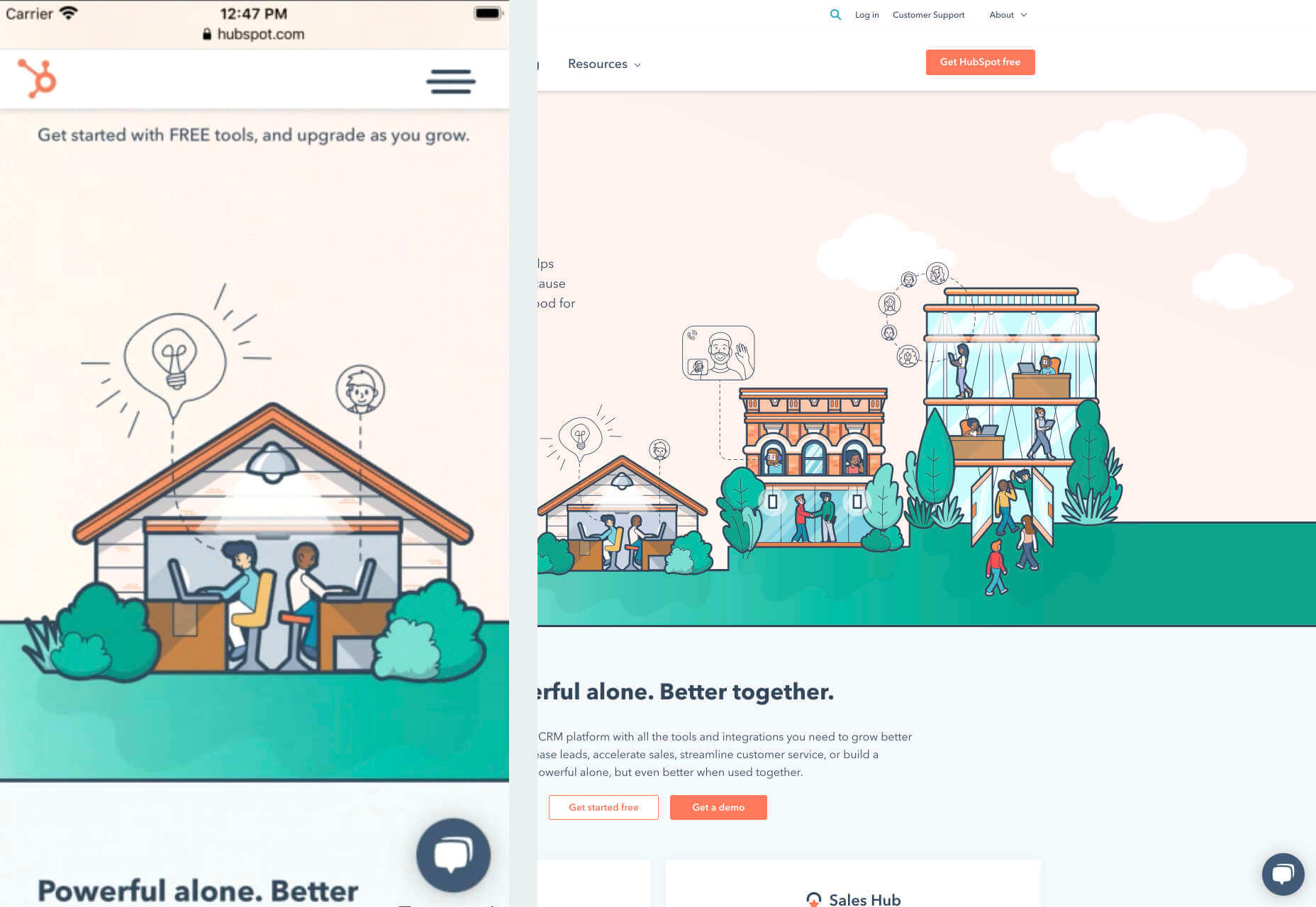
Intricate illustrations are a massive component of HubSpot’s brand. If those images were saved as PNGs or other alternative files, then they would take forever to load. Because they’re all SVGs, you can enjoy the same consistent experience across desktop and mobile.

4. Get the Typography Right

It’s not just the big graphics and images that make a huge difference to your website when it comes to mobile-first design. You also need to think about the legibility and clarity of your website across all devices and platforms. If people can’t read the value proposition of the company that you’re designing for, you’re going to have a major problem.

Focus on making your content as easy to read as possible. Look into the typefaces that seem most appealing on a range of devices.

Remember to balance the body and heading font sizes for the device size too. You’ll need to ensure that the experience feels consistent and smooth as your users scroll through each page. Just take a look at the mobile version of the IMPACT website, for instance.

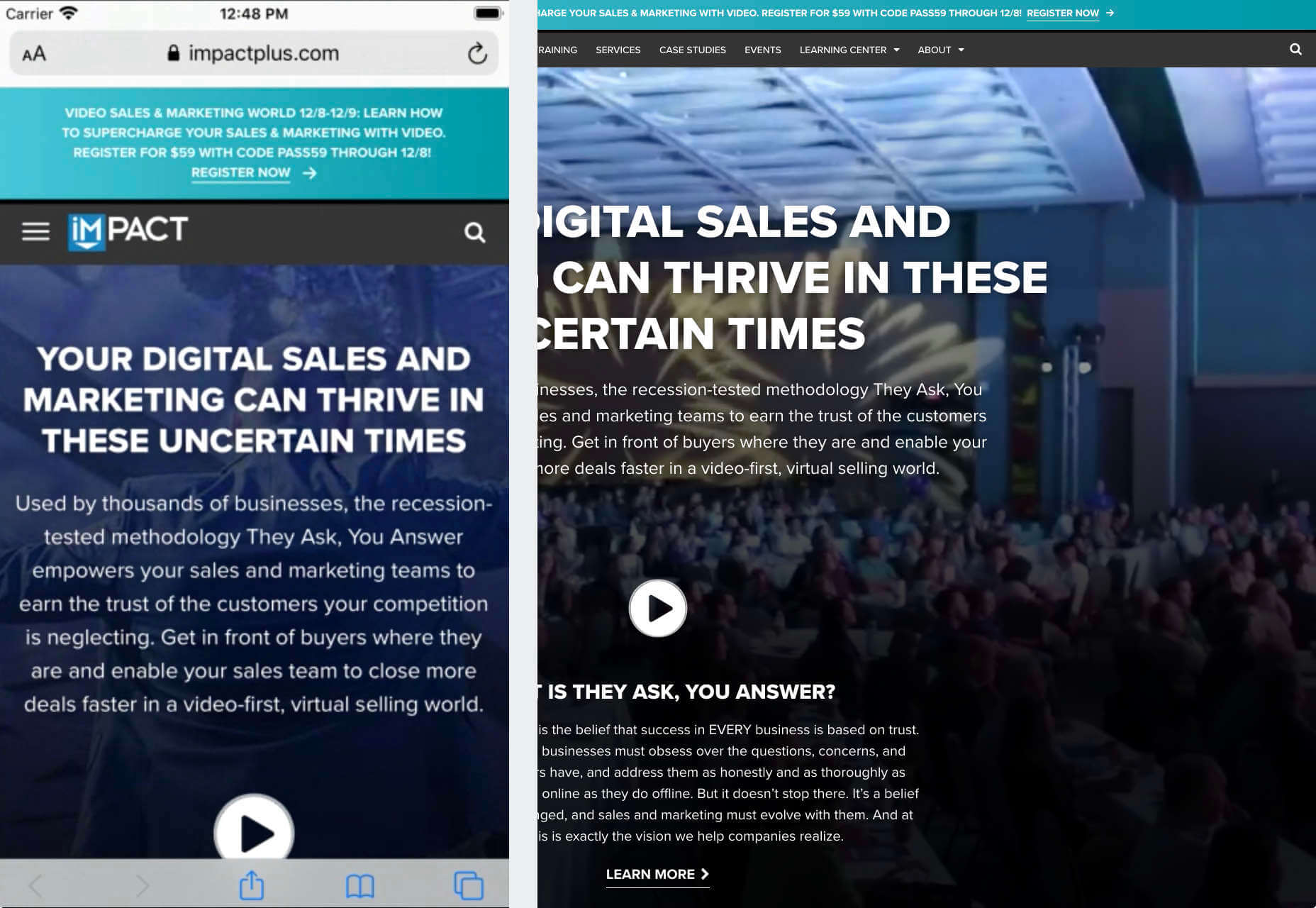
The headings aren’t as huge as they are on the desktop version of the website, and they’re displayed below, rather than above the featured image. However, this helps to give a more immediately eye-catching and structured experience to mobile users.

There’s even a handy “Search Engine Optimization” tag included, that users can click on if they want to find more related articles.

When it comes to typography, remember that it’s not just size and clarity that matter, but how things are structured throughout your website too. Your type should naturally guide your visitors along the page.

5. Master Available Device Features

Finally, on smartphones, you can accomplish a range of amazing things that you might not be able to do when using a desktop device. Your users can make calls, open apps, send messages, and more, all from within their mobile browser. They can also move their smartphone around a room, taking advantage of concepts like AR and VR.

Taking advantage of the unique capabilities that smartphone design can offer gives you a chance to get unique with your user experience.

Making the most of the mobile experience can be much simpler than you’d think. For instance, on a desktop site, you could list your phone number on a contact page. On a mobile site, the number can begin a call when clicked. You can also take the same approach with email addresses, and social media icons too.

Depending on how experimental you feel, there’s also plenty of opportunities to go above and beyond with your mobile features. You may decide to create a mobile app version of a website that your customers can download onto their phones.

Alternatively, you can look into things like AR technology. This could allow your users to practice placing items of furniture that they may be thinking of buying from an online retailer into their house, so they can see how well they work with their other interior design choices.

Making the Most of Mobile-First Design

Ultimately, having a responsive website that works on both mobile and desktop devices is mandatory in the modern world. However, going above and beyond with mobile-first design is a great way to get ahead of the game.

If you can focus on building a website that puts the experiences of mobile users first, then you can create something that’s much more likely to grab audience attention and deliver amazing experiences.

If nothing else, showing your clients that you have what it takes to design for mobile is an excellent way to ensure that you can gain as many new project opportunities as possible.

Source


Source de l’article sur Webdesignerdepot

Every week users submit a lot of interesting stuff on our sister site Webdesigner News, highlighting great content from around the web that can be of interest to web designers.

The best way to keep track of all the great stories and news being posted is simply to check out the Webdesigner News site, however, in case you missed some here’s a quick and useful compilation of the most popular designer news that we curated from the past week.

Sidekick Browser – The Fastest Browser Built for Work


Why is Apple’s M1 Chip so Fast?


Two Color Combinations – A Curated Collection of 164 Two-color Palette Combinations


5 Tips to Build a Stunning Website that Stands Out from the Crowd


10+ Bootstrap Newsletters


Text Fish – Get Just Text


Ecommerce Website Designs: 27 Best Online Shops and Why They Work


SpaceHey – MySpace Reborn


State of CSS – 2020


5 Overlooked Mobile Experience Design Best Practices


Modern Blackletter Inspired Fonts and their Use in Web Design


Internxt Drive – Secure & Private Cloud Storage Service


Spline – 3D for the Web (Preview Release)


Nots – A Free Beautifully Designed Note-taking App for your Desktop


Google Play’s Best of 2020


Beacon – Run SQL Commands in Slack


Designing for the New Reality: Getting Rid of Pre-COVID Assumptions


Undoing the Toxic Dogmatism of Digital Design


Color Theory: A Beginner’s Guide for Designers


Atkinson Hyperlegible Font


11 Tips for Creating a Usable Website Contact Page


The 7 Secrets to a Great Conversation


Checklist Generator – Create Checklists for Free and Host Them Wherever You Want


Empathetic Design: The First Stage of Design Thinking


Handy Guide to Networking for UX Designers


Want more? No problem! Keep track of top design news from around the web with Webdesigner News.

Source


Source de l’article sur Webdesignerdepot

Every week users submit a lot of interesting stuff on our sister site Webdesigner News, highlighting great content from around the web that can be of interest to web designers.

The best way to keep track of all the great stories and news being posted is simply to check out the Webdesigner News site, however, in case you missed some here’s a quick and useful compilation of the most popular designer news that we curated from the past week.

15 Best Illustration Tools in 2020


Slidepage 1.0 – Create Engaging and Swipeable Stories-on-the-Web, for Free


Notion Timeline – More than Gantt, for all your Projects


Unslack


UX Lessons from Big Sur


Pattern Collect


Apple Silicon M1 Chips and Docker


Difference Between UI and UX Design


How Many WordPress Plugins Should You Install?


5 Things I Wish I’d Known Before Starting a Design System at Spotify


8 Pure CSS Games You Can Play in your Browser


We Can do Better than DuckDuckGo


Fulljar – Simple and Privacy Focused Analytics


Accessibility in User Experience: How to Include People with Disabilities


9 Common WordPress Myths Debunked and Explained


Impressive Pure CSS Drawings


I Took 21 Online Courses, Here’s What I Learned


User Experience: Insights into Consistency in Design


How to Use Emotion to Make your Brand’s Content More Compelling


25 Free Icon Sets You Can Download and Use Today


6 Ways 2020 has Changed the Landscape of Design


25 Inspirational Quotes for Web Designers


9 Tips to Keep You Sane When Working with Multiple Clients


Write Code like You Write a Recipe


UI Coach – UI Design Challenge Generator


Want more? No problem! Keep track of top design news from around the web with Webdesigner News.

Source


Source de l’article sur Webdesignerdepot

When I use map apps such as Google Maps, I often use Street View to display more detailed views of a street or inside of a building.  Although Google Street View is fantastic, there are many use cases where I want to control the development pipeline and assets without having to upload images to Street View. 

To control and optimize your business workflow, you can use open-source Marzipano to build virtual tours yourself and host the tours on your own web site.  This tutorial explains how to build the tour with open source software and host it for free on GitHub Pages. The technology and techniques can scale to large cloud businesses and are in production at commercial sites.   This tutorial focuses on a minimal simplified site to get you started with the basic concepts in minutes.

Source de l’article sur DZONE

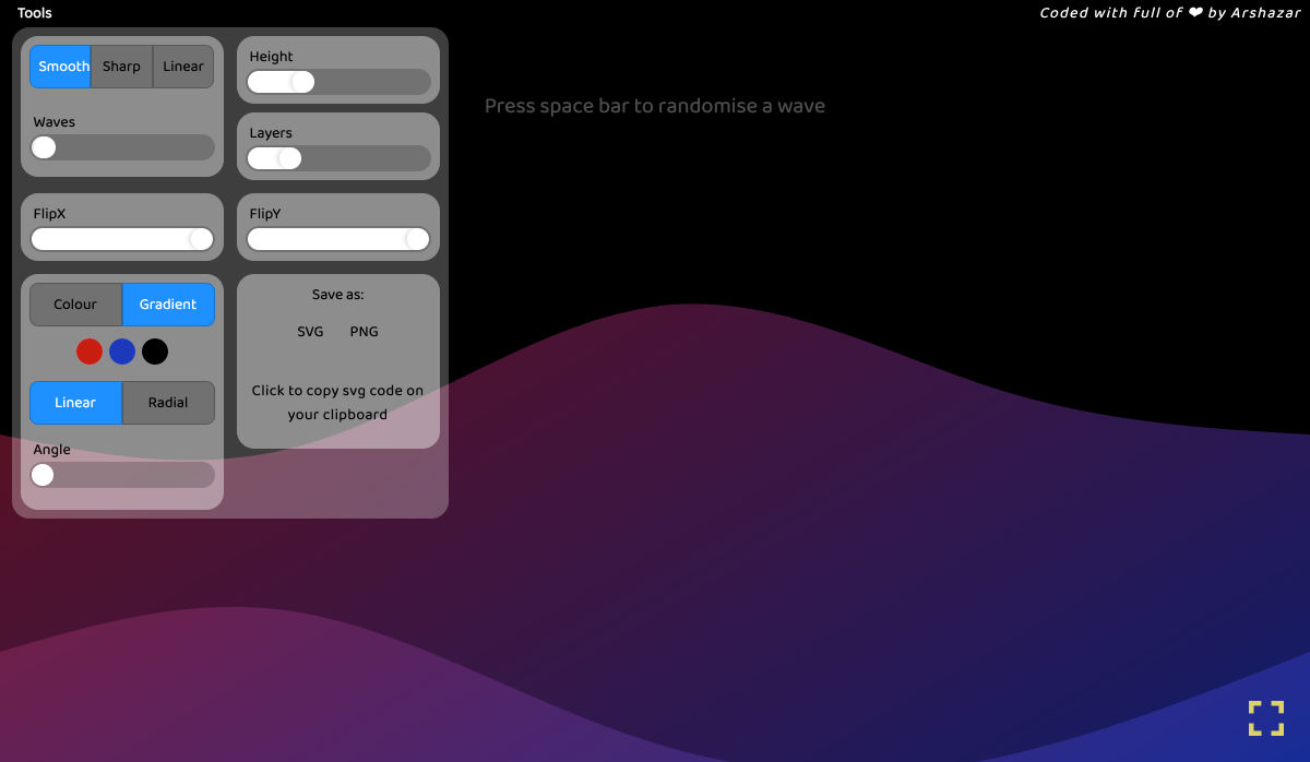
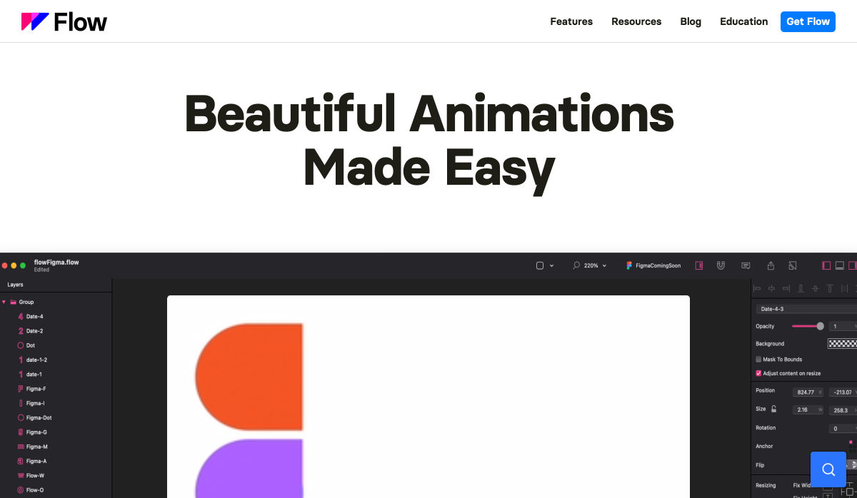
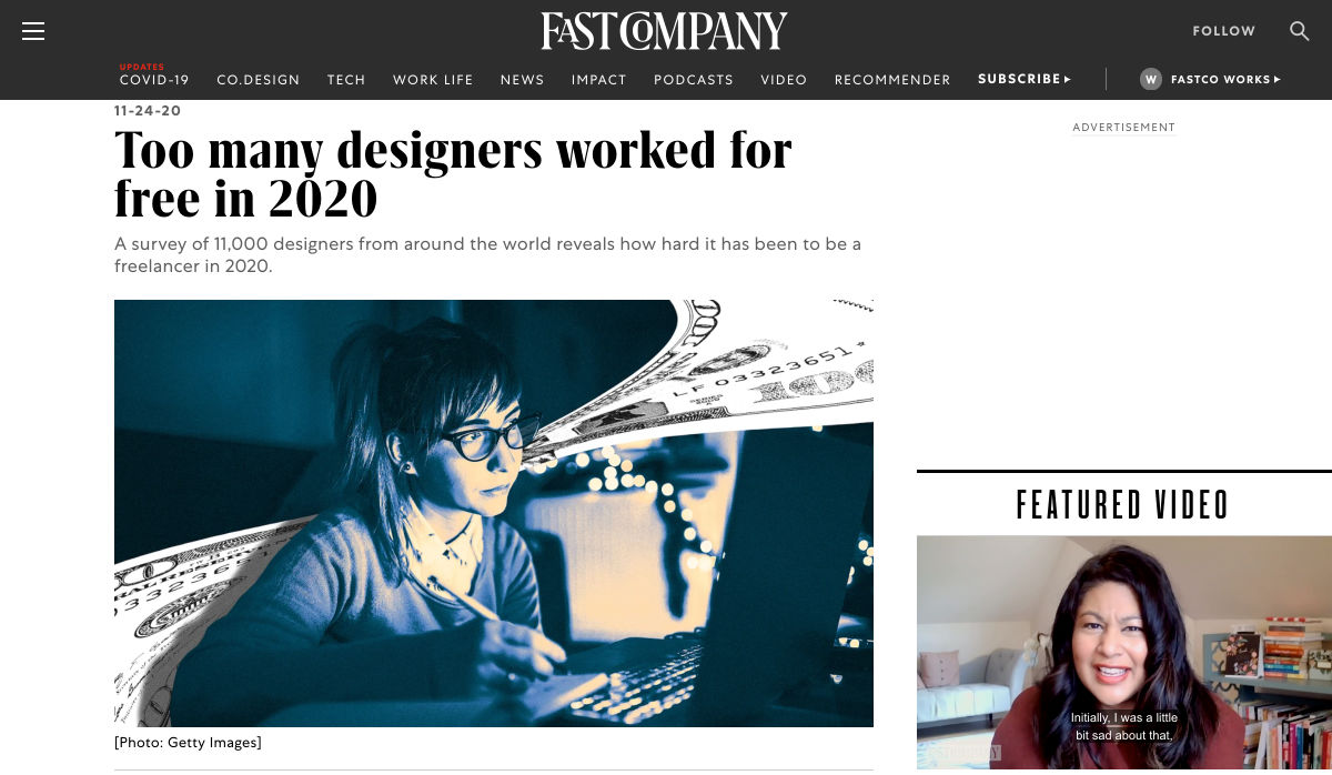
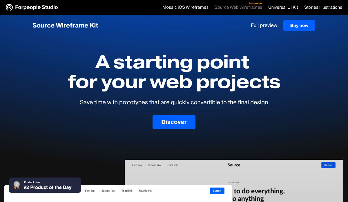
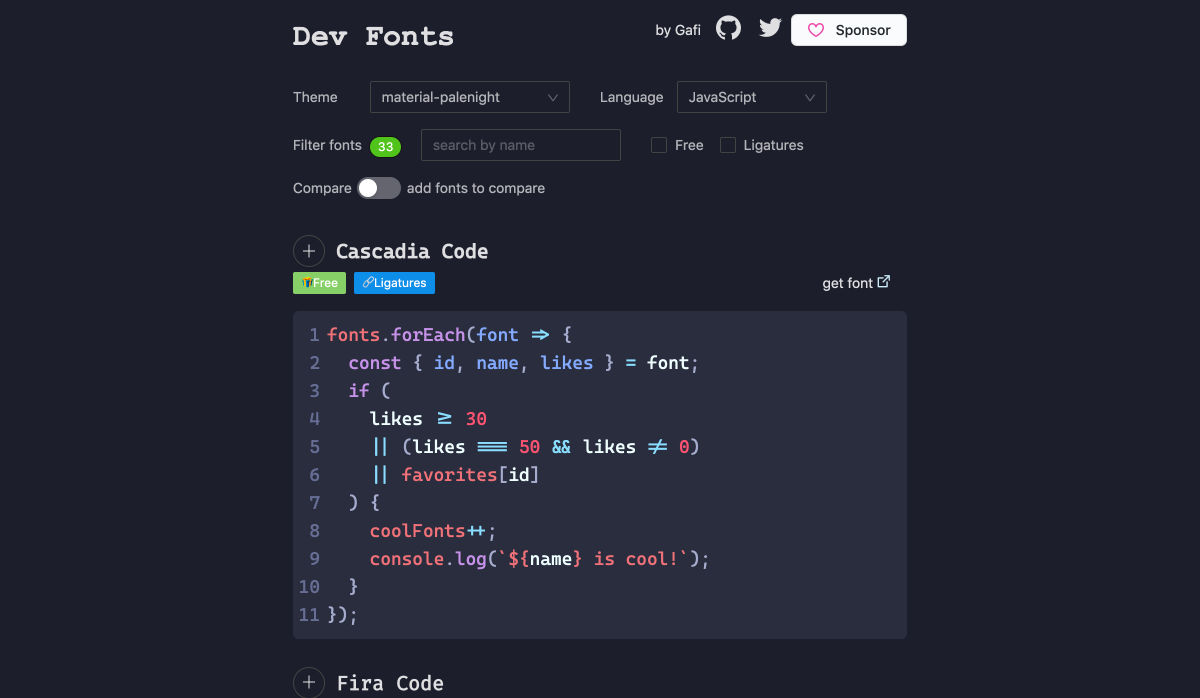
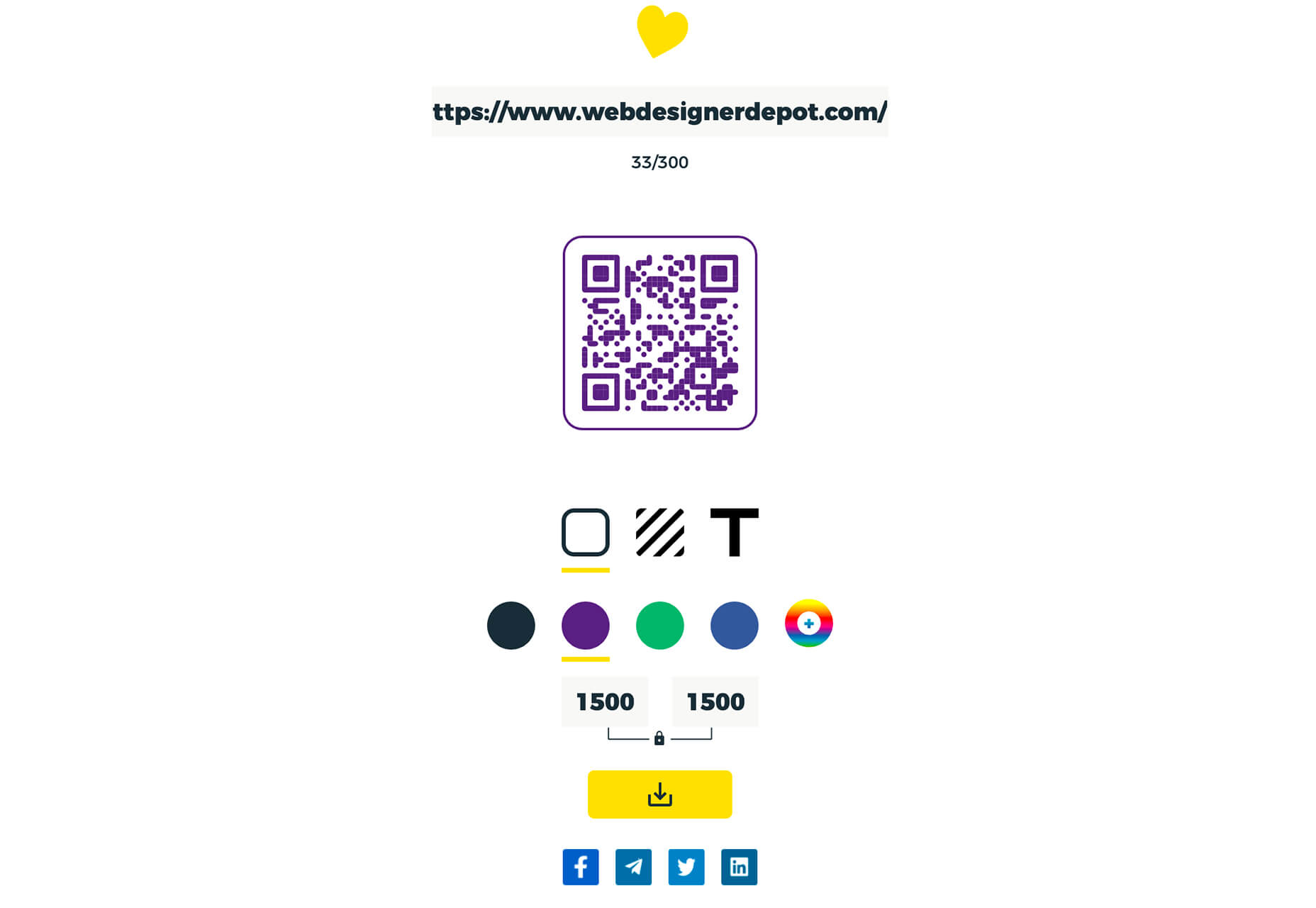
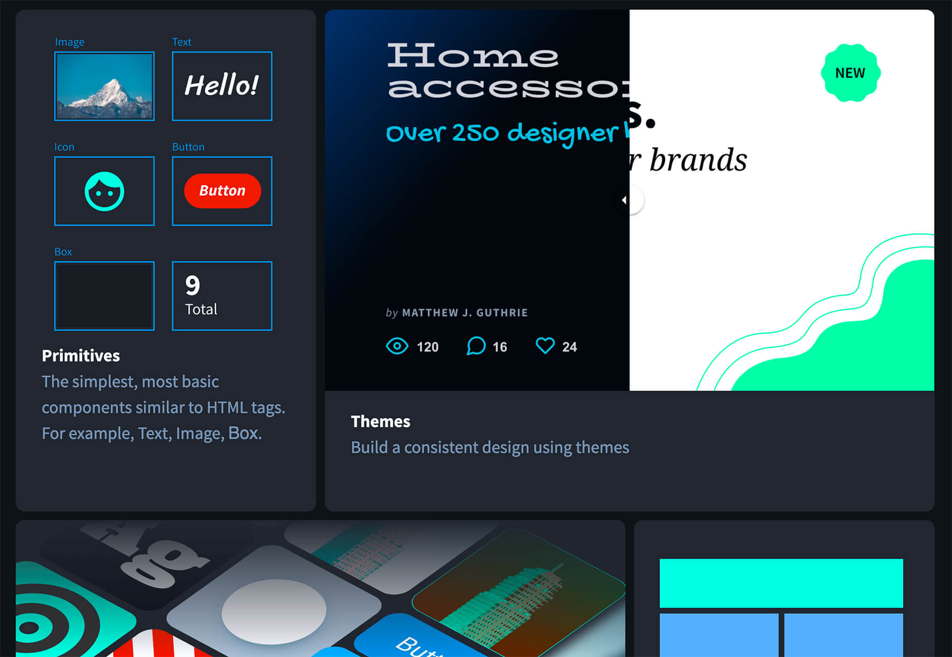
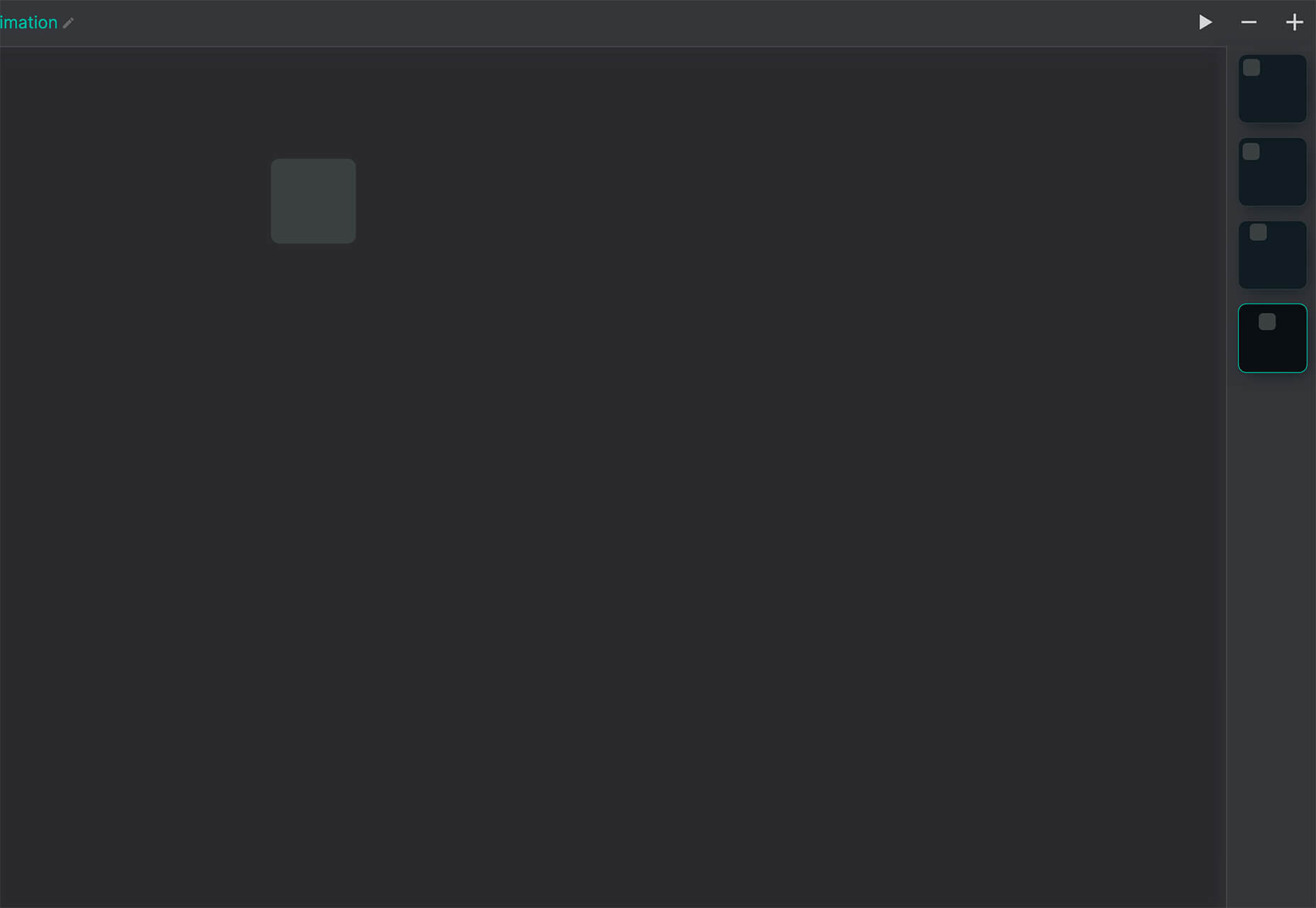
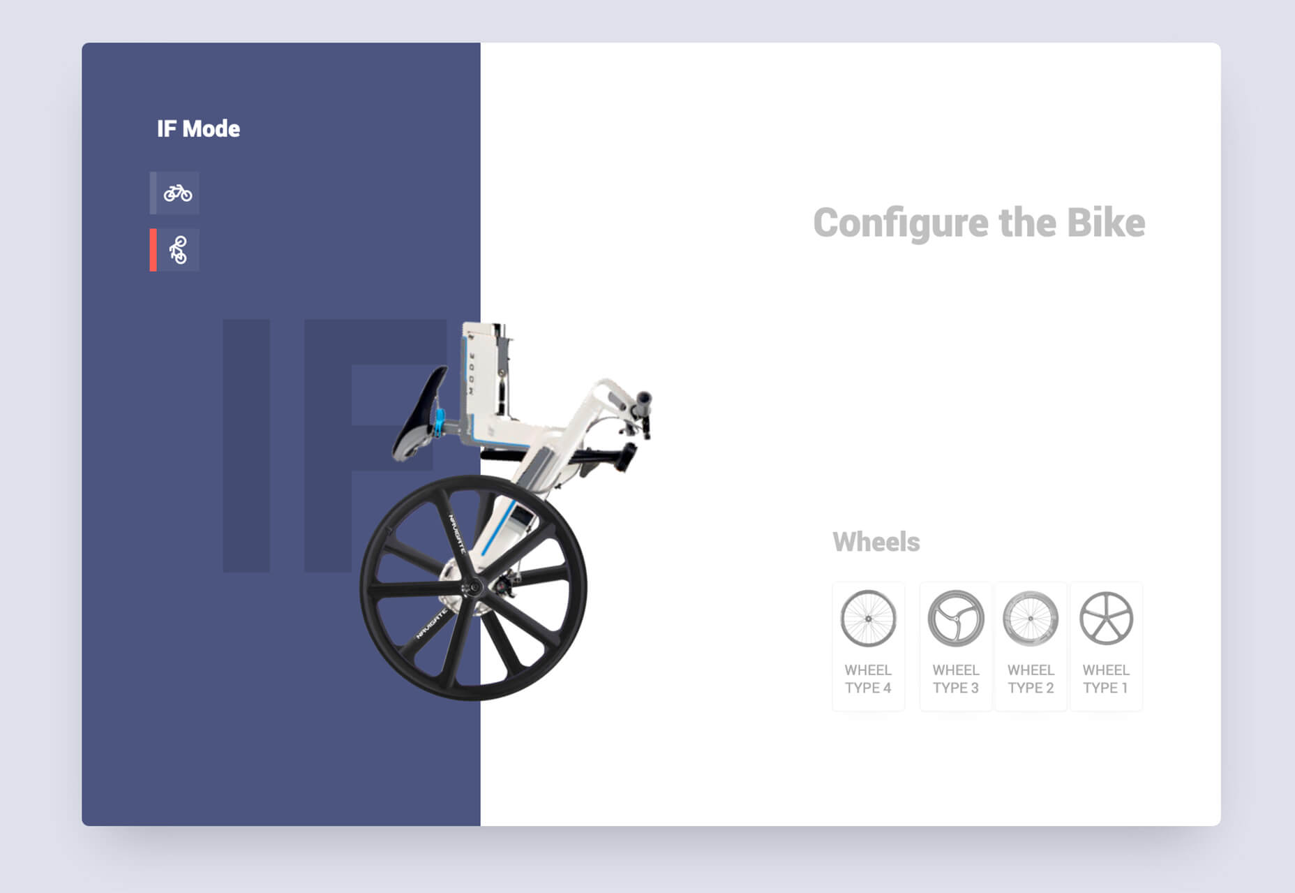
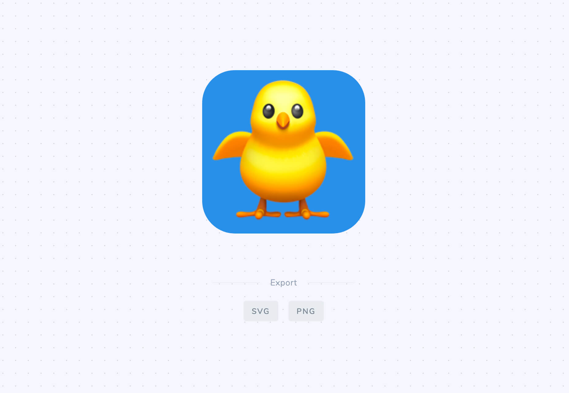
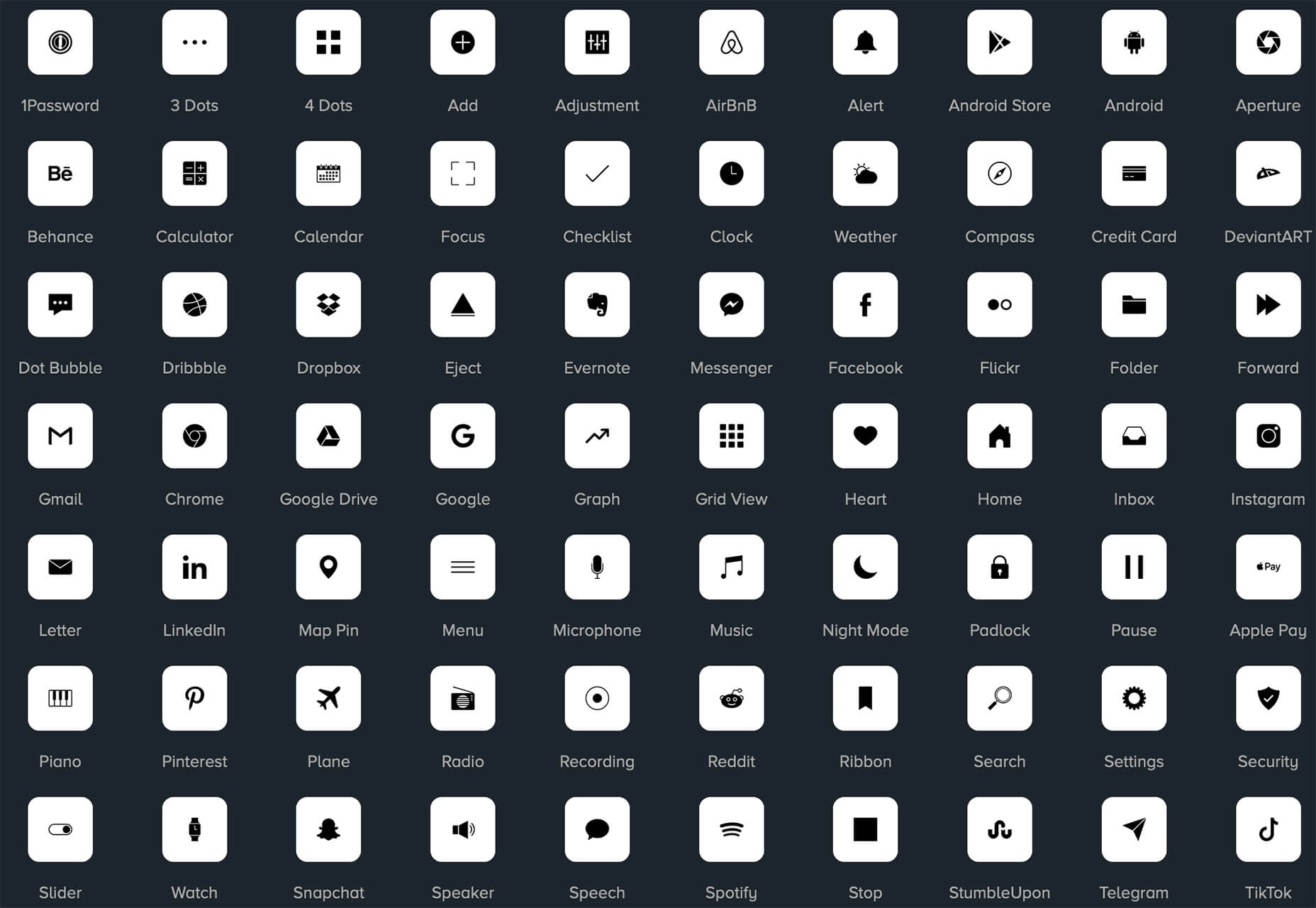
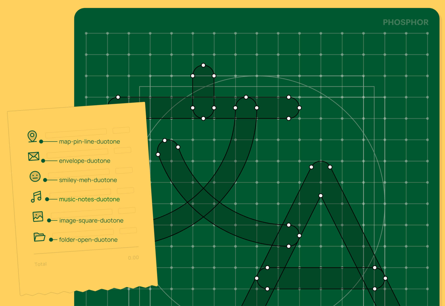
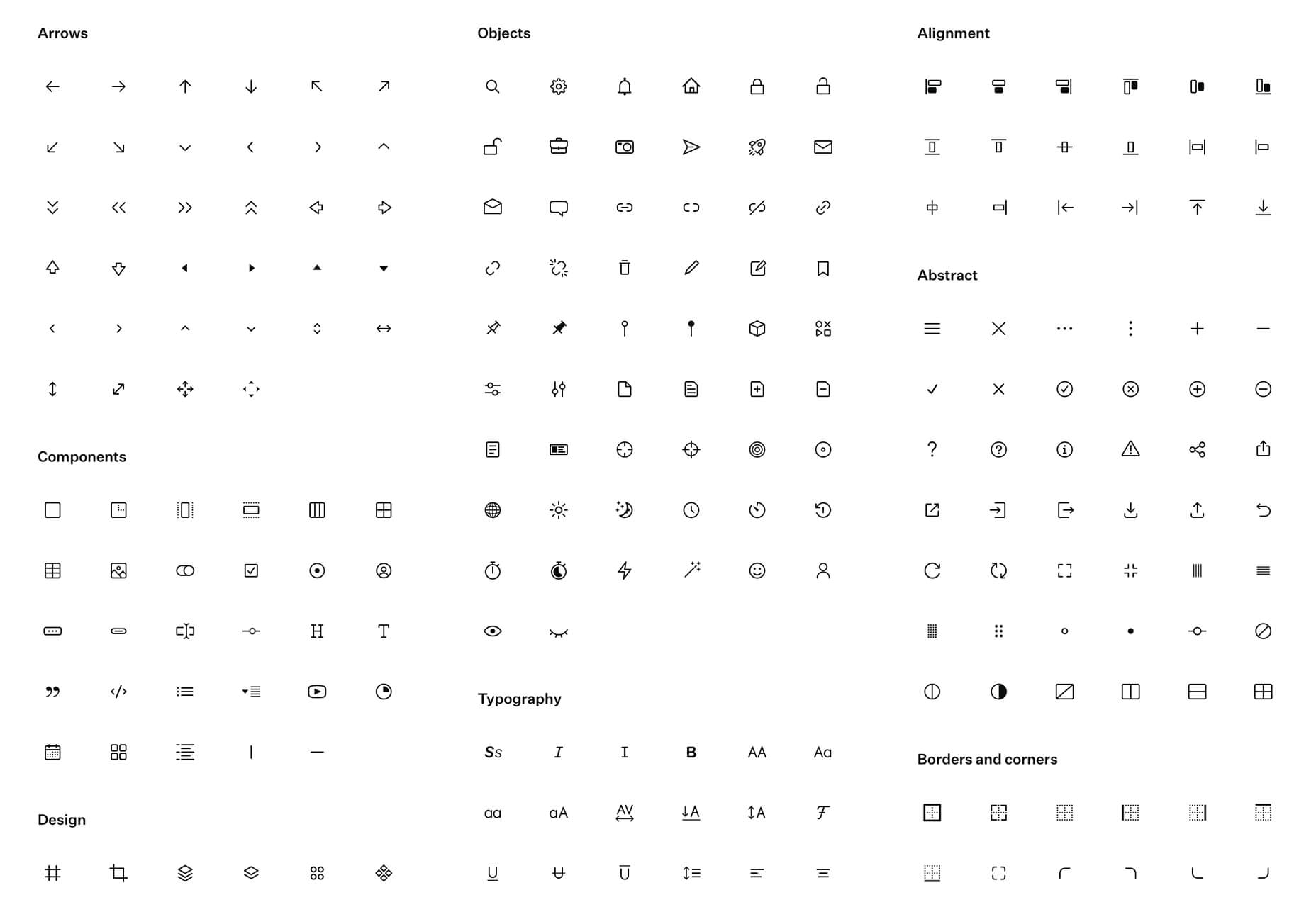
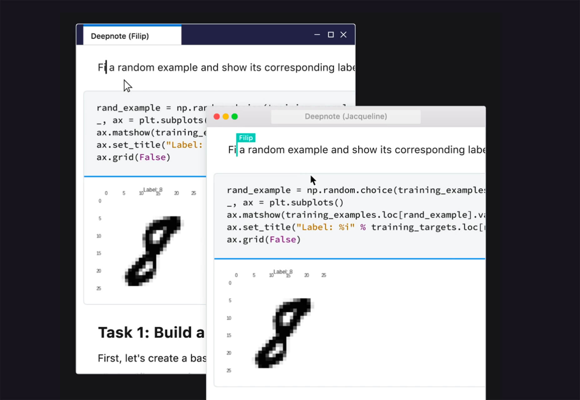
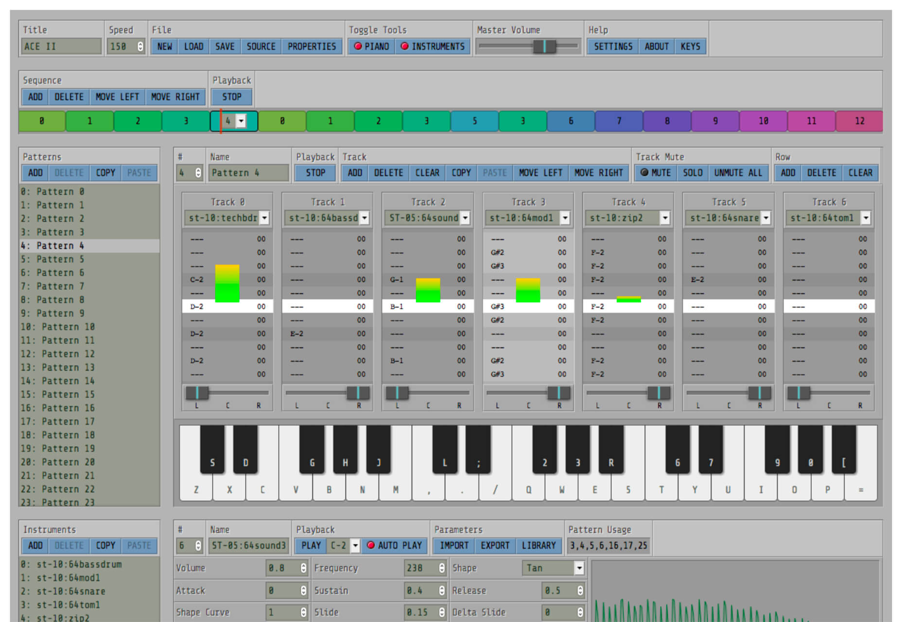
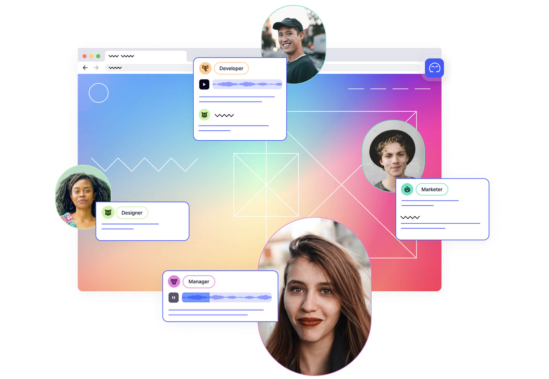
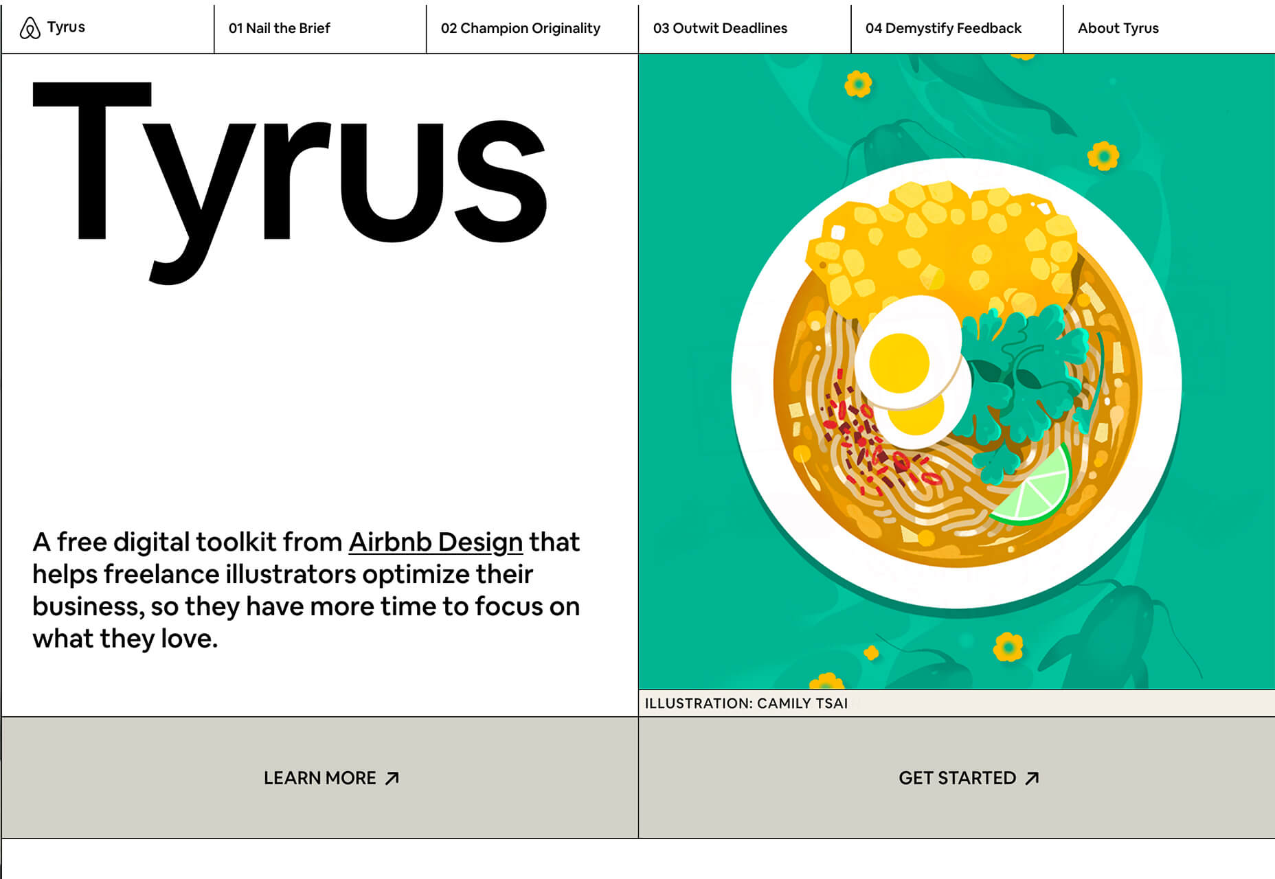
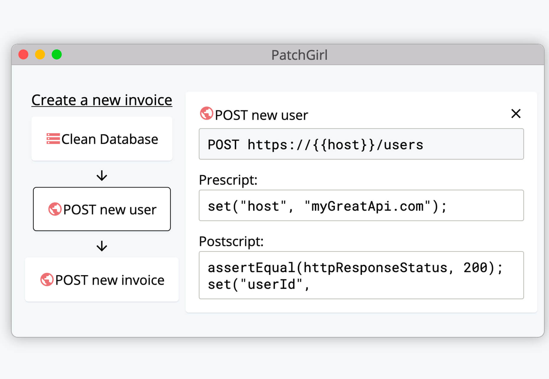
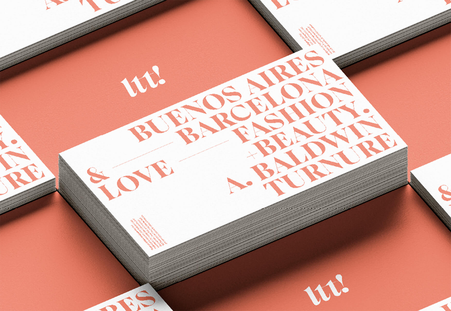
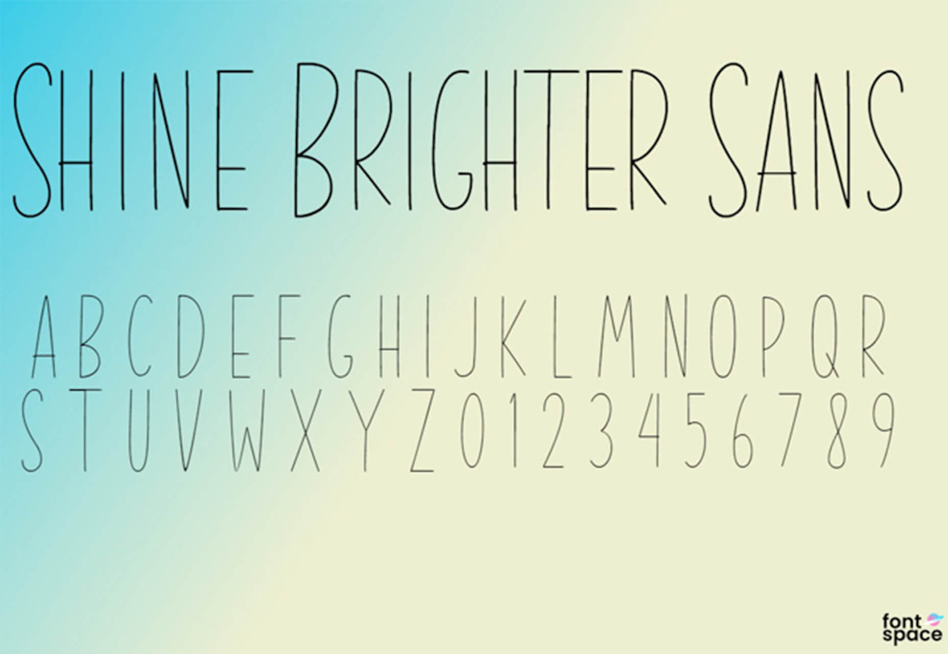
In the spirit of fall feasts, this month’s collection of tools and resources is a smorgasbord of sorts. You’ll find everything from web tools to icon libraries to animation tools to great free fonts. Let’s dig in.

Here’s what new for designers this month.

The Good Line-Height

The Good Line-Height is the tool you won’t be able to live without after using it a few times. The tool calculates the ideal line-height for every text size in a typographic scale so that everything always fits the baseline grid. Set the font size, multiplier, and grid row height to get started.

Link-to-QR

Link-to-QR makes creating quick codes a breeze. Paste in your link and the tool creates an immediate QR code that you can download or share. Pick a color and transparency, plus size, and you are done.

Quarkly

Quarkly allows you to create websites and web apps both using a mouse and typing code – you get all the pros of responsive editing, but can also open the code editor at any time and manually edit anything and it all synchronizes. The tool is built for design control and is in beta.

UnSpam.email

Unspam.email is an online spam tester tool for emails. Improve deliverability with the free email tester. The service analyzes the main aspects of an email and returns a spam score and predicts results with a heat map of your email newsletter.

Filmstrip

Filmstrip allows you to create or import keyframe animations, make adjustments, and export them for web playback. It’s a quick and easy tool for modern web animation.

CSS Background Patterns

CSS Background Patterns is packed with groovy designs that you can adjust and turn into just the right background for your web project. Set the colors, opacity, and spacing; then pick a pattern; preview it right on the screen; and then snag the CSS. You can also submit your own patterns.

Neonpad

Neonpad is a simple – but fun – plain text editor in neon colors. Switch hues for a different writing experience. Use it small or expand to full browser size.

Link Hover Animation

Link Hover Animation is a nifty twist on a hover state. The animation draws a circle around the link!

Tint and Shade Generator

Tint and Shade Generator helps you make the most of any hex color. Start with a base color palette and use it to generate complementary colors for gradients, borders, backgrounds, or shadows.

Pure CSS Product Card

Pure CSS Product Card by Adam Kuhn is a lovely example of an e-commerce design that you can learn from. The card is appealing and functional.

Free Favicon Maker

Free Favicon Maker allows you to create a simple SVG or PNG favicon in a few clicks. You can set a style that includes a letter or emoji, font and size, color, and edge type and you are ready to snag the HTML or download the SVG or PNG file.

Ultimate Free iOS Icon Pack

The Ultimate Free iOS Icon Pack is a collection of 100 minimal icons in an Apple style. With black and white version of each icon and original PSD files, you can create sleek icons for your iPhone screen in minutes. And it’s completely free! No email address or registration required.

Phosphor Icon Family

Phosphor is a flexible icon family for all the things you need icons for including diagrams and presentations. There are plenty of arrows, chats, circles, clocks, office elements, lists, business logos, and more. Everything is in a line style, filled, or with duotone color. Everything is free but donations are accepted.

3,000 Hands

3,000 Hands is a kit of hands that includes plenty of gestures and style in six skin tones and with 10 angles of every gesture. They have a 3D-ish shape and are in an easy to use PNG format. This kit has everything you need from a set of hand icons.

Radix Icons

Radix Icons is a set of 15px by 15px icons for tiny spaces. They are in a line style and are available in a variety of formats including Figma, Sketch, iconJar, SVG, npm installation, or GitHub.

Deepnote

Deepnote is a new kind of data science notebook. It is Jupyter-compatible with real-time collaboration and running in the cloud and designed for data science teams.

ZzFXM Tiny JavaScript Music Generator

ZzFXM is a tiny JavaScript function that generates stereo music tracks from patterns of note and instrument data. Instrument samples are created using a modified version of the super-tiny ZzFX sound generator by Frank Force. It is designed for size-limited productions.

Image Tiles Scroll Animation

Image Tiles Scroll Animation is a different type of scrolling pattern using Locomotive Scroll. The grid creates a smooth animation in a fun and modern style.

Bubbles

Bubbles is a Chrome extension that allows you to collaborate by clicking anywhere on your screen and then dropping a comment to start a conversation with anyone. This is a nice option for work from home teams.

Tyrus

Tyrus is a toolkit from the design team at Airbnb to help illustrators make the most out of their design businesses. It is broken into sections to help you with design briefs, originality, deadlines, and feedback.

PatchGirl

PatchGirl is an automated QA tool for developers. You can combine SQL and HTTP queries to build any possible state of your database.

Apparel

Apparel is a beautiful premium typeface family with plenty of versatility in a modern serif style. It is a contemporary, classy, and fresh serif typeface with a laid-back. Its medium-large x-height makes it ideal for headlines and brand identity design.

Christmas Story

Christmas Story is a nice solution if you are already starting to think ahead to holiday projects or cards. The long swashes and tails are elaborate and fun.

Nafta

Nafta is a fun handwriting style font that has a marker-style stroke. It’s a modern take on the popular Sharpie font. It includes all uppercase letters.

Safira

Safira is a wide and modern sans with ligatures and a stylish feel. The rounded ball terminals are especially elegant.

Shine Brighter Sans

Shine Brighter Sans is a super-thin sans-serif with a light attitude. The limited character set combined with its light weight is best for display use.

Source


Source de l’article sur Webdesignerdepot

Every week users submit a lot of interesting stuff on our sister site Webdesigner News, highlighting great content from around the web that can be of interest to web designers.

The best way to keep track of all the great stories and news being posted is simply to check out the Webdesigner News site, however, in case you missed some here’s a quick and useful compilation of the most popular designer news that we curated from the past week.

Quarkly – Design Tool for Creating Websites and Web Apps


Create your Personal Branding Strategy in 4 Simple Steps


How to Design a Landing Page


No Code MBA – Learn to Build Real Apps and Websites Without Code


Your Computer Isn’t Yours


Swatches – Generate Colors for Every Purpose


Markabaly – Cross-platform Markdown Editor


12+ Bootstrap Hero Image Examples


The UX of Among Us: The Importance of Colorblind-friendly Design


No, your Clean Code won’t Save the Planet


My Side Project Rocks – Share and Discover Side Projects


How to Test Content like a Pro: A Step-by-step Guide


MacOS Big Sur is Here


Free Fonts for Prototyping and Wireframing


Gamification: The Broken Way of Carrot and Stick


Everything You were Wondering About Apple’s New M1 Chip


Please Unsubscribe – Fwd Emails to Unsubscribe from Marketing


The Fonts in Popular Things Identified Vol. 2


How to Become a Self-taught Graphic Designer


Using PowerPoint’s Animated GIF Function


Scribbble.io – A Blogging Platform for Developers


How to Work with WordPress Block Patterns


The Power of Happiness: Being Safe, Free, and Supported


How to Handle Scope Creep in Web Design


Building Products


Want more? No problem! Keep track of top design news from around the web with Webdesigner News.

Source


Source de l’article sur Webdesignerdepot