
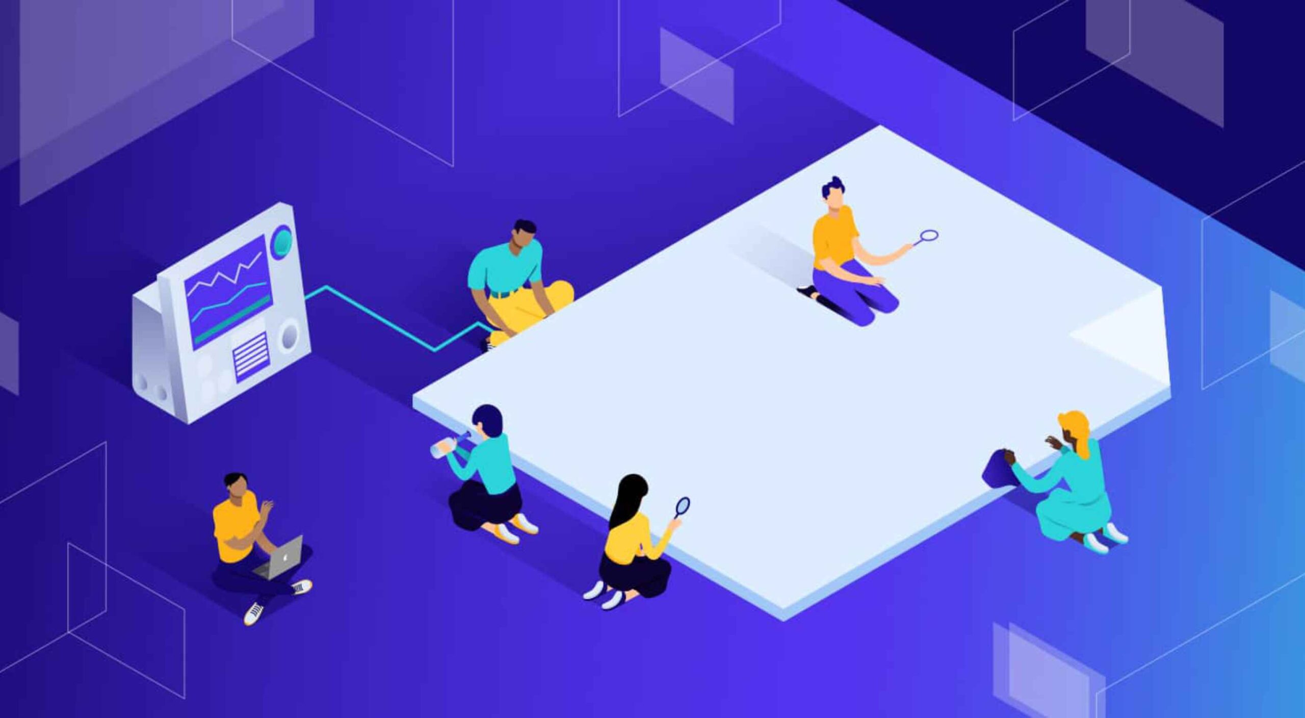
 There are some spook-tacular finds in this month’s October collection of resources and tools for designers and developers. From interesting tools that can help in the design process to boo-tiful typefaces, there’s something for everyone here.
Here’s what is new for designers this month…
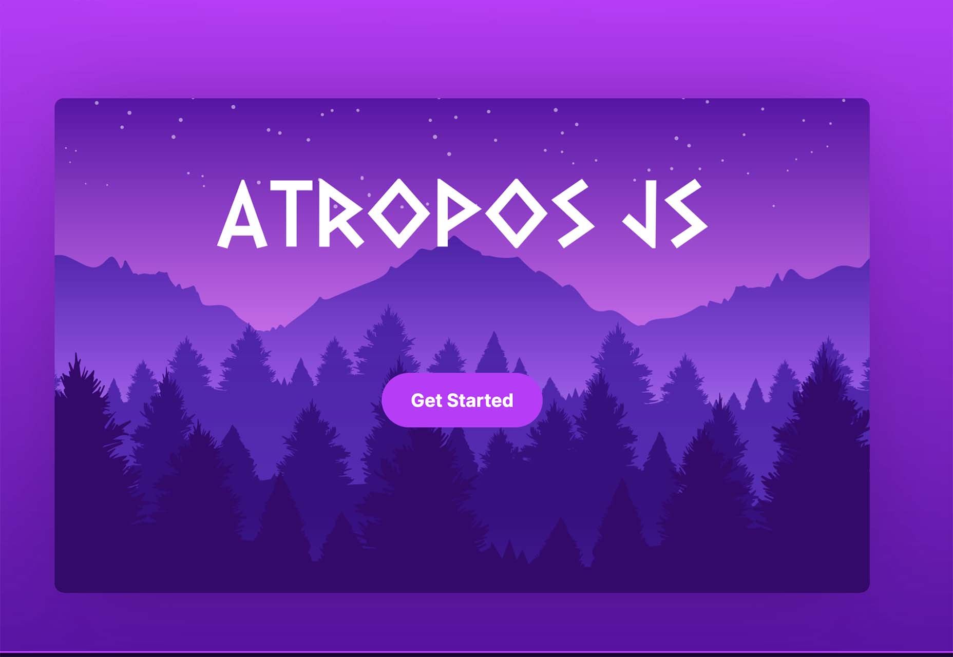
Atropos
Atropos is a lightweight, open-source JavaScript library to create touch-friendly, three-dimensional hover effects. The results are stunning and have a nice parallax style. Everything is highly configurable and customizable. It’s available for JavaScript, React, and Vue.js and has zero dependencies.
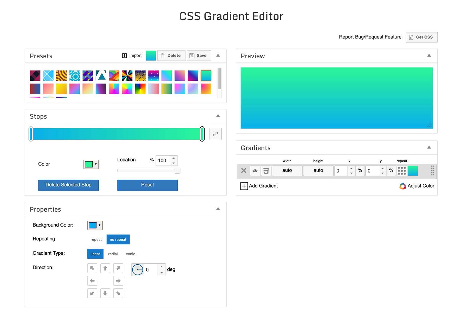
CSS Gradient Editor
CSS Gradient Editor helps you create the perfect gradient style – you can start from presets – that you can use in projects. Design a background, fill, or almost any other gradient element you might need, make adjustments or customizations, and then get the CSS with one click so you can use it right away.
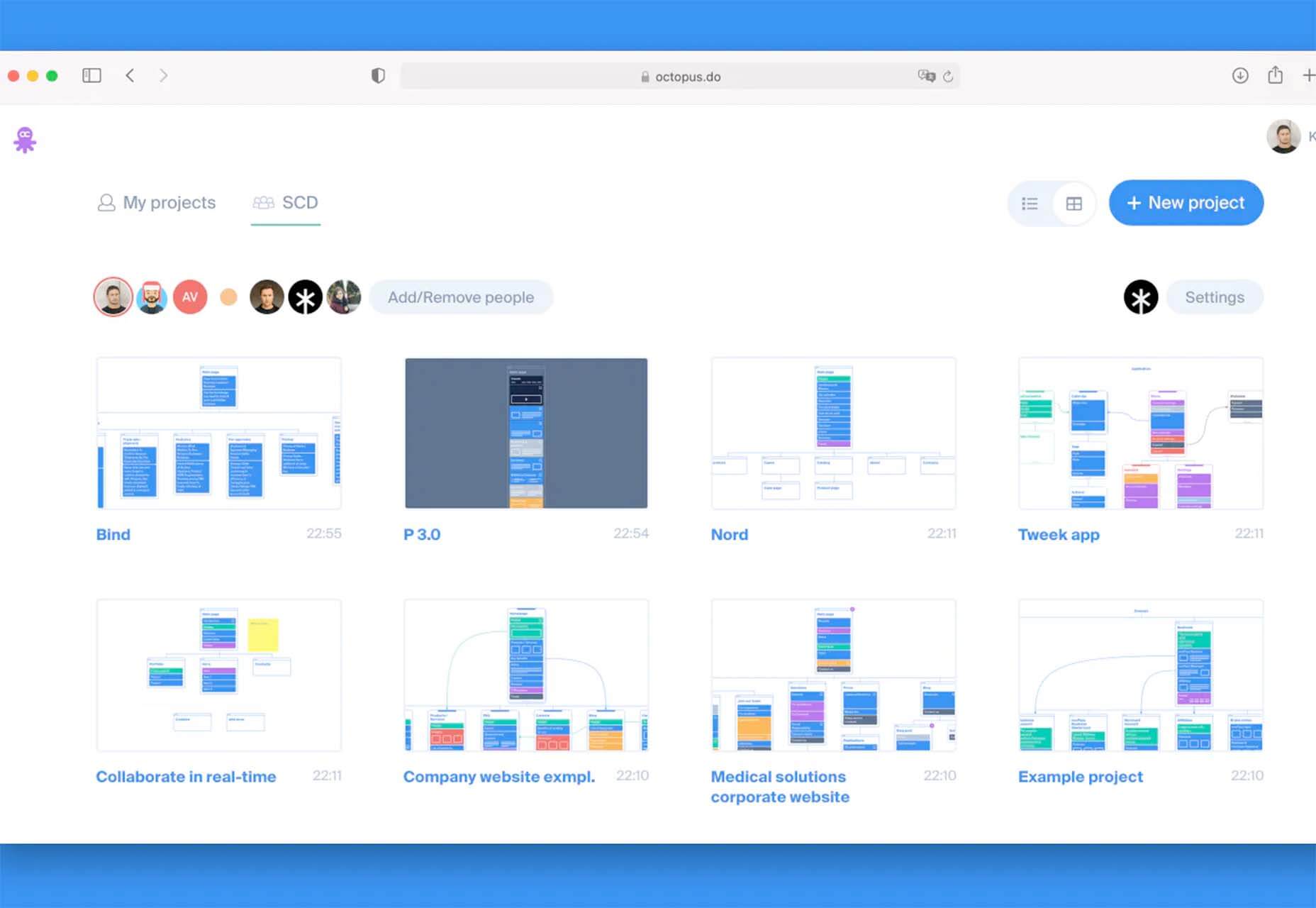
Octopus.do
Octopus.do is a fast visual sitemap builder that lets you work in real-time using the content brick method. Share and collaborate in real-time and there’s no signup required to use it.
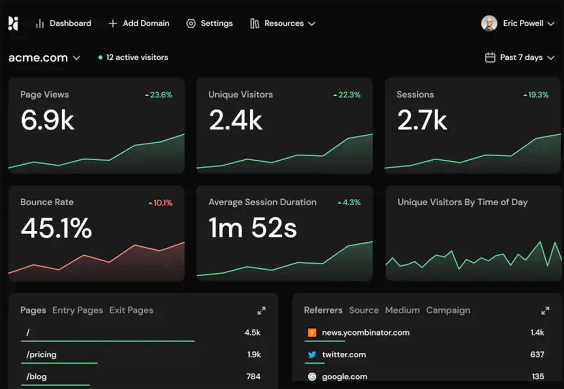
Pirsch Analytics
Pirsch Analytics is a privacy-friendly, open-source alternative to Google Analytics — lightweight, cookie-free, and easily integrated into any website or directly into your backend. It includes filters to see metrics in the way you want and light and dark modes.
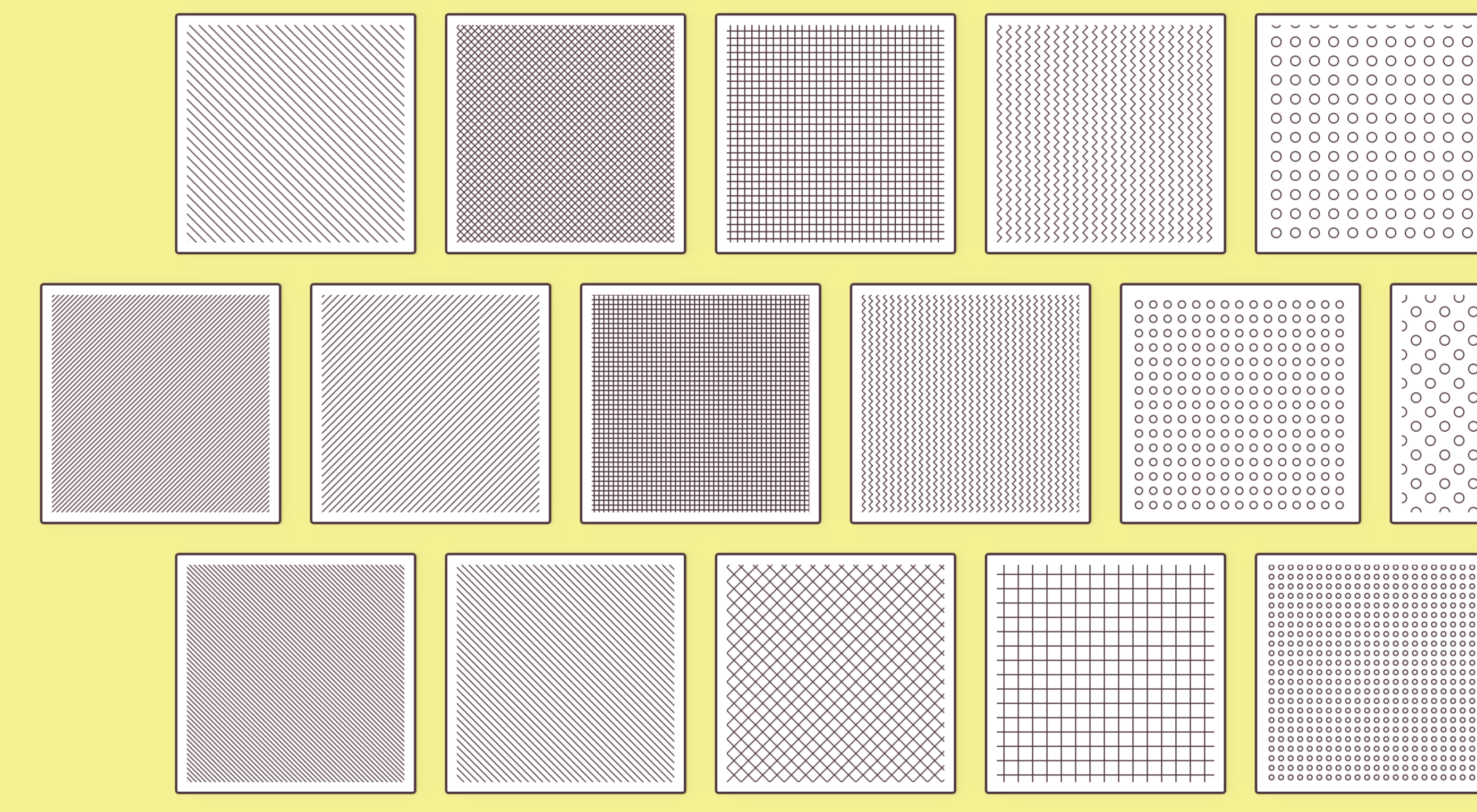
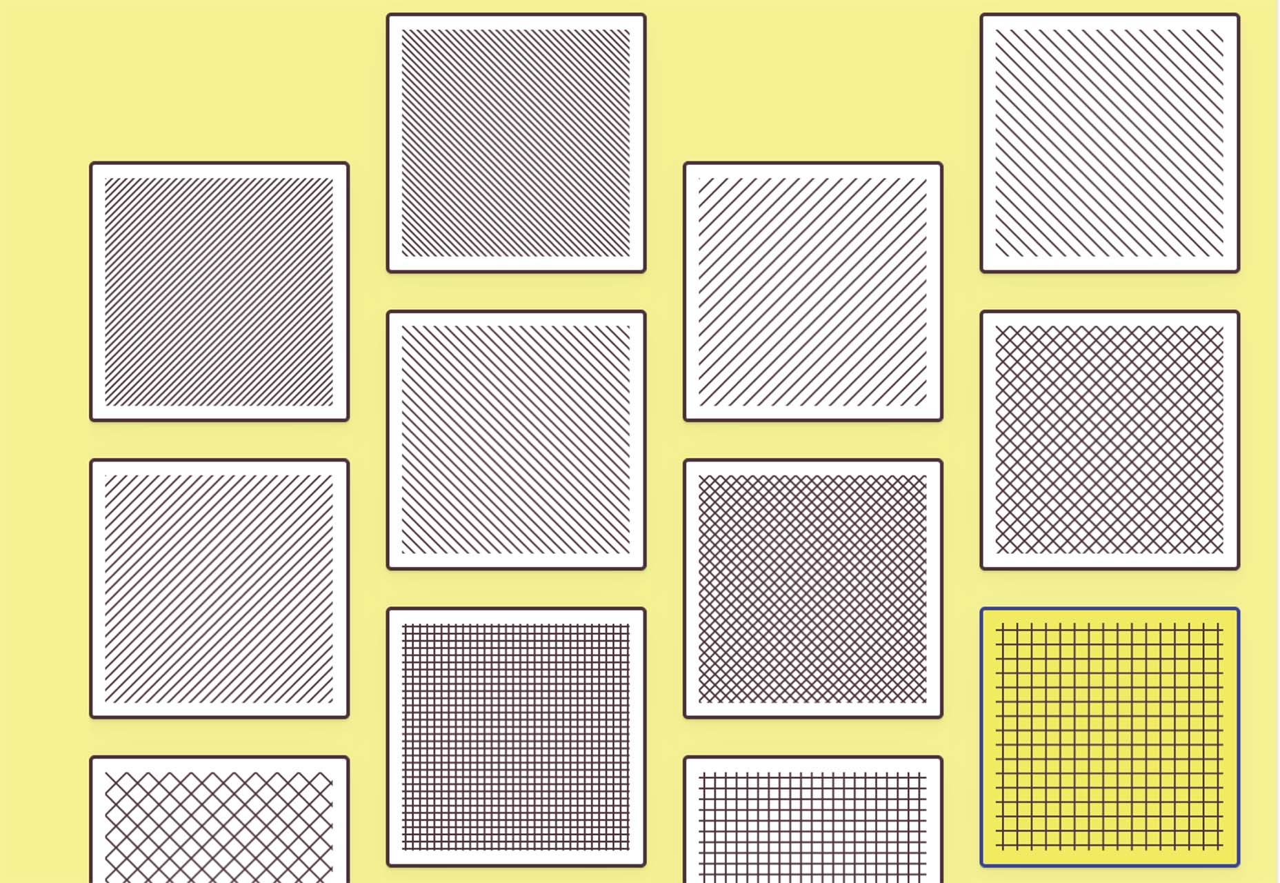
Basic Pattern Repository
Basic Pattern Repository is a collection of simple SVG patterns for projects. Everything is rooted in a simple style to help push projects along quicker. You can get it via GitHub or as a Figma Library.
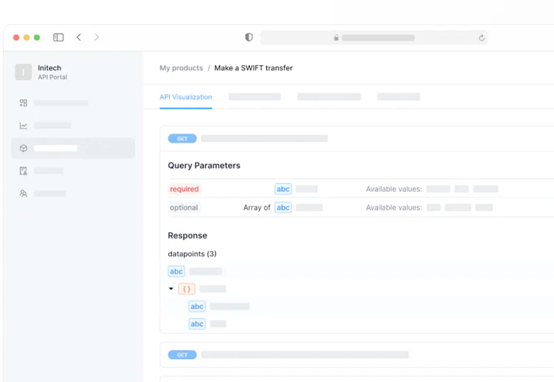
Blobr
Blobr is a way to get a branded API portal, manage access, and monitor usage all in one place. Customize everything to fit your brand and the tool grows as you do with the ability to increase or change capacity. Plus, it is easy to set up and free to use.
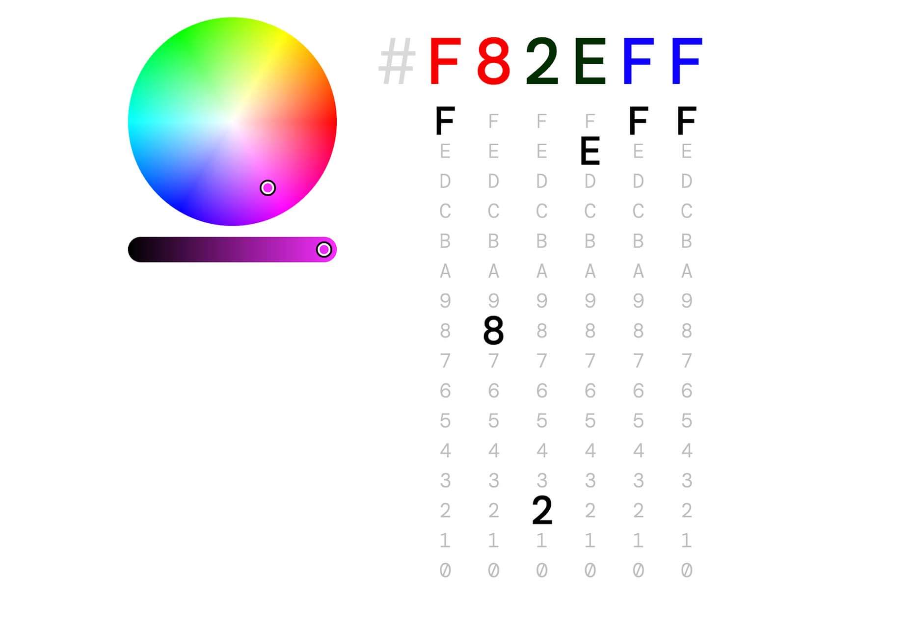
HEXplorer
HEXplorer helps you better understand something you use all the time – HEX colors. This pen by Rob DiMarzo shows how the values for different colors come together to provide greater comprehension when it comes to this color format.
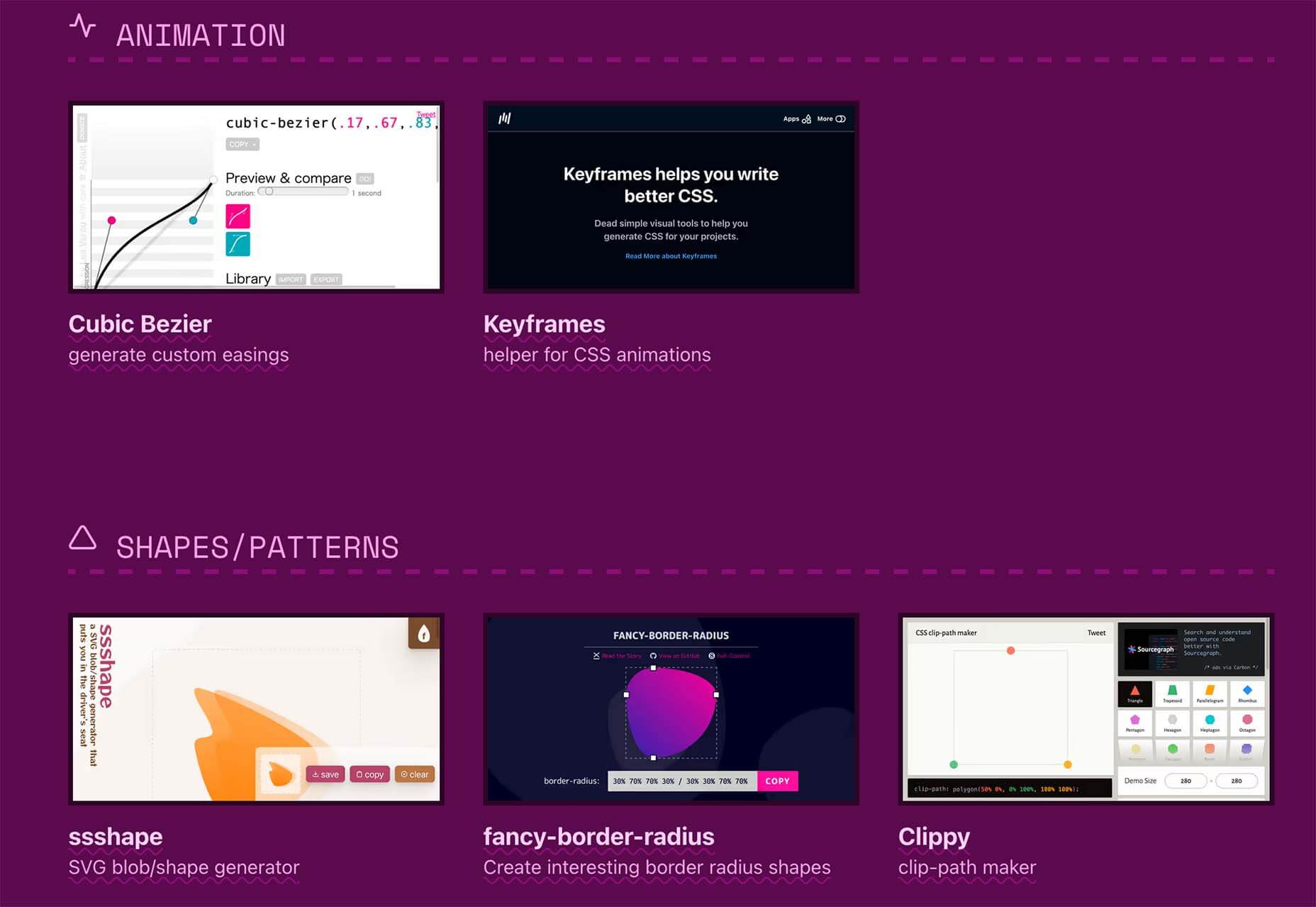
CCCreate
CCCreate is a curated collection of tools and resources for web creators. It includes some tools that have been around for a while as well as some newbies. Everything is grouped and sorted by type of resources – color, icons, type, layouts, animation, shapes, docs, and miscellaneous so you can find what you are looking for faster.
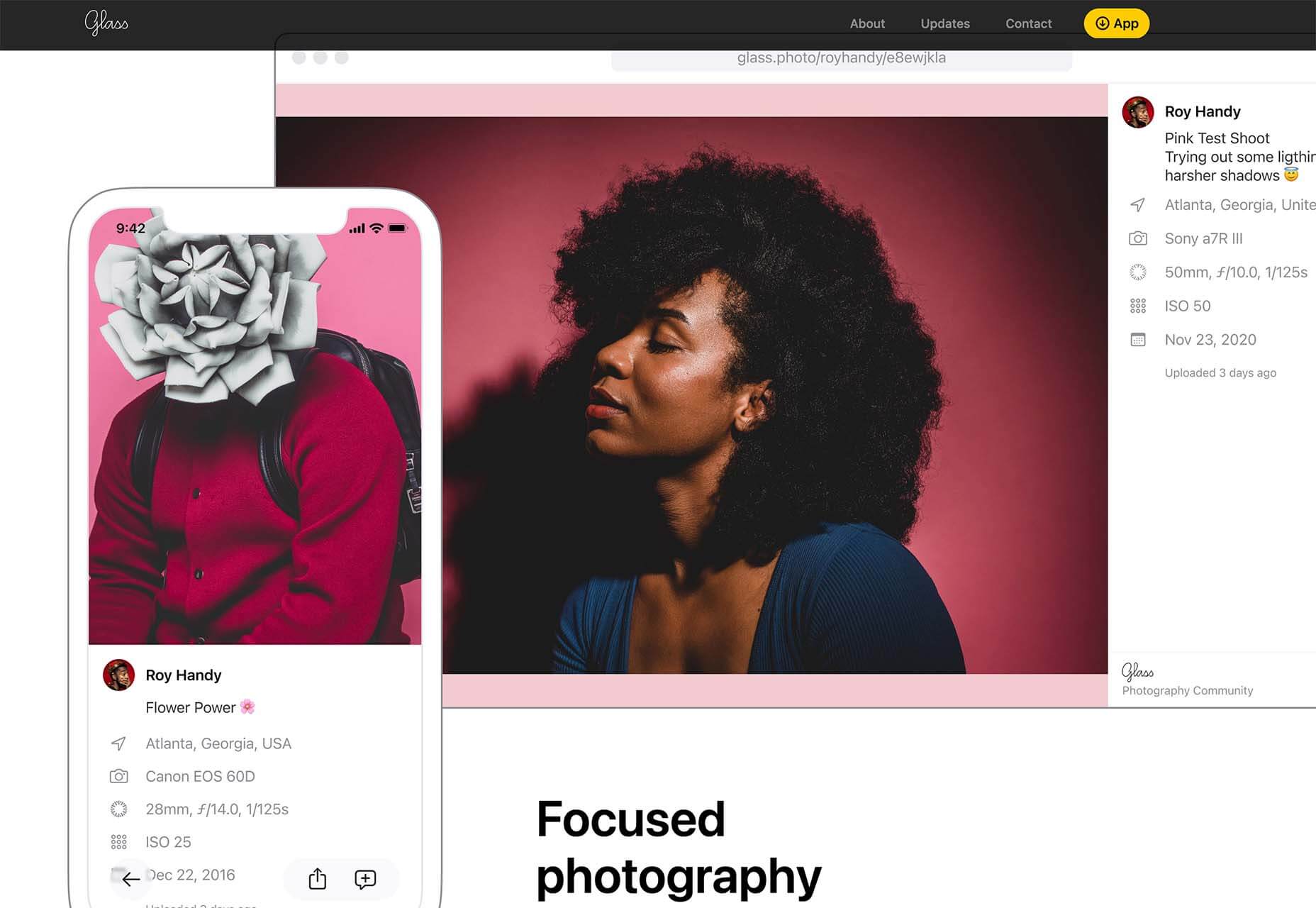
Glass
Glass is a photo-sharing app for photographers. It’s a social network of sorts that lets you share images with the greater photography community without “likes.” Just great images.
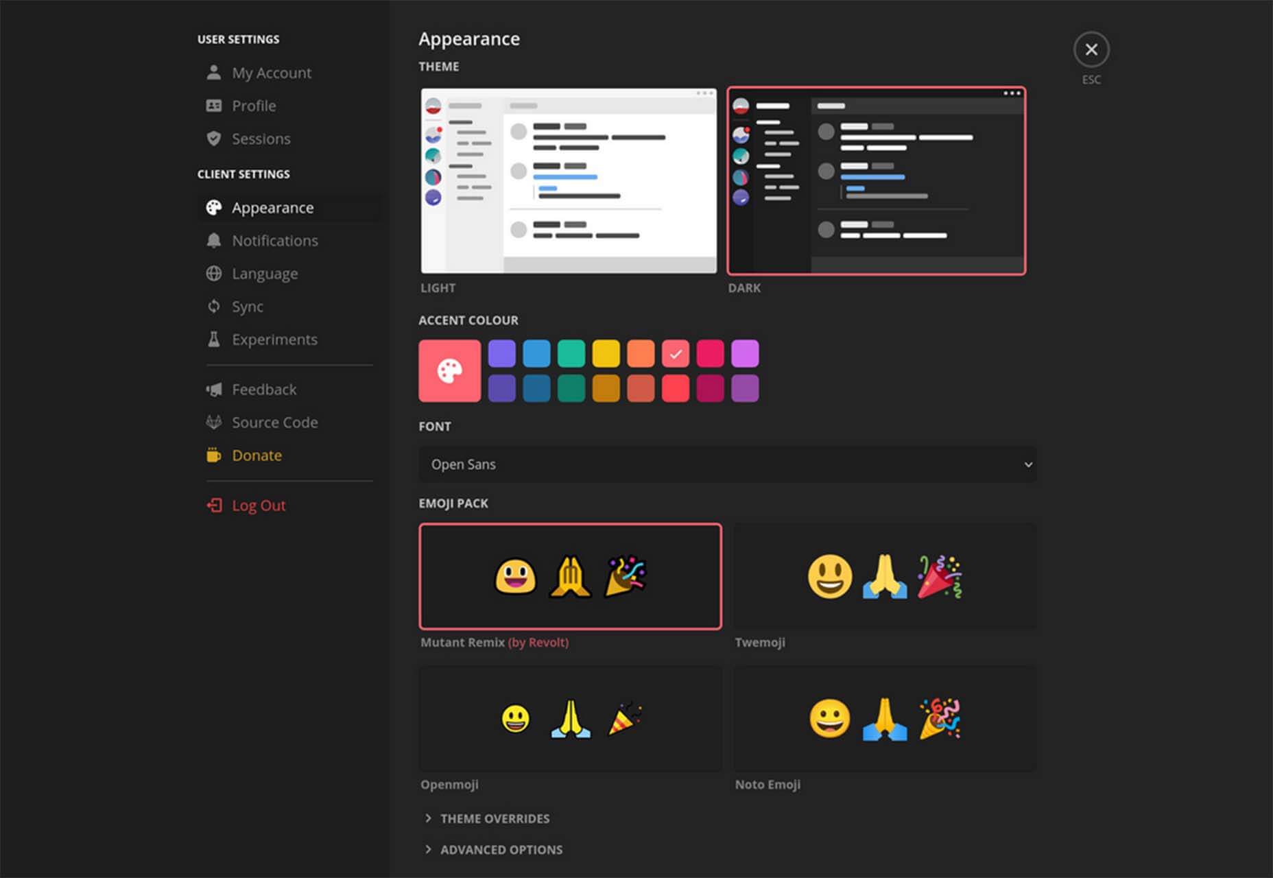
Revolt
Revolt is a chat app that’s still in beta and designed for easy communication without having to download apps. It’s an open-source project that is customizable and with an intuitive and recognizable interface. The thing that’s different about this app is that it is built on a privacy-first model.
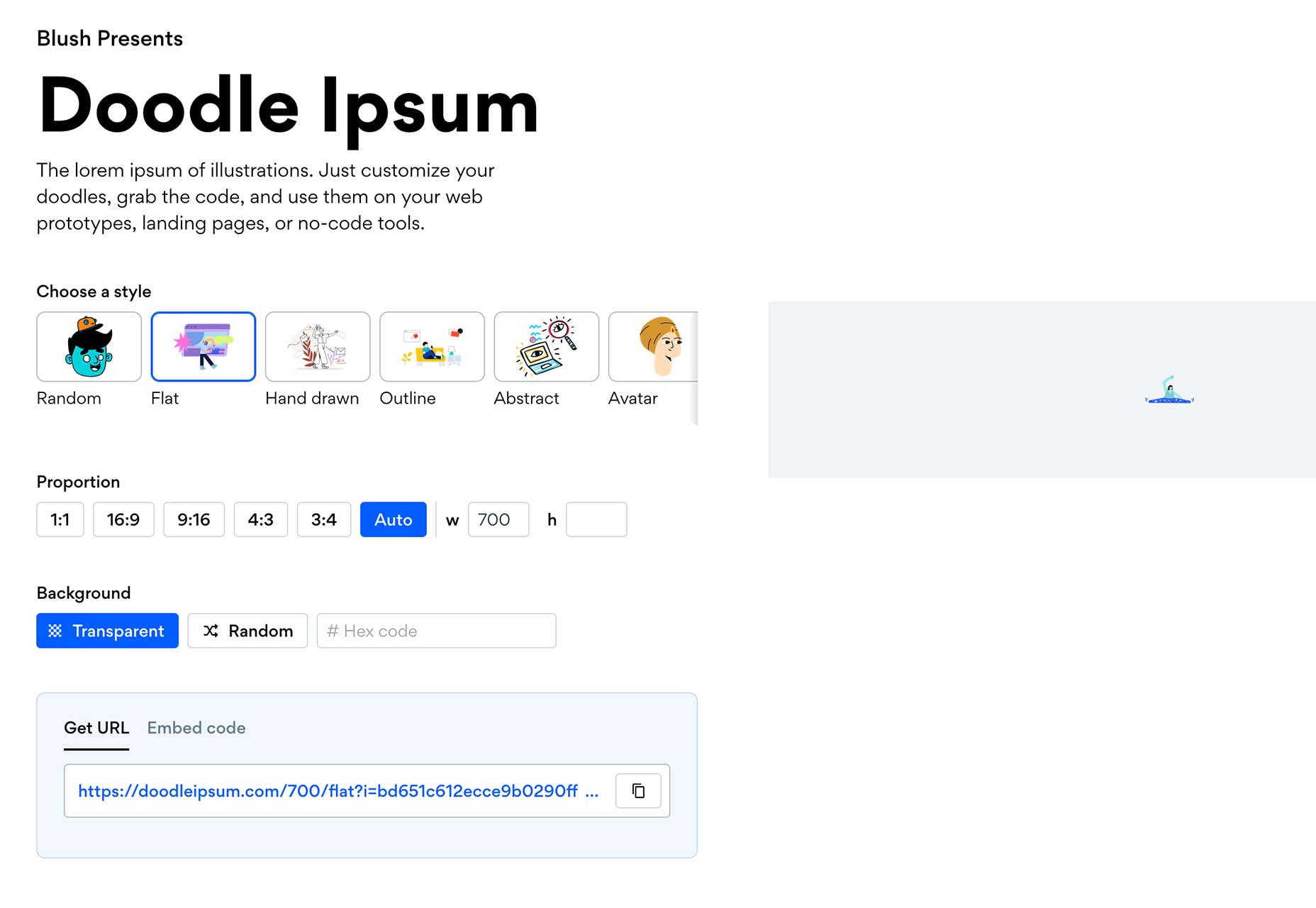
Doodle Ipsum
Doodle Ipsum is the illustrated version of placeholder elements. Customize your doodles, grab the code, and use them on your web prototypes, landing pages, or no-code tools.
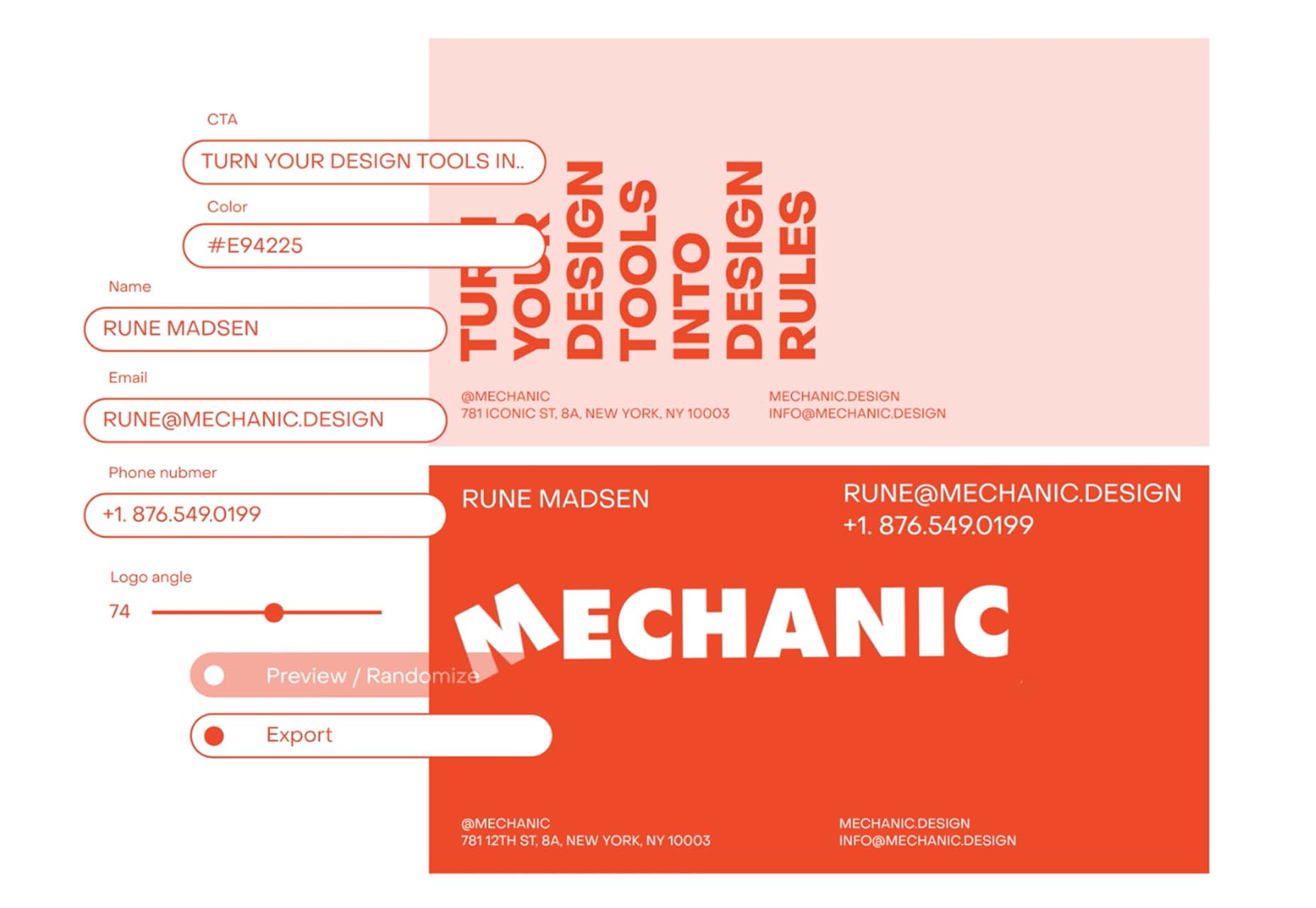
Mechanic
Mechanic is an open-source framework that helps you create custom, web-based tools that export design assets in your browser. The best part is you can try it right on screen using the “poster generator.” If you like what you see, there’s plenty of documentation to help you along the way.
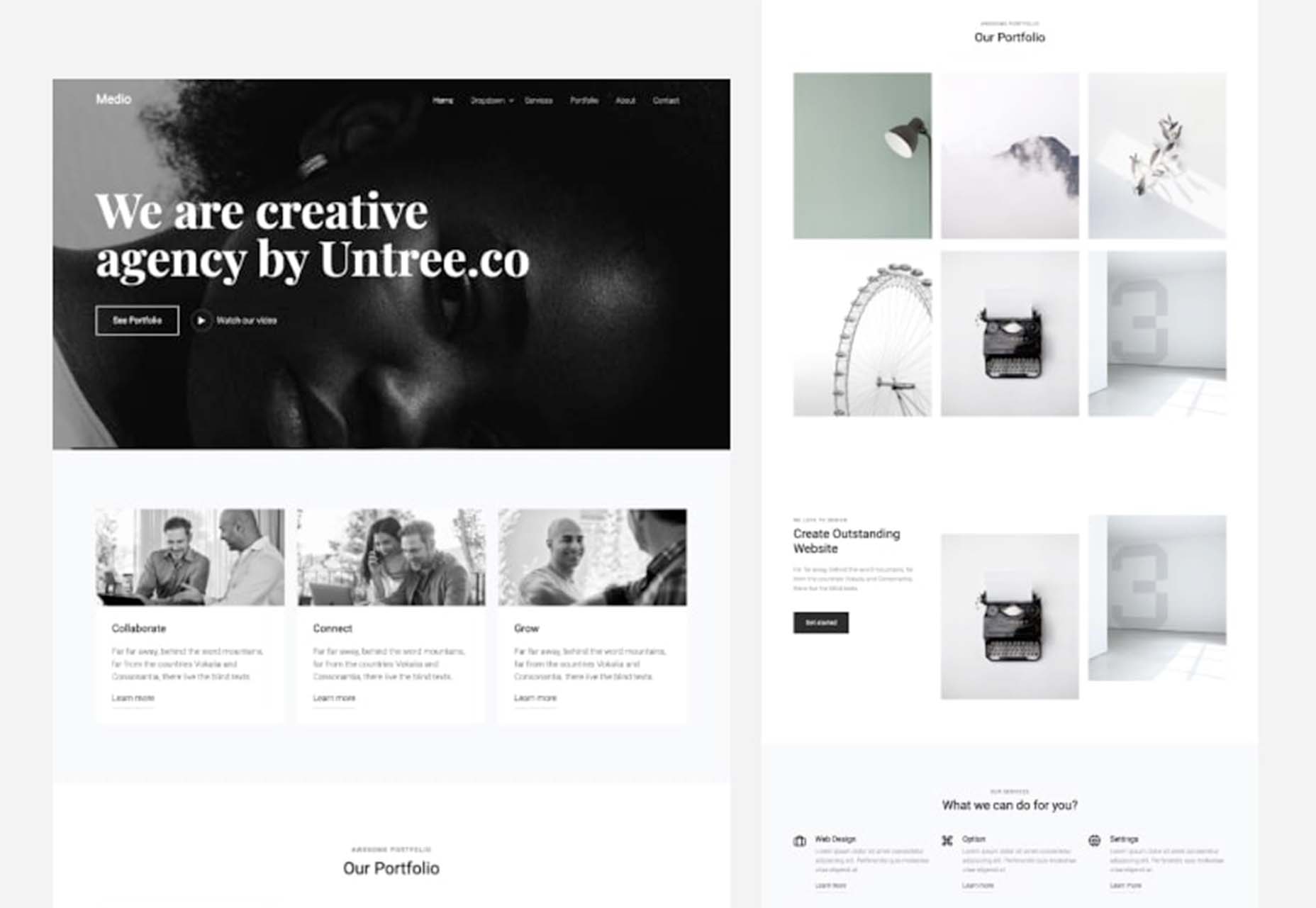
Medio Website Template
Medio is an agency-style website design template for Bootstrap 5. The layout is perfect for a design agency or marketing group but can be adjusted for almost any multi-purpose design. The free template includes a minimal design and includes features such as parallax, popup video, and more.
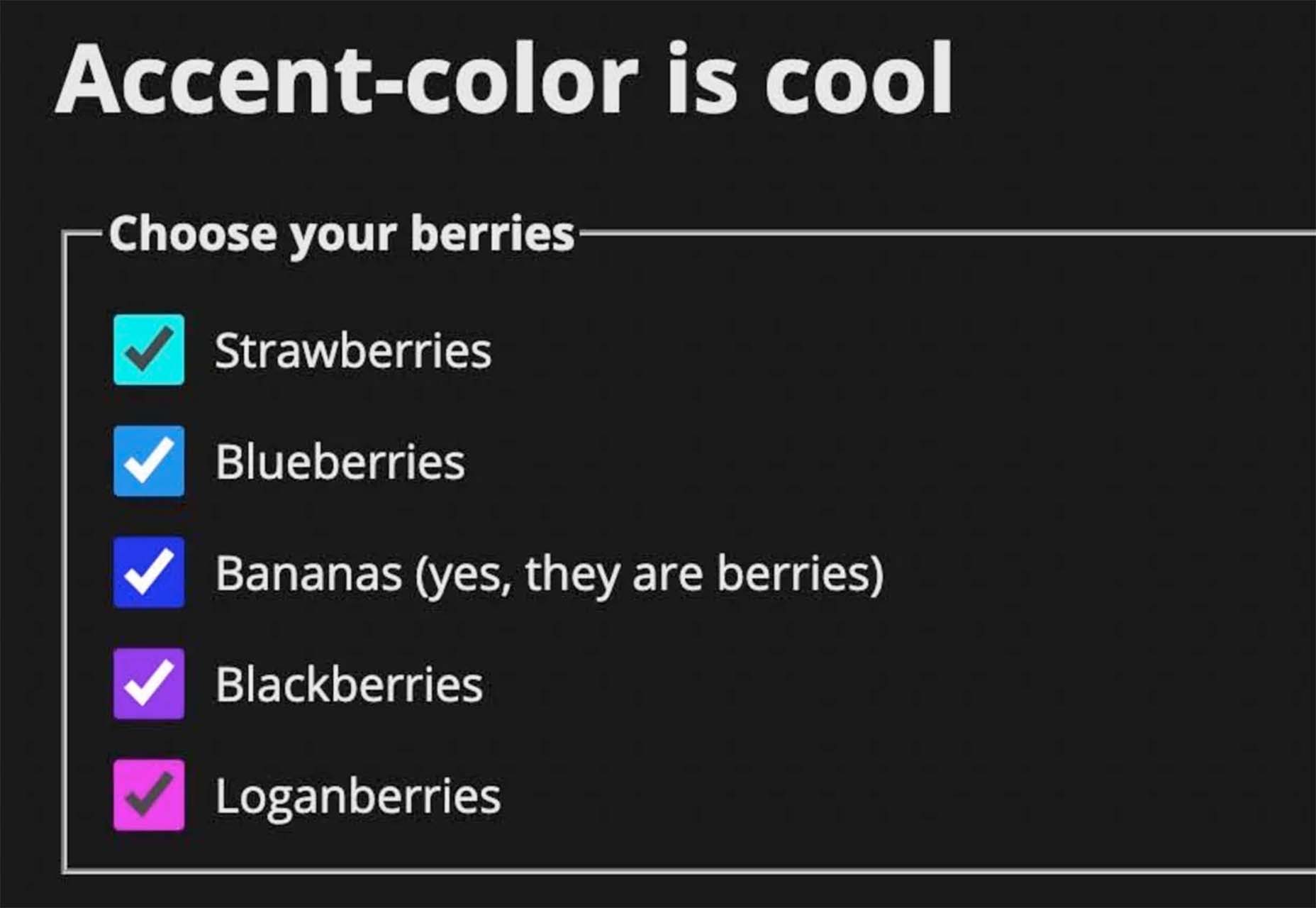
Tutorial: Simplifying Form Styles with Accent Color
This tutorial is a life-saver when it comes to using and understanding the new CSS accent-color property. This quick lesson will help make your life easier and is simple to use. It starts with setting an accent-color property on the root element and then applying it.
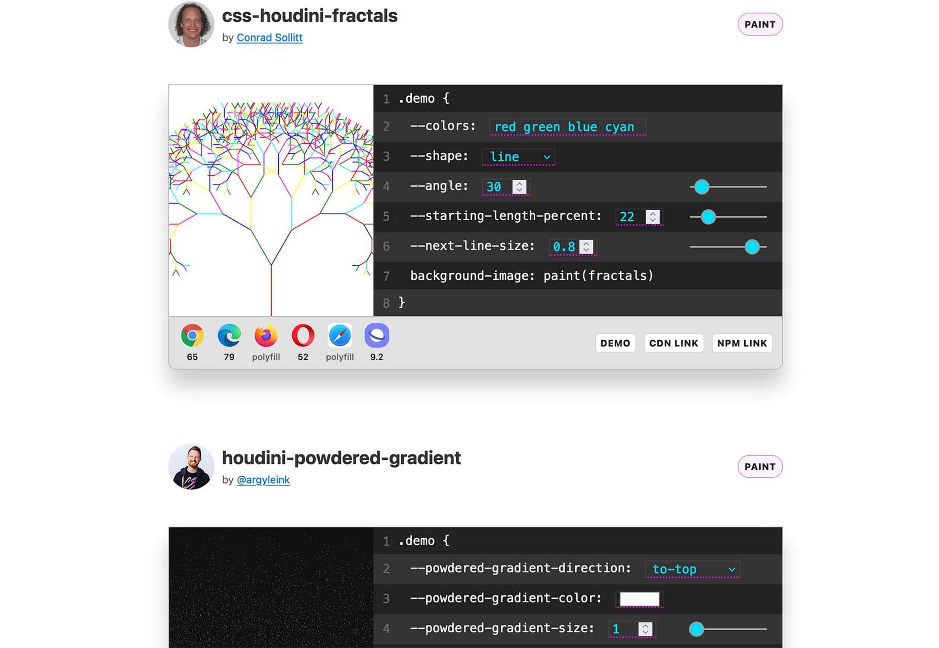
Houdini.how
Houdini.how is a worklet library that is full of CSS and code examples to help you work smarter. See how different elements look cross-browser and learn to adjust the code and put them together in just the way you want. Houdini is a set of low-level APIs that exposes parts of the CSS engine, giving developers the power to extend CSS by hooking into the styling and layout process of a browser’s rendering engine.
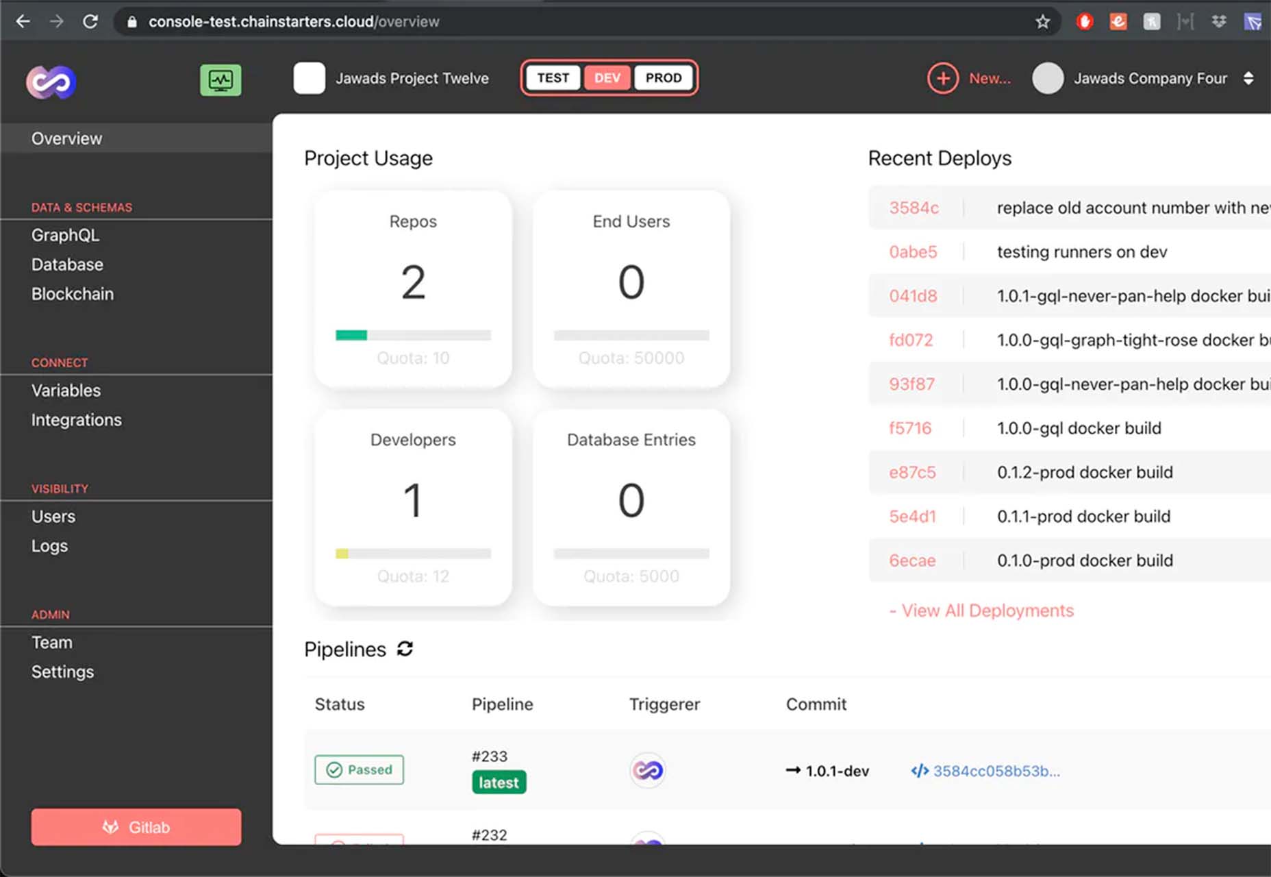
Chainstarters
Chainstarters is a powerful, rapid, Web3-enabled platform for software developers. It eliminates the burden of setting up and maintaining a secure and scalable infrastructure, allowing you to focus on creating amazing technology.
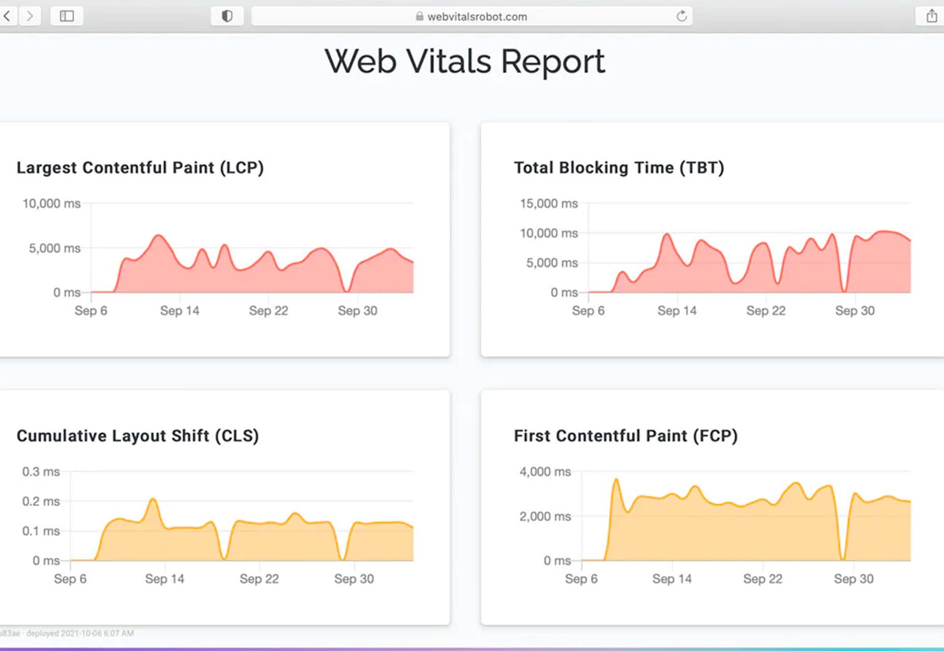
Web Vitals Robot
Web Vitals Robot is a search optimization tool that monitors SEO metrics for you – so you can prevent your business from disappearing from Google.
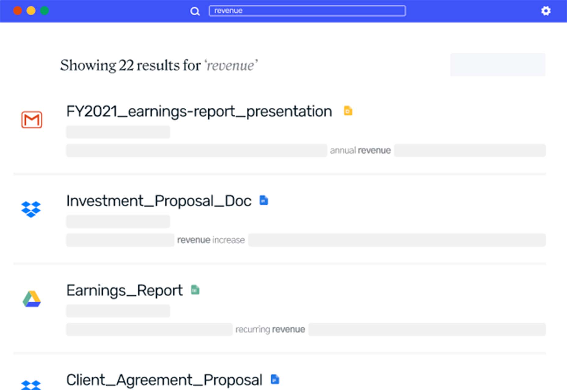
Searchable
Searchable is a unified search tool that looks at local, cloud storage, and apps to find the files you are looking for. It returns results in a jiffy with previews so you don’t have to open every file to find what you are looking for.
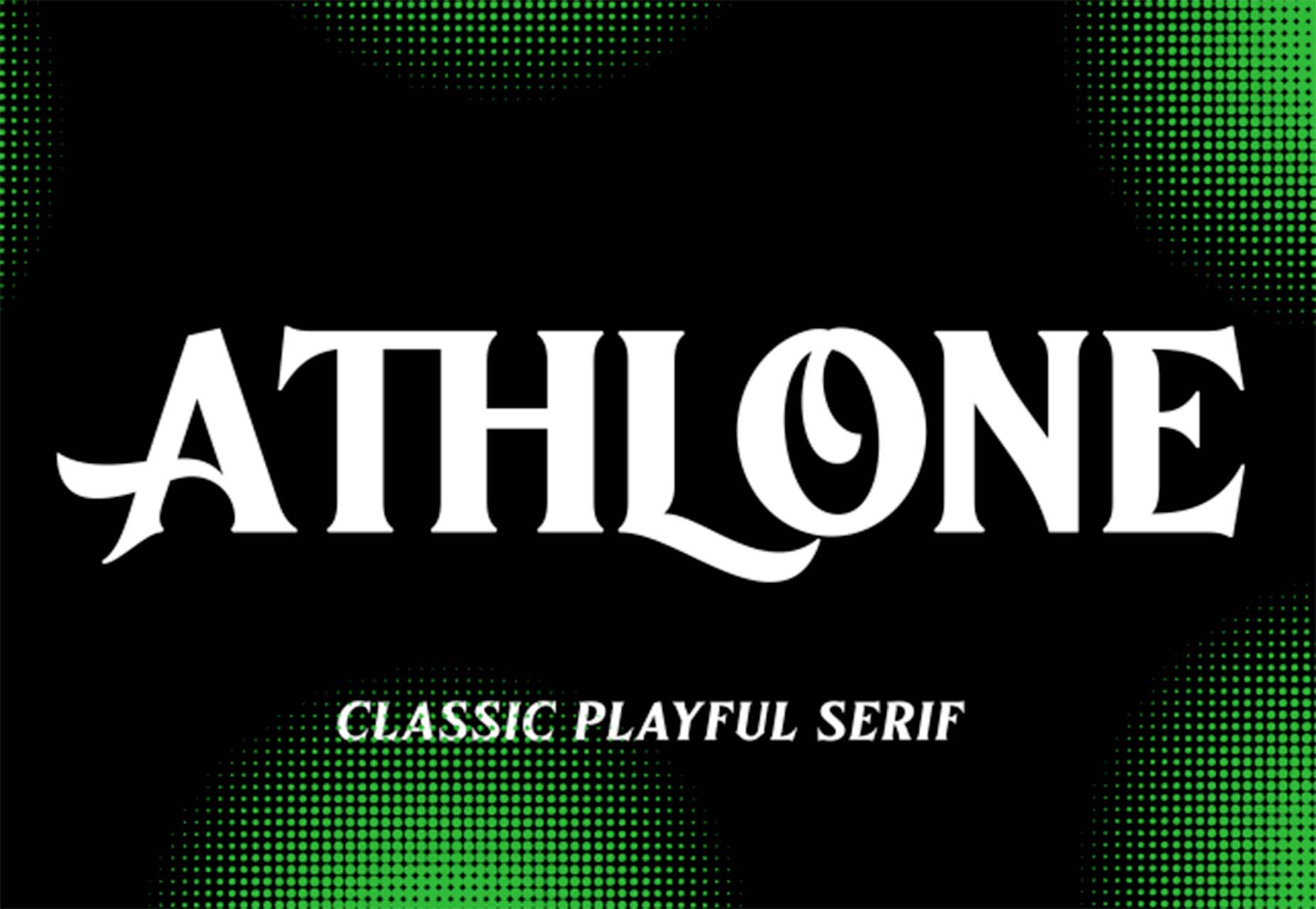
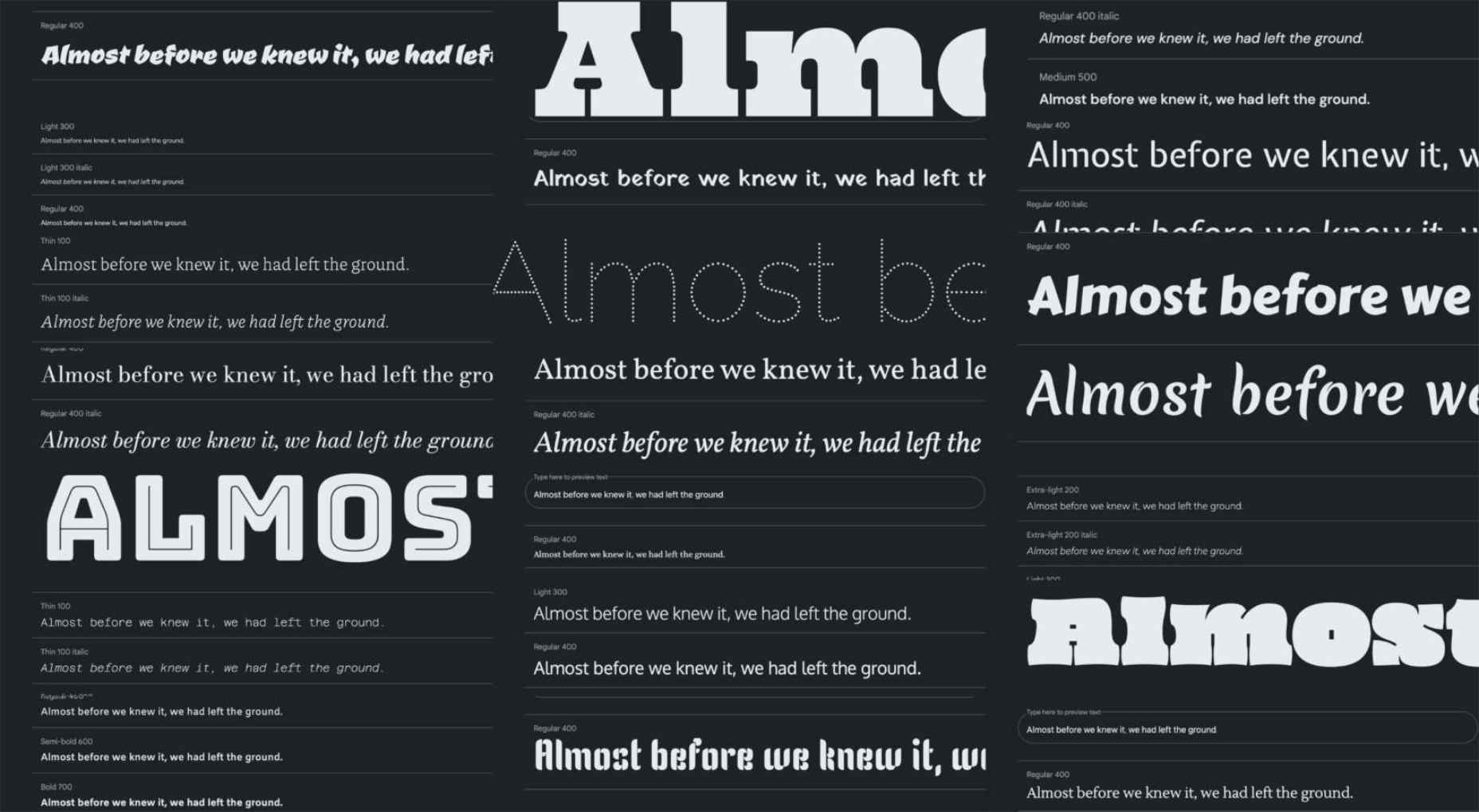
Athlone
Athlone is a fun serif with lots of personality. The free demo version includes a limited character set for personal use only and the full version has everything you need for fun display or branding with this typeface.
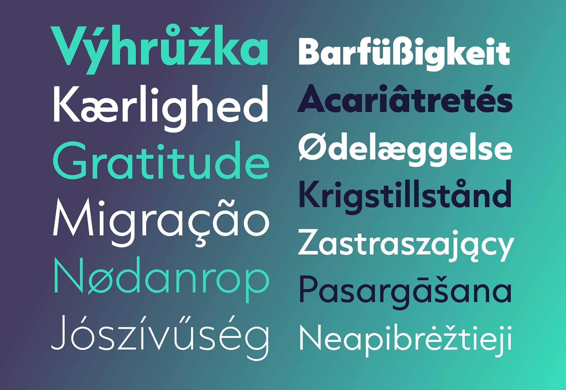
Capitana
Capitana is a Geometric Sans typeface with humanistic proportions and open apertures. This means that all shapes are constructed from basic forms, the circle, triangle, and square, and are designed according to the classic proportions of the Roman Antiqua. Distinct ascenders and pointed apexes with deep overshoot give it a cool beauty and classic elegance. It includes 784 characters per style in nine weights from Thin to Black, it offers both light and extremely heavy weights for striking headlines.
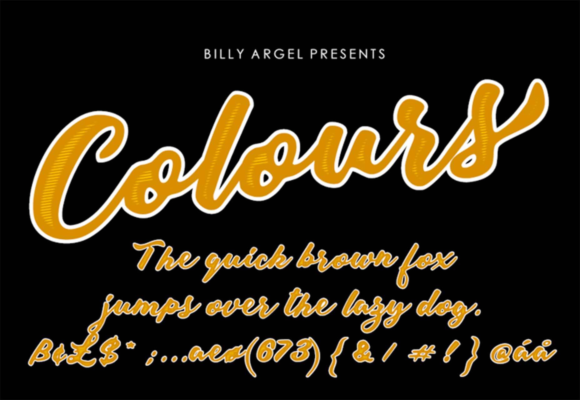
Colours
Colours is a funky script with just enough texture to keep it interesting. The free version includes a partial character set and is for personal use only.
Flexible
Flexible is a variable typeface that includes 18 styles in the family. It’s made for creativity and display use. This typeface is made for experimenting because there are so many things you can do with this single family.
Singo Sans Serif
Singo Sans Serif is a simple and strong typeface that would make an excellent display option. The free version is for personal use only. Fun fact: Singo means Lion in Indonesia, which is where the name of this strong font comes from.

The post Exciting New Tools For Designers, October 2021 first appeared on Webdesigner Depot.

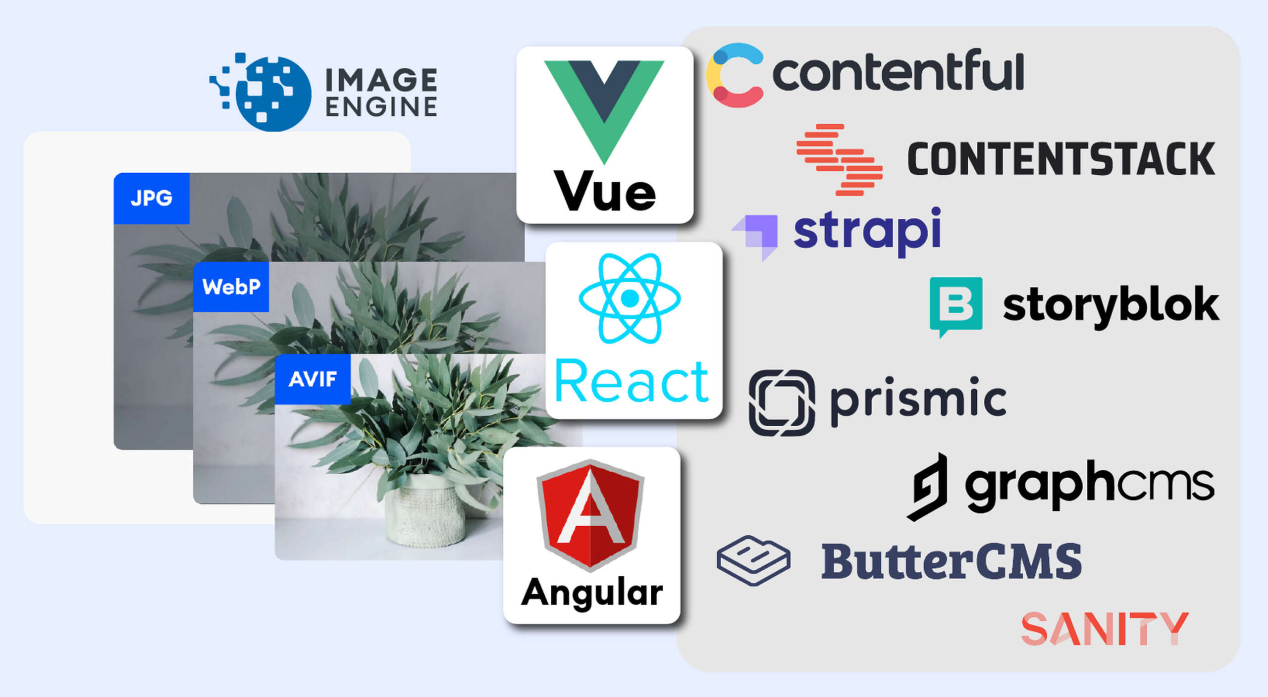 The headless CMS trend is gaining traction growing at over 20% annually. The driving force behind the headless CMS trend is developer’s increasing need for flexibility and control. Using the headless CMS’s API, front-end developers can use JavaScript frameworks like React, Vue, or Angular to quickly deploy content and designs in various web pages and apps.
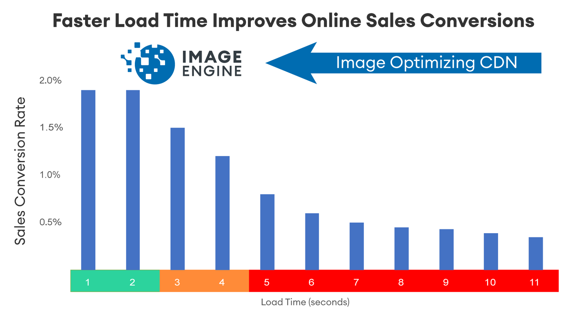

 Every day design fans submit incredible industry stories to our sister-site,
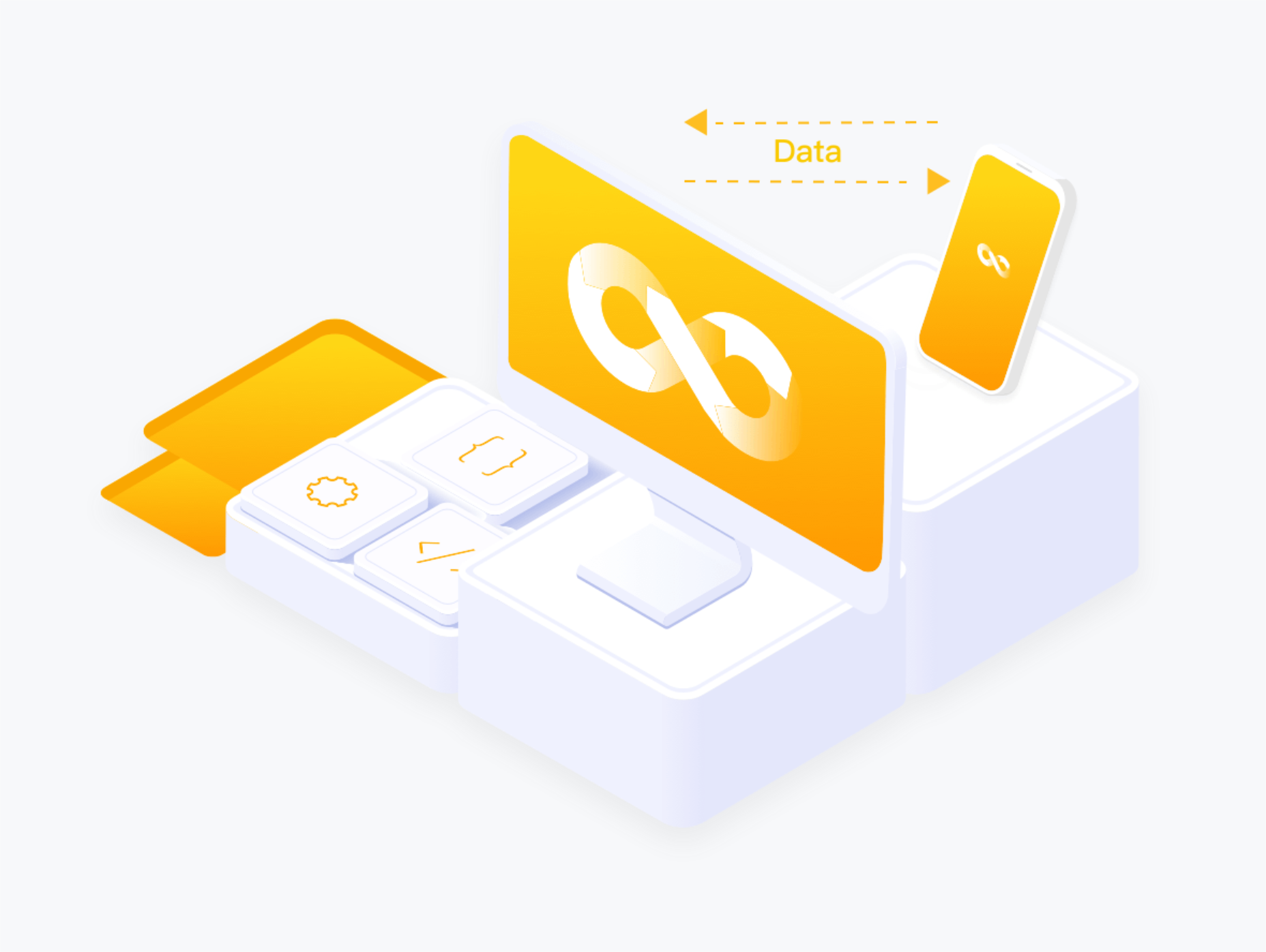


 As a utility-first CSS framework,
  Not so long ago, customers only had a couple of ways to interact with brands.


 In my experience, the biggest challenge that freelancers face — more than winning clients or setting prices — is project management; take on too much work, and you’ll start missing deadlines, take on too little, and you’ll start missing your rent.

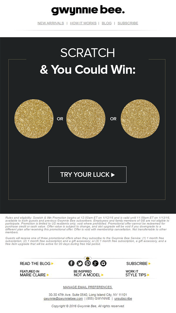
 We all want a little more fun and games in our lives. So, why not add some gamification to your next interactive content campaign?


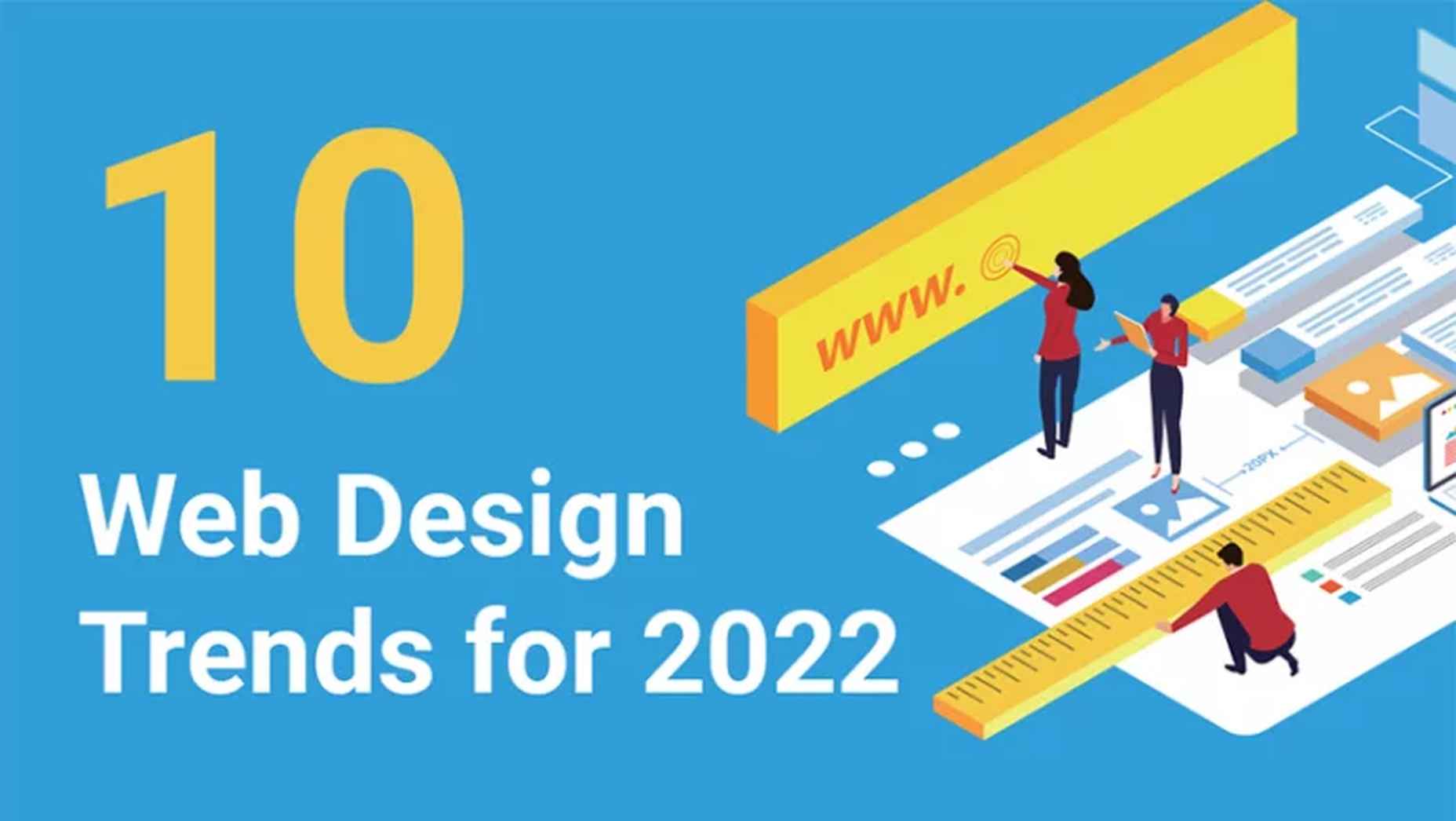
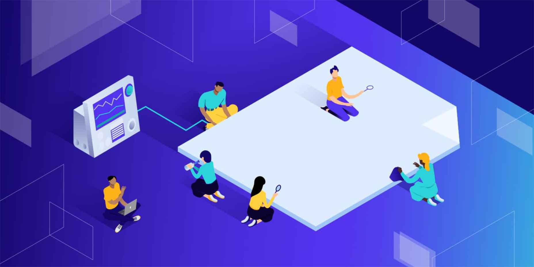
 The world of web design is incredibly dynamic. Every year, new trends and opportunities emerge, primarily driven by the arrival of modern technology.