Often, when designing a website or branding, it is easy to get wrapped up in the details–typography, graphics, color, the grid–and lose the bigger picture. Of course, these things are vitally important, but they are building blocks that go together to form a greater whole.
A good website creates an impression; it tells a story. And all the various elements involved, from copy to hero image to type choices, combine to create that story. Telling a story can mean taking a user through a linear narrative of how a company or a product came about, using a narrative to make a point, or simply creating an environment or experience that shows the user what a brand is all about.
We have selected examples of different kinds of storytelling for this month’s collection–we’ve even included an actual story. Enjoy!
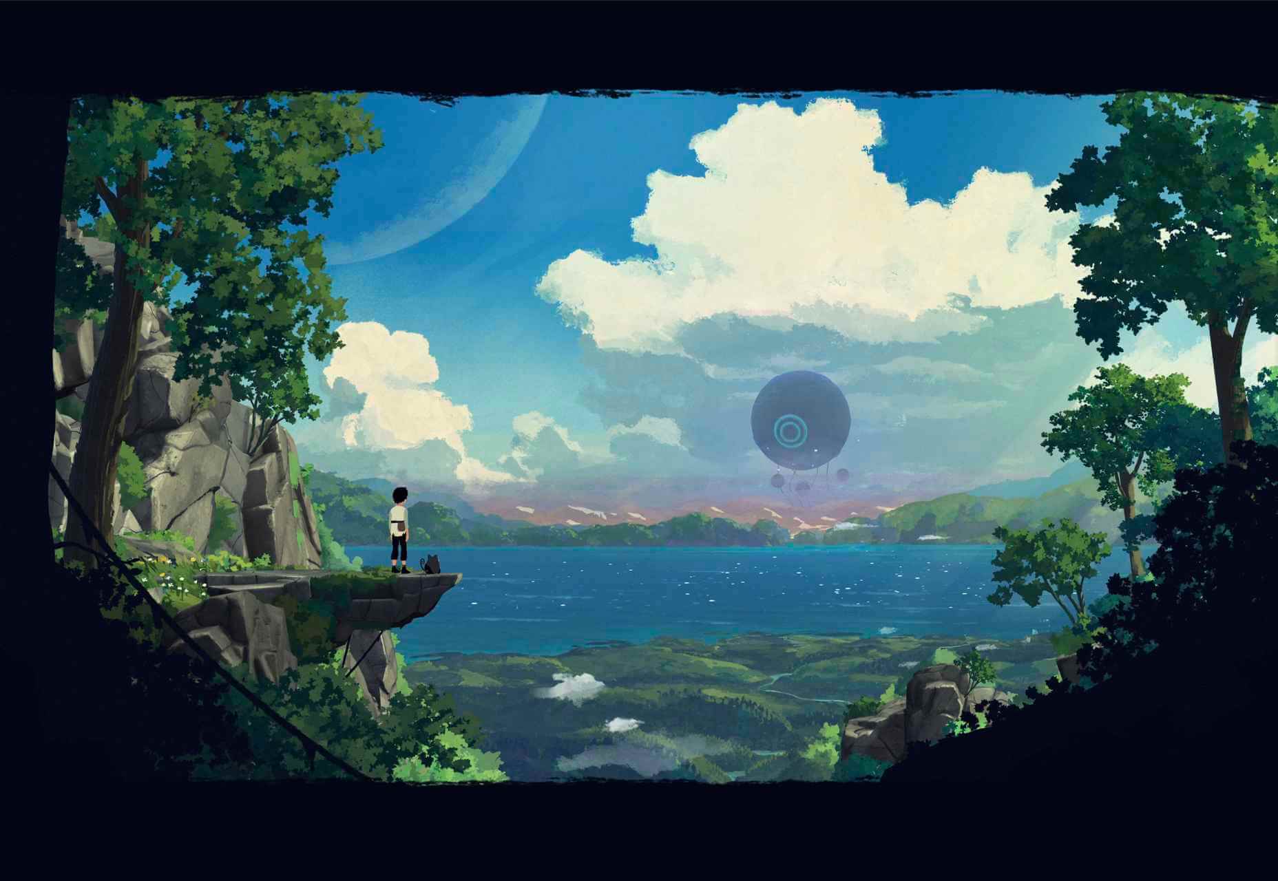
Black Dog
Black Dog is a rather beautiful picture book project showcasing the developer’s WebGL skills.

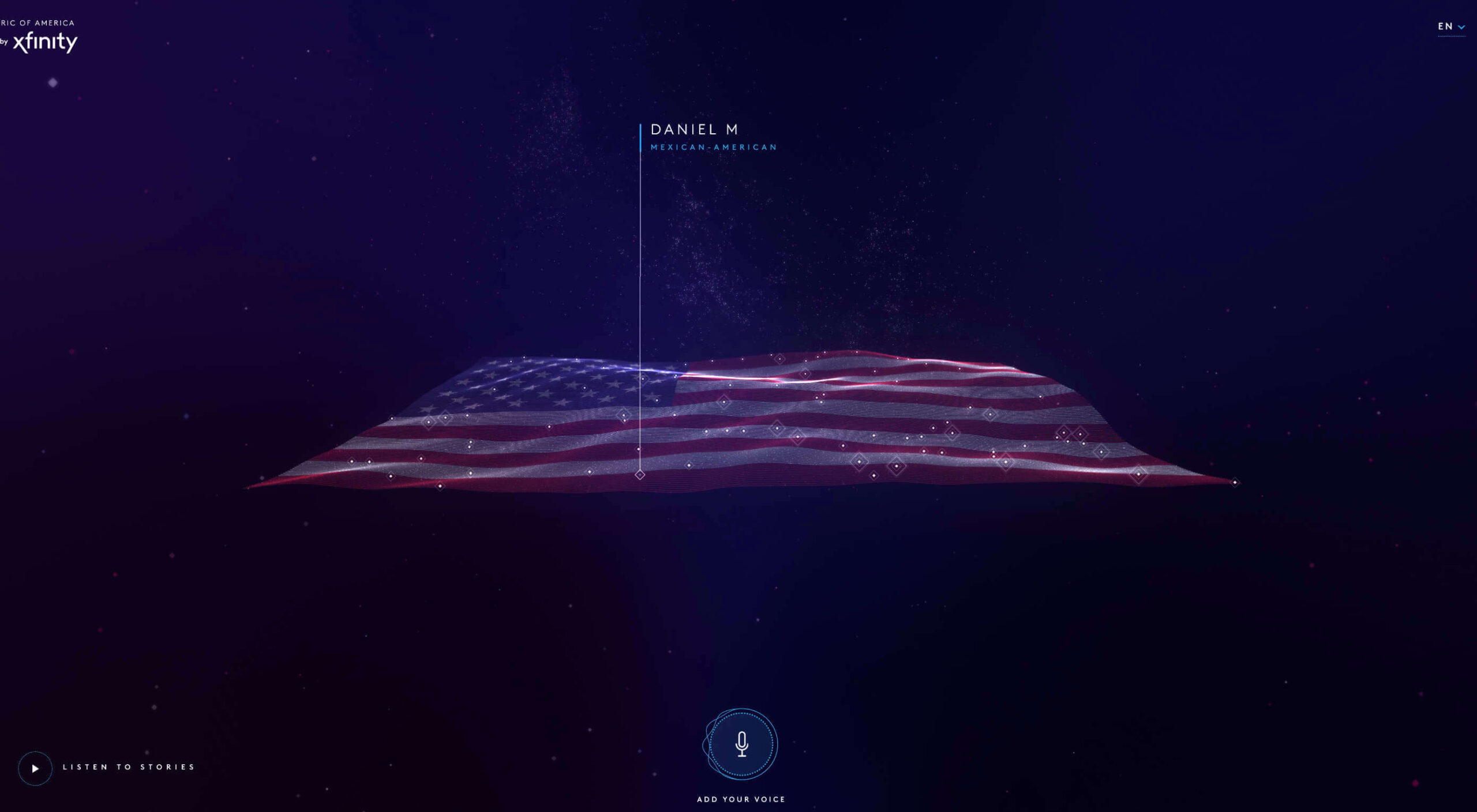
Right to Breathe
Right to Breathe highlights the dangers of passive smoking in a way that is engaging and intriguing.

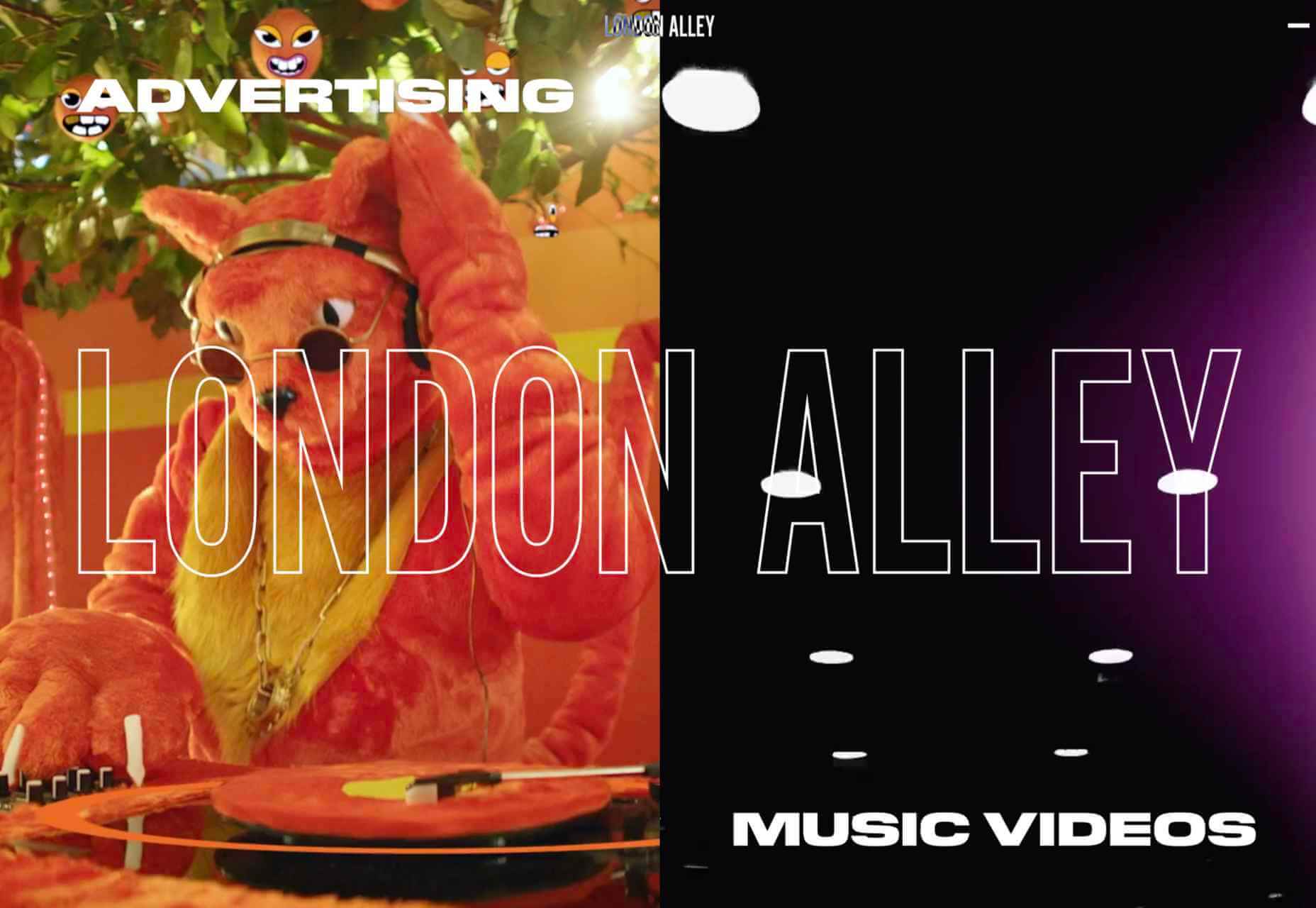
Superglow
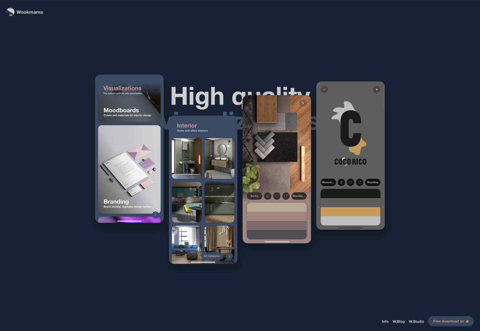
Creative agency Superglow focuses on clients in the music industry, and their particular aesthetic is clearly demonstrated in their portfolio site.

Instabase
Instabase is an enterprise productivity platform for complex data. Not the most glamorous product to sell, but this site does a good job of engaging the user through good layout and colorful graphics.

Bake Inc.
Bake Inc.’s corporate site makes good use of diagonals to break up content and to provide a sense of energy to the flow. Plus it features some fairly mouth-watering photographs.

Julia Johnson
This portfolio site for photographer, director, and creative director Julia Johnson, is simple but with very nice details, such as the color backgrounds for image loading.

Pitchfork Music Festival
While yellow text on a multi-color background doesn’t sound like a great idea, it works on this site for Pitchfork Music Festival.

Little Yawn Collective
Some sweet illustrations and a soothing color scheme set the mood for Little Yawn Collective, which offers natural sleep solutions for children.

Pine
Production company Pine takes a bold approach, showing the work with very little text beyond contact information.

Bloomers
Bloomers describes itself as a knowledge consultancy offering branding and strategy. To illustrate its philosophy of connecting past and present, it has gone for Victoriana.

Fox Computers
With its slightly muted palette and a very businesslike feel, this site for web agency Fox Computers gives the impression of competent and safe, without being boring.

Forest Gum
Forest Gum makes natural chewing gum — from tree sap instead of plastic. There are lots of greens and bubblegum pink here and a bold, irregular display type for a modern, young feel.

Felt
Although Felt online — a collaborative mapping tool – is currently in private beta, this promotional site does a good job of creating interest while doubling as a recruitment notice/job advert.

Help Dad
Help Dad is a micro-site from Oatly, aimed at UK customers. In terms of visual design, it adheres to the same style as all of Oatly’s sites. However, what stands out here is the quality of the content, tailored for the UK market.

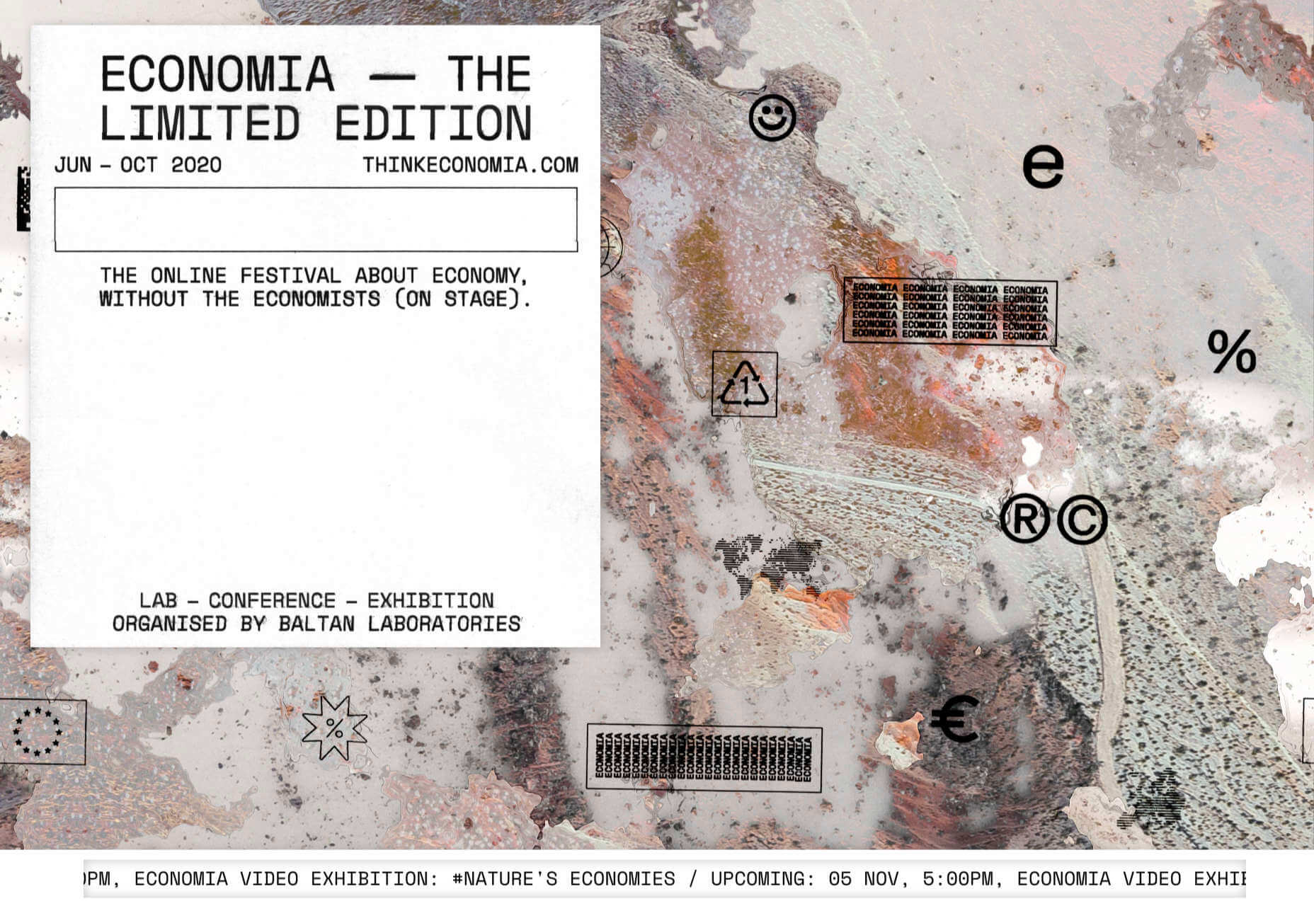
Epicurrence
Epicurrence, the 4-day not-conference for creatives, is back for 2021, and this time it’s at Outer Banks, NC. The site keeps the content simple and to the point, livened up by illustration.

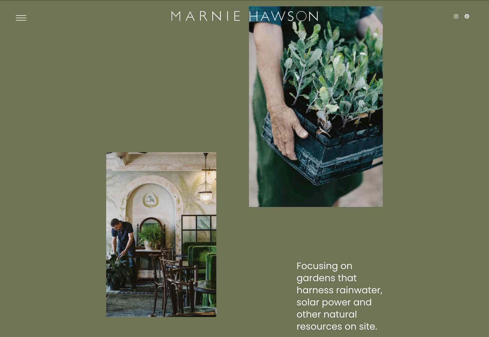
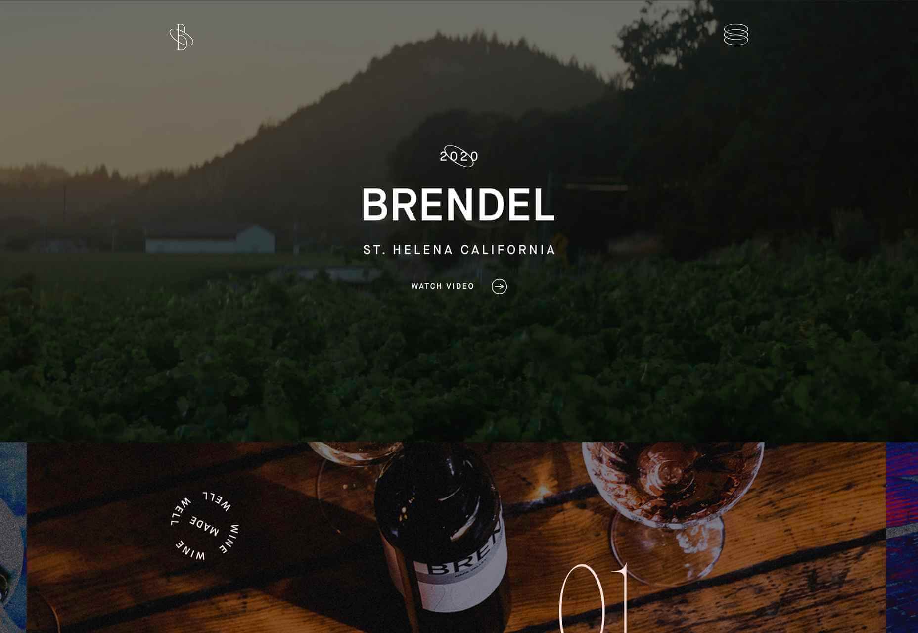
Marram
With some great photography and a soft color palette, this site for Marram boutique hotel manages to create an impression of soft, almost golden, light and calm.

Re-Forme
Re-Forme makes recyclable and biodegradable food packaging. The site is in a style used a lot by companies whose focus is sustainability – simple illustration, strong colors, color transitions, and large type. There’s a nice little arrow detail in their logo.

Miti Navi
You could be forgiven for thinking Miti Navi has been included because we want one of their sailing boats to “test.” After seeing how they are presented here, who wouldn’t?

Under Armour
Sportswear brand Under Armour has just updated its website. Visually the difference isn’t startling, but the usability and navigation have been improved.

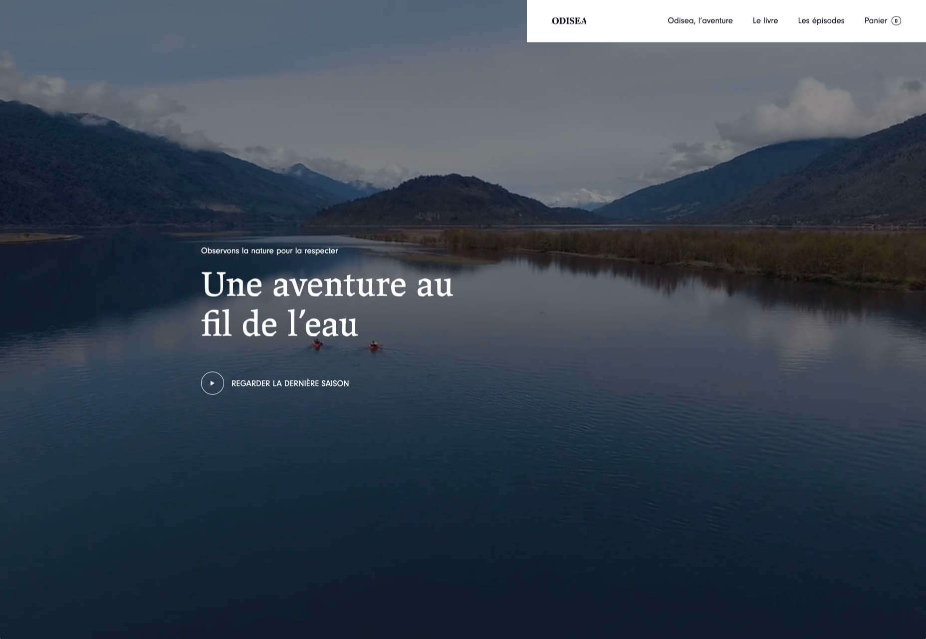
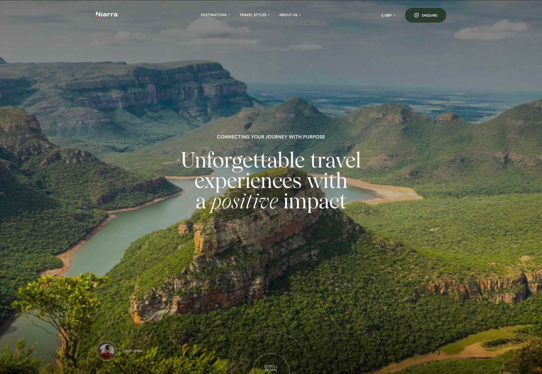
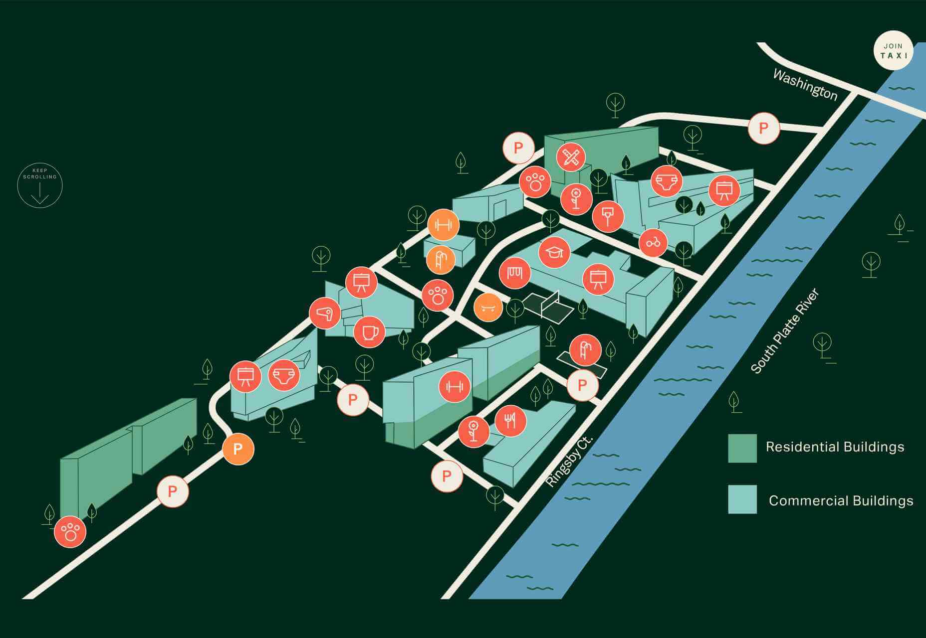
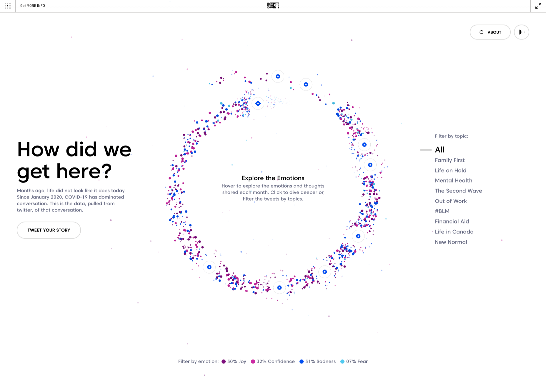
The Longest Road Out
The Longest Road Out site promotes a travel map and journal based on its creators’ own road trip around Britain and Ireland (plus the outlying islands). The site is charming.

The post 20 Best New Sites, August 2021 first appeared on Webdesigner Depot.

 Every day design fans submit incredible industry stories to our sister-site,


 Ever since online stores first emerged they’ve faced one big challenge compared to their real world rivals; yes, it’s convenient to shop wherever, whenever you want, and delivery options permitting, buy from anyone anywhere in the world. But it’s a minimal experience compared to the fuller sensory experience of shopping in the real world.

 As we approach our first winter holiday season since the pandemic set in, the world could feel like a very scary place; there is a great deal of uncertainty about the future for businesses, for young people in education, for jobs, for travel. Celebrations are certainly going to be a lot quieter this year.

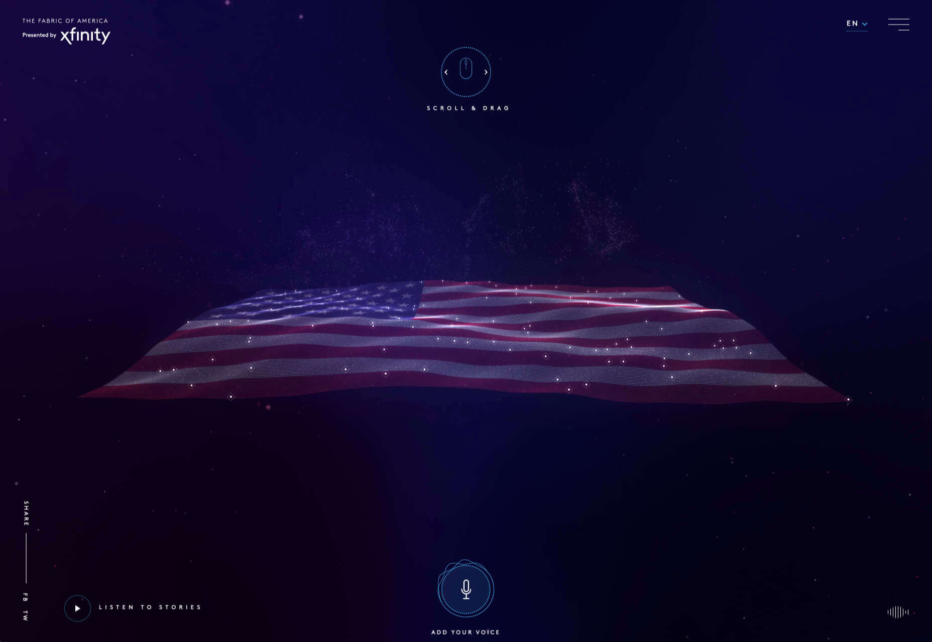
 We have become so used to using web sites just to buy stuff that it is easy to forget that the web has more to offer. So this month we’ve included some because-it’s-interesting sites, some micro-sites and some just-for-the-sake-of-it projects.