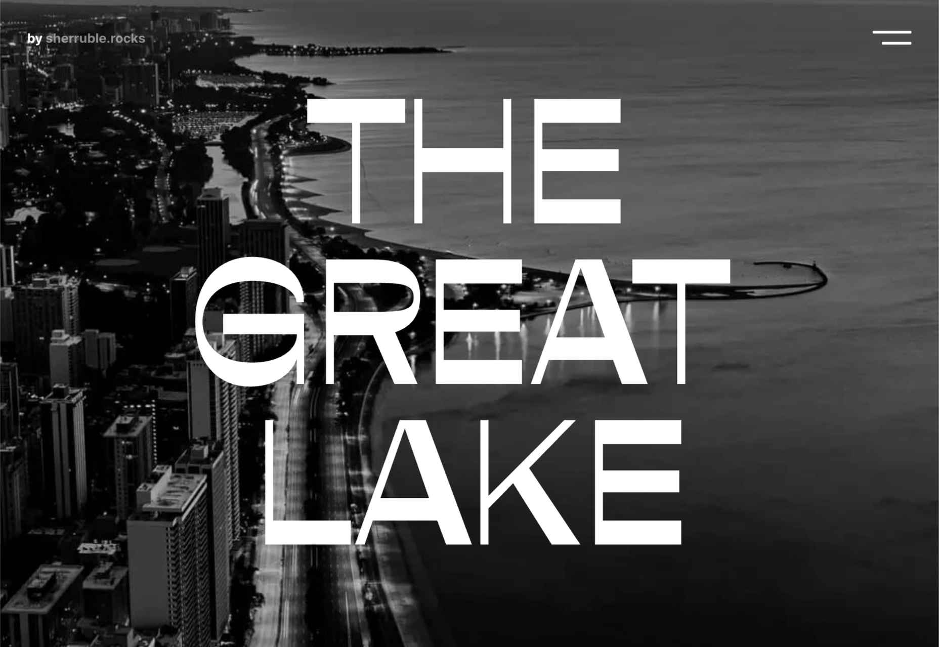
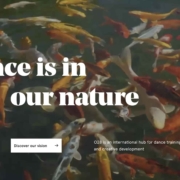
 It’s February, and the spring sun is finally starting to peep through the winter clouds. While many of us are still largely restricted to our homes, the web has kept on growing.
We see a shift in attitude towards natural health, wellbeing, and sustainability, and these are now being branded less often as outliers and increasingly mainstream. We’re also seeing more and more color all the time, ranging from an emotional signifier in the background to being a functional element in its own right.
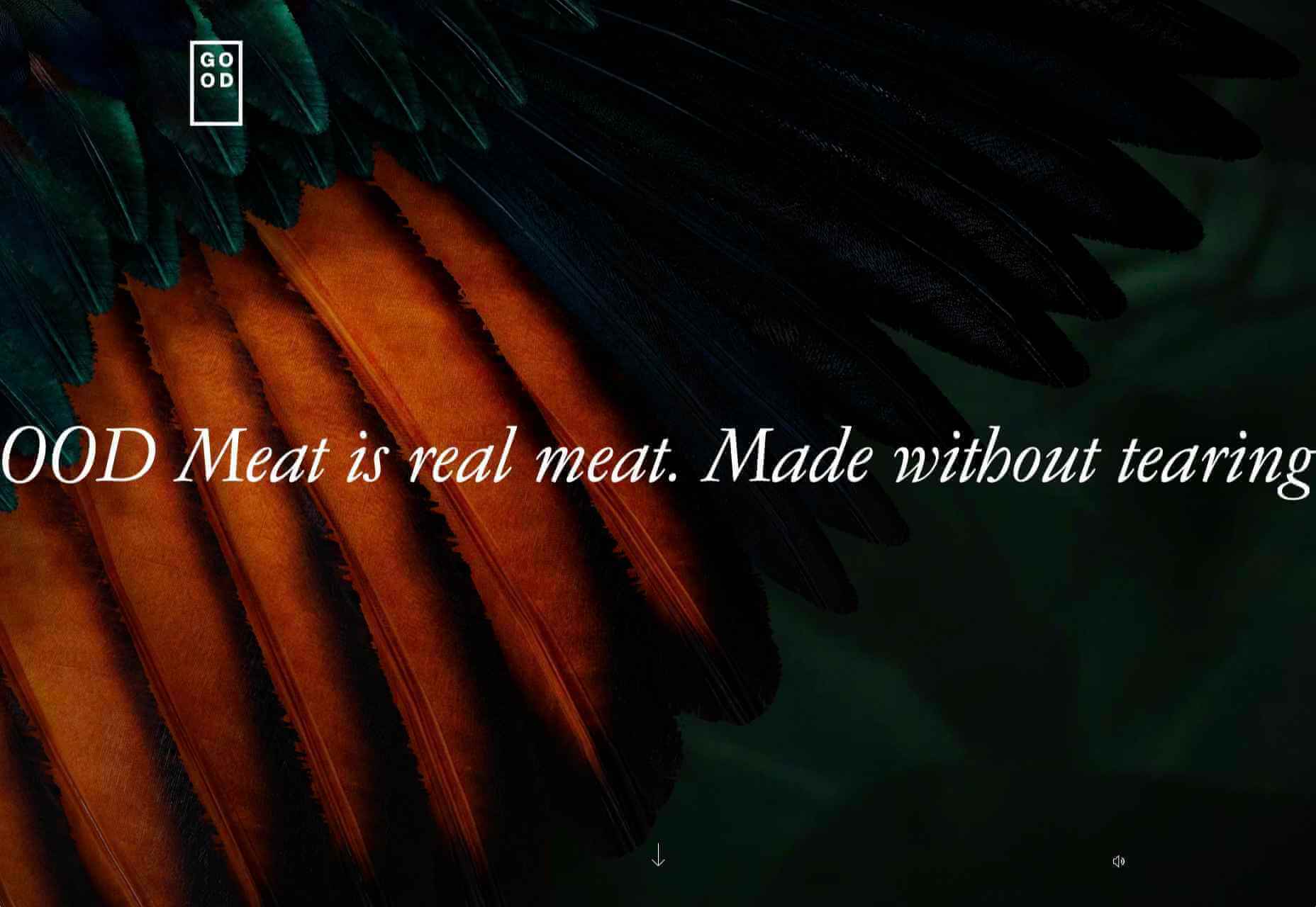
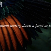
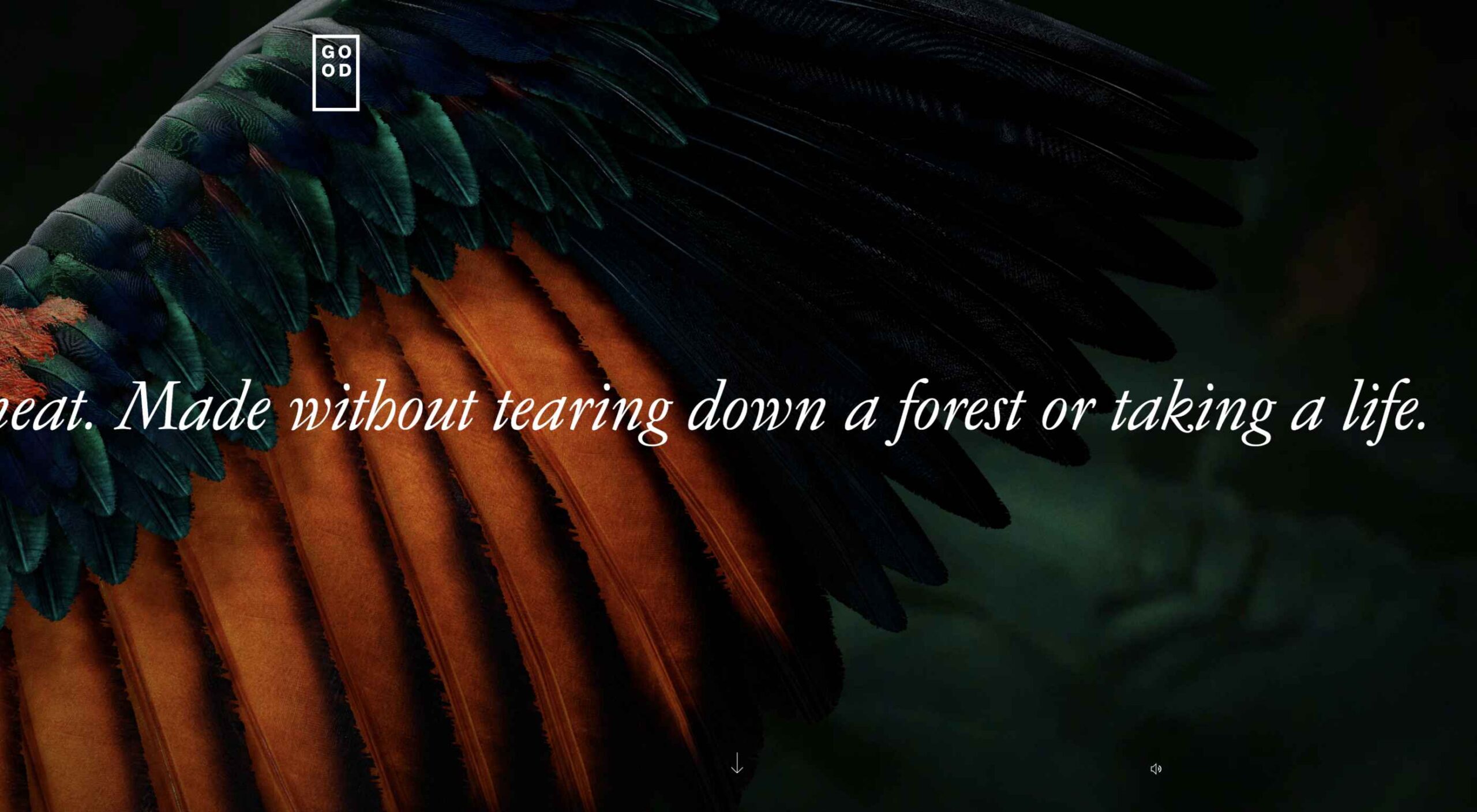
GOOD Meat
Gorgeous color in the background image and the scrolling narrative pull the user in on this site for lab ‘grown’ meat.

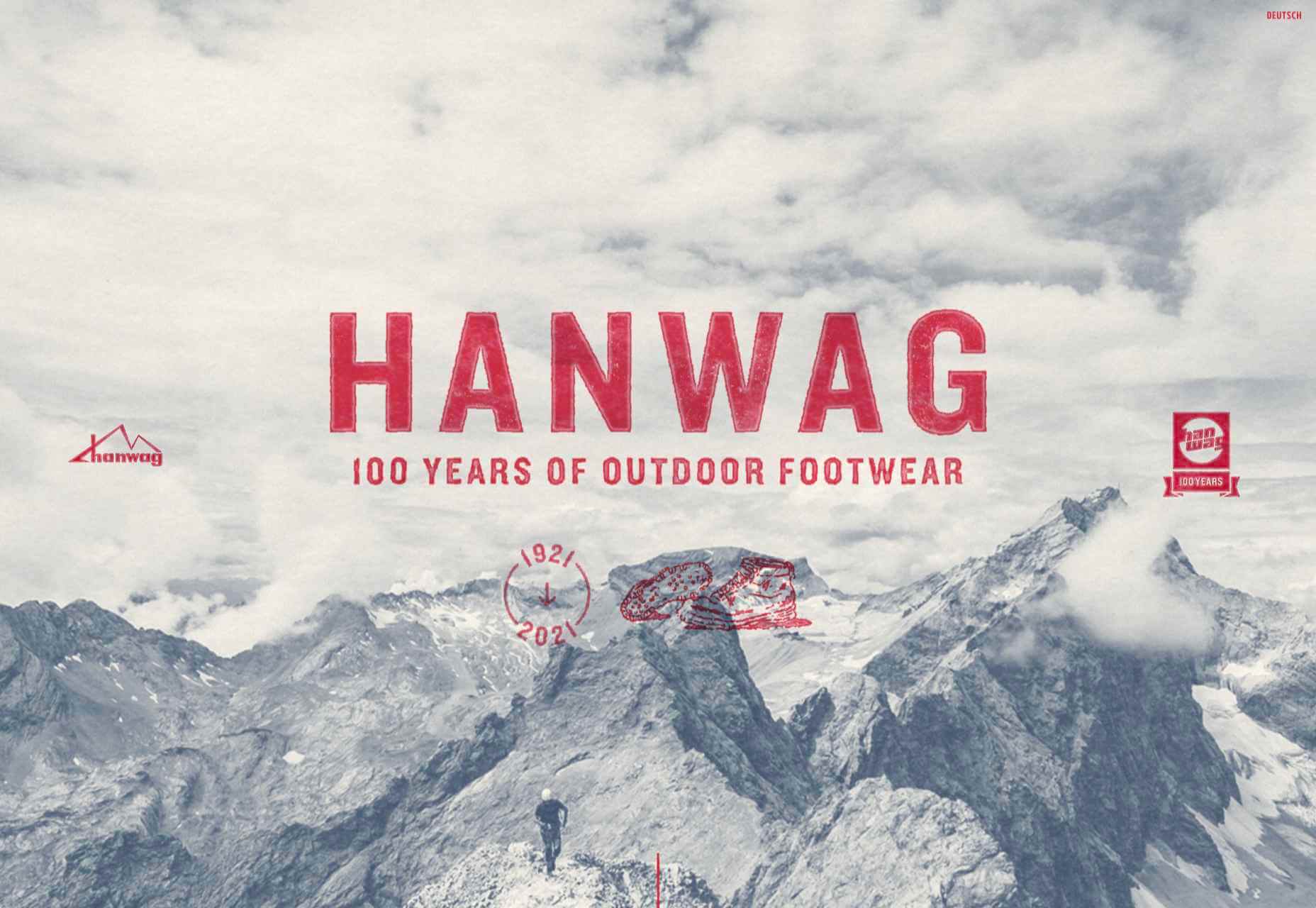
Hanwag 100 Years
This page celebrating 100 years of outdoor footwear company Hanweg uses a mix of illustrations and photographs to create a timeline marking the company’s highlights alongside what else was happening at the time. Any excuse to get Yoda in.
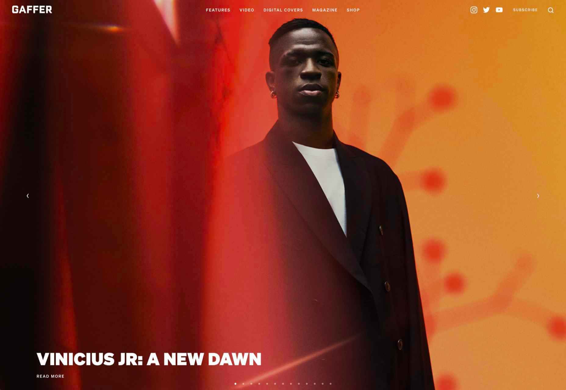
Gaffer
Gaffer describes itself as bridging the gap between football, music, fashion, and culture. The site has a glossy feel, with strong art direction and an easily navigable architecture.
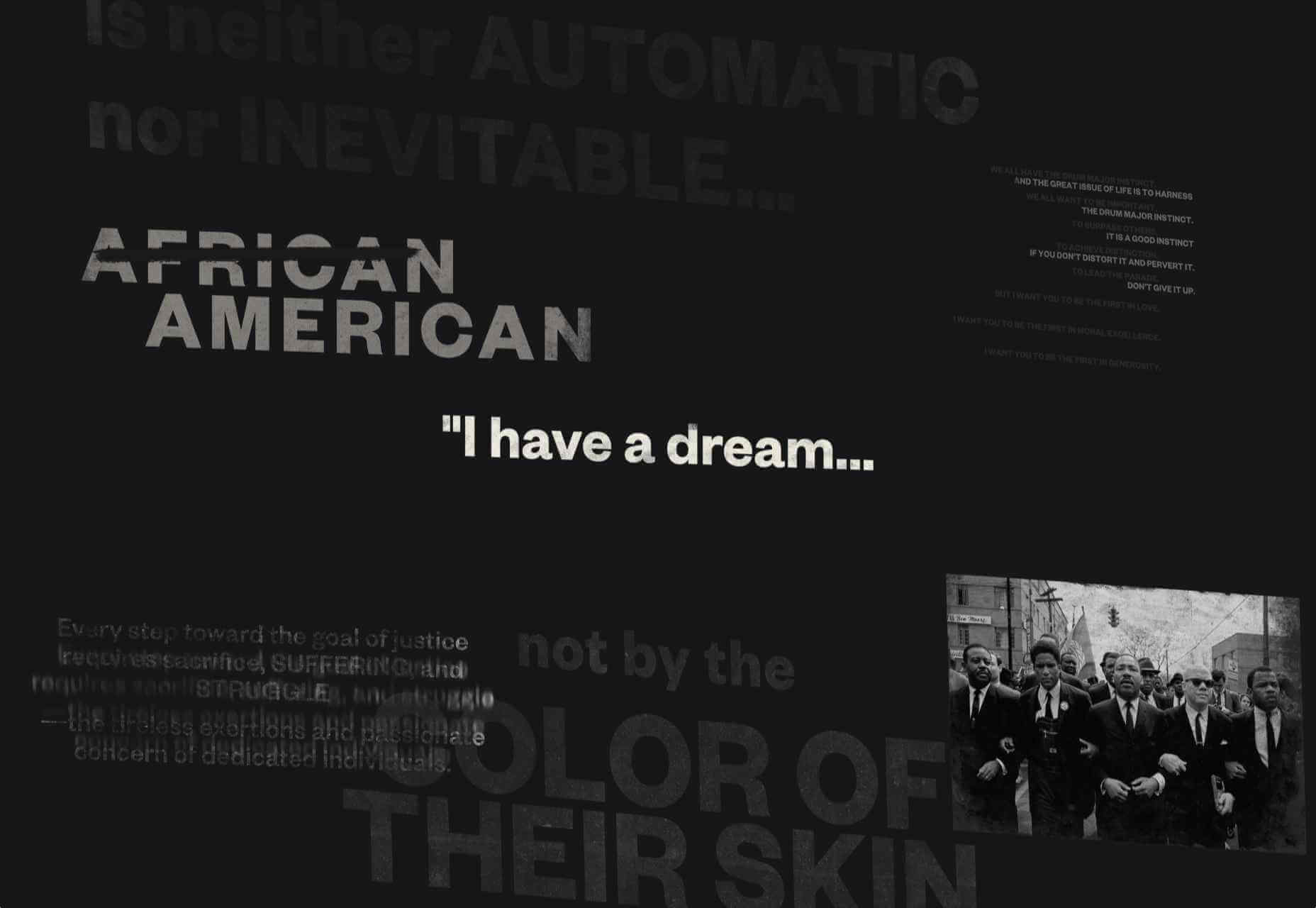
Remember MLK
This rather beautifully made tribute to Martin Luther King uses some great typographic effects, and the variations, in contrast, create a layering of the different content elements.
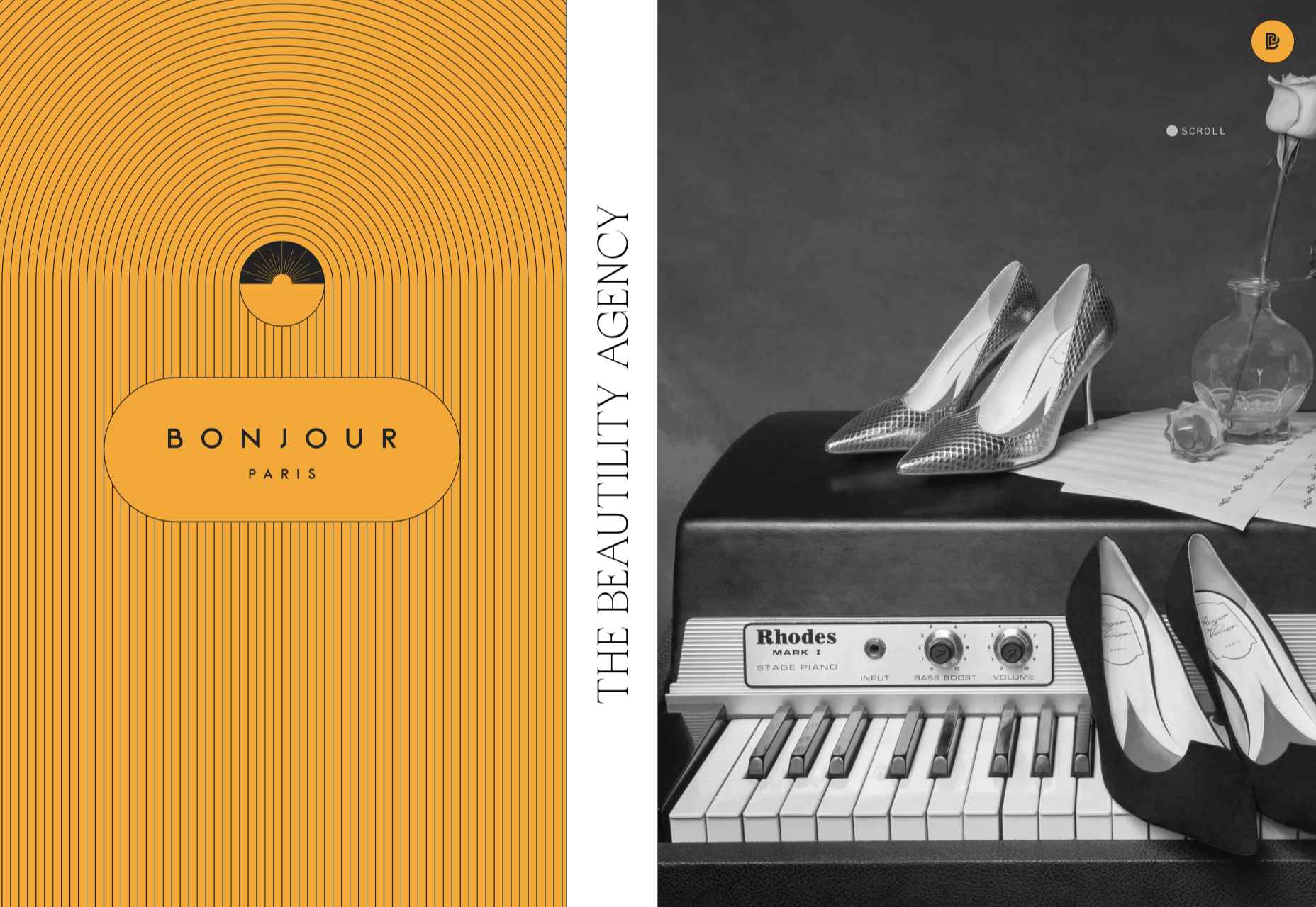
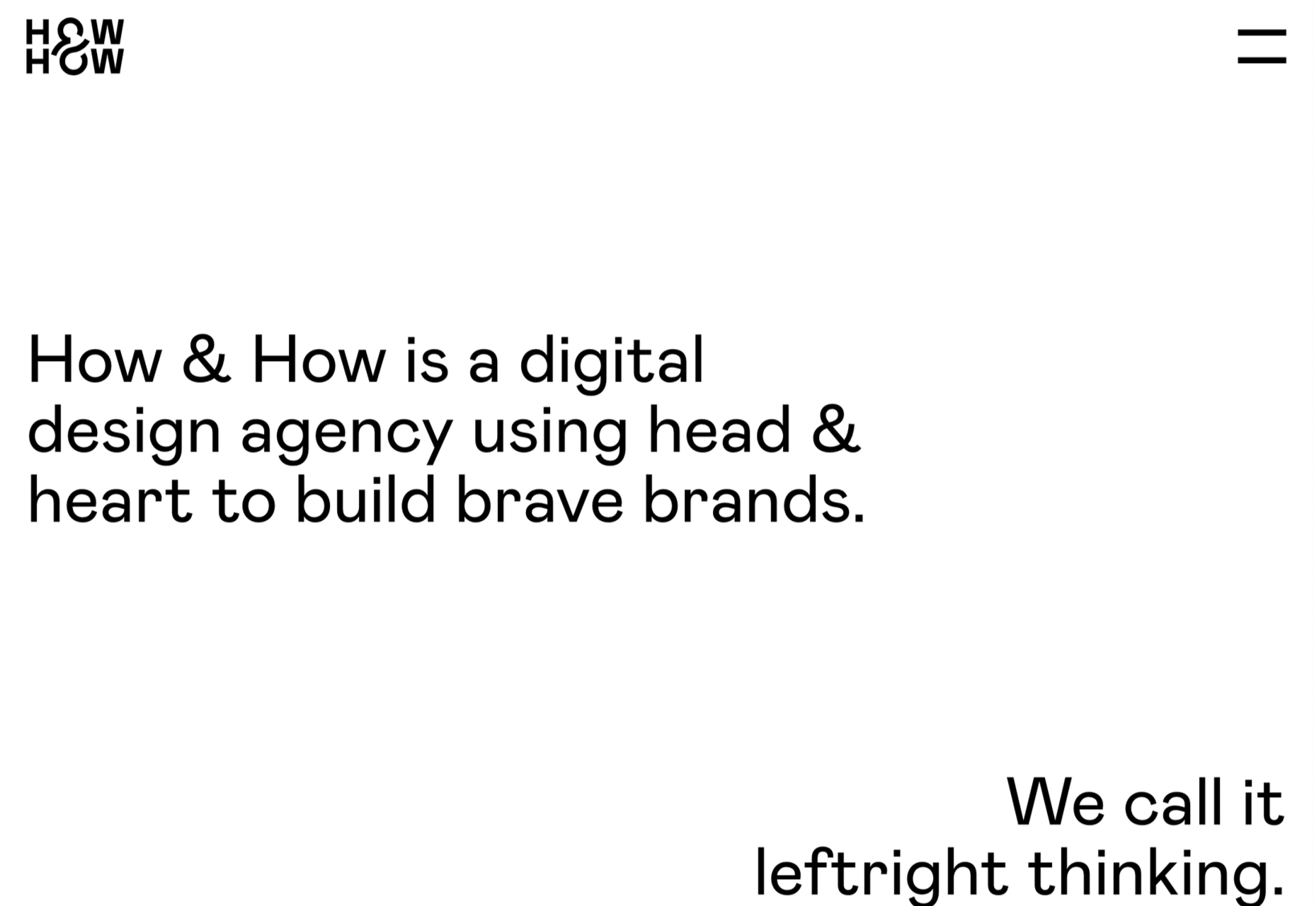
Bonjour Agency
The home page for design agency Bonjour Paris uses sideways scrolling to give an overview of the whole site. There is a lot of content, but it doesn’t feel like waffle, and exploring the site is a pleasant experience in itself.
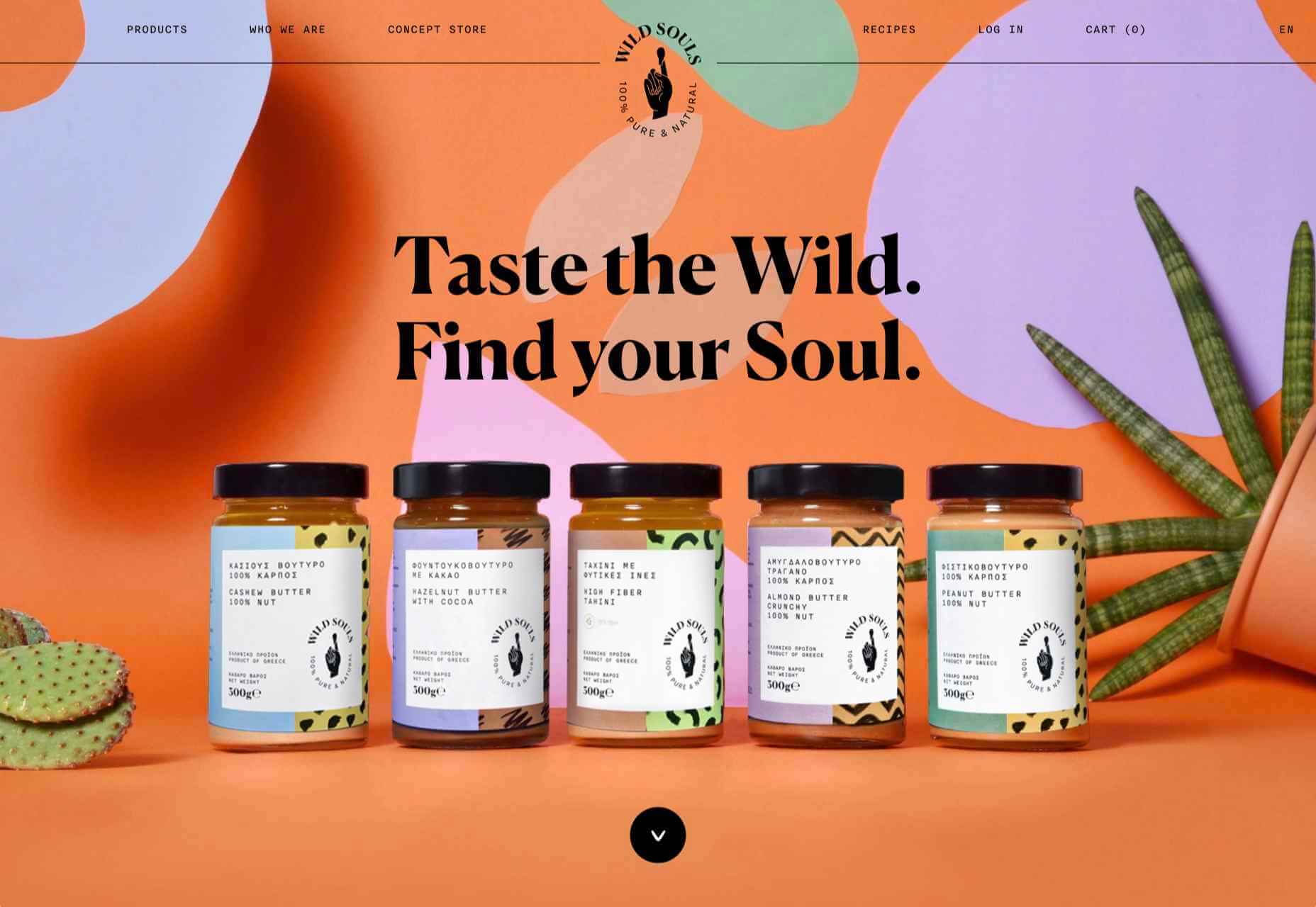
Wild Souls
Wild Souls is a Greek company that principally makes nut butters, tahini, and halva. The site is very colorful but warm, and the display type — Canela — has a slight softness to it that is appealing.
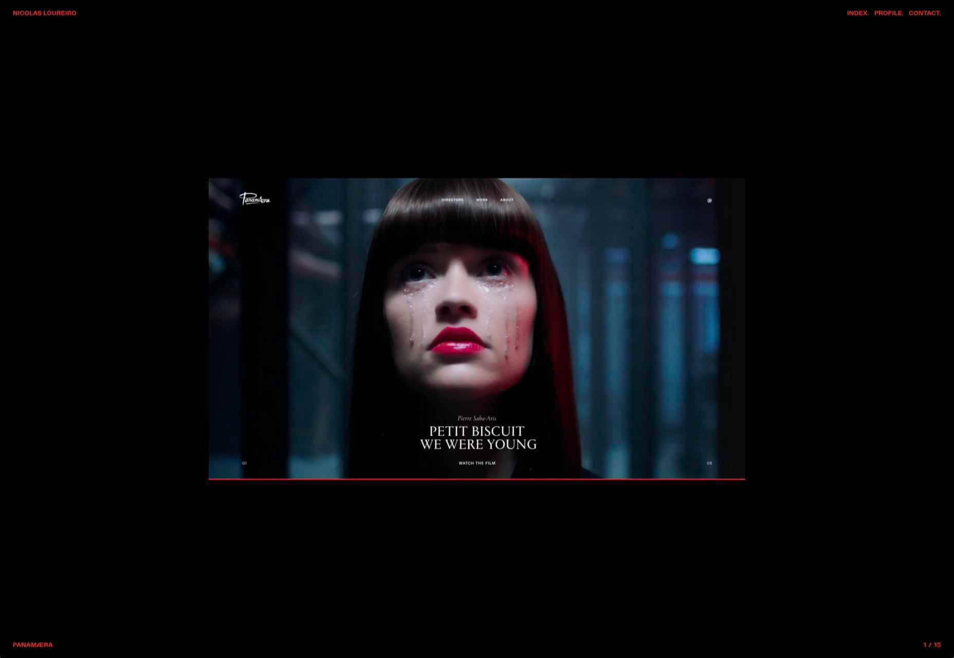
Nicolas Loureiro
This is a strong portfolio site for interactive and graphic designer Nicolas Loureiro. The work is front and center, and the navigation is pleasing.
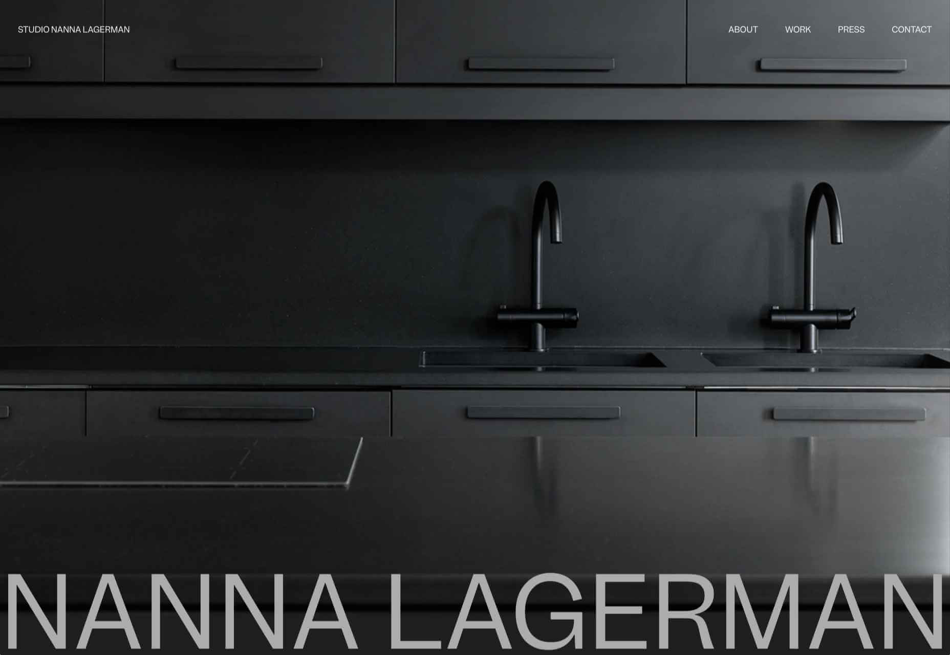
Studio Nanna Lagerman
Studio Nanna Lagermann is a small interior design studio that works on private homes, public spaces, and set design. The site creates a feeling of space and calm. Colors are soft and neutral, and the type, although massive in places, is clean and sophisticated.
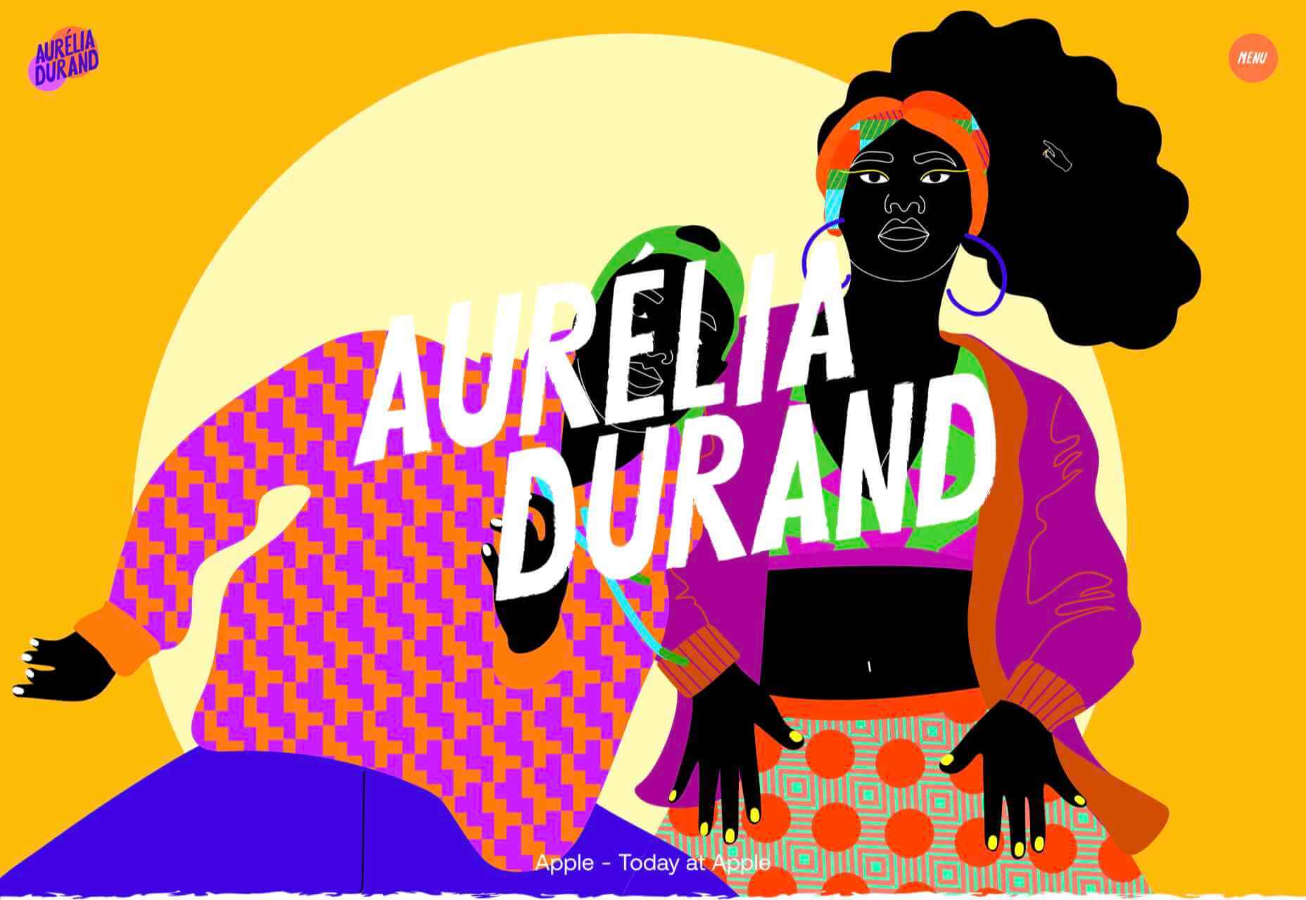
Aurelia Durand
Illustrator Aurelia Durand created her own typeface that she uses in her work, and it is used as the main display font here too. This site has a sense of joy about it that is hard to resist.
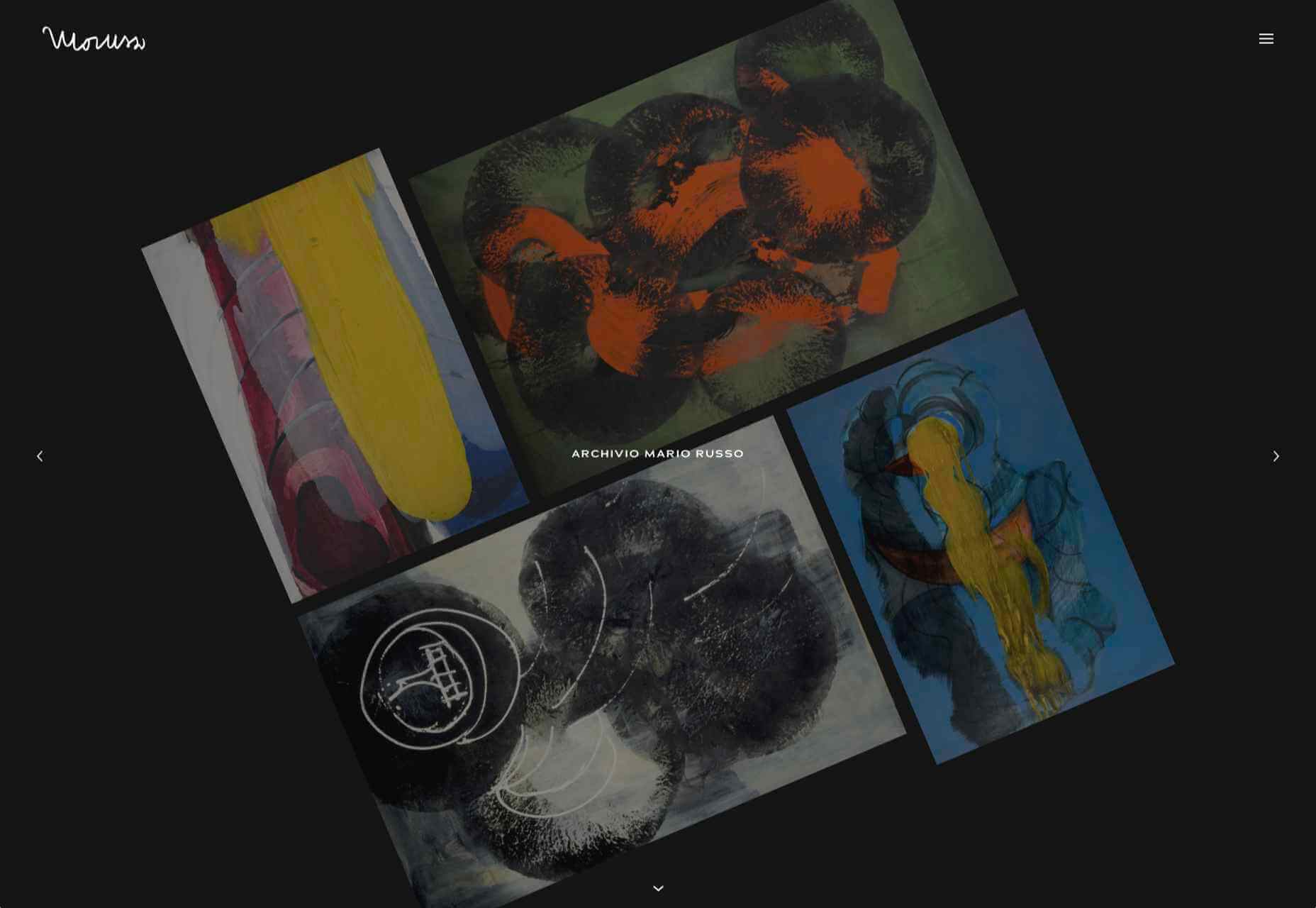
Archivio Mario Russo
This site documents the life and work of 20th-century Italian artist Mario Russo. The layout is thoughtful, and the text, while informative, doesn’t detract from the work being shown.
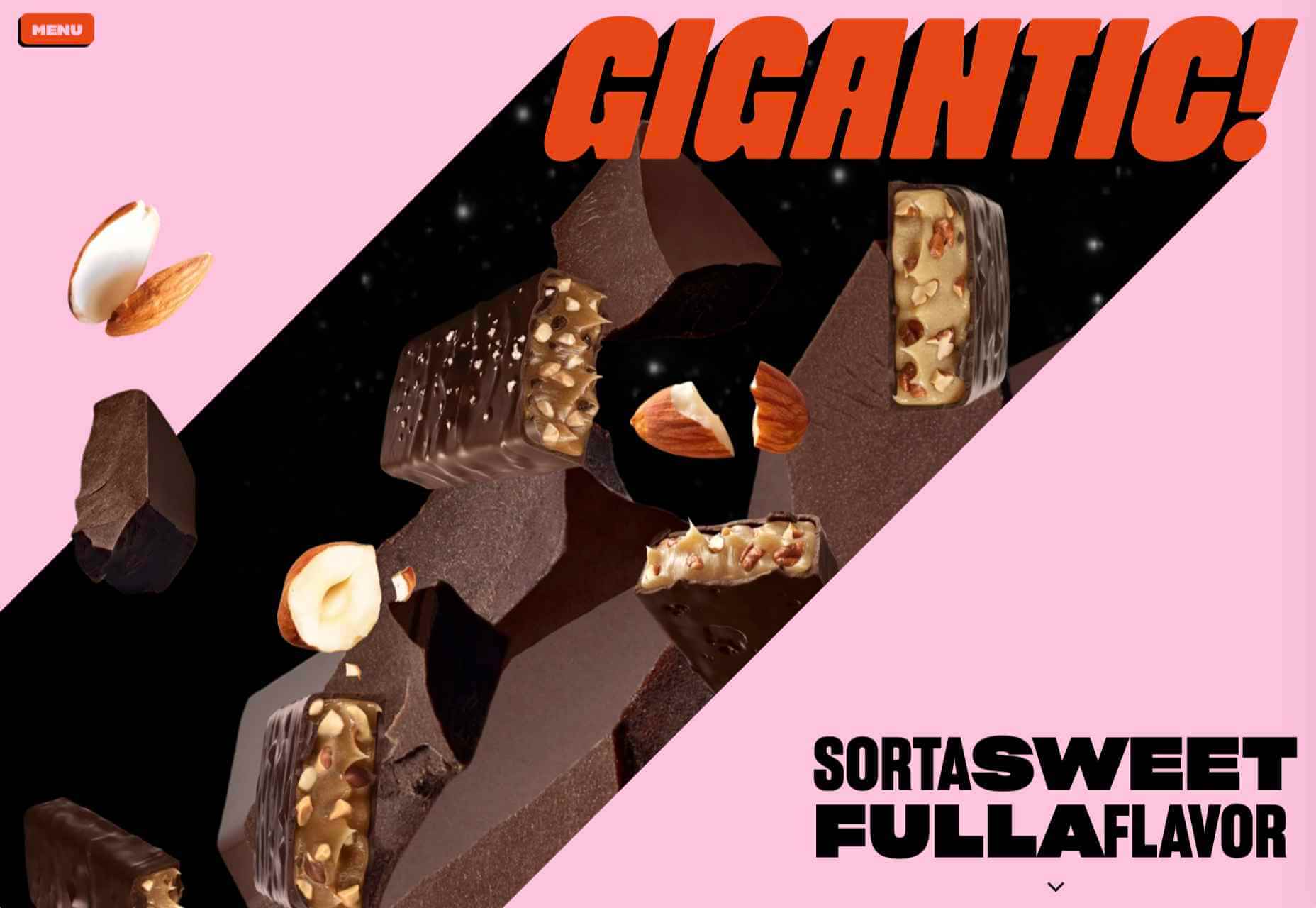
Gigantic Candy
Gigantic Candy makes vegan chocolate candy bars. The site is big, bold and lo-fi, and has a sense of fun to it.
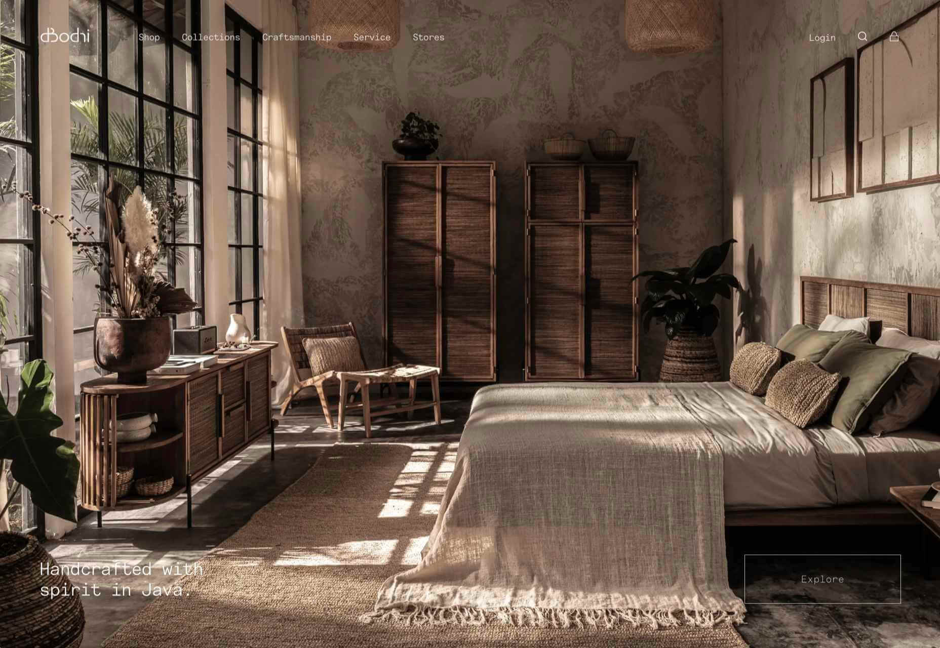
dBodhi
dBodhi sells handcrafted furniture from Java, made from reclaimed teak and locally grown plant materials. The clean layout combined with a slight sepia tone on all the photography creates a feeling of quietness and nature.
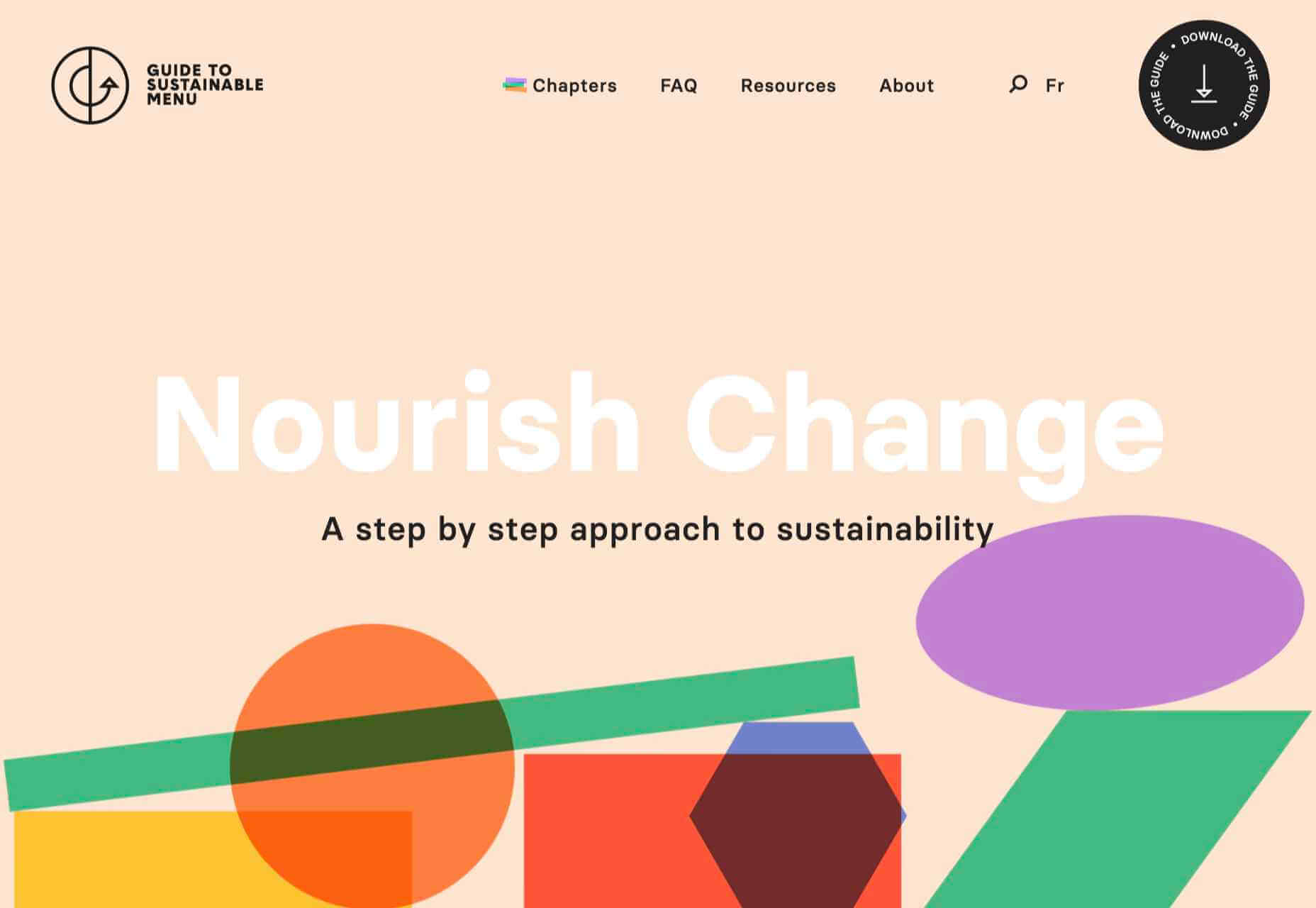
Menu Durable
Menu Durable is a guide to creating healthier, sustainable food menus in Canadian healthcare facilities. There is a lot of information here, and it is well written and attractively presented with clear color coding.
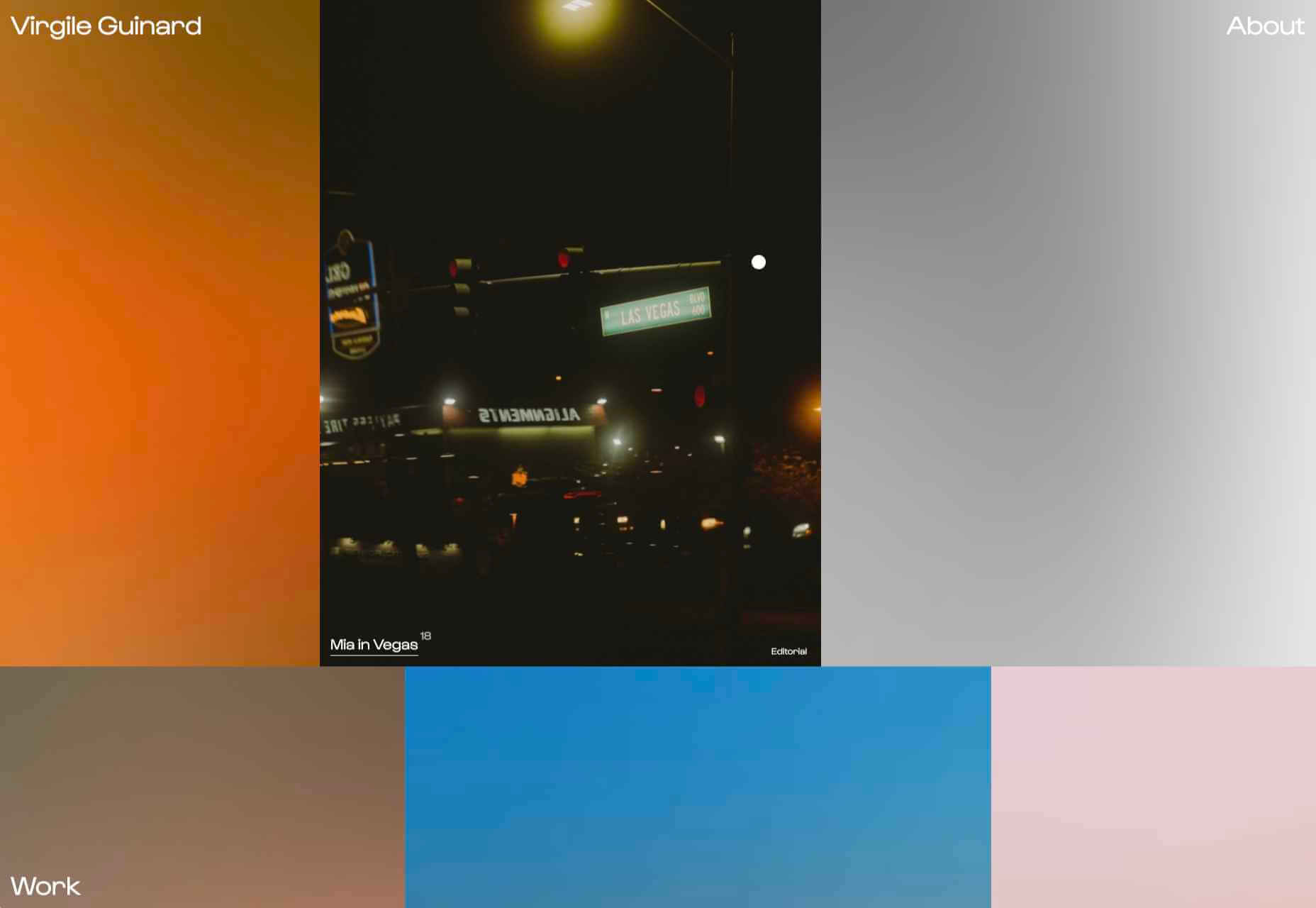
Virgile Guinard
This is a lovely, simple portfolio site for photographer Virgile Guinard. By using blocks of color pulled from each photograph’s predominant color and only revealing each photograph on rollover, each image is allowed to stand out.
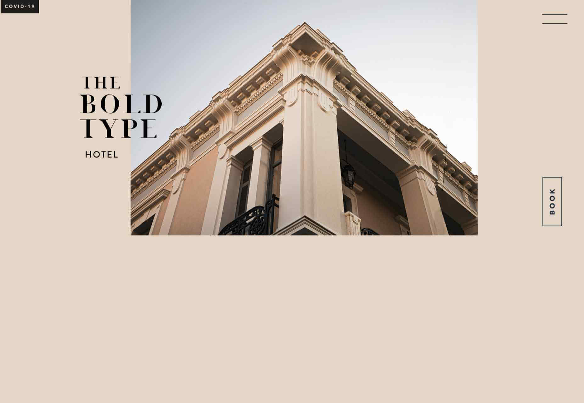
The Bold Type
This site for The Bold Type Hotel in Patra, Greece, is a boutique hotel website archetype, but it is done well. The pinky sand background color is a good choice, and the photographs are excellent.
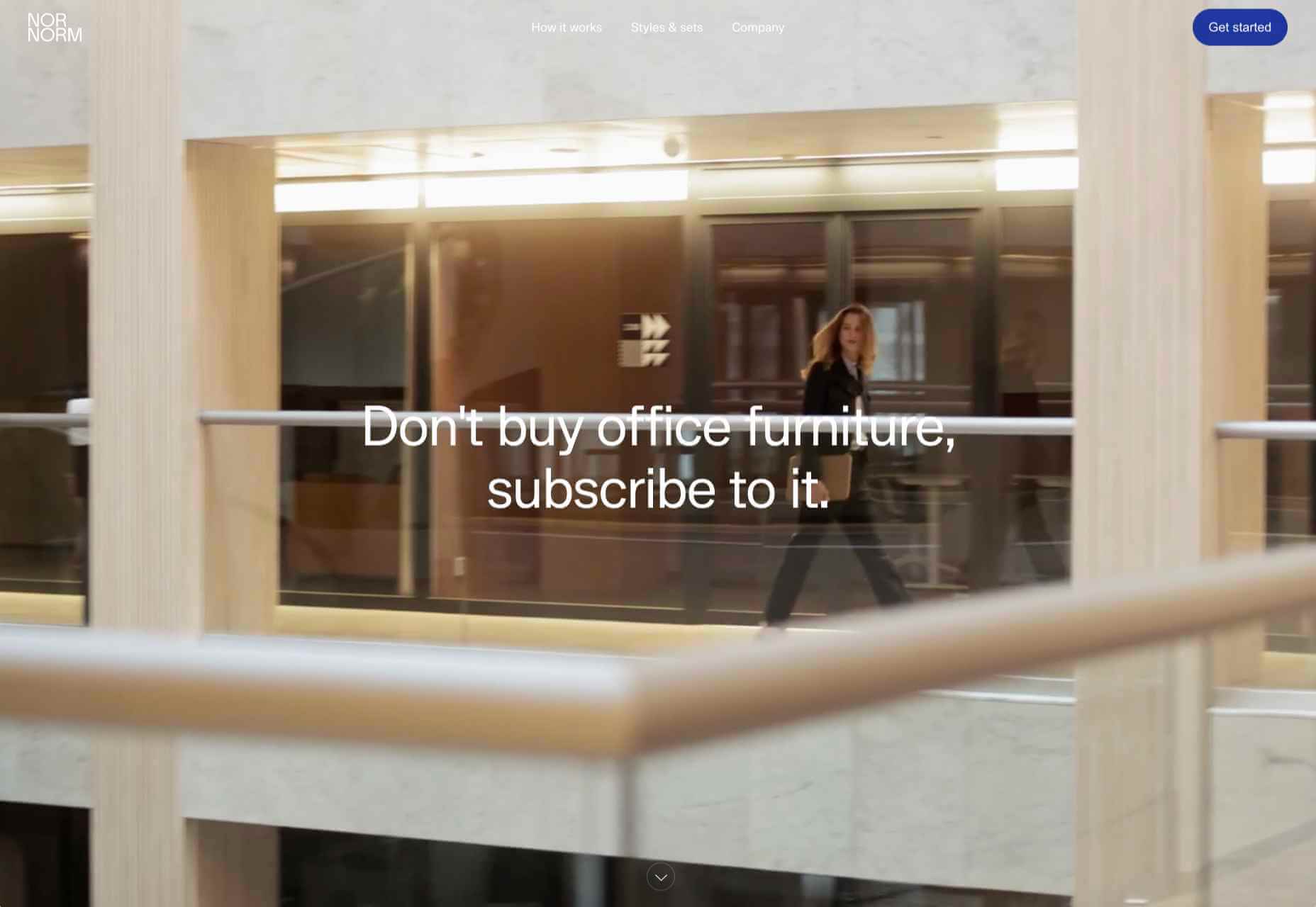
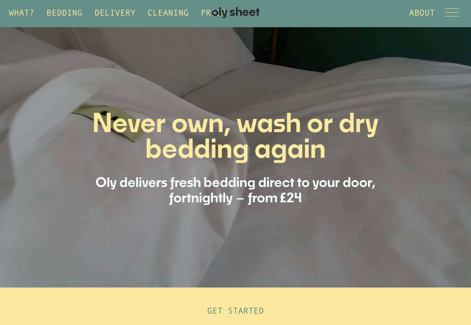
NOR NORM
Nor Norm provide an office furniture subscription service. The site is clean with a feeling of light and space. There is a good balance between an overview of the process and details of the individual items available.
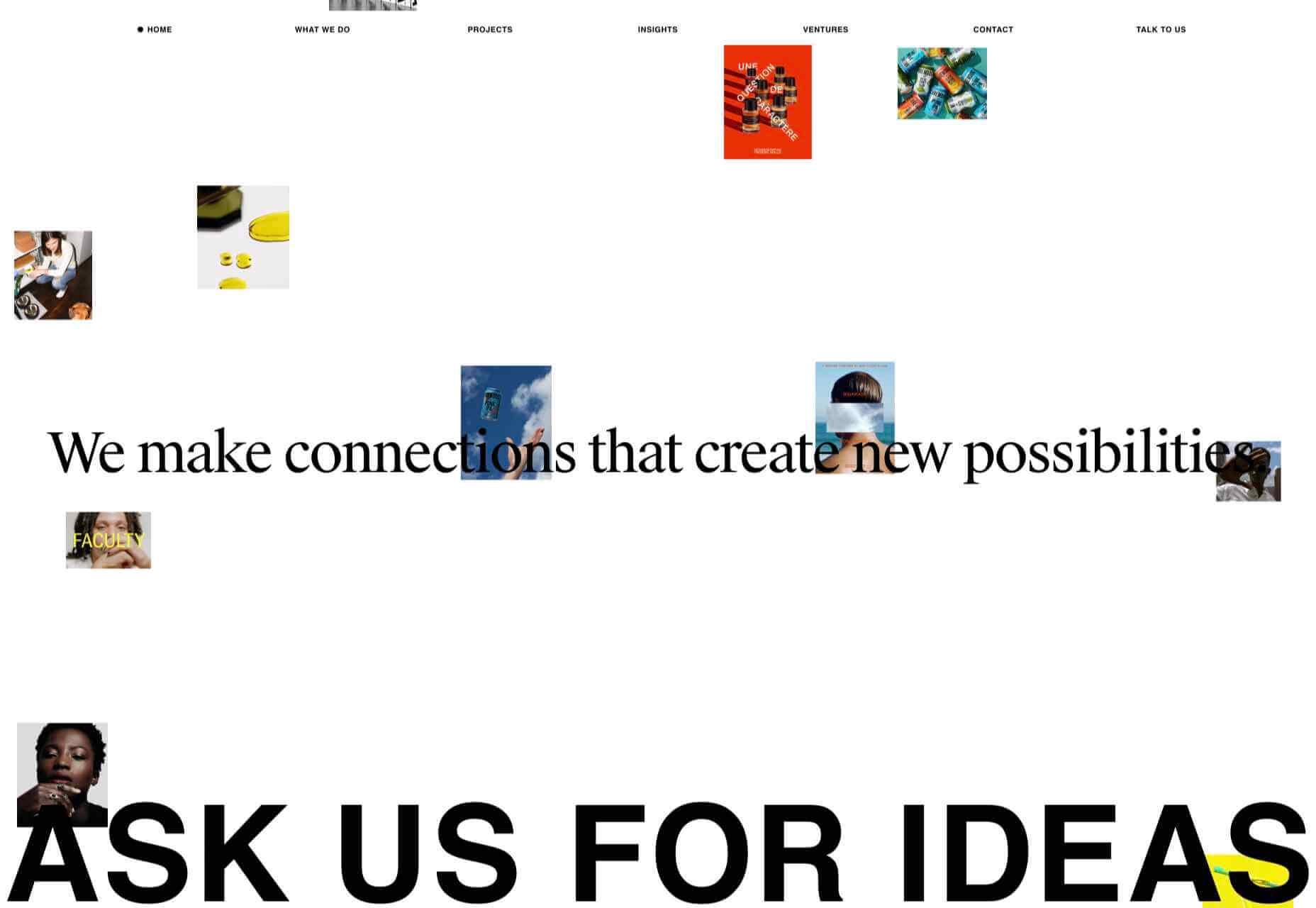
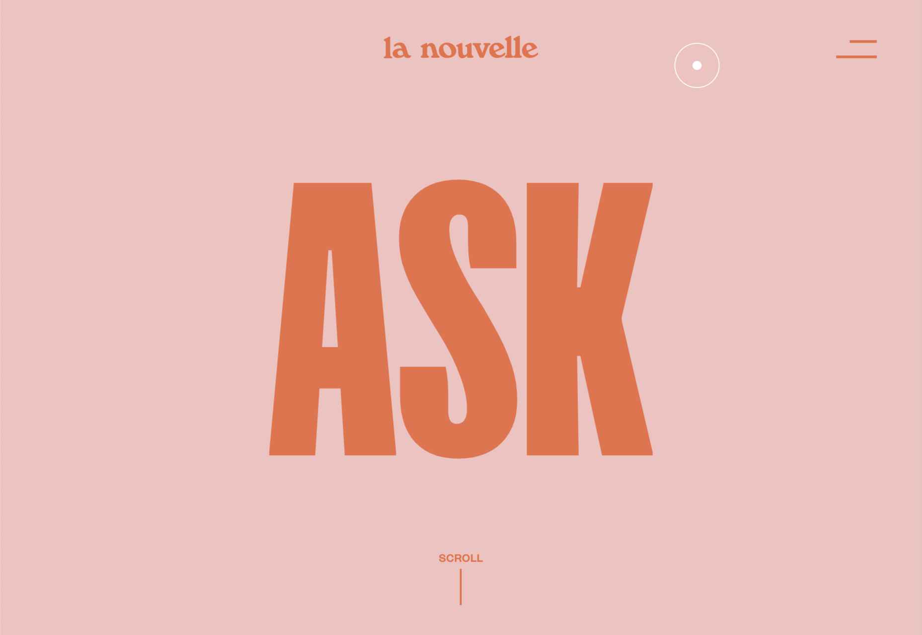
Ask Us For Ideas
At first glance, Ask Us For Ideas looks like a creative agency, but it is actually a creative broker, matching clients with agencies.
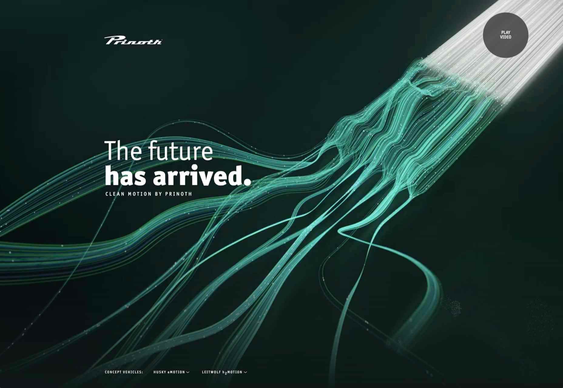
Prinoth Clean Motion
Prinoth has been making snow groomers since the 1960s, and this microsite is to mark the launch of their new hydrogen and electric versions. It is as slick and glossy as any luxury car website. And now I know what a snow groomer is.
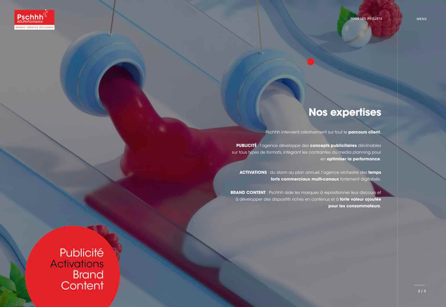
Pschhh
Design agency Pschhh has embraced the use of circles, reflecting the sound of bubbles their name suggests.
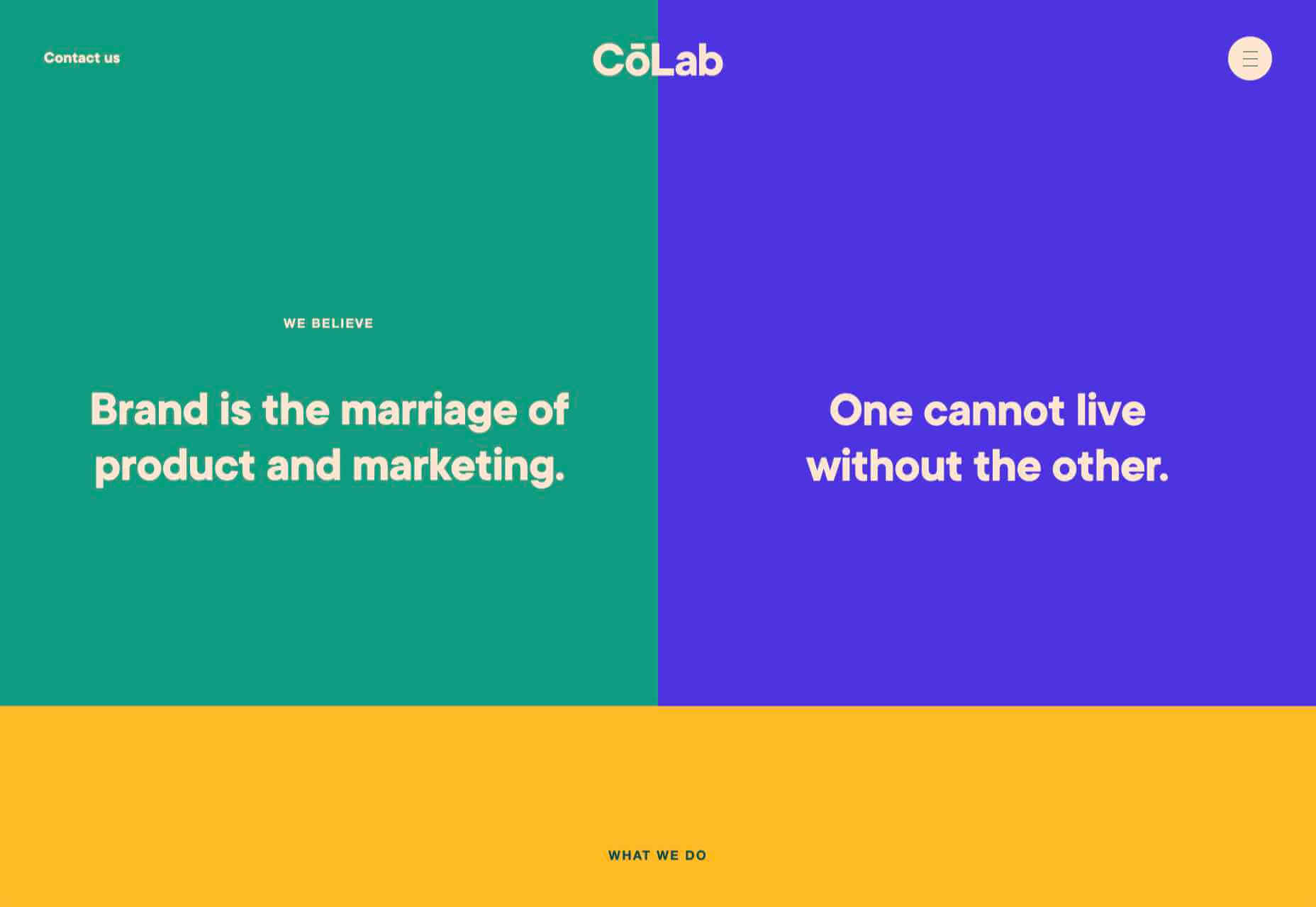
CōLab
CōLab is a design and marketing firm. There is a great use of color and movement here, and you don’t really notice initially that there is no actual work on show.
Source
The post 20 Best New Websites, February 2021 first appeared on Webdesigner Depot.

Source de l’article sur Webdesignerdepot

 Every day design fans submit incredible industry stories to our sister-site, Webdesigner News. Our colleagues sift through it, selecting the very best stories from the design, UX, tech, and development worlds and posting them live on the site.


 This month we have a variety pack for you. There are all sorts, from the most conservative layouts and structures to more experimental navigation. And we see how even the most traditional and functional websites can connect with users through mood-enhancing color schemes, clever font choices, and illustrations.


 Every day design fans submit incredible industry stories to our sister-site,

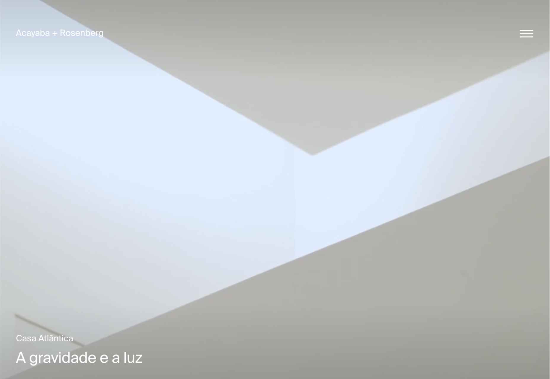
 This month we have several examples of brutalism used to good effect as a foil to showcase products and/or work. By contrast, at the other end of the scale, we have brands who have chosen to go more of an immersive experience route, using full-screen images, sound, animation, and even VR.

 Every day design fans submit incredible industry stories to our sister-site,


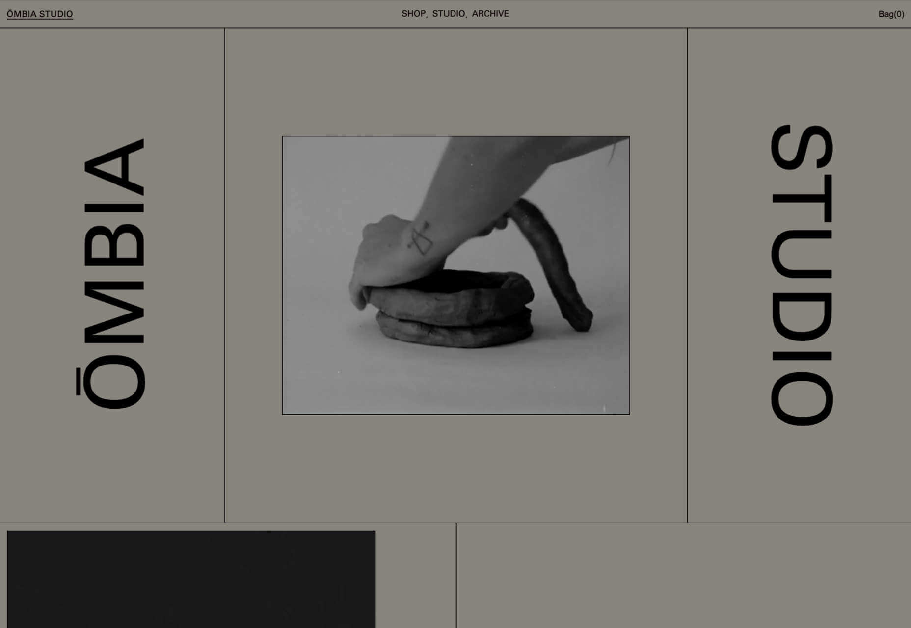
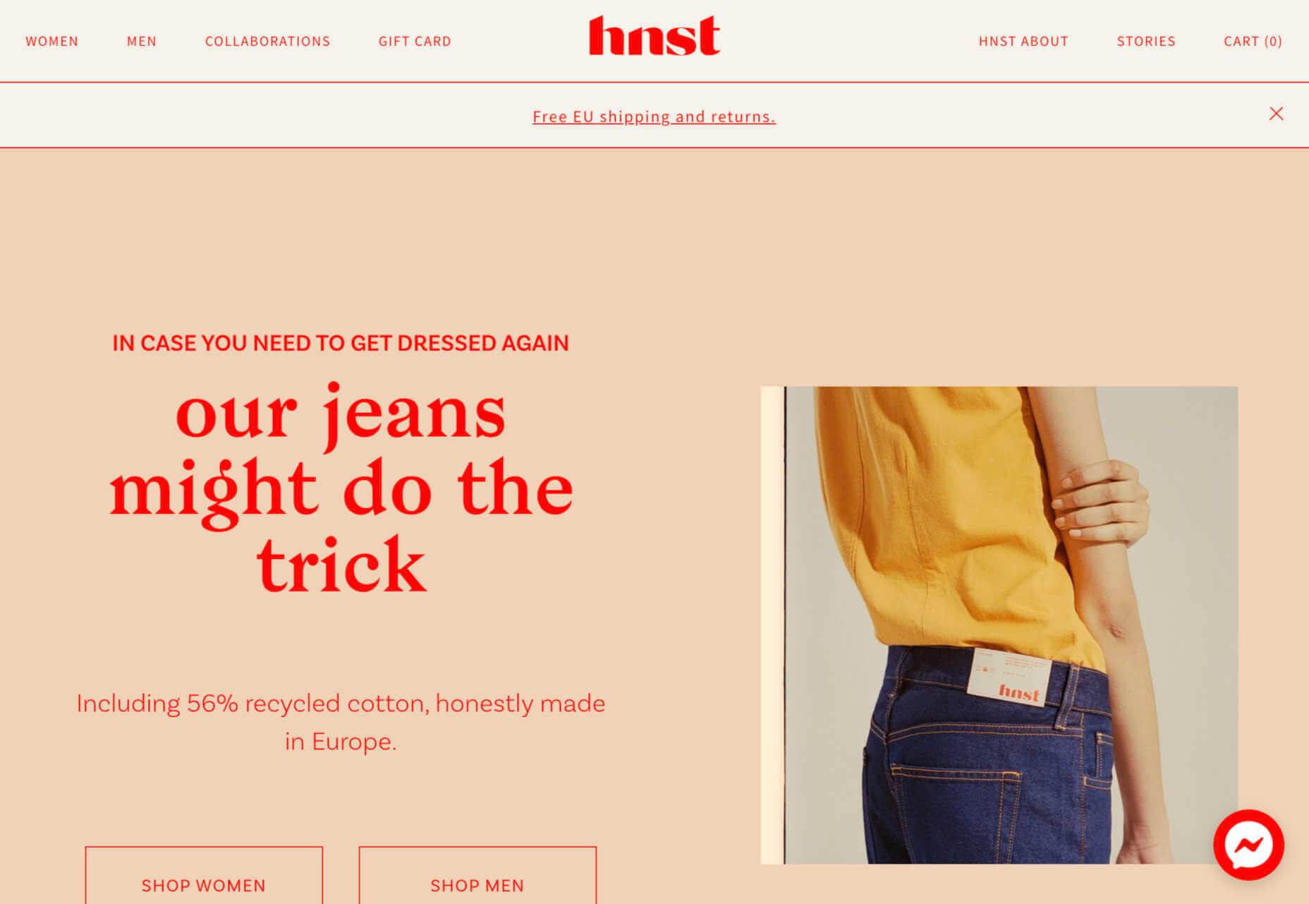
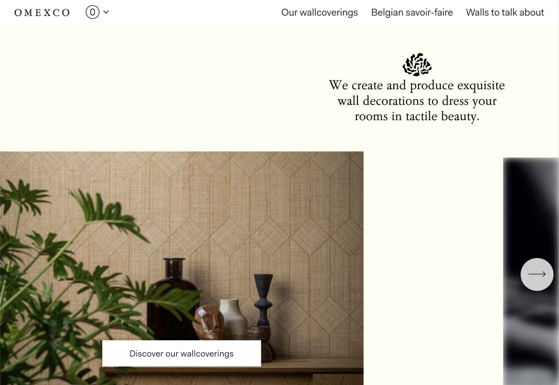
 This month’s collection contains a combination of big and bold, and clean and minimal. Although basic minimalism is still trendy, with lots of white space and greyscale type, we are seeing it softened with color. This is implemented differently, ranging from hints of off-whites in images to gentle pastels as section backgrounds.
 Everyday design fans submit incredible industry stories to our sister-site,
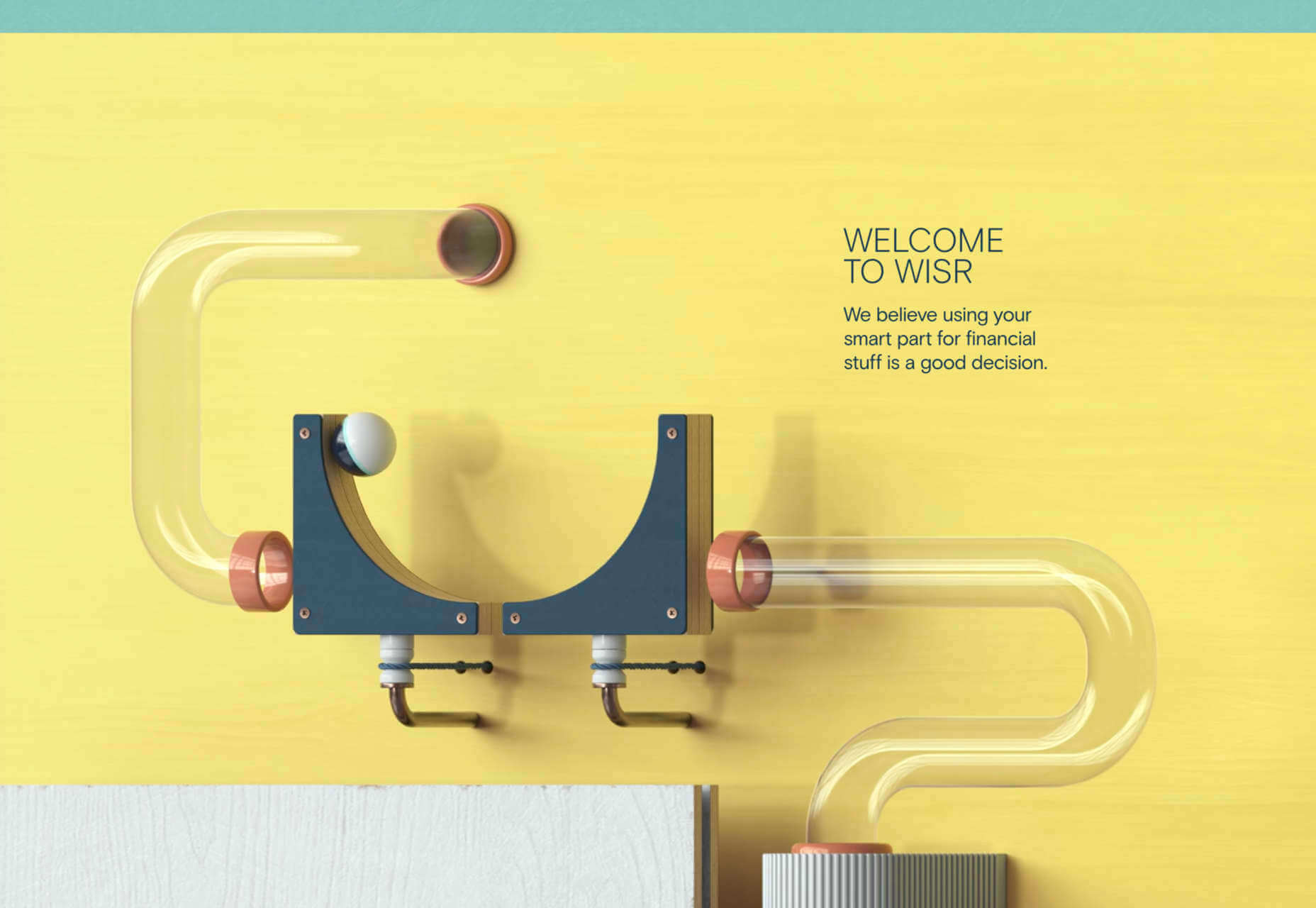
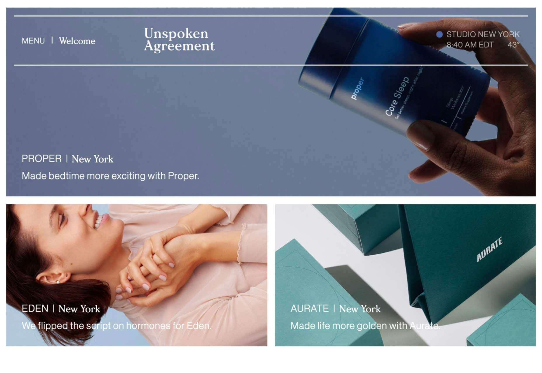
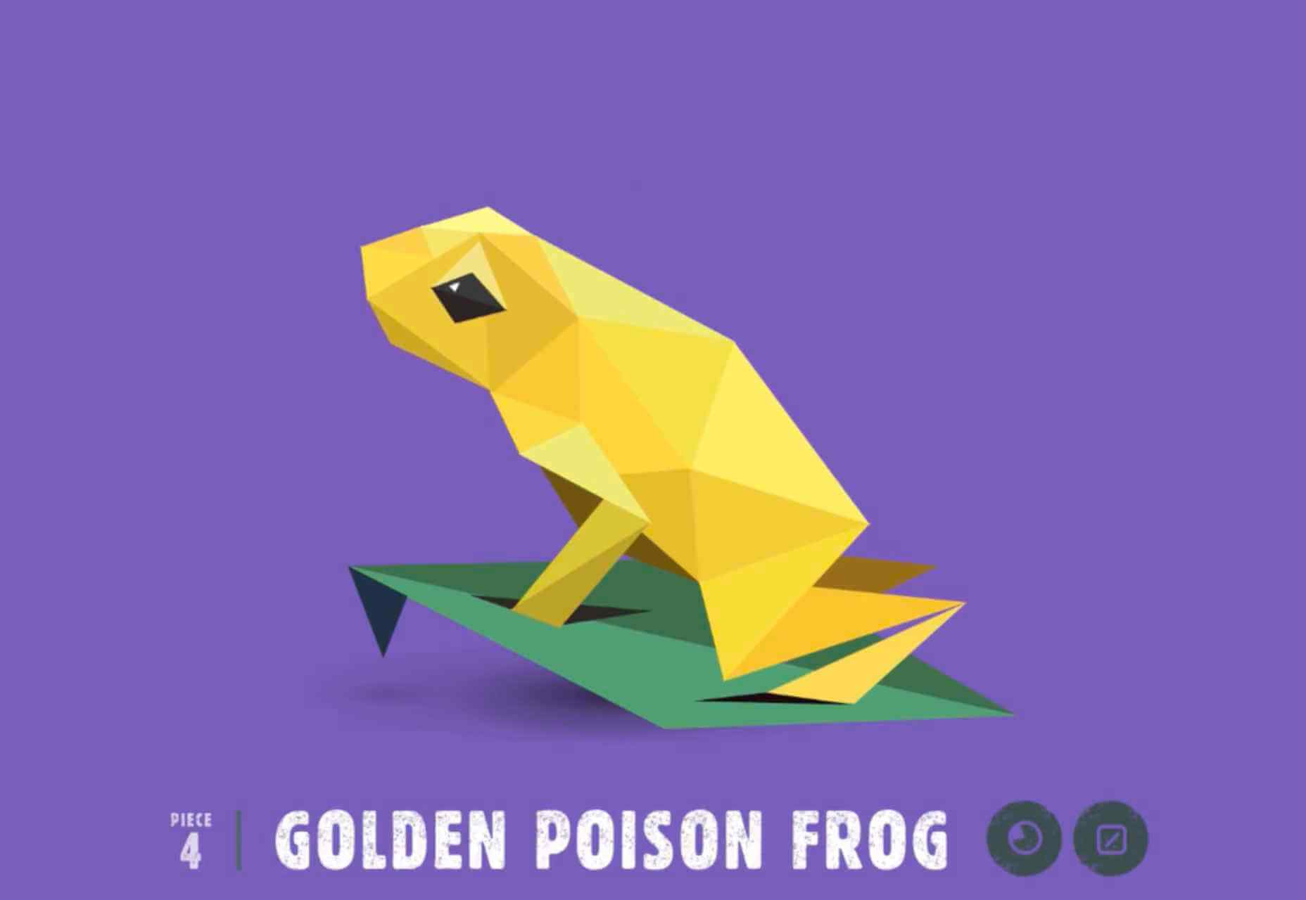
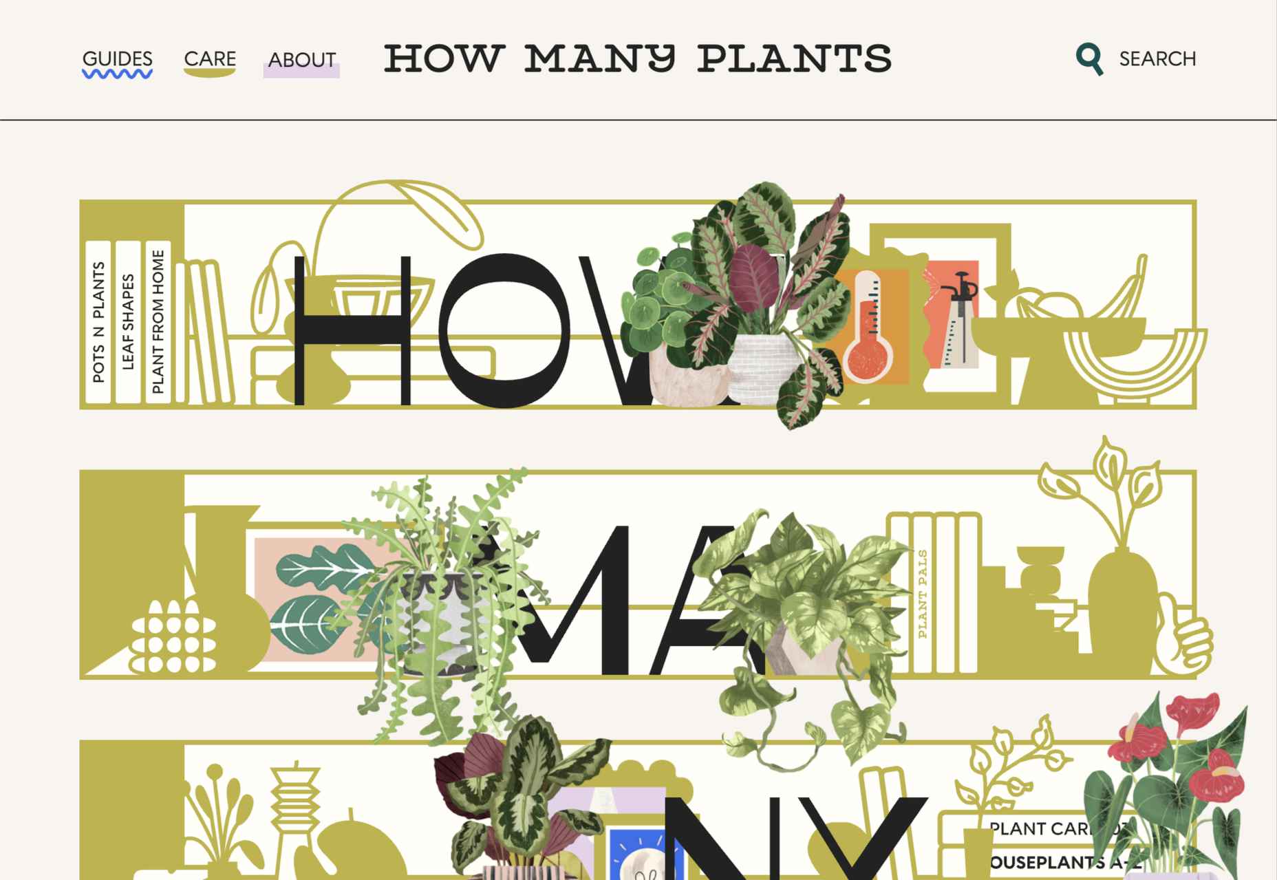
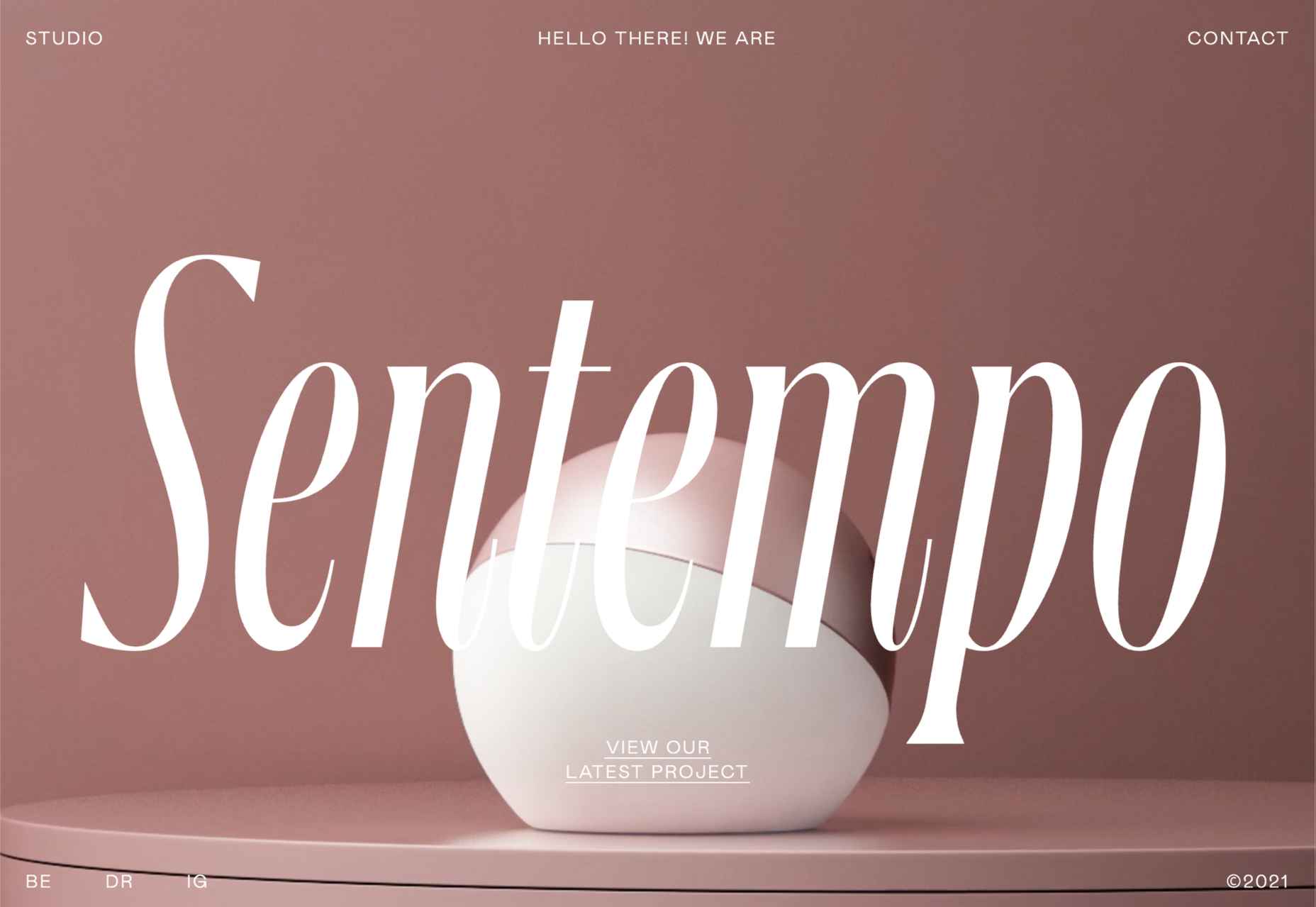
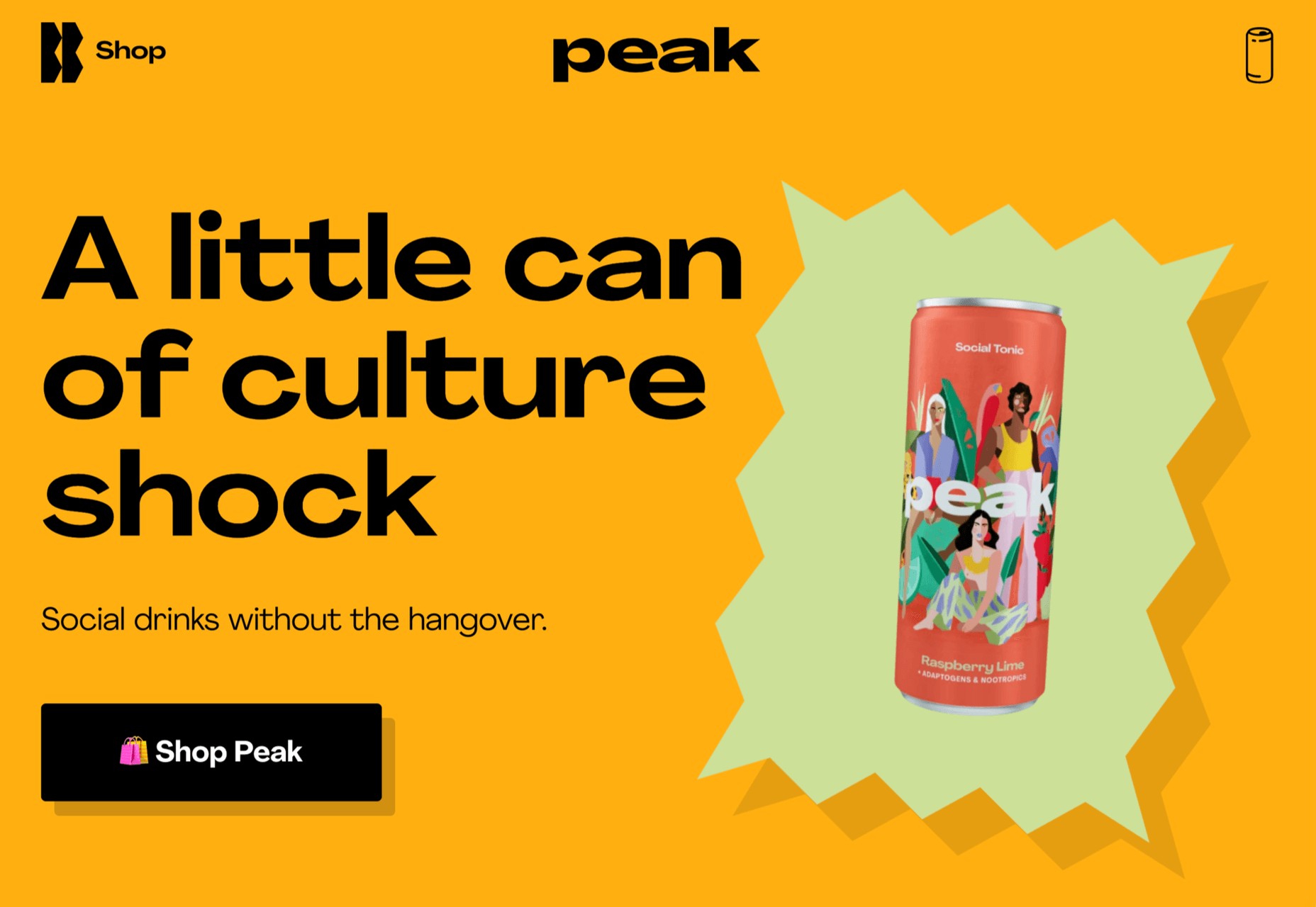
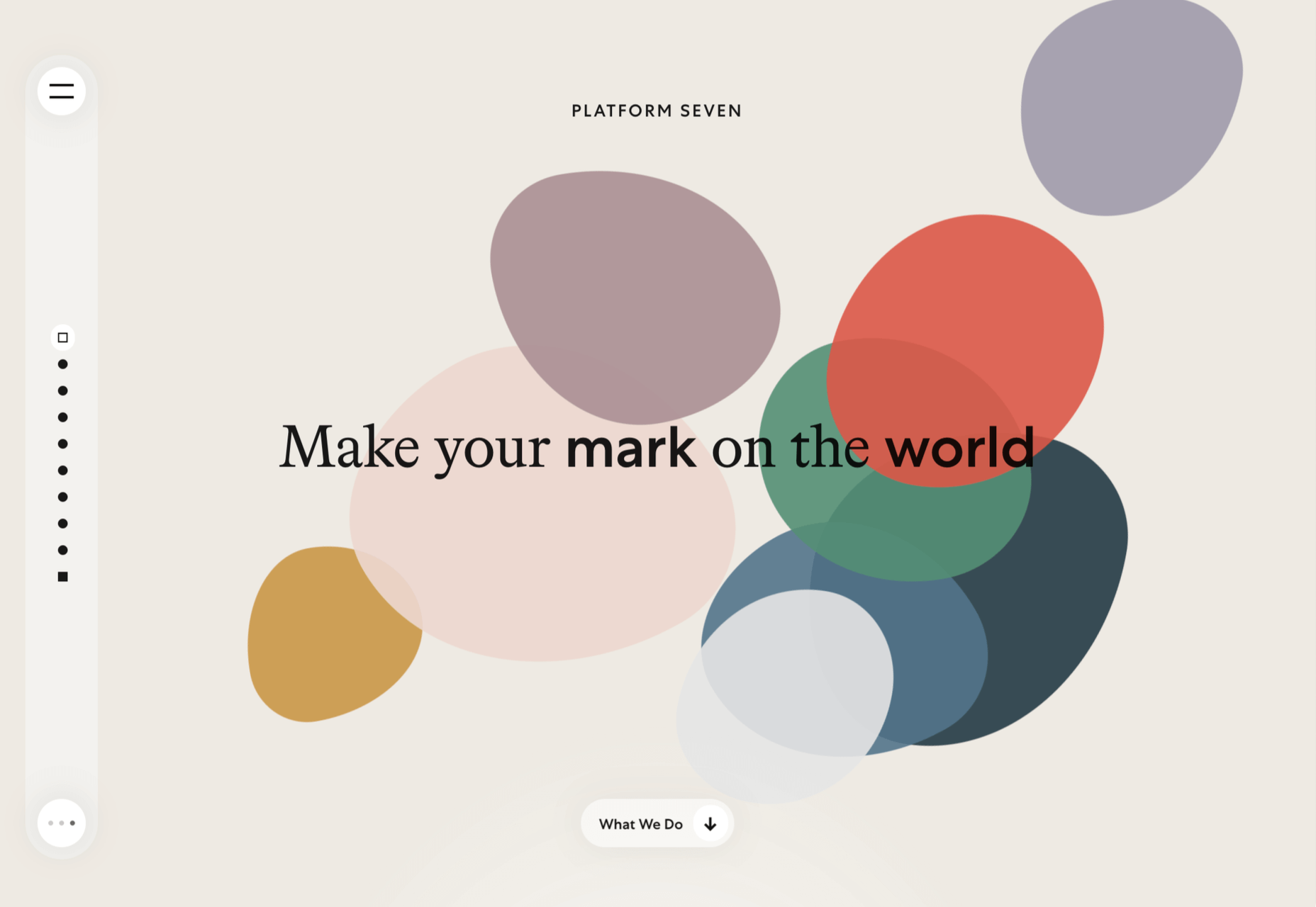
 This month’s collection of the best new websites launched or updated in the last four weeks features color, and more color, and then — just for good measure — a bit more color. Yellow is a hue of choice, but you’ll also find burnt orange, rich purples, and greens and blues in equal measure. What is missing is the tech-blue of years past, replaced with something altogether more Mediterranean. Enjoy!


 Everyday design fans submit incredible industry stories to our sister-site,