Articles

Here we are into a brand new year, and although we’re far from out of the woods yet, there is a feeling of renewed hope on many fronts.

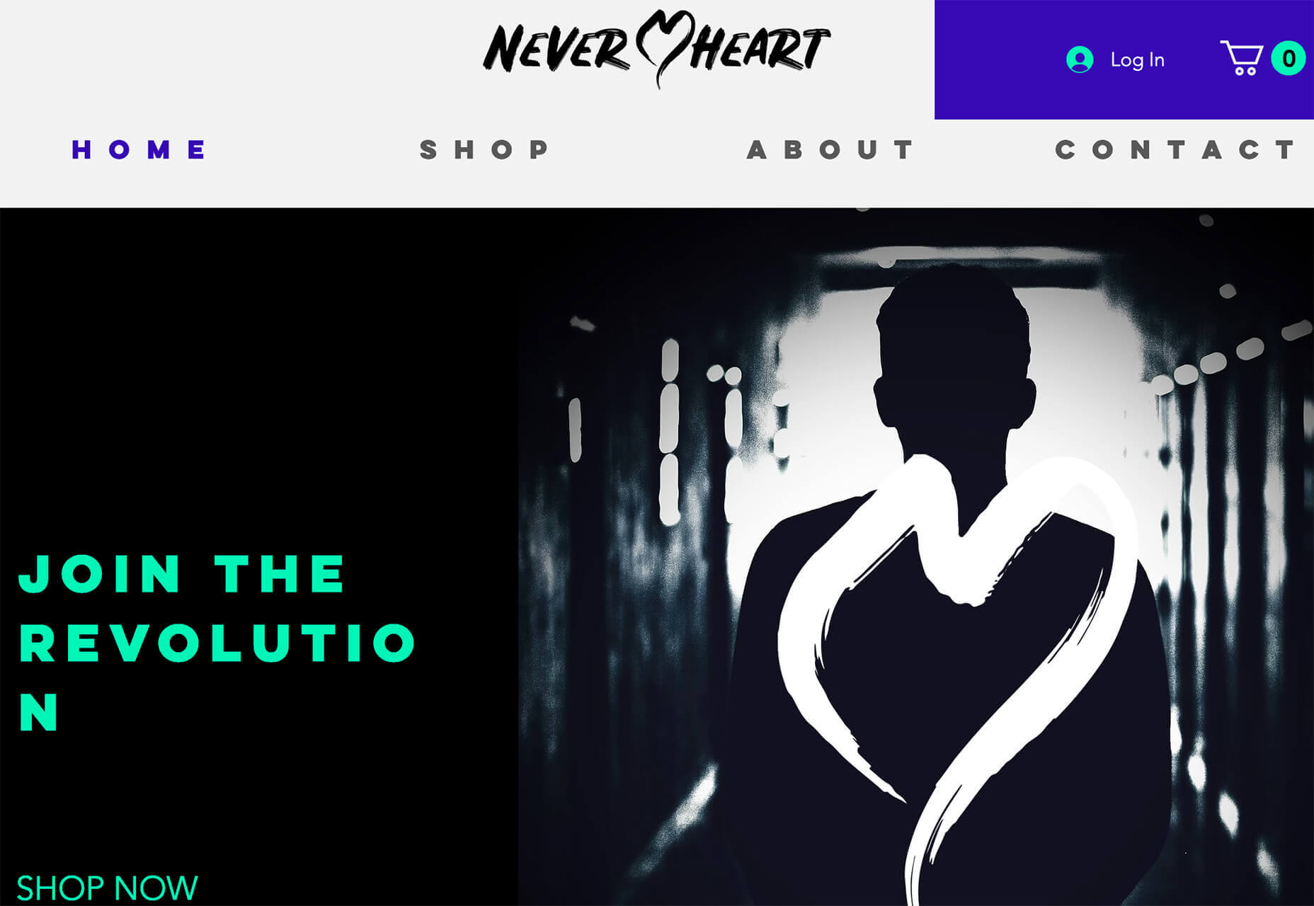
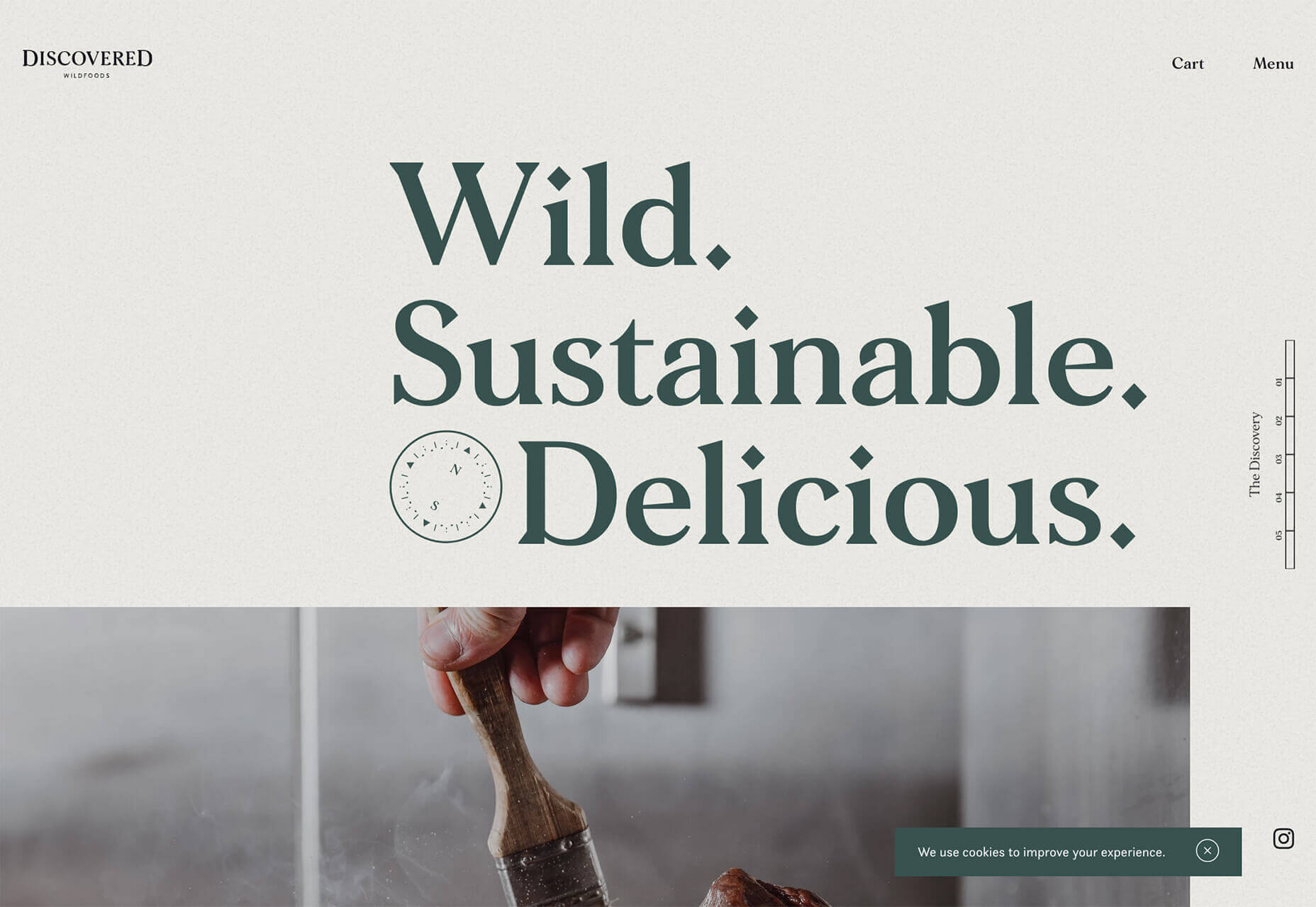
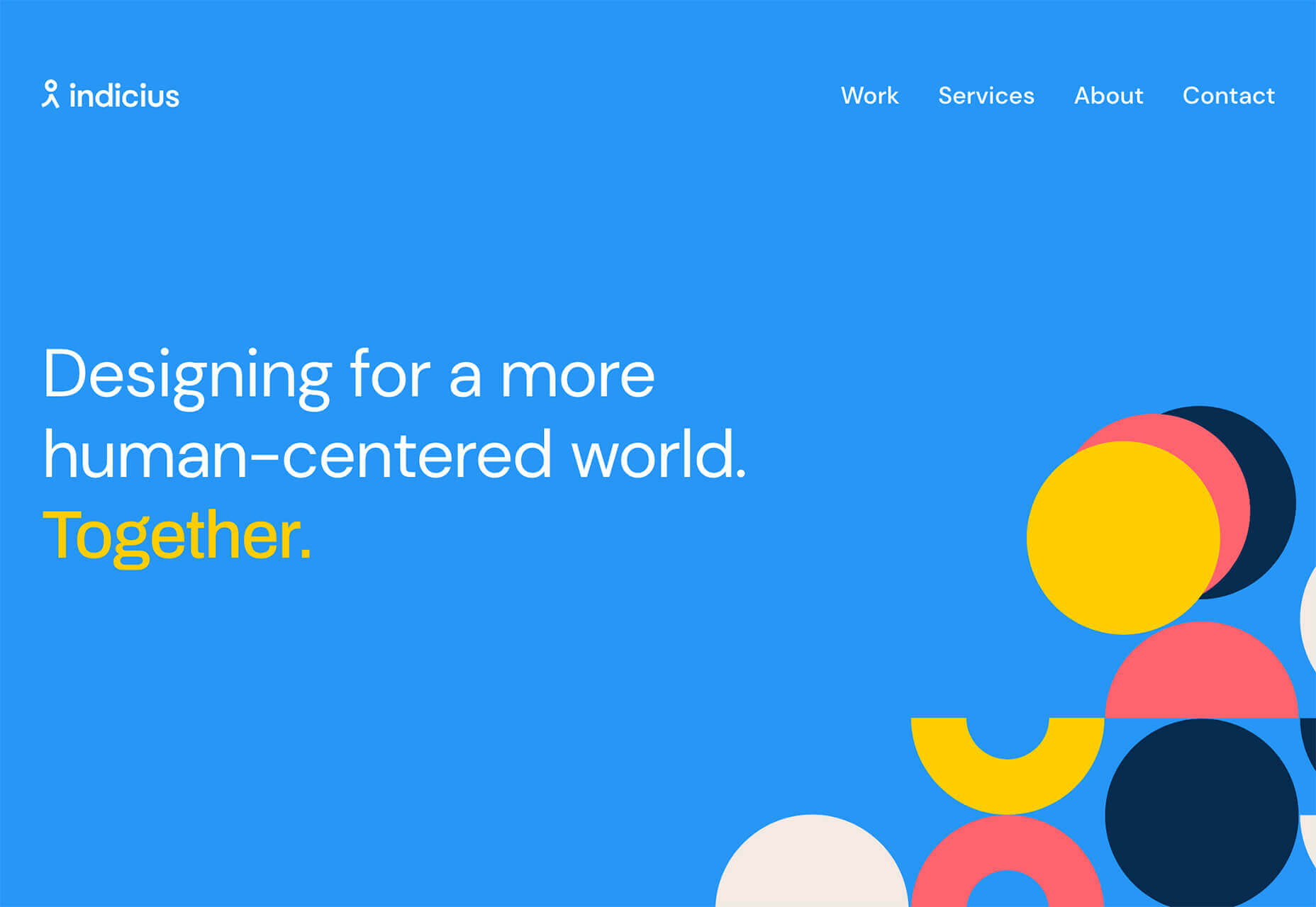
In this first collection of the year, we have a mix of retrospectives, brand new ventures, and business as usual. There is an eclectic mix of styles on offer, from glossy and slick to minimalist and brutalist, but all confident and looking to a better world in the year ahead.
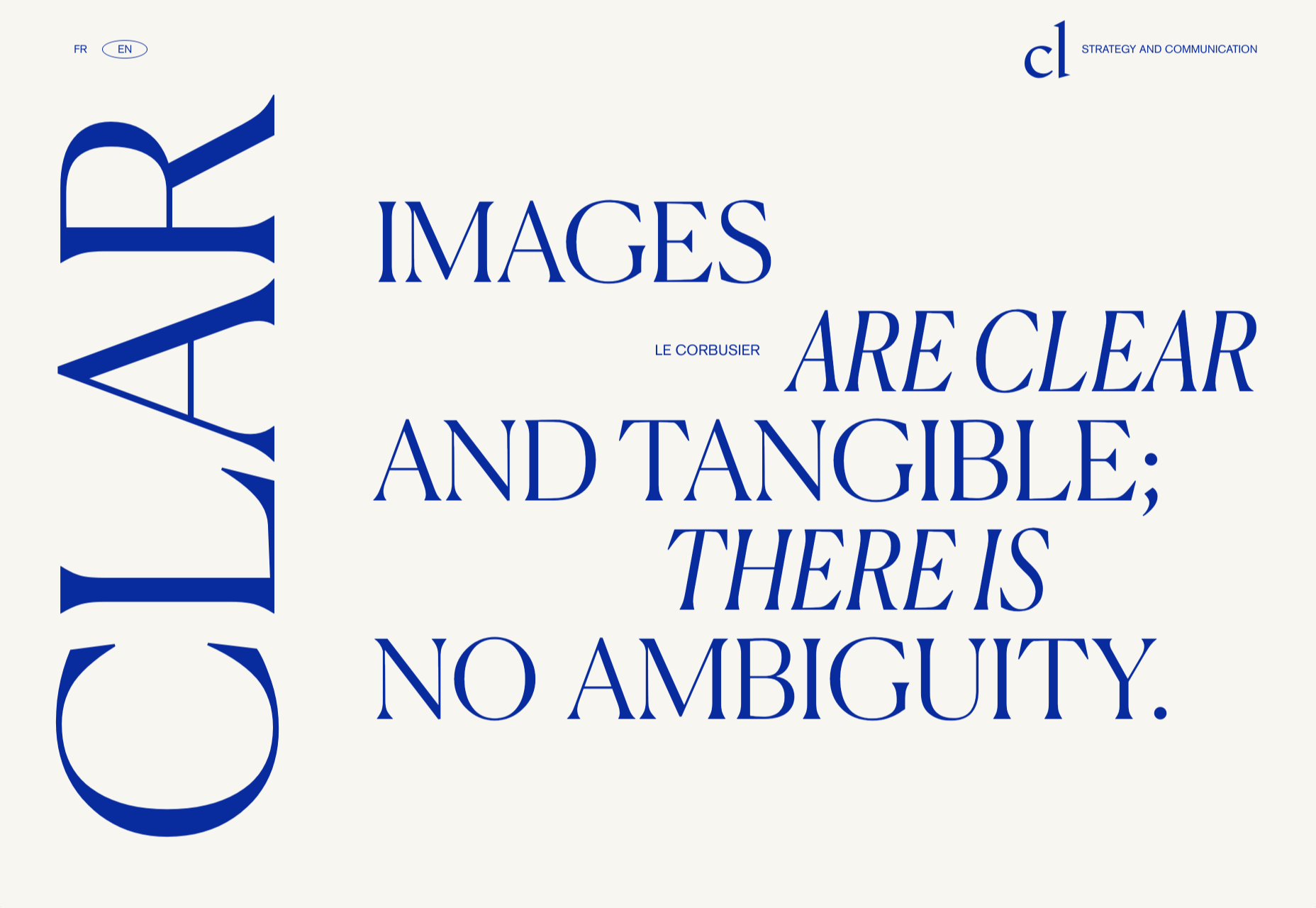
Clar

Brand strategists Clar have a simple but strong site. Aside from a few personnel profile shots and the odd bit of line animation, it is all text. The typography is good, and the use of color holds interest.
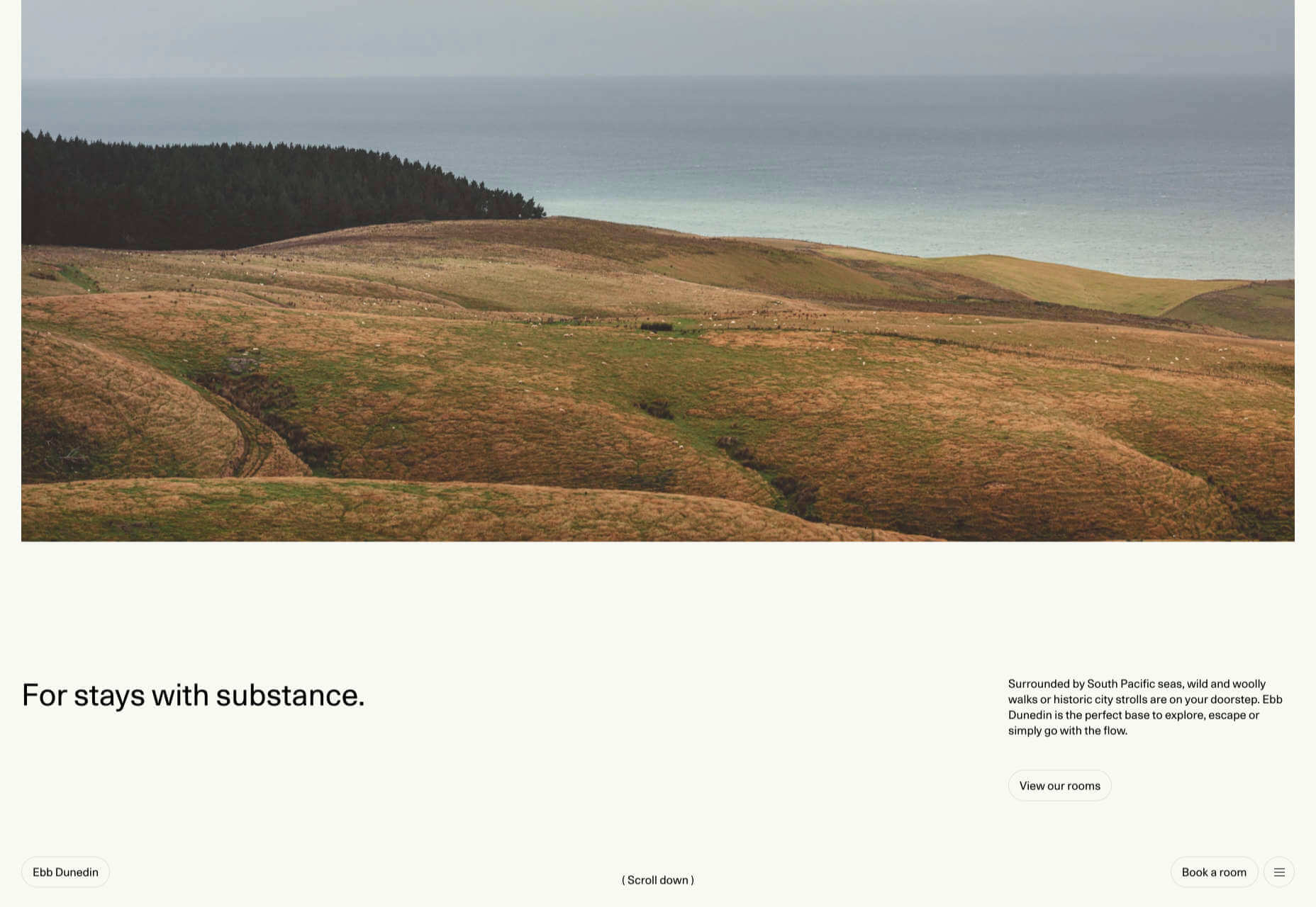
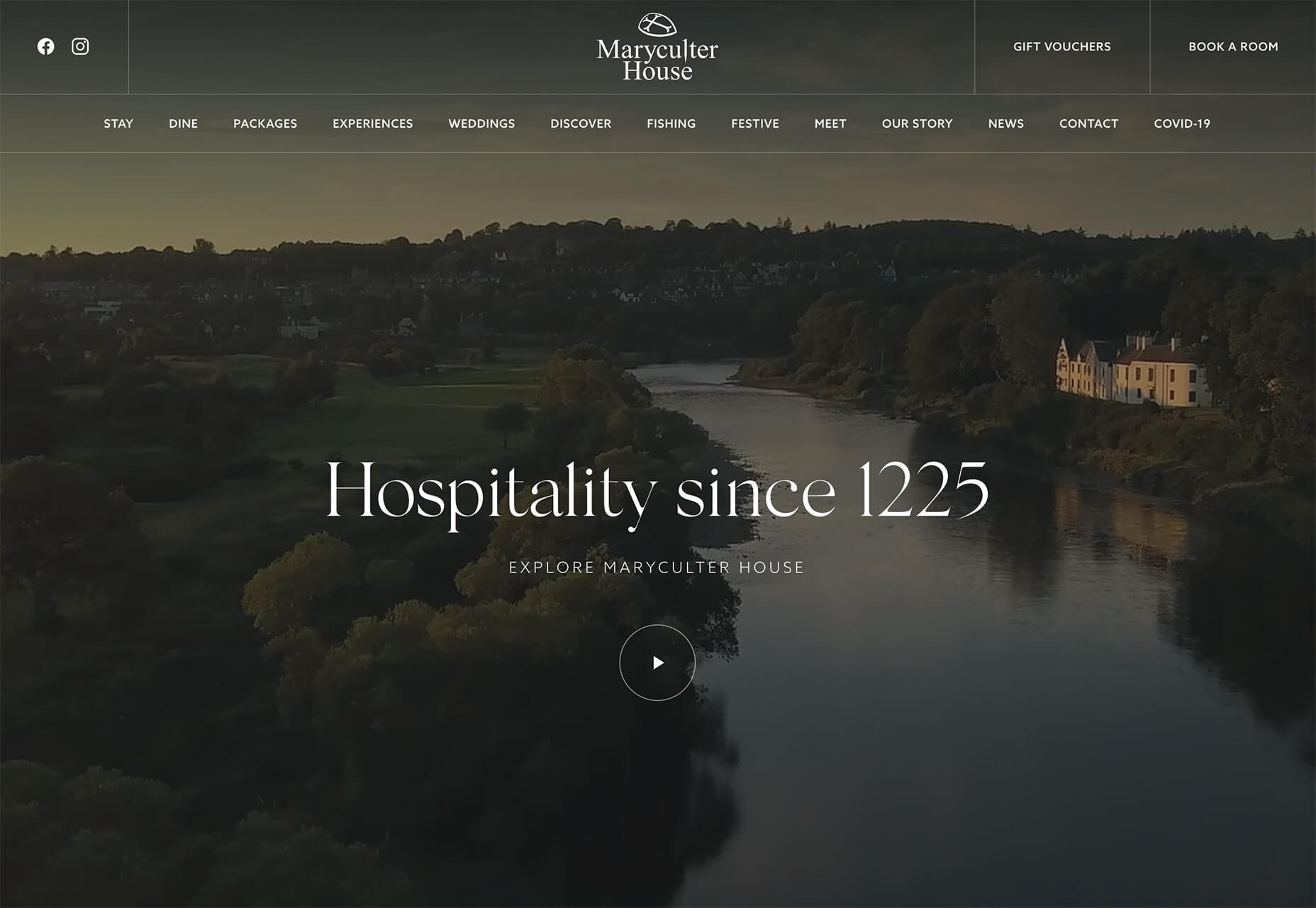
Ebb Dunedin

This boutique hotel, opening in March 2021 (COVID permitting), has bucked the usual luxury hotel trend and bravely gone for a more minimal design style to complement its interiors.
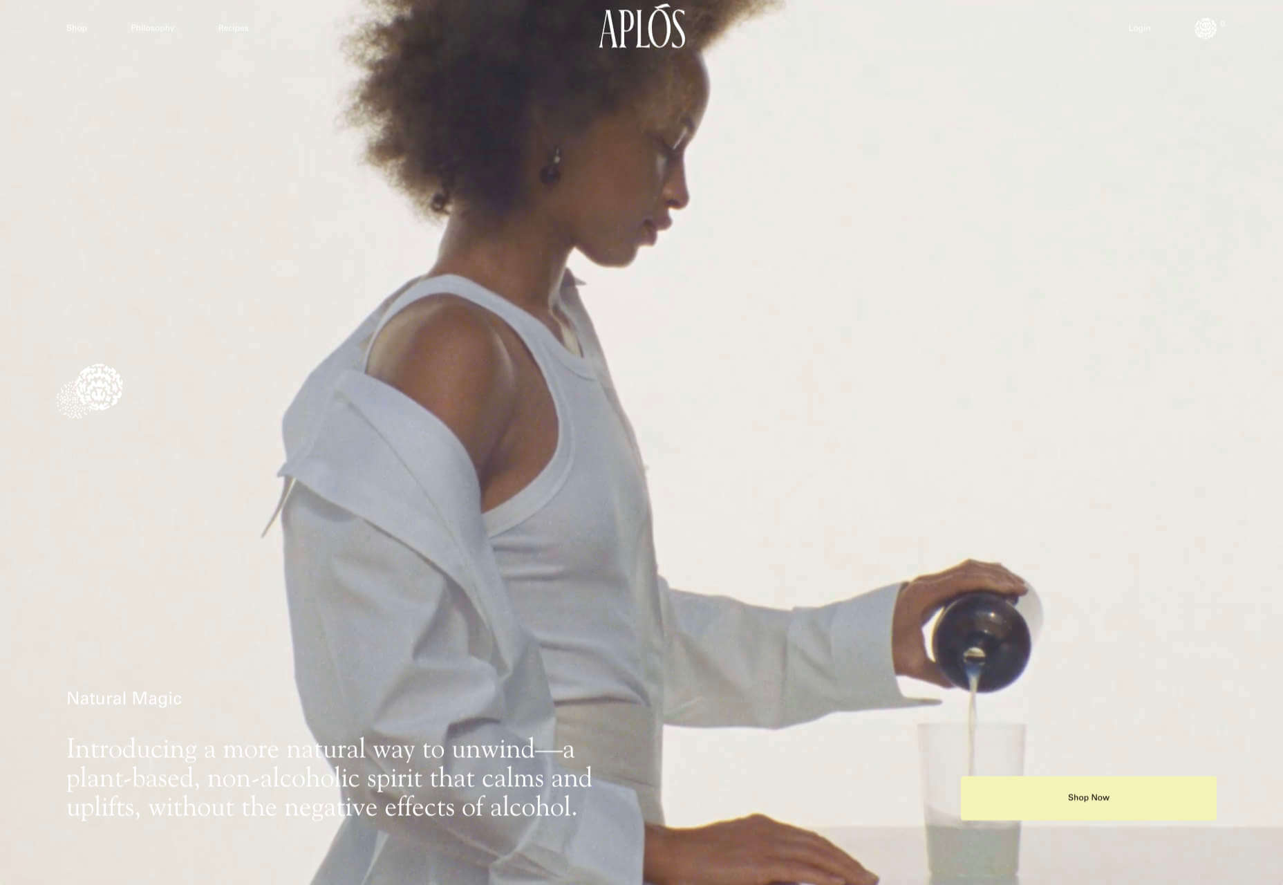
Aplós

Perfect for Dry January, Aplós is a new, non-alcoholic spirit that can be drunk on its own, with a mixer or in a cocktail. The site design and branding aesthetic is sophisticated calm.

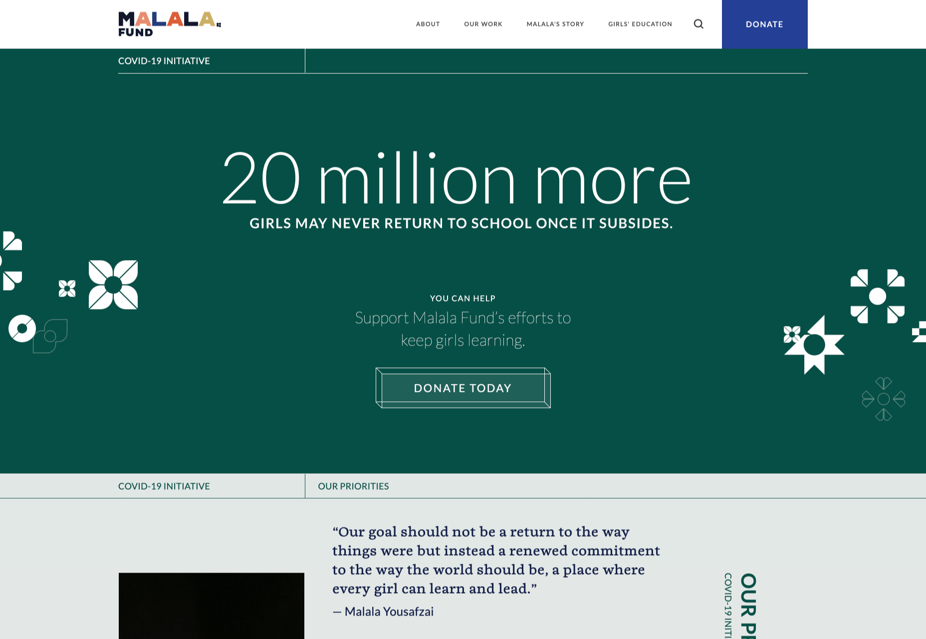
Malala Fund COVID Initiative

Subtle color and simple line decorations keep this site for the Malala Fund’s COVID Initiative clean but warm and appealing.

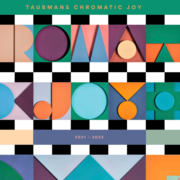
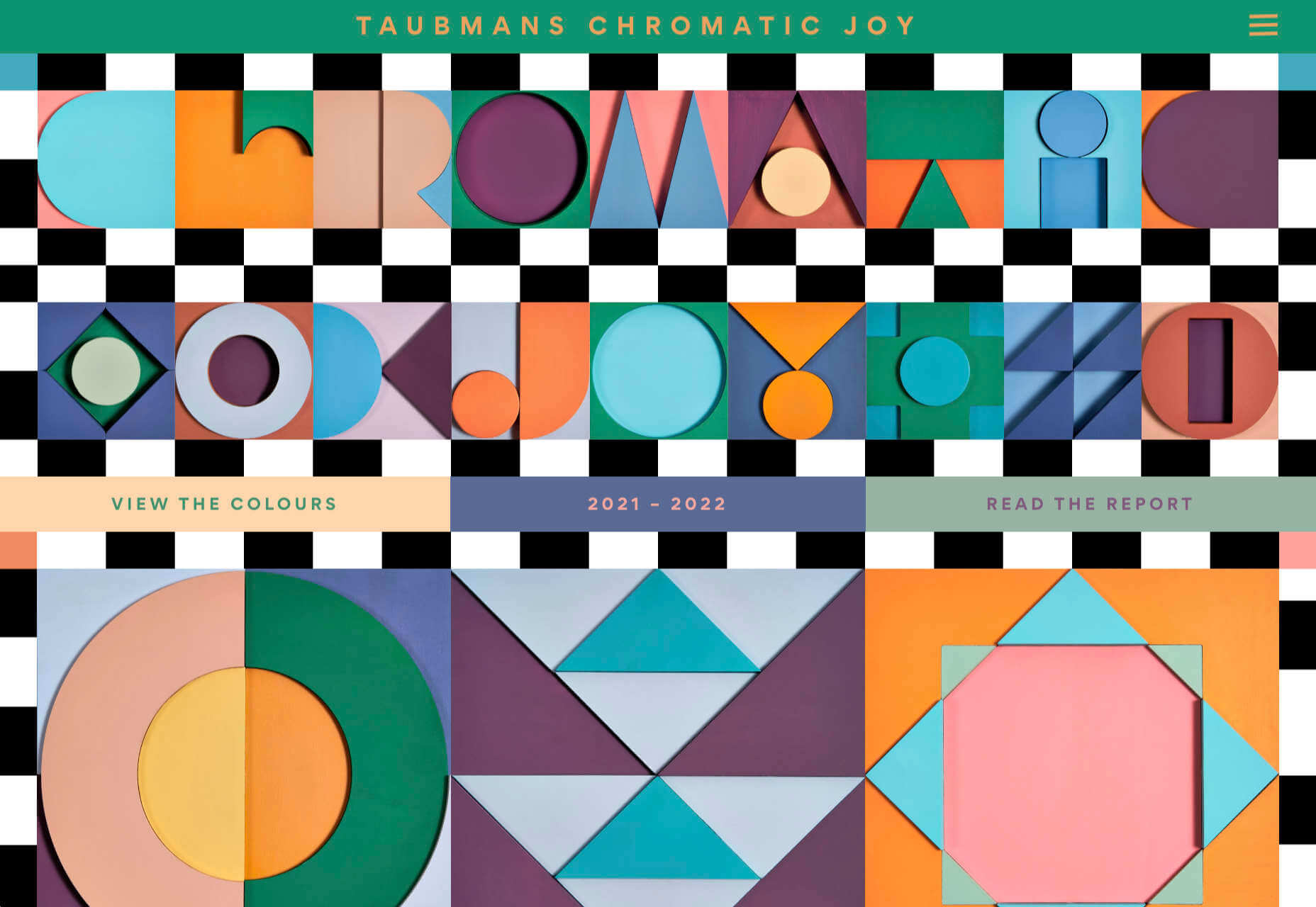
Taubmans Chromatic Joy

This micro-site promoting Taubmans’ new paint color collection is bursting with color and makes a big nod to the Memphis style of the 1980s.
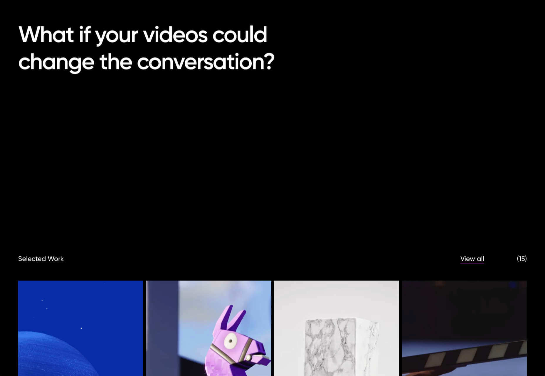
Myriad

Myriad video production agency’s site uses small amounts of bright colors really well. And they quote Eleanor Shellstrop.

The Ocean Cleanup

Cleaning all the plastic crap out of the oceanic garbage patches is a grim job, but it’s getting done, and The Ocean Cleanup site explains how and why in a not grim way.

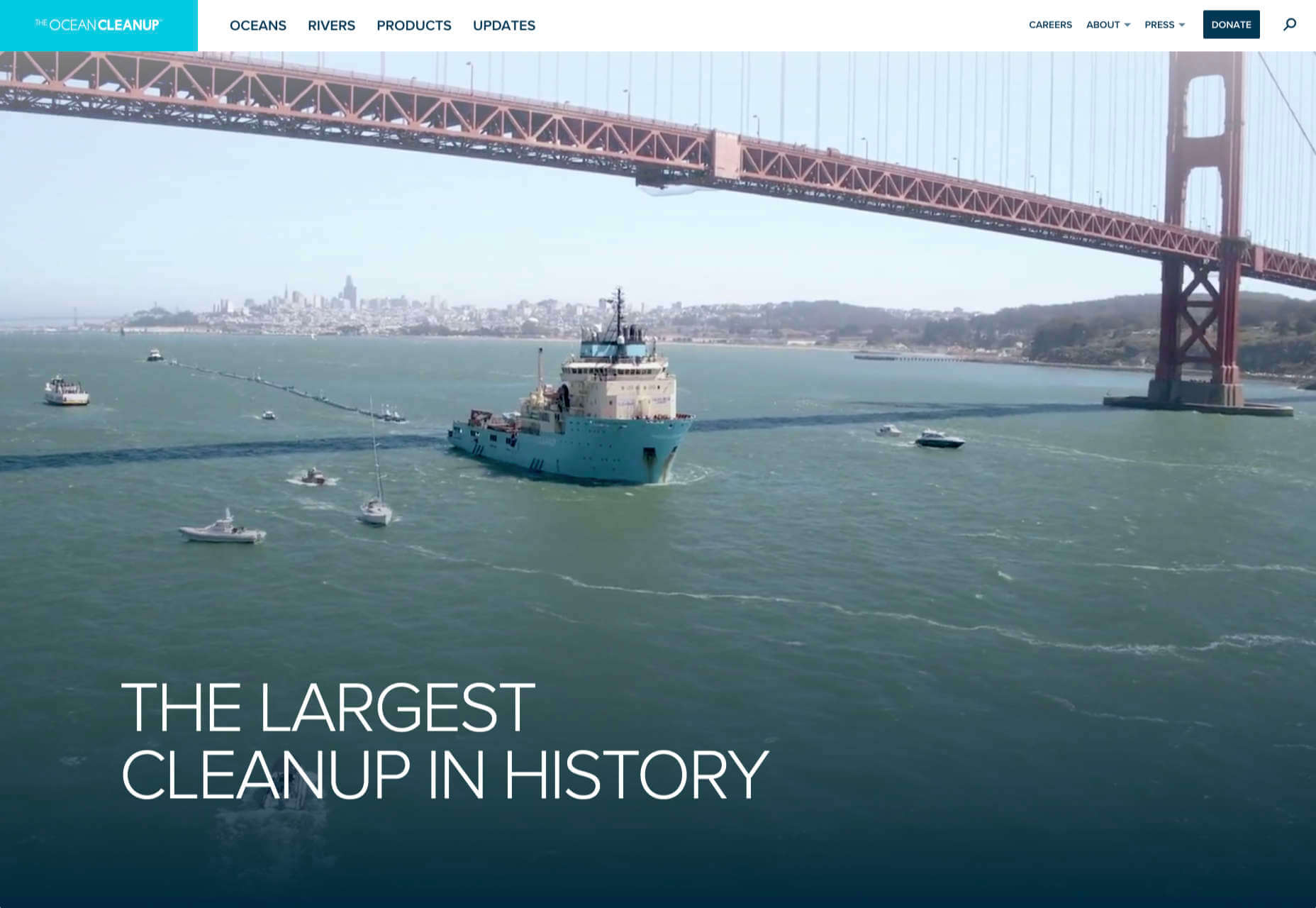
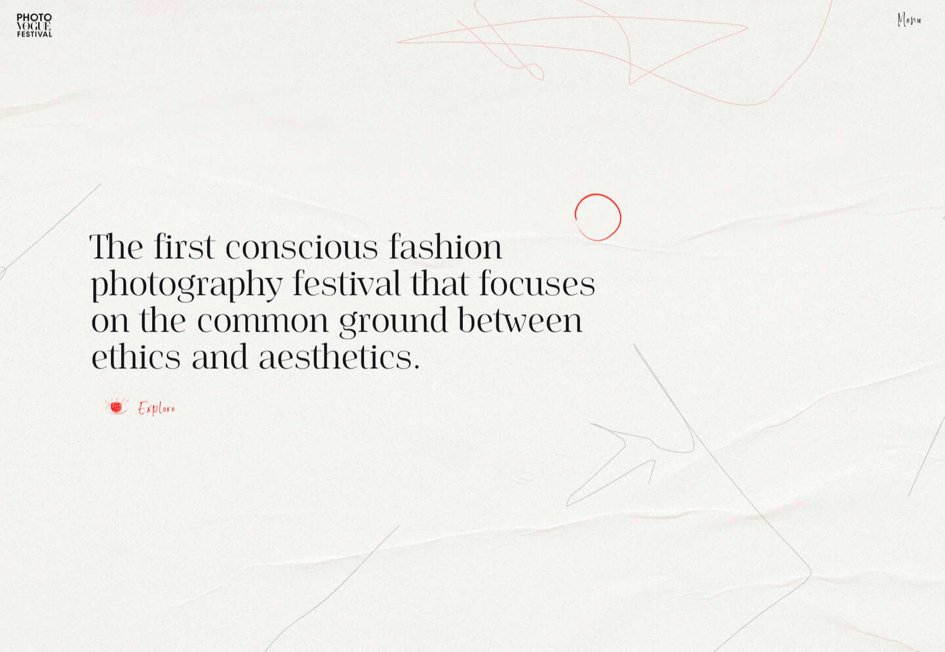
Photo Vogue Festival

This site displaying the work and talks from Vogue Italia’s 2020 Photo Festival mixes a hand-drawn style with clean type and a strong grid.
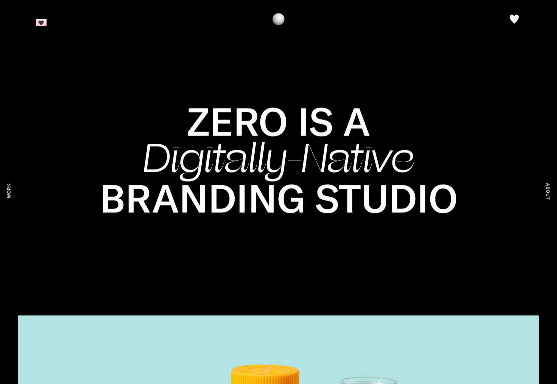
Zero

Zero is a digital branding agency. Their site is glossy with lots of high-quality images, smooth transitions, and a clear structure. The background options are a fun touch.
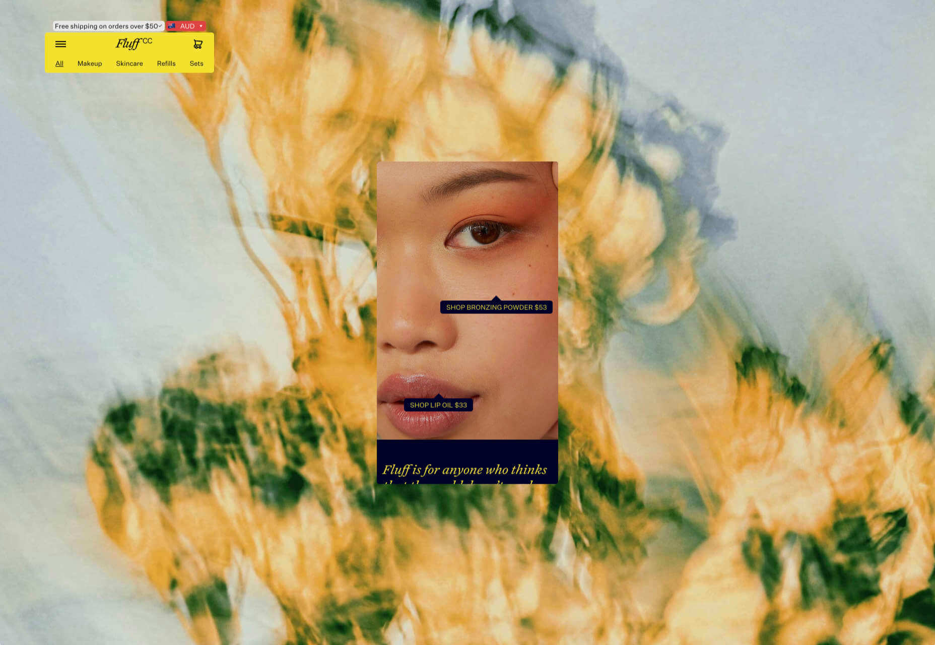
Fluff

This site for cosmetics brand Fluff takes an old school approach to designing for different viewports — sticking a fullscreen background behind your mobile view for desktop sounds like a terrible idea, but here it works.
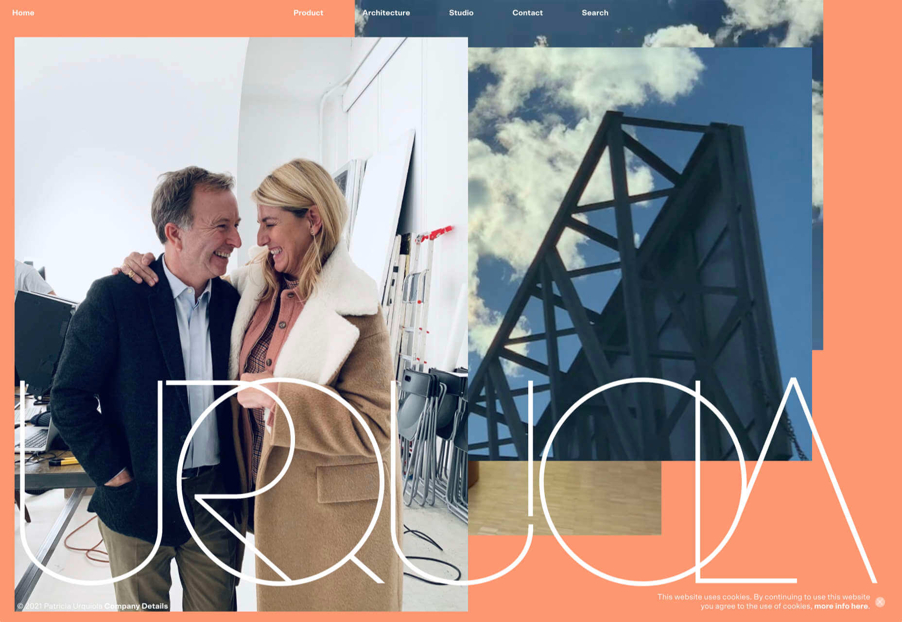
Patricia Urquiola

The new site for Patricia Urquiola design studio is bright, bold, and assured, inspiring confidence.
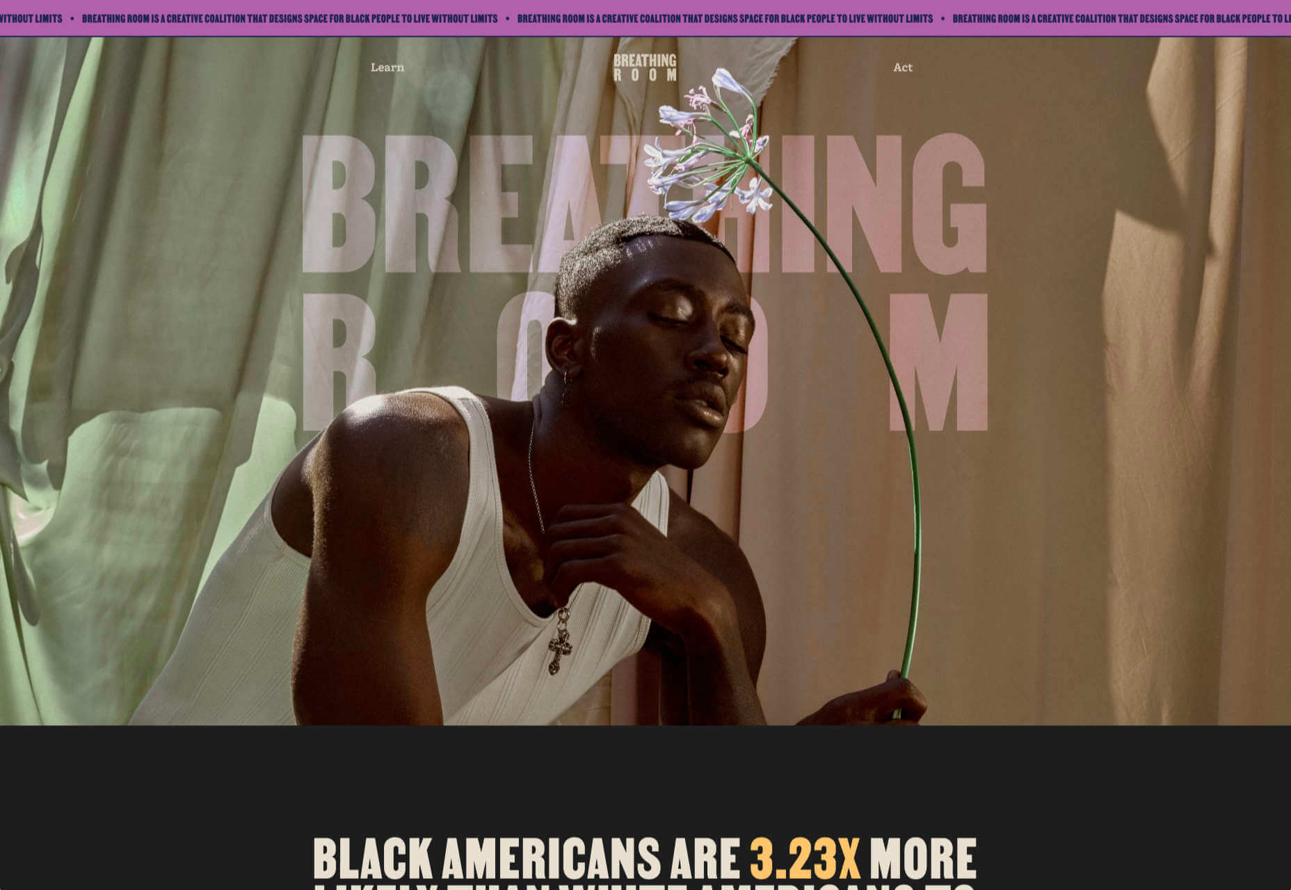
Breathing Room

Breathing Room describes itself as a volunteer creative coalition that designs spaces for black people to live without limits through art, design, and activism. The design radiates confidence and optimism.
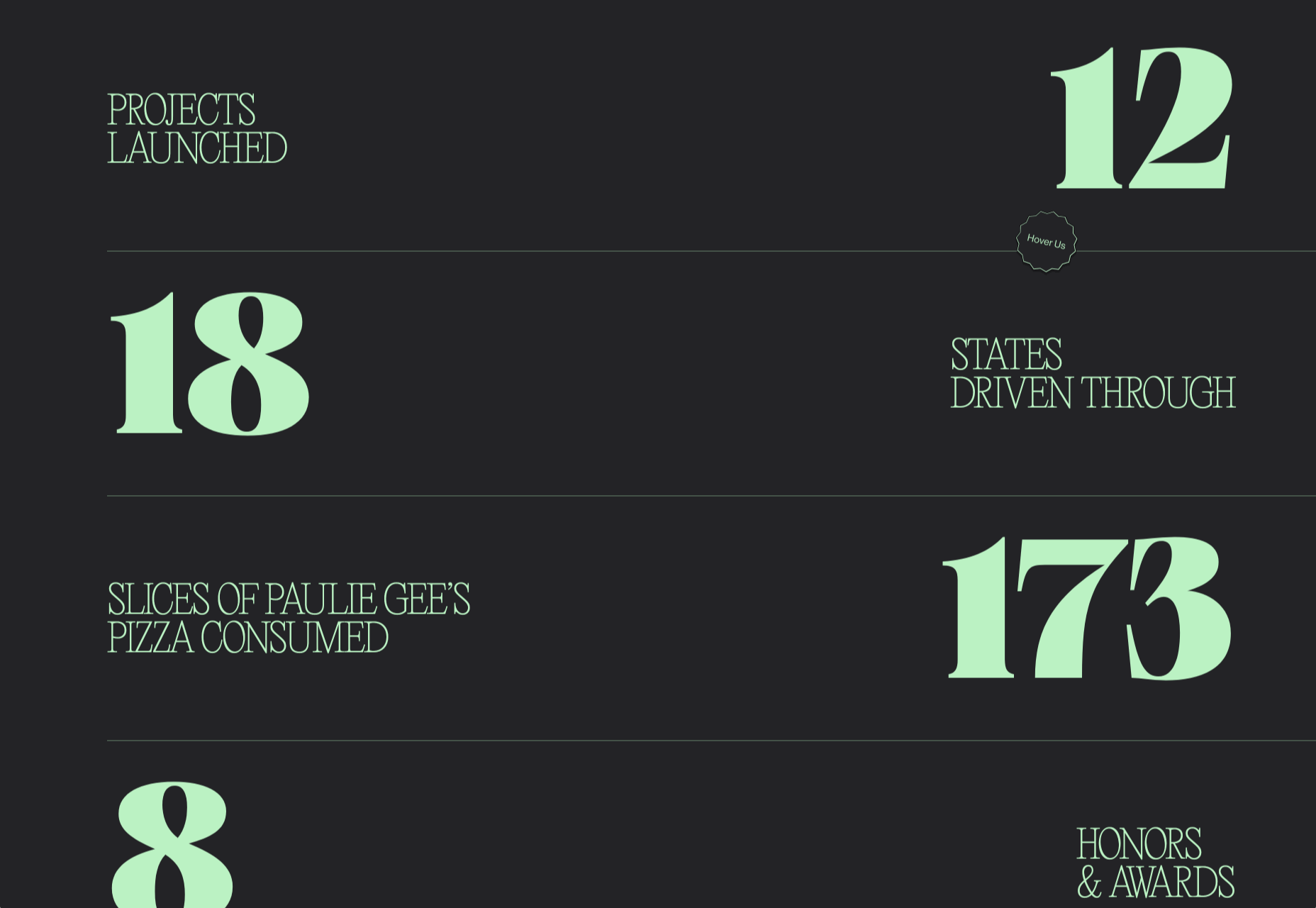
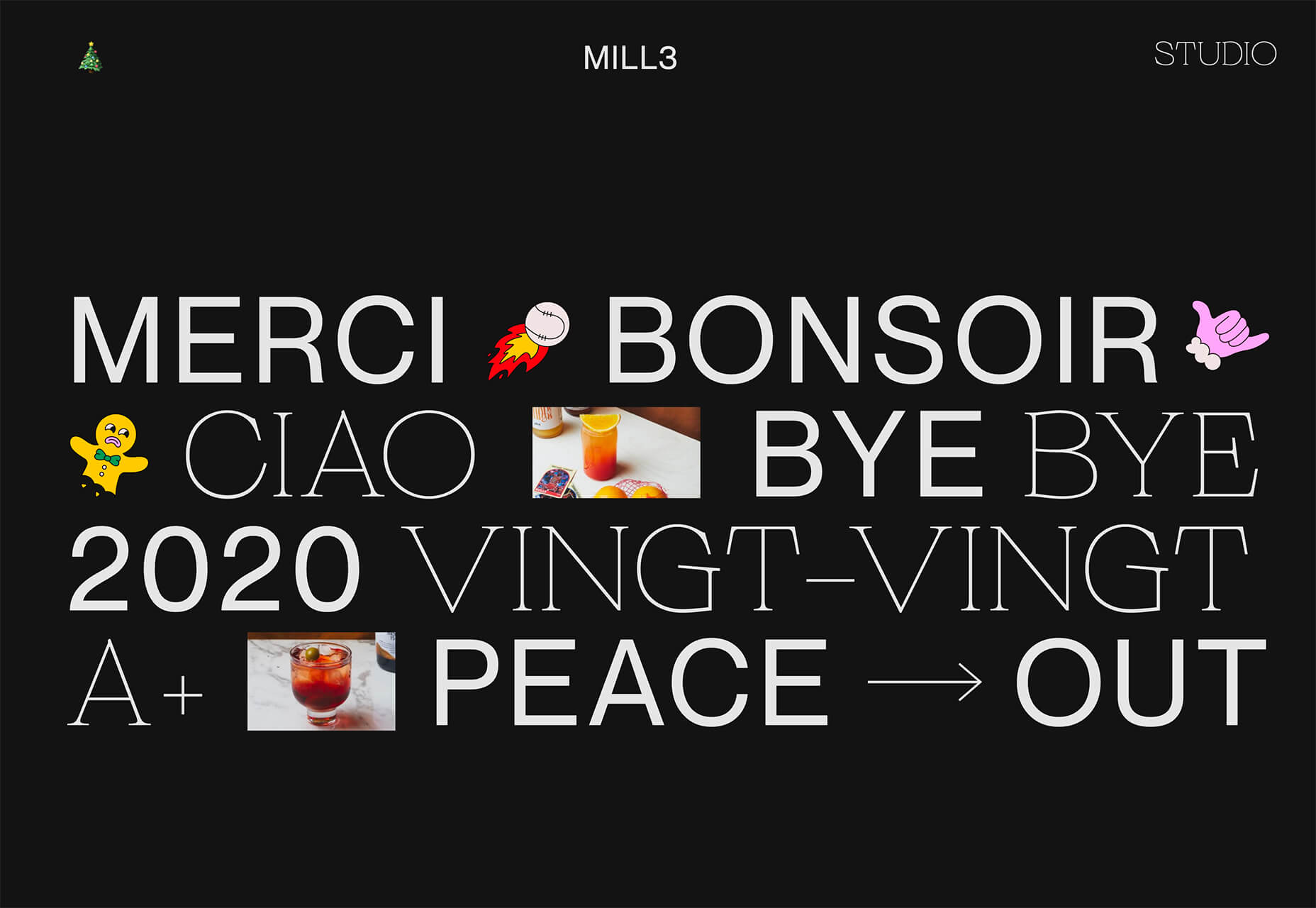
A Year in Review

A microsite from Milkshake Studio, highlighting their work over the past year. Some good scrolling animation.
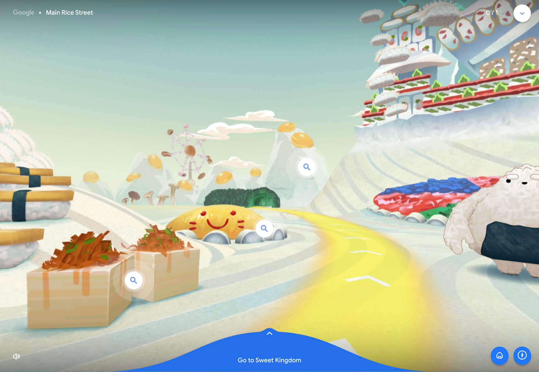
Umamiland

Umamiland is an animated interactive introduction to Japanese food, with links to Google search results for individual items or where to get them.
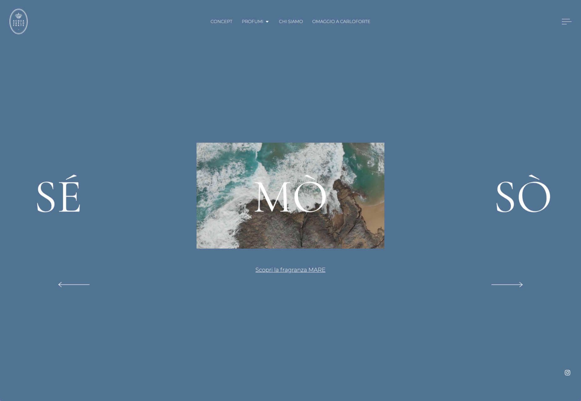
Acqua Carloforte

Carloforte is the town on the island of San Pietro, near Sardinia, and the scents of the island inspire the perfumes of Acqua Carloforte. Cue beautiful photography.
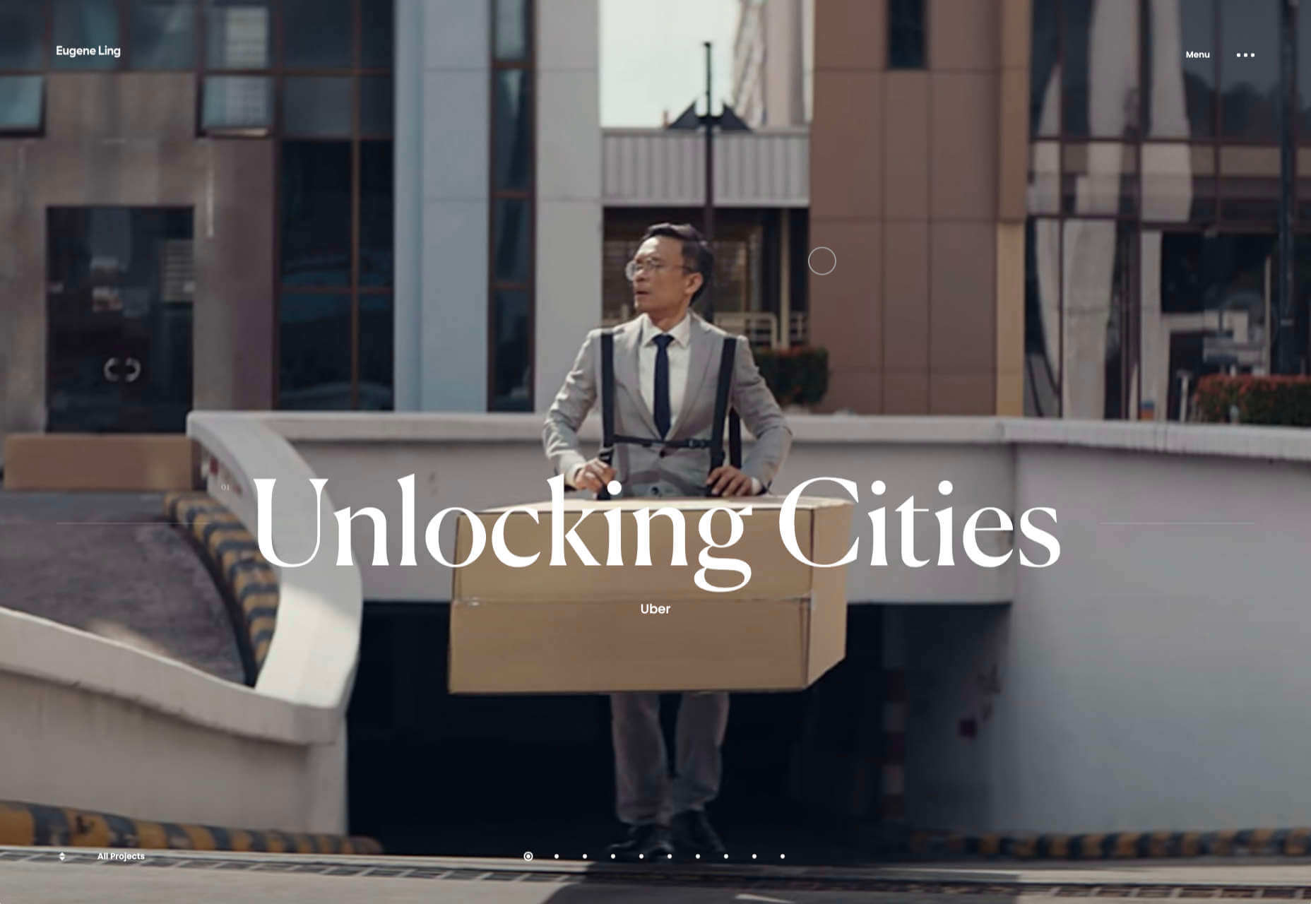
Eugene Ling

Eugen Ling’s portfolio site is simple and straightforward with little or no marketing-speak and a lovely, understated slider transition.
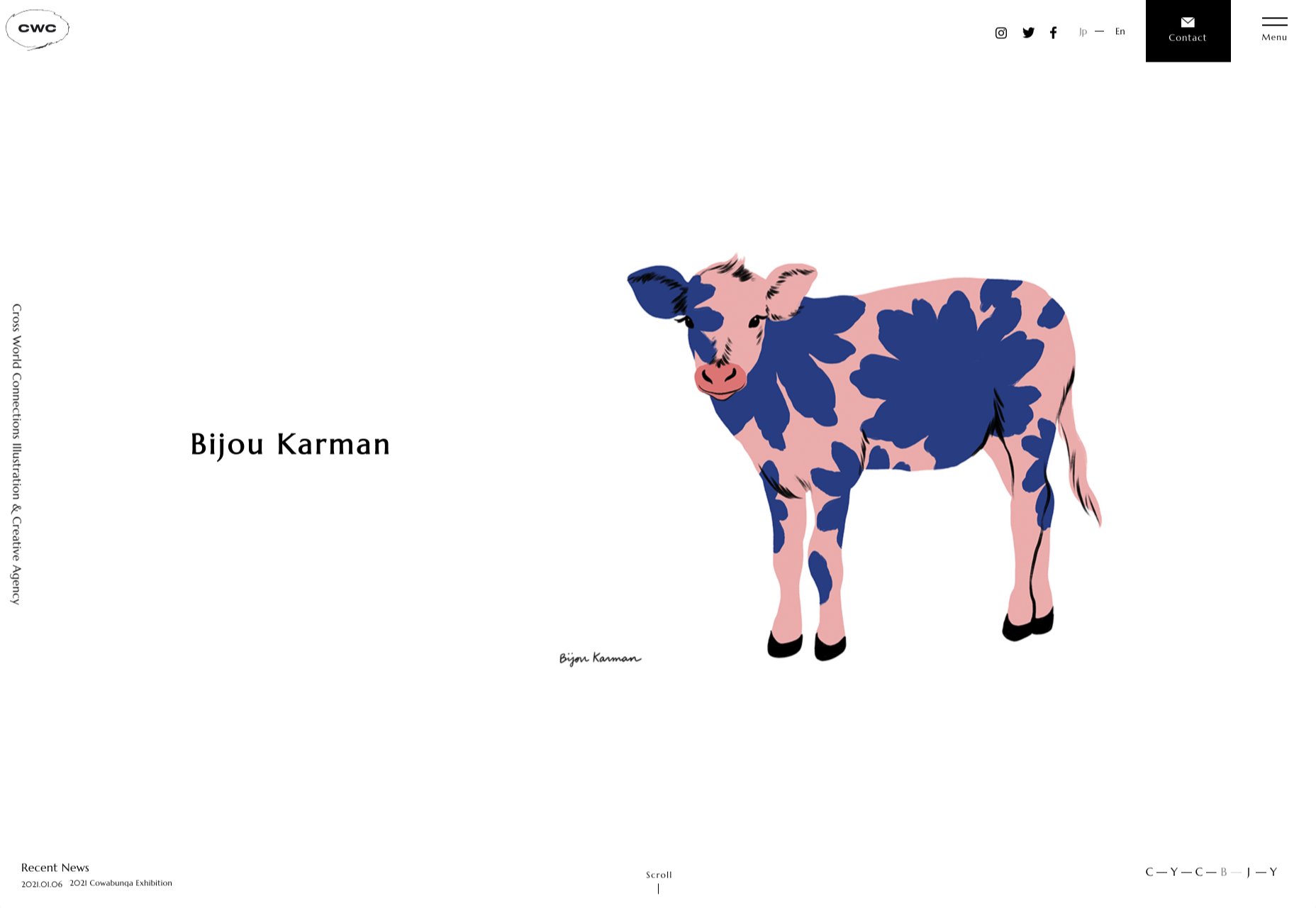
CWC Tokyo

Cross World Connections is an Illustration and Creative Agency based in Japan and represents illustrators from all over the world.
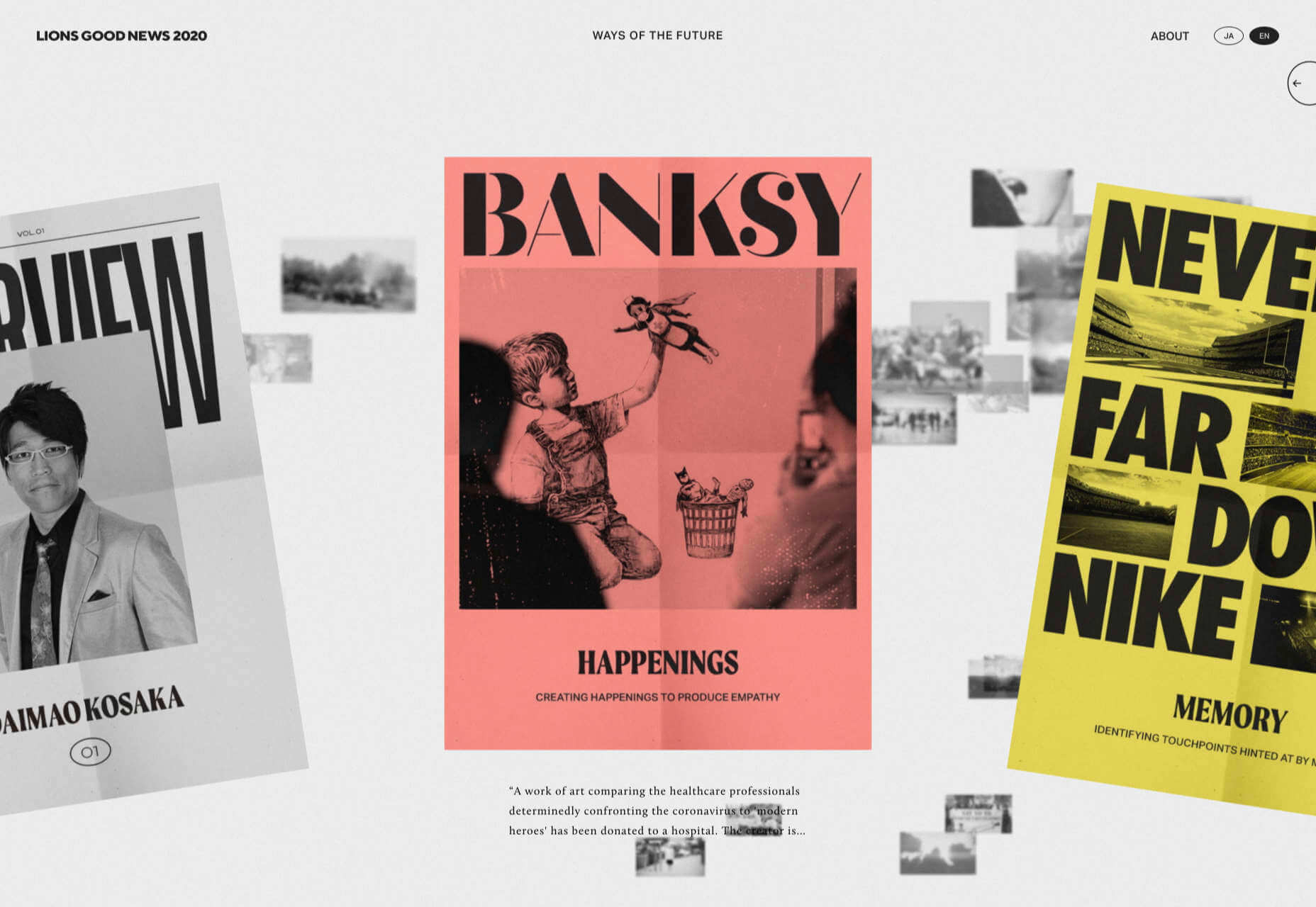
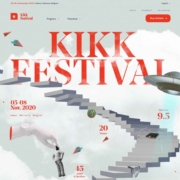
Lions Good News

Following the cancellation of the Cannes Lions Festival of Creativity in 2020, this site was set up to highlight good news in creativity during the pandemic. A carousel of paper flyers forms the main navigation and creates a lo-fi, DIY feel.
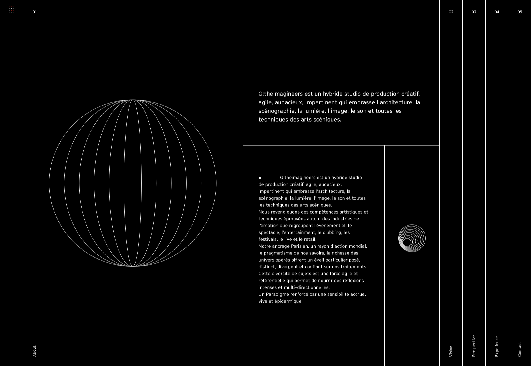
G!theimagineers

G!theimagineers is a production studio for events and entertainment. White lines on black, horizontal concertina navigation, and lots of circles.
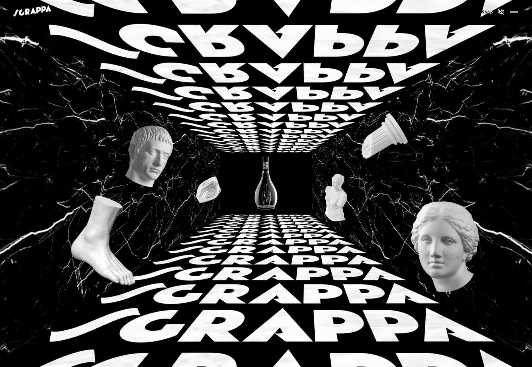
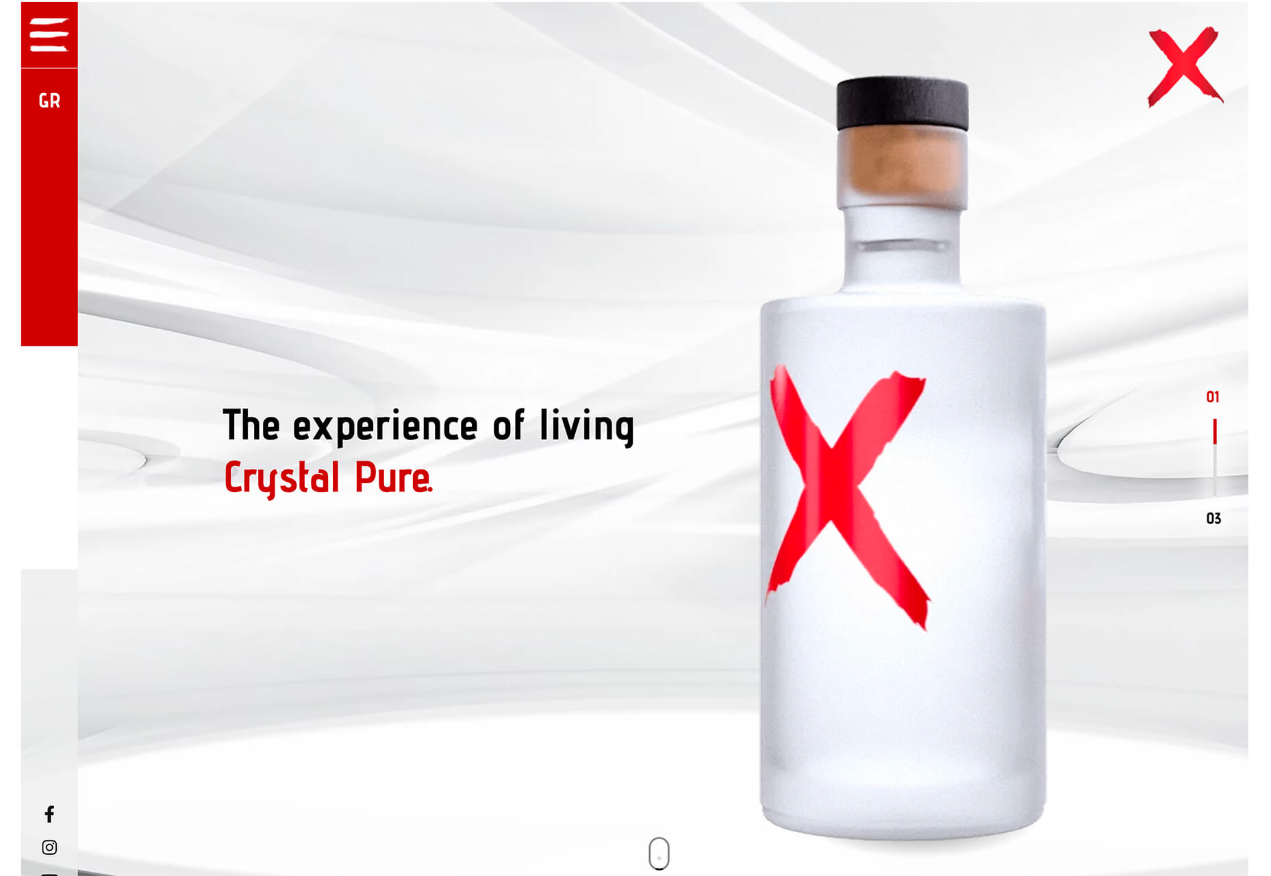
Sgrappa

Sgrappa is handmade grappa with attitude, and this site has an uncompromising, in your face vibe.

Source

The post 20 Best New Websites, January 2021 first appeared on Webdesigner Depot.


Source de l’article sur Webdesignerdepot

Don’t drop the ball on these website design trends for the new year. All of the trends featured here this month are visual in nature – not as many user interface elements as previous months, but all just as stunning and usable.

Here’s what’s trending in design this month.

1. 3D Scenes on White (Light)

Three-dimensional scenes are not just a trend this month but are likely to be one of the biggest website design trends that you see all year.

They offer a great way to show off product imagery, design something with illustrations or animation for visual impact, and provide usability and understandability cues for users.

It’s a versatile technique that can work with real or created images and are also “COVID-friendly,” something designers have had to think a lot about in the past few months. (Appropriate imagery in design is a real concern, as is trying to design projects without the ability to produce traditional photoshoots.)

What’s neat about all of these projects – and plenty of others – is that they root the design in white or light backgrounds. The light effect creates an easier visual mood that’s clean and emphasizes the imagery.

This website design trend solves a lot of those problems and looks good doing it.

Google’s Cloud design uses 3D illustrated animation on a white background with plenty of depth elements. The primary color palette of illustrated objects pulls it all together and guides the eye through each of the callout labels.

The red words on the screen Crystal Pure fit perfectly with the white-on-white 3D imagery of this design. Red accents pull you into different places on the screen, and it all has a clean feel.

Hofmann & Hofmann uses the same concept with a slightly different approach. The background is still light with a realistic feel and 3D objects, but it is a lot less stark and white. The feel is a little warmer and more inviting than a flat white aesthetic.


2. So Many Stacked Capitals

If you don’t have great artwork or imagery, make your own with typography.

This trend seems like it might be yelling at you just a little, but it still works for the most part — well, as long as you don’t land on too many of these website designs in a row!

What’s interesting about this trend is that many of the designs feature all caps type and serifs. These styles have been making a bit of a comeback, but this use is interesting for many reasons.

The hardest part when using all caps is maintaining readability. That’s why you see some variances in regular, italics, and bold weights, as well as the use of multiple typefaces. The goal is to create a good reading flow with a stunning visual presence.

This trend works best when you have “easy” words on the screen to facilitate scanning. Too many long or complicated letter combinations can get challenging quickly.

Make sure to look for the Easter eggs in each of these projects:

Emotion Agency has tiny “waving” illustrations next to each word (which doubles as the navigation) when you hover over them.

Mill3 Studio has a few animations, from the text flying in and out on load and scroll to subtle movements in the emojis.

Bizarro has this fun little cat video with a tiny warning not to hover over it, but you definitely should.


3. Empty Places

The final trend in this roundup is a stark reminder of current times. Each of the website design features empty places or locations.

This style of imagery would have been avoided pre-pandemic because tourism locations would want visitors to feel like a part of a bustling environment. Not today. If you travel, chances are you may feel safer or want to be in a more secluded environment.

All of the images and videos from these locations show just that.

Designers are doing this with new stark imagery that stands alone for the design or inserting a few empty place frames into video clips or among images that show more populated times. Even scenes that contain people show very few people and focus on more solitary activities.

Paragon Oak does this by showing a beautifully lit location at night. Note that using a nighttime photo eliminates questions about where the people are or what they are doing. (This is a clever option when showing imagery of an empty place.)

Vienne to Paris shows boats on the water with a beautiful background. While you assume there are people on the water vessels; you don’t see them and get the feeling that everyone is separated in their own “pod,” a pandemic-friendly option for travel.

The Maryculter House shows various images without people – the resort’s location on beautiful grounds; empty, but immaculate rooms, and a few images of a person alone on the grounds. Again, the empty nature of the place feels more appropriately welcome for the time we live in.


Conclusion

One of the things that we’ve seen with design trends in the past year is pandemic-related. The composition of images to the way elements are arranged on the screen influences every aspect of our lives.

While the empty place image and video trend is big now, it may fade post-pandemic. Although, it could still be relevant for quite some time. It will be interesting to see what happens as the year progresses with this trend – will it hold on or fade away?

These trends might continue to hold well into 2021.

Source


Source de l’article sur Webdesignerdepot

As we turn the corner into the final part of the year, many of the new websites and redesigns that we see during much of the rest of the year tend to slow down. Many businesses are focusing on fourth quarter and holiday sales.

With that being said, there are plenty of holiday flourishes already showing up on many websites. But there are still a few trends that don’t have a holiday theme.

Here’s what’s trending in design this month.

1. Beautiful Connectivity

Web elements that merge and flow into one another can be difficult to design but the payoff is totally worthwhile. This website design trend exemplifies connected elements in a way that’s beautiful and mesmerizing.

You can accomplish it with static elements or interactivity; the common theme is that design parts enter the space of one another and merge in ways that are seamless and visually interesting.

The thing that makes it exceptionally tricky is responsiveness. To ensure that pieces work well at all sizes when they overlap or encroach on the space of one another takes a lot of planning and testing.

Here are a few examples of projects that do it well – and each one does it in a different way.

Kirk Whayman’s website uses a floating ice cube over simple lettering. The interactivity is spot on here with hover actions that allow you to move the block with the letters refracting in an expected manner. (It would be easy to play with it all day.) But the coolest interaction happens when you “break it” (click on the cube). The elements continue to merge and interact in a new and different way.

Kikk Festival uses animations and giant scrollable illustrations and plenty of elements that overlap within the space. What’s neat is that everything on this canvas seems to touch everything else. The staircase design encourages scrolling and lettering and smaller animated elements all connect to the steps in the sky motif.

Multi Options Nursing takes a totally different approach. It uses a static split screen with a photo on the right side that merges into a round graphic element. It takes two not-s-interesting images and makes something out of them. The design carries this theme below the scroll as well and this style of image presentation carries a nice visual weight without feeling heavy.

2. Almost Brutalism

Brutalism just seems to keep coming back around. For those that love this trend, it keeps evolving as well.

The latest styles of brutalism are a little less mono but still pretty sharp with harsh lines, questionable type readability, and a lot going on in a compressed space. These projects also seem to be embracing color and alternative font choices more readily.

Fledge uses a split screen – still a dominant trend two years running – with a blue that’s almost too bright with an almost white offset color. The text is big and smooshed into the space tightly. Depending on the breakpoint, you might not even get the whole phrase on the left side. The design challenge is what are you supposed to do here? There are some hover animation cues, but they aren’t very direct.

Loeven Morcel’s design has hints of brutalism and elements of elegance. What makes this design skew toward the brutal side is use of space and typography. Like the previous example, it falls into the territory of “what should I do here” with some concerns about readability. Most of these issues are resolved on the scroll if you move beyond the homepage.

Szymon Michalczyl’s site is another that is close to brutal in style but has an element of sleekness that doesn’t quite carry it over the edge. The simple framework has that brutalist feel but the use of simple, clean fonts with plenty of space pulls it back into a more mainstream design scheme.

3. Beige Everything

Is a shade of beige the color of the year for 2020? Or is it just how we all feel?

Beige backgrounds are everywhere, making this one of those design trends that you can’t miss. The good news is that designers are playing with different shades of beige as well as warm and cool variations. Beige on its own can take on some of the color from accent hues and imagery, so that’s important to keep in mind when using this in the background.

The other variable is how saturated to make beige coloring. Most designs are using some of the more muted options while mostly playing with the levels of green and red. But darker beiges are also an option.

Simon Daufresne uses a beige that is the color that comes to mind when you think beige. It’s simple, a hint reddish, and is used with black only to maintain true color.

Discovered Wildfoods uses a more neutral feeling beige with a more green undertone (or is that color feel coming from other design elements). The neutral and natural color fits the brand and association this website is trying to create.

Aebele Interiors also uses a more traditional beige but with a bold mustard accent that makes the color feel exceptionally warm. What’s nice about this color combination is that in small sizes the mustard colored-type almost falls into the beige background, but at larger sizes seems to almost jump off the screen. It’s an interesting color juxtaposition.

Conclusion

Personally, this month’s trends are a mixed bag. I love the lines and interactivity of the beautifully connected examples. It shows that elements can cross and work together well.

On the flip side, brutalism and beige just aren’t my style. But apparently, they appeal to a lot of people based on the number of projects using these styles. What do you think? I’d love to know how you feel about these trends. Let me know on Twitter.

Source


Source de l’article sur Webdesignerdepot

Design can make a statement. It evokes feeling and can encourage thought and conversation. That’s the common theme among the three trends in website design this month.

Each trend is rooted on the time and place where we live and includes elements that provoke thought. Kudos to these designers and design teams for jumpstarting conversations. Here’s what’s trending in design this month.

1. “Taking a Stance” Design

From social to environmental issues, design projects are echoing the sentiments of their audiences and organization in a way that take a stance on an issue.

Once taboo, this is becoming increasingly used as a technique for brands who are no longer worried about turning off a certain segment. The goal is to rally the core audience and people who feel the same way about an issue or cause.

There’s also a secondary thing happening here. Some designs aren’t really position based, but use imagery and language that resonates with a movement to associate with that feeling.

Never Heart uses “Join the Revolution” and a dark image with a heart to tug at your feelings. It can help create an association to a cause that you believe in without stating that cause directly. The design feels strong and inviting while making you feel like part of something.

Skye High uses “powerful” twice in the headline to convey a particular messages to women. The agency is looking to work with “powerful” women. It’s a timely statement and message that could resonate with a lot of business-women at various levels of their careers.

Discovered Wildfoods is a brand that is rooted in sustainability. The corporate model and responsibility of the brand shows through in the website. This type of design helps connect people with mutual feelings to the brand and products.

It’s refreshing to see more websites and brands embracing social causes and issues. It can be tricky for a number of reasons. But for some brands, it pays off.

2. Abstract Art Elements

If you are worried about a lack of images, or not sure how to portray images in an appropriate way due to the worldwide pandemic – groups or not, masked or not – abstract art elements can be the solution.

Widely used for startups and apps, more abstract design elements are everywhere. It’s an easy way to create strong visual interest without photography.

The most common use of abstract art elements is often in the form of geometric shapes with animation. This is something that almost anyone can understand and simple shapes and movement can be quite stunning when done well.

The good news is this aesthetic can work for almost any type of website. Try it for a redesign when you don’t have photography that feels appropriate in the current environment or if you want to create focus for content that drives website visitors to the words or scroll. This works with more abstract concepts when they are simple and help you move quickly from the visual to text.

Here’s how each of the examples handles abstract art elements:

Indicius uses bouncing circles that move toward text and down the screen to drive users to the headline and scroll action.

With Code uses a fun fuzzy circle with different animations to draw you in.

Appimized uses bright color and a monotone scheme with geometric shapes to sell its services.

3. Images That Make You Think

This might be the most visually interesting, and thought-provoking, website design trend we’ve seen in a while. These designs all feature images with a little something different or unusual that make you think.

There are a lot of different ways to do this – marry photographs and illustrations, create imaginary imagery, animations or effects, visual tricks that play on depth perception or create pseudo-3D effects.

The commonality is that the visual is so striking and unusual that website visitors stop and engage with the design. What do the “oddball” visuals mean? What message do they convey? How did they do that?

All of the questions could be associated with this different style of visual representation.

Bling uses a combination of a photo with illustrated animated elements to draw the eye. The yin and yang between reality and fantasy is quickly evident and makes you want to know more. (It doesn’t hurt that the animation uses dollars and lightning.)

Kibun is interesting because the photo choices create an optical illusion of depth. It matches the content of the design well because the website features artistic textile panels with an artistic design. The illusion is in the angles and coloring of photographs and their placements on the screen. The only downside of this design is that it loses the artistic panache on mobile because the images stack.

Oddball images can sell. We Are Mad stands out because it uses a contrived image, but doesn’t go oversized with it. The more subtle placement is ideal and arguably more attention-grabbing.

Conclusion

Website design can be a powerful thing, as these trends and examples show. Don’t discredit the power of choices in color, imagery, animation, and text when creating a digital experience. Design can mean a lot of different things depending on the audience as these examples show.

At the same time, these design trends are powerful and meaningful. They provide context into our world, our time, and our feelings. Don’t be afraid to experiment and make a statement with your design work. Just remember to keep in mind all potential impacts (positive and negative) before taking the project live.

Source


Source de l’article sur Webdesignerdepot