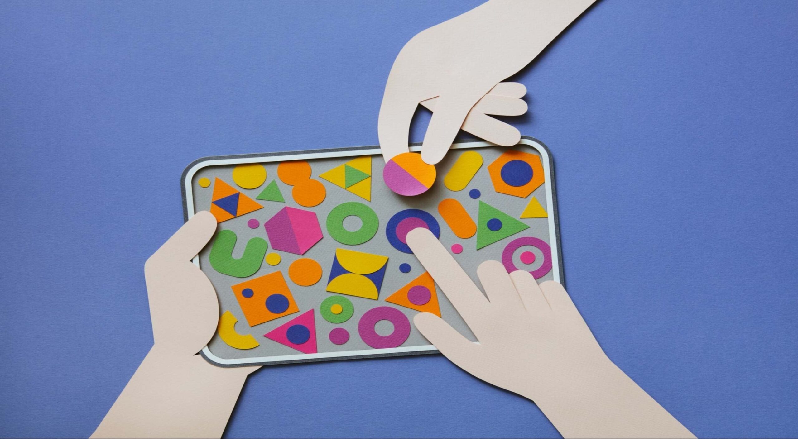
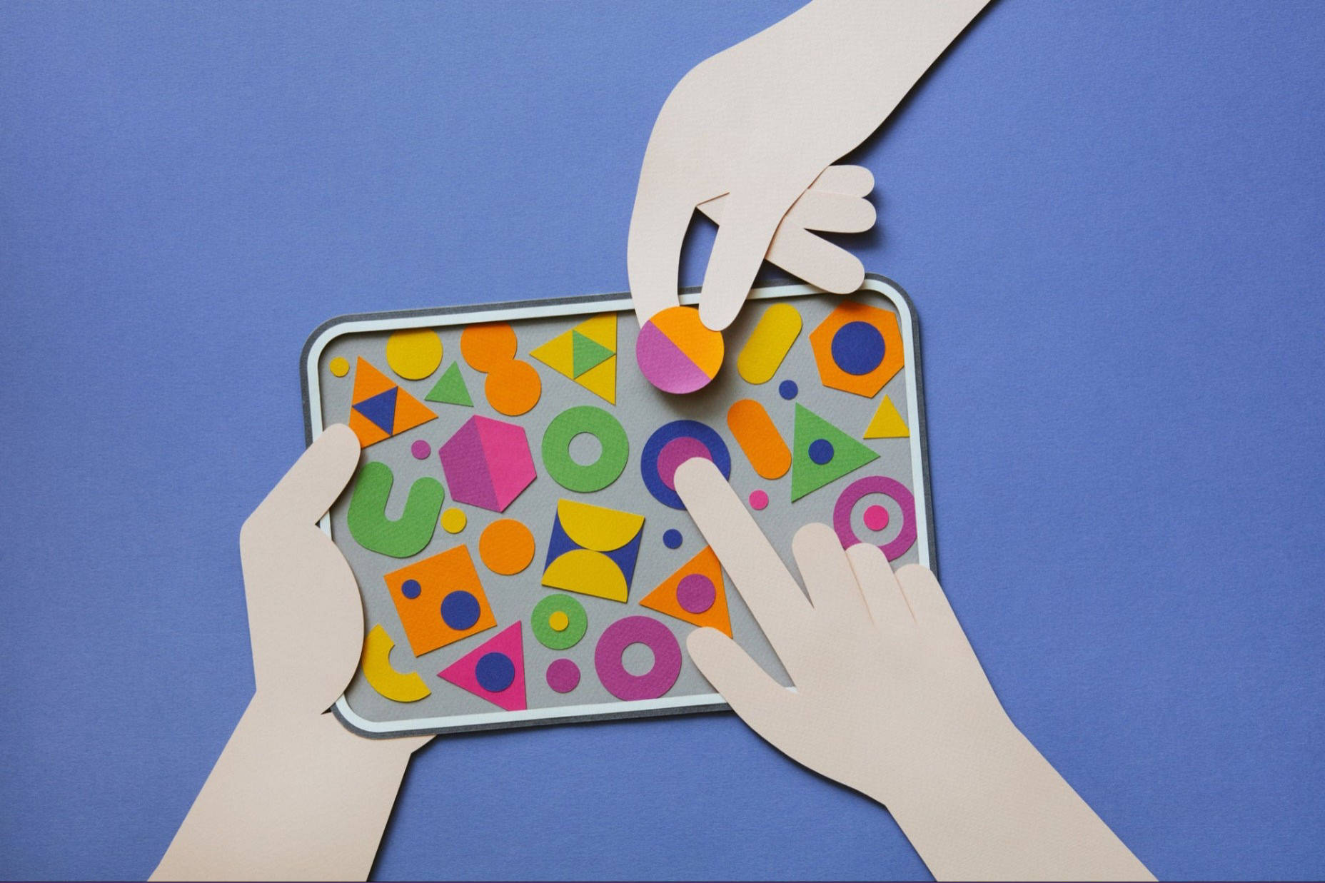
 There are long-standing patterns in design that help us understand what the user wants and which solution will work best. These are referred to as design patterns. This article will explain how patterns help us appropriately construct an interface. We’ll dissect features like buttons, navigation, accordions, and date selection with examples.
This article will be helpful to both new and experienced designers who want to learn more about how to use interactive features and when to use them. If you’ve been in the industry for more than a year, you’ll know that nothing is black and white and that multiple ways can address the same problem depending on the situation.
Buttons
First, consider the following question: which of the buttons depicted in the graphic is better?
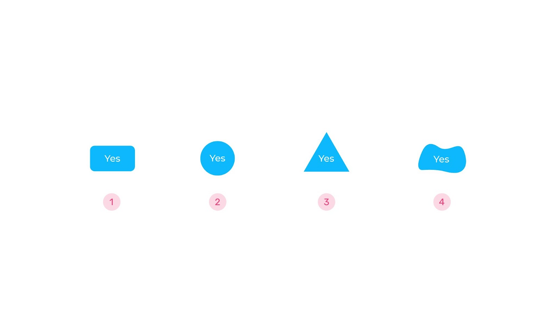
The first button will appear to be the obvious choice for many people. Indeed, it is a well-known pattern that most people will recognize; it is the perfect solution for many projects. However, if customers understand the context, they are less concerned with the shape; therefore, there is no need for the designer to think in stereotypical terms. The context or states of a button can demonstrate that it is a button. When we place the cursor at an interactive feature on one website, it turns into a circle. “View” will be written inside the circle. The interface will be less cluttered as a result, and you will be able to clearly show the user that they are dealing with an interactive interface.
Next, which of these two Skip and Sign Up buttons, each with a distinct design accent, is better?
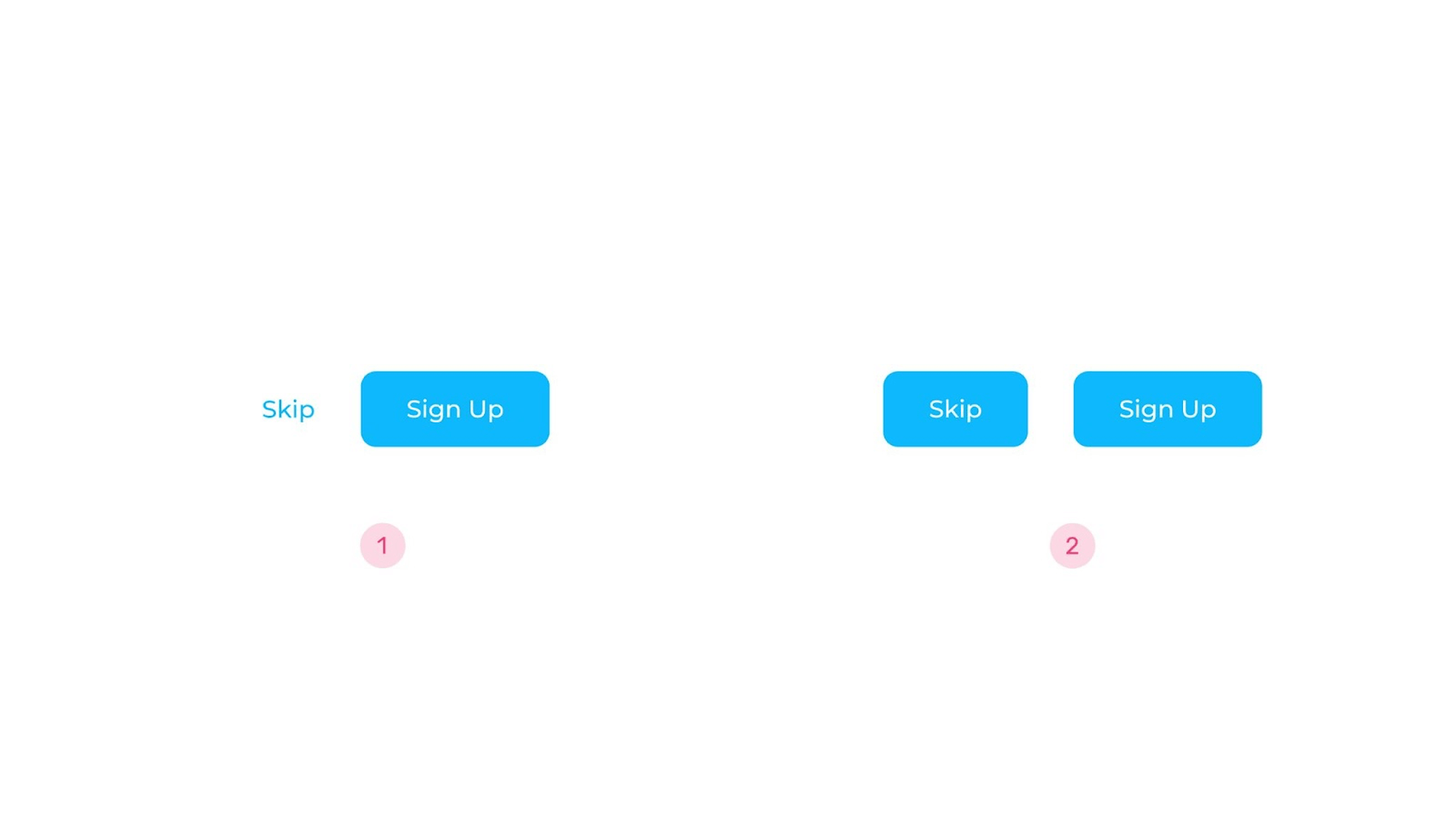
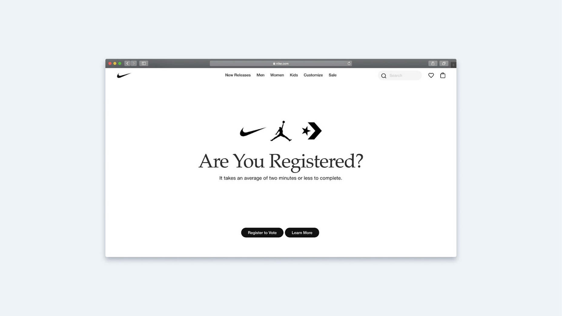
Many people would most likely vote for the first couple. That was something I used to do as well. However, put yourself in the shoes of a user and observe what this interface expects of you. They also want us to collect data at registration, which they emphasize. You can, however, skip this step. Is it up to par? Yes, because many users are hesitant to register on the site and provide personal information. We decide for the user which action is a priority when we show this hierarchy of buttons. But why not let them make their own decision? This is becoming a more prevalent strategy nowadays. For example, we see two identically filled buttons at Nike: Register and Learn more.
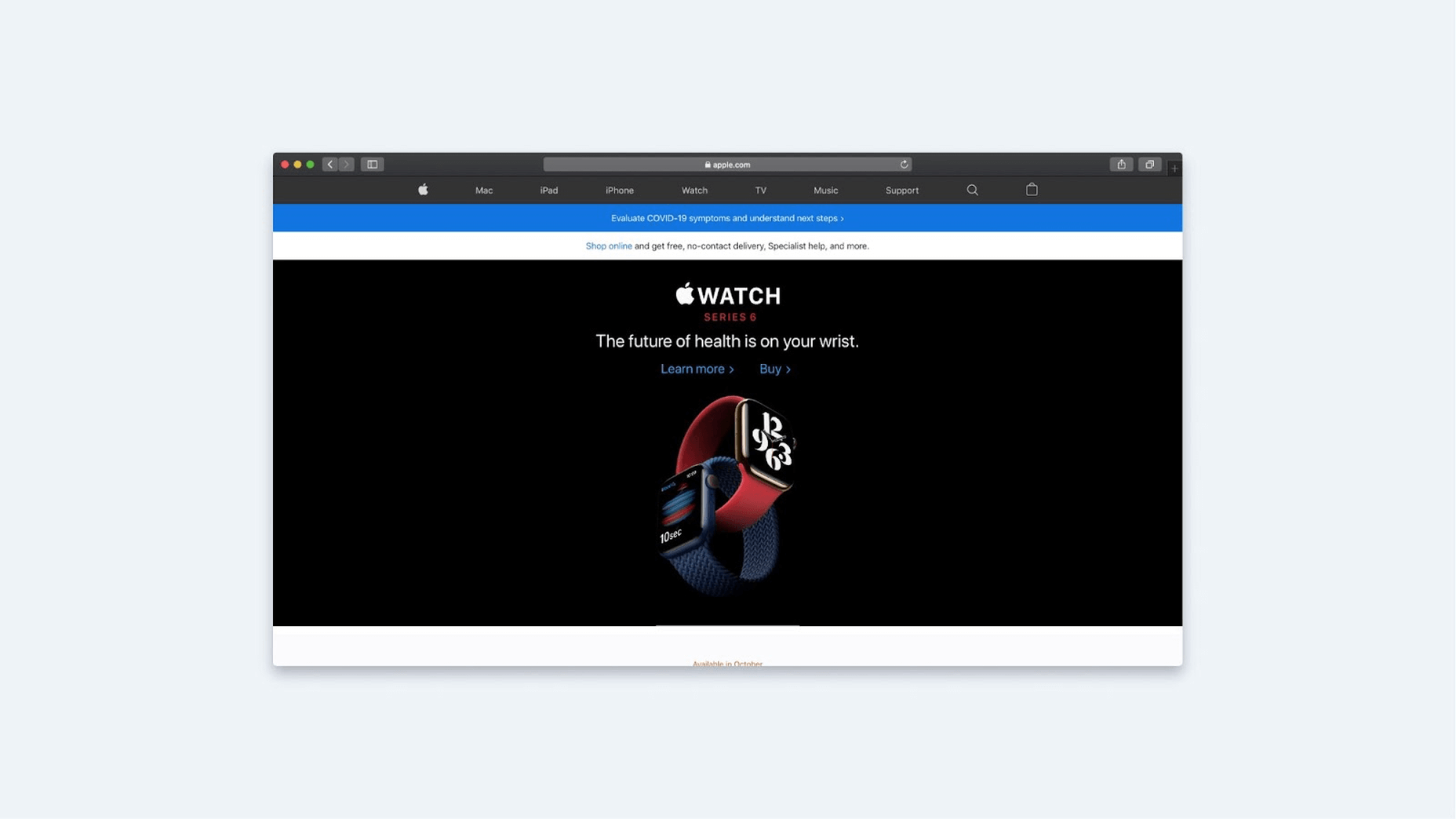
Apple uses the Learn More and Buy buttons the same way. The latter isn’t a large red button that screams, “Buy now! Buy now!” The user also can decide what is more important right now.
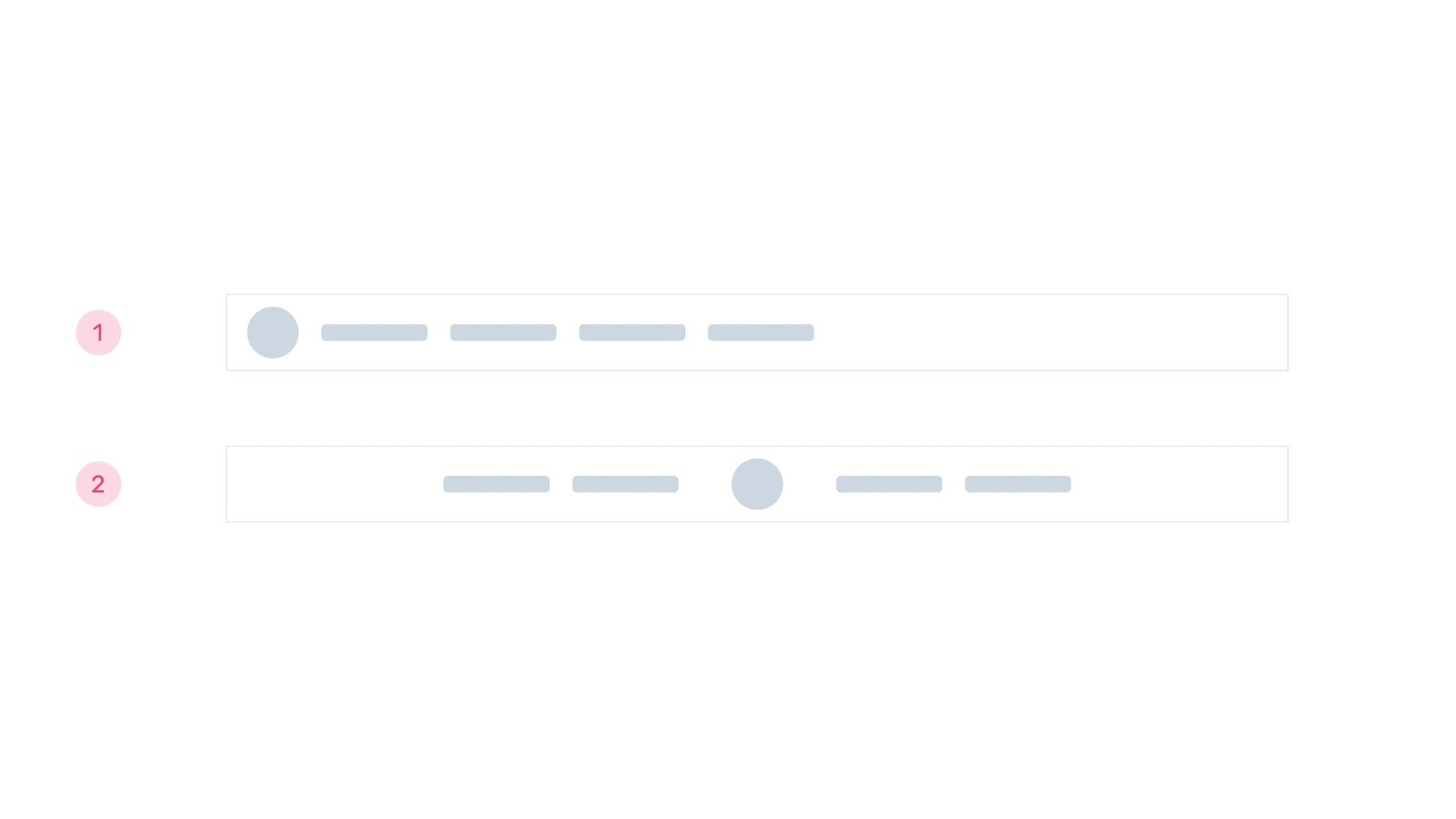
And here’s another question: if you had to choose between Cancel and Save, which would you put first?
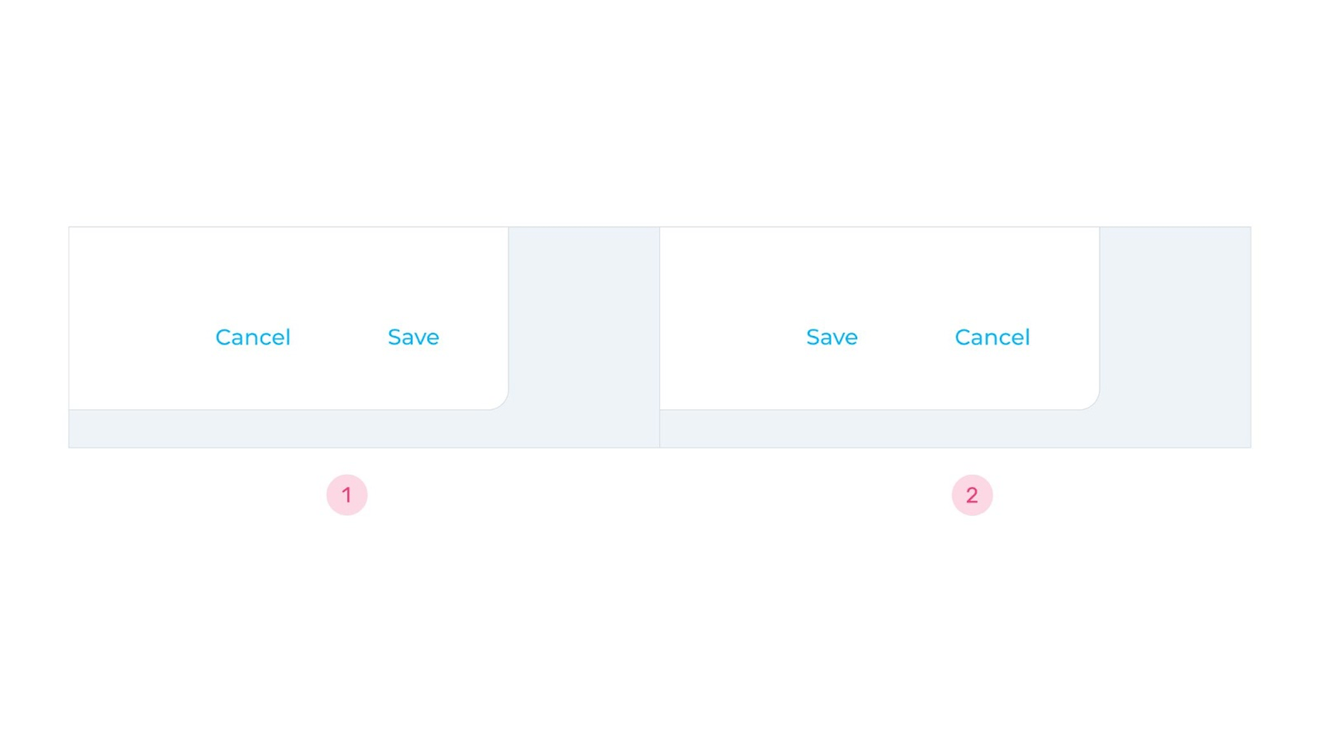
It’s difficult to say whether Cancel should be displayed first or Save. Assume I issue a command. Which is more important: having a button in the interface for the desired action or seeing all of the answer alternatives and then deciding? Designers frequently choose the second choice, but it is unimportant.
According to Nielsen Norman Group research, both the first and second patterns are understandable for customers. Android and iOS are two examples of this, as they use both methods. They all have their own set of benefits.
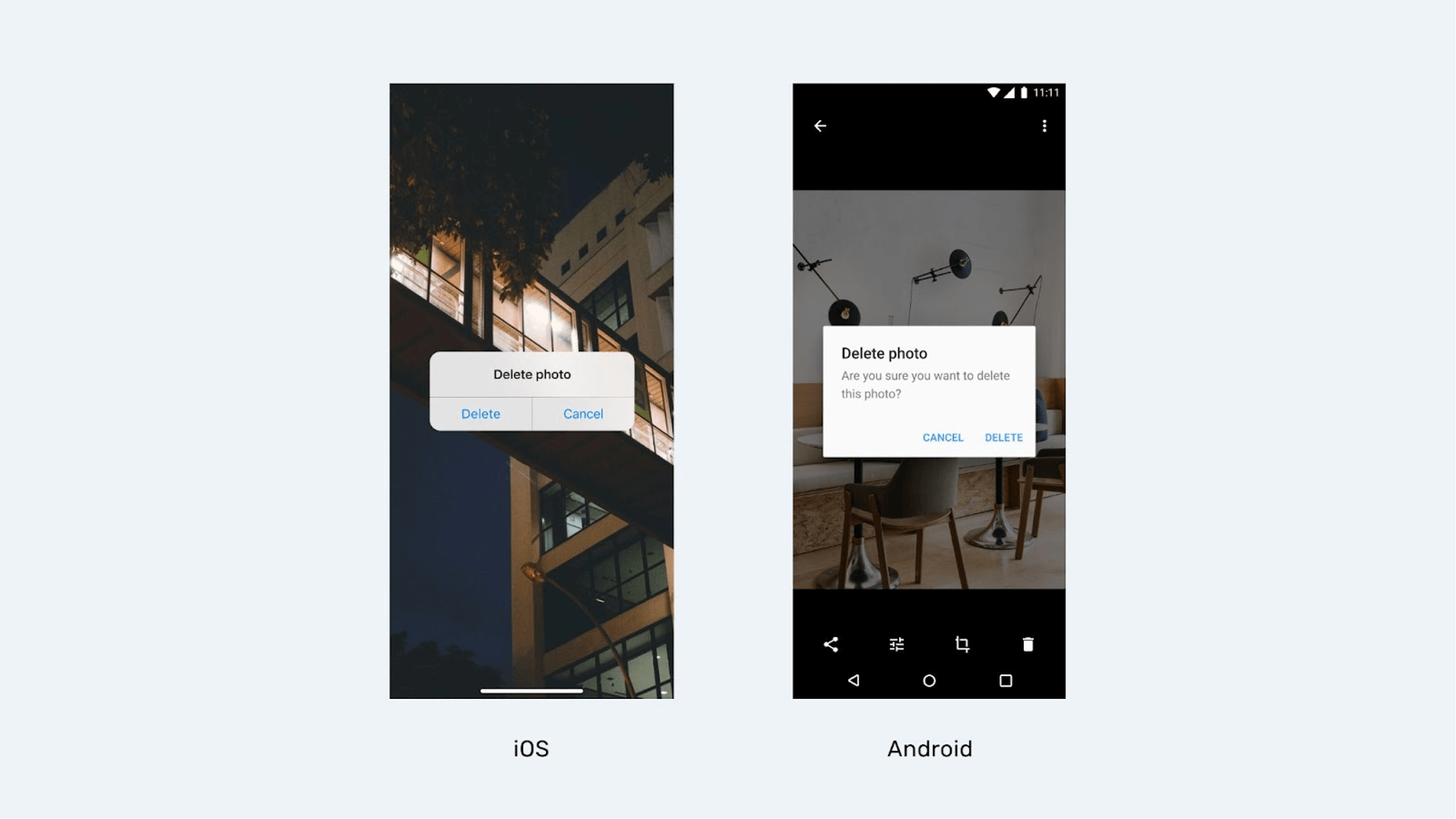
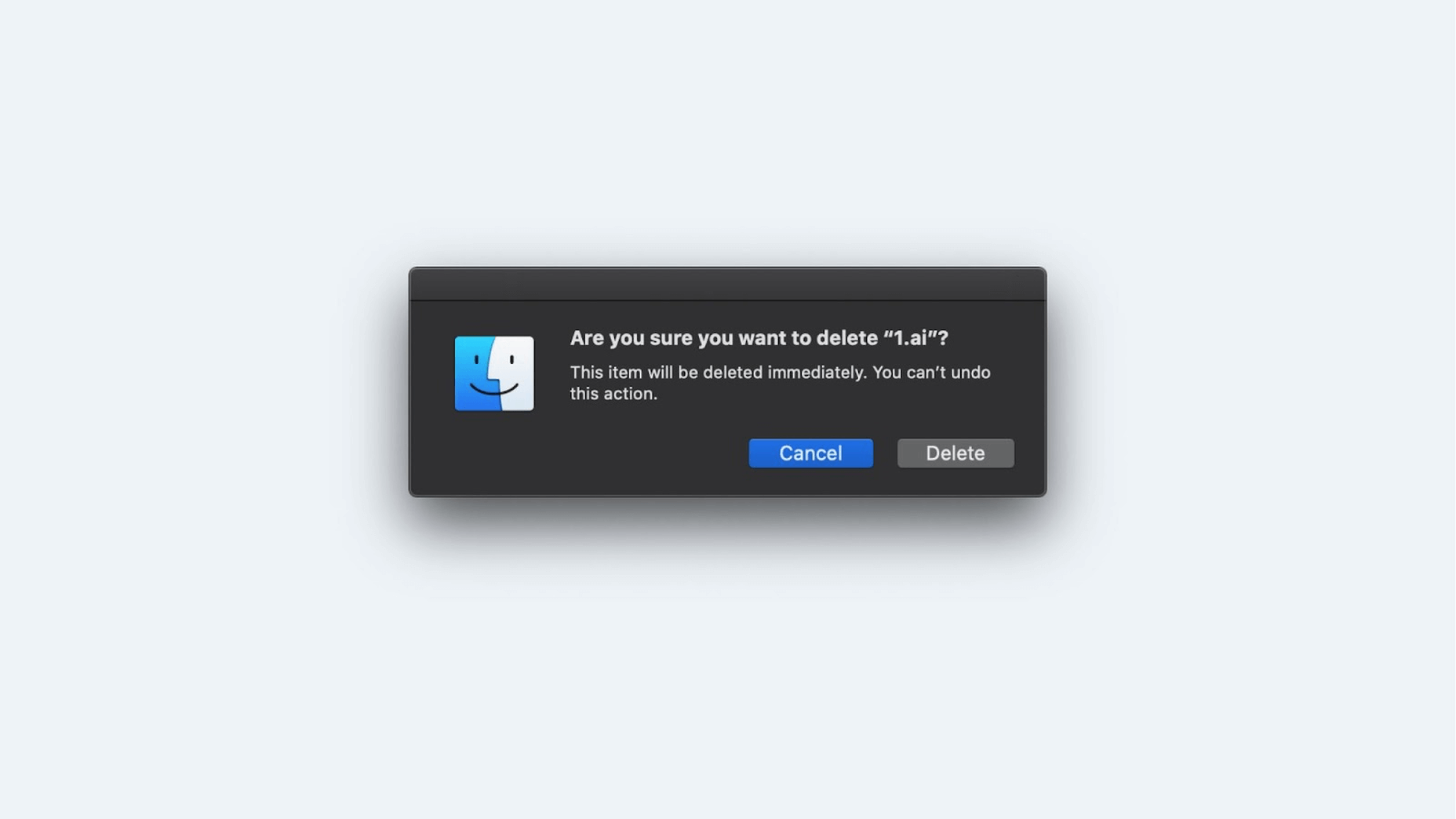
I enjoy how Apple handles this in macOS. The emphasis is on canceling the action if you are assigned an irreversible task (such as deleting data from the recycle bin). The user must fully comprehend that they cannot retrievd anything they delete.
So, when working with buttons, do the following:
- Determine your task, i.e., what action the constructed buttons should prompt the user to take.
- See if you can demonstrate that the button is a button by looking at its uses in the interface or its states.
- Check to see if the text on the buttons is legible.
Navigation
I’ll also begin the navigation section with an example question. Consider a site’s navigational block and a logo (a circle on the slide). Is it better to put the logo in the middle of the navigation or on the left side?
Both options appear to be equivalent. However, according to various research, the upper left corner is still preferable. There are numerous explanations for this. Because we read from left to right, the logo is the first thing we see. It’s also a marker that tells the user where they came from.
The NNG research center conducted an interesting experiment on this topic. Users were tasked with purchasing a specific item from an online store. At the same time, the list did not include any well-known stores, only local businesses. Some sites’ logos were on the left side of the navigation, while others were in the middle. Commodities were purchased, but the users had no idea what was being tested in the trial. After a while, they were asked for the company’s name from which they purchased the merchandise on the internet. People remembered both the brand and the company name better when the logo was on the left. As a result, having the logo on the left is likely to be significantly better—especially for well-known organizations. Of course, this doesn’t stop a lot of websites from putting their logo in the middle of the navigation box.
Consider a site that displays page links in a burger-style menu. Is it better to hide all navigation in the burger or remove part of the elements and display them to the user?
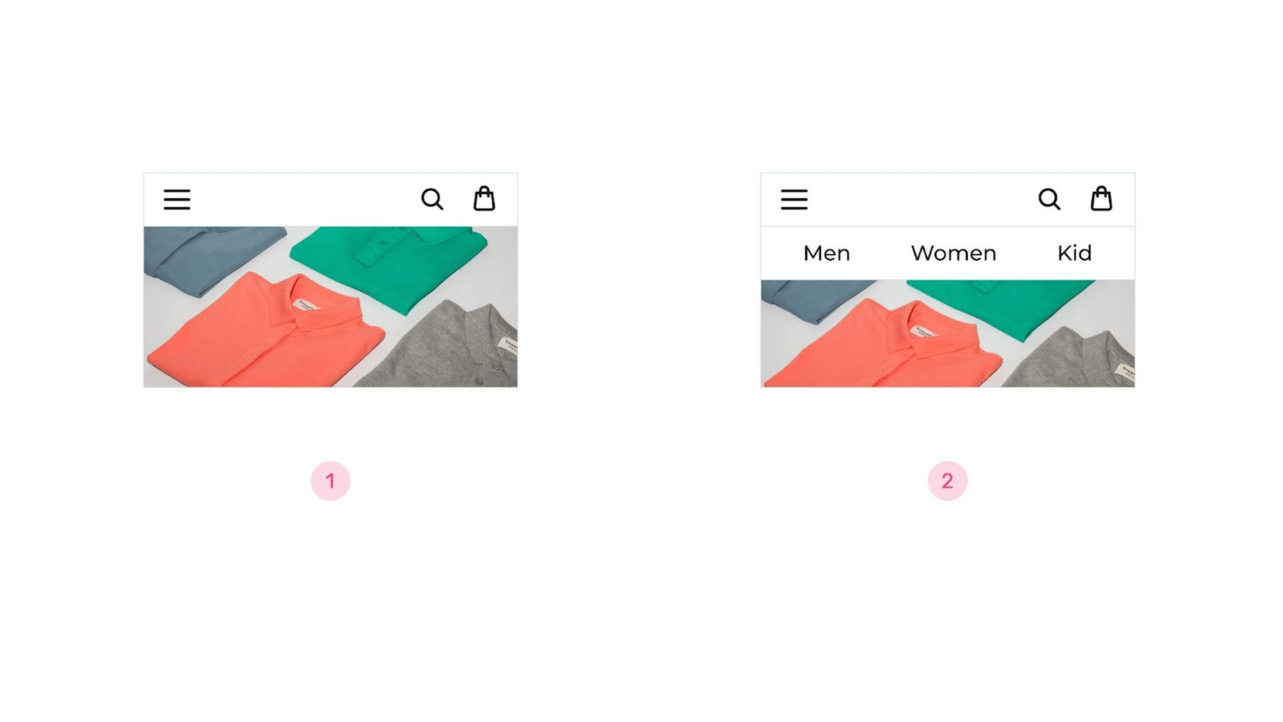
According to research, it is preferable to highlight a part of the navigation. If you know what sections users visit first, you might be able to show them those sections immediately. However, the user must click on the icon and search through a comprehensive database for specific information. Therefore, it makes sense to expedite this process and immediately provide them with what they require.
This is true not only for mobile interfaces but also for desktop interfaces. In the example below, a directory must be opened independently to be viewed. When the focus of a user’s attention shifts, it irritates them. If a drop-down list displays when you open a menu, users are not always comfortable. After that, it must proceed from left to right, and so on. Therefore, it’s preferable to display the complete menu if possible.
When it comes to navigation, the issue of the menu’s number of items cannot be overlooked. The fewer options a user has, the easier it is for them to decide. It is suggested that 7-9 things are ideal on the internet. However, when there are a lot of sections, subcategories, and sub-subcategories (as in a marketplace), fitting everything into a minimal number of items isn’t always feasible.
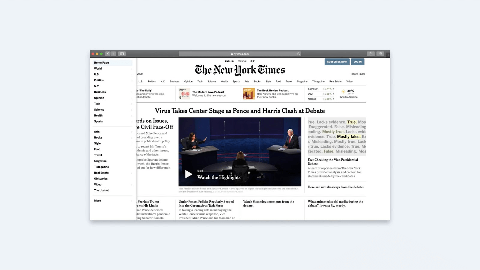
There are various options in this instance. There are multiple tiers of menus that can be created. The website of the New York Times is an example. There is horizontal navigation and another burger on the upper left of the home page. A wide menu appears when you click it, with more sections at the bottom and more sections at the top. The fact that the New York Times is a vast resource justifies this. That is why the website’s designers placed the essential items on the horizontal while also indicating that there are other components. The menu is accessed using a button in the upper left corner. If the user is dissatisfied with the primary navigation, this placement enhances the likelihood that they will see the menu and click.
According to the three-click rule, the user must reach the needed information in three clicks. There is, however, no data to back this up. Users today are willing to spend significantly more time looking for information. For example, if we’re looking for a product at an online store, we browse to the appropriate department and then dig further into many subcategories until we find it. Then there’s more filtering, sorting, adding to comparisons, adding to cart, checkout, shipping, etc. This does not appear to fit within three clicks. As a result, don’t limit yourself to this guideline. It’s preferable to keep the navigation simple and obvious so that the user may rapidly reach his objectives.
Perhaps you could divide the interface so that the user chooses from 7-9 categories first, then another 7-9, then another 7-9, and so on till they reach the end. Although you shouldn’t make it too complicated by creating a hierarchy with ten to twenty levels—this is scarcely practical. Five catalog segments, in my opinion, are quite acceptable.
But what if there are a lot of subcategories, and you can’t sensibly divide them into 7-9 items? Here are two basic strategies to assist you: The first is a list of names in alphabetical order. The second point to consider is terminology. This may be seen with Amazon. Take a look at their home decor area, which is organized alphabetically by subcategories. This makes finding things much easier for the user. The essential requirement is that the name be correct and recognizable to the user. You should not use jargon, slang, or professional vocabulary.
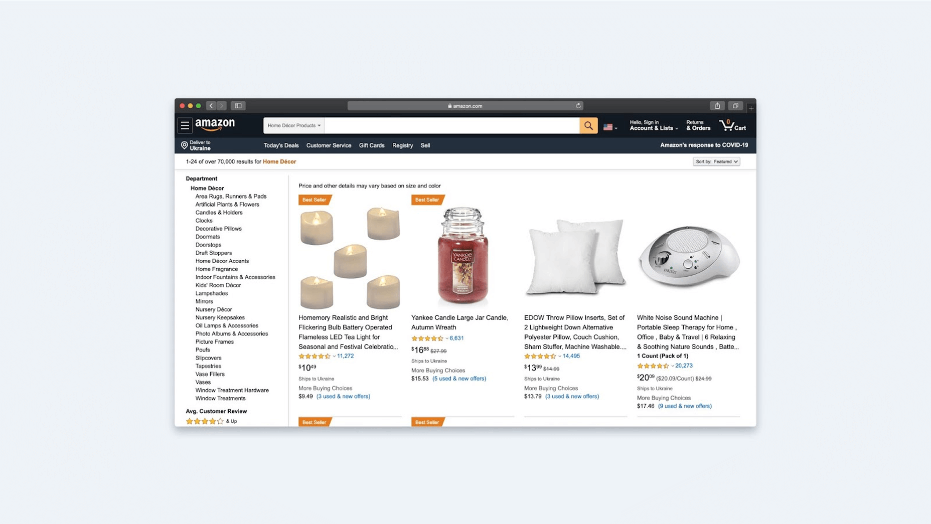
In some places, I genuinely admire Amazon’s approach. The creators placed a couple of the most popular subcategories at the top of the list, then let the rest of them go in alphabetical order. This is an excellent solution to the problem because it allows you to display the most popular things first.
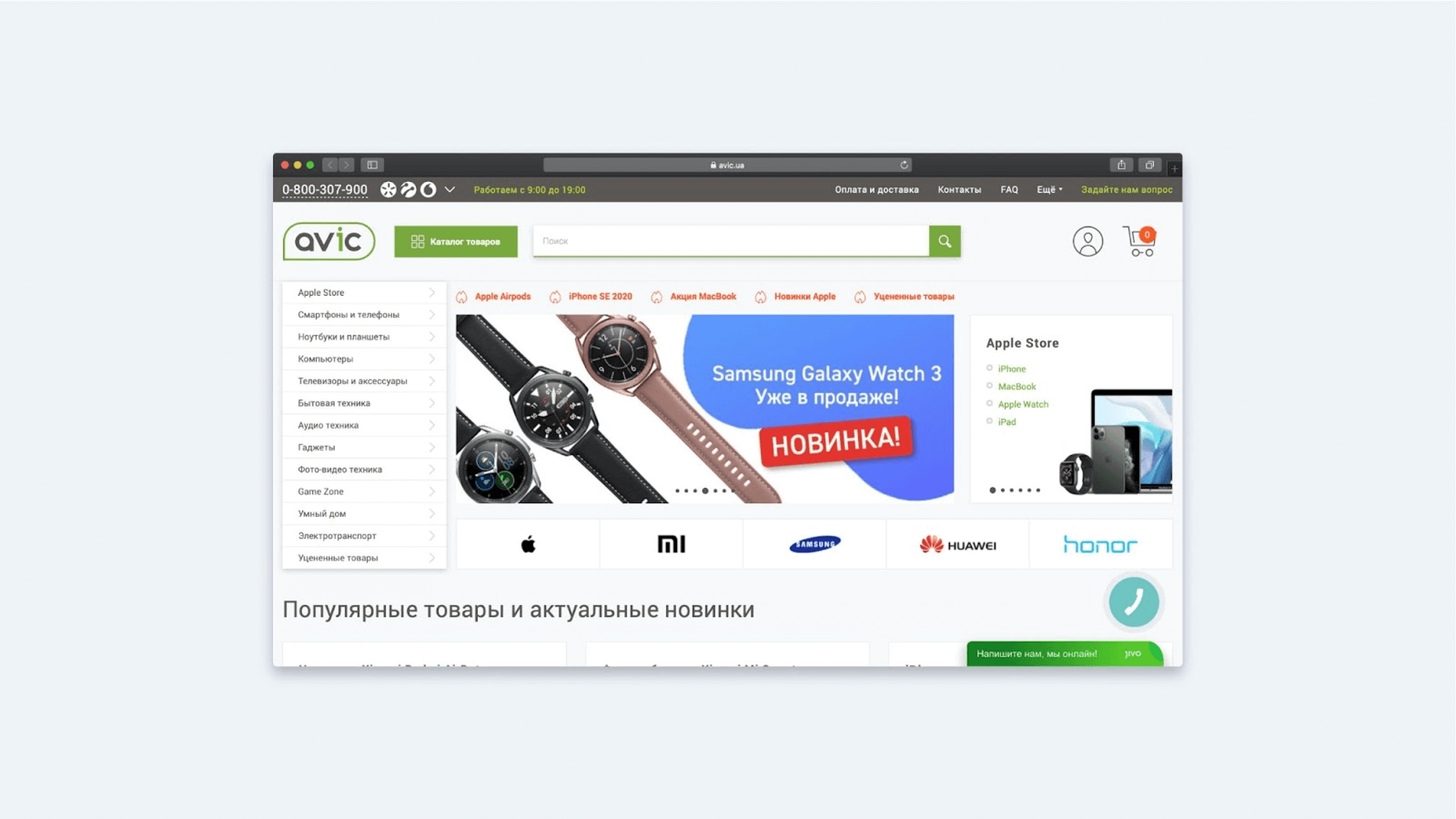
Avic follows suit. Apple products account for the majority of the company’s revenue. As a result, breaking up or hiding such products makes no sense; instead, they are removed from the catalog and relocated to the top, increasing the number of categories on the main page. Again, it appears that the user will have difficulty making a decision. However, if Apple is the primary source of revenue, it seems logical to feature this section right away.
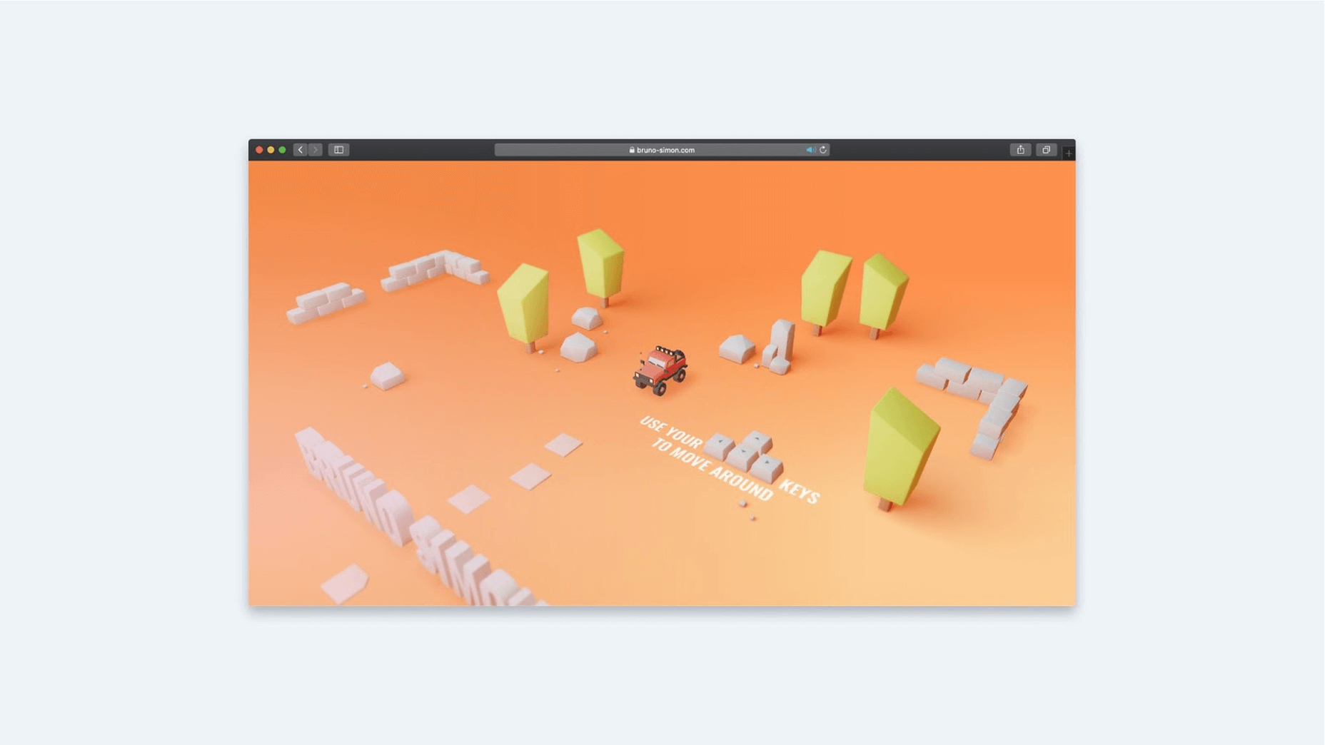
The examples considered are based on simple navigation. However, not every task is like this in practice. You might want to do something entirely out of the ordinary in some circumstances. For example, you may have seen a developer’s website in France where you have to use the arrow keys on the keyboard to drive a car that rides between menu items to traverse between sections. This is a rare occurrence, and even though it appears to me to tackle a slightly different problem, it succeeds—and in the process, it generates an environment around the project.
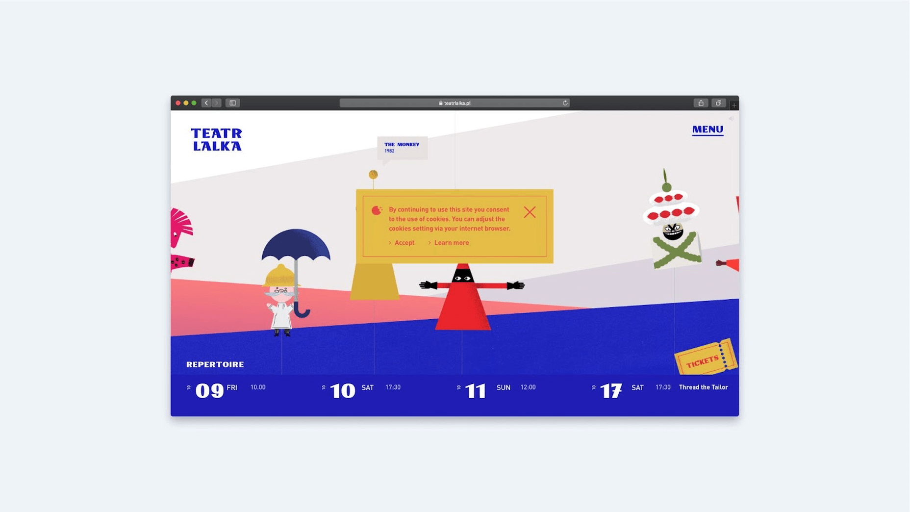
Here’s another example of an impressive menu from the Warsaw Puppet Theater’s website. All navigation is done using symbolic images that appear to be on strings and move as you point at them, much like puppets. As a result, the user becomes more engaged in the navigation game. In the tradition of puppet theater, this approach produces a delightful ambiance.
Go over the following items before beginning to work with navigation:
- Is there anything you don’t want to be seen on the site? If the service is huge, consider how you might make the user’s life easier: alphabetical order, putting critical stuff first, constructing sophisticated breadcrumbs, etc.
- Find a way to display to the user where they are now and where they can go. This is critical because you should always design states for all interactive elements: normal, on hover, active, unavailable, and in the process of loading.
- Determine whether the menu will be anchored at the top and what it will contain. A language switcher, for example, will most likely be located in the top right corner of a bilingual site. Should you, however, remove the option to change the language if the visitor has already begun scrolling down the page?
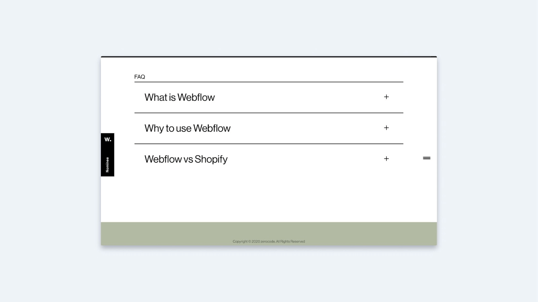
Accordion
Let’s get to the accordion now. First, let’s look at two different versions of this interface element: one with the chevron pointing down and one with the plus symbol. Which version of the icon do you think is better? Then there’s the question of whether the icon should be placed to the right or left of the text, independent of its type.
According to studies, users recognize accordions and are more likely to click on the text. They click on the icon 25% of the time when it’s on the right and 75% of the time the text it’s on the left. Does this mean there’s no need for the icon to be on the right? No, it’s pretty acceptable to put it there. In truth, it doesn’t matter where we put it; the important thing is that we put it somewhere and make it big enough to click on.
The only difference is that the procedure takes a little longer when you click on the icon. This is because individuals aim and try to click on the icon accurately. As a result, it is vital to create such an element large enough to work with comfortably. I would even propose enlarging the clickable area rather than the icon itself. The project “Dia,” in which the icons are as large as the accordion itself, appeals to me. This site is, I believe, simple and convenient for all users. Each cell is clickable and takes up the entire screen width in this example.
When it comes to the arrow’s direction, you shouldn’t always aim it right. Many users have learned that pointing the arrow to the right indicates heading to another page. Only the tiny area, text, and icon in the example below are clickable, and there is a button at the bottom with an arrow that points in the same direction as the accordion’s equivalent. However, the acts are distinct. When you click the accordion, it will open block down, and when you click the button, you will be redirected to another page. People may be perplexed by this.
Giving the user an accordion with no identifying signs is likewise not good. A person must know which aspect of the interface they are interacting with. You must either use an icon or demonstrate that the element is clickable. The only thing that indicates clickability in the example above is the changing appearance of the cursor when hovering over the text. However, it is not visible; it must be larger, or a term such as “Read” should be used. Without that, the user won’t be able to tell the accordion apart from the bold text selection.
As I previously stated, you must think out all interactive features in terms of states. If there was a positive, for example, it should change—or at least become a minus. As a result, the user will realize that the drop-down box can be hidden.
It’s inconvenient when the icon vanishes after you click on it. The user anticipates being able to close the block at the exact location where they first opened it. After all, they may not like the response that appears and may want to delete it right away. He’ll have to re-aim now that the button has been repositioned. Here’s an unusual example of an accordion plus that isn’t clickable. This is only true for mobile navigation. If the user has previously dealt with the desktop version, they may not recognize what’s wrong and believe it’s a bug when switching to the mobile version.
Imagine you’re charged with deciding whether to keep the open items or conceal them when the user opens others. On the one hand, if the items don’t shut, the symbol will not move because no items are transferring. On the other hand, if there is too much text, the user may have trouble navigating to the following question. As a result, it may be preferable to close superfluous blocks automatically. However, consider the number of responses in a specific accordion.
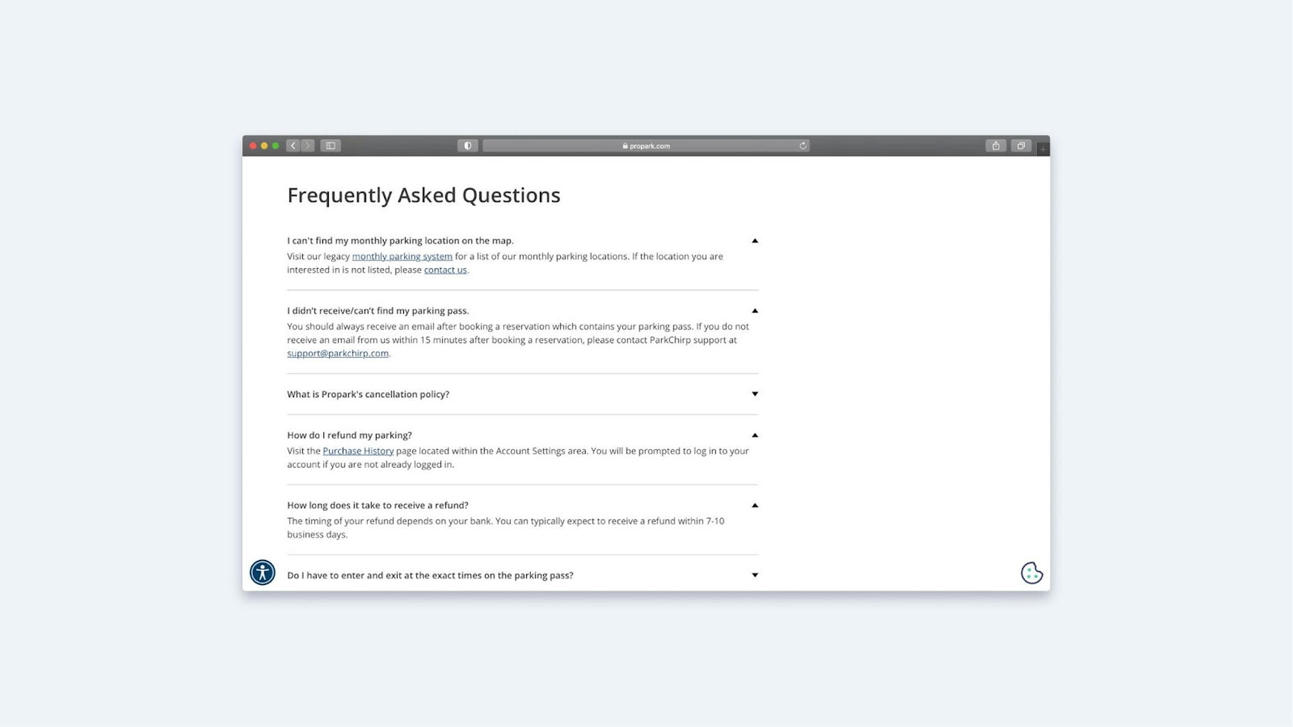
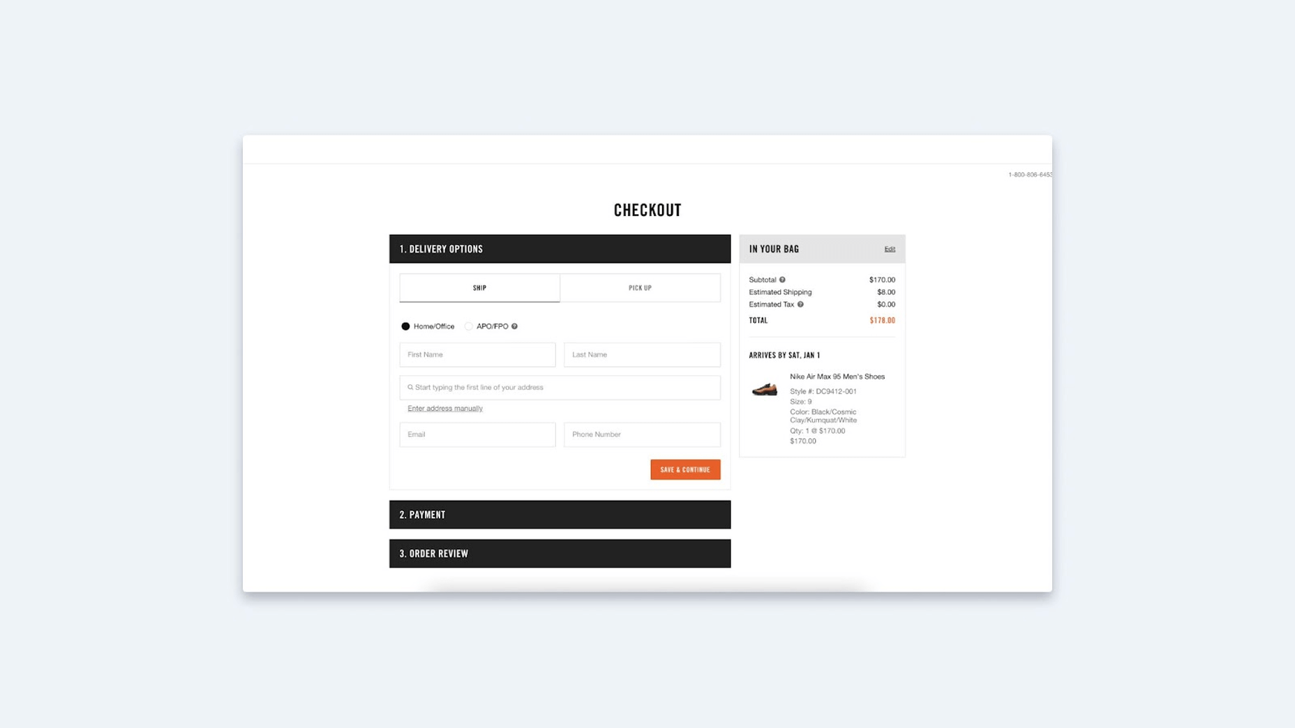
The accordion is a multipurpose element. Not only may it be utilized for the FAQ area, but also the checkout page. According to Baymard, more than 30% of online retailers worldwide accept payments through accordion-style checkouts, with the percentage in the United States being considerably higher at 56%.
This solution has several benefits. The user can first view the following steps to complete (say, which payment systems are accepted). You don’t even have to click “Next” or navigate to another website to accomplish this. Second, the accordion makes it simple to navigate from block to block to check data without having to reload the page and risk losing it. After all, if the user made a mistake in the first area and discovered it in the second, it’s simple to correct it here. You’d have to return to the previous page in a typical checkout and risk losing the information you’d filled out but hadn’t sent to the server.
You can also use an accordion to create menus. However, you must exercise caution in this situation. The parent accordion category in the example below has no content. As a result, if you repeatedly click on the items to collapse the accordion, the entire content area remains empty. In this situation, it’s also a good idea to include some information in this page section.
The fantastic, beautiful accordion on hover is another example. It is quite adaptable. Although there is no accordion in the mobile version, it is essentially just banners that translate to other links.
Another more extreme example created by evident admirers of such a solution is an accordion within an accordion. The entire site can be navigated using these blocks. It’s amazing.
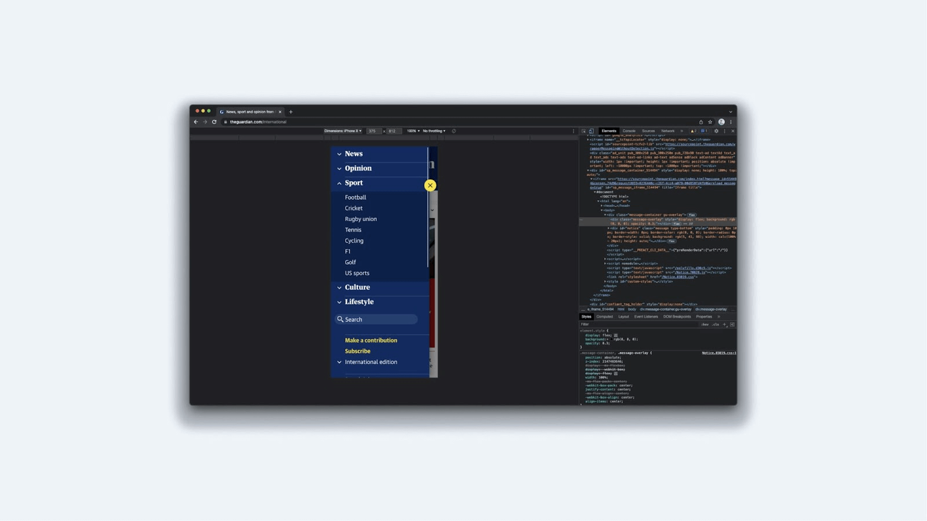
In mobile interfaces, accordions are also essential for website design. They make it simple to conceal information. All navigation on The Guardian’s website is done through these blocks. The only thing that bothers me is that the parent categories aren’t clickable. A user does not have the choice of seeing all of the sports news. Only the subcategories “Football,” “Cricket,” “Rugby,” and so on are available. On the other hand, The Guardian has moved the parent categories on the front page, which is a reasonable answer to such an issue.
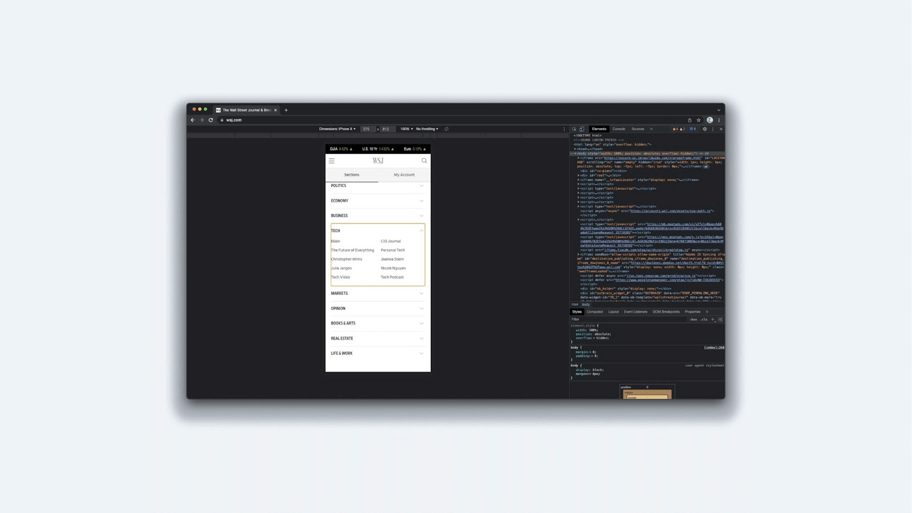
The Wall Street Journal, on the other hand, took a very different approach. They didn’t post the categories on the main page and instead crammed everything into a single block. When a user visits a category, however, there is the Main section. This allows you to navigate to the main parent section or a specific subcategory.
Let’s summarize the accordion:
- Always ask yourself from the start if you really need an accordion. After all, the user’s “fee” is the click. You can sometimes get away without it and supply all the information at once.
- Consider which icon to use. It can be anything, but the most important thing is that it is simple to use.
- Where should the symbol be placed? It is highly dependent on how everything adapts. For example, if you have a long line, it is preferable to set the symbol on the left. Then, you won’t have to worry about the icon vanishing when you collapse the accordion into a small block and shift the text to the following line.
- Choose whether all blocks are closed by default or the initial block is left open. This is dependent on your task and the aims of the user.
Date
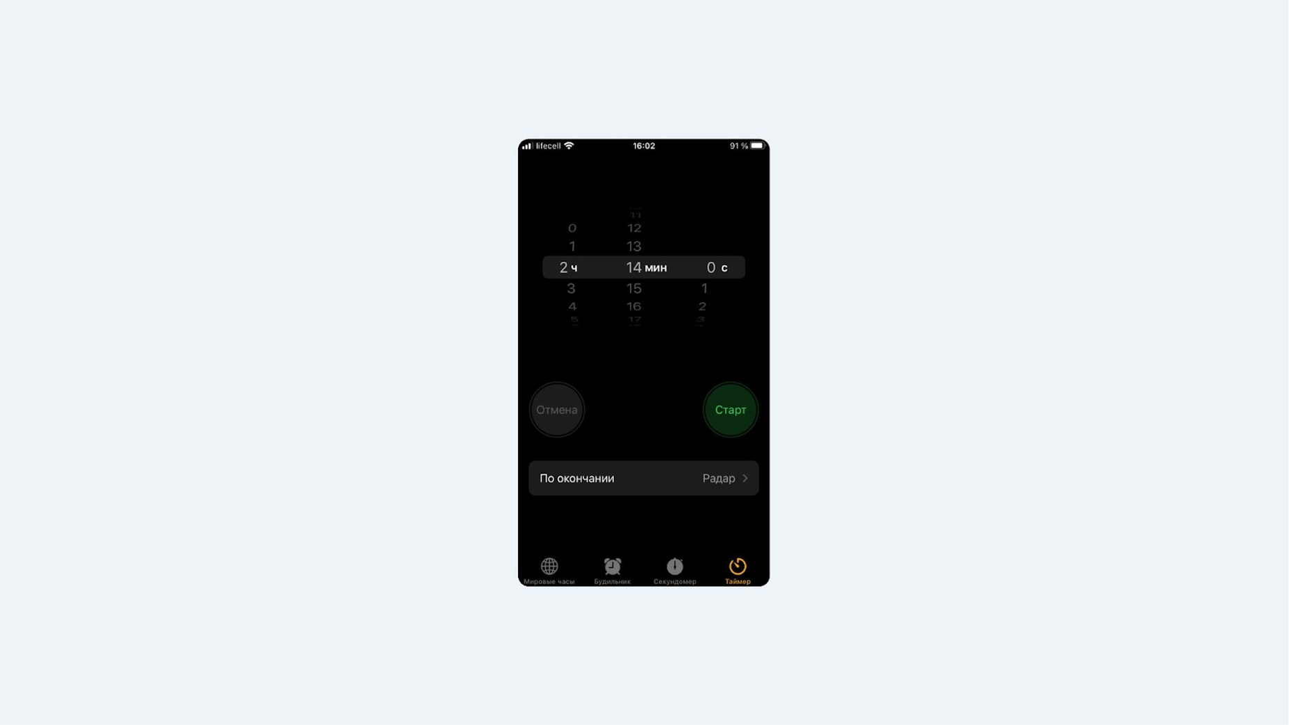
The choice of date is the next crucial factor to consider when discussing design patterns. I’ll begin with a comparison, as is customary. Users of iOS 14 who have set the alarm clock time will be familiar with this scenario. What is the better option?
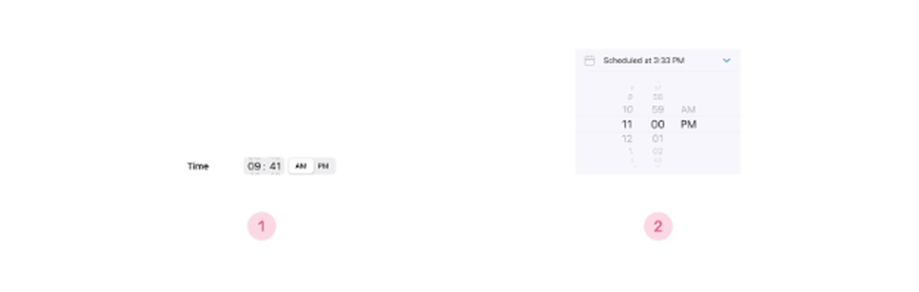
I like the first choice since it is more attractive and does not distort the font as much as the second. However, the first variant has a potential issue: it is difficult to modify and twist. After all, the space is limited, and the user must fit precisely into the spot. It’s worth noting that Apple decided to leave both alternatives open.
Consider what you’ll use the Date Picker for a while you’re creating it: a date range for booking hotels or planning excursions, a date to set a birthday or reminder, a date to indicate the time for a movie session, or for ordering a cab. This will impact the rest of the process of envisioning and designing this feature.
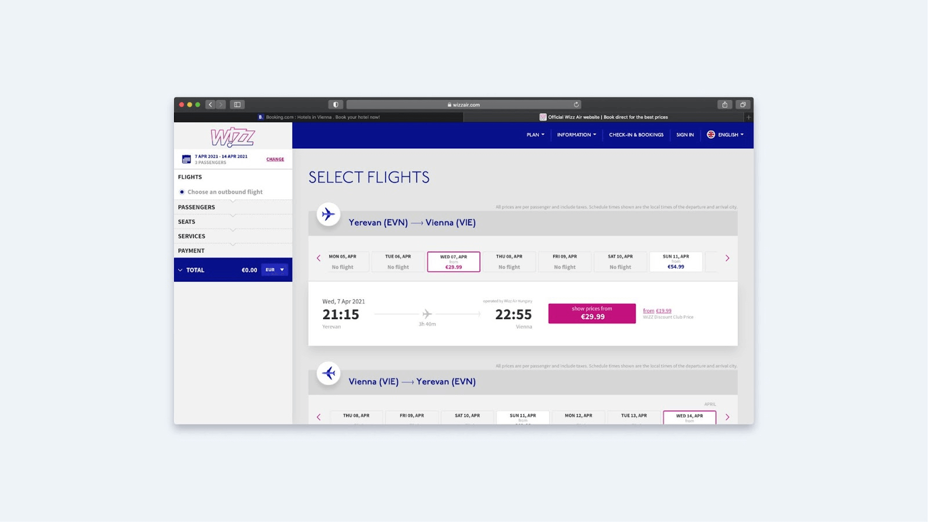
It’s critical, in my opinion, to describe the many ways in which the user obtains information right now. The four options are a calendar, a drum (more of a mobile solution), a conventional input area, and a drop-down list. Let’s look at a few distinct solutions that all deal with airline tickets. Wizz Air, for example, utilizes a calendar, but it’s a double one so that the customer can see two months at once.
But, if so, which start date should be specified? It seems it should be the next day, and the website shows this. However, studies have shown that users are not always happy when a date has already been set. People rarely purchase next-day plane tickets. Therefore this “default” setting will almost certainly need to be modified.
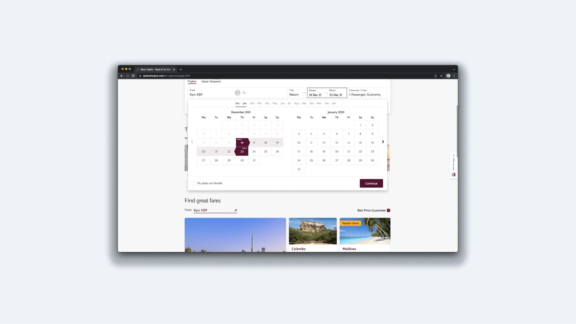
Qatar Airlines went even further by announcing a start and end date. Today is the first day of the program. Is that choice required if the user logs in at 23:58? The second issue is that there is no differentiation between the start and end dates and all days in between. Everything is painted in the same hue. Users want to see anchors for dates if they plan a long trip that begins in one location and concludes in another. People are used to being told that we begin and end at specific places. As a result, the user can be certain that the dates are correct.
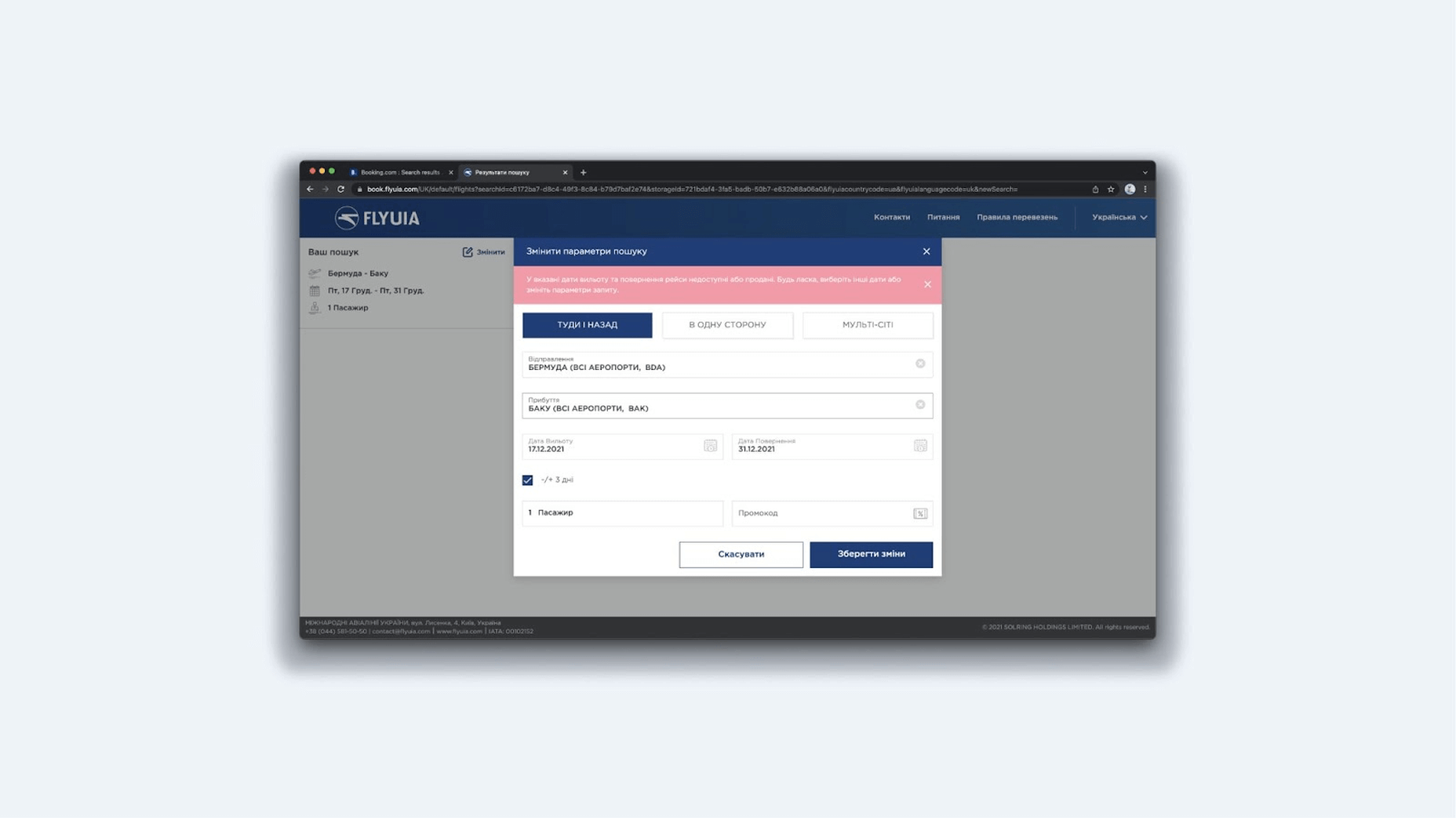
Today, UIA puts both the departure and return dates on the calendar. We’ve already established that this isn’t ideal. It’s also challenging to select a destination because you have to first click on the list, then go to the dropdown, search for the country, etc. It’s a long and winding road. But, it appears to me that the main blunder is something else. The search results output is blank. If I select two destinations and dates, I may be informed that that destination has no available flights. If I go on to the following date on the calendar, there are no flights available. Overbooking is the only method to find out when they will arrive. I’m likely to use a third-party aggregator that gathers data from numerous airlines straightforwardly and conveniently.
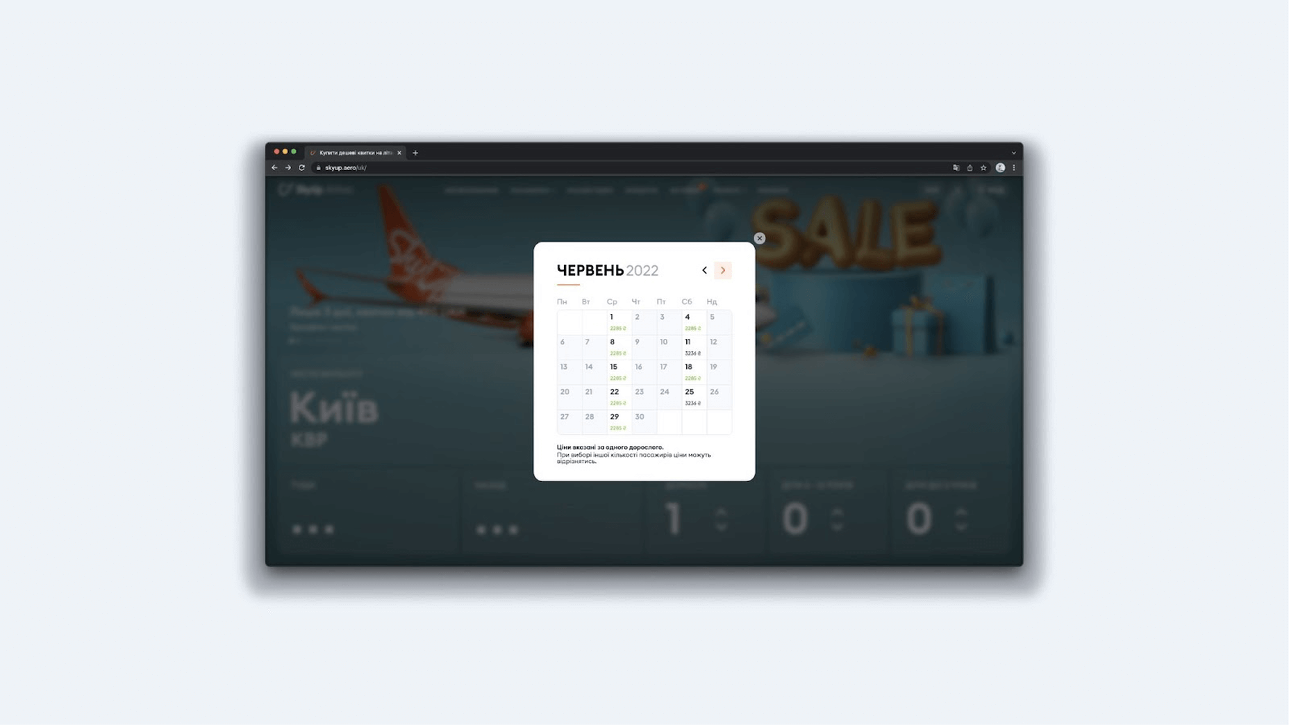
SkyUp’s calendar is one of my favorites. It includes large fields that open up a large calendar, and it’s simple to set the trip’s start and end dates. It indicates days when there are no flights for a specific location, and you can view the price for each ticket right away. This is quite useful because it allows you to choose a day and a flight even before you click confirm.
Let us now turn our attention to the drum. You can enter nearly any information into such an element, including time, date, and other lists. Users may easily navigate this tool and jump between values.
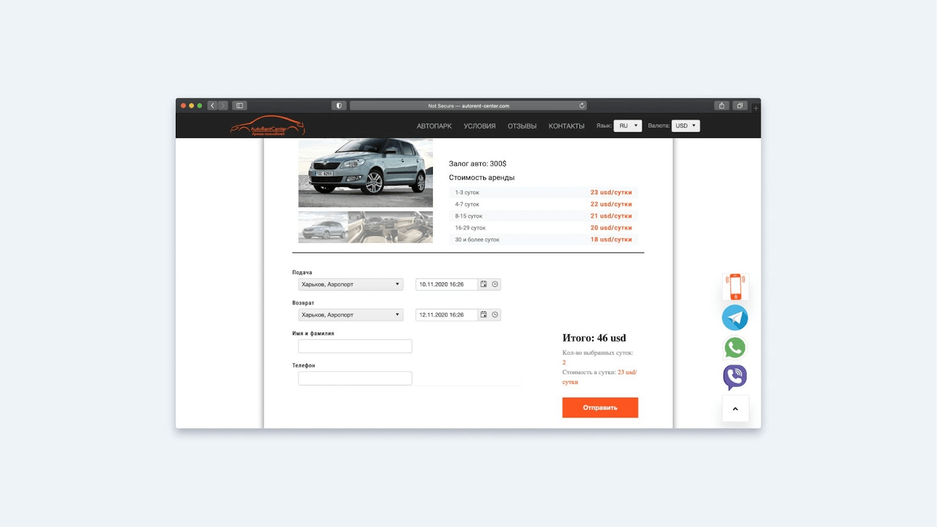
The input field follows. We must consider the format if we allow the user to enter a date using the keyboard. For example, in different regions of the world, “12.10.2021” may be interpreted differently: for some, it may be October 12, while for others, it may be December 10. This is especially significant in the case of the following example site for renting a car in another country. The user must be aware of the format they are dealing with. In this circumstance, several experts advise that the user writes in text. However, there is the issue of localization: would the system recognize that the language is not global English but rather a more non-standard language? After all, the user can use abbreviations when writing. You must either instruct the user on how to do it or use other solutions, such as placing a calendar icon next to it. In this method, the user controls how the data is entered.
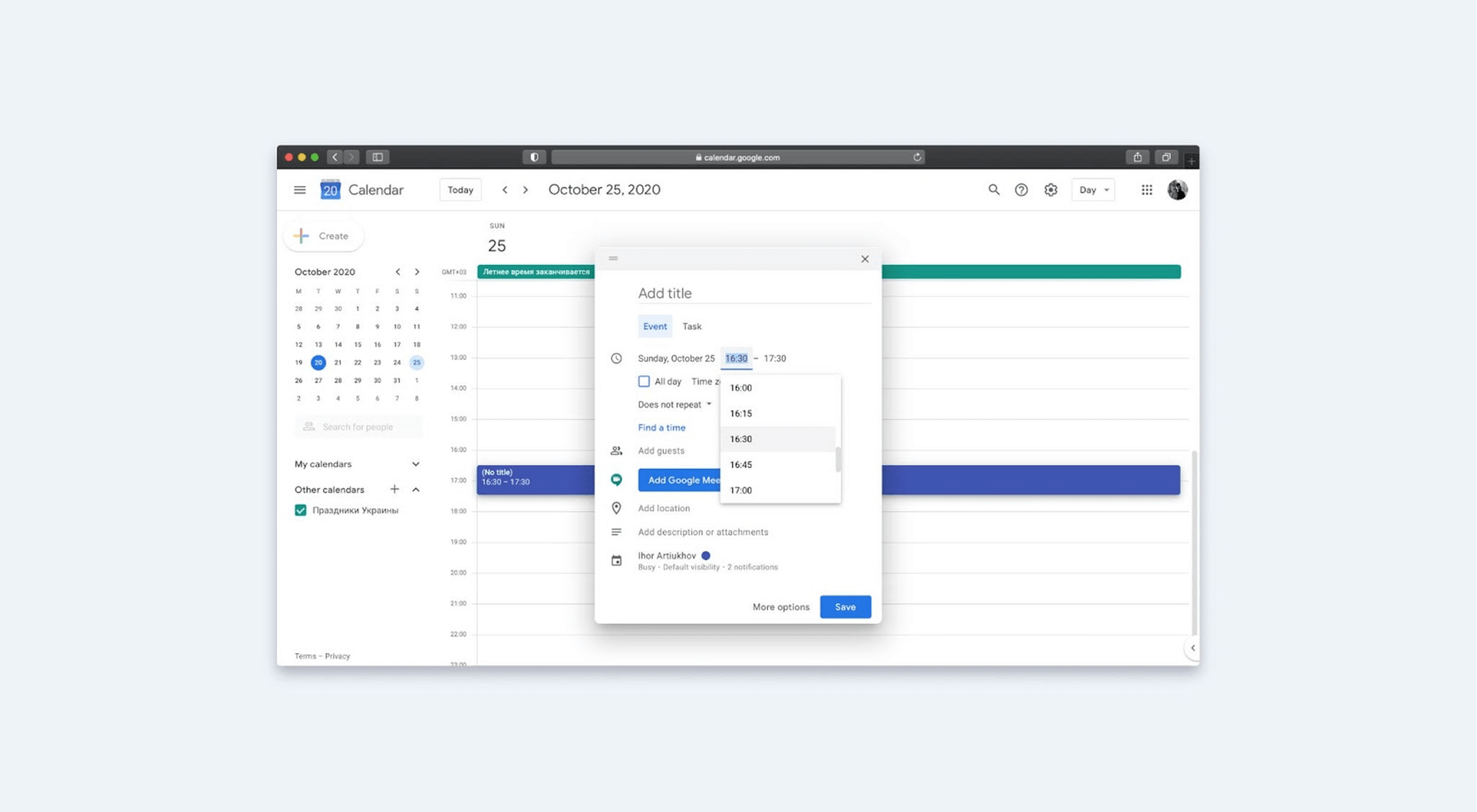
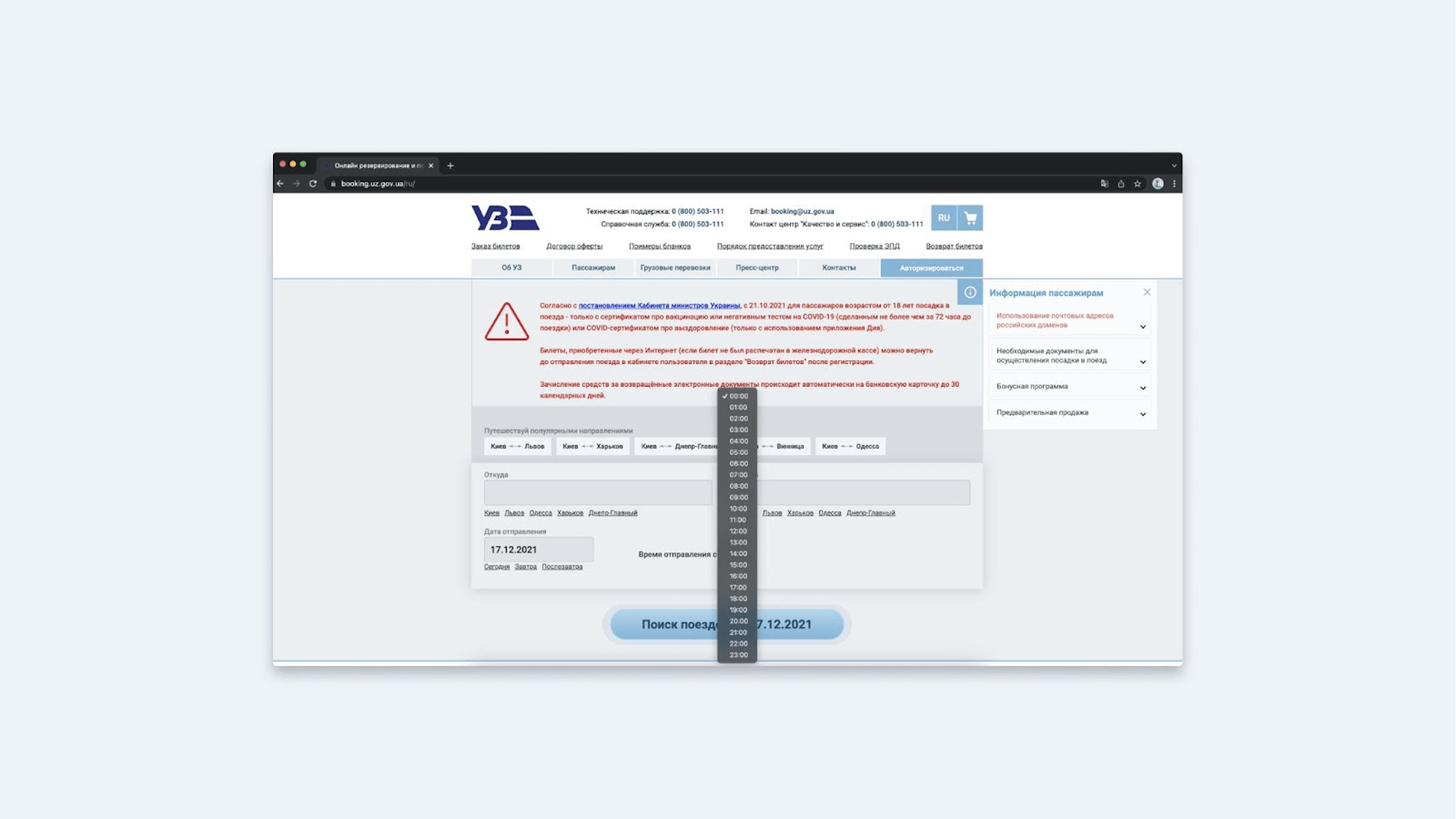
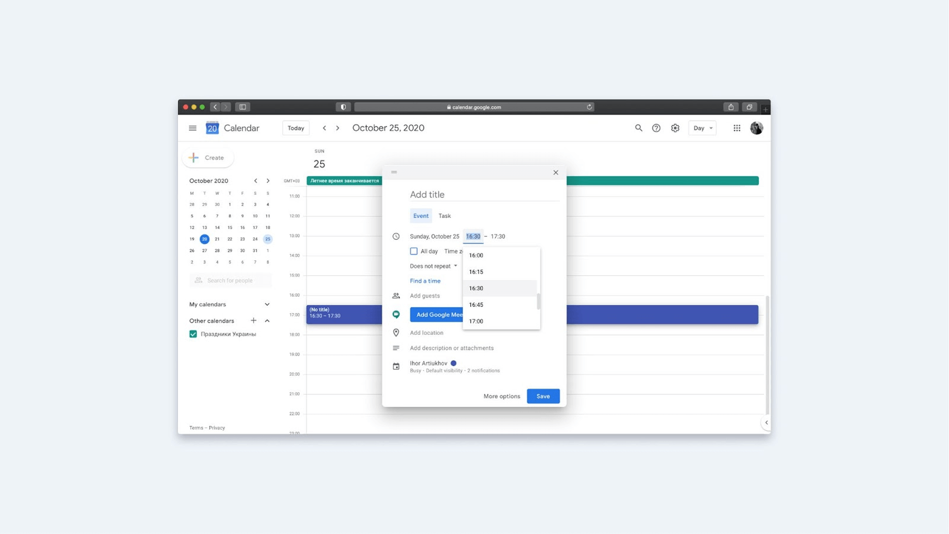
If the drop-down list is modest, such as months, there is nothing wrong with it. However, you may accumulate an excessively long list over time. Consider the website Ukrzaliznytsia. The time limit is one hour, and there are 24 items on the list. Perhaps a mixed approach is best here, where the user enters a few digits and then selects from a list.
This is precisely the approach used in Google Calendar. If you start writing 16 in the input box, the sub-options appear at 16:00, 16:15, 16:30, and 16:45 (according to the system’s set step of 15 minutes).
Let’s summarize calendars:
- When creating a calendar, remember to figure out what format the date will be in, as well as localization, language, and how to define where the day and month will be.
- It’s worth noting that the start of the week varies by region and personal preference—in some cases, it’s Sunday rather than Monday.
- Figure out whether the fields should have some default value if they are going to make sense to users or leave everything blank at the start.
- Decide if unavailable days should and can be shown. In some cases, there may be technical limitations here. I’ll refer you to the examples mentioned above. SkyUp may not have many flights, and Qatar Airlines has an order of magnitude more. Because of this, it is not always possible to pull flight information to the calendar before the user sends a request to the server.
- Determine whether the next entry step should be opened automatically. For example, for Wizz Air, after filling in the departure date, the field for the end date will open automatically, while for UIA, you need to click the field again for the second date.
- What to give the user first: the date or the time? Let’s say you want to sign up for an English course. You have certain working hours, and you want to get to classes before or after them, any day suits you. What is the primary goal: to allow a person to enter the time and then show the available days for a given schedule, or do otherwise? That brings up another question: how do you show selected and unavailable days or other labels? For example, in Google calendar, everything is well separated by color tags: events, public holidays, invitations to events, etc. But in this scenario, you need to think about the possibility of creating a legend that describes all the tags you’ve created.
Remember: Design Patterns Must Solve the User’s Problems
If you summarize everything above, the main recommendation is simple: before applying any design patterns, make sure you know what tasks the user should complete and how to solve them. Based on this, you can build an interface with gorgeous and, more significantly, human-friendly buttons, navigation, accordions, dates, and other features.
Source
The post Design Patterns: How to Create Simple Interfaces first appeared on Webdesigner Depot.
Source de l’article sur Webdesignerdepot

 As a website designer, your professional life revolves around crucial questions that might help you to deliver better results for your clients.


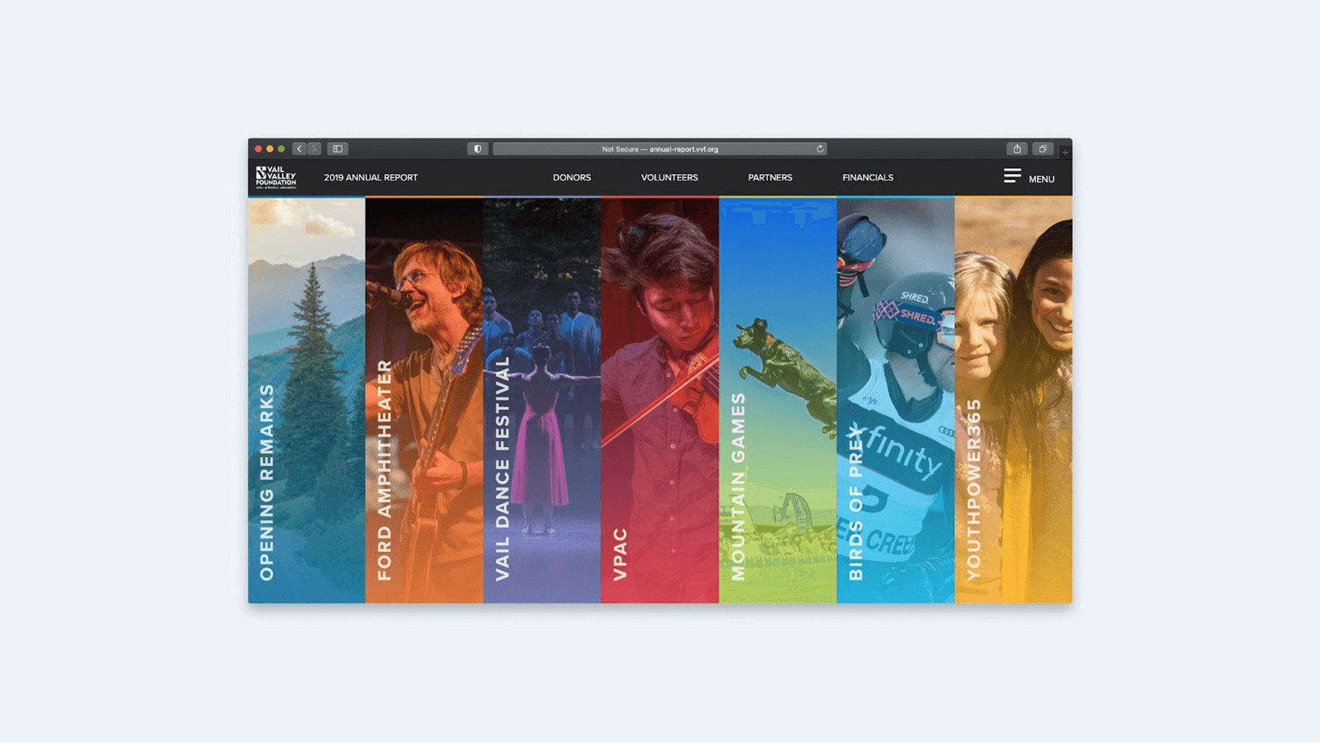
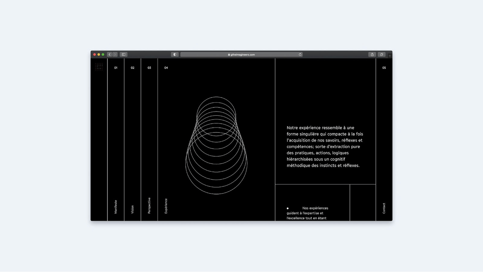
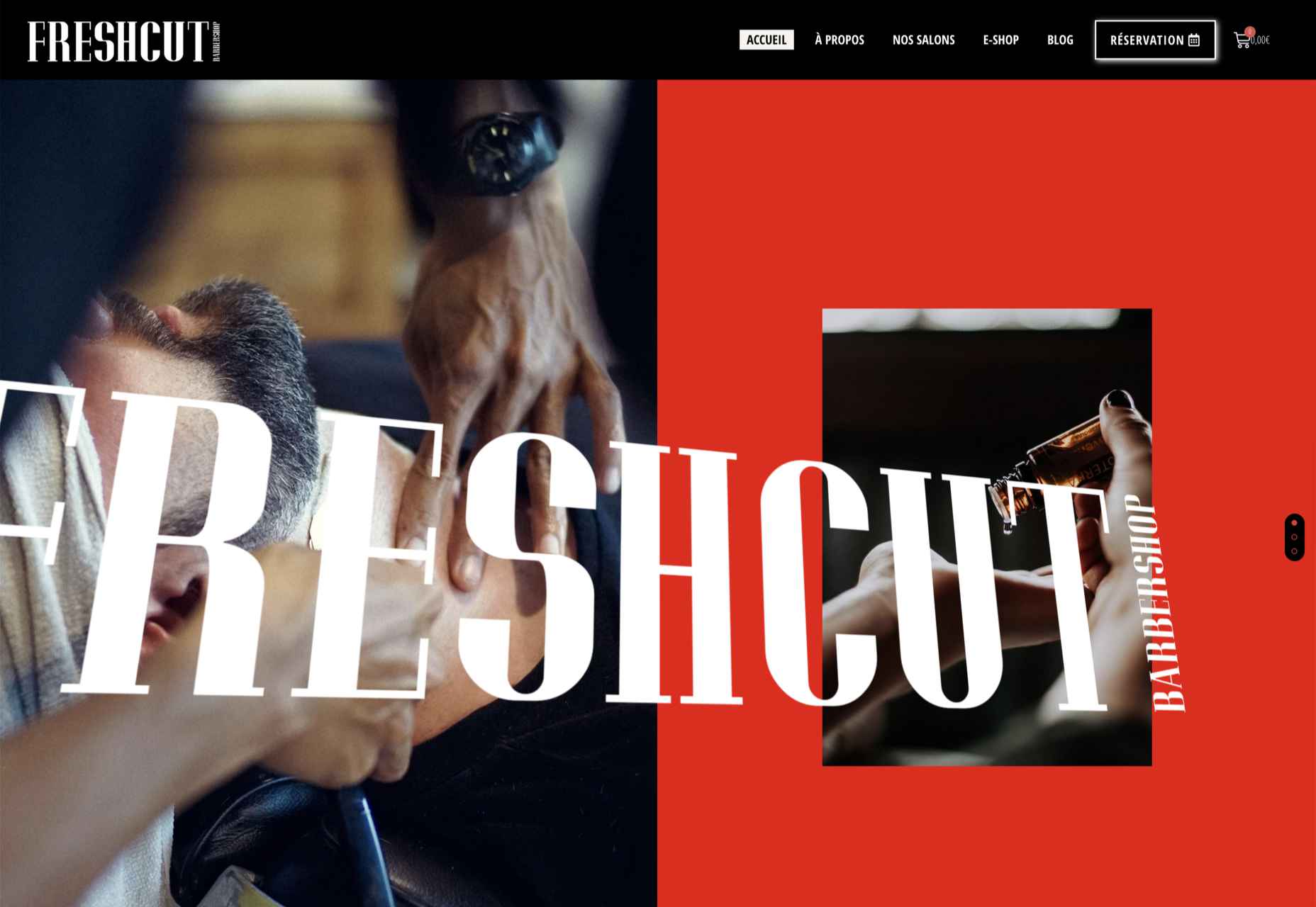
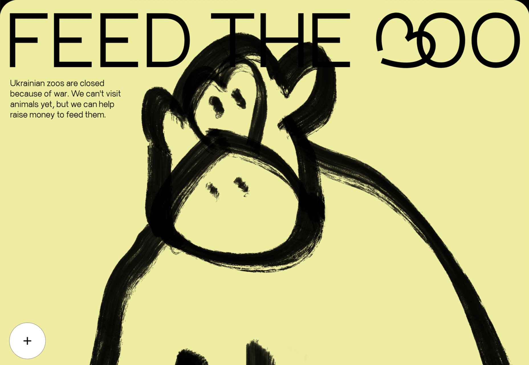
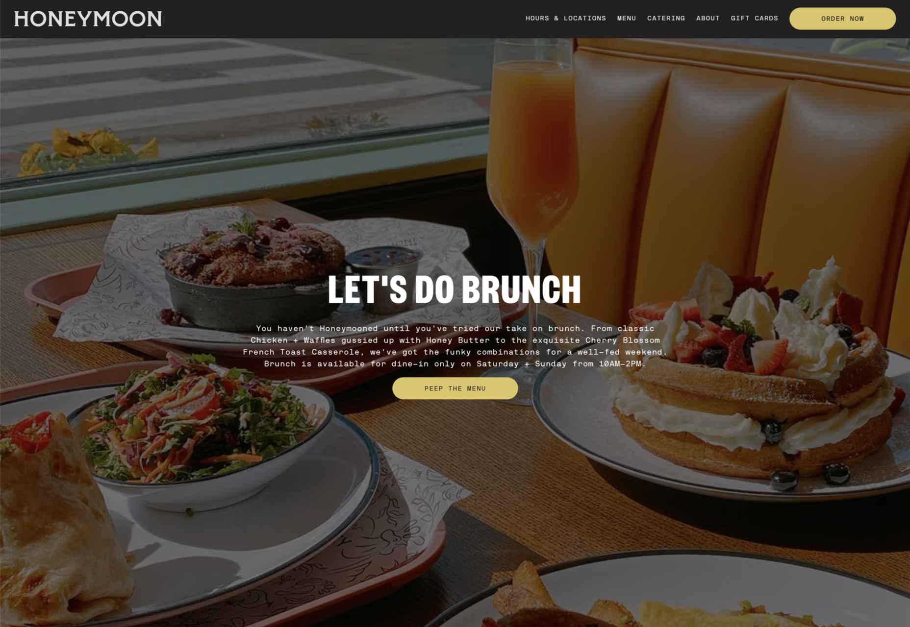
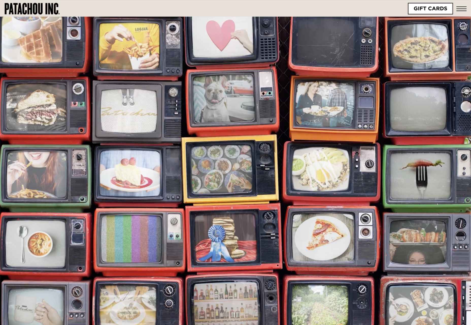
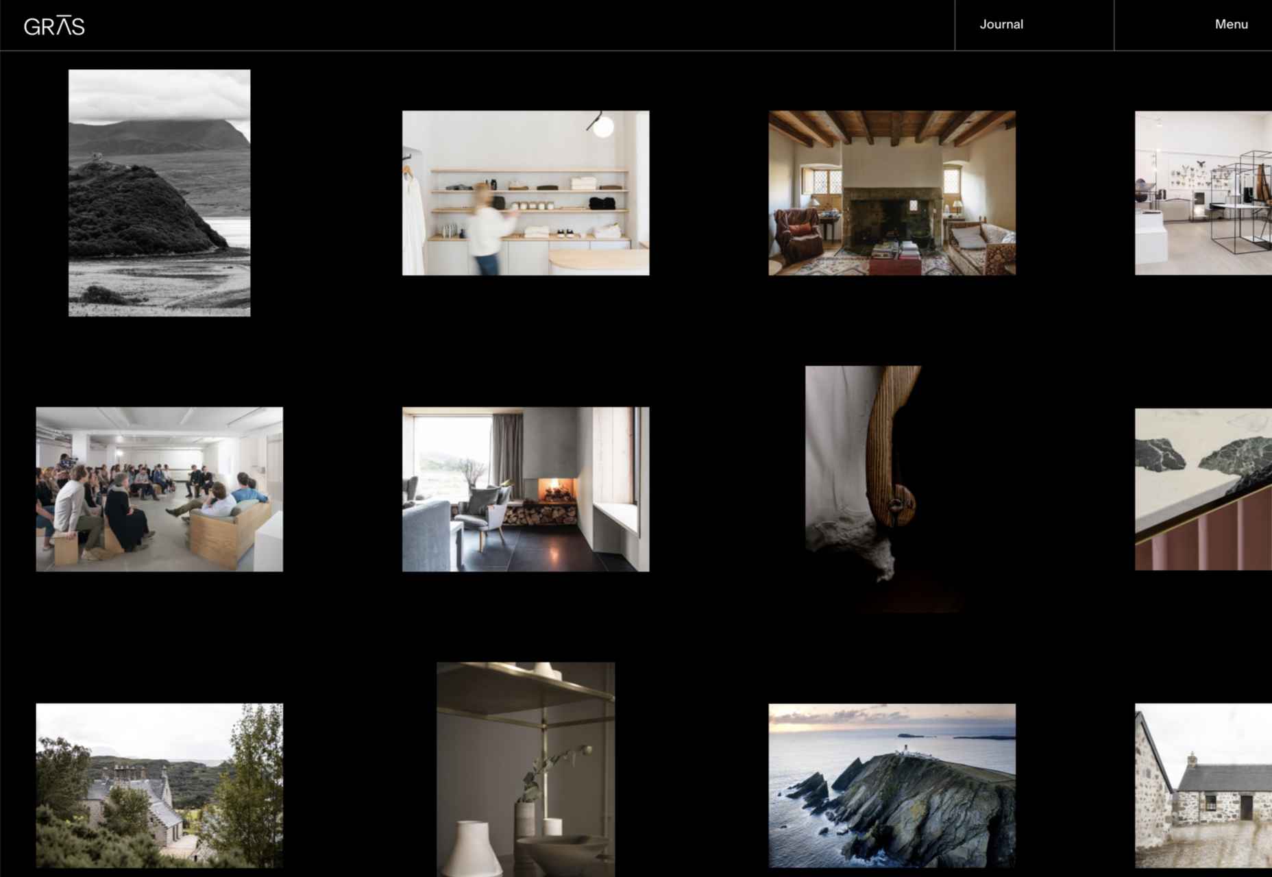
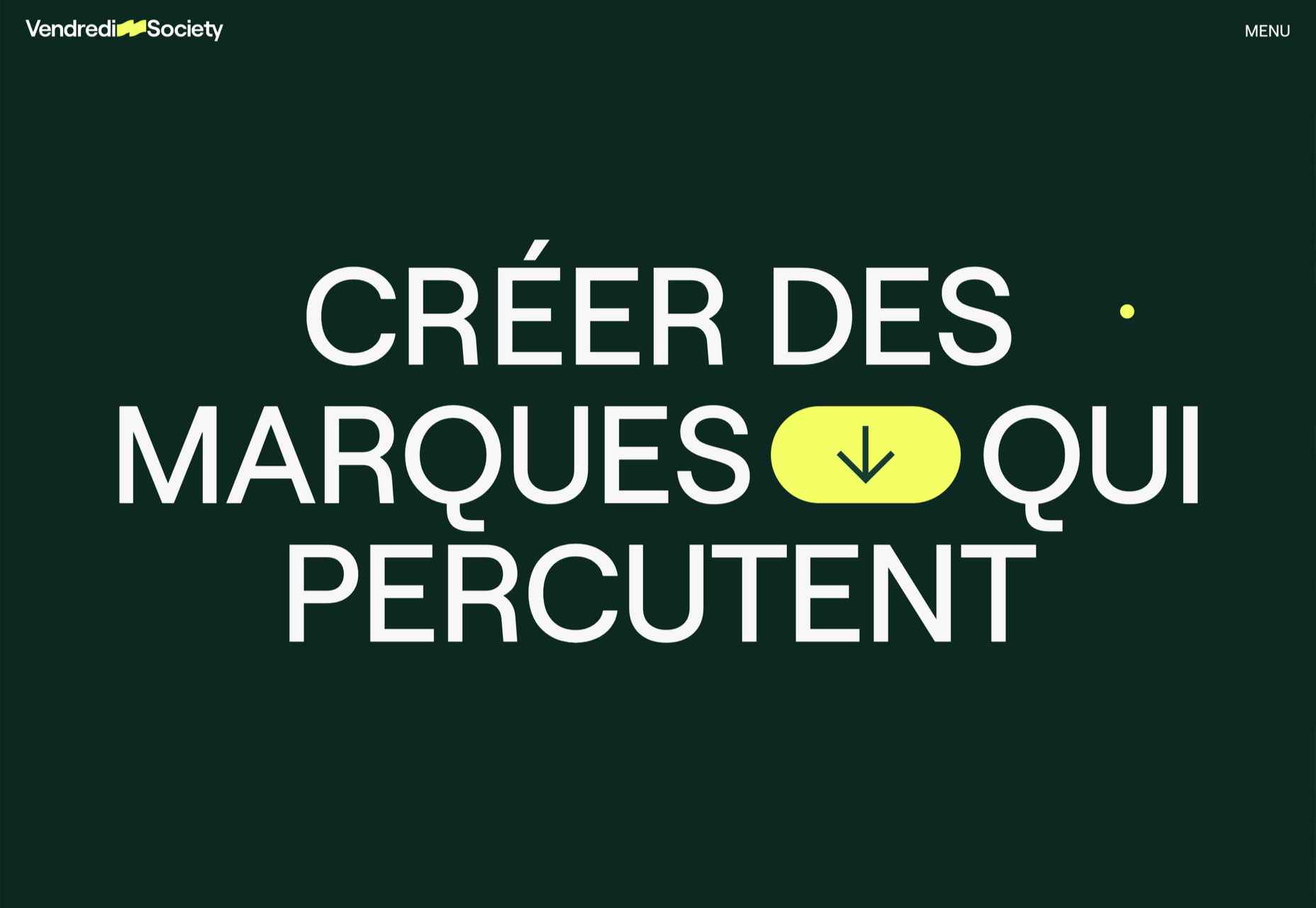
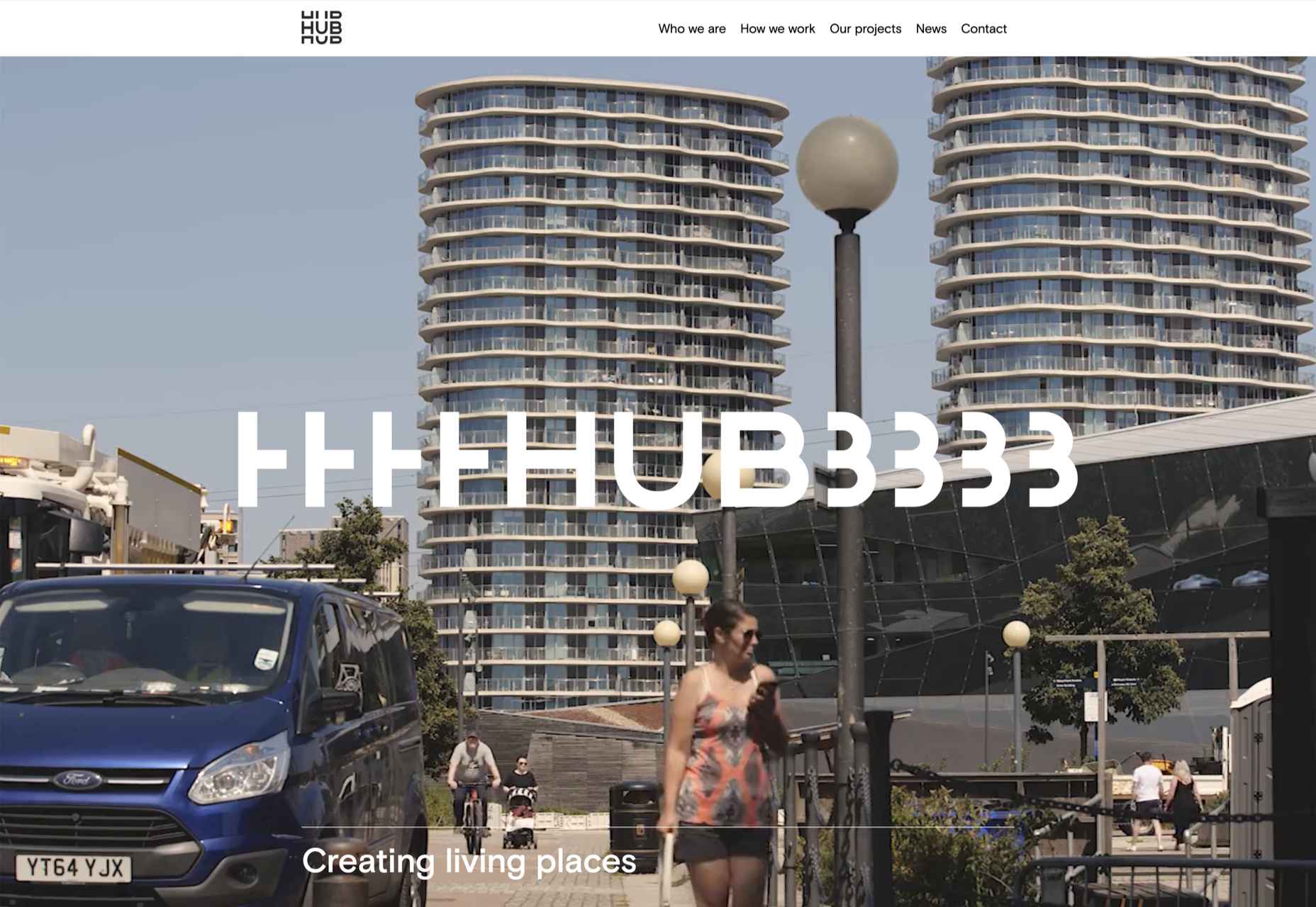
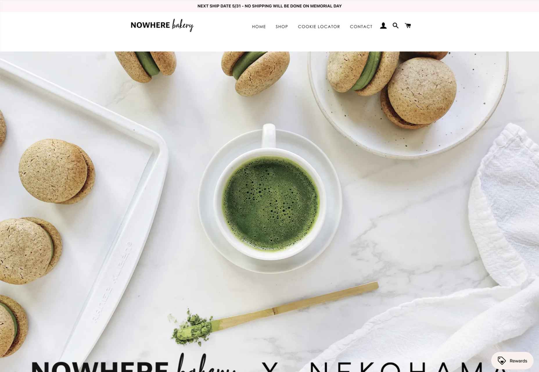
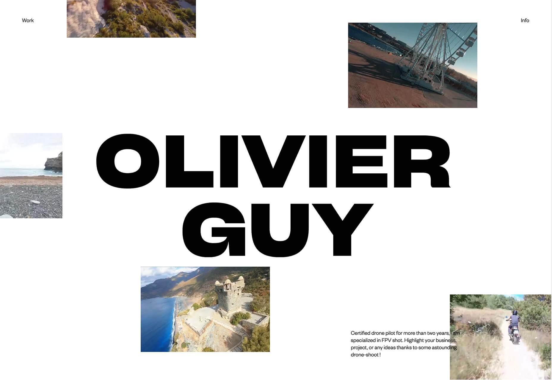
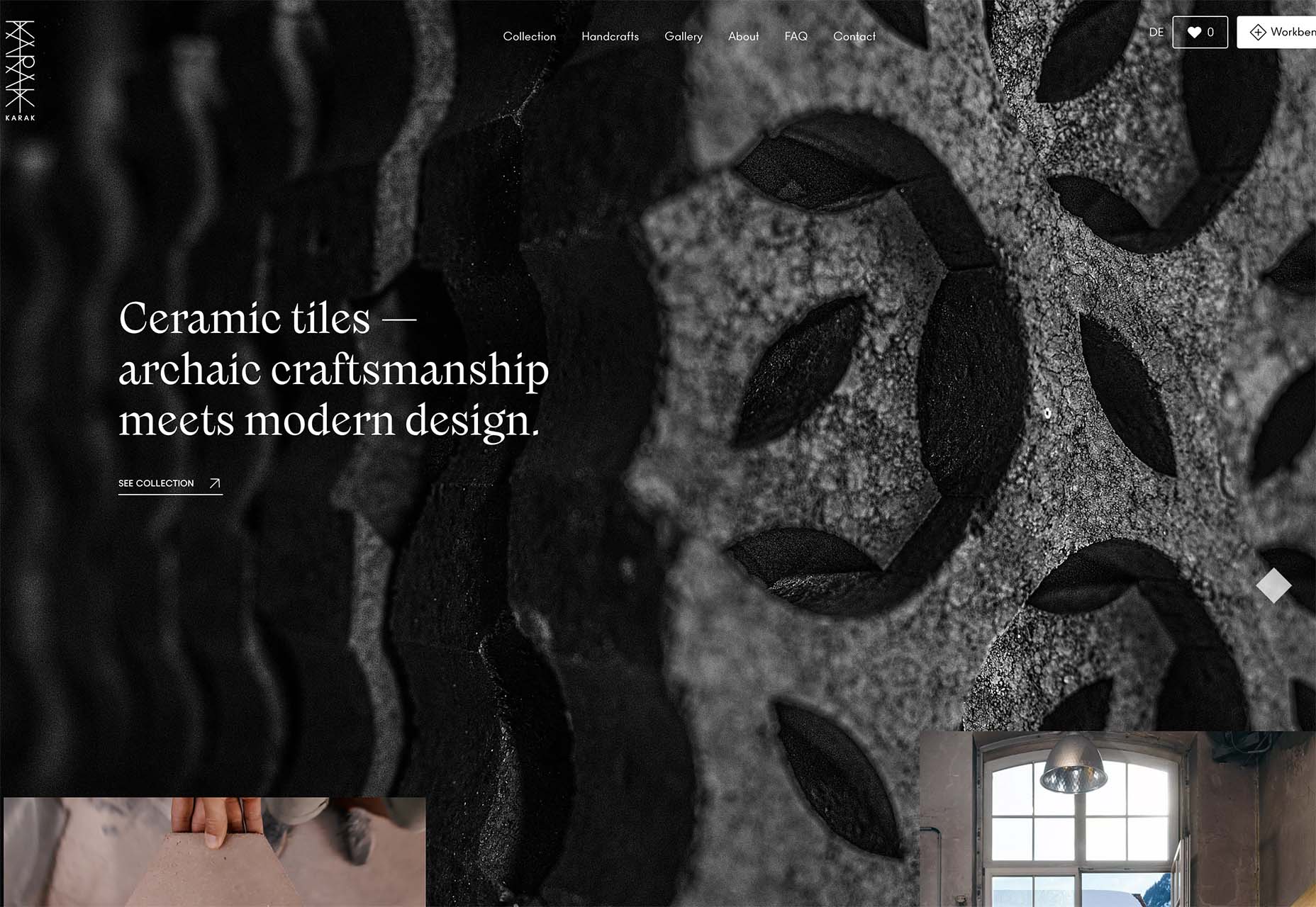
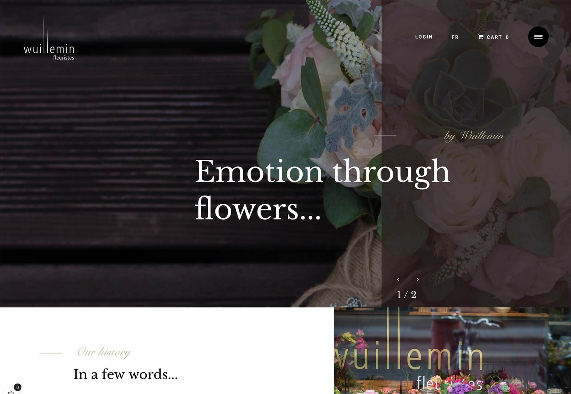
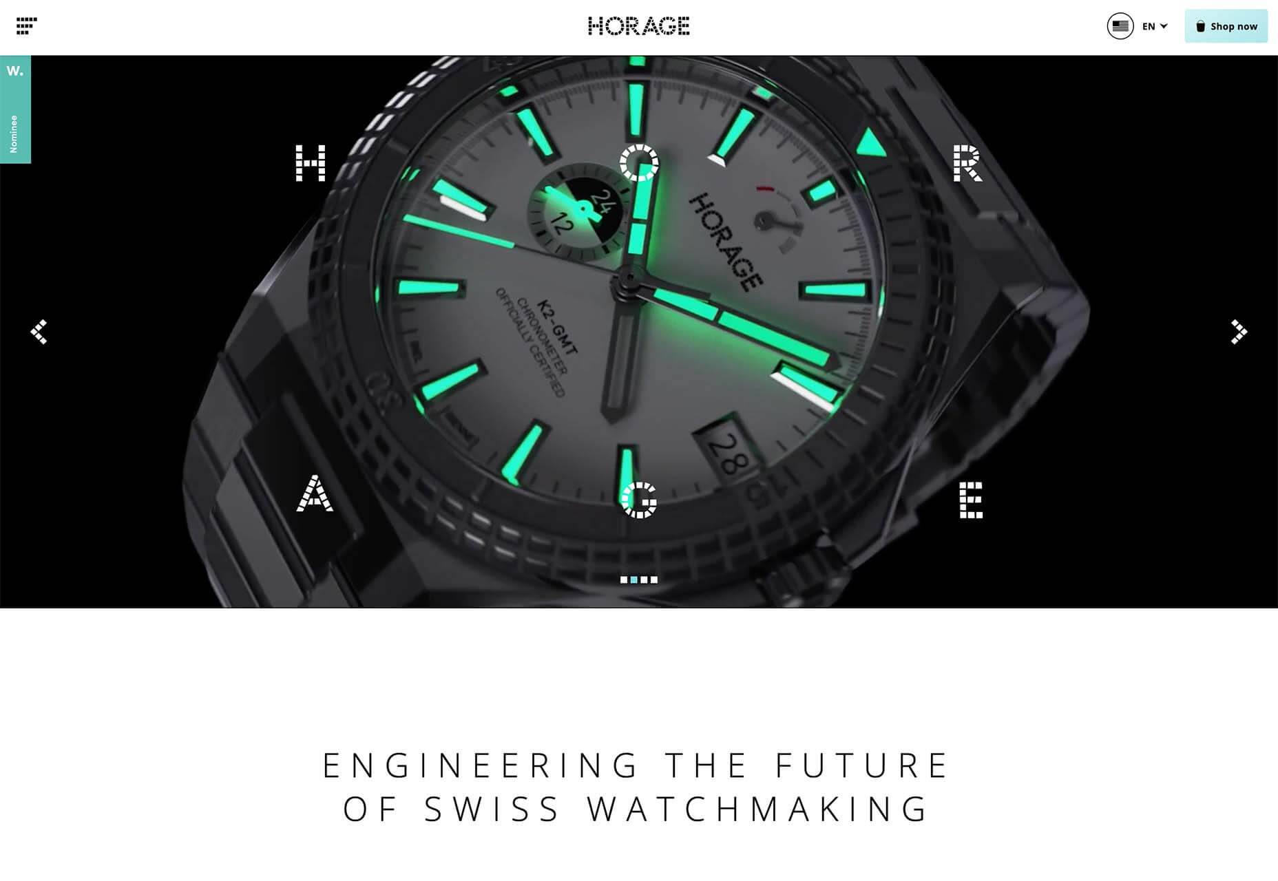
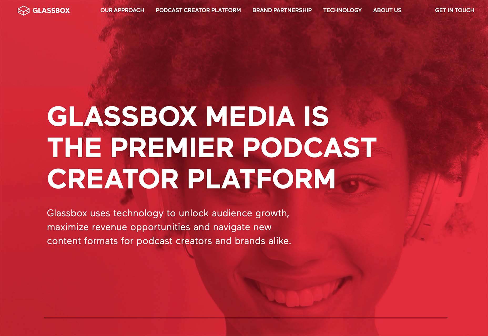
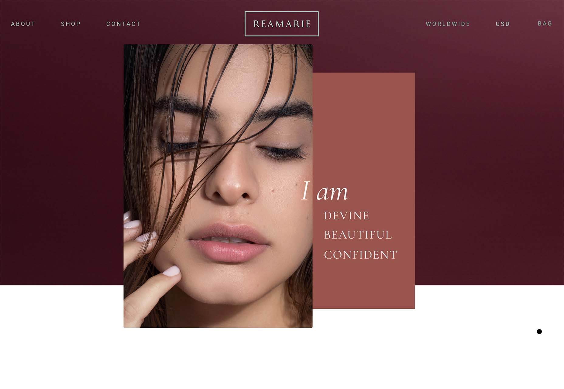
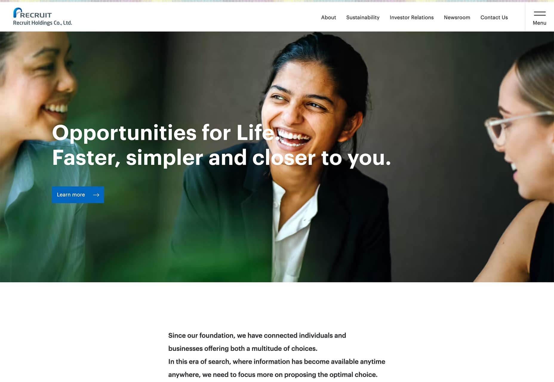
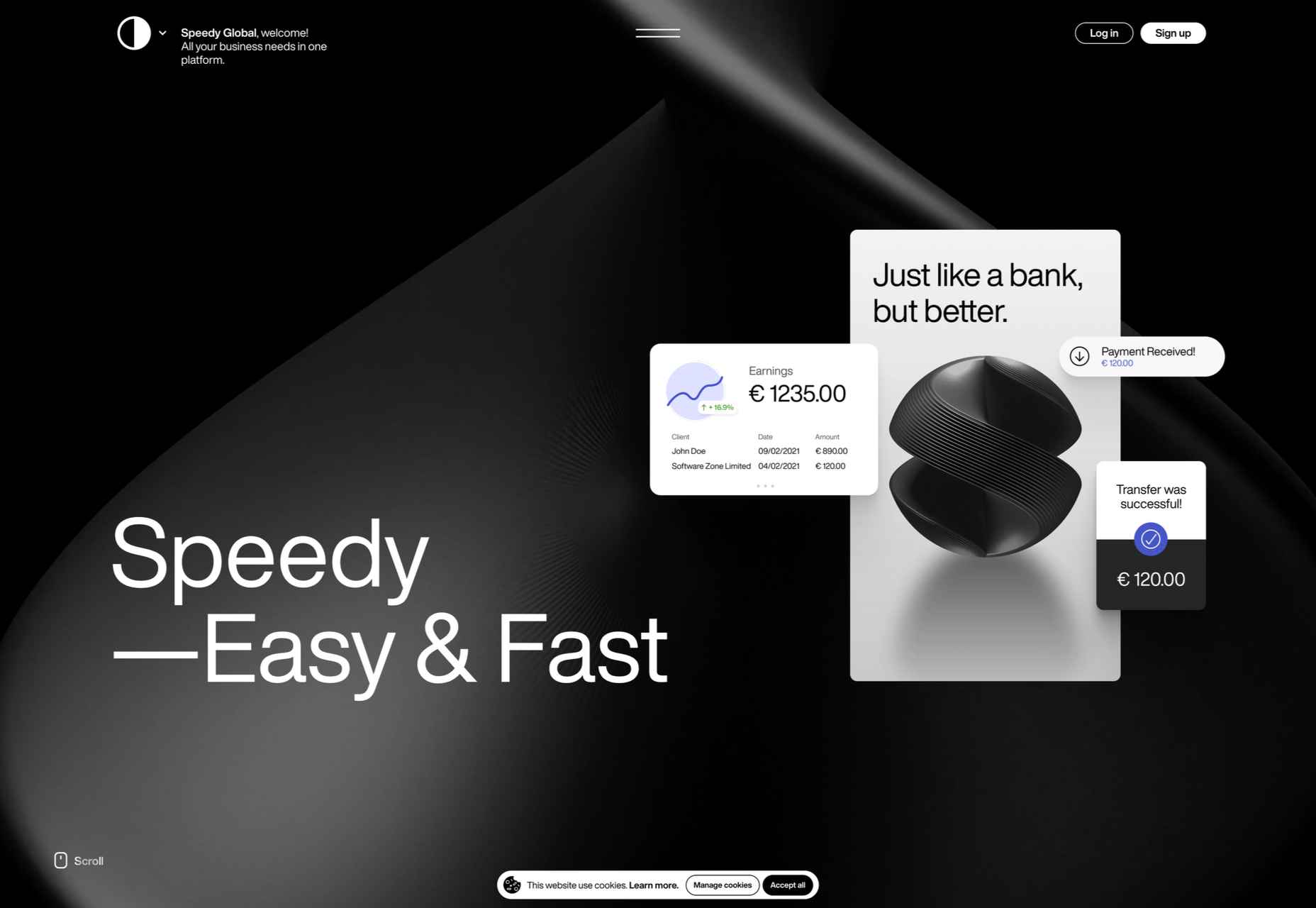
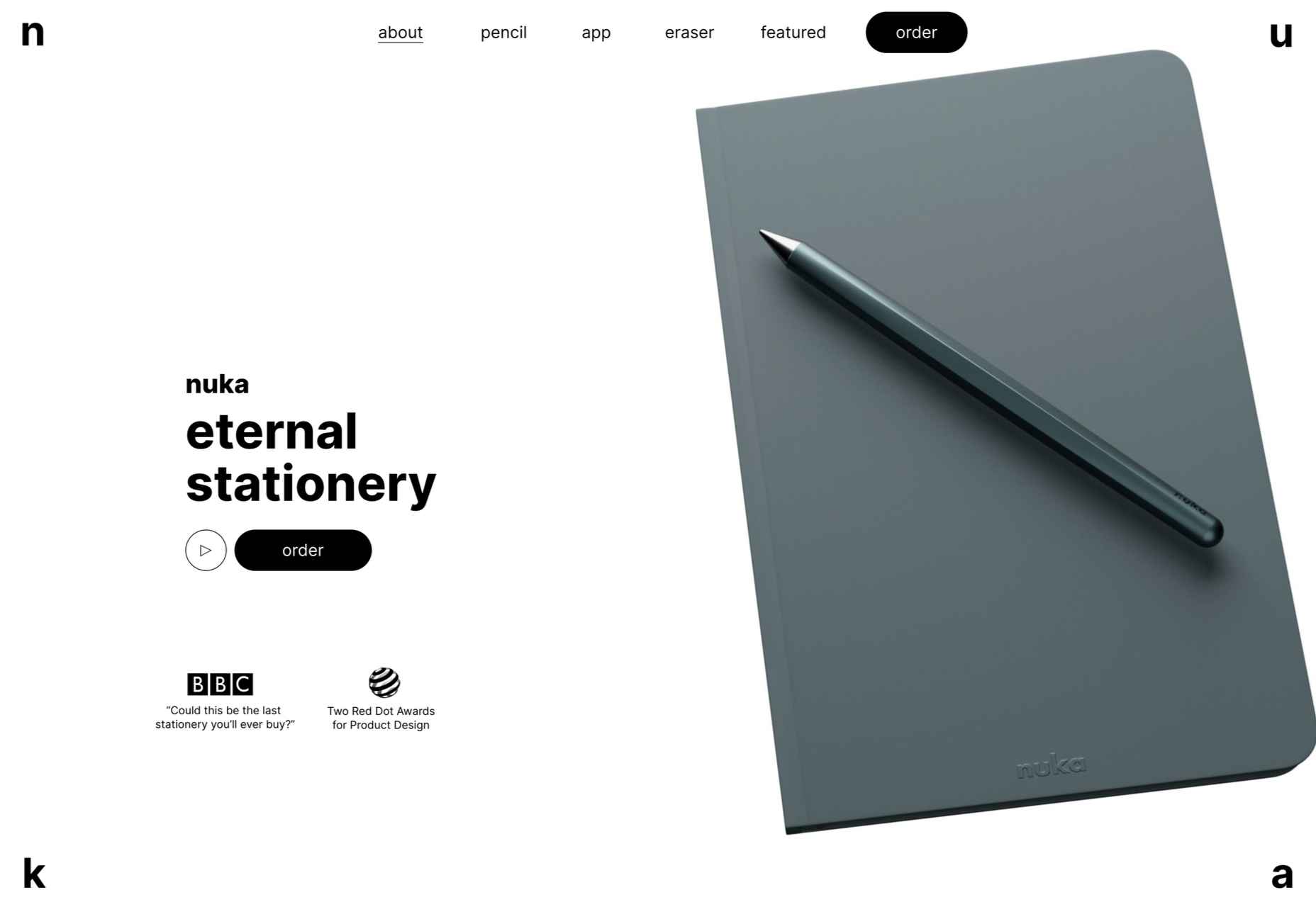
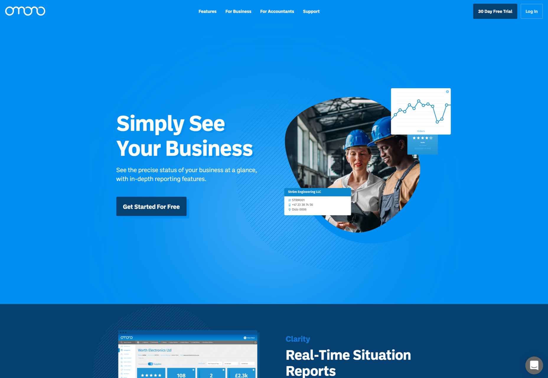
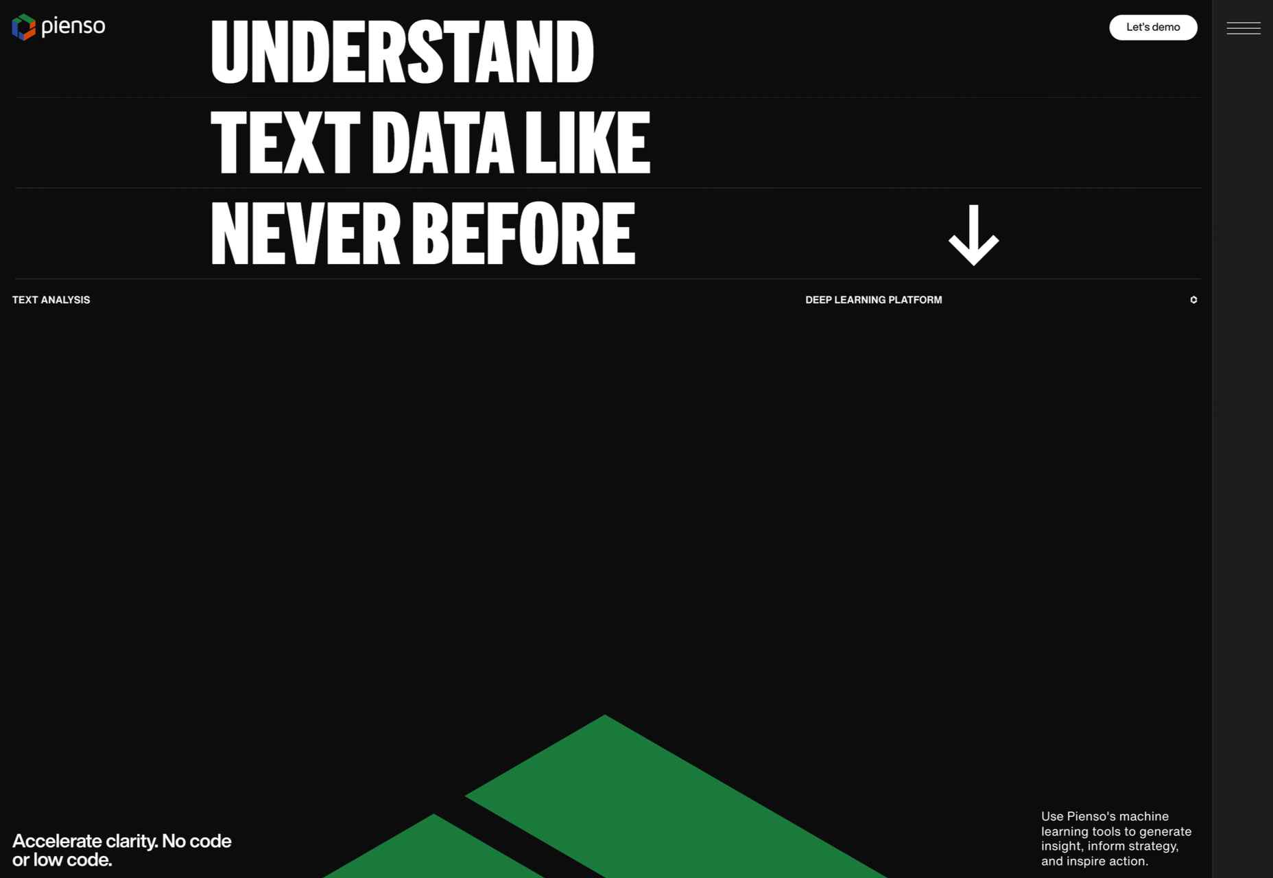
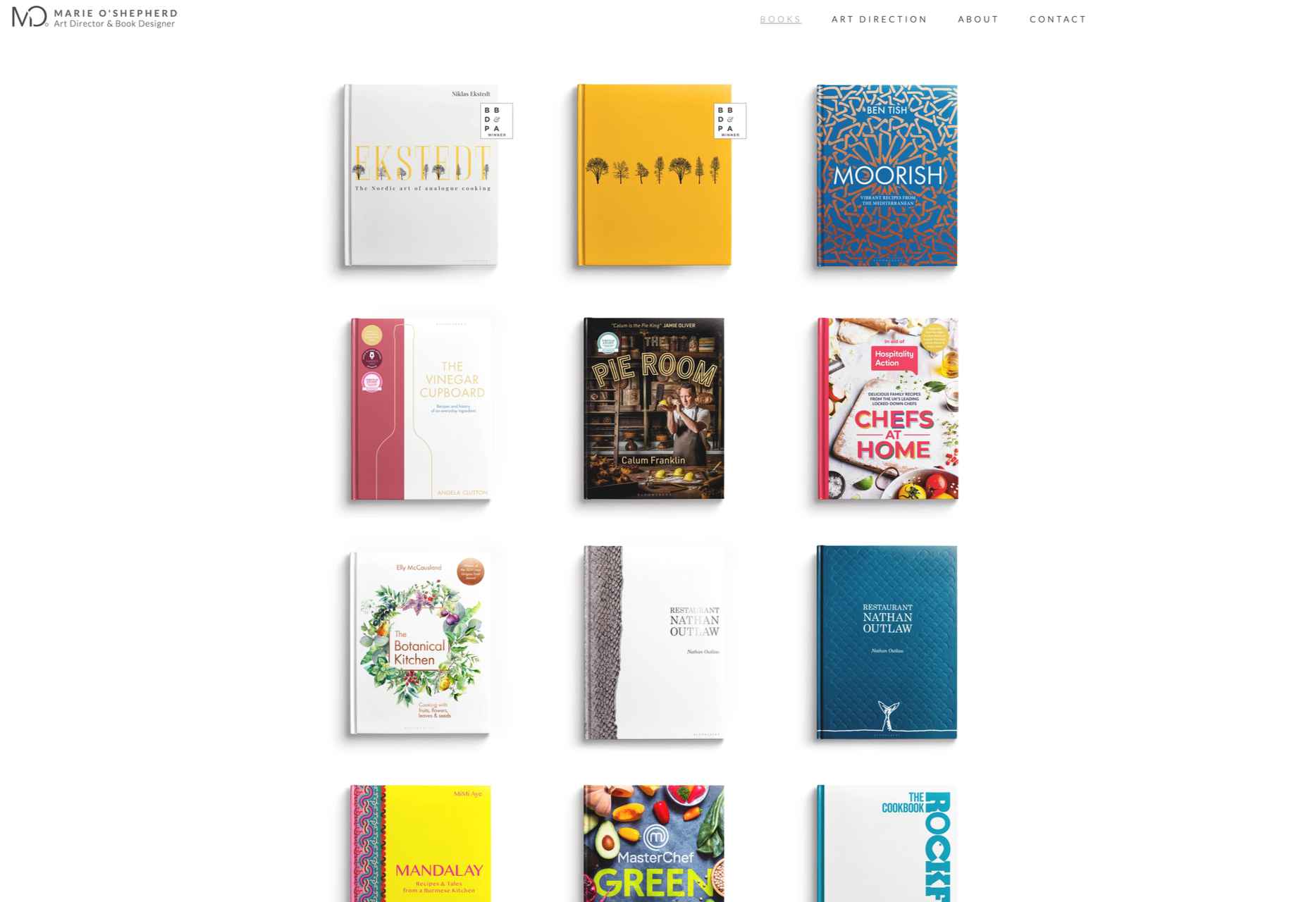
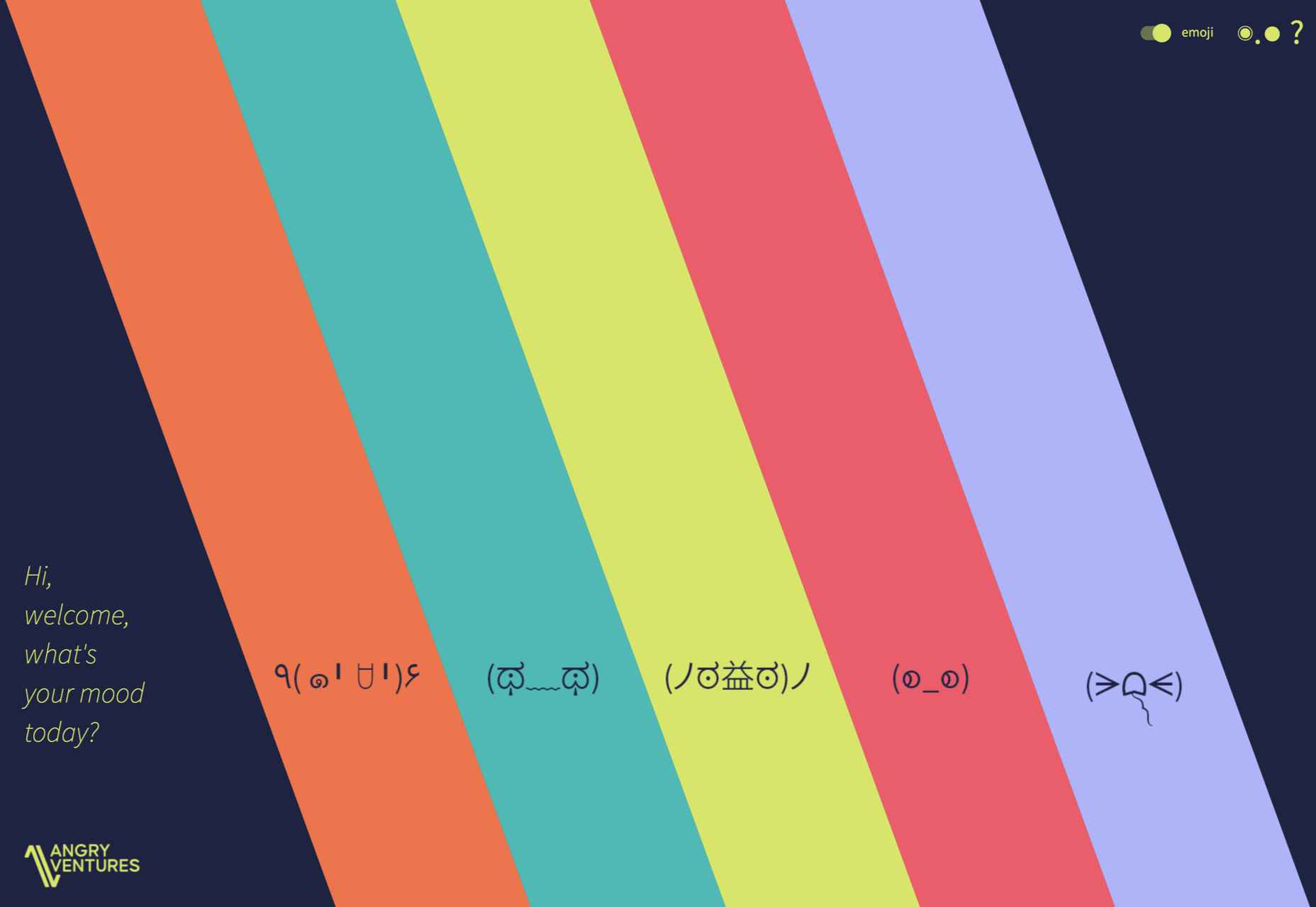
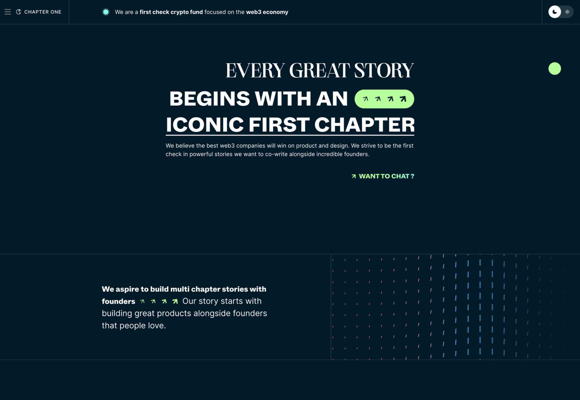
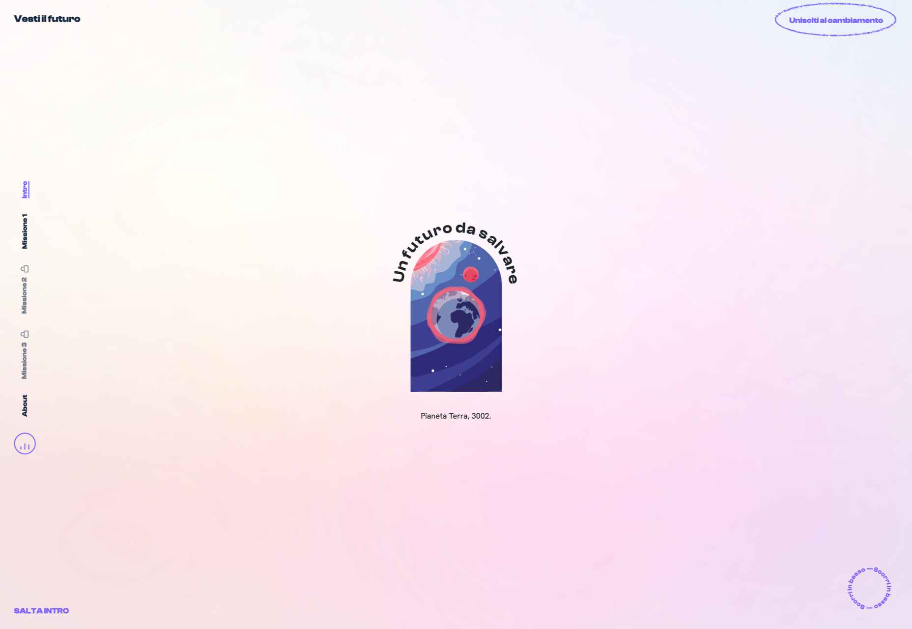
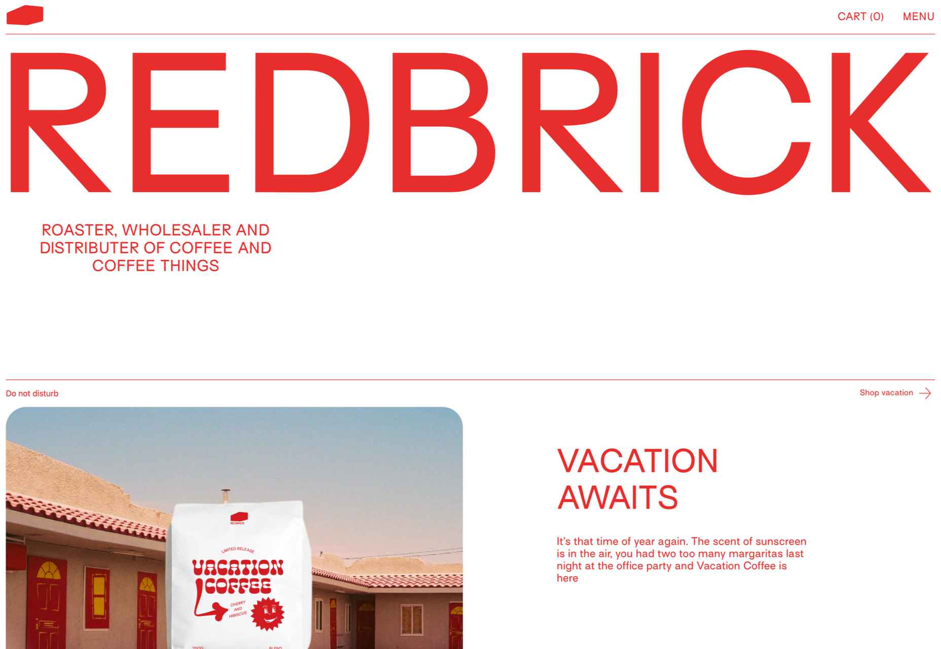
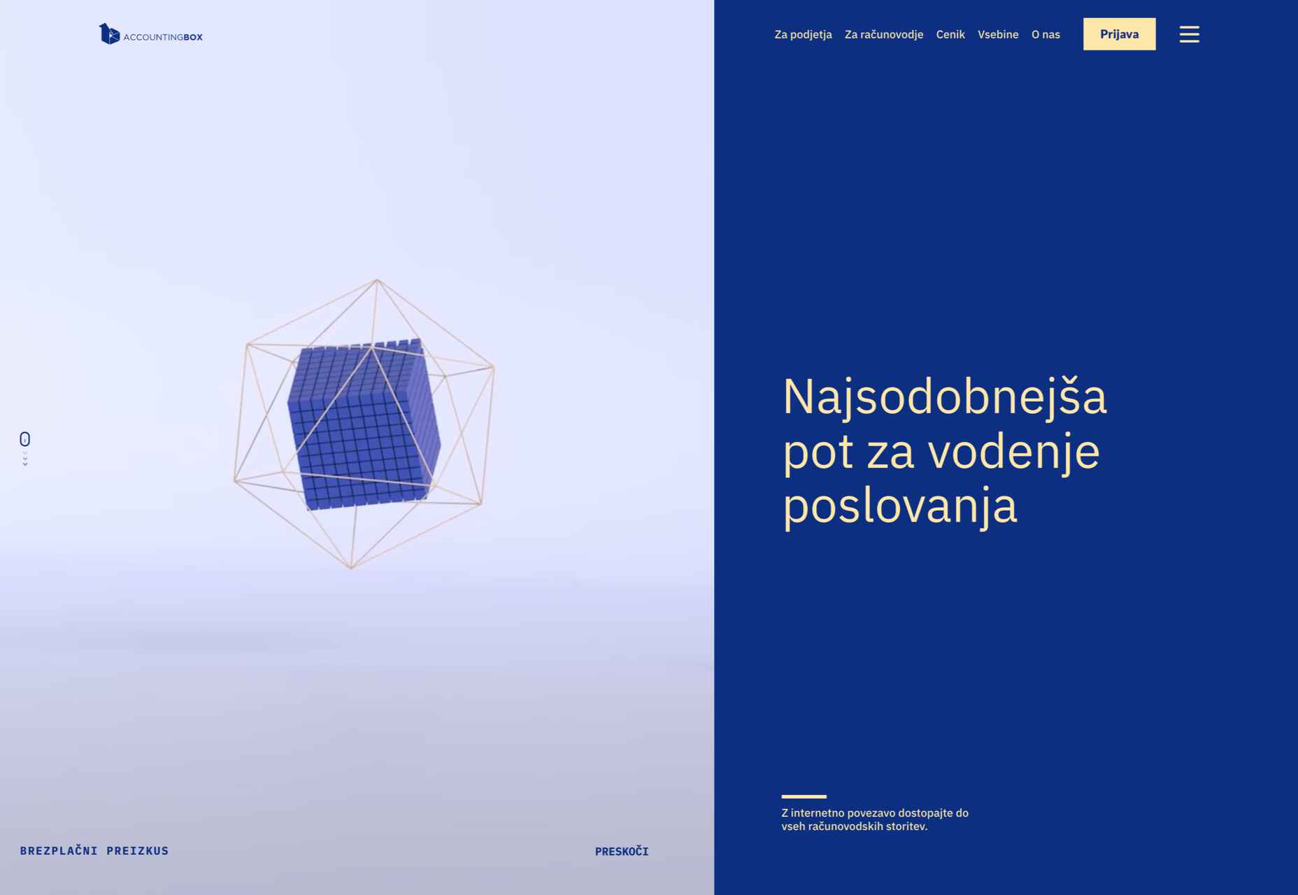
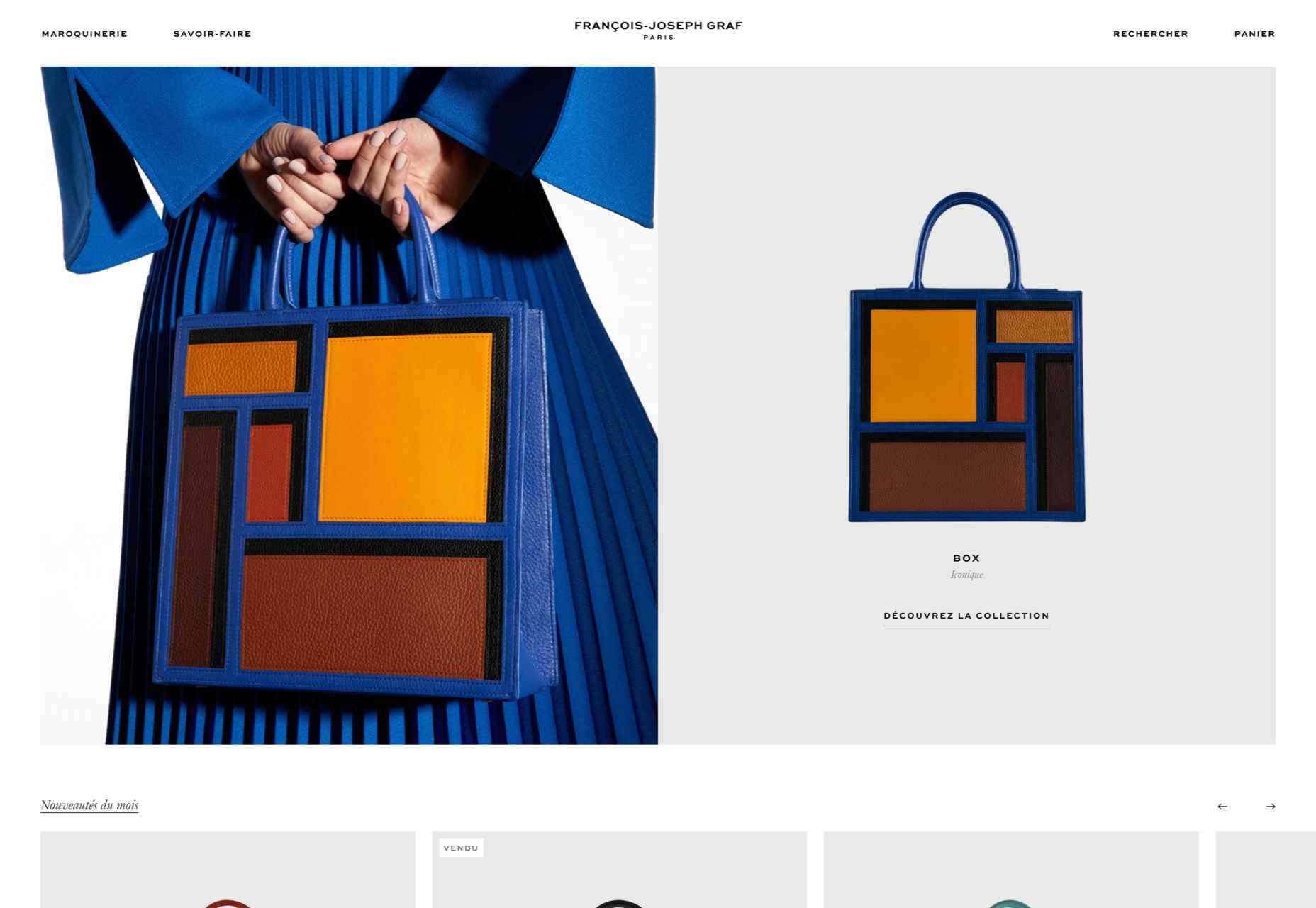
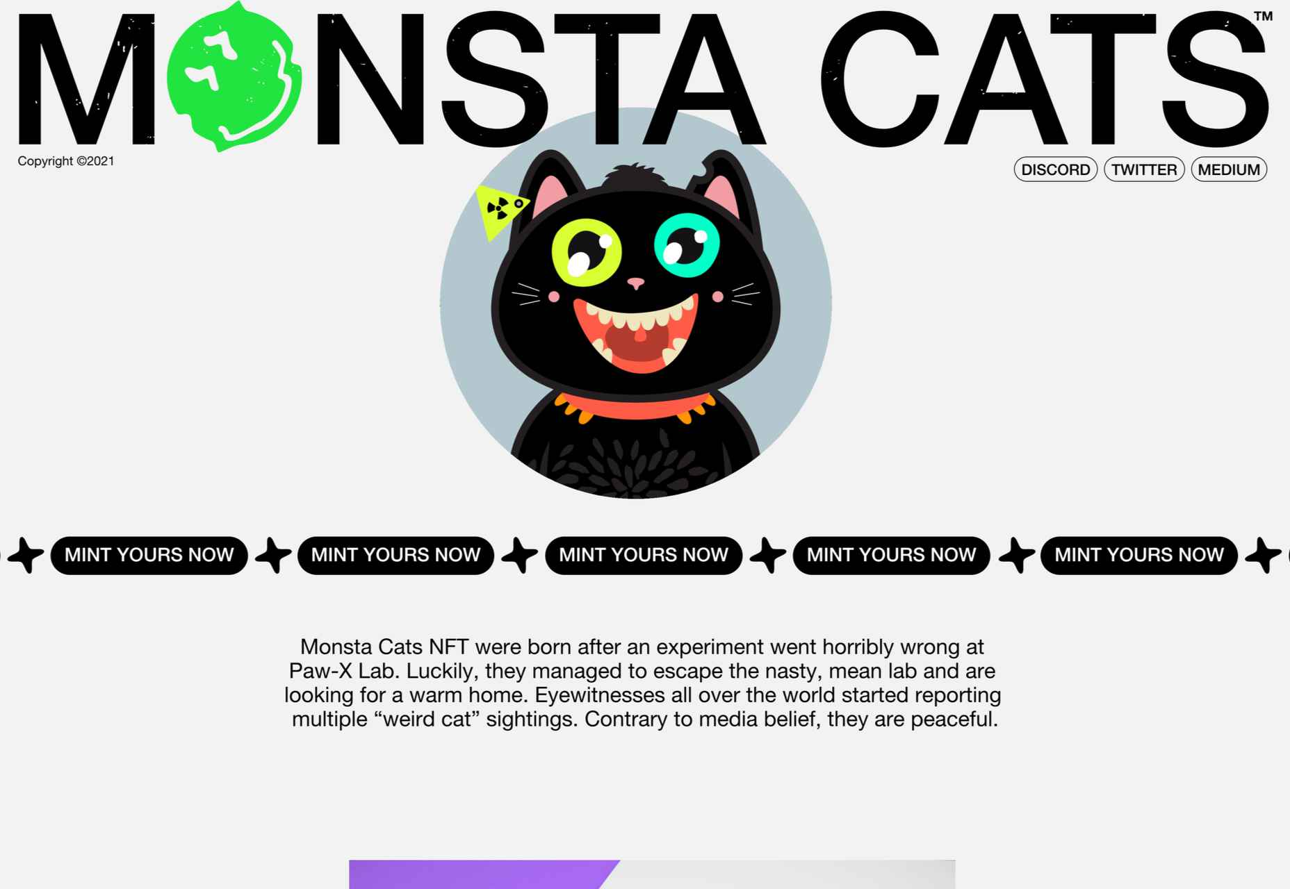
 This month’s collection of the best new sites is a mixed bag. Positivity remains from


 The underlying theme of this month’s collection of new tools and resources is development. Almost every tool here makes dev a little easier, quicker, or plain fun. There are a few great tutorials in the mix to help you get into the spirit of trying new things and techniques.
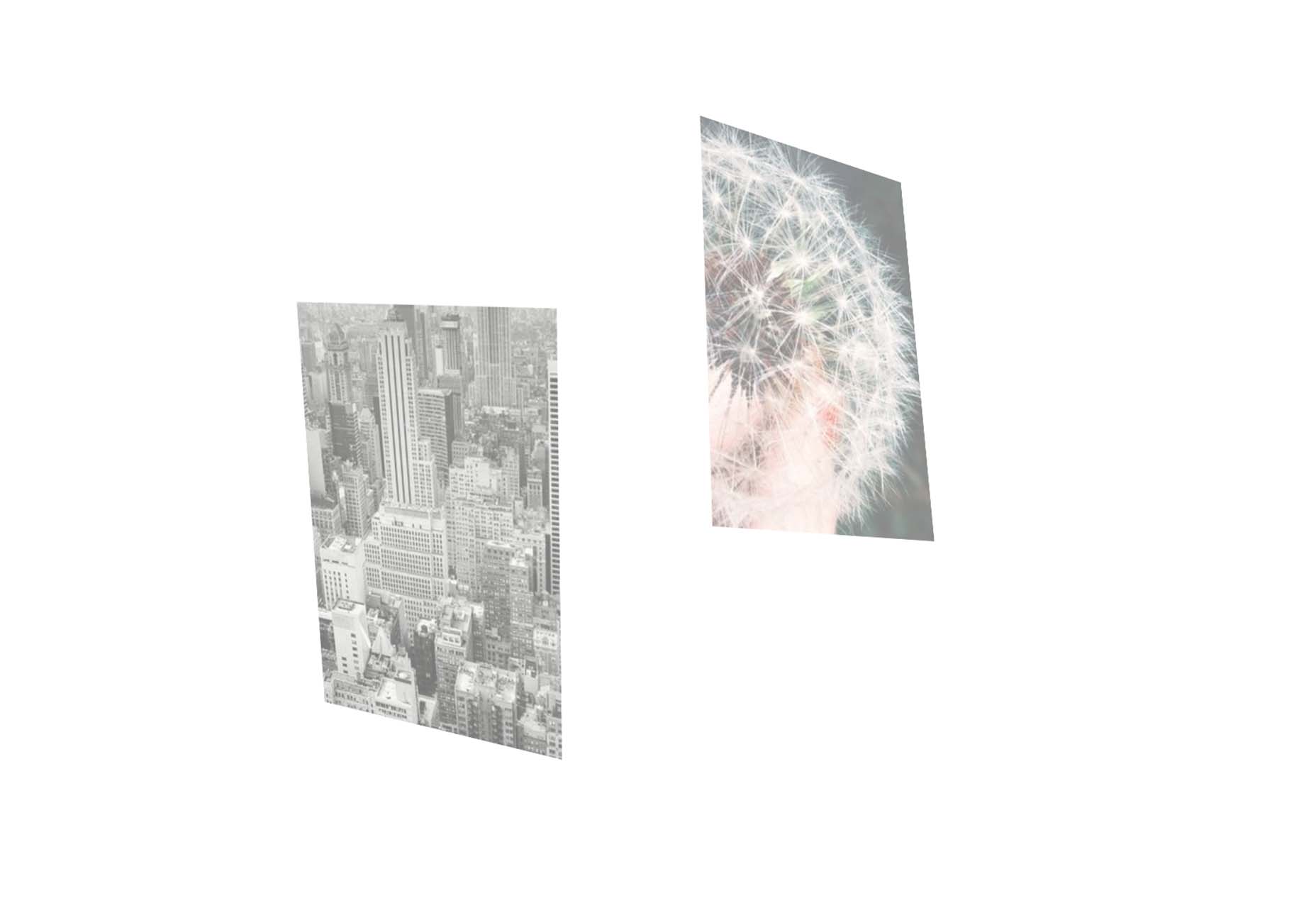


 This month all of our web design trends have a common theme – imagery. Whether it’s seasonal or just coincidence, there’s a shift in the styles and types of images on many designs right now. One thing that might push these design trends is a relaxation of COVID-spurred rules worldwide or even fatigue from the pandemic.
 Every day design fans submit incredible industry stories to our sister-site, Webdesigner News. Our colleagues sift through it, selecting the very best stories from the design, UX, tech, and development worlds and posting them live on the site.


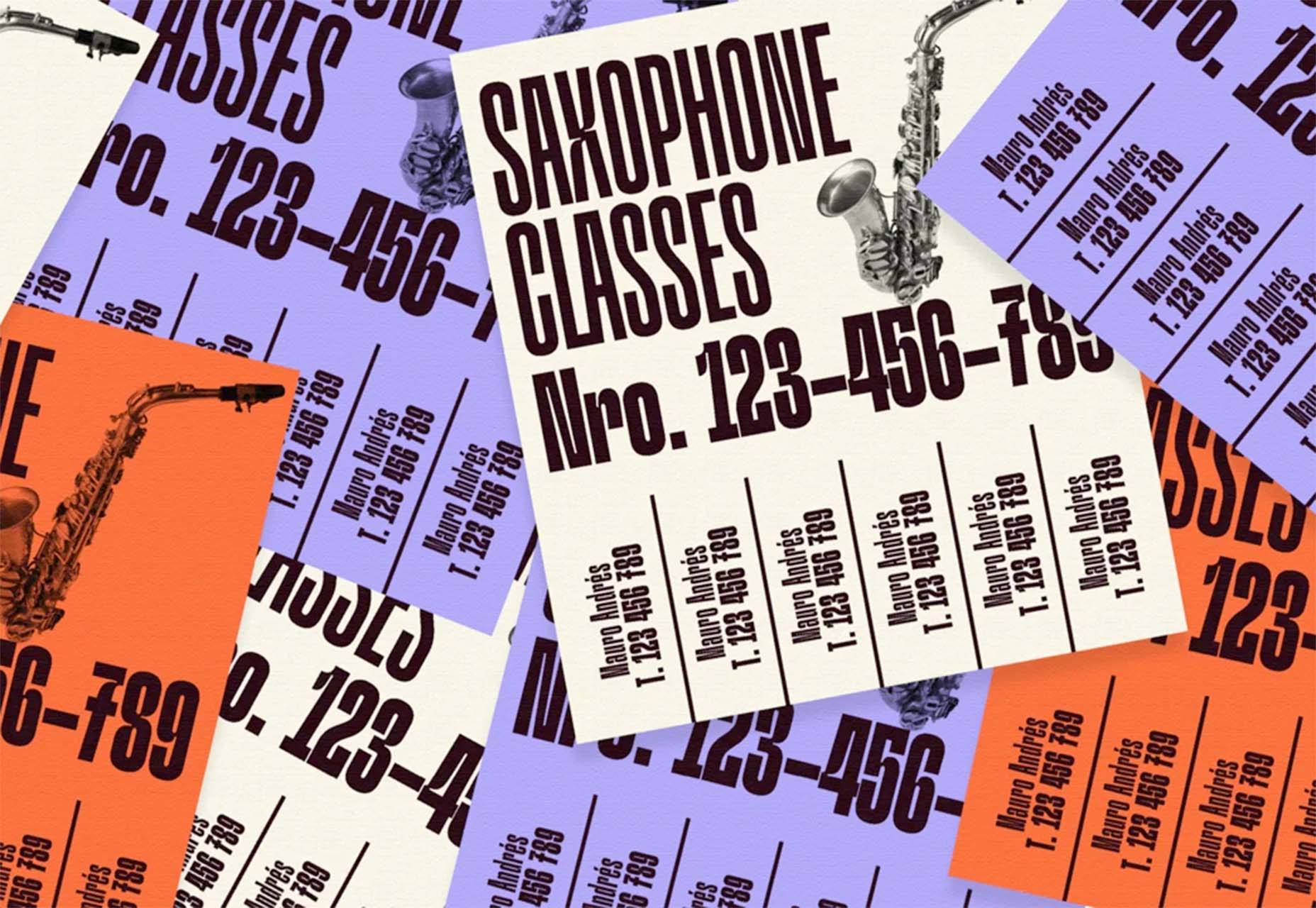
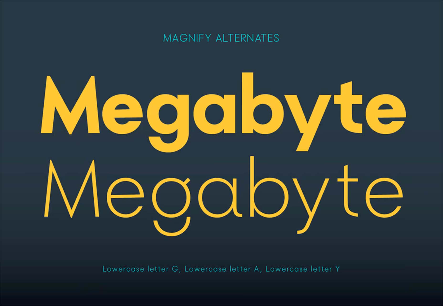
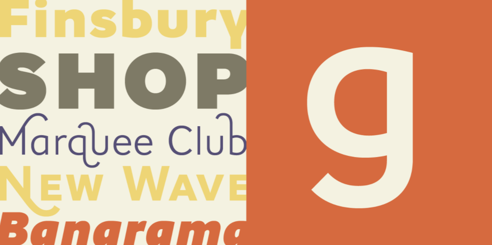
 As we move closer to spring, we’re going to see a change in typography styles come with it. While we always need new serifs and sans serifs to design with, in the spring, it’s not uncommon to use more nature-inspired and whimsical fonts to usher in the warmer temps, wedding season, and holidays like Earth Day and Mother’s Day.


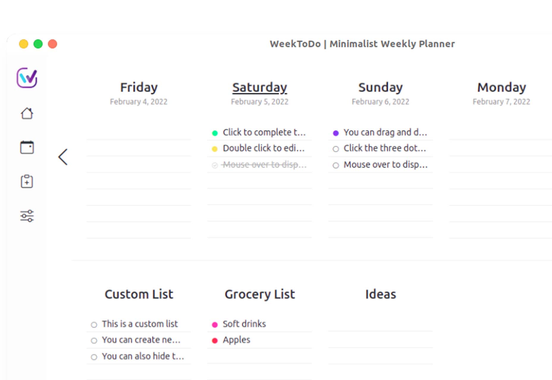
 So here we are, in a brand spanking new year—time for looking forward with fresh ideas and renewed hope for the year ahead. We are kicking off 2022 with a mixed bag and, we hope, something for everyone.


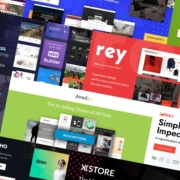
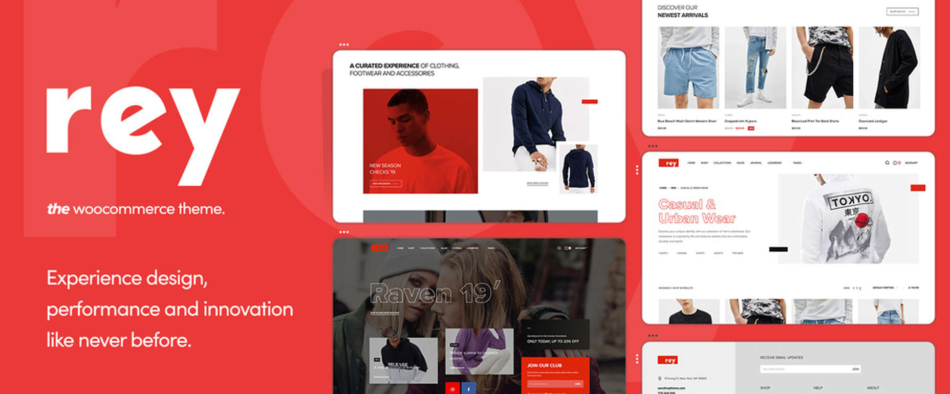
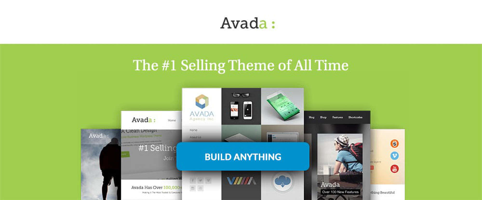
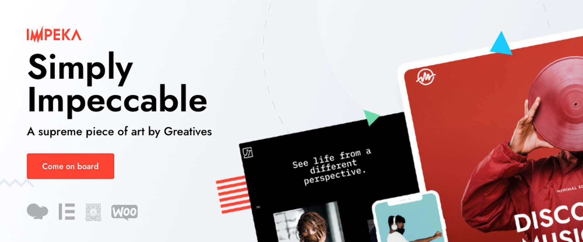
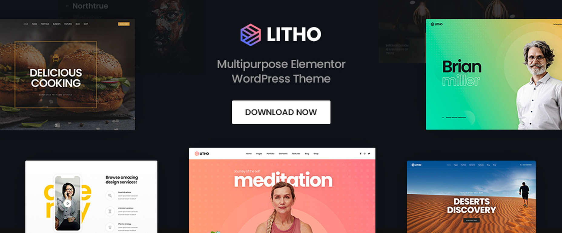
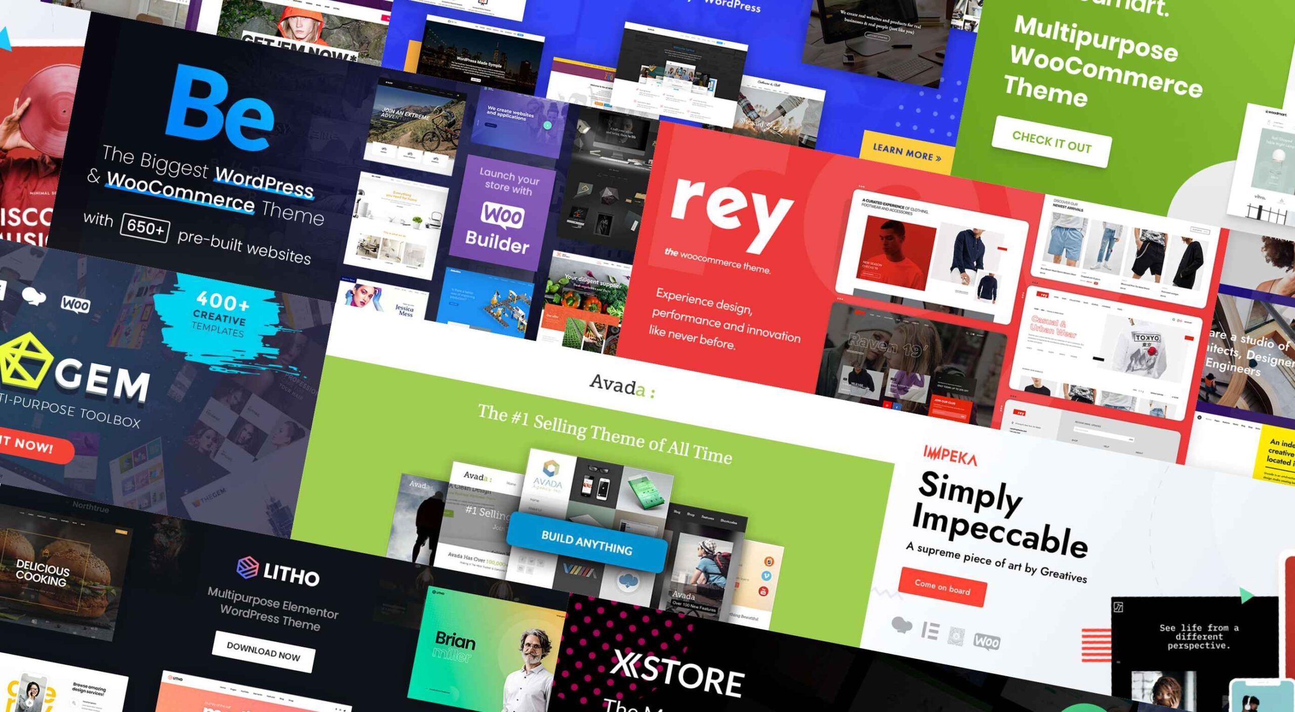 If you’re looking for a WordPress theme for your 2022 projects, it never hurts to see what the experts consider to be the best of the bunch. That’s not to say that experts don’t have their favorites. They often do, and we are no different.
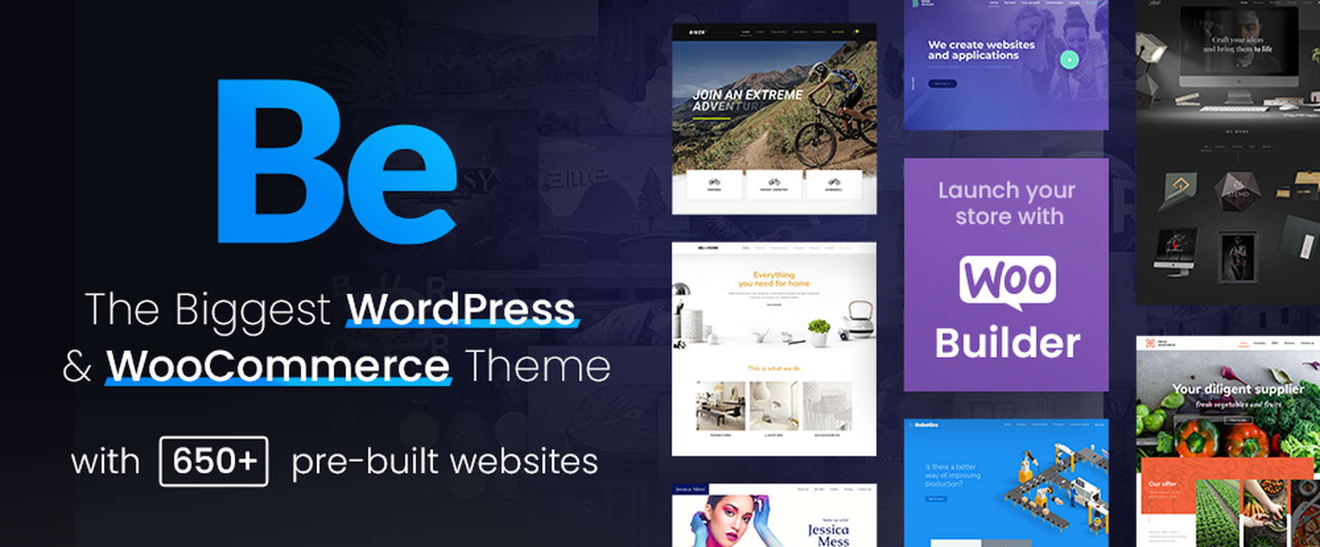
