Articles

So, really, you’re in the business of designing websites for your clients’ audiences.

But how do you ensure you get it right? You could take what your client tells you at face value, but that’s only going to scrape the surface of who their audience is.

What you need to do is figure out how consumers think and why they respond to websites the way they do. A lot of this is already explained to us by psychology principles.

Once you memorize them, you’ll be able to design user journeys that get visitors to respond exactly as you and your client want them to.

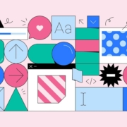
15 Psychology Principles to Use in Web Design

We as humans think certain ways, and your design should cater to those underlying thought processes and natural responses.

Below are 15 psychology principles that’ll help you design better, more intuitive digital experiences for your end-users:

1. Aesthetics-Usability Effect

The Aesthetics-Usability Effect suggests that people equate more attractive interfaces with more usable ones. In other words, a good, modern, responsive design should always be your starting point.

2. Color Psychology

Color psychology tells us about color’s influence over how something is perceived. With color so strongly tied to emotion, you can do a lot to affect how visitors perceive a website and the brand behind it.

3. Psychology of Shapes

Just as a color has the ability to affect someone’s perception of a brand or the content they’re looking at, so too do individual shapes used within an interface. Each shape — circles, squares, triangles, hexagons, and polygons — has a unique psychological association.

4. Gestalt Principles

Gestalt Principles are a way for humans to make sense of chaotic data presented to them. So, rather than see a bunch of text, images, and space, the human brain recognizes patterns to simplify complexity.

About half a dozen principles are associated with this theory, and they’re related to factors like symmetry, similarity, and proximity.

5. Mere-Exposure Effect / Jakob’s Law

The Mere-Exposure Effect, or Familiarity Principle, suggests that people are more likely to prefer things that seem familiar.

Jakob’s Law applies this psychology specifically to the internet user experience. It suggests that users expect your website to work the same way as the other sites they spend their time on.

6. Von Restorff Effect

The Von Restorff Effect, or Isolation Effect, describes what happens when someone is exposed to identical stimuli, and then a unique element is introduced to the fold. It’s the outlier that will most effectively grab their attention.

7. Selective Disregard

Selective disregard is a type of “blindness” users develop to anything seemingly irrelevant to their main goal. This often occurs when a design or marketing trend grows stale — like websites that use the exact same cookie consent banner.

8. Hick’s Law

Hick’s Law states that the number of choices a person has to make will increase the amount of time it takes to make a decision.

This is a fundamental principle to pay attention to on ecommerce sites as you want to speed up the decision-making process, not slow it down.

9. Loss Aversion

Loss Aversion states that decision-making is more commonly driven by avoiding losses than acquiring gains.

If your website or the content within it gives visitors any reason not to trust it or feel confident in taking action, you’re more likely to see high abandonment rates than conversions.

10. Paradox of Choice

The Paradox of Choice is a response to the problem posited by Hick’s Law. It suggests that the reduction of choices makes consumers feel less anxious, which, in turn, increases confidence and satisfaction with purchases.

If your site suffers from high cart abandonment or product returns, the paradox of choice would be a useful principle to leverage.

11. Miller’s Law

Miller’s Law, also referred to as Cognitive Load Theory, has to do with memory capacity. On average, people can only have about seven items stored in their working memory at any given time.

This psychology principle encourages the reduction of options and the general reduction of content to improve focus and decision-making capabilities.

12. Feedback

Feedback is one of the principles of learning and plays a big part in interaction design.

Feedback is what designers use to tell people when they’ve made progress towards a goal or achieved it. You can also use it to teach visitors how a website will respond to their actions, which encourages faster and more confident engagements with your website.

13. Extrinsic Motivation

There are two types of motivation. Intrinsic motivation is an internal one, whereas extrinsic is external.

It’s Extrinsic Motivation that plays a role in getting users to complete more tasks online. As a designer, you have to make sure these kinds of “rewards” are obvious.

14. Social Proof

Not so much a psychological principle as it is a psychological phenomenon, Social Proof or Influence, suggests that people will copy the actions of the masses. It also refers to the assumption that the truth lies with the majority.

This is why customer reviews, client testimonials, and user-generated content have become so useful on websites.

15. Peak-End Rule

The Peak-End Rule states that people will judge an experience based on their very first and last impressions of it. This is somewhat related to the Serial Position Effect, whereby people will remember the first and last items in a group.

So, this is something to remember when you build out the top and bottom of each page as well as the start and expected end to the user journey.

Wrap-Up

Want to build better websites? Then, you need to design from the end users’ perspective.

The best place to start is with psychology principles, as they’ll tell you how most consumers think and what motivates them to respond. If you understand this inherent cause-and-effect relationship, you can design websites that elicit the right kind of response from your visitors.

Source

The post 15 Psychology Principles Every Designer Should Know first appeared on Webdesigner Depot.


Source de l’article sur Webdesignerdepot

Today, most companies are using Python for AI and Machine Learning. With predictive analytics and pattern recognition becoming more popular than ever, Python development services are a priority for high-scale enterprises and startups. Python developers are in high-demand — mostly because of what can be achieved with the language. AI programming languages need to be powerful, scalable, and readable. Python code delivers on all three.

While there are other technology stacks available for AI-based projects, Python has turned out to be the best programming language for this purpose. It offers great libraries and frameworks for AI and Machine Learning (ML), as well as computational capabilities, statistical calculations, scientific computing, and much more. 

Source de l’article sur DZONE

In the era of web-scale, every organization is looking to scale its applications on-demand, while minimizing infrastructure expenditure. Cloud-native applications, such as microservices are designed and implemented with scale in mind and Kubernetes provides the platform capabilities for dynamic deployment, scaling, and management. 

Autoscaling and scale to zero is a critical functional requirement for all serverless platforms as well as platform-as-a-service (PaaS) solution providers because it helps to minimize infrastructure costs.

Source de l’article sur DZONE

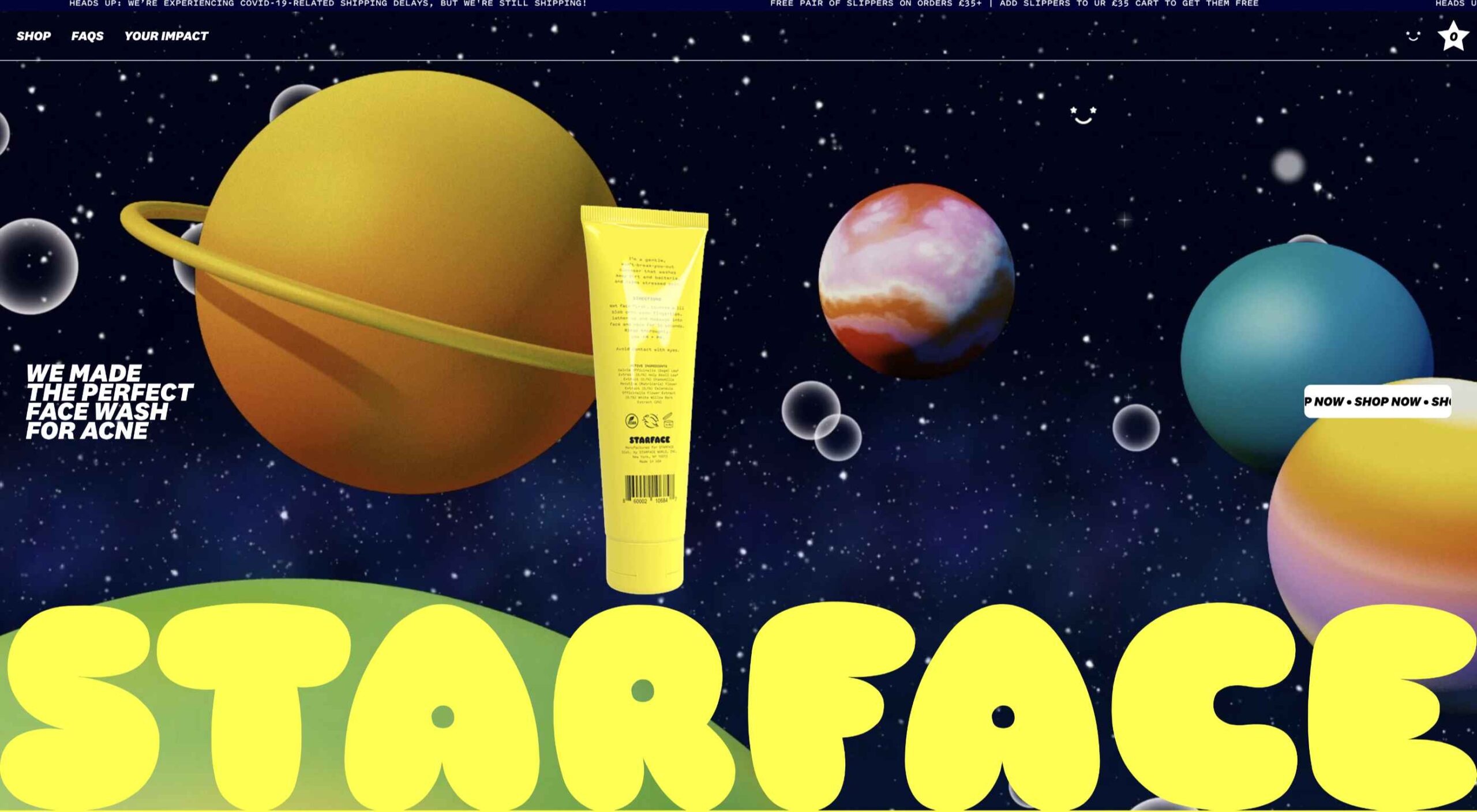
If you like to build websites with WordPress, then you’re in for a treat.

Now, for the first time, you don’t need to know how to code to use Google’s popular Material Design system on your WordPress website; the web giant has released a WordPress plugin and theme to import its colors, icons, UI elements, and typography straight into your CMS.

Google already provided a set of tools for generating Material Design themes, but until now you needed to know how to copy that code across to your site files. With this latest plugin and theme, all you need to do is click and go.


You need to install both the plugin and theme to take advantage of Material Design for WordPress. Using the add-ons, you can tweak your typography via Google Fonts, add-in MD color, and even choose your own icons. If even that’s too much, pick one of the pre-built themes. One of the best features is that the plugin warns you if your customizations break accessibility guidelines, saving you a do-over when you discover it later on.

Google calls it “an experimental plugin and theme,” which means it’s subject to change. And Google has been quick to emphasize that the plugin is very much a work in progress, asking for feedback to help them direct future development efforts.

It’s a really great option for anyone who’s starting on the web, building their first site, or who really wants a nice reliable design system that they can build on in the future.

It’s yet another automation tool that has driven WordPress to the top of the technology pile and made it the CMS of choice for 40% of the web. As tech hots up and AI continues to develop, it’s hard to dismiss the idea that one day soon, our only contribution to websites will be paying the hosting bill!

Source

The post Try the New Material Design Capabilities for WordPress first appeared on Webdesigner Depot.


Source de l’article sur Webdesignerdepot

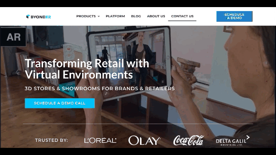
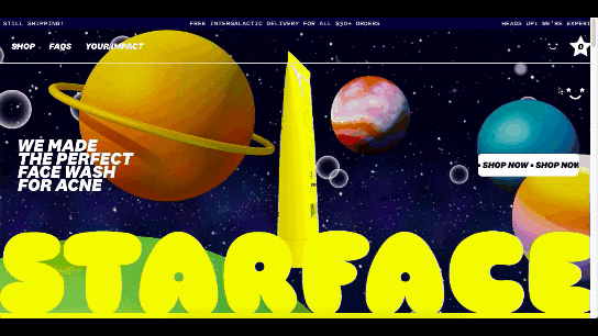
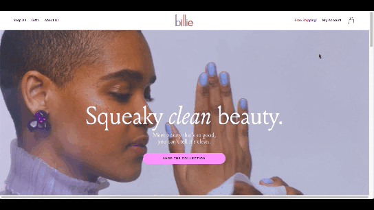
There are some interesting shake-ups on the horizon for ecommerce: Experiential shopping, Virt-ical worlds, Au naturale models.

We’re starting to see signs of them already — many of them spurred on thanks to the events of 2020. Below, we’re going to explore what’s going on with these new ecommerce trends and technologies and take a look at a bunch of sites that are setting really cool examples for each.

1. Experiential Shopping

With many stores, either closed to in-person shopping during the pandemic or their capacities severely limited, online shopping and BOPIS became much more attractive options for consumers.

That said, buying something like a pair of jeans or a new pair of glasses is much different than the pack of toilet paper someone’s bought for years. There are just some things you have to try to know if you’re going to like it and make sure it fits.

Augmented reality and other immersive shopping tools are bringing those “try-on” capabilities to people’s homes.

There are a number of technologies built specifically for this purpose:

Obsess is a particularly noteworthy one. It’s an ecommerce platform that enables retailers to build virtually immersive shopping experiences. Charlotte Tilbury is one such retailer that is taking advantage of it.

Obsess, the augmented reality and immersive shopping experience platform

At the end of 2020, Obsess announced that it had received $3.4 million in seed funding, so expect to see more Obsess-powered ecommerce sites and apps.

ByondXR is another platform that empowers brands to design immersive experiences for online shoppers:

ByondXR helps brands create experiential shopping

Retailers like Lancome, Procter & Gamble, and Calvin Klein have used ByondXR’s immersive commerce technology.

Another option is offered by Matterport:

Matterport's virtual shopping experiences and 3D store mapping tech

This technology is interesting as you’re not just creating a virtual store. You can also design a 3D model of a brick-and-mortar shop that in-store shoppers can use to get in and out quickly.

2. Virt-ical Worlds

There’s a new trend brewing, and we see it most commonly on websites for fresh and youthful brands. I wouldn’t say it’s nostalgic design, per se, though there are certainly some elements reminiscent of the bold, in-your-face style of the web in the late ‘90s and early ‘00s.

No, I think what we see here is a creative reimagining of our world.

With so many people having spent time in their homes and with their faces glued to screens, there’s been a blurring between our VIRTual and physICAL worlds. This new web design trend is one I’m going to call the Virt-ical World. While parts of these sites look like the websites we’ve designed in years past, there are motion, color, and sizing elements that feel more like a trippy virtual simulation.

Let’s look at some examples.

Starface is a company that creates acne-fighting products.

Starface's in-your-face website design

This is one of the more experimental designs in this set of examples. Still, it’s one that shows us how far the boundaries can be pushed without totally compromising the online shopping experience.

Billie is another company having fun with this trend. I’d say this is on the opposite end of the spectrum.

Billie has a fun, candy-colored website design

For the most part, this ecommerce site looks similar to other small retailer sites. However, the fun, candy-colored palette, the bobbing products, and the color shifts add a somewhat surreal element to the design.

Catching THEO is another ecommerce brand playing around with this Virt-ical World.

Catching THEO mixes nostalgia and modern design

See what I mean by this style feeling somewhat nostalgic? Thankfully, this site commits to today’s good, clean, responsive design while only using some of the more fun and quirky elements from the past.

Au Naturale Models

When I talk about au naturale models, I’m really referring to the makeup-less faces, relaxed hairstyles, and casual apparel that we’re seeing ecommerce models don these days.

I think it’s safe to say we have the pandemic to thank for this. And it’s not just because many of us took a more casual approach to getting dressed during the week. It’s also because the pandemic wiped away the glitz and glamour from many of our lives.

I don’t know about you, but it was kind of nice seeing fewer Instagram influencers flaunting their luxurious lifestyles and more real people rocking their matching pajama sets. I think brands have sensed this change in mood over the last year, and they’re now putting forward their own simple and casual styles for us to connect to.

There are tons of ecommerce websites we’re seeing this on in 2021.

Here’s Dove’s homepage, where they specifically call attention to the lack of digital distortion in the photo:

Thinx also uses more natural and realistic-looking models to show off its undergarment products:

Madison Reed takes a unique approach with this trend:

Madison Reed shows off some of the real faces of its customers

While the hair color brand does a great job of using diverse models around the site, it also has this scrolling bar showing off its customers’ very natural and real faces.

Wrap-Up

It feels like ecommerce trends and technologies are changing at a rapid pace these days. To help you stay on top of what’s new in ecommerce, stay tuned to this blog for more interesting news and changes to the landscape.

Source

The post What’s New in Ecommerce, February 2021 first appeared on Webdesigner Depot.


Source de l’article sur Webdesignerdepot

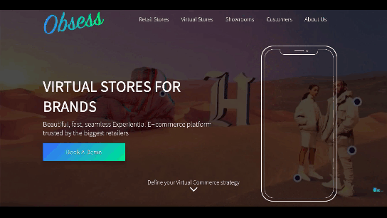
One of the few bright spots in 2020 has been the creativity companies and individuals alike have exhibited in dealing with what, at times, seemed to be overwhelming problems.

The world of web design was no different. Designers and agencies had to adapt and implement new color schemes or design new shopping experiences, which made some of the previous design trends not fit for the current design problems.

We’ll take a look at these newest design trends and the rationale behind them. As we do so, we’ll also take a look at some of BeTheme’s 600+ pre-built sites that have already put them to good use.

1. Comforting Color Palettes Lighten the Load

In years past, bolder color schemes were one of the hallmarks of web design trends. Their purpose was to quickly engage a visitor and prompt him or her to respond emotionally.

Given all the drama and turmoil we were subjected to through most of 2020, we’ve come to welcome the use of toned-down colors in marketing instead of the bolder, brasher, and more “in-your-face” color schemes. 

Bellroy’s website puts toned-down colors to good use. This company’s product line of wallets, bags, and the like, are designed to keep people’s belongings organized, safe, and secure. A wild color scheme simply wouldn’t be fitting.

How, then, are brightly-colored products dealt with? Thanks to judicious uses of white space and background photos, this website still emphasizes a toned-down color palette.

The BeSpa pre-built website is another example of a color scheme that almost immediately puts the mind at ease.

Calm and soothing? Yes.

Boring? Definitely not.

Comfort and security are the emotional drivers in this example.

2. Seamlessly Intermingle and Balance Physical and Digital Imagery

People confined to their homes because of Covid-based restrictions spent many more hours looking at their screens in 2020. Online programming began to take on the appearance of a reality show that blurred the boundaries between the real and the digital.

Whereas web designers tended in the past to rely on either photos or illustrations in their designs, these same designers have started to integrate these blurring effects into their designs, with results that range from amusing and quirky to highly informative.

Check out this example from fashion designer Constance Burke

It’s not every day you see real models wearing hand-drawn fashion sketches. But it’s just one example of how the physical can be blended with the digital.

The BeSki pre-built site does the same blending of the two, but in a totally different way:

The sections’ designs switch from predominantly physical to largely digital and back again, an excellent approach that provides a maximum amount of useful information.

It’s also worth noting how snowbanks are effectively used to seamlessly transition from one section to the next.

3. Create Well-Organized and Helpful Shopping Experiences

More people spending more time at home has created a surge in online shopping. As a result, many online store owners are now feeling the effects of increased competition.

Consumers look for brands they believe they can trust. At the same time, they want their online shopping experiences to be as quick and painless as possible. They look for (and expect) quick and effective product search capabilities, helpful and effective product displays, one-page product descriptions, and the like.

Walgreen’s product page design is especially well-suited for 2021 ecommerce shoppers: 

Everything shoppers usually need to know is presented above-the-fold. They can easily proceed to the next step or scroll down for reviews or additional product specifications. 

BePestControl’s pre-built website uses a similar product design approach: 

In this example, the main selling points are up-front and are kept short and sweet. The shopper can either hit the ‘Add to Cart’ button or look below the button for additional information.

In both examples, a visitor doesn’t have to mull over what step to take next since one of the design objectives is to make the shopping experience as easy and as satisfying as possible.

4. Take Advantage of the Benefits of User-Controlled Video Content

Once upon a time, video content was “the thing” to incorporate in a website. Hero background videos proved to be particularly engaging, and “how-to” videos presented much more useful information than illustrations or blocks of text could.

On the other hand, Auto-play videos, those that started on their own, all too often had a tendency to irritate rather than inform, especially when their content didn’t address a visitor’s immediate concern.

Thanks to Zoom and similar video platforms that came into widespread use in 2020 and to website designs that include video “Play” buttons, users have become much more comfortable with the medium. As an example, Shoppers have been given total control over if or when they want to view a given video. 

This is the design approach Payoneer has taken: 

The white “Pay” button is impossible to miss, and while it is designed to encourage a visitor to watch a testimonial, doing so is completely optional.

The BeOptics pre-built website cleverly slips in a video play option as well: 

In this example, when visitors hover over the “See More” button, it lets them know that they have the option to watch the video if they want to learn more.

5. Trust Builders Should be Non-Negotiable Web Design Elements

There are various ways in which products are organized or showcased in brick and mortar businesses to instill trust. Helpful and friendly staff also contribute to instilling trust.

Some of these trust-builders are easily incorporated into eCommerce designs. Others, though more difficult to fit in, can usually be satisfactorily addressed.

Digital trust builders can include.

  • Logos (familiar, whimsical, innovative, engaging)
  • Portfolios and/or product pages
  • Customer reviews, product ratings, and client testimonials
  • Case studies and product or price comparisons
  • Safety and security seals, e.g., Better Business Bureau, PayPal checkout
  • Charts, graphs, counters, and other data visualization techniques
  • Proof of social, charitable, or community-related actions and contributions

Put, trust-building content will beat hard-sell techniques every time, especially if you would like your customer base to include referred and repeat customers.

Omaze, for example, gives people entries for prizes based on their donations while at the same time highlighting the good things it and its donors have brought about.

To help build trust, the site devotes space to highlighting publications that have featured Omaze and the work it has done and is doing.

Plus, it puts data visualization and non-profit testimonials into play to give visitors an added insight into what is going on behind the scenes: 

As you can see, it doesn’t have to be difficult to incorporate genuine trust-building content into your website designs.

BePortfolio is a great example of how you might go about doing this for a portfolio site, whether it’s your own or a site for a client:

The home page alone has plenty of space for including trust-building content:

  • A satisfied customer counter
  • Product usage case studies and testimonial
  • Portfolio highlights
  • Client and partnership logos

And it can only get better as a visitor moves through the site, but only if you’ve chosen to make that happen.

Have You Started to Take These New Web Design Trends to Heart?

We’re not suggesting that you throw the baby out with the bathwater, but some trends will need to be discarded to enable you to adjust to a new normal. Other 2020 design trends, like minimalism and headline topography, are likely to remain popular for years to come.

New trends that incorporate calming color palettes, image blending, more efficient eCommerce UX designs, user-controlled video, and trust-building elements should give your customers the feeling of comfort and security they will be seeking in 2021.

If you want to implement some or all of these new trends in your 2021 website designs, BeTheme’s 600+ pre-built sites make doing so an easy task.


[– This is a sponsored post on behalf of BeTheme –]

Source

The post 5 Web Design Trends and Ideas for 2021 first appeared on Webdesigner Depot.


Source de l’article sur Webdesignerdepot

I was playing around with the CLI to see how I can incorporate it into demos and wanted to share a couple of things to remind people of its capabilities.

1. Log In as a Human

Note for interactive usage of the CLI, i.e., as a human, you can log in to the platform using your organization’s domain name and password if your organization is delegating authentication to your corporate IdP. Typing the command below will open a browser for you to log in:

Source de l’article sur DZONE


Introduction

MuleSoft provides out-of-box policies that can be applied to APIs for enhancing the functionalities of the APIs. These policies include various categories like security, compliance, troubleshooting, transformation, QoS, custom, etc.

MuleSoft also provides the capabilities to implement custom policies and Custom Policies are policies that anyone can develop and apply to their APIs, with the intention of extending existing functionality or defining new ones. 

Source de l’article sur DZONE

By the end of the year, the number of global smartphone users is expected to reach 3.5 billion. That’s a significant 9.3% increase over the last 12 months.

In a world where everyone is constantly connected to their mobile devices, it makes sense that web developers and designers would need to consider new rules for how they create engaging experiences. After all, most of us find browsing from our smartphones to be much more convenient than sitting down at a laptop each day.

With a little luck, you’re already taking steps to mobile optimize your website but standards are changing all the time. To make sure your website is up to scratch, here’s your guide to prioritizing your site for mobile, ready for the new year.

Understanding Mobile-First Design

The first step in updating your web design and development principles, is understanding the concept of mobile first design, and how it’s changed.

With a responsive website, you create something that adjusts to the screen size of any device; with a mobile-first site, you’re focusing first-and-foremost on the user experience that people get when they’re on mobile, taking that as your starting point, and building from there. Instead of building your website for the desktop and using mobile as an afterthought, you start with a consideration of mobile.

Even Google is highlighting the demand for this process lately, with the mobile-first indexing algorithm. If you can’t design for mobile-first, then you could risk your clients being unable to rise up the search engine ranks.

So, how do you get started?

1. Start With the Right Tools

Web developers and designers are nothing without a great toolkit.

The good news is that there are solutions out there that can help you to master the right skills for a mobile-focused user experience. For instance, Skeleton is excellent for small-scale projects that require fluid grids and minimal compiling.

Alternatively, Bootstrap can offer a one-size-fits-all solution for the front-end development for mobile devices. There’s a default grid system available, plenty of components, and JavaScript plugins to work with.

With the right tools, you can minimize and prioritize the content that’s most valuable for your website projects. This is crucial for maximizing website speed and creating clarity when it comes to content and imagery.

For instance, check out the ESPN website; it’s split into very easy-to-follow categories of content that are perfect for scrolling on a smartphone. The grid of videos makes it feel like you’re using a tool like YouTube.

2. Prioritize Mobile-First Elements

Once you have the right tools to assist you, it’s time to begin building your mobile-first website from the ground up. Rather than jumping straight into considerations of the latest design trends, it’s important to start with the foundations.

For instance, navigation within a mobile page is usually hidden under a hamburger button. However, you can take this concept to the next level too. For example, the Shojin mobile website only demonstrates the most important website options within the navigation bar to avoid overwhelming users.

The key here is to keep things as simple as possible, without restricting what your audience can do when they visit your website. Although you want to keep the number of interactive elements on your site small, you also need to ensure that those elements are easy to find and use.

All buttons and CTAs should be clear and tappable. Fonts need to be large enough to read from any screen, and your navigation system needs to be 100% simple, without slowing anything down.

On average, we recommend making all clickable elements at least 48 pixels in height.

3. Use Responsive Imagery and SVGs

Images are a crucial part of any website. They add context and appeal to your design. However, they can also seriously slow down your website if you’re not careful.

Remember, different devices have different demands when it comes to imagery. A desktop page may need a 1200px wide image, while a mobile-only needs the image to be 400px wide at most. The old way of making your images work was to load a large resolution image and use the same file on every platform. Unfortunately, this slows downloading time significantly.

Instead, it’s better to have at least two different versions of the same image for your mobile and desktop solutions. You can also consider SVG.

SVGs are incredibly scalable – more so than bitmaps. With SVG, you can ensure any icon or graphic continues to look sharp and clickable across all devices. Because these files are often smaller, your site loads quicker too! Hubspot is great at using SVGs.

Intricate illustrations are a massive component of HubSpot’s brand. If those images were saved as PNGs or other alternative files, then they would take forever to load. Because they’re all SVGs, you can enjoy the same consistent experience across desktop and mobile.

4. Get the Typography Right

It’s not just the big graphics and images that make a huge difference to your website when it comes to mobile-first design. You also need to think about the legibility and clarity of your website across all devices and platforms. If people can’t read the value proposition of the company that you’re designing for, you’re going to have a major problem.

Focus on making your content as easy to read as possible. Look into the typefaces that seem most appealing on a range of devices.

Remember to balance the body and heading font sizes for the device size too. You’ll need to ensure that the experience feels consistent and smooth as your users scroll through each page. Just take a look at the mobile version of the IMPACT website, for instance.

The headings aren’t as huge as they are on the desktop version of the website, and they’re displayed below, rather than above the featured image. However, this helps to give a more immediately eye-catching and structured experience to mobile users.

There’s even a handy “Search Engine Optimization” tag included, that users can click on if they want to find more related articles.

When it comes to typography, remember that it’s not just size and clarity that matter, but how things are structured throughout your website too. Your type should naturally guide your visitors along the page.

5. Master Available Device Features

Finally, on smartphones, you can accomplish a range of amazing things that you might not be able to do when using a desktop device. Your users can make calls, open apps, send messages, and more, all from within their mobile browser. They can also move their smartphone around a room, taking advantage of concepts like AR and VR.

Taking advantage of the unique capabilities that smartphone design can offer gives you a chance to get unique with your user experience.

Making the most of the mobile experience can be much simpler than you’d think. For instance, on a desktop site, you could list your phone number on a contact page. On a mobile site, the number can begin a call when clicked. You can also take the same approach with email addresses, and social media icons too.

Depending on how experimental you feel, there’s also plenty of opportunities to go above and beyond with your mobile features. You may decide to create a mobile app version of a website that your customers can download onto their phones.

Alternatively, you can look into things like AR technology. This could allow your users to practice placing items of furniture that they may be thinking of buying from an online retailer into their house, so they can see how well they work with their other interior design choices.

Making the Most of Mobile-First Design

Ultimately, having a responsive website that works on both mobile and desktop devices is mandatory in the modern world. However, going above and beyond with mobile-first design is a great way to get ahead of the game.

If you can focus on building a website that puts the experiences of mobile users first, then you can create something that’s much more likely to grab audience attention and deliver amazing experiences.

If nothing else, showing your clients that you have what it takes to design for mobile is an excellent way to ensure that you can gain as many new project opportunities as possible.

Source


Source de l’article sur Webdesignerdepot

Artificial intelligence. Just hearing the phrase has been a trigger for many in the technology world since that creepy Haley Joel Osment film circa 2001. But more recently, artificial intelligence and machine learning strike fear into the hearts of skilled workers for an entirely different reason: job security, or lack thereof.

Smart-home devices, streaming services, self-checkouts, even Google searches are ways that artificial intelligence has seeped into everyday life, exemplifying the abilities of computers and machines to master both simple and complex tasks. In some instances, these technological advancements make our lives easier, but for some people, their proliferation has meant job loss and skill replacement. There’s no wonder that when artificial intelligence starts being mentioned along with web design and site creation, the spidey senses of designers all over the world start tingling.

designers think outside the box, something that AI just can’t do

But let’s get real about what AI and automation really mean for designers for a second. Talented designers with busy schedules should view these advancements as virtual assistants. For some small businesses on a limited budget, the websites that artificial intelligence can pump out might be fine…for a while. However, as businesses grow, change, require updating and customization to adapt to their customer base, the expertise of creative and talented designers will always be needed. Even the best AI that we see today is limited by evaluating, replicating, and revising what already exists. It may be able to mix 1,000 different color schemes into 10 million potential combinations, but great designers think outside the box, something that AI just can’t do.

In fact, rather than being scared of automation, designers ought to embrace automation and artificial intelligence as a way to unleash their creative thinking. Delegate repetitive, straightforward tasks to the right software, and suddenly you have time to bring your best ideas to the table and push the boundaries of your own innovation. 

Where AI has Failed in Design

The ultimate goal of artificial intelligence and automation in design work is a grand vision that has yet to be realised.

Consider the case of The Grid, which began as a crowdfunding campaign in 2014. The “revolutionary” product posed itself as an artificial intelligence solution for building thoughtfully, yet automatically, designed websites in five minutes. Research “Reviews of the Grid” in any search engine and you’ll be met with scathing criticism with only some small praise sprinkled in. Most of the initial users cite underwhelming results, the feeling of being duped by the Grid’s marketing tactics, nonsensical placement of text, and ultimately, the Grid being a complete waste of money for the resulting product. Even at the low cost of $100, compared to hiring a talented designer, most users felt their investment was wasted.

For the AI capabilities that exist now, most small business owners, or those looking to put together a simple website, are better off using drag and drop site builders (Wix, Squarespace, Weebly, etc) that have been around for ages. Even so, there are plenty of businesses still willing to hire designers to take this simple task off their plate due to a lack of technical expertise or lack of time. And let’s be honest, are there even enough talented (keyword here!) designers out there to keep up with the millions of websites created every year, without each one working themselves to death? 

Where Automation Shines for Designers

Fortunately for good designers, it appears for now that the days of artificial intelligence completely taking over their jobs is a fantasy. However, what AI and automation do offer designers is a solid starting point for success, eliminating much of the lower-level grunt work that most designers would rather skip anyway.

Even well-received AI website builders like Firedrop still require a basic eye for design and specialised knowledge to produce truly unique, high-converting, and user-friendly websites. Tools and practices that designers should adopt are the artificial intelligence and automation resources that will help them do their jobs better, faster, and leave them with more time to focus on project elements that AI cannot accomplish on its own.

Bridging the Gap Between Designers and Developers

Well-established brands are likely to already have design systems in place that guide the creation of new elements across their digital profiles whether on social media, various mobile apps, or different sections of a website. But even in large corporations — excepting those who have perfected the process — there’s often a breakdown between a designer’s vision and resulting product from the developers. It stems from the basic difference in how they each approach their work and the limitations of the systems they use.

While component libraries — or even full design systems for that matter — won’t reconcile every question, they provide both developers and designers a source of truth to work from that both parties can understand. Design collaboration tools like Invision and Visme, specifically, keep designers and developers on the same page with automated version saving and code-friendly workflows.  

Understanding the Consumer

I don’t suggest using artificial intelligence to produce content for your site

Digging into and understanding the behaviours and habits of site users is a relatively new component of site design, but offers invaluable insights. Tools like HotJar, Mouseflow, or Smartlook make it simple to see holes or leaks in your conversion funnels, detect which page elements users are interacting with, and which they’re not interested in to refine the look and feel of a page for maximum conversions. Even though these tools provide the data, it still takes a keen eye and understanding of design to implement the right changes to improve site performance.

Site content is another way that artificial intelligence has the potential to improve our understanding of customer behaviour and improve site performance for individual users. I don’t suggest using artificial intelligence to produce content for your site, no matter how much the results have improved. However, static landing pages or a single set of further reading recommendations are unlikely to appeal to the majority of site visitors. Artificial intelligence tools like CliClap and Personyze instantly collect and analyse consumer data to provide dynamic, personalised experiences that drive more leads and encourage conversions. Creative designers will also learn from this data to improve customer experience with other pages or elements throughout the site.

Removing Distracting, Time-Sucking Administrative Tasks

Because “artificial intelligence” has become a term with such negative connotations, we often overlook the simple way that AI actually makes our work lives better and easier. Machine learning in email filtering is a great example of this. Consider a simple interface like a Gmail inbox. We have the option to mark certain senders as spam or as important, and our inbox learns that type of communication is and isn’t useful to the user. Pandora, Spotify, Apple Music, and more all take cues from the user behaviour of liking a certain song, artists, or genre of music to build customised playlists. There are a myriad of ways that artificial intelligence and its branches of disciplines merge with our everyday lives. 

Some of the most useful automations for business, and especially for designers, are related to the administrative tasks that frequently take time away or distract from more pressing projects. A perfect example of automation that can relieve stress and cut down on mindless work is an email autoresponder. I’ve always found that having time blocked off in my calendar to tackle complex or important projects helps me to focus on the task at hand and be more efficient. In order to more effectively block out my time, closing my email and setting an autoresponder to reply to all incoming emails serves two purposes: 

  1. Lets those trying to get in touch with me know that I only check my email at certain times of the day and that my response may not be immediate — tempering their expectations of when they might hear from me.
  2. Relieves my personal stress of being tethered to my inbox, splitting my focus, and also saves the time of having to initially respond to each email individually. 

This is just one simple way to use automation in your email, although there are many others to explore.

While Zapier isn’t the only workflow automation service on the market, it’s probably the most well known. Workflow automation reduces time spent on mind-numbing, repetitive tasks and helps designers connect apps that might not natively work together. Do you keep a task list in Todoist? Set up a Zap, then create a task in Todoist anytime someone mentions you on Asana or assigns you a task in Trello.

This is especially helpful for freelance designers who work with multiple clients across various project management platforms. The potential for automation to relieve unnecessary mental overhead for designers is nearly limitless.

Don’t be Afraid of AI, Embrace It

The bottom line of this brief overview of artificial intelligence and automation in design is that this emerging technology isn’t something designers should be scared of. In fact, it’s something to welcome with open arms because ultimately it can make our jobs, and our lives, better. Leave the monotonous tasks of collecting and analysing huge amounts of data or administrative minutiae to the machines; they can handle it.

Save the interesting, creative, abstract work for the talented designers who can turn AI recommendations into unique and intuitive digital experiences. Making the relationship between artificial intelligence and design symbiotic will yield the best results for every entity involved: the business, the AI, and yes, even the designer.


Featured image via Unsplash.

Source


Source de l’article sur Webdesignerdepot