Articles

Jakob Nielsen’s How Users Read on the Web is 25 years old this week, and one glance at an eye-tracking study will tell you its key observations are still relevant today.

Simply put, users don’t read a web page; they scan it for individual words and sentences.

A typical pattern shown in eye-tracking reports is that users will rapidly scan a page, scrolling down to do so. Then either hit the back button and pump your bounce rate, or scroll to the top and re-engage with the content.

Even when content, volume, and quality tick all the user’s boxes, and they choose to stay on your site, they still don’t read; they scan; a slightly deeper scan, but still a scan.

As a result, it’s vital to design websites to be easily scannable, both in a split-second scan to decide if your page is worth the reader’s time and on a second or third pass.

Clarify the Page’s Purpose Immediately

Every page should have a primary goal. The majority of the time, that goal is embodied in a CTA (Call to Action).

The good news is, if your SEO (Search Engine Optimisation) has gone to plan, your goal (i.e., to sell something) and your user’s goal (i.e., to buy something) will align. By clarifying the page’s purpose, you can show the user that your goals align.

You can be experimental if you’re an established company and the user knows what to expect. But if you’re new to the market or have a lower profile, you need to conform to established design patterns. This means that a SaaS should look like a SaaS, a store should look like a store, and a blog should look like a blog.

Including your CTA above the fold — which in the context of the web, means the user doesn’t have to interact to see it. Doing so makes it easier for the user to progress and clearly tells the user what you are offering.

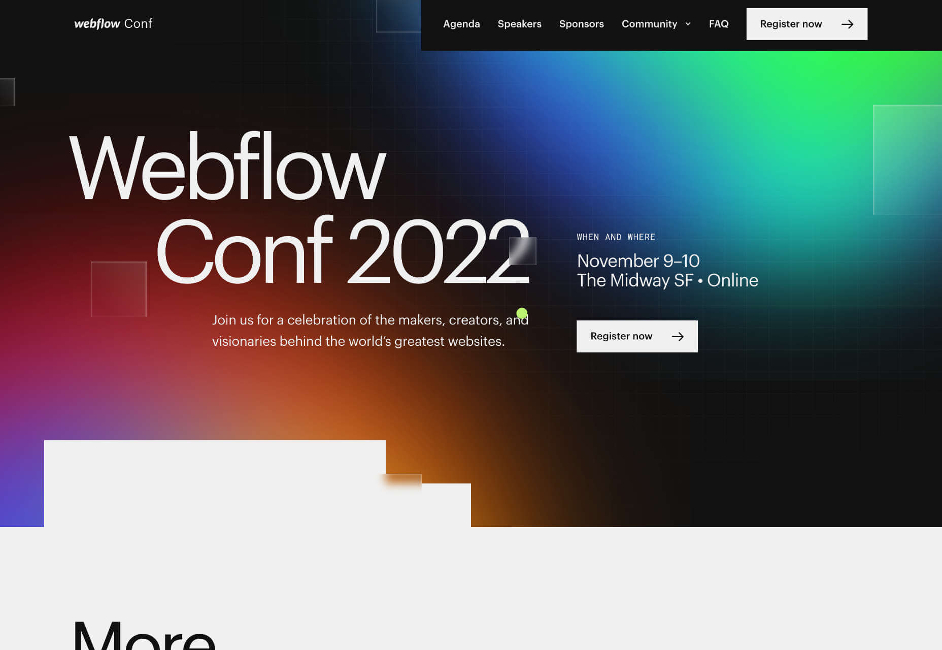
The landing page for next month’s Webflow Conf 2022 clarifies the page’s content, with a clear CTA above the fold.

Employ a Visual Hierarchy

The Von Restorff effect states that the more something stands out, the more likely we are to notice and remember it.

Visual hierarchies are excellent for guiding a user through content. HTML has the h1–h7 heading levels — although, in reality, only h1–h4 are much use — which gives you several levels of heading that can be scanned by different readers scanning at different rates.

For example, we know that subheadings have little impact if a user diligently reads the page from top to bottom, but they are excellent for catching the eye of skim readers.

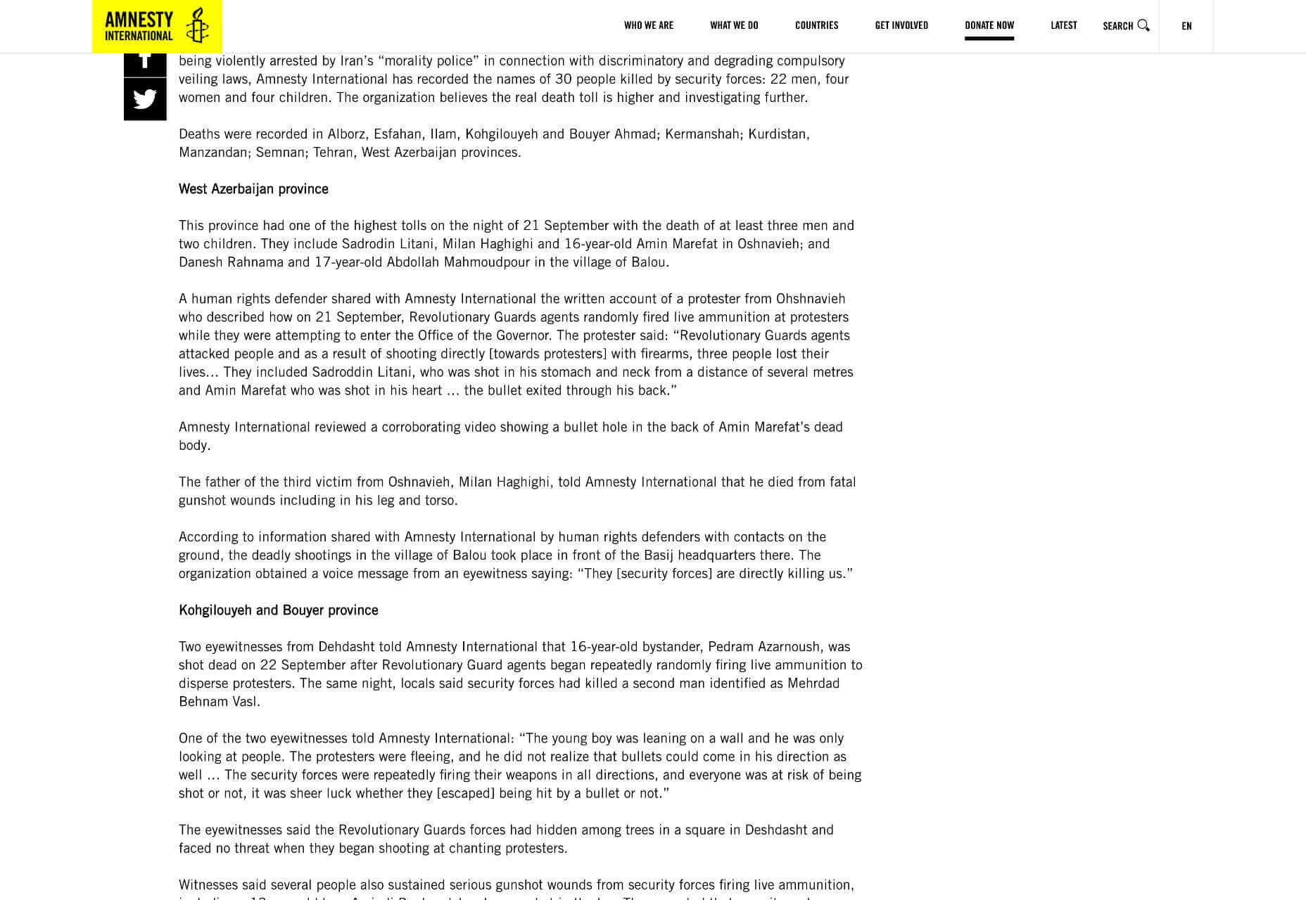
Amnesty uses very a very simple hierarchy, the only change for its subheading being increased weight. But it is enough to catch the user’s eye.

You can also create visual hierarchies with other forms of contrast; weight and color are often employed in addition to size. For accessibility and inclusive design, it’s wise to combine visual indicators when creating a hierarchy; for example, headings are usually larger, bolder, and colored.

Use Negative Space

Imagine a person standing in a crowd. Let’s say they’re wearing a red and white striped jumper and a red and white bobble hat — pretty distinctive. But if there are hundreds of other characters around them, they might be hard to spot.

Now imagine the same person dressed the same, standing on their own. How long will it take you to spot them? Even without the stripy outfit, it’s not much of a challenge.

Elements in isolation are not only easier to spot, but they pull the eye because the negative space (sometimes referred to as white space) around them creates contrast.

When using negative space, the key is to give elements enough room to breathe and attract the eye without giving them so much room that they are disassociated from the rest of your content.

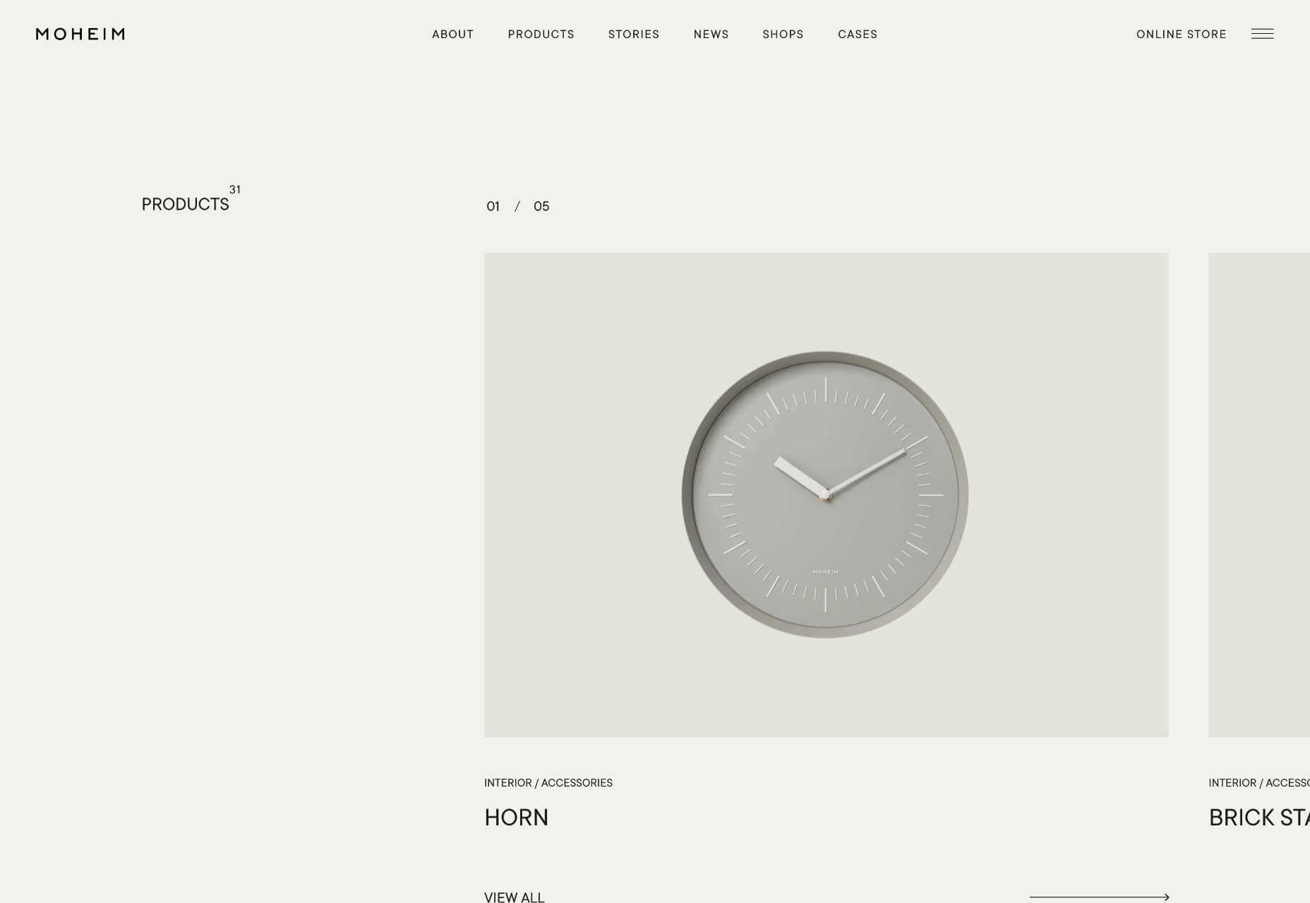
Across its site, Moheim uses negative space to highlight UI elements while grouping associated content.

Use F Patterns

Users scan a page using either an F-pattern or a Z-pattern.

Because users scan your page in predictable ways, we can employ layouts that cater to this tendency.

Designers have been aware of F and Z patterns for some time, and because they’ve been used for so long, they may be self-fulfilling, with users being trained to scan a page in this fashion. However, both patterns are similar to how eyes travel from line to line in horizontal writing systems.

Whatever the cause, by placing key content along these paths, you increase the chance of capturing a user’s attention.

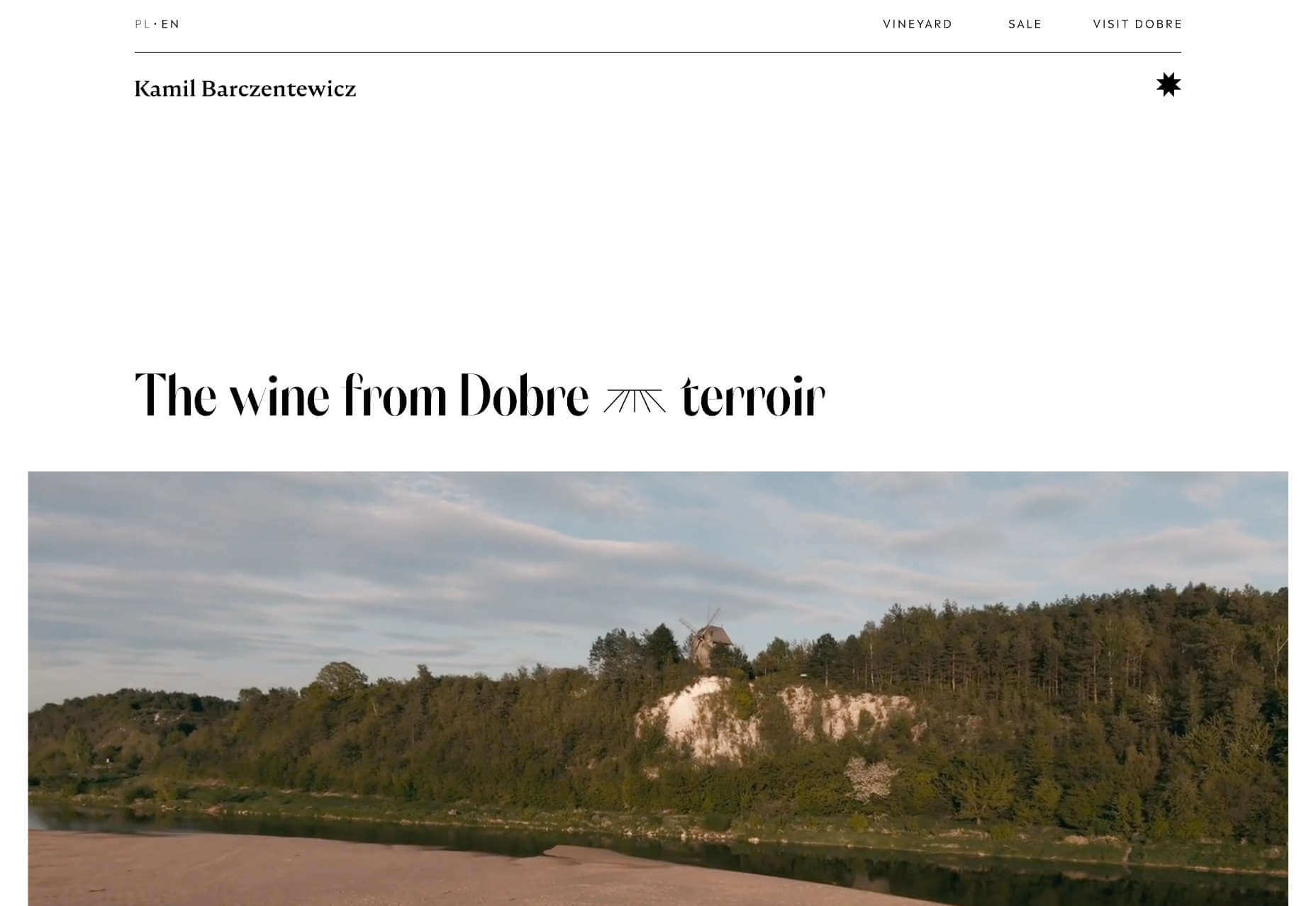
Kamil Barczentewicz uses a beautiful, natural layout that also conforms to a classic F pattern.

Include Images with Faces

Images are a great way of conveying brand values and making a site engaging. But when it comes to catching the eye of a user scanning your design, the best images include faces.

For example, a testimonial with an image of the customer will catch the eye more than a text-only testimonial.

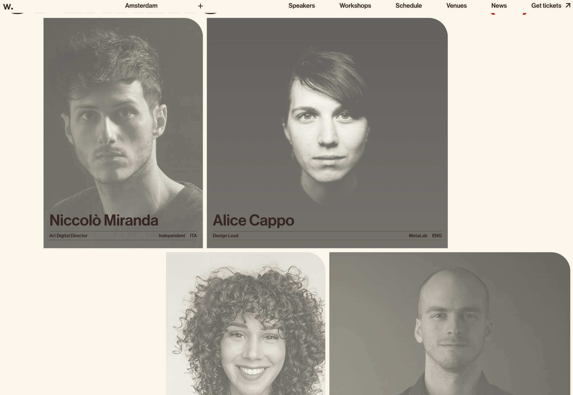
The Awwwards Conference uses an animated computer with a face to capture attention. And large images of speakers making eye contact.

This is almost certainly due to social conditioning; we see a face, and we engage with it to see if it is a threat or not. Most of us naturally look to expressions of emotion to understand situations, and the distinction between a real-life person and an image hasn’t made its way into our mental programming yet.

You don’t need to use photos. Illustrations are fine. The key is to ensure there is a face in the image. That’s why illustrations of characters perform so well.

Copy Print Design

Print design is centuries older than the web, and many print applications, from newspapers to advertising, developed design elements to catch the eye of readers scanning the design.

Subheadings, lists, blockquotes, and pull quotes all catch the eye. Introductory paragraphs in a larger size or even italics draw users into the text. Shorter paragraphs encourage users to keep reading.

Horizontal rules used to delineate sections of text act as a break on eyes traveling over content with momentum. They are a good way of catching a scan-reader who is losing interest.

You can use a horizontal rule or break up your layout with bands of color that divide content sections.

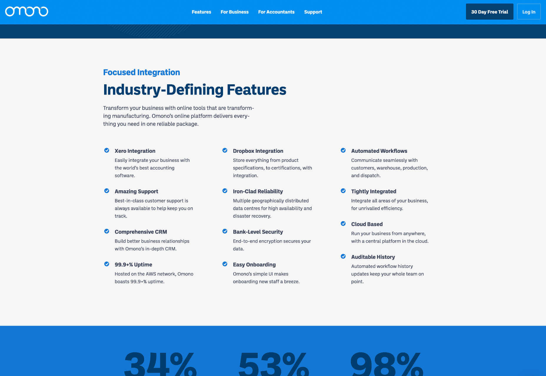
Omono uses horizontal bands to highlight different sections of content.

Mass, Not Weight

We often discuss design elements as having weight; font-weight is the thickness of strokes.

But it is more helpful to think of design elements as having mass; mass creates gravity, pulling a user’s eye towards them.

The trick is to design elements with enough mass to attract the user‘s eye when scanning at speed without forcing the user to change how they engage with your content.


Featured image via Pexels.

Source

The post How To Make Your Designs Scannable (And Why You Should) first appeared on Webdesigner Depot.

Source de l’article sur Webdesignerdepot

SCM est un industriel indépendant né de la cession de la filiale oil and gas du groupe américain TE Connectivity. Suite à cette transaction, l’entreprise sarthoise avait un an pour basculer vers son propre ERP. Elle a opté pour une offre cloud SAP S/4HANA aux fonctionnalités resserrées sur l’essentiel, afin de tenir des délais de mise en place particulièrement courts. Avec l’aide des équipes de delaware, SCM a atteint ses objectifs en à peine 6 mois.

Une société presque centenaire, qui retrouve son indépendance

Systèmes et Connectique du Mans – SCM – conçoit, produit, teste, livre et installe des connecteurs électriques de puissance et optiques adaptés à des environnements extrêmes de corrosion, température et pression. La société travaille principalement pour des acteurs du secteur pétrolier et gazier (elle équipe notamment des plates-formes d’extraction en mer), mais également des clients des secteurs de la défense, du transport ferroviaire et de l’aéronautique. Elle s’appuie sur un site industriel moderne de 14.400 m². SCM emploie aujourd’hui environ 140 personnes pour un chiffre d’affaires annuel de 20 millions d’euros.

L’histoire de SCM est intimement liée à celle de CKB (Carier Kheops Bac), entreprise reprise en 2012 par TE Connectivity. Lorsque le groupe américain annonce la délocalisation des activités de sa filiale, les salariés reprennent la main, avec le lancement de SCM en avril 2021. La filiale oil and gas de TE Connectivity utilisait l’ERP SAP ECC 6 du groupe. Suite à la cession d’actif, SCM disposait d’une année pour mettre en place son propre ERP.

Autre contrainte, la nécessité de basculer d’un système SAP conçu pour une multinationale et massivement customisé vers une solution plus simple, adaptée à une ETI française. Le tout dans un contexte de fin de vie programmée de SAP ECC.

Un projet mené à bien dans des délais records

Sur les conseils de SAP et de l’intégrateur delaware, SCM opte pour une migration vers une solution SAP cloud de dernière génération, au travers de l’offre RISE with SAP S/4HANA. Le projet démarre le 22 septembre 2021. Afin de limiter la conduite du changement, l’entreprise choisit de rester dans un premier temps en SAP GUI, comme le permet l’offre RISE with SAP S/4HANA. Les impacts du changement d’ERP sont ainsi minimisés. Un important travail de nettoyage des données a également été mené, afin de se concentrer sur les seules informations nécessaires au fonctionnement de la nouvelle structure.

Le démarrage du nouveau système a été effectif le 26 mars 2022, après seulement 6 mois de travaux. SCM a pu commencer à utiliser immédiatement son ERP SAP S/4HANA : émission des premières factures, enregistrement des réceptions de produits et des mouvements de stock, saisie des validations de qualité, etc. Aucun incident majeur n’a été remonté depuis ce lancement express de la solution SAP S/4HANA en mode cloud.

Satisfait de l’accompagnement proposé par delaware tout au long du projet, SCM a décidé de lui confier la tierce maintenance applicative de son ERP pour les 15 prochains mois. Dans un premier temps, la société s’appuiera sur cette TMA pour stabiliser son système d’information SAP et lui apporter quelques premières améliorations.

« Nous sommes passés d’un groupe international disposant de 90 sites dans le monde à une entreprise industrielle sarthoise d’un peu plus de 100 personnes. Il nous fallait un ERP adapté à ce nouveau contexte : une solution plus simple, capable d’aller à l’essentiel. Au cours du projet, nous avons pris le temps de déterminer quelles fonctionnalités nous étaient vraiment utiles et lesquelles étaient de l’ordre du confort (des sujets que nous étudierons ultérieurement) ce qui nous a permis de mettre en place notre nouvel ERP dans des délais particulièrement courts, » témoigne Frédéric Kleindienst, président de SCM.

« SCM est l’exemple d’une entreprise qui souhaite bénéficier de la force d’un ERP tel que celui de SAP sans y ajouter les contraintes. La nouvelle version S/4HANA Cloud de SAP est adaptée aux PME/ETI car elle allie une couverture fonctionnelle standard riche et une simplicité de gestion et d’utilisation de par son prisme SAAS. La binôme SAP – delaware permet de faire bénéficier à SCM d’un système reconnu partout dans le monde tout en y ajoutant la flexibilité et la réactivité attendues par une PME/ETI. C’est le modèle SAP tel que nous le définissons pour les 15 prochaines années à venir » déclare Lahcen Binoumar, Head of General Business, SAP France.

« Ce projet était un énorme challenge. Nous avons réussi à basculer vers l’ERP SAP S/4HANA en seulement 6 mois, alors qu’il faut habituellement entre 10 et 12 mois. Nous avons pu compter sur les équipes de delaware, qui nous ont accompagnés tout au long de ce projet, mais aussi sur nos équipes internes et nos utilisateurs, particulièrement matures sur l’environnement SAP. Afin de tenir les délais, nous avons opté pour un ERP resserré, que nous améliorerons par la suite, en lui ajoutant des fonctionnalités qui nous permettront de travailler encore plus confortablement, » détaille Mickaël Medard, directeur de programme, et supply chain Management, SCM

« Nous avons su mettre en place une solution de pointe, dans des délais particulièrement courts. Nous entretenons des relations étroites avec nos clients, afin de mieux comprendre leurs besoins et de leur apporter un service de qualité. La symbiose a ici été parfaite entre nos équipes, celles de SAP et de SCM. En optant pour l’offre RISE with SAP S/4HANA, la bascule vers le cloud a par ailleurs été grandement simplifiée, SAP devenant le point de contact unique pour la contractualisation, la mise à disposition et le maintien en conditions opérationnelles des infrastructures cloud, » résume Fatsah Nasri, chef de projet et Aymeric Fosset, Partner, delaware France.

The post delaware delaware accompagne SCM dans son adoption de l’ERP intelligent SAP S/4HANA en mode cloud appeared first on SAP France News.

Source de l’article sur sap.com

With the rapid development of the IoT industry, the MQTT protocol is being used by more companies and developers. In the process of learning and using MQTT, a handy client tool can help developers debug IoT applications, explore the features of MQTT, and shorten the development cycle.

There are a wide variety of MQTT client tools with different functional focuses. For beginners and even MQTT experts, it is a challenge to choose a suitable MQTT client tool.

Source de l’article sur DZONE

Rightsizing resource requests is an increasing challenge for teams using Kubernetes—and especially critical as they scale their environments. Overprovisioning CPU and memory lead to costly overspending, but underprovisioning risks CPU throttling and out-of-memory errors if requested resources aren’t sufficient. Dev and engineering teams that don’t thoroughly understand the live performance profile of their containers will usually play it safe and request vastly more CPU and memory resources than required, often with significant budget waste.

The open source Kubecost tool (https://github.com/kubecost) has had a Request Sizing dashboard to help Kubernetes users bring more cost efficiency to their resource requests. One of the tool’s most popular optimization features, the dashboard identifies over-requested resources, offers recommendations for appropriate per-container resource requests, and estimates the cost-savings impact of implementing those recommendations. The dashboard utilizes actual usage data from live containers to provide accurate recommendations. However, leveraging the dashboard has included some hurdles, requiring users to manually update YAML requests to align resource requests with Kubecost recommendations or introduce integrations using a CD tool. 

Source de l’article sur DZONE

There are a lot of dark, retro vibes trending in website design right now. Although there are still some light projects popping up – including a pastel trend below – a lot of what we are seeing has a quite moody feel.

Here’s what’s trending in design this month.

Pastel Color Palettes

Let’s start with the trend with a lighter feel – pastel color palettes. While much of the web is trending toward dark aesthetics, there’s a segment that’s going in the exact opposite direction. Those sites feature soft, pastel color palettes that serve as a balance to all the super dark websites out there.

One thing about this website design trend is that it jumps out because of the stark contrast with all of the dark color palettes out there.

Each of these designs seems to use a pastel color palette as the basis for a background. A blur effect is paired with the colors to use pastels in a way that has a natural feel without appearing too feminine or light.

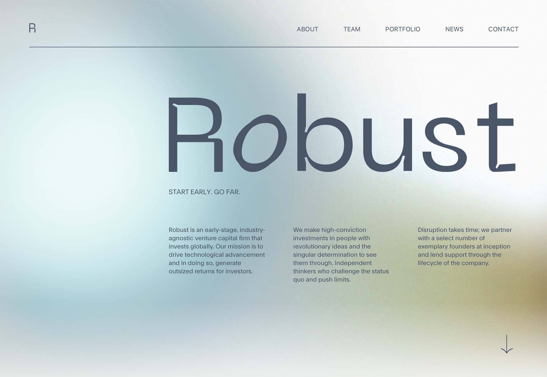
Robust uses blue and earth tones for a pastel background that feels modern and strong when paired with the hard-edged headline font.

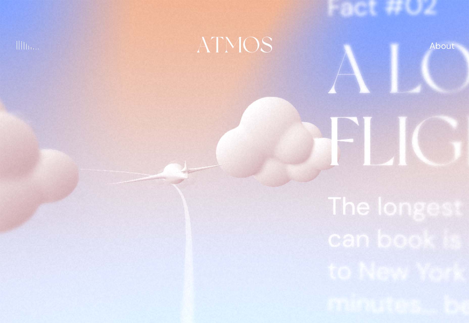
Atmos uses a light pastel theme that takes you through the clouds with blues, and pinks, and purples. The pastel color scheme works well with the content which is airline-themed and makes you feel like you are flying through the sky. The colors are also soft enough to provide an easy reading experience.

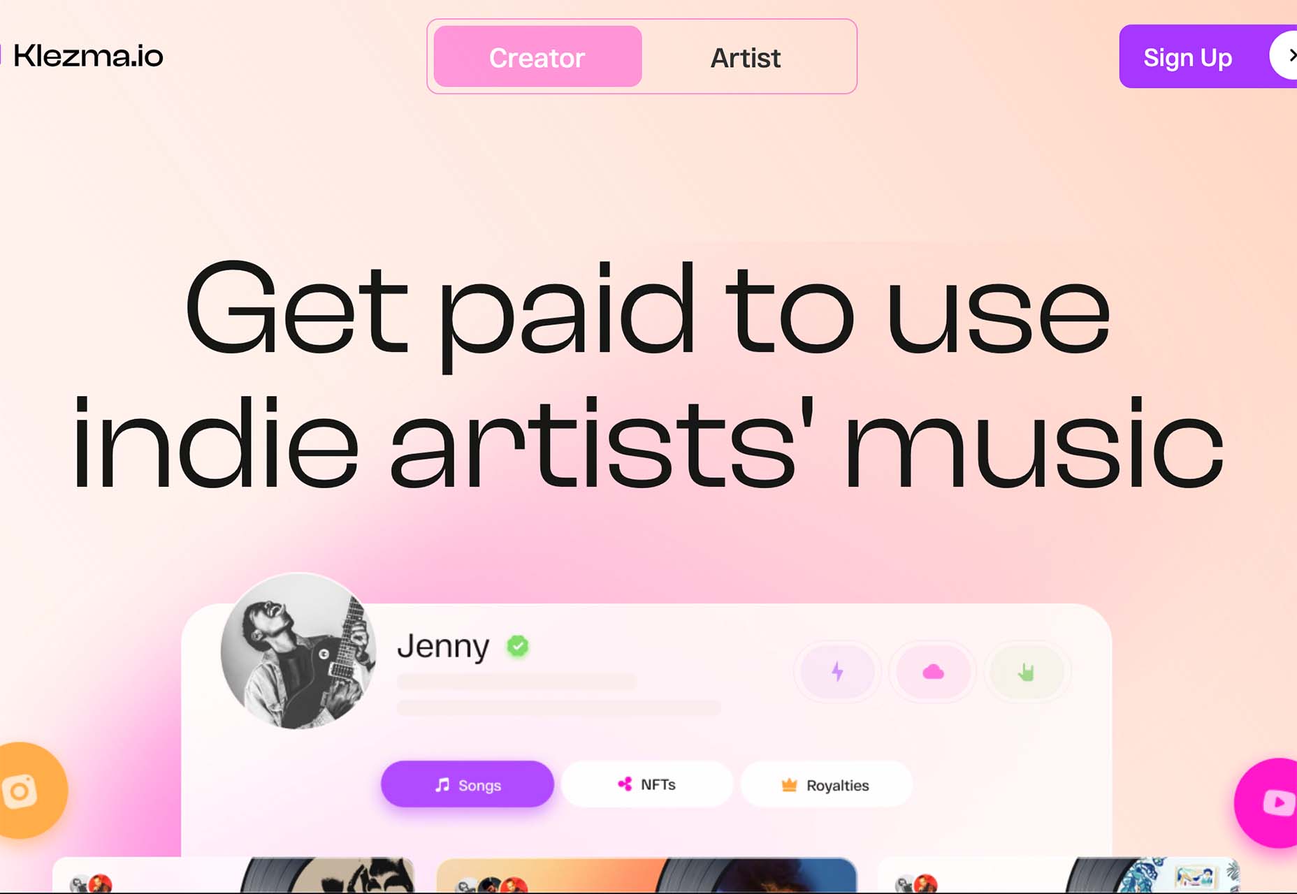
Klezma is another design with the same pastel background with graduated color. The peach tones are fairly neutral and give plenty of room to the content.

Fonts with a Distinct Retro Look

Every one of these websites uses a typeface with a similar look and feel. This retro headline style is trending in a major way.

The best way to use this design element is for short words. This typeface design isn’t meant for a lot of words or when readability is a high priority.

This style is all about creating a specific kind of vibe for your website. The typefaces in this trend have a quite retro look and feel with an almost 1960s or ’70s feel to them. The rest of the design mimics this feel as well with colors and surrounding elements that contribute to the overall look.

A couple of common elements here include the use of all capitals font sets and letterforms that include odd shapes and lines.

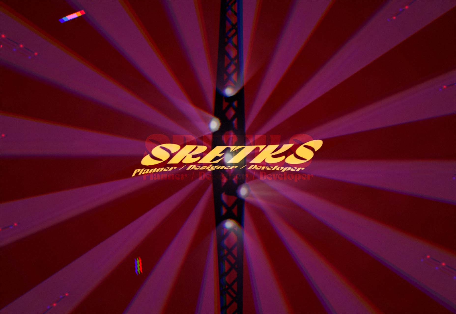
Sretks not only uses a retro typeface but bends and twists it a bit too to add to the old-school feel. The background color helps add to the groovy vibe.

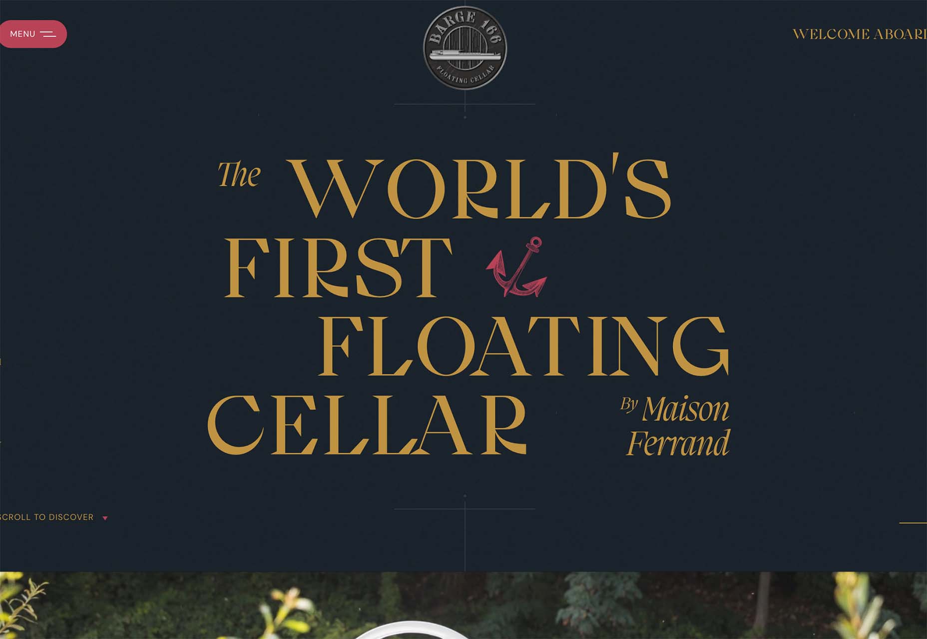
Barge 166 uses a retro typeface with the same design feel as the other examples but with a sharper, more serif-style edge. It’s easier to read but still carries a retro look and feel. Use a typeface similar to this if you want to capture that retro font style for a trending look while maintaining as much readability as possible. This option works best for multiple lines of words in a large size.

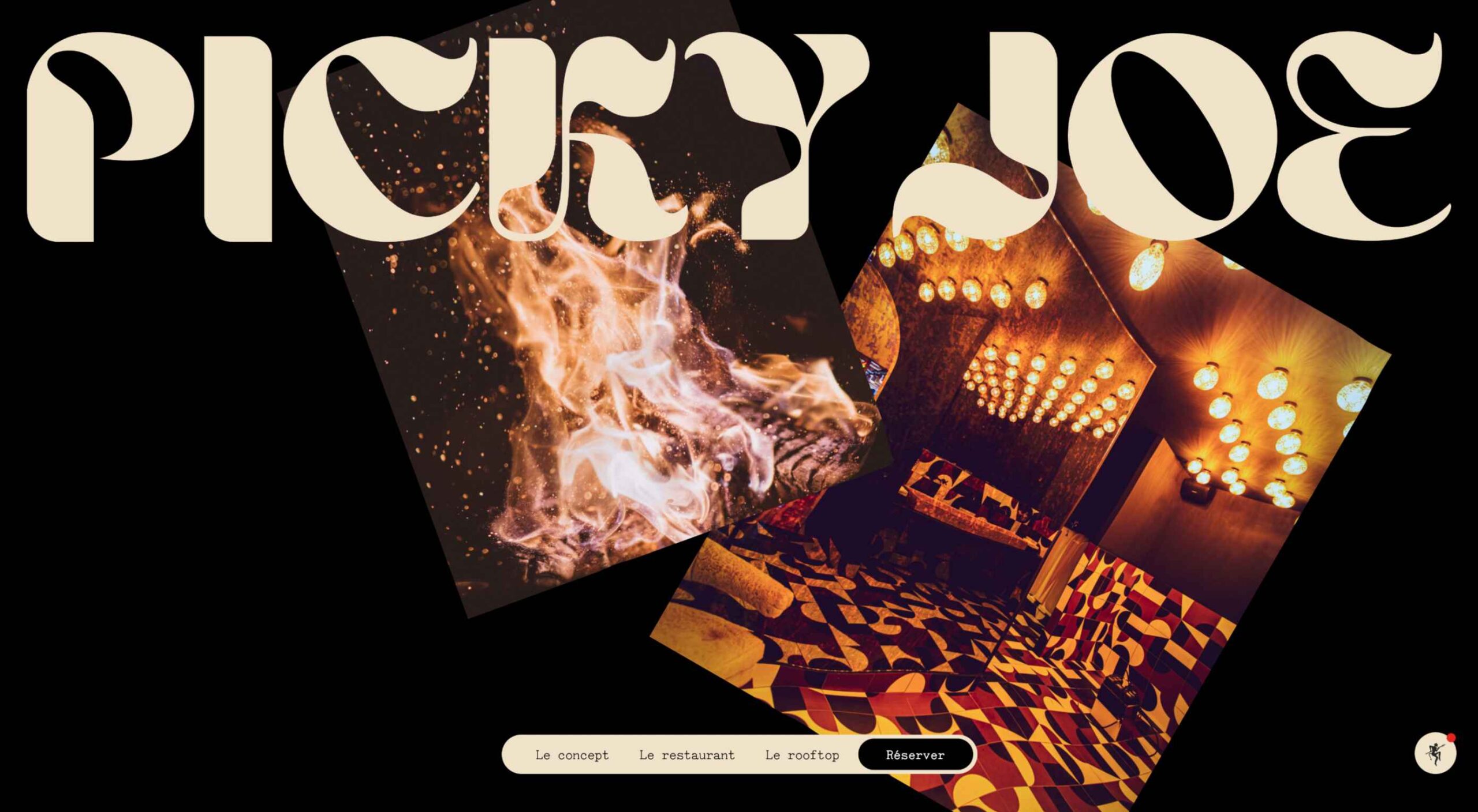
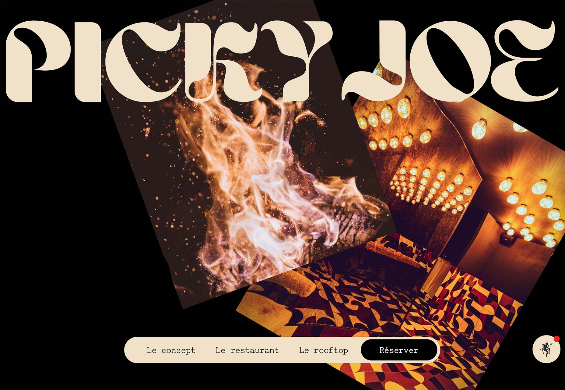
Picky Joe uses a retro typeface with rounded letters and a bit of a tilt to the characters to create a distinct feel. This is definitely a style that has to be used sparingly but can be a fun option, depending on the content of your website design.

Dark “Product” Sites

Dark mode design is probably the biggest design trend of 2022. Everywhere you look, websites are using dark color palettes and styles. Designers are creating more projects with a dark/light toggle so users can control their experience.

This visual concept is carried over to website designs that feature products as well. This is one of the last places the dark aesthetic had not touched. It’s been a bit of an unwritten rule that product images should be on white or light backgrounds to help make them easy to see and inspect digitally.

This design trend bucks that idea and features products on dark backgrounds – some with so little contrast that you almost have a hard time seeing the products. (Maybe these brands are banking on the idea that you already know them or are selling a lifestyle product.)

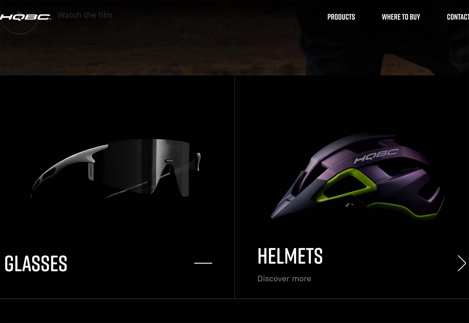
HQBC sells bike accessories such as glasses and helmets and the site has a sleek look and feel. You know it is cool from the second you land on it. The question though – is there enough visual information with the dark background to help you make a purchase? This design probably works because it only encourages you to find a physical location to make a purchase rather than buy online.

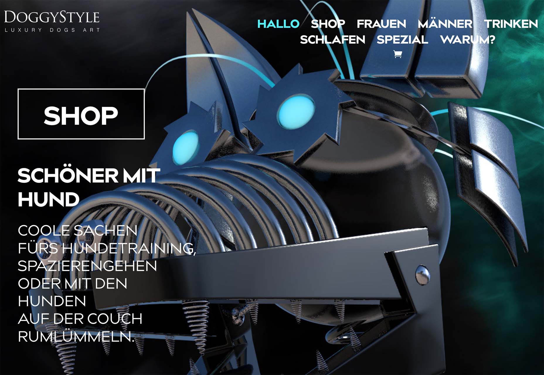
Doggystyle Shop also banks on the idea of you knowing the shopping experience or brand when you arrive. What the design does do though is put products on white backgrounds after you have clicked through far enough to make a commitment to buy. This helps you see the product well one final time before making a purchase. (The challenge is that it is three to four clicks in for the most part.)

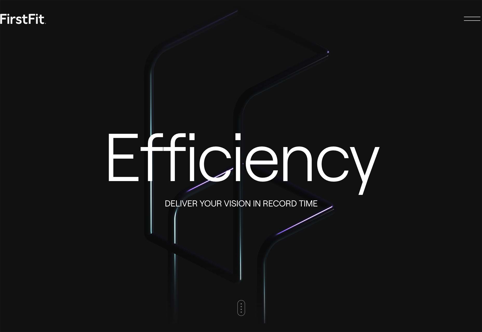
FirstFit uses the design trend in a way that’s similar to the first example. They are showing a product, but not actually trying to convert sales on the website. Other links take you to more product information and content – using a lighter background and color scheme – and the dark background with the product serves mostly as a highly visual landing page that will help entice users to learn more. When it comes to dark mode and products, this seems to be the best option for most website designs.

Conclusion

The state of the world around us and our emotions can play hard into websites and other design projects. Some of the darker elements that are popular now may be a reflection of that or it could be more of a lean into dark mode schemes.

Either way, the web has a pretty dark feel right now.

Source

The post 3 Essential Design Trends, July 2022 first appeared on Webdesigner Depot.
Source de l’article sur Webdesignerdepot


This is an article from DZone’s 2022 Low Code and No Code Trend Report.

For more:

Read the Report

Many companies are looking to low-code and no-code platforms to build apps in the visual environment. They provide the opportunity for faster app development and reduce the dependence on highly skilled developers. Companies may hire less experienced or only minimally trained staff (I’ll call them citizen developers) to meet service gaps and to respond to skills shortages, ensuring their larger dev team can focus on more advanced projects. 

Source de l’article sur DZONE

The hardest part of designing websites for a living is setting your prices. Setting a fair price for your services is something that nearly all of us struggle with.

If you’re lucky, you’re part of an agency that has experienced design leads who can assess projects objectively. But if you’re a freelancer — or if you’re one of those design leads — you have to set your own rate.

It’s a challenge to find a sweet spot in the market. You want to be competitive or you’ll price yourself out of jobs. But you also want to be able to live the lifestyle you aspire to.

The truth is there is always someone cheaper. There is always someone who believes the ‘exposure’ myth and will do a project for free. You can’t compete on price, and you really shouldn’t try. If you have been competing on price, you are almost certainly undercharging for web design. Where you should compete, is on quality and results.

When you’re no longer competing on price, you can put your rates up.

How Much Do You Charge for Web Design Services?

To find out what most professional designers charge, we’re asking you to answer the following two questions (anonymously).

We’d like to know how much you charge for web design services per hour. (We don’t necessarily recommend you charge by the hour, but with projects varying in scope this is the best way to compare pricing.)

Because the value of the dollar varies a great deal — $1 goes a lot further in Patagonia than it does in Norway — we’d also like to know how much you charge per hour as a percentage of your monthly housing cost (your rent or mortgage).

Remember, most experts in the field agree: No matter how much you’re charging for web design services, you’re probably undercharging. Perhaps it’s time to put your prices up.


Featured image via Pexels.

Source

The post Are You Undercharging for Web Design Services? first appeared on Webdesigner Depot.
Source de l’article sur Webdesignerdepot

An IT project is never an end in itself, but a means to attain a business objective. In this day and age, when leaders and decision-makers are exposed to buzzwords, frameworks, and tech trends constantly, it is more important than ever to take a step back and reflect on the business goal before deciding on the technological way to get there.

Decades after the advent of information technology, the challenge remains the same: to successfully apply IT practices that improve revenue streams and unlock new DevOps opportunities. Organizations urgently need to establish frameworks to manage information systems and apply them to daily operations, contributing to delivering business value and improving economic performance.

Source de l’article sur DZONE

Any typical enterprise-grade application deployed on Kubernetes comprises several API resources that need to be deployed together. For example, the WordPress application, which is one of the example applications available on the Kubernetes GitHub repository, includes:

  • a wordpress frontend pod,
  • a wp-pv-claim persistent volume claim mounted to the frontend pod,
  • a wordpress-mysql MySQL database pod,
  • a mysql-pv-claim persistent volume claim mounted to the MySQL database pod,
  • two persistent volumes: wordpress-pv-1 and wordpress-pv-2 to serve the persistent volume claims,
  • services for the database and frontend pods.

Application (or app) is not a native construct in Kubernetes. However, managing applications is the primary concern of the developers and operations. Application delivery on Kubernetes involves upgrading, downgrading, and customizing the individual API resources. Kubernetes allows you to restrict the spread of your application resources through namespaces such that you can deploy an entire app in a namespace that can be deleted or created. However, a complex application might consist of resources spread across namespaces, and in such cases answering the following questions might be a challenge:

Source de l’article sur DZONE