Articles

We’re going to have some fun this month. There are so many new tools and resources out there for designers that make life easier, and others are simply enjoyable.

Here’s what is new for designers this month …

Polka Dot Generator

Polka Dot Generator is exactly what you think. Adjust colors, dot size, shadow, and fuzziness, and then export the CSS for use in your projects. This could make for fun effects or backgrounds.

Design Memes

Design Memes is just a lot of fun. It’s a collection of memes based on design culture updated daily. It’s a little silly and a little reflective. Yes, it’s completely ok to laugh at yourself.

Pppointed

Pppointed is an SVG arrow-making tool that helps you create cool pointers without a lot of effort. Just pick a color, shape, and style, and you are ready to go. Save your custom arrows as SVG files or copy the code and use them on the web whenever you want to point at things visually.

Open Source Color System

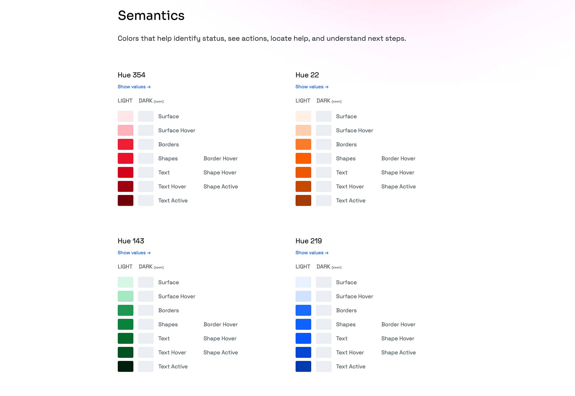
Open Source Color System is a set of palettes that include carefully picked colors to help you overcome interface challenges. For example, it is one of the only color tools out there that includes palettes for light and dark modes. It’s also designed with accessibility in mind to help you create a complete and usable system.

Cowsay

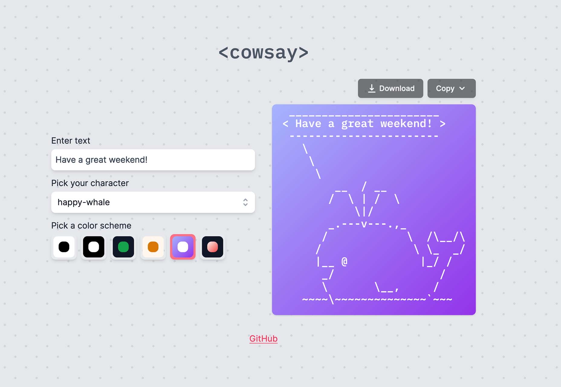
Cowsay is a nifty little web interface of the same name made with Svelte and HTML Canvas. Play with it and then copy your art as ASCII or an image.

Minze

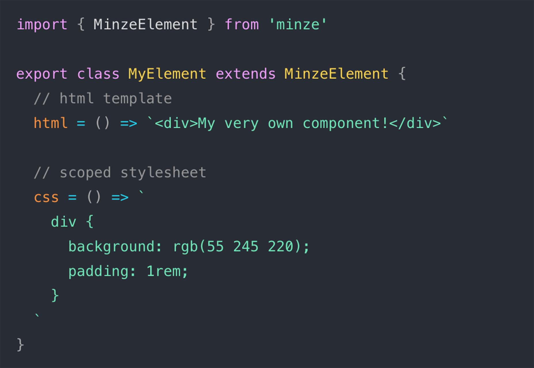
Minze is a simple JavaScript framework for native web components. It’s tiny and fast, modern, shareable, framework agnostic, and uses TypeScript to scale your component library. Plus, you can get started with it right away.

Tally

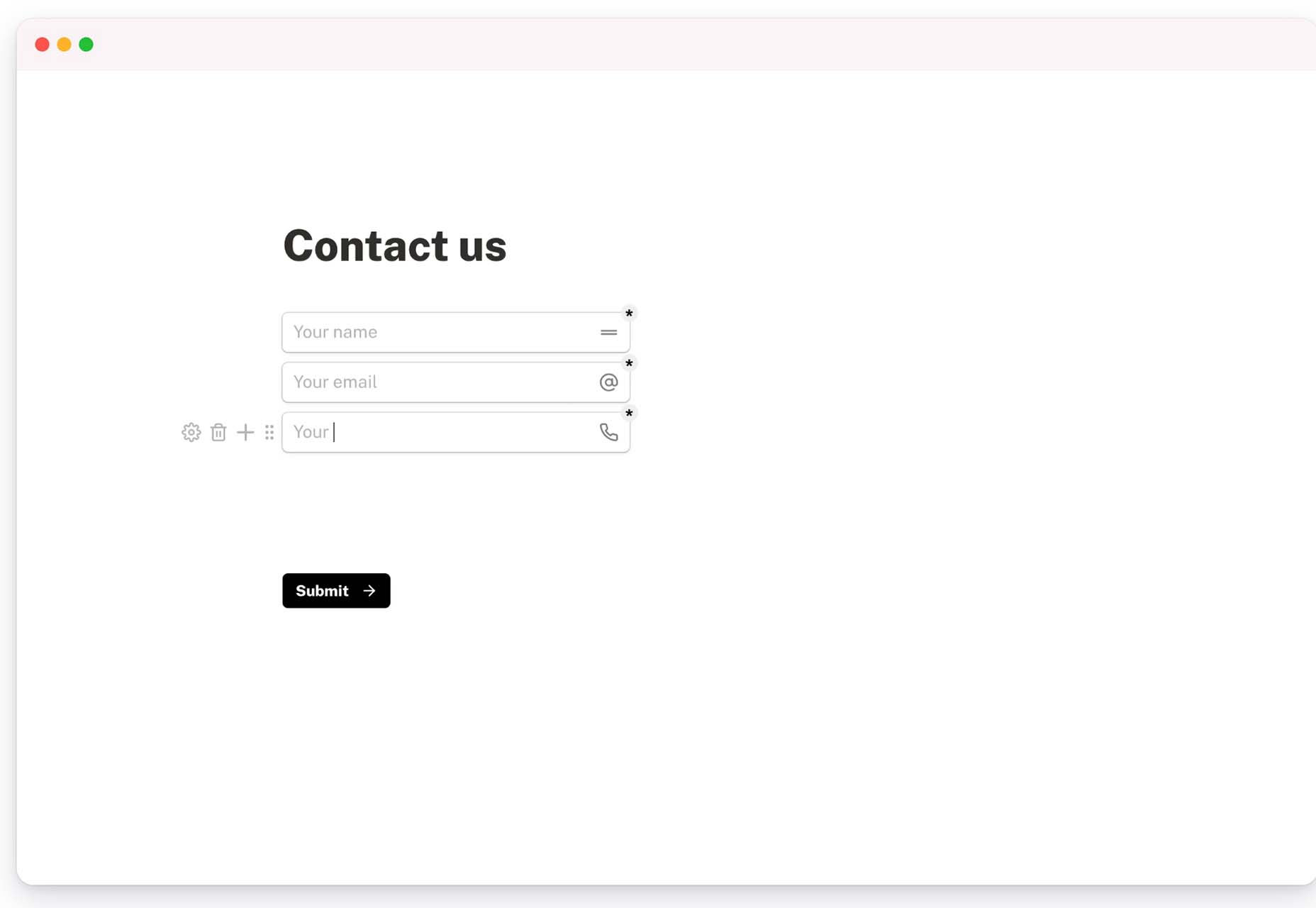
Tally is a simple – and free – online form builder. You can use it without coding, and it works like a document file, so there’s no learning curve. You can create unlimited forms, integrate with other tools, set logic, collect payments, and more. There’s a pro version as well if you need even more features.

Hue.Tools

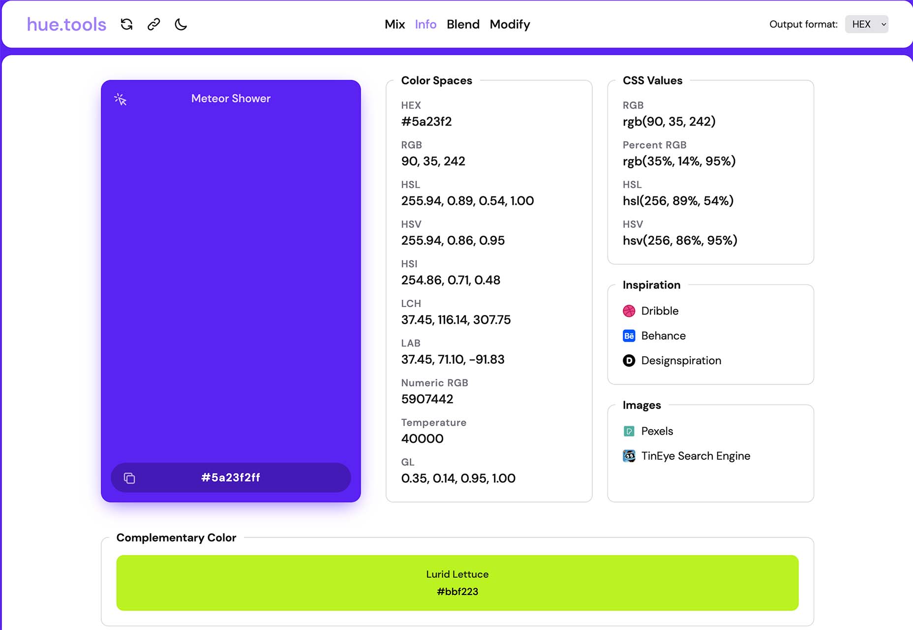
Hue.Tools is another color tool to help you maximize effort when creating palettes. Generate a color you like, see specs and values in all the different color spaces, inspiration from design sites, and colors that work with it. It’s fun and functional.

Sturdy

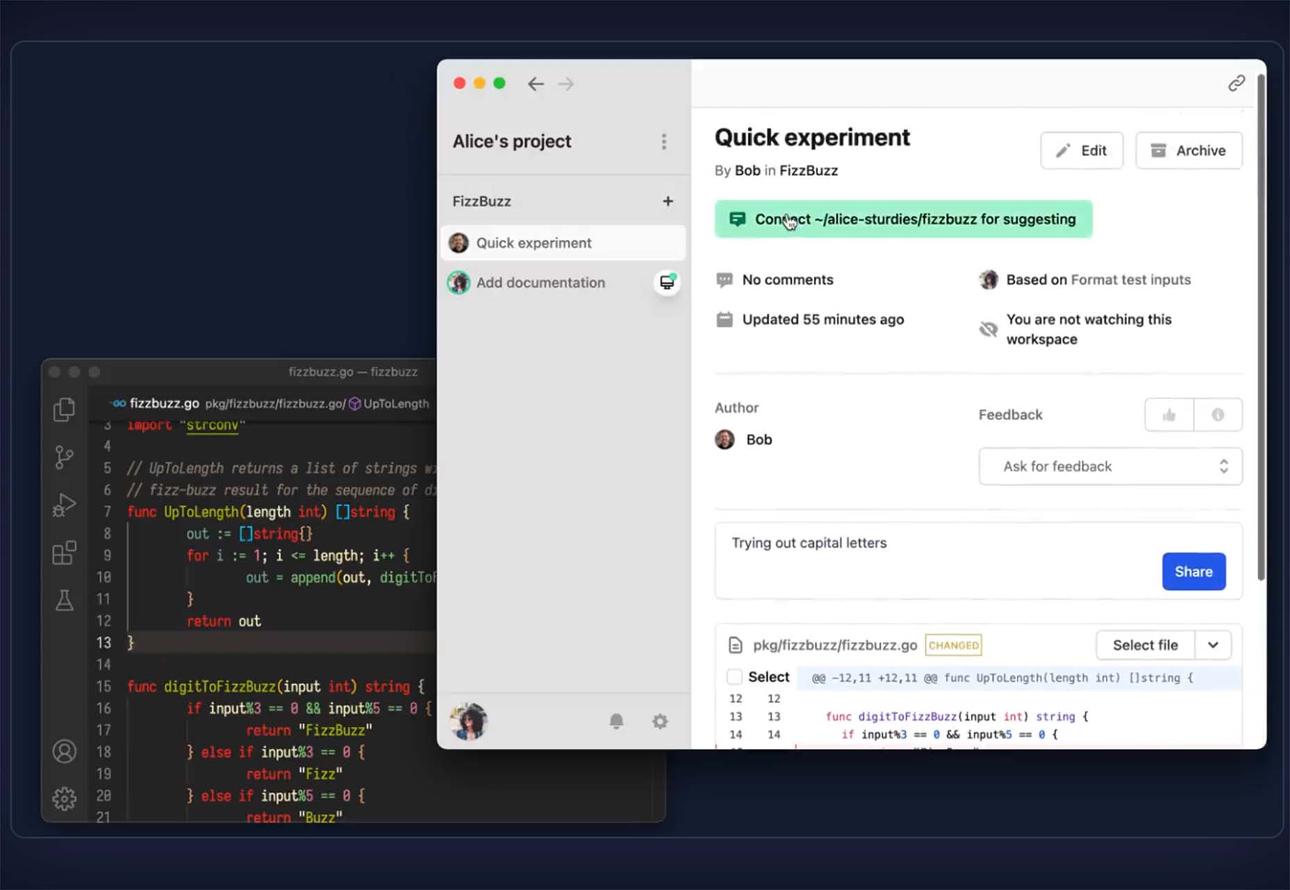
Sturdy is a low overhead code collaboration platform for fast-moving teams. With Sturdy, you work in the open with your team. Discover and interact with draft code as it is written. Those team drafts are like live pull requests (Figma or Google Docs) but using your local editor.

Mage

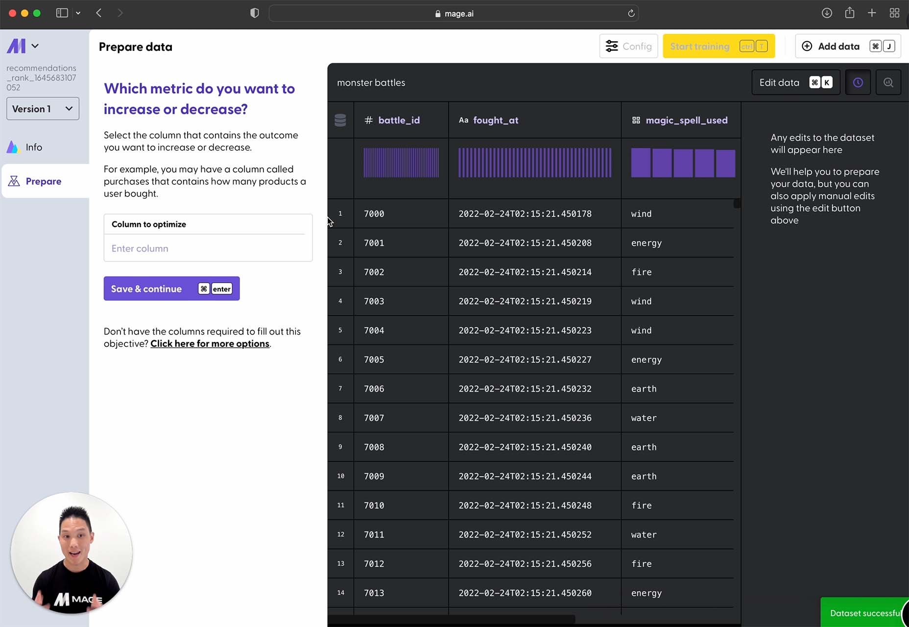
Mage is a tool that transforms your data into predictions. Build, train, and deploy predictive models in minutes with no AI experience required. This is a premium tool, but you can try it for free.

Huemint

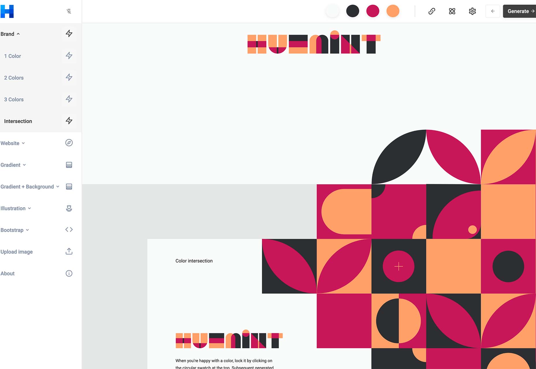
Huemint is a machine-learning-based color scheme generator for websites, graphics, and branding. There are many options to play with, and you can generate some pretty interesting combinations that ordinarily you might not think of.

CSSUI

CSSUI is another tool you’ll love because it includes pure CSS interactive components without any JavaScript. It’s easy to customize, uses standard HTML, is easy for all levels to use, is tiny and fast, and supports pretty much all modern browsers. It’s an open-source tool that you can download and use immediately.

UI Icons Line – Free

UI Icons Line – Free is a set of 1,000 free vectors for use in your projects. Who doesn’t need a robust set of icons?

Skill Icons

Skill Icons is a set of icons to help you showcase your design and development skills on your resume or GitHub. They all look great and match.

Ambient Design

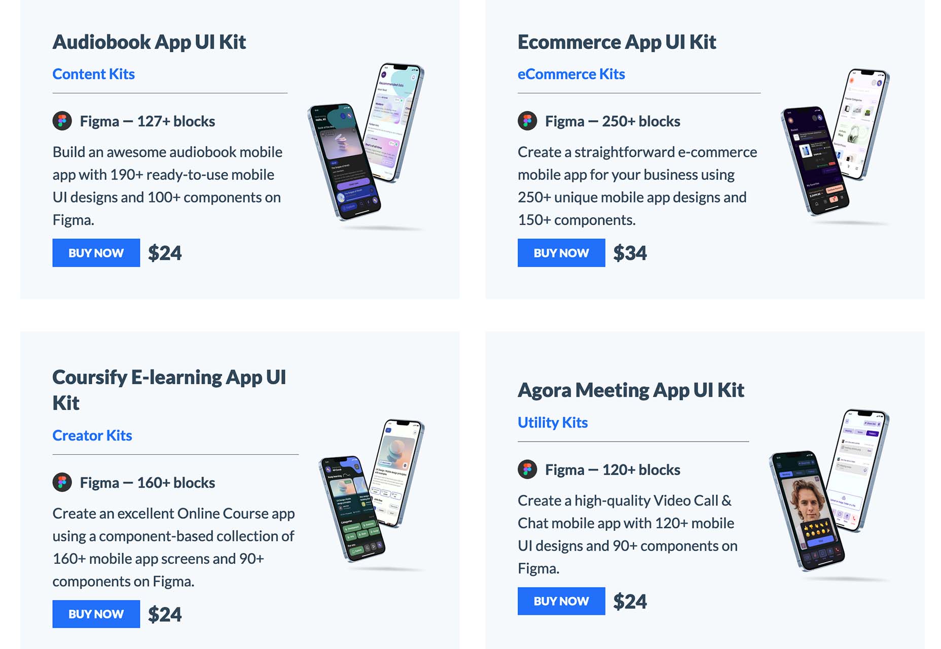
Ambient Design is a mobile app design market where you can get mobile UI kits for Figma. Purchase kits separately, or buy quarterly or yearly plans to access all current and future UI kits.

TextFrame

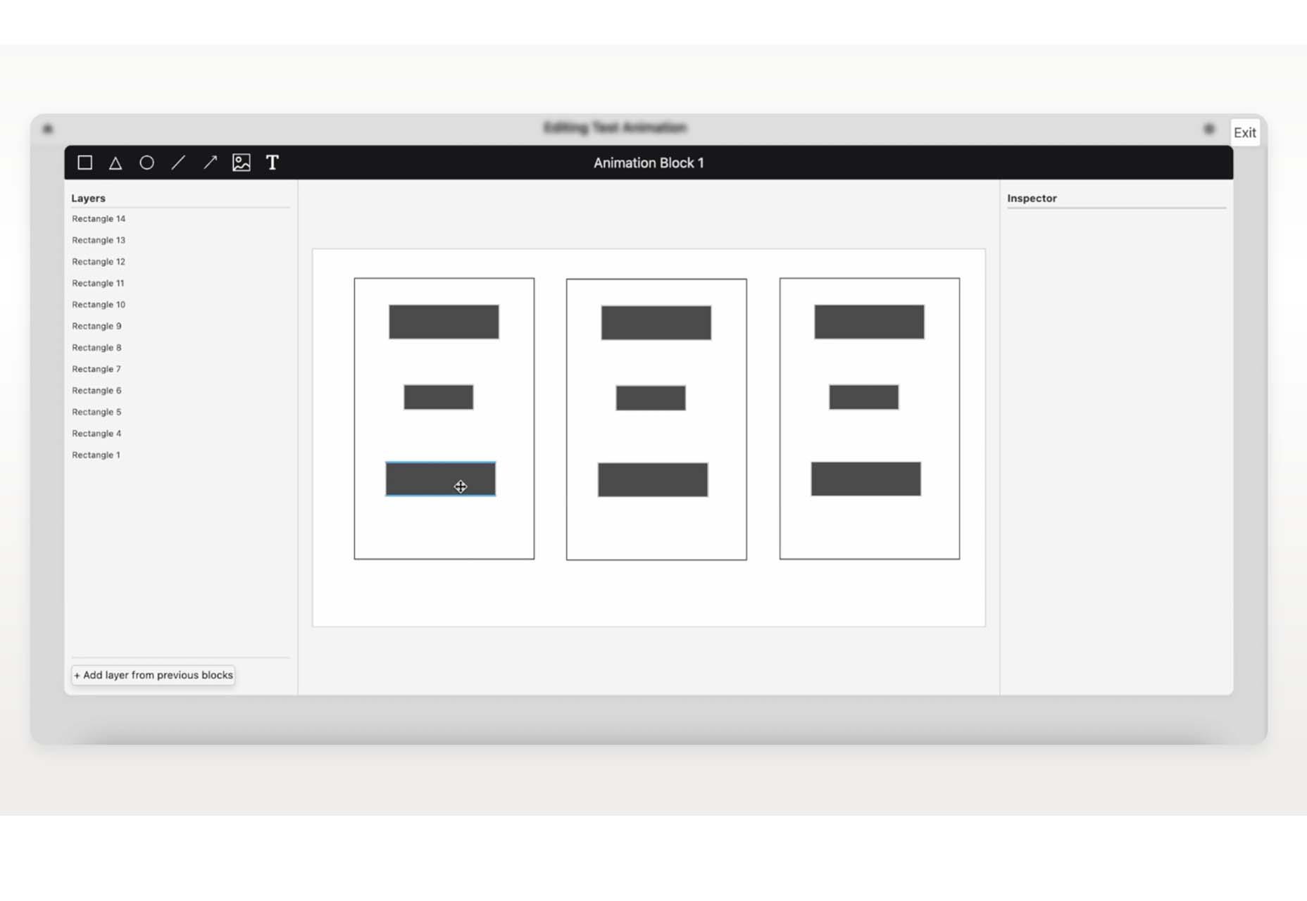
TextFrame lets you create animated tutorials for your users to get the help they need. It integrates directly with WordPress or any other website with just a couple of lines of code and includes plenty of customizable options to make it easy for you to help others understand how to use the website. The tool is free for one site and just a few bucks per month for additional sites.

Booqsi

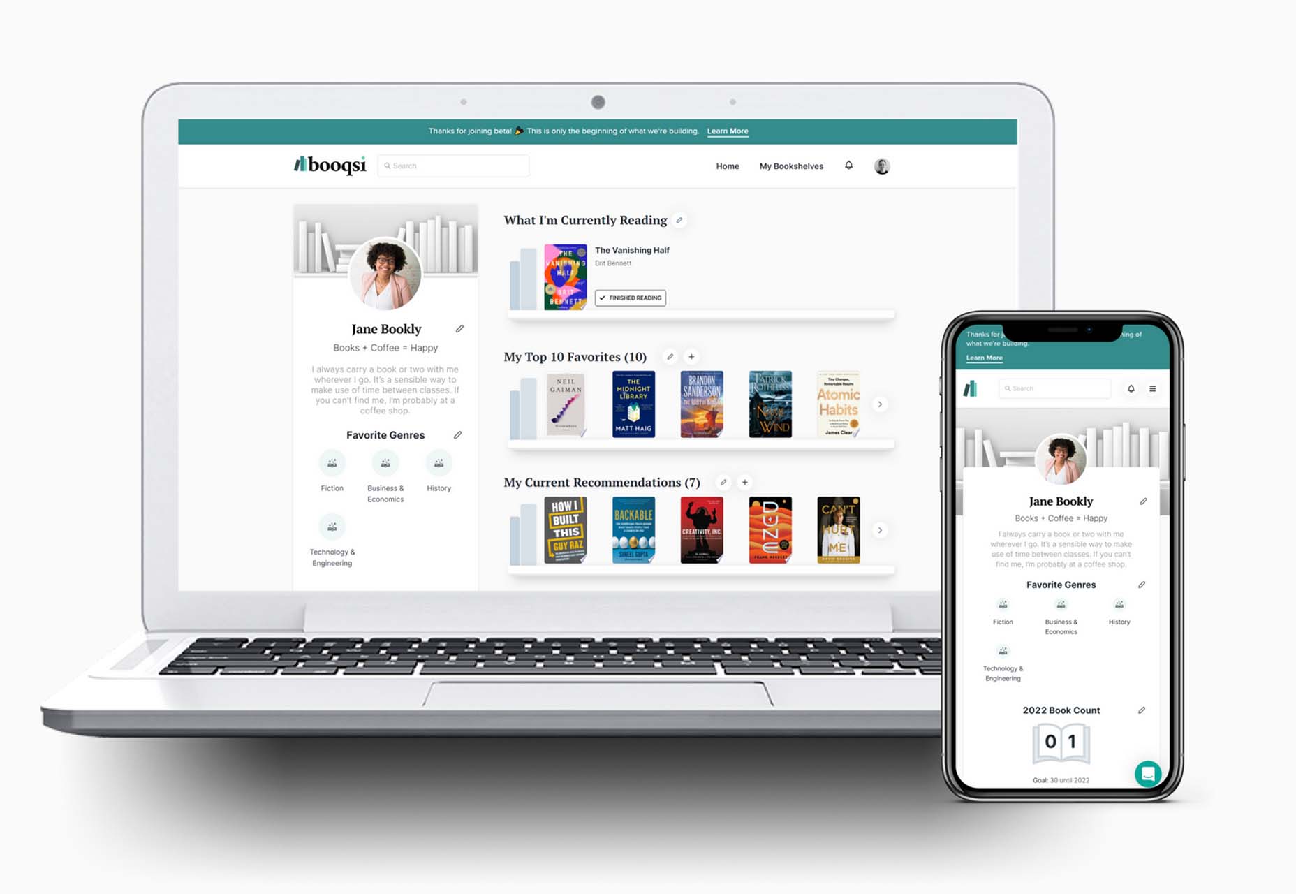
Booqsi is a fun new social media network for book lovers. The platform is still in beta and lets you save and share books, create shelves for reading, and doesn’t force a connection to Amazon. It’s just all about the books. And there’s a bonus: every link from the site goes back to bookshop.org to help you find and support local bookstores.

Stylo

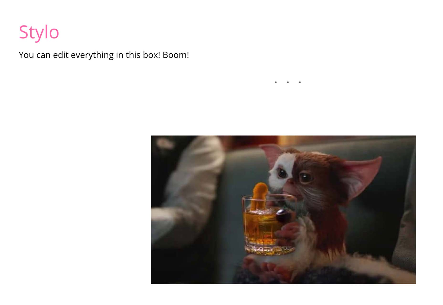
Stylo is an open-source WYSIWYG interactive editor for JavaScript. It is made to bring great user experience and interactivity to the web, for everyone, with no dependencies. It has an interactive design, is customizable, and is future-proof.

Tutorial: How to Favicon in 2022

How to Favicon in 2022 is an excellent lesson on the five icon files every website needs (plus one JSON file). If you are creating more than that, this is a must-read.

Tutorial: Creating Generative SVG Grids

Creating Generative SVG Grids is an in-depth, step-by-step tutorial for anyone who wants to create a more artistic SVG. It uses a handful of tools, including SVG.js, Generative Utils, TinyColor, and GSAP.

Fromage

Fromage is a new and beautiful premium typeface family from Adam Ladd. It includes 14 styles with an interesting serif and alternative sans option. The high-contrast design is great for a variety of projects.

HD Colton

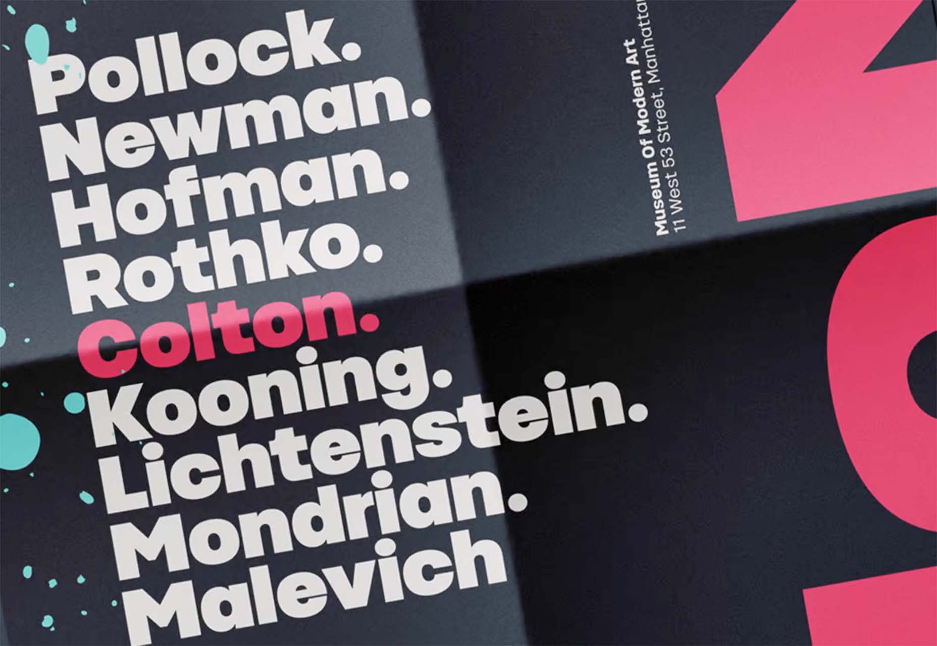
HD Colton is a premium super sans serif typeface with a whopping 91 styles and family package options. It would make a bold statement as a display option.

Source

The post Exciting New Tools For Designers, March 2022 first appeared on Webdesigner Depot.

Source de l’article sur Webdesignerdepot

Dealing with a database is one of the biggest challenges within a software architecture. In addition to choosing one of several options on the market, it is necessary to consider the persistence integrations. The purpose of this article is to show some of these patterns and learn about a new specification proposal, Jakarta Data, which aims to make life easier for developers with Java.

Understanding the Layers That Can Make Up Software

Whenever we talk about complexity in a corporate system, we focus on the ancient Roman military strategy: divide and conquer or divide et impera. To simplify the whole, we break it down into small units.

Source de l’article sur DZONE


This is an article from DZone’s 2021 Kubernetes and the Enterprise Trend Report.

For more:

Read the Report

As more organizations have begun to embrace cloud-native technologies, Kubernetes adoption has become the industry standard for container orchestration. This shift toward Kubernetes has largely automated and simplified the deployment, scaling, and management of containerized applications, providing numerous benefits over legacy management protocols for traditional monolithic systems. However, securely managing Kubernetes at scale comes with a unique set of challenges, including hardening the cluster, securing the supply chain, and detecting threats at runtime. 

Source de l’article sur DZONE

Maps are a fascinating method for delivering content. At their best, they can create an intuitive way of presenting information and interacting with it. This is the advantage that digital maps, through mobile apps and websites, have over print maps and images where no interactivity is possible.

But it’s important to understand that more data ≠ better experiences. We all now have so much data available to us through multiple services that, arguably, the greatest challenge isn’t sourcing information but filtering it out. We can only handle so much information input before we become overloaded. This issue risks being omnipresent with maps. There are so many potential points of interest on a map that it’s essential to be clear about what needs to be exposed to users.

Also, UX design, map design, and user interface are all critical. While maps can be a powerful way of drawing people in, if end-users feel that you didn’t even consider the visual design, they’ll ‘bounce off’ your site or app in moments.

Common Use Cases

When are maps useful, and what problems do they solve? Let’s dive right into the most common use cases for maps used in web design.

Navigation and Direction

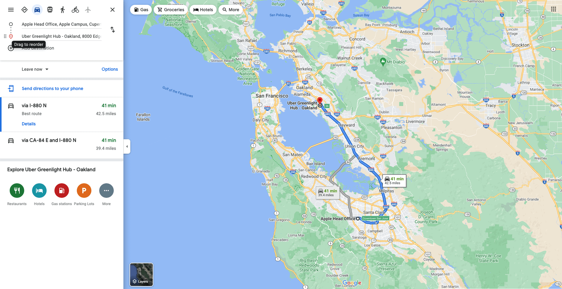
Like Google Maps shows, navigation and direction are arguably the classic case study for interactive maps. You are in one place and need to get to another. You can enter your destination, your current location, and the map will present suggestions for getting there. You can select the method of travel and adjust desired departure or arrival times. But you need to understand first what functionality your users need. How these options are exposed to users is a critical piece of UX design.

Also, if users are searching for options such as somewhere to eat, it’s not so straightforward. Then, how your map handles panning in real-time as users swipe around a city is going to be a big issue.

Showing Relationships and Trends Geographically

This is something that you’ll see in every election in any western country. We’re all used to seeing maps that give us a state-of-play for which state or seat is held by which party. Then, we might see projections based on voter intentions and projected voting swings deriving from that. Then, exit poll data can be projected with the map updated on an ongoing basis until the final result is confirmed.

The capability to do this is essential because if a static map were used, it’d be out of date any time a new poll was released. Also, voting intentions can change over a campaign, so such maps need to be dynamic. Of course, such maps are only as accurate as the available data, as the US 2016 election map showed.

Show Points of Interest

As mentioned previously, there’s a lot of data that can be exposed to map users. However, that doesn’t automatically mean that it should be. Usability is key. For example, when you look at a map, you’ll typically first see key points of interest. Which points of interest are going to be presented to you can vary.

One variant is zoom level. If your map is currently showing an entire city, the level of detail the map presents is deliberately limited. You’ll see districts, large roads, or geographic features such as rivers. If more detailed information were presented, users on mobile devices, in particular, would be overwhelmed. Even at this level, you’ll notice typography differences. These can include the city name being in bold or the names of different areas in capital letters. So the level of detail is coupled with the scale of the map. Zooming in a few notches will expose significant points of interest, such as museums. Zooming in to specific districts will reveal restaurants, coffee shops, and universities. This visual hierarchy is a critical way of managing the exposed level of information.

But information is still being abstracted away. It’s not until you tap on the museum that you’ll see information on opening hours and busy times. This is also typically presented with user photos and reviews. Context is also taken into account, so you’ll start to see local hotels and restaurants. So it’s not just individual points of interest that are important, but the connections between them.

6 Tips For Improving Interactive Maps

What are the challenges of creating effective maps, and how do people address the data overload problem? We’ll answer this question and go over the must-know aspects of map creation.

1. Ensure Security and Brand Trust

GDPR or General Data Protection Regulation. This is a critically important European law that extends a wide range of legal protection to European citizens regarding personal data. It’s not possible here to cover the full extent of the law, but here are some quick key points:

  • Consent is required for the processing of personal data; it cannot be assumed
  • You need to have a retention policy for information that’s capable of identifying people

Be aware that the latter doesn’t just cover commercial purposes. Research students have to submit GDPR forms that address what kind of data they’re sourcing and how they’ll be retaining it.

But the most crucial context is commercial. If a business suffers a data breach, it can be fined up to 20 million euros or 4% of annual worldwide turnover in the preceding financial year, whichever is greater. Therefore, any business storing data that could identify their customers will need to assess risk and compliance. Remember: it’s 4% of worldwide turnover, not EU turnover.

Also, anything of your business that you expose to your customers or users is an extension of your brand. Therefore, you need to assess your maps for brand compliance too. If you have primary brand colors and your map doesn’t abide by them, that’s a very poor look. Source the color hex codes directly from your brand team and involve them in design.

2. Use the Appropriate Type of Map

It’s also important to consider what type of map is most appropriate for your use case. Think carefully about what your users need, what you’re trying to communicate, what information you need to present, and how best to present it.

For example, points of interest style maps in a tourist app will be way more helpful than heat maps: people want to know where something is, key data like opening hours, and how to get there. A heat map showing the number of visitors to each attraction or area of a city is unlikely to be useful to tourists. However, it could be useful to the attractions themselves to map their visitors by heat map over time. This could help larger museums chart which exhibits are most popular.

Transport for London is charting passenger movement on the London Underground by detecting when a device with Wi-Fi comes into range and then passes out of range. They’re using this to understand overall user journeys and movements within individual stations to better manage disruptions.

3. Avoid Pop-Ups

It should go without saying by now that auto pop-ups are despised. It doesn’t matter what they’re doing or what they’re offering; an unwanted pop-up can only get in the way. The level of impact is even greater on a phone where pop-ups take up even more screen space.

Given this, many users close them without even reading them. So if you’re using pop-ups, don’t kid yourself. You’re likely just irritating users and increasing the likelihood that they’ll ‘bounce off’ or uninstall.

4. Avoid Auto-Geolocation

Auto-geolocation sounds incredibly convenient but can result in some real problems. For example, if there are any bugs with auto-geolocation, you could get false results. If someone connects through public building Wi-Fi, you could get false results. If they’re connecting through a VPN then, unless you get the user’s IP address and check if it’s the exit portal of a VPN, you could get false results.

The problem is most significant with mobile maps. If a map user is looking at a points of interest map, they likely have a specific and immediate use. This means it’s in their best to get the most accurate results possible. So why not just ask them?

Precision and Accuracy

These terms have specific meanings in geolocation. ‘Precision’ is the exactness of the data. ‘Accuracy’ is how closely the information on a map matches the real world. So you want precision and accuracy to be spot on, or data risks losing value. This applies not just to the gathering of data but to the representation of it. For example, if you have street-level data but your maps don’t present individual streets, then any representation of data on that map is likely to have poor accuracy. That map might succeed in abstracting irrelevant information but presenting an imprecise and inaccurate view.

5. Avoid Map Legends as Much as Possible

In many cases, primarily points-of-interest maps, they’re just not needed anymore. An essential part of user experience design isn’t just visual hierarchy but information hierarchy. You can mouse over on a desktop or laptop to get the essentials of a location, e.g., the museum’s name and its opening hours. On a mobile device, you can tap on that location to get the essentials, and you can tap on another location to move on; you don’t even have to press back. Given that, a legend would get in the way. So this simple piece of information design solves information overload issues.

As with all rules, there are exceptions. A good one is a heat map where a density of what’s being measured needs to be communicated. It doesn’t matter what the data is; it just needs to be something where mapping provides greater insight, especially if it informs decision-making. Sales is an excellent example for a national or multinational company. Of course, weather forecasting can make use of literal heat maps.

6. Accessibility Compliance

Not everyone has perfect eyesight. Even if someone has excellent vision, they could still be colorblind (8% of men and 0.5% of women are). Given that, take the W3C’s accessibility standards into account and treat them as a baseline or minimum barrier to entry for compliance. You shouldn’t feel good about the possibility of excluding 8% of your potential audience or customers. Ensure you keep your UX designers involved and don’t shy away from creating senior-friendly web designs.

Put simply: imagine if you could appeal to a new demographic that’s not catered to. If your competitors ignore them, you could give them a real reason to choose you instead by taking some straightforward steps. If your competitors are catering to them, you also need to. If you don’t, you’re just giving potential customers a big reason to ignore you.

Conclusions

The key takeaway is that there’s far more to creating good maps than just good cartography. That can be critical, too, though this may vary depending on the use case.

This will be a team effort because your map will involve data sets, design decisions, and, yes, cartography. You’re going to need to involve brand and IT too. So think about design principles and development methodologies.

First and foremost, what are your users’ needs? If you haven’t done any user research or taken the time to understand the customer journey, are you adding anything or getting in the way? It’s easy to see the department that requested the map as stakeholders, but you should probably view your users as stakeholders too.

This sounds complex, but as you hopefully now appreciate, a map is probably more complicated than you thought.


Featured image via Pexels.

Source

The post The UX of Maps in Web Design first appeared on Webdesigner Depot.

Source de l’article sur Webdesignerdepot

Modern data-driven applications are based on various data sources and complex data stacks that require well-designed frameworks to deliver operational efficiency and business insights. Data pipelines allow organizations to automate information extraction from distributed sources while consolidating data into high-performance storage for centralized access. In this Refcard, we delve into the fundamentals of a data pipeline and the problems it solves for modern enterprises, along with its benefits and challenges.
Source de l’article sur DZONE

The year’s winding down as everyone segues into a much-needed holiday R&R. But that doesn’t mean there aren’t some awesome new tools and resources for website design projects.

Check them out, and hit the ground running in January. Here’s what’s new for designers this holiday period. Enjoy!

Fancy Border Radius Generator

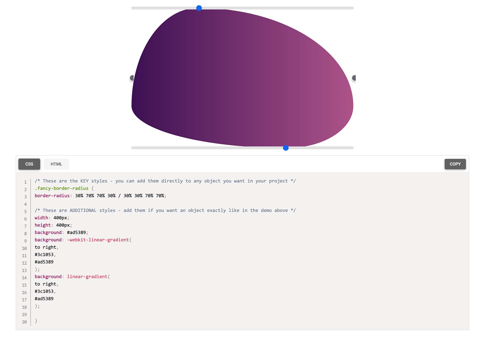
Fancy Border Radius Generator is a fun tool that allows you to create exciting shapes for elements. Use the included templates or create your own border shapes and then export the CSS/HTML for a variety of uses.

Pulsetic

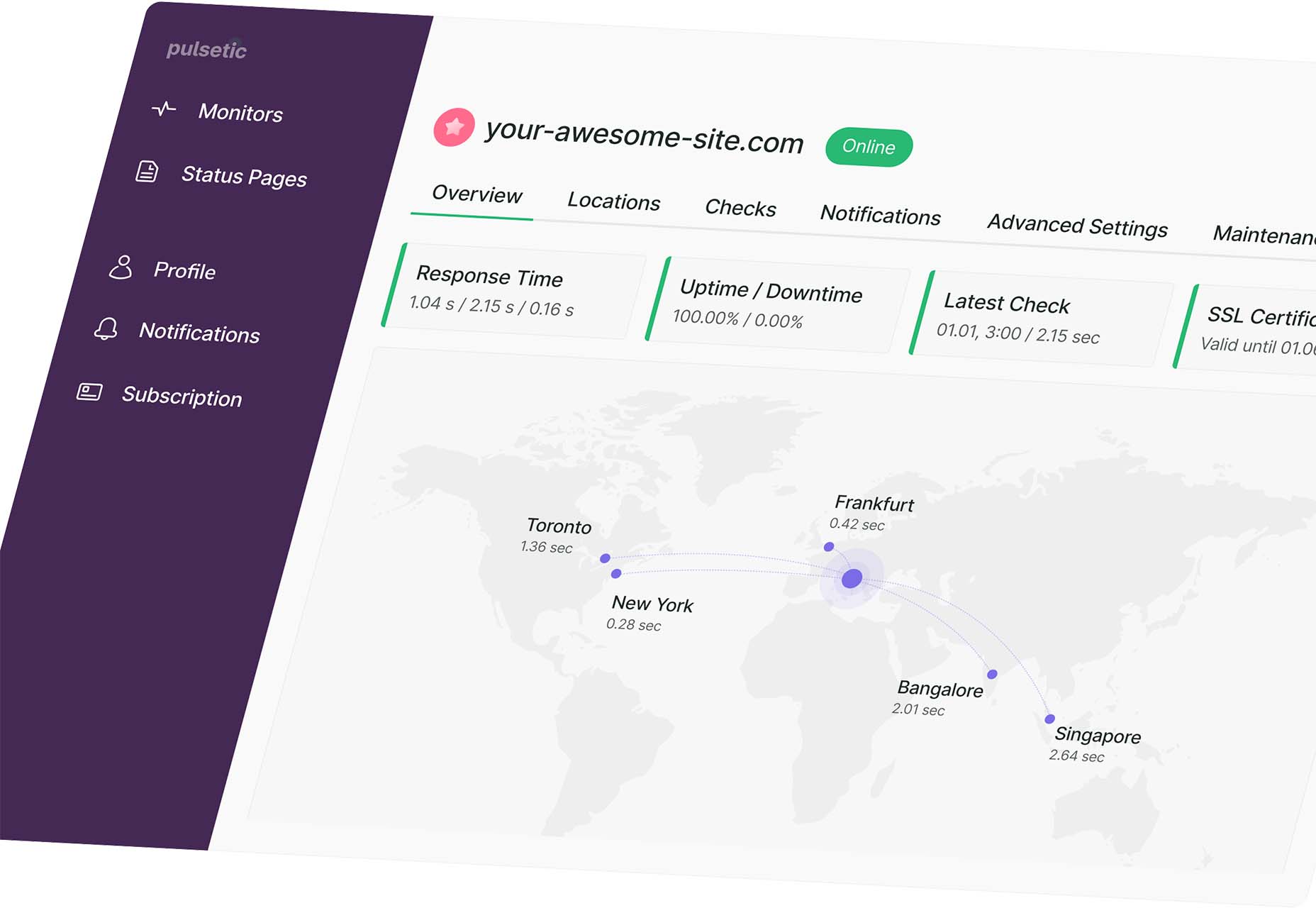
Pulsetic answers the question: “Is your website down?” Get website downtime alerts by phone call, SMS, email, or Slack. Create beautiful status pages and incident management reports and keep visitors (and your team) updated.

Ffflux SVG Generator

Ffflux SVG Generator makes it easy to generate fluid and organic-feeling gradients. You can use the resulting graphics as backgrounds to elements on a page to give a colorful fluid look to page elements. Choose colors and styles, then save or copy your SVG for use.

Fable

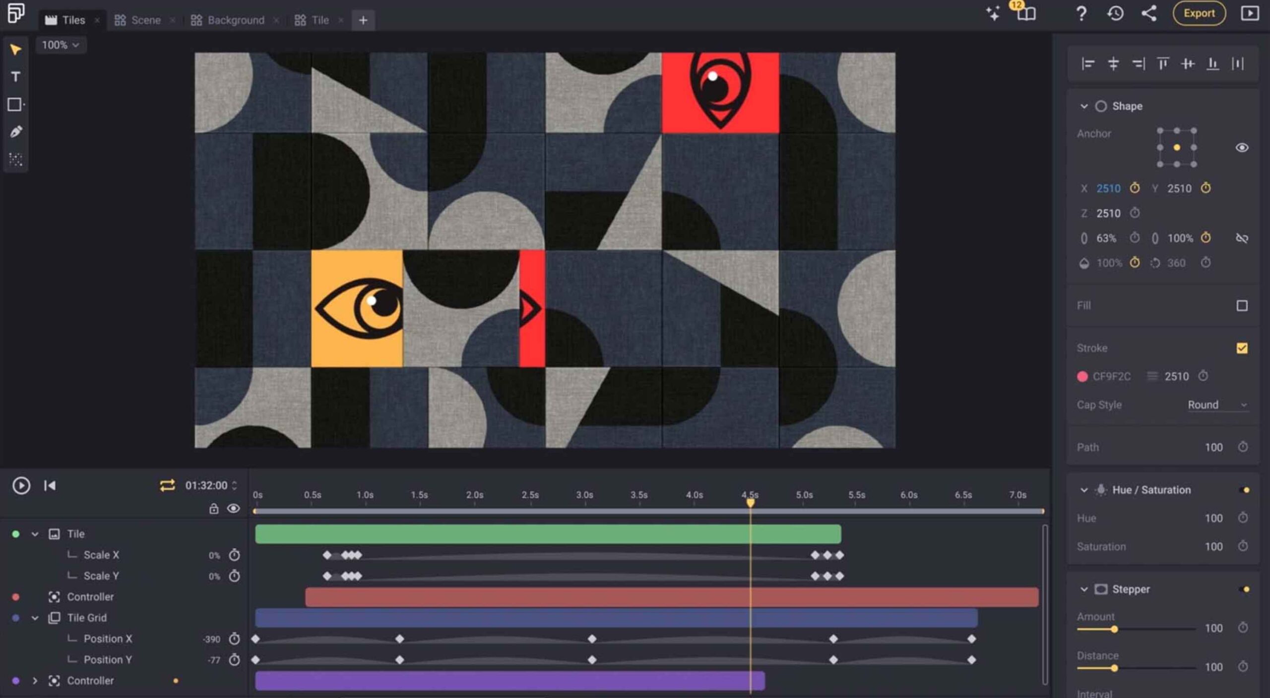
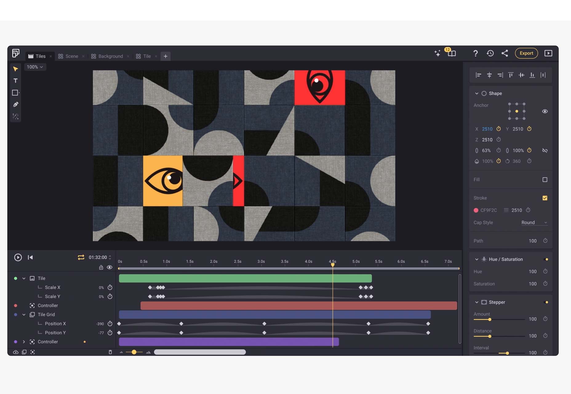
Fable is a web-based motion design platform to help you tell moving stories. It’s designed to be easy enough for beginners to use but has tools that even the most experienced motion designers can appreciate. This is a premium tool, but you can try it free.

Modern Fluid Typography Editor

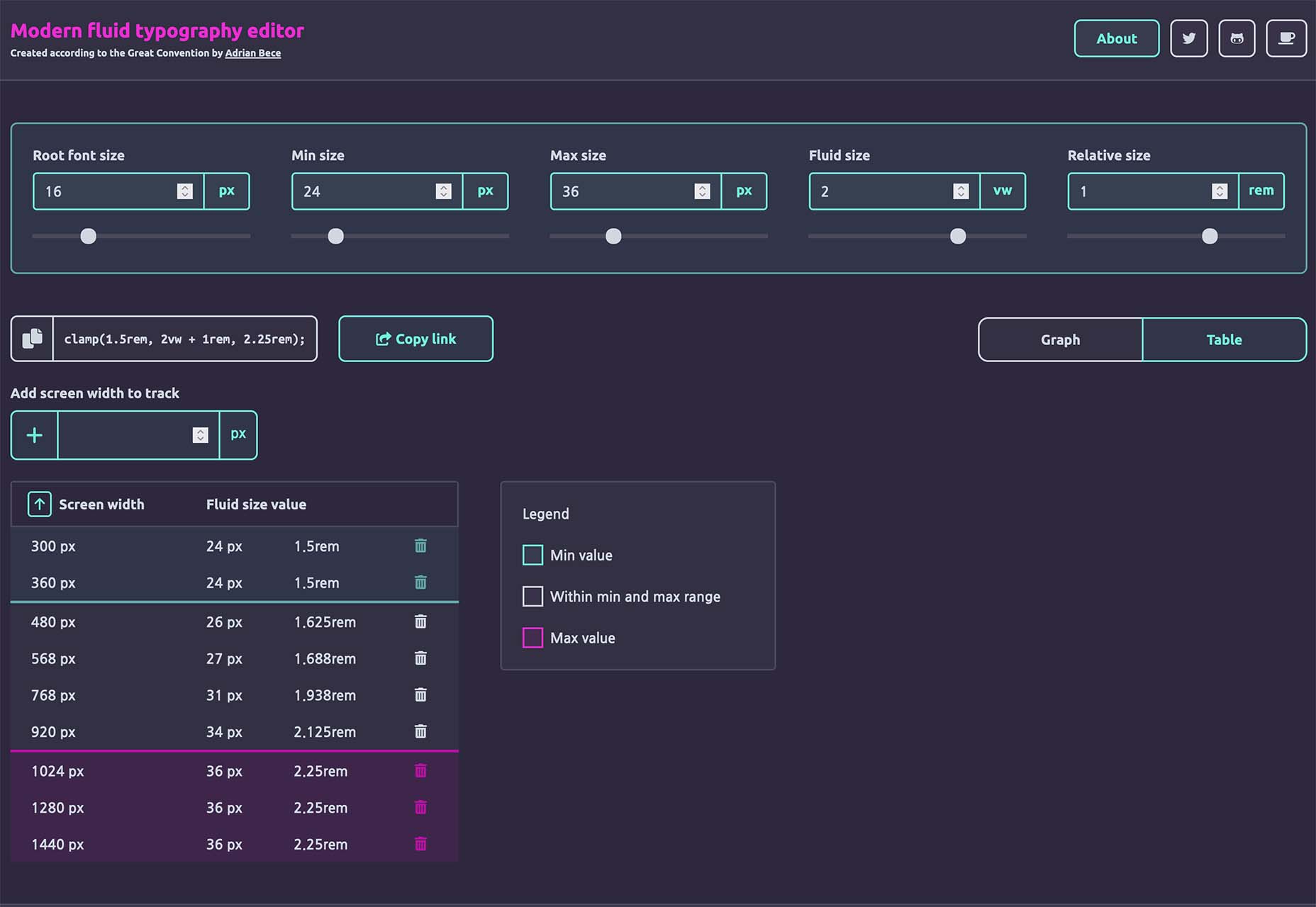
Modern Fluid Typography Editor takes the guesswork out of sizing and scale for type sizes on different screens. Set a few preferences and see ranges your type styles should fall in. This typography calculator is visual and easy to use.

Emoji to Scale

Emoji to Scale is a fun look at emojis in a real-world relationship to each other. Make sure to also note the Pokemon to Scale project, which is just as much fun.

Page Flip Text Effect

Page Flip Text Effect is a fun and straightforward PSD asset that adds a nice element to design projects. Everyone can use some fun, colorful animation, right?

Nanonets

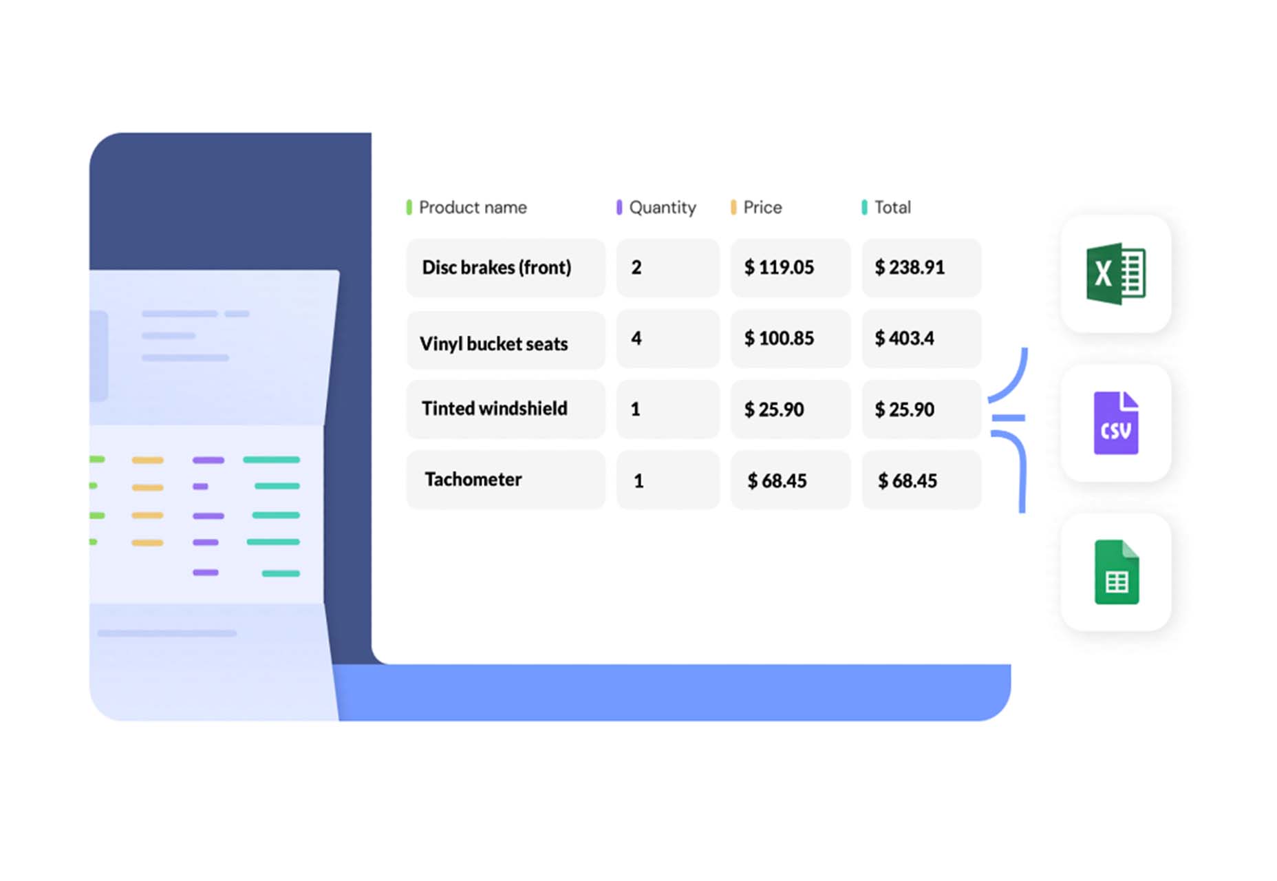
Nanonets is a practical tool for automated table extraction. You can snag tables from PDFs, scanned files, and images. Then capture relevant data stored in tabular structures on any document and convert to JSON Excel, or CSV and download.

Browsers.page

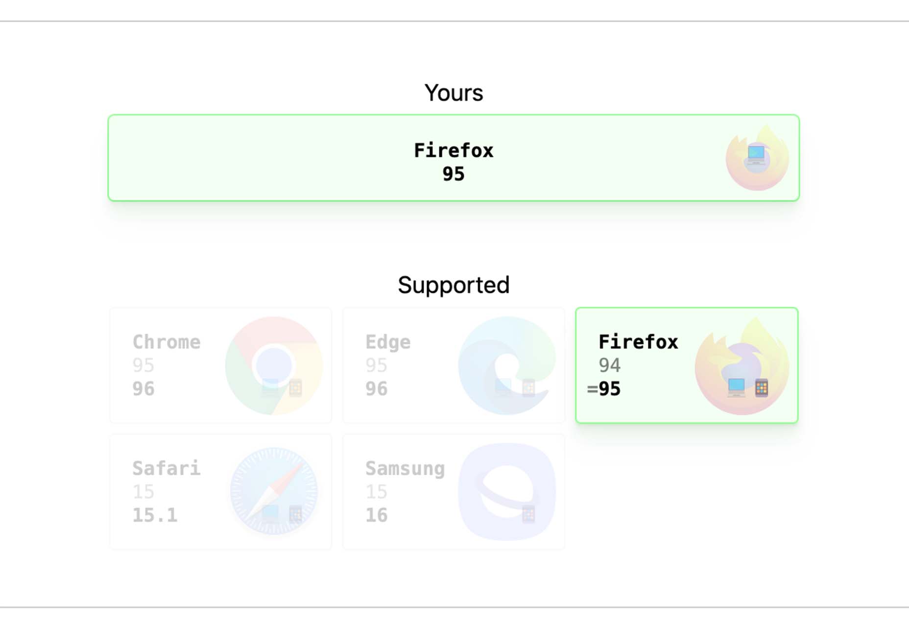
Browsers.page shows browser name and version, matched with a list of the browsers you support as a company or project. It’s a visual reminder to update if you are working with some browser lag. It’s a free tool and includes a frontend API.

UKO UI

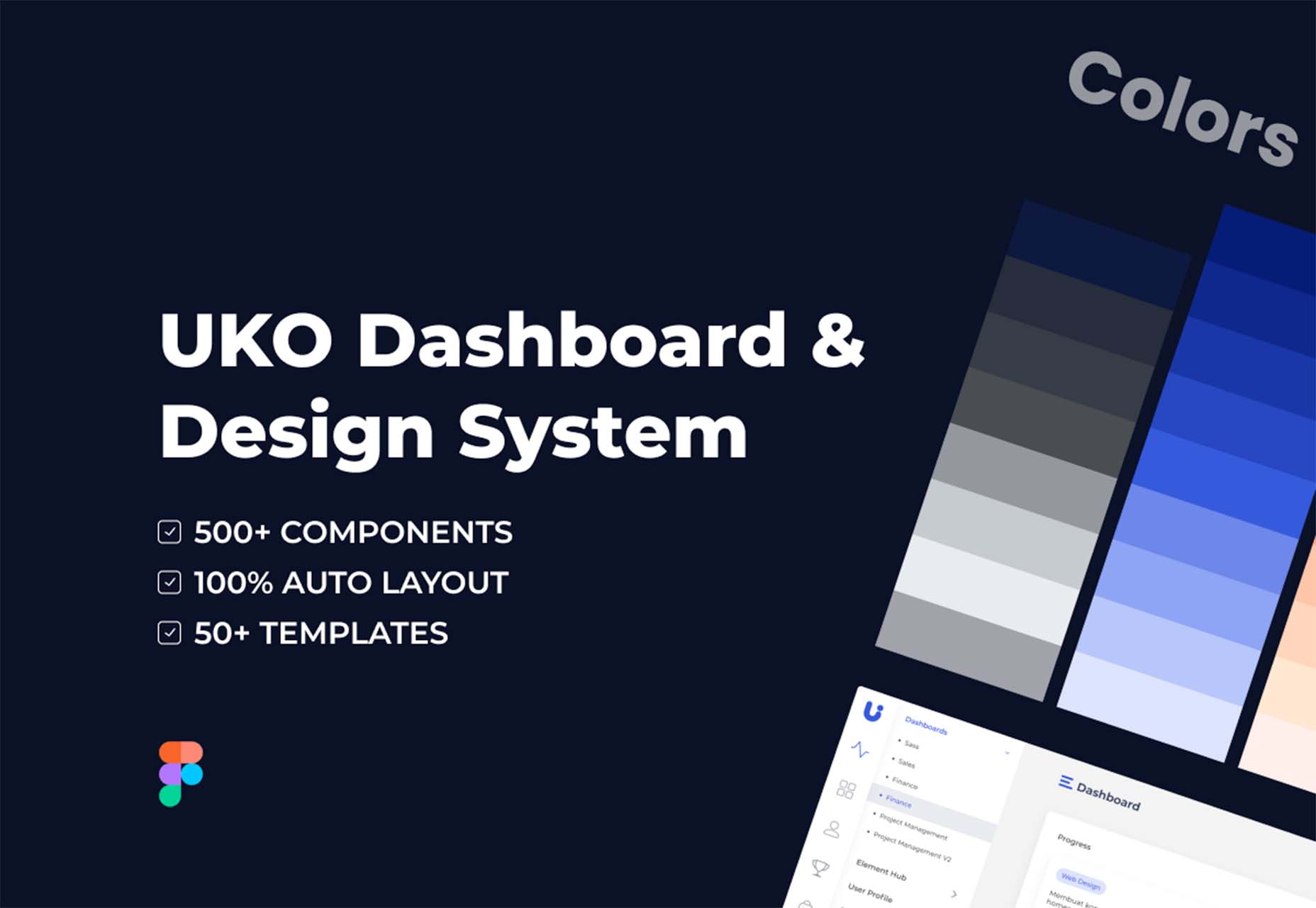
UKO UI is a Figma dashboard and design system bundle packed with components and pages to build from. It’s free for personal use.

Floating UI

Floating UI is a low-level library for positioning “floating” elements like tooltips, popovers, dropdowns, menus, and more. Since these types of elements float on top of the UI without disrupting the flow of content, challenges arise when positioning them. It exposes primitives, which enable a floating element to be positioned next to a given reference element while appearing in view for the user.

Style-Dictionary-Play

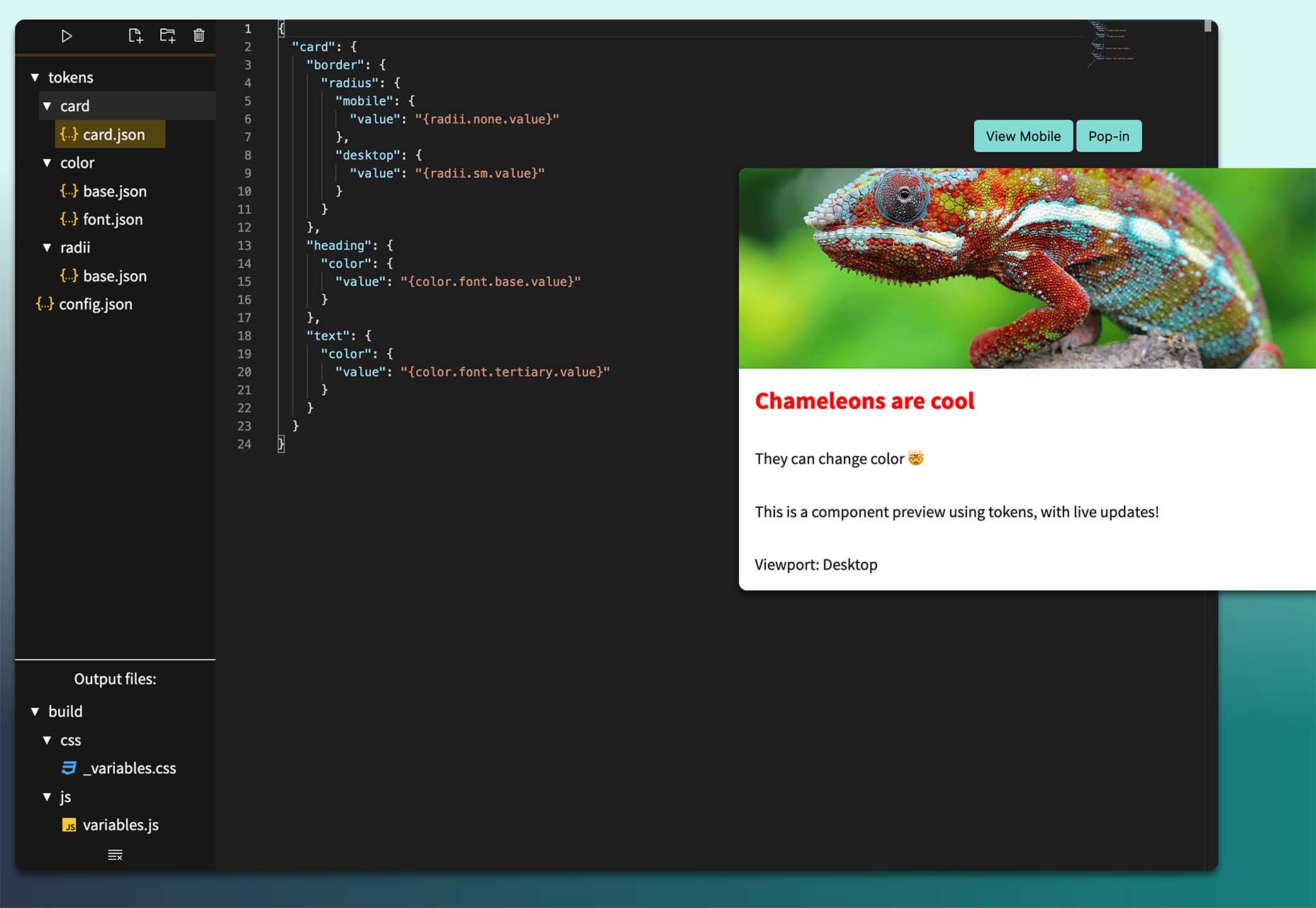
Style-Dictionary-Play lets you experiment with a style dictionary in your browser with a live preview and mobile and desktop views. It’s an open-source tool and allows for URL project sharing, and you can use it without logging in or signing up.

Airplane Runbooks

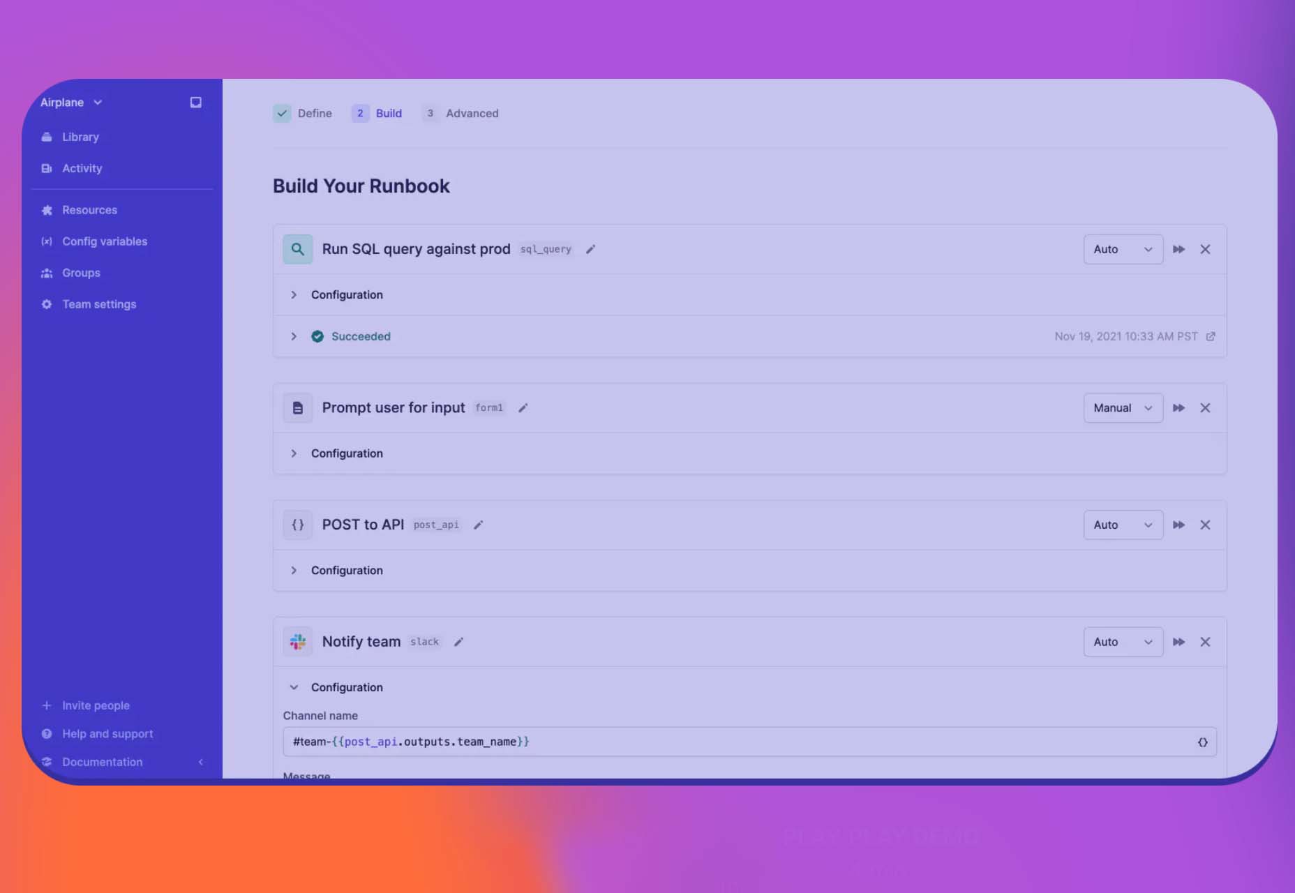
Airplane Runbooks makes it easy to turn small amounts of code into complex internal workflows. Model onboarding flows, admin operations, cron-like schedules, and more and share with your team. It’s like Zapier but for first-party operations that touch prod data.

Shoelace

Shoelace is a forward-thinking library of web components that works with any framework. It’s fully customizable – and has a dark mode. It’s built with accessibility in mind, and the open-source tool is packed with components.

Tutorial: Coloring with Code

Coloring with Code is an excellent tutorial by the team at Codrops that will help you create beautiful, inspiring, and unique color palettes/combinations, all from the comfort of your favorite text editor. It’s practical and easy to follow along as you work through the steps on your own.

Stytch

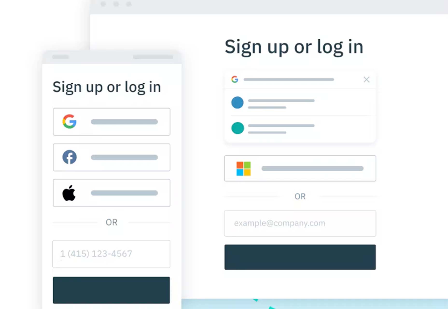
Stytch is a full-stack authentication and authorization platform whose APIs make it simple to seamlessly onboard, authenticate and engage users. Improve security and user experience by going passwordless with this premium tool.

Highlight

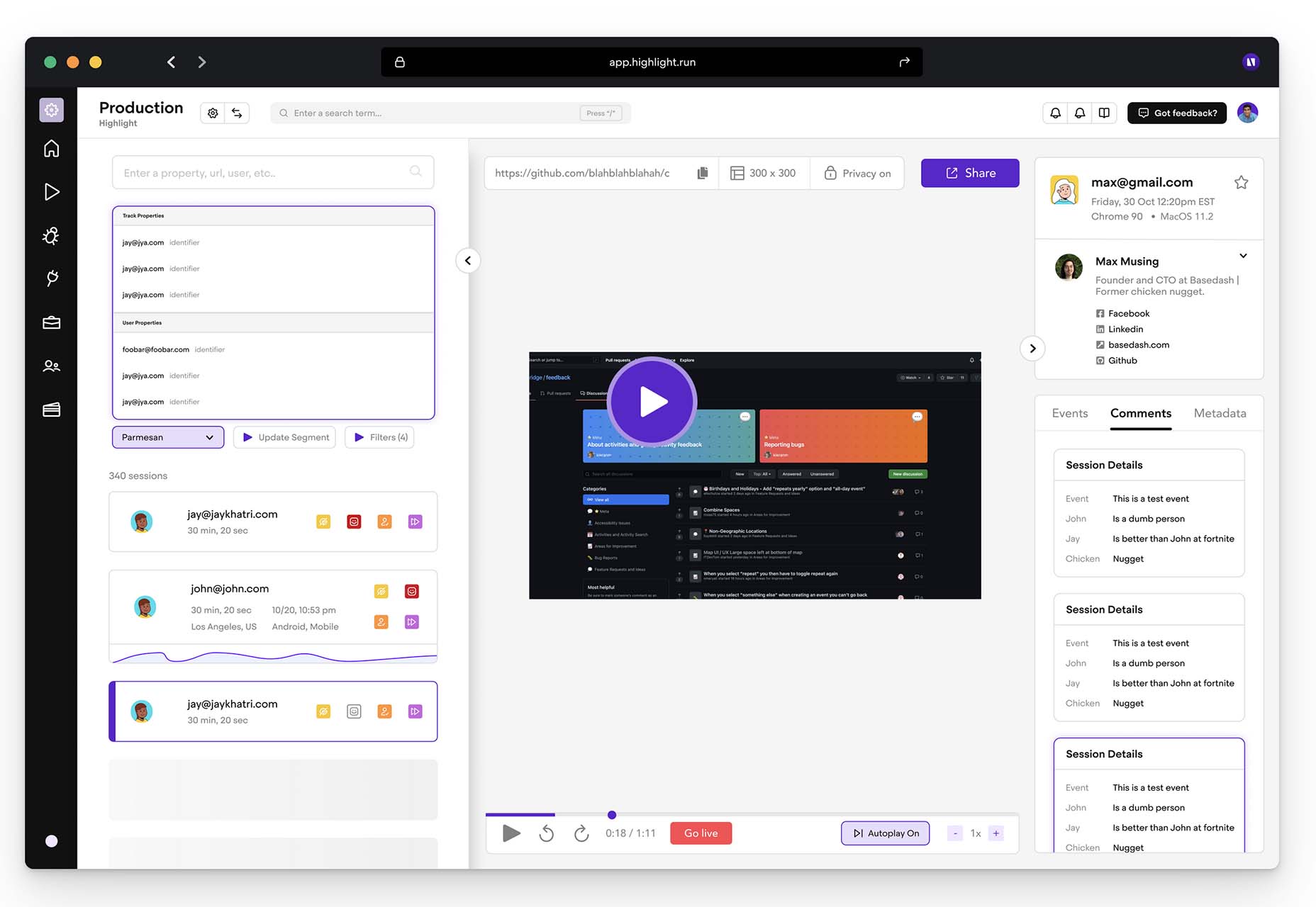
Highlight keeps web apps stable. With pixel-perfect session replay, you’ll get complete visibility into issues and interactions that are slowing down users. You can start using this premium tool in minutes, and it works on every framework.

Source

The post Exciting New Tools For Designers, Holidays 2021 first appeared on Webdesigner Depot.

Source de l’article sur Webdesignerdepot

It’s normal to pull up sharp in front of a problem; after all, if there was a known solution, it wouldn’t be a problem. But knowing that it’s normal, doesn’t make encountering problems any less frustrating. So how do we avoid sitting in front of a UX problem for hours, achieving nothing?

That’s what creative problem solving is all about.

In this post, we’ll explore creative problem solving, and how it can help you as a UX designer. Then we’ll analyze how you can solve UX problems in a few, easy-to-remember steps. By the end of this article, you’ll have all the tips you need for UX problem-solving.

What is Creative Problem Solving?

Creative problem solving is a term developed by Alex Osborn, the founder of the Creative Education Foundation. In a nutshell, this term is about overcoming challenges in our work lives through innovative solutions. But, of course, such solutions vary by profession.

For UX designers, creative problem solving is about solving UX problems with efficient tactics, that work. And that’s precisely why UX problem solving is so essential because following a specific method can help us avoid getting stuck.

Whether you are a newbie or an experienced designer, you are probably focused on projects that require you to solve problems. If you have never had a problem before, you must be a superhero; for us mere mortals, here are the steps we need to follow to solve a UX problem:

UX Problem Solving in 5 Easy Steps

Delivering a great UX solution is influenced by two key parameters: user research and creative problem-solving. Suppose you have done your user research and are currently looking for an original solution to a problem. In this case, the methodology below will be handy:

1. Identify the UX Problem

I know this may sound obvious, but think about it. How many times have we lost days because we didn’t identify the real problem? If you are solving the wrong problem, it does not matter if your solution is original and innovative.

That’s why the first thing you need to do is think about the problem. Ask yourself what the real problem is, and then get to work solving it. Identifying the problem may take some time, but it will prove beneficial to your project in the long run.

2. Clarify the UX Problem

Now that you have identified the UX problem, it’s time to demystify it. In this step, you could create a user journey plan. It does not have to be perfect; some low-fidelity sketches are more than enough.

Set a timer and start visualizing your solution on paper. Remember, sketching is not about perfection or fine details. Once you have created a customer journey you are happy with, it’s time to move on to the next step.

3. Use Analytics

UX design isn’t about design per se. It’s also about numbers and data. This is why analytics are critical to UX problem-solving. Once you have gathered some data from users and competitors, it’s time to create patterns. This will help you better understand the problem and change your drafts accordingly.

Numbers and data alone can help you a lot if you combine them with an original idea. However, facts alone are not enough, and your original story will not be compelling without them. So what’s better than combining them?

4. Use Your Feedback

So you have come up with an innovative solution to the UX problem. You have successfully combined this idea with essential data. Unfortunately, your work is not yet done. 

The next step is equally important. Once you have polished your ideas, you should share them with colleagues and/or customers.

It’s not easy to get feedback for your UX mapping, but it’s very constructive and will ultimately make you a better designer.

5. Solve the Problem

The last step is also the most fun. Once you have listened to people’s feedback, you can redesign your original solution. Then you are just one step away from solving the UX problem. Now it’s time to digitally redesign your idea.

This is the step where fine details matter. Creating a high-fidelity wireframe is not easy, but most UX designers have the knowledge and tools to get it done.

UX Problem Solving: Useful Tips and Tricks

Be Methodical

In my opinion, this is the most useful tip when it comes to UX problem-solving. You do not always have to be in a hurry. In the early stages of a project, try not to get distracted by other problems. Focus on finding the real problem.

Once you are sure you have found it, you can move on to finding the best solution. Then move on to the next step and so on. It becomes clear that being methodical is a brilliant tactic.

UX Problem Solving is All about the Ecosystem

UX problem solving is not about fine details. So try to care less about the design and more about the ecosystem you want to create. That will help you gather all the data you need, from user opinions to analytics.

Low-Fidelity vs. High-Fidelity Wireframes

Starting with sketches and low-fidelity wireframes is a brilliant thing to do. Whenever I have tried to start a project directly with high-fidelity wireframes, I have gotten bogged down in details.

For this reason, pen and paper should be your best friends in UX problem-solving. Sketches help you explore different approaches and get the feedback you need.

Explore Different Tools/Approaches

When it comes to solving a UX problem, there is usually one efficient solution. But that is not always the case. In most cases, we have to consider different alternatives and identify more than one critical interaction.

For this reason, feedback is also crucial for UX problem-solving. Your colleagues and customers will help you find the best method. Try to accept criticism and be open when listening to feedback. This way, you will ensure that you will find the best possible solution.

Wrap Up

Solving a UX problem is not easy. However, if you identify the real problem and illustrate different approaches, you will be on the right track. Also, do not neglect to use the data and feedback you collect. The more tools you have in hand, the better UX designer you will be.


Featured image via Unsplash.

Source

The post Creative Problem Solving for UX Designers first appeared on Webdesigner Depot.

Source de l’article sur Webdesignerdepot


Background Context

In our first blog, we introduced the definition and evolution of hybrid multicloud, key challenges of the enterprises, and the value realized by implementing a hybrid multicloud strategy. This blog will cover how to create a holistic and business-value-driven multicloud strategy. In order to provide agility, security, reliability, and access to a large ecosystem of services, a robust transformation strategy and program are required. This strategy must align with business objectives such as revenue growth, cost reduction, risk reduction, enhancing the customer experience, and capitalization of market opportunities.

Having created many transformation strategies across many industries, we have observed critical success factors that are worth noting. For instance, successful IT organizations tightly align their cloud strategies to business objectives while developing a target architecture and operating model blueprint while quantifying the costs and benefits in a business case. Organizations that have failed to implement their cloud strategy, or failed to realize their committed benefits, typically do not complete these important elements of a holistic strategy. 

Source de l’article sur DZONE

Feedback is one of the most valuable resources for any business. Informative messages from your customers can tell you a lot about your company. They’re a way to check that your service strategies are paying off and a chance to learn which parts of your product need an upgrade.

Reviews and testimonials can also help you better understand your audience and the kind of solutions they’re looking for with your brand. 

Solid feedback is also how you improve your chances of gaining more customers in the long term. Brands with superior customer service generate about 5.7 times more revenue than their competitors. 

Of course, before you can begin tackling challenges like pulling trends from feedback or using your reviews to upgrade your business, you have one essential task to consider: How are you going to collect the valuable information your customers have to share?

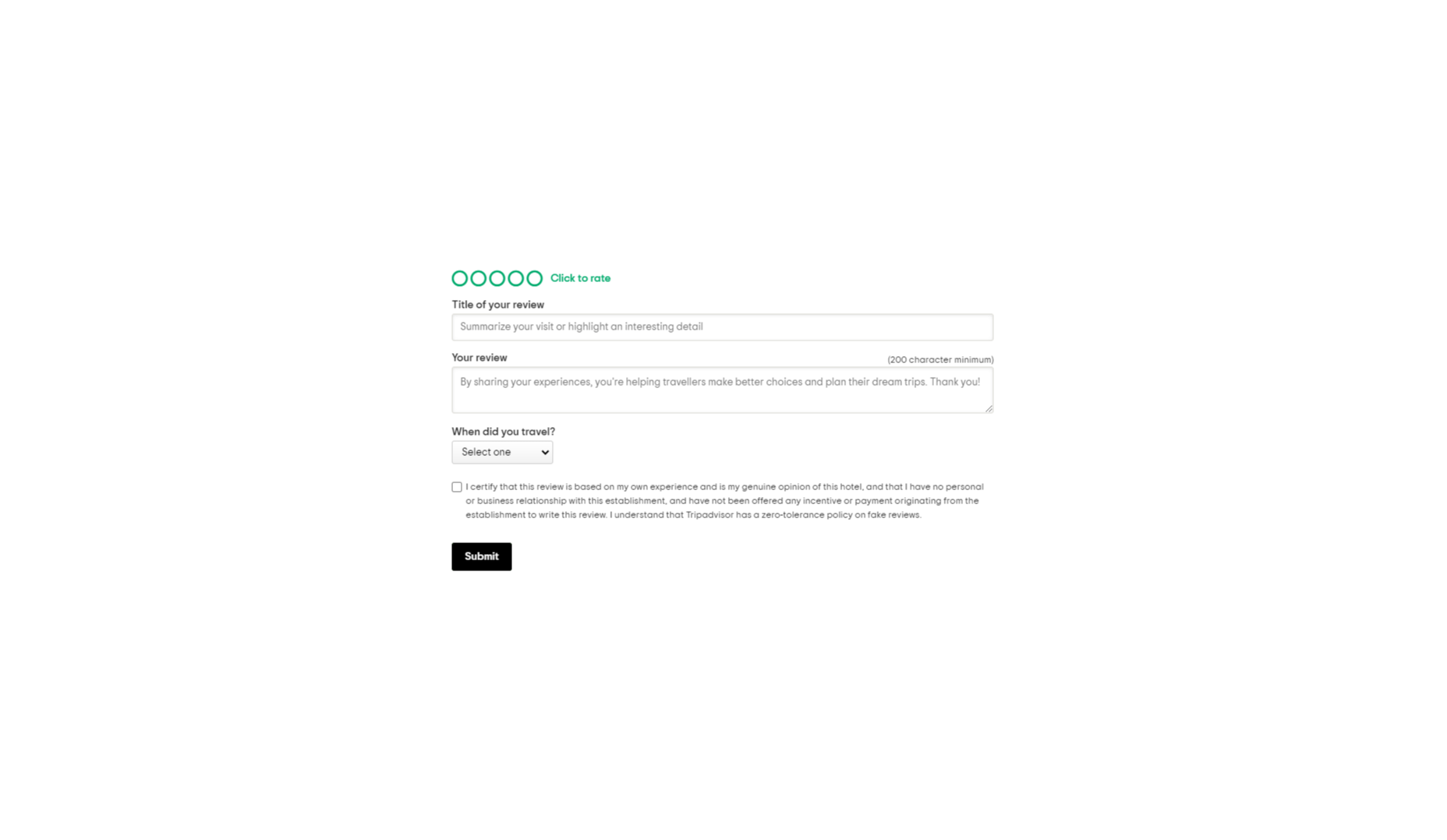
There are a lot of options to choose from. You can reach out to clients individually with email messages or set up a feedback form on your website. You could even consider working with a review site to give your audience more options. 

Today, we will look at the steps you can take to collect customer feedback the right way.
Unlocking the Benefits of Customer Feedback

Customer feedback is the information and input shared by your community. It provides a behind-the-scenes view of people’s interactions with your team and shows you where you need to focus on beginning driving new opportunities. 

Customer feedback becomes a guiding compass for your organization when used correctly. It shows you what you’re getting right and wrong from your customer’s perspective. Positive feedback can even become part of your marketing campaigns. User-generated content in the form of reviews and testimonials makes for excellent tools to encourage new people to purchase your products. 

Case studies and in-depth reviews from your clients can also help generate trust among potential customers, so you’re more likely to earn crucial sales. 

Only around 3% of customers say that they find marketers and salespeople “trustworthy.” This means that no matter how good your marketing messages might be, you’re only going to be able to accomplish so much with the claims you make about your brand. Ultimately, your clients will turn to other customers like them to determine who they should buy from.

On average, buyers read around seven reviews before they’ll even consider trusting a business. 

The good news is that around two-thirds of customers will share their personal information with a brand. Clients are happy to provide feedback in the right circumstances. It’s your job to ensure that the process is as easy as possible for your customers.

So, how do you get customer reviews?

1. Design an Effective Feedback Survey

The most obvious way to encourage feedback from your customers is to ask for it. Unfortunately, designing a good customer survey isn’t always as simple as it seems. 

On the one hand, you’re keen to gather as much information as possible from your customer, which could mean that you want to ask many questions. On the other hand, asking too many questions could easily scare your audience away. 

To improve your audience’s chances of actually sharing information, keep the feedback requests as simple as possible.
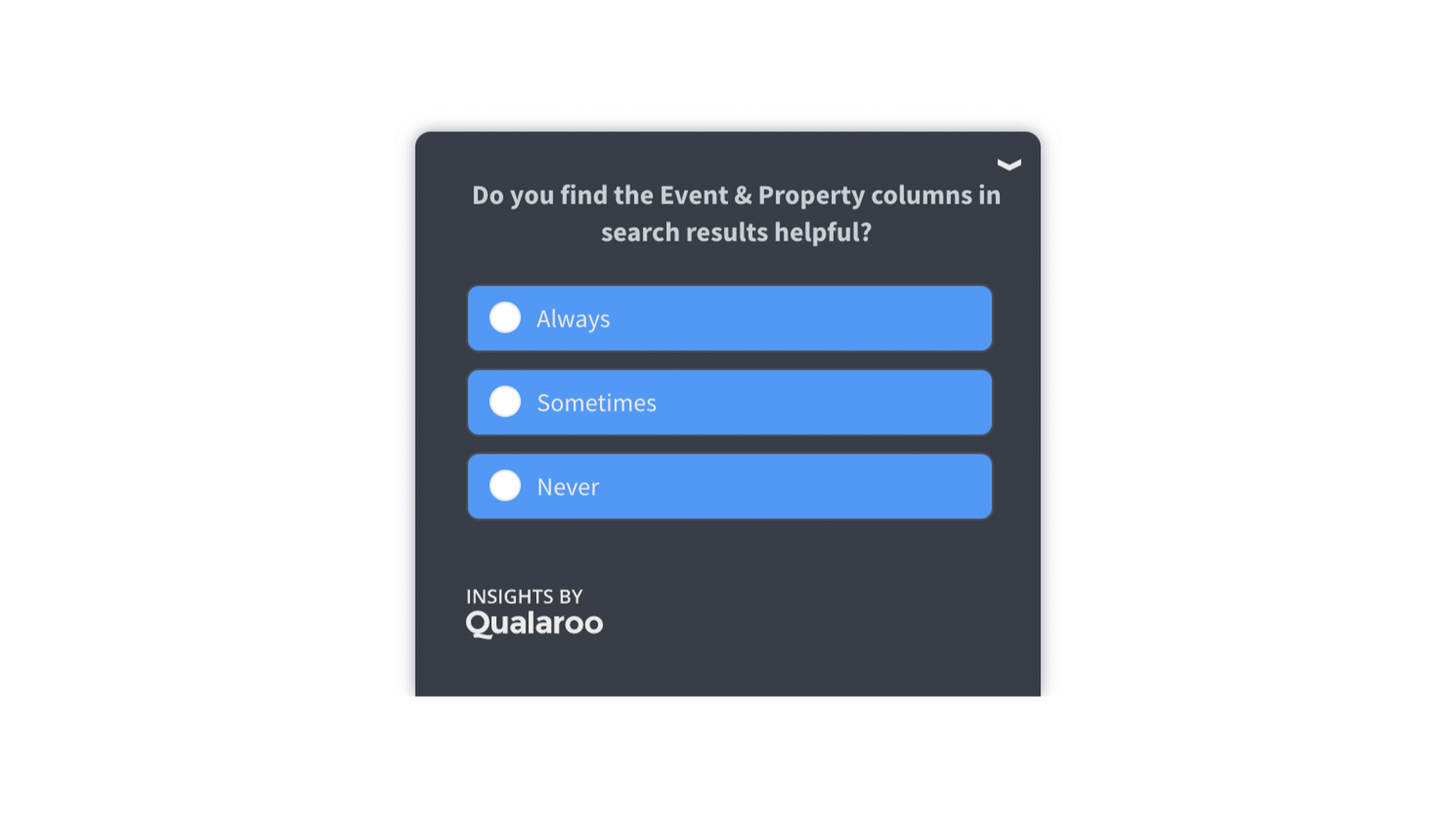
One or two questions at a time should be enough to give you some helpful information about customer preferences and expectations. When choosing what to include in your survey, remember:

  • Only ask essential questions: If the answer to a question isn’t going to help you achieve your goals, don’t ask it. You don’t need to know someone’s age if you want to know if they had a good experience with your service reps. Keep it relevant. 
  • Make the questions thoughtful: Yes or no questions are great for collecting quick information. However, if you want more valuable feedback, leave your queries open-ended, and give customers room to explain themselves. 
  • Use rating scales: If your customer doesn’t have time to respond to a question in your survey with a complete answer, a rating scale can give you some helpful insights with minimal effort from the client. 

Ensure none of the questions on your survey are leading or loaded. Customers don’t want to feel like you’re answering questions for them. It might also be worth showing your audience how much you value their data with a quick response. Hilton Hotels always responds to any adverse reactions to surveys within days of receiving the information. 

Customers can even see how their reviews contribute to the overall rating of the business. 

2. Master Your Emails and Customer Contact Forms

Email is one of the easiest and most effective ways to gather customer feedback. Because this is a standard support channel for most businesses, there are plenty of opportunities to generate feedback. 

The first step in using emails for feedback is to send a message thanking your customer for their recent interaction with you. If someone purchased a product from your company, immediately follow up to let them know you appreciate their custom. A couple of days after, when your customer has had a chance to use your product or service, that’s when you follow up with your feedback request. 

Ideally, your email request should be as short and straightforward as possible, with a clear call to action that tells your customer what to do next. This example from Papier keeps things as detailed as possible.

If you want to boost your chances of engagement, you can add elements to your email that might encourage a positive response, for instance:

  • Remind them of what they bought: Remind your customer of the item they purchased with a picture and a bit of information. Highlight the key features and benefits of that product, so they have some inspiration on what to write about in their review. 
  • Offer them a reward: If you want to boost your chances of your customers doing something for you, you need to offer something in return. This could be a discount on their next order, a chance of winning something, or even just free shipping on their next purchase. 
  • Personalize the message: Make your customer feel special by personalizing the message. Use their name and reference their previous interactions with your company. If they’ve been with your business for a while, mention that in the email.  

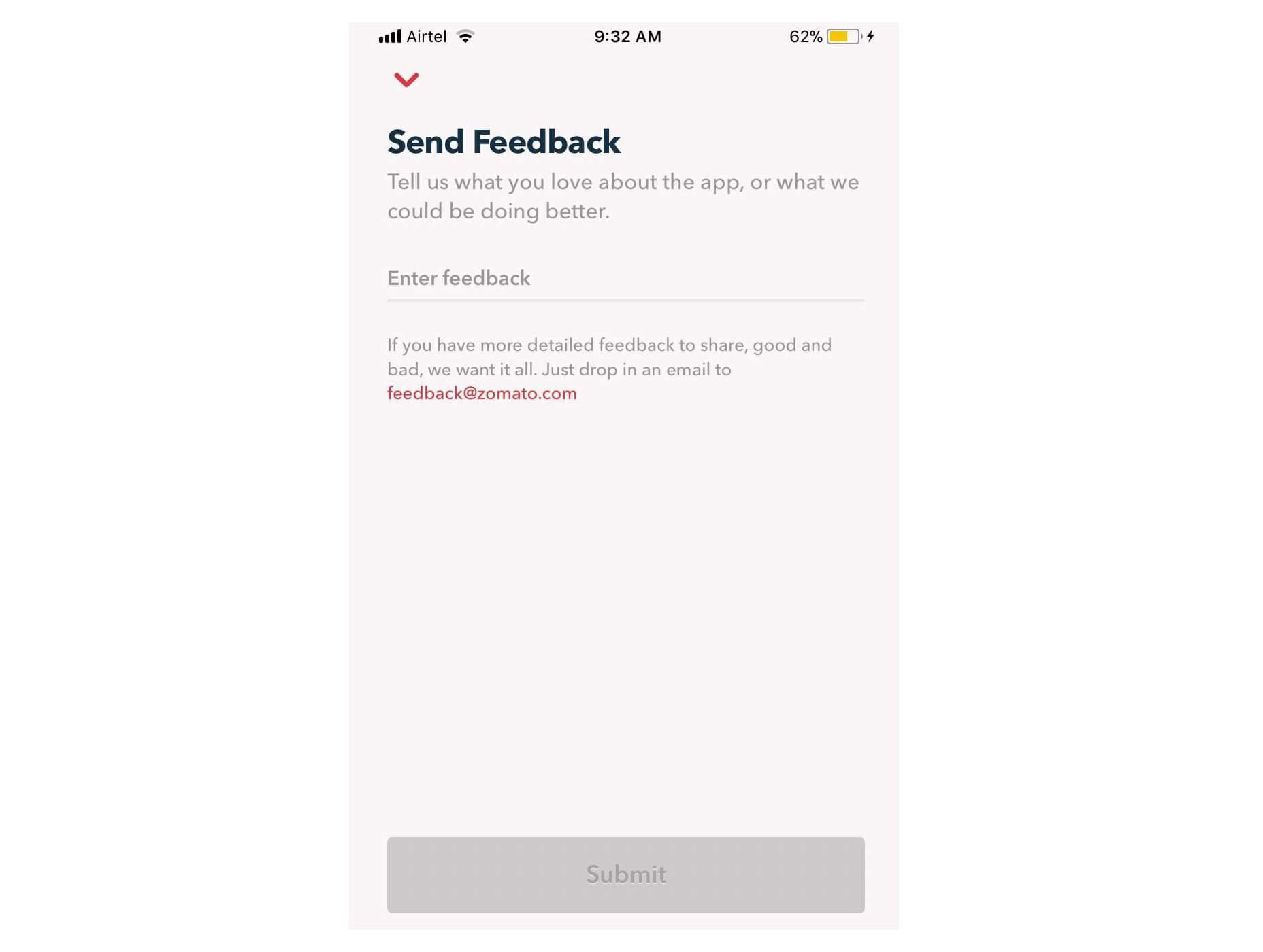
Remember, many of your customers are likely to check their emails on the go. That means that giving feedback should be as simple as possible, regardless of the tech your customer is using. For instance, in this Zomato example, users can choose to drop an email to the company or send feedback straight from the app. 
3. Create App Usability Tests

If you want some in-depth insights into your company, and your business processes, then a usability test could be the best way to generate valuable feedback. If you have your app, ask your customer to submit some information right there and then, after they’ve finished using the service. The great thing about this kind of input is it’s fresh.

Unlike other customer reviews that might come a day or two after your customer has used a product, usability tests allow you to get feedback at the moment. There’s a much better chance that you’re going to get some relevant and detailed responses here. 

For instance, in this Skype lab feedback request, customers can tick boxes for any video or audio issues they had and leave a starred review. 

If there’s extra information to share, the customer can tap on the comment box to elaborate. However, they don’t need to do this part unless they want to. 

With usability tests, it’s a good idea to focus on a few key things that you want to learn about. For instance, Skype’s example above demonstrates that the company wants to check at least five user experience issues for both video and audio. 

Giving your customers options that they can choose from reduces the amount of work they need to put into leaving a review. It also means that you can get actionable information on which parts of your app or site need the most improvement. 

You can get the same kind of instant feedback on your website, too, mainly if you’re using a live chat app for customer service. 

Live chat is quickly becoming an essential part of the customer experience environment because it’s fast, easy to use, and efficient. It’s also highly affordable for most companies, thanks to evolving technology. Set up your Live Chat app to immediately request a review from your customer when the interaction is over.

For instance, SiteGround asks customers to rate their service provider with a picture of the employee they spoke to. The image lets the customer see that they were talking to a real person, which improves the relationship with the company. The statement about feedback improving the customer service and support that SiteGround can offer shows the customer how valuable their reviews are. 

4. Conduct Customer Interviews

Conducting a customer interview is a lot like sending out a survey. The main difference is that you ask the client to engage in a much more in-depth conversation. Usually, these interviews will be the initial research required for a published case study on a B2B website. 

Reaching out to valuable and loyal customers can give you a fantastic source of in-depth information to learn from. You’ll need to make sure that you have a good relationship with the customer in question before you attempt this, however. Most one-time clients won’t want to get involved with a time-consuming interview. 

Look at your CRM technology and find out who your most impressive VIP customers are. Reach out to them with a request for feedback, and make sure you offer something in return. For instance, tell them that you’d like to interview for a case study that you can display on your website. If they’re happy for you to do this, you can reward them with a discount on their next purchase or some gifts. 

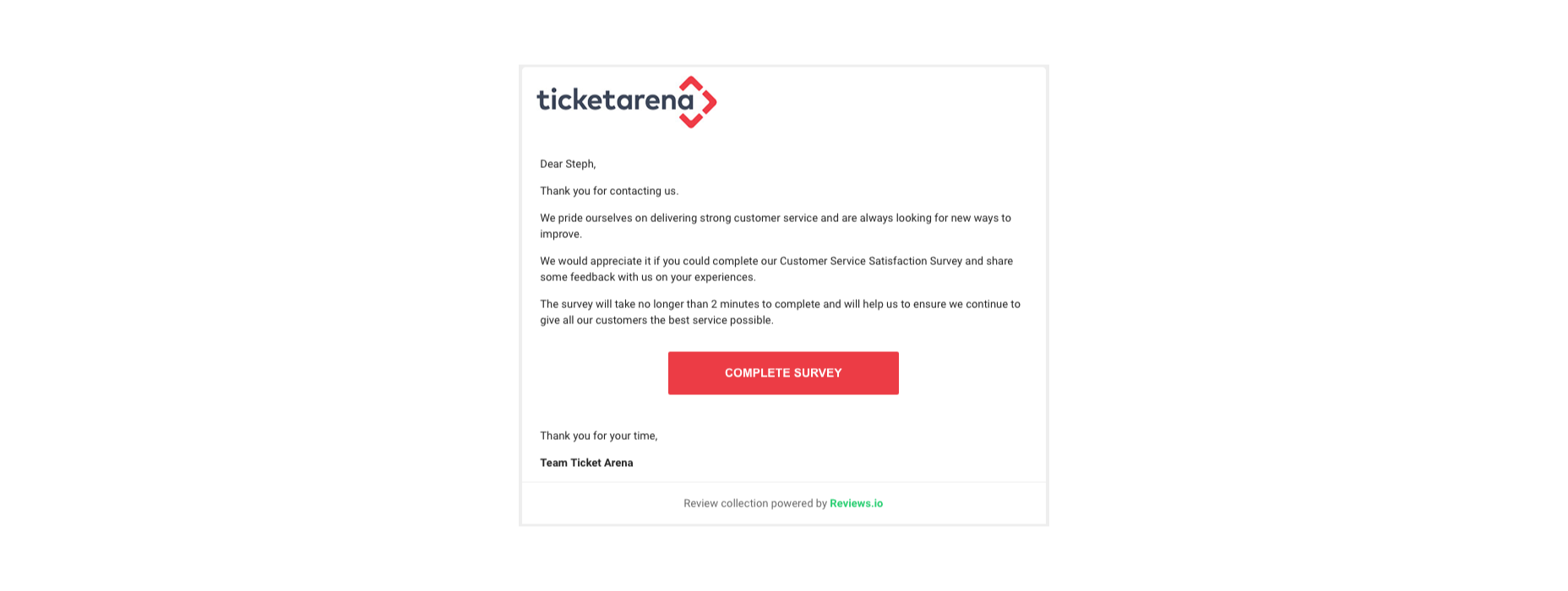
You could also follow up with a customer who recently contacted your team for an interview, like Ticket Arena does here. With this message, they promise the customer that their insights will make the customer experience better for future clients:
When requesting long-form qualitative feedback, remember to think through your questions carefully. In-depth stories from customers bring nuance and color to your quantitative data. They could even guide your business to making some crucial future decisions. 

When talking to your customers:

  • Start with an open-ended dialogue: Remember that open-ended questions are crucial to get as much detail as possible from your customers. These queries give your customers more flexibility to cover the details of their experiences.
  • Get more specific as you go: Start with simple questions, then build on them as your conversation evolves. Use the things you learn from your customers to dive into topics that are relevant to them. For instance, if a customer mentions your live chat app, go into a deeper discussion about the channels they prefer to use. 
  • Practice active listening: Make sure that you’re open and receptive to the information you’re given. Actively listen to customers, even if you’re not in the same room, by acknowledging what they say and providing valuable responses. 

5. Use Social Media

Sometimes, people are reluctant to give feedback for your business on your website because they’re not in the frame of mind. When customers come to your site, there’s a good chance they’re looking for information from you or want to check out a new product. 

They’re probably not in the right mood to start sharing their opinions. 

However, if you capture your customers on social media, there’s a good chance they’ll be feeling a lot more talkative. After all, social media platforms are where most customers discuss their issues with companies, talk about purchases with friends, and make their voices heard. 

Simply paying attention to when people talk about your company on social media can give you a lot of helpful feedback. Social listening tools allow you to collect post information every time someone mentions your business name or product. 

Alternatively, you can actively use the tools on social media to gather data from customers. For instance, Instagram has its own “poll” feature on Stories that allows companies to collect opinions. 

If you’re collecting feedback on social media, remember that you shouldn’t be asking any questions that are too complicated. Although people are more willing to share their opinions on social, they’re still looking for a relatively laid-back and casual experience.

Polls, where people can vote for their preferences with a single click, are more likely to garner engagement than a post asking people to tell you about the best purchasing experience they ever had with your brand. 

If you do want to encourage more in-depth feedback, the best option is to promise a reward in return for your follower’s effort. 

Make the experience fun by transforming it into a competition. 

For instance, ask your customers to share their favorite story involving your brand for a chance to win an impressive prize. You can ask each customer to tag their response with a branded hashtag so that relevant answers are easier to find. You could even add users to tag their friends in their posts too, to increase brand reach while you collect feedback:

With gifts and rewards to incentivize them, people will be much more likely to interact with your brand and put effort into the reviews they leave. You could even gather some user-generated content to put into your subsequent ad campaigns. 

6. Create a Dedicated Website Page

Finally, if you want to make it as simple as possible for people to leave feedback on your website and for you to collect all of that information into one space, then create a review page on your website. This can double up as social proof for people who need additional evidence to buy from your brand. 

A review page could be as simple as a page on your website listing the latest comments that your customers have left. You can include a form at the bottom of the page where people can add their thoughts. Just make sure that you carefully review these posts before they’re submitted to your website if you want to prevent spam from getting through. 

You could also create a case study or portfolio page that showcases the work you’ve done with other companies like Fabrik Brands does here:
At the bottom of each case study, give your customers a unique email address they can reach out to if they want to be featured as your following case study. Or include a contact form where people can get in touch to discuss their own experiences. 

Having a dedicated review, case study, or testimonial page on your website could be enough to inspire more feedback from your customers. It’s also a fantastic way to demonstrate how credible your company is to potential buyers. 

Still, Struggling? Take the Customer Out of the Equation

If, even with all the suggestions above, you still can’t seem to convince your audience to give you some decent feedback, then take them out of the equation. You can learn things about your audience without asking them for information. Google Analytics and other tools will give you valuable insights into which of your blog pages get the most engagement and how many people click on individual buttons throughout your site. 

These fundamental insights might not be as good as valuable, contextual feedback from your audience, but they’re an excellent way to start figuring out how to invest in your future growth. 

Remember, feedback of any kind – even if it’s just statistics and numbers – gives your business the ability to grow and make informed decisions.

Gather as much feedback as you can, and make sure you use it!


Featured image via Pexels.

Source

The post 6 Tips for Collecting Customer Feedback (The Right Way) first appeared on Webdesigner Depot.


Source de l’article sur Webdesignerdepot


JAVA_TOOL_OPTIONS

Imagine a scenario where you need to change a JVM parameter, but you can’t or is not a good solution to changing the start script of your server(s).

One of the challenges we had, when we were working with containers, was a way to change a parameter to a JVM without building the docker image again.
The application at the start time should read a JVM parameter where a _user profile_was defined.
For specific reasons we sometimes need to change this profile, for instance, to use a more controlled user where we can debug an issue. In these situations, we want to stop the container/pod, change the profile and start again, or even start a different container with a different profile.

Source de l’article sur DZONE