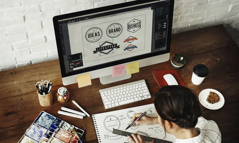
 Designers have a wide range of lucrative career options.
This resource puts together some of the best small business ideas to help chart your career path.
It covers the market size, earning potential, estimated startup cost, the target audience, and the value they bring to the table. You’ll also learn how to launch the business, the required training and licenses, and a few companies already killing it in the space for your inspiration.
So, let’s begin.
Table of Contents
- Online Course for Designers and Animators
Target Audience and Value
- Motion Design Courses
- Product Design Courses
- Graphic Design Courses
- User Interface (UI) and User Experience (UX) Design Courses
- Fashion Design Courses
How to Launch
Required Training, Certifications, or Licenses?
Example of Businesses in this Space
- Graphics Design Business Serving Brick-and-Mortar Outlets
Target Audience and Value
- Ice cream shop
- Landscaping Business
- Catering Business
- Food Truck Business
- Pet Sitting
How to Launch
Required Training, Certifications, or Licenses?
Example of Businesses in this Space
- Graphics Design and Animation Coach
Target Audience and Value
- Personal Training and Coaching
- Graphic and Animation Coaching for Design Teams
- Online Courses
How to Launch
Required Training, Certifications, or Licenses?
Example of Businesses in this Space
- WordPress Themes and Website Templates
Target Audience and Value
- WordPress Themes Development
- Site Templates Development
- Landing Page Templates Development
How to Launch
Required Training, Certifications, or Licenses?
Example of Businesses in this Space
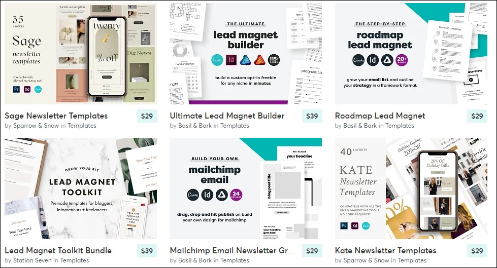
- Email and Newsletter Templates Creator
Target Audience and Value
- Themeforest Email Templates
- Fiverr Email Templates
- Creative Market Email Templates
How to Launch
Required Training, Certifications, or Licenses?
Example of Businesses in this Space
- Fonts
Target Audience and Value
- Envato
- Fiverr
- Corporate Clients
How to Launch
Required Training, Certifications, or Licenses?
Example of Businesses in this Space
- Graphics Templates and Marketing Collateral
Target Audience and Value
- Brochures
- Business cards
- Flyers
How to Launch
Required Training, Certifications, or Licenses?
Example of Businesses in this Space
- Presentation Template Designer
Target Audience and Value
- Marketing
- Pitches
- Key Notes
How to Launch
Required Training, Certifications, or Licenses?
Example of Businesses in this Space
- Custom T-Shirts and Screen Prints
Target Audience and Value
- Custom T-Shirt Design Marketplaces
- Fiverr
- eCommerce Store
How to Launch
Required Training, Certifications, or Licenses?
Example of Businesses in this Space
- Comics
Target Audience and Value
- Comic Artist
- Comic Book Letterer
- Color Flatter
How to Launch
Required Training, Certifications, or Licenses?
Example of Businesses in this Space
- Sewing Patterns and Fashion Designs
Target Audience and Value
- Fashion Designers
- Online Marketplaces
- NFT Fashion Marketplace
How to Launch
Required Training, Certifications, or Licenses?
Example of Businesses in this Space
- Wrap Designer
Target Audience and Value
- Auto Shops
- Car Owners
- Marketplaces
How to Launch
Required Training, Certifications, or Licenses?
Example of Businesses in this Space
- Videographer and Video Editor
Target Audience and Value
- Marketplace
- Portfolio Website
How to Launch
Required Training, Certifications, or Licenses?
Example of Businesses in this Space
- Online Freelance Designer
Target Audience and Value
- Marketplaces
- Freelance Website
How to Launch
Required Training, Certifications, or Licenses?
Example of Businesses in this Space
- NFT Artist
Target Audience and Value
- NFT Creators
- NFT Marketplaces
How to Launch
Required Training, Certifications, or Licenses?
Example of Businesses in this Space
- Event Designers
Target Audience and Value
- Corporate Organizations
- Event planners
- Catering Services
How to Launch
Required Training, Certifications, or Licenses?
Example of Businesses in this Space
- Extended Reality Designer
Target Audience and Value
- XR Developers
- Marketplace
How to Launch
Required Training, Certifications, or Licenses?
Example of Businesses in this Space
- Photographer and Photo Editor
Target Audience and Value
- Event Planners
- Marketplace
- Commercial Photography
- Stock Photography
How to Launch
Required Training, Certifications, or Licenses?
Example of Businesses in this Space
- Sell Coloring Books
Target Audience and Value
- Children’s Coloring Books
- Adult Coloring Books
- Teenagers
- Teach People to Create and Sell Coloring Books
How to Launch
Required Training, Certifications, or Licenses?
Example of Businesses in this Space
- Products and eCommerce Packaging Designer
Target Audience and Value
- Brick-and-Mortar Retail outlets
- eCommerce Stores
- Marketplaces
How to Launch
Required Training, Certifications, or Licenses?
Example of Businesses in this Space
- Publish Books and eBooks
Target Audience and Value
- Amazon
- Apple Books
- Online bookstore
How to Launch
Required Training, Certifications, or Licenses?
Example of Businesses in this Space
- Printing Press
Target Audience and Value
- Businesses
- Political and Social Campaigns
- Authors
How to Launch
Required Training, Certifications, or Licenses?
Example of Businesses in this Space
- Website Design Services
Target Audience and Value
- Local Businesses
- Charities
- Marketplaces
How to Launch
Required Training, Certifications, or Licenses?
Example of Businesses in this Space
- Graphic Design Academy
Target Audience and Value
- Design Teams
Image Credit: Medium
- College Students
- Graphic Designers
How to Launch
Required Training, Certifications, or Licenses?
Example of Businesses in this Space
- YouTuber
Target Audience and Value
- YouTube Ads
- Sell Merchandise or Courses
- Sponsored Videos
How to Launch
Required Training, Certifications, or Licenses?
Example of Businesses in this Space
- Newspaper, Magazine, and Catalog Design Agency
Target Audience and Value
- Newspaper and Magazine Companies
- Marketplaces
- eCommerce and Retail Businesses
How to Launch
Required Training, Certifications, or Licenses?
Example of Businesses in this Space
- Online Drawings and Handcrafts Sales
Target Audience and Value
- Offer Custom Art
- Start Online Craft Store
- Sell Your Drawing Online
How to Launch
Required Training, Certifications, or Licenses?
Example of Businesses in this Space
How to Choose the Best Business Ideas as a Designer
1. Online Course for Designers and Animators
The demand for digital designers will grow by 23% until 2031—faster than America’s 5% average occupation growth rate. And the market for online courses will grow at the same speed to reach $198 billion in sales by 2030.
Also, 87% of managers said hiring more UX designers is their organization’s top priority.
- Earning potential: $19,500 to $135,000 annually (or $69,900 average).
- Top marketplaces: Udemy, Udacity, Skillshare, LinkedIn Learning, Thinkific, Alison, AppSumo, CyberU, PluralSight, and self-hosted options.
- Estimated start cost: $8,000 to $36,000.
Target Audience and Value
Create and sell online courses based on your transferable design skills. Let’s explore five options:
1. Motion Design Courses
Students pay about $85 to $600 for motion design courses.
And students can recuperate their investment quickly since motion designers earn between $58 to $300 per hour.
2. Product Design Courses

Jaguar C-X16 Design. Creative Commons.
Product design courses are between $85 to over $4,000.
Product designer roles pay about $115,000 annually. And finding employment is easy, as over 70% of hiring managers have increased their designer hires.
3. Graphic Design Courses
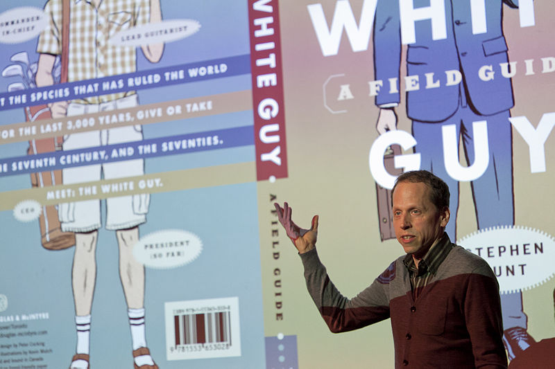
Art Director and Graphic Designer Peter Cocking, on utilizing white spaces. Creative Commons.
Top-earning graphics designers earn about $43 an hour or $90,000 a year. So, you can sell this online course for $85 to $15,000 per student.
4. User Interface (UI) and User Experience (UX) Design Courses

Pixabay image
UI/UX online course creators usually take $85 to $2,500 per student. And students who become top earners take home up to $174,000 a year or $84 an hour.
5. Fashion Design Courses
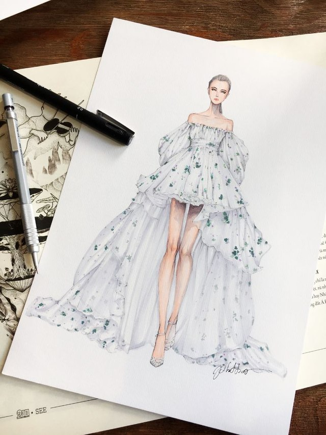
Wikimedia Commons
Fashion designer courses cost $40 to $4,000.
However, top designers earn over $90,000 a year. So your students can get outsized value from their investment.
How to Launch
Launch your online design course in seven steps:
- Find a simple course idea
- Outline the course
- Create the first module
- Build your sales page and join marketplaces
- Create your thank you page
- Write your sales emails
- Launch your course
Most people get stuck in the ideas phase. Instead, find a simple course idea based on your skills and launch it.
Required Training, Certifications, or Licenses?
Course marketplaces have unique education requirements. So check the publisher requirements of the platform you want to launch the course.
However, most marketplaces do not require special certifications to launch a design course.
Example of Businesses in this Space
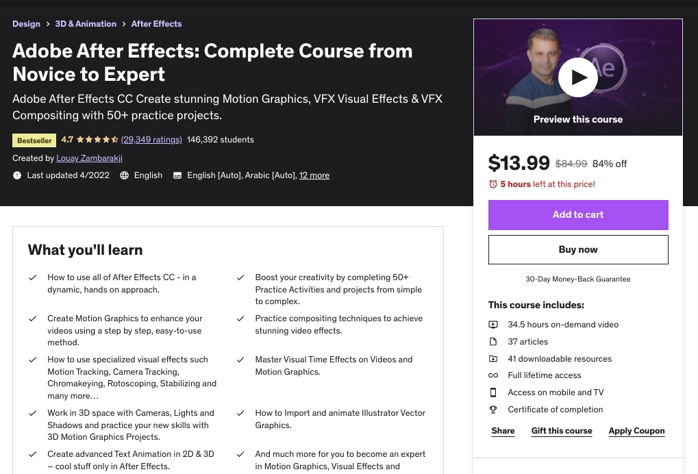
Adobe After Effects: Complete Course from Novice to Expert by Louay Zambarakji.
Courses from Motion Design School.
2. Graphics Design Business Serving Brick-and-Mortar Outlets
Graphic design for brick-and-mortar outlets can be a quick way to start your small business for designers. These businesses use graphic design services to create marketing collateral, like flyers, presentations, and brochures, to send brand messages to their audience.
The increasing demand for designers drives consistent global graphic design market growth, currently valued at around $43.4 billion.
- Earning potential: $35,000 to $66,000 per year (or $47,921 average)
- Top marketplaces: Fiverr, Upwork, Freelancer.com, SolidGigs, and self-hosted options.
- Estimated start cost: $2,000 to $10,000.
Target Audience and Value
You can provide graphic design services to countless small businesses, and some of them include:
1. Ice cream shop
Image credit: Fiverr
You can create packaging designs and logos for those planning to own ice cream shops. The top Fiverr designers charge around $25 per project, while some value their services up to $260 per project.
2. Landscaping Business

Image credit: Fiverr
Most landscaping businesses need graphic designers to help with custom 3d Landscape concept design and illustrations for their client’s properties—some designers on Fiverr charge around $180 per project and up to $480 for premium service.
3. Catering Business
Image credit: Fiverr
Catering business logos on Fiverr costs $5 to $100 per project. However, some top designers charge up to $450 for premium services.
4. Food Truck Business
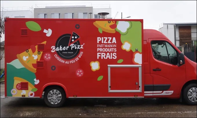
Image credit: Fiverr
Professional food truck and trailer wrap designers on Fiverr charge $25 to over $100 per project. You transform the designs into formats such as AI, JPG, and PDF to provide multiple use options for the business.
5. Pet Sitting
About 70% of U.S. households own a pet. That’s approximately 91 million households, nearly ten million more than the population of Germany, the EU’s largest population, making a pet business lucrative.
You can design logos and marketing materials for pet-sitting and dog-walking businesses. The standard rate on Fiverr is between $5 and $100.
How to Launch
Start your graphic design small business in six steps:
- Build your portfolio by offering free designs
- Name your graphic design business
- Build a basic website
- Create social media accounts
- Join top graphic design marketplaces
- Build your email lists and run ads
Required Training, Certifications, or Licenses?
Starting this new business doesn’t need special certifications and licenses. However, pursuing certifications like Adobe Certified Associate and other courses on Udemy and Coursera can advance your credibility.
Example of Businesses in this Space
Some of the small businesses making waves in this space are:
Landor & Fitch.
Polar.
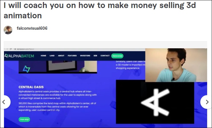
3. Graphics Design and Animation Coach
Graphic design and animation coaching is one of the best small business ideas to start as a designer. Consider this career path if you’re curious about designs and motion graphics and are passionate about teaching.
Employment for professionals in this field will grow by 5% from 2021 to 2031, as fast as the average for all occupations.
- Earning potential: $79,153 average compensation per year.
- Top marketplaces: Udemy, Coursera, Alison, Fiverr, and self-hosted options.
- Estimated start cost: $0 to $15,000, depending on whether you run the coaching business from home or the office.
Target Audience and Value
Let’s explore some of the coaching services you can provide:
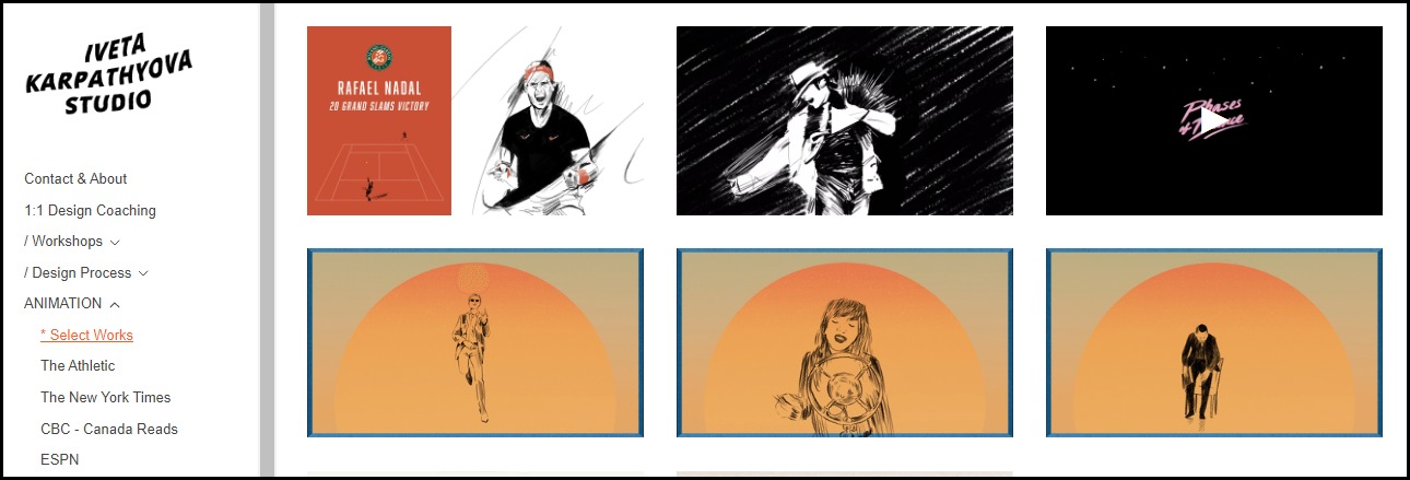
1. Personal Training and Coaching

Image credit: Iveta Karpathyova Studio
One-on-one graphics and animation coaching via Zoom is in high demand. You can sell your training and coaching service on your website or online marketplaces. Some personal trainers charge about $650 for a three-month-long session.
Most non-marketplace users often charge more. For instance, Iveta Karpathyova, a graphic design personal trainer, takes about $2,000 for eight hours of private one-on-one instruction.
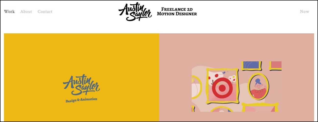
2. Graphic and Animation Coaching for Design Teams
You can use RFPs to find companies who want to train their in-house design teams in 2D or 3D animations. Also, you can target companies that use graphics to boost user engagement, like UX professionals.
Austin Saylor is an example in this space. He earns up to $10,000 from his training program for graphic design teams.
3. Online Courses
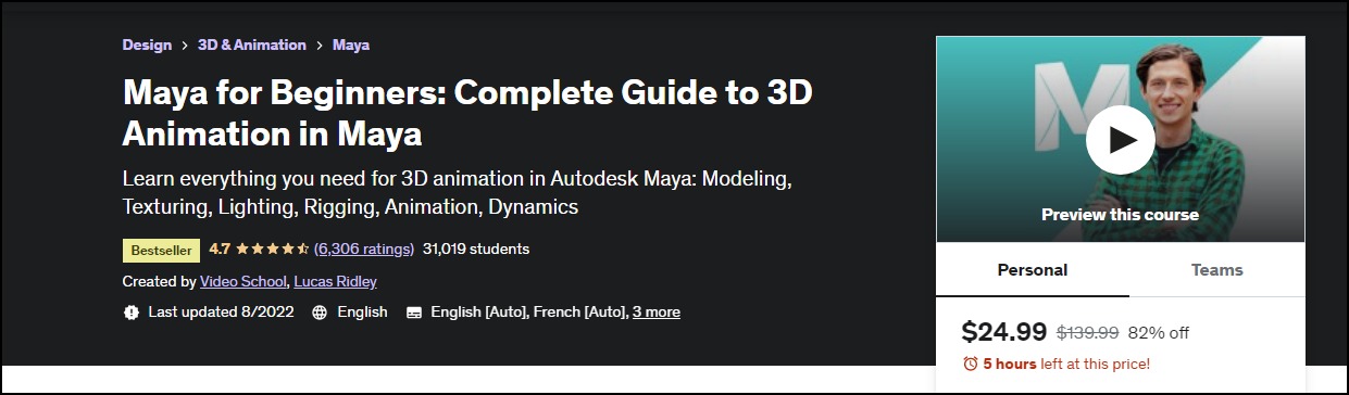
Image credit: Udemy
You can create online courses and sell them on marketplaces like Udemy, Coursera, and Alison if you don’t have the resources for one-on-one coaching. For instance, some animation courses on Udemy cost between $20 to $139 for old students or between $14 and $24.99 for new users.
How to Launch
Start your graphic design and animation coaching small business idea in seven steps:
- Get professional training
- Develop your business plan
- Design your coaching courses and certificate of completion
- Set your coaching fees
- Set up your payment methods and plan your business finances
- Choose a coaching business name
- Create a logo and your brand identity
- Set up your coaching website and social media presence
- Design your marketing plan
Required Training, Certifications, or Licenses?
Once you possess transferable design and animation skills, you don’t need special training, certification, or licenses to operate a graphic coaching business. However, getting certification training will advance your qualification and give you the confidence to train people.
Some options include:
Example of Businesses in this Space
Some businesses offering graphic design and animation coaching services are:
Austin Saylor
Iveta Karpathyova Studio
Falcon Visuals
4. WordPress Themes and Website Templates
A WordPress theme and website template development business is one of the most lucrative small business ideas for designers.
The WordPress platform controls nearly 65% of the CMS market share and powers 43% of all websites. That’s a staggering 82 million, meaning there are about three times more WordPress websites than the number of web developers worldwide.
Shopify comes a distant second, powering only 3.5% of all websites. However, WordPress has over 11,000 themes. As a theme developer, you can tap into this lucrative market.
- Earning potential: $12 t0 $12,000 per theme or template
- Top marketplaces: Envato, Creative Market, and Codecanyon.
- Estimated start cost: Premium WordPress theme builders costs between $99 to $200
Target Audience and Value
Some of the most successful business ideas or markets to explore in this field are:
1. WordPress Themes Development
Image Credit: Themeforest
Bestselling themes on Themeforest cost $39 to $69, while the most expensive options go for $6,000 to $12,000. Also, Fiverr developers charge up to $1,000 for custom WordPress theme development.
2. Site Templates Development
Best-selling site templates on Themeforest cost between $12 to $49. The high-priced ones go from $200 to $1,000. The price range for popular themes on Creative Market is the same as on Themeforest. However, the most expensive options range from $520 to $5,000.
3. Landing Page Templates Development
Landing page creation is a lucrative business because of its high demand for lead generation. The best-selling landing page templates on Themeforest cost $12 to $39, while the expensive ones go for $59 to $118, making them affordable.
How to Launch
Launch this new business idea with these simple steps:
- Pick a niche
- Develop your business plan
- Set your pricing
- Plan your business finances to understand the overhead costs involved
- Design your themes and site templates on your computer
- Develop the theme with premium theme builders like TemplateToaster or outsource to freelance theme developers.
- Create a free version of the theme
- Test your theme or site templates
- Join a marketplace and sell your theme
- Promote your business with paid ads
Required Training, Certifications, or Licenses?
You don’t need special training, certification, or licenses to build a successful career as a theme developer. In addition, some theme builders don’t require coding knowledge.
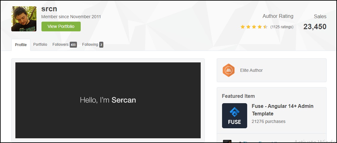
Example of Businesses in this Space
Some theme developers on Fiverr and Themeforest are:
Zainshabirdev
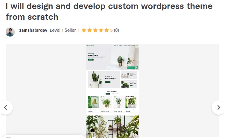
Scrn
5. Email and Newsletter Templates Creator
Email template development is another good business idea to explore.
There are over four billion daily email users, sending and receiving more than 306 billion emails daily, making it an effective channel to reach and engage customers. Also, data shows that 37% of brands are increasing their email budget.
As an email and newsletter templates creator, you can design beautiful templates for small and medium-sized businesses that can’t afford an in-house design team, digital marketing services, and marketplaces.
- Earning potential: $10 to $150 per project
- Top marketplaces: Themeforest, Fiverr, Creative Market, and self-hosted options.
- Estimated start cost: $0 to $200
Target Audience and Value
You can offer your service on several marketplaces and your website. However, these options provide the most straightforward way to make it big in this field.
1. Themeforest Email Templates
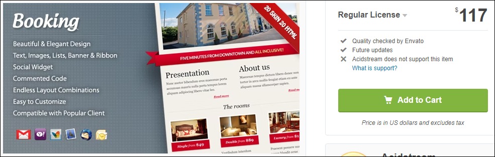
Themeforest’s top-rated email templates cost about $8 to $116. Most of these templates have between 100 and 1,500 sales, indicating high demand for Themeforest email templates. The most expensive option currently costs $117 for the regular license and has sold over 100 copies.
2. Fiverr Email Templates
Demand for Fiverr email template creators is also pretty high. The best-selling professionals take between $10 to $25 per project. However, hand-coded responsive HTML options go as high as $80.
3. Creative Market Email Templates
Creative Market has over 1,500 email templates. The popular designs go for $10 to $39, while the most expensive templates cost between $50 and $150. Most designs are for MailChimp, Campaign Monitor, and Constant Contact platforms.
How to Launch
Launch your email and newsletter design business in these few steps:
- Pick a niche and develop your business plan
- Set your pricing
- Design your email and newsletter templates
- Test on different devices such as desktop computers, mobile, and iPad
- Join marketplaces and sell your templates
- Create a logo and business website
- Join popular social media and build your online presence
- Market your business
Required Training, Certifications, or Licenses?
You don’t need special training or licenses to create email and newsletter templates. Instead, strong customer relationships and positive reviews are what you need to thrive in this field.
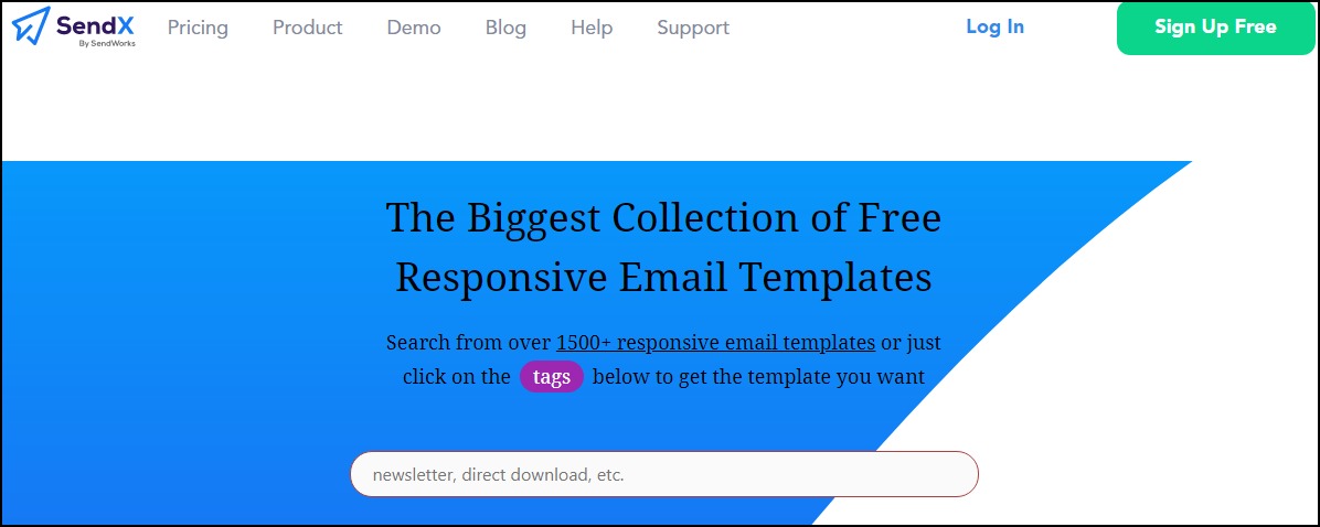
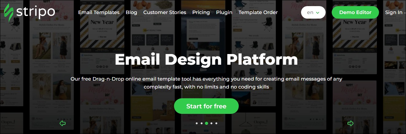
Example of Businesses in this Space
You can build a profitable business in this field. Let’s see a few of the successful ones for your inspiration.
SendX
Stripe
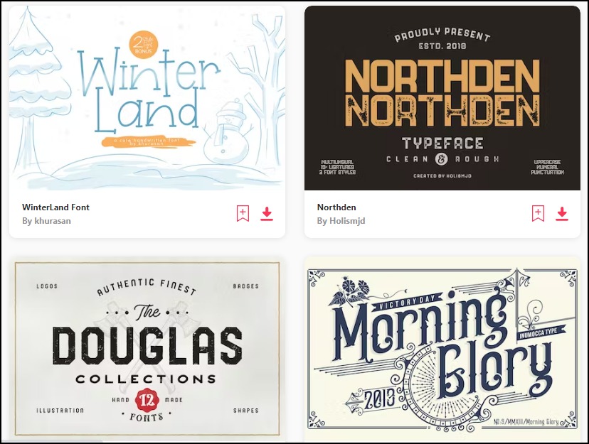
6. Fonts
Typography is one of the financially rewarding home business ideas for designers.
Custom fonts allow businesses to create unique brand identities to stand out from the crowd. As a result, this space holds limitless opportunities for typographers.
For instance, IBM paid over $1 million annually to use Monotype’s warhorse font Helvetica before developing its IBM Plex typeface.
Other companies like Netflix, Airbnb, and SAP also invested in custom fonts and typefaces to reinforce brand messages and save on licensing fees. So you might want to explore this small business idea. You can also structure it as a consulting business.
- Earning potential: $30 to $300,000 for bespoke font
- Top marketplaces: Envato, Creative market, Fiverr, and self-hosted options
- Estimated start cost: $200 to $1,200
Target Audience and Value
The best target audience for this small business idea is brands that want to create a unique identity to differentiate from the competition. Some of the places to sell your service are:
1. Envato
Envato has an extensive library of over 30,000 stunning fonts and types.
Many small business owners and online businesses use the marketplace to find unique fonts. Envato users with an active subscription can download the fonts for any project and marketing campaign.
The individual plan costs $16.5 monthly, while the team plan is available at $10.75 per member. The enterprise plan requires a custom quote.
2. Fiverr
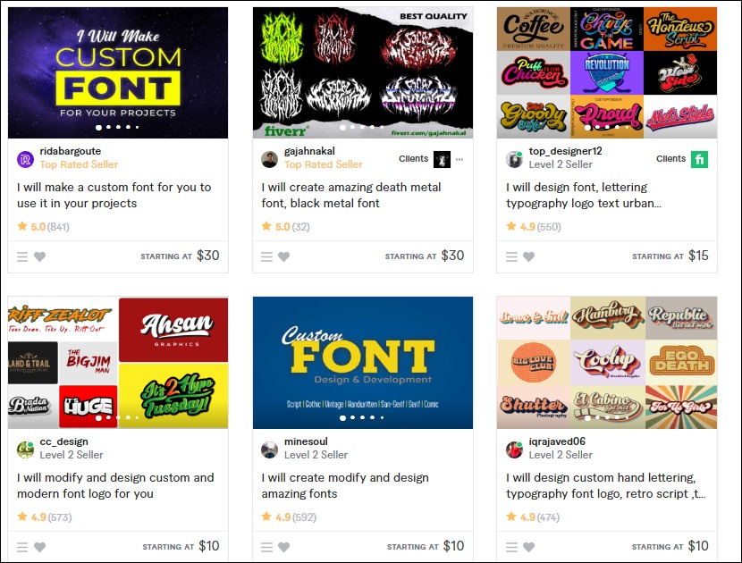
Fiverr is a great place to start a typography business as a beginner. Small business owners and online businesses use it to hire affordable typographers. The platform currently hosts over 2,000 custom font services.
Typographers on the platform charge between $10 to $30 for custom fonts. The top earners take home over $60 for premium services.
3. Corporate Clients
Experienced typographers can explore this option.
Creating bespoke typefaces for corporate clients may cost up to $300,000. First, however, you’ll need to demonstrate your value by building a strong portfolio and understanding how to craft a pitch, an offer, and a closing.
How to Launch
Typographers are in high demand. Start your typography business in five types:
- Design your fonts
- Build your website and plan your marketing
- Join marketplaces and sell your fonts
- Build your prospects list
- Send custom font design proposals to prospects
- Market your business with paid ads and on social media
Required Training, Certifications, or Licenses?
Typography is one of the most lucrative home business ideas for designers today. You can start this small business without special certifications and licenses.
However, taking typography courses on Udemy and other learning platforms can help you master your art and design better fonts.
Example of Businesses in this Space
Some of the businesses in this field are:
Typotheque
Fontfabric
7. Graphics Templates and Marketing Collateral
Marketing collateral is media and graphics materials organizations use to support their sales efforts and advance their brand messages.
It includes anything from brochures, business cards, and posters. These materials give prospects the information they need to make informed purchasing decisions.
Creating them as graphic templates lets people customize and use them as they wish, enabling a much larger potential audience size. For example, as a marketing collateral designer, you could also run a consulting business as part of your larger offering.
- Earning potential: $10 to $1,300 per project.
- Top marketplaces: Envato, Creative Market, Fiverr, and self-hosted options.
- Estimated start cost: $200 to $1,200 to get a good computer.
Target Audience and Value
The target audiences for this small business idea are social media managers, cleaning services, brick-and-mortar stores, and dog-walking businesses.
Also, targeting profitable niches like small business owners, personal training businesses, and property managers can lower your customer acquisition and overhead costs.
Let’s examine some graphic templates and marketing collateral you can design for clients.
1. Brochures
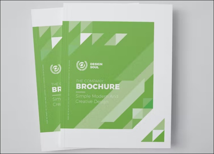
Image credit: Envato Elements
Brochures are some of the most widely used marketing collateral.
Creating them as customizable graphic templates and selling them on marketplaces like Envato and Creative Market allows you to attract many users.
You can also offer custom brochure design services on Fiverr. Designers on the platform take between $10 t0 $150 per project.
2. Business cards
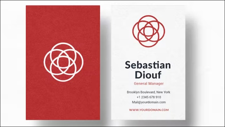
Image credit: Envato Elements
Custom business card designers on Fiverr charge between $10 to $640 per project. Some premium services go for as high as $1,300. You can also sell on Envato to earn money from users’ subscription fees.
3. Flyers
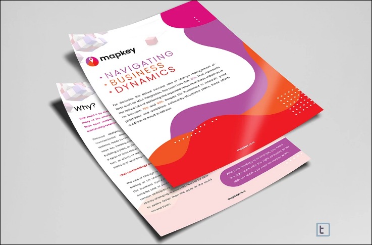
Image credit: Fiverr
Flyers are another in-demand marketing collateral. Nearly 50% of surveyed companies said that door drop campaigns are essential to their marketing strategy.
Offering custom flyer design services to these businesses can help you make it big as a designer. Pro-verified designers on Fiverr make between $100 to $495 per project.
Their premium packages cost as much as $1,295.
How to Launch
Launch this small business idea with these six steps:
- Get a nice laptop and internet connection
- Create an actionable business plan
- Define your target market and ideal customers
- Build your portfolios
- Join marketplace
- Create a sales page to attract non-marketplace users
- Join social media platforms
- Promote your business through paid and organic marketing channels
Required Training, Certifications, or Licenses?
You need special training or a license to start this business at home. However, an impressive portfolio will help you land high-paying clients more quickly.
Example of Businesses in this Space
Some of the businesses in this field are:
Trpeski Design
Brand Design
8. Presentation Template Designer
Creating an entire presentation deck from scratch can be challenging for non-designers.
As a result, 79% of presenters use pre-built templates to find inspiration, streamline their workflow and create stunning presentations in a few minutes. So this is an excellent business idea for designers.
You can explore opportunities in this field to shore up your income and build a flourishing career.
- Earning potential: $90 to $6,000
- Top marketplaces: Envato, Creative Market, Fiverr, etc.
- Estimated start cost: You can start the business with just a computer. It costs between $200 to $1,200 to get a good one.
Target Audience and Value
Businesses in high demand for presentations, like landscaping businesses, property managers, startups, and consultancy businesses, are your targets. Also, executives and busy business people need you too.
Others include personal trainers, social media managers, and cleaning businesses.
Let’s explore some templates you can start with and what each brings to the table.
1. Marketing
Image credit: Envato Elements
Marketing presentation templates do the heavy lifting for salespersons, enabling them to create their presentations and slides quickly. Your presentation design agency can charge between $90 to $6,000 per ten slides.
However, selling on marketplaces enables you to access a ready market with minimal marketing efforts.
2. Pitches
Image credit: Fiverr
A beautifully designed pitch deck helps startup entrepreneurs to make a lasting impression on potential investors. So they often prefer to use templates to create theirs or outsource the project to professionals like you.
You can join marketplaces to reach potential clients more quickly, and there is a lot of money to make from those platforms. For example, pro-verified sellers on Fiverr earn between $100 and $1,500, while premium packages can go for as much as $3,000.
3. Key Notes
Professional keynote presentations from pro-verified designers on Fiverr are between $360 and $650 for the basic package. Non-pro-verified professionals on the platform price their service between $10 to $200.
Presentation design services hourly rate on Upwork ranges from $20 to $95. Some charge as high as $130 per hour.
How to Launch
A presentation template design business is a great business idea to pursue as a designer. You can launch yours with these six steps:
- Buy a good computer with enough graphics card
- Create a business plan
- Define your market and ideal prospects
- Build your portfolios
- Create your website and join marketplaces
- Plan your marketing strategies
- Launch your templates
Required Training, Certifications, or Licenses?
You don’t need any special training, certifications, or licenses for this small business idea. However, an impressive portfolio and many positive customer reviews will do.
Example of Businesses in this Space
Let’s examine some professionals in this space.
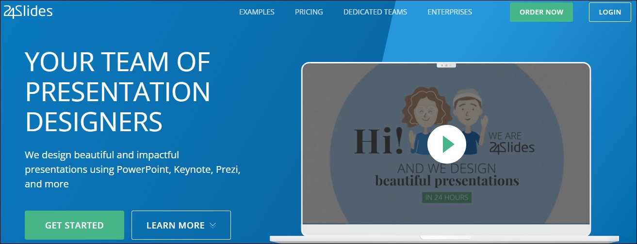
24Slides
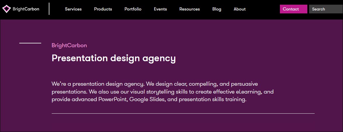
BrightCarbon
9. Custom T-Shirts and Screen Prints
The high demand for customized wear makes custom T-shirt design a thriving enterprise. Future Market Insights estimated that the market size of global custom T-shirt printing would exceed $3.5 billion in 2022.
Furthermore, they believe it will grow by 9.7% CAGR over the next ten years to reach over $9 billion.
- Earning potential: $5 to $1,200 per project and up to $1 million a year.
- Top marketplaces: Teespring, Zazzle, CafePress, Redbubble, and self-hosted options
- Estimated start cost: You can start a custom T-shirt design business with $0 from home if you already own a computer and internet connection.
Target Audience and Value
Build your business for these audiences:
1. Custom T-Shirt Design Marketplaces
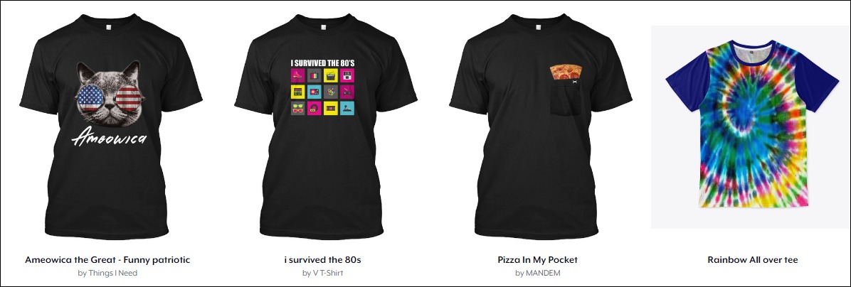
Image credit: Teespring
Joining and selling your designs on custom t-shirt marketplaces like Teespring (now, Spring), CafePress and Zazzle is your best bet to hit the ground running immediately. T-shirt designs on Teespring can cost as much as $49.99.
2. Fiverr
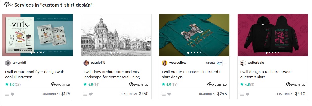
Pro-verified custom t-shirt designers on Fiverr take home between $125 and $450 per design. Premium packages can go for as high as $1,200—other gigs in the category cost between $5 and $30.
3. eCommerce Store
An eCommerce store for your custom designs lets you control your marketing and the ideal audience you want as customers.
You can also connect the online store to print-on-demand platforms like Printful to run a full-fledged online t-shirt business. There is no limit to how much you can make from this business. Some sellers earn up to $10,000 monthly.
How to Launch
Follow these six steps to launch this business idea:
- Find a t-shirt niche
- Create your t-shirt design
- Join marketplaces to sell your designs
- Create an eCommerce to promote your business
- Connect your store to print-on-demand software to drop-ship your custom-printed wear
Required Training, Certifications, or Licenses?
You don’t need any special training to thrive in this space. Getting many positive customer reviews and referrals can help advance your business.
Example of Businesses in this Space
Many designers are in this space, offering custom T-shirt design services to individuals, groups, and local businesses. Some of our top picks for your inspiration are:
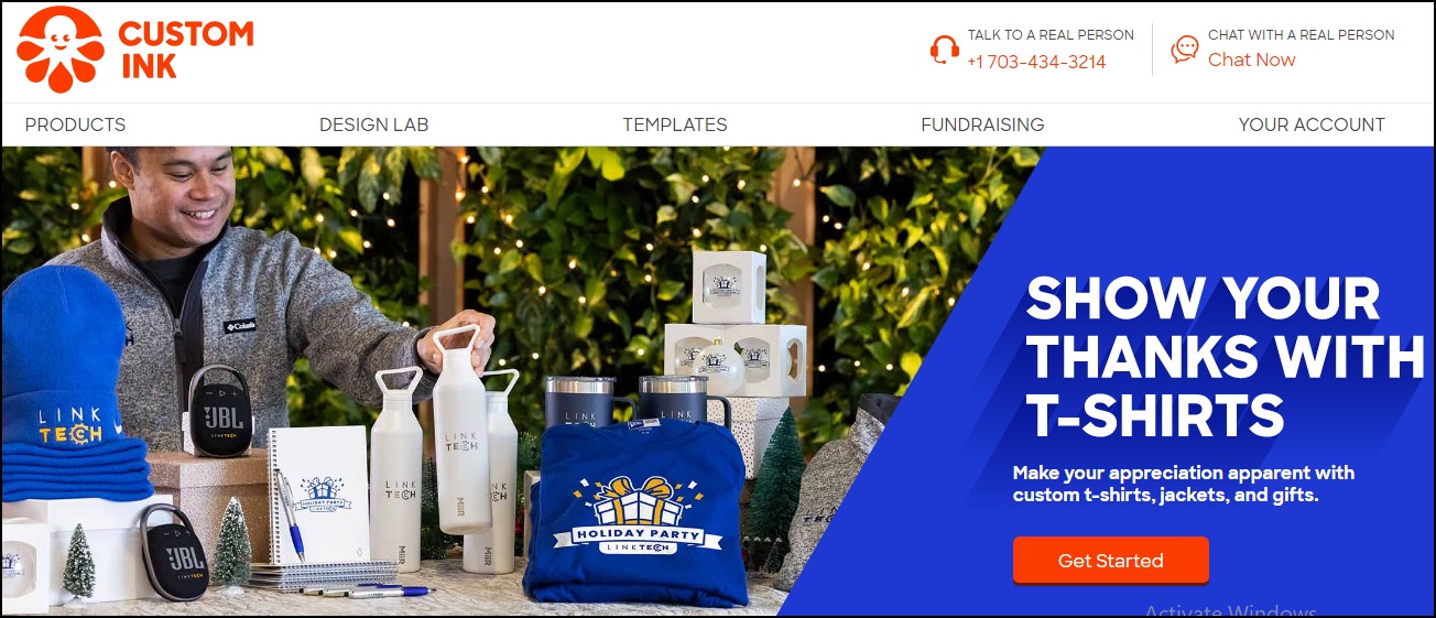
Custom Ink
Mandem
10. Comics
Comics are graphic novels. It’s popular among kids and teens. Fortunate Business Insights estimated that the comics market size will reach $12.81 billion in 2028, up from $9.21 billion in 2021. It grew by a staggering 12% in 2020.
Analysts believe it’ll grow at a CAGR of 4.8% from 2021 to 2028.
- Earning potential: $63,167 per year for comic artists and about $210 per project for comic artists and color stylists.
- Top marketplaces: ComicConnect, Subzero Comics, and LiveAbout
- Estimated start cost: $200 to $1,200 to get a good computer
Target Audience and Value
Comics are lucrative when you build the business around these audiences:
1. Comic Artist
Image credit: Cbr.com
You can try your hands here if you can create attractive graphics and illustrations for comic books. Professionals in this field typically earn over $63,000 a year. But they vary from city to city. For instance, San Francisco, California comic artists take home over $95,000.
2. Comic Book Letterer
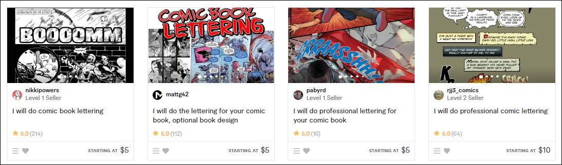
Advanced skills in color flattering can also help you get something tangible out of this space. Some professionals in this field earn between $5 to $25 on Fiverr. The verified professionals take between $100 to $210 per project.
3. Color Flatter
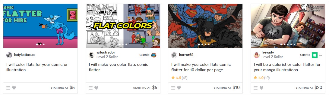
Color-flattering services on Fiverr are in high demand. Most color stylists on the marketplace charge between $5 and $40. As a verified professional, you may earn up to $100.
How to Launch
Comics are another successful business idea you can consider as a designer. It’s not expensive to launch, and you can run it 100% from home.
Start your own business in these few simple steps.
- Pick a niche and define your market
- Develop your business and marketing plan
- Set your price
- Join marketplaces to sell your service
- Create a website to target off-marketplace audiences
- Promote your business
Required Training, Certifications, or Licenses?
You don’t need special certification or licenses as a comic artist. However, professional courses on Udemy and other learning platforms can advance your skills.
Example of Businesses in this Space
Some professionals in this field are:
Jorge Jiménez
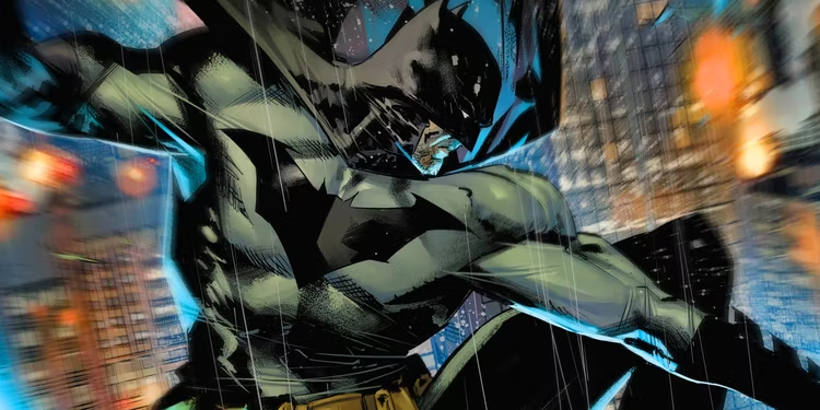
Image credit: Cbr.com
Freyady
11. Sewing Patterns and Fashion Designs
The U.S. 2022 fashion design market size stands at $2.9 billion. Data shows that the market size declined by 1% between 2017 and 2022. However, analysts believe the value will grow at 0.9% in 2022.
- Earning potential: Earn up to $130,000 annually.
- Top marketplaces: Fiverr, DressX, Replicant, Dribble, and self-hosted options
- Estimated start cost: $200 to $1,200 to get a good computer
Target Audience and Value
Set your sights on these markets to make it big in this field.
1. Fashion Designers
Creating and selling your designs to top-rated designers is one of your best bets to earn big from this small business idea. Most bespoke wears cost several thousand dollars, and many designers won’t mind paying hundreds and thousands of dollars for your designs.
2. Online Marketplaces
Image credit: Fiverr
Joining marketplaces will save you a lot of marketing costs, and there is also money to make from the platforms—top professional stylists on Fiverr earn $100 to $300. You can also sell your designs on Dribble.
3. NFT Fashion Marketplace
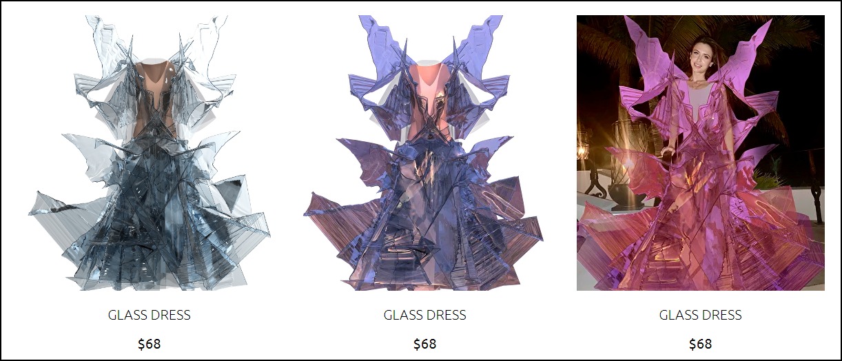
Image credit: Replicant
NFT digital fashion marketplaces like Replicant are reimagining fashion designing businesses, allowing anyone to try on a digital garment.
They are a new and growing trend. Jumping in right away lets you secure a space before it gets saturated. And the digital fashion business is financially rewarding.
For instance, the best-selling digital garments on Replicant cost around $35, while the most expensive digital fashion wearables sell for as high as $68.
How to Launch
You can launch this business idea in these steps:
- Pick a niche and define your fashion style
- Develop your business and marketing plan
- Create a physical version of your NFT
- Choose and blockchain for your NFT and set up your digital wallet
- Select an NFT marketplace
- Create a business website to promote your digital fashions
- Join social media to improve your online presence
Required Training, Certifications, or Licenses?
The fashion design business doesn’t require any special training, certification, or licenses.
Example of Businesses in this Space
Some of the businesses in this space are:
Olivia Goodall
Trend Miles
12. Wrap Designer
The wrap design business is one of the most profitable business ideas to start as a designer.
Several organizations and individuals wrap their vehicles for branding and aesthetic purposes.
In addition, a vehicle wrap is cheaper than a painting, driving its demand in the U.S. The global automotive car wrap film market was $4.9 billion in 2021.
Analysts estimated it will grow at a CAGR of 22.2% from 2022 to 2030.
- Earning potential: $21 per hour
- Top marketplaces: Wrap Stock, Fiverr, Design Hill, Upwork, and self-hosted options
- Estimated start cost: $200 to $1,200
Target Audience and Value
Wrap design small businesses can target:
1. Auto Shops
Many auto repair shops in the U.S. offer car wrap services. You can create and sell your designs to them. They charge clients between $2,500 and $5,000 to wrap their vehicles, so it’s fair to expect some money from them for your design.
2. Car Owners
Top-rated custom wrap designers on Upwork charge between $30 and $50 hourly rates. Several have earned $10,000 to $60,000 creating and selling bespoke wrap designs on the platform.
3. Marketplaces
Image credit: Wrap Stock
You can upload and sell your designs on marketplaces like Wrap Stock.
Here, you don’t have to worry about marketing or running ads. Instead, the platform handles every aspect of the process, enabling you to focus on creating stunning designs.
How to Launch
Launch this wrap design small business idea in these steps:
- Pick a niche
- Develop your business plan and sales processes
- Create your designs
- Turn your designs into templates downloadable in different formats
- Join marketplaces to sell your design templates
- Create a website to promote your business
- Offer custom design services
Required Training, Certifications, or Licenses?
This small business idea doesn’t require special training, licenses, or certification. However, building your portfolio and generating positive reviews can advance your credibility.
Example of Businesses in this Space
Some of the professionals in this space are:
Inflamez Designs

Sean P
13. Videographer and Video Editor
About 87% of businesses use video as a marketing tool.
YouTube, the world’s largest online video-sharing platform, has over 122 million daily users. They watch over one billion hours of content each day. Every minute, creators upload more than 500 hours of videos. These make video editing a lucrative business.
- Earning potential: $49,496 average base salary per year
- Top marketplaces: Upwork, Fiverr, and self-hosted options
- Estimated start cost: $250 to $1,020 for professional video editing software yearly subscription
Target Audience and Value
Let’s explore some ways you can earn money with your skills:
1. Marketplace
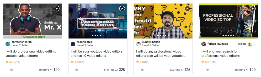
Image credit: Fiverr
Most video editors sell their services on Fiverr, Upwork, and other talent marketplaces. They charge between $10 to $40 per gig on Fiverr and an hourly rate of $10 to $25 on Upwork. You can join both marketplaces to maximize your options and reach a wider audience.
2. Portfolio Website
Create a portfolio website to target non-marketplace audiences and sell your service. It lets you take charge of your marketing, build your customer list and manage your customer relationships 100%. The median hourly rate of video editors is $20.
How to Launch
Videography and video editing are profitable business ideas. Launch yours in these simple steps:
- Pick a niche and your target audience
- Write a business and marketing plan
- Buy video editing software
- Join marketplaces
- Create a website to promote your business
- Run ads and market your service
Required Training, Certifications, or Licenses?
This small business idea doesn’t require special training and licenses, especially if you want to run it from home. However, getting professional video editing training and certification can help you become a better video editor.
Example of Businesses in this Space
Some businesses in this field are:
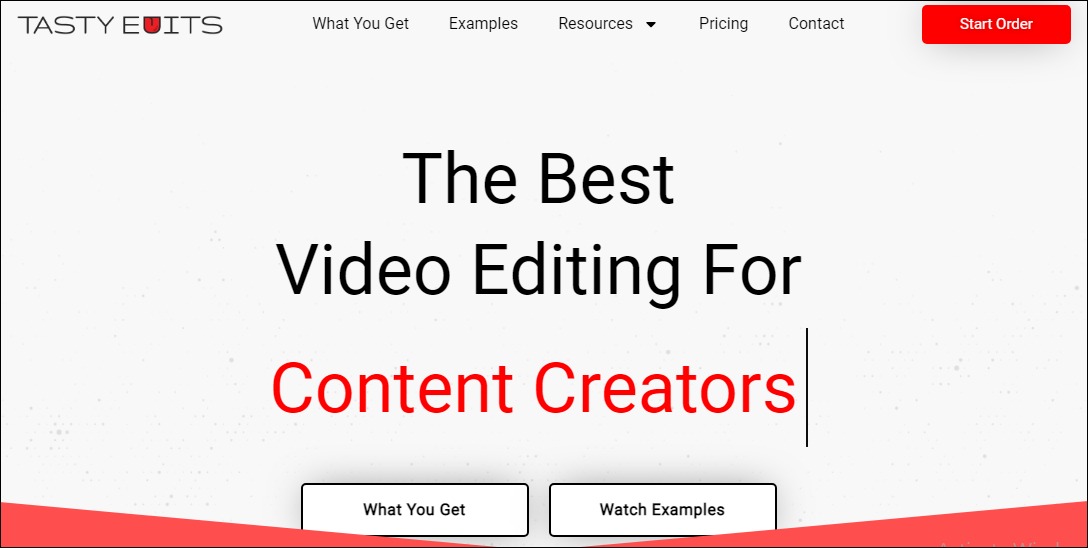
Tasty Edits
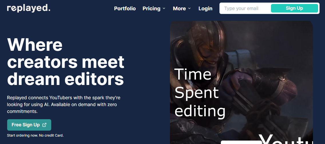
Replayed
14. Online Freelance Designer
The freelance industry currently contributes about $1.4 trillion to the U.S. economy. With over 58 million people offering freelancing services in the country, analysts believe it will grow to become the U.S. majority workforce.
A career path as an online freelance designer lets you have a slice of the pie.
- Earning potential: $25 to $150 per hour
- Top marketplaces: Upwork, Fiverr, Freelancer.com, and self-hosted options
- Estimated start cost: $200 to $1,200
Target Audience and Value
An online freelance design offers limitless opportunities to designers. The small business idea will stay true to its potential when you build it around these target markets:
1. Marketplaces
Joining a marketplace gives you instant access to ready-to-buy customers—beginners in this space charge between $10 and $80 on Fiverr. Pro-verified experts earn up to $800. Upwork graphic designers take $14 to $95 per hour.
2. Freelance Website
A website lets you create a unique brand identity for your graphic design business.
It also allows you to approach your prospects directly, control your pricing and scale your business over time. The $20 to $150 average industry hourly rate is encouraging, and you can charge more as your business advances.
How to Launch
Action the steps below to launch this small business idea.
- Pick a niche and define your ideal clients
- Create a marketing and business plan
- Build your portfolio
- Set your price
- Join marketplaces
- Create a small business website
Required Training, Certifications, or Licenses?
A freelance graphic designer doesn’t need any special license or training. However, acquiring advanced design and marketing skills improve their odds of having a successful career.
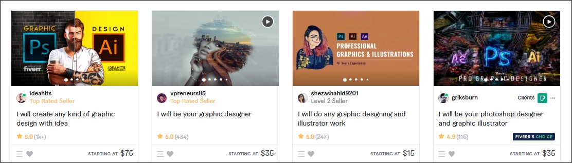
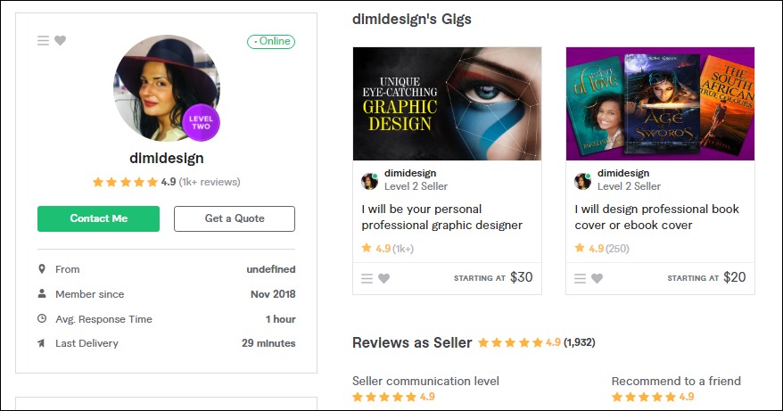
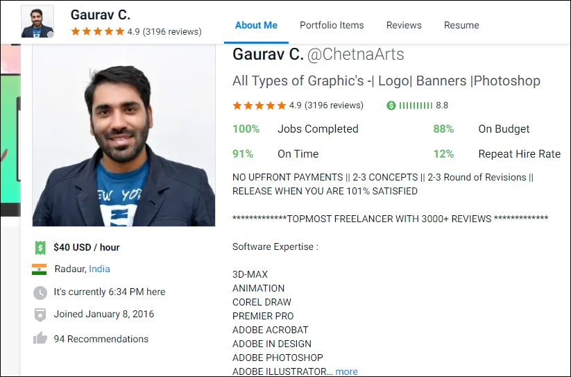
Example of Businesses in this Space
Some of the top professionals in this field are:
Dimi Designs
Gaurav C.
15. NFT Artist
NFT lets owners prove authorship and authenticity, future-proofing digital assets. It’s one of the latest in-thing today and a trend that is not dying off soon.
The value of the global non-fungible token market was $4.6 billion in 2021. Analysts estimated that the market size will grow at a staggering CAGR of 23.9% between 2022 and 2028 to reach nearly $20 billion at the end of the forecasted period.
- Earning potential: $96,643 average annual salary (the top 10% earn about $360,000 yearly)
- Top marketplaces: Fiverr, Upwork, OpenSea, SuperRare
- Estimated start cost: $200 to $1,200 for a computer with a sound graphics card
Target Audience and Value
Let’s examine some target audiences for your NFT art business.
1. NFT Creators
Create unique NFT art collections and sell them to NFT creators with the metadata. You can sell the service on Fiverr and Upwork. NFT artists on Fiverr charge between $40 and $150 for basic packages, while those on Upwork collect up to $5,000.
2. NFT Marketplaces
Image credit: OpenSea
You can mint your art on NFT marketplaces like OpenSea, SuperRare, and others if you’re uncomfortable selling them to third-party NFT creators. The opportunities in this space are limitless. For example, some NFTs on OpenSea sell for as high as 19 ETH floor price.
How to Launch
Launch this NFT art small business idea in these few simple steps:
- Define why you’re going into the business
- Pick a niche
- Join marketplaces to sell your art
- Set up an Ethereum wallet If you wish to mint your arts
- Find a minting platform that meets your needs
- Mint and sell your NFT arts
Required Training, Certifications, or Licenses?
You don’t need any special training or license. However, you can take online NFT minting courses on Udemy, Coursera, and other learning platforms to master the art.
Also, the business doesn’t have special license requirements.
Example of Businesses in this Space
Some of the professionals in this field are:
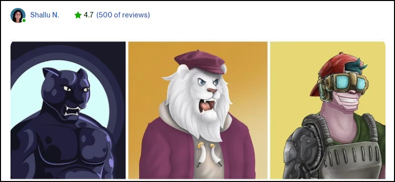
Nyolings
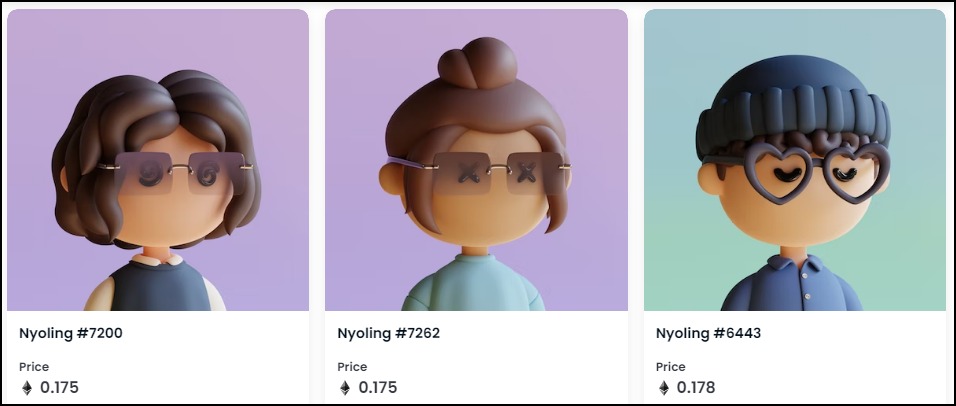
Shallu N
16. Event Designers
Event designers work with planners to help them put details into their decorations. However, unlike planners focusing on event logistics and ensuring everything is on schedule and running smoothly, event designers transform the space and bring clients’ visions to life.
- Earning potential: $43,977 median annual salary (the top 25% earns up to $50,000 annually0
- Top marketplaces: Fiverr, Upwork, Freelancer.com, and self-hosted options
- Estimated start cost: $300 to $3,000 to start the business from home. It’ll require a laptop, project management platforms (for example, ClickUp), and virtual event design software (3D Event Designer).
Target Audience and Value
Segment your audience, targeting these markets:
1. Corporate Organizations
Most organizations and companies hold at least one corporate event, such as annual general meetings, award ceremonies, and product launches. You can work with them to plan out the design and decoration. Payment is usually per project, and it’s encouraging.
2. Event planners
Image credit: Harpers Bazaar
Partnering with event planners is your odds-on-favorite to ensure a steady supply of gigs. So, you don’t need a big marketing budget. Most event planners are already entrenched in the system and can quickly put something on your plate.
3. Catering Services
Catering services are another solid option to explore. Most caterers want to know how to set up their buffet and other items to ensure a seamless workflow. You can create multiple floor layouts of the event space to show them ways to arrange their stuff.
How to Launch
Launch a successful event design small business idea in these six steps:
- Define your target audience
- Buy project management and virtual event design software
- Create virtual event designs to show off your skills
- Join marketplaces
- Build your websites and create social media accounts
- Collaborate with event planners
- Market your business to build your clientele
Required Training, Certifications, or Licenses?
This small business idea doesn’t require any special training, certification, or license.
However, professional certification and training in project management can make you a better event designer. Also, you’ll need a strong customer relationship, positive reviews, and a referral network to thrive in this space.
You might not need special licenses to run the business from home.
Example of Businesses in this Space
Some of the businesses in this field are:
Encore Event Design
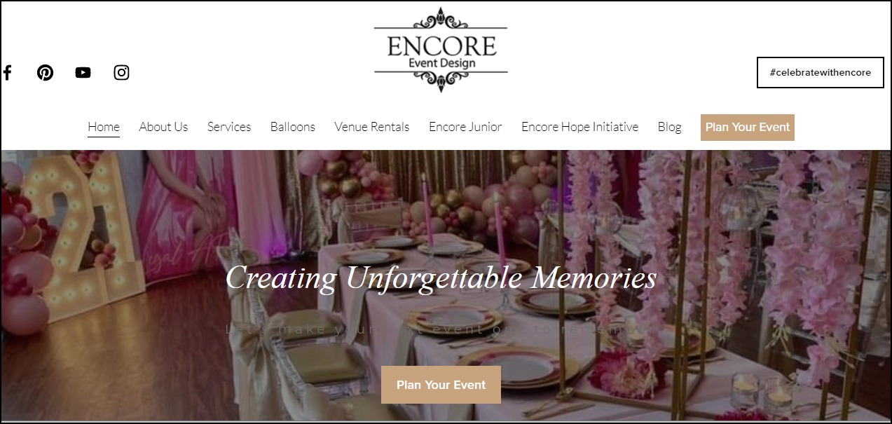
Mindy Rice Design
17. Extended Reality Designer
Extended Reality (XR) is the catch-all term for all immersive technologies such as virtual reality (VR), augmented reality (AR), and Mixed Reality (MR).
Mordor Intelligence predicts the XR market valued at $26.05 billion in 2020, will grow at a staggering CAGR of 62.7% between 2021 and 2026 to reach $463.7 billion. A career as an XR designer can bring a lot to the table.
Target Audience and Value
Who is your target audience in this space? First, let’s examine the top two and what you can gain from them.
1. XR Developers

Image credit: The Academy of International Extended Reality
You can have a lucrative career as an XR designer, working with extended reality developers to create cutting-edge XR applications for forward-thinking businesses.
While designers focus on figuring out the “whys” and ‘what’s” of the projects, developers’ interests rely on transforming them into a reality.
Typical XR designers earn around $106,000 annually. The more experienced hands go home with over $215,000 each year. So you’re getting in early on an industry poised for rapid growth.
2. Marketplace
Selling your XR assets on specialized marketplaces like Unity Asset Store, Unreal Engine, and Oculus Rift store lets you access a ready market, minimizing the efforts you need to put in to build your clientele.
You can also list on Upwork to diversify your income. For example, XR designers on the marketplace earn $20 to $85 per hour. Some designers have earned over $500,000 selling their skills on the platform.
How to Launch
These steps can help you launch this XR design small business idea:
- Pick a niche
- Write a business plan detailing the market opportunities you wish to exploit
- Register your business if you’re renting an office space
- Acquire XR hardware and software
- Create your marketing plan and launch your website
- Join marketplaces to sell your service
- Hire and train your staff, including a social media manager and digital marketing professional
- Collaborate with XR developers
Required Training, Certifications, or Licenses?
This Extended Reality design small business idea doesn’t require any special licenses.
However, you’ll need specialized training and certifications to advance your credibility and credentials. Some of the top-rated in the industry are
Example of Businesses in this Space
Some of the professionals in this space are:
Jalaj S.
Or Fleisher
18. Photographer and Photo Editor
The photography business is competitive, and you can build a sustainable career, even while working from home, with the right skills.
The future outlook for the industry looks promising.
Analysts expect the global market size to reach $44.07 billion in 2025 from $32.92 billion in 2020, meaning, in three years, the global photography business value will be more than half the Serbian GDP, a country of over seven million people.
- Earning potential: $29,230 to $109,760 per year (the average base annual salary is $60,298)
- Top marketplaces: Fiverr, Upwork, Pixabay, Shutterstock, Getty Image, and self-hosted options
- Estimated start cost: $10,000 to $15,000.
Target Audience and Value
You can work with these people as a photographer and photo editor:
1. Event Planners

Image credit: Expert Photography
Event planners can guarantee you steady gigs. Working with them means you don’t have to worry about prospecting, writing proposals, and closing clients.
Some professional photographers charge between $75 and $300 per image, while experienced ones may earn up to $1,000.
2. Marketplace
Marketplaces like Fiverr and Upwork are other excellent options for beginners. For example, photo editors on Upwork take home about $20 to $100 per hour; some have earned over $250,000 since joining the platform.
3. Commercial Photography
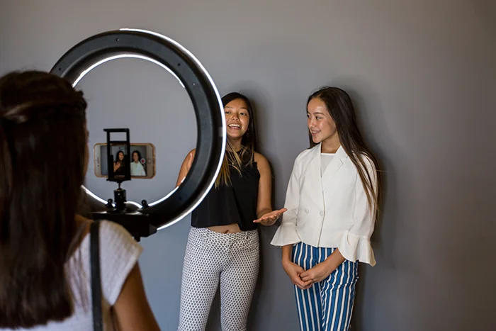
Image credit: Expert Photography
Commercial photography is one of the most lucrative options in this field. The professionals here earn between $800 to $5,000 per day. The licensing fees often start from $250 and may get as high as $10,000.
4. Stock Photography
You can start a stock photography website or join already established stock photo websites like Shutterstock to sell your photos. Monthly subscriptions on Shutterstock cost between $49 to $479. The platform has paid over $1 billion to contributors in the last 15 years.
How to Launch
Launch your photography and photo editing business in these steps:
- Find your niche and target market
- Pick a nice location if you wish to run a brick-and-mortar business
- Register your business to legalize it
- Open a business bank account and set up accounting for the business
- Check with local authorities for the necessary permit
- Get photo editing business insurance
- Purchase photography equipment, gear, and photo editing software
- Create a unique brand identity for the business
- Develop your business website and add your business to social media
- Build your portfolio
- Join marketplaces
Required Training, Certifications, or Licenses?
This business model doesn’t require special training, licenses, or certifications.
However, investing in professional courses can help you become better at what you do. Online courses are a great place to start. For example, you can check Udemy and Coursera for top-rated photography courses.
When creating a website for your business, consider taking marketing and customer relationship courses to improve your client acquisition skills.
Example of Businesses in this Space
Some of the businesses for your inspiration are:
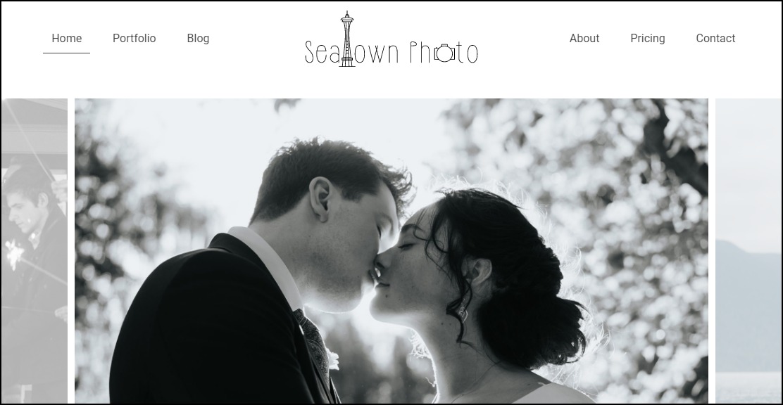
Seatown Photo

James Maher Photography
19. Sell Coloring Books
A coloring book is one containing line art for coloring with the crayon. It’s a healthy way to relieve stress, calm the brain and help the body relax.
The adult coloring books market peaked between 2014 and 2017. It sold over 12 million books in 2015, up from one million copies the previous year.
Although on a decline today, exploring options in this field can be lucrative.
- Earning potential: $10,000 to $40,000 monthly
- Top marketplaces: Amazon, Lulu, Etsy, and self-hosted options.
- Estimated start cost: $200 to $1,200 for a good computer
Target Audience and Value
Create and sell coloring books online. You can begin with some of these marketplaces:
1. Children’s Coloring Books
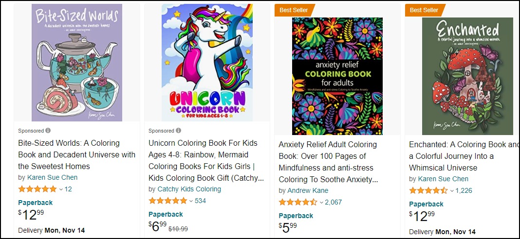
Children’s coloring books are popular on Amazon. A quick search shows over 80,000 results—the top-rated books on the marketplace cost between $5.99 and $12.
2. Adult Coloring Books
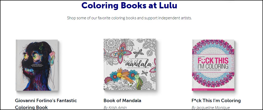
Lulu is an online self-publishing book company. Creating and selling coloring books on the platform lets you reach over one million monthly visitors. They also handle inventory and fulfillment. A paperback coloring book on Lulu sells for up to $16.
3. Teenagers
Teenagers use coloring books, and you can target teen themes that attract that audience. These books typically cost $8 to $38. You can even publish digital versions of these coloring books.
4. Teach People to Create and Sell Coloring Books
If you’ve found success creating and selling coloring books, you can teach others how to do it. Typically, these courses cost $14 and $50 and can attract over 5,000 students.
How to Launch
Follow these steps to start selling coloring books:
- Pick a niche
- Write and design your book
- Decide on whether to self-publish or use publishing companies
- Format and edit your book
- Design the cover art or outsource to freelancers
- Sort the copyright and ISBN
- Set the pricing
- Upload and sell your book
- Promote your coloring books on social media
Required Training, Certifications, or Licenses?
Selling coloring books doesn’t require any special training or certification. You don’t also need special licenses to run this business.
Example of Businesses in this Space
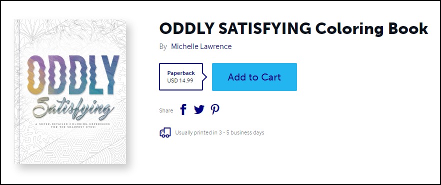
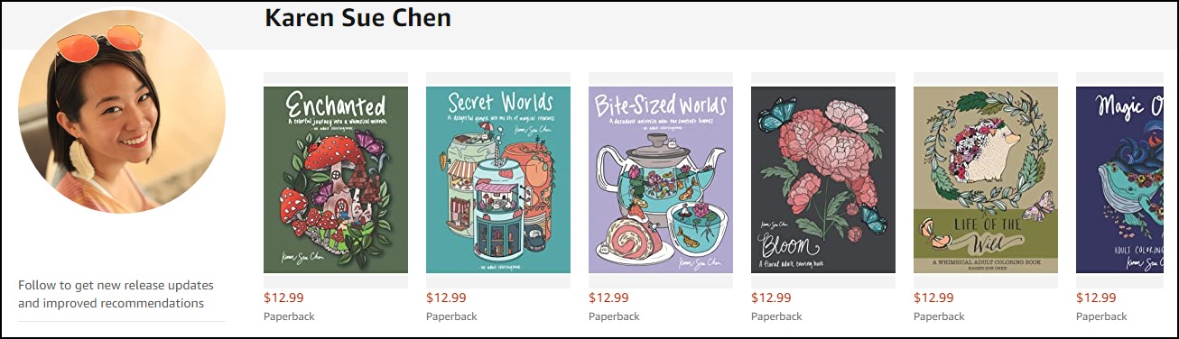
Some of the professionals in this field are:
Michelle Lawrence
Karen Sue Chen
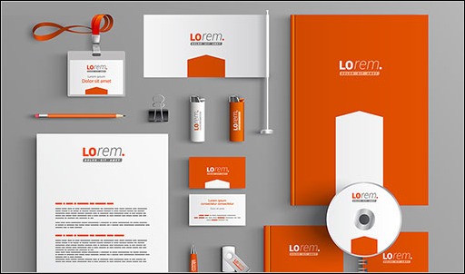
20. Products and eCommerce Packaging Designer
Product packaging designers develop eye-catching labels and product packages that meet safety and packaging regulations. In addition, they often work closely with the marketing team to create designs that reinforce the brand’s messaging.
Analysts expect the market size of packaging design services to reach nearly $32 billion in 2030, up from $21.9 billion.
- Earning potential: $37,000 to $80,000 annual base salary (the average salary for packaging designers in the U.S. is $51,000 yearly)
- Top marketplaces: Fiverr, Upwork, 99Designs, and self-hosted options.
- Estimated start cost: $62 to $23,259.
Target Audience and Value
Getting gigs is the most challenging aspect of this business. Some sources you might want to explore are:
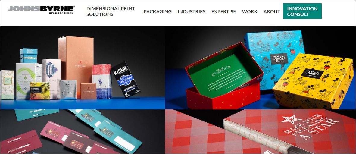
1. Brick-and-Mortar Retail outlets

Image credit: Johns Byrne
Approach and pitch your packaging designs to nearby brick-and-mortar stores. Also, run paid adverts to reach more businesses and direct them to your website to schedule a discovery call—a typical packing designer charges between $80 to $100 per hour.
2. eCommerce Stores
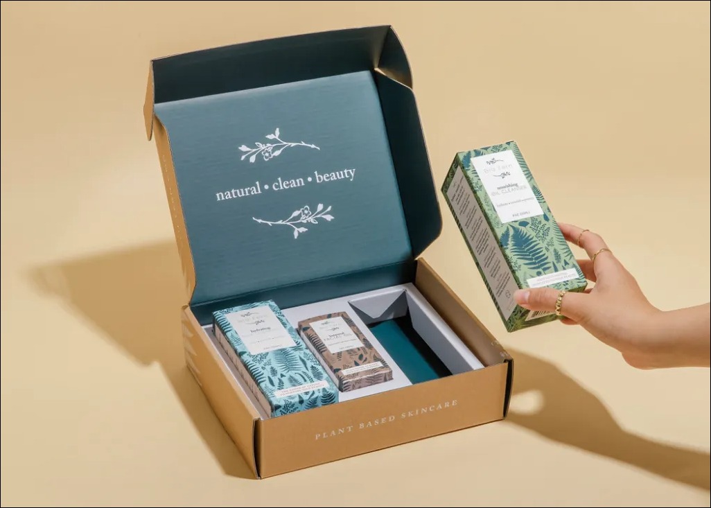
Image credit: PakFactory Blog
Many eCommerce stores fulfill their orders. Work with them to design custom packaging to ship their orders. You can reach them online via paid and organic promotions.
The $80 to $100 hourly rate is the competitive fee for designers in this niche.
3. Marketplaces
Product packaging designers on Upwork take between $20 to $100 per hour. Also, pro-verified designers on Fiverr earn $500 to $1,000 per project. So, there is so much money to make from this channel.
How to Launch
Start your product packaging design business in these simple steps:
- Study the different product packaging needs to understand your audience’s needs.
- Select a niche for your business.
- Build your portfolio.
- Set your price.
- Determine your positioning for differentiation.
- Establish your brand identity.
- Join marketplaces.
- Create a website and join social media platform.
Required Training, Certifications, or Licenses?
This business idea doesn’t require any special certification and training to start. However, obtaining packing training, licenses, and certificates can set you apart from competitors.
So consider these options:
- Certified Packaging Professional (CPP)
- Certificate of Packaging Science (CPS)
- Certificate of Mastery in Packaging Management (CMPM)
Also, check with local authorities for necessary licenses.
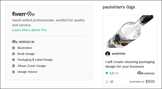
Example of Businesses in this Space
Some businesses and professionals in this space are:
Johns Byrne
Paul Virian
21. Publish Books and eBooks
Publishing books and eBooks is an excellent way to monetize your design skills.
A career as an author is financially rewarding, and the future also looks promising. A report by Technavio shows that the electronic books market will grow by $6.93 billion between 2020 and 2030.
Also, published books don’t have recurrent expenditures. So you have nothing to lose exploring your options in this field as a designer.
- Earning potential: 70% on every book sold on Amazon Kindle
- Top marketplaces: Amazon, Lulu, Apple Books, Kobo, and self-hosted options
- Estimated start cost: $0 to $4,000.
Target Audience and Value
You can write books based on your transferable skills, case studies, or the latest trends. Some of the platforms to self-publish your work are:
1. Amazon
Amazon receives over two billion monthly visits, making it the biggest platform to self-publish books and eBooks. Most books on the marketplace are available at $2 to $30. So, some authors earn between $5,000 and $8,000 each month.
2. Apple Books
Self-publishing on Apple Books lets you target a wide range of Apple device users, including CarPlay and Apple Watch. Apple has sold over two billion iOS devices, and over 100 million people use Macs worldwide. So the Apple Book brings so much to the table.
3. Online bookstore
You can sell through your website if you drive enough traffic to the online store and fulfill your orders. Your online store allows you to set your price, control your messaging, target your ideal audience and manage your customer list.
How to Launch
Follow these steps to turn this small business idea into a reality:
- Pick a niche
- Choose a topic and write your book or eBook
- Edit your book or hire a professional editor
- Design your book cover or outsource
- Format the book or hire a freelancer
- Choose a self-publishing platform and upload your book
- Create an online community for your books business
- Hire a social media manager and digital marketing services to promote your books
Required Training, Certifications, or Licenses?
You don’t need special training or certifications to start a book or eBook publishing business. However, getting and flaunting them can boost your credibility and show off your expertise. Also, advanced book publishing and formatting courses can help you create better-looking and attractive books.
You can find and take these courses on Udemy, Coursera, and Alison.
Example of Businesses in this Space
Some designers in this space are:
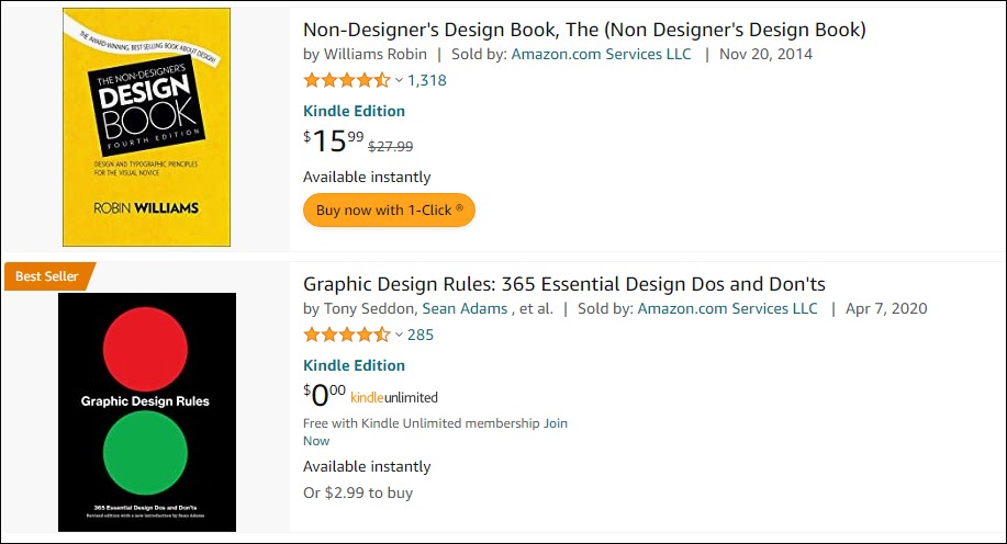
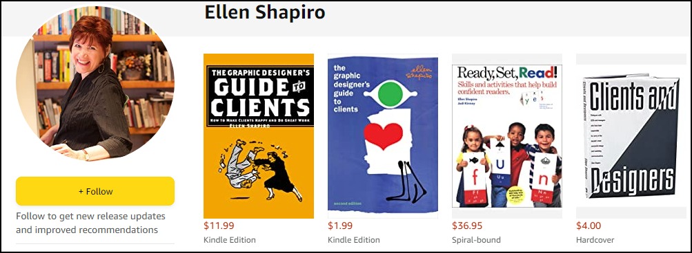
Debbie Millman
Ellen Shapiro
22. Printing Press
The printing business is financially rewarding. About 25,000 U.S. companies are into commercial printing. They generate nearly $900 billion in revenue annually, more than the Saudi Arabian GDP and almost half that of Italy—the EU’s third-largest economy.
Target Audience and Value
Set up your printing press to target these audiences:
1. Businesses
BluSky ETO
The global commercial printing market is lucrative and has impressive long-term growth potential. You can have a slice of the pie by providing printing services to businesses like marketing collateral, catalogs, magazines, product labels, and packaging.
The U.S. has over 10 million companies, so you always have options.
2. Political and Social Campaigns
Image credit: ABC News
Thousands of political and social campaigns happen in the U.S. yearly, making campaign posters and signage printing a thriving business.
The 2022 market size for printed signage alone is $33.9 billion, and analysts expect the number to grow at a CAGR of 2.8% to reach $40.08 billion in 2028.
3. Authors
The number of books published yearly in the U.S ranges from 500,000 to one million, excluding self-published authors. In 2021, the country sold over 826 million physical books, that’s nearly three books per citizen on average. So you can earn big printing books.
How to Launch
Launch your printing shop in ten steps:
- Define your target market and develop your business model
- Rent office space in a nice location
- Register your business to make a legal entity
- Open a business bank account and set up accounting for the business
- Check with local authorities for the necessary permits and licenses
- Secure a business insurance
- Purchase and set up the equipment you need for the print shop
- Create a logo for a unique brand identity
- Develop your business website and join social media platforms
- Develop your marketing plan and run promotions
Required Training, Certifications, or Licenses?
A printing press doesn’t require any special training and certification to start.
However, you should comply with OSHA requirements and regulations. Also, check with the local authorities to learn other necessary environmental, health, and safety requirements.
Example of Businesses in this Space
Some of the businesses in this space are:
RRD Printing
Taylor Printing Solutions
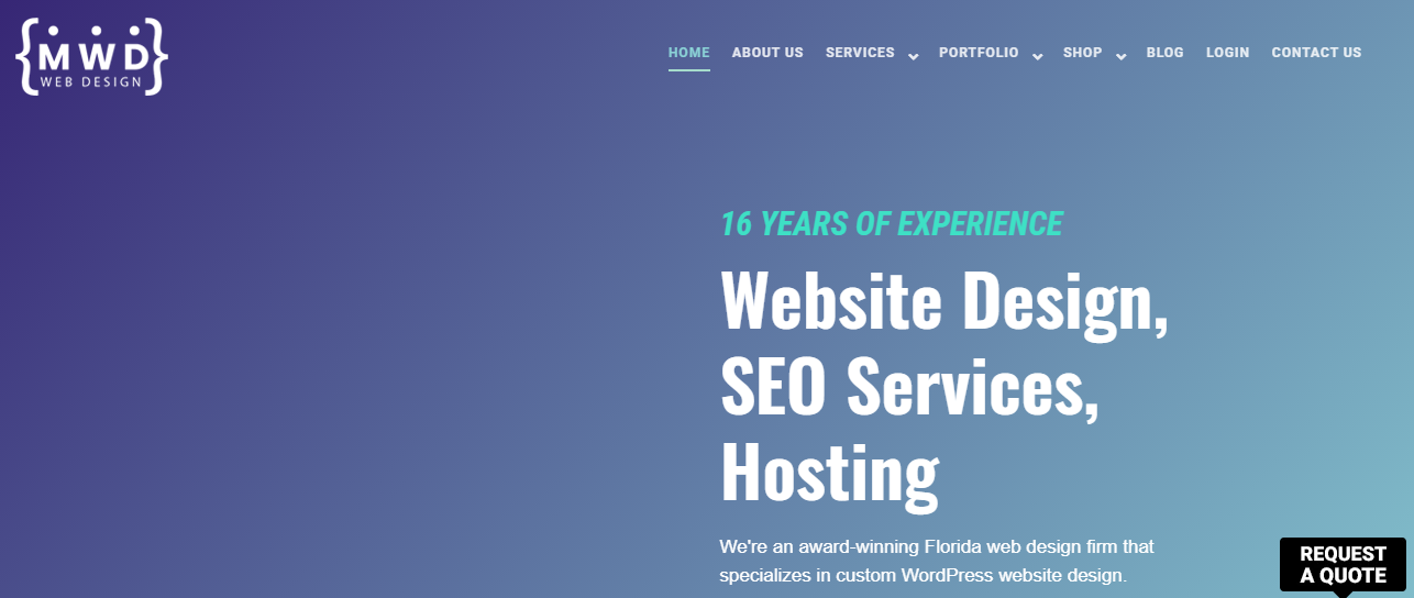
23. Website Design Services
The 2022 total number of web developer and digital interface designer jobs in the U.S. is around 200,000.
However, Statista believes the number will reach 229,000 in 2032, while the total number of web developers and designers will grow to 205,000, so there’ll be enough jobs to go around.
Target Audience and Value
Model your small business web development idea around these markets to have a home run.
1. Local Businesses

Image credit: Unsplash
Small businesses and eCommerce stores drive the growing demand for business websites. A web development agency’s custom services cost between $15,000 and $30,000. But more complex site design projects can go as high as $75,000.
2. Charities

Image credit: Unsplash
Charities are another excellent option for web designers. Most of them need simple websites. So you’ll be looking at making $2,000 to $5,000 per project as a freelancer. And you can command up to $30,000 if you’re an agency.
3. Marketplaces
Verified professional web designers on Fiverr walk away with $100 to $5,000 after each project. They priced some of their premium packages up to $12,000.
Web designers on Upwork charge between $25 and $150 per hour for their services.
How to Launch
Follow these steps to start a web design agency:
- Define your target market
- Rent an office space if you wish to run an out-home agency
- Register your business to make it a legal entity
- Secure a business insurance
- Choose a business name and create a unique logo
- Develop your business website and set up social media accounts
- Build your portfolios
- Create a marketing plan and run promotions
Required Training, Certifications, or Licenses?
Once you have the requisite skills, you don’t need special training or certification to launch a web design service. However, enrolling in project management certification courses can help you seamlessly manage your workflow and customer expectations.
Other necessary certifications are:
- User experience and usability courses to build sites with frictionless navigation
- Search Engine Optimization certifications for search-friendly designs
- Conversion rate optimization courses to create high-converting websites
- Graphic and 3D animations to create stunning graphics
Example of Businesses in this Space
Check out these businesses to see what other people are doing in this space:
MWD Web Design Inc.
Colton J.
24. Graphic Design Academy
A graphic design academy might cost you an arm and a leg, but it’s lucrative, as most soft skill training centers.
Data shows that the global soft skill training market reached over $24 billion in 2020, and market analysts believe the number will grow by a CAGR of 12.3% between 2022 and 2027 to reach $47.2 billion in 2027.
Besides the financial rewards, a career as an instructor can be fulfilling. You should consider this career path if you have a passion for teaching or other transferable skills to share with others.
- Earning potential: $39,000 to $93,000 yearly total pay (average salary is $56,438 per year)
- Top marketplaces: Yelp
- Estimated start cost: $14,491 average startup cost for skills training center
Target Audience and Value
Some of the target audiences for this business idea are:
1. Design Teams

Image Credit: Medium
Approach nearby businesses and show them how your training program can help advance the skills of their design team and save the company money. Then, negotiate your pay based on the value you are bringing to the table and what you think the business can afford.
2. College Students

Image Credit: Ms. Magazine
College students are excellent targets for graphic design training skills. Reach those that are interested in acquiring graphic design skills with paid ads.
You can run foundational, undergraduate, and postgraduate programs to cater to all categories of students. For example, some training schools charge up to $40,000 for postgraduate graphic design degree programs.
3. Graphic Designers
Professional graphic designers are always looking for ways to advance their design skills. You can target this segment with professional certification programs or bootcamps. You might also partner with reputable certifying bodies like Adobe to offer their certification programs.
How to Launch
Follow these steps to launch your academy:
- Develop your training programs and modules
- Set your training fees and payment plans
- Rent a training center in a good location
- Register your academy
- Secure the appropriate licenses and insurance policy
- Design your training center to set the right ambiance
- Create a logo for the business
- Design a website with online learning features to cater to out-of-location students
- Set up your social media presence
- Develop your marketing plan
- Hire and train your staff
Required Training, Certifications, or Licenses?
You’ll need a license to run a degree-awarding training center.
Also, it would help if you had more than transferable graphic design skills as an instructor. Your students expect you to have professional certifications and specialized training from recognized bodies.
Some top options are:
- Adobe Certified Associate
- Graphic and Digital Design Certificate (Parsons School of Design)
- Udemy or Coursera professional graphic design and animation courses
- Master’s degree in graphic design
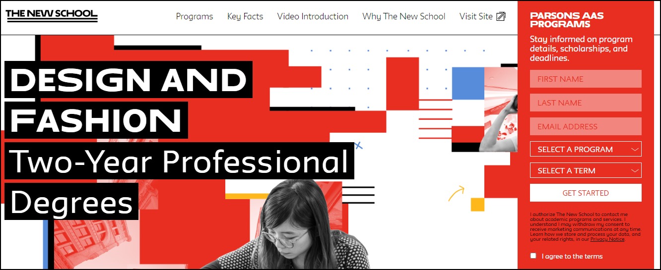
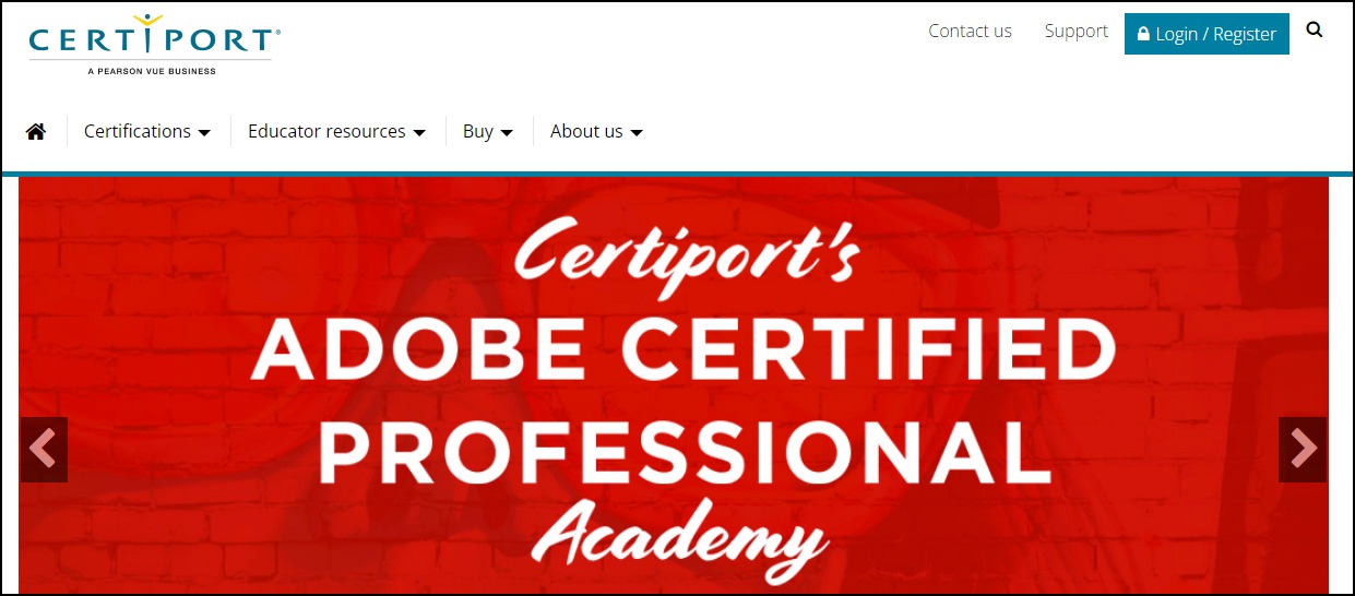
Example of Businesses in this Space
Some graphic design training centers are:
The New School
Certiport
25. YouTuber
YouTube is not just a video-sharing platform. It’s also the second-largest search engine after Google. Over 2.6 billion people use the platform once a month. They spend about one billion hours daily watching five billion videos.
A career as a YouTuber is financially rewarding but never a walk in the park.
Identifying your target audience and creating content that addresses their pain point is the most straightforward to succeed in this space.
Target Audience and Value
You can target prospective graphic designers or designers with your video. Some ways you can monetize your YouTube content are:
1. YouTube Ads
Joining the YouTube partner program is the most popular option for monetizing YouTube videos through YouTube ads.
However, to qualify, you’ll need to rake in at least 1,000 subscribers and 4,000 video watch hours in the past year. Then, you can earn between $2 to $12 per 1,000 views.
2. Sell Merchandise or Courses
Another way to monetize YouTube videos is by selling merchandise. If you don’t have any physical product, you can promote your design courses before or after your YouTube videos and drop the purchase link in the video description.
3. Sponsored Videos
Image credit: Fran Patrillo.
Influencer marketing is reimagining how brands connect with their customers. YouTube is the second most popular platform for influencer marketing. Join the train if you have a large and engaged following.
Several brands can pay you $500 to $10,000 to recommend their products. Some may even pay up to six figures for a YouTube campaign if they are sure of the results.
How to Launch
Follow these steps to launch a career as a YouTuber:
- Understand your audience and find your niche
- Create a YouTube channel and brand yourself
- Decide on the monetization strategy
- Invest in good camera and gear
- Acquire video editing skills and video editing software if you don’t want to outsource
- Develop your content calendar
- Create your first video and upload
- Optimize your video for search engines
- Run YouTube to promote your videos
Required Training, Certifications, or Licenses?
You don’t need special training, certification, or licenses to become a YouTuber.
However, taking video editing courses can save you a lot of money. Also, if your business model centers on teaching your audience design skills, you should acquire professional certifications in the field to advance your credibility.
Example of Businesses in this Space
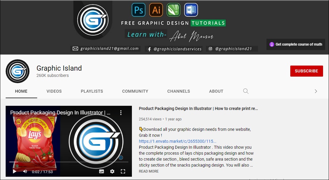
Some of the designs YouTubers making a wave in the industry are:
4 The Creatives
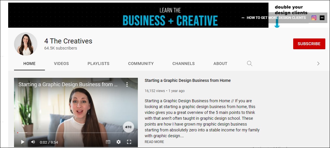
Graphic Island
26. Newspaper, Magazine, and Catalog Design Agency
The global digital newspaper and magazine market, valued at $34.2 billion in 2021, will grow at a CAGR of 4.2% between 2022 and 2028 to reach $45.6 billion. The industry looks promising. You can register your agency and run it from the comfort of your home.
- Earning potential: $35,000 to $67,000 base salary per year (the average is 48,289 yearly)
- Top marketplaces: Fiverr, Upwork, Legit, and self-hosted options
- Estimated start cost: $2,300 to $5,200
Target Audience and Value
Some of the target audiences for this business are:
1. Newspaper and Magazine Companies
Image credit: Envato
Partner with newspaper and magazine companies. Offer to handle their designs to save them the cost of maintaining a full-time in-house team. Working with them can guarantee you a steady supply of jobs. Negotiate your pay per page or project.
Some magazine designers charge $50 to $90 per page.
2. Marketplaces
Join marketplaces like Fiverr and Upwork to build your client base and portfolio incrementally. You can earn between $10 to $55 by selling your service on Fiverr. Some designers on Upwork charge about $30 and up to $750 per project.
Catalog designers on the platform earn between $20 and $100 per hour.
3. eCommerce and Retail Businesses
eCommerce brands and retail businesses are your largest audience. Most of them use product catalogs and magazines to spread their marketing messages.
You can approach them for custom designs or target them with customizable templates on your websites or third-party template marketplaces like Envato or Creative Market.
How to Launch
Follow these steps to launch this business at home:
- Identify your target market
- Choose a name and register the business
- Get business insurance
- Buy design software
- Create a website and set up social media accounts
- Hire and build your remote team
- Design newspaper, catalog, and magazine templates to build your portfolio
- Join marketplaces
- Promote your business
Required Training, Certifications, or Licenses?
You don’t need special training, certification, or licenses to run this business model. However, you can find relevant professional courses to advance your skills.
Example of Businesses in this Space
Some of the professionals in this field are:
Corey F.
Luis L
27. Online Drawings and Handcrafts Sales
You can build a sustainable career selling custom drawings and handcrafts art collectors. Statista projected that the global arts and crafts market will grow from $35 billion in 2017 to $50.9 billion in 2024.
Besides the tempting financial rewards, the business lets you express yourself and bring your imagination to life.
- Earning potential: $12.5 to $49.84 per hour (the average hourly rate is $20.97)
- Top marketplaces: Etsy, Shopify, Fiverr, and self-hosted options
- Estimated start cost: $200 to $1,200 for a personal computer and software.
Target Audience and Value
Build your business around art lovers. It helps you lower acquisition costs and maintains a high conversion rate. Some small business ideas in this field are:
1. Offer Custom Art

Image credit: Yasmeen A
You can make a lot of money creating custom art for clients. Since they’re tailor-made and provide personal significance and uniqueness, most collectors will be okay with paying more to have them on their walls.
Commissioned paintings from experienced artists cost $100 to $10,000.
2. Start Online Craft Store
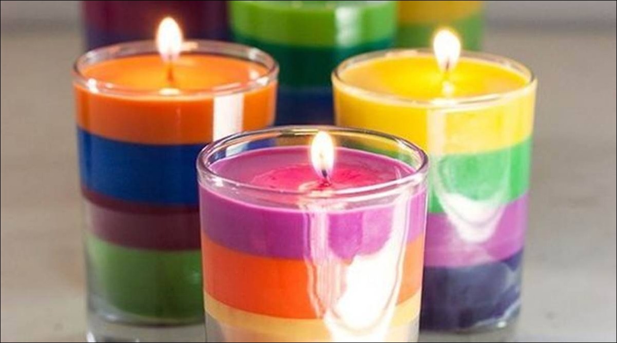
Image credit: The Indian Express
An online store for your craft business lets you transform your passion and creativity into a business. Moreover, it’s lucrative so that you can earn a good living.
Candle making, jewelry, and headbands are some craft business ideas for your inspiration. Others include embroidery, home decor, sculpture, and decorative pillows.
Also, sell your crafts on Amazon, Etsy, and other marketplaces to reach more people.
3. Sell Your Drawing Online

Image credit: Artmajeur
Create stunning hand-drawn images and sell them on art marketplaces like Shutterstock and iStock. Also, sell on your website to cater to non-marketplace users.
Additionally, license your art to businesses for commercial use. It’s where the money is. You can make between $100 and $10,000 from licensing fees.
How to Launch
Follow these simple steps to launch your online drawing and handcrafting small business ideas:
- Identify the gap in the market—decide what you’re going to sell
- Define your target audience and pick a niche
- Name and register your business
- Create a logo and brand your business
- Design your website and set up your social media
- Create sales pages and join marketplaces
- Plan your supply chain and order fulfillment
- Make your crafts or sample drawings
- Promote your business
Required Training, Certifications, or Licenses?
This business model doesn’t require special training, certification, or licenses. However, check with local authorities to learn what applies in your area.
Example of Businesses in this Space
Some of the design businesses making it big in this space are:
Cedar and Sail
Artisaire
How to Choose the Best Business Ideas as a Designer
We have explored some of the best small business ideas for designers. When you start your journey, choose options that match your passion and career objectives.
And remember to use this resource to start on the right footing.
Featured image via Unsplash.
Source
The post 27 Best Small Business Ideas for Designers first appeared on Webdesigner Depot.
Source de l’article sur Webdesignerdepot
 As we head into the final month of 2022, plenty of new ideas and website design trends are still emerging. The evolution throughout the year has been exciting and designed to help website designers and developers create greater engagement and interactivity while pushing the envelope. These trends are no exception.
 Looking to save big and make your web design job easier at the same?


 Every month we put together this collection of the best new websites we’ve seen appear on the web in the previous four weeks.


 Color and depth are key themes this month as we look at what design trends are happening across websites. Red is the primary color of choice, and you can see it almost everywhere; the new thing is that it’s being used in backgrounds and as more than an accent color. Additionally, 3D elements and depth of field are making significant impressions.


 A robust email marketing strategy is a great way to reach your target audience directly.


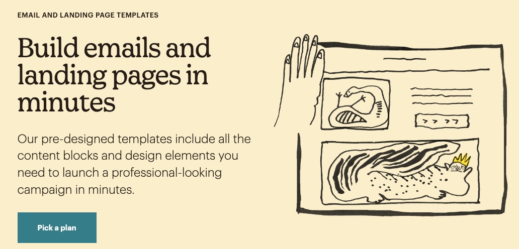

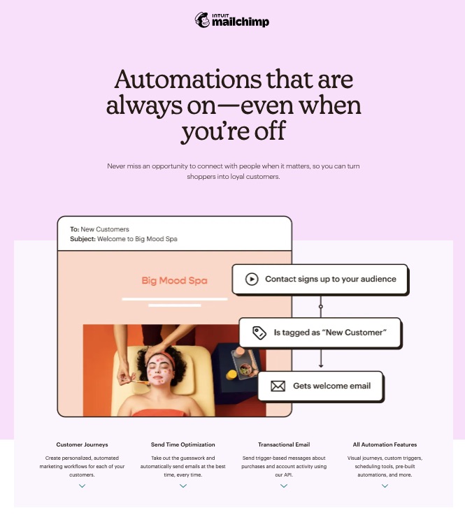

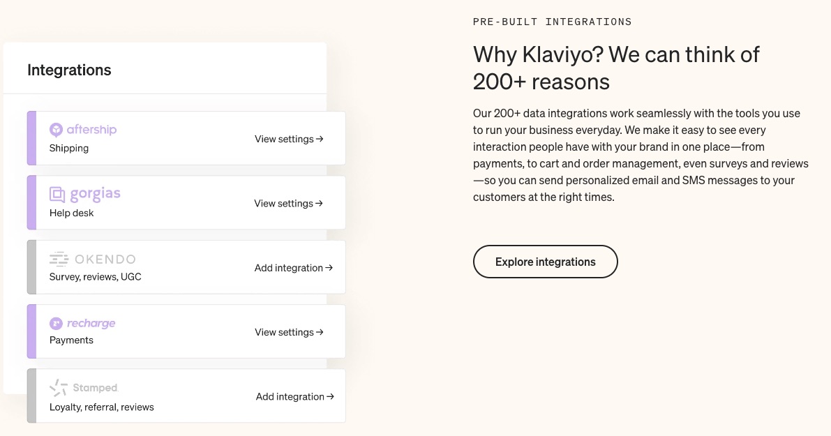


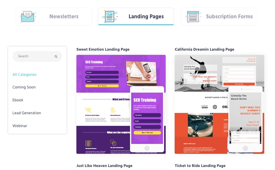


 This month, it’s all about the images. Each of the design trends we spotted has to do with the images you select – or don’t select – for a project and how you use them.


 Jakob Nielsen’s