Articles

Design can make a statement. It evokes feeling and can encourage thought and conversation. That’s the common theme among the three trends in website design this month.

Each trend is rooted on the time and place where we live and includes elements that provoke thought. Kudos to these designers and design teams for jumpstarting conversations. Here’s what’s trending in design this month.

1. “Taking a Stance” Design

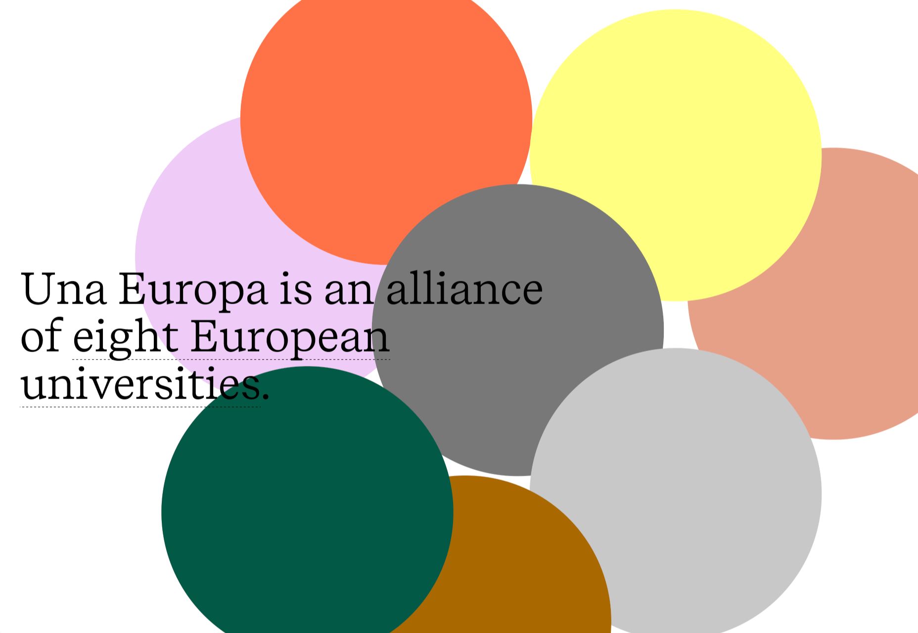
From social to environmental issues, design projects are echoing the sentiments of their audiences and organization in a way that take a stance on an issue.

Once taboo, this is becoming increasingly used as a technique for brands who are no longer worried about turning off a certain segment. The goal is to rally the core audience and people who feel the same way about an issue or cause.

There’s also a secondary thing happening here. Some designs aren’t really position based, but use imagery and language that resonates with a movement to associate with that feeling.

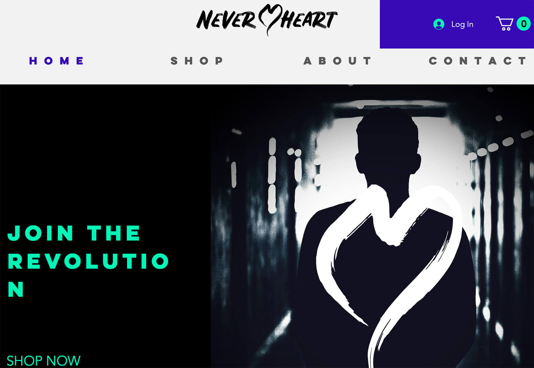
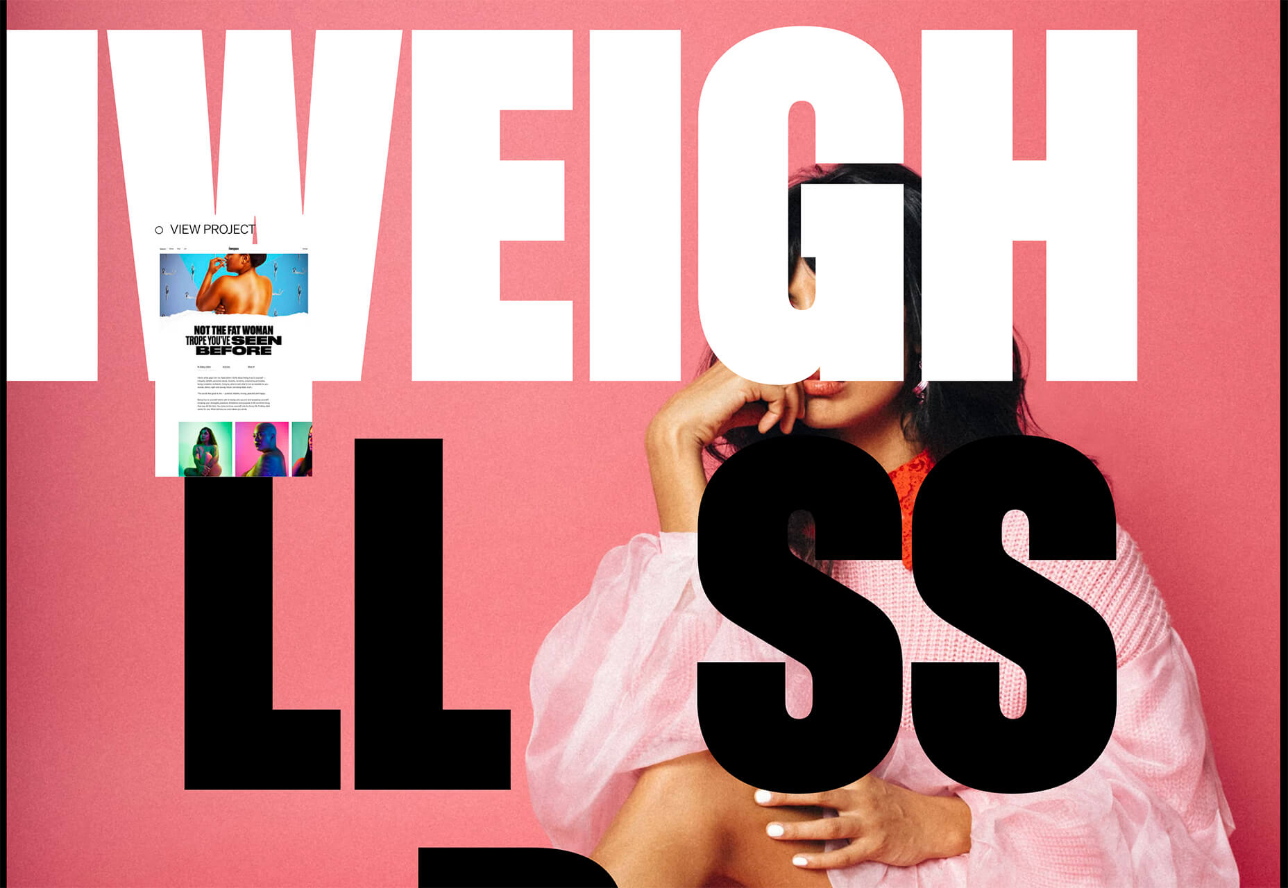
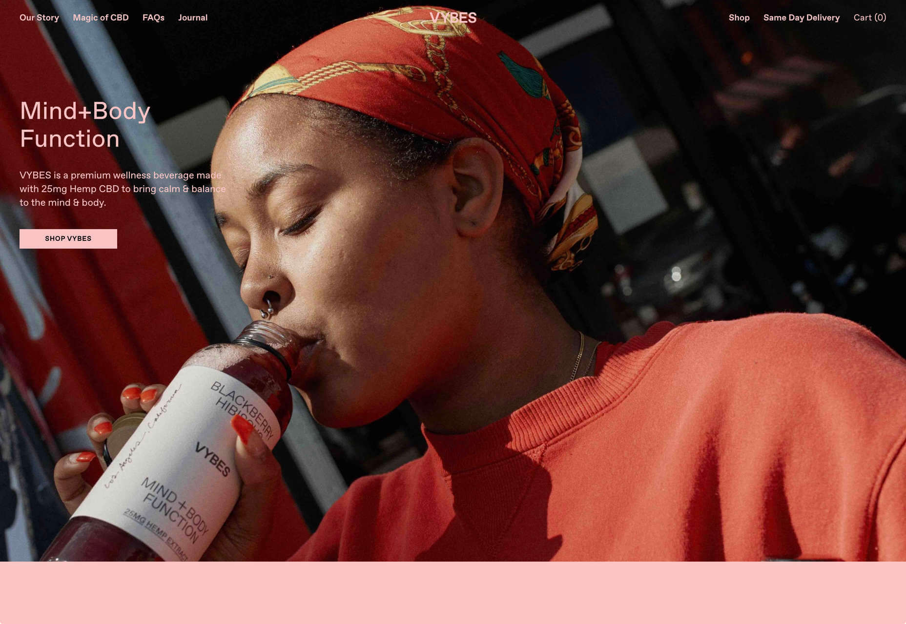
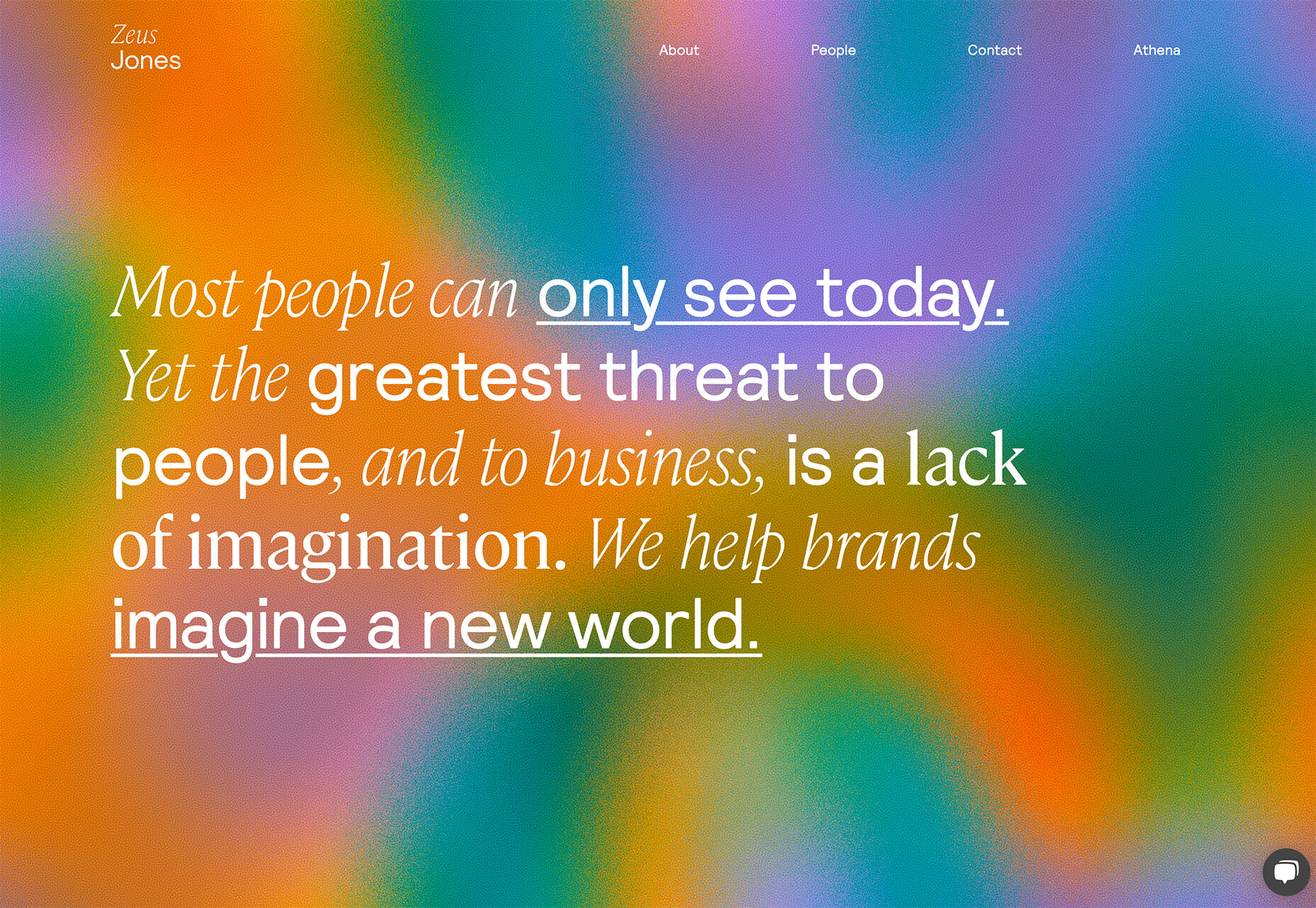
Never Heart uses “Join the Revolution” and a dark image with a heart to tug at your feelings. It can help create an association to a cause that you believe in without stating that cause directly. The design feels strong and inviting while making you feel like part of something.

Skye High uses “powerful” twice in the headline to convey a particular messages to women. The agency is looking to work with “powerful” women. It’s a timely statement and message that could resonate with a lot of business-women at various levels of their careers.

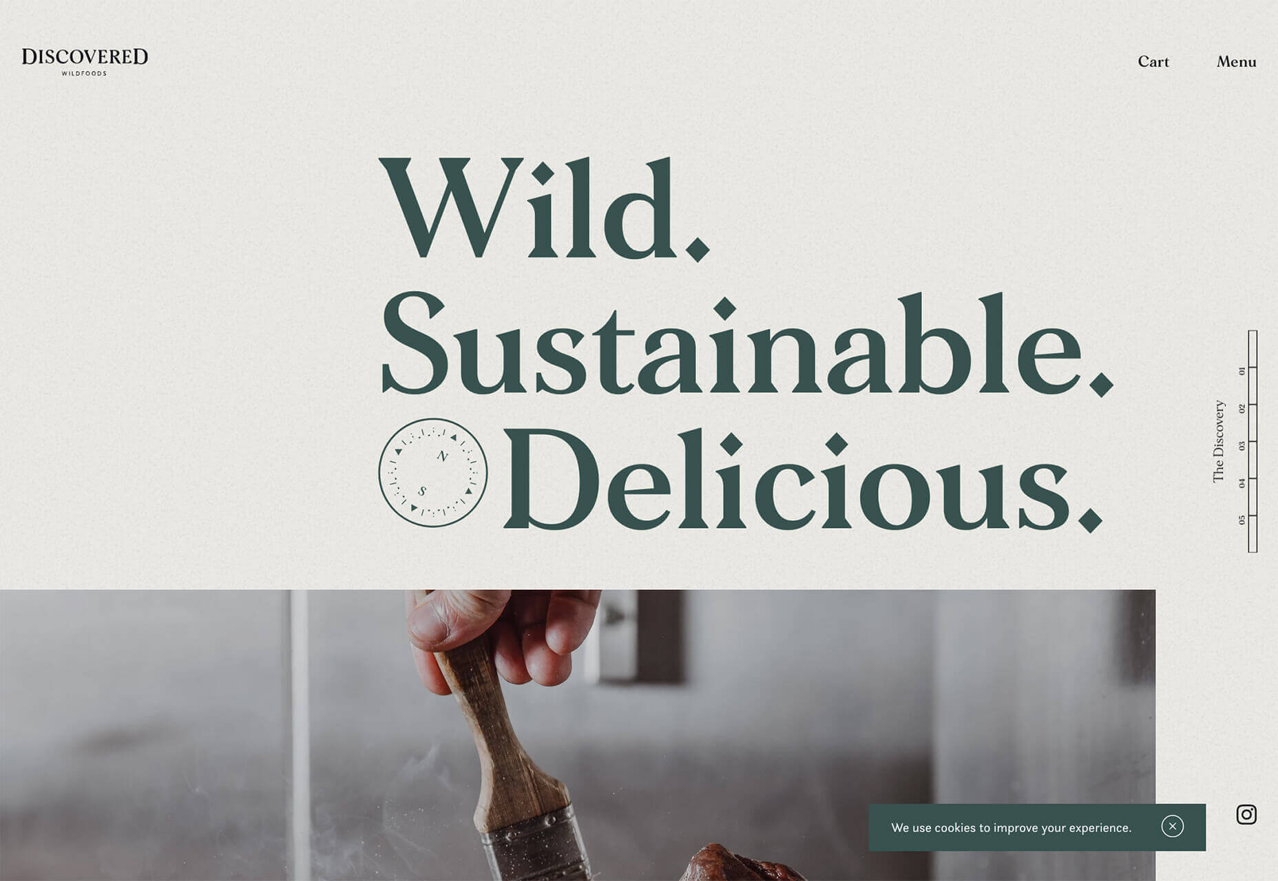
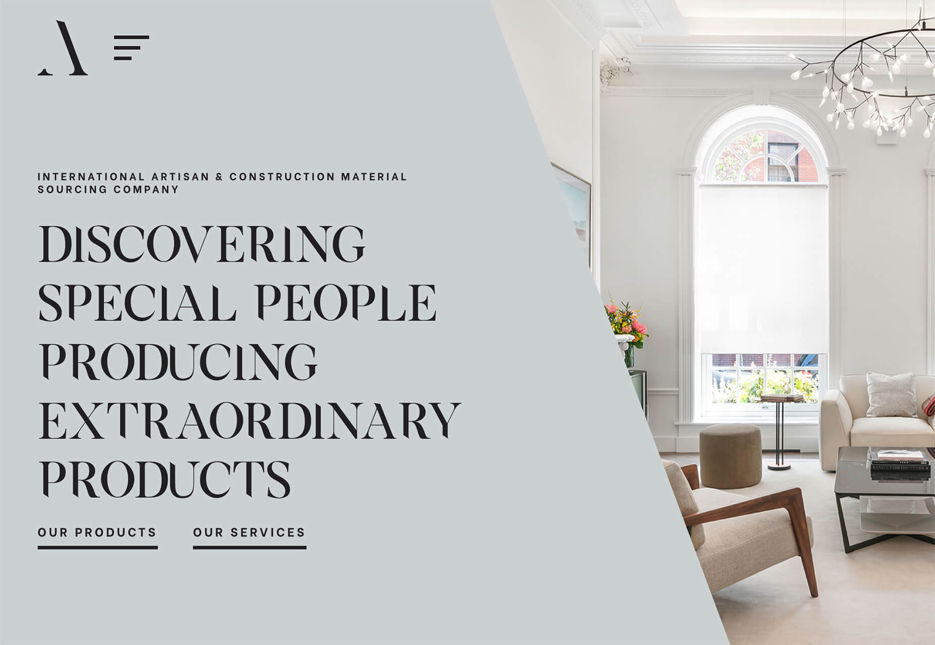
Discovered Wildfoods is a brand that is rooted in sustainability. The corporate model and responsibility of the brand shows through in the website. This type of design helps connect people with mutual feelings to the brand and products.

It’s refreshing to see more websites and brands embracing social causes and issues. It can be tricky for a number of reasons. But for some brands, it pays off.

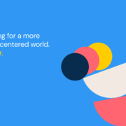
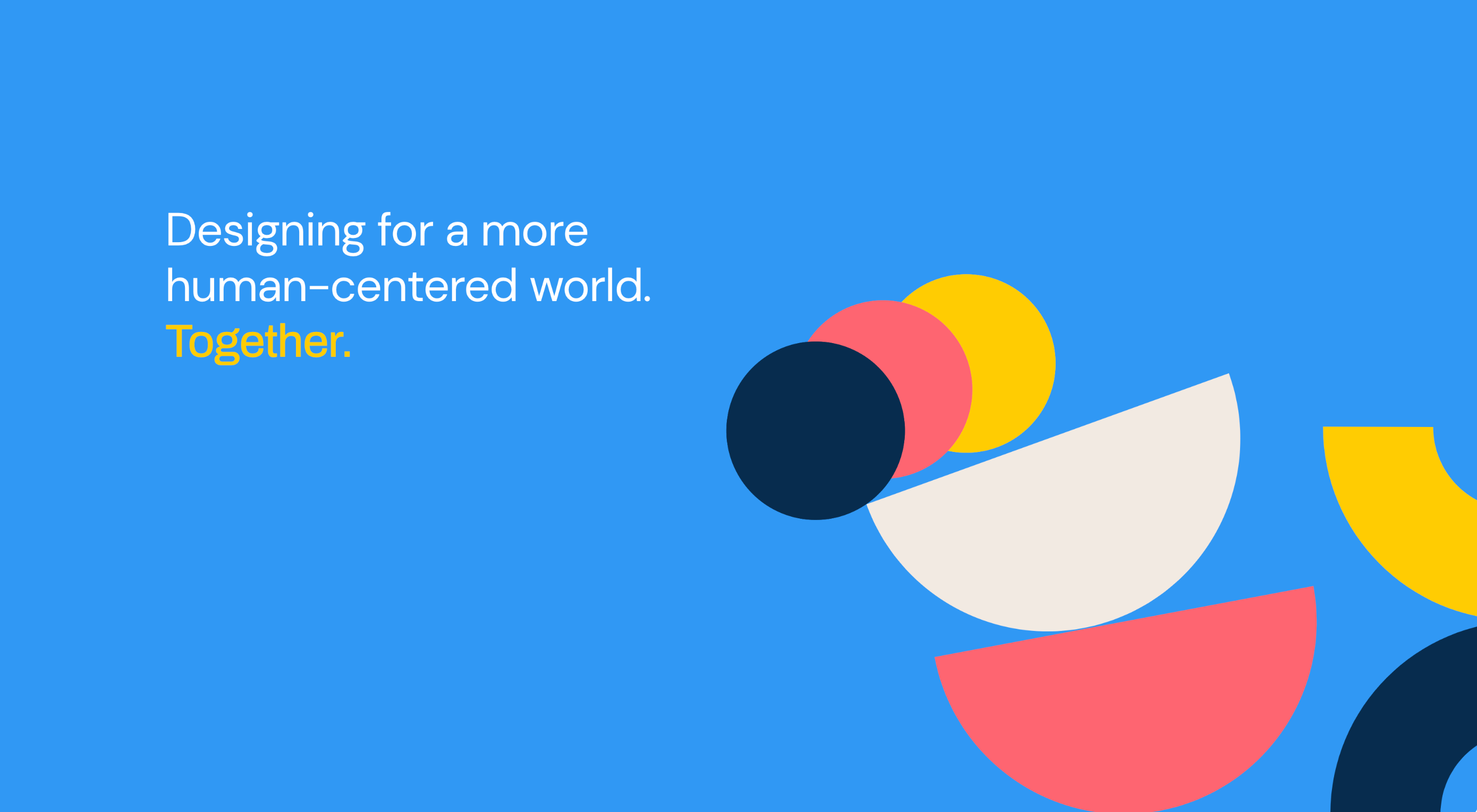
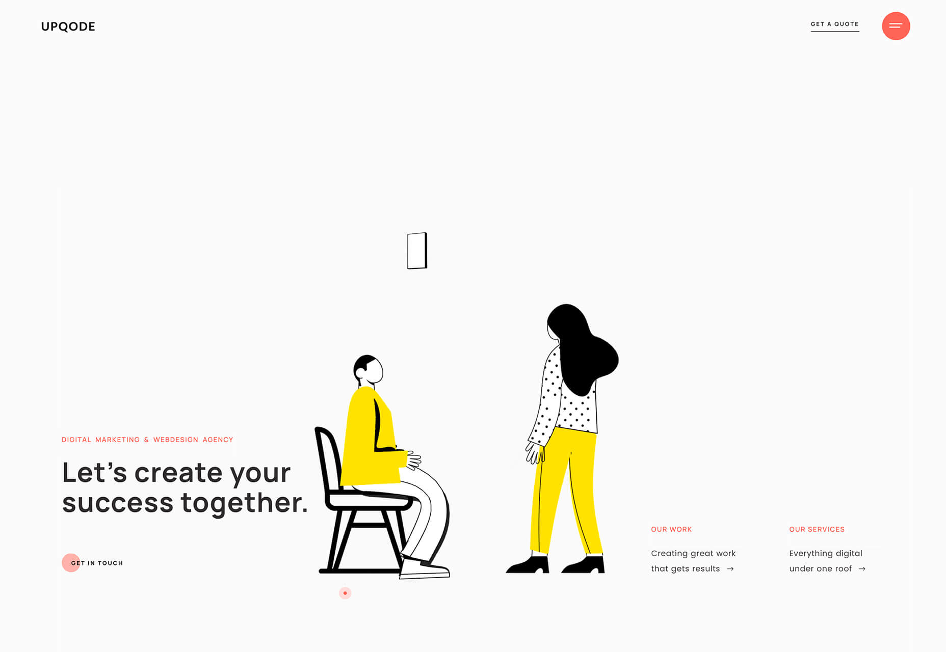
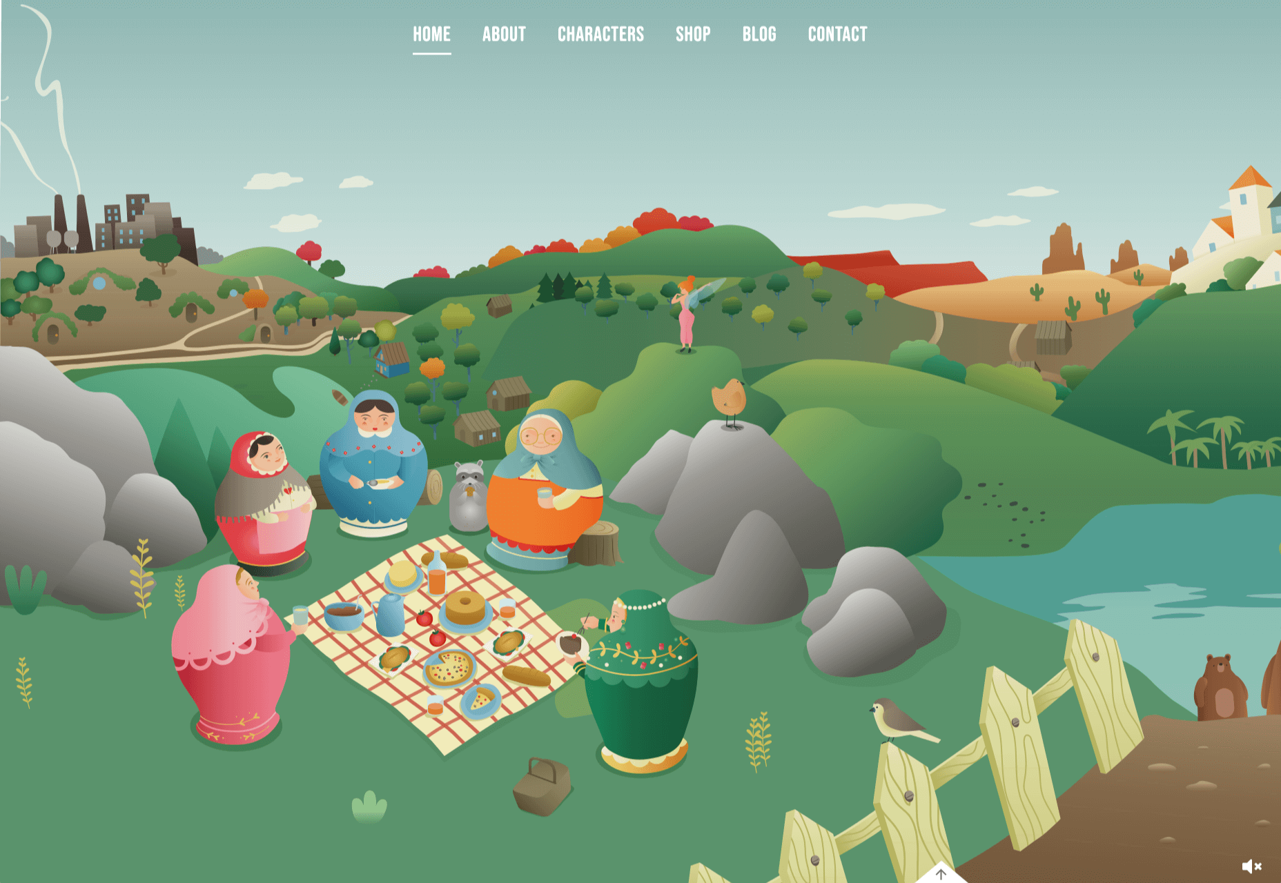
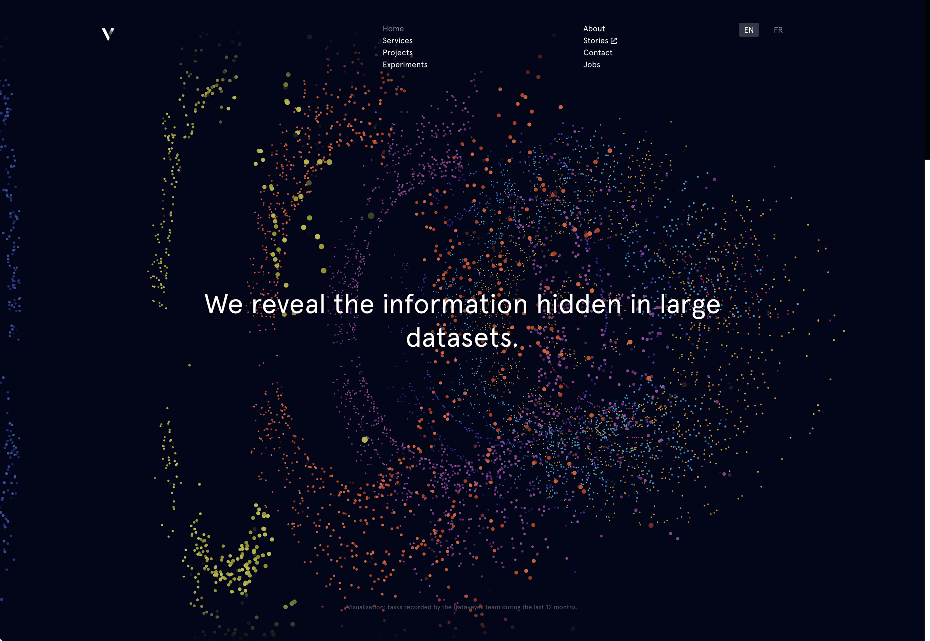
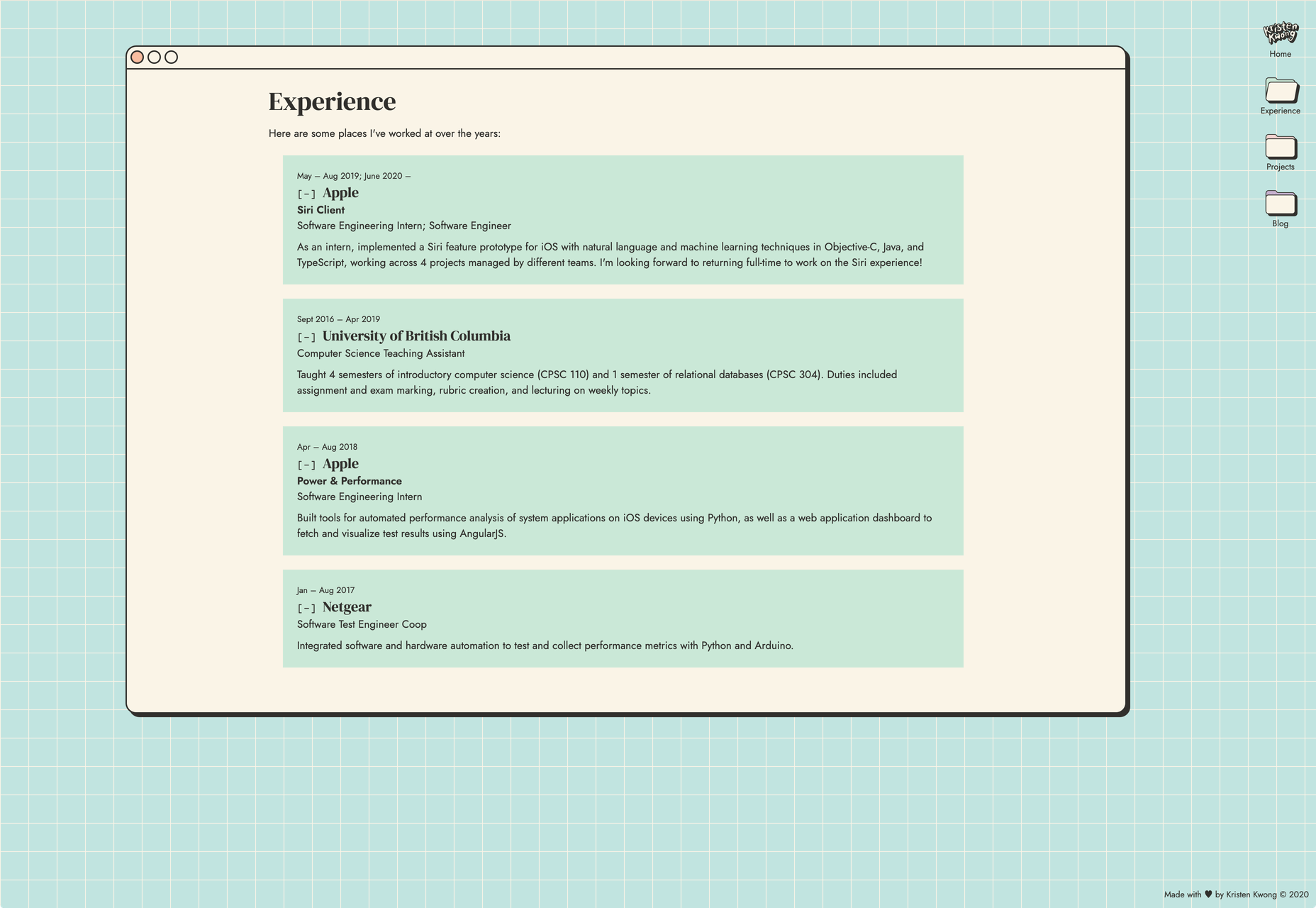
2. Abstract Art Elements

If you are worried about a lack of images, or not sure how to portray images in an appropriate way due to the worldwide pandemic – groups or not, masked or not – abstract art elements can be the solution.

Widely used for startups and apps, more abstract design elements are everywhere. It’s an easy way to create strong visual interest without photography.

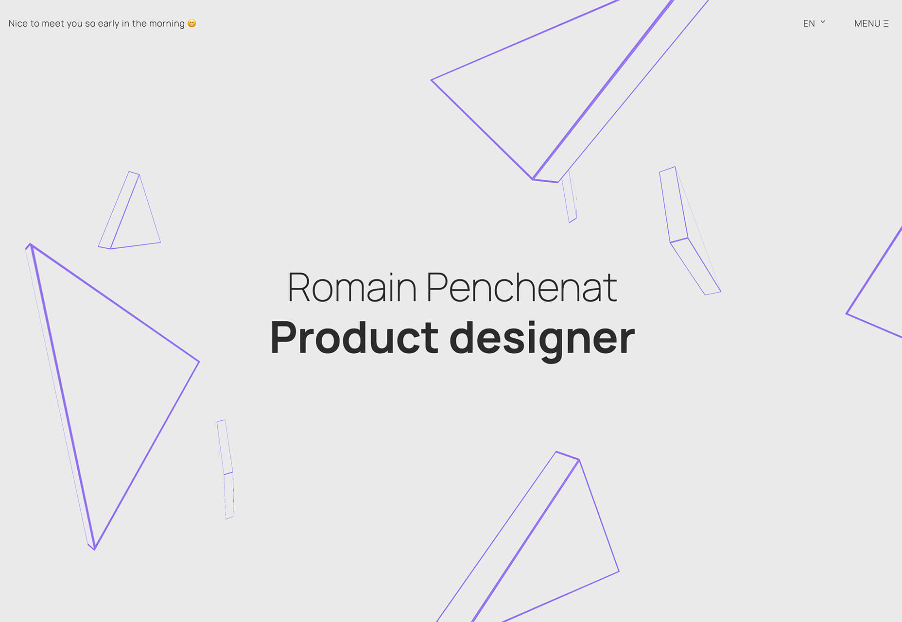
The most common use of abstract art elements is often in the form of geometric shapes with animation. This is something that almost anyone can understand and simple shapes and movement can be quite stunning when done well.

The good news is this aesthetic can work for almost any type of website. Try it for a redesign when you don’t have photography that feels appropriate in the current environment or if you want to create focus for content that drives website visitors to the words or scroll. This works with more abstract concepts when they are simple and help you move quickly from the visual to text.

Here’s how each of the examples handles abstract art elements:

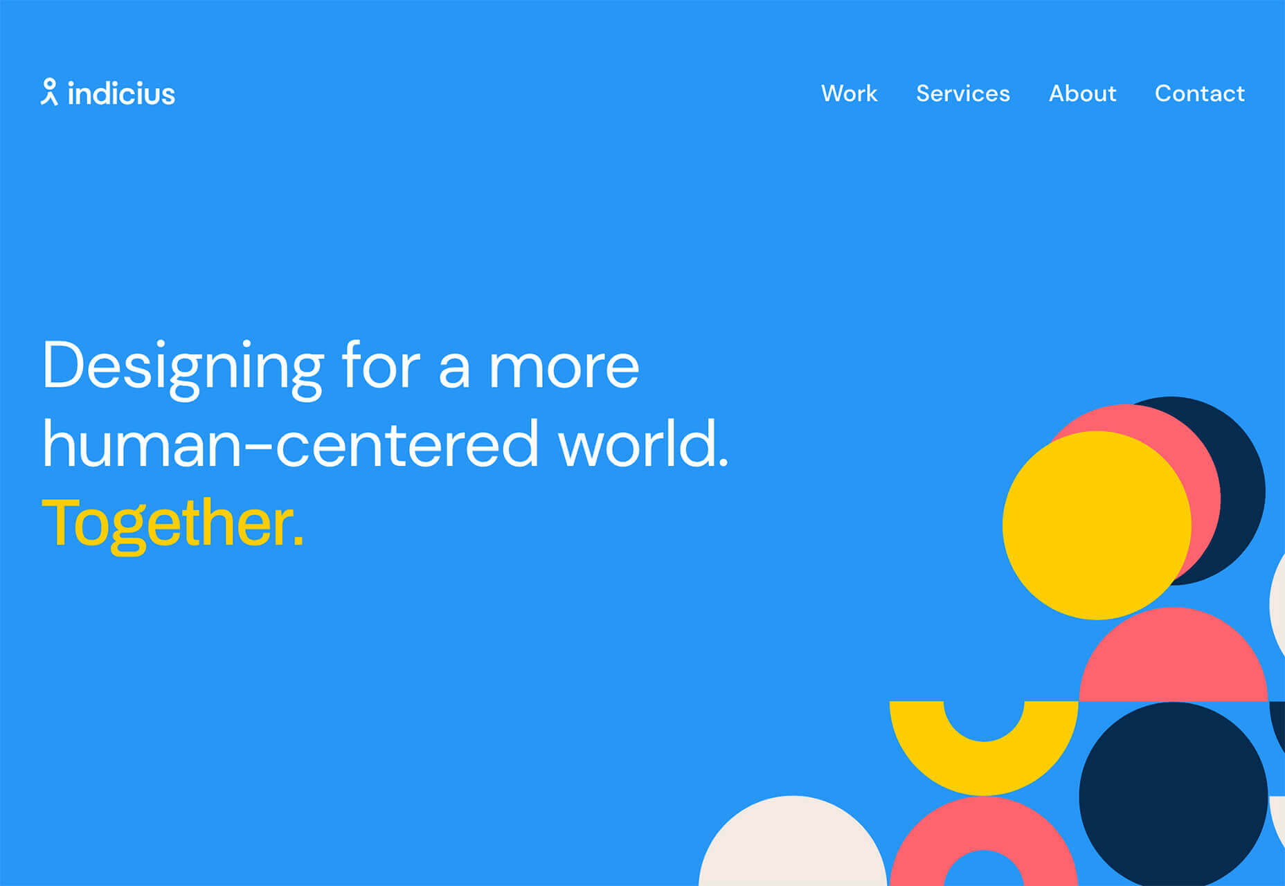
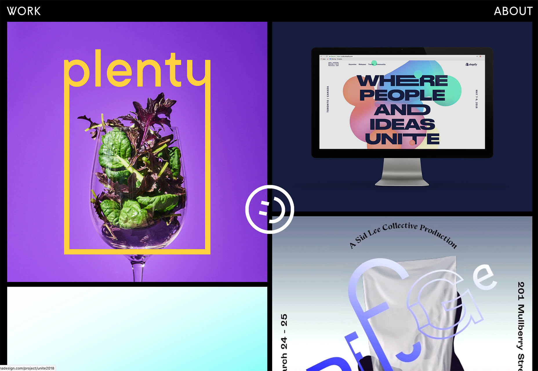
Indicius uses bouncing circles that move toward text and down the screen to drive users to the headline and scroll action.

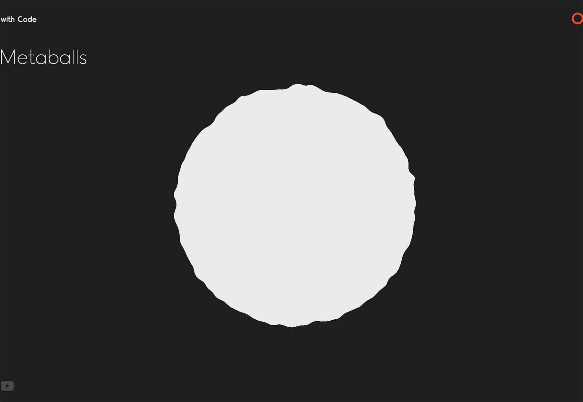
With Code uses a fun fuzzy circle with different animations to draw you in.

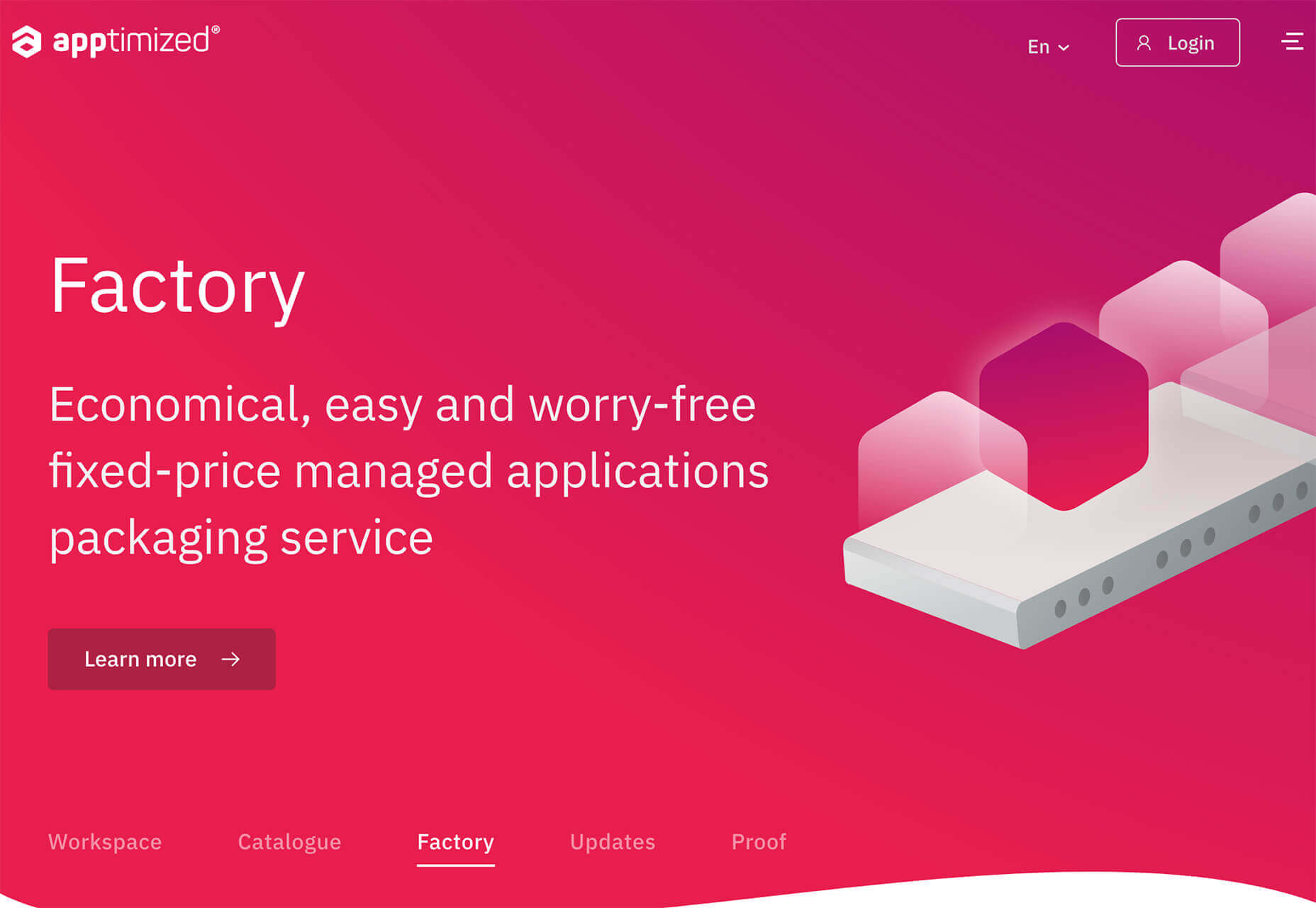
Appimized uses bright color and a monotone scheme with geometric shapes to sell its services.

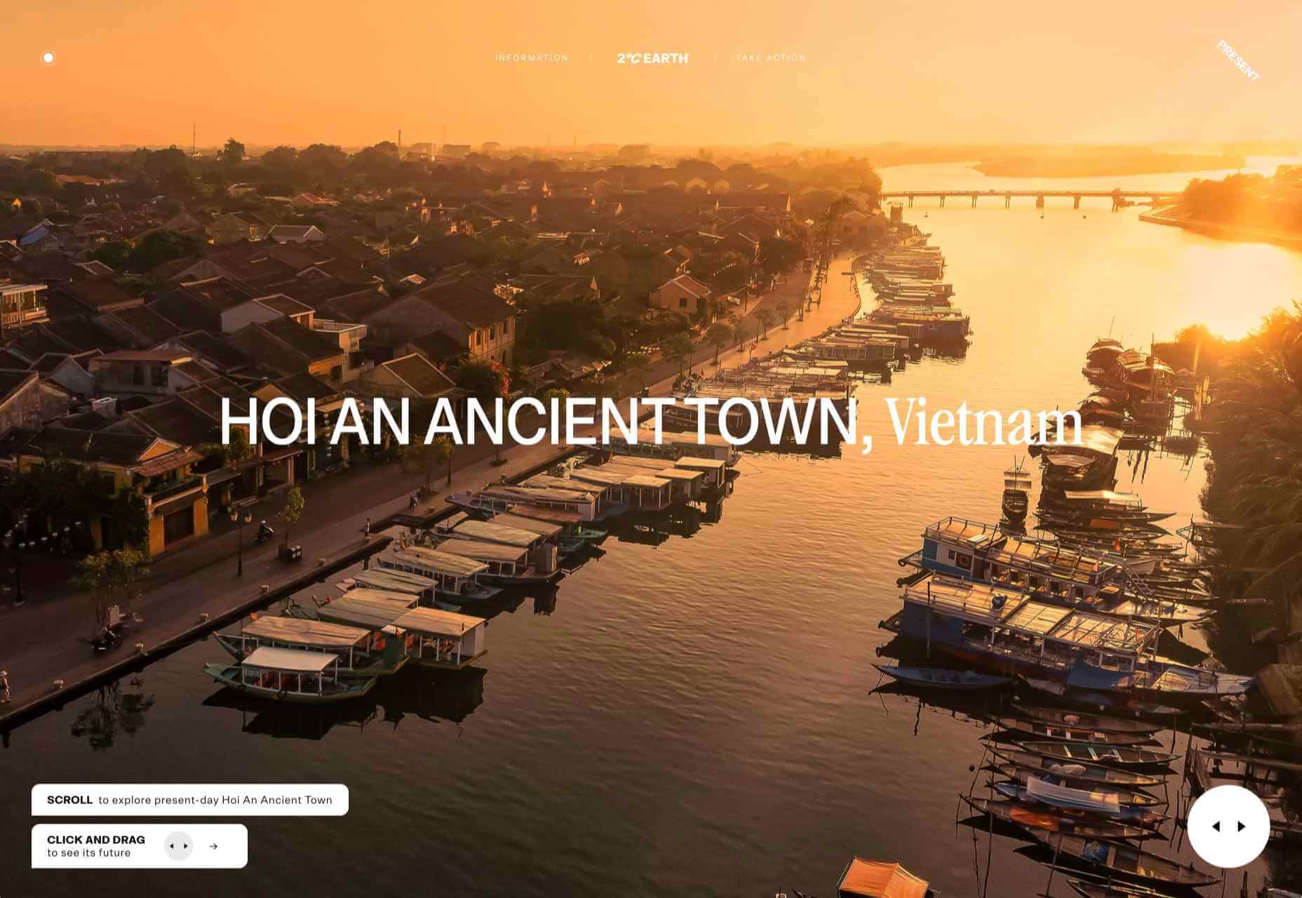
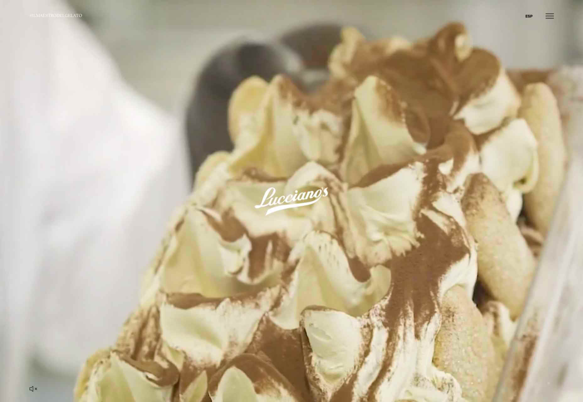
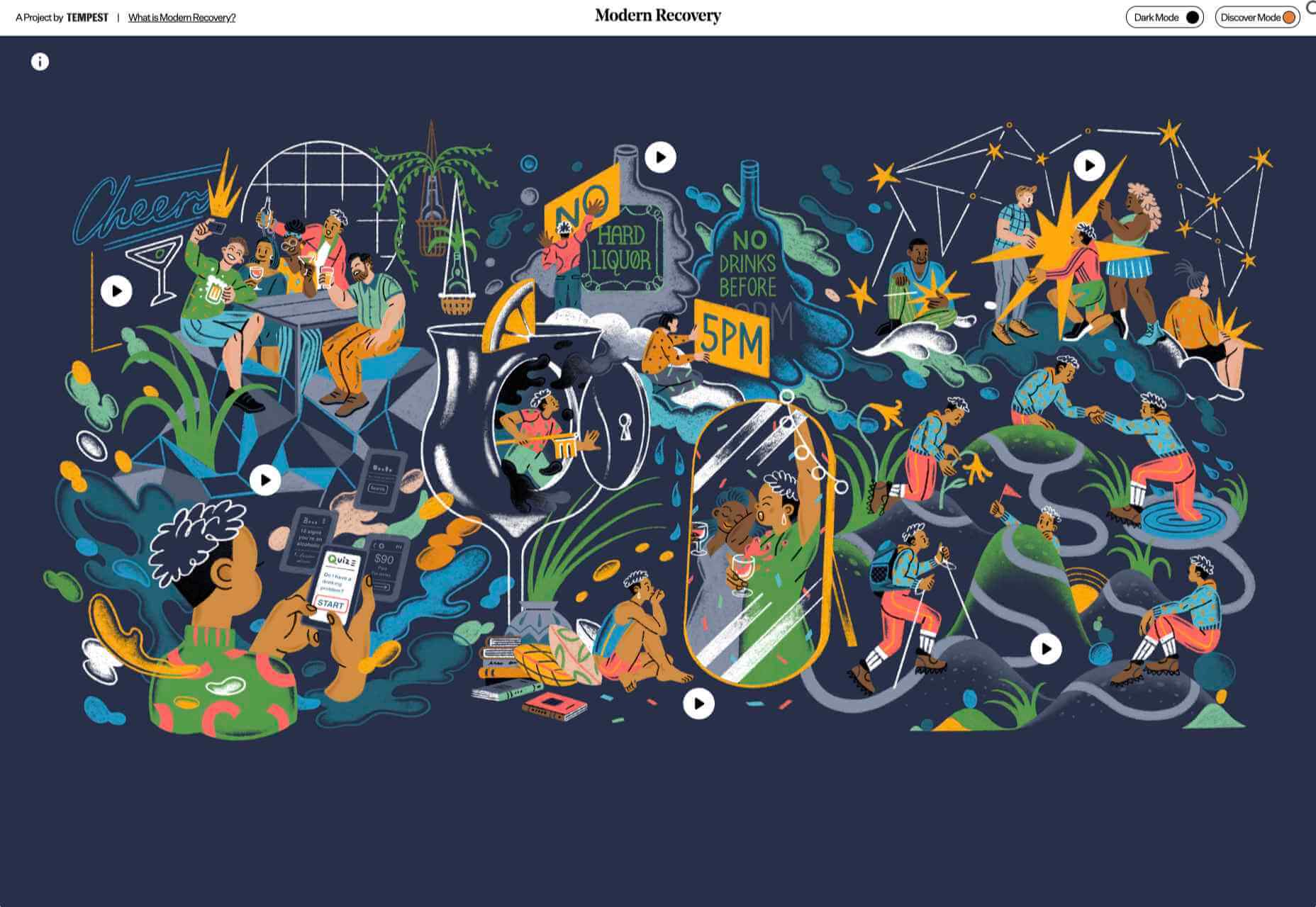
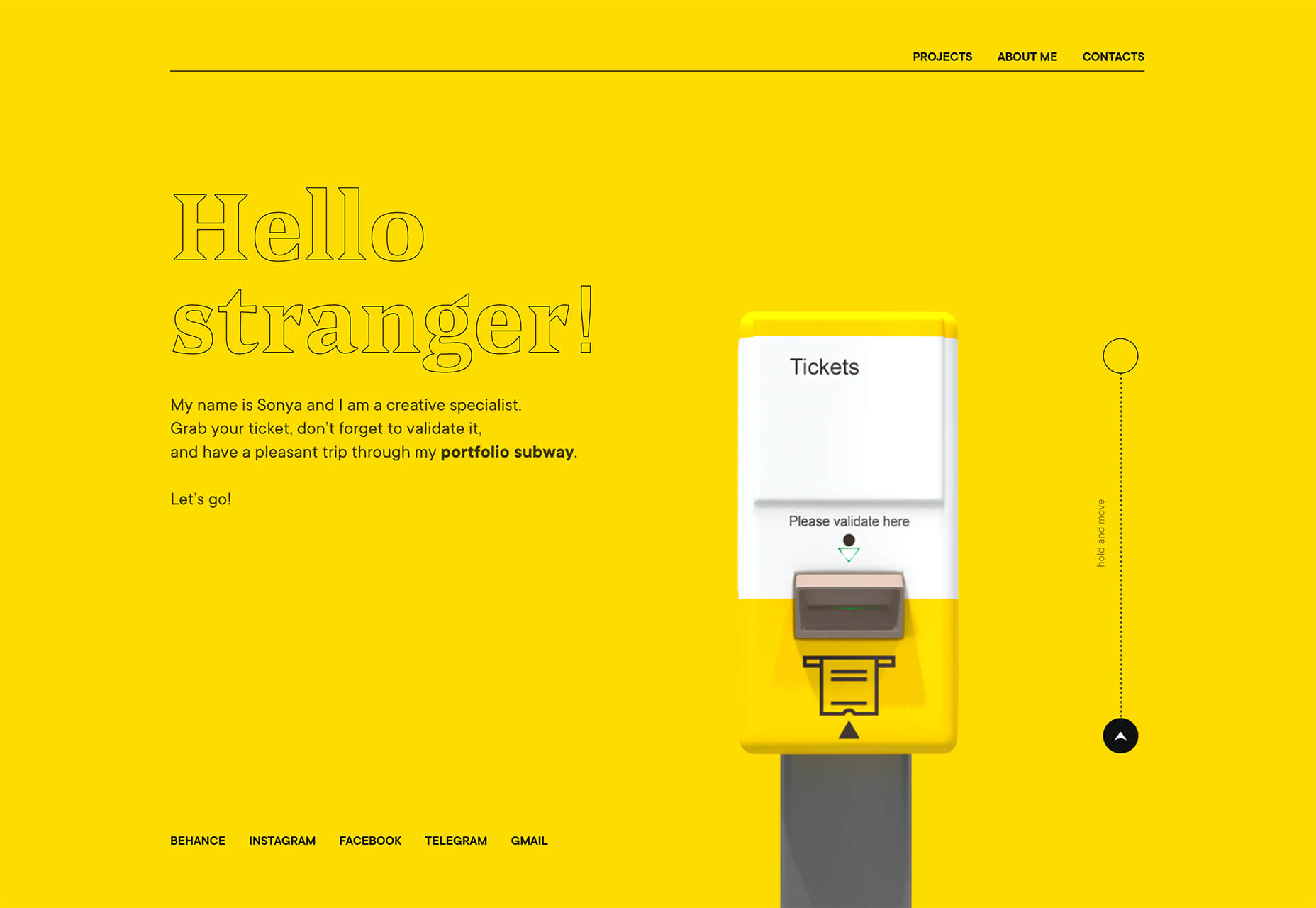
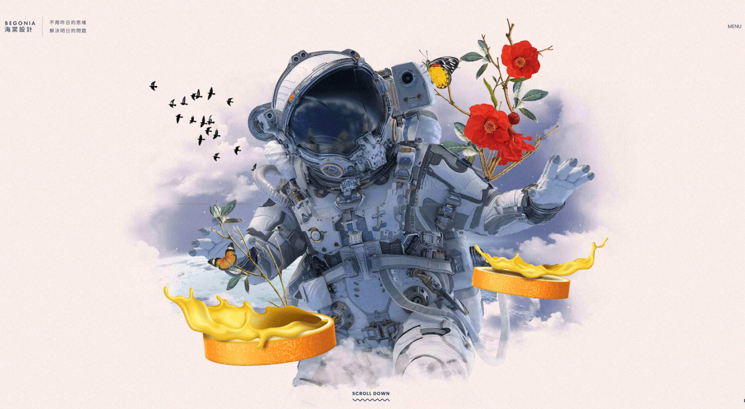
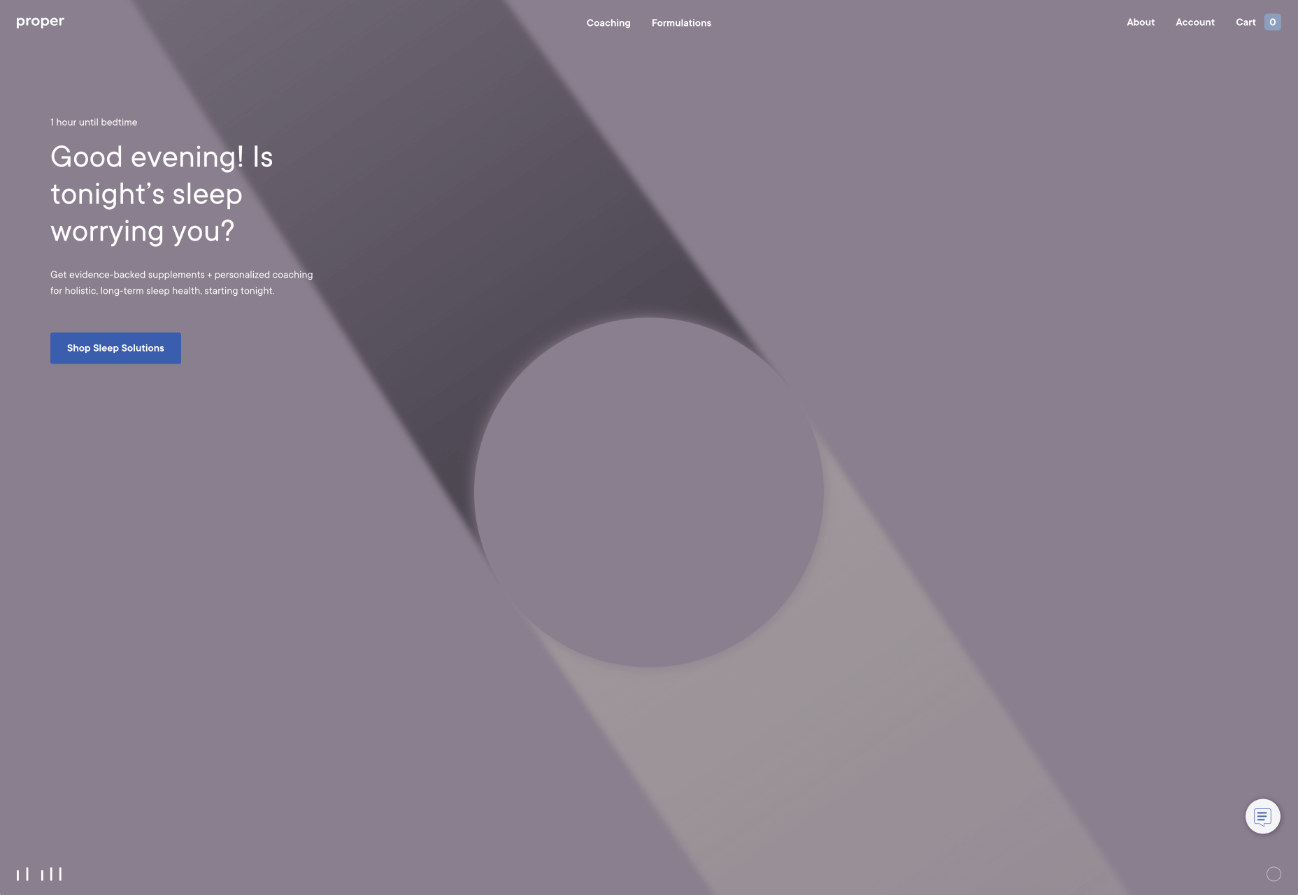
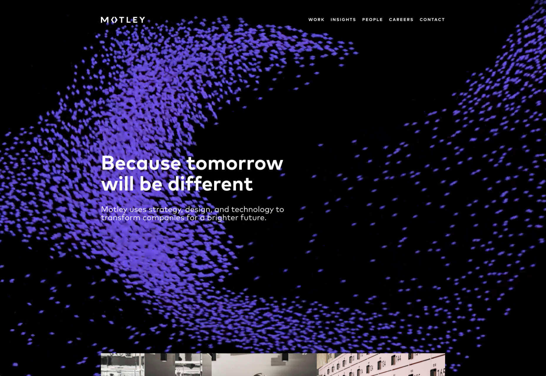
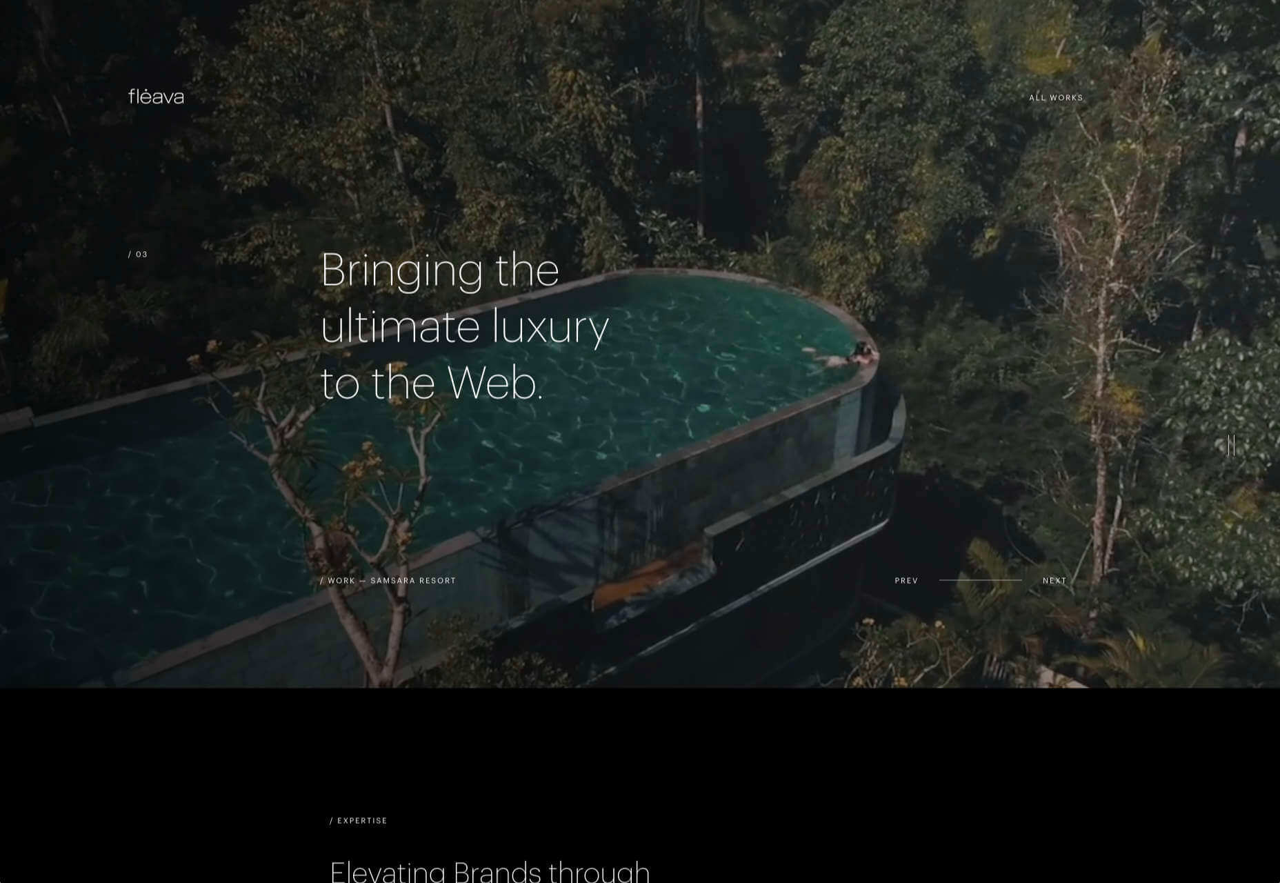
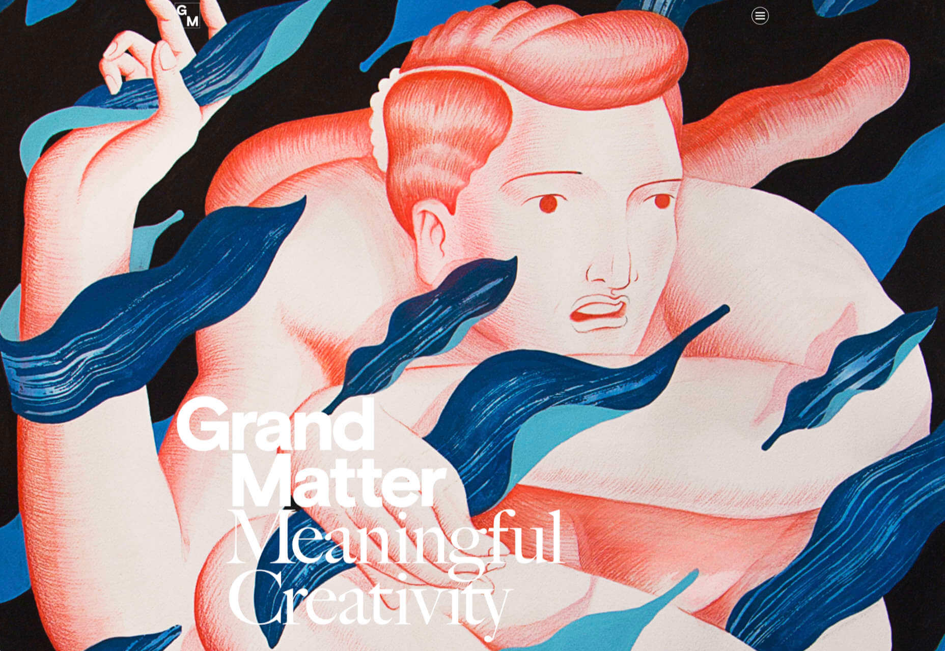
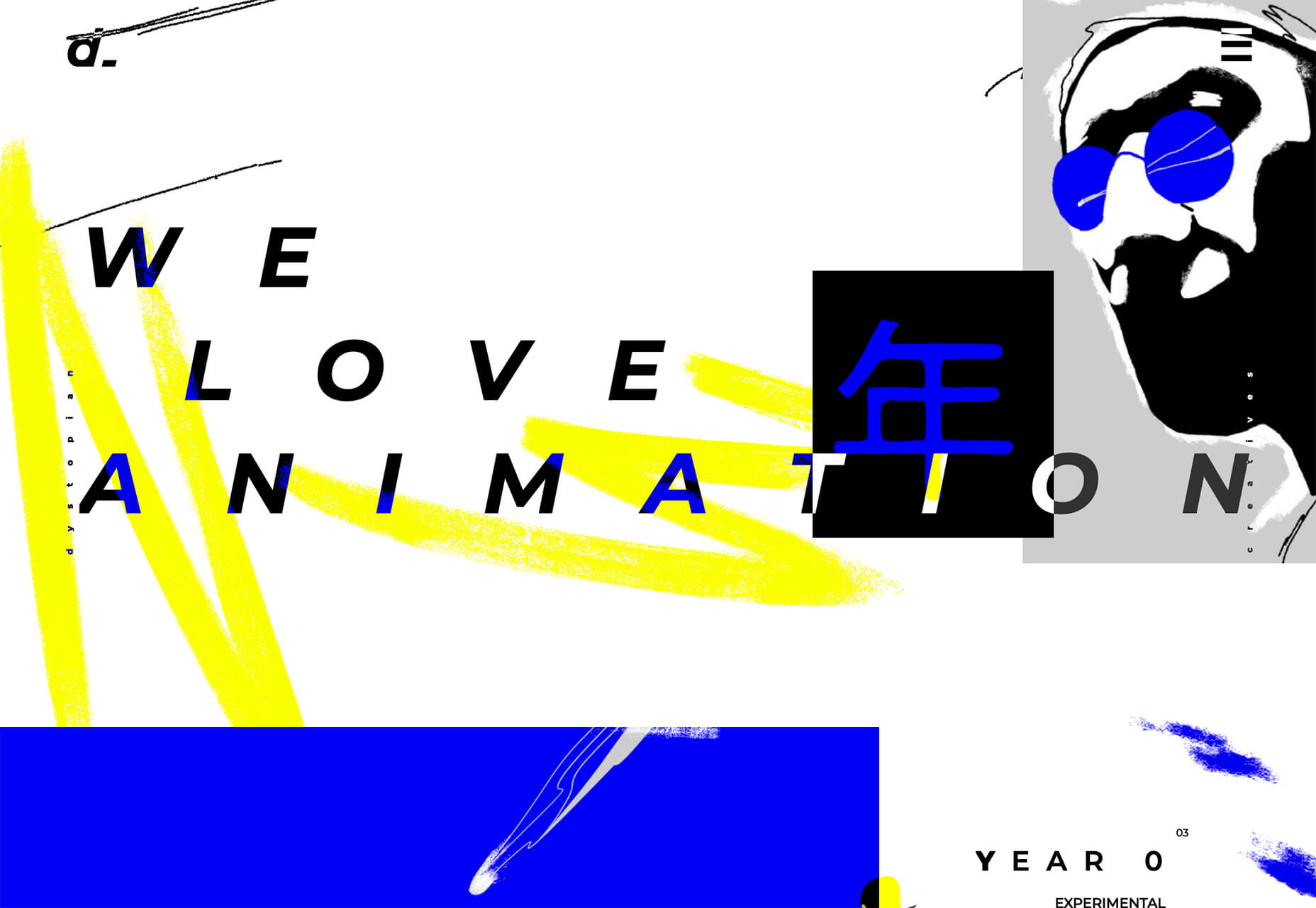
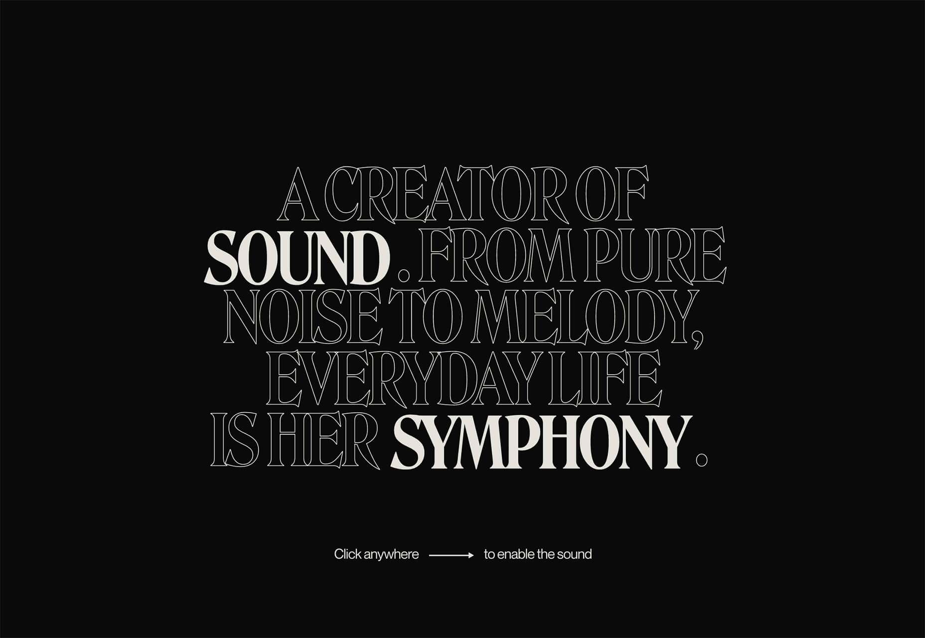
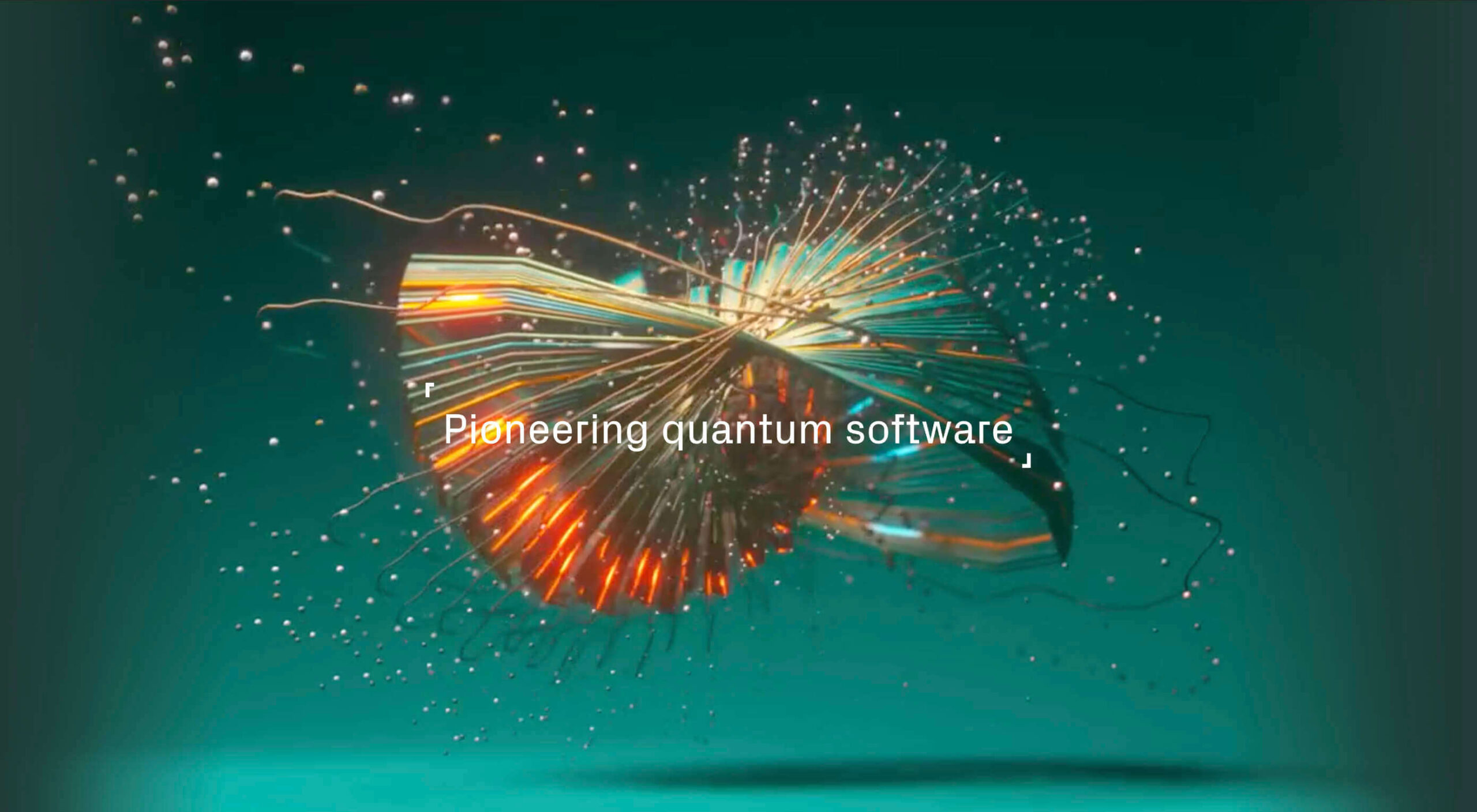
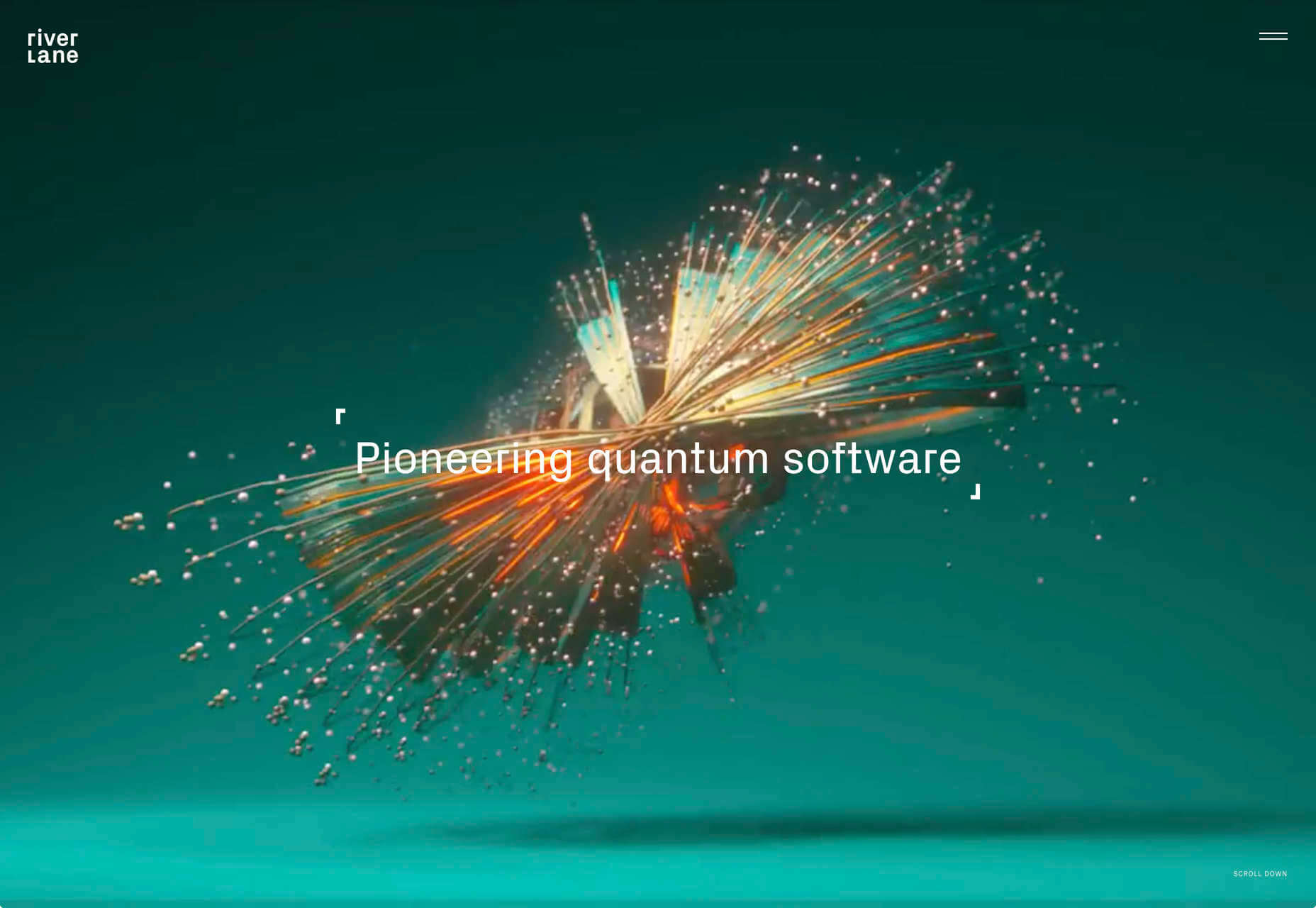
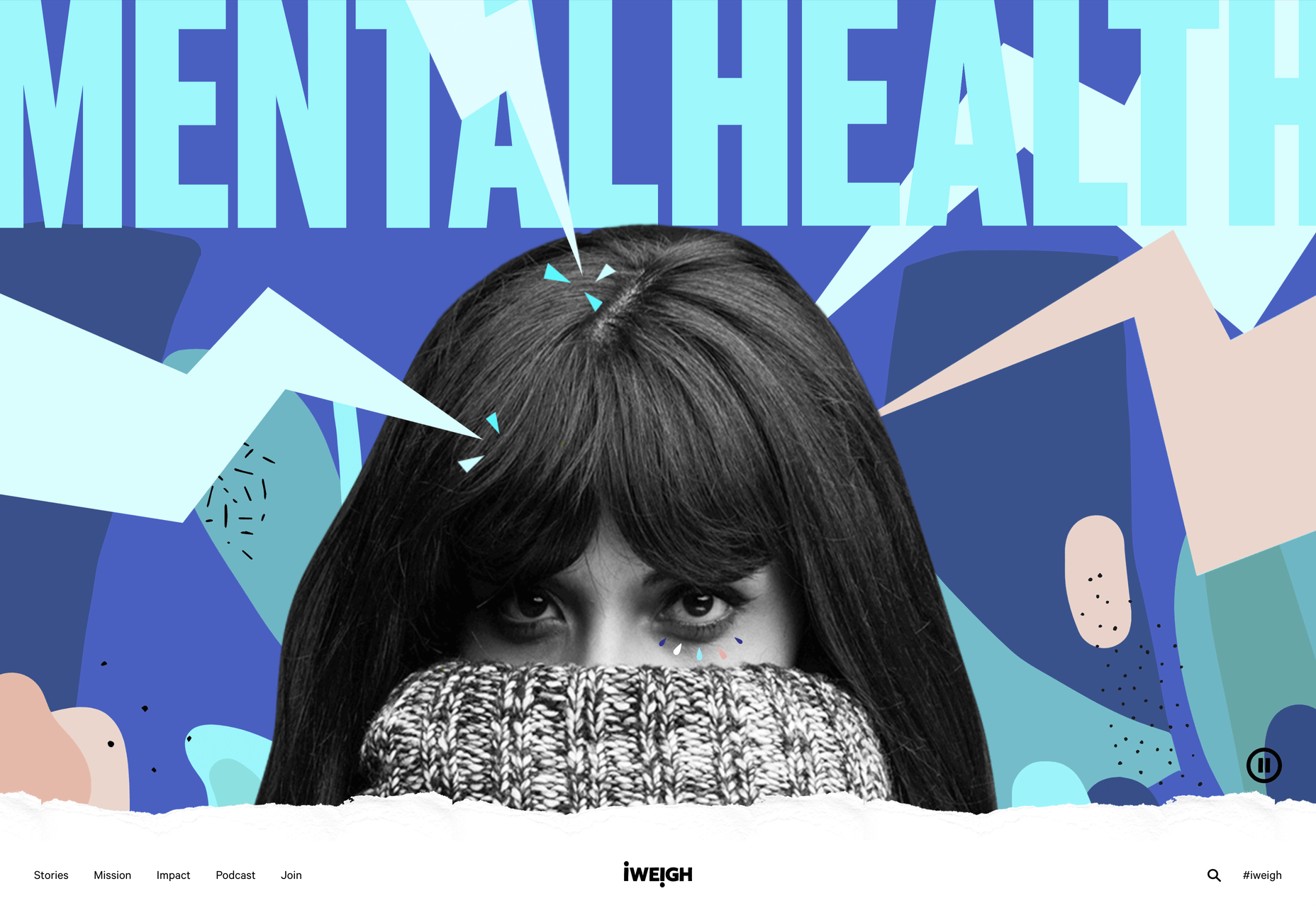
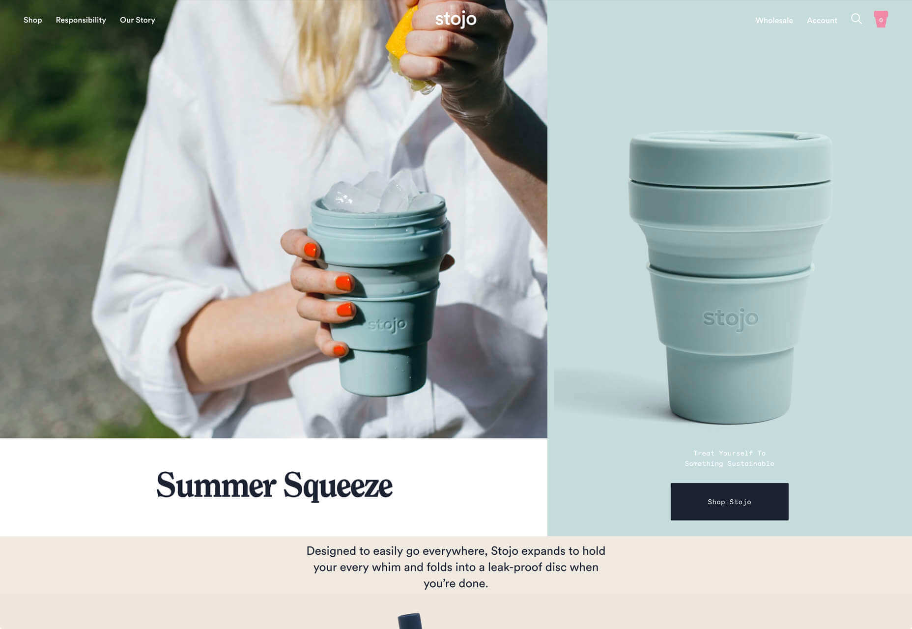
3. Images That Make You Think

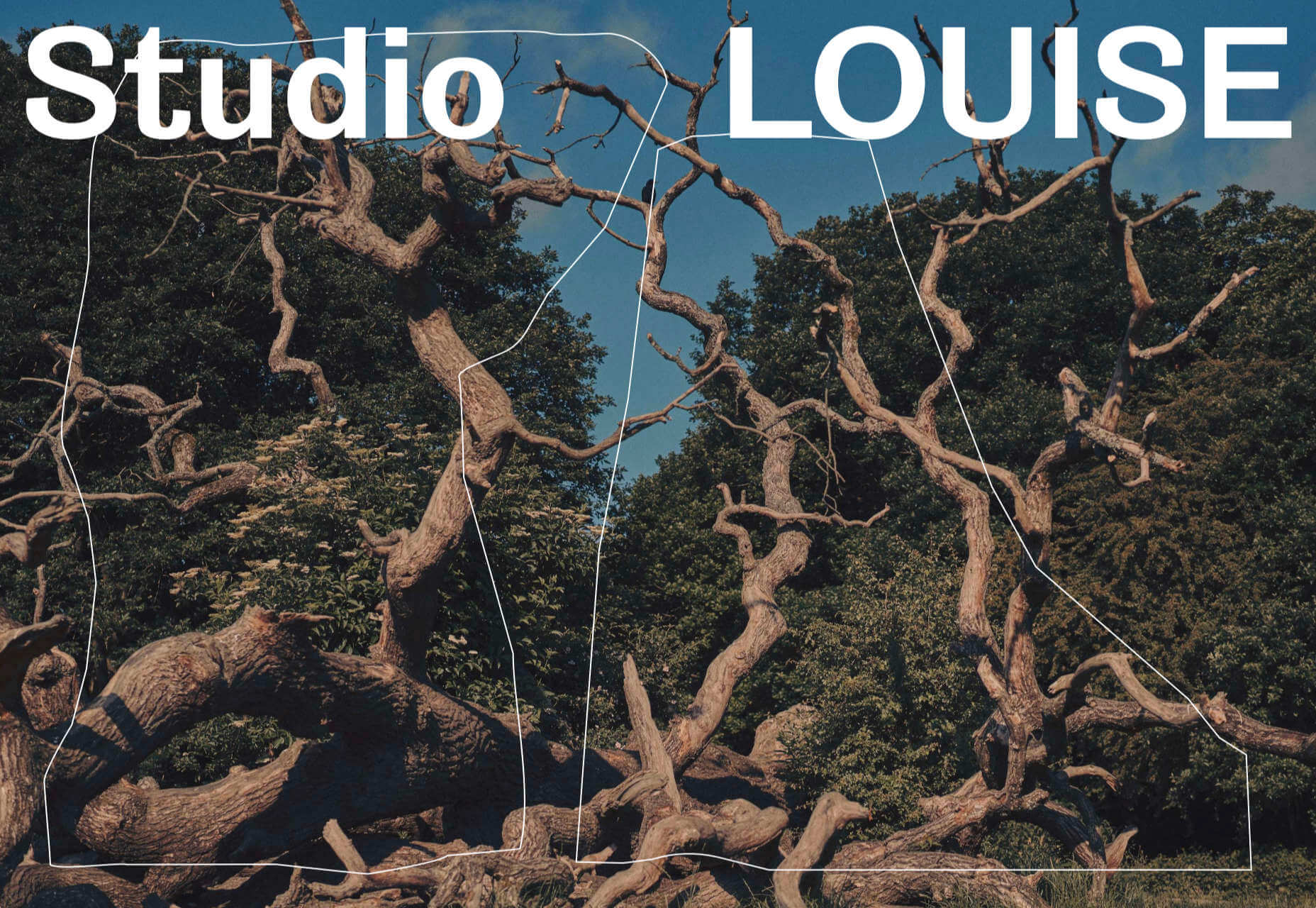
This might be the most visually interesting, and thought-provoking, website design trend we’ve seen in a while. These designs all feature images with a little something different or unusual that make you think.

There are a lot of different ways to do this – marry photographs and illustrations, create imaginary imagery, animations or effects, visual tricks that play on depth perception or create pseudo-3D effects.

The commonality is that the visual is so striking and unusual that website visitors stop and engage with the design. What do the “oddball” visuals mean? What message do they convey? How did they do that?

All of the questions could be associated with this different style of visual representation.

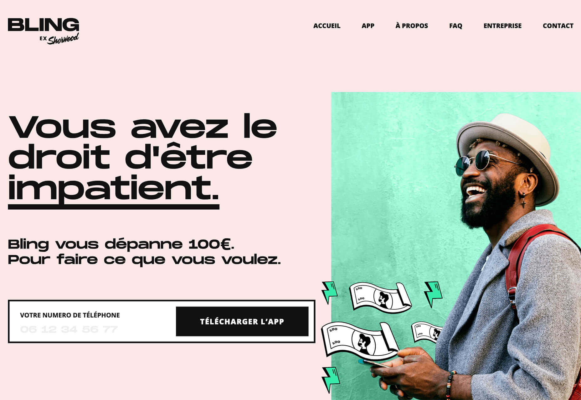
Bling uses a combination of a photo with illustrated animated elements to draw the eye. The yin and yang between reality and fantasy is quickly evident and makes you want to know more. (It doesn’t hurt that the animation uses dollars and lightning.)

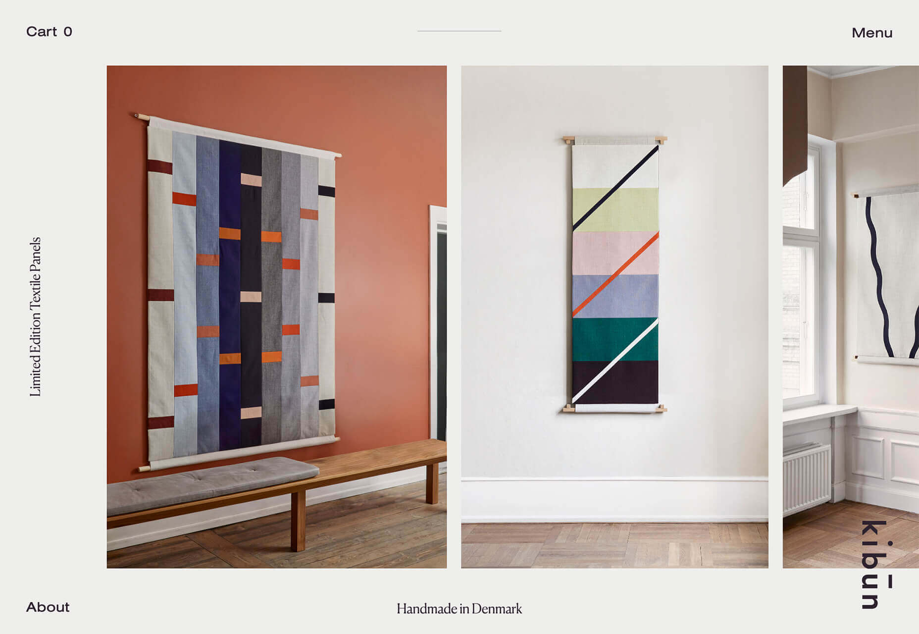
Kibun is interesting because the photo choices create an optical illusion of depth. It matches the content of the design well because the website features artistic textile panels with an artistic design. The illusion is in the angles and coloring of photographs and their placements on the screen. The only downside of this design is that it loses the artistic panache on mobile because the images stack.

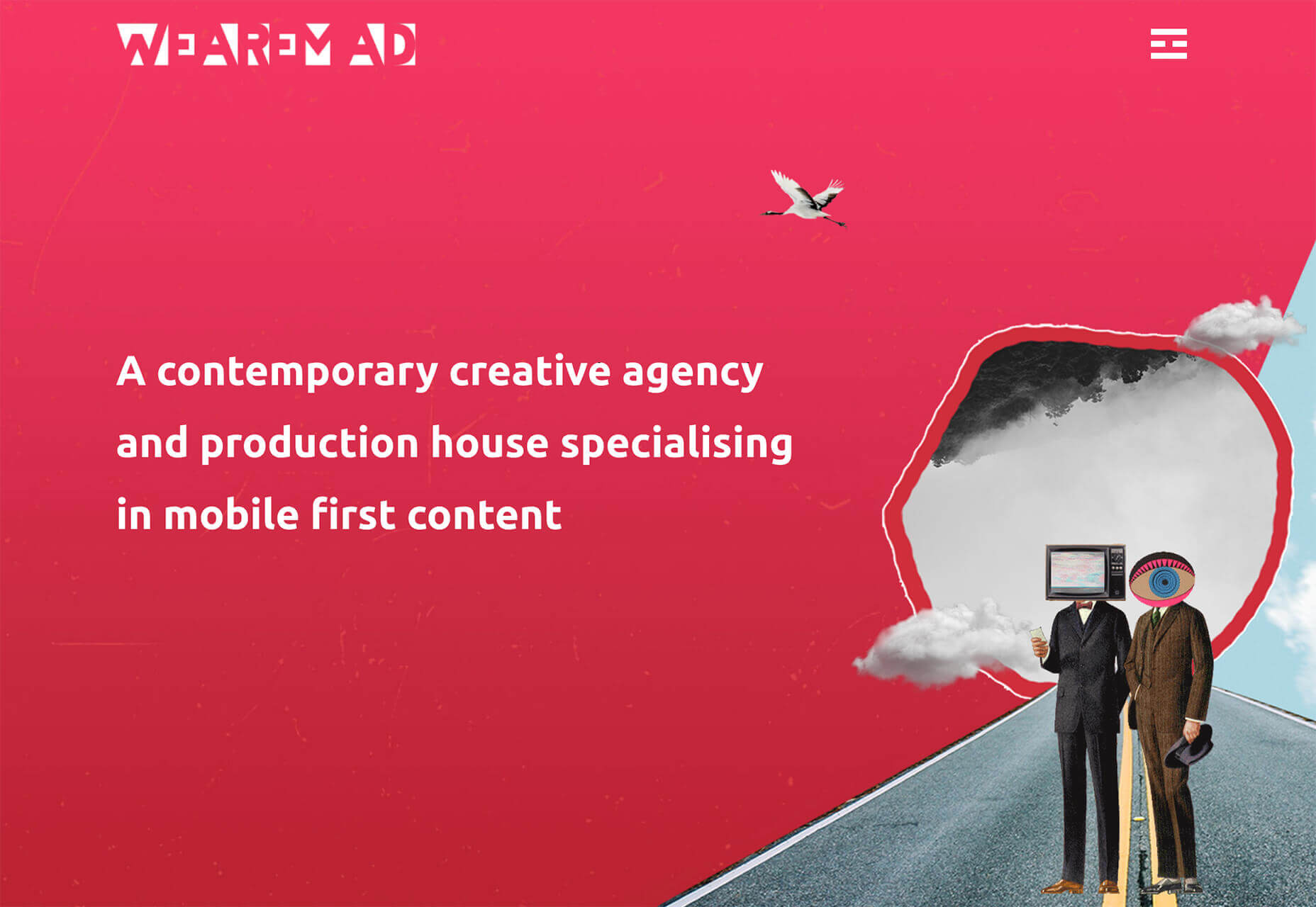
Oddball images can sell. We Are Mad stands out because it uses a contrived image, but doesn’t go oversized with it. The more subtle placement is ideal and arguably more attention-grabbing.

Conclusion

Website design can be a powerful thing, as these trends and examples show. Don’t discredit the power of choices in color, imagery, animation, and text when creating a digital experience. Design can mean a lot of different things depending on the audience as these examples show.

At the same time, these design trends are powerful and meaningful. They provide context into our world, our time, and our feelings. Don’t be afraid to experiment and make a statement with your design work. Just remember to keep in mind all potential impacts (positive and negative) before taking the project live.

Source


Source de l’article sur Webdesignerdepot

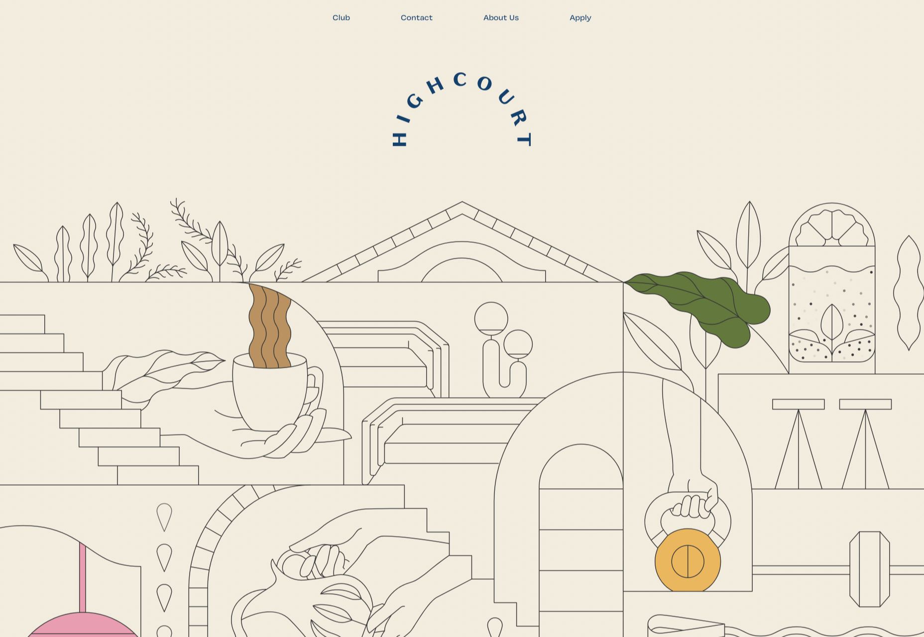
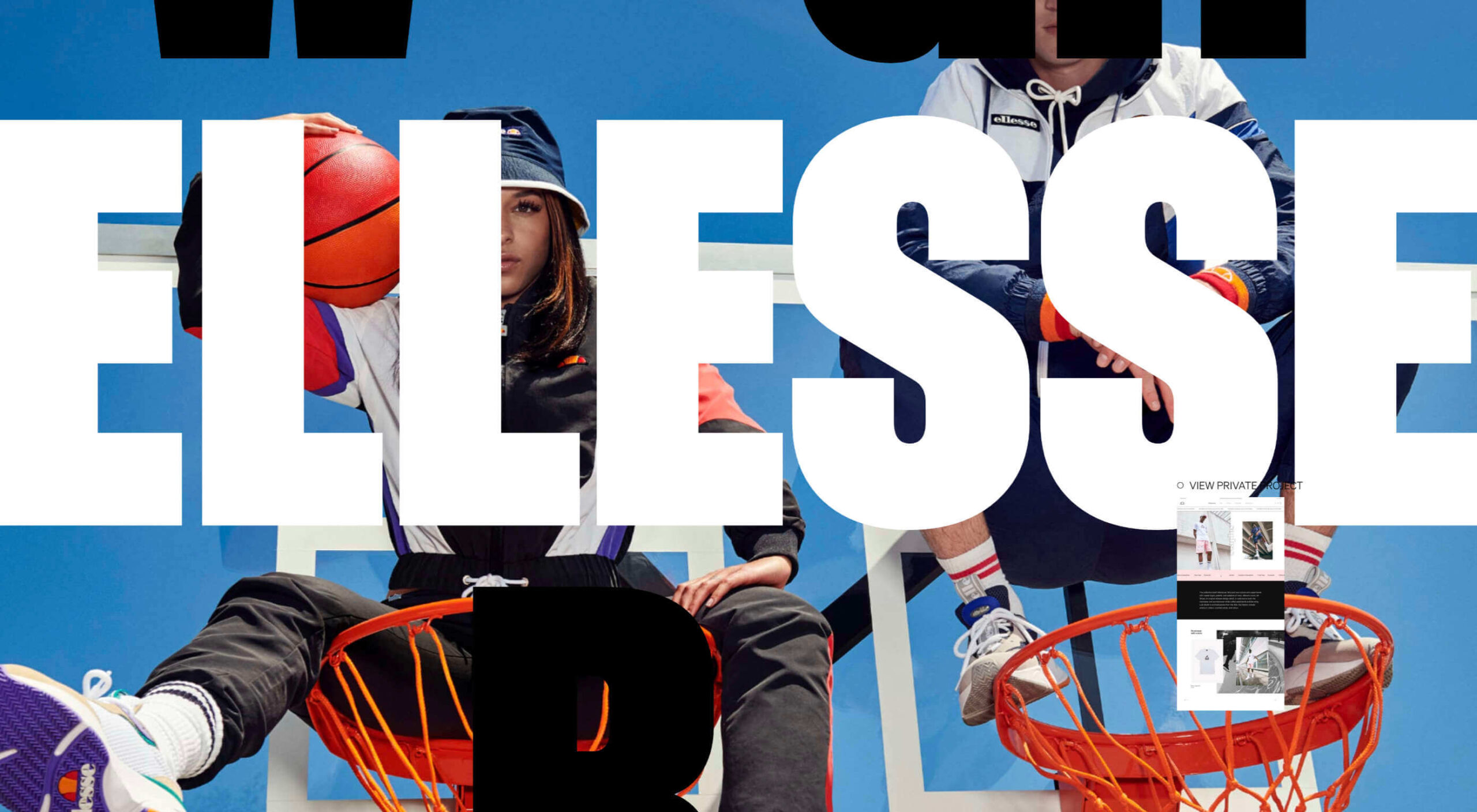
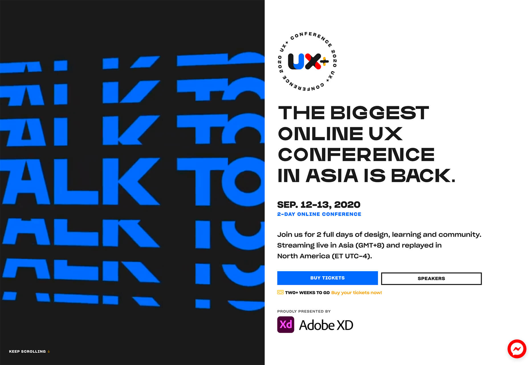
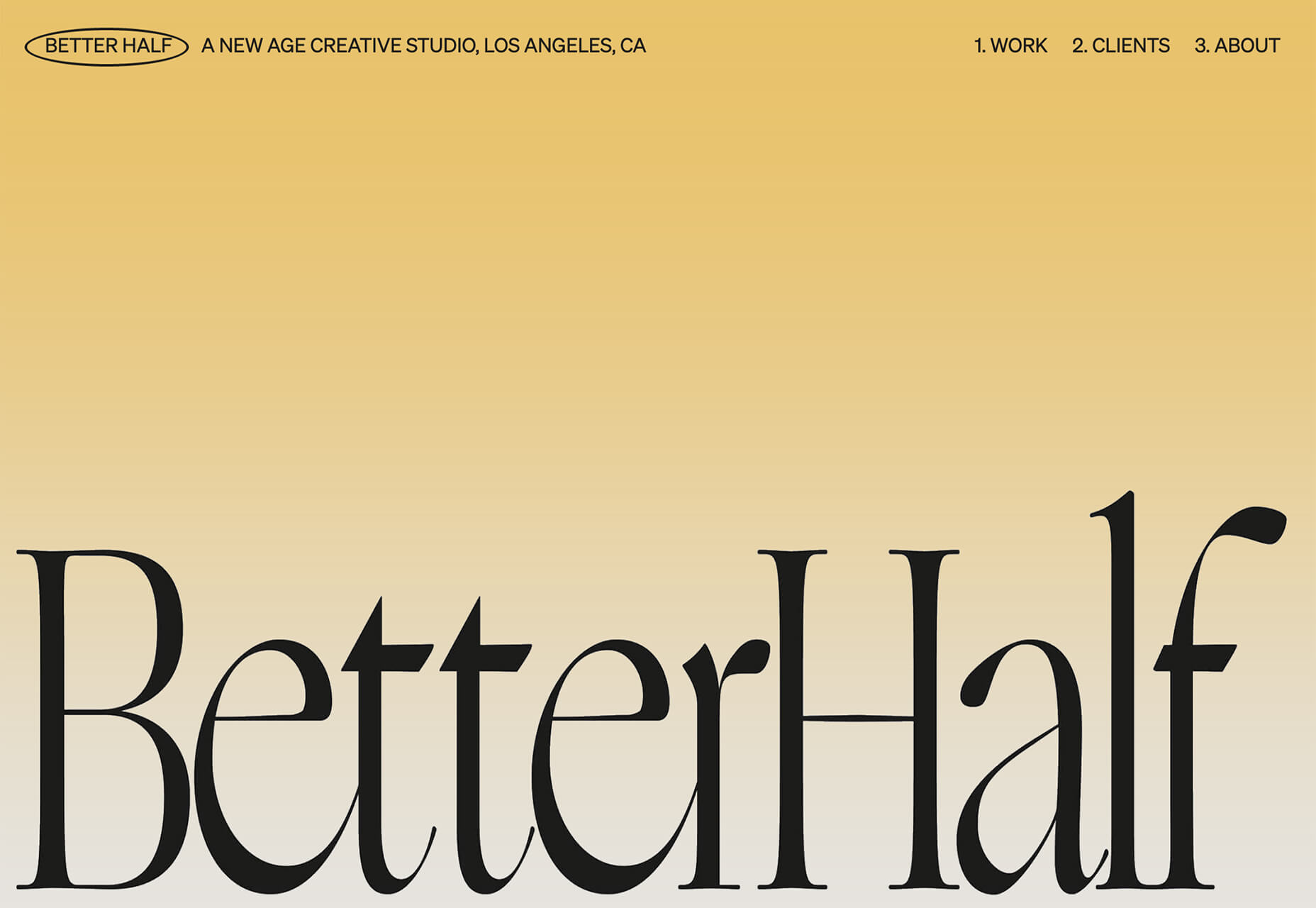
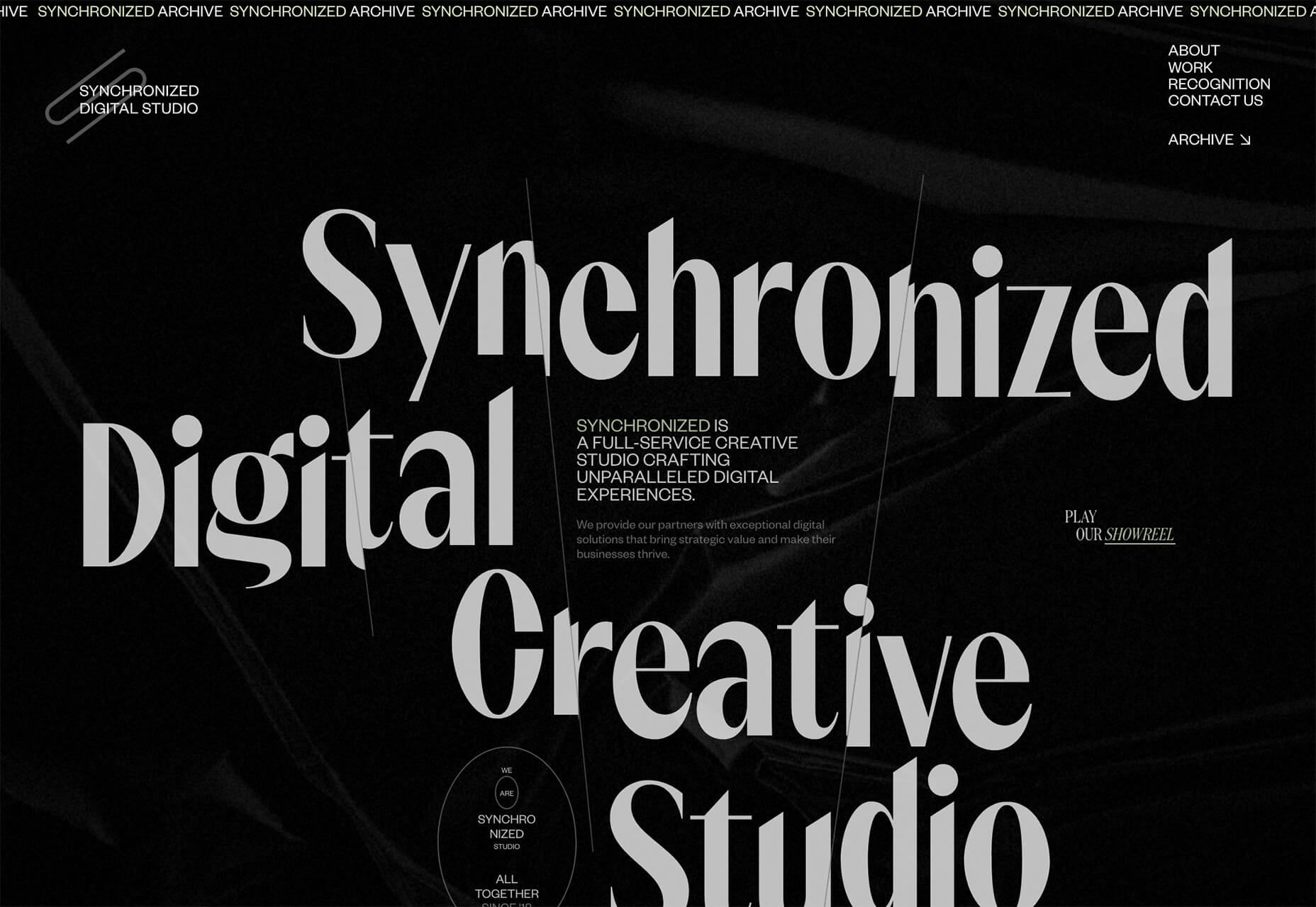
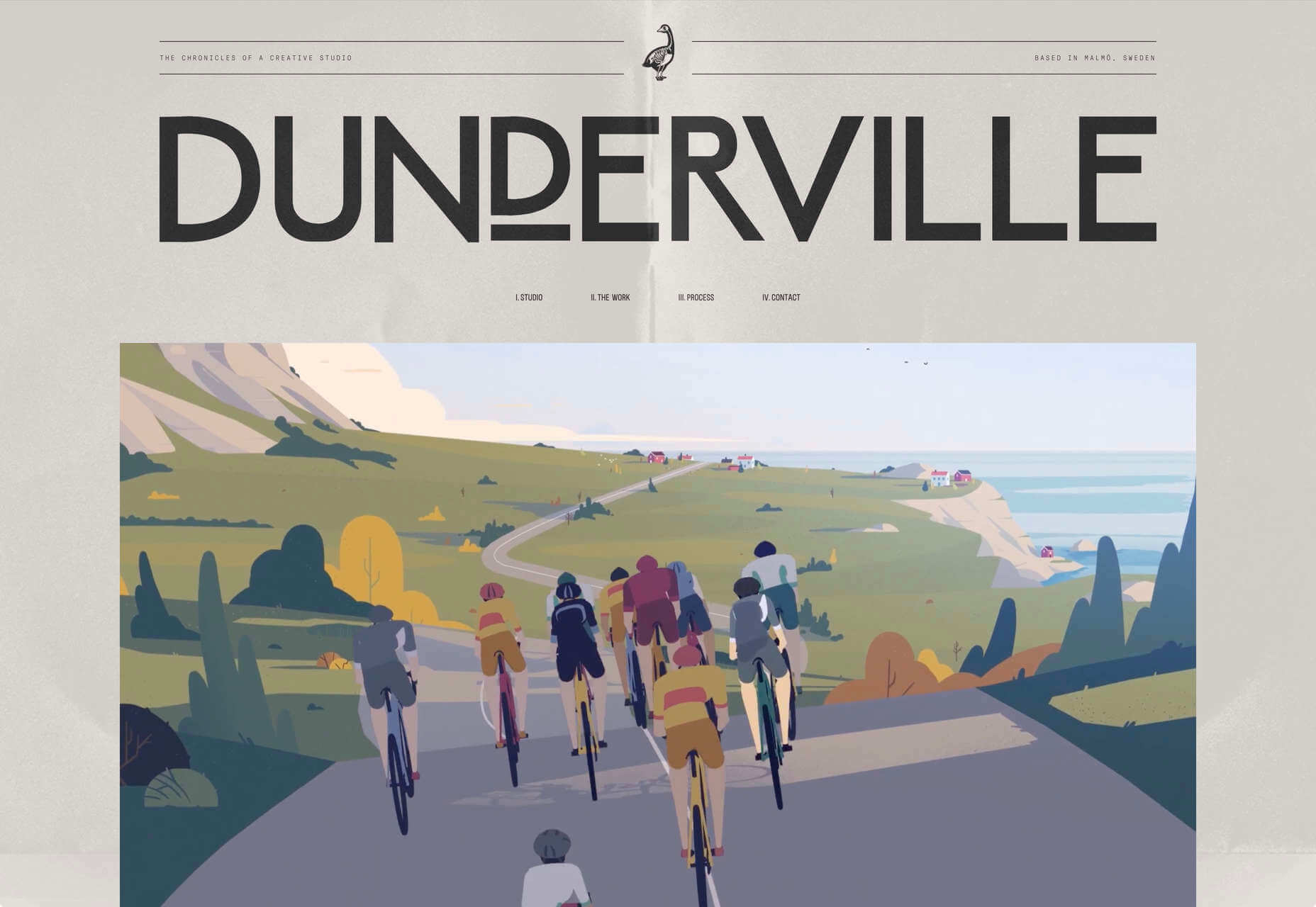
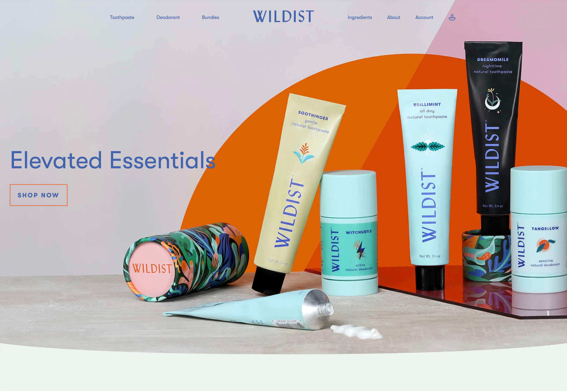
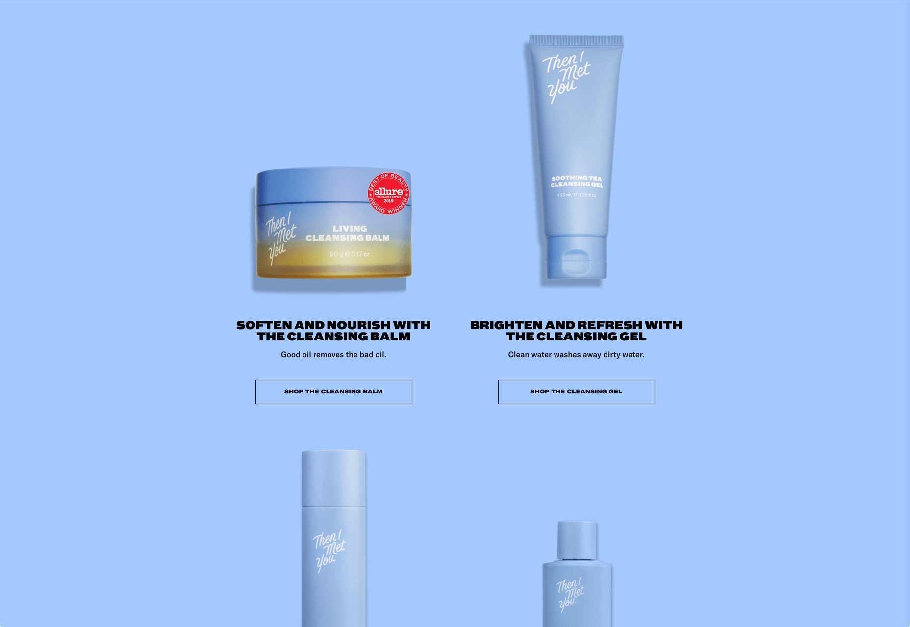
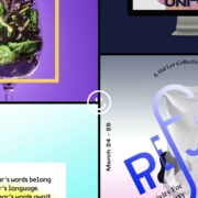
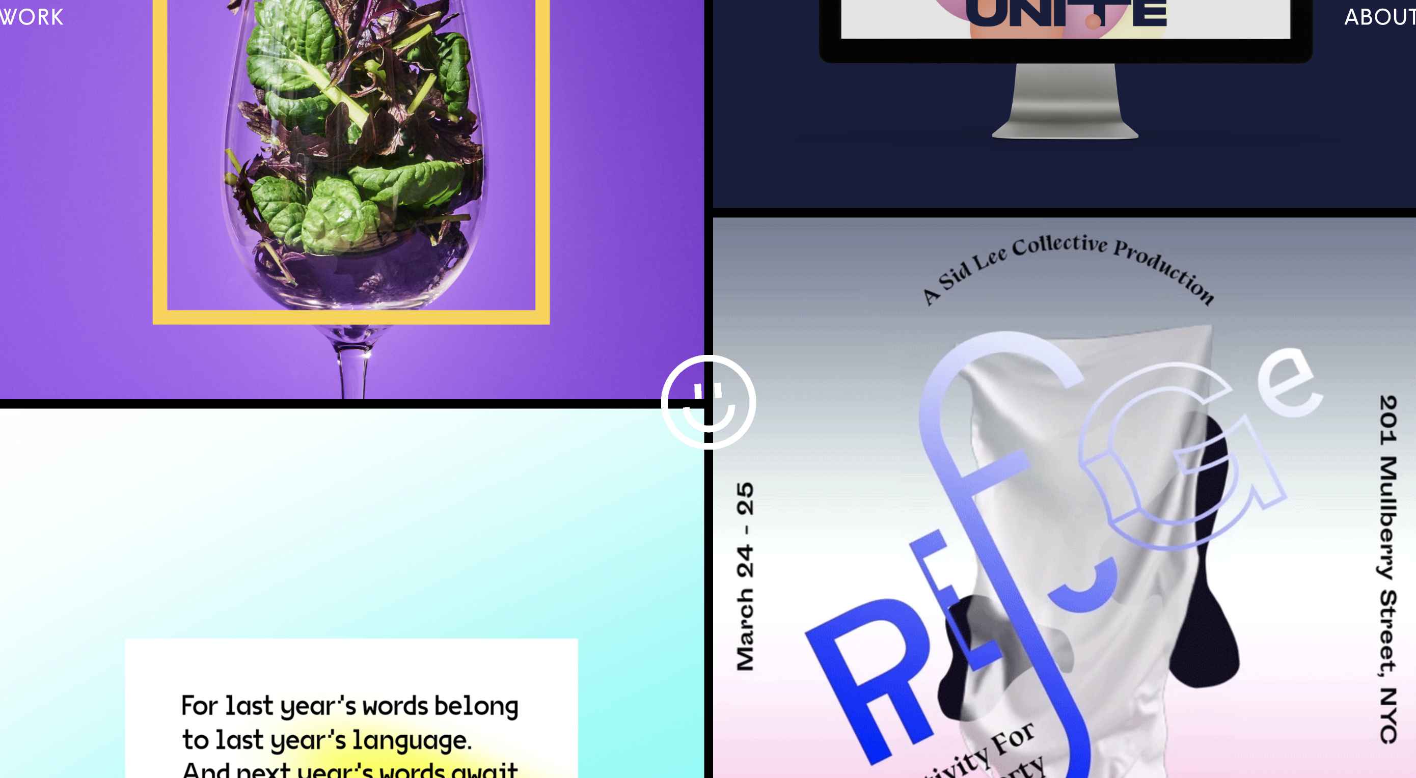
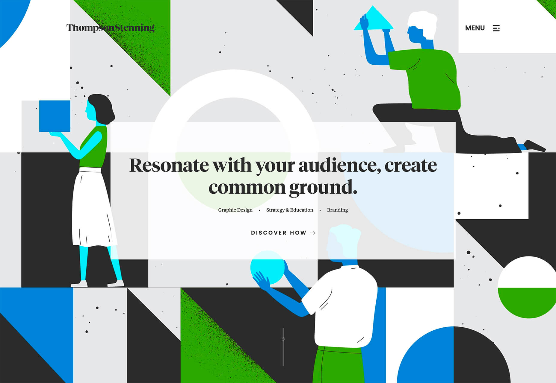
This month we’re going big and bold. Oversized type, strong colors, in-your-face layouts, and little touches of playfulness exude confidence and make a statement. There are some quieter moments too, with thoughtful illustration and more gentle use of color. Animation still features strongly in the details, with circles proving popular in rollover effects. Enjoy.
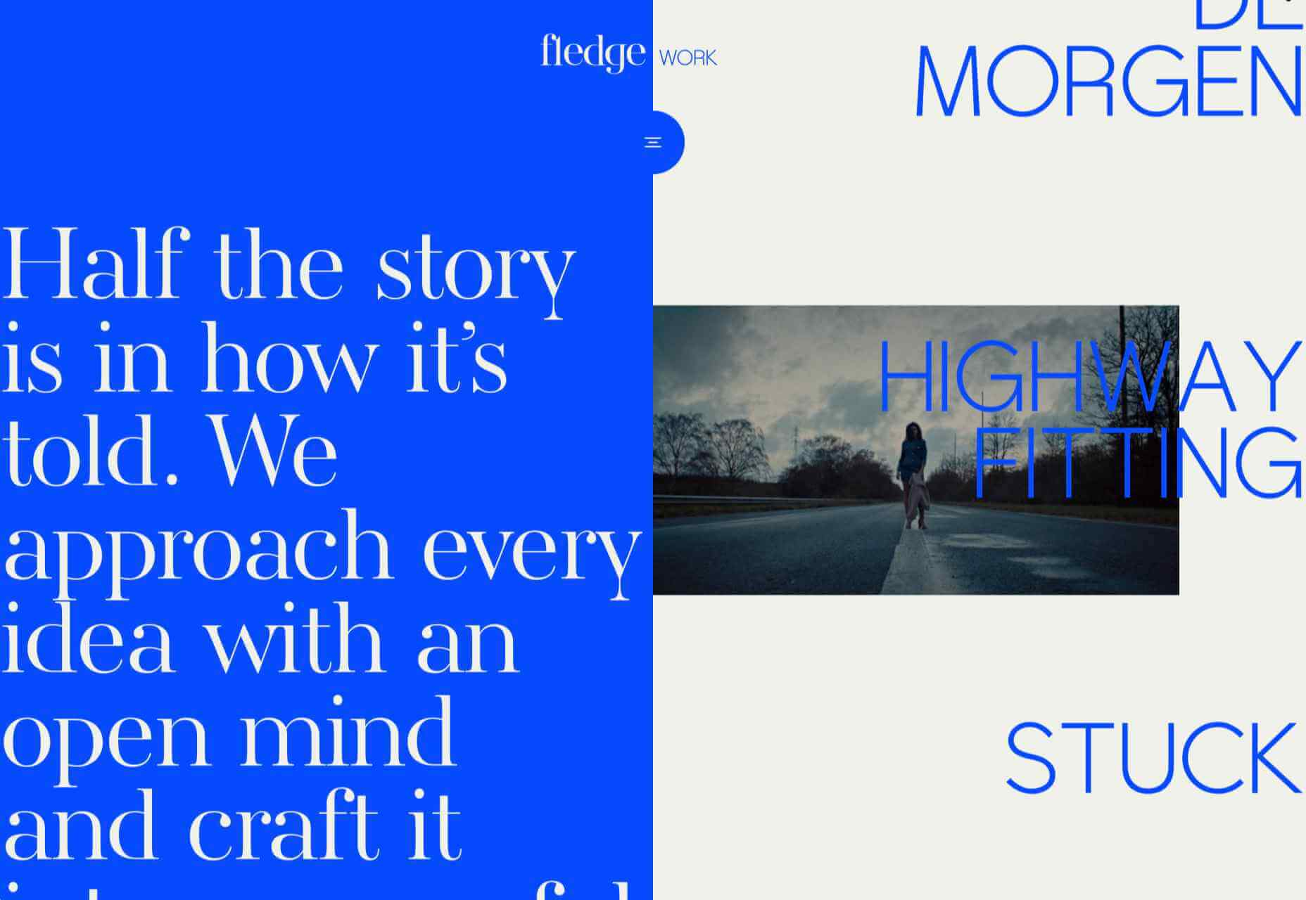
Fledge

Fledge is a film production company based in Belgium. Their site uses split screen with looped text scrolling in opposite directions on each side. A minimal color palette adds extra punch.

2ºC Earth

2ºC Earth is a beautiful and also scary website that explores the effects of rising global temperatures by focusing on 5 specific locations. Some stunning photography and subtle use of sound take you to these locations as they are now, then show what they could become. The experience is both immersive and unsettling.

pill&pillow

Unlike many digital studios who use the design of their own site to demonstrate their skills, pill&pillow have taken a very basic approach. It is very self-assured, and it works. Random colored strikethroughs on visited links add a nice touch of playfulness.

Ferrum Pipe

Metal fencing is not the most interesting of subjects to most of us, but this site for Ferrum Pipe is surprisingly appealing. On scroll animation and some off-grid image layout brings life to what would normally be, well, a bit dull.

Lucciano’s

With its focus on mouth-watering photography and videography, the site for gelato makers Luccianos, will have you checking your freezer for any leftover salted caramel or stracciatella. The zoom on rollover is a nice effect, and the use of circles with ice cream color backgrounds for rollover text reinforces the gelato theme.

Björn Wieland

UI designer and artist Björn Wieland has created a portfolio site with a simple, relaxed feel and pleasing transitions. It feels simple, but behind the scenes there is quite a lot going on.

Coloursmith

Coloursmith is a tool from Taubmans paint company which allows you to create a custom paint color by uploading a photo. You name your color and can add a story, then you order a test pot. colors are presented well, in different light and with suggestions for complementary colors.

Finn 

Finn make diet supplements for dogs. Their site is fun, modern and clean. Bright colors and an illustration that manages to be cute but not too cutesy make a bold impression.

Highcourt

Highcourt is a new private membership leisure club set to open in New York in spring 2021. Dark blue text on cream gives a softer edge than black on white. The background color changes on scroll are pleasing, and simple line illustrations with occasional gentle animation add to the overall sense of calm.

Elevence

Elevence is the company of product designer Kazuo Kobayashi. The site uses only black, white, and grays allowing the color photos of his work to really stand out. Circular thumbnails are used to good effect, appearing on rollover.

Playtype

Playtype is a Danish type foundry whose site seems to fit their name. It has a playful, almost chaotic feel, with bright blocks of color and occasional animation. Some pretty nice typefaces too.

Neri Oxman 

Neri Oxman is many things: architect, scientist, engineer, inventor, and designer. This site feels like a really beautiful coffee table art book that you want to pick up and look through every so often. There are some nice details too, like the lens ‘reveal’ effect on rollover in a few places.

Modern Recovery

Modern Recovery is a project by sobriety program Tempest. The interactive illustration encourages exploration, to discover different stages of recovery from alcohol abuse and insights from others who have followed the program. The aim is to change our social attitudes towards alcohol and not drinking.

Bliss

Have you clicked on the link to visit Bliss Search? Yes, the link is correct, no you haven’t been redirected to a Google search results page. This Australian digital marketing company have copied the appearance of different well-known sites for their pages — Google, Instagram, LinkedIn, Tinder all make an appearance. The humor in this approach shows confidence, and makes it memorable.

Miilkiina

Miilkiina describe themselves as a digital media space and creative agency. Punchy typography, with great use of blackletter, well chosen images, and a strong header video give this home page an in-your-face edge.

Ukrainian Railroad Ladies

Ukrainian Railroad Ladies is a book by photographer Sasha Maslov. Its subjects are the, mostly, women who work as traffic controllers and safety officers at railroad crossings in Ukraine. It’s a simple site — outsized type, black and white, basic image grid, only very brief text — but it is effective in its simplicity.

Una Europa

Una Europa is an alliance of 8 European universities with the aim of offering joint research and study programs. There is some playful scrolling behavior with geometric shapes moving and changing color that enlivens what could otherwise be quite a dry site.

Bureau Cool

There’s a bit of an old school feel about the site of digital design studio Bureau Cool, with its recent traffic animation. The changing backgrounds on scroll are a nice touch.

Gridspace

Gridspace is a multimedia entertainment studio based in Montreal, and their website is a visual feast. Lots of movement, lots of video, some good use of sideways scrolling.

Nolii

Nolii make cases and accessories for iPhone that work together. The sorbet color palette complements the product colors and the block layout provides a visual reflection of the interlocking of the different products.

Source


Source de l’article sur Webdesignerdepot

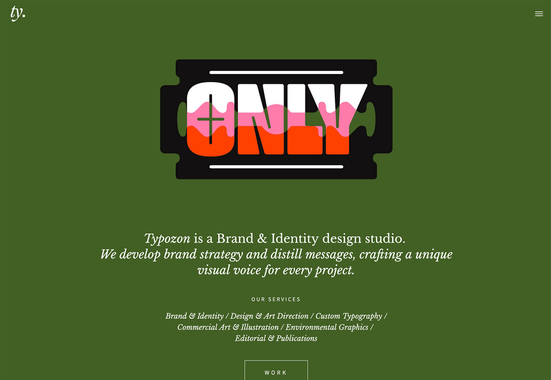
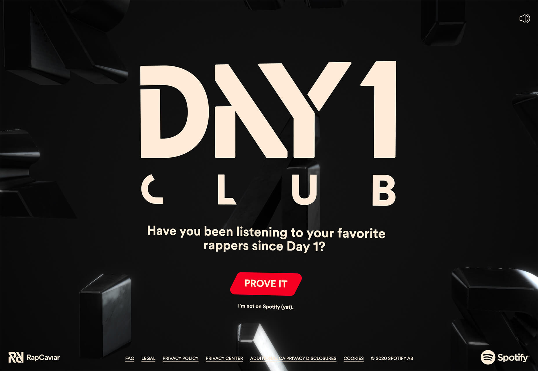
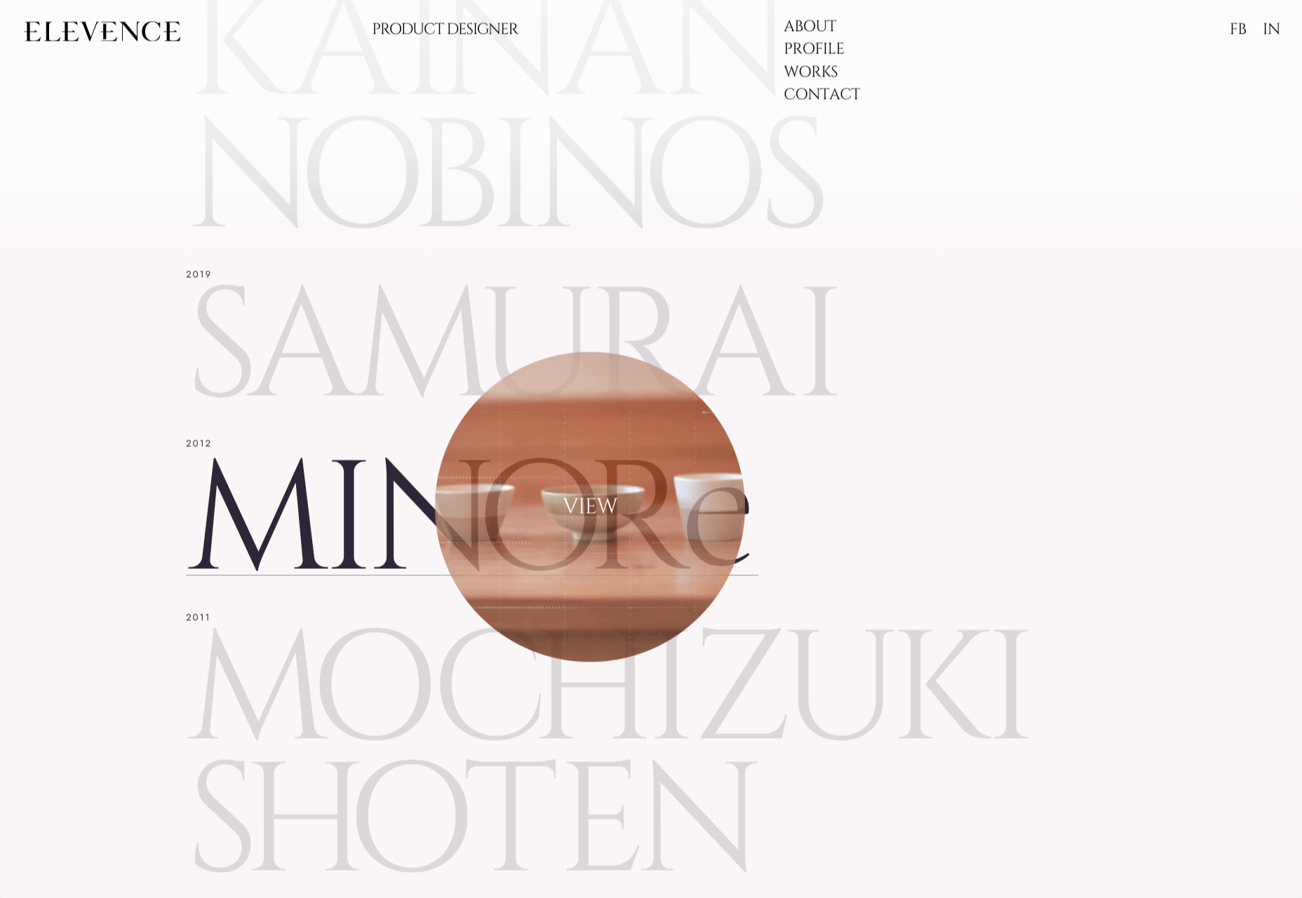
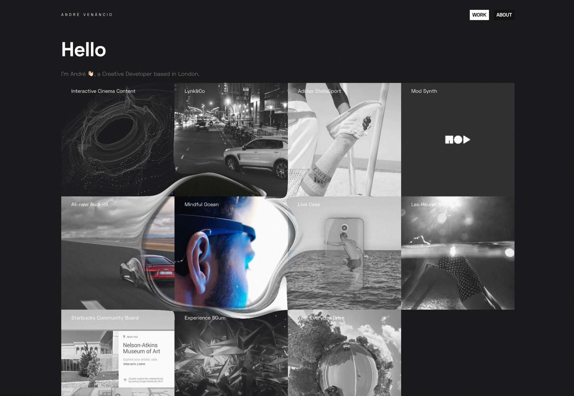
In this month’s collection of the freshest web designs from the last four weeks the dominant trend is attention to detail.

You’ll find plenty of animation, in fact, almost every one of these sites uses animation to a greater or lesser degree. Let’s dive in:

Globekit

Globekit is a tool that allows developers to quickly create animated and interactive globes and embed them on web pages. Its site features some exceptional 3D animation.

Yolélé

Yolélé is food company built around fonio, a West African super grain. Its site features a great page transition, and the landing page carousel is one of the few examples of horizontal scrolling we’ve seen work well.

Begonia

Begonia is a Taiwanese design agency with an impressive client list. Its site features animated typography, a super bold splash screen, and some surreal artwork. There’s so much here, it’s almost overwhelming.

Next Big Thing

Next Big Thing is an agency supporting the full lifecycle of start-ups. Its site is clearly targeting tech-based clients, and there are some lovely transitions. The masked hero transition on scroll is delightful.

Proper

We all have every reason for the odd sleepless night right now, but regular sleep is essential for our health. Proper offers sleep solutions from coaching to supplements on its subtly shaded site.

The Oyster & Fish House

The site for The Oyster & Fish House is packed with some delightful details. We love the subtle wave textures, the photography has a nostalgic feel, and the typography is perfectly sophisticated.

Drink Sustainably

Fat Tire produces America’s first certified carbon neutral beer, and Drink Sustainably has been produced to explain the concept. We love the vintage advertising style of the artwork.

Treaty

It seems like every week there’s a new CBD brand launching. What we like about Treaty’s site is the slick fullscreen video, the inclusion of botanical illustrations, and the really brave use of whitespace.

Studio Louise

You’re greeted on Studio Louise’s site by a shot of trees with two random shapes; as you scroll the shapes morph and relocate to the top right corner, and you suddenly realize they’re an “S” and an “L”, cue: smiles.

Wünder

Another site for a CBD product, this time a vibrantly branded sparkling beverage. Wünder’s site features enticing photography, an on-trend color palette, and credible typography.

Seal + Co

Some professions lend themselves to exciting, aspirational sites, and some companies are accountancy firms. However Seal + Co’s site creates the impression of a modern, capable, and imaginative firm.

DocSpo

There is some lovely, 3D animation on the DocSpo site. The company is a Swedish startup enabling digital business proposals, and its site is bold, Appleesque, and packed with nice details.

Motley

We never get tired of particle effects, like the one employed by Finland-based agency Motley. There’s some superb work in the portfolio, and it’s great to see a blog using Old Master paintings for thumbnails.

The Ornamental

The Ornamental sources leather goods for wealthy individuals, and luxury lifestyle firms. Its site is minimal, with some drool-worthy handbags. We particularly liked the image zoom hover effect in the store.

G.F Smith

G.F Smith is one of the world’s leading paper suppliers. Its redesigned site is much simpler than its last, with some lovely touches, like the varied paper photography when you hover over product thumbnails.

Raters

Raters is a new app that lets you discover new movies via reviews from people you trust. This simple site does an exceptional job of previewing the app, across multiple device sizes.

Fleava

There’s a whole heap of nice interactive details on Fleava’s site, from the cursor-following circles when hovering over links, to the way the thumbnails are squeezed when dragging through projects.

The Story of Babushka

A babushka doll is a traditional Russian toy, made up of dolls, nested inside dolls. The Story of Babushka uses the toy as a metaphor for growth in this children’s book, and the accompanying animated website.

Grand Matter

After the uniformity of the 2010s, there are a wealth of illustration styles being explored across the web. Grand Matter is an artist agency that represents some amazing talent, and we love the illustration they chose themselves.

Nathan Young

Nathan Young’s site does exactly what it needs to do: Providing case studies for his design work. The fade-out on scroll is a simple device that elevates the whole site experience.

Source


Source de l’article sur Webdesignerdepot

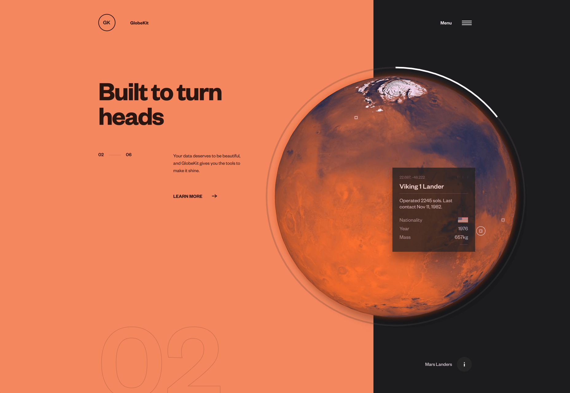
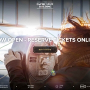
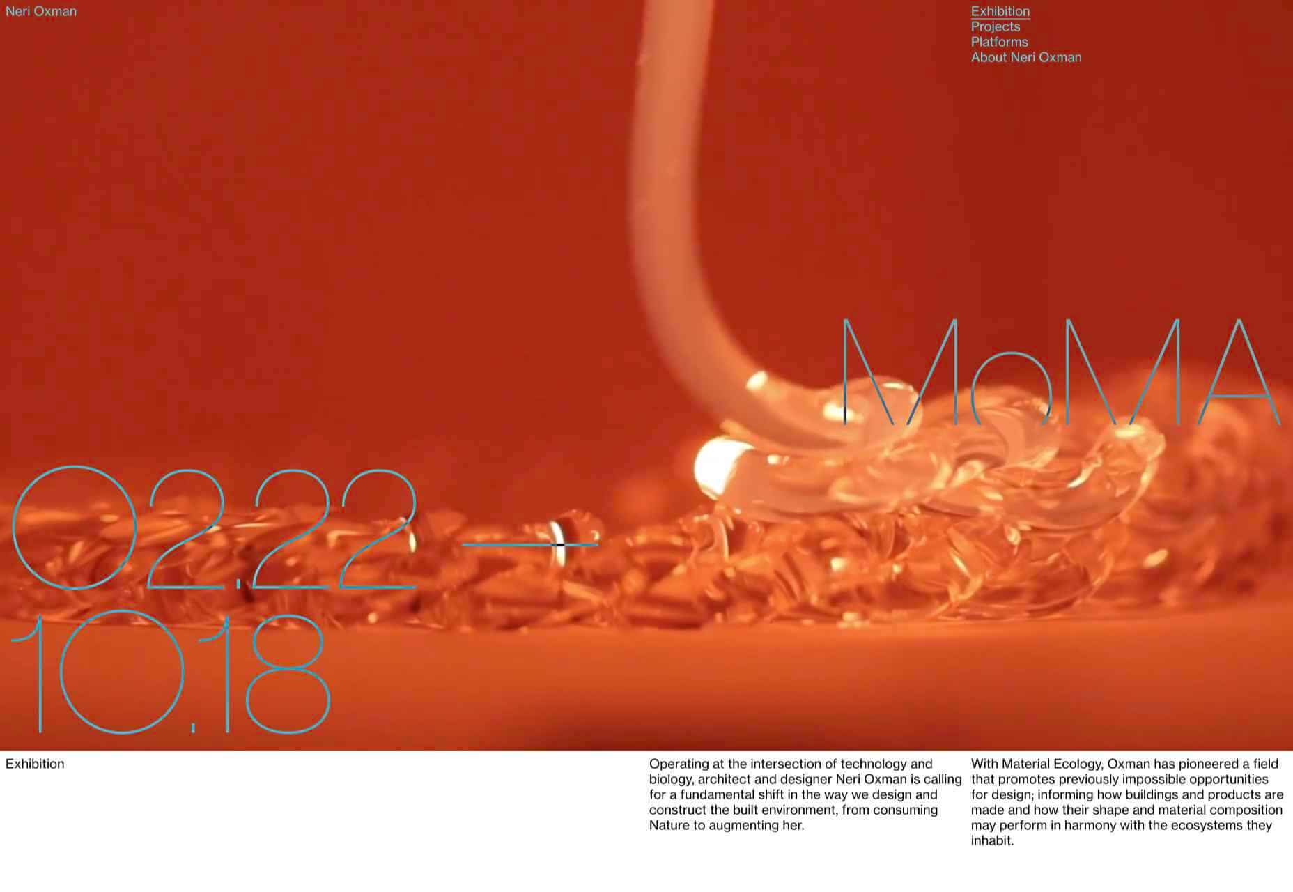
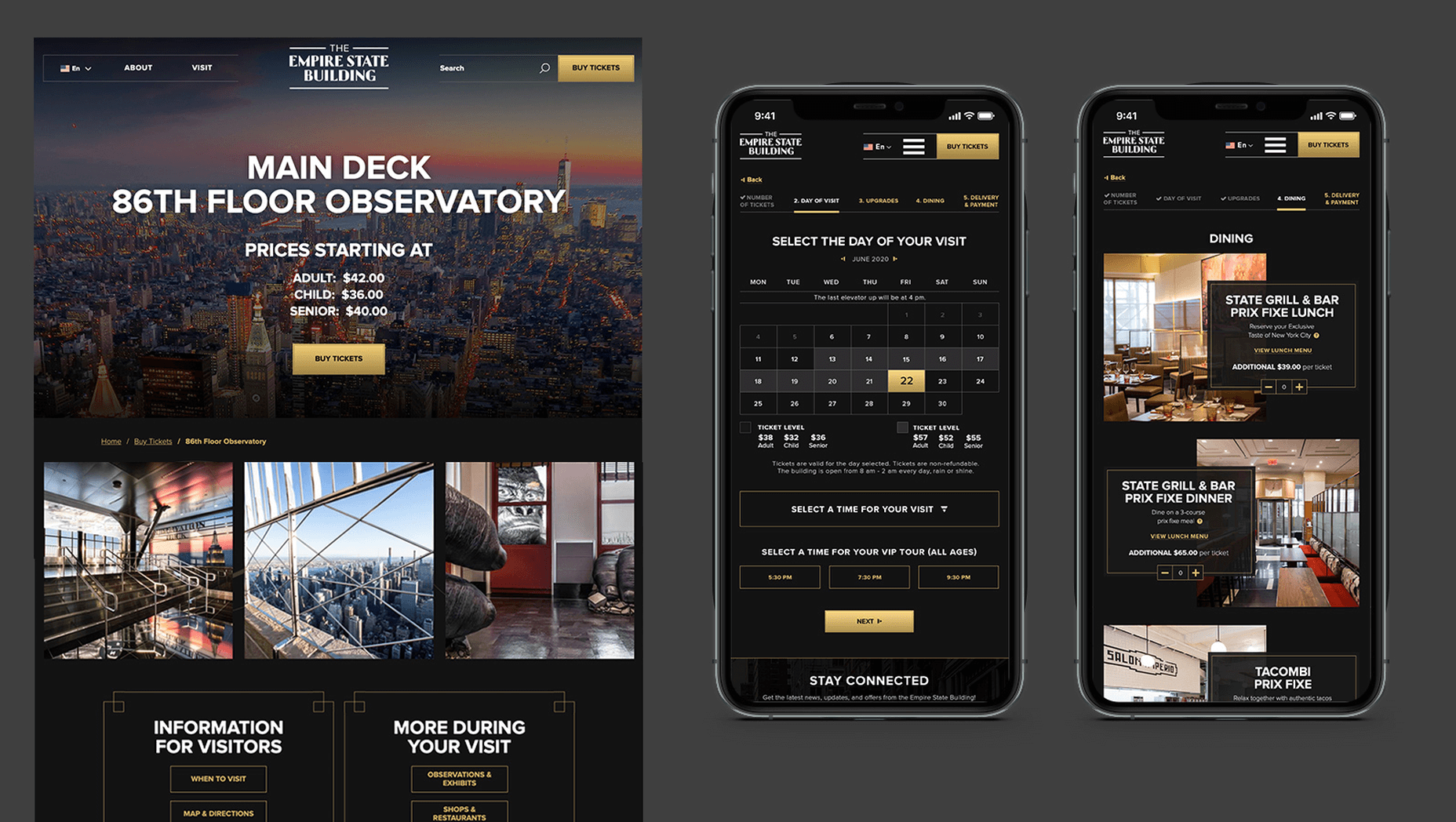
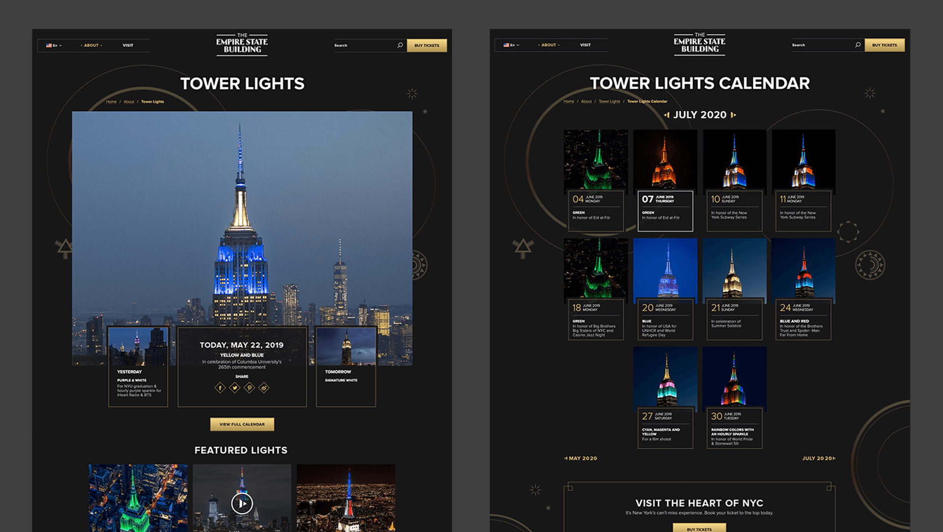
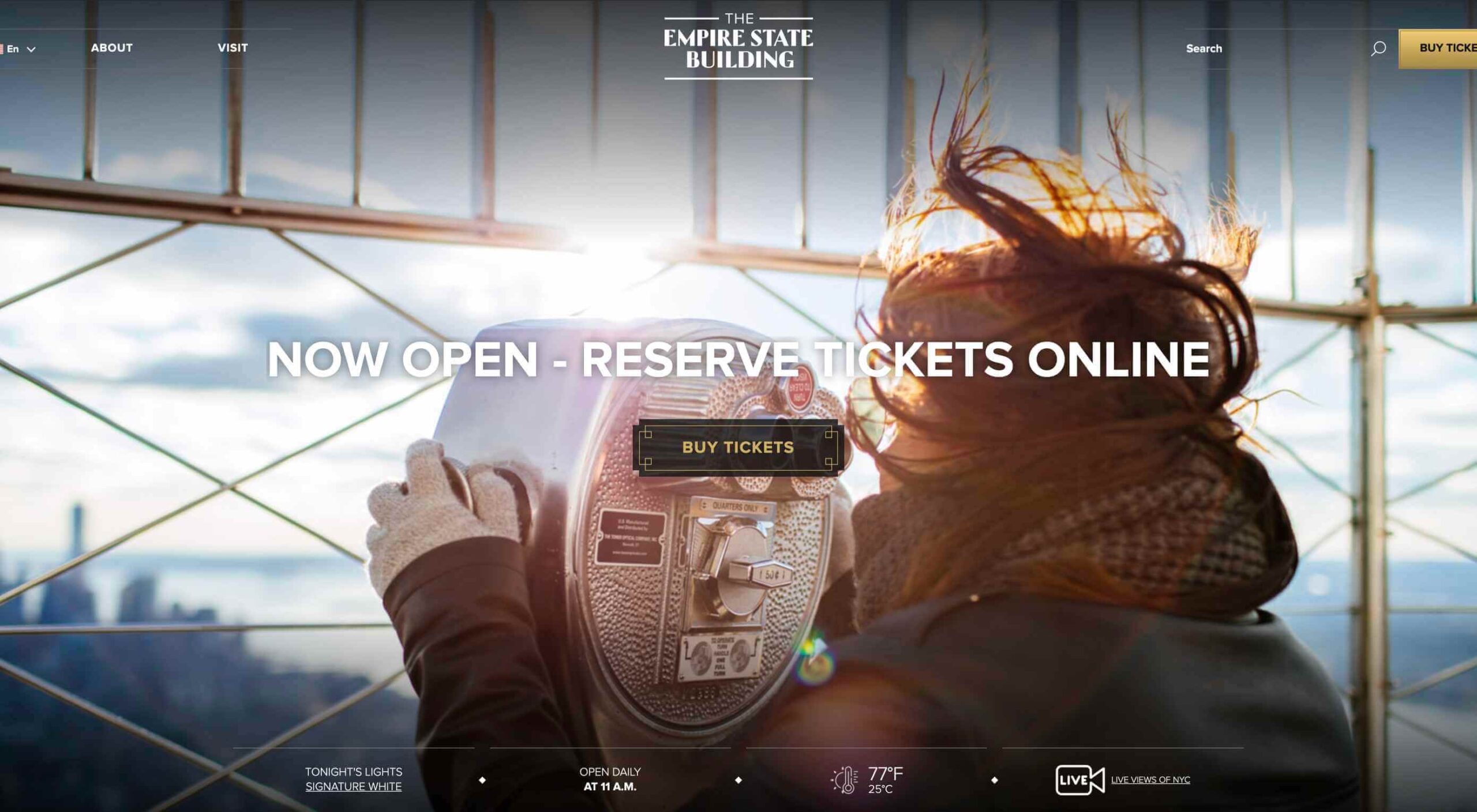
In 2019, to keep pace with an interior redesign of its visitor experience, the
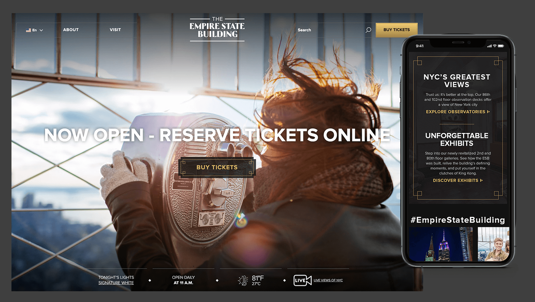
 Empire State Building decided to redesign its website. Blue Fountain Media were engaged to deliver the project. With the new site launching, we spoke to Head of Design, Tatyana Khamdamova about designing for the world’s most famous building.

Webdesigner Depot: The Empire State Building is probably the most iconic building in America, if not the world. Were there any points at which you thought, “Oh God, this is too much pressure”?

Tatyana Khamdamova: Yes, of course, it was a lot of pressure knowing that people all over the world will be looking at your work. But with the pressure, we also felt excitement and pride that we got to work on such an iconic project. Just thinking that we are doing the site for Empire State Building made us feel proud of all that other work we did during our whole life that gave us the opportunity to be a part of this project.

WD: Blue Fountain Media is a large agency. Did you utilize the whole company, or was there a smaller, dedicated team tasked with creating the site?

TK: On a project like this one, you need the expertise of the team members from all departments in the agency. You want people to work together from the beginning to ensure that their knowledge helps to shape the project and produce the best possible outcome. It’s important for designers and marketers, for example, to be a part of the strategy and UX phase to provide their input which minimizes tunnel vision and generates more ideas. You can only achieve the best results if every single detail from strategy to design to development is done right.

WD: That’s a lot of people to coordinate. Did any roles naturally come to the fore, or is design leadership a quality that varies from person to person?

TK: Some people are natural leaders in their fields. But, sometimes a certain project requires people to take responsibility and show their leadership skills within the team. So I would say that it’s a quality that varies from person to person and doesn’t depend on a role or a title at all.

WD: What were the central aims of the redesign?

TK: ESB’s previous website did not reflect the level of design to match their iconic brand, UX was not user friendly, the content was outdated, and they wanted to grow online individual and group ticket sales. In addition to competing with global and NYC based tourist attractions, ESB was also faced with growing competition in the NYC Observatory market with Top of The Rock, One World Observatory, and Edge at Hudson Yards.

While the building underwent a $165 million renovation, BFM was tasked with creating a best in class website that reclaimed their iconic brand identity while providing an intuitive, and enjoyable user experience for both domestic and international visitors looking to learn about the building, exhibits, and the many ticket experience packages that they offer to visitors.

WD: How do you approach researching a unique project like this?

TK: We went to the source! First, we spoke to visitors of the Empire State Building while they were in line. What was their experience, did they use the website, what made them choose to visit the observatory instead of or in addition to some of the other competing observatories in the city. We then looked at other key tourist towers worldwide to see how they are positioning themselves globally to draw inspiration. We did in-depth stakeholder interviews that included folks working at the building every day and the types of interaction and questions they field from visitors. We conducted surveys of international travelers to understand their motivations and concerns. Finally, we dug into the website itself by testing using various protocols and platforms to understand the visitor paths, what they were able to easily do, and what tasks they may have found challenging. Drawing from all of those insights, we planned and designed the site using an iterative process.

WD: ESB visitors come from all over the world; how did you tackle designing for an international audience?

TK: People across the globe speak different languages, have different cultures and needs. Our goal was to learn about the audience and give them a site that looks and feels like it was created for them. Luckily we were working for the iconic building that is well known internationally and capturing the design aesthetic of the building itself already made the site recognizable across the globe. When working on the project we also were making sure that all users can see the information in their local language when they land on the site and have easy access to the language selector in case they want to change it. When you translate from one language to another the number of words and characters is not always the same. It was important to make sure that the site is designed and developed with an understanding of how the content will be displayed in other languages. With the localization help of our parent company Pactera EDGE we successfully translated the site in several languages and tested it to ensure that it looks right for the local and international audience.

WD: The famous view of the ESB is the external view, but your design feels more in keeping with the experience of the building’s interior. Was that a conscious decision?

TK: It was a conscious decision to create a site that makes you feel like you are visiting the building. Our goal was to make the visitor excited to buy a ticket and see all that beauty with their own eyes. But, if someone doesn’t have an opportunity to come to NY we wanted to make that online experience as close to the real one as possible. We understand that nothing will replace the actual visit to the Empire State Building but we wanted the website to feel real and by using the great photography and amazing Art Deco design elements, we were able to do so.

WD: How did you interpolate such a complex style as Art Deco into a functional site?

TK: Fortunately for us, our office is located a couple blocks away from the building and we had the opportunity to go there and see some of the details. We also had access to the great photos of the renovated hallways, exhibits, and observatory decks, which gave us the idea of how the Art Deco elements were used in the interior design of the building. We all know that interior design and web design have different needs and goals so it was an interesting challenge to design a site that makes you feel like you are inside the building without overwhelming users and that content is easy to read and the ticket purchasing process is simple and clean. We re-created a lot of design elements used on the ceiling, walls, and floor of the building simplified those elements and made them part of the website design. A lot of those elements were used in the background, call to actions, icons, and maps, and combined with the brand colors used in both interior and web designs we were able to give the site the Art Deco look.

WD: There’s been speculation in the design community recently that Art Deco may re-emerge as a trend in the 2020s. Having worked with the style, do you think it could benefit the wider web?

TK: This was a very specific design approach for a very specific project that takes us back to the 1920’s and emphasizes that era through modern twists in web design. I do not see how it can be applied on the web in general unless the client specifically asks for it, for example, architecture website, real estate, or furniture site. Every project is unique and has its own goals and style and there is no one solution that will fit all. As of today, The ESB is Art Deco in a sense and it truly owns that style.

WD: Can you share some details on the technology stack you employed?

TK: The site was built on the Drupal CMS, integrates with Empire’s partner Gateway Ticketing System, and is hosted on Acquia.

WD: Why Drupal? Does it have qualities that suit a project of this scale, or is it simply the case that BFM had the pre-existing expertise of Drupal to facilitate the build?

TK: BFM is a dev-agnostic production team and we always ensure we’re making the best recommendation to our clients. In this case, the previous website was built on Drupal, so in order to decrease the effect of a new platform rollout that would be unfamiliar to the internal ESB teams, we decided to keep the site on the Drupal platform. Luckily, Drupal is an extremely flexible CMS and the needs of the site perfectly align with what Drupal provides.

WD: With visitors from around the world, the range of browsers and devices you had to consider was vastly larger than most projects. Did you draw a line for support? If so, where was it?

TK: BFM constantly updates our list of supported browsers and devices to stay in line with changing technology trends and device usage around the world. We’re extremely lucky that our larger organization, Pactera EDGE, has deep roots in globalization and localization, so we leveraged their team to help us with all aspects of website visitors from the many regions around the world, including translation services and testing. Since this was a complete overhaul, we ensured the baseline standard for all devices was met and will continue to enhance as the future technology needs become apparent.

WD: The Empire State Building gets millions of visits each year, what sort of server resources do you need to throw at it to guarantee uptime?

TK: BFM is a partner of Acquia, and Empire State Building is hosting their new site with them. Acquia is a wonderful ecosystem built specifically for high performing drupal websites and provide many tools for their hosted sites to be able to handle fluctuations in visitors, traffic surges, and with the 24/7 support offered, they can easily manage the changing needs of worldwide visitors.

WD: Now it’s live, how does the new ESB site relate to its real world presence?

TK: The Empire State Building defines the New York City skyline. The world’s most magnificent Art Deco skyscraper, it’s a living piece of New York history and an instantly recognizable symbol of city culture today. The old site did not reflect the amazing interior and exterior design of the building and we had a chance to showcase the redesigned interior and bring more attention to the beautiful Art Deco design elements. We wanted to create the site to make you feel like you are visiting the building. By showcasing the exhibits, renovated halls, and observatories through compelling photography and architectural details, our goal is to make the visitor excited to buy a ticket and see all that beauty with their own eyes.

We’d like to thank Tatyana for taking the time out of her day to talk to us.

Source


Source de l’article sur Webdesignerdepot

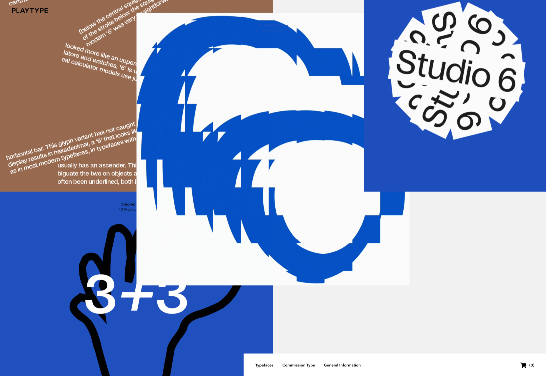
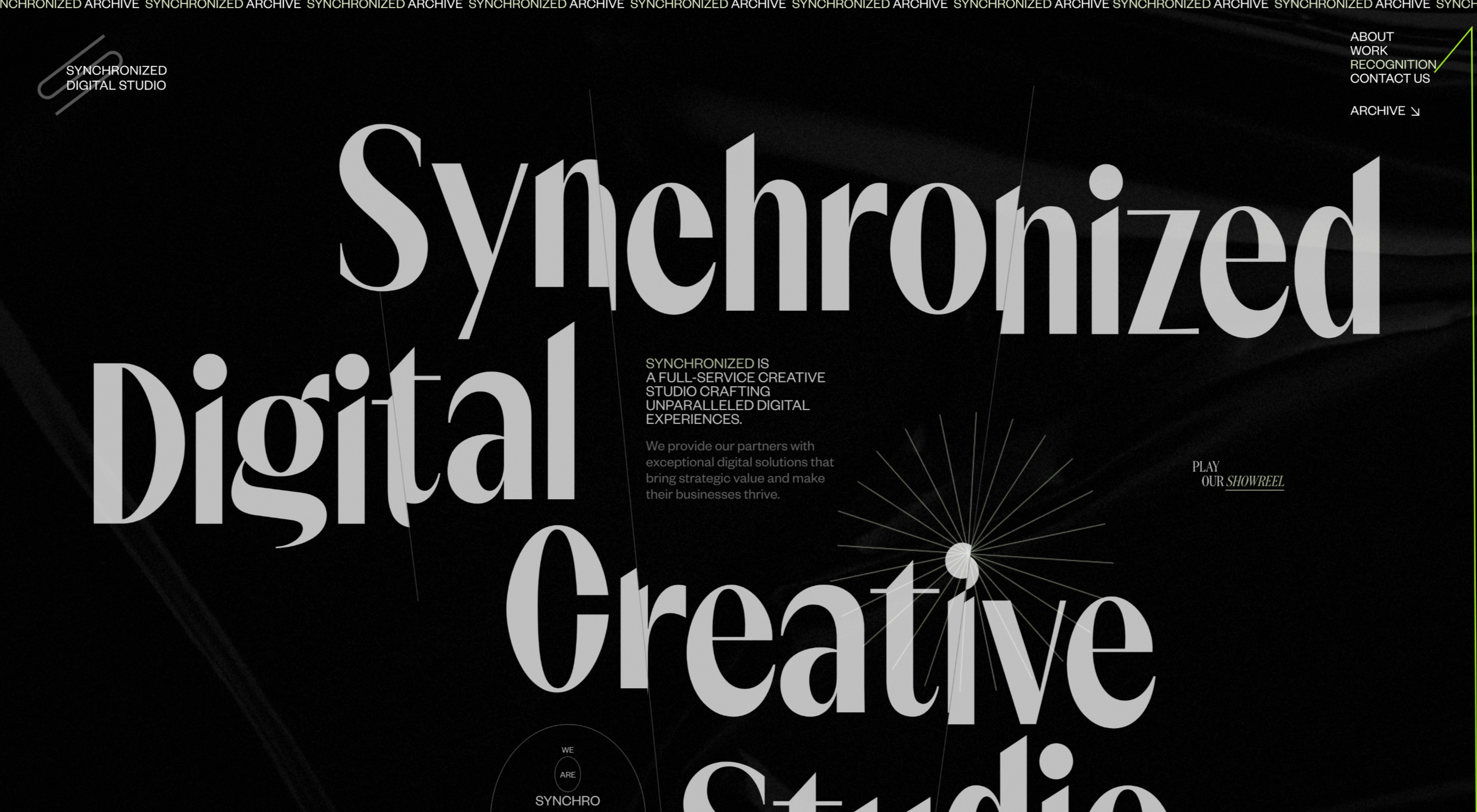
After six months of uncertainty 2020 is finally beginning to find a style of its own. There are nods to Brutalism, a delightful blending of 80s pastels with 90s primaries, and the font style of choice is anything but geometric sans-serif.

In this month’s collection of the freshest sites from the past four weeks you’ll find tons of new portfolios, from big agencies to freelancers, and some amazing primal scream therapy. Enjoy!

Looks Like You Need Iceland

Looks Like You Need Iceland is an incredible site that asks you to record a scream, that they’ll broadcast for you into the wide open spaces of Iceland as therapy. And then perhaps you’ll visit Iceland for real. It’s brilliant marketing for the Iceland tourist board.

Riverlane

The abstract 3D animation on Riverlane’s site is a stunning introduction to a topic that’s hard to visualize. The rest of the site is equally well done, with great typography, slick brand assets, and a professional engaging tone.

Monokai

Wimer Hazenberg’s site features a simple pixelated text column. But scroll down the page and keep an eye on the awesome text dissolve effect, it transforms this simple design.

I Weigh Community

The I Weigh Community is a non-profit community activism initiative helmed by Jameela Jamil. It’s devoted to radical inclusivity, and it promotes its message on its site with striking graphics and bold, expressive typography.

WAKA WAKA

Waka Waka is a design studio specializing in wooden furniture. The noise effect and the mid-century typography evoke the radical design of 60 years ago. The random rotations on the thumbnail hovers are delightfully disruptive.

Dataveyes

Dataveyes is an information design studio that works with large datasets to give meaning to complex information. Its site features beautiful, full-screen animations that illustrate the type of information it specializes in.

Year & Day

Year & Day is an ecommerce site that sells ceramics, glassware, and other choice pieces of tableware. It’s a colorful collection that perfectly complements your food and the stunning site takes its cues from the collection.

Dunderville

Dunderville is a motion design studio with an impressive portfolio of animation and live action films. Its site features a tactile paper fold detail, and as you would expect, some superb text, and vector animations.

André Venâncio

It’s been months since we last saw a creative developer’s site with a liquid effect. André Venâncio revisits the idea with a cool oil bubble effect, hover over the thumbnails to see it.

Thomas Prior

It’s not all 60s revivalism, pastels, and cute animations. There will always be room for minimalism, and nothing suits this style as well as portfolios for photographers; Thomas Prior’s site is a prime example.

Serra

Serra’s site features a really beautiful high-contrast typeface that sits apart from the usual sans-serif. The product page is all colored product photography. It exudes luxury and distinction in a saturated marketplace.

VYBES

VYBES is a CBD drink made in LA. Its site evokes the Californian spirit with baby pink brand colors and sun-bleached photography. It’s a cool, and ever so slightly Brutalist look for what is essentially a health drink.

Karina Sirqueira

We love the simplicity of Karina Sirqueira’s portfolio. The desaturated rainbow leads to a simple slideshow of projects, and it’s refreshing to see a minimal site that uses bold serif-based typography. The content feels fresh and honest too.

Smalls

Smalls produces healthy food for cats. The site, is packed with adorable pictures of kitties, which if you’re a cat person, is guaranteed to draw you in. There’s a definite Brutalist style to the site, and lots of color too.

Wildist

There’s a clear aesthetic beginning to emerge in 2020, with pastels creating a soft background for desaturated primaries, and Wildist gets it exactly right with this youthful, site that features just enough animation to bring it to life.

Kristen Kwong

We’ve seen a lot of OS-style sites recently, but Kristen Kwong’s is one of the slickest. It manages to take a simple metaphor for interaction and transform it with a vintage color scheme.

Stojo

Continuing the Miami-meets-Brutalism trend this month is the site for Stojo, a collapsable cup and bottle. The pastel shades block out a disrupted grid, but for our money it works better on mobile. The vintage typeface is a nice touch.

Hoang Nguyen

Hoang Nguyen’s site features a surreal 3D scene with mountains, a spinning planet, floating islands, a waterfall, and a floating dragon-boy. Click around the site and the scene transforms.

SMTH / Sam Smith

Sam Smith’s portfolio has a cool magazine style to it, with a nice blocky background on the text and a personality packed animated avatar taking centre stage.

Then I Met You

Then I met You is a site promoting a range of skincare products. In this case, the usual pastel colors are replaced with an 80s-style gradient. Watch the products as you scroll, the lighting changes creating an awesome, subtle 3D effect.

Source


Source de l’article sur Webdesignerdepot

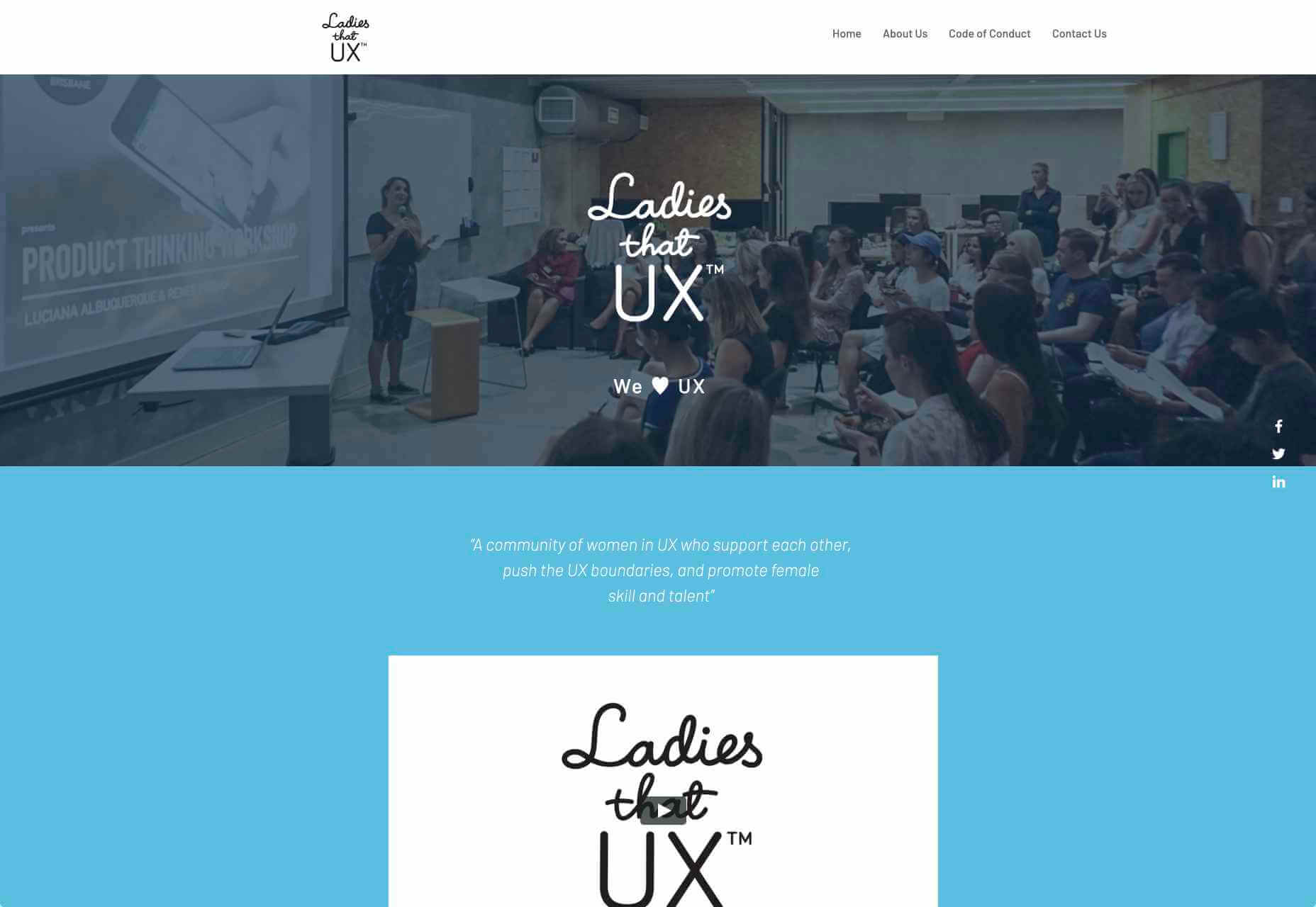
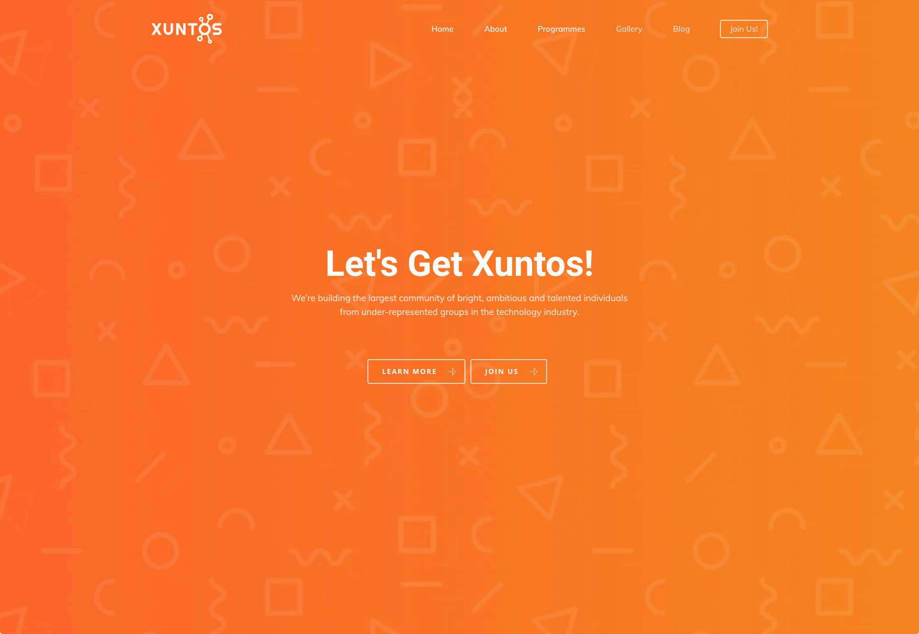
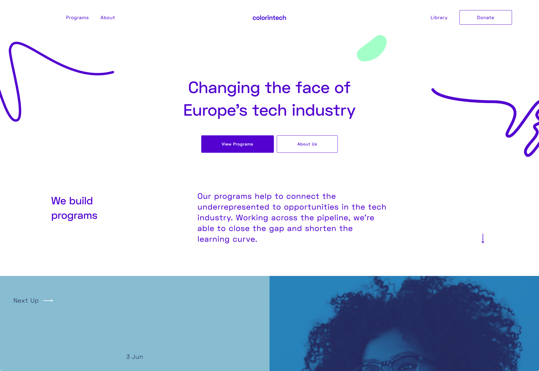
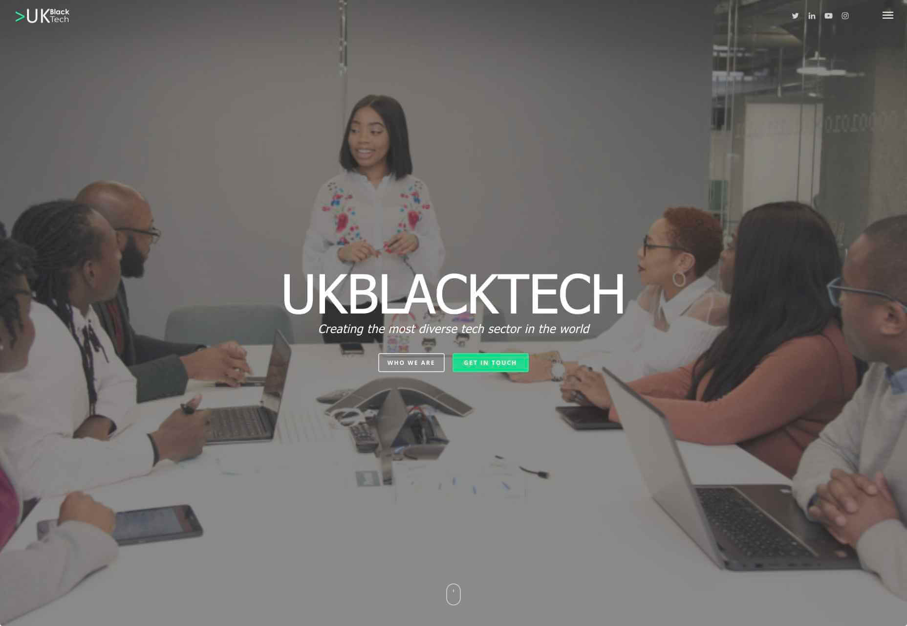
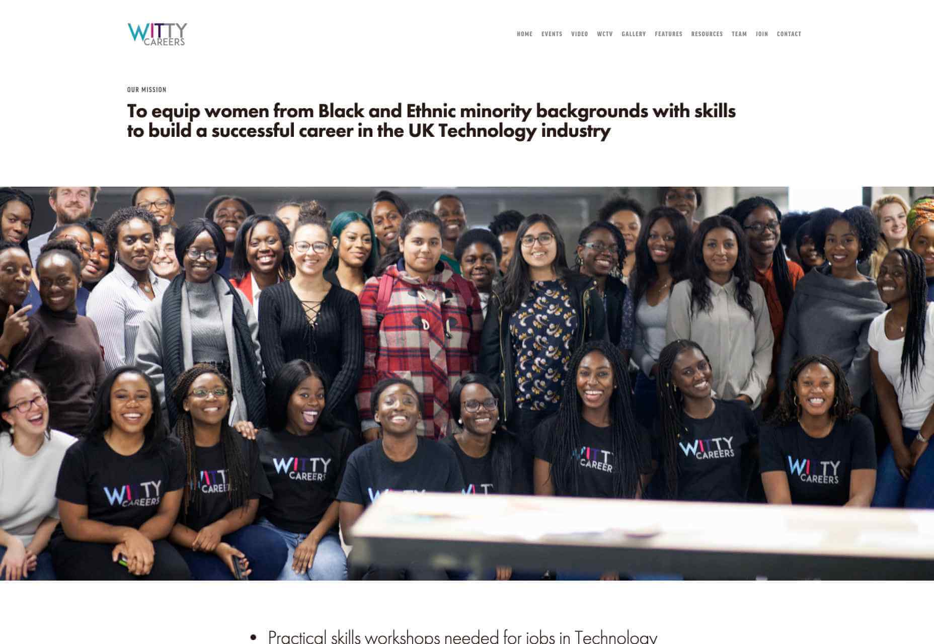
Web developers have been the bedrock of any company’s business strategy for some time, and the industry is continuing to thrive and grow at a rapid pace. This is why it’s surprising that it is so lacklustre when it comes to diversity.

A recent study revealed 80% of those in the design industry are male, and more specifically 79% within the field of web design. According to WISE, just 23% of the people working in STEM roles (Science, Technology, Engineering and Maths) are female and women currently account for just 15.8% of the UK’s current generation of engineering and technology graduates.

Why the Lack of Diversity in Web Design?

The main reason for this, as cited by the Organisation for Economic Co-operation and Development (OECD) found that women still lack the confidence to pursue these careers, despite their school results being as good as (or better) than their male counterparts. Research has found that the professional and technical services sector has the fourth-highest gender pay gap of all UK industries. If more women were to join these higher-paid sectors it could help reduce the gender pay gap as a whole, as well as help female economic empowerment.

This division is seen in ethnic minority groups too. The numbers for BAME (Black, Asian, Minority Ethnic) employees in the British tech industry are unknown but is estimated by the British Computer Society to be at 1-2%, a ridiculously low number in this day and age. This is why groups and organisations are cropping up designed to promote an industry that reflects all of society rather than one part of it. Here are some of the organisations to pay attention to who are bridging the diversity gaps in web design.

Girls Who Code

Girls Who Code are working to create opportunities for women within tech, aiming to deepen their computer science skills and confidence. They run a range of programs designed to equip women with the necessary computing skills to pursue opportunities in the field and to give chances that are often shunned due to society. Founder Saujani states that women are socialized to seek perfection, and this is something that needs to be overcome. One way to break that mentality at an early age, she says, is coding:

[Girls] walk into these classrooms and they feel like they will never be good at it, and when they learn how to create something, whether it’s a website or app, it changes their mindset and they stop giving up

Adobe Design Circle

Adobe Design Circle is another initiative aiming to introduce all members of society to design. They want to create more visibility for design as a viable career path for anyone that might be considering it, and to help with youth entering the field. This is opening the opportunities of working in tech and web to aspiring designers at a young age who aren’t necessarily yet conditioned by the pressures of society and showing them it can be a realistic career path.

They have their own scholarships and mentoring initiative to support these goals too. The faces behind the team of Adobe Design Circle range through multiple ethnicities and have a fairly even male-female divide. This equal representation alone is inspiring. One of Adobe’s core missions is to offer youth the opportunity to learn and express themselves through creativity and technology, regardless of their economic or cultural backgrounds. With this they specifically encourage applicants of all backgrounds to apply and offer many other opportunities from mentoring to internships.

Ladies that UX

Ladies that UX are a collaborative community of women in UX aiming to “support each other, push the UX boundaries and promote female skill and talent.” It is a European-based initiative where each city involved runs slightly different events and groups decide together what they would like to get from their meetups. They assist each other with UX challenges, discuss topics, and brainstorm ideas. Ladies that UX was created in 2013 by Georgie Bottomley and Lizzie Dyson with the aim of bringing together women in the industry, offering support and creating connections around the world.

Xuntos

Xuntos is aiming to create the largest community of ambitious and talented individuals from under-represented groups in the technology industry. It works to nurture university students and recent graduates that are often overlooked in the tech industry by the means of educational workshops, university hubs, events and an active community. The very name “Xuntos” is a Galician word which means “together” and this is their most important factor. They want people to realise they are not alone and just because the representation isn’t there, doesn’t mean their capabilities aren’t.

Colorintech

Colorintech is a non-profit organisation that was founded in 2016. It aims to close the gap and shorten the learning curve, with a strong community designed to help each other. The company was founded by Silicon Valley tech executive Dion McKenzie and ex-Googler Ashleigh Ainsley after they became frustrated at the few black individuals in the field. Since its inception 30,000 students, professionals, volunteers and tech companies have been impacted by their work, and over 450 minorities graduated from their programs in 2019 alone.

UKBlackTech

UKBlackTech are on a mission to create the most diverse tech sector in the world. Their aim is to encourage more ethnic minorities to enter the UK’s technology workforce and make an impact. To help with this, they design and implement different initiatives to help them get employed and retain employment, put on bespoke events that target aspects such as specific job roles or tech topics and promote different opportunities for members to apply to.

Witty Careers

Witty Careers was created with the aim to support women from black and ethnic minority backgrounds in the UK and equip them with the skills to build a career in the tech industry. They run different practical skills workshops and events which in the past have included visits to a Microsoft store, Uber, and Pivotal. They open doors for communications, networking and future career prospects for those in the minority. They also have a handy range of resources designed to help you get into the career you want. From CV writing advice to industry insights, they are all free of charge.

Featured image via Unsplash.

Source

p img {display:inline-block; margin-right:10px;}
.alignleft {float:left;}
p.showcase {clear:both;}
body#browserfriendly p, body#podcast p, div#emailbody p{margin:0;}


Source de l’article sur

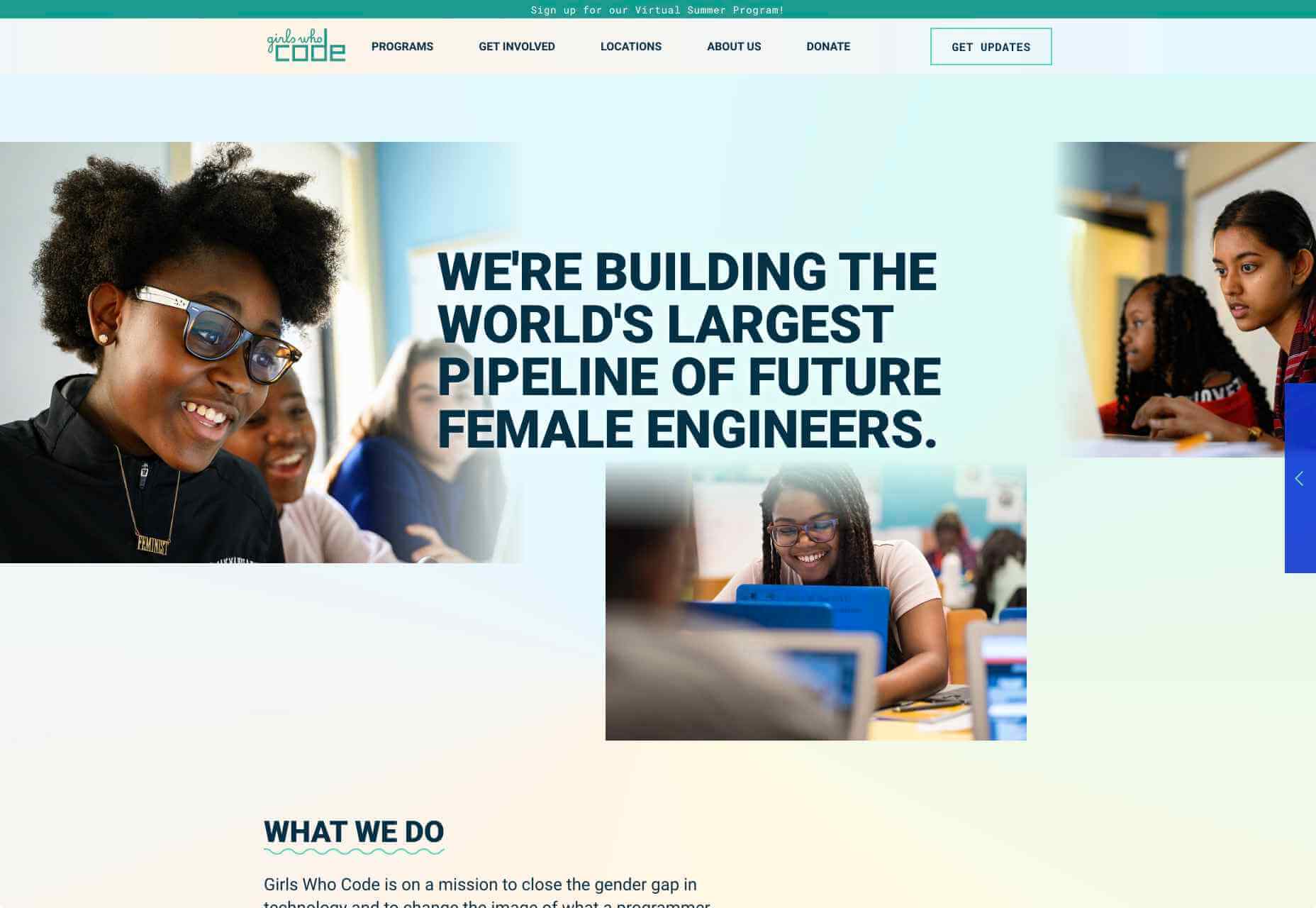
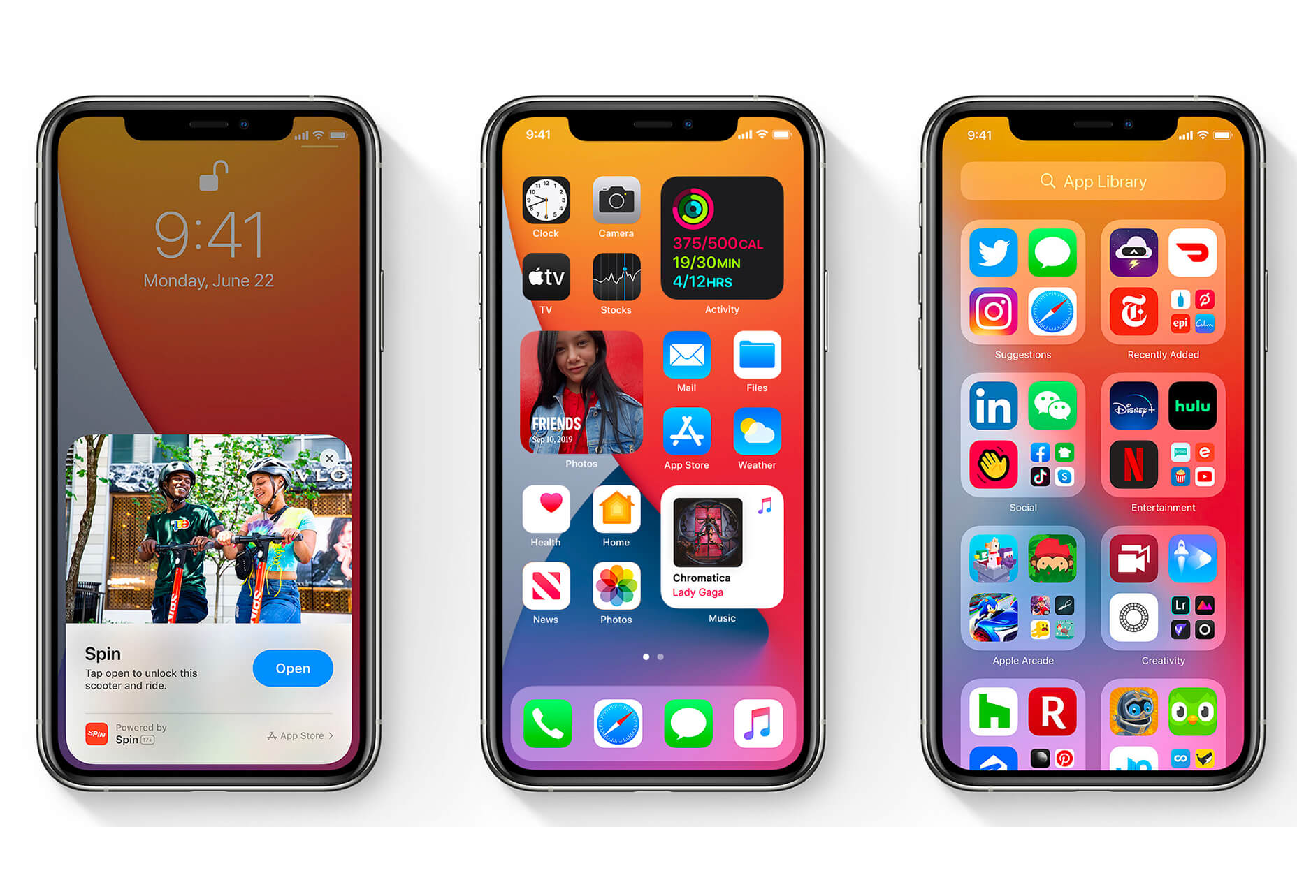
The biggest trend we’re talking about this month started at WWDC as Apple provided a glimpse of what’s coming next for their operating systems. This time around there’s a distinct design element. Did you catch it?
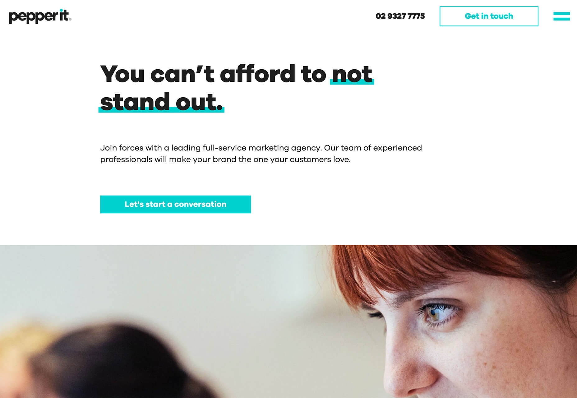
Here’s what’s trending in design this month.

1. Text Highlights and Underlines

There’s always been an unwritten rule in website design that text uses more plain styles. Bold is acceptable, italics are OK from time to time, but underlining is seldom used.

This design trend bucks that concept with text elements that use highlighter or underline elements to emphasize key words. And it works rather nicely.

What it takes to make this work is plenty of contrast and a design style that fits with underline or highlighted elements.

This design trend works thanks to clear intention. The words are obviously important to the overall meaning of the design or what visitors should take away from the content.

Pepper It uses a nifty underline that the letters seem to rest inside of to highlight a key phrase. The shape and color also mimic that of the larger button below, helping the eyes move from one element to the next. It’s an effective use of an underline (or maybe you could call it a highlight) effect in conjunction with brand colors.

Zappos Kids uses a fun highlight in a colorful scheme to highlight a key text element. It almost looks like a button and helps website visitors understand that the entire hero image area is clickable. The highlight serves to make the text more readable and the interactive element more functional.

Zeus Jones uses a variety of text treatments on the homepage, but arguable the underline is most noticeable, likely because it is the most unfamiliar in the context of website design.

2. Distinct Geometry

Geometric shapes in website design have popped up as trending elements in a variety of forms. This iteration is pretty simple: Use of distinct geometry as part of the overall aesthetic.

Geometry might pair with illustrations, photos, text, or in the background or foreground. What’s great about shapes is that they are versatile and work with a lot of other design patterns.

What can be the most challenging about shapes and design is that distinct geometry requires some space and thought. Just tossing a few triangles or rectangles in a design without reason can look rather strange.

So how can you add geometric shapes to a design so that they look intentional? These examples do it well (and in three different ways).

Rui Ma uses square and rectangular containers in a modular grid with portfolio projects inside each. This is one of the most common and applicable uses of geometry – as a container element. What makes it stand out is the circle, smiley wheel (also a geometric shape) that never leaves the center of the screen. The black background for the grid is also a nice contrast element for content blocks.

Thompson Stenning uses shapes in the background and with illustrations to create a stunning homepage visual. It’s big and bold and has just enough going on that you want to look at it and figure out the scene. Maybe what’s most intriguing about the visual concept is that it uses lots of geometric shapes – rectangles, squares, triangles, ad circles – whereas most projects pick one shape to focus on.

Romain Penchenat uses three-dimensional style angles to draw you into the portfolio website. They use a simple animation that “floats” on the homepage and follows the scroll with other geometric elements.

3. Shadow and Gradient Icons

Did you notice all the gradients and subtle shadows in icons in the images previewing iOS 14 or were you just looking at other changes (such as widgets) on the iPhone screen?

We’ve been seeing more designers incorporating more shadows and depth into icons for a while, but this move by a major player in design will push it to the forefront fast. Each of the icons moves from a flat style to one with a background gradient color as well as more shadows within icon elements for depth.

Don’t worry, the design still looks very much like Apple, but is a little more reminiscent of the skeuomorphism style icons from earlier versions of iOS.

It’s nice that the color and shadow elements are contained within each icon. This creates more visual interest and depth for each element without getting cluttered or junky. The gradients are also super simple, using a darker version of the main color in a monotone element.

It’s an iconography style that others are already using. DG Studio has a collection of icons on its homepage with subtle gradients and shadowing in the designs. Again, what’s nice about this trend is that it adds depth to visuals without tricks that get in the way of visual comprehension.

Guillaume Gouessan uses gradients in image icons in much the same way as the previous examples but with a little more color variation. Here, you can see what the gradient looks like when using a color change that’s not super drastic, but more dramatic than a monotone option. You can find some use of the more monotone gradient on his site below the scroll in the large desk image. (It’s definitely worth a few clicks to check it out.)

Love it or hate it, gradients and shadows seem to be here to stay for a while.

Conclusion

How often do you find yourself looking to major brands and companies for design inspiration? While a lot of web design trends start as experiments with smaller sites, the big players can really shape what gets popular (or not).

The example of Apple moving to icons with more shadows and gradients is a prime example. We’ve been seeing more of these elements creeping in for a while, but this style is about to get very big again.

Source

p img {display:inline-block; margin-right:10px;}
.alignleft {float:left;}
p.showcase {clear:both;}
body#browserfriendly p, body#podcast p, div#emailbody p{margin:0;}

Source de l’article sur