Articles

Infrastructure is one of the core tenets of a software development process — it is directly responsible for the stable operation of a software application. This infrastructure can range from servers, load balancers, firewalls, and databases all the way to complex container clusters.

Infrastructure considerations are valid beyond production environments, as they spread across the entire development process. They include tools and platforms such as CI/CD platforms, staging environments, and testing tools. These infrastructure considerations increase as the level of complexity of the software product increases. Very quickly, the traditional approach for manually managing infrastructure becomes an unscalable solution to meet the demands of DevOps modern rapid software development cycles. And that’s how Infrastructure as Code (IaC) has become the de facto solution in development today.

Source de l’article sur DZONE

Dealing with a database is one of the biggest challenges within a software architecture. In addition to choosing one of several options on the market, it is necessary to consider the persistence integrations. The purpose of this article is to show some of these patterns and learn about a new specification proposal, Jakarta Data, which aims to make life easier for developers with Java.

Understanding the Layers That Can Make Up Software

Whenever we talk about complexity in a corporate system, we focus on the ancient Roman military strategy: divide and conquer or divide et impera. To simplify the whole, we break it down into small units.

Source de l’article sur DZONE


WordPress is by far the world’s most popular CMS. Not only does it dominate the CMS market with a 64% market share, but it also powers 39.6% of all websites. It has taken the internet by storm by democratizing the web for all. Now, anyone can build, manage, and host a successful website without needing a college degree or coding expertise.

However, while WordPress is great at managing many technical aspects, it still can’t do everything for you. Built mostly on PHP, there are often concerns regarding how performant WordPress is. And, with performance impacting everything from bounce rates to SEO rankings to conversions, it’s something that should be on your radar too.

If you don’t know it yet, images are one of the main causes of slow-loading websites. In recent years, WordPress has stepped up its efforts to try and help users with image optimization out-of-the-box.

Still, as we’ll show, it’s not a total solution, and there is still plenty you can do to deliver better experiences on your WordPress website through image optimization.

What is WordPress Image Optimization? Why is it Important?

Simply put, image optimization is anything you do to make images load faster on your website pages. Almost all websites that use images can benefit from some form of image optimization, even those using WordPress.

Why?

Well, performance is a hugely significant factor when it comes to the competitiveness of your website today.
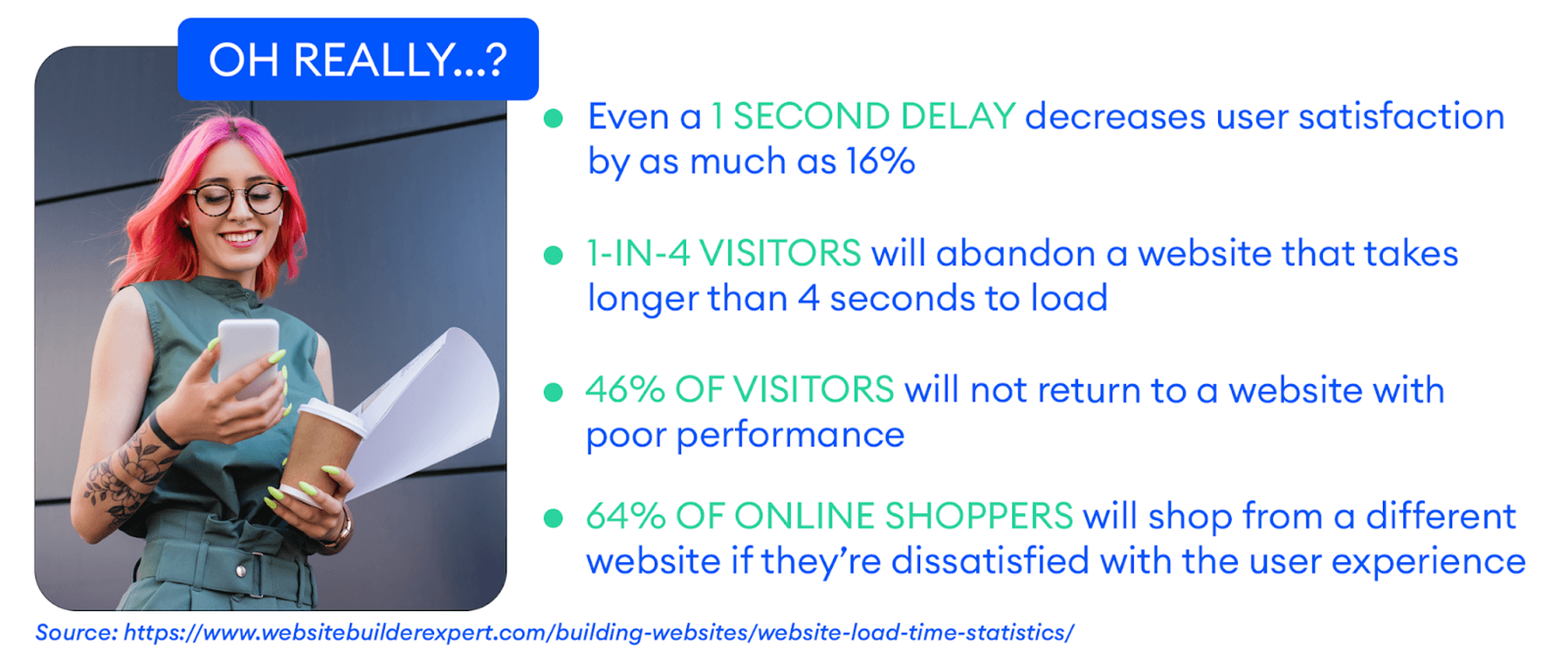
Google has also made performance an increasingly important factor when it comes to SEO rankings. In fact, performance is a direct ranking signal that carries significant weight.

Google’s Page Experience Update that went live in 2021 has been the biggest move in that direction yet. Soon, Google might even use visual indicators in SERP results to distinguish high-performing websites from the rest.

In Google’s own words, “These signals measure how users perceive the experience of interacting with a web page and contribute to our ongoing work to ensure people get the most helpful and enjoyable experiences from the web.”

So, Why Should We Target Images For Performance Optimization?

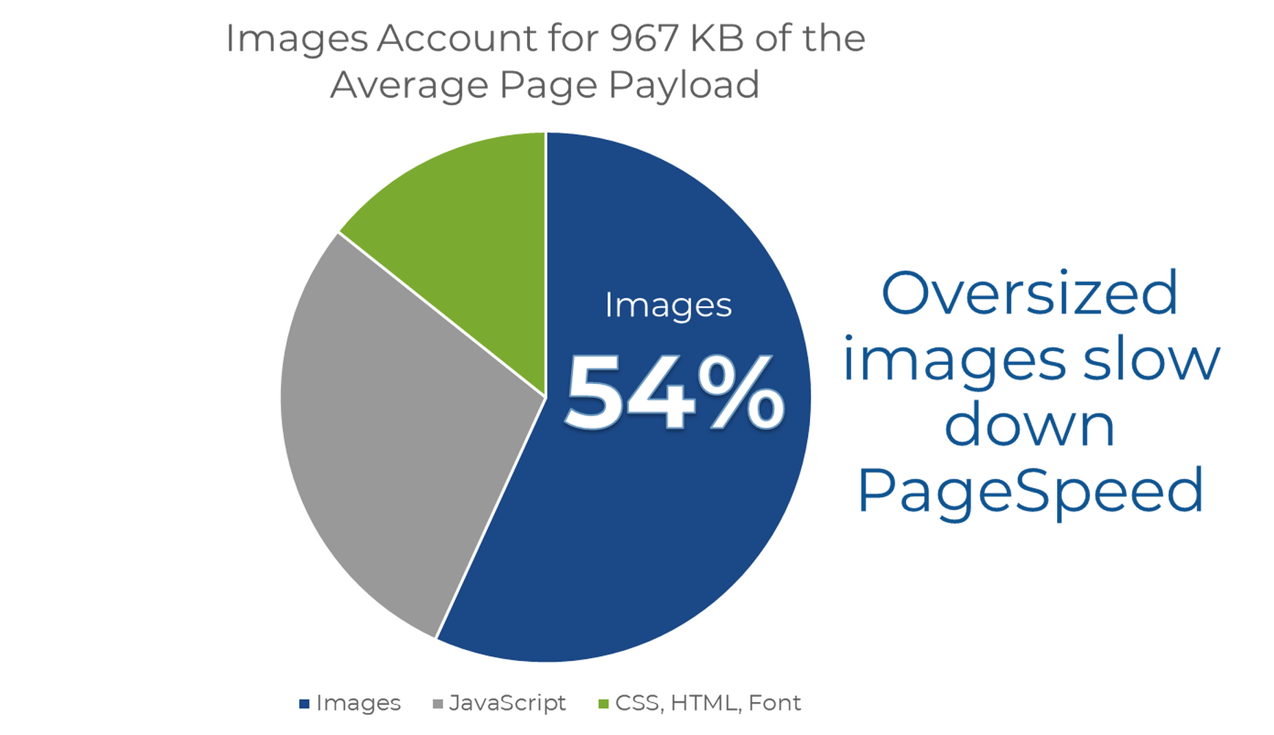
According to Google, images are the largest contributor to page weight. Google has also singled out image optimization specifically as the factor with the most untapped potential for performance optimization.

This problem isn’t going away soon. According to data by the HTTP Archive, there are roughly 967.5 KB bytes of image data on desktop web pages and 866.3 KB of image data on mobile pages. This is an increase of 16.1% and 38.8%, respectively, over the last five years.
Thanks to popular e-commerce tools like Woocommerce, it’s estimated that up to 28% of all online sales happen on WordPress websites.

And don’t forget, images are both a key part of conveying information to the user and integral to the design of your website. If they take significantly longer to load than your text, for example, it will negatively impact the user experience in a variety of ways.

In summary, optimized images help your WordPress website by:

  • Improving user satisfaction.
  • Improving various traffic metrics, like bounce rates, time-on-page, etc.
  • Boosting your SEO rankings.
  • Contributing to higher conversions (and sales).

How Does Image Optimization in WordPress Work?

WordPress is so popular because it’s a CMS (content management system) that allows anyone to build, design, and manage a website without any coding or advanced technical experience. Advanced features can be installed with just a few clicks, thanks to plugins, and you rarely have to touch the code behind your website unless you want to make some unique modifications.

In short, using a CMS like WordPress shields you from many of the day-to-day technicalities of running a website.

WordPress Image Optimization: What It Can Do

As we mentioned, one of the main reasons WordPress is so popular is because it takes care of many of the technical aspects of running a website. With that in mind, many think that WordPress should also automatically take care of image optimization without them having to get involved at all.

Unfortunately, that’s not really the case.

True, WordPress does offer some built-in image optimization. Whenever you upload an image to WordPress, it currently compresses the quality to about 82% of the original (since v4.5).

In v4.4, WordPress also introduced responsive image syntax using the srcset attribute. This creates four breakpoints for each image you upload according to the default WordPress image sizes:

  • 150px square for thumbnails
  • 300px width for medium images
  • 768px max-width for medium_large images
  • 1024px max-width for large images.

Here you can see an example of the actual responsive syntax code generated by WordPress:

<img loading="lazy" src="https://bleedingcosmos.com/wp-content/uploads/2021/12/33-1024x683.jpg" alt="" class="wp-image-9" width="610" height="406" srcset="https://bleedingcosmos.com/wp-content/uploads/2021/12/33-1024x683.jpg 1024w, https://bleedingcosmos.com/wp-content/uploads/2021/12/33-300x200.jpg 300w, https://bleedingcosmos.com/wp-content/uploads/2021/12/33-768x512.jpg 768w, https://bleedingcosmos.com/wp-content/uploads/2021/12/33-1536x1024.jpg 1536w" sizes="(max-width: 610px) 100vw, 610px">

Depending on the screen size of the device from which a user visits your webpage, WordPress will let the browser pick the most appropriately sized image. For example, the smallest version for mobile displays or the largest for 4K Retina screens, like those of a Mac.

While this may seem impressive, it’s only a fraction of what can be achieved using a proper image optimization solution, as we’ll show later.

Lastly, WordPress implemented HTML native default lazy loading for all images starting with version 5.5.

So, in short, WordPress offers the following image optimization capabilities baked-in:

  • Quality compression (limited)
  • Responsive syntax (up to 4 breakpoints)
  • Lazy loading

WordPress Image Optimization: What it Cannot Do

There are other issues many have with both the implementation of image compression and responsive syntax as it’s used by WordPress. This leads to some users even purposefully deactivating WordPress’ built-in image optimization so they can fully take control of it themselves.

Here are some of the reasons why:

  • WordPress uses a very basic form of quality compression. It does not use advanced technologies like AI and machine learning algorithms to compress images while maintaining maximum visual quality. It’s also lossy compression, so the quality is lost for good. You can clearly see the difference between an original HD image and the compressed version created by WordPress.
  • WordPress only compresses most images by up to 20%, while advanced image optimization tools can reduce all image sizes intelligently by up to 80%.
  • Responsive syntax can provide significant performance improvements over simply uploading a single HD image to be served on all devices and screens. However, it’s still only limited to a set number of breakpoints (typically 3 or 4). Since it’s not dynamic, a whole spectrum of possible image sizes is not created or used.
  • Responsive syntax code is not scalable and can quickly lead to code that’s bloated, messy, and hard to read.
  • WordPress doesn’t accelerate image delivery by automatically caching and serving them via a global CDN, although this can be done using other tools.

Another important optimization feature that WordPress does not have is auto-conversion to next-gen image file formats. Different image formats offer different performance benefits on different devices. Some formats also enable higher levels of compression while maintaining visual fidelity.

Next-gen formats like WebP, AVIF, and JPEG-2000 are considered to be the most optimal formats on compatible devices. For example, until recently, WebP would be the optimal choice on Chrome browsers, while JPEG-4000 would be optimal on Safari browsers.

However, WordPress will simply serve images in the same formats in which they were originally uploaded to all visitors.

How to Measure the Image Performance of a WordPress Website?

As the undisputed king of search engines, we’ll base most of our performance metrics on guidelines established by Google.

Along with its various performance updates, Google has released a number of guidelines for developers as well as the tools to test and improve their websites according to said guidelines.

Google introduced Core Web Vitals as the primary metrics for measuring a web page’s performance and its effect on the user experience. Thus, Core Web Vitals are referred to as “user-centric performance metrics.” They are an attempt to give developers a testable and quantifiable way to measure an elusive and abstract concept such as “user experience.”

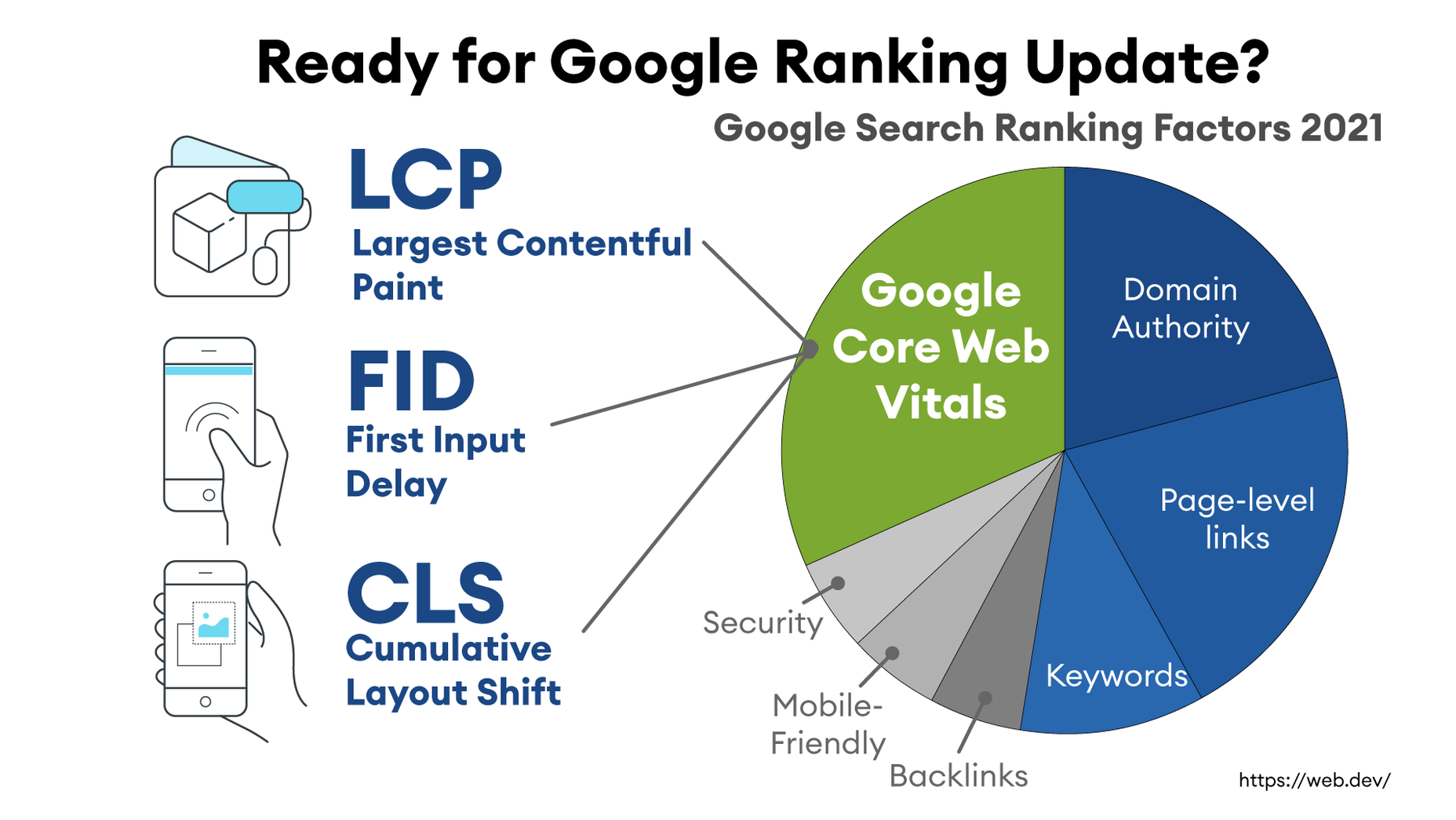
Combined with a number of other factors, Core Web Vitals constitute a major part of the overall page experience signal:
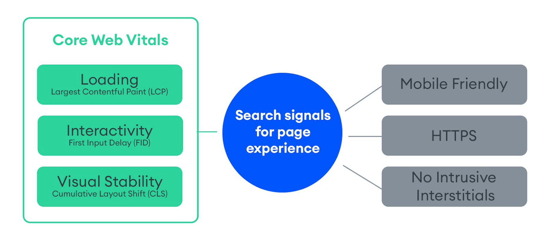
You can find a complete introduction to Core Web Vitals here. However, they currently consist of three main metrics:

  • LCP (Largest Contentful Paint): The time it takes the largest above-the-fold element on your page to load. This is typically a full-sized image or hero section.
  • FID (First Input Delay): The delay from the moment a user first interacts with an element on the page until it becomes responsive.
  • CLS (Cumulative Layout Shift): The visual stability with which the elements on a page load.

Here is an illustration of how these metrics are scored:

While these are the three most important metrics to optimize, they are not the only ones. Google still measures other metrics like the FCP (First Contentful Paint), SI (Speed Index), as well as the TTFB (Time to First Byte), TBT (Total Blocking Time), and TTI (Time to Interactive).

A number of these metrics are directly affected by the images used on your web pages. For example, LCP, FCP, and SI are direct indicators of how fast the content of your web page loads and depends on the overall byte size of the page. However, it can also indirectly affect FID by keeping the main thread busy with rendering large amounts of image content or the perceived CLS by delaying the time it takes large images to load.

These metrics apply to all websites, whether they are custom-made or built using a CMS like WordPress.

When using tools like Lighthouse or PageSpeed Insights, you’ll also get scored based on other flags Google deems important. Some of them are specific to images, such as properly sizing images and serving images in next-gen formats.

If you only use built-in WordPress image optimization, you’ll get flagged for the following opportunities for improvement:

Some of the audits it will pass, however, are deferring offscreen images (lazy loading) and efficiently coding images (due to compression):

A Better Way to Optimize WordPress Images: ImageEngine

Billions of websites are all vying for prime real estate on Google SERPs, as well as the attention of an increasingly fussy internet-using public. Every inch matters when it comes to giving your website a competitive advantage.

So, how can you eliminate those remaining performance flags and deliver highly optimized images that will keep both your visitors and Google happy?

Sure, you could manually optimize images using software like PhotoShop or GIMP. However, that will take you hours for each new batch of images. Plus, you still won’t benefit from any automated adaptive optimization.

A more reasonable solution in today’s fast-paced climate is to use a tool developed specifically for maximum image optimization: an image CDN like ImageEngine.

ImageEngine is an automated, cloud-based image optimization service using device detection as well as intelligent image compression using the power of AI and machine learning. It can reduce image payloads by up to 80% while maintaining visual quality and accelerating delivery around the world thanks to its CDN with geographically dispersed PoPs.

Why is ImageEngine Image Optimization Better Than WordPress?

When making a head-to-head comparison, here are the reasons why ImageEngine can deliver better performance:

  • Device Detection: ImageEngine features built-in device detection. This means it picks up what device a visitor to your website is using and tailors its optimization strategy to what’s best for that specific device.
  • Client hints: By supporting client hints, ImageEngine has access to even more information regarding the device and browser to make better optimization decisions.
  • Next-gen formats: Based on optimal settings, ImageEngine automatically converts and serves images in next-gen formats like WebP, AVIF, JPEG2000, and MP4 (for GIFs).
  • Save data header: When a Chrome user has save-data mode enabled, ImageEngine will automatically compress images more aggressively to save on data transfer.
  • CDN with dedicated edge servers: ImageEngine will automatically cache and serve your optimized image assets using its global CDN. Each edge server has device awareness built-in to bring down latency and accelerate delivery. You can also choose to prioritize specific regions.

So, the key differentiator is that ImageEngine can tailor optimizing images for what’s optimal for each of your visitors. ImageEngine is particularly good at serving mobile visitors thanks to WURFL device detection, which can dynamically resize images according to most devices and screen sizes in use today. As of now, this is a completely unique capability that none of its competitors offer.

It allows for far better and more fine-tuned optimization than WordPress’ across-the-board approach to compression and responsive syntax.

If you want, you could turn off WordPress responsive syntax and compression, and you would still experience a performance increase using ImageEngine. However, ImageEngine also plays nice with responsive syntax, so it’s not completely necessary unless you want to serve the highest-fidelity/low-byte-size images possible.

How Does ImageEngine Work with WordPress?

The process ImageEngine uses to integrate with WordPress can be broken down into a few easy steps:

  • Sign up for an ImageEngine account: ImageEngine offers three pricing plans depending on the scale and features you need as well as a no-commitment 30-day free trial.
  • Specify your image origin: This tells ImageEngine where to find the original versions of your images. For a WordPress website, you can just use your domain, e.g., https://mywordpresswebsite.com. ImageEngine will then automatically pull the images you’ve uploaded to your WordPress website.
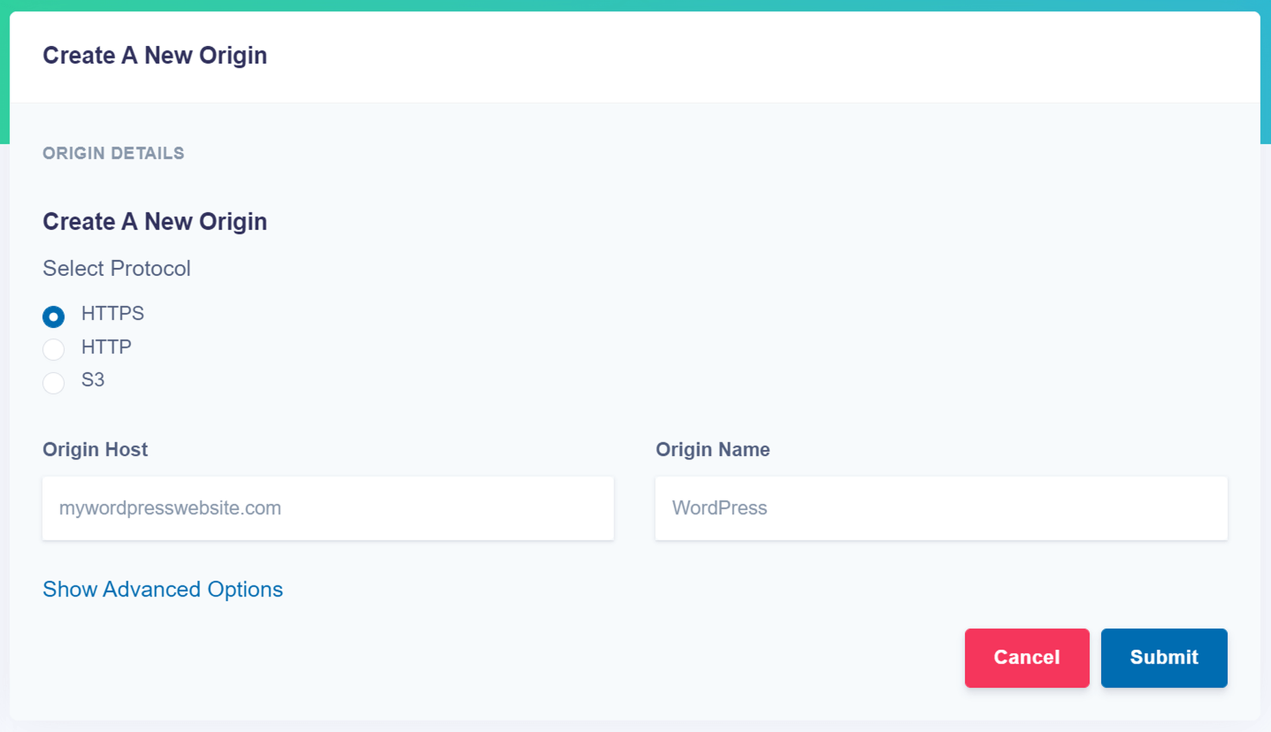
  • Copy the Delivery Address: After you create an account and specify your image origin, ImageEngine will provide you with a Delivery Address. A Delivery Address is your own unique address that will be used in your <img> tags to point back to the ImageEngine service. Delivery Addresses may be on a shared domain (imgeng.in) or customized using a domain that you own. A Delivery Address typically looks something like {random_string}.cdn.imgeng.in. If your images are uploaded to the default WordPress folder /wp-content/uploads/, you can access your optimized images from ImageEngine simply by changing your website domain. For example, by typing {imageengine_domain}.cdn.imgeng.in/wp-content/uploads/myimage.jpg into your browser, you’ll see the optimized version of that image. Just press the copy button next to the Delivery Address and use it in the next step configuring the plugin.

  • Install the ImageEngine Optimizer CDN plugin: The plugin is completely free and can be installed just like any other plugin from the WordPress repository.
  • Configure and enable ImageEngine Plugin in WordPress: Just go to the plugin under “ImageEngine” in the main navigation menu. Then, copy and paste in your ImageEngine “Delivery Address,” tick the “Enabled” checkbox, and click “Save Changes” to enable ImageEngine:
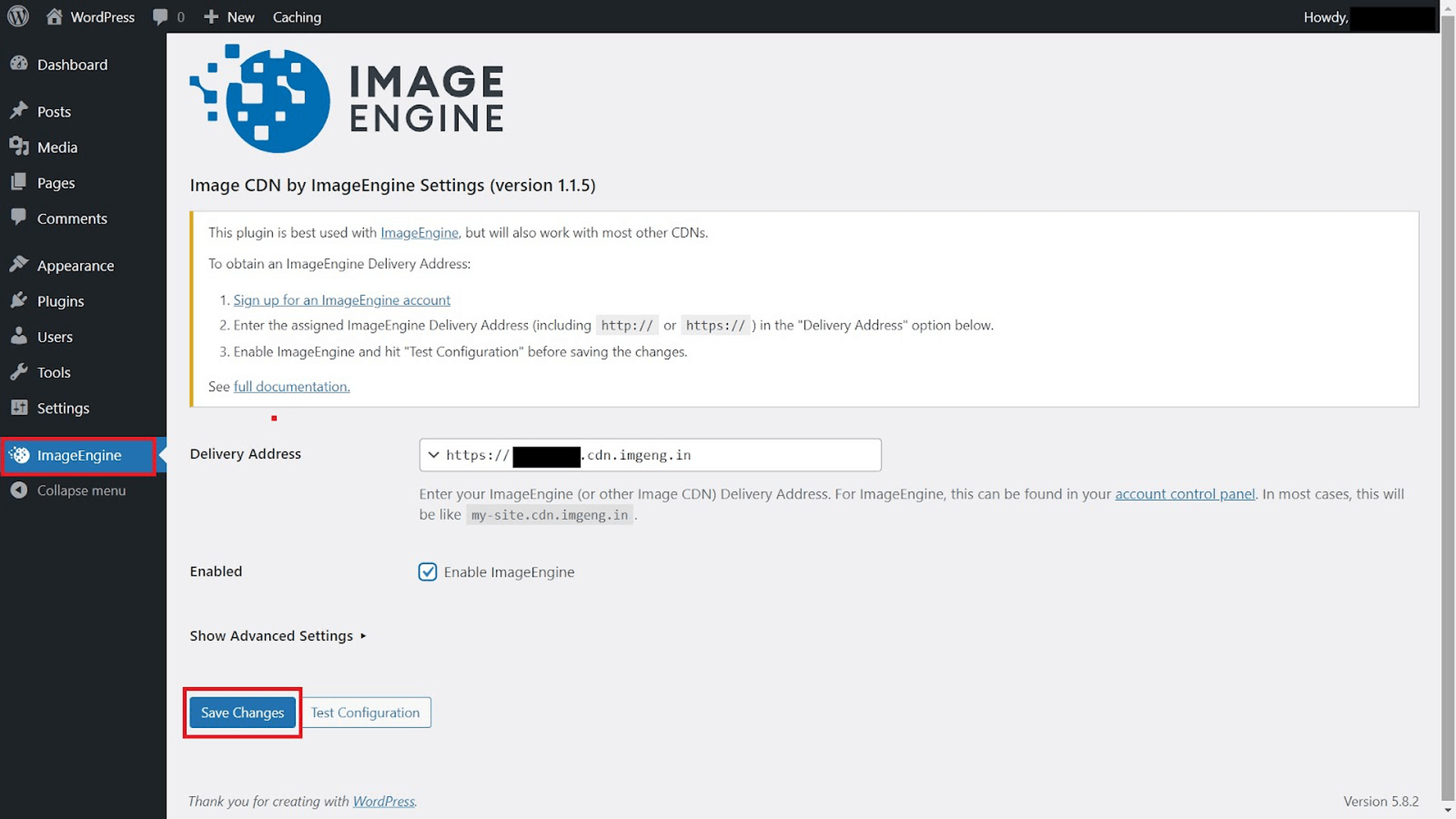
Now, all ImageEngine basically does is replace your WordPress website domain in image URLs with your new ImageEngine Delivery Address. This makes it a simple, lightweight, and non-interfering plugin that works great with most other plugins and themes. It also doesn’t add unnecessary complexity or weight to your WordPress website pages.

ImageEngine vs Built-in WordPress Image Optimization

So, now let’s get down to business by testing the performance improvement you can expect from using ImageEngine to optimize your image assets.

To do this test, we set up a basic WordPress page containing a number of high-quality images. I then used PageSpeed Insights and the Lighthouse Performance Calculator to get the performance scores before and after using ImageEngine.

Importantly, we conducted this test from a mobile-first perspective. Not only has mobile internet traffic surpassed desktop traffic globally, but Google themselves have committed to mobile-first indexing as a result.

Here is a PageSpeed score using the Lighthouse calculator for WordPress with no image optimization:
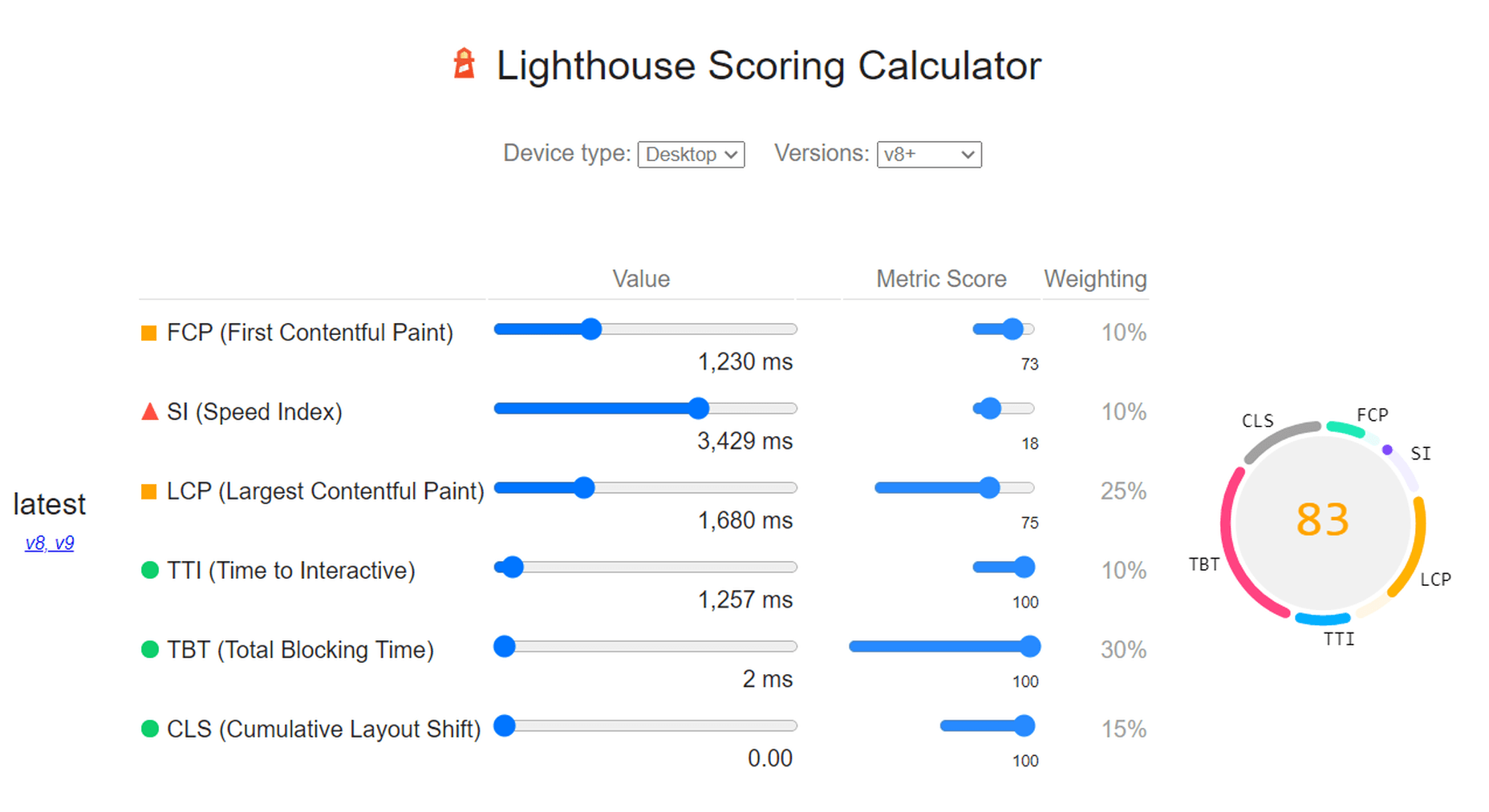
As we can see, both Core Web Vitals and other important metrics were flagged as “needs improvement.” Specifically, the LCP, FCP, and TBT. In this case, both the LCP and FCP were a high-res featured image at the top of the page.

If we go to the opportunities for improvement highlighted by PageSpeed, we see where the issues come from. We could still save as much as 4.2s of loading time by properly resizing images and a further 2.7s by serving them in next-gen formats:

So, now let’s see how much ImageEngine can improve on that.

The same test run on my WordPress website using ImageEngine got the following results:
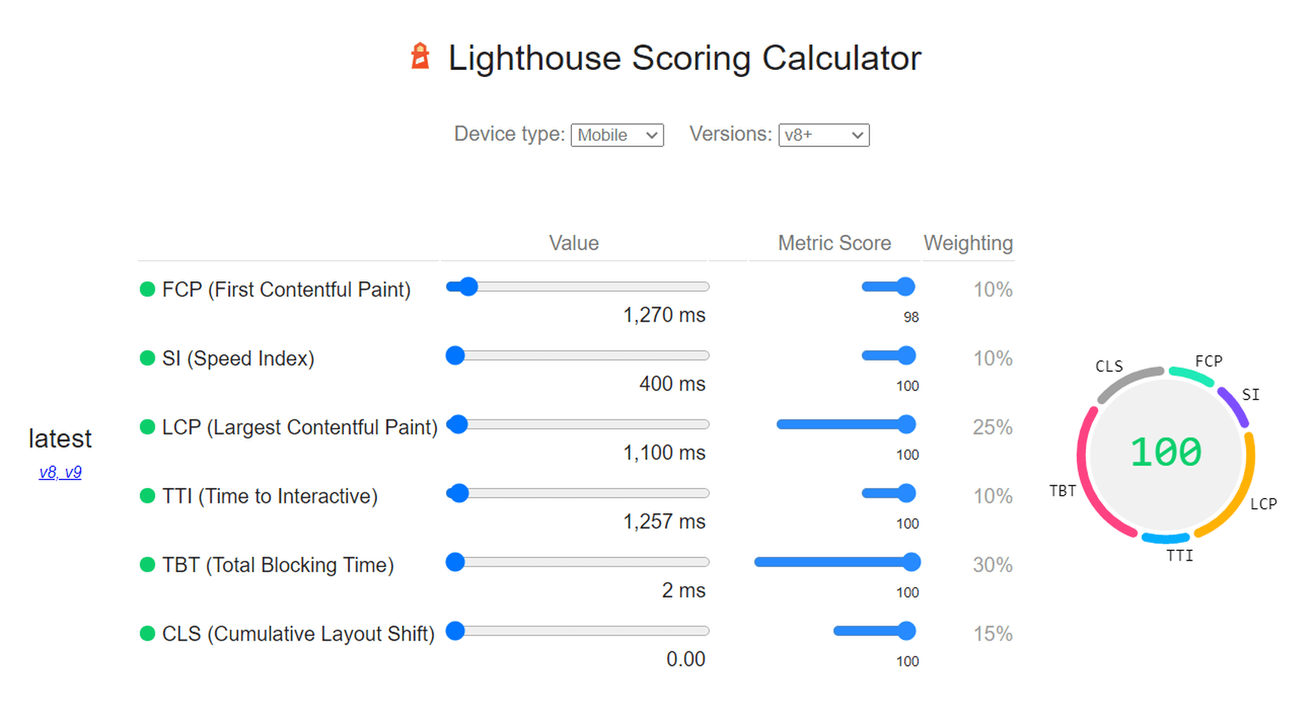
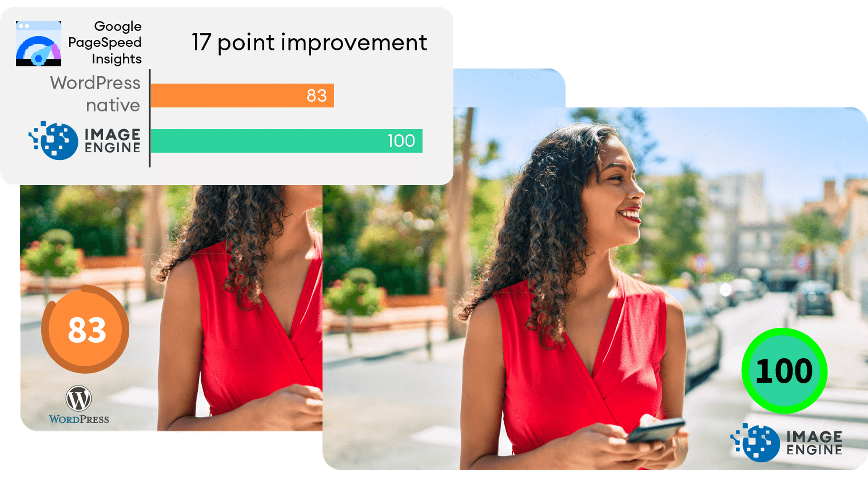
As you can see, we now have a 100 PageSpeed score. I saved roughly 2.5s on the SI (~86%) as well as roughly 1.7s on the LCP (~60%). There was also a slight improvement in the FCP.

Not only will you enjoy a stronger page experience signal from Google, but this represents a tangible difference to visitors regarding the speed with which your website loads. That difference will lead to lower bounce rates, increased user satisfaction, and more conversions.

There was also a 53% overall reduction in the total image payload. This is impressive, considering that it’s on top of WordPress’ built-in compression and responsive syntax.

Conclusion

So, as someone with a WordPress website, what can you take away from this?

Well, first of all, WordPress does feature some basic image optimization. And while not perfect, it should help you offer reasonable levels of performance, even if you use a lot of image content.

However, the caveat is that WordPress applies aggressive, across-the-board compression, which will lead to a noticeable reduction in visual quality. If you use WordPress for any type of website where premium quality images are important, this is a concern — for example, as a photography portfolio, exhibition, or image marketplace like Shutterstock.

By using ImageEngine, you can reduce image payloads and accelerate delivery even further without compromising too harshly on visual quality. What’s more, ImageEngine’s adaptive image optimization technology will provide greater improvements to more of your visitors, regardless of what device(s) they use to browse the web.

Whether or not you still want to use WordPress’ built-in optimizations, ImageEngine will deliver significant improvements to your user experience, traffic metrics, and even conversions.

Plus, true to the spirit of WordPress, it’s extremely simple to set up without any advanced configuration. Just sign up for ImageEngine in 3 easy steps, install the plugin, integrate ImageEngine by copy/pasting your image domain, and you’re good to go.


[ This is a sponsored post on behalf of ImageEngine ]

Source

The post WordPress Website Analysis: Before & After ImageEngine first appeared on Webdesigner Depot.

Source de l’article sur Webdesignerdepot

The central principle of cloud engineering is adopting software engineering practices. Refactoring is a technique for making changes to code that improve maintainability, enhance performance, scalability, and security without changing its external behavior. In DevOps, refactoring often occurs with modern applications; however, we can apply those same techniques to cloud infrastructure with infrastructure as code.

Refactoring results in many advantages. First and foremost, the code is more readable and easier to understand for other team members –this aids in maintainability and well-organized code, providing a solid foundation for future releases. Overall, if done well, refactoring reduces complexity which makes future changes more efficient.

Source de l’article sur DZONE

Every year, at this time, blogs like this one like to try and predict what’s going to happen in the year ahead. It’s a way of drawing a line under the archive and starting afresh. A rejuvenation that, as humans, we find life-affirming.

Ten years ago, I would have had high confidence in these predictions — after all I was eventually right about SVG adoption, even if it took a decade. But the last few years have shown that web design is tightly interwoven with the muggle world, and that world is anything but predictable.

So as we look at what might occur in the next year (or five), think of it less as a set of predictions and more as a wishlist.

Last Year’s Predictions

When I write this post every January, I like to keep myself honest by glancing back at the previous year’s predictions to gauge how accurate (or not) my predictions have been.

Last year I predicted the long-term trend for minimalism would end, WordPress would decline, cryptocurrency would go mainstream, and then hedged my bets by saying we’d make both more and fewer video calls.

Gradients, maximalism, and the nineties revival pulled us away from minimalism. It’s still popular, just not as dominant.

WordPress is still the biggest CMS in the world and will continue to be for some time. But the relentless grind of no-code site builders at the low end, and being outperformed by better CMS at the high end, mean that WordPress has passed its peak.

Over-inflated predictions for BitCoin reaching $100k by December 2021 turned out to be a damp squib. In the end, Bitcoin only tripled in value in 2021. However, with micro-tipping and major tech companies moving into the arena, it’s clear digital currency arrived in the public consciousness in 2021.

And how could I be wrong about more but also fewer video calls? So I’m calling that my first clean sweep ever. With that heady boast, let’s take a look at the next twelve months.

What Not to Expect in 2022

Do not expect the Metaverse to be significant in anything but marketing speak. Yes, the hardware is slowly becoming more available, but the Metaverse in 2022 is like playing an MMORPG on PS5: theoretically, great fun, until you discover that absolutely none of your friends can get their hands on a console.

Ignore the blog posts predicting a noughties-era retro trend. All those writers have done is looked at the nineties-era trend and added a decade. Fashions aren’t mathematical; they’re poetic. Retro happens when people find a period that rhymes with present-day hopes and fears. After the last couple of years, if we revisit a decade, it’s likely to be the late-forties.

Finally, don’t expect seismic change. Material design, parallax scrolling, and jQuery are still with us and are still valid choices under the right circumstances. Trends aren’t neat; they don’t start in January and conclude in December.

5 Web Design Predictions for 2022

Predictions tend to be self-fulfilling. So we’ve limited ourselves to five trends that we believe are either positive or, at worst harmless. Of course, there are no guarantees, but if these come to pass, we’ll be in good shape for 2023.

1. The Blockchain is Coming

Underpinning the cryptocurrency industry are blockchains. In simple terms, they’re a set of data that can be appended to but can’t be edited or deleted. Think of it as version control for data.

As with most technology, the first wave has been a way to make a fast buck. However, the exciting development is blockchain technology itself and the transformative nature of the approach. For example, Médecins Sans Frontières reportedly stores refugees’ medical records on the blockchain.

Imagine the Internet as a set of data, editable for a micro-fee, and freely accessed by anyone anywhere. Instead of millions of sites, a single, secure, autonomous source of truth. Someone somewhere’s working on it.

2. Positivity & Playfulness & A11y

Even before world events descended into an endless tirade of grim news, time was running out for dull, corporate, geometric sans-serif design.

We added gradients, we added personality, we embraced humor. And contrary to the established business logic, we still make money. Over the past few years, there have been extraordinary efforts by designers and developers to examine, test, and champion accessibility, and thanks to them, inclusive design is no longer reliant on the lowest common denominator.

In 2022 you can get experimental without obstructing 10%+ of your users.

3. Everything Green

Green is a fascinating color, the primary that isn’t (except in RGB, when it is).

Green has the same visual weight as blue, is substantially more flexible, and yet to date, has been radically underutilized in digital design.

Green has a prominent cultural association with the environment. At a time when tech companies are desperate to emphasize their ethical credentials, marketing companies will inevitably begin promoting a brand color shift to green as a quick fix for all those dumped chemicals, strip mines, and plastic-filled seas.

We’ve already seen earthy hues acquire popular appeal. At the other end of the vibrancy scale, neons are popular. Green spans both approaches with everything from calm sages to acidic neons.

In 2022, if you’re looking for a color to capture the moment, look to green.

4. Hero Text

A picture is supposed to be worth 1000 words, although I’m not sure anyone has actually tried to measure it. The problem is that sites increasingly rely on stock images, so the 1000 words that we’re getting may or may not accurately reflect 100% of our message.

In 2022, a handful of well-chosen words will be worth more than an image, with hero images taking a back seat to large hero text. This is aided by a number of minor trends, the most notable of which is the willingness of businesses to look beyond the geometric sans-serif to a more expressive form of typography.

Reading through the prediction posts on sites other than this, almost everyone agrees on large hero text replacing images, which virtually guarantees it won’t happen. Still, at the start of 2022, this seems to be the direction we’re taking.

5. Bring the Noise

One of the unexpected consequences of the past couple of years has been a renewed connection with nature. The effortless complexity in nature is endlessly engaging.

We’ve already begun to popularise gradients — there are no flat colors in nature — and the next logical step is the addition of noise.

In visual terms, noise is the grainy texture that sits so beautifully in vector illustrations. Noise has dipped in and out of trends for years, hampered a little by the leap in file size it creates. However, with WebP and Avif file types, noise is now usable on production sites.

Designing in 2022, when in doubt, throw some noise at it.


Featured image via Unsplash.

Source

The post 5 Big Web Design Predictions for 2022 first appeared on Webdesigner Depot.

Source de l’article sur Webdesignerdepot

Jamstack (JAMstack), is one of the most popular (and rapidly growing) tools for app and website creation. A unique ecosystem of functionality, Jamstack promises developers the support they need to create powerful websites and progressive applications. 

For a while, Jamstack was mostly written off as just another buzzword in the developer space. However, today, it’s growing to become a powerful investment for many business leaders. Even big companies are getting involved, like Cloudflare, with Cloudflare pages, and Microsoft with Azure Static Web Apps. Elsewhere, we’ve seen brands like Shopify, PayPal, and Nike getting involved too.

So, what exactly is Jamstack, and is it time you transitioned over? Let’s find out…

What is Jamstack?

Jamstack, otherwise known as “JAMstack,” is the name of a developer ecosystem made up of JavaScript, APIs, and Markup (hence: JAM). The solution is a web development architecture allowing developers to access static website benefits, such as higher security and better performance, while still unlocking dynamic database-oriented CMS.

The Jamstack solution allows companies and developers to build a dynamic website where real assets are pre-rendered static files in a CDN. The dynamic environment runs on JavaScript client-side, through serverless functions. 

For a better insight, let’s compare Jamstack to the LAMP stack development strategy, which originated from the four open-source components many developers used to build sites: Linux, Apache HTTP, MySQL, and PHP.

With LAMP, each user request for a page forces the server to query a database — unless the page is cached — and combine the result with page markup data and plugins. Jamstack websites serve pre-built optimized assets and markup solutions quickly because the files are already compiled on a CDN. There’s no need to query the database. 

Jamstack workflows dramatically reduce cumbersome issues with development and excess maintenance, making them highly appealing to developers. 

What Are the Benefits of Jamstack?

Jamstack won’t be the ideal development tool for everyone, but it has a lot of benefits to offer. By fetching HTML from a CDN, the system doesn’t have to wait for HTML to be combined and returned to clients. The solution also provides an improved developer experience with static methods. 

Using Jamstack, developers can build fantastic static files ready to serve by request, hosted on a global CDN. Some of the biggest benefits of Jamstack include:

  • Performance: Because you’re serving pre-built static files from a CDN directly, you’ll achieve much faster loading times, unmatched by typical server-side rendering options. Because you’re serving static files, you’re also better equipped to handle any traffic spikes you might encounter, with minimal slowdown.
  • User experience: Better website performance significantly improves user experience and website traffic, as well as SEO efforts. User experience has always been a critical factor in ensuring the success of a website, and it’s essential to keeping your customers around for as long as possible. Websites optimized for performance will always delight users. 
  • Security: With Jamstack, there are no servers or databases to worry about. You use third-party solutions to handle these issues for you. The architecture of Jamstack means the back and front end of your development processes are decoupled, and you can rely on APIs to run server-side processes easily. Jamstack also comes with security benefits other approaches can lack. Clear separation of services is essential here. 
  • Hosting and scaling: Scaling and hosting can often be problematic in the development world, but because you’re serving files from a CDN, you’re less likely to encounter issues. CDNs are almost infinitely scalable, so you get excellent extensibility built into your development environment. CDN hosting for static files is also cheaper than traditional hosting, so you can keep costs low. 
  • Maintenance: Jamstack makes it easy to push your front end to the edge rather than managing infrastructure directly. Ditching plugins, databases, and other hosting services can help you to save more time and money on a significant scale. 
  • Developer experience: From a developer perspective, there are tons of benefits from Jamstack. You get the ease of a Github, CI/CD, CDN flow, and auto previews with simple rollback to reduce the need for backups. Local developer environments and the ability to run and debug cloud functions locally are all fantastic.

Does Jamstack Have any Limitations?

In a lot of ways, Jamstack is an innovative and revolutionary solution for development. It can help you to create a far more engaging website and present your company in an incredible way. Of course, that doesn’t mean there are no limitations to be aware of. 

Jamstack is developer-friendly, for instance, but it’s not beginner-friendly. You will need at least some knowledge of web development to start unlocking the benefits. You’ll need to understand things like Vue or React, but you should develop a tool anyone can use with a bit of work.

There’s also a handful of things you can’t pre-generate, like user-specific and real-time data. So, this means you may not be able to use Jamstack effectively on projects requiring these kinds of data. Building an analytics dashboard, for instance, probably isn’t a good idea with Jamstack. Other issues for some developers may include:

  • API complexity: It can be overwhelming to try and find the right solution for your needs among so many different options. Of course, this could also be something you’d say about the WordPress ecosystem and its huge variety of plugins. An API usually won’t break your production website, at least. 
  • Long building processes: If you have a large number of pages, there’s more likely to be an extensive building process to think about. Whenever you make a change to a single page, even a little one, you’ll need to rebuild your entire website. This is a problem if you run into a website with thousands of pages. There are solutions to this problem available, however.
  • Handling dynamics: Going with Jamstack doesn’t mean abandoning your backend. An important part of the approach is accessing serverless functions, which are becoming more effective over time. These serverless functions can also be executed on the edge. The backend parts of your website will require regular maintenance as they scale.

Best Jamstack Tools to Check Out

Now you know the basics of Jamstack, let’s look at some of the tools you can use to design an incredible website or application within the Jamstack environment. 

The Git Tool Landscape

There are tons of tools within the Git ecosystem common among Jamstack developers. Starting with Git itself. Git represents a powerful free, and open-sourced distributed version control system. With this solution, companies can handle everything from small to enterprise-level projects with efficiency and speed. The solution is extremely easy to use and learn, and outclasses a range of tools like Perforce, ClearCase and Subversion. 

GitHub Pages and GitLab pages are two hosting services for Git repositories with built-in services to host static pages from out of your codebase. This makes the two solutions fantastic for when you’re building a Jamstack website. You can access the functionality for free too. 

GitLab gives you a comprehensive DevOps platform to work with, where you can enjoy a comprehensive CI/CD toolchain out of the box. The comprehensive solution, delivered as a single application, changes the way security, development, and Ops teams integrate and collaborate. Gitlab helps to accelerate software delivery on a massive scale.

AWS Amplify

AWS Amplify, created by Amazon Web Services, is a development platform packed full of useful features for people in the Jamstack environment. The Amplify offering aims to reduce the complexities associated with Amazon Web Services for mobile and web deployment. You get 12 months of hosting for free with new accounts, and you get Storage with Amplify too. 

The Amazon Amplify solution dramatically improves the regular AWS workflow, especially if you’re just a novice user. There’s a huge documentation hub to help you too, which is way more convenient than Amazon’s usual documentation solutions. Amplify is still accessed from a somewhat bloated console, however. 

With AWS Amplify, companies can access features like a comprehensive data store to sync data between the cloud and websites. There’s also easy-to-use interface access across all different categories of cloud operations. The service works well with a range of JavaScript central tools. 

Netlify

Netlify is a pioneering solution in the Jamstack environment, allowing users to go dynamic with their websites and applications on their own terms. You can access a range of add-ons and integration, access your favorite tools, and make your own. The flexible environment enables developers to run websites on a multi-cloud infrastructure designed for speed and scale automation. 

Built to be entirely secure from the ground up, Netlify makes it easy to build a site that’s custom-made for performance and deployed directly. You don’t need to worry about managing, scaling and patching web services, which means you can more quickly implement your Jamstack architecture. 

Unlike other large legacy apps, Jamstack projects are neatly separate from your front-end pages and UI from the backend databases and apps with Netlify. Using this service, the entire front-end can be pre-built with highly optimized static assets and pages, and developers can deliver new web projects faster than ever before.

Next.JS

Inspired by the functionality of PHP, Next.JS is a solution for pre-rendered JavaScript modules. The solution allows developers to easily export the components of their apps and perform individual tests to determine how each element works. You can also access a wide range of components and modules from NPM. The Next offering allows developers to save time, removing the need to use webpack bundles and transform with compilers. 

The full solution is extremely intuitive, ensuring developers can create solutions quickly. What’s more, the technology you build will allow you to load only the bundle needed from your JavaScript workflow, rather than all the JavaScript at once. Pre-fetching, one of the features of Next.JS, also picks up where standard code-splitting leaves off, allowing for optimized bundles of code to load seamlessly. 

Next.JS also supports hot-module replacement. This means instead of reloading an entire application when you change the code, you only recreate the modules you’ve altered.

Angular

Probably the most widely-recognized of all the JavaScript frameworks, Angular, designed by Google engineers, appeared first in 2012, offering developers a new way to create dynamic pages. Before this technology, there were other opportunities for creating dynamic pages, but they were nowhere near as convenient or speedy. 

Angular is probably one of the most essential tools companies can use when building a Jamstack website or environment. The front-end web development tool attracts developers from all over the world. Every version is packed with features and constantly upgraded to ensure you can generate the best results. 

Angular extends HTML file functionality with powerful directives, and it requires very little effort to enable these directives too. All you do is add the ng- prefix to your HTML attributes and you’re ready to go. Angular also allows developers to create widgets leveraging editable data with two-way binding. This means developers don’t have to write code that syncs constantly between the model and view. 

With Angular, developers also get access to things like virtual scrolling, which can help with displaying large lists of elements performantly, rendering on the items that fit on the screen to reduce loading times. 

React

Another must-have tool in the JavaScript world for Jamstack, the React solution was launched first in 2013, and has won thousands of customers across the globe thanks to fantastic functionality. Today, the full landscape is maintained by Facebook, along with all the members of the standard developer community. The solution is used by some of the biggest giants in the tech industry, like Netflix, PayPal, and Apple. 

React is a true pioneer in the Jamstack ecosystem, with its sensational approach to simple and straightforward solutions for JavaScript management. You’ll be able to access batched and virtual DOM updates, which makes it easier to unlock components quickly, and write your components the way you see them. There’s also the added benefit that React is compatible with a lot of tools. 

You can build a comprehensive app or website with the help of React, and you’ll have no trouble accessing some of the top features, particularly with plenty of support available from the React community. 

Gatsby

Created from the ground up to improve user experience on a comprehensive level, Gatsby is a static site generator with heavy focus on things like SEO, performance, and accessibility. The solution offers plenty of out-of-the-box features to help developers deliver the most immersive solution for their users, without unnecessary complexity. 

Gatsby users pre-configuration to develop static websites giving developers faster loading pages, stronger code splitting, and server-side rendering. You can also access features like data prefetching, asset optimization, and quick image loading. Gatsby boasts excellent documentation and starter packs to help you get your site up and running more quickly.

The GraphQL data layer of Gatsby also means the system can collect your data from anywhere, including your CMS, JSON, Markdown, and APIs. More than just your standard site generator, this is a tool built specifically with performance in mind. 

Agility CMS

Developing an effective Jamstack website means having access to the right CMS technology. Agility CMS wasn’t the first CMS solution to support Jamstack, but it is one of the better-known options. As one of the first headless CMS solutions to hit the market, the company has quickly captured the attention of a huge range of developers worldwide.

Agility CMS is a Jamstack pioneer, capable of helping developers to build a foundation for any online ecosystem. The technology is an API-first CMS with support for REST APIs, so developers can connect all the third-party apps and front-end frameworks they like.

The technology also gives developers the freedom to code their solutions their way. You don’t have to follow a specific set of guidelines for how content is created, but templates are available to fast-track development. Agility CMS also hosts and abstracts your database, so you don’t have to worry about connection strings, backups, and maintenance. 

With a strong content architecture to help companies manage digital content and a partnership with Gatsby, Agility is ideal for Jamstack development strategies. 

Building Your Jamstack Website

The Jamstack solution is more than just a buzzword in today’s development world. This unique approach to building incredible development experiences delivers an excellent advantage to both developers and their end-users. Fast, scalable, and full of solutions for customization, Jamstack is a powerful way to bring websites to life with simplicity and speed. 

Every day, more companies take advantage of the Jamstack environment, and we’re constantly seeing a wide selection of new tools, APIs and offerings emerging to help enhance the Jamstack landscape too. This environment is definitely worth consideration for any developer looking to significantly speed up their development strategy.


Featured image via Pexels.

Source

The post Is it Time to Transition to JAMStack? first appeared on Webdesigner Depot.

Source de l’article sur Webdesignerdepot
1, 2, 3 – That’s exactly how long it takes you to start losing visitors if you have a slow-loading website.

Hold on! Surely, the only thing that matters to users is that your website works flawlessly and looks great… right? Wrong!

The fact of the matter is that we’ve all become accustomed to instant access to information and content. The average internet user today places a lot of value on speed, and the bar is continually being raised.

If you are like most people, you probably feel an immediate sense of dread at the thought of optimizing your website. Where do you start? How can you make the most impactful improvements? What makes your website slow in the first place?

Have no fear, as we’ll be answering all of your questions below as well as putting you on your way to a website that loads with blazing speed.

Why Should You Be Worried About A Slow-Loading Website?

Good question!

As many as 53% of visitors abandon a site that takes more than 3 seconds to load. Even worse, 1 in 3 shoppers will leave a website if it takes longer than 5 seconds to load.

So, performance plays a huge role in the user experience of your website and whether your visitors will stay on your website or be converted into customers.

For some time, Google has been keenly aware of this fact. As a search engine, Google knows that it’s counterproductive to recommend content to users if they won’t stick around to consume it.

That’s why they’ve continually been increasing the role performance plays when ranking websites for their SERPs (search engine results pages).

In recent years, Google has introduced core web vitals. These are metrics they hope will help quantify how performance affects the user experience. In general, they measure how fast, stable, and interactive a page is while loading. This will be more important than ever after Google announced its Page Experience update, which started its global rollout in June 2021.

As you may know, ranking highly for Google is vital for your website’s visibility. For one, 68% of online experiences begin with a search engine, of which Google has a 92.7% market share. Even if you manage to land on the coveted first page of Google, the first five results get over 70% of all clicks (28% to the first result alone).

So, to recap why a fast loading website is so desirable:

  • It directly affects your ability to keep, satisfy, and even convert visitors to your website.
  • It impacts your search engine rankings which impacts your “findability” and organic traffic.

8 Reasons Your Site Is Slow + How to Fix Them

O.K., so now that we’re all on the same page regarding the importance of your website performance, let’s look at common issues slowing down your website + how to fix them.

1. You’re Using A Sub-Par Hosting Service

As the party responsible for making your website available to the outside world, your hosting service can be a make-or-break factor. Not only should you pick a host that has a good track record when it comes to uptime a performance, but also one that’s suitable according to your needs.

Even if you take all the steps below to optimize your website’s performance, it may still load slowly if traffic to your website is overwhelming your available bandwidth or your host’s server capacity. If that happens, some users may experience extremely slow loading times, broken features, or even complete unavailability.

For most personal, blog, or local/small business sites, a respectable hosting provider like Bluehost or GoDaddy should be good enough. However, if you plan on running any type of large-scale, high-traffic webstore, business portal, or other type of website, you’ll want premium hosting, such as WPEngine (for WordPress), VPS hosting, or even a dedicated server.

2. You’re Not Optimizing Your Media Assets

As you probably know, media like images and videos take up significantly more space than most other types of content, such as text, code, stylesheets, or other static files. Even a single image has the potential of consisting of more data than dozens of website pages containing nothing but the underlying HTML and text.

In a Speed Essentials presentation, the Google team identified images as the largest contributor to page weight. In fact, they have the potential to consume a website’s entire performance budget if left unoptimized. Images can also directly impact all three of Google’s core web vitals – key metrics Google uses to measure the performance of a website.

However, the use of images and video is likely to continue growing, heightening the importance of finding a sustainable solution. According to HTTPArchive, images have increased by 19.3% on desktop and 42.7% on mobile.

For now and the foreseeable future, optimizing your images carries the greatest potential for improving performance.

The problem is that optimizing image assets requires multiple steps. Most importantly:

  • Using the appropriate next-gen formats which can differ depending on the user’s device, OS, or browser.
  • Appropriately compressing the size and quality of images to reduce payload without affecting visual quality too badly.
  • Using the optimal display size and density based on the accessing device to reduce payloads further.
  • Using lazy loading to only load images as needed.

As you can see, manually going through these steps for every single image on your website can be extremely labor-intensive. This is especially true if you consider that you somehow need to create the optimal variants for different users based on what device, OS, or browser they are using.

In-code strategies, like a JS plugin, responsive images, or CSS media queries tend to bloat your code and lead to other performance issues we’ll discuss below.

Luckily, there are plenty of CDN services available designed specifically for providing some degree of automated image optimization. These platforms analyze the context (i.e., a specific mobile device model, OS version, and browser version) of the user trying to load one of your images and try to serve them a version of the image that’s ideally optimized for them.

However, any media optimization platforms still require installing a small JavaScript plugin to dramatically improve the image and video optimization capabilities. 

The one exception here is ImageEngine. ImageEngine uses WURFL device-detection to pick up every possible detail of the user’s device. The logic is built into their device-aware edge servers and doesn’t rely on you adding any additional code or markup to your website pages.

So, not only does it reduce your image payloads by up to 80% and serve them via a global CDN, but it doesn’t leave a footprint in your website’s code. As a bonus, it also happens to support the widest range of image/video formats, including animated GIFs, as well as client hints and save-data mode.

3. Render-Blocking JavaScript And CSS Is Delaying Page Loads

JavaScript is the de facto programming language for adding interactivity and advanced features to websites today. Likewise, CSS is the standard for adding styling. Both are critical components for almost any modern website.

However, nothing good comes free, and both may impact the performance of your website, particularly when used carelessly. 

The following are some steps you can take to minimize the impact of these assets on your website performance:

  • Minify your JavaScript and CSS files.
  • Combine a large number of JS/CSS files into fewer files.
  • Replace some of your external JS and CSS files with inline JS/CSS. (Don’t overdo this! Inline JS and CSS is only suitable for small code snippets).
  • Defer loading JavaScript until after all your content is loaded and use media queries for CSS files.

Because media can have a more significant impact on your page weight, this leads some to believe that adding more JavaScript is the lesser of two evils. 

However, depending on whether you already have render-blocking JS, Google might flag this as a completely new issue. Regardless, it will negatively impact your performance score in tools like PageSpeed Insights:

You can avoid it altogether by using an optimization engine like ImageEngine that doesn’t require any JavaScript.

4. You’re Not Using A Content Delivery Network (CDN)

A CDN is a network of servers spread across various regions all over the globe. What it basically does is store a copy of your website on each of these servers. When an internet user visits your site, the CDN automatically serves your website from the nearest server to that user.

What this does is allow your website to load faster, no matter where in the world people are visiting it from. If your website was only hosted on a single server, say somewhere in the U.S., then it could take much longer to load for a visitor located in Asia than one in the U.S.

While they all basically do the same thing, different CDNs are better at handling different types of content. Cloudflare, Fastly, and Akamai are just some of the most popular general-purpose CDNs around. Image CDNs like ImageEngine are purpose-built to not only serve image and video assets but to also optimize them using compression, formatting, etc.

So, the two main factors to consider are the type of content you want to deliver via the CDN and its global coverage. However, it’s usually possible to use multiple CDNs in tandem to cover different types of content and reach a wider area.

5. There’s Excessive Overhead In Your Database

If you have a website with any type of complexity, you probably have a corresponding database. In fact, all WordPress websites require a database to function.

Over the years, a lot of information moves in and out of the database. Sometimes, the data can get lost along the way or become obsolete. If you don’t regularly spring-clean your database, then this can really start to add up. Not only will it bloat the storage size of your database, but it will start to impact the speed of database queries and requests.

CMS users are especially prone to racking up these kinds of artifacts from plugins and themes that have been installed and removed over the years.

Unfortunately, there aren’t many easy fixes for this issue available. With most hosting providers, you’ll probably need to use phpMyAdmin to manually check and scrub your data. If you have a managed hosting solution, the host’s support team might be able to help you out. In the event that you have a locally installed database, there are some tools you can use, although they’re not 100% effective.

The best way to avoid any issues is to make database maintenance part of your routine and to learn the basics of how databases work.

6. You Have Too Many Plugins Or Themes Installed

For CMS users, plugins or themes offer near-limitless potential to spruce up the design and functionality of their website. However, each plugin or theme comes with additional code and content that add to the overall complexity and size of your website.

If you have a hand-coded website, the same goes for any additional applets or libraries you want to add to your site. 

The best way to combat this is to be conscientious when adding any extras to your website. Only install what you really need or want, and make sure to uninstall and properly remove them if you don’t need them anymore.

As mentioned, they might leave various transients or artifacts behind, so you should keep an eye out for them throughout your website files (not just the database) whenever you do some spring cleaning.

7. You Aren’t Utilizing Caching

Caching is often one of the most effective yet ignored techniques for improving website performance. Caching stores your website content in fast-access memory in the user’s browser, allowing it to be loaded near-instantaneously by users. This can include everything from text to stylesheets to images to JavaScript files.

Without caching, a user will need to redownload everything when they navigate to or reload a page — whether or not anything has changed.

However, not properly configuring caching on your website can lead to issues, such as users only loading out-of-date content. Most high-quality caching tools have built-in features that automatically clear the cache when you make changes to a specific website page or content. So, users will only reload content once it has been modified.

Some hosts offer out-of-the-box caching tools with their hosting service. CMS can also usually find plugins for this, such as WPRocket for WordPress.

8. Ads Are Dragging You Down

In the end, ads are just another form of media that increases the overall weight of your website pages. While they are typically small and lightweight, multiple ad placements can really start to add up.

What aggravates the issue is that ads are loaded from external sources. This means they’ll take longer to render, generate more requests, and may mess with how stable your pages load — affecting your core web vitals.

Depending on how important ads are to your revenue stream, you’ll want to carefully consider how many ads you use on your site, where to position them, and when they load. If possible, avoid loading ads at the same time as the rest of your page, especially interstitials.

Conclusion

As you can see, website performance is a multi-faceted subject. Although some may be worse than others, you can’t just address one area and expect your website to suddenly be performant.

However, some general principles apply:

  • Keep HTTP requests low by limiting the number of files required for each of your website pages.
  • Maintain proper code hygiene and spring clean transients and leftover artifacts.
  • Invest in proper hosting infrastructure as well as a CDN for your website.
  • Optimize your media assets to significantly bring down payloads without sacrificing engagement.

The final point deserves another shoutout. As we’ve pointed out, finding an optimization solution for your media, particularly images, is probably the best thing you can do to improve your website performance. From purely a performance perspective, there is no service quite as effective as ImageEngine. It’s also the one that requires the least amount of technical expertise and ongoing maintenance.

Regardless, you’ll want to run some tests using tools like PageSpeed Insights so you can gather data on what issues your website is facing. From there, you can prioritize fixes to make your website more competitive.


[– This is a sponsored post on behalf of ImageEngine –]

Source

The post 8 Reasons Your Site Is Slow + How To Fix Them first appeared on Webdesigner Depot.


Source de l’article sur Webdesignerdepot

Fundamentally Hyperlambda is really just a Turing complete markup language, with some added capabilities resembling features from XSLT and XPath. You could argue Hyperlambda is the programming equivalent of YAML. On the index of « programming level abstractions » if we argue that CISC x86 assembly code is at level 1 (the bottom level) and C# and Java is at level 5, while Python and PHP are at level 10 – Hyperlambda is at level 100+ somewhere.

Of course, the point being, that 95% of the times you need a low level programming construct, Hyperlambda implicitly creates your C# objects and ties these together 100% correctly out of the box. This reduces the cognitive complexity of your resulting app’s code by orders of magnitudes. To illustrate this difference, please have a look at the following code snippet taken from Microsoft’s official documentation for how to correctly create an HTTP request from C#.

Source de l’article sur DZONE

For everyone having done multithreading and async programming, it’s fairly obvious that the amount of complexity required to (correctly) implement threading and async increases the cognitive requirements to understand the codebase to sometimes unfathomable amounts. Typically, this results in difficult to track down bugs, and over time what we often refer to as « spaghetti code » or « the big ball of mud ». To put this into context, I’d like to put forth a statement in regards to this.

Everyone who (falsely) believes they understand threading and async, don’t understand threading and async!

Source de l’article sur DZONE

PageSpeed Insights is a free performance measurement tool provided by Google. It analyzes the contents of a web page for desktop and mobile devices. It provides a single number score (from 1 to 100) that summarizes several underlying metrics that measure performance. If you have not run PageSpeed Insights on your website, then you should stop and do it now. It’s an important indicator of how Google scores and ranks your site.

If your PageSpeed Insights score is below 80, don’t panic. You are not alone. Many websites are not optimized for performance. The good news is that you can take steps that should immediately improve your score.

You will notice that PageSpeed Insights highlights issues that cause slow page loading. However, you might need more guidance to resolve these issues. Below, we walk you through how to resolve four common issues related to images. We also show you how ImageEngine, an image CDN, can simplify, automate, and deliver the best image optimization solution possible.

Performance Drives Google SEO Rankings

Why does the PageSpeed Insights score and performance matter? Isn’t SEO ranking all about content relevance, backlinks, and domain authority? Yes, but now performance matters more than it did a year ago. Starting in 2021, Google added performance metrics to the factors that impact search engine rankings. In a market where websites are constantly jockeying to match their competition’s pages (for content relevance, keywords, and other SEO issues), performance is making a difference in keyword search engine rankings.

What Are Core Web Vitals Metrics?

PageSpeed Insights relies on a set of performance metrics called Core Web Vitals. These metrics are:

Largest Contentful Paint (LCP): Measures the render time (in seconds) of the largest image or text block visible within the viewport, relative to when the page first started loading. Typically, the largest image is the hero image at the top of pages.

First Input Delay (FID): Measures the time from when a user first interacts with a page (i.e. when they click a link, tap on a button, or use a custom JavaScript-powered control) to the time when the browser is actually able to begin processing event handlers in response to that interaction.

Cumulative Layout Shift (CLS): Measures the layout shift that occurs any time a visible element changes its position from one rendered frame to the next.

Images and JavaScript are the Main Culprits

PageSpeed Insights breaks down problems into categories based upon how they impact these Core Web Vitals metrics. The top two reasons why you might have a low score are driven by JavaScript and images.

JavaScript issues are usually related to code that either blocks or delays page loading. For example, lazy-loading images might involve JavaScript that blocks loading. As a rule of thumb, do not use a third-party JavaScript library to manage image loading. These libraries frequently break the browser’s built-in image loading features. Lazy-loading may make above-the-fold images load slower (longer LCP) because the browser starts the download later and because the browser first has to execute the JavaScript.

Another JavaScript issue involves code that is large or unnecessary for the page. In other words, code bloat. There are good resources for resolving these issues on the web. However, in this blog, we will focus on image problems.

Images are a major contributor to poor performance. The average website payload is 2MB in 2021, and 50% of that is images. Frequently, images are larger than they need to be and can be optimized for size with no impact on quality…if you do it right.

Four Image Issues Highlighted by PageSpeed Insights

Largest Contentful Paint is the primary metric impacted by images. PageSpeed Insights frequently recommends the following four pieces of advice:

  1. Serve images in next-gen formats.
  2. Efficiently encode images.
  3. Properly size images.
  4. Avoid enormous network payloads.

That advice seems straightforward. Google provides some great advice on how to deal with images in its dev community. It can be summarized in the following steps:

  • Select the appropriate file format.
  • Apply the appropriate image compression.
  • Apply the right display size.
  • Render the image.
  • Write responsive image code to select the right variant of the image.

We call Google’s process the “Build-Time Responsive Syntax” approach. If you have a relatively static website where you don’t generate new pages or switch out images frequently, then you can probably live with this approach. However, if you have a large and dynamic site with many images, then you will quickly feel the pain of this approach. Google itself stresses that developers should seek to automate this image process. Why? Because the process has some serious workflow drawbacks:

  • Adds storage requirements due to a large increase in image variants.
  • Increases code bloat and introduces more code complexity.
  • Requires developers’ time and effort to create variants and implement responsiveness.
  • Requires logic to account for different browser’s support for next-gen image formats.
  • Doesn’t adapt to different contexts. It relies on best-guess (breakpoints) of what device visits the web page.
  • Needs a separate CDN to further increase delivery speeds.
  • Requires ongoing maintenance to adapt to new devices, breakpoints, image formats, markets, and practices.

Key Steps to Achieving High-Performance Images

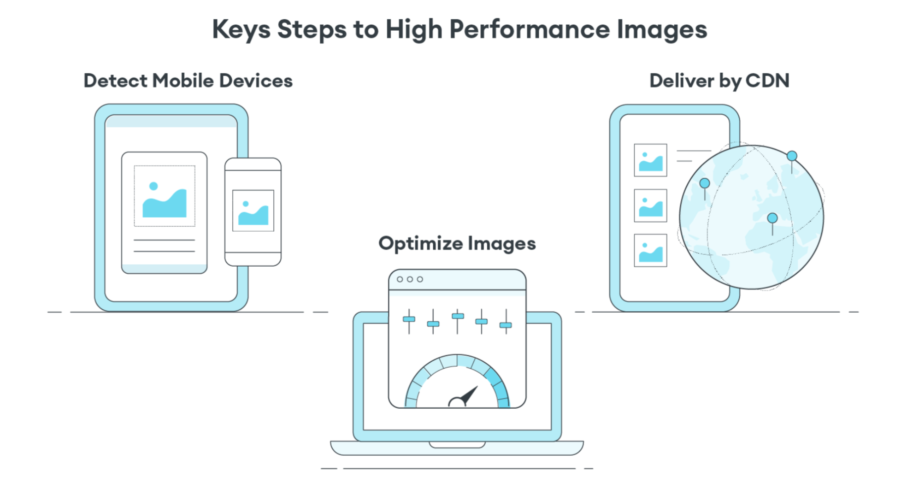
Instead of using the Build-Time Responsive Syntax approach, an automated image CDN solution can address all of the image issues raised by PageSpeed Insights. The key steps of an image CDN that you should look for are:

  1. Detect Mobile Devices: Detection of a website visitor’s device model and its technical capabilities. These include: OS version, browser version, screen pixel density, screen resolution width and height, support for next-gen image and video formats. This is where ImageEngine is unique in the market. ImageEngine uses true mobile device detection to further improve image optimization. It has a huge impact on the effectiveness of the image optimization process.
  2. Optimize Images: An image CDN will leverage the device’s parameters to automatically resize, compress and convert large original images into optimized images with next-generation file formats, like WebP and AVIF. Frequently, an image CDN like ImageEngine will reduce the image payload by up to 80%.
  3. Deliver by CDN: Image CDNs like ImageEngine have edge servers strategically positioned around the globe. By pushing optimized images closer to requesting customers and delivering them immediately from the cache, it often provides a 50% faster web page download time than traditional CDNs.

Easy Integration Process for Image CDN

After signing up for an ImageEngine account and free trial, you will receive a Delivery Address. After adjusting your <img /> elements to include the Delivery Address, ImageEngine will start to pull the original images from your website (no need to move or upload them), automatically optimize them, and deliver them.

You can automate the addition of the Delivery Address to the img src tag by using plug-ins for WordPress and Magento. Developers can also use ImageEngine’s React, Vue, or Angular JavaScript frameworks to simplify the process.

Additionally, there are many ways to simplify implementation via adjustments to templates for many CMS and eCommerce platforms.

Results: Improved Performance, Better SEO

Most ImageEngine users see a huge improvement in LCP metrics, and consequently, a big improvement in the overall PageSpeed Insights score. ImageEngine provides a free demo analysis of your images before and after image optimization. In many cases, developers see improvements of many seconds on their LCP and Speed Index.

In summary, performance drives higher search rankings, and better UX, and increases website conversions for eCommerce. The steps you take to improve your image performance will pay for themselves in more sales and conversions, streamlined workflow, and lower CDN delivery costs.

Source

The post 4 Steps to Improve PageSpeed Insights Score and SEO first appeared on Webdesigner Depot.


Source de l’article sur Webdesignerdepot