Articles

Since school is back in session, this month’s roundup has a learning focus. In addition to tools, many of the resources include guides, tutorials, and cheat sheets to help make design work easier.

Here’s what’s new for designers this month.

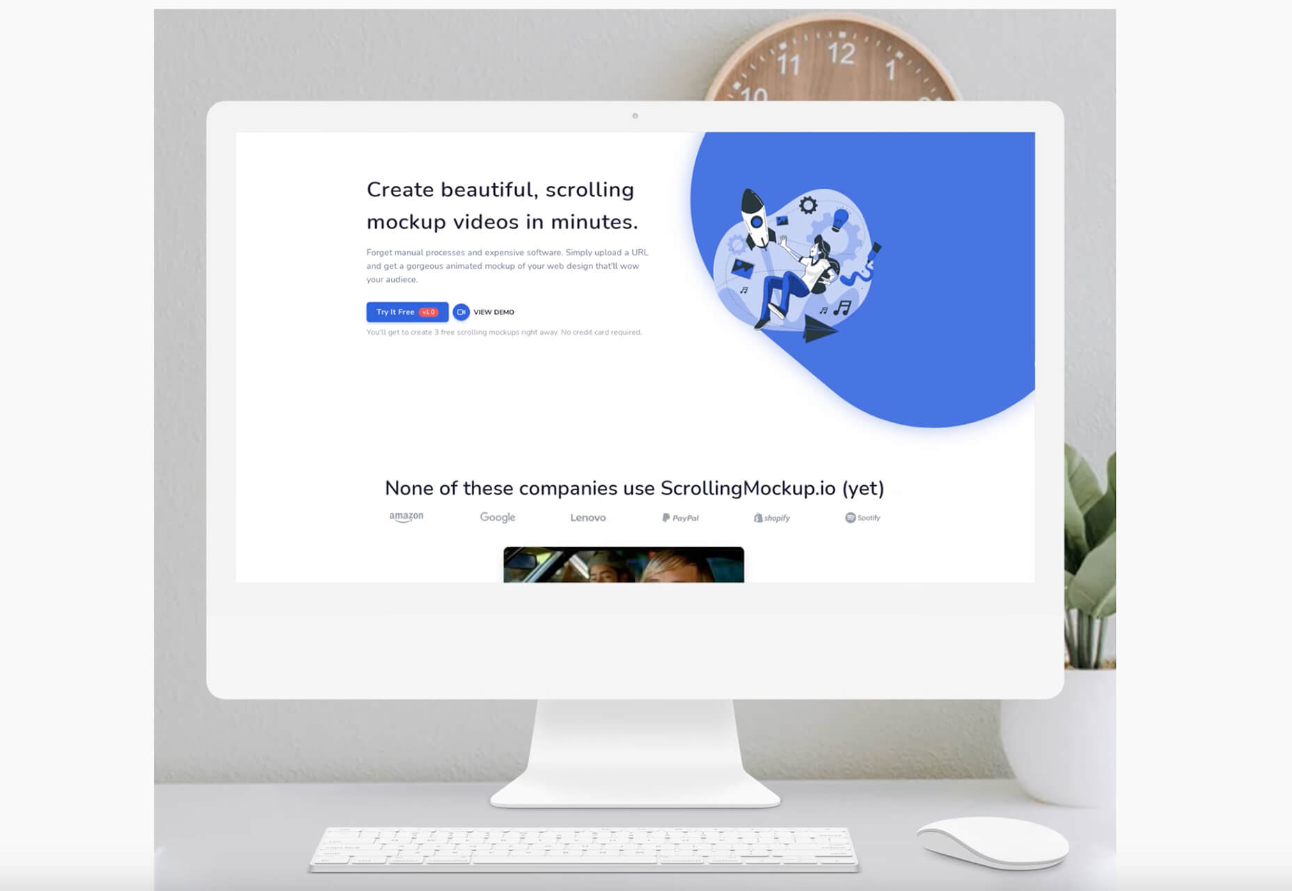
ScrollingMockup.io

ScrollingMockup.io generates high-definition, animated scrolling mockups in minutes. All you have to do is paste your website URL, select from the expanding template gallery, add some music and post. You can create three mockups for free, and then this tool comes with a subscription model. The paid model allows for custom branding for mockups and more.

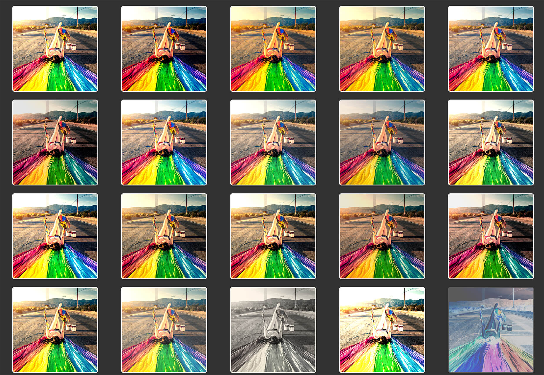
FilterSS

FilterSS is a curated collection of CSS image filters for use in projects. Upload an image, sort through the list, and then copy the code for the filter you want to use. It’s that easy!

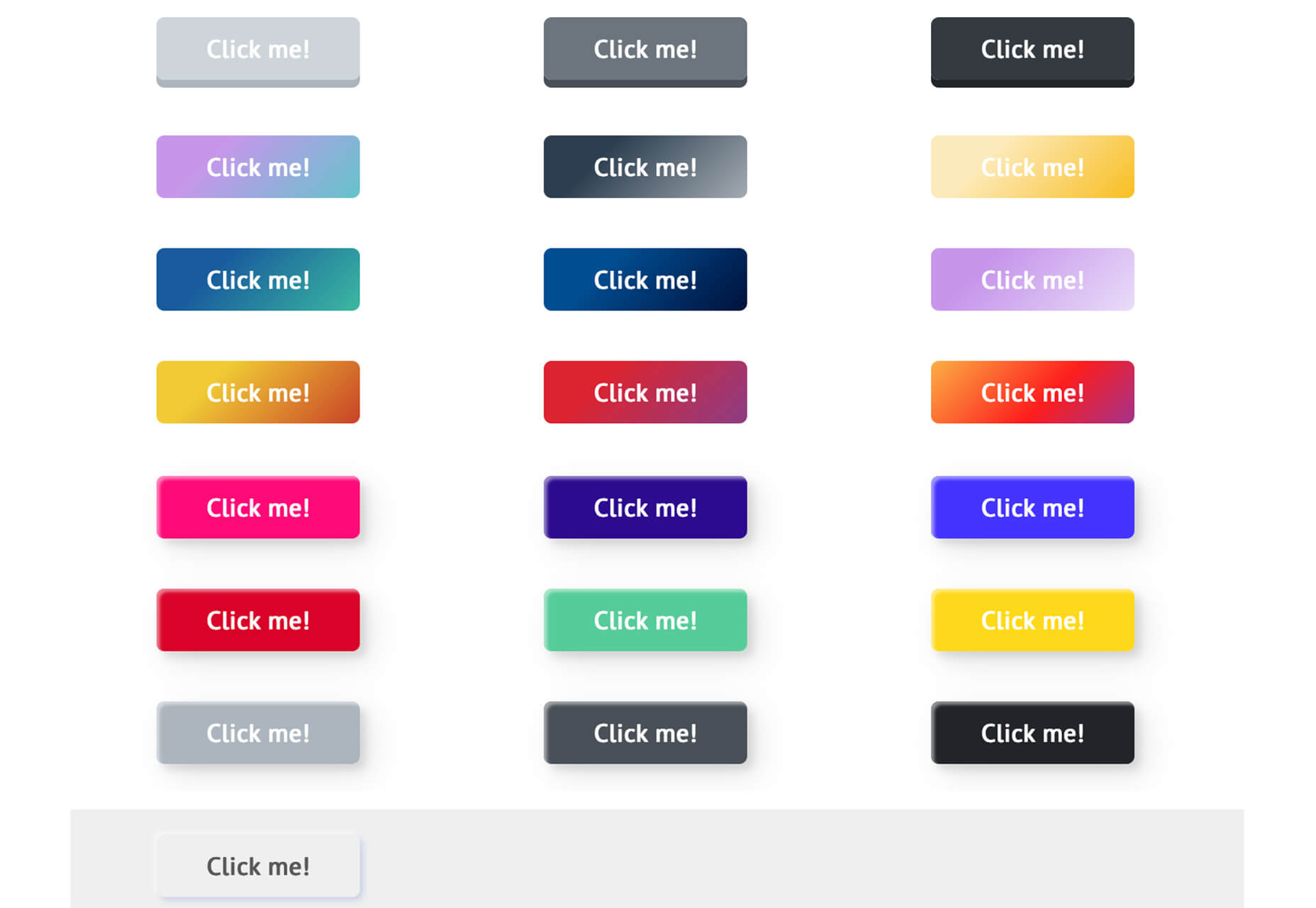
Buttons Generator

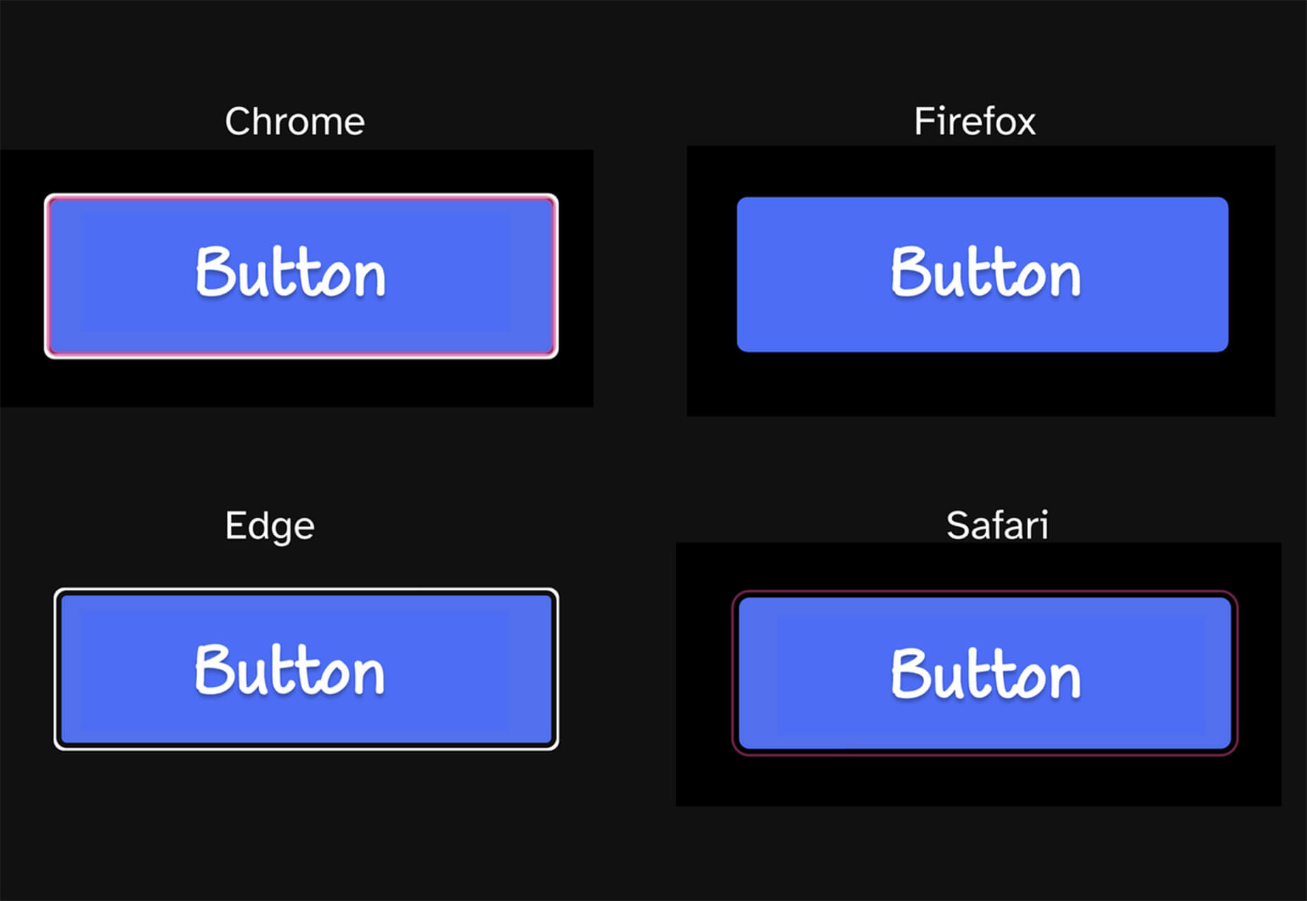
Buttons Generator is a fun tool with so many button options in one place. Choose from three-dimensional, gradient, shadow borders, neumorphic, retro, animated, ghost, with arrows, and more all in one place. Click the one you like, and the code is copied right to your clipboard and ready to use in projects.

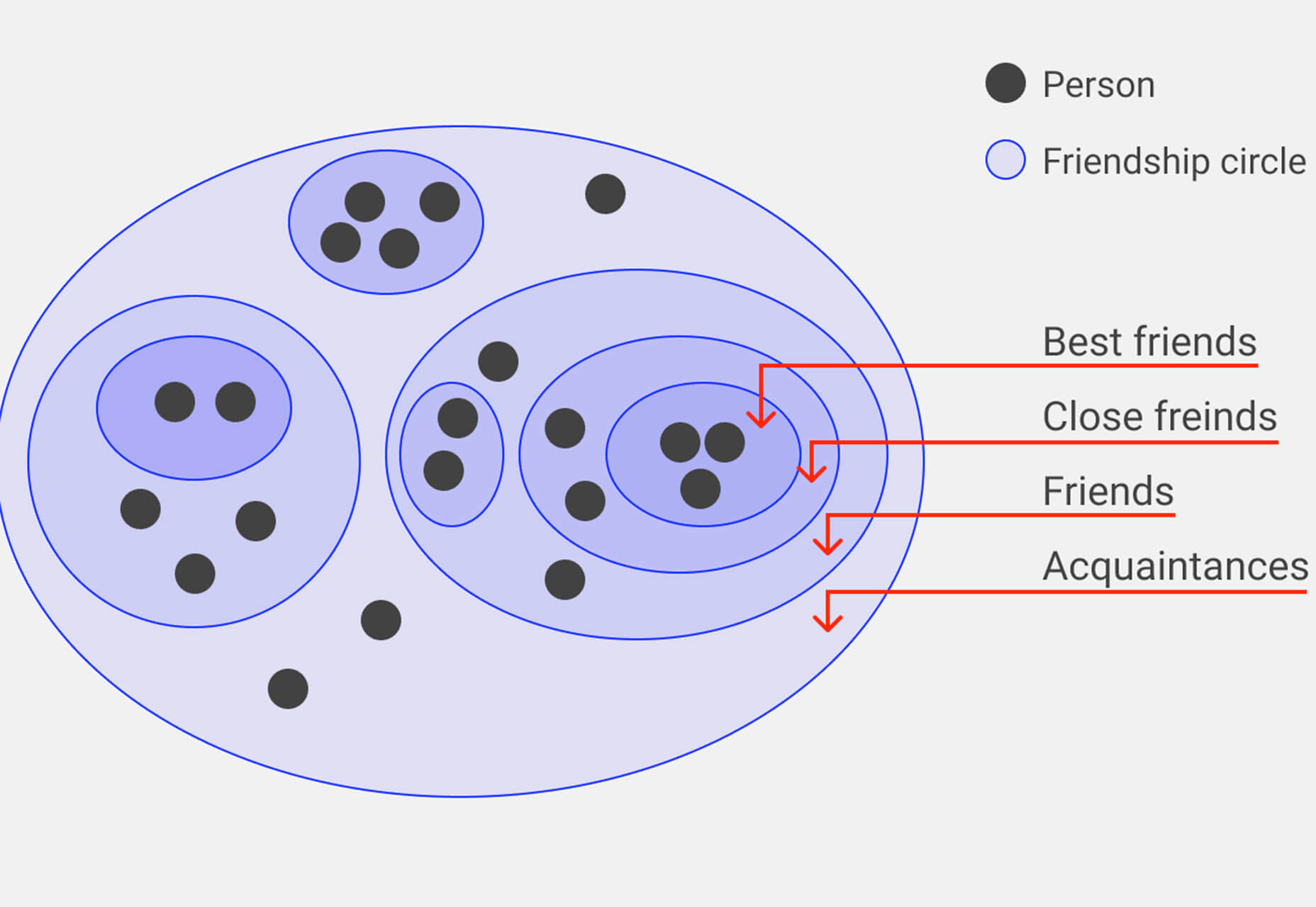
UI Cheat Sheet: Spacing Friendships

UI Cheat Sheet: Spacing Friendships is a fun – and memorable approach to figuring out spacing. This guide shows how close or far away elements should be based on “friend” circles with a couple of relatable instances. It’s one of the most relatable examples of this concept out there while emphasizing the importance of spacing in design.

PrettyMaps

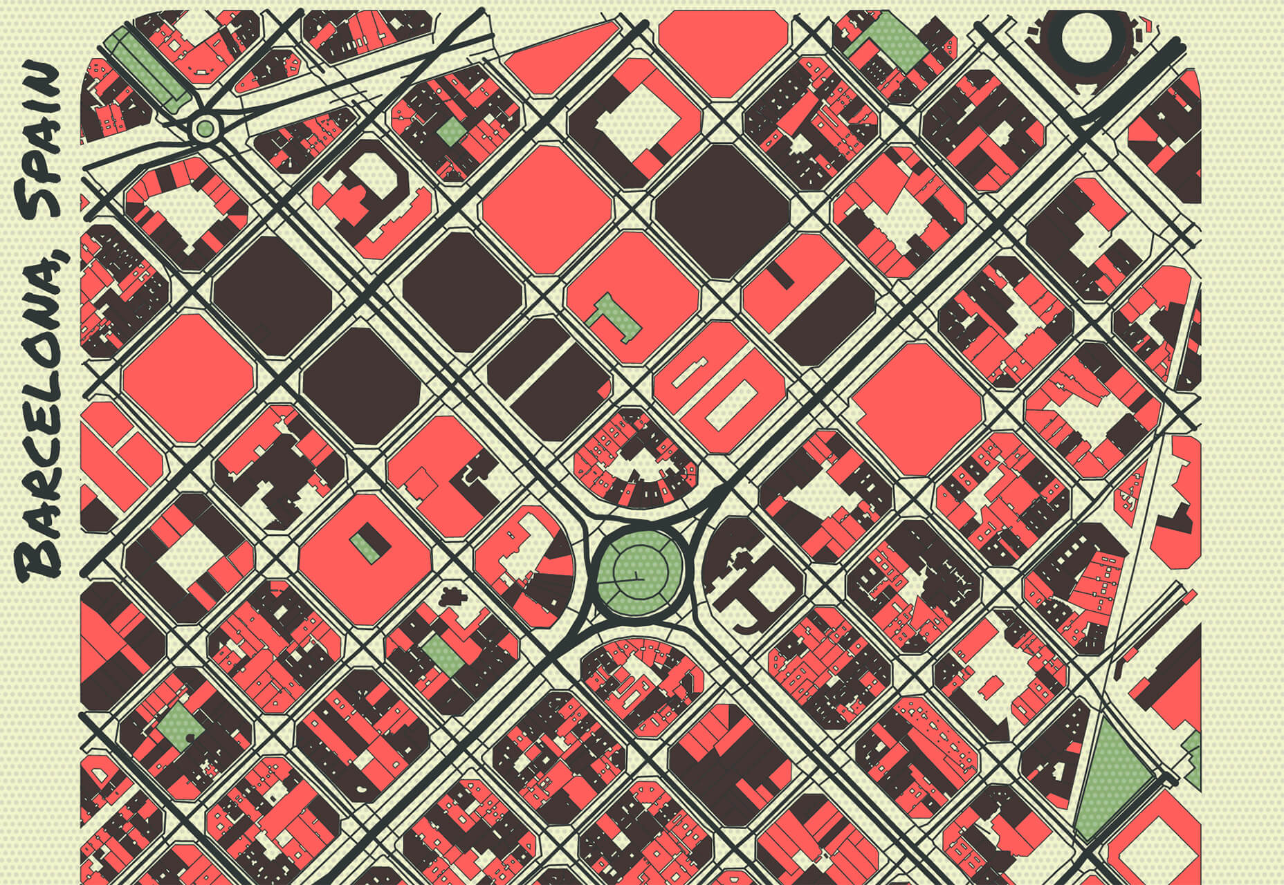
PrettyMaps is a minimal Python library that allows you to draw customized maps from OpenStreetMap data. This tool can help you take online map design to the next level with cool, unique map visuals. It’s based on osmnx, matplotlib, shapely, and vsketch libraries.

Card.UX/UI

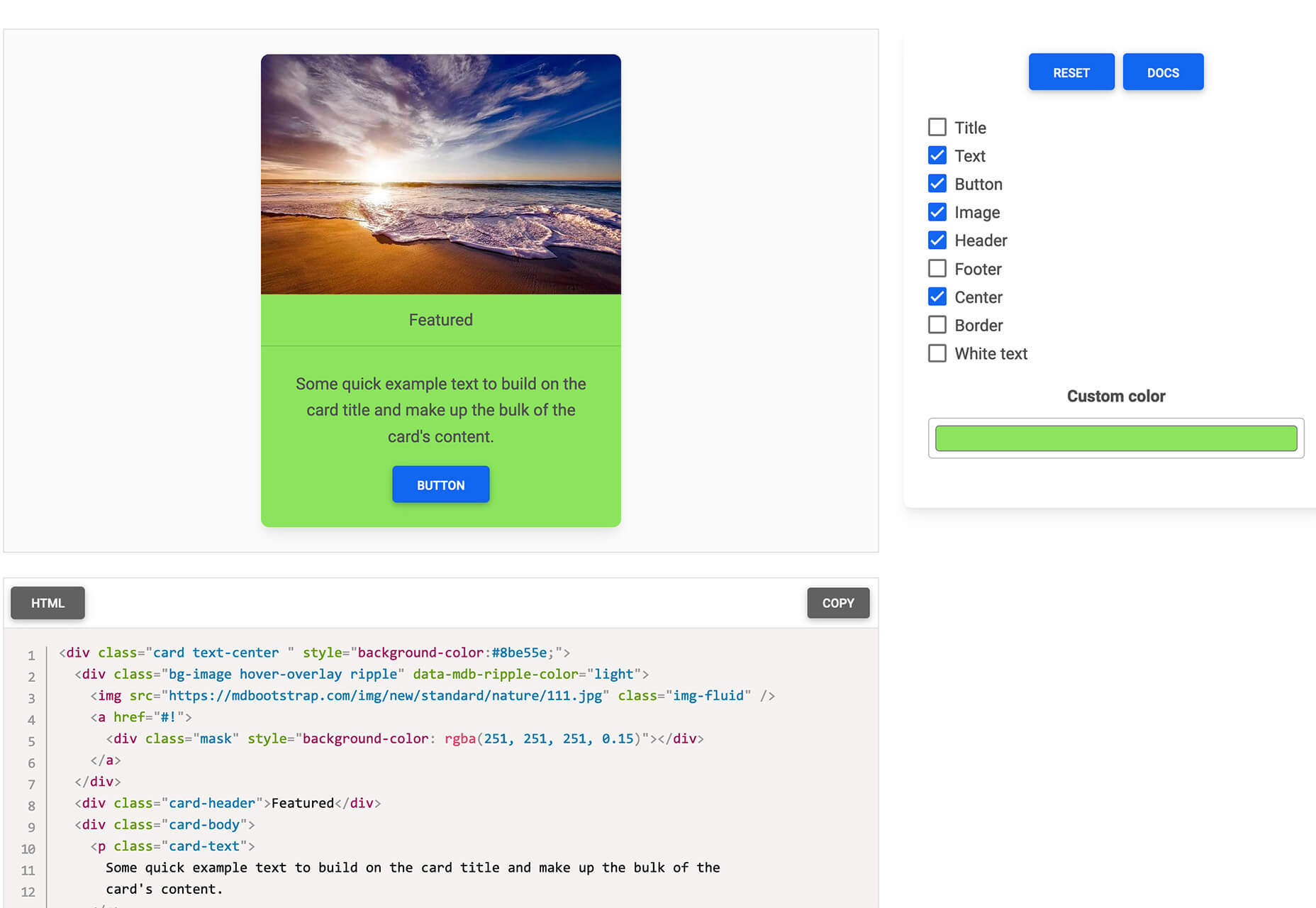
Card.UX/UI is a card-style generator with more than 20 templates and elements to create custom cards. Use the on-screen tools to design it the way you want and then copy the code for easy use.

Couleur.io

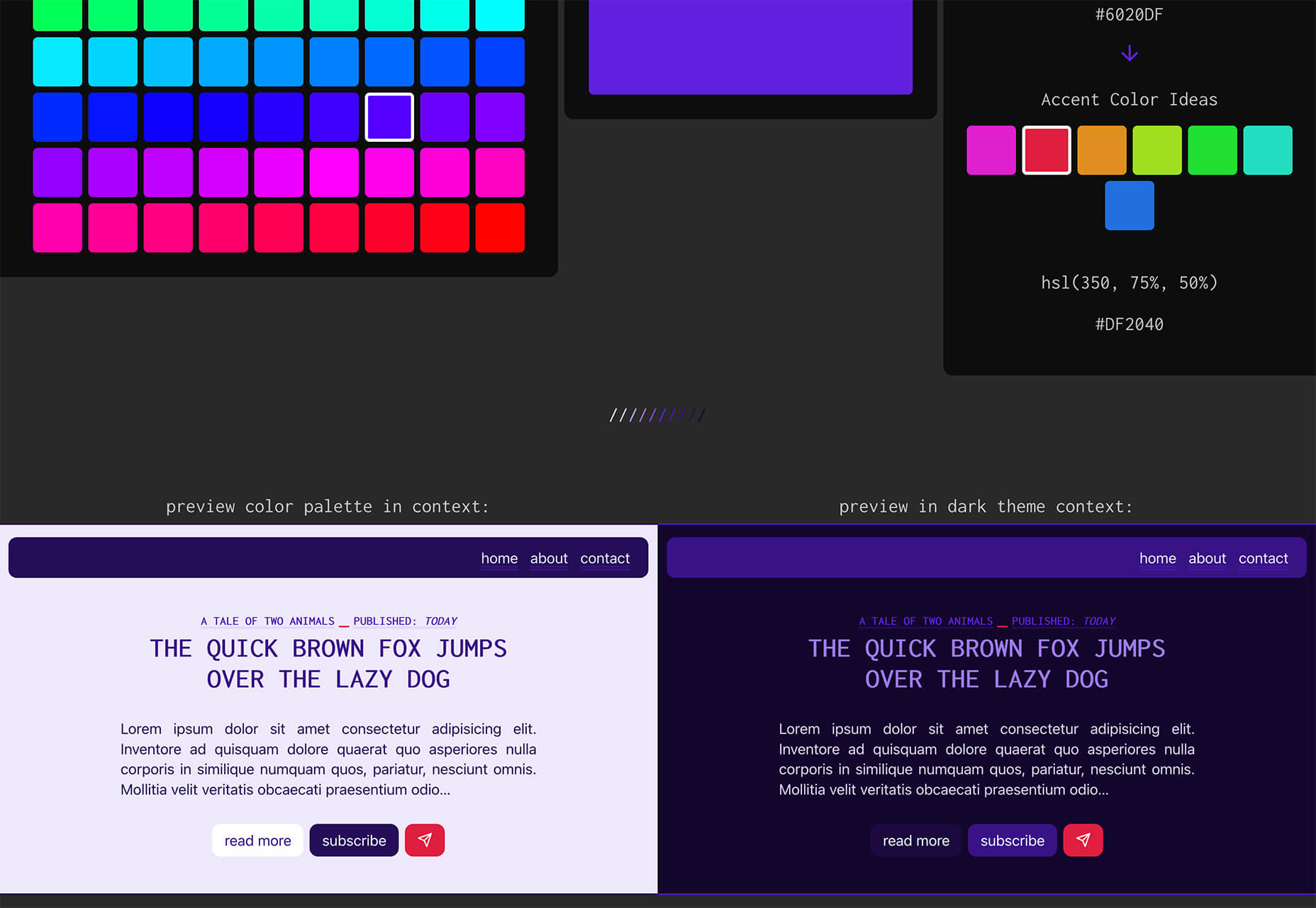
Couleur.io is a simple color palette builder tool that lets you pick a starting color and build a scheme around it. One of the best elements of the tool might be the quick preview, which shows your choices using the palette in context and in dark mode. Get it looking the way you want, and then snag the CSS to use in your projects.

CSS Accent-Color

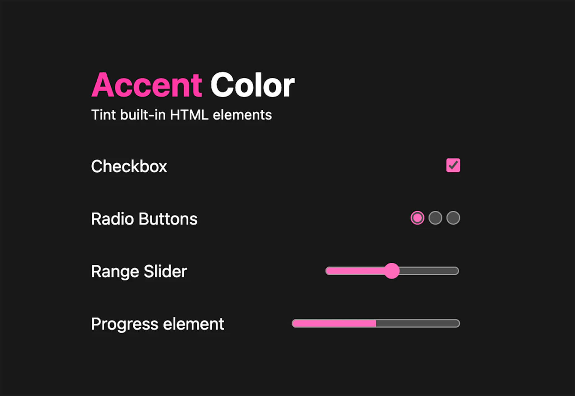
CSS Accent-Color can help you tint elements with one line of CSS. It’s a time-saving trick that allows for greater customization for your brand in website design projects. Plus, it works equally well in dark or light color schemes. It supports checkboxes, radio, range, and progress bars.

Vytal

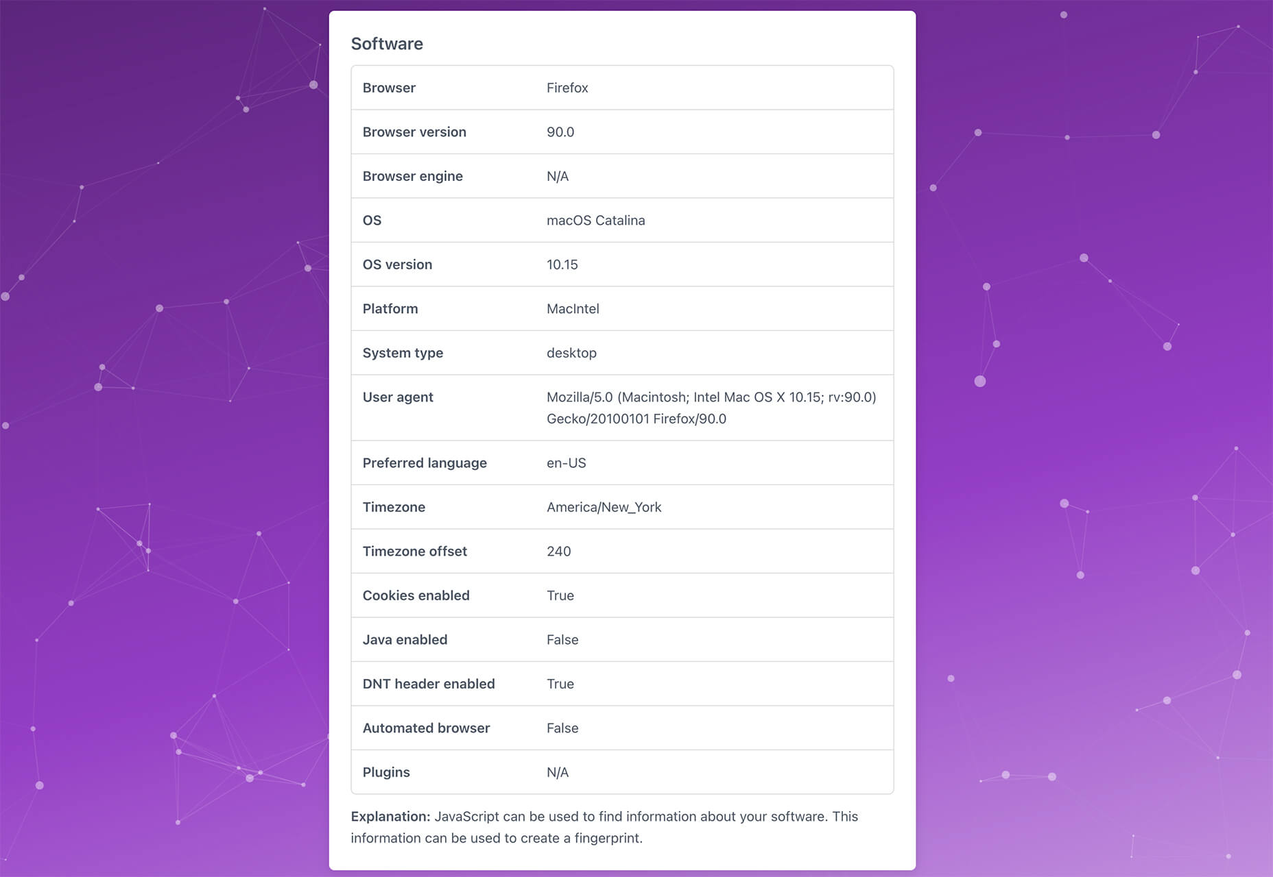
Vytal shows what traces your browser leaves behind while surfing the web. This scan lets you understand how easy it is to identify and track your browser even while using private mode. In addition, it scans for digital fingerprints, connections, and system info.

Imba

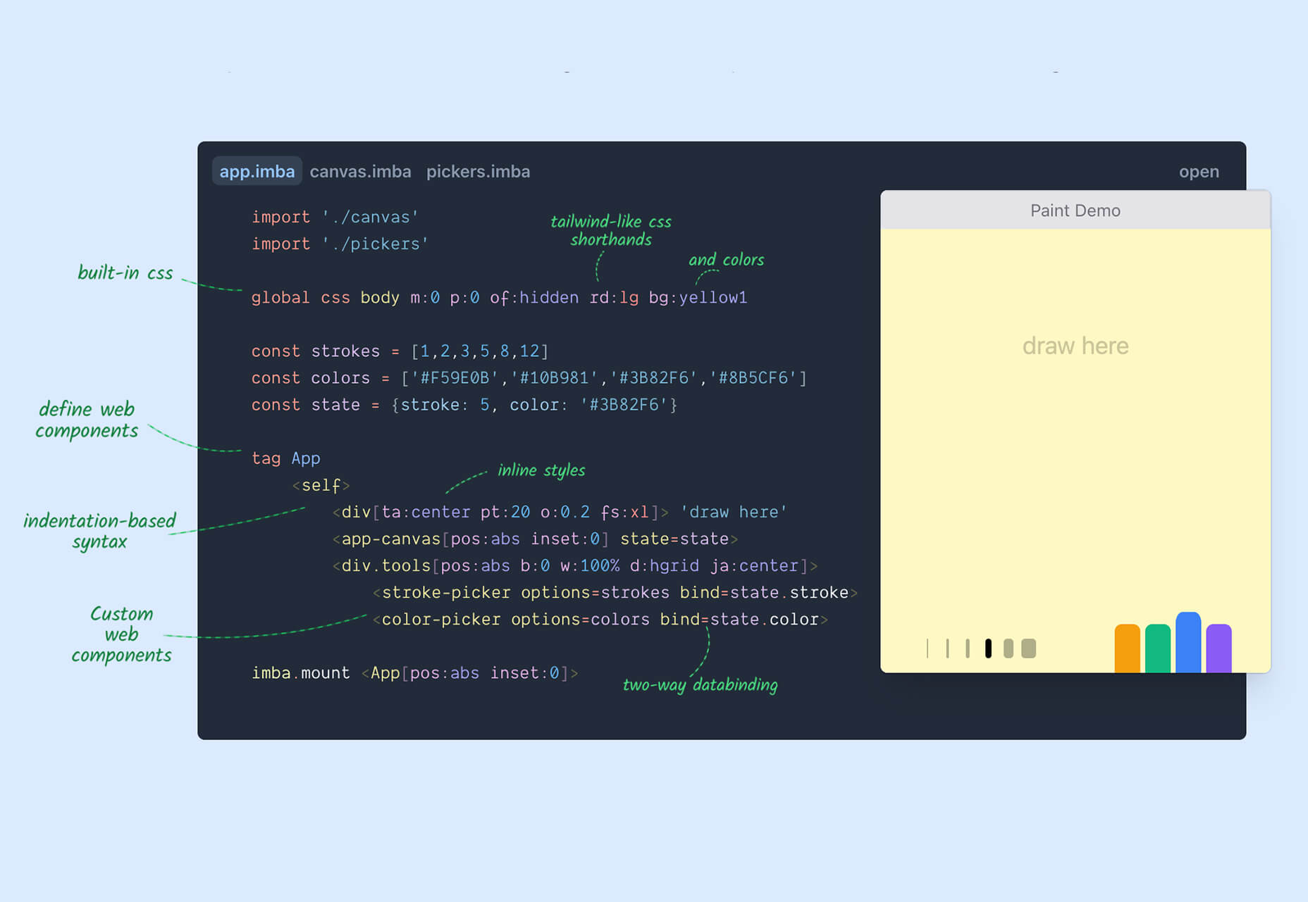
Imba is a programming language for the web that’s made to be fast. It’s packed with time-saving syntax tags and a memorized DOM. Everything compiles to JavaScript, works with Node and npm, and has amazing performance. While the language is still in active development, the community around it is pretty active and growing.

SVG Shape Dividers Creator

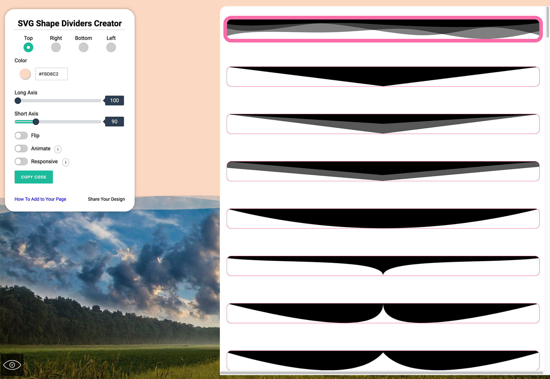
SVG Shape Dividers Creator is a tool that allows you to create interesting shapes with SVG so that your colors and backgrounds aren’t always rectangles. You can adjust and side, change the color, axis, and flip or animate it. Then snag the CSS, and you are ready to go.

Image Cropper

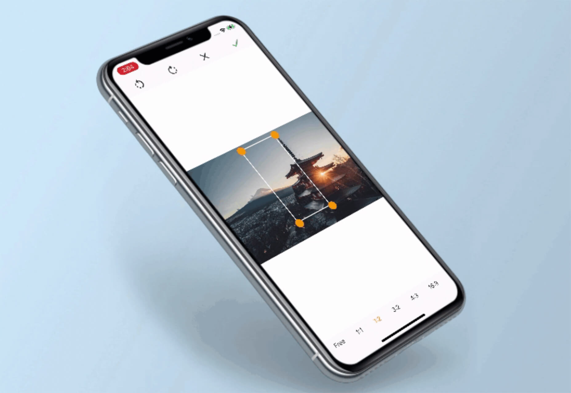
Image Cropper is a tool that allows you to crop and rotate images using the flutter plugin. It works for Android and IOS.

Noteli

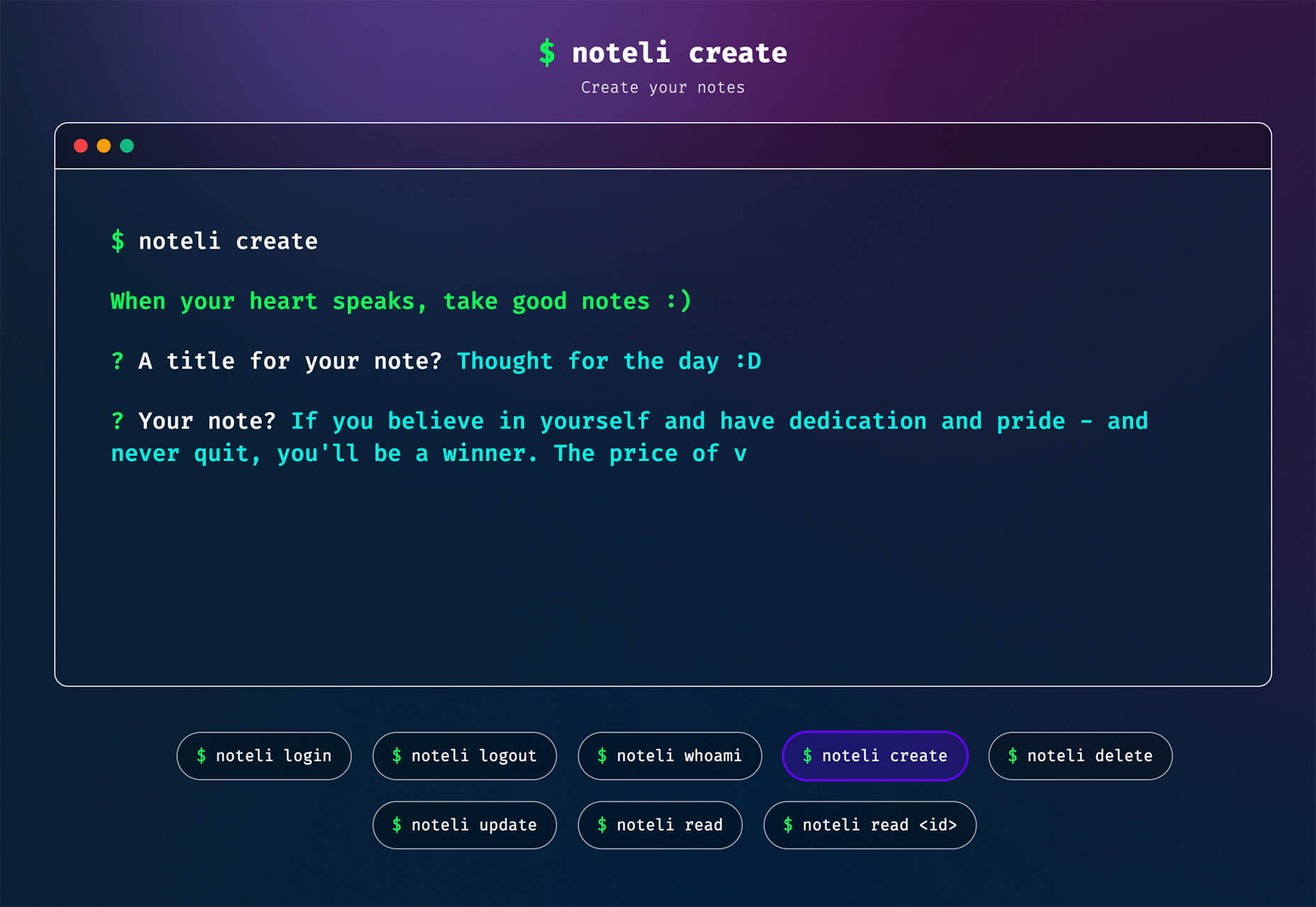
Noteli is a CLI-based notes application that uses TypeScript, MongoDB, and Auth0. The tool is just out of beta.

Yofte

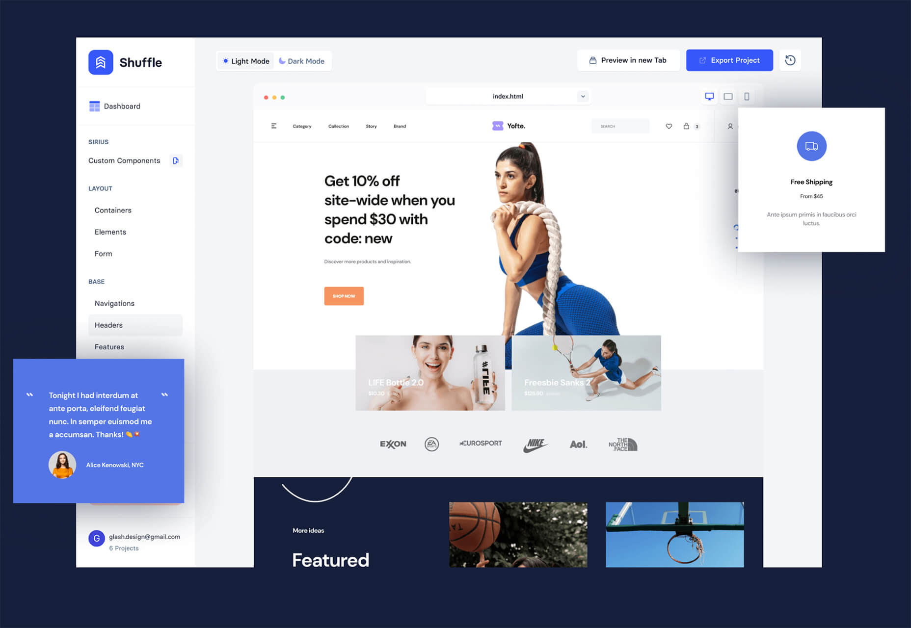
Yofte is a set of components for Tailwind CSS that help you create great e-commerce stores. The UI Kit is packed with components with clean and colorful designs that are customizable. The code is easy to export and clean. This premium kit comes with a lifetime license or a monthly plan.

UI Deck

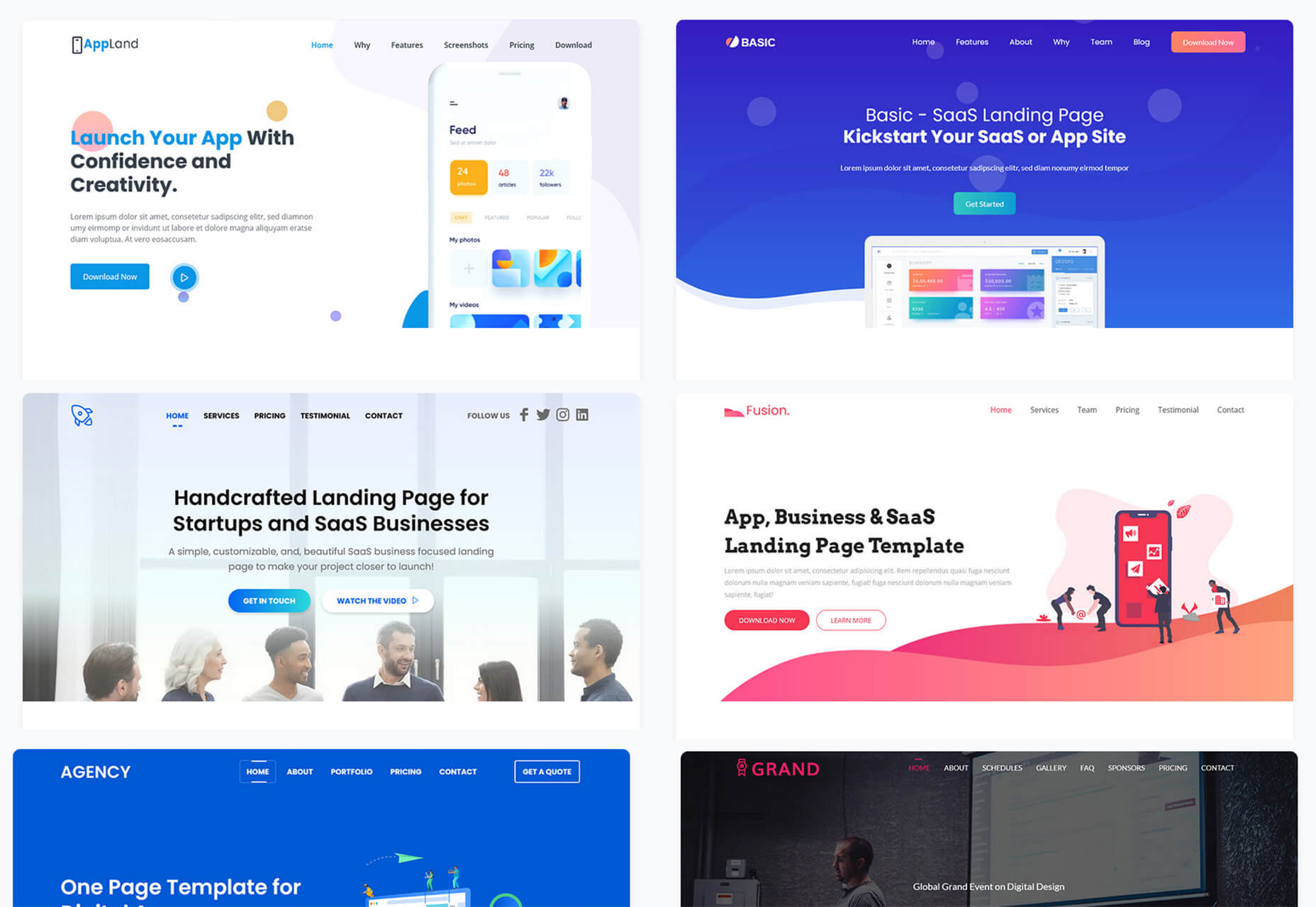
UI Deck is a collection of free and premium landing page templates, themes, and UI kits for various projects. This is a premium resource with paid access to all of the tools. It includes access to more than 80 templates.

Star Rating: An SVG Solution

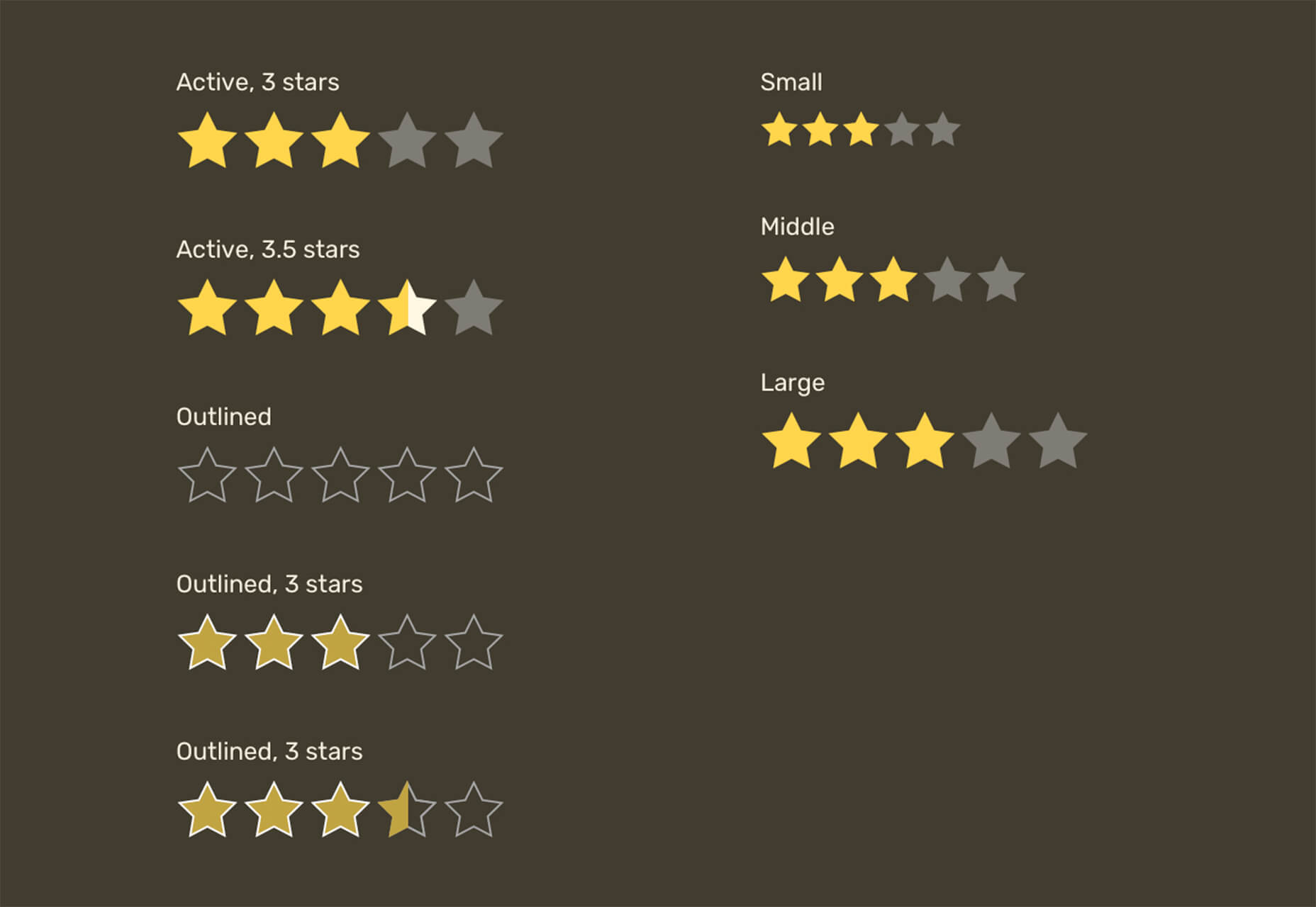
Star Rating: An SVG Solution is a tutorial that solves a common design dilemma: How to create great star rating icons for pages. This code takes you through creating an imageless element that’s resizable, accessible, includes partial stars, and is easy to maintain with CSS. It’s a great solution to a common design need.

Designing Accessible WCAG-Compliant Focus Indicators

Designing Accessible WCAG-Compliant Focus Indicators is another convenient guide/tutorial for an everyday application. Here’s why it is important: “By designing and implementing accessible focus indicators, we can make our products accessible to keyboard users, as well as users of assistive technology that works through a keyboard or emulates keyboard functionality, such as voice control, switch controls, mouth sticks, and head wands, to mention a few.”

Blockchain Grants

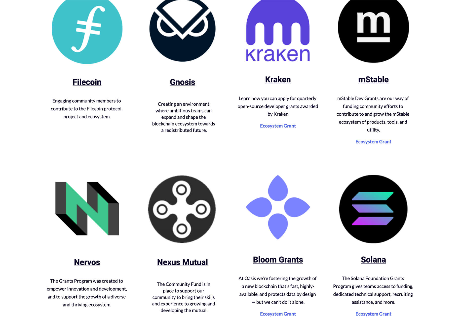
Blockchain Grants is a tool for anyone developing blockchain applications and in need of funding. It’s a database of grants from a variety of organizations for different applications. Start looking through this free resource to help secure additional funding for your projects.

Basement Grotesque

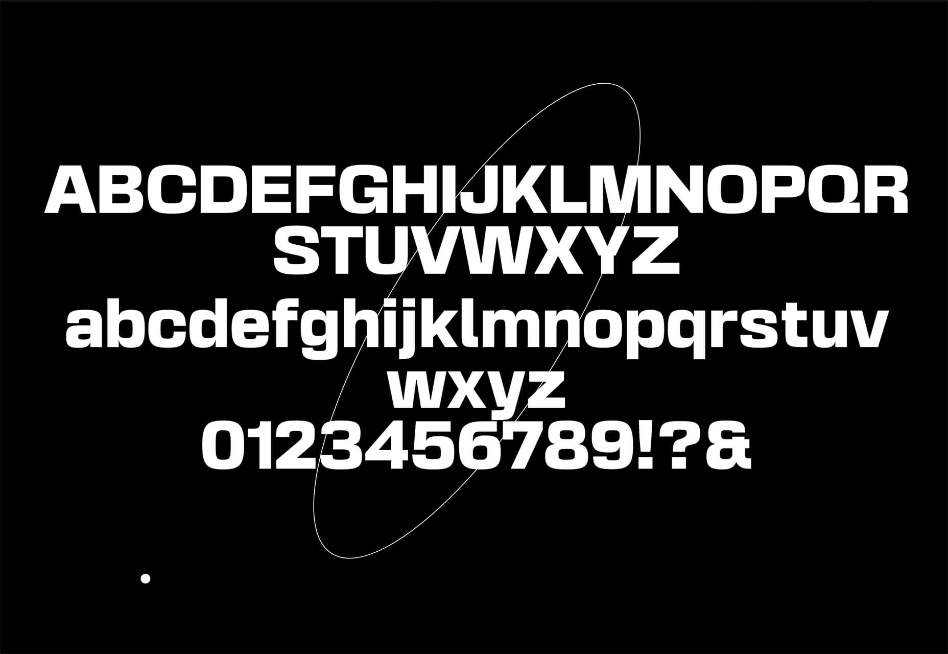
Basement Grotesque is a beautiful slab with a great heavy weight and plenty of character. There are 413 characters in the set with plenty of accents, numbers, and variable capitals.

Gadimon

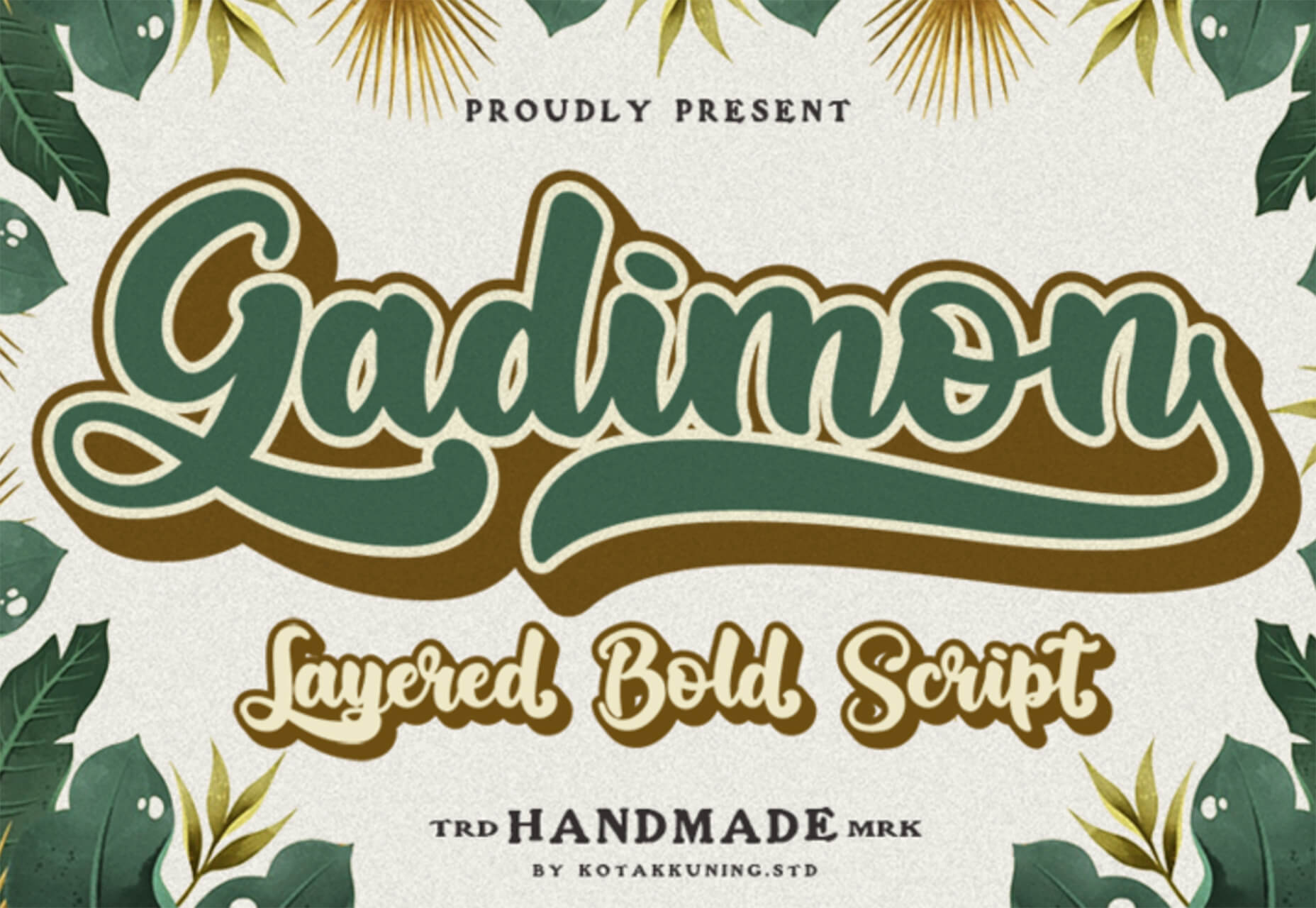
Gadimon is a fun, almost comic book-style layered script. The font package includes a regular and extrude style.

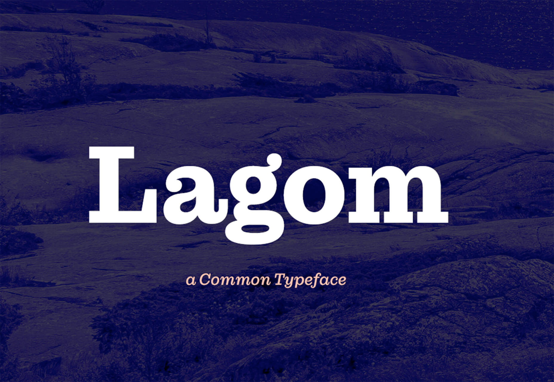
Lagom

Lagom is a sleek and functional serif typeface with 16 styles in the robust family from ultralight to extra bold italic. It’s readable and has a lot of personality.

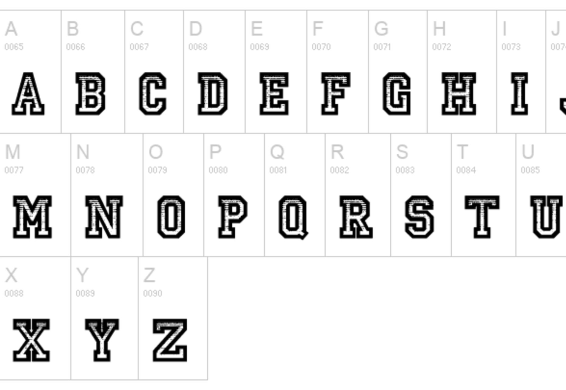
Striped Campus

Striped Campus fits our back-to-school theme with a fun, scholastic look and feel. The block letters have a thick outline stroke and some fun inline texture.

Source

The post Exciting New Tools for Designers, September 2021 first appeared on Webdesigner Depot.


Source de l’article sur Webdesignerdepot

Do you ever get bored with design projects? Feel like you keep designing the same things on repeat?

This collection of trends – from fun angles to illustrations where you wouldn’t expect them to cool three-dimensional concepts – is sure to help you think a little more out of the box. It might be just the right inspiration to cure some of that design boredom.

Here’s what’s trending in design this month.

1. Angles for Attention

Working with angles is a fun technique because you can essentially point website visitors to what you want them to see on the screen.

Angles can be aggressive and have an obvious visual goal. They can also have an easier feel without so much direct intent. This trend can look a lot of different ways, making it a versatile option for designers.

Each of the three examples here takes a different approach to angles.

Bake Inc. uses various angles with imagery and whitespace to draw the eye past the visual elements to the brand name at the bottom of the screen. If you click through to the design, you’ll see that there isn’t just one angle-image design, but it’s a collection of changing images and angles that work beautifully in concert.

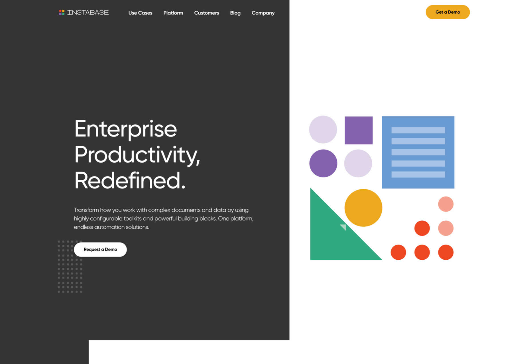
Instabase uses a collection of animated geometric shapes as the main visual element on the screen. Note the directional pull of the triangle in the bottom left of the group of shapes. It helps lead the user to the “Request a Demo” call to action on the other side of the screen.

Readymag’s Custom Cursor is one of those aggressive angles. The giant cursor is what the design is about, but because of the size and shape of the object, users are directed to the word “cursor” as well. That adds extra emphasis to what the design is about. With the combination and the oversized element and giant angle that are so in your face, you can’t help but get a quick understanding of what the design is about.


2. Unexpected Illustrations

This might be the most fun we’ve seen with a website design trend in a while – projects and companies are using illustrations in some of the most unexpected places.

The design surprise happens when an industry that you don’t expect uses this type of imagery. A simple illustration takes the design to another level, or illustrations mix with other elements to paint a whimsical overall scene. Those are the things you can find with each of these three examples.

Krivitzky is a website for a business law firm. This is not at all the type of website where you’d expect illustrations (including a dragon). While the design is fun to interact with, it’s hard to say if it works. If you needed representation, would this appeal to you? In terms of legal websites, this is a total disruptor and forces your attention. That could be a good thing.

Studio Mesmer is one of those simply understated designs that’s almost perfect. The stark black background makes the simple illustration that much more striking. The eye also has a nice hover animation effect for an added surprise.

Kenn & Kitt mixes an illustration with real imagery to paint a more whimsical scene. What’s nice about the illustrated elements of the website design is that it helps connect the website to the product packaging, which uses illustrations while feeling “real” with the photo of a dog. It’s a bright and sunny combination of photos and illustrations that feels whimsical but has the right vibe for the product category.


3. 3D Depth

The three-dimensional website design trend keeps ebbing and flowing. And right now, it is flowing with full-screen 3D elements for maximum depth that makes you feel like you can almost dive into the screen.

While most of these designs use illustration with animation to create the 3D scene, you don’t have to abide by this example. The goal is to create something that looks and feels immersive so that users will want to take part in the experience.

The Match Maker has an 80s gamer vibe where you can feel yourself going down the tunnel on the screen. Additional hover animations move the screen, even more to help you get into the game.


Hafele Discoveries uses a wide-angle style animation with back and forth motion. The fish-eye style of the design adds an element of depth, which is further magnified by the foreground box with text and call to action elements. The design concept is attention-getting, but the motion can be a little dizzying if you leave it on the screen too long.

FiveT Hydrogen takes a more “traditional” approach to a three-dimensional website design with an illustration/animation that includes elements of depth. This is magnified on the scroll action of the design with shadows and layers and a variety of elements – real and illustrated – that make you feel like part of what’s happening on the screen. It’s an immersive learning experience about clean hydrogen that almost forces users to keep scrolling. The 3D effect is what takes it to another level.


Conclusion

Not every design trend is right for every project. Take a good look at what you are trying to accomplish and match it with a design concept.

If you want to try one of these trends, but they are a little too out there, experiment with a small area of the design or a landing page first. That’s a good place to test ideas and conversion rates to see if the design technique will work for your audience.

Source

The post 3 Essential Design Trends, September 2021 first appeared on Webdesigner Depot.


Source de l’article sur Webdesignerdepot

In the information age, time is a valuable commodity and something people don’t want to spend too much of. As a result, the average visitor only reads about 20% of the content of a page

For web designers and developers, that means a few things: first, you need to ensure that the web pages you create are as engaging as possible; secondly, you need to find a way of making the critical information on any page stand out; thirdly, every modern designer needs to create assets that are easy for today’s fast-paced customers to use. 

Making websites more scannable is how you do your part as a designer to ensure that the customers who come to a page get the quick and convenient experiences they need. 

So, how do designers embrace scannability?

Designing for Scannability: An Introduction

At first glance, the concept of creating a website for scannability is strange. 

Most designers start their projects with the aim of making customers stay on a page for as long as possible. So it’s odd to think that you would want to make it simple for end-users to skip from one page to another on a website in a matter of seconds. 

However, scannability isn’t just about delivering information and getting users off a page. When sites are scannable, they make it quicker and easier for customers to slide down the purchasing funnel. A quicker and more convenient customer journey leads to a stronger user experience and more conversions. 

Look at Netflix, for instance. It doesn’t give interested users a ton of information on its homepage. Instead, the key USPs of the product are laid out bright and bold in the middle of the screen, along with one simple call to action: Get Started.

Designing for scannability means making it easy for users on a page to glance at a screen and instantly access all the information they need to take the next step in their buyer journey. 

There’s no needless scrolling or wondering what to do next. 

According to analyst Jacob Nielsen, scannability is essential because people look for specific things on every page they visit. 

Customers don’t read through web pages word by word. Instead, they scan through the content, plucking information out that serves their requirements. 

Questions to Ask When Designing for Scannability

So, how do you know if your web pages are scannable?

Start by asking the following questions:

  • What’s the intent of the people who arrive on this page?
  • What kind of information needs to be conveyed instantly?
  • Can the visitor see the next step in their journey immediately?

For instance, when someone arrives on the Evernote homepage, you can assume that they want to:

  • Find out about Evernote
  • Learn how to sign up
  • Jump to other pages to find out about features, and contact details

That’s why the designer behind the Evernote website placed an immediate piece of useful information at the top of the page: “Tame your work, organize your life” tells customers exactly what the entire product is all about. The brief paragraph of information underneath can provide a few more details if customers need it, then there’s an immediate call to action: Sign up for free. 

Not only does the call to action tell users what to do next, but it tells them the most important information they need straight away: it’s free. 

Scannable pages like this are useful because:

  • They help users complete their tasks quicker: Whether you want to sign up or learn more about the product, everything you need is available instantly, with no scrolling required. 
  • The bounce rate is reduced. Customers don’t get confused and hit the back button. That’s good for your client’s SEO and their bottom line. 
  • The website looks and feels more credible: Because customers get all the answers to their questions immediately, they’re more likely to trust the website. 

So, what are some of the best things you can do to make your sites as scannable as possible?

Use Visual Hierarchy

Visual hierarchy is a way of organizing the content on your website in a way that adheres to how people use the website. For instance, if you land on a blog page, you expect to see the headline first, maybe some information about the writer, and any other essential information, followed by the body content. 

Although it’s tempting for designers to try and surprise users with new visual strategies, the best way to make your content more scannable is to give end-users precisely what they expect. 

If you’re not sure what a page should look like, try checking out the competition. 

One of the most obvious visual hierarchy rules is that the main navigation should always go at the top of the page. 

Customers will expect to look at the top of the page to find navigation. They don’t want to have to scroll through your website, searching for a way to get to another page. If you want to make it as easy as possible for end-users to jump from one page to another, you can pin the navigation bar to the page so that it stays with users as they scroll. 

Maintain Negative Space

White space, negative space, or whatever you call it – is the part of your design that’s left empty. 

White space is crucial because it gives all of the objects on your page some much-needed breathing room. Without enough negative space on your pages, it’s impossible to embrace scannability because there’s too much information for a customer to take in at once. 

For instance, notice how there are big gaps of space between every element on a Forbes website post. A proper amount of negative space on your site ensures that users can quickly take in chunks of information and use that information to decide what to do next. 

To ensure there’s enough negative space on your website pages, ask yourself what the key elements visitors will notice when they come to a website. The essential items should be:

  • A title or header to confirm that the user is in the right place
  • A CTA that shows your user what to do next
  • A navigation header or menu
  • Critical information includes an introduction to what a page is about or an excerpt from the blog post they’re about to read. 
  • A visual component: A picture or image that gives context to the page. 

Anything else can usually be removed. So, for instance, if Forbes wanted to make the page above more scannable, they could easily remove the ads and social media sharing buttons.

Make the Next Step Obvious

Every page on a website exists in a hierarchy within the customer journey. 

A homepage leads customers to product pages, which leads to a checkout page, which connects to a thank-you page that sends the visitor back to another product page, and so on. 

When designing for scannability, it’s crucial to make the next step in the journey as obvious as possible. Usually, this means placing the call to action “above the fold,” where the customer can see it immediately.

Ideally, scannable pages should have just one CTA. This will stop your audience members from being confused or overwhelmed by choice. 

However, if you’ve got multiple CTAs, think about the average customer’s journey and what they’ll want access to first.

If those buttons don’t appeal to the customer, they can scroll a little further and see other “next step” options, like shopping for “self-isolation essentials” or browsing other popular product categories:

Test Every Page

Testing for scannability means examining every page and making sure that it’s as easy as possible for customers to move through the buying process as fast as they want to. 

Visit each page you design in a buyer journey and ask how quickly it would take end-users to get from point A to point B and beyond. Here are some of the common issues that might slow the customer’s journey and harm scannability:

  • Readability: Is the font legible? Is it large enough to read on all screens, including mobile devices? Legibility in the design world measures how quickly and intuitively your users can distinguish what’s going on any page. Remember that the color of the background, the amount of negative space around copy blocks, and even font pairing can impact the readability of the content. Show your pages to multiple people and time how long it takes for them to grasp the message that you’re trying to convey. 
  • Fluff: Fluff and extra features can make your pages more intriguing, but they can also slow users down. For instance, one picture at the top of a blog page can add context to the article. A slideshow of pictures stops the customer from progressing and keeps them stuck at the top of the page for longer. 
  • Words instead of numbers: According to Nielsen, eye-tracking studies show that numerals often stop the wandering eye. Numbers are compact and more regularly associated with statistics and facts, so they’re more likely to grab attention. If you want to get important points across to end users fast, use numbers, not words. 

Creating Scannable Pages

Scannability is becoming an increasingly important concept in today’s busy landscape. 

Now that more customers are browsing websites from their smartphones or checking out products on the move, designers need to think more carefully about adjusting to this agile environment. 

Scannable pages that move visitors along the buying cycle and into the next stage of the funnel will deliver better results for your clients, and therefore better outcomes for you. 

Source

The post Quick Ways to Make a Webpage More Scannable first appeared on Webdesigner Depot.


Source de l’article sur Webdesignerdepot

The world of web design is incredibly dynamic. Every year, new trends and opportunities emerge, primarily driven by the arrival of modern technology. 

In recent years, we’ve seen various updates to the web design landscape, such as the arrival of AR and VR solutions for making mixed media. Video content has increased in quality, while the demand for inclusivity and usability has transformed the way that we build everything from websites to apps. 

Yet, for the most part, web design trends have continued to focus on the visual. 

When we hear the word “interface,” we often think of the graphical user interface – the ultimate way to connect users with sites. However, now we have a new, more natural way for customers to interact with their digital tools… The era of voice is here. 

Designing for the Age of Voice

The technology sector has made incredible progress in the development of things like Automated Speech Recognition and Natural Language Understanding. 

Thanks to updates in the way that machines process and understand human language, voice recognition accuracy is now at 90% and above. More than ever before, users can speak to a smart assistant, speaker, or phone-based application, and get the results that they’re looking for without error. 

The simplicity of communicating with technology via voice means that users have adopted this technology at an incredible pace. Half of all searches will be made with voice by the end of this year.

We’re standing on the edge of a fundamental shift in the way that we interact with computers and critical tools. As designers and developers, we need to be ready to embrace this new medium. 

With that in mind, here’s what designers need to think about when designing for voice UI. 

1. Decide How to Experiment with Voice

There are various steps involved in making a website more “conversational.” One of the first steps for any designer or developer is to think about the kind of voice-based interactions they’re going to enable for an app or website. 

For instance, rather than embedding voice technology into a website, you might decide to create a separate Amazon Alexa “Skill” for devices like the Echo. Companies like Capital One have already invested in this technology so that users can ask their smart speaker about their balance, rather than opening a laptop and logging into the site. 

To determine what kind of voice experiences you should be creating for your client, work with them on a customer journey map. Using this map of interactions that the customer has with your client on a regular basis, you can highlight areas where voice interactions might fit into the user flow. 

For instance, if customers are constantly asking questions about a brand or its service, an FAQ page that’s equipped with a bot that can respond to voice queries could be an excellent choice. 

UI design should always solve problems. Examining the frictions and frustrations that your client’s end-users encounter during their journey will help you to decide which direction to take with your voice UI experience. 

2. Examine the Anatomy of Voice Commands

Before designers can create a dialog flow for their voice UI, they need to understand how voice commands work. The key to success in a successful design for voice is understanding the objective of the interaction. A voice consists of three crucial factors for designers to consider:

  • Intent: Intent represents the subject and context of the voice command. A high utility interaction involves a request for a specific task. For instance, your users might request that your app gives them a list of five-star hotels in a specific area. Designing for these requests is often straightforward because what the voice algorithm needs to do is clear. However, low-utility requests can be harder to decipher, such as “hotels near me,” because there’s less specificity for the bot to work with. 
  • Utterance: Utterance refers to how a user phrases a command. For instance, in the case of looking for five-star hotels in Amsterdam, the customer might say “show me hotels,” or they might ask for “places to stay”. Designers must consider every variation of an utterance for their voice command UI. 
  • Optional variables: This refers to the extra filters that your voice UI needs to be aware of. In the case of five-star hotels in Amsterdam, the descriptor “five stars” is optional. The optional input needs to overwrite default values and bring more detail to the search. 

SideChef, for instance, is a voice-activated recipe app that offers narrated guidance to users and allows customers to search for recipes based on their specific needs. The app comes with a wide range of variables built-in, allowing users to customize their searches according to descriptors like “vegetarian” or “quick” meals. 

3. Learn How to Prototype with Dialog Flows

Learning how to leverage a complex UI strategy like VUI takes time and practice. Prototyping designers will often have to think like scriptwriters, designing various dialog flows to suit the different needs of customers, and the numerous interactions they might face. 

Dialog flows will outline:

  • Keywords that lead to the interaction
  • Branches that represent where the conversation might lead
  • Example dialogs for the user and the voice assistant. 

Practicing your dialog flows with scripts that illustrate the back-and-forth between the voice assistant and user will help designers and developers to understand the various nuances that can appear in a customer to robot interaction. 

Remember, while a crucial part of good voice UI design is keeping the communication conversational and straightforward, you will need to ensure that there is a dialog flow in place for every discussion that may occur between end-users and their apps, website, or digital tools. Users don’t want to feel overloaded and overwhelmed, but they need to ensure that they can complete their tasks too.

Consider the voice-based game RuneScape: One Piercing Note, for instance. 

The developers behind this app allowed players to speak with other in-game characters and use commands like “pull the lever” or “open the chest.” In designing the playable components of the game, the designers needed to think about every possible interaction that a player might have with different parts of the story while ensuring that users didn’t stray off track. 

A Few Tips for Voice UI Design 

Voice UI design can be very complex, mainly if you’ve never created something using voice as your only input before. However, once you get used to creating dialog flows, the whole process starts to feel a lot easier. 

As you’re designing, remember to:

  • Always confirm when a task is complete: When designing a checkout flow for an eCommerce page, one of the most crucial screens for a designer is the confirmation page. It shows the customer that the transaction has successfully been completed and stops them from worrying whether they’ve done the right thing. The same concept applies to Voice UI design. If your client’s end-user asks a voice-activated app to book an appointment with their therapist, for instance, they want to know that the appointment has been successfully booked and added to their calendar. Determine how you’re going to deliver the peace of mind your customers need. 
  • Create a strong strategy for errors: Designers and developers are still in the very early stages of experimentation with voice UI. This means that there’s a good chance that something could go wrong with your applications and tools from time to time. Having a strong error strategy in place is crucial. Always design a dialog flow scenario that allows the assistant to respond if they don’t understand a request, or don’t hear anything at all. You can also implement analytics into these situations to identify misinterpretations and improve usability in the future.  
  • Add extra layers of security: Various Voice UI solutions like Google Assistant and Alexa can now recognize individual voices. This is a kind of biometric security that’s similar to face or touch ID. As voice recognition continues to improve, it’s essential to ensure that you’re adhering to the latest guidelines in security. Additional authentication may be required for some companies. For instance, passwords, face recognition, or fingerprints might be needed for things that require payments and transactions. For instance, the Duer voice assistant uses face recognition to both approve payments, and make meal recommendations based on previous purchases. 

Are You Ready for the Voice UI Revolution?

Voice-based user interfaces are here to stay.

In the years to come, the chances are that developers and designers will need to learn how to use voice more consistently as part of their interface strategies. 

The good news is that although voice takes some getting used to as a design tool, it’s easy enough to make sure that your projects are moving in the right direction. Just like any other kind of design, implementing voice means thinking about whether the interactions and experiences that you’re delivering to end-users are seamless, effective, and valuable. 

Succeeding in voice UI isn’t just about adding the capacity for voice into your designs. It’s a matter of learning how to make user’s lives easier with the power of voice.


Featured image via Unsplash.

Source

The post Designing UI for the Voice Era first appeared on Webdesigner Depot.


Source de l’article sur Webdesignerdepot

The best free online coding websites for beginners are hubs of education and insight, designed to take your knowledge and career to the next level.

For years, technical careers have been gaining more attention among innovative individuals. In a digital world, people capable of speaking computer language often have the widest selection of job opportunities. However, before you can start leveraging the blossoming job market, you need to hone your skills. That’s where free coding websites come in.

A free online coding website is an environment where you can develop your understanding of various kinds of code, update your programming prowess, and even earn certifications. Today, we’re going to be looking at some of the most impressive coding websites on the market.

Coding Careers: Opportunities in 2021 and Beyond

Before we leap into our overview of the best free coding websites, let’s examine why it’s so important to invest in your coding role. Looking at the US Bureau of Labor Statistics, we see that coders earn an average of $89,190 per year.

Elsewhere, CompTIA notes that technology hiring has accelerated since the end of 2020, with up to 391,000 new positions opening in the US during December.

Though coding careers have been popular for some time now, they have particularly high value following the pandemic, as companies worldwide adapt to the changes associated with remote workforces, digital customer service, and ecommerce. The pandemic has made us more reliant on technology than ever before, as a result:

  • Coding skills are in high demand: Coding skills are essential for the newly digital world. Studies find that the pandemic has accelerated digital transformation by around 7 years. Companies need coding professionals to stay ahead of the curve.
  • Coding knowledge is becoming more versatile: Companies are looking for coding skills in more than just programmers. They want their data analysts, IT workers, artists, designers, and other professionals to have these talents too.
  • People with coding talent can earn more: Jobs requiring coding skills tend to pay more than those that don’t. This reveals the growing need for coding knowledge in the digital ecosystem.

Coding skills provide an avenue to tech professionals for higher-income jobs, and these careers are growing faster on average than other job opportunities.

The Best Websites for Learning to Code

Learning to code or developing your existing coding skills can help you to unlock a host of new opportunities. Today, you can learn coding online for free, just by visiting the right websites.

Even a basic knowledge of coding can drive a range of results, such as helping to support the better management of websites, reducing reliance on outside developers, and opening the door to app development. So whether you want to start a new career or upgrade your existing knowledge, these sites will help:

BitDegree

BitDegree is a wonderful website for anyone interested in web development, coding, data science, and programming. There are various courses to choose from, depending on the career path you want to take. For instance, you can learn about the AWS cloud or start your journey into gaming development. For coding, BitDegree covers languages like:

  • CSS
  • HTML
  • PHP
  • SQL
  • JavaScript
  • jQuery

The best thing about BitDegree is how it makes learning so fun. There are gamified courses and sections where you can really dive into the essentials of coding. In addition, the online coding course collection often features hundreds of discounted options for people on a budget.

CodeAcademy

One of the most popular sites for learning how to code for free, CodeAcademy is home to over 24 million students who have built their skills. The interactive learning approach lets you apply what you’ve learned immediately. Over 300 million hours of free coding content are available to check out at your leisure. Like most coding platforms, you can learn languages such as:

  • CSS
  • JavaScript
  • HTML
  • PHP
  • jQuery
  • Python
  • PHP
  • Ruby

CodeAcademy is particularly effective for beginners because you get instant feedback after submitting your coding efforts. When you make mistakes, you’ll find out exactly where you went wrong, allowing you to avoid similar mistakes in the future.

Codewars

Codewars by Qualified is definitely one of the most versatile free platforms for learning how to code. There are dozens of languages you can learn – too many to list right here. Options range from C++ and C# to Ruby, Python, Lean, Java, PHP, Scala, and countless others.

Codewars teaches you your programming language in-depth by selecting challenges designed to put your mind to the test. The goal for each challenge is to help you sharpen your knowledge over time, with tasks that get progressively more difficult over time.

The cool thing about Codewars is it allows you to see how you respond to challenges compared to how other coders have tackled the same issues.

Code.Org

Designed for a younger community of would-be coders, Code.org is an engaging and highly accessible introduction to coding. With around 60 million students worldwide, the Code.org platform gives you access to a wide range of different learning opportunities intended to suit different needs and learning levels.

The Code.org environment is built on a desire to bring coding into the standard curriculum. You can dive into full one-hour tutorials, or you can experiment with a more structured approach to learning, which is ideal for people with different learning styles. There’s also a huge catalog of courses extending from basic coding for younger kids all the way to University-level education.

Free Code Camp

A diverse option in our free coding website list, Free Code Camp is all about developing your coding knowledge while simultaneously networking with other like-minded people in the industry. The solution allows you to learn coding by participating in challenges – which is ideal if you want to put your skills to the test as soon as possible.

To help you jump in, you’ll have access to a range of courses and tutorials designed to help you understand and overcome each challenge. You can even code for non-profits on the platform and build tradeable projects in languages like:

  • HTML5
  • Javascript
  • Node.JS
  • CSS3
  • React.JS
  • Databases
  • Git

If you’re a little nervous about the concept of coding alone, you’ll have a full community to work within the Free Code Camp. You might even meet someone you can work with in the years ahead.

Code Conquest

Code Conquest is less of a course website and more of a comprehensive guide for beginners diving into the world of code. This amazing platform will help you understand all of the basics of coding in no time – even if you’re brand-new to the landscape. You can find out what coding is all about, learn which languages are best to learn for your needs, and more.

The website is full of resources for all kinds of coders, including comprehensive tutorials, reviews, a knowledge center, training packs, and more. You can even choose from a range of languages like:

  • CSS
  • HTML
  • PHP
  • jQuery
  • Ruby
  • JavaScript
  • Python
  • MySQL

To help you figure out where you should get started, the Code Conquest website also gives you recommendations on which tutorials to take next.

W3Schools

One of the better-known free websites for coding on the market today, W3Schools is an environment packed full of example codes, resources, tutorials, exercises, and libraries to help you learn how to code. The site is one of the largest in the world for developers.

To begin coding with W3 Schools, you’ll need to choose the programming language that’s right for you, then either jump into the program immediately or select from a range of learning options. The site comes with a handy quiz to help you define your knowledge level.

Languages range from CSS to SQL, JavaScript, HTML, Python, Java, C++, and many more.

Code Avengers

Code Avengers offers a fun and interactive approach to learning how to program and code. There are various course options to teach you how to create everything from games and apps to entire websites. The good thing about the Code Avengers website is you don’t need a lot of spare time to start learning. Each course takes around 12 hours to complete.

You can choose from languages like HTML, CSS, Python, jQuery, JavaScript, and more, and connect with a wide selection of similar coding enthusiasts, just like you. The biggest downside is that the free trial only lasts for seven days before you’ll need to pay to use the full program.

The Code Player

A simple and effective website for learning how to code and building your existing skills. There are tons of videos and demos to walk you through the process of learning how to code from scratch. All you need to do is click on one of the things you want to learn how to do, like creating a simple web page, and the site will give you a video walkthrough.

Though a little simple compared to other coding resources, the Code Player still has a lot of great video guidance to help beginners jump into various languages. For example, you can learn about CSS and HTML or check out various tools to help you make a more effective website.

CodeGym

If you’re particularly interested in learning about Java, the CodeGym is probably the website for you. This online Java programming course teaches you the basics of Java by allowing you to dive into various tasks. You can get involved with various exercises depending on your existing skill level and play around with games designed to teach you more about the coding landscape.

This website is fantastic for people in all stages of the coding journey. Whenever you suggest a solution to a challenge, the website will give you immediate feedback to learn from. There are more than 500 hours of Java coding exercises and educational resources to explore.

The Odin Project

One of the better-known free coding websites on the market, the Odin Project aims to take the headaches and frustration out of learning web development. If you’re a beginner looking to develop a career in coding, then the Odin Project will give you all the pieces of the puzzle required to decide exactly where you want to go and build the appropriate skills.

This site offers a full-stack curriculum of coding education options, with tons of challenges, tasks, and exercises to help you put your newly gained knowledge to the test. You’ll learn how to program in languages like CSS and HTML, explore the basics of JavaScript and Ruby, and even get tips on how to get hired when your skills are maxed out.

Plural Sight

Previously known as Code School, Plural Sight is a fantastic online learning platform that allows you to build your knowledge through a range of paid and free courses. The comprehensive platform is organized into a wide selection of different learning paths. You can choose how you want to develop your skills based on your chosen language and your existing skillset.

You choose an education path created by professional instructors to achieve specific outcomes, and Plural Sight gives you all the material you need. You can also practice what you’ve learned during the course in your browser and get immediate feedback on what you need to work on. There’s even a gamification aspect that allows you to earn points for every course level you complete.

MIT Open Courseware

Imagine how amazing it would be to get accepted to MIT to learn your new coding skills? What if you didn’t have to go through the headache of an official application. If you have a computer and internet access, you can explore MIT’s course material easily through the MIT Open Courseware website. This dedicated website gives you an insight into all of the courses and materials learned by students at MIT.

You can browse through all the courses available in the programming landscape and filter through results based on things like course features. For instance, you might specifically look for courses with their own online textbook, lecture notes, and videos. It’s a great way to get an insight into how one of the most reputable universities in the world offers coding education.

Web Fundamentals

We’ve already looked at a website offering coding resources specifically for Java, now let’s take a look at one designed for HTML5. Launched about 11 years ago as HTML5 Rocks, the Web Fundamentals website is packed full of tutorials, resources, and insights into the most recent updates to HTML5. This open-source environment allows developers and programmers to really get active with their skills.

You can play around with some of the code already available on the website, and explore tutorials authored by a range of amazing individuals. Although these courses are very comprehensive, it’s worth noting that they might not be the perfect choice for true beginners, as the tutorials can be more complex than most.

Dash General Assembly

If you’re keen to learn the essentials of coding in some of the most popular languages, like CSS, JavaScript, and HTML, then Dash General Assembly is the site for you. This website offers fun and free courses which will guide you through the basics of web development. You even get interactive tasks and challenges you can leverage within your browser, with no downloads required.

Users learn how to do a range of amazing things with this website, including how to code HTML5, build a beautiful website, and balance your layouts for aesthetic appeal and usability. You can even design dynamic interfaces where you can add aminations and effects. Dash General Assembly is a fantastic tool for anyone keen to get started in the world of coding.

Codeasy.net

Finally, Codeasy.net promises beginners a fast and simple way to start learning how to code, while having plenty of fun. This exciting website immerses you within a digital story which takes you on an adventure through the basics of coding. You’ll need to learn real-life coding skills to navigate your way through the rest of the story, which means you can develop your C# knowledge as you go.

This is one of the more unique tools for learning how to code that we’ve found so far. It’s a great way to discover the basics of C# without being bogged down in boring lectures. Remember, though, this website is intended for complete beginners, so you might find it a little basic if you already know some of the coding essentials.

Free Websites for Learning to Code

Free coding websites are an excellent way to develop your skills and unlock new opportunities in the world of coding. If you’re keen to jump into a new career as a programmer or coding developer, make sure you check out some of the options above. There’s no doubt you’ll find a site capable of giving you the boost you need.


Featured image via Unsplash.

Source

The post 16 Free Websites for Learning to Code in 2021 first appeared on Webdesigner Depot.


Source de l’article sur Webdesignerdepot
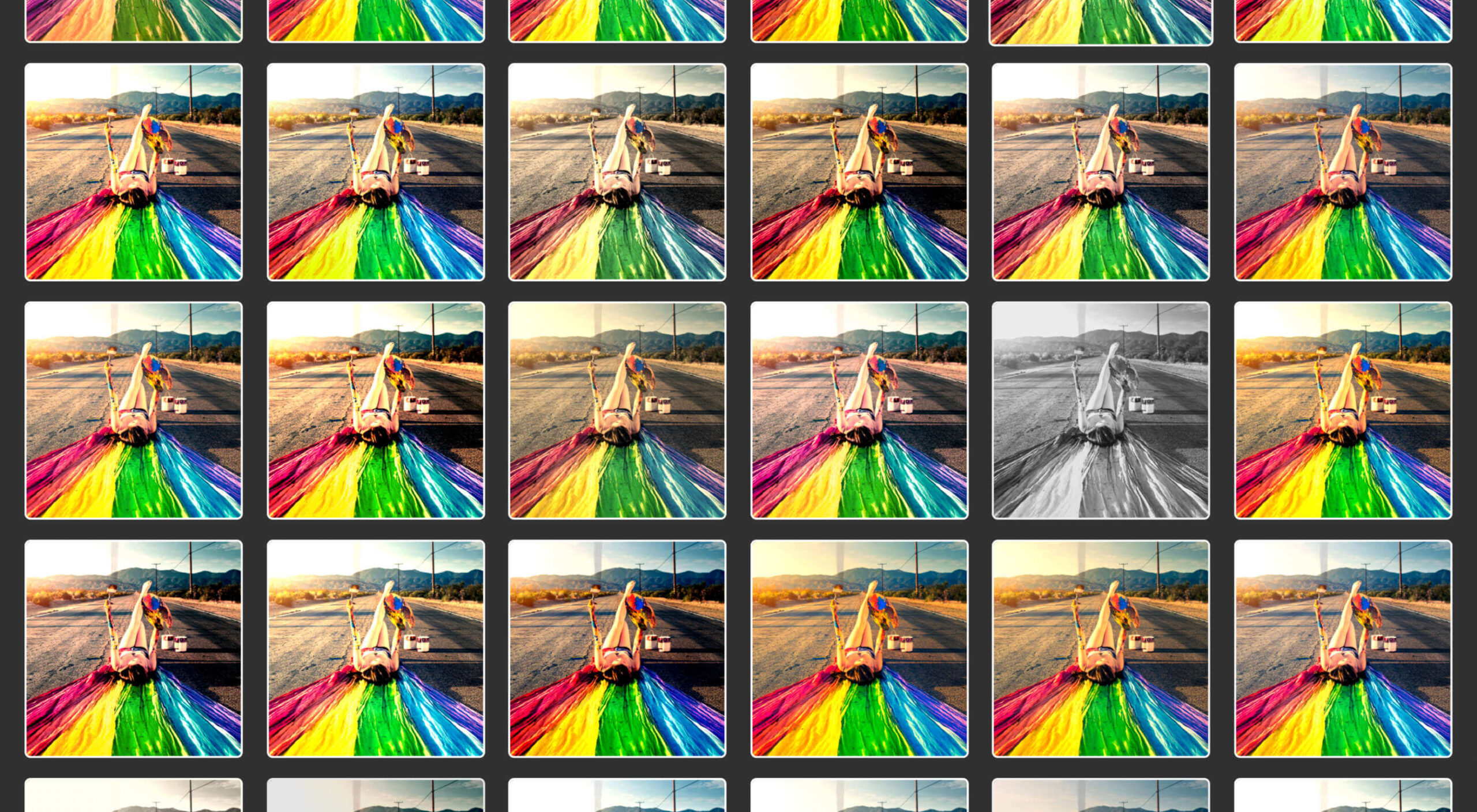
This month we have a variety pack for you. There are all sorts, from the most conservative layouts and structures to more experimental navigation. And we see how even the most traditional and functional websites can connect with users through mood-enhancing color schemes, clever font choices, and illustrations.

Non-functional–that is, purely decorative–details can really improve the user’s reaction to a site when applied sparingly. Constant movement gets tiring, and adding too many elements can feel fussy and unfocused. Getting the balance right so that things are kept simple but not bare and boring can be difficult, but it is a skill worth mastering.

Enjoy!

Laboratorio Permanente

The site for this multi-disciplinary architecture studio makes very nice use of a scrolling concertina effect.

Sometimes Always 

Wine sellers Sometimes Always have gone for a retro vibe with their color scheme and type.

Empty State 

Split-screen contraflow scrolling and the pop of bright blue against neutrals give Empty State’s home page impact, while the clean layout and clear navigation make the rest of the site pleasant to use.

Kibana 

Quirky display type and illustrations give this single-page site for Kibana lodge a friendly, welcoming feel.

For Good Design Lab

For Good Design Lab’s site is simple and bold; it makes a strong statement. And its design works even better on mobile.

Levitate

Levitate is a sports brand that makes an affordable running blade. Their site has a clean minimal feel, contrasting spaciousness with a sense of movement in the photography used.

Sunst-studio 

Multidisciplinary creative agency Sunst Studio keeps things simple but impactful with oversized black type on white and smaller images.

Made By Nacho 

Strong colors and illustrations, with the occasional subtle animation, work well for Made By Nacho.

Flexe 

Flexe are logistics experts, not the first industry that springs to mind when we think of great website potential, but this one is very appealing.

Friesday 

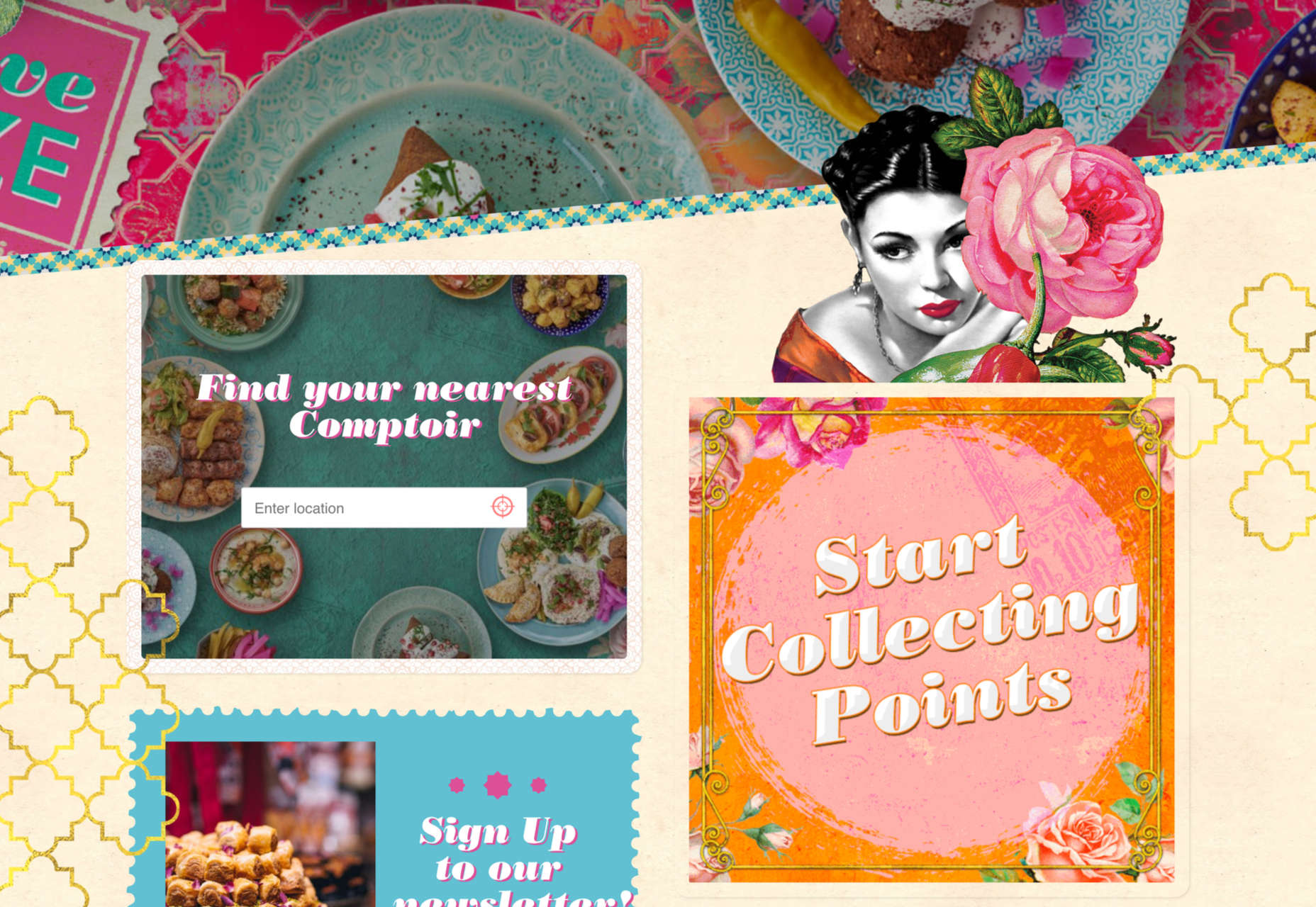
This site for Friesday restaurant/takeaway is lively, colorful, and fun.

Go out{side}

This offshoot site from B.A.S.S. (Bass Anglers Sportsman Society) aims to promote angling as part of an outdoor lifestyle. Earthy colors and a lively visual rhythm create energy.

Protos Car Rentals

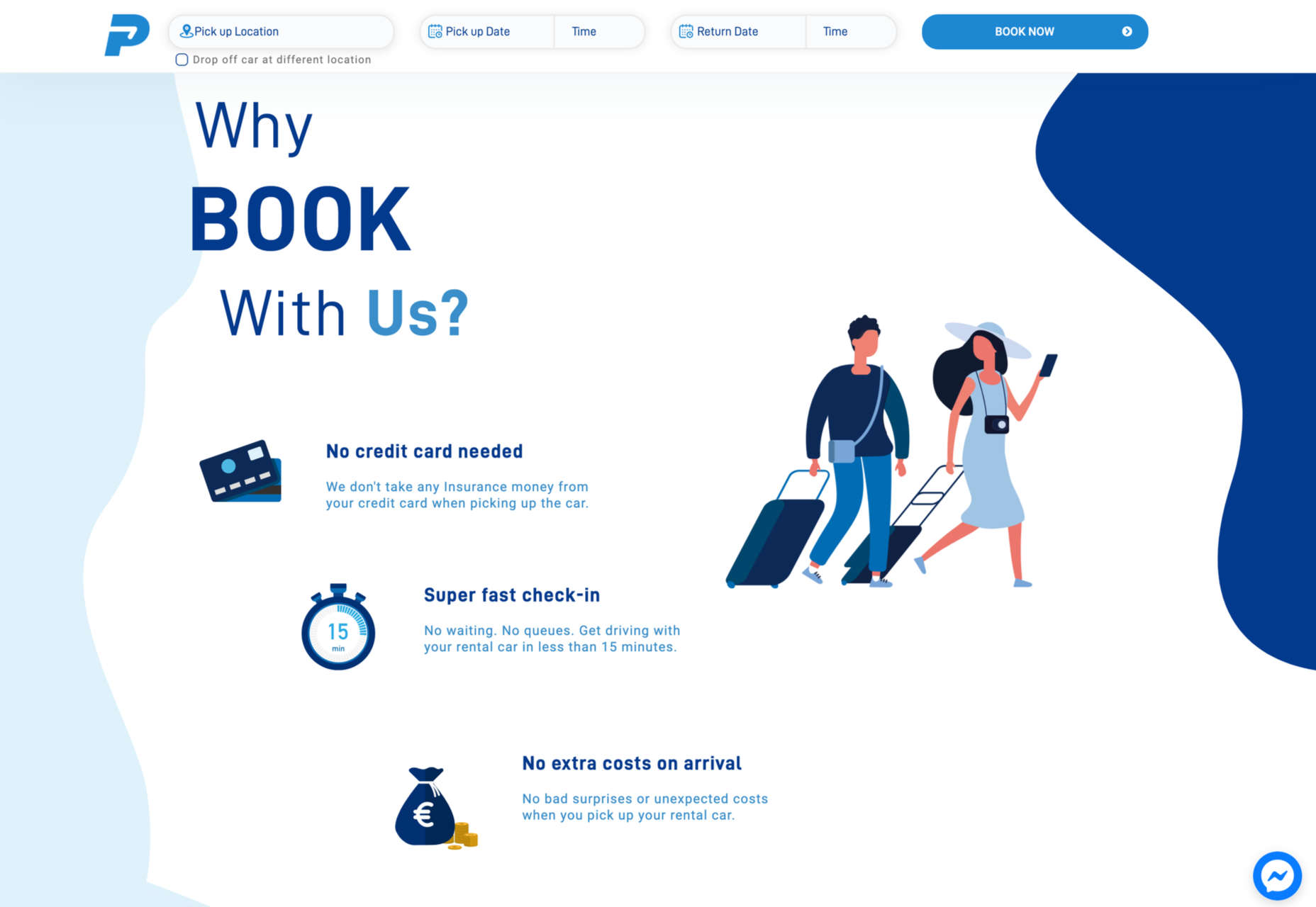
Illustration brings a touch of personality to this site for Protos Car Rentals, while attention to detail pays off in the usability.

21wallpaper 

21wallpaper offers downloadable screen savers from different illustrators (7 artists, 3 designs each) regularly, which at the same time acts as a showcase for the artists.

Elon’s Toilet 

This is a brilliant and vital piece of marketing that succeeds in presenting a serious subject in a lighthearted and engaging way. You’ll have to find out for yourself what it’s about.

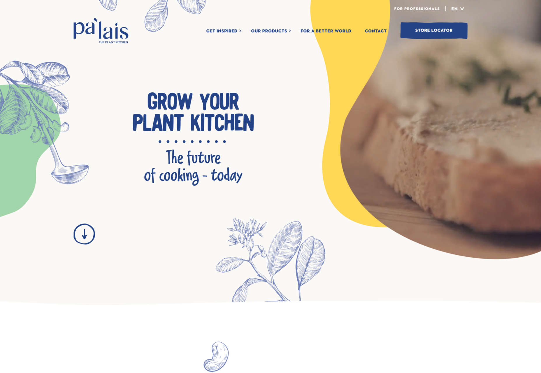
Pa’lais

A fresh feeling color scheme, a distinct lack of straight lines, and a scattering of illustration work well for the site for this vegan food producer.

Benjamin Righetti

Using a primarily visual medium to effectively promote an artist whose medium is sound is not always easy. This website for organist Benjamin Righetti does an outstanding job.

Wavemaker

Wavemaker is a creative media agency. Their site is strong and confident but with a playfulness that is engaging for the user.

Dpt.

This site for Dpt. throws out the usual menu concept and has its navigation arranged around the screen. It can be a risky strategy, but here it works well.

Plunt.co

Plúnt sells mix and match plant and planter combinations. The site’s core functionality is the combination chooser, which is pleasingly reminiscent of an animal flipbook.

Kingdom & Sparrow

Branding agency Kingdom & Sparrow have gone for a fairly standard approach, but the little hand-drawn details here and there add just enough individuality without overdoing it.

Source

The post 20 Best New Websites, July 2021 first appeared on Webdesigner Depot.


Source de l’article sur Webdesignerdepot

The dog days of summer are here. From vacations to pool time, you might not be thinking about work that much. But there are still plenty of new tools and resources popping up to help you become a better or more efficient designer.

Here’s what new for designers this month.

Haikei

Haikei is a web app that you can use to generate SVG shapes, backgrounds, and patterns in a web-based editor that you can use with any design tool or workflow process. Everything is customizable and it is free with access to 15 generator functions. (Additional templates and generators will be available when the pro plan is released later.)

Pixelhunter

Pixelhunter is a smart image resizer for social media platforms. It recognizes objects and crops pictures automatically. It supports 102 sizes and is free to use.

Compo

Compo is an Apple app that allows you to play with shapes and colors and create compositions on your own. You can see shapes and colors like the Bauhaus masters, creating from a blank canvas or shuffling in more creative ways. You can move, rotate, copy, overlap, and adjust shapes and colors to suit your style. Available for iPad and iPhone.

Backlight

Backlight is an all-in-one design system platform that allows you to build code and reference sites in a space where designers and developers can work together. It has a series of “starter kits” to help you with the technology you use from React to Chakra to Tailwindcss. It’s designed to be collaborative with everything in one place and integrates into your workflows. The tool is just launching and you can request early access to learn more.

Multi Color Text With CSS

Multi Color Text With CSS is pure fun. Check out the pen by Shireen Taj.

Mega Creator

Mega Creator is an online graphic design tool that helps you create images, icons, illustrations, backgrounds, and more for a number of uses. It has templates that are sized for common uses such as social media. You can upload your own elements to work with (free) or use including graphic assets for a fee.

Noloco

Noloco is a no-code solution for designers to build web apps. You can start building for free and design almost anything you can dream up from a set of drag-and-drop ready-made blocks. (And it will work across all screen sizes.)

Tinter

Tinter is a tiny web tool to generate color variations of images. The tool also generates monochrome colors of images with multiple variants, without hampering the quality of the image.

Radix Colors

Radix Colors is an accessible, open-source color system for designing gorgeous websites and apps. It includes 28 color scales with 12 steps each and includes support for dark mode as well as matching transparencies.

WP Cost Calculator

WP Cost Calculator is a smart, simple tool that allows you to easily create price estimation forms. It’s perfect for a number of industries that use online pricing.

TraveledMap

TraveledMap allows you to create customizable maps thanks to the use of markers, routes, and photos, which you can share or add to your website or blog. This tool is made for travelers and tourism pros.

Glyph Neue Icons

Glyph Neue Icons is a collection of 1,500 icons in SVG and PNG format. (They are free with a link.) Icons come in plenty of categories and styles for all types of use.

Streamline Icons

Streamline Icons is a set of thousands of icons in 12 different styles and themes that you can use for projects. They work through the Streamline app or a plugin for Figma, Sketch, or Adobe XD.

Health Icons

Health Icons is a set of free, open-source health icons for personal or commercial projects. They include filled and outline styles that are editable. There are more than 800 icons in the collection.

OMG, SVG Favicons FTW!

OMG, SVG Favicons FTW! Is a look at the benefits of using SVG favicons in web projects. It also examines some of the challenges – such as browsers support – with code snippets to help you get started.

Aspect Ratio in CSS

Aspect Ratio in CSS explores a design concept we talk about a lot in other places, but not so much with CSS. This piece by Ahmad Shadeed takes a look at how you can go beyond the “padding hack” and use native aspect ratio support in CSS to maintain image height and width ratios in responsive design.

Fight Kick

Fight Kick is a bold font with a lot of personality. The free demo version has 249 characters and is for personal use only.

Glow Better

Glow Better is a beautiful premium typeface with a pair of options – a serif and script. Both contain letterforms with swashes and tails that are delightful.

Huggable Hedgehogs

Huggable Hedgehogs is a playful font that’s perfect for children’s projects. Everything has a mono-height in the all uppercase typeface.

Monice

Monice is a rounded sans serif with thick lines and high readability. It includes bold, regular, and italic styles with free (demo, personal) and commercial options.

Rustica

Rustica is a robust premium typeface with 20 styles and family options. It has slim curves and an easy-to-read character set that would work for almost any use. It also supports 219 languages.

Source

The post Exciting New Tools for Designers, July 2021 first appeared on Webdesigner Depot.


Source de l’article sur Webdesignerdepot

This month, you will either love or hate the featured design trends.
The common theme among them is a strong design element that can create distinct emotional connections. They range from interesting monotone color choices to brutalist examples to AI-inspired faces and design elements.

Here’s what’s trending in design this month.

1. Interesting Monotone Color Palettes

Monotone color palettes aren’t something that we usually call a trending design theme because mono patterns are almost always in style. What makes these monotone website designs interesting is color choice.

The trend is to use a pretty unconventional color choice for monotone color palettes. For example, would you start the design process thinking of an all-mauve, canary yellow, or purple aesthetic?

For most designers, those probably aren’t the first choices. But, conversely, the outcome of those decisions is rather stunning in each of the examples below, whether you love the color choices or not.

What works (and what might fall short) with each of these trending examples:

Wookmama: This mauve color scheme might be the first one you’ve encountered? It uses varying hues that are pretty in-your-face. It works because the concept behind the website is to create custom color schemes. The challenge lies in contrast and that there’s not a lot of distinction between hues in the mono scheme.

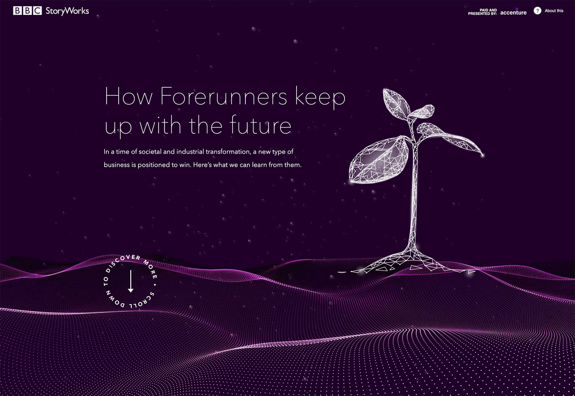
BBC Storyworks: The deep purple color palette with pinkish highlights is bright and readable, despite the dark background. White text and elements with smooth animation bring out the regality of the color choice. The challenge with this color is that purple often has strong emotional associations for individuals (good and bad), and you don’t know what “baggage” users might bring to the design.

Yellow Pony: This design is incredibly bright and has some brutalist undertones. What makes this color choice work is that it stops you in your tracks. You can’t help but look at the bright yellow and oddly-colored pony. The challenge, like with Wookmama, is contrast. There’s also a lot going on here with the bright color.


2. Fairly Brutal Black and White

Brutalism and brutalist design themes seem to keep ebbing and flowing. Understandably, it seems like, as a whole, designers can’t quite decide how they feel about this overall visual theme.

This trio of fairly brutal designs shares more than starkness in technique. They also feature distinct black and white color schemes and animation.

Put it all together, and the overall theme is maybe more “fairly brutal” than straight brutalist, re-emphasizing the hesitancy with the trend.

What’s nice about each of these designs is that they feel special and content-focused. This is a little in contrast with some other brutalist designs that are so stark and harsh that it can be hard to figure out what you are supposed to do with the website or what information is most important.

The other interesting thing here is that while all three websites have a similar design theme, they are nothing alike. (Personally, I find this type of brutalism and the included animation a lot easier to understand and digest. It uses the harsh feeling that you want to associate with the style but adds an element of comprehension that’s incredibly valuable.)

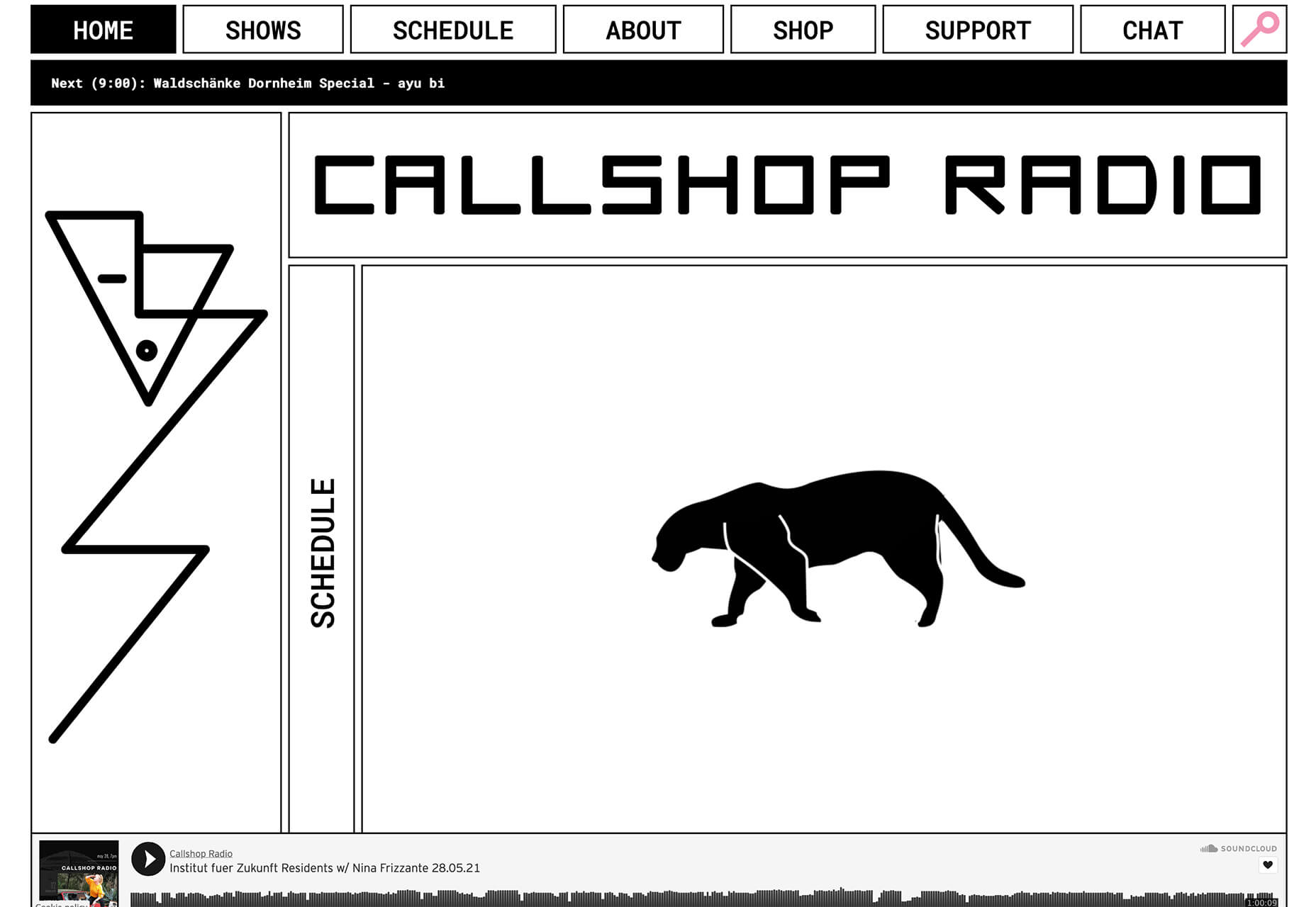
Callshop Radio uses an almost magazine theme style, block design with big buttons, a simple animation, and flash of color.

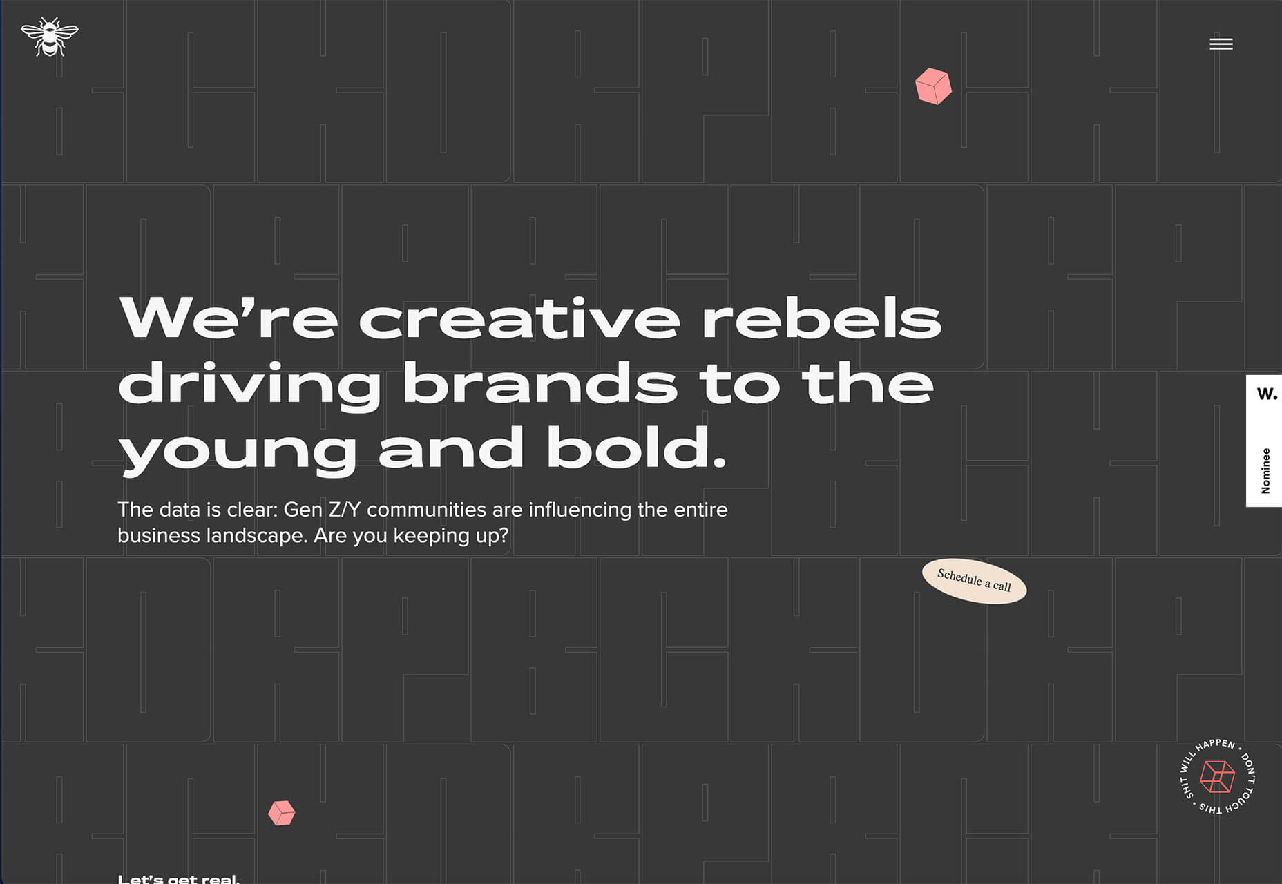
BCKDRP features a more subtle richer, almost black background with blocky type and accented color without the harshness often associated with brutal styles.

Vision Get Wild may be the closest to true brutalism, but the animated element in the center of the screen has a simple softness that lightens the entire feel.


3. Futuristic Faces

The final trending design element this month is a fun take on faces. There’s a movement happening with a futuristic or artificial intelligence/cyborg-inspired look to the people featured in the designs.

It’s hard to say where this design inspiration is coming from, but it is fun to look at with so many ways to play the style. The other commonality seems to be the dominant use of female faces.

These computer-generated images start with photos that are brightened and smoothed so that all imperfections are lost. The faces have no lines, color that might not look 100% natural, and enhanced features that may or may not be realistic.

You aren’t quite sure if you are looking at a face from a video game or image in many instances.

The types of websites that are using this design trend are similar in content and fashion, art, gaming, portfolios, and AI themes, among the most popular.

The true common thread is imagination. This type of design element can’t come to fruition without a strong vision and the ability to see the vision through creation.

These examples use progressively more futuristic variations of the trend:

HueLe Museum: The least AI-looking of the examples, has imagery with super bright light on faces to remove lines and imperfections so that the models almost the look of mannequins.

Jenny Lin: The portfolio design shows the designer in a style representing her work with a headshot that features an augmented reality, or digital design feel with an almost plastic-looking, on-the-verge of cartoon style.

Ruby9100m: The imagery here is full-on futuristic. From coloring to facial features to an almost Frankenstein-pieced-together look, nothing about this image insists on reality. (Did you notice the blue hand?)


Conclusion

This month’s design trends are a lesson in experimentation and evolution of other visual concepts. They also create an immediate impact on you in terms of emotion because of strong design choices.

Trends like these tend to come and go quickly; nevertheless, it will be interesting to see how they evolve.

Source

The post 3 Essential Design Trends, July 2021 first appeared on Webdesigner Depot.


Source de l’article sur Webdesignerdepot

Après avoir mis SAP HANA au cœur du SI financier de SCOR, SAP annonce que son client a finalisé avec succès sa roadmap finance. Annoncée en 2015, cette dernière permet aux différents métiers de la finance de SCOR de répondre sereinement aux objectifs des années à venir. La raison d’être du projet : être au service des métiers pour soutenir l’excellence opérationnelle du domaine finance.

Quatrième réassureur mondial, SCOR offre à ses clients une gamme innovante et diversifiée de solutions et de services pour le contrôle et la gestion des risques via une assise financière solide. Fidèle à sa devise « l’Art et la Science du Risque », le Groupe met son expertise reconnue au sein du secteur et ses solutions financières de pointe au service du bien-être et de la résilience des populations.

Répondre à de nombreux enjeux business et numérique pour évoluer technologiquement

SCOR concrétise sa roadmap 2015-2020 avec la conversion vers S/4HANA opérée en Juillet 2020, point d’orgue d’une ambition métier supportée par SAP HANA visant à mettre en place une plateforme financière unique et intégrée pour l’ensemble des besoins de la Finance.

Ce plan sur 5 ans a permis la mise en place des axes suivants :

  • Le passage des portfolio Analytics (SAP BW) et EPM (SAP BFC) sur une instance SAP HANA unique
  • La migration du General Ledger (ECC) sur S/4HANA;
  • La création et le développement de la Reporting Factory, s’appuyant sur un catalogue analytique en temps réel et réconcilié « by design » par une consolidation très précise grâce à 3 outils SAP intégrés :
    • Analysis For Office (AO) pour l’analyse et la manipulation des données
    • SAP Analysis Cloud (SAC) pour le dashborading
    • Disclosure Management (DM) pour le reporting statique
  • La digitalisation et la robotisation des processus Finance au sein du Groupe

Un déploiement prenant en considération tous les paramètres, coûts, délais et qualité grâce à l’expertise consolidée métier, projets et systèmes du SAP Competency Center de SCOR dirigé par François Bossard, qui s’est vu être complétée par le déploiement sur une instance unique de la gestion de la trésorerie (SAP TRM), de la communication bancaire (SAP BCM), de la gestion budgétaire (SAP eBPC) et de la sécurisation du cycle de développement (Solution Manager).

SCOR est désormais doté d’un avantage concurrentiel indéniable pour les 3 prochaines années dans le domaine de la Finance en termes d’innovations technologiques. Sa plateforme est complètement intégrée et dotée d’interfaces répondant en temps réel voire en streaming, un niveau d’intégration que de nombreux acteurs commencent tout juste à entrevoir. Ces avancées sont dues à un concept fonctionnel clé : la réconciliation « by design » de l’ensemble des domaines de la finance au sein d’une plateforme unifiée.

« SCOR posait il y a 10 ans les bases d’une vision rationnalisée de son système d’information financier en migrant l’ensemble de ses comptabilités dans SAP. Ces cinq dernières années, il nous paraissait naturel de faire fructifier cet acquis via une roadmap de développement ambitieuse, associant enrichissements fonctionnels et innovations technologiques pour en tirer tous les bénéfices, optimisant nos processus financiers et nos capacités analytiques. Grâce à ces acquis et à une migration fluide vers S/4HANA réalisée en quelques mois, nous pouvons compter sur une plateforme financière performante qui est en mesure d’encaisser les impacts des prochaines échéances d’évolution règlementaire IFRS9 et IFSR17 », précise Marc Philippe, Directeur des Systèmes d’Information du Groupe SCOR.

Une implémentation réussie pour aller plus loin dans l’excellence opérationnelle

Déployée en juillet 2020, SAP S/4HANA, montre déjà de nombreux bénéfices : des économies sur de nombreux projets, des gains de temps pour mieux redéployer les ressources, la mise en place de process plus intégrés, plus automatisés, plus simples et plus informés pour permettre aux équipes de se concentrer sur leur valeur ajoutée et ainsi libérer du temps aux collaborateurs pour se concentrer sur l’opérationnel. Cette nouvelle étape répond à une logique stratégique sur le moyen long-terme. En effet, elle permet de se rapprocher tactiquement de la roadmap SAP, d’avoir toujours un œil sur l’innovation, d’aller encore plus loin dans l’excellence opérationnelle ou encore de se rapprocher davantage de la réalité comptable tout en abordant de manière plus sereine les challenges normatifs de l’industrie pour les 3 prochaines années.

A l’initiative et à la direction de cette roadmap, y compris la conversion vers S/4HANA venant la conclure, Marc Henry, Head of Finance Projects, Systems, Processes and Controls du Groupe SCOR, précise que « S/4HANA nous permet de construire et développer IFRS9 et IFRS17 sur la nouvelle plateforme sans avoir à faire de migration par la suite. La solution nous permet aussi de développer de nouvelles fonctionnalités clés comme l’ajout de devises, de ledger, de GAAPs et d’aller encore plus loin dans l’intégration du domaine de la finance ».

La solution SAP Analytics Cloud permet de déployer un ensemble de best practices, de capitaliser sur l’ensemble des efforts consentis sur HANA et de s’inscrire comme early-adopter de la roadmap de SAP pour assurer une co-innovation et un partage constant avec toutes les parties prenantes. La solution fournit également au top management des données en temps réel leur permettant d’avoir un avis fiable et factuel sur plusieurs process comme la santé financière de leur division dans le cadre d’un projet ou encore sur le pilotage de KPIs plus globaux. Enfin, SAC permet de rendre les utilisateurs de la solution plus indépendants afin d’être davantage sur l’accompagnement et la certification de la donnée plutôt que sur sa production par les équipes métier.

SAP Business Planning and Consolidation (eBPC) a offert à SCOR la possibilité d’adapter ses plans de planification, de budgétisation, de prévision pour améliorer l’ensemble du processus budgétaire du Groupe. La solution a également permis d’entrevoir des gains additionnels au regard de la roadmap SAP et de son intégration avec d’autres outils déjà existants comme SAP Analytics Cloud Planning. L’objectif : accélérer les cycles budgétaires et de clôture financière, et renforcer l’expérience utilisateur.

« Après le succès de la première implémentation avec SAP, nous souhaitions poursuivre la collaboration. Nous avons pu mettre en place une plate-forme mondiale intégrée, dotée d’une base de données unique disponible en temps réel. SCOR a pu capitaliser sur tout le travail effectué précédemment, avoir un seul point d’accès pour la donnée Finance et rendre certains modules plus flexibles. Nous sommes très fiers d’être une vitrine pour SAP qui nous offre de réels bénéfices opérationnels à court terme », ajoute Marc Henry.

A propos de SAP

La stratégie de SAP vise à aider chaque organisation à fonctionner en “entreprise intelligente”. En tant que leader du marché des logiciels d’application d’entreprise, nous aidons les entreprises de toutes tailles et de tous secteurs à opérer au mieux : 77 % des transactions commerciales mondiales entrent en contact avec un système SAP®. Nos technologies de Machine Learning, d’Internet des objets (IoT) et d’analytique avancées aident nos clients à transformer leurs activités en “entreprises intelligentes”. SAP permet aux personnes et aux organisations d’avoir une vision approfondie de leur business et favorise la collaboration afin qu’elles puissent garder une longueur d’avance sur leurs concurrents. Nous simplifions la technologie afin que les entreprises puissent utiliser nos logiciels comme elles le souhaitent – sans interruption. Notre suite d’applications et de services de bout en bout permet aux clients privés et publics de 25 secteurs d’activité dans le monde de fonctionner de manière rentable, de s’adapter en permanence et de faire la différence. Avec son réseau mondial de clients, partenaires, employés et leaders d’opinion, SAP aide le monde à mieux fonctionner et à améliorer la vie de chacun. Pour plus d’informations, visitez le site www.sap.com.


Contacts presse :

Daniel MARGATO, Directeur Communication : 06 64 25 38 08 – daniel.margato@sap.com
Pauline BARRIERE : 06.13.73.93.11 – presse-sap@publicisconsultants.com
SAP Press Room; press@sap.com

The post SAP conclut avec succès la roadmap finance de SCOR appeared first on SAP France News.

Source de l’article sur sap.com