
 Jakob Nielsen’s How Users Read on the Web is 25 years old this week, and one glance at an eye-tracking study will tell you its key observations are still relevant today.
Simply put, users don’t read a web page; they scan it for individual words and sentences.
A typical pattern shown in eye-tracking reports is that users will rapidly scan a page, scrolling down to do so. Then either hit the back button and pump your bounce rate, or scroll to the top and re-engage with the content.
Even when content, volume, and quality tick all the user’s boxes, and they choose to stay on your site, they still don’t read; they scan; a slightly deeper scan, but still a scan.
As a result, it’s vital to design websites to be easily scannable, both in a split-second scan to decide if your page is worth the reader’s time and on a second or third pass.
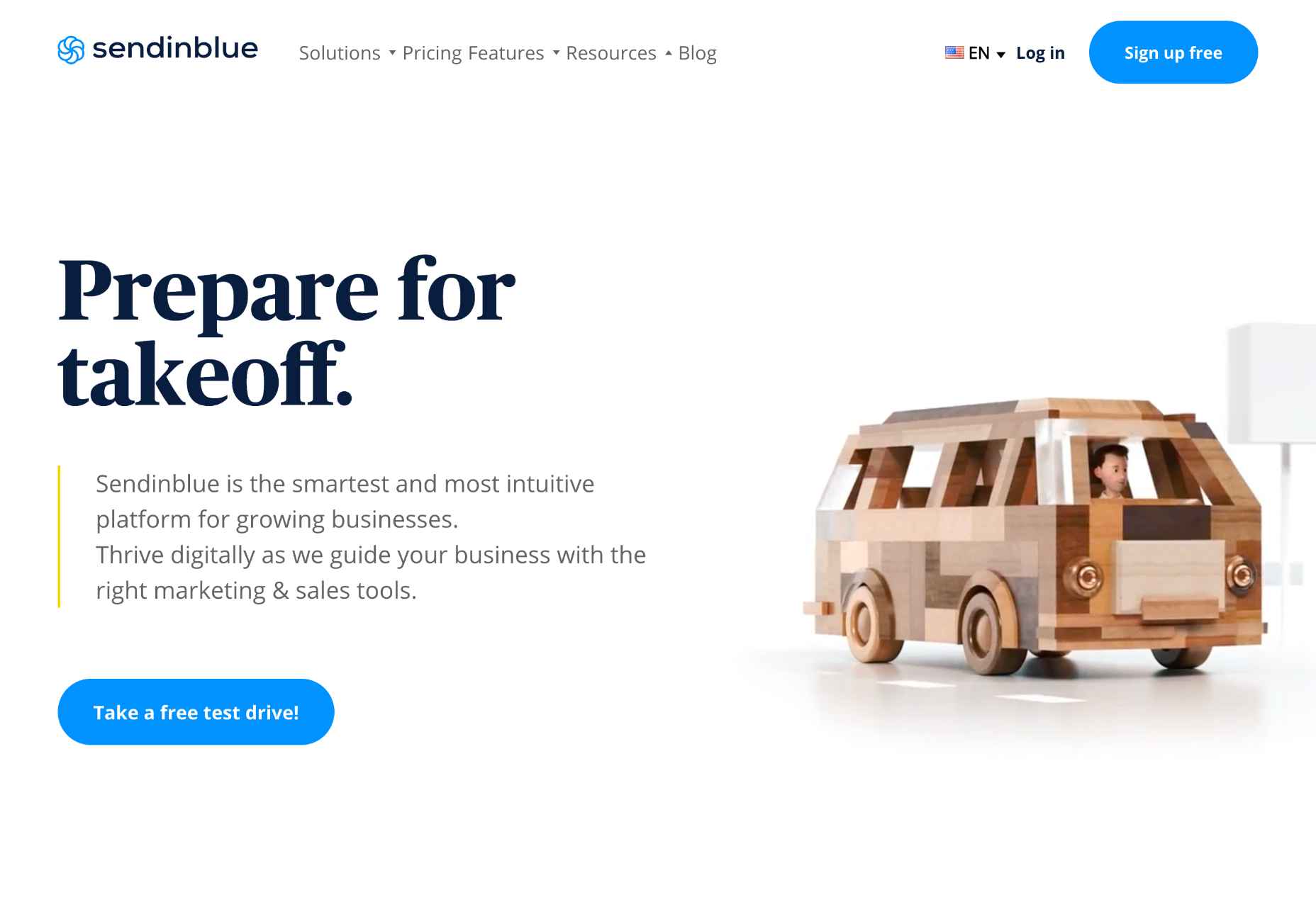
Clarify the Page’s Purpose Immediately
Every page should have a primary goal. The majority of the time, that goal is embodied in a CTA (Call to Action).
The good news is, if your SEO (Search Engine Optimisation) has gone to plan, your goal (i.e., to sell something) and your user’s goal (i.e., to buy something) will align. By clarifying the page’s purpose, you can show the user that your goals align.
You can be experimental if you’re an established company and the user knows what to expect. But if you’re new to the market or have a lower profile, you need to conform to established design patterns. This means that a SaaS should look like a SaaS, a store should look like a store, and a blog should look like a blog.
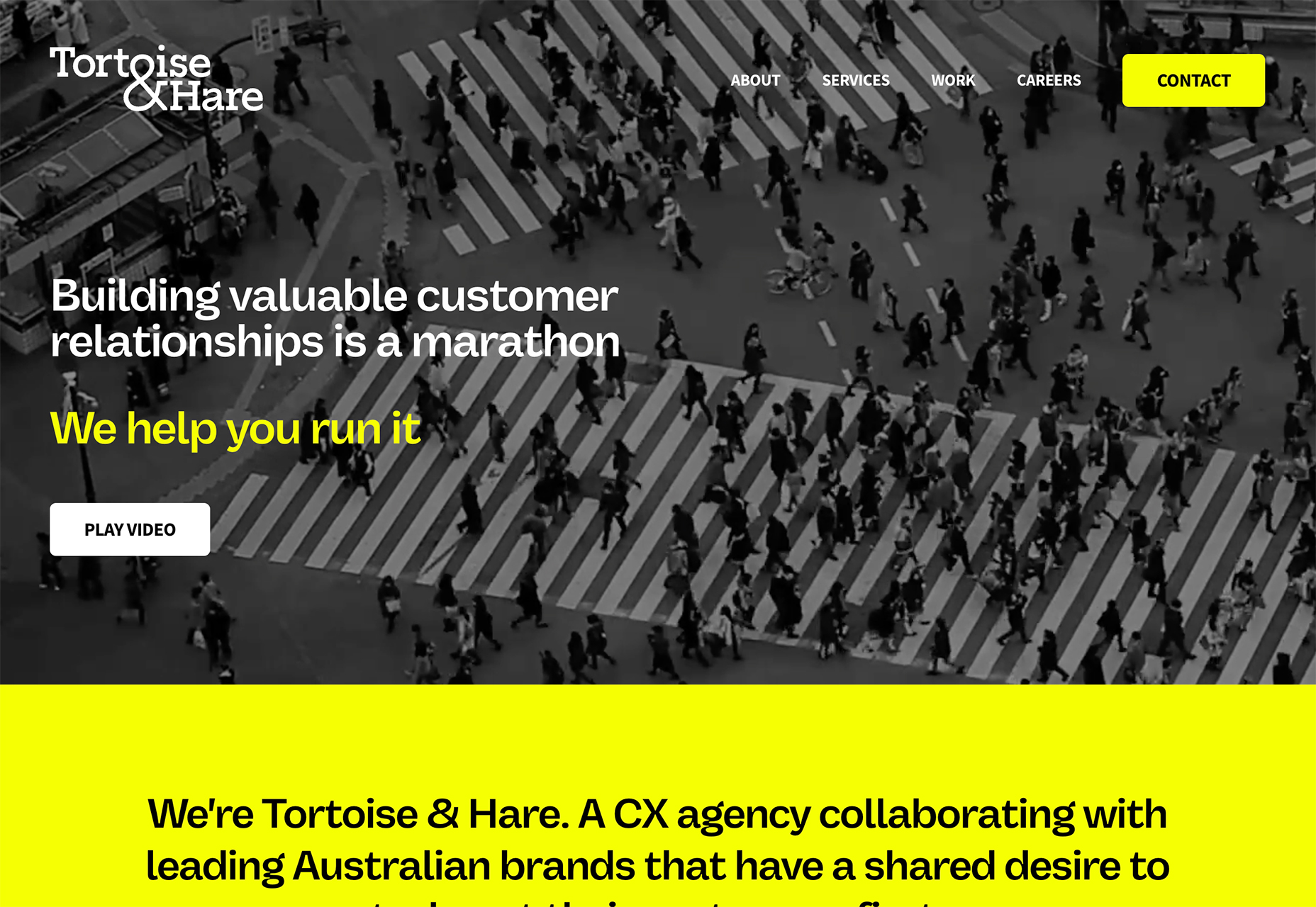
Including your CTA above the fold — which in the context of the web, means the user doesn’t have to interact to see it. Doing so makes it easier for the user to progress and clearly tells the user what you are offering.
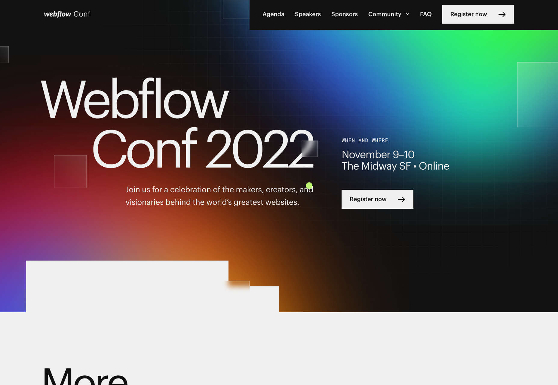
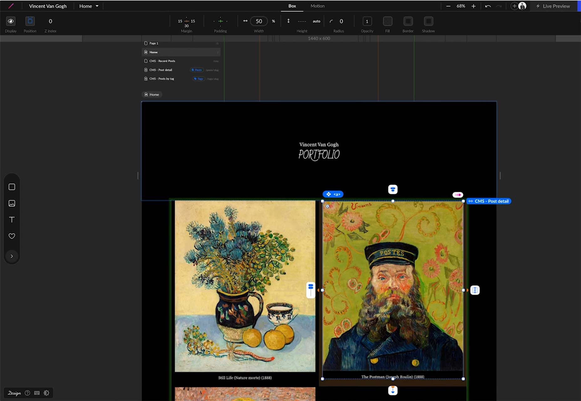
The landing page for next month’s Webflow Conf 2022 clarifies the page’s content, with a clear CTA above the fold.
Employ a Visual Hierarchy
The Von Restorff effect states that the more something stands out, the more likely we are to notice and remember it.
Visual hierarchies are excellent for guiding a user through content. HTML has the h1–h7 heading levels — although, in reality, only h1–h4 are much use — which gives you several levels of heading that can be scanned by different readers scanning at different rates.
For example, we know that subheadings have little impact if a user diligently reads the page from top to bottom, but they are excellent for catching the eye of skim readers.
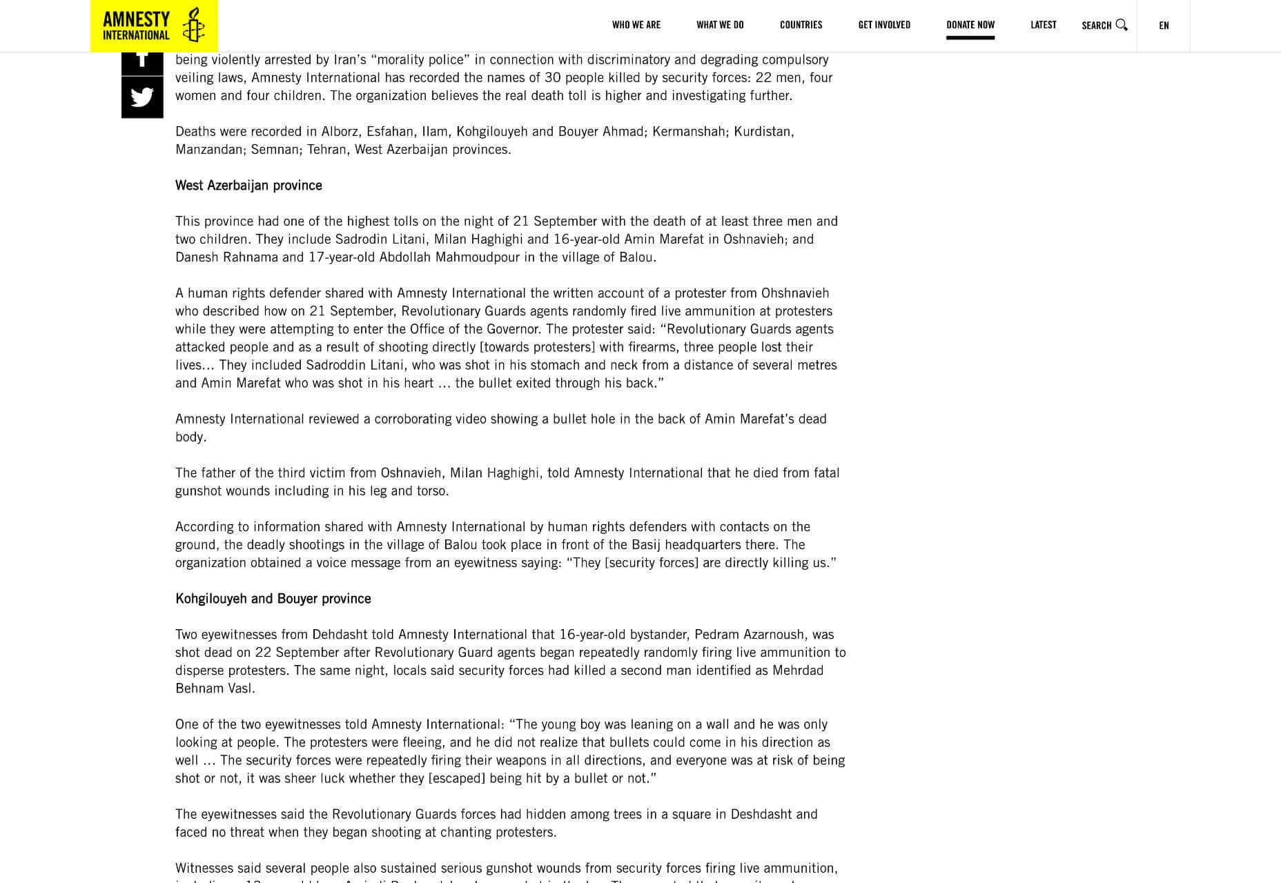
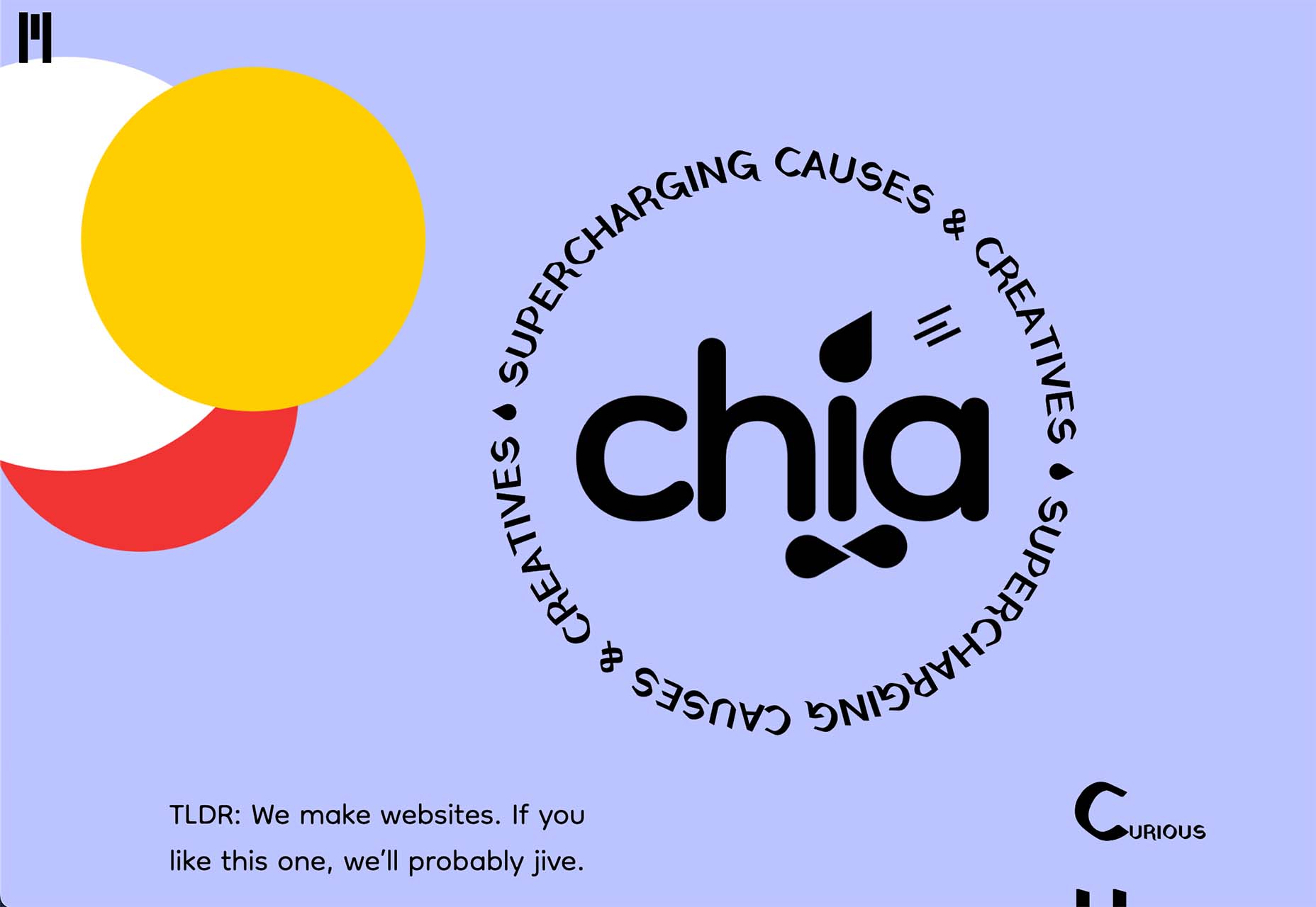
Amnesty uses very a very simple hierarchy, the only change for its subheading being increased weight. But it is enough to catch the user’s eye.
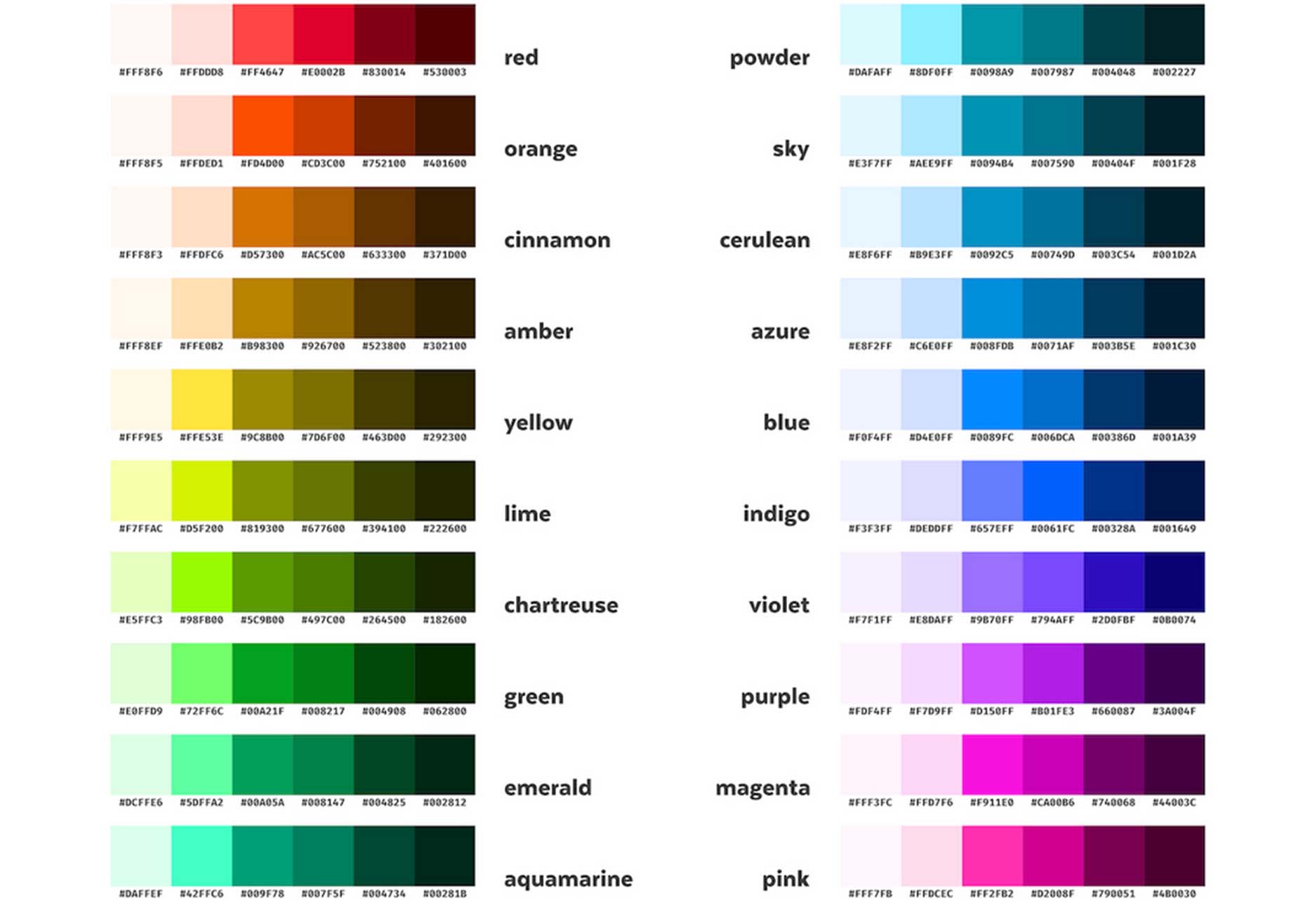
You can also create visual hierarchies with other forms of contrast; weight and color are often employed in addition to size. For accessibility and inclusive design, it’s wise to combine visual indicators when creating a hierarchy; for example, headings are usually larger, bolder, and colored.
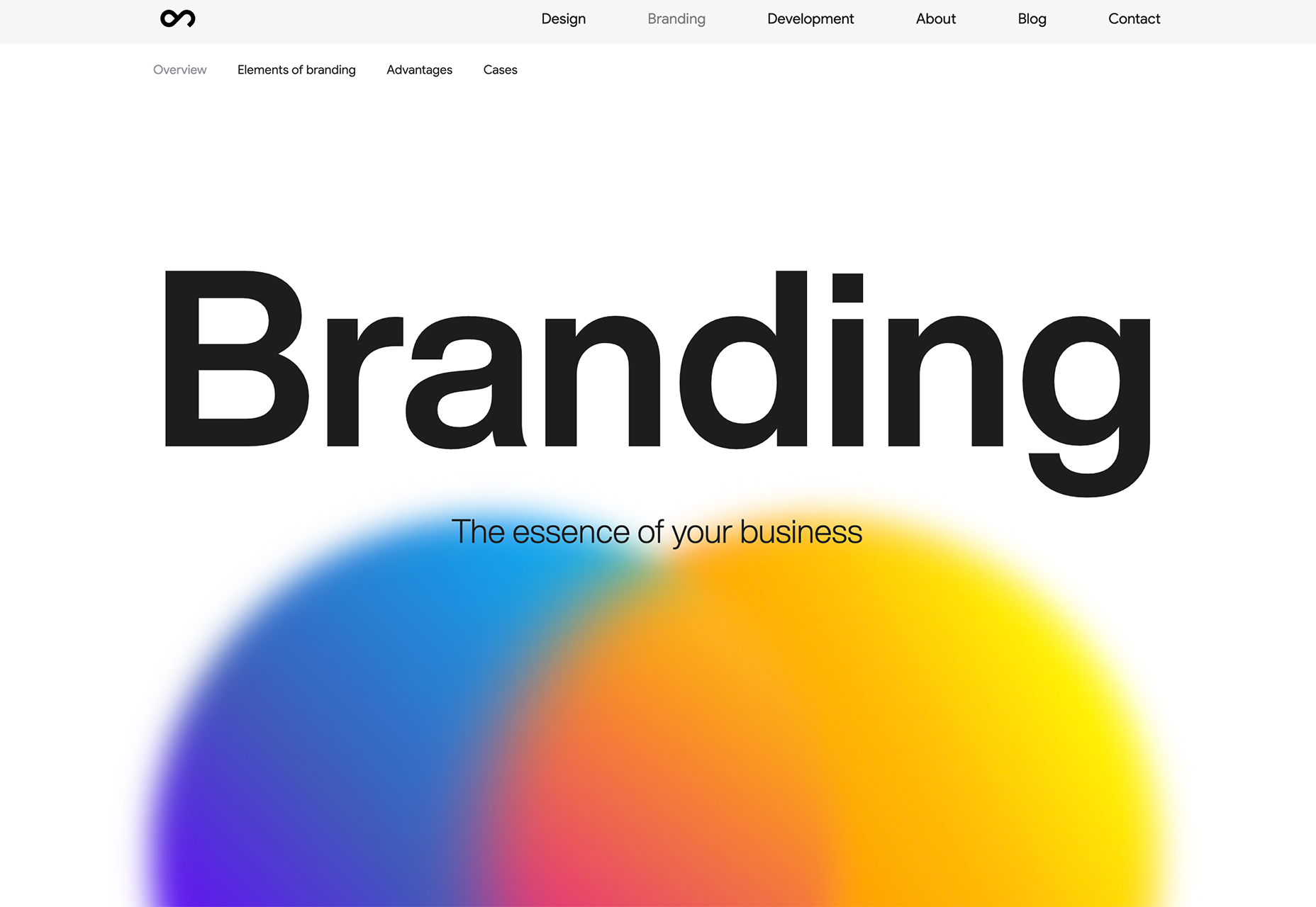
Use Negative Space
Imagine a person standing in a crowd. Let’s say they’re wearing a red and white striped jumper and a red and white bobble hat — pretty distinctive. But if there are hundreds of other characters around them, they might be hard to spot.
Now imagine the same person dressed the same, standing on their own. How long will it take you to spot them? Even without the stripy outfit, it’s not much of a challenge.
Elements in isolation are not only easier to spot, but they pull the eye because the negative space (sometimes referred to as white space) around them creates contrast.
When using negative space, the key is to give elements enough room to breathe and attract the eye without giving them so much room that they are disassociated from the rest of your content.
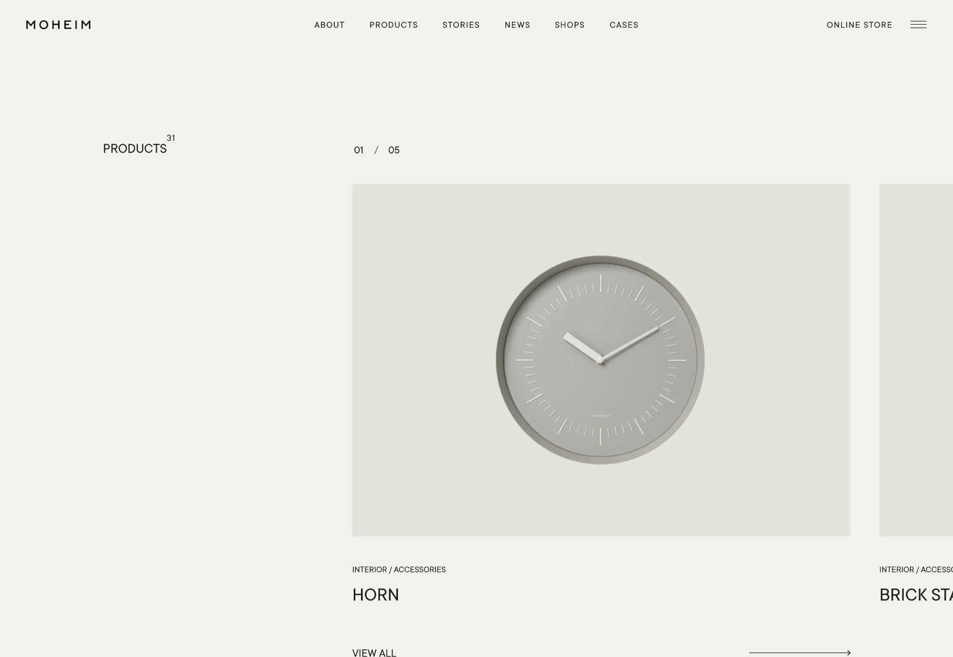
Across its site, Moheim uses negative space to highlight UI elements while grouping associated content.
Use F Patterns
Users scan a page using either an F-pattern or a Z-pattern.
Because users scan your page in predictable ways, we can employ layouts that cater to this tendency.
Designers have been aware of F and Z patterns for some time, and because they’ve been used for so long, they may be self-fulfilling, with users being trained to scan a page in this fashion. However, both patterns are similar to how eyes travel from line to line in horizontal writing systems.
Whatever the cause, by placing key content along these paths, you increase the chance of capturing a user’s attention.
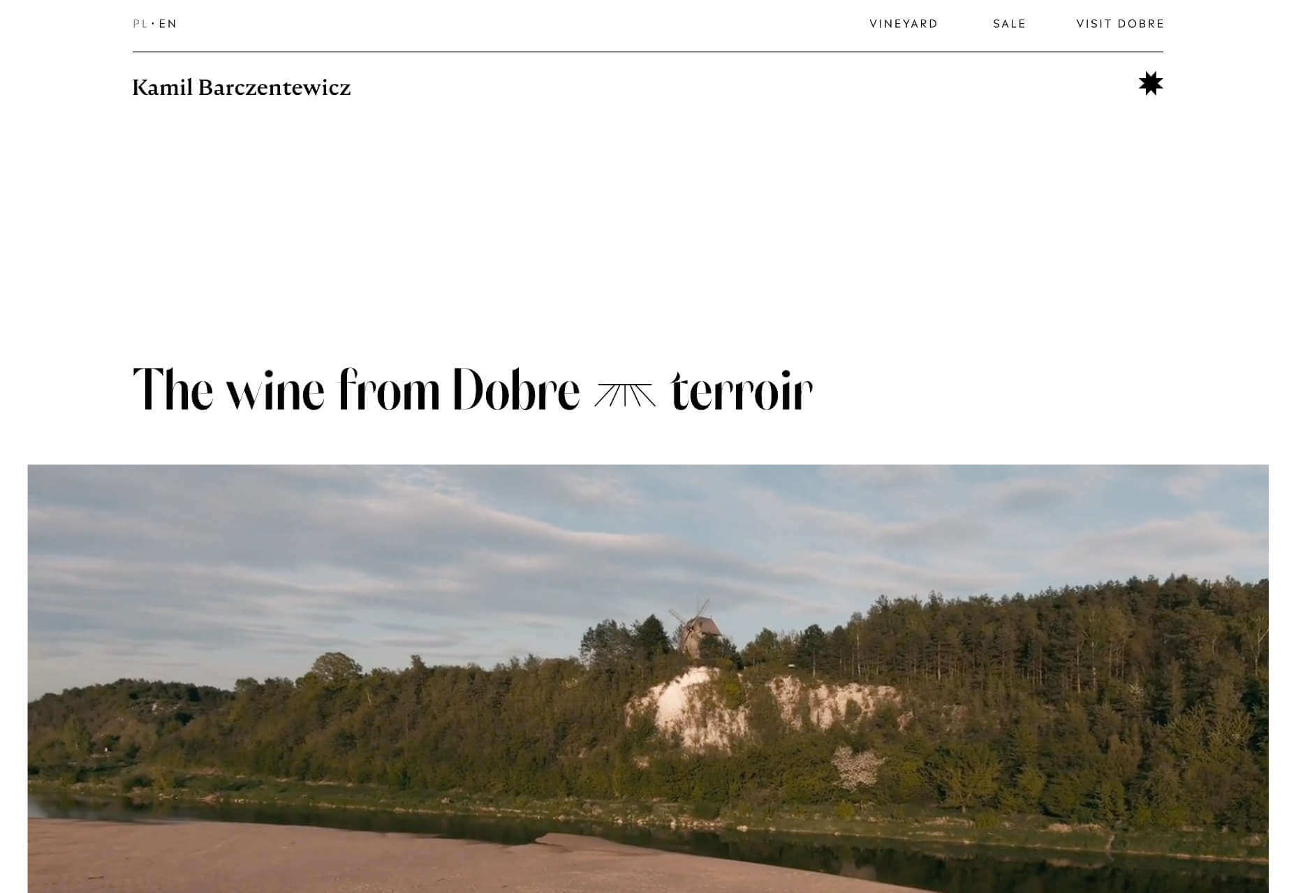
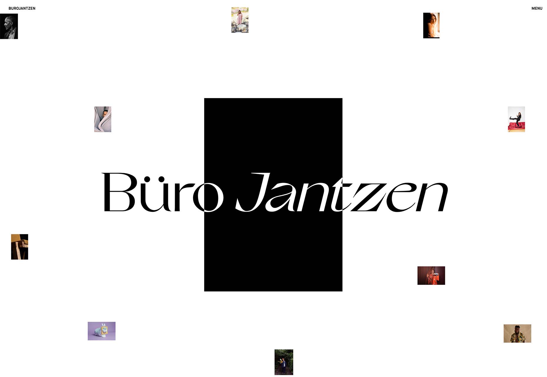
Kamil Barczentewicz uses a beautiful, natural layout that also conforms to a classic F pattern.
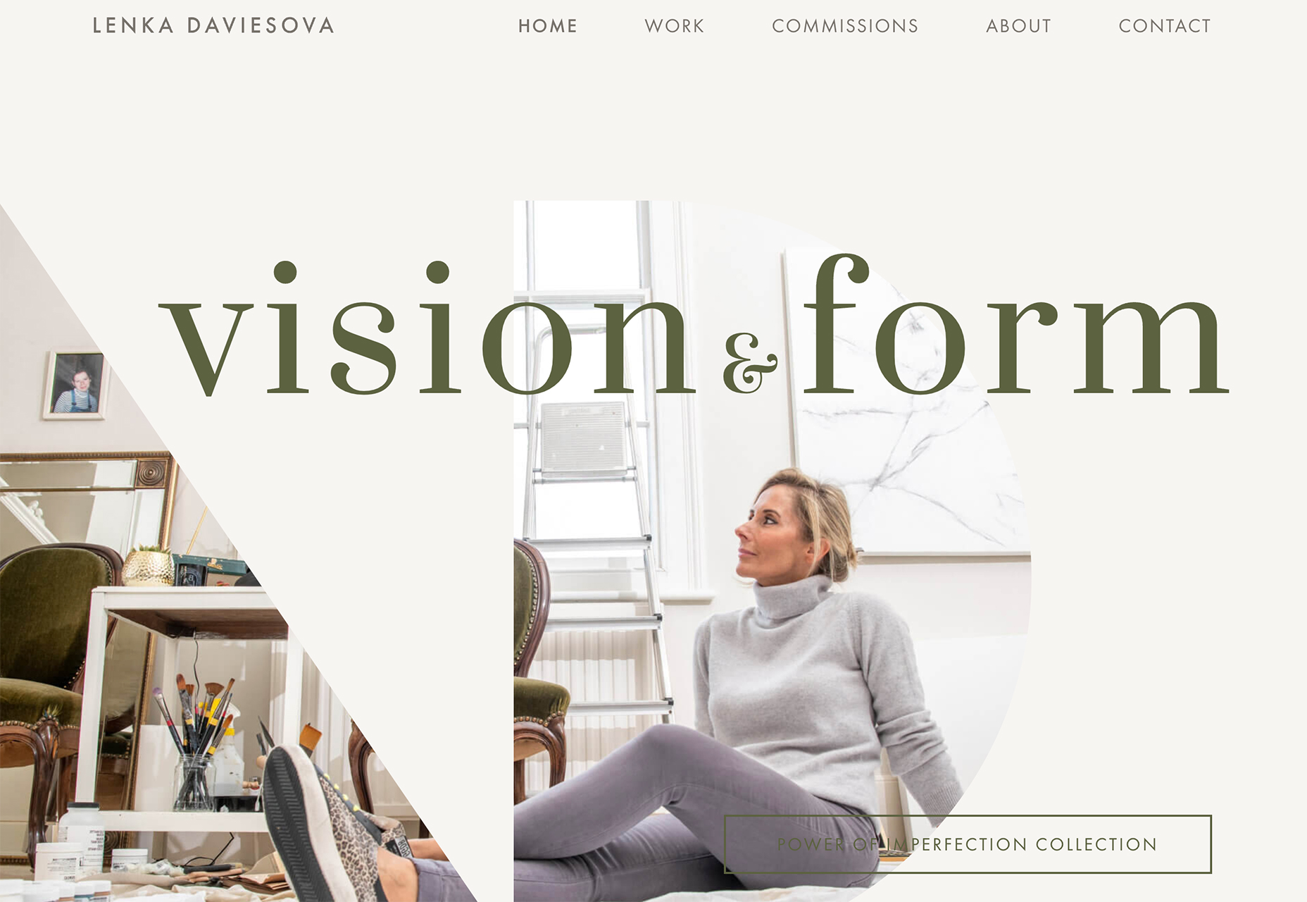
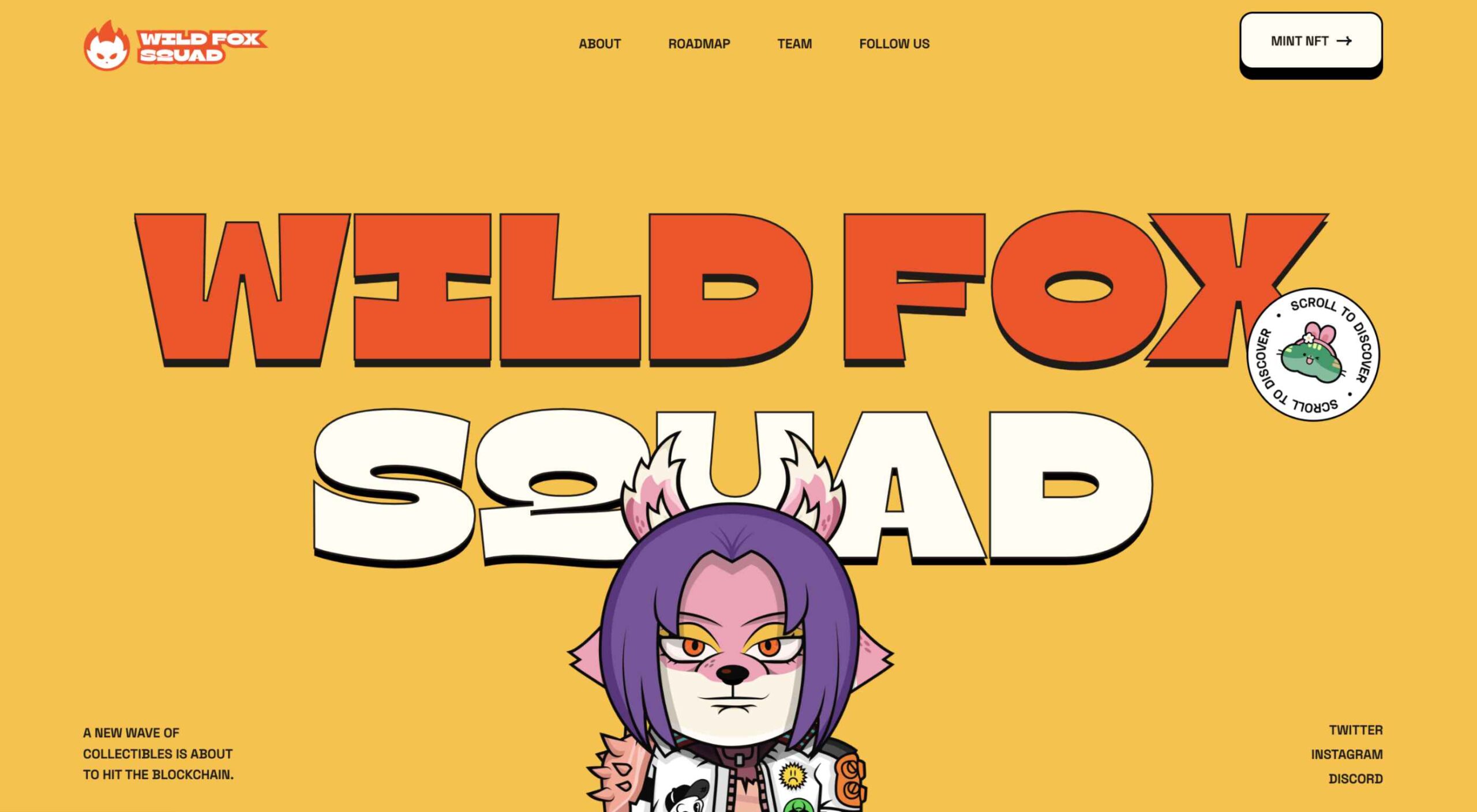
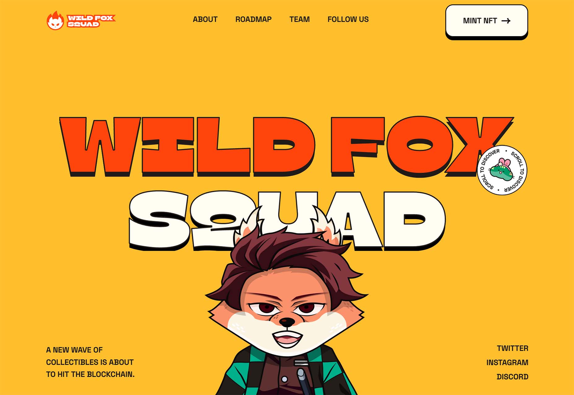
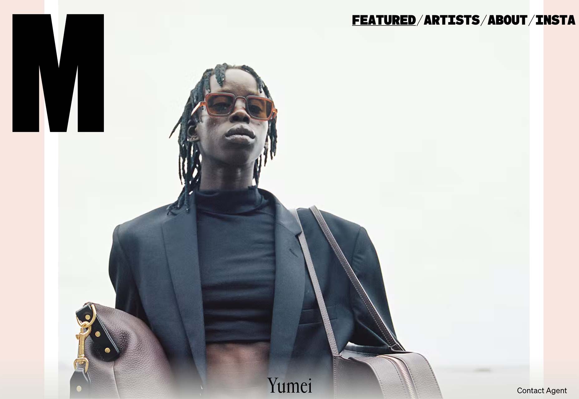
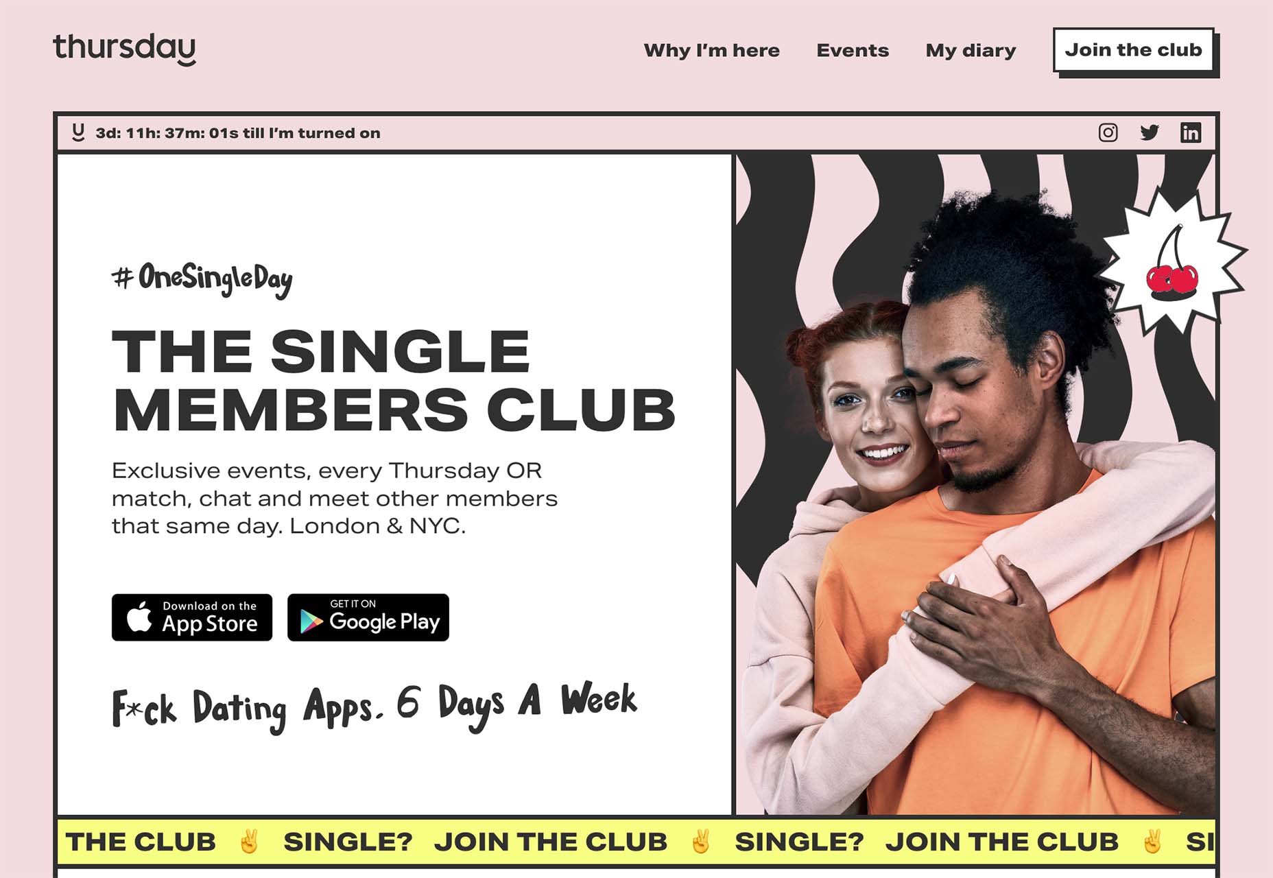
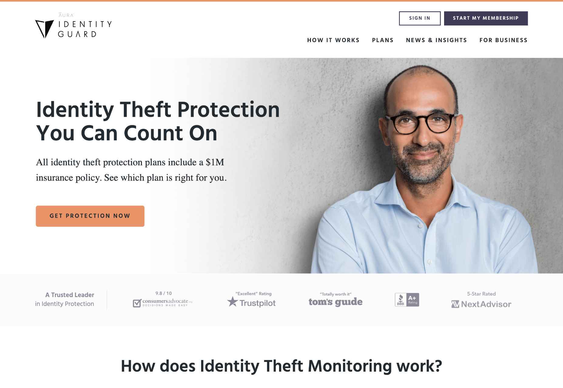
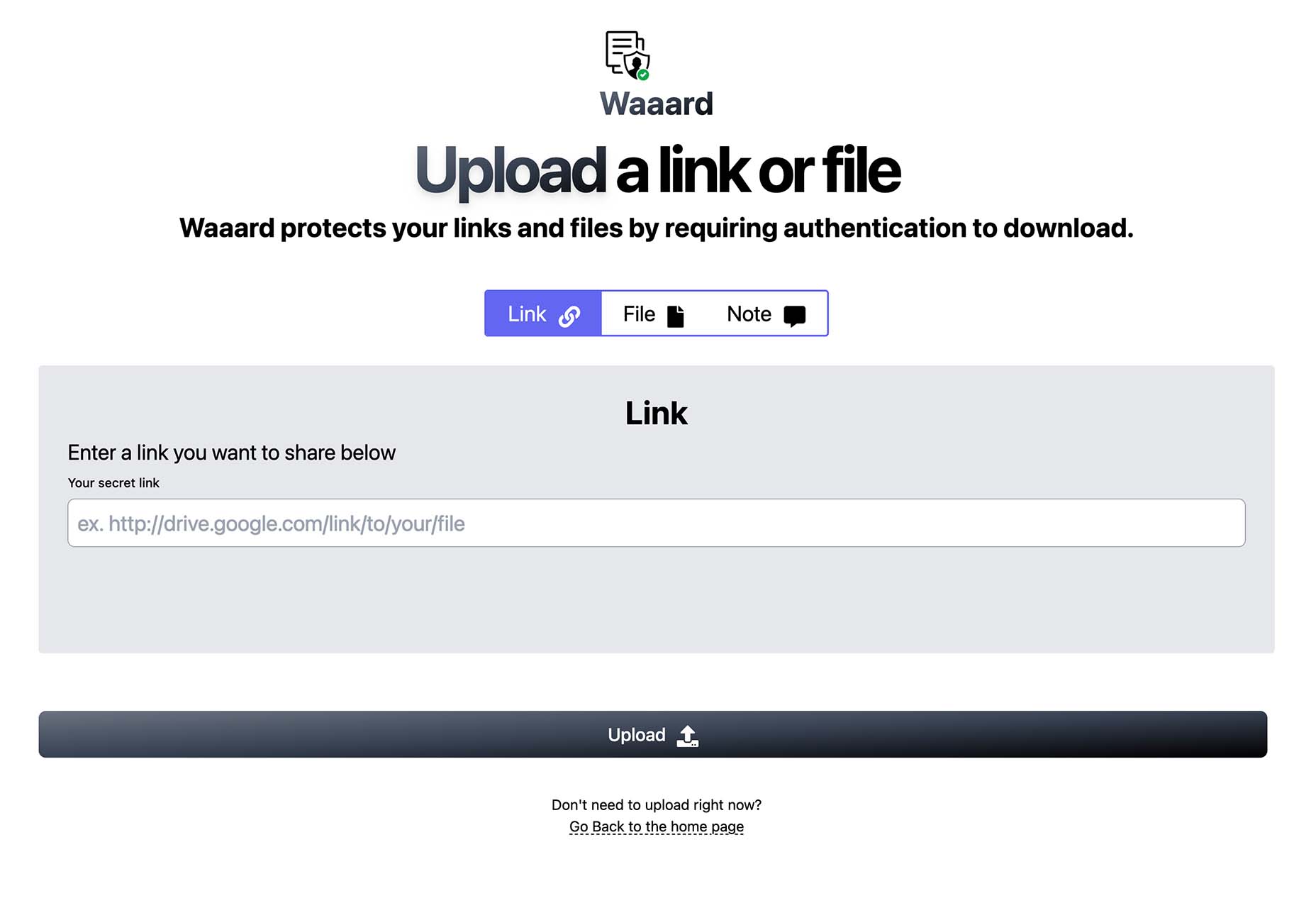
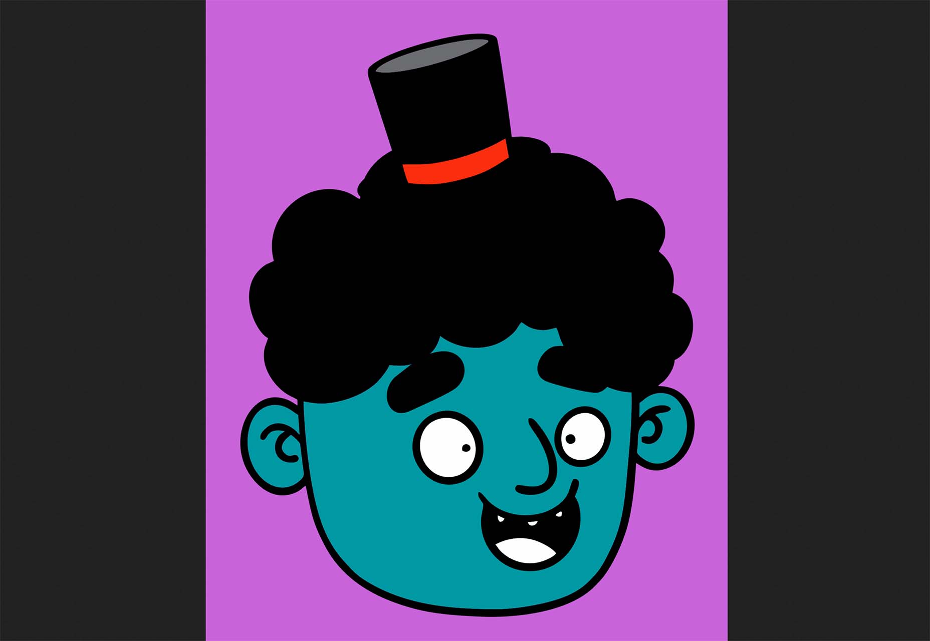
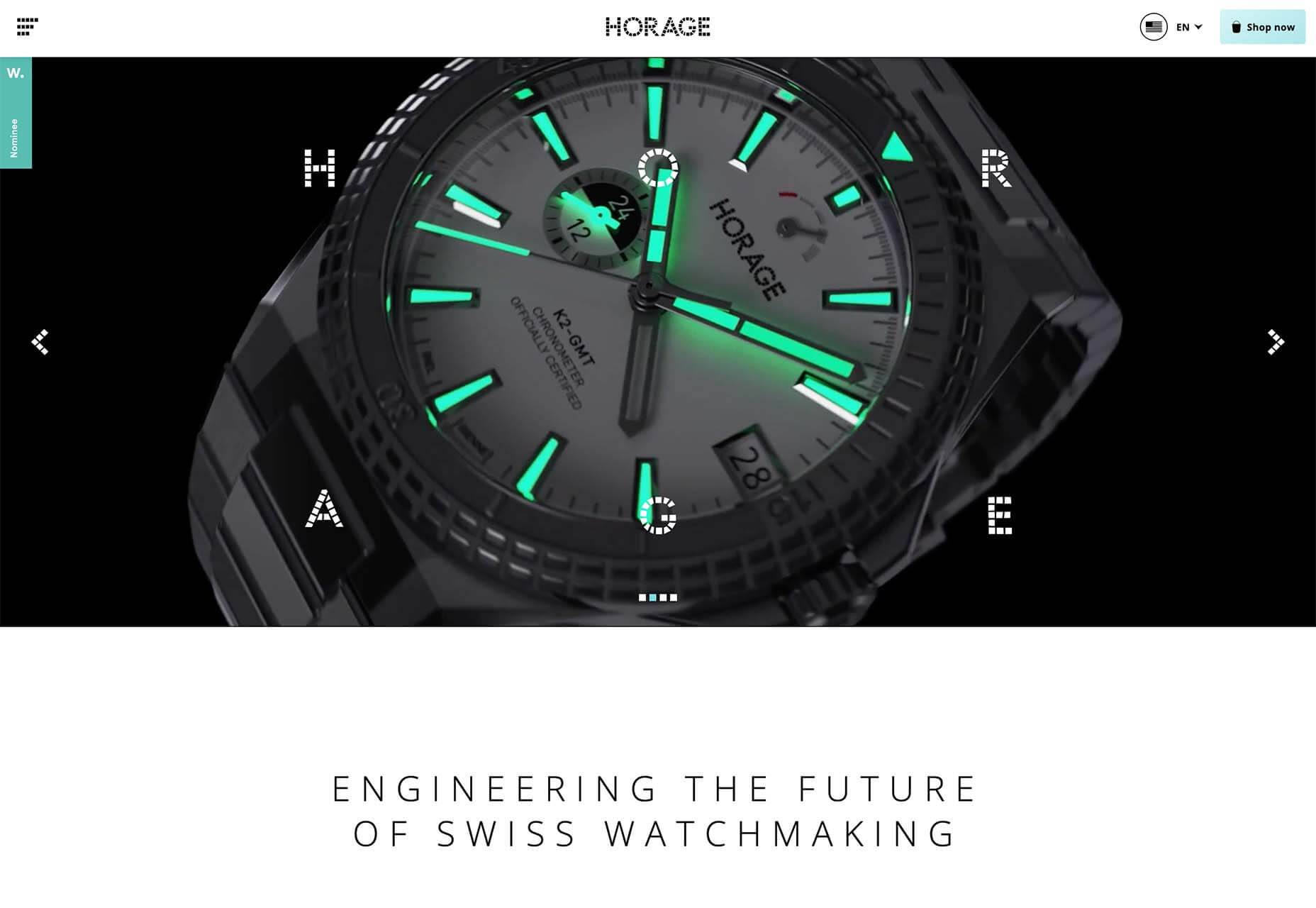
Include Images with Faces
Images are a great way of conveying brand values and making a site engaging. But when it comes to catching the eye of a user scanning your design, the best images include faces.
For example, a testimonial with an image of the customer will catch the eye more than a text-only testimonial.
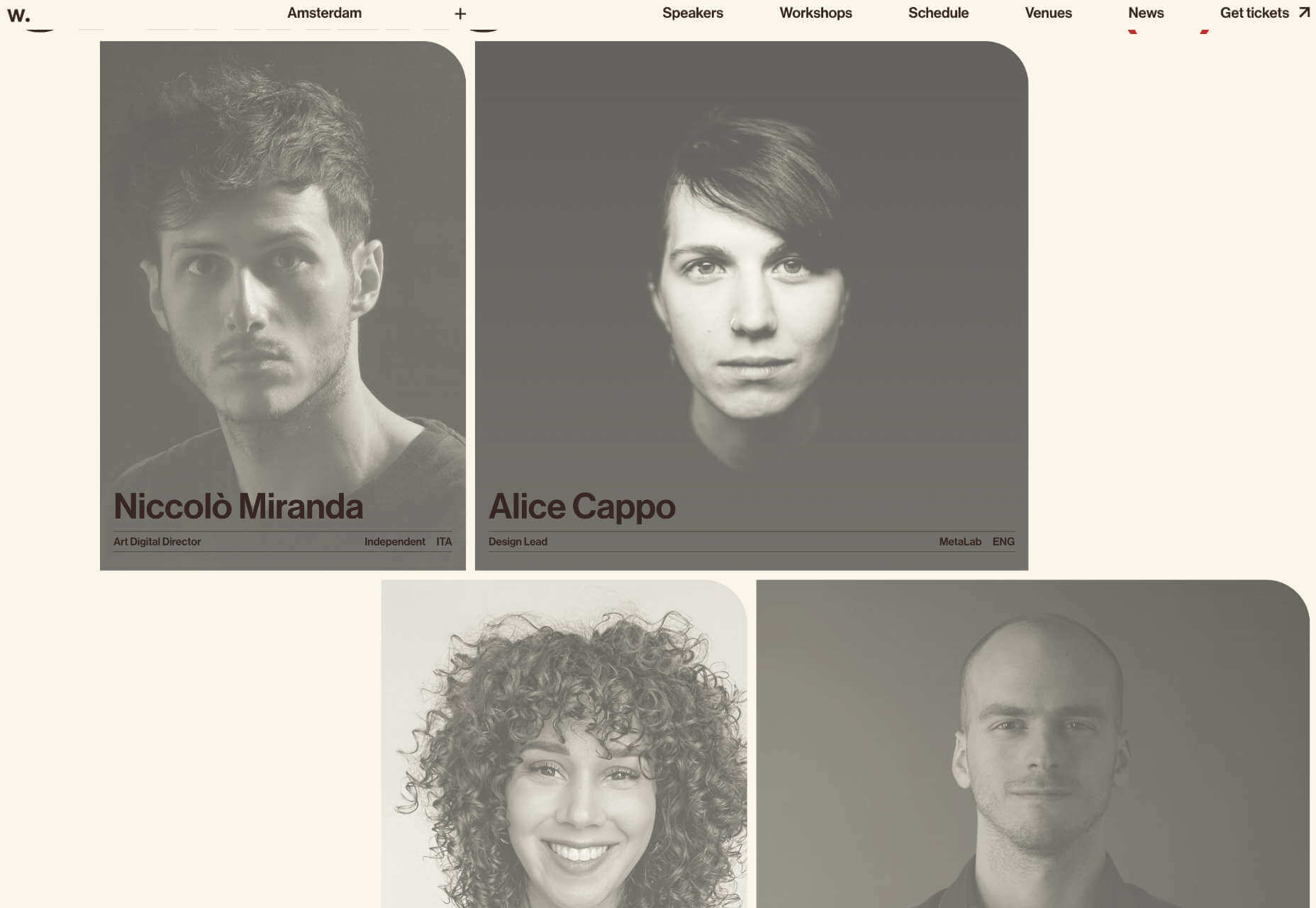
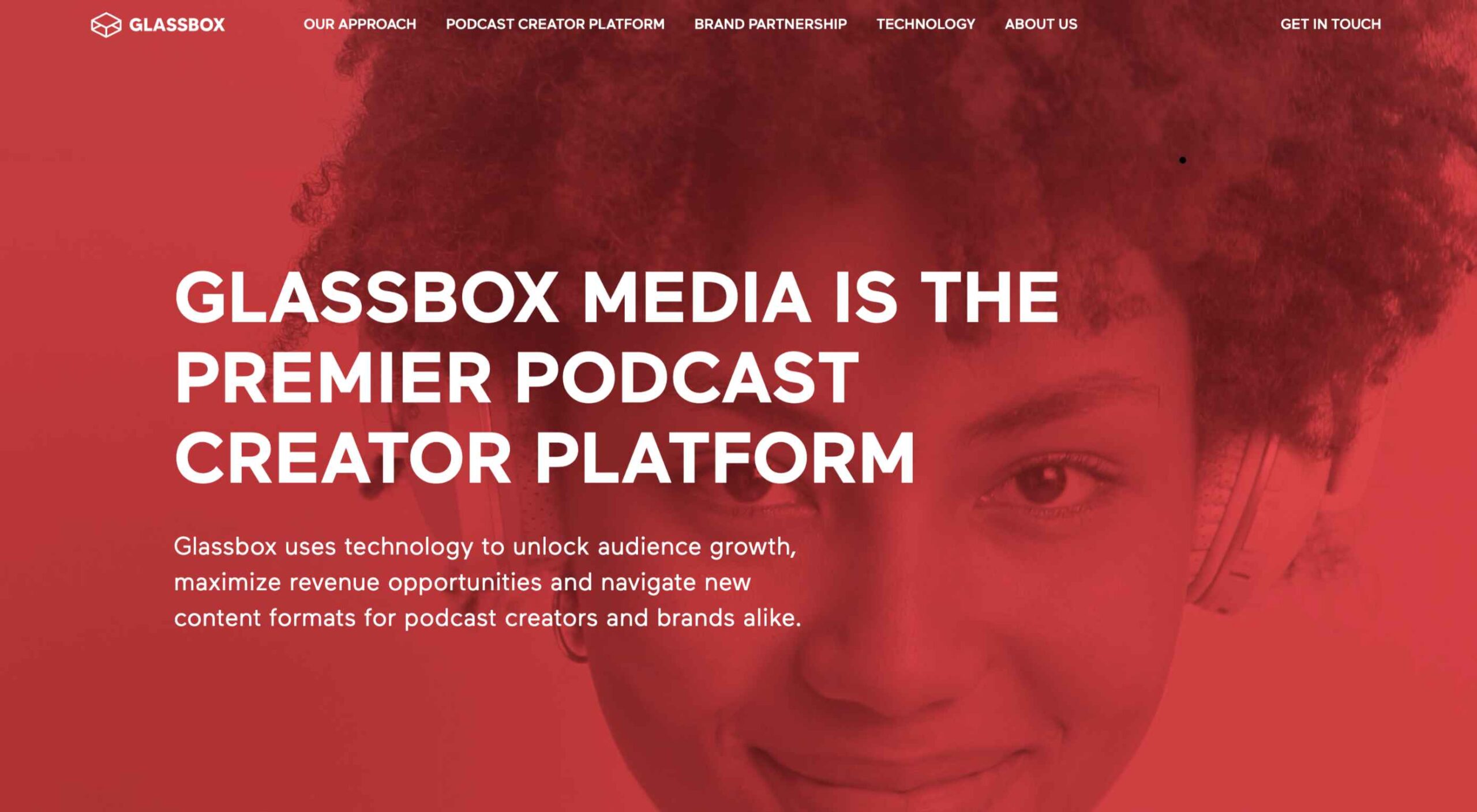
The Awwwards Conference uses an animated computer with a face to capture attention. And large images of speakers making eye contact.
This is almost certainly due to social conditioning; we see a face, and we engage with it to see if it is a threat or not. Most of us naturally look to expressions of emotion to understand situations, and the distinction between a real-life person and an image hasn’t made its way into our mental programming yet.
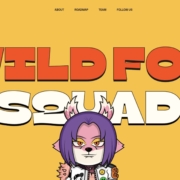
You don’t need to use photos. Illustrations are fine. The key is to ensure there is a face in the image. That’s why illustrations of characters perform so well.
Copy Print Design
Print design is centuries older than the web, and many print applications, from newspapers to advertising, developed design elements to catch the eye of readers scanning the design.
Subheadings, lists, blockquotes, and pull quotes all catch the eye. Introductory paragraphs in a larger size or even italics draw users into the text. Shorter paragraphs encourage users to keep reading.
Horizontal rules used to delineate sections of text act as a break on eyes traveling over content with momentum. They are a good way of catching a scan-reader who is losing interest.
You can use a horizontal rule or break up your layout with bands of color that divide content sections.
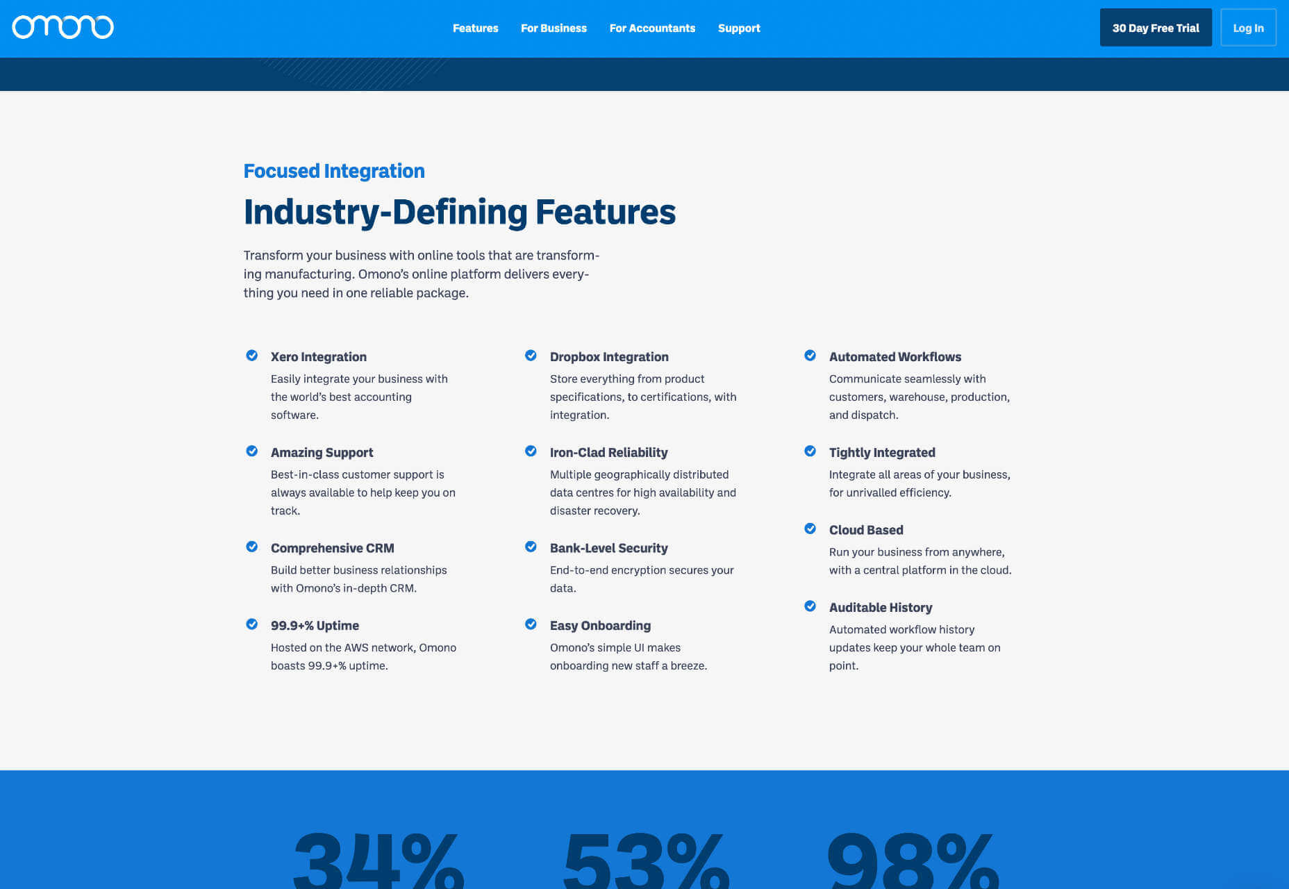
Omono uses horizontal bands to highlight different sections of content.
Mass, Not Weight
We often discuss design elements as having weight; font-weight is the thickness of strokes.
But it is more helpful to think of design elements as having mass; mass creates gravity, pulling a user’s eye towards them.
The trick is to design elements with enough mass to attract the user‘s eye when scanning at speed without forcing the user to change how they engage with your content.
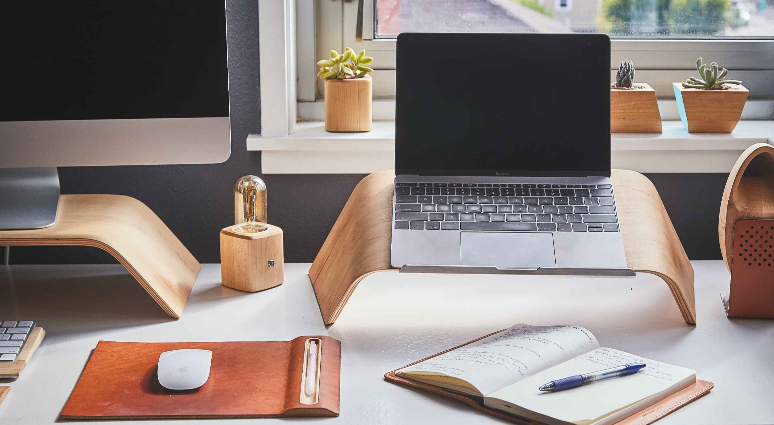
Featured image via Pexels.
The post How To Make Your Designs Scannable (And Why You Should) first appeared on Webdesigner Depot.
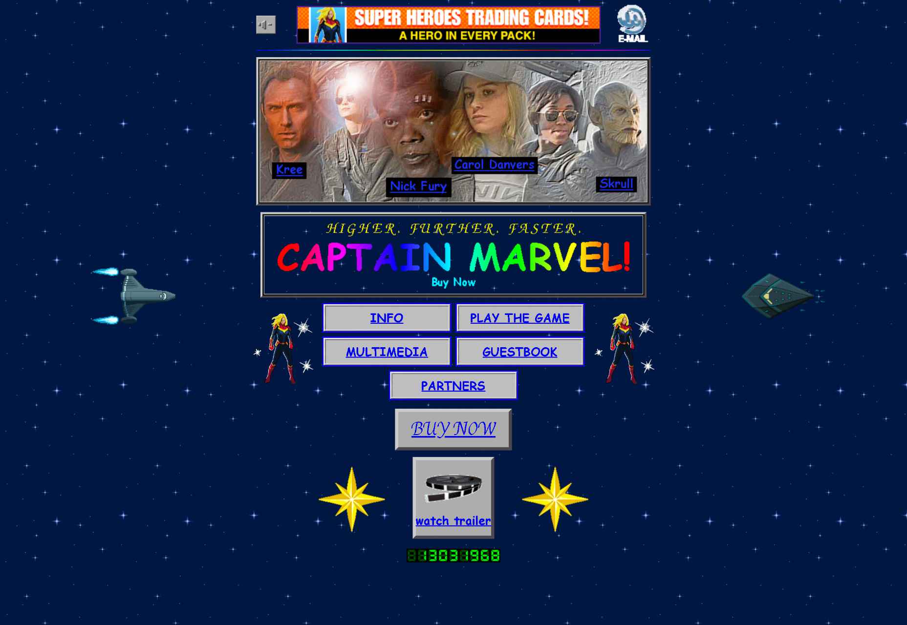
 As the season starts to change, so do some of the trends that web designers are using in projects. From a return of blur to interesting frame edges for images to neon color, there’s a lot to get excited about.
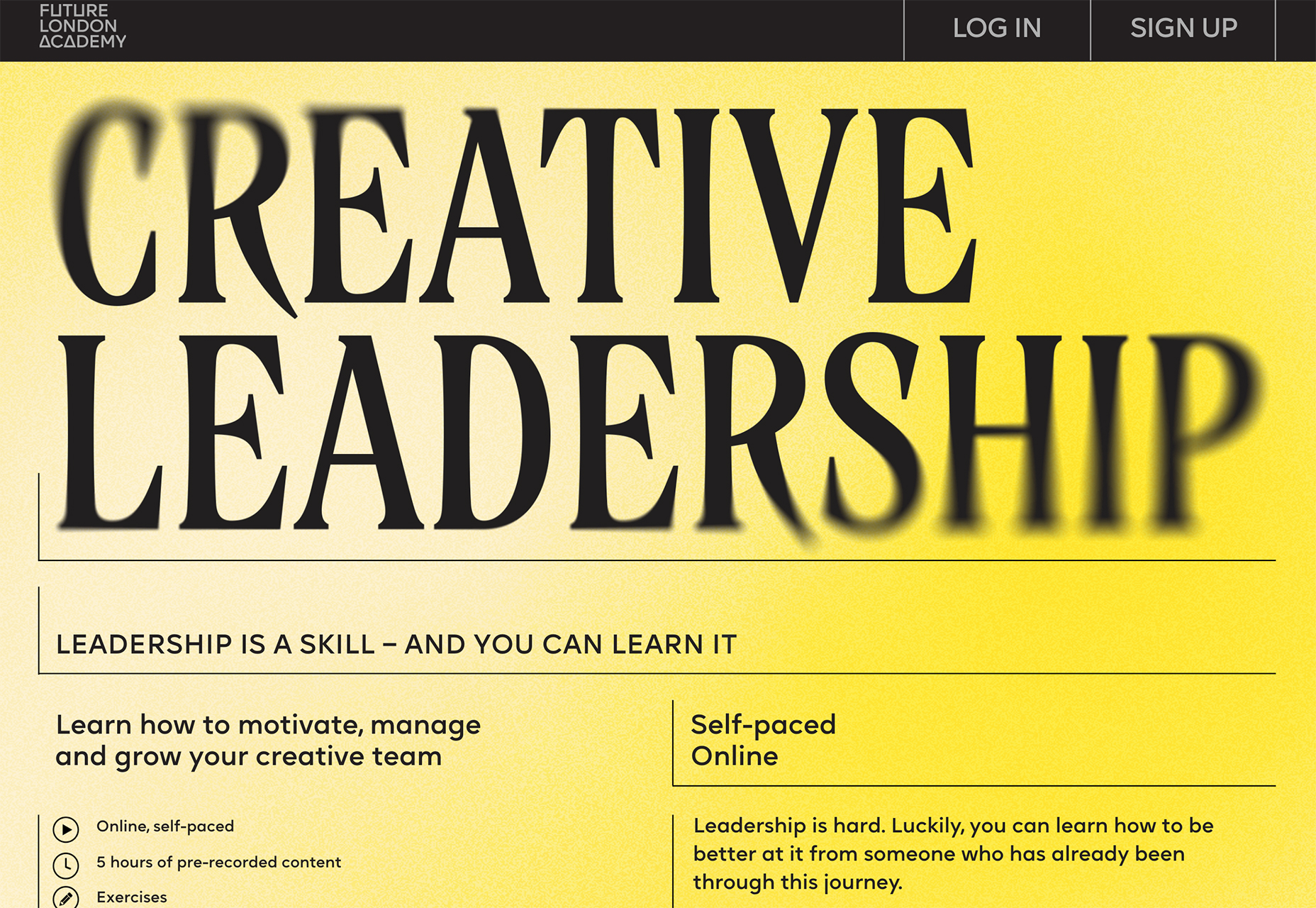
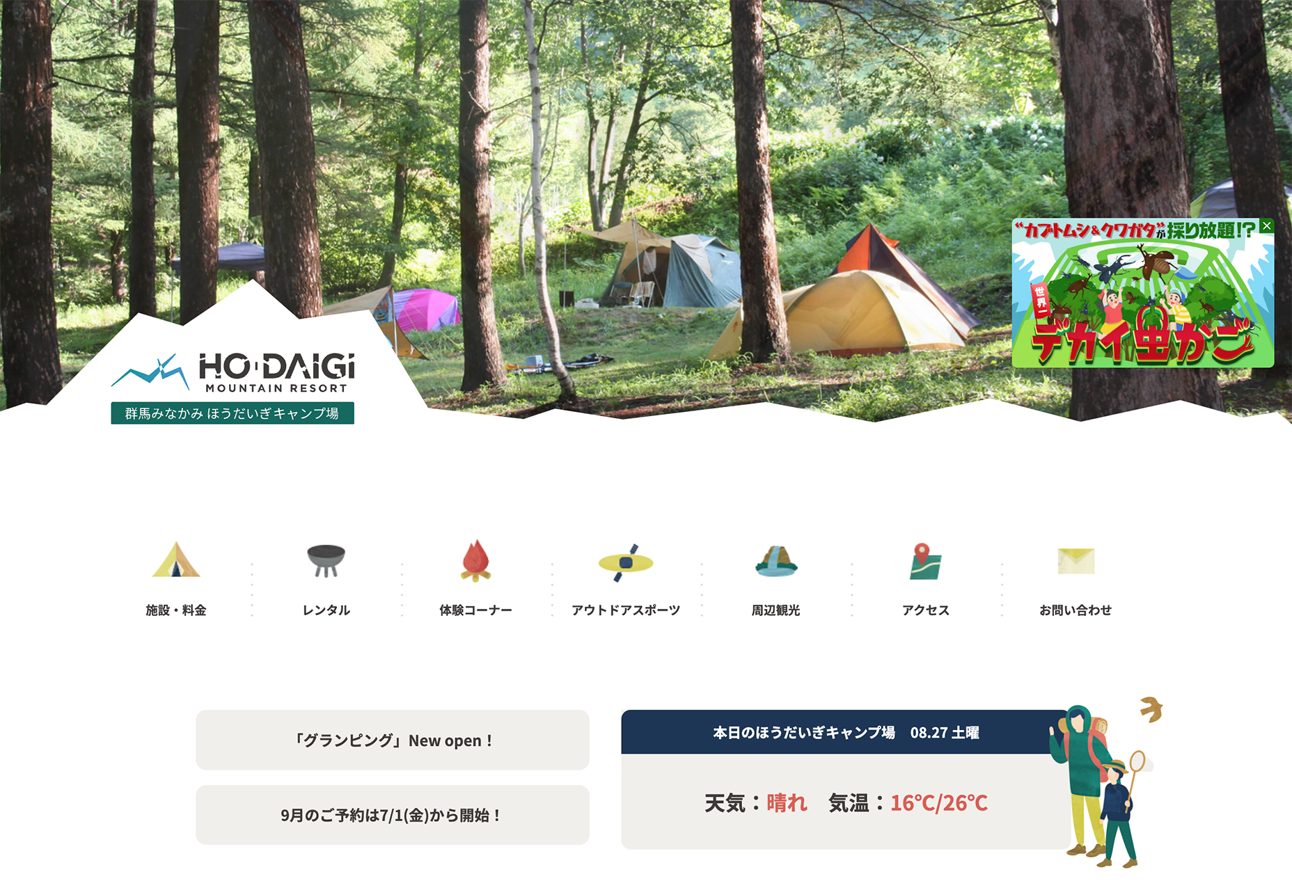
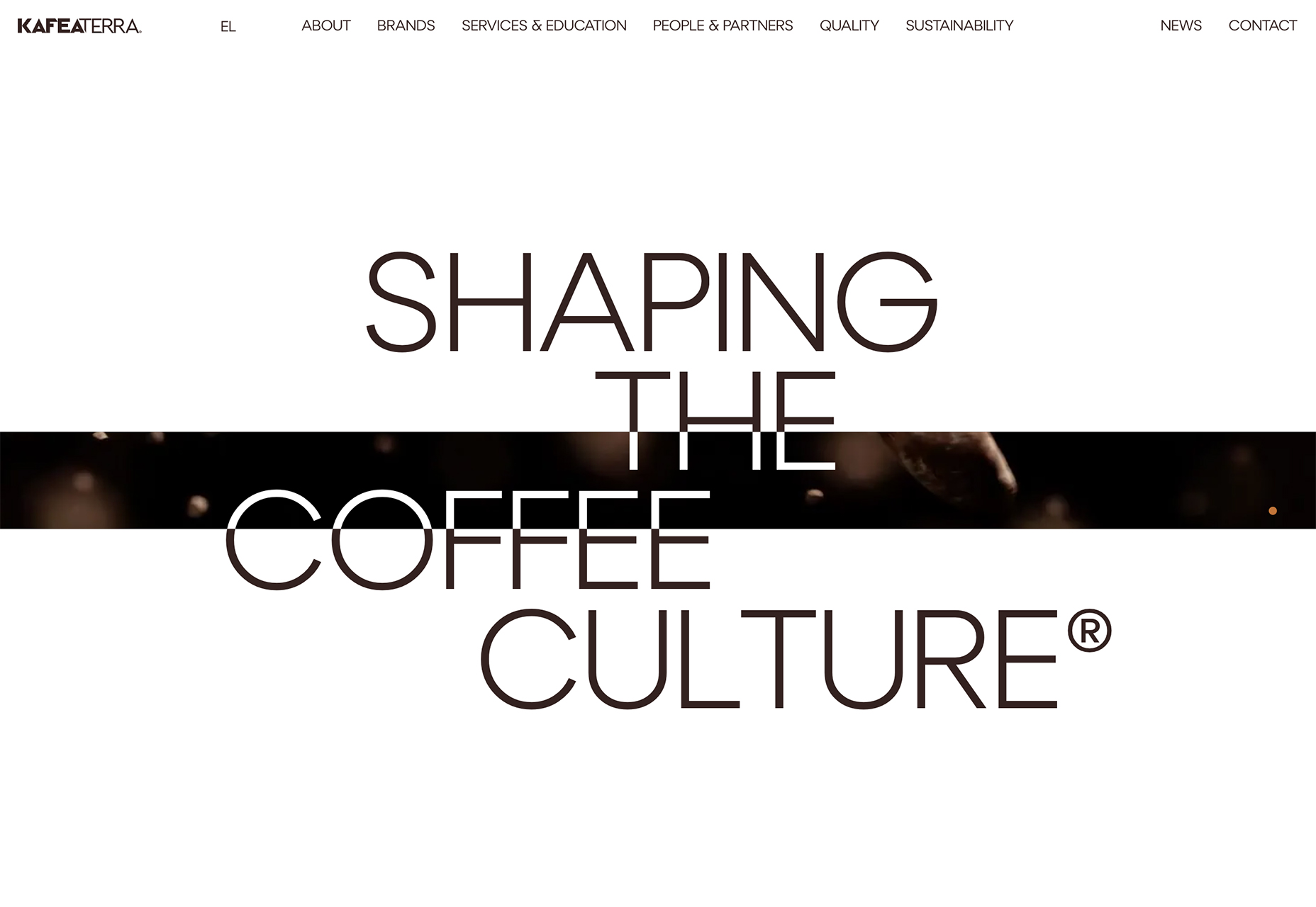
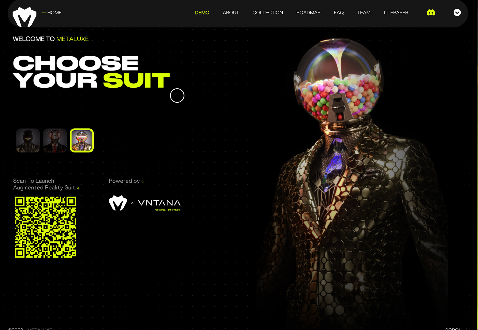
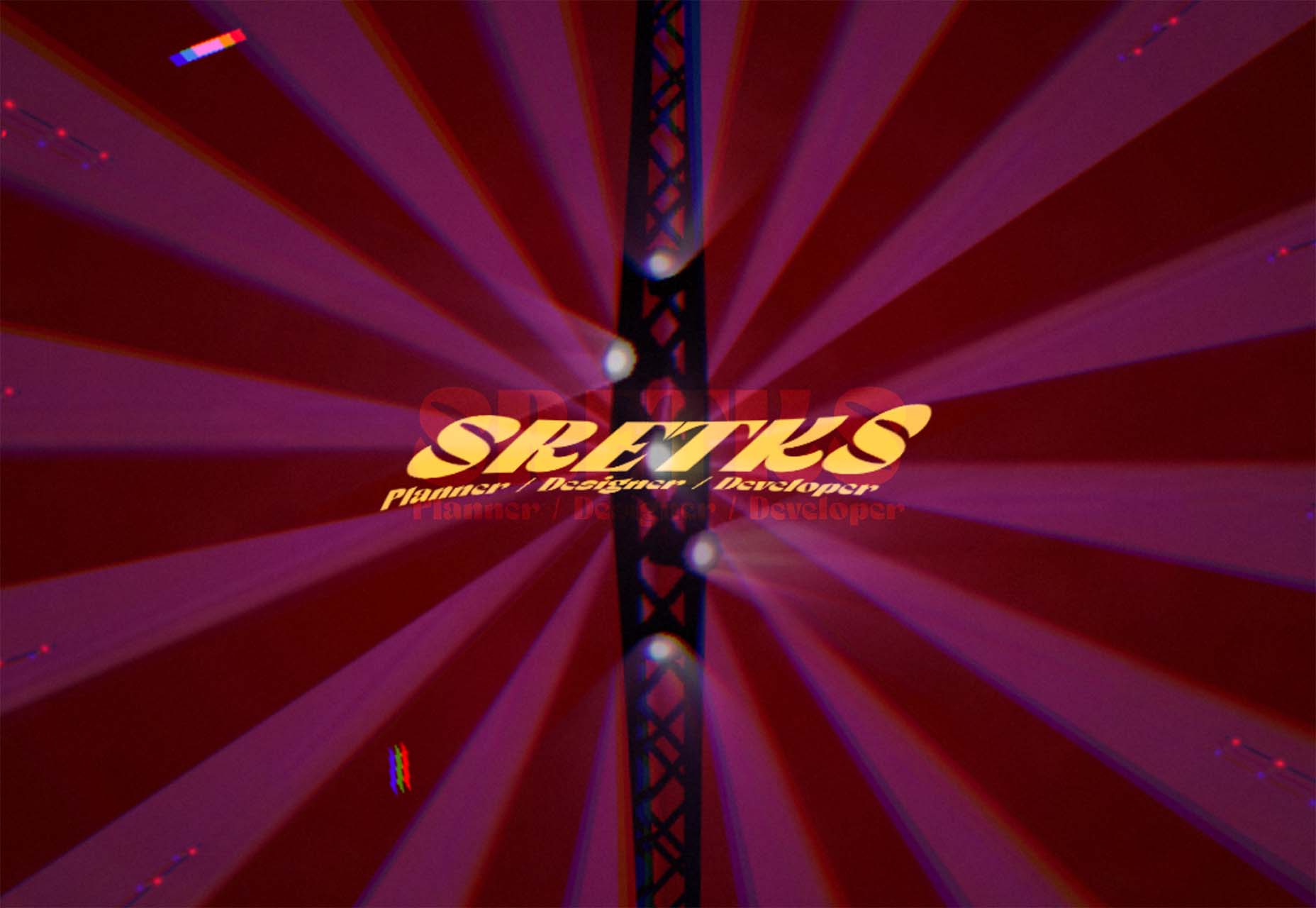
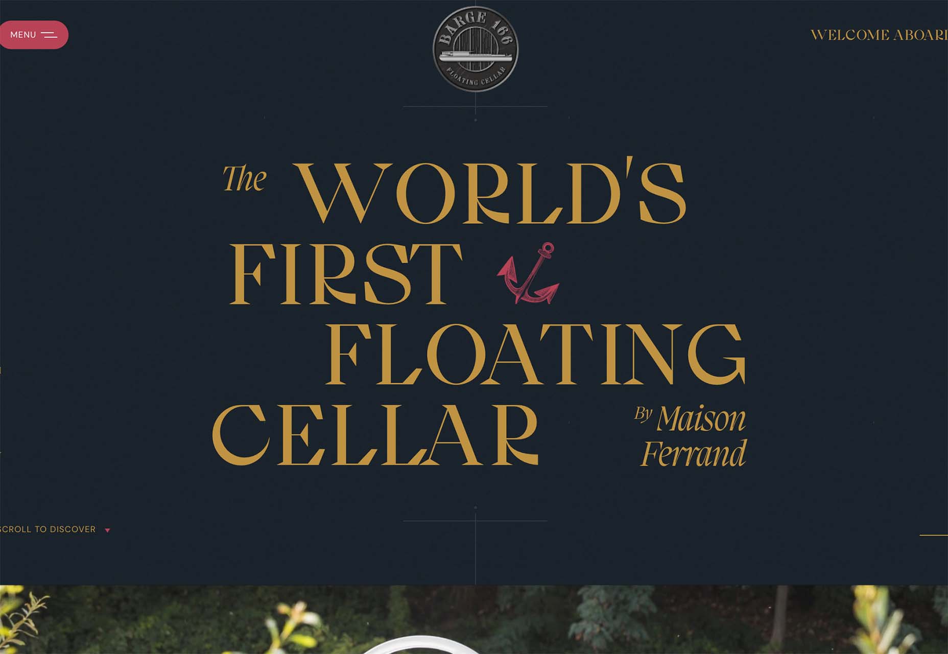
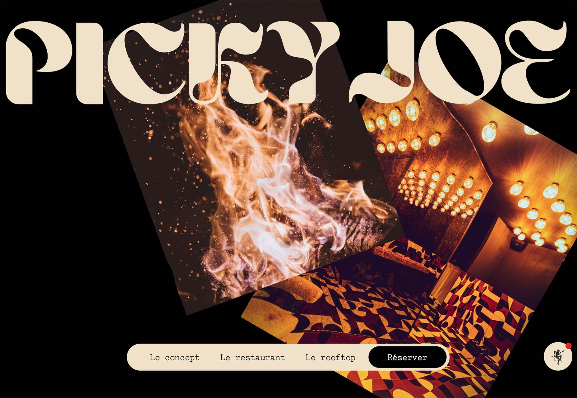
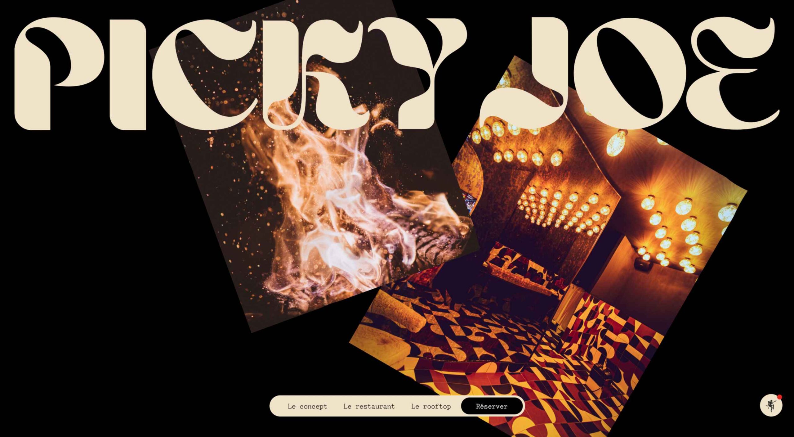 There are a lot of dark, retro vibes trending in website design right now. Although there are still some light projects popping up – including a pastel trend below – a lot of what we are seeing has a quite moody feel.

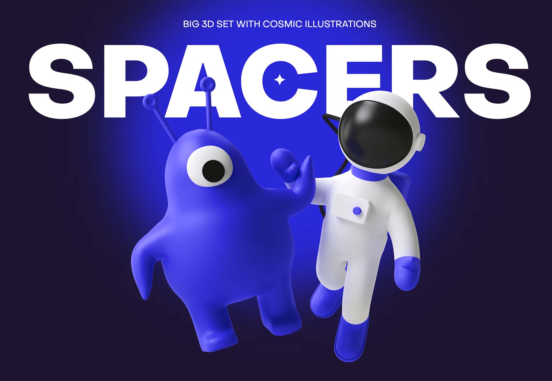
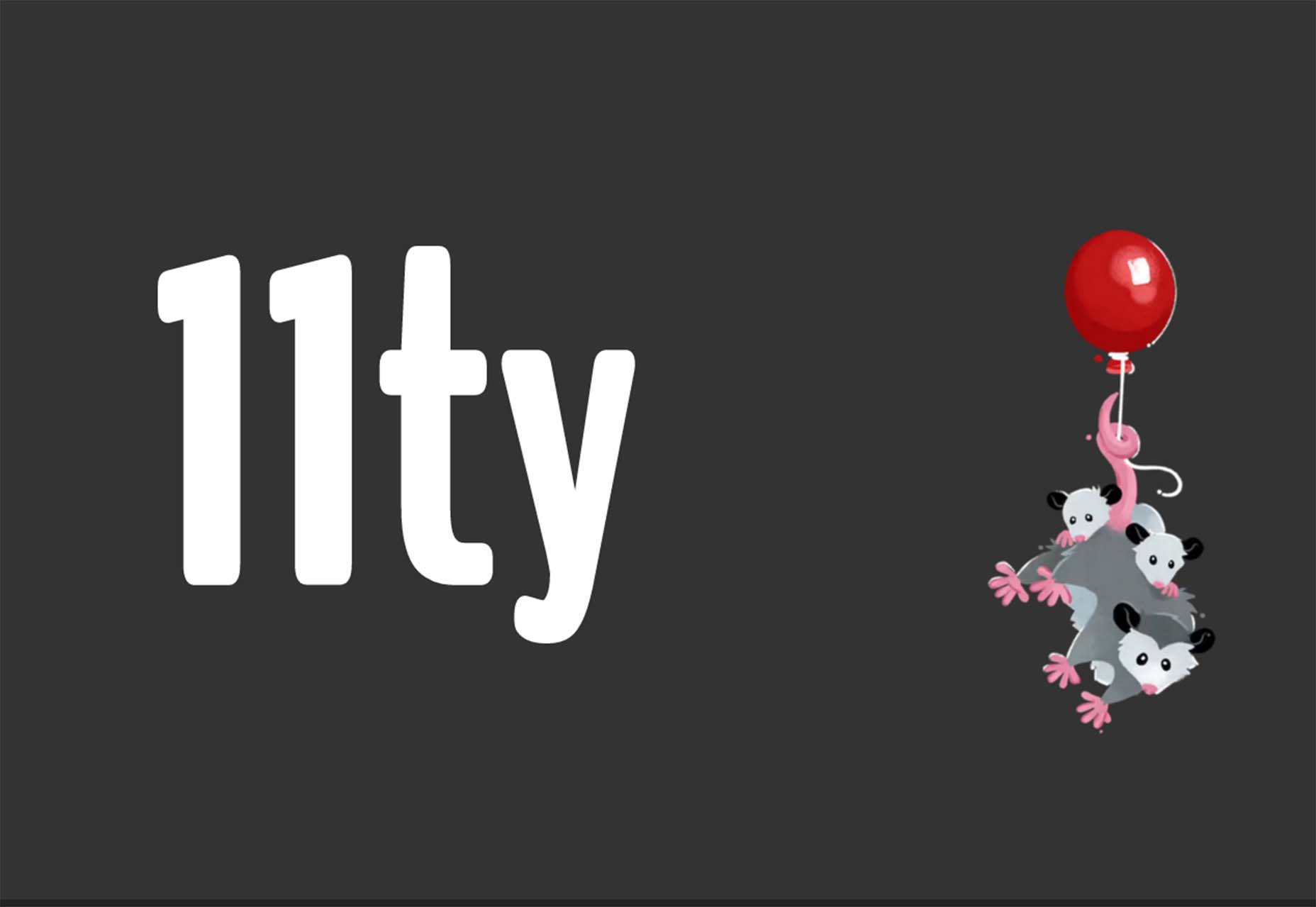
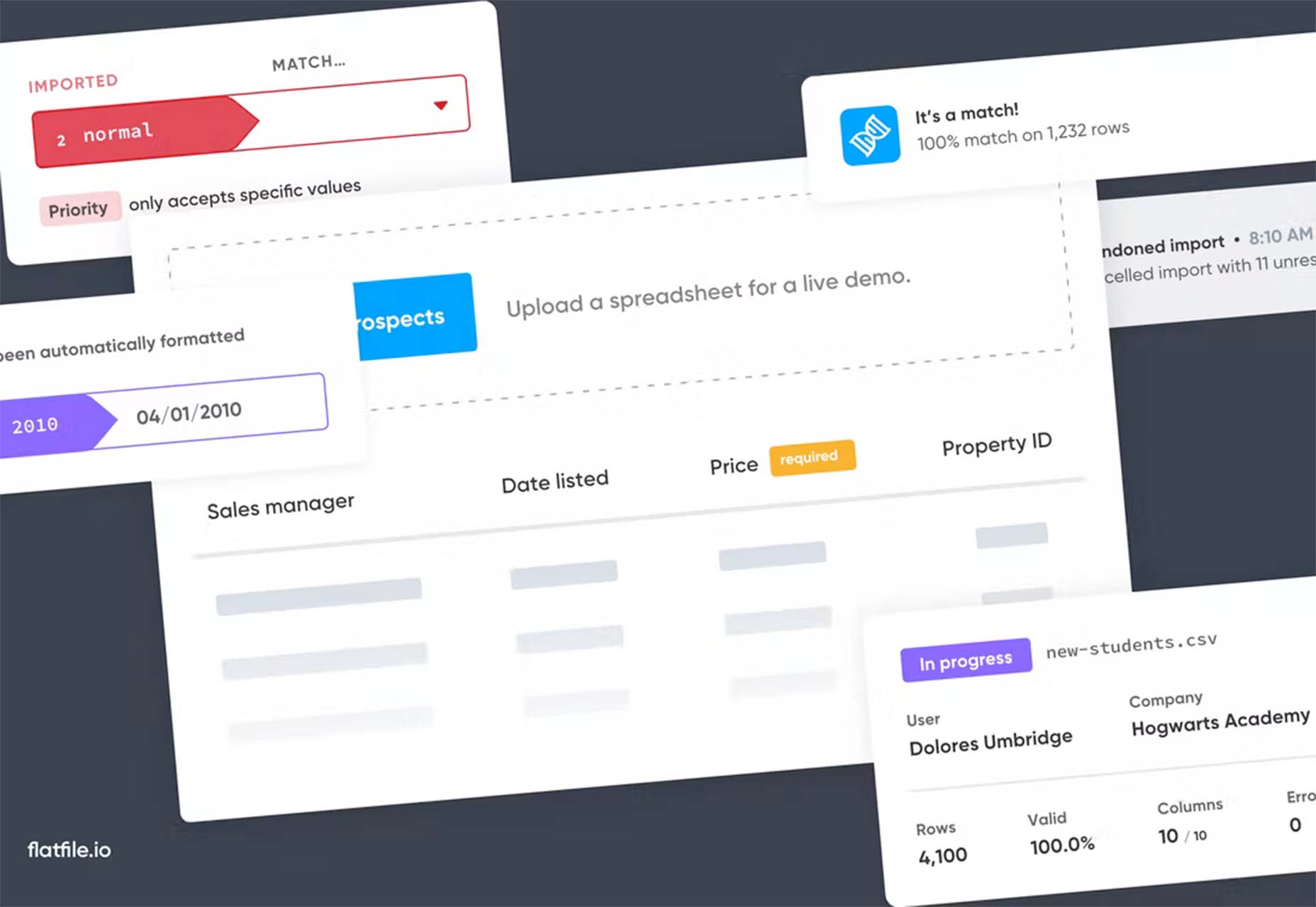
 The underlying theme of this month’s collection of new tools and resources is development. Almost every tool here makes dev a little easier, quicker, or plain fun. There are a few great tutorials in the mix to help you get into the spirit of trying new things and techniques.
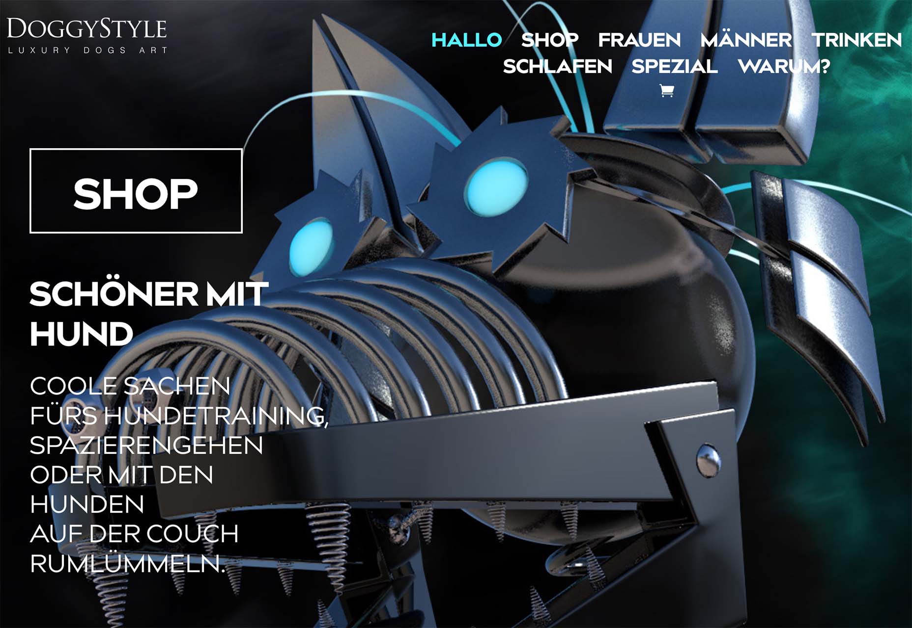
 Do you ever look at a website and think, why did they do that? Sometimes with website design trends, that’s the exact thought that can come to mind. What about an element works (or doesn’t) and why did it get so popular so fast? That’s the theme of this month’s roundup.
 We all know that psychology is a powerful tool. When used correctly, it can influence and persuade people to take action. In the world of web design, this is extremely important.
 Bored with the same old design tools? There are plenty of new toys to experiment with, from fun divots to functional design tools that could become your new go-to’s.
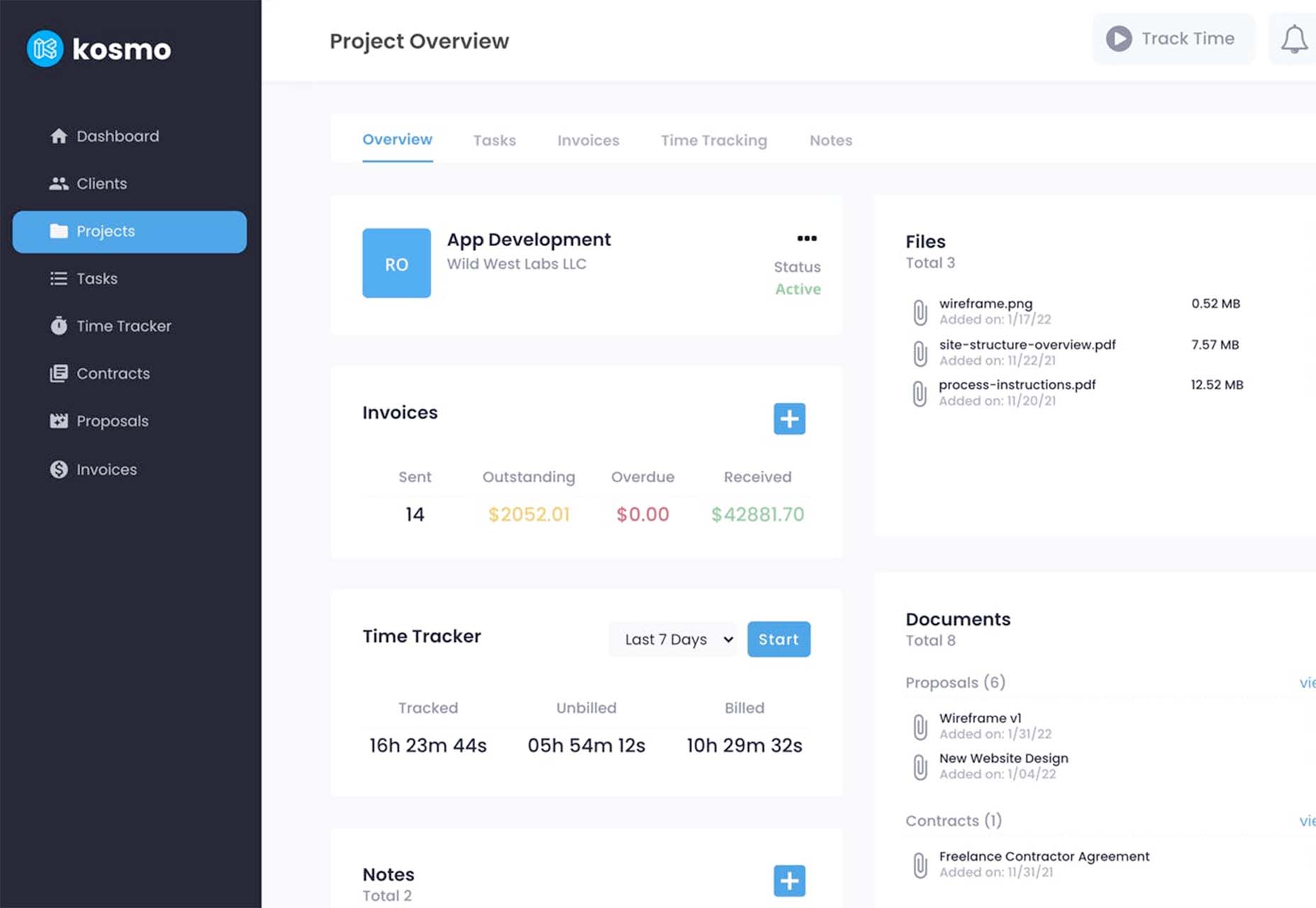

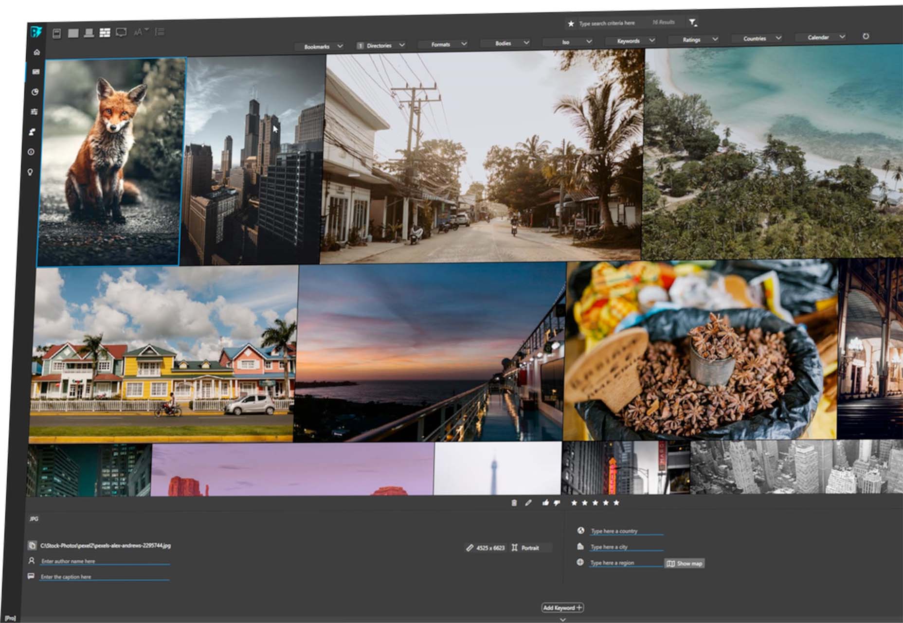
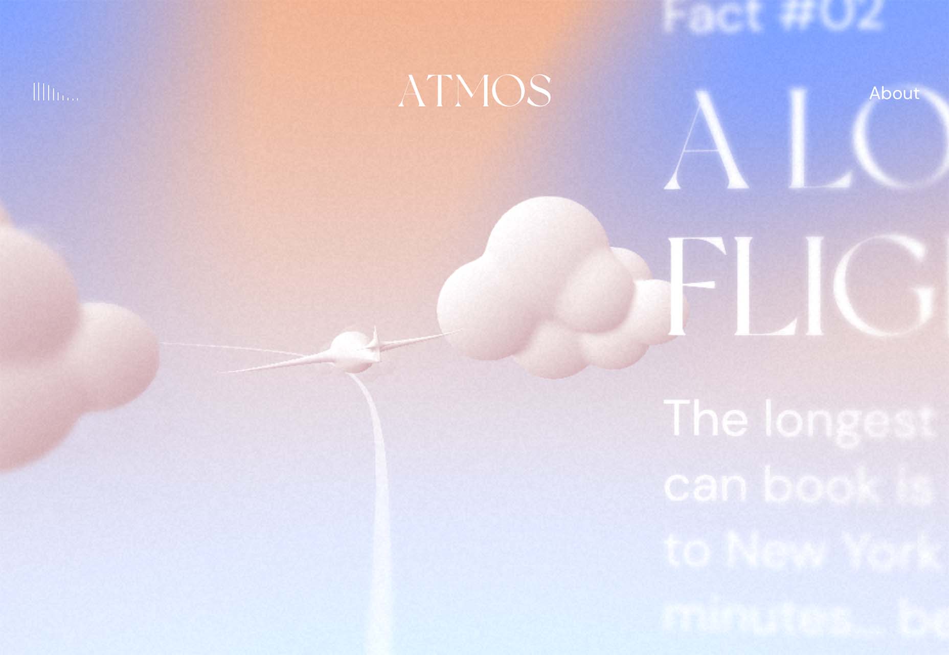
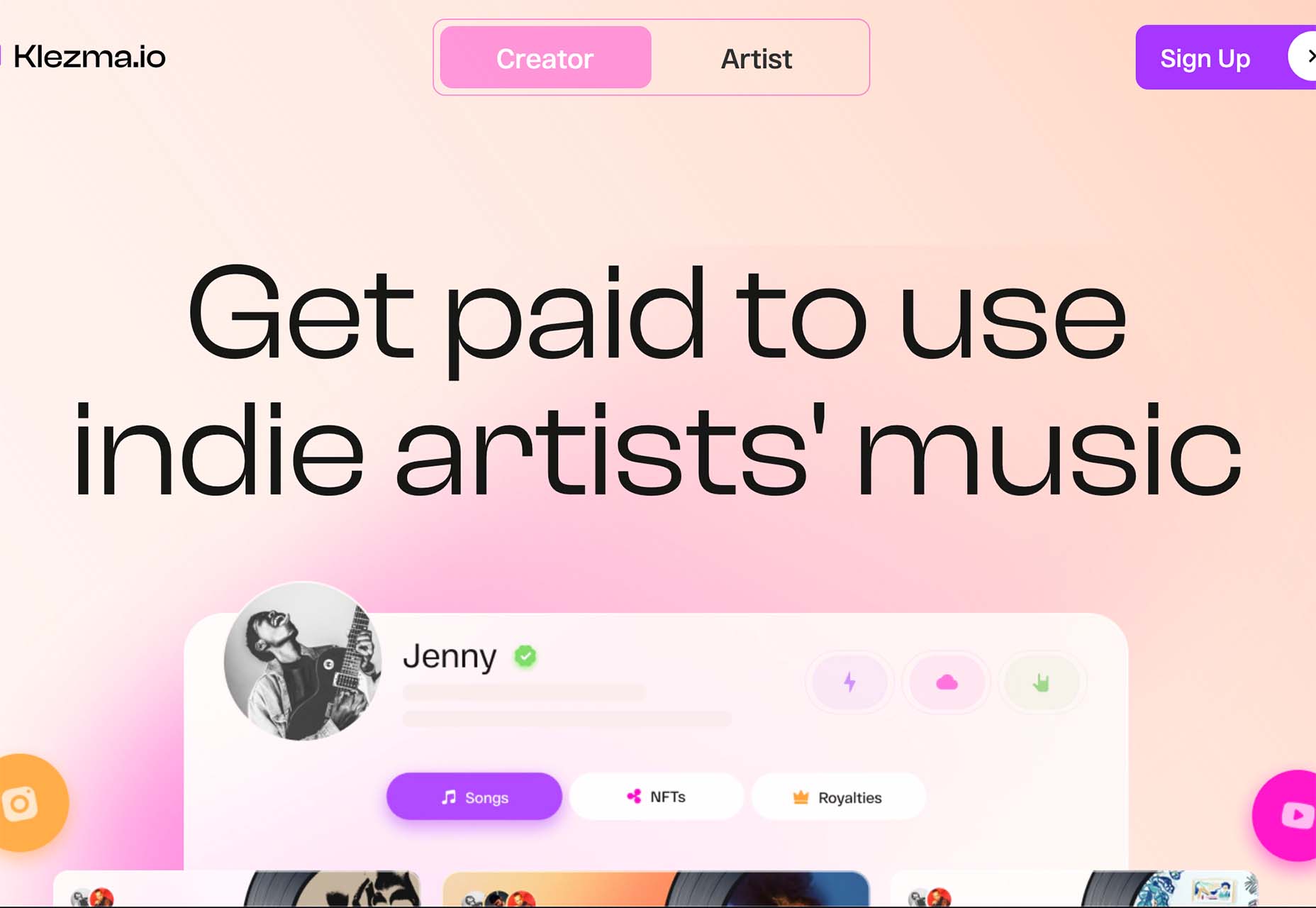
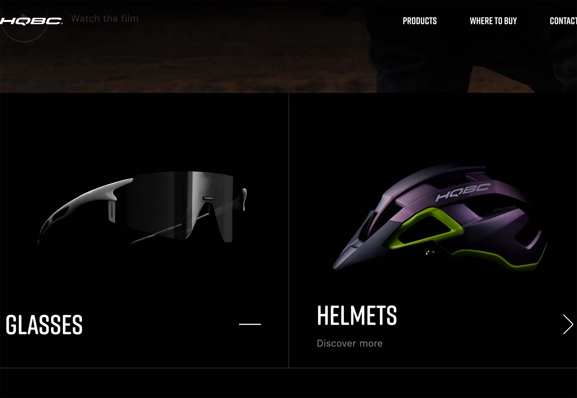
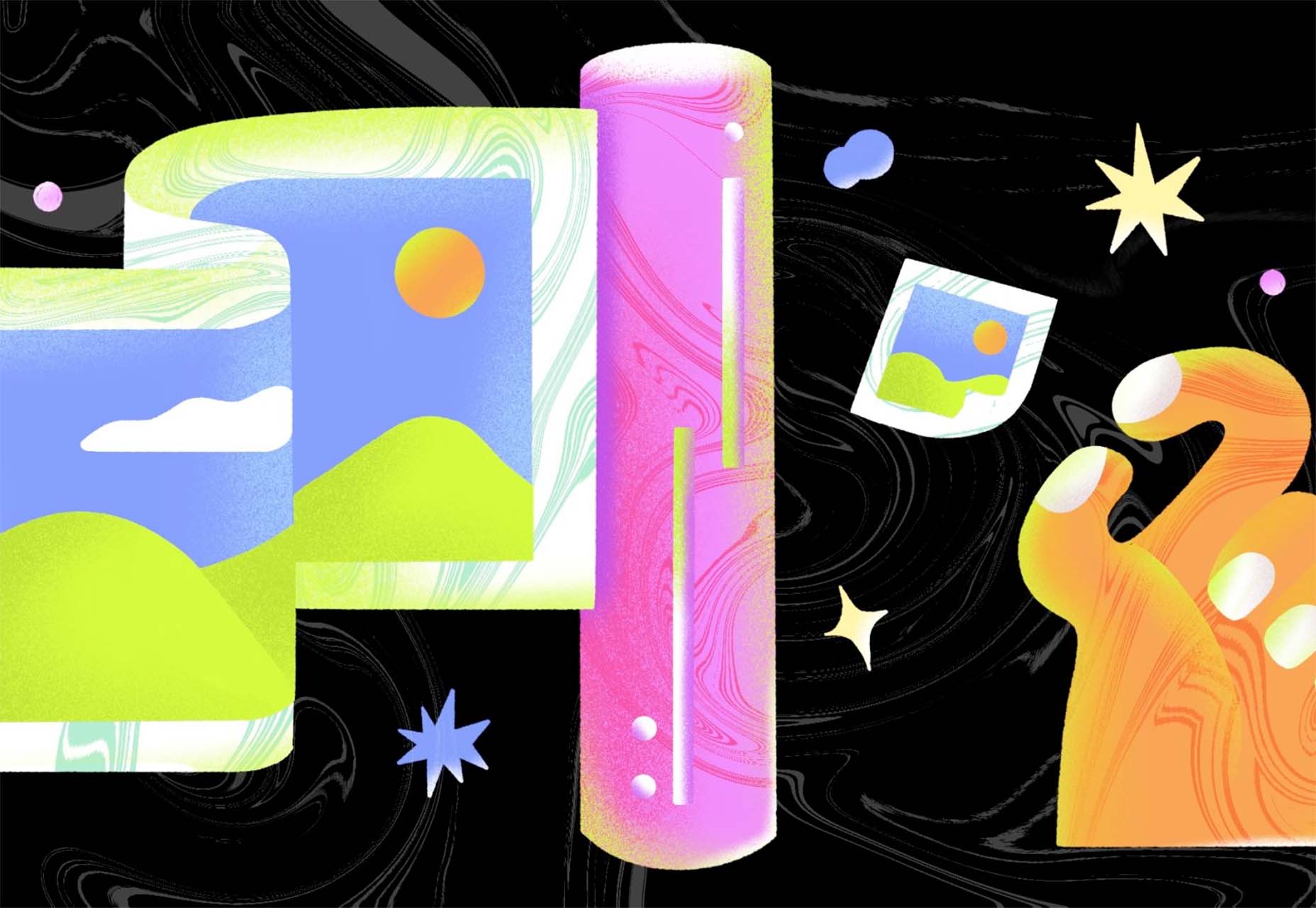
 This month all of our web design trends have a common theme – imagery. Whether it’s seasonal or just coincidence, there’s a shift in the styles and types of images on many designs right now. One thing that might push these design trends is a relaxation of COVID-spurred rules worldwide or even fatigue from the pandemic.
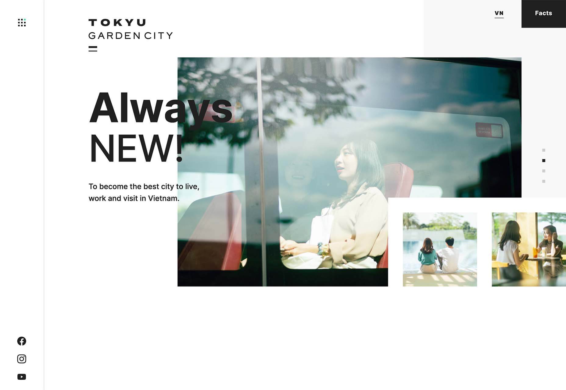

 User Experience (UX) design and User Interface (UI) design are two terms people sometimes mistakenly use interchangeably. While aspects of each are interconnected, there are distinct differences between UI/UX design.