 Most of the information we consume happens through reading, so it makes a lot of sense to pay attention to the words when designing. There are many aspects to typography, but one of the things that helped improve the quality of my design was letter-spacing.
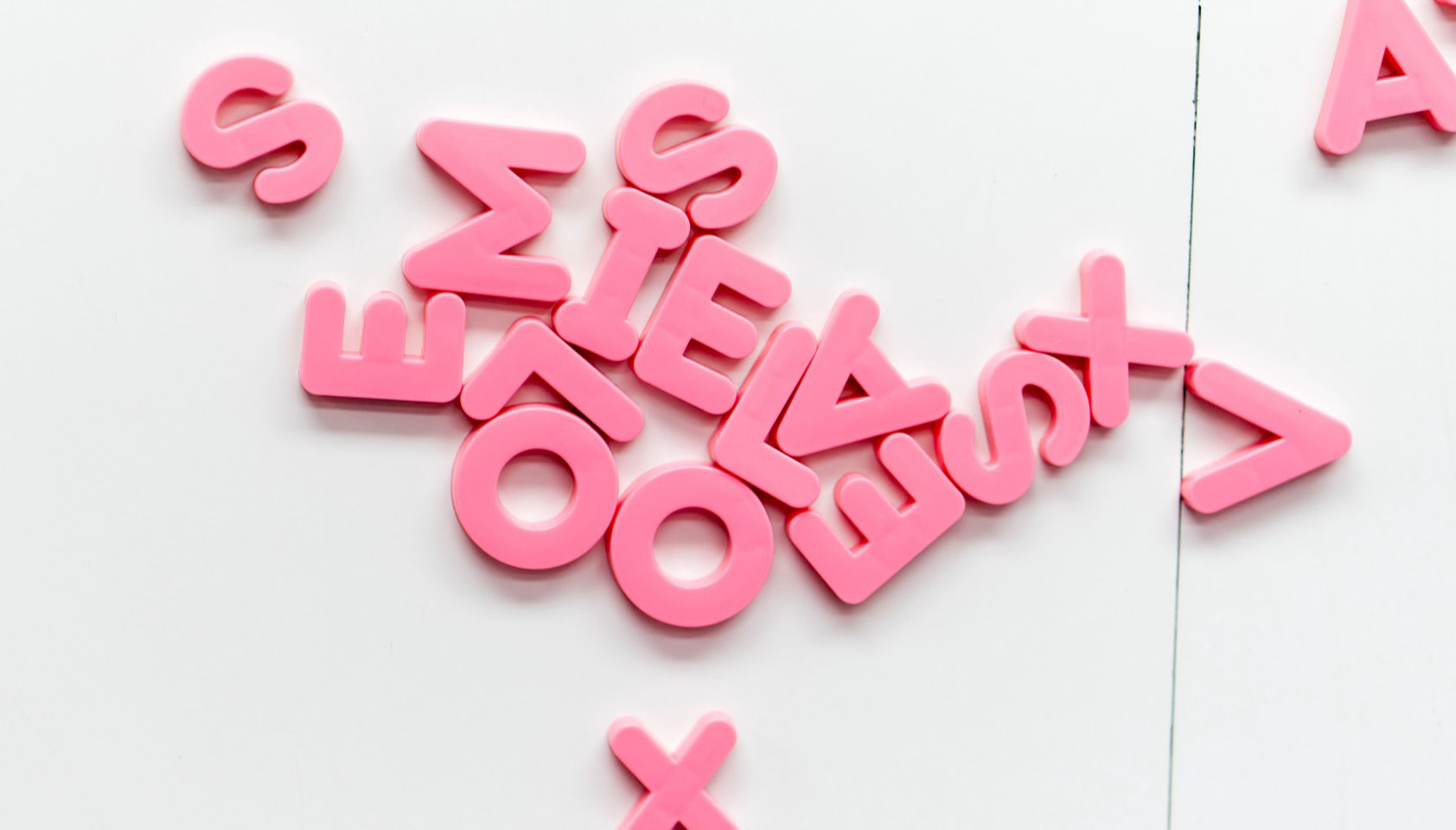
Letter-spacing is about adding and removing space between letters. Some people confuse it with kerning, but these two are different; letter-spacing affects the whole line of text, whereas kerning adjusts the space between two individual letters at the time. Kerning is best left to type designers, besides which, unlike letter-spacing there is currently no way to control kerning in CSS.
I believe that practice and a lot of observation will change the way you treat letter-spacing in your work as well.
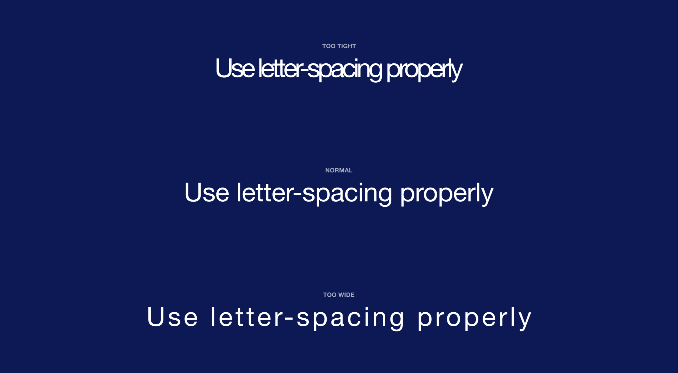
The Purpose of Letter-Spacing
The main purpose of letter-spacing is to improve the legibility and readability of the text. Words act differently depending on their size, color, and the background they are on. By adjusting letter-spacing to the environment you are working with you will help readers consume your information faster, and more efficiently. The fun part is that they won’t even notice it — that’s the whole point of the job.
Bear in mind that typographers think about letter-spacing and kerning when designing a typeface. It means you don’t have to apply it to all your text, but in order to have an understanding when it’s necessary, you should know some basic principles, and use good typefaces.
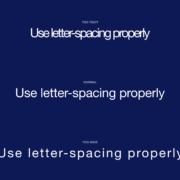
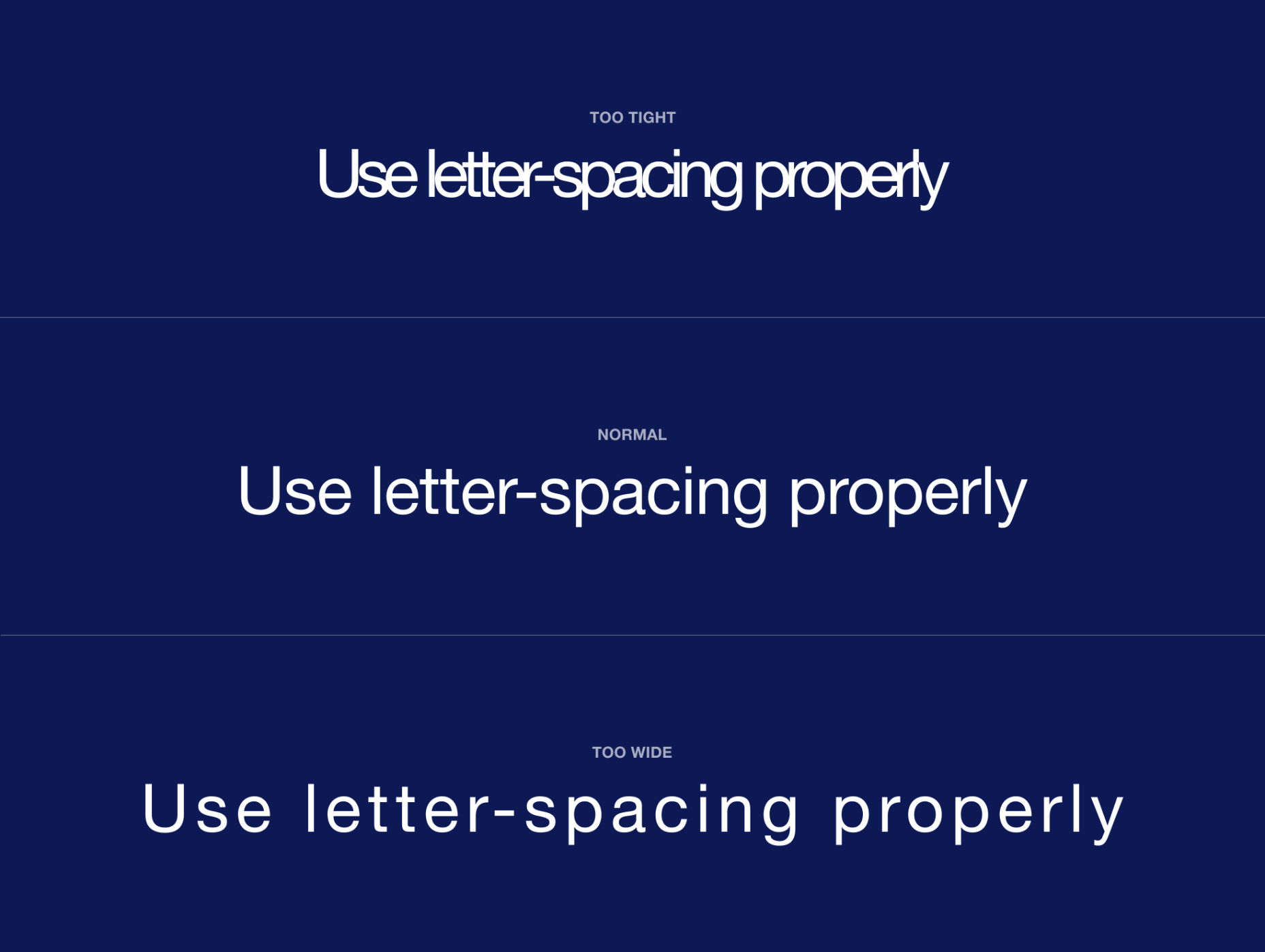
How Letter-Spacing Affects Legibility and Readability
The legibility and readability of your text depend on things like line-height, paragraph length, font size, typeface choice, letter-spacing, and much more. Regarding letter-spacing, if you are just getting into typography, the best thing you can do is not overuse it. What I mean by that is simply don’t make the distance between letters too big or too small; even if you think it looks good, people will struggle reading it, and that will ruin their experience.
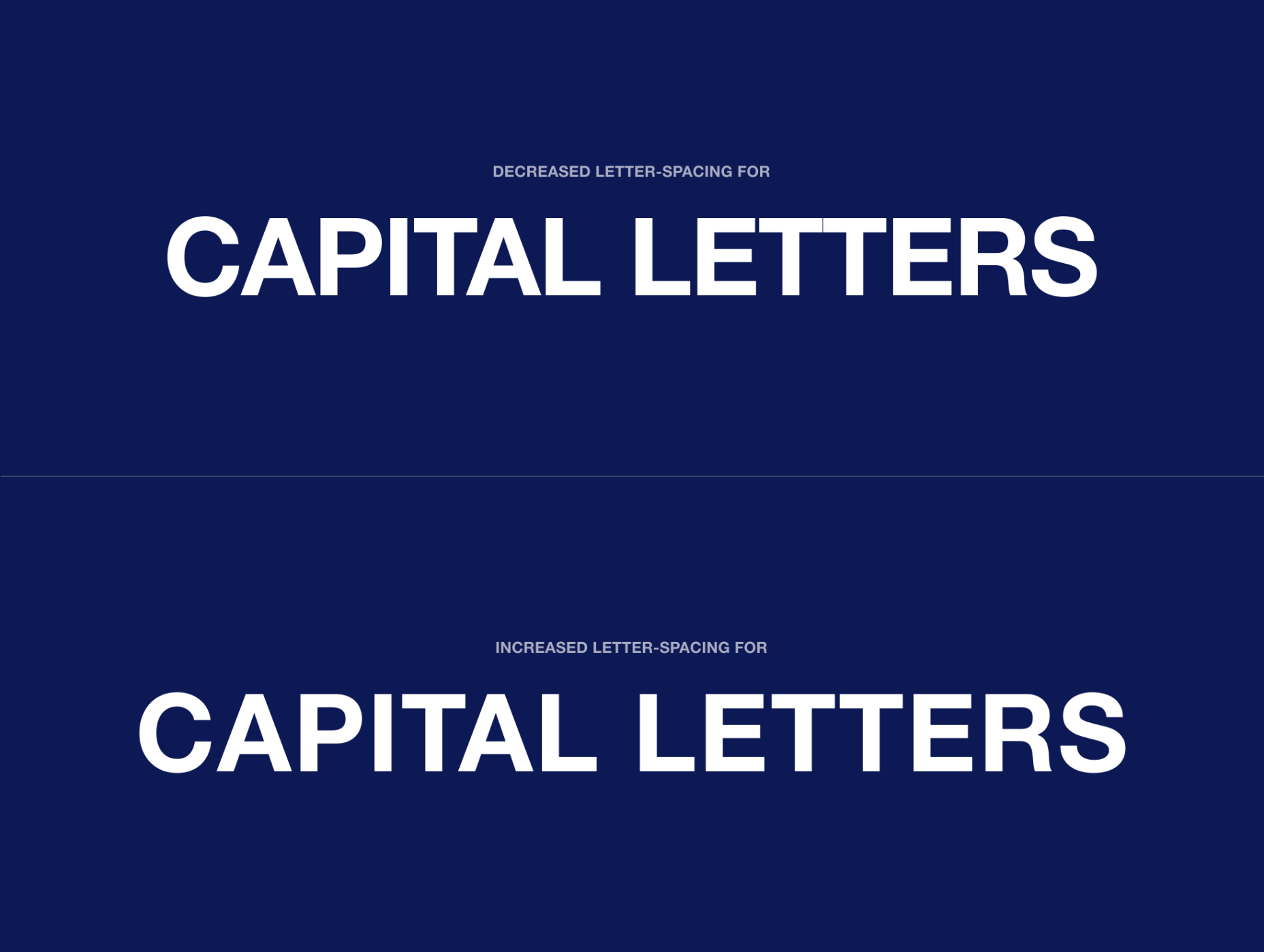
Letter-Spacing Capital Letters
Capital letters are designed with the intention that they will appear at the beginning of a sentence or proper noun, in combination with lowercase letters. When capital letters are next to each other, the space between them is too tight. So in order to achieve better readability, space needs to be increased. This applies to both large and small font sizes.
Letter-Spacing Headlines
If you are using well designed fonts, you can be sure that they are calibrated well, and you won’t need to make any major adjustments to them. However, the problem with headlines is that at larger scales the space between letters looks unbalanced. It can be fixed by increasing or decreasing the letter-spacing value.
There are no strict rules for letter-spacing — there are a lot of typefaces and all of them require an individual approach — but if you look at how big companies like Google and Apple treat their typefaces, you can find a lot of valuable information there.
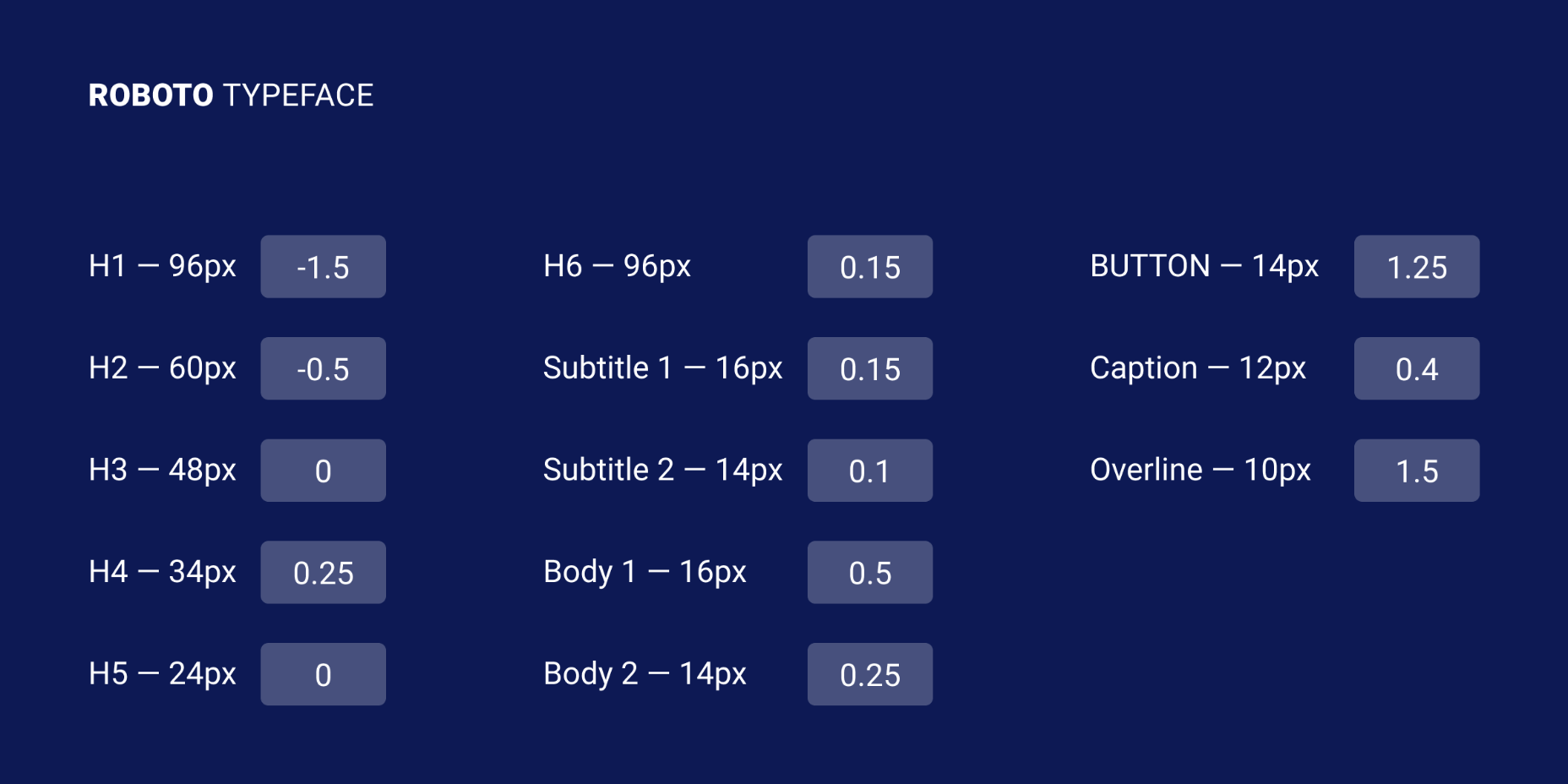
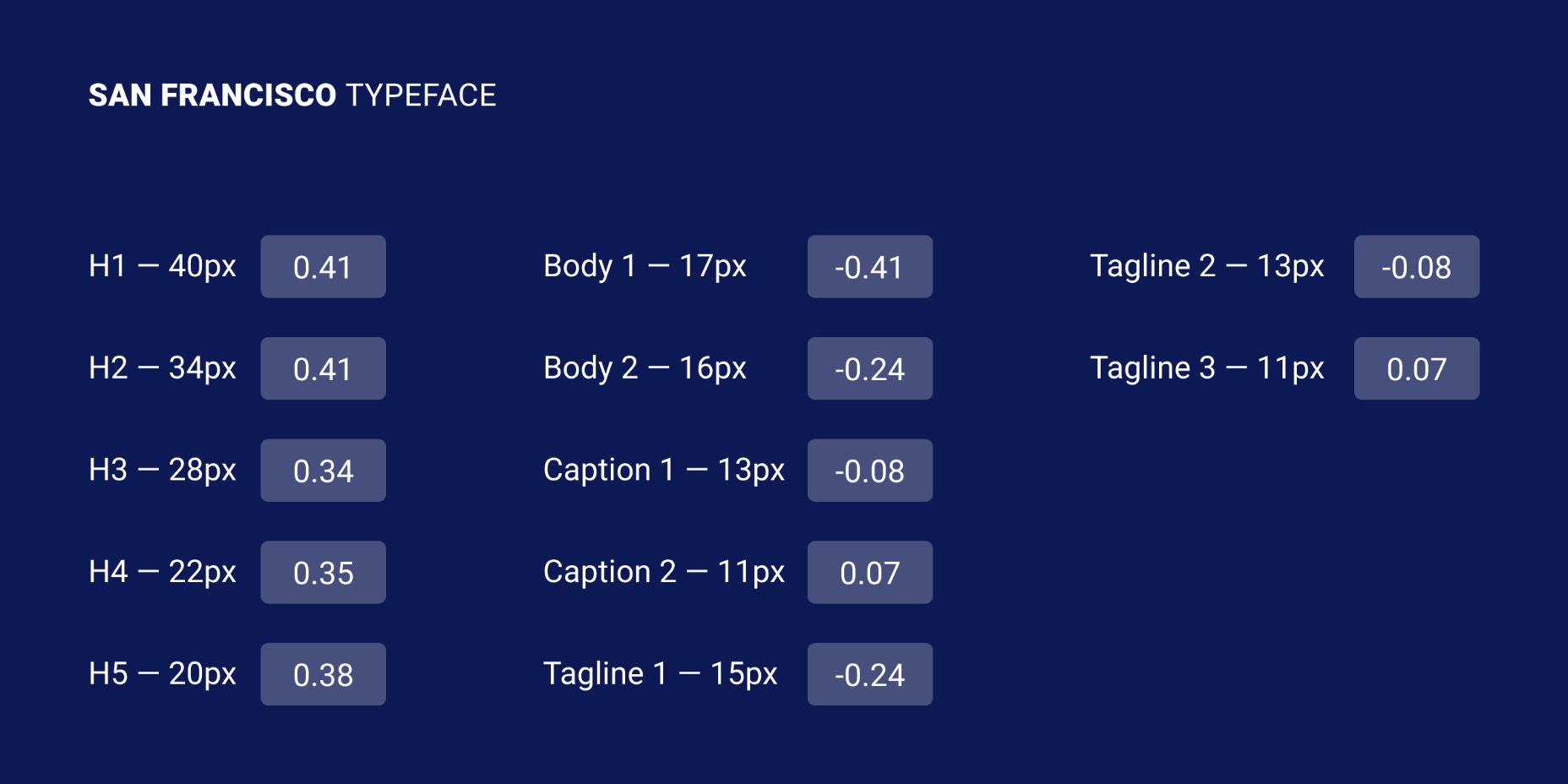
Let’s take a look at the “Roboto” and “San Francisco” typefaces (the first one is used in Material Design and the second one in Apple’s ecosystem). Headlines from 20 to 48 pixels have either a positive letter-spacing value or none. If the font size is bigger, letter-spacing becomes negative. These exact numbers are not going to work that well for other typefaces, but after trying different approaches I can state that it’s a common pattern.
I’ve tested several guidelines for letter-spacing and the one that was published by Bazen Agency works for a lot of popular typefaces. It will be a good starting point for you, but you can always apply additional adjustments:
- H1 — 96px — -1.5%
- H2 — 60px — -0.5%
- H3 — 48px — 0%
- H4 — 34px — 0.25%
- H5 — 24px — 0%
- H6 — 20px — 0.15%
- Subtitle — 16px — 0.15%
If you happen to design a lot of apps or you’re planning to do that, one thing that helps me is using the default Material Design and Apple guidelines for their typefaces. They are well balanced and it saves a lot of time.
Letter-Spacing Body Text
If you ever read anything about letter-spacing, you’ve probably have seen this popular wisdom from typographer Frederic Goudy: “Anyone who would letter-space lowercase would steal sheep”. (There’s an argument that he was only referring to blackletter fonts.) Some designers took it as a hard rule and now never adjust the letter-spacing of lowercase text.
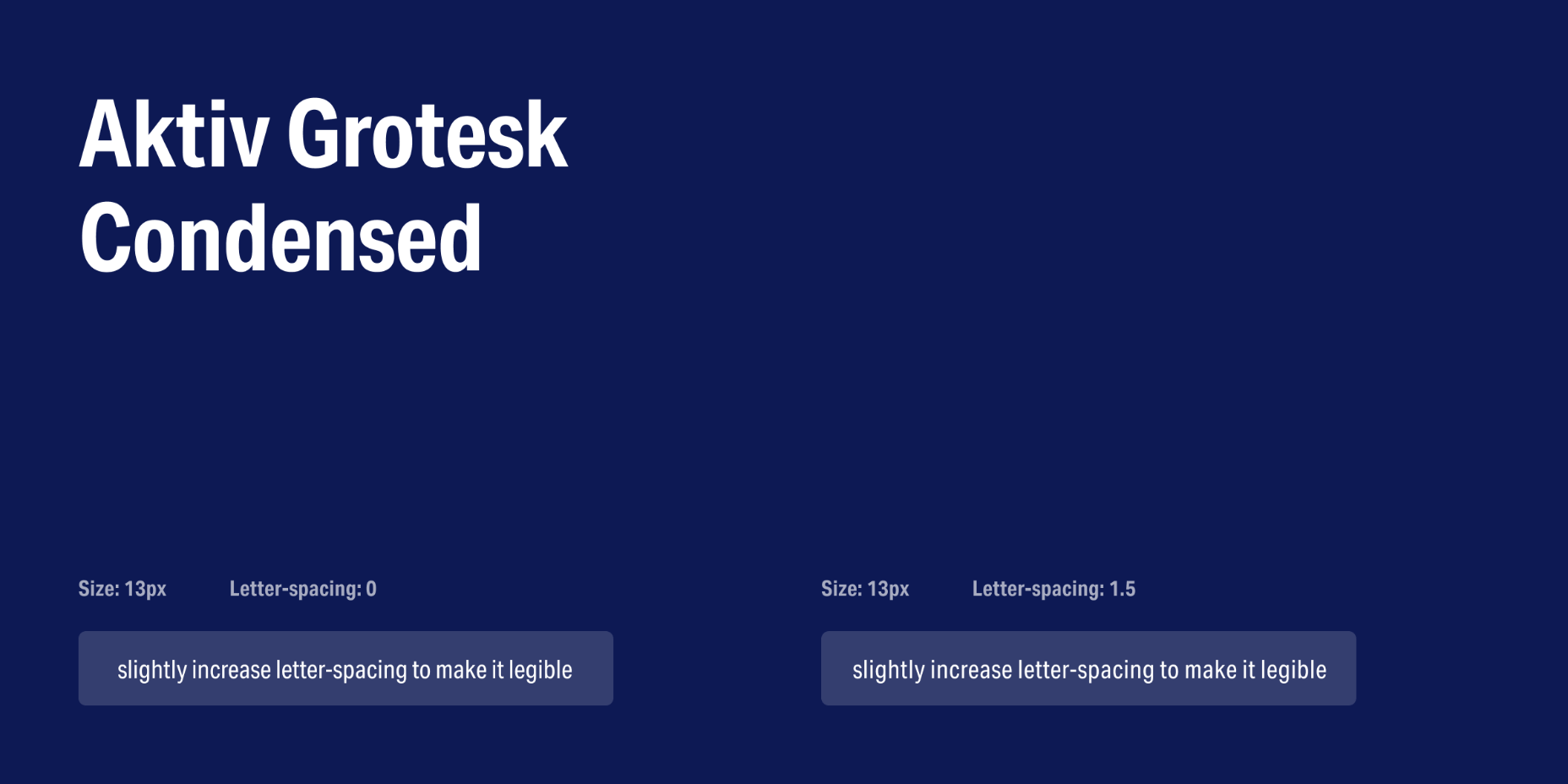
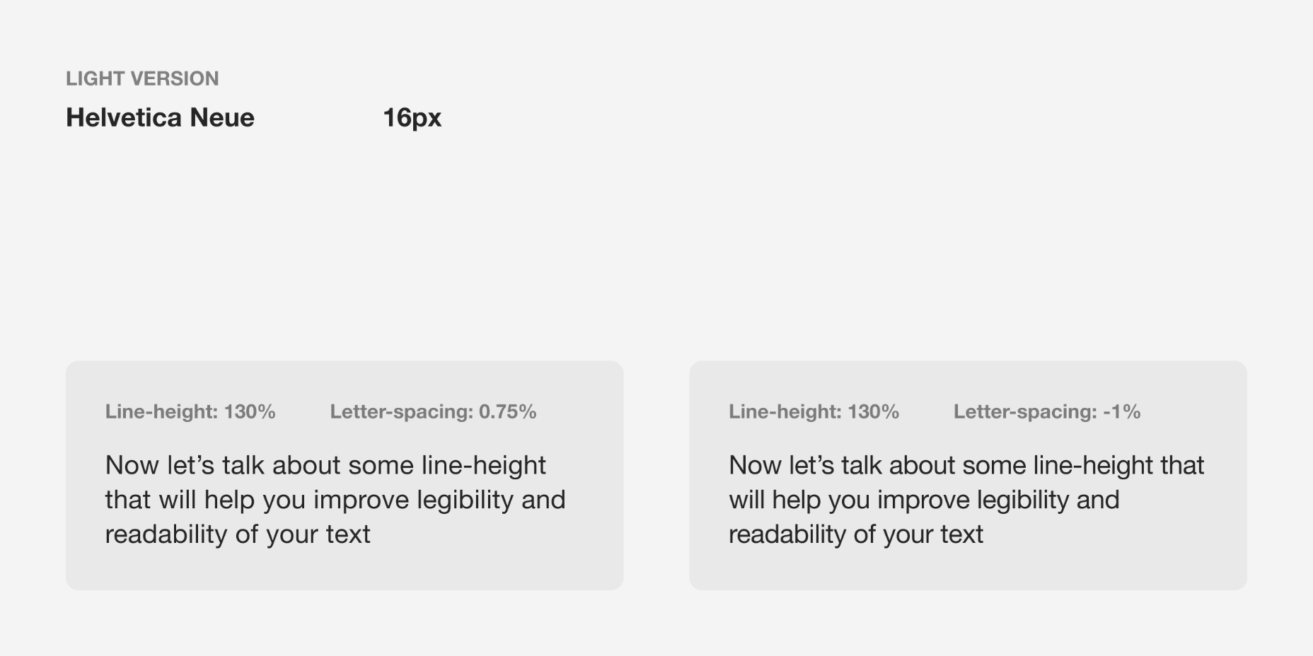
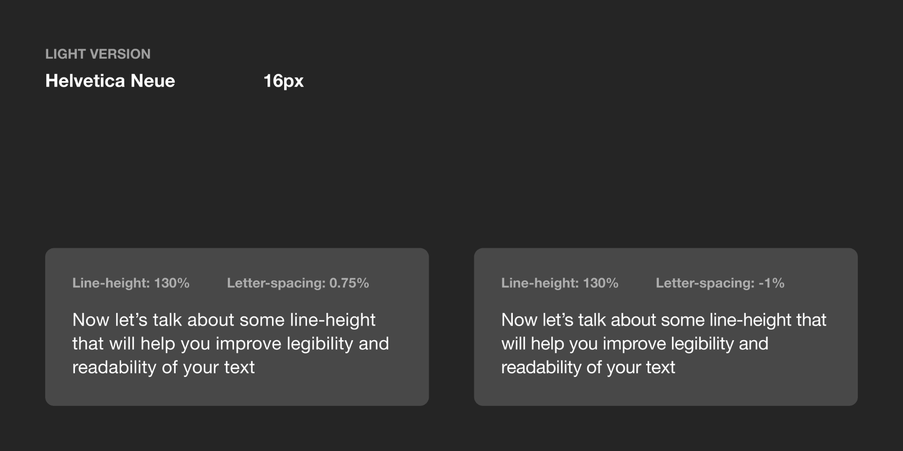
Based on my practice and by looking at the work of designers I can’t agree with Goudy, because sometimes small changes can make a big difference in how your text performs. Let’s take, for example, condensed fonts. At a small size, the letters are too close to each other, which leads to poor legibility. By increasing letter-spacing by 1.5% you will see that the text is now easier to read.
If we look at my previous example, in the guidelines for “Roboto” and “San Francisco” typefaces, letter-spacing is applied to body text; even though San Francisco has a dedicated “SF Pro Display” for headlines and “SF Pro Text” for body text, letter-spacing is still used to refine them.
There are a lot of different typefaces and a single rule doesn’t apply to all of them. Experiment with letter-spacing and do what seems right to you. There are some simple guidelines that will lead you in the right direction, especially when working with body text:
Keep in Mind Line-Height
If you have a line-height greater than 120%, most likely negative letter-spacing will lead to an unbalanced look to the paragraph. To refine it you would need to either keep it at 0% or only slightly increase it.
Light Text on Dark Background
On a dark background, white text looks overexposed and therefore letters appear too tight. To make it more legible, I would suggest you increasing letter-spacing a small amount.
General Values for Body Text
You can use the following guidelines for body text, which I have tested with several typefaces:
- Body 1 — 16px — 0.5%
- Body 2 — 14px — 0.25%
Letter-Spacing Captions
Unlike headlines and body text, smaller font sizes don’t have many variations in letter-spacing. It’s a common practice when a font size is lower than 13px to increase the space between letters to make it legible. But there are always exceptions (“SF Pro Text” guidelines suggest using positive letter-spacing only when a font size is 11px or below). Make sure you experiment with settings.
You can use the following values as a starting point and then edit them to what seems right to the typeface of your choice:
- Caption — 12px — 0.5%
- Overline — 10px — 1.5%
Final Tip
One of the things that helped me improve my skills in typography was looking at other designers and especially type foundries. By decoding their work you might notice some nuances of how they treat typography and it will help you in future projects.

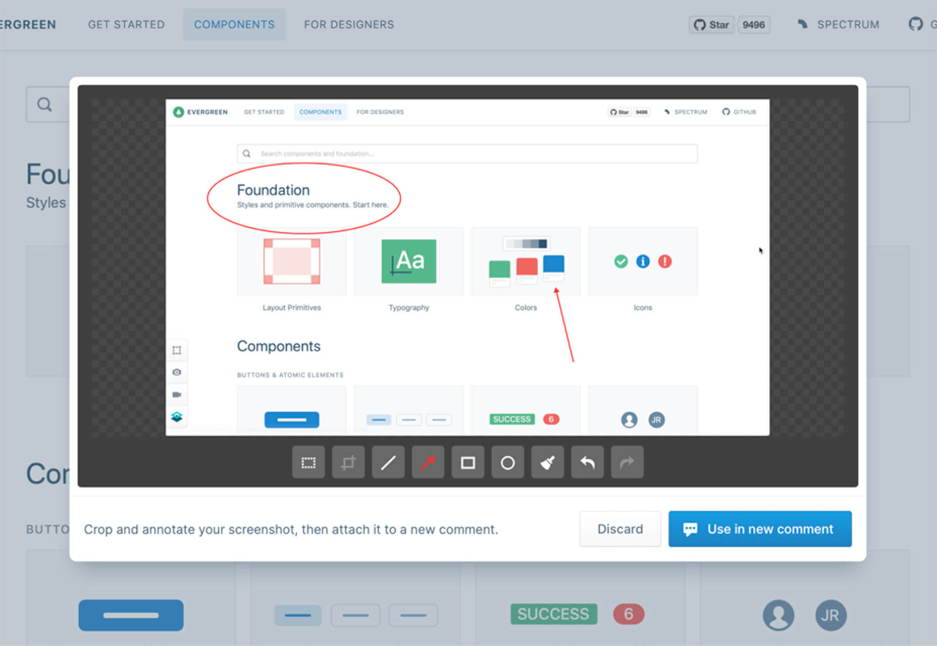
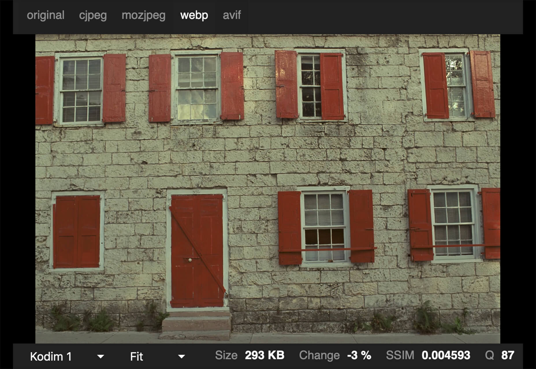
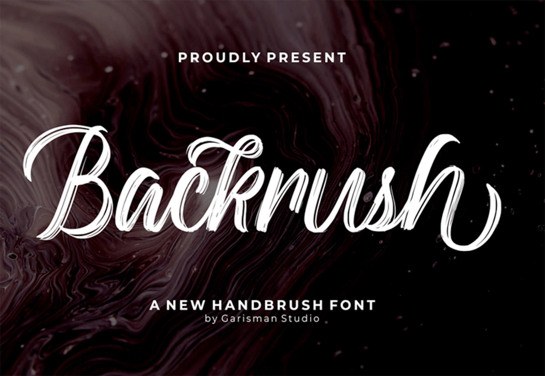
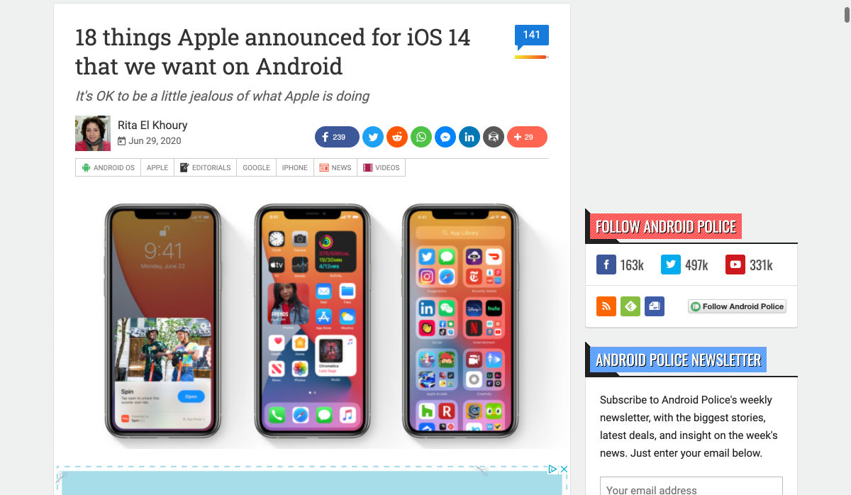
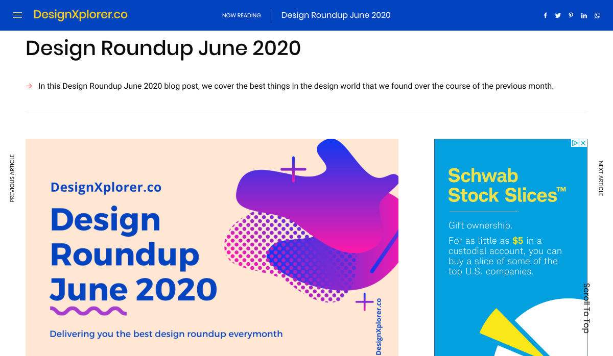
 Every week users submit a lot of interesting stuff on our sister site Webdesigner News, highlighting great content from around the web that can be of interest to web designers.


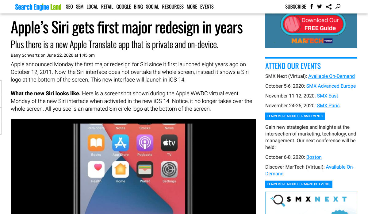
 We are gathered here today….
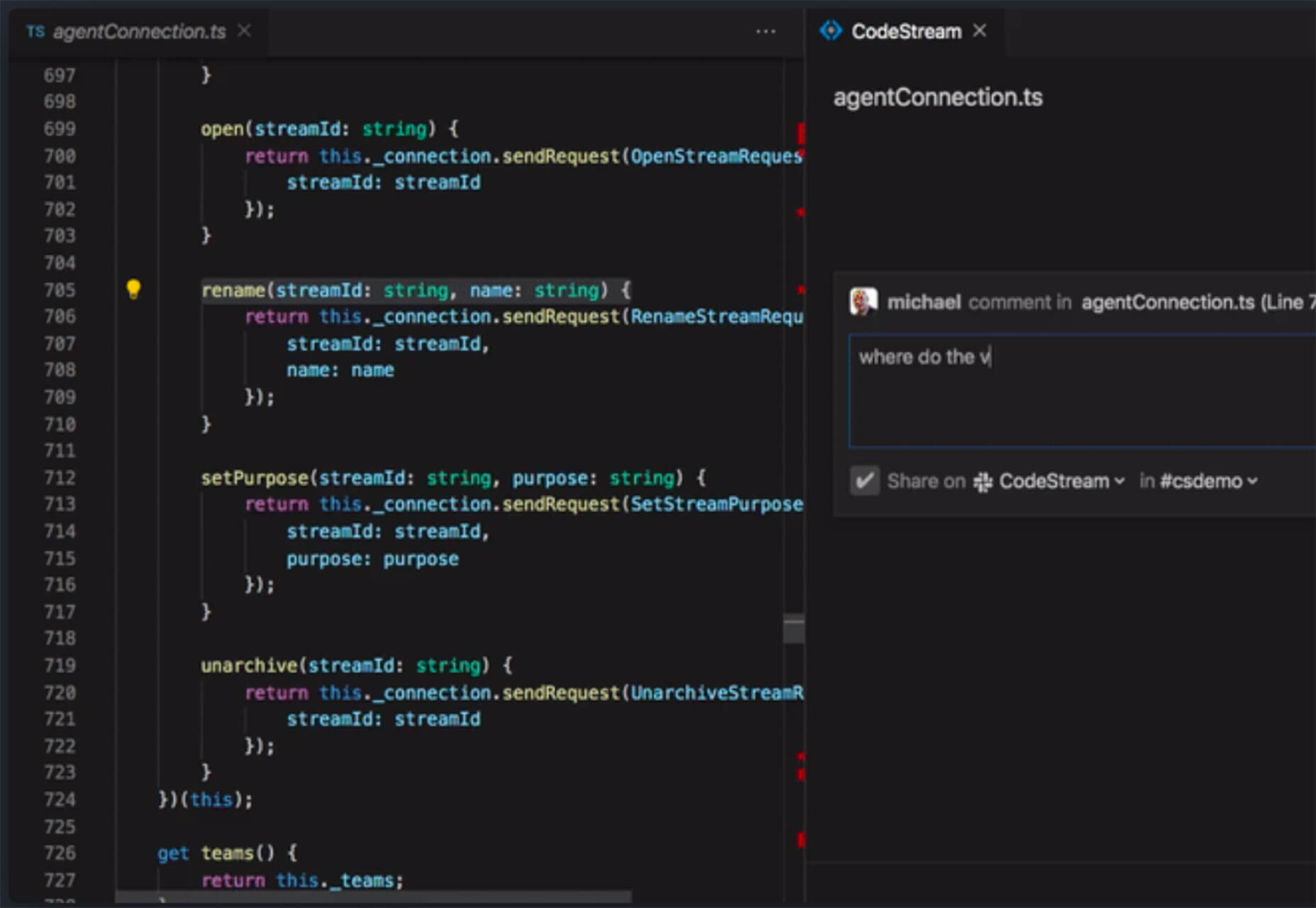
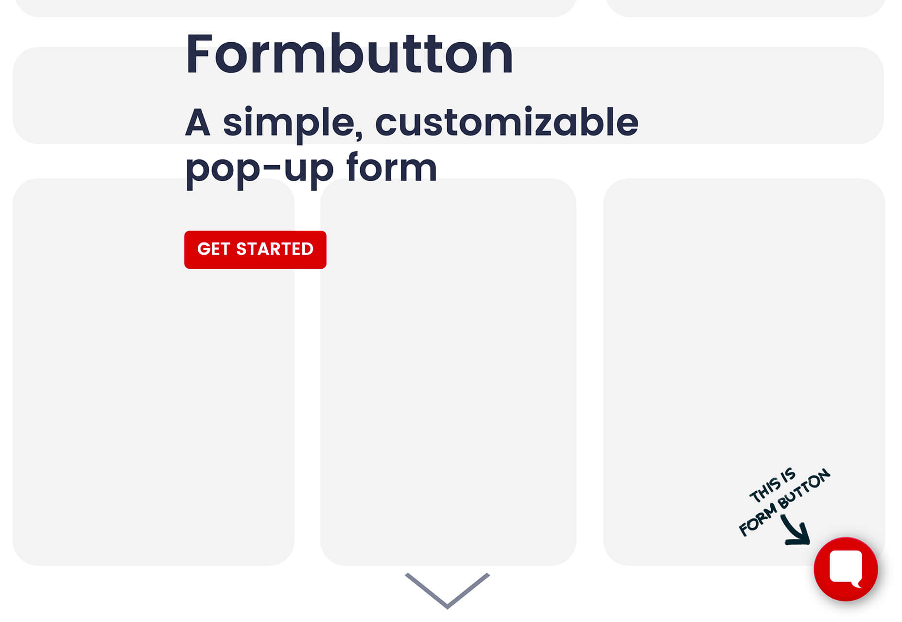
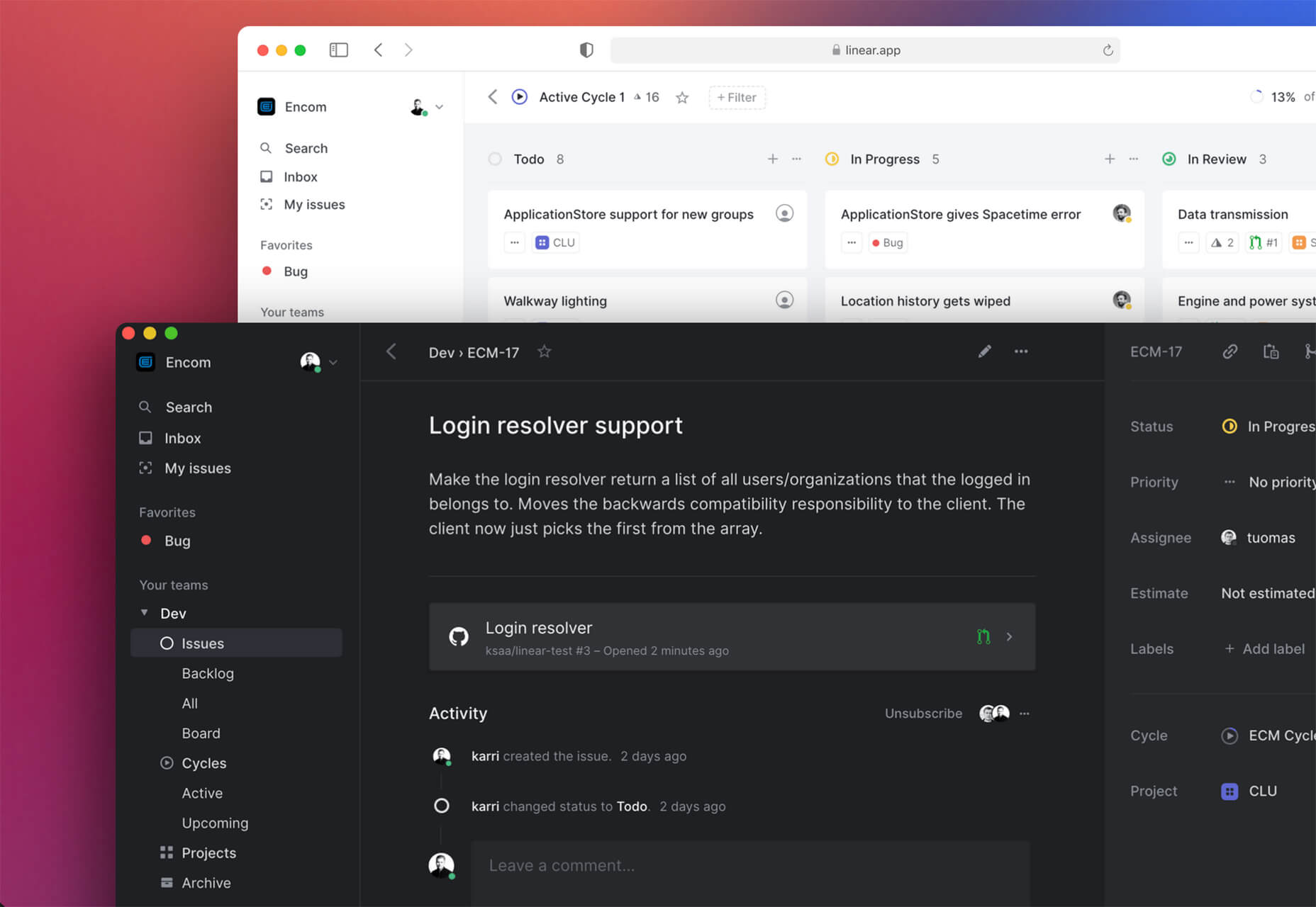
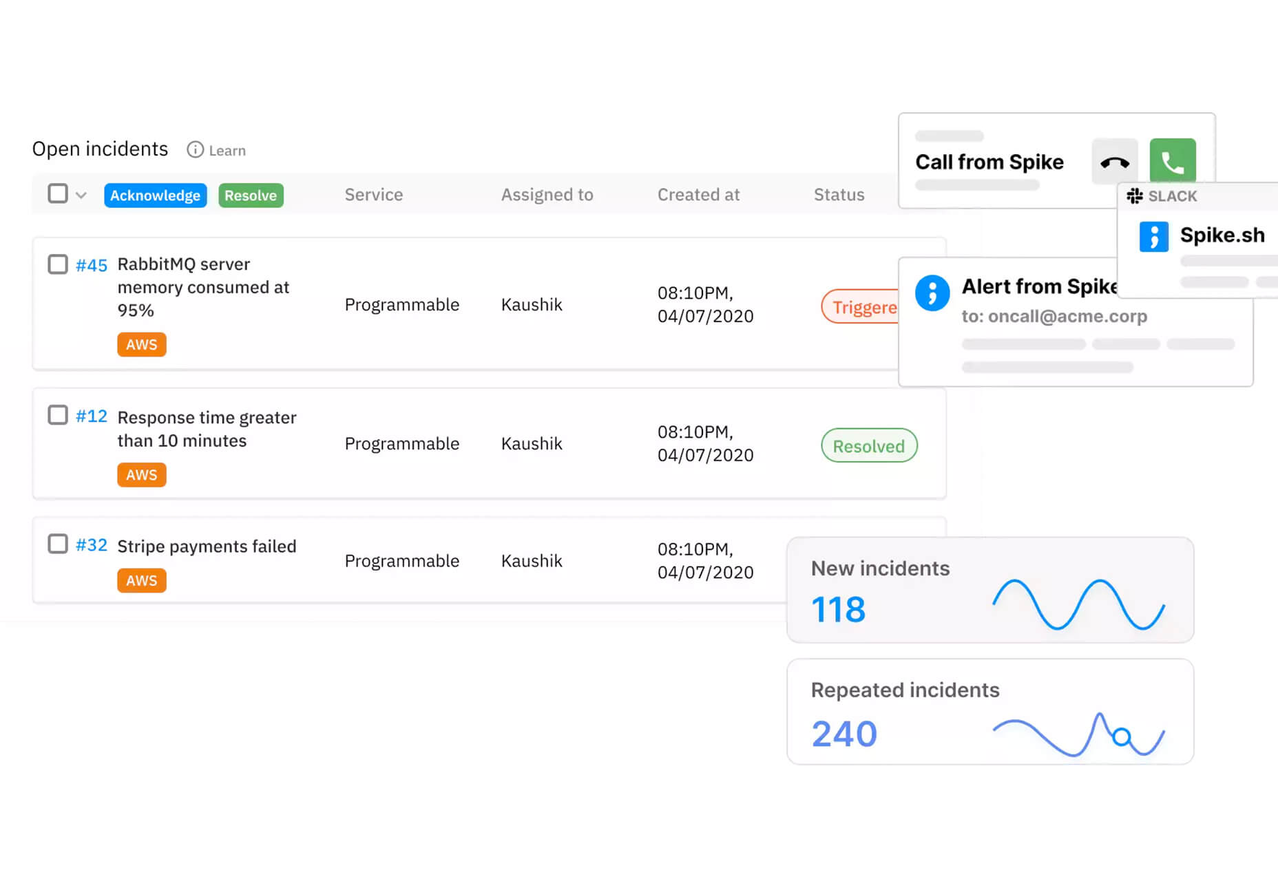
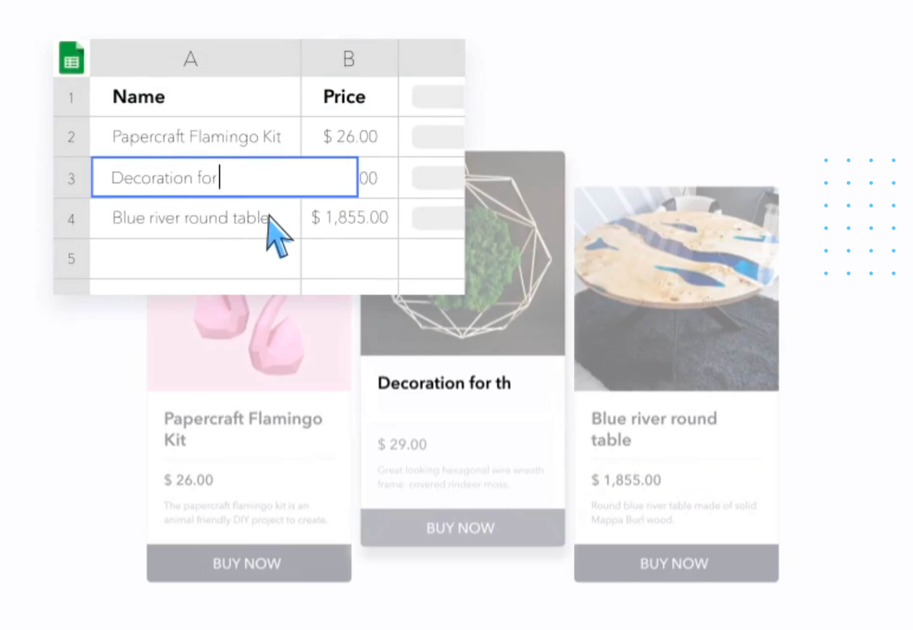
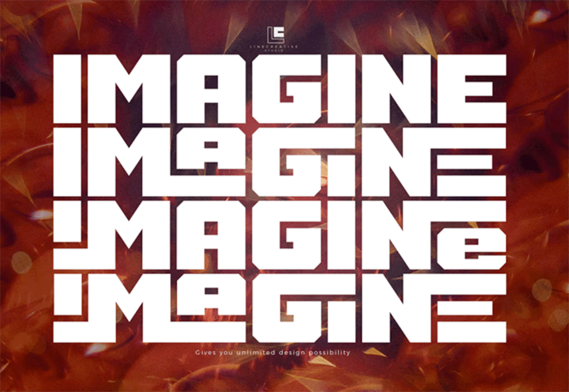
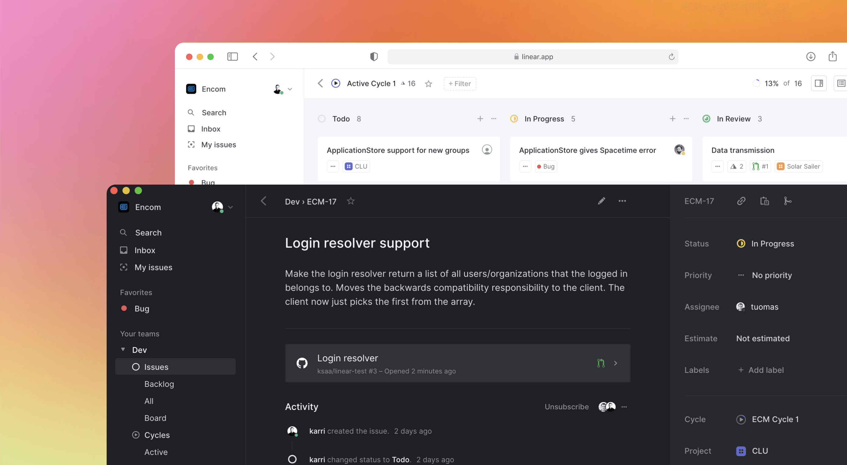 Some of the changes we are seeing with where we work are starting to pop up in the type of new tools made for designers and developers. More tools with remote collaboration as a key feature are increasing in popularity. (You’ll find a few of those here.)
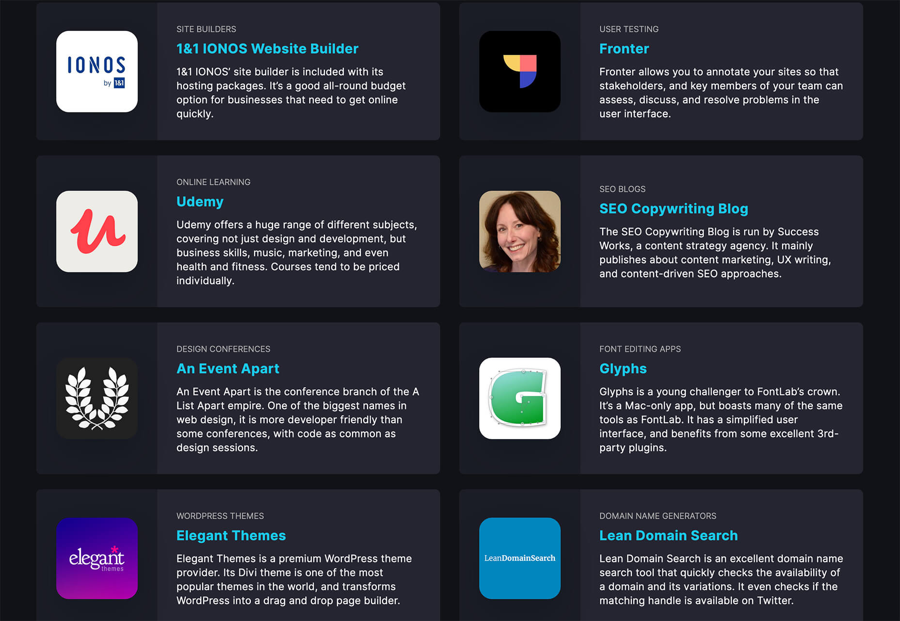
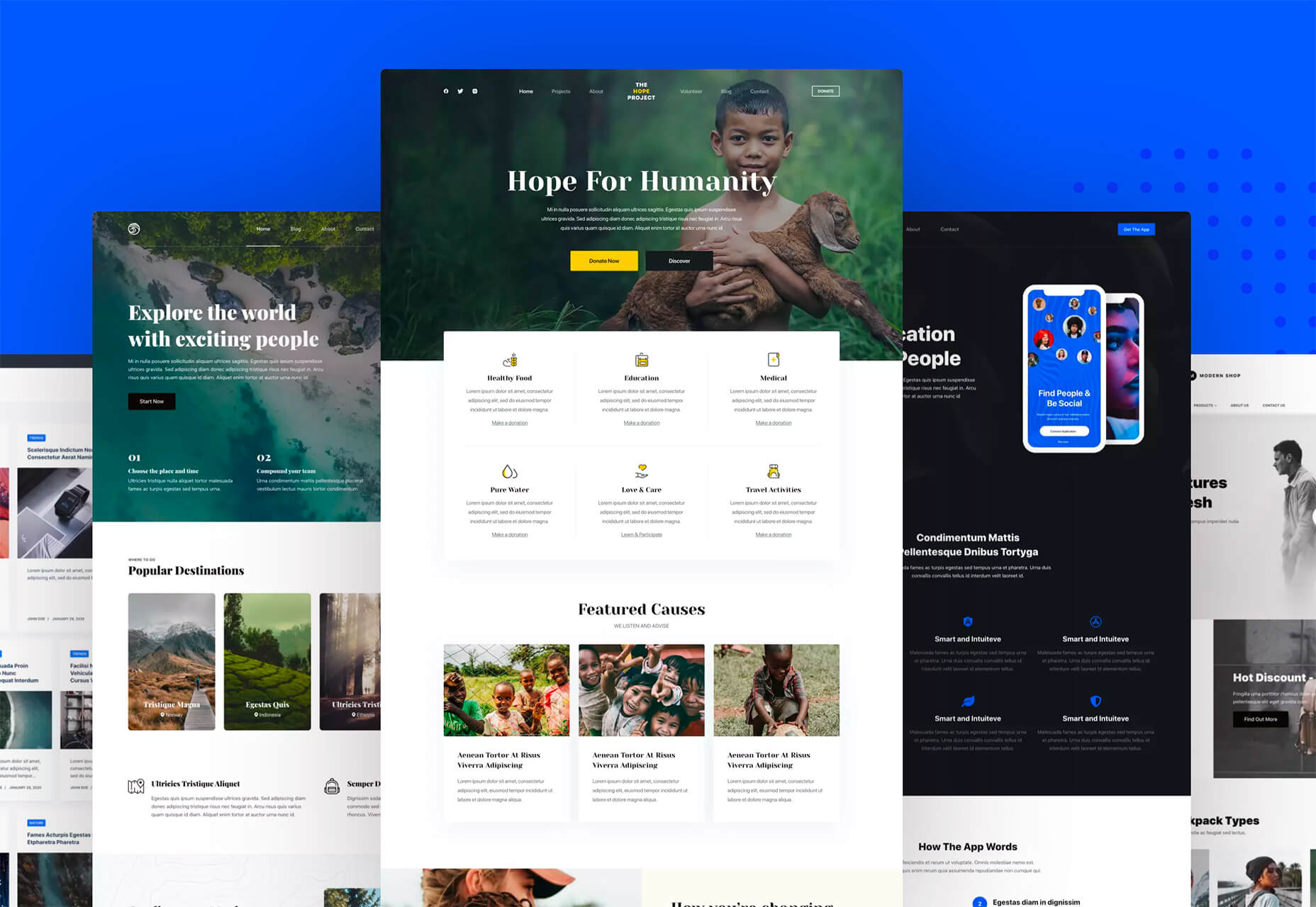


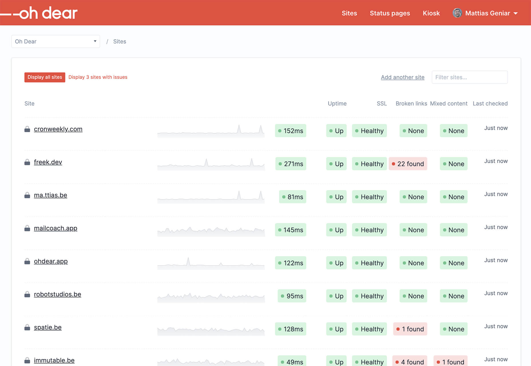


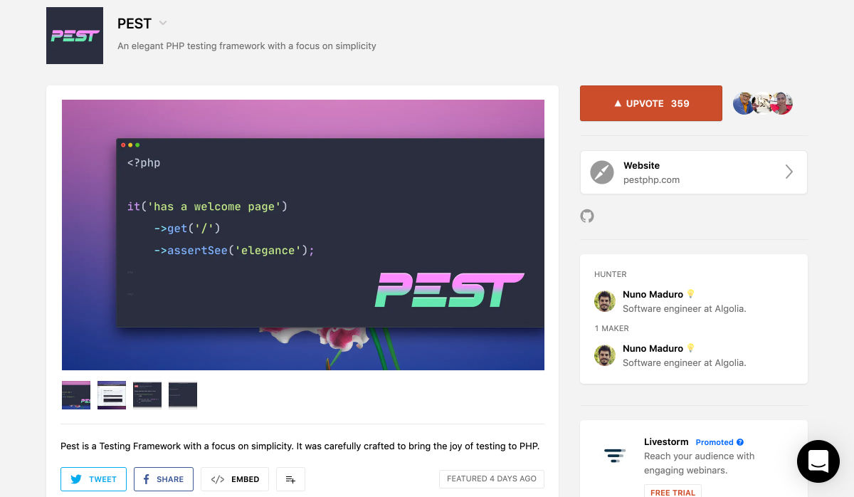
 Every week users submit a lot of interesting stuff on our sister site Webdesigner News, highlighting great content from around the web that can be of interest to web designers.


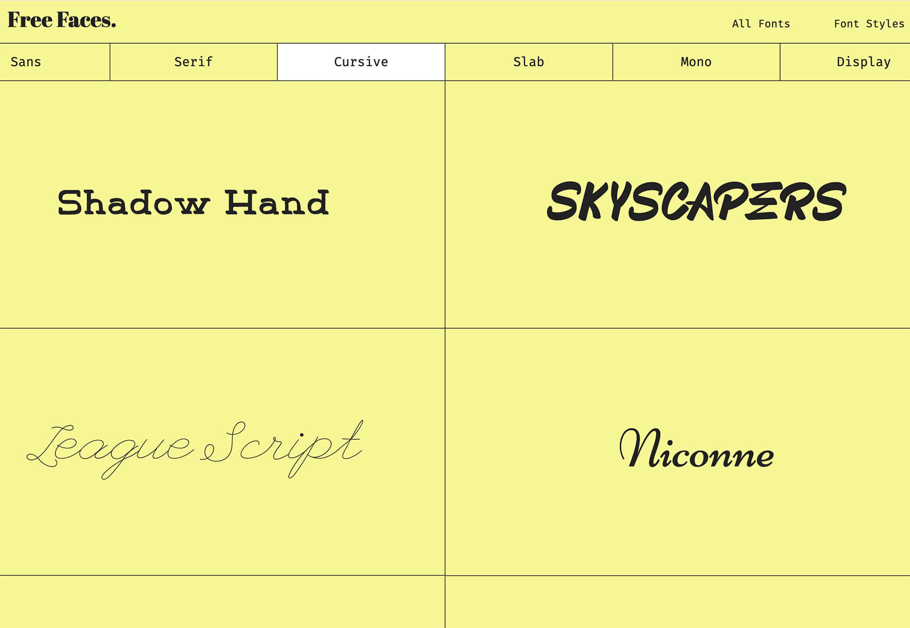
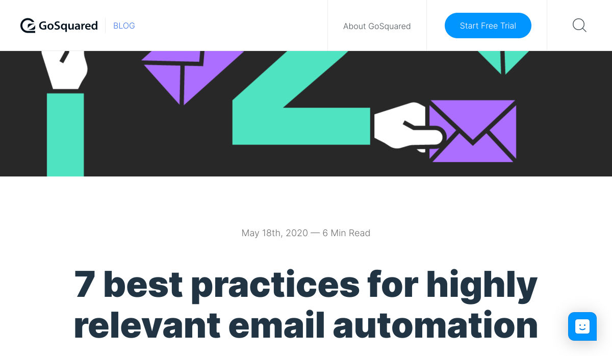
 Every week users submit a lot of interesting stuff on our sister site Webdesigner News, highlighting great content from around the web that can be of interest to web designers.


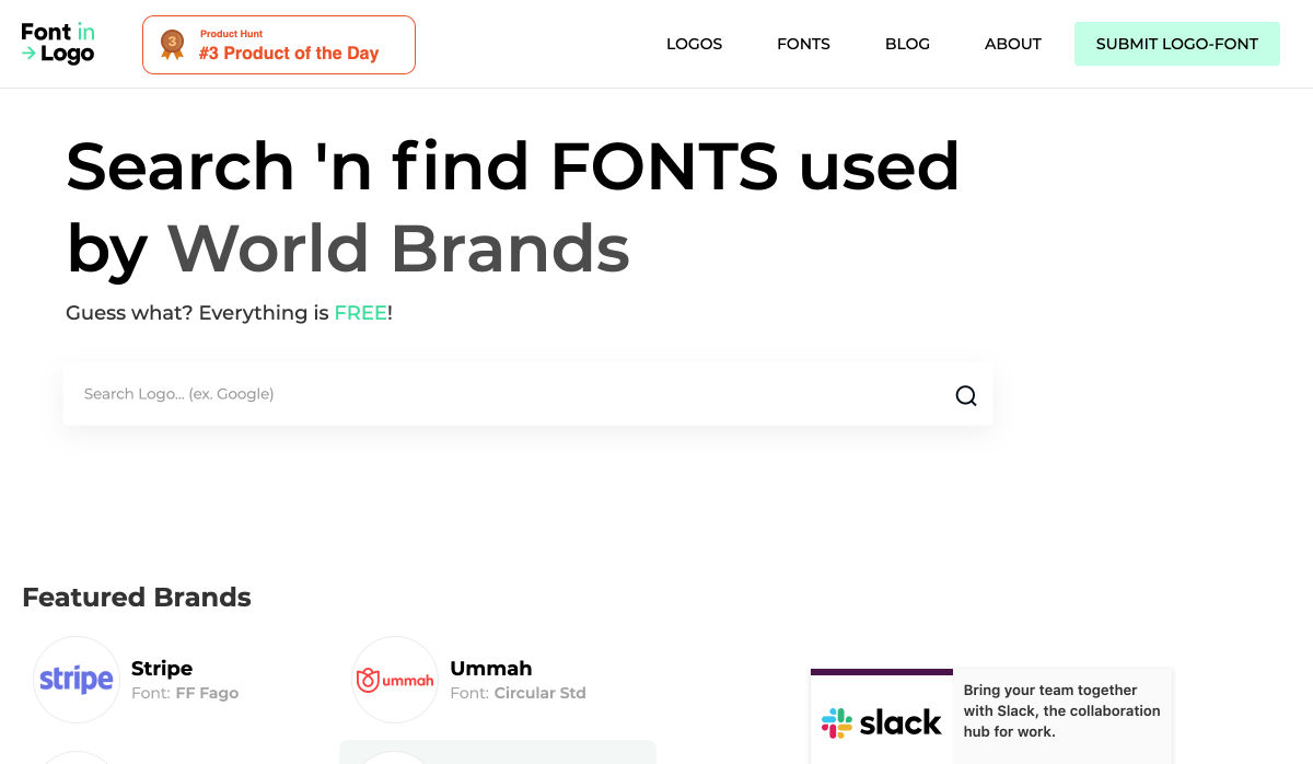

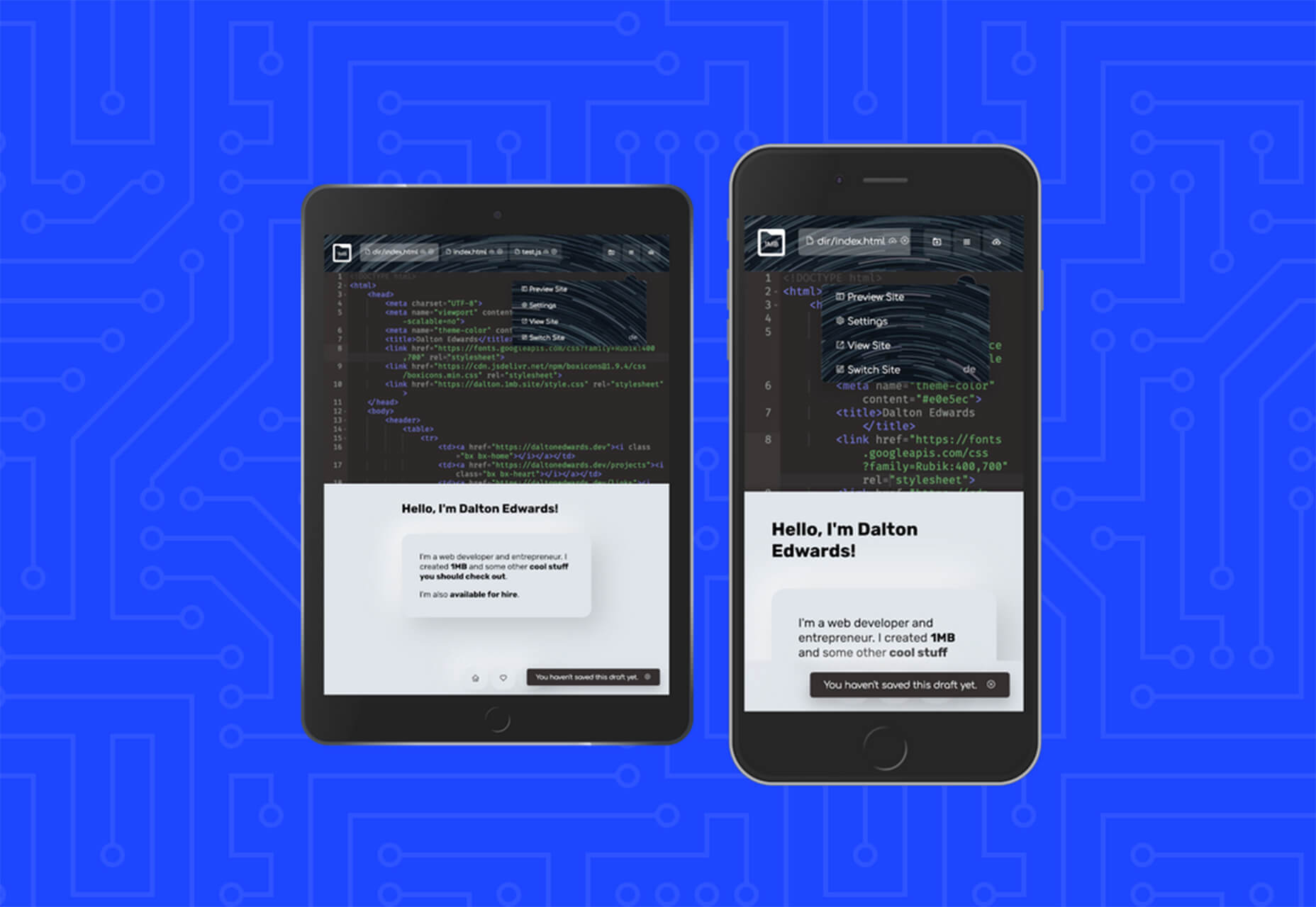
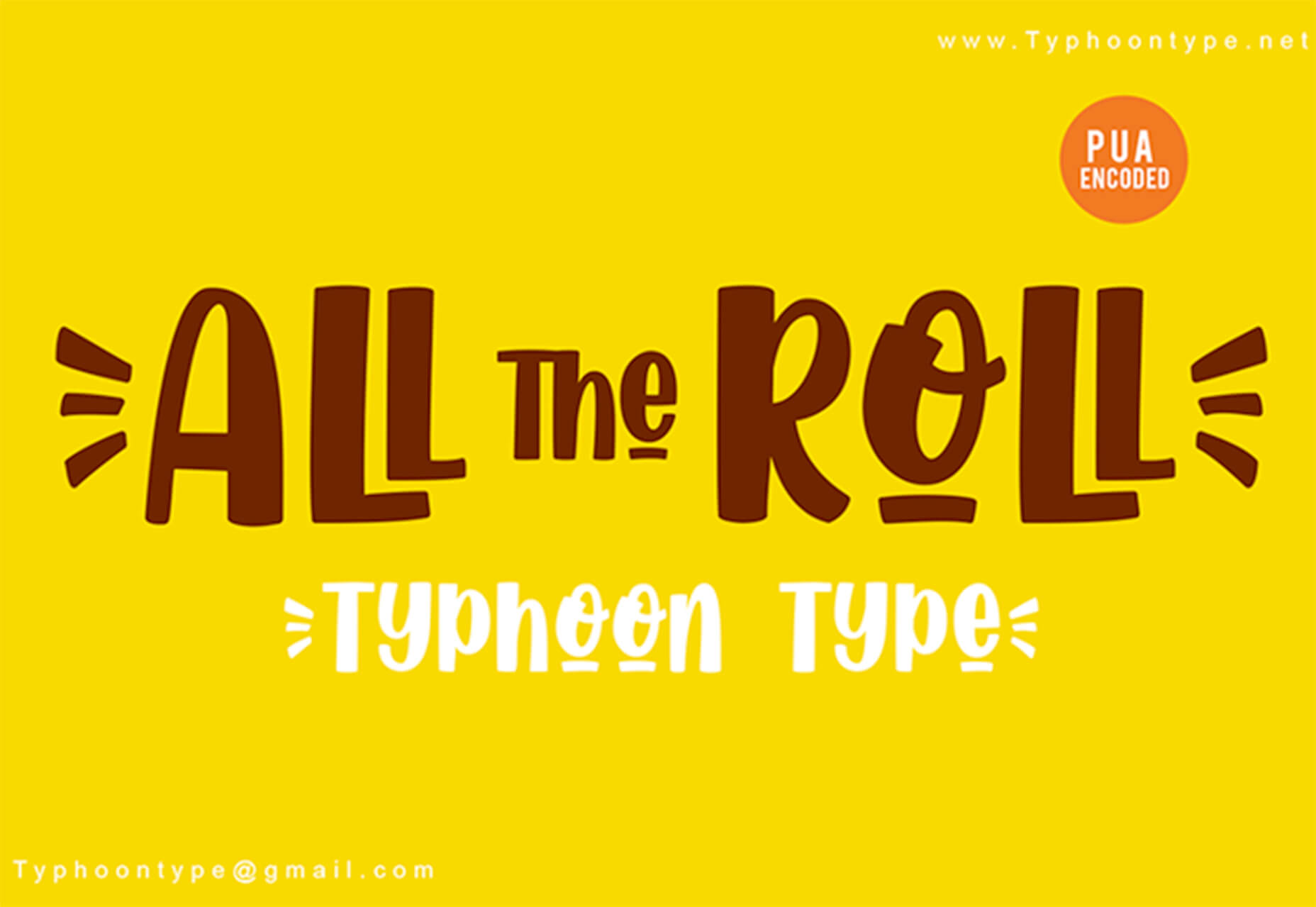
 Every week users submit a lot of interesting stuff on our sister site Webdesigner News, highlighting great content from around the web that can be of interest to web designers.


