Articles

Google resembles an iceberg: there’s the part above the water we can see and use everyday; there’s also the part beneath the water, that we don’t see and know little about.

While many of us are concerned about the aspects of Google we don’t see — the parts that threaten our privacy, or monopolize the web — there’s no denying that Google offers some amazing products and tools, many of them free, all from the convenience of a single login.

Today we’re going to take a look at 12 tools from Google that really do bring something positive to the table.
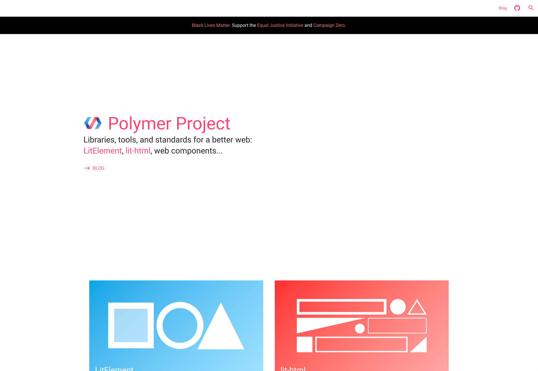
1. Polymer

Polymer is an open-source JavaScript library from Google for building web applications using Web Components. The platform comes with a ton of libraries and tools to help designers and developers unlock the web’s potential by taking advantage of features like HTTP/2, Web Components, and Service Workers. 

The main feature of Polymer is Web Components. With Web Components, you can share custom elements to any site, work seamlessly with any browser’s built-in elements, and effectively use frameworks of all kinds. Products like LitElement (a simple base class for creating fast, lightweight web components) and PWA Starter Kit make Polymer easy to use. If you like, you can build your app entirely out of Web Components.
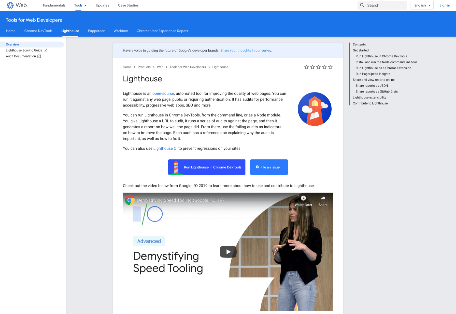
2. Lighthouse

Google Lighthouse is an open-source, automated tool for improving the quality of web pages. The software allows you to audit web pages for performance, SEO, accessibility, and more. You can run Lighthouse using ChromeDevTools, directly from the command line, or as a Node module. 

To use Lighthouse in Google Chrome, just go to the URL you want to audit (you can audit any URL on the web), open ChromeDevTools, and click the Audits tab. After you have run the audit, Lighthouse will give you an in-depth report on the web page. 

With these reports, you will see which parts of your web page you need to optimize. Each report has a reference doc that explains why that audit is important and also shows you the steps you can take to fix it. 

You can also use Lighthouse CL to prevent regression on your sites. Using Lighthouse Viewer, you can view and share reports online. You can also share reports as JSON or GitHub Gists. 

Lighthouse also comes with a feature called Stack Packs that allows Lighthouse to detect what platform a site is built on. It also displays specific stack-based recommendations.
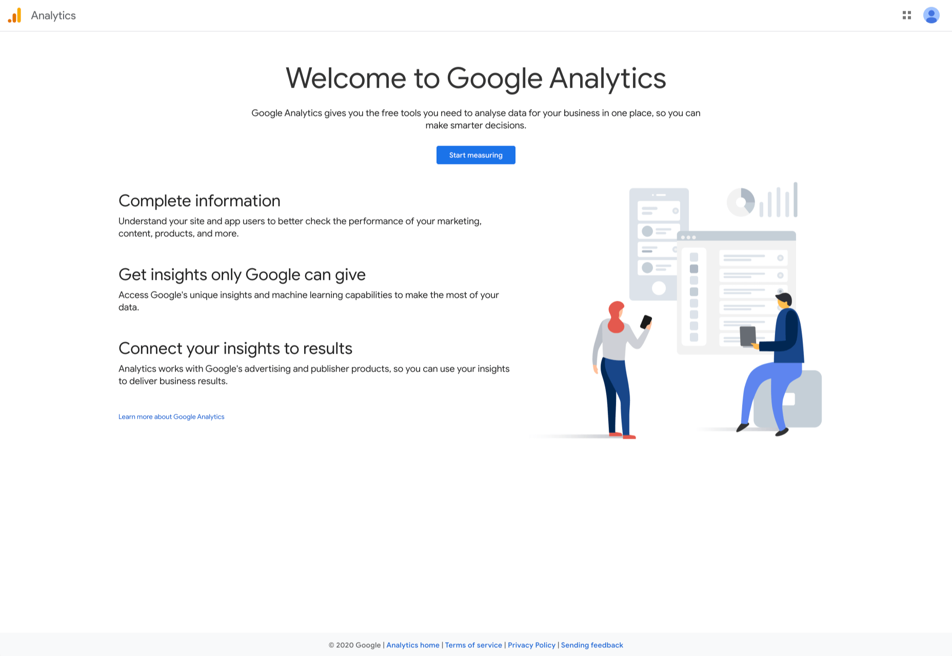
3. Google Analytics

Google Analytics is the gold standard of analytics services. Google analytics can be installed on your site for free with a small amount of JavaScript and allows you to see all kinds of details about your site visitors, like what browser they’re using, and where they’re from.

By using Google Analytics you can make decisions about your site based on science, and therefore be somewhat confident that the decisions you make will result in the outcome you are expecting.
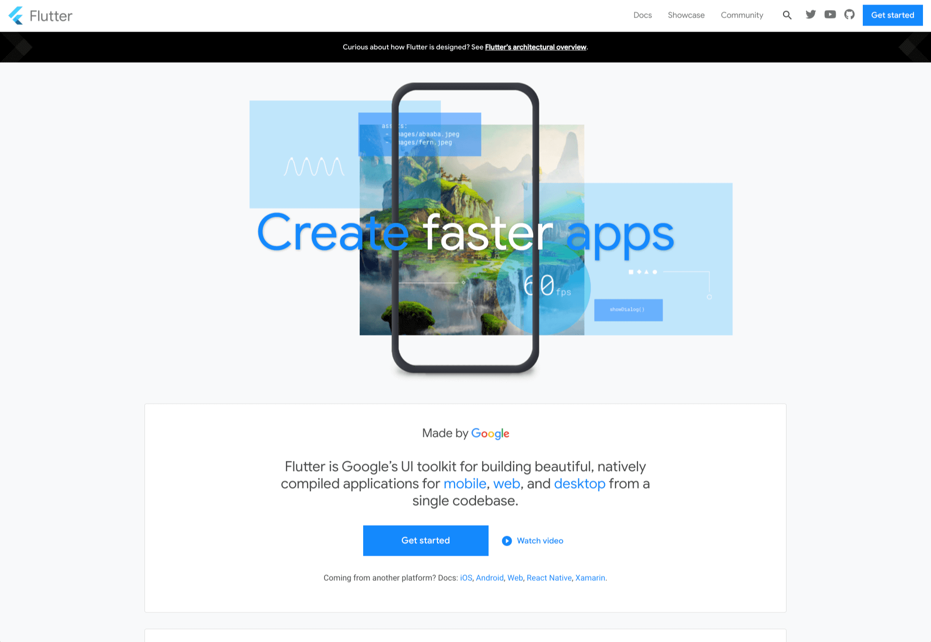
4. Flutter

Flutter is Google’s UI toolkit for building natively compiled applications for mobile, web, and desktop from a single codebase. The toolkit is open source and free to use. The best part of Flutter is that it works with existing code. 

The toolkit has a layered architecture that allows for full customization, which results in fast rendering and flexible designs. It also comes with fully-customizable widgets that allow you to build native interfaces in minutes. With these widgets, you will be able to add platform features such as scrolling, navigation, icons, and fonts to provide a full native performance on both iOS and Android.

Flutter also has a feature called hot reload that allows you to easily build UIs, add new features, and fix bugs faster. You can also compile Flutter code to native ARM machine code using Dart native compilers. 

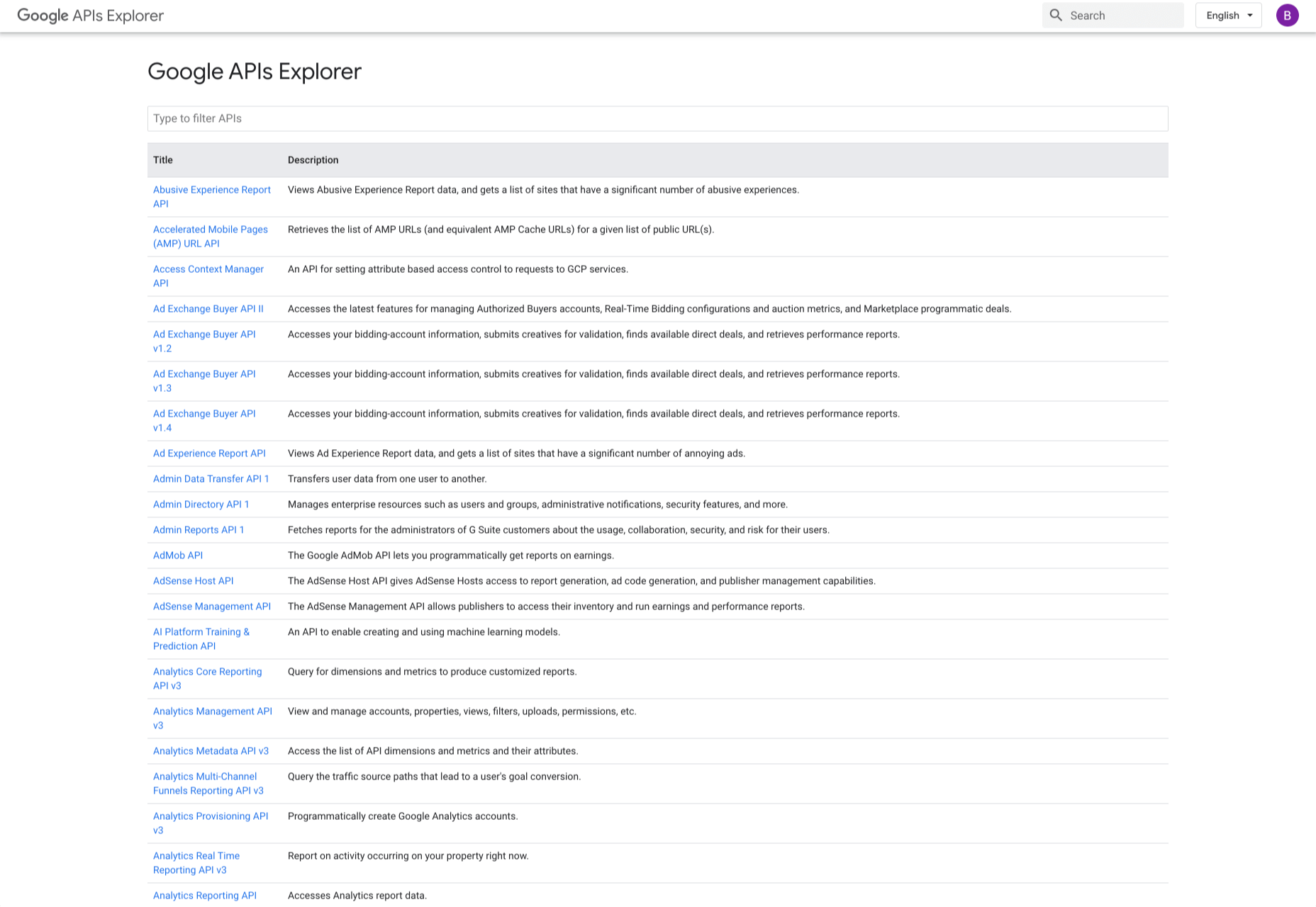
5. Google API Explorer

Google has a huge library of APIs that are available to developers but finding these APIs can be difficult. Google API Explorer makes it easy for developers to locate any API. On the Google API Explorer web page, you will see a complete list of the entire API library. You can easily scroll through the list or use the search box to filter through the API list. 

The best part of Google API Explorer is that each link to a reference page comes with more details on how to use the API. API Explorer is an excellent way to try out methods in the Monitoring API without having to write any code.
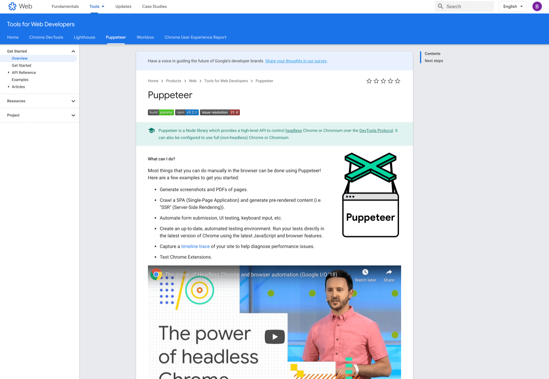
6. Puppeteer

Puppeteer is a project from the Google Chrome team. The platform enables web developers to control a Chrome (or any other Chrome DevTools Protocol based browser) and execute common actions, much like in a real browser. Puppeteer is also a Node library and it provides a high-level API for working with headless Chrome. It is also a useful tool for scraping, testing, and automating web pages. 

Here are some things you can do with Puppeteer: generate screenshots and PDFs of pages, UI testing, test Chrome Extensions, automate form submission, generate pre-rendered content, and crawl Single-Page Applications. 
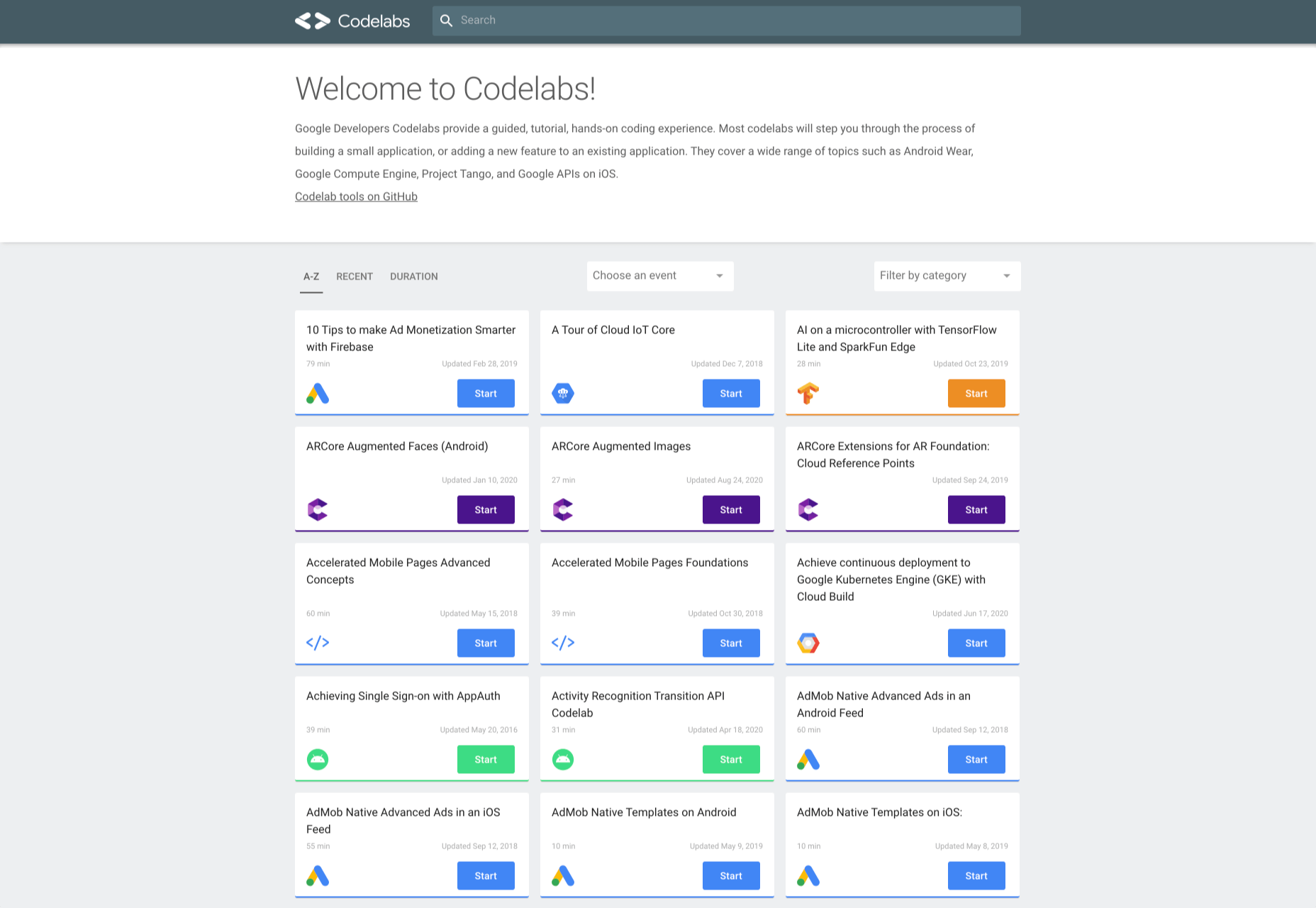
7. Codelabs

Google Developer Codelabs is a handy tool for beginner developers and even advanced developers who want to improve their knowledge. Codelabs provide a guided, tutorial, hands-on coding experience. Codelabs’ site is broken down into several tutorial sessions on different topics. 

With the tutorials on Codelabs, you can learn how to build applications from scratch. Some of the tutorial categories include Augmented reality, TensorFlow, Analytics, Virtual Analytics, G Suite, Search, Google Compute Engine, and Google APIs on iOS. 
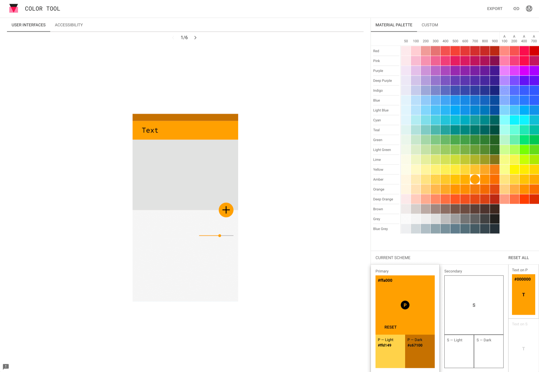
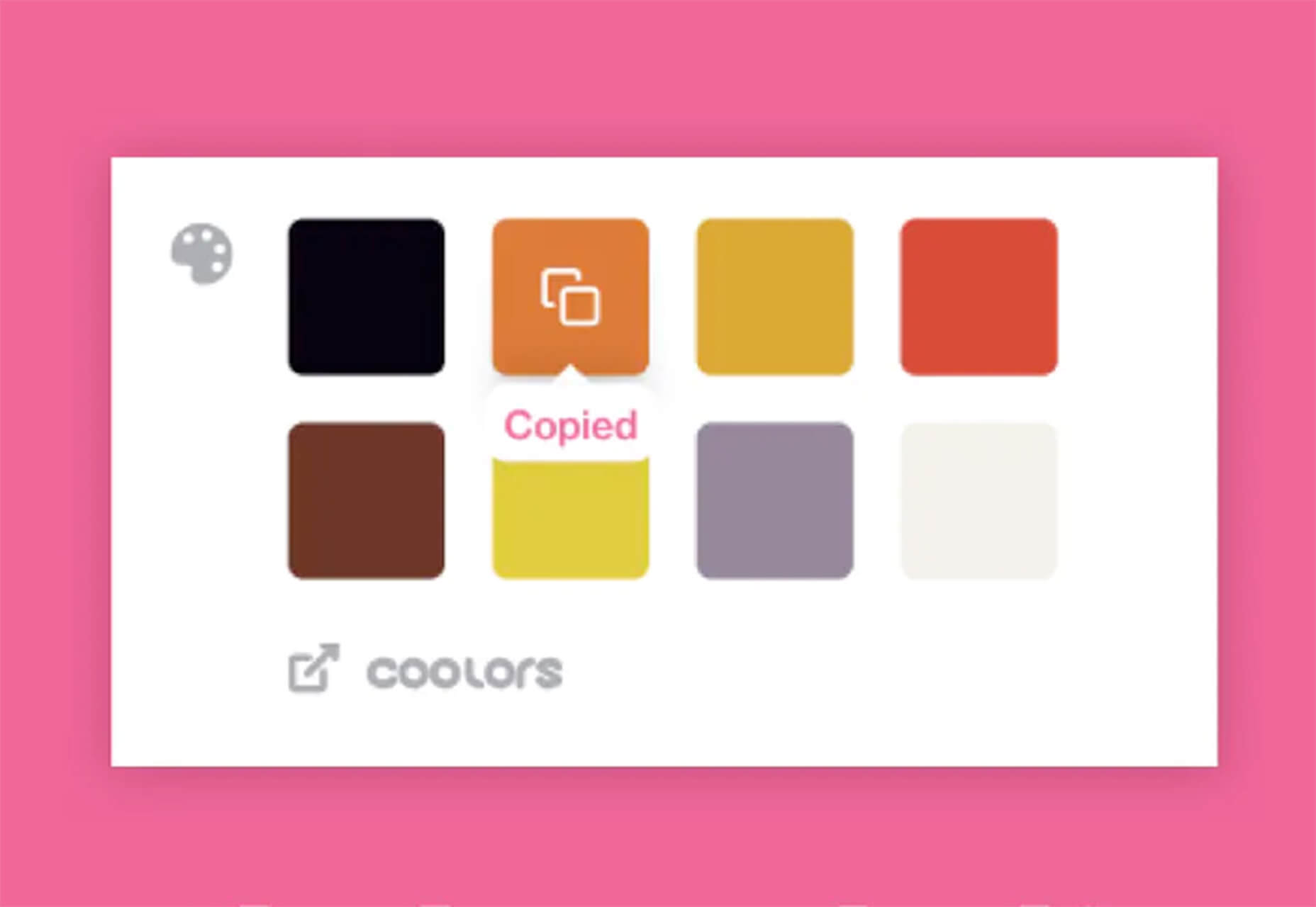
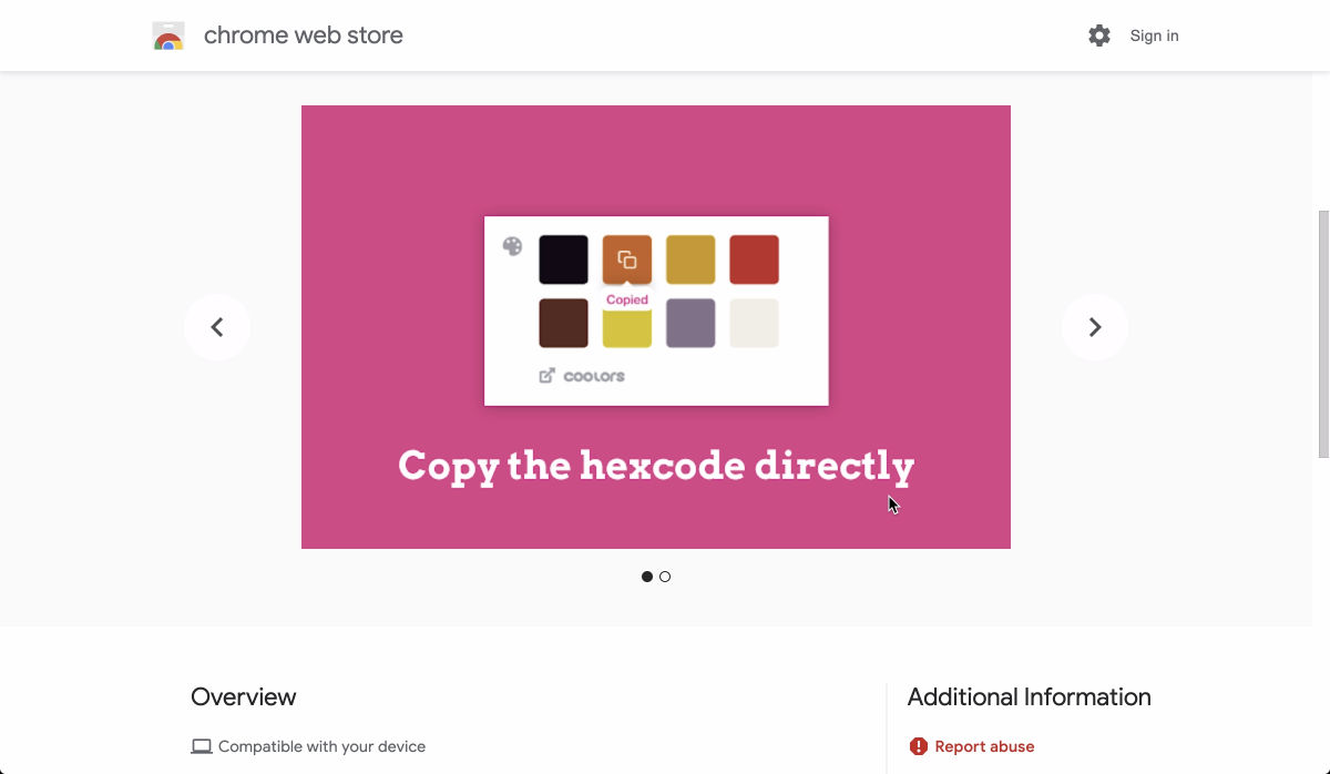
8. Color Tool

Color Tool makes it easy for web designers to create, share, and apply colors to their UI. It also measures the accessibility level for any color combination before exporting to the palette. The tool comes with 6 user interfaces and offers over 250 colors to choose from. 

The tool is also very easy to use. All you need to do is pick a color and apply it to the primary color scheme; switch to the secondary color scheme, and pick another color. You can also switch to Custom to pick your own colors. After you have selected all your colors, use the Accessibility feature to check if all is good before exporting it to your palette. 
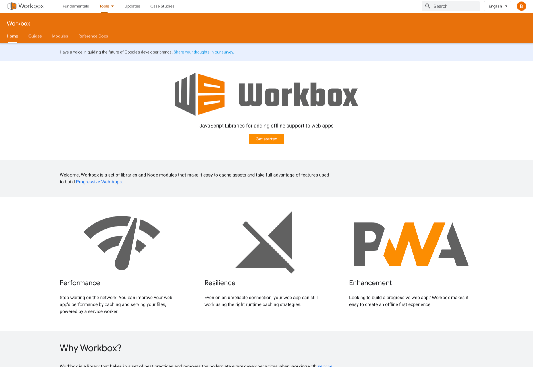
9. Workbox

Workbox is a set of JavaScript libraries and Node modules. The JavaScript libraries make it easy to add offline support to web apps. The Node modules make it easy to cache assets and offer other features to help users build Progressive Web Apps. Some of these features include pre-caching, runtime caching, request routing, background sync, debugging, and greater flexibility than sw-precache and sw-toolbox. 

With Workbox, you can add a quick rule that enables you to cache Google fonts, images, JavaScript, and CSS files. Caching these files will make your web page to run faster and also consume less storage. You can also pre-cache your files in your web app using their CLI, Node module, or webpack plugin. 

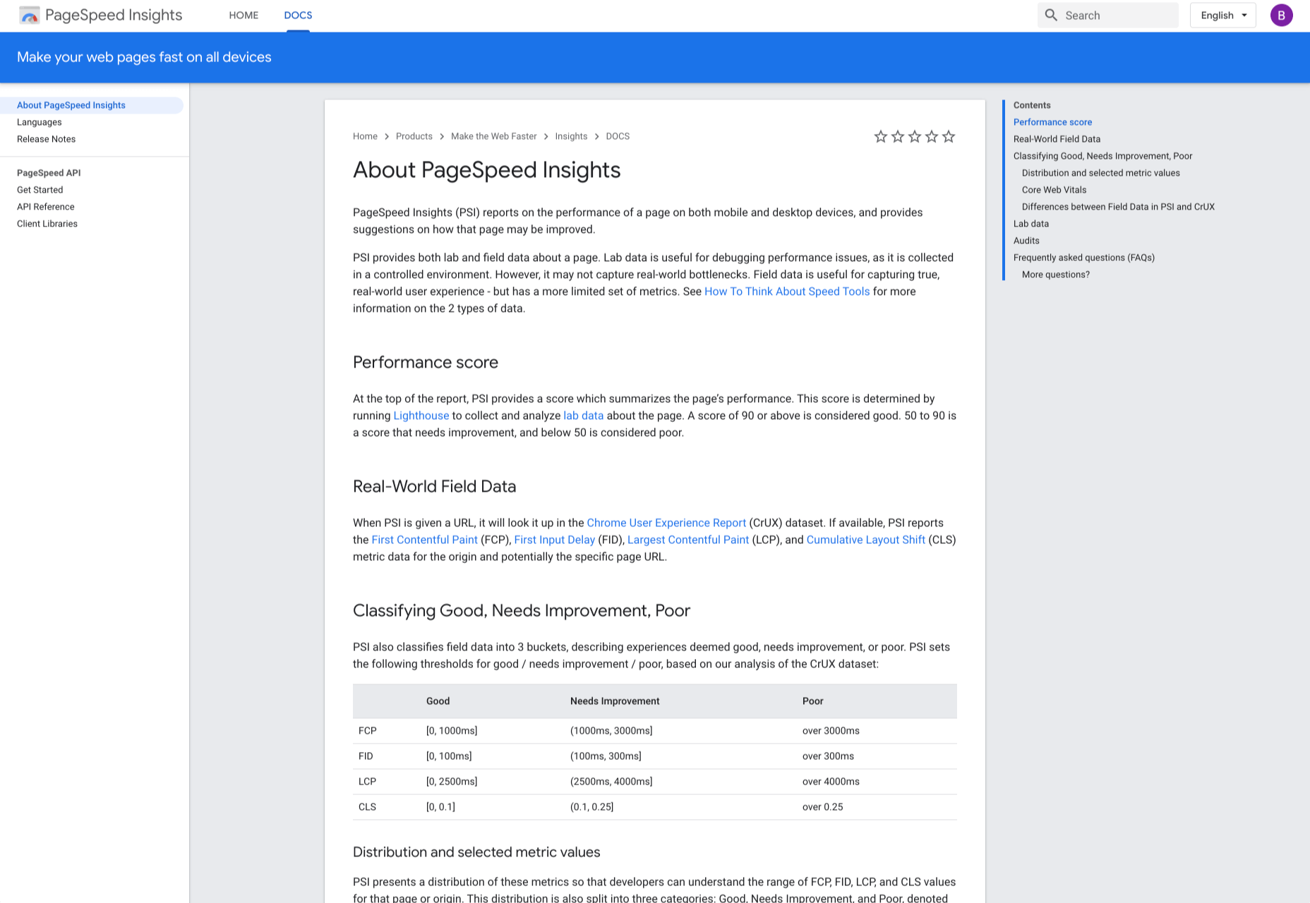
10. PageSpeed Insights

PageSpeed Insights is a handy tool from Google Developers that analyzes the content of a web page, then generates suggestions on how to make the page faster. It gives reports on the performance of a web page on both desktop and mobile devices. At the top of the report, PageSpeed Insights provides a score that summarizes the page’s performance. 
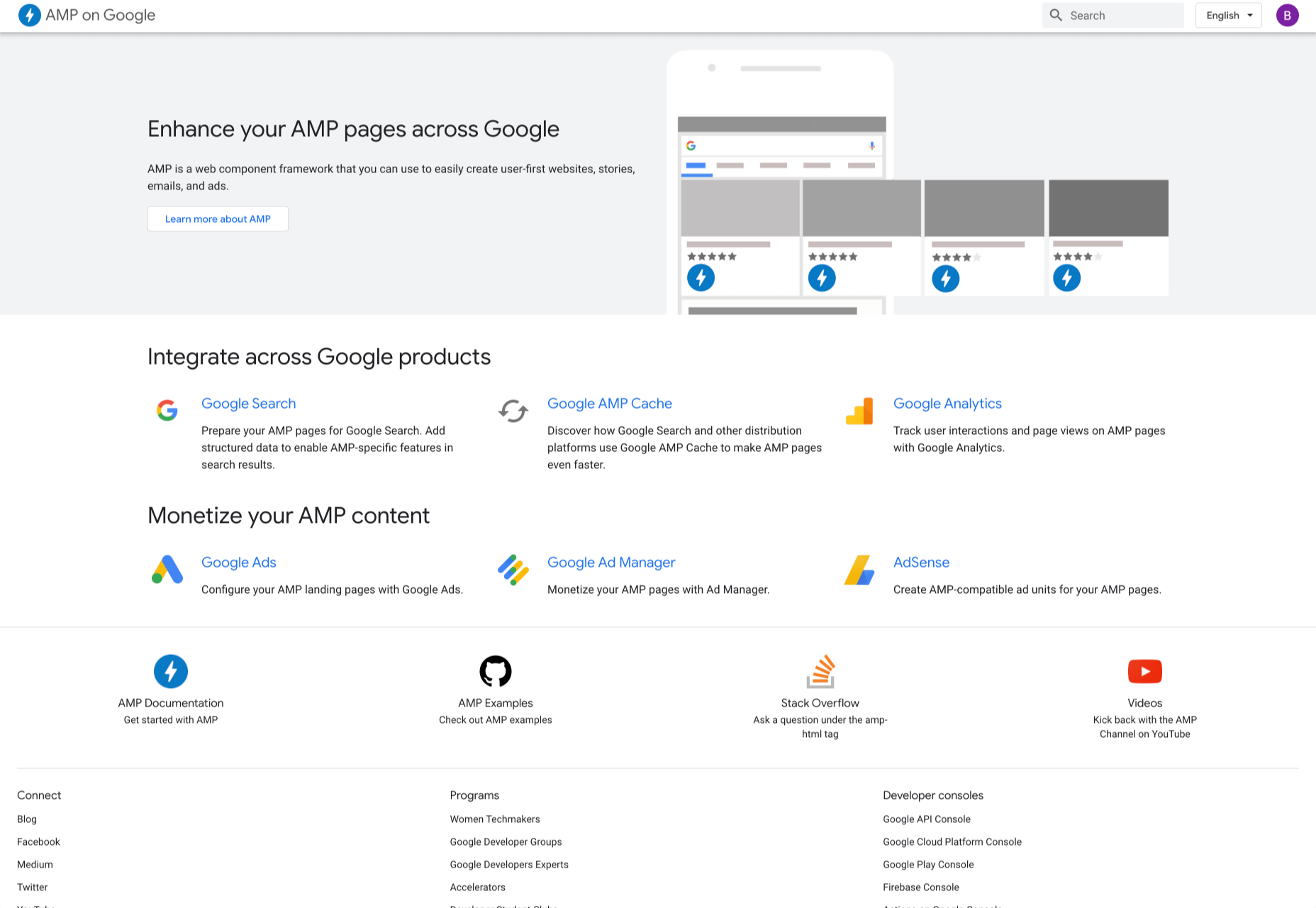
11. AMP on Google

AMP pages load faster and also look better than standard HTML pages on mobile devices. AMP on Google allows you to enhance your AMP pages across Google. It is a web component framework that allows you to create user-first websites, ads, emails, and stories. One benefit of AMP is that it allows your web pages to load almost instantly across all devices and platforms hence improving the user’s experience. 
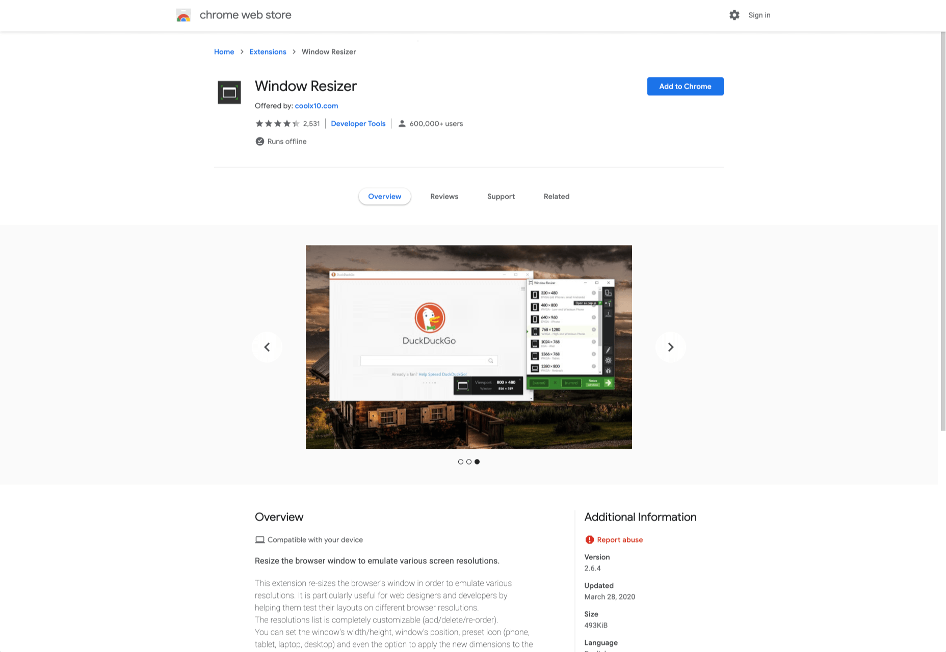
12. Window Resizer

When creating websites, it is important that developers test them for responsive design – this is where Window Resizer comes in. Window Resizer is a Chrome extension that resizes the browser window so that you can test your responsive design on different screen resolutions. The common screen sizes offered are desktop, laptop, and mobile, but you can also add custom screen sizes. 


Featured image via Unsplash.

Source


Source de l’article sur Webdesignerdepot

The common theme in this month’s collection of new tools and resources is “things that help you show off your work.” Many of these tools are made to help you better web products or apps or showcase designs with others.

Here’s what new for designers this month.

Naturaltts

Naturaltts is an online text to speech converter, that allows you to download an mp3 recording. The tool has more than 60 voices to choose from in six languages. There’s a free plan for personal use (based on characters converted) and affordable paid plans for higher volumes and commercial users. One application of this tool is voiceover for videos or tutorials.

Handz

Handz is a library of hands with different gestures in three-dimensional shapes. The collection includes 12 gestures with nine skin colors, and three different sleeve types. Put all that together and you have 320 potential combinations that you can use for projects. The library is completely free and works in a variety of formats with different tools.

Isoflow

Isoflow allows you to create isometric diagrams for presentations and illustrations with ease. You can edit and then export diagrams for print or website use, thanks to vector rendering.

Device Shots

Device Shots is a small web app that helps you generate a high-resolution device mockup using a screenshot of your website or mobile application. It supports almost every device type you can think of and resizes for social media platforms.

Barchartrace

Barchartrace is a simple MIT open source bar chart generator. Use it to create some of the animated charts you see on social media. Just insert your information (upload via CSV file), choose animation settings, and go.

Zettlr Markdown Editor

Zettlr is a free and open source markdown editor for Mac OS. Zettlr supports simple notations, references, includes a dark mode, and tagging. It’s made for note takers who need a tool to amp up their projects, and is used primarily in higher education.

CSS Leaning Card Effect

The CSS Leaning Card Effect replicates the bookshelf feel you get when rectangles lean with a shadow against planes. Lynn Fisher does it in the pen with code that you can see and work on with your own images.

Lemon.io

Lemon.io is a tool that matches you with freelance developers to get projects moving more quickly. You are guaranteed a match in 24 hours and there is no risk if the match doesn’t work out. Just tell Lemon.io what you need and the algorithm will match you with a dev from the database. Prices for development through the platform start at $35 per hour.

Papercups

Papercups is a customer messaging tool that lets you chat in real-time. The customizable widget works with your favorite tools, such as Slack and Gmail, and is free to use. Chat apps are one of the most in-demand website features right now.

CSS Click to Animate Gif

Christian Heilmann has created a great guide/experiment in pure CSS that adds a play button on top of animated GIFs so that users can control the motion. He developed the concept because GIFs can get overwhelming and annoying. Learn how he did it and see it in action.

3D Book Image Generator

Here’s another little bit of CSS magic with a 3D Book Image Generator. Just input your image and set some specifications and get a 3D book cover image that you can use in projects. (There’s also an accompanying tutorial if you want to learn how to generate the CSS on your own.)

Luckysheet

Luckysheet is an online spreadsheet – it’s a lot like Microsoft Excel – with powerful data functions and tools. It’s user-friendly and open source. It even has quite a few built-in mathematical formulas and supports various table types.

RevKit

RevKit is a design system UI kit that works with Sketch, Figma, and Adobe XD. It includes plenty of organized components that you can pop right into designs to help get them started faster. It also includes a style guide, elements, and form controls. The download is free.

Card

Card allows you to store social media profiles, websites, and files in a customized profile. Share it in one click. Replace awkward contact exchange and multiple usernames with a simple QR code or link.

Scale Nucleus

Scale Nucleus helps visualize data, curate interesting slices within your dataset, review and manage annotations, and measure and debug model performance. This tool claims to be “the right way” to develop ML models.

Previewed

Previewed is a mockup generator to create beautiful promotional graphics for your app. Browse a variety of templates, pick one, customize, and download your design to show off.

NSFW Filter

NSFW Filter is a browser extension that blocks images that aren’t safe for work. The best part is that it runs locally in-browser and doesn’t access any of your data. Plus, it saves you from on-the-job embarrassment.

ColorFlick for Dribbble

ColorFlick for Dribbble is another browser extension that makes it easy to copy hex codes from the tool to your clipboard with ease. You can also create palettes you can share from your favorite shots using Coolors.

Tabler Icons

Tabler Icons is a collection of more than 550 SVG icons that you can customize. Change the color, size, or stroke width with on-screen controls and then click to copy the icons you want to use. It’s that simple!

Teenyicons

Teenyicons might be some of the cutest icons out there. This collection includes minimal 1px icons in outline or solid fills. And there are plenty of icons to choose from. Adjust the size and grab the ones that you need for projects.

Basicons

Basicons is a set of simple icons for product design and development. Plus, they are updated weekly.

Chozy Mermaid

Chozy Mermaid is a super funky novelty typeface to close out summer. The characters feature beach themes within slab characters. It might be hard to find an application for this one, but it is too fun not to share.

Dotuku

Dotuku is a dingbats font with a back to school theme. The limited character set features filled and outline styles that are perfect for classrooms.

Margin

Margin is a fun retro style typeface with a 1970s vibe. It’s a “chubby serif” with 60 characters and 58 glyphs.

Rollanda

Rollanda is a signature-style script with a thicker weight and rough stroke. The character set is pretty robust.

Source


Source de l’article sur Webdesignerdepot

Many people dream of a career in web design, but it may actually be more attainable than you think.

There are countless online courses, of variable quality, with little to no academic structure; self-learning is an option, but it doesn’t come with a curriculum. Without a professional structure and a comprehensive curriculum your dream career might never be more than that.

But there is a practical, fast-track option to making a career in web design a reality, and that’s the Parsons Web Design and Development Certificate.

Built around the innovative teaching approach that Parsons is known for, you’ll learn human-centered design, explore the latest tools, evaluate techniques and approaches, and uncover the secrets of UX. The certificate even offers two distinct tracks, one for designers, and one for developers, so you can take control of your own future.

It’s one of the most creative approaches to a formal design education in the world, and what’s more, because it’s entirely online you can study from anywhere.

What Will I Learn?

Parsons offers a flexible curriculum to suit both designers and developers. There are two core courses, followed by three specialist courses.

learn human-centered design, explore the latest tools, evaluate techniques and approaches, and uncover the secrets of UX

The core courses cover the essentials of web and mobile design, plus JavaScript for designers. Each of the core courses lasts nine weeks. When you’ve completed them, you can opt for a design specialism or a development specialism. (You don’t have to make your choice until you’ve completed the core courses!)

If you prefer design work, you’ll spend a total of 21 further weeks learning mobile design patterns, studying emerging platforms, working with interactive typography, and mastering design systems.

If development is more your thing, then on the 21 week development track you’ll cover advanced HTML, CSS, and JavaScript, learn how to work with APIs, and finish up with experimental JavaScript.

To earn the Web Design and Development Certificate you need to complete the two core courses, plus three specialist courses within two years — a total of 39 weeks of study. Parsons recommend that you take two courses per semester, but it’s possible to complete the entire certificate program in one year.

Is This Really For Me?

Parsons Web Design and Development Certificate is a recognized qualification from a reputable institution that will stand you in good stead in future job interviews. But what’s more important, is the knowledge and experience you’ll gain from the course.

Thanks to the creative, flexible approach to learning, the certificate is suitable for designers and developers at any stage of their career

Thanks to the creative, flexible approach to learning, the certificate is suitable for designers and developers at any stage of their career.

If you’re just starting out, the certificate is a superb way of exploring the field, all the while building skills that will make you stand out to employers.

If you’re a print designer, or a programmer, the Web Design and Development Certificate is a great way to supplement your existing skills and make a lateral move into web work.

And if you’re a grizzled industry professional with decades of experience, you’ll benefit from the track you know least well; designers studying development, developers studying design. Not only will it open up new creative avenues to you, but you’ll find project management easier with a broader outlook on the web.

The best thing about the Parsons Web Design and Development Certificate is that because it’s made up of modules, you can still work part-time as you tick off the courses.

Why Choose Parsons?

Parsons College of Design is part of The New School, a New York-based university. Open Campus, the platform that will run the certificate, is the New School’s online system for pre-college, professional, and continuing education courses.

Thanks to Covid-19, most learning institutions are planning online-only courses for at least the next 12 months, so why not enroll in a program run by an institution that already excels at online teaching.

Innovative courses, underpinned by the creative approach to teaching that Parsons College of Design is renowned for, mean the design education you embark on this fall will be second to none.

Individual courses cost between $577 and $850, with the entire Web Design and Development Certificate costing just $3,704.


[– This is a sponsored post on behalf of Parsons College of Design –]

Source


Source de l’article sur Webdesignerdepot

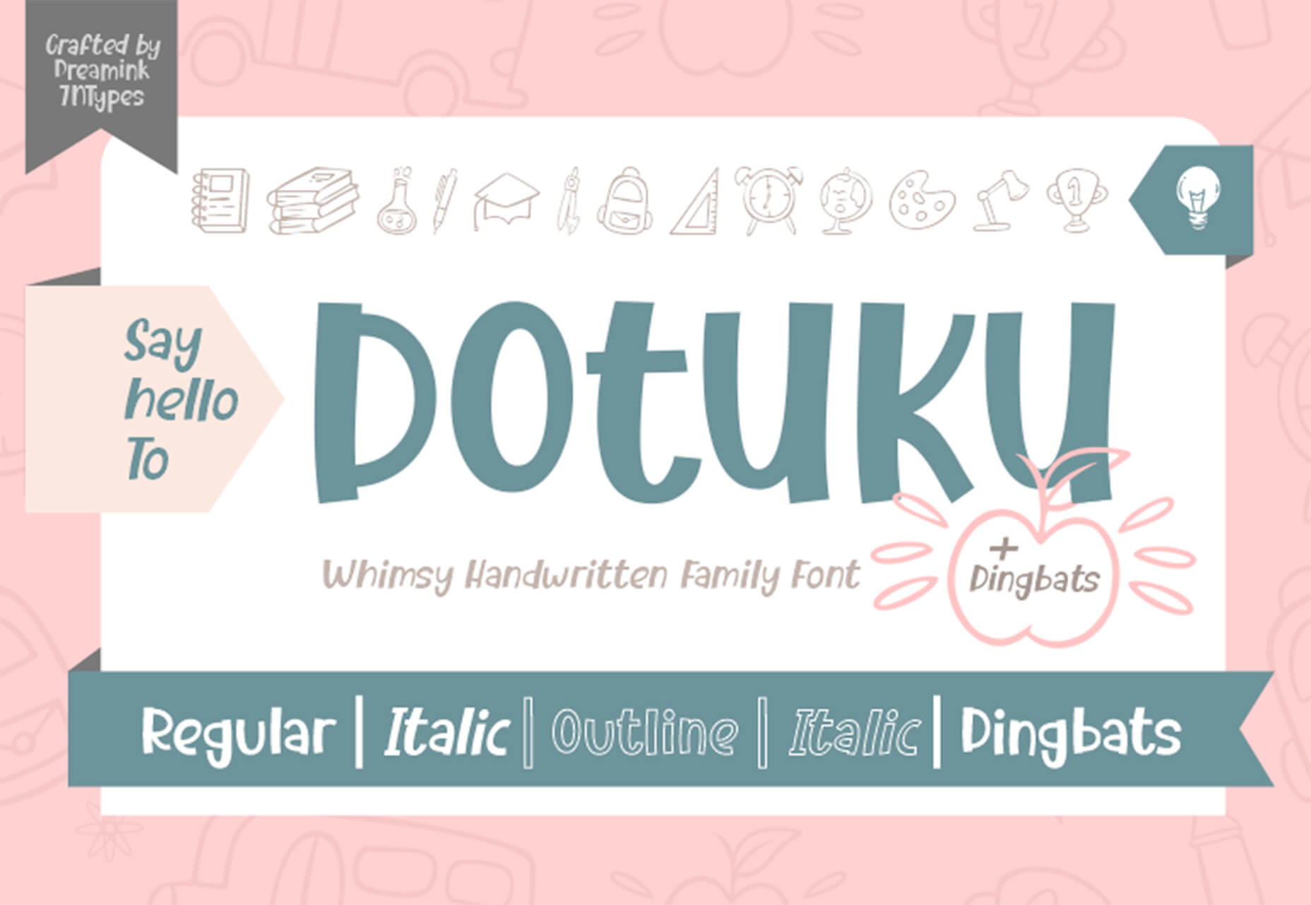
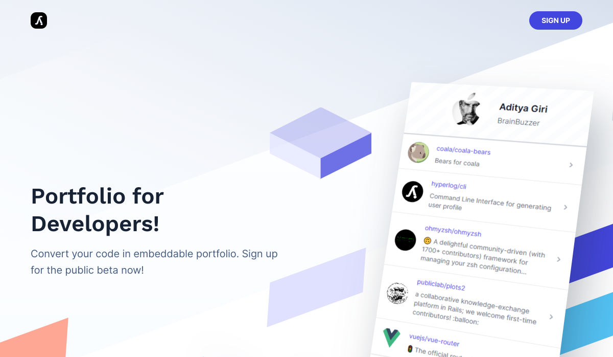
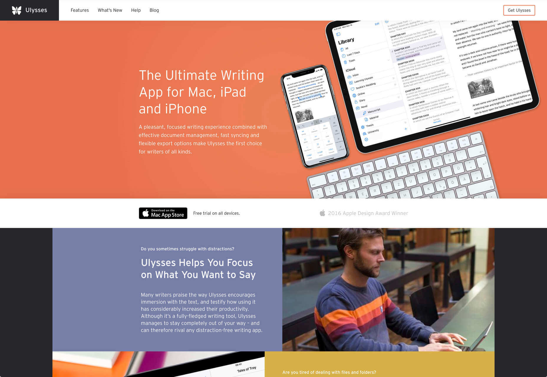
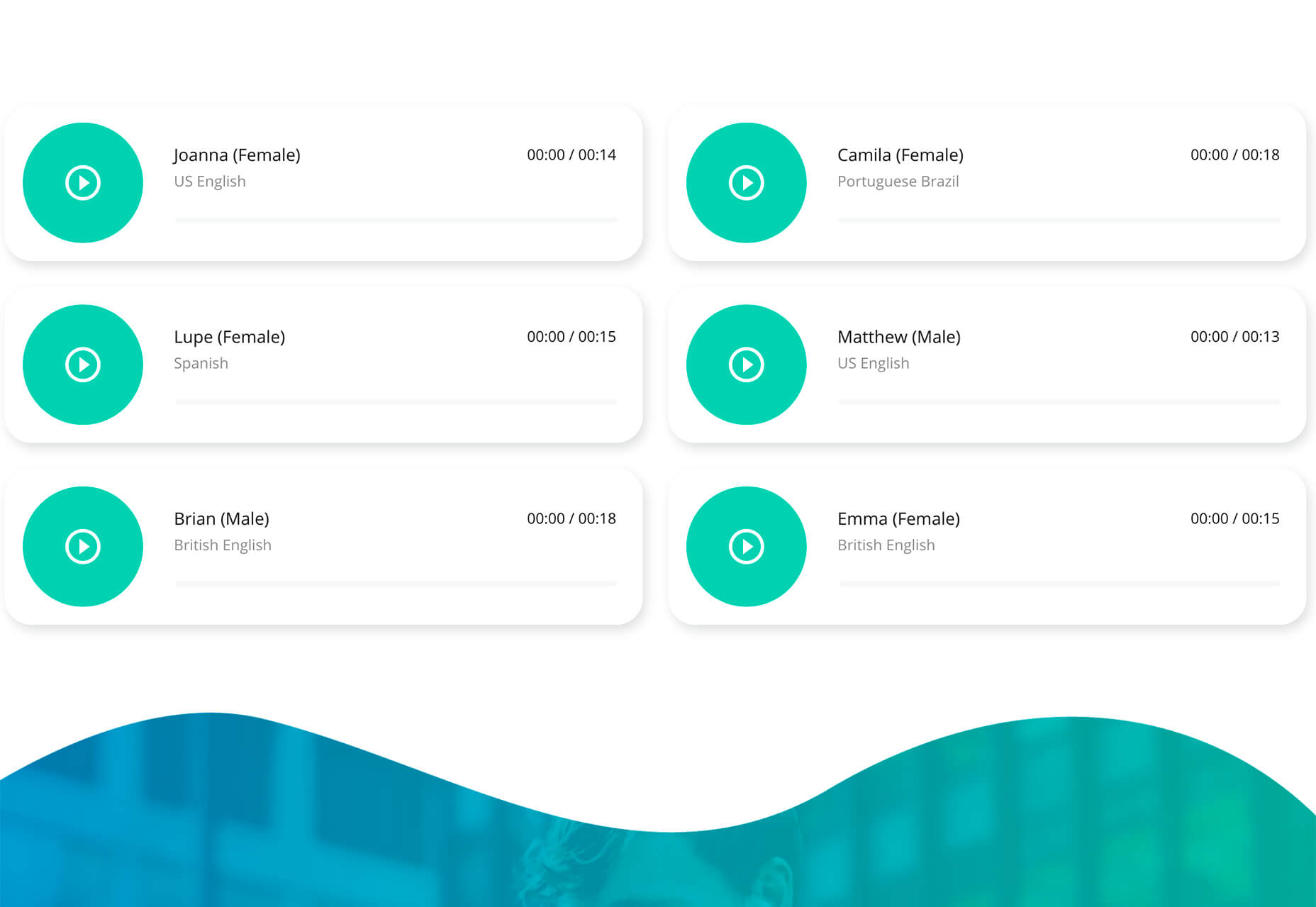
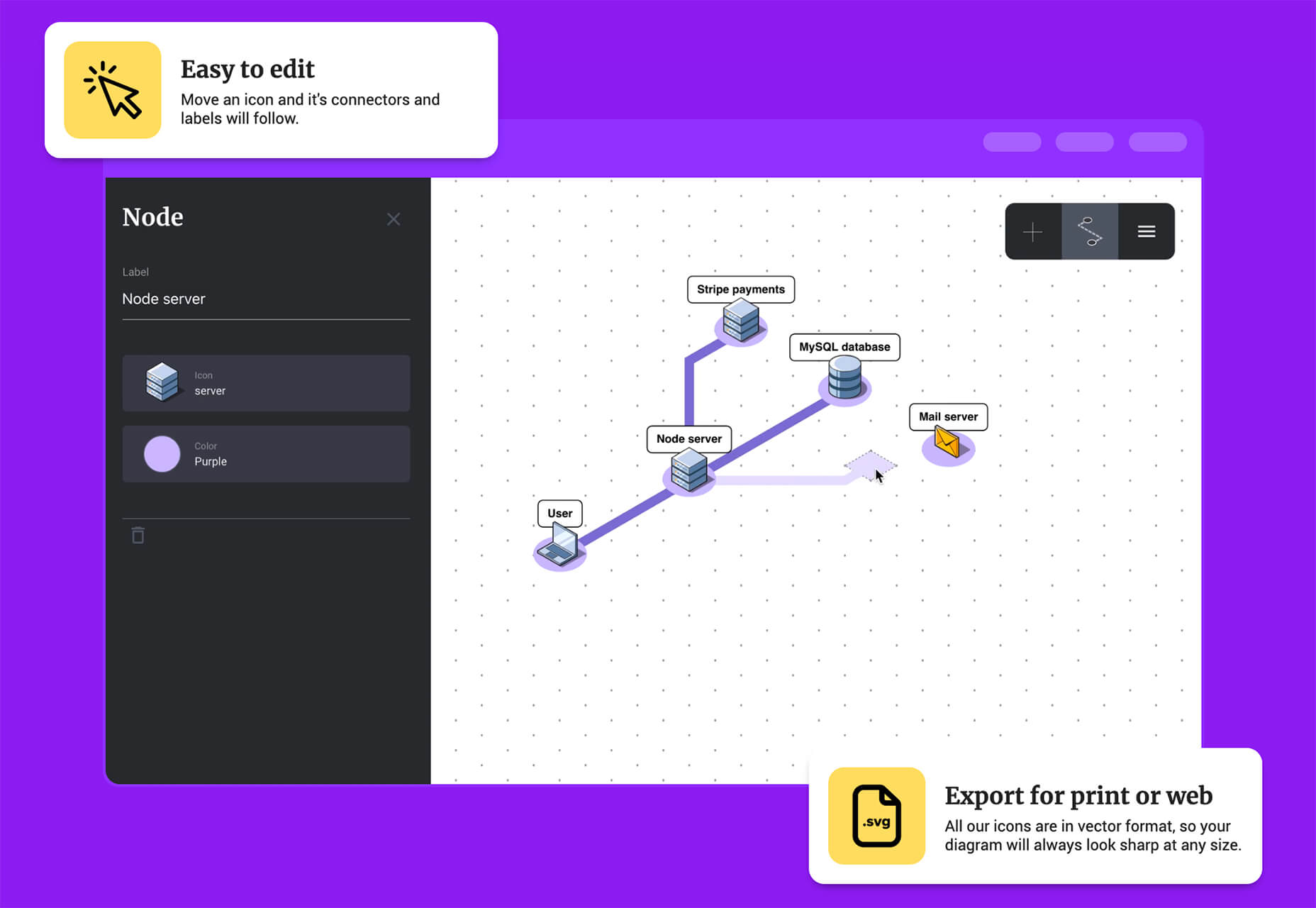
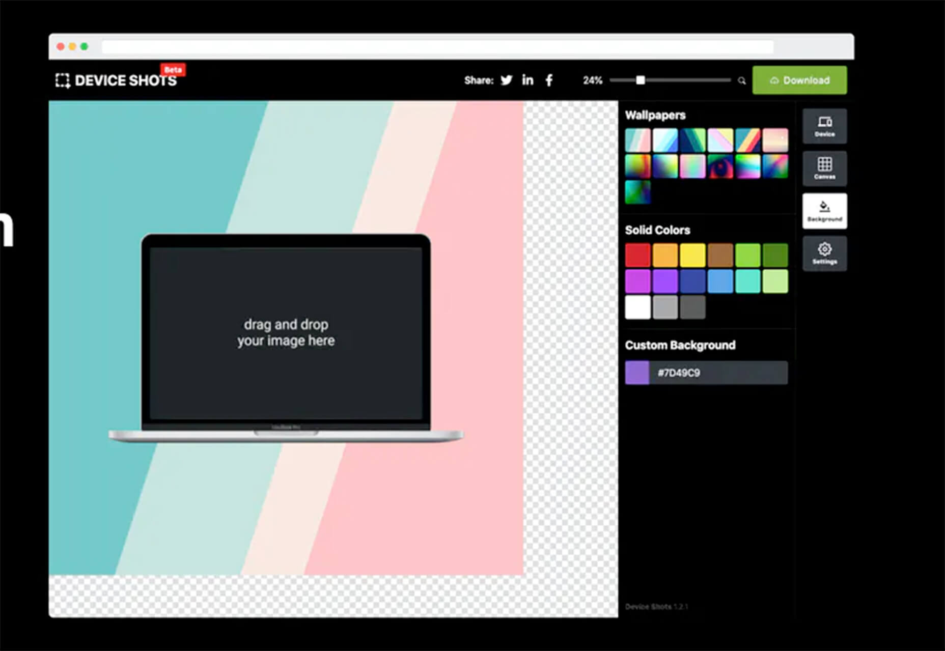
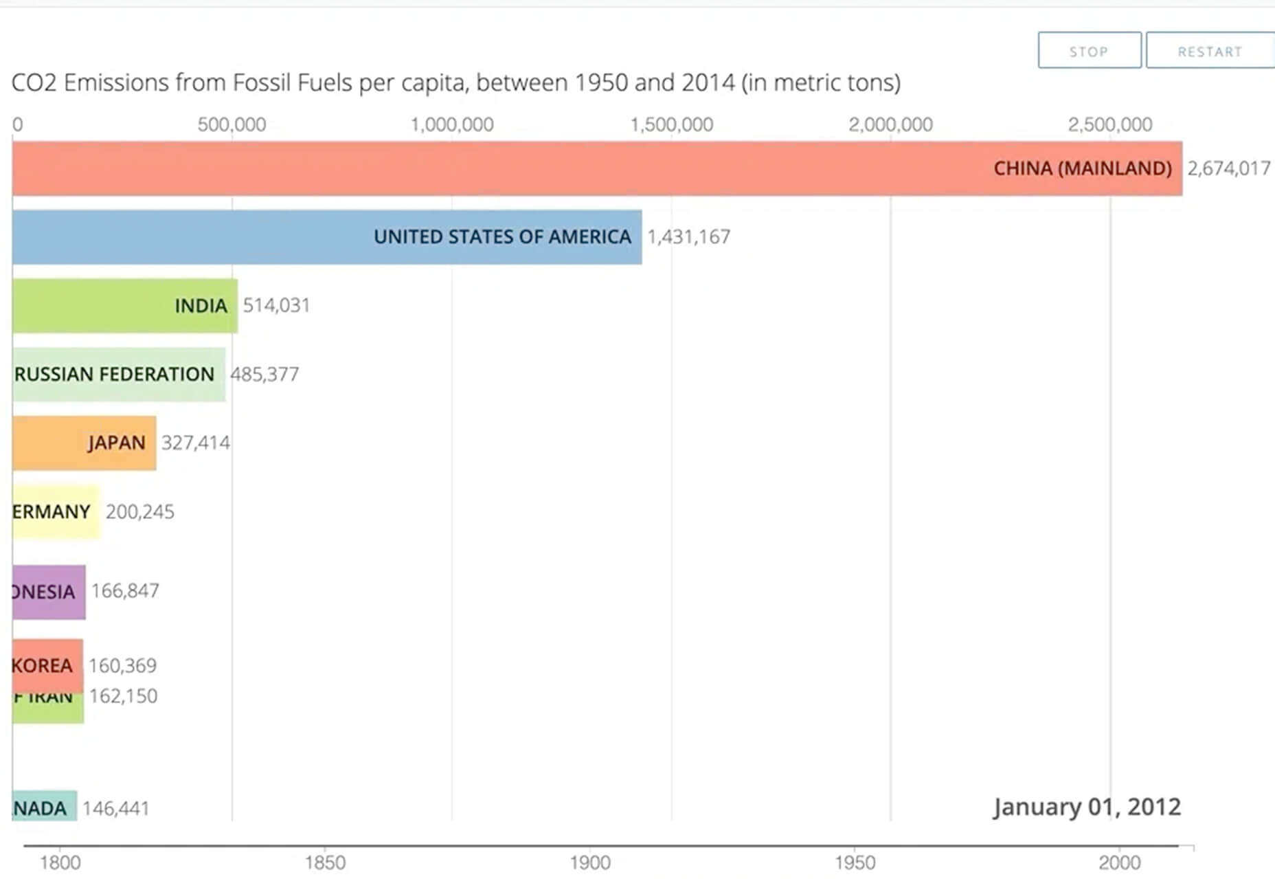
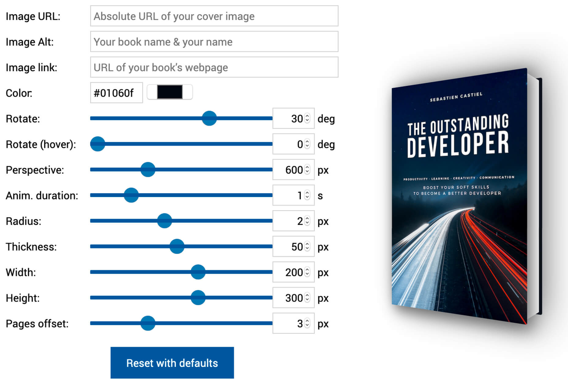
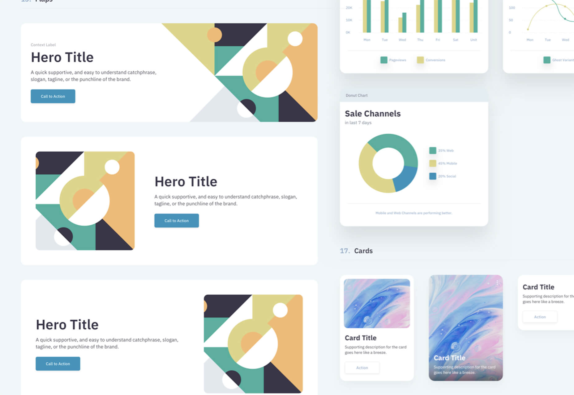
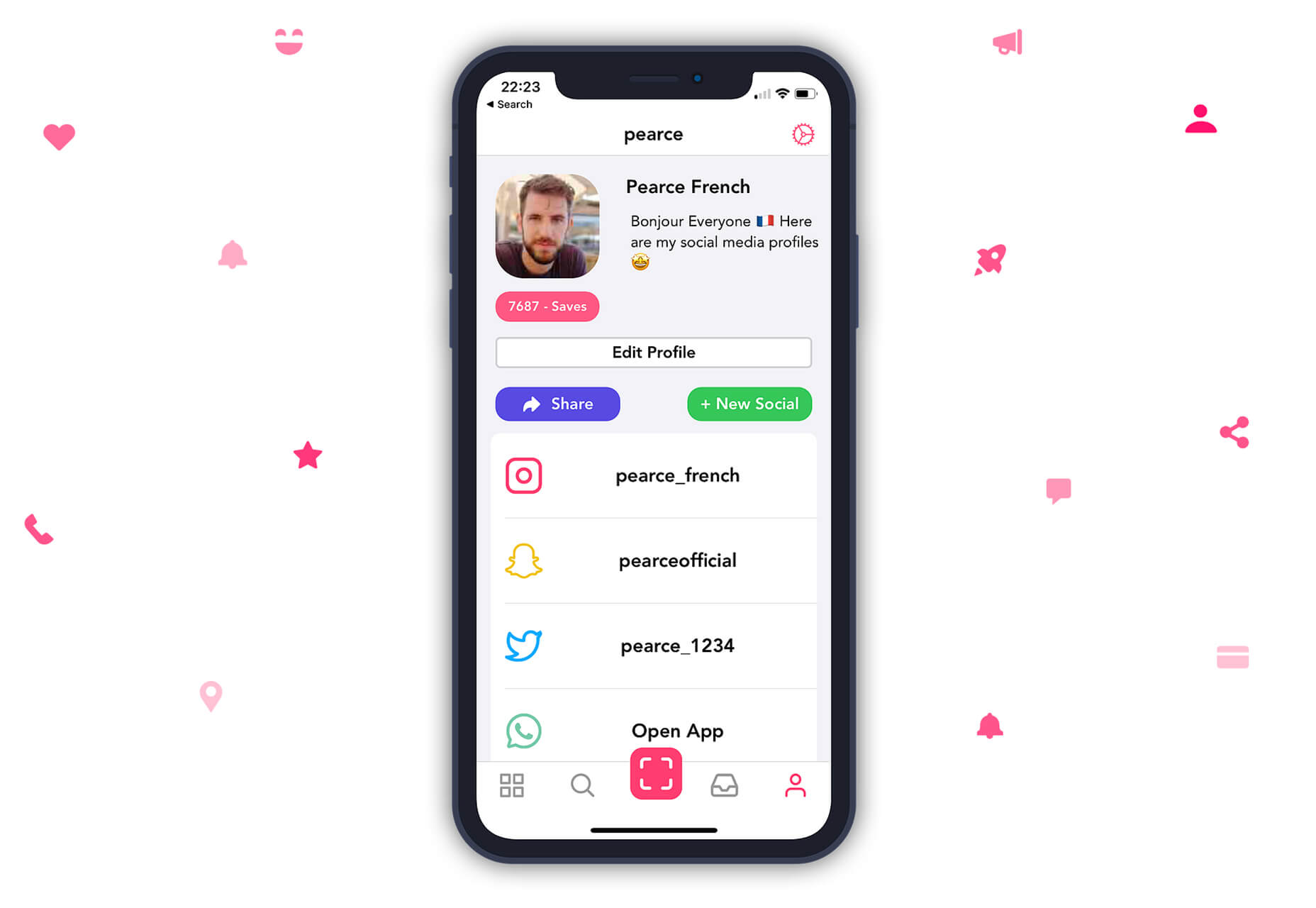
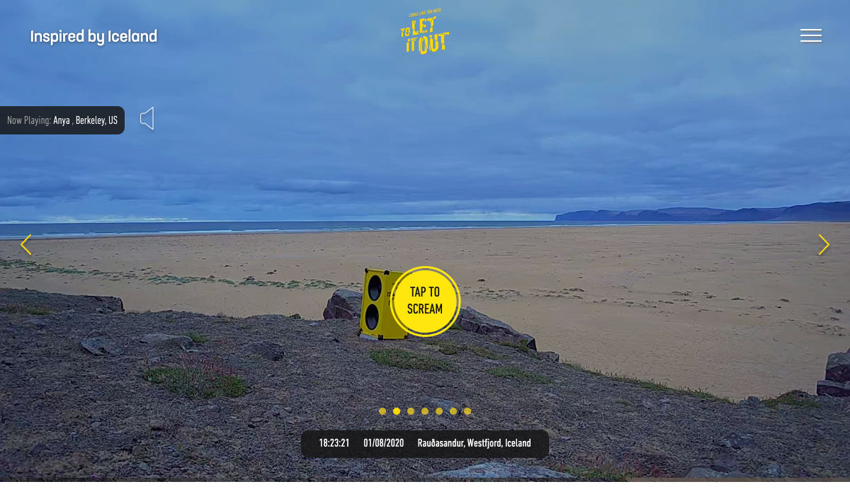
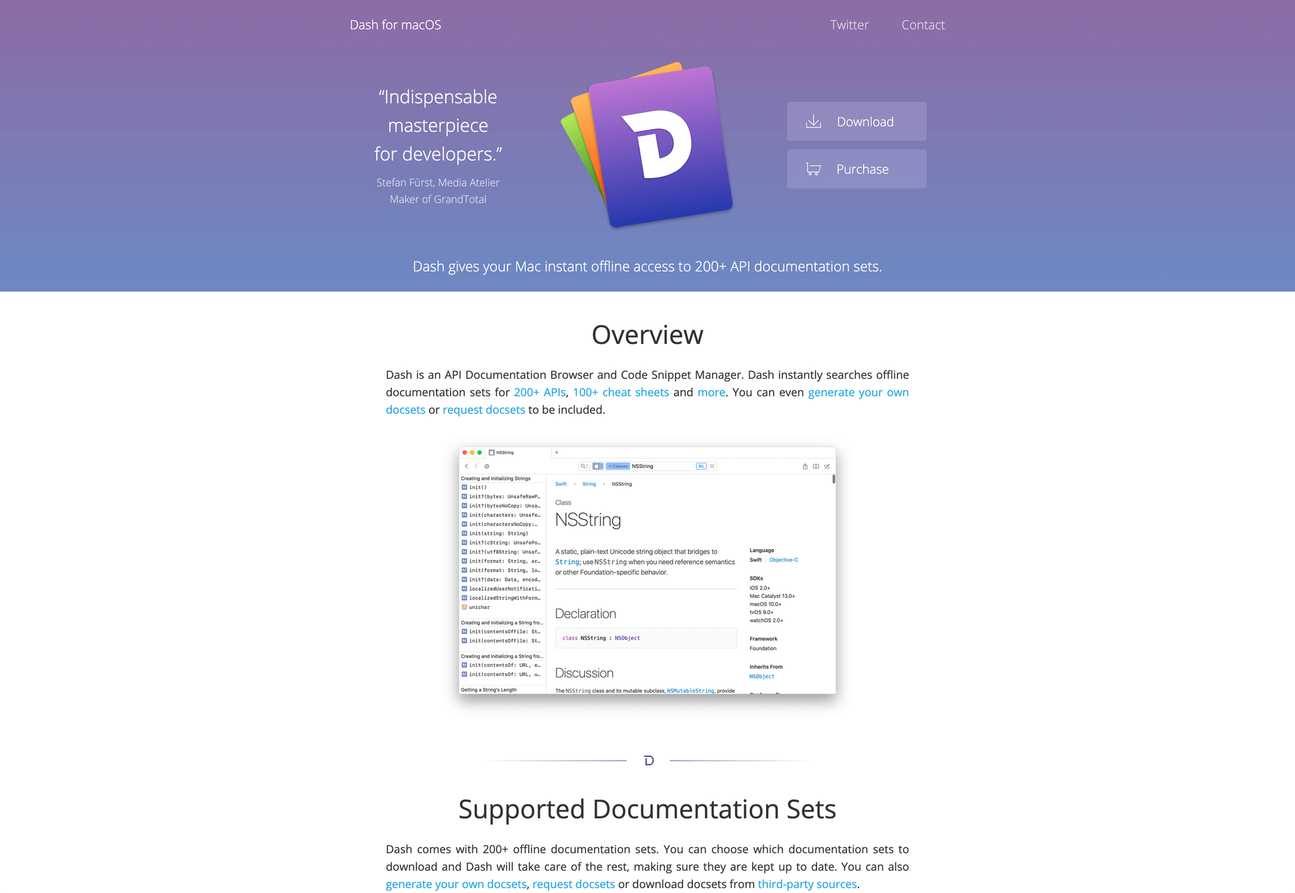
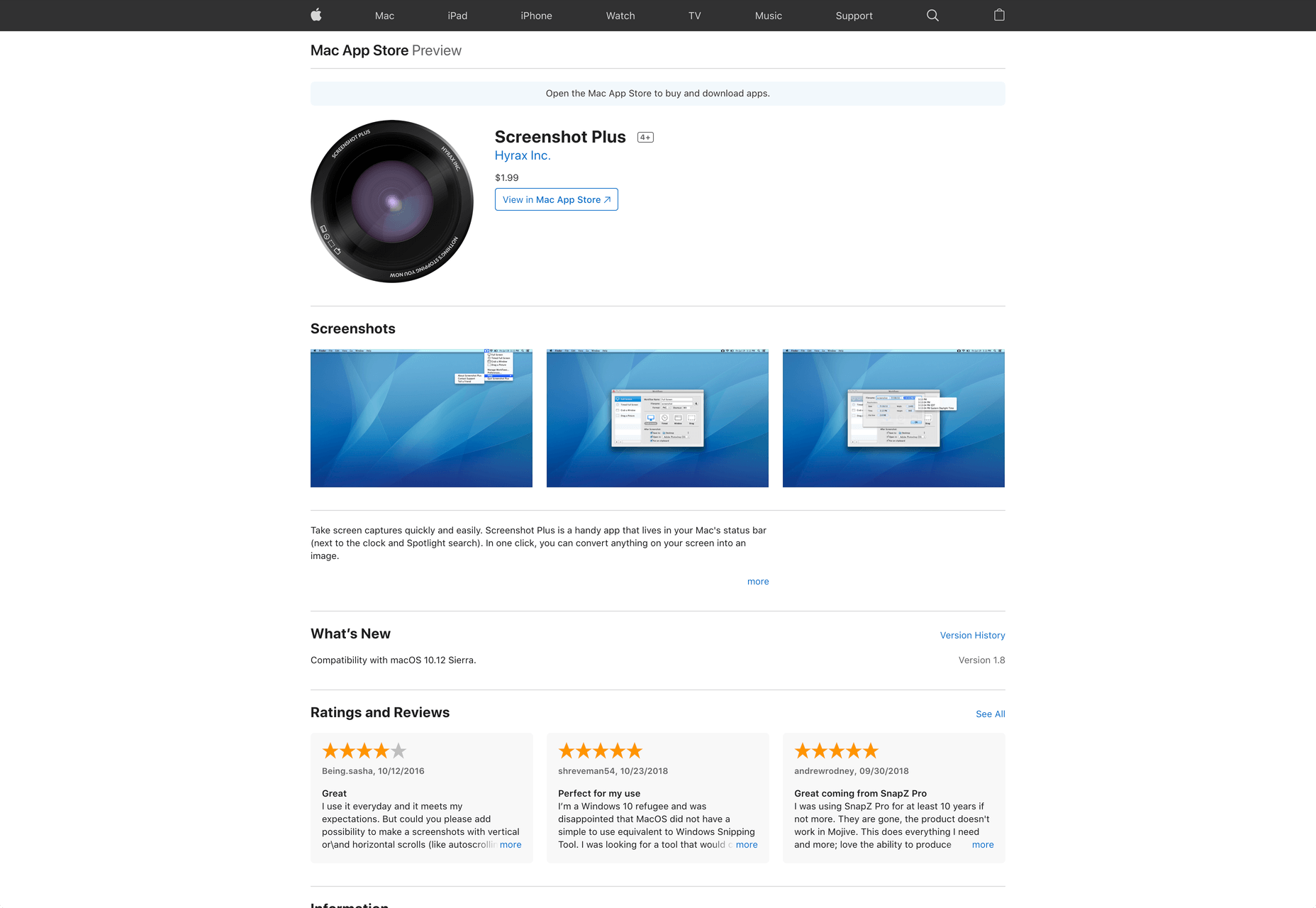
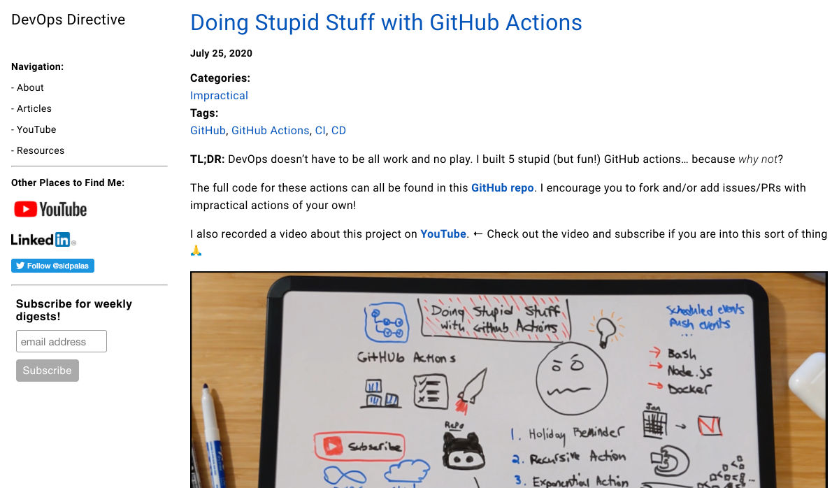
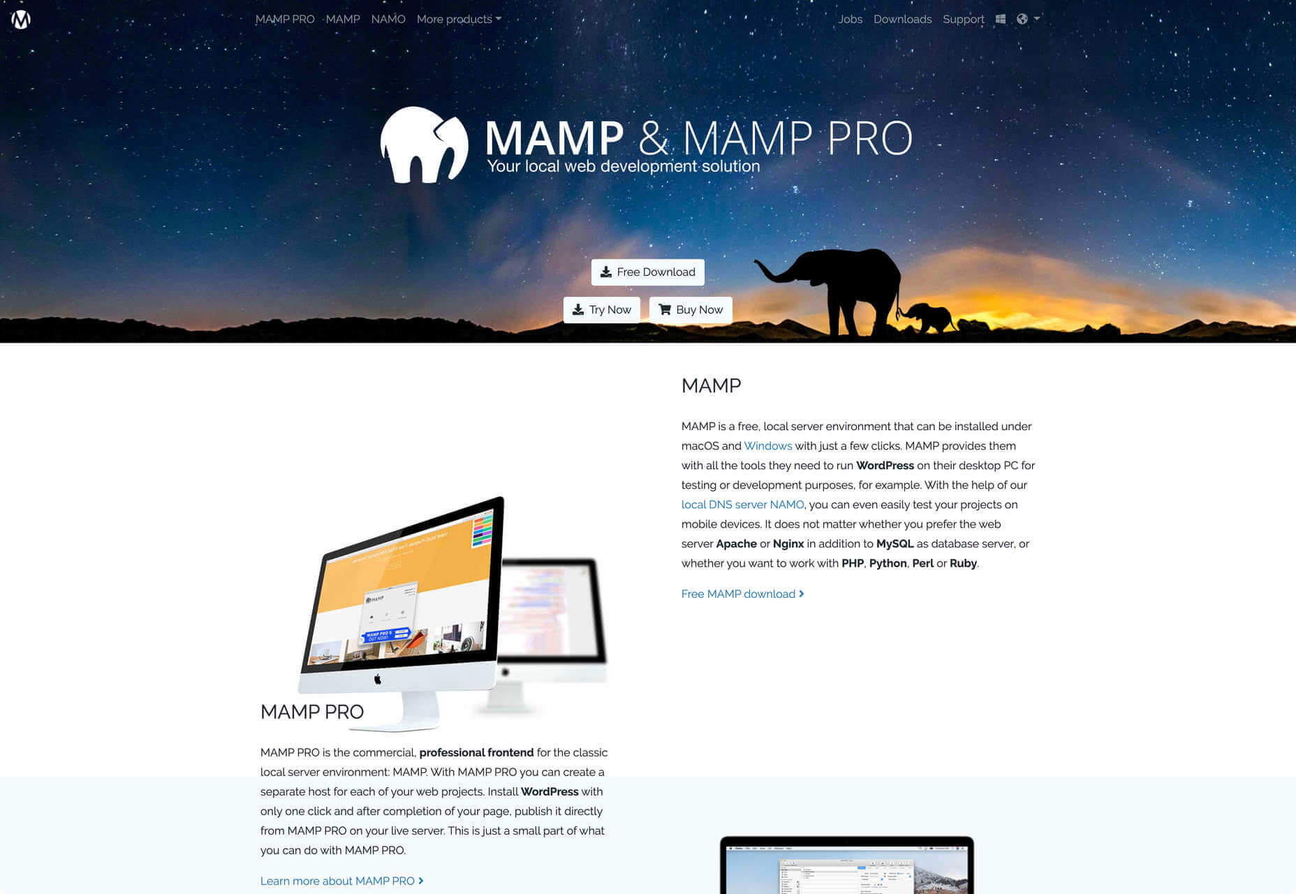
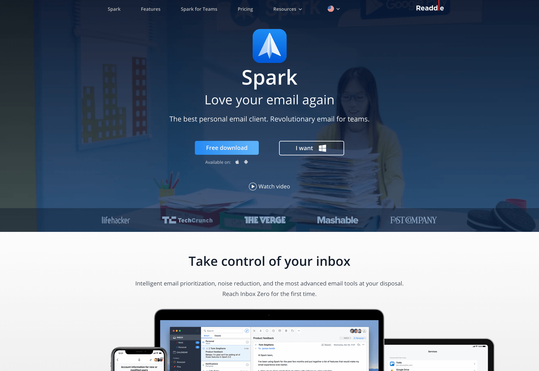
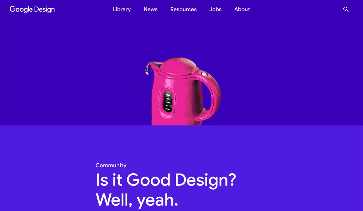
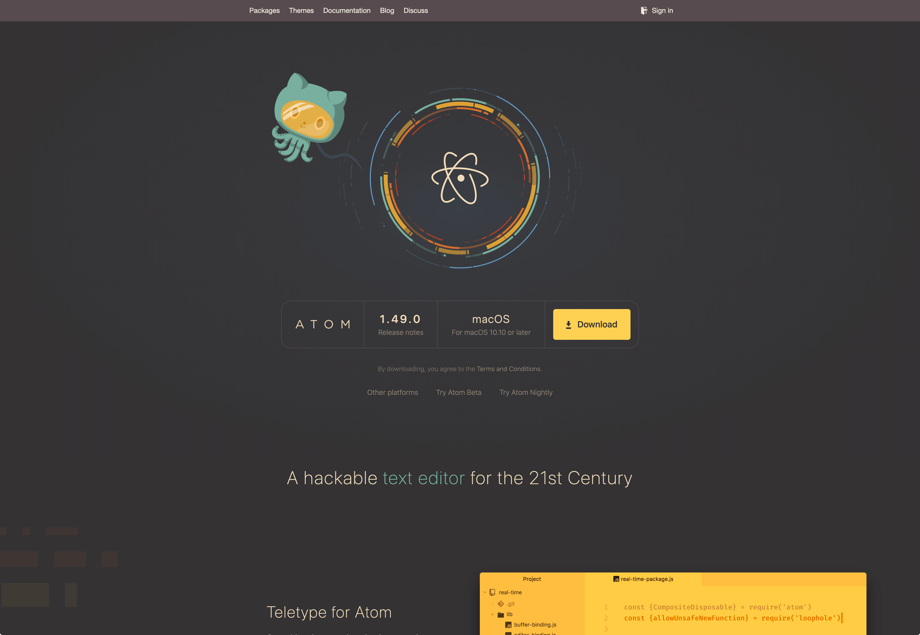
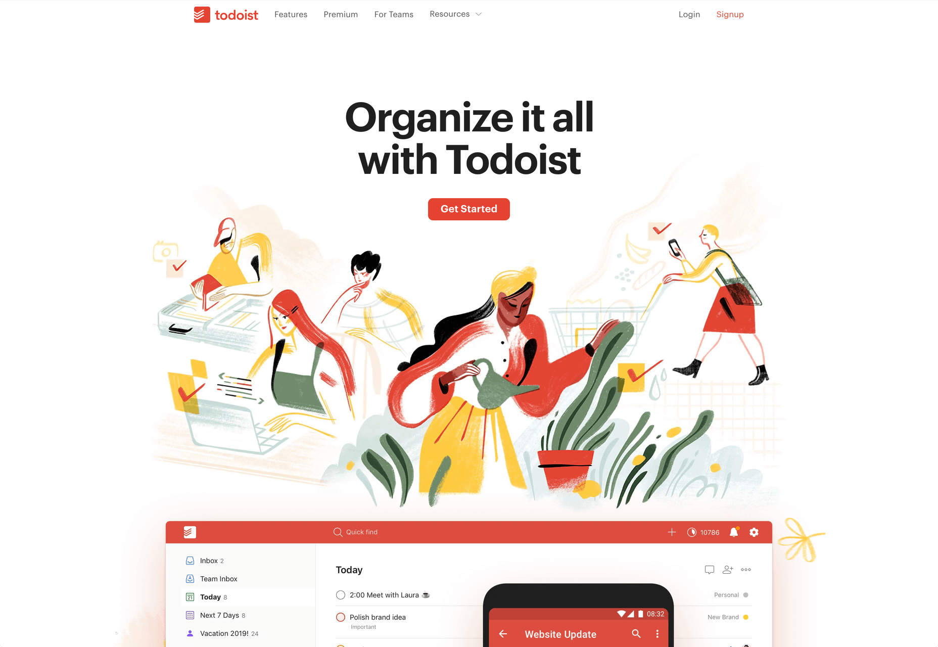
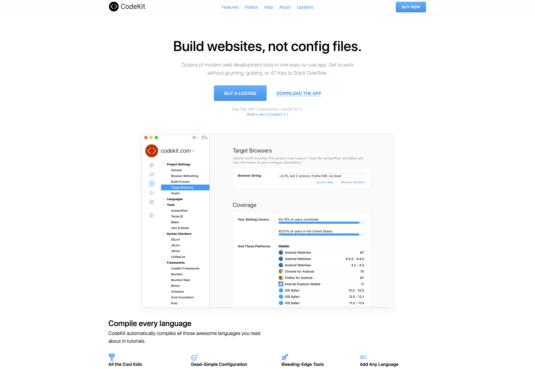
Every week users submit a lot of interesting stuff on our sister site Webdesigner News, highlighting great content from around the web that can be of interest to web designers.

The best way to keep track of all the great stories and news being posted is simply to check out the Webdesigner News site, however, in case you missed some here’s a quick and useful compilation of the most popular designer news that we curated from the past week.

Stroke Text CSS: The Definitive Guide


Code Snippets for Easier Coding


Textdb – A Simple Way to Share Small Amounts of Data


10+ Favicon Generators to Make your Brand Stand Out


12 CSS Grid Layouts


Applying Disney’s Basic Principles of Animation to UI Design


Curiosity Creates


Previewed – Beautiful Mockups & Graphics for your Next App


We’re in a Golden Age of UX. Why is Video Chat Still Stuck in the ’90s?


18+ CSS Book Effect


How to Promote a Mobile App with an Animated Explainer Video


Hyperlog – Portfolios for Developers


Site Design: Looks like You Need to Let it Out


Doing Stupid Stuff with GitHub Actions


Is it Good Design? Well, Yeah.


15 Free Adobe XD UI Kits for Web and Mobile App Designers


The Office as You Know it is Gone


How Interactive Content will Increase your Visitor’s Time on Page


What do Web Design Clients Need from Designers?


Truthmark is a Photography Database Aiming to Stop Misuse in Fake News


200+ NoCode Tool List by WeLoveNoCode


Designing for ‘Why?’


10 Tips Before You Buy a Domain Name


Making Memories to Last (August 2020 Wallpapers Edition)


Design Constraints are not Restraints – They Stoke Creativity


Want more? No problem! Keep track of top design news from around the web with Webdesigner News.

Source


Source de l’article sur Webdesignerdepot

I think of a creative practice as a combination of an approach (a design philosophy) and a series of techniques (craft skills); a good tool facilitates a technique, which in turn supports an approach.

It wasn’t until I sat down to write a list of tools I can’t design without, that I realized just how many tools I rely on as an integral part of my creative process. The danger of tools is that they promote certain techniques, and that bias can alter your approach.

First and foremost a good tool does no harm, it does not dictate, or obstruct your approach. Secondly, a good tool offers flexibility in the techniques you choose. Thirdly a good tool is invisible, it leaves no marks on the end product.

If I’d written this post a year ago the list would have been different, and I hope that in a year it will be different again. These are the tools that I currently find enabling, that have contributed to my craft, and supported my approach.

Affinity Designer

I’ve always used Adobe products. Photoshop and Illustrator were the de facto graphic tools for half my life. I’ve never had an issue with the subscription licensing of Creative Cloud, which I think is proportionate for a professional set of tools. Then, around 18 months ago I got very frustrated with how sluggish Illustrator had become.

I’d written an early review of Affinity Designer, I’d been impressed at the time, so I decided to give it another try expecting the sojourn to last an hour or two before I gravitated back to Illustrator. Running the latest version of Affinity Designer was a revelation, I’ve simply never wanted to switch back.

Why not Sketch? Well, I do occasionally jump into Sketch, especially for pure vector wireframing. I was an early adopter of Sketch, but the reliability issues (long since resolved) poisoned my relationship with it. Why not Figma? Well, Figma’s real strength is in collaboration, something that I get with Sketch, and personally I find some of Figma’s features unintuitive.

Affinity Designer isn‘t perfect. I dislike the color tools, especially the gradient tool, which I find clunky. But it’s the first design app I’ve used in years that syncs closely with my creative process.

Affinity Photo

I don’t do a lot of photo manipulation, so when I switched away from Creative Cloud for design work, I was relaxed about switching from Photoshop to Affinity Photo.

In my experience, Affinity Photo is stronger than Photoshop in some areas, and weaker in others. Affinity Photo’s bitmap scaling is much better than Photoshop’s, largely due to Lanczos 3 sampling.

Affinity Photo also solves a lot of little irritations that Adobe has chosen not to address for legacy or philosophical reasons, such as the toggleable ratio setting when resizing the canvas — I’ve lost track of the hours I’ve spent in Photoshop manually calculating vertical whitespace so that it’s proportionate to the horizontal.

TinyPng

Both Affinity Photo and Photoshop are poor at web format optimizations. Photoshop perhaps has the edge, but its output certainly isn’t acceptable for production.

I run bitmaps through TinyPng, which on average halves the size of the file without any appreciable loss of quality. (It stripped 66% off the images for this post.)

Fontstand

When I started to drift away from Creative Cloud, the one service that delayed me was Adobe Fonts (née Typekit). Not so much for the webfonts — which are faster and more reliable self-hosted — but for the ability to sync desktop fonts into my design apps.

I tried Fontstand when it was first released, and I loved the concept, but was worried about the small library. When I took a second look and discovered the library is now substantial for both workhorses and experimental typefaces, it was an easy decision to switch.

Fontstand is a desktop font rental service. Once you’ve found a typeface you’re interested in, you can activate an hour-long trial, then choose to rent the font for a small fee. You can auto-renew the rental if you need to, and if you rent the font for 12 months it’s yours forever.

If there’s one tool on this list I genuinely could not design without it’s this one. Fontstand makes working with fonts from independent foundries affordable for freelancers, and it’s enriched the typographic palette available to me.

Khroma

Every designer has strengths and weaknesses. Since day one of art school, my weakness has been color. It just doesn’t come naturally to me, and I have to work quite hard at it.

An incredibly helpful tool that I’ve been using for a few months is Khroma. It helps my eyes warm up before approaching color, and helps me find a starting point that I can then refine. Comparing my design work before, and after Khroma, the latter color choices are cleaner, more vibrant, and more interesting.

Atom

A good code editor is essential, and I’ve never found one that I’m completely happy with. For years I’ve flitted back and forth between Brackets, Sublime Text, and BBEdit. I think that probably reflects the changes in the type of coding I’m doing.

For now, I’ve settled on Atom. It’s fast, reliable, and it’s not biased to front or back-end code.

CodeKit

I held out on compilers longer than I should have, using apps like Minify to minify CSS and JavaScript, and the command line to process Sass (see below). Then I found CodeKit and it’s been essential to my workflow ever since.

What I like best about CodeKit is that it’s a GUI. Which means I can change settings while coding, like toggling off the JavaScript linting, without switching mental gears into another language.

MAMP

MAMP is a tool that allows you to run a local server environment, meaning I can run PHP and MySQL without the tedious process of FTPing to a server to test a change. Mac comes with Apache, so this isn’t strictly necessary, but it’s simple to use and works well with both CodeKit and Craft (see below).

There’s a pro version of MAMP, which allows you to switch seamlessly between projects, but it’s heavily geared towards WordPress. I’m still trying to find the time to evaluate Laravel Valet.

Dash

When you first start coding you try and memorize the entire language. It’s very possible to become fluent in the core of a language, but there are always nuances, defaults, and gotchas that you miss. As you grow more experienced, you realize that all professional coders Google the answer at least once per day.

When I got tired of Googling I started using Dash which is a superb app that combines the docs of numerous different languages into a searchable window. I use it daily for everything from SVG to Twig.

LambdaTest

It doesn’t really matter what you’re building, even the indy-web needs to be tested. Ideally you’ll test on real devices, but if you can’t afford a device library — and who but the largest agencies can — you need a live testing solution.

There are a few upstarts, but your choice is basically between BrowserStack and LambdaTest. I went for LambdaTest because I prefer the style of the UI, but that’s entirely subjective. If you’re not sure, toss a coin, you’ll get the same results with both.

Sass

I can’t write CSS without Sass — and I mean that literally. If I try and write vanilla CSS I guarantee I’ll nest something with @at-root and it will throw an error.

Craft CMS

Stating any preference for a CMS online that is not WordPress inevitably invites impassioned protests from developers whose career is built on the WordPress platform. So let me say preface this by saying: if WordPress works for you, and more importantly for your clients, then more power to you; I think it’s a dog.

Shopping around for a CMS is challenging, and I’ve gone through the process several times. A good CMS needs to be in sync with your mindset, and it needs to be appropriate for your clients — all of them, because unless you’re in a large agency with multiple coders, you need to commit to a single solution in order to master it.

I have looked and looked, and finally settled on Craft CMS. Craft makes it easy to build and maintain complex, high-performance sites. It has a shallow learning curve that grows exponentially steeper, making it easy to get started with plenty of room to grow.

Vue.js

Way back when Flash went kaput I switched to jQuery, and that was a really easy route into JavaScript — ignore the people who tell you to master the core language first, do whatever it takes to start using a language, that’s how you learn. But jQuery is heavy, and I found I needed it less and less.

These days 90% of the JavaScript I write is progressive enhancements in vanilla JavaScript to keep the dependencies low. Occasionally I encounter a job that requires complex state management, and then I fall back on Vue.js. JavaScript developers are as partisan as CMS aficionados, so let’s just say I favor Vue.js because it’s not controlled by a mega-corp and leave it at that.

Ulysses

As editor at WDD, I cannot emphasize enough that the right way to write copy for the web is markdown.

Markdown is faster to write so you don’t lose the thread of your thought process, and it doesn’t impose formatting so you can easily migrate to a CMS. If you’ve ever spent 20 minutes stripping the class, id, and style tags out of a file created in Word, Pages, or (by far the worst offender) Google Docs, then you don’t need to be sold on this point.

There are a few markdown-based writing apps available, I tested half a dozen, and the one I settled on was Ulysses. I like its distraction-free mode, I love its clean exports. Everything I write, I write in Ulysses.

Screenshot Plus

Much like markdown editors, there’s no shortage of screenshot apps. My current favorite is Screenshot Plus.

Screenshot Plus has one feature that makes it standout for me, and that is its Workflows. It sounds like a small problem, but when you’re taking screenshots of a dozen sites, the extra clicks to save, switch to your editor, and open the file are laborious. I have several workflows setup in Screenshot Plus that allow me to take a screenshot, save it to a specified folder on my local machine, and then open it in Affinity Photo, all with a single click.

Spark

I get a lot of email, a lot. At one point the influx was so bad I was using multiple email apps to segment it. Yes, I use Slack daily, but it doesn’t eliminate the need for email.

I‘ve been using Spark for around six months and it’s radically sped up my workflow. I’m a big fan of the smart inbox that allows me to compartmentalize email like newsletters, and email that warrants a reply. I like that I can switch to a chronological list if I’m looking for something specific. I love the ability to pin, or snooze messages, which helps me triage my inbox.

Todoist

I’m one of those people who can’t make it through the day without being organized. I need lists and sublists, and I need something native that opens automatically when I boot my Mac, and something that sits on the home screen of my Android.

There are as many to-do apps as there are things to do. When I’m working in a team I’ll use whichever task-tracking system it prefers. But by choice I always use Todoist thanks to its balance of simplicity and power. At this point it’s something of a meta-tool, and the app I open first every morning.

Source


Source de l’article sur Webdesignerdepot

Contentful; Webster’s Dictionary defines “contentful” as… not found. Clearly someone made up this word, but that is not necessarily a bad thing.

The world of user experience metrics is moving quickly, so new terminology is needed. Largest Contentful Paint (LCP) is one of a number of metrics measuring the render time of content on a web page.

What is Largest Contentful Paint?

Google defines LCP as “the render time of the largest content element visible within the viewport.” For what we are talking about in this blog, we will consider “content” to be an image, typically a JPEG or PNG file. In most cases, “largest” points to a hero image that is “above the fold” and is one of the first images people will notice when loading the page. Applying optimization to this largest content is critical to improving LCP.

It is probably more instructive to view LCP relative to other metrics. For example, First Contentful Paint (FCP) and Visually Complete book end LCP.

Each metric has its pros and cons, but LCP is a happy medium. LCP marks when web page loading starts to have a substantial impact on user experience.

In Google’s opinion, to provide a good user experience, LCP should occur within 2.5 seconds of when the page first starts loading. Poor values are anything greater than 4 seconds.

How Does Largest Contentful Paint Impact Lighthouse Scores and SEO?

LCP is now part of several “Core Web Vitals” scores that Google will measure in its ranking algorithm. Each of the Core Web Vitals represents a distinct facet of the user experience, is measurable in the field, and reflects the real-world experience of a critical user-centric outcome.

In the case of the overall Google Lighthouse score, LCP represents 25% weighting on the performance score of Lighthouse version 6.0. This makes LCP the most important Core Web Vitals metric in determining the performance score.

While Google has indicated that content is still the most important factor in SEO ranking, a better user experience (as measured by Core Web Vitals) will generate higher rankings in a crowded field. If there are many websites competing for the top search engine spots, then Largest Contentful Paint will play a critical factor in rankings.

How to Improve Largest Contentful Paint

Now that you know that LCP is important, what can you do to improve it by making content load faster? Google provides a number of suggestions, but the most effective technique is to optimize content for the device requesting it.

For example, a website includes an 800kb JPEG image that is intended for high resolution desktops. On a smartphone, that would be optimized down to less than 100kb, with no perceptible impact on quality. LCP can improve by more than 60% — or several seconds — through this single optimization.

Find Savings in Largest Contentful Paint by using Image Speed Test

Image Speed Test is a great tool offered by ImageEngine.io that provides an analysis of LCP improvement opportunities. Just paste in the URL of the web page you are interested in optimizing, and the test will show you:

  • Image Payload Reduction
  • Speed Index
  • Largest Contentful Paint
  • Page Load Time (Visually Complete)

It also provides a video of the web page loading with and without optimizations. Finally, it analyses each image to provide an estimate of payload savings. In this case, the “largest content” on the page is this image. With optimizations, the image payload is reduced by 94%. That delivers a huge improvement in LCP.

How Does ImageEngine Improve LCP

ImageEngine is an image content delivery network (CDN) service that makes image optimization simple. Basically, for each image on the page, the image CDN will:

  1. Detect the device model requesting the web page;
  2. Optimize the image in terms of size, compression, image format;
  3. Deliver via a CDN edge server that is geographically closest to the user.

ImageEngine improves web performance for every image on the page, including the largest. You can learn more about ImageEngine here, and also sign up for a free trial.

Best Practices: Preconnect

In addition to using an image CDN like ImageEngine, a few other best practices can improve LCP. Using the resource hints to provide a preconnect for your content can streamline the download process.

For example, putting the following link statement in the HTML will accelerate the download process. The link statement will make the browser connect to the third party as early as possible so that download can start sooner. ImageEngine’s optimizations make each image download smaller and faster, but preconnect save time in the connection phase.

Best Practices: Minimize Blocking JavaScript and CSS

When JavaScript or CSS is “blocking” it means that the browser needs to parse and execute CSS and JavaScript in order to paint the final state of the page in the viewport.

Any website today relies heavily on both JavaScript and CSS, which means that it is almost impossible to avoid some render blocking resources. On a general note: be careful with what kind of CSS and JavaScript is referenced inside the <head> element. Make sure that only the strictly necessary resources are loaded in <head>. The rest can be deferred or loaded asynchronously.

When looking to improve the LCP specifically, there are some practices worth looking into more deeply.

Inline Critical CSS

It is not an easy task, but if the browser can avoid making a request to get the CSS needed to render the critical part of the page – usually the “above the fold” part – the LCP is likely to occur earlier. Also you will avoid content shifting around and maybe even a Flash of Unstyled Content (FOUC).

The critical CSS — the CSS needed by the browser to set up the structure and important styles of the part of the page shown above the fold — should in-inlined. This inlined CSS may also refer to background images, which of course should also be served by an Image CDN.

Do Not Use JavaScript to (lazy) Load Images

Many modern browsers natively support lazy loading, without the use of JavaScript. Because images usually are heavily involved in the performance of LCP, it is best practice to leave image loading to the browser and avoid adding JavaScript in order to lazy load images.

Lazy loading driven by JavaScript will add additional latency if the browser first has to load and parse JavaScript, then wait for it to execute, and then render images. This practice will also break the pre-parser in the browser.

If an image CDN is used to optimize images, then the benefits of lazy loading become much smaller. Especially large hero images that are above the fold have a large impact on LCP and will not benefit from being lazy loaded with JavaScript. It is best not to make JavaScript a blocking issue for rendering images, but rather rely on the browser’s own ability to select which images should be lazy loaded.


[– This is a sponsored post on behalf of ImageEngine –]

Source


Source de l’article sur Webdesignerdepot