 We all want a little more fun and games in our lives. So, why not add some gamification to your next interactive content campaign?
By 2025, the gamification market is expected to witness a massive 30.1% growth rate, with global sales revenue reaching around $32 billion.
That’s because gamification adds more entertainment to the website experience and gets audiences engaged. The idea behind gamification is to bring game mechanics into the design of a website or piece of content. There are many different ways to do this.
Some companies add hidden achievements and bonuses to their blogs that customers can collect by visiting every page and reading their content. Others allow readers to collect points for leaving comments or play games to win potential prizes.
Used correctly, gamification is a fantastic way to connect with your audience and increase engagement levels. So, how can you use gamification in interactive content?
The Evolution of Gamification
Elements of gamification have appeared in everything from marketing campaigns to web design and even eCommerce strategies.
In 2014, an Apple App Store review of more than 100 health apps even found that gamification elements in applications led to greater participation and higher user ratings. In other words, customers are more likely to get involved with an activity that includes gamification components.
While gamification can take on many different forms, the aim for most companies is to create an environment where customers can feel more invested in their interactions with the website. For example, if you win a point every time you comment on a blog post, and you can trade those points in for prizes, you have more of a desire to keep commenting.
The promise of being able to “accomplish” things with pieces of interactive content and websites also appeals to the competitive part of our psychology that pushes us to keep doing things in exchange for the promise of a kind of reward.
Many companies have generated a lot of enthusiasm for their brands through leaderboards, time events, and similar experiences. For example, just look at how popular McDonalds becomes each year when the monopoly game rolls out as part of the purchasing experience.
People buy more items than they usually would during McDonald’s Monopoly just for the opportunity to win. This same boost in engagement benefits your content strategy too.
6 Ways to Add Gamification to Your Content
There’s no one right way to gamify your website or your marketing content. The method you choose will depend heavily on your audience and the kind of experience they respond best to.
The key to success is finding a way to grab your customer’s attention and hold onto it. Here are some of the tried and tested strategies to explore:
1. Create an Actual Game Experience
When it comes to incorporating gamification into your website design and content, you don’t necessarily need to be clever. You can be extremely straightforward and just design an actual game. For instance, to help attract more people to the American Army, the US created a war simulator that potential applicants could play on Steam.

The game aimed to introduce young people who might consider a career in the military to what that job might be like. If the kids liked what they saw on Steam, they could visit the military website and learn more.
For companies who can’t afford to build an entire fully-featured game, something a little smaller can be just as engaging. For instance, rather than using a standard pop-up with a discount code to entice customers to buy the rental service, Gwynnie Bee created a scratch card. People could scratch the spaces using their smartphone or computer cursor and win money off.
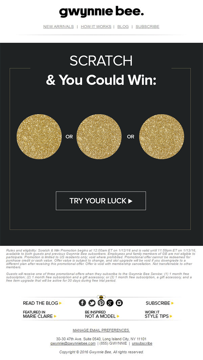
The great thing about the interactive content from Gwynnie Bee is that it encouraged potential visitors to connect with the business in a lucrative way. To use the scratch card, you first had to give your email address. This meant the company could build its email list while delighting consumers.
When designing a game experience for your marketing campaign, remember:
- Get the right support: Designing a great game is tough, particularly if you want something more complicated than a scratch card. Don’t take the risk of creating something that doesn’t work properly; hire a developer.
- Promote the experience: Make sure everyone knows about your new game. Share screenshots on social media and talk about it in your email campaigns.
- Focus on fun: Remember, games are supposed to be fun. Measure the reactions of your audience to ensure they’re having a good time.
2. Design a Loyalty or Reward Program
Loyalty is one of the most valuable things your audience can give you. So why not reward them for it? Loyalty programs are fantastic tools for business growth and engagement. They give you a way to turn one-off clients into repeat customers and advocates for your brand.
How you choose to reward your customers (and when) is up to you. Some companies might give customers points every time they share a post on social media or comment on a blog. This encourages more engagement with your brand.
On the other hand, you might just let your customers earn rewards for every purchase they make. This is a strategy that Starbucks uses with its reward program.
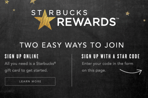
As customers increase their spending with Starbucks, they get the reward of extra points that they can put towards future purchases. This keeps customers coming back for more and may even entice some clients to buy Starbucks when they otherwise wouldn’t.
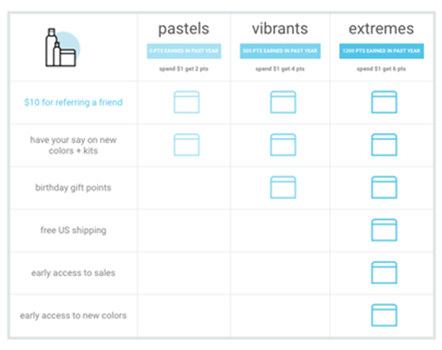
The oVertone company is another excellent example of a brand using gamified rewards with its marketing strategy. The loyalty program breaks down into tiers, where users can see how much they need to spend to ascend to the next level. New rewards and perks appear with each level.
Remember, when building a loyalty program:
- Make your customers feel special: Ensure that your audience feels good about being one of the lucky few in your loyalty program. Give discounts and offers they can’t get elsewhere.
- Keep them informed: Make it easy for your customers to see what they need to do to get their next reward, so they keep coming back for more.
- Mix things up sometimes: To stop the experience from getting boring, roll out things like “double points” days and bonuses for your most active customers.
3. Encourage Customer Interaction
The biggest benefit of gamification is that it encourages and increases customer interaction. You can give rewards to participants that comment on your blog posts, for instance, or share your posts on social. The customer benefits from the reward, while you get the advantage of a better business presence.
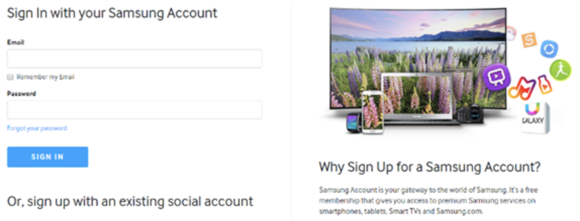
Samsung drives interaction with gamification with a function on its website that allows customers to discuss issues and watch videos. The most active participants get a badge for their efforts.
If your business structure requires a lot of engagement from your audience, then using gamification elements can encourage them to stick with you for longer rather than losing interest. For instance, language learning software Duolingo has a four-point gamification strategy for its users.
Duolingo knows that learning a new language takes a lot of time, so it asks users to set small specific goals instead. The smaller tasks bring users back regularly, and consistent users gain rewards. There’s even a progress bar to help you track your progress compared to other customers.
Gamification gives your customers another reason to keep coming back and connecting with your brand. That makes a lot of sense for companies that rely on long-term relationships with customers, like Duolingo and other teaching brands, for instance. Remember:
- Make it simple: People will only want to interact with your brand if it’s easy to do so. Make it clear what you want your customer to do and what they need to do next.
- Reward every action: Keep people coming back for more by rewarding them for their actions, even if it’s just with a gold star or digital sticker.
- Nudge inactive customers: If a client gets involved in your interactive content, then stops participating, send an email reminding them why they should come back.
4. Run Contests and Offer Prizes
Probably one of the easiest ways to use gamification in your advertising campaigns is with a competition. Contests and competitions have been around since the dawn of business. They’re a useful way for companies to collect information from customers, particularly if you ask your clients to sign up to your site with an email address to get involved.
Competitions are also a way to push your audience into doing positive things for your company. For instance, you could run a competition where consumers share a social media post and tag a friend to enter. Or you could have a competition that asks your clients to refer a friend to get involved.
When KIND, a healthy snack company, wanted to connect with its customers and create a new product, it didn’t just do market research. Instead, the company created the “Raise the Bar” contest to let customers cast a vote for which flavor they wanted to see next.
When 123ContactForm wanted to engage its audience, it gave people the chance to win one of three platinum subscriptions for 6 months.
Contests are naturally exciting and fun to take part in. They’re an opportunity to get your audience excited, and you don’t need to give anything huge away either. Just make sure that the prize you offer is something that your audience will be interested in.
A few more pro tips include:
- Generate hype first: Don’t just launch a contest out of nowhere; get people excited about the idea with announcement blogs, social media posts, and emails.
- Give people a lot of ways to get involved: If people can’t take part in the competition on social media, let them do something on your website instead.
- Follow up after the win: When someone does win something from your website, follow up with that winner and post pictures in the form of a blog/case study. This will generate more hype for your brand and get people excited about the next event.
5. Get Your Audience Feeling Competitive
No matter how much they might deny it, most people are at least a little competitive. So when you’re implementing a gamification campaign into your content and marketing efforts, it pays to tap into that sense of competition. All you need to do is find a way to encourage your followers to compete.
The best example of a company that did this particularly well is Nike. Nike and the Run Club app teamed up to motivate people to get involved with healthy activities. The app allowed users to customize and build their ideal training program based on their athletic level.
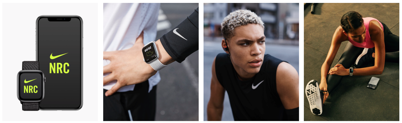
At the same time, you could also win badges and trophies to share with your running community. The more you took part in challenges on the app, the more you could potentially win.
The Fitbit application has a similar way of keeping customers engaged. When you download Fitbit, you can access information about your exercise strategies and potentially track your progress towards your goals. However, there are also measurable achievements to earn – like a badge when you first walk 500 miles.
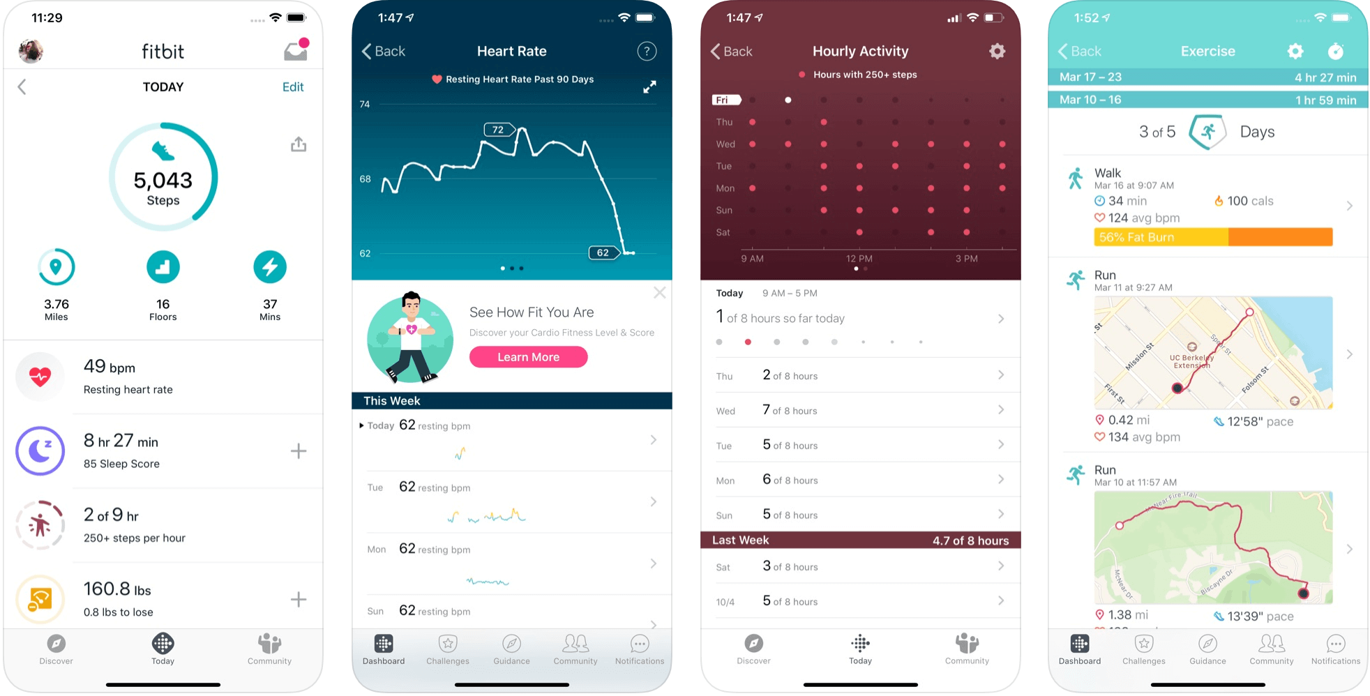
Users on Fitbit can also find their friends using the same app and compete with them in various challenges.
To successfully add a competition to your gamification strategy, remember:
- It needs to be social: People will be more inclined to get involved if they show off their achievements. So make sure that people can showcase their accomplishments.
- Make people want to win: There needs to be a reason to get to the top of the leaderboard. You might offer people discounts or exclusive prizes if they accomplish certain goals.
- Show progress: Prompt people to keep working on reaching their targets by showing them how close they are to success.
6. Make Boring Content Seem More Interesting
Some content is naturally more engaging than others. If you want to showcase some important information or data, you might create a whitepaper or a report. Unfortunately, the result can be a relatively bland piece of content.
With elements of gamification, you can make the experience a lot more engaging and interesting. Sites like Daytum.com allow users to turn personal stats and information into charts that showcase information in engaging ways. You can allow your users to track their progress through the report and rack up points as they go.
Adding subtle elements to otherwise clinical and less interesting information is a wonderful way to make the experience more exciting. The more enticed your customers are by your content, the more likely it is that you’ll sell them on your business.
Gamify Your Marketing Strategy
Gamification isn’t a new concept, but it’s one that many companies and designers can begin to take advantage of these days. Thanks to more advanced browsers and smartphones, customers can more fully enjoy the interactive elements of websites and content campaigns.
As your audience dives deeper into the digital world, they expect more unique experiences from you. Gamification can make any website or marketing experience more memorable. It’s time to take advantage.
Source
The post 7 Ways to Use Gamification in Marketing Campaigns first appeared on Webdesigner Depot.

Source de l’article sur Webdesignerdepot

 We’re going to have some fun this month. There are so many new tools and resources out there for designers that make life easier, and others are simply enjoyable.


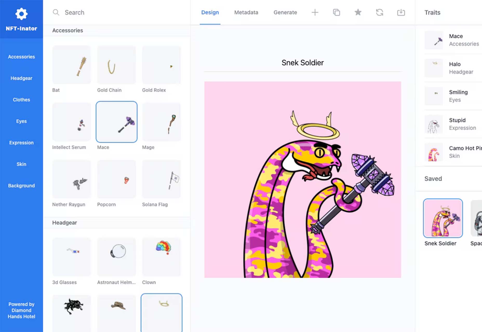
 One of the most talked-about digital elements of the new year leads our roundup of tools and resources this month – NFTs. The NFT landscape seems to be exploding right now and that includes tools for designers to get in on the game as well.
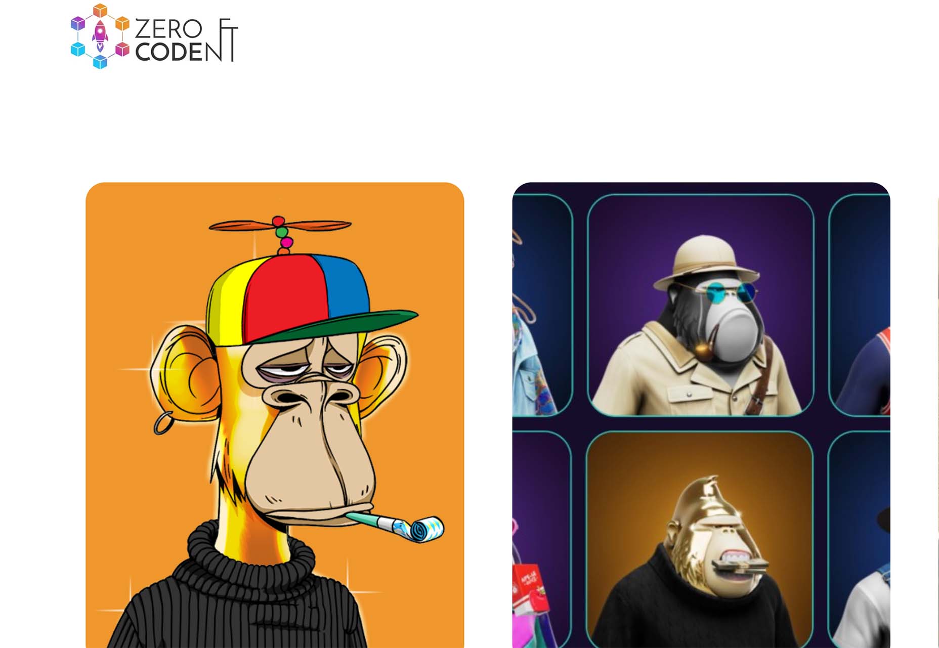


 There are a lot of factors that contribute to a


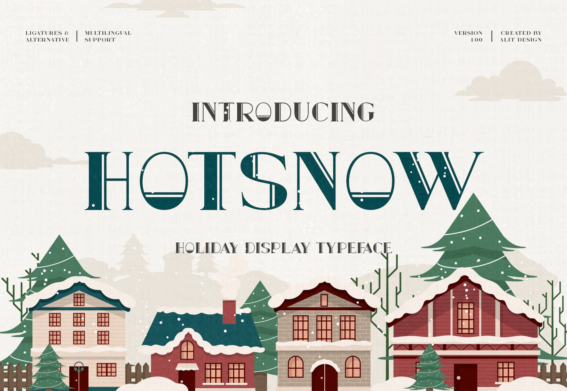
 With the holidays fast approaching, there are plenty of fun gifts for you in this roundup of new tools and resources for web designers. Make sure to share anything you find helpful with others to spread additional holiday cheer.


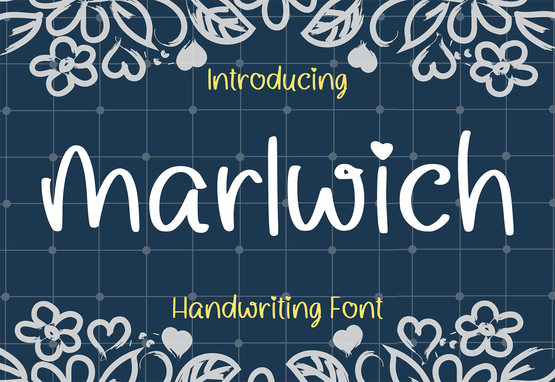


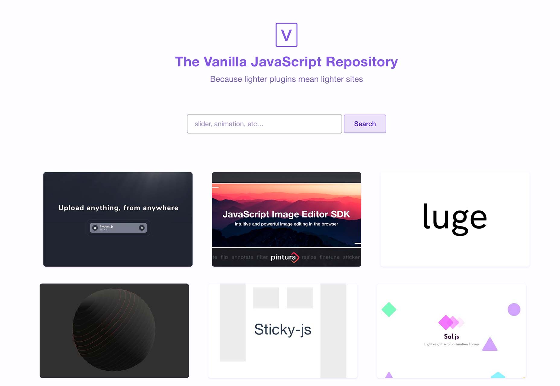
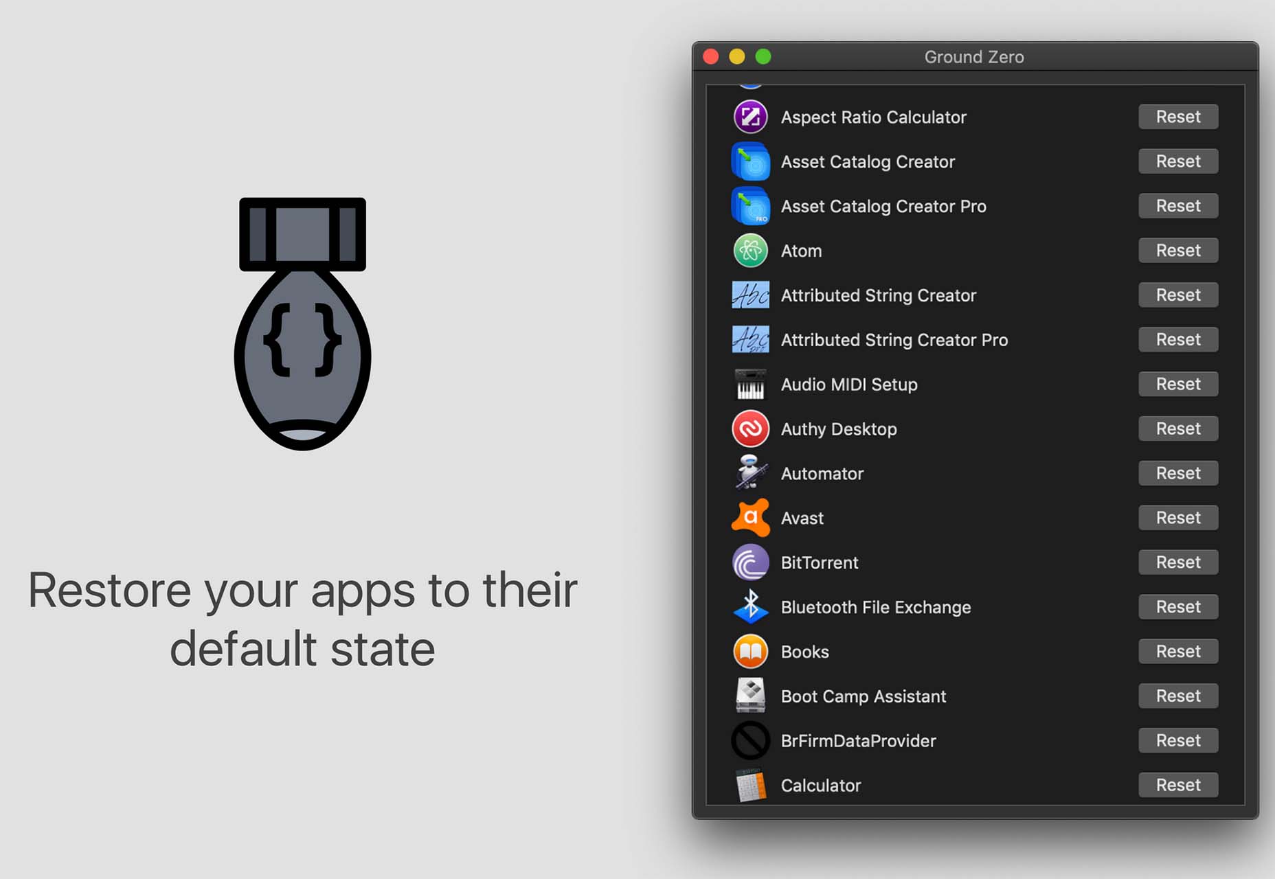
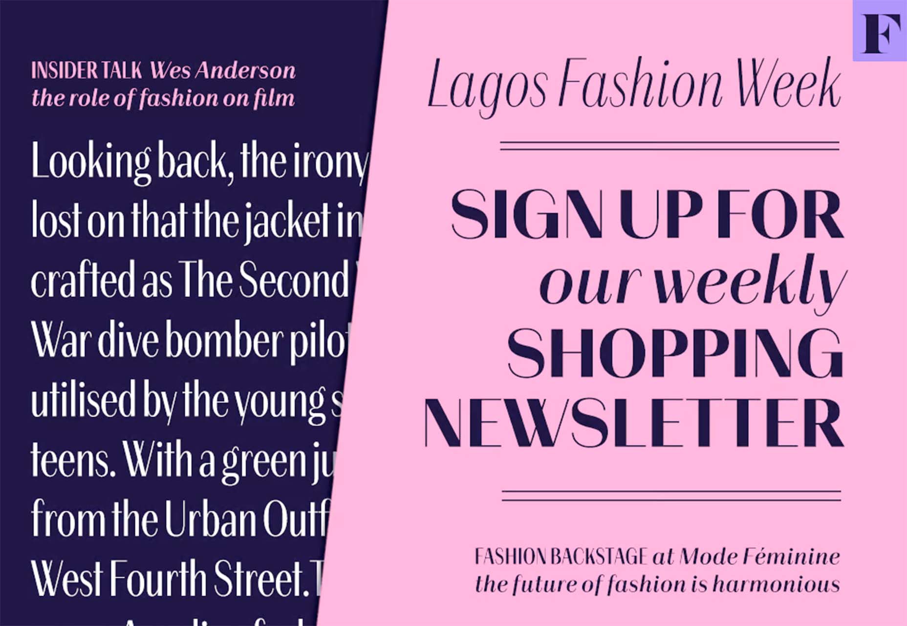
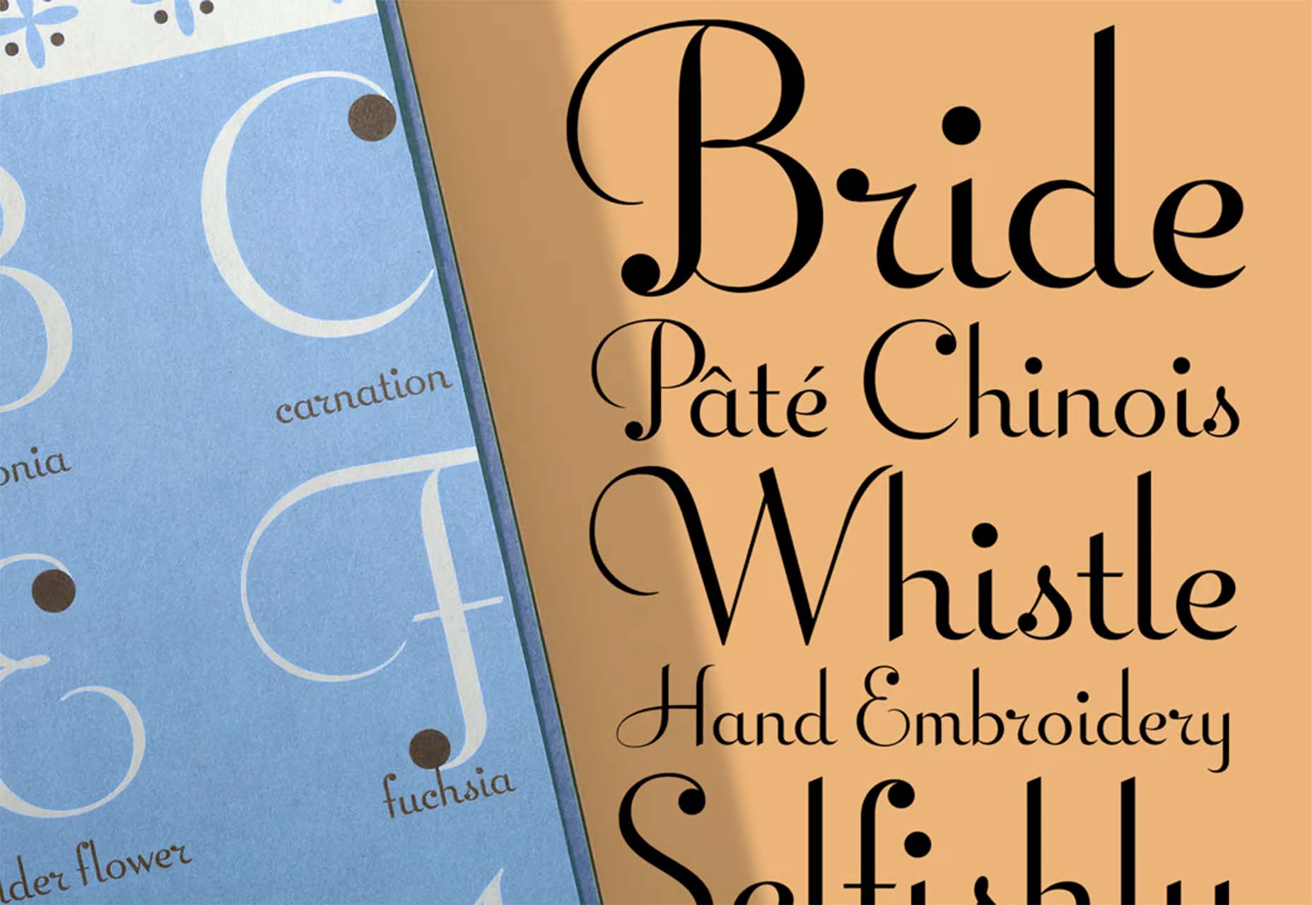
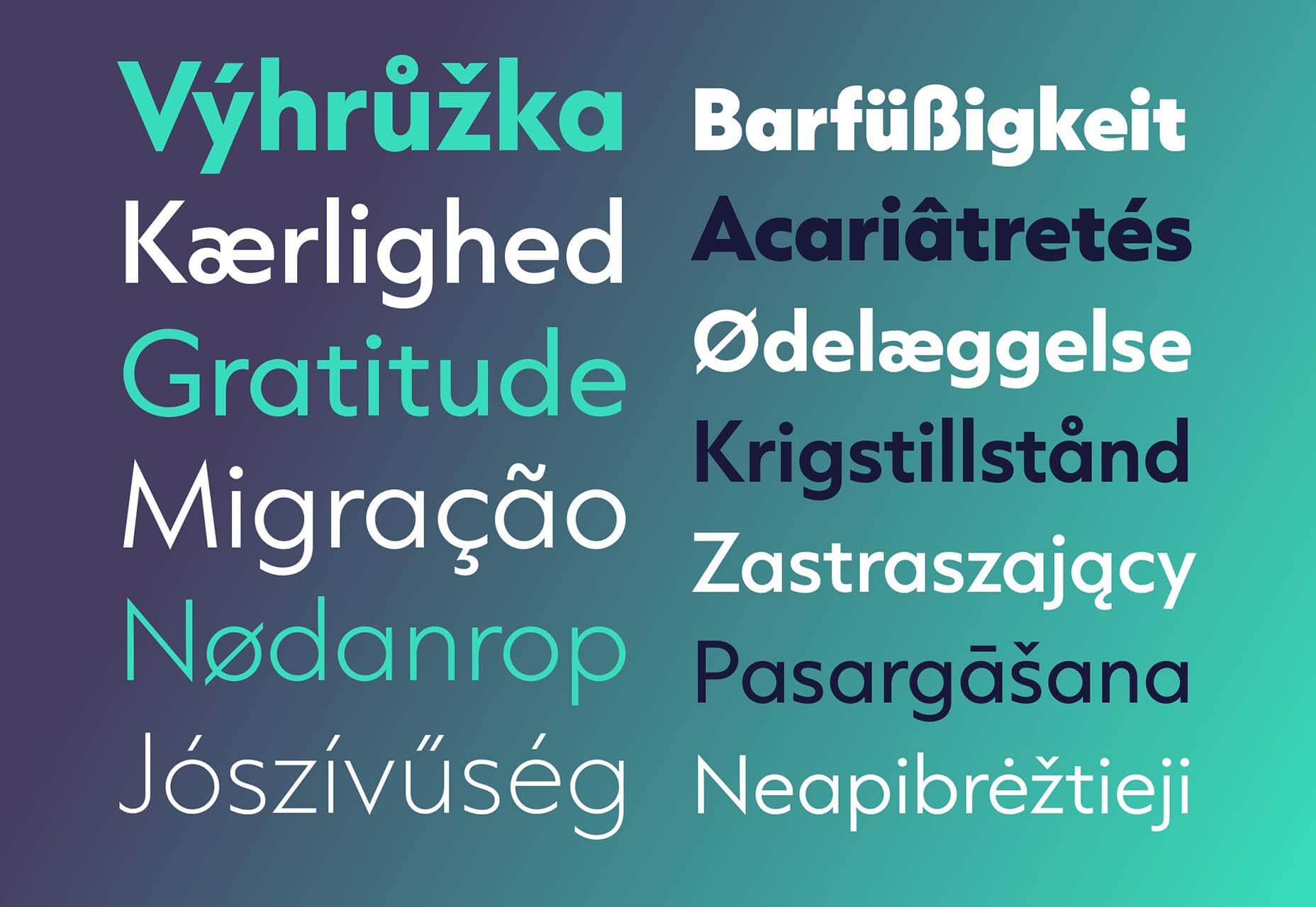
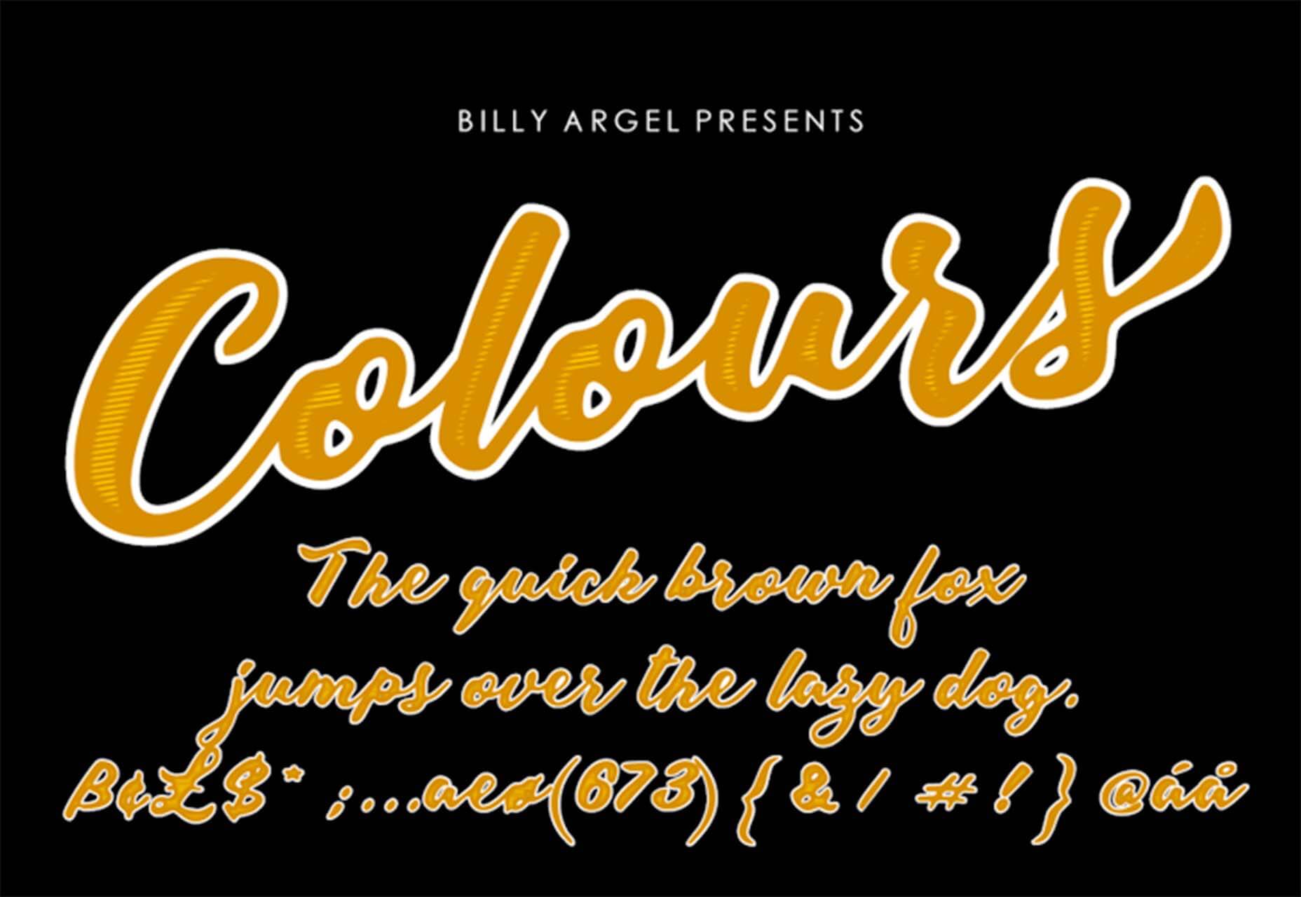
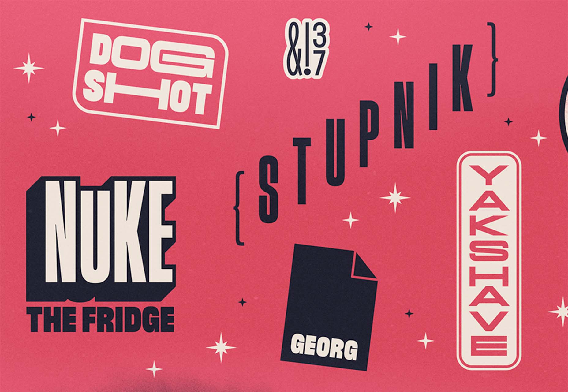
 There are some spook-tacular finds in this month’s October collection of resources and tools for designers and developers. From interesting tools that can help in the design process to boo-tiful typefaces, there’s something for everyone here.


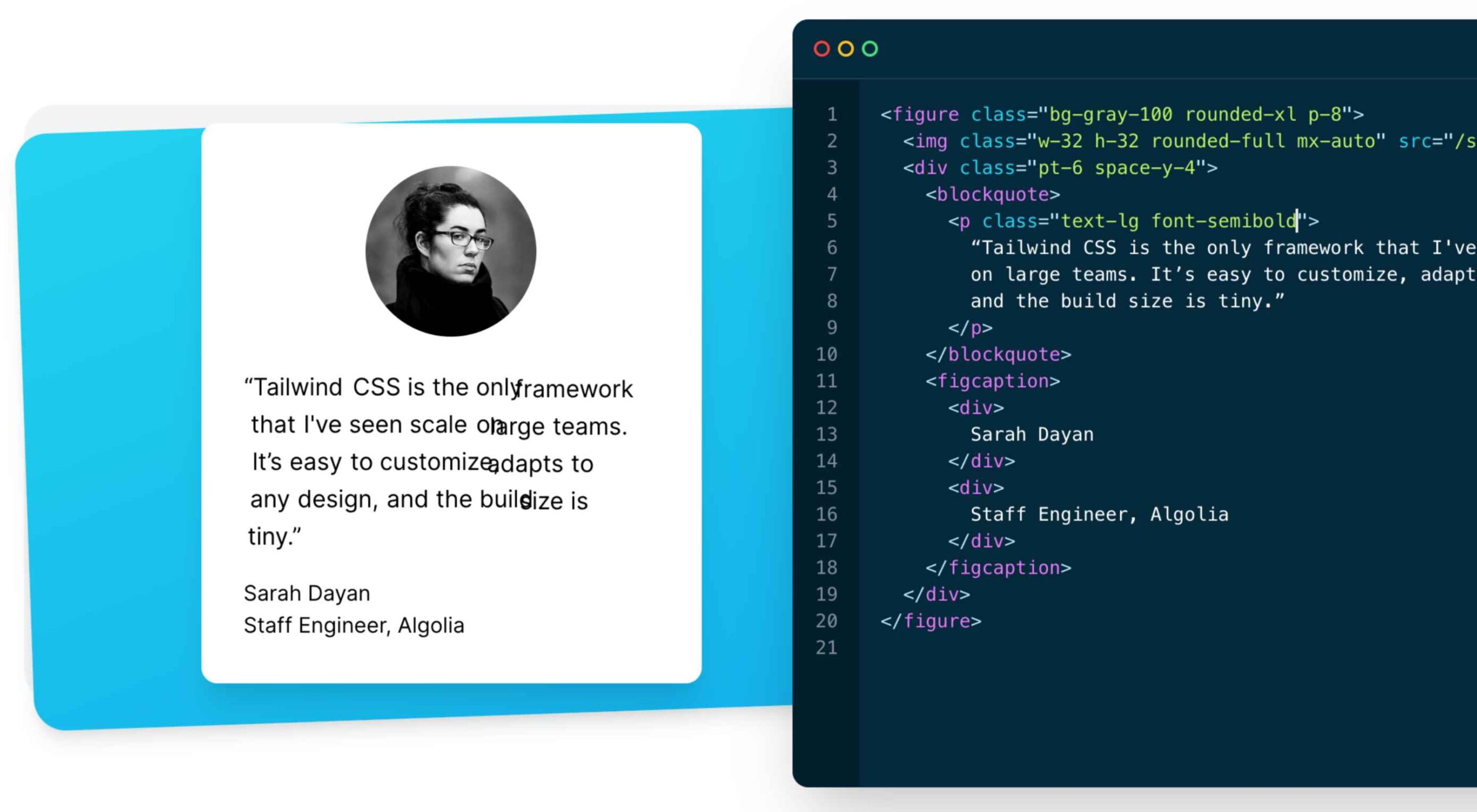 As a utility-first CSS framework,
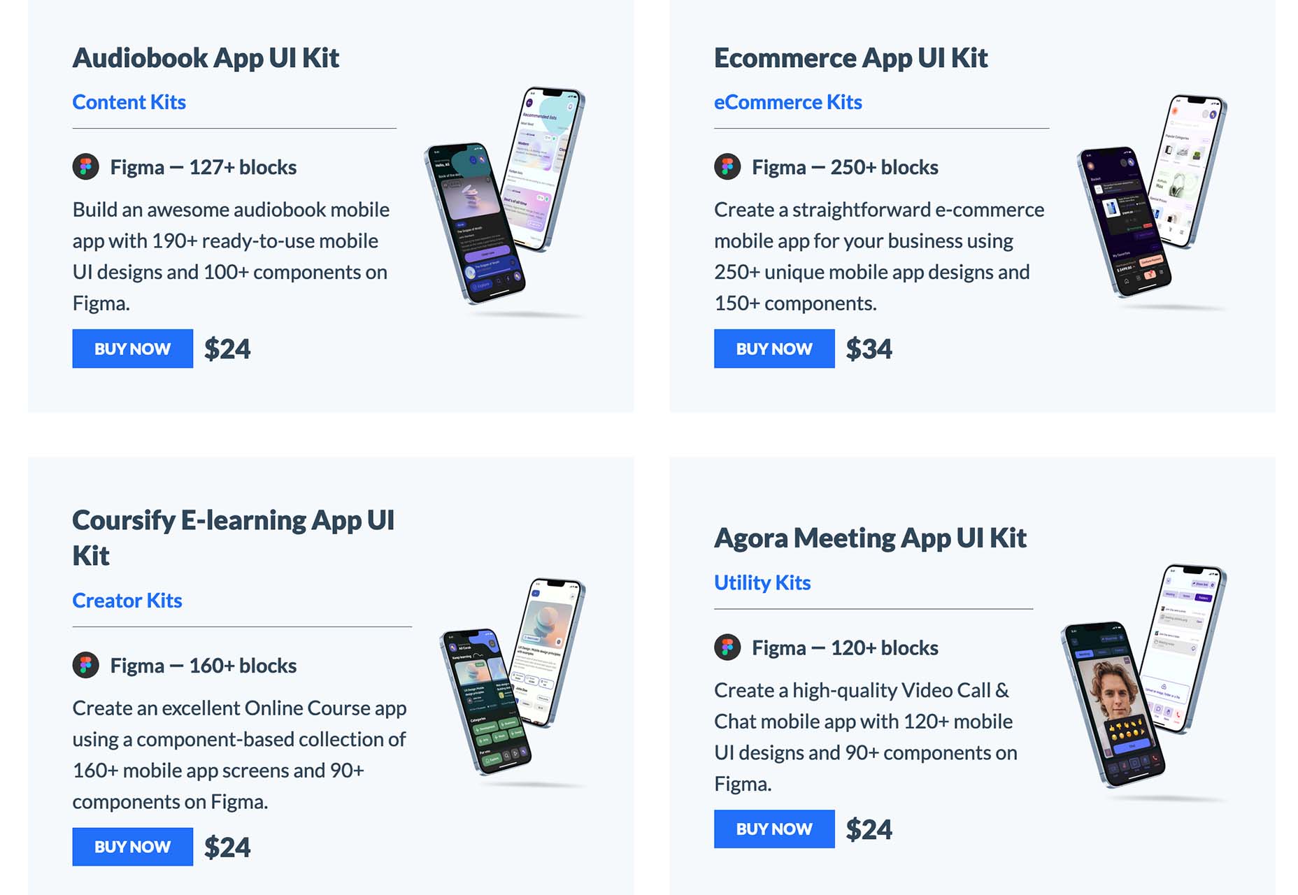
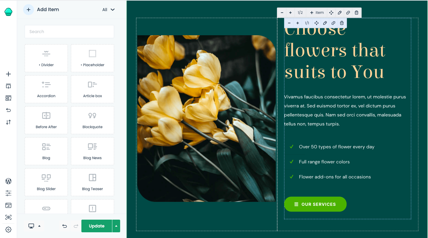
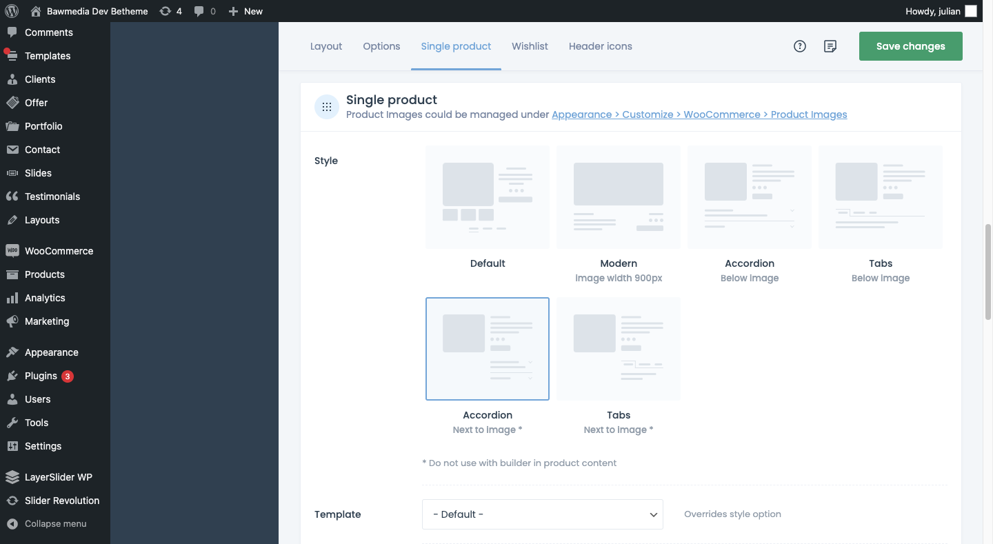
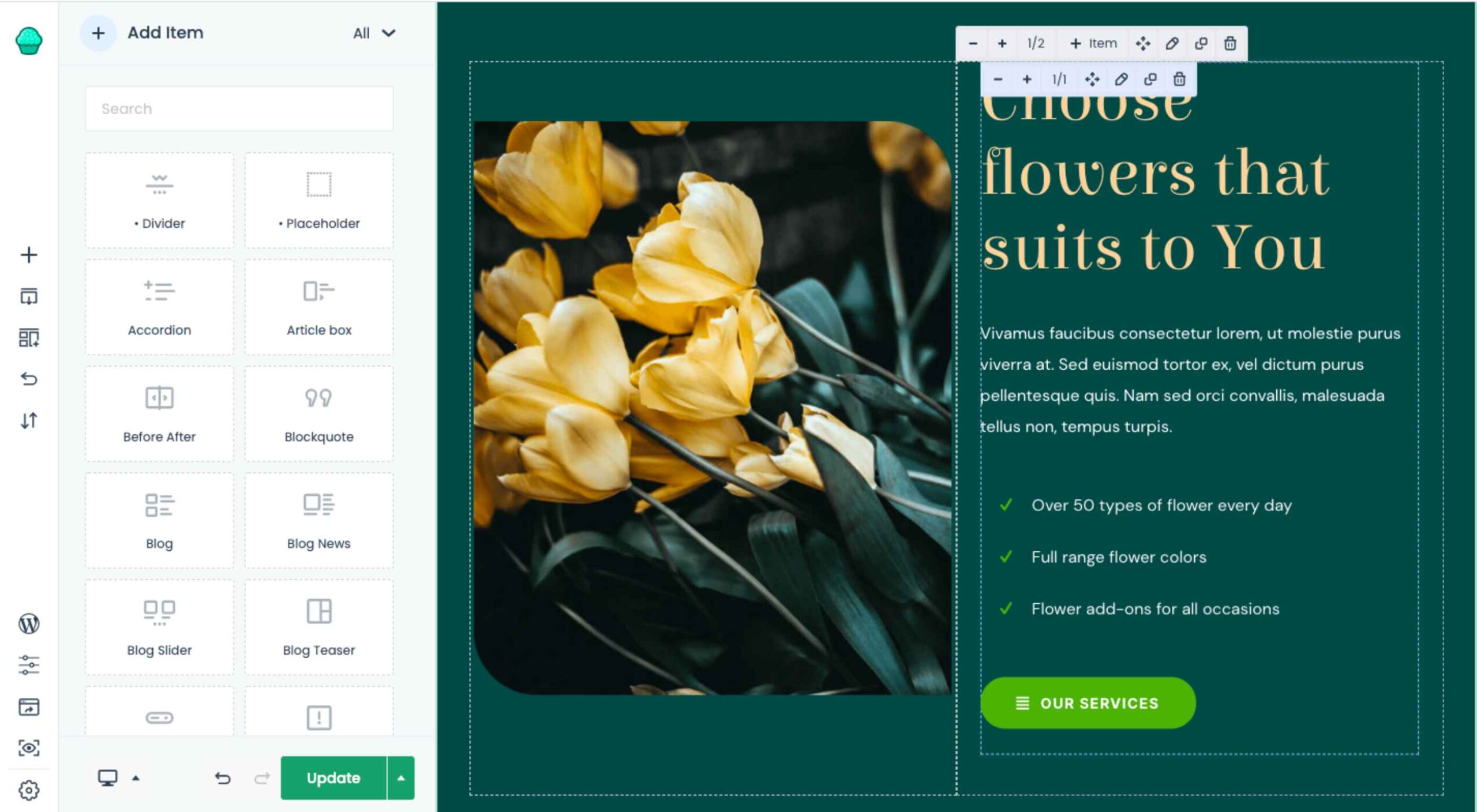 The WordPress themes and plugins you choose for your clients’ sites don’t just impact how the interface looks or how well it works. They also impact your ability to build them.
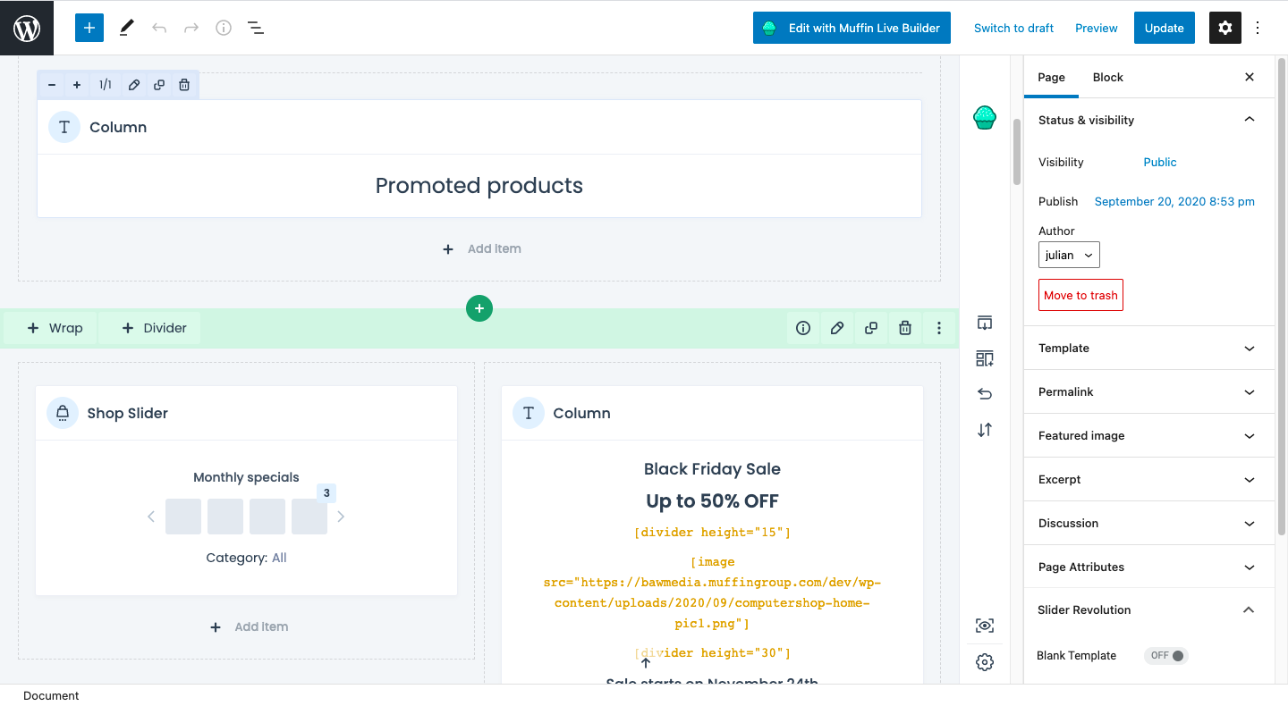


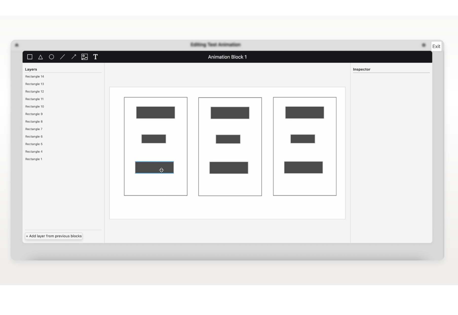
 The world of web design is incredibly dynamic. Every year, new trends and opportunities emerge, primarily driven by the arrival of modern technology.