 Creating an incredible brand experience for an end-user is about more than just designing the right home page or lining up a series of great product pages.
Effective website design conveys crucial information about a company, through everything from font styles, to image choices. Nowhere is this representation of brand identity more important than on the about page.
People frequently confuse the about page with the contact page or fail to leverage it correctly simply because they don’t know what to say. However, creating an about page that speaks to an audience can be immensely powerful.
What is an About Page?
The first step in designing a great about page is understanding the purpose of the space. This isn’t just a page on a website explaining what a company does.
The about page is an introduction to a company’s story, its brand essence, and personality.
Done correctly, this page will demonstrate a crucial sense of affinity between a business and its customers. It will highlight values that resonate with a customer and make it easier for clients to trust businesses.
The Yellow Leaf hammocks company starts its about page with a video.

As you scroll through the interactive site, you discover new elements of the company’s tale, including what prompted the birth of the business to begin with and the brand’s mission.
Yellow Leaf lets its visitors know what the company is all about by using authentic images of real people to external content and bold quotes.
There are even snippets from customer case studies for social proof.
About pages are relevant because they give customers a way to build a real human connection with a business. Harvard professors say that 95% of purchasing decisions are emotional; we don’t buy things just because we need them. Instead, we look for companies that we feel connections with to solve problems.
Using an about page to convey an attitude, personality, or just what makes a business special is how designers can ensure that end-users will care more about the business.
How to Make an About Page Stand Out
So, how do you make an about page stand out?
Since every company is different, there’s no one-size-fits-all strategy for everything. However, there are a few essential steps to consider as you move through the design process.
Here are some pro tips for successfully attracting attention with the about page…
Step 1: Decide What to Include
It’s tempting to assume that a complicated about page will lead to a stronger relationship between a brand and its customers. After all, the longer the story, the more the customer knows about the company – right?
While it’s essential to include plenty of valuable information in an about page, it’s also worth remembering that today’s customers are short on time. They don’t want to spend hours scrolling through one part of a website. Instead, they want access to quick, convenient snippets of information.
The Joseph Payton about page is effective because it cuts the story down into bite-sized chunks. Each piece of information highlights valuable insights for the customer. Plus, hand-drawn images and animations make the experience feel like you’re getting to know Joe on a deeper level.

Before you begin designing, ask yourself:
- How much text does the page need? How much space does there need to be for copy? How can you spread the content out in a visually engaging way?
- What sections should the page include? For example, does there need to be a link to the contact us page or a contact form somewhere?
- How does the page connect to the rest of the website? For example, can you link to things like case studies and reviews with quotes to tie more of the website together?
Step 2: Make the Mission Statement Clear
In a world where emotion influences buyer behavior, clients and customers want to buy from companies they believe in. It’s not enough to have the right product or price point anymore. People want to know that they have a human connection with a business.
On some about pages, it’s difficult to pinpoint the real mission of the company. It seems like you have to scroll through endless paragraphs of text to make your own assumptions about what matters to the company. However, a well-designed about page puts this crucial info front and center.
For instance, on the Apptopia about us page, the subheading tells you everything you need to know about the brand. This heading instantly tells the audience whether it’s worth reading on to find out more.

The best about us pages often include a lot more than just a single sentence of text. But it’s worth pinpointing some of the essential details from these pages and drawing extra attention to them. A larger font or a different font color could be perfect for this purpose.
Alternatively, if it’s difficult to refine the company’s mission down into one message, it might be worth creating a whole segment at the top of the page dedicated to this information. That’s what the Toms shoe company does.

Step 3: Invest in the Right Trust Elements
People aren’t always sure who they can trust these days.
There are millions of websites out there and billions of companies. Not all of them are going to appeal to every customer. Since an about page is all about making a crucial human connection between a business and its client, it’s important to implement as much trust as possible.
The good news is that there are many trust elements you can embed into an about page to make it more reputable. Star ratings taken straight from companies like Trusted Reviews and Google are a great way to show that a company is already impressing its followers.
Quotes plucked from your customers or segments of case studies that you can place throughout the About Page copy is another great way to show your authenticity.
You could even take the same approach as Aja Frost here and embed genuine data and graphs into the about page.

One particularly helpful way to make a website’s about page more trustworthy without eating up too much space is to implement trust stickers. Badges that show all the right groups and regulators approve a company are a great start.
Even showcasing the logos of companies that the business worked for before on a slideshow could be an excellent opportunity to add depth to their authority.
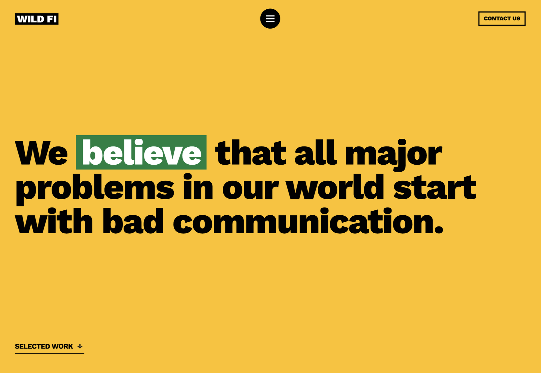
Step 4: Convey Brand Personality
Brand personality is reflected in the tone of voice that a company uses for its content. You can see a company’s personality in the choice of colors it has on its website. It’s in the fonts that convey a message, and the videos, images, and other unique strategies that each business uses.
Although a brand personality needs to shine through in everything the company does, it’s imperative on the about page. This is the environment where a customer is getting to know a business for the first time. As a result, the consumer should instantly recognize what kind of brand archetype they’re working with.
Take a look at the Eight Hour Day about page, for instance. The first thing you see is a picture of two people laughing. That means you instantly get a sense of friendliness.

As you scroll through the page, you’re greeted by friendly, informal copy combined with bright colors and snippets of useful information. Everything feels comfortable and reassuring.
When you reach the bottom of the page, you find a bunch of data that makes the company seem more trustworthy. There are links to its social media pages and a partial client list showcasing brands like JCPenny, Wired, and Purina.
Using the right combination of font, copy, and imagery, this About page tells you exactly what to expect before you begin interacting with the company.
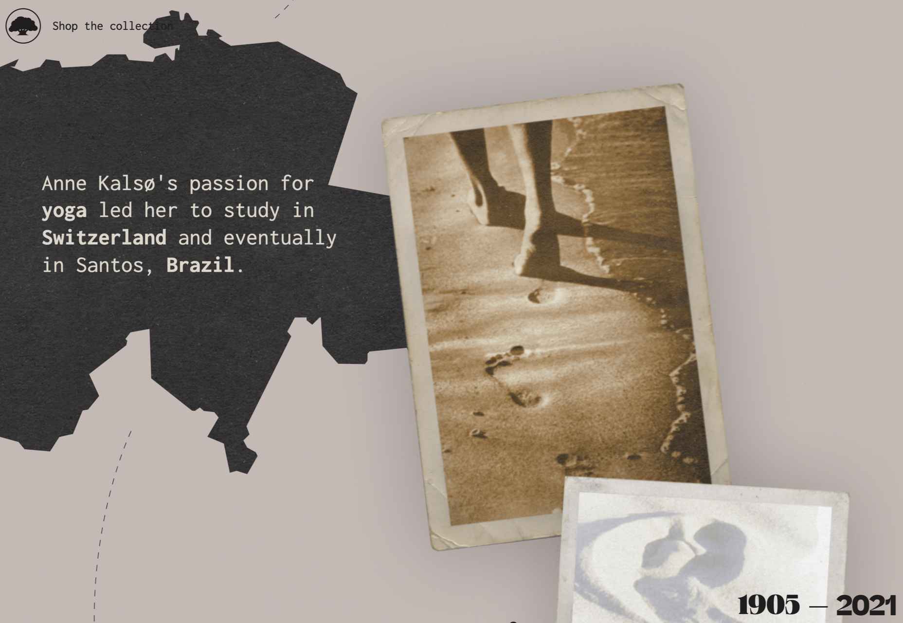
Step 5: Take Visitors on a Journey Through Time
Showing customers where a business is going with things like brand mission statements and values are great. However, it’s also worth giving people an insight into where a brand has already been.
Many of today’s shoppers aren’t comfortable buying from brands that haven’t spent much time in their chosen industry. They want to see that the people they’re working with have experience, heritage, and plenty of background knowledge.
What better way to demonstrate all of these things than with a timeline of accomplishments? Here’s an example of how Marshall showcases its history by mentioning various crucial historical milestones.

A timeline of events doesn’t have to be this complex, however. If you don’t want to overwhelm visitors with a wall of text, an actual timeline that offers quick and easy insights into what the business has done over the years could be a better option.
Another option could be to have a few key statements from the company’s timeline, then link out to a separate “History” page for people who want to find out more.
Step 6: Show the Human Side
People don’t buy from businesses; they buy from other people.
An about page isn’t just a chance to show customers what a company does. It’s also an introduction to the people behind that organization. Showcasing the team members that contributed to the growth and continued development makes that organization more attractive.
Obviously, if there are hundreds or thousands of employees in a team, you might not be able to mention them all on an about page. However, the page should generally include some insights into the c-suite and significant members of staff.
A selection of company photos is a good way to introduce your team. However, you can consider other options too. For instance, to maintain their unique brand, the Tunnel Bear team designed to draw their own bear icons that represented their personalities.

The design is adorable, and it’s a wonderful way to showcase what makes the company so unique. At the same time, using this kind of illustration means you can avoid the hassle of trying to get all of your business photos to look consistent.
Step 7: Show Values with Visuals
Finally, as we’ve mentioned frequently throughout this guide, an about page is an essential place to showcase the values of your business. These are the core principles that guide you in everything that you do. They help tell customers what matters most to you and prevent you from moving in the wrong direction.
However, you’re not restricted to highlighting your values through copy and nothing else. You can also introduce customers to the things that matter most to you through visuals too. Graphics or illustrations that highlight important aspects of your business are a great way to share information without relying too heavily on text.
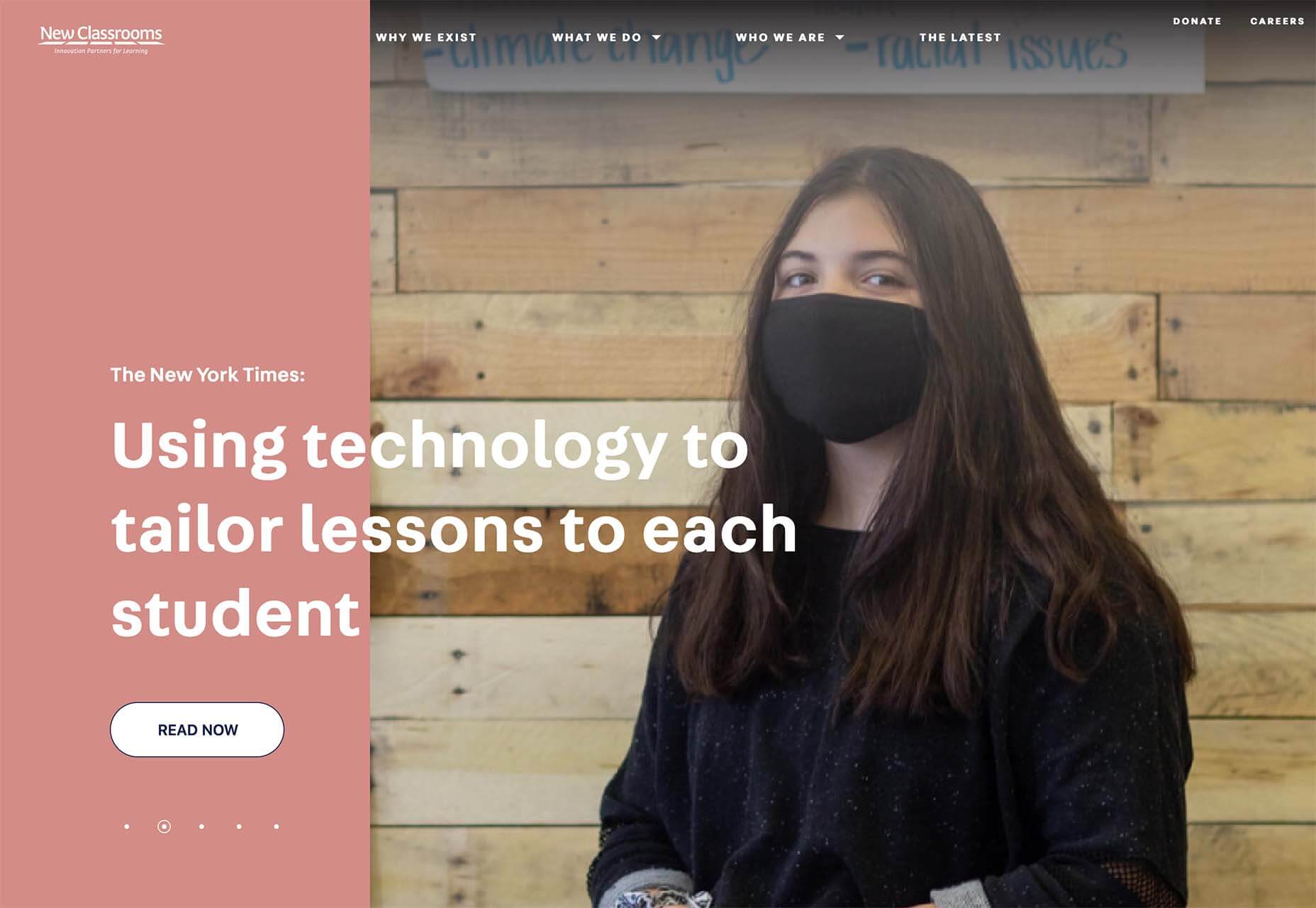
Videos are another brilliant option, particularly if you have a lot to say but not a lot of time to say it in. That’s what Ben & Jerrys does.

You can also find a stream of “issues” the company cares about on the website too. This means that people can get more information on things like Democracy, Racial Justice, Fair trading, and what Ben & Jerry’s is doing about all of those things.
Visual elements like this are a great way to give an about page more pizazz. Plus, they appeal to people who want to learn about your company but don’t want to spend forever reading through the text.
Create Better About Pages
An about page shouldn’t be an afterthought.
It’s a crucial part of showcasing a company’s unique style and personality. Used correctly, these pages convey crucial information about everything a business stands for.
Use the tips above to give more meaning to your about page design, and remember to pay attention to how much your traffic and conversions evolve with every update you make. A better about page could even help you to drive more conversions.
Source
The post 7 Essential Design Tips for a Killer “About Us” Page first appeared on Webdesigner Depot.

Source de l’article sur Webdesignerdepot

 As the year begins to wind down, there are still plenty of new and evolving website design trends going strong. Much of what you’ll see this month carries over from things we’ve been seeing all year but with fresh touches.
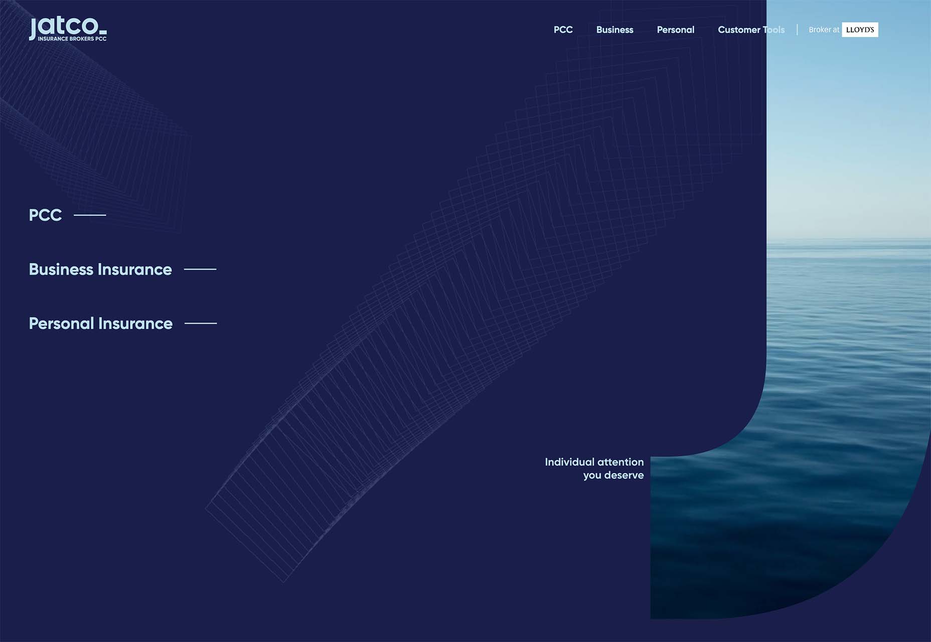

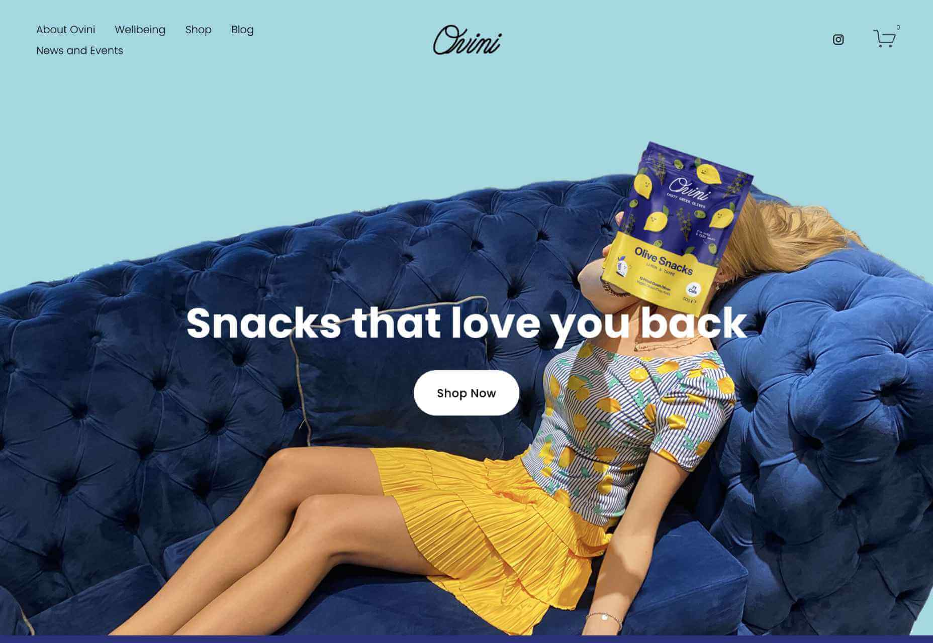
 We’re well on our way to Hallowe’en already, and it’s time for another collection of websites that have caught our eye.
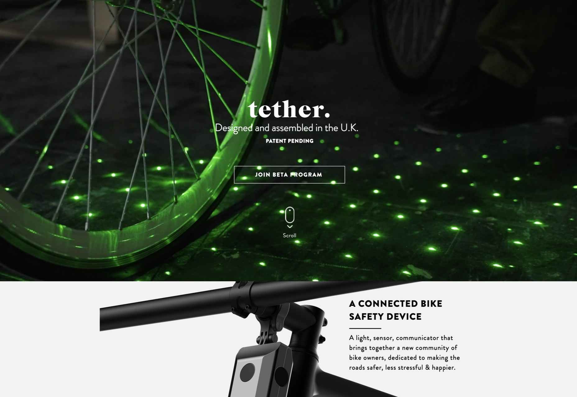

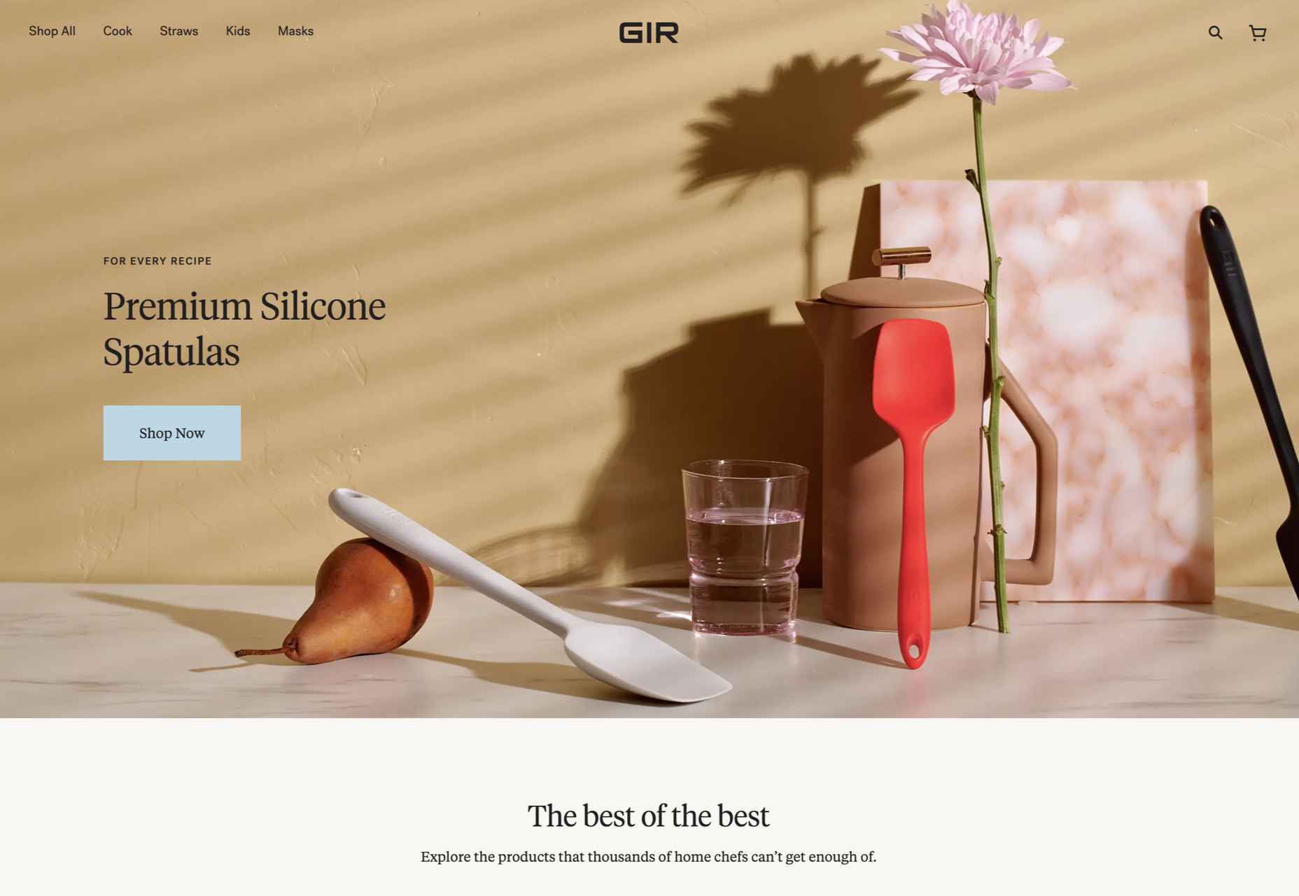
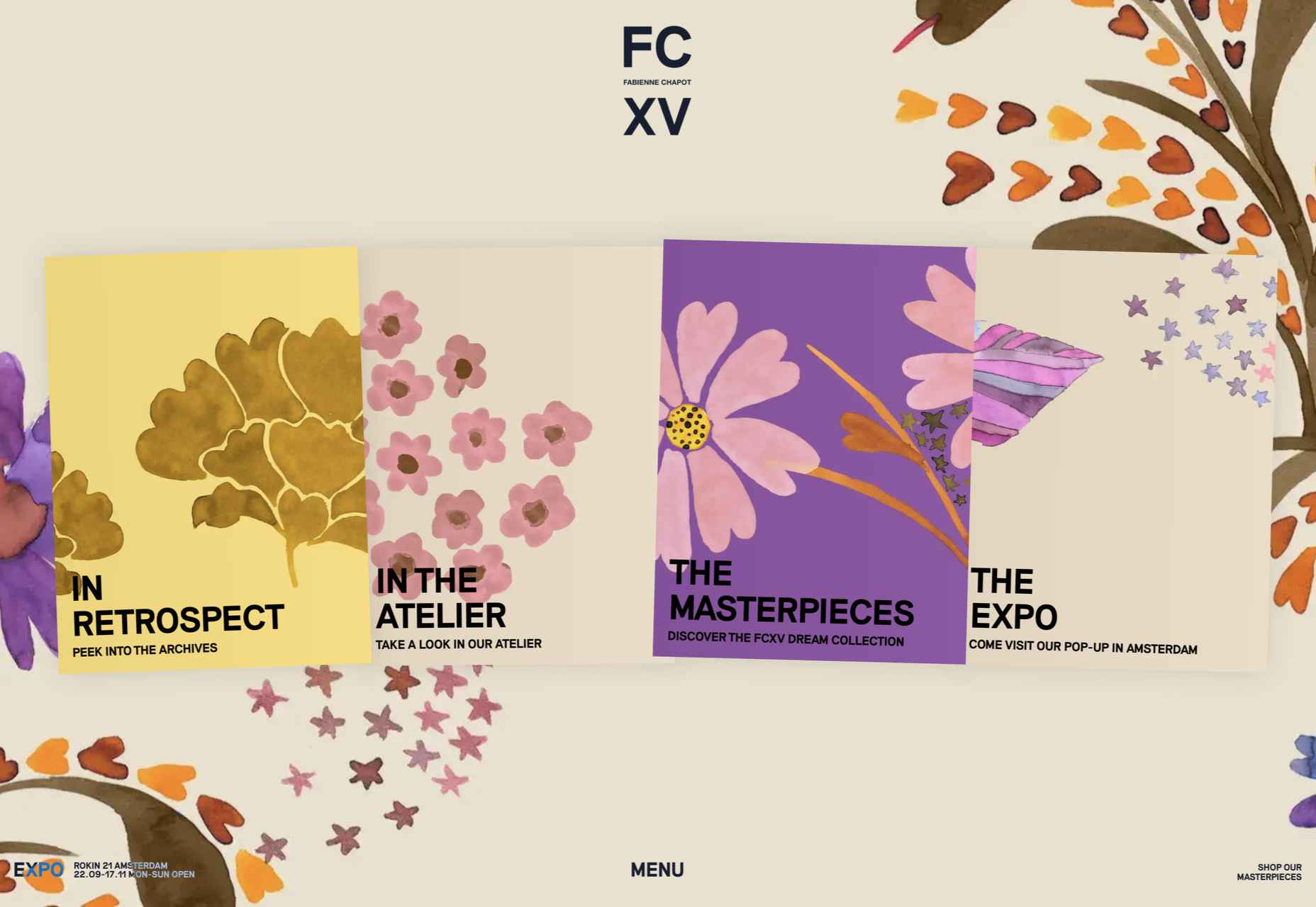
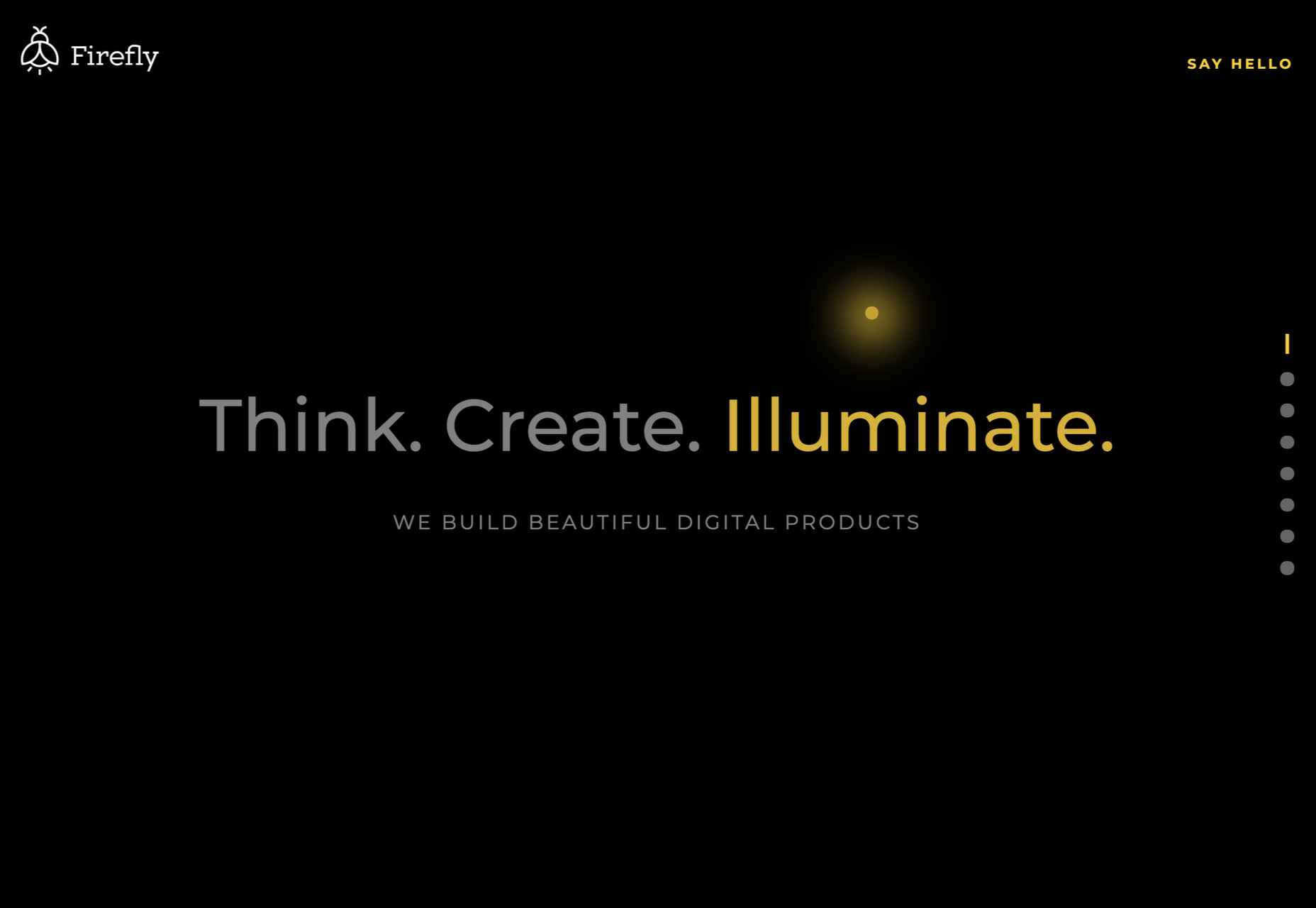

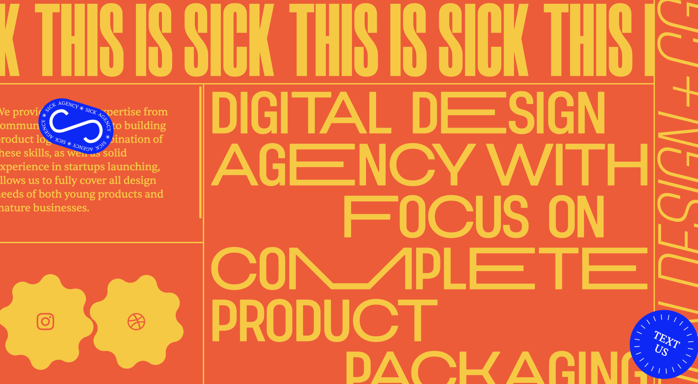
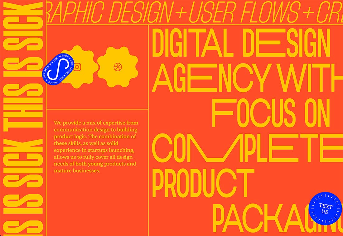
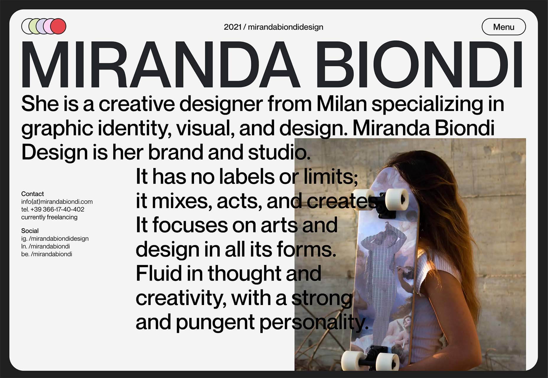
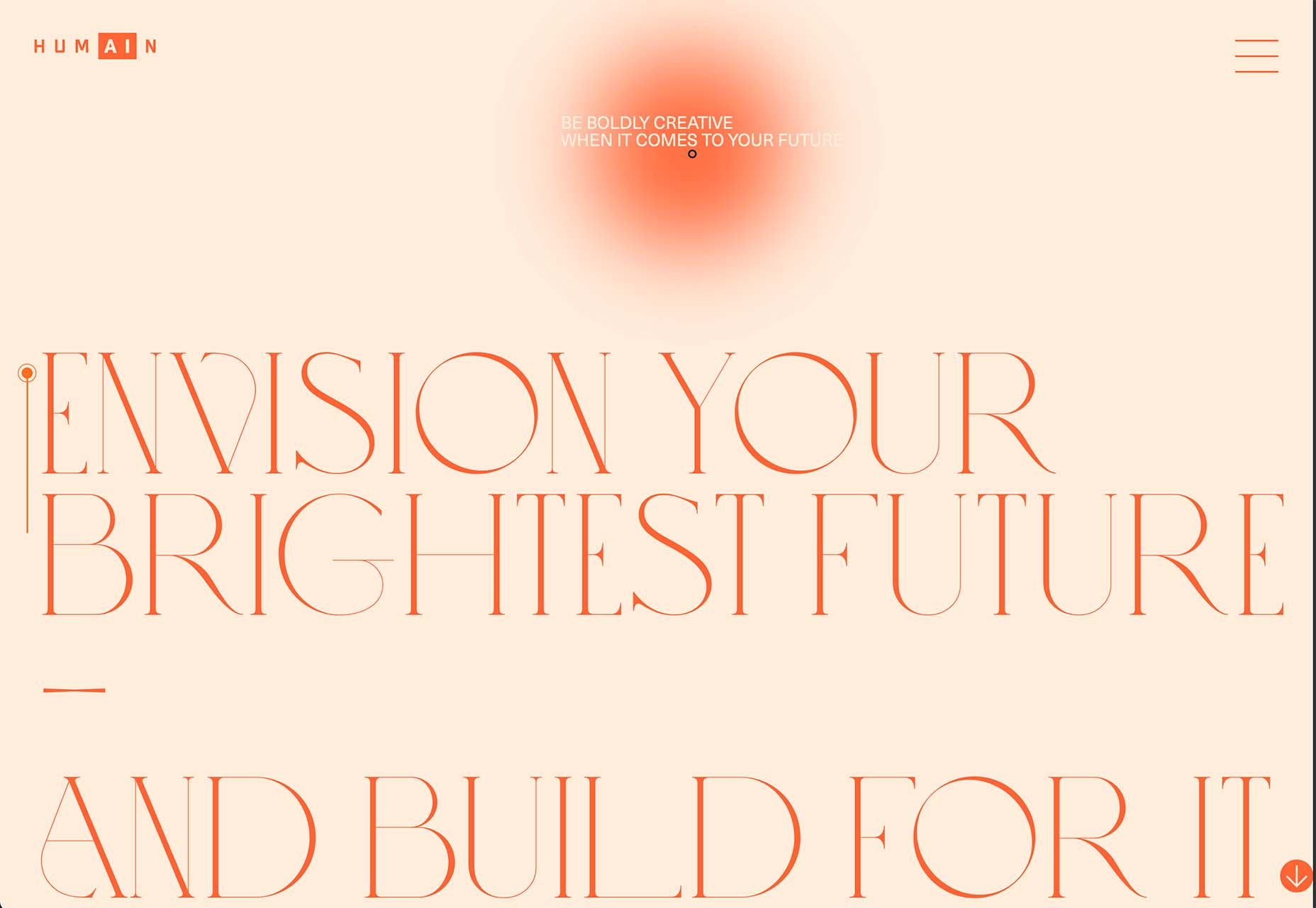
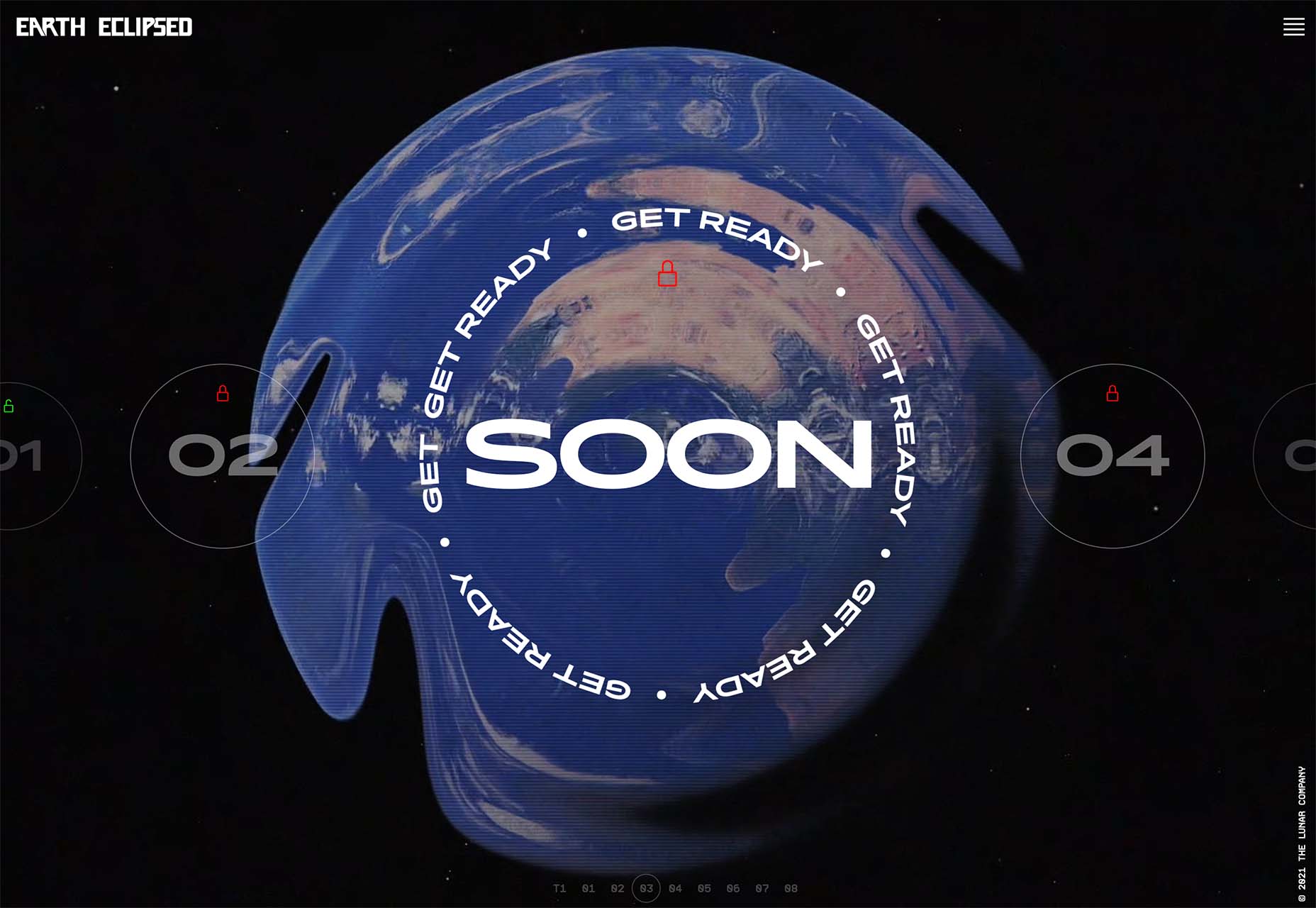
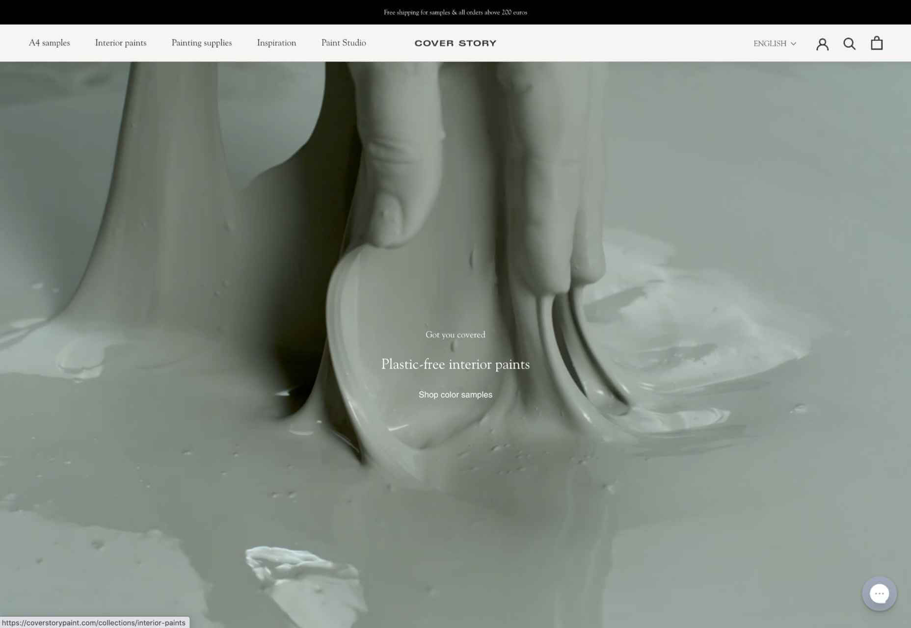
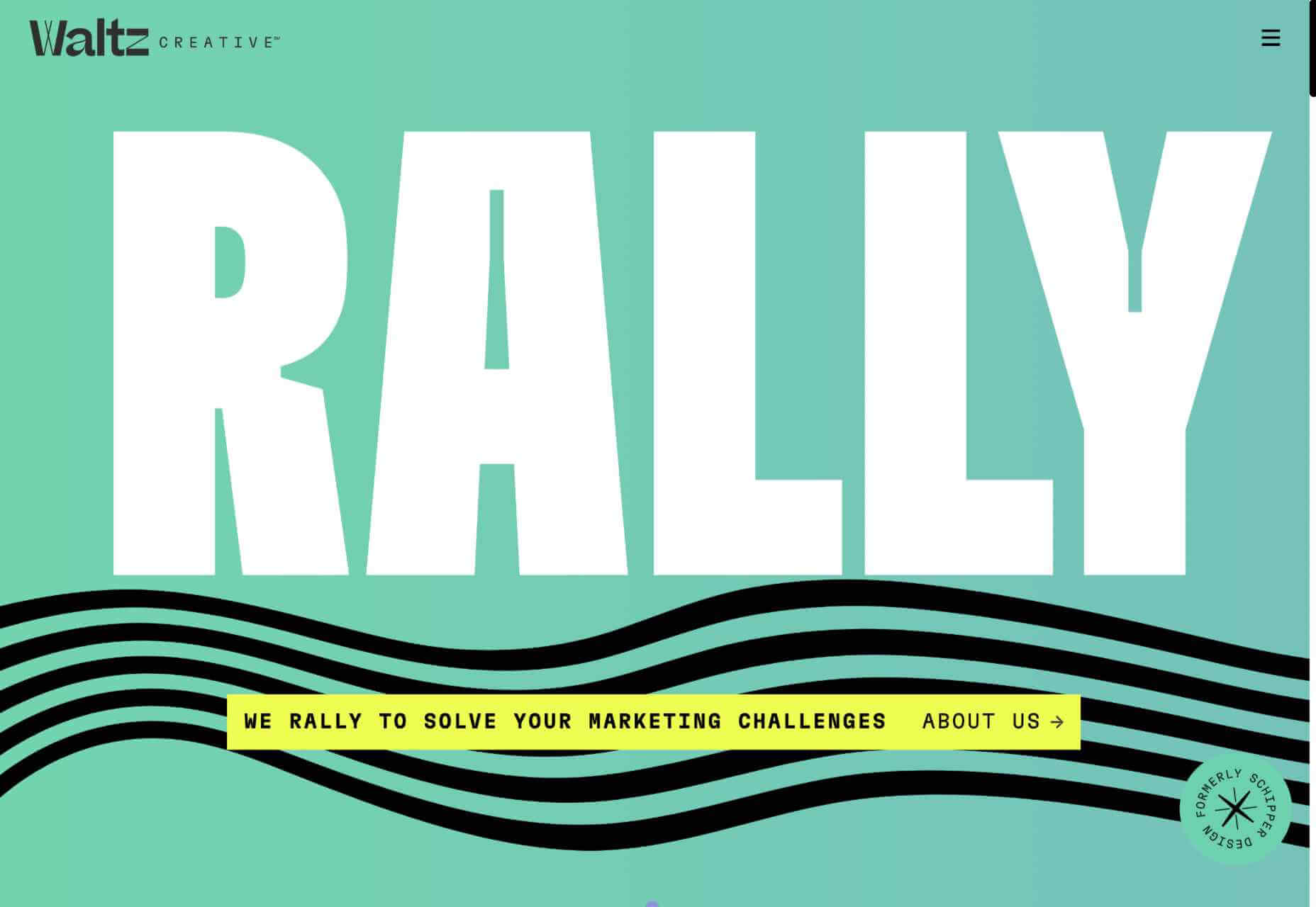
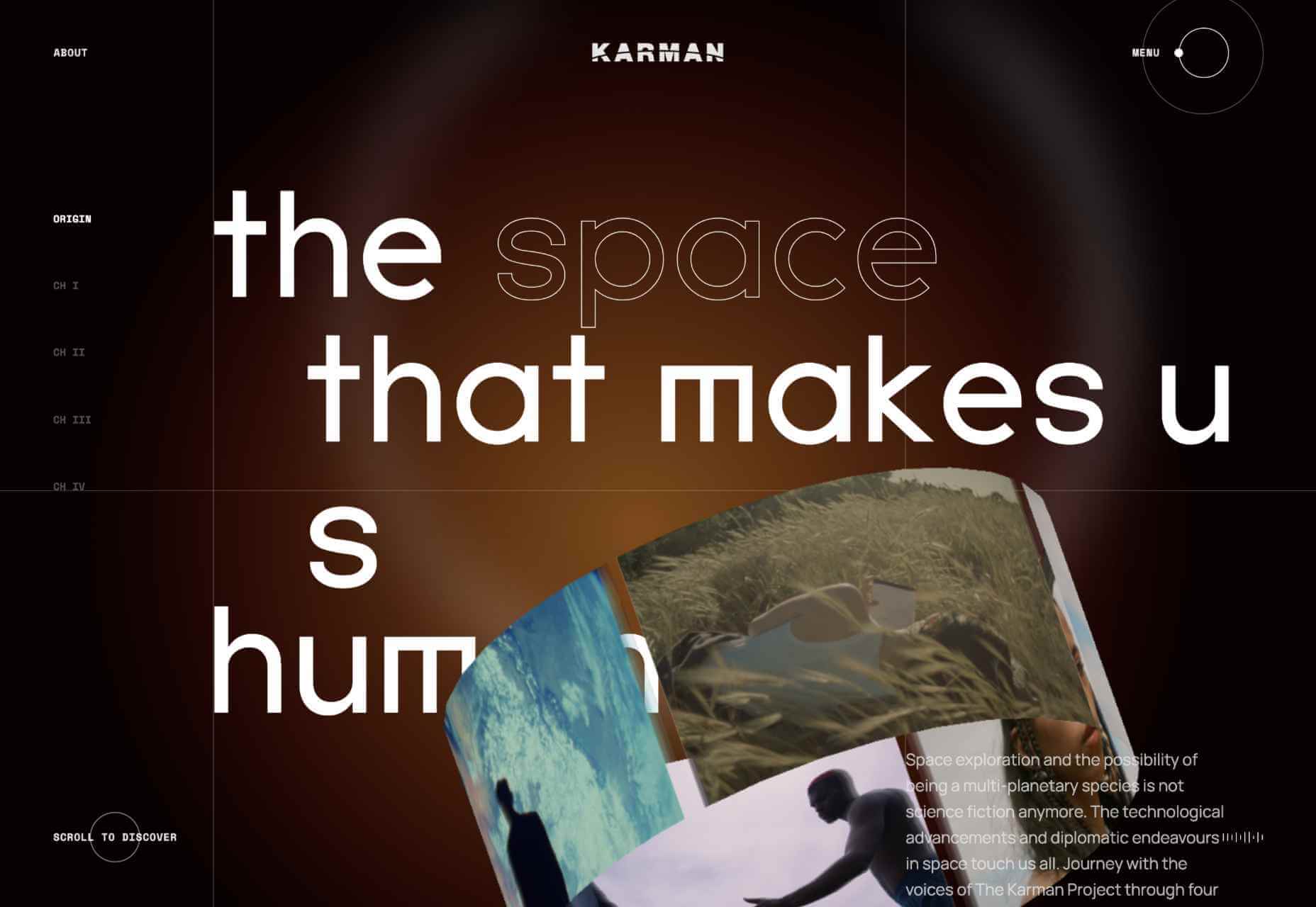
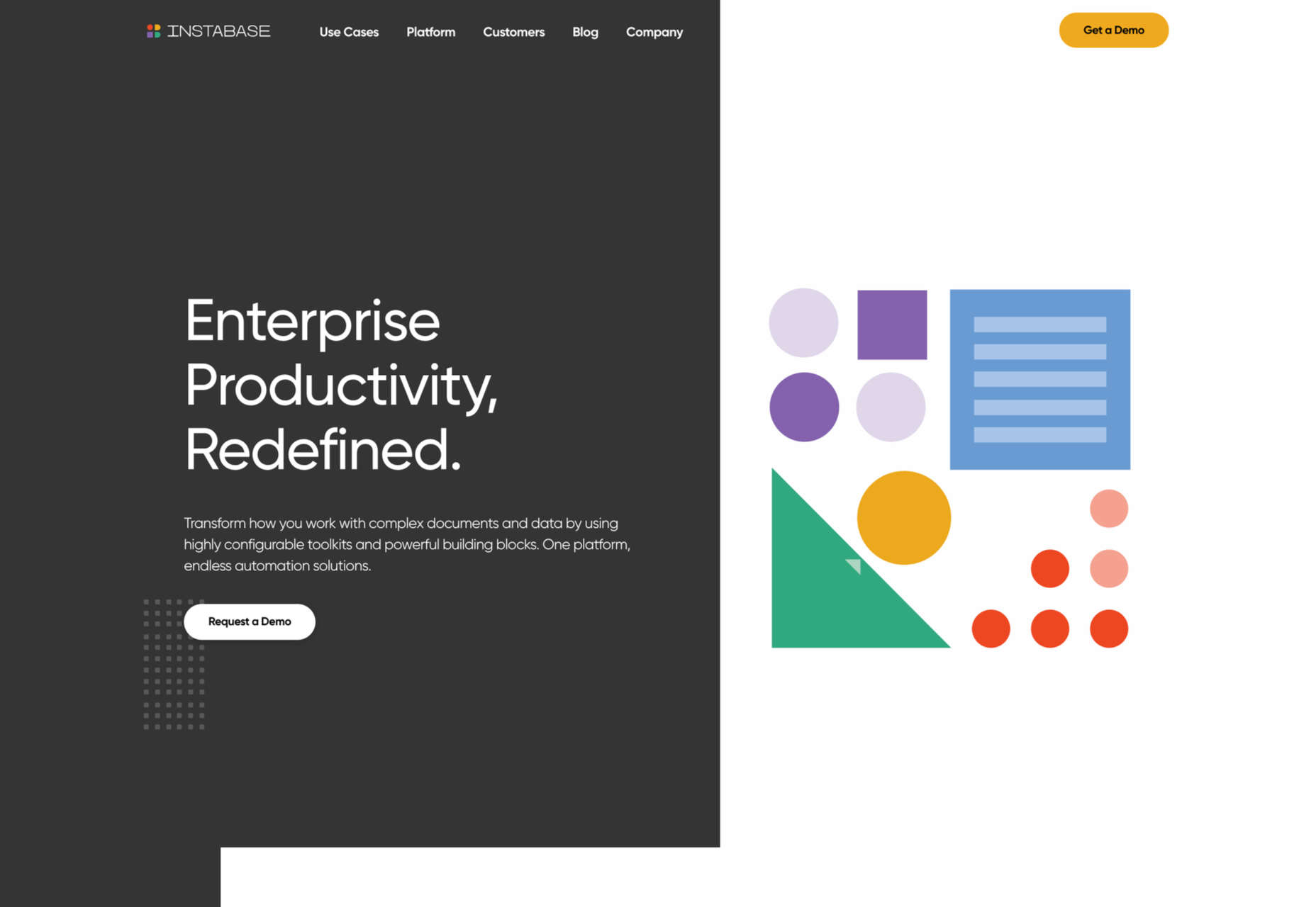
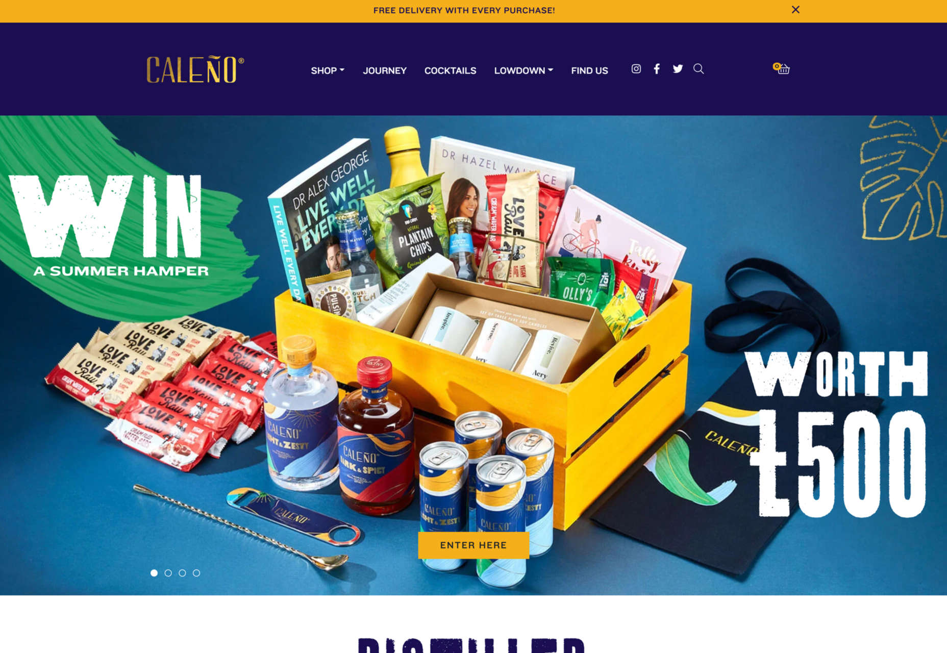
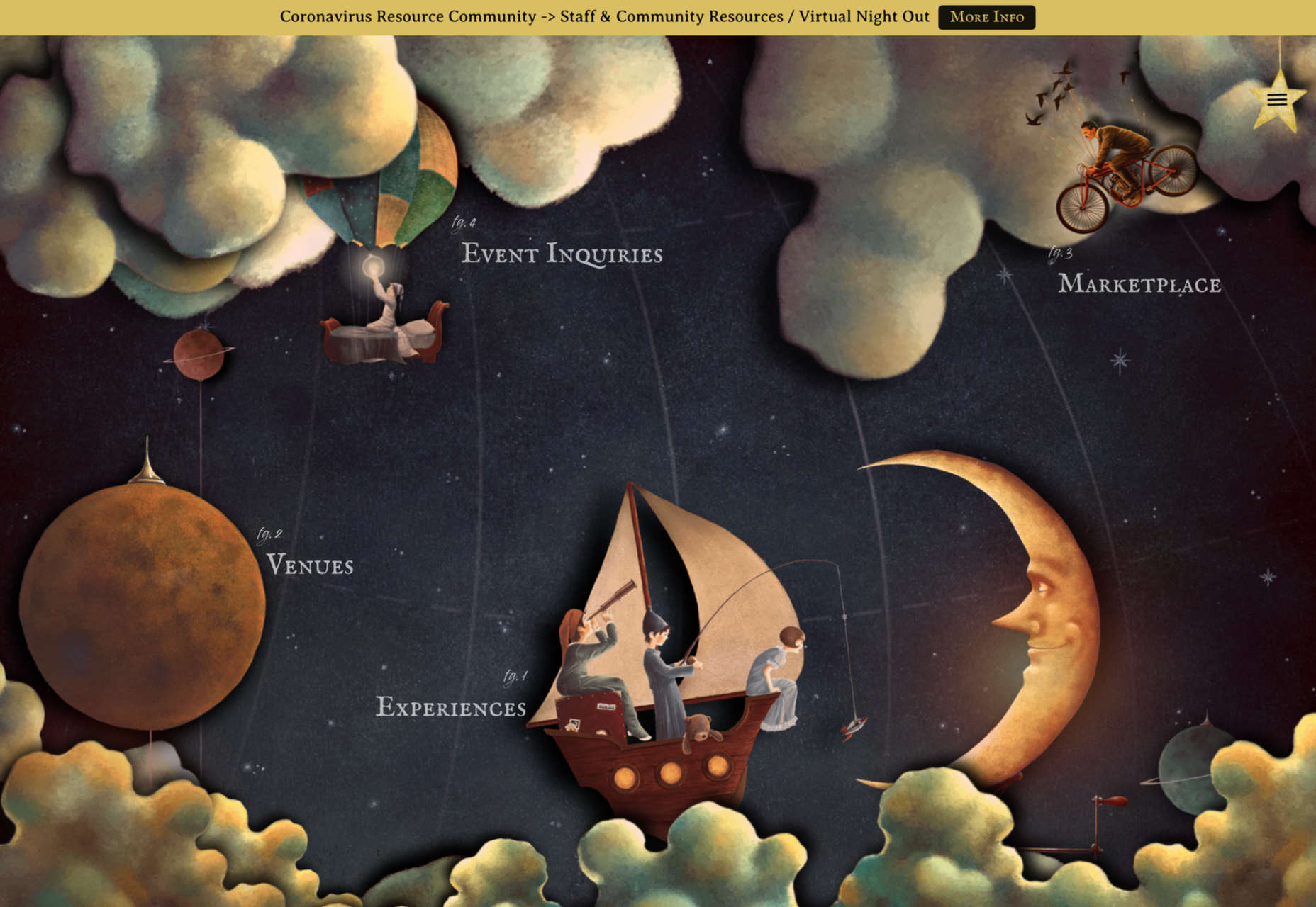
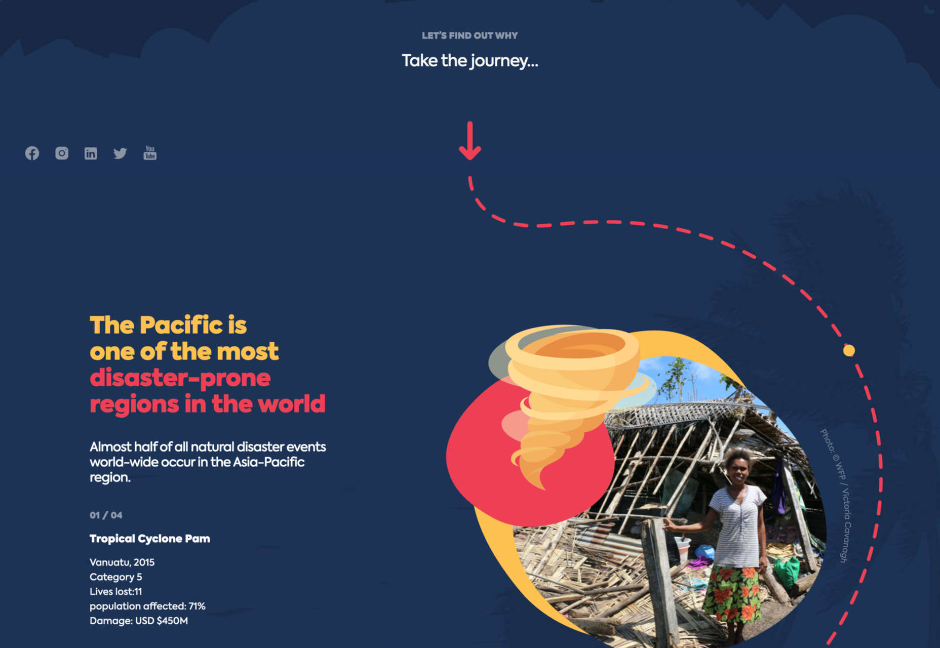
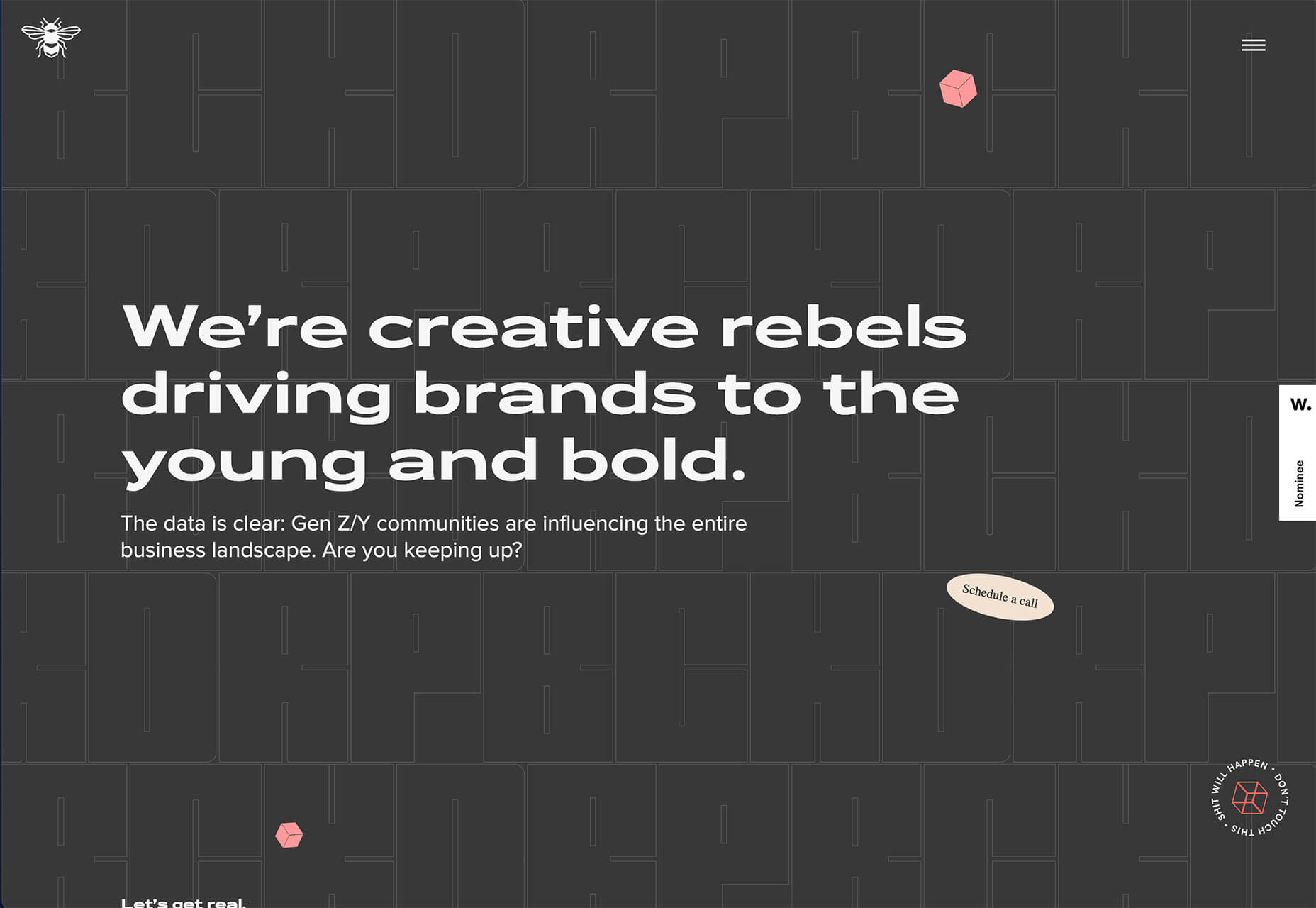
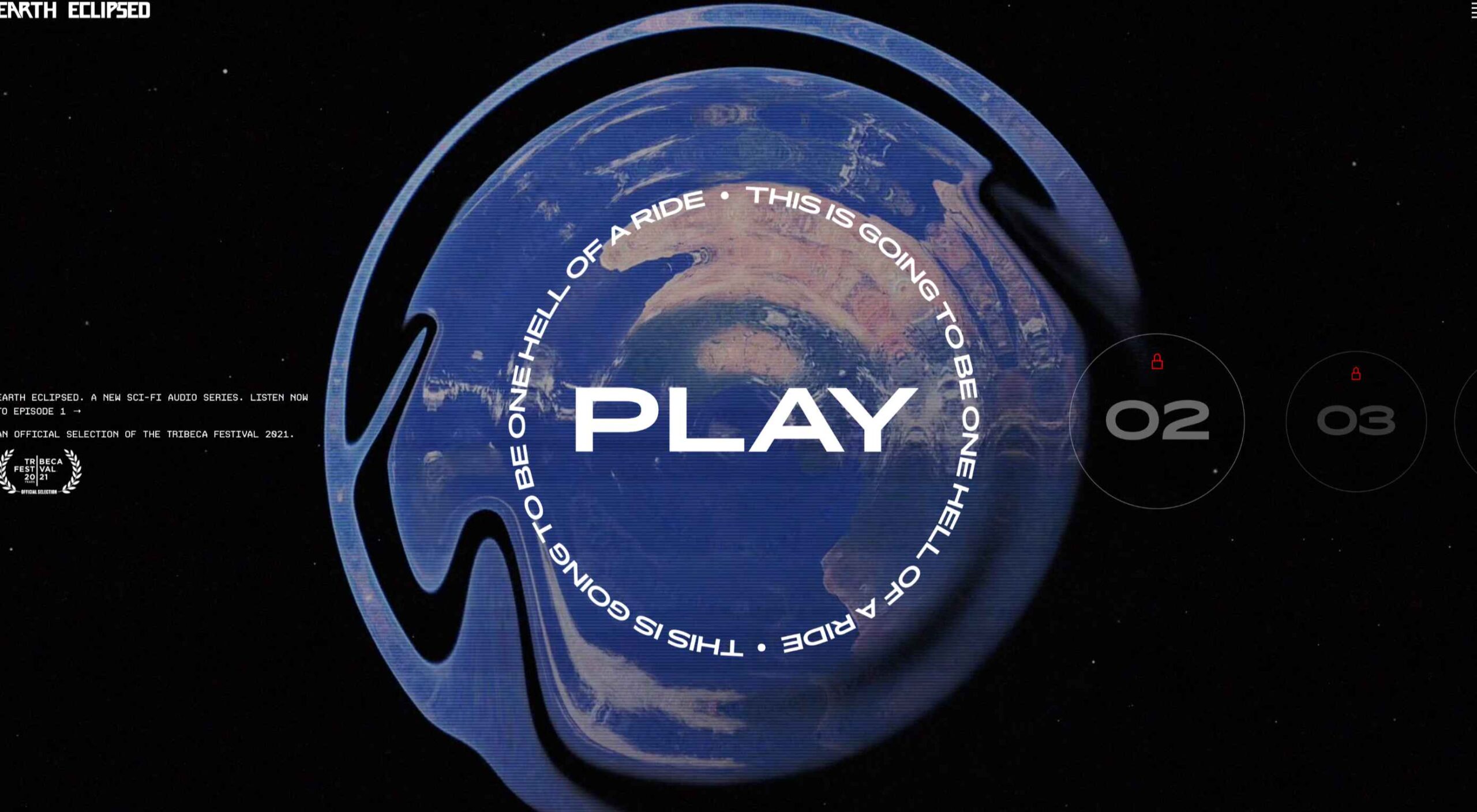 Design trends on top of design trends. This theme of this month’s collection is trends that seem to build on each other. These examples use multiple trends listed here: hero typography, round buttons, and big branding.
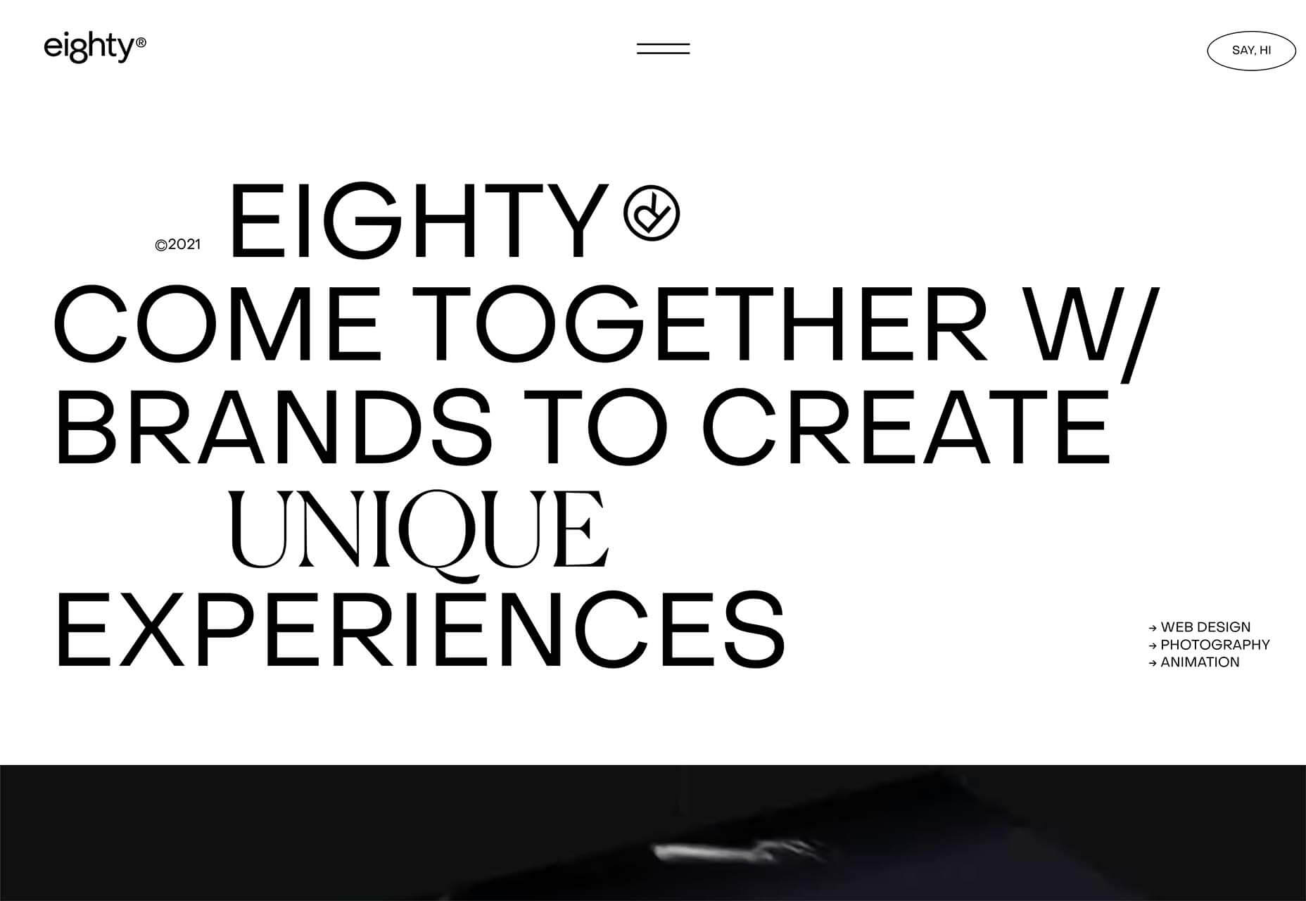
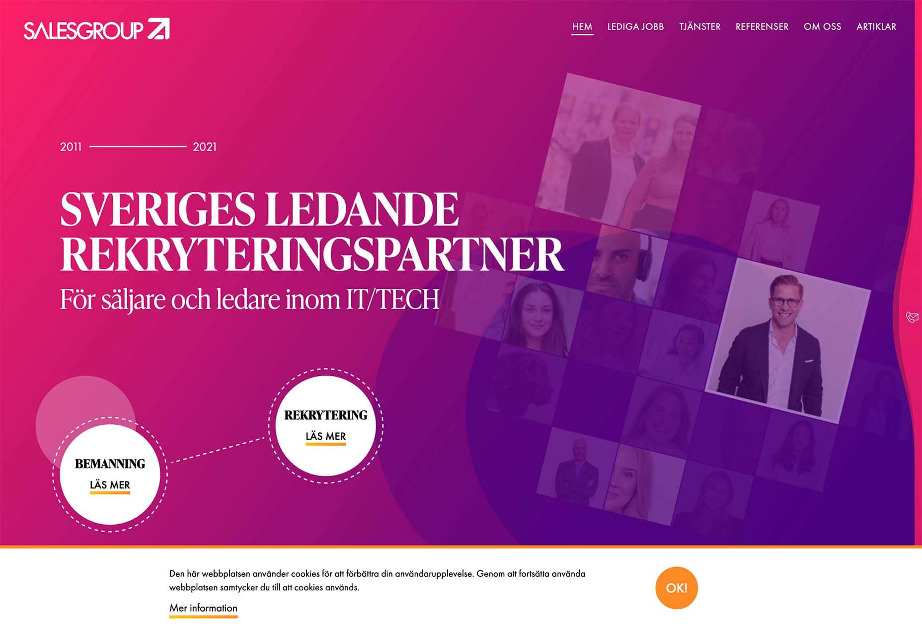
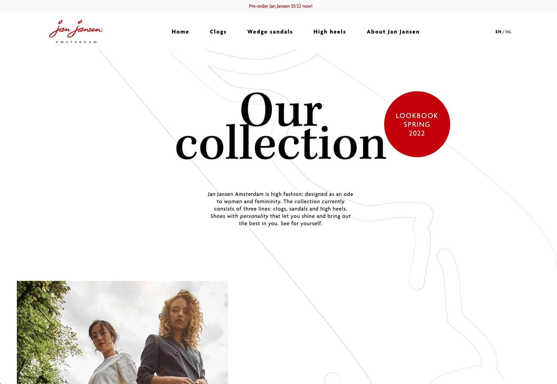
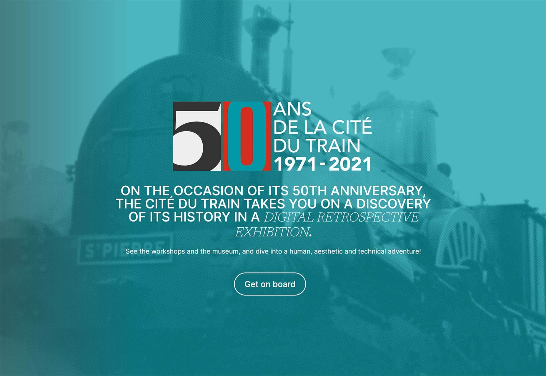

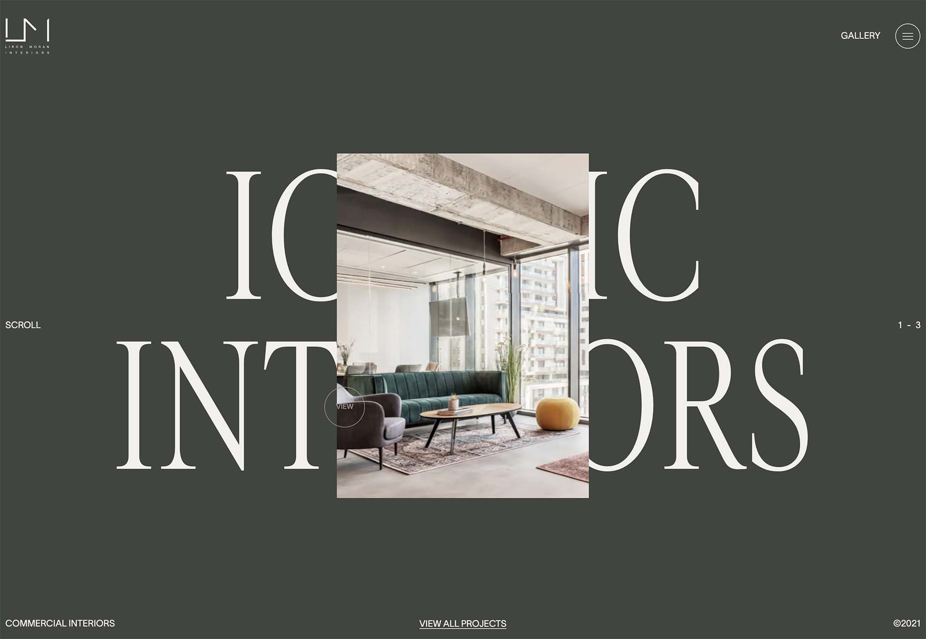
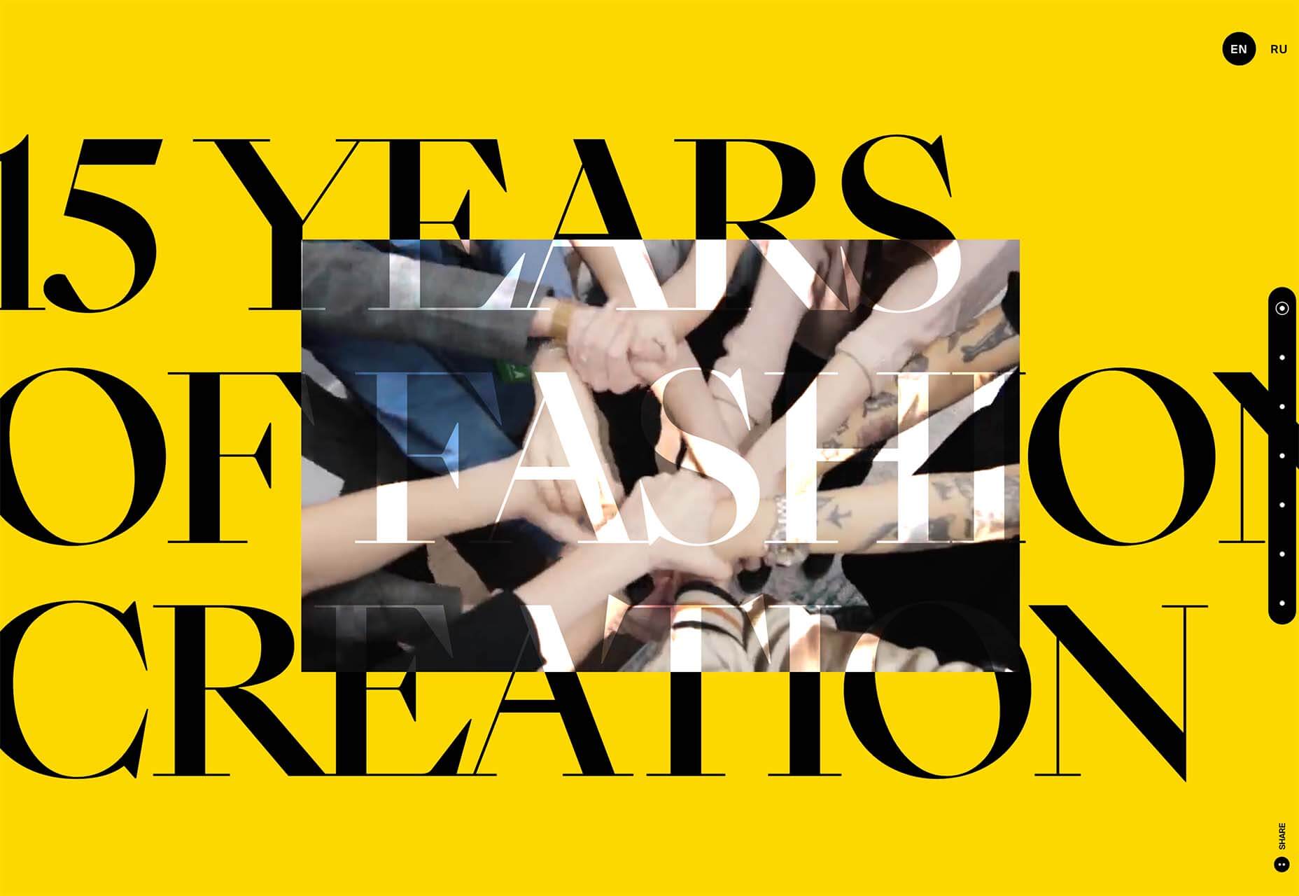
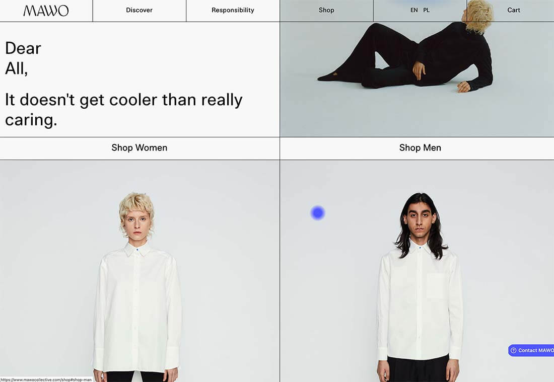
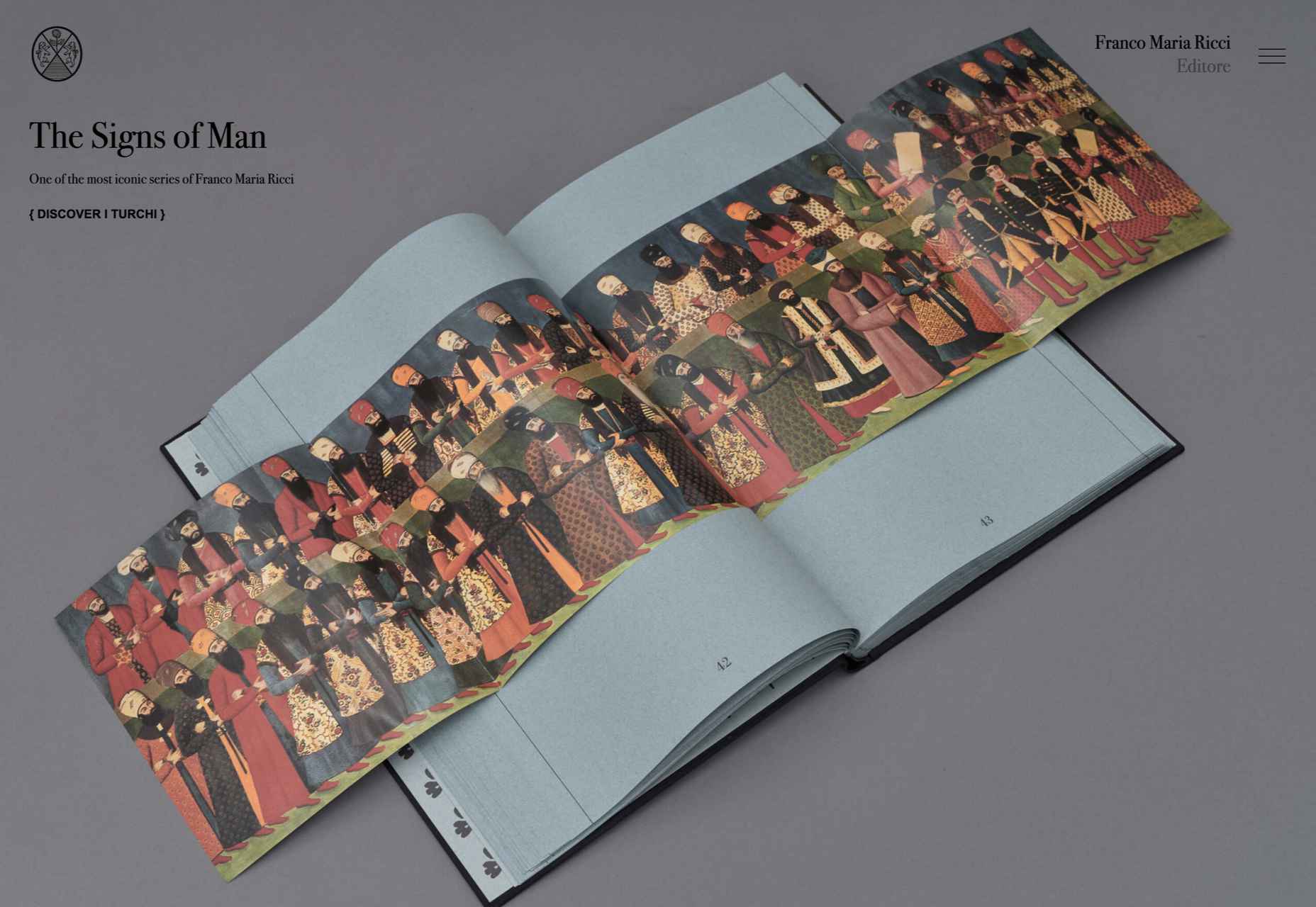
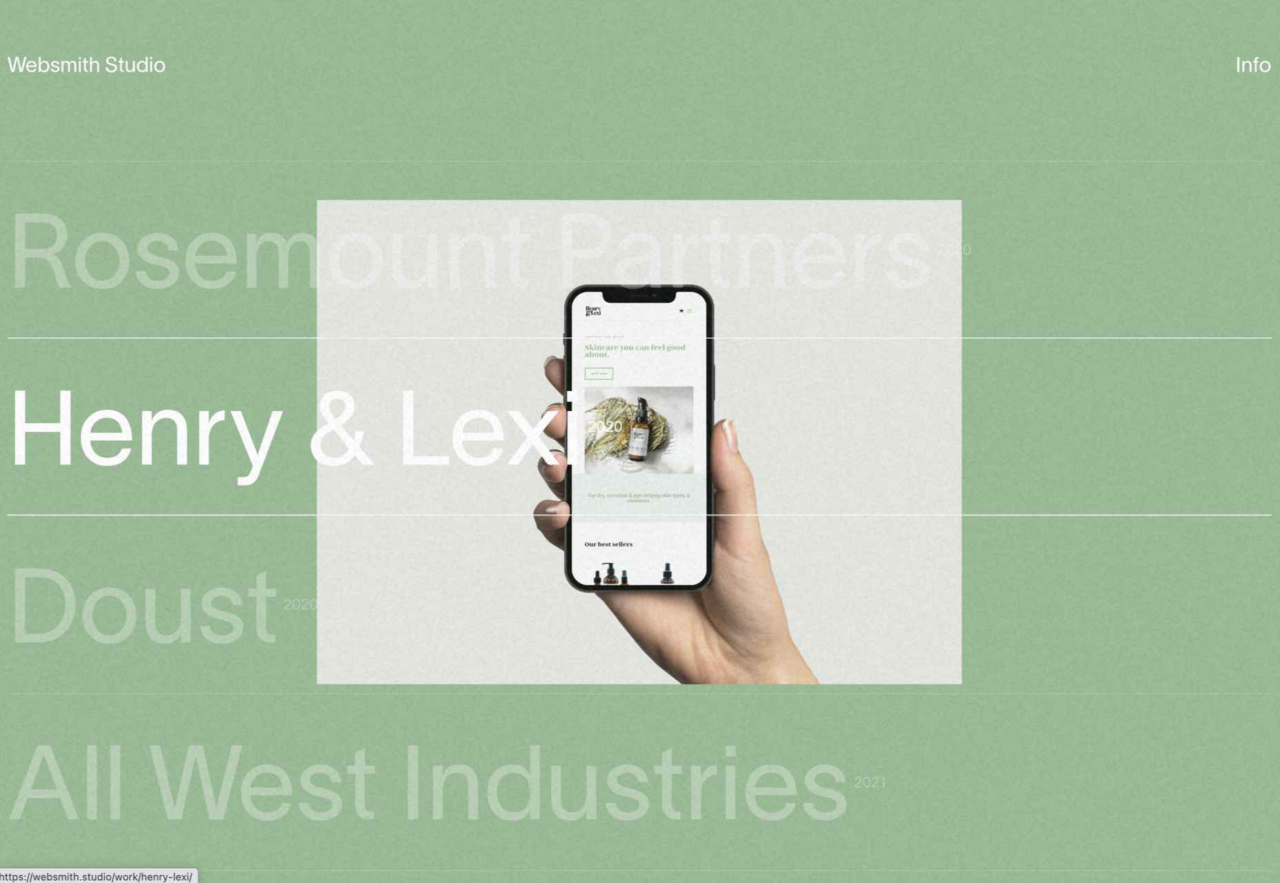
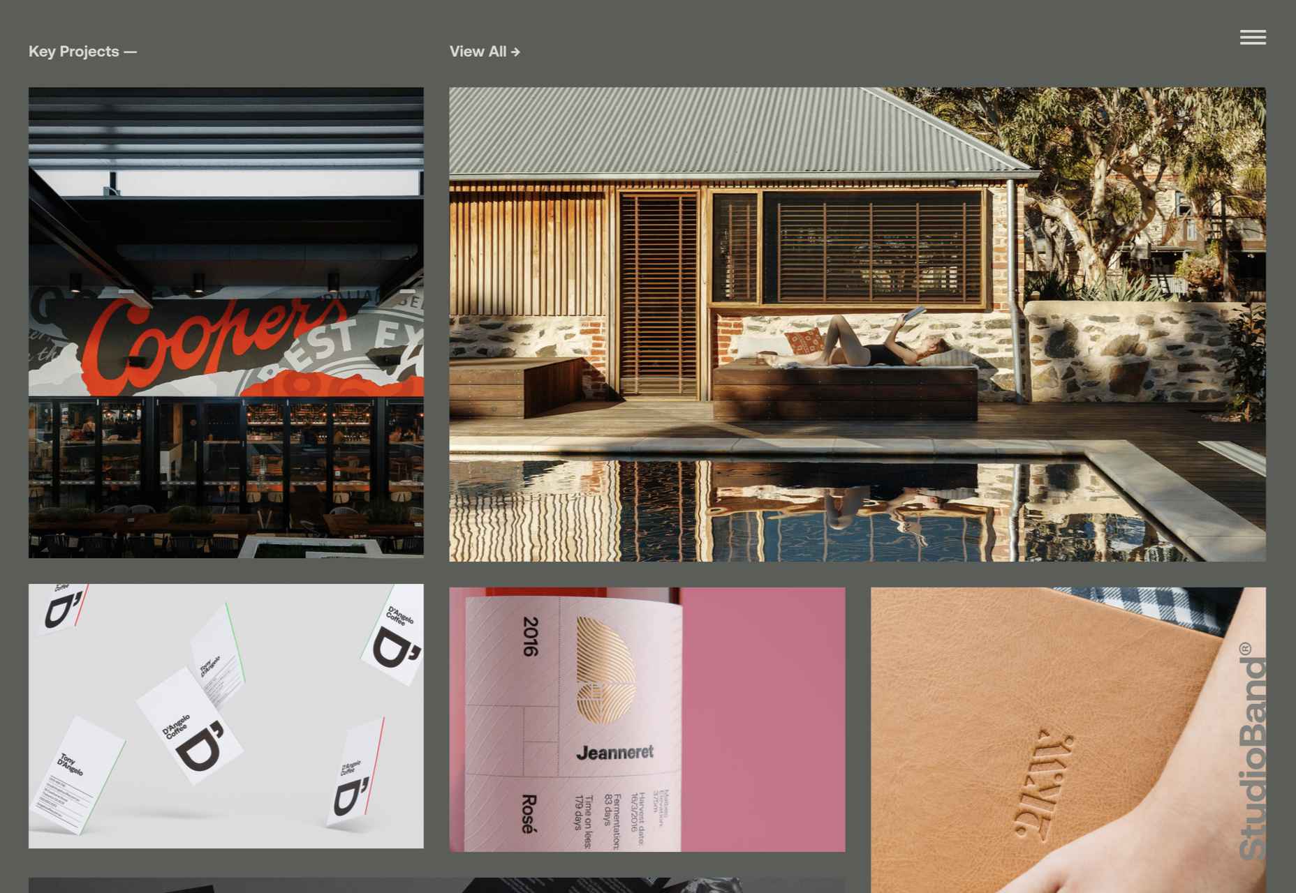
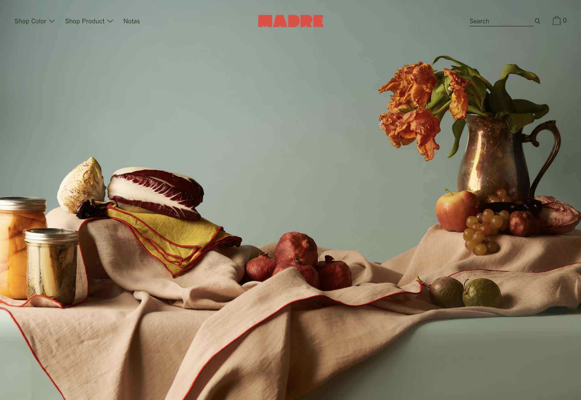
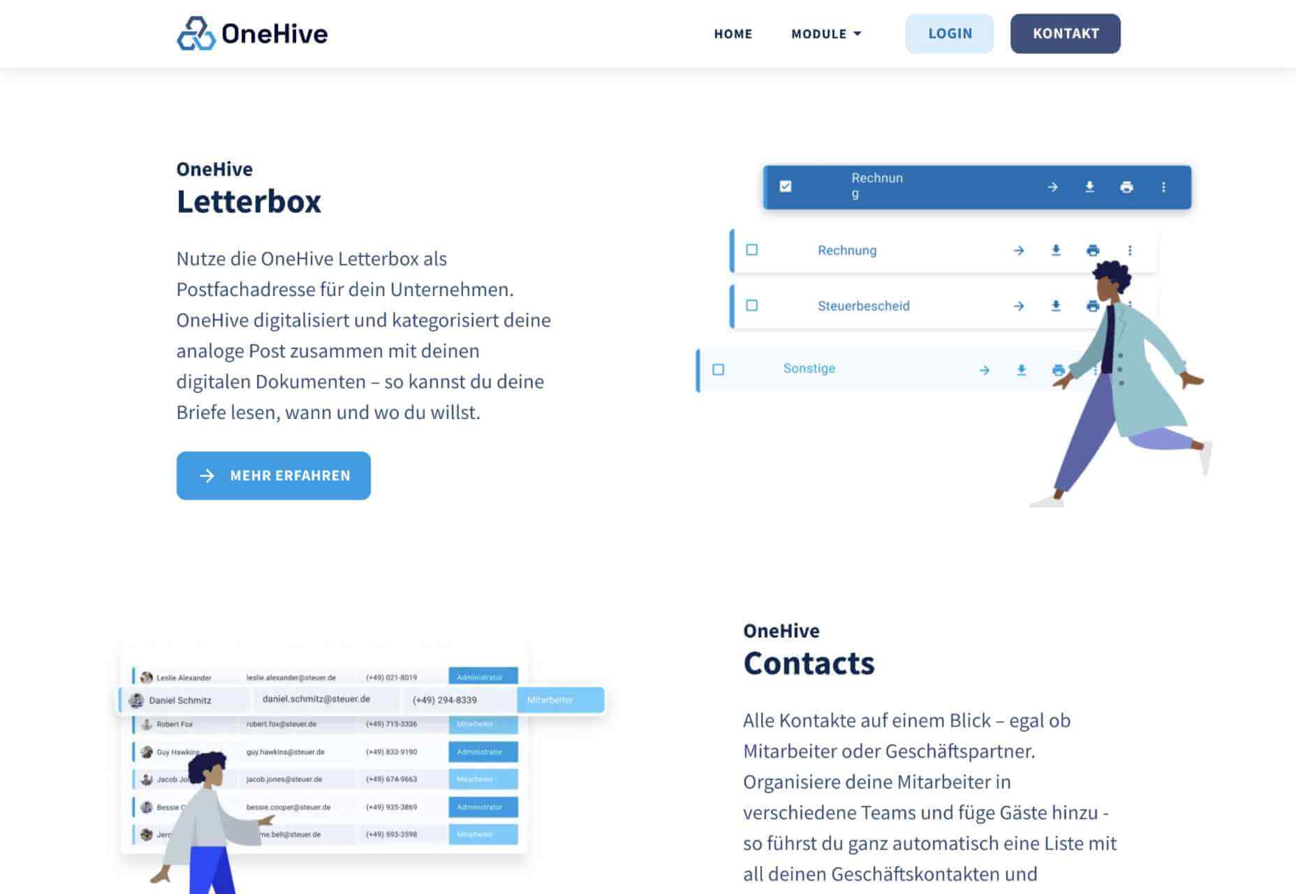
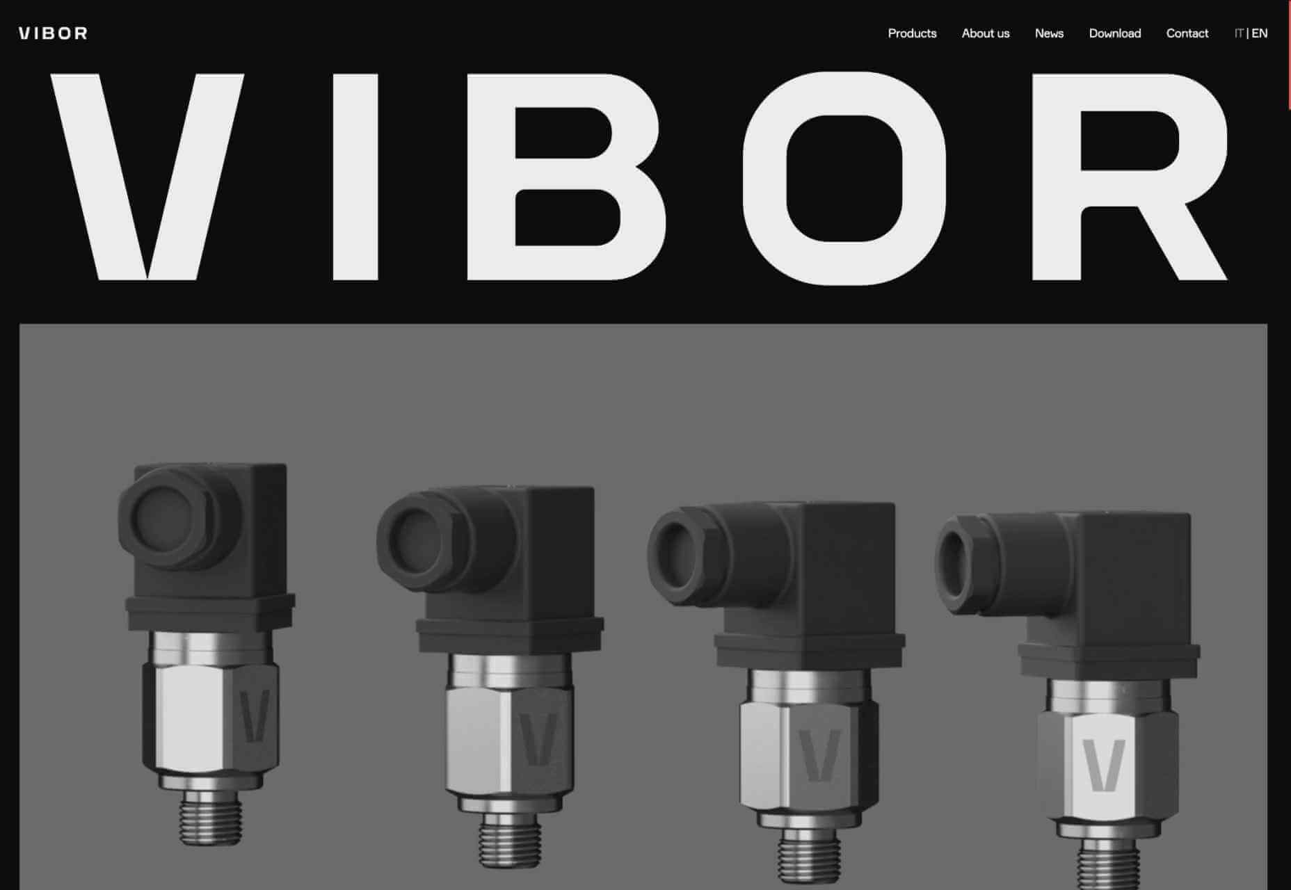
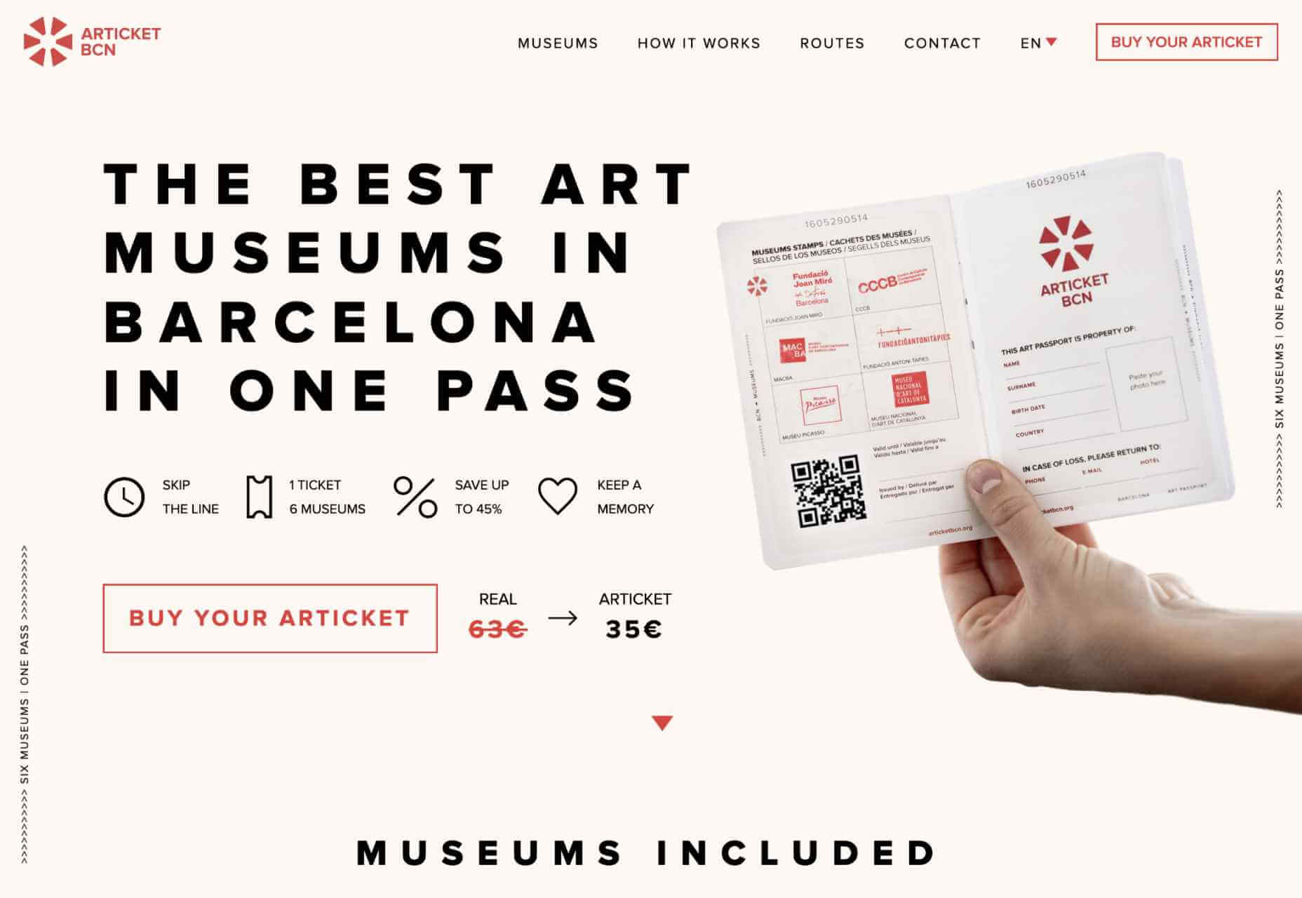
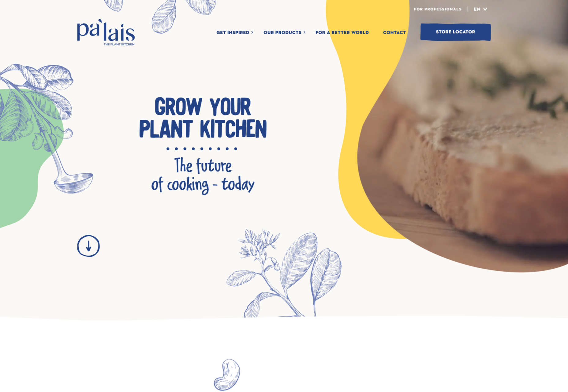
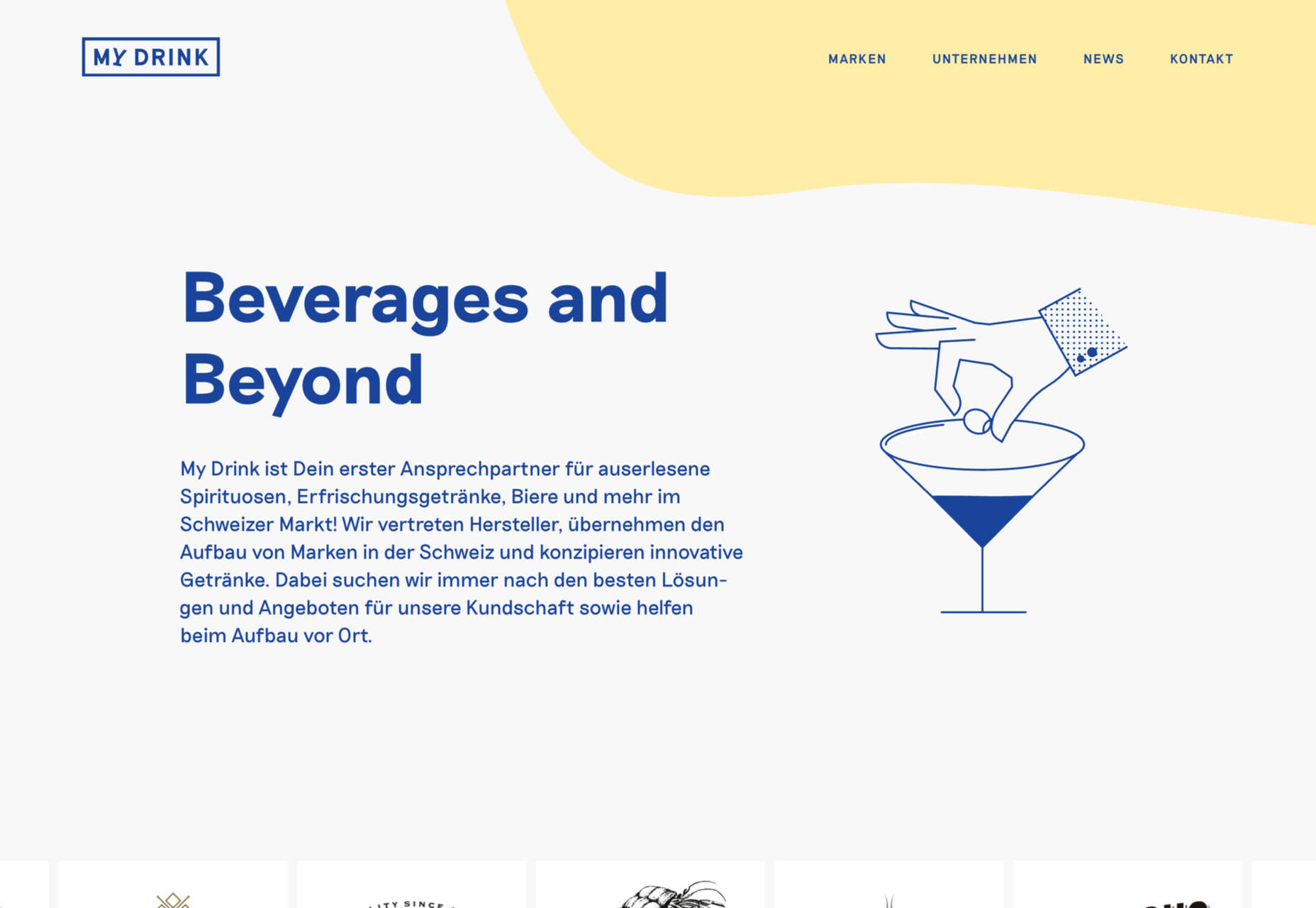
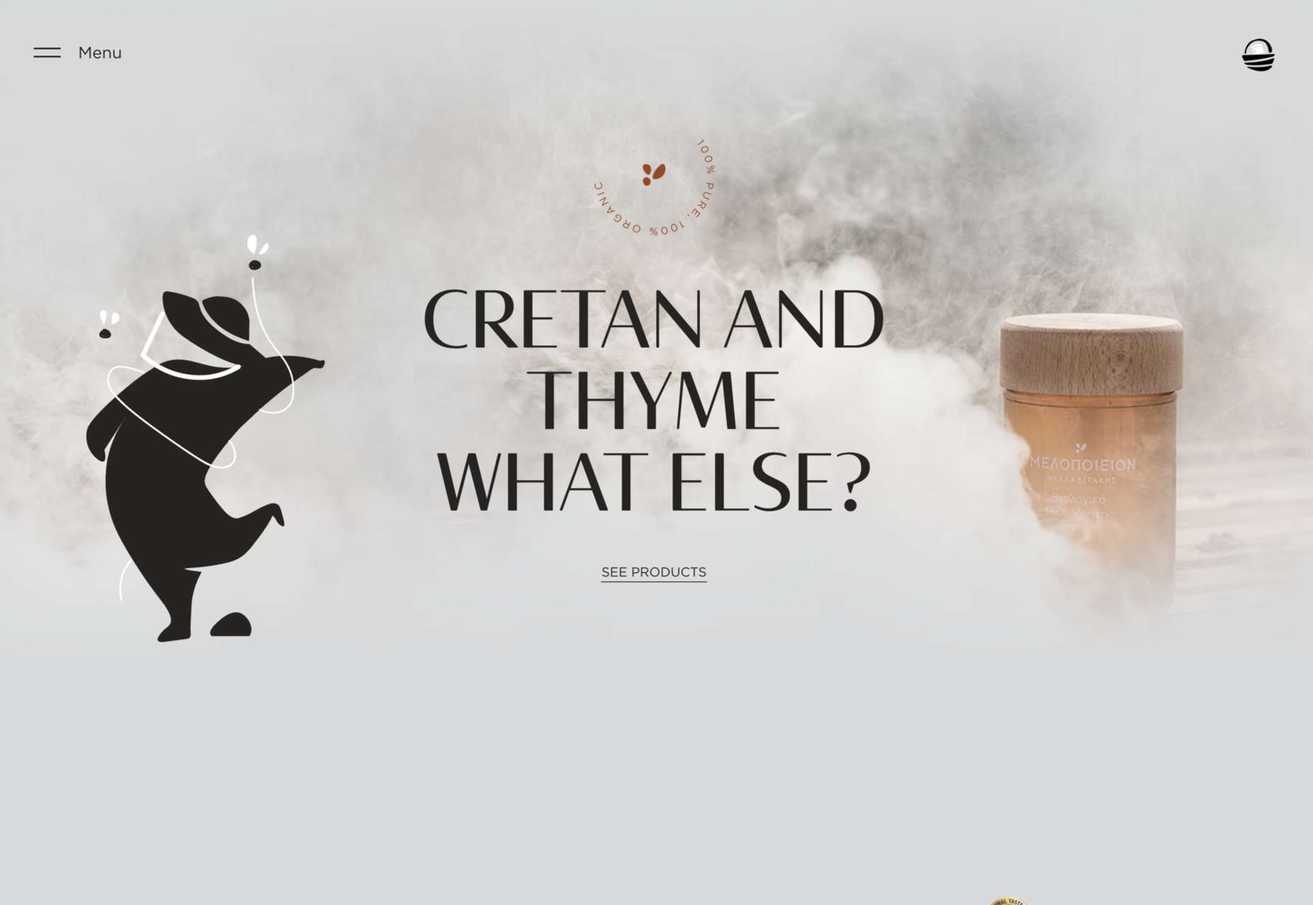
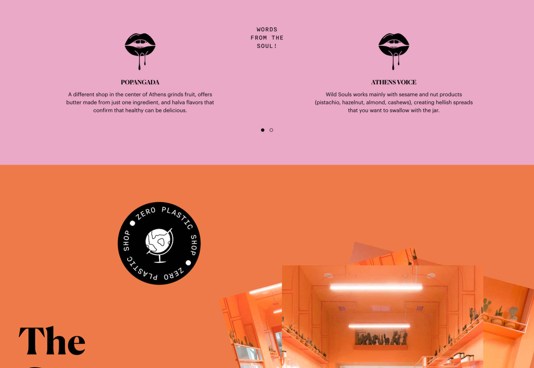
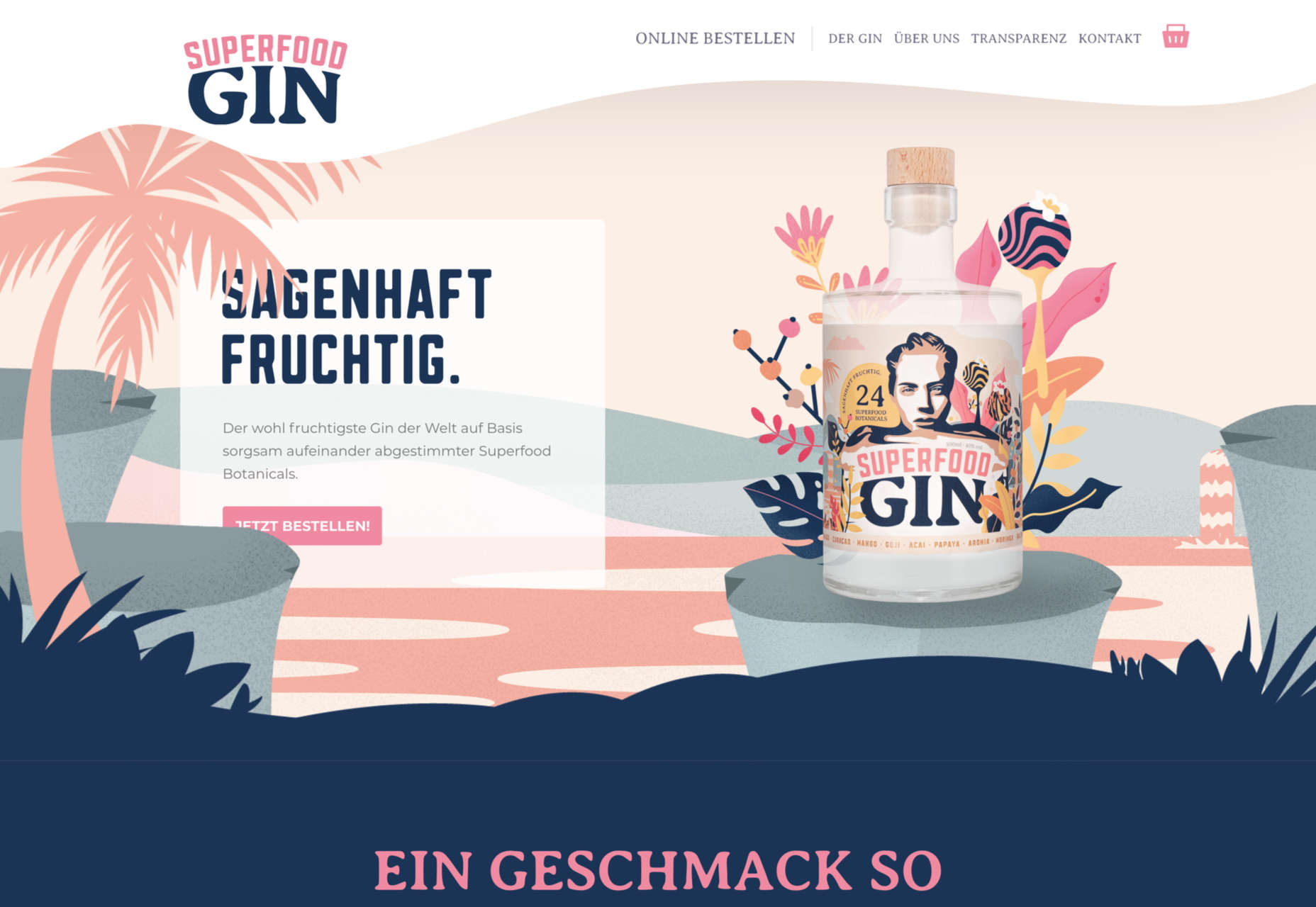
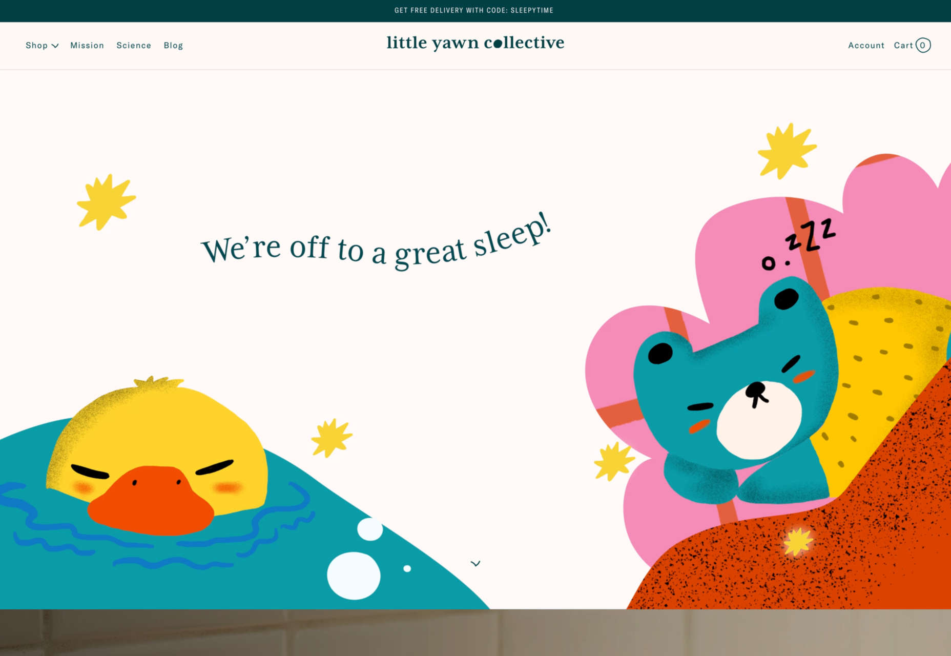
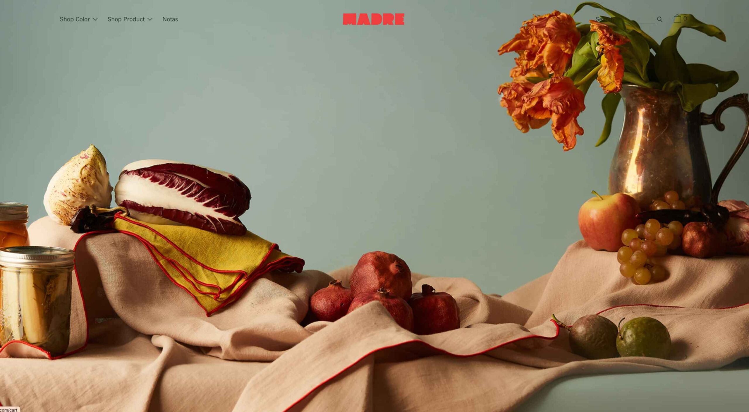 Welcome to this month’s collection of what’s making the web look good. This time out we’ve got some new brands and some rebrands, and we’ve got some good examples of branding continuity across media.
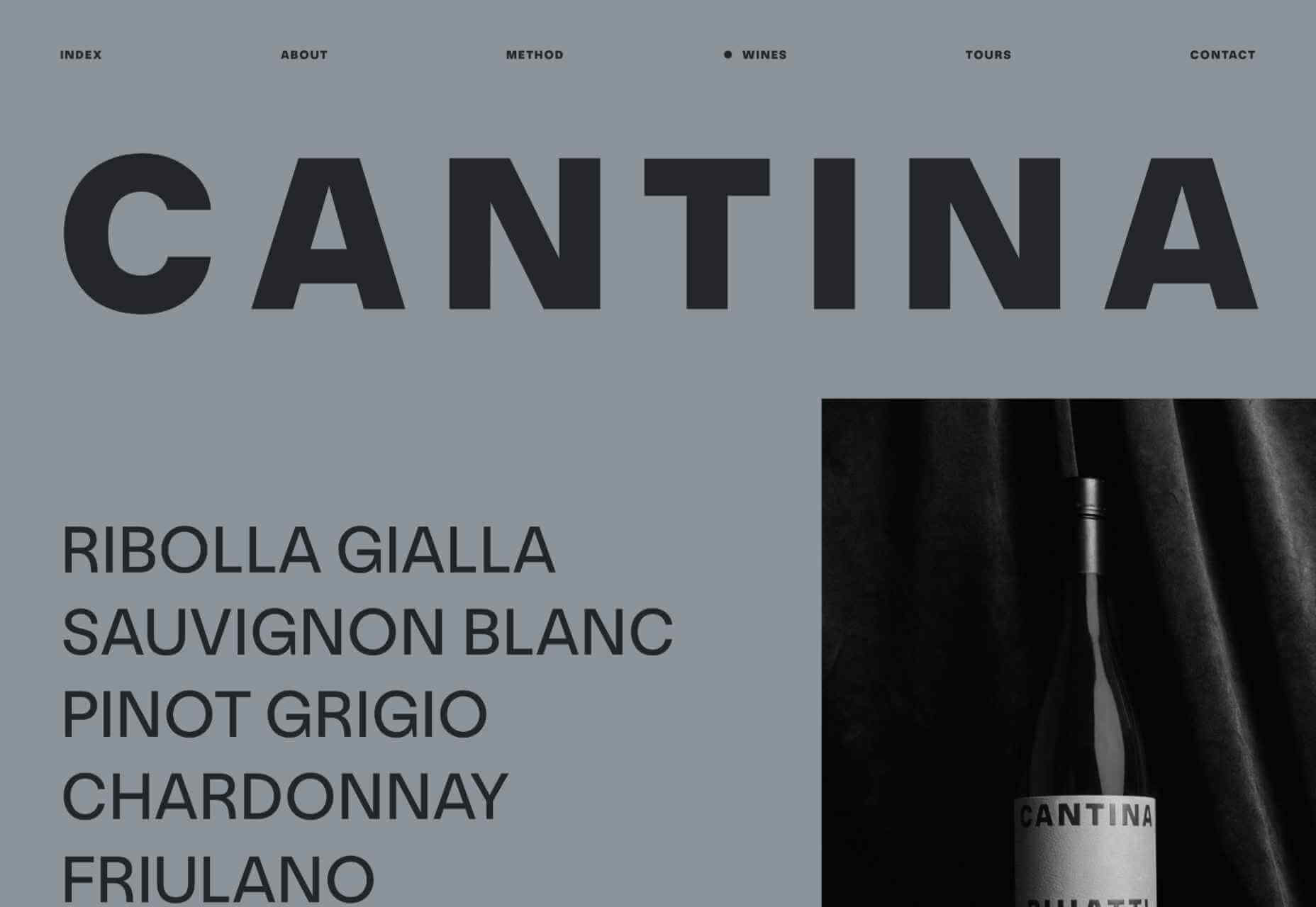

 From 45,000-year-old cave paintings to 21st-century space rocket diagrams, illustrations have long played a significant role in human communication.

 Do you ever get bored with design projects? Feel like you keep designing the same things on repeat?


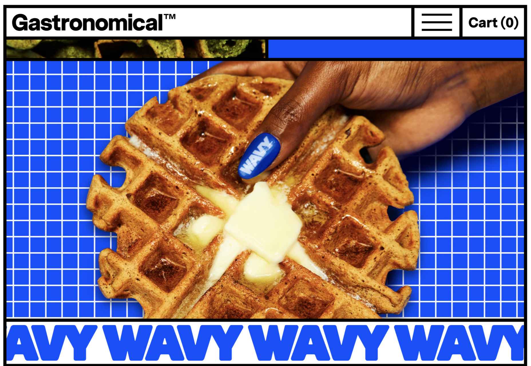
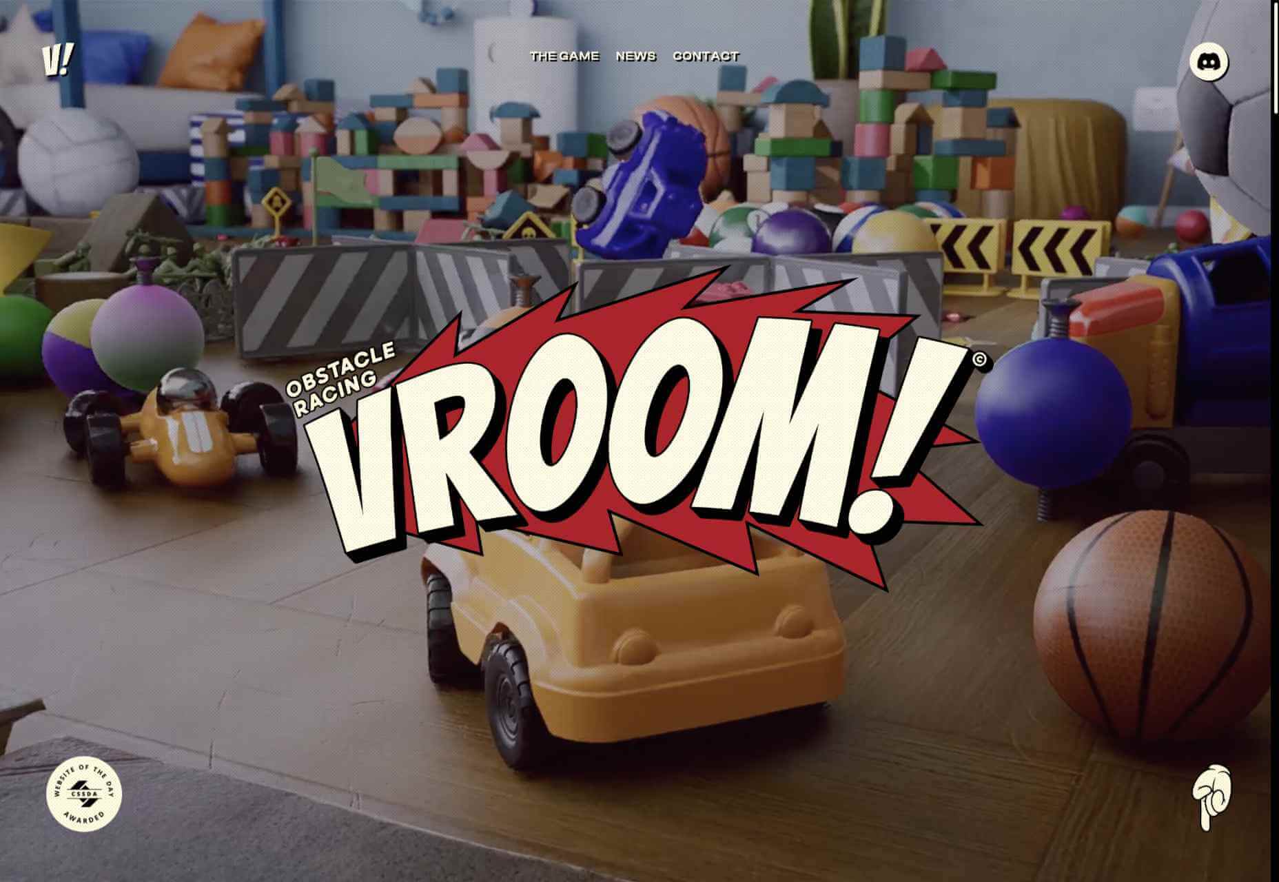
 Sometimes the designs that make the most impact do a lot of unexpected things and break some of the most tried and true rules of visual theory.


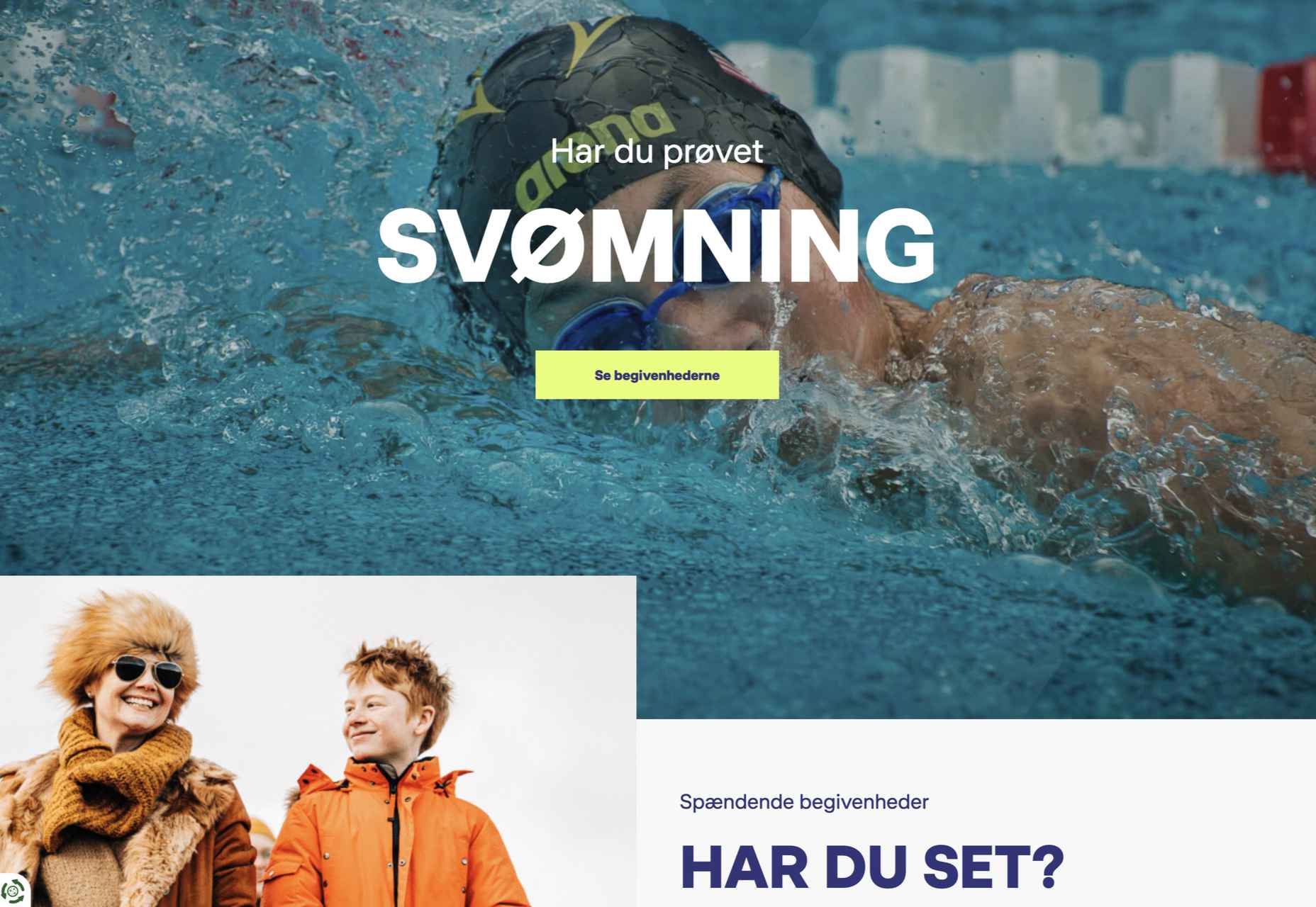
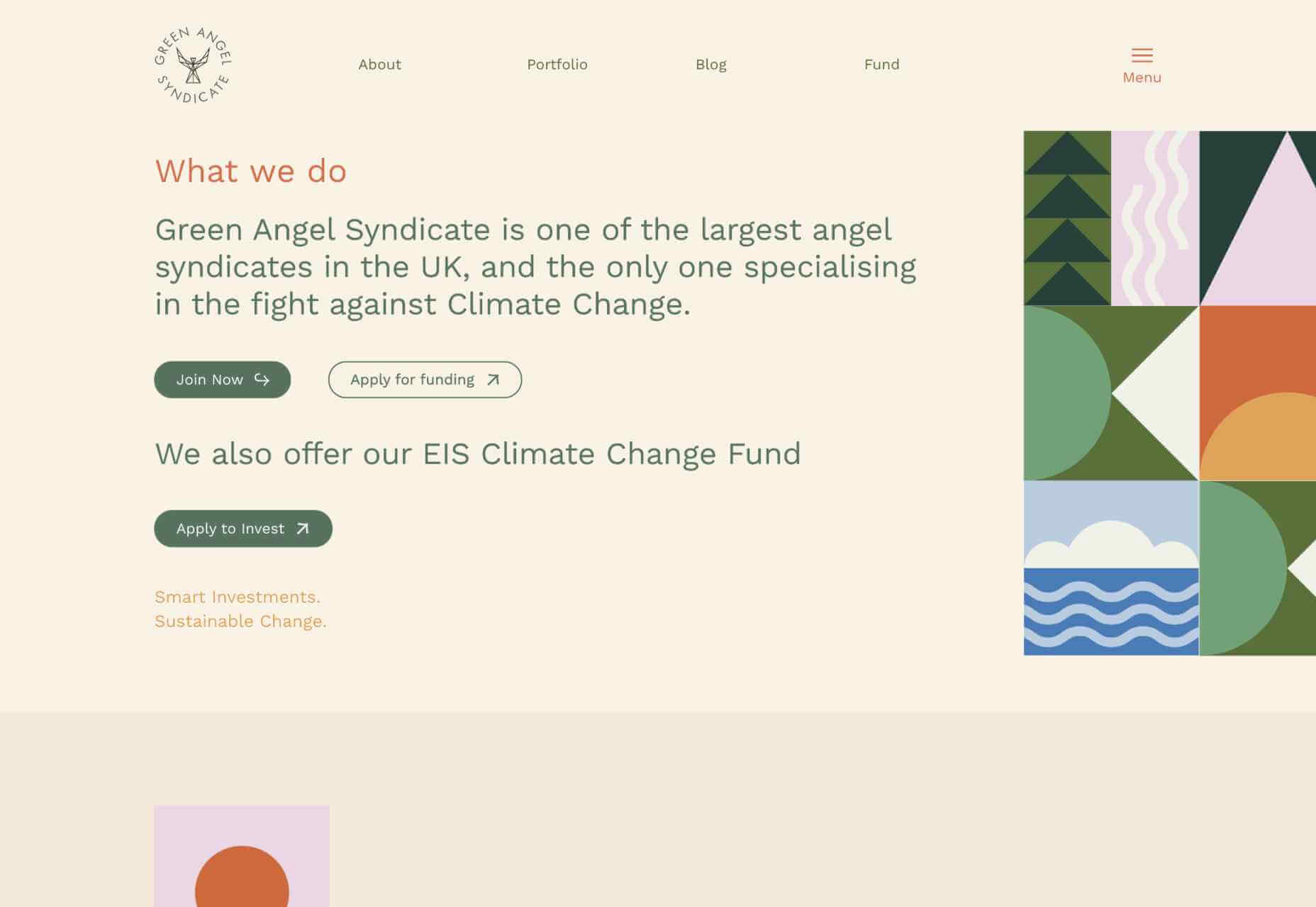
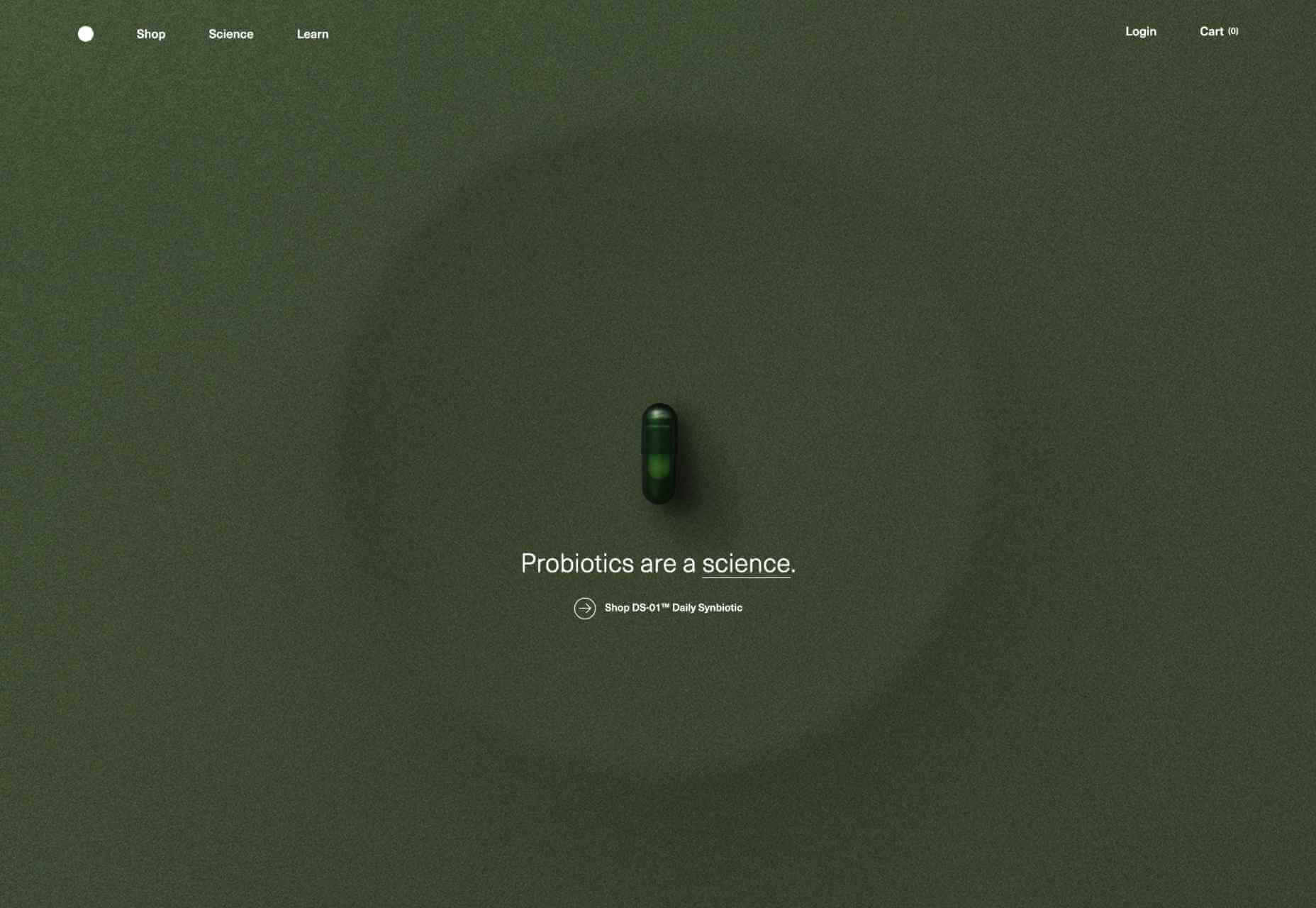
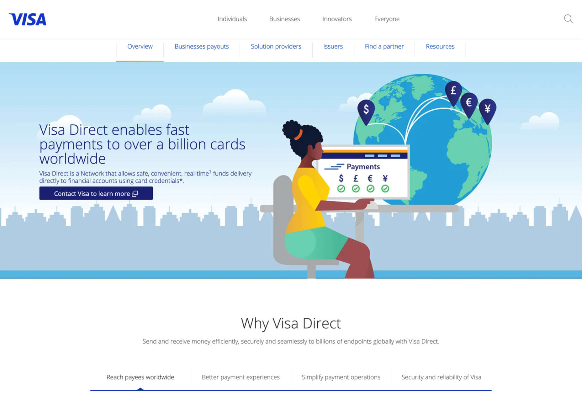
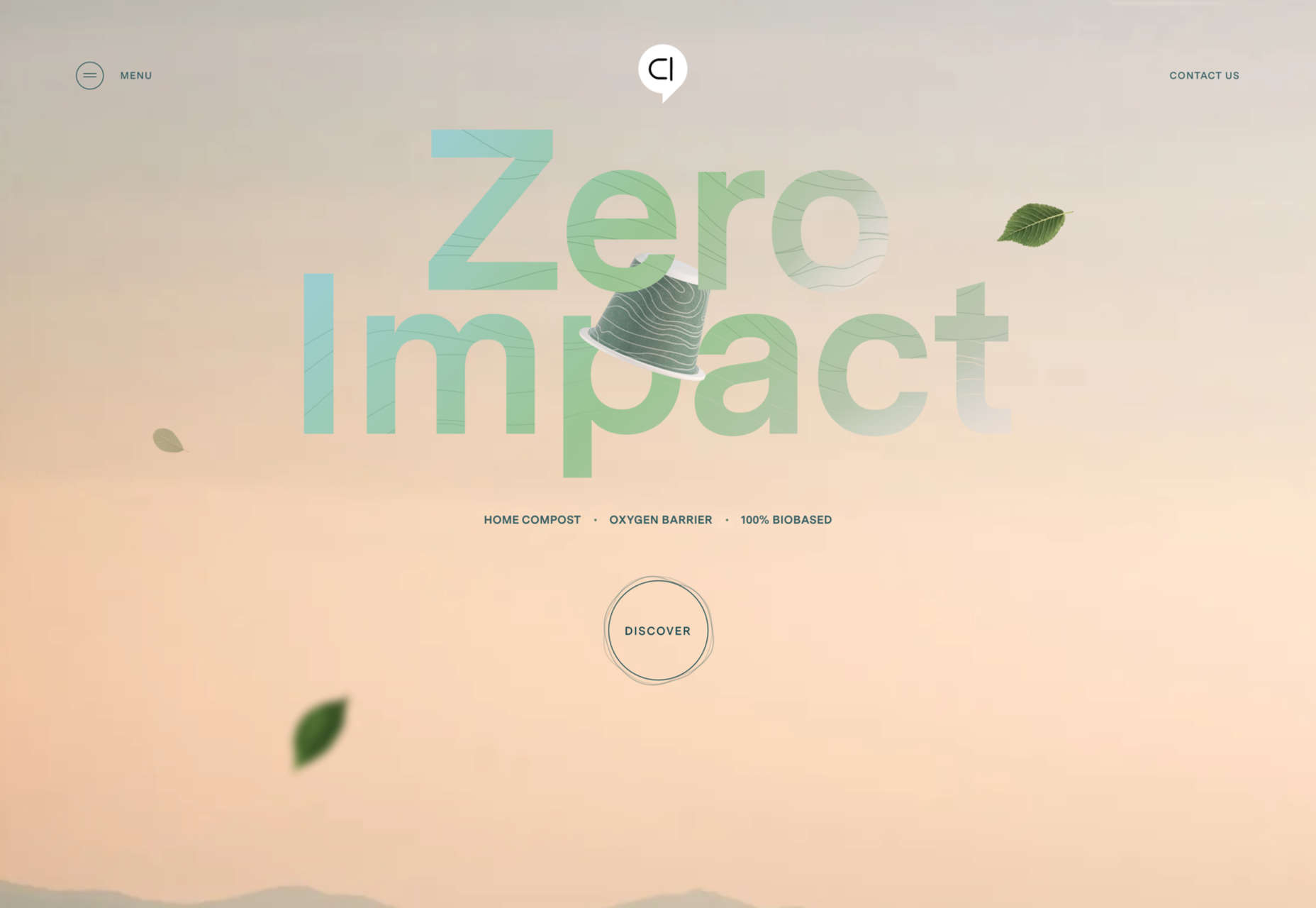
 Looking to give your homepage a well-needed design update in late 2021 or 2022? Not a bad idea; first impressions are crucial when it comes to business websites. But, fixing your homepage and website design is no easy feat.


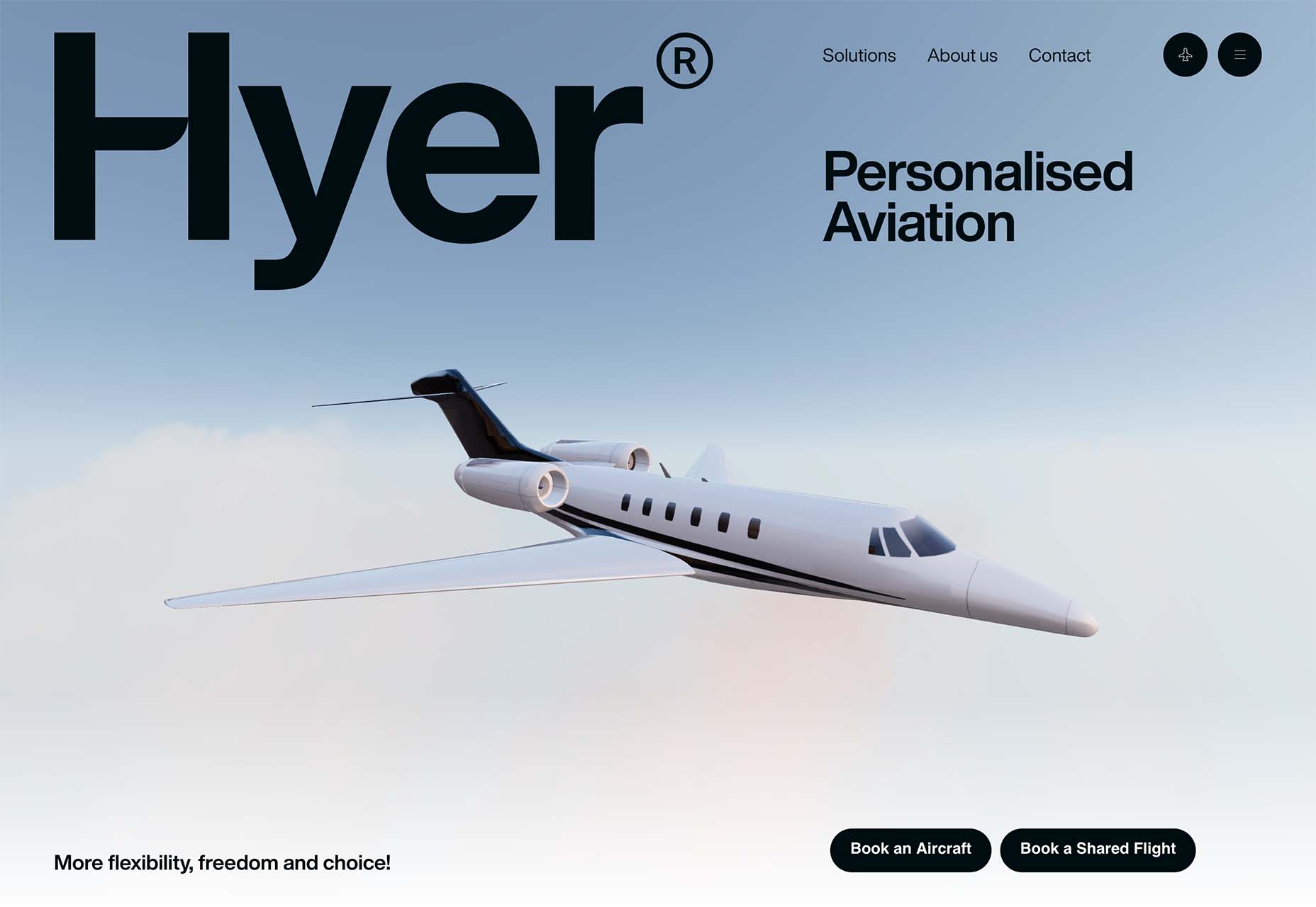
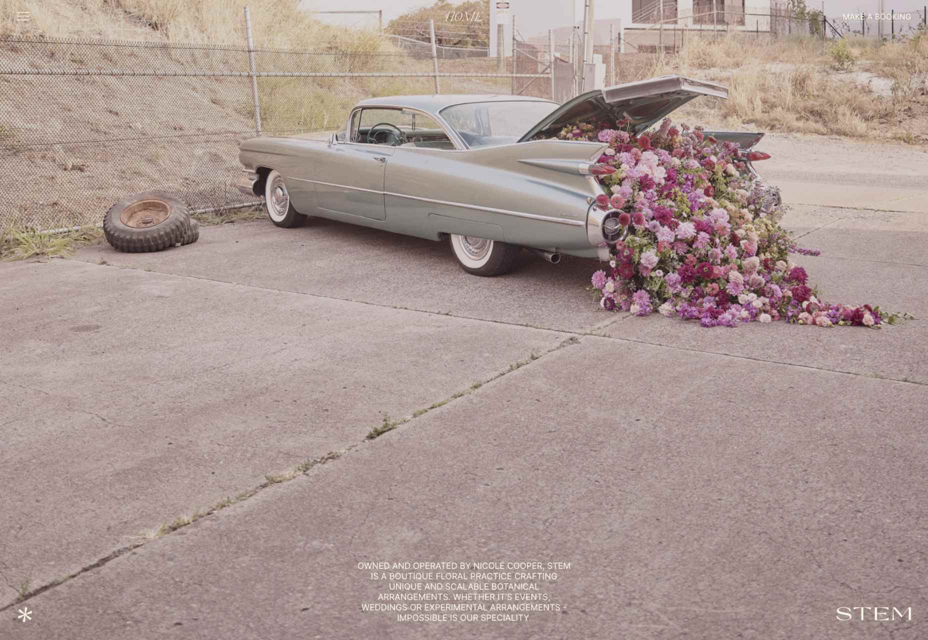
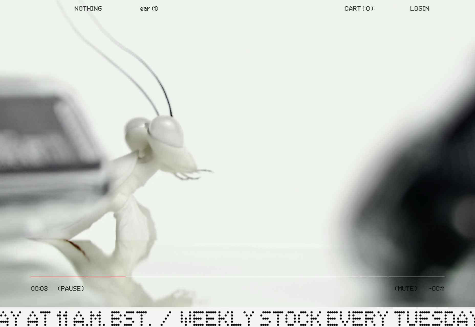
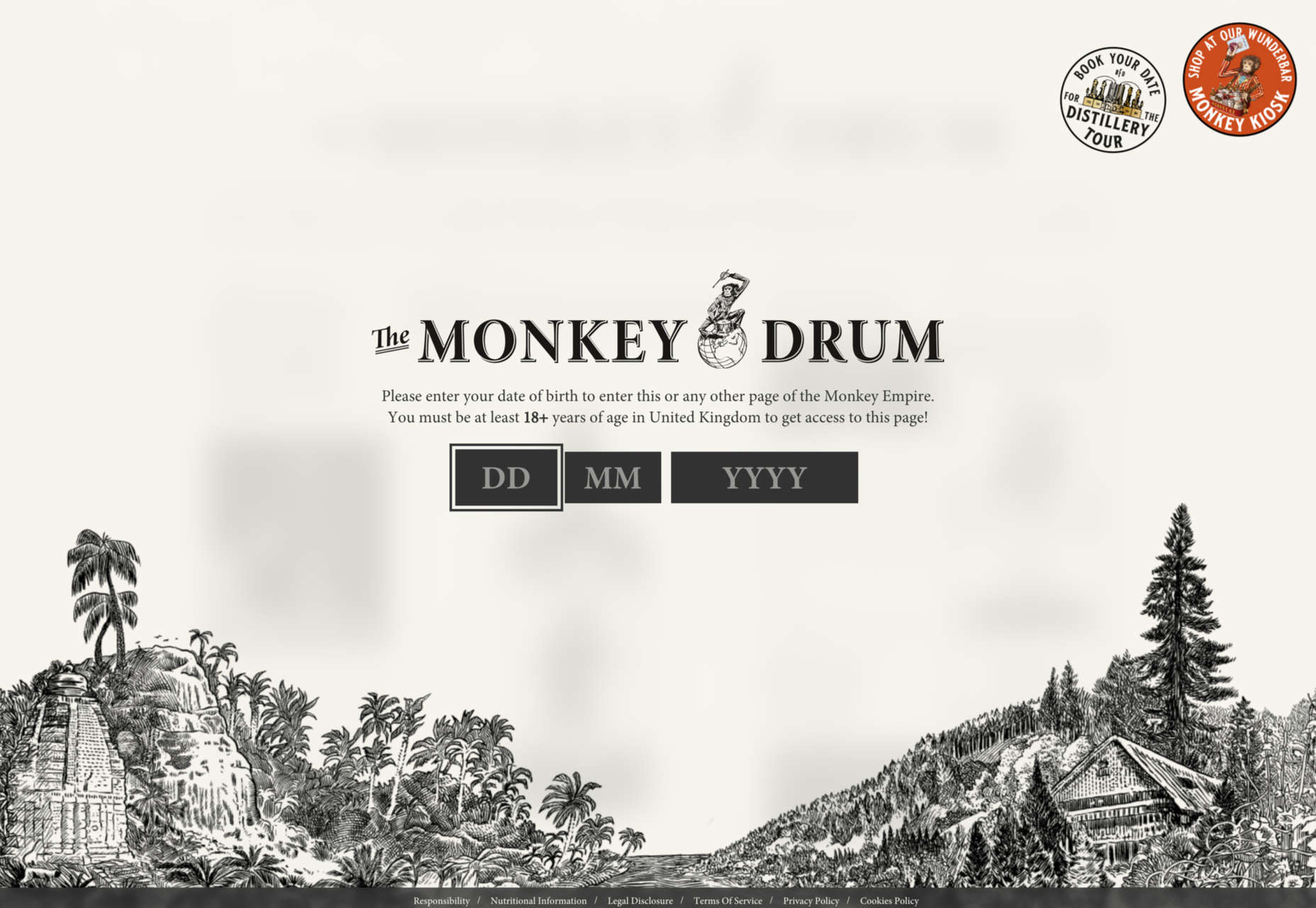
 This month, you will either love or hate the featured design trends.


