Articles

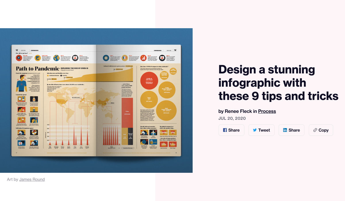
The best thing about writing about website design trends each month is looking at all the great sites that are being developed. Designers are stretching creatively and exploring new techniques and ways of doing things all the time.

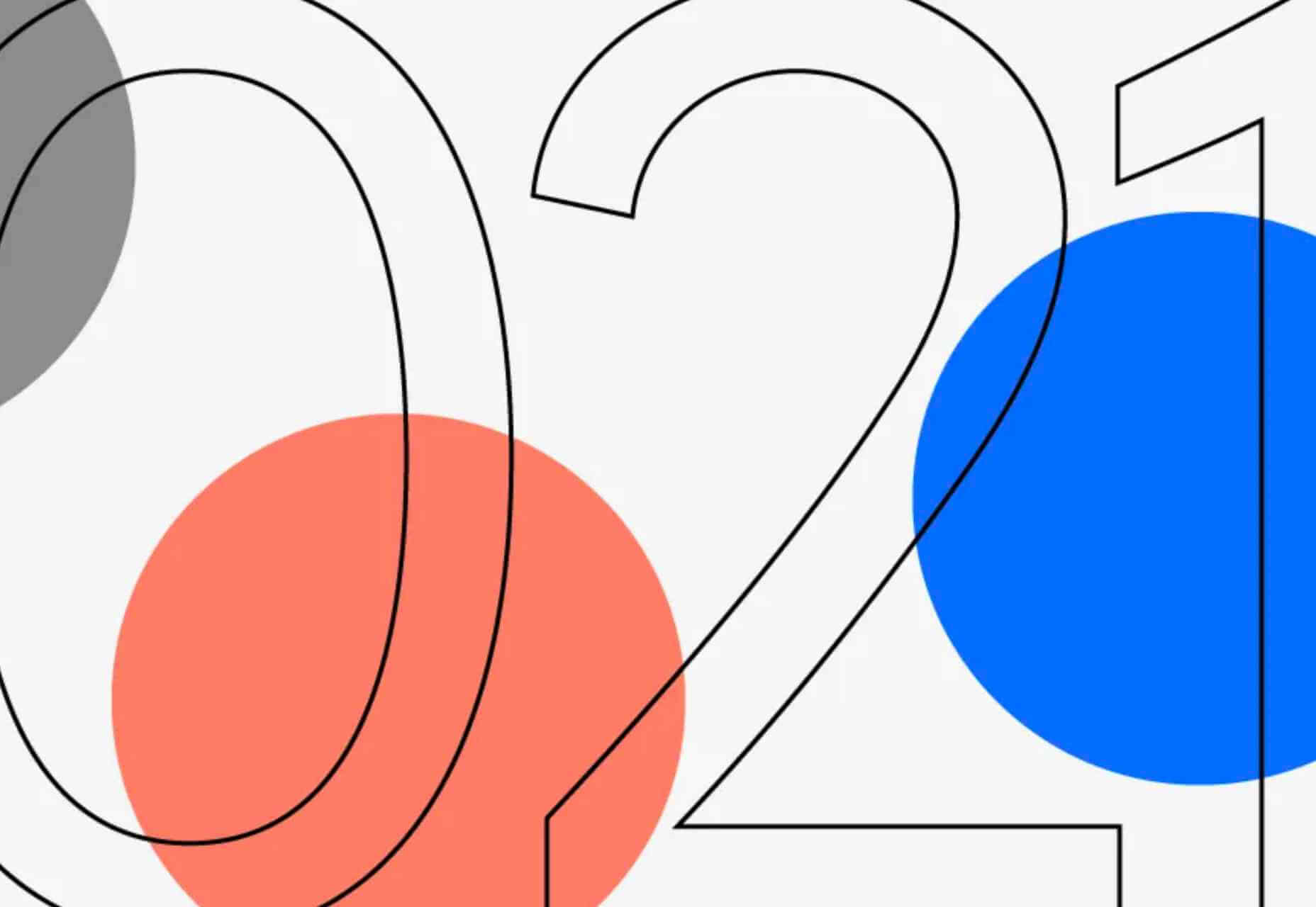
It’s refreshing and inspiring. This month, some of those trends include a style that nods to brutalism, slide scrolling that’s interesting and fresh, and animated typography.

Here’s what’s trending in design this month…
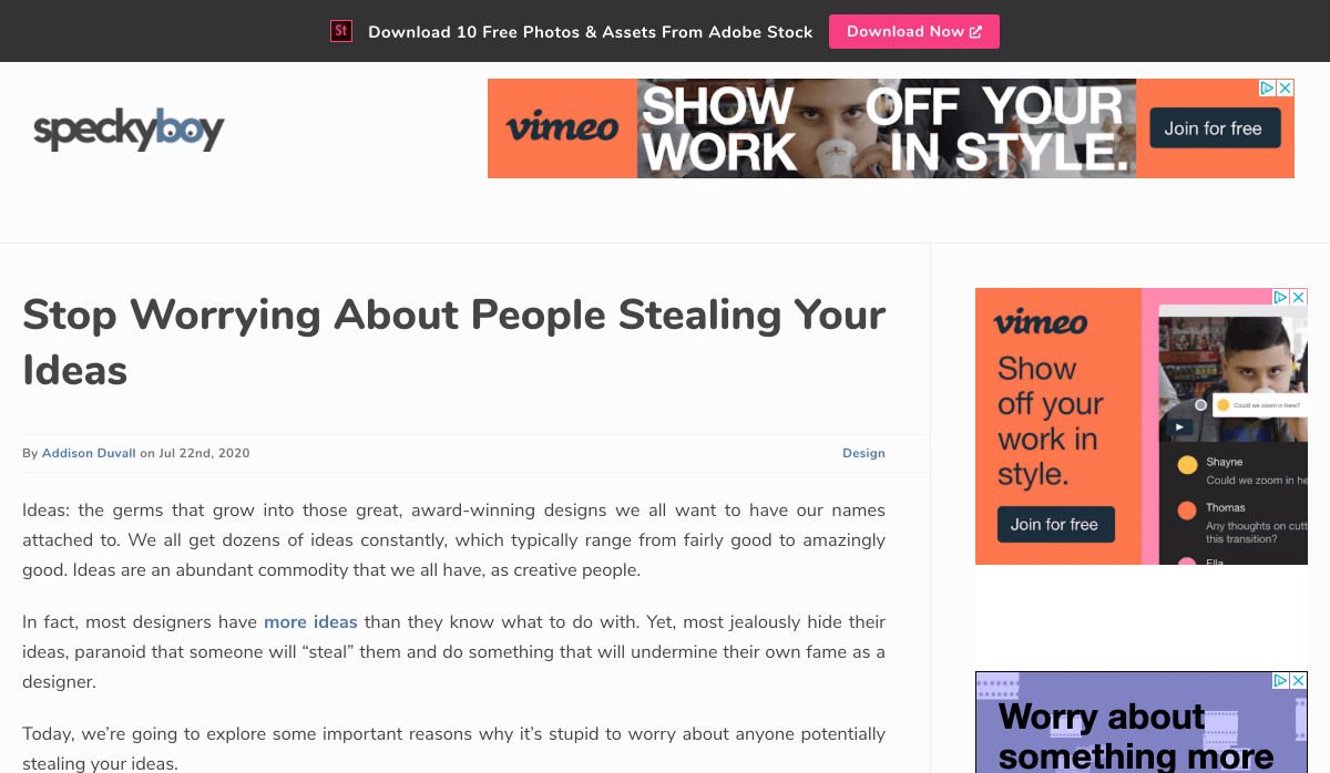
1. Almost Brutalism

Brutalism can be a lot to handle and only really works for certain types of projects. That being said, some of the elements of brutalism can be the foundation for an interesting aesthetic.

So, it’s not surprising that an “almost brutalism” trend has emerged.

Designers are working with some of the design elements – slab fonts, simple color schemes with a lot of contrast, twitchy animation, mono typefaces, and overall design patterns that are almost over-simplified.

The result is a striking design that isn’t so harsh that it turns users away. It’s the right combination of brutalism and usability to create something with a harder-edge feel that people understand.

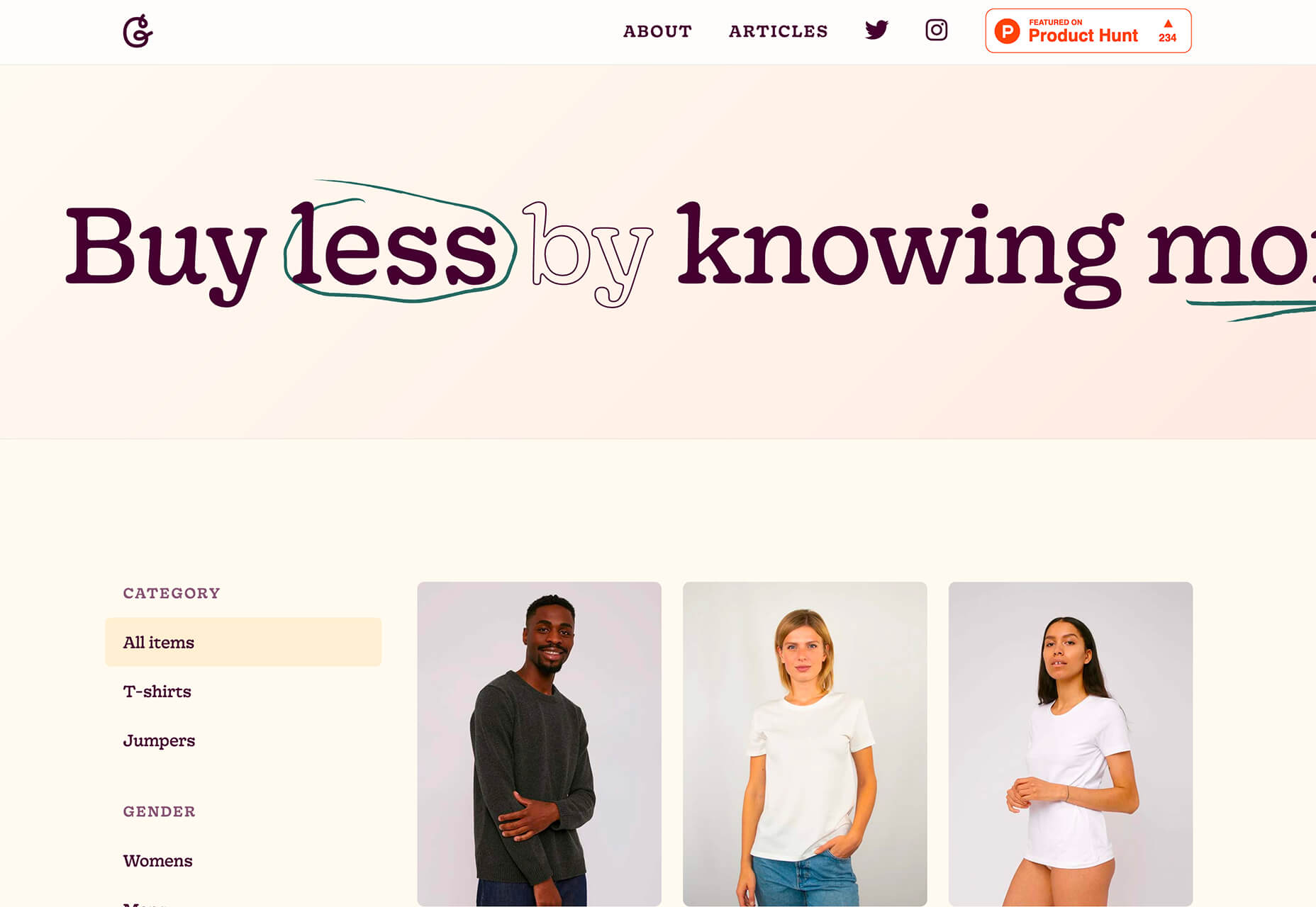
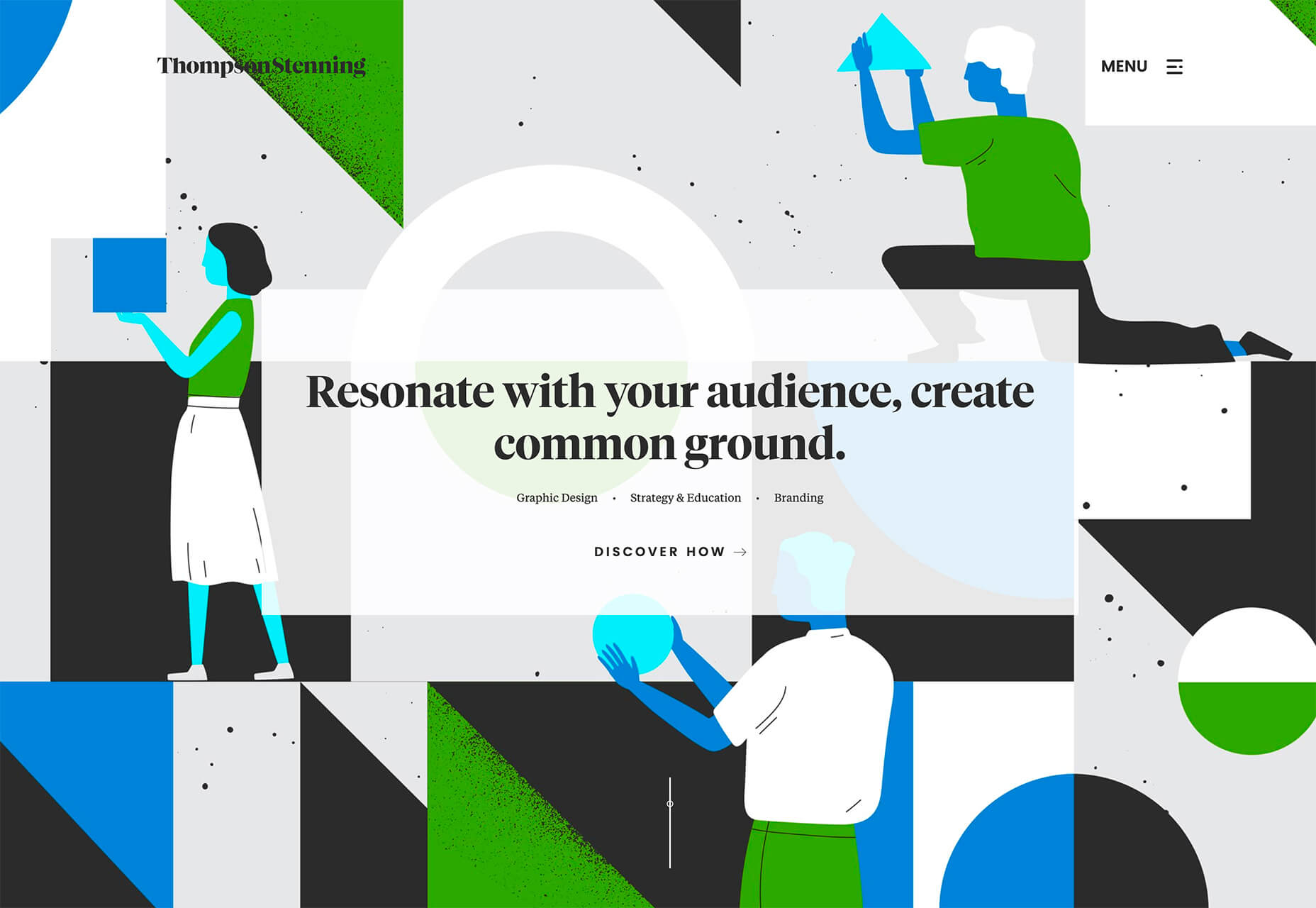
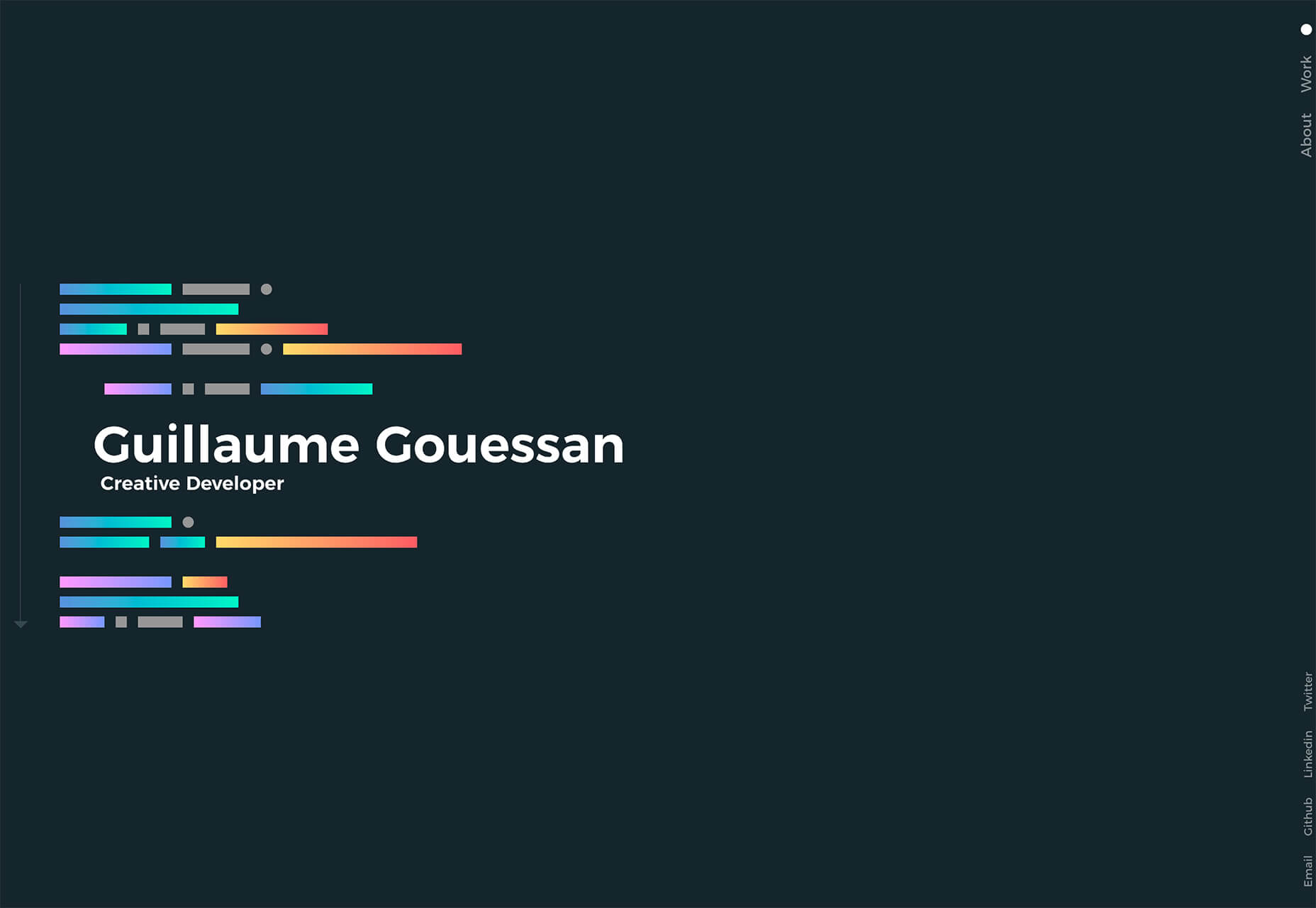
Good Garms uses a typewriter-style typeface, simple patterns, and one of the most streamlined designs you might find for an ecommerce store. It’s effective and makes you look because it is different.

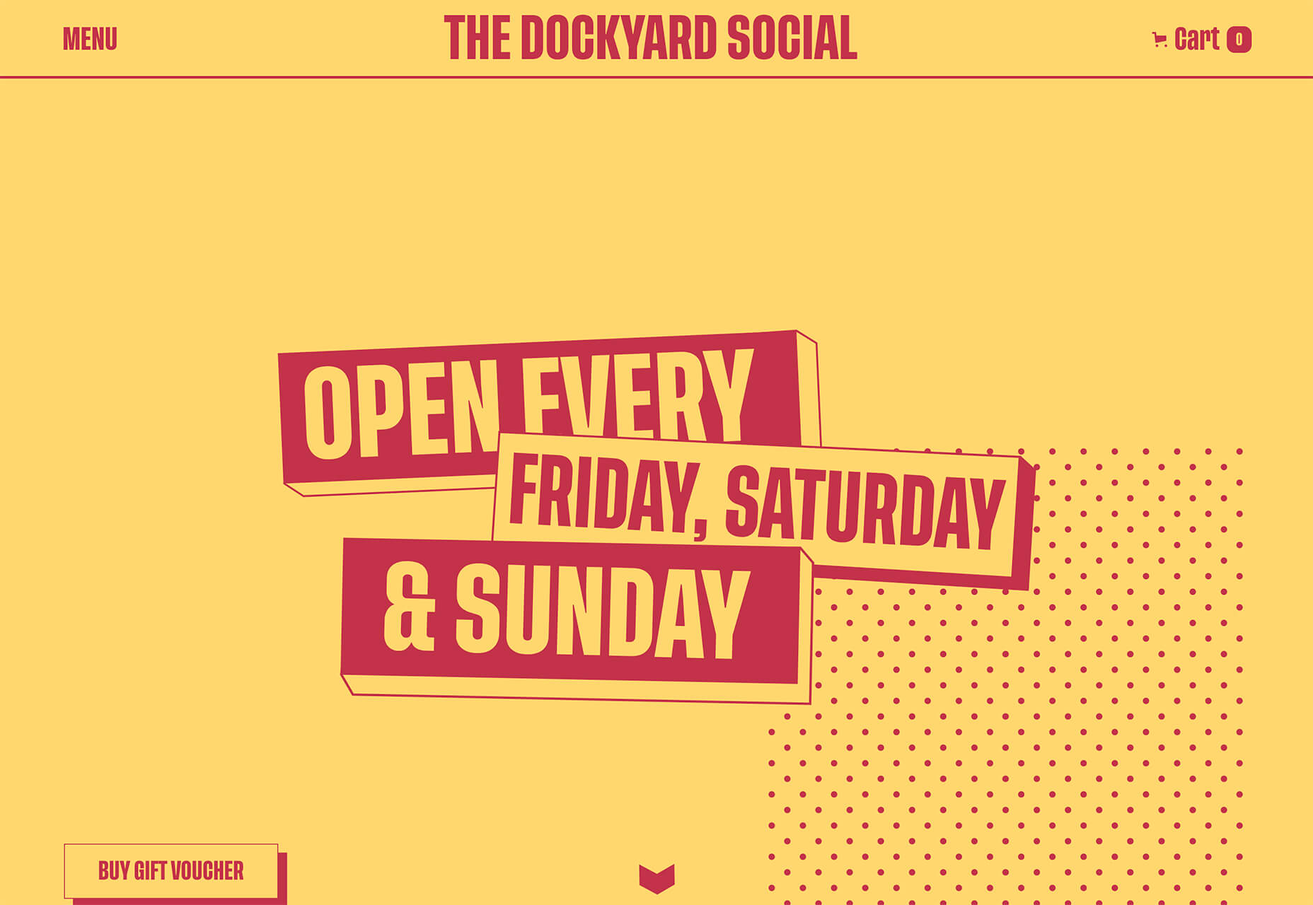
Dockyard Social uses an unexpected color combination with high contrast, sharp shapes, and design elements, and bold slab typography to grab your attention right away. The theme continues on the scroll with new color combinations with equally brutal design elements. It feels a little tight and uncomfortable in places but still highly usable – exactly what almost-brutalism intends to do.

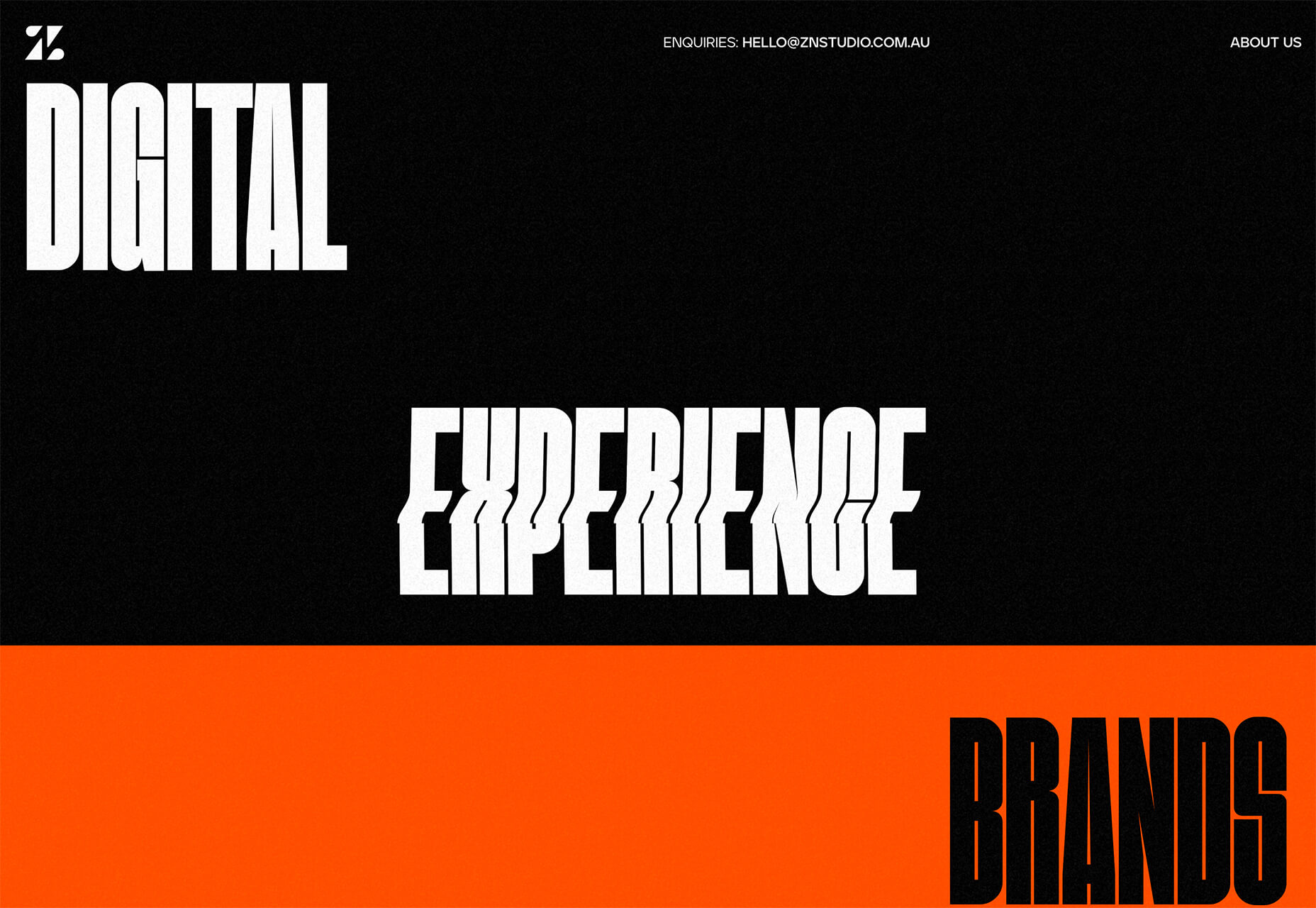
ZN Studio uses the same big, bold type elements as the previous example with a twitchy-style animation to draw you into the design. The entire design uses clever animation effects with a brutal aesthetic to keep you scrolling.


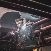
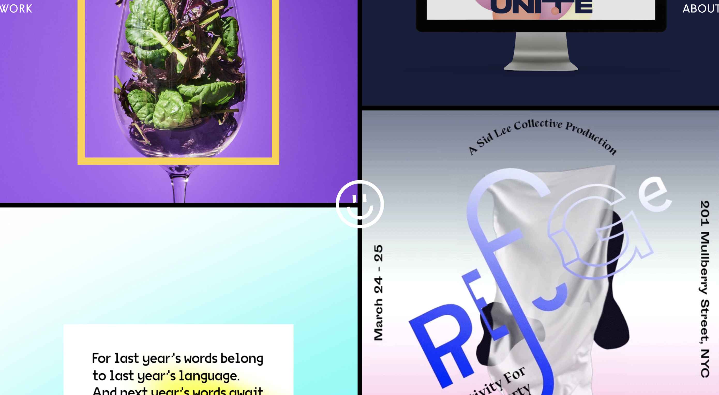
2. Beautiful Slide Scrolling

You can argue the value – or lack thereof – of website sliders as long as you want to. The reality, though, is that, for the most part, they are clunky and get in the way of the content. It’s a lazy option that keeps you from having to make a content choice.

Not with these beautiful slide-scrolling website designs.

Each of these designs uses side-scrolling as a design asset. Here’s the trick that makes it work: Slide scrolling isn’t a “feature” above a bunch of other content. It is how the content is featured.

These examples show you how to use the trend well and should get you excited about slide (or side) scrolling.

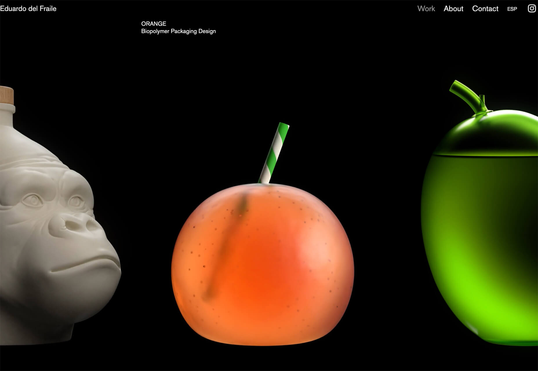
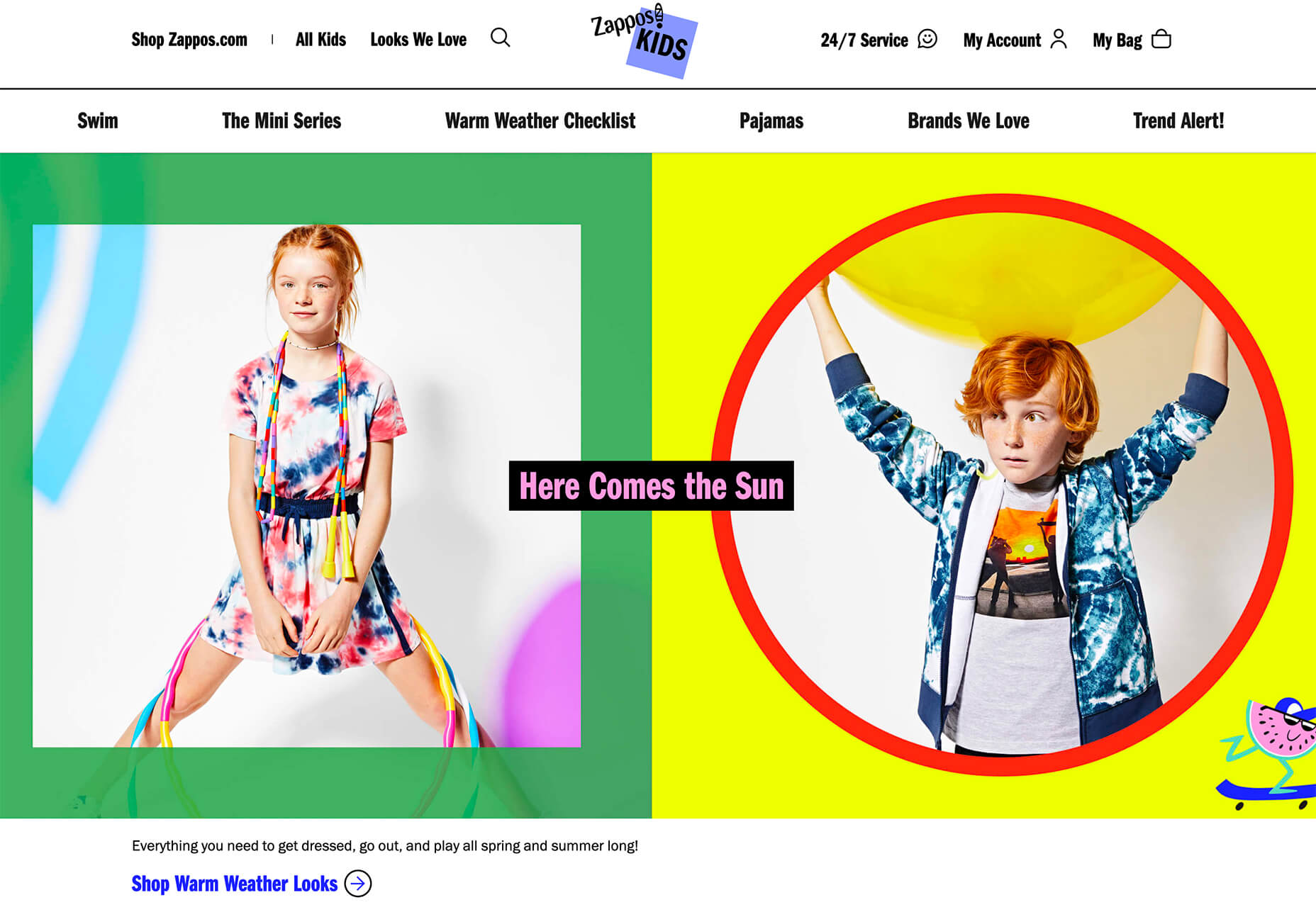
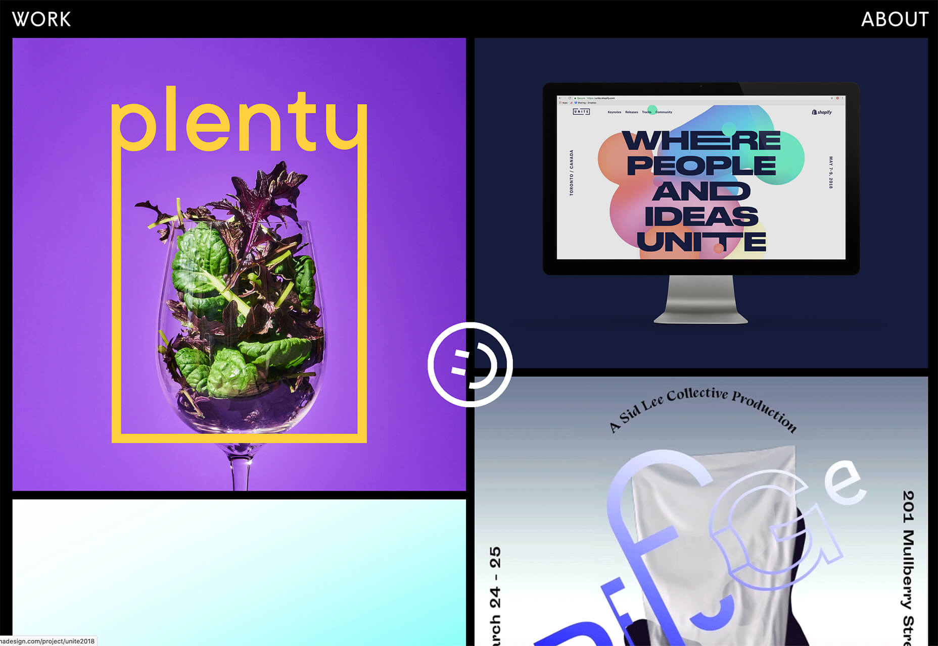
Eduardo del Fraile uses a side scroll to show different projects in his portfolio. In addition to scroll, each element also has a simple and beautiful animation that allows you to see each product he has designed. Everything about the scrolling motion is intuitive, and the site never scrolls vertically, which is where many side scrollers go wrong.

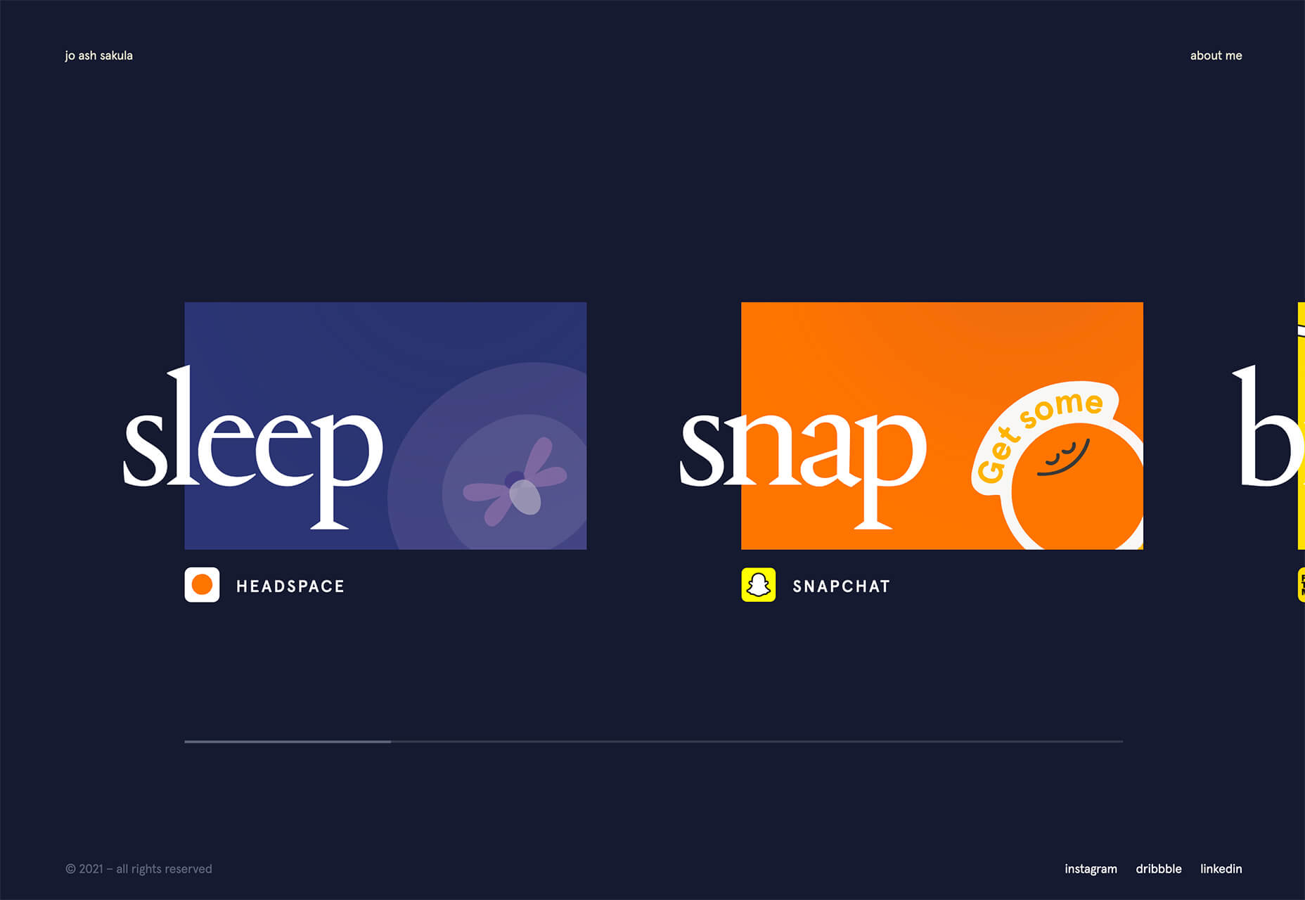
Jo Ash Sakula uses a similar concept for the side scroll here but with different design elements. The bold card elements are striking in terms of color, contrast, and design. You know the scroll will move horizontally because a third element sneaks into your field of vision on the right side. It’s simple, clean, and highly usable.

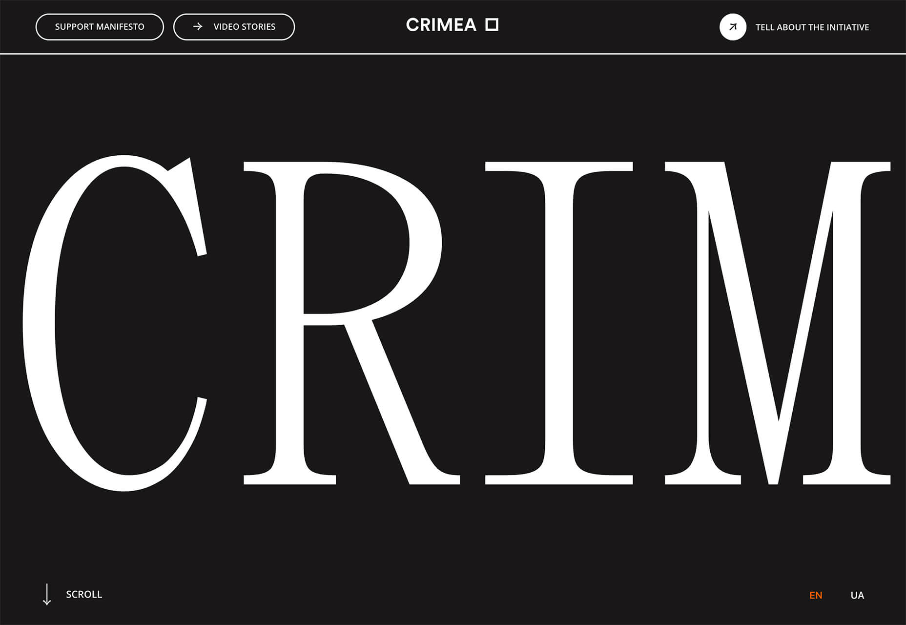
Crimea is interesting because it has an “almost brutalism” style design and uses a side-scrolling pattern. The design is bold and almost overwhelming, but the scroll works to tell a nice story with visuals and content.


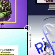
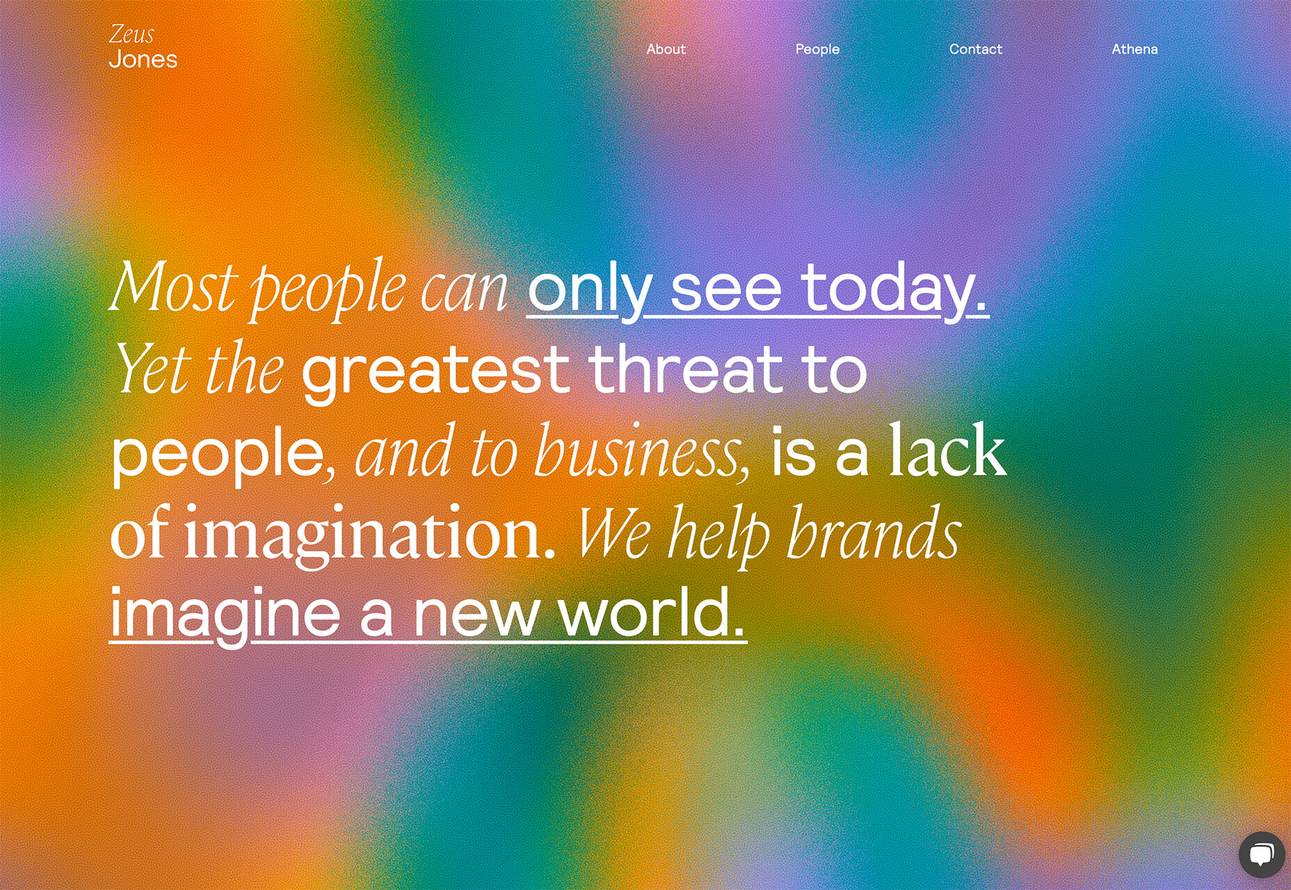
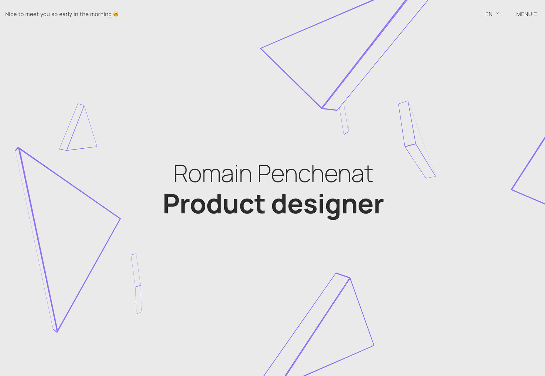
3. Typography Animations

Web typography can make or break a design from font choice to size and color to animation, every detail with text elements matters.

This trend explores and pushes the boundaries of animation with text elements in website design. And it is so tricky. The difference between an amazing result and a design fail is a thin line that can be quite subjective.

Each of these examples does something unique with text and animation together to create just the right feel. The flow for each is seamless and text elements – while incorporating movement – maintain readability.

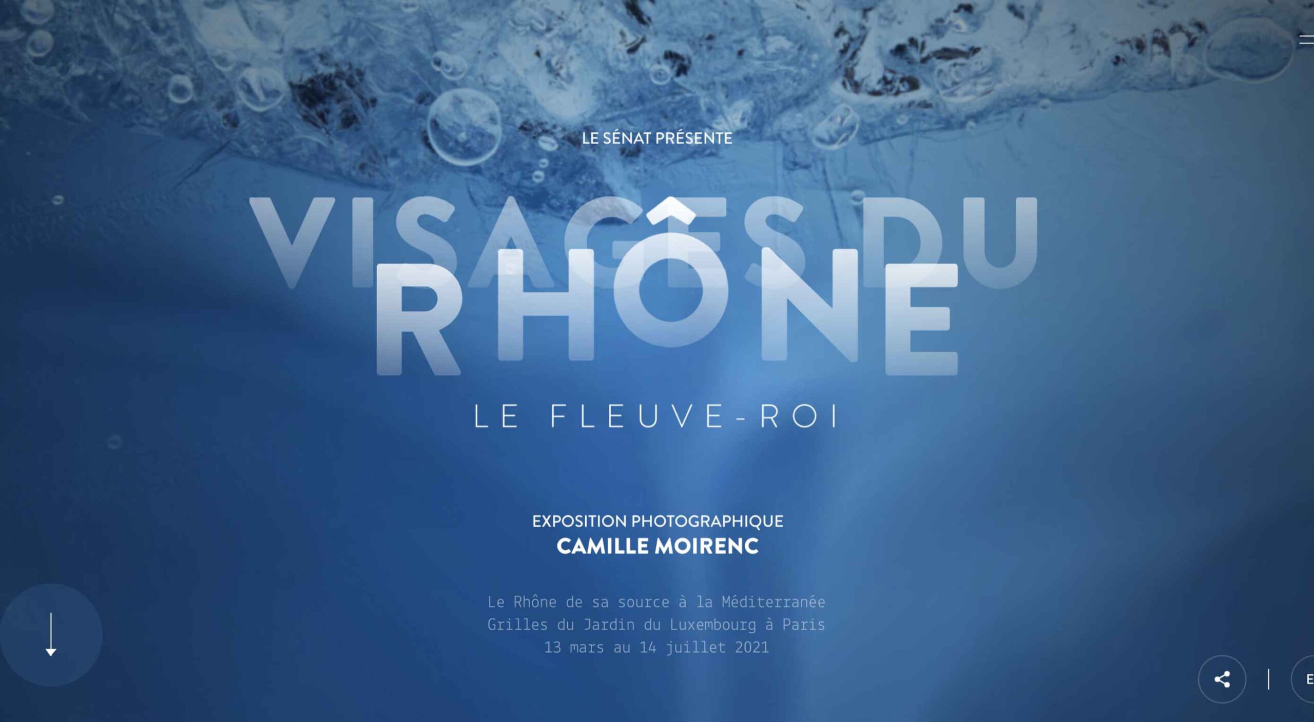
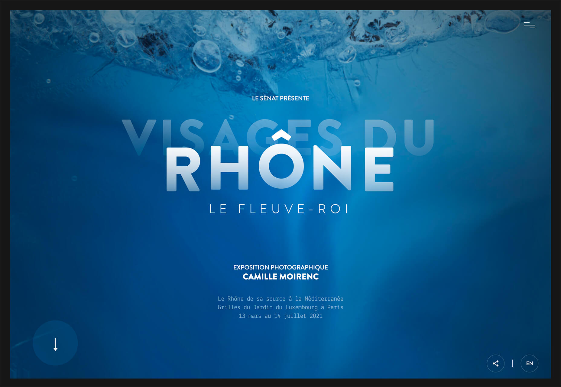
Visages Du Rhone has two layers of animation. The first happens as the words come onto the screen as the color and fade change within the letters. The second is a subtle hover state with a fluid feel for the letters that match the design’s underwater theme. What’s special about the typography animation is that it happens without distorting the letters, something many other liquid text animations do.

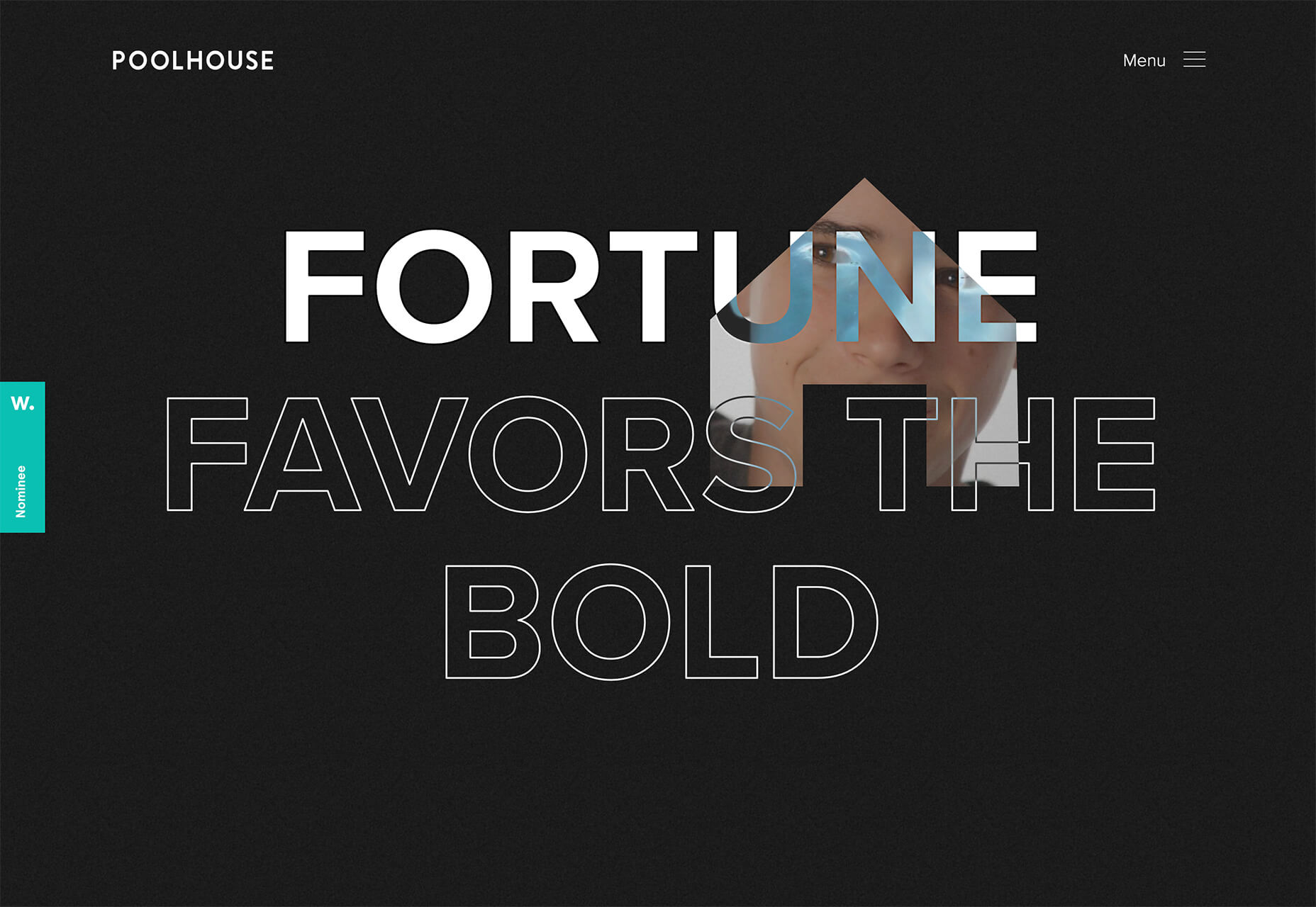
Poolhouse uses transparent letters with movement in a layer behind the words. What’s very neat here is the additional filtering so that the background motion still works while maintaining the integrity of each letterform. Again, the focus on keeping text readable is what sets this design apart and makes it trend-worthy.

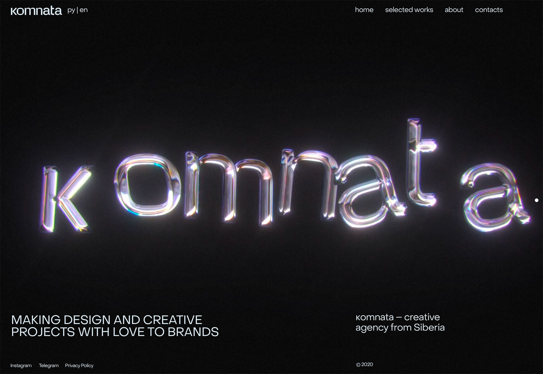
Komnata takes a wholly different approach with letters that float and look like balloons. The motion mimics what you would expect from an element that looks and feels like something in the real world. The user doesn’t have to do anything for this motion to take place. The animation might be even more effective if the scroll and pointer did not have a tail that “draws” on the screen as a distracting element.


Conclusion

The good thing about looking at variations of different trends is that you can see the practical application and apply it to your projects. While you might not move to a full sliding scroll on your website homepage, you could use that concept in another part of the design.

Experiment, have fun and draw inspiration from trending website designs.

Source

The post 3 Essential Design Trends, April 2021 first appeared on Webdesigner Depot.


Source de l’article sur Webdesignerdepot

Everyday design fans submit incredible industry stories to our sister-site, Webdesigner News. Our colleagues sift through it, selecting the very best stories from the design, UX, tech, and development worlds and posting them live on the site.

The best way to keep up with the most important stories for web professionals is to subscribe to Webdesigner News or check out the site regularly. However, in case you missed a day this week, here’s a handy compilation of the top curated stories from the last seven days. Enjoy!

The New Trello – Going Beyond the Board

Flameshot – Superb Screenshot Tool

GitHub Surf – Open repositories in a VSCode Environment

The Never-Ending Job of Selling Design Systems

The Secret Ingredients to Design

What Saul Bass Can Teach Us About Web Design

2021 Planner for Notion – A Smart Notion Workspace

Ideas for CSS Button Hover Animations

Ray.so – Create Beautiful Images of Your Code

Variable Font Reveals The Full Horror of The Climate Crisis

Design Systems For Figma: Year In The Life Of A Material Design Advocate

Interface Market – An Extensive Collection of App UI Kits

DogeHouse – Open-Source Audio Chat on the Web

Interaction Design is More Than Just User Flows and Clicks

Design Trends 2021

Straw.Page – Extremely Simple Website Builder

The Impact of Web Design and SEO Conversion Rates

Powerful Microinteractions to Improve Your Prototypes

What’s New in Ecommerce, February 2021

Colortopia – The Easiest Way to Find Colors

5 Simple Design Patterns to Improve Your Website

TextBuddy for macOS – A Swiss Army Knife for Plain Text

Upcoming Interesting JavaScript ES2021 (ES12) Features

WordPress 5.7: Big ol’ jQuery Update

JavaScript reducer – A Simple, Yet Powerful Array Method

Source

The post Popular Design News of the Week: February 15, 2021 – February 21, 2021 first appeared on Webdesigner Depot.


Source de l’article sur Webdesignerdepot

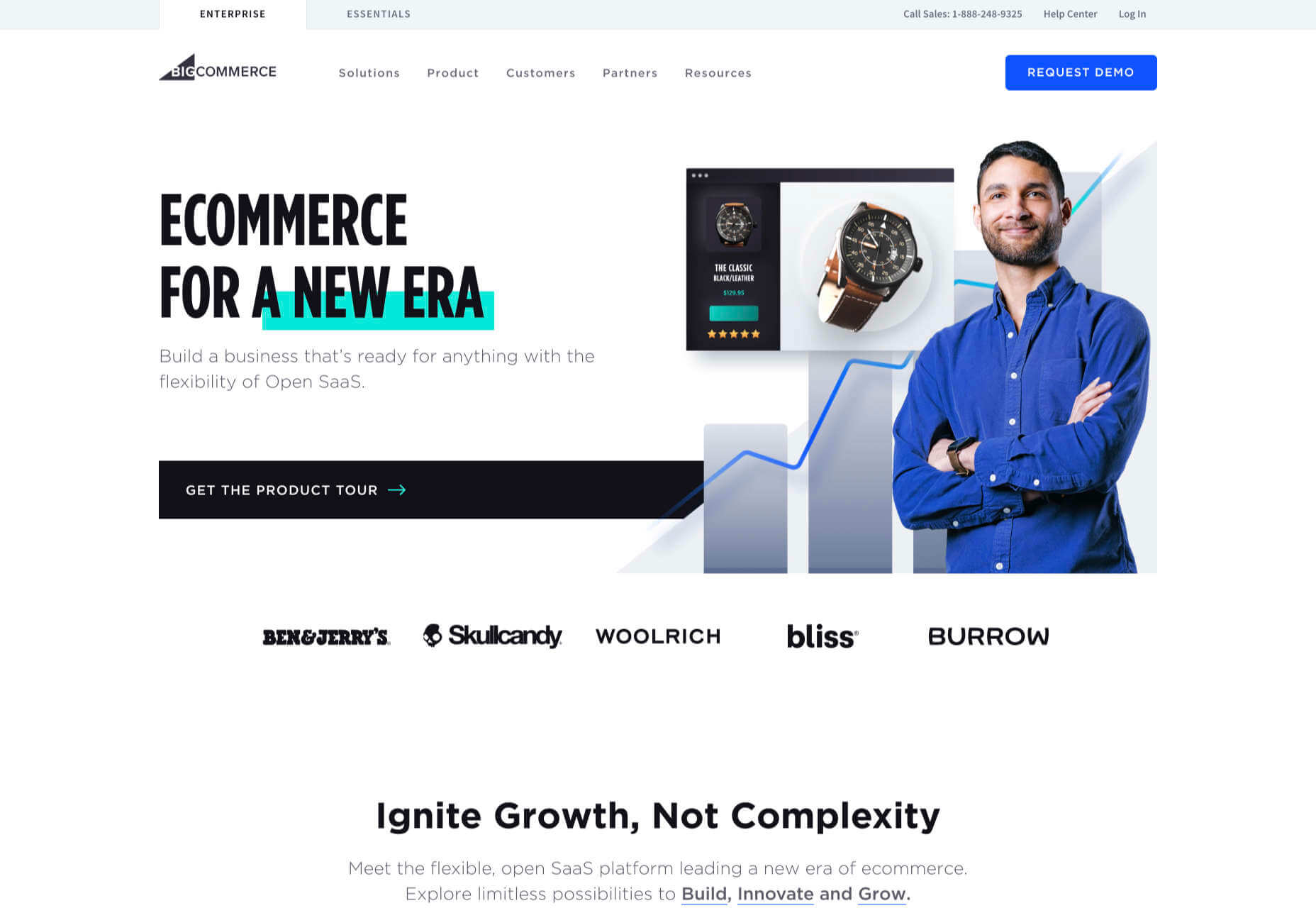
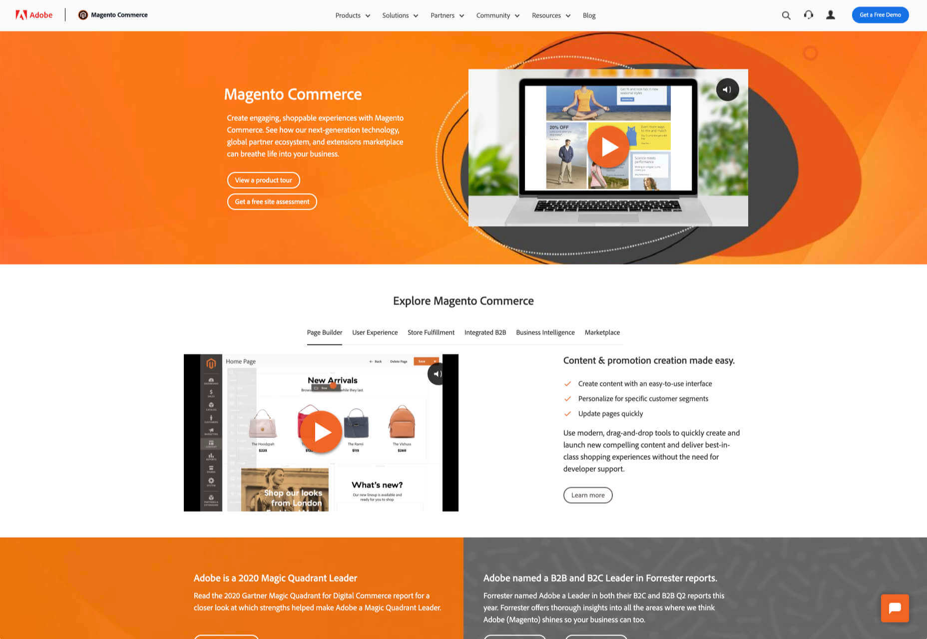
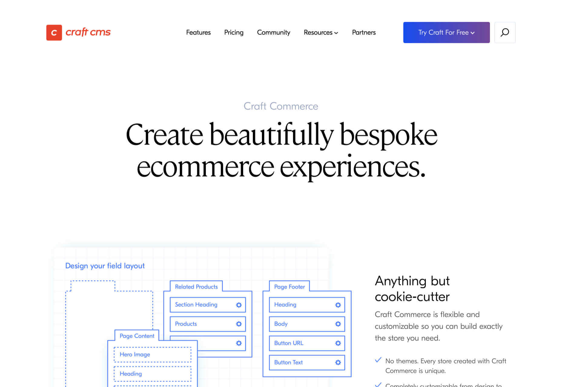
It’s never been easier to set up an ecommerce store and start selling. There are a dizzying array of ecommerce solutions available in 2021, and most are feature-rich and competitively priced.

Ecommerce sites are notoriously difficult to migrate from platform to platform, so more often than not, you’ll be committed to your chosen solution for years. The key when choosing an ecommerce solution to maximize your return on investment, is to consider not just what your business needs today but what it will need tomorrow.

There are two basic approaches to ecommerce. The first is a dedicated platform that handles everything. The second is a plugin that adds ecommerce features to an existing CMS. Both approaches have benefits and drawbacks.

1. Shopify: Best for Almost Everyone

Shopify is a well-known, well-liked, and reliable dedicated ecommerce platform. As a system for getting a business off the ground and selling fast, it is peerless.

Shopify jealously guards developer access, with templates and plugins pre-vetted. Unlike some marketplaces, you can be confident that there are no hidden surprises in your shiny new store.

And because Shopify has passed the point of market saturation, it’s worthwhile for big players to provide their own plugins; credit services like Klarna and shipping companies like netParcel can be integrated with a few clicks.

The admin panel is a touch complex, as Shopify is designed to allow a single account to be linked to multiple stores. But once you’re set up and familiar with where to find everything, it’s a slick, streamlined business management system.

Whenever a client says, “we want to start selling online.” My first thought is, “Shopify.” And for 90% of clients, it’s the right choice.

And that’s where this roundup should end…except there’s still that 10% because Shopify isn’t perfect.

For a start, an all-in-one platform doesn’t suit everyone. If you already have a website you’re happy with, you’ll either need to migrate or lease a dedicated domain for your store.

Shopify’s platform is very secure, which inspires confidence in buyers, but the price of that security is a lack of flexibility in the design.

Then there’s the infamous variant limit. Shopify allows 100 variants on a product. Almost every client runs into that wall at some point. Let’s say you’re selling a T-shirt: male and female cuts are two variants; now add long or short sleeves, that’s four variants; now add seven sizes from XXS to XXL, that’s 28 variants; if you have more than three color options, you’ve passed the 100 variant limit. There are plugins that will allow you to side-step this issue, but they’re a messy hack that hampers UX for both customer and business.

Shopify should certainly be on every new store owner’s shortlist, but there are other options.

2. WooCommerce: Best for WordPress Users

If you’re one of the millions of businesses with a pre-existing site built on WordPress, then adapting it with a plugin is the fastest way to get up and running with ecommerce.

WooCommerce is regularly recommended as “Best for WordPress Users,” which is a back-handed compliment that belies the fact that WooCommerce reportedly powers 30% of all ecommerce stores. If running with the crowd appeals to you — and if you’re using WordPress, it presumably does — then you’re in the right place.

WordPress has a gargantuan plugin range. As such, there are other plugins that will allow you to sell through a WordPress site. The principle benefit of WooCommerce is that as the largest provider, most other plugins and themes are thoroughly tested with it for compatibility issues; most professional WordPress add-ons will tell you if they’re compatible with WooCommerce. If your business is benefitting from leveraging WordPress’ unrivaled ecosystem, it can continue to do so with WooCommerce.

The downside to WooCommerce is that you’re working in the same dashboard as the CMS that runs your content. That can quickly become unmanageable.

WooCommerce also struggles as inventories grow — every product added will slow things a little — it’s ideally suited to small stores selling a few items for supplementary income.

3. BigCommerce: Best for Growth

BigCommerce is an ecommerce platform similar to Shopify, but whereas Shopify is geared towards newer stores, BigCommerce caters to established businesses with larger turnovers.

The same pros and cons of a dedicated ecommerce solution that applied to Shopify also apply to BigCommerce. One of the considerable downsides is that you have less control over your front-end code. This means that you’re swapping short-term convenience for long-term performance. Templates, themes, and plugins — regardless of the platform they’re tied to — typically take 18 months to catch up with best practices, leaving you trailing behind competitors.

BigCommerce addresses this shortcoming with something Shopify does not: a headless option. A headless ecommerce platform is effectively a dedicated API for your own store.

Enabling a headless approach means that BigCommerce can be integrated anywhere, on any technology stack you prefer. And yes, that includes WordPress. What’s more, being headless means you can easily migrate your frontend without rebuilding your backend.

BigCommerce also provides BigCommerce Essentials, which is aimed at entry-level stores. It’s a good way to get your feet wet, but it’s not BigCommerce’s real strength.

If you have the anticipated turnover to justify BigCommerce, it’s a flexible and robust choice that you won’t have to reconsider for years.

4. Magento: Best for Burning Budgets

If you have a development team at your disposal and a healthy budget to throw at your new store, then Magento could be the option for you.

You can do almost anything with a Magento store; it excels at custom solutions.

Magento’s main offering is its enterprise-level solution. You’ll have to approach a sales rep for a quote — yep, if you have to ask the price, you probably can’t afford it. Magento has the track-record and the client list to appeal to boards of directors for whom a 15-strong development team is a footnote in their budget.

That’s not to say that a Magento store has to be expensive; Magento even offers a free open source option. But if you’re not heavily investing in a custom solution, you’re not leveraging the platform’s key strengths.

5. Craft Commerce: Best for Custom Solutions

If you’re in the market for a custom solution, and you don’t have the budget for something like Magento, then Craft Commerce is ideally positioned.

Like WooCommerce for WordPress, Craft Commerce is a plugin for Craft CMS that transforms it into an ecommerce store.

Unlike WordPress, Craft CMS doesn’t have a theme feature. Every Craft Commerce store is custom built using a simple templating language called Twig. The main benefit of the approach is that bespoke solutions are fast and relatively cheap to produce, with none of the code bloat of platforms or WordPress.

Because your site is custom coded, you have complete control over your frontend, allowing you to iterate UX and SEO.

You will need a Craft developer to set up Craft Commerce because the learning curve is steeper than a CMS like WordPress. However, once you’re setup, Craft sites are among the simplest to own and manage.

6. Stripe: Best for Outliers

Ecommerce solutions market themselves on different strengths, but the nature of design patterns means they almost all follow a similar customer journey: search for an item, add the item to a cart, review the cart, checkout. Like any business, they want to maximize their market share, which means delivering a solution that caters to the most common business models.

Occasionally a project happens along that doesn’t fit that business model. Perhaps you’re selling a product that’s uniquely priced for each customer. Perhaps you’re selling by auction. Perhaps you don’t want to bill the customer until a certain point in the future.

Whatever your reason, the greatest customization level — breaking out of the standard ecommerce journey — can be managed with direct integration with Stripe.

Stripe is a powerful payment processor that handles the actual financial transaction for numerous ecommerce solutions. Developers love Stripe; its API is excellent, it’s documentation is a joy, it’s a powerful system rendered usable by relentless iteration.

However, this approach is not for the faint-hearted. This is a completely custom build. Nothing is provided except for the financial transaction itself. Every aspect of your site will need to be built from scratch, which means hefty development costs before seeing any return on investment.

The Best eCommerce Solution in 2021

The best ecommerce solution is defined by three factors: the size of your store, the anticipated growth, and the degree of custom design and features you want or need.

Shopify is the choice of most successful small stores because you can be selling inside a day. For businesses with an existing presence and a smaller turnover, those on WordPress will be happy with WooCommerce. For larger stores planning long-term growth, BigCommerce’s headless option is ideal. Craft Commerce is a solid performer that marries low costs with flexibility for businesses that need a custom approach.


Featured image via Unsplash.

Source

The post 6 Best Ecommerce Solutions for 2021 first appeared on Webdesigner Depot.


Source de l’article sur Webdesignerdepot

To understand why user onboarding is such an indispensable tool, we need to empathize with the people using our products; we all come from different backgrounds and cultures, we make different assumptions, and we see the world differently.

User onboarding helps mitigate these differences by making your product’s learning curve less steep.

However, companies often make unfortunate mistakes that hinder user experience and cause frustration. In today’s article, we’ll take a look at eight ways companies ruin their products’ onboarding process.

Let’s dive right in, shall we?

1. No User Onboarding at all

As a part of the team that created a product, you’ve probably spent hundreds of hours going over its features and the most minute detail. Naturally, you know the product like the back of your hand. The user does not.

Naturally, you know the product like the back of your hand. The user does not

We may believe that the app we’ve worked on is straightforward and that user onboarding is probably overkill — but that’s almost never the case. Guiding our users through a product will help with retention, conversion, and their overall satisfaction.

However, there are very rare cases when you can do without user onboarding, here are a few:

  • Your product is too straightforward to cause any confusion;
  • Your product has a formulaic structure, similar to that of other products’ in your category, i.e., social media or e-commerce;
  • Your product relies heavily on Google or iOS design guidelines with common design patterns;
  • Your product is too complex (enterprise or business-oriented) — in such cases, users need special training, rather than just an onboarding;

2. Assuming That Users “Get It”

 One of the vital UX mottos we should always be mindful of is that “we are not our users.” When onboarding them, we always need to assume that they’re at square one. We should communicate with them as if they have no prior knowledge of our product, its terminology, and the way it works.

Providing freshly-registered users with highly contextual information will most likely confuse them. As a result, this will render your attempts to create a helpful onboarding process useless.  

3. Onboarding Users on a Single Touchpoint

it’s tempting to brainstorm which features should make it into the onboarding, then design and code them; that’s a very bad idea

The main problem with the previous point is that it’s too contextual for new users. However, providing no context altogether can be problematic as well. This is commonly found in onboarding processes that focus on a single touchpoint while leaving out the rest of the product.

By choosing to inform users of our product’s features, we force them to detour from their “normal” course of action. This comes at the cost of the user’s frustration.

Since we’re asking people to pay this price, it’s best to provide them with information that will also help them navigate the entire product. As a result, this will decrease the number of times we’ll have to distract them from their ordinary flow.

4. Forcing Users Through Onboarding

We’ve previously mentioned that we mustn’t assume that users have any background knowledge about our products.

The opposite argument can be made — experienced users don’t need a basic onboarding process. It will most likely frustrate them, and it won’t provide them with any real value. Also, forcing users through this process will most likely take the onboarding frustration to a whole other level.

This is why it’s essential that we allow them to skip the parts they don’t find useful. This way, we’ll address the knowledge gaps of the people who really want it and need it.

5. Onboarding Based Purely on Assumptions

This is yet another point that’s implicit in “we are not our users”. Oftentimes, it’s tempting to brainstorm which features should make it into the onboarding, then design and code them; that’s a very bad idea.

Here’s what every designer should do instead:

  • Do user interviews: You should conduct these before having anything designed; user interviews will help you shortlist and prioritize features in terms of their significance, so that the onboarding is focused around the features that matter most.
  • Do usability testing: Once you have a good idea of what features your users consider most important, design onboarding that reflects that; having completed your design, make sure to conduct at least 5 usability testing sessions with users, so that you can make sure that your design works.

6. Just Letting Users Quit

While we shouldn’t force people to go through onboarding, it doesn’t mean we shouldn’t nudge them in the right direction.

find that sweet spot between being front of mind and annoying

People choose not to onboard for many reasons, but showing them around will benefit both parties. Therefore, it’s never wrong to remind them that they can always resume onboarding via email or push notifications (unless you’re too pushy). Make sure to find that sweet spot between being front of mind and annoying. 

Similarly, these two mediums are a great way to deliver valuable information as well.

Here’s a great example of an onboarding email from InVision:

And here’s a clever notification from TripPlanner:

Source: clevertap.com

7. Asking For Too Much Information

We need to always be mindful of the fact that the product’s spokesperson should act as a guide during onboarding. Its goal at the very beginning is to build trust.

We can ask for small favors when we’ve built a solid and lasting relationship

Not only is asking for too much information from the get-go unproductive, but it will also undermine the trust that the user already gave us.

It’s best to abstain from asking freshly-registered users for their credit card information. Nearly 100% of businesses care about profits — and there’s no shame in it. However, today’s most successful companies make money by providing users with value. So it’s best to stimulate users to share their financial data in subtler ways while focusing on customer experience.

The same can be said about subjecting the people using your service to extensive questionnaires. At the first steps of our interaction, it’s all about giving and gaining trust. We can ask for small favors when we’ve built a solid and lasting relationship.

8. Onboarding for the Sake of Onboarding

While there are dozens of reasons why you should guide your users through your product, it needs to be done well. A pointless onboarding process that doesn’t provide users with value is more frustrating than the lack thereof.

Onboarding can be a bit frustrating at times. Pointless onboarding will just raise eyebrows. It will slow users down and disengage them, which is exactly the opposite of what we want.

Conclusion

The process of introducing your users to your product is one of the factors that will define its success.

A critical aspect of user onboarding that we need to always take into account is value. Is this detour from our user’s ordinary course of action valuable to them? Will this improve their experience with the product?

Onboarding demands careful and continuous tailoring. Once perfected, this process will help you win new users’ hearts and help you build brand loyalty.


Featured image via Unsplash.

Source


Source de l’article sur Webdesignerdepot

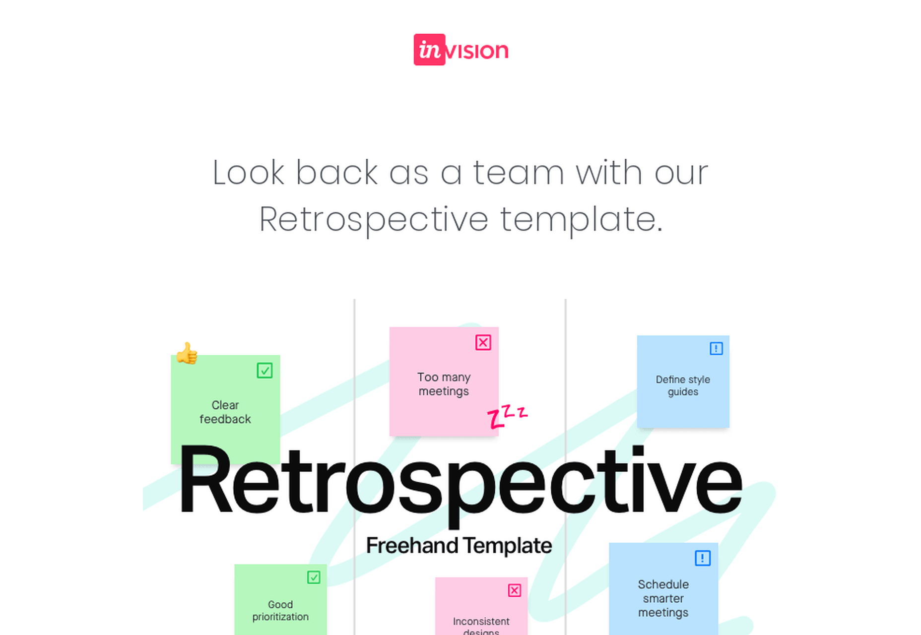
Many people dream of a career in web design, but it may actually be more attainable than you think.

There are countless online courses, of variable quality, with little to no academic structure; self-learning is an option, but it doesn’t come with a curriculum. Without a professional structure and a comprehensive curriculum your dream career might never be more than that.

But there is a practical, fast-track option to making a career in web design a reality, and that’s the Parsons Web Design and Development Certificate.

Built around the innovative teaching approach that Parsons is known for, you’ll learn human-centered design, explore the latest tools, evaluate techniques and approaches, and uncover the secrets of UX. The certificate even offers two distinct tracks, one for designers, and one for developers, so you can take control of your own future.

It’s one of the most creative approaches to a formal design education in the world, and what’s more, because it’s entirely online you can study from anywhere.

What Will I Learn?

Parsons offers a flexible curriculum to suit both designers and developers. There are two core courses, followed by three specialist courses.

learn human-centered design, explore the latest tools, evaluate techniques and approaches, and uncover the secrets of UX

The core courses cover the essentials of web and mobile design, plus JavaScript for designers. Each of the core courses lasts nine weeks. When you’ve completed them, you can opt for a design specialism or a development specialism. (You don’t have to make your choice until you’ve completed the core courses!)

If you prefer design work, you’ll spend a total of 21 further weeks learning mobile design patterns, studying emerging platforms, working with interactive typography, and mastering design systems.

If development is more your thing, then on the 21 week development track you’ll cover advanced HTML, CSS, and JavaScript, learn how to work with APIs, and finish up with experimental JavaScript.

To earn the Web Design and Development Certificate you need to complete the two core courses, plus three specialist courses within two years — a total of 39 weeks of study. Parsons recommend that you take two courses per semester, but it’s possible to complete the entire certificate program in one year.

Is This Really For Me?

Parsons Web Design and Development Certificate is a recognized qualification from a reputable institution that will stand you in good stead in future job interviews. But what’s more important, is the knowledge and experience you’ll gain from the course.

Thanks to the creative, flexible approach to learning, the certificate is suitable for designers and developers at any stage of their career

Thanks to the creative, flexible approach to learning, the certificate is suitable for designers and developers at any stage of their career.

If you’re just starting out, the certificate is a superb way of exploring the field, all the while building skills that will make you stand out to employers.

If you’re a print designer, or a programmer, the Web Design and Development Certificate is a great way to supplement your existing skills and make a lateral move into web work.

And if you’re a grizzled industry professional with decades of experience, you’ll benefit from the track you know least well; designers studying development, developers studying design. Not only will it open up new creative avenues to you, but you’ll find project management easier with a broader outlook on the web.

The best thing about the Parsons Web Design and Development Certificate is that because it’s made up of modules, you can still work part-time as you tick off the courses.

Why Choose Parsons?

Parsons College of Design is part of The New School, a New York-based university. Open Campus, the platform that will run the certificate, is the New School’s online system for pre-college, professional, and continuing education courses.

Thanks to Covid-19, most learning institutions are planning online-only courses for at least the next 12 months, so why not enroll in a program run by an institution that already excels at online teaching.

Innovative courses, underpinned by the creative approach to teaching that Parsons College of Design is renowned for, mean the design education you embark on this fall will be second to none.

Individual courses cost between $577 and $850, with the entire Web Design and Development Certificate costing just $3,704.


[– This is a sponsored post on behalf of Parsons College of Design –]

Source


Source de l’article sur Webdesignerdepot

The Builder Pattern is extremely popular in Java applications. Unfortunately, it’s often misunderstood and incorrectly applied, which results to runtime errors.

Let’s remember the purpose of Builder: set only necessary fields in some object and keep remaining fields set to default values. For example, if we’re preparing a configuration object, then it’s convenient to change only the necessary parameters and keep other parameters set to default values. 

Source de l’article sur DZONE

The biggest trend we’re talking about this month started at WWDC as Apple provided a glimpse of what’s coming next for their operating systems. This time around there’s a distinct design element. Did you catch it?
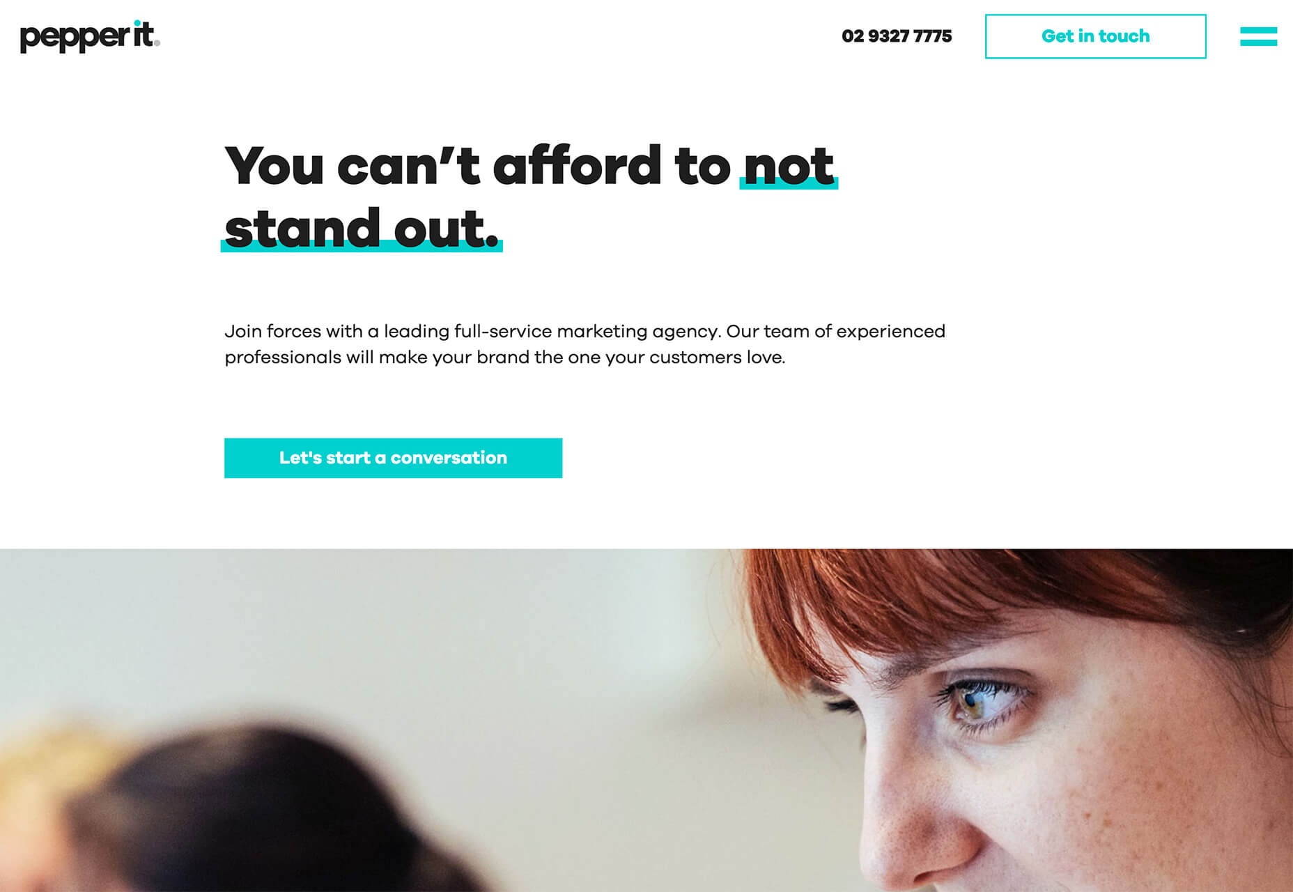
Here’s what’s trending in design this month.

1. Text Highlights and Underlines

There’s always been an unwritten rule in website design that text uses more plain styles. Bold is acceptable, italics are OK from time to time, but underlining is seldom used.

This design trend bucks that concept with text elements that use highlighter or underline elements to emphasize key words. And it works rather nicely.

What it takes to make this work is plenty of contrast and a design style that fits with underline or highlighted elements.

This design trend works thanks to clear intention. The words are obviously important to the overall meaning of the design or what visitors should take away from the content.

Pepper It uses a nifty underline that the letters seem to rest inside of to highlight a key phrase. The shape and color also mimic that of the larger button below, helping the eyes move from one element to the next. It’s an effective use of an underline (or maybe you could call it a highlight) effect in conjunction with brand colors.

Zappos Kids uses a fun highlight in a colorful scheme to highlight a key text element. It almost looks like a button and helps website visitors understand that the entire hero image area is clickable. The highlight serves to make the text more readable and the interactive element more functional.

Zeus Jones uses a variety of text treatments on the homepage, but arguable the underline is most noticeable, likely because it is the most unfamiliar in the context of website design.

2. Distinct Geometry

Geometric shapes in website design have popped up as trending elements in a variety of forms. This iteration is pretty simple: Use of distinct geometry as part of the overall aesthetic.

Geometry might pair with illustrations, photos, text, or in the background or foreground. What’s great about shapes is that they are versatile and work with a lot of other design patterns.

What can be the most challenging about shapes and design is that distinct geometry requires some space and thought. Just tossing a few triangles or rectangles in a design without reason can look rather strange.

So how can you add geometric shapes to a design so that they look intentional? These examples do it well (and in three different ways).

Rui Ma uses square and rectangular containers in a modular grid with portfolio projects inside each. This is one of the most common and applicable uses of geometry – as a container element. What makes it stand out is the circle, smiley wheel (also a geometric shape) that never leaves the center of the screen. The black background for the grid is also a nice contrast element for content blocks.

Thompson Stenning uses shapes in the background and with illustrations to create a stunning homepage visual. It’s big and bold and has just enough going on that you want to look at it and figure out the scene. Maybe what’s most intriguing about the visual concept is that it uses lots of geometric shapes – rectangles, squares, triangles, ad circles – whereas most projects pick one shape to focus on.

Romain Penchenat uses three-dimensional style angles to draw you into the portfolio website. They use a simple animation that “floats” on the homepage and follows the scroll with other geometric elements.

3. Shadow and Gradient Icons

Did you notice all the gradients and subtle shadows in icons in the images previewing iOS 14 or were you just looking at other changes (such as widgets) on the iPhone screen?

We’ve been seeing more designers incorporating more shadows and depth into icons for a while, but this move by a major player in design will push it to the forefront fast. Each of the icons moves from a flat style to one with a background gradient color as well as more shadows within icon elements for depth.

Don’t worry, the design still looks very much like Apple, but is a little more reminiscent of the skeuomorphism style icons from earlier versions of iOS.

It’s nice that the color and shadow elements are contained within each icon. This creates more visual interest and depth for each element without getting cluttered or junky. The gradients are also super simple, using a darker version of the main color in a monotone element.

It’s an iconography style that others are already using. DG Studio has a collection of icons on its homepage with subtle gradients and shadowing in the designs. Again, what’s nice about this trend is that it adds depth to visuals without tricks that get in the way of visual comprehension.

Guillaume Gouessan uses gradients in image icons in much the same way as the previous examples but with a little more color variation. Here, you can see what the gradient looks like when using a color change that’s not super drastic, but more dramatic than a monotone option. You can find some use of the more monotone gradient on his site below the scroll in the large desk image. (It’s definitely worth a few clicks to check it out.)

Love it or hate it, gradients and shadows seem to be here to stay for a while.

Conclusion

How often do you find yourself looking to major brands and companies for design inspiration? While a lot of web design trends start as experiments with smaller sites, the big players can really shape what gets popular (or not).

The example of Apple moving to icons with more shadows and gradients is a prime example. We’ve been seeing more of these elements creeping in for a while, but this style is about to get very big again.

Source

p img {display:inline-block; margin-right:10px;}
.alignleft {float:left;}
p.showcase {clear:both;}
body#browserfriendly p, body#podcast p, div#emailbody p{margin:0;}

Source de l’article sur

What’s this “Producer/Consumer” thing? It’s around us, everywhere. Every time you see some kind of workflow with multiple serial steps, that’s an example. A production line in a car factory, a fast-food kitchen, even the postal service.

So why do we care about it? Well, that’s easy: in almost every piece of software we write, there’s a pipeline to fulfill. And as every pipeline, once a step is completed the output is redirected to the next one in line, freeing up space for another execution.

Source de l’article sur DZONE

In this guide, we provide an introduction to the world of design patterns. For each pattern, we further understand the pattern and the context in which it is applicable, with real-world examples.

In this post, you will learn:

Source de l’article sur DZONE