Articles

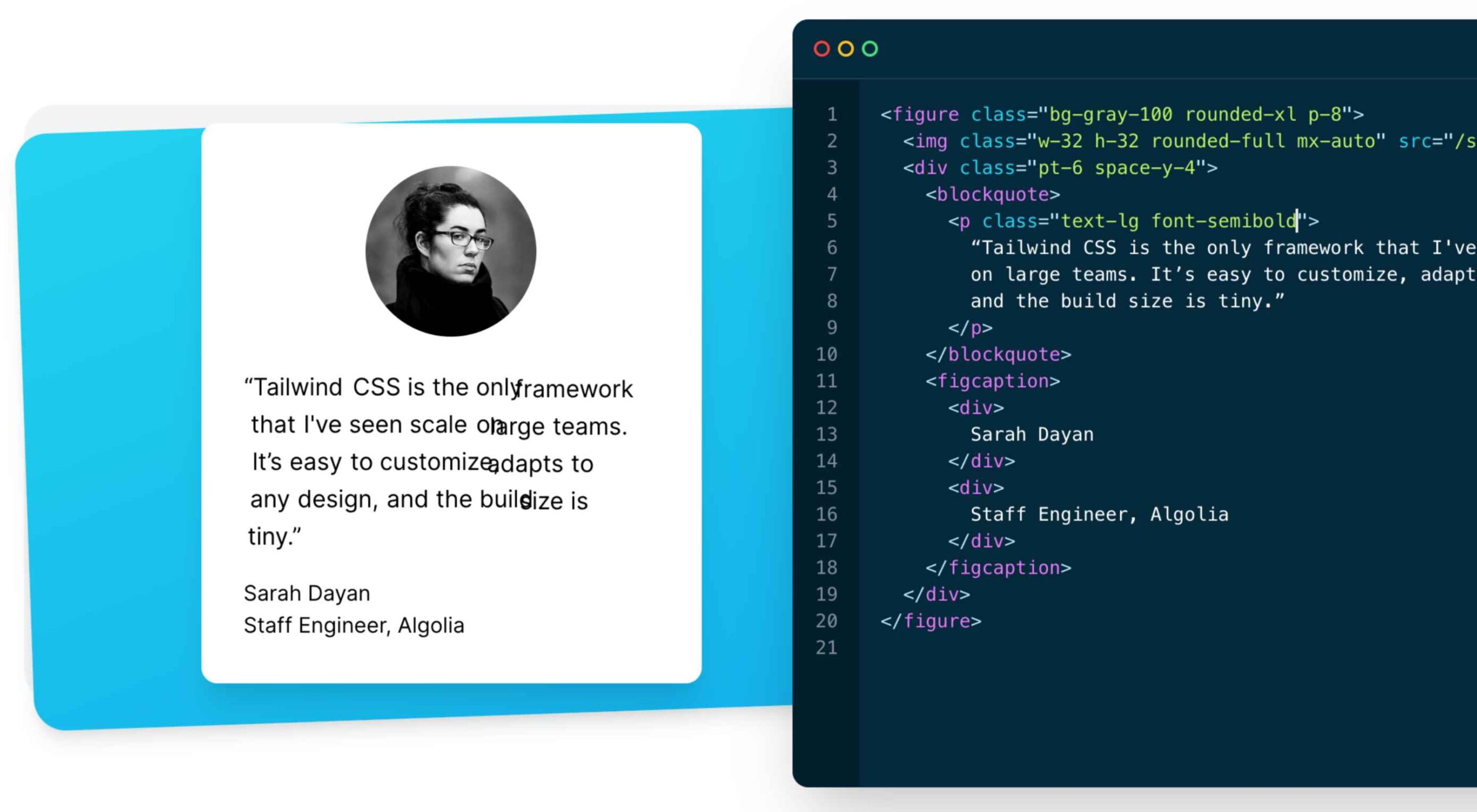
As a utility-first CSS framework, Tailwind has rapidly become popular among developers. With its fast styling process and the freedom it offers when designing a website, it’s really no wonder why.

But how can you make sure this is the right CSS framework for your upcoming development projects? In this blog post, you’ll learn what Tailwind is, and how it differs from other frameworks like Bootstrap, or Foundation.

In addition, we will highlight the main advantages and disadvantages of the framework. By the end, you will be able to make an honest and objective assessment as to whether Tailwind is the right framework for you. So without further ado, let us dive deeper into it. 

What is Tailwind CSS?

First released in May 2019, Tailwind CSS is a front-end CSS framework. It is currently at version 2.2. Since its release, Tailwind has created quite a following. More than 260k developers have used it to enhance their design systems.

Stats like these make Tailwind one of the most popular CSS frameworks on the market, and all in less than two years. There are many reasons for this. Primarily, because its features make it the ideal choice for a wide variety of projects. Tellingly, most developers prefer it to create React projects.

The main difference between Tailwind and its competitors is that it gives developers complete control over the styling of a web application. So, is it the right CSS framework for you? To answer this question, let us take a look at Tailwind’s advantages and disadvantages.

Tailwind CSS: Pros and Cons

Tailwind CSS: Advantages

1. Control Over Styling

Tailwind is a unique CSS framework when it comes to styling web applications, meaning that Tailwind does not have a default theme that you have to use like other CSS frameworks.

For example, you can give each project a different look even if you use the same elements (color palette, size, etc.). Therefore, it’s one of the few CSS frameworks that is not opinionated on how you should style your project. 

2. Faster CSS Styling Process

There is no faster framework than Tailwind when it comes to styling HTML. As a result, you can easily create good-looking layouts by styling elements directly. This is possible because Tailwind offers thousands of built-in classes that do not require you to create designs from scratch.

Therefore, you do not have to write CSS rules yourself. These CSS classes are the main reason why building and styling with Tailwind is so fast. 

3. Responsiveness and Security 

With Tailwind’s pre-built classes, you can design the layout directly in an HTML file. This makes it a very responsive, mobile-friendly CSS framework. Apart from that, Tailwind has proven to be a stable framework since its initial release.

The framework was developed by top-notch engineers, which is why bugs and breaks are rare. 

4. Additional Features 

Tailwind CSS works in the front end of a website. For this reason, it is reasonable for developers to demand ultimate responsiveness. Well, Tailwind provides the ability to create responsive themes for your web applications and remove all unused CSS classes. With PurgeCSS, Tailwind helps you keep your final CSS as small as possible.

Tailwind CSS: Disadvantages

1. Styling and HTML are Mixed

Because you do not have to write CSS rules yourself, Tailwind works differently than most CSS frameworks. While this is great for those unfamiliar with CSS, it also means that Tailwind mixes style rules in with your HTML files.

This goes against the principle of the “separation of concerns.” Many developers prefer to separate page structure and style, claiming that classes make the Tailwind markup process verbose. 

2. It Takes Time to Learn 

Because of the built-in classes, Tailwind CSS is quite learning-intensive. Even for experienced developers, it can be a challenge to learn how to use and fully utilize the pre-built classes. But, of course, as with any other development task, practice makes perfect.

However, if you are confident and quick when it comes to writing CSS classes, Tailwind may not be the best choice for you. Even if that’s true, Tailwind generally makes CSS styling faster in the long run.  

3.  Lack of Important Components

Unlike Bulma and Bootstrap, Tailwind does not have many significant styling components. Unfortunately, this means you have to manually add features like headers, buttons, and navigation bars for web apps.

This is not a significant drawback, as experienced developers can implement these features quickly. However, you will need to spend some time doing so. 

4. Documentation 

Although Tailwind CSS has made great strides when it comes to adding guides and video tutorials, it still lags behind competitors like Bootstrap. Of course, you can always contact the developers if you have a problem.

However, keep in mind that this may take some time. For this reason, you may need to customize the framework to your needs manually.

Is Tailwind Worth Trying?

In a few words, working with Tailwind is quite different from other CSS frameworks. We have identified its main advantages and disadvantages. Based on these features, we can easily say that Tailwind is:

  • An excellent solution for developers familiar with CSS who want to speed up the creation and design process in the long run.
  • Not such a good idea if you are not familiar with CSS or do not want to spend time learning a new CSS framework. 

It becomes clear that it all depends on your personal needs and preferences. However, if saving time on CSS styling is a priority for you, you should definitely give Tailwind a try.

Regardless of whether you choose to use Tailwind or not, it’s evident that many developers use it for good reasons. Since it offers a faster styling process and is a responsive and stable framework, it’s here to stay.

Tailwind can help you save time and change the way you design websites, and so taking the time to test it out is worthwhile.

Source

The post The Pros and Cons of Tailwind CSS first appeared on Webdesigner Depot.


Source de l’article sur Webdesignerdepot

Every day design fans submit incredible industry stories to our sister-site, Webdesigner News. Our colleagues sift through it, selecting the very best stories from the design, UX, tech, and development worlds and posting them live on the site.

The best way to keep up with the most important stories for web professionals is to subscribe to Webdesigner News or check out the site regularly. However, in case you missed a day this week, here’s a handy compilation of the top curated stories from the last seven days. Enjoy!

Medusa – Headless Open-Source Ecommerce Platform

28 Free Website Testing Tools

Google Search Finally Has a Dark Mode

Top 10 Good Website Designs

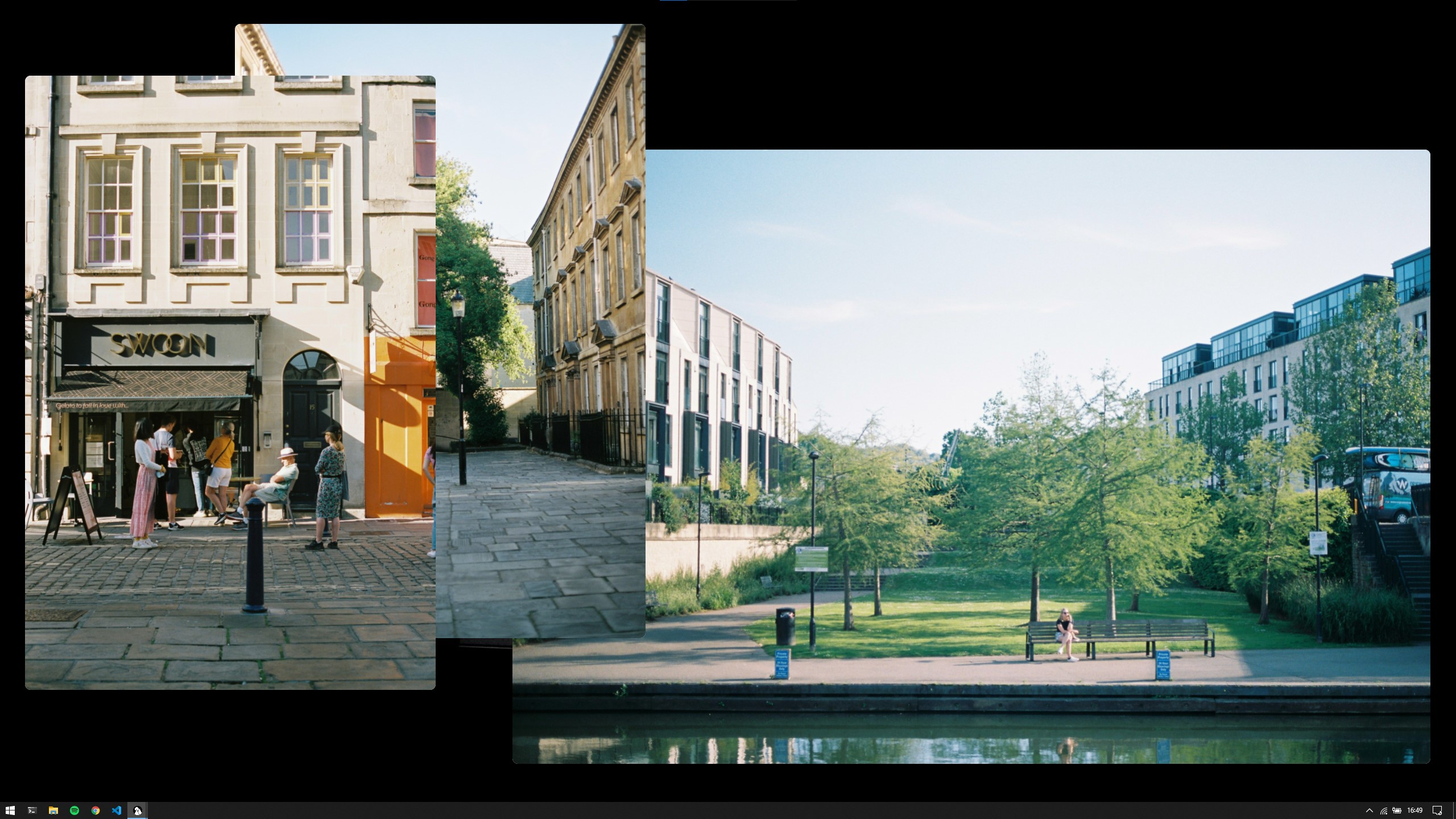
A Minimal Image Viewer for Windows

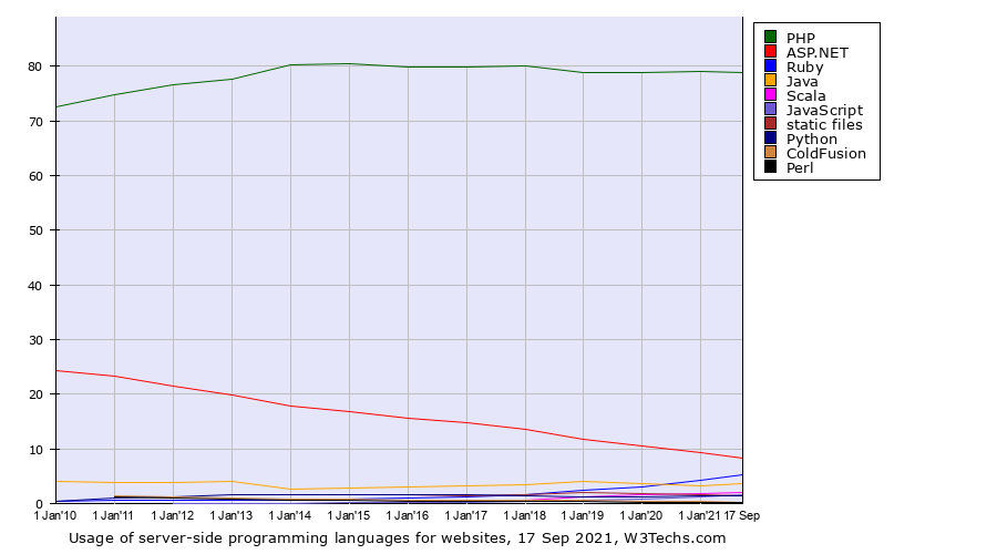
PHP is Still The Most Used Server-Side Language

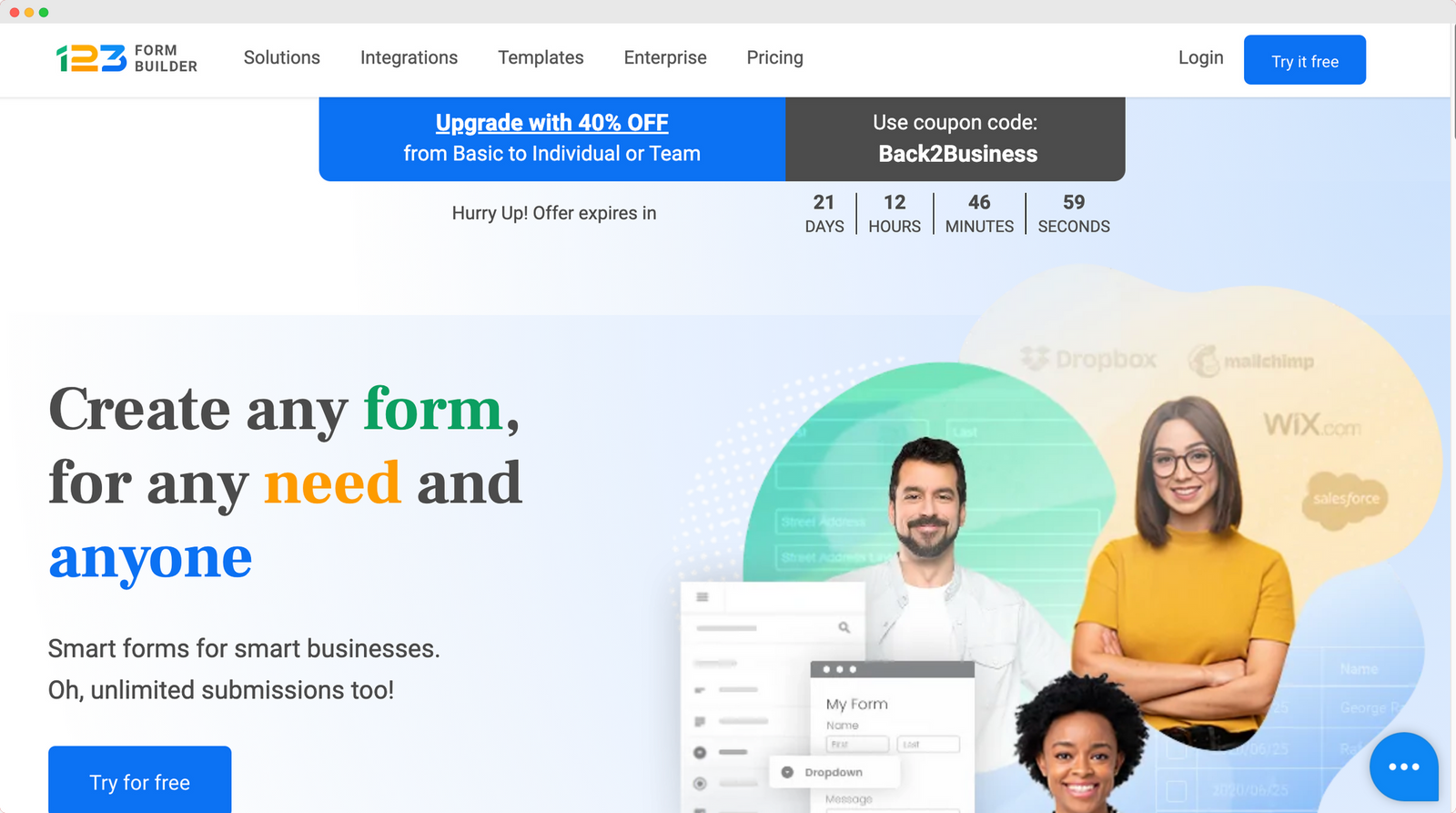
22 Best Typeform Alternatives In 2021 (Free & Paid)

Grainy Gradients

25+ CSS Page Transitions (Free Code + Demos)

Doodle Ipsum – The lorem ipsum of illustrations

Source

The post Popular Design News of the Week: September 13, 2021 – September 19, 2021 first appeared on Webdesigner Depot.


Source de l’article sur Webdesignerdepot


Man working on machine

No-Code

No-code facilitates the reuse of predefined components, typically using a drag and drop interface or a web form. Such platforms always include things like identity and access management, and most importantly don’t require any code to stitch components together, therefore reducing the need for engineers to spend time architecting databases, APIs, or internal workflows. They are always related to one particular task and audience, like web development, spreadsheets, analytics, market automation, etc. Airtable, Zapier, Webflow, Retool, Waylay Digital Twin solution, and similar apps can be found in this category.

Low-Code

On the other hand, low-code has a different set of goals and user personas in mind. The major misconception about low-code is that the “low” in low-code means that a person with hardly any knowledge of coding is the user of such a platform.

Source de l’article sur DZONE

Every day design fans submit incredible industry stories to our sister-site, Webdesigner News. Our colleagues sift through it, selecting the very best stories from the design, UX, tech, and development worlds and posting them live on the site.
The best way to keep up with the most important stories for web professionals is to subscribe to Webdesigner News or check out the site regularly. However, in case you missed a day this week, here’s a handy compilation of the top curated stories from the last seven days. Enjoy!

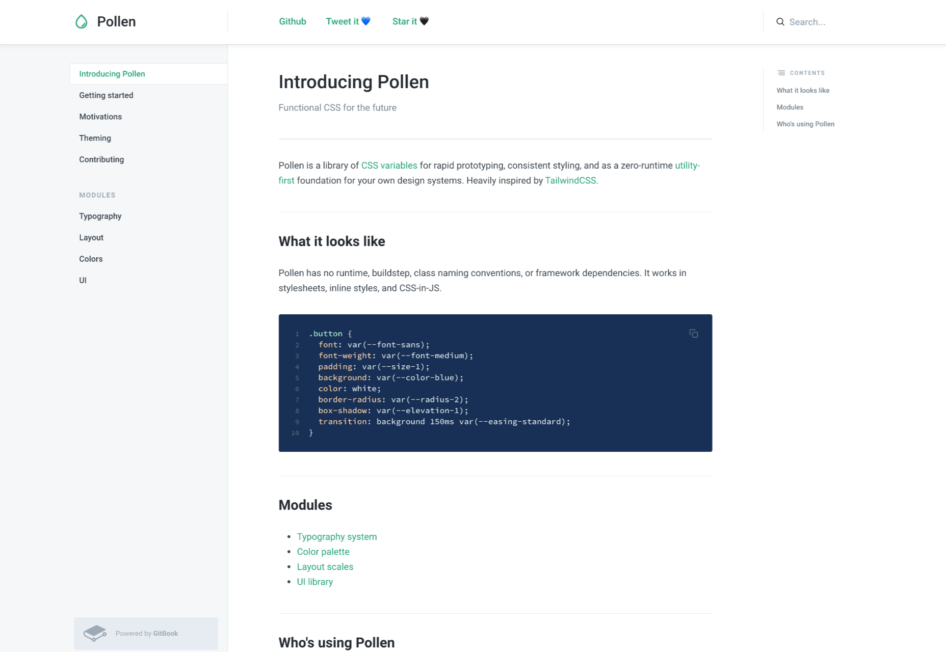
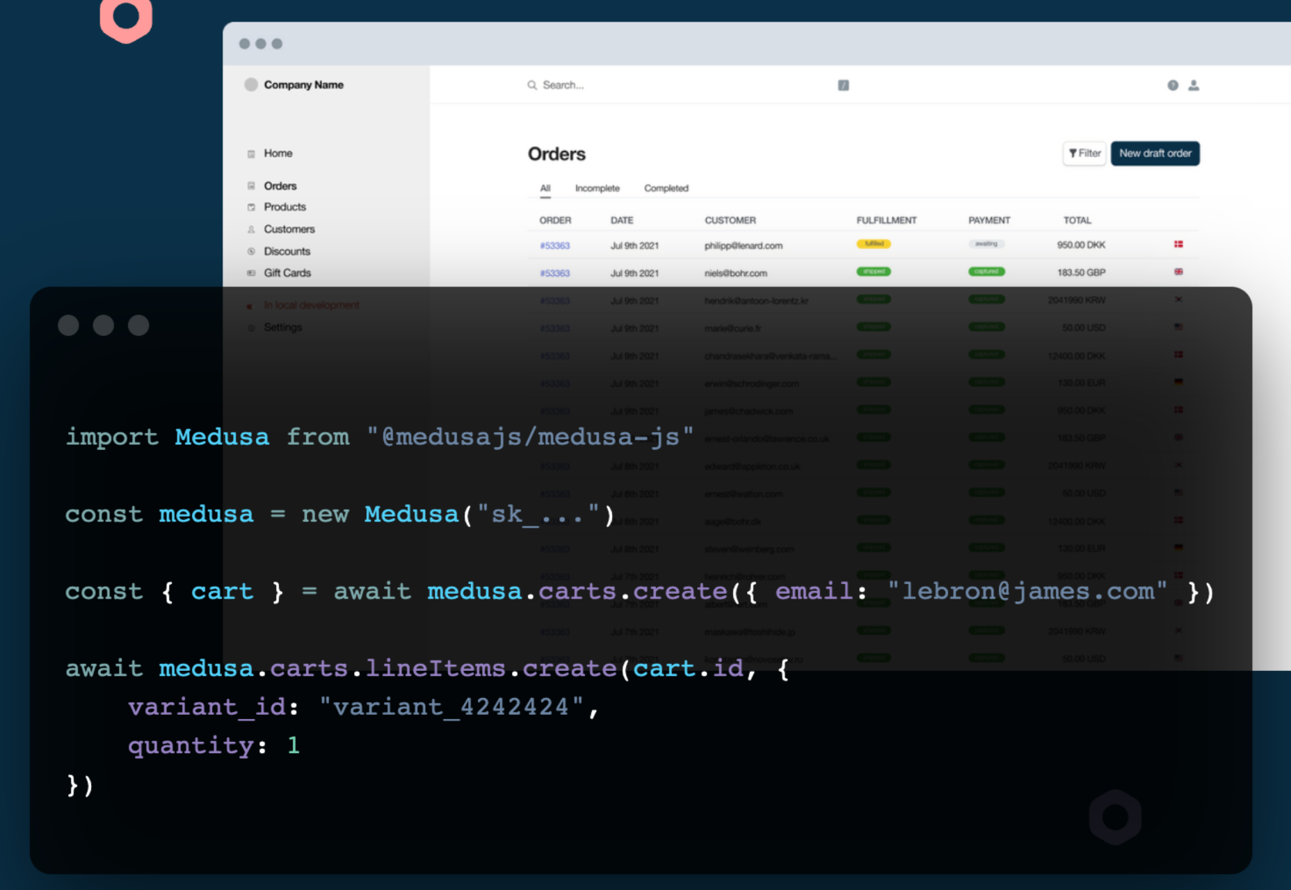
Pollen – A Library of CSS Variables Inspired by TailwindCSS

Using the Platform

Why You Should Switch to Code-Based Design

15 Great Chrome Extensions for Web Designers and Developers

Exciting New Tools for Designers, September 2021

24 CSS Javascript Animation Effects

3 Psychological UX Design Principles to Enhance User Experience

UX vs. UI – Which Should You Focus?

Customize TailwindCSS to Give Your Sites a Unique Look

10 Fundamental UI Design Principles You Need to Know

Source

The post Popular Design News of the Week: September 6, 2021 – September 12, 2021 first appeared on Webdesigner Depot.


Source de l’article sur Webdesignerdepot

Since school is back in session, this month’s roundup has a learning focus. In addition to tools, many of the resources include guides, tutorials, and cheat sheets to help make design work easier.

Here’s what’s new for designers this month.

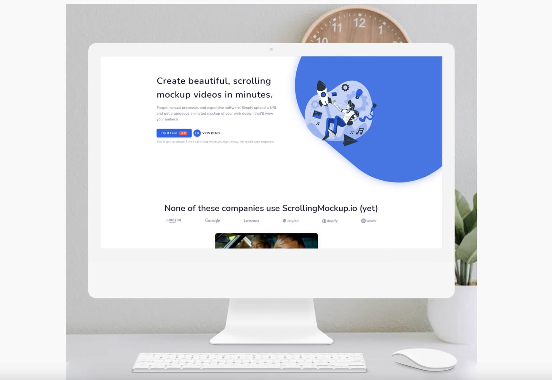
ScrollingMockup.io

ScrollingMockup.io generates high-definition, animated scrolling mockups in minutes. All you have to do is paste your website URL, select from the expanding template gallery, add some music and post. You can create three mockups for free, and then this tool comes with a subscription model. The paid model allows for custom branding for mockups and more.

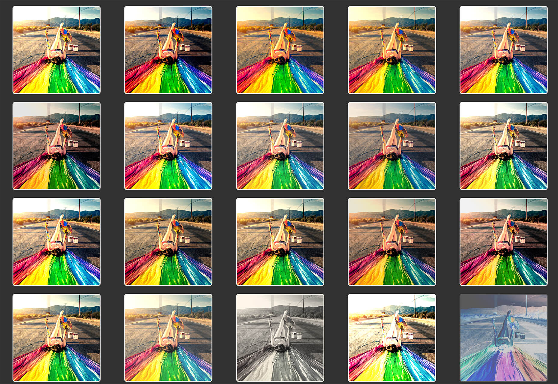
FilterSS

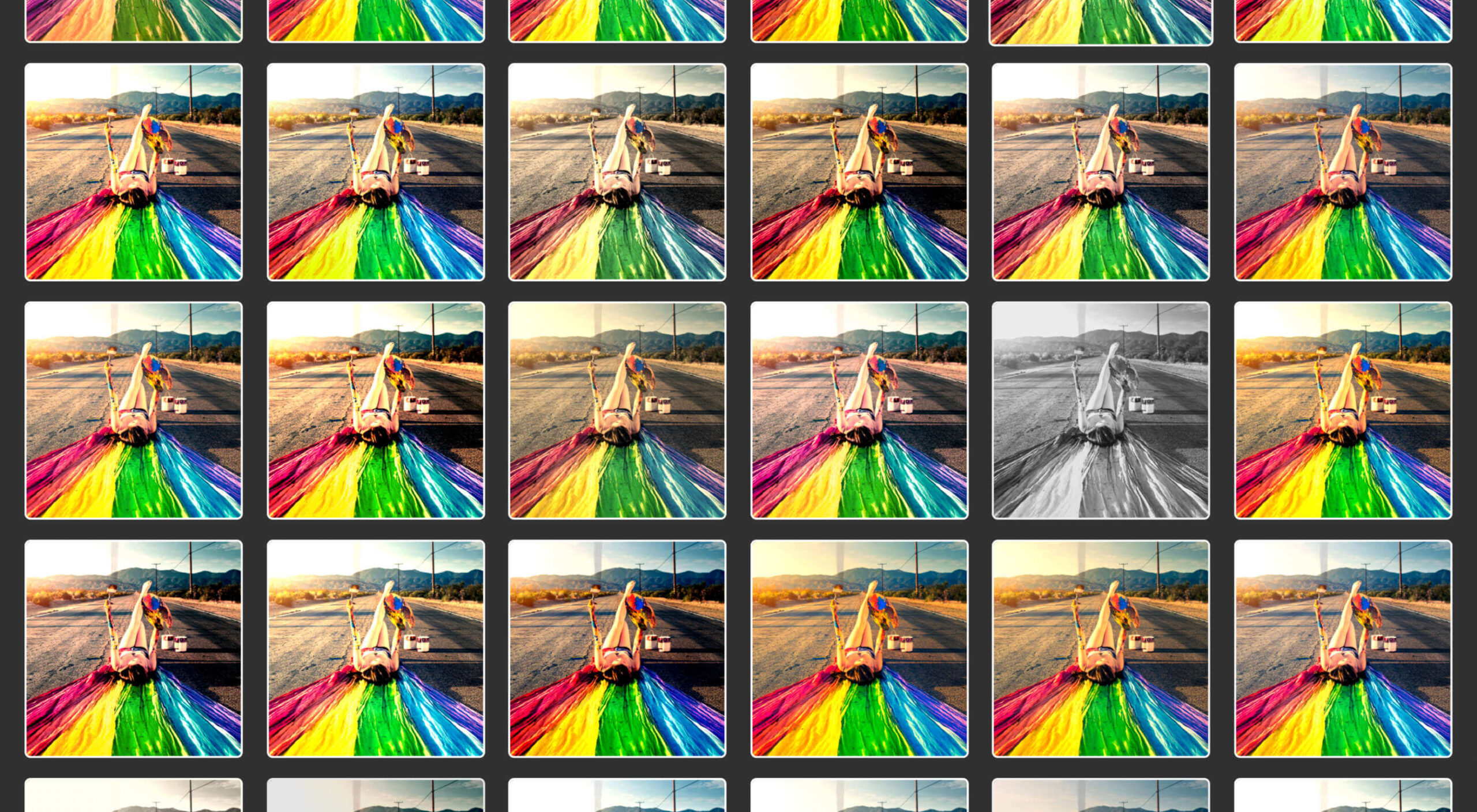
FilterSS is a curated collection of CSS image filters for use in projects. Upload an image, sort through the list, and then copy the code for the filter you want to use. It’s that easy!

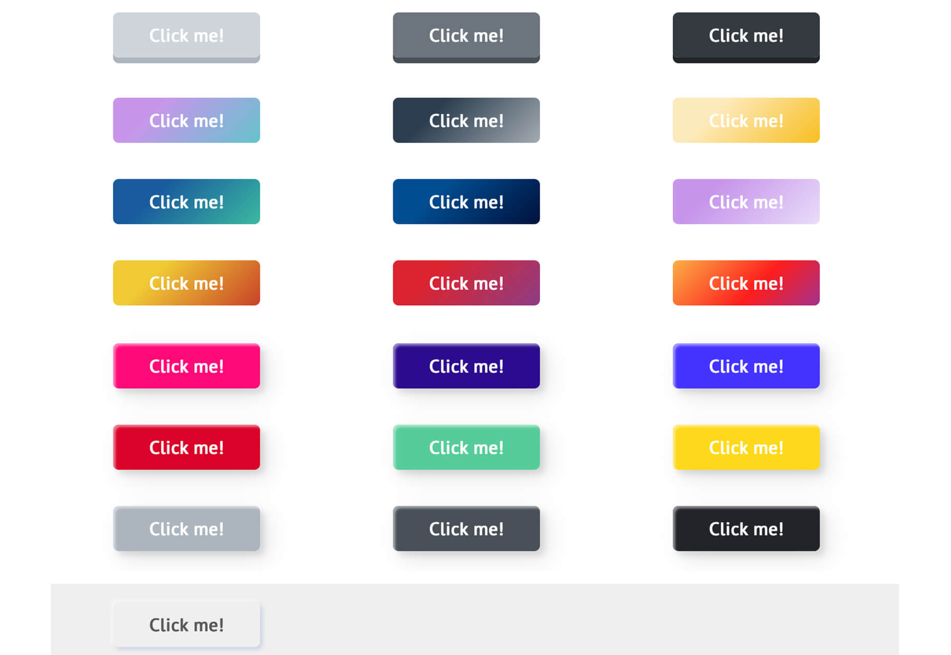
Buttons Generator

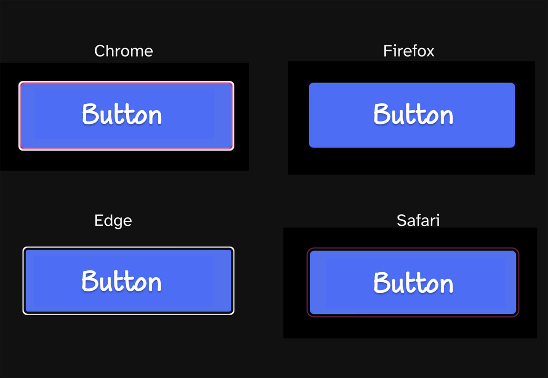
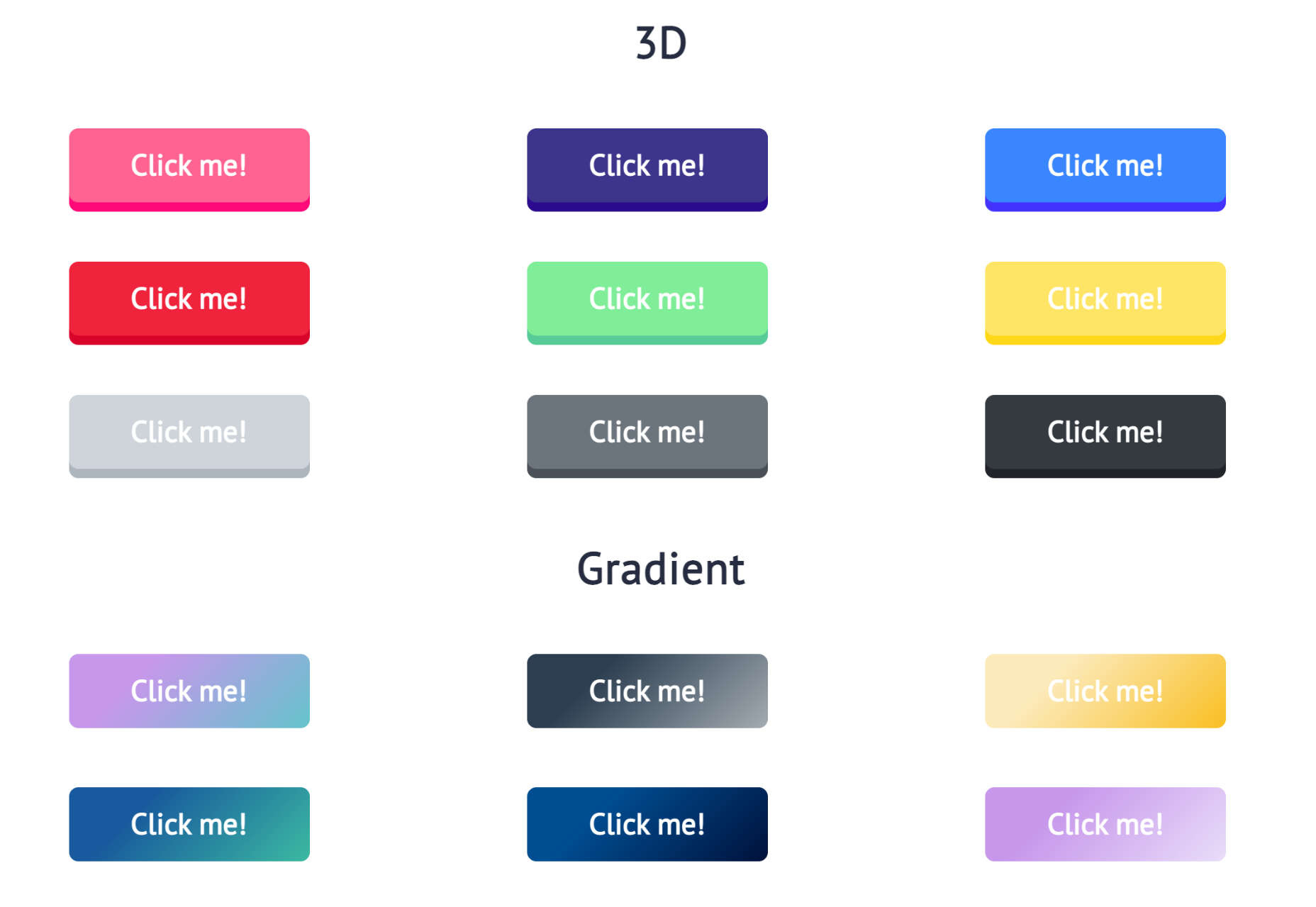
Buttons Generator is a fun tool with so many button options in one place. Choose from three-dimensional, gradient, shadow borders, neumorphic, retro, animated, ghost, with arrows, and more all in one place. Click the one you like, and the code is copied right to your clipboard and ready to use in projects.

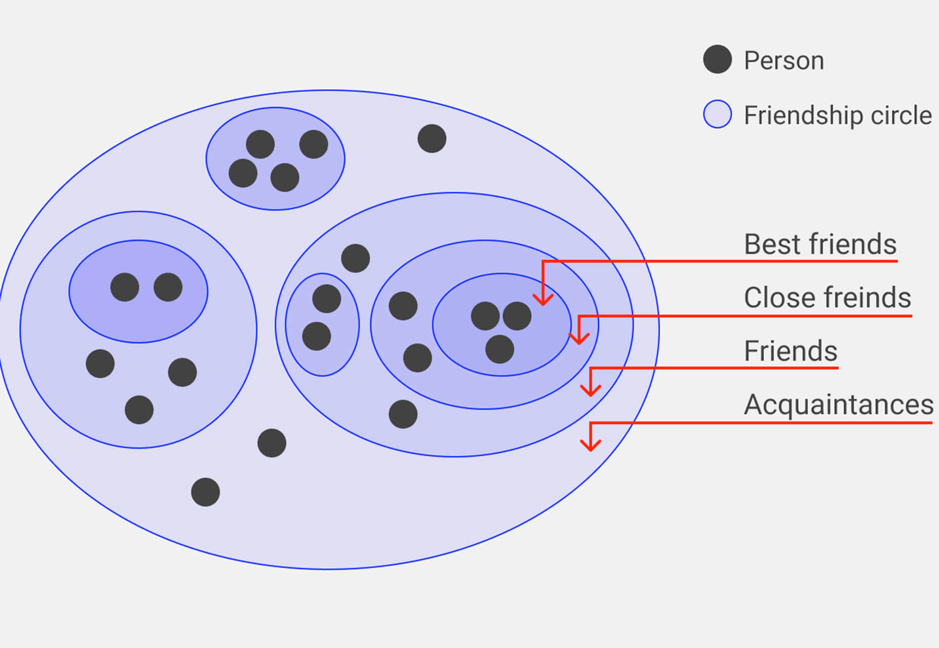
UI Cheat Sheet: Spacing Friendships

UI Cheat Sheet: Spacing Friendships is a fun – and memorable approach to figuring out spacing. This guide shows how close or far away elements should be based on “friend” circles with a couple of relatable instances. It’s one of the most relatable examples of this concept out there while emphasizing the importance of spacing in design.

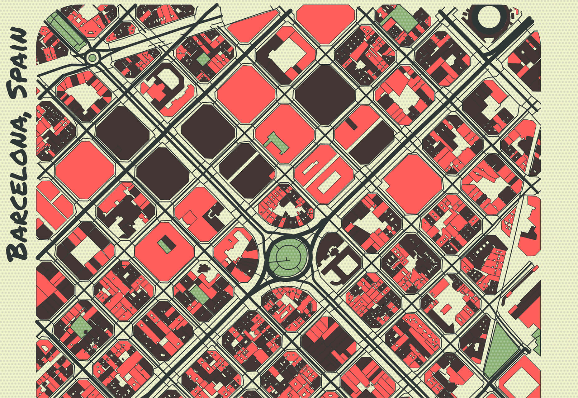
PrettyMaps

PrettyMaps is a minimal Python library that allows you to draw customized maps from OpenStreetMap data. This tool can help you take online map design to the next level with cool, unique map visuals. It’s based on osmnx, matplotlib, shapely, and vsketch libraries.

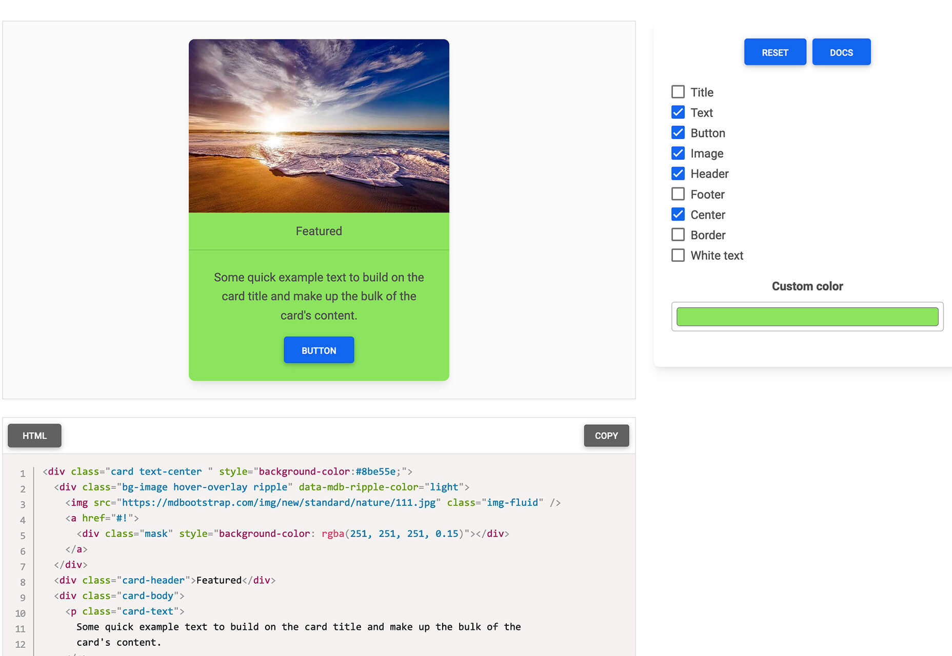
Card.UX/UI

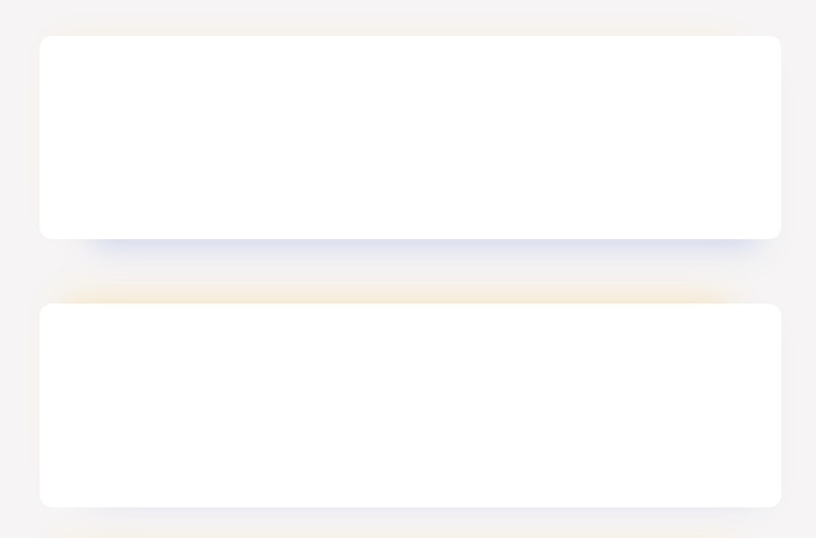
Card.UX/UI is a card-style generator with more than 20 templates and elements to create custom cards. Use the on-screen tools to design it the way you want and then copy the code for easy use.

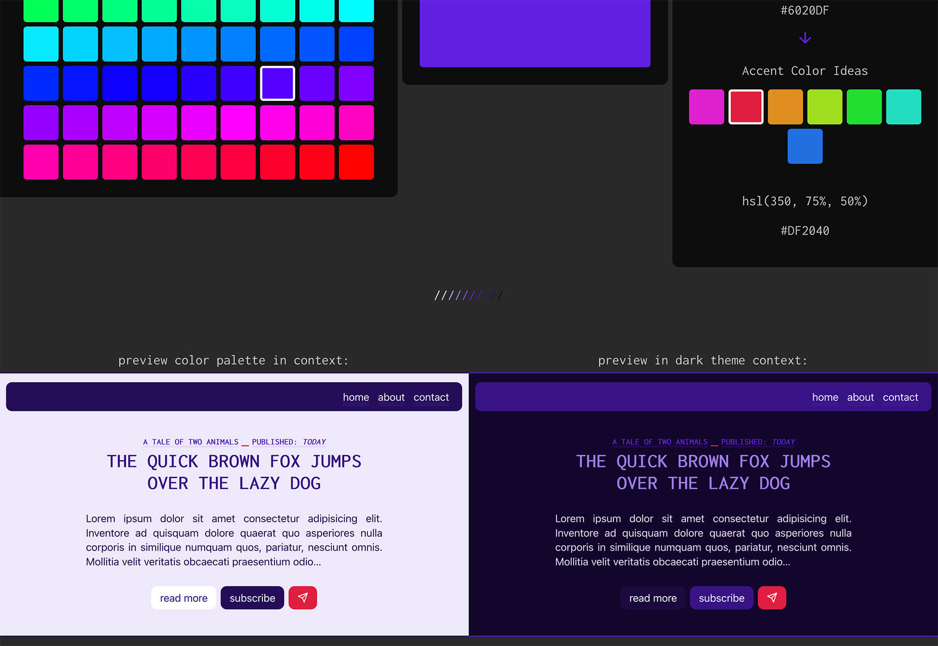
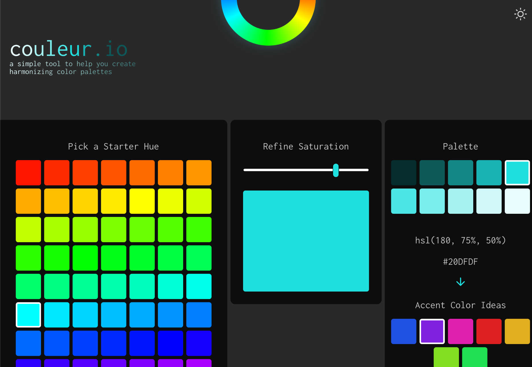
Couleur.io

Couleur.io is a simple color palette builder tool that lets you pick a starting color and build a scheme around it. One of the best elements of the tool might be the quick preview, which shows your choices using the palette in context and in dark mode. Get it looking the way you want, and then snag the CSS to use in your projects.

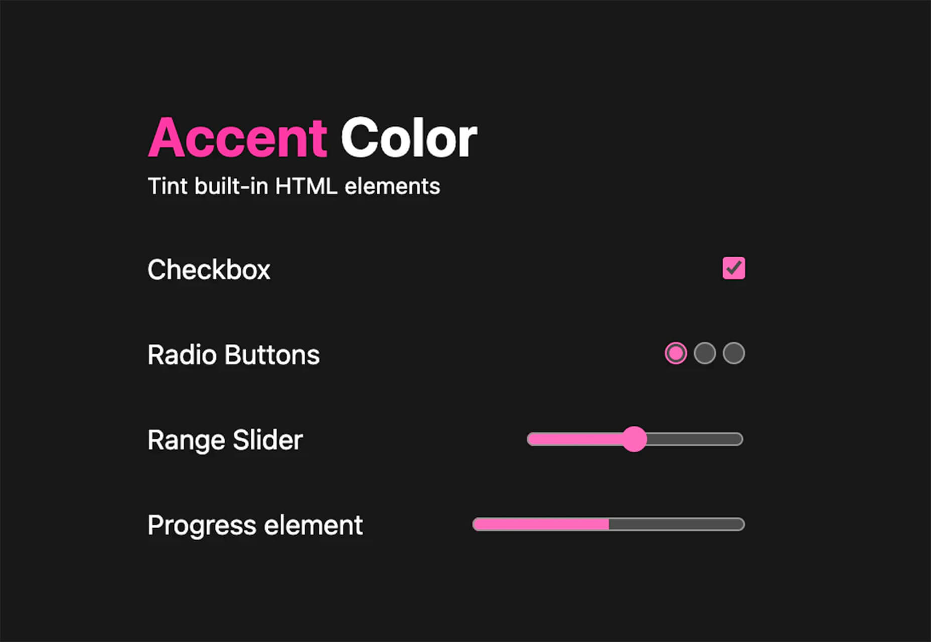
CSS Accent-Color

CSS Accent-Color can help you tint elements with one line of CSS. It’s a time-saving trick that allows for greater customization for your brand in website design projects. Plus, it works equally well in dark or light color schemes. It supports checkboxes, radio, range, and progress bars.

Vytal

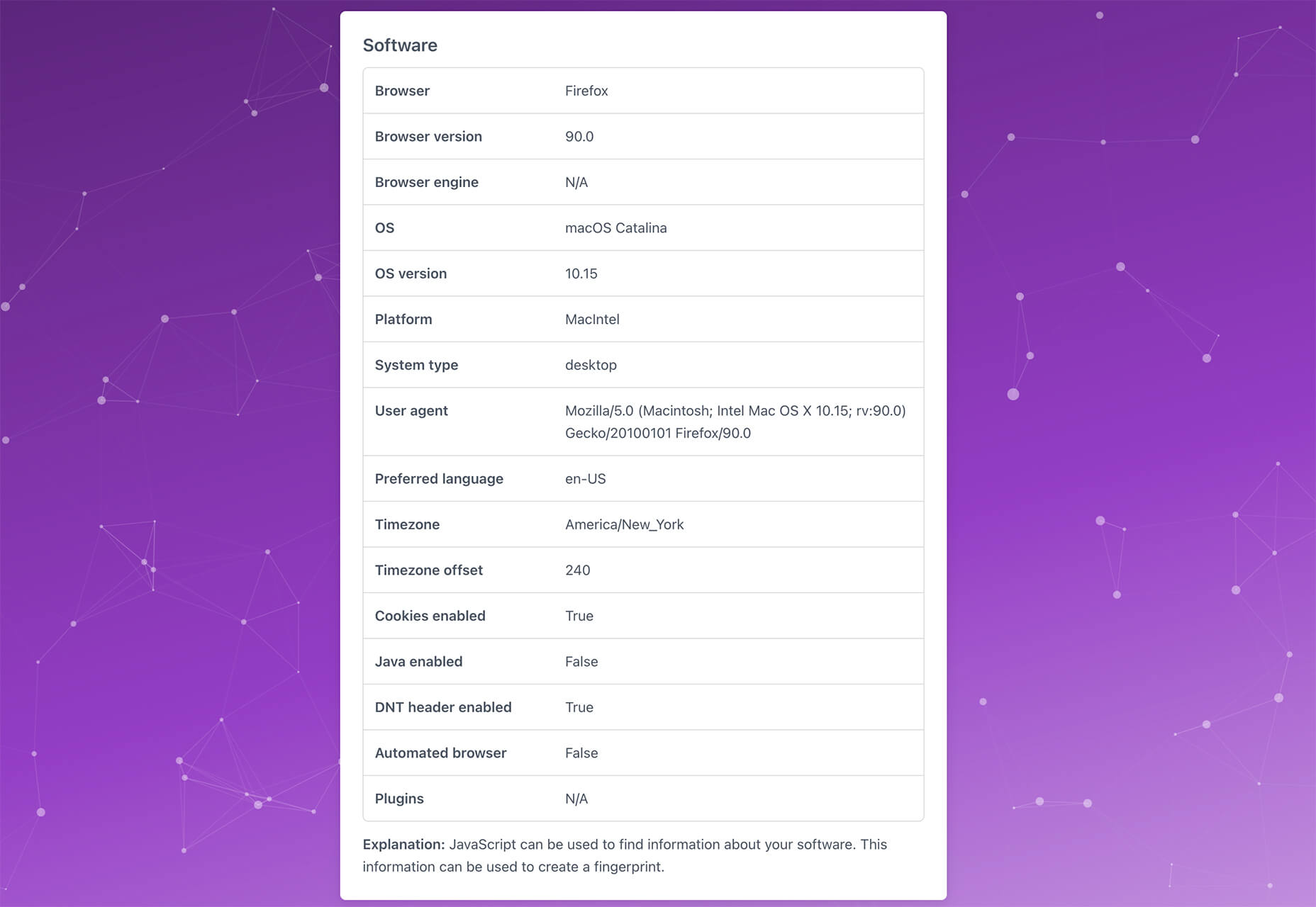
Vytal shows what traces your browser leaves behind while surfing the web. This scan lets you understand how easy it is to identify and track your browser even while using private mode. In addition, it scans for digital fingerprints, connections, and system info.

Imba

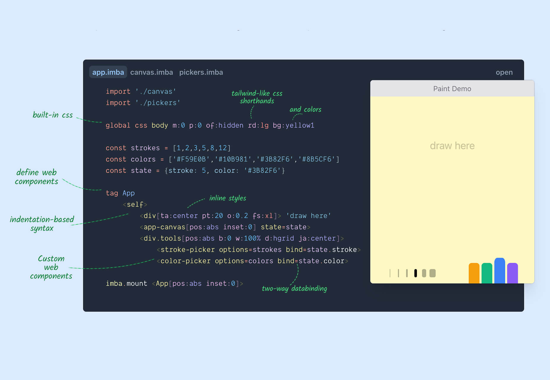
Imba is a programming language for the web that’s made to be fast. It’s packed with time-saving syntax tags and a memorized DOM. Everything compiles to JavaScript, works with Node and npm, and has amazing performance. While the language is still in active development, the community around it is pretty active and growing.

SVG Shape Dividers Creator

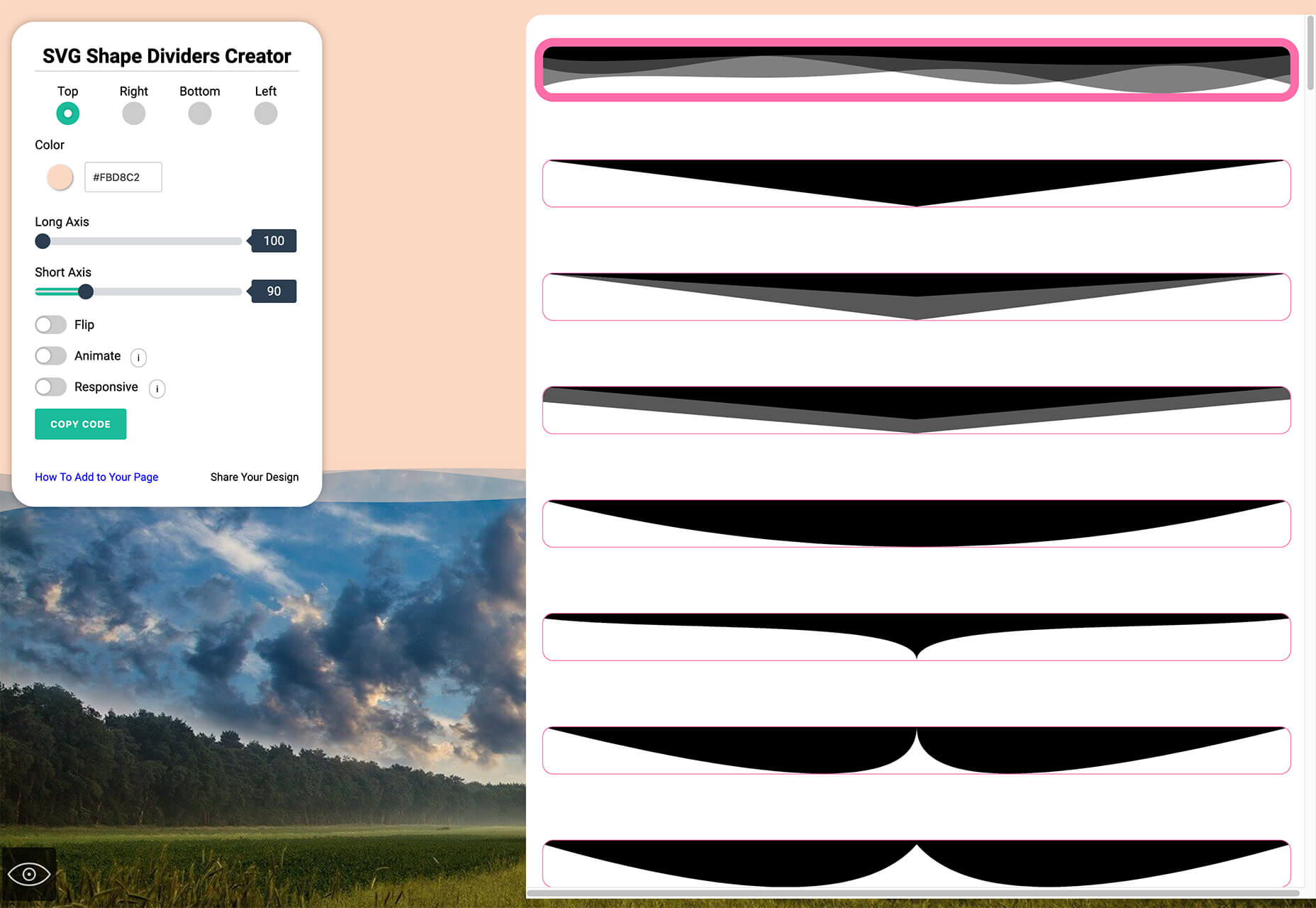
SVG Shape Dividers Creator is a tool that allows you to create interesting shapes with SVG so that your colors and backgrounds aren’t always rectangles. You can adjust and side, change the color, axis, and flip or animate it. Then snag the CSS, and you are ready to go.

Image Cropper

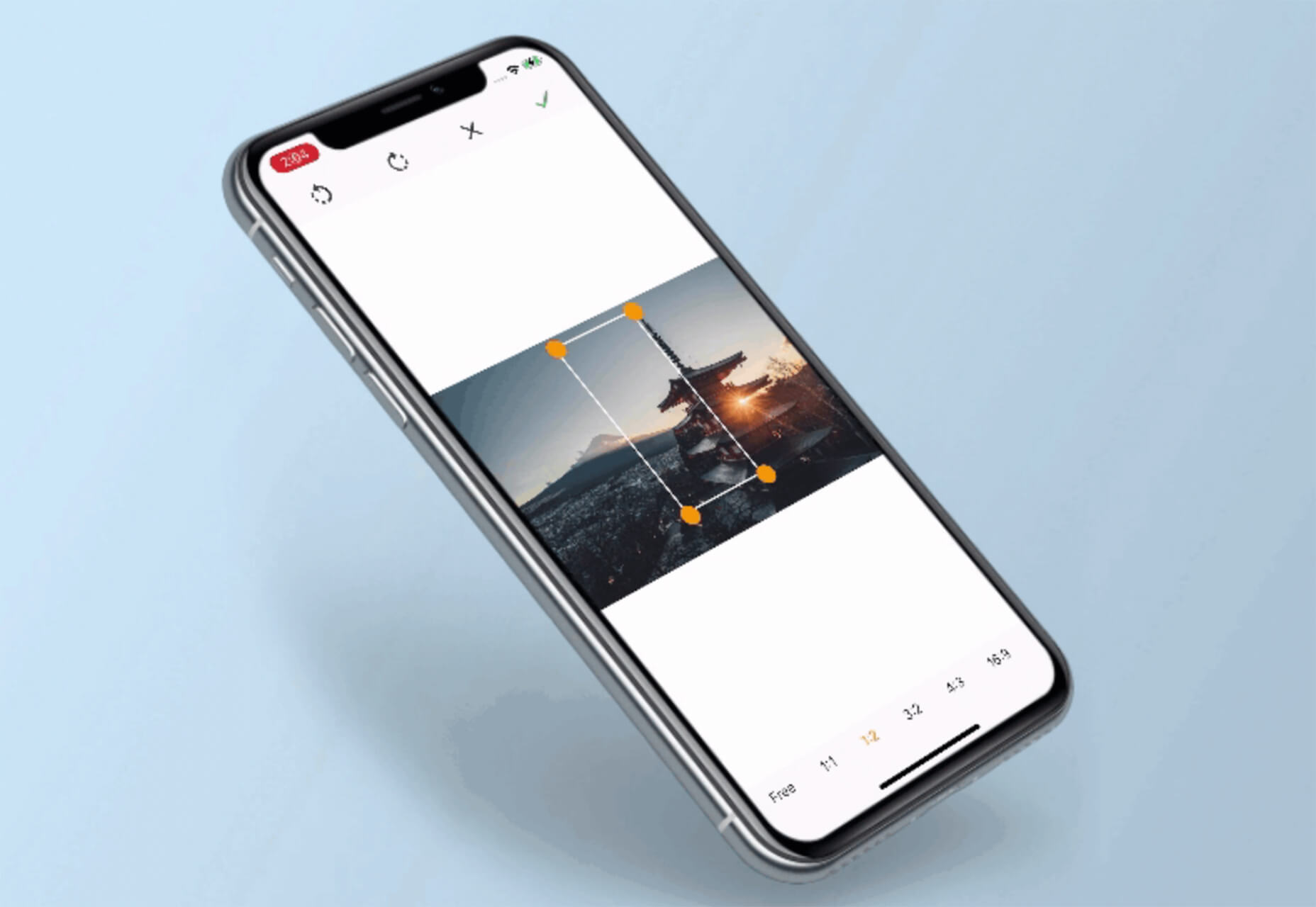
Image Cropper is a tool that allows you to crop and rotate images using the flutter plugin. It works for Android and IOS.

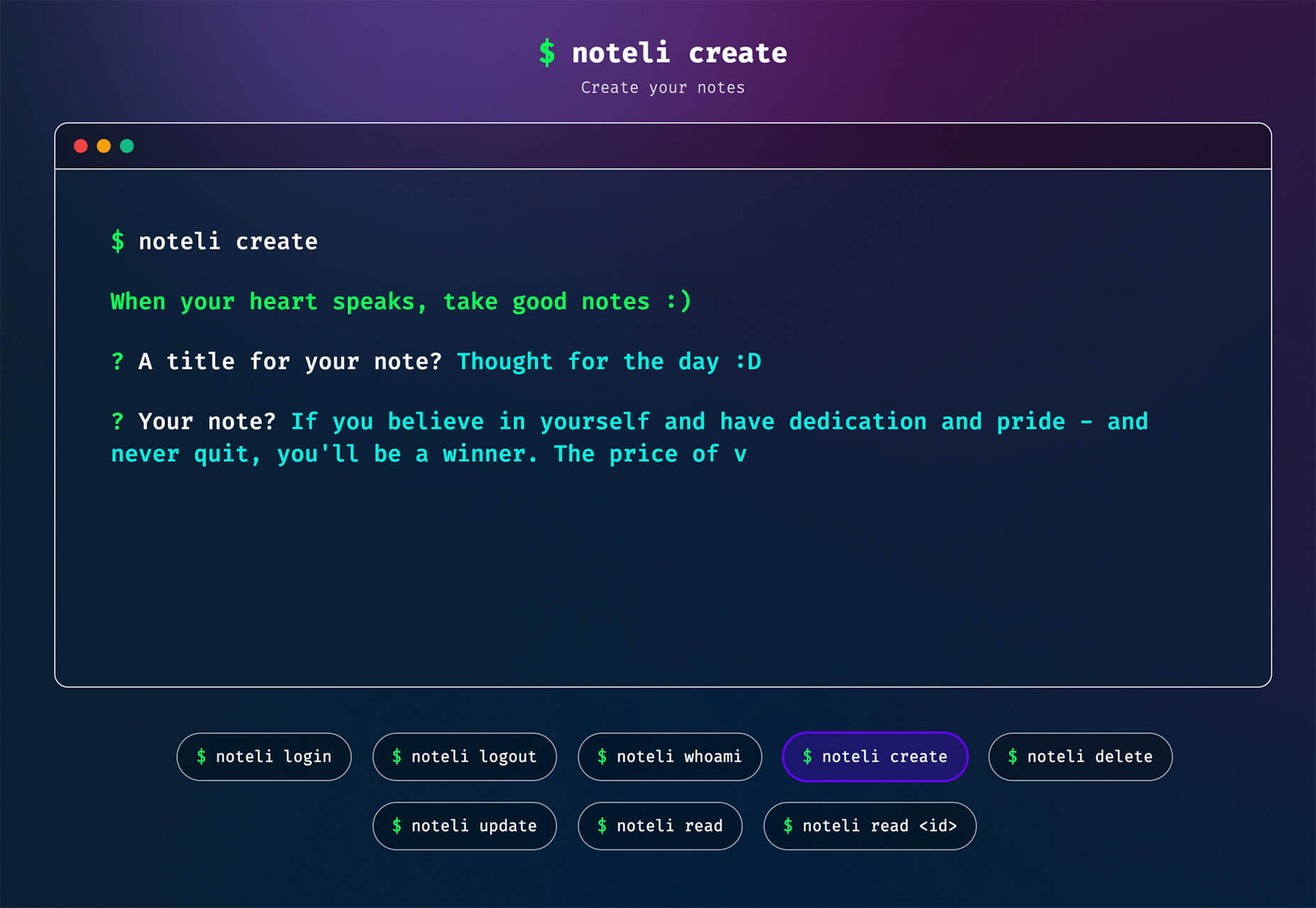
Noteli

Noteli is a CLI-based notes application that uses TypeScript, MongoDB, and Auth0. The tool is just out of beta.

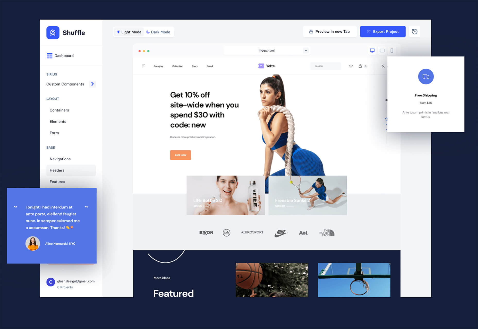
Yofte

Yofte is a set of components for Tailwind CSS that help you create great e-commerce stores. The UI Kit is packed with components with clean and colorful designs that are customizable. The code is easy to export and clean. This premium kit comes with a lifetime license or a monthly plan.

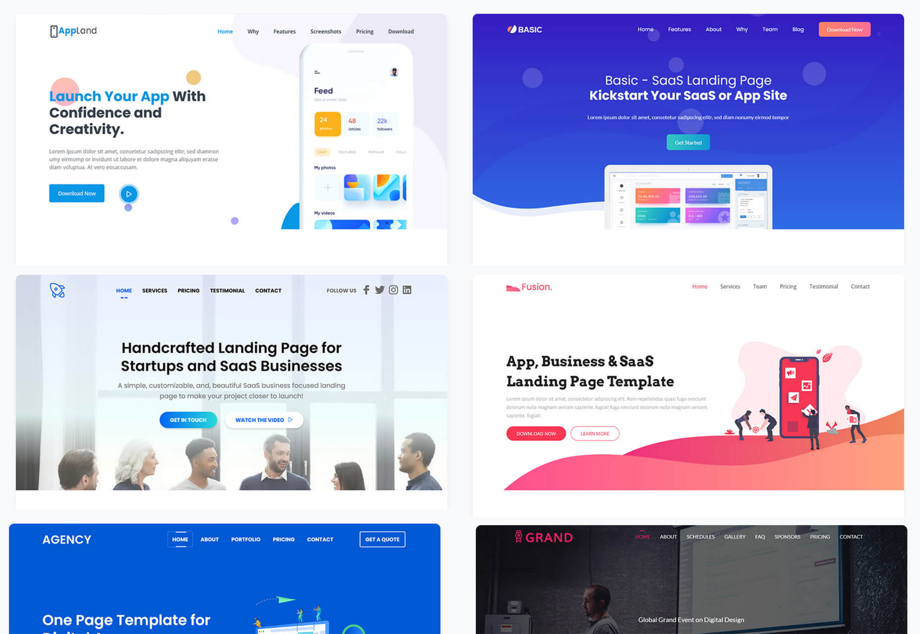
UI Deck

UI Deck is a collection of free and premium landing page templates, themes, and UI kits for various projects. This is a premium resource with paid access to all of the tools. It includes access to more than 80 templates.

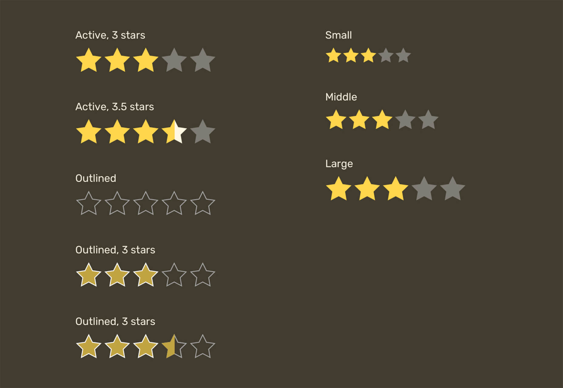
Star Rating: An SVG Solution

Star Rating: An SVG Solution is a tutorial that solves a common design dilemma: How to create great star rating icons for pages. This code takes you through creating an imageless element that’s resizable, accessible, includes partial stars, and is easy to maintain with CSS. It’s a great solution to a common design need.

Designing Accessible WCAG-Compliant Focus Indicators

Designing Accessible WCAG-Compliant Focus Indicators is another convenient guide/tutorial for an everyday application. Here’s why it is important: “By designing and implementing accessible focus indicators, we can make our products accessible to keyboard users, as well as users of assistive technology that works through a keyboard or emulates keyboard functionality, such as voice control, switch controls, mouth sticks, and head wands, to mention a few.”

Blockchain Grants

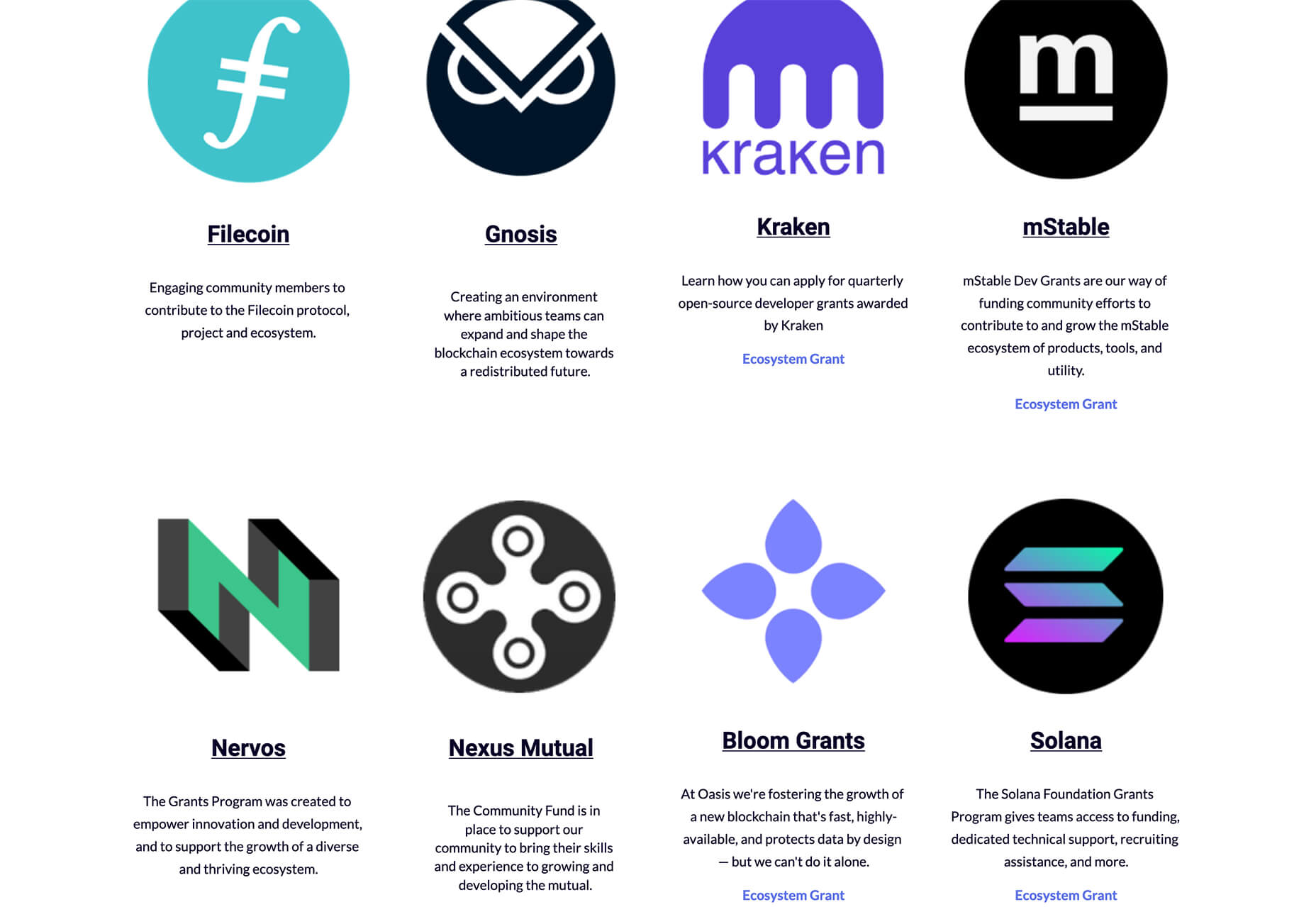
Blockchain Grants is a tool for anyone developing blockchain applications and in need of funding. It’s a database of grants from a variety of organizations for different applications. Start looking through this free resource to help secure additional funding for your projects.

Basement Grotesque

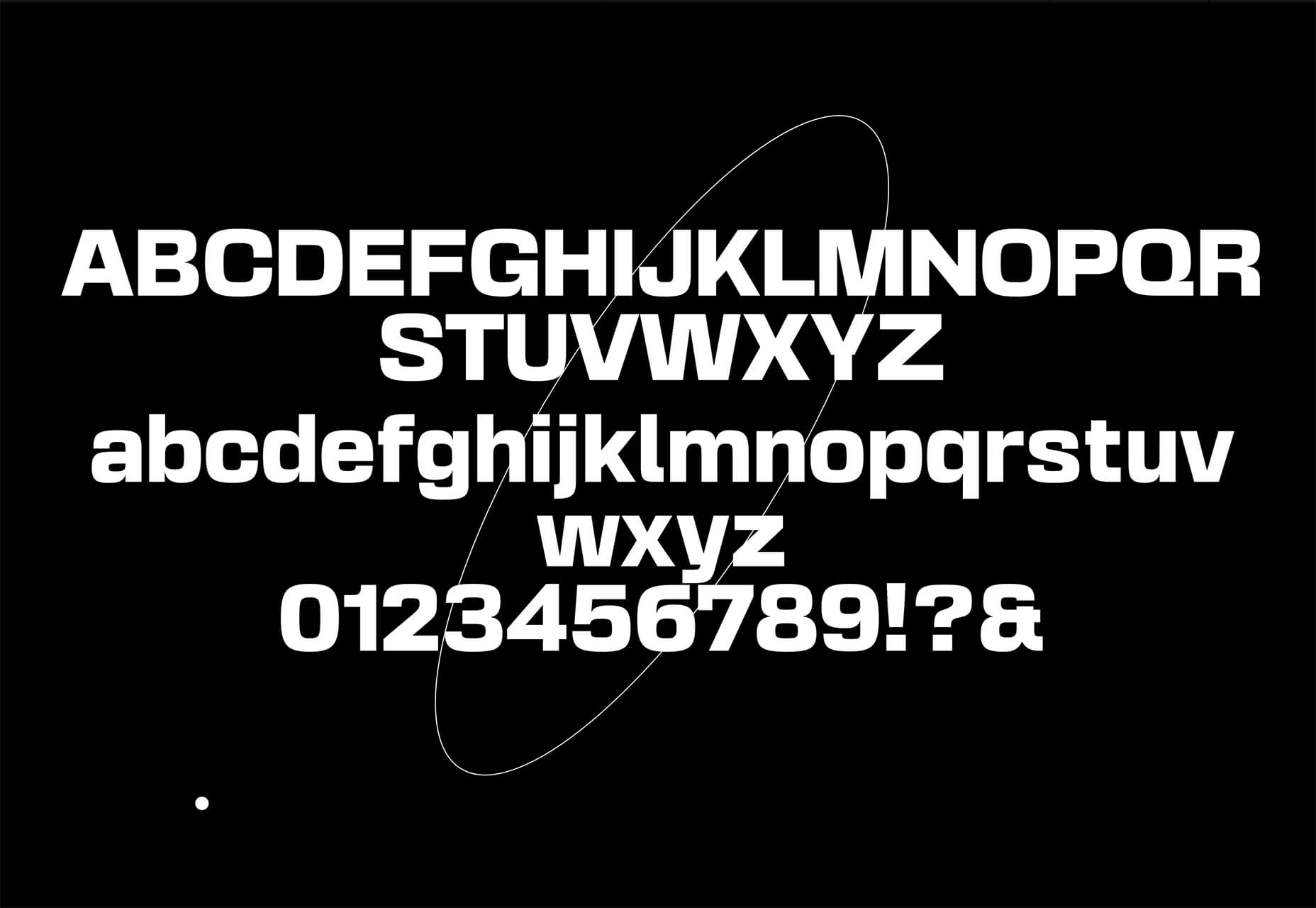
Basement Grotesque is a beautiful slab with a great heavy weight and plenty of character. There are 413 characters in the set with plenty of accents, numbers, and variable capitals.

Gadimon

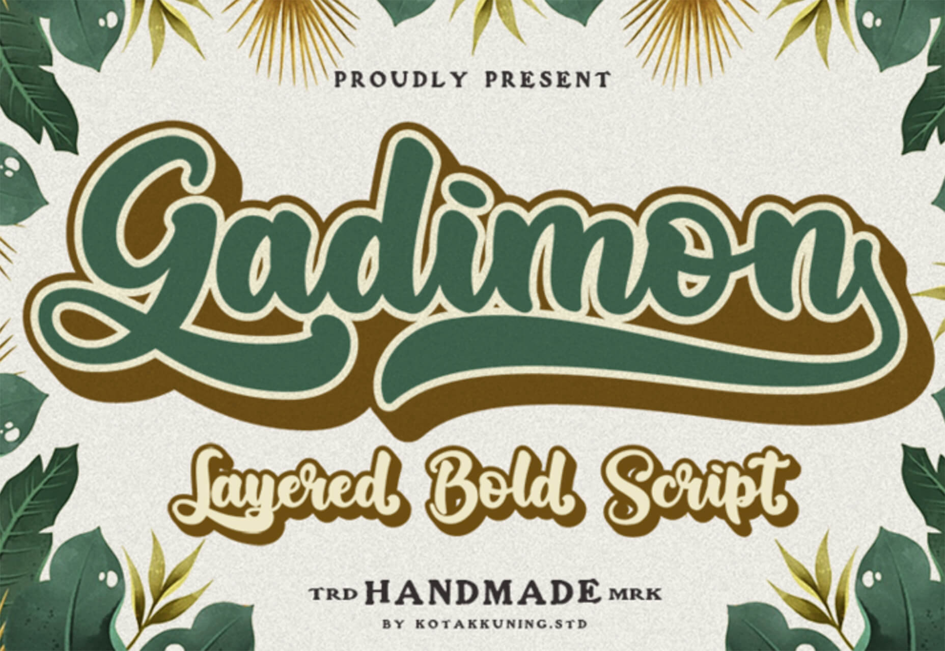
Gadimon is a fun, almost comic book-style layered script. The font package includes a regular and extrude style.

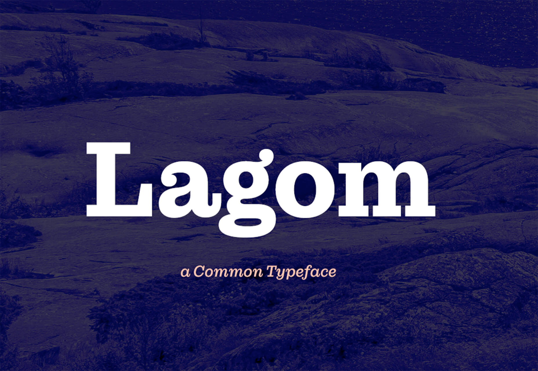
Lagom

Lagom is a sleek and functional serif typeface with 16 styles in the robust family from ultralight to extra bold italic. It’s readable and has a lot of personality.

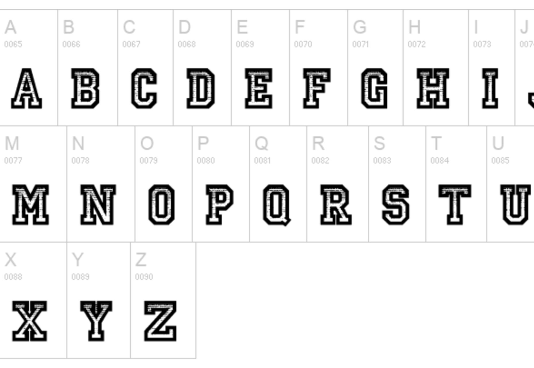
Striped Campus

Striped Campus fits our back-to-school theme with a fun, scholastic look and feel. The block letters have a thick outline stroke and some fun inline texture.

Source

The post Exciting New Tools for Designers, September 2021 first appeared on Webdesigner Depot.


Source de l’article sur Webdesignerdepot

Every day design fans submit incredible industry stories to our sister-site, Webdesigner News. Our colleagues sift through it, selecting the very best stories from the design, UX, tech, and development worlds and posting them live on the site.
The best way to keep up with the most important stories for web professionals is to subscribe to Webdesigner News or check out the site regularly. However, in case you missed a day this week, here’s a handy compilation of the top curated stories from the last seven days. Enjoy!

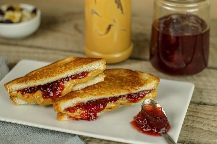
Next.js and Drupal Go Together Like PB & Jelly

Couleur.io – Harmonizing Color Palettes for Your Web Projects

11 Open-Source Static Site Generators You Can Use to Build Your Website

Buttons Generator – 100+ Buttons You Can Use In Your Project

3 Essential Design Trends, September 2021

12 CSS Box Shadow Examples

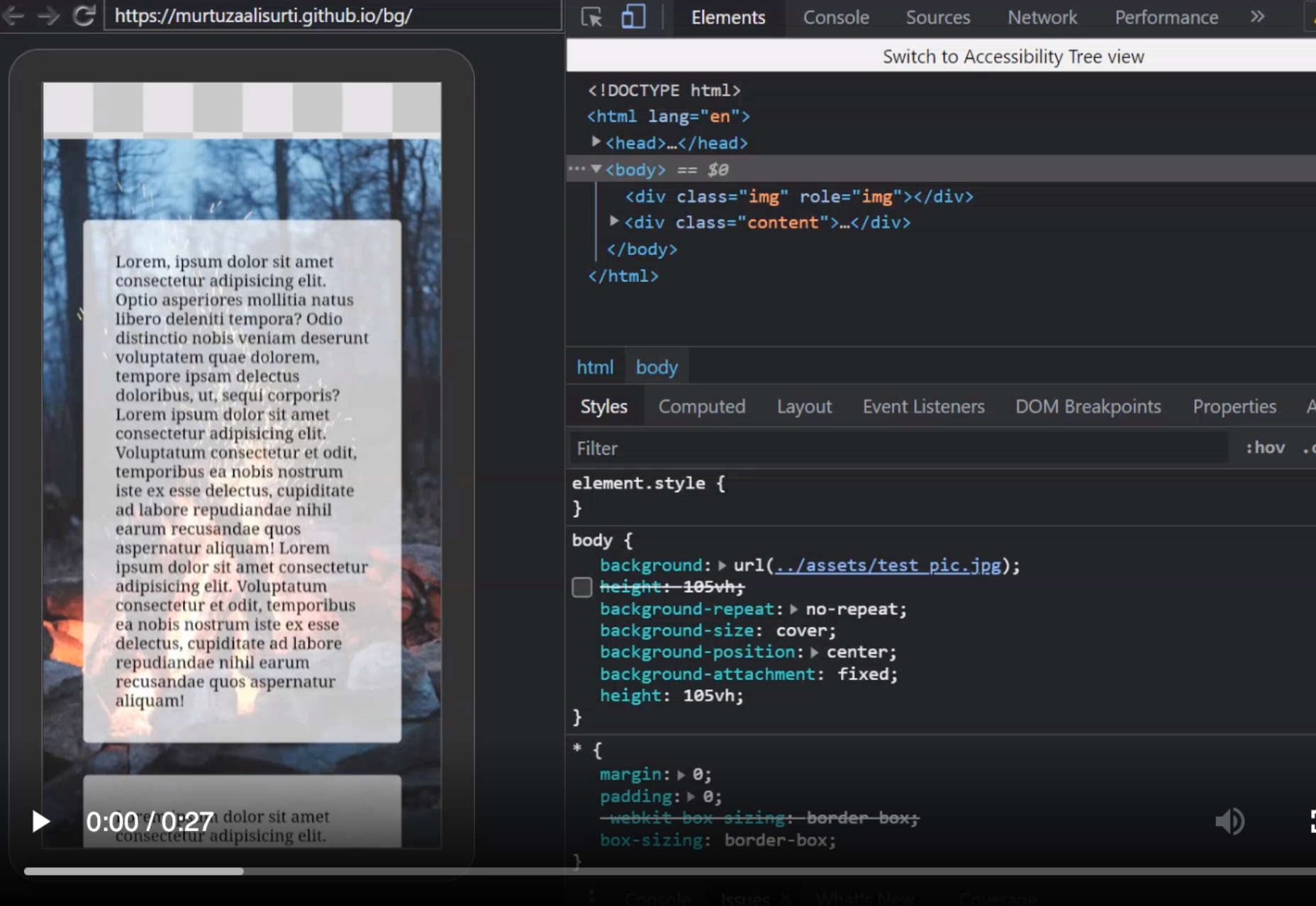
The Fixed Background Attachment Hack

The Internet ‘Died’ Five Years Ago

Media Queries in Responsive Design: A Complete Guide (2021)

The 7 Core Design Principles

Source

The post Popular Design News of the Week: August 30 2021 – September 5, 2021 first appeared on Webdesigner Depot.


Source de l’article sur Webdesignerdepot

Low-code and no-code development platforms have been the trending IT topic for some time now. Experts in this field speculate as to how they could change the future of the industry. Some publications predict the gradual decline of traditional IT, as low-code and no-code products continue to reshape the very approach to solutions development. But, before we get into a discussion on the future of low-code and no-code, let’s define what these terms actually mean.

What Is Low-Code/No-Code?

Low-code and no-code tools help scale and maximize software delivery. The grid below explains, defines, and differentiates low-code vs. no-code tools.

Source de l’article sur DZONE

Every day design fans submit incredible industry stories to our sister-site, Webdesigner News. Our colleagues sift through it, selecting the very best stories from the design, UX, tech, and development worlds and posting them live on the site.
The best way to keep up with the most important stories for web professionals is to subscribe to Webdesigner News or check out the site regularly. However, in case you missed a day this week, here’s a handy compilation of the top curated stories from the last seven days. Enjoy!

7 Free Javascript Effects for a Truly Interactive Site

Responsivize – A Must-Have Tool to Develop Responsive Websites

12 Graphic Design Memes That Will Make You Laugh (or Cry)

Why Do People Hate Redesigns?

Why Should Designers Learn to Code?

12+ CSS Text-Stroke Examples

20 Best New Sites, August 2021

8 CSS & JavaScript Snippets for Creating Hand-Drawn Elements

Ten Years of Bootstrap

A Complete Introduction to Web Components in 2021

Source

The post Popular Design News of the Week: August 23 2021 – August 29, 2021 first appeared on Webdesigner Depot.


Source de l’article sur Webdesignerdepot

According to a research and market report « Cloud Services Market by Service Type, Cloud Type, Enterprise Size and Industry Vertical: Global Opportunity Analysis and Industry Forecast, 2020-2027 », the cloud service is valued at $264.8 billion in 2019 and is expected to increase to $927.51 billion by 2027. Certainly, businesses big and small are increasingly becoming aware of the importance of SaaS software development or cloud solutions in bestowing speed and accuracy to their operations. But more than everything, the key driver of the sector is the cost it saves, amounting to approximately 35% of the total expenses of businesses. 

The Reason Behind the Growing Cloud Computing Trend

Source de l’article sur DZONE

Creating an incredible brand experience for an end-user is about more than just designing the right home page or lining up a series of great product pages. 

Effective website design conveys crucial information about a company, through everything from font styles, to image choices. Nowhere is this representation of brand identity more important than on the about page. 

People frequently confuse the about page with the contact page or fail to leverage it correctly simply because they don’t know what to say. However, creating an about page that speaks to an audience can be immensely powerful. 

What is an About Page?

The first step in designing a great about page is understanding the purpose of the space. This isn’t just a page on a website explaining what a company does. 

The about page is an introduction to a company’s story, its brand essence, and personality. 

Done correctly, this page will demonstrate a crucial sense of affinity between a business and its customers. It will highlight values that resonate with a customer and make it easier for clients to trust businesses.

The Yellow Leaf hammocks company starts its about page with a video.

As you scroll through the interactive site, you discover new elements of the company’s tale, including what prompted the birth of the business to begin with and the brand’s mission. 

Yellow Leaf lets its visitors know what the company is all about by using authentic images of real people to external content and bold quotes. 

There are even snippets from customer case studies for social proof. 

About pages are relevant because they give customers a way to build a real human connection with a business. Harvard professors say that 95% of purchasing decisions are emotional; we don’t buy things just because we need them. Instead, we look for companies that we feel connections with to solve problems. 

Using an about page to convey an attitude, personality, or just what makes a business special is how designers can ensure that end-users will care more about the business. 

How to Make an About Page Stand Out

So, how do you make an about page stand out?

Since every company is different, there’s no one-size-fits-all strategy for everything.  However, there are a few essential steps to consider as you move through the design process. 

Here are some pro tips for successfully attracting attention with the about page…

Step 1: Decide What to Include

It’s tempting to assume that a complicated about page will lead to a stronger relationship between a brand and its customers. After all, the longer the story, the more the customer knows about the company – right?

While it’s essential to include plenty of valuable information in an about page, it’s also worth remembering that today’s customers are short on time. They don’t want to spend hours scrolling through one part of a website. Instead, they want access to quick, convenient snippets of information. 

The Joseph Payton about page is effective because it cuts the story down into bite-sized chunks. Each piece of information highlights valuable insights for the customer. Plus, hand-drawn images and animations make the experience feel like you’re getting to know Joe on a deeper level. 

Before you begin designing, ask yourself:

  • How much text does the page need? How much space does there need to be for copy? How can you spread the content out in a visually engaging way?
  • What sections should the page include? For example, does there need to be a link to the contact us page or a contact form somewhere?
  • How does the page connect to the rest of the website? For example, can you link to things like case studies and reviews with quotes to tie more of the website together?

Step 2: Make the Mission Statement Clear

In a world where emotion influences buyer behavior, clients and customers want to buy from companies they believe in. It’s not enough to have the right product or price point anymore. People want to know that they have a human connection with a business. 

On some about pages, it’s difficult to pinpoint the real mission of the company. It seems like you have to scroll through endless paragraphs of text to make your own assumptions about what matters to the company. However, a well-designed about page puts this crucial info front and center. 

For instance, on the Apptopia about us page, the subheading tells you everything you need to know about the brand. This heading instantly tells the audience whether it’s worth reading on to find out more. 

The best about us pages often include a lot more than just a single sentence of text. But it’s worth pinpointing some of the essential details from these pages and drawing extra attention to them. A larger font or a different font color could be perfect for this purpose. 

Alternatively, if it’s difficult to refine the company’s mission down into one message, it might be worth creating a whole segment at the top of the page dedicated to this information. That’s what the Toms shoe company does.

Step 3: Invest in the Right Trust Elements

People aren’t always sure who they can trust these days. 

There are millions of websites out there and billions of companies. Not all of them are going to appeal to every customer. Since an about page is all about making a crucial human connection between a business and its client, it’s important to implement as much trust as possible. 

The good news is that there are many trust elements you can embed into an about page to make it more reputable. Star ratings taken straight from companies like Trusted Reviews and Google are a great way to show that a company is already impressing its followers. 

Quotes plucked from your customers or segments of case studies that you can place throughout the About Page copy is another great way to show your authenticity. 

You could even take the same approach as Aja Frost here and embed genuine data and graphs into the about page.

One particularly helpful way to make a website’s about page more trustworthy without eating up too much space is to implement trust stickers. Badges that show all the right groups and regulators approve a company are a great start. 

Even showcasing the logos of companies that the business worked for before on a slideshow could be an excellent opportunity to add depth to their authority. 

Step 4: Convey Brand Personality

Brand personality is reflected in the tone of voice that a company uses for its content. You can see a company’s personality in the choice of colors it has on its website. It’s in the fonts that convey a message, and the videos, images, and other unique strategies that each business uses. 

Although a brand personality needs to shine through in everything the company does, it’s imperative on the about page. This is the environment where a customer is getting to know a business for the first time. As a result, the consumer should instantly recognize what kind of brand archetype they’re working with. 

Take a look at the Eight Hour Day about page, for instance. The first thing you see is a picture of two people laughing. That means you instantly get a sense of friendliness.

As you scroll through the page, you’re greeted by friendly, informal copy combined with bright colors and snippets of useful information. Everything feels comfortable and reassuring. 

When you reach the bottom of the page, you find a bunch of data that makes the company seem more trustworthy. There are links to its social media pages and a partial client list showcasing brands like JCPenny, Wired, and Purina.

Using the right combination of font, copy, and imagery, this About page tells you exactly what to expect before you begin interacting with the company. 

Step 5: Take Visitors on a Journey Through Time

Showing customers where a business is going with things like brand mission statements and values are great. However, it’s also worth giving people an insight into where a brand has already been. 

Many of today’s shoppers aren’t comfortable buying from brands that haven’t spent much time in their chosen industry. They want to see that the people they’re working with have experience, heritage, and plenty of background knowledge. 

What better way to demonstrate all of these things than with a timeline of accomplishments? Here’s an example of how Marshall showcases its history by mentioning various crucial historical milestones.

A timeline of events doesn’t have to be this complex, however. If you don’t want to overwhelm visitors with a wall of text, an actual timeline that offers quick and easy insights into what the business has done over the years could be a better option. 

Another option could be to have a few key statements from the company’s timeline, then link out to a separate “History” page for people who want to find out more. 

Step 6: Show the Human Side

People don’t buy from businesses; they buy from other people. 

An about page isn’t just a chance to show customers what a company does. It’s also an introduction to the people behind that organization. Showcasing the team members that contributed to the growth and continued development makes that organization more attractive. 

Obviously, if there are hundreds or thousands of employees in a team, you might not be able to mention them all on an about page. However, the page should generally include some insights into the c-suite and significant members of staff. 

A selection of company photos is a good way to introduce your team. However, you can consider other options too. For instance, to maintain their unique brand, the Tunnel Bear team designed to draw their own bear icons that represented their personalities.

The design is adorable, and it’s a wonderful way to showcase what makes the company so unique. At the same time, using this kind of illustration means you can avoid the hassle of trying to get all of your business photos to look consistent. 

Step 7: Show Values with Visuals

Finally, as we’ve mentioned frequently throughout this guide, an about page is an essential place to showcase the values of your business. These are the core principles that guide you in everything that you do. They help tell customers what matters most to you and prevent you from moving in the wrong direction. 

However, you’re not restricted to highlighting your values through copy and nothing else. You can also introduce customers to the things that matter most to you through visuals too. Graphics or illustrations that highlight important aspects of your business are a great way to share information without relying too heavily on text. 

Videos are another brilliant option, particularly if you have a lot to say but not a lot of time to say it in. That’s what Ben & Jerrys does.

You can also find a stream of “issues” the company cares about on the website too. This means that people can get more information on things like Democracy, Racial Justice, Fair trading, and what Ben & Jerry’s is doing about all of those things. 

Visual elements like this are a great way to give an about page more pizazz. Plus, they appeal to people who want to learn about your company but don’t want to spend forever reading through the text. 

Create Better About Pages

An about page shouldn’t be an afterthought. 

It’s a crucial part of showcasing a company’s unique style and personality. Used correctly, these pages convey crucial information about everything a business stands for. 

Use the tips above to give more meaning to your about page design, and remember to pay attention to how much your traffic and conversions evolve with every update you make. A better about page could even help you to drive more conversions.

Source

The post 7 Essential Design Tips for a Killer “About Us” Page first appeared on Webdesigner Depot.


Source de l’article sur Webdesignerdepot