
 Many people dream of a career in web design, but it may actually be more attainable than you think.
There are countless online courses, of variable quality, with little to no academic structure; self-learning is an option, but it doesn’t come with a curriculum. Without a professional structure and a comprehensive curriculum your dream career might never be more than that.
But there is a practical, fast-track option to making a career in web design a reality, and that’s the Parsons Web Design and Development Certificate.
Built around the innovative teaching approach that Parsons is known for, you’ll learn human-centered design, explore the latest tools, evaluate techniques and approaches, and uncover the secrets of UX. The certificate even offers two distinct tracks, one for designers, and one for developers, so you can take control of your own future.
It’s one of the most creative approaches to a formal design education in the world, and what’s more, because it’s entirely online you can study from anywhere.
What Will I Learn?
Parsons offers a flexible curriculum to suit both designers and developers. There are two core courses, followed by three specialist courses.
learn human-centered design, explore the latest tools, evaluate techniques and approaches, and uncover the secrets of UX
The core courses cover the essentials of web and mobile design, plus JavaScript for designers. Each of the core courses lasts nine weeks. When you’ve completed them, you can opt for a design specialism or a development specialism. (You don’t have to make your choice until you’ve completed the core courses!)
If you prefer design work, you’ll spend a total of 21 further weeks learning mobile design patterns, studying emerging platforms, working with interactive typography, and mastering design systems.
If development is more your thing, then on the 21 week development track you’ll cover advanced HTML, CSS, and JavaScript, learn how to work with APIs, and finish up with experimental JavaScript.
To earn the Web Design and Development Certificate you need to complete the two core courses, plus three specialist courses within two years — a total of 39 weeks of study. Parsons recommend that you take two courses per semester, but it’s possible to complete the entire certificate program in one year.
Is This Really For Me?
Parsons Web Design and Development Certificate is a recognized qualification from a reputable institution that will stand you in good stead in future job interviews. But what’s more important, is the knowledge and experience you’ll gain from the course.
Thanks to the creative, flexible approach to learning, the certificate is suitable for designers and developers at any stage of their career
Thanks to the creative, flexible approach to learning, the certificate is suitable for designers and developers at any stage of their career.
If you’re just starting out, the certificate is a superb way of exploring the field, all the while building skills that will make you stand out to employers.
If you’re a print designer, or a programmer, the Web Design and Development Certificate is a great way to supplement your existing skills and make a lateral move into web work.
And if you’re a grizzled industry professional with decades of experience, you’ll benefit from the track you know least well; designers studying development, developers studying design. Not only will it open up new creative avenues to you, but you’ll find project management easier with a broader outlook on the web.
The best thing about the Parsons Web Design and Development Certificate is that because it’s made up of modules, you can still work part-time as you tick off the courses.
Why Choose Parsons?
Parsons College of Design is part of The New School, a New York-based university. Open Campus, the platform that will run the certificate, is the New School’s online system for pre-college, professional, and continuing education courses.
Thanks to Covid-19, most learning institutions are planning online-only courses for at least the next 12 months, so why not enroll in a program run by an institution that already excels at online teaching.
Innovative courses, underpinned by the creative approach to teaching that Parsons College of Design is renowned for, mean the design education you embark on this fall will be second to none.
Individual courses cost between $577 and $850, with the entire Web Design and Development Certificate costing just $3,704.
[– This is a sponsored post on behalf of Parsons College of Design –]
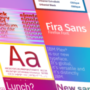
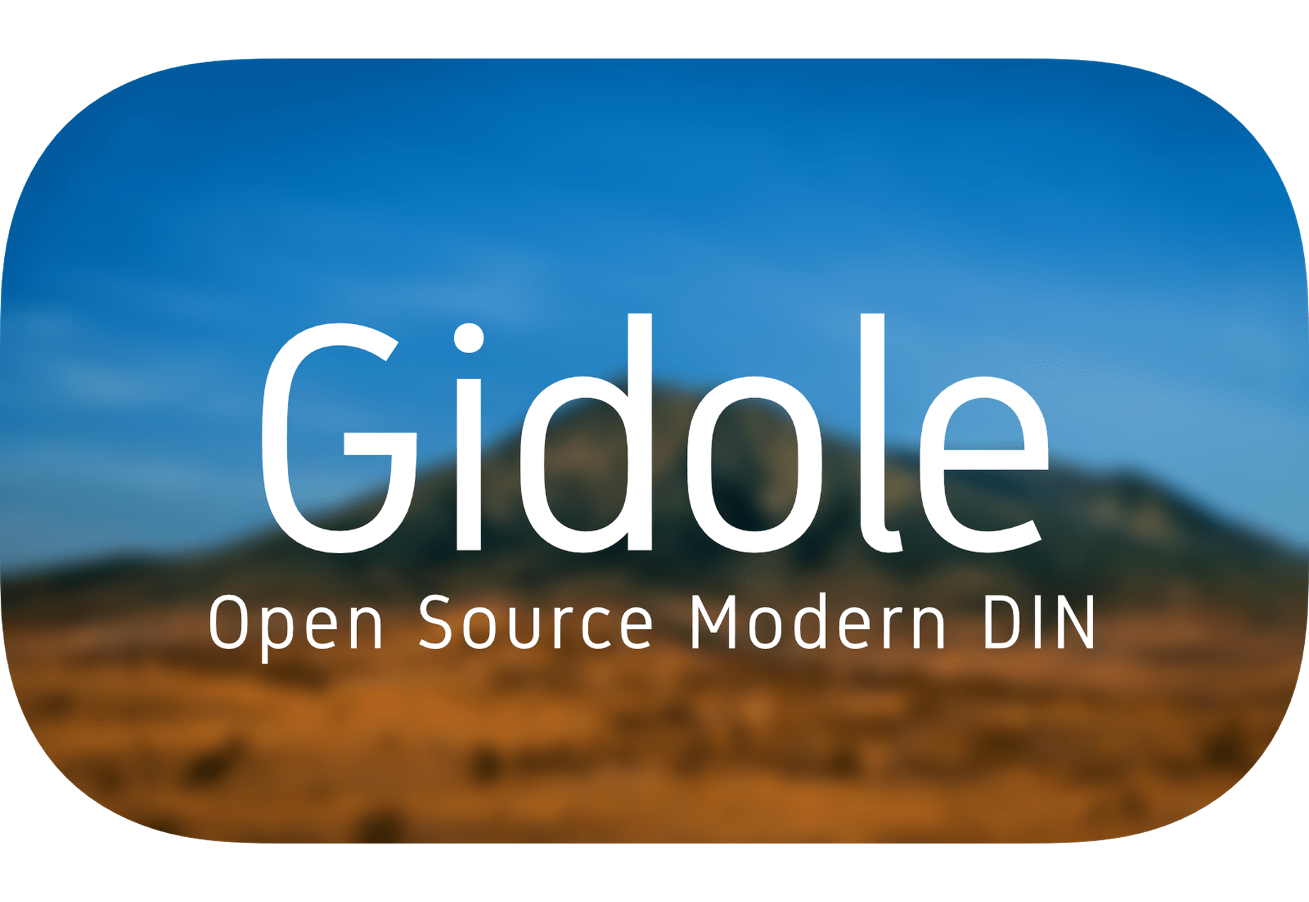
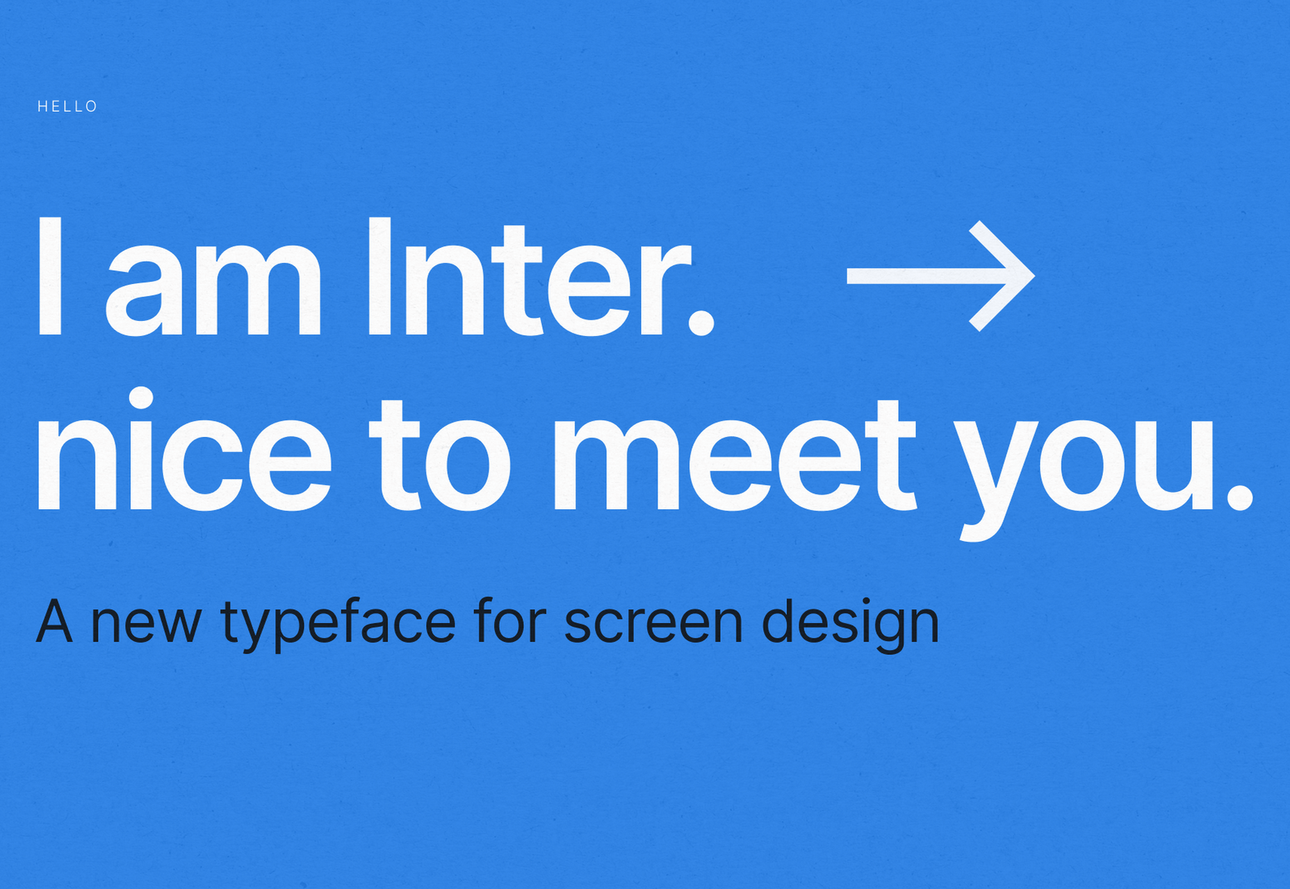
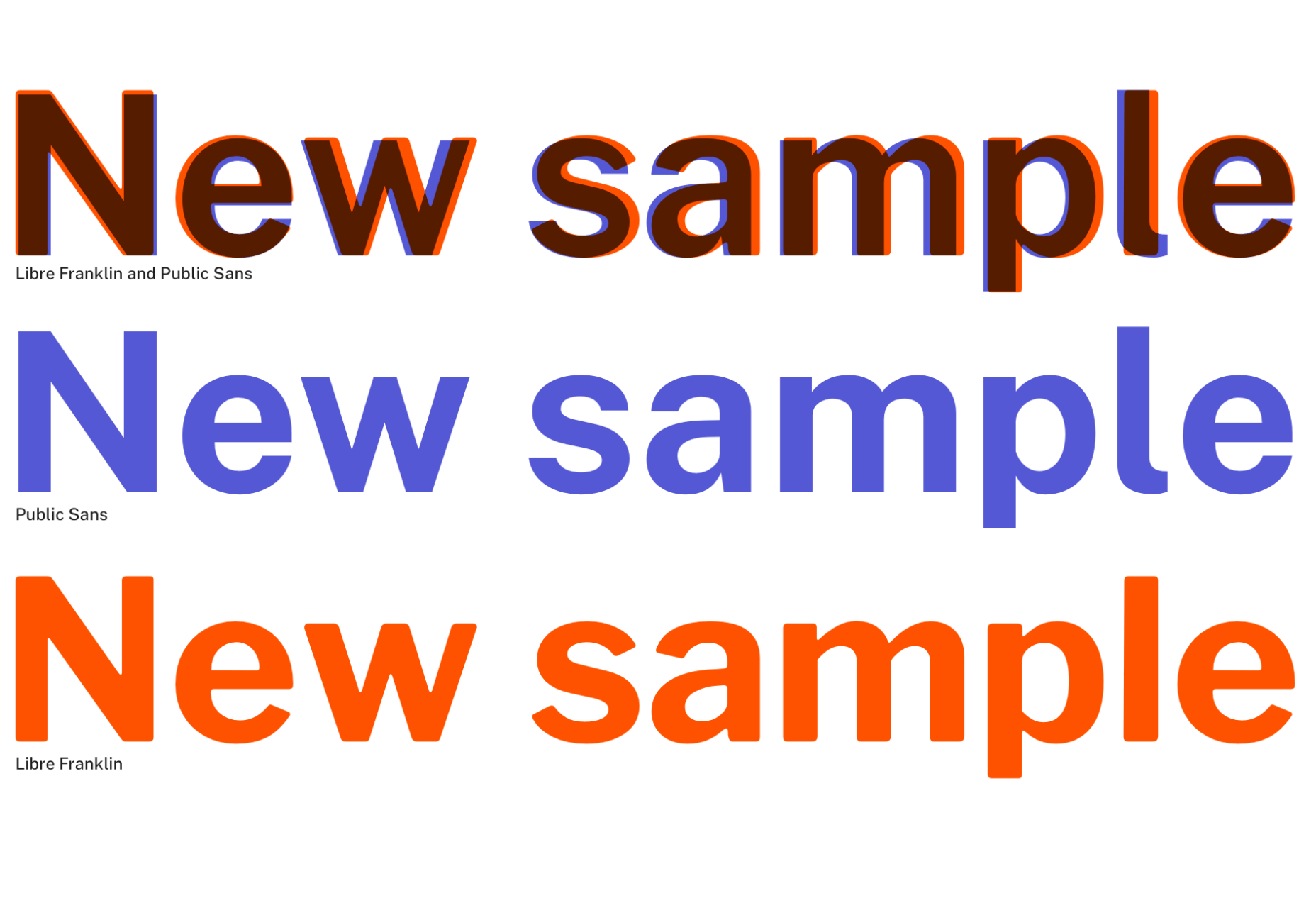
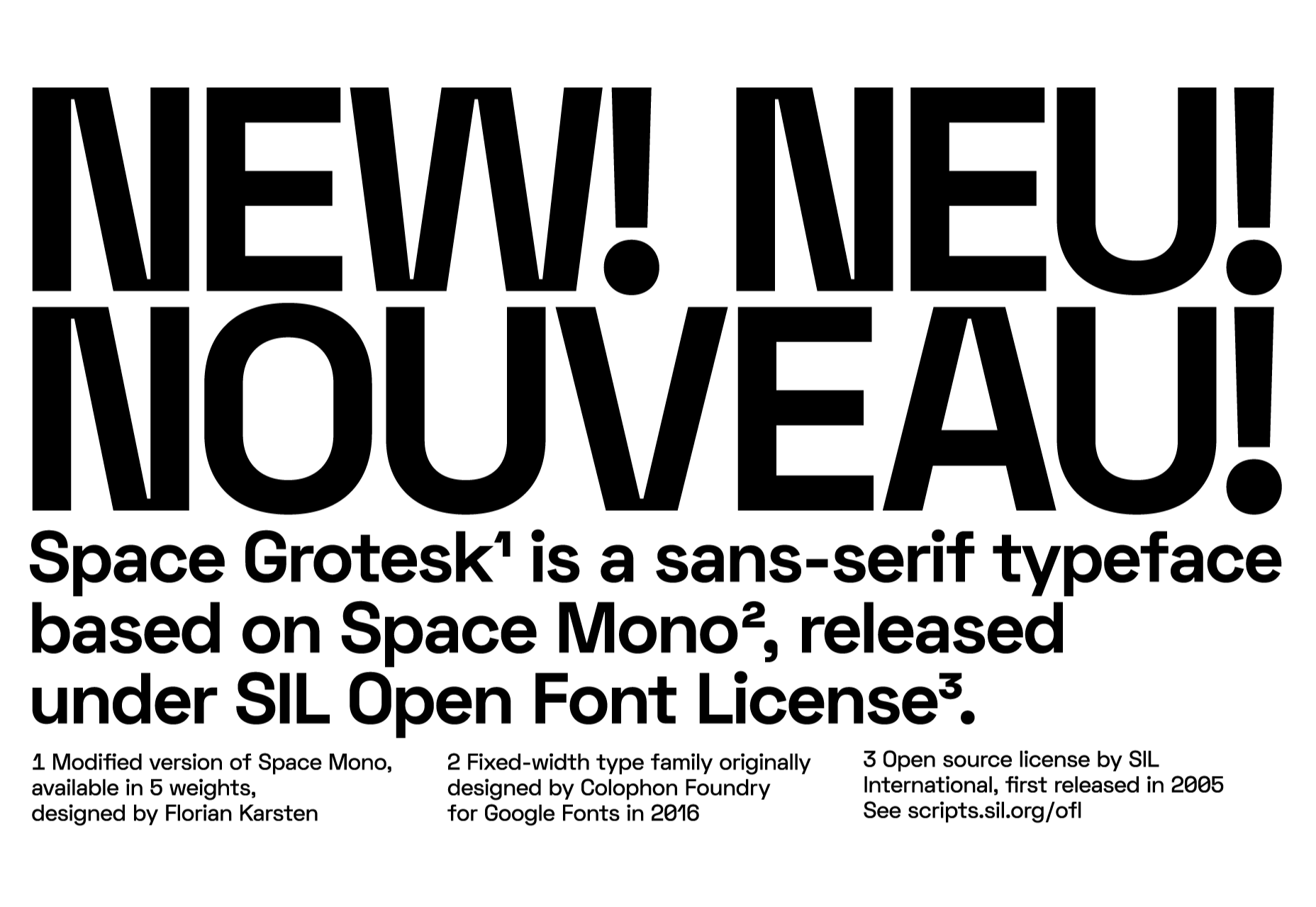
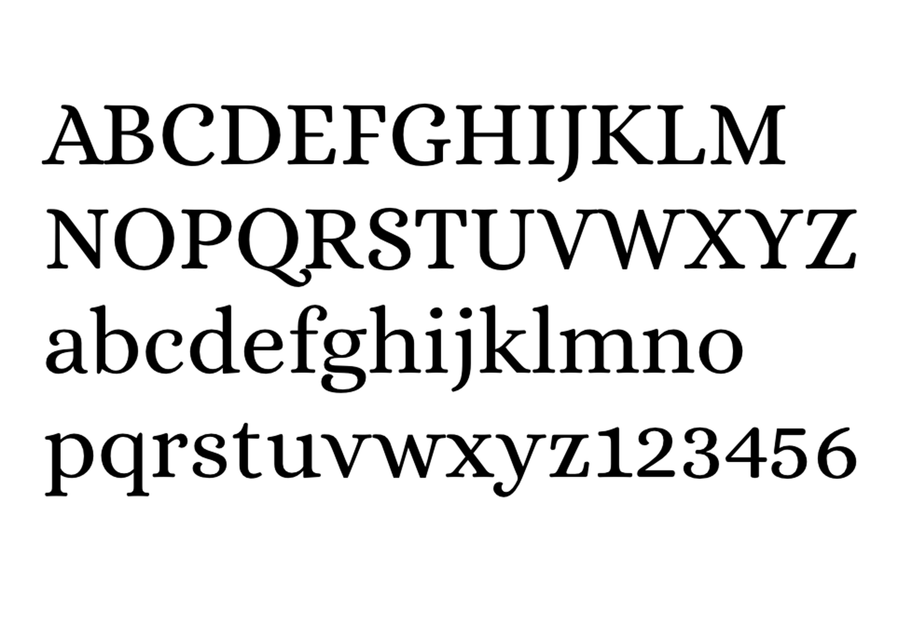
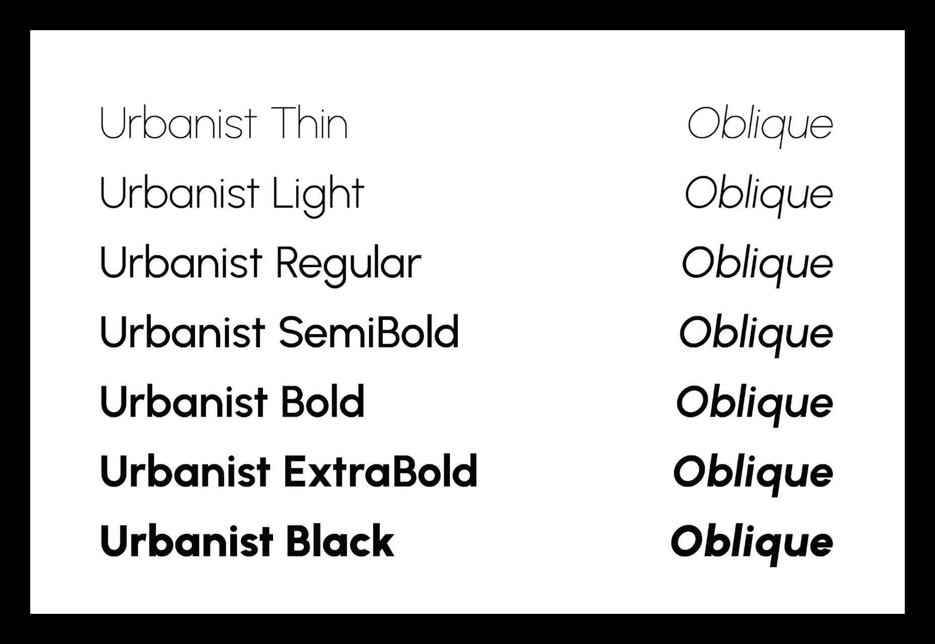
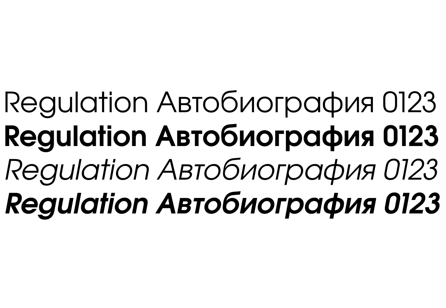
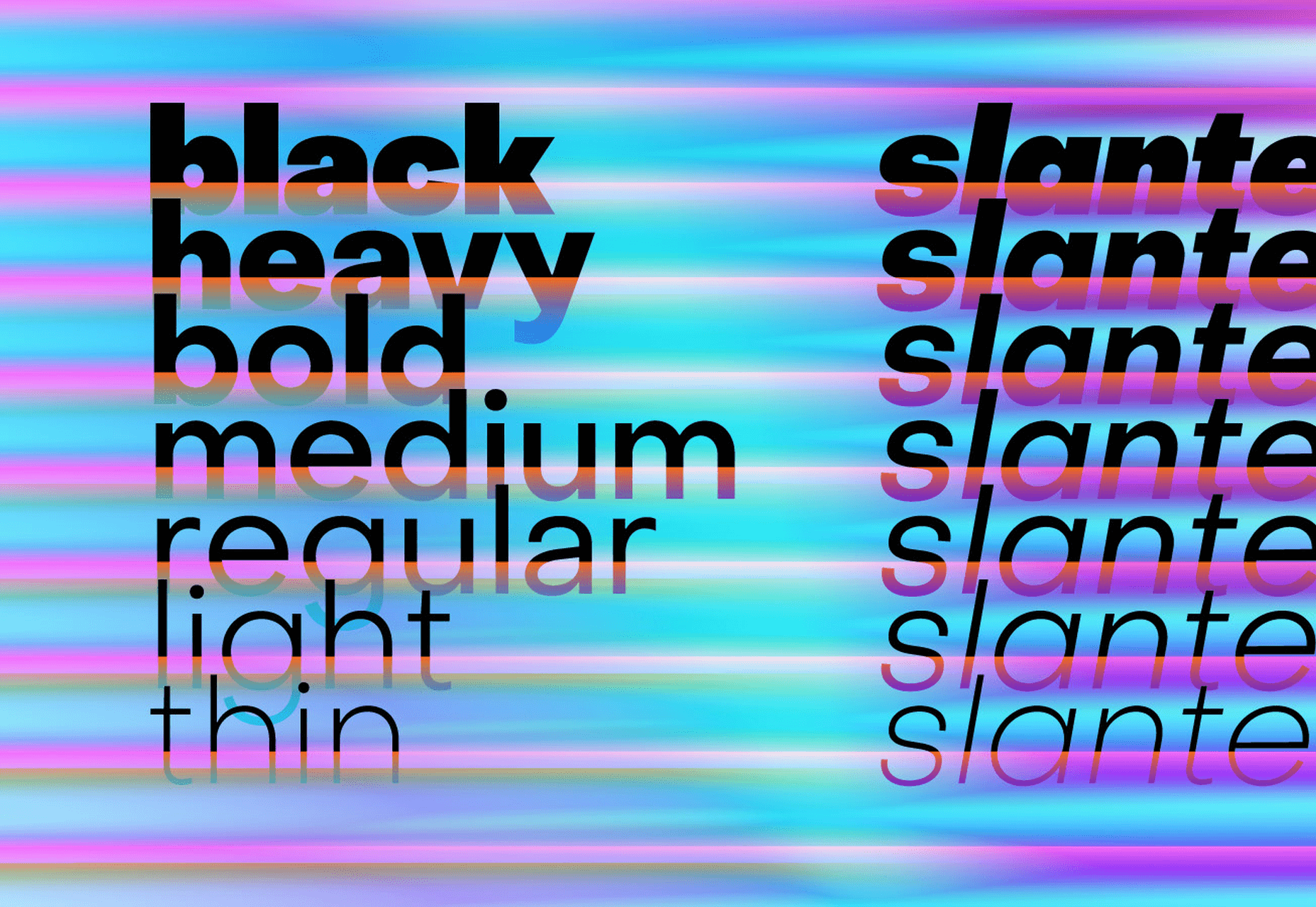
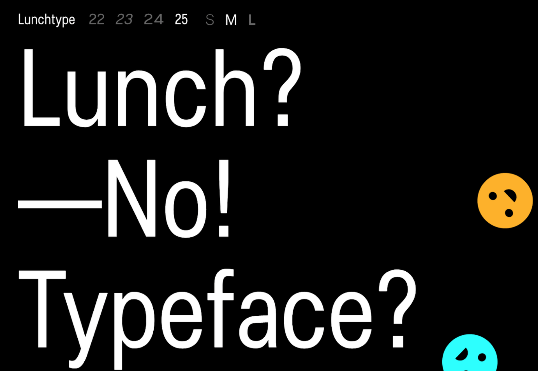
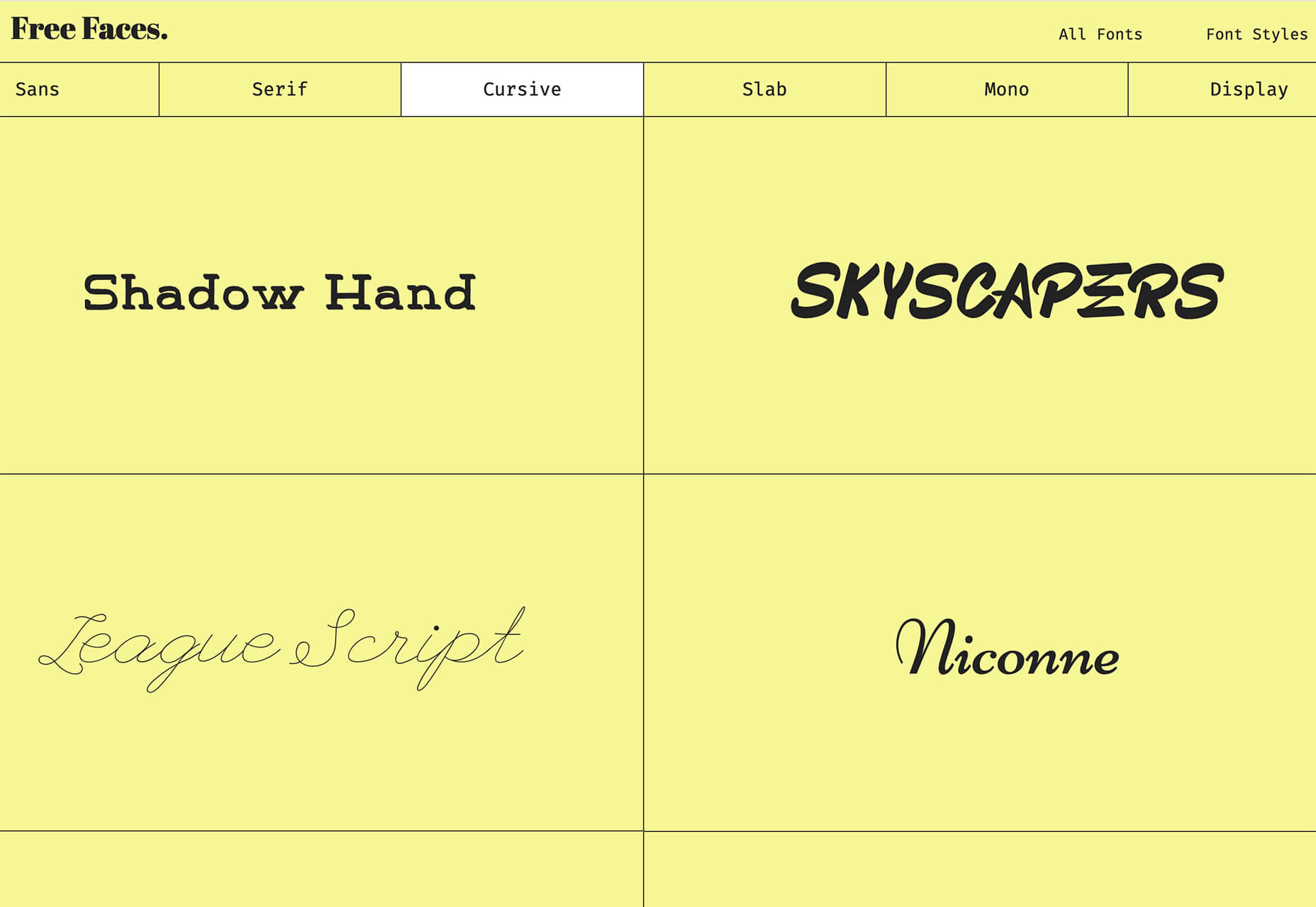
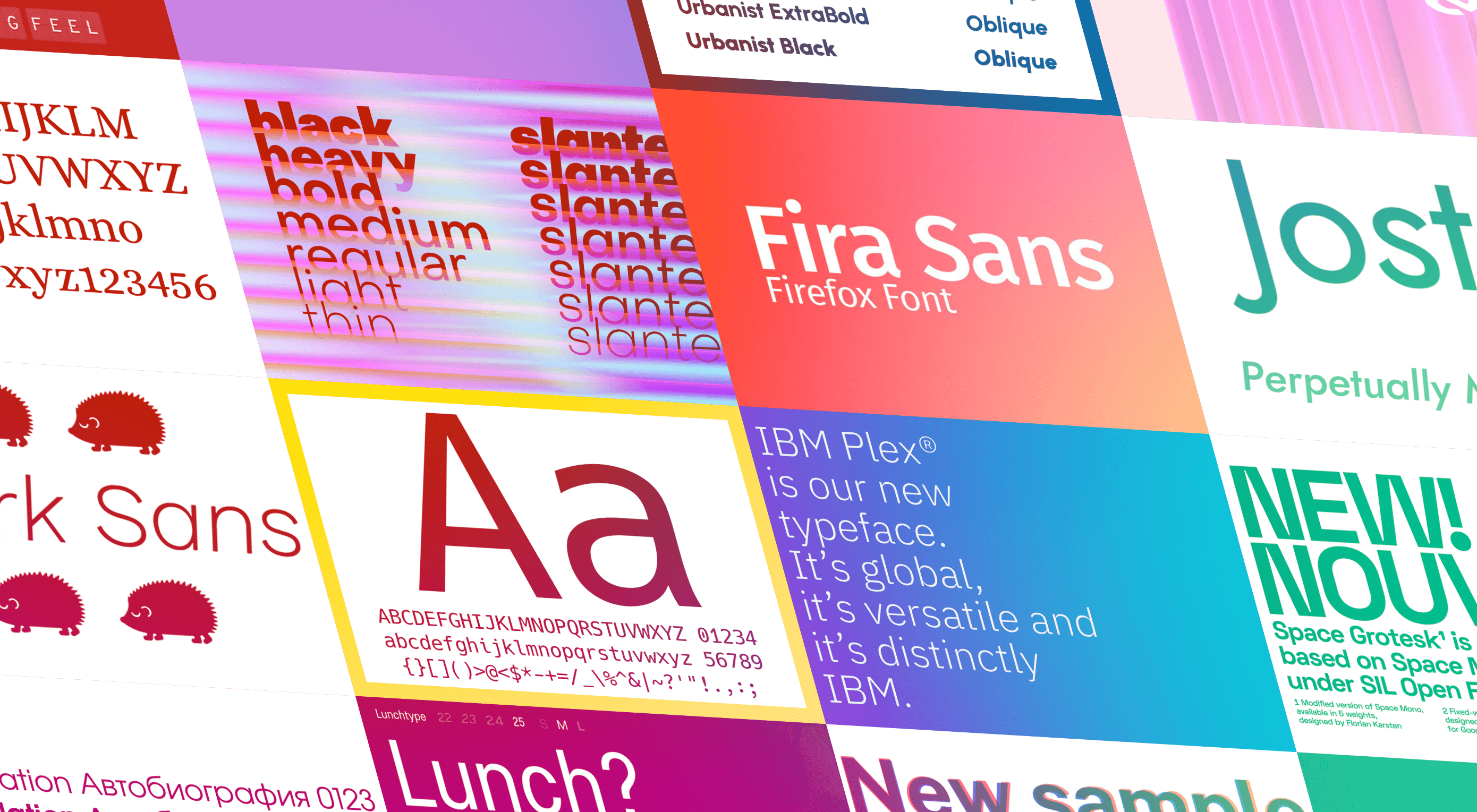 The right typeface can make or break your website. As designers, we will always be naturally drawn towards the premium fonts such as Circular, DIN, or Maison Neue; Before you know it, your website is racking up a font bill larger than your hosting bill.


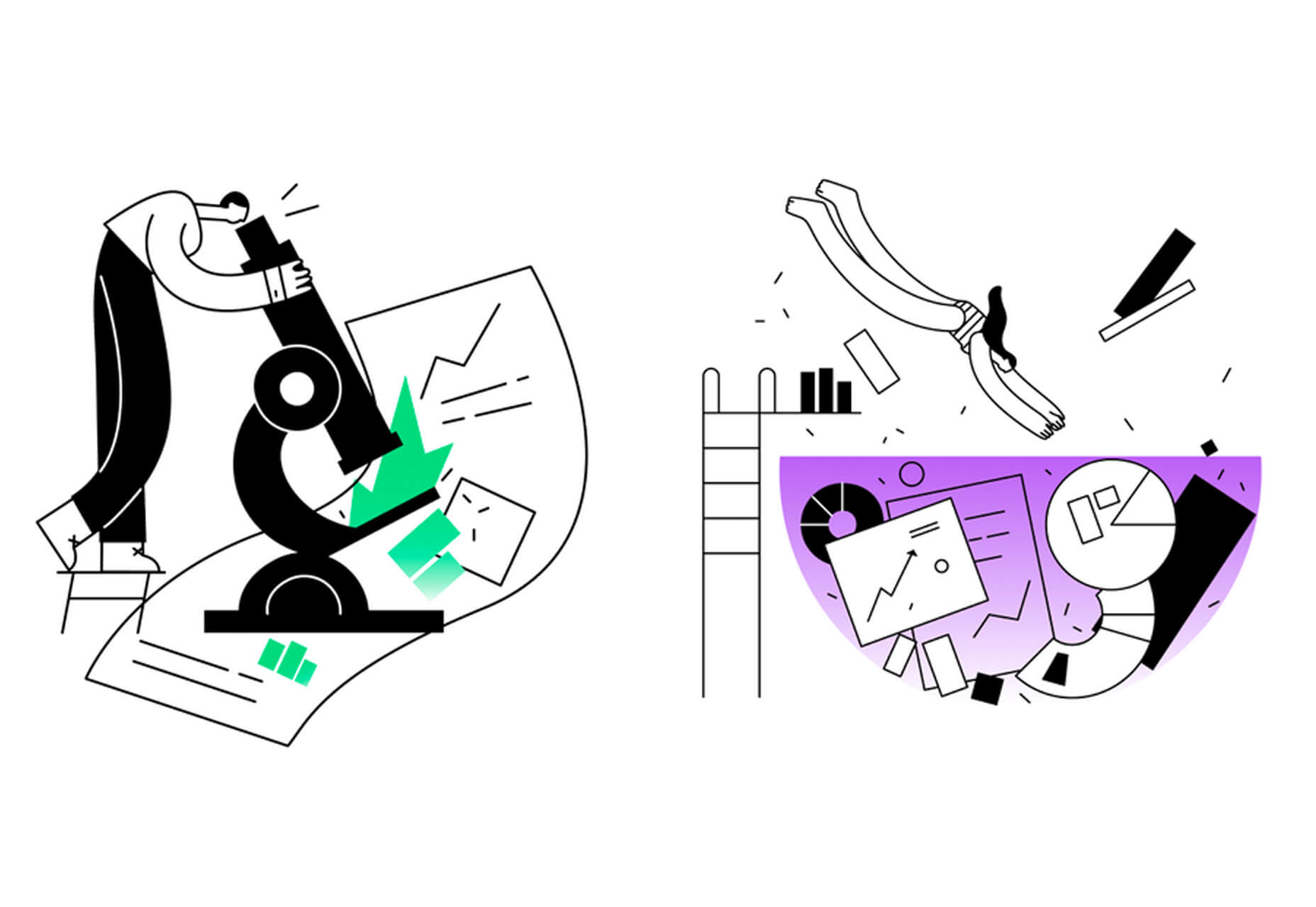
 Artificial Intelligence is the use of computers or machines that have been created to work and react like humans. Some of the computers that have AI, are designed to include speech recognition, and learn user behaviours so they can predict activities or decisions before they happen.

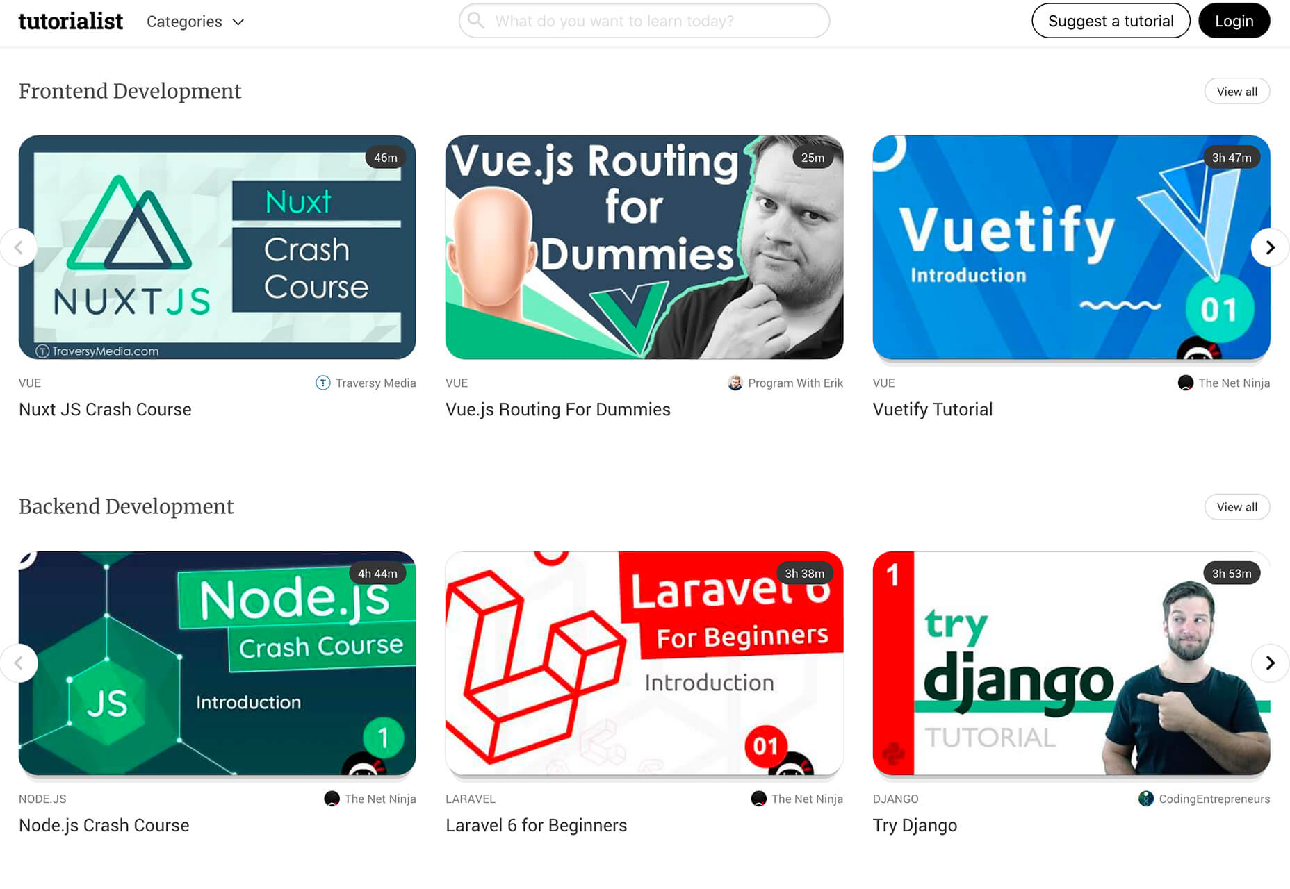
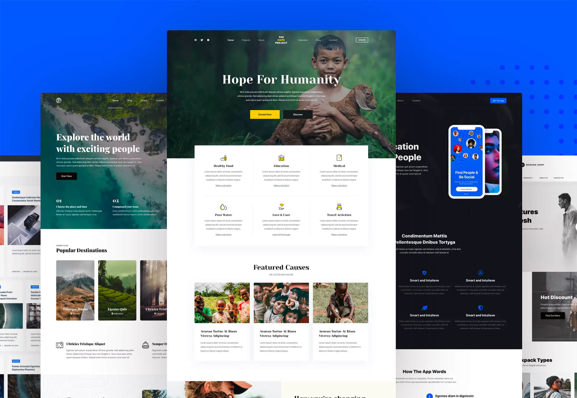
 Every week users submit a lot of interesting stuff on our sister site Webdesigner News, highlighting great content from around the web that can be of interest to web designers.
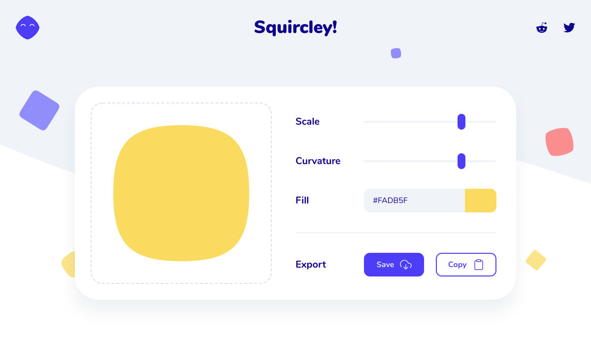
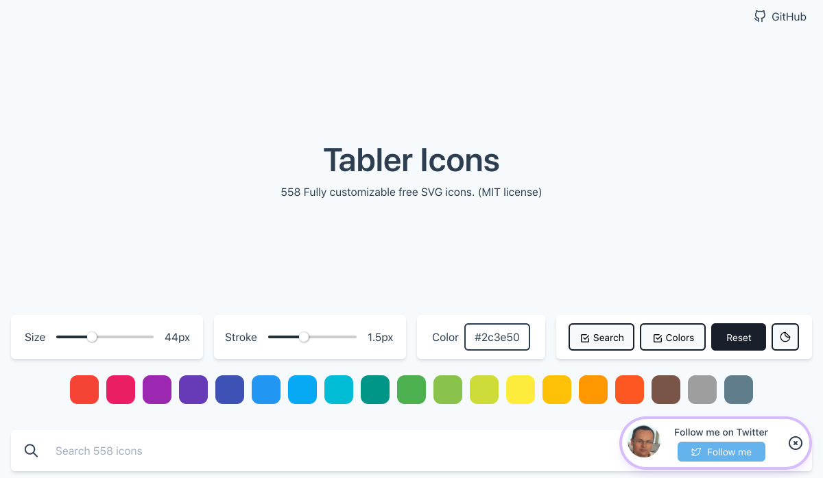


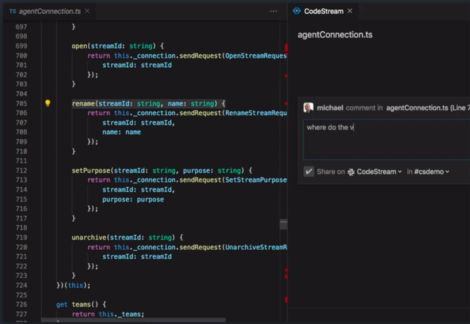
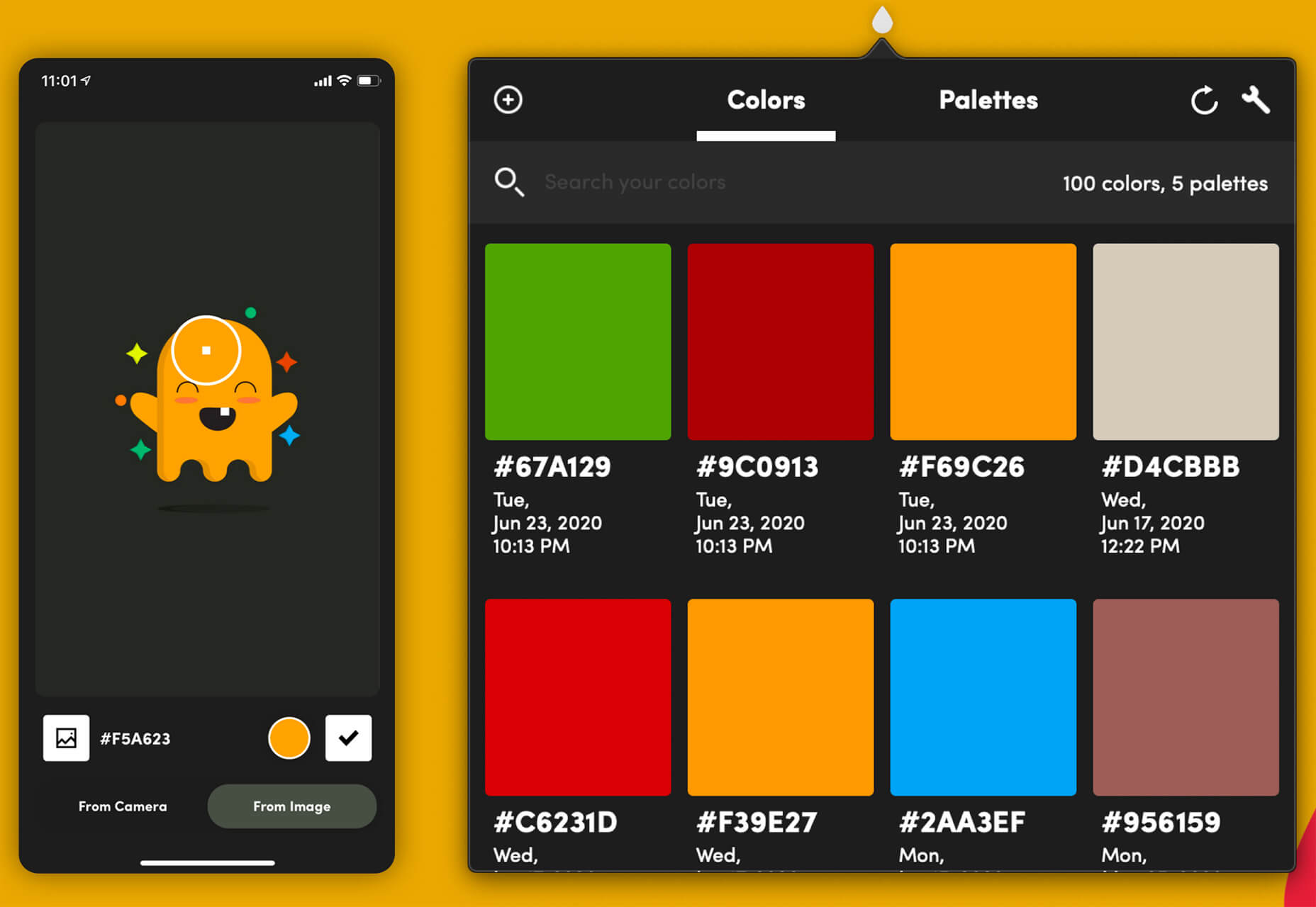
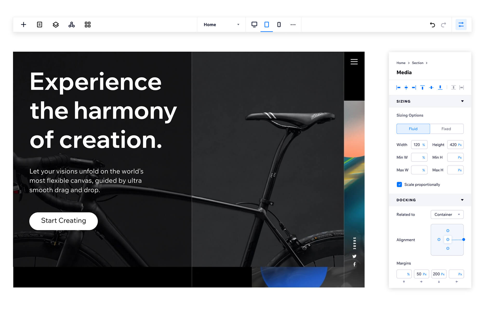
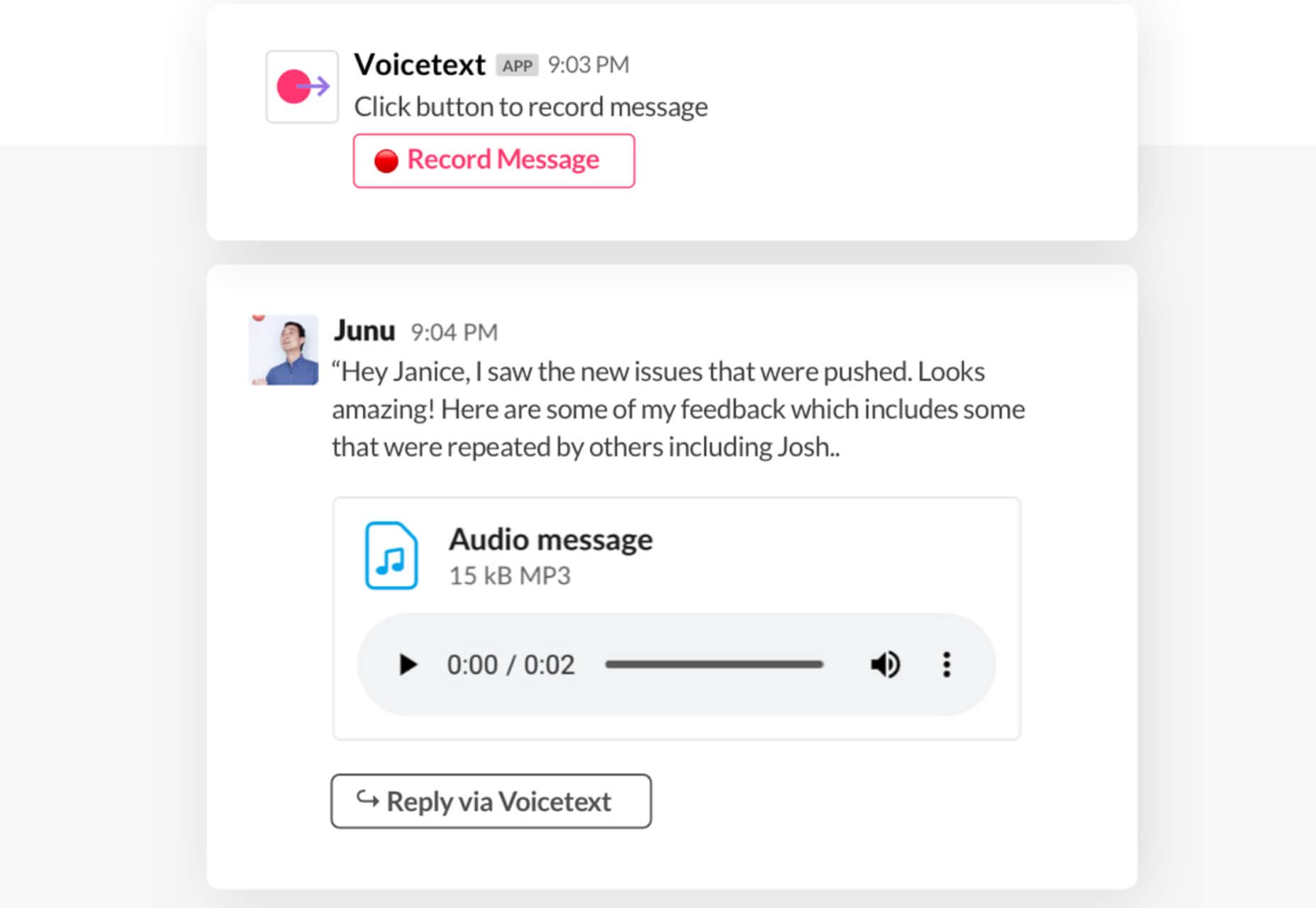
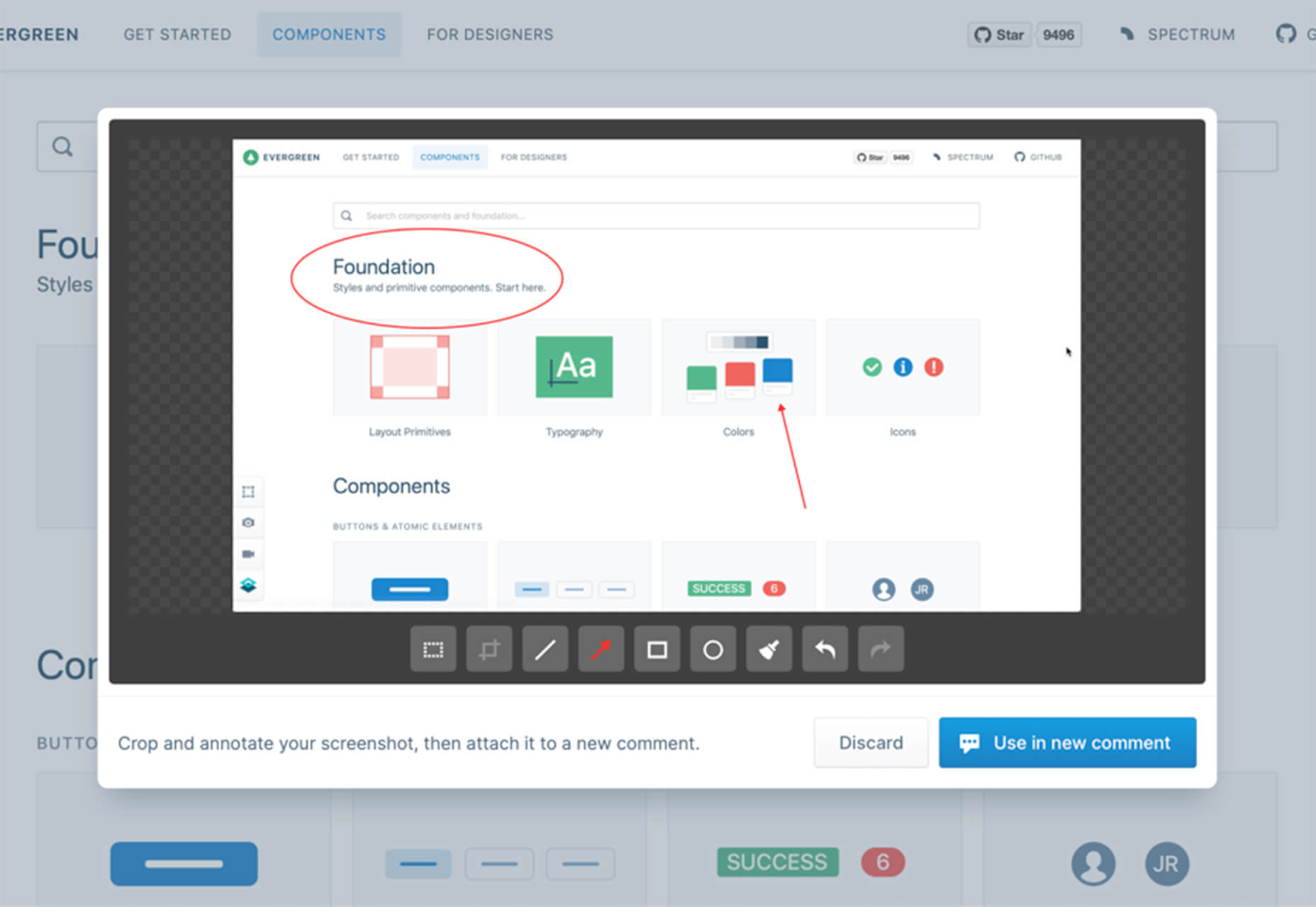
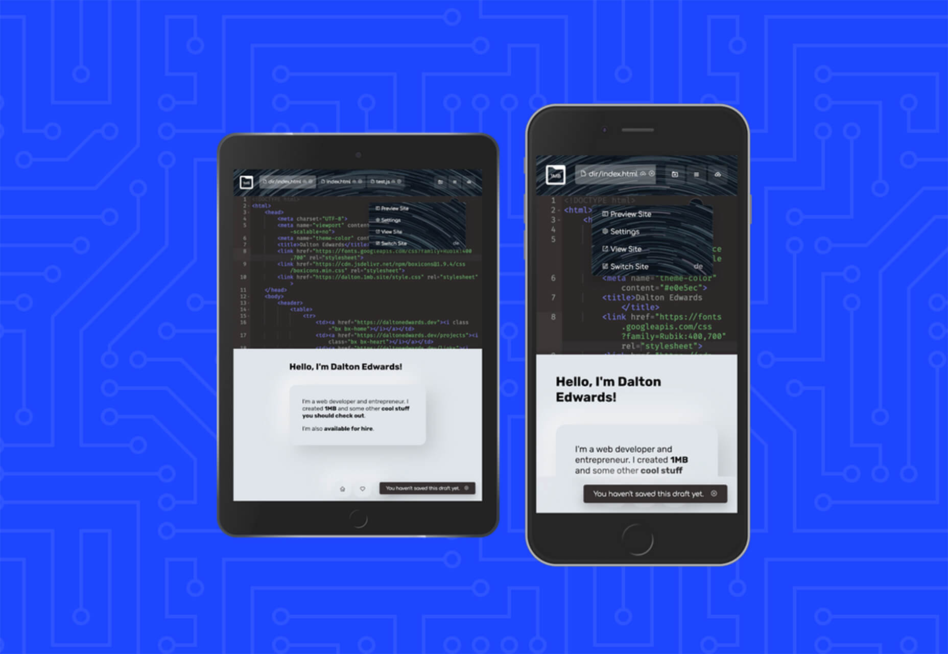
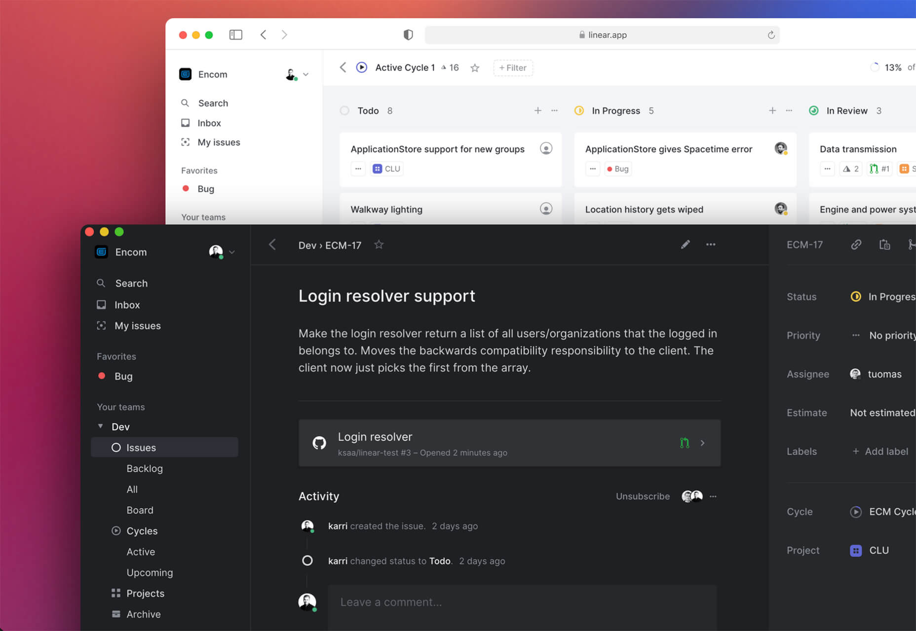
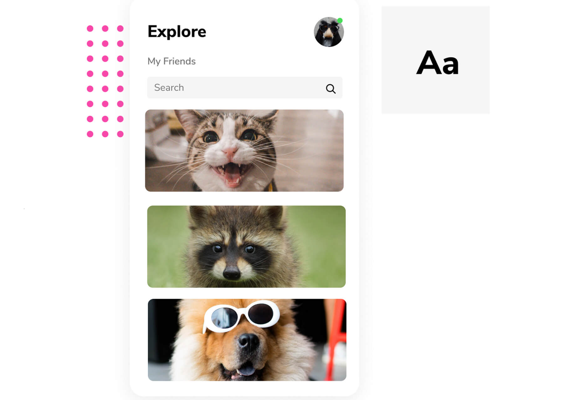
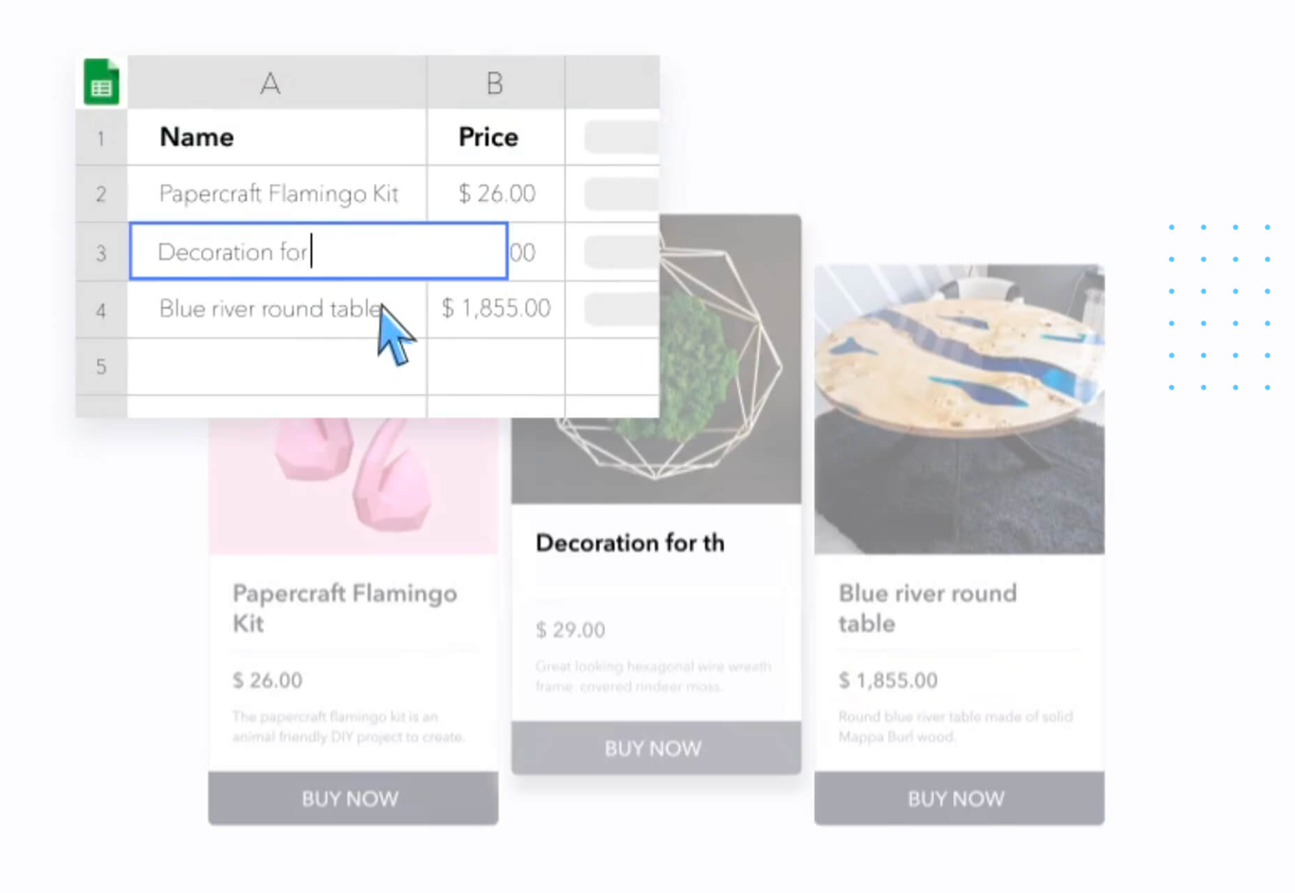
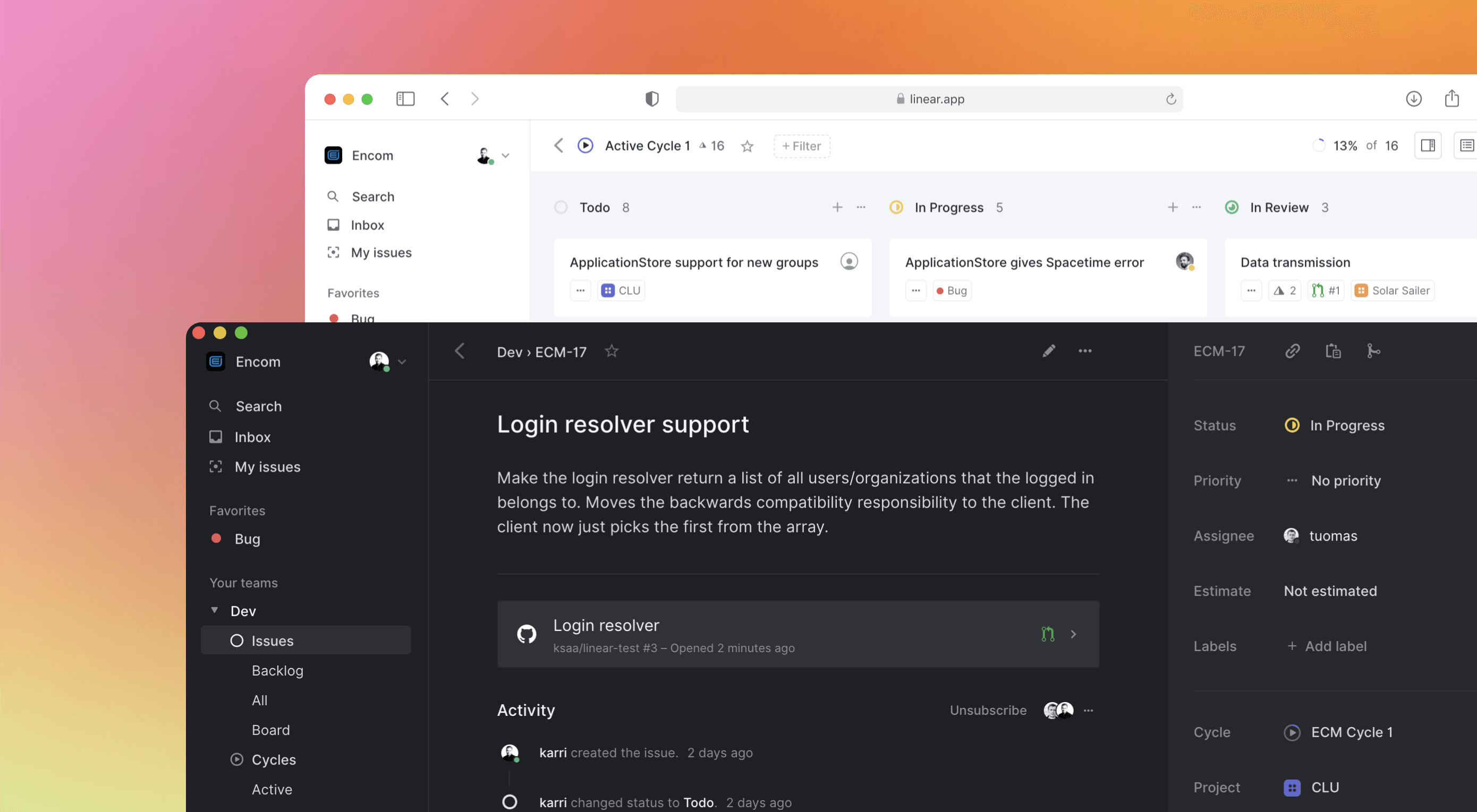 Some of the changes we are seeing with where we work are starting to pop up in the type of new tools made for designers and developers. More tools with remote collaboration as a key feature are increasing in popularity. (You’ll find a few of those here.)
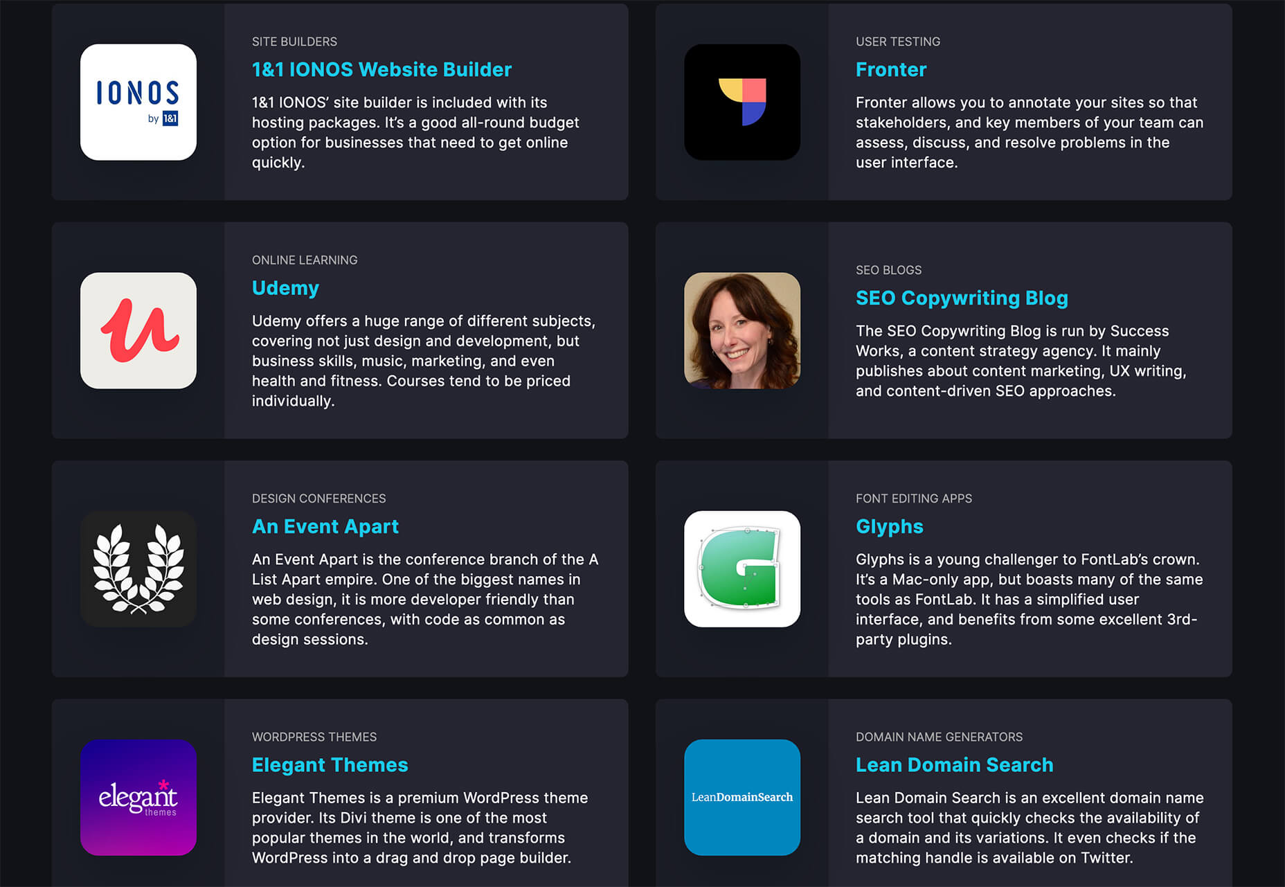


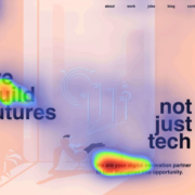
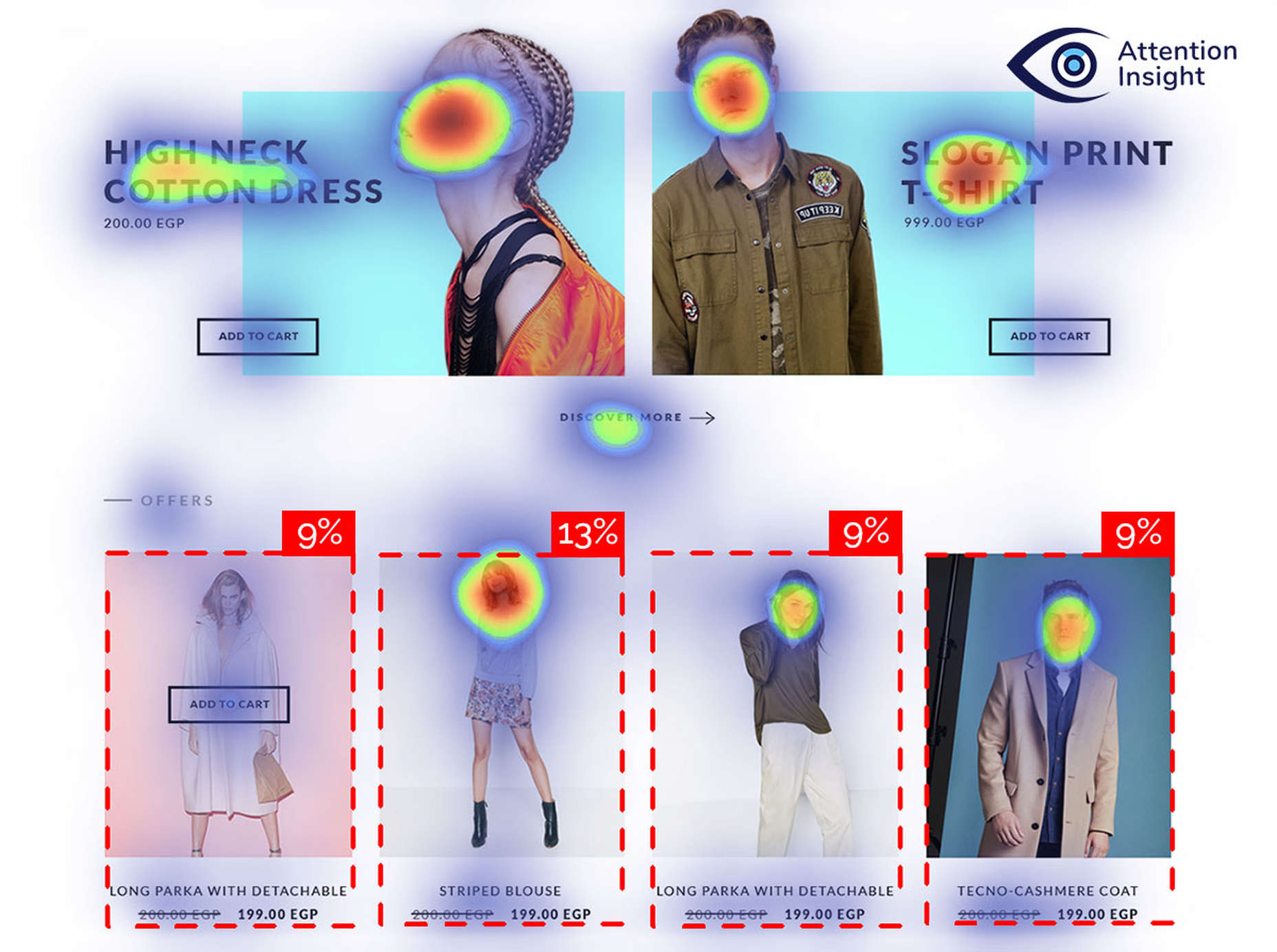
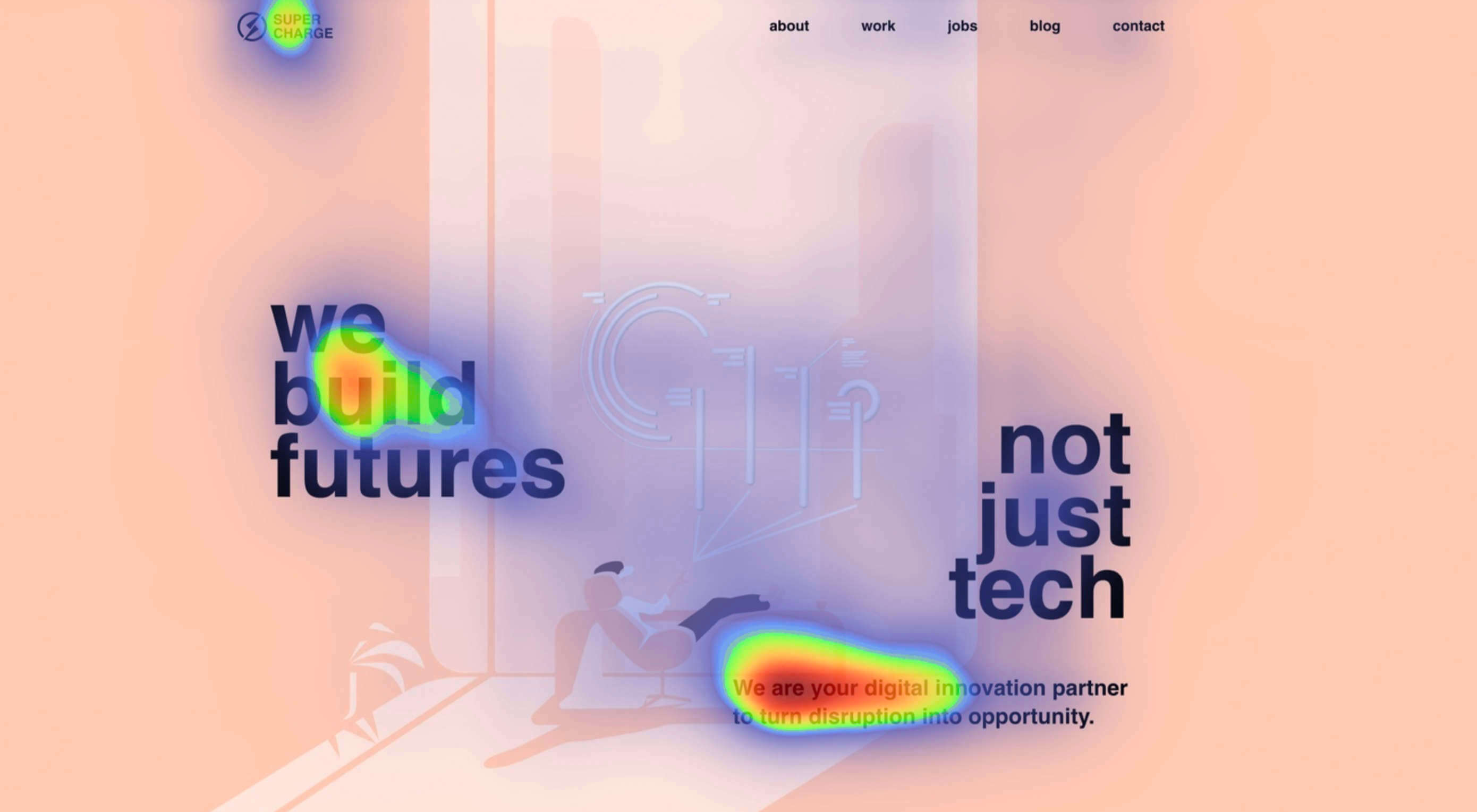 Attention is the new gold; brands are in a constant competition for our attention.

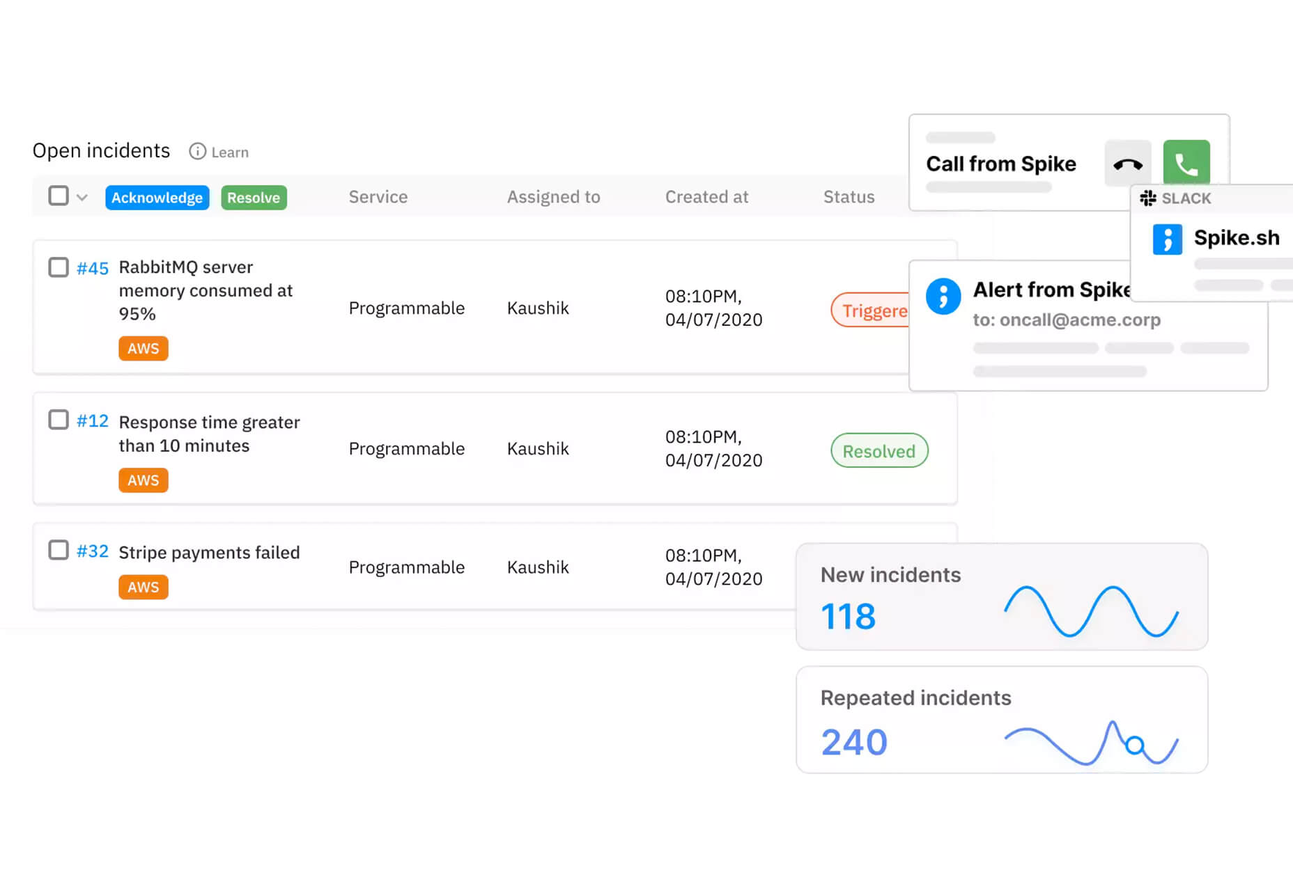
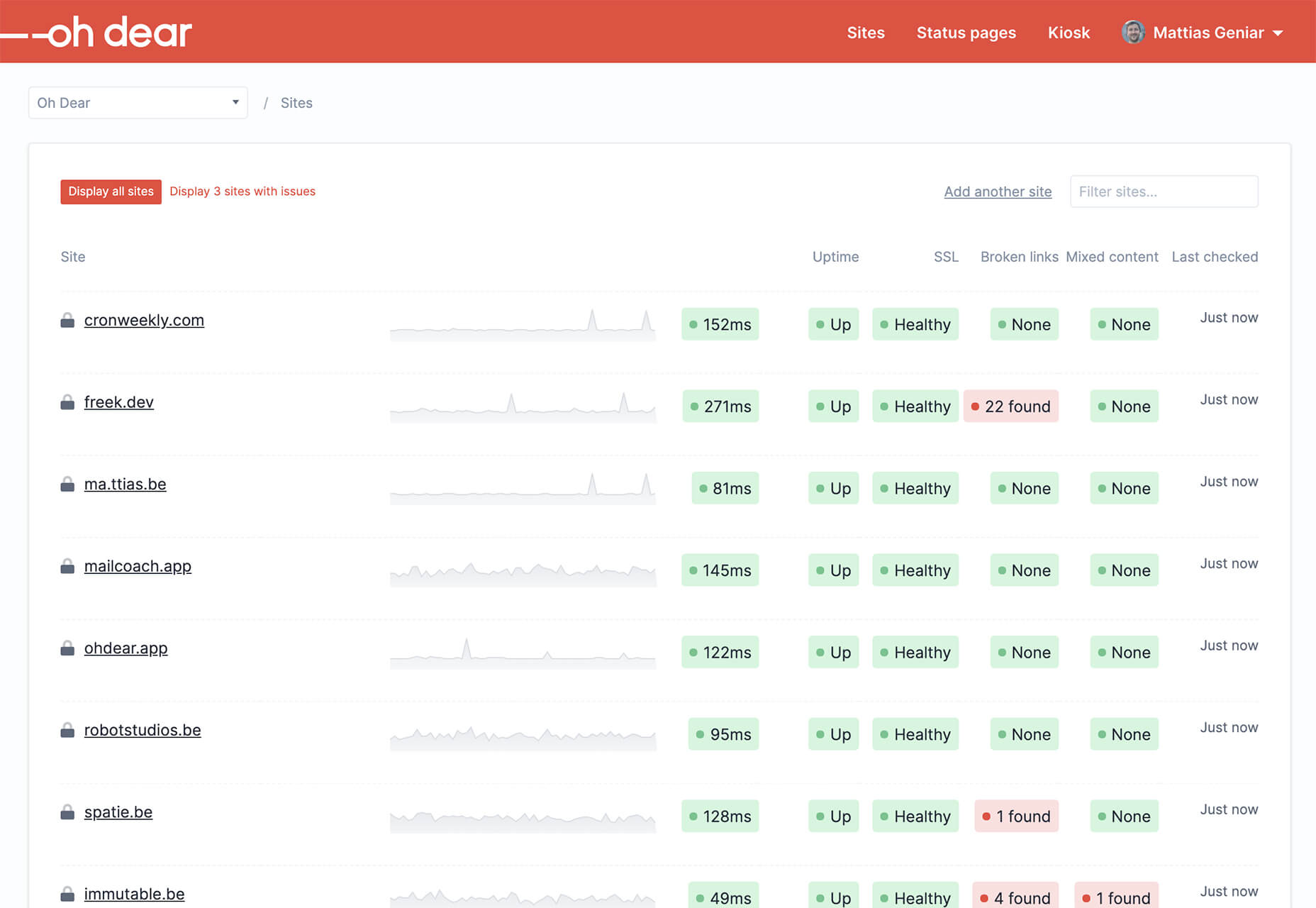
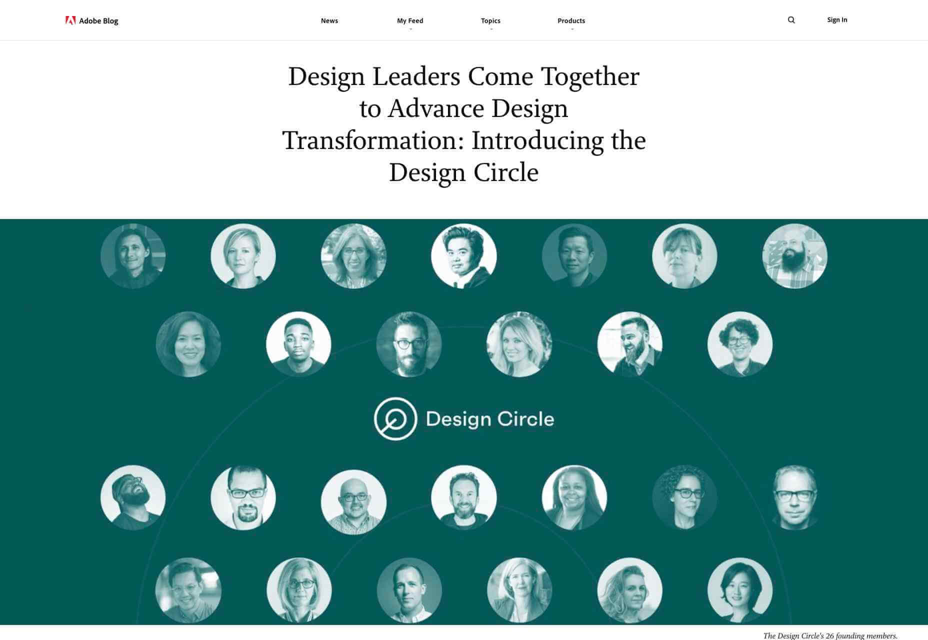
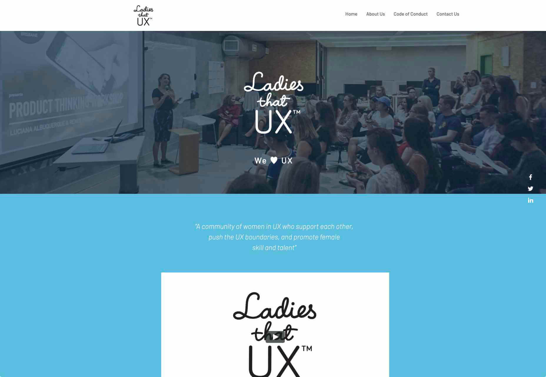
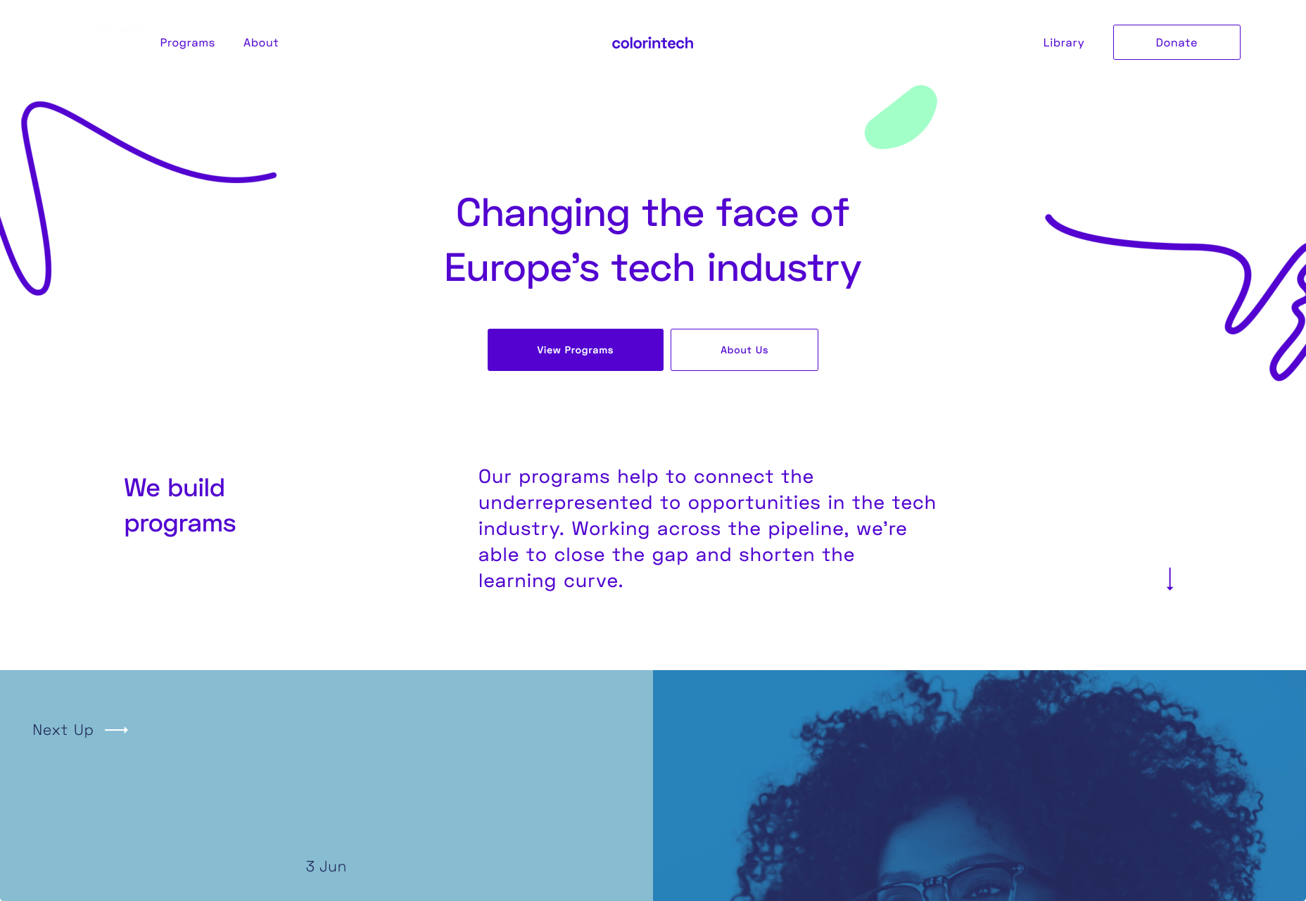
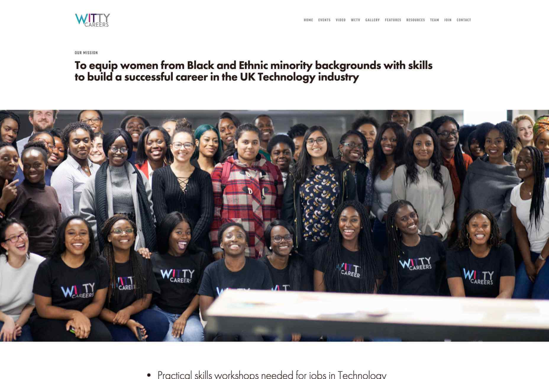
 Web developers have been the bedrock of any company’s business strategy for some time, and the industry is continuing to thrive and grow at a rapid pace. This is why it’s surprising that it is so lacklustre when it comes to diversity.


 You’ve been working away at your latest design project, and the client has given the go-ahead on your lovingly created digital concepts. Now it’s time to bring those designs to life, and you have a developer queued up to do just that.
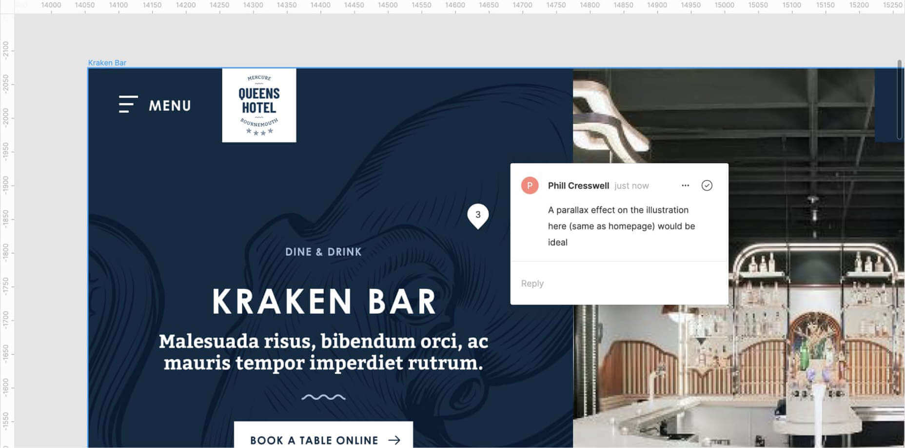

