 Who is Grammarly for? Can a grammar checking tool like Grammarly replace a human editor and proofreader? Is the Grammarly checker worth it? Are the Grammarly free checks sufficient for me, or should I upgrade to Grammarly Premium? Should I install Grammarly on Chrome? How effective is Grammarly for Word? Is downloading the Grammarly desktop app worth it? You have questions…all of which we’re going to answer.
I have been using Grammarly regularly for proofreading my documents and emails since 2015 and have witnessed its evolution as a product firsthand. After checking over three million words during this period, I can confidently say that Grammarly has come a long way. Raising $200M in total funding at a valuation of $1B+ so far, and with more than a million downloads per month, Grammarly is now a top-1000 website by traffic worldwide.

I write a lot, so Grammarly has been my go-to writing assistant for correcting passages and enhancing my writing. I first tried the Free version, and in May 2020, I upgraded to the Premium version, finally! Grammarly Premium is a great tool that takes care of most of your writing, proofreading, and plagiarism-checking needs for intensive work.
In this article, I’ll explain what Grammarly is, its features, what it does (functions of all versions and products), the pros and cons of using Grammarly, my rating of Grammarly, who should use the Free version, and who should use the Premium version and the difference between the two. I’ll also explain how to use Grammarly properly. I’ll then compare it with other popular tools and suggest which ones suit your needs. In the end, I’ll leave you with my final assessment and FAQs.
What is Grammarly?
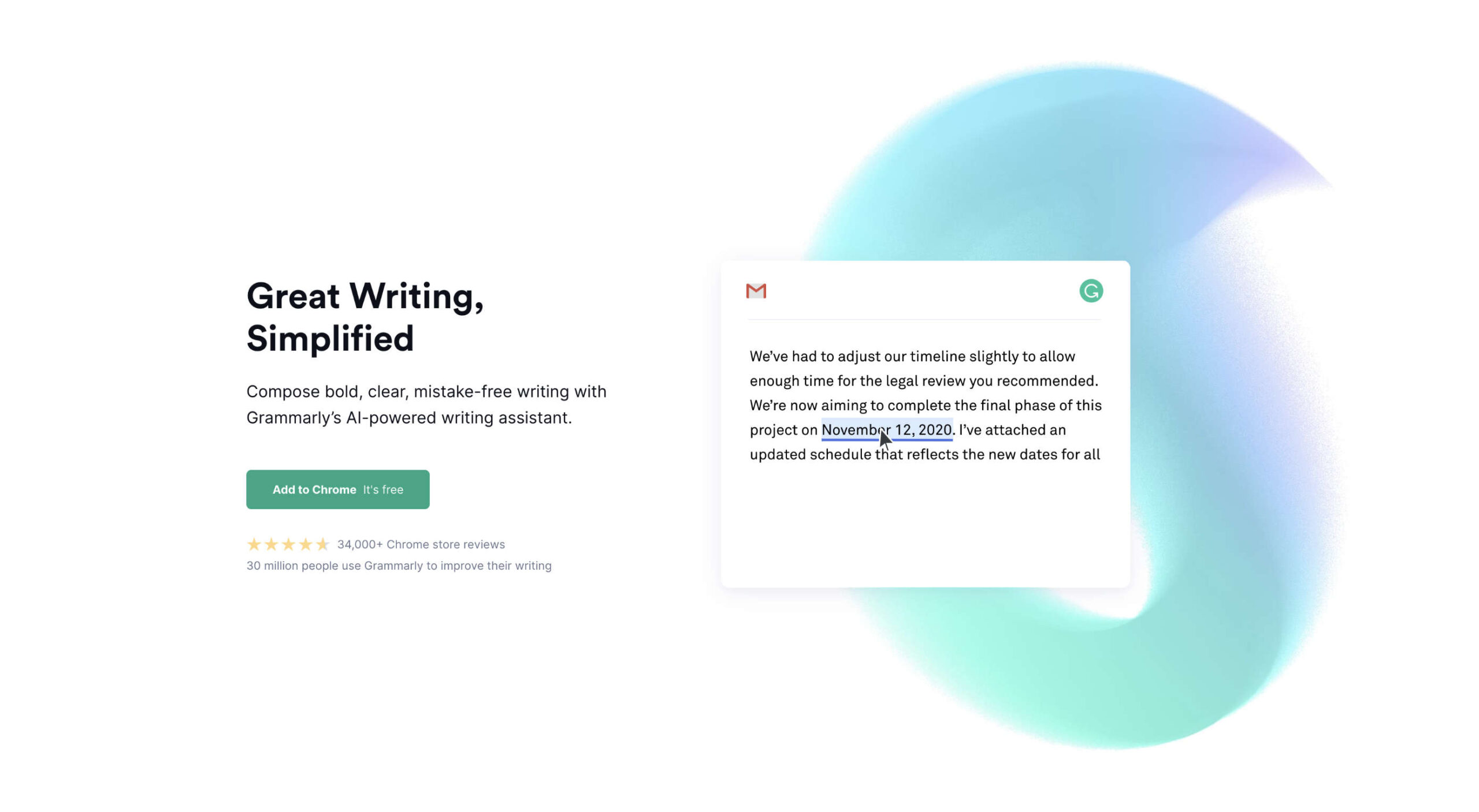
Grammarly is an online digital writing assistant that checks for a range of English grammar and spelling mistakes. It also helps enhance the writing through its excellent context-based clarity suggestions (Premium version).
Grammarly is a writing aid that checks not only for spelling slights, grammar rules, and clarity issues but also identifies the tone of the writing to provide relevant instructions through its Error Cards. It also has a plagiarism checking tool, which is available with the Premium version.
Grammarly employs AI (Artificial Intelligence) and NLP (Natural Language Processing) to check the content for all possible syntactic and semantic issues. Although it has an extensive database, it is still incomparable to human proofreading and professional editing, especially when it comes to understanding the context of the writing.
Grammarly Overview For Beginners – Compatible, Accessible
Grammarly is astonishingly easy to use, primarily due to its compatibility via the Browser Extension/Add-on, from which you can use it on millions of websites. Moreover, its other product forms, i.e., the Online Editor (Web App), Desktop Application, MS Word/Outlook Add-in, and the Grammarly Keyboard for iOS/Android, make it accessible everywhere.
How Does Grammarly Work?
It automatically detects issues in the content in the Desktop App, the Online Editor, and the browser (even in Google Docs, which is in Beta at this time) via its add-on. Yet, for the MS Word Add-in, you have to click the Grammarly button to activate the app. Grammarly explains all detected issues via an Error Card that contains relevant information for each item. You can implement it by clicking the suggestion, ‘Ignore’ the problem, or ‘Add to Dictionary’ (in case of a spelling issue). You can also provide feedback (if you think that the suggestion is wrong). The Free version checks only for spelling and critical grammar mistakes. The Premium version also reveals a ton of advanced ‘Clarity Issues.’
The Tone Detector helps you estimate the entire document’s tone, which can be valuable for many writers who target a particular audience, e.g., formal writing for the business audience.

Limitations of Grammarly (For Beginners)
Grammarly, overall, excels at almost all the things it does, and therefore the free version is recommended for everyone. Grammarly provides a generic readability score. Advanced grammar checks like the clarity checker, the plagiarism checker, and many other features are not available for the free version.
Grammarly is dominant amongst its competition, but it doesn’t solve all English language problems. It is useful at picking syntactic mistakes but still misses significant semantic errors, which can be a problem for people who are not particularly adept at English — as they won’t notice these slips.
| The Good |
The Bad |
& The Ugly |
| Ease of use – simple, intuitive, and efficient interface |
English language only |
Tad expensive (notably the monthly subscription at $29.95 per month) |
| Context-based grammar checking |
Not 100% accurate (primarily misses linguistic bloopers) |
No free trial for the premium version. |
| Fantastic grammar checker |
Business account starts at three users and charges per number of users (can be a bit expensive for small businesses) |
Only one account (license) for the premium version. You can use it on up to five devices. |
| Convenient tone detector |
Insufficient as a standalone tool (doesn’t do everything) |
Incomplete sentences can sometimes go undetected |
| The insightful error cards are instructional and productive (they help you to improve your writing) |
Unlike ProWritingAid and Hemmingway Editor, it doesn’t provide much information about the whole passage, Grammarly’s scoring is generic right now |
No substitutes are suggested in many cases. Example: synonyms, rephrasing suggestions for the intricate text, etc. |
| Integrates well with MS Word, Outlook, WordPress, emails, social media, and millions of websites |
The free version is limited to fundamental grammar and spelling mistakes |
Cannot determine contextually incorrect sentences (it cannot perceive the meaning of the written document) |
| Knowledge-base |
The premium version identifies repeated words but sometimes doesn’t provide a suitable alternative to use |
Short on vocabulary suggestions (not as competent as the free thesaurus writing tool) |
| The Grammarly keyboard is available for Android & iOS for FREE |
Free version shows the number of advanced clarity mistakes but doesn’t tell you what those mistakes are and where they are |
The formatting tool is rudimentary. You have to write in another text editor and then import it to the Grammarly Editor to format your writing accurately |
| Personal dictionary |
Google Docs is not supported yet (in Beta). |
Restricted to English only, and it also doesn’t translate other languages as Ginger does. |
| The adjust goal option allows you to customize Grammarly’s feedback. |
It can miss simple semantic issues, which sometimes can be caught by text editors like Google Docs and MS Word. |
|
| Formatting remains the same if you import/upload a document, but it changes if you copy/paste. |
Plagiarism Detector is not available for the free version. |
|
| Weekly writing stats (sent to user email) can help you identify your problem areas |
The browser extension can malfunction, i.e., opening and closing the Grammarly editor within a website (sometimes) duplicates the content |
|
| Option to download the detailed performance statistics as a PDF |
Sometimes Grammarly doesn’t catch all mistakes on the first try. You have to refresh or scroll to let it run again and see if it finds new issues |
|
| Grammarly blog teaches English grammar rules, writing techniques, and more |
|
|
| Context-based checker is more accurate than competitors |
|
|
| Provides rephrasing suggestions for complicated sentences |
|
|
| The premium version excels at catching inconsistencies |
|
|
Who Should Use Grammarly?
Free:
Everyone
Despite being limited, Grammarly (free version) is a phenomenal tool. Therefore, I would heartily recommend it to everyone. It’s free, and it’s convenient.
The free version should be everyone’s go-to tool for proofreading social media statuses, tweets, and comments. It is also crucial for editing all sorts of short-form writing, such as emails. Professional writers can also use the free version to catch typos and basic grammar mistakes.
Premium:
- Professional Writers
- Authors
- Bloggers
- Students
- Businesses that require extensive writing
- Marketers/Advertisers
- Content Creators
- Editors and Proofreaders
Apart from all the necessary features offered in the Grammarly free version, Grammarly Premium provides several other valuable elements such as an advanced clarity checker and a robust plagiarism checker. All these help you enhance your writing effectively.
Grammarly Premium is a helpful tool for people who are already adept at English as it still requires plenty of work on catching semantic errors. Businesses and Professional writers who do intensive writing should give the Premium version a go. From writing, editing, and proofreading to plagiarism checking, it is almost an All-in-One solution (though not a substitute for a human proofreader – at least yet).
Who Shouldn’t Use Grammarly?
Free:
- Students
- English Learners
People, especially students who cannot learn from their mistakes, should avoid relying on Grammarly as it can hinder their learning process.
Granted, Instructional Error Cards and Weekly Writing Stats (emailed to the user) can pinpoint your weak points, but educating yourself from there on is entirely up to you.
Just like ‘Auto-correct’ hinders people’s ability to learn proper spellings, Grammarly can do that for learning grammar rules.
Premium:
- Amateur Writers
- Infrequent Users
Grammarly is an excellent tool, but it still makes slips, which can be misleading for amateurs who don’t have a solid grip on the English language. Therefore, if you are not proficient enough in English, you should only subscribe to Grammarly Premium if you can remember that it is not a replacement for a human teacher or a proofreader. Or, you can continue using the Free version, which is competent enough to check fundamental grammar and spelling oversights.
Furthermore, businesses and professionals who are infrequent users can stick to the Free version if they feel they will not be making the most of the Premium version.
Grammarly vs. Basic Text Editors
A comparison with basic text editors will illustrate Grammarly’s true potential:
Microsoft Word
Microsoft Word is the most popular and feature-packed text editor. It includes a basic grammar and spelling checker that catches typos in real-time. However, MS Word is very limited in its grammar checking capabilities.
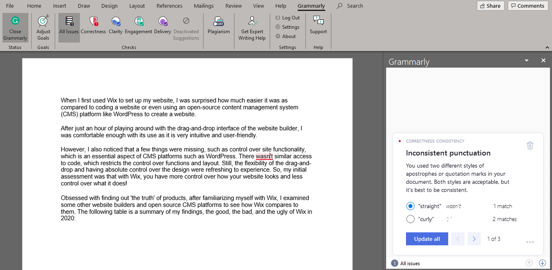
I’ve written many articles using Microsoft Word, which were considered error-free by the text editor. However, when I put the same documents in Grammarly’s Editor, there’d always be some critical mistakes caught by the Free version and some clarity or consistency mistakes pointed out by the Premium version.
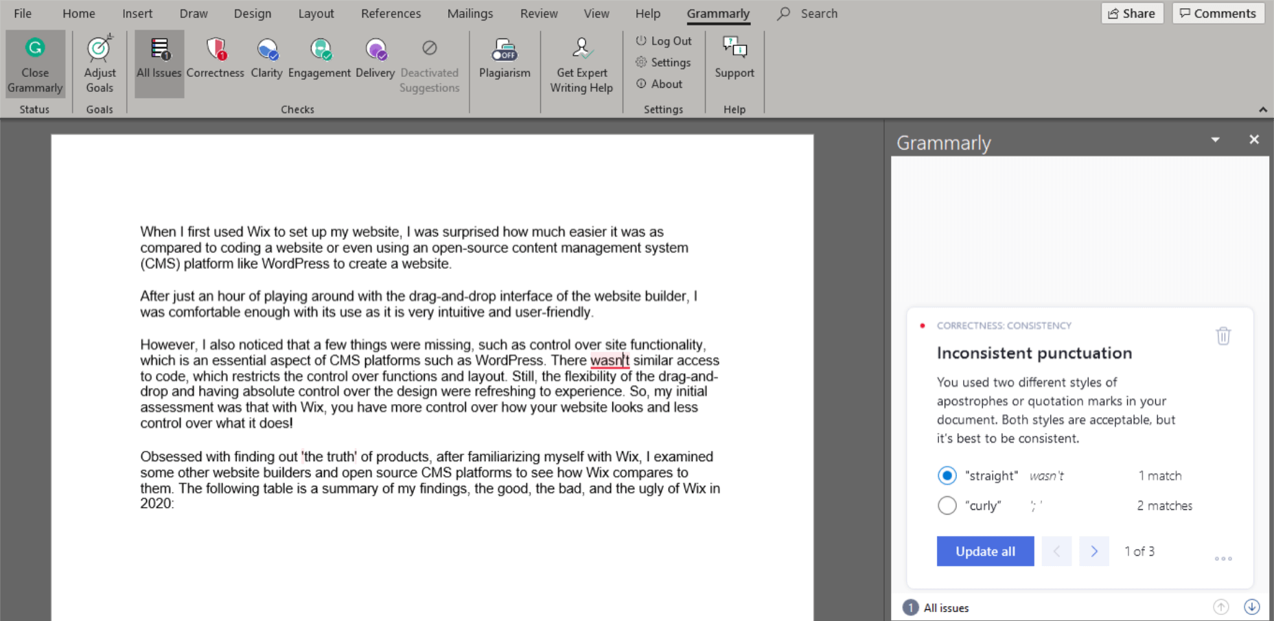
Grammarly finds inconsistent punctuation that MS Word missed.
Google Docs
Google Docs is another mighty text editor, which is free to use. It also has numerous features, including spelling and grammar checking. Google Docs’ grammar and spelling check software only flag issues with an alternative in its database; otherwise, it ignores them. It auto-corrects the obvious spelling blunders. It can also pick missing determiners (articles) better than Microsoft Word. However, once again, when compared to Grammarly, Google Docs falls far behind in exposing slip-ups.
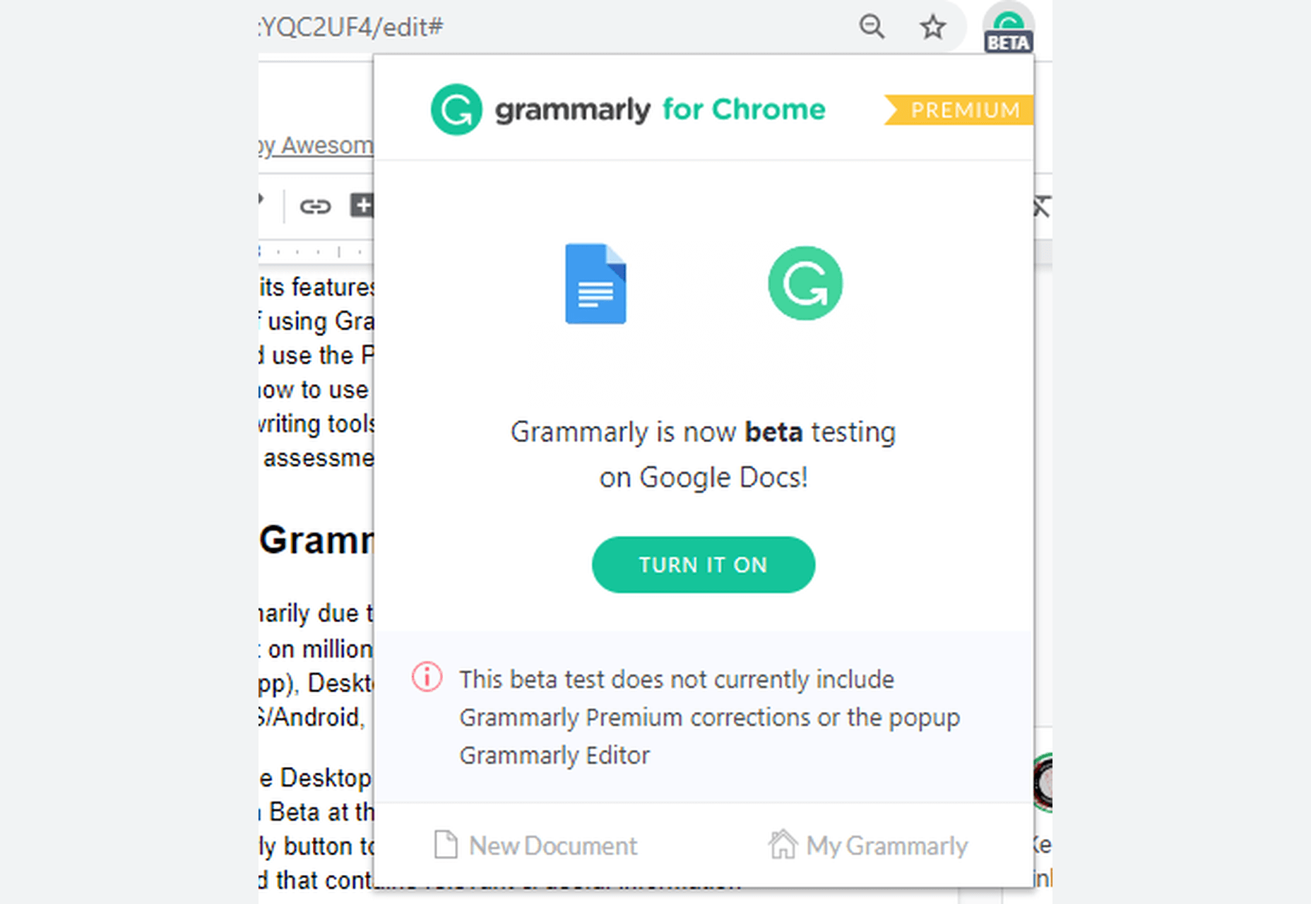
Grammarly in Google Docs.
Google Docs performs a little better than MS Word when it comes to punctuation, yet it is incomparable to Grammarly, which is in Beta for Google Docs.
How to Write Better With Grammarly
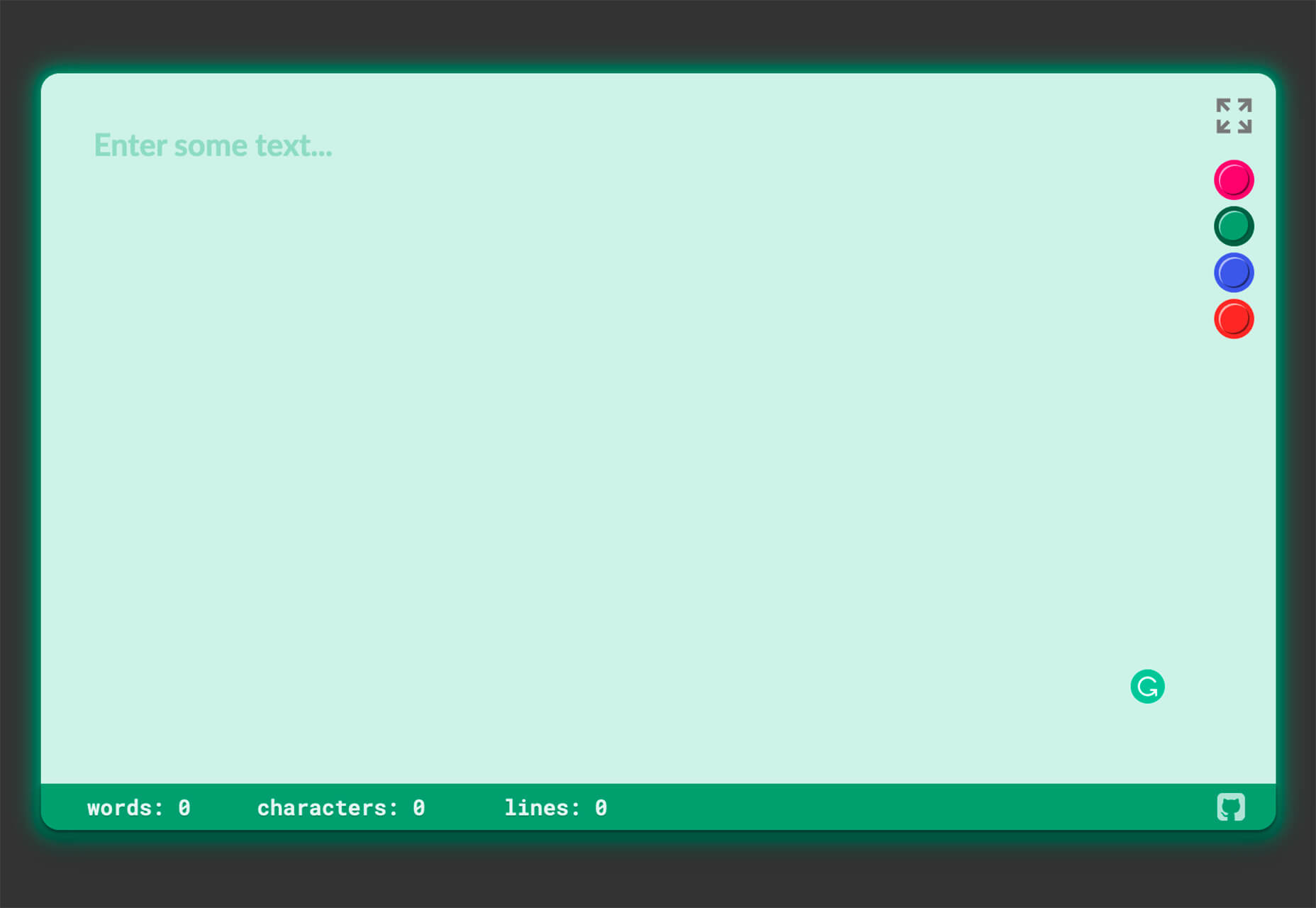
Grammarly proofreads content written in English (American, British, Australian, and Canadian) and gives detailed performance statistics. Weekly Writing Statistics are emailed to the user account, and you can download a complete PDF that extensively illustrates your performance.
From scoring to pointing out all mistakes and amendments, Grammarly doles out a comprehensive document that you can use to improve your weak areas. Grammarly can function as your teacher in this regard if you learn from these mistakes and try to improve your performance, especially in areas pointed out by the software.
Try Grammarly for yourself.
All Grammarly Products
Grammarly is available in the following product versions:
- Grammarly for Business (3 or more users)
- Grammarly @edu (for Educational Organizations/Institutes)
- Grammarly Premium
- Grammarly Free
All these versions are usable in the following product forms:
1. Online Editor
Grammarly’s web application acts as an online editor to upload a document, copy/paste content, or write directly. It has a 4MB size-limit and a 100,000 characters-limit (about 60 pages). When you upload a file, a pop-up tells you that your document formatting will restore when downloaded.
Grammarly’s interface for the online version and the desktop app is identical, and it is outstandingly intuitive and accessible. A dedicated writing assistant panel on the right side contains valuable information and choosable options. It also lists and categorizes all the errors found.
A bar at the bottom contains a few formatting options and some length-related info about the passage.
2. Browser Extension
Typing in any online text editor activates the ’Grammar and Spelling Checker’ when the extension is on. It underlines (in red) all the issues in real-time. Hovering over the problem pops up an Error Card that contains corrections and more information about the mistake.
You can use the Grammarly icon at the bottom-right of online text editors to activate or deactivate the tool. This option is beneficial because sometimes you want to check your content but don’t want distractions while writing. I recommend turning on the extension after you have completed your draft and now want to begin the editing phase. You can also open the Grammarly editor within a website for added convenience.
The Grammarly add-on is available on all popular browsers – Chrome, Firefox, Safari, Edge Chromium, etc. And it is compatible with millions of websites and the web versions of many desktop applications, including WordPress, emails, social media, work platforms, and many more. Grammarly for Google Docs is in Beta right now. The Grammarly extension also gives you the option to ’Show Definitions and Synonyms via Double Click,’ which works like a dictionary within any website.
The Grammarly icon within your text editors tells you the total number of issues found on the Grammarly pop-up. However, you have to scroll through the document and find those problems yourself. It is not as efficient as the online Editor. The extension only shows the critical issues inside your online editor. It gives you the option to open the online Grammarly Editor to see the errors pointed out by the Premium version. The browser extension also works slower for lengthy content. It is convenient but only for short-form writing.
3. Desktop Application
The desktop application, like all other products, is online only and doesn’t work offline. An internet connection is necessary as Grammarly uses its database to process the document. The desktop app is identical to the online editor.
4. Microsoft Word/Outlook Add-in
You can integrate Grammarly into Microsoft Word and Outlook through their Add-in. Unlike other Grammarly product forms, the MS Word Add-in activates when clicked — otherwise, it stays dormant. When enabled, a right panel appears with suggestions, Error Cards, and statistics, just like the Online Editor and the Desktop App. Grammarly has no character limit for the MS Word Add-in.
5. The Grammarly Keyboard App
You can download Grammarly Keyboard for both Android and iOS through their respective stores. Now available for iPad as well, it is easy to use as it works like the auto-correct feature available in the smart devices. It gives suggestions when Grammarly encounters any grammar or spelling lapses.
Grammarly Pricing Plans
Grammarly is a tad expensive when purchased as a monthly subscription, which costs $29.95 per month. The quarterly ($59.95) and annual ($139.95) subscriptions offer better value for money. Through its weekly newsletter and other channels, Grammarly presents discount offers to its free users from time to time, which you can avail yourself of to get an even cheaper deal for the Grammarly Premium subscription.
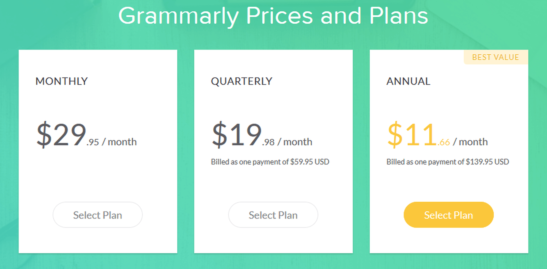
Grammarly Pricing Plans for Premium Version – Monthly, Quarterly, Annual
Free
Grammarly Free is limited but still adequate for many as it gives you critical grammar and spelling checking capabilities. It is usable in all product forms.
Premium
Grammarly Premium, along with Spelling and Grammar Checker, offers an advanced Clarity Checker, Plagiarism Checker, and experimental Tone Detector. All Grammarly features are available for the Premium version.
Business
Grammarly for Business offers all the Premium features for three or more users. It also gives you an admin panel to customize your experience. You can add a personal dictionary, among other things, which will be accessible to all users. Grammarly for Business includes:
- Individual accounts
- Admin panel
- Centralized billing
- Team usage stats
- Priority email support
- Single sign-on
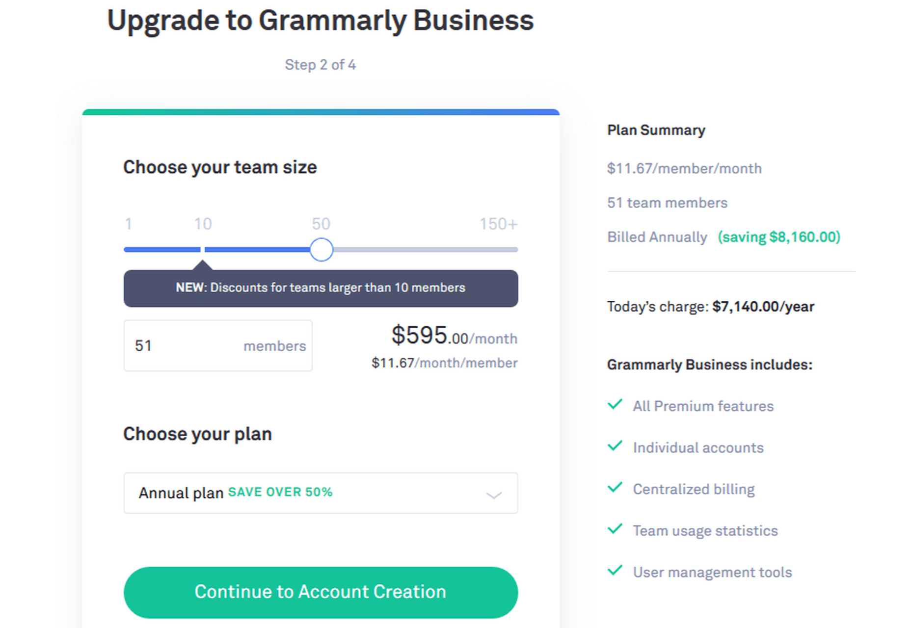
Grammarly Business Pricing Example
Grammarly @Edu
Grammarly @Edu is also an available option, of which educational institutes and organizations can avail themselves. It caters to a large number of accounts, as it targets students.
Grammarly Features
UI
Grammarly has hands-down the best interface among all the writing assistants. It is incredibly intuitive and user-friendly.
Compatibility
Grammarly integrates with millions of sites and text editors. It is also compatible with MS Word (both for Windows and Mac) and Outlook via an Add-in. It is still in Beta for Google Docs.
Grammarly is incompatible with some desktop apps, but you can use Grammarly in their web versions.
Supported Document Formats
For products where you can upload text documents, the supported document formats are: .docx, .rtf, .odt, .txt.
Languages
Grammarly is restricted to English only, including American, British, Canadian, and Australian English. Grammarly doesn’t support foreign language phrases, translation, etc., at the moment.
Grammarly Functions
Spelling Checker
Grammarly checks for spelling mistakes based on context. It is excellent at differentiating between commonly misspelled words. It can also tell Common and Proper Nouns apart (in most cases).
Grammar Checker
All Grammarly products on all plans help you check for grammatical errors and syntax issues in the provided document in real-time.
Plagiarism Checker
The Plagiarism Checker is not available for the free version. When I inquired about plagiarism in hard copy, patch plagiarism, and ProQuest, here’s what Grammarly Support had to say:
“We teamed up with ProQuest to provide even more accurate plagiarism checks: currently, Grammarly’s plagiarism checker searches major proprietary databases along with over 16 billion web pages. You can check ProQuest libraries here http://www.proquest.com/libraries/academic/databases/.
Please note that Grammarly catches verbatim plagiarism and slightly modified text that can be classified as unoriginal. As comprehensive as our algorithms are, significantly rephrased text oftentimes can’t be traced back to its source.”
Note: I checked this document with both; Grammarly Plagiarism Checker is not as robust as Copyscape, but it’s catching up fast.
Tone Detector
It detects a variety of tones based on the context of the given passage.
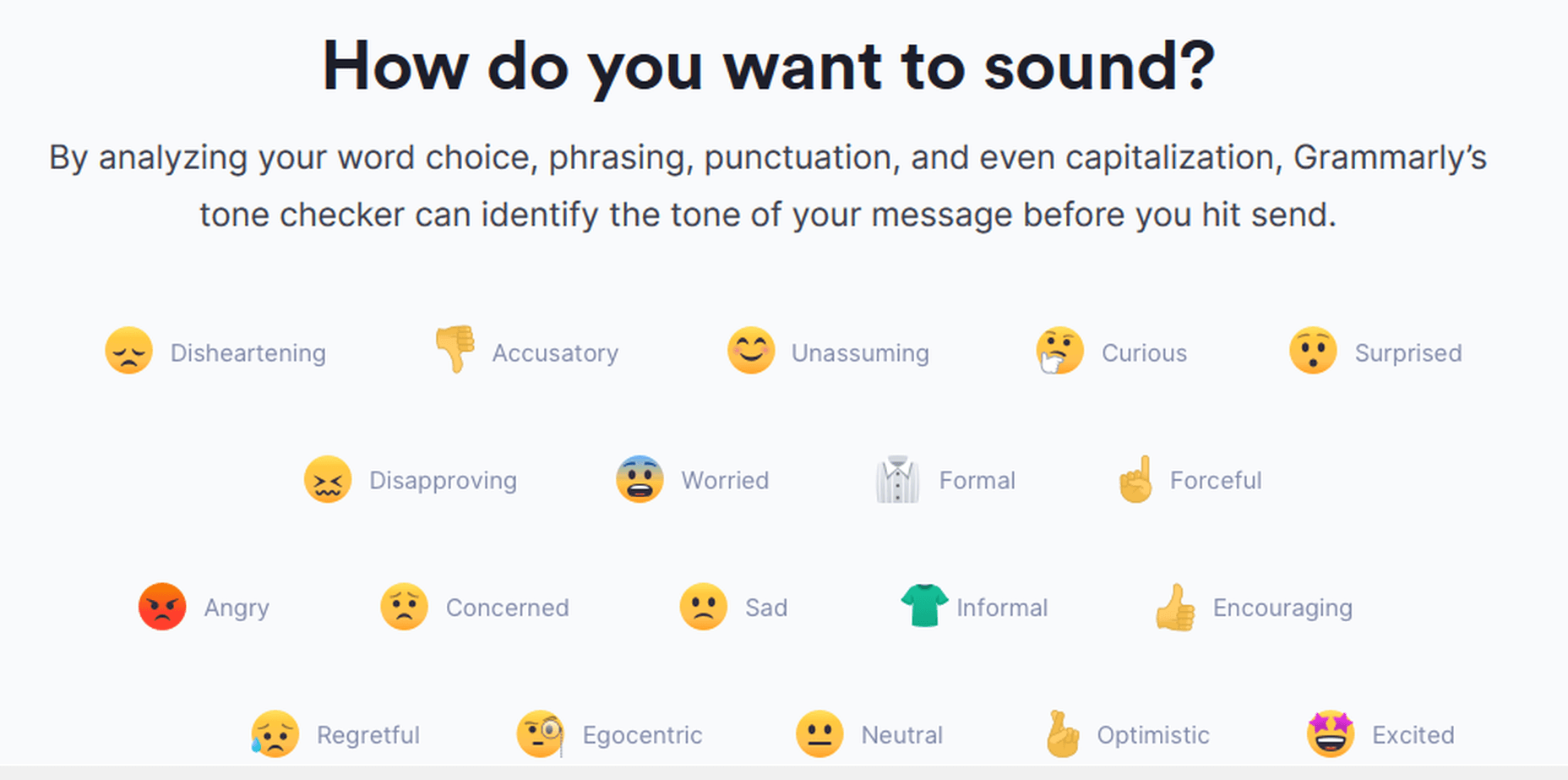
Grammarly Tone Detector
Clarity Checker
Grammarly checks for advanced issues for the Premium, Education, and Business versions. The Free version checks for limited conciseness; the rest is available on the Premium version only.
Grammarly Support
Grammarly offers support via its extensive, well-written, and user-oriented knowledge-base. Grammarly also provides support via email (24/7 for the Business version) if you can’t find a relevant answer in the knowledge-base.
Moreover, the Grammarly Blog teaches, among other useful things, the proper use of grammar in English.
Grammarly Blog
The Grammarly Blog teaches the rules of English grammar and gives tips on writing. It also specializes in teaching about the most common blunders, which are also a strong suit of the application.
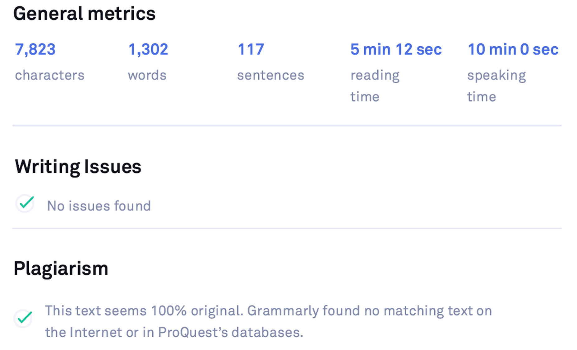
Detailed Performance Statistics
You can view the ‘Statistics Summary Card’ by clicking the ‘See Performance’ button. Or you can download the detailed statistics via the Download PDF Report option. These statistics are in-depth and contain exhaustive information regarding the whole document, including your score, errors, reading time, speaking time, and more.
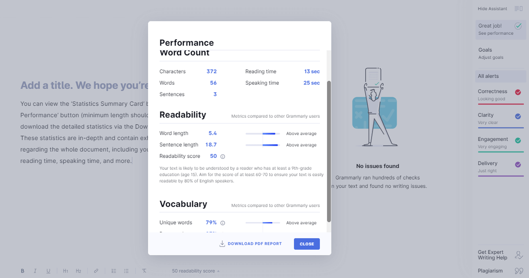
Grammarly Performance Stats
Adjust Goals
You can customize Grammarly’s feedback according to your needs. This option gives you an adjustable chart where you can set your preferences according to your needs. It helps with the document’s tone, the difficulty level depending on the target audience, and more.

Grammarly Adjust Goals
Get Expert Writing Help
Grammarly gives you the option to get your work checked by experts. It’s a particularly convenient option for those who cannot or do not want to rely on their proofreading skills better than finding and hiring someone yourself.
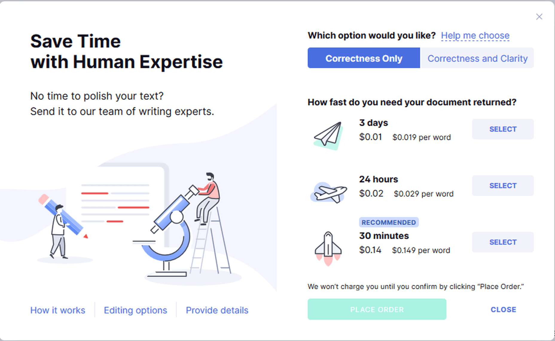
Grammarly Expert Writing Help
Is Grammarly Really Free to Use?
Grammarly has a free version with a powerful-enough spelling and grammar checker. It is available in all product forms – Online Editor, Browser Extension, Desktop Application, and Word Add-in. The Free version checks for up to 150 grammar rules.
It is superb at uncovering elementary grammar fallacies due to its context-based checking, powered by its robust AI and NLP software.
The Free version doesn’t show clarity issues. It reveals the number of clarity issues in the content, but it doesn’t tell you what and where those issues are.
Is Grammarly Premium Worth The Cost?
The Premium version shows advanced grammar issues such as clarity, conciseness, dangling modifiers, squinting modifiers, monotonous sentences, intricate text, split infinitives, and many more. It checks for over 400 rules of English grammar, far more than the Free version. Grammarly Premium also has a plagiarism checker within the interface, which is mighty-enough for online plagiarism checking.
Grammar Checks
When you run some text through any version and product form of the app, Grammarly will process the document for the following:
- Sensitivity
- Determiners
- Voice
- Conciseness
- Conjunctions
- References
- Nouns
- Fluency
- Word order
- Spelling
- Conventions
- Syntax
- Variety
- Formality
- Pronouns
- Prepositions
- Verbs
- Numerals
- Punctuation
- Modifiers
- Consistency
- Correctness
- Clarity
- Delivery
- Readability
- Engagement
However, Grammarly will not point out many of these mistakes for the Free version. It will only tell you the number of such problems in your content.
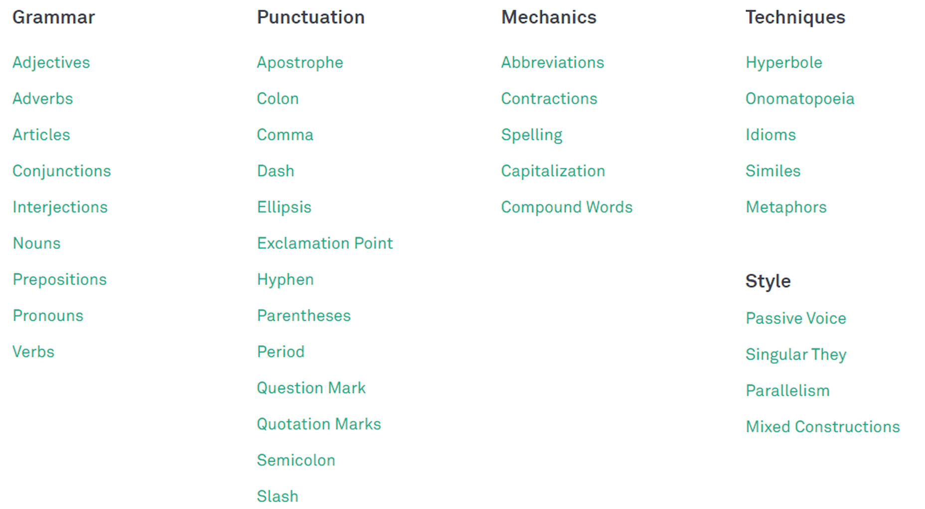
Grammarly Checklist
Grammarly Free in Action:
Let’s see some examples.
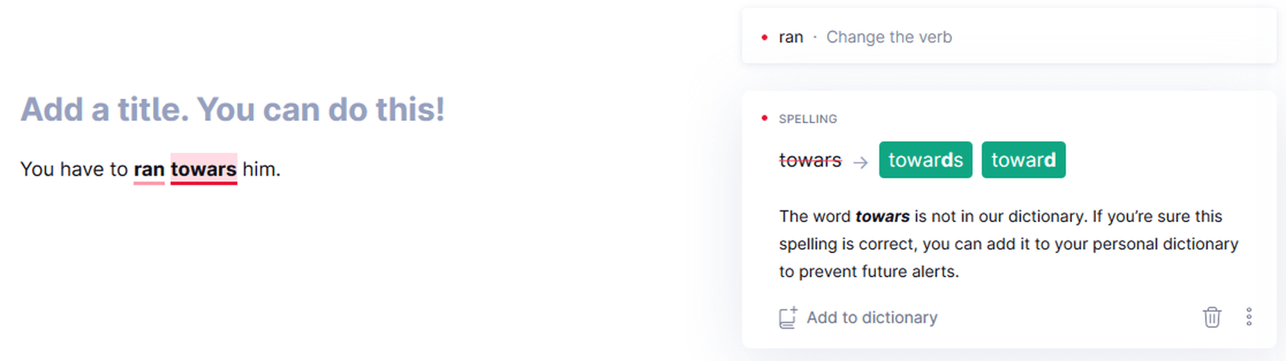
Verbs
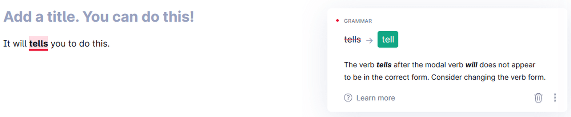
Grammarly detecting the wrong form of a verb.
Context-Based Checking
Grammarly Context-Based Checking
Capitalized Words
Grammarly detects unknown words, and if you capitalize them, it considers them proper nouns. It can also miss the incorrect use of a term if you spell it correctly and put it within commas.
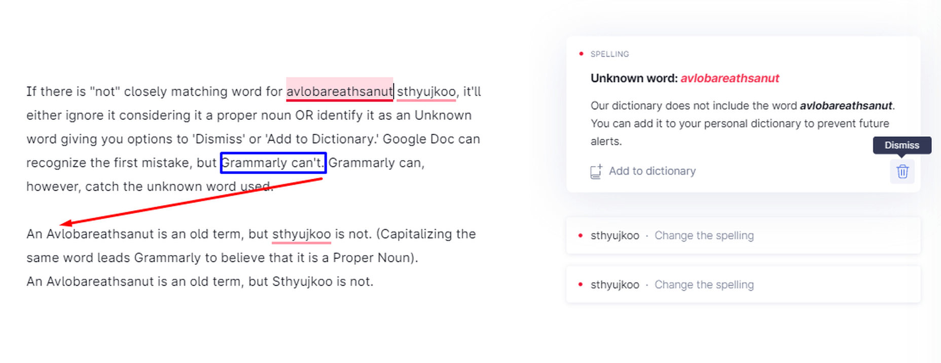
Grammarly while dealing with proper nouns, capitalization, and unknown words
Phrases vs. Sentences
Grammarly can differentiate between phrases and sentences. Therefore, you can write headings and subheadings in the form of expression.
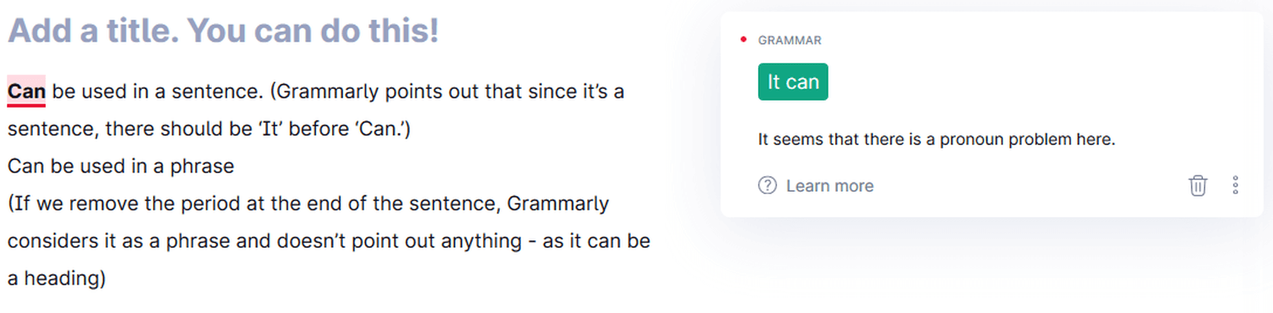
Grammarly differentiating between sentences and phrases
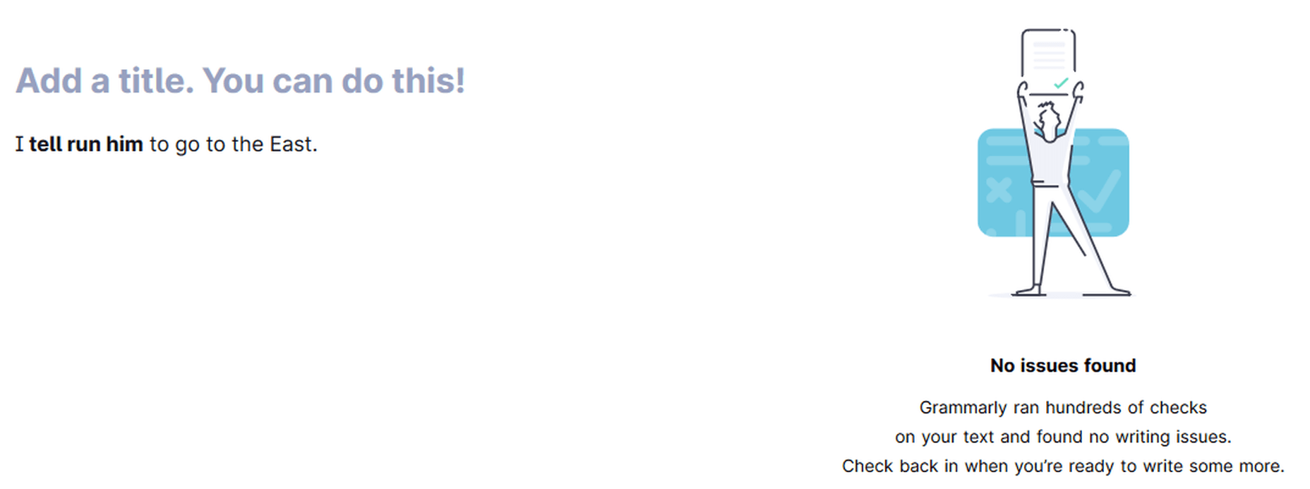
Multiple Mistakes in One Sentence
Grammarly catching multiple mistakes in one sentence
Determiners
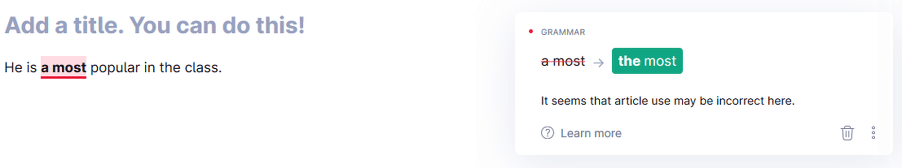
Grammarly pointing out the wrong determiner-article use
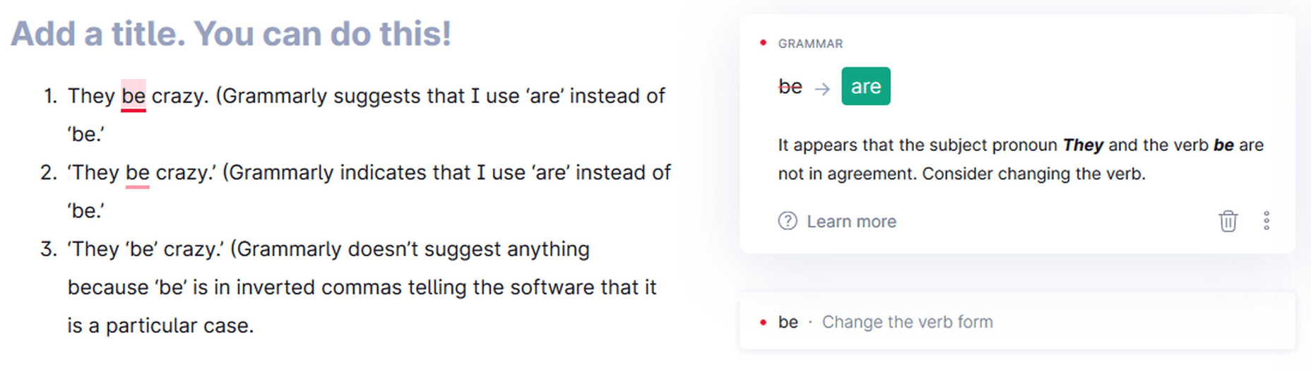
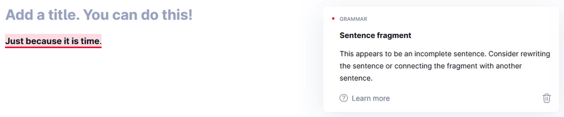
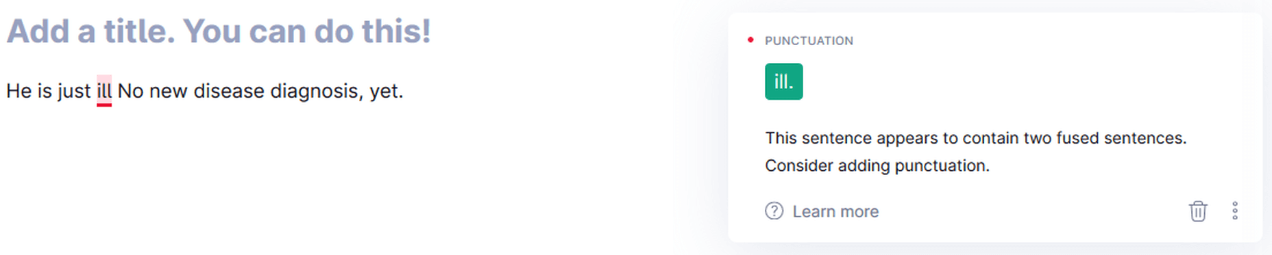
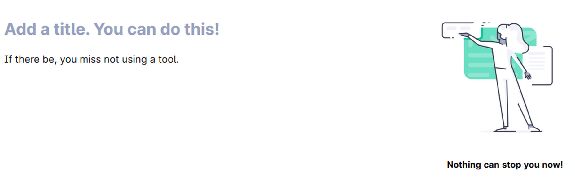
Incomplete Sentences
The Grammarly algorithm is not good enough yet at recognizing incomplete sentences. Grammarly is far from perfect, as evident from these examples. Google Docs suggested ’was because’ for the last line instead of ’is because,’ but Grammarly missed that.
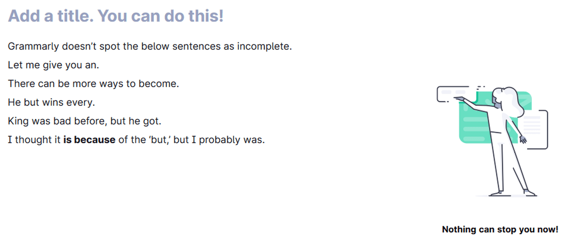
Grammarly can miss incomplete sentences.
Grammarly is only making one suggestion that the article use may be incorrect here in the below image.
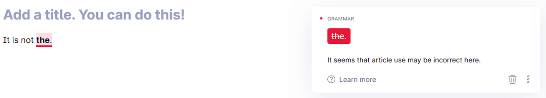
Cannot detect incomplete sentences (sometimes) if other issues exist
Grammarly suggests you change the first line in the below image because it believes it’s caught a sentence fragment. You accept the suggestion, and it becomes the second line, which is, again, a sentence fragment, according to Grammarly.
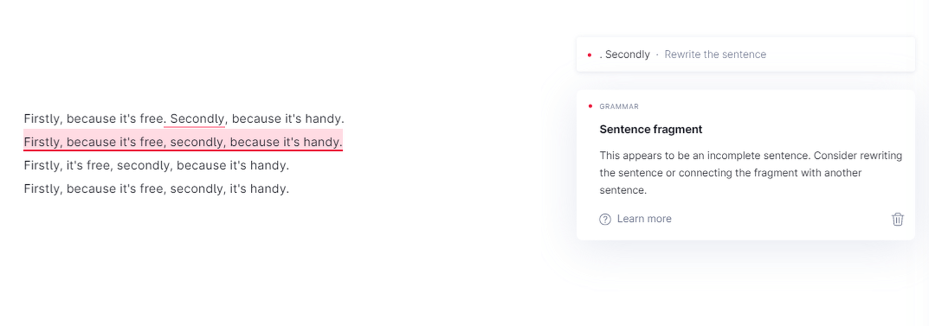
Grammarly ‘sentence fragment’ suggestions
Sometimes, the suggestions are right as well.
Grammarly recognizes sentence fragments in some cases
Punctuation
Comma
Grammarly is a sniffing-hound-on-steroids when it comes to commas — both missing and wrong ones. It pinpoints the exact location where you should place a comma in a sentence. Whether it is between clauses, a list of items, or something else, Grammarly knows if you have missed a comma or placed a wrong one. It also exposes the famous “Oxford Comma.” Grammarly now points out any inconsistent punctuation (curly vs. straight commas, for example) in your articles.
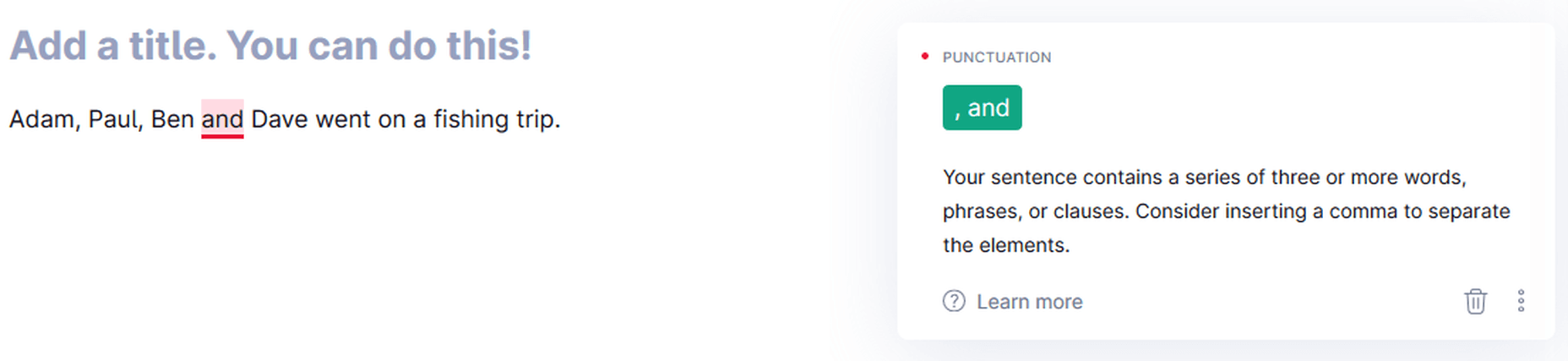
Grammarly pointing out the missing Oxford Comma
Hyphen
First, it points out the missing hyphen. Once you rectify the error, it points out the wrong capitalization. Grammarly works in steps for multiple errors in a sentence.
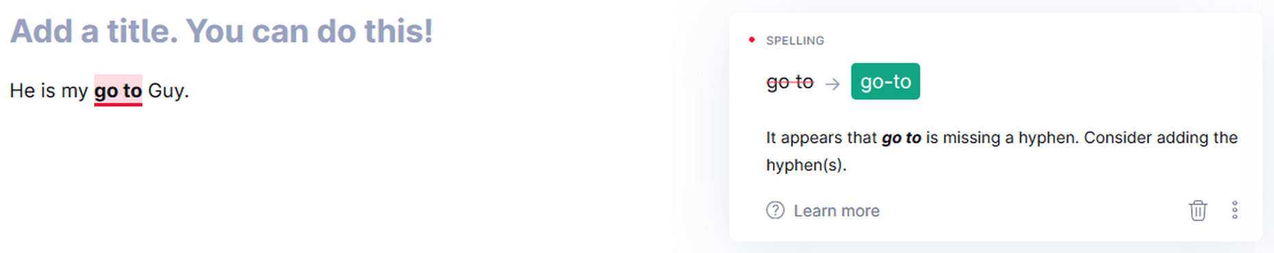
Grammarly catching a missing hyphen.
Semi-colon & Colon
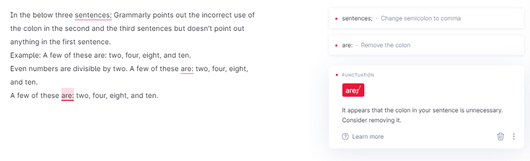
Grammarly catches the incorrect use of the semi-colon & colon.
Period
Grammarly points out a missing period
Missing Apostrophes
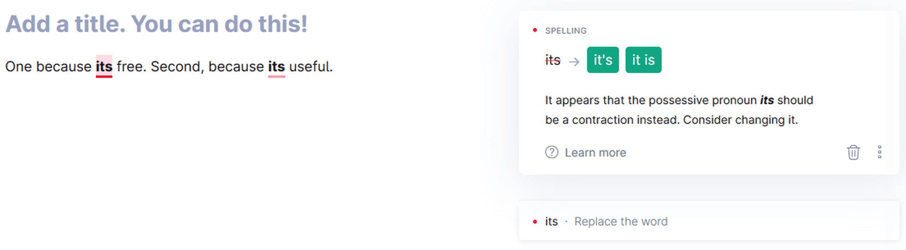
Grammarly can catch missing apostrophes
Grammarly Premium in Action:
Apart from correctness that checks for critical grammar mistakes, the Premium version has options to check for clarity, delivery, and engagement, along with many more correctness checks.
Clarity
Clarity check is not available for the Free version; all other versions of the app have it. It catches linguistic issues that a fundamental grammar checker cannot reveal. These include dangling modifiers, split infinitives, misuse of passive voice, intricate text, inappropriate colloquialisms, etc.
Text Inconsistencies
Grammarly Premium can detect inconsistencies and gives you the option to select one form if a word has been used inconsistently in the same document. It can also detect inconsistent punctuation, for example, curly and straight commas.
Grammarly Premium identifies text inconsistencies.
Rephrasing Suggestions
For unclear or complicated sentences where there might be an issue of a dangling modifier or something else, Grammarly suggests an alternative way to write the same sentence.
Grammarly Premium giving rephrasing suggestions
Wordy Sentences
Grammarly can also note if you have used many unnecessary words in a sentence. If there are more words and less content in a sentence, then it suggests you rephrase it. This option can help you make your content non-fluff.
Passive Voice Misuse
Grammarly is so-so at deciphering when the passive voice is right to use and when you should avoid it in a sentence. My experience is that, more often than not, it will recommend that you rewrite a sentence if it detects passive voice use anywhere.
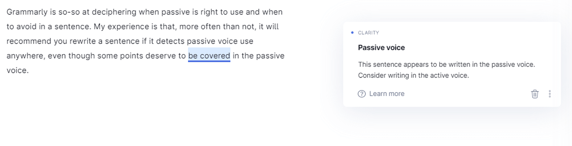
Grammarly – always – detects passive voice use.
Intricate Text
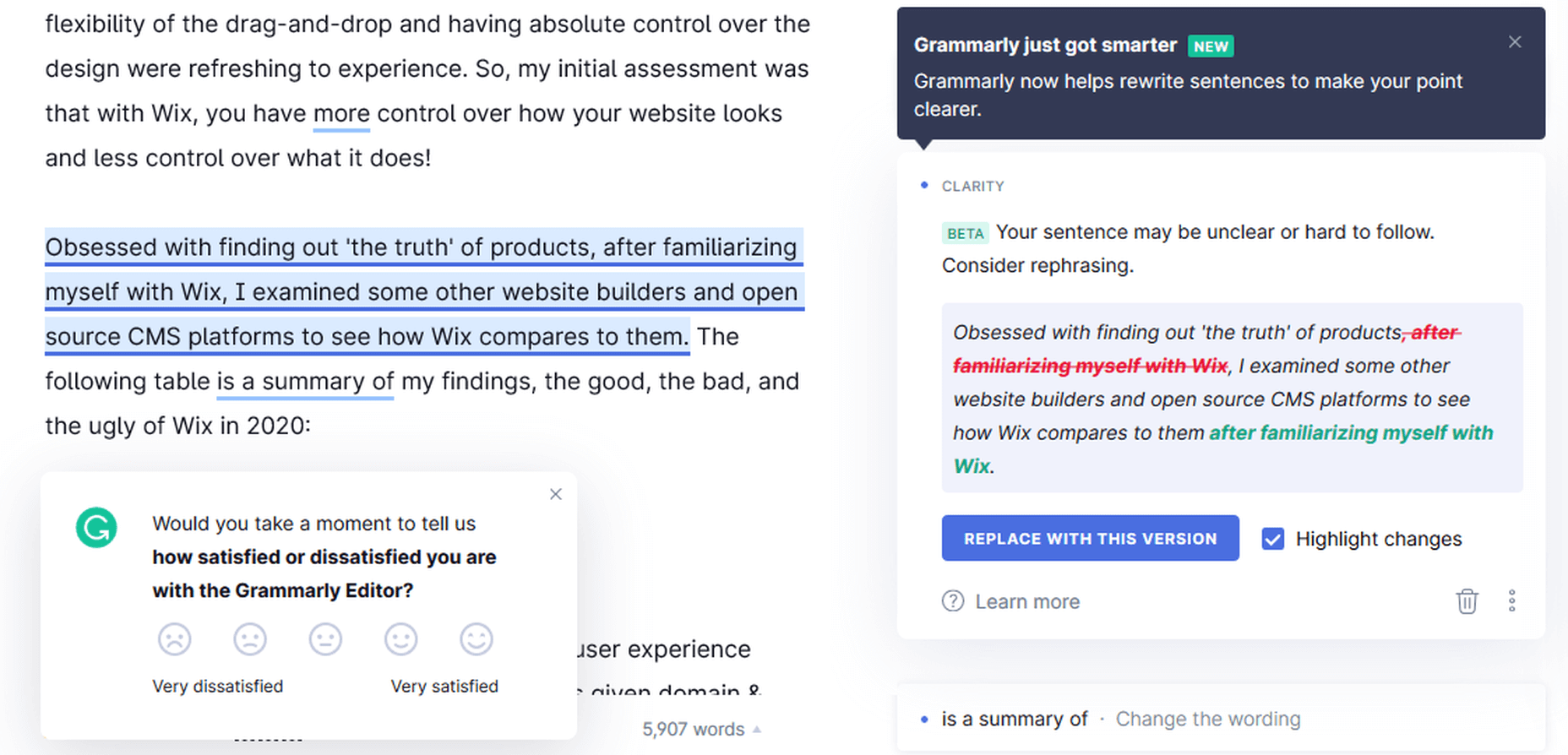
Grammarly exposes unclear and hard-to-follow sentences in the written piece. Sometimes it gives alternatives (if one is available in its database), but usually, it only tells you to rephrase the sentence to make it more understandable.
Monotonous Sentences
If you continuously write similar sentences in a passage, Grammarly will detect these sentences’ monotonous nature and advise you to rephrase them.
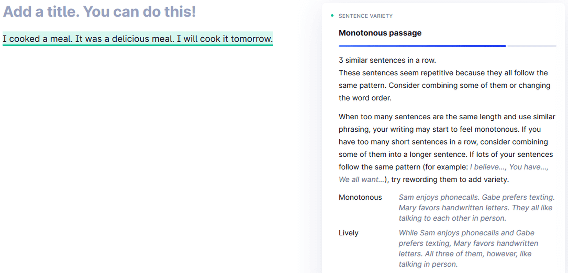
Grammarly detecting a monotonous passage
Sound Confident Suggestion
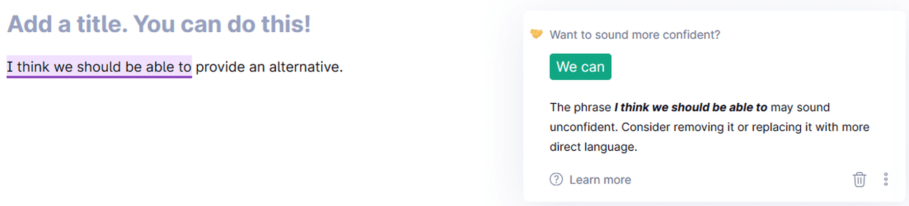
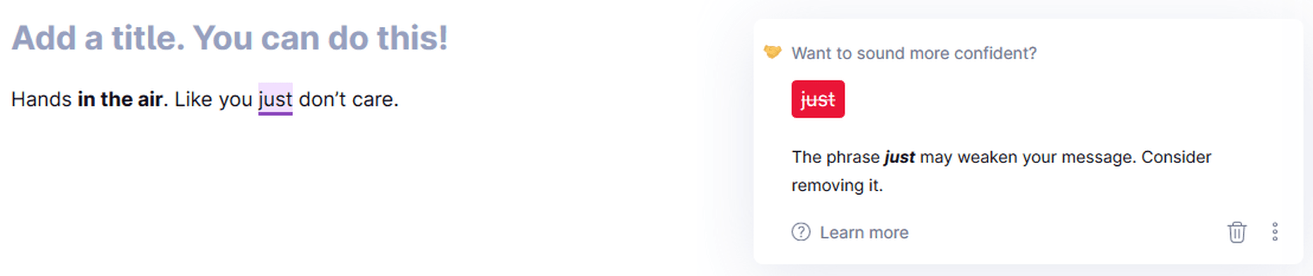
Grammarly suggesting alternatives to sound confident
Politeness Suggestion
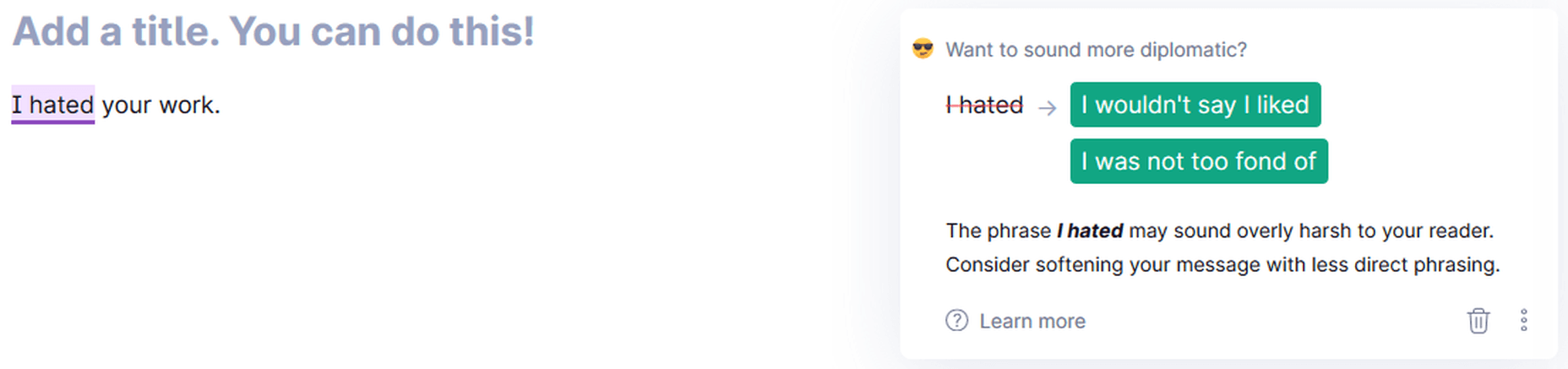
Sound more diplomatic with Grammarly!
Delivery
Grammarly Premium catches informal sentence structure like a preposition at the end of a sentence. Some other informalities include inappropriate colloquialisms, split infinitives, etc.
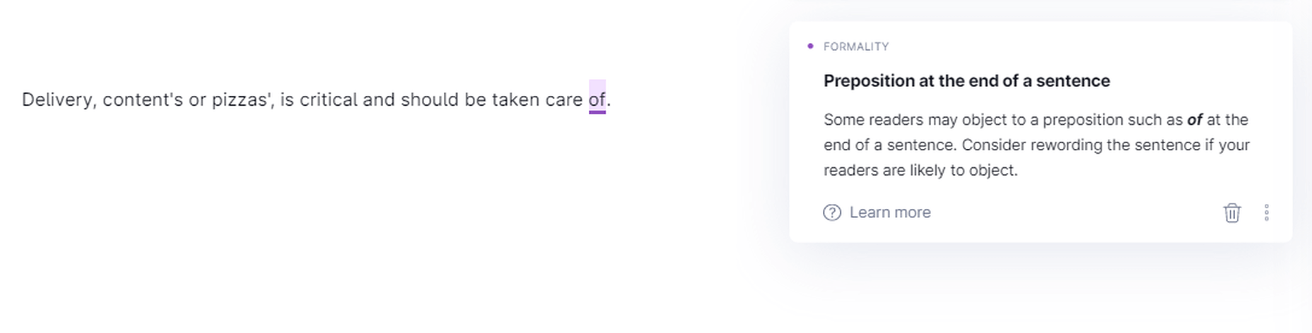
Grammarly points out informality.
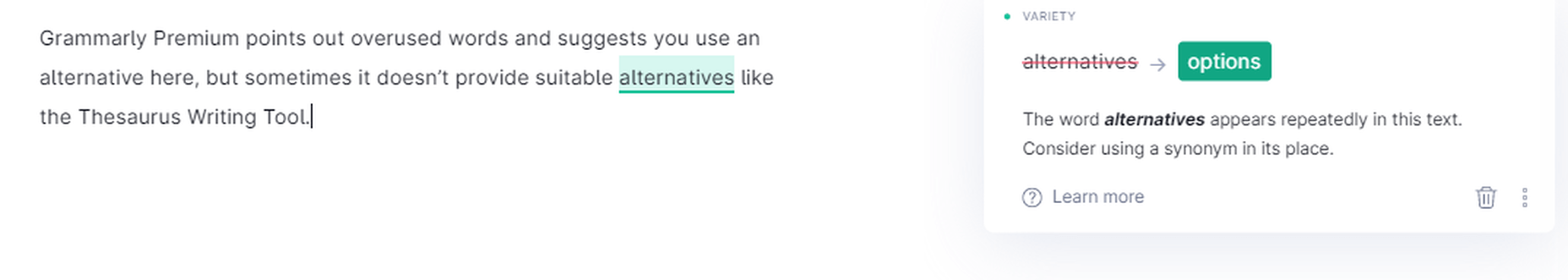
Engagement
Grammarly Premium points out overused words and suggests using an alternative here, but sometimes it doesn’t provide suitable options like the Thesaurus Writing Tool.
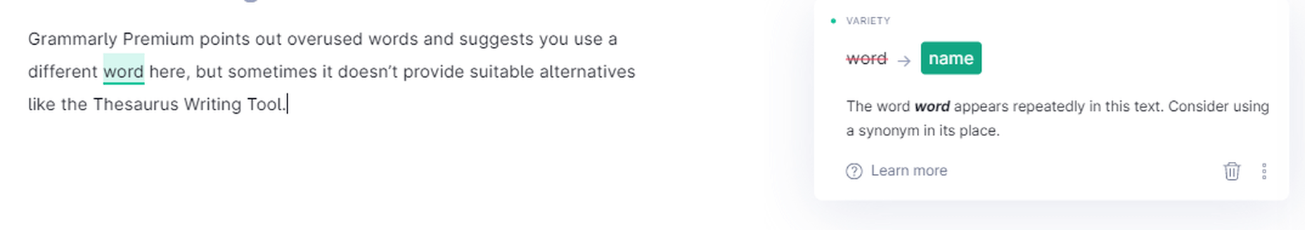
Grammarly suggesting engaging alternatives
Most of the time, the suggestions are worth considering, though.
Grammarly is suggesting more engaging alternatives
Grammarly Free vs. Grammarly Premium
The Grammarly Free version catches all critical issues as it checks for 150 Grammar Rules to determine errors in a document. The Premium version looks for over 400 Grammar Rules and detects far more problems than the Free version.
I wrote an article and checked it through both the Free and the Premium versions. Here is the difference between how the stats of both look like before making the suggested changes:
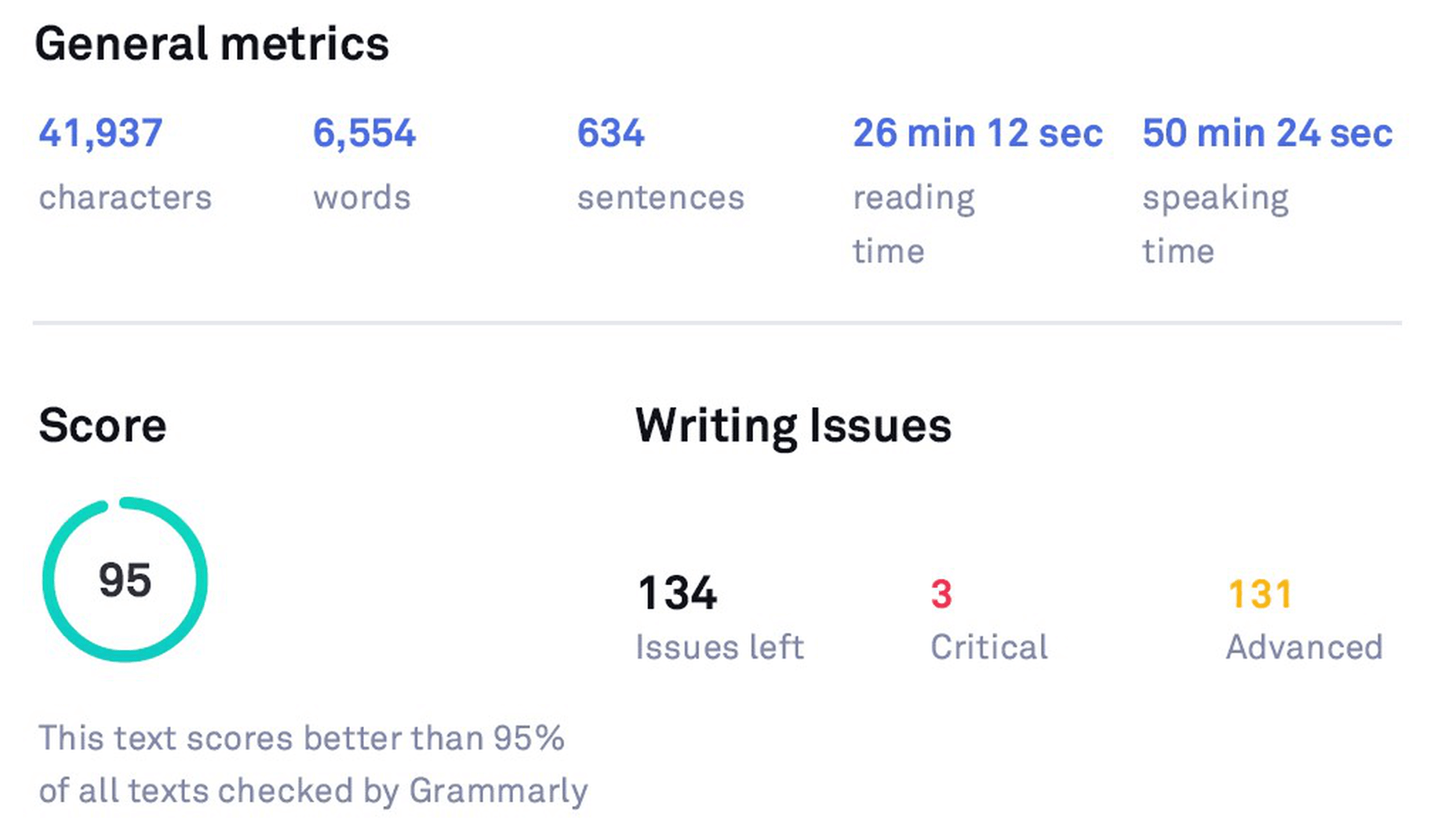
Original Stats (before checking with Grammarly Free)
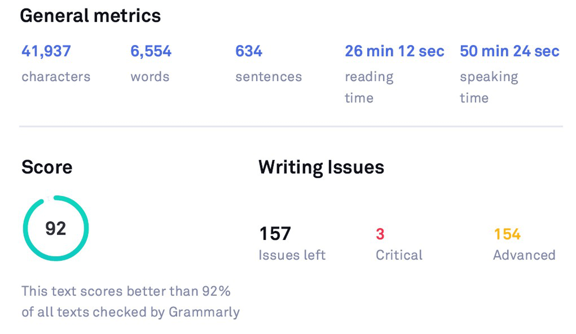
Original Stats (before checking with Grammarly Premium)
After editing another article and making the suggested changes, here’s how the Free version stats look like:
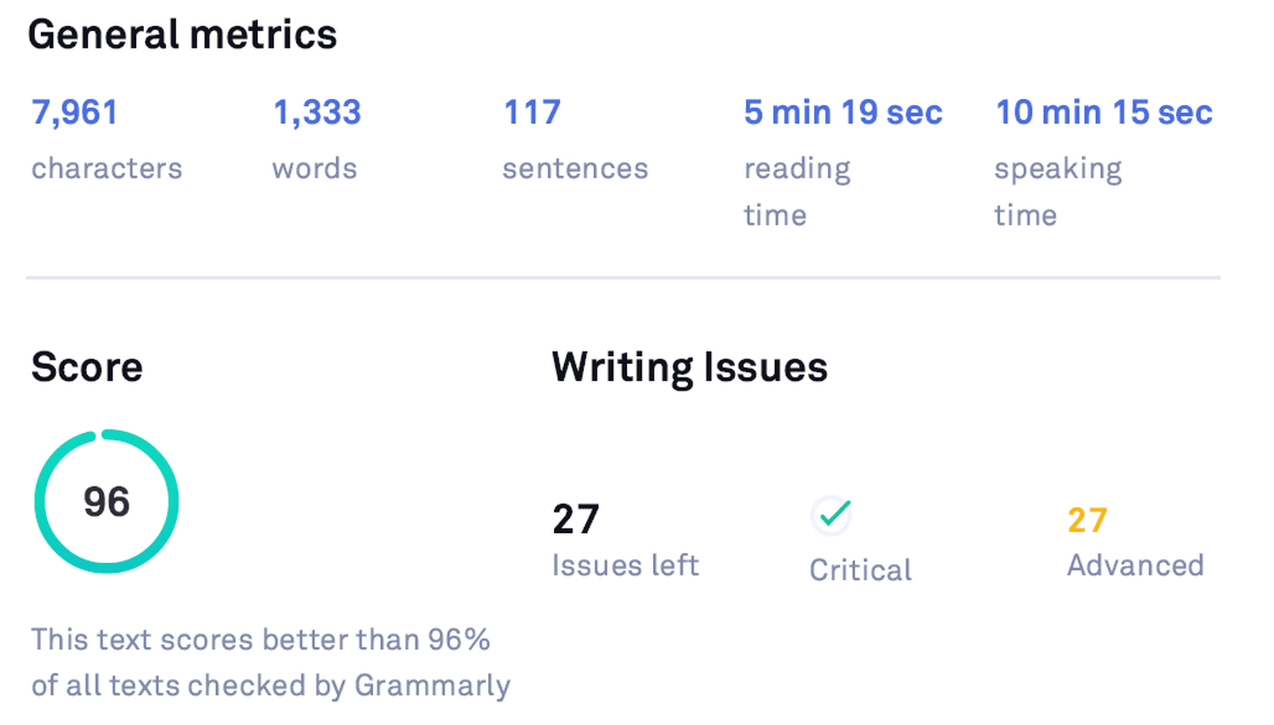
Grammarly Free Stats
After editing the same article using the Premium version, the stats look like the following:
Grammarly Premium Stats
Grammarly vs. Human Proofreader
Grammarly is a marvelous tool, but it is incomparable to human proofreading. Grammarly cannot detect the sense and meaning of the written text. It catches blunders using English language and grammar rules as efficiently as a machine can. However, some mistakes can slip through Grammarly if there is no syntax error, but just a linguistic or semantic misuse.
Grammarly didn’t suggest anything for a nonsense sentence
Grammarly is not an alternative to human proofreading
Pros of using Grammarly in 2021
Context-Based Grammar Checker
Grammarly is evolving with time and has gotten pretty accurate in identifying common mistakes. Its extensive database helps Grammarly recognize errors based on the context.
Real-Time Grammar and Spelling Checker
Grammarly scours the whole text for errors when you provide it a written document. Thankfully, it also checks for blunders as you write or edit your text in any product form – Chrome Extension, Online Editor, Word Add-in, Desktop App (Windows and Mac), and the Grammarly Keyboard for iOS and Android.
Accessible Interface and Robust Editing
With Grammarly, you get a highly-efficient software, which is not only a phenomenal editor but also incredibly easy to use.
Customizations – Set Goals and Personal Dictionary
You can customize your Set Goals and your Personal Dictionary with the ‘Add to Dictionary’ feature in the Error Cards. This element is convenient for proper nouns and personal vocabulary (even words from a different language).
Tone Detector
Based on your Goals, Grammarly, through its tone detector emojis, cautions you of your tone – the vocabulary and phrasing you are using. You can adjust goals keeping in mind your target audience and choose the most appropriate words to use.
Clarity Checker
Apart from basic grammatical mistakes, Grammarly helps you fix linguistic oversights. It tracks down a wide range of slip-ups, including dangling modifiers, intricate text, split infinitives, passive voice misuse, redundancies, and many other slips. In essence, the Clarity Checker elevates the level of your writing.
Plagiarism Checker
It is a bonus in all senses of the word. It might not be essential to the app, but it certainly assists users. Grammarly plagiarism checker is not the absolute best in the industry, but it does the job swiftly. It checks plagiarism across 16 billion pages on the internet and ProQuest’s database.
Error Cards
Error cards are compact, simple, and instructional. They serve their purpose elegantly. Any shortcoming that you experience in Grammarly’s usage so far is due to its still-not-so-extensive database. Error cards also fall short when it comes to giving suggestions due to this very reason. Otherwise, they are usually handy.
Free Version
You can proofread, remove typos, and analyze the content quickly via the app’s free version. You can also use it before buying the Grammarly Premium subscription.
The Grammarly Keyboard
Supported on both Android and iOS, The Grammarly Keyboard App functions like the auto-correct feature. It gives real-time suggestions about the proper use of grammar and spellings in the written text. Grammarly is now available for iPad and supports hardware keyboards as well.
Grammarly Support
Grammarly provides customer support via its extensive database and email. By now, almost all popular queries have a database entry. Furthermore, the Grammarly Blog assists with learning English grammar rules.
Knowledge-base
Grammarly has amassed a plethora of information in its database, which helps run the application smoothly. This knowledge allows the app to identify problems based on the context. You will find accurate solutions for most common issues, thanks to its extensive database growing with time.
Grammarly Blog
The Grammarly Blog focuses on teaching people English grammar rules and common mistakes in their writing. There are dedicated articles for each item; separate sections cover different punctuation like Commas, Hyphens, etc.
Writing Stats
The weekly writing stats sent via email and the downloadable detailed performance stats PDF give you comprehensive feedback on your writing. This feature helps you pinpoint your mistakes better than anything else available in the market.

Insights
Grammarly Insights are the real-time feedback that the application provides regarding your writing. It bases it on your Set Goals. You can customize this feedback according to your needs, which can be amazingly valuable if you cover different audiences. Insights also include the reading time and speaking time, which is particularly useful to Vloggers, YouTubers, etc., who can quickly determine how much time their script will take on the video.
Reliability
Grammarly is the most popular and best-in-class digital writing assistant tool, growing exponentially both in features and number of users, indicating that it will provide the best services to its customer base.
Grammarly is notably popular among professional writers, bloggers, publishers, marketers, and businesses, showing that Grammarly has a demanding clientele to please. Therefore, their standards are supposed to be (and they are) higher than the competition.
Product Investment
Having more than a million downloads per month and being a top-1000 website by traffic globally, Grammarly has raised $200M in total funding at a valuation of $1B+ so far, which speaks volumes of its success, investors’ trust in the product, and its projections.
Cons of using Grammarly in 2021
Free Version is Limited
The Free version identifies only critical grammatical errors, typos, and limited ‘conciseness.’ Moreover, it only lists the number of total advanced clarity issues in the text with an ‘Ad’ that keeps asking you to buy a Premium subscription for these issues. It also doesn’t support plagiarism checking.
Premium Version is a Tad Expensive
The biggest drawback of Grammarly is that it is a tad expensive for many. Grammarly Premium can be a costly subscription at $30 per month if you don’t have much writing to proofread.
Semantic Issues
Grammarly is good at picking fundamental grammar mistakes – even context-based grammar issues, but it still cannot understand what you have written. If you write a nonsense sentence with no grammatical fault, Grammarly will consider it a correct sentence. It can also happen with incomplete sentences.
Insufficient
Grammarly is a mighty grammar checker but lags behind when it comes to rating the whole document. Its scoring is based on mistakes and length of words and sentences only, unlike some other tools that provide a more comprehensive text scoring. Grammarly is also not an alternative to human proofreading as it can’t understand the meaning of the written content.
Limited Vocabulary
Grammarly has a limited vocabulary in its database so far, which leads to inaccurate synonym suggestions at times. The Thesaurus Writing Tool, another free digital writing assistant, has an extensive vocabulary due to its vast Thesaurus.com database and offers far more vocabulary suggestions and alternatives.
Alternatives Not Provided for Every Issue
For many suggestions like Intricate Text, Split Infinitives, etc., Grammarly doesn’t provide an alternative. You have to rephrase the sentence yourself. Grammarly only points out bloopers sometimes, which can be a little frustrating for amateur writers.
Not Supported Everywhere
Grammarly is not supported everywhere yet. The most prominent places are Google Docs (in Beta at the moment – which doesn’t include Grammarly Premium corrections and the Pop-up Grammarly Editor) and desktop applications. However, it works on the web versions of these desktop applications via its browser extension.
Insufficient Formatting Options in the Editor
Grammarly Editor is imperfect for writing purposes. It is incomparable to authoritative text editors like Microsoft Word and Google Docs. So you have to write your text in another editor and import it in Grammarly for proofreading if you want proper formatting of your document.
Irritating and Aggressive Advertising
Grammarly wants you to upgrade all the time. When using the Free version, you’ll get constant notifications to upgrade to Premium to check for issues that are not available in the Free version.
Only One Language Supported
Grammarly doesn’t offer support for languages other than English. There is also no option available for translation like Ginger.
Only One Account for Premium
The Grammarly Premium account gives you only one license for use on up to five devices. It is an obstacle for people with multiple accounts for different purposes. Grammarly Premium is already expensive, so buying two licenses is not feasible for the majority.
Top 5 Free Grammarly Alternatives 2021
Grammarly stands out as the most prominent and well-received tool when you compare all popular digital writing assistants. It has been endorsed and appreciated by countless publishers and writers. Grammarly has become a top product in the digital writing industry with its robust marketing and significant NLP and AI improvements.
Grammarly Inc. has secured enough funding as of late 2019 to improve its natural language learning database to enhance its AI-based application further. Keeping all this in mind, it is evident that Grammarly is dominating the market. Still, there are a few products that come close for one reason or the other. Here are the top 5 Grammarly alternatives in 2021:
ProWritingAid
Pros: Long-Form Writing (Books, etc.), Writing Insights, Separate Checking of Issues, MS Word Add-in, Efficient Browser Extension
Cons: Short-Form Writing, Fewer Errors Detected, Not for Amateurs, No Free Version
ProWritingAid is considered a worthy alternative to Grammarly (notably for long-form writing – books, etc.), but it falls far behind Grammarly for short-form writing.
ProWritingAid is accurate, feature-rich, and integrates well with apps and websites, but the interface is not as user-friendly as Grammarly’s. It also reveals fewer issues as Grammarly has advanced context-based grammar checking capabilities.
ProWritingAid offers better pricing and value for money (Premium is $60 per year, $70 with Plagiarism Checker), and it also has a Lifetime Plan. However, it doesn’t have a free plan like Grammarly. The Online Editor has no word limit, unlike Grammarly’s 60-pages or 100,000 character limit.
ProWritingAid provides many options/tabs to check for each issue separately, handy for longer articles or books. However, it is not as user-friendly for short writing pieces.
It also presents a better analysis of the whole document and provides a lot of information regarding your writing, which you can use to improve your writing style.
ProWritingAid has an easy-to-scroll-through panel at the right-side that contains corrections and suggestions, which you can use to see all issues without scrolling the entire document.
ProWritingAid has the following tabs to check for each issue separately:
- Grammar
- Spelling
- Overused
- Readability
- Cliche
- Sticky
- Diction
- All Repeats
- Echoes
- Thesaurus
- Dialogue
- Consistency
- Pacing
- Pronouns
- Alliterations
- Homonyms
- Transition
- Acronym
Ginger
Pros: Keeps Formatting, 60 Languages & Translation, Built-in Dictionary, Browser Extension, Free Version
Cons: Fewer Issues Detected, Fewer Insights, Interface is just OK, no MS Word plugin
Ginger is also a notable competitor of Grammarly. It has a free version, and it integrates well with different websites. However, it doesn’t have an MS Word plugin. It is also not as accessible due to its clunky interface.
Ginger is not as powerful as Grammarly, but it is still a decent alternative. Ginger’s annual subscription is $89.88 (cheaper than Grammarly’s).
Ginger keeps the original formatting of the text document, which is pleasant. It also has a Translator within the app that supports 60 languages. Also, there’s a built-in dictionary, which you can use to find alternatives to overused words.
WhiteSmoke
Pros: Cheap, Integrates with Platforms, Gimmicks – i.e., Templates, etc.
Cons: Interface is awful, Fewer Mistakes Caught
WhiteSmoke is cheap to use, but it has a horrible interface. It integrates with many platforms, but it is incomparable to an advanced tool like Grammarly. It has some useful gimmicks like templates for specific writing purposes, i.e., Sorry, Thank You, Condolences, etc.
The annual subscription of WhiteSmoke costs $79.99. However, it is not advanced enough to be considered better value for money.
Thesaurus Writing Tool
Pros: Free, Vocabulary suggestions on hovering the cursor over a word, Blog
Cons: Editor is dreadful to use, Ruins Formatting
Thesaurus Writing Tool is a free-to-use online text editor powered by Thesaurus.com. You can copy/paste or write directly in the Editor. It doesn’t retain the original formatting, which makes it a bit uncomfortable to use. Just click on the ‘Check for Grammar’ button, and it will work its magic. It also has a dedicated blog that teaches you how to write better.
The Thesaurus Writing Tool is unimpressive when checking grammatical errors, but it is highly potent in vocabulary suggestions. Its interface is simple but insufficient. Hover over any word, and it will show you a vocabulary card with a lot of synonyms. Clicking on any suggestion will replace the original term with the selected item. The replaced word gets a yellow underline. An undo option is available if you are not happy with your word selection.
Hemingway App
Pros: Free, Information about Text, Text Readability Score
Cons: Ruins Formatting, Fewer Mistakes Caught
Hemingway App is yet another incredible tool that is quite capable and straight-forward. It is convenient for analyzing your document as it scores the content based on its readability. It has a free web app and a paid desktop app. You can copy/paste into the online Editor or write directly, but it messes up the formatting.
Hemingway App identifies the use of passive voice, adverbs, and difficulty of reading. It recognizes long sentences – even the easy-to-read ones – as complex, which affects the document’s grade.
Final Verdict: Grammarly Review 2021
Using advanced NLP and AI, Grammarly free is hands-down the best and must-have writing, editing, and proofreading tool for everyone that checks for spelling and critical grammar mistakes. Easy to use, compatible with most popular products, and trusted by millions of users, Grammarly instantly elevates your writing everywhere; statuses, comments, emails, documents, tweets, you name it! Trying out the free version before upgrading to a premium plan also makes sense.
Grammarly Premium is a more robust and advanced tool with numerous amazing features like an advanced clarity checker, tone detector, and plagiarism checker. The Premium version is unparalleled when complemented with knowledge of the English language and some other tools. However, it is insufficient as a standalone tool because it can make slips (especially semantic ones).
I highly recommend Grammarly Premium to professionals (freelancers, writers, bloggers, authors, publishers, and editors) who require intensive use of the app. Similarly, Grammarly for Business is a good investment if your team does intensive writing. Non-intensive users should stick to the Free version as it suffices.
Aa one user said, “Grammarly Premium helps you sound like a pro, or at least helps you avoid looking like a fool!”

FAQs About Grammarly
Is Grammarly a good app?
Yes, Grammarly stands out among its competitors as it has advanced context-based grammar checking capabilities, thanks to its up-to-date natural language processing and artificial intelligence.
Is Grammarly Premium worth it?
Yes, for the most part. However, it is a tad expensive for many. It is suitable for professionals and businesses that have lots of writing needs. It identifies several advanced grammar issues that the Free version only counts. However, it is not a substitute for human proofreading as it can make linguistic mistakes that a human can easily find.
Is Grammarly supported in Google Docs?
It is in Beta at the moment. So, it should be available shortly. At the moment, it is imperfect as it only specifies the number of errors. You have to scroll the document to find those mistakes (underlined red) on your own. It has already started working in the comments, though.
Is Grammarly supported in Quora?
Yes, Grammarly works with Quora.
Is Grammarly supported in Medium?
Yes, Grammarly is available for Medium.
Can Grammarly replace a professional editor?
No, it can’t. Grammarly can make simple semantic mistakes because it doesn’t know the meaning of the written text, so it cannot replace a professional editor. It is only suitable for catching syntactic issues.
Is Grammarly supported in Microsoft Word?
Yes, a plugin is available. It is an efficient plugin as it gives similar options in Microsoft Word as it does in its online editor and desktop application. Grammarly is now available for both Windows and macOS versions of MS Word.
Is Grammarly available for Mac?
Yes, Grammarly’s desktop app is available for macOS. Grammarly is available for both Windows and macOS. Grammarly for MS Word is also available for Mac now.
Is Grammarly supported in WordPress?
Yes, it is supported. You can use Grammarly in WordPress via its browser extension.
Is Grammarly supported in Gmail?
Yes, it is. You can edit your email using the Grammarly browser extension within Gmail. However, it is not the best solution for lengthy content. For extended text, the Online Editor, the Desktop App, and the MS Word Add-in are better options.
Does Grammarly work offline?
No, it doesn’t. Grammarly uses its database to run the app, so an internet connection is necessary.
Does Grammarly help you improve your writing?
Yes. If you read the weekly stats, detailed performance stats PDF, and Grammarly Blog for grammar rules and writing tips and try to implement them in your writing, Grammarly can significantly improve your writing capabilities.
Is Grammarly Safe and Secure?
Yes, Grammarly is quite safe, as Google verifies it. Moreover, Grammarly is as secure as any other site that uses SSL/TLS encryption. It is also reliable for plagiarism checking as it doesn’t violate your privacy.
What is the Grammarly cancellation refund policy?
You can get your money back if you are not satisfied with the Premium subscription by contacting Grammarly support within ten days.
Is Grammarly a reliable checker?
Yes, Grammarly outperforms its competitors. Yet, it cannot surpass a professional human editor.
Is Grammarly available for Android/iOS?
Yes, it is. You can use the Grammarly Keyboard to edit your text for grammar and spelling errors by installing the Grammarly Keyboard app from the Play Store or the App Store. It works like the auto-correct feature. Grammarly is now available on iPad as well.
Check out Grammarly for yourself.
This article contains affiliate links to products and services. We may receive a commission for purchases made through these links.
Source
The post The Most Comprehensive Grammarly Review Ever first appeared on Webdesigner Depot.

Source de l’article sur Webdesignerdepot


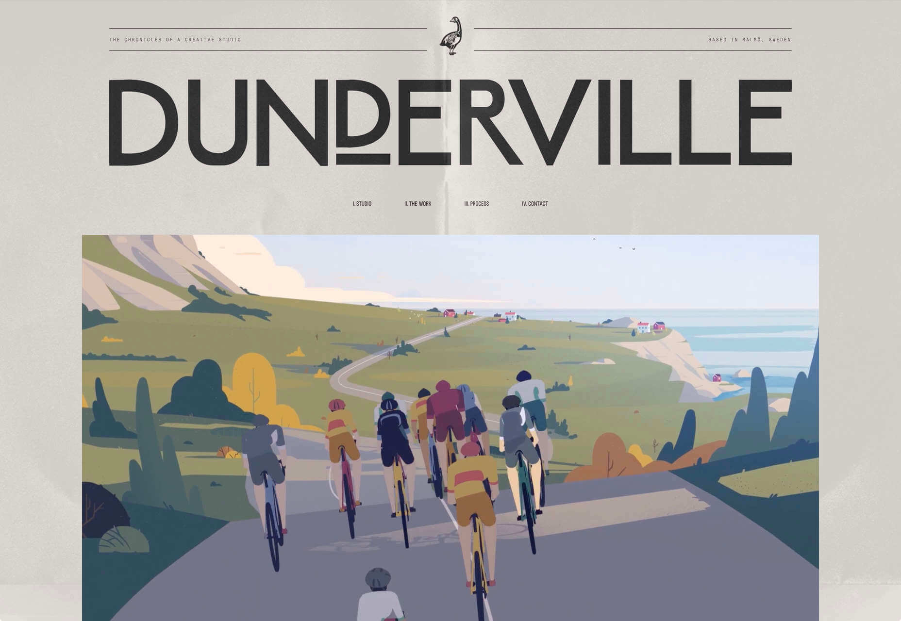
 We tend not to think about it, but the Internet has a physical dimension. It’s a complex network of wires, cables, servers, and technical odds and ends — if you really want to, you can track it down; doing so is particularly easy on small islands because there tends to be a single cable tethering the region to the wider world.
 Stock images are an essential tool for anyone working with clients who can’t afford to hire a photographer for a bespoke shoot, and with the cost of photography shoots running into thousands of dollars, that’s most clients.


 There are dozens of factors that influence the UX of your site, app, or game. Most of them are beyond your control; user connection speed, end-system resources, even browser technology is all out of your hands. So when you do have the opportunity to influence your project’s infrastructure, you should seize it.


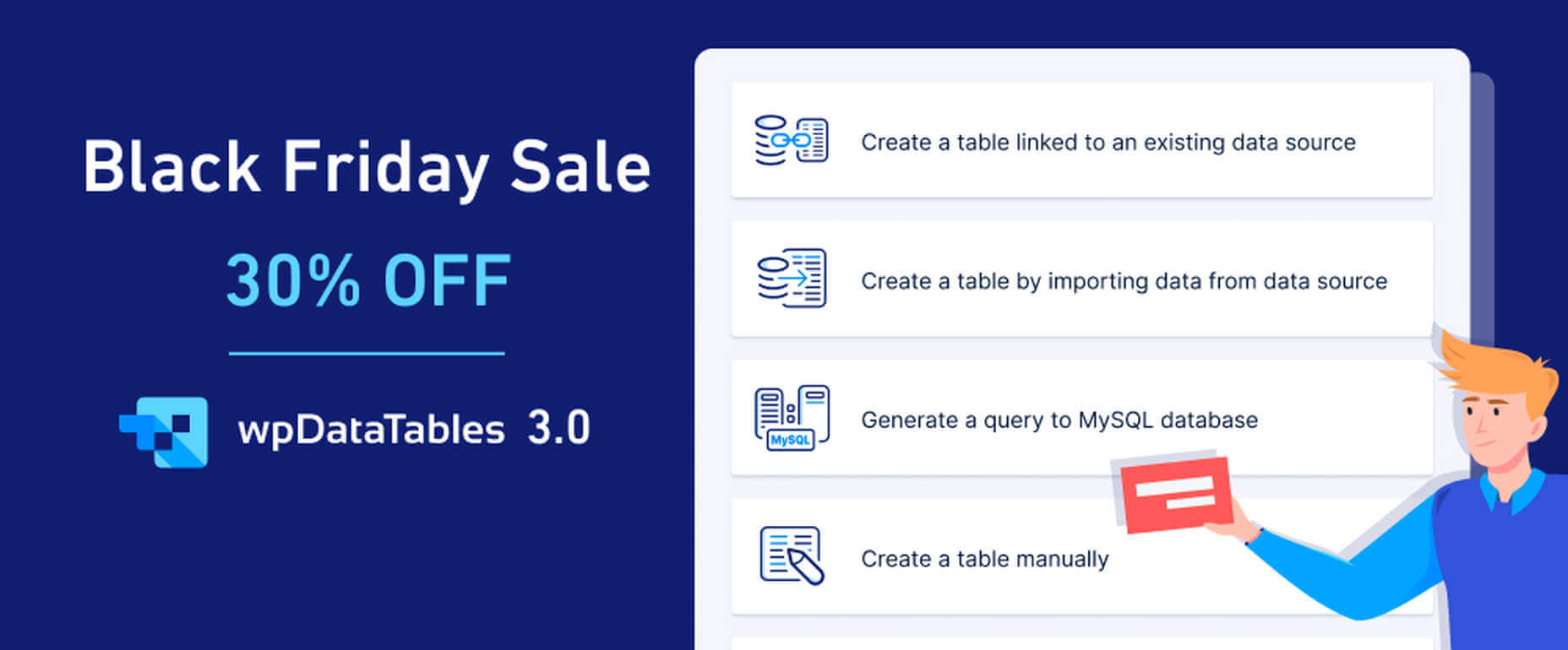
 If you’re interested in a sneak peek of this year’s best Black Friday deals, stick around. You’ll find a few web designers’ favorites, including a stellar deal or two.


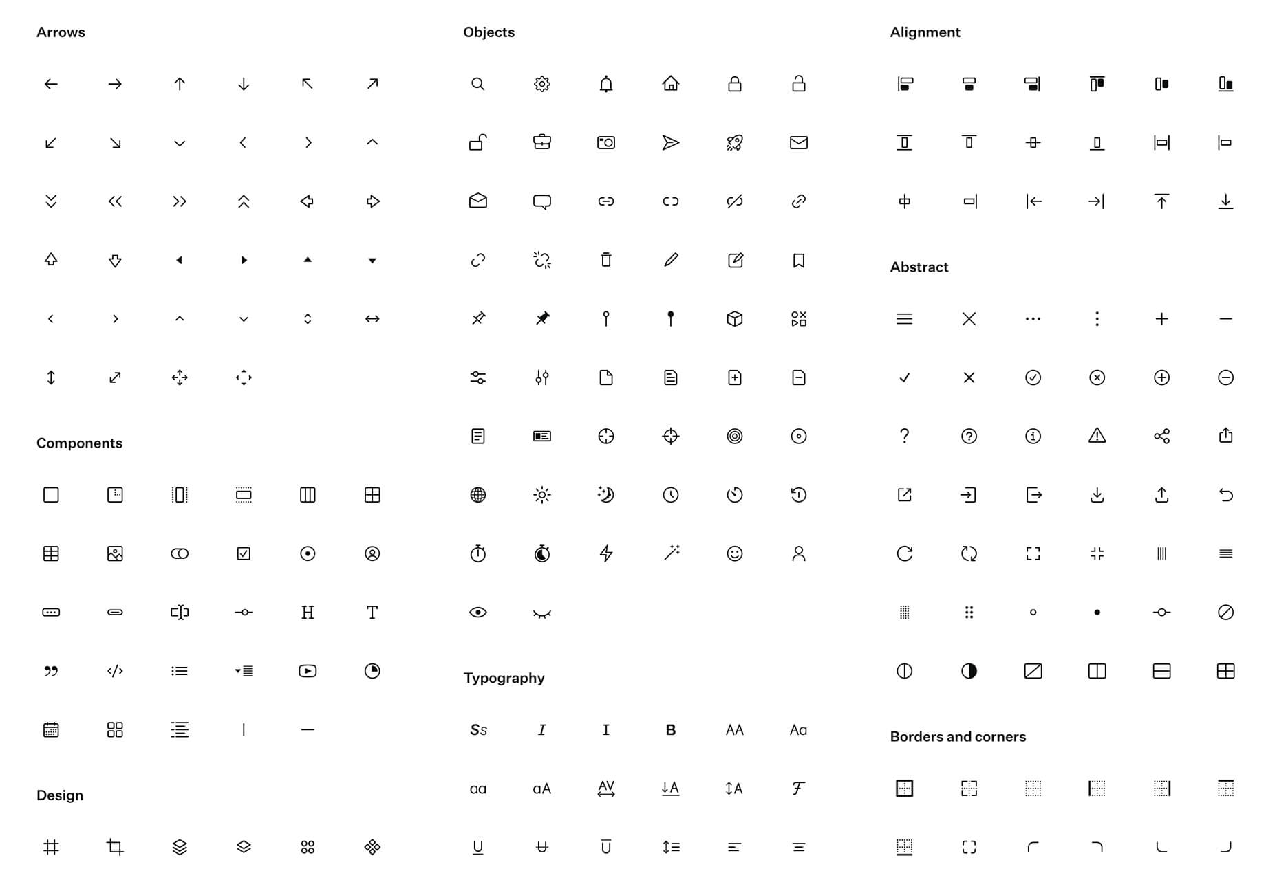
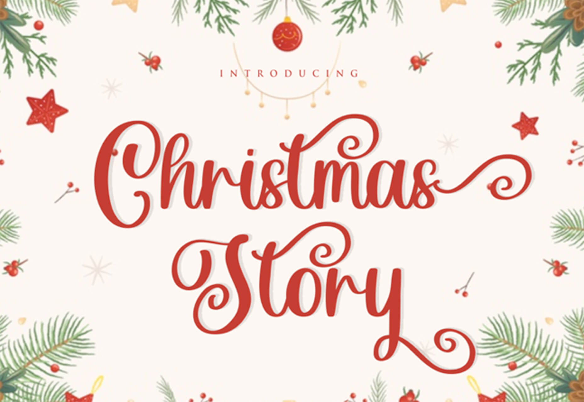
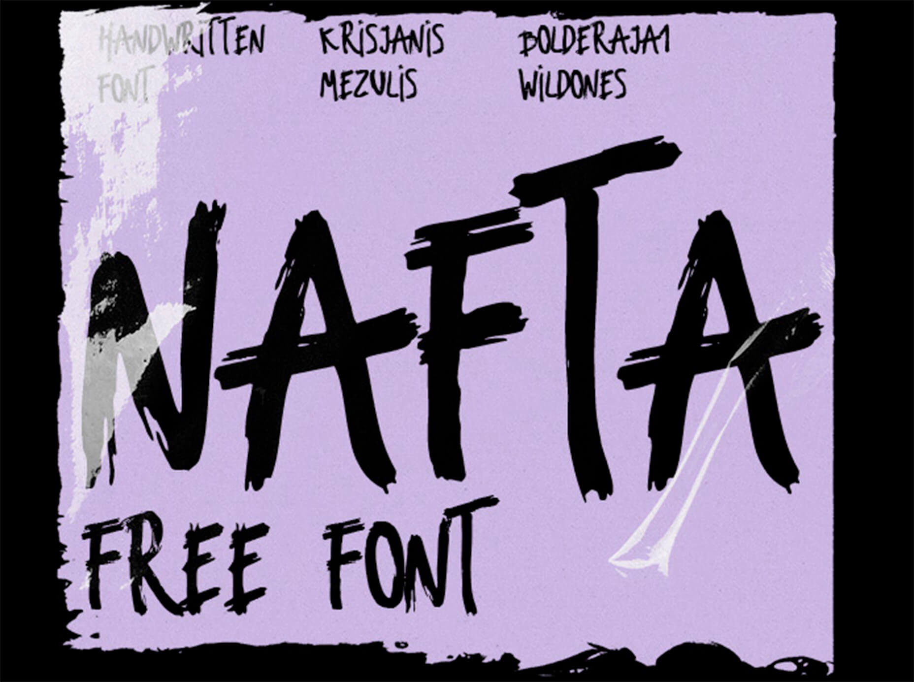
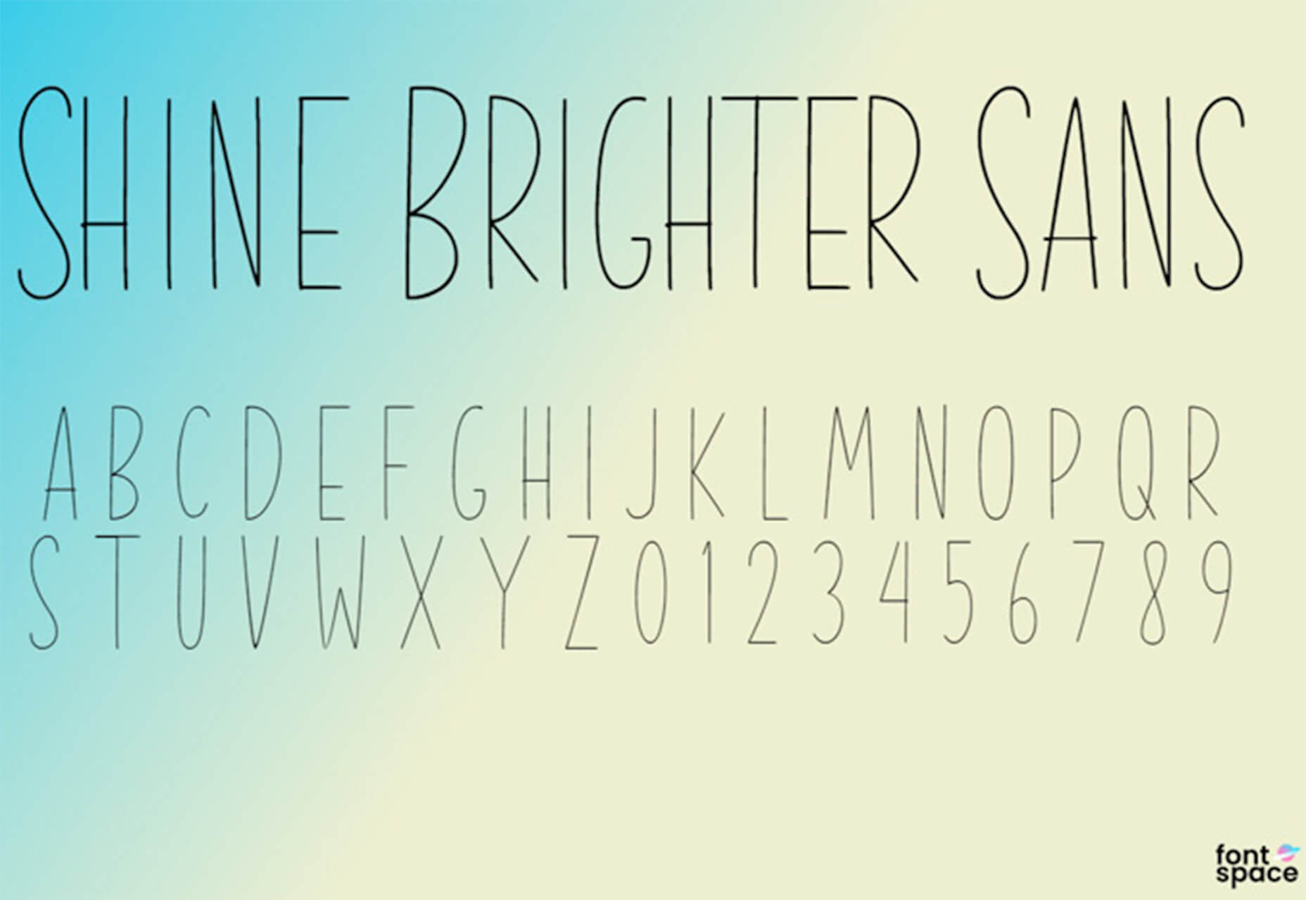
 In the spirit of fall feasts, this month’s collection of tools and resources is a smorgasbord of sorts. You’ll find everything from web tools to icon libraries to animation tools to great free fonts. Let’s dig in.


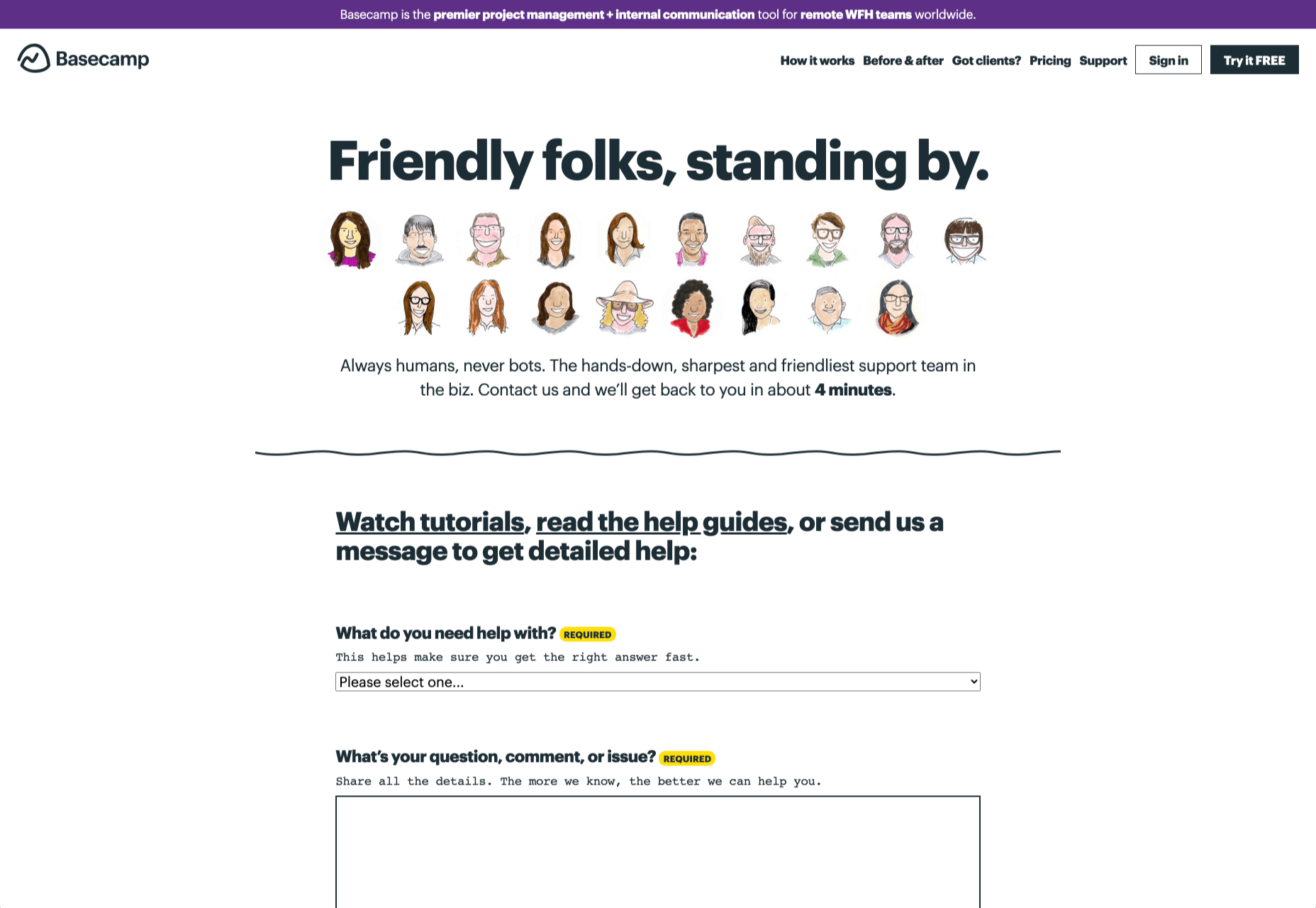
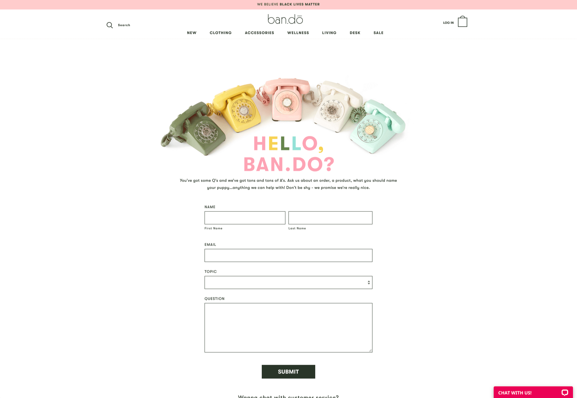
 How can your customer reach you? If a client arrives on your website after searching on Google, what can they do to take the next step in a relationship with your brand, without buying anything?