
 Welcome to our roundup of the best plugins for popular CMS, this month. We’re going to cover plugins built to enhance WordPress, Shopify, Craft CMS, and Joomla. Enjoy!
WordPress
Tutor LMS Elementor Addons
Tutor LMS Elementor Addons is a useful plugin that adds 25+ add-ons to the Elementor page builder. The plugin allows users to create custom styling and layouts for Tutor LMS courses. For this plugin to work effectively, you will have to install Tutor LMS and the Elementor Plugin. After activating all three plugins, you will be able to build single course pages using Elementor. Some of the Elementor Addons include course rating, course title, course author, course level, course duration, course thumbnail, course price, and lots more. The plugin can also be used to edit the look of your existing courses. The pro version of Elementor is not required to use this plugin. It has also been tested with top WordPress themes.
Quick Audio Player
Quick Audio Player is a customizable audio player for WordPress websites. The plugin is responsive and works with any WordPress theme. It runs seamlessly on all devices and major web browsers. Features of the plugin include an HTML5 audio player, live player editing, player poster image, rich control settings, player shortcode, player width customization, and player color customization. The player is available in different audio types including .mp3, .wav, and .ogg.
Simple Responsive WP Slider
Simple Responsive WP Slider is a lightweight slider plugin for WordPress. The plugin allows you to create and customize unlimited sliders for your website. You can use a shortcode or place the slider within Gutenberg blocks to add the slider to a webpage. Some of the features of the plugin include unlimited sliders and multiple sliders on each page. You can set custom configuration options for each slide, including the navigation and slider. Some of the basic configuration options for individual sliders include adding dots or arrows to the slides.
NutsForPress Images and Media
Images and Media is an essential plugin from NutsForPress that makes it easy to customize image and media files on WordPress. The plugin allows you to set the threshold size for images on your website and automatically resizes images that exceed that threshold upon uploading. It also allows users to set a JPEG compression level and will automatically compress JPEGs to meet that compression quality upon uploading. You can prevent GIFs from getting resized to avoid breaking their animation. The plugin can also bulk rebuild “alt title,” “description,” and “caption” for all uploaded media files. You can also bulk rebuild missing PDF preview images. They are seven custom thumbnail sizes to choose from. The plugin is fully compliant with WPML.
Ultimate Social Media Share
Ultimate Social Media Share is a lightweight and responsive plugin for WordPress that allows users to add social media share buttons and social media follow buttons to their site. The plugin is GDPR compliant and DSGVO compliant. The plugin does not collect any IP or personal data. You can insert the social buttons and icons in widgets or Gutenberg blocks. The plugin is free to use and supports 9 different languages. You can customize the plugin to suit your audience’s needs, and it is responsive on any screen, big or small. It is compatible with Gutenberg and Classic WordPress editors. Ultimate Social Media is compatible with WooCommerce, BBPress, BuddyPress, and all custom post types. You can choose from over 35 social media platforms. It is also free to use. The plugin’s social icons are Scalable Vector Graphics, meaning they are scalable to any screen size and load fast.
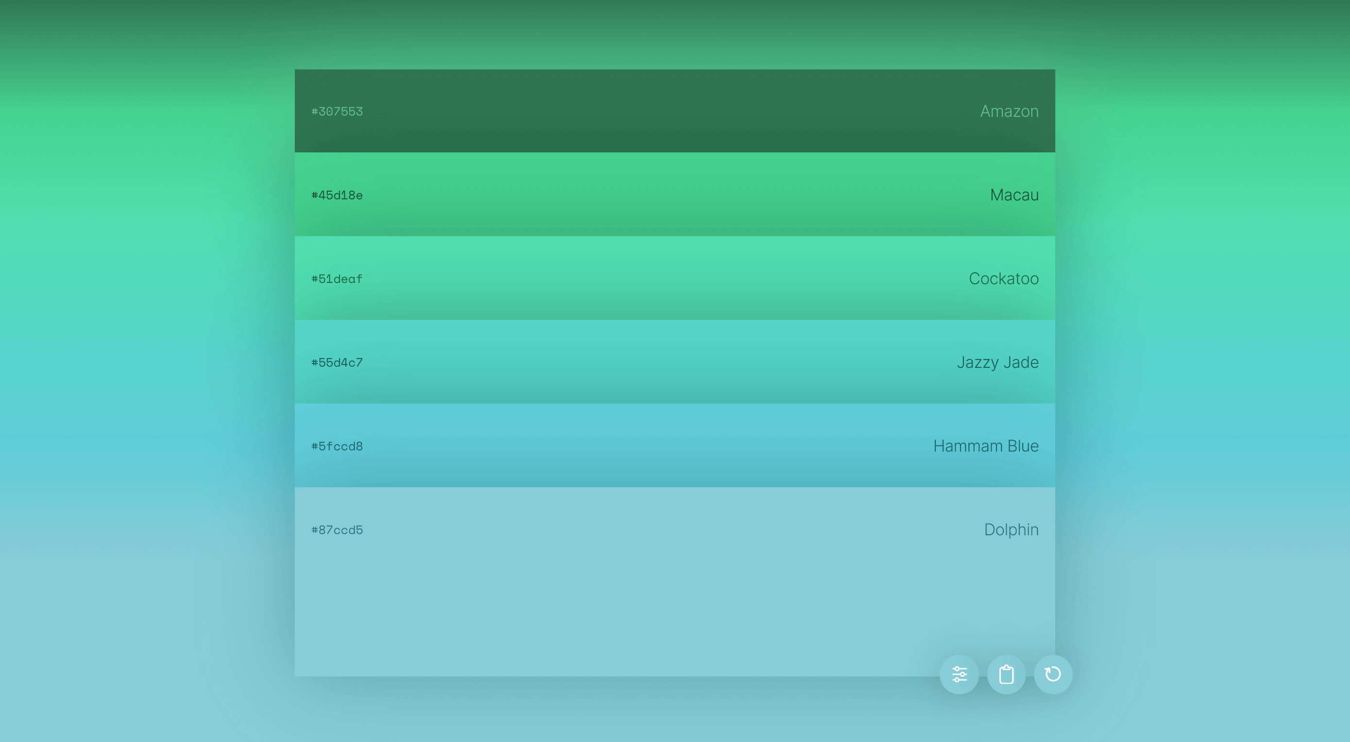
Wall Pricing Table
Wall Pricing Table plugin allows WordPress users to create pricing tables for their WordPress site. You can add the features of the different pricing plans and also display the price table anywhere on your site. The available fields on the pricing table are title, subtitle, price, button, and features(you can add as many as you want). You can differentiate each plan by color. The plugin is completely free to use.
Job App Manager
Job App Manager is a simple WordPress plugin that allows you to display a job application form on your website for candidates to apply with their details. A shortcode is used to display the form on any webpage on your site. After the user completes a form, they will receive a confirmation email. To find the submissions in the form, go to ‘All Submissions’ on the admin page. On the admin page, you can also search, filter, and delete forms. There is also a dashboard widget that shows the latest 5 form submissions.
Jetpack Boost
Jetpack Boost is a one-click optimization plugin that allows users to supercharge their WordPress site’s performance and SEO. Jetpack Boost is still pre-release software, so it’s advised to install the plugin on only production sites until version 1.01 is released. The pre-release version of the software has three powerful modules. The first module uses local critical CSS to generate optimized styles for your webpages. This will allow content to load faster on the screens of viewers. The second module defers non-essential Javascript. This means that the non-essential tasks show after the page loads, allowing important visual information to be seen sooner. The third module implements lazy image loading, so images load when they appear in the browser’s viewport. So if a viewer doesn’t scroll to the end of the webpage, images placed at the bottom of the page won’t load. This makes the website load faster.
Rsiltech Postcode Availability
Rsilitech postcode availability is a simple plugin that allows your customers to check shipping availability. All your customer needs to do is enter their postcode in the “check availability” section of the product details page. Other features include display delivery date in the product page, display shipping note on the product page, add postcode in the admin panel, edit postcode in the admin panel, and list postcode in the admin panel.
WPTD Video Popup
WPTD Video Popup is a simple video popup plugin for WordPress. The plugin supports both YouTube and Vimeo. Some of the plugin features include unlimited popups, retina ready, easy shortcodes for set up, and customizable width and height size for YouTube and Vimeo videos.
Easy Translate
Easy Translate allows you to translate your WordPress site into multiple languages. The plugin will translate everything on your site regardless of themes or plugin specifications. Easy Translate currently works with Polylang and WPML plugins. It uses the plugins to detect frontend language. It is easy to use and is compatible with all themes and plugins. You can translate your site to as many languages as you want. A unique feature of the plugin is that it can translate dynamic strings added by themes, WordPress, and plugins.
Shopify
ConvertOut Ambassadors
ConvertOut Ambassadors is a Shopify plugin that allows users to create an ambassador program in minutes. You don’t need any technical knowledge to get started. The plugin starts working minutes after installation. For every sale made, ConvertOut will track the commission it needs to pay to the ambassador. Payouts are made directly to the ambassador’s PayPal account.
Product Stories Convert Sales
Products Stories Convert Sale is a cool plugin that upgrades your website by giving it a trendy social network look. The plugin makes it fun and easy for customers to view products in your store. All your catalog will appear in carousel stories, just like Instagram feed stories. Coupons will also pop up in the stories to help increase sales. You will also receive real-time reports that will help you identify what your customers are interested in.
Advoz
Advoz is a Shopify plugin that allows experts to create high-quality Google, Facebook, and Instagram ads to promote your business. Once you set a weekly budget, you will receive a custom graphic or video on how the ads will run. The plugin will create ads that will drive quality leads to your store.
Craft CMS
Presence
Presence is a Craft plugin that displays the current users editing an entry. The users are displayed in the right sidebar settings when editing an entry. A default logo is set for users that do not have a profile image. Admins can review and approve the entries made.
Marketplace for Craft Commerce
Marketplace for Craft Commerce allows Craft users to turn their e-commerce sites into a marketplace. Users can add payees to products and also charge fees for your platform. You can charge a flat or percent fee. Payouts are handled via Stripe Connect.
Joomla
AA Youtube Subscribe Button
AA Youtube Subscribe Button is a Joomla module that allows you to show a Youtube subscribe button with your site’s subscriber number. It is easy to use and is fully responsive. It has cross-browser support and works with any template.
MyRealPin
MyRealPin provides a Pinterest-like look to your website. You can create your own pinboards and collaborate with friends. You can customize the Joomla extension to suit your needs.
AA Tiny Audio Player
AA Tiny Audio Player allows Joomla users to add an HTML5 audio player to their website. The extension comes with a responsive layout and supports animations. It works with .mp3, .ogg, and .wav video formats. It also works with all templates.
Featured image via Pexels.
The post Top New CMS Plugins, February 2021 first appeared on Webdesigner Depot.

 Every week users submit a lot of interesting stuff on our sister site Webdesigner News, highlighting great content from around the web that can be of interest to web designers.


 User experience is one of the most important aspects of web design, but many experts overlook that UX doesn’t just apply to web pages. User experience as a concept encompasses all aspects of end-user interaction with a company.
 Looking for the best new CMS plugins to take your website to the next level? Well look no further.
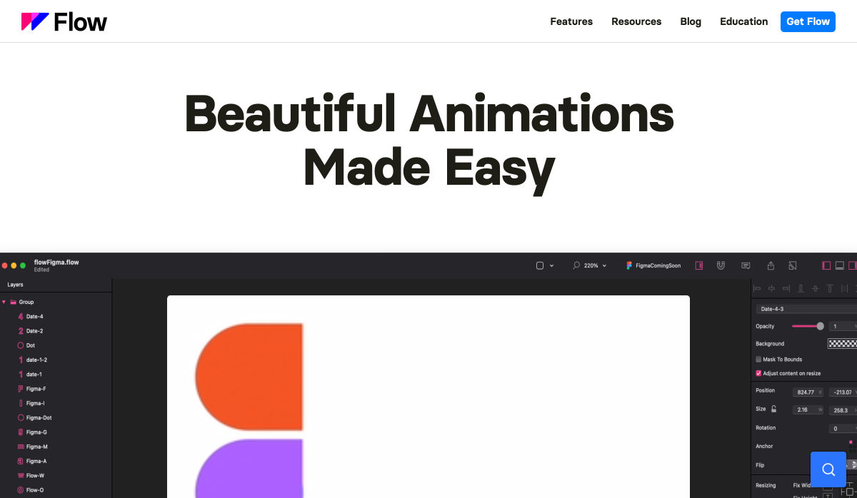
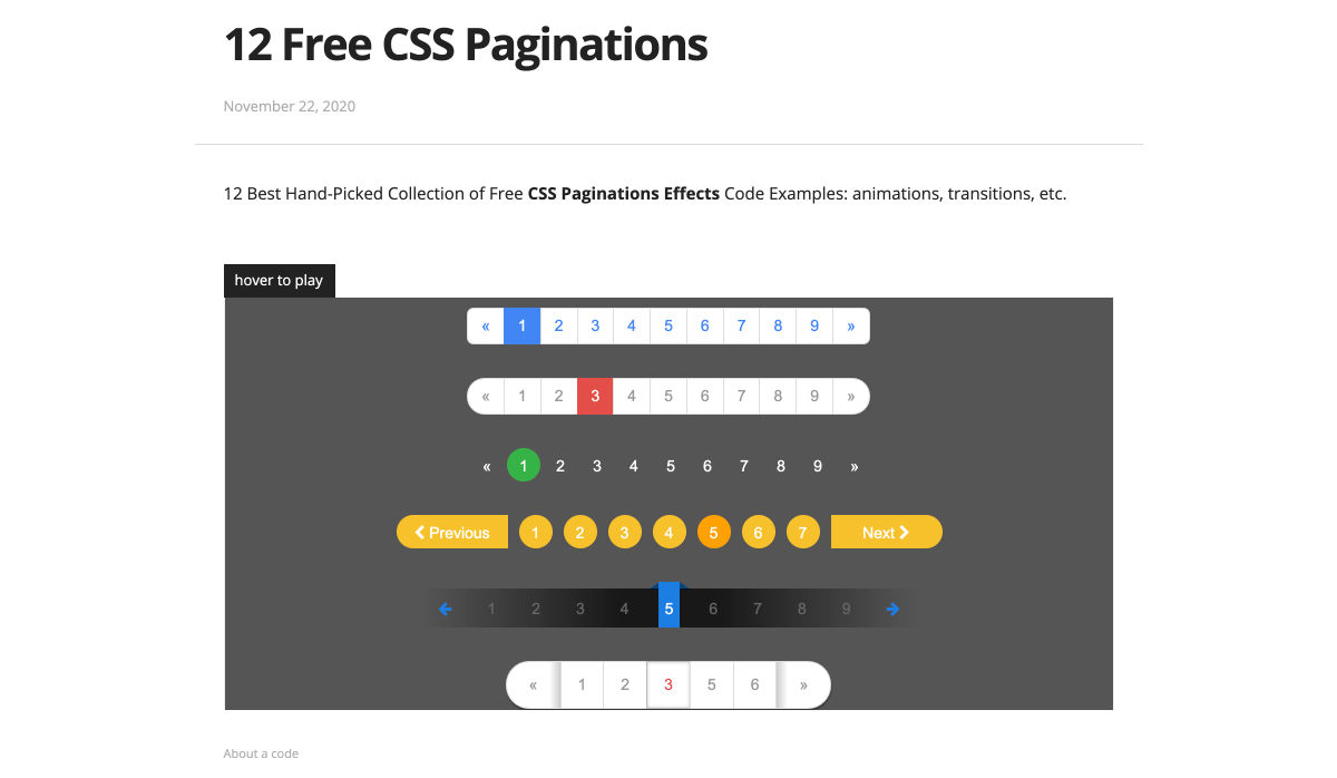
 Animation is a fun and interesting way to bring life to a website. Used correctly, it can capture audience attention, make your website more engaging, and even improve your chances of delivering conversions for your clients.

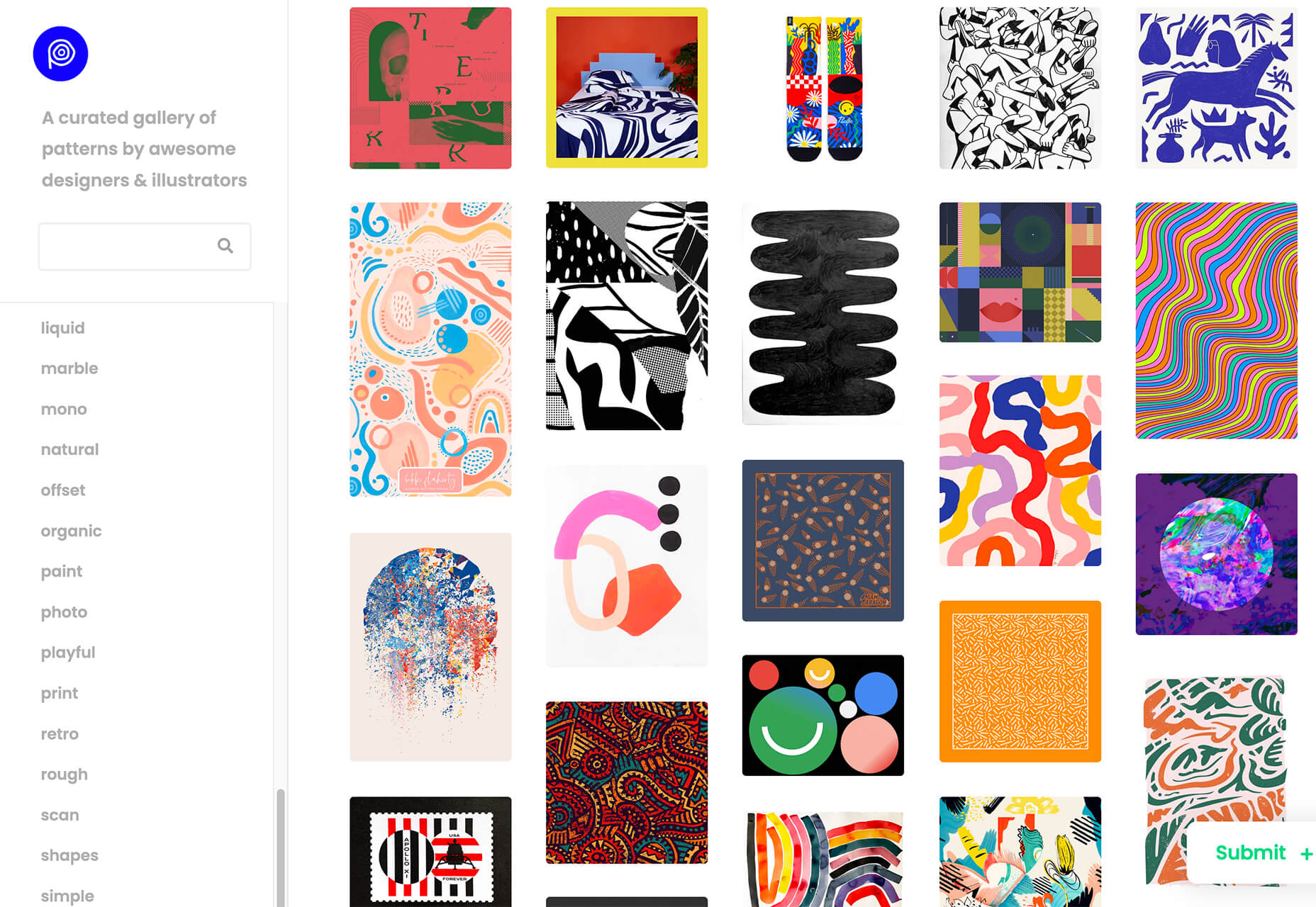
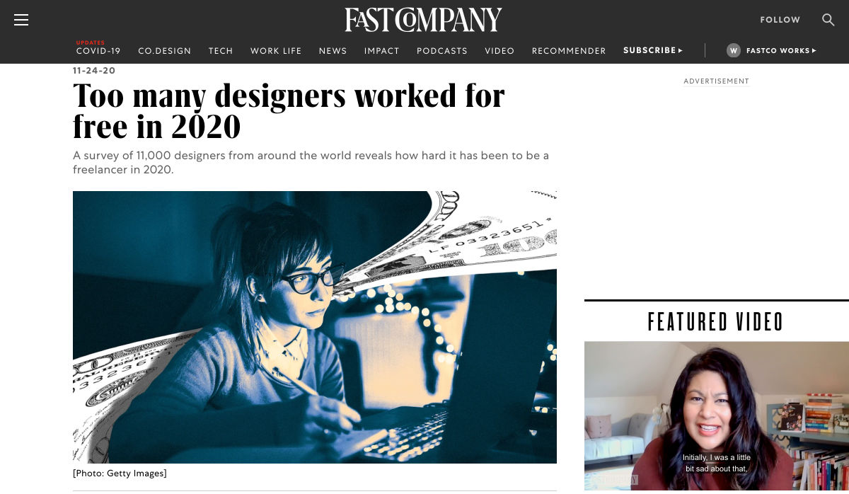
 Jumpstart your next design project or speed up a workflow with some of these new tools and resources. With so many new tools being developed all the time, you are almost certain to find something that can help you with projects.


 By the end of the year, the number of global smartphone users is

 Every week users submit a lot of interesting stuff on our sister site Webdesigner News, highlighting great content from around the web that can be of interest to web designers.


 Since there are so many CMS plugins out there, it can be overwhelming to choose the best ones for your website. We’ve done the research for you; this list contains the top new CMS plugins for November 2020. You’ll find useful plugins for WordPress, Craft, Shopify, and Joomla.


