Articles

Micro-interactions effectively communicate brand identity and ethos while strengthening ties with the customer. These habit-forming tools make for a fun and seamless user experience. Facebook’s ‘likes’ and Tinder’s ‘swipes’ are two classic examples. 

Micro-interactions originated with the need to guide customers who had hit a snag while using a service or a product. The goal was to ease customers into being more product-savvy via subtle reassurance and feedback. Micro-interactions are now employed by everything from washing machines, to coffee makers.

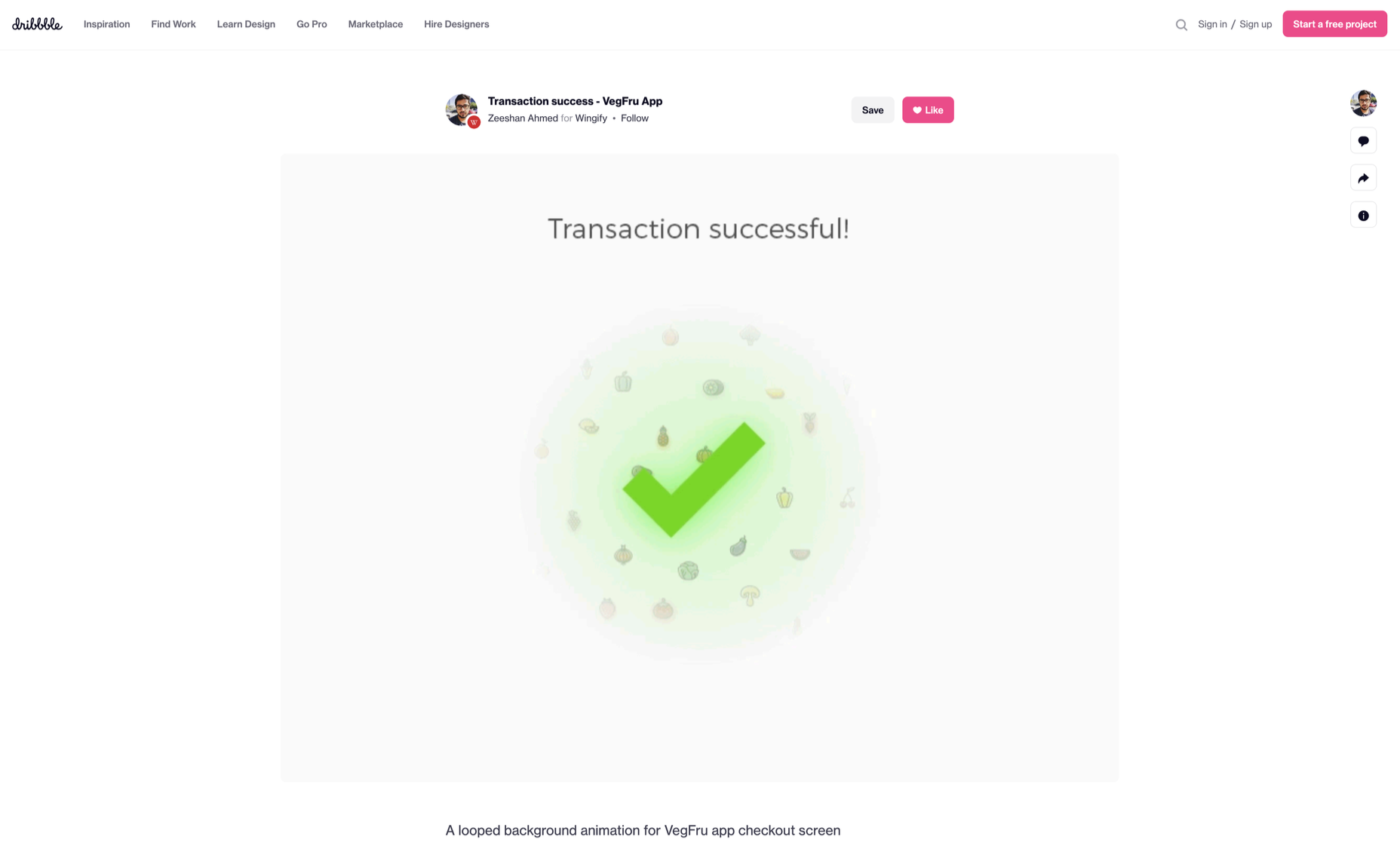
Along with feedback, prompts, and recommendations, they can also present customers with an appealing visual reward upon finishing a task. When used optimally, micro-interactions drastically enhance the navigation and simplify how users interact with sites and apps.

How Micro-Interactions Work

Here are the four structural elements to a simple micro-interaction: triggers, rules, feedback, and loops. Every micro-interaction has a significant component to organize the operational cycle. It lets you control feedback and runs, so the users understand the consequences of their performance and feel motivated to follow through.

Triggers

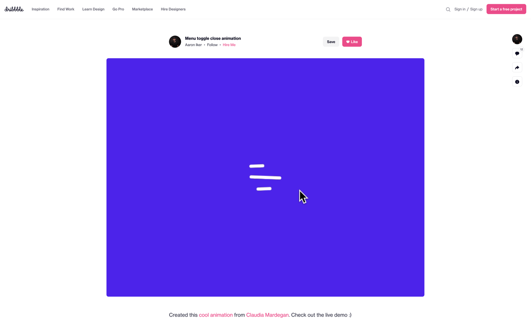
This feature begins micro-interactions of both the user-initiated (prompted by user) and system-initiated (driven by the system) kind. For example, a click, scroll, swipe, tap, and pull are common triggers that users carry out. So making a payment, booking a cab, and clicking or tapping on the hamburger menu all fall under this category. On the flip side, the user’s alert prompt upon entering a wrong password is a classic system-generated trigger. 

Rules

This element determines what happens after the user sets a prompt into motion via tapping, clicking, scrolling, or swiping. Rules refer to the fact that apps decide the triggers that users employ — Tinder’s ‘swipe’ feature illustrates this point. These rules gradually become a habit-forming action that users get accustomed to while regularly engaging with an app.

Feedback

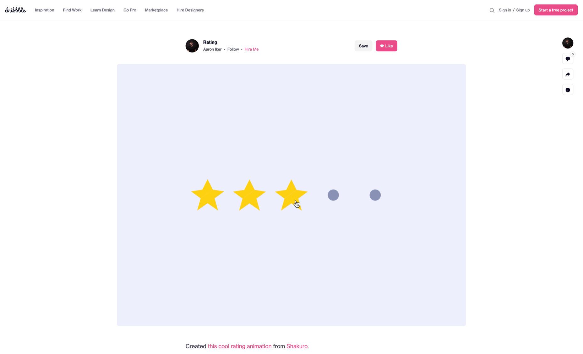
During this process stage, the system informs the user via auditory, visual, or haptic cues. It engages the users and encourages them to proceed further in their process. For example, the progress bar of a download, the visual representation of steps cleared in a circle, or the visual, aural, and tactile indication upon the success or failure of payment are all a part of the feedback mechanism.

Loop/Modes

This final stage entails tiny meta-rules of the process and determines the frequency and duration. A classic example from an ecommerce app is the ‘Buy Now’ transformed to ‘Buy Another’ Before the user loses interest in the app, the app typically uses such a loop to get them to re-engage with the app. 

How to Use Micro-Interactions

We’ve established that micro-interactions are fabulous, but not every UX interaction on your app or site needs one throughout the wireframe. Overusing this tool could saturate the overall creative experience your design may want to offer. Worse, it might even end up confusing the information hierarchy. It undermines the design and unbalances the user experience of discomfort and irritability. So it’s crucial to know when exactly to use them.

Let’s find out how few quick tips on micro-interactions can elevate and humanize your mobile user experience:

  • Swipe right or left: A signature move made entirely on swiping micro-interaction featured in the famous Tinder app. Swiping is an easier action than clicking or tapping.
  • Call-to-action:  As part of the last step during payment or order, place a ‘Confirm Order’ or ‘Book Now’ prompt, which gives the task a sense of urgency. As a result, having acted on it feels like a minor achievement. 
  • System status: Your app user wants to know what’s happening. System status lets them know they are moving in the right direction and helps avoid confusion. Sometimes, users even run out of patience while uploading a picture, downloading a file, or filling up the registration form.
  • Classic notifications: Users need a quick reminder of products selected/wishlist in their abandoned cart with a reduced attention span. A simple notification can nudge them toward finalizing the purchase. 
  • Button animation: Animated buttons are not only cute, but they also help users navigate the mobile app swiftly. Try out attractive colors, fonts, sizes, shapes, and clipart elements corresponding to the animation and create that cool button to pop up when tapped or hovered on. 
  • Animated text inputs:  A simple process of a likable element like zooming in while entering data into a form or filling up card details for payment can enhance the user experience.
  • Reward an achievement:  Especially true for educational and health apps, micro-interactions celebrating big and small milestones with a badge or a compliment of encouragement can strengthen a user’s engagement with the app. 

Benefits of Micro-Interactions

  • Brand communication: A successful brand ensures that the transmission to the buyer is engaging, positive, and hassle-free. When micro-interactions show a process status clearly, it creates and reinforces a positive image for your brand.
  • Higher user engagement: Experts say micro-interactions engage users better. These tiny elements subconsciously create the urge to keep interacting with your app. For example, each push or nudge notification acts toward redirecting your customers back to your app.
  • Enhanced user experience: From shopping to banking to traveling to learning to staying healthy, there’s an app for everything. A wide range of activities elevates the overall user experience and stays ahead in the game. Micro-interactions can work that magic for your brand. 
  • Prompt feedback: It’s frustrating not to know what’s happening behind the blank screen, especially during a purchase. Instant feedback via visual, sound, or vibrating notifications makes for a pleasant user experience. 
  • Visual harmony: Micro-interactions initiated even with a tap, swipe, typing, or scrolling are all a part of the UX design’s overall appeal. The trick is to keep all the interface elements in perfect sync with the app’s visual features.

Micro-Interaction Best Practices

Here are a few basic principles you should follow when you introduce a micro-interaction to the user experience.

1. Keep it simple, stupid (KISS)

KISS is a famous design principle that becomes even more important in the case of micro-interactions. The goal is to make the user journey delightful and not be a distraction.

2. Keep it Short

It has ‘micro’ in the name itself. But, again, micro-interactions aren’t supposed to be show stars, and a lengthy micro-interaction only distracts the user. 

3. Pick the Right Place

You should always consider the options carefully before choosing the spot for any micro-interaction. The widely used user-interaction designs are popular for a reason. Many people have already approved them, so you can safely continue with them. The use of micro-interaction should also sit well with your brand image. 

See also if the placement of a micro-interaction is reaching your ideal customer or not. And even consider whether you need a micro-interaction to begin with. 

And That’s a Wrap!

As UX designers, we can profoundly impact the overall design of sites and apps, the user’s journey, their interactions with our product/service, their connection with the brand, and the ease of doing a transaction.

We want customers to connect to our brand, love our products, and experience our exceptional customer service. But most of all, we want to earn their trust and loyalty.


Featured image via Pexels.

Source

The post Using Micro-Interactions to Drive UX first appeared on Webdesigner Depot.

Source de l’article sur Webdesignerdepot

Kubernetes is ruling the container market. According to a CNCF survey, the use of Kubernetes in production in 2020 was 93%, up from 78% in 2019. Moreover, the survey reveals that the use of containers in production in 2020 was 92%. This figure is up 300% from CNCF’s first survey in 2016. 

Due to the adoption of Kubernetes by DevOps teams and the open source community’s encouragement, this figure could grow more. And if it stays at present prices, this market share still is a significant portion. This means that even though Kubernetes makes a lot of things easier, challenges will always appear, as the survey confirms. Namely, the problems listed include networking, storage, tracking, surveillance, a lack of preparation, and, of course, cost management.

Source de l’article sur DZONE

If we don’t question this kind of design homogenization, do we put ourselves at risk of perpetuating the same mistakes in the years to come? Or is it even a mistake to begin with?

Today, I’m going to look at four things that are likely causing this, and what you can do to break the mold.

1. Education

We used to have a design school in every city in the world, each with its own design style or, at the very least, the encouragement of its designers to be creative and come up with something new.

These days, though, traditional design education isn’t as popular as it once was. According to Design Census 2019, only about a third of working designers have a formal education and degree:

The rest have been trained through a variety of means:

  • Online learning (17%)
  • Self taught (12%)
  • Workshops (10%)
  • Mentorship (6%)
  • Certificate programs (4%)

Cost and convenience are definitely two factors influencing this shift towards online learning methods. And with a wealth of resources online to teach them how to design and code, why not go that route? Plus, designers have to keep learning new things in order to remain competitive, so it’s not as though a degree is the be-all and end-all of their design training.

Plus, there isn’t as much demand for it from employers. Unless you plan on working for one of the top global marketing agencies, many hiring companies just want to see proof in the form of a portfolio and maybe have you do a test job.

Now, I’m not saying that online courses and other informal design education don’t foster creativity. However, in order to make them cost-efficient and quick to get through, they have to focus on teaching essential best practices, which means less room for experimentation. Perhaps more importantly, their curriculums are guided by fewer voices. So, this could likely be one of the culprits.

2. Design Blogs and Vlogs

You have to wonder if all the design blogs out there (yes, like Webdesigner Depot) impair designers’ ability to break free from the homogeneity of websites.

I think the answer to that is both “yes,” and “no”.

Why, Yes?

What is the purpose of a web design blog? Mainly it’s to educate new and existing designers on best practices, new trends, and web standards.

By their very nature, they really should be teaching web designers the same kinds of things. Let me show you an example.

This is a Google search for “web design trends 2020”:

Most design blogs will publish trends predictions around January 1. And herein lies the problem. The writers/designers can only deviate so far from what we know to be true when writing on the same topic… so these sites end up with similar recommendations.

For instance, the top search results recommended similar things for 2020:

  • Dark mode
  • Hand-drawn illustrations
  • Immersive 3D
  • Glowing colors
  • Minimalist navigation
  • Geometric shapes
  • Inclusivity
  • Accessibility

When web designers receive the same guidance no matter where they turn, it’s only logical that they’d end up creating websites that adhere to those same practices.

Why, No?

Because I write for web design publications, I can tell you that there’s a big difference in the kinds of content some of them publish.

For instance, I find that WebDesigner Depot isn’t interested in rehashing what everyone else is writing about this month. We’re given topics that challenge us to think outside the box and present readers with meaningful insights and recommendations.

So, I think that finding design blogs that push the boundaries and don’t just want to recap what everyone else is saying is really important. That’s how web designers are going to master the basic skills they need to succeed while getting inspired to try new things.

3. Designs Tools and Frameworks

This is another one that’s not as cut and dried. I think it depends on the tools used and the intent to use them.

Where Issues Start to Arise

There are certain site builder solutions that you’re going to be hard-pressed to create something innovative with. The same goes with using templates from sources like Dribbble. It’s just the nature of the beast.

If your goal is to create a cheap website very quickly for a client, then you’re probably going to use a cheap builder to do so. With ready-made templates and a lot of the work already done for you, you can create something that looks good with little effort.

When you’re limited by time and cost, of course you’re going to rely on shortcuts like cheap site builders or boring (but professional) design templates.

How to be More Careful

You can run into these kinds of issues with more flexible content management systems like WordPress or frameworks like Bootstrap, too.

Whenever you rely heavily on ready-made templates, pre-defined styles, or pre-built components, you run the risk of someone else’s work informing your own.

The solution is simple: Use demos, templates, UI kits, and so on as a base. Let them lay down the foundation that you work from.

But if you want your website to look different from the sea of lookalikes, you’re going to have to spend much more time developing a unique visual style that’s equally as effective in its mission. Which also means moving beyond clients that have small budgets or low expectations.

4. User Data

Data gathering is an important part of the job you do as a web designer.

You research the target user (or the existing user, when applicable). You look at industry trends as well as the competition to formulate an idea of what you need to build and how you’re going to do it. And you also use resources like Nielsen Norman Group and Think with Google that put out definitive research on what users want.

Even with the most niche of audiences, consumers’ wants and needs are all basically the same. So, obviously, you have to design experiences that align with them. If you deviate too much from what they expect from your site or brand, you run the risk of creating too much friction.

Is This a Bad Thing?

It’s not in terms of usability. If we build simple, predictable and user-friendly interfaces based on data that successfully drive visitors to convert, that’s great. So long as the content remains strong and the UI attractive, there’s nothing wrong with that approach.

But…

This is the same issue presented by templates and site builders. If you do exactly what’s needed and not much more, your site is going to look and act just like everyone else’s. Which comes at the cost of your brand reputation.

Just look at Google’s Material Design. This design system may have made it easier for web and app designers to create new solutions that were user-friendly and responsive, but there was just too much spelled out. And this led to a slew of Material Design lookalikes everywhere you turned.

This is the whole reason why companies take the time to craft a unique selling proposition. Without a USP, brands become interchangeable in the eyes of consumers.

So, again, my suggestion here is to use data to formulate a strategy for building your website. But don’t forget to spend time adding a unique style, and voice of the brand to the site.

Wrap-Up

It seems like, despite all that we’ve learned to do, websites are becoming less and less diverse in terms of design. And I think a lot of that is due to the fact that it’s much easier to design websites today than it was ten, or even five years ago.

Modern-day education, resources, tools, and consumer data take a lot of the questions and the work out of building websites. Which is good… but only to a point.

Unless you’re building websites for clients who have absolutely no budget, you can’t afford to skimp on the creativity and personalization that will set their website apart. Yes, you need to adhere to tried-and-true practices and standards, but beyond that, you should be experimenting.


Featured image uses photo by Kari Shea.

Source

p img {display:inline-block; margin-right:10px;}
.alignleft {float:left;}
p.showcase {clear:both;}
body#browserfriendly p, body#podcast p, div#emailbody p{margin:0;}

Source de l’article sur