Articles

In the information age, time is a valuable commodity and something people don’t want to spend too much of. As a result, the average visitor only reads about 20% of the content of a page

For web designers and developers, that means a few things: first, you need to ensure that the web pages you create are as engaging as possible; secondly, you need to find a way of making the critical information on any page stand out; thirdly, every modern designer needs to create assets that are easy for today’s fast-paced customers to use. 

Making websites more scannable is how you do your part as a designer to ensure that the customers who come to a page get the quick and convenient experiences they need. 

So, how do designers embrace scannability?

Designing for Scannability: An Introduction

At first glance, the concept of creating a website for scannability is strange. 

Most designers start their projects with the aim of making customers stay on a page for as long as possible. So it’s odd to think that you would want to make it simple for end-users to skip from one page to another on a website in a matter of seconds. 

However, scannability isn’t just about delivering information and getting users off a page. When sites are scannable, they make it quicker and easier for customers to slide down the purchasing funnel. A quicker and more convenient customer journey leads to a stronger user experience and more conversions. 

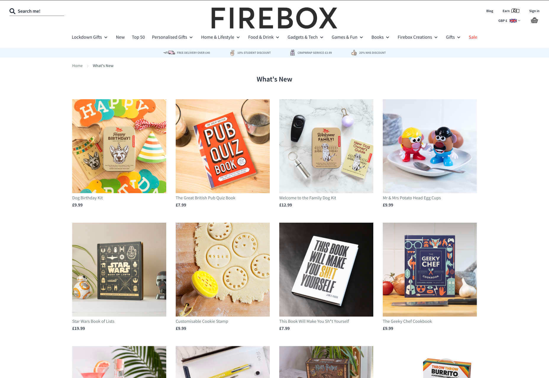
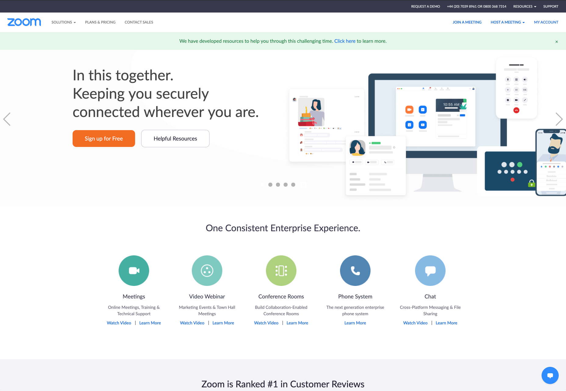
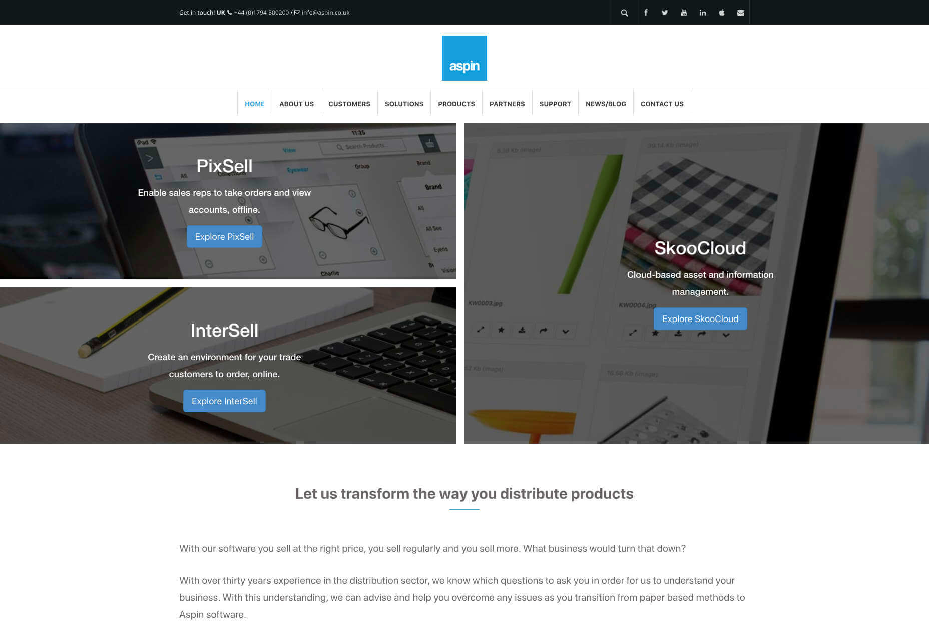
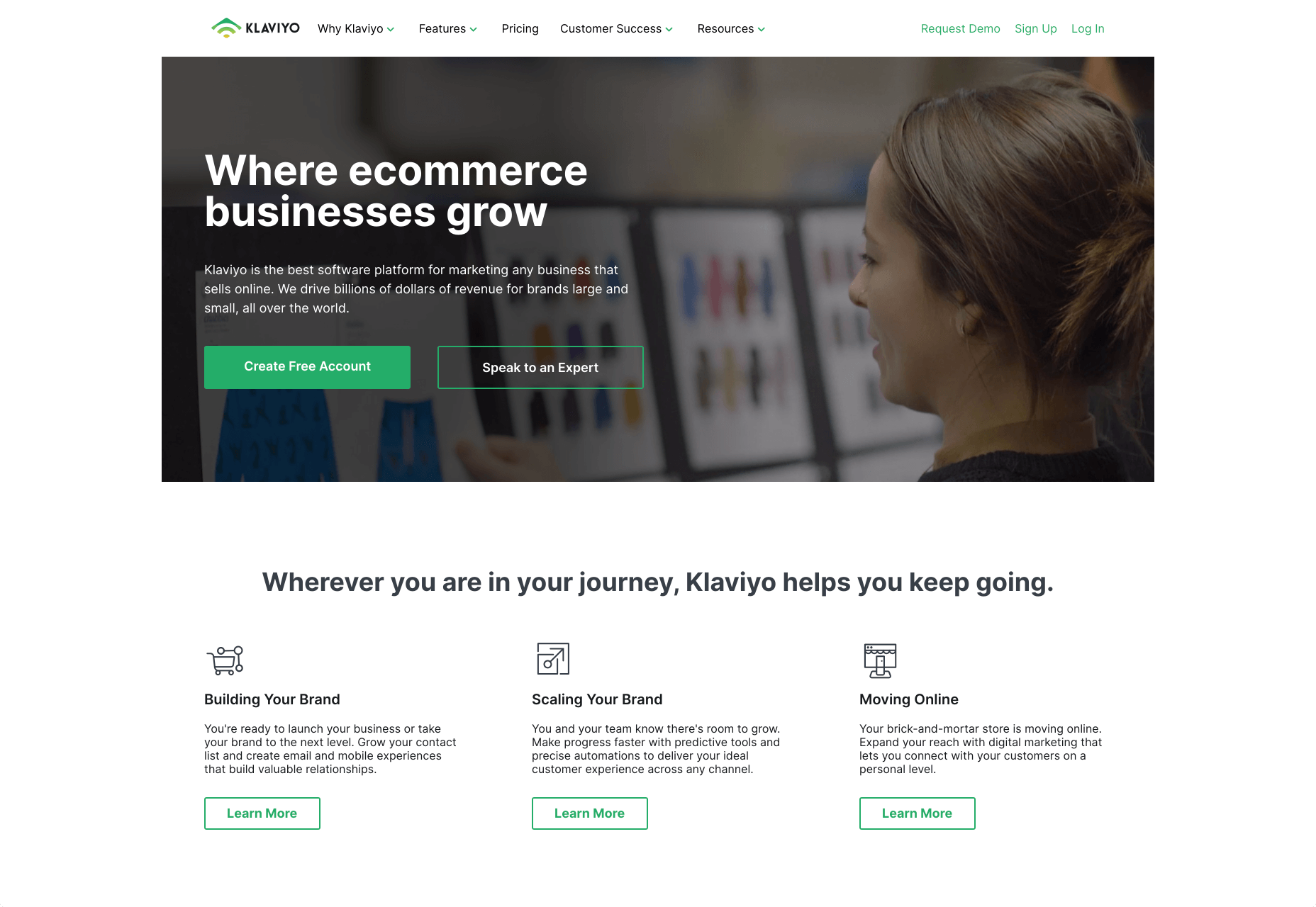
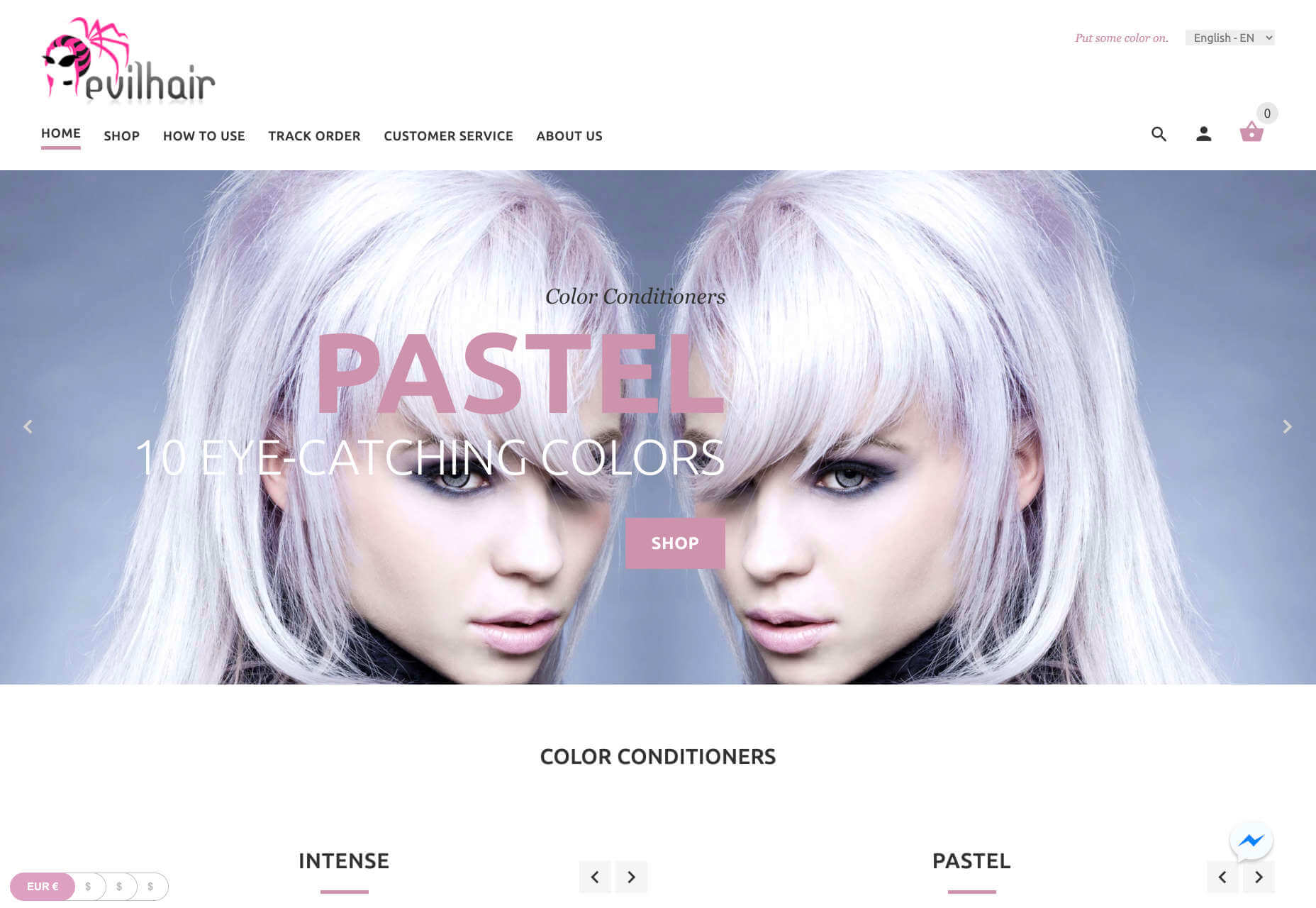
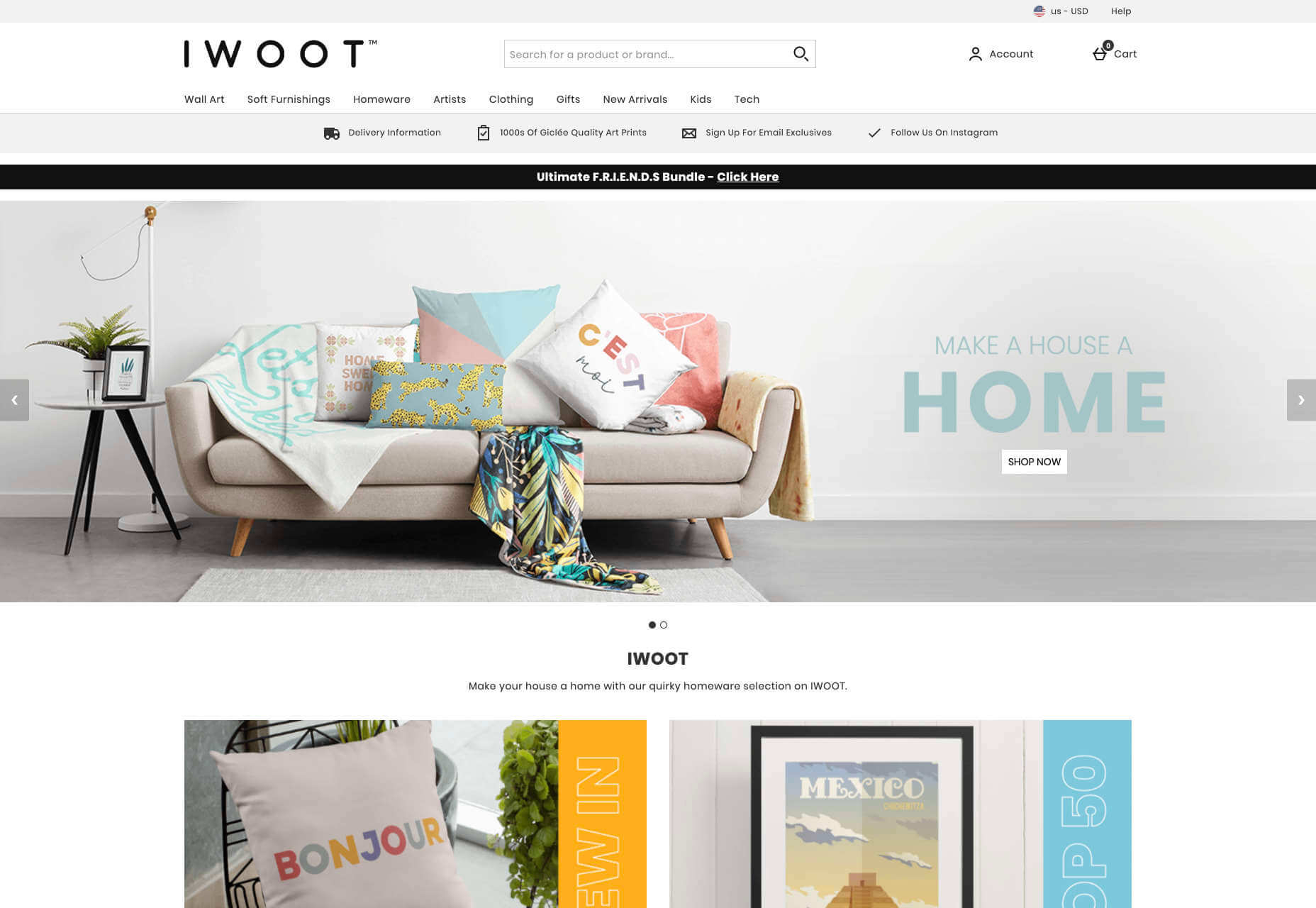
Look at Netflix, for instance. It doesn’t give interested users a ton of information on its homepage. Instead, the key USPs of the product are laid out bright and bold in the middle of the screen, along with one simple call to action: Get Started.

Designing for scannability means making it easy for users on a page to glance at a screen and instantly access all the information they need to take the next step in their buyer journey. 

There’s no needless scrolling or wondering what to do next. 

According to analyst Jacob Nielsen, scannability is essential because people look for specific things on every page they visit. 

Customers don’t read through web pages word by word. Instead, they scan through the content, plucking information out that serves their requirements. 

Questions to Ask When Designing for Scannability

So, how do you know if your web pages are scannable?

Start by asking the following questions:

  • What’s the intent of the people who arrive on this page?
  • What kind of information needs to be conveyed instantly?
  • Can the visitor see the next step in their journey immediately?

For instance, when someone arrives on the Evernote homepage, you can assume that they want to:

  • Find out about Evernote
  • Learn how to sign up
  • Jump to other pages to find out about features, and contact details

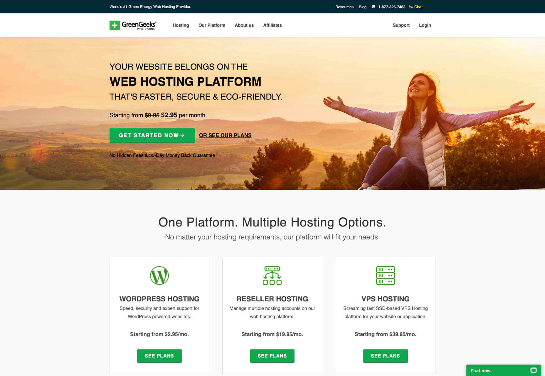
That’s why the designer behind the Evernote website placed an immediate piece of useful information at the top of the page: “Tame your work, organize your life” tells customers exactly what the entire product is all about. The brief paragraph of information underneath can provide a few more details if customers need it, then there’s an immediate call to action: Sign up for free. 

Not only does the call to action tell users what to do next, but it tells them the most important information they need straight away: it’s free. 

Scannable pages like this are useful because:

  • They help users complete their tasks quicker: Whether you want to sign up or learn more about the product, everything you need is available instantly, with no scrolling required. 
  • The bounce rate is reduced. Customers don’t get confused and hit the back button. That’s good for your client’s SEO and their bottom line. 
  • The website looks and feels more credible: Because customers get all the answers to their questions immediately, they’re more likely to trust the website. 

So, what are some of the best things you can do to make your sites as scannable as possible?

Use Visual Hierarchy

Visual hierarchy is a way of organizing the content on your website in a way that adheres to how people use the website. For instance, if you land on a blog page, you expect to see the headline first, maybe some information about the writer, and any other essential information, followed by the body content. 

Although it’s tempting for designers to try and surprise users with new visual strategies, the best way to make your content more scannable is to give end-users precisely what they expect. 

If you’re not sure what a page should look like, try checking out the competition. 

One of the most obvious visual hierarchy rules is that the main navigation should always go at the top of the page. 

Customers will expect to look at the top of the page to find navigation. They don’t want to have to scroll through your website, searching for a way to get to another page. If you want to make it as easy as possible for end-users to jump from one page to another, you can pin the navigation bar to the page so that it stays with users as they scroll. 

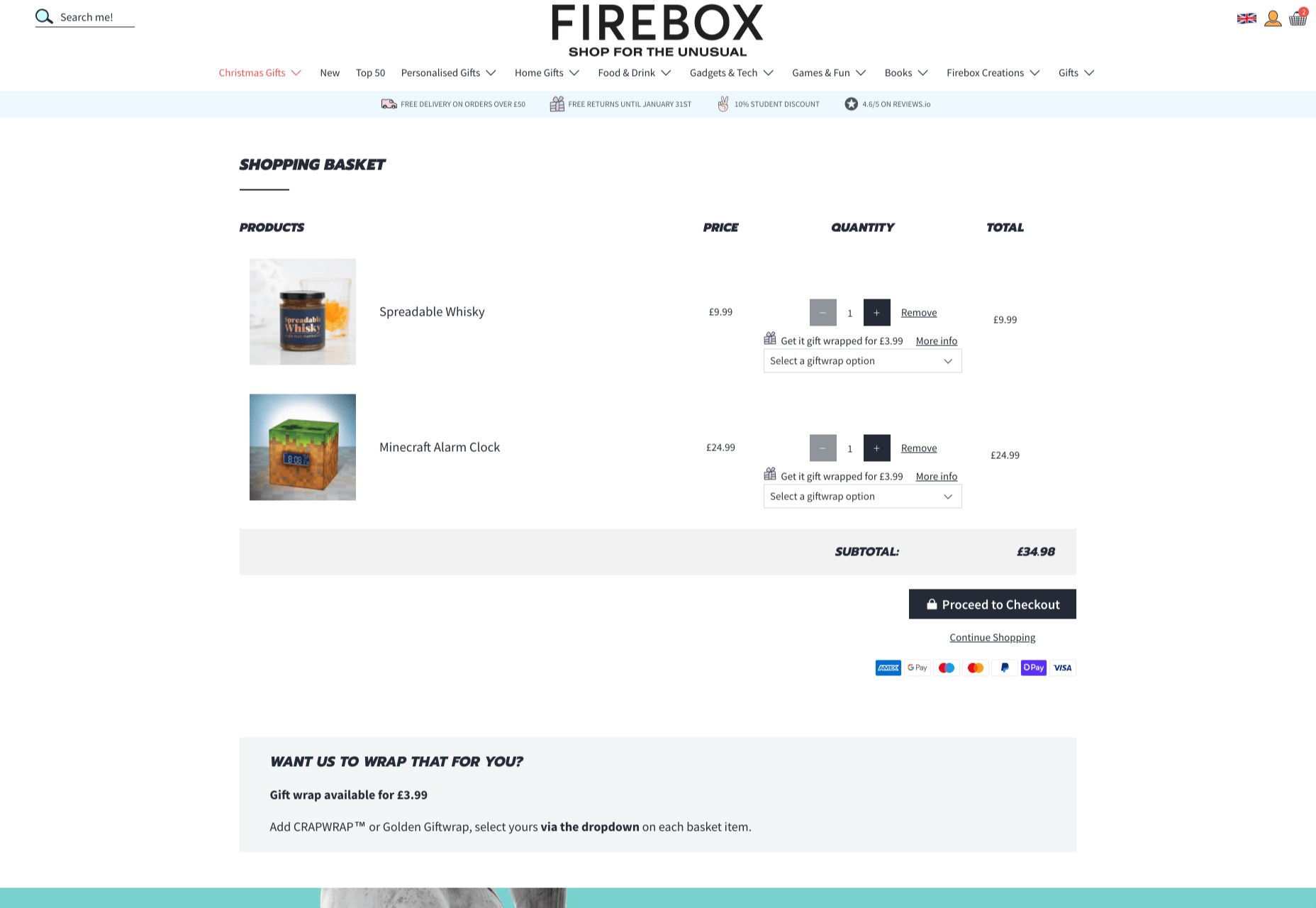
Maintain Negative Space

White space, negative space, or whatever you call it – is the part of your design that’s left empty. 

White space is crucial because it gives all of the objects on your page some much-needed breathing room. Without enough negative space on your pages, it’s impossible to embrace scannability because there’s too much information for a customer to take in at once. 

For instance, notice how there are big gaps of space between every element on a Forbes website post. A proper amount of negative space on your site ensures that users can quickly take in chunks of information and use that information to decide what to do next. 

To ensure there’s enough negative space on your website pages, ask yourself what the key elements visitors will notice when they come to a website. The essential items should be:

  • A title or header to confirm that the user is in the right place
  • A CTA that shows your user what to do next
  • A navigation header or menu
  • Critical information includes an introduction to what a page is about or an excerpt from the blog post they’re about to read. 
  • A visual component: A picture or image that gives context to the page. 

Anything else can usually be removed. So, for instance, if Forbes wanted to make the page above more scannable, they could easily remove the ads and social media sharing buttons.

Make the Next Step Obvious

Every page on a website exists in a hierarchy within the customer journey. 

A homepage leads customers to product pages, which leads to a checkout page, which connects to a thank-you page that sends the visitor back to another product page, and so on. 

When designing for scannability, it’s crucial to make the next step in the journey as obvious as possible. Usually, this means placing the call to action “above the fold,” where the customer can see it immediately.

Ideally, scannable pages should have just one CTA. This will stop your audience members from being confused or overwhelmed by choice. 

However, if you’ve got multiple CTAs, think about the average customer’s journey and what they’ll want access to first.

If those buttons don’t appeal to the customer, they can scroll a little further and see other “next step” options, like shopping for “self-isolation essentials” or browsing other popular product categories:

Test Every Page

Testing for scannability means examining every page and making sure that it’s as easy as possible for customers to move through the buying process as fast as they want to. 

Visit each page you design in a buyer journey and ask how quickly it would take end-users to get from point A to point B and beyond. Here are some of the common issues that might slow the customer’s journey and harm scannability:

  • Readability: Is the font legible? Is it large enough to read on all screens, including mobile devices? Legibility in the design world measures how quickly and intuitively your users can distinguish what’s going on any page. Remember that the color of the background, the amount of negative space around copy blocks, and even font pairing can impact the readability of the content. Show your pages to multiple people and time how long it takes for them to grasp the message that you’re trying to convey. 
  • Fluff: Fluff and extra features can make your pages more intriguing, but they can also slow users down. For instance, one picture at the top of a blog page can add context to the article. A slideshow of pictures stops the customer from progressing and keeps them stuck at the top of the page for longer. 
  • Words instead of numbers: According to Nielsen, eye-tracking studies show that numerals often stop the wandering eye. Numbers are compact and more regularly associated with statistics and facts, so they’re more likely to grab attention. If you want to get important points across to end users fast, use numbers, not words. 

Creating Scannable Pages

Scannability is becoming an increasingly important concept in today’s busy landscape. 

Now that more customers are browsing websites from their smartphones or checking out products on the move, designers need to think more carefully about adjusting to this agile environment. 

Scannable pages that move visitors along the buying cycle and into the next stage of the funnel will deliver better results for your clients, and therefore better outcomes for you. 

Source

The post Quick Ways to Make a Webpage More Scannable first appeared on Webdesigner Depot.


Source de l’article sur Webdesignerdepot

As human beings, we like to think that we’re rational creatures.

We tell ourselves that we make our decisions based on fact and logic. However, that’s rarely the full truth. As much as we try to make choices guided by rationality, the truth is that we’re often highly emotional people, driven by the way that things make us feel.

So, what does that mean for a website designer?

Though designing a functional and logical website is important, it’s crucial not to forget about the emotional impact of each interaction that your customer has with the sites that you build.

Sites that don’t elicit any kind of emotional response aren’t just boring; they’re forgettable.

A forgettable website is poison to any website designer’s portfolio.

That’s why we’re going to introduce you to some easy ways to use emotion in your designs this year.

Getting to the Bottom of Emotion in Web Design

First, you need to understand the part that emotion plays in user decisions.

Don Norman’s book Emotional Design says that there are many things that designers can do to make their designs more emotional. Even something as simple as focusing on the aesthetic impact of your website can make it more likely that you’ll reach your audience on an emotional level.

One important thing to remember about emotional design, is that it’s not just about making your customers feel good. Emotion can be both positive and negative. Sometimes negative emotion is more impactful than positive feelings – it all depends on the kind of site you’re trying to create.

A website selling health products to customers needs to make that audience feel comfortable and confident that they’re buying a trustworthy item. However, it may also need to trigger small feelings of worry or concern in the audience about what might happen if they don’t buy.

Knowing how to walk that balance between positive and negative feelings is how a designer takes a simple website design and turns it into something incredible.

So, where do you get started?

Step 1: Use Visual Elements to Trigger Emotion

Visual elements are one of the easiest points to get started with when you’re designing for emotion. That’s because visuals are fantastic at drawing out feelings.

An animation can create an emotional connection with your audience by helping them to understand how your product works or making them laugh when they land on your page. A genuine photograph of your team working together can inspire trust and feelings of affinity.

One of the most common visual elements used to trigger emotion is color.

Shades like blue and green in the digital design world are more likely to drive feelings of calmness and comfort. On the other hand, red and yellow often encourage feelings of enthusiasm and happiness.

The way that you use color can make a massive difference to how users feel when they arrive on a website. For instance, the Barclay’s website would have been pretty boring if it was just a basic black and white screen. However, a banking site can’t afford to go over the top with animations or illustrations in most cases, as this can detract from its professional image.

Adding small patches of blue in a way that complements the brand’s color palette is a great way to generate feelings of trust. Combined with the image of a genuine real-life person, and calm tones, the bank instantly presents itself as something approachable and honest.

At the same time, the clear hierarchical layout of the bank’s website, with an easy-to-follow navigation bar, easy-to-read font, and clear headings and buttons comfort the customer. Users get exactly what they expect when they come to a financial website, and that makes users feel as though they’re in the right place.

Step 2: Create Engaging and Emotional Interactions

Visual elements are a great way to embed emotion into digital design. However, they’re just the first step. The emotional aspects of your web design choices should also appear throughout the interactions that customers have with the website.

A good interaction on a website or app needs to be simple and straightforward enough that users feel comfortable taking the next step in their journey. However, it also needs to drive the right emotional response from users too.

For instance, when you sign up for a free account trial from Box.com, you don’t just get a form full of information that you need to fill out.

Next to the form, you also get information about what you’re signing up for, complete with small checks next to each of the free features you’re getting. This helps to put the customer’s mind at ease and remind them that they’re in the right place.

The use of a box, including discount information next to the sign-up form also helps to make the interaction more emotional, by reminding customers that they’re getting something for free.

Every time a customer interacts with a website, there’s another opportunity to engage them on an emotional level. On the Firebox website, when a customer adds something to their cart, there’s a small animation on the cart icon that informs them that something is waiting for them.

When they click through to the checkout, they get instant information, including what they can do to “gift wrap” their item, and buttons showing the various payment options available.

Whenever you’re designing a page for a website, whether it’s the checkout page, a product page, or something else entirely, think about the interaction that the visitor is having at that moment. How can you ensure that each customer feels more comfortable, delighted, informed, or engaged?

Step 3: Leverage Microcopy and Detail to Express Emotions

Visuals are an excellent way to express emotions.

However, they’re not the only option.

As a designer, you’ll need to think about how you can combine web design with the use of microcopy to connect with customers on a deeper level.

Rather than drawing attention to tedious, dull, or impersonal instructions, notifications, and error messages on a site, how you can you make sure that everything on the website delivers the same emotional impact?

The simple addition of a tiny illustration is enough to provide a much more emotional experience to customers. Compelling micro copy and illustrations on 404 pages can also strengthen the connections that customers have with the sites they visit.

Just look at how Google added a dinosaur game to the page that customers are sent to when they don’t have an internet connection.

The right micro copy and interactions can instantly transform even a negative experience, like not being able to connect to the internet, into something emotionally engaging and positive.

When it comes to making an emotional connection between your customer and their end users, web designers need to remember that often the smallest details can make the biggest differences. Little extra features, like implementing a way for customers to have fun when their internet connections aren’t working, are the things that make websites more memorable from an emotional perspective.

Don’t Choose Emotion Over Functionality

Although emotional impact can be an essential aspect of a fantastic website design, it’s important not to get carried away. Adding too much to a website in the form of little extra graphics and unique interactions could end up weighing down a site and making it slow to load.

Although it’s valuable to think about how every interaction an end-user has with a website will make them feel, it’s important not to overlook the basics of web design when you’re at it. You’ll still need to ensure that the finishing design is easy to use, engaging, and attractive.

Pay attention to the basics of user experience design, and make sure that the extra emotional elements you’re infusing into your sites aren’t going to damage the experience that end-users get.

If you can get the blend right between emotional impact and functionality, then you could create the kind of website that audiences will never forget.

It pays to implement emotion into your design portfolio.

Source


Source de l’article sur Webdesignerdepot

For some time, products have been leaning towards NoSQL databases because of the number of advantages that they provide compared to Relational databases (RDBMS), especially in today’s distributed systemsThere is always a pressure of delivering things faster to make it live to end users. But does that mean relational databases won’t be able to compete with NoSQL databases, provided Relational Databases are still best-known for adhering to the ACID property?

Here, I am going to explore the possibilities from Relational Databases perspective and how they come a long way to compete with NoSQL Databases. I am going to compare two managed databases from AWS, DynamoDB and Aurora, to see if it’s really worth giving credit to one type of database over another.

Source de l’article sur DZONE

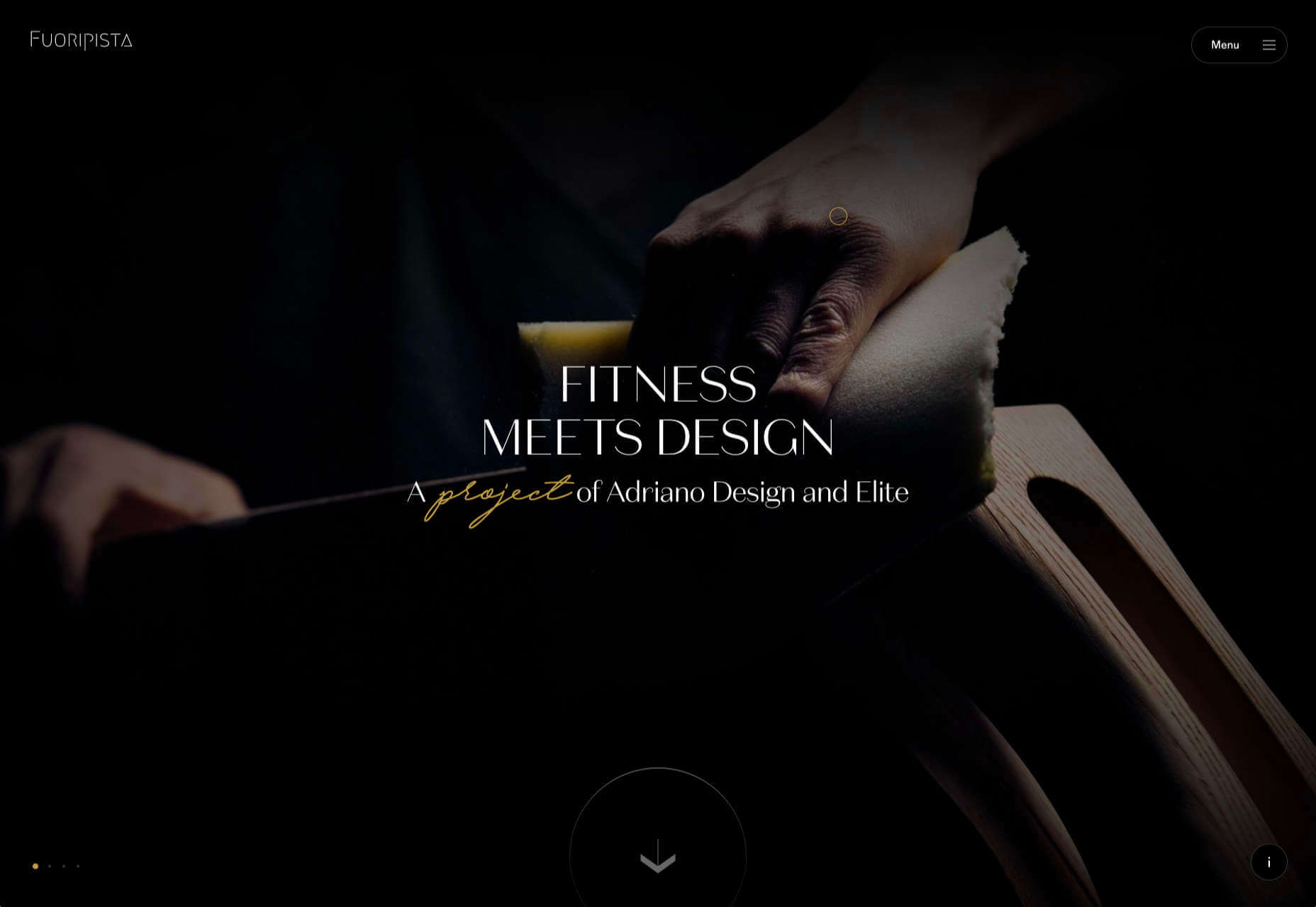
Dark themes are everywhere these days. 

As human beings continue to spend more of their time interacting with technology, dark themes provide a more relaxing way to engage with the digital world. More often than not, these themes are easier on the eyes, more attractive, and perfect for the dedicated user

Throughout 2020, countless leading brands have debuted their own version of the dark theme. Google has a solution for your Drive, while Apple and Android have built dark theme performance right into their operating systems. 

If you haven’t learned how to make the most out of dark mode yet, then you could be missing out on an excellent opportunity to differentiate your design skills, and earn more clients going forward. 

Why Dark Mode?

Before we dive too deeply into the possibilities of creating your own dark theme, let’s examine what dark mode is, and why it’s so effective. 

Ultimately, dark themes are created to reduce the amount of luminance emitted by everything from your desktop and laptop, to your smartphone and smartwatch. Dark themes help to improve the visual ergonomics of design, by reducing eye strain, adjusting brightness to suit current lighting conditions, and more. Additionally, many dark mode offerings are also fantastic at conserving battery life. 

Here are some of the main benefits of adding dark themes to your design portfolio

  • Better user experience: A focus on user experience is one of the most important trends of the digital age. You need to be willing to deliver incredible experiences to everyone who visits your website if you want to stand out today. Dark mode reduces everything from eye strain, to battery power consumption. This helps to keep customers on a website for longer.
  • Innovation and cutting edge appeal: Most companies want to prove that they can stay on the cutting edge of their industry. The ability to offer an opt-in dark mode version of a website theme or appearance can help your clients to stand out from the crowd. As the environment becomes more mobile-focused, more companies will be looking for designers that can provide the best mobile experiences. 
  • Support for universal design: Dark mode isn’t just great for people who have light sensitivity at night. This solution could be more comfortable for visually-impaired users who would struggle with eye strain when visiting your websites otherwise. If you want your content to be more inclusive for a wider range of viewers, then learning how to design for dark mode is a good way to start.

Best Practices When Designing for Dark Mode

Designing for dark mode is easier than you’d think. Most of the time, it involves simply thinking about how you can replace some of the brighter, more overwhelming aspects of your site, with something deeper and darker. 

Here are some useful tips that will get you moving in the right direction. 

1. Experiment with Colors

A big issue for a lot of web designers when it comes to developing a dark mode solution is that they get too caught up with things like pure white text against pure black backgrounds. However, this high-contrast option can be a little much after a while. 

It’s often much easier to use a dark grey as your primary surface color, instead of a true black. Additionally, rather than using bright white, think about slightly off-white alternatives that will be warmer to the eye.

Experiment with surfaces and color combinations that are unlikely to cause too much eye strain. Dark grey foundations often offer a wider range of depth, too, because you can demonstrate shadows on grey. 

Additionally, when you are experimenting with colors, remember that saturated colors often vibrate painfully against very dark surfaces, making them harder to read. Desaturating your colors will help to reduce the contrast and make your websites more welcoming. 

Lighter tones in the 200-50 range will have better readability on dark themes. However, you can always experiment with your choices. Google Material Design recommends using a contrast level of around 15:8:1 between your background and text. 

2. Consider the Emotional Impact

Much of the effort involved with dark mode design is figuring out how certain colors work together. It’s easy to get carried away with stark contrasts, particularly when you’re used to working with a white background. However, you need to remember that you’re designing for a user that’s primarily looking for an easier and more subdued browsing experience.

While you’re working, remember to consider the emotional aspect of the design too. The emotion in colors can make or break a buyer’s journey in any environment. However, an often overlooked-aspect of color psychology, is that people perceive shades differently when they’re on a black background

For instance, think of the color green. On a light background, it conveys nature and even financial wealth. However, on a dark background, the same green could come across as something venomous, toxic, or even sickly. It’s important to think about the kind of impressions end users are going to get when they arrive on your site.

3. Give Users the Freedom to Choose

One of the biggest mistakes you can make when you begin designing for dark mode, is thinking that you should focus entirely on your dark themes, and nothing else. This lines you up for a problem if you interact with users who want the best of both worlds. If you’re designing for apps in particular, you’re going to need web pages that can switch naturally between light and dark themes. 

Learning how to implement both a dark mode and a light mode option into the desks you create will help you to reach a wider selection of customers. Remember, you’ll need to test the performance and impact of your designs in both themes, to check that they deliver the same kind of experience, no matter how your user chooses to browse. 

Although dark mode should offer a different experience to end-users, it still needs to feel as though they’re browsing on the same website. That means that you’re going to need to experiment with the most natural combination of light and dark mode options.

4. Remember the Basics

Remember, although the three tips above will help you to get on the right path for dark mode design, you’ll also need to consider the opportunities and limitations of the platforms that you’re designing for. The kind of dark mode experience you can deliver for Google Chrome websites is going to be very different to what you can create for something running on iOS.

Examining the documentation provided by the system that you’re designing for will help you to develop something with a close insight into what’s actually possible. 

Other top tips for dark mode design include:

  • Focus on your content: Make sure that your content stands out on the page, without being too overwhelming. 
  • Test your design: In both light and dark appearances, you need to make sure everything is working as it should be.
  • Adopt vibrancy for your interfaces: Vibrancy helps to improve the contrast between your background and foreground. 
  • Use semantic colors: Semantic colors adapt to the current appearance of a website automatically. Hard-coded color values that don’t adapt can seem more aggressive. 
  • Desktop tinting: Try experiment with things like transparency and filters to give your websites and apps a slightly warmer tint – ideal for late-night browsing
  • Icons: Use individual glyphs and icons for dark and light modes if necessary. 

Ready to Design for Dark Mode?

Preparing your web development and design portfolio for an era addicted to dark mode can be a complex experience. You need to think carefully about how people are going to browse through your websites and apps when they’re searching for something more subtle, and less visually overwhelming than the websites that we’re used to making. 

The most important thing to remember is that everything on your website or application should look just as beautifully tailor-made in dark mode as it does in light mode. Simply adding a dynamic black background when people want to switch settings in an app isn’t enough. You need to go in-depth with your designs and examine how different fonts, colors, and images work together.

Source


Source de l’article sur Webdesignerdepot

It would be way too easy to answer this question with: “Whoever pays your bills.” And, honestly, I don’t think you can be a very successful web designer if you’re only driven by what the person paying you tells you to do.

Then again, that doesn’t mean you should swing to the exact opposite end and say that you only serve the end user.

When you take an extreme view or approach to this, you’re bound to leave someone or something important out. Everyone along the chain of command — your boss (if you work at an agency), your client, and their customers — matters.

So, what I’d suggest you do instead is approach the idea of who you really work for the way you would Maslow’s Hierarchy of Needs.

Establishing Your Own Hierarchy of Needs

Who do web designers really work for? I think the true answer to this question is: “Everyone.” But there’s a catch…

Think about some of the requests you’ve received from superiors, or clients in the past. How many times have you rolled your eyes at their wacky requests?

  • “The contact form would be better in the header so visitors can always see it.”
  • “Let’s use this stock photo of two women shaking hands that I’ve seen a few other companies use.”
  • “Why don’t we redesign all of this and make it look like this site my brother built last night?”

You’re the design professional. That’s why they’re paying you to design their website and they’re not doing it themselves. So, there comes a point where you have to push aside what they want for what they need. And this will ultimately help you figure out who you work for and what you actually owe them (because fulfilling every nitpicky and unreasonable request will never lead to anything good).

So, here’s where the Hierarchy of Needs comes in. If we’re creating our own, it would look like this to start:

Working for the Boss

According to Dr. Neel Burton on Psychology Today:

Maslow called the bottom… levels of the pyramid ‘deficiency needs’ because we do not feel anything if they are met but become anxious or distressed if they are not.

I’d argue that these basic needs are like the ones we fulfill for bosses (or clients, if you’re a freelancer and work for yourself). It would look something like this:

Of course, you’ll feel a sense of accomplishment by meeting these needs, but, as a creator, how important are these really to you? These are the basic things you have to do in order to make your boss happy and to stay gainfully employed. They also help to ensure that the client is happy with the boss and agency in the end.

Bottom line: Without these needs fulfilled, you won’t be able to move any deeper into the triangle/hierarchy. So, when focusing on working for your boss, make sure the basic needs are met so you can move on and serve others as they need you to.

Working for the Client

Now, if your boss and client are two different people, you’ll have a second layer of needs to attend to here.

Just as your boss wants you to help them make more money and earn a strong reputation within their space, so too does your client. However, the work you owe them is different. Here’s how it would be represented in the triangle:

Again, you’ll be pleased if you can do and be all these things that your client needs, but is this ultimately what drives you as a designer? Sure, you want to build great relationships with clients so they return to you time and time again with all their website and marketing needs. But in terms of being fulfilled by being a good listener or a timely communicator? Probably not.

All the same, it’s important to be skilled in this type of work and to know how to serve your clients in order to get to that top level. It’ll also help you prioritize their needs accordingly, so you’re not jumping at every single thing or request they claim to “need” and blowing the budget or scope of the job.

For example, if they start demanding more of you (like bombarding you with emails every day wanting to know what’s going on), you can confidently remind them that things are under control (because you’re adhering to the project deadlines, per your boss) and you’ve already scheduled the next client check-in for this week (because you’ve been a good communicator, just as they need you to be).

Working for the End User (Customer)

Maslow refers to the top-level of the pyramid as the growth need. And here’s how Dr. Burton sums this one up for us:

Once we have met our deficiency needs, the focus of our anxiety shifts to self-actualization, and we begin, even if only at a sub- or semi-conscious level, to contemplate our bigger picture. However, only a small minority of people are able to self-actualize because self-actualization calls upon uncommon qualities such as independence, awareness, creativity, originality, and, of course, courage.

These characteristics perfectly sum up everything you want to and should be as a web designer. Unfortunately, it’s those employer and client needs that can stand in your way before you can truly flex your muscles as a creative.

Once you’ve attended to the basics, though, you’ll get your chance to design the kinds of user experiences you know will delight your client’s customers.

Here’s how their part of the triangle should look:

These are universally applicable needs and cannot be ignored.

After you’ve addressed them, though, you will have fulfilled your responsibility to all three parties: your boss, your client, and your end users. And once you’ve done that, you are free to be the creative designer that you are.

Wrap-Up

What I want you to take away from this, is that there are certain basic needs which you must fulfill when working as a web designer. These are the ones you’ll put into your own hierarchy of needs.

Take a systematic approach, starting with your boss and ending with the customer:

  • What do you have to do to ensure that your boss is happy to have you on the team?
  • And that the client is pleased with the site you’ve built them?
  • So you can design a website and experience that end users respond to positively?

Once you’ve figured all this out, you’ll unlock the answer to whom you work for and, more importantly, how you should work for them.


Featured image via Pexels.

Source


Source de l’article sur Webdesignerdepot

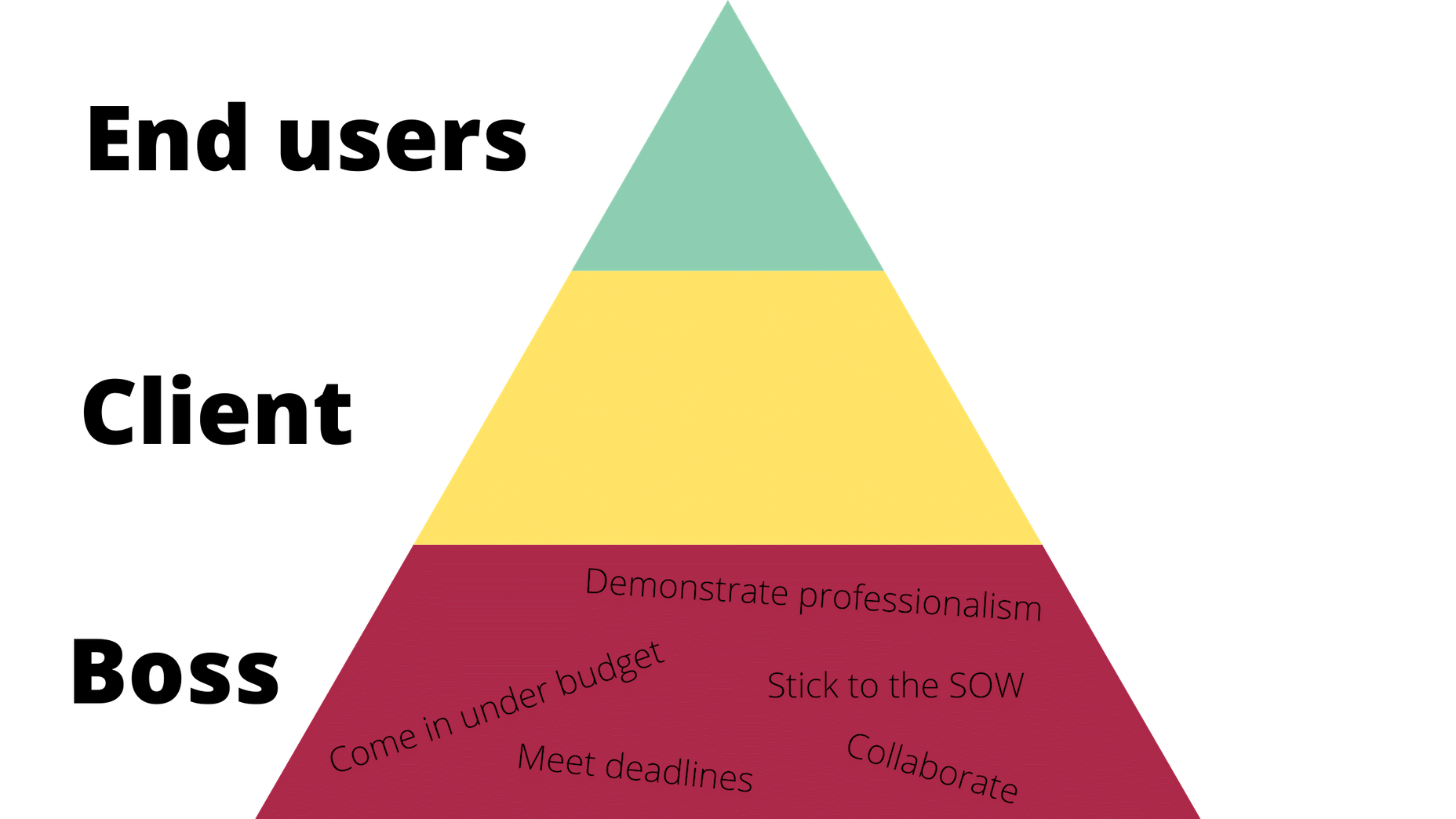
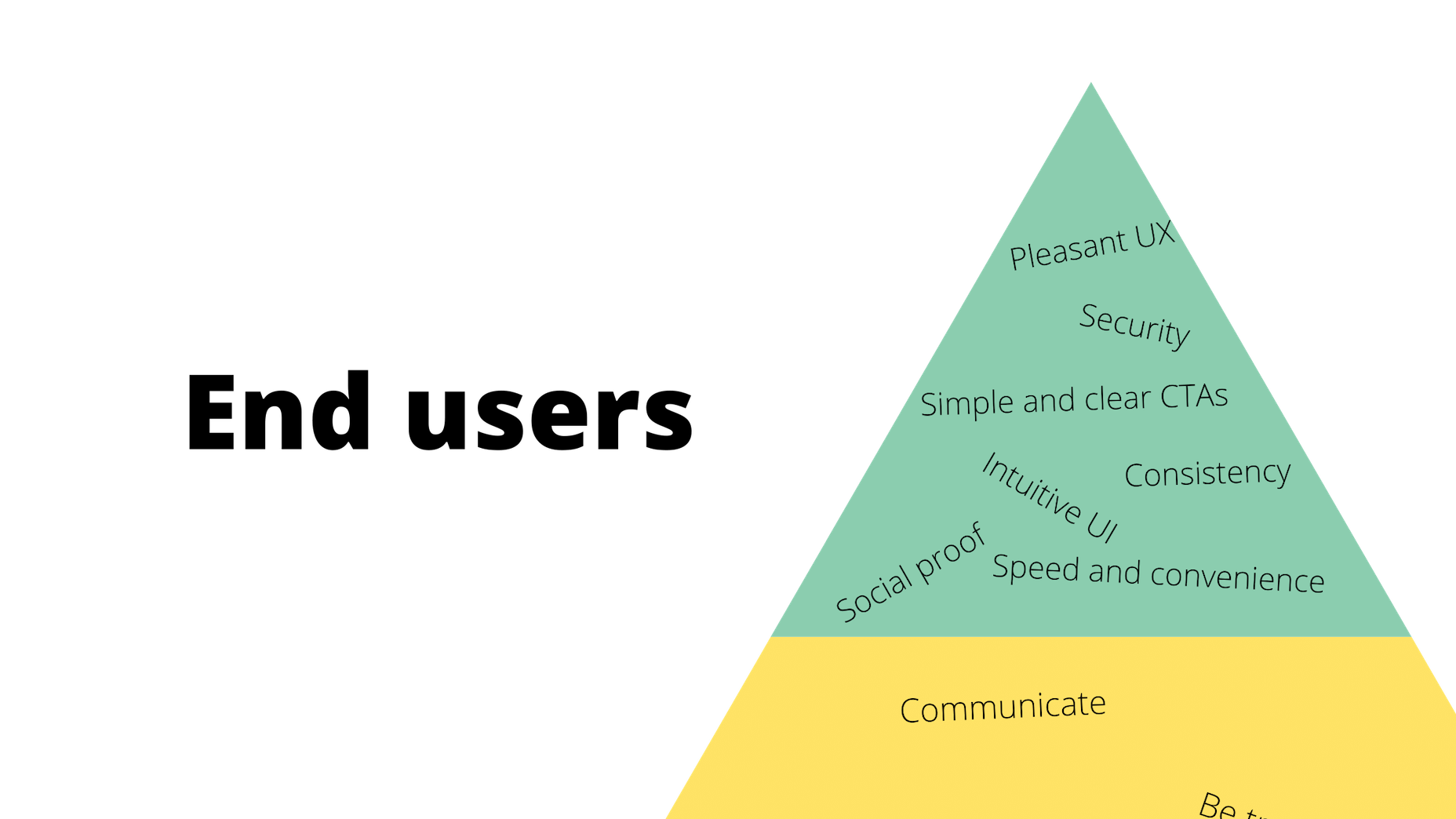
Web design clients come from a wide variety of backgrounds. One day, you’ll be designing a portfolio website for a voiceover artist, the next you’ll be creating a comprehensive ecommerce site for a leading retailer. In an ideal world, you’ll get to a point where you eventually specialize in a niche. However, you’ll need to master both avenues first.

The more time you spend in this industry, the more you’ll learn that every client comes with their own unique requirements and challenges to consider. However, there’s a particularly huge divide between the kind of web design projects you do for B2B clients, and the ones you do for B2C customers.

Both B2B (Business to Business) and B2C (Business to Consumer) websites need to be clear, concise, and aesthetically pleasing. They should always have a strong focus on user experience, and they need to work consistently across devices. However, being aware of the difference between B2B and B2C projects will help you to deliver better results to your customers.

Defining the Differences Between B2B and B2C Sites

Some web design trends remain consistent in any environment.

Whether you’re creating a site for a hairdresser, or a leading SaaS company, you’ll need to deliver responsive design, intuitive navigation, and excellent site security.

Your process is unlikely to differ from B2B to B2C much in terms of project milestones, phases, prototyping and wire-framing. The differences that arise between B2B and B2C projects often come in the approach you take to building certain elements.

Let’s take a closer look at the things you might need to consider:

1. The Target Audience

In any design project, it’s always important to keep the end customer in mind. Knowing your client’s target audience will help you to create both an image and a tone of voice that appeals to the right people.

B2B Websites

With B2B websites, you’ll be speaking to a range of highly-educated individuals who already have a general knowledge of your service. The aim here will be to show the end-user how you can help them achieve better results. For instance, m.io highlights “syncing communication” so you can “effortlessly chat” with your team.

The language and content of the website is all about highlighting the key benefits of the products, and the kind of outcomes that they can deliver. The Nielsen Norman Group reports that there’s often a lot of discussion between decision-makers when they’re checking out a B2B website.  

Designers need to work harder at convincing B2B buyers that they’re making the right decision. This is particularly true when you’re selling something like a software subscription that requires a lot of long—term investment.

B2C Websites

On the other hand, while B2B customers make decisions based on logic, information, and well-explained benefits, B2C customers are more influenced by emotion. They want quick solutions to their problems, and the opportunity to purchase from a brand that “understands” them.

Look at the Firebox website, for instance. It instantly highlights an ongoing sale at the top of the homepage, addressing any concerns a customer might have about price. That combined with a quirky layout full of authentic photos and bright colors means that customers are more inclined to take action.

2. The Purpose

Another factor that can vary from B2C to B2B websites, is the motive behind a customer’s purchase. Knowing what’s pushing a target audience to interact with a brand will help you to create a website that appeals to specific goals.

B2B Websites

B2B websites often aim to solve expensive and time-consuming problems for companies. To sell a decision-maker on the validity of a solution, it’s important to thoroughly explain what the solution is, how it works, and how it addressees a specific pain point.

Look at the Zoom website for instance, they don’t just tell people that they offer video conferencing, they address the practical applications of the platform:

B2C Websites

Consumers are a lot easier to appeal to in terms of emotional impact, because many of them come to a website looking to fulfill an urgent need. Because of this, many web designers can take advantage of things like urgency and demand to encourage conversions. For instance, look at this website from TravelZoo. It takes advantage of a customer’s desire to get away:

A B2B website needs to focus on providing information that helps companies to make more confident decisions. What’s more, with B2B sites, decisions are often made by several stakeholders, while B2C sites ask a single person to make a choice. A B2C website needs to address immediate concerns and connect with customers on an emotional level. B2C buyers still want to do their research on products or services, but the turnaround is much quicker, and often requires less information.

3. The Design Elements (Visual Appearance)

Just as the focus of your website design and the audience that you’re creating the experience for can differ from B2B to B2C websites, the visual elements of the design might change too.

B2B Websites

In most cases, B2B websites are all about presenting a highly professional and respectable image. You’ll notice a lot of safe and clear choices when it comes to typography and imagery. It’s unusual to see a B2B website that takes risks with things like illustrations and animations.

Look at the Green Geeks website for instance. Everything is laid out to encourage clarity and understanding. Information is easy to find, and there are no other issues that might distract a customer.

B2C Websites

On the other hand, B2C websites can be a little more daring. With so many different options to choose from, and most customers buying out of a sense of urgency or sudden demand, designers are under pressure to capture attention quick. This means that it’s much more likely to see large pieces of eye-catching imagery on B2C sites, with very little text.

Movement, like slideshows and animations often play more of a role here. Additionally, there’s a good chance that you’ll be able to experiment more aggressively with color. Take a look at the Yotel website, for instance. There’s very little textual information here, but the appeal of the website is conveyed through sliding images:

4. Website Content

The way that information is conveyed on a B2B website is very different to the messages portrayed on a B2C site. Usually, everything from the language, to the amount of content that you use for these projects will differ drastically.

B2B Websites

When designing for a B2B website, you’ll need to be careful with content, as you’ll be speaking to a very mixed audience. If your site caters to different industries, you’ll need to ensure that you show authority, without using too much jargon. Some companies even create different pages on their site for specific customers. The aspin.co.uk website covers the benefits from a company, sale and integration perspective:

Rather than try to talk to all business owners about their differing communication pains, G-Suite anticipates its audience and creates pages for each.

B2C Websites

Alternatively, B2C websites can make things a little simpler. For instance, on glossybox.co.uk, there’s no need to provide a ton of information for different types of shopper, designers can appeal to one audience, i.e. the “beauty addict”:

In both B2B and B2C websites, the aim of the content should always be to answer any questions that the end user might have.

5. CTA Buttons

Call to Action buttons are often a crucial part of the web design journey. However, it’s sometimes difficult to determine where they should be placed, or how many buttons you need.

B2B Websites

Because the decision to buy something won’t always happen immediately with a B2B website, these kinds of sites often use a variety of CTAs. For instance, you might have a “Request a Quote” button at the top of a page, as well as a Sign in button.

On the Klaviyo site, for instance, you can request a demo, sign up or log in:

You can place CTAs lower on the page with B2B websites too, as it’s more likely that your customers will be scrolling through the site to collect more information before they decide to buy.

B2C Websites

On the other hand, with B2C websites, you usually don’t need to give your visitors as many options. A single option to “Add to Cart”, or perhaps an extra choice to “Add to Favorites” is all your user will need. Customers need to instantly see what they need to do next as soon as they arrive on a page:

On the Evil Hair website, you immediately see how to add a product to your cart.

Remember, the sales process is a lot quicker with B2C customers. This means that you need your CTA buttons to be front and center as soon as someone clicks on a page.

6. Contact Forms

In a similar vein, the way that you design your contact forms will also depend on the end-user that the website wants to appeal to. There’s a very different process for getting in touch on a B2B website, compared to a B2C site.

B2B Websites

B2B websites often require longer contact forms, as clients need to collect additional information about a prospect’s position in a company, and what that company does. B2B companies need to share things like what they’re looking for in a service, and how many users they have, so a sales team knows what kind of demonstration to give.

As with any strategy for contact form design, you should always only include the fields that your client needs and no more. If you demand too much from any client, you could send them running in the opposite direction. Check out this straightforward option from Ironpaper, for instance:

The form addresses as many relevant questions as possible without overwhelming the customer. Because the site handles things like design, it makes sense that they would ask for a link to the company’s existing website.

B2C Websites

On a B2C website, there are very different approaches to contact forms. You may have a dedicated contact form on your website where people can get in touch if they have any questions. A FAQ page where customers can serve themselves is another great way to help your client stand out from the competition. Check out this option from River Island, for instance:

On the other hand, you might implement pop-up contact forms into a website if your client wants to collect emails for email marketing. In that case, it’s important to make sure that you’re only asking for the information you need, and nothing more.

The easier it is to sign up for a newsletter, the more likely it is that customers will do it. Being able to enter their name and email address and nothing else will make the signup seem less tasking.

7. Search Bars and Navigation

Whether you’re designing for B2B or B2C companies, navigation will always be a critical concern. End users need to find it easy to track down the information that they need about a company, whether they’re looking for a particular product or a blog.

B2B Websites

On a B2B website, the search bar often takes up a lot less prominence than it does on a B2C site. That’s because all of the information that a client needs, and the buttons they need to take their next steps, are already visible front-and-center.

As a designer, it will be your job to push as many people to convert as possible, by making the purchasing journey the most appealing path for visitors. For instance, on the Copper website, the “Try Free” buttons are much easier to see than “Continue with Google” or “Login”:

With B2B sites, the focus is on a very specific goal. Although navigation still needs to be available, it doesn’t need to be as obvious as it is on a B2C site.

B2C Websites

On the other hand, most B2C websites offer a wide range of products, and they’re perfectly happy for their customers to purchase anything, as long as they eventually convert. Because of this, they make navigation a much more significant part of the customer journey.

The search bar is often presented at the very top of the screen where customers can see it immediately. Additionally, there may be multiple pages within certain product categories, so that customers can browse through the items they’re most interested in. For instance, look at the homepage on the IWoot website:

The navigation elements in B2C websites need to be a lot more obvious, because consumers are more likely to use them when they’re searching through their options.

8. Social Proof and Testimonials

Finally, social proof is one of the things that will work well for improving conversions on any kind of website. When your customers aren’t sure whether or not they should buy from you, a review or testimonial could be just the thing to push them over the edge.

B2B Websites

On a B2B website, the decision-making process takes a lot longer. Because of this, it’s worth including as much social proof as possible in every part of the website. Client testimonials, reviews and ratings, and even high-profile company logos make all the difference. Many B2B websites include a page dedicated to case studies highlighting the success of other brands.

Your client might even go as far as to ask for a page that highlights their awards and recognition or showcases comparison tables that pit their products against the competition.

For instance, Authority Hacker has a “what the pros say about us” section as social proof:

B2C Websites

With a consumer website, you can include consumer ratings and reviews wherever you like. However, it’s most likely that you’ll want to have a place where customers can see the reviews of other clients on the product pages themselves. On the EMP website the company gives users the option to click on the star review section to jump to a different space on the page where testimonials are listed. This ensures that customers don’t have to scroll through a lot of excess information if they just want to add an item straight to their cart.

Designing for B2B vs B2C

In the world of web design, no two customers are ever the same. While you’ll need to adapt your processes to suit each customer you interact with, you can set your expectations in advance by learning the differences between B2B and B2C strategies.


Featured images by Chris Ross Harris and Mike Kononov.

Source

p img {display:inline-block; margin-right:10px;}
.alignleft {float:left;}
p.showcase {clear:both;}
body#browserfriendly p, body#podcast p, div#emailbody p{margin:0;}

Source de l’article sur

Software can be shipped by deadlines. In that case, it has some value that does not grow over time. To make the app great, it must be continuously upgraded. This is what true Agile is about.

"The Definition of Done" is a complex problem for many software development companies. How do you know when there are enough features? Is it worth the time to implement a functionality nobody might ever use? How do you know if we develop a thing the end users will adore? Do we stop at MVP or should we continue to work on the product?

Source de l’article sur DZone (Agile)