Articles

As a website designer, your professional life revolves around crucial questions that might help you to deliver better results for your clients.

Which widgets are essential to driving conversions? What kind of checkout page elements do you need to include? Should there be a video or slideshow on that product page?

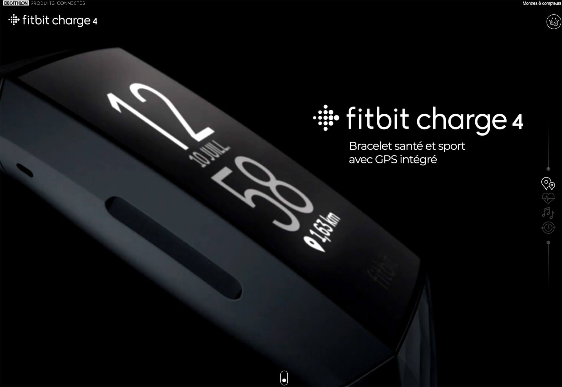
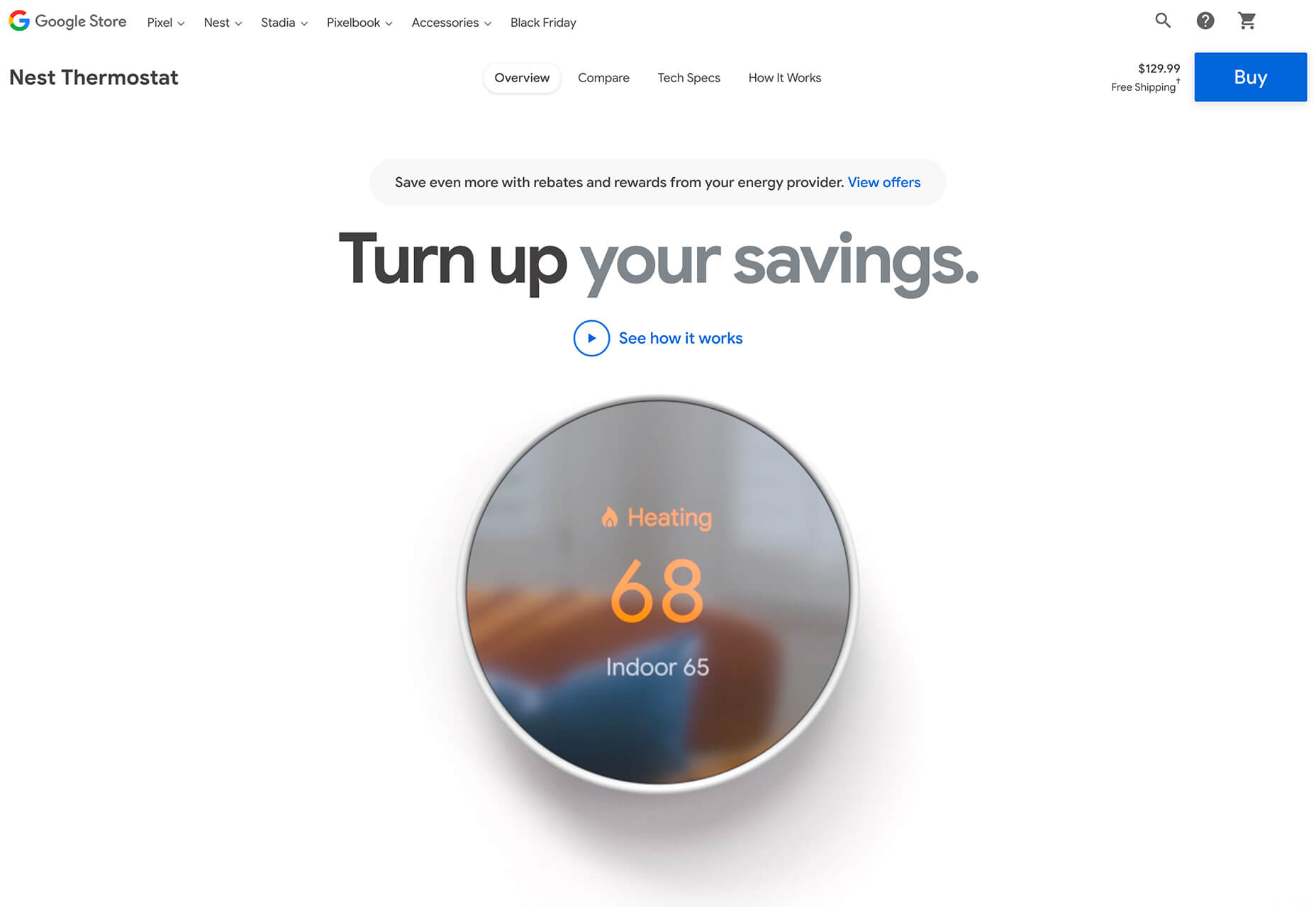
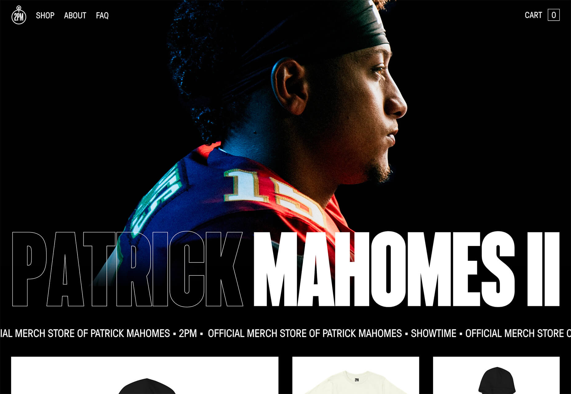
One of the biggest queries that we face when building landing pages to encourage sales is whether a CTA (call to action) button needs to be above or below the fold. 

Answering the question: “Where should the CTA go?” correctly could make or break your client’s chances of a sale. Unfortunately, this particular concern has been the source of a raging debate for many years now. Everyone has their own opinion about CTAs and where they belong.

Today, we’re going to cover the benefits and issues with placing a CTA above the fold.

Should You Place a CTA Above the Fold? 

Starting with a quick refresher, the term “above the fold” refers to any area of a website seen on a screen when a user arrives on a webpage. The content that appears above and below the fold may differ depending on the device you’re visiting a website with. 

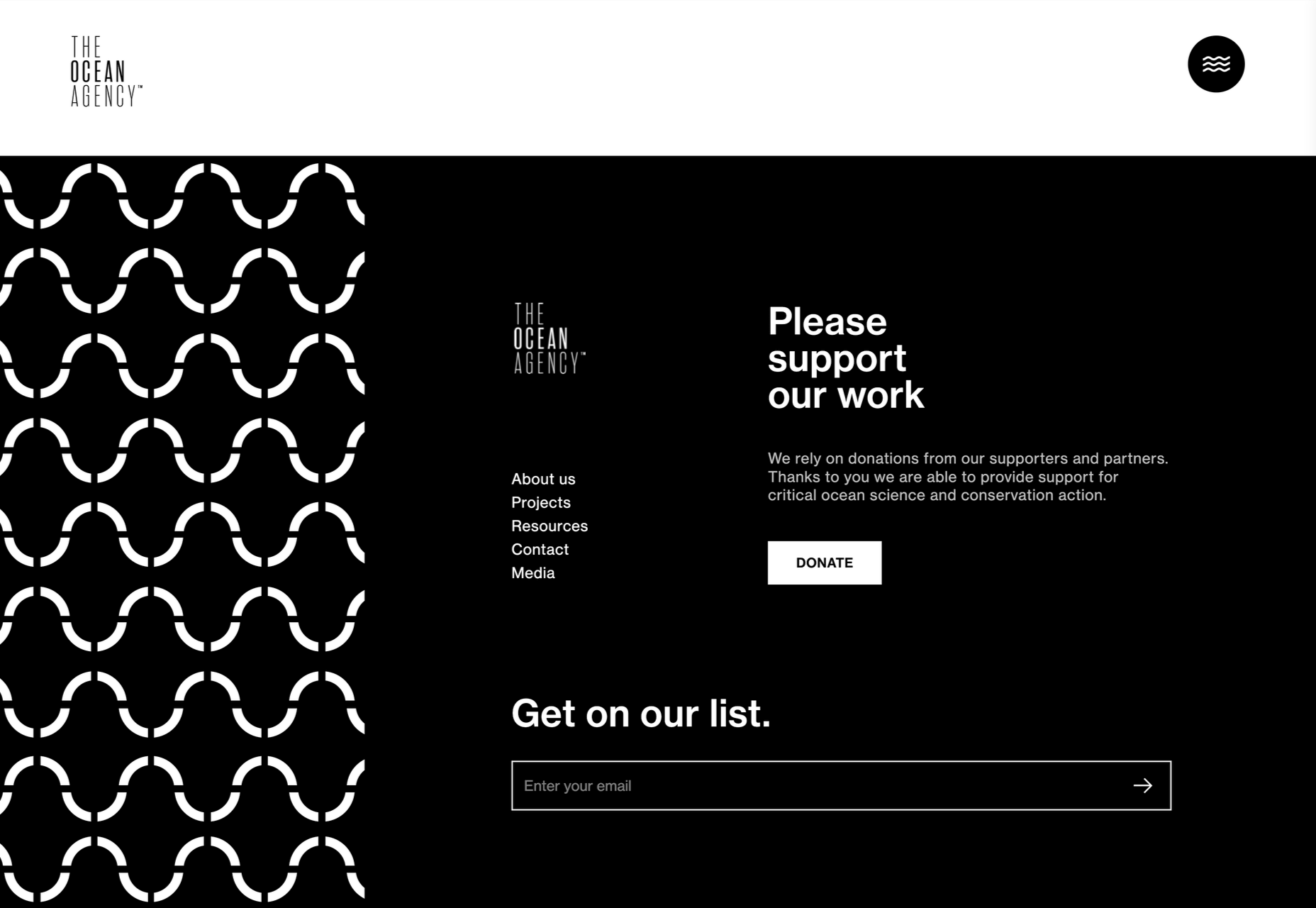
Experts in the design and digital marketing world have frequently claimed that if you want to get the best results with a CTA, you need to place it above the fold. 

This strategy makes a lot of sense. If your CTA is above the fold, then your chances of it being seen are significantly higher. Some customers might not want to scroll to the bottom of a page to find out what they need to do next in their buyer journey. 

Additionally, according to the NN group, the 100 pixels that appeared above the fold were seen 102% more often than the pixels underneath the fold. Eye-tracking technology learned that more often than not, you’ll get more engagement above the fold. 

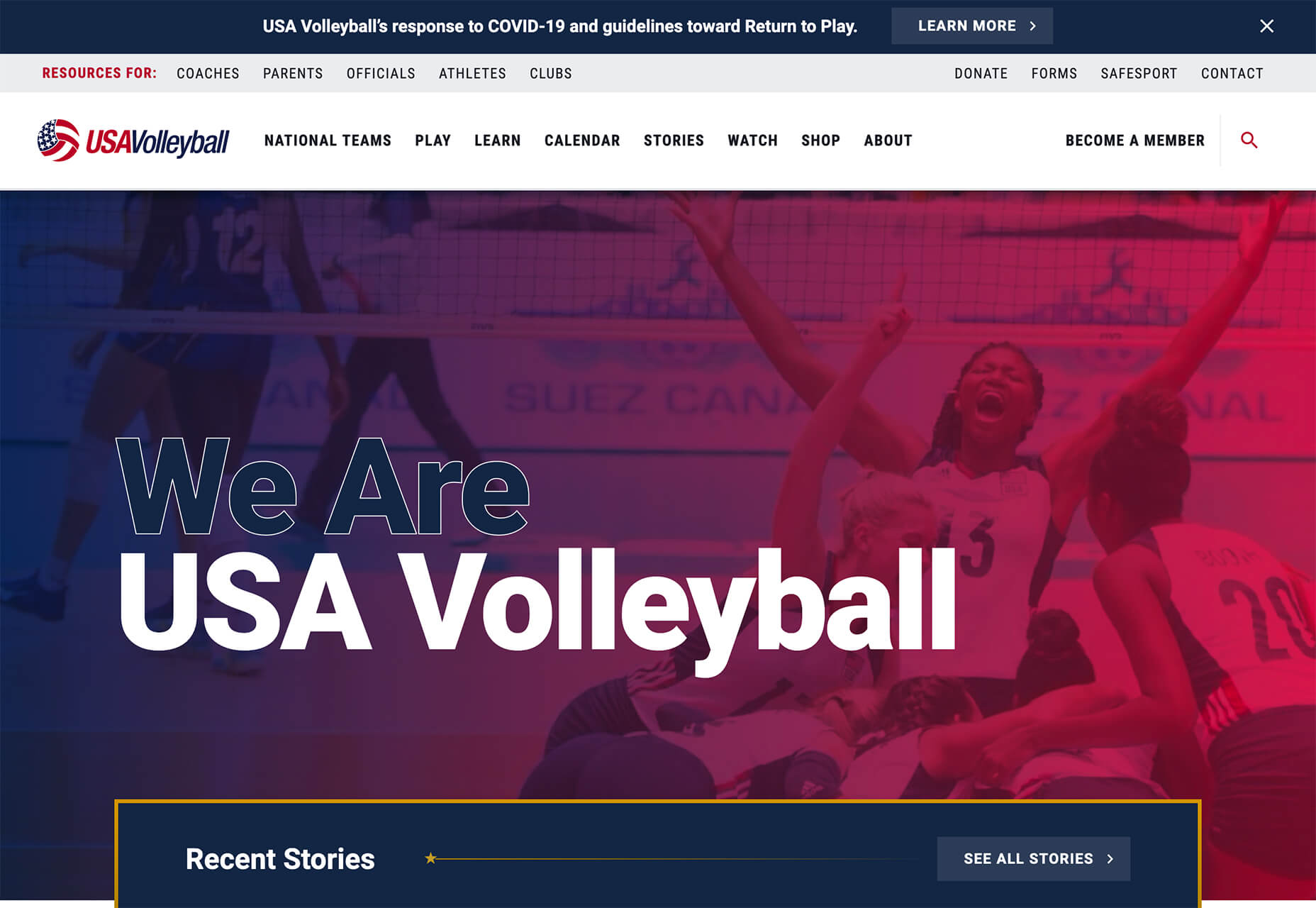
Just look at this landing page from Lyft, for instance, you immediately see what you need to do next:

It’s not just a single study that has touted the benefits of an above-the-fold CTA, either. 

Another report into the “importance of being seen” found that above-the-fold ads and CTAs had a 73% rate of visibility compared to only 44% for those below the fold

So, with stats like that to think about, why would you ever consider using a below-the-fold CTA? 

When to Place a CTA Below the Fold

As with most things in web design, there is an exception to the rule. 

Yes, above the fold, CTAs will be better for you most of the time. However, there are times when you might need to think outside of the box. 

Most people think that placing a CTA below the fold practically guarantees that it won’t be seen. However, if you’re creating a website page or landing page that includes a lot of vital information, your audience will need to scroll. 

For instance, if you’re creating a page where someone can download an app to engage with a business they already know about, it makes sense to speed the journey along with an above-the-fold CTA. However, if you’re trying to convince someone to sign up for your webinar, you might need to tell them what that webinar is all about first. That’s where a below-the-fold CTA comes in handy. 

Customers might not have a lot of time in their busy schedules for scrolling these days. However, they still need the right information before they can make a decision about what to do next with your brand. According to Marketing Experiments, below the fold, CTA buttons can result in a 20% increase in conversions. However, this conversion boost only happens when you’re providing valuable, engaging, and persuasive content.

Check out this example from the Boston Globe, for instance:

The Fold Isn’t Everything in Web Design

The fold is often an essential consideration in web design. 

However, it’s not all you need to think about when you’re deciding where to place sign-up forms and valuable CTA buttons. 

According to the Nielsen Norman group, the content that appears at the top of the page will always influence user experience. However, that doesn’t mean that you need to place your CTA there. What you do need to do is ensure that whatever you have above the fold is promising enough to engage your visitor and make them scroll. 

Put simply, what’s above and below the fold does matter, but your focus should be on taking advantage of customer motivation, rather than worrying exclusively about an imaginary line. 

When deciding where a CTA belongs, you need to think about motivation. 

How motivated is your prospect to click on a button? How desirable is your offering at that time, and how much does your visitor already know about the thing they’re being offered?

If you’re going to need to provide more information before your customer wants to convert, then a below-the-fold CTA makes more sense. 

If you’ve already provided all the information that your customer needs and a prospect is visiting from an advertisement or another page on the website, then above the fold should be exceptional. 

The Truth About Designing for The Fold

The reality for web designers today is that achieving higher conversion rates doesn’t really have that much to do with whether a CTA is above or below the fold.

What’s important is whether your buttons come under the right amount of copy that answers the correct questions for an audience. 

Remember, when visitors come to a website, they’re looking for different things. There are visitors that:

  • Already know your brand and value your offering: These people are often clicking into your landing pages from other marketing campaigns where they’ve learned about the brand or offer. You can give these prospects a CTA immediately so they can continue down the buyer’s funnel as fast as possible. 
  • Are uncertain about your offering and need to know a bit more: These people need some extra information. They might have a concern that needs to be addressed before they’re willing to spend their money. You might not need much copy here, which means that a CTA may still appear above the fold. 
  • Are brand new to your website: These prospects need a reasonable amount of copy. They don’t know what you’re offering or why it’s valuable to them. Because of this, you may need to wait to push them into action until you’ve delivered the right copy. 

In some cases, you may even place multiple CTAs on the same page. Some people will have a general understanding of the technology and what it does. This means that they’ll be happy to click on the button at the top of the fold. 

On the other hand, there could also be visitors arriving on the same page that don’t understand what the benefits of real-time personalization are. This means that you need to elaborate a little on what you have to offer. A simple one-line explanation isn’t enough here.  

Figuring Out Where to Place a CTA

Deciding where to place different elements of a website is a common challenge for web designers. Despite tons of blogs out there, that claim “above the fold” is always the best option for any conversion rate optimization, the truth is a little more complicated. 

The critical thing to remember as a web designer is that a CTA button asks a customer for commitment. Even if the CTA allows someone to download a free demo or sign-up for a newsletter without spending any money, it requires a customer to start a relationship with a brand. 

In a world where customers are less trusting of companies than ever, it doesn’t make sense to push them into a relationship too quickly. Asking for a commitment from a target audience before they’ve had the chance to see what’s “in it for them” is not a good idea. 

Jump in too quickly, and you’re likely to rub people the wrong way. 

Go Out and Master the Fold

The issue for today’s designers isn’t figuring out whether a button needs to be visible from the moment someone arrives on a page. Instead, you need to think about whether visitors are finding the CTA at a time when they’re ready to take action. 

You can only answer the question “where should the CTA go?” after you’ve carefully analyzed the project that you’re working on. 

Remember, above the fold isn’t always the answer. 


Featured image via Pexels.

Source

The post Perfect CTA Placement: Above-The-Fold Vs. Below-The-Fold first appeared on Webdesigner Depot.

Source de l’article sur Webdesignerdepot

 At my company, we see a lot of SDKs and Swagger-generated clients that could throw exceptions at any time. This could be a fault in our logic, or it could be a fault with some 3rd party SDKs that have no rhyme or reason to how their exception handling works. But either way, when our customers want to fetch a Git commit history for a service, they do not want to be greeted with an error message.

We’ve seen GitHub go down during a customer demo and 3rd party integrations throwing other unexpected exceptions. Overall, it was a very discouraging experience for our customers that we had no control over.

Source de l’article sur DZONE

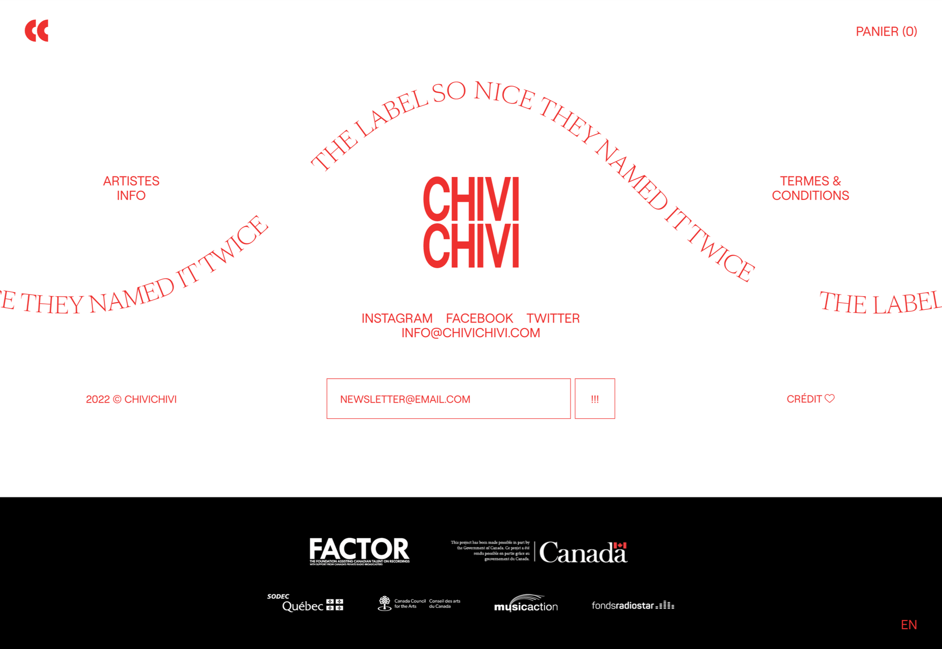
1, 2, 3 – That’s exactly how long it takes you to start losing visitors if you have a slow-loading website.

Hold on! Surely, the only thing that matters to users is that your website works flawlessly and looks great… right? Wrong!

The fact of the matter is that we’ve all become accustomed to instant access to information and content. The average internet user today places a lot of value on speed, and the bar is continually being raised.

If you are like most people, you probably feel an immediate sense of dread at the thought of optimizing your website. Where do you start? How can you make the most impactful improvements? What makes your website slow in the first place?

Have no fear, as we’ll be answering all of your questions below as well as putting you on your way to a website that loads with blazing speed.

Why Should You Be Worried About A Slow-Loading Website?

Good question!

As many as 53% of visitors abandon a site that takes more than 3 seconds to load. Even worse, 1 in 3 shoppers will leave a website if it takes longer than 5 seconds to load.

So, performance plays a huge role in the user experience of your website and whether your visitors will stay on your website or be converted into customers.

For some time, Google has been keenly aware of this fact. As a search engine, Google knows that it’s counterproductive to recommend content to users if they won’t stick around to consume it.

That’s why they’ve continually been increasing the role performance plays when ranking websites for their SERPs (search engine results pages).

In recent years, Google has introduced core web vitals. These are metrics they hope will help quantify how performance affects the user experience. In general, they measure how fast, stable, and interactive a page is while loading. This will be more important than ever after Google announced its Page Experience update, which started its global rollout in June 2021.

As you may know, ranking highly for Google is vital for your website’s visibility. For one, 68% of online experiences begin with a search engine, of which Google has a 92.7% market share. Even if you manage to land on the coveted first page of Google, the first five results get over 70% of all clicks (28% to the first result alone).

So, to recap why a fast loading website is so desirable:

  • It directly affects your ability to keep, satisfy, and even convert visitors to your website.
  • It impacts your search engine rankings which impacts your “findability” and organic traffic.

8 Reasons Your Site Is Slow + How to Fix Them

O.K., so now that we’re all on the same page regarding the importance of your website performance, let’s look at common issues slowing down your website + how to fix them.

1. You’re Using A Sub-Par Hosting Service

As the party responsible for making your website available to the outside world, your hosting service can be a make-or-break factor. Not only should you pick a host that has a good track record when it comes to uptime a performance, but also one that’s suitable according to your needs.

Even if you take all the steps below to optimize your website’s performance, it may still load slowly if traffic to your website is overwhelming your available bandwidth or your host’s server capacity. If that happens, some users may experience extremely slow loading times, broken features, or even complete unavailability.

For most personal, blog, or local/small business sites, a respectable hosting provider like Bluehost or GoDaddy should be good enough. However, if you plan on running any type of large-scale, high-traffic webstore, business portal, or other type of website, you’ll want premium hosting, such as WPEngine (for WordPress), VPS hosting, or even a dedicated server.

2. You’re Not Optimizing Your Media Assets

As you probably know, media like images and videos take up significantly more space than most other types of content, such as text, code, stylesheets, or other static files. Even a single image has the potential of consisting of more data than dozens of website pages containing nothing but the underlying HTML and text.

In a Speed Essentials presentation, the Google team identified images as the largest contributor to page weight. In fact, they have the potential to consume a website’s entire performance budget if left unoptimized. Images can also directly impact all three of Google’s core web vitals – key metrics Google uses to measure the performance of a website.

However, the use of images and video is likely to continue growing, heightening the importance of finding a sustainable solution. According to HTTPArchive, images have increased by 19.3% on desktop and 42.7% on mobile.

For now and the foreseeable future, optimizing your images carries the greatest potential for improving performance.

The problem is that optimizing image assets requires multiple steps. Most importantly:

  • Using the appropriate next-gen formats which can differ depending on the user’s device, OS, or browser.
  • Appropriately compressing the size and quality of images to reduce payload without affecting visual quality too badly.
  • Using the optimal display size and density based on the accessing device to reduce payloads further.
  • Using lazy loading to only load images as needed.

As you can see, manually going through these steps for every single image on your website can be extremely labor-intensive. This is especially true if you consider that you somehow need to create the optimal variants for different users based on what device, OS, or browser they are using.

In-code strategies, like a JS plugin, responsive images, or CSS media queries tend to bloat your code and lead to other performance issues we’ll discuss below.

Luckily, there are plenty of CDN services available designed specifically for providing some degree of automated image optimization. These platforms analyze the context (i.e., a specific mobile device model, OS version, and browser version) of the user trying to load one of your images and try to serve them a version of the image that’s ideally optimized for them.

However, any media optimization platforms still require installing a small JavaScript plugin to dramatically improve the image and video optimization capabilities. 

The one exception here is ImageEngine. ImageEngine uses WURFL device-detection to pick up every possible detail of the user’s device. The logic is built into their device-aware edge servers and doesn’t rely on you adding any additional code or markup to your website pages.

So, not only does it reduce your image payloads by up to 80% and serve them via a global CDN, but it doesn’t leave a footprint in your website’s code. As a bonus, it also happens to support the widest range of image/video formats, including animated GIFs, as well as client hints and save-data mode.

3. Render-Blocking JavaScript And CSS Is Delaying Page Loads

JavaScript is the de facto programming language for adding interactivity and advanced features to websites today. Likewise, CSS is the standard for adding styling. Both are critical components for almost any modern website.

However, nothing good comes free, and both may impact the performance of your website, particularly when used carelessly. 

The following are some steps you can take to minimize the impact of these assets on your website performance:

  • Minify your JavaScript and CSS files.
  • Combine a large number of JS/CSS files into fewer files.
  • Replace some of your external JS and CSS files with inline JS/CSS. (Don’t overdo this! Inline JS and CSS is only suitable for small code snippets).
  • Defer loading JavaScript until after all your content is loaded and use media queries for CSS files.

Because media can have a more significant impact on your page weight, this leads some to believe that adding more JavaScript is the lesser of two evils. 

However, depending on whether you already have render-blocking JS, Google might flag this as a completely new issue. Regardless, it will negatively impact your performance score in tools like PageSpeed Insights:

You can avoid it altogether by using an optimization engine like ImageEngine that doesn’t require any JavaScript.

4. You’re Not Using A Content Delivery Network (CDN)

A CDN is a network of servers spread across various regions all over the globe. What it basically does is store a copy of your website on each of these servers. When an internet user visits your site, the CDN automatically serves your website from the nearest server to that user.

What this does is allow your website to load faster, no matter where in the world people are visiting it from. If your website was only hosted on a single server, say somewhere in the U.S., then it could take much longer to load for a visitor located in Asia than one in the U.S.

While they all basically do the same thing, different CDNs are better at handling different types of content. Cloudflare, Fastly, and Akamai are just some of the most popular general-purpose CDNs around. Image CDNs like ImageEngine are purpose-built to not only serve image and video assets but to also optimize them using compression, formatting, etc.

So, the two main factors to consider are the type of content you want to deliver via the CDN and its global coverage. However, it’s usually possible to use multiple CDNs in tandem to cover different types of content and reach a wider area.

5. There’s Excessive Overhead In Your Database

If you have a website with any type of complexity, you probably have a corresponding database. In fact, all WordPress websites require a database to function.

Over the years, a lot of information moves in and out of the database. Sometimes, the data can get lost along the way or become obsolete. If you don’t regularly spring-clean your database, then this can really start to add up. Not only will it bloat the storage size of your database, but it will start to impact the speed of database queries and requests.

CMS users are especially prone to racking up these kinds of artifacts from plugins and themes that have been installed and removed over the years.

Unfortunately, there aren’t many easy fixes for this issue available. With most hosting providers, you’ll probably need to use phpMyAdmin to manually check and scrub your data. If you have a managed hosting solution, the host’s support team might be able to help you out. In the event that you have a locally installed database, there are some tools you can use, although they’re not 100% effective.

The best way to avoid any issues is to make database maintenance part of your routine and to learn the basics of how databases work.

6. You Have Too Many Plugins Or Themes Installed

For CMS users, plugins or themes offer near-limitless potential to spruce up the design and functionality of their website. However, each plugin or theme comes with additional code and content that add to the overall complexity and size of your website.

If you have a hand-coded website, the same goes for any additional applets or libraries you want to add to your site. 

The best way to combat this is to be conscientious when adding any extras to your website. Only install what you really need or want, and make sure to uninstall and properly remove them if you don’t need them anymore.

As mentioned, they might leave various transients or artifacts behind, so you should keep an eye out for them throughout your website files (not just the database) whenever you do some spring cleaning.

7. You Aren’t Utilizing Caching

Caching is often one of the most effective yet ignored techniques for improving website performance. Caching stores your website content in fast-access memory in the user’s browser, allowing it to be loaded near-instantaneously by users. This can include everything from text to stylesheets to images to JavaScript files.

Without caching, a user will need to redownload everything when they navigate to or reload a page — whether or not anything has changed.

However, not properly configuring caching on your website can lead to issues, such as users only loading out-of-date content. Most high-quality caching tools have built-in features that automatically clear the cache when you make changes to a specific website page or content. So, users will only reload content once it has been modified.

Some hosts offer out-of-the-box caching tools with their hosting service. CMS can also usually find plugins for this, such as WPRocket for WordPress.

8. Ads Are Dragging You Down

In the end, ads are just another form of media that increases the overall weight of your website pages. While they are typically small and lightweight, multiple ad placements can really start to add up.

What aggravates the issue is that ads are loaded from external sources. This means they’ll take longer to render, generate more requests, and may mess with how stable your pages load — affecting your core web vitals.

Depending on how important ads are to your revenue stream, you’ll want to carefully consider how many ads you use on your site, where to position them, and when they load. If possible, avoid loading ads at the same time as the rest of your page, especially interstitials.

Conclusion

As you can see, website performance is a multi-faceted subject. Although some may be worse than others, you can’t just address one area and expect your website to suddenly be performant.

However, some general principles apply:

  • Keep HTTP requests low by limiting the number of files required for each of your website pages.
  • Maintain proper code hygiene and spring clean transients and leftover artifacts.
  • Invest in proper hosting infrastructure as well as a CDN for your website.
  • Optimize your media assets to significantly bring down payloads without sacrificing engagement.

The final point deserves another shoutout. As we’ve pointed out, finding an optimization solution for your media, particularly images, is probably the best thing you can do to improve your website performance. From purely a performance perspective, there is no service quite as effective as ImageEngine. It’s also the one that requires the least amount of technical expertise and ongoing maintenance.

Regardless, you’ll want to run some tests using tools like PageSpeed Insights so you can gather data on what issues your website is facing. From there, you can prioritize fixes to make your website more competitive.


[– This is a sponsored post on behalf of ImageEngine –]

Source

The post 8 Reasons Your Site Is Slow + How To Fix Them first appeared on Webdesigner Depot.


Source de l’article sur Webdesignerdepot

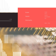
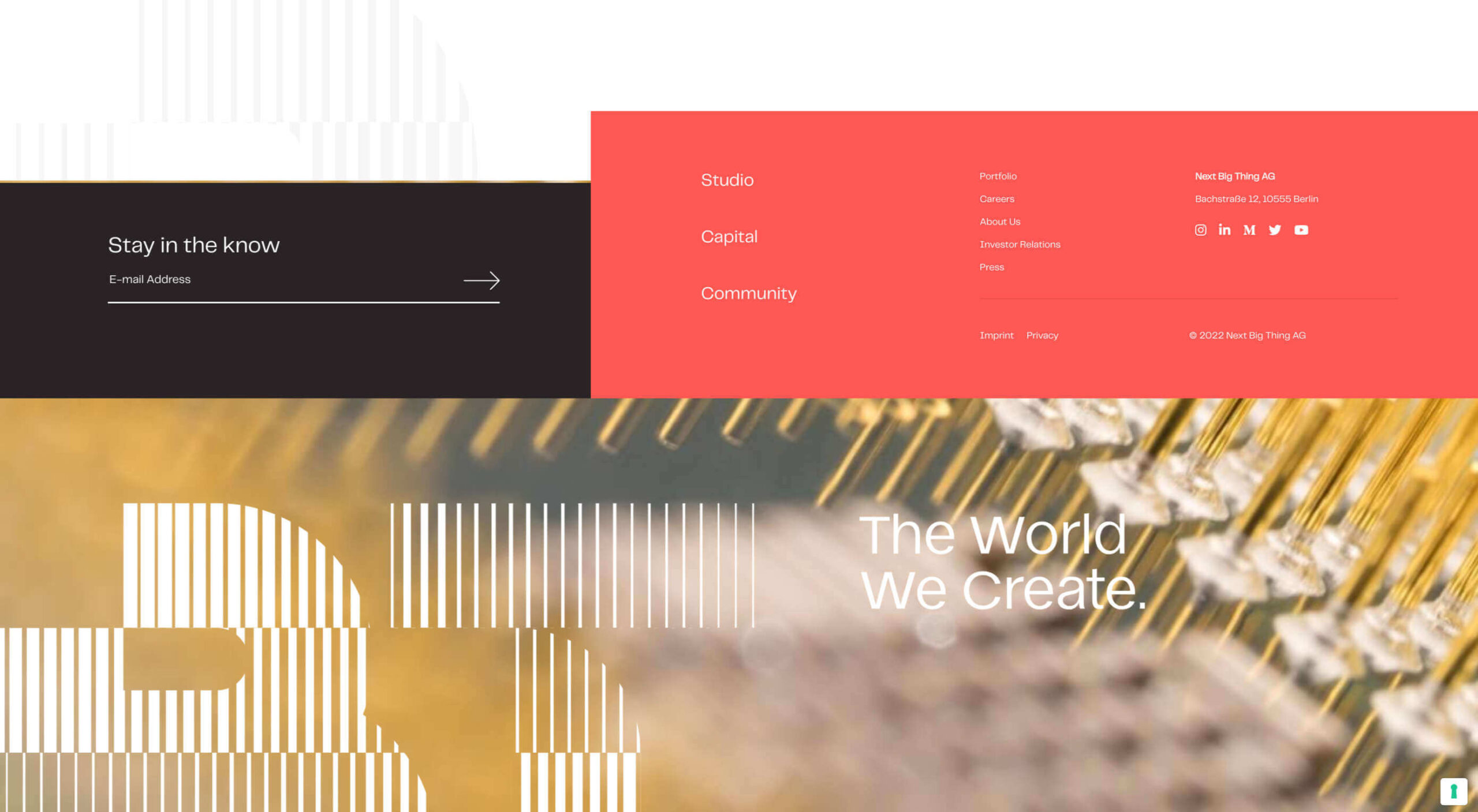
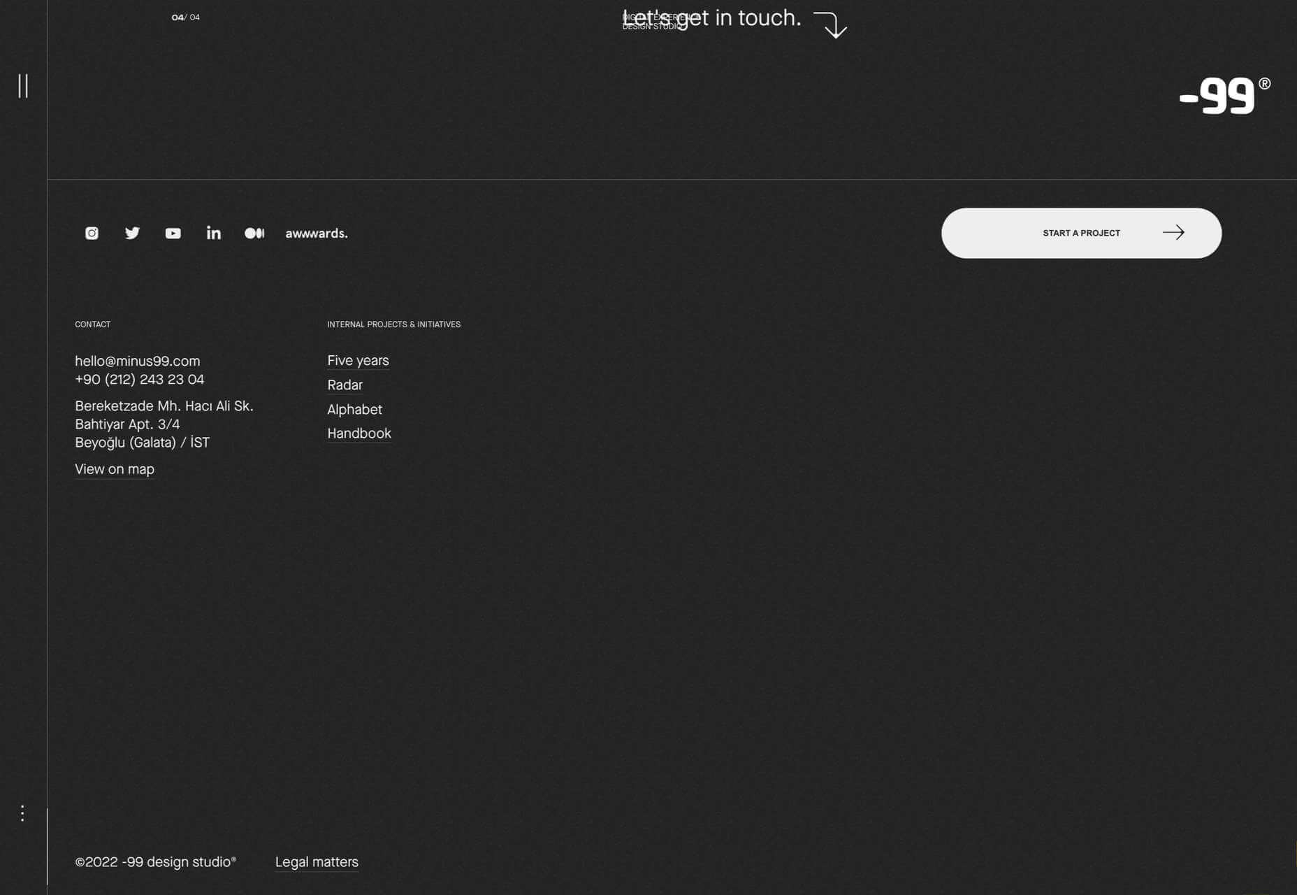
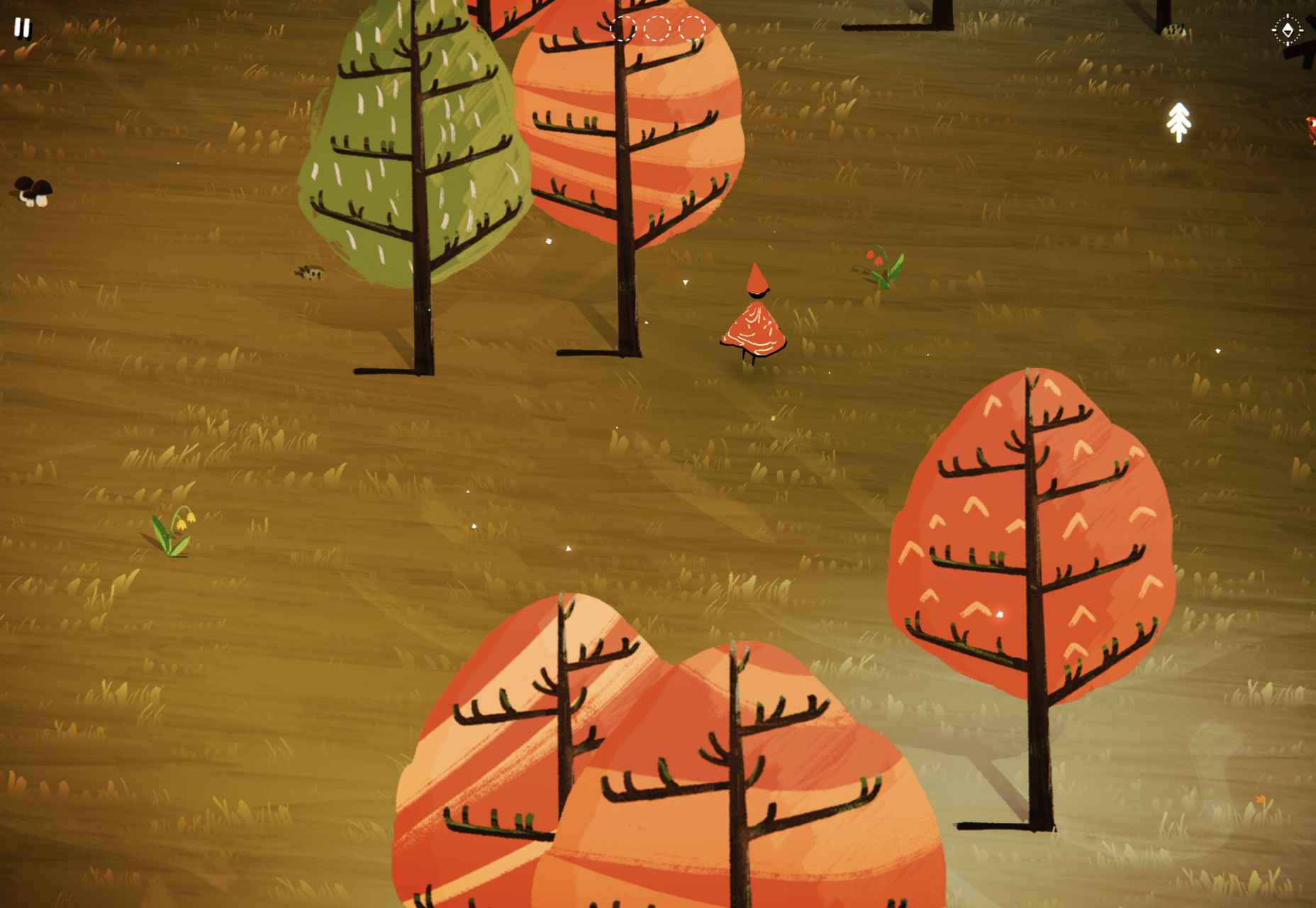
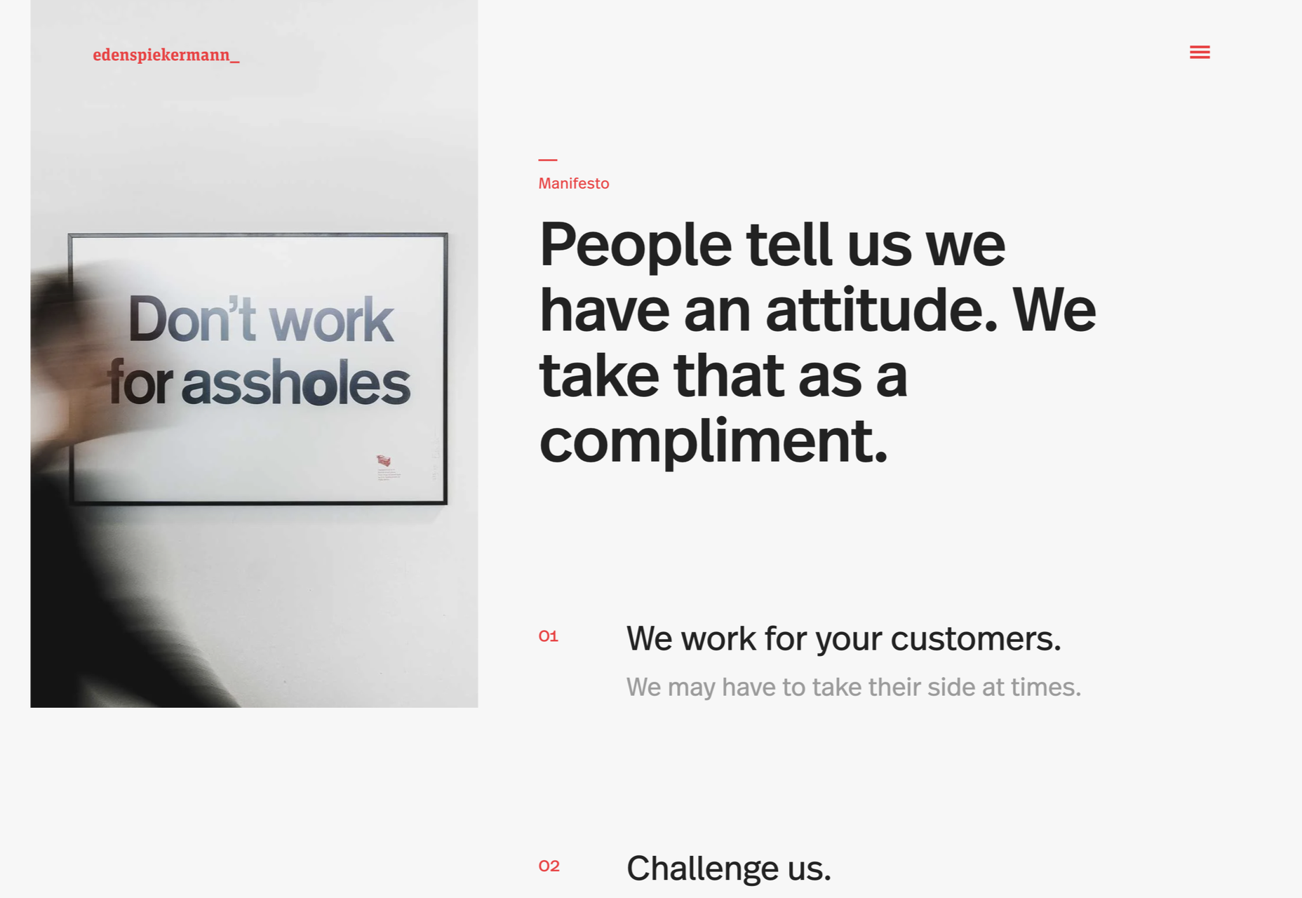
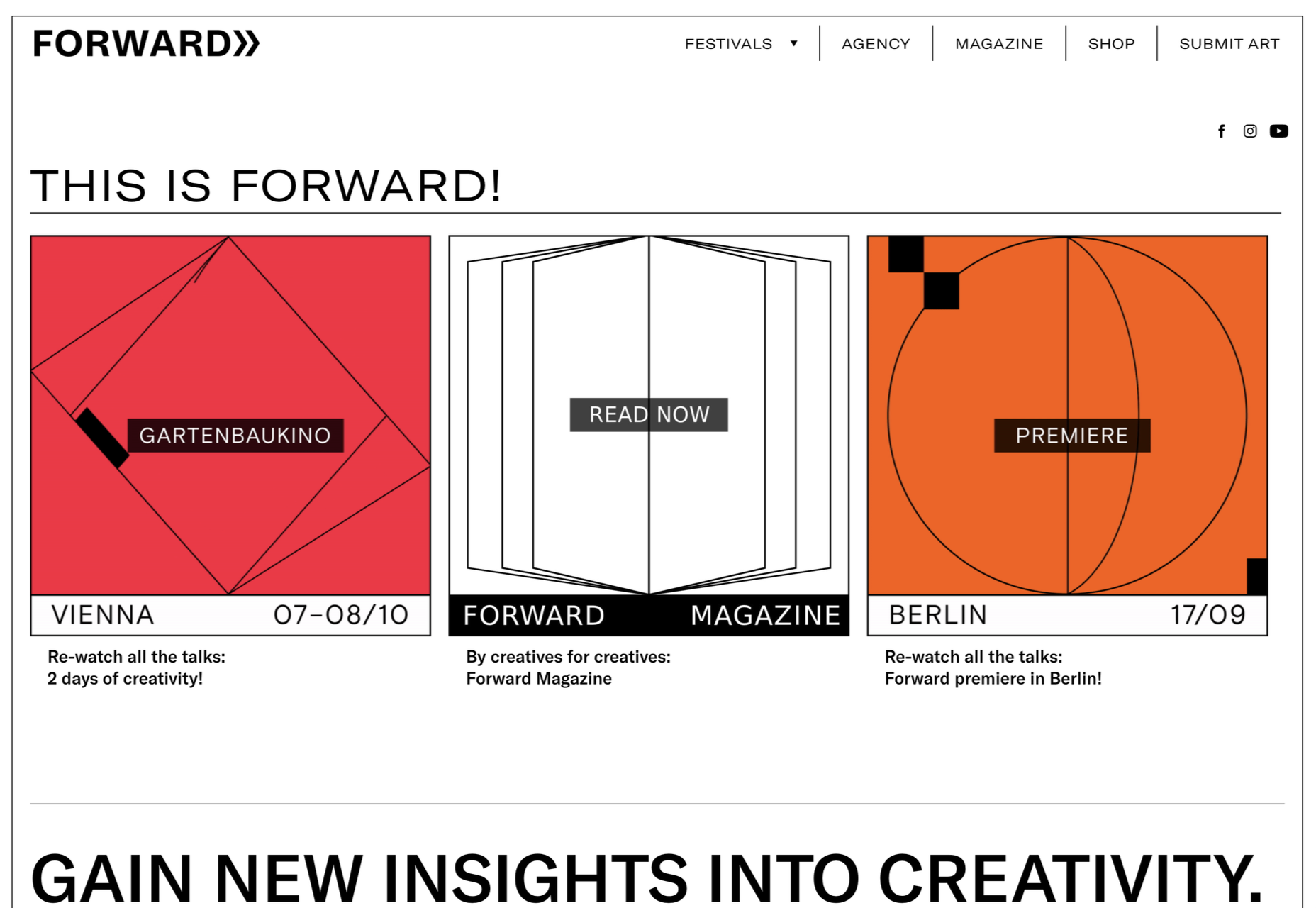
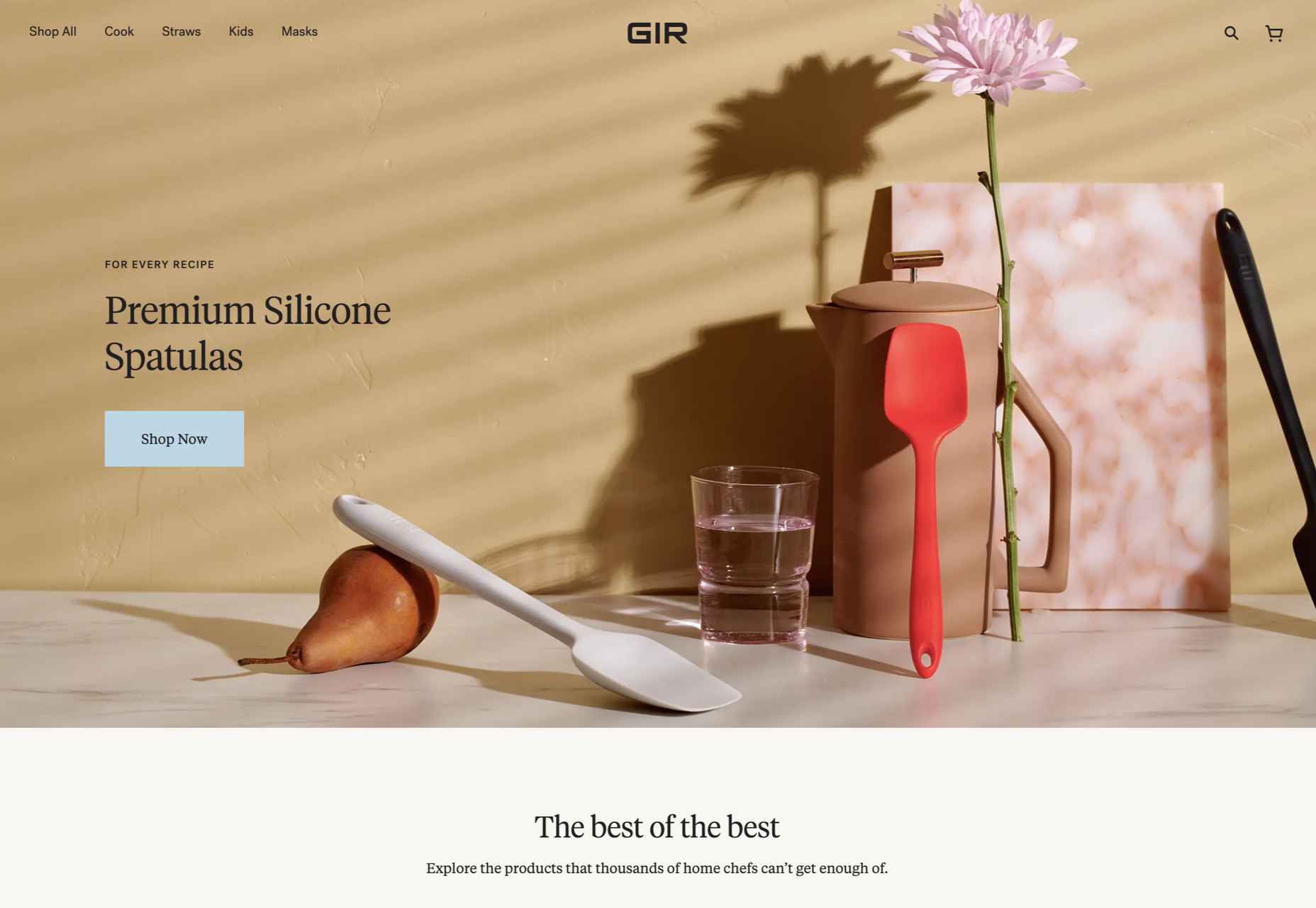
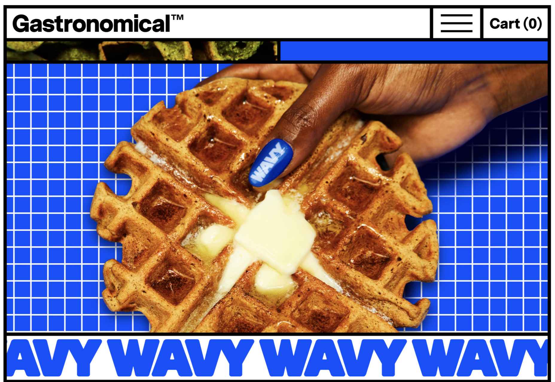
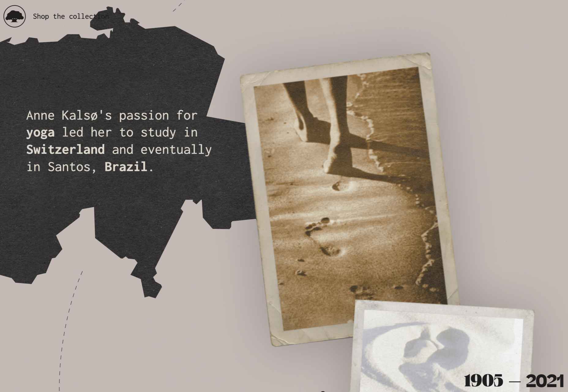
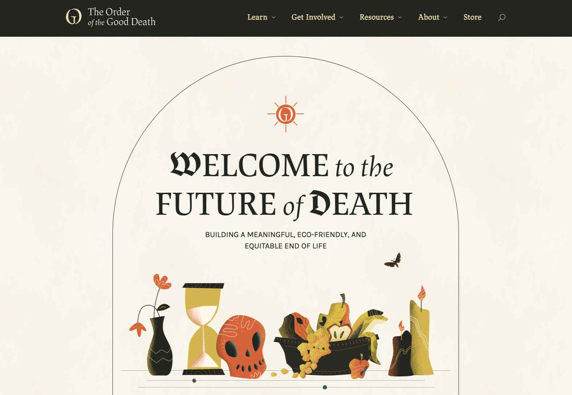
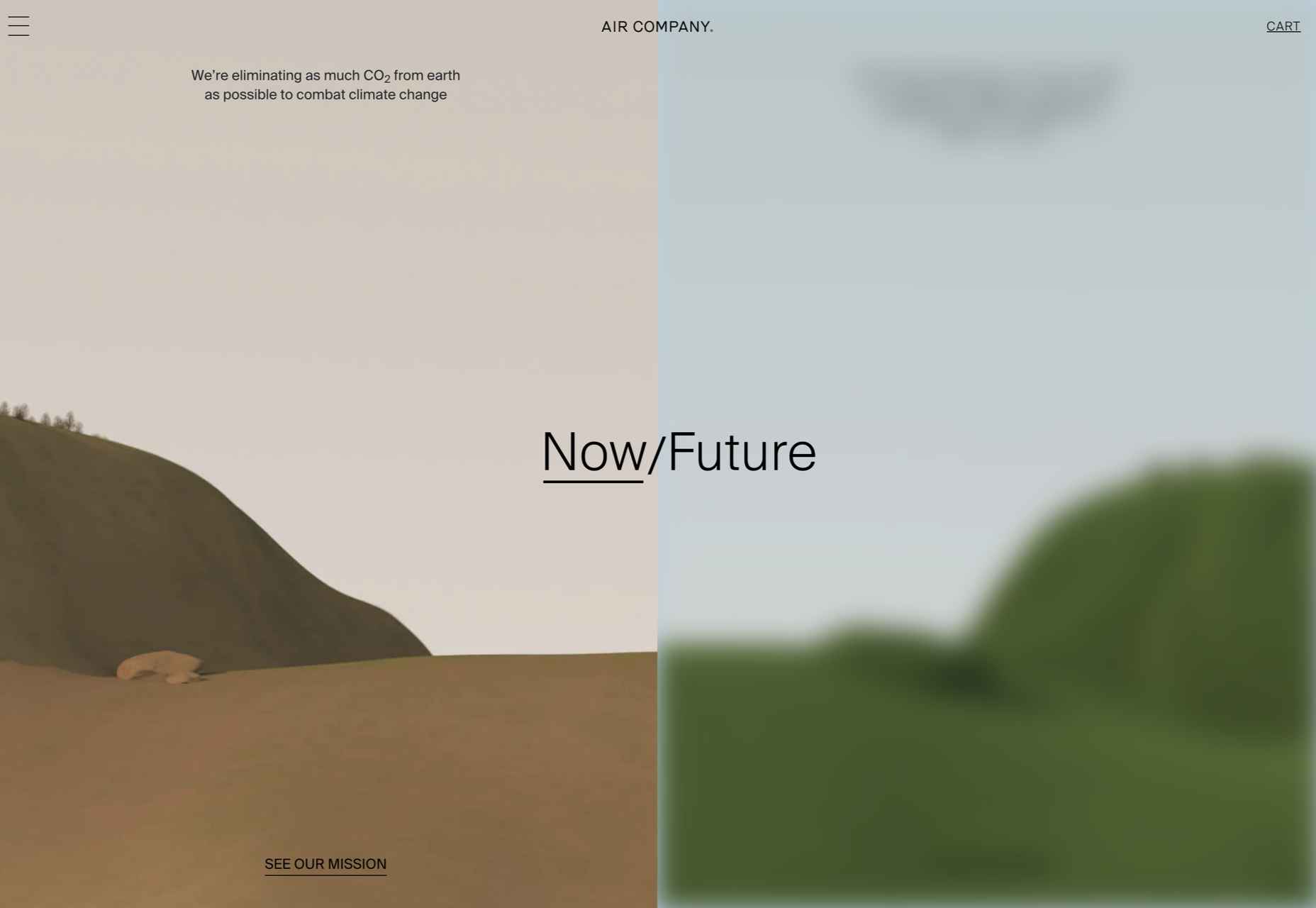
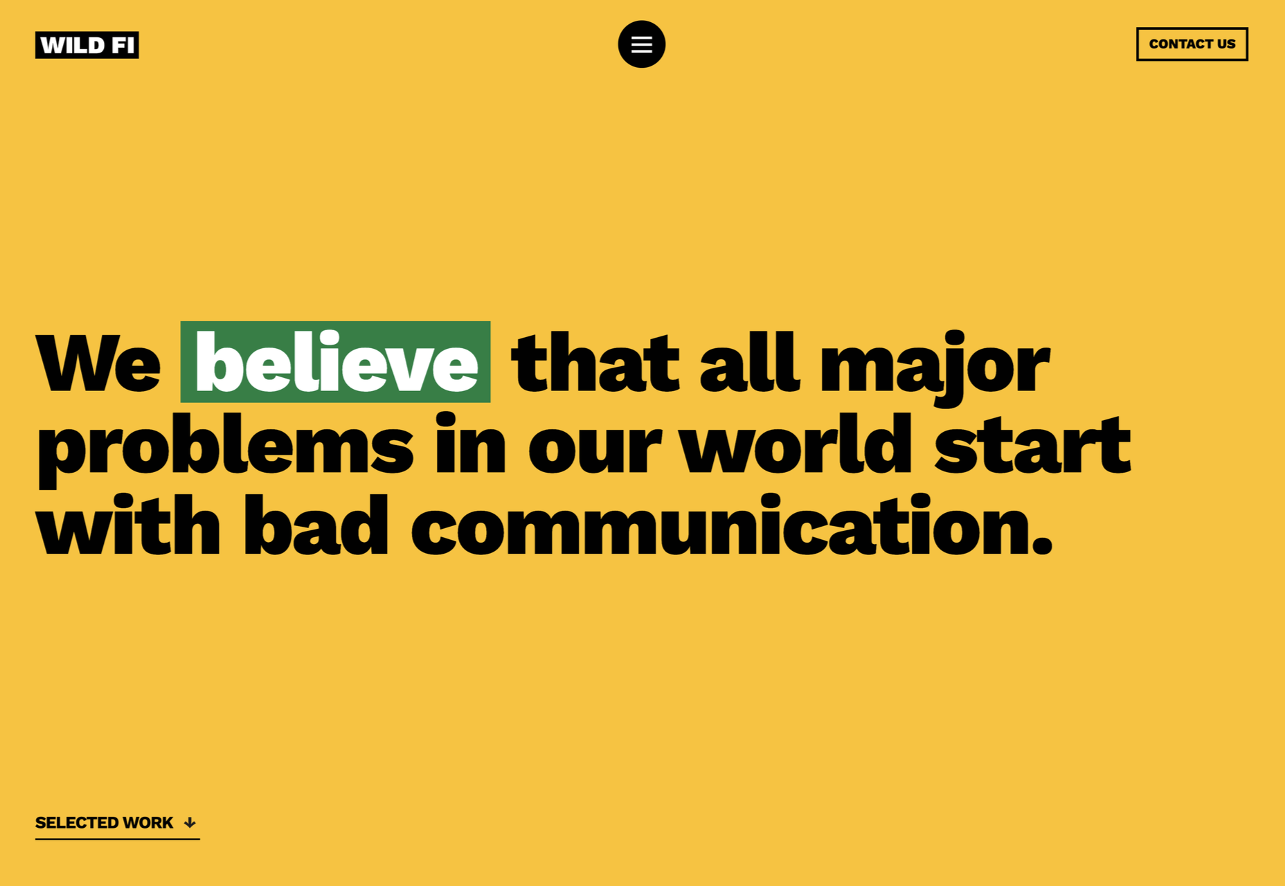
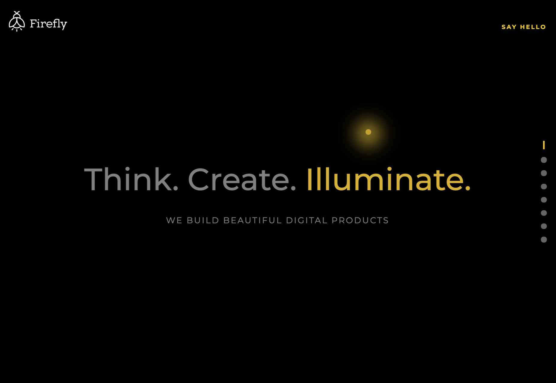
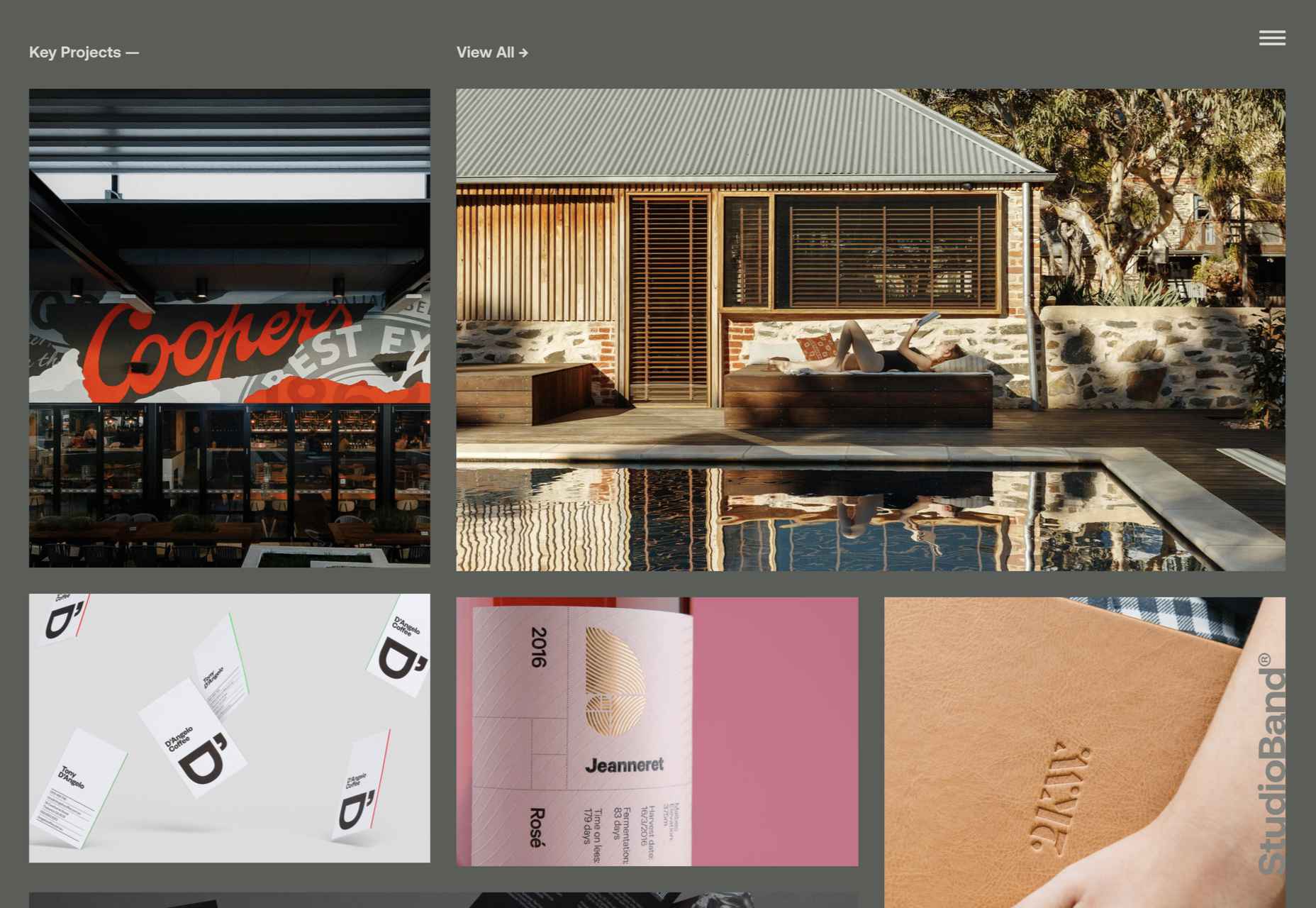
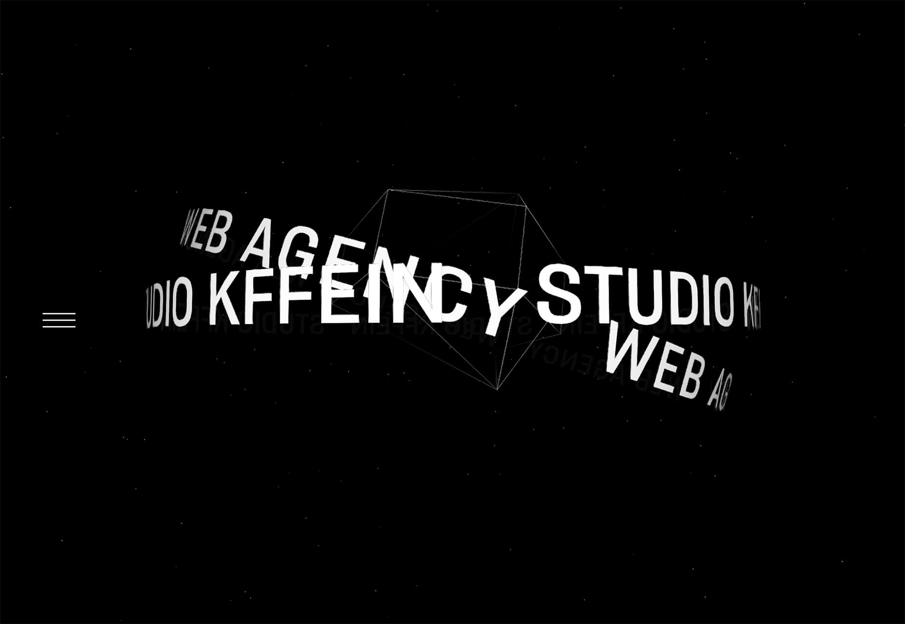
We’re well on our way to Hallowe’en already, and it’s time for another collection of websites that have caught our eye.

It’s a mixed bag of candy this month, but nothing that should make you scream with fright. Enjoy!

Tether

This single-page site for forthcoming cycle safety system Tether uses a balanced combination of hero video and illustration to explain its features.

Wayfinder 

Wayfinder is a game about our connection to nature that uses generative code, artificial intelligence, machine learning, and data mining to create a new experience each time it is played.

Beechhouse

Beechhouse has a clean, airy feel, with subtle scrolling animation. For a tattoo studio, the overall feel is refreshingly light, without a rose-filled skull to be seen.

edenspiekermann_ 

This is how you do a portfolio site with absolute confidence.

Forward Festival 

Forward Festival is a series of creative conferences run by Forward Creatives design agency. This is an excellent example of a classic magazine site with enough individuality to pull the user in and keep them engaged.

Danmarks Motionsuge 

Denmark’s Exercise Week focuses on a national campaign (in Denmark) to get Danish people to be more active. A fresh color scheme, offset grid, and strong photography all create a dynamic feel. And it is somehow reassuring to the rest of us that even the second happiest population in the world needs to exercise more.

Franco Maria Ricci 

Because we have come to expect load times to be almost nothing, loading screens are not something too many sites bother with. However, this site for publisher Franco Maria Ricci is a pleasing exception.

Pierre Yovanovitch 

Stylishly curated portfolio and catalog site for interior and furniture designer Pierre Yovanovitch.

Gir

Silicone spatulas are probably not the first subject most of us fantasize about designing a site for, but that’s what makes this site for Gir extra good. The ‘add to cart’ footer widget on individual product pages is done well, making sure a buy button is always present but without being over pushy.

Gastronomical 

Bright, bold, and in your face, this site for Gastronomical pancake and waffle mix is about as far from Betty Crocker as it could get, bringing ‘cool’ to home baking.

FC XV

Marking 15 years of Dutch fashion brand Fabienne Chapot, this microsite makes a feature of the illustration style used by the brand for its prints.

Websmith Studio

This is a good, simple portfolio site with good use of color to highlight, and the background noise effect adds subtle interest. Good name too.

Van Gogh Museum

This is definitely one of the better museum websites around. The use of color creates warmth without detracting from the sense of space. The ability to search the collection visually is a welcome feature.

Chérie Healey 

Life coach Chérie Healey’s site manages to stay on the right side of positive and uplifting without tipping over into hippy meme territory.

Kalso 

To mark the launch of the new Earth Shoes website, this microsite traces the history of the original Kalso Earth shoes, starting with their inventor Anne Kalsø herself.

The Order of the Good Death 

The Order of the Good Death is aimed at changing attitudes around a subject that most of us find extremely difficult, in a way that is informative and at the same time appealing. The tone of the content is as essential here as the visual style.

Air Company 

The use of split-screen works well here for Air Company, to show now and future, along with some great photography and video.

Wild Fi 

Wild Fi design agency’s site manages to be colorful but clean at the same time. Bold type and a balance between black on white and white on black make an impact.

Firefly 

This site for Firefly digital design agency has some great little details, notably a glow around the cursor.

StudioBand 

Dark neutral colors provide a calm, muted background for video and photography of work in StudioBand’s portfolio site redesign.

Source

The post 20 Best New Sites, October 2021 first appeared on Webdesigner Depot.


Source de l’article sur Webdesignerdepot

Alors que la vaccination progresse et que les restrictions COVID-19 s’assouplissent, les entreprises du monde entier revoient leurs politiques internes pour répondre aux demandes de flexibilité des collaborateurs. L’évolution mondiale vers le travail à domicile a conduit à de nouvelles préférences de la part des employés et à une meilleure compréhension de la manière dont la productivité et la collaboration peuvent se poursuivre avec succès, malgré le travail à distance.

Depuis des décennies, SAP a adopté un environnement de travail basé sur l’indépendance, et ce pour toute les localisations. Nous avons ainsi créé une main-d’œuvre véritablement mondiale et soutenu les employés grâce à la technologie mobile, qui permet de travailler partout et à tout moment.

Nos récentes enquêtes auprès des employés sur l’avenir du travail après le COVID montrent que les employés souhaitent continuer à bénéficier de cette flexibilité. Plus de 80 % des employés de SAP déclarent vouloir allier travail à domicile ou à distance et temps passé au bureau.

Aujourd’hui, SAP s’appuie sur les méthodes éprouvées de travail à distance que ses employés apprécient depuis des décennies et dans le monde entier pour créer une nouvelle politique entièrement flexible et basée sur la confiance. Nous continuons à croire en un environnement de travail basé sur la confiance et la responsabilisation, car nos collaborateurs sont  au cœur de ce que nous faisons.

Aujourd’hui, SAP s’engage à fournir une configuration adaptée à chaque poste, chaque style et chaque lieu

  • Un environnement de travail 100 % flexible et basé sur la confiance : la norme, pas l’exception.
  • Un environnement inclusif dans lequel les employés peuvent travailler à domicile, au bureau ou à distance, afin que chacun puisse donner le meilleur de lui-même et contribuer à la réussite des clients de SAP.
  • Des horaires de travail flexibles, pour que les employés puissent décider de leurs horaires de travail en fonction des besoins de l’entreprise.
  • Des bureaux inspirants, conçus pour favoriser la créativité, la collaboration, la vie en communauté ou le travail ciblé, permettant aux employés de trouver l’espace adapté à chaque tâche.
  • Des immeubles de bureaux qui privilégient la durabilité et la santé
  • Une approche qui respecte les réglementations locales dans les nombreuses régions où travaillent nos employés.

Notre engagement en faveur de la flexibilité vise à garantir que nos collaborateurs puissent disposerde tout ce dont ils ont besoin pour être productifs, créatifs et inspirés. Le tout, en gérant l’entreprise de manière responsable et en répondant aux exigences commerciales. Nous avons de plus constaté dans les enquêtes sectorielles que les femmes et les jeunes diplômés souhaitent particulièrement bénéficier d’un  environnement de travail flexible. Grâce à notre engagement, nous espérons et croyons que SAP sera une entreprise de choix pour ces groupes d’employés précieux.

L’une des pièces maîtresses de l’approche flexible du travail de SAP est notre technologie. Le logiciel SAP SuccessFactors offre une solution de gestion de l’expérience des employés (HXM) de bout en bout, de l’accueil des employés jusqu’à l’évolution de leur carrière, améliorant ainsi leur engagement, leur croissance et leur fidélisation, quel que soit leur lieu de travail. Qualtrics nous permet de rester en phase avec le ressenti des employés en offrant une visibilité instantanée de l’expérience vécue par les employés dans le monde entier. Pour permettre une collaboration facile et fluide, quel que soit l’endroit où se trouvent les personnes, nous travaillons à l’intégration de Microsoft Teams dans l’ensemble de notre portefeuille, ce qui permet un choix plus large d’outils d’accès.

Chez SAP, c’est avec honneur et humilité que nous avons été choisis plusieurs fois comme employeur de choix dans les pays où nous sommes implantés. Notre engagement en faveur de la flexibilité est une autre expression de notre profond respect pour nos collaborateurs.

The post Pledge to Flex : L’avenir du travail chez SAP sera 100% flexible et basé sur la confiance appeared first on SAP France News.

Source de l’article sur sap.com

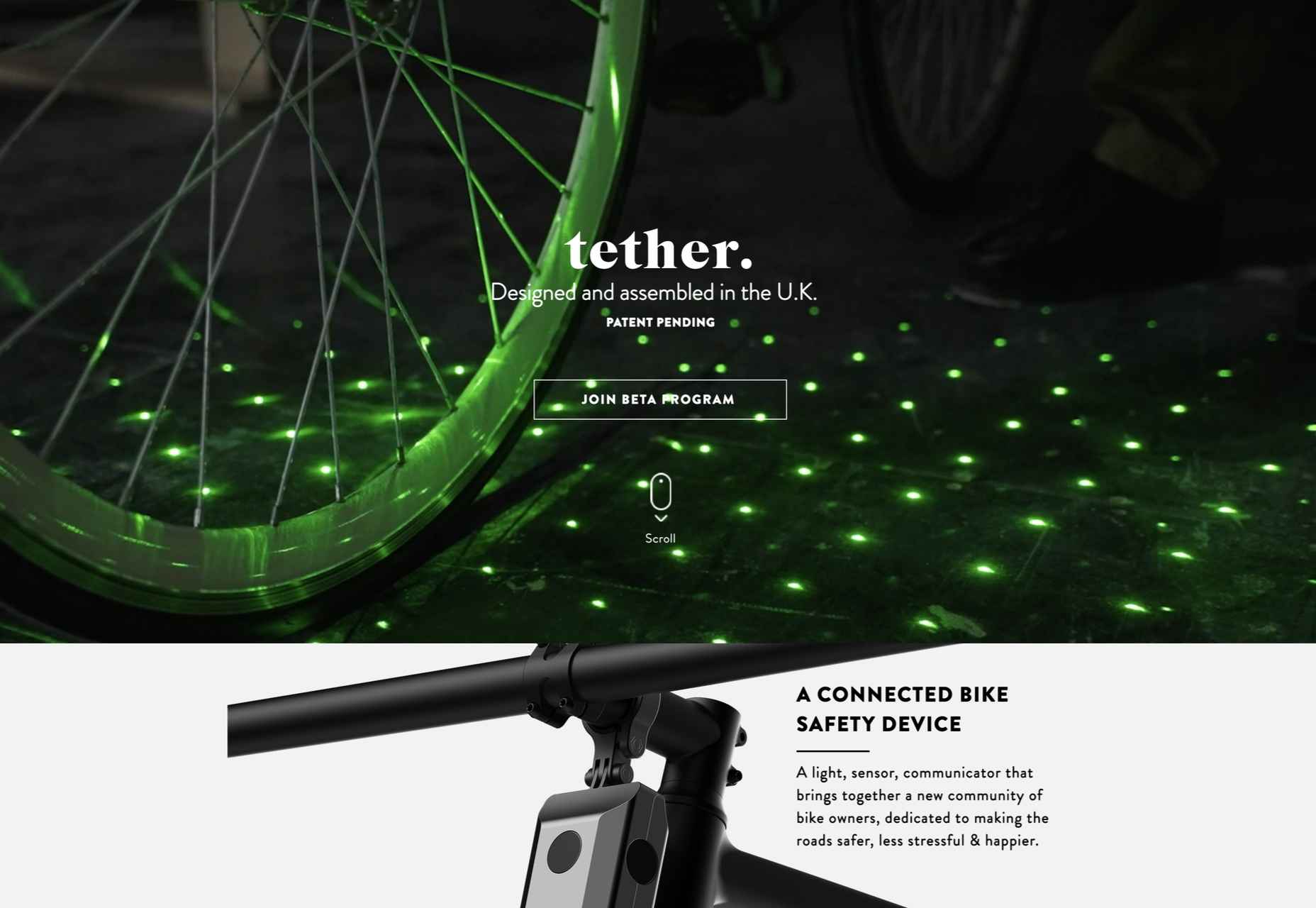
A domain name is an essential element of every project, product, and company. It’s central to a brand and has a disproportionately large impact on user experience. Not only that, but it also impacts SEO and ultimately revenue.

Domain names are also one of the most commonly retailed elements in web technology, with most designers hoarding a small empire’s worth of domain names “just in case” the right side-project comes along.

Because so much of the information and advice on domain names is provided by companies selling domain names and is therefore not impartial, we wanted to bust some of the myths you’ll encounter.

Myth 1: Anyone Can Own a Domain Name

In fact, almost no one can own a domain name. As demonstrated by the (probably) annual renewal notices you receive, you are merely renting a domain name.

You pay a registrar, who registers the domain with ICANN (The Internet Corporation for Assigned Names and Numbers) — or an entity to whom ICANN has delegated the responsibility for a particular TLD.

Even when renting a domain, you do not have the right to use it; thousands of UK-based businesses have had .eu domains stripped from them as a result of being removed from the EU.

Myth 2: There’s a Perfect Domain For Every Project

Domains do not have inherent value; they acquire value over time.

25 years ago, if you were building a search engine, the ‘perfect’ domain might have been search.com, find.com, or perhaps look.com — the particularly cynical might have opted for webads.com. You almost certainly wouldn’t have registered google.com because it says nothing about search.

Any domain name can acquire value through longevity, SEO, and branding

google.com acquired its value through a simple, relentless branding strategy and a generous dollop of luck.

Any domain name can acquire value through longevity, SEO, and branding.

Myth 3: Your Domain Name Should Contain Keywords

If you’re at the point of registering a domain name, either your business is new, or your digital strategy is. In either case, you have hopefully carried out keyword research, but without a live site, your keyword research hasn’t been validated. In other words, you don’t know what your keywords are.

Even if you’re confident that you know exactly what your keywords should be at this time, your keywords may change. The pandemic has required most businesses to pivot to some degree. eatoutny.com isn’t much use if legal restrictions have forced you to switch to a delivery business — unless you’ve also registered eatinny.com.

Furthermore, in the area of ecommerce, customers tend to view keyword-heavy domain names as budget options because they are like generic-brand goods. It may be that your business will only ever be a budget option, but it’s not a wise business decision to restrict your options.

There is an SEO benefit to keywords in a domain, but it is minimal and will almost certainly vanish in the next few years — even for EMD (Exact Match Domains) — because it is too close to gaming the system.

Myth 4: You Don’t Need a .com

As frustrating as it may be to seek out a .com you’re happy with, nothing says “late to the party” like a .biz domain.

A .co extension is slightly better in some regions because the .co.** format is commonly used; .co.jp for example. However, .co tends to be typed as .com by users accustomed to the more common format.

nothing says “late to the party” like a .biz domain

It’s possible to opt for pun-based names using regionally specific TLDs like buy.it, or join.in. This kind of strategy will play havoc with your local search strategy because computers don’t understand puns; you’ll potentially do quite well in Italy or India, though.

If you’re registering a domain for a non-profit, then .org is perfectly acceptable. However, carefully consider whether a domain is worth the lost traffic if you can’t also register the .com (because people will type .com).

The one exception is industry-specific TLDs that communicate something about the domain’s contents to a target demographic. For example, .design is a great extension for designers, and .io is fine for an app if it targets developers (i.e., people who understand the joke). You should also register the .com if you can, and if you can’t, carefully consider whom you’re likely to be competing with for SERPs.

This is not to say that anything other than a .com is worthless, just worth less than the .com.

Myth 5: A Trademark Entitles You to Register a Domain

Trademark registration and domain registration are two entirely different processes, and one does not entitle you to the other. This has been legally challenged a few times and fails far more often than it succeeds.

Trademarks are rarely blanket registrations, which means the trademark owner needs to declare the industry in which it will operate; there was no enmity between Apple Inc. and Apple Corp Ltd. until the former moved into music publishing and no one could download the White Album onto their iPod.

There is, however, a limited value in registering a domain that has been trademarked elsewhere. Not least because you will be competing against their SEO, and if they’re big enough to trademark a name, they’ve probably grabbed the .com.

Myth 6: Premium Domains Are a Good Investment

Premium domains are domains that have been speculatively registered in the hope of attracting a huge resale fee. The process is commonly referred to as ‘domain squatting.’

Domain squatters bulk-register domains in the hope that one of them will be valuable to someone. As a result, they are forced to charge exorbitant fees to cover their losses; a premium domain will cost anything from 1000–100,000% of the actual registration cost.

Setting aside the cost — which would be better spent on marketing — premium domains often come with legacy issues, such as a troubled search engine history, that you do not want to inherit.

Myth 7: A Matching Handle Must be Available on Social Media

The business value of a social media account varies from company to company and from platform to platform. Even if it is valuable to you, numerous marketing strategies will accommodate a domain name: prepending with ‘use,’ or ‘get,’ or appending with ‘hq,’ for example.

More importantly, it’s unwise to allow a third-party to define your long-term brand identity; sure, Facebook is huge now, but then so was the T-Rex.

Myth 8: You Need a Domain Name

A domain name is an alias, nothing more. You don’t actually need a domain name — what you need is an IP address, which a domain name makes human-friendly.

Think of domain names as an accessibility issue; humans are less able to read IP addresses than computers, and domains bridge the gap. (See how helpful accessibility is?)

While a domain name is beneficial, question whether a sub-domain or even an IP address would do. Registering a domain is an exciting stage of a project that many people never get past, leaving themselves with a huge collection of domains that they pay an annual fee for, and never actually develop.

What Makes a Good Domain Name

Now we’ve dispelled some of the myths surrounding domain names, let’s look at the key characteristics shared by good domain names:

A Good Domain Name is Brandable

A brandable domain is non-generic. It’s the difference between a sticky-plaster and a band-aid. Unique is good, rare is acceptable, generic is a waste of money.

A Good Domain Name is Flexible

Keep it flexible. Don’t tie yourself to one market or one demographic. Your domain name needs to work now and fifty years in the future.

A Good Domain Name is Musical

Six to 12 characters and two to three syllables is the sweet spot. Names in that range have a musical rhythm our brains find it easier to retain and recall.

A Good Domain Name is Phonetic

There are 44 word sounds in the English language. Other languages have similar totals. If you use a domain name that is pronounced phonetically, it will be easy to communicate.

Source

The post 8 Domain Name Myths Every Web Designer Should Know first appeared on Webdesigner Depot.


Source de l’article sur Webdesignerdepot

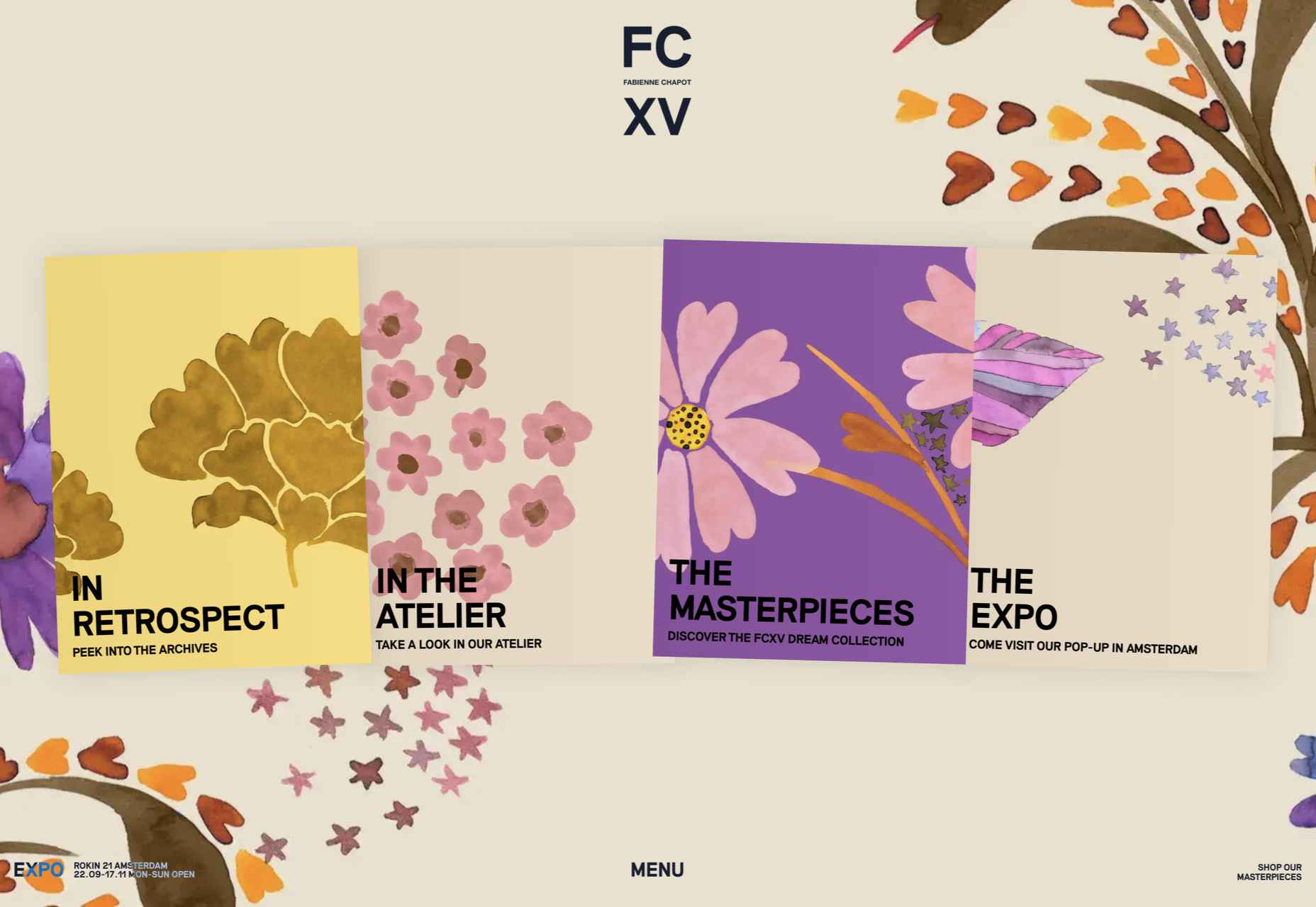
March is that time of year where the feeling of newness starts, from the first Spring days to fresh design projects. These trends are no exception, with fun new takes on some classic concepts.

Circles are always popular, but the top trend is an animated take on the traditional element; plus, fun pink and purple color palettes and a few faux split screen designs round out trending styles.

Here’s what’s trending in design this month.

Circle Animations

Circles are one of those shapes that never leave the design sphere. They have a lot of classical meaning and are flexible in terms of design options.

Designers are having a lot of fun with this shape right now. From animations to text circles to image frames, they seem to be all over the place.

More recently trending is more circle-shaped animations. This trend maintains a circle’s properties as a unified and harmonious element with movement to create more engagement and make you look at the design just a little bit more.

Each of these examples uses circles in a different but equally interesting – and animated – way.

Universal Favourite uses a circular blob. It’s almost like a giant bubble. It wiggles and flows, and stretches within the space without any help from the user. It has a smoothly quality that makes you want to stare at it. The color here helps, with the circle and background not having an immense amount of contrast. Also, note the cute little circle button in the bottom corner.

Kenta Toshikura put most of the subtle animation for this design inside the circle. With a hover state, the entire circle moves on the screen with a second layer of animation, and the cursor is also a circle that hops around the black background.

Kffein takes a totally different approach with a circle made from the primary test elements. Identifying website information rotates in a circle around another geo shape on the main plane. Not only is there a circular animation, but an almost three-dimensional effect that happens due to the way elements are layered here.


Pink and Purple Palettes

The prevalent pink and purple color combination isn’t for everyone – although you wouldn’t know it from the number of designs using similar colors.

This bright combination almost screams “spring” and has a lightness to it that almost seems to lift the mood of any project. (Maybe color selection is a reflection of how we all want to feel.)

What’s nice about these colors is that they flow into one another nicely. They can also be expanded to fall into neighboring hues on the color wheel, such as red from pink and blue from purple.

Maybe the most popular use of this color pair is as a gradient. You can find pink to purple everywhere, from background gradients to image overlays to buttons and user interface elements. There’s no lack of use here.

Each of these examples shows opportunities with this color combination.

SMU uses bright pink, blue, and purple to create a giant “road sign” in the design that jumps out from the rest of the project. The sign almost seems out of place and doesn’t fit as part of the normal color palette. This is what draw you right to it.

USA Volleyball uses the popular gradient option and extends the pink to the purple palette to hints of blue and red. What’s great about this design is that it uses a super trend element and color option and makes it work with their current color palette. You can almost imagine the design conversation when someone wanted to use a pink to purple gradient for a brand that features red, white, and blue. The gamble paid off, and it works beautifully without being off-brand.

Blobmixer uses purple, pink, and a few other bright colors – note the animated circles, too – to draw users into the design. The entire project is a fun, customizable experience that you can play with, and the color choices are what make you interested enough to try. This design also offers a great example of tactile animation and elements that feel real even when you interact with them using a mouse on the screen.


Faux Split Screens

Split-screen designs were a huge trend for about two years. The aesthetic was also functional for content that required a this or that choice on the part of users.

Now, we see the design elements but without the function. (Maybe because it just looks nice and creates a sense of balance without a symmetrical design.)

These projects look like they might offer multiple gateways to content, but there is only one call to action on the dual-screen aside from navigation elements.

What this design option does is help draw the eyes across the screen. One side will immediately appeal to you, and when done well, you’ll feel a subtle push of pull from the color, text, and images to look at the other side as well.

Renaissance TV does it with heavy animation with “dancing dots” from an old TV that doesn’t work. But then you need to look at the green text to understand what is happening.

Yacht uses text weight and space to push the eyes across the screen. Almost everyone will go to the heavier areas first and then gaze across the screen through blocks of space to the final small text on the right side. And it all happens in a fraction of seconds.

Bonjour Paris pairs bold color with black and white images. You may look at either side first, depending on personal preference, but the other half of the screen is necessary for a complete understanding of the website.


Conclusion

While all of these design trends are evident in new and recent projects, the use of pink and purple color palettes – particularly with a gradient – seems to be everywhere you look. These color choices are popular and come in a lot of forms.

Maybe the most obvious is with brighter pink and purple gradients, but other variations are also trending. It’s definitely one to watch in the longer term.

Source

The post 3 Essential Design Trends, March 2021 first appeared on Webdesigner Depot.


Source de l’article sur Webdesignerdepot

2020 was a transformative year for many industries, and IT and software development was no exception. Customer demands and behavior have changed in many ways, causing companies to quickly react and adjust to these shifts.

Aside from the unpleasant side of the pandemic, such a dynamic environment has led to new solutions and better business models.

Source de l’article sur DZONE

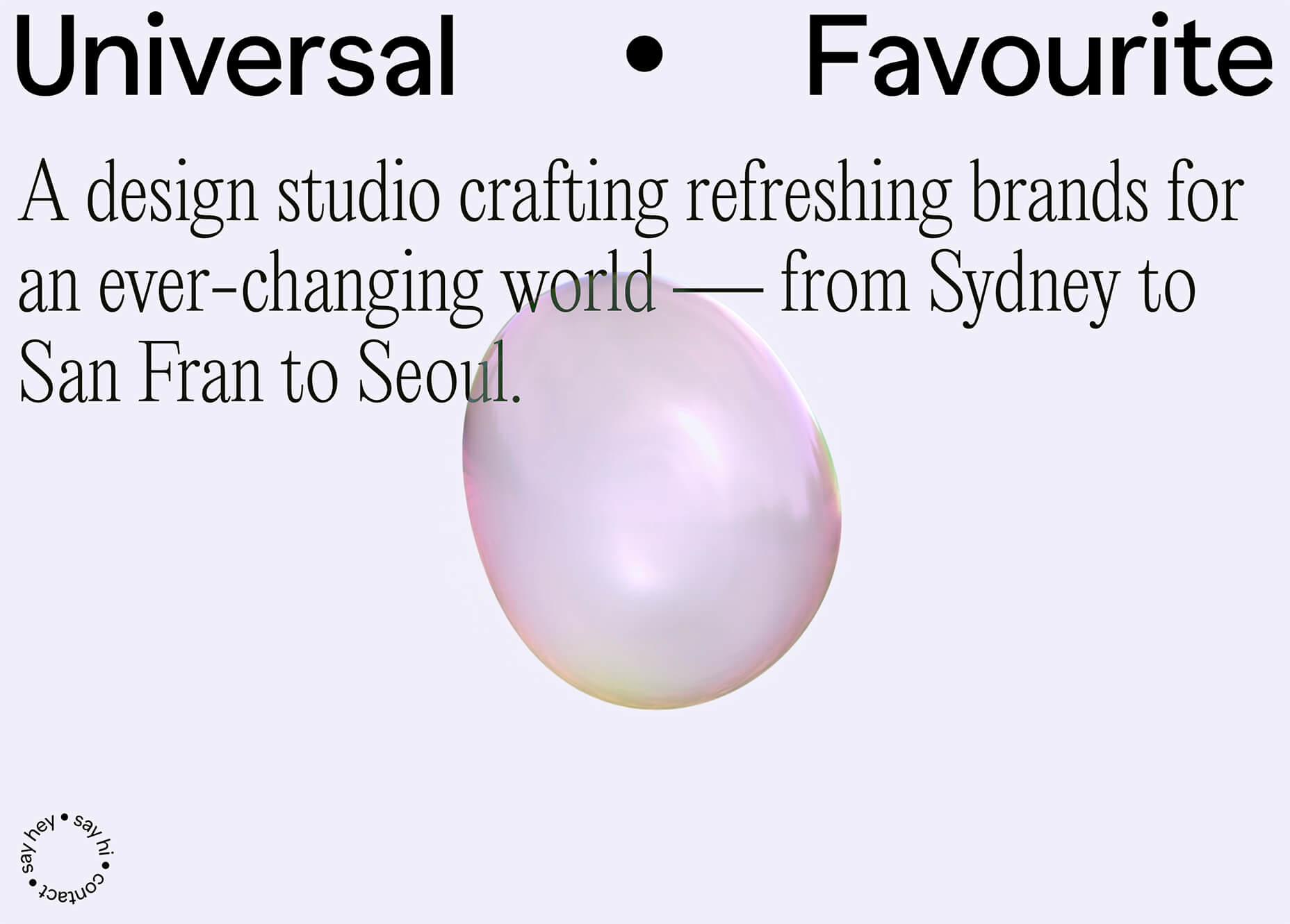
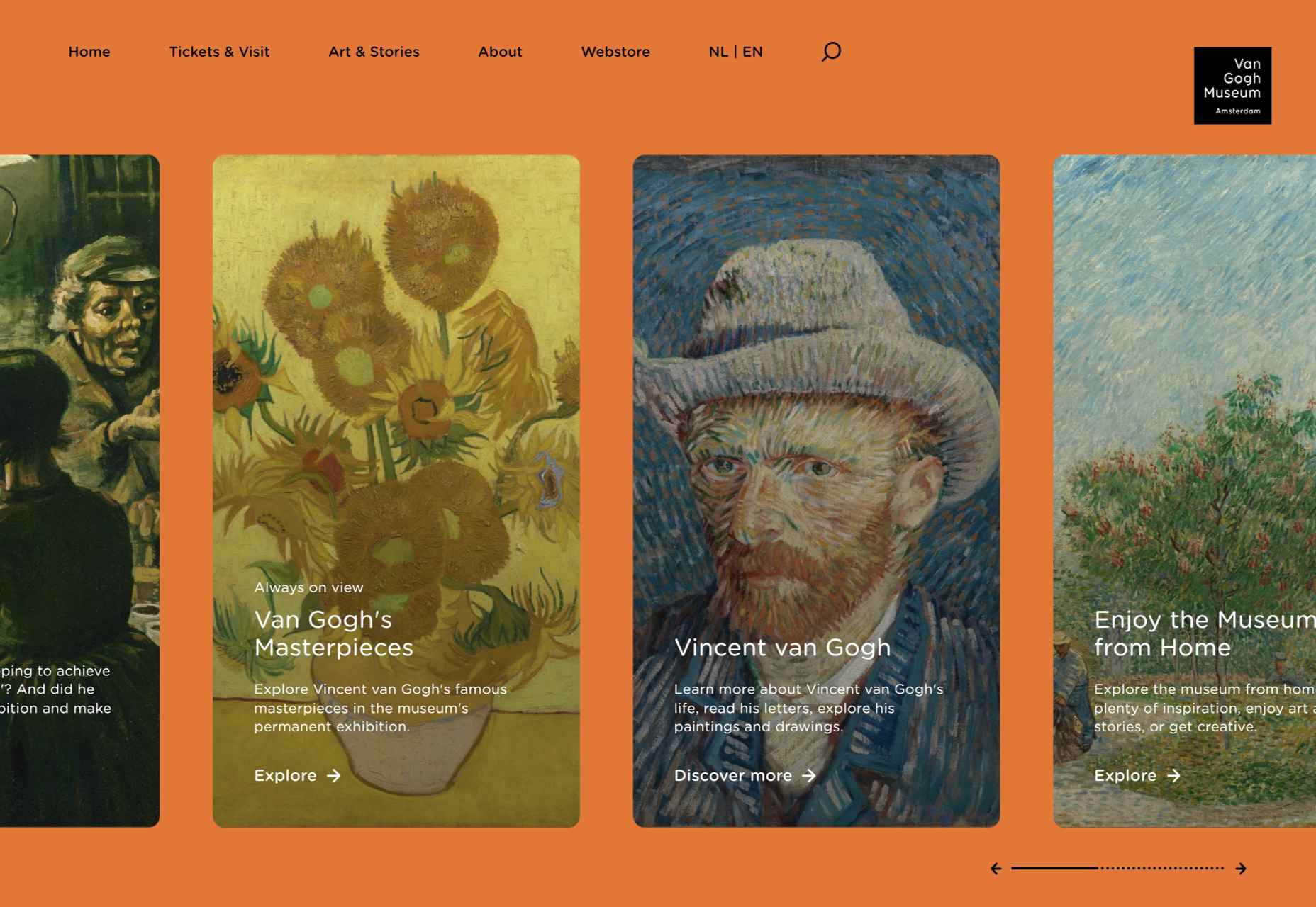
The end of the year tends to be busy for a variety of reasons and it can limit some of the freshness we see in designs during much of the year. Regardless, there are a few trending design elements.

What we are seeing right now is rooted in deep simplicity with a focus on the message.

Here’s what’s trending in design this month…

Activism and Engagement

Websites with a focus on societal issues have moved to the forefront. While the look and design techniques used for these websites can vary greatly, there’s a common theme of activism, community engagement, and support.

What’s great about this movement – and what it reflects – is that people can take to the digital space to help amplify their message or find support with people who are going through the same things they are.

While some of these efforts are backed by people and brands you may know, that’s not always the case.

The designs also work best when they reflect the personality of the spokesperson or mood of the issue at hand. Note the vast differences in the three examples.

The I Weigh Community uses bright color with a black and white image of promoter and celebrity Jameela Jamil to bring attention to mental health issues.

Wear the Waste by retailer H&M uses simple typography in a natural environment to set the stage for more eco-friendly clothing options.

Wavering Stripes uses an illustrative approach to bring attention to the stories of immigrants in detention.

Each design is vastly different but all are striking and draw attention to the causes therein. The common thread is that each design is simple enough to draw you in and help you better understand the message and not get lost in tricks or design effects.


In Your Face Products

’Tis the season for product promotion.

Designers are opting for larger-than-life product images that allow shoppers to see every detail before making a purchase. (Seems like a good plan in a socially-distanced pandemic world.)

It can work in a number of ways:

  • With an oversized image and ability to use on-screen controls to take a closer look;
  • With video and animation effects to see the product in action;
  • With super high-resolution and zoomed in photography.

Pair these visuals with strong descriptive language and you’ve got a winning combination.

The variance in the examples is a good showcase of how to do this well, while not over-doing effects.

The Fitbit Charge 4 website uses an opening image of the device that’s way larger in scale than reality (especially if you are on a large desktop screen). Users control using click and scroll to get more views and details of the device. Zoom and animation aren’t overwhelming, providing a solid look at the product.

The Nest Thermostat opens with a video animation of the device moving into the forefront of the screen. (It’s rather quick.) From there, if you want more detail, there’s a video to watch that provides deeper product information in a digestible manner.

The final example isn’t really a product at all, but rather an art installation. What’s interesting is that it uses these same oversized options to show the art in detail. This is a great way to handle seeing something that you may not be able to experience in person. What makes it work so well is that the angles of the photography mimic how you would view it, looking up toward the piece hanging from the ceiling.


Simple Motion for Impact

Carrying on the theme of big, bold, and oversized designs, this trend focuses on simple animation for maximum impact.

While all-out cinematic animation can be fun to watch, it can be a little overwhelming at times. This more subtle approach is easier to digest and helps put the focus on the content at hand rather than the effect on the display.

There are plenty of ways to use simple animated effects, including scrolling animations, hover actions, and constantly moving elements. (You can see each of these if you click through the examples.)

The Patrick Mahomes store, 2PM, uses a single line of moving text that tells you what the website is about. It differentiates the retail store website from information about the athlete or his other efforts. White text on a black background is classic and easy to read. The most important thing of note may be the speed of the animation; it’s timed in a way that’s scannable but not dizzying. Sometimes the hardest part of nailing an animation is getting the speed right.

The resume-style website for Naomi Niko is striking and simple, but neat hover effects and a simple scroll animation for her resume only – and not the photo or details on the left side of the screen – make the design intriguing. The almost awkward crop and directional pull of her image also creates interest and makes you want to get further into the design.

Guilbo uses layered hover animation to make it look like he’s blowing a glittery-dust off the screen and at the user. The rugged detail of his face with the sparkle of the animation is a fun contrast. The design uses layering with dots in the foreground and background for an additional depth effect. It’s also especially nice that the objects are made to stay off his face for a realistic effect.


Conclusion

While 2020 has been an interesting year, designers have continued to find new ways to evolve the craft and create visual experiences that are inspiring. These trends are no exception.

It shows that even in unusual circumstances or with odd constraints, that amazing work and creativity can thrive. Stay creative everyone, and keep those new designs – and potential trends – coming!

Source


Source de l’article sur Webdesignerdepot