Every day design fans submit incredible industry stories to our sister-site, Webdesigner News. Our colleagues sift through it, selecting the very best stories from the design, UX, tech, and development worlds and posting them live on the site.
The best way to keep up with the most important stories for web professionals is to subscribe to Webdesigner News or check out the site regularly. However, in case you missed a day this week, here’s a handy compilation of the top curated stories from the last seven days. Enjoy!
https://ankaa-pmo.com/wp-content/uploads/2021/07/popular-design-news-of-the-week-july-5-2021-july-11-2021.jpg14082560Service comm.https://ankaa-pmo.com/wp-content/uploads/2017/04/Logo-Ankaa-engineering.pngService comm.2021-07-11 16:45:172021-07-11 16:45:17Popular Design News of the Week: July 5 2021 – July 11, 2021
A new design trend has emerged in the last year: Soft UI or Neumorphism is everywhere.
Even Apple is in on the trend; the company introduced a host of changes in both its mobile and desktop operating systems that use the style. The elements of Soft UI introduced by Apple reflect various aspects of the Microsoft Fluent UI design too.
So, if soft UI is such a huge concept, what do we need to know about it? How does soft UI work, and what are the pros and cons of using it?
What is Soft UI (Neumorphism)?
Soft UI involves using highlights and shadows in design elements to make them look as though they’re layered on the page.
The term neumorphism is derived from a previous design style — skeuomorphism, where designers create something as close to its real-life counterpart as possible. If you remember the shift between iOS 6 and 7, you’ll remember the switch between skeuomorphic and flat designs. However, neumorphic design isn’t quite as dramatic.
Neumorphism doesn’t focus excessively on things like contrast or similarities between real and digital elements. Instead, this “soft UI” practice creates a smoother experience for users.
With neumorphism, you get the sense that buttons and cards are actually part of the background they’re on. This trend removes the flashier aspects of a typical interface and focuses on a softer style that stays consistent throughout the design.
The Common Features of Soft UI
Soft UI is all about smoothing out the experience by making everything feel more connected. There’s nothing overly harsh in the aesthetic, hence the term “soft.”
So, what kind of features can you expect?
Rounded Corners: Soft UI removes some of the sharper parts of the interface, like the corners on modules and segments. This allows for a more gentle appearance overall. In this experimentation from Iqonic Design, we can see how the round corners tie everything together.
Transparency and Background Blur: Background blur and transparency are more popular today since the infamous iOS 7 solution emerged. Most people hated the appearance of ultra-minimalism, combined with thin fonts. However, the background blur effect was more popular. The blur in soft UI shows that part of the window is connected to the rest of the OS. It seems like parts of the background in the app are pushing through to the surface.
Unified Symbols: Everything needs to fit perfectly in a soft UI design. Anything that doesn’t look like it’s part of the same entity throws off the experience. In this design experiment by Surja Sen Das Raj, you can see how all the colors, shadows, and gradients tie together consistently. Because everything is more uniform, the experience flows perfectly for the end-user.
Implementing Soft UI Elements in Your Design
So, what does neumorphism look like in your UI design process?
Ultimately, it’s all about subtle contrast and aligned colors. Every part of your interface needs to look like it’s part of the same form. Your element and background need to be the same color so that you can create a feeling of objects protruding from the background.
With Soft UI, the keys to success are shadows and highlights.
Let’s take a look at some key steps.
Achieving the Soft Look
When you’re designing your interface, remember that sharp edges make the interface more serious and formal. Rounded corners are more playful and friendly.
What also makes the design look lightweight and delicate is plenty of deep shadows and highlights. When you add shadows to elements, you create a visual hierarchy. The items that cast a larger, deeper shadow are the ones closest to you. That’s why only a few elements need to cast an intense shadow. Everything else should work in the background.
Gradients are part of the shadow and highlighting process in Soft UI design. Ideally, you’ll need to choose colors from the same palette, just toned down or brightened, depending on your needs. The gradient needs to be barely visible, but just enough to make the elements stand out.
For white gradients, like highlights, use a very delicate color somewhere between white and your background shade. For instance, consider this design from Marina Tericheva.
Consider the Little Details
Finally, remember that the neumorphism design principle is all about little details.
Choosing a font that visually matches the background is an excellent choice. However, you can also choose something more contrasting, as this will help information stand out.
Adding a little bit of the background into your fonts might be suitable too. For instance, if you have a green font and a grey background, add a little grey into the mix.
Extra elements in your design, like allowing a button to shift into a more recessed state after being clicked, are a great way to make the soft UI more engaging. Everything your end-user interacts with needs to feel smooth and perfectly unified.
The Problems with Soft UI Design
Just because a design process is trending – doesn’t mean it won’t have its issues.
Neumorphism is a fun way to make apps, operating systems, and websites feel more friendly and informal. However, this softer approach has a weak spot too.
When you’re dealing with a small margin of contrast and color where neumorphism works well, it’s hard to get the effect right every time. For instance, this all-yellow design for Dtail Studio may be overwhelming for some.
A slight deviation in saturation or a problem with your shadowing could render the entire effect of Neumorphism completely pointless.
Another major issue is accessibility. The soft UI design looks great for people who have a full visual range. However, visually impaired users might not see the same benefits. Anyone without perfect vision may see crucial objects disappearing into the background.
Your users don’t necessarily need significant vision problems to struggle with neumorphism, either. The design is all about softness that causes elements to almost blend together. People with low-quality screens that don’t have as many pixels to work with won’t see these elements.
Issues With Buttons and CTAs
Another major issue of neumorphism is that its subtlety can lead to problems with attracting clicks and conversions. Usability is the most important consideration of any UI design.
Unfortunately, when you focus on subtle elements throughout your entire interface, usability sometimes takes a hit.
Let’s consider buttons, for instance – they’re essential to any interface. To simplify the customer journey, these buttons need to be noticeable, and they need to shift into different states when your customers interact with them.
For the button experience to be excellent, users need to notice the design instantly. However, the heart of neumorphism revolves around the idea that nothing stands out too much.
This isn’t just an accessibility issue; it’s a problem for conversions too.
Neumorphism is soft on the eyes, with minimal color contrast and few color pops. This means that CTA buttons don’t stand out as much as they should. Buttons almost blend into the background, and the website struggles to pull attention to the areas that demand it most.
How to Experiment With Soft UI (Free Kits)
The key to unlocking the benefits of soft UI interfaces without getting lost in the negative points – is proper experimentation. Like any new design trends, professionals and artists will need to learn how to merge the elements of soft UI together in a way that doesn’t compromise usability.
Trends in UI design can’t focus exclusively on aesthetics, as a customer’s comfort will always be an essential part of the process.
If you want to start exploring, here are some of the best kits and freebies to get you started:
Neumorphism Button kit: A button kit available in dark and light mode to help you create the best buttons for your next project.
Neumorphic Elements Sketch file: A free file for creative use, available to help you embed the right elements into your Soft UI design.
Neumorphism UI kit: A modern Soft UI kit for Figma available in 3 color variables.
Neumorphic UI kit for Adobe XD: A light-style Neumorphic kit for the Adobe XD app.
The world of design and the trends that we use are constantly changing. Companies are always searching for the best ways to connect with their users. Often, this means focusing on an interface that really connects with your target audience and delivers the best possible results.
The soft UI design trend has its benefits and its downsides. On the one hand, the smooth appearance of every element on a combined screen can deliver a delightful aesthetic. Buttons feel less imposing, and elements are friendlier and easier to interact with.
On the other hand, neumorphism also makes it difficult to truly capture your audience’s attention in the places where it matters most. It suffers from accessibility issues and requires plenty of care and practice.
https://ankaa-pmo.com/wp-content/uploads/2021/06/soft-ui-making-sense-of-the-latest-design-trend.jpg14082560Service comm.https://ankaa-pmo.com/wp-content/uploads/2017/04/Logo-Ankaa-engineering.pngService comm.2021-06-23 16:45:422021-06-23 16:45:42Soft UI: Making Sense of the Latest Design Trend
Does it ever cross your mind that praise can be negative? I guess not. After all, it looks harmless and seems to be quite effective. Conventional wisdom says that if you praise people, they are motivated to do better.
People who have been praised throughout their life by their well-meaning parents, friends, and teachers for their talent and smartness or those who have experienced extreme focus on talent and smartness throughout their childhood learn to value only intelligence. No wonder when these people enter the workforce, they continue to seek approval and demand praise every step of the way.
Every opportunity is a measure of their intelligence — do I look smart, how will I be judged, what if others find my ideas dumb. With a single-minded focus on validating themselves, all their actions are rooted in establishing their worth. Every mistake hurts their reputation and every failure is a reflection of their competence. They care less about learning and more about proving themselves. Their sense of morality sometimes takes a hit as they resort to brutal behaviors — demeaning others by yelling, insulting, controlling, or taking undue credit — all in an attempt to boost their self-esteem.
Carol Dweck, professor of Psychology at Stanford University summarised this unfortunate reality from Morgan McCall’s book High Flyers:
People often like the things that work against their growth. . . . People like to use their strengths . . . to achieve quick, dramatic results, even if . . . they aren’t developing the new skills they will need later on. People like to believe they are as good as everyone says . . . and not take their weaknesses as seriously as they might. People don’t like to hear bad news or get criticism. . . . There is tremendous risk . . . in leaving what one does well to attempt to master something new.
What Do Organizations Do with Such People?
They feed and promote this mindset. They praise people for their brilliant ideas conveying the message “we value talent and smartness.” They shower people with rewards and bonuses for their achievements communicating to everyone else around “all we care about is success.”
What happens when these people take on a leadership role? Their mindset of valuing brilliance above everything else amplifies leading to disastrous results. History is full of leadership fiascos with great promises that turned out to be the biggest disasters. This article from Malcolm Gladwell in The New Yorker is as valid now as it was 18 years ago. Describing the talent mindset at Enron and the consultants at McKinsey who wandered the hallways at the company’s headquarters, he points out “They were there looking for people who had the talent to think outside the box. It never occurred to them that, if everyone had to think outside the box, maybe it was the box that needed fixing.”
He also talks about the impact of an environment that values innate talent and what happens when times get tough and that self-image is threatened “They have difficulty with the consequences. They will not take the remedial course. They will not stand up to investors and the public and admit that they were wrong. They’d sooner lie.”
Really, is praising people for their intelligence and achievements the only way to develop people who will be the leaders of tomorrow? Is there a better way out?
What if we praised people for their hard work, for their ability to persist despite failures and setbacks, for taking initiatives to build new skills, for standing up to their mistakes, for believing in their growth, and implementing the right strategies to overcome their shortcomings. What does this kind of praise tell them?
It tells them the value of effort in building abilities. It teaches them the importance of implementing the right strategies to solve problems. It encourages them to seek help to make progress on their task. It creates a passion for learning that’s not driven by the need to look smart, but with a desire to cultivate skills, to stretch themselves to grow.
When these people take on leadership positions, this mindset guides them to put the well-being of the company and its people before their own needs, to place value on teamwork over individual accomplishment, and to foster growth and development of their people.
As growth-minded leaders, they start with a belief in human potential and development — both their own and other people’s. Instead of using the company as a vehicle for their greatness, they use it as an engine of growth — for themselves, the employees, and the company as a whole. – Carol Dweck
Unlike leaders who pull their companies down with their focus on brilliance, these leaders lead their companies into greatness and gratitude filled in their own hearts and those of the people around them.
Choose your praise carefully as you will see the tremendous benefits in praising for growth over brilliance.
When Leaders Focus on Brilliance
They live in a world of personal greatness and entitlement, vie for labels, and will do anything to boost their image. Instead of building a long-lasting company, they spend time and money on enhancing their image.
With the constant need for validation, they use people in the company to feed their egos and showcase their superiority. Everything is about pleasing the boss. They surround themselves with people who boost their self-esteem. Agreement earns them admiration and disagreement is an attack on their intelligence. Instead of hearing people out, they punish dissent and shut people down.
They pounce at the less talented for their lack of intelligence and find those who are more talented than they are as threatening. They mistreat employees, yell, insult, control and abuse them into their way of doing things. They feel better about themselves by making other people feel worse. Employees worry about being judged all the time. When people are ridiculed for mistakes, they soon learn to keep their heads down, stop putting their critical thinking skills to use, and give in to groupthink.
Their belief in their superiority blinds them to see reality. They turn a blind eye to complaints, ignore warning signs, and fire people who tell them what they don’t want to hear. Their decision-making criteria are based on what would make them look good as opposed to what’s good for the company long term.
What happens when a leader refuses to confront the brutal facts? “The minute a leader allows himself to become the primary reality people worry about, rather than reality being the primary reality, you have a recipe for mediocrity, or worse. This is one of the key reasons why less charismatic leaders often produce better long-term results than their more charismatic counterparts. – Jim Collins
Since success and failure are a part of their identity — success means they are smart and failure means they are not — they find excuses and blame others for failures instead of taking personal responsibility. Instead of investing in the future growth of their company, they play safe with fear of failure, become less responsive to challenges from competition, go with what’s tried and tested, and refuse to take risks. Why take up the challenge that can hurt their reputation? On the other extreme, they may not shy away from crossing ethical boundaries to beat the competition at all costs. Success is what they are after and it doesn’t matter how they get it.
With more focus on talent and less on potential, they do not invest in mentoring and coaching employees. Instead of putting practices in place to develop employees and help them collaborate together, they make them compete against each other.
Carol Dweck sums up their brilliant mindset “My genius not only defines and validates me. It defines and validates the company. It is what creates value. My genius is profit. Wow!”
When Leaders Focus on Growth
They operate with a learning mode. They don’t claim to be genius but promise to invest in development, their own development, and the development of their people. The drive and enthusiasm to grow their companies make them adopt long-term strategies over short-term tactics. They aren’t in the game to boost their ego or establish their self-esteem. It’s the pure joy of shaping the future of their company that excites and motivates them. More than prestige, they are in it for the challenge.
They understand that the path to success goes through failure. Why lose the opportunity that can drive their future growth? So instead of hiding behind their failures, they face them head-on. Failures don’t define their competence, they are glaring moments of self-reflection. They are opportunities to build skills, explore possibilities, experiment, and invest in the promise of a better future.
They lead with vulnerability. They accept mistakes to shift the focus in the organization from hiding mistakes to finding solutions. When they don’t know something, instead of pretending to hide their ignorance, they say “I don’t know”. These three powerful words show humility and self-confidence. To make decisions, they invite others to share their opinion which promotes the culture of constructive criticism. Since they do not connect their identity to their opinion, more value is placed on seeking the right answers which require open disagreements and championing flexibility of opinion over their sense of righteousness.
Difficult situations make them uncomfortable, no doubt. Instead of letting their discomfort get in the way of meaningful conversations, they embrace it. They choose to look past their discomfort in the value that these discussions provide — saving a lot of time that can be wasted due to stress and anxiety that comes from misalignment of expectations and lack of clarity of purpose.
They are tough but compassionate. They do not shy away from giving critical feedback while also challenging the people in their organization to step outside their comfort zone. They empower people to make decisions with the right channels of feedback to assist in better decision-making in the organization.
Leaders with the growth mindset operate with what Lou Gerstner, who turned IBM’s fortunes around by saving it from near bankruptcy said “Hierarchy means very little to me. Let’s put together in meetings the people who can help solve a problem, regardless of position.” Not blinded by reality, they focus on finding solutions that will push their company forward. This requires keeping an open eye to change in market trends, identifying and investing in future growth areas, and taking calculated risks.
With a focus on potential and growth, they invest in identifying and building future skills of the organization — skills that will be useful during difficult circumstances giving them an advantage over the competition. They foster productivity through coaching and mentoring, place value on teamwork by encouraging collaboration and defining shared measures of success.
Warren Bennis, a scholar, author, and widely regarded as a pioneer of the contemporary field of Leadership studies, writes in Organizing Genius:
Leaders are people who believe so passionately that they can seduce other people into sharing their dream.
His most admirable view on leadership says:
Good leaders make people feel that they’re at the very heart of things, not at the periphery. Everyone feels that he or she makes a difference to the success of the organisation. When that happens people feel centred and that gives their work meaning.
What kind of leaders think like this — those focused on brilliance or the ones driven by growth?
https://ankaa-pmo.com/wp-content/uploads/2021/06/leadership-is-about-growth-not-brilliance.jpg375600Service comm.https://ankaa-pmo.com/wp-content/uploads/2017/04/Logo-Ankaa-engineering.pngService comm.2021-06-05 01:40:412021-06-05 01:40:41Leadership Is About Growth, Not Brilliance
Creatives need a digital space to call their home. A place from which they can show off their best work, and from where people can get in touch with them to buy or hire from them.
You should have a digital space of your own as well, and we’re here to help you do just that.
With one of 600+ Be Theme’s pre-built websites at your fingertips you can establish your own digital presence in no time at all. While you’re certain to find one to get started among such a large selection, we’re happy to offer a helping hand. The following 15 top BeTheme pre-built websites were specifically designed with creatives and developers in mind.
Don’t be afraid of choosing one that might not turn out to be the exact best choice. Every one of these 600+ pre-built websites is customizable, and you can always select another example or experiment if you want to.
15 Awesome BeTheme Pre-Built Websites You Can Call Your Own
No matter your choice, you’ll quickly discover that most or all of the heavy lifting involved in creating a website has already been done for you. Customize, add your own content, tweak as necessary, and you’re done!
That said, let’s get started.
1. BeAgency 4
Whether you prefer to go it alone or dream of someday building your own creative agency, the BeAgency 4 pre-built site would be a great foundation for your site. It oozes professionalism, it’s easy for your visitors to navigate, and you’ll love its clean, modern design.
As an extra feature (and most of these pre-built sites have one or two), BeAgency 4 has a Portfolio page. Swap in your own content and you’re set to go.
2. BeAgency 5
Like its predecessor, BeAgency 5 offers plenty of flexibility. You might find its completely different style more causal and relaxing, given the hand-drawn elements and small animations sprinkled throughout.
The extra feature here is a premade page for case studies you could use to add context to items in your portfolio.
3. BeArtist 3
Whether you’re a visual artist, photographer, graphic designer, writer, or whatever, the BeArtist 3 pre-built site’s cool design with its unique vibe could be just what the doctor ordered.
It even has a Shop setup you can use to sell your work, or you can convert it to a portfolio if you intend to showcase that.
4. BeBusiness 3
If you would like to create a simple website to market your artistic services BeBusiness 3 would be an excellent choice.
Whether you’re a photographer selling family portraits or wedding packages, a web developer searching for clients, or a graphic designer specializing in logo design, this pre-built site gives you a great starting point.
5. BeCompany 6
If you’re looking for a way to help your company stand out from those that would prefer to play it safe in terms of website design, this BeCompany 6 pre-built site, whose geometric shapes and illustrations give it a particularly artsy vibe, would be an option well worth considering.
Not to forget; among BeCompany 6’s features there’s a page with case studies that can help you highlight your work.
6. BeConsultant
It’s sometimes the case that after creatives have become experts at their game or craft, they branch out into consulting. If you fit into that category, you might find BeConsultant to be the perfect fit for you.
If you’re not a full-time consultant, or not into consulting at all, you could still use this pre-built site as the basis for a website to show off or sell your skills.
7. BeCopywriter 2
This one’s for writers. If that’s you, and your work is focused on words, it only makes sense to use a pre-built site like Copywriter 2 to beautifully showcase your content.
8. BeCreative 4
BeCreative 4 offers a distinctive point of view on what a typical website for creatives should look like.
While it features everything you need, e.g., a portfolio page is included along with a section for sharing testimonials, it offers a few other surprises as well; surprises like its left-aligned navigation for starters.
9. BeCV 2
BeCV 2 is not your standard digital CV or resume. Not by any means.
It’s a single page site that will serve as a perfect vehicle for sharing your skills, your experience, and your accomplishments as reflected in your body of work. It also gives prospective employers or clients the opportunity to connect with you directly through your site.
10. BeData
BeData would be a good choice for IT professionals, web developers, and programmers. Its layout, techy design, and cool features can easily be customized to suit your needs.
11. BeMedia 2
BeMedia 2 tests the limits of conventional design in a variety of ways, including its asymmetric layouts, outsized images, and its animated background video; all designed to instill a heavy dose of energy into your website and your brand.
12. BePhotography 3
TheBePhotography 3 pre-built site isn’t for professional photographers only. If you are a web designer, an illustrator, or any kind of a visual creator, this image-centric pre-built site offers a great way to show off your creative efforts and dazzling works of art.
13. BePortfolio 2
BePortfolio 2 is great way for showing off in the best possible way your work, your experience, your list of clients, and whatever else is of importance to you and your business. For creative professionals it doesn’t get any better than this.
14. BeTheme
A great thing about using BeTheme is you can use it to create a website as simple or as complex as you like, as well as one that will get your message across in the best possible way. BeTheme comes with the building blocks you need, and quite naturally an impressive portfolio page.
15. Webmaster 2
Programmers and developers. This pre-built website was created just for you.
BeWebmaster 2 gives you a fun way to take your techie language and translate it into something they can relate to.
Build a website you’ll be proud to share with the world.
One of the things users like best about using Be Theme is its huge selection of pre-built websites they can make a choice from (600 and counting to date!).
[– This is a sponsored post on behalf of BeTheme –]
https://ankaa-pmo.com/wp-content/uploads/2021/05/10-cool-pre-built-websites-designed-with-creatives-and-developers-in-mind.jpg14082560Service comm.https://ankaa-pmo.com/wp-content/uploads/2017/04/Logo-Ankaa-engineering.pngService comm.2021-05-11 16:45:092021-05-11 16:45:0910+ Cool Pre-Built Websites Designed With Creatives and Developers in Mind
From dev tools to productivity to a little bit of fun with sudoku, this month’s collection of new tools is packed with something for everyone.
Here’s what new for designers this month.
May’s Top Picks
Am I FLoCed?
Am I FLoCed? Is a tool to see if you are part of a Google Chrome origin trial. It tests a new tracking feature called Federated Learning of Cohorts (FLoC). According to Google, the trial currently affects 0.5% of users in selected regions, including Australia, Brazil, Canada, India, Indonesia, Japan, Mexico, New Zealand, the Philippines, and the United States. The page will try to detect whether you’ve been made a guinea pig in Google’s ad-tech experiment.
According to the designers of Am I FloCed: “FLoC runs in your browser. It uses your browsing history from the past week to assign you to a group with other ‘similar’ people around the world. Each group receives a label, called a FLoC ID, which is supposed to capture meaningful information about your habits and interests. FLoC then displays this label to everyone you interact with on the web. This makes it easier to identify you with browser fingerprinting, and it gives trackers a head start on profiling you.”
Uncut
Uncut is a Libre typeface catalog that just got started in April. It features contemporary typefaces and styles and is set to be updated regularly. Sort by sans serif, serif, monospace, or display typefaces. Plus, you can submit a typeface for inclusion.
Dashblock
Dashblock allows you to build automations without coding. Use it to create visual automations, or turn blocks into use-cases. (It is a premium tool, but comes with a 14-day free trial to test it out.)
Instant
Instant is a fast and secure one-click checkout tool that works with WooCommerce. Users fill out a short form the first time they shop and then join the network to enable instant, frictionless, 1-click checkouts without passwords. It makes shopping easier and cuts abandoned carts.
5 Image Tools
Triangula
Triangula uses a modified genetic algorithm to triangulate images. It works best with images smaller than 3000px and with fewer than 3000 points, typically producing an optimal result within a couple of minutes. The result is a nifty-looking image.
Content-Aware Image Resizing in Javascript
Content-Aware Image Resizing in Javascript solves that problem with images where you have a photo but it just doesn’t quite fit. A crop doesn’t work because you lose important information. The carver slices and cuts photos to give you the image elements you want in the size you want them. It’s probably a good idea to read through the tutorial before jumping into the open-source code on GitHub.
Globs Design
Globs Design uses toggles and drag and drop to help you create funky shapes and fills that you can save in SVG format for projects.
Root Illustrations
Root Illustrations is a stylish set of people-based illustrations that you can customize to create scenes for your projects. Construct a scene and then snag your set of vector graphics that also work with Sketch and Figma. The set includes 24 characters, more than 100 details, and the ability to change colors and styles.
Make Your Photo 16×9
Make Your Photo 16×9 is as simple as it sounds. It is a cropping tool that allows you to upload any shape of photo – even vertical – and pick options to fill the space to make it fit the standard 16×9 aspect ratio.
6 Dev Tools
Devbook
Devbook is a search engine for developers that helps them to find the resources they need and answer their questions faster. Fast, accessible right from a code editor, and fully controllable with just a keyboard.
Madosel
Madosel is a fast, advanced responsive HTML front-end framework that’s in an alpha version. The open-source tool is made to create websites and apps that look great on any device. Plus, it is semantic, readable, flexible, and customizable.
Say Hello to CSS Container Queries
Say Hello to CSS Container Queries helps solve a problem with media queries and smart stacking of elements. CSS Container Queries allow you to make a fluid component that adjusts based on the parent element and everything is independent of viewport width. This post takes you through everything you need to do to implement this yourself.
Frontend Toolkit
Frontend Toolkit is a customizable dashboard that you can use to keep up with recurring tasks. It’s one of those little tools that can speed up workflows.
Flatfile
Flatfile is a production-ready importer for SaaS applications. It allows you to auto-format customer spreadsheets without manual cleaning of data and you can do it all without a CSV parser. The tool also includes an elegant UI component to guide users through the process.
Plasmic
Plasmic is a visual website builder that works with your codebase. It’s designed to speed up development with developers focusing on code (not pixel pushing) and allows non-developers to publish pages and content. The premium tool works with any hosting, CMS, or framework and you can adapt it by the component, section, or page.
2 Productivity Tools
Calendso
Calendso is an open-source calendar scheduling tool. It’s flexible with the ability to host it yourself or with the makers of the calendar. It is API-driven and allows you to control events and information. The interface is simple and sleek and can integrate into your website.
Slidev
Slidev is a set of presentation slides for developers. What’s different about this presentation deck is that you can write slides in a single markdown file with themes, code blocks, and interactive components.
4 Icons and UI Kits
Iconic
Iconic is a set of pixel-perfect icons that gets updated each week. The collection of 24×24 px elements in SVG format contains 160 icons and counting. The simple style is easy to implement and you can search for just what you need by category.
5 Dashboard Templates for Figma
5 Dashboard Templates for Figma is a set of free ready-made screens with light and dark modes for each that you can use with components such as calendars, charts, tables, and more. The free elements are a preview of a larger premium Figma set if you like how they look and work.
Free Mobile Chat UI Kit
Free Mobile Chat UI Kit is a tool of components for Sketch, Figma, and Adobe XD that includes more than 50 messaging screens with light and dark modes.
Stratum UI Design Kit
Stratum UI Design Kit is a collection of more than 9,000 consistent elements for Figma. It’s packed with elements and tools that make this premium UI kit a tool that gets projects moving quickly.
4 Type Tools and Fresh Fonts
Fluid Typography
Fluid Typography is a nifty tool that allows you to test headings in any size at different viewports to ensure it looks great everywhere. Then you can copy the CSS and use it in your projects.
Eighty-Eight
Eighty-Eight is a funky block-style typeface for display use.
Harmonique
Harmonique is a robust typeface family with lovely serifs and alternates. It’s a type family of two styles that work in harmony together to add distinction and personality to your own typographic compositions. Harmonique’s low contrast forms have the appeal of a humanist sans serif typeface.
Sketchup
Sketchup is a charming display typeface that has a nice pen style. The free version has a limited character set.
Just for Fun
Generating and Solving Sudokus in CSS
Generating and Solving Sudokus in CSS by Lee Meyer for CSS-Tricks is a fun deep dive into using CSS for something you might not expect. It’s a complicated – but fun – look at some of the things CSS can do with plenty of code snippets. The final result is a solvable puzzle with 16 squares.
https://ankaa-pmo.com/wp-content/uploads/2021/05/26-exciting-new-tools-for-designers-may-2021.jpg14072560Service comm.https://ankaa-pmo.com/wp-content/uploads/2017/04/Logo-Ankaa-engineering.pngService comm.2021-05-10 16:45:292021-05-10 16:45:2926 Exciting New Tools For Designers, May 2021
Have you ever wondered why we’re so amazed by motion? A moving image is more likely to grab your attention than a static one. Motion is exciting and attention-grabbing – plus, it allows us to access more information in a short space of time.
For a while now, companies have been experimenting with all kinds of motion and animation in their design choices. We’ve seen the rise of animated website backgrounds or live-playing videos instead of images on a home page. There are videos and 360-degree pictures on product pages to help people get a better view of certain items and immersive AR experiences on apps.
So why has the power of motion not made its way into the logo design landscape yet?
Sure, there are a few examples of animated logos out there, but they haven’t had the same long-lasting impact as animated websites. Perhaps that’s because people don’t have the right tools to bring their animated logos to life?
Today, we’re going to cover some top tips for live logo design.
1. Understand What “Live Logo” Means
An animated logo or live logo can be a powerful tool in a company’s branding strategy. Although there’s more to a company’s identity than its logo, it’s fair to say that logos make a huge difference to how we feel about brands and their identity.
A powerful logo can make an emotional connection with your target audience and help your brand to thrive in virtually any environment. Live logos, or animated logos, bring more attention to the brand image, by helping a customer to focus on the logo’s action. A live logo might tell a story about what the business does through motion, or just be eye-catching.
The level of animation varies depending on the designer, but it can go all the way from a short video presentation to a few simple moves. The Skype logo is an excellent example of something simple, that multiple designers have played with to great effect.
Today, there are plenty of open-access tools helping to create more immersive animated graphics in the logo design world. Additionally, the types of animation available are becoming more impressive all the time.
2. Explore the Types of Logo Animation
The next stage of properly leveraged live logos, is knowing what kinds of logo animation are available. There are plenty of different styles of animation to explore today, depending on the kind of impact you want to have.
For instance, sometimes the animation you choose will be connected to your business. A vehicle company might have a logo that seems to “drive” into the central space on the screen. An electricity company might choose a logo that pulses like an electric charge. This animated FedEx logo is an excellent example of how animation can show what a business does.
Options for animation might include:
Rotation: Make an emblem stand out by moving it to the sides or allowing it to move on its axis. Rotation gives a logo a sense of 3D space.
Appearance/Disappearance: You can make a logo grow on the screen by bringing to life one pixel at a time, or have it dissolve and disappear in a similar way.
Transformation: Your logo doesn’t have to start out in the shape it’s going to achieve. You might start with a seed that gradually grows into a tree-shaped logo for a gardening company, for example.
Replacement: Another great way to tell a story is to replace a graphic related to the company in question with the logo through an immersive animated experience.
3. Set Goals for the Live Logo
If you’re not sure what kind of animations to experiment with, then it’s a good idea to start with some solid goals. Your goals will give you a direction to move in with your logo choices. An animated logo can be a dynamic and modern way to present a brand to an audience, but it’s only going to be effective when implemented carefully.
Let’s look at some of the goals you can choose for your live logo:
Differentiation: While it’s true that animation and live content is gaining more attention lately, it’s still relatively new as an overall concept. With an animated logo, you could help a brand to create a more unique image for themselves, which sets them apart from the other organisations in the same space.
Storytelling: As mentioned above, animated logos can tell a story about what the company or product actually does. In this example for Firefox, for instance, the logo mimics a loading wheel to demonstrate a speedy internet browser.
Brand awareness: Dynamic logos and animations are more likely to capture your audience’s attention than static images. They’re also more of a novel experience, which means that customers might want to share them with other people too.
Memorability: Today’s customers are bombarded by hundreds, if not thousands of logos all the time. They need something special to convince them that one image deserves a spot at the front of their mind. Animation can help to make a business more memorable.
4. Do Your Research
Doing your own research is an excellent way to get some inspiration for a live logo or animation. Ideally, you’ll want to focus on the industry you’re already working in, as this will give you some guidance as to the kind of movement that can attract the most attention from the correct audience.
Watch as intros to brand videos and check out as many live logos as you can. Check out the kind of animations that people use in their videos when they’re showcasing products online. You can learn a lot about what works just by evaluating what other people have done before. Just be careful not to simply copy what you’ve found elsewhere.
The aim of your live animation should be to tell a unique story about the company
The aim of your live animation should be to tell a unique story about the company in question. If you’re not sure how to start with differentiating the image, check out the brand guidelines for the company in question. The guidelines that the company used to choose the right brand colors, fonts, and other visual assets can work just as well for your animation strategy.
Remember, the aim here is to tell a specific story, send a message, or evoke a certain emotion. Don’t make the mistake of designing something that looks cool but doesn’t have much of a purchase. Most human beings will naturally look for the meaning behind the content that they see. If there isn’t anything there, it’ll just lead to confusion.
5. Use Live Logos on Brand Websites
The most obvious way to begin experimenting with animated logos in web design, is to implement live logos into a client’s website. Some companies have a “welcome screen” for their site which uses an animation to introduce visitors to the home page and other navigation options. There are also brands out there who love the impact that animation can have but want to use it more subtly.
In these cases, live logos can be an excellent way to draw the eye to a specific spot on a website, perhaps the area just above the “contact” button that encourages a client to reach out. Crucially, to avoid weighing down the website and distracting visitors, companies and designers will need to make some important choices.
Although it might be tempting to keep the animation looping at all times, just in case someone misses the first round, this requires a lot of extra processing power. Too much animation also makes it harder for businesses to push the focus of their visitors to other points on the website, like landing pages for products, or testimonial pages.
Often, as with most innovative decisions in web-design, the best bet is usually to start small and work your way up. Don’t over-do it with animation on day one. See how the visitors to the website respond first.
6. Find the Right Balance
Animations in a live logo are there to grab attention quickly, and effectively. They shouldn’t go on for too long, or you risk overwhelming your audience before they have a chance to browse the rest of the website or check out other content. A live logo should only be active for a few seconds at most, and in that time, it needs to say something valuable.
Often, the best strategy is to start by building up curiosity, and getting your viewer engaged so that they’re keen to see more. Every frame will count to pull the customer in and make them feel connected to the brand in question.
Make sure that the logo animation is dynamic so that it doesn’t just capture the attention of the viewer but maintain their interest for the full time required. During the motion, the viewer’s brain should be working to figure out what’s going to happen next.
Just like most logo design and graphic animation strategies, the key to success is finding the right balance between clever experiences, and simplicity. You want to do something meaningful that earns your viewer’s attention, but you need to compete with the fact that attention spans are plummeting all the time.
7. Explore Logo Animation in Video
One of the best ways to use logo animation, is to draw interest for a company at the beginning of a video. Video is gaining incredible levels of popularity lately, particularly in a world where you can view video content almost anywhere. Companies are adding videos to their product pages, social media accounts, applications, websites, and so much more .
For the majority of companies, a live logo at the start of a video can help their brand to seem more professional. It’s a reminder to viewers of the brand that they’re learning about with that video content. Plus, a logo at the beginning of a piece of video content can also build on the consistency that companies attempt to create by using the same brand assets in various mediums online.
(Starting a video with an animated logo is great for presentation, but it can also be frustrating to customers in certain pieces of content where they’re looking for quick answers to questions. If an animated logo is more than a couple of seconds long, it may be better placed at the back of a video instead.)
With videos for news reports or announcements where you want to get straight to the point and generate excitement about a new product or service, it can be better to jump straight into action. Ending a video with a live logo keeps the brand image front of mind for the customer for longer, even after the message has ended. On the other hand, ending a video with a logo could increase the chances that customers miss the animation, because they click away from the content too quickly.
If you’re new to adding live logos into videos, consider experimenting with different strategies to see which works best. Different companies might get unique results.
8. Bring Logo Animation to the Real World
Another interesting option for live logo design, could be to step outside of the computer screen for a while. In today’s digitally transforming landscape, it’s becoming more common to see the real and digital worlds converging. Most events and trade-shows come with presentations that rely on digital content, like animated presentations and slide shows.
Depending on the signage solutions available at industry events, companies could even use an animated logo above their booth to draw attention in a cluttered environment. Around 48% of exhibitors agree that a more eye-catching stand or booth is often the most effective way to attract visitors and customers at an event.
Animation and live logos may have started life on the computer screen, but they can appear in much more diverse environments today. Offices could use a live logo in the reception room or lobby to make their on-premises environment more appealing. Retail locations could display ads on digital signage, followed by live logos that work to both separate messages, and keep shoppers entertained when they’re enjoying the bricks-and-mortar experience.
9. Include Live Logos in Brand Signatures
Remember, a live logo doesn’t just have to sit on a company’s app or website until someone discovers it. Sometimes, the right logo can also be a powerful way to “sign off” on a message from a brand or its management team. For instance, email remains to be one of the most valuable tools for business marketing and customer relationship building today.
It’s the third most influential source of content and news for a lot of B2B audiences, and yet, most companies aren’t taking full advantage of what their email marketing software solutions are capable of. If you can display gifs and animated videos in an email (which most software solutions can), then you can also add a live logo to the brand signature.
The important thing to remember is that if you’re going to be adding a signature to a lightweight thing, like an email, it needs to be lightweight too. Don’t make the live logo too long and complicated, or it might prevent the email from loading properly.
Outside of email, don’t forget to consider options for live logos in things like social media profile pictures too. According to experts, around 80% of companies use visual assets in their social media marketing. A live logo is a great way to go beyond the basics with a company’s imagery. Motion grabs attention, and video content is quickly gaining steam on a lot of social media platforms.
Embracing a New World of Live Animation
Designers are only just beginning to scratch the surface of what’s possible with animated logos. For many companies, live logos are an excellent way to capture audience attention and encourage engagement with a brand.
A live logo at the beginning of a video, at the start of an app loading screen, or even at the top of a website can differentiate a company and make them stand out. As technology continues to evolve, and customer expectations continue to expand, the options for live animation could continue to grow. You might even be able to infuse live logos with elements of VR and AR, to impart brand essence in a brand-new digital world.
If you haven’t begun experimenting with live logo design yet, now could be the time to start.
https://ankaa-pmo.com/wp-content/uploads/2021/04/9-tips-for-better-live-logo-design.png15292780Service comm.https://ankaa-pmo.com/wp-content/uploads/2017/04/Logo-Ankaa-engineering.pngService comm.2021-04-14 16:45:092021-04-14 16:45:099 Tips for Better Live Logo Design
Today, great design isn’t just about conveying the right amount of information in a certain number of pages.
There’s more to creating the perfect website than experimenting with visuals and sound. Designers need to think carefully about how each element of their site impacts the overall user experience.
After all, with billions of websites available to explore, it takes something truly immersive to convince your client’s audience that they should stay on their pages. The more convenient and attractive your websites are, the more likely it is that visitors will want to stick around.
Minimalism, one of the more popular styles of web design from the last few years, can sometimes assist designers in making attractive and effective websites more functional.
The less clutter and confusion there is on a page, the easier it is to navigate.
So, how do you embrace the benefits of functional minimalism?
Understanding Functional Minimalism
Many webs designers are convinced that minimalism is all about aesthetics.
They see a website like Hugeinc.com and assume that the minimalist appearance is all about making the website as attractive as possible.
However, the underlying ideas of minimalism in web design go much deeper than this. The history of minimalist design begins with Japanese culture. Japan has long focused on balancing simplicity and beauty with its architecture, interior design, and even graphic design. In the Western world, minimalism got its day in the sun in the web design environment, after customers endured years of cluttered and complicated web pages with difficult navigation, overwhelming information and clashing graphics.
Designers began to experiment with the idea that less really could be more — particularly when it came to the digital landscape.
The Functional Rules of Minimalist Web Design
For a while, minimalism was the most popular style for a website. During 2018, in particular, minimalist web design soared to the top of the designer demand list, as companies fell in love with a combination of white space, simple navigation and bold text.
While now, there are other design trends stepping into the industry, designers can still benefit from exploring some of the essential rules of functional minimalism. After all, visual complexity has been proven to damage a person’s perception of a website.
Additionally, a study conducted by the EyeQuant group found that a clean and simple design can lead to a lower bounce rate. Minimalism gives viewers less to contend with on a page, which can allow for a simpler and more straightforward experience. Additionally, a clean website can also drive additional benefits, including faster loading times, better responsivity between screen sizes and more.
Because you’re only using a few images and well-spaced text, you can even experiment with different strategies, like graphics and dynamic fonts. Look at the Manuel Rueda website, for instance, it’s a great example of how a minimalist design can be brimming with activity.
So, how can any designer use the principles of functional minimalism?
1. Focus on the Essentials
First, just like when designing a landing page, designers need to ensure that they’re concentrating only on the elements in the page that really need to be there.
This means removing anything on the website that doesn’t support the end-goals of the specific page that the viewer is using. Any pictures, background noise, buttons, or even navigation features that aren’t going to support the initial experience that the visitor needs, must go.
Think about what’s going to distract your visitors from the things that are important and concentrate on giving everything a purpose. For instance, the Plus63.org website instantly introduces the visitors to the purpose of the website, then allows users to scroll down to get more information. The data is spread clearly through the home page, pulling the viewer into a story.
2. Embrace the Positives of Negative Space
Negative space is one of the fundamental components of good minimalist web design.
Every part of a good website doesn’t need to be filled with noise to make a difference. White, or negative space can help to give your viewer the room they need to fully understand the experience that they’re getting.
From a functional perspective, it’s the difference between placing someone in an overflowing storage container and asking them to find what they need or placing them in a room where items are carefully spaced out, labelled, and waiting for discovery.
The Hatchinc.co website uses negative space to ensure that information is easy to consume. You can find the different pages of the site easily, the social media buttons, and the newsletter subscription tool. Plus, you get a chance to see some of the work behind the site.
3. Make it Obvious
One of the biggest problems that consumers have encountered in recent years, is the concept of “choice overload”.
Whether you’re in a store, or on a website, you’re never sure what to do first. Do you check out the blog posts on the site to learn more about the authority of the company? Do you visit the “About” page, to see where the brand come from? Do you head to their product pages?
As a designer, functional minimalism can help you to make it obvious what your audience should do next. As soon as you arrive on the AYR.com website, you’re not overwhelmed with choice. You can either head to your bag, “shop now”, or check the menu.
Since the “Shop Now” CTA is the biggest and most compelling, the chances are that most visitors will click that first, increasing the company’s chance of conversions.
4. Simplify the Navigation (But Don’t Hide It)
The AYR.com example above brings us to another concept of functional minimalism.
While minimalism and simplicity aren’t always the same thing, they should go hand-in-hand. When you’re designing for functional minimalism, you should be concentrating on helping visitors to accomplish tasks as quickly and easily as possible, without distraction.
That means that rather than overwhelming your audience with a huge selection of pages that they can visit at the top or side of the screen, it may be worth looking into simpler navigation options. A single menu icon that expands into a full list of items remains a popular design choice – particularly in the era of mobile web design.
With this basic approach, designers can ensure that visitors are more likely to click through to the pages that their clients want their customers to visit. They can still find what they need in the menu, but it’s not taking up space on the page, or distracting them.
5. Set Great Expectations with the Top of the Screen
Functional minimalism can also help today’s designers to more quickly capture the attention of their visitors from the moment they click into a website.
The content that’s visible at the top of the page for your visitors is what will encourage them to take the next step in their online experience. Make sure that you’re providing something that keeps your audience interested and gives them the information they need.
That way, you’ll lower the risk of high bounce rates for your clients, while also taking advantage of minimalism’s ability to deliver quick access to information for your audience.
At the top of the page, the Kerem.co website instantly introduces the visitor into what the website is all about, and what they should do next.
You can even deliver more information in one chunk at the top of the page, without cluttering the environment, by using good UI animation.
Consider implementing a slideshow of pictures that flip from one image to the next, or a font section that dynamically changes as your audience has chance to read each sentence.
6. Use Functional Minimalism in the Right Spaces
Remember, functional minimalism isn’t just for home pages.
Depending on what you want to accomplish for your client, you could also embed the components of minimalism into landing pages, portfolios, and squeeze pages too.
After all, when there’s less clutter and confusion on a page to distract a potential audience, there’s a greater chance that your visitors will scroll to the bottom of the page and complete a conversion. For instance, look at how simple and attractive the Muzzleapp.com landing page is.
The page provides useful information and tells customers exactly what they need to do next. There’s no confusion, no complexity, and nothing to hold visitors back.
Just be careful. While functional minimalism can be very useful, it won’t be right for every website. A lack of elements can be harmful to websites that rely heavily on content. That’s because low information density will force your user to scroll excessively for the content that they need. Using functional minimalism correctly requires a careful evaluation of where this technique will be the most suitable.
Minimalism Can be Functional
A minimalist design isn’t just an aesthetic choice. The right aspects of minimalism can simplify interfaces on the web by eliminating unnecessary elements and reducing content that doesn’t support an end goal.
The key is to ensure that you’re focusing on a combination of aesthetics and usability when creating the right design. An easy-to-navigate and beautiful website can be a powerful tool for any business.
https://ankaa-pmo.com/wp-content/uploads/2020/10/making-minimalism-functional-in-web-design.jpg14082560Service comm.https://ankaa-pmo.com/wp-content/uploads/2017/04/Logo-Ankaa-engineering.pngService comm.2020-10-21 12:45:552020-10-21 12:45:55Making Minimalism Functional in Web Design
As human beings continue to spend more of their time interacting with technology, dark themes provide a more relaxing way to engage with the digital world. More often than not, these themes are easier on the eyes, more attractive, and perfect for the dedicated user.
Throughout 2020, countless leading brands have debuted their own version of the dark theme. Google has a solution for your Drive, while Apple and Android have built dark theme performance right into their operating systems.
If you haven’t learned how to make the most out of dark mode yet, then you could be missing out on an excellent opportunity to differentiate your design skills, and earn more clients going forward.
Why Dark Mode?
Before we dive too deeply into the possibilities of creating your own dark theme, let’s examine what dark mode is, and why it’s so effective.
Ultimately, dark themes are created to reduce the amount of luminance emitted by everything from your desktop and laptop, to your smartphone and smartwatch. Dark themes help to improve the visual ergonomics of design, by reducing eye strain, adjusting brightness to suit current lighting conditions, and more. Additionally, many dark mode offerings are also fantastic at conserving battery life.
Better user experience: A focus on user experience is one of the most important trends of the digital age. You need to be willing to deliver incredible experiences to everyone who visits your website if you want to stand out today. Dark mode reduces everything from eye strain, to battery power consumption. This helps to keep customers on a website for longer.
Innovation and cutting edge appeal: Most companies want to prove that they can stay on the cutting edge of their industry. The ability to offer an opt-in dark mode version of a website theme or appearance can help your clients to stand out from the crowd. As the environment becomes more mobile-focused, more companies will be looking for designers that can provide the best mobile experiences.
Support for universal design: Dark mode isn’t just great for people who have light sensitivity at night. This solution could be more comfortable for visually-impaired users who would struggle with eye strain when visiting your websites otherwise. If you want your content to be more inclusive for a wider range of viewers, then learning how to design for dark mode is a good way to start.
Best Practices When Designing for Dark Mode
Designing for dark mode is easier than you’d think. Most of the time, it involves simply thinking about how you can replace some of the brighter, more overwhelming aspects of your site, with something deeper and darker.
Here are some useful tips that will get you moving in the right direction.
1. Experiment with Colors
A big issue for a lot of web designers when it comes to developing a dark mode solution is that they get too caught up with things like pure white text against pure black backgrounds. However, this high-contrast option can be a little much after a while.
It’s often much easier to use a dark grey as your primary surface color, instead of a true black. Additionally, rather than using bright white, think about slightly off-white alternatives that will be warmer to the eye.
Experiment with surfaces and color combinations that are unlikely to cause too much eye strain. Dark grey foundations often offer a wider range of depth, too, because you can demonstrate shadows on grey.
Additionally, when you are experimenting with colors, remember that saturated colors often vibrate painfully against very dark surfaces, making them harder to read. Desaturating your colors will help to reduce the contrast and make your websites more welcoming.
Lighter tones in the 200-50 range will have better readability on dark themes. However, you can always experiment with your choices. Google Material Design recommends using a contrast level of around 15:8:1 between your background and text.
2. Consider the Emotional Impact
Much of the effort involved with dark mode design is figuring out how certain colors work together. It’s easy to get carried away with stark contrasts, particularly when you’re used to working with a white background. However, you need to remember that you’re designing for a user that’s primarily looking for an easier and more subdued browsing experience.
While you’re working, remember to consider the emotional aspect of the design too. The emotion in colors can make or break a buyer’s journey in any environment. However, an often overlooked-aspect of color psychology, is that people perceive shades differently when they’re on a black background.
For instance, think of the color green. On a light background, it conveys nature and even financial wealth. However, on a dark background, the same green could come across as something venomous, toxic, or even sickly. It’s important to think about the kind of impressions end users are going to get when they arrive on your site.
3. Give Users the Freedom to Choose
One of the biggest mistakes you can make when you begin designing for dark mode, is thinking that you should focus entirely on your dark themes, and nothing else. This lines you up for a problem if you interact with users who want the best of both worlds. If you’re designing for apps in particular, you’re going to need web pages that can switch naturally between light and dark themes.
Learning how to implement both a dark mode and a light mode option into the desks you create will help you to reach a wider selection of customers. Remember, you’ll need to test the performance and impact of your designs in both themes, to check that they deliver the same kind of experience, no matter how your user chooses to browse.
Although dark mode should offer a different experience to end-users, it still needs to feel as though they’re browsing on the same website. That means that you’re going to need to experiment with the most natural combination of light and dark mode options.
4. Remember the Basics
Remember, although the three tips above will help you to get on the right path for dark mode design, you’ll also need to consider the opportunities and limitations of the platforms that you’re designing for. The kind of dark mode experience you can deliver for Google Chrome websites is going to be very different to what you can create for something running on iOS.
Examining the documentation provided by the system that you’re designing for will help you to develop something with a close insight into what’s actually possible.
Other top tips for dark mode design include:
Focus on your content: Make sure that your content stands out on the page, without being too overwhelming.
Test your design: In both light and dark appearances, you need to make sure everything is working as it should be.
Adopt vibrancy for your interfaces: Vibrancy helps to improve the contrast between your background and foreground.
Use semantic colors: Semantic colors adapt to the current appearance of a website automatically. Hard-coded color values that don’t adapt can seem more aggressive.
Desktop tinting: Try experiment with things like transparency and filters to give your websites and apps a slightly warmer tint – ideal for late-night browsing
Icons: Use individual glyphs and icons for dark and light modes if necessary.
Ready to Design for Dark Mode?
Preparing your web development and design portfolio for an era addicted to dark mode can be a complex experience. You need to think carefully about how people are going to browse through your websites and apps when they’re searching for something more subtle, and less visually overwhelming than the websites that we’re used to making.
The most important thing to remember is that everything on your website or application should look just as beautifully tailor-made in dark mode as it does in light mode. Simply adding a dynamic black background when people want to switch settings in an app isn’t enough. You need to go in-depth with your designs and examine how different fonts, colors, and images work together.
https://ankaa-pmo.com/wp-content/uploads/2020/10/how-to-get-dark-mode-design-right.jpg14082560Service comm.https://ankaa-pmo.com/wp-content/uploads/2017/04/Logo-Ankaa-engineering.pngService comm.2020-10-16 12:45:342020-10-16 12:45:34How to Get Dark Mode Design Right
This month’s collection of new tools, resources, and freebies for designers is a smorgasbord of sorts. You’ll find everything from useful APIs to icons to tutorials to fonts.
Let’s get right into it, here’s what new for designers this month:
Tooltip Sequence
Now that your app or website is ready, you might need to help users engage with it. Tooltip Sequence is a simple JavaScript package that helps you create a series of small tooltips that will guide users through product features with a small description of what they need to know. It looks great and the best part is this tool saves you from having to create each tooltip description manually on each page and link them together.
Serenade
Serenade allows you to free up your hands with voice coding technology. Use natural speech and stay productive with this tool that allows you to code without typing. It works across multiple coding languages and platforms. It’s as easy as “add function hello” and the tool knows what syntax to use.
Gazepass
Gazepass, which is still in beta, is a nifty API that allows for passwordless multi-factor authentication for any website or mobile app. It uses biometrics on any device or platform to make getting into apps or websites easier for users.
Filters.css
Filters.css is a CSS-only library to apply color filters to website images. Installation only takes three steps and includes a variety of filers, such as blur, grayscale, brightness, contrast, invert, saturate, sepia, and opacity.
Sidebar Webring
Sidebar Webring is a collection of blogs and websites that are focused on web design. The curated list is handpicked for superb content for designers and developers. But, what’s a webring? It’s a collection of linked websites in a circular structure that are organized around a theme. The term is a throwback to the early days of the web in the 1990s and 2000s.
Wicked Templates
Wicked Templates is a set of responsive HTML templates made with Bulma and Tailwind CSS that you can style and use as you wish. Use these templates to jumpstart projects. Free and paid options available.
WP Umbrella
WP Umbrella will help you keep sites running in a healthy and safe manner on WordPress. Monitor uptime and performance, PHP errors, and keep up with hundreds of websites from one dashboard.
Servicebot
Servicebot helps you create customer-facing embeddable billing pages that work with Stripe payments. This premium tool is quite user-friendly and works with websites or SaaS.
Custom, Accessible Checkboxes with Perfect Alignment
Sombras.app is a nifty tool that creates 3D object shadows. Use the easy on-screen controls to get just the right orientation and shape.
urlcat
Urlcat is a tiny JavaScript library that helps you build URLs with dynamic parameters and without mistakes. The friendly API has no dependencies, includes TypeScript types, and is just 0.8KB minified and gzipped.
Reacher
Reacher is a real-time email verification API that lets you check the validity of an address before you send the email. Reduce bounce rates in an instant. (The personal version is free.)
Swell
Swell is a most powerful headless ecommerce platform for modern brands, startups, and agencies. Create fast and flexible shopping experiences with the API and headless storefront themes. This is a premium tool but does have a free trial.
No Code Founders 2.0
No Code Founders 2.0 is a platform for discovering the latest startups built with no-code and the tools used to build them. Browse startups, tools, perks, interviews, jobs, meetups, posts, and more as part of the no-code movement. The community engages on Slack and requires an email to sign up.
How to Pick More Beautiful Colors for Your Data Visualizations
Beautiful color choices will make your data visualizations that much more impactful. This tutorial by Lisa Charlotte Rost will help you make better color choices on the way to better infographics and charts. Plus, it’s well developed, designed, and packed with useful information.
IconPark
IconPark is a collection of more than 1,200 high-quality icons with an interface that allows you to customize them. It uses a single SVG source file that can be transformed into multiple themes. The library includes cross-platform components and is free to use.
Mono Icons
Mono Icons is a simple and consistent open-source icon set that uses mono spacing. The collection includes 136 icons.
BGJar
BGJar is a free SVG background generator for digital projects. Pick a category and customize the result to fit your project or needs.
HitCount
HitCount is almost too simple to be true. This tiny tool lets you add a hit counter to your website that’s as easy as adding an image. Copy the code and make any customizations you want. Then paste it to your design. That’s it!
Blacklight
Blacklight is a real-time website privacy inspector. The tool by Surya Mattu scans any website you enter in the scan bar and shows what user-tracking technologies are used on the website. This allows you to see who might be gathering data about your visit.
Alter
Alter is a customizable – and experimental – three-dimensional typeface that you can experiment with. It’s as fun to play with as use.
Autobus Omnibus
Autobus Omnibus is a simple all capitals font with new wave styling. The character set has 96 glyphs that are perfect for display use.
Deathmatch
Deathmatch is a seasonal blackletter font that’s ideal for the upcoming Halloween holiday. The character set includes plenty of options and there’s a full version (paid) for commercial use.
Futura Now
Futura Now is a premium typeface and update to a font you may already know and love. The new version has 107 styles in a massive family.
Pumpkin Soup
Pumpkin Soup is a fun almost handwriting style typeface with a cartoonish vibe. It includes a regular and italic style and is most appropriate in limited use.
https://ankaa-pmo.com/wp-content/uploads/2020/10/exciting-new-tools-for-designers-october-2020.png15292780Service comm.https://ankaa-pmo.com/wp-content/uploads/2017/04/Logo-Ankaa-engineering.pngService comm.2020-10-12 12:45:492020-10-12 12:45:49Exciting New Tools for Designers, October 2020
Design can make a statement. It evokes feeling and can encourage thought and conversation. That’s the common theme among the three trends in website design this month.
Each trend is rooted on the time and place where we live and includes elements that provoke thought. Kudos to these designers and design teams for jumpstarting conversations. Here’s what’s trending in design this month.
1. “Taking a Stance” Design
From social to environmental issues, design projects are echoing the sentiments of their audiences and organization in a way that take a stance on an issue.
Once taboo, this is becoming increasingly used as a technique for brands who are no longer worried about turning off a certain segment. The goal is to rally the core audience and people who feel the same way about an issue or cause.
There’s also a secondary thing happening here. Some designs aren’t really position based, but use imagery and language that resonates with a movement to associate with that feeling.
Never Heart uses “Join the Revolution” and a dark image with a heart to tug at your feelings. It can help create an association to a cause that you believe in without stating that cause directly. The design feels strong and inviting while making you feel like part of something.
Skye High uses “powerful” twice in the headline to convey a particular messages to women. The agency is looking to work with “powerful” women. It’s a timely statement and message that could resonate with a lot of business-women at various levels of their careers.
Discovered Wildfoods is a brand that is rooted in sustainability. The corporate model and responsibility of the brand shows through in the website. This type of design helps connect people with mutual feelings to the brand and products.
It’s refreshing to see more websites and brands embracing social causes and issues. It can be tricky for a number of reasons. But for some brands, it pays off.
2. Abstract Art Elements
If you are worried about a lack of images, or not sure how to portray images in an appropriate way due to the worldwide pandemic – groups or not, masked or not – abstract art elements can be the solution.
Widely used for startups and apps, more abstract design elements are everywhere. It’s an easy way to create strong visual interest without photography.
The most common use of abstract art elements is often in the form of geometric shapes with animation. This is something that almost anyone can understand and simple shapes and movement can be quite stunning when done well.
The good news is this aesthetic can work for almost any type of website. Try it for a redesign when you don’t have photography that feels appropriate in the current environment or if you want to create focus for content that drives website visitors to the words or scroll. This works with more abstract concepts when they are simple and help you move quickly from the visual to text.
Here’s how each of the examples handles abstract art elements:
Indicius uses bouncing circles that move toward text and down the screen to drive users to the headline and scroll action.
With Code uses a fun fuzzy circle with different animations to draw you in.
Appimized uses bright color and a monotone scheme with geometric shapes to sell its services.
3. Images That Make You Think
This might be the most visually interesting, and thought-provoking, website design trend we’ve seen in a while. These designs all feature images with a little something different or unusual that make you think.
There are a lot of different ways to do this – marry photographs and illustrations, create imaginary imagery, animations or effects, visual tricks that play on depth perception or create pseudo-3D effects.
The commonality is that the visual is so striking and unusual that website visitors stop and engage with the design. What do the “oddball” visuals mean? What message do they convey? How did they do that?
All of the questions could be associated with this different style of visual representation.
Bling uses a combination of a photo with illustrated animated elements to draw the eye. The yin and yang between reality and fantasy is quickly evident and makes you want to know more. (It doesn’t hurt that the animation uses dollars and lightning.)
Kibun is interesting because the photo choices create an optical illusion of depth. It matches the content of the design well because the website features artistic textile panels with an artistic design. The illusion is in the angles and coloring of photographs and their placements on the screen. The only downside of this design is that it loses the artistic panache on mobile because the images stack.
Oddball images can sell. We Are Mad stands out because it uses a contrived image, but doesn’t go oversized with it. The more subtle placement is ideal and arguably more attention-grabbing.
Conclusion
Website design can be a powerful thing, as these trends and examples show. Don’t discredit the power of choices in color, imagery, animation, and text when creating a digital experience. Design can mean a lot of different things depending on the audience as these examples show.
At the same time, these design trends are powerful and meaningful. They provide context into our world, our time, and our feelings. Don’t be afraid to experiment and make a statement with your design work. Just remember to keep in mind all potential impacts (positive and negative) before taking the project live.
Paramètres des cookies et politique de confidentialité
Comment nous utilisons les cookies
Nous utilisons les cookies pour nous faire savoir quand vous visitez nos sites Web, comment vous interagissez avec nous, pour enrichir votre expérience utilisateur et pour personnaliser votre relation avec notre site Web.
Cliquez sur les différents titres de catégories pour en savoir plus. Vous pouvez également modifier certaines de vos préférences. Notez que le blocage de certains types de cookies peut avoir un impact sur votre expérience sur nos sites Web et les services que nous sommes en mesure d'offrir.
Cookies essentiels sur ce site
These cookies are strictly necessary to provide you with services available through our website and to use some of its features.
Because these cookies are strictly necessary to deliver the website, you cannot refuse them without impacting how our site functions. You can block or delete them by changing your browser settings and force blocking all cookies on this website.
Cookies Google Analytics
Ces cookies recueillent des renseignements qui sont utilisés sous forme agrégée pour nous aider à comprendre comment notre site Web est utilisé ou l'efficacité de nos campagnes de marketing, ou pour nous aider à personnaliser notre site Web et notre application pour vous afin d'améliorer votre expérience.
Si vous ne voulez pas que nous suivions votre visite sur notre site, vous pouvez désactiver le suivi dans votre navigateur ici :
Autres services
Nous utilisons également différents services externes comme Google Webfonts, Google Maps et les fournisseurs externes de vidéo. Comme ces fournisseurs peuvent collecter des données personnelles comme votre adresse IP, nous vous permettons de les bloquer ici. Veuillez noter que cela pourrait réduire considérablement la fonctionnalité et l'apparence de notre site. Les changements prendront effet une fois que vous aurez rechargé la page.
.
Paramètres de Google Webfont Settings :
Google Map :
Vimeo et Youtube :
Politique de confidentialité
Vous pouvez lire nos cookies et nos paramètres de confidentialité en détail sur la page suivante

 Every day design fans submit incredible industry stories to our sister-site, Webdesigner News. Our colleagues sift through it, selecting the very best stories from the design, UX, tech, and development worlds and posting them live on the site.


 A new design trend has emerged in the last year: Soft UI or Neumorphism is everywhere.
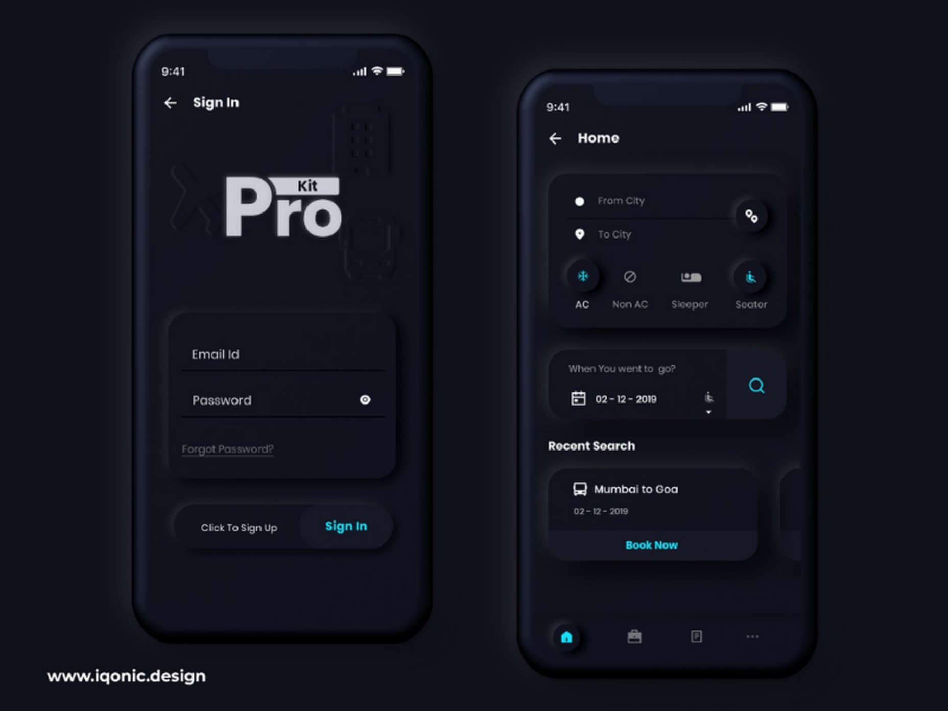
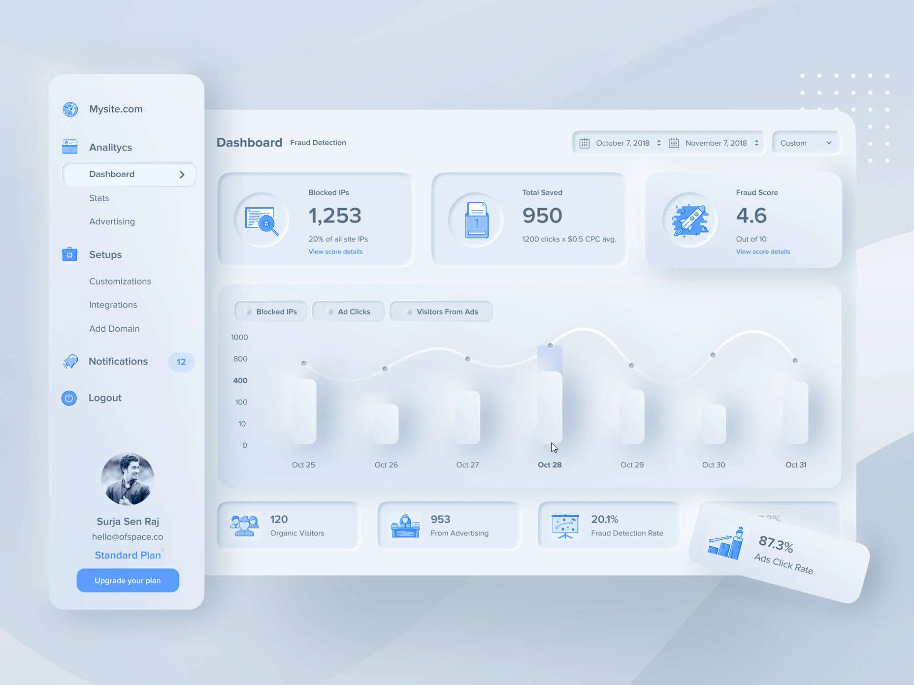
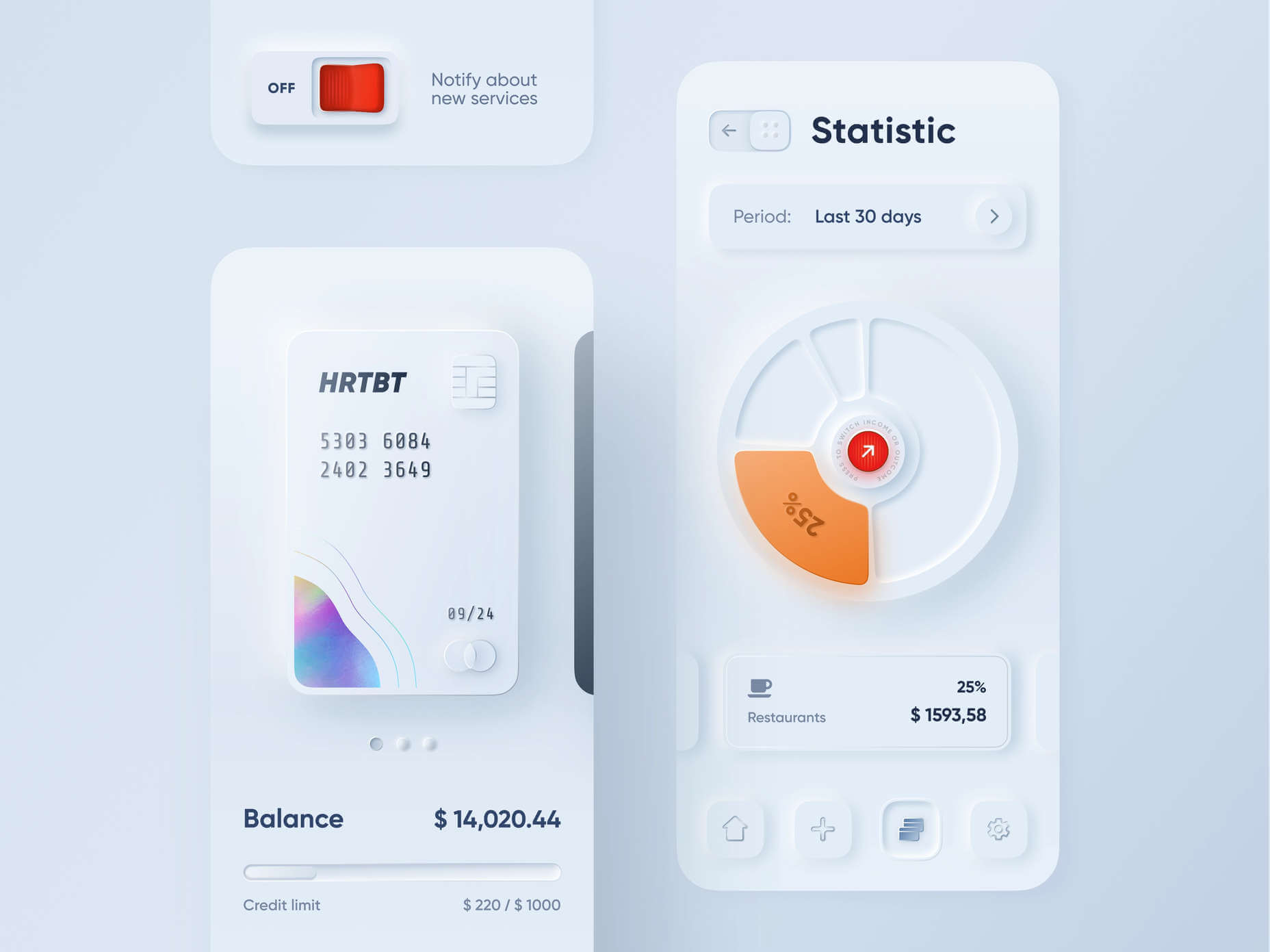
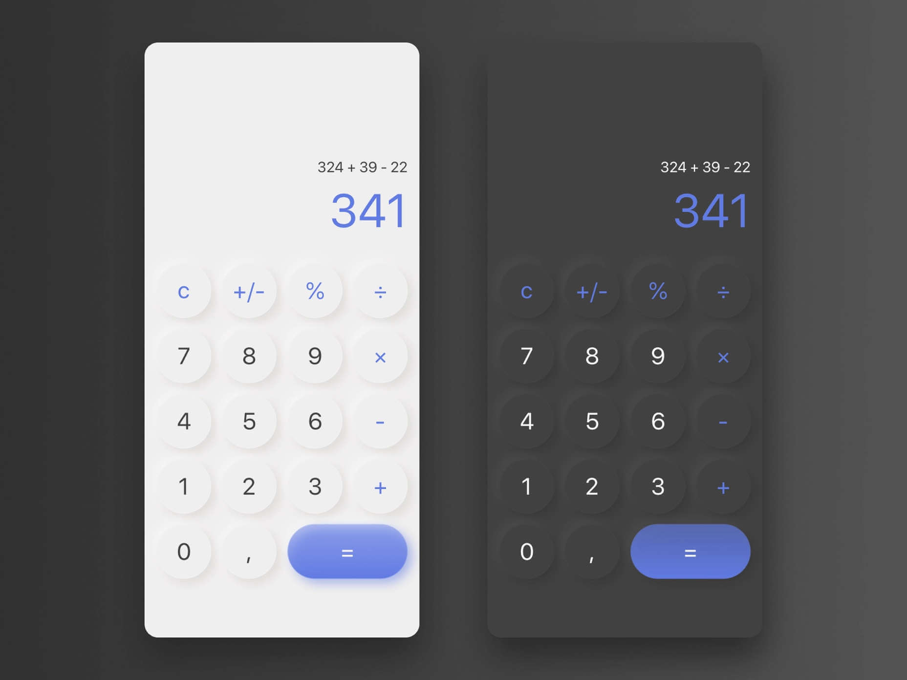


 Creatives need a digital space to call their home. A place from which they can show off their best work, and from where people can get in touch with them to buy or hire from them.
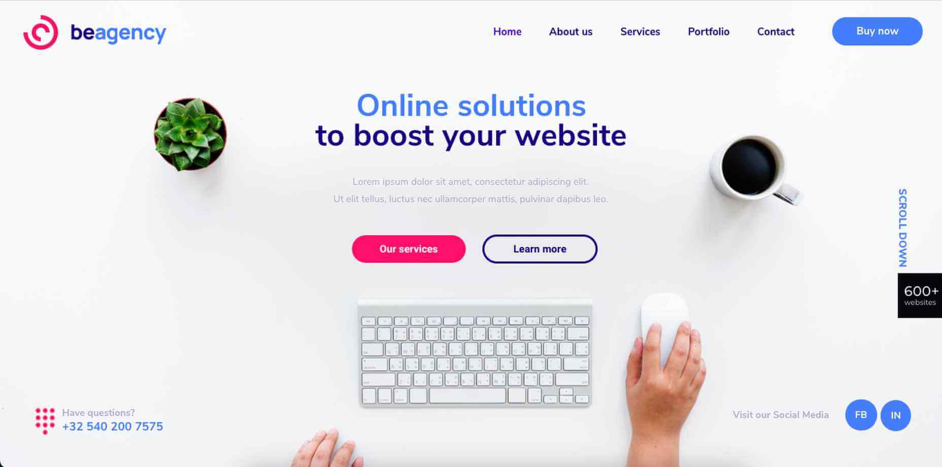
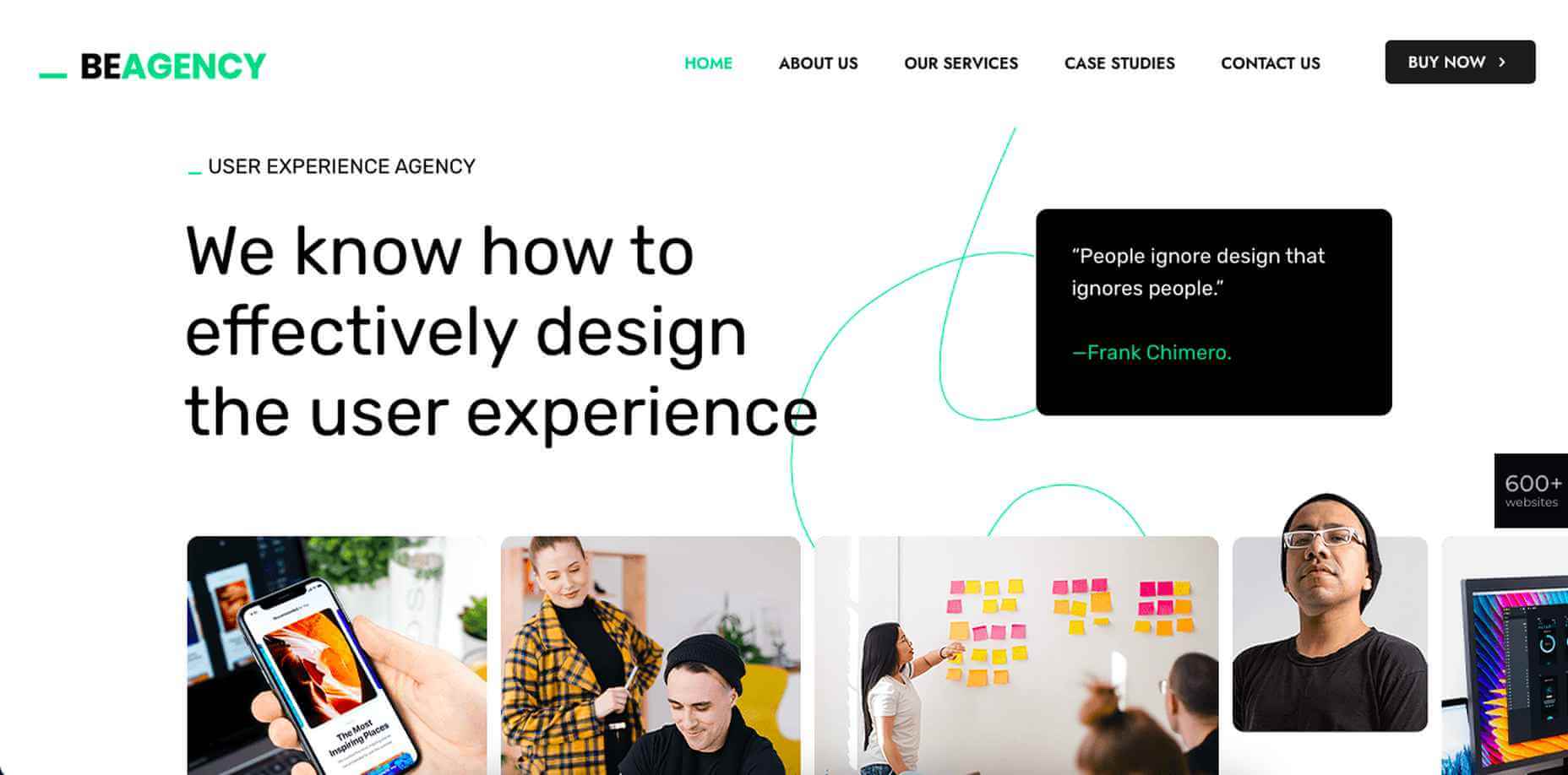
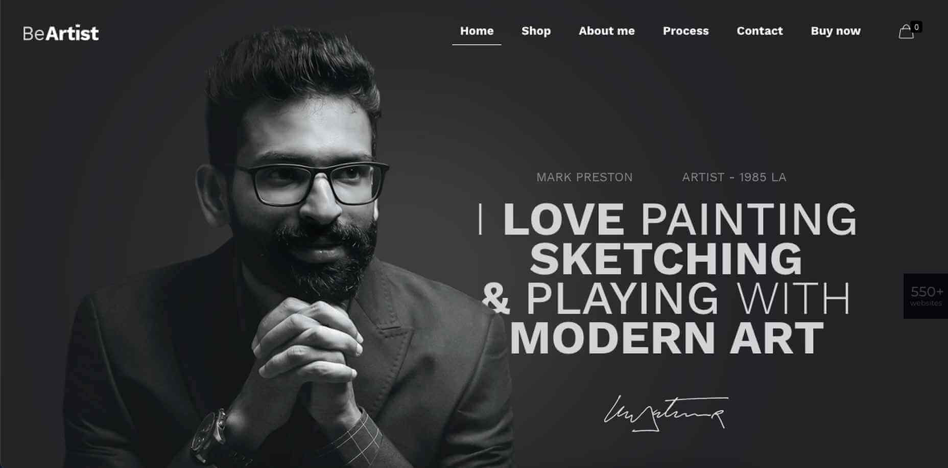
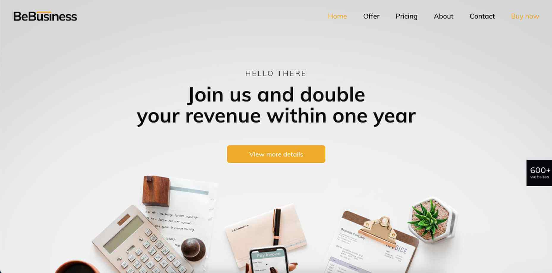
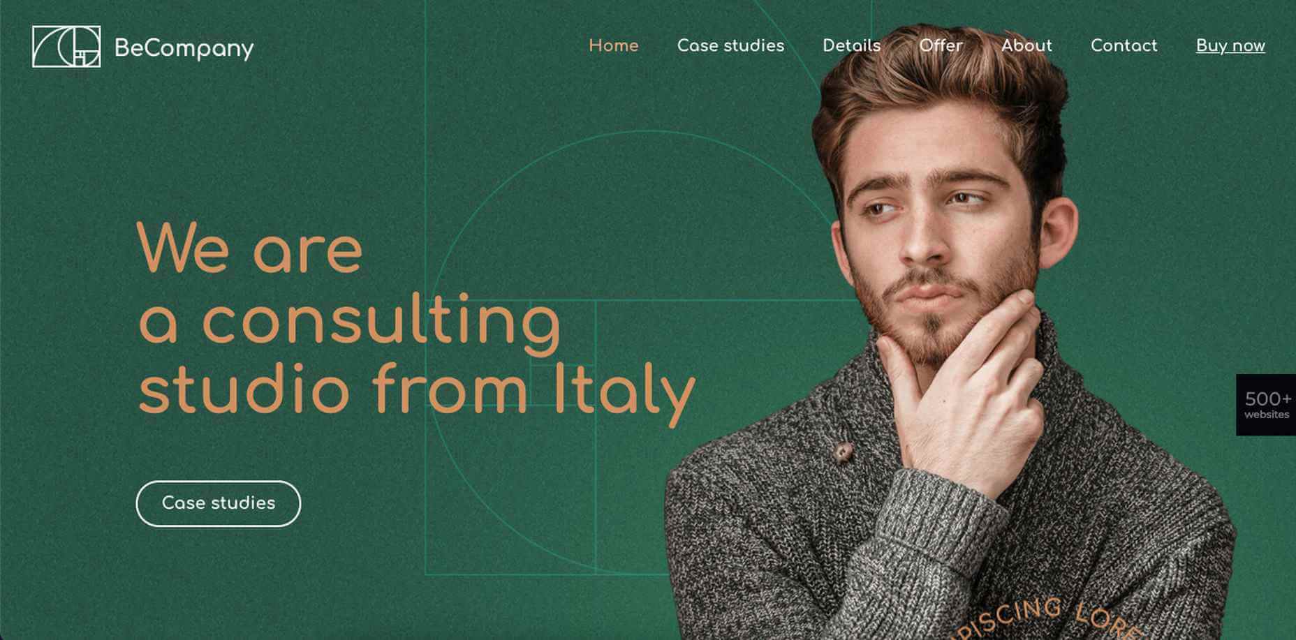
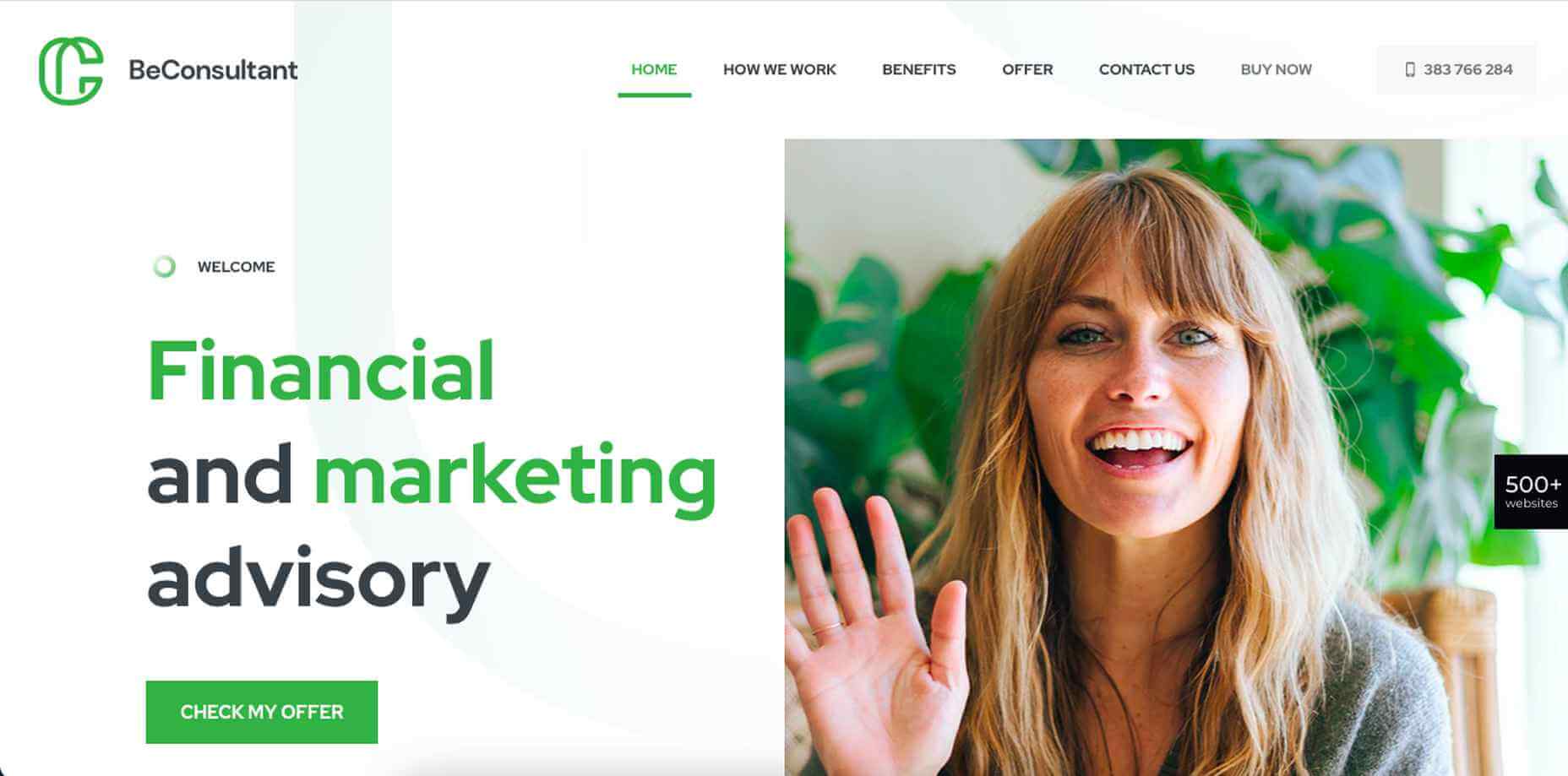
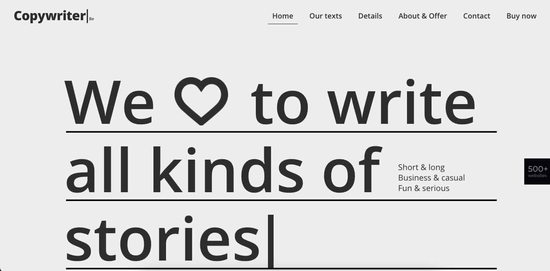
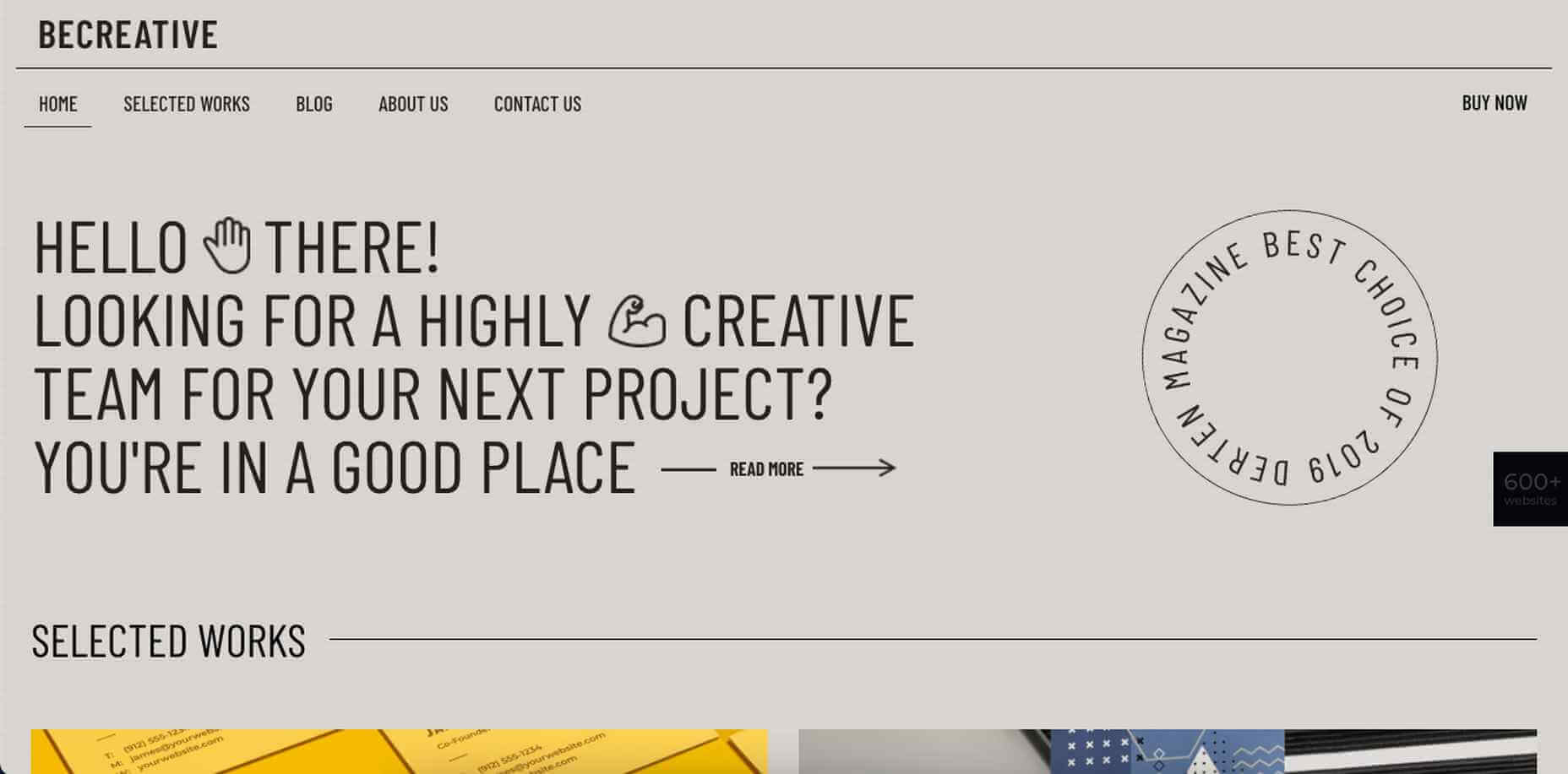
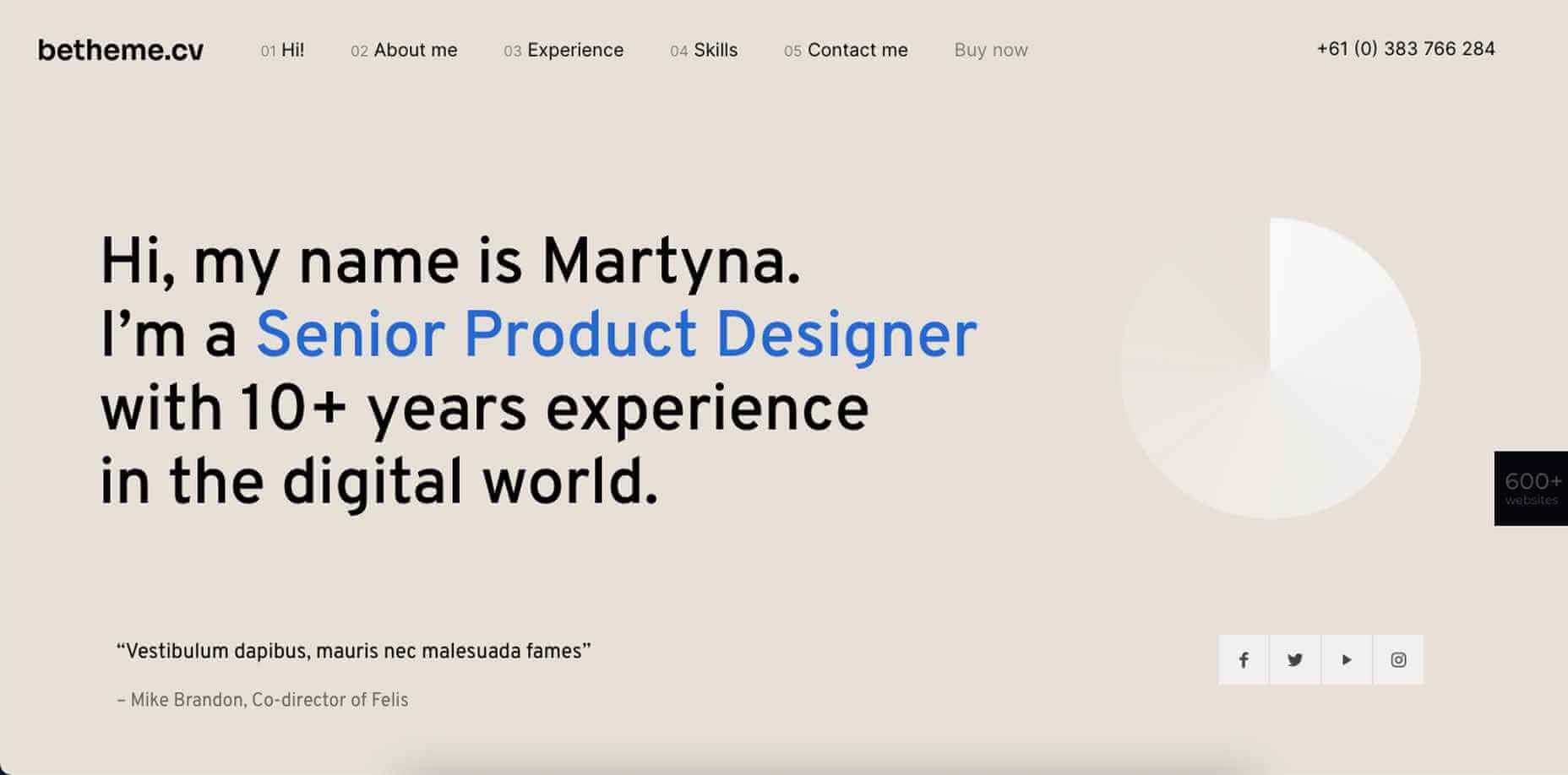
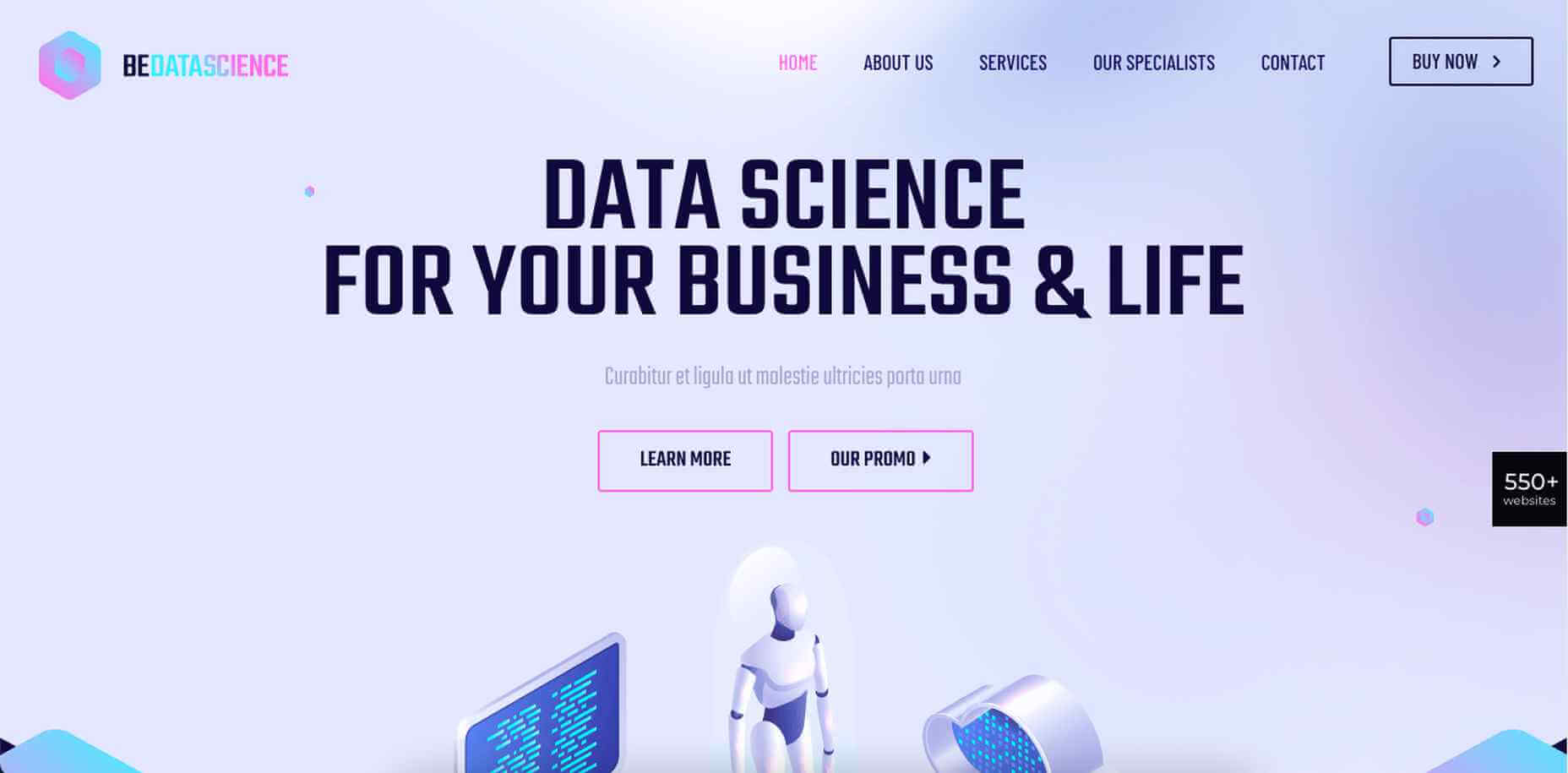
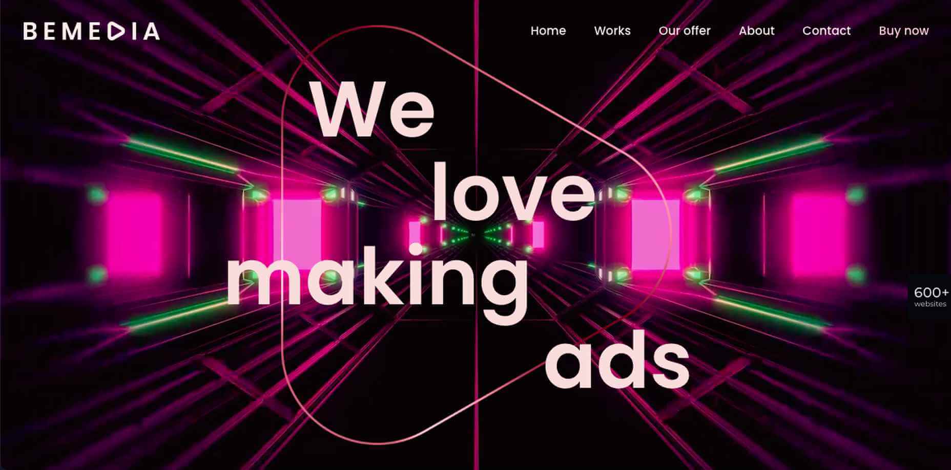
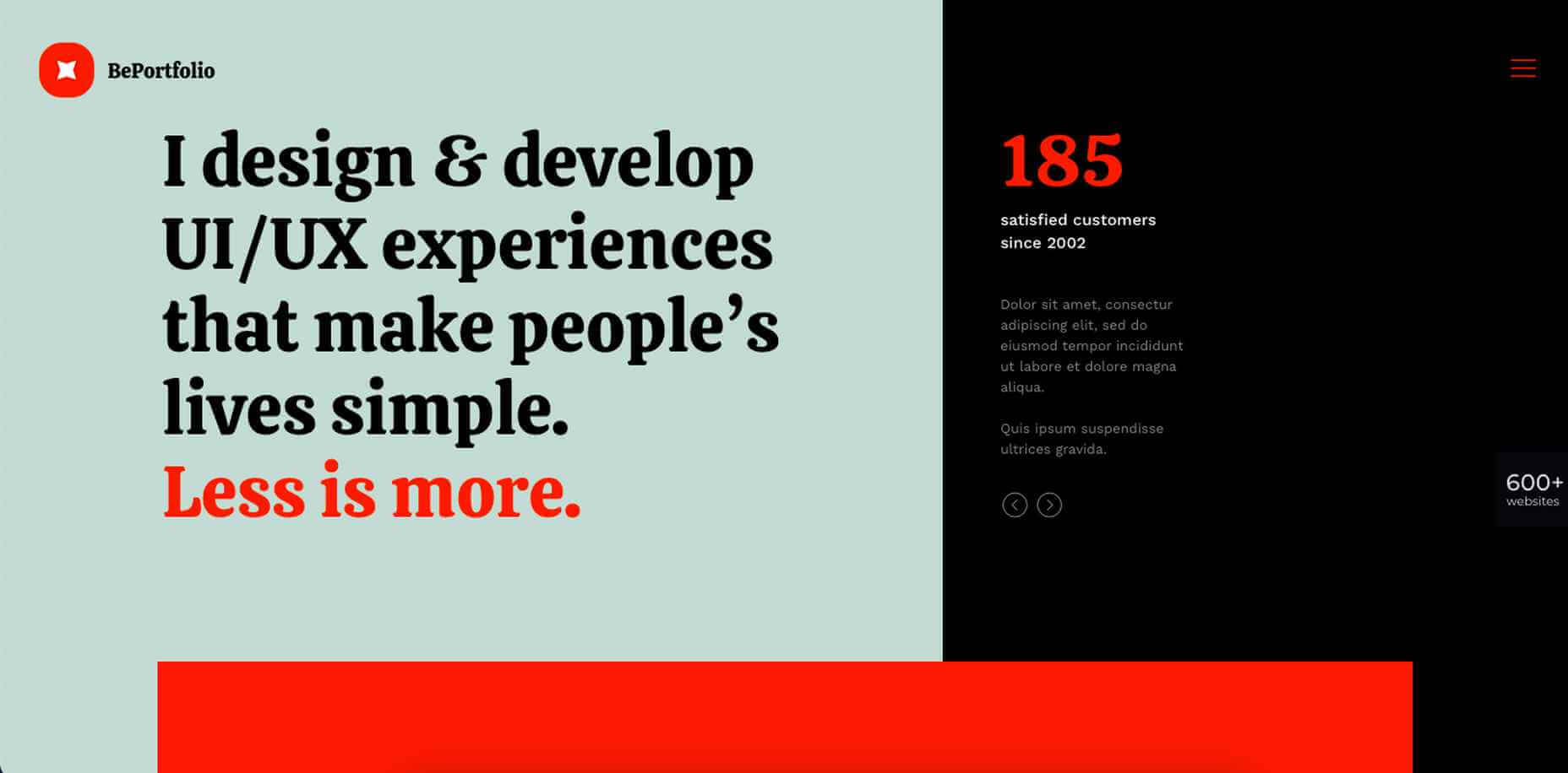
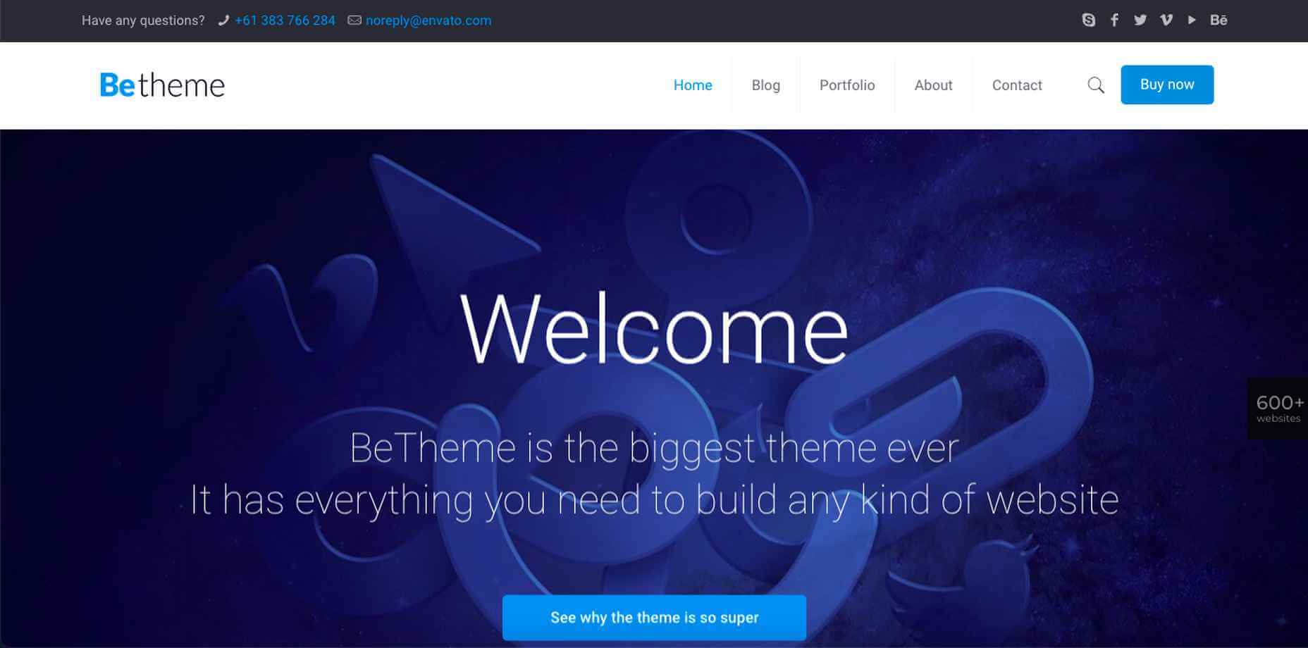
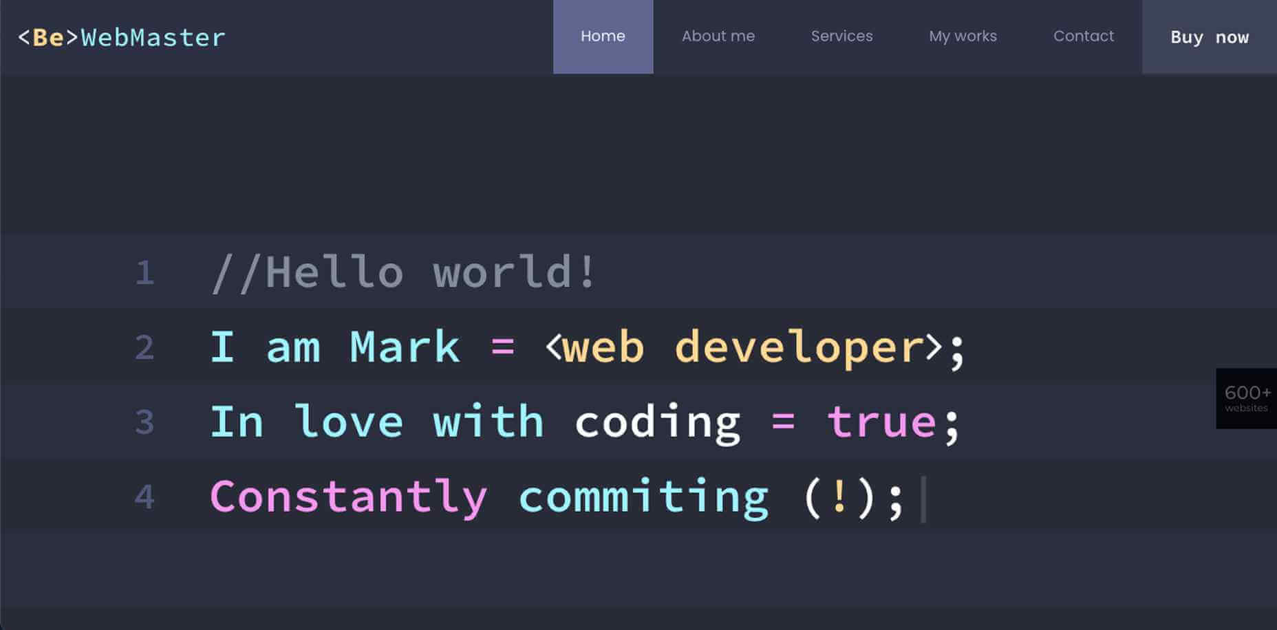

 From dev tools to productivity to a little bit of fun with sudoku, this month’s collection of new tools is packed with something for everyone.
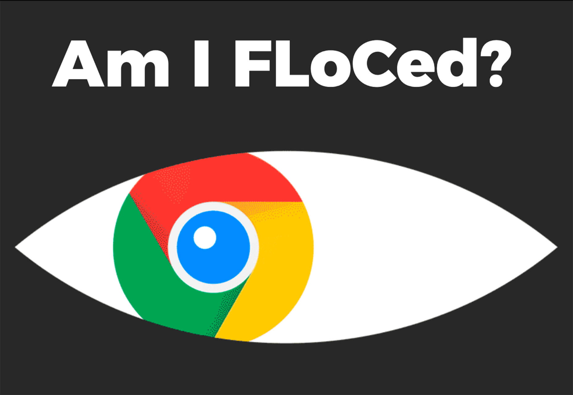
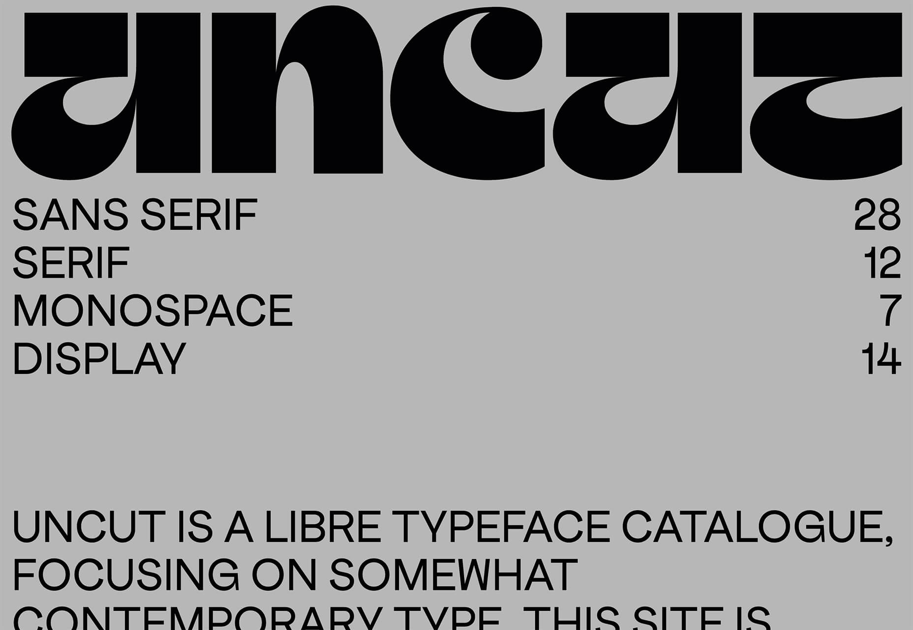


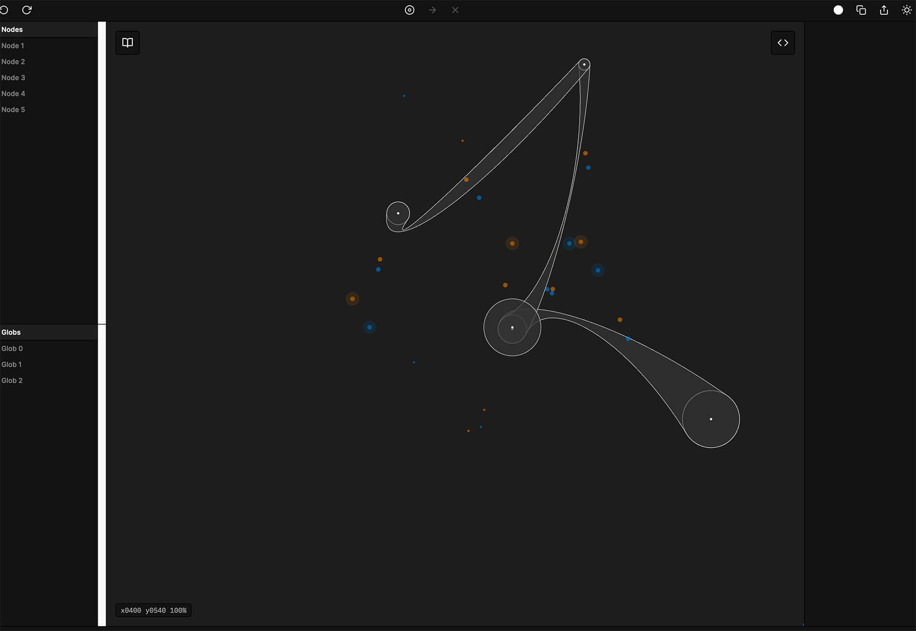
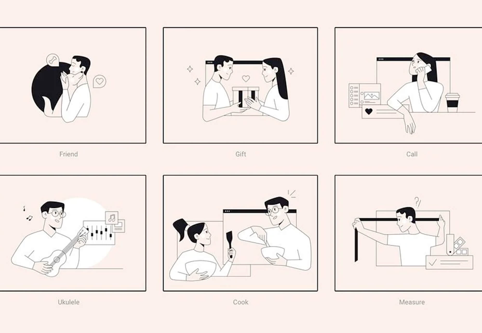

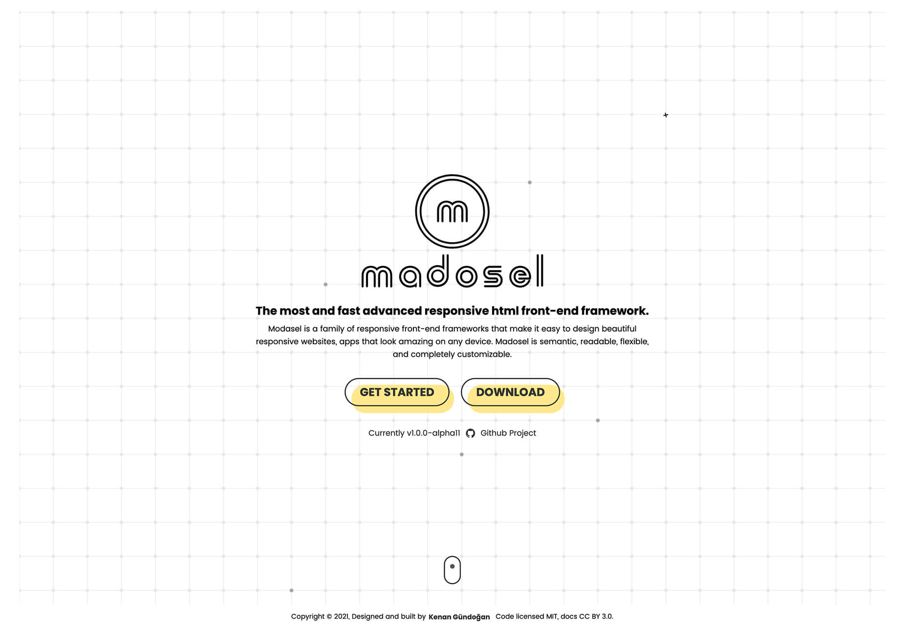
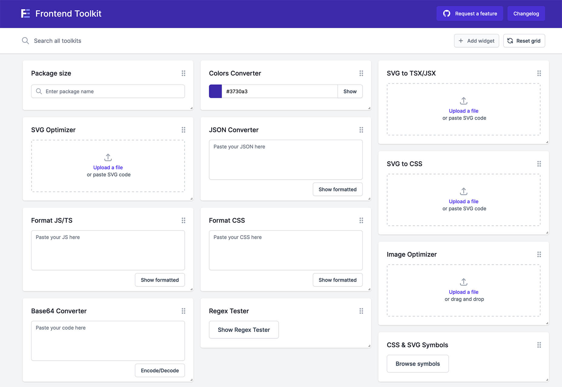
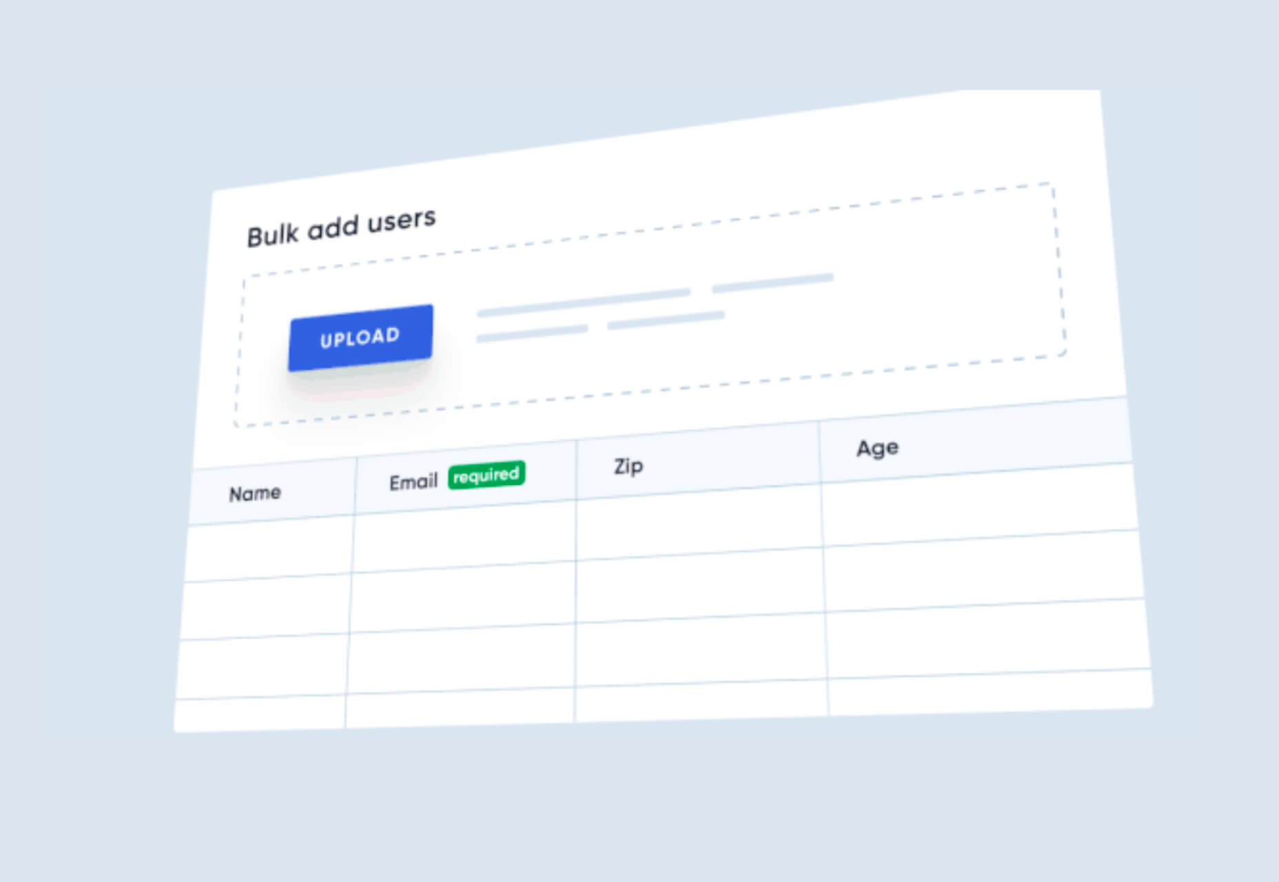
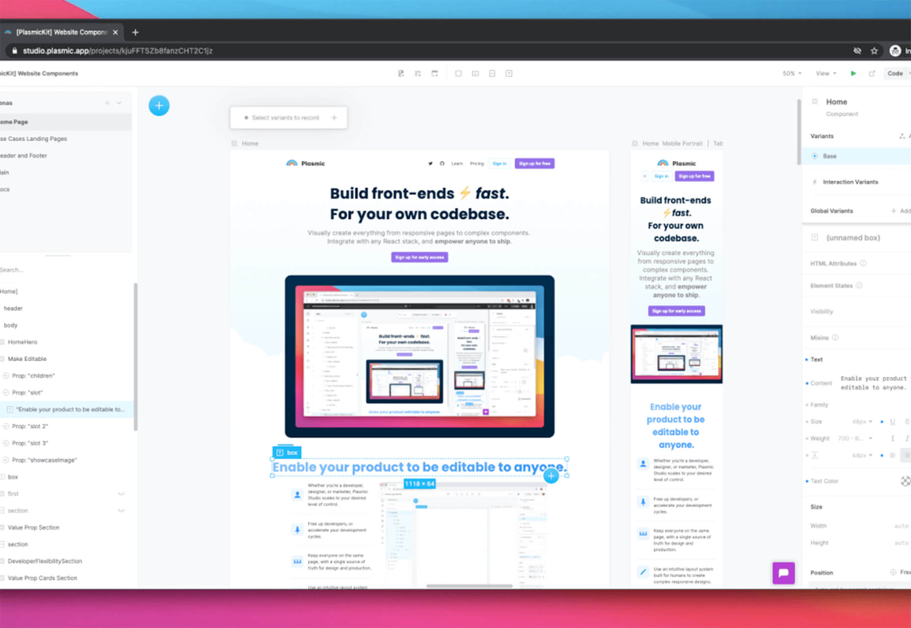
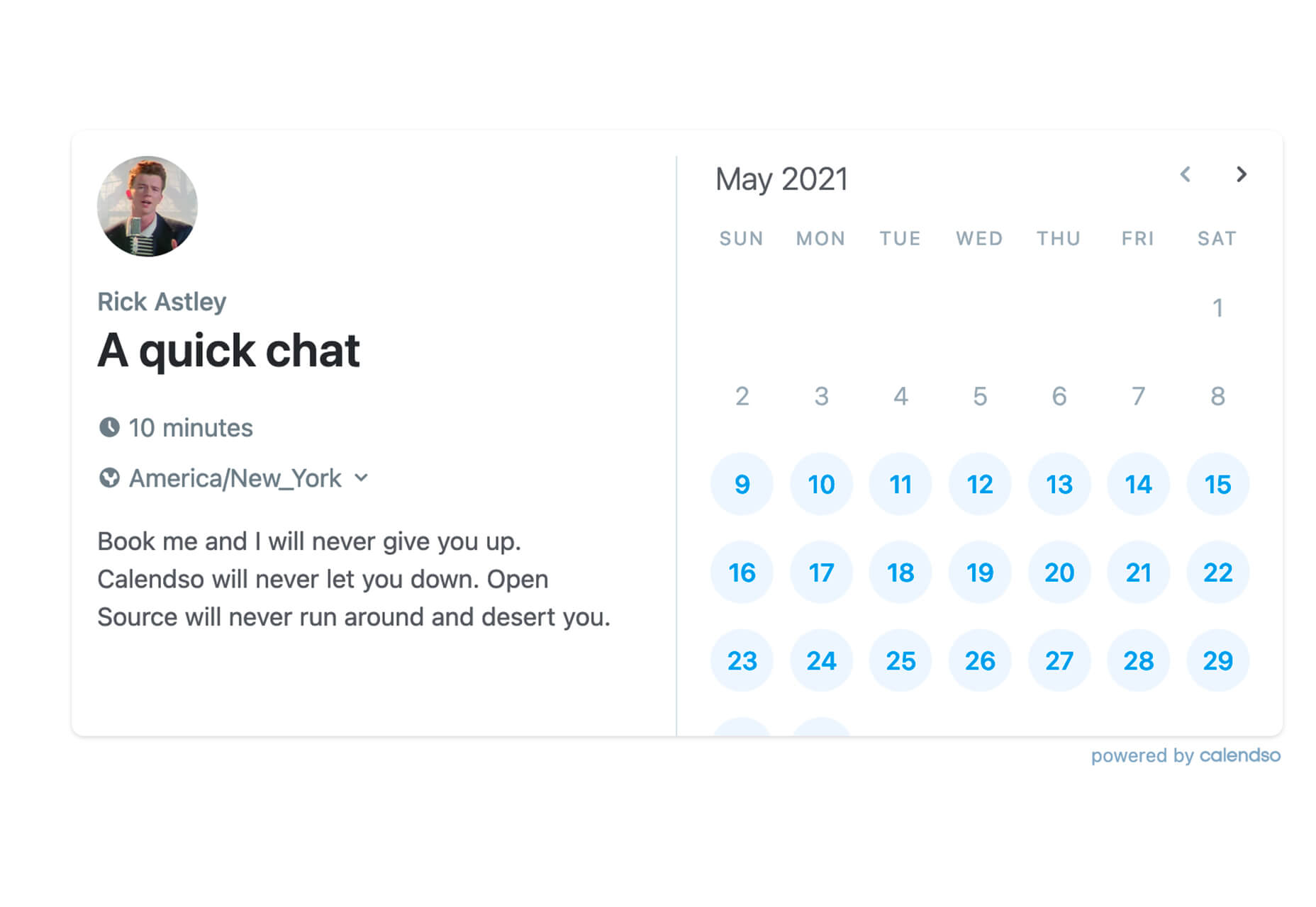
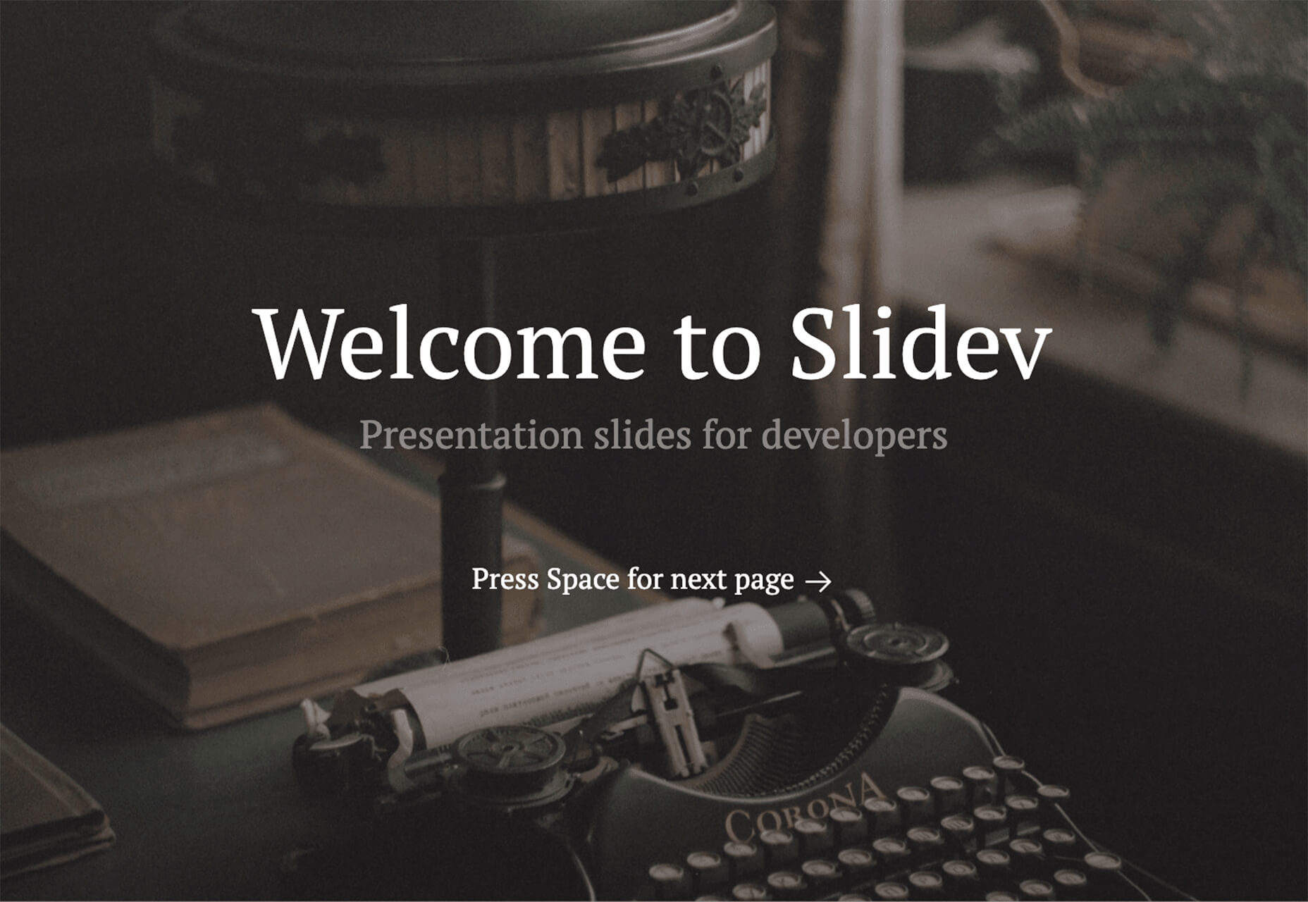
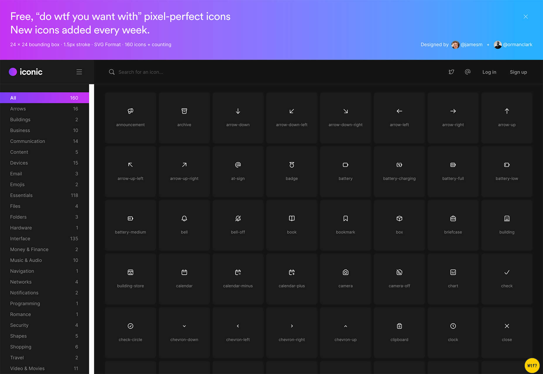
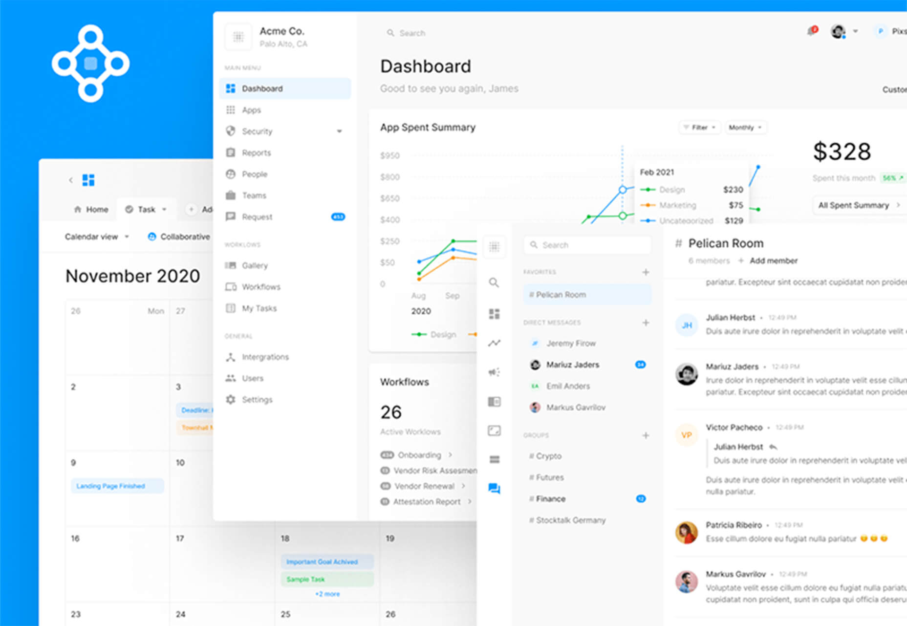
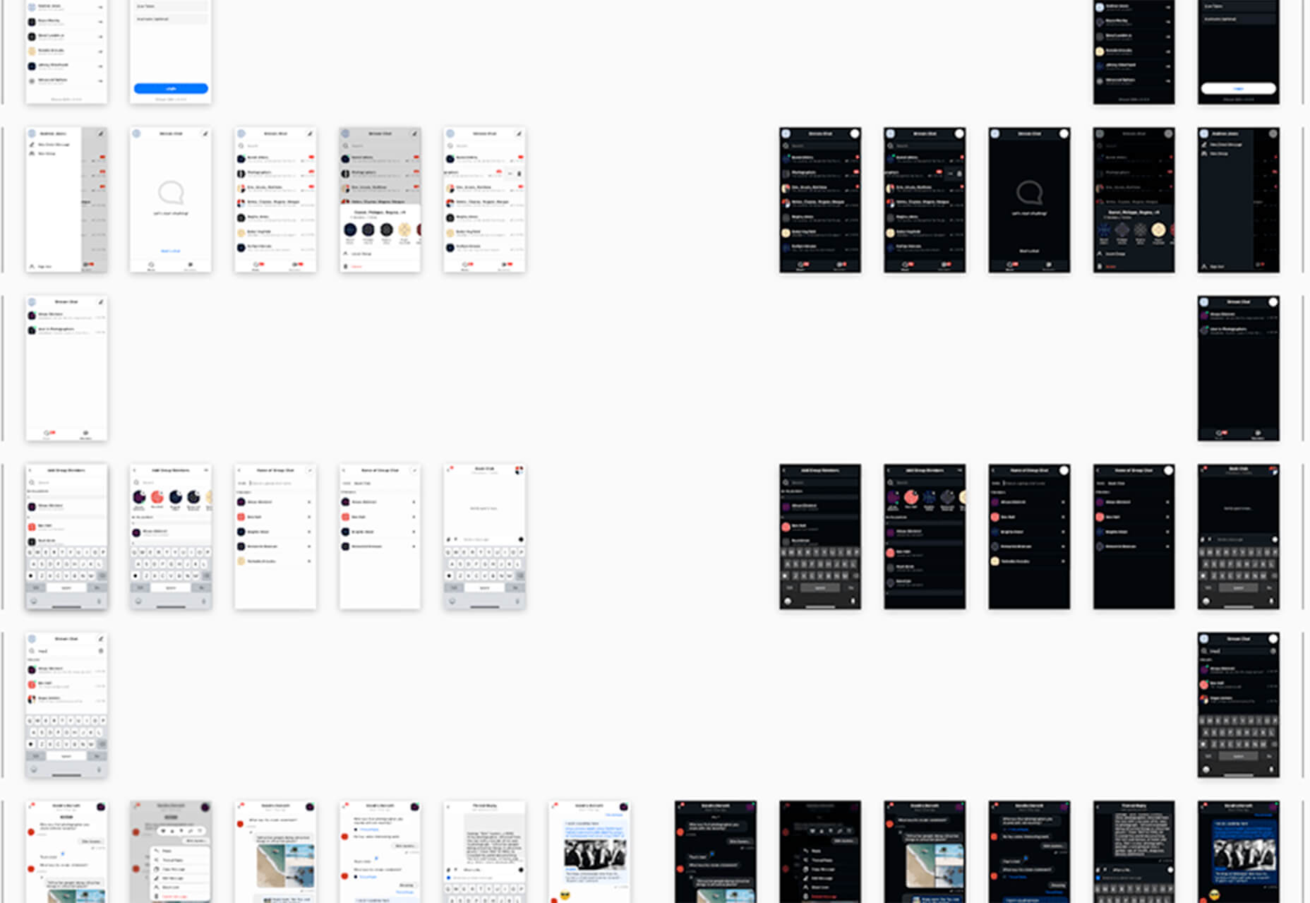
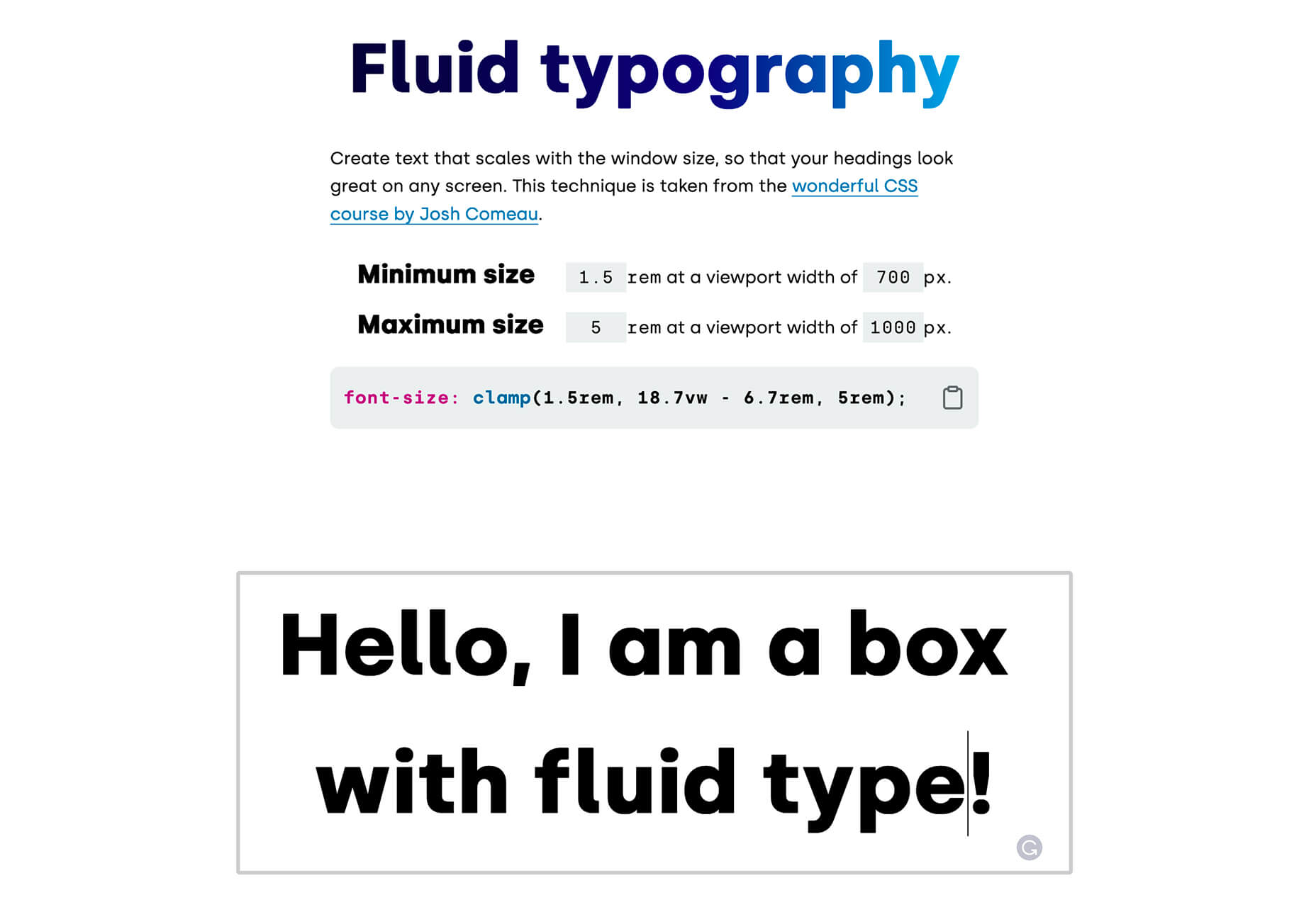
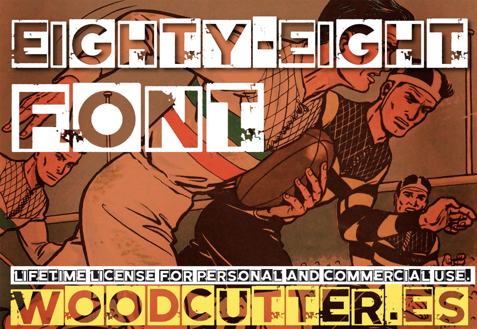
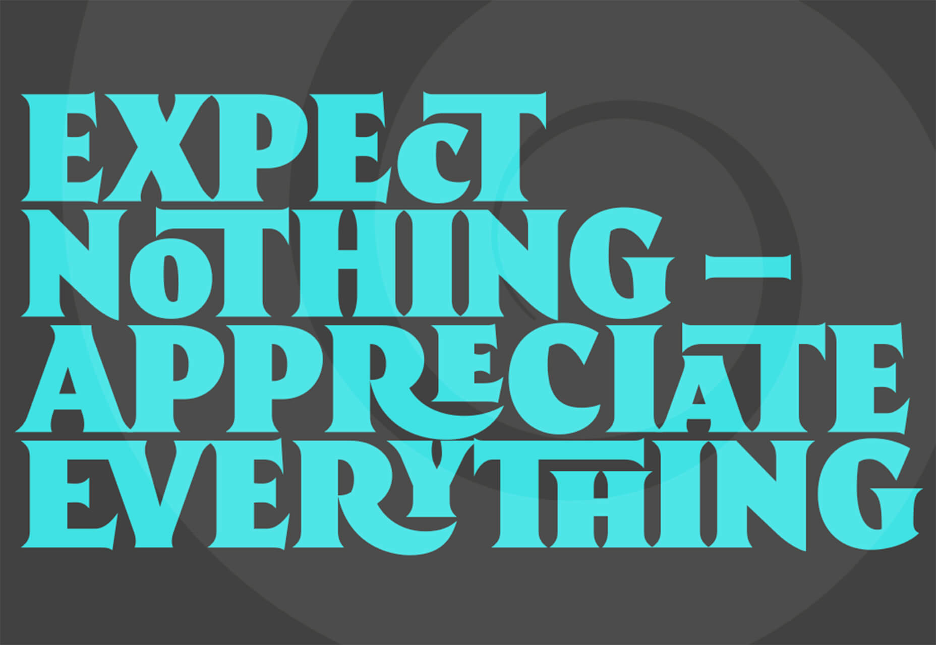
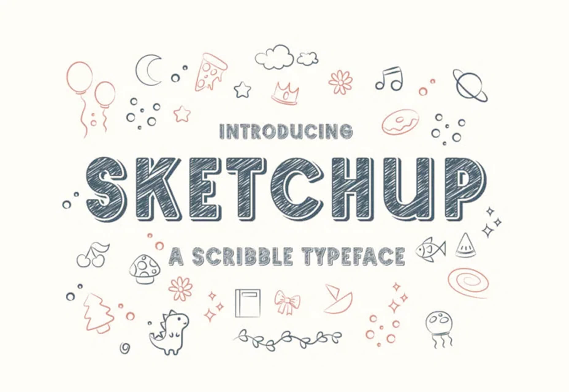
 Have you ever wondered why we’re so amazed by motion? A moving image is more likely to grab your attention than a static one. Motion is exciting and attention-grabbing – plus, it allows us to access more information in a short space of time.
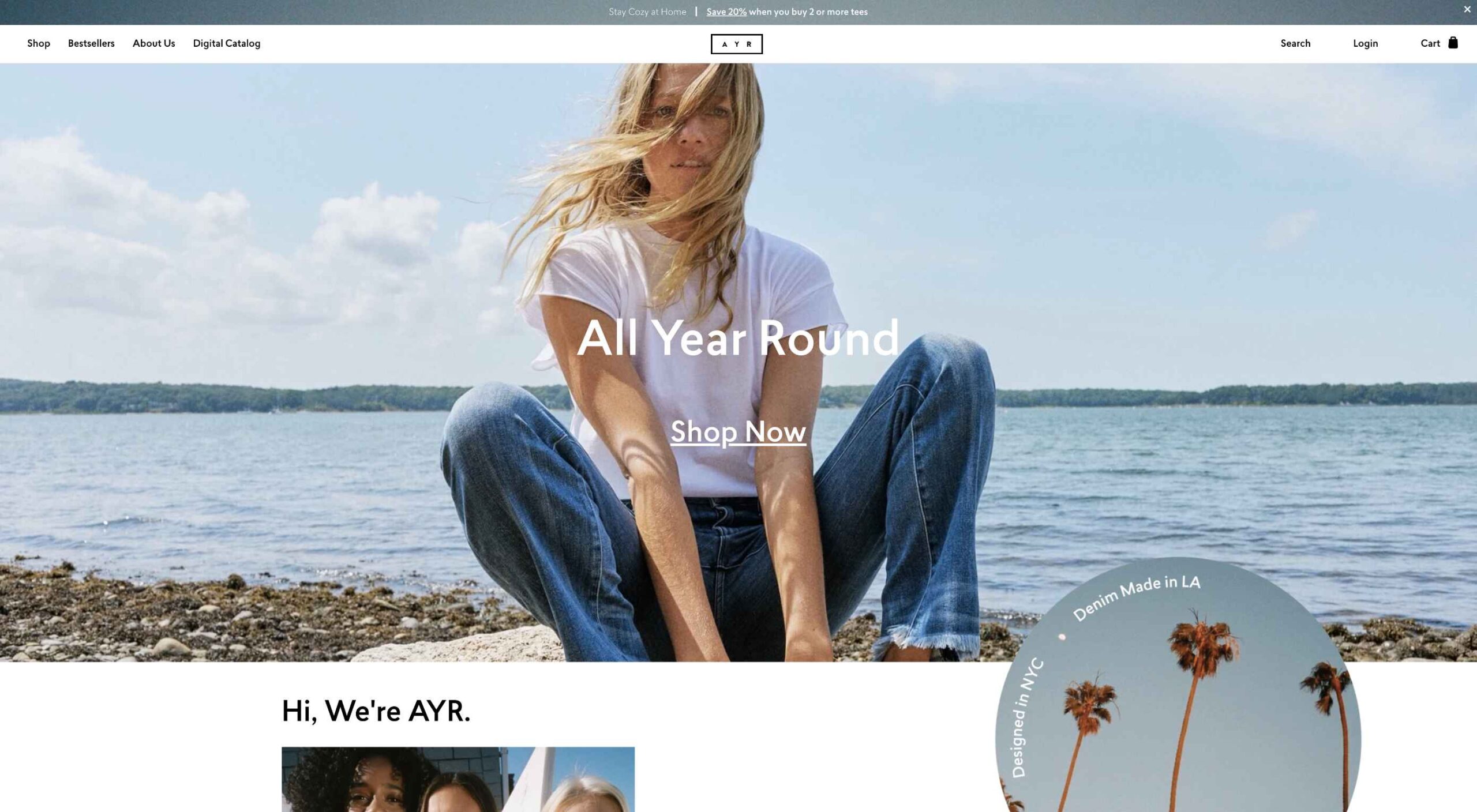 Today, great design isn’t just about conveying the right amount of information in a certain number of pages.
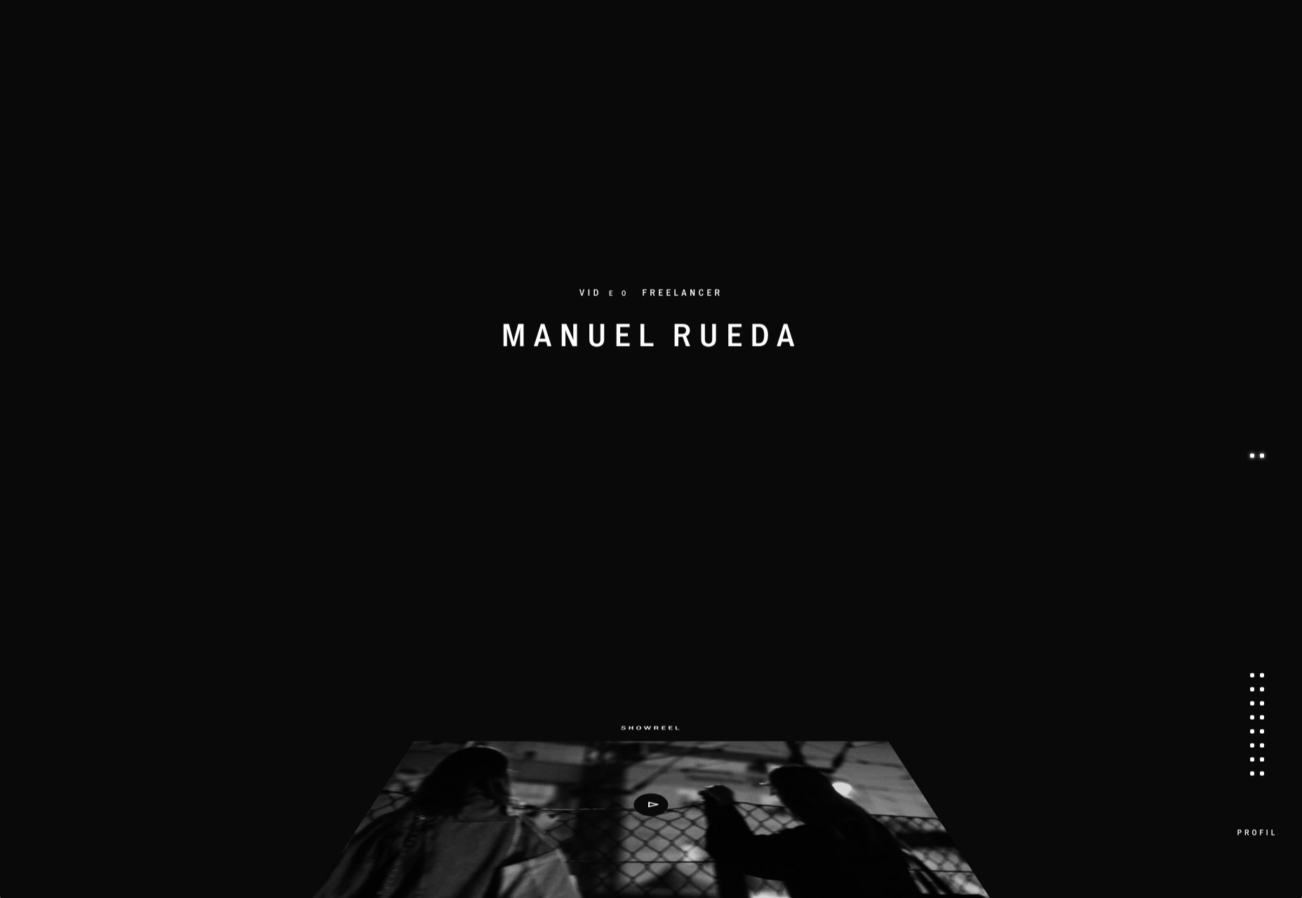
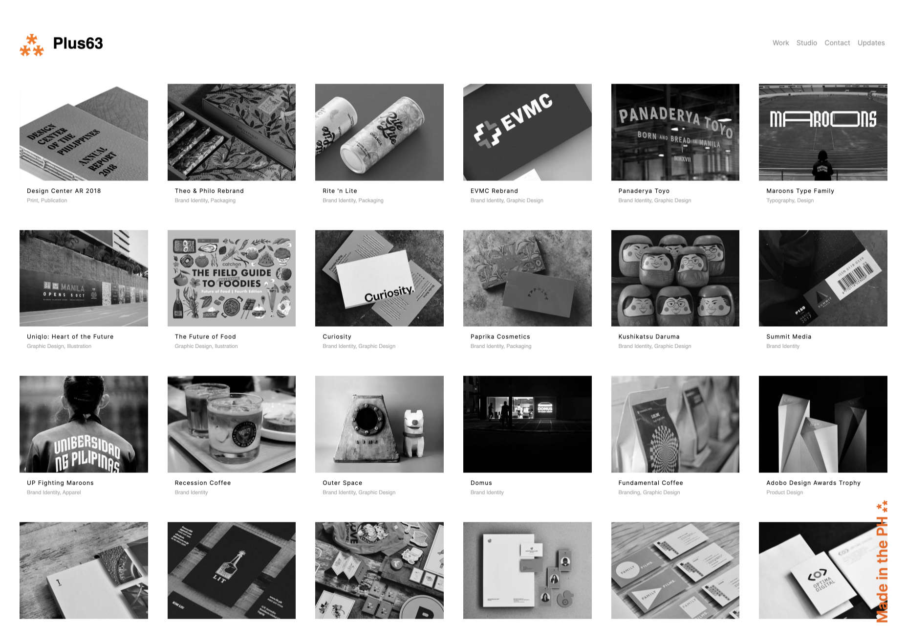
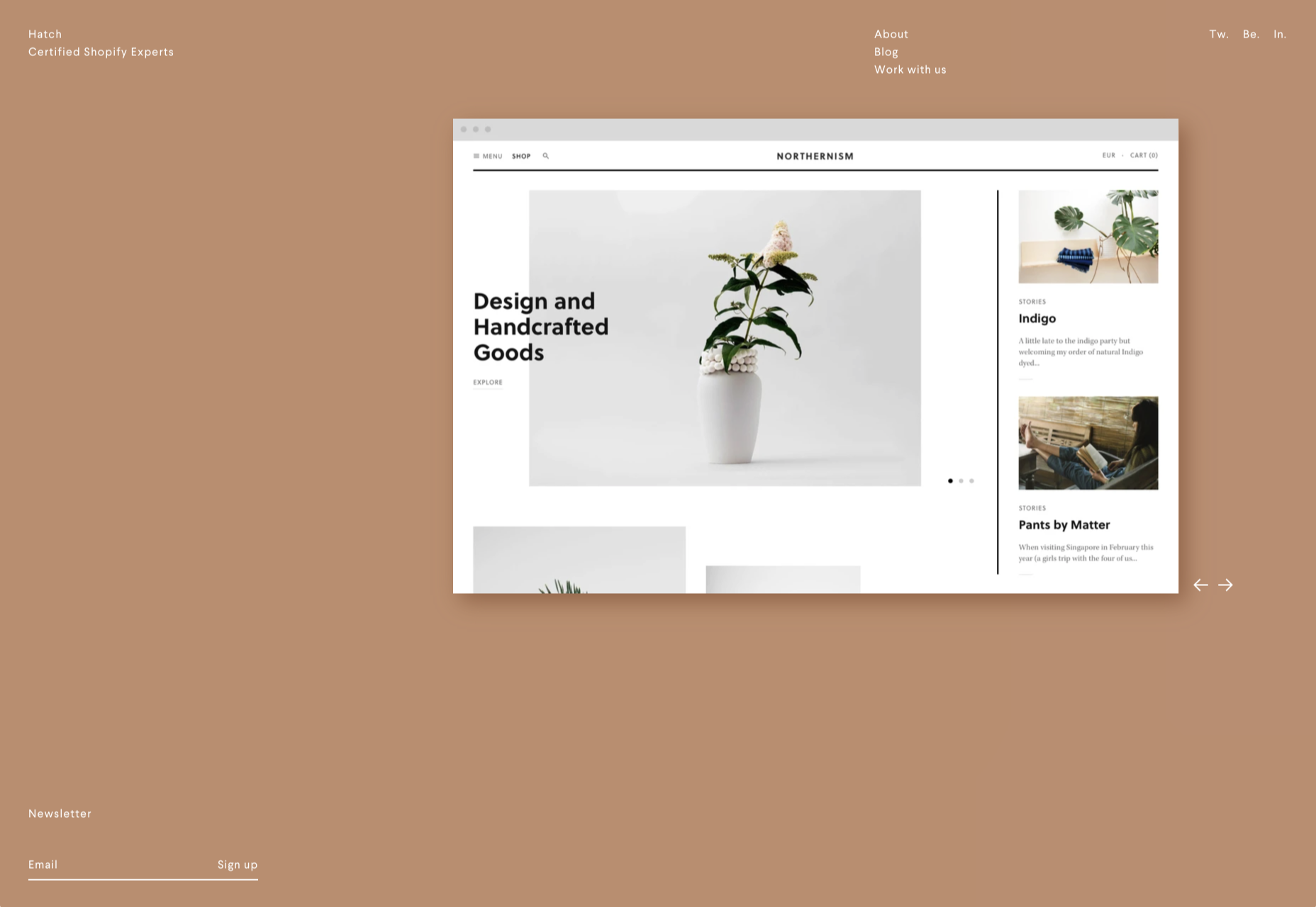
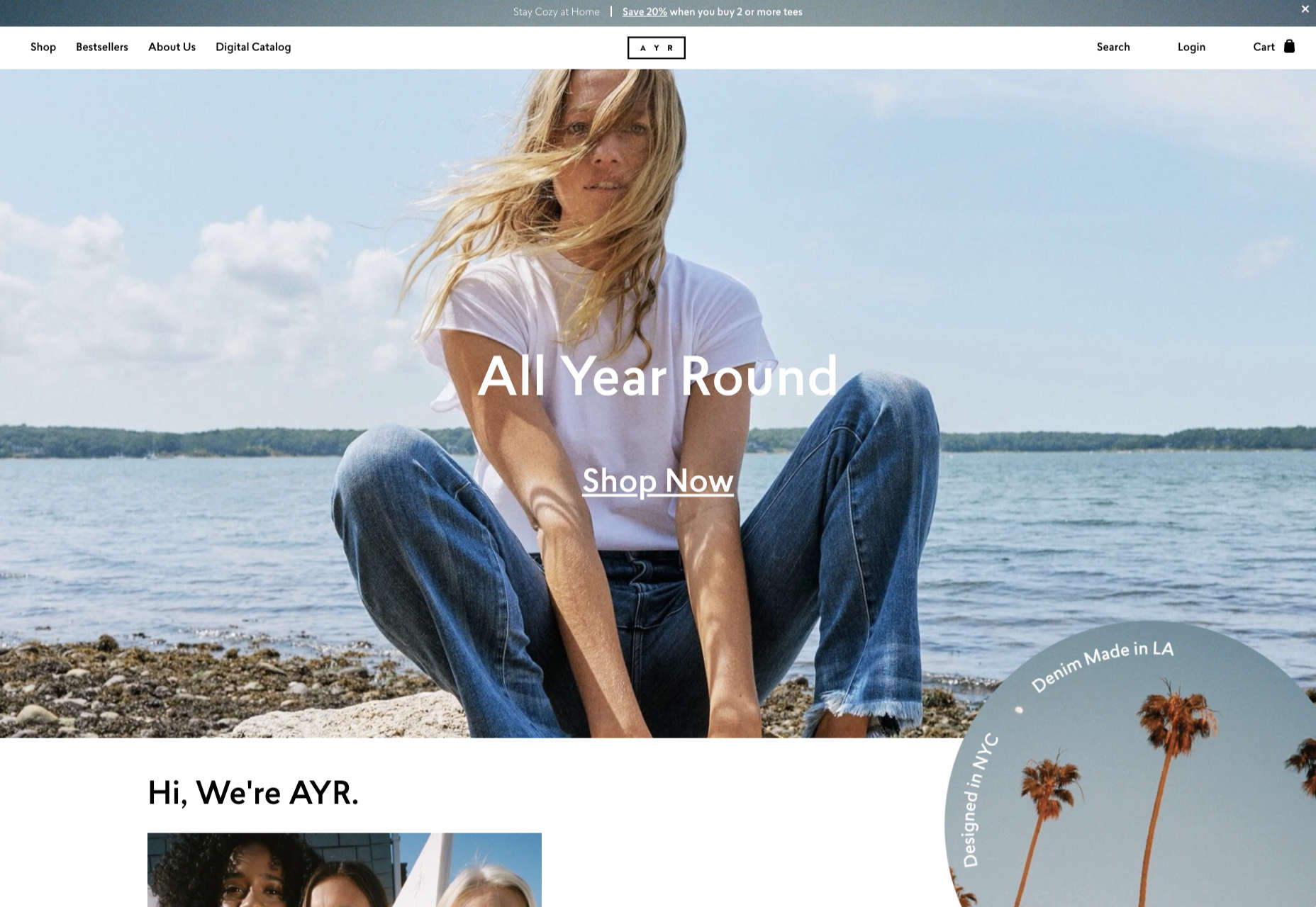
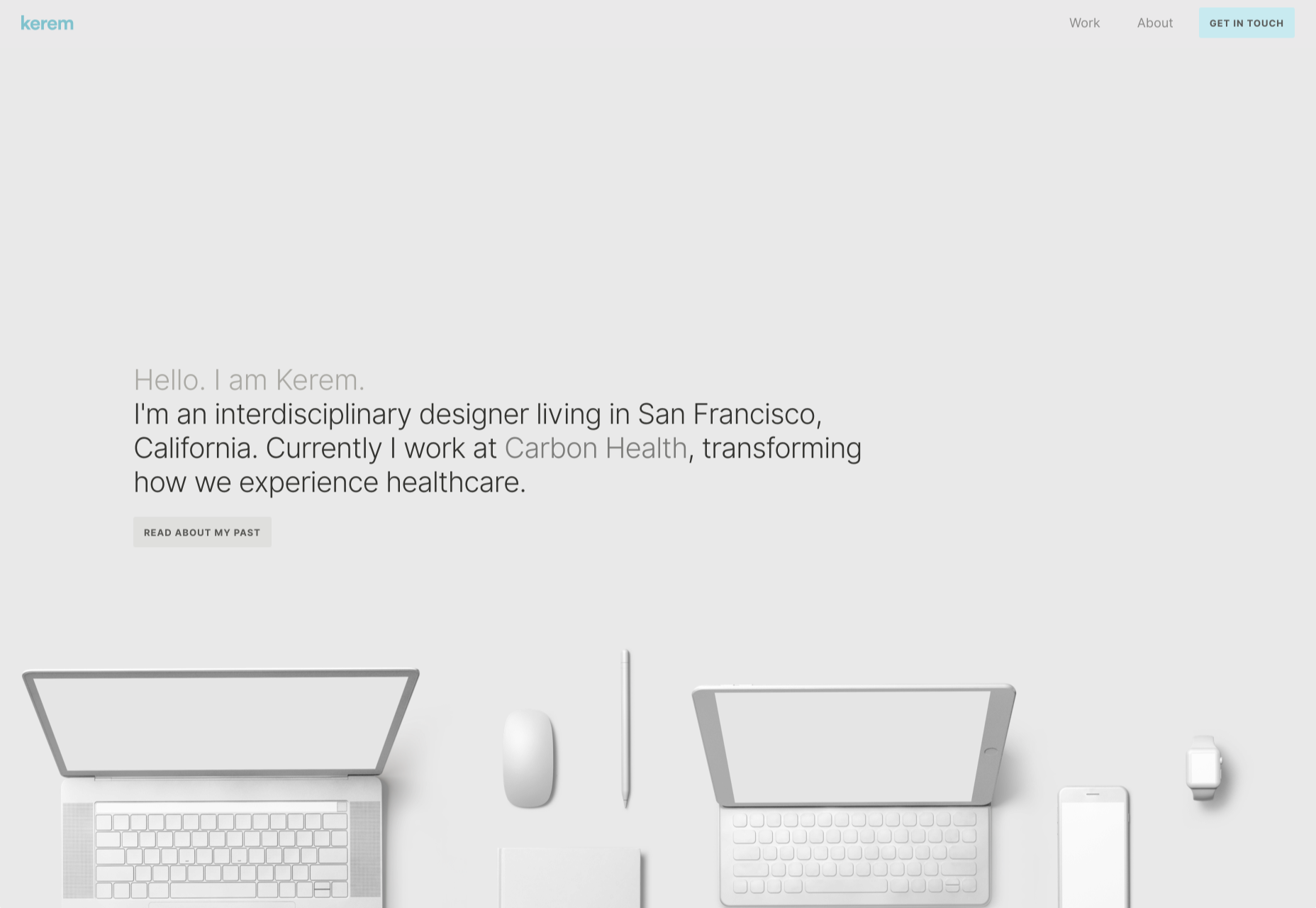
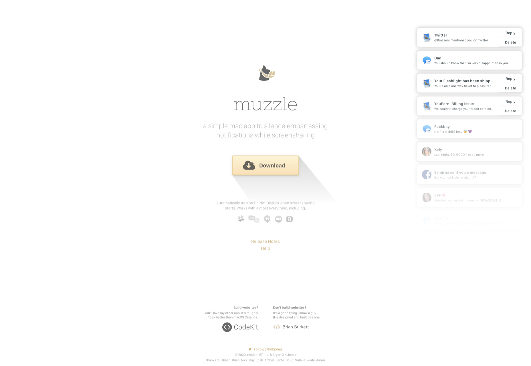
 Dark themes are everywhere these days.
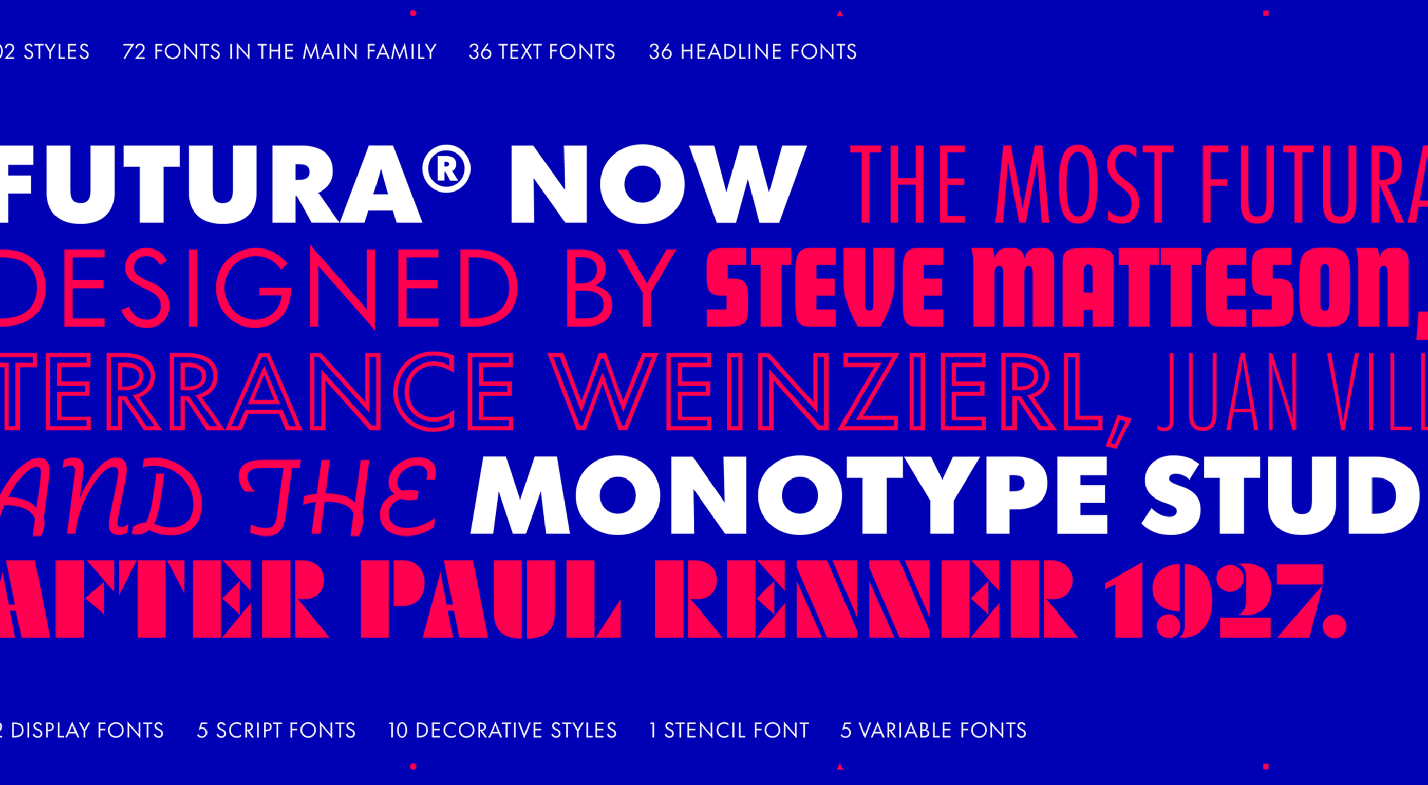 This month’s collection of new tools, resources, and freebies for designers is a smorgasbord of sorts. You’ll find everything from useful APIs to icons to tutorials to fonts.
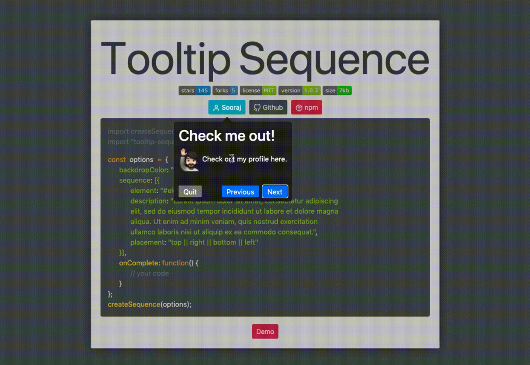
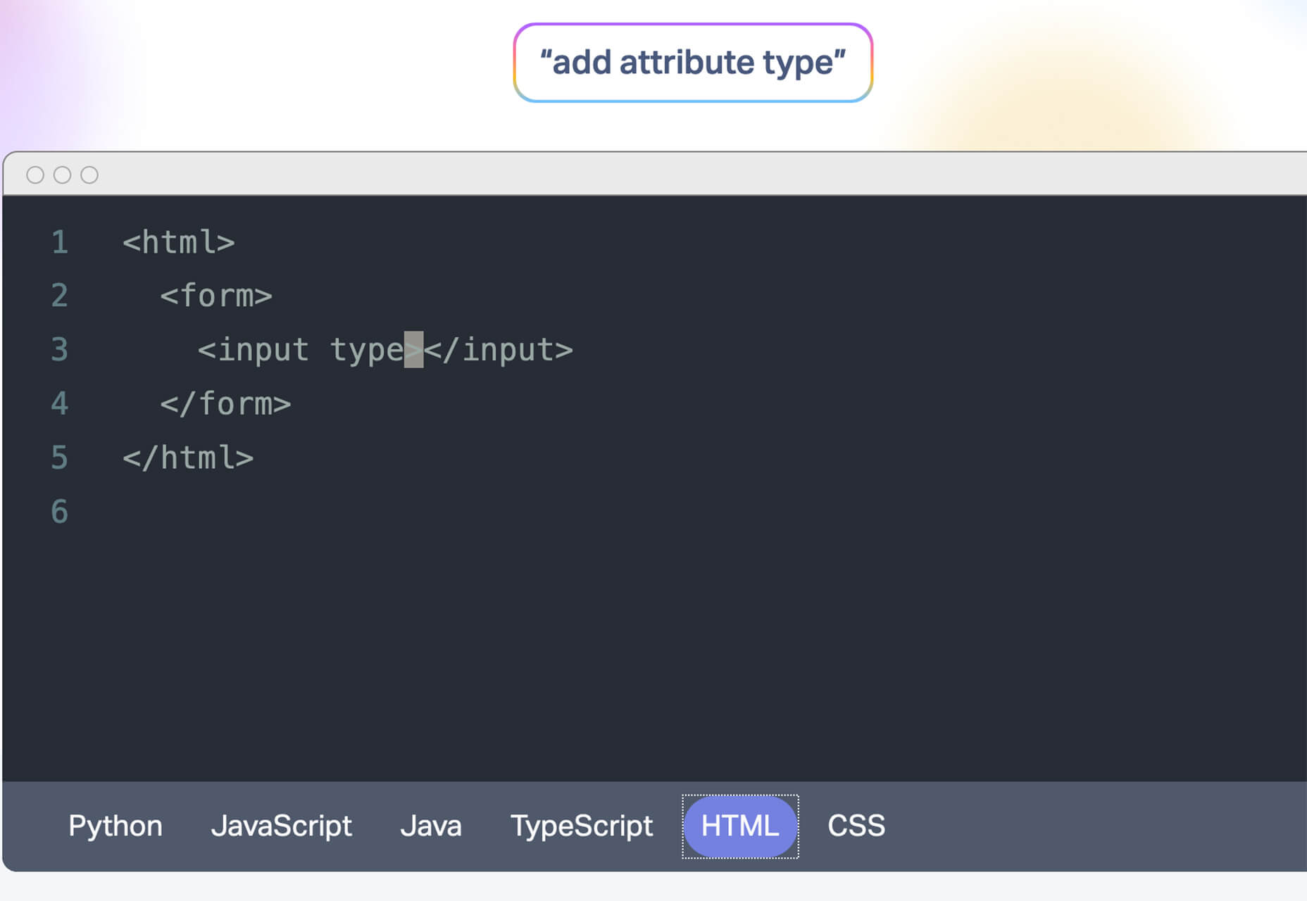
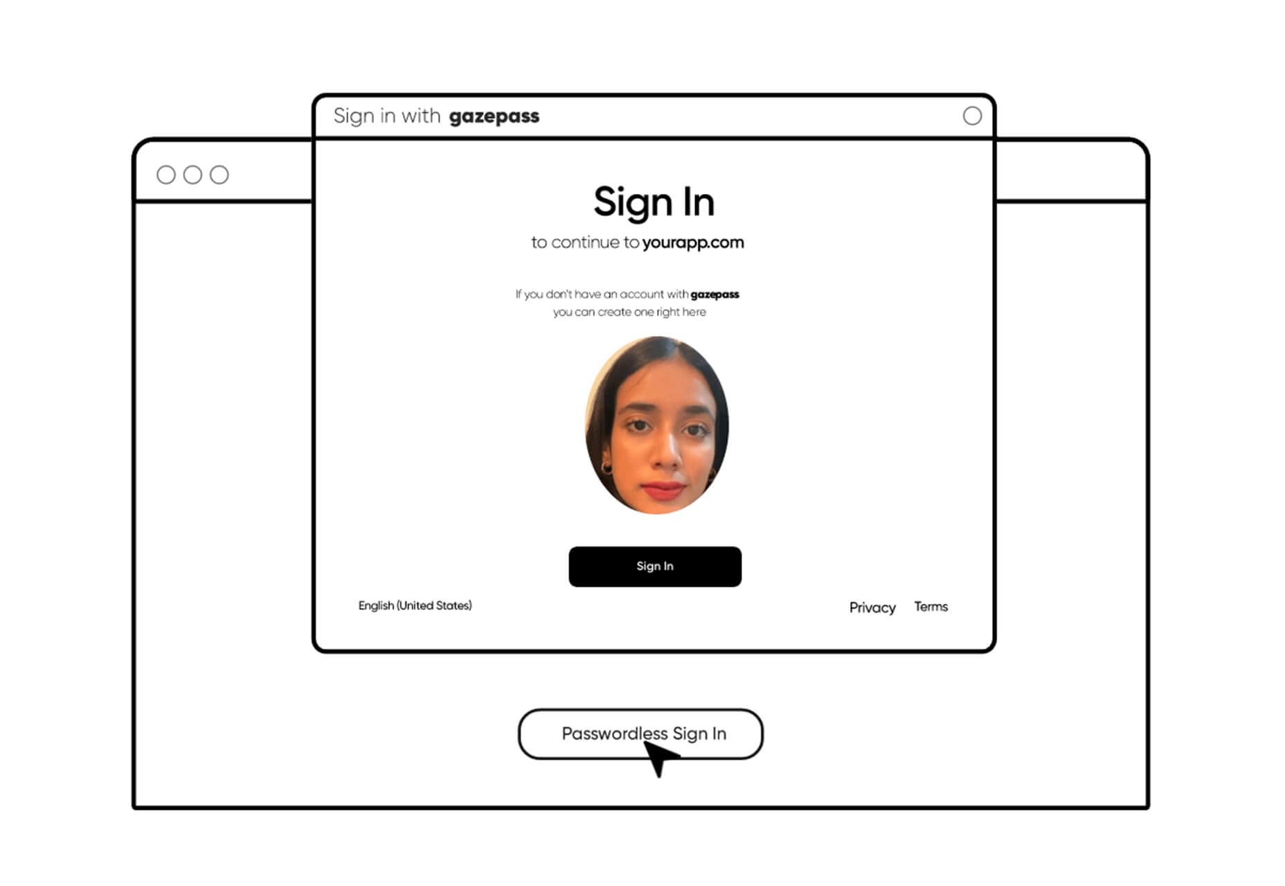
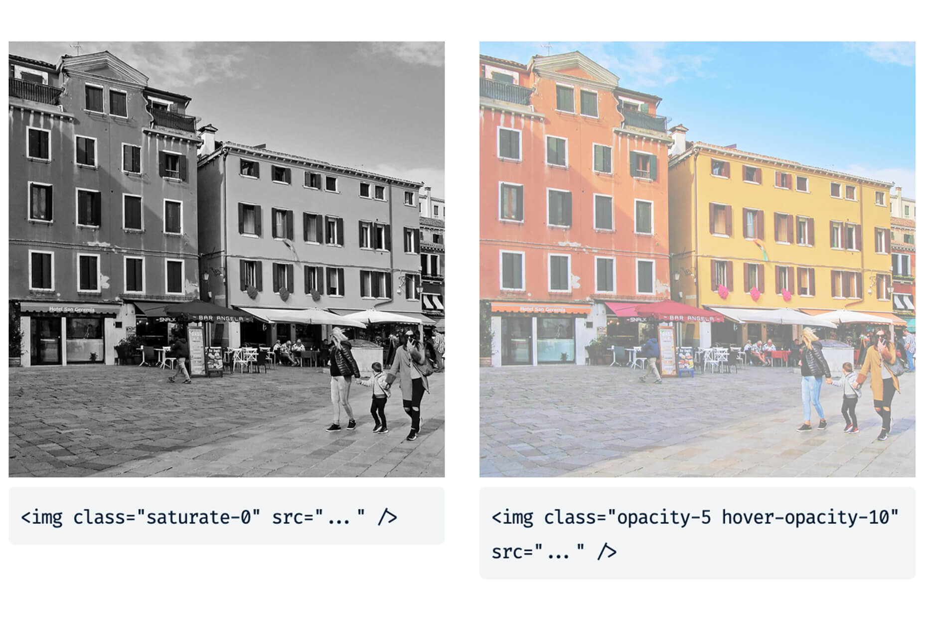
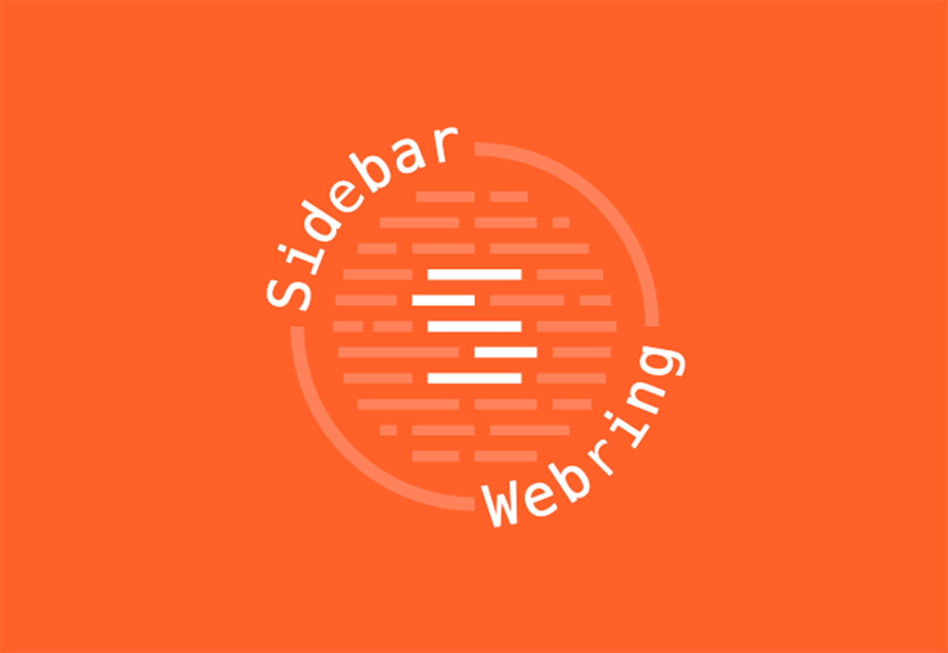

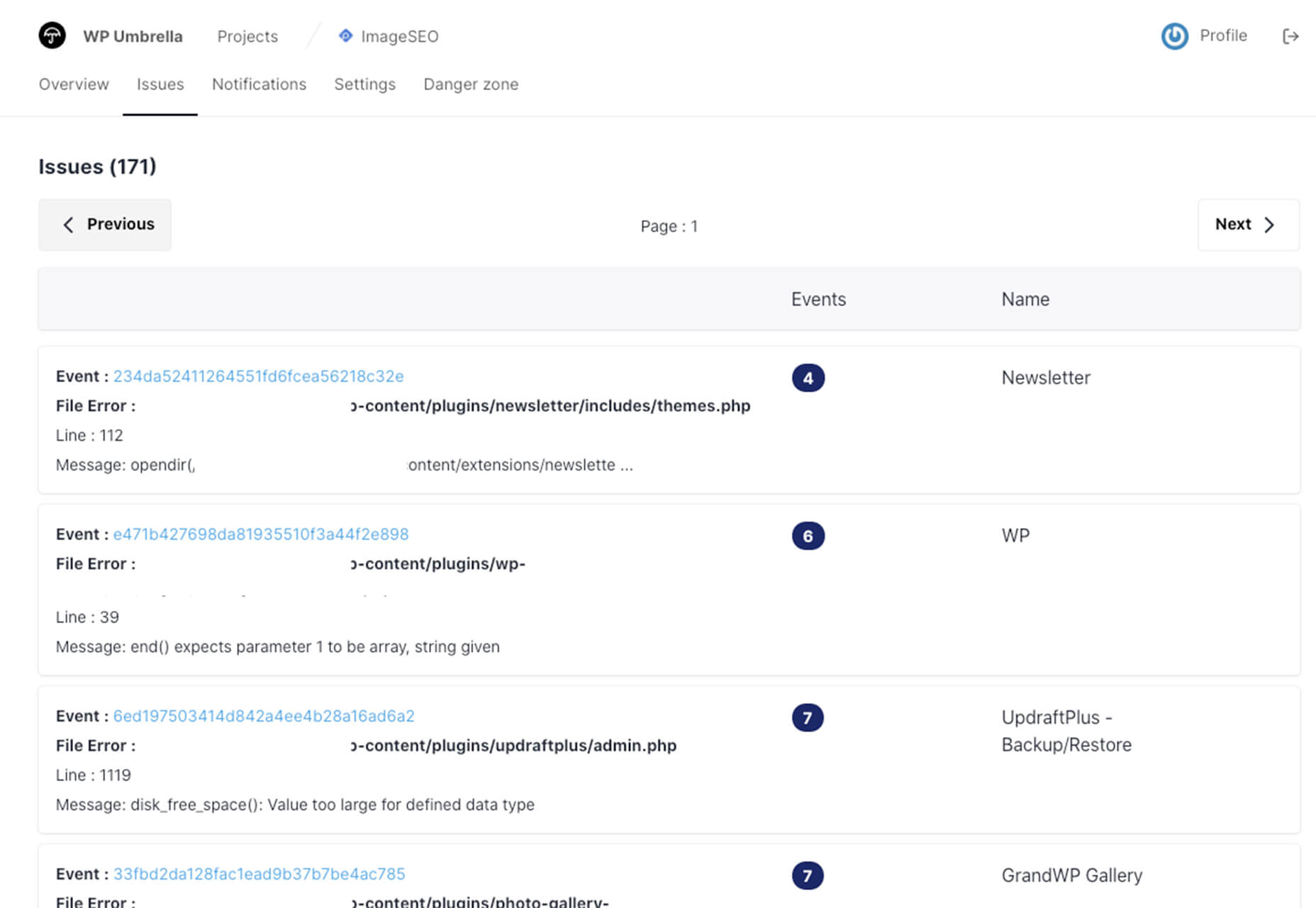
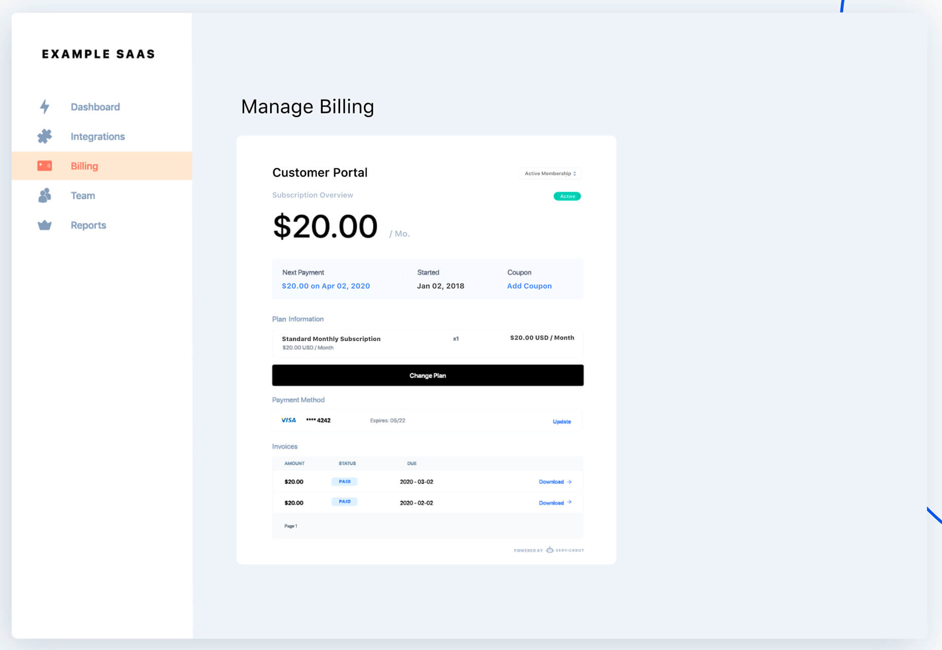
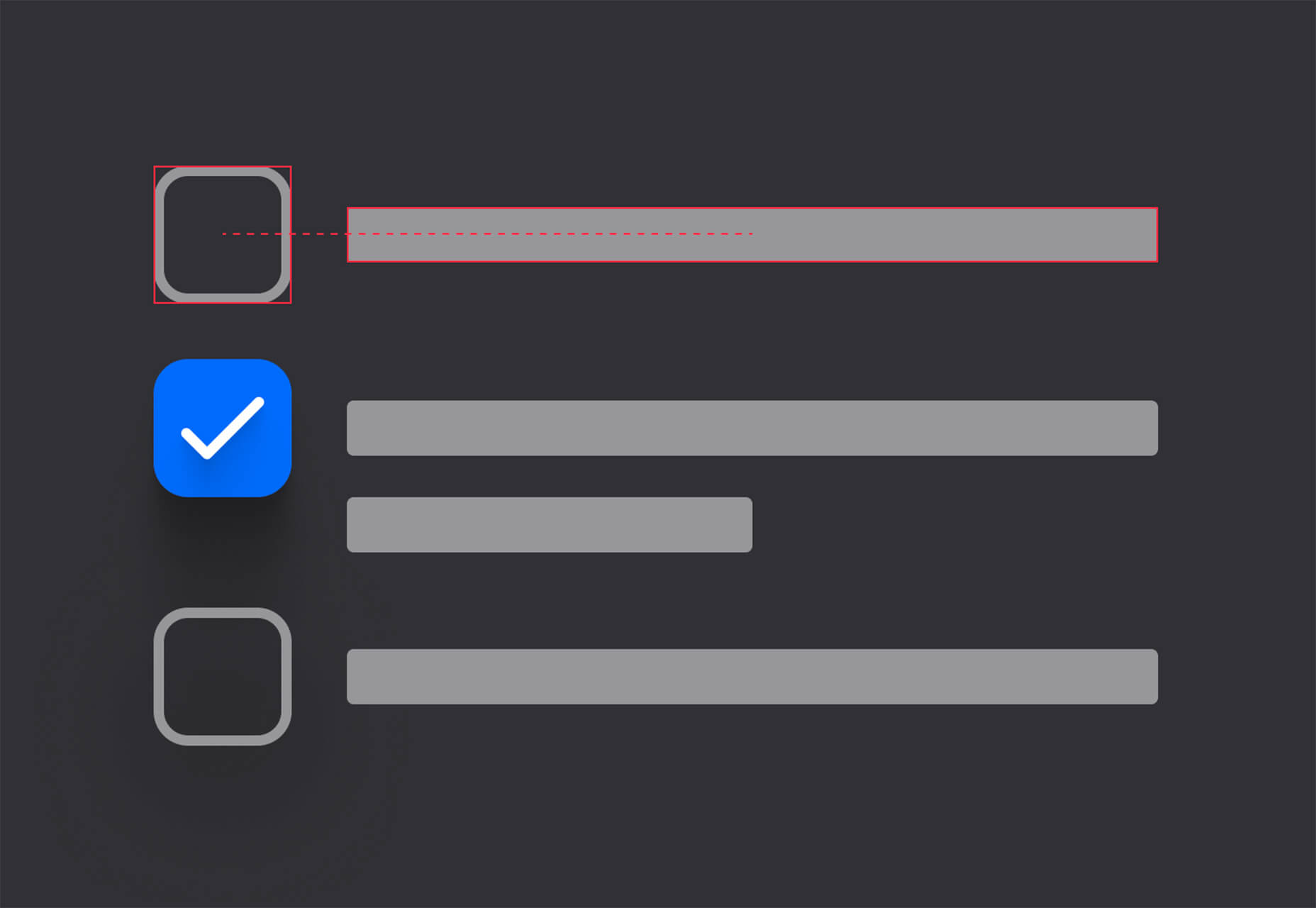
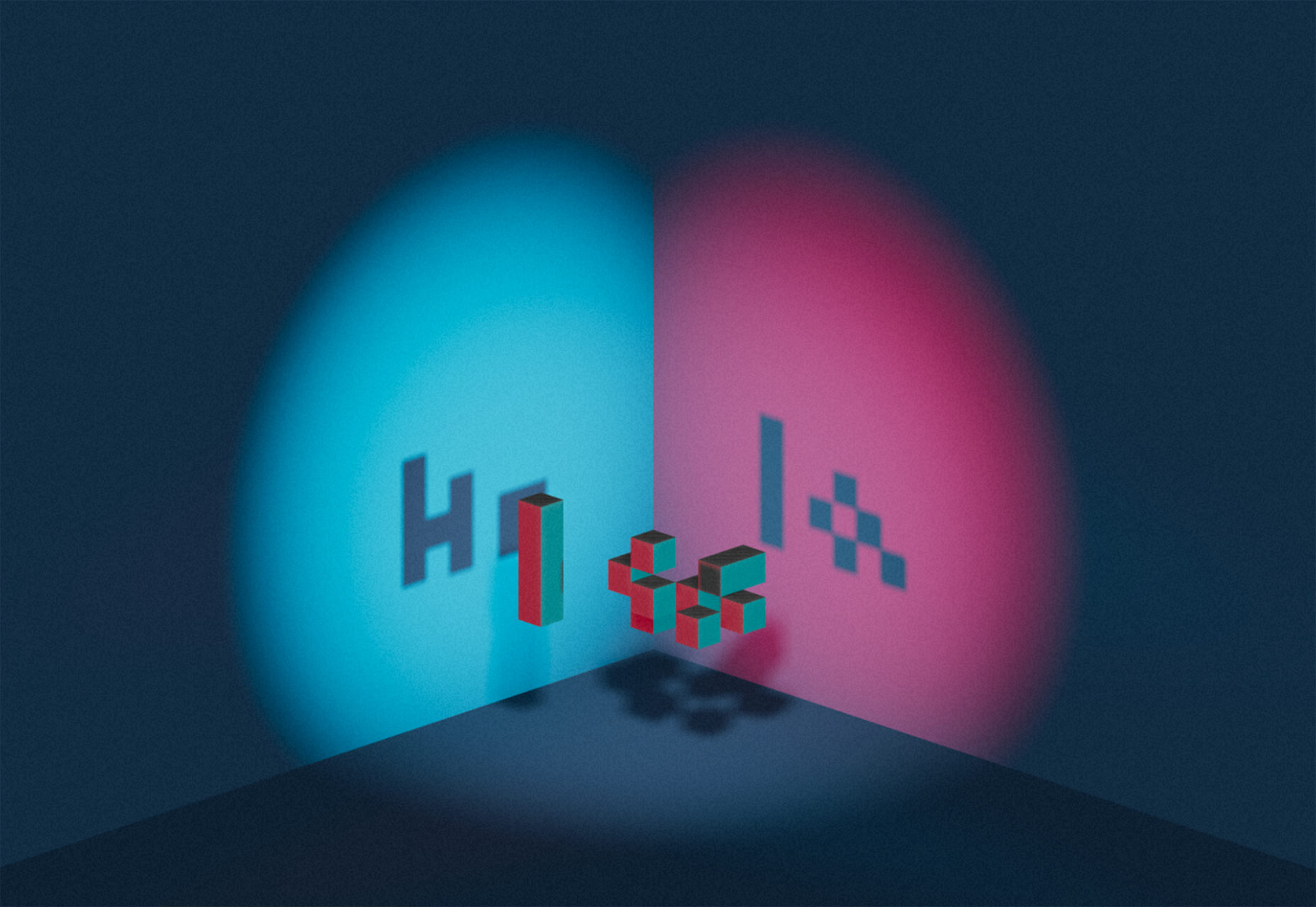
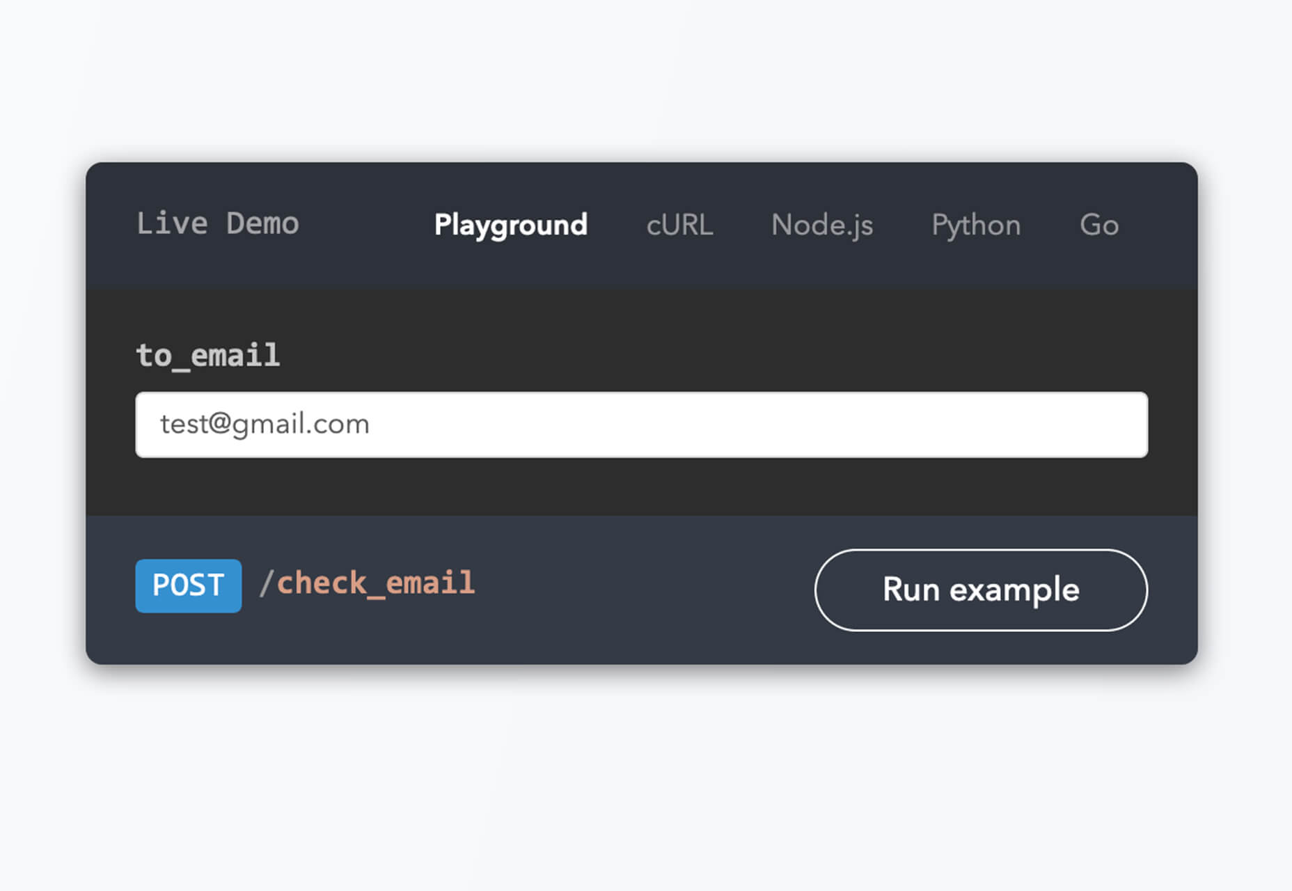
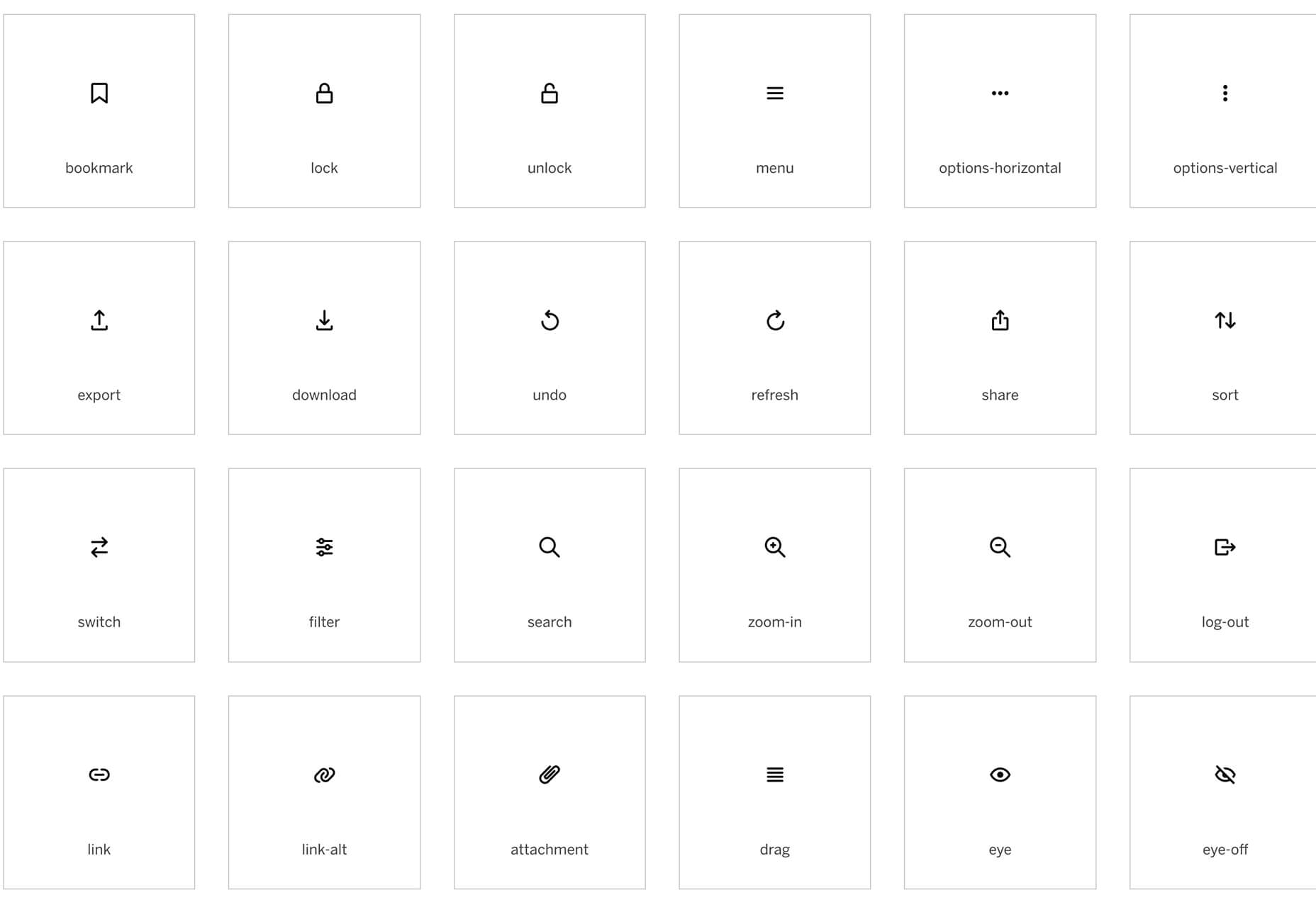
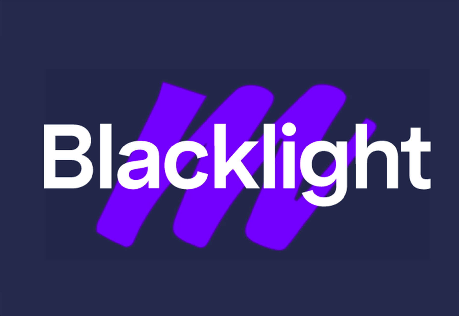

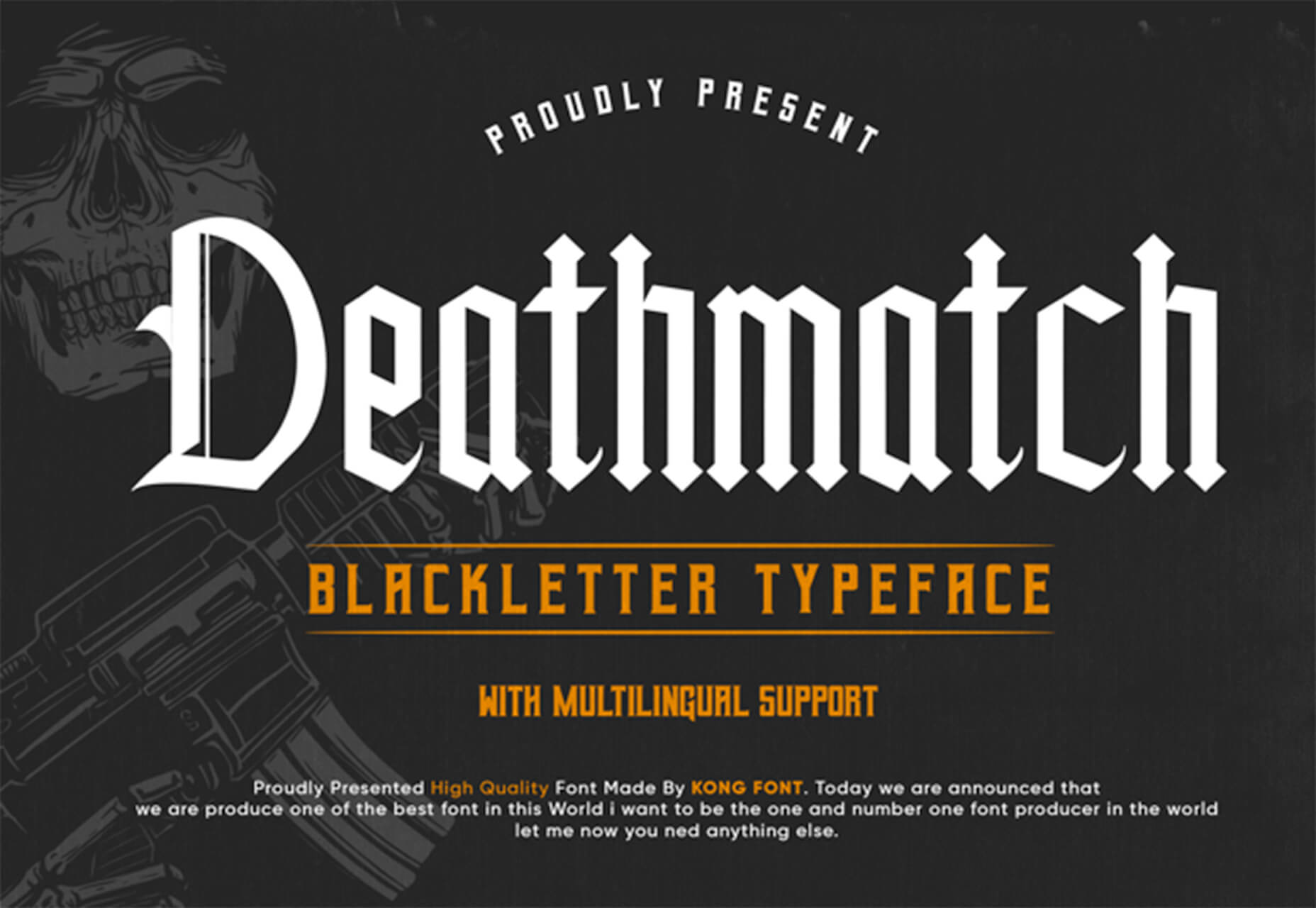
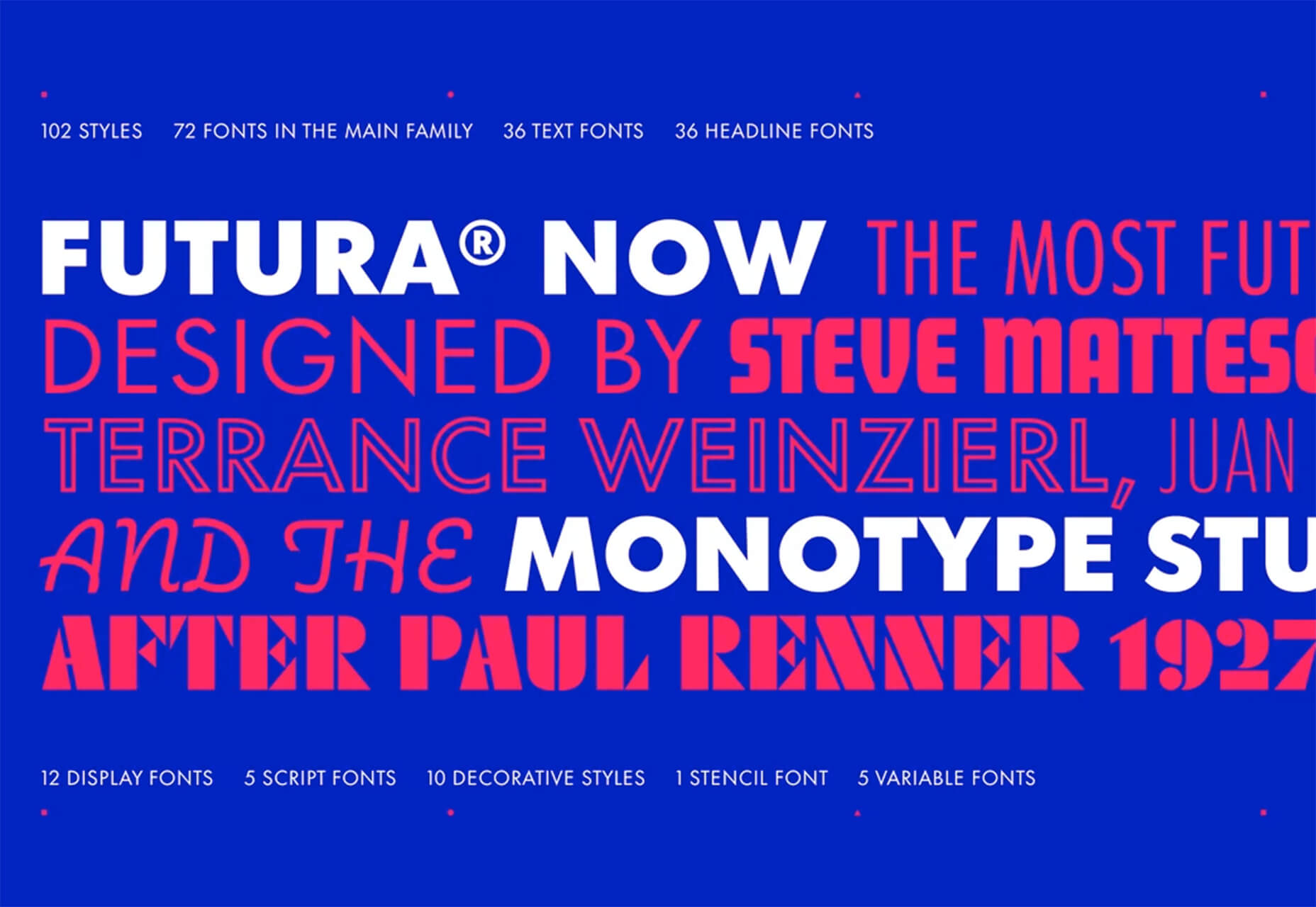
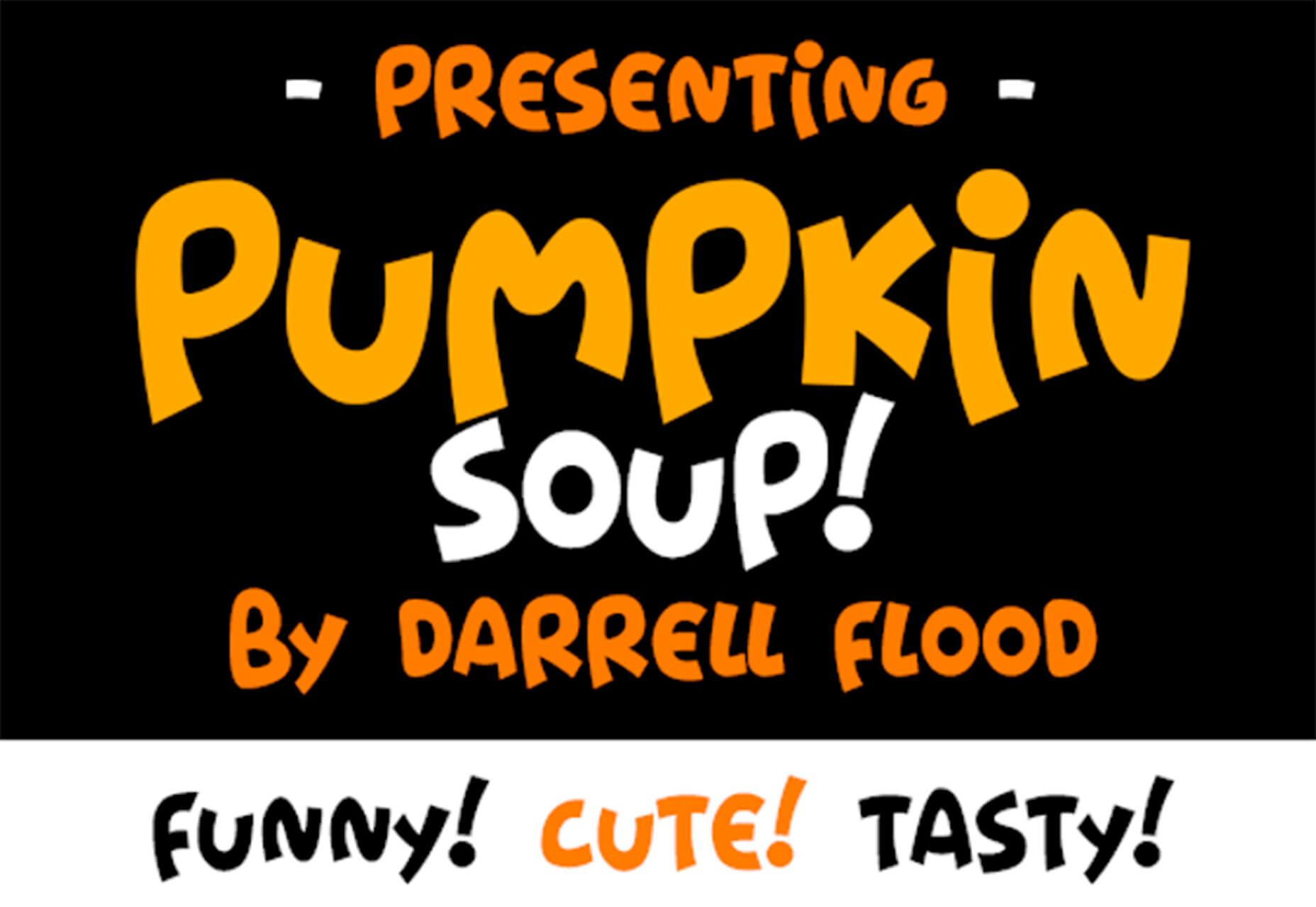
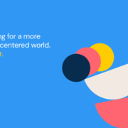
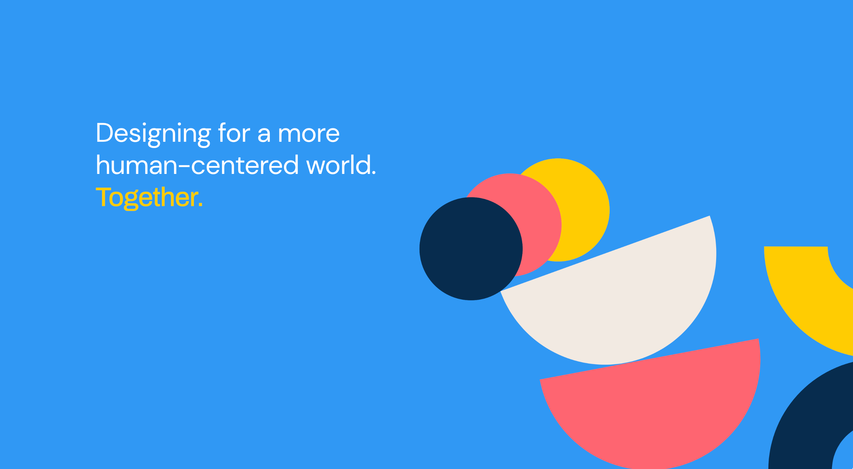 Design can make a statement. It evokes feeling and can encourage thought and conversation. That’s the common theme among the three trends in website design this month.
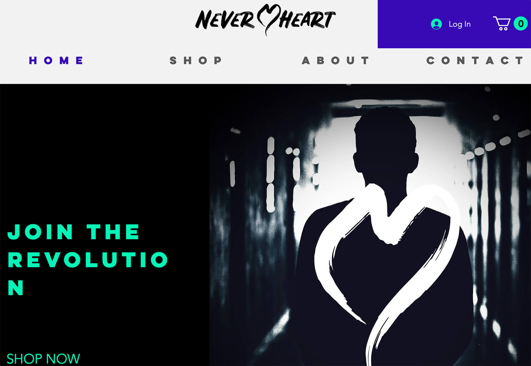

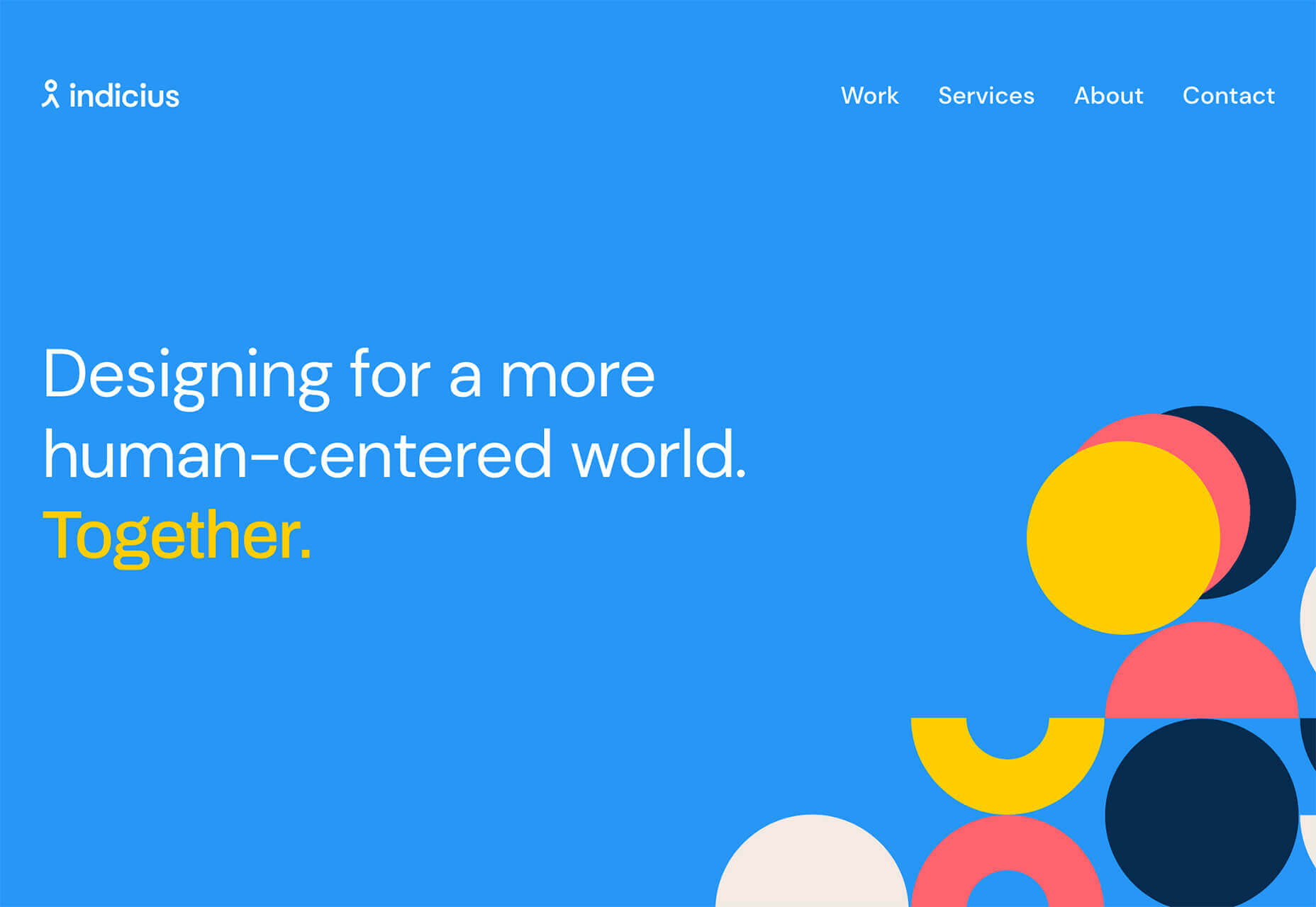