Articles

Many websites today use some type of traditional Content Delivery Network (CDN), which means improvements in website load times, decreases in bandwidth, and better redundancy and security. But not everything is optimized, specifically when it comes to images, and image CDNs can help with that! 

Traditional vs. Image CDNs

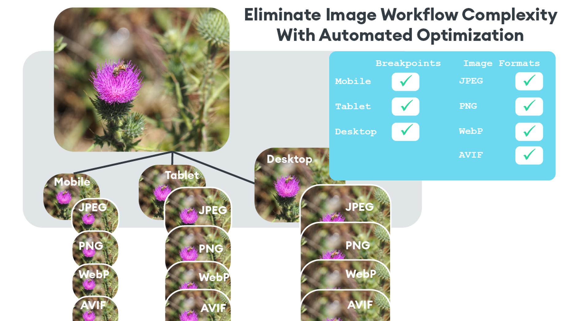
A traditional CDN treats images as static. If you want to tailor images to better match various mobile device types, then you need to create many variants of each image and upload them to your web server. It also means you must develop responsive code that will tell the server and CDN which image variant to deliver. This is clunky, time-consuming, and inefficient. For a large website, the amount of code needed can be astronomical. Using this static image model, there’s just no realistic way for each image to be effectively sized and compressed for every possible device model – at this point, there are thousands of them. The combination of these two unfortunate factors leads to potentially slow load times and poor UX caused by oversized images delivered to mobile devices.

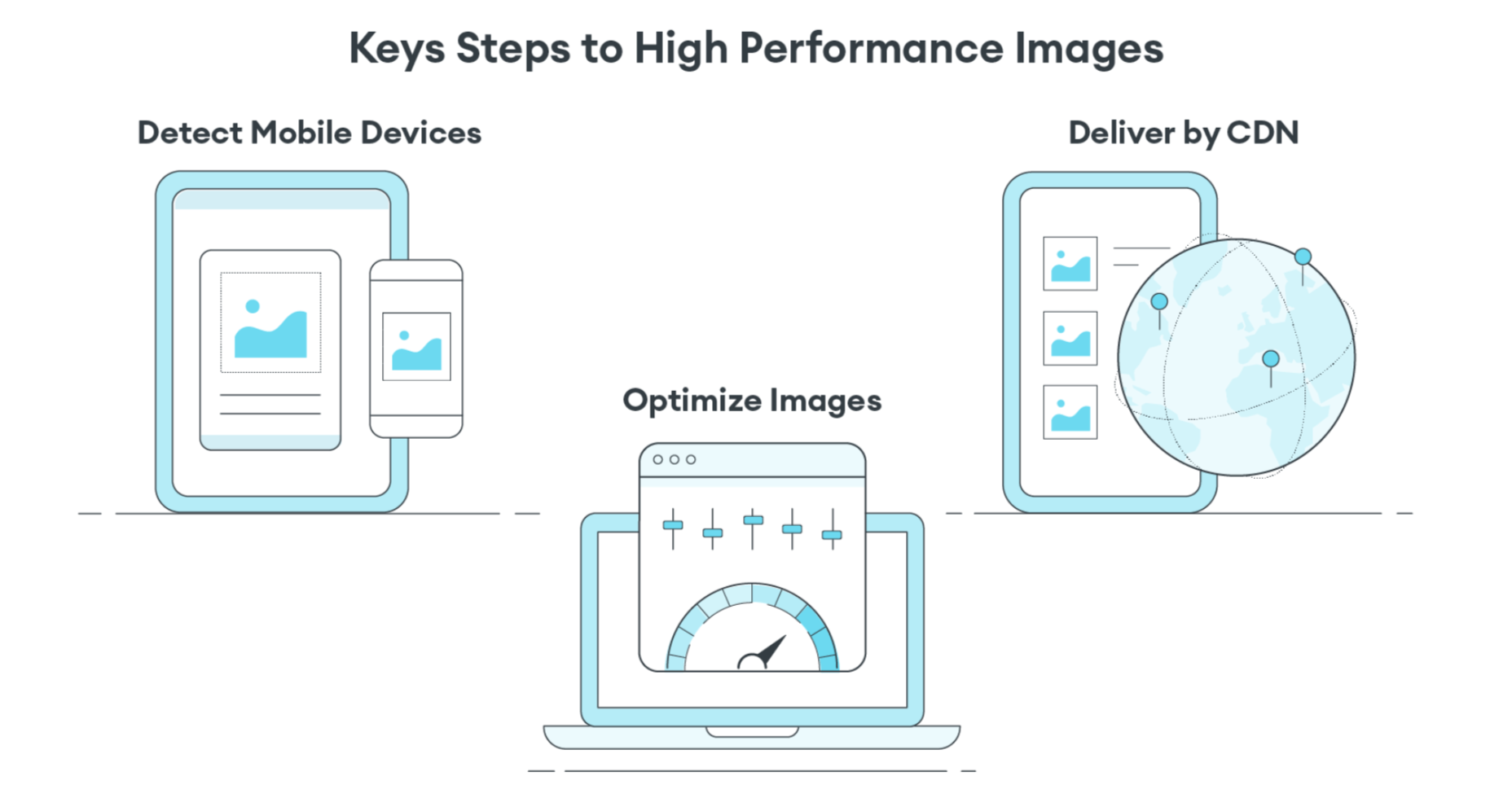
So what is an image CDN? An image CDN builds on the traditional CDN model with the addition of device detection and image optimization. Instant detection of the device model and browser requesting the images is done right at the device-aware edge server (true edge computing!) Additional information, including screen resolution and dimension, pixels per inch, and support for next-gen image formats (such as WebP, JPEG 2000/JP2, and AVIF), provides even more details crucial for superior image optimization. Using this information derived from device-aware edge servers, the image CDN optimizes each image and serves the perfect version for each device and resolution, meaning users get the finest webpage experience faster.

A Bit About the Edge (Whoa, Living on the Edge?)

With a single server website, a web request would have to travel from the requestor, back to the origin server (wherever that was geographically located), be processed, and then travel back to the requestor. Depending on the physical distance between the requestor and the origin server, this could introduce a great deal of latency, which means lag time on page loads. 

A traditional content delivery network (CDN) is a global network of servers that optimizes web performance by using the node geographically closest to the user for faster delivery of assets. It takes static content like images and stores them on the edge. But usually, these edge servers are relatively simple in terms of their role in business processes. They mostly index, cache, and deliver content. And traditional CDNs like to keep edge servers simple because of concerns over CPU usage, storage, and scalability.

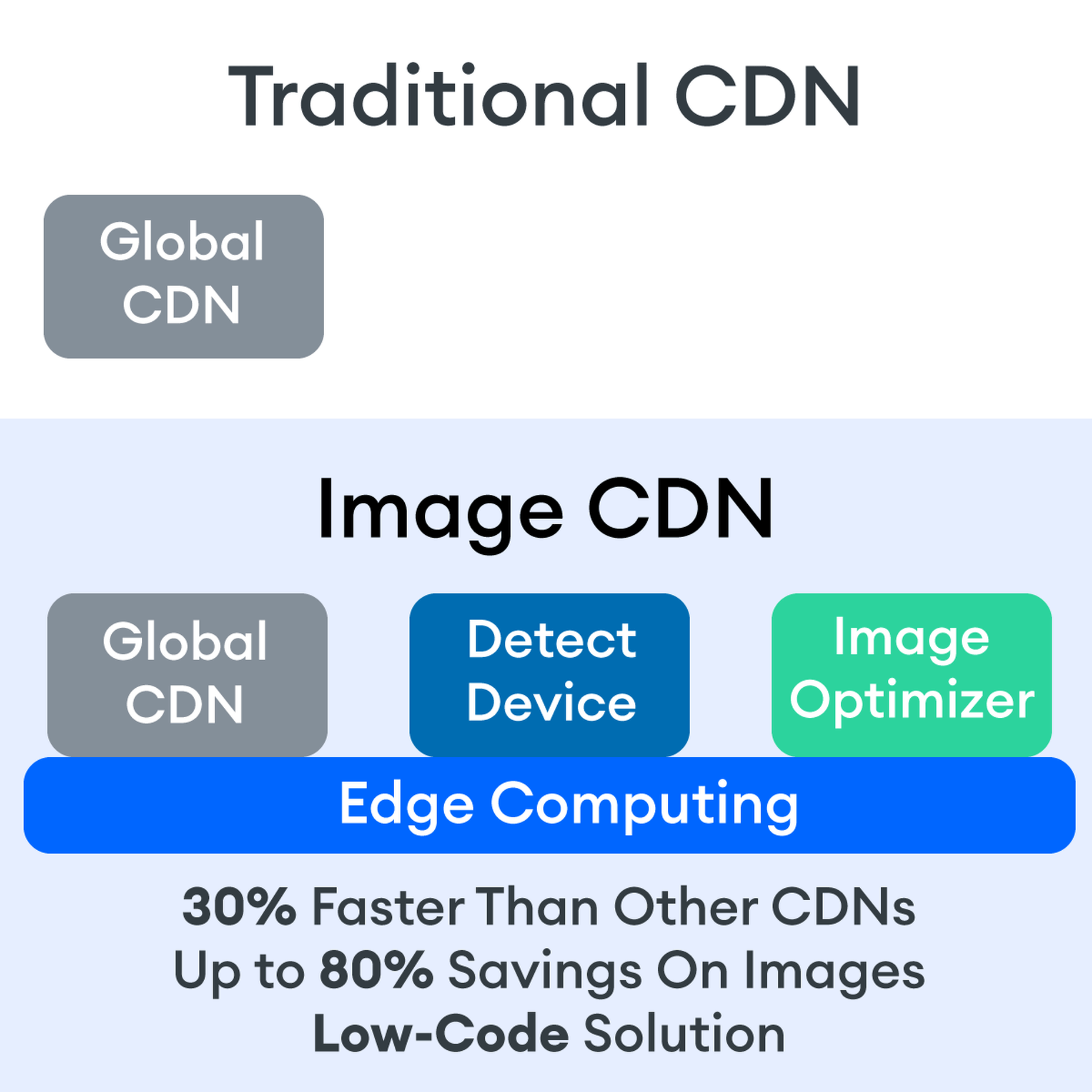
But what if these edge servers could also provide computing power that enhances performance and business processes? This is called edge computing. Slowly, CDNs are starting to open their edge servers to allow enterprises to deploy apps/services on the edge. Likewise, Cloud computing networks (e.g., AWS, Azure, Google Cloud) provide virtualized server capacity around the world for those who want to use geographically distributed servers. In a sense, Edge Computing is a marriage of the CDN (where edge servers synchronize/work with each other) and Cloud computing (where servers are open to applications). 

Edge computing is a fascinating concept, but what is the killer app that will enhance business processes and improve website performance? The addition of device detection to edge computing provides the ability to transform from delivery of static images to a new model where images are dynamic and tailored exactly to devices. 

Edge computing is computing that is done in a geographically distributed space, with many servers located at or near the source of the web request. This reduction in bandwidth and latency leads to fast processing times, increased site speed, and improved customer experience. And edge computing doesn’t require new infrastructure — it leverages the networks of existing providers to create Points of Presence (POP) around the globe. 

The Edge Servers are…Aware?

Device-aware edge servers, like those used by the ImageEngine image CDN, take edge computing to a new level. Device detection is actually one of the use cases where edge computing really shines. Normally, the edge server would have to send a Javascript query to the device to figure out any information about a requesting device’s model, browser, operating system. But with a device-aware edge server, the User Agent string is captured and decoded. This contains all of the information necessary for device detection without the need for any back and forth – a definite speed improvement. So you’re starting ahead of the game! 

Each time a new request comes to the device-aware edge server, the image is processed by that server (meaning optimized for that specific device parameters) and stored right there in cache, primed for future use. This is done in three stages: changing image size based on device resolution, compressing the image using an image optimization tool, and selecting the most efficient file format for the device. 

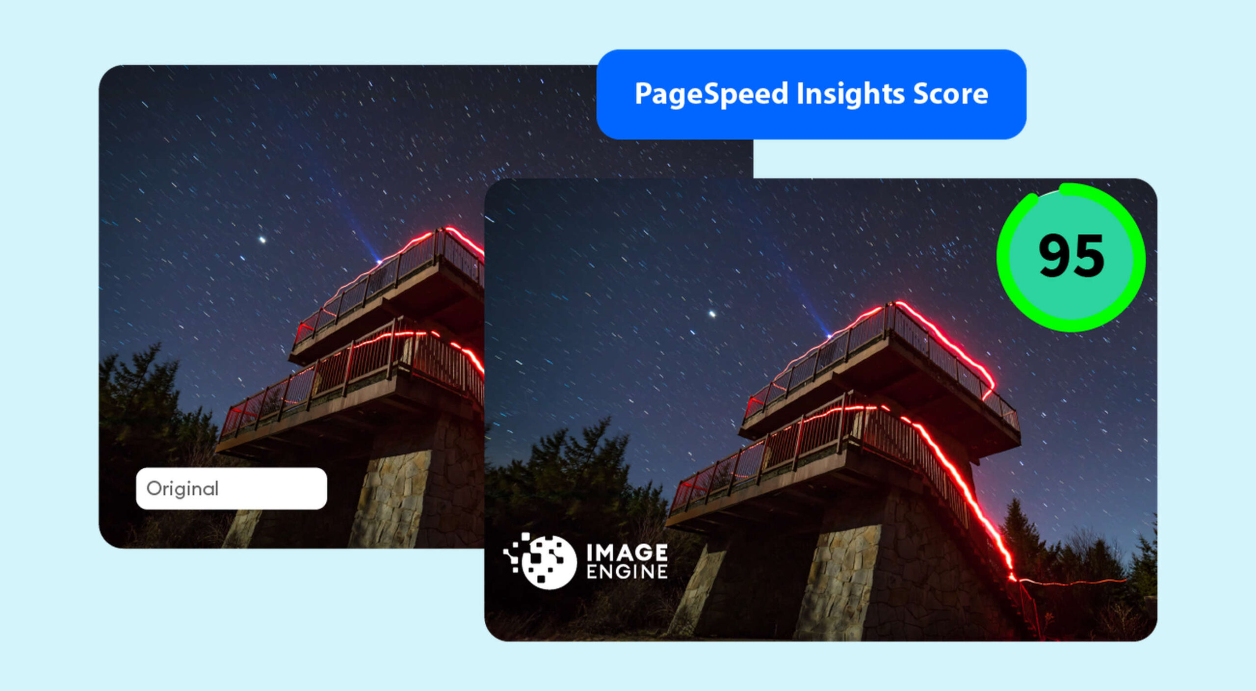
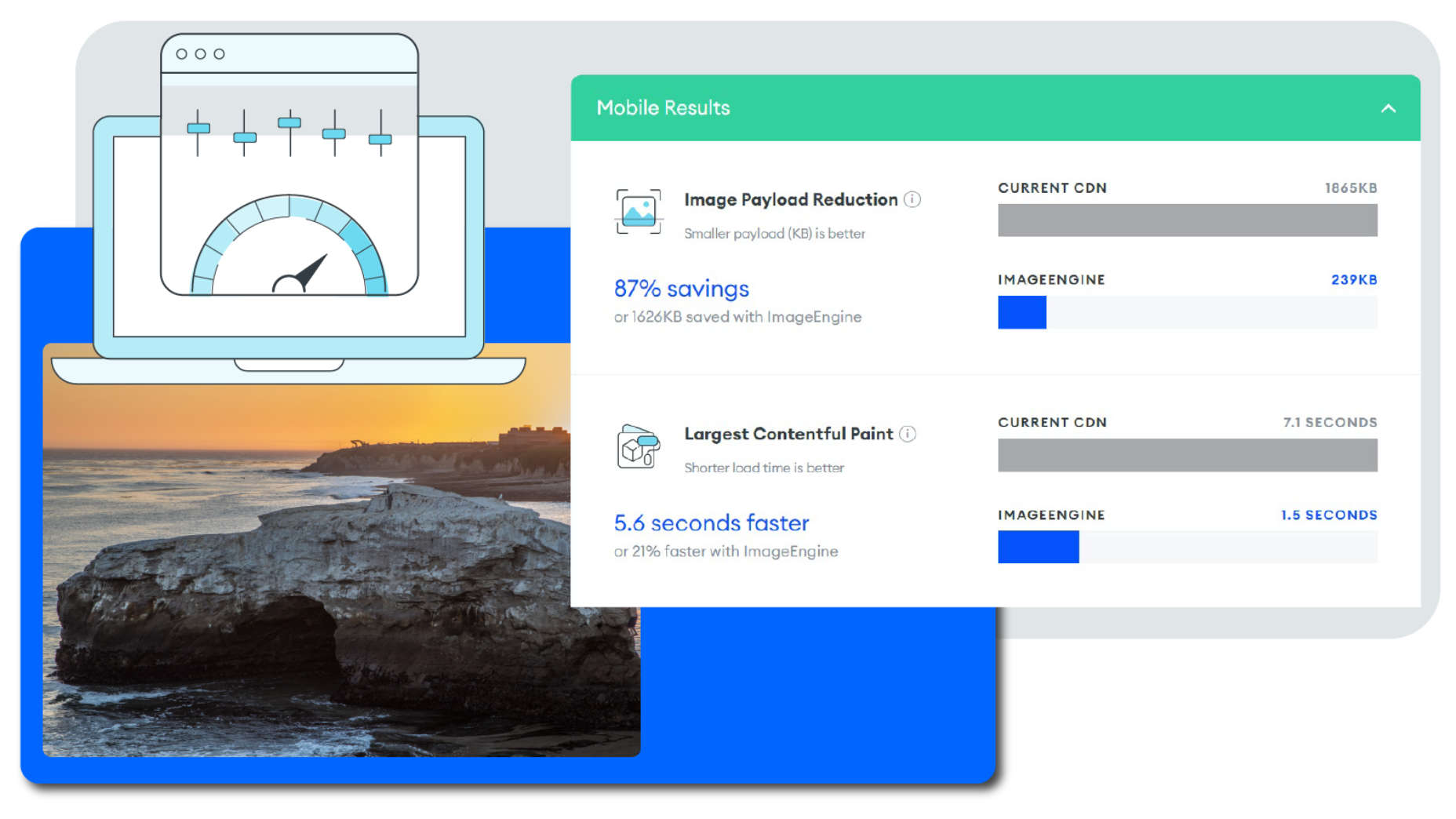
If the device-aware edge server has already processed a request from a similar device model before, then it can serve the device-optimized image from its edge cache, leading to a lightning-fast server response — and ImageEngine’s device-aware edge servers can serve up cached images 98% of the time! Not only is there geographical proximity because of the distributed global POP network, but the smaller size of the optimized image compared to the full-sized original cuts up to 80% off the image payload. This can cut up to several seconds off page load times. When almost 70% of people say that page speed influences their likelihood of making a purchase, every single second counts! 

Some image CDNs detect the device information and group the devices into “buckets” of similar types and serve an image based on that type. While this is certainly an advancement over a traditional CDN, and works passably well for some common devices, it still isn’t a truly optimal solution. There are so many variants of browser, screen size,  resolution, etc., even among very similar devices, that images are still often oversized (too large payloads) and lead to poor load speed. A true image CDN, such as ImageEngine, serves the perfect image for every device, every time.

So Now You Want To Get Started (Don’t Worry, It’s Really Simple)

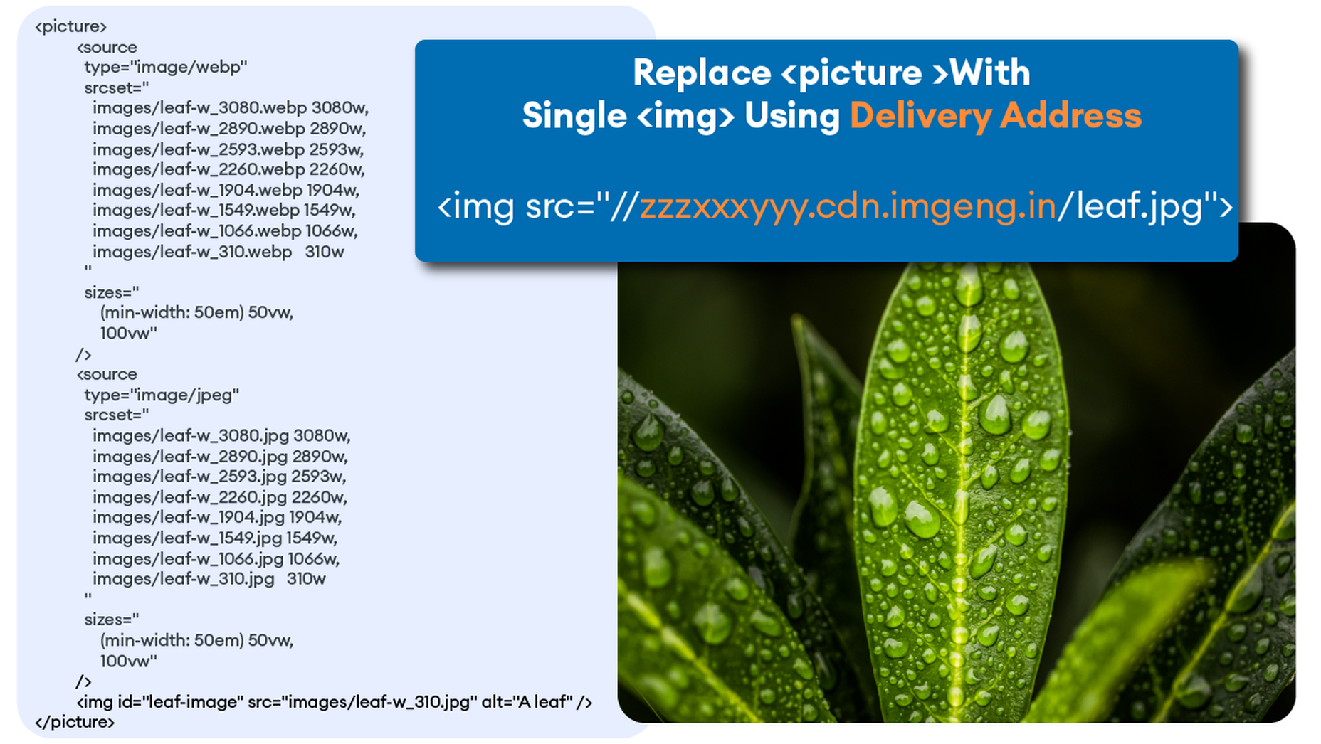
One of the best things about the ImageEngine image CDN is the ease of integration – and it can integrate into any platform that supports a 3rd-party CDN. All you need is to sign up for an account and receive a delivery address during your two (yes, 2!) minute signup process. This delivery address is used to redirect image traffic for optimization and superior delivery performance. Next, you’ll have to make some slight adjustments to img tags on your website, but that’s really all the work you’ll need to do. There are no DNS changes during a standard (generic delivery address) integration. You read that right, none at all. Contrast that to a traditional CDN integration, where there is just no way around some messing around in the DNS – in fact, usually some fairly extensive DNS changes. 

This low-code, virtually no code, integration saves you time. It saves you money. It saves you the hassle of putting multiple team members on a new project. And it means that you can be up and running in about 15 minutes with a standard install. You can be serving optimized images to your site visitors at blazing fast speeds before lunch! And don’t worry, ImageEngine has an experienced integration support team available to answer any questions you might have. 

There’s also no issue with adding the ImageEngine image CDN on top of an existing CDN. Traditional CDNs may have security features that you may prefer to keep for your site. It requires slightly more integration but provides the same benefits of a solo ImageEngine implementation — screaming fast image load times and perfectly optimized images from device-aware edge servers. All that is recommended is that the ImageEngine image CDN actually serve the images directly, not simply process them, to get maximum benefits.

Adopt an Image CDN and See The Benefits

We’ve learned that image CDNs bring numerous benefits to your site AND your business. Using device-aware edge servers, image CDNs provide measurably better UX to your visitors. Pages load potentially seconds faster with perfectly optimized images, meaning your customers get to the heart of your message right away, and you don’t lose potential sales. 

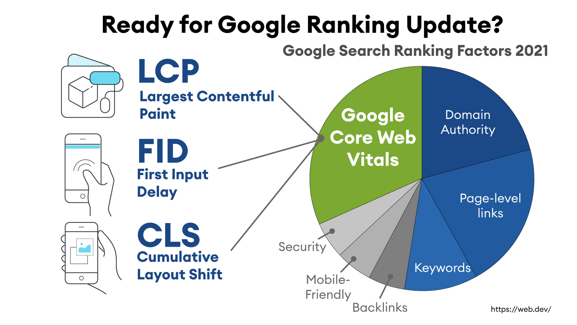
Image CDNs are actually 30%+ faster than most traditional CDNs, improving site speed accordingly. From an SEO perspective, that’s huge! And your SEO gets an additional boost from the improvement to your Largest Contentful Paint scores (which can help you gain valuable rank on Google’s SERPs). Implementation is simple and fast. You get all this, plus cost savings: since you have smaller payloads because of the fully optimized images, you’re delivering fewer gigabytes of data.

Source

The post Image CDNs: How Edge Computing Provides a Faster Low Code Image Solution first appeared on Webdesigner Depot.

Source de l’article sur Webdesignerdepot

gRPC is a high-performance, open-source universal RPC framework.
There are various benefits to using gRPC.

  • It simplifies development by providing client/server code.
  • It supports multiple languages.

It all starts with defining a .proto file, .proto files reside on src/main/proto file.

Source de l’article sur DZONE

If you’ve done any work with Vue.js and SASS (or SCSS from here on), you may have run into this very common issue: you have SCSS variables in one file that you want to make available to your Vue components.

The good news is that the Vue CLI makes it incredibly easy to support writing SCSS, and with Vue’s single-file components, you can simply add lang="scss" to the <style> block (docs).

Source de l’article sur DZONE


Introduction

In this article, I am going to explain to you how we can use the power of MuleSoft to send PDF files from Experience API to Process/System API, using the multipart/form-data type, and to covert it back to PDF file in the second API.

Use Case

We are going to read the PDF file from the local disk using Mule’s out-of-the-box (OOTB) File connector to read in Experience API. Then we will be sending this PDF as binary with some other fields to another API (this can be named as Process API) which accepts data as multipart/form-data. Next, we will extract this PDF binary from the received payload and convert it back to PDF and save the file to the local disk using Mule’s OOTB File connector to write.

Source de l’article sur DZONE

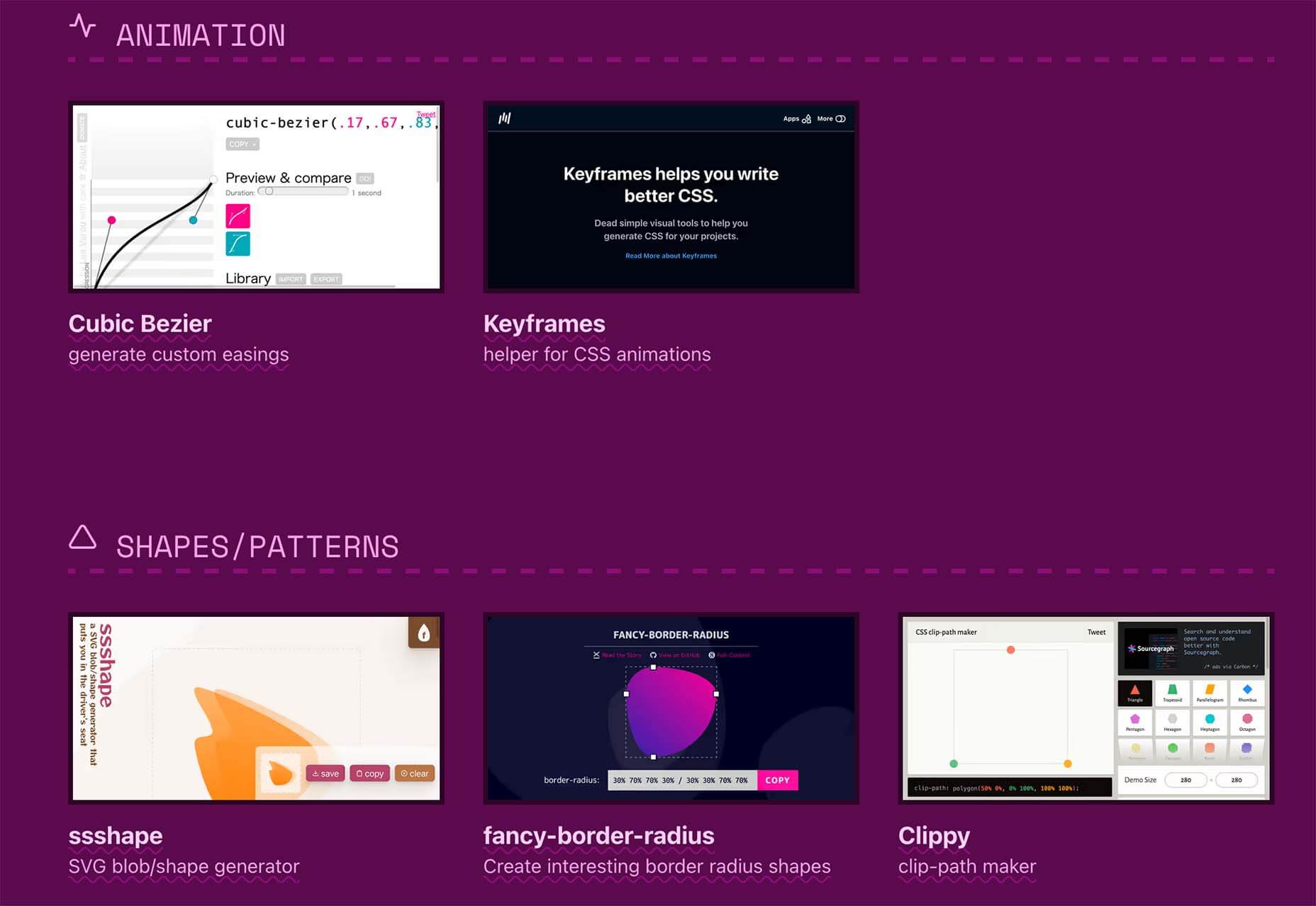
There are some spook-tacular finds in this month’s October collection of resources and tools for designers and developers. From interesting tools that can help in the design process to boo-tiful typefaces, there’s something for everyone here.
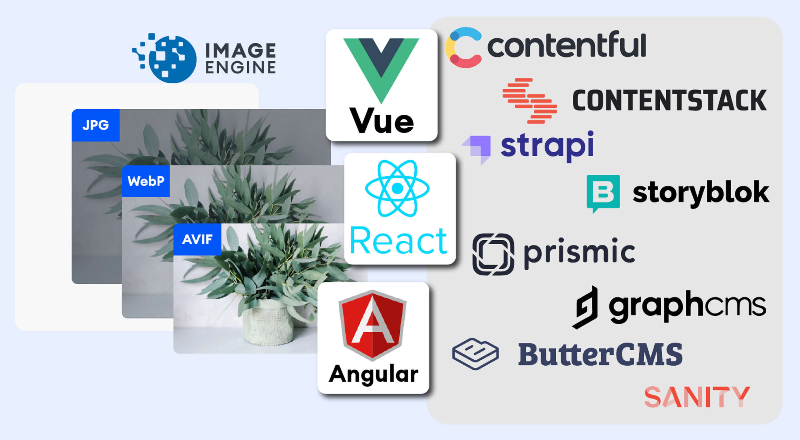
Here’s what is new for designers this month…

Atropos

Atropos is a lightweight, open-source JavaScript library to create touch-friendly, three-dimensional hover effects. The results are stunning and have a nice parallax style. Everything is highly configurable and customizable. It’s available for JavaScript, React, and Vue.js and has zero dependencies.

CSS Gradient Editor

CSS Gradient Editor helps you create the perfect gradient style – you can start from presets – that you can use in projects. Design a background, fill, or almost any other gradient element you might need, make adjustments or customizations, and then get the CSS with one click so you can use it right away.

Octopus.do

Octopus.do is a fast visual sitemap builder that lets you work in real-time using the content brick method. Share and collaborate in real-time and there’s no signup required to use it.

Pirsch Analytics

Pirsch Analytics is a privacy-friendly, open-source alternative to Google Analytics — lightweight, cookie-free, and easily integrated into any website or directly into your backend. It includes filters to see metrics in the way you want and light and dark modes.

Basic Pattern Repository

Basic Pattern Repository is a collection of simple SVG patterns for projects. Everything is rooted in a simple style to help push projects along quicker. You can get it via GitHub or as a Figma Library.

Blobr

Blobr is a way to get a branded API portal, manage access, and monitor usage all in one place. Customize everything to fit your brand and the tool grows as you do with the ability to increase or change capacity. Plus, it is easy to set up and free to use.

HEXplorer

HEXplorer helps you better understand something you use all the time – HEX colors. This pen by Rob DiMarzo shows how the values for different colors come together to provide greater comprehension when it comes to this color format.

CCCreate

CCCreate is a curated collection of tools and resources for web creators. It includes some tools that have been around for a while as well as some newbies. Everything is grouped and sorted by type of resources – color, icons, type, layouts, animation, shapes, docs, and miscellaneous so you can find what you are looking for faster.

Glass

Glass is a photo-sharing app for photographers. It’s a social network of sorts that lets you share images with the greater photography community without “likes.” Just great images.

Revolt

Revolt is a chat app that’s still in beta and designed for easy communication without having to download apps. It’s an open-source project that is customizable and with an intuitive and recognizable interface. The thing that’s different about this app is that it is built on a privacy-first model.

Doodle Ipsum

Doodle Ipsum is the illustrated version of placeholder elements. Customize your doodles, grab the code, and use them on your web prototypes, landing pages, or no-code tools.

Mechanic

Mechanic is an open-source framework that helps you create custom, web-based tools that export design assets in your browser. The best part is you can try it right on screen using the “poster generator.” If you like what you see, there’s plenty of documentation to help you along the way.

Medio Website Template

Medio is an agency-style website design template for Bootstrap 5. The layout is perfect for a design agency or marketing group but can be adjusted for almost any multi-purpose design. The free template includes a minimal design and includes features such as parallax, popup video, and more.

Tutorial: Simplifying Form Styles with Accent Color

This tutorial is a life-saver when it comes to using and understanding the new CSS accent-color property. This quick lesson will help make your life easier and is simple to use. It starts with setting an accent-color property on the root element and then applying it.

Houdini.how

Houdini.how is a worklet library that is full of CSS and code examples to help you work smarter. See how different elements look cross-browser and learn to adjust the code and put them together in just the way you want. Houdini is a set of low-level APIs that exposes parts of the CSS engine, giving developers the power to extend CSS by hooking into the styling and layout process of a browser’s rendering engine.

Chainstarters

Chainstarters is a powerful, rapid, Web3-enabled platform for software developers. It eliminates the burden of setting up and maintaining a secure and scalable infrastructure, allowing you to focus on creating amazing technology.

Web Vitals Robot

Web Vitals Robot is a search optimization tool that monitors SEO metrics for you – so you can prevent your business from disappearing from Google.

Searchable

Searchable is a unified search tool that looks at local, cloud storage, and apps to find the files you are looking for. It returns results in a jiffy with previews so you don’t have to open every file to find what you are looking for.

Athlone

Athlone is a fun serif with lots of personality. The free demo version includes a limited character set for personal use only and the full version has everything you need for fun display or branding with this typeface.

Capitana

Capitana is a Geometric Sans typeface with humanistic proportions and open apertures. This means that all shapes are constructed from basic forms, the circle, triangle, and square, and are designed according to the classic proportions of the Roman Antiqua. Distinct ascenders and pointed apexes with deep overshoot give it a cool beauty and classic elegance. It includes 784 characters per style in nine weights from Thin to Black, it offers both light and extremely heavy weights for striking headlines.

Colours

Colours is a funky script with just enough texture to keep it interesting. The free version includes a partial character set and is for personal use only.

Flexible

Flexible is a variable typeface that includes 18 styles in the family. It’s made for creativity and display use. This typeface is made for experimenting because there are so many things you can do with this single family.

Singo Sans Serif

Singo Sans Serif is a simple and strong typeface that would make an excellent display option. The free version is for personal use only. Fun fact: Singo means Lion in Indonesia, which is where the name of this strong font comes from.

Source

The post Exciting New Tools For Designers, October 2021 first appeared on Webdesigner Depot.


Source de l’article sur Webdesignerdepot

PageSpeed Insights is a free performance measurement tool provided by Google. It analyzes the contents of a web page for desktop and mobile devices. It provides a single number score (from 1 to 100) that summarizes several underlying metrics that measure performance. If you have not run PageSpeed Insights on your website, then you should stop and do it now. It’s an important indicator of how Google scores and ranks your site.

If your PageSpeed Insights score is below 80, don’t panic. You are not alone. Many websites are not optimized for performance. The good news is that you can take steps that should immediately improve your score.

You will notice that PageSpeed Insights highlights issues that cause slow page loading. However, you might need more guidance to resolve these issues. Below, we walk you through how to resolve four common issues related to images. We also show you how ImageEngine, an image CDN, can simplify, automate, and deliver the best image optimization solution possible.

Performance Drives Google SEO Rankings

Why does the PageSpeed Insights score and performance matter? Isn’t SEO ranking all about content relevance, backlinks, and domain authority? Yes, but now performance matters more than it did a year ago. Starting in 2021, Google added performance metrics to the factors that impact search engine rankings. In a market where websites are constantly jockeying to match their competition’s pages (for content relevance, keywords, and other SEO issues), performance is making a difference in keyword search engine rankings.

What Are Core Web Vitals Metrics?

PageSpeed Insights relies on a set of performance metrics called Core Web Vitals. These metrics are:

Largest Contentful Paint (LCP): Measures the render time (in seconds) of the largest image or text block visible within the viewport, relative to when the page first started loading. Typically, the largest image is the hero image at the top of pages.

First Input Delay (FID): Measures the time from when a user first interacts with a page (i.e. when they click a link, tap on a button, or use a custom JavaScript-powered control) to the time when the browser is actually able to begin processing event handlers in response to that interaction.

Cumulative Layout Shift (CLS): Measures the layout shift that occurs any time a visible element changes its position from one rendered frame to the next.

Images and JavaScript are the Main Culprits

PageSpeed Insights breaks down problems into categories based upon how they impact these Core Web Vitals metrics. The top two reasons why you might have a low score are driven by JavaScript and images.

JavaScript issues are usually related to code that either blocks or delays page loading. For example, lazy-loading images might involve JavaScript that blocks loading. As a rule of thumb, do not use a third-party JavaScript library to manage image loading. These libraries frequently break the browser’s built-in image loading features. Lazy-loading may make above-the-fold images load slower (longer LCP) because the browser starts the download later and because the browser first has to execute the JavaScript.

Another JavaScript issue involves code that is large or unnecessary for the page. In other words, code bloat. There are good resources for resolving these issues on the web. However, in this blog, we will focus on image problems.

Images are a major contributor to poor performance. The average website payload is 2MB in 2021, and 50% of that is images. Frequently, images are larger than they need to be and can be optimized for size with no impact on quality…if you do it right.

Four Image Issues Highlighted by PageSpeed Insights

Largest Contentful Paint is the primary metric impacted by images. PageSpeed Insights frequently recommends the following four pieces of advice:

  1. Serve images in next-gen formats.
  2. Efficiently encode images.
  3. Properly size images.
  4. Avoid enormous network payloads.

That advice seems straightforward. Google provides some great advice on how to deal with images in its dev community. It can be summarized in the following steps:

  • Select the appropriate file format.
  • Apply the appropriate image compression.
  • Apply the right display size.
  • Render the image.
  • Write responsive image code to select the right variant of the image.

We call Google’s process the “Build-Time Responsive Syntax” approach. If you have a relatively static website where you don’t generate new pages or switch out images frequently, then you can probably live with this approach. However, if you have a large and dynamic site with many images, then you will quickly feel the pain of this approach. Google itself stresses that developers should seek to automate this image process. Why? Because the process has some serious workflow drawbacks:

  • Adds storage requirements due to a large increase in image variants.
  • Increases code bloat and introduces more code complexity.
  • Requires developers’ time and effort to create variants and implement responsiveness.
  • Requires logic to account for different browser’s support for next-gen image formats.
  • Doesn’t adapt to different contexts. It relies on best-guess (breakpoints) of what device visits the web page.
  • Needs a separate CDN to further increase delivery speeds.
  • Requires ongoing maintenance to adapt to new devices, breakpoints, image formats, markets, and practices.

Key Steps to Achieving High-Performance Images

Instead of using the Build-Time Responsive Syntax approach, an automated image CDN solution can address all of the image issues raised by PageSpeed Insights. The key steps of an image CDN that you should look for are:

  1. Detect Mobile Devices: Detection of a website visitor’s device model and its technical capabilities. These include: OS version, browser version, screen pixel density, screen resolution width and height, support for next-gen image and video formats. This is where ImageEngine is unique in the market. ImageEngine uses true mobile device detection to further improve image optimization. It has a huge impact on the effectiveness of the image optimization process.
  2. Optimize Images: An image CDN will leverage the device’s parameters to automatically resize, compress and convert large original images into optimized images with next-generation file formats, like WebP and AVIF. Frequently, an image CDN like ImageEngine will reduce the image payload by up to 80%.
  3. Deliver by CDN: Image CDNs like ImageEngine have edge servers strategically positioned around the globe. By pushing optimized images closer to requesting customers and delivering them immediately from the cache, it often provides a 50% faster web page download time than traditional CDNs.

Easy Integration Process for Image CDN

After signing up for an ImageEngine account and free trial, you will receive a Delivery Address. After adjusting your <img /> elements to include the Delivery Address, ImageEngine will start to pull the original images from your website (no need to move or upload them), automatically optimize them, and deliver them.

You can automate the addition of the Delivery Address to the img src tag by using plug-ins for WordPress and Magento. Developers can also use ImageEngine’s React, Vue, or Angular JavaScript frameworks to simplify the process.

Additionally, there are many ways to simplify implementation via adjustments to templates for many CMS and eCommerce platforms.

Results: Improved Performance, Better SEO

Most ImageEngine users see a huge improvement in LCP metrics, and consequently, a big improvement in the overall PageSpeed Insights score. ImageEngine provides a free demo analysis of your images before and after image optimization. In many cases, developers see improvements of many seconds on their LCP and Speed Index.

In summary, performance drives higher search rankings, and better UX, and increases website conversions for eCommerce. The steps you take to improve your image performance will pay for themselves in more sales and conversions, streamlined workflow, and lower CDN delivery costs.

Source

The post 4 Steps to Improve PageSpeed Insights Score and SEO first appeared on Webdesigner Depot.


Source de l’article sur Webdesignerdepot

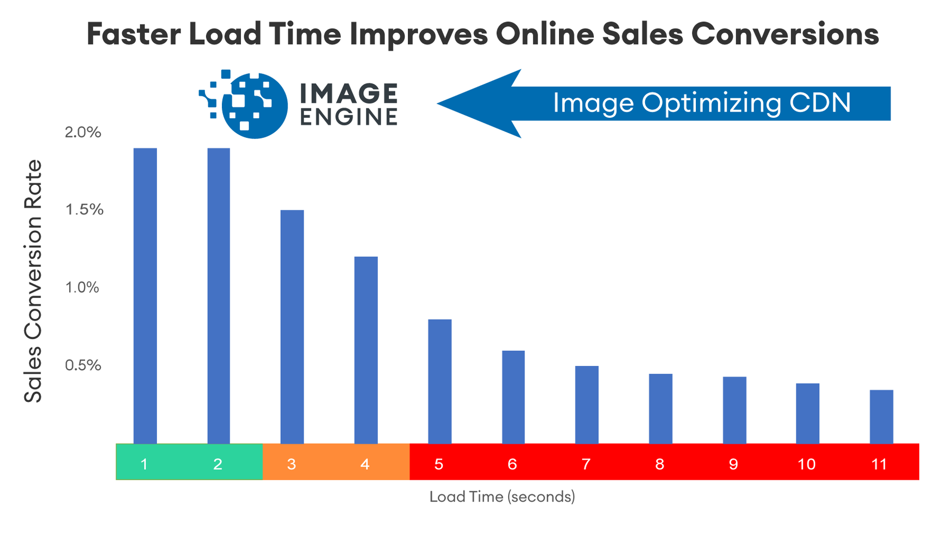
As a utility-first CSS framework, Tailwind has rapidly become popular among developers. With its fast styling process and the freedom it offers when designing a website, it’s really no wonder why.

But how can you make sure this is the right CSS framework for your upcoming development projects? In this blog post, you’ll learn what Tailwind is, and how it differs from other frameworks like Bootstrap, or Foundation.

In addition, we will highlight the main advantages and disadvantages of the framework. By the end, you will be able to make an honest and objective assessment as to whether Tailwind is the right framework for you. So without further ado, let us dive deeper into it. 

What is Tailwind CSS?

First released in May 2019, Tailwind CSS is a front-end CSS framework. It is currently at version 2.2. Since its release, Tailwind has created quite a following. More than 260k developers have used it to enhance their design systems.

Stats like these make Tailwind one of the most popular CSS frameworks on the market, and all in less than two years. There are many reasons for this. Primarily, because its features make it the ideal choice for a wide variety of projects. Tellingly, most developers prefer it to create React projects.

The main difference between Tailwind and its competitors is that it gives developers complete control over the styling of a web application. So, is it the right CSS framework for you? To answer this question, let us take a look at Tailwind’s advantages and disadvantages.

Tailwind CSS: Pros and Cons

Tailwind CSS: Advantages

1. Control Over Styling

Tailwind is a unique CSS framework when it comes to styling web applications, meaning that Tailwind does not have a default theme that you have to use like other CSS frameworks.

For example, you can give each project a different look even if you use the same elements (color palette, size, etc.). Therefore, it’s one of the few CSS frameworks that is not opinionated on how you should style your project. 

2. Faster CSS Styling Process

There is no faster framework than Tailwind when it comes to styling HTML. As a result, you can easily create good-looking layouts by styling elements directly. This is possible because Tailwind offers thousands of built-in classes that do not require you to create designs from scratch.

Therefore, you do not have to write CSS rules yourself. These CSS classes are the main reason why building and styling with Tailwind is so fast. 

3. Responsiveness and Security 

With Tailwind’s pre-built classes, you can design the layout directly in an HTML file. This makes it a very responsive, mobile-friendly CSS framework. Apart from that, Tailwind has proven to be a stable framework since its initial release.

The framework was developed by top-notch engineers, which is why bugs and breaks are rare. 

4. Additional Features 

Tailwind CSS works in the front end of a website. For this reason, it is reasonable for developers to demand ultimate responsiveness. Well, Tailwind provides the ability to create responsive themes for your web applications and remove all unused CSS classes. With PurgeCSS, Tailwind helps you keep your final CSS as small as possible.

Tailwind CSS: Disadvantages

1. Styling and HTML are Mixed

Because you do not have to write CSS rules yourself, Tailwind works differently than most CSS frameworks. While this is great for those unfamiliar with CSS, it also means that Tailwind mixes style rules in with your HTML files.

This goes against the principle of the “separation of concerns.” Many developers prefer to separate page structure and style, claiming that classes make the Tailwind markup process verbose. 

2. It Takes Time to Learn 

Because of the built-in classes, Tailwind CSS is quite learning-intensive. Even for experienced developers, it can be a challenge to learn how to use and fully utilize the pre-built classes. But, of course, as with any other development task, practice makes perfect.

However, if you are confident and quick when it comes to writing CSS classes, Tailwind may not be the best choice for you. Even if that’s true, Tailwind generally makes CSS styling faster in the long run.  

3.  Lack of Important Components

Unlike Bulma and Bootstrap, Tailwind does not have many significant styling components. Unfortunately, this means you have to manually add features like headers, buttons, and navigation bars for web apps.

This is not a significant drawback, as experienced developers can implement these features quickly. However, you will need to spend some time doing so. 

4. Documentation 

Although Tailwind CSS has made great strides when it comes to adding guides and video tutorials, it still lags behind competitors like Bootstrap. Of course, you can always contact the developers if you have a problem.

However, keep in mind that this may take some time. For this reason, you may need to customize the framework to your needs manually.

Is Tailwind Worth Trying?

In a few words, working with Tailwind is quite different from other CSS frameworks. We have identified its main advantages and disadvantages. Based on these features, we can easily say that Tailwind is:

  • An excellent solution for developers familiar with CSS who want to speed up the creation and design process in the long run.
  • Not such a good idea if you are not familiar with CSS or do not want to spend time learning a new CSS framework. 

It becomes clear that it all depends on your personal needs and preferences. However, if saving time on CSS styling is a priority for you, you should definitely give Tailwind a try.

Regardless of whether you choose to use Tailwind or not, it’s evident that many developers use it for good reasons. Since it offers a faster styling process and is a responsive and stable framework, it’s here to stay.

Tailwind can help you save time and change the way you design websites, and so taking the time to test it out is worthwhile.

Source

The post The Pros and Cons of Tailwind CSS first appeared on Webdesigner Depot.


Source de l’article sur Webdesignerdepot

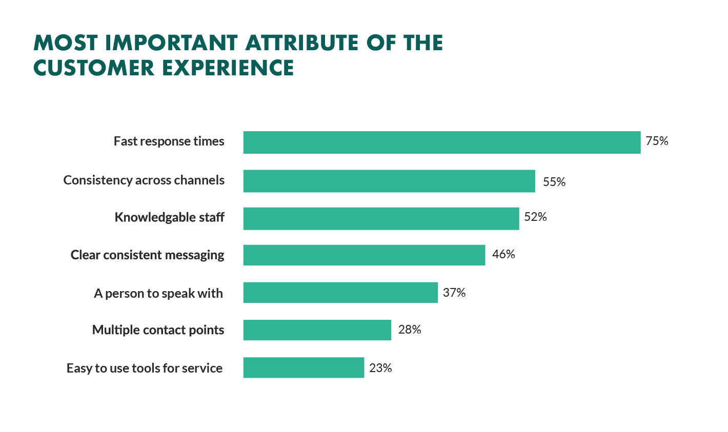
Not so long ago, customers only had a couple of ways to interact with brands. 

If you had an issue with a product or service, you could reach out through the customer service phone number or send an email. Occasionally, sites would introduce dedicated forms on their website that allowed consumers to send support tickets straight to the service desk – but that was it.

The problem with this kind of service was all the waiting. 

Send an email or ticket, and you have no idea when the company is going to get back to you. Customers end up refreshing their inbox all day, waiting for a response. Call the company, and 9 times out of 10, you’ll be placed on hold. You can’t exactly do much when you’re stuck listening to hold music, so customers are gradually getting more frustrated as they wait for a response. 

Fortunately, the evolving digital age has introduced a new solution: live chat.

Transforming Your CX With Live Chat

Live chat is a quick and convenient way for your customers to contact your business and get a response immediately. The result is happier clients, better customer satisfaction scores, and even opportunities for bigger sales. 

More than 41% of customers say they expect to see live chat on a site. 

Even if you don’t have an agent on hand to answer a chat message immediately, you can create an automated system that notifies your customer when someone is available. That means they can go and do other things while they’re waiting for a response. Live chat solutions with bots can even allow your customers to fix problems for themselves. That’s pretty convenient!

Widgets equipped with answers to commonly asked questions can automatically deal with customer queries or help them find solutions to their problems before passing them over to an agent. This means that your customer gets a solution faster, and your agents don’t have as much pressure to deal with. It’s a win-win – as long as you get it right. 

Unfortunately, a lot of companies don’t know how to implement live chat experiences correctly. 

Kayako’s study into 400 customers found that 47% couldn’t remember the last time they’d had a positive experience through a live chat tool.  

How to Upgrade Live Chat CX

The evidence shows that customers love the idea of live chat, but the reality of how businesses implement this technology isn’t always ideal. 

However, since 86% of customers say they’re willing to spend more on a better customer experience, it’s worth figuring out what separates a good live chat interaction from a bad one. 

1. Set Expectations Instantly

Setting the right expectations is crucial if you want to generate better satisfaction for your customers at a later date. When customers know what to expect from your live chat strategy, they can also make more informed decisions about which support channels they’re going to use, and whether they want to hang around for someone to answer their messages. 

The first thing you should do is showcase your agent’s availability. In this example from Help Scout, you can see whether the team is active, online, and ready to talk. The company also sets expectations for how quickly you can get an email response if you don’t want to chat.

Other ways to set expectations include:

  • Showing your opening hours: List when team members are usually available to answer questions if you’re not currently online. 
  • Topics: Offer your customers some topics that they can ask about or use the welcome message on your chat tool to direct your customers to an FAQ page. 
  • Restrictions: If there’s anything you can’t deal with over live chat, like changing a customer’s password, let them know in advance so they don’t waste time.

2. Leverage Pre-Chat Forms

Pre-chat forms are some of the most important parts of the live chat experience. They ask your customer to explain their issue to your chatbot so that they can be directed towards the right agent. Using these forms correctly ensures that your agent has all the information they need to solve a problem fast. 

You can even set up automated systems that direct customers to different agents and teams based on their needs. For instance, the live chat app on Outgrow.co gives customers the option to fill out different forms depending on whether they want answers to a question, a demo, or something else.

The button you click on dictates which professional you’ll get through to. Although filling out a form can seem like an extra friction point for your customer at first, it helps to streamline the customer journey. After all, if you can direct the customer to the right agent the first time, there are fewer chances that they’ll need to explain their issue to various different people. 

Here are a few things you can ask for in the live chat form to make it more effective:

  • The customer’s name: This will help to personalize the conversation. It could also be an opportunity to track down any background information you have about an existing customer and the orders that they may want to speak to you about.
  • An email address: Having an email address will allow you to bring up a customer’s record on your CRM. It also means that you can send any information that the customer needs to their email inbox at the end of the conversation.
  • A brief explanation: Ask your customers to share what they’re reaching out to you about and use keywords in their message to assign the chat to the right agent or professional. You could even add a drop-down menu of topics for them to choose from. 

Remember, don’t ask for too much information straight away, or you’ll risk your clients feeling that the service experience is too complicated. 

3. Make Sure It Works Everywhere

We’ve reached the point now where every customer expects a brand’s website to be responsive on any device. Most web-building templates automatically work on mobile tablets and smartphones. Additionally, it’s becoming increasingly easy for companies to transform their website and online store experiences into dedicated apps too. 

However, while most businesses know that their site needs to be responsive, they often forget about the mobile element when it comes to live chat. If your live chat function is only available on the web browser version of your website, then this is going to end up making your mobile customers pretty unhappy. They don’t want to have to stop browsing on their phone just to connect with you. 

Ideally, you’ll want to create a separate component for your mobile app where your customers can easily access the same live chat functions they’d have on your browser-based site.

If you’re just offering live chat through a mobile version of your website, make sure that it’s easy for your customer to click into the chat section and send messages without accidentally ending up on a different tab or page. It might also be worth setting up functions that allow your chat app to send push notifications to your customer’s phone whenever they get a new message. 

Being able to put their smartphone down or switch to another app while they wait for a response will provide a much more intuitive experience for your audience. 

4. Make Sure You Support All the Right Languages

You’d think that this CX tip for live chat would be obvious, but it’s shocking how many companies fail to offer support for all the languages that their customers might use. If you’re selling your products throughout the world, and you know you have customers in China, then it doesn’t make much sense to only offer live chat in English. 

Some of the available live chat apps on the market today come with features that allow you to automatically translate languages when your agents are talking to foreign customers. For instance, LiveChat currently supports 45 languages

If you’re creating your own chat app from scratch, then you’re going to need to work with your developer or designer to make sure that the right languages are supported. Remember, you don’t have to cover everything, but at least make sure that you can connect with the most common groups of customers in your CRM. 

Ensure that if you are using multiple languages, your customers know how to switch to their preferred option too. Usually, the best way to do this is with a drop-down menu. You could also use little flag icons of the countries that you support. 

5. Find Ways to Reduce First Response Time

Speed is probably one of the biggest advantages of live chat, and the main reason that customers like it so much. According to the CMO council, fast response time is the number one thing that a customer looks at when measuring satisfaction. 

While you might not be able to have someone on-hand to answer your customers 24/7, you can improve the way they perceive your load times in a variety of ways. For instance, start by making it clear when your people are online to talk to your customers. Setting expectations on when you’ll be available to immediately respond should help to avoid frustration.

  • Keep all chats in the same place for agents: Having a combined contact center solution on the back-end makes responding to queries much easier for your agents. If they can see all of your brand’s live chat, social, and email conversations in one place, they don’t have to waste time jumping between different platforms and tabs. 
  • Set routing queues: Use an automated system to send every message you get to the most appropriate agent available. You can intelligently route conversations based on the issues that your customers have or the things they want to discuss. It’s also worth ensuring that your system prioritizes routing conversations to the first agent available. 
  • Send notifications: Make sure that you set your live chat system up to send push notifications to agents when a new message is waiting. It’s also with notifying your customer when they have a response, just in case they’ve switched to another tab. 

The notifications you send to your agents could come with access to a customer’s CRM file, so that your agent can go into a conversation with the context they need. Agents that instantly get context on a conversation don’t have to waste as much time tracking down the right information. Giving your agents context also means that they don’t have to ask repetitive questions, which could annoy your customer. 

6. Make the Chat Experience On-Brand

Every company wants to give their customer a slick experience with live chat. The solution you build needs to be easy to use, and responsive across every device. However, it also needs to be something that your customer associates with your brand. 

Companies generally have a lot of options for how a live chat window can look. You can adjust the appearance to suit your brand by picking specific colors, tweaking button shapes, and even changing the available fonts. 

Working the visual elements of your brand into the design of the live chat experience is the best way to make your customers feel comfortable and confident that they’re dealing with your company. For instance, Hubspot uses matching colors, rounded edges on chat bubbles, and even a fun illustration to make their chat experience more “branded.”

Remember, when you’re creating a Live Chat experience that’s “on brand”, it’s also a good idea to think about things like voice and tone. Infusing live chat with the unique personality of your brand will make the experience more memorable. 

If you usually stick with informal language and use a lot of slang, then it makes sense to continue that in live chat – even when you’re sending automated messages. To make sure your brand identity really shines through:

  • Write scripts for your automated messages in your brand’s tone of voice
  • Write guidance scripts for employees that highlight your tone for agents
  • Provide training on brand tone of voice for your support team
  • Encourage support agents to connect with customers on a personal level
  • Remember to set guidelines on how to use things like gifs, slang, and emojis too!

7. Make a Checklist For Security and Tech Issues

One of the most significant things that will affect the experience your customer has with your live chat service, is technical and security issues. Choose the right developer or designer to help with your app, and the risk of problems dwindle. You can also address the issue of having to constantly maintain, check, and update your live chat experience by using a pre-existing solution, like Intercom.

No matter how you choose to approach live chat, these are the things you’ll need to check for most:

  • Page load times: Page load times are crucial for user experience and SEO, so you should be taking them seriously already. Check your web chat software isn’t dragging down the performance of your page or causing unnecessary problems.
  • Cross-channel conversations: If your website has various subdomains, make sure that moving through these in chat won’t mean you lose the session. Customers don’t want to have to repeat themselves!
  • Functionality with browsers: Your chat app needs to work just as well on every browser and operating system – including mobile devices. 
  • Data management: Under things like GDPR, you need to ensure that you’re controlling user information safely. Ensure you have a DPA in place, and make sure that your web channel doesn’t affect any PCI-DSS compliance systems you have in place. Your chat solution may need to automatically mask credit card information, for instance.

Time to Enhance Your Live Chat Strategy

Ultimately, whether you like it or not, your customers love live chat technology, and they’re not going to stop looking for it on your website. Today’s consumers expect you to serve their interests by delivering customer support on the channels that they choose. Unfortunately, most companies just aren’t living up to expectations.

Following the tips above could help you to transform the way that you interact with your clients and improve your chances of better satisfaction overall.

Source

The post 7 Tips for Transforming CX with Live Chat first appeared on Webdesigner Depot.


Source de l’article sur Webdesignerdepot

According to a recent Hubspot survey, more than 85% of marketers believe video content is essential for any marketing strategy. This percentage is more than 20% higher than in 2016.

Understanding why this is the case is not hard. Modern digital marketing is all about engaging with your audience and sharing personal stories. And there’s simply no better way to do that than video content.

Videos are engaging for people of all ages and less boring than other types of content. However, it’s not easy to create or optimize video content. That’s why we have created a list of the top 10 video content tips and tricks you should follow.

Top 10 Tips and Tricks to Succeed in Video Content Marketing 

Whether you are an influencer, blogger, or business owner, video content is important for promoting your services or products. The following tips will help you improve your video content strategies.

Plus, you can apply these tactics across all websites and platforms: from your website or YouTube channel to social media platforms like Instagram or Twitter.

1. Utilize Video SEO

Contrary to what many believe, SEO does not only apply to written content. In fact, video SEO is just as important for drawing organic traffic to your website or social network account.

You can achieve this in several ways. When you upload a new video, you need to consider things like keywords, tags, file names, and descriptions. However, this is only part of what you can do to optimize your videos for SEO purposes.

There are plenty of video SEO guides for beginners that can help you improve your online presence through your video content. 

2. Identify Your Goals and the Scope of Your Videos

As with written and visual content in general, it is critical to identify your business goals for video content. This is one of the first things you should think about when launching a new video content campaign.

Think about what you want to achieve. For example, do you need to generate new customer leads or expand your audience? Considering the reach of your videos can help you stand out from your competitors.

When it comes to video content, planning is key. For this reason, setting the goals of your strategy should be a priority.

3. Schedule Your Video Content

While it’s important to set goals, no video content strategy will work without consistency. Planning your video content is the best way to be consistent when creating, uploading, and promoting.

There are many online apps and tools that can help you organize your video content strategy. For example, scheduling tools like Buffer or MeetEdgar can help you keep everything organized and save time uploading your videos.

In addition to these social media scheduling tools, you can also use apps like Trello to help you organize your content creation in general.

4. Use Premade Material like Instagram Templates

If you are a professional video creator or video editor, you’ll have no problem creating top-notch video content. But what happens if you have no experience with video content at all?

Luckily, there are plenty of tools out there to make your life easier. For example, if you want to create video stories for Instagram, you can use captivating pre-made Instagram templates.

Editing such templates using software like Photoshop can save you both time and money. However, if you do not have Photoshop experience, you can also create videos using simple online editors like Canva

5. Make Your Videos Engaging and Emotional

There are a few tips we would like to share when it comes to the content of videos. An important thing to keep in mind is that your videos should always be engaging. If you don’t try to engage with your audience through your videos, there is a big chance of failure. 

Therefore, whether you own a personal blog or an enormous corporate website, your video content should connect you emotionally with your audience. Adding a personal feel to your videos is a fantastic approach to consider. 

By doing so, your customers/readers will feel the need to engage by sharing their stories with you.  

6. Create Educational and Relevant Video Content

There are a few tips we’d like to share with you when it comes to video content. One important thing to keep in mind is that your videos should always be engaging. If you are not trying to engage your audience through your videos, there is a high chance of failure.

Whether you have a personal blog or a huge corporate website, your video content should connect emotionally with your audience. Adding a personal touch to your videos is an excellent approach to consider.

This way, your customers/readers will feel the need to engage by sharing their stories with you.

7. Implement CTAs

Calls to action are one of the most effective marketing strategies for written content. Although most websites only include CTAs on the homepage, it’s a brilliant thing to also use them in blog posts, videos, and visual content in general.

You should let your customers know how they can interact with your brand. For example, let them know about your website or how they can follow you on social media for more information.

CTAs are the best way to keep your customers and ultimately increase your conversion rates.

8. Focus on Storytelling

Videos that focus on sales often bore viewers. For this reason, you should add some value to your video content. Creating videos that act like stories is a great thing to do.

When you tell a personal story, your customers can better understand your brand and how it can help them. Remember, storytelling makes your content more engaging and interesting.

9. Promote your Content

Say you have developed a great video content strategy and have already created some top-notch videos. What should be your next step? Well, maximizing your target audience is a smart approach.

You can achieve this by promoting your videos on platforms like Facebook, YouTube, Instagram, etc. Another smart move is to incorporate your video content into other content like blog posts, your website, etc.

10. Occasionally Evaluate your Video Content Strategy

Since you have already established your goals and the scope of your videos, you know exactly what you want to achieve with your video content strategy. Therefore, it’s important to evaluate how your plan is working. If you are happy with the analytics of your videos, that’s great.

If not, you can always consider what’s going wrong. For example, maybe you need to promote your videos better or include more CTAs.

Wrap Up

In this article, we analyzed how important video content has become for marketing. For this reason, implementing videos into your marketing strategies is a great thing to do.

If you follow the tips and tricks above, you will increase your video content strategy’s chances of success.


Featured image via Unsplash.

Source

The post 10 Tips to Help Video Content Succeed in 2021 first appeared on Webdesigner Depot.


Source de l’article sur Webdesignerdepot