Articles

Are you a creative person looking for the perfect career path to take? If so, there are not many more creative professions than that of a web designer.

However, becoming a web designer can be challenging, especially if you do not know where to start. For example, do you need to attend college to become a web designer? And what kind of computer and software do you need to own to be successful as a web designer?

This guide aims to answer all these questions and show you the steps you need to follow to build a career in web design.

Web Designer: Main Skills and Responsibilities

Generally speaking, a web designer is a professional who creates, manages, and maintains content for the web. Nothing is left out from designing pages and visual elements via programming languages and creating user-friendly websites.

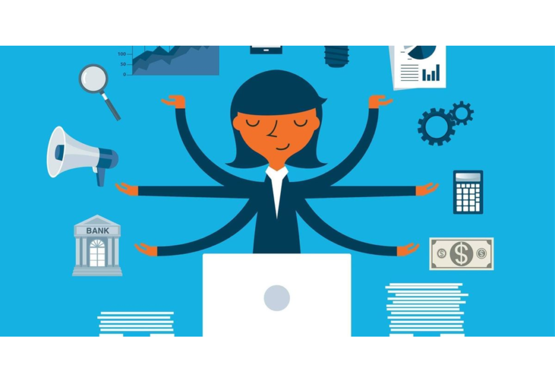
Web Designer (Hard and Soft) Skills:

  • UX, UI, and visual design knowledge (web fonts, colors, etc.)
  • Management of design software (e.g., Adobe Photoshop)
  • Coding knowledge (HTML, CSS, JavaScript, etc.)
  • Time management
  • Communication skills
  • Problem-solving and teamwork skills
  • Research skills

Web Designer Responsibilities:

  • Plan and create web pages
  • Design appealing layouts
  • Use codes to create user-friendly pages
  • Ability to meet deadlines
  • Listen and advise clients
  • Able to work as part of a team and effectively solve occurring problems
  • Analyze the client’s niche, explore new web design opportunities/ innovative digital marketing approaches

If you feel overwhelmed reading this table, don’t be! You do not have to master all of the above skills. No one expects you to either. Becoming a top-notch web designer takes some dedication, but ultimately it’s nothing more than a series of steps. Let’s dive deeper into them.

Becoming a Web Designer: 7 Essential Steps

1. Gaining the Knowledge Needed: Theory and Certifications

Let’s start with the most common question, “Do I need to go to college to become a web designer?” Research shows that more than 65% of web designers are self-taught (fully or partially). Of course, that does not mean you can jump into design from the start.

Instead, we recommend that you learn some essential web design elements and how to use them in your future projects. This includes UX (user experience), UI (user interface), protocols, and patterns. The same goes for technical knowledge like programming languages, frameworks, and design software.

2. Developing Certain Skills

So, there are numerous aspects you can explore regarding technical skills. To be specific, your first steps in web design include developing the following skills: 

  1. Theory and certifications: Learning the theory to understand how the web and the market work
  2. Web design tools: Finding the web design tools you need to start designing (.e.g Webflow, Sketch, Figma). This will allow you to learn how to prototype web design mock-ups.
  3. Graphic design tools: Becoming familiar with software like Photoshop, Illustrator, etc.
  4. Programming languages: Especially if you think of becoming a freelance web designer, you should at least learn how to use fundamental languages (HTML, JavaScript, CSS).
  5. SEO (Search Engine Optimization): Learning how to optimize your web pages to rank on search engines is crucial.  

3. Mastering Web Design Software 

What software do you need as a beginner to start creating web designs? There are numerous apps that will help you gradually enter the fascinating world of web design. 

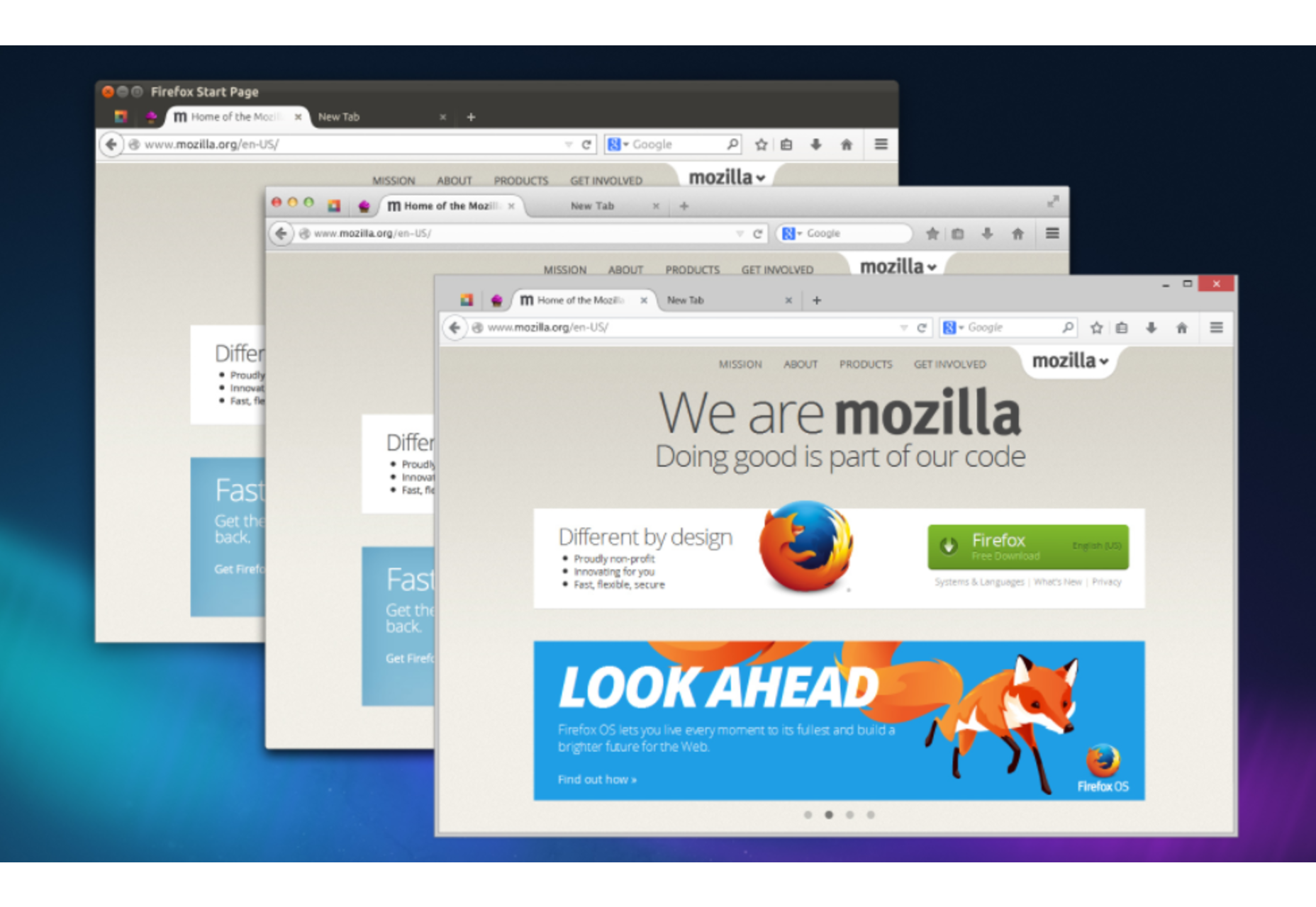
When it comes to CMS platforms, WordPress is by far the most popular in the market. The good thing about WordPress is that it is very beginner-friendly and comes with thousands of pre-built themes and plugins that you can use when creating a website.

But the same is true for InVision Studio. Unlike WordPress, InVision Studio is specifically designed to help web designers prototype and design a website. Finally, when it comes to graphic design software, we recommend you start with Photoshop (for creating visual samples and prints) and Sketch (for UI designs). 

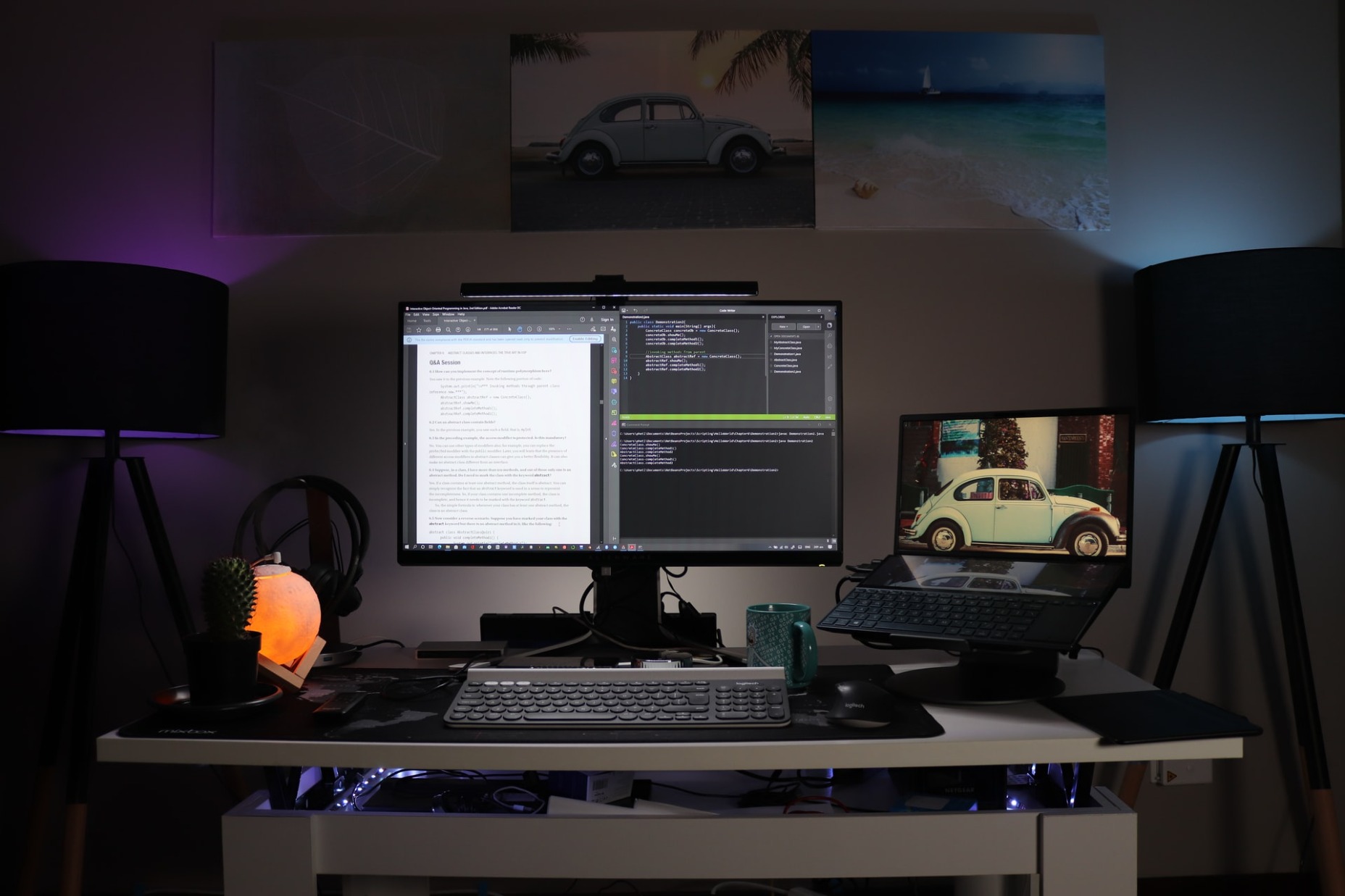
4. Learning How Much Computing Power you Need

Although online CMS platforms like WordPress do not require special hardware, that’s not true for web design and graphic design software. To be precise, both InVision Studio and Photoshop have quite demanding system requirements. 

Still, a mid-range desktop or an entry-level gaming laptop can easily handle such applications. You need a reliable CPU, 8 GB RAM, and a dedicated graphics card.

I find working with two screens perfect when it comes to prototyping. You do not need to spend thousands of dollars to buy a laptop or desktop for web design.

5. Practice, Practice, and Practice

As with any other profession, practice makes perfect in web design. Therefore, the good idea is to get involved with personal web design projects before you start seeking clients or applying for job offers. This way, you can gradually acquire the technical skills you need.

Also, by working on some personal projects first, you can build a professional portfolio.

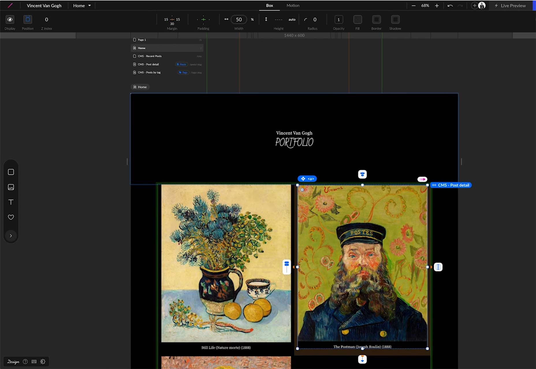
6. Creating a Professional Portfolio

If you want to draw attention to your talent, you should have a comprehensive portfolio as a web designer. This way, potential customers to trust you by having a look at your work and previous experience.

When creating a portfolio, make sure to showcase all aspects of your work and make it user-friendly. In other words, think of your online portfolio representing your talent and treat it accordingly.

7. Choosing the Web Designer Type That Best Suits Your Needs and Preferences

Last but not least, before working as a web designer, you should know that there are three main types of web designers: Freelance web designers, Agency web designers, and In-house web designers.

If you prefer to be self-employed and believe that you have the required soft skills, freelancing is probably the best path.

On the other hand, working for an agency or a company is usually easier (especially for beginners) and will provide you with a stable income. But, in the end, it all depends on your needs and preferences.

Wrap Up

Being a web designer can be an exciting career. As long as you have the necessary dedication and willingness, nothing will stand in your way.

Learning different aspects of the profession and mastering specific software will only make you better. All you need to do is respond positively to (and ask for) incoming feedback and practice!


Featured image via Pexels.

Source

The post How To Take Your First Steps in Web Design first appeared on Webdesigner Depot.
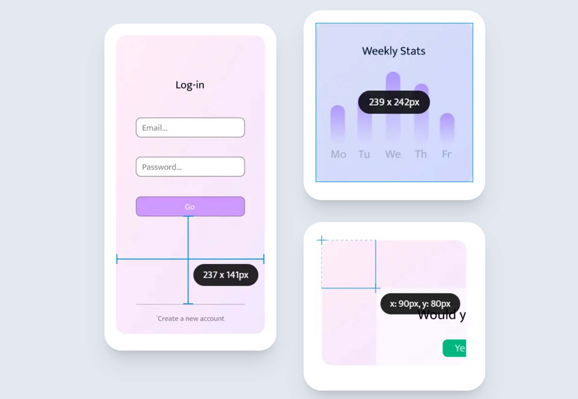
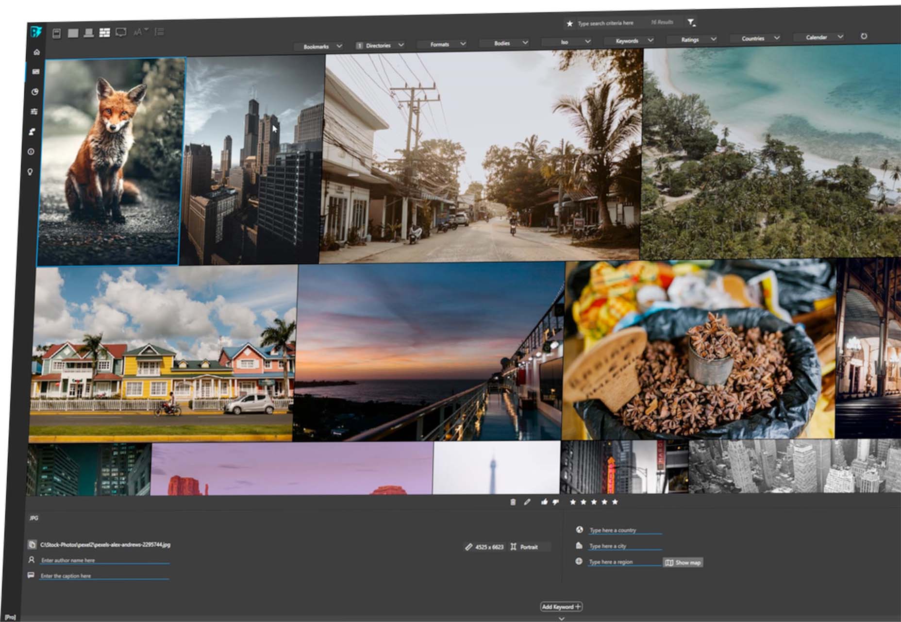
Source de l’article sur Webdesignerdepot

Ask any seasoned web app developer about their choice of programming language, and they are sure to mention PHP. PHP is a widely-used general-purpose scripting language that is especially suited for Web development and can be embedded into HTML. As per Builtwith, 3,090,319 live websites are still using PHP. However, when it comes to developing massive projects without lag or stability issues, developers tend to use frameworks, and PHP has two remarkable frameworks: 1) Laravel and 2) Yii. Both frameworks have a lot of followers in terms of full-grown communities globally, and there may be questions arising about which to choose.

What Are Laravel and Yii?

Laravel is a simple PHP framework frequently used for web-based or web application development initially created as a better alternative to Codeigniter. It is known for MVC Support, articulated ORM systems, reliability, modularity, and uncomplicated coding rules. Some of the key features of Laravel Framework are:

Source de l’article sur DZONE

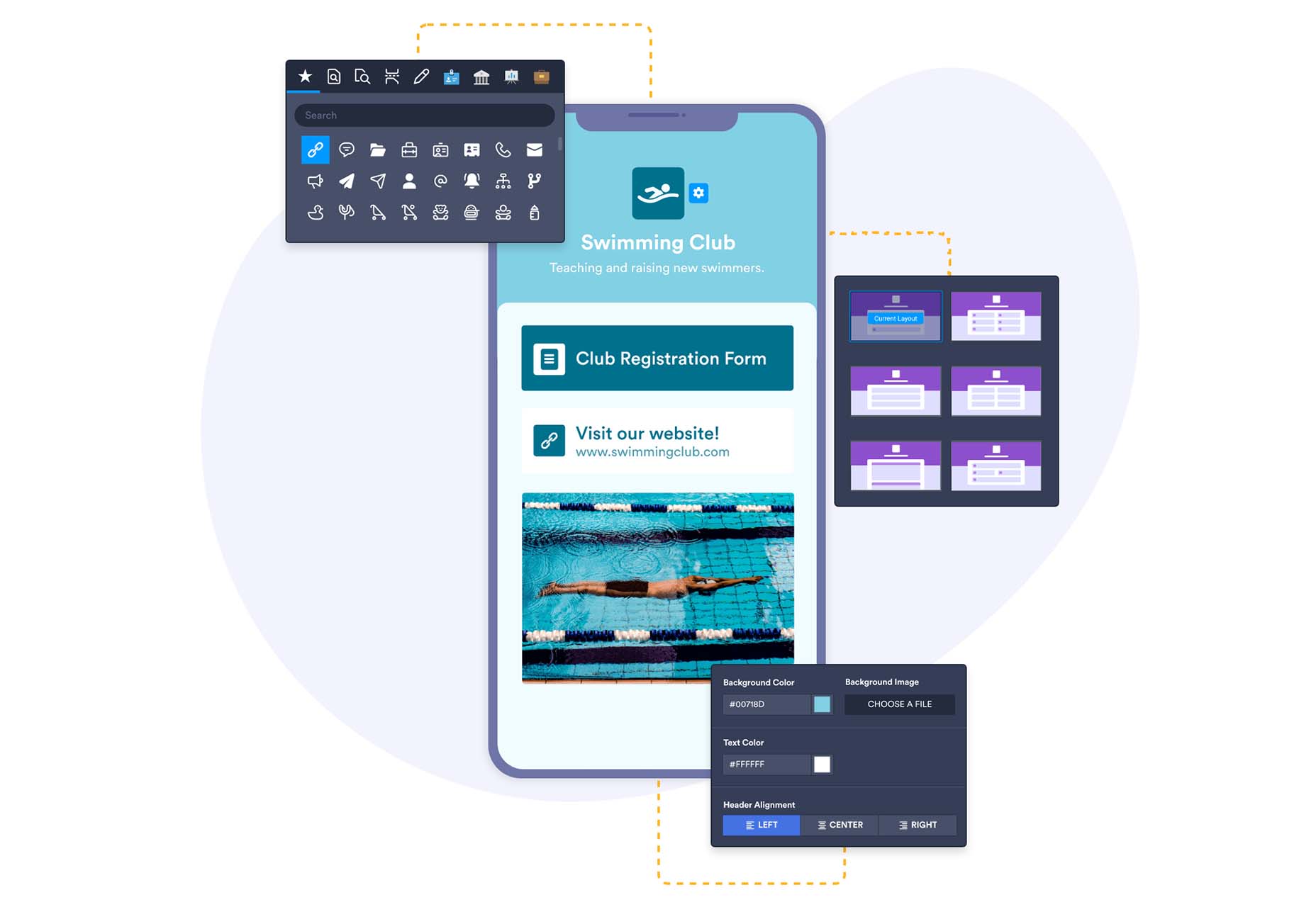
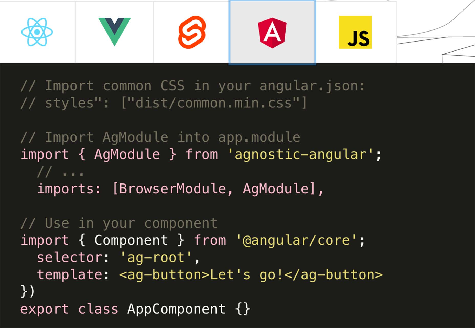
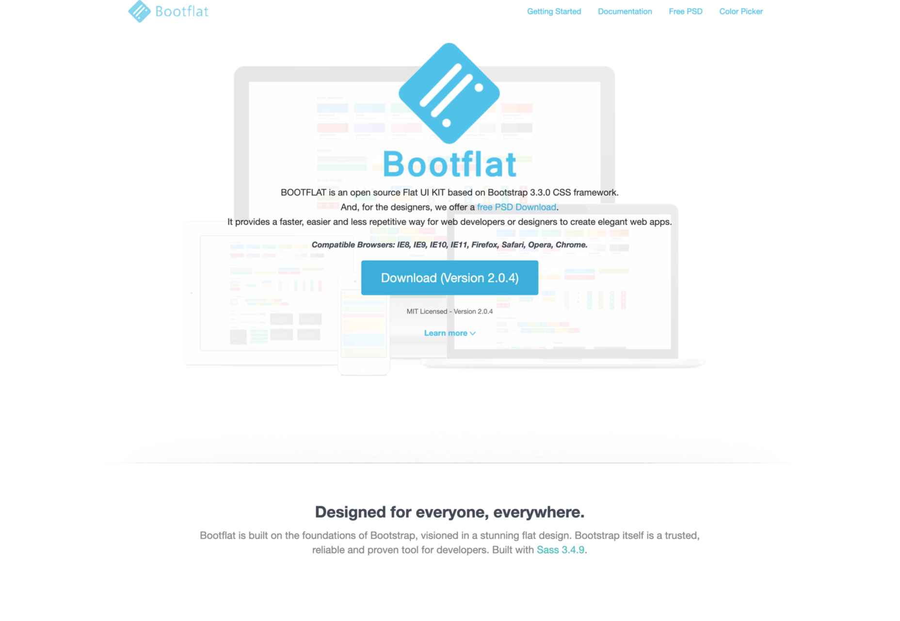
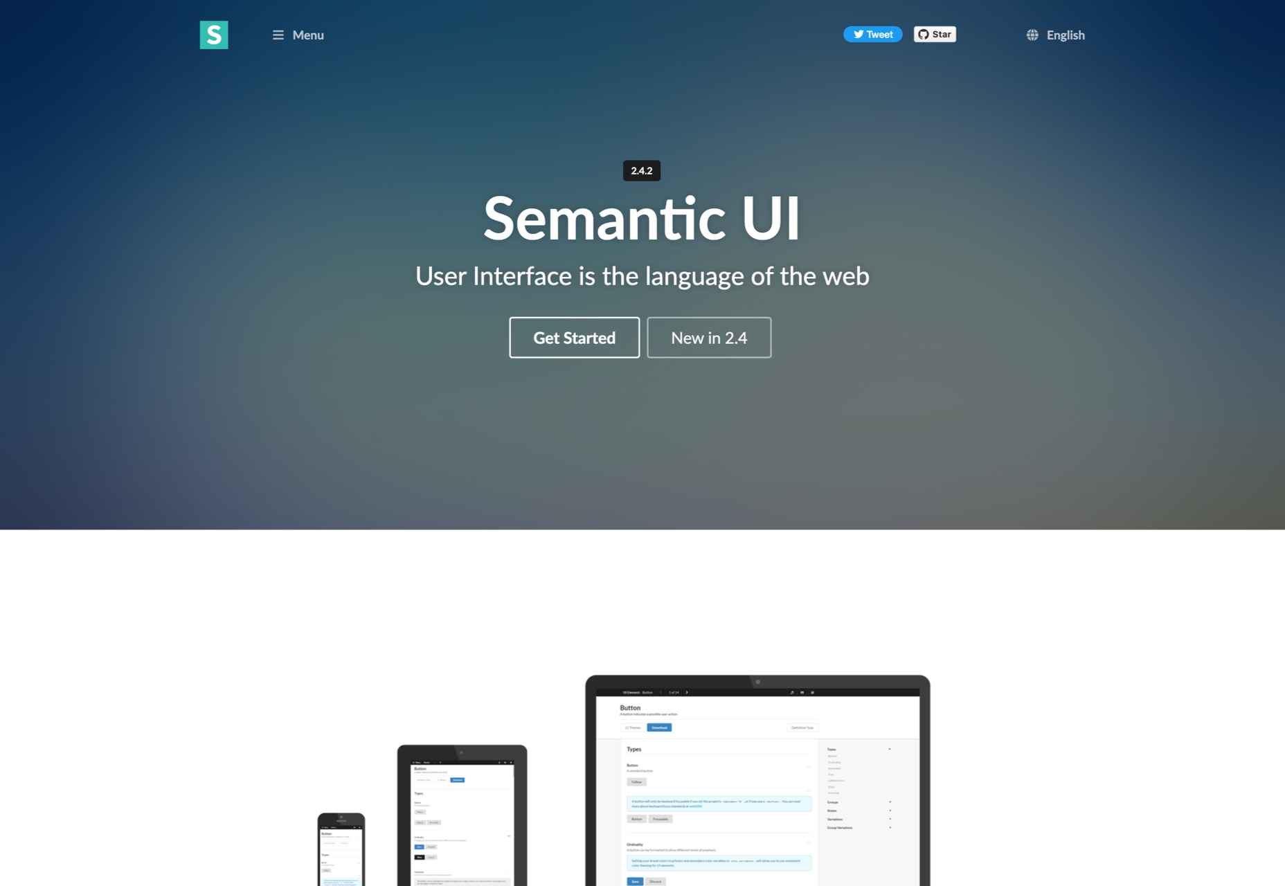
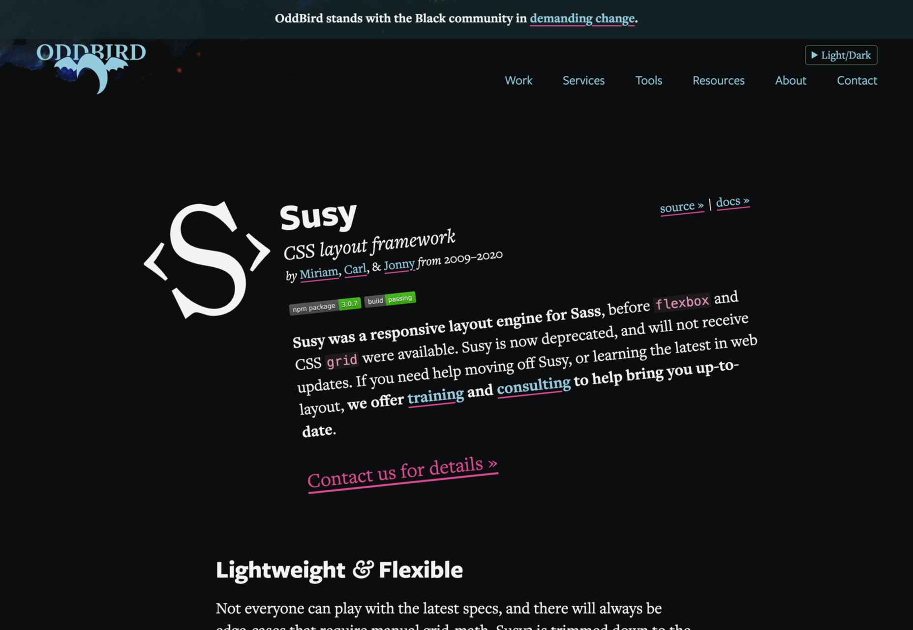
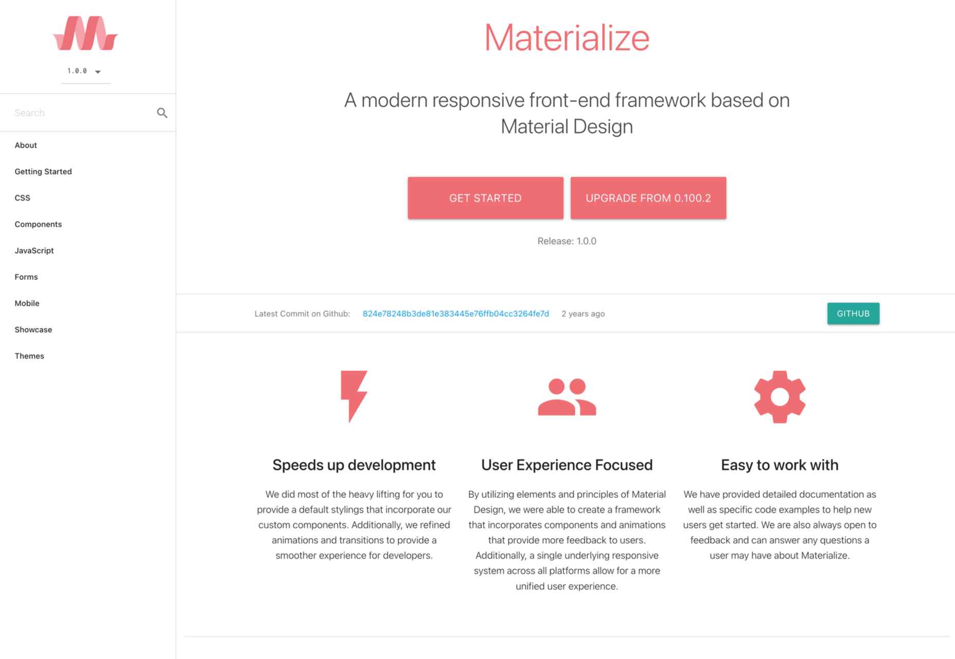
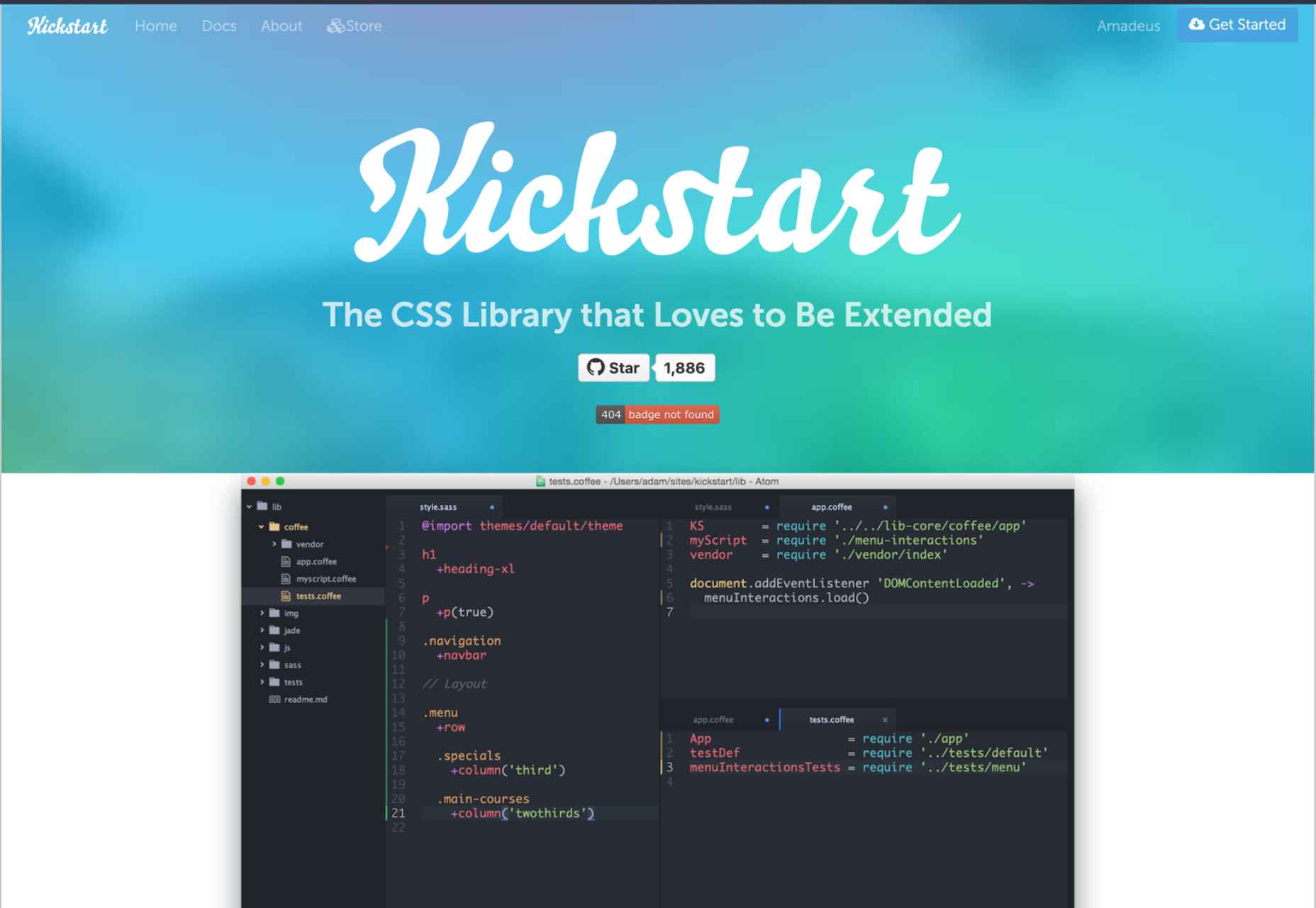
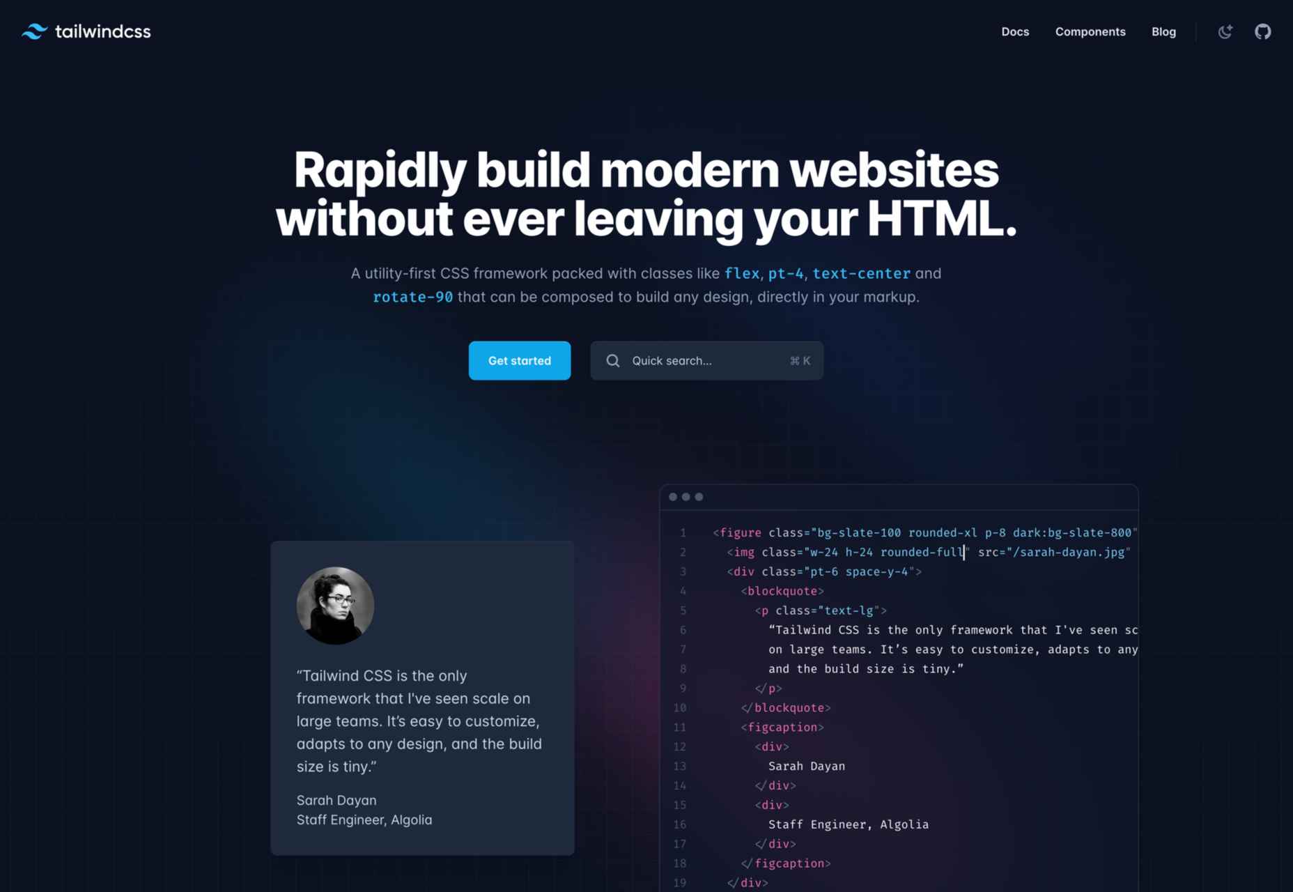
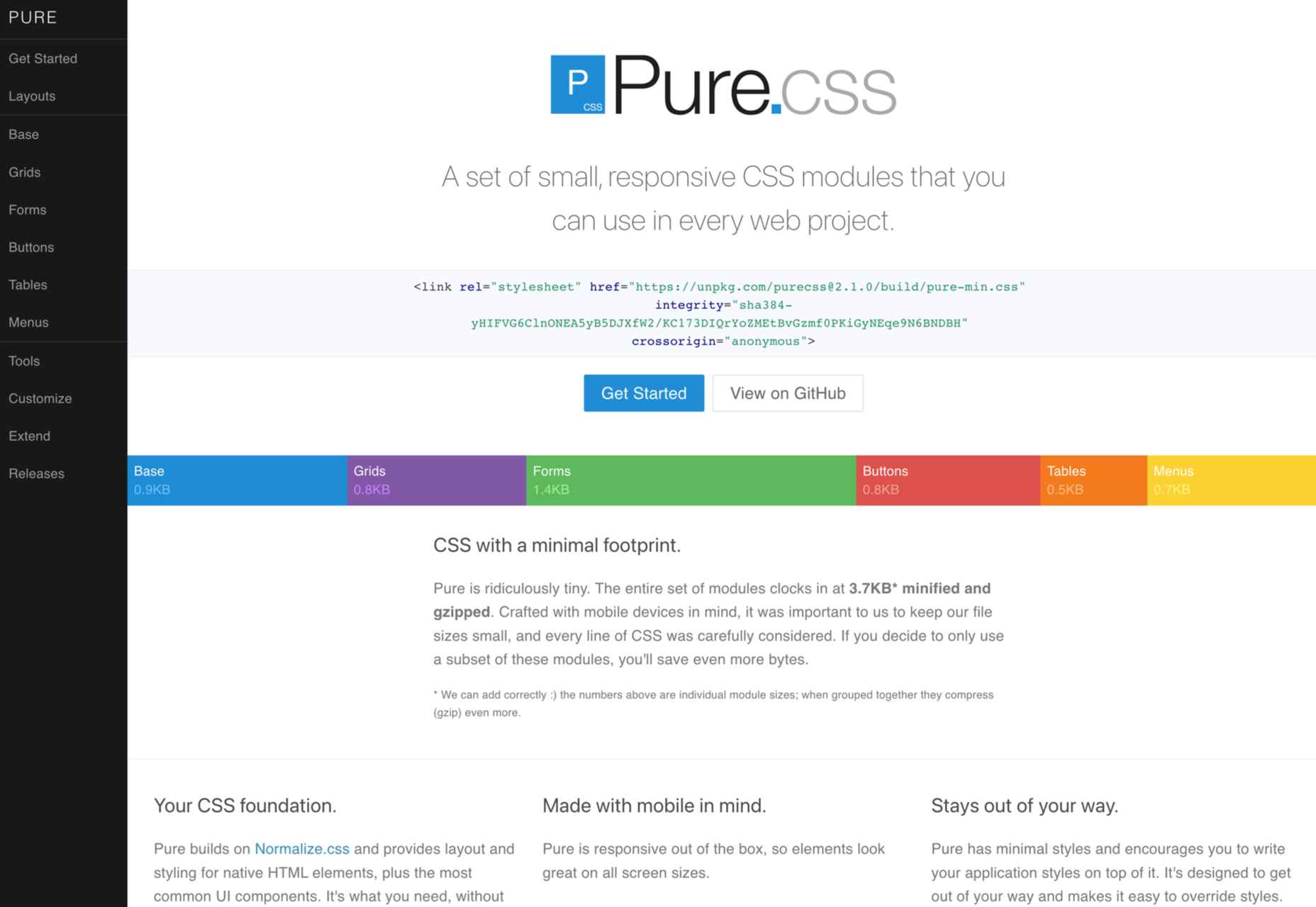
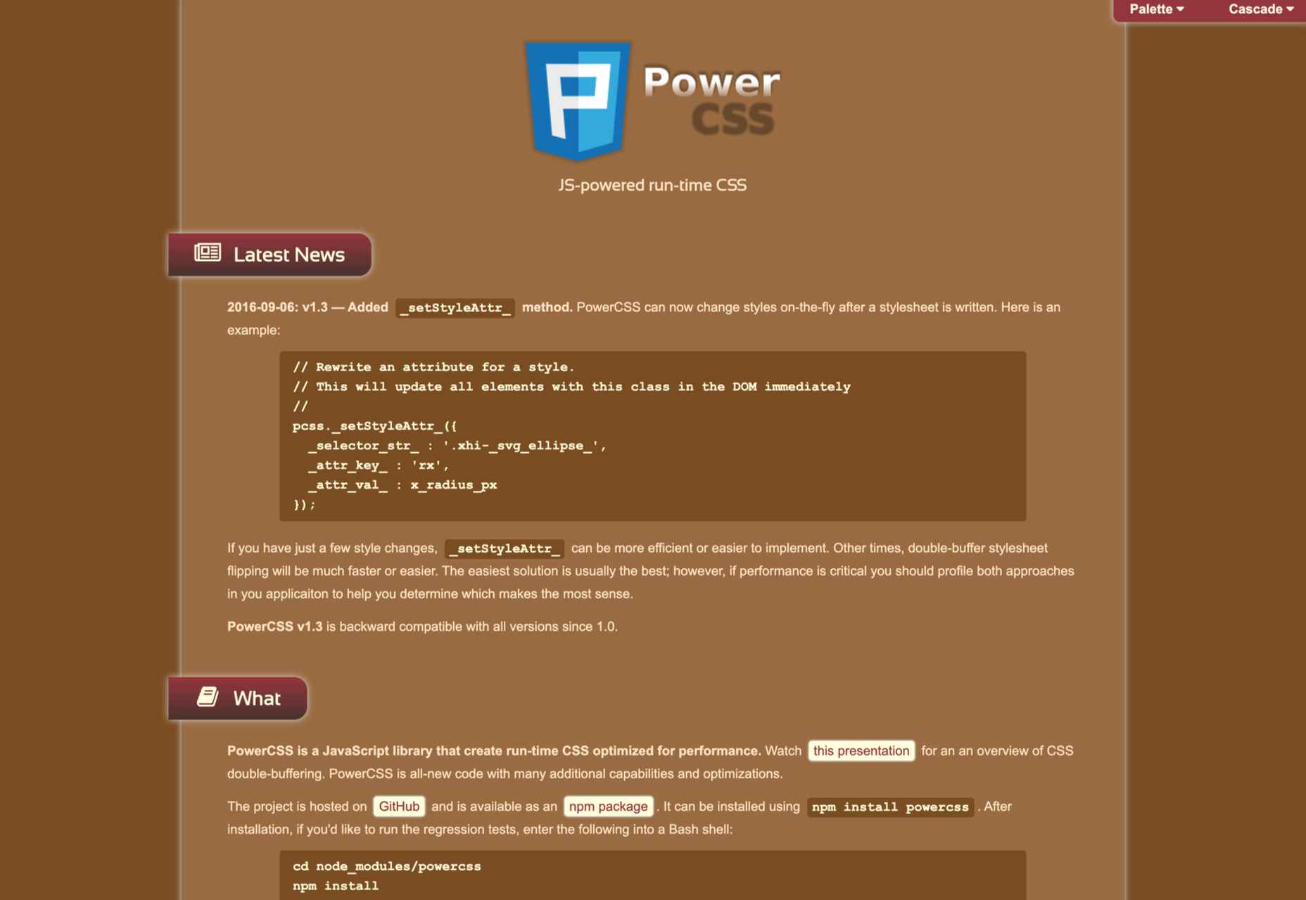
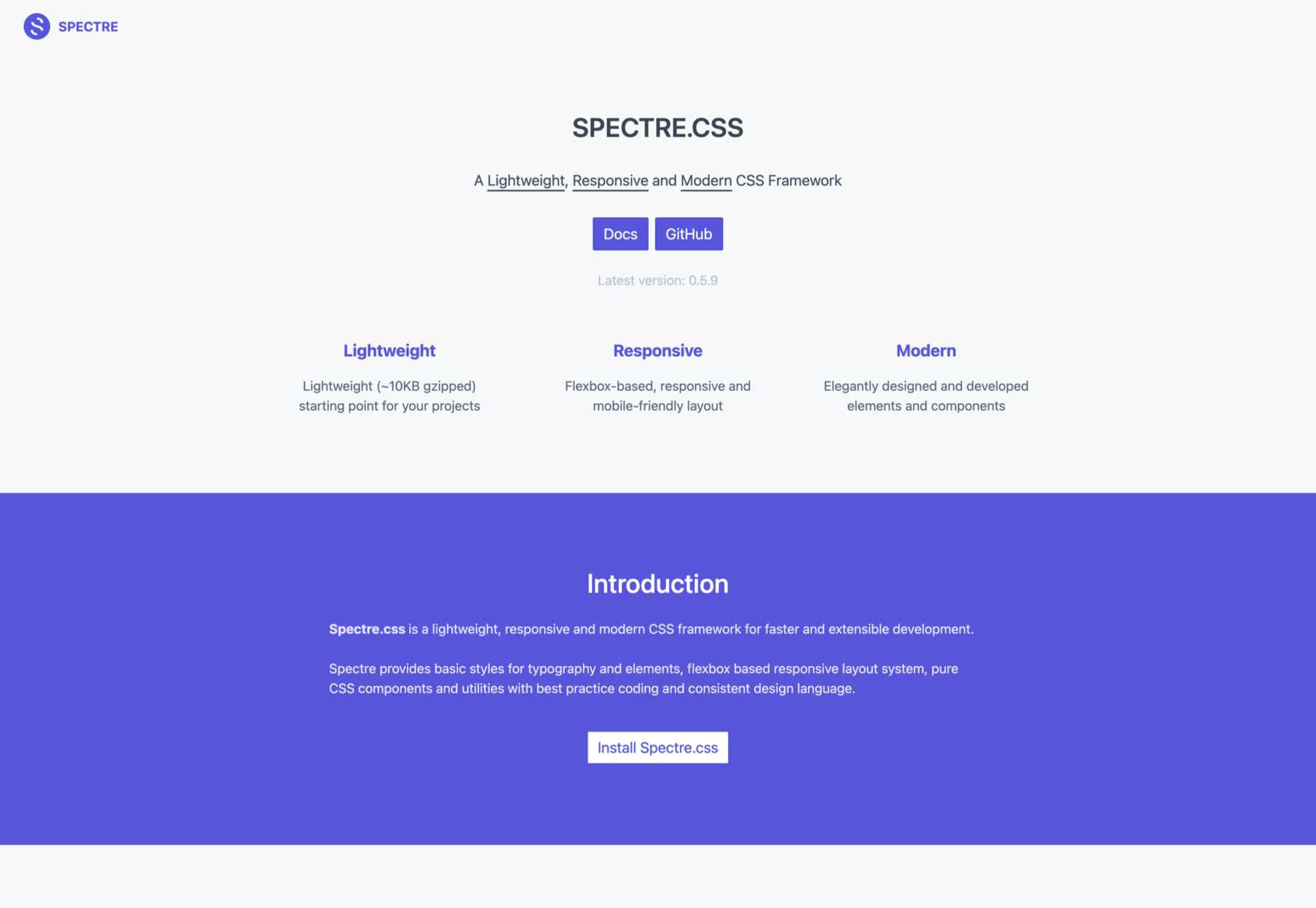
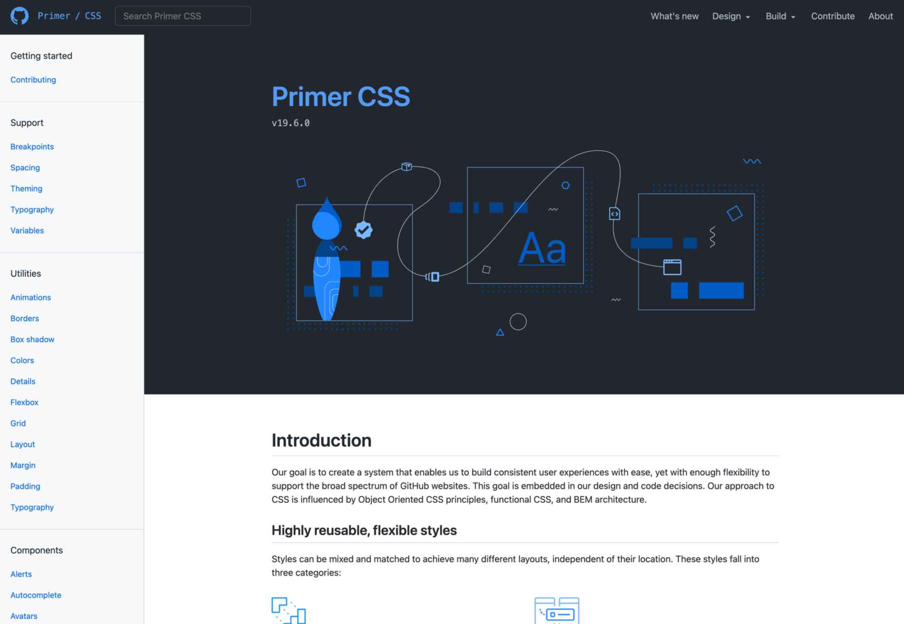
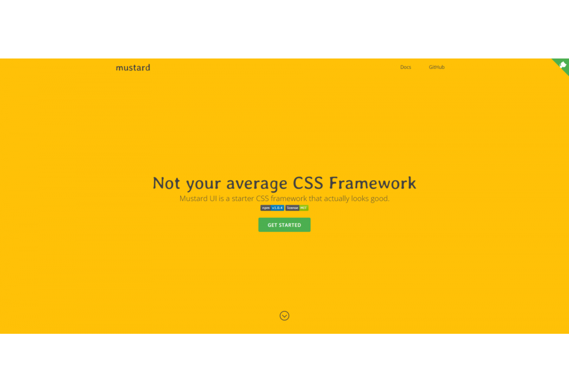
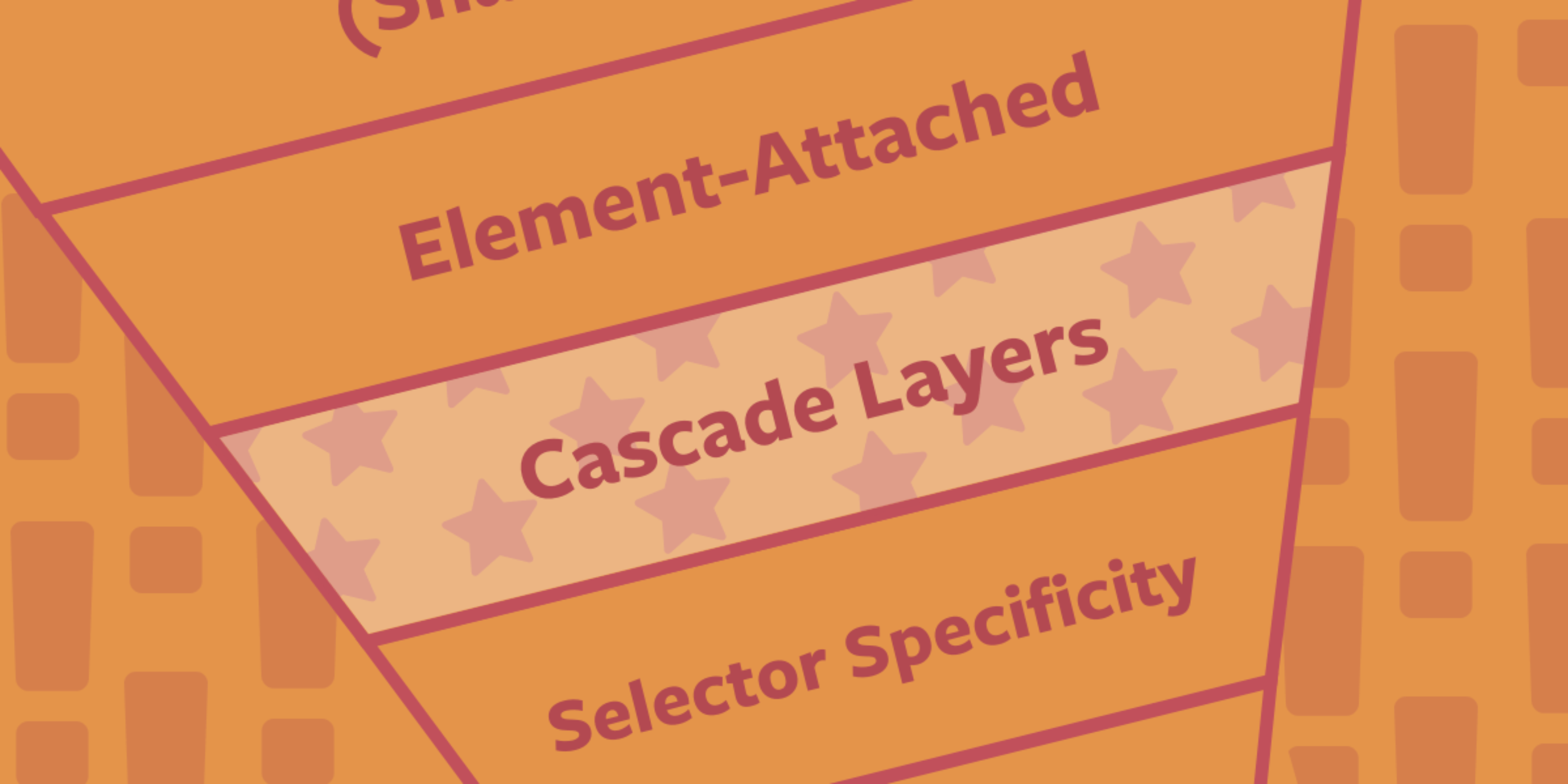
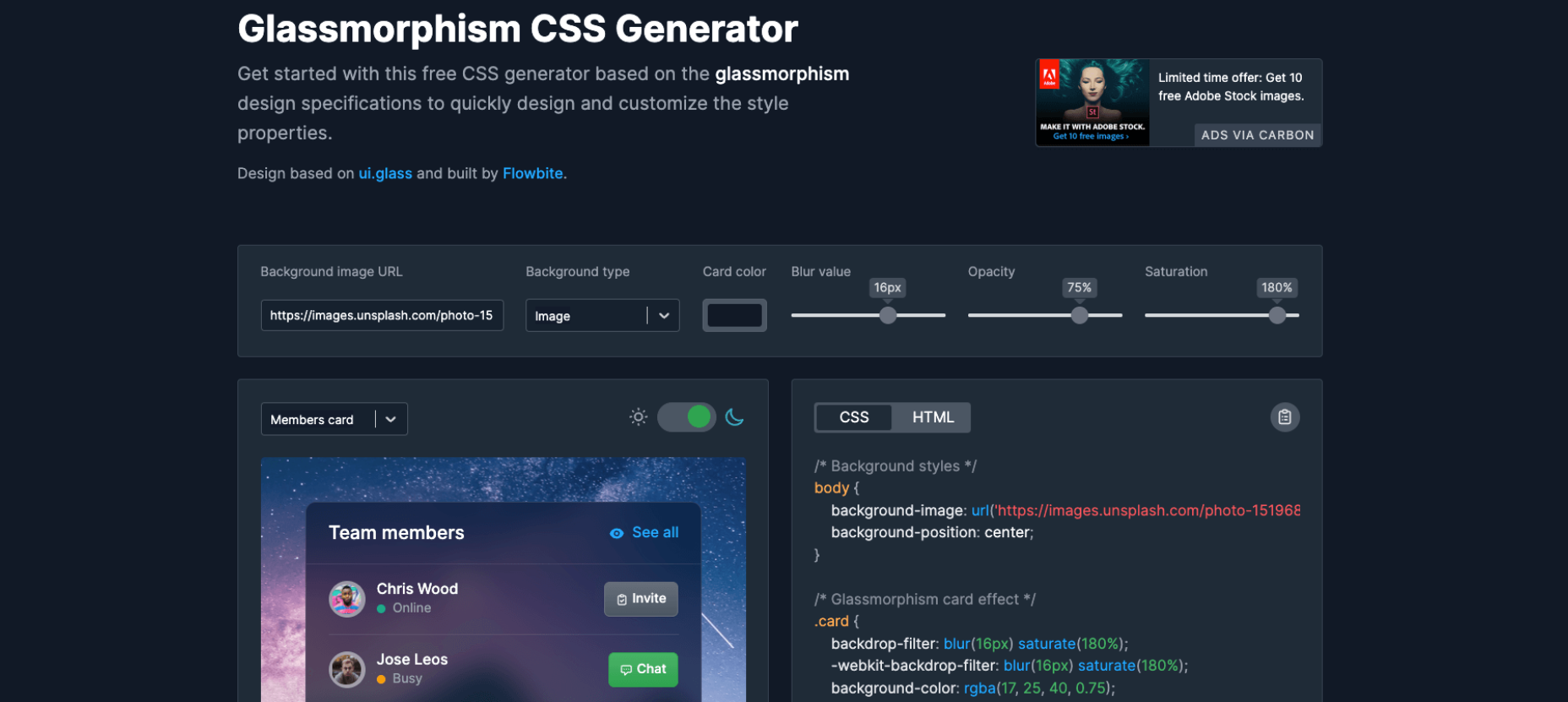
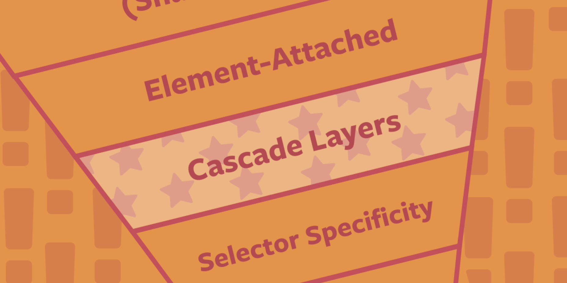
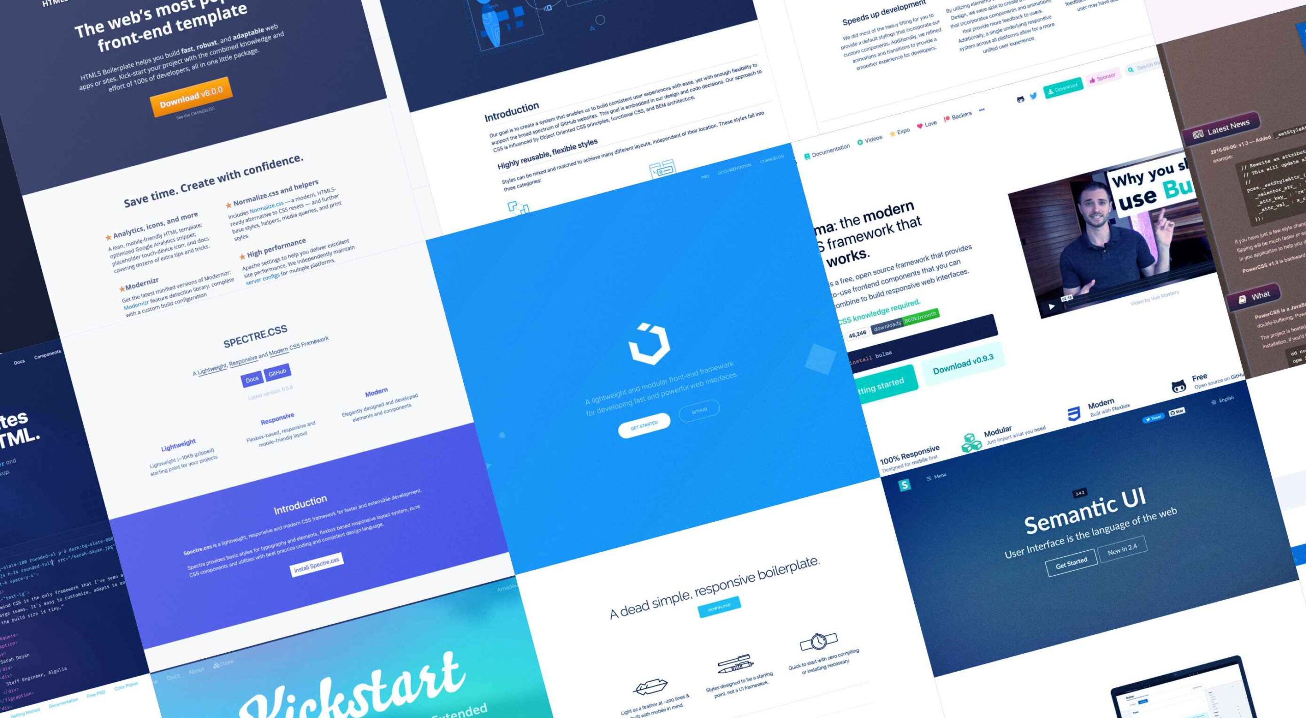
Whether you are a CSS expert or a front-end beginner, using the right CSS framework is crucial for your daily tasks. There are numerous frameworks whose ultimate goal is the same: helping developers target multiple screens, in the simplest possible way.

This is why Bootstrap is by far the most popular framework on the market. All developers have heard of Bootstrap, and more than 80% of them say they are happy using it.

But that doesn’t mean that there aren’t some great alternatives if you’re willing to shop around. Bootstrap won’t be top dog forever, and there are numerous new lightweight and powerful CSS frameworks.

If you are bored of coding with Bootstrap and Foundation and tired of using complex CSS rules, this list is for you. 

From frameworks that take a pure CSS approach to minimalist frameworks with fully customizable themes, nothing is left out. Let’s get started…

1. Bulma

Bulma is one of the most popular alternatives to Bootstrap and Foundation. It is an entirely free, open-source CSS framework that does not have a steep learning curve. No prior CSS knowledge is required to use Bulma.

When you add the variety of colors, responsiveness, and clean flexbox-based grid it offers, it’s no wonder Bulma is becoming more popular every day. Bulma is a well-documented framework that you should definitely try out.

2. UIkit

If you’re looking for a lightweight yet powerful CSS framework that can be wired with HTML and JS, Ulkit is for you. It fully supports right to left languages and has one of the best icon libraries out there.

Keep in mind that Ulkit is also easy to use. All in all, Ulkit is an excellent Bootstrap alternative that is perfect for designing web layouts for desktop and mobile screens.

3. HTML5 Boilerplate

Even though Bootstrap is relatively easy to learn, it is much more than just a front-end template. So what if you need a fully compatible JavaScript, CSS3, and HTML5 template? In this case, HTML5 Boilerplate is a good choice.

Of course, since it’s a template, this framework does not include layouts and component modules. However, if you need a reliable CSS template that offers extensive documentation, HTML5 Boilerplate is a great solution.

4. Metro UI

Metro UI is one of the most flexible CSS frameworks on the market. This front-end framework can be easily combined with JavaScript-based frameworks like Angular, React, etc.

We found Metro UI to be an excellent open-source CSS framework and a great alternative to Foundation during our testing.

5. Skeleton

As a two-in-one solution, Skeleton quickly made it on our list. This is both a boilerplate and a comprehensive CSS framework. We enjoyed customizing its 12-column grid during our testing, and we found out that it has virtually no learning curve. 

The automatic width resizing works like a charm, and the syntax is fully responsive. This is why we consider Skeleton to be an excellent Bootstrap alternative.

6. Bootflat

If you are looking for a quick way to create a web app, Bootflat is the framework you need. Bootflat’s components are built with CSS3 and HTML5, and the framework offers a comprehensive panel of color schemes for you to choose from. 

Bootflat looks and acts like a simplified version of Bootstrap. However, that doesn’t mean that this CSS framework isn’t scalable and robust. On the contrary, you can fully manipulate the size and performance of the web designs you create. 

7. Semantic UI

If you exclude the fact that Semantic UI doesn’t have the utility classes Bootstrap offers, it is a comprehensive CSS framework that you should try. The best Semantic feature allows you to write HTML code without using BEM methodologies. 

So, if you need a framework that will help you write readable codes in minutes, Semantic is the one for you. 

8. Susy

We know that most developers nowadays use flexbox and native CSS grids. Still, there’s nothing better than Susy if you need a grid system that supports legacy browsers. Although Susy is no longer maintained, it is one of the most flexible old-school grid systems. 

9. Materialize

Like most CSS frameworks on this list, Materialize is built with HTML, CSS, and JavaScript. 

It’s specifically designed to help you develop faster using a standard template and customizable components. As the name suggests, Materialize is based on the basic principles of Material Design.

10. Kickstart

If you need a lightweight alternative to Bootstrap, Kickstart is the CSS library for you. A great thing about Kickstart is that it doesn’t require jQuery which makes it very small. 

Of course, like a pruned version of Bootstrap, this CSS framework isn’t as robust. Still, this is an excellent choice for those who need a UI framework and a comprehensive boilerplate library. 

11. Tailwind CSS

With a fast styling process and the ultimate freedom it provides, Tailwind is extremely popular among some developers. This is a utility-first, front-end framework that is fully responsive and stable. 

Unfortunately, Tailwind CSS requires some time to learn, and it is not the most flexible choice when it comes to revising CSS rules.

12. Pure CSS

Yahoo specially developed Pure CSS to help developers create fully responsive web pages. 

We consider Pure a minimalist alternative to Bootstrap that offers every module a beginner needs (navigation menu, grid, tables, etc.).

13. PowertoCSS

PowertoCSS is on this list for a good reason. This is an ultimately responsive CSS framework that you can use to create grids and scale web apps on any platform. 

PowertoCSS is based on Modular Architecture and Scalable when it comes to design.

Unlike other CSS frameworks, PowertoCSS is very lightweight, beginner-friendly, and comes with detailed documentation. 

The coding process is simple, and we found the learning curve to be shallow.

14. Spectre

Spectre is one of the most flexible and lightweight CSS frameworks we tested for this article. 

It has a modern (flexbox) layout system; it is fully customizable and allows you to get quick, attractive results. 

15. Primer

Our last suggestion is Primer, a great open-source CSS framework. 

To be precise, Primer is more of a design system that lets you use a BEM CSS framework and create your projects quickly and efficiently.

So, even though Primer is not a CSS framework in the strict sense, it will help you use React and Figma components, icons, and advanced documentation to unify all of that.

Wrap Up

Choosing the right CSS framework is not easy. It all depends on your personal needs and preferences as a front-end developer. 

Although Bootstrap and Foundation are still the most popular frameworks, many of the alternatives presented above will continue to gain popularity for good reasons.

Source

The post 15 Best CSS Frameworks: Professional Bootstrap and Foundation Alternatives first appeared on Webdesigner Depot.

Source de l’article sur Webdesignerdepot

In web development, no one is surprised when a new framework or library enters the stage. Implementing complex functionalities and creating UI elements from scratch only using the powers of a specific programming language is not always the most optimal way. Instead, developers either rely on the existing frameworks or create their own for internal use. In the case of programming languages, the situation is a little more complicated.

A fairly large number of coders are unhappy with the limitations of the programming language that they use every day. Therefore, from time to time, we can hear about the new programming language release. The question is, will the development community adopt it as a replacement for well-established technologies? As an example, we can take a look at Dart. It was initially released in 2011 but remained quite unpopular until the Flutter framework was launched in 2017.

Source de l’article sur DZONE

It’s something every design team dreams about – a better design process and handoff procedure. Your design team is not alone if you are looking for a better solution.

Imagine what your workflow would look like if you could forgo the struggles of image-based technology, design and handoff with accurate components that have interactive features. Projects in the design phase will look more like final products and, most importantly, interact like final products. 

Let’s imagine a new design process together.

Challenges of an Image-Based Design Process

Here’s what we all know – image-based design tools provide pictures of components in the visual form but lack the interactivity and conditions that exist in the end-product. There’s not a high level of functional fidelity there, and it can cause confusion among design teams and rework.

These tools require you to redraw the fundamental components and design with boxes and rectangles, which takes too much time and can create a disconnect between the design and development teams. 

Further, you don’t fully maximize the potential of a design system because of inconsistencies between code-powered systems that developers use and these image-based systems for designers. There’s an innate gap between maintaining the environments and creating consistency in components. 

The final and maybe most difficult challenge with an image-based design process is in usability testing. You just can’t test an image the way you can working components. If the prototype is not interactive enough, you lose valuable feedback in the testing process. Functional fidelity is a must-have design and development tool in 2022. 

Iress, market-leading financial software, had many of these same problems in its design system process. You can probably relate to its story, which includes a designer and engineer who aren’t entirely on the same page, hit the deadline and have to deliver, and then get customer feedback. The result was a lot of extra headaches and work. 

But there is a better way: Import all user interface components into a code-powered design system in sync with a design tool so that your team can work in harmony to build, scale, and handoff projects with ease. 

Scale Design With Accurate Components

Here’s what most design and development teams want en route to building products: Accurate components with built-in interactivity, states, and conditions. No redrawing boxes and rectangles; no trying to figure out what states and interaction should be.

And if you can do it with ten times the speed and agility? Now you’re really in business. 

“It used to take us two to three months just to do the design. Now, with UXPin Merge, teams can design, test, and deliver products in the same timeframe,” said Erica Rider, Senior Manager for UX at PayPal. “Faster time to market is one of the most significant changes we’ve experienced using Merge.”

The time and workflow savings come from the ability to maintain only one environment as a product team. Rather than image-based tools, a code-powered design system that will push updates to components as the design evolves is the modern way to work. This workflow can also eliminate duplicate documentation so that your team has a single source of truth for whole product teams. 

Now you can be more agile in the design process and scale. And as Rider hinted at, there is a solution already available in UXPin Merge. 

Scalability with accurate design components has other benefits as well. 

Teams can onboard people faster because the design system is in the design tool. There’s less searching for answers with drag and drop-ready building blocks. New team members will find more success and be more valuable to the team quicker due to fewer inconsistencies and errors. 

Testing also gets a boost as you scale with a single source of truth. You can actually create better usability tests with a high-fidelity, functional version of the prototype, allowing users to leave more valuable and detailed feedback that can improve your product in the early stages. 

Better Handoffs Start Here

As you imagine a better design process, take it one step further. Better handoffs are a goal for most teams. 

An interactive component-based design tool can eliminate the need for multiple iterations of the same meeting to explain how a prototype works. Everyone can see and interact with it for themselves with accurate, true components that ensure the prototype works the same as the product. 

Designers will feel more like their vision is making it into the final product, and developers have a better idea of how to work. Everyone has the exact same components written in code. Thanks to the single source of truth, devs can speed up as they build the product because they start with components that include production-ready code.

A typical design to developer handoff might have multiple steps: Create vector design elements, create a model for interactions, and then send the prototype with documentation. Not to mention the meetings that are required to make sure everyone is on the same page.

In a model with interactive component elements, the developer handoff is fast and easy; they create a prototype with true components and all the built-in properties. The developer copies the JSX code and pastes it into his tool to build the final product. All the component properties and their coded interactions already exist in the source code. This is possible because the source of truth is the code itself, the source code.

Quick Tool Solution and Technical Use

This solution to this common challenge is not somewhere in the future; it’s already here.

UXPin, a code-based design tool, has Merge technology, which allows you to bring all interactive components into UXPin. Then you can use your own, or the open-source library with the ready-made building blocks to get products ready faster.

Here are just a few of the things you can do with Merge by UXPin:

  • Integrate your developer’s storybook to use it as a single source of truth (works for all frameworks)
  • Import design system components from a dev’s Git repository, such as GitHub, Bitbucket, GitLab, or others (works with React)
  • Work with the built-in MUI library
  • Add the npm component package to UXPin on your own (no developer required)
  • Design with the confidence that your work can be ideally reflected by developers
  • Create and share a library of interactive components

Summary 

Say bye-bye to redrawing rectangles – build more accurate prototypes easier and end-products faster with Merge by UXPin.

Now is the time to solve one of your biggest design challenges while upgrading and scaling the design process and improving handoffs. 

Merge by UXPin is user-friendly and made for scalable projects of almost any size. The line between design and development blurs with quicker product release and a fully-interactive solution. Request access today.


[– This is a sponsored post on behalf of UXPin –]

Source

The post How to Scale Your Design Process and Improve Handoff first appeared on Webdesigner Depot.

Source de l’article sur Webdesignerdepot

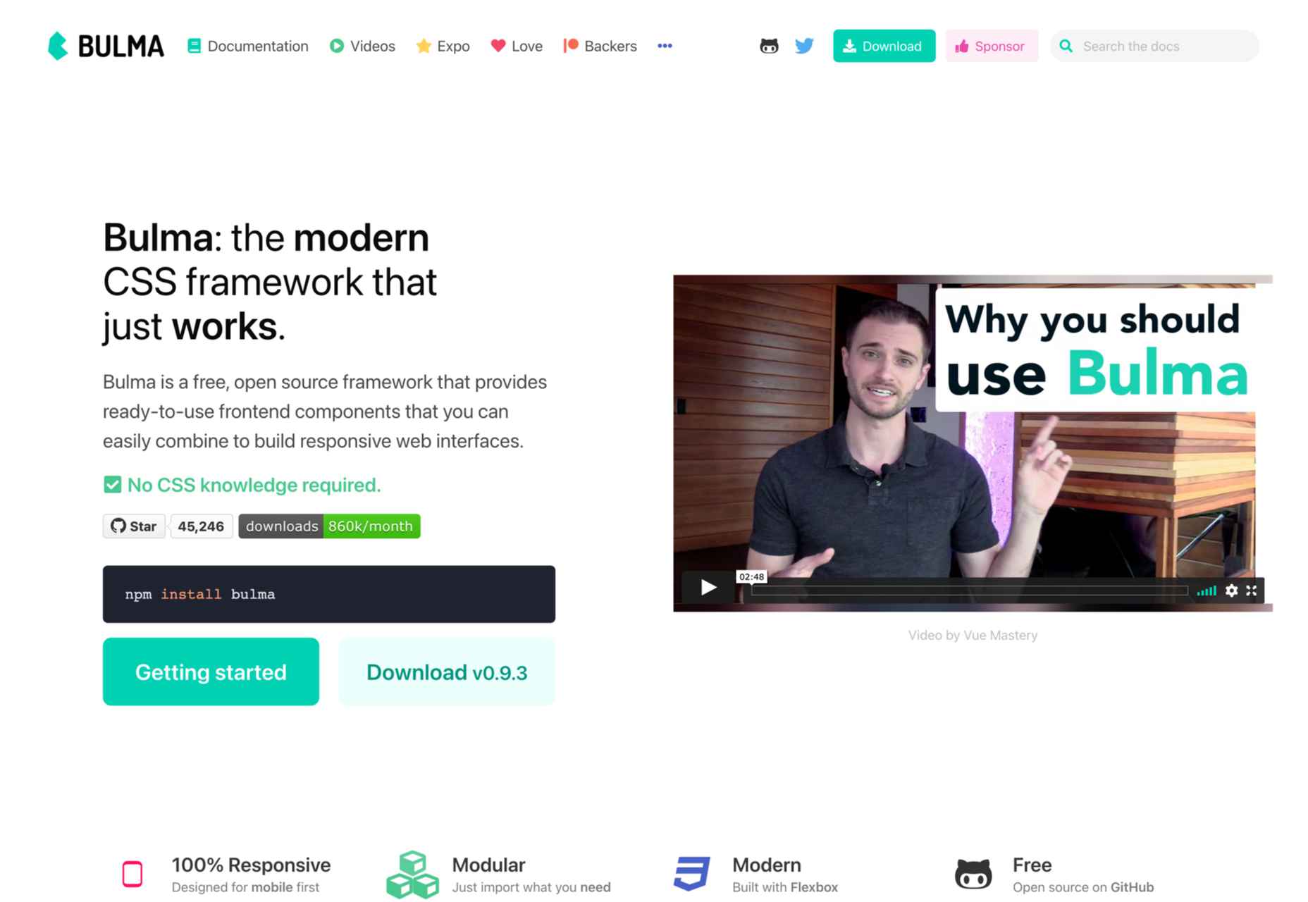
Every day design fans submit incredible industry stories to our sister-site, Webdesigner News. Our colleagues sift through it, selecting the very best stories from the design, UX, tech, and development worlds and posting them live on the site.
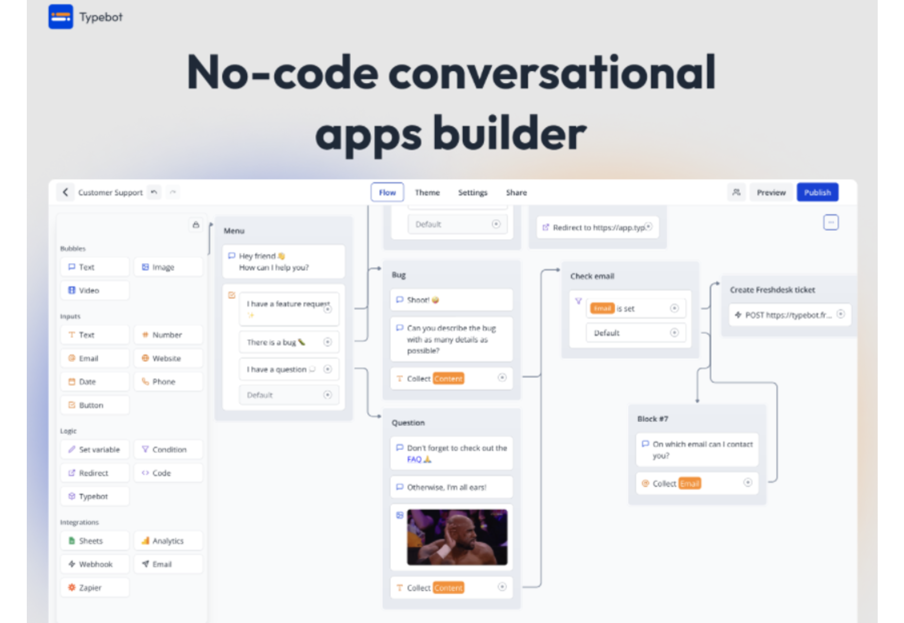
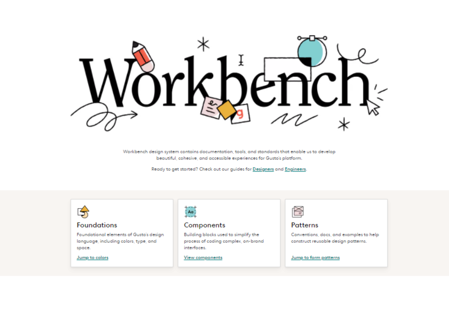
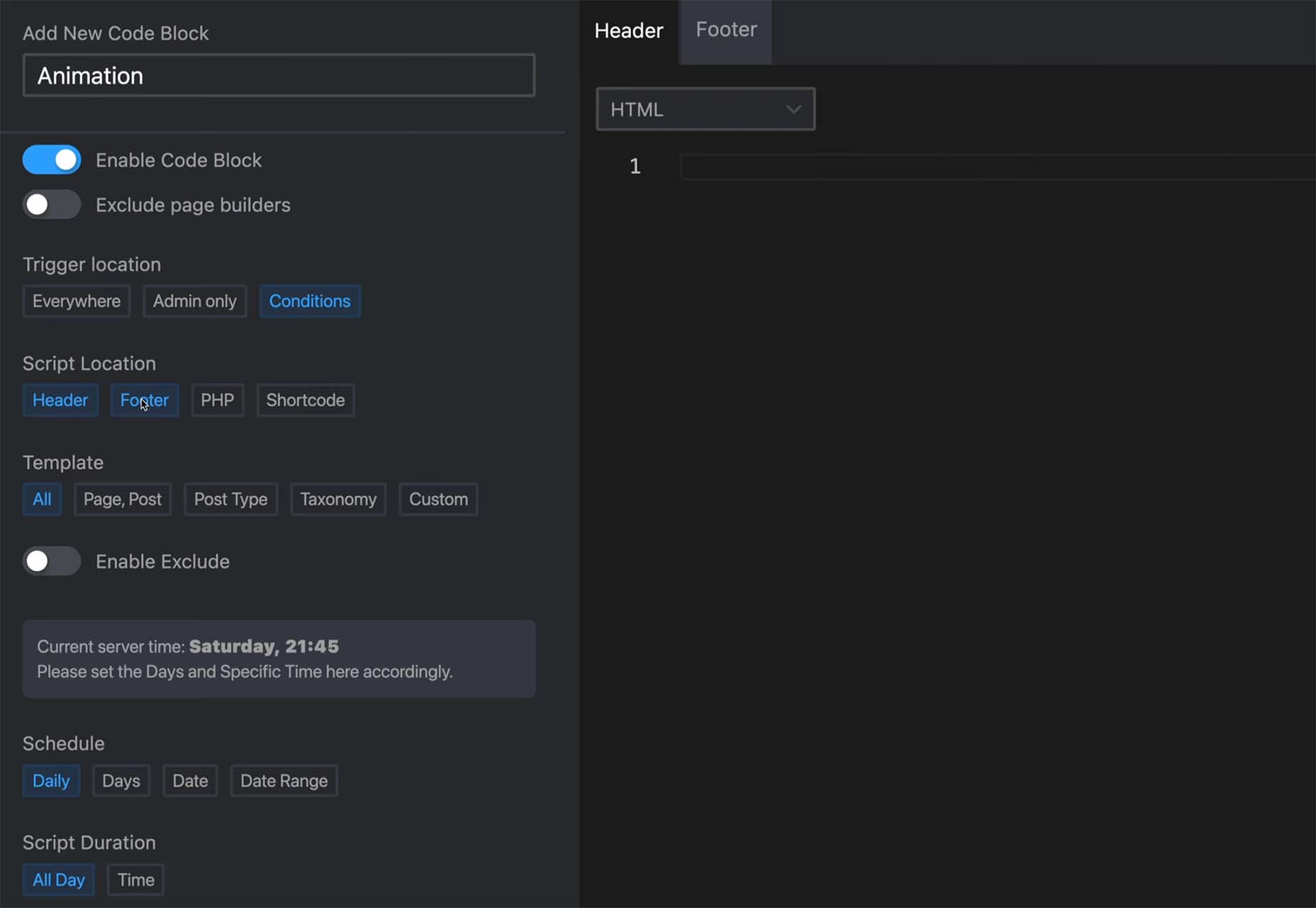
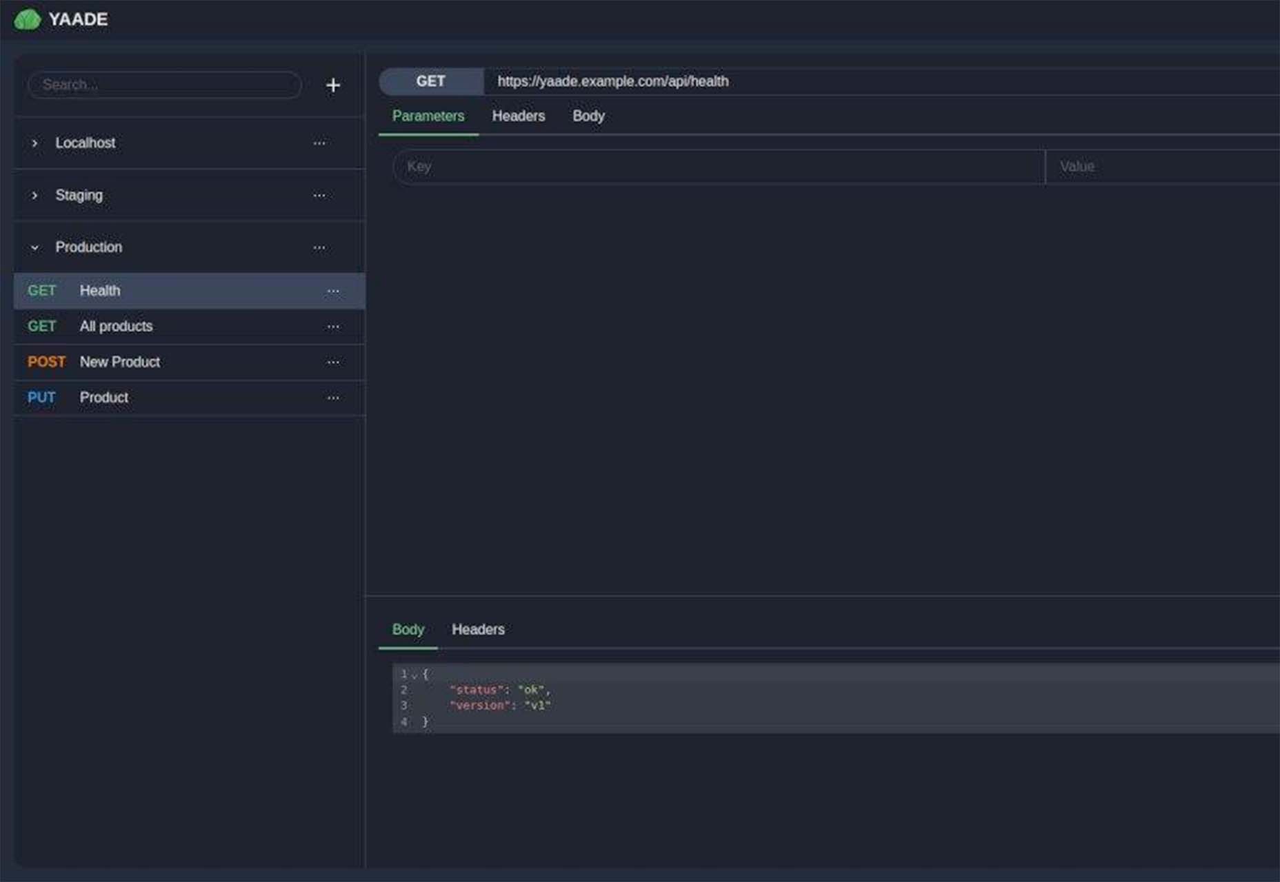
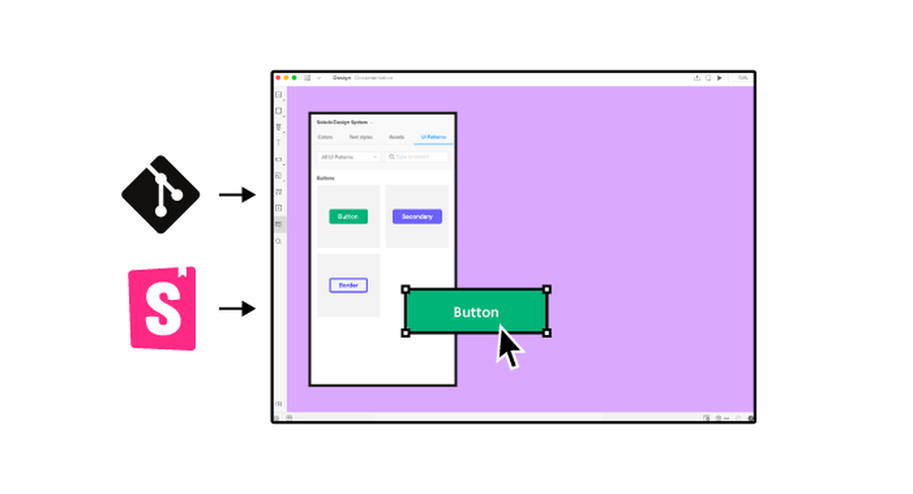
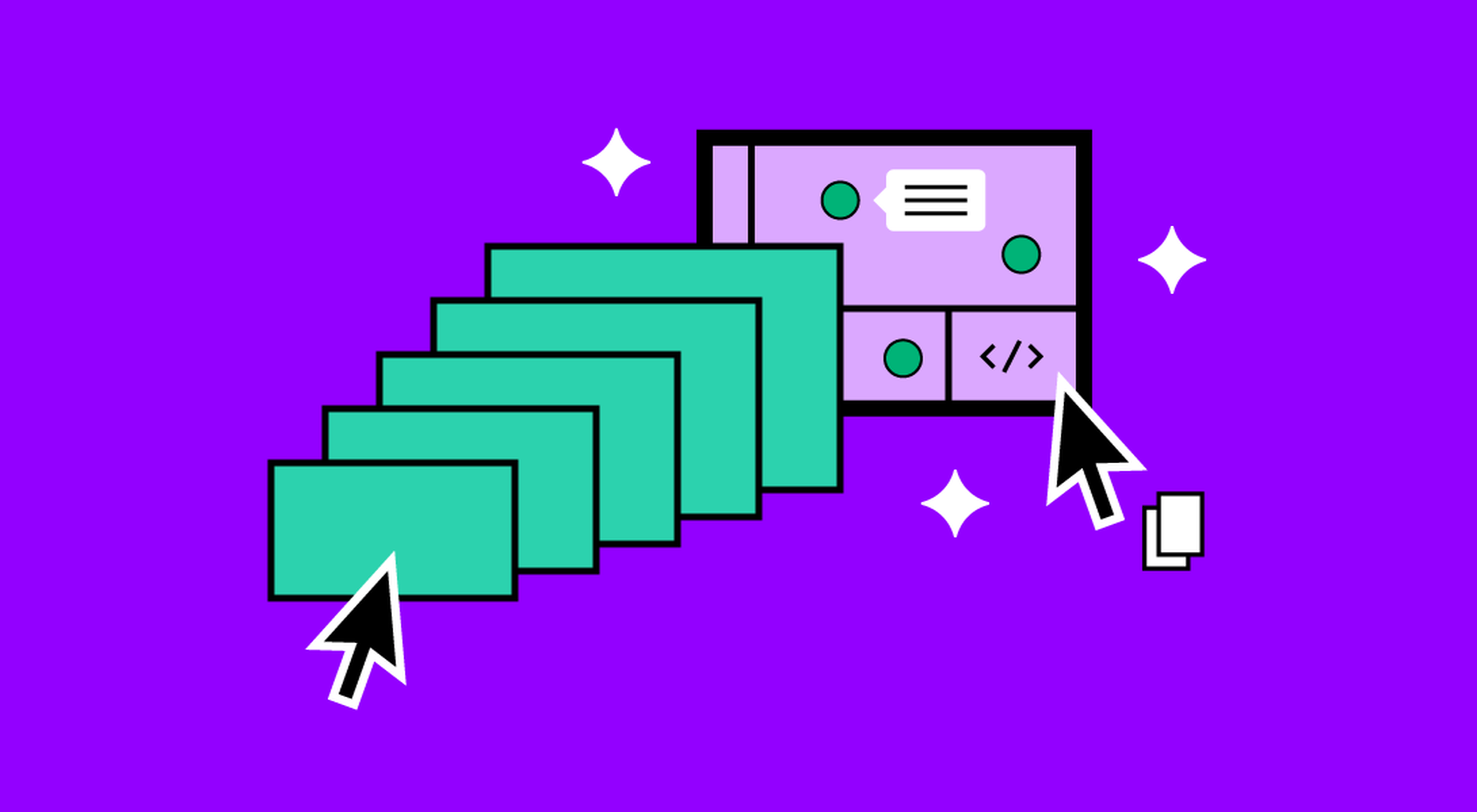
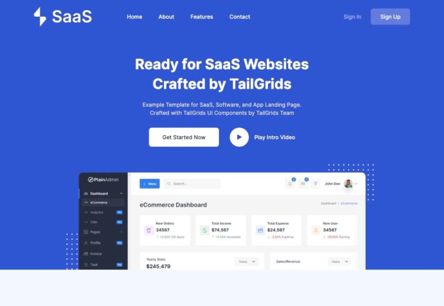
The best way to keep up with the most important stories for web professionals is to subscribe to Webdesigner News or check out the site regularly. However, in case you missed a day this week, here’s a handy compilation of the top curated stories from the last seven days. Enjoy!

Web 3.0: How Web Design will Change Forever

Cookie Notice for Websites

The Most Popular JavaScript Frameworks of 2022

Exciting New Tools for Designers, February 2022

The CSS From-font Value Explained in 4 Demos

A UX Designer Walks into a Tesla Bar

Looking Ahead to WordPress 6.0: The Early Roadmap

What’s the Difference Between Good UI and Good UX?

22+ CSS Dropdown Menus

Famous Logos in the Grotesque Art Style Typical for the Middle Ages

Source

The post Popular Design News of the Week: January 31, 2022 – February 6, 2022 first appeared on Webdesigner Depot.

Source de l’article sur Webdesignerdepot

Modern data-driven applications are based on various data sources and complex data stacks that require well-designed frameworks to deliver operational efficiency and business insights. Data pipelines allow organizations to automate information extraction from distributed sources while consolidating data into high-performance storage for centralized access. In this Refcard, we delve into the fundamentals of a data pipeline and the problems it solves for modern enterprises, along with its benefits and challenges.
Source de l’article sur DZONE