 1, 2, 3 – That’s exactly how long it takes you to start losing visitors if you have a slow-loading website.
Hold on! Surely, the only thing that matters to users is that your website works flawlessly and looks great… right? Wrong!
The fact of the matter is that we’ve all become accustomed to instant access to information and content. The average internet user today places a lot of value on speed, and the bar is continually being raised.
If you are like most people, you probably feel an immediate sense of dread at the thought of optimizing your website. Where do you start? How can you make the most impactful improvements? What makes your website slow in the first place?
Have no fear, as we’ll be answering all of your questions below as well as putting you on your way to a website that loads with blazing speed.
Why Should You Be Worried About A Slow-Loading Website?
Good question!
As many as 53% of visitors abandon a site that takes more than 3 seconds to load. Even worse, 1 in 3 shoppers will leave a website if it takes longer than 5 seconds to load.
So, performance plays a huge role in the user experience of your website and whether your visitors will stay on your website or be converted into customers.
For some time, Google has been keenly aware of this fact. As a search engine, Google knows that it’s counterproductive to recommend content to users if they won’t stick around to consume it.
That’s why they’ve continually been increasing the role performance plays when ranking websites for their SERPs (search engine results pages).
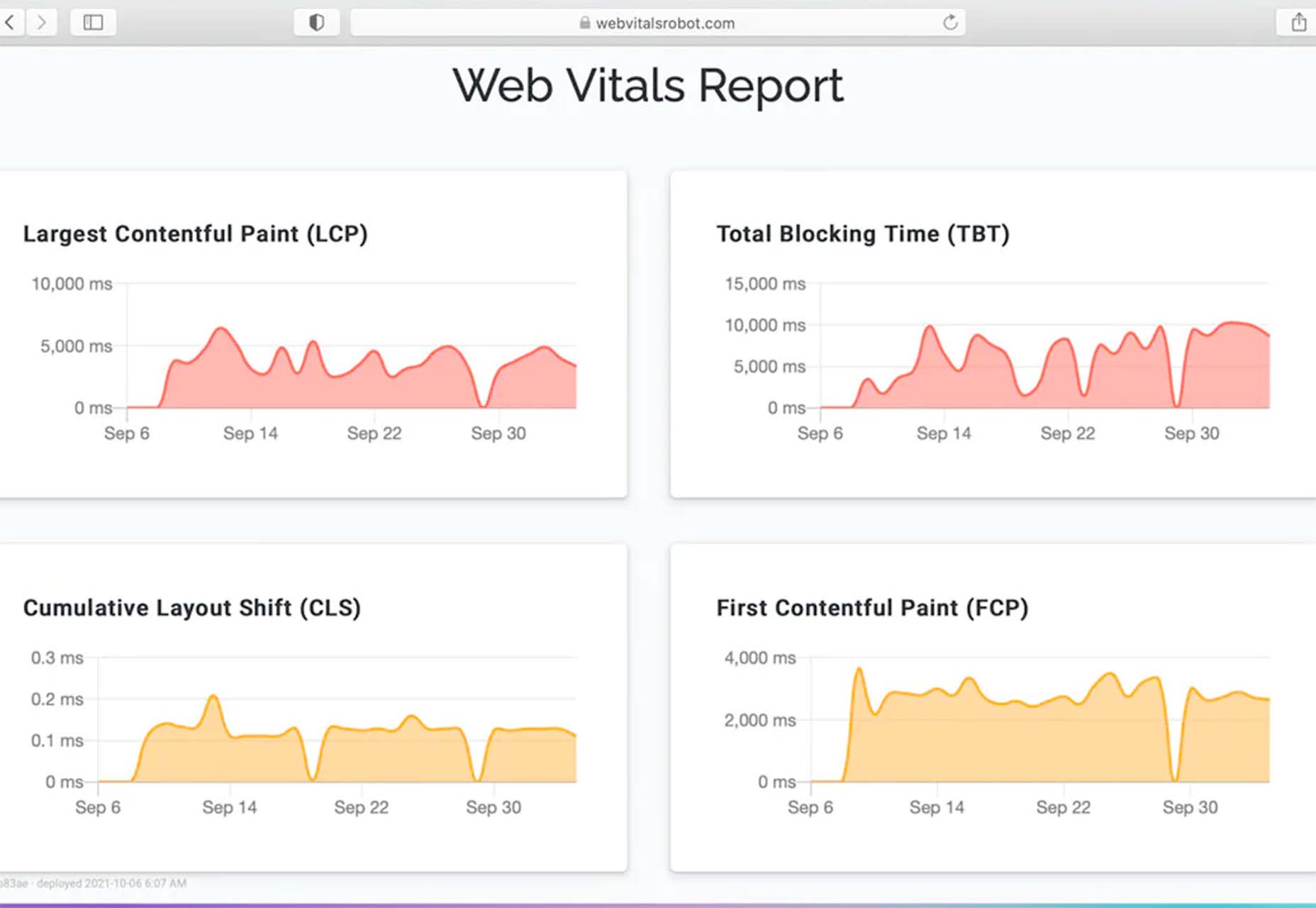
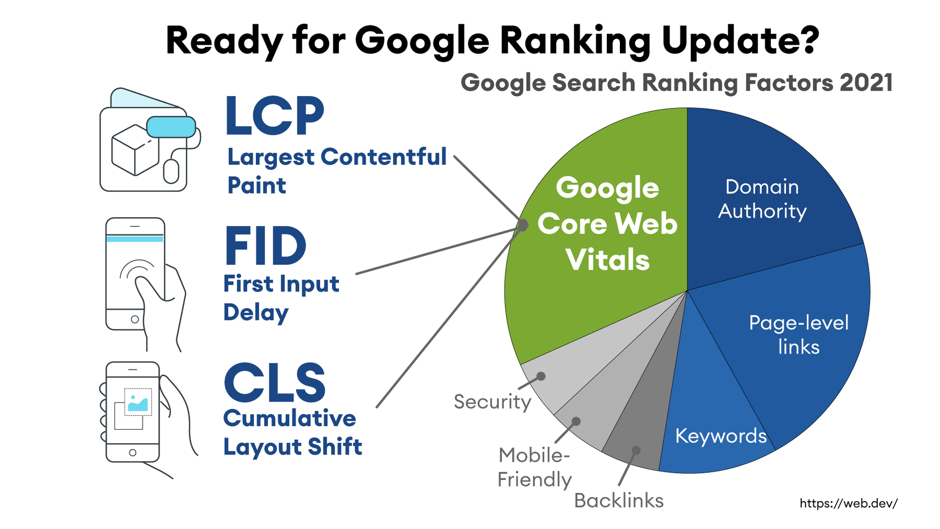
In recent years, Google has introduced core web vitals. These are metrics they hope will help quantify how performance affects the user experience. In general, they measure how fast, stable, and interactive a page is while loading. This will be more important than ever after Google announced its Page Experience update, which started its global rollout in June 2021.
As you may know, ranking highly for Google is vital for your website’s visibility. For one, 68% of online experiences begin with a search engine, of which Google has a 92.7% market share. Even if you manage to land on the coveted first page of Google, the first five results get over 70% of all clicks (28% to the first result alone).
So, to recap why a fast loading website is so desirable:
- It directly affects your ability to keep, satisfy, and even convert visitors to your website.
- It impacts your search engine rankings which impacts your “findability” and organic traffic.
8 Reasons Your Site Is Slow + How to Fix Them
O.K., so now that we’re all on the same page regarding the importance of your website performance, let’s look at common issues slowing down your website + how to fix them.
1. You’re Using A Sub-Par Hosting Service
As the party responsible for making your website available to the outside world, your hosting service can be a make-or-break factor. Not only should you pick a host that has a good track record when it comes to uptime a performance, but also one that’s suitable according to your needs.
Even if you take all the steps below to optimize your website’s performance, it may still load slowly if traffic to your website is overwhelming your available bandwidth or your host’s server capacity. If that happens, some users may experience extremely slow loading times, broken features, or even complete unavailability.
For most personal, blog, or local/small business sites, a respectable hosting provider like Bluehost or GoDaddy should be good enough. However, if you plan on running any type of large-scale, high-traffic webstore, business portal, or other type of website, you’ll want premium hosting, such as WPEngine (for WordPress), VPS hosting, or even a dedicated server.
2. You’re Not Optimizing Your Media Assets
As you probably know, media like images and videos take up significantly more space than most other types of content, such as text, code, stylesheets, or other static files. Even a single image has the potential of consisting of more data than dozens of website pages containing nothing but the underlying HTML and text.
In a Speed Essentials presentation, the Google team identified images as the largest contributor to page weight. In fact, they have the potential to consume a website’s entire performance budget if left unoptimized. Images can also directly impact all three of Google’s core web vitals – key metrics Google uses to measure the performance of a website.
However, the use of images and video is likely to continue growing, heightening the importance of finding a sustainable solution. According to HTTPArchive, images have increased by 19.3% on desktop and 42.7% on mobile.
For now and the foreseeable future, optimizing your images carries the greatest potential for improving performance.
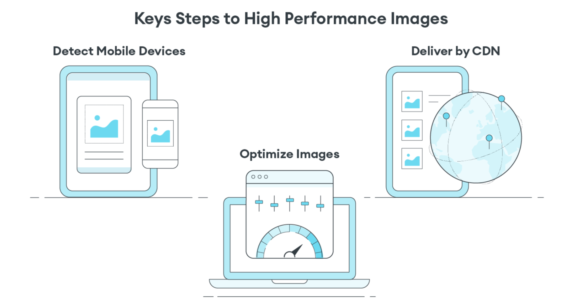
The problem is that optimizing image assets requires multiple steps. Most importantly:
- Using the appropriate next-gen formats which can differ depending on the user’s device, OS, or browser.
- Appropriately compressing the size and quality of images to reduce payload without affecting visual quality too badly.
- Using the optimal display size and density based on the accessing device to reduce payloads further.
- Using lazy loading to only load images as needed.
As you can see, manually going through these steps for every single image on your website can be extremely labor-intensive. This is especially true if you consider that you somehow need to create the optimal variants for different users based on what device, OS, or browser they are using.
In-code strategies, like a JS plugin, responsive images, or CSS media queries tend to bloat your code and lead to other performance issues we’ll discuss below.
Luckily, there are plenty of CDN services available designed specifically for providing some degree of automated image optimization. These platforms analyze the context (i.e., a specific mobile device model, OS version, and browser version) of the user trying to load one of your images and try to serve them a version of the image that’s ideally optimized for them.
However, any media optimization platforms still require installing a small JavaScript plugin to dramatically improve the image and video optimization capabilities.
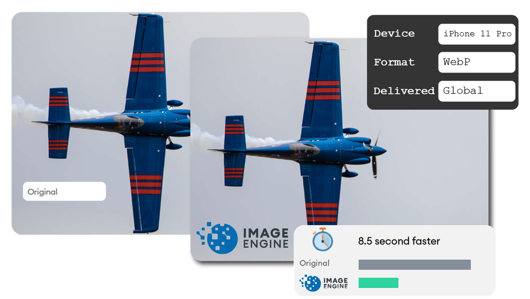
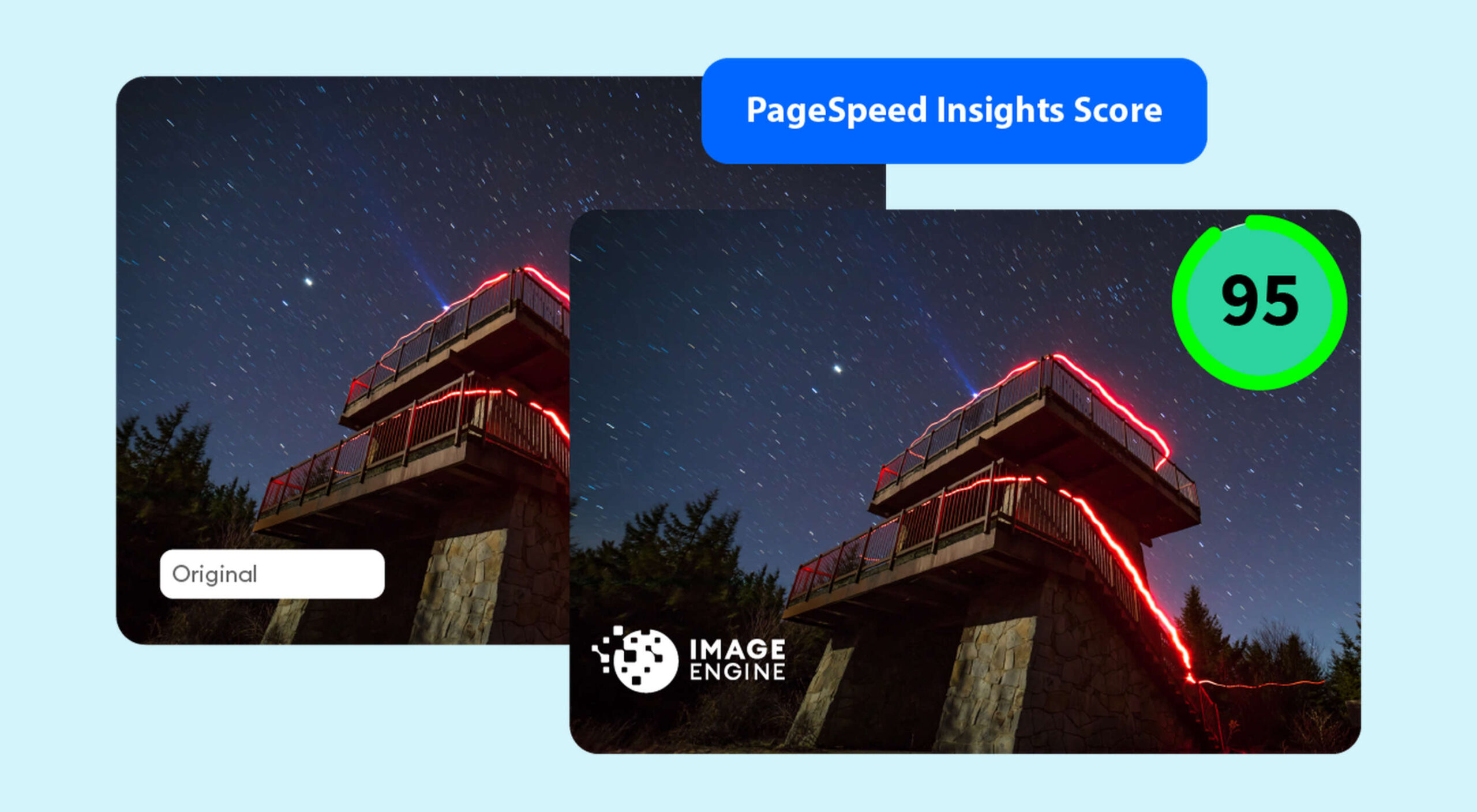
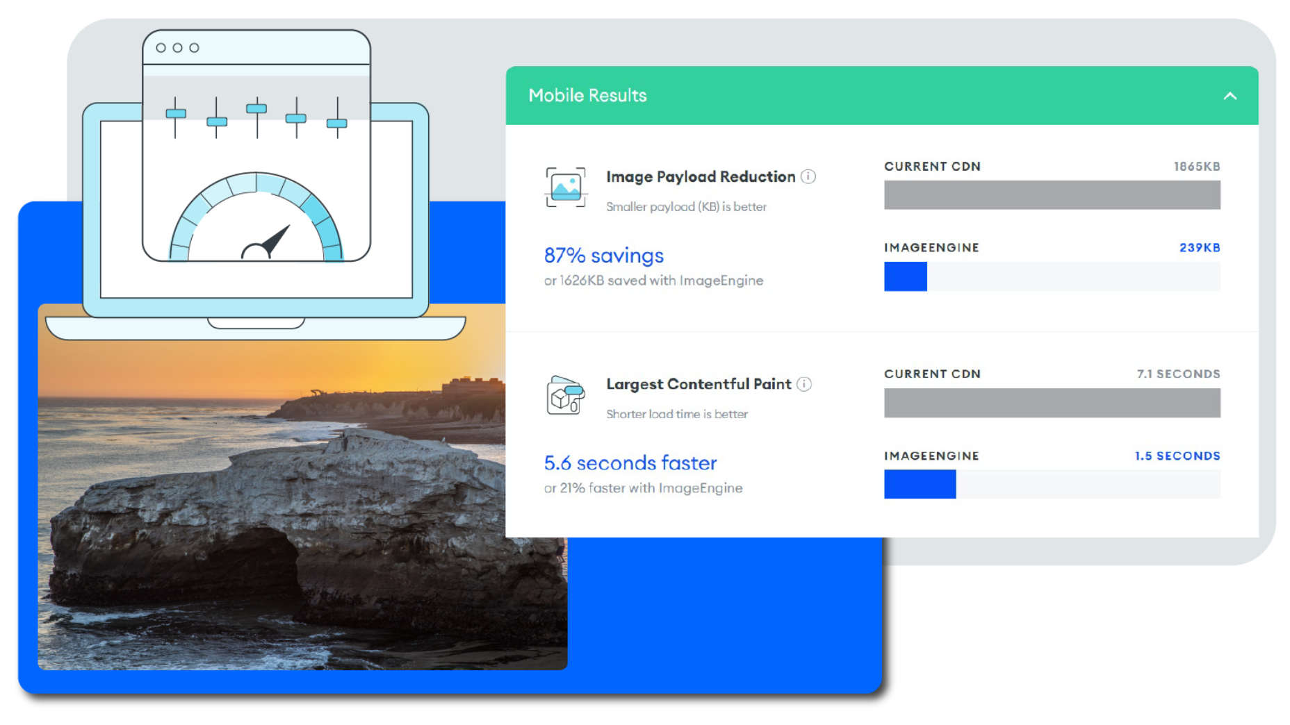
The one exception here is ImageEngine. ImageEngine uses WURFL device-detection to pick up every possible detail of the user’s device. The logic is built into their device-aware edge servers and doesn’t rely on you adding any additional code or markup to your website pages.
So, not only does it reduce your image payloads by up to 80% and serve them via a global CDN, but it doesn’t leave a footprint in your website’s code. As a bonus, it also happens to support the widest range of image/video formats, including animated GIFs, as well as client hints and save-data mode.
3. Render-Blocking JavaScript And CSS Is Delaying Page Loads
JavaScript is the de facto programming language for adding interactivity and advanced features to websites today. Likewise, CSS is the standard for adding styling. Both are critical components for almost any modern website.
However, nothing good comes free, and both may impact the performance of your website, particularly when used carelessly.
The following are some steps you can take to minimize the impact of these assets on your website performance:
- Minify your JavaScript and CSS files.
- Combine a large number of JS/CSS files into fewer files.
- Replace some of your external JS and CSS files with inline JS/CSS. (Don’t overdo this! Inline JS and CSS is only suitable for small code snippets).
- Defer loading JavaScript until after all your content is loaded and use media queries for CSS files.
Because media can have a more significant impact on your page weight, this leads some to believe that adding more JavaScript is the lesser of two evils.
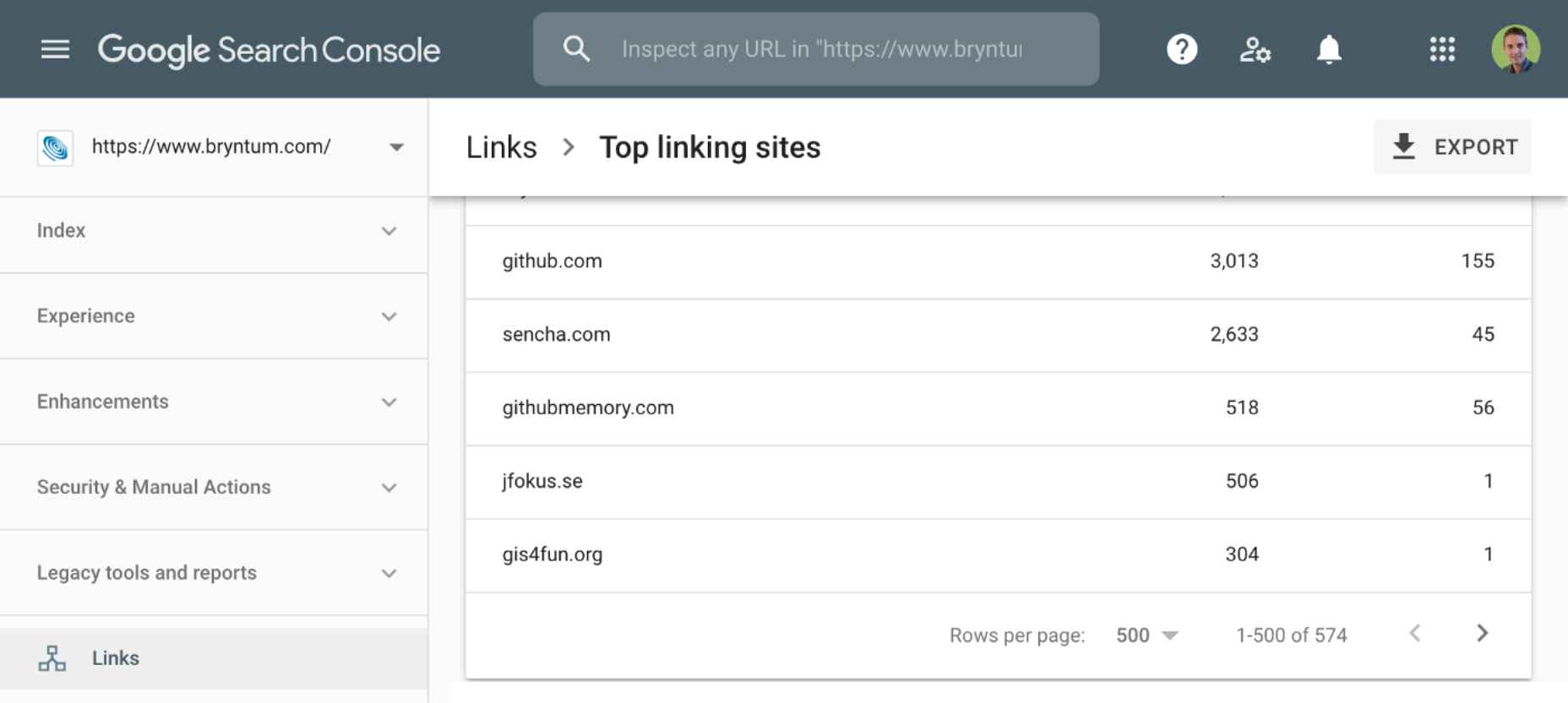
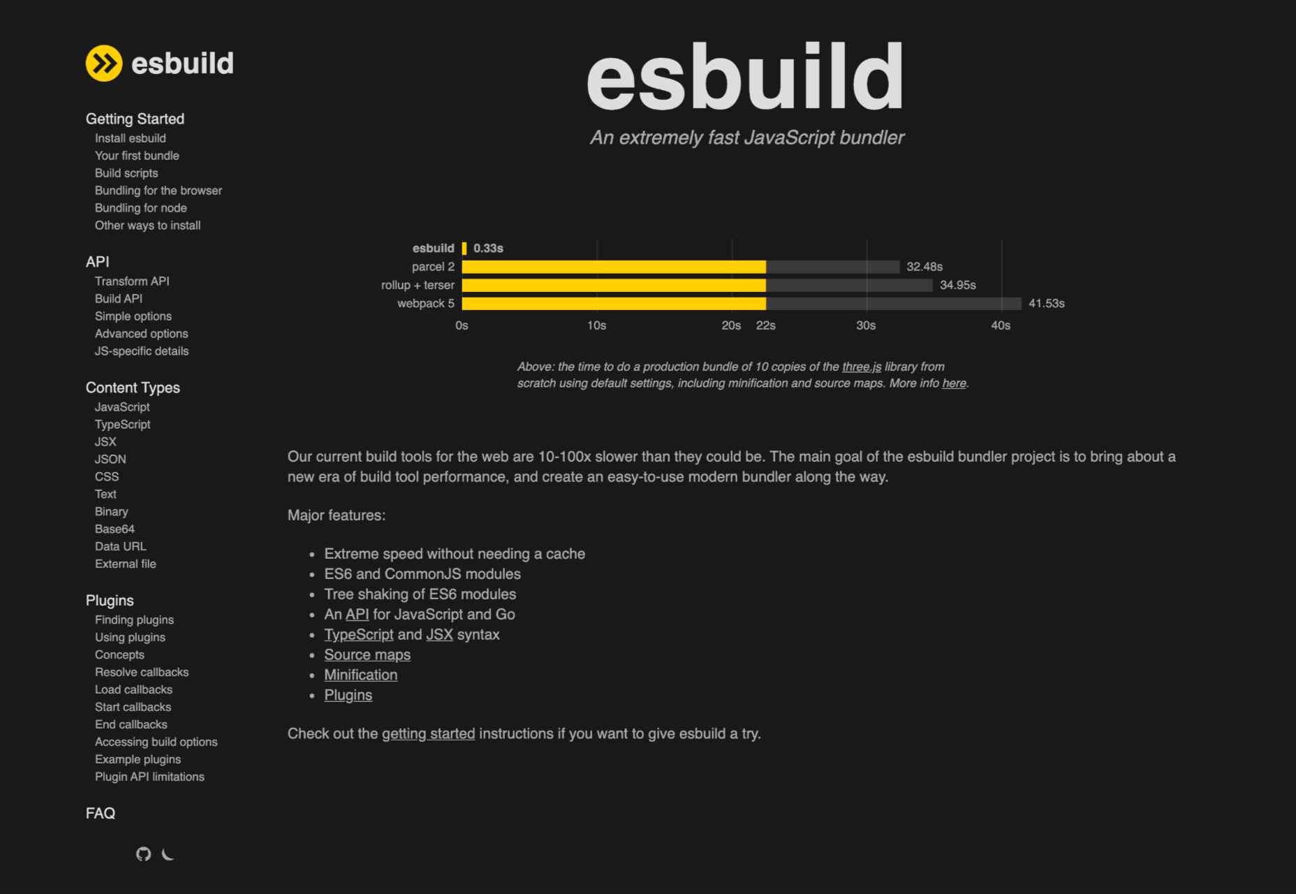
However, depending on whether you already have render-blocking JS, Google might flag this as a completely new issue. Regardless, it will negatively impact your performance score in tools like PageSpeed Insights:
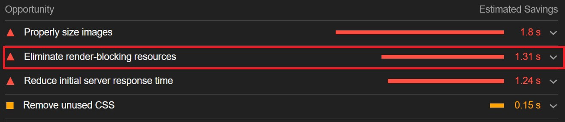
You can avoid it altogether by using an optimization engine like ImageEngine that doesn’t require any JavaScript.
4. You’re Not Using A Content Delivery Network (CDN)
A CDN is a network of servers spread across various regions all over the globe. What it basically does is store a copy of your website on each of these servers. When an internet user visits your site, the CDN automatically serves your website from the nearest server to that user.
What this does is allow your website to load faster, no matter where in the world people are visiting it from. If your website was only hosted on a single server, say somewhere in the U.S., then it could take much longer to load for a visitor located in Asia than one in the U.S.
While they all basically do the same thing, different CDNs are better at handling different types of content. Cloudflare, Fastly, and Akamai are just some of the most popular general-purpose CDNs around. Image CDNs like ImageEngine are purpose-built to not only serve image and video assets but to also optimize them using compression, formatting, etc.
So, the two main factors to consider are the type of content you want to deliver via the CDN and its global coverage. However, it’s usually possible to use multiple CDNs in tandem to cover different types of content and reach a wider area.
5. There’s Excessive Overhead In Your Database
If you have a website with any type of complexity, you probably have a corresponding database. In fact, all WordPress websites require a database to function.
Over the years, a lot of information moves in and out of the database. Sometimes, the data can get lost along the way or become obsolete. If you don’t regularly spring-clean your database, then this can really start to add up. Not only will it bloat the storage size of your database, but it will start to impact the speed of database queries and requests.
CMS users are especially prone to racking up these kinds of artifacts from plugins and themes that have been installed and removed over the years.
Unfortunately, there aren’t many easy fixes for this issue available. With most hosting providers, you’ll probably need to use phpMyAdmin to manually check and scrub your data. If you have a managed hosting solution, the host’s support team might be able to help you out. In the event that you have a locally installed database, there are some tools you can use, although they’re not 100% effective.
The best way to avoid any issues is to make database maintenance part of your routine and to learn the basics of how databases work.
6. You Have Too Many Plugins Or Themes Installed
For CMS users, plugins or themes offer near-limitless potential to spruce up the design and functionality of their website. However, each plugin or theme comes with additional code and content that add to the overall complexity and size of your website.
If you have a hand-coded website, the same goes for any additional applets or libraries you want to add to your site.
The best way to combat this is to be conscientious when adding any extras to your website. Only install what you really need or want, and make sure to uninstall and properly remove them if you don’t need them anymore.
As mentioned, they might leave various transients or artifacts behind, so you should keep an eye out for them throughout your website files (not just the database) whenever you do some spring cleaning.
7. You Aren’t Utilizing Caching
Caching is often one of the most effective yet ignored techniques for improving website performance. Caching stores your website content in fast-access memory in the user’s browser, allowing it to be loaded near-instantaneously by users. This can include everything from text to stylesheets to images to JavaScript files.
Without caching, a user will need to redownload everything when they navigate to or reload a page — whether or not anything has changed.
However, not properly configuring caching on your website can lead to issues, such as users only loading out-of-date content. Most high-quality caching tools have built-in features that automatically clear the cache when you make changes to a specific website page or content. So, users will only reload content once it has been modified.
Some hosts offer out-of-the-box caching tools with their hosting service. CMS can also usually find plugins for this, such as WPRocket for WordPress.
8. Ads Are Dragging You Down
In the end, ads are just another form of media that increases the overall weight of your website pages. While they are typically small and lightweight, multiple ad placements can really start to add up.
What aggravates the issue is that ads are loaded from external sources. This means they’ll take longer to render, generate more requests, and may mess with how stable your pages load — affecting your core web vitals.
Depending on how important ads are to your revenue stream, you’ll want to carefully consider how many ads you use on your site, where to position them, and when they load. If possible, avoid loading ads at the same time as the rest of your page, especially interstitials.
Conclusion
As you can see, website performance is a multi-faceted subject. Although some may be worse than others, you can’t just address one area and expect your website to suddenly be performant.
However, some general principles apply:
- Keep HTTP requests low by limiting the number of files required for each of your website pages.
- Maintain proper code hygiene and spring clean transients and leftover artifacts.
- Invest in proper hosting infrastructure as well as a CDN for your website.
- Optimize your media assets to significantly bring down payloads without sacrificing engagement.
The final point deserves another shoutout. As we’ve pointed out, finding an optimization solution for your media, particularly images, is probably the best thing you can do to improve your website performance. From purely a performance perspective, there is no service quite as effective as ImageEngine. It’s also the one that requires the least amount of technical expertise and ongoing maintenance.
Regardless, you’ll want to run some tests using tools like PageSpeed Insights so you can gather data on what issues your website is facing. From there, you can prioritize fixes to make your website more competitive.
[– This is a sponsored post on behalf of ImageEngine –]
Source
The post 8 Reasons Your Site Is Slow + How To Fix Them first appeared on Webdesigner Depot.

Source de l’article sur Webdesignerdepot

 Welcome to this month’s round up of what has caught our eye on the web. As it’s November we’re going to help chase those winter blues away with some color.


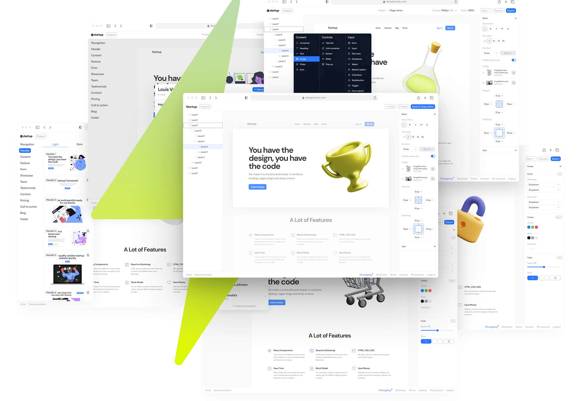
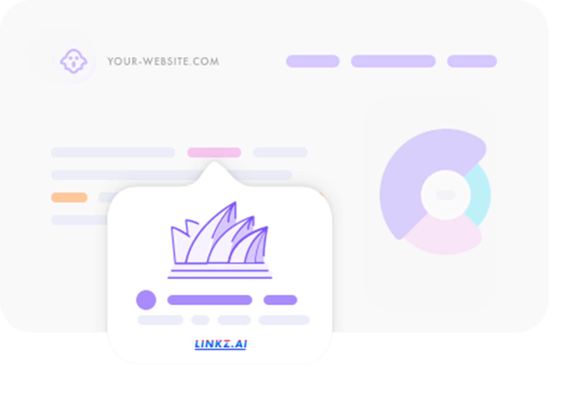
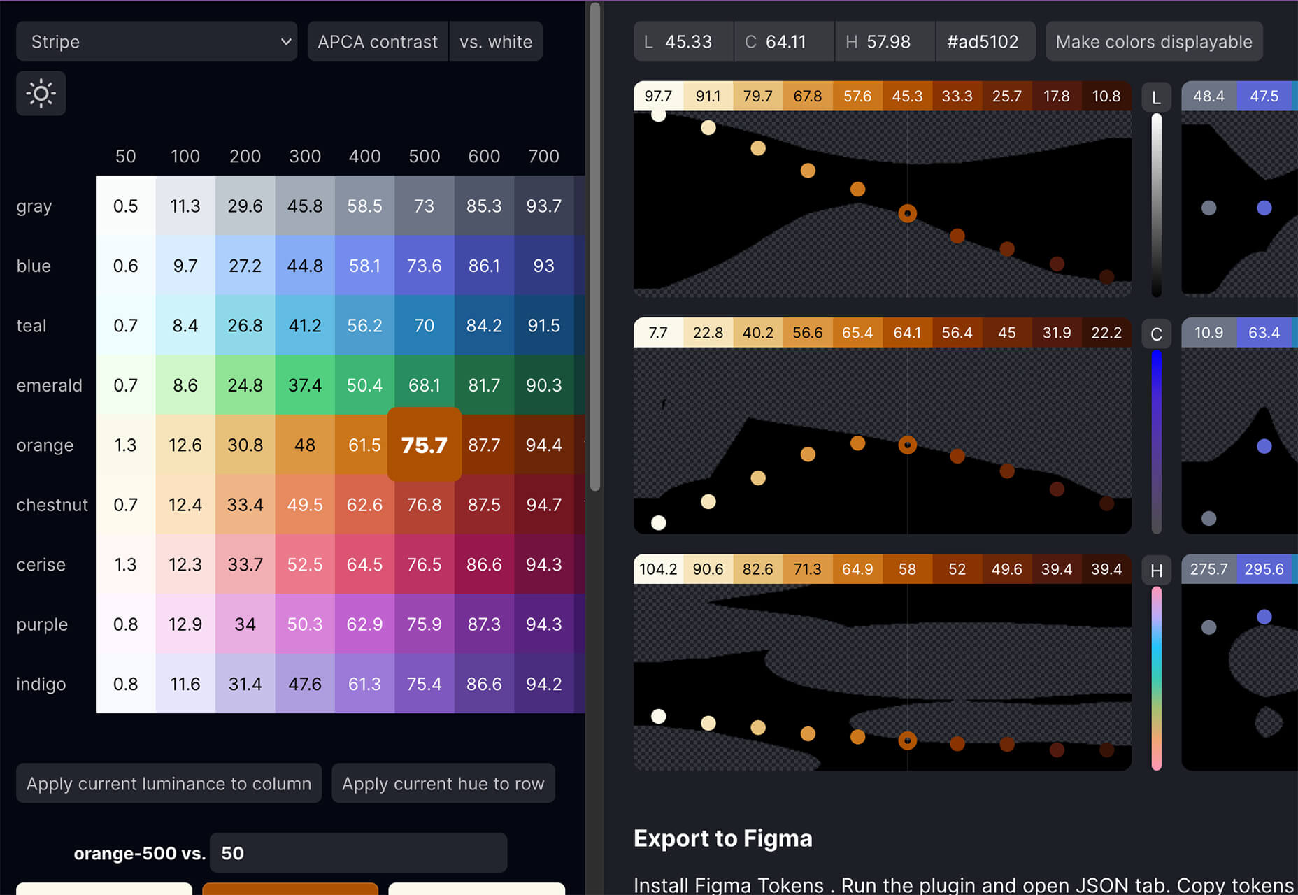
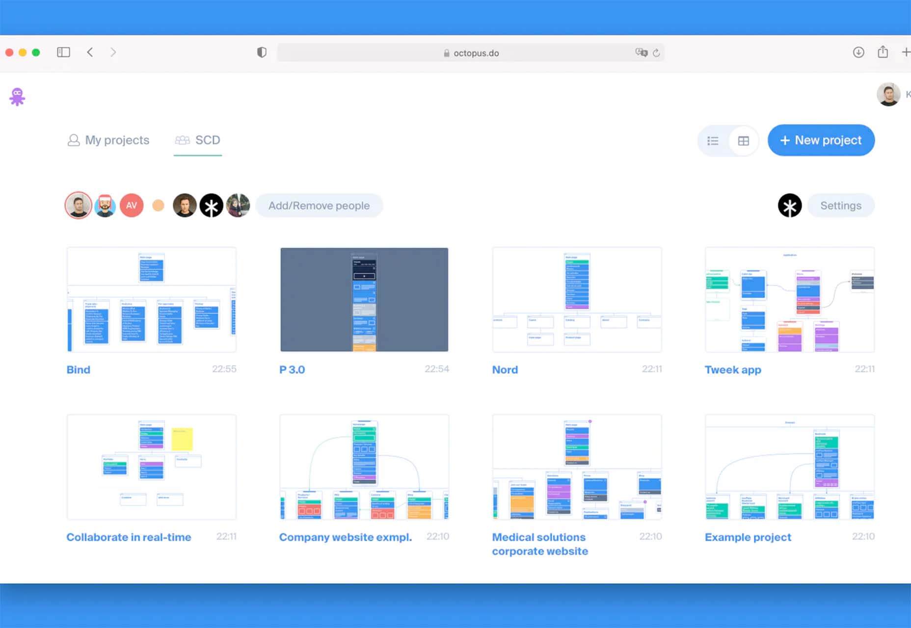
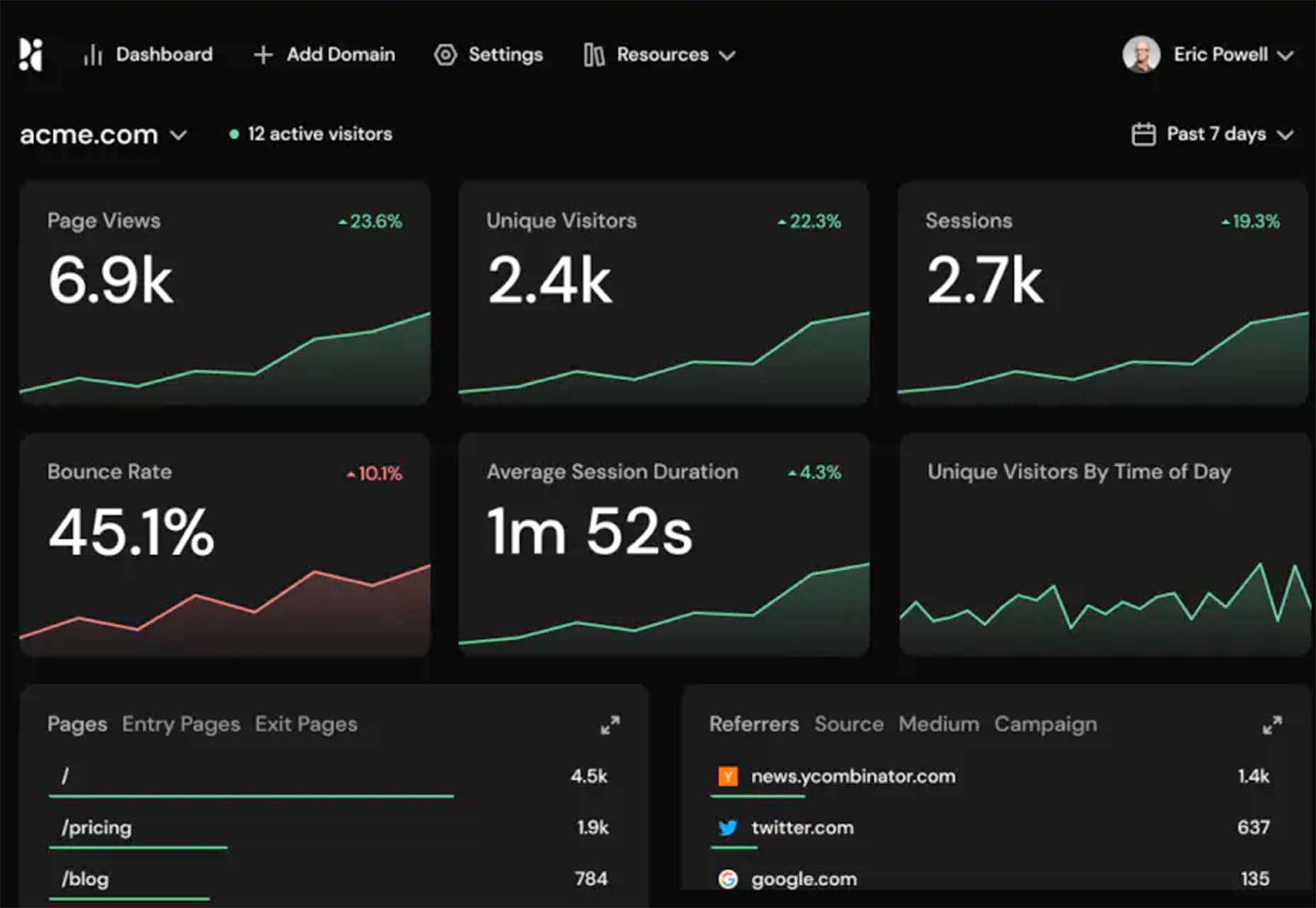
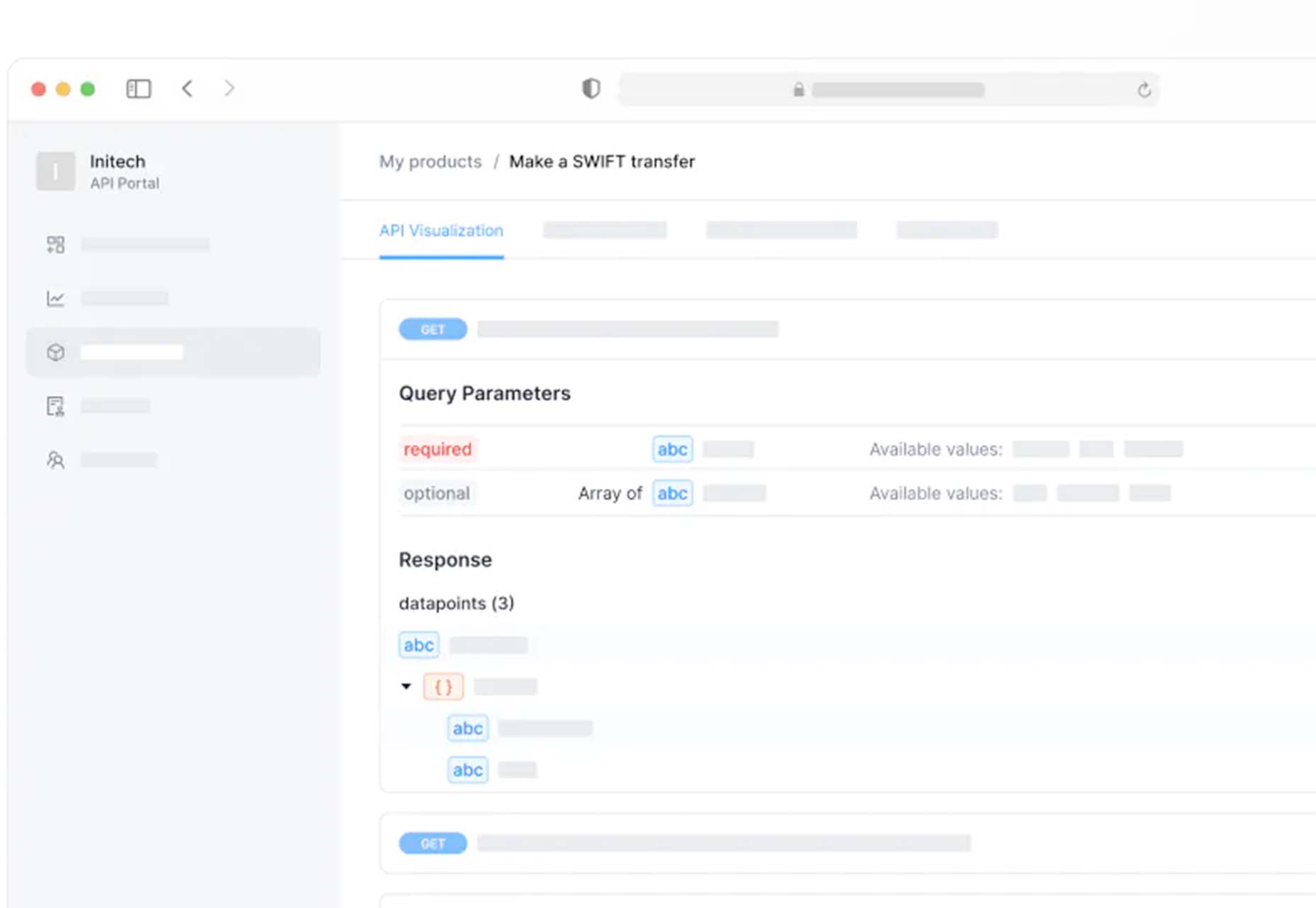
 With the holidays fast approaching, there are plenty of fun gifts for you in this roundup of new tools and resources for web designers. Make sure to share anything you find helpful with others to spread additional holiday cheer.
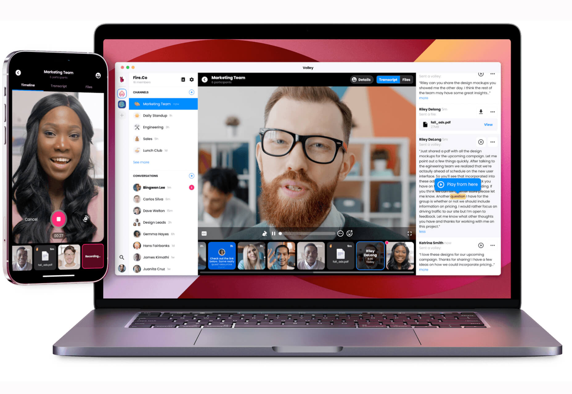


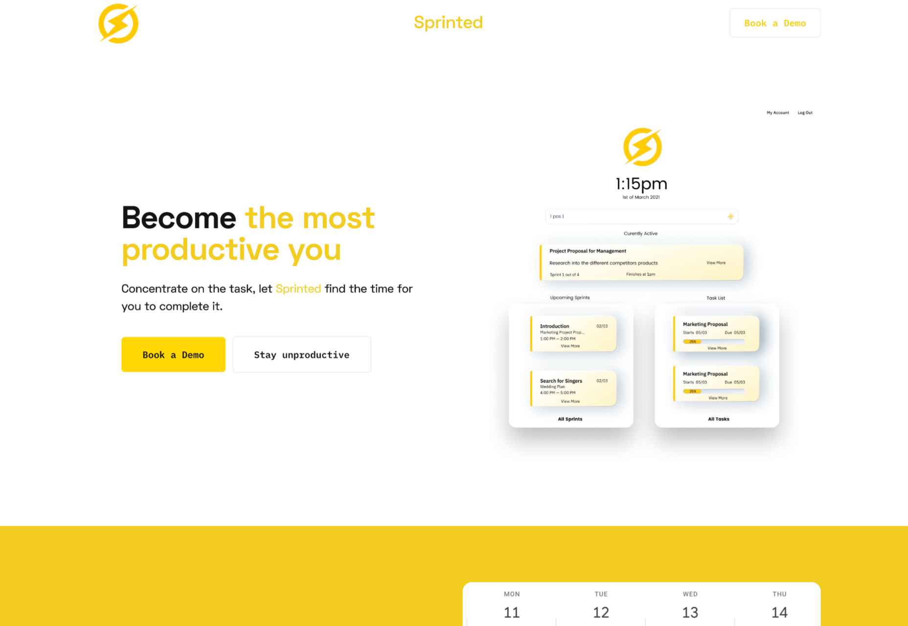
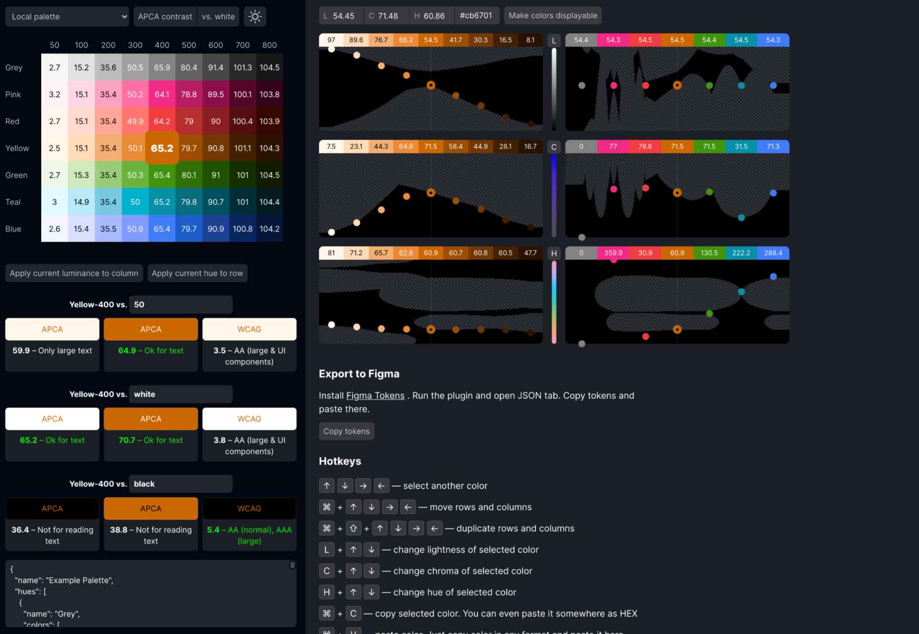
 Every day design fans submit incredible industry stories to our sister-site,


 Every day design fans submit incredible industry stories to our sister-site,


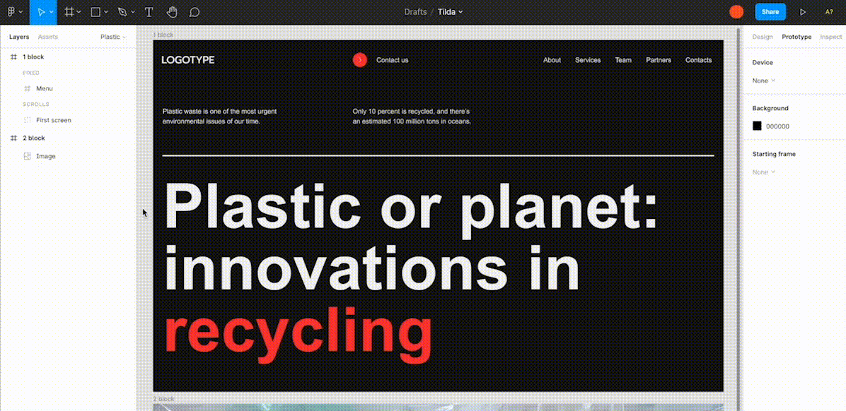
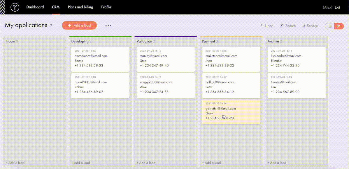


 Every day design fans submit incredible industry stories to our sister-site,


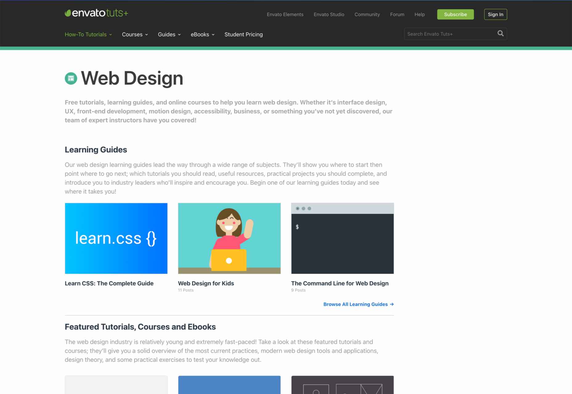
 Need inspiration for an upcoming web design project? Want to learn how to add live chat functionality to your site, or which trends you should be aware of as you pursue new projects? Leading web design blogs could be the solution to your problems.


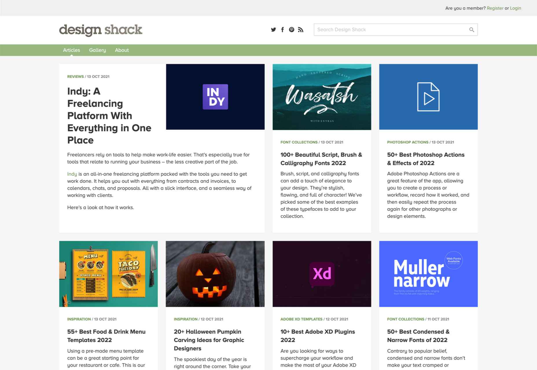

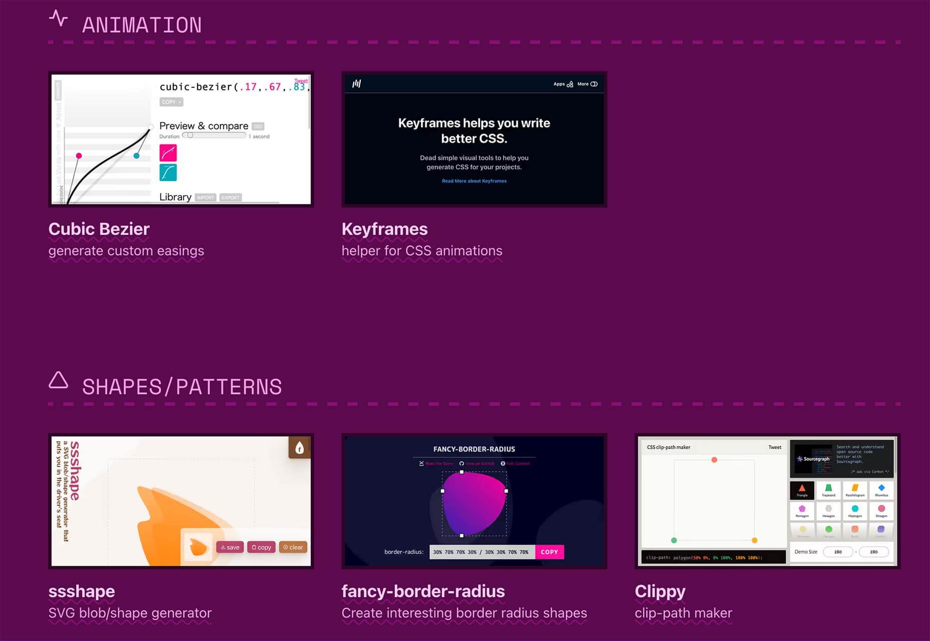
 There are some spook-tacular finds in this month’s October collection of resources and tools for designers and developers. From interesting tools that can help in the design process to boo-tiful typefaces, there’s something for everyone here.


