Articles

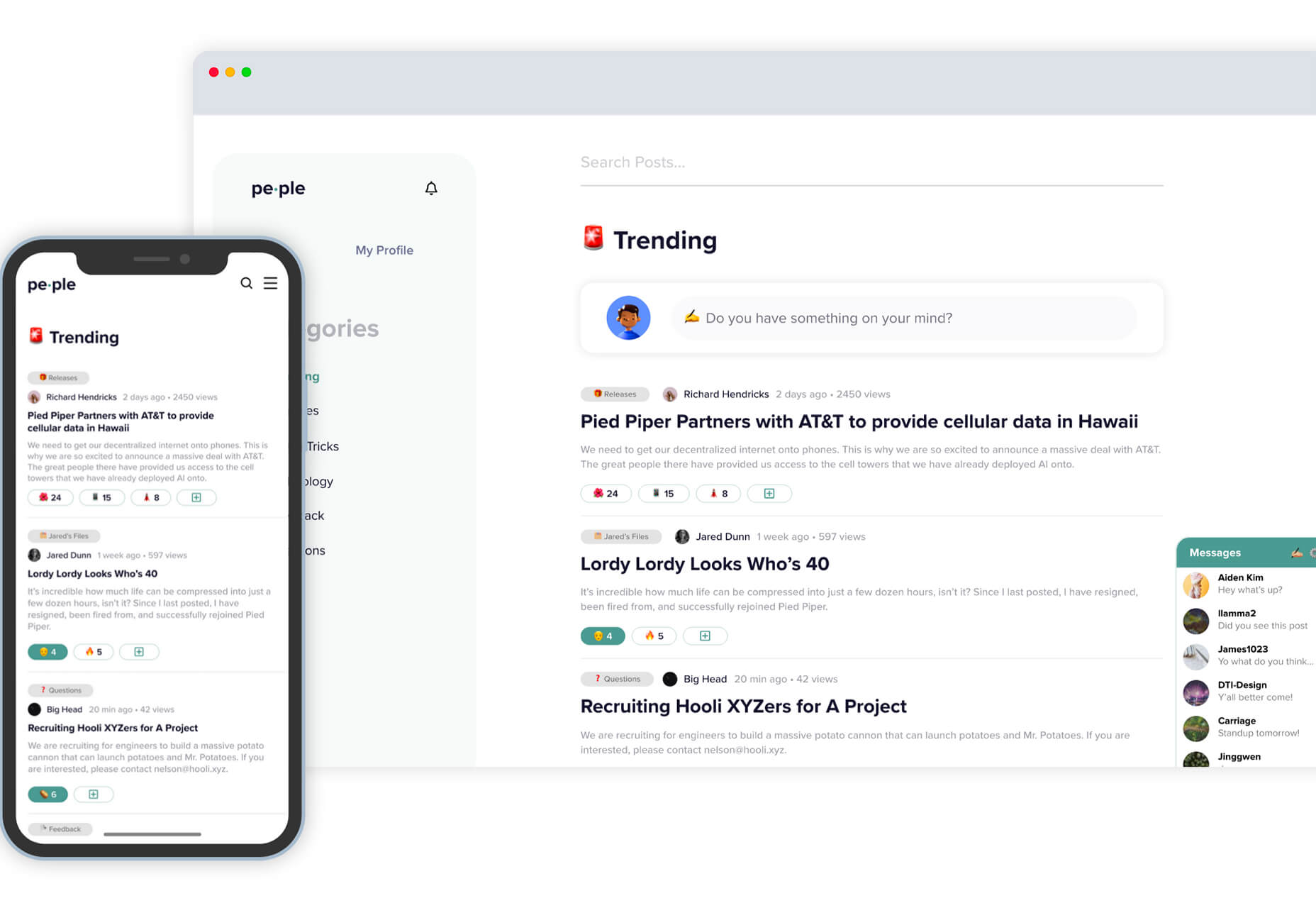
The new year is often packed with resolutions. Make the most of those goals and resolve to design better, faster, and more efficiently with some of these new tools and resources.

Here’s what new for designers this month.

Radix UI

Radix UI is an open-source UI component library for building high-quality, accessible design systems and web apps. It includes examples and guidelines for all kinds of user interface elements that provide guidance and really make you think about accessible website design. (And everything is usable!)

Froala Charts

Froala Charts is made to help you create data visualizations for web or mobile apps. Build any chart you can imagine – bar, line, area, heat map, sankey, radar, time series, and more. Plus, you can customize anything and everything, so it all matches your brand. This premium tool is enterprise-level and comes with a one-time license fee.

CSSfox

CSSfox is a collection of designs that you can use for inspiration. The curated community project includes posts, reviews, and award nominees and winners.

Pattern Generator

Pattern Generator is a tool to create seamless and royalty-free patterns that you can use in projects. Almost every element of the pattern design is customizable, and you can “shuffle” to get new style inspiration. Design a pattern you like and export it for use as a JPG, PNG, SVG, or CSS.

Type Scale Clamp Generator

Type Style Clamp Generator helps you create a visualize a typographic scale for web projects. Pick a font and determine a few other settings and see the scale right on the screen. You can even put in your own words to see how they would look. Then, flip to see how sizes appear on different devices. Find a scale you like and snag the code with a click.

Flowdash

Flowdash is a premium app that helps you build custom tools, data sets and streamline your business operations with one tool. Manage data and processes without code. The tool combines a spreadsheet’s familiarity with a visual workflow builder, plus built-in integrations to automate repetitive tasks so your team can focus on what matters.

Scale

Scale is a website that provides new and open-source illustrations that you can use for projects. Maybe the illustration generator’s neatest part is that you can change the color with just a click to match your brand. Then download the image as an SVG or PNG.

Pe•ple

Pe•ple is a tool that adds a “customizable community” to any website to help grow your fanbase and provide a boost to SEO. It allows you to integrate chat, commenting, emojis, and passwordless login, among other things.

K!sbag: Free Minimal Portfolio Template

K!sbag is a free minimal website template that’s made for portfolio sites. (Did you resolve to update yours in 2021?) It includes 6 pages in a ready-made HTML format and PSD.

Merico Build

Merico Build is like a fitness tracker for code. It uses contribution analytics to empower developers with insight dashboards and badges focused on self-improvement and career growth. Sign up with tools you already use – Github or Gitlab.

Automatic Social Share Images

Automatic Social Share Images solves a common website problem: Missing or broken images when posts or pages are shared on social media. This tutorial walks you through the code needed to create the right meta tags so that popular social media channels pick up the image you want for posts. The best part is this code helps you create a dynamic preview image, so you don’t have to make something special every single time.

Animated SVG Links

Animated SVG Links can add a little something special to your design. This pen is from Adam Kuhn and includes three different link styles.

Blush

Blush helps you create illustrations. With collections made by artists across the globe, there’s something for everyone and every project. All art is customizable, so you can play with variations to create something unique.

Palms

Palms is a set of 43 sets of hands to help illustrate projects. Each illustration is in a vector format and ready to use.

Tabbied

Tabbied allows you to create and customize patterns or artwork in a minimal style for various projects or backgrounds. Tinker with your artwork and patterns and then download a free, high-resolution version.

How to Create Animated Cards

How to Create Animated Cards is a great little tutorial by Johnny Simpson that uses WebGL and Three.js to create a style like those on Apple Music. The result is a stylish modern card style that you can follow along with the CodePen demo.

Bandero

Bandero is a fun slab with a rough texture and interesting letterforms. The character set is a little limited and is best-suited for display use.

Magilla

Magilla is a stunning modern serif with great lines and strokes. The premium typeface family has six styles, including an outline option.

Roadhouse

Roadhouse is one of those slab fonts that almost screams branding design. The type designer must have had this in mind, too, with stripe, bevel, inline, half fill, outline, drop extrude, and script options included. (This family is quite robust, or you can snag just one style.)

Street Art

Street Art is for those times when a graffiti style is all that will do. What’s nice about this option – free for personal use – is that the characters are highly readable.

Source

The post Exciting New Tools for Designers, January 2021 first appeared on Webdesigner Depot.


Source de l’article sur Webdesignerdepot

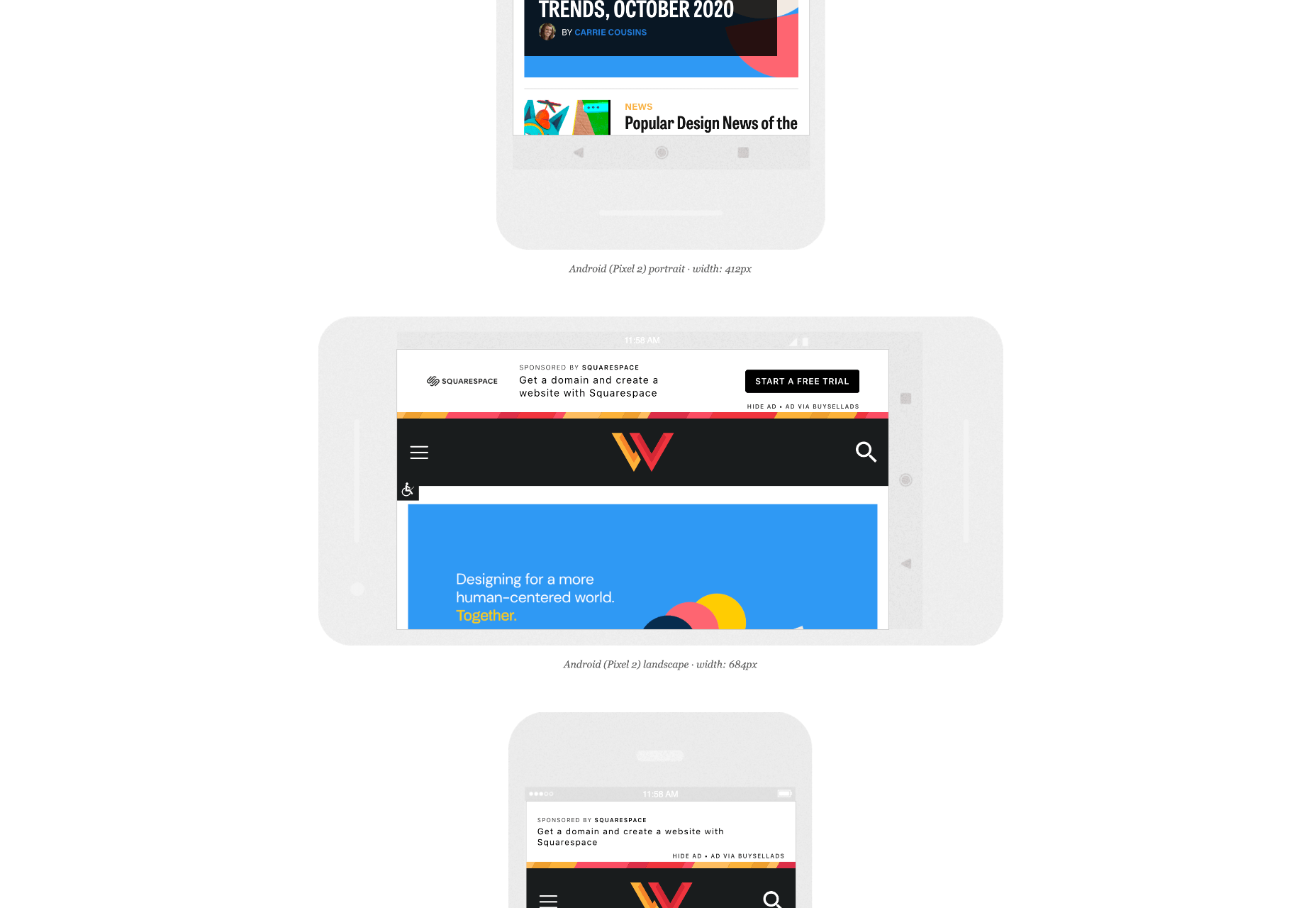
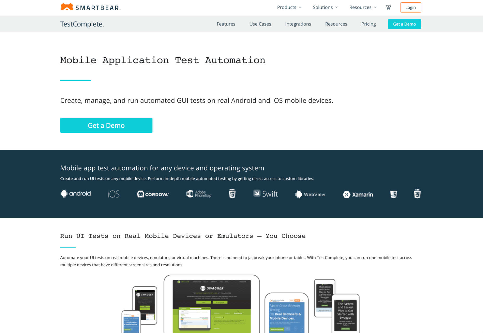
When creating a website, it’s vital to remember that not only does it need to work and look great on the device you are creating it on, but on all the other devices, it might be used on too.

Mobile and tablet optimization is important not only for the user journey but from an SEO point of view too, and badly created mobile sites just don’t cut it anymore.

With more and more devices entering the market, you need to check any website you create is compatible across the board. One bad experience and users are likely to leave and not come back again, which can be catastrophic for a business, particularly if it is just starting out.

It’s vital to check how a site looks and behaves when browsed differently from how you would use it. A common mistake is to assume users only browse websites on mobile devices in portrait mode; they don’t; landscape browsing is common, especially if the user is used to watching video.

Here are some of our top tools for testing websites on devices without the need for an entire device library:

1. Multi-Screen Test

WhatIsMyScreenResolution offers a great little tool to test how your site will look on different devices easily, and it costs absolutely nothing. You put the URL and choose between desktop, mobile, tablet, and television and then the orientation. Each device can also be broken down into different sizes and resolutions (or you can enter your own), making it easier than ever to test what a site will look like on different devices.

2. Responsinator

Responsinator is another great tool to test how a site looks on other devices without dipping into your wallet. Put your URL in the top bar, and it will instantly show you what it looks like on generic devices. This is a great, easy to use tool, and you can click through any links on your site to check the usability of multiple pages. This site is free, but if you want to “create your own” template, you need to sign up.

3. Google Dev Tools

Google Dev Tools is one of the most commonly used free tools. Add it to Chrome, and you can see how your site looks in a multitude of different screen sizes and resolutions. You can simulate touch inputs, device orientation, and geolocation to test how they work. It’s great to easily spot problems using their remote debugging tool to view, change, debug and profile a page’s code directly from your laptop or computer while viewing it on your mobile device.

4. Browser Stack

Browser Stack allows you to test your site on over 2,000 real devices and browsers, enabling you to see in real-time how your site looks. It is no hassle to set up, and it can be seamlessly integrated into your setup. As it tests on real browsers on real machines, you know the results are more reliable and accurate. It also enables you to debug in real-time using their pre-installed developer tools for ease of editing. The tests are all run securely on tamper-proof physical devices and are wiped clean of all data after each session, so you don’t need to worry about security being compromised.

5. TestComplete Mobile

TestComplete Mobile allows you to create and run UI tests across real mobile devices, virtual machines, and emulators. You can test both mobile device layouts and apps with script-free record and replay actions. This can help you to edit and fix any potential issues that may arise during the tests. Due to them being conducted on real devices, you know it is less likely to have errors in the system than a simulated device. This is free for 30 days then can get pricier, so make sure you take advantage of the trial and try the service before committing to it.

6. Sizzy

Sizzy is a great tool for checking sites, and it has a host of features to assist you. You can rotate the screen between portrait and landscape, filter by OS and device type, switch themes, and take screenshots. These little things mean it’s a super easy to use and convenient tool. It claims to simulate each device’s viewport and user agent, meaning the results are the same as what you would actually see on that phone/ tablet, etc. It can’t simulate different browser rendering engines however, so there’s a chance there might be some minor differences compared to the actual thing. Sizzy offers a free trial or has different price packages starting at $5 per month.


Featured image via Unsplash

Source

The post 6 Tools for Rapid Cross-Device Website Testing first appeared on Webdesigner Depot.


Source de l’article sur Webdesignerdepot

This article will help you practice your Dataweave skills in Mulesoft. Here we have to convert the input to a specific type of output. Let’s get started.

Input:

Source de l’article sur DZONE

If you were paying close attention to your IT department around the 8th of December, you might have heard some quiet sobbing and the occasional wail of, “Why? Why?! WHY?!” Now, it was the year 2020, so this might have seemed normal to you, but it’s actually something of a problem that could affect your business: CentOS is pretty much dead.

For the non-total-nerds among us, here’s the skinny: CentOS is a Linux-based operating system, typically used on servers. CentOS has been incredibly popular, and quite a few businesses run on it. But now, that’s changing.

CentOS is a Linux-based operating system, typically used on servers…But now, that’s changing

CentOS used to be released in thoroughly tested versions, the latest being CentOS 8. CentOS 8 was released in September of 2019 and was supposed to be supported for ten years. Now, it’s been decided that CentOS will no longer have versioned releases, opting for a rolling-release style of updates. That means there’ll be one version that constantly gets new software.

That’s cool in theory, but it means the operating system will be less stable overall. Essentially, it’s going to be used as a development branch of / testing ground for Red Hat Enterprise Linux and is no longer its own OS. If you have CentOS-based servers, you should migrate to another OS sooner rather than later.

And I just got my own CentOS-based VPS set up the way I wanted it.

Wait, What Does Red Hat Have To Do With This?

Here’s the short, short version of the history of CentOS: Red Hat (an OS developer) has two Linux distributions of its own and has had for a long time. There’s the free and community-focused Fedora and the business-focused highly expensive Red Hat Enterprise Linux (AKA RHEL).

Funny story: RHEL, despite its expensive licenses, is still mostly made from open source code, which anyone can access and use. And it’s a good OS, particularly for people who like stability.

In 2004, some smart people took all the open-source parts of RHEL and made a brand new, nearly identical operating system with it: the Community Enterprise Operating System, or CentOS. Basically, people could download and use an enterprise-level server OS for free. All the documentation for RHEL was compatible, and you could get support from the community.

It was the perfect alternative for anyone who didn’t have the budget for expensive software licenses.

In 2014, Red Hat offered to partner with the CentOS community. The idea was basically this: “It’s pretty much the same software. If our company and your community work together, both our products will be better! We make our money from enterprise customers, anyway.”

Most importantly, with Red Hat doing a lot of the heavy lifting in terms of updates and support, the CentOS community could focus on growing in other ways.

Red Hat pinky swore [citation needed] that they were in this for the long haul, and CentOS did continue to flourish. You know, until 2020.

Well, So Much For Pinky Swearing

Red Hat must have eventually decided that having a popular free version of its own enterprise software and managing it themselves no less — wasn’t that good for business. So they all but shut the project down.

Well, technically, they just changed how it operated. Instead of producing tested, production-ready versions, CentOS is merely a testing ground for RHEL. It is no longer, in my opinion, a good option for anyone who wants to run a stable server.

Current and Future CentOS Alternatives

So if you jumped on the CentOS 8 bandwagon, what should you put on your physical and virtual servers now? Well, you’ve got options.

Debian / Ubuntu

For those who don’t mind going to a very different kind of Linux, Debian has been the picture of OS stability and sysadmin-friendliness for a long time. If you want more frequent software updates, the Debian-based Ubuntu Server is popular and pretty good.

Oracle Linux

Yes, that Oracle has a RHEL-compatible Linux distribution of its own. But it’s not a clone, exactly. I mean, this is Oracle. It’s set up to use their tools and ecosystem, so I hope you like Oracle products. But hey, the OS itself is free!

ClearOS

ClearOS is another RHEL-compatible OS that’s mostly doing its own thing, though I’m not entirely sure what that thing is. Does the company have some deal with Hewlett-Packard? Anyway, they do have a free community edition and paid editions for home and business use.

The CloudLinux RHEL Fork

This is an upcoming release from the makers of CloudLinuxOS. It looks like they intend to load the new RHEL-based OS with some of their own tools, such as reboot-less server update tech. The first release is intended to be a more or less drop-in replacement for CentOS 8.

Rocky Linux

So the community that made and loved CentOS in the first place is, to say the least, ticked. They are so ticked that Greg Kurtzer (a co-founder of CentOS) has decided to do it all over again by making Rocky Linux and keep it in the community this time.

Again, the goal is to make a re-build of RHEL, a drop-in replacement for CentOS (at least for now). Eventually, the goal is to migrate from CentOS to Rocky Linux as easy as using a single, one-line command. The ETA for initial release isn’t quite set in stone, but I can personally vouch for how hard the community is working.

[See, full disclosure here… after writing this article, I joined the Rocky Linux documentation team.]

So Yeah, You Have Options

Some are out now, and others will be soon. Again, CentOS 8 will be supported until the end of 2021. CentOS 7, weirdly, will be supported until June 2024.

Migration shouldn’t be too complicated. Still, a pain in the rear that we have to do this at all, though.

Source

The post How CentOS Became 2020’s Final Victim first appeared on Webdesigner Depot.


Source de l’article sur Webdesignerdepot

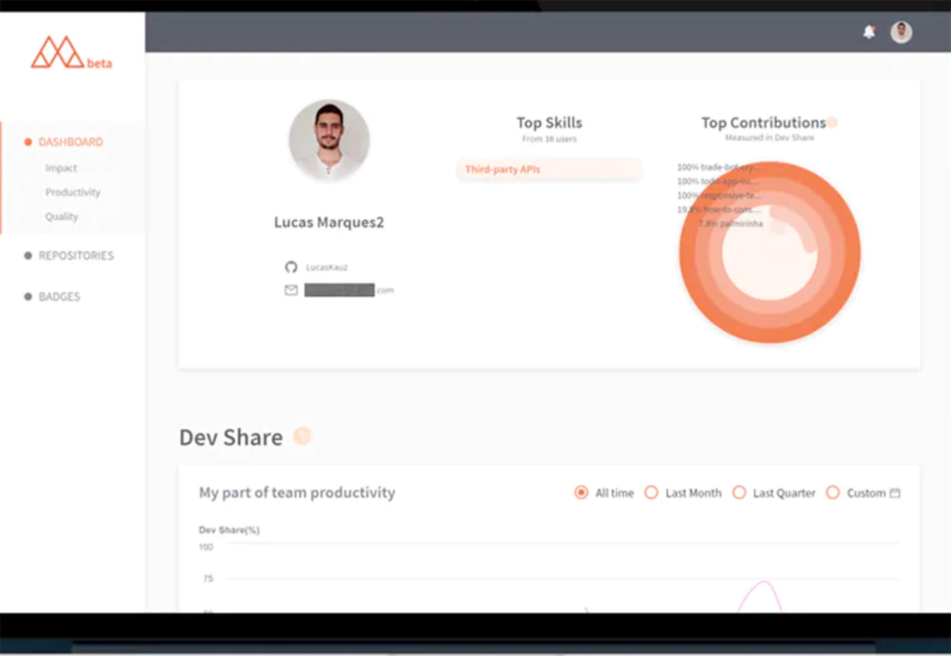
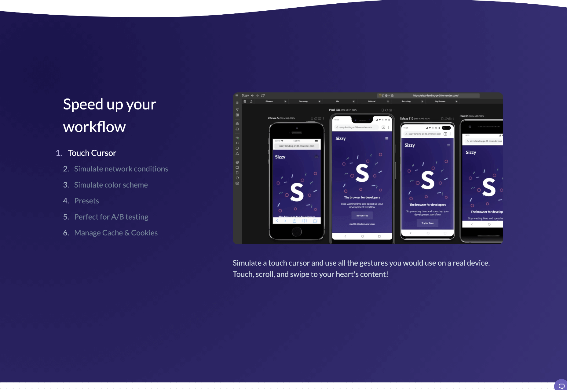
There are dozens of factors that influence the UX of your site, app, or game. Most of them are beyond your control; user connection speed, end-system resources, even browser technology is all out of your hands. So when you do have the opportunity to influence your project’s infrastructure, you should seize it.

The world’s fastest muscle car can’t perform at its best when traffic is gridlocked bumper to bumper; likewise, the most finely tuned website can’t meet its potential running on shared hosting.

If you want your website, application, or service to run quickly and securely, maximizing both UX and SEO, then you need to look at the bare metal servers from OVHcloud.

Bare Metal Performance

Bare metal (or dedicated) servers aren’t uncommon. Still, most hosts only offer a single type of server, expecting small startups to pay for resources at the same rate as global giants, which can make dedicated hosting prohibitively expensive.

OVHcloud is different; it offers a range of bare metal server products optimized for a wide variety of challenges. That means small startups can invest in fast, easily scalable solutions that meet the most demanding security requirements without breaking the bank.

Whatever your aims, there’s a different OVHcloud solution configured for you:

OVHcloud Rise

Rise is the perfect option for a website, or web app hosting. With its low entry-cost, Intel-powered performance, bundled DDoS protection, and simplified administration, Rise is the natural choice for your first step into bare metal servers.

OVHcloud Advance

To meet SMEs’ need for reliable infrastructure to run mission-critical applications, OVHcloud configured Advance. From in-house CRMs to web-facing SaaS products, Advance is a solid foundation upon which to build your business.

OVHcloud Storage

Storage is ideal for storing large amounts of data securely. Hosting data on standard servers is a colossal waste of resources; with OVHcloud’s Storage product you can host up to 504TB and seamlessly access it via a performance-tuned server.

OVHcloud Infrastructure

For large companies with thousands of employees, global non-profits, colleges, and even local governments, OVHcloud Infrastructure offers scalability and flexibility beyond the average dedicated server.

OVHcloud High-End

For web apps that are leveraging cutting edge technology like machine learning and big data, OVHcloud’s High-End product is a no-compromise custom solution, the humdinger of bare metal servers, with every conceivable option available.

OVHcloud Game

If you’re developing video games, then lightning-quick, reliable streaming servers are essential. OVHcloud’s Game product delivers the type of speed your customers demand, with massive performance gains over comparable bare metal servers.

How to Choose a Bare Metal Server

It’s easy to get bogged down in detail, especially if this is your first foray into bare metal servers.

But here’s the good news: every OVHcloud bare metal server is a massive boost in performance over shared web hosting. That’s because, with a dedicated server, all of the server’s resources are…dedicated; that is, you don’t have to share with anyone. Shared hosting is pot-luck: You might wind up on a server with thoughtful users who don’t eat up all the resources, and you might end up on a server with one selfish user who hogs the processes and compromises the security. With a bare metal server, that’s not an issue.

Choosing a bare metal server is a two-step process. The first step is to think about what you intend to use it for:

Are you going to store a lot of data? If so, think about OVHcloud’s Storage product. But a lot of data doesn’t mean a WordPress blog. Let’s say you’re a polling company, collating millions of records that you hope to analyze to predict political movement; that requires a lot of storage. On the other hand, all servers have some storage. OVHcloud’s Rise product comes with 500Gb and can be configured with more. So if you’re planning to host something the size of a blog, then OVHcloud’s Storage might be using a sledgehammer to crack a nut.

The second step is to ask how complex the operations you’re going to ask the server to perform will be:

Hitting up a database to retrieve some data is not a complex operation. Even something like a complex search isn’t too taxing. If that’s the kind of process you expect to perform, OVHcloud’s Rise is more than adequate. But if you’re manipulating large amounts of data, like resizing hundreds of raster images dynamically; or using facial recognition to search through millions of biometric data records; or even managing your advertising application serving millions of ads to sites across the web; in those cases, you need the sort of performance OVHcloud’s Infrastructure product delivers.

OVHcloud’s products are all scaleable. Its High-End bare metal server product is entirely customizable. Whatever you choose, and however your needs change over time, you can be confident you’re running the optimum server for your project.

Why Choose OVHcloud

There are a mind-boggling array of processors, and OS, and a seemingly infinite — and increasingly expensive — amount of hardware on offer on the web. OVHcloud radically simplifies running a bare metal server by delivering a range of popular packages, tailored for everyday uses, that are both customizable and scaleable.

What OVHcloud delivers is a clear choice, letting you choose the right server for your product.

Whether you need lighting fast response times to maximize your SEO or the space to store a digital archive of the world’s most important art, for reliability and choice, opt for OVHcloud bare metal servers.


[— This is a sponsored post on behalf of OVHcloud —]

Source

The post How to Choose a Bare Metal Server From OVHcloud first appeared on Webdesigner Depot.


Source de l’article sur Webdesignerdepot

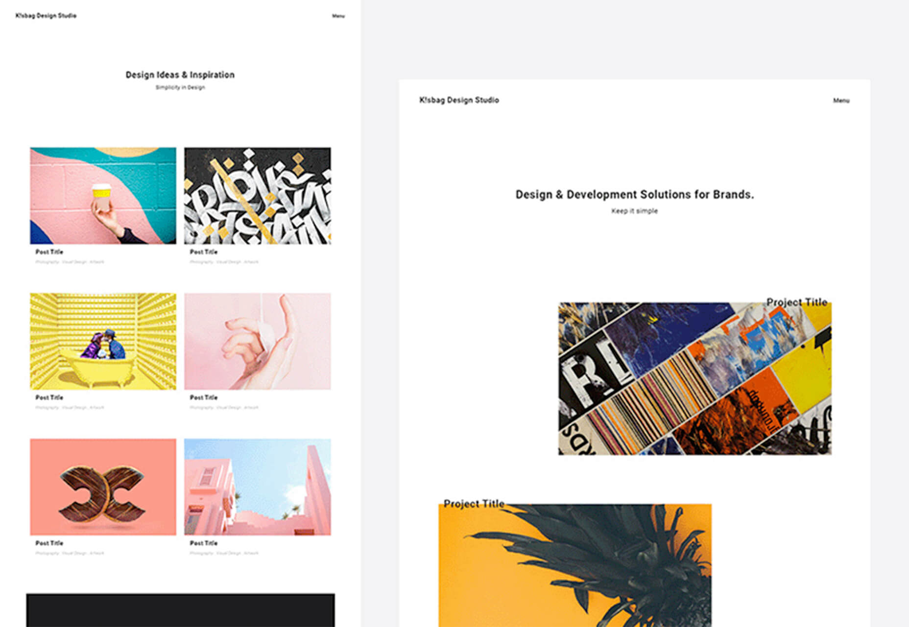
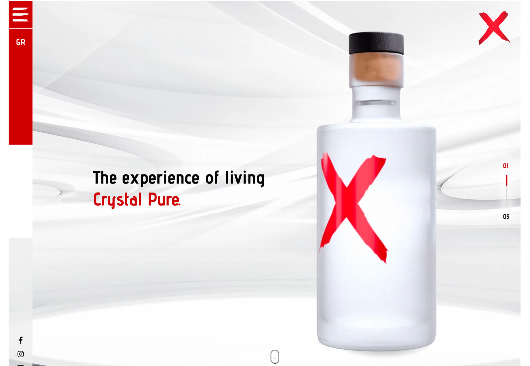
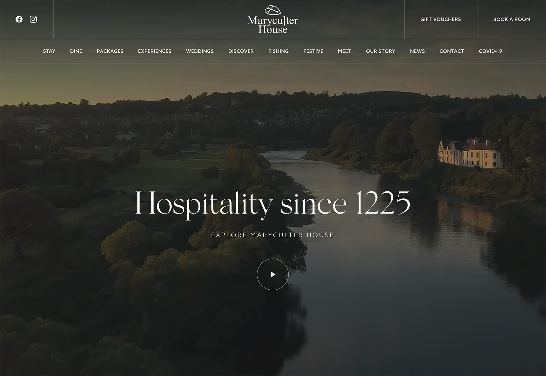
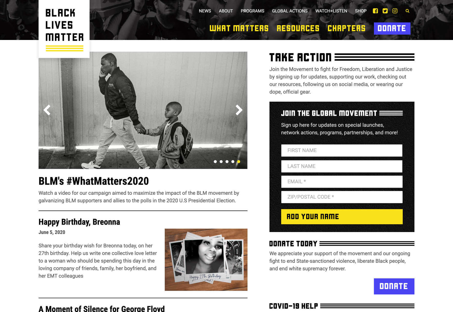
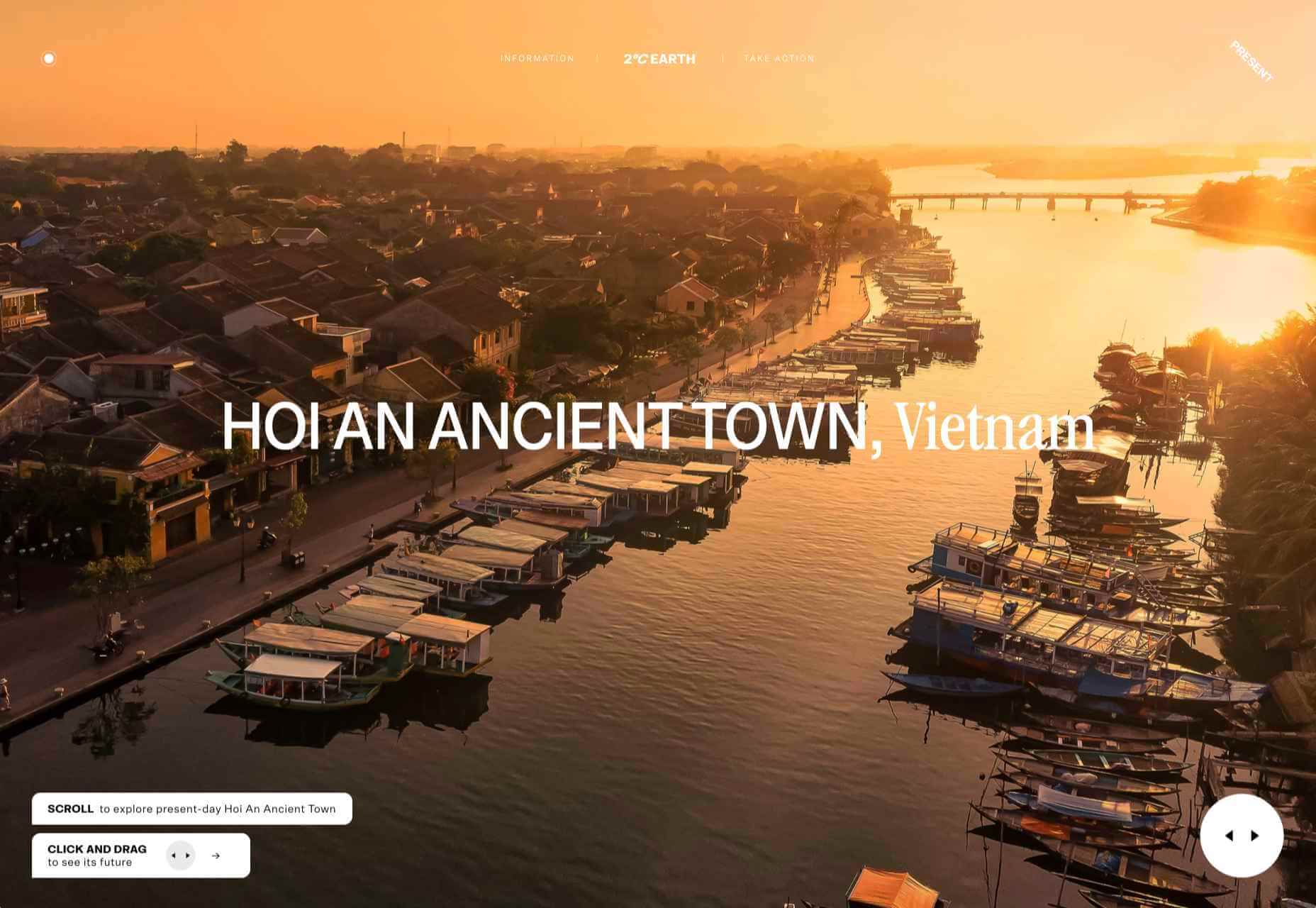
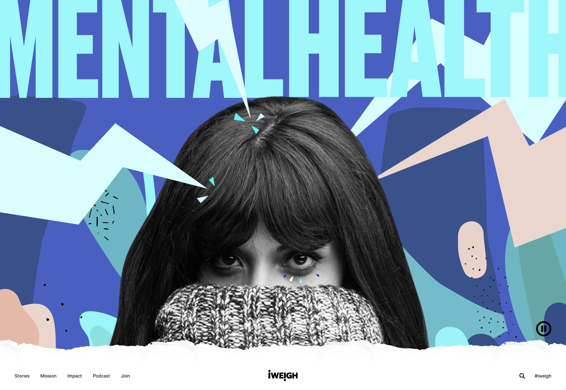
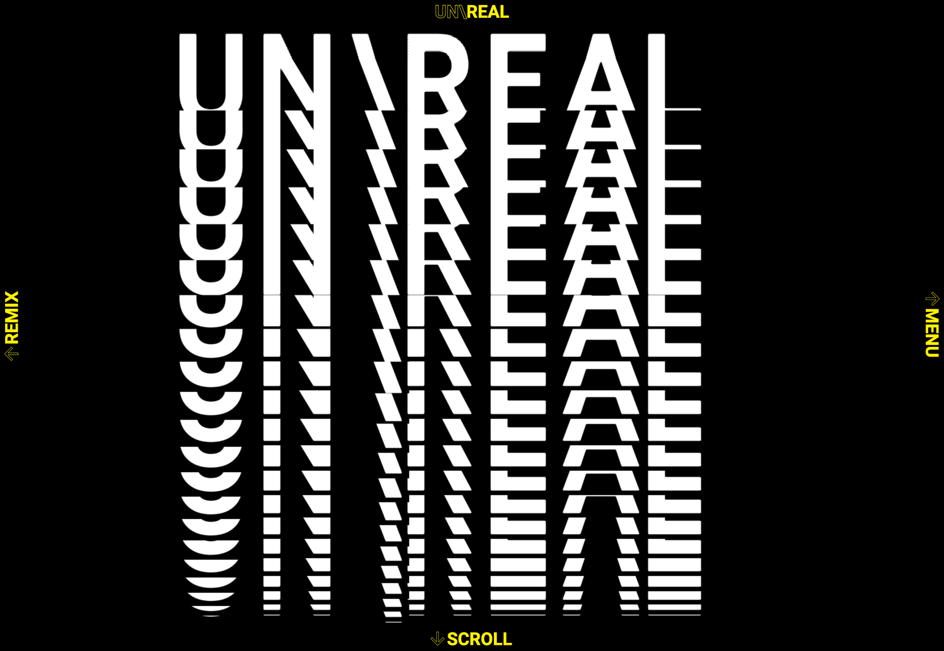
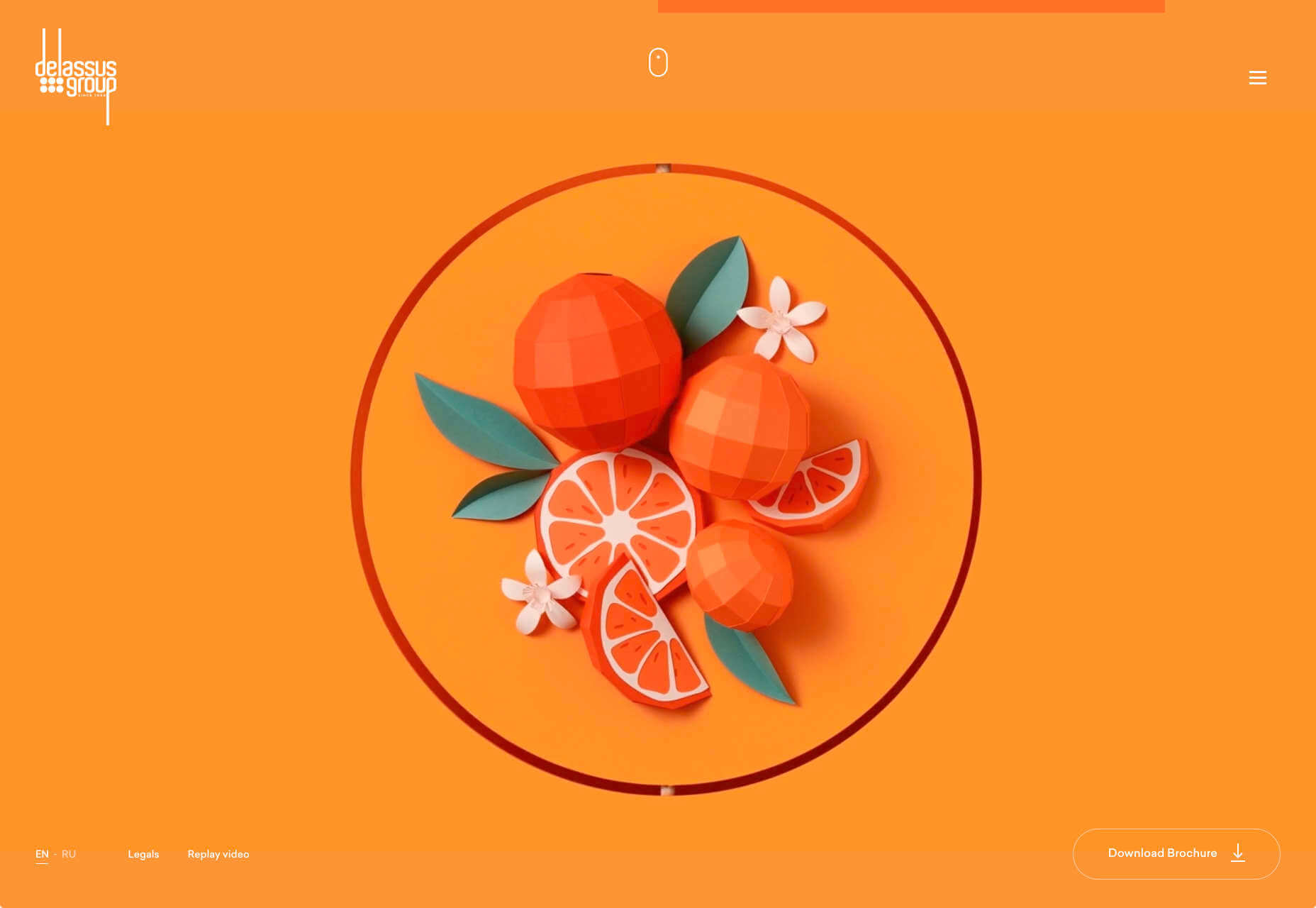
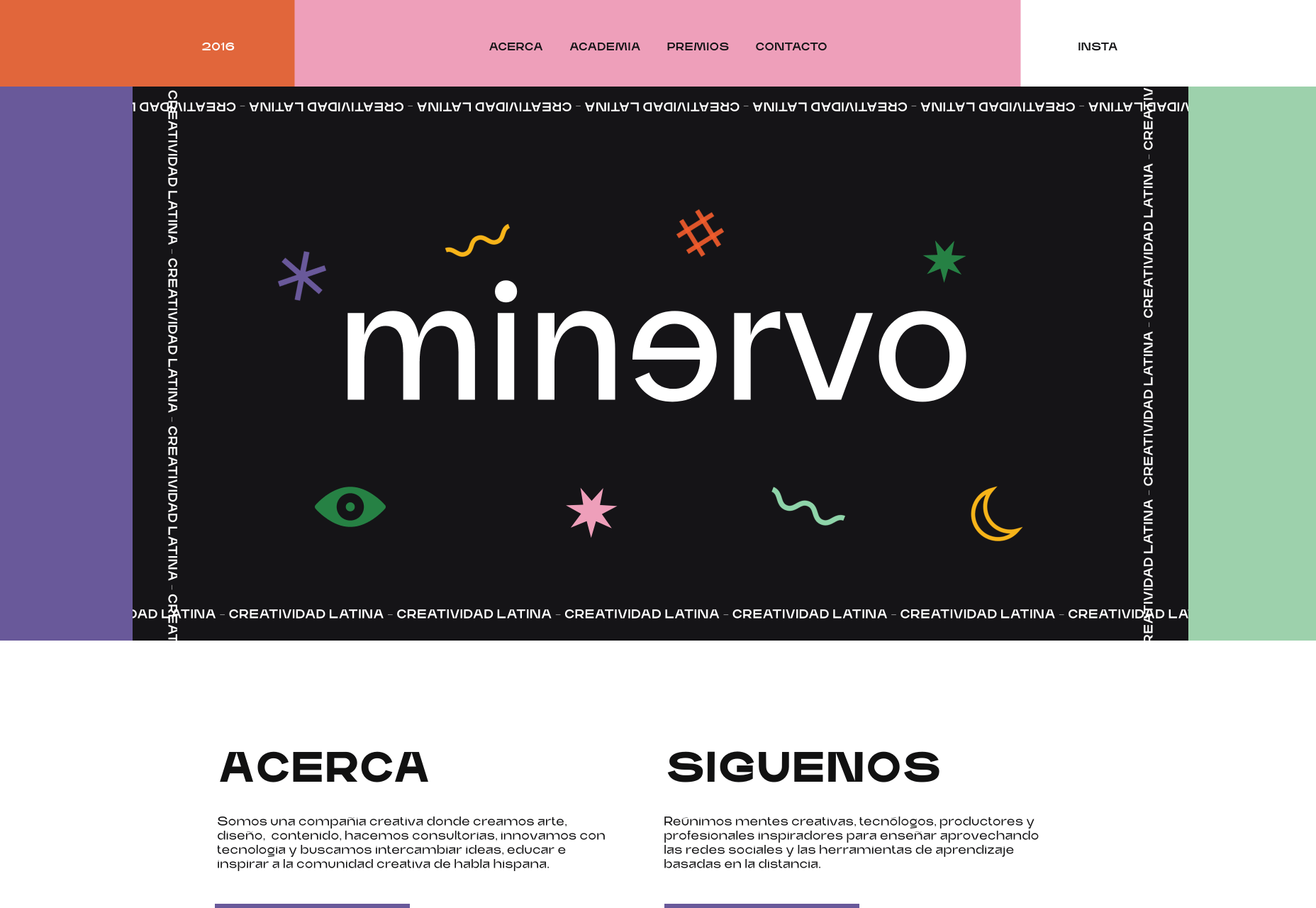
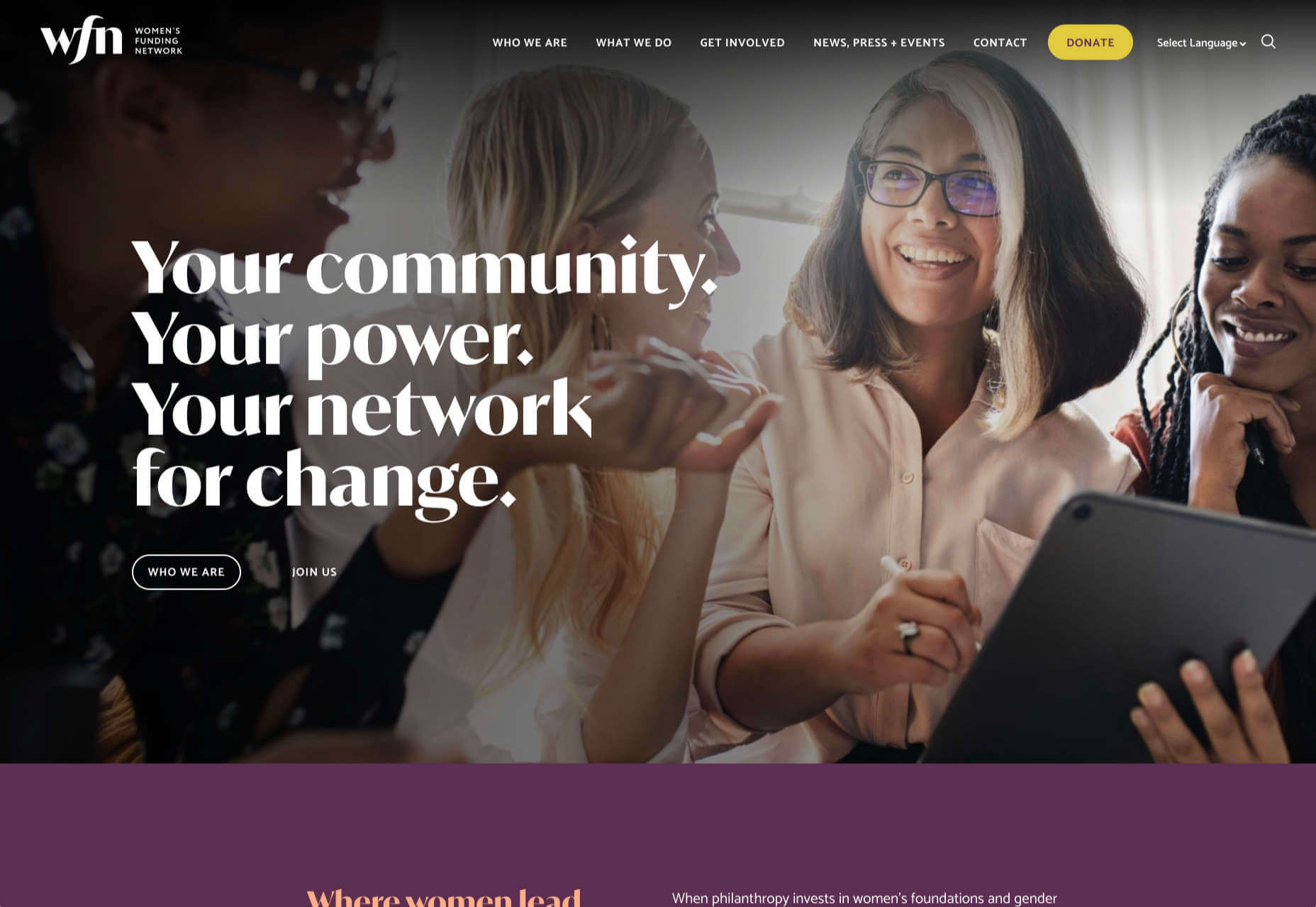
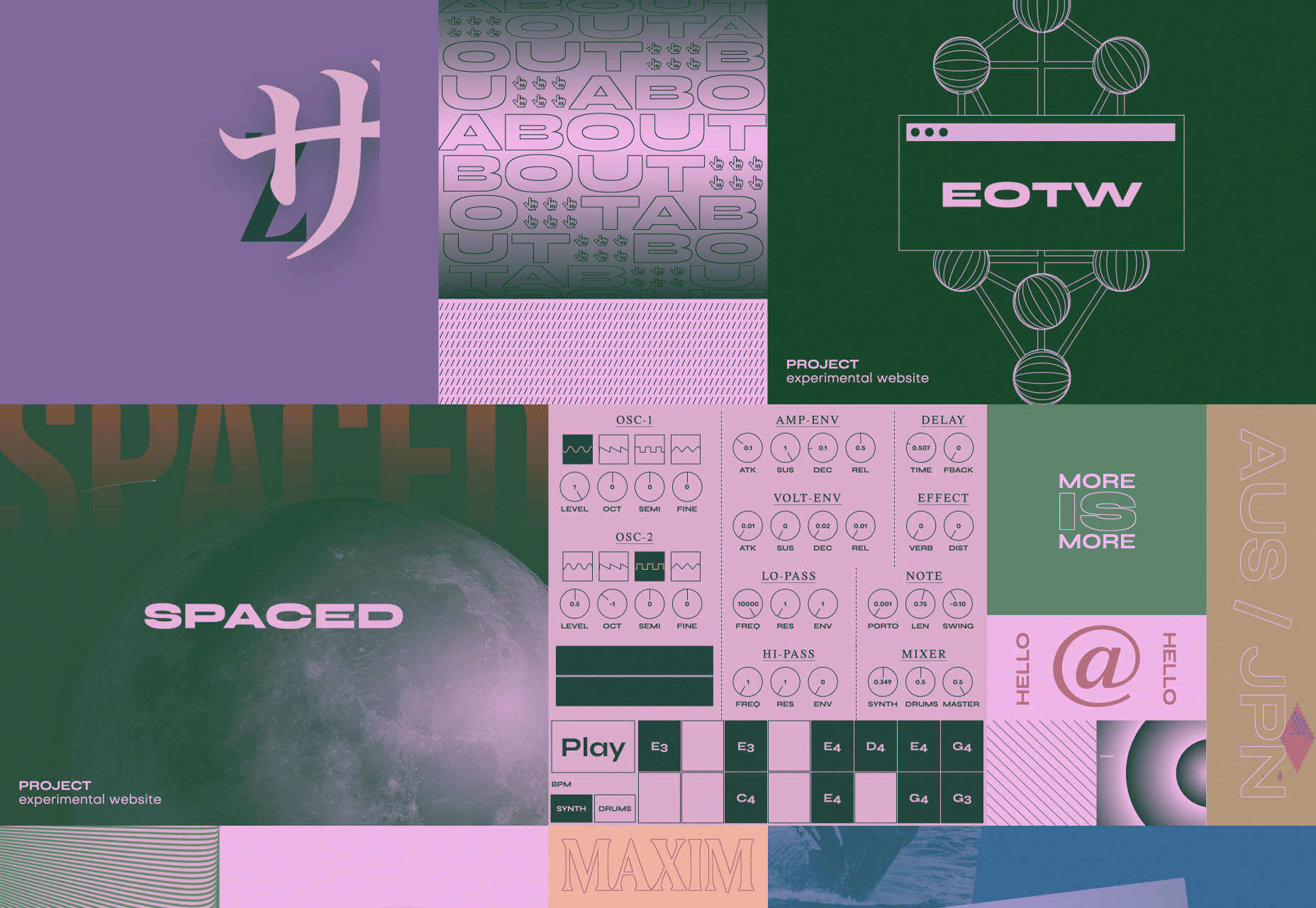
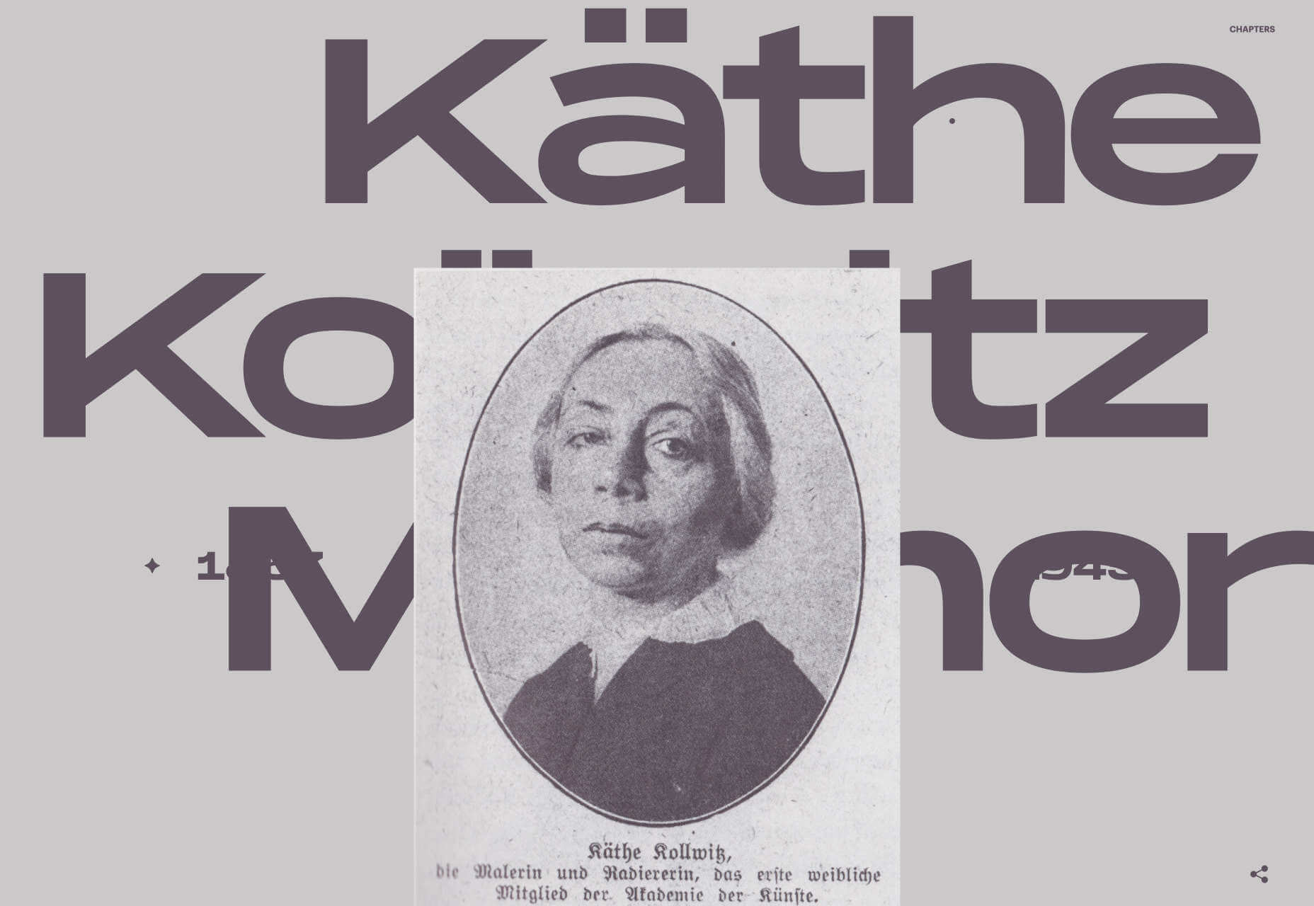
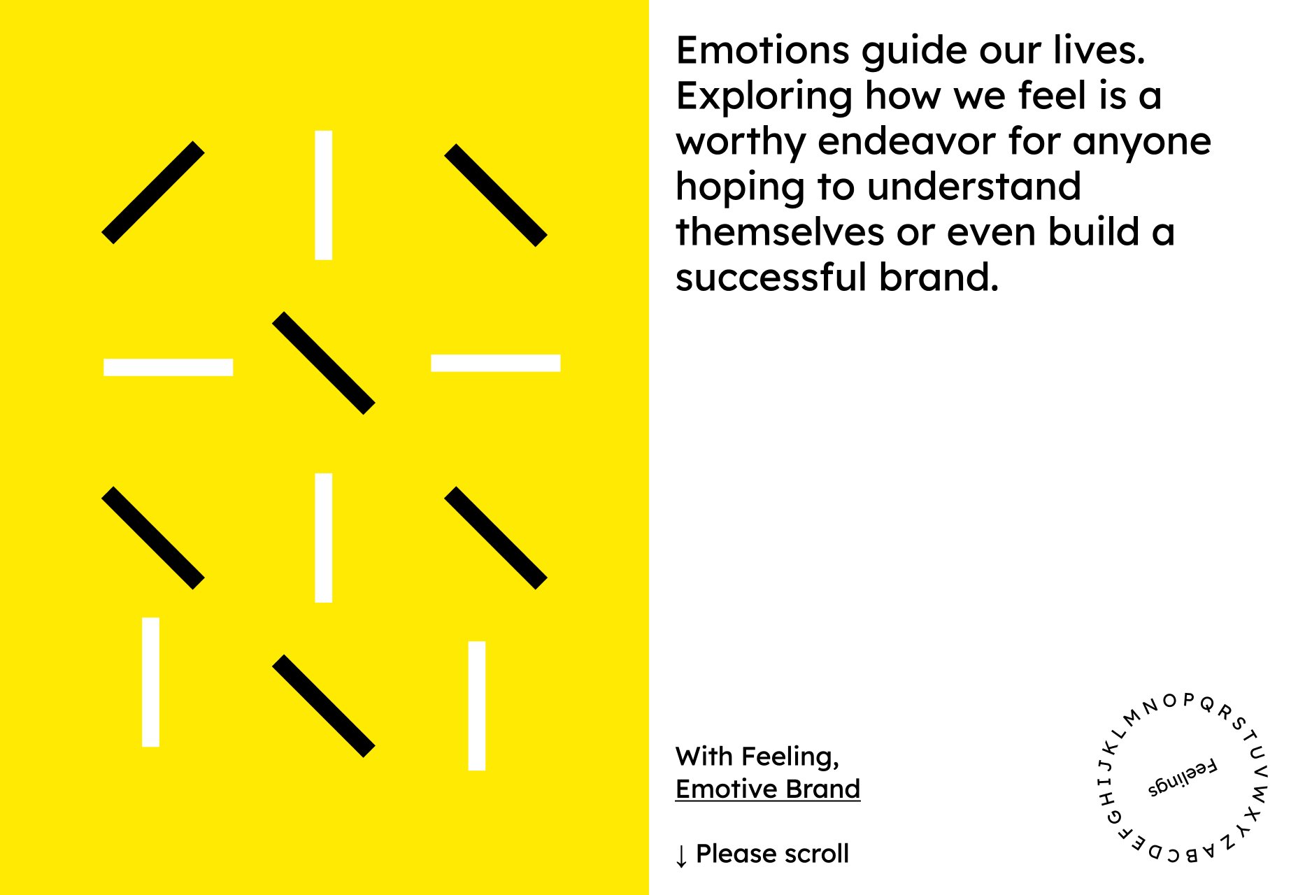
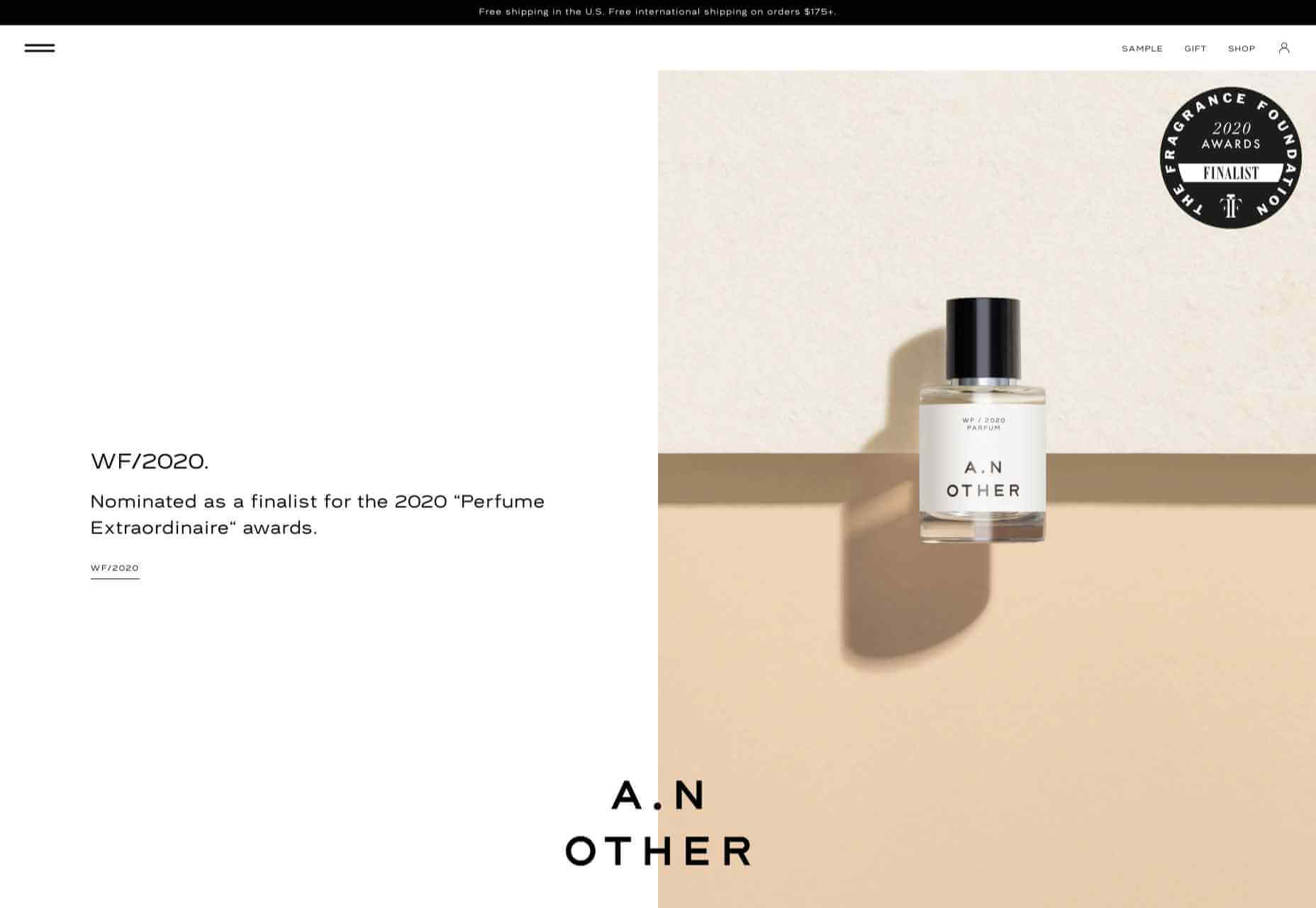
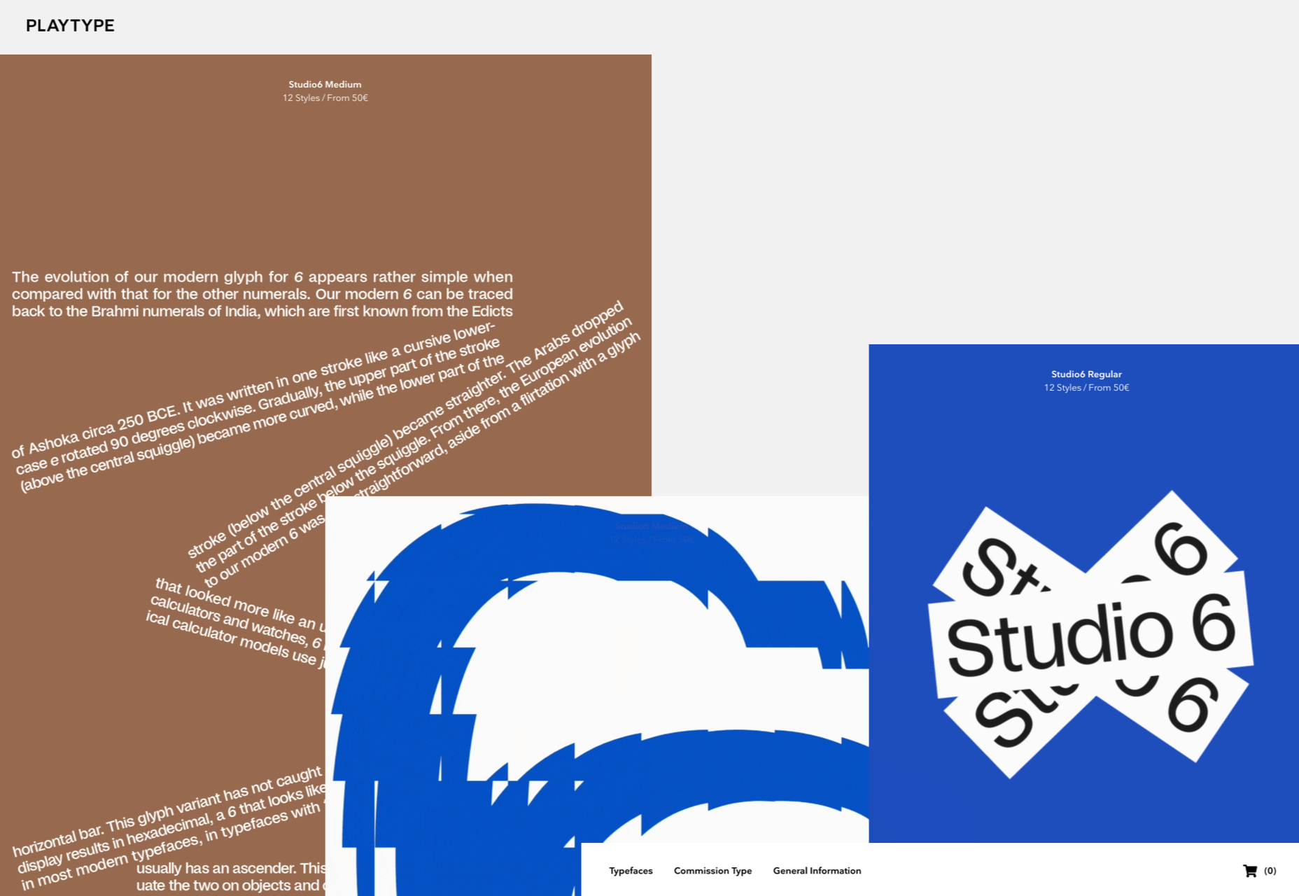
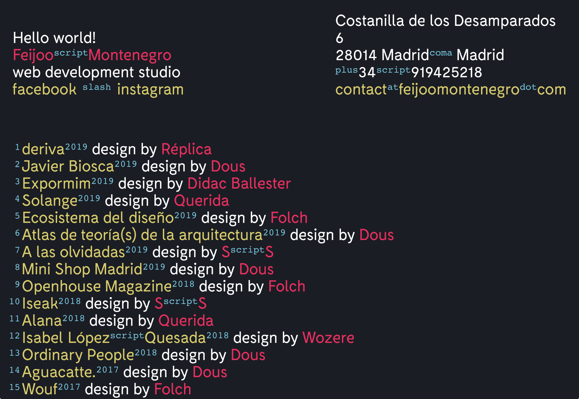
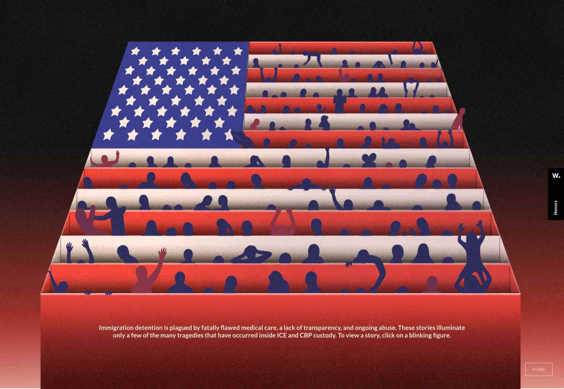
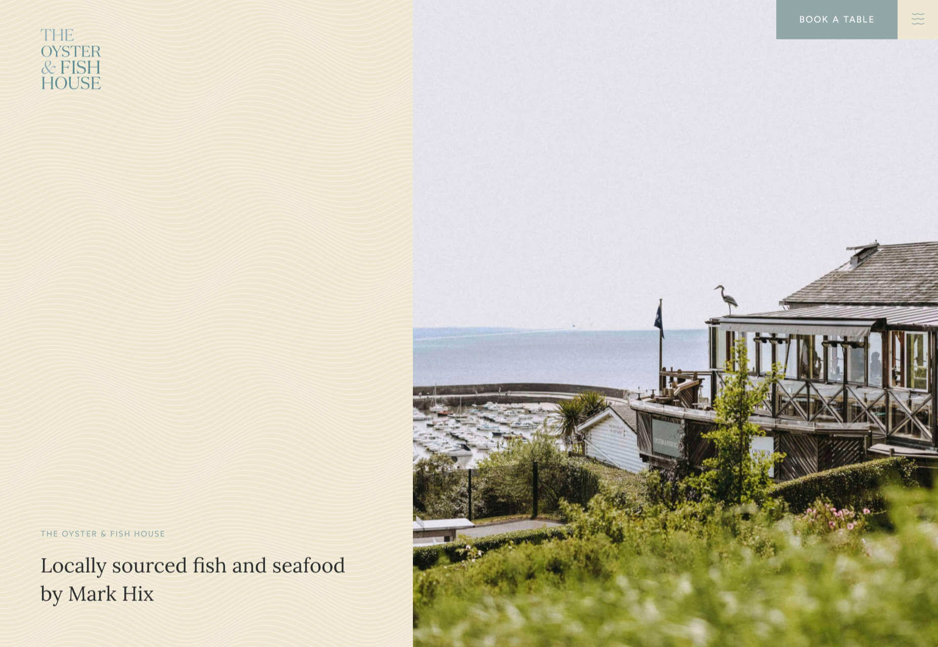
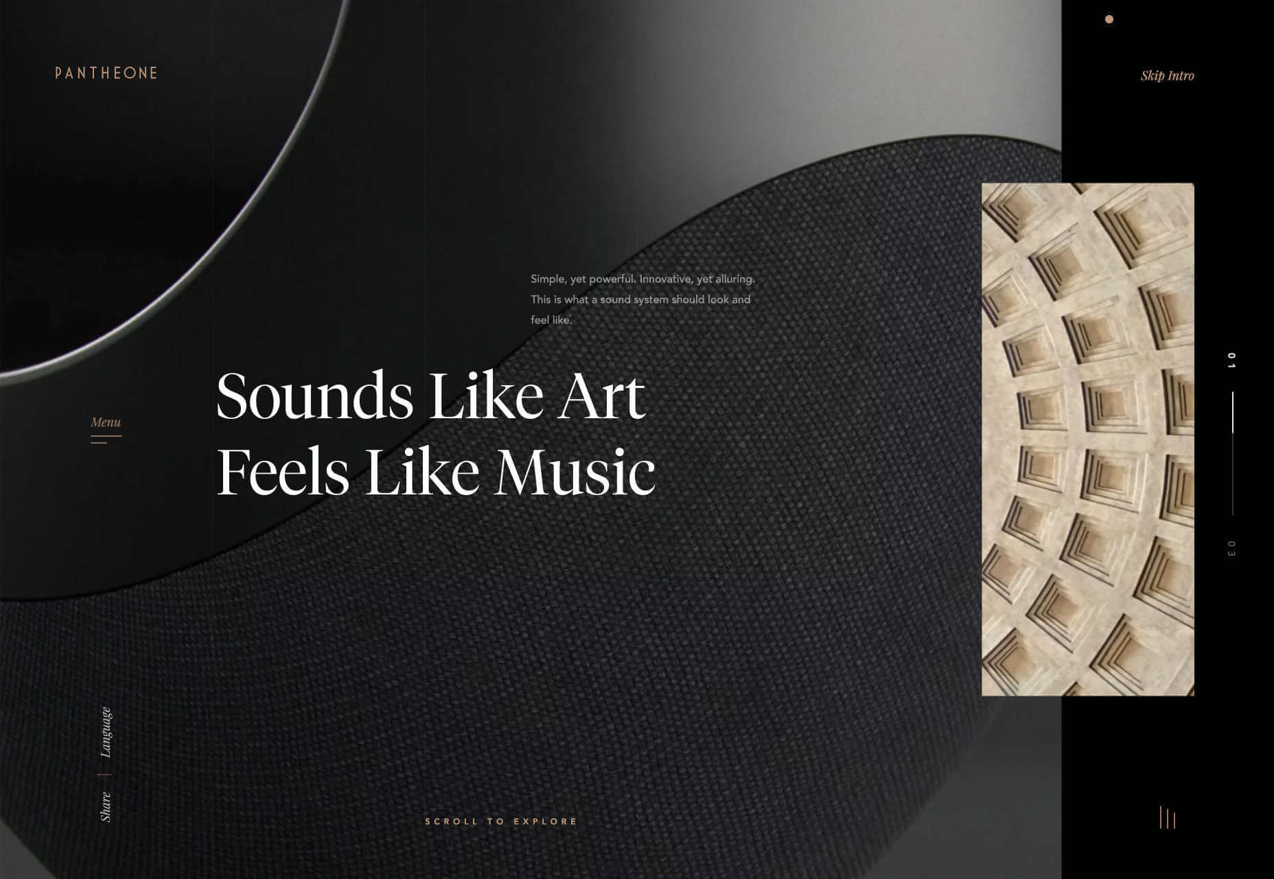
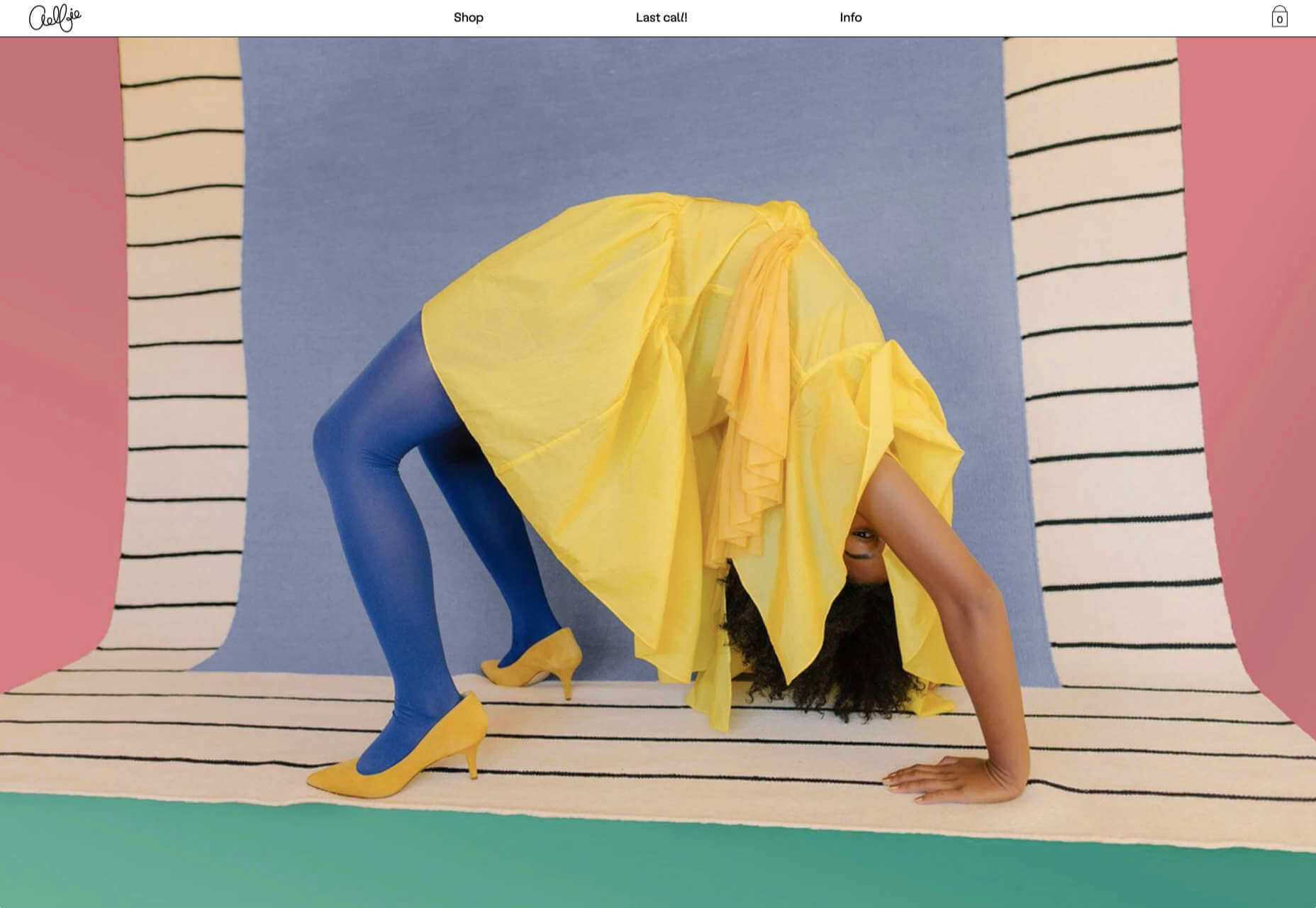
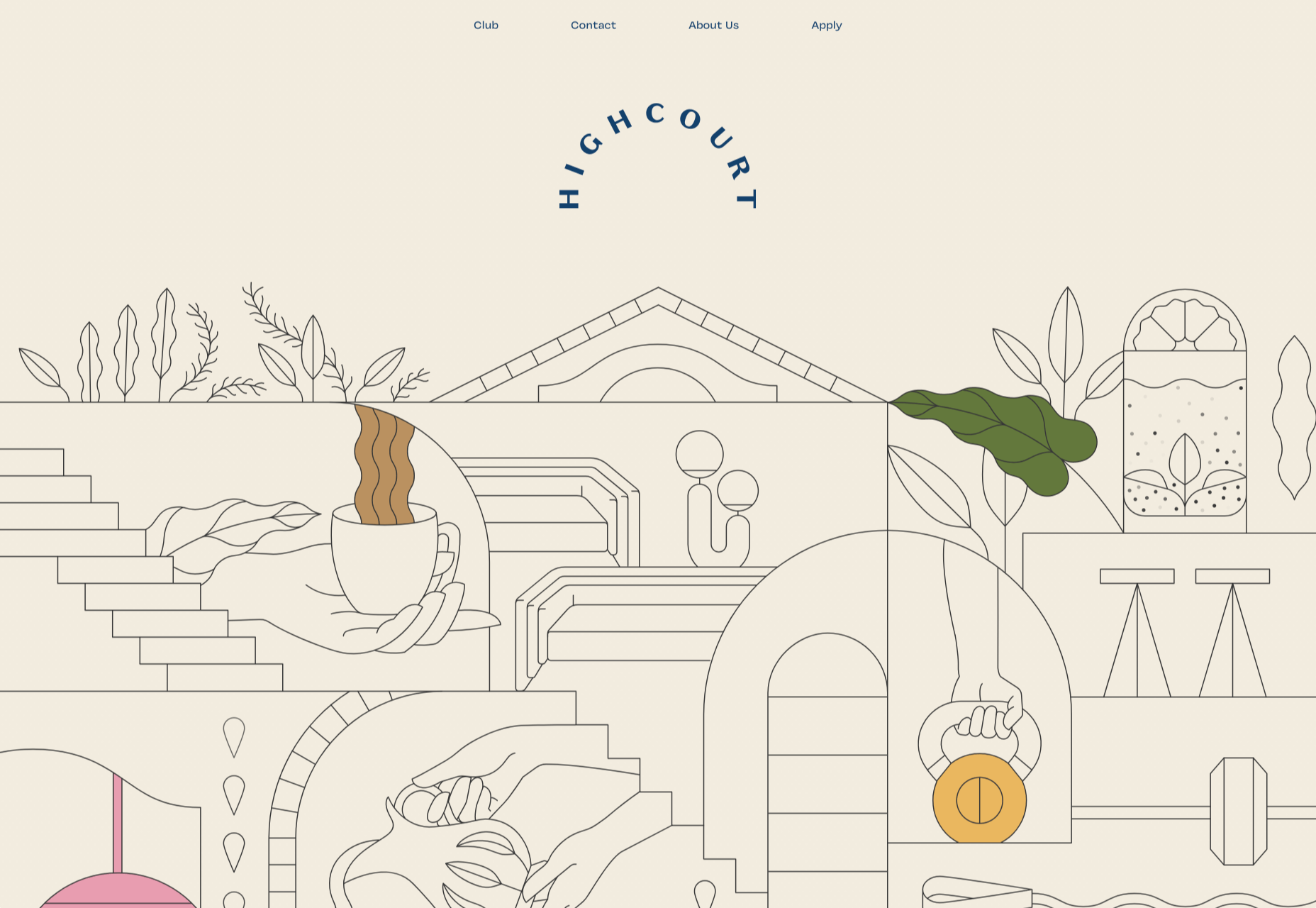
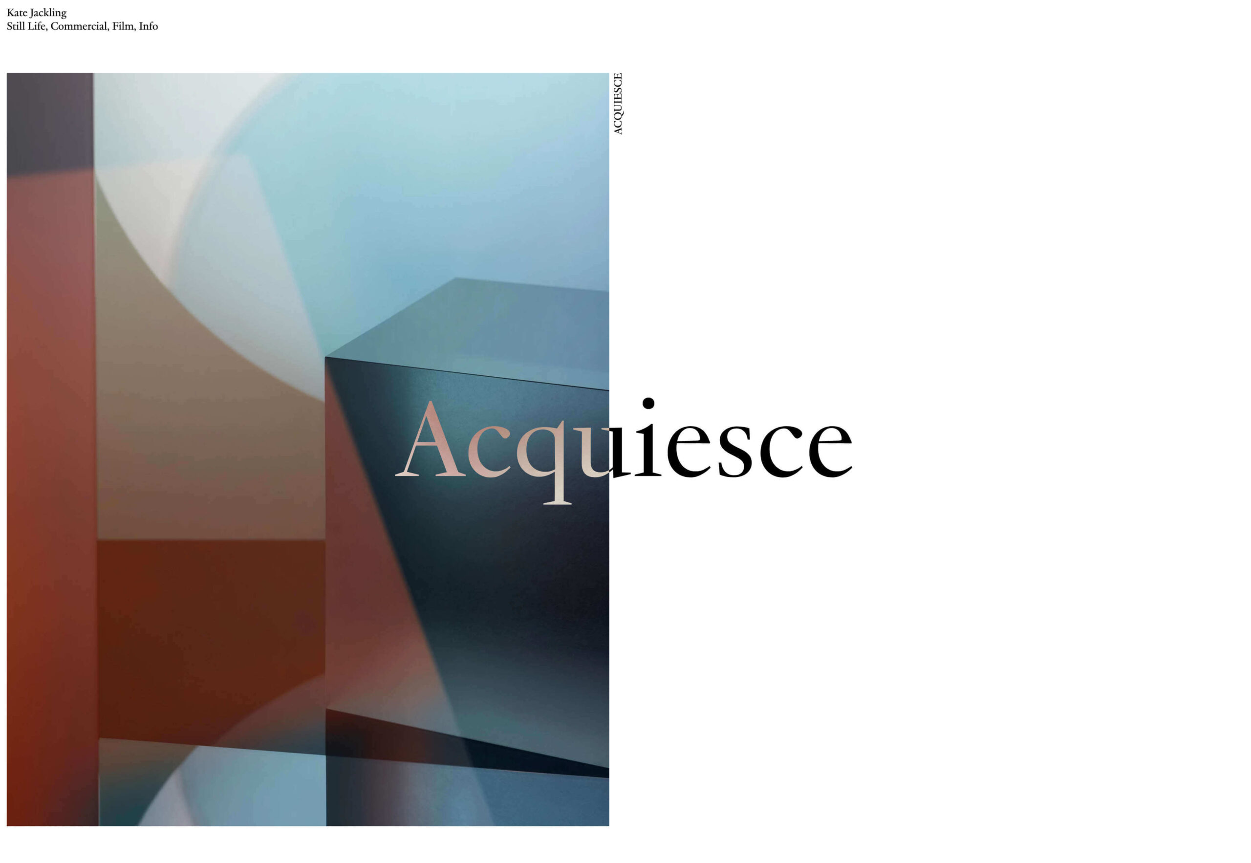
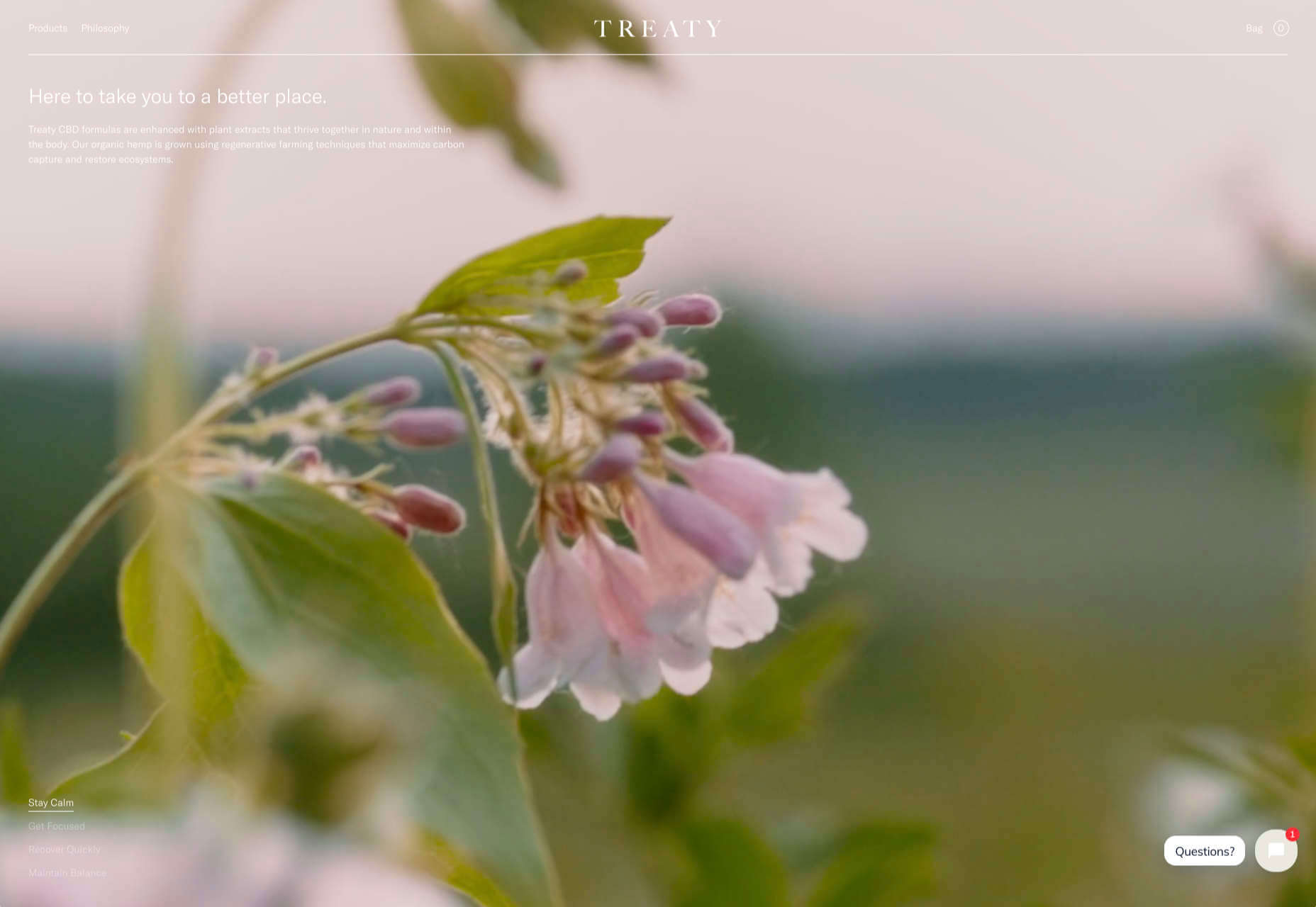
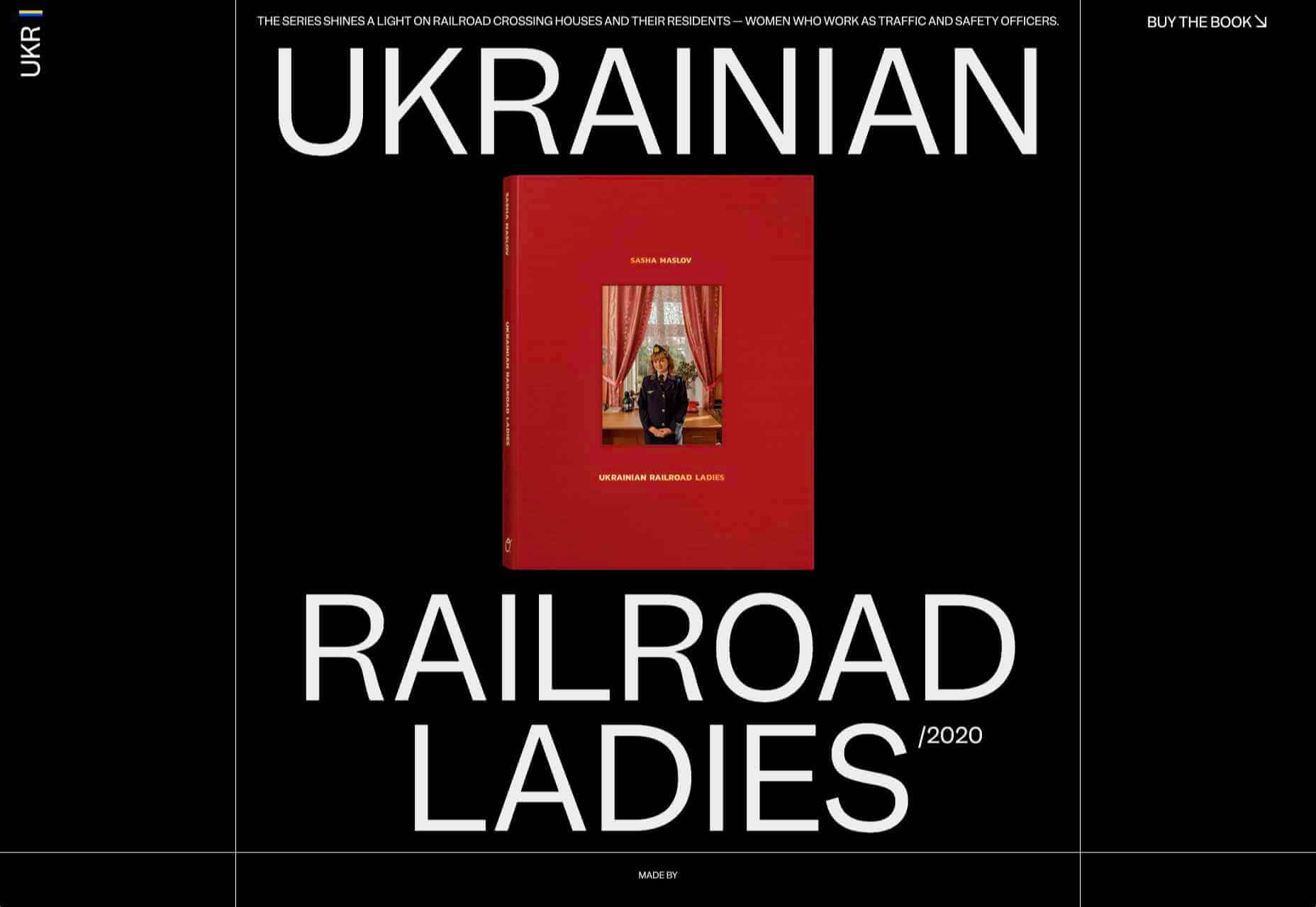
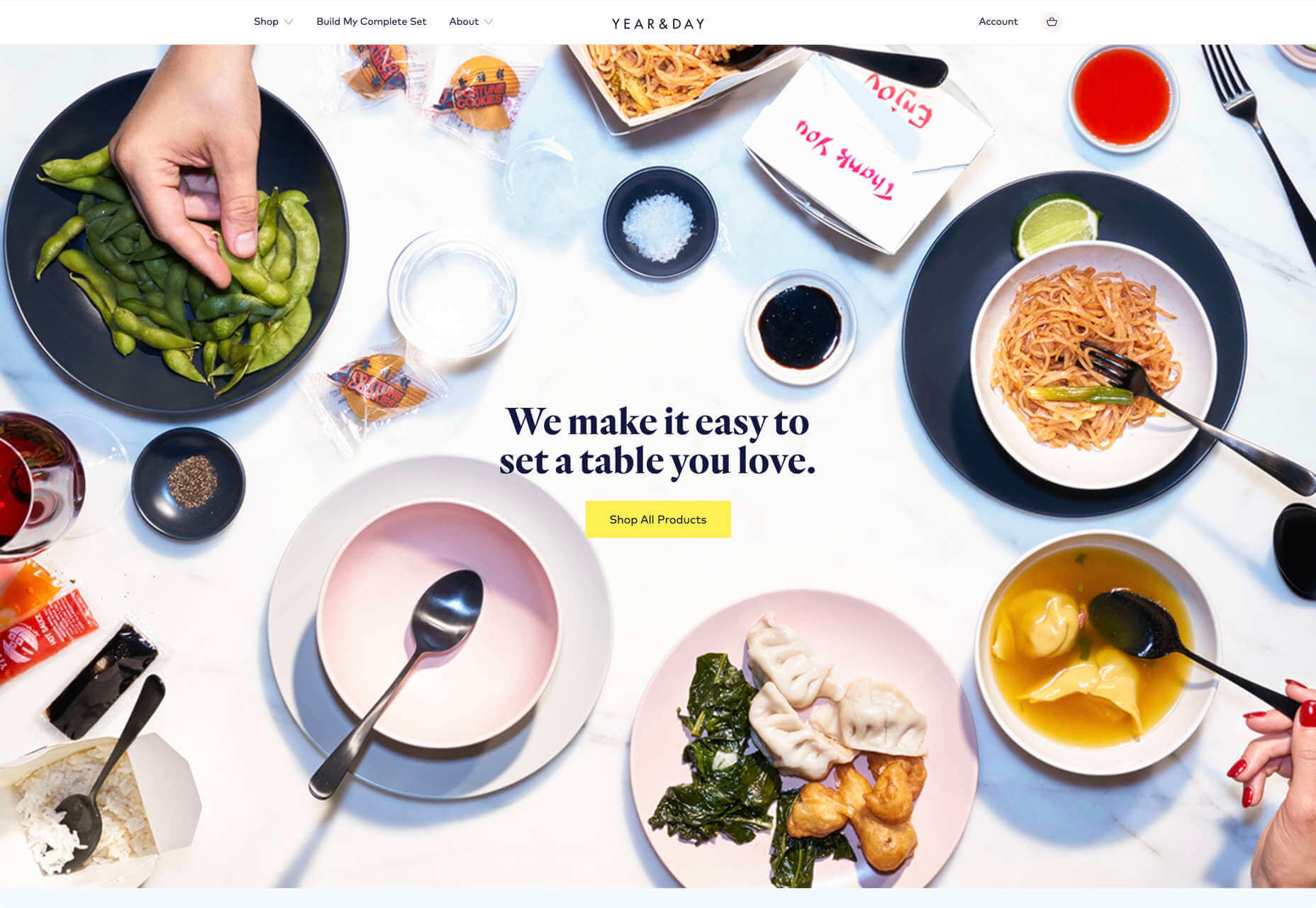
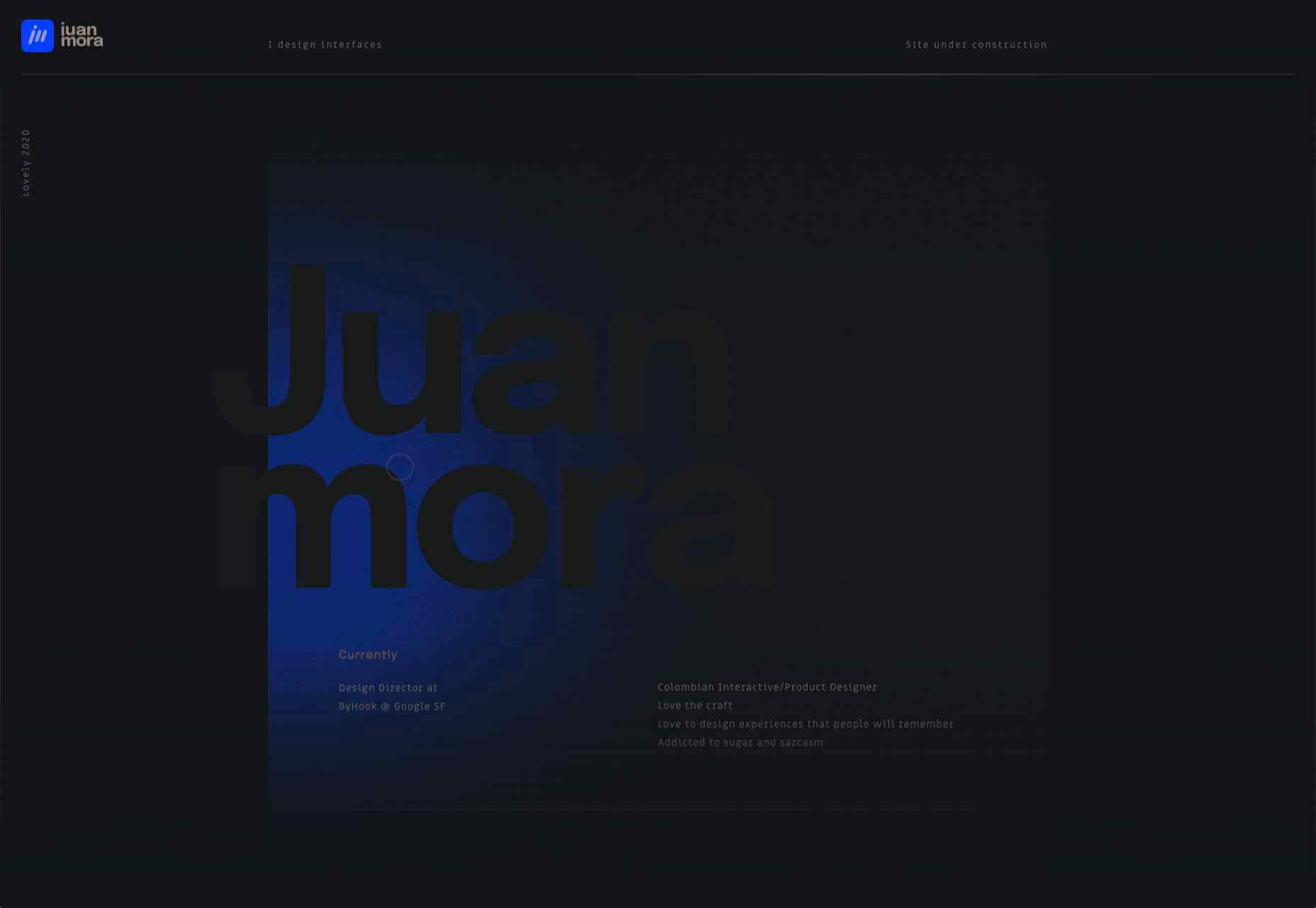
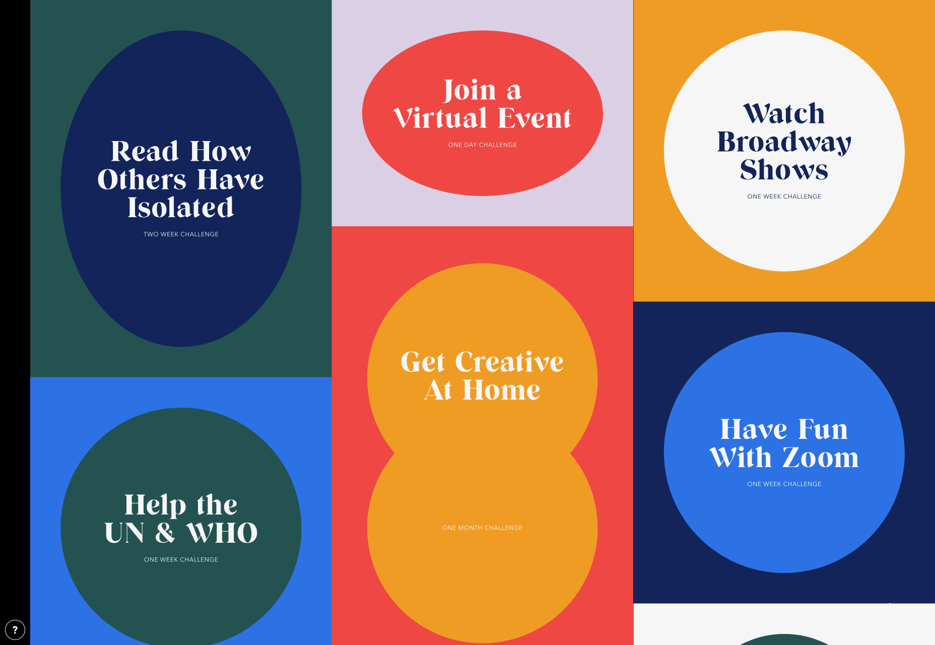
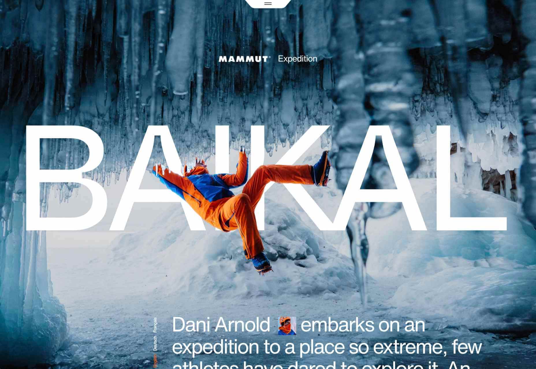
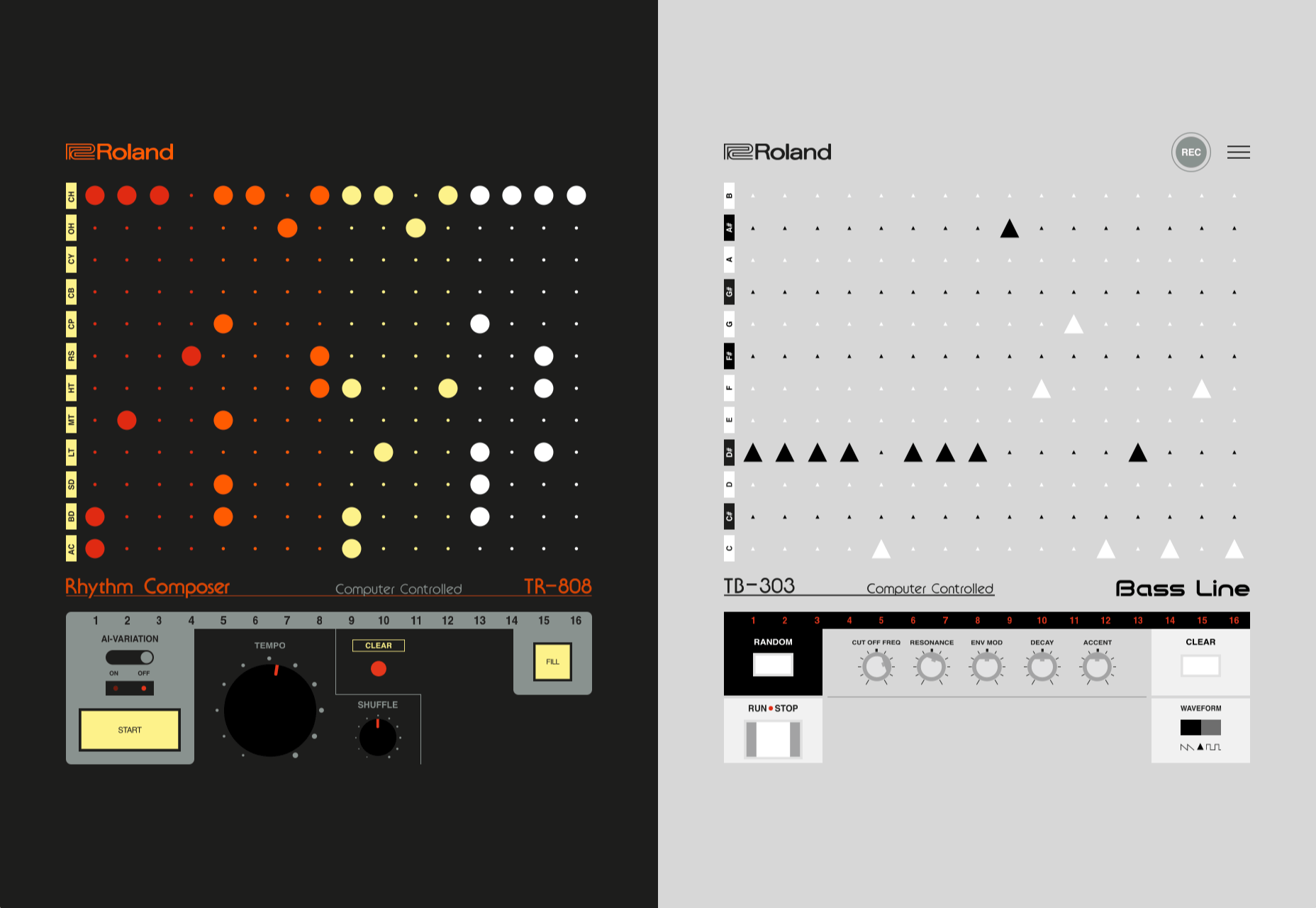
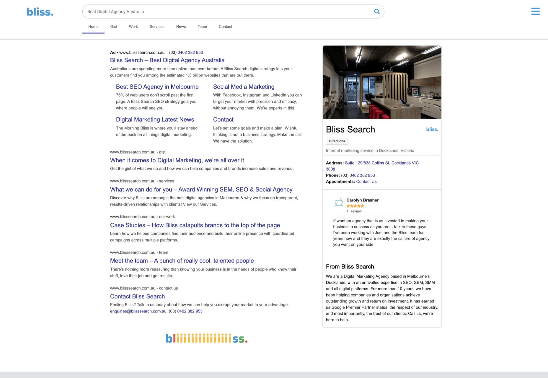
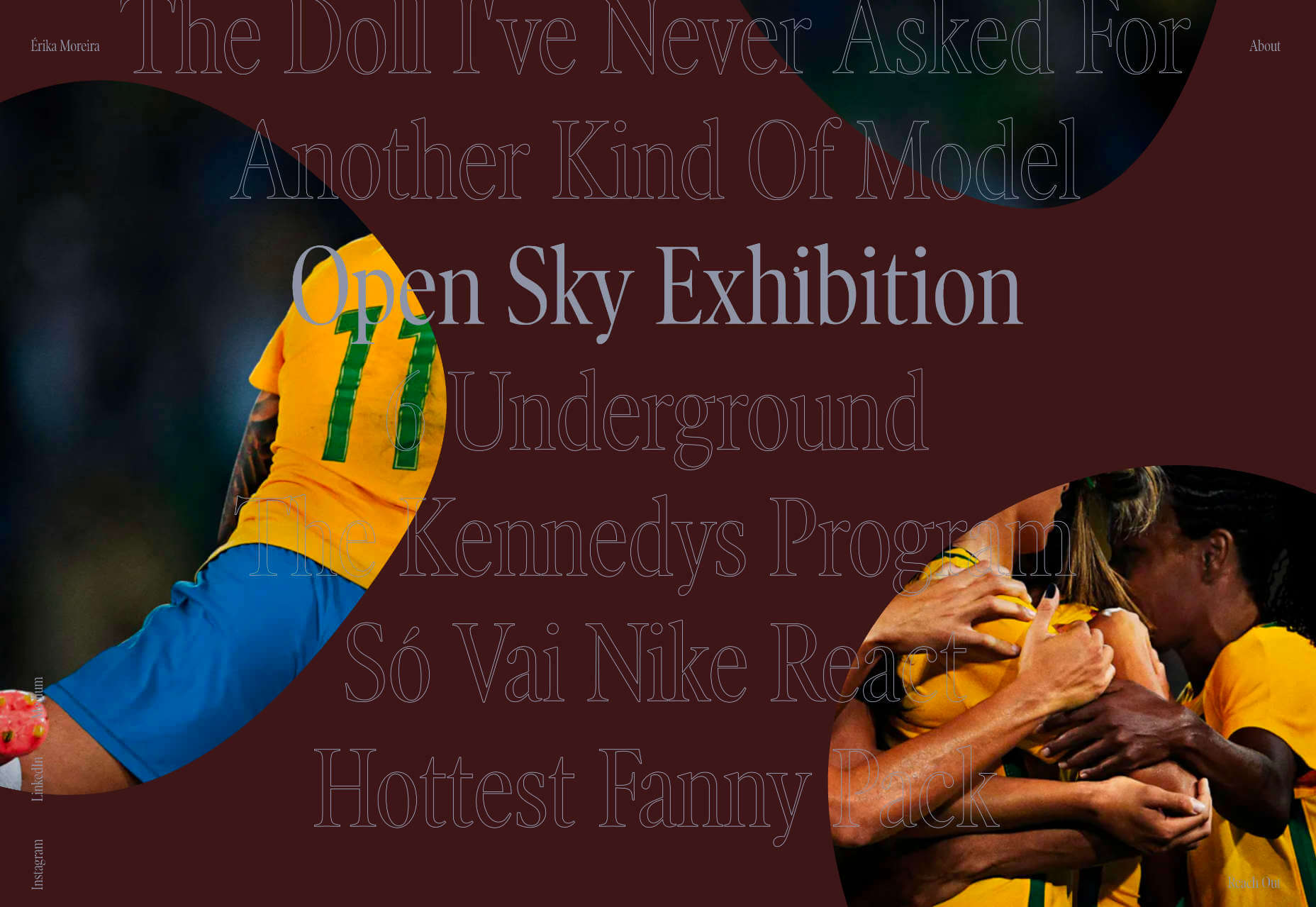
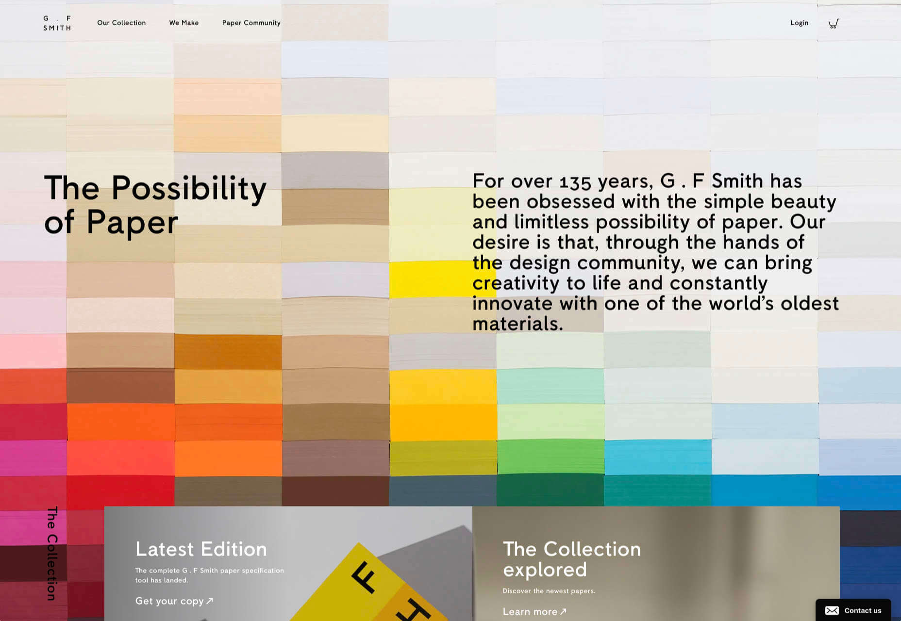
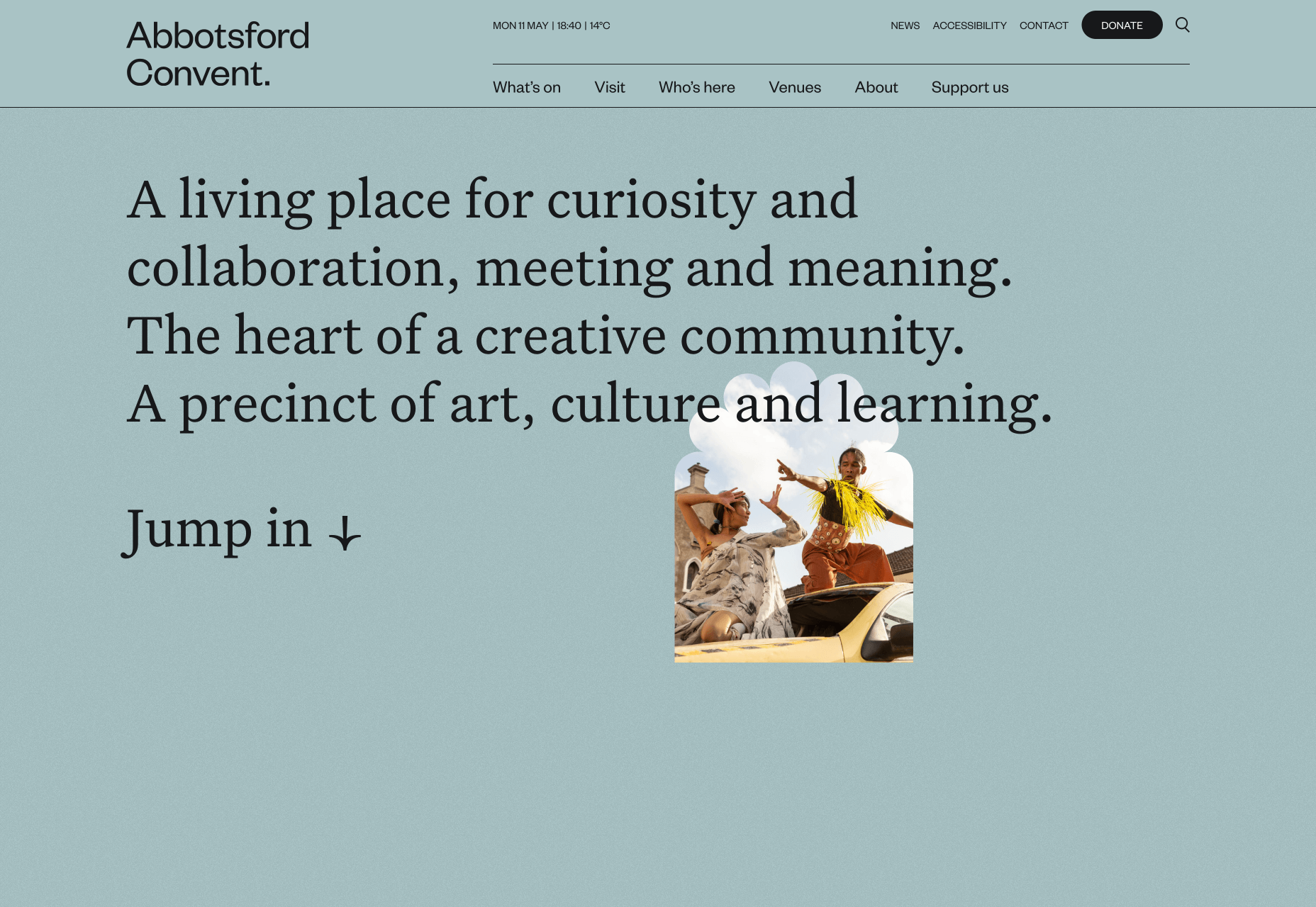
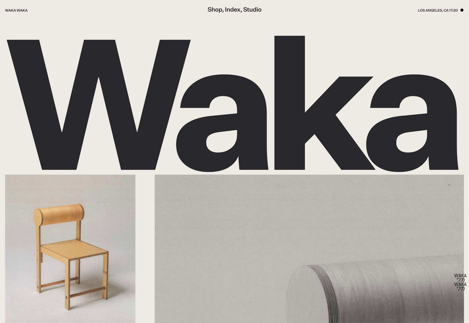
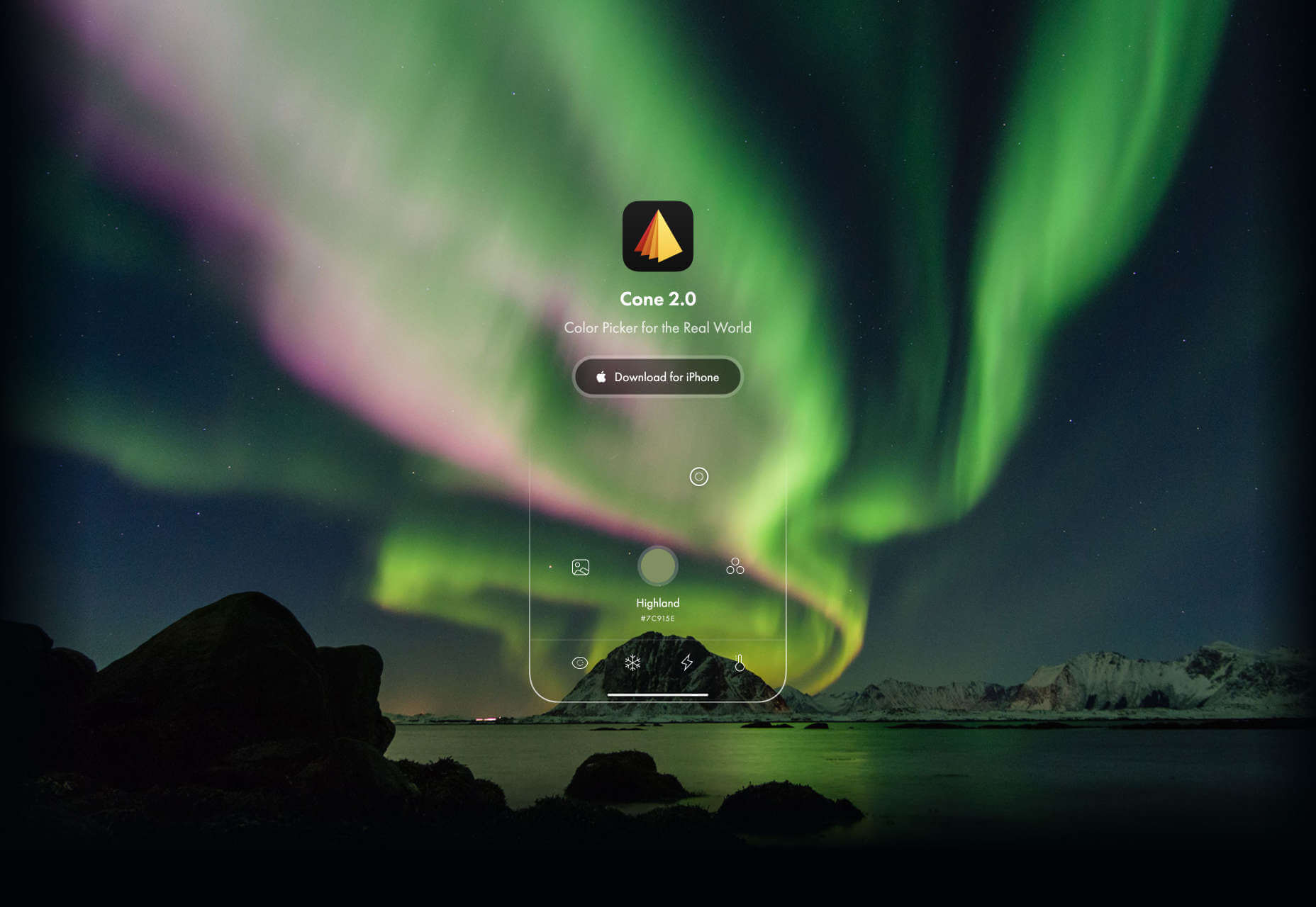
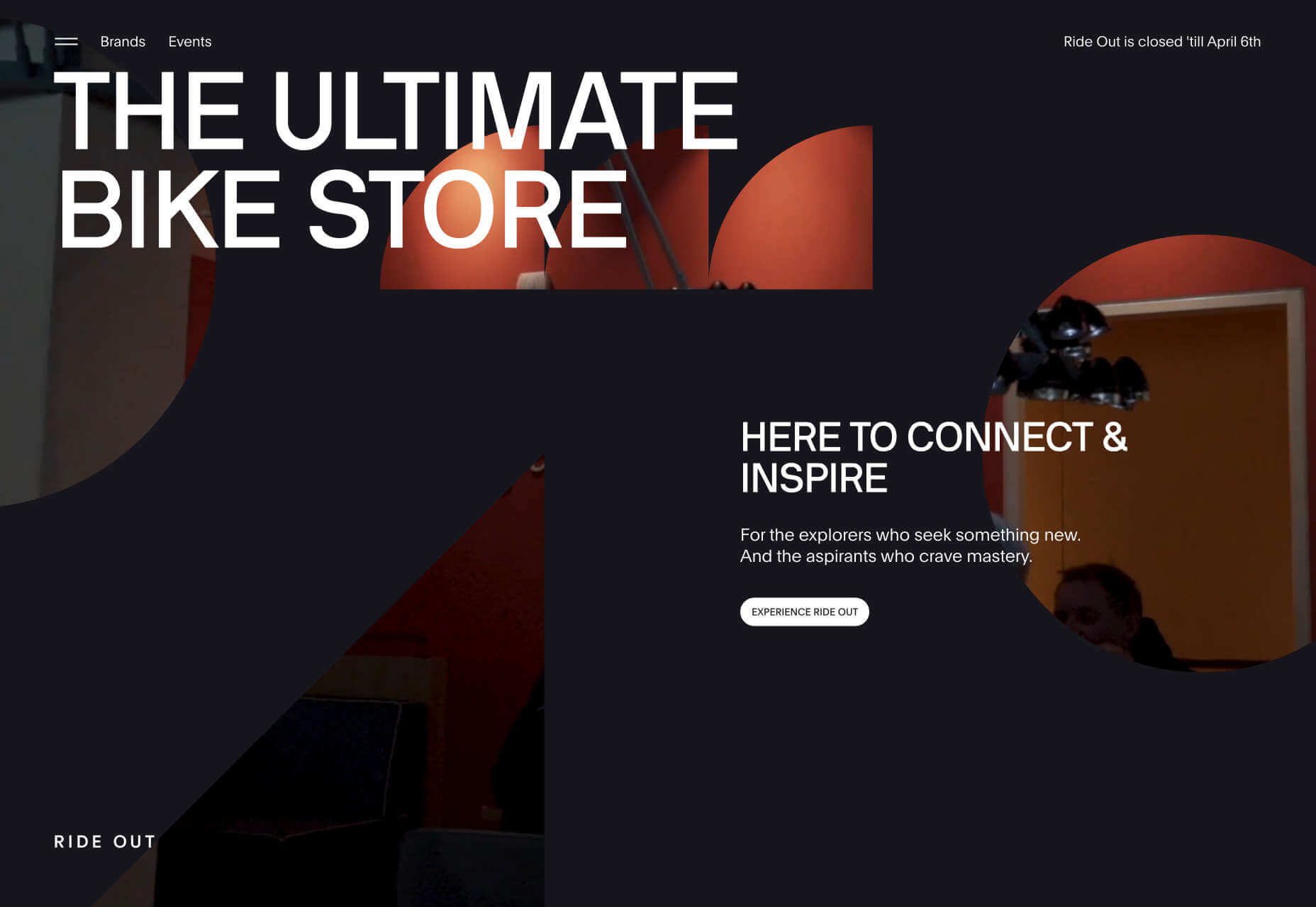
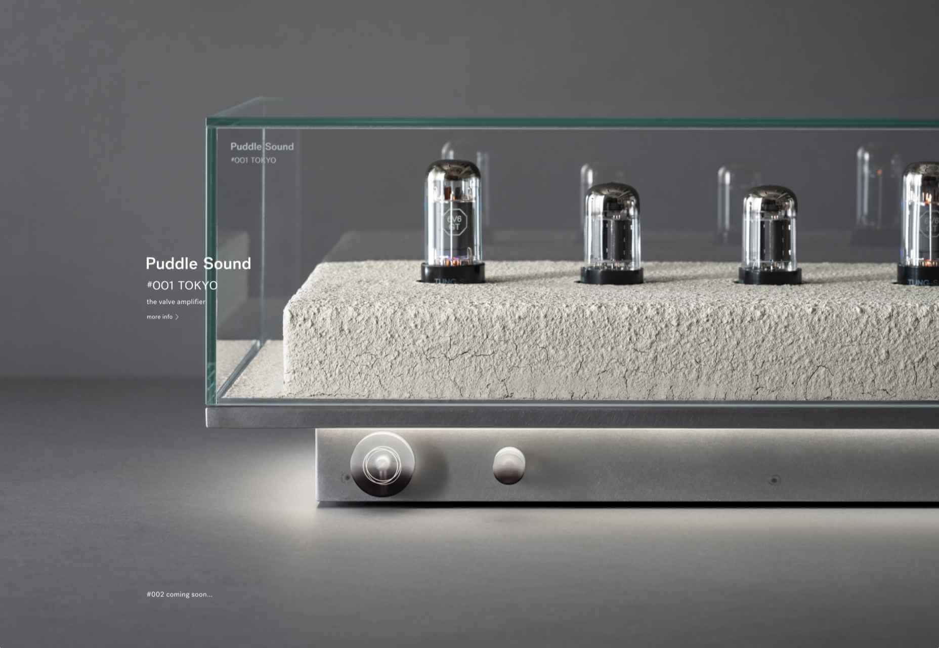
Don’t drop the ball on these website design trends for the new year. All of the trends featured here this month are visual in nature – not as many user interface elements as previous months, but all just as stunning and usable.

Here’s what’s trending in design this month.

1. 3D Scenes on White (Light)

Three-dimensional scenes are not just a trend this month but are likely to be one of the biggest website design trends that you see all year.

They offer a great way to show off product imagery, design something with illustrations or animation for visual impact, and provide usability and understandability cues for users.

It’s a versatile technique that can work with real or created images and are also “COVID-friendly,” something designers have had to think a lot about in the past few months. (Appropriate imagery in design is a real concern, as is trying to design projects without the ability to produce traditional photoshoots.)

What’s neat about all of these projects – and plenty of others – is that they root the design in white or light backgrounds. The light effect creates an easier visual mood that’s clean and emphasizes the imagery.

This website design trend solves a lot of those problems and looks good doing it.

Google’s Cloud design uses 3D illustrated animation on a white background with plenty of depth elements. The primary color palette of illustrated objects pulls it all together and guides the eye through each of the callout labels.

The red words on the screen Crystal Pure fit perfectly with the white-on-white 3D imagery of this design. Red accents pull you into different places on the screen, and it all has a clean feel.

Hofmann & Hofmann uses the same concept with a slightly different approach. The background is still light with a realistic feel and 3D objects, but it is a lot less stark and white. The feel is a little warmer and more inviting than a flat white aesthetic.


2. So Many Stacked Capitals

If you don’t have great artwork or imagery, make your own with typography.

This trend seems like it might be yelling at you just a little, but it still works for the most part — well, as long as you don’t land on too many of these website designs in a row!

What’s interesting about this trend is that many of the designs feature all caps type and serifs. These styles have been making a bit of a comeback, but this use is interesting for many reasons.

The hardest part when using all caps is maintaining readability. That’s why you see some variances in regular, italics, and bold weights, as well as the use of multiple typefaces. The goal is to create a good reading flow with a stunning visual presence.

This trend works best when you have “easy” words on the screen to facilitate scanning. Too many long or complicated letter combinations can get challenging quickly.

Make sure to look for the Easter eggs in each of these projects:

Emotion Agency has tiny “waving” illustrations next to each word (which doubles as the navigation) when you hover over them.

Mill3 Studio has a few animations, from the text flying in and out on load and scroll to subtle movements in the emojis.

Bizarro has this fun little cat video with a tiny warning not to hover over it, but you definitely should.


3. Empty Places

The final trend in this roundup is a stark reminder of current times. Each of the website design features empty places or locations.

This style of imagery would have been avoided pre-pandemic because tourism locations would want visitors to feel like a part of a bustling environment. Not today. If you travel, chances are you may feel safer or want to be in a more secluded environment.

All of the images and videos from these locations show just that.

Designers are doing this with new stark imagery that stands alone for the design or inserting a few empty place frames into video clips or among images that show more populated times. Even scenes that contain people show very few people and focus on more solitary activities.

Paragon Oak does this by showing a beautifully lit location at night. Note that using a nighttime photo eliminates questions about where the people are or what they are doing. (This is a clever option when showing imagery of an empty place.)

Vienne to Paris shows boats on the water with a beautiful background. While you assume there are people on the water vessels; you don’t see them and get the feeling that everyone is separated in their own “pod,” a pandemic-friendly option for travel.

The Maryculter House shows various images without people – the resort’s location on beautiful grounds; empty, but immaculate rooms, and a few images of a person alone on the grounds. Again, the empty nature of the place feels more appropriately welcome for the time we live in.


Conclusion

One of the things that we’ve seen with design trends in the past year is pandemic-related. The composition of images to the way elements are arranged on the screen influences every aspect of our lives.

While the empty place image and video trend is big now, it may fade post-pandemic. Although, it could still be relevant for quite some time. It will be interesting to see what happens as the year progresses with this trend – will it hold on or fade away?

These trends might continue to hold well into 2021.

Source


Source de l’article sur Webdesignerdepot

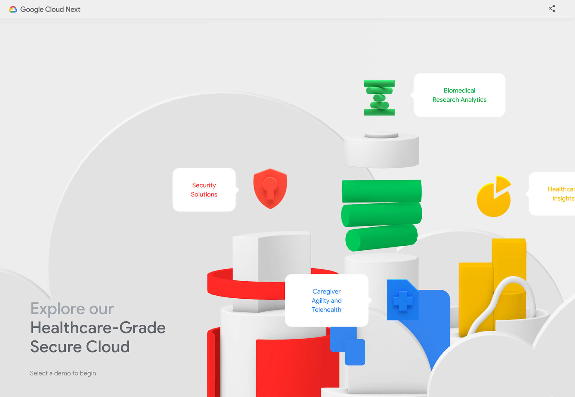
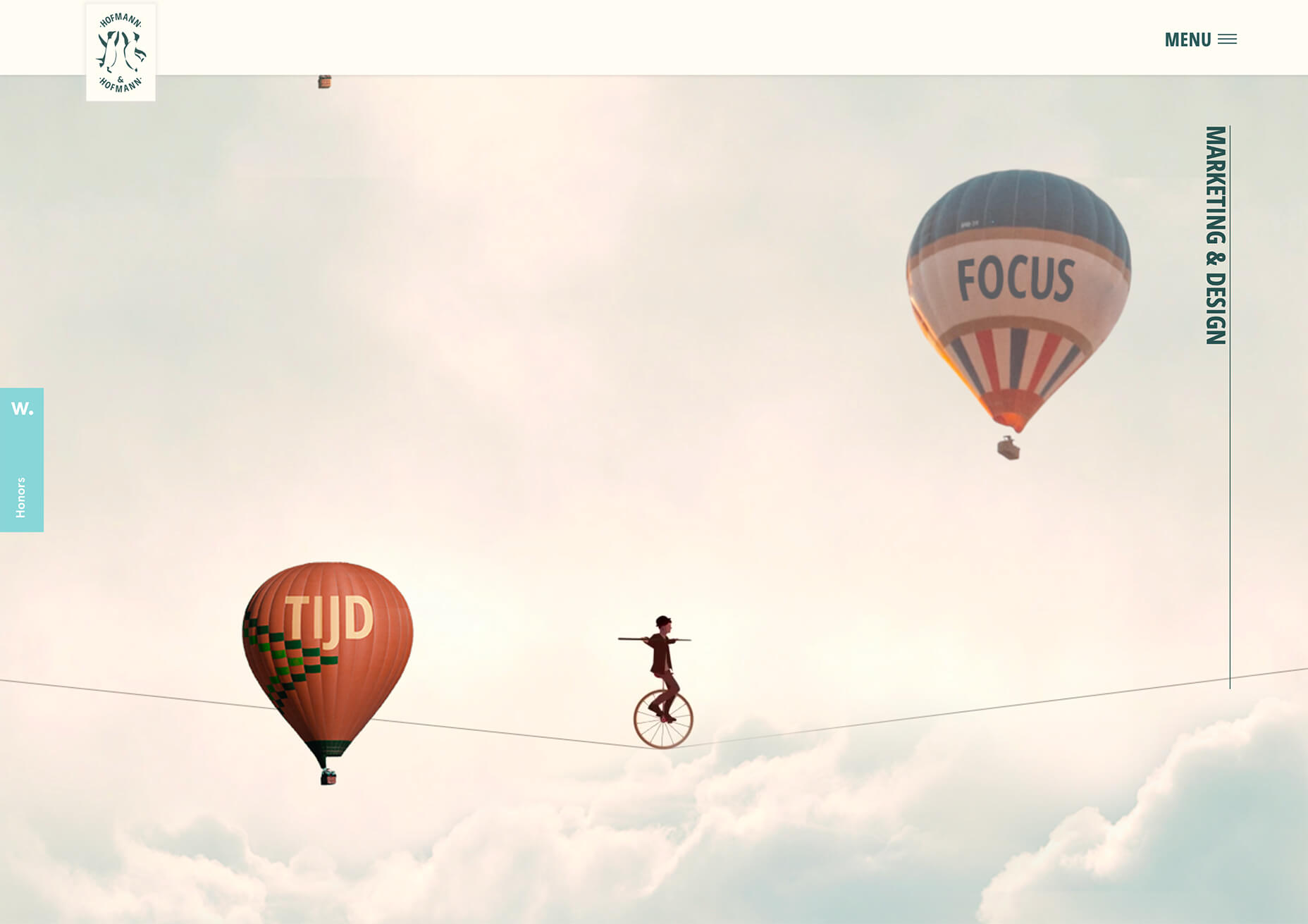
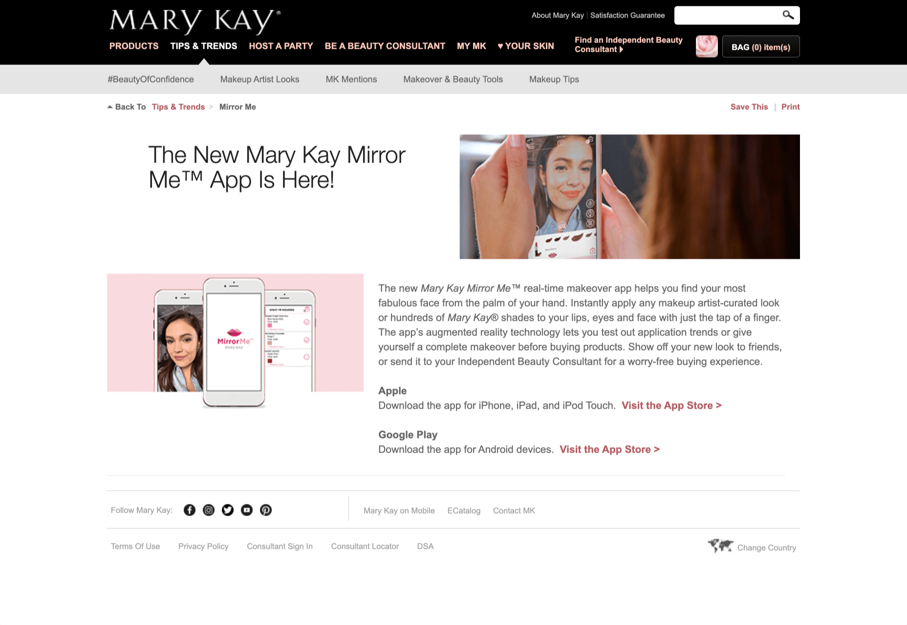
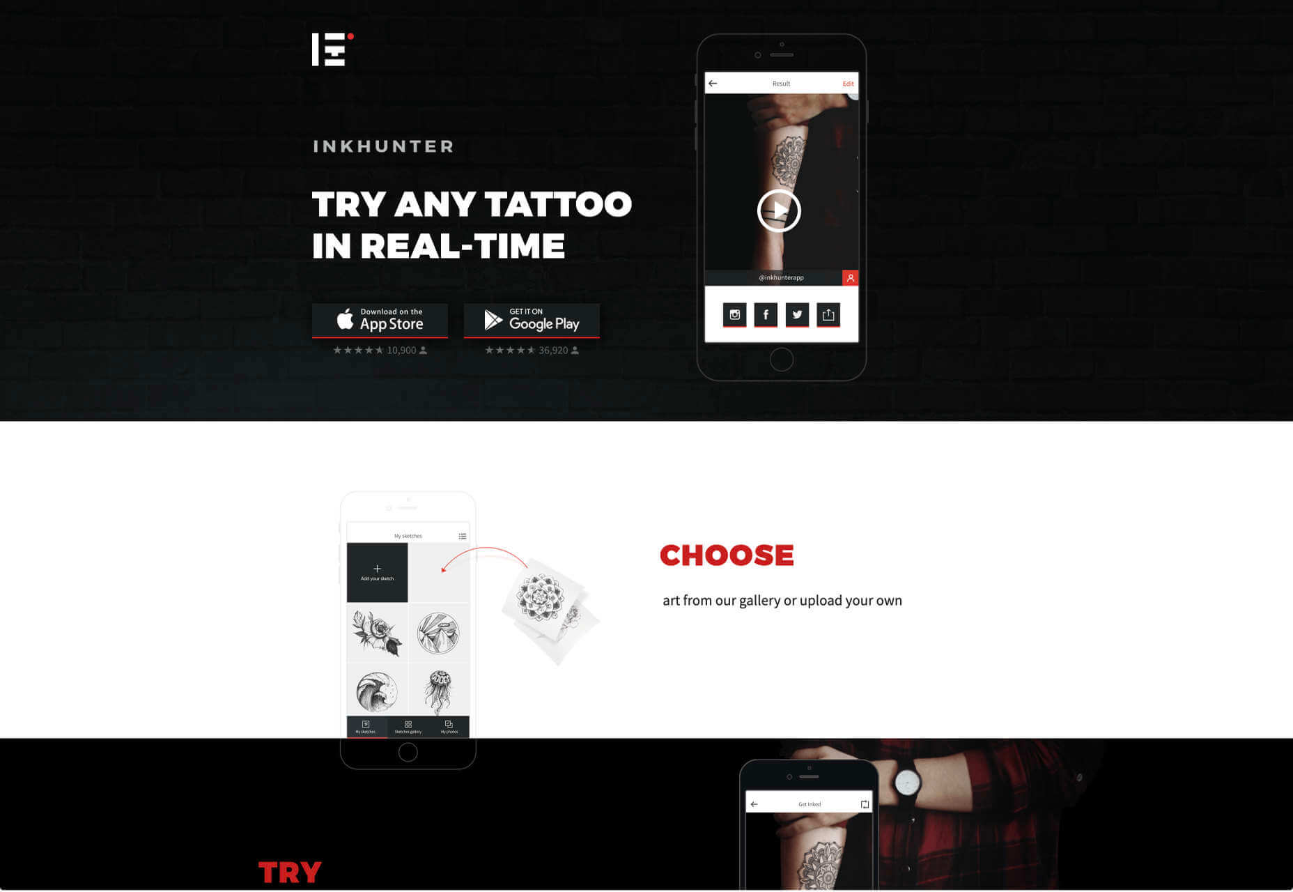
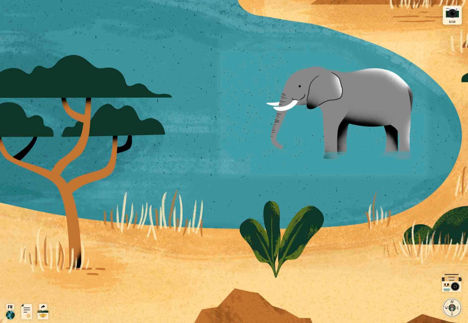
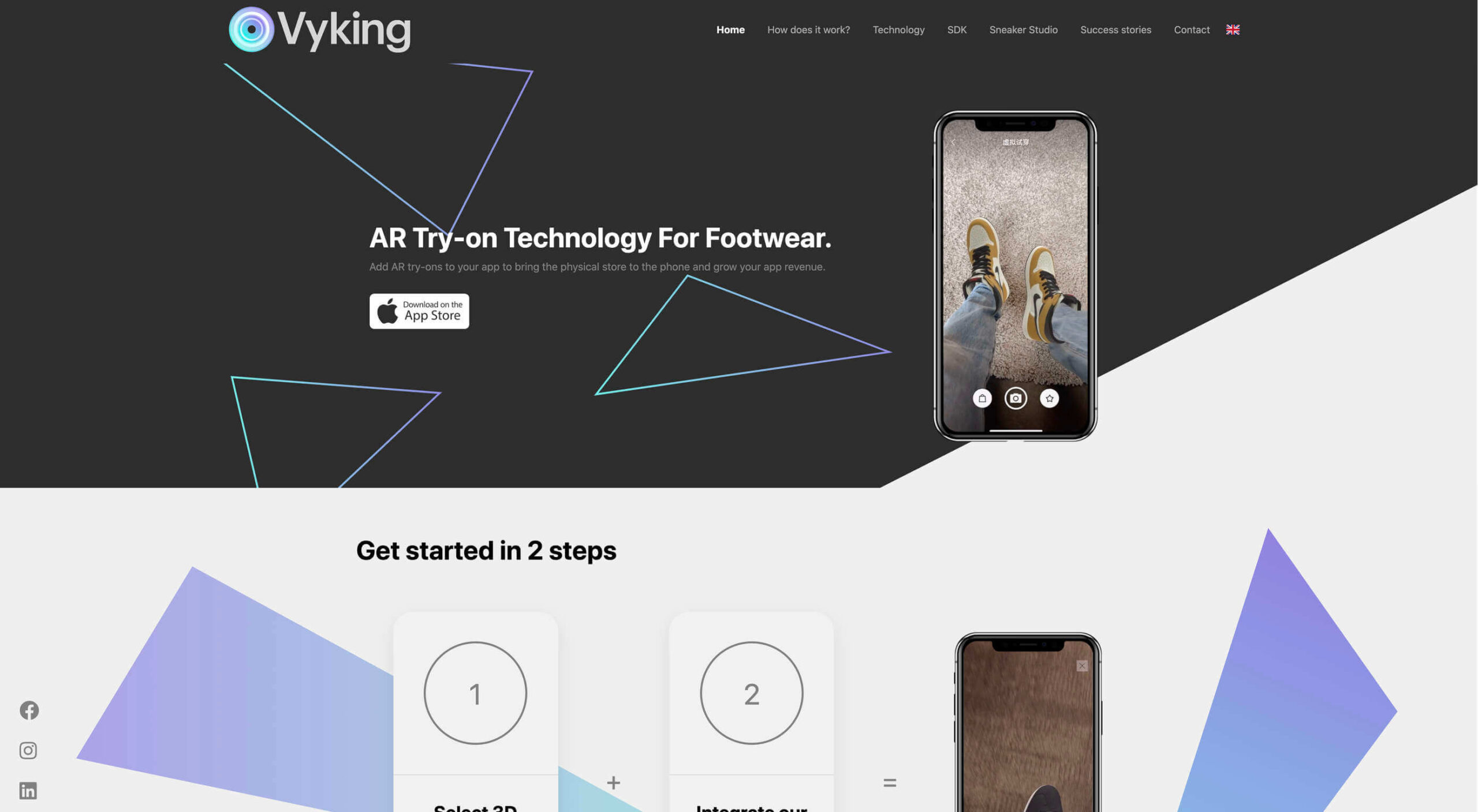
Over the years, experts have repeatedly discussed the possible impact of mixed realities on web design. Concepts like AR and VR are expected to have the potential to change the way that we interact with websites on a fundamental level.

Now that we’re in the year 2021, however, discussions about AR aren’t just observational anymore. The age of mixed-reality interfaces is here, in everything from Pokémon Go, to Snapchat filters.

The question is, how do web designers create incredible user experiences in a world where there are now multiple digital realities to consider?

The Benefits of Experimenting with AR

Before we look at some of the steps that web designers can take to enhance their projects with AR, it’s worth examining the benefits of interacting with augmented reality in the first place. 

While virtual reality replaces the typical world around us completely with digital components, AR augments it. This means that developers and designers need to learn how to thrive in an environment where the real world and the digital one work together. 

The most common AR application for website owners is to provide a solution for real-time and remote product visualization. Imagine being able to try on a pair of shoes before you buy them online. That’s a service that the Vyking brand can deliver by creating technology that “reinvents” the digital shopping experience. 

This test functionality plays a massive role in purchasing decisions. In a world where people can’t see a shade of make-up in person when they’re shopping online, or check how an item of furniture looks in their home, AR has a crucial role to play. 

In simple terms, AR helps shoppers to make more informed purchases. 

Here’s how you can use augmented reality to deliver incredible UX. 

1. Focus on Real-Time Feedback

Augmented reality is all about connecting the real world to the virtual world. 

Doing this provides users a unique experience – one that’s filled with real-time feedback that can deliver crucial and insightful information. For instance, an augmented reality system in a GPS app can calculate the average time before reaching a destination based on previous trips.

Another option is for an augmented reality to use solutions like face-mapping to help customers determine how a certain makeup product will look before they buy it. For instance, that’s the case for the Mary Kay Mirror Me app, which simplifies the process of shopping for make-up. 

When designing for AR, experts need to consider how they can provide customers with real-time information that they can use to make better purchasing decisions. 

2. Define input and output

Although you’ve probably performed similar exercises when designing for traditional websites and applications in the past, defining inputs and outputs of UX in AR environments can be tough.

Defining inputs and outputs allows you to determine which elements of an interface your user can actually interact with, in your interface. This gives you a better idea of what to “augment.” For instance, you might decide that physical gestures like a swipe of the hand will be essential for AR inputs. However, you’ll also need to consider how each mobile device offers different input possibilities. 

Outputs are a little simpler. For instance, you could offer a three-dimensional model of a product that your customers are interested in. Once you have that output, you can think about how the customer will interact with it by changing colors or position.

3. Embrace Customer-Friendly Performance

Another feature at the heart of AR applications is interactivity. 

Good designs in the augmented reality world need to be simple to access and use, otherwise customers will end up avoiding them. For instance, 60% of customers say they want to use AR when they’re shopping for furniture. However, they’re only going to use your app if it actually works. 

The Décor Matters website and app mix gamification with home decorating features that help customers get a better view of the home goods they’re planning on buying. The website even has inspiration pages available to help users find and try new design options with their AR technology. 

When designing for AR, think about how you can make your applications or technology as simple to use as possible, so customers actually want to interact with it. 

4. Address the Environment

In augmented and virtual reality applications, it’s important to remember that interfaces aren’t bound by physical screens. The viewport will move with the user, shifting perspectives in response. Most AR designers will use four different signifiers to describe AR environments:

  • Public environment: The entire body of the user is involved as a controller, like with the Xbox Kinect or Nintendo Wii;
  • Intimate environment: Where a user can be seated – often in a desktop environment;
  • Personal environment: AR on smartphones, mobile devices, and tablets, like Pokémon Go;
  • Private environments: Completely private spaces, such as with wearable technology like the Google Glass solution.

The environment that you’re designing for will be crucial for your project outcomes. Remember, spatial considerations need to be carefully considered when accounting for how users will interact with objects in a frame. 

5. Remember User Fatigue

Another thing to keep in mind when designing for AR technology is that user fatigue is likely to be a much more significant consideration. After all, people interact with websites and applications in a much more intimate and in-depth way when AR is involved. 

AR applications can often use the entire body of a customer as a controller. Because of this, designers need to be careful about exhausting interactions. High-effort and repetitive interactions could tire the user out mentally and physically, causing them to give up on the interaction. 

When designing, you’ll need to consider how you might over-stimulate the user with too many interaction-focused elements at once. Keep it simple.

6. Remember the Essential Principles of UX Design

Remember, just because you’re tapping into a relatively new technology doesn’t mean that you should abandon all the basic tenets of user experience design that you’ve come to understand over the years. Although UX is constantly evolving and changing, it’s always going to keep a few fundamental principles in mind. 

For instance, you’ll always strive to give users the best digital experience in exchange for the lowest amount of effort on their part. Additionally, you’ll need to think about how you can make end-users as comfortable as possible when they’re interacting with new types of technology on websites and apps. 

For instance, since AR is most commonly associated with gaming in the current environment, it might be a good idea to implement gamification concepts into your AR design. What can you do to make sure your customers are having fun?

For instance, Inkhunter is an app that allows users to try on tattoos just like using a filter on Snapchat. The experience feels familiar, comfortable, and exciting.

Unlocking the Potential of AR Web Design

Augmented Reality technology has come a long way over the years. Today, developers and designers can access simple plug-in tools like WordPress VR, allowing designers to upload 360-degree videos into WordPress sites and other unique web extensions. 

Augmented reality is becoming much more readily available on sites and apps of all shapes and sizes. Additionally, customers are accessing more ways to unlock AR’s power through everything from headsets to mobile interfaces. 

However, just like any new technology in the web design world, designers need to think carefully about how they will overcome the challenges in user experience that AR can present. For instance, though AR can offer more information for a customer and help them make purchasing decisions faster, there are also risks. For instance, add too many interactive features to a single website or application, and you could scare users off with too much information. 

In the short-term, web designers need to explore the new tools that are available to them and think about the customers they’re designing for. Only this way will we be able to make any considerable advances in the possibilities of AR. 

Are You Ready to Embrace AR?

Designing for augmented reality applications and websites can be an intimidating concept – even for seasoned designers. However, this is just another technology that creatives can use to drive better experiences for end-users. 

Learn how the latest technology works and get an insight into your customers’ needs, and you’ll be amazed at what you can accomplish in the AR world.

Source


Source de l’article sur Webdesignerdepot

2020 has been one of the most memorable years in our history. Few of us have been alive long enough to experience a more turbulent time. But throughout the year, we saw design respond to challenging events with positivity, color, and a desire to elevate those people and projects working to make the world better.

As we head into 2021, there’s no denying that 2020 has changed our outlook on life and marked a major turning point in web design trends.

Here’s a collection of the websites we loved the most this year. Enjoy!

Looks Like You Need Iceland

On Looks Like You Need Iceland, you are invited to record a scream, which will then be broadcast into the Icelandic wilderness. It’s meant as a form of therapy. The idea is that you will one day visit Iceland in person. That might still be some way off for most of us, but we could certainly use a good therapeutic scream.

Black Lives Matter

Across 2020 there were major protests around the world in support of Black Lives Matter. The movement’s website is a central hub for news, resources, and civil rights information in 38 countries.

2º Earth

2ºC Earth takes the user to 5 locations worldwide and shows what will happen there if global temperatures rise by 2ºc. Sound is used really well here to create an immersive experience, along with some beautiful photography.

Github

Along with some new features announced earlier this month, GitHub has a glossy new homepage. It has a clean feel, with some nice scrolling animation and sparing but effective use of illustration.

I Weigh Community

Political and social initiatives were big in 2020, and non-profit activism initiative I Weigh Community is the brainchild of actress Jameela Jamil. It’s devoted to radical inclusivity, communicated with bold, expressive graphics.

UNREAL

Back in January, we clicked around UNREAL’s site for hours, enjoying the sharp transitions. The Swiss agency produced a wonderfully chaotic love letter to web animation.

Delassus

Delassus grows fruit, from citrus to avocados. The Moroccan company employs a cornucopia of 3D design to make its site bold, fun, and practical.

Lynn Fisher

We loved everything about Lynn Fisher’s site back in May. The homepage illustration was awesome. It was a humorous approach to RWD that we really appreciated. The site has since changed, with tons more to explore.

Minervo

The Minervo site feels distinctly Latin, with the hot pinks and sun-blasted desaturation feeling suitably South American. We love the cropping on the custom typeface.

Babord

Norwegians have an almost mystical connection with the sea, which is evident in the site for Babord, a Norwegian seafood supplier. We loved the brand font too.

Calexo

Calexo makes THC-infused beverages, and back in April, we loved the color and positivity of the site. The animated hamburger menu was a hit too.

Moooi

Moooi’s site layers illustration with a maximal effect that makes you feel like you’re chasing a white rabbit. There are tons of great UI details here, especially the bar that reveals the product videos.

Blind Barber Anniversary

The Blind Barber celebrates 10 years of success with this microsite. A deconstructed grid and an entirely black and white design, but with color photos, create energy and a sense of joy.

Zand Harirchi Architects

Zand Harirchi is an architecture firm based in Tehran, Iran. Its site features subtle references to architecture, like the delightful thumbnails reminiscent of small windows.

WFN

The WFN (Women’s Funding Network) is an international alliance supporting women’s foundations and gender justice funders. The sophisticated color palette and clean type are both confident and feminine.

Nathan Taylor

We loved exploring Nathan Taylor’s playful site all the way back in January. The different lighting modes were a firm favorite.

Käthe Kollwitz Memorial

A tribute to the life and work of Käthe Kollwitz, an Expressionist printmaker. There’s a catalog of her work, presented alongside large type and splashy color transitions.

Emotive Feels

Emotive Feels is a design manifesto from the Emotive Brand agency that illustrates an A–Z of potential brand emotions with simple animations that we likened to a Blue Note release.

A. N Other

A.N Other’s site for perfume highlights quality ingredients, materials, simplicity, craftsmanship, and the environment; in the process, it cleverly invokes a sense of luxury.

Playtype

Danish type foundry Playtype’s site fits its name perfectly. The playful site with bright blocks of color and the occasional animation shows off some pretty nice typefaces.

Feijoo Montenegro

All-text sites are always a thrill, and back in June, we were treated to this simple one-pager by Feijoo. Details like the numerals being replaced by words are delightful.

Wavering Stripes

Although this site’s subject matter is harrowing, it is presented in a very beautiful, thoughtful manner.

The Oyster & Fish House

Sophisticated typography, the wave textures, the nostalgic feel of the photography, and even the cookie notice’s on-brand styling all show attention to detail, which gives this site its appeal.

Who Cares

Find and ‘photograph’ the endangered species to learn about them in this delightfully illustrated game.

Curbed

When Curbed came under the umbrella of New York magazine earlier this year, it got a makeover. Neon highlights and a distorted grid give an edge to the classic magazine layout.

Yolélé

The carousel of fonio (it’s a West African grain) products on Yolélé’s landing page is a good example of horizontal scrolling that works well. There are some great page transitions too.

Pantheone Audio

Pantheone Audio’s site employs elegant scrolling to enable seamless navigation of an extremely luxurious site, underpinned by a complex grid.

Aelfie

Bright color, an irregular grid, illustrations, and a display type that feels almost hand-drawn perfectly captures the aesthetic of this NY-based home furnishing brand.

Highcourt

This site for private membership leisure club Highcourt uses subtle background color changes and simple line illustrations to create a sense of calm. Black and white are softened to dark blue and ivory, and gentle animation adds interest.

Kate Jackling

Kate Jackling’s site takes a step back and allows the content to bask in the glow of attention, placing her photography at center stage.

Treaty

While there is less hustle and bustle outside than we were used to pre-pandemic, we could certainly all use some calm. Treaty’s site for CBD oils reflects that calm with a combination of video, whitespace, and botanical drawings.

Ukrainian Railroad Ladies

Ukrainian Railroad Ladies is a book of photographs of women, and some men, who work on the Ukrainian railways. The site is basic, even brutalist, but it has charm, and the photographer’s fascination with his subject comes through.

Year & Day

Year & Day is an ecommerce site that sells tableware, from glassware to ceramics. The colorful collection is designed to complement different types of food, and the site’s color scheme reflects that perfectly.

Juan Mora

Juan Mora’s ‘under construction’ holding page has probably been crafted with more care than many full-blown sites. This showcase cleverly manages to demonstrate its subject’s skills without showing a single piece of work.

Lucciano’s

Lucciano’s homepage hero video alone will have your mouth watering for some of their gelato. Much of the appeal of food is visual, and the photography here does not disappoint. Circular text boxes in ice cream colors complement the product shots nicely.

Bored Solutions

Back in April, we were already a little weary of lockdown — if only we’d known how long it would last! The amazing color blobbing of bored.solutions was the ideal distraction.

Grand Matter

Grand Matter is an artist agency representing illustrators. There is a wealth of talent on show here and a broad enough range of styles to keep the web interesting for a good while.

Dunderville

This site for Dunderville motion design studio features a paper fold detail, which adds tactility to the virtual. Some superb type and vector animations showcase an impressive portfolio.

Album Colors of the Year

Album Colors has taken the covers from 150 albums released this year and arranged them by dominant color. The hex code for each color is provided if you want to copy it.

Mammut Expedition Baikal

Mammut uses stunning photography and a strong narrative to present its Eiger Extreme outdoor clothing. Longing for the great outdoors will either be alleviated or exacerbated by this one.

808303

808303.studio is a virtual Roland TR-808 drum machine and TB 303 bass synthesizer. You can program, record, and share your very own 80s techno masterpiece.

Bliss

Humor can be hard to get right, especially when you want to be taken seriously at the same time. Here, it works, and the result is a memorable site, oozing with confidence.

Jazz Keys

Type your message into Jazz Keys, and you’ll hear it in sound. You can send the message to anyone and let them hear your words — the web lives for side-projects like this.

Érika Moreira

The fabulous, simple site for Sao Paulo-based Érika Moreira has some awesome big type and creative case studies. It’s an excellent example of a non-visual portfolio.

G.F Smith

Earlier this year, the site for leading paper supplier G.F Smith got a redesign. It is a simpler design than the previous site and keeps the visual focus on the products and the colors.

Abbotsford Convent

Abbotsford Convent is a creative arts venue in Melbourne, Australia, based in a former convent. The UI for its site blends architectural forms to acknowledge the building’s heritage.

Waka Waka

Waka Waka designs and builds wooden furniture. The mid-century typography and the noise textures transport the site to the last century’s radical graphic design. There’s some clever disruption to the typical thumbnail approach.

Cone

Sites advertising apps always seem to want to box the design into a hastily de-branded mock-up. Cone takes a daringly refreshing approach by depicting a more expansive mobile experience.

Ride Out

Amsterdam’s Ride Out bike store teases the content with an intriguingly masked video. Plus, we love the wheel-inspired spinning links.

Puddle Sound

This site is a model of minimalism. Beautiful photographs and very little text, there is nothing to distract from the product on display.

Source


Source de l’article sur Webdesignerdepot

Let’s say that we have a UserController class with two GET endpoints:

  • /users/{id} endpoint, which returns a User object for a given id
  • /users endpoint, which returns List<User>
Java


xxxxxxxxxx
1

26

1

public class User {

2


3

    private Integer id;

4

    private String name;

5

    private Date dateOfBirth;

6

    private String city;

7


8

    // constructors, getters & setters are ignored

9

}

10


11

@RestController

12

public class UserController {

13


14

    @Autowired

15

    UserService userService;

16


17

    @RequestMapping(value = "/user/{id}", method= RequestMethod.GET)

18

    User getUser(@PathVariable("id") String id){

19

        return userService.getUser(id);

20

   }

21


22

    @RequestMapping(value = "/users", method= RequestMethod.GET)

23

    List<User> getAllUsers(){

24

        return userService.getAllUsers();

25

   }

26

}

Source de l’article sur DZONE