Articles

It’s no secret that the senior population is growing. By 2030, people over the age of 65 are predicted to make up 20.6% of the population of the US. 

Around the world, people are living longer and remaining more active in the later years of their lives. What’s more, despite what you might have heard in the past, seniors aren’t as wary of the internet as they used to be. In 2019, the Pew Research institute revealed that 73% of people over the age of 65 were connected to the web. 

So, what does that mean for web designers?

your main focus needs to be on ability…people age differently

Well, first of all, it’s time for all of us to start thinking about user experience from different perspectives. We need to stop expecting our audiences to be made up entirely of iPhone-using millennials and start thinking about the needs of seniors too. After all, designing websites for seniors opens you up to a wide selection of potential visitors in the future.

What’s more, according to the US Census Bureau, people over the age of 65 generally have the highest household wealth figures of any age group. That’s a big deal. 

So, how do you adapt UX for seniors?

Creating Senior-Friendly Web Designs

When it comes to designing websites and applications for seniors, your main focus needs to be on ability. Age is just a number, and people age differently. 

That means that one person in their 70s might have no problem browsing through Netflix to watch the latest shows, while someone else wouldn’t be able to tell you what ‘streaming’ means. 

Rather than worrying specifically about age, think about how different people in older age groups might have different requirements when it comes to things like movement control, hearing, vision, and even device bias. 

Get the Visual Elements Right

Vision loss is by far the most common disability reported by elderly individuals in the US. Around one in six people over the age of 70 have some manner of visual impairment. That’s why UI designers need to think carefully about visual accessibility when creating the right websites. 

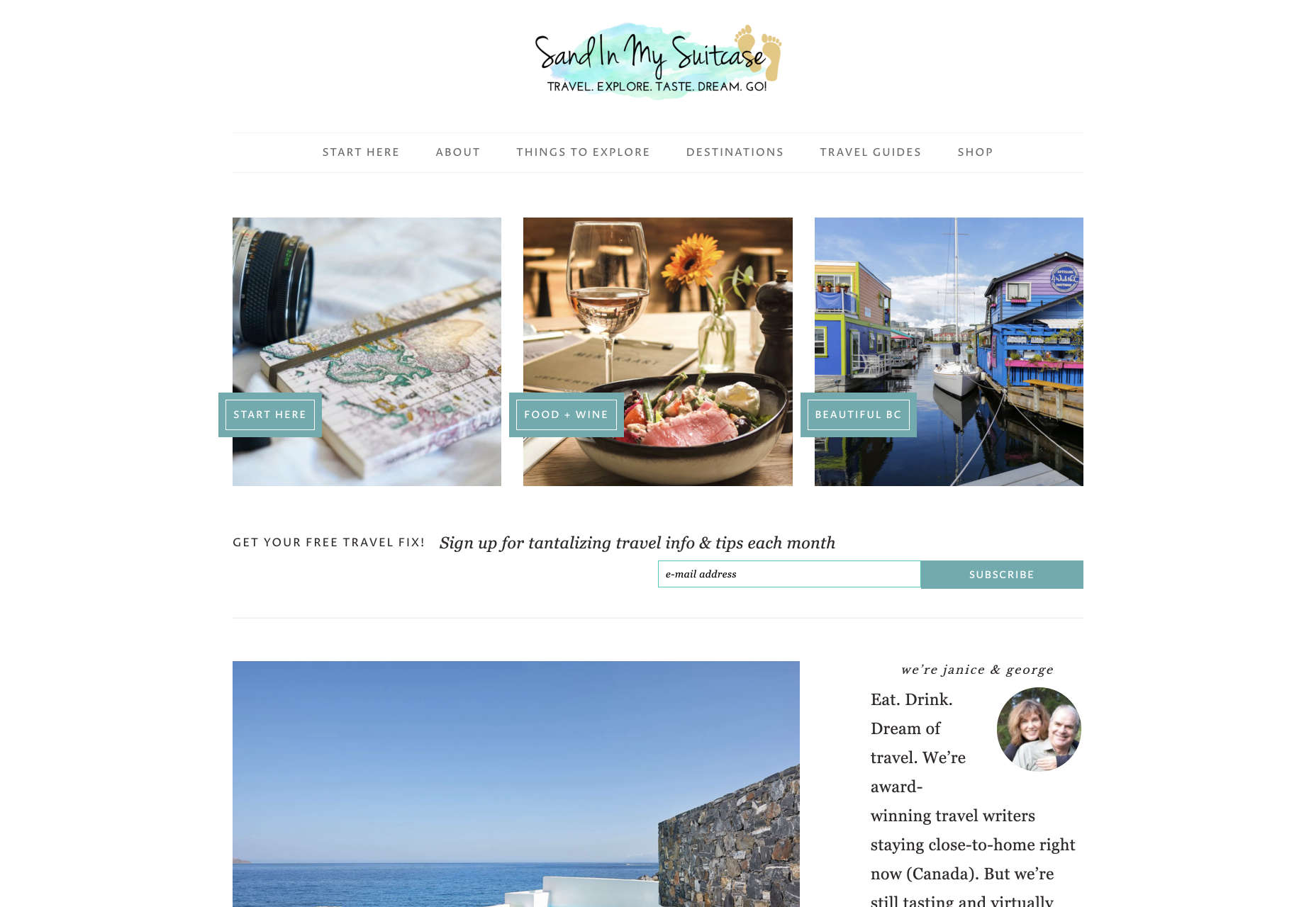
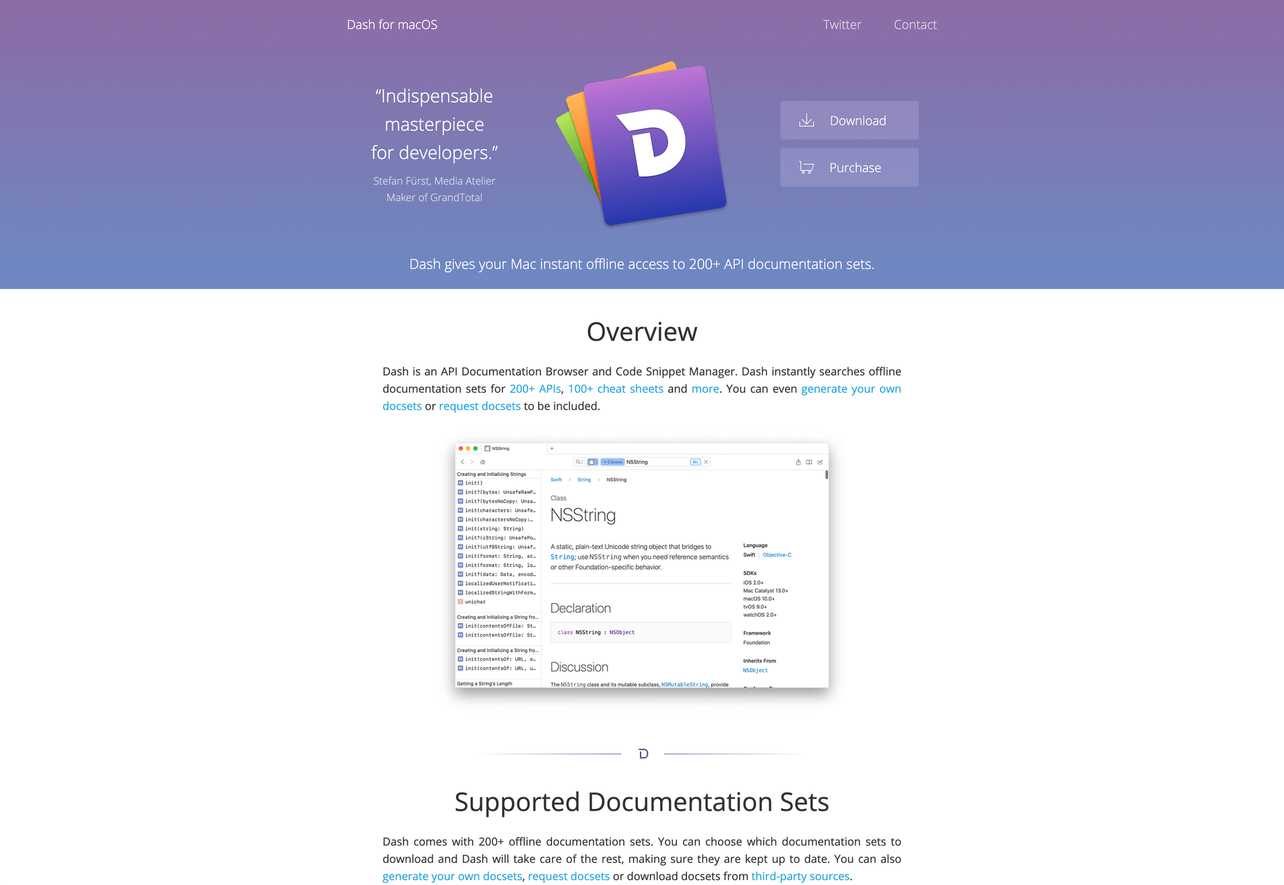
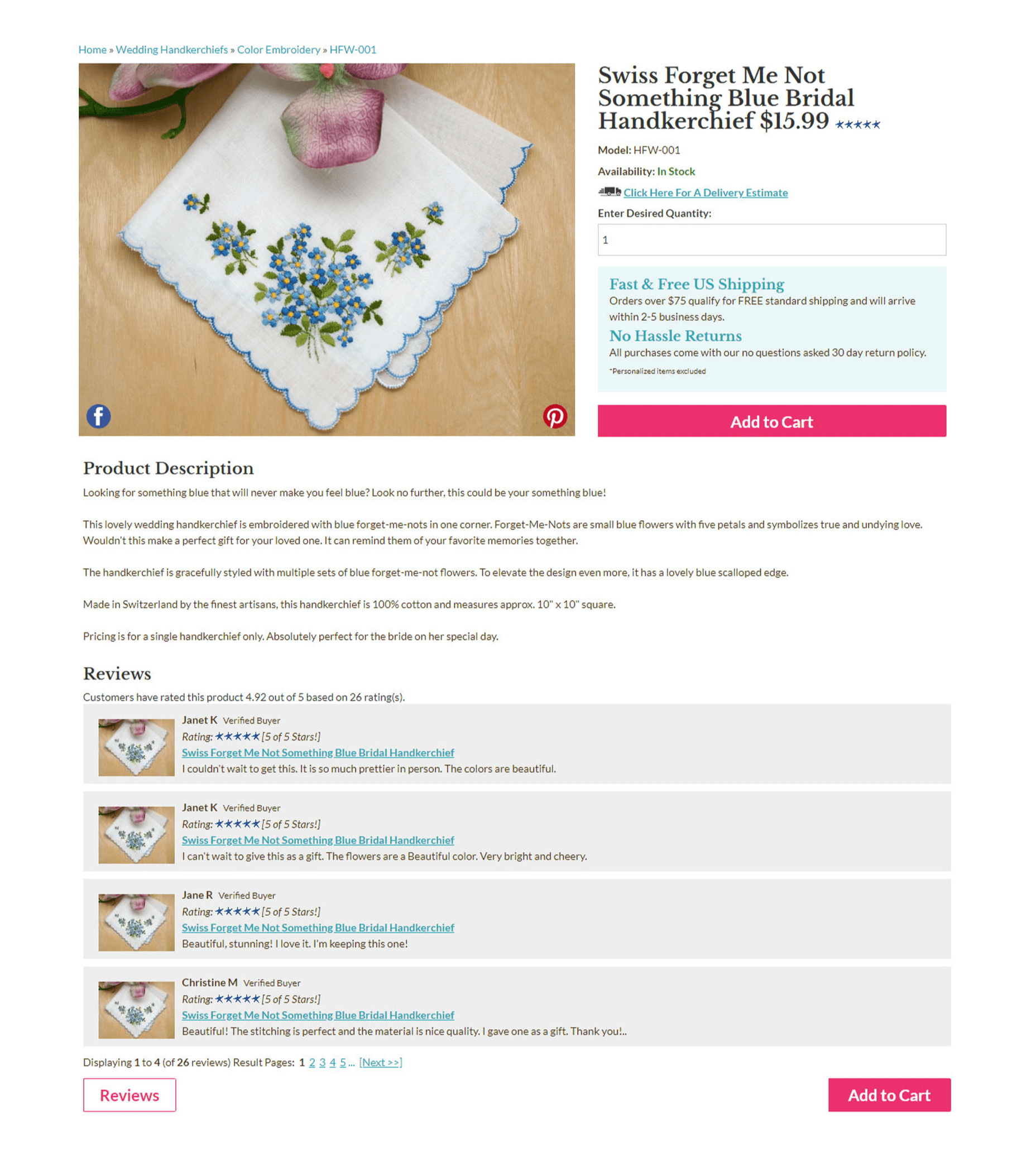
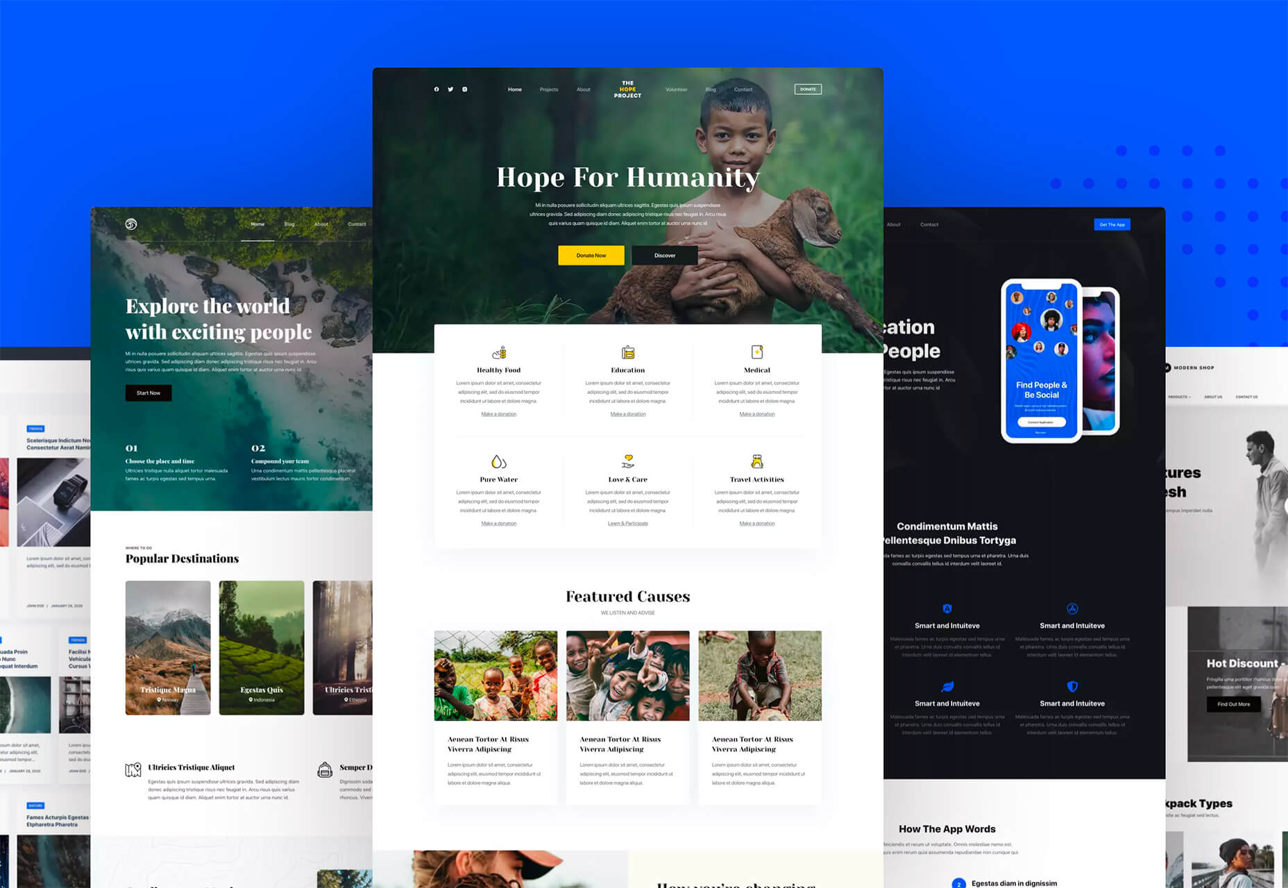
For instance, text and button sizes should always be kept large. Anything that needs to be read or clicked needs to be scaled up, to ensure that everyone can see the information clearly. For instance, on the Sandinmysuitcase.com website, you’ll find clear typography, combined with big buttons that tell you to “Start Here” so you know exactly what to do next.

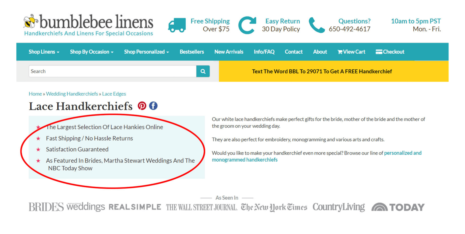
Remember to stick to icons that are clearly labelled wherever possible. Stay away from anything that your customers might not understand. “Start Here” is easier to read and understand than “Submit”. 

It’s also worth sticking to the color and contrast guidelines laid out by basic UX design when you’re creating something for optimal visibility.  Colors that are too close together might create a nice pastel or gradient effect on a website – but they’ll also make things difficult to read. 

Concentrate on Usability

Over the age of 55, motor skills and coordination can begin to decline for some people. These changes make it harder for people to interact with complex UIs. The mouse on a computer can be a particular problem for people with diminishing motor skills – as can the touchscreen of a tablet or smartphone. 

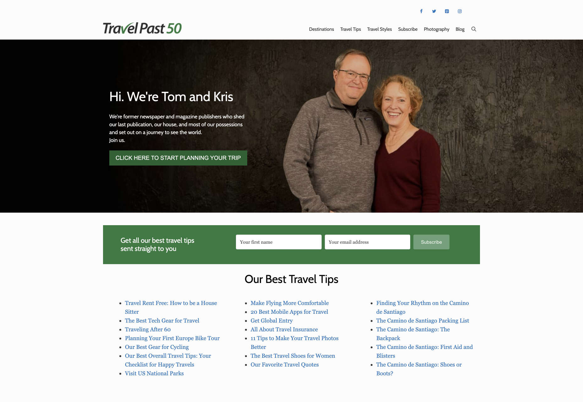
When you’re working on the perfect UX, think about how you can make things as easy to click as possible for people who have a hard time hitting their targets. For instance, in this website for people traveling over the age of 50, you’ll see not only fantastic large font choices but big buttons that are descriptive and easy to understand too: “Click here to start planning your trip”:

The scrollbar can also be a bit of a problem for people with impaired motor skills. Because of this, it’s best to keep your focus on designing above the fold. Make sure that users don’t need to scroll far to find the information that they need and keep scrollbars simple in terms of their look and feel.

While you’re working on usability, remember that it will be important to keep interactions to a minimum wherever possible. Where you can engage younger audiences with double-taps, swiping and scrolling, it’s much easier to connect with seniors through simple one-tap interactions. The less actions your user needs to take to reach their goals, the better. 

Deliver Smooth Navigation 

Navigating from point A to B on your website needs to be as simple as seamless as possible. Remember, crowded pages on your websites and apps are often overwhelming – even for younger browsers. Seniors are generally just searching for “must know” information, so they don’t want anything to get in their way as they navigate through their website. 

As you work on your site or app design, ask yourself if every element on the page absolutely has to be there. If it doesn’t deliver value, then get rid of it. 

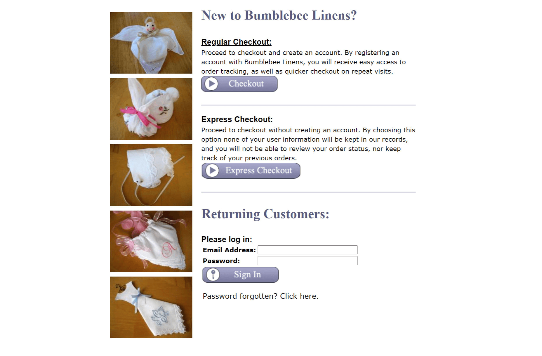
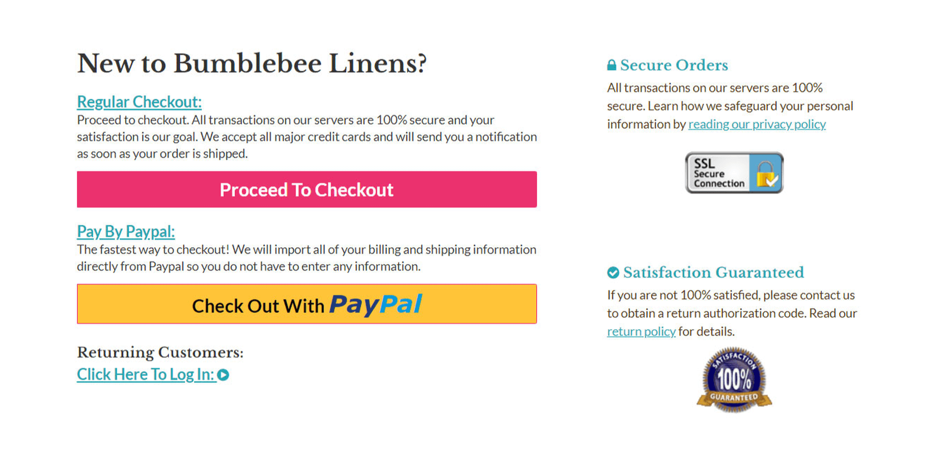
Additionally, remember that seniors don’t always have the best memories and concentration levels. That means that they need your navigation experience to be as simple as possible. Basic horizontal menu bars that show everything at once are often a good idea – even if they’re not very exciting.

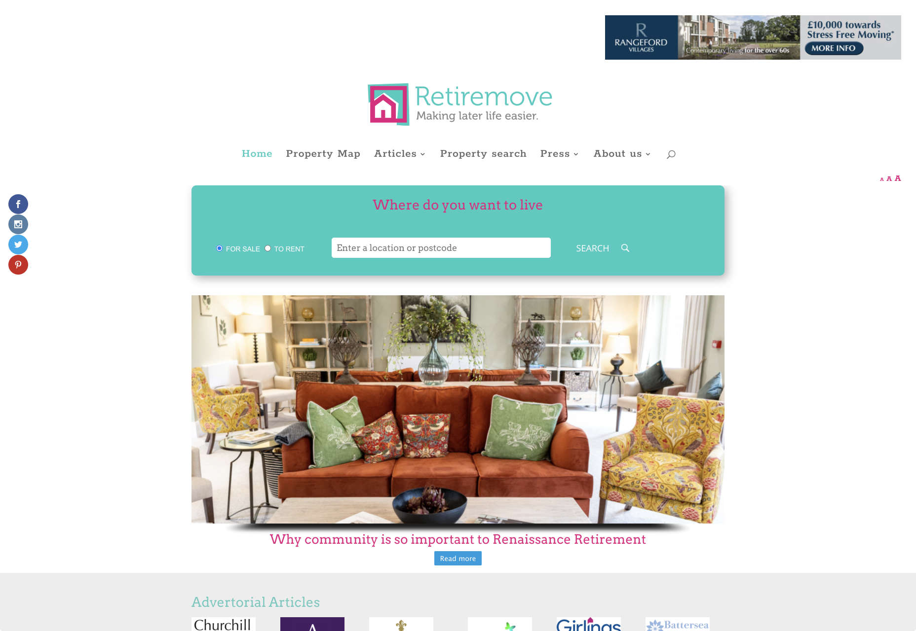
Look at this helpful navigation experience from RetireMove.com, for instance. Everything you need is located at the top of the page, and you can even just enter your postcode to get started:

Cognitive decline happens regularly with age. Although not all older adults will have issues with their memory and concentration, it’s important to be prepared for an audience that might process information a little more slowly. It’s worth double-checking that your viewer’s attention isn’t being diverted to multiple parts of the page at once.

Get to the Point Quickly

While younger generations have quickly implemented technology into every aspect of their lives, older consumers use tech a little differently. These people don’t want to spend forever fiddling around with different parts of your website. They want to get the answers to their questions as quickly and easily as possible. 

Applications that are complicated or difficult to access are usually instantly rejected by seniors. Even if you’ve offered everything that we’ve covered above, from seamless navigation to minimalist design, you still won’t get the interactions you’re looking for if older adults don’t consider your design to be useful. 

Because of this, you need to highlight the point of a website or application to your seniors as quickly as possible. Avoid worrying about things like gifs, animations and gamification. Instead, focus on making sure that your designs are useful and simple. 

For instance, from the moment your senior user arrives on a web page, they should have instant access to clear instructions on how to use the application or service, and what they need to do next. Keep in mind that this is particularly important when you’re creating mobile apps, as apps are still a relatively new concept to older generations. 

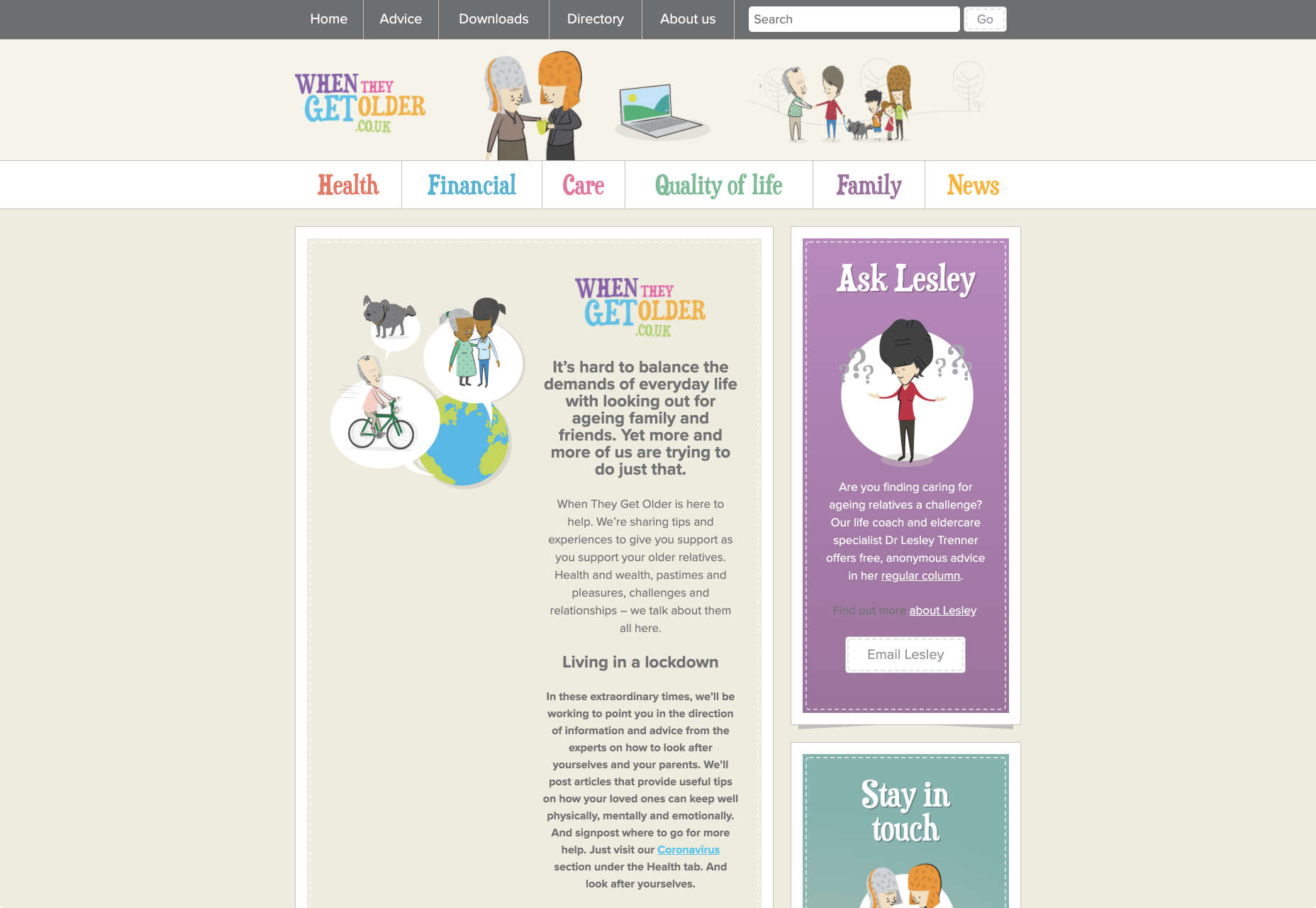
On the “When They Get Older” website, you can instantly find the information you need in a well-organized navigation bar that’s labelled clearly:

A clear interface like this, combined with simple, step-by-step guidance that shows elderly individuals how to get the information that they want is the key to keeping these users coming back for more. 

Bringing a Mature Perspective to Web Design

These days, most designers focus heavily on younger audiences when creating websites and apps. After all, it’s these users that allow us to experiment more with the latest tools and concepts, like augmented reality, artificial intelligence, and robust animations. 

However, there’s still a market out there for the seniors of the world that want more opportunities to get online. This audience often goes ignored and under-served. However, as the value of older consumers grows, and their ability to interact online increases, you’ll find that more businesses begin to search for web designers who can provide immersive experiences for a more mature audience. 

The steps above will give you an excellent insight into how you can start designing for a different kind of customer base. However, remember that the best way to make sure that you’re delivering the right solution for any customer, is to test. User testing will provide you with the exclusive insights that you need to determine whether your senior UX is really working, or whether you’re still struggling to get into the shoes of an older user. 


Featured image via Unsplash.

Source


Source de l’article sur Webdesignerdepot

If you’ve spent any time in tech circles lately, there are three letters you’ve surely heard: SRE. Site Reliability Engineering is the defining movement in tech today. Giants like Google and Amazon market their ability to provide reliable service and startups are now investing in reliability as an early priority.

But what makes reliability engineering so important? In this blog, we’ll look at three big benefits of investing in reliability and explain how you can get started on your journey to reliability excellence.

Source de l’article sur DZONE

Many people might think this a simple question; I am not one of them. I feel that in the modern world of development, there are too many factors to pick a single tool for debugging any language, let alone Java.

In The Beginning

Let’s take a step back and look at where we started with debugging, and while I am not going to get into the history of debugging, we should look at some of the basic tools used for debugging Java, aside from logging and system-out.

Source de l’article sur DZONE

As a web designer, you’re constantly being bombarded with messages that tell you to acquire new skills, try new tools, and keep on hustling.

But if you’re constantly changing things up, does it do the opposite of what you originally set out to do? In other words, if you always have to start over, is it possible to ever really achieve anything?

I think it ultimately depends on why you’re making the change.

When Change Is the Right Move for Web Designers

One of the reasons I despise New Year’s resolutions is because it’s change for the sake of change:

It’s a new year, so it’s time to get all hyped up about this one thing I need to change about myself!

There’s a reason why so many resolutions fail by February. When you force a change, it’s really hard to stay invested in it, especially if it’s something you’ve chosen to do because everyone else has.

Change should be driven by necessity.

That said, when it comes time to make changes as a web designer, is it ever really necessary? Or are you learning new skills, trying new tools, or switching up your client list simply because it’s what you believe you have to do?

It’s important to be open to change, but you should only invest your time, money, or effort when it’s the absolute right move for you. Here are some ways you’ll know when that’s the case:

Learn New Skills To…

…Round Out the Basics

If you’re a new designer and there are gaps in your education and training (and I don’t mean formally, just in general), then there’s no reason to hesitate in spending time to acquire those skills.

This doesn’t just go for basic skills as a web designer or as a coder. This also goes for skills you need to become a successful freelancer.

…Add Evergreen Skills to Future-Proof Your Position

As you move up in your career, you’ll eventually find other skills worth learning. Just make sure they’ll help you move the needle.

The best way to do that is to focus on acquiring evergreen skills that’ll always be useful to you, no matter what stage you’re at in your career or how the design landscape changes. They should also go beyond the average skill set of a designer, so they help you stand out further from the pack.

… Create a Better Situation for Yourself

The web is constantly evolving, which means that your responsibilities and skills as a web designer will have to change in order to adapt. Whenever one of these shake-ups occurs, you should either be ready to master the needed skill right away or, better yet, have been working on it beforehand.

Take, Google’s mobile-first indexing, for instance. It announced it was going to be making this shift years before website rankings were impacted. Designers had plenty of time to not only learn what was needed to design for the mobile-first web, but to get all their existing clients’ sites in shape for it.

Adopt New Tools When…

…Your Existing Ones Are Slowing You Down

If you’re doing a lot of things from-scratch (like writing emails to clients or creating contracts), that’s a good sign your toolbox needs some improvement.

As a web designer, you should be focused on creating, not on the tedious details involved in running a business or communicating with clients. That’s just not a good use of your time. A lot of this stuff can easily be automated with tools and templates.

…You’re Turning Down Business

In some cases, it’s the right thing to say “no” to prospective clients — like when they’re a bad fit or can’t afford your rates. However, there are other times when you desperately want to be able to say “yes”, but you don’t have the capacity for the job or you’re unable to cover the full scope of what they need.

This is where new tools come in handy. For instance, let’s say you’ve been approached by a ecommerce company that not only wants you to build a new store, but also needs it fully optimized for search (it’s not the first time this has happened either). Rather than turn something like that down, you may find that the addition of an SEO tool to your toolbox is all you need to be able to say “yes”.

…You Have Extra Room in Your Budget

Obviously, you don’t want to throw away money on a bunch of tools simply because a ton of people are talking about them. But you’ll eventually get to a point where the tools that served you well in the first year of business need to be replaced.

If you get to a point where you have extra time to experiment and there’s room in your budget for upgraded tools, go ahead and assess what you currently have and test out replacement solutions that will help you work better, faster, and smarter.

Look for New Business Opportunities If…

…You’re Not Doing Well

“Well” here is subjective. For instance:

  • If you’re not doing well financially, you probably need to look for more clients;
  • If you’re not doing well in terms of how you get along with clients, you should explore a niche that’s a better fit;
  • If you’re not happy with your job because burnout and stress have overtaken your life, then you might consider exploring other avenues of work.

When something has been amiss for awhile, the last thing you should do is lean into it and hope it gets better.

…The Web is Changing

Notice a trend here? Each of these changes (skills, tools, and now business opportunities) is often driven by the fact that the web is always changing. And as the web changes, you have to be ready to evolve.

In terms of business opportunities, what you’ll realistically need to do is look for new kinds of design work as technologies make your job obsolete. Take website builders like Wix or Shopify, for example. As business owners and entrepreneurs take it upon themselves to build their own websites, more and more web designers will need to find other kinds of clients and jobs to take on.

…You Want to Diversify Your Income

This is something many web designers are doing already as they’ve discovered how beneficial it is to have predictable recurring revenue streams.

But even if you’ve already found one way to diversify and stabilize your income (like by offering website maintenance services), you may become interested in exploring other opportunities along the way. If you have the capacity to pursue them, then go for it.

Is Change a Good Idea?

As you can see, change can be a very good thing for a web designer, their business, and their clients. However, there should be a very good reason for the change and you need to prepare yourself for how it’s going to impact what you’re doing now before implementing it. No amount of change can happen without some level of sacrifice.


Featured image via Unsplash.

Source


Source de l’article sur Webdesignerdepot

I think of a creative practice as a combination of an approach (a design philosophy) and a series of techniques (craft skills); a good tool facilitates a technique, which in turn supports an approach.

It wasn’t until I sat down to write a list of tools I can’t design without, that I realized just how many tools I rely on as an integral part of my creative process. The danger of tools is that they promote certain techniques, and that bias can alter your approach.

First and foremost a good tool does no harm, it does not dictate, or obstruct your approach. Secondly, a good tool offers flexibility in the techniques you choose. Thirdly a good tool is invisible, it leaves no marks on the end product.

If I’d written this post a year ago the list would have been different, and I hope that in a year it will be different again. These are the tools that I currently find enabling, that have contributed to my craft, and supported my approach.

Affinity Designer

I’ve always used Adobe products. Photoshop and Illustrator were the de facto graphic tools for half my life. I’ve never had an issue with the subscription licensing of Creative Cloud, which I think is proportionate for a professional set of tools. Then, around 18 months ago I got very frustrated with how sluggish Illustrator had become.

I’d written an early review of Affinity Designer, I’d been impressed at the time, so I decided to give it another try expecting the sojourn to last an hour or two before I gravitated back to Illustrator. Running the latest version of Affinity Designer was a revelation, I’ve simply never wanted to switch back.

Why not Sketch? Well, I do occasionally jump into Sketch, especially for pure vector wireframing. I was an early adopter of Sketch, but the reliability issues (long since resolved) poisoned my relationship with it. Why not Figma? Well, Figma’s real strength is in collaboration, something that I get with Sketch, and personally I find some of Figma’s features unintuitive.

Affinity Designer isn‘t perfect. I dislike the color tools, especially the gradient tool, which I find clunky. But it’s the first design app I’ve used in years that syncs closely with my creative process.

Affinity Photo

I don’t do a lot of photo manipulation, so when I switched away from Creative Cloud for design work, I was relaxed about switching from Photoshop to Affinity Photo.

In my experience, Affinity Photo is stronger than Photoshop in some areas, and weaker in others. Affinity Photo’s bitmap scaling is much better than Photoshop’s, largely due to Lanczos 3 sampling.

Affinity Photo also solves a lot of little irritations that Adobe has chosen not to address for legacy or philosophical reasons, such as the toggleable ratio setting when resizing the canvas — I’ve lost track of the hours I’ve spent in Photoshop manually calculating vertical whitespace so that it’s proportionate to the horizontal.

TinyPng

Both Affinity Photo and Photoshop are poor at web format optimizations. Photoshop perhaps has the edge, but its output certainly isn’t acceptable for production.

I run bitmaps through TinyPng, which on average halves the size of the file without any appreciable loss of quality. (It stripped 66% off the images for this post.)

Fontstand

When I started to drift away from Creative Cloud, the one service that delayed me was Adobe Fonts (née Typekit). Not so much for the webfonts — which are faster and more reliable self-hosted — but for the ability to sync desktop fonts into my design apps.

I tried Fontstand when it was first released, and I loved the concept, but was worried about the small library. When I took a second look and discovered the library is now substantial for both workhorses and experimental typefaces, it was an easy decision to switch.

Fontstand is a desktop font rental service. Once you’ve found a typeface you’re interested in, you can activate an hour-long trial, then choose to rent the font for a small fee. You can auto-renew the rental if you need to, and if you rent the font for 12 months it’s yours forever.

If there’s one tool on this list I genuinely could not design without it’s this one. Fontstand makes working with fonts from independent foundries affordable for freelancers, and it’s enriched the typographic palette available to me.

Khroma

Every designer has strengths and weaknesses. Since day one of art school, my weakness has been color. It just doesn’t come naturally to me, and I have to work quite hard at it.

An incredibly helpful tool that I’ve been using for a few months is Khroma. It helps my eyes warm up before approaching color, and helps me find a starting point that I can then refine. Comparing my design work before, and after Khroma, the latter color choices are cleaner, more vibrant, and more interesting.

Atom

A good code editor is essential, and I’ve never found one that I’m completely happy with. For years I’ve flitted back and forth between Brackets, Sublime Text, and BBEdit. I think that probably reflects the changes in the type of coding I’m doing.

For now, I’ve settled on Atom. It’s fast, reliable, and it’s not biased to front or back-end code.

CodeKit

I held out on compilers longer than I should have, using apps like Minify to minify CSS and JavaScript, and the command line to process Sass (see below). Then I found CodeKit and it’s been essential to my workflow ever since.

What I like best about CodeKit is that it’s a GUI. Which means I can change settings while coding, like toggling off the JavaScript linting, without switching mental gears into another language.

MAMP

MAMP is a tool that allows you to run a local server environment, meaning I can run PHP and MySQL without the tedious process of FTPing to a server to test a change. Mac comes with Apache, so this isn’t strictly necessary, but it’s simple to use and works well with both CodeKit and Craft (see below).

There’s a pro version of MAMP, which allows you to switch seamlessly between projects, but it’s heavily geared towards WordPress. I’m still trying to find the time to evaluate Laravel Valet.

Dash

When you first start coding you try and memorize the entire language. It’s very possible to become fluent in the core of a language, but there are always nuances, defaults, and gotchas that you miss. As you grow more experienced, you realize that all professional coders Google the answer at least once per day.

When I got tired of Googling I started using Dash which is a superb app that combines the docs of numerous different languages into a searchable window. I use it daily for everything from SVG to Twig.

LambdaTest

It doesn’t really matter what you’re building, even the indy-web needs to be tested. Ideally you’ll test on real devices, but if you can’t afford a device library — and who but the largest agencies can — you need a live testing solution.

There are a few upstarts, but your choice is basically between BrowserStack and LambdaTest. I went for LambdaTest because I prefer the style of the UI, but that’s entirely subjective. If you’re not sure, toss a coin, you’ll get the same results with both.

Sass

I can’t write CSS without Sass — and I mean that literally. If I try and write vanilla CSS I guarantee I’ll nest something with @at-root and it will throw an error.

Craft CMS

Stating any preference for a CMS online that is not WordPress inevitably invites impassioned protests from developers whose career is built on the WordPress platform. So let me say preface this by saying: if WordPress works for you, and more importantly for your clients, then more power to you; I think it’s a dog.

Shopping around for a CMS is challenging, and I’ve gone through the process several times. A good CMS needs to be in sync with your mindset, and it needs to be appropriate for your clients — all of them, because unless you’re in a large agency with multiple coders, you need to commit to a single solution in order to master it.

I have looked and looked, and finally settled on Craft CMS. Craft makes it easy to build and maintain complex, high-performance sites. It has a shallow learning curve that grows exponentially steeper, making it easy to get started with plenty of room to grow.

Vue.js

Way back when Flash went kaput I switched to jQuery, and that was a really easy route into JavaScript — ignore the people who tell you to master the core language first, do whatever it takes to start using a language, that’s how you learn. But jQuery is heavy, and I found I needed it less and less.

These days 90% of the JavaScript I write is progressive enhancements in vanilla JavaScript to keep the dependencies low. Occasionally I encounter a job that requires complex state management, and then I fall back on Vue.js. JavaScript developers are as partisan as CMS aficionados, so let’s just say I favor Vue.js because it’s not controlled by a mega-corp and leave it at that.

Ulysses

As editor at WDD, I cannot emphasize enough that the right way to write copy for the web is markdown.

Markdown is faster to write so you don’t lose the thread of your thought process, and it doesn’t impose formatting so you can easily migrate to a CMS. If you’ve ever spent 20 minutes stripping the class, id, and style tags out of a file created in Word, Pages, or (by far the worst offender) Google Docs, then you don’t need to be sold on this point.

There are a few markdown-based writing apps available, I tested half a dozen, and the one I settled on was Ulysses. I like its distraction-free mode, I love its clean exports. Everything I write, I write in Ulysses.

Screenshot Plus

Much like markdown editors, there’s no shortage of screenshot apps. My current favorite is Screenshot Plus.

Screenshot Plus has one feature that makes it standout for me, and that is its Workflows. It sounds like a small problem, but when you’re taking screenshots of a dozen sites, the extra clicks to save, switch to your editor, and open the file are laborious. I have several workflows setup in Screenshot Plus that allow me to take a screenshot, save it to a specified folder on my local machine, and then open it in Affinity Photo, all with a single click.

Spark

I get a lot of email, a lot. At one point the influx was so bad I was using multiple email apps to segment it. Yes, I use Slack daily, but it doesn’t eliminate the need for email.

I‘ve been using Spark for around six months and it’s radically sped up my workflow. I’m a big fan of the smart inbox that allows me to compartmentalize email like newsletters, and email that warrants a reply. I like that I can switch to a chronological list if I’m looking for something specific. I love the ability to pin, or snooze messages, which helps me triage my inbox.

Todoist

I’m one of those people who can’t make it through the day without being organized. I need lists and sublists, and I need something native that opens automatically when I boot my Mac, and something that sits on the home screen of my Android.

There are as many to-do apps as there are things to do. When I’m working in a team I’ll use whichever task-tracking system it prefers. But by choice I always use Todoist thanks to its balance of simplicity and power. At this point it’s something of a meta-tool, and the app I open first every morning.

Source


Source de l’article sur Webdesignerdepot

When it comes to increasing sales for your ecommerce store, there are 3 levers you can pull: You can increase your average order value; You can increase the amount of traffic to your site; You can increase your conversion rate.

While all of the above are important, the cheapest, most effective way to grow your sales is by improving your conversion rate.

For most online stores, low conversion rates are typically the result of a poor design or a bad user experience. Your visitors may not resonate with the look and feel of your website or they may have problems finding the information they need in order to make a purchase.

In this post, I will walk you through the exact steps I took to increase my desktop conversion rate by 46% and my mobile conversion rate by 39% with my last site redesign. I will also show you how you can apply these same design principles to optimize the conversion rate for your own online store.

Even if your ecommerce business is already performing well, this post will help you achieve even better results.

What Is Considered A Good Ecommerce Conversion Rate? 

Monitoring your conversion rate is crucial to building a profitable ecommerce business. And most analytics tools can help you measure this data out of the box.

Your conversion rate is calculated by simply dividing the number of desired actions by the number of website visitors in a given period. For example, if your website is getting 50 conversions for every 5,000 visitors, your conversion rate is 1%.

Depending on the specific type of online business you run, your conversions may include online sales, email signups, add to carts, or any other KPI you wish to measure. But in the case of an ecommerce store, your primary focus should be your purchase conversion rate.

On average, ecommerce stores have a purchase conversion rate of 1% – 2%. What’s more, experts say a good conversion rate is anywhere from 2% to 5%. This should be your baseline as you measure your online store’s success.

The Conversion Results of My Last Site Redesign

Before we dive into the nitty gritty details of how I improved my conversion rate, here are my overall results and exactly how I conducted my experiment.

First off, I run Bumblebee Linens, an ecommerce store that sells handkerchiefs online.

Because my site gets a ton of traffic from content pages that do not directly convert to sales, I measured my conversion rate based on my most predictable traffic sources.

As a result, all of my conversion data was taken from targeted PPC ad traffic sources like Google Shopping and Google Adwords. After all, my Google ads traffic is very steady and always converts at a consistent percentage.

Before I redesigned my site, the conversion rate for my ecommerce store hovered at around 3% which is above average. But the look and feel of the site was dated and desperately needed a refresh. Overall, the entire redesign took approximately 7 weeks and cost me roughly $1840.

Here are the conversion results from my updated design compared to the original:

  • Desktop conversion rates increased by 46%
  • Mobile conversion rates increased by 26% 
  • Tablet conversion rates increased by 32% 

The remainder of this post will highlight the specific elements of the redesign that contributed to these increases. (Note: I made all of my redesign changes live simultaneously so it’s difficult to determine which specific optimization contributed the most gains.)

8 Ecommerce Design Tips To Optimize Your Conversion Rate

If your ecommerce store is not performing as well as it should, there are many aspects of the user experience that could be negatively impacting sales. Even a seemingly innocuous design choice like your font size or the color of your buttons can have a significant impact on your overall conversion rate.

If you want to systematically improve the conversion rate for your ecommerce store, you should follow these 8 design steps.

1. Use A Consistent and Complementary Color Scheme 

Use color.adobe.com to choose complementary colors when redesigning your website.

A well chosen color scheme can instantly attract a customer’s attention, evoke emotion, and drive users to take action. After all, how a customer feels about your website can be the deciding factor between completing checkout or bouncing from your shop.

A well designed ecommerce store should utilize at least 3 complementary colors that are consistently applied across every page of your website.

If you don’t have a good eye for color, you can use a free tool like color.adobe.com which will help you mix and match different colors that go well together.

For my site redesign, I wanted a modern feel so I chose teal, hot pink, and yellow for my color palette.

I also assigned each color a specific purpose on my site:

  • Teal was applied to give the site a bright, overall color for a young and hip feel;
  • Yellow was used to draw attention to marketing elements like free shipping and special offers;
  • Hot Pink was used for all action buttons on the site.

Overall, every single page of your ecommerce store should have 1 main call to action (using a bright color like hot pink) that guides a customer closer towards checkout.

For example on my front page, the hot pink button “Shop Our Personalized Collection” pops out of the page and catches a user’s attention right away. We want visitors to shop our personalized collection because our personalized products are the highest margin products in our store.

2. Simplify Your Navigation 

Is your menu too complicated? Is your navbar taking up too much screen real estate?

A good rule of thumb for an ecommerce store is to minimize the number of clicks for a customer to add to cart. As a result, you should avoid nesting your product categories in more than 1 level of hierarchy.

If you have too many categories in your shop to display all at once, choose your best selling categories for your main menu and lump your less trafficked categories in a separate tab.

For my store, I decided to use a top-level, hover style drop-down menu as shown in the photo below.

Top-level navigation is one way to organize and display your product categories.

My old design utilized left hand style navigation which took up too much screen real estate. And freeing up the extra space allowed me to blow up my category and product images by 300%. With my new navigation menu, every visitor can add to cart in just three clicks: One click to find a product category; One click to view the product description; One click to add to cart.

Once you’ve designed your menu, pretend that you are a customer and try to shop on your site. Is the content easy to read? Do the important elements pop out? Can you find the information you need right away? Analyzing your site from a customer’s perspective will help you improve your users’ shopping experience.

3. Display Trust Factors On Every Page 

Free shipping, easy returns, and trust are crucial to driving conversions. 

Trust is the most important value you must establish with your customer.

Unless you’re Amazon or a big box store, people have likely never heard of your brand and you have to reassure them that it’s safe to buy from your store.

Due to Amazon’s influence in the ecommerce space, most customers look for 3 things when shopping at an online boutique for the first time:

  • Fast and free shipping;
  • Easy returns;
  • A way to reach customer support.

Displaying your phone number and email address is very important! Adding your store hours also helps to make your site look legit to new visitors. If you don’t have a recognizable brand, customers will want to know that they can reach a real human in case of problems or questions.

In the above image, you’ll notice that I placed my trust factors in the header, so they can be seen above the fold on every single page. We’ve also been featured on the Today show and a bunch of magazines. So I made sure to display this social proof on the bottom of every page.

Don’t hesitate to flaunt your achievements to reinforce trust. 

In addition, customer testimonials provide social proof and credibility to your website. As a result, it’s important to regularly reach out to happy customers for testimonials and endorsements. On our redesigned site, you’ll find the testimonials section right below our press mentions.

Testimonials lend social proof and credibility to your website.

Remember, to generate conversions as an unknown store or brand, you first have to gain your customers’ trust. Make it easy for them to contact you or get a full refund if anything goes wrong with their purchase. By showing a genuine concern for customer satisfaction, you’ll be able to build a solid reputation over time.

4. Emphasize Your Unique Value Proposition

Users spend an average of 5.59 seconds looking at your website’s written content. And in those 5.59 seconds, you must capture their interest or else they’ll bounce from your page. Right off the bat, you must convey to a user exactly what you sell and why they should buy from your store over a competitor.

What’s more, every single page on your site should communicate your unique value proposition. A unique value proposition is a concise statement that describes what makes your business special and outlines what your store does better than anyone else. The best way to show off your unique value proposition is to use an eye-catching image alongside compelling copy.

For example, here’s the first thing a user sees on my home page above the fold:

Right away, a user is shown a large image of one of our best selling personalized handkerchiefs. And right beside that image is a clear and concise value proposition, followed by a call to action to shop in our store.

Displaying your value proposition should not be limited to your home page. We also include our unique value proposition on every category page as well. Overall, you should include your value proposition on every landing page on your website.

5. Optimize The Visual Hierarchy Of Your Product Pages 

Every page on your site should have a single objective. And for your product pages, your goal is to get a customer to add to cart.

When designing a product page, you must apply a logical visual hierarchy to your design. A visual hierarchy is the order in which a user processes information on a page and in the case of a product page, there must be a clear path to your add to cart button with as few distractions as possible.

Here’s a screenshot of my old product page:

As you can see, my old product page is overwhelming. All of the design elements try to grab your attention at the same time and there are many different calls to action that blend together. To improve my product descriptions, I freshened up the color scheme and enlarged my product image by 266%. I also changed the placement of the buttons in a more logical flow.

Here’s what the redesigned product page looks like today:

By adjusting the size, color, contrast, and alignment of the page elements, I now force the customer to process my product information in a set path that leads directly to my primary call to action. For example, the hot pink color draws attention to the “Add to Cart” button over the “Reviews” button. Also, by applying a blue text color and teal background, I reassure customers that shopping with us is safe and risk free.

Overall, rearranging the design elements this way nearly doubled my add to cart percentage.

6. Simplify Your Checkout Process 

With our old site design, we would regularly receive feedback from confused customers who weren’t sure if they needed an account to purchase our products.

Here’s what our old checkout page looked like:

As you can see, there are too many choices. After all, a customer doesn’t need 3 ways to checkout and the choices are a little overwhelming.

Here’s what the checkout page looks like now:

Instead of offering 3 separate options for checkout, I consolidated them all into one and added a separate Paypal option (more on this later). First off, less than 6% of customers create an account so there was no reason to offer account creation as a separate option. Furthermore, displaying a login form was causing more headaches than it was worth because the majority of customers don’t even have an account. As a result, I decided to hide the form altogether by default.

Overall, when you are designing your checkout process, keep these optimization principles in mind.

Principle #1: Remove all unnecessary elements from the page. Don’t make the customer think and hide all elements that are not frequently used.

Principle #2: Display trust logos to assure customers of a secure checkout. In the image above, you’ll find trust logos on the right-hand side of the checkout page.

7. Optimize The Checkout Process For Mobile Users

4 out of 10 mobile users abandon their carts if they have a hard time entering their personal information. People don’t like entering their contact and credit card information using a tiny keyboard. What’s more, small buttons and too many form fields drive away mobile users. 79% of smartphone users shop online with their mobile devices, which is why you should optimize for mobile.

These days, a responsive design is par for the course but you can still screw things up if you are not careful. Here’s what my checkout process looks like on a desktop:

And here’s how the checkout page looks on a mobile device:

On mobile, the user’s cart contents are collapsed so it doesn’t occupy the entire screen. Overall, here were the mobile optimizations I made to checkout:

Optimization #1: Keep Your Checkout Form Short And Sweet

A mobile user should be able to tap buttons on your checkout page without accidentally hitting another option. Also, the buttons should be large enough to tap on a mobile device.

Given the smaller screen size of a mobile phone, keep your checkout form short and sweet with no extraneous options. Also, make sure you turn off autocorrect for your form fields. Otherwise, your phone’s autocorrect feature may frustrate users when they try to enter their address. In fact, we once had a customer get so frustrated trying to type in their city on their iPhone that they called us up and complained in frustration.

To fix this, you simply need to add the following tag to all of your text input fields.

<input type="text" name="name" autocorrect="off">

And to reduce frustration, you should also turn off auto-capitalization and auto-complete by adding auto-capitalization=”off” and auto-complete=”off” to all of your forms as well:

<input type="text" name="name" autocorrect="off" auto-capitalization="off" auto-complete="off">

In addition, for phone number entry, you should always display a numeric keypad as opposed to a regular keyboard:

Optimization #2: Automatically Import Your Customer Data If Possible

The less information mobile users have to enter in, the better. Payment options like Paypal Express and Amazon Payments can simplify the checkout process. These third-party payment processors automatically fill out a customer’s billing and shipping information which reduces typing and increases conversion rates.

To offer a more convenient checkout, I implemented PayPal One Touch, which alone increased my mobile conversion rates by 31%.

Here’s a quick tip when implementing Paypal: Make sure you display the Paypal button early in the checkout process before a user has entered in their information. Otherwise, it defeats the purpose of importing their information! In the first step of my checkout process, I explain each payment option in depth.

These simple changes made a huge difference in my conversion rate. And the number of PayPal users on my site nearly doubled from 13% to 23%!

8. Add A Sense Of Urgency

Most customers like to window shop and the best way to get a visitor to take action is to create a sense of urgency.

Whenever I run a sale, a big yellow countdown timer is displayed on every page of the website.

Note: It’s important to note that we only utilize this timer when there is actually a sale going on. Otherwise, you risk desensitizing your customers or losing trust.

In addition, I also display a countdown timer on the checkout page to create a sense of urgency to complete the payment process:

These extra design elements force a customer to take action sooner rather than later.

Final thoughts

Optimizing your conversion rate is an ongoing process. And testing your results is the only way to track your improvement.

Never go with your gut and always listen to the data. After all, sometimes an ugly site can out-convert a beautiful one.

Regardless, the design tips I demonstrated above will give you a solid foundation to start with. From there, you can further improve your website and optimize your conversion rate through repeated testing and tweaks. Good luck!

Source


Source de l’article sur Webdesignerdepot

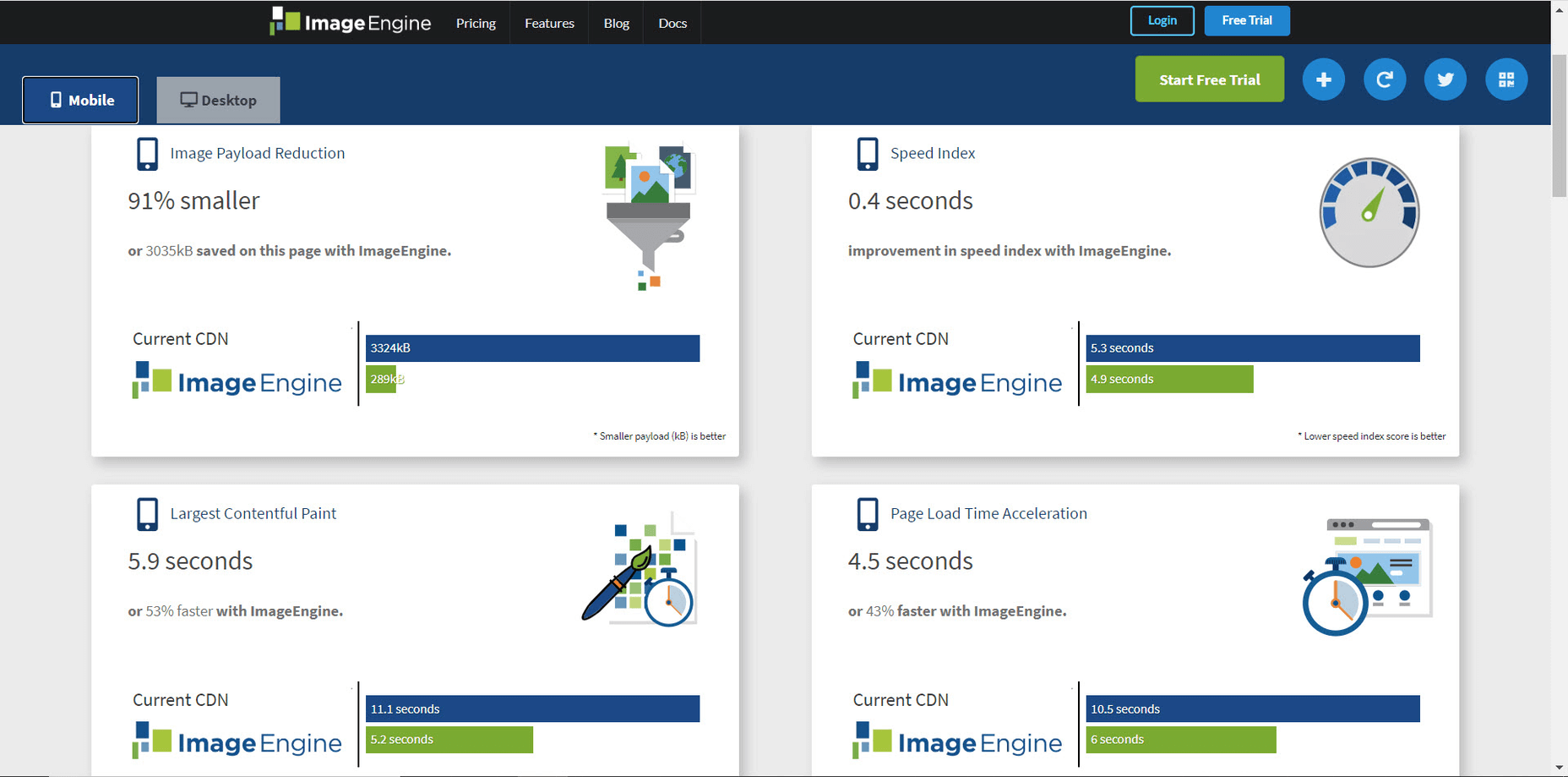
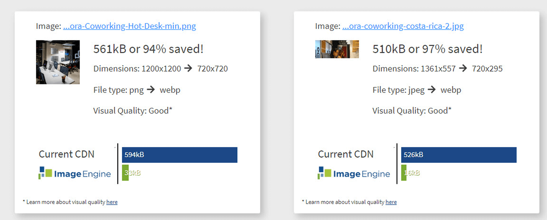
Contentful; Webster’s Dictionary defines “contentful” as… not found. Clearly someone made up this word, but that is not necessarily a bad thing.

The world of user experience metrics is moving quickly, so new terminology is needed. Largest Contentful Paint (LCP) is one of a number of metrics measuring the render time of content on a web page.

What is Largest Contentful Paint?

Google defines LCP as “the render time of the largest content element visible within the viewport.” For what we are talking about in this blog, we will consider “content” to be an image, typically a JPEG or PNG file. In most cases, “largest” points to a hero image that is “above the fold” and is one of the first images people will notice when loading the page. Applying optimization to this largest content is critical to improving LCP.

It is probably more instructive to view LCP relative to other metrics. For example, First Contentful Paint (FCP) and Visually Complete book end LCP.

Each metric has its pros and cons, but LCP is a happy medium. LCP marks when web page loading starts to have a substantial impact on user experience.

In Google’s opinion, to provide a good user experience, LCP should occur within 2.5 seconds of when the page first starts loading. Poor values are anything greater than 4 seconds.

How Does Largest Contentful Paint Impact Lighthouse Scores and SEO?

LCP is now part of several “Core Web Vitals” scores that Google will measure in its ranking algorithm. Each of the Core Web Vitals represents a distinct facet of the user experience, is measurable in the field, and reflects the real-world experience of a critical user-centric outcome.

In the case of the overall Google Lighthouse score, LCP represents 25% weighting on the performance score of Lighthouse version 6.0. This makes LCP the most important Core Web Vitals metric in determining the performance score.

While Google has indicated that content is still the most important factor in SEO ranking, a better user experience (as measured by Core Web Vitals) will generate higher rankings in a crowded field. If there are many websites competing for the top search engine spots, then Largest Contentful Paint will play a critical factor in rankings.

How to Improve Largest Contentful Paint

Now that you know that LCP is important, what can you do to improve it by making content load faster? Google provides a number of suggestions, but the most effective technique is to optimize content for the device requesting it.

For example, a website includes an 800kb JPEG image that is intended for high resolution desktops. On a smartphone, that would be optimized down to less than 100kb, with no perceptible impact on quality. LCP can improve by more than 60% — or several seconds — through this single optimization.

Find Savings in Largest Contentful Paint by using Image Speed Test

Image Speed Test is a great tool offered by ImageEngine.io that provides an analysis of LCP improvement opportunities. Just paste in the URL of the web page you are interested in optimizing, and the test will show you:

  • Image Payload Reduction
  • Speed Index
  • Largest Contentful Paint
  • Page Load Time (Visually Complete)

It also provides a video of the web page loading with and without optimizations. Finally, it analyses each image to provide an estimate of payload savings. In this case, the “largest content” on the page is this image. With optimizations, the image payload is reduced by 94%. That delivers a huge improvement in LCP.

How Does ImageEngine Improve LCP

ImageEngine is an image content delivery network (CDN) service that makes image optimization simple. Basically, for each image on the page, the image CDN will:

  1. Detect the device model requesting the web page;
  2. Optimize the image in terms of size, compression, image format;
  3. Deliver via a CDN edge server that is geographically closest to the user.

ImageEngine improves web performance for every image on the page, including the largest. You can learn more about ImageEngine here, and also sign up for a free trial.

Best Practices: Preconnect

In addition to using an image CDN like ImageEngine, a few other best practices can improve LCP. Using the resource hints to provide a preconnect for your content can streamline the download process.

For example, putting the following link statement in the HTML will accelerate the download process. The link statement will make the browser connect to the third party as early as possible so that download can start sooner. ImageEngine’s optimizations make each image download smaller and faster, but preconnect save time in the connection phase.

Best Practices: Minimize Blocking JavaScript and CSS

When JavaScript or CSS is “blocking” it means that the browser needs to parse and execute CSS and JavaScript in order to paint the final state of the page in the viewport.

Any website today relies heavily on both JavaScript and CSS, which means that it is almost impossible to avoid some render blocking resources. On a general note: be careful with what kind of CSS and JavaScript is referenced inside the <head> element. Make sure that only the strictly necessary resources are loaded in <head>. The rest can be deferred or loaded asynchronously.

When looking to improve the LCP specifically, there are some practices worth looking into more deeply.

Inline Critical CSS

It is not an easy task, but if the browser can avoid making a request to get the CSS needed to render the critical part of the page – usually the “above the fold” part – the LCP is likely to occur earlier. Also you will avoid content shifting around and maybe even a Flash of Unstyled Content (FOUC).

The critical CSS — the CSS needed by the browser to set up the structure and important styles of the part of the page shown above the fold — should in-inlined. This inlined CSS may also refer to background images, which of course should also be served by an Image CDN.

Do Not Use JavaScript to (lazy) Load Images

Many modern browsers natively support lazy loading, without the use of JavaScript. Because images usually are heavily involved in the performance of LCP, it is best practice to leave image loading to the browser and avoid adding JavaScript in order to lazy load images.

Lazy loading driven by JavaScript will add additional latency if the browser first has to load and parse JavaScript, then wait for it to execute, and then render images. This practice will also break the pre-parser in the browser.

If an image CDN is used to optimize images, then the benefits of lazy loading become much smaller. Especially large hero images that are above the fold have a large impact on LCP and will not benefit from being lazy loaded with JavaScript. It is best not to make JavaScript a blocking issue for rendering images, but rather rely on the browser’s own ability to select which images should be lazy loaded.


[– This is a sponsored post on behalf of ImageEngine –]

Source


Source de l’article sur Webdesignerdepot

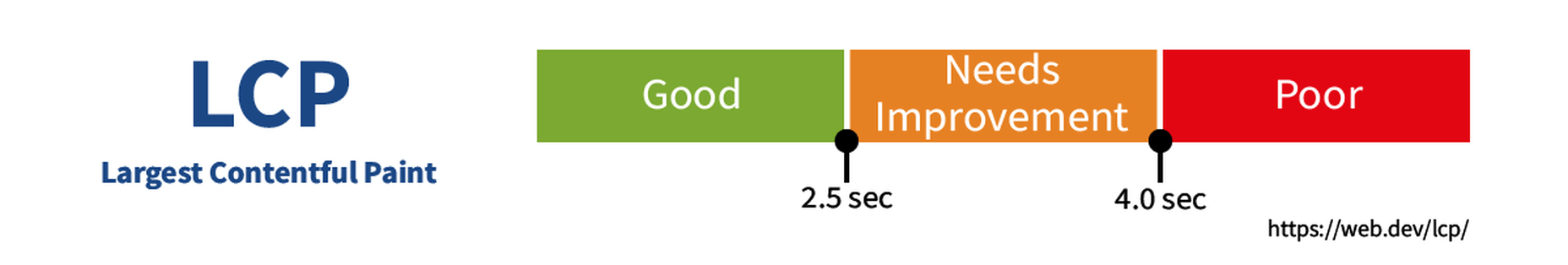
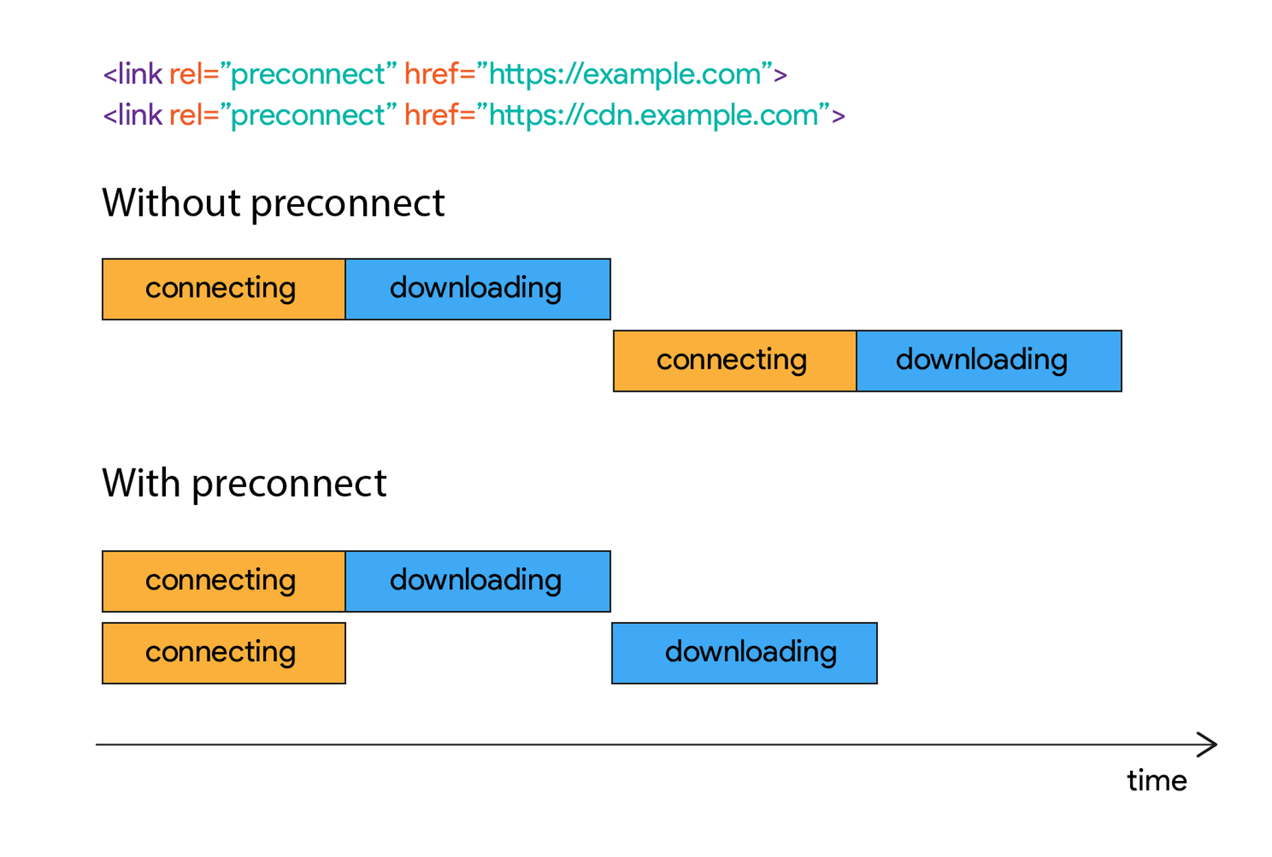
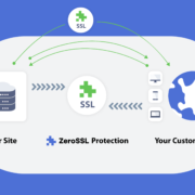
Like it or not, we’re slowly edging towards a two-tier web: those sites that are secure, and…everything else.

There was a time on the web, when we didn’t have SSL certificates, and lots of people’s data got stolen. To address the problem, and regain users’ trust SSL certificates were introduced to secure sites handling sensitive data. And because they were initially a niche technology, you paid through the nose for them.

(An SSL certificate, for those that don’t know, is the difference between http:// and https://)

Then, thanks in part to privacy initiatives, and in part to high-profile data breaches, a few big players decided that all data should be protected. And the next thing you know, Google’s using SSL certificates as a ranking factor. And then suddenly browsers are warning people that non-SSL certified sites are insecure and they should “Get Out of Here!” And before long your hobby blog about cat-friendly board games is being billed hundreds of dollars a year just to be seen on the web.

Choosing whether to jump on the SSL bandwagon is simple: you have to have one. Finding an affordable SSL certificate, now that’s a challenge.

Most hosting companies will provide you with an SSL certificate as an add-on, and they’ll charge you anything up to $200 per year for it.

That’s why we’re blown away by ZeroSSL, because ZeroSSL is the first practical opportunity to grab an SSL certificate for your site, for free!

Get an SSL Certificate for Free

Now, it must be said that ZeroSSL isn’t the first place to offer a free SSL certificate. Plenty of hosts offer a “free” SSL certificate for the first year, when you pay for premium hosting. And there’s Let’s Encrypt which offers free certificates if you can work out how to access them.

ZeroSSL is just the first place to offer a genuinely free SSL certificate that you don’t need a post-grad degree in server engineering in order to use.

Get a Free SSL Certificate from ZeroSSL

Using ZeroSSL’s free-forever plan you can register three 90-day certificates entirely free. You’ll never need to pay for them, just renew every few months.

ZeroSSL also offers a variety of packages for simplifying your SSL management. The Basic package for example starts at $8/month and offers unlimited 90-day certificates, and even three 1-year certificates so you can renew annually and forget about them the rest of the time.

ZeroSSL also scales; if you need unlimited 1-year certificates — because you have, erm, unlimited websites? — that’s possible too.

Where ZeroSSL Excels

ZeroSSL offers a number of benefits over its competitors.

Firstly there’s the full-featured management console, that makes SSL management transparent. It sounds like a little thing, but with many other suppliers the first thing you know about your SSL certificate expiring is your site breaking.

ZeroSSL…makes managing your certificates…insanely easy.

ZeroSSL has an easy-to-use REST API, which can be used with the language of choice: PHP, Ruby, ASP, anything. It makes managing your certificates for multiple sites insanely easy.

Verifying SSL certificates can be confusing, and technically difficult. But ZeroSSL streamlines the process with automatic CSRs and one-step email validation (even for multiple domains) — considerably faster and easier than industry standard DNS validation. There’s even a one-click check to make sure your certificate is installed correctly.

Most importantly, ZeroSSL offers superb technical support on all of its paid plans. So if you’re one of the many people who started reading this post without fully understanding what an SSL certificate is, you can be confident that if you run into difficulties getting set up, there’s someone available 24/7 to dig you out of the hole.

Getting Started with ZeroSSL

If by now you’re planning to try ZeroSSL, the best place to start is the free-forever plan. ZeroSSL allows you to upgrade, downgrade, or cancel at any time, so it makes sense to start with the no-credit-card option and upscale if you need it.

Using ZeroSSL’s dashboard you can create a free 90-day SSL certificate in minutes, and the step-by-step installation instructions will guide you all the way through.

ZeroSSL’s 1-year certificates are the gold-standard of SSL protection

ZeroSSL auto-generates certificates in different formats depending on your choice of platform, to speed up installation.

You can register certificates for multiple domains — you will have to verify each domain individually, but it’s simple to setup. Premium plan users can even use wildcards, allowing you to secure a site with multiple sub-domains, from a single certificate.

ZeroSSL’s 1-year certificates are the gold-standard of SSL protection and are the option that most site owners will come to rely on.

If you’re running an agency and you’re responsible for maintaining multiple client sites, ZeroSSL is made for you. ZeroSSL’s dashboard gives you one central location to monitor the status of all of your SSL certificates, and you can set expiry reminders to notify you by email when a certificate is about to expire.

Automated SSL Renewal with ZeroSSL

If that sounds too much work, and you’d like to automate your SSL certificates, ZeroSSL has you covered.

ZeroSSL works with both its own dedicated ACME Certbot, and more than ten other third-party ACME clients to fully automate your SSL certificates absolutely free, on a rolling 90-day schedule.

If you really know what you’re doing, you might even consider the ZeroSSL’s REST API. It enables certificate creation, validation, renewal, and management using HTTPS Get calls and JSON responses. The API handles millions of requests per month using 256-bit bank-level HTTPS encryption. You can access the API for free, and the Pro plan offers unlimited access.

Go Get Certified

There are millions of sites that drop traffic every month because they lack an SSL certificate.

Whatever your site, it’s not a question of whether you need an SSL certificate, it’s how you can affordably manage to create, install, and monitor a certificate.

ZeroSSL solves all of the problems of SSL certificate management, and for the majority of users, its free-forever plan is all you’ll ever need.

Head over to zerossl.com today to boost your traffic with a free SSL certificate.


[– This is a sponsored post on behalf of ZeroSSL –]

Source


Source de l’article sur Webdesignerdepot

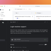
Some of the changes we are seeing with where we work are starting to pop up in the type of new tools made for designers and developers. More tools with remote collaboration as a key feature are increasing in popularity. (You’ll find a few of those here.)
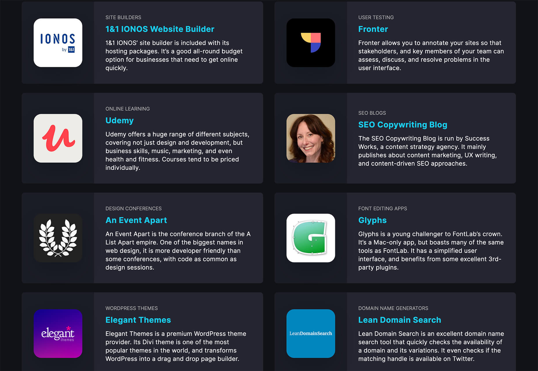
Here’s what new for designers this month.

Webdesign Toolbox

Webdesign Toolbox is a collection of tools, apps, and resources all in one location for designers and developers. The best part of this resource is that it is human-curated, so every tool is quality checked and makes the list because it has been tested and researched. Search the collection by design, dev, stock, typography, UX, or workflow tools (and more) and use them to help create more efficiently. The collection is constantly growing, too.

CodeStream

CodeStream might be the new-world workflow tool for web designers and developers. It is made for remote teams to review code right inside your IDE without breaking from development flow. You can post and review changes and comments are all independent of the code itself, even though they link to it.

Litur

Litur is a color management app for iOS. Use it to find and collect color swatches, create custom palettes, and even check color combinations against accessibility standards. The app can even generate color codes for you from swatches you find from a photo or image upload or create. The app works on mobile and desktop Mac devices and is a paid app.

Editor X

Editor X, which is still in beta, is a website building tool that combines advanced design and prototyping capabilities with secure web hosting and integrated business solutions. Go from an idea straight to production in a highly intuitive design workspace. The best feature might be exact design precision tools.

Grid Cheatsheet

Grid Cheatsheet is a visual and code-based set of “cheats” based on the W3C CSS Grid Specifications. What’s nice is it makes these guidelines easier to understand and use if reading through them makes you a little uneasy.

Tutorialist

Tutorialist brings together some of the best development tutorials on the web. All of the tutorials are free videos available on YouTube, and this project collects them all in one place.

Pure CSS Halftone Portrait from JPG

Pure CSS Halftone Portrait from JPG is a beautiful pen from Ana Tudor that shows how to change the visual representation of an image. The examples are brilliant and in true halftone fashion. The code snippet works with color, or black and white images as well.

VoiceText for Slack

VoiceText for Slack is another work from home productivity tool. Integrate it with Slack and send messages with text that’s transcribed right in your channels. It’s a free integration and supports 18 languages.

Feature Peek

Feature Peek is a developer tool that helps you get frontend staging environments on demand and gather team feedback earlier in the development process. It’s made for use with GitHub and works with a variety of other tools as well.

Formbutton

Formbutton is a simple and customizable pop-up form. (And we all know websites have plenty of them right now.) It connects to other services you already use, such as Google Sheets and MailChimp, and is simple to set up.

Blocksy Theme

Blocksy is a WordPress theme that’s made for non-coders. It’s a zippy and highly visual theme made for Gutenberg. It works with other builders and allows the user to customize pretty much everything visually. (There’s even a dark mode.) The theme is packed with tools and options and is a free download.

Oh My Startup Illustrations

Oh My Startup Illustrations is a set of vector illustrations in several categories featuring a popular style on many projects. Use the characters and scenes to create a semi-custom story for your startup project.

1mb

1mb is a code editor and host where you can create a static website with a custom domain and SSL included. The editor works in-browser and everything is saved in the cloud.

Linear

Linear is an issue tracking Mac app for teams. It’s designed to help streamline software projects, sprints, and tasks, and can integrate with standard tools such as Github, Figma, and Slack.

Hosting Checker

Hosting Checker solves a common issue – a client wants you to work on their website, but has no idea who hosts it. Hosting Checker shows the user hosting provider and IP address the website uses, along with where its server computers are located and the host’s contact details. It also claims to be 82% faster than other similar tools.

Spike

Spike alerts you to website incidents before customers. Create alerts and get a phone call, text message, email, or Slack notification right away. The tool provides unlimited alerts and integrations to you can stay on top of issues before they become real problems.

Magnus UI

Magnus UI is a framework that helps you building consistent user interfaces in React. It comes with plenty of components ready to use and you can customize the theme.

SpreadSimple

SpreadSimple uses data in Google Sheets to create styled websites with features such as filtering, search, sorting, cart, order collection via forms, and much more. Update the sheet and instantly see changes on the website.

WebP vs. JPEG

Google is starting to suggest using it’s WebP image format to decrease load times, because of the lighter file size. But is WebP better than the traditional JPEG? Developer Johannes Siipola tested the file types at different sizes to answer the question. The answer is a bit complicated, but sometimes it might be better; read the full analysis for more.

Oh Dear

Oh Dear is a website monitoring tool that can help you keep a check on websites. Monitor uptime, SSL certificates, broken links, and more with notifications that come right to you if there’s an issue.

Airconnect

Airconnect is a Zoom video conferencing alternative that you can use for your brand with a custom header, colors, and portal for clients. The tool includes video calling as well as the ability for customers to access their data and automate your onboarding process.

Free Faces

Free Faces is a curated collection of free typefaces that you can browse and use in projects. Search by type style with visual results that include a download link.

All the Roll

All the Roll is a fun novelty font for just the right type of project. It includes 167 characters with swash characters that can be added before or after certain letters.

Backrush

Backrush is a handwriting-style typeface with easy strokes and a pen-like feel. It includes thicker letterforms with nice swashes and a full character set.

Thuner

Thuner is a slab display font with interesting quirks. It’s made for larger than life designs. It includes a full uppercase character set and numerals.

Source


Source de l’article sur Webdesignerdepot