
 Few things are more important to a web designer or developer’s chances of success than having the proper workflow. The term “workflow” applies to the set of standardized steps you or your company uses to create, test, and deploy designs or products.
Over the years, as development processes have evolved, so too have the workflows experts use to bring their ideas to life. The MVP workflow, or “Minimum Viable Product” strategy, is one of the most popular options in 2022.
Here’s what you need to know about the MVP workflow and how it differs from some of the other standard workflows developers may be used to.
What is the Designer/Developer Workflow?
As mentioned above, the designer/developer workflow is a series of steps used by experts in the web design world to achieve a creative goal. The process includes the steps taken to start a project, evolve it, and finish it. Since software is never developed without tools, the technology you’ll access throughout the development process is also considered in most workflows.
An example of a standard development workflow might look like this:
- Scaffolding: This is the stage wherein you start your new web project, creating a git repo, downloading libraries, preparing file structures, and completing other tasks to make sure your product is ready to roll out into the world.
- Develop: This is where you’ll spend most of your time writing code for your application or website. The development process may include various specific tools and support from other staff members.
- Test: In this stage, you examine the functionality of your code to determine if everything works as it should. If there are errors or issues, you can go back and develop fixes to the potential problems. Your code may go through the development/test process several times before you can move to the next stage.
- Integrate: This is when you merge the code for your part of the development process with the rest of the team. You can also integrate your code into websites and existing apps at this point. If you’re working solo, you can skip this process.
- Optimize: You prepare all your assets for use on a production server during the optimization stage. Files are generally optimized to ensure your visitors can view your site easily or access your applications with ease.
- Deploy: In the deployment stage, developers push code and assets up into the server and allow for changes to be viewed by the public.
What is MVP? (Minimum Viable Product)
Now you know what a developer workflow looks like, you can begin to assess the concept of the “MVP” workflow. The term “MVP” stands for Minimum Viable Product.
The idea of “Minimum Viable Product” applies to a range of industries, from education to healthcare and government entities. This term comes from lean start-up practices and focuses heavily on the value of learning and changing during the development process.
When you adapt your workflow to focus on an MVP, you’re essentially adjusting your focus to a point where you can create a stripped-back version of something new – like an app or a website. The MVP is built just with the core features (the minimum), so you can bring the idea to market and test it as quickly as possible.
For instance, if your goal were to create an attractive new website for a client, an MVP would focus on implementing the crucial initial tools, and nothing else. While you may create checkout pages, product pages, and other aspects of the site, you wouldn’t populate it with content or start experimenting with bonus widgets and apps.
So, how does this offer a better alternative to the standard workflow?
Simply put, an MVP workflow is quick, agile, and easy. The idea is you can validate key concepts with speed, fail quickly, and learn just as fast. Rather than having to build an entire app and almost start over from scratch every time you find an error, you can race through the iteration and development process.
MVP workflows are also highly appealing to start-ups and entrepreneurs hoping to validate ideas without a massive amount of upfront investment.
Examples of MVP Workflows
Still confused? The easiest way to understand how an MVP workflow works is to look at an example.
Let’s start with a conceptual example. Say you were building a voice transcription service for businesses. The desired features of this product might include the ability to download transcription, translate them into different languages, and integrate them into AI analytics tools.
However, using the MVP approach, you wouldn’t try to accomplish all of your goals with your software at once. Instead, you’d focus on something simple first – like the ability to download the transcripts. Once you confirm you can do that, you can start a new workflow for the next most important feature for the app.
One excellent example of a company with an MVP approach is Airbnb. The entrepreneurs behind this unicorn company, Joe Gebbia and Brian Chesky, didn’t have a lot of cash to build a business with at first. They had to use their own apartment to validate the idea of creating a website where people could share their available “space” in a home or apartment with the public.
To begin, Airbnb only created a very basic website, published photos of their property, and waited to see the results. After discovering people were genuinely interested in renting another person’s home, the company was able to begin experimenting with new ideas to make a site where people could list their properties for travelers.
The Pros and Cons of an MVP Workflow
There are a lot of benefits to the MVP workflow – particularly when it comes to gaining agility and developing new products quickly. However, there are downsides too.
Pros
- With an MVP approach, you can maximize your learning opportunities and create a more innovative, successful product at speed. You get to test every step of the way.
- You release iterations or versions of your product quickly, which means you discover problems faster, allowing you to quickly solve these issues.
- You build on the benefits of customer fans, “evangelists” in the marketplace who are keen to help your product or service grow.
- An MVP gives you more freedom to try out unique ideas and “risks” you might otherwise avoid with a traditional workflow.
- Because you’re focusing on creating only the “minimum viable product,” you don’t have to spend a fortune on initially setting up your workflows.
Cons
- Agile work with an MVP flow requires a lot of effort in collecting constant feedback from customers and releasing iterations.
- You’ll need to dedicate yourself to releasing many small and frequent product releases on a tight schedule.
- You might have to revise the functionality of your product or app a number of times.
Creating Your MVP Workflow
If you believe an MVP workflow might be effective for you, the first step is defining your “Minimum Viable Product.” The app, website, or product you design needs to align with your team’s strategic goals, so think about what your company is trying to achieve at this moment – before you get started. If you have limited resources, or specific purposes, like improving your reputation as a reliable company, now might not be the right time to develop a new MVP.
Ask what purpose your minimum viable product will serve and what kind of market you’re going to be targeting. You’ll need to know your target customer to help you test the quality and performance of each iteration of your MVP. Once you know what your ideal “product” is, ask yourself what the most important features will be.
You can base these decisions on things like:
- User research
- Competitive analysis
- Feedback from your audience
For example, if you’re producing an AI chatbot that helps companies to sort through customer inquiries, the most important “initial feature” may be the ability to integrate that bot into existing websites and apps owned by the company.
MVP Approach Guidelines
Once you have your hierarchy of most valuable features for your minimum viable product, you can translate this into an action plan for development. Remember, although you’re focusing on the “minimum” in development, your product still needs to be “viable.” In other words, it still needs to allow your customer to achieve a specific goal.
- Review your features: Reviewing your prioritized product requirements and the minimum level of functionality you can deliver with each of these “features.” You need to ensure you’re still providing value to your customer with anything you produce.
- Build your solution: Build your minimum set of features for the product or service. Remember to build only what is required. You can use methodologies like the agile or waterfall method to help guide your team during this process.
- Validate your solution: Release your offering into the market, and ensure you have tools in place to gather feedback from early adopters. Use beta programs, focus groups, and market interviews to understand how your solution works for your customers and where you can improve on your current offer.
- Release new iterations: Based on what you learn from your target audience, release improvements to your product quickly. Use your validation strategies to collect information from your audience with each release.
- Review again: Go back to your product requirements and desired features and start the process over again, this time focusing on the next most valuable functionality. Over time, the value of your minimum viable product will increase.
Using the MVP Workflow Approach
While the MVP workflow approach might not be the right solution for every development or design team, it can work very effectively in the right circumstances. The MVP approach doesn’t minimize the importance of understanding market problems and delivering value. Instead, the focus is on delivering quick value that gradually increases and evolves over time.
As many developers and designers know, the most useful form of product validation in most cases is real-world validation. When your customers have had an opportunity to use a product on a day-to-day basis, they can provide much more effective feedback.
Just keep in mind that committing to the MVP approach also means changing your workflow and committing to iterations – otherwise, other features may never be completed. You’ll need to be willing to work quickly and in small bursts without getting too heavily caught up in one feature or functionality.
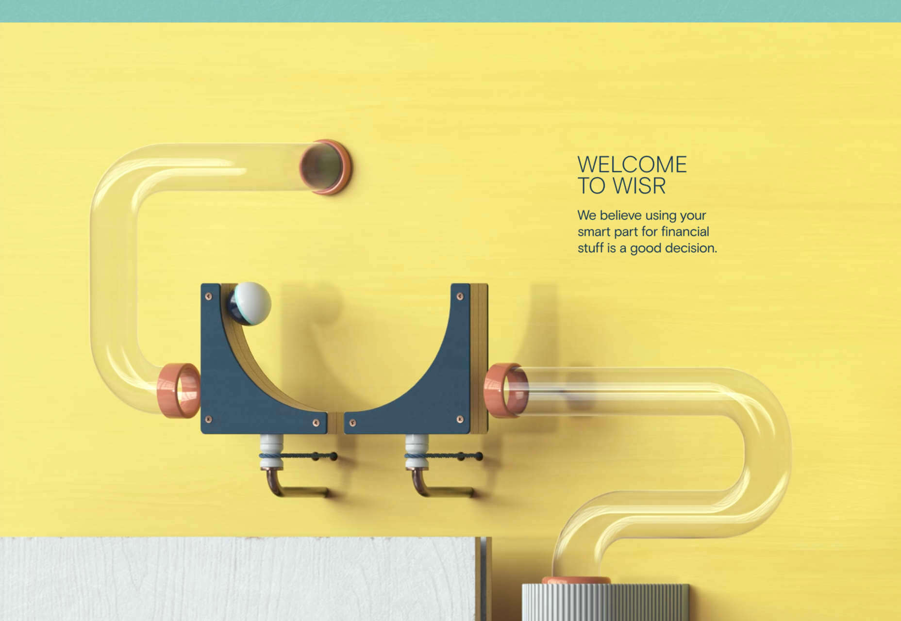
Featured image via Pexels.
The post How to Get Started with the MVP Workflow first appeared on Webdesigner Depot.

 Picture a dark office, blinds drawn. Picture a UX designer smoking a cigar. See the light filtered through the smoke whipped to fog by a spinning ceiling fan. Watch as the UX designer sits at a desk and considers the website.
 There was a point at which I was very close to losing my business, and I didn’t realize how close.
 There are a lot of factors that contribute to a


 Every year, at this time, blogs like this one like to try and predict what’s going to happen in the year ahead. It’s a way of drawing a line under the archive and starting afresh. A rejuvenation that, as humans, we find life-affirming.
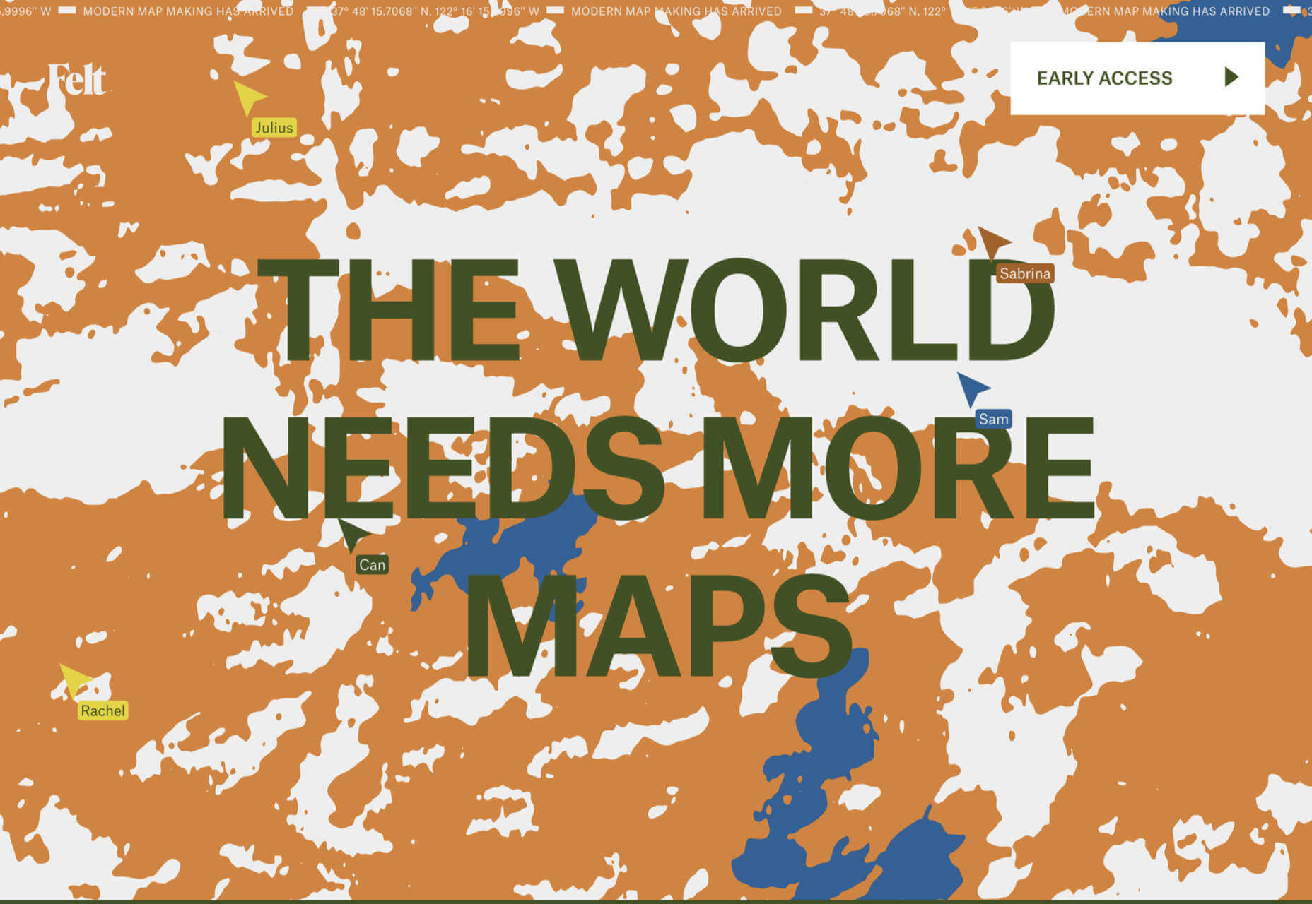
 Maps are a fascinating method for delivering content. At their best, they can create an intuitive way of presenting information and interacting with it. This is the advantage that digital maps, through mobile apps and websites, have over print maps and images where no interactivity is possible.
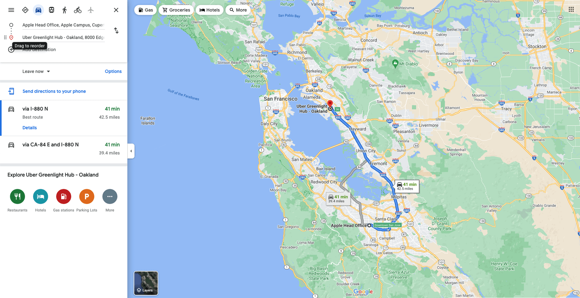


 According to Klipfolio research, users spend on average

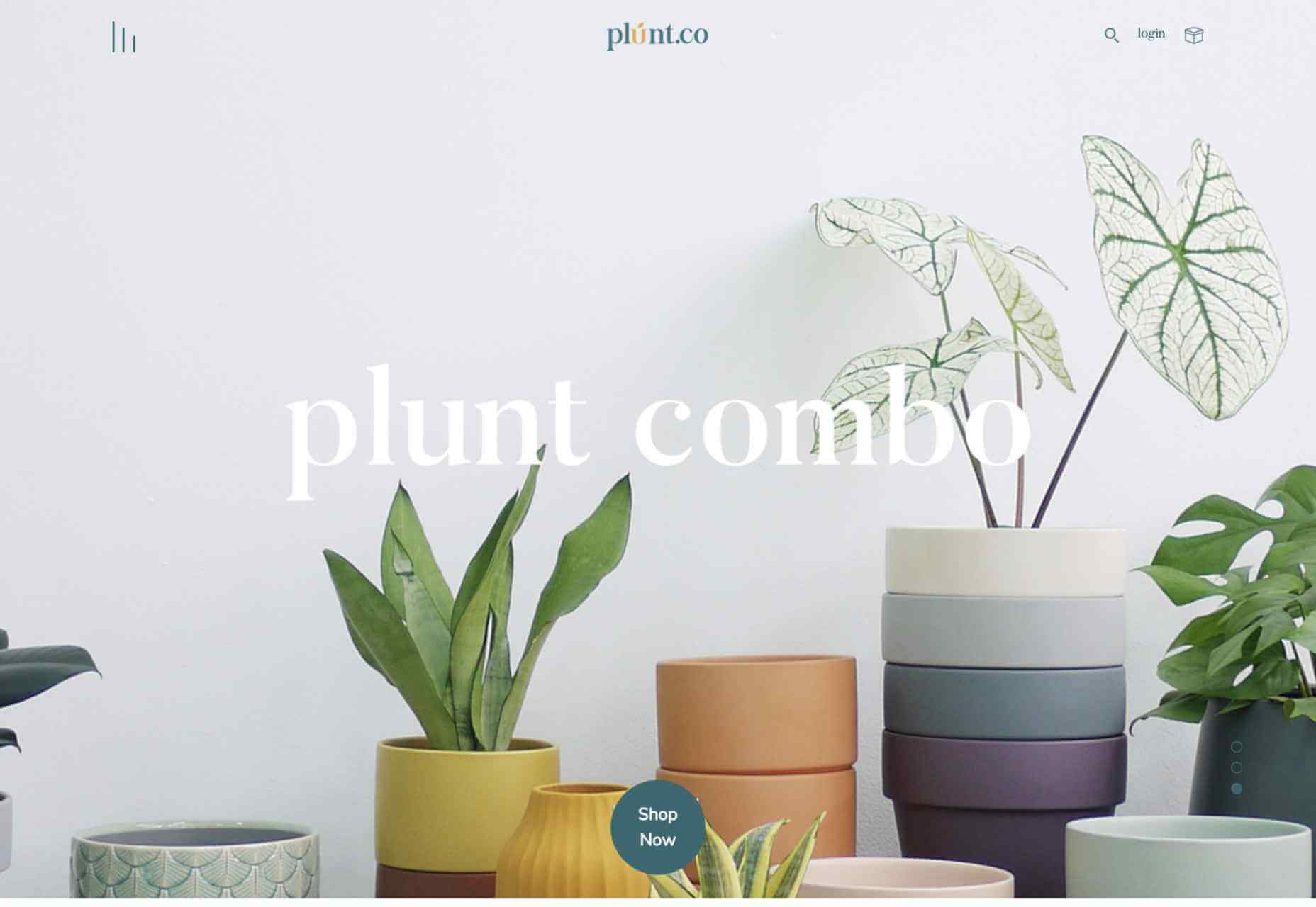
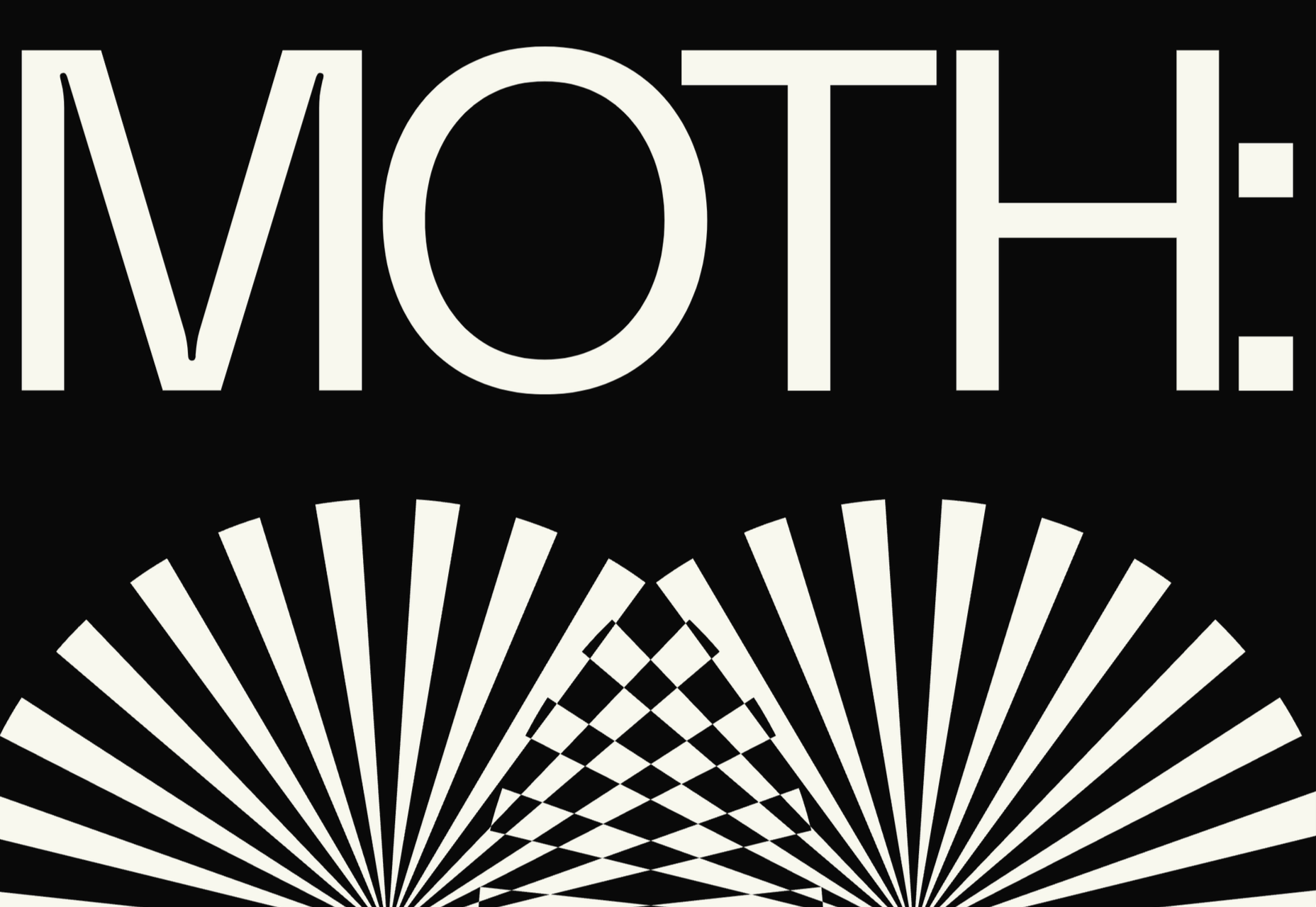
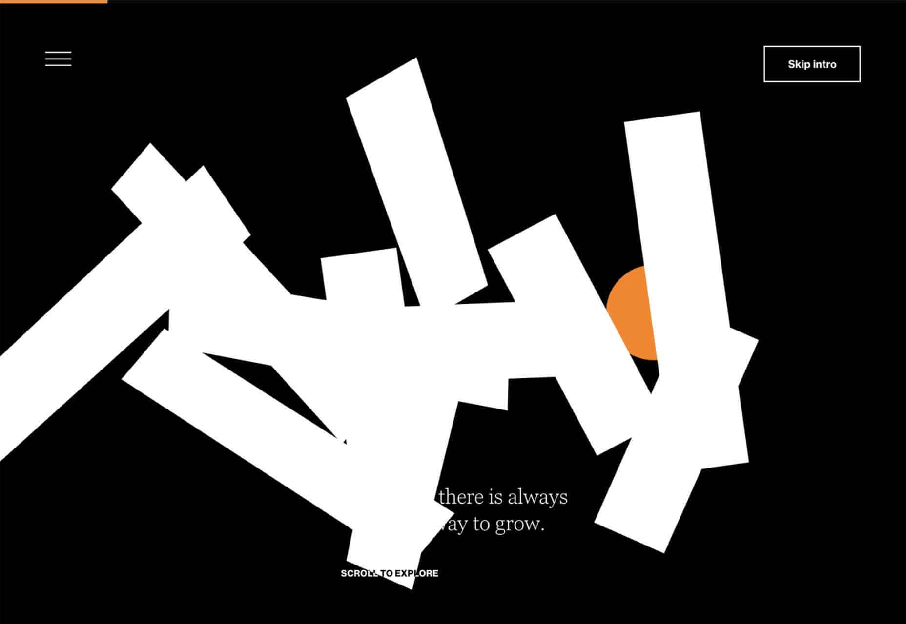
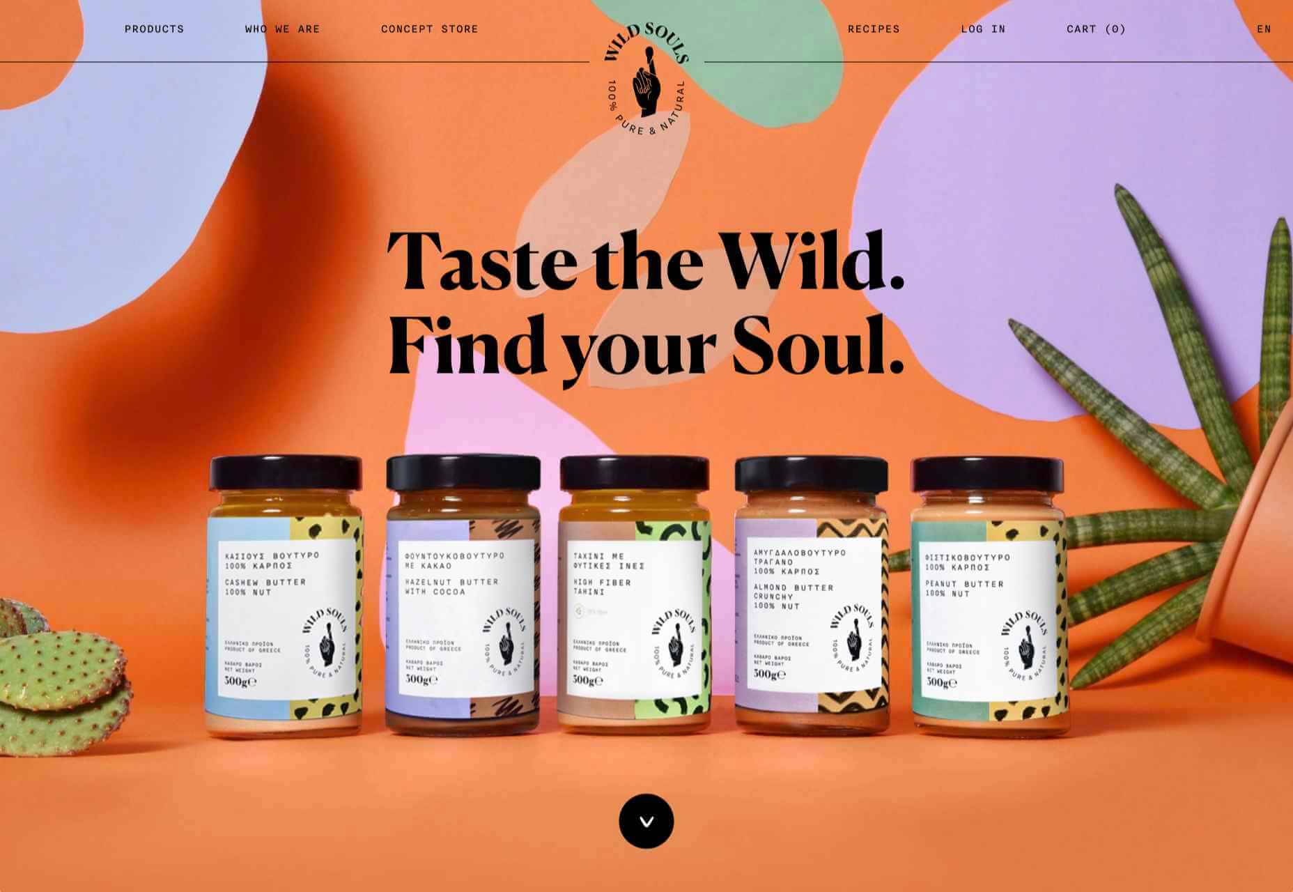
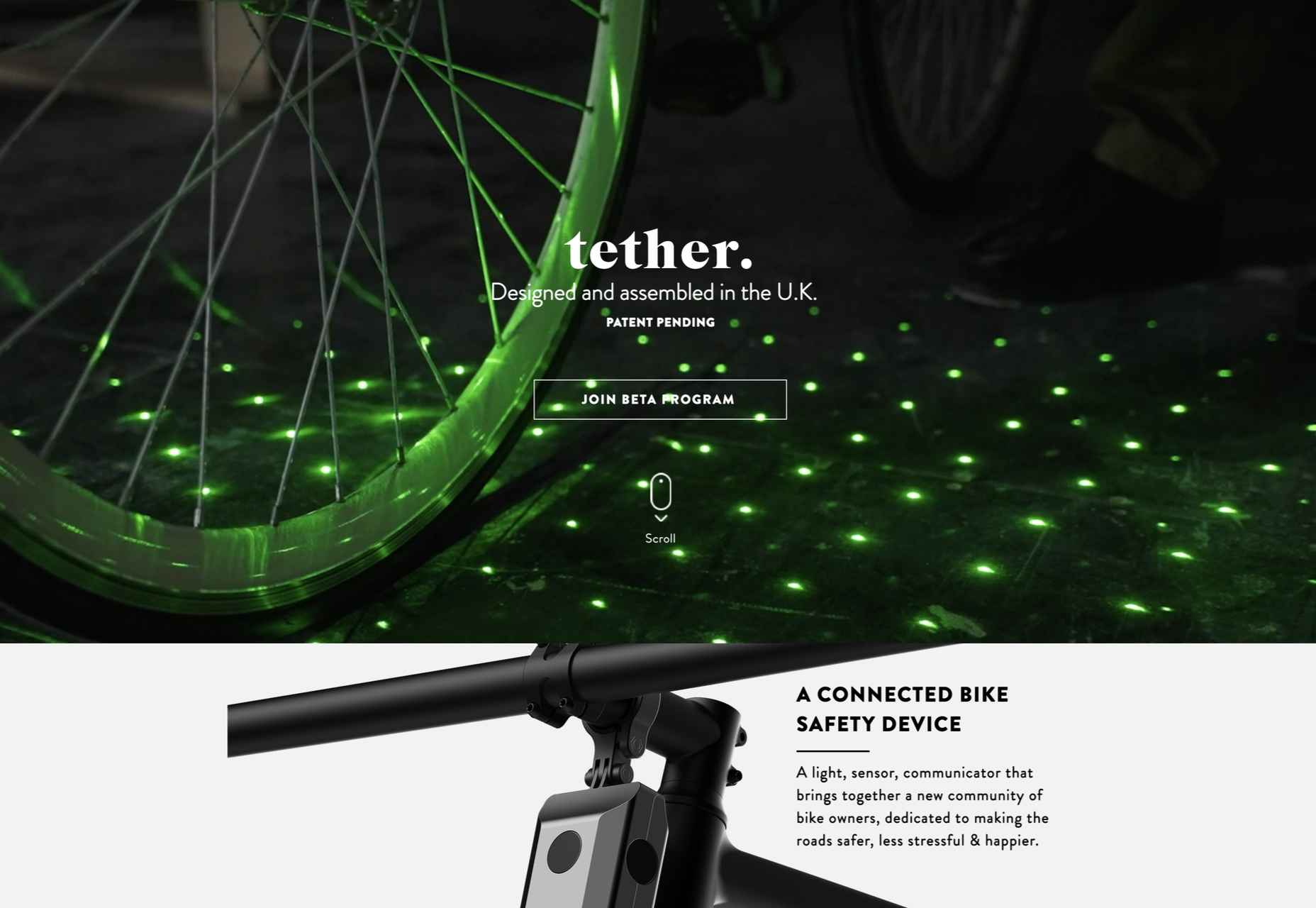
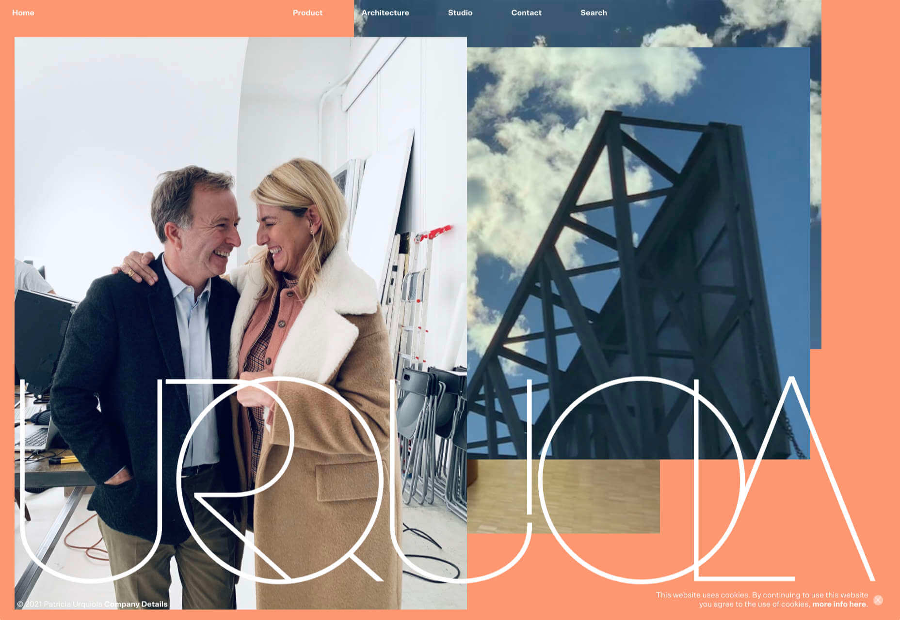
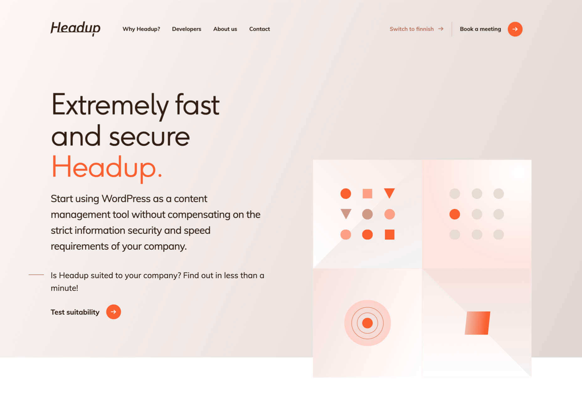
 2021 has been both memorable and instantly forgettable. Pop stars were freed from modern-day servitude, some people tried to overthrow democracy, and we all vacationed at home.


