Articles

We write this guide to the best new tools for designers and developers each month. For October, we’ve sought out tools to make you a better website builder, some handy utilities to make you more productive, and a spooky font for the end of the month. Enjoy!

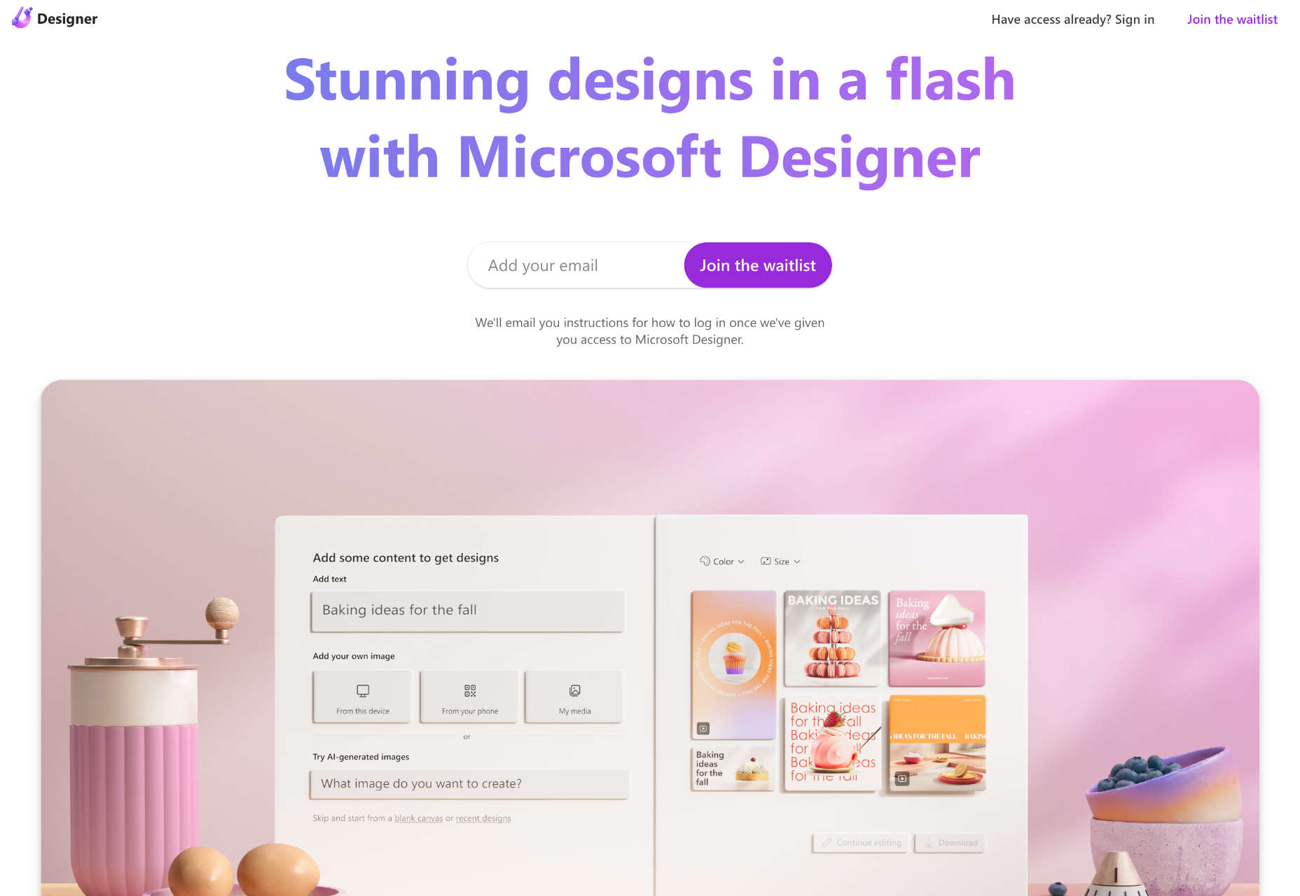
Microsoft Designer

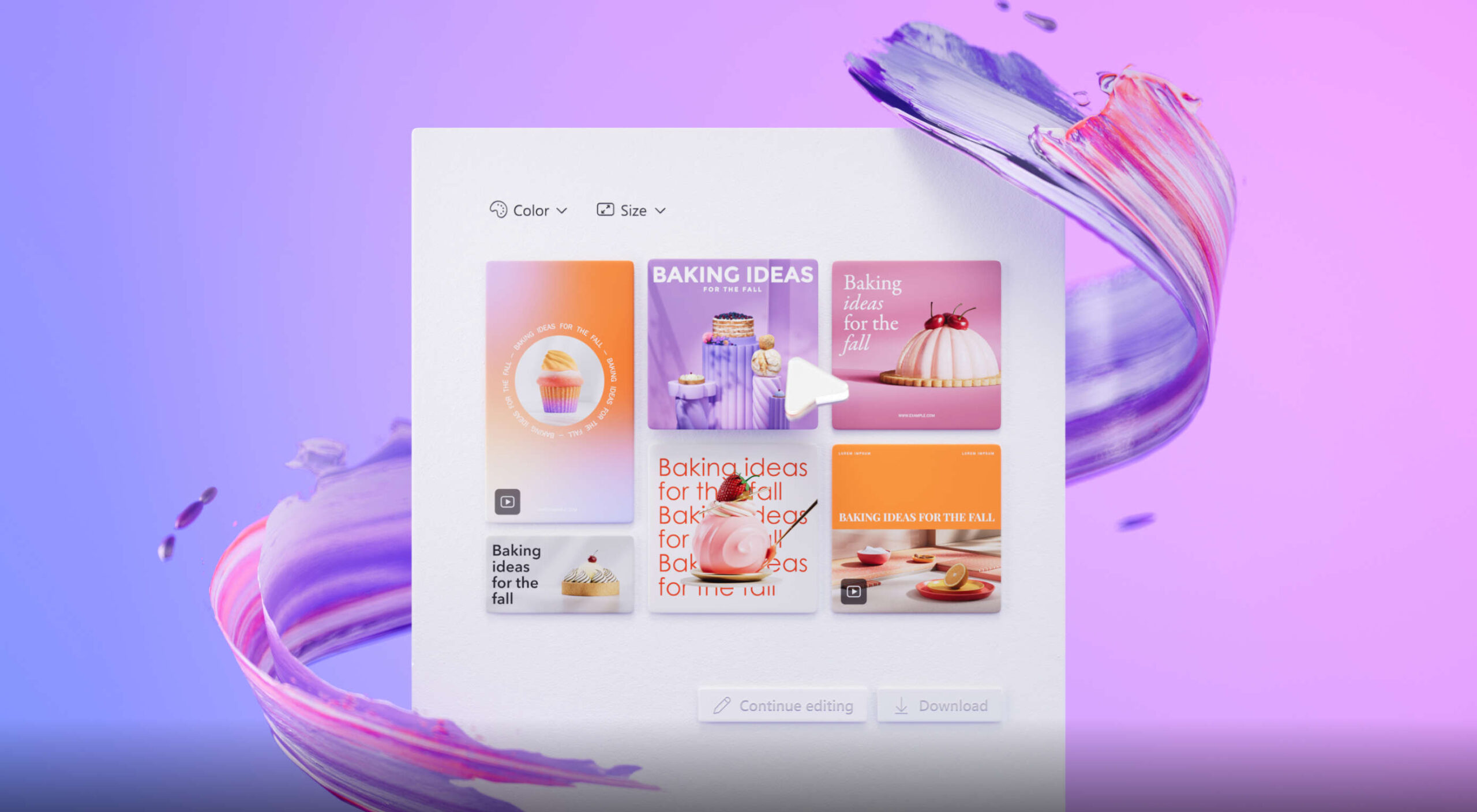
Microsoft Designer is a brand-new app for creating images from text prompts. You can create social media posts, blog images, and any other assets you need with its step-by-step guided process.

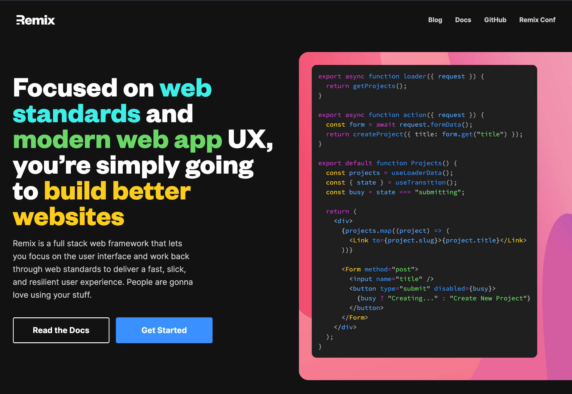
Remix

Remix is a full-stack web framework for React that lets you focus on designing your UI. Remix is geared towards web standards and delivers a resilient user experience so you can build better sites.

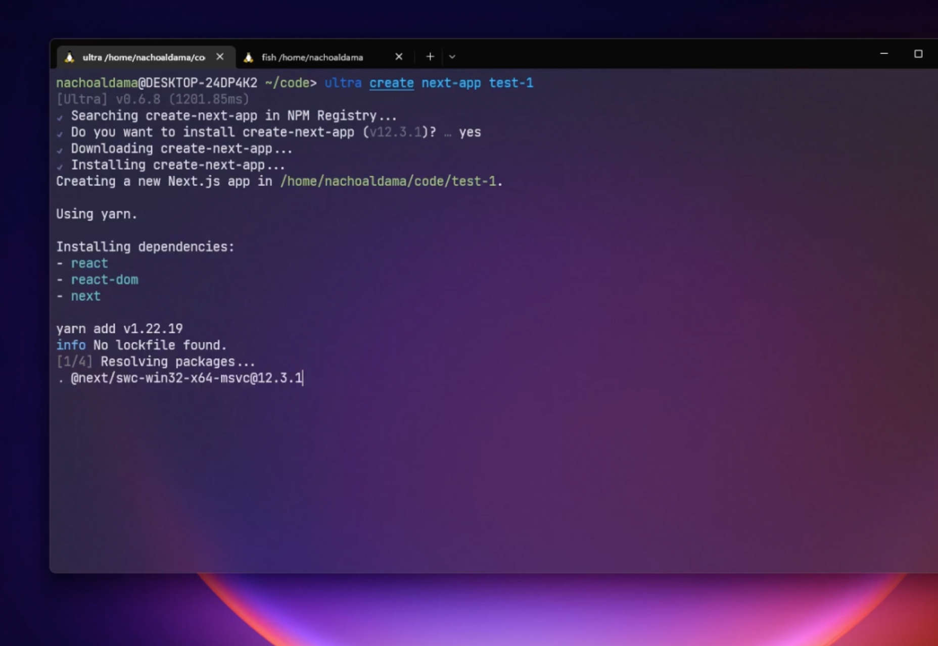
Ultra

Ultra is a super-fast package manager that uses hardlinks to install packages. It’s up to ten times faster than NPM and Yarn, and the project is open-source.

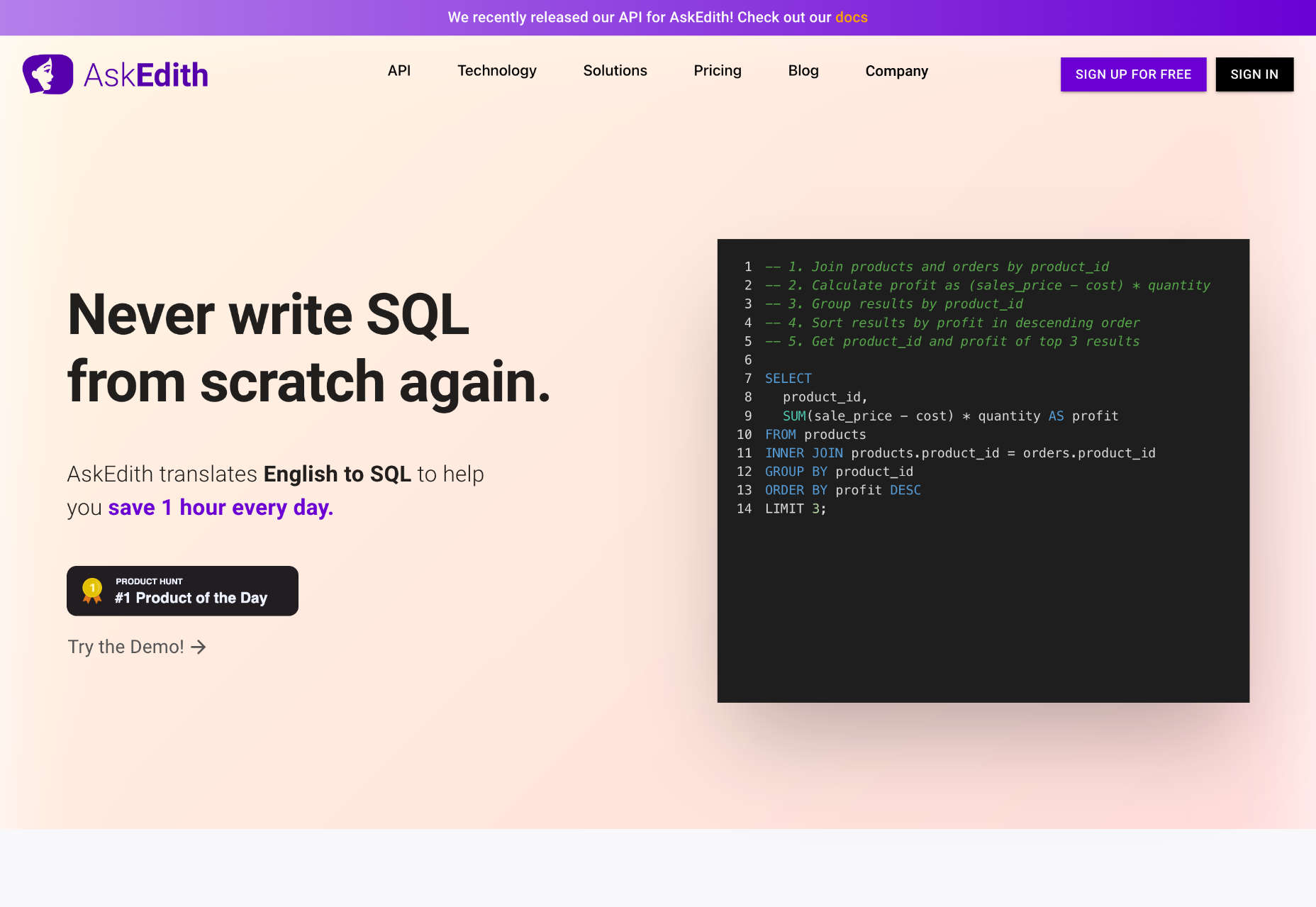
AskEdith

AskEdith is an AI-powered app that translates English into SQL so you can query your database without writing custom SQL. Just type a description of what you want to know, and the app creates the query for you.

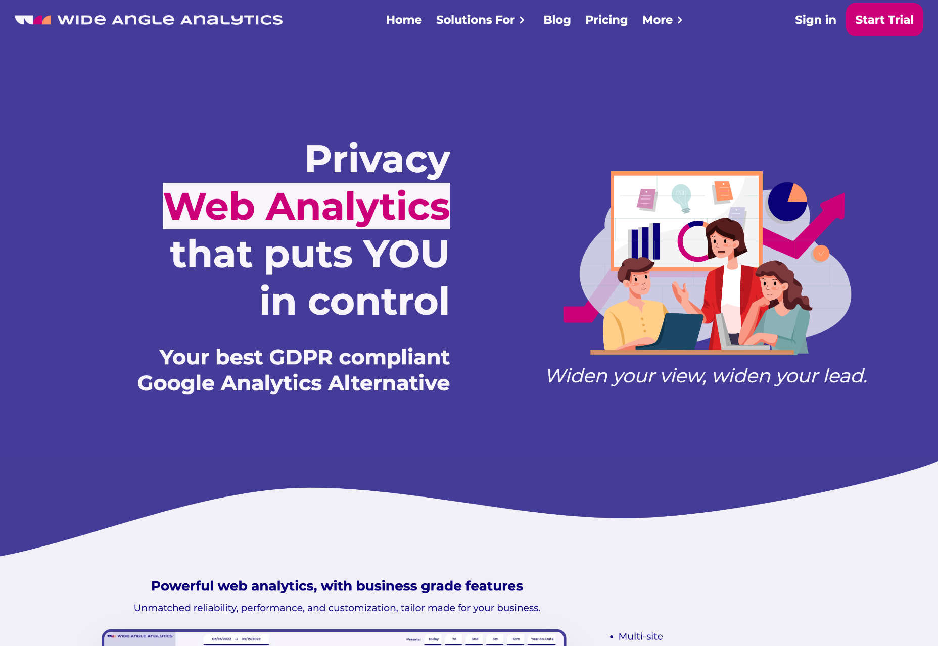
Wide Angle Analytics

Wide Angle Analytics is a GDPR-compliant Google Analytics alternative that puts privacy first. Track actions across multiple sites and discover insights about your site without exposing yourself to privacy violations.

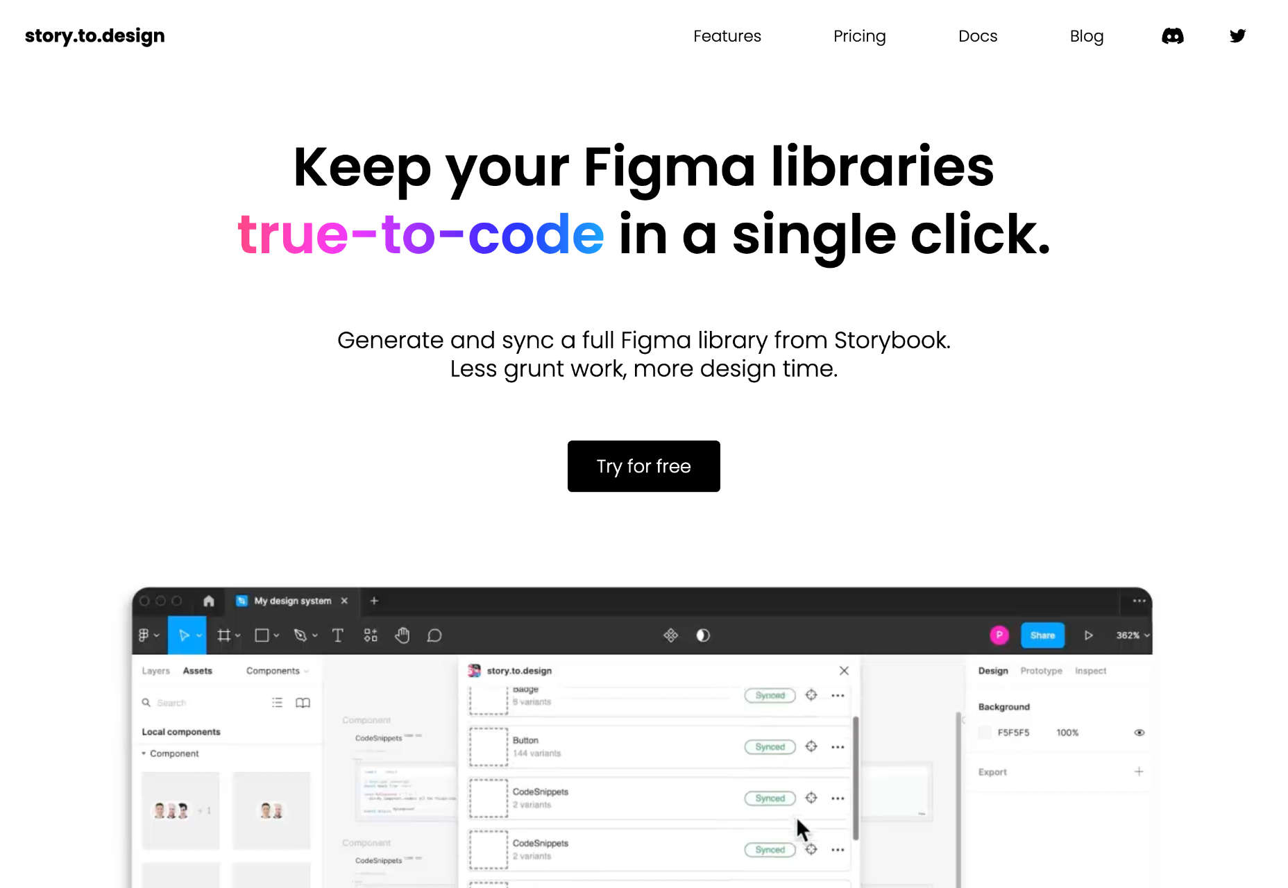
story.to.design

Imagine being able to import a whole webpage straight into Figma. You can, with story.to.design, a fantastic app that imports code into Figma for updating UI elements or speeding up redesigns.

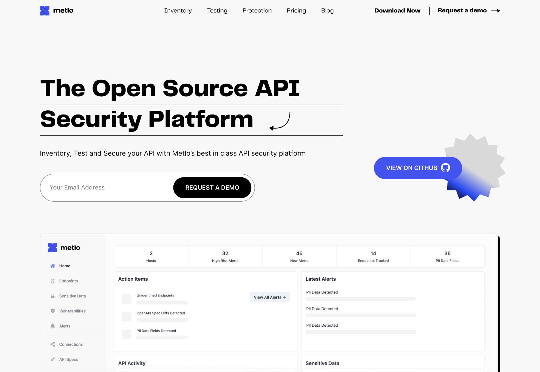
Metlo

Metlo is a testing platform for securing APIs. By running comprehensive tests against your API, you can uncover issues like unidentified endpoints, before they become a security threat.

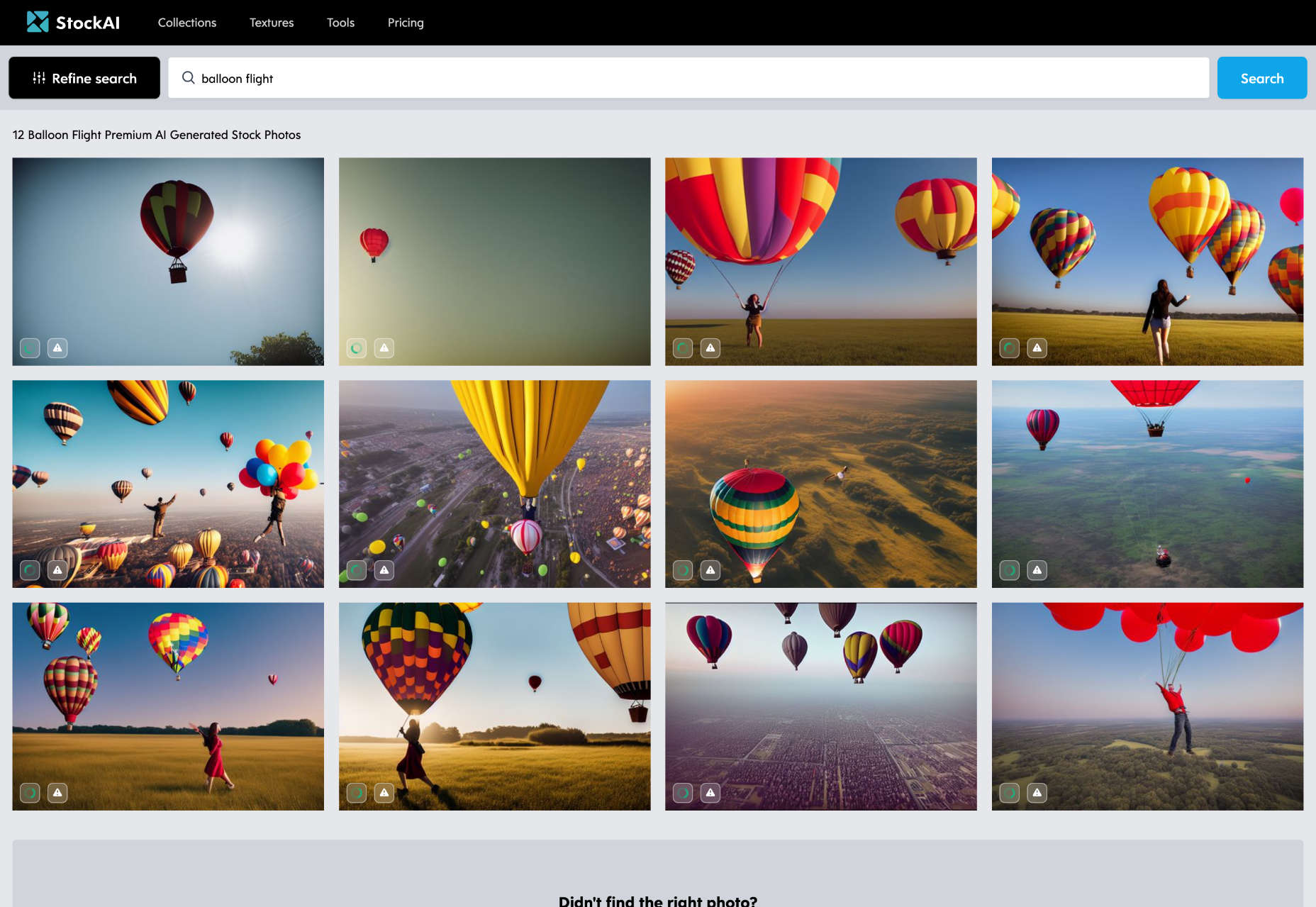
StockAI

Nothing is more frustrating than searching for the right stock image when one doesn’t exist. StockAI is a day-saver that searches for stock images, and if the sought-after image doesn’t exist, it will generate one for you.

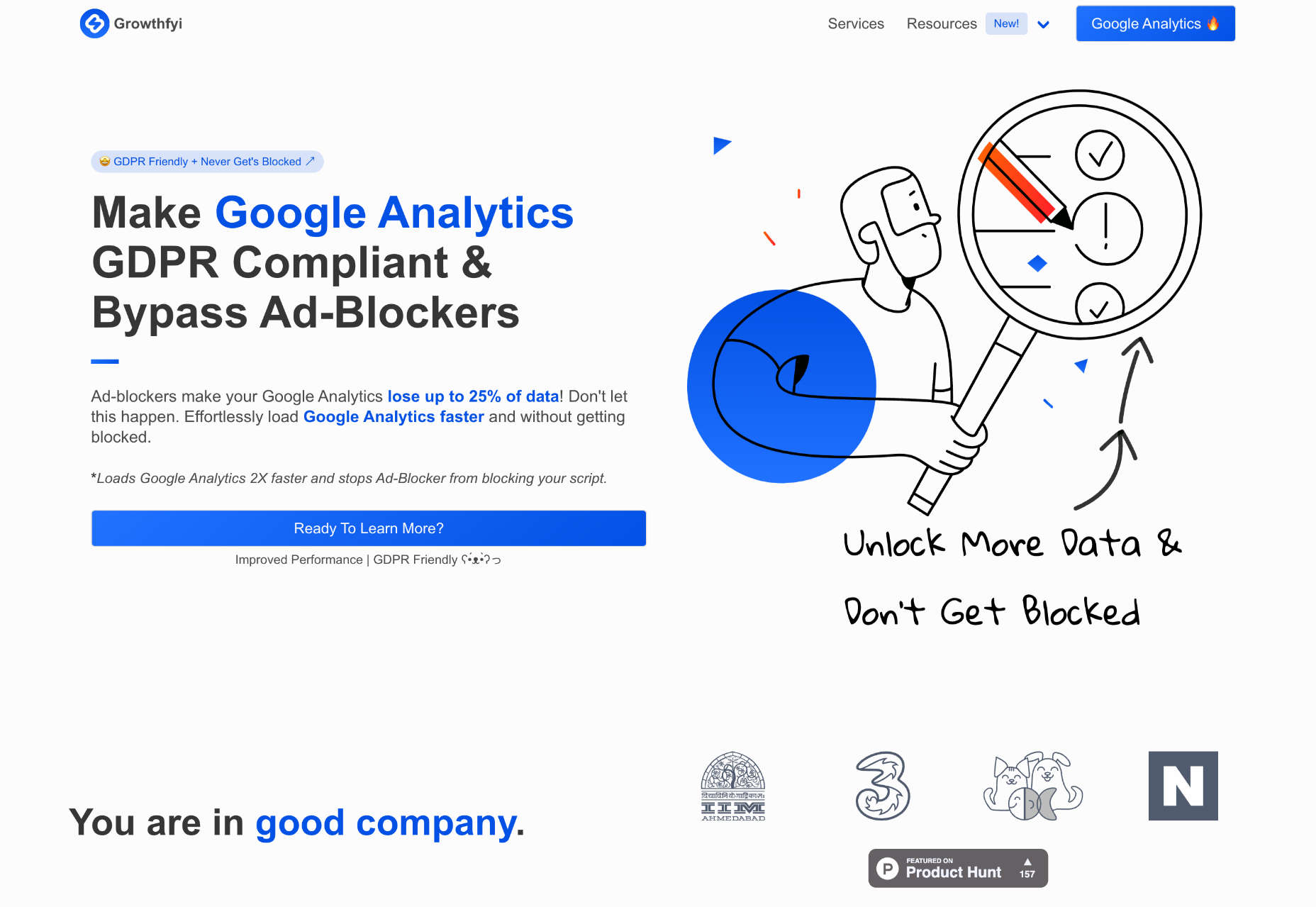
Growthfyi

If ad-blockers are playing havoc with your Google Analytics, check out this script from Growthfyi. It’s an invaluable service that doubles the speed of GA while ensuring ad-blockers don’t catch it.

Sourcery

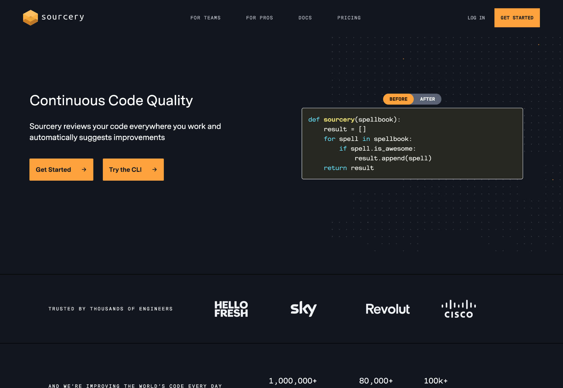
Sourcery is an excellent tool for developers that continually reviews your code and suggests improvements automatically. Write better code, and catch errors before it goes to review.

Cyber Security Icons

This set of Cyber Security Icons contains 20 illustration-style icons. In addition, there are some great interpretations of complex ideas like retina scans, crypto vaults, and end-to-end encryption.

Blinqo

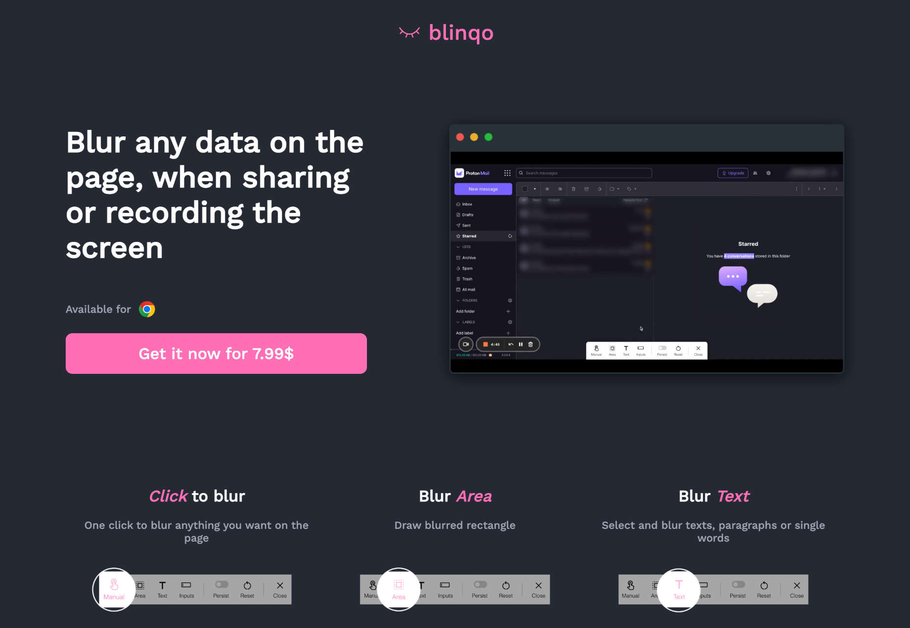
Blinqo is a handy little Chrome extension for anyone that needs to share their screen. It allows you to blur parts of your screen when sharing or recording, so your private details remain private.

Instaprice

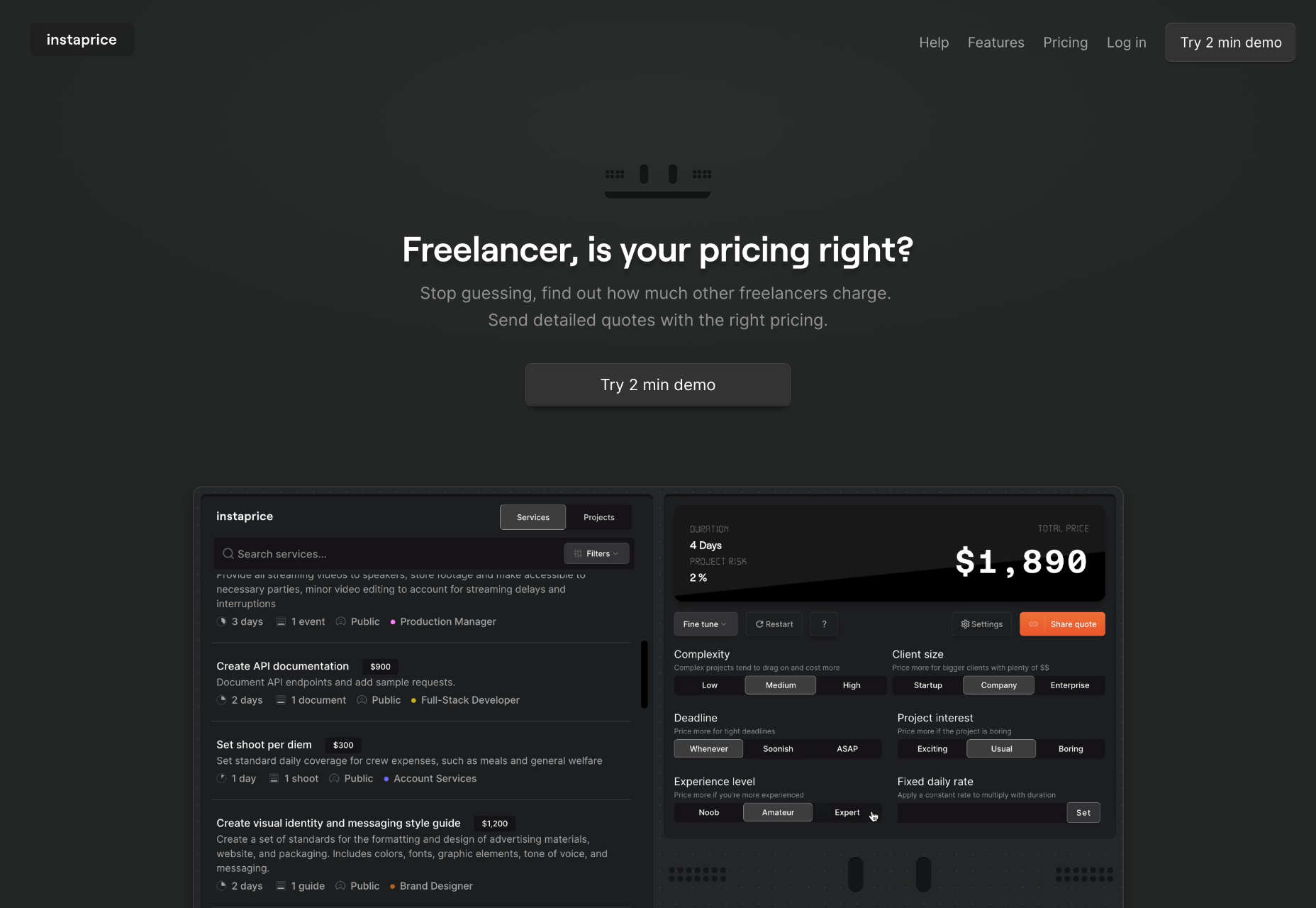
Instaprice is a helpful new service that shows you what other freelancers charge for the job you’re quoting on. Earn the actual market rates and never get caught out undercharging again!

Leta

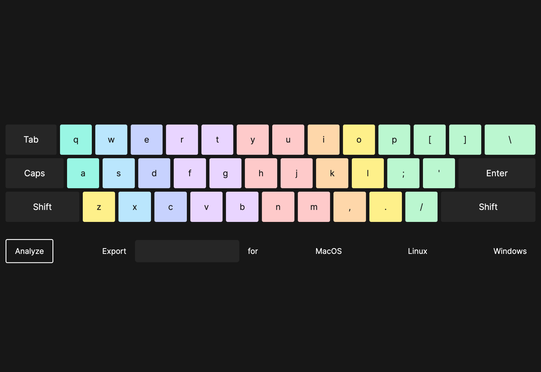
Leta is a great app that allows you to design your own keyboard layout. You can redesign the key positions for macOS, Linux, or Windows and download them for free.

Blogic

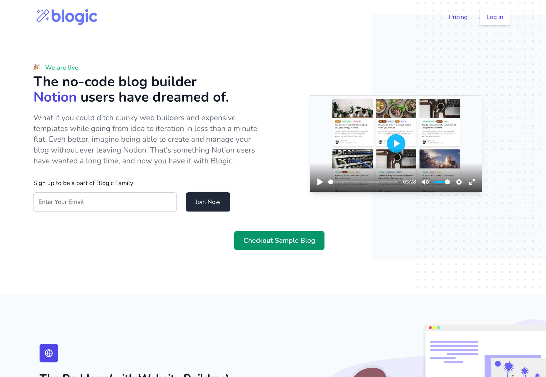
Build blogs powered by the Notion API with Blogic, a no-code blog builder that can create fast, SEO-friendly blogs in under a minute. Custom domains and third-party scripts are supported.

Digital Maker Toolkit

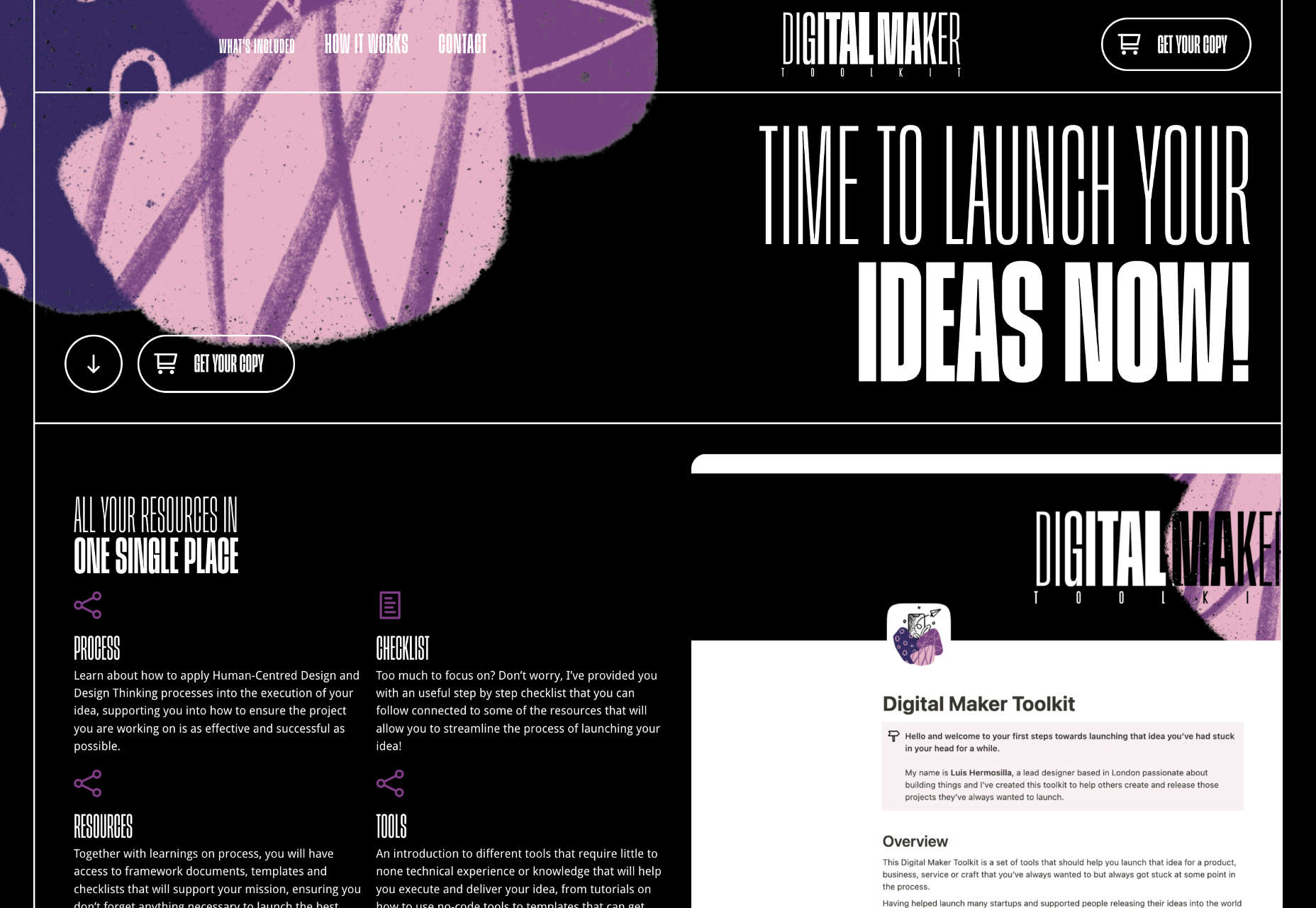
The Digital Maker Toolkit is a collection of resources for anyone releasing digital products. It includes guides on process, a handy step-by-step checklist, a list of further resources, and a guide to the available tools.

Slides

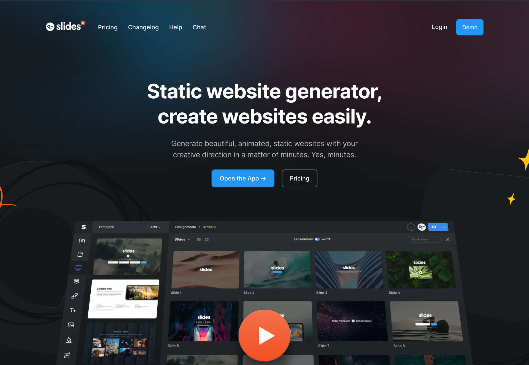
Slides is a static website generator you can use to create beautiful, animated websites in minutes. Select layouts from a collection of templates and publish with clean code that downloads fast.

AXplorer

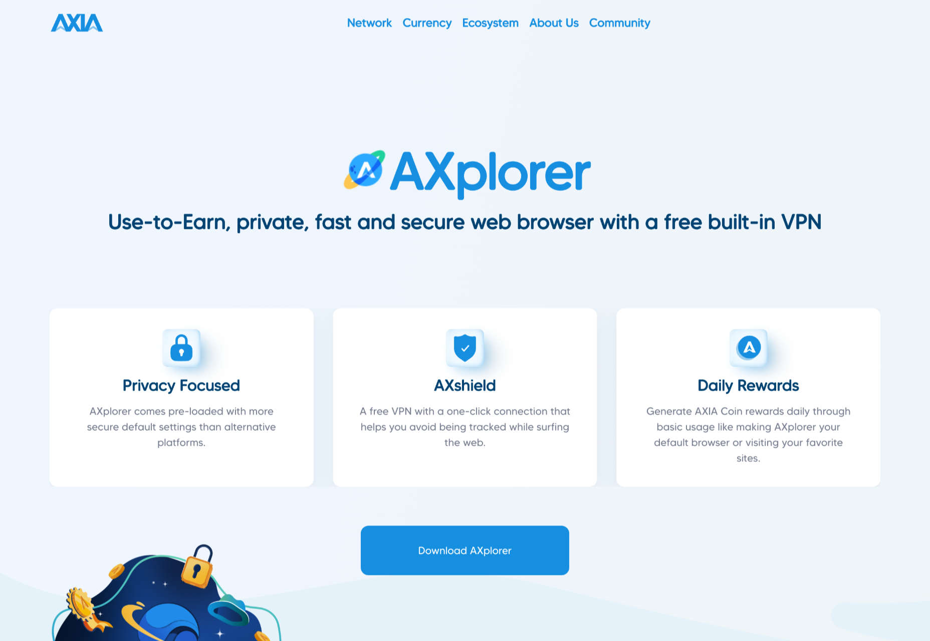
AXplorer is a privacy-focused browser with a built-in VPN. Created by the Axia blockchain network, it generates free crypto in the form of AXIA coins when using it to browse the web.

Font Engine

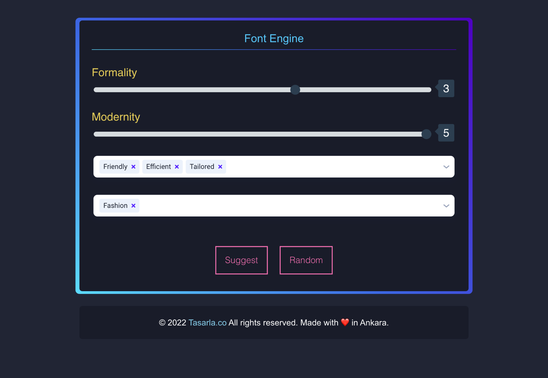
Can’t decide on a font for your latest side project? Font Engine is a handy little app that will suggest fonts for you. Just tell it your brand values and hit the ‘Suggest’ button.

Deliciozo

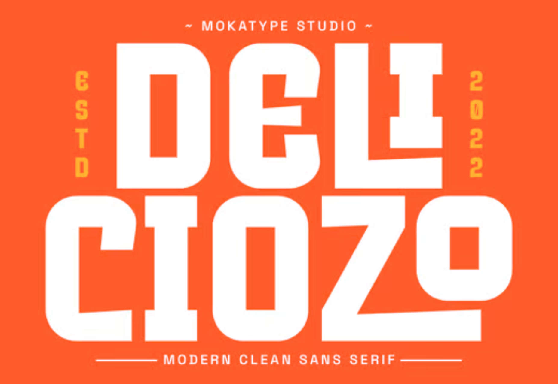
Deliciozo is an excellent display font with irregular strokes and styling, making it feel like a paper cut-out. It’s perfect for magazines, cookbooks, and even logos.

Kayino

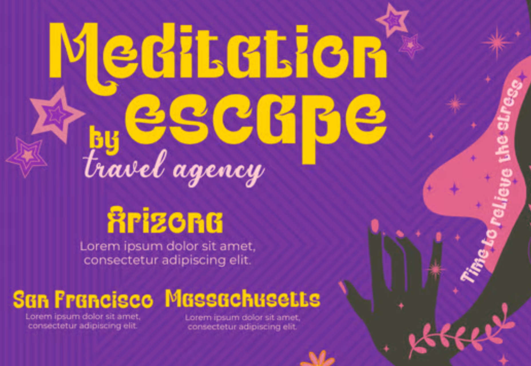
If you’re looking for a font to convey the hippy era, look no further than the psychedelic stylings of Kayino, a groovy display font with crazy details.

Noganas

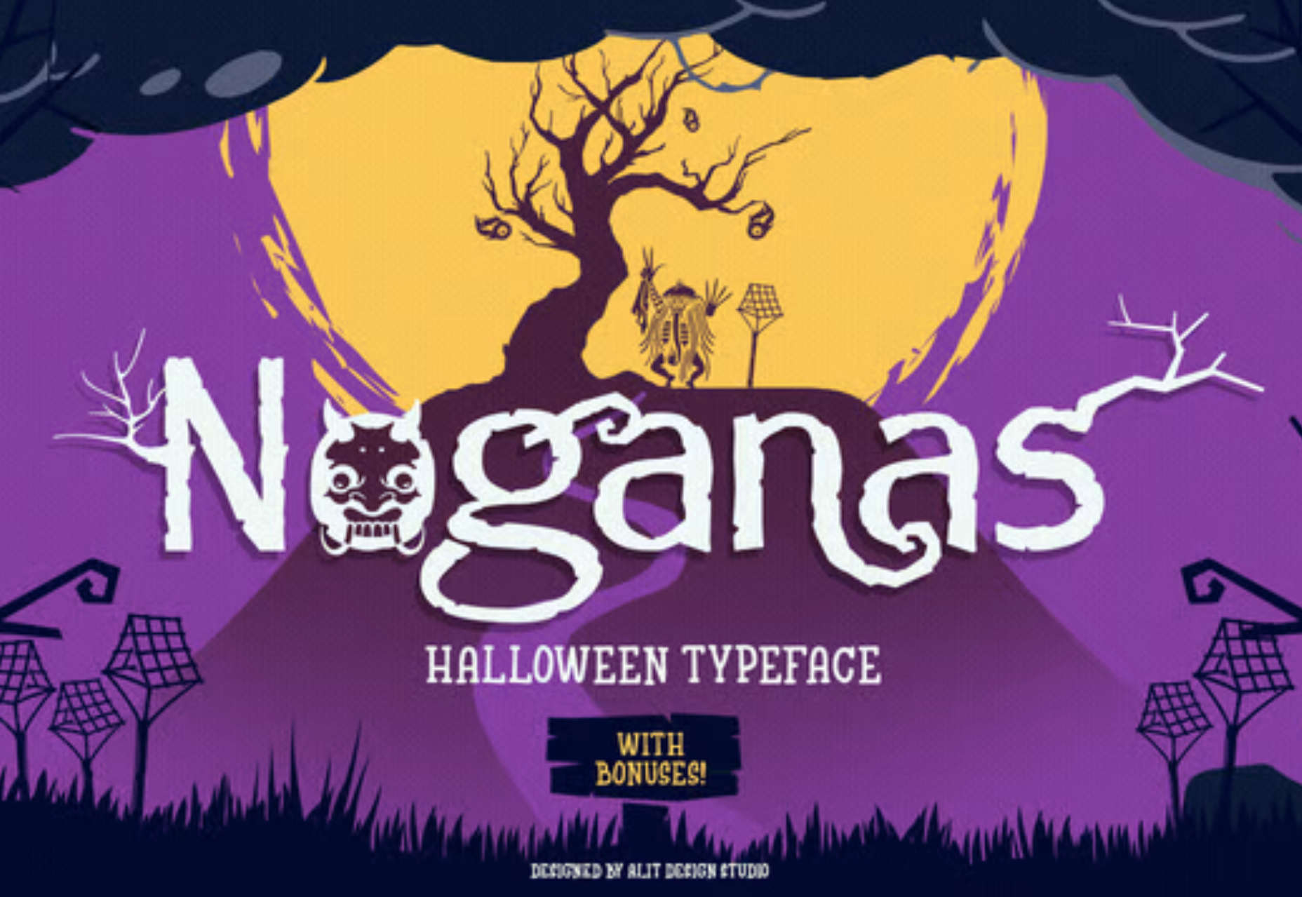
Noganas is a spooktacular font for the upcoming Halloween festivities. Use it to add some gruesome frivolity to your seasonal designs.

Source

The post Exciting New Tools for Designers, October 2022 first appeared on Webdesigner Depot.
Source de l’article sur Webdesignerdepot

Last year we saw the launch of a new Web programming language Dart – Structured Web Programming from Google. A very interesting approach to support web application development. Not so long after Go, Groovy, Ruby, Scala, << Name your DSL here >>; we see Dart. Is it a good thing to have at least one programming language to solve one problem? The answer is, like we already know, it depends.

Stay Away From “Do it Yourself”

It is your choice as to if you will try to do things yourself or allow the truly seasoned professionals to help out. Some decide that they are going to try to go it alone when they are programming something new, but this often ends up in a less than desirable place. It may even be more expensive than just hiring an expert who can help you get it programmed for you in the first place.

Source de l’article sur DZONE

There are a lot of dark, retro vibes trending in website design right now. Although there are still some light projects popping up – including a pastel trend below – a lot of what we are seeing has a quite moody feel.

Here’s what’s trending in design this month.

Pastel Color Palettes

Let’s start with the trend with a lighter feel – pastel color palettes. While much of the web is trending toward dark aesthetics, there’s a segment that’s going in the exact opposite direction. Those sites feature soft, pastel color palettes that serve as a balance to all the super dark websites out there.

One thing about this website design trend is that it jumps out because of the stark contrast with all of the dark color palettes out there.

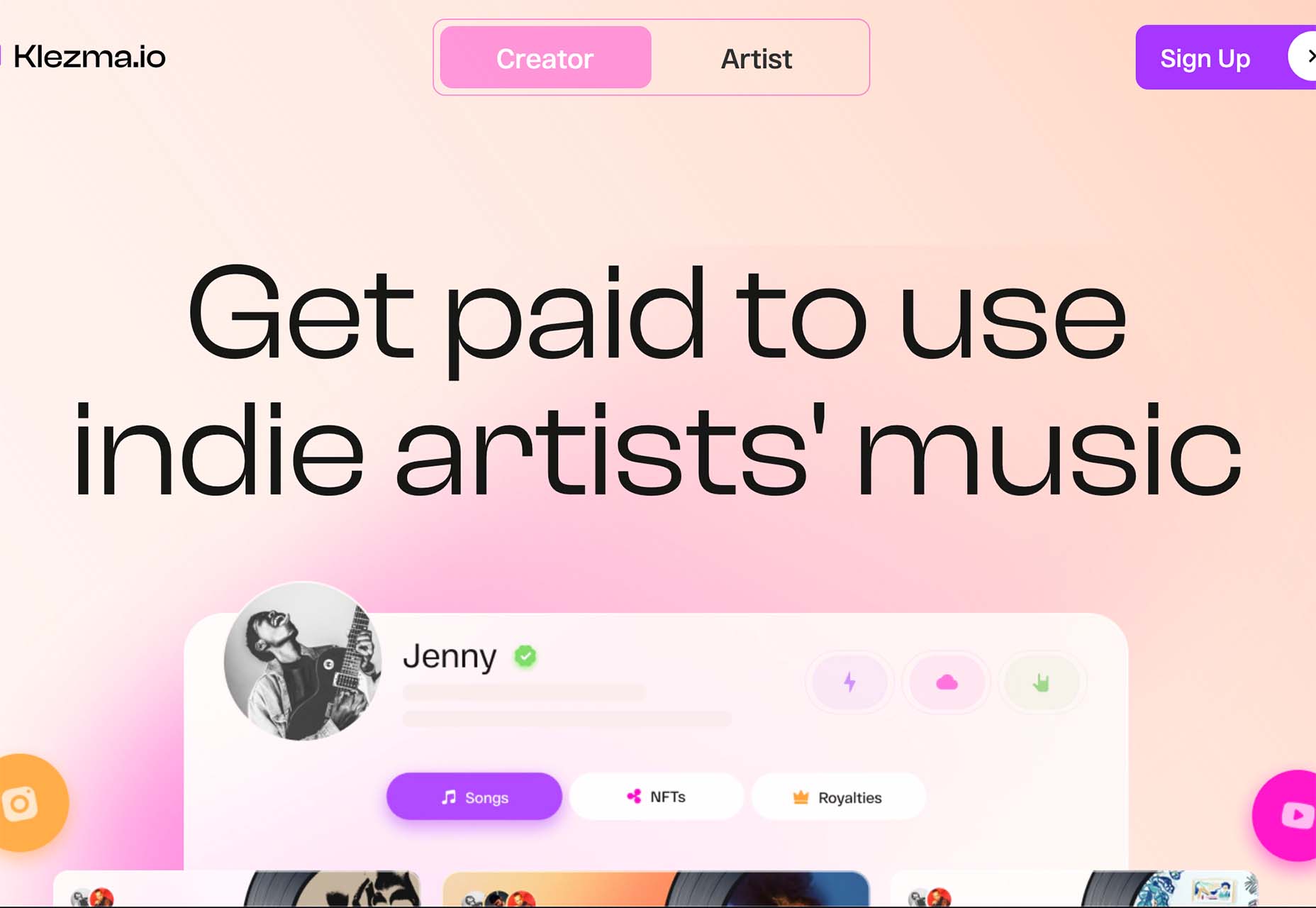
Each of these designs seems to use a pastel color palette as the basis for a background. A blur effect is paired with the colors to use pastels in a way that has a natural feel without appearing too feminine or light.

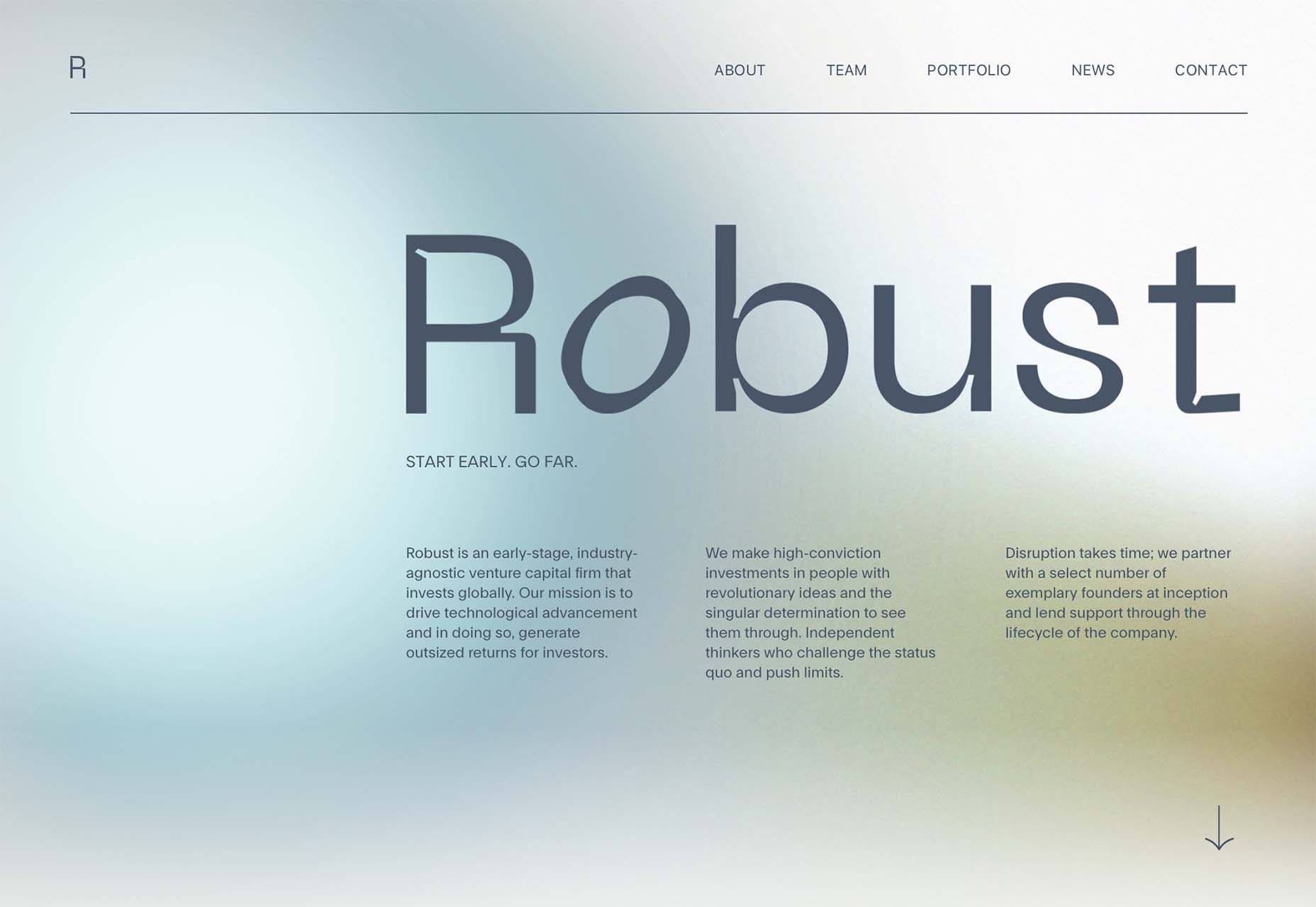
Robust uses blue and earth tones for a pastel background that feels modern and strong when paired with the hard-edged headline font.

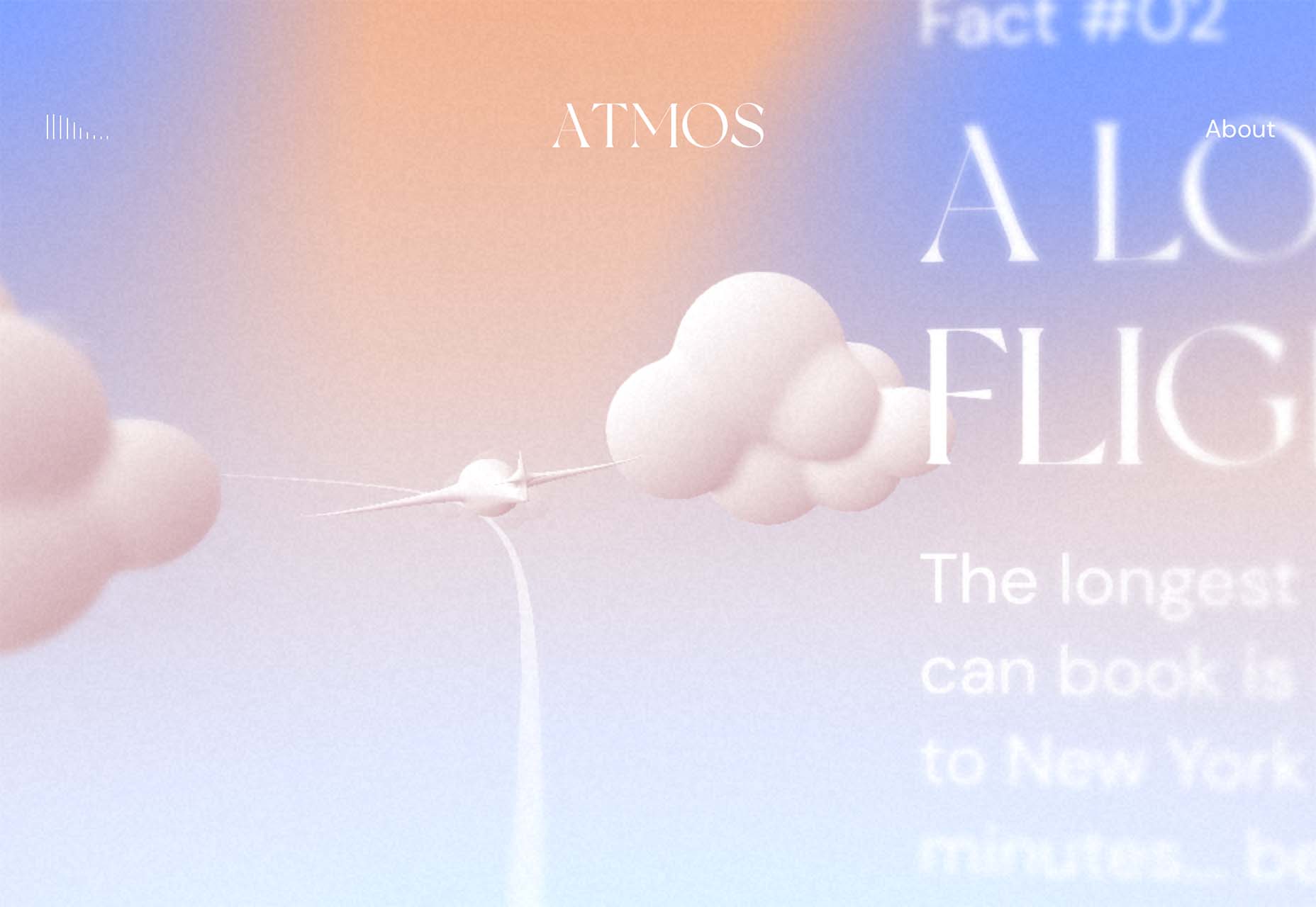
Atmos uses a light pastel theme that takes you through the clouds with blues, and pinks, and purples. The pastel color scheme works well with the content which is airline-themed and makes you feel like you are flying through the sky. The colors are also soft enough to provide an easy reading experience.

Klezma is another design with the same pastel background with graduated color. The peach tones are fairly neutral and give plenty of room to the content.

Fonts with a Distinct Retro Look

Every one of these websites uses a typeface with a similar look and feel. This retro headline style is trending in a major way.

The best way to use this design element is for short words. This typeface design isn’t meant for a lot of words or when readability is a high priority.

This style is all about creating a specific kind of vibe for your website. The typefaces in this trend have a quite retro look and feel with an almost 1960s or ’70s feel to them. The rest of the design mimics this feel as well with colors and surrounding elements that contribute to the overall look.

A couple of common elements here include the use of all capitals font sets and letterforms that include odd shapes and lines.

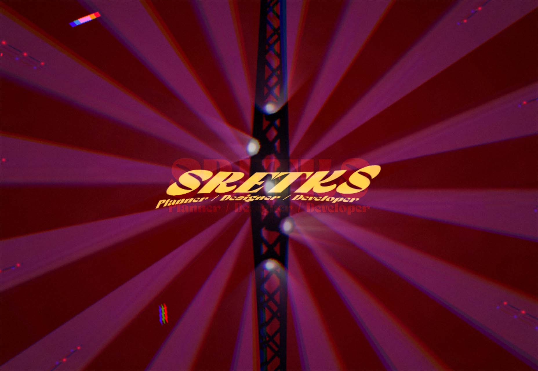
Sretks not only uses a retro typeface but bends and twists it a bit too to add to the old-school feel. The background color helps add to the groovy vibe.

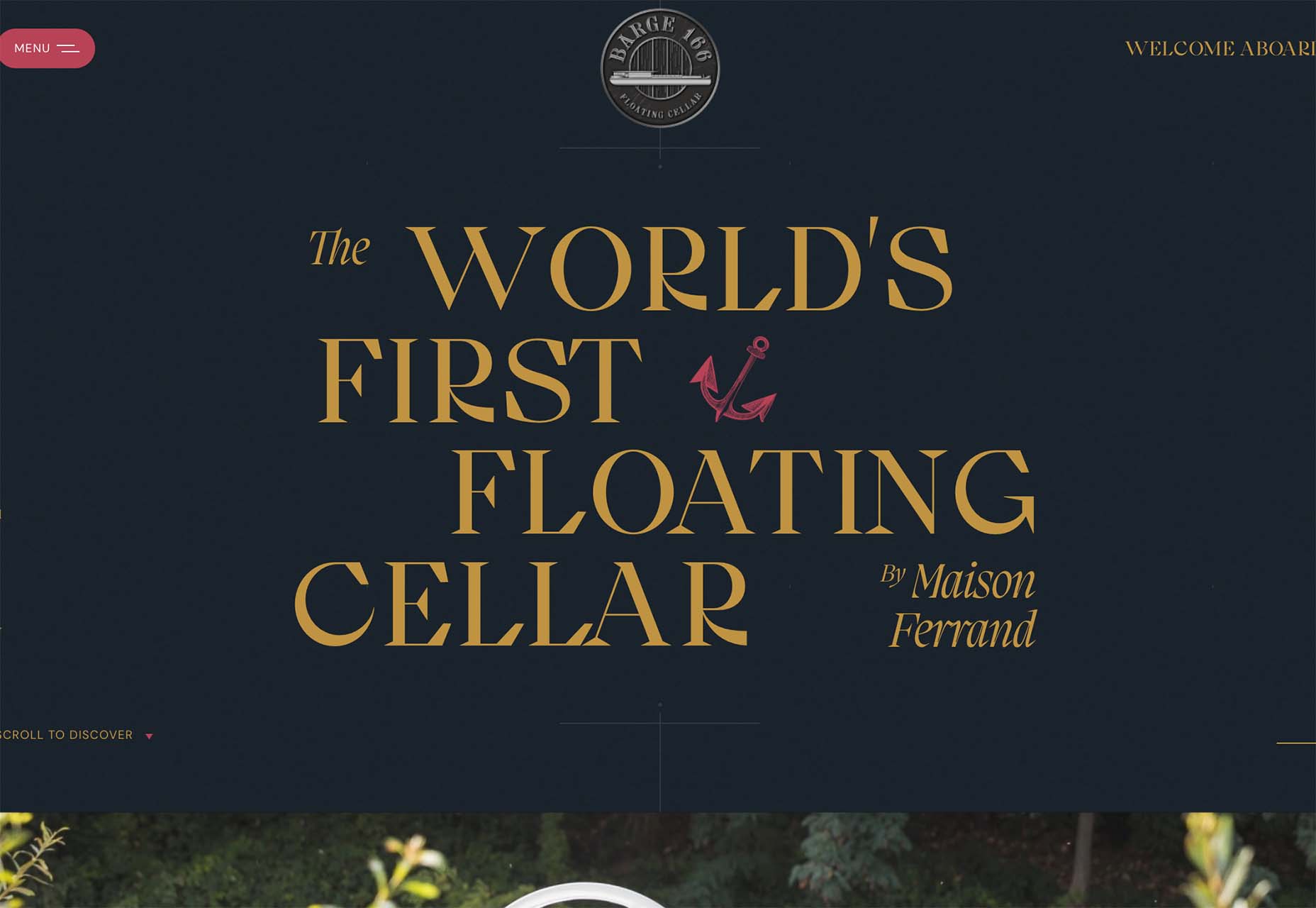
Barge 166 uses a retro typeface with the same design feel as the other examples but with a sharper, more serif-style edge. It’s easier to read but still carries a retro look and feel. Use a typeface similar to this if you want to capture that retro font style for a trending look while maintaining as much readability as possible. This option works best for multiple lines of words in a large size.

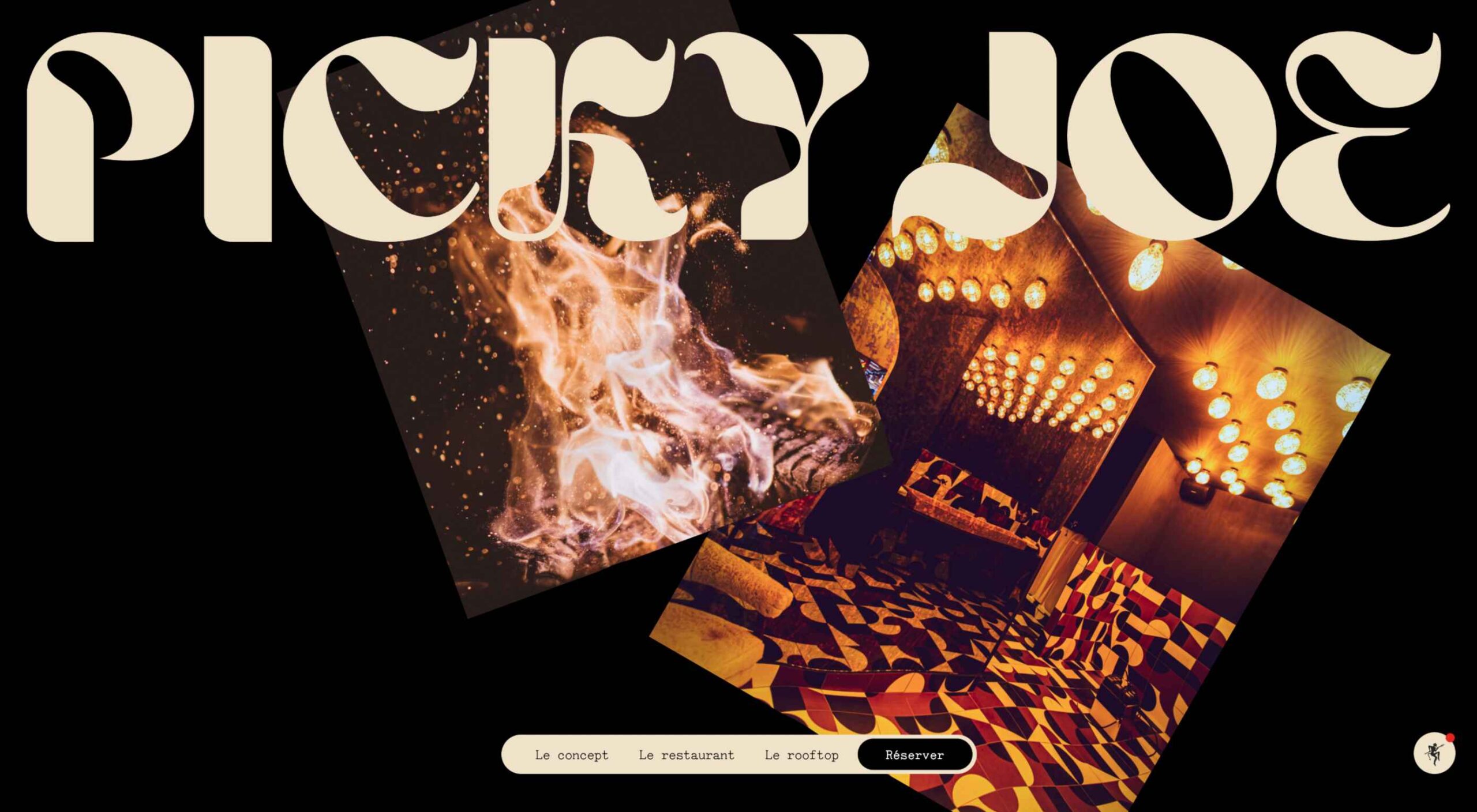
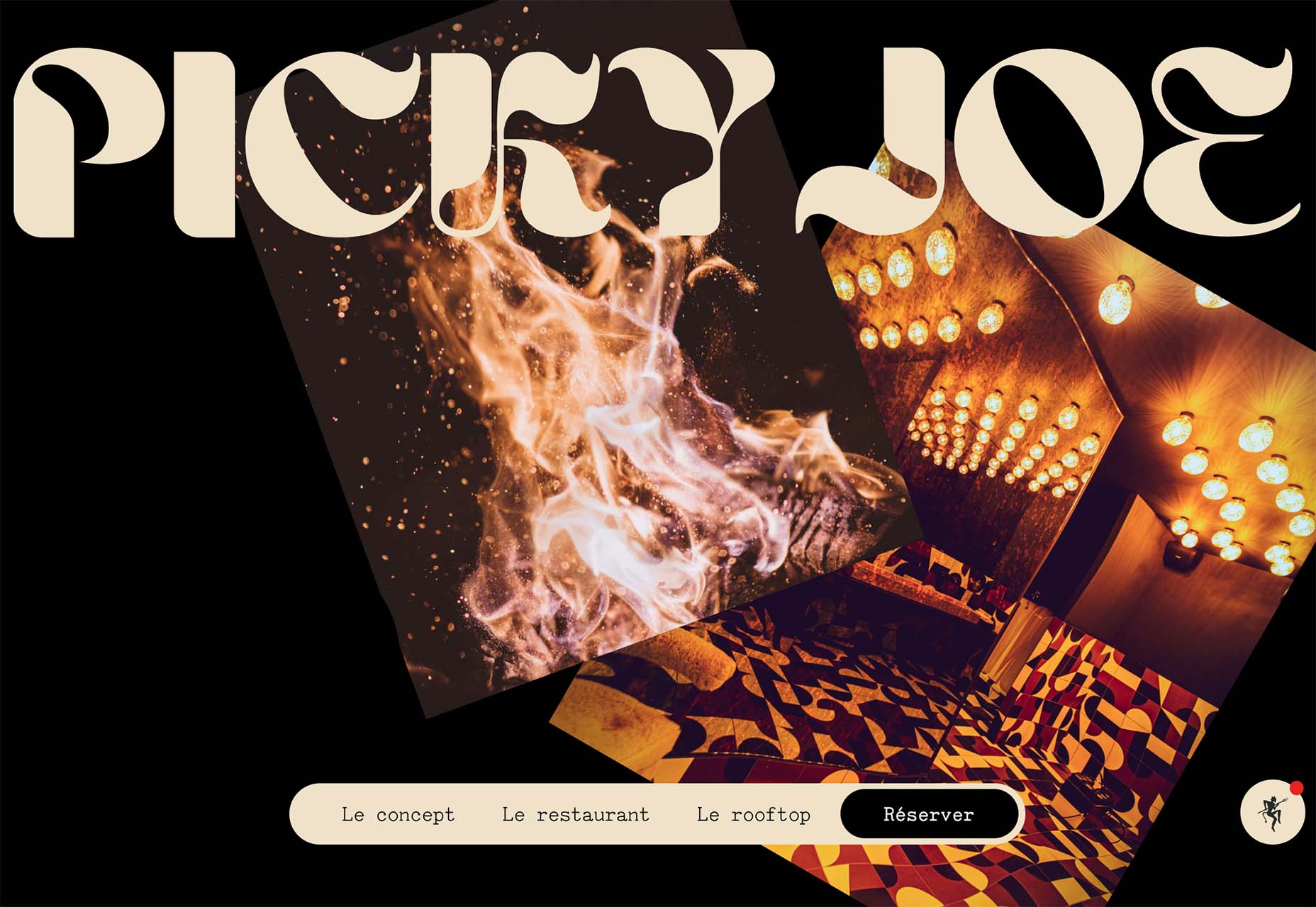
Picky Joe uses a retro typeface with rounded letters and a bit of a tilt to the characters to create a distinct feel. This is definitely a style that has to be used sparingly but can be a fun option, depending on the content of your website design.

Dark “Product” Sites

Dark mode design is probably the biggest design trend of 2022. Everywhere you look, websites are using dark color palettes and styles. Designers are creating more projects with a dark/light toggle so users can control their experience.

This visual concept is carried over to website designs that feature products as well. This is one of the last places the dark aesthetic had not touched. It’s been a bit of an unwritten rule that product images should be on white or light backgrounds to help make them easy to see and inspect digitally.

This design trend bucks that idea and features products on dark backgrounds – some with so little contrast that you almost have a hard time seeing the products. (Maybe these brands are banking on the idea that you already know them or are selling a lifestyle product.)

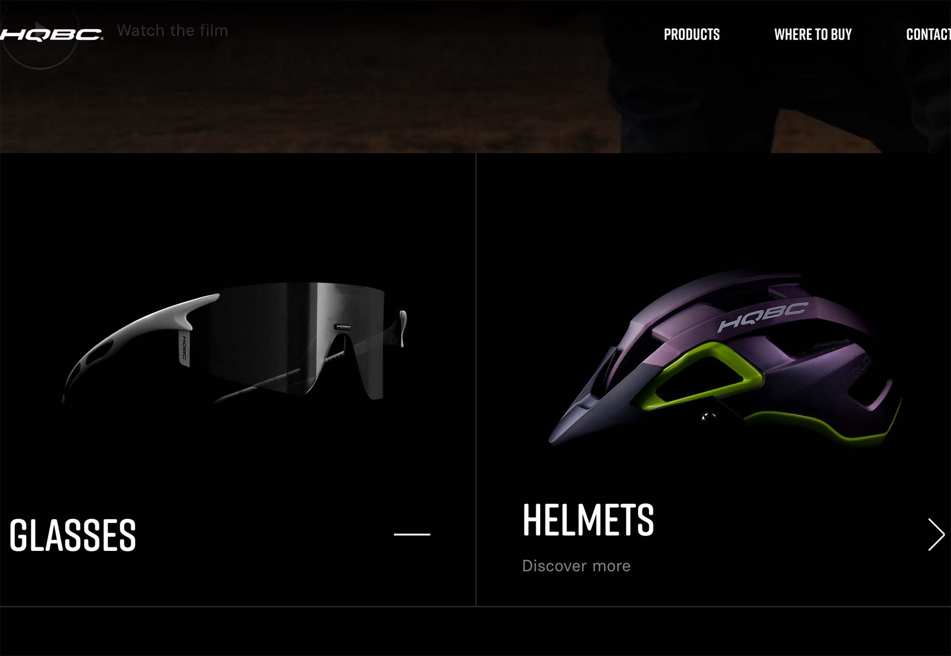
HQBC sells bike accessories such as glasses and helmets and the site has a sleek look and feel. You know it is cool from the second you land on it. The question though – is there enough visual information with the dark background to help you make a purchase? This design probably works because it only encourages you to find a physical location to make a purchase rather than buy online.

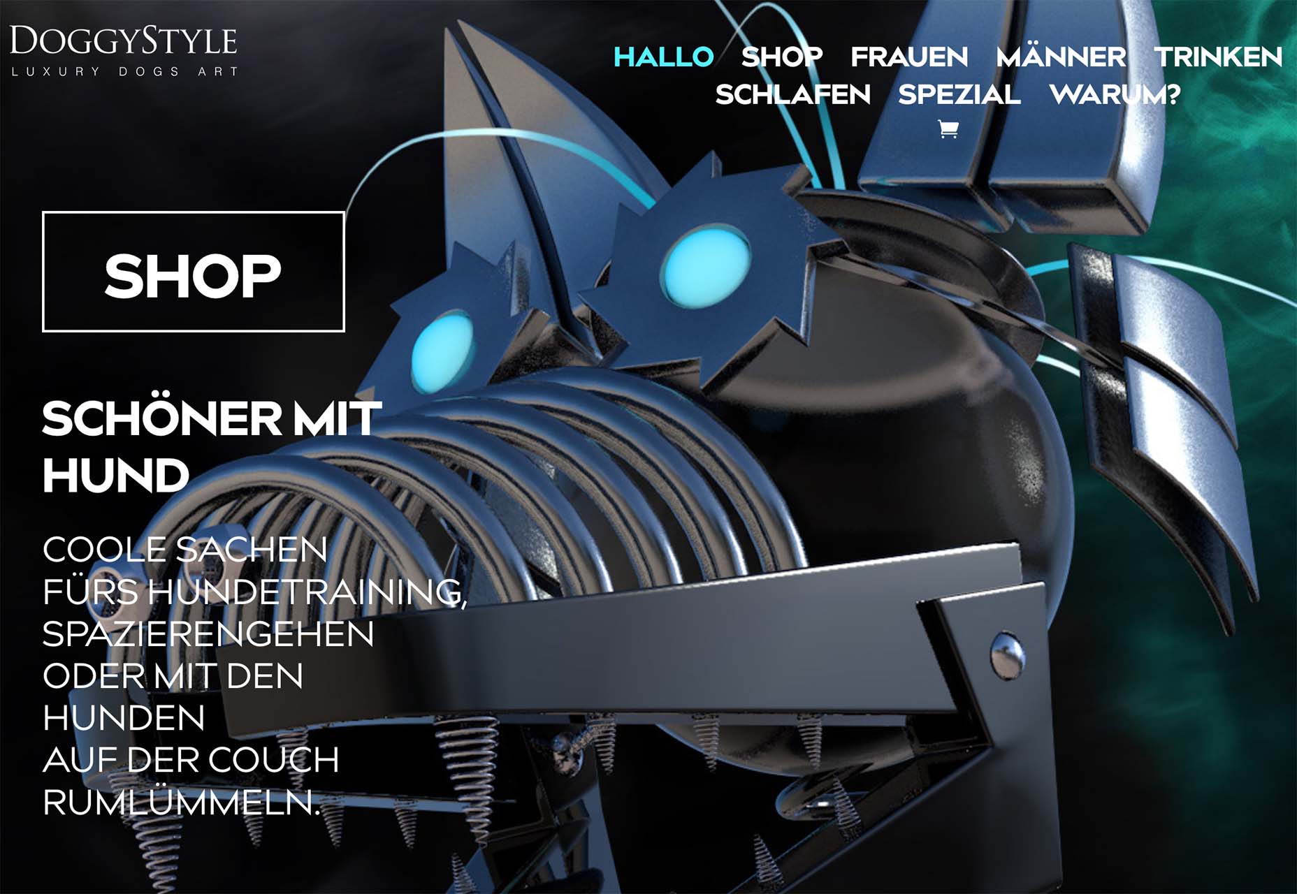
Doggystyle Shop also banks on the idea of you knowing the shopping experience or brand when you arrive. What the design does do though is put products on white backgrounds after you have clicked through far enough to make a commitment to buy. This helps you see the product well one final time before making a purchase. (The challenge is that it is three to four clicks in for the most part.)

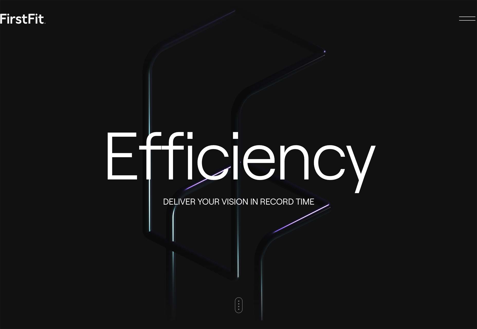
FirstFit uses the design trend in a way that’s similar to the first example. They are showing a product, but not actually trying to convert sales on the website. Other links take you to more product information and content – using a lighter background and color scheme – and the dark background with the product serves mostly as a highly visual landing page that will help entice users to learn more. When it comes to dark mode and products, this seems to be the best option for most website designs.

Conclusion

The state of the world around us and our emotions can play hard into websites and other design projects. Some of the darker elements that are popular now may be a reflection of that or it could be more of a lean into dark mode schemes.

Either way, the web has a pretty dark feel right now.

Source

The post 3 Essential Design Trends, July 2022 first appeared on Webdesigner Depot.
Source de l’article sur Webdesignerdepot

In the spirit of fall feasts, this month’s collection of tools and resources is a smorgasbord of sorts. You’ll find everything from web tools to icon libraries to animation tools to great free fonts. Let’s dig in.
Here’s what new for designers this month.

The Good Line-Height

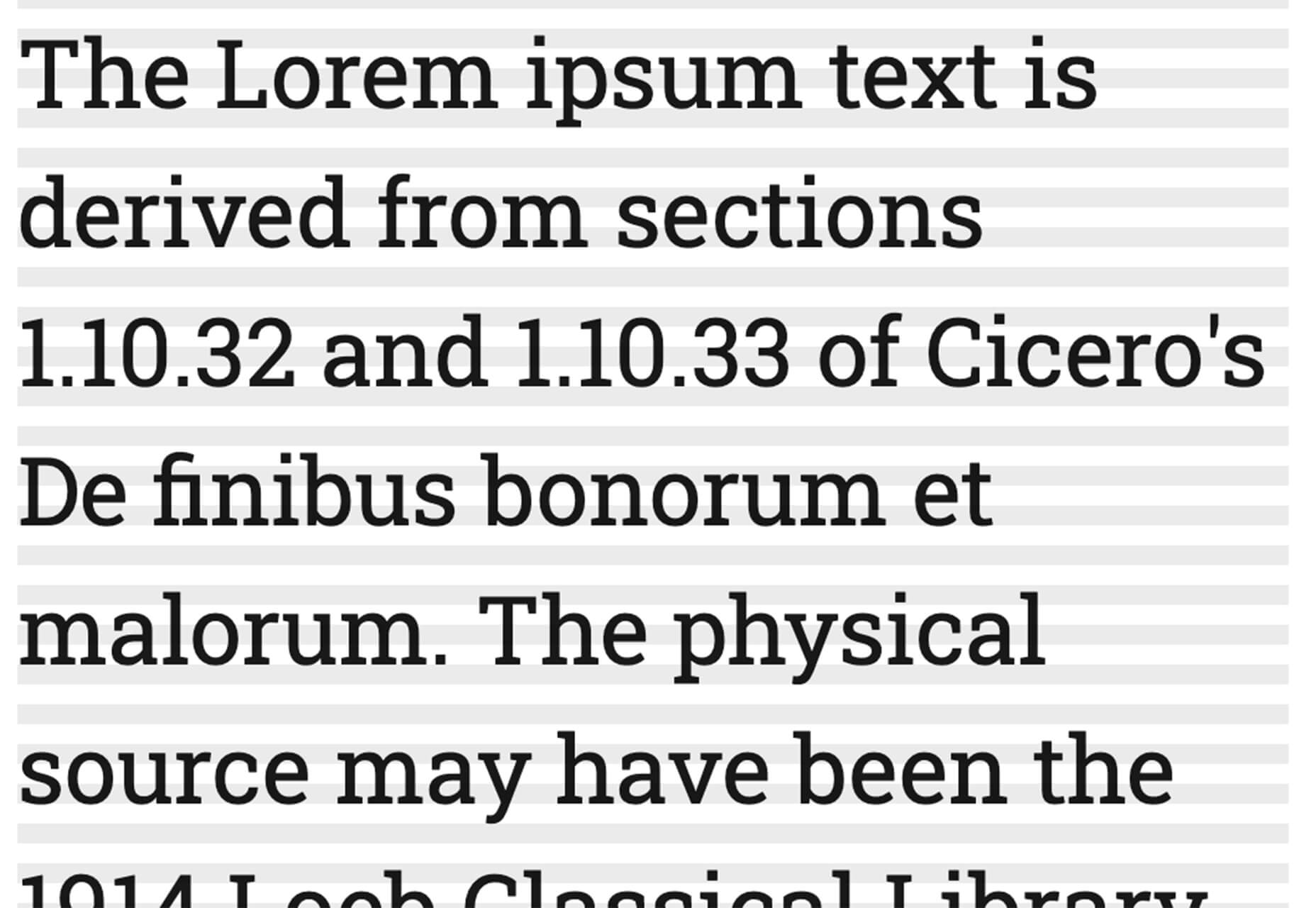
The Good Line-Height is the tool you won’t be able to live without after using it a few times. The tool calculates the ideal line-height for every text size in a typographic scale so that everything always fits the baseline grid. Set the font size, multiplier, and grid row height to get started.

Link-to-QR

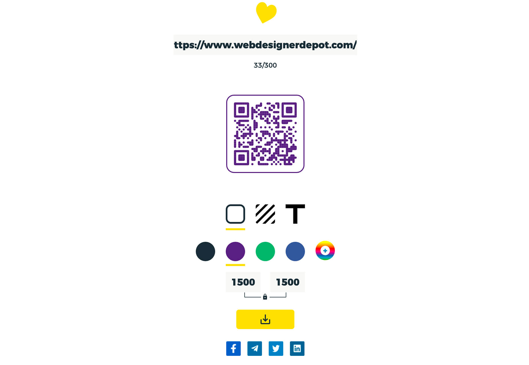
Link-to-QR makes creating quick codes a breeze. Paste in your link and the tool creates an immediate QR code that you can download or share. Pick a color and transparency, plus size, and you are done.

Quarkly

Quarkly allows you to create websites and web apps both using a mouse and typing code – you get all the pros of responsive editing, but can also open the code editor at any time and manually edit anything and it all synchronizes. The tool is built for design control and is in beta.

UnSpam.email

Unspam.email is an online spam tester tool for emails. Improve deliverability with the free email tester. The service analyzes the main aspects of an email and returns a spam score and predicts results with a heat map of your email newsletter.

Filmstrip

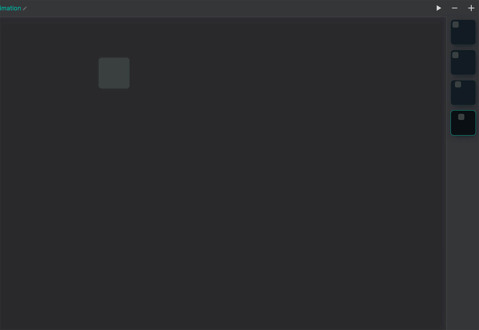
Filmstrip allows you to create or import keyframe animations, make adjustments, and export them for web playback. It’s a quick and easy tool for modern web animation.

CSS Background Patterns

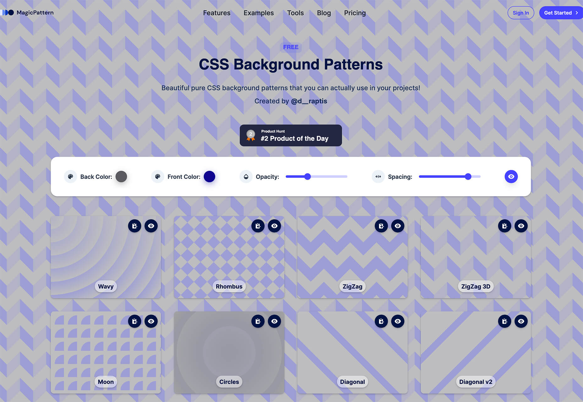
CSS Background Patterns is packed with groovy designs that you can adjust and turn into just the right background for your web project. Set the colors, opacity, and spacing; then pick a pattern; preview it right on the screen; and then snag the CSS. You can also submit your own patterns.

Neonpad

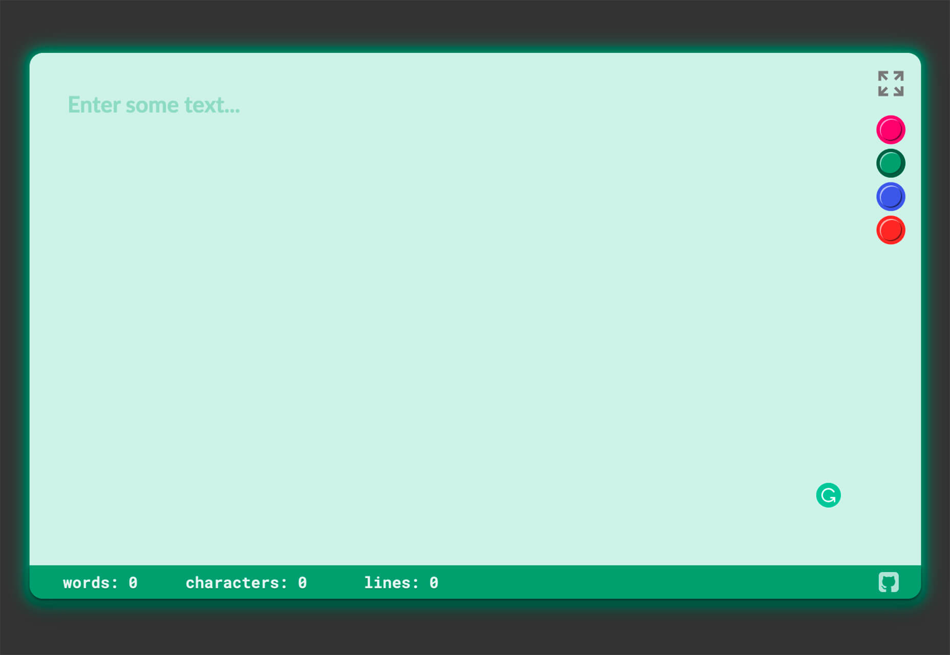
Neonpad is a simple – but fun – plain text editor in neon colors. Switch hues for a different writing experience. Use it small or expand to full browser size.

Link Hover Animation

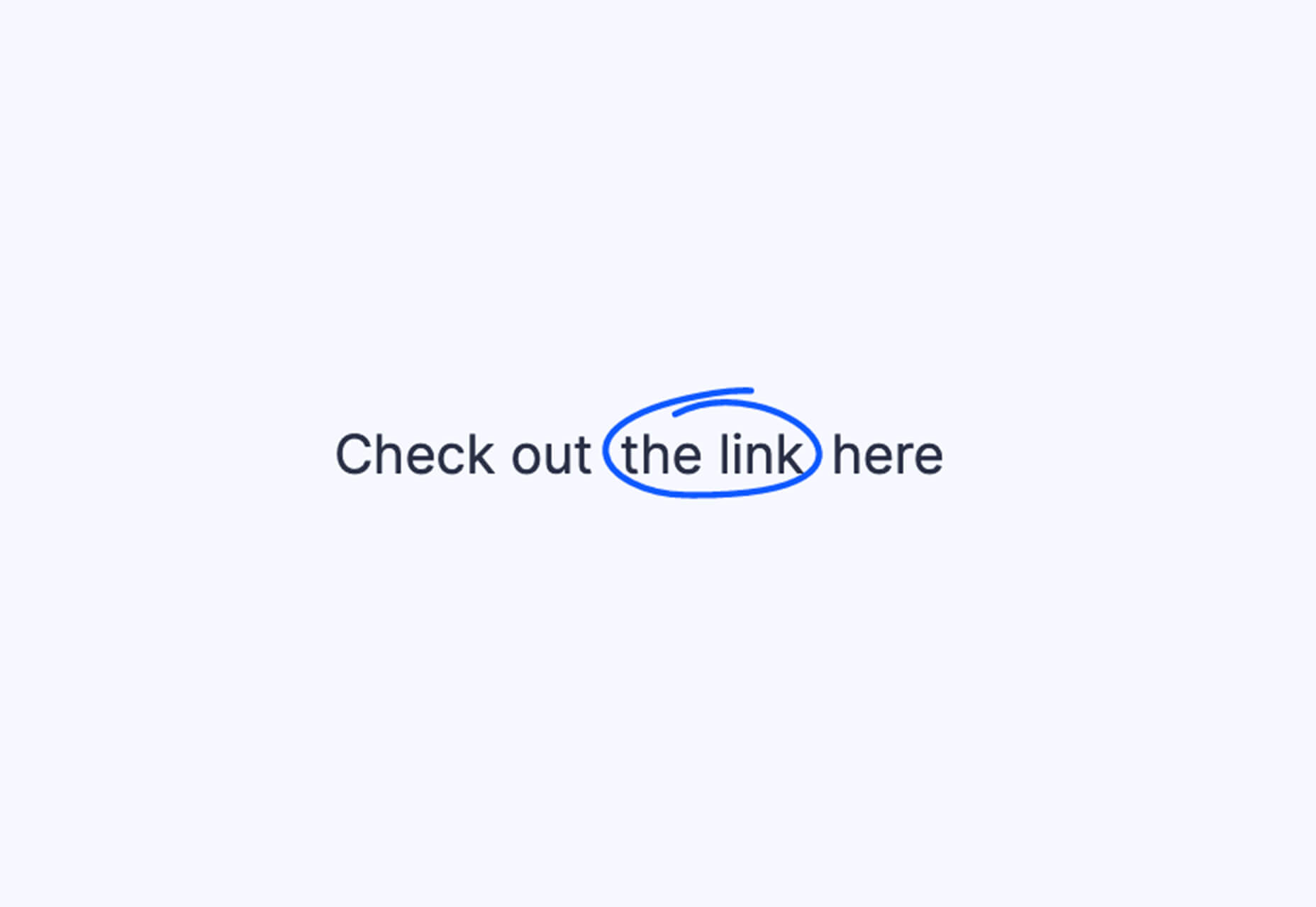
Link Hover Animation is a nifty twist on a hover state. The animation draws a circle around the link!

Tint and Shade Generator

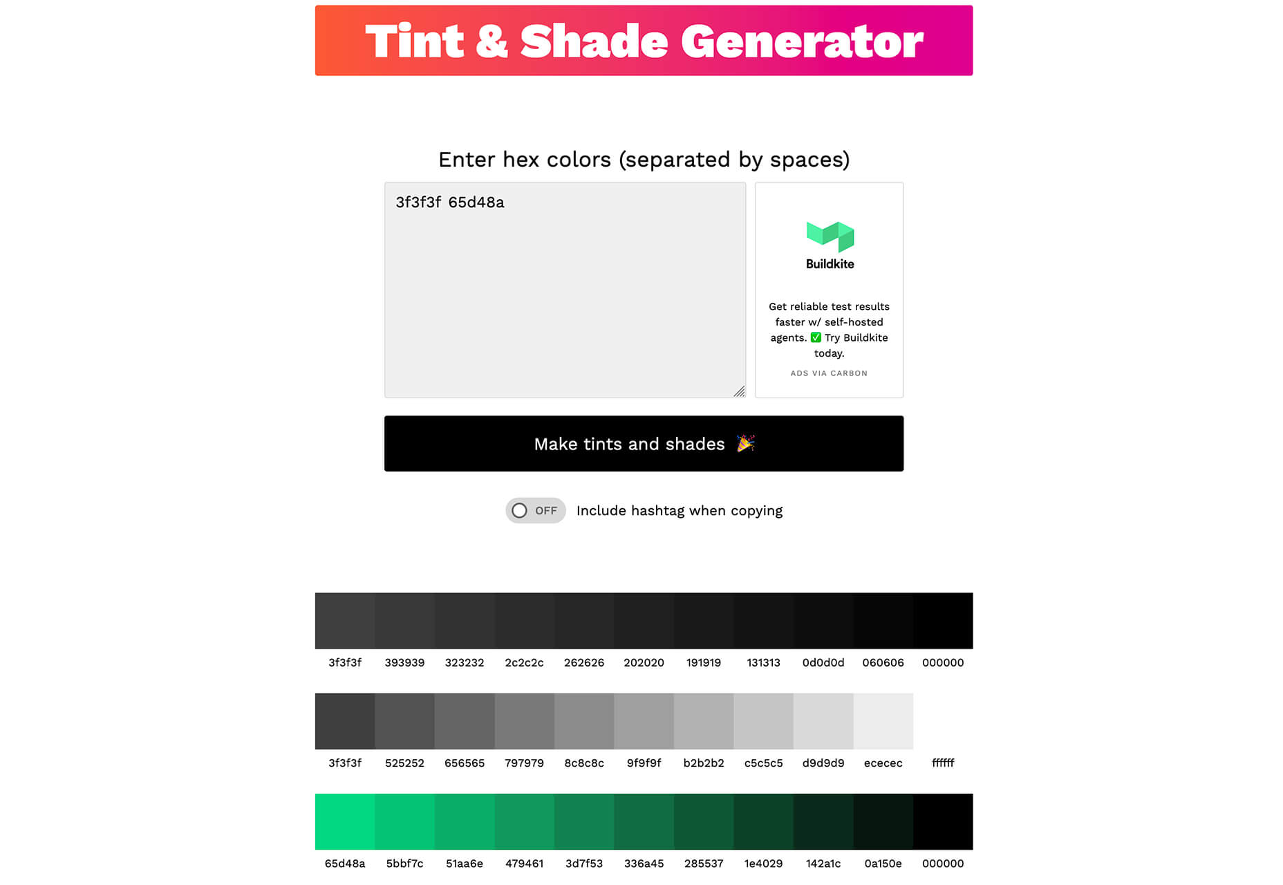
Tint and Shade Generator helps you make the most of any hex color. Start with a base color palette and use it to generate complementary colors for gradients, borders, backgrounds, or shadows.

Pure CSS Product Card

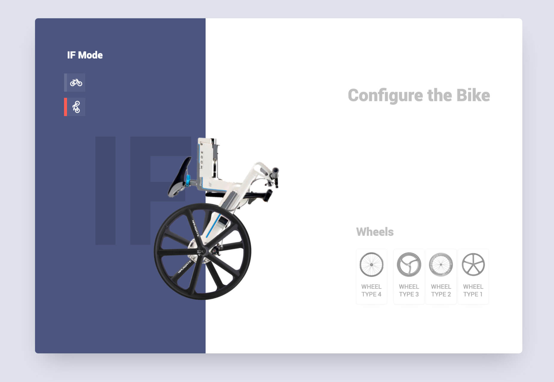
Pure CSS Product Card by Adam Kuhn is a lovely example of an e-commerce design that you can learn from. The card is appealing and functional.

Free Favicon Maker

Free Favicon Maker allows you to create a simple SVG or PNG favicon in a few clicks. You can set a style that includes a letter or emoji, font and size, color, and edge type and you are ready to snag the HTML or download the SVG or PNG file.

Ultimate Free iOS Icon Pack

The Ultimate Free iOS Icon Pack is a collection of 100 minimal icons in an Apple style. With black and white version of each icon and original PSD files, you can create sleek icons for your iPhone screen in minutes. And it’s completely free! No email address or registration required.

Phosphor Icon Family

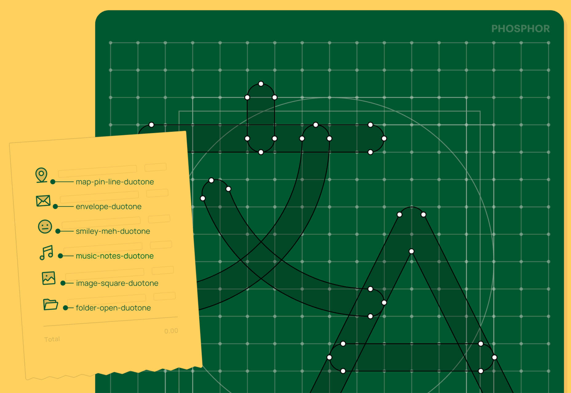
Phosphor is a flexible icon family for all the things you need icons for including diagrams and presentations. There are plenty of arrows, chats, circles, clocks, office elements, lists, business logos, and more. Everything is in a line style, filled, or with duotone color. Everything is free but donations are accepted.

3,000 Hands

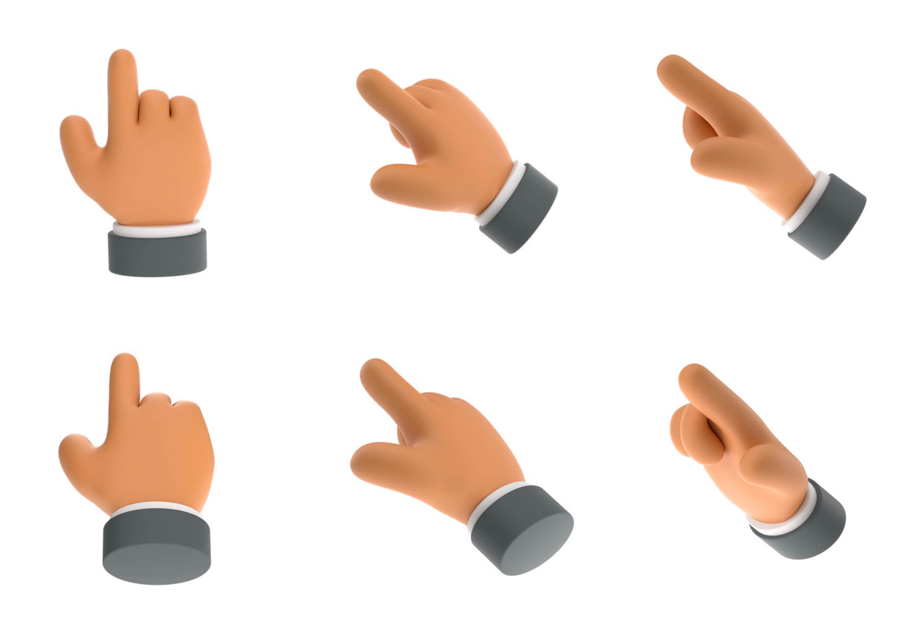
3,000 Hands is a kit of hands that includes plenty of gestures and style in six skin tones and with 10 angles of every gesture. They have a 3D-ish shape and are in an easy to use PNG format. This kit has everything you need from a set of hand icons.

Radix Icons

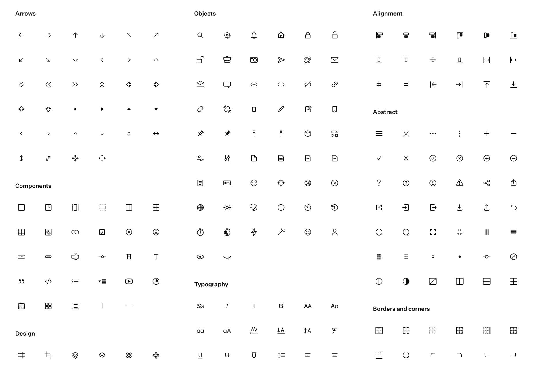
Radix Icons is a set of 15px by 15px icons for tiny spaces. They are in a line style and are available in a variety of formats including Figma, Sketch, iconJar, SVG, npm installation, or GitHub.

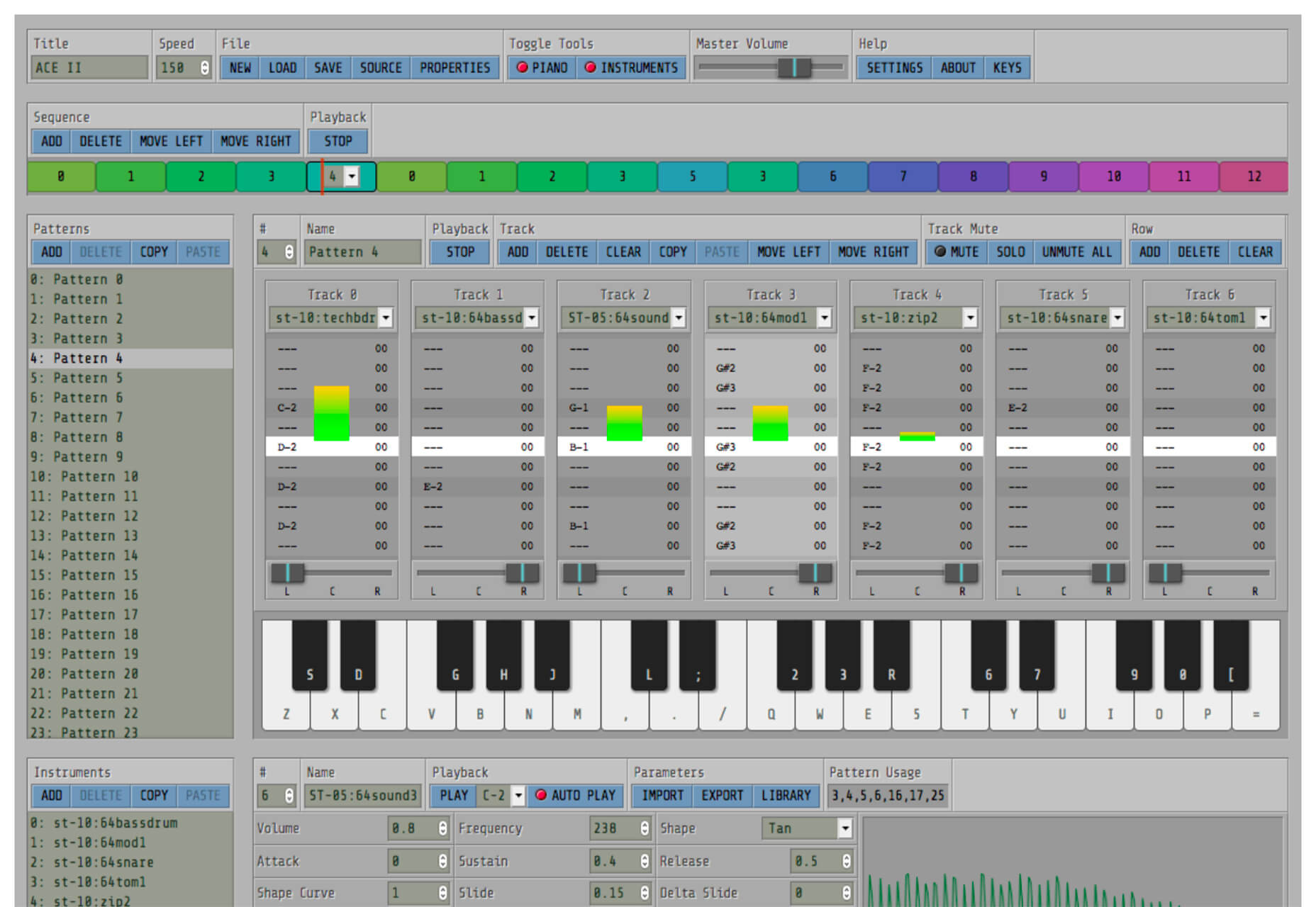
Deepnote

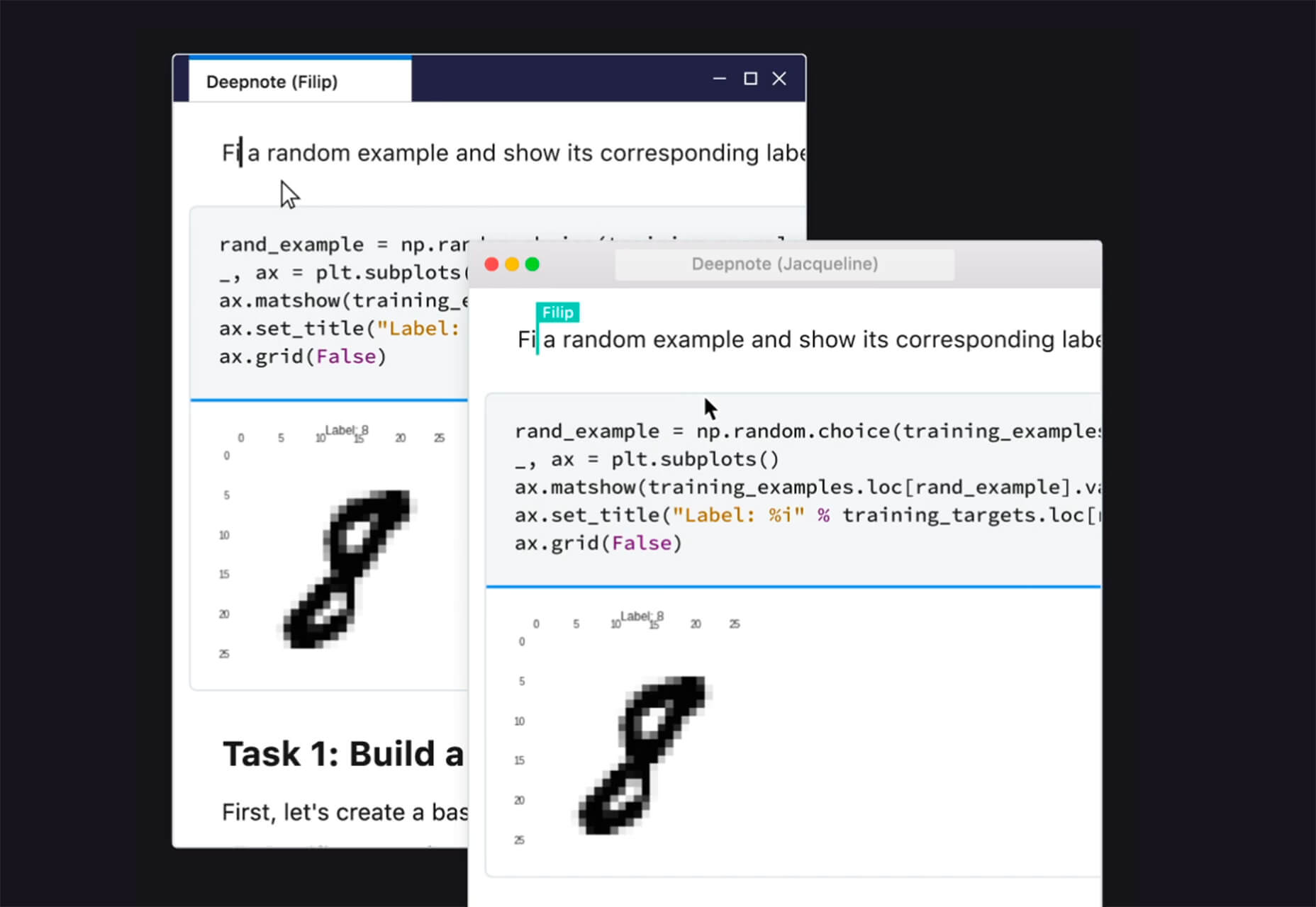
Deepnote is a new kind of data science notebook. It is Jupyter-compatible with real-time collaboration and running in the cloud and designed for data science teams.

ZzFXM Tiny JavaScript Music Generator

ZzFXM is a tiny JavaScript function that generates stereo music tracks from patterns of note and instrument data. Instrument samples are created using a modified version of the super-tiny ZzFX sound generator by Frank Force. It is designed for size-limited productions.

Image Tiles Scroll Animation

Image Tiles Scroll Animation is a different type of scrolling pattern using Locomotive Scroll. The grid creates a smooth animation in a fun and modern style.

Bubbles

Bubbles is a Chrome extension that allows you to collaborate by clicking anywhere on your screen and then dropping a comment to start a conversation with anyone. This is a nice option for work from home teams.

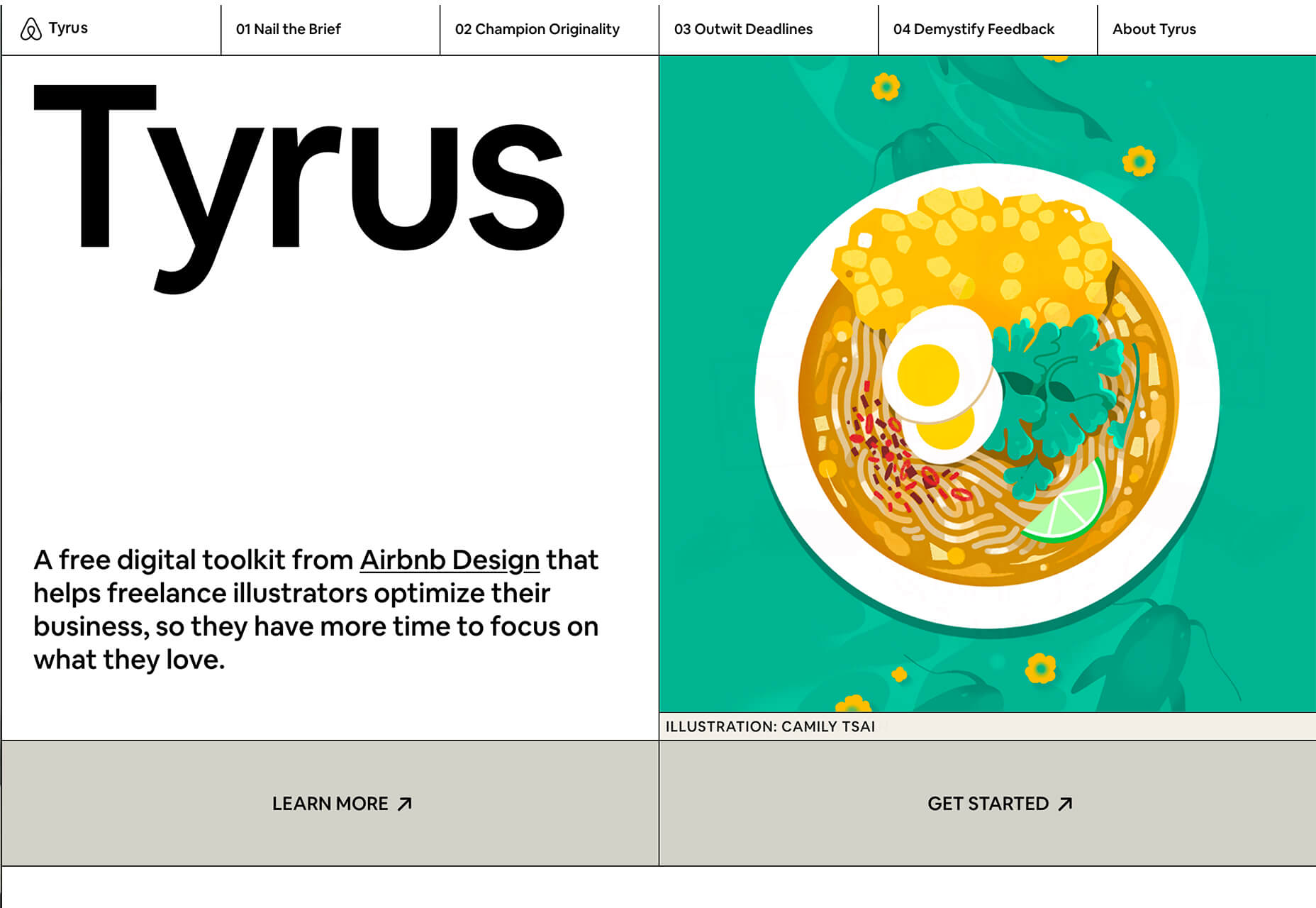
Tyrus

Tyrus is a toolkit from the design team at Airbnb to help illustrators make the most out of their design businesses. It is broken into sections to help you with design briefs, originality, deadlines, and feedback.

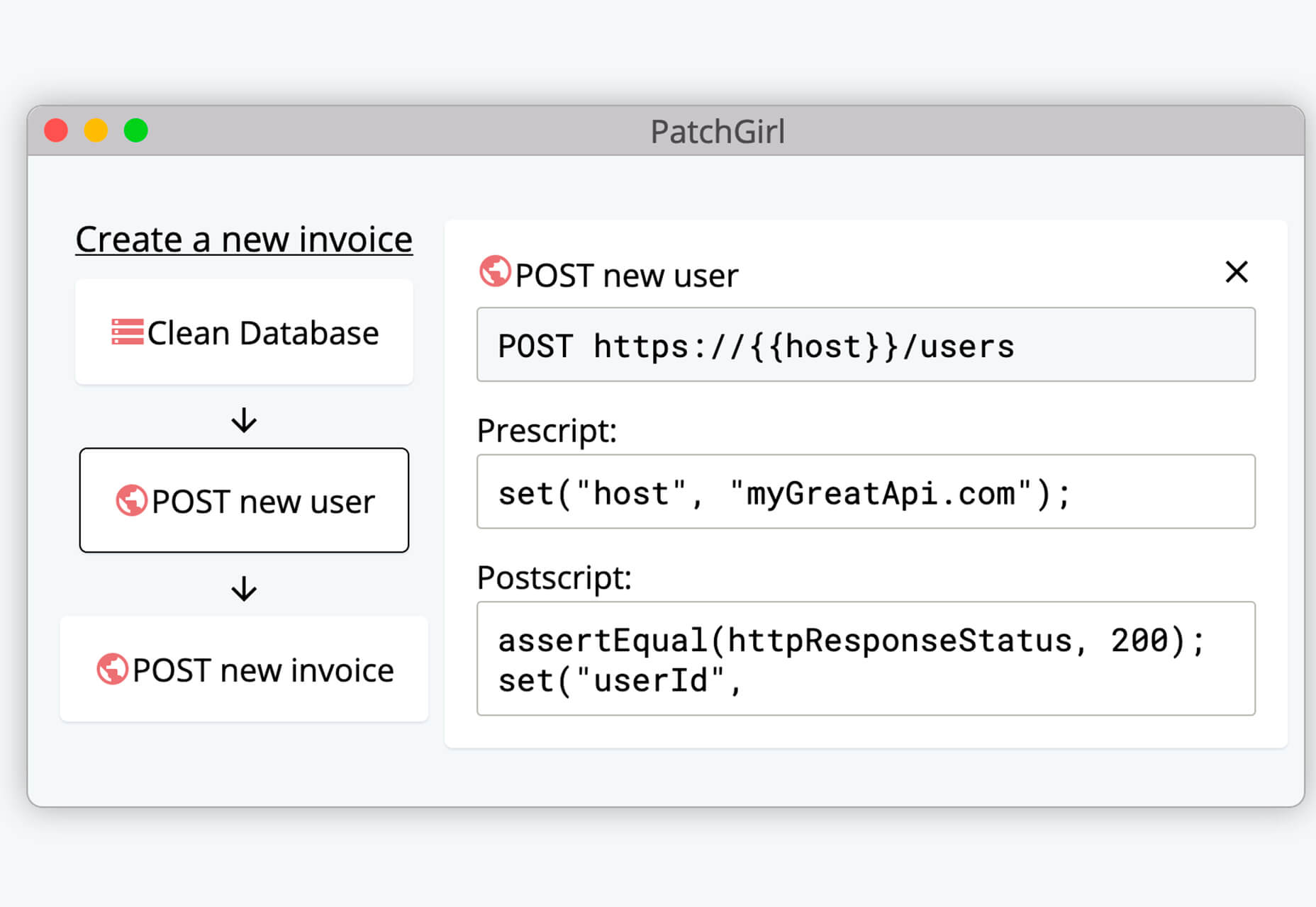
PatchGirl

PatchGirl is an automated QA tool for developers. You can combine SQL and HTTP queries to build any possible state of your database.

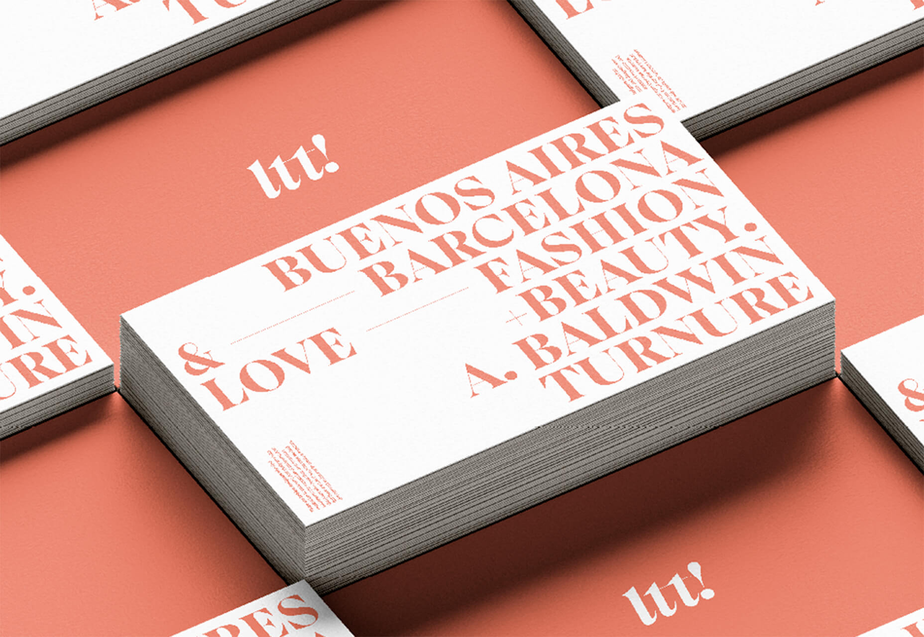
Apparel

Apparel is a beautiful premium typeface family with plenty of versatility in a modern serif style. It is a contemporary, classy, and fresh serif typeface with a laid-back. Its medium-large x-height makes it ideal for headlines and brand identity design.

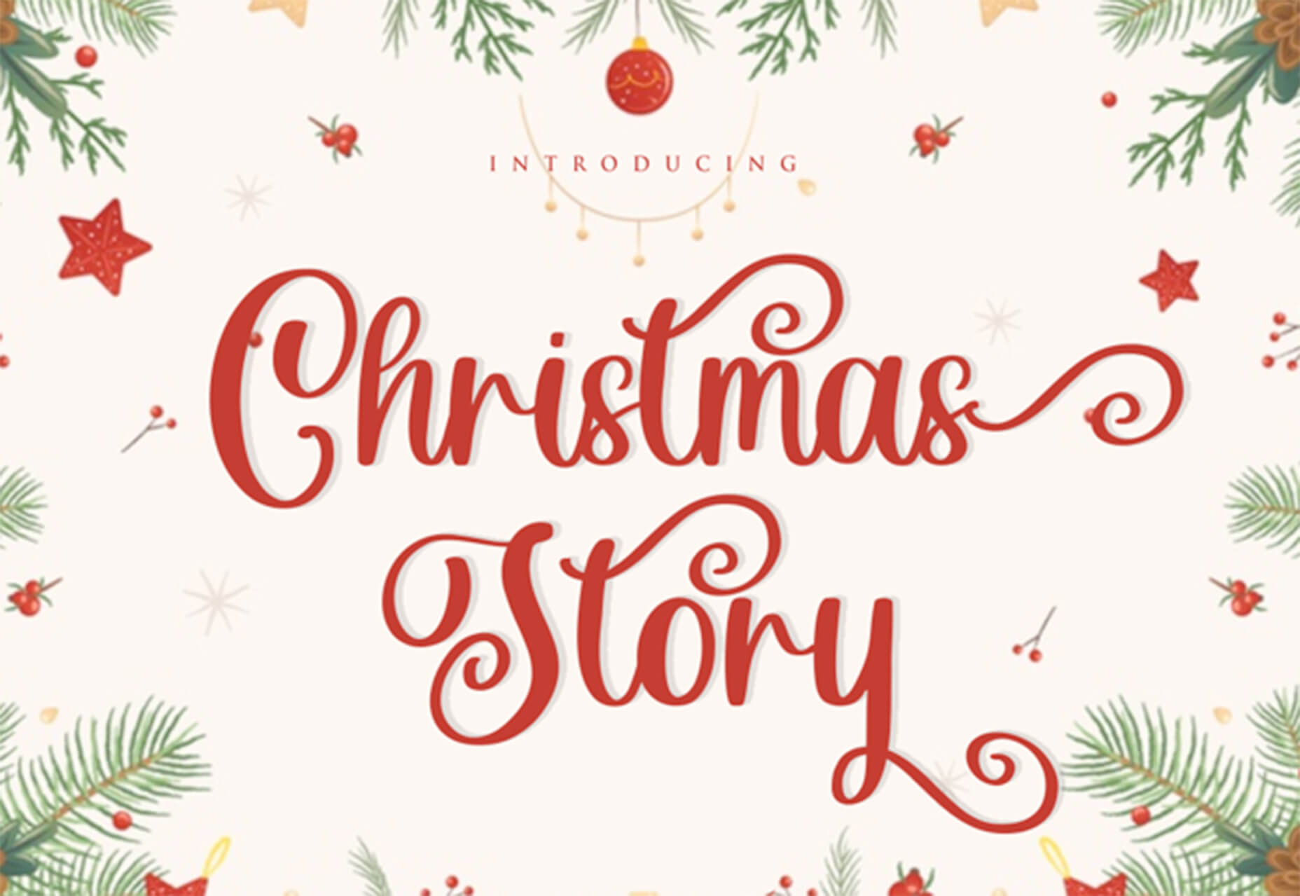
Christmas Story

Christmas Story is a nice solution if you are already starting to think ahead to holiday projects or cards. The long swashes and tails are elaborate and fun.

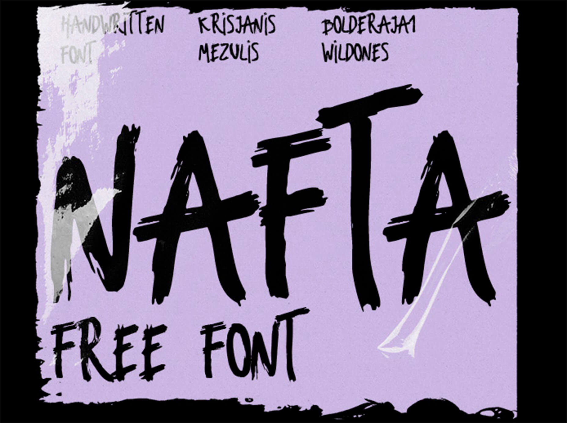
Nafta

Nafta is a fun handwriting style font that has a marker-style stroke. It’s a modern take on the popular Sharpie font. It includes all uppercase letters.

Safira

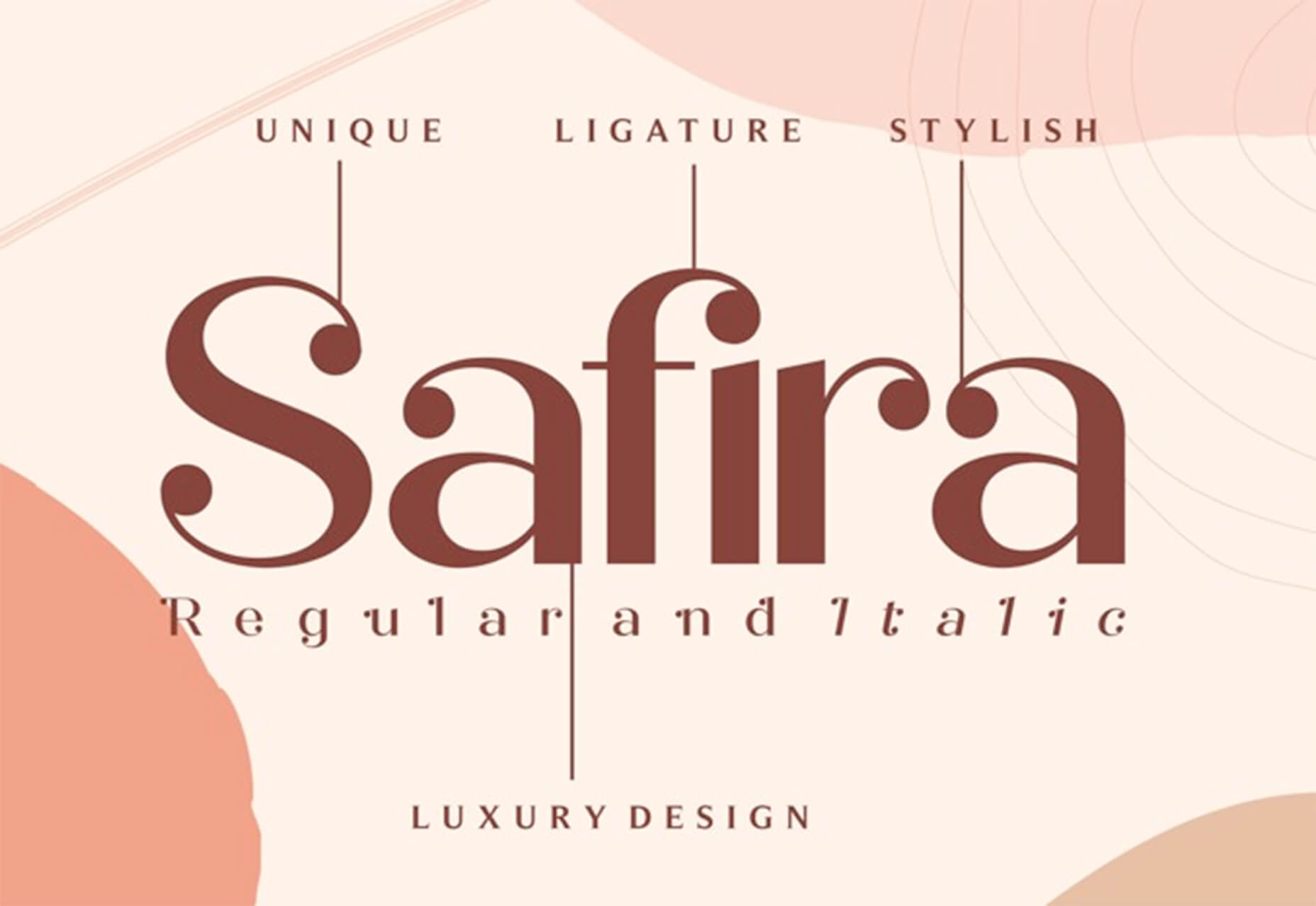
Safira is a wide and modern sans with ligatures and a stylish feel. The rounded ball terminals are especially elegant.

Shine Brighter Sans

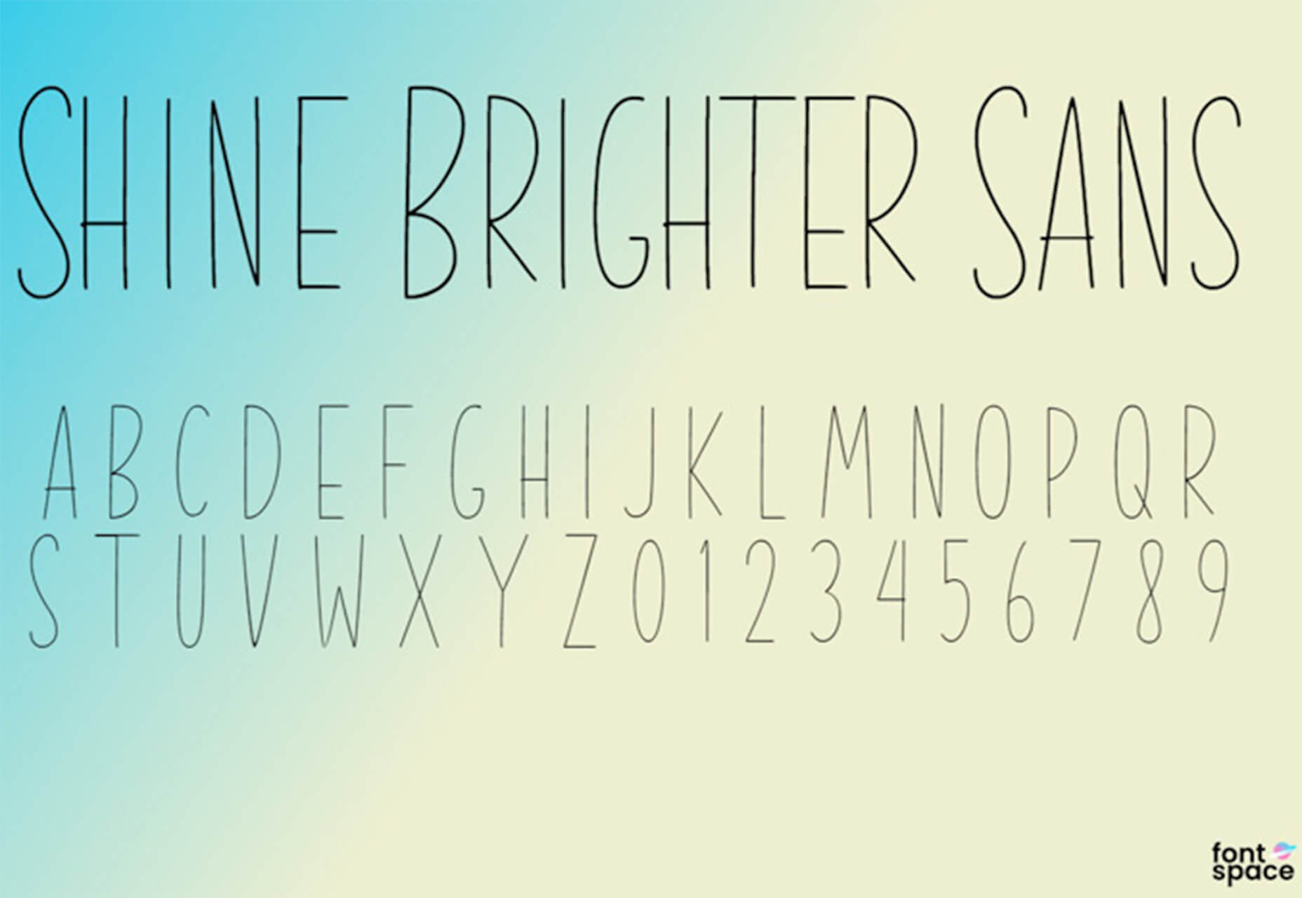
Shine Brighter Sans is a super-thin sans-serif with a light attitude. The limited character set combined with its light weight is best for display use.

Source


Source de l’article sur Webdesignerdepot

Though I have worked on Java for more than a decade, I have not had a chance to work on Groovy. While working for API Integration into Jenkins CI/CD pipeline, I extensively used Groovy to invoke REST API, validate the user input parameters, and business logic for that. After that, I found that Groovy is a fascinating program language for Java developers.

Why Is Groovy Easy for Java Developers?

It allows to use the Java syntax liberally and tries to be as natural as possible for Java developers. It is an object-oriented dynamic programming language for Java virtual machine (JVM) and can be integrated smoothly with any Java Program. The groovy syntax is lucid, familiar, and direct that makes to develop projects faster and easier. It demands a shorter learning curve for Java Developer to develop, test, and integrate to make production-ready code in a short span.

Source de l’article sur DZONE

In a previous post, we learned about setting the value of options attribute to nowrap on listing and literal blocks, so the lines in the block are not wrapped. In the comments, a user suggested another option to disable line wrapping for all listing and literal blocks in the document by using the document attribute prewrap. We must negate the document attribute, :prewrap!:, to disable all wrapping. If we place this document attribute at the top of our Asciidoctor document, it is applied for the whole document. We can also place it at other places in the document to change the setting for all listing and literal blocks following the prewrap document attribute. To enable wrapping again, we set :prewrap: (leaving out the exclamation mark).

In the following example, we have markup with a listing, literal, and example block, and we use the document attribute :prewrap!: to disable the wrapping for the listing and literal blocks:

Source de l’article sur DZONE

Recently, I came across Micronaut, a super light framework that fills the need for something in between Spring Boot and Vert.x.

I have been playing with it and wanted to see if I could get a simple project with Micronaut, a Kotlin/Java intermix for the (main) source code, and Groovy/Spock tests. Turns out it’s not that difficult. I just had to fiddle with it a little bit to get it right. So to save you time, here it is:

Source de l’article sur DZONE