Articles

Happy New Year, fabulous new website design trends!

This month’s design trends are a collection of the somewhat unexpected – from NFT website design to large text to illustrations; you won’t see a single photo or video here. Here’s what’s trending in design this month.
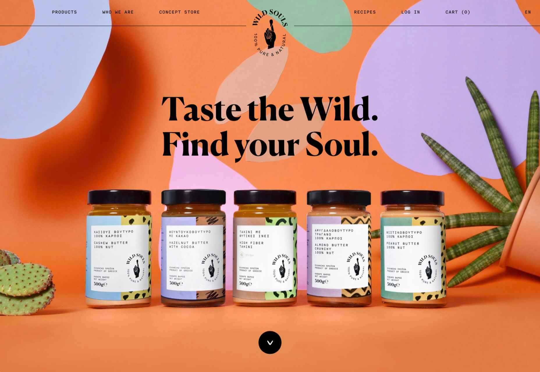
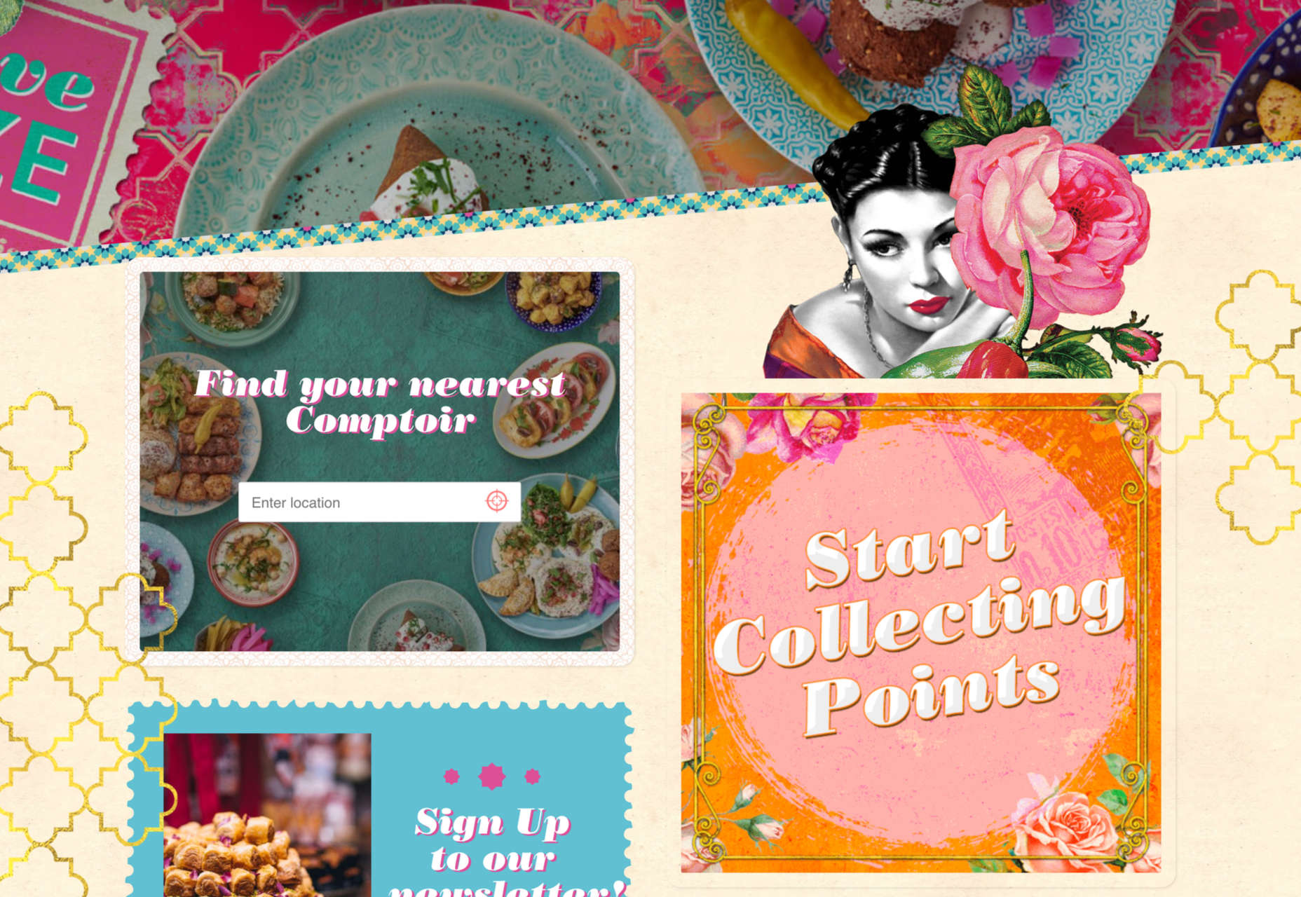
NFT Websites

This website design trend has more to do with the greater trends in digital marketplaces and commerce but has value in the design space as well. NFT websites are popping up everywhere.

Marketplaces for non-fungible tokens use modern design effects to draw users in and help them make purchases and view available images. If you haven’t delved into the world of NFTs, they are data units – often in the form of gifs – stored on a blockchain digital ledger. You can buy, sell, and trade these digital nuggets on various marketplaces.

The designs of NFTs could be explained as a trend of their own. Here, we’re focusing on the look and feel of the websites surrounding them. While some designs are relatively primitive, the best marketplaces have a full e-commerce feel with easy-to-use interfaces and a modern design.

Each of these three NFT marketplaces does it a little differently.

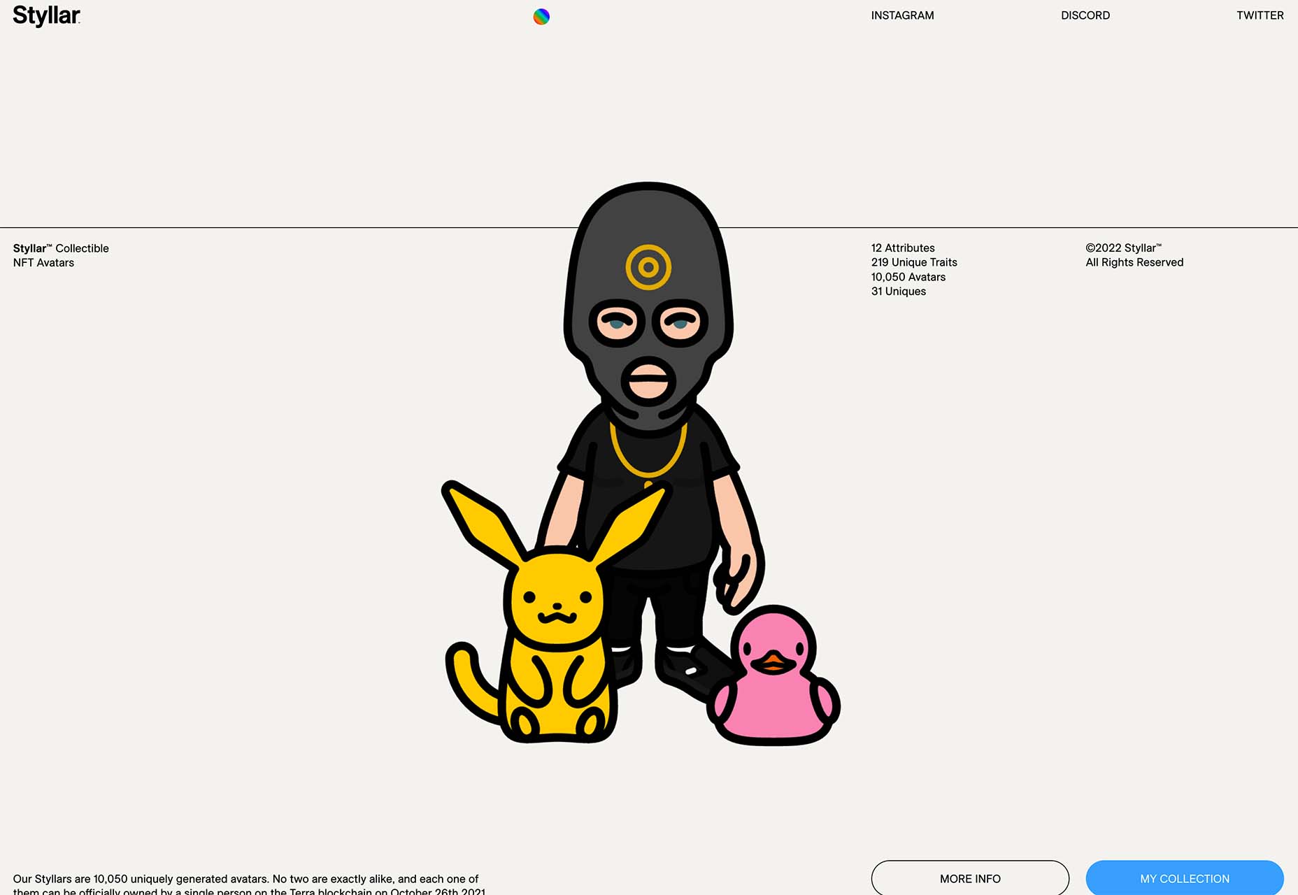
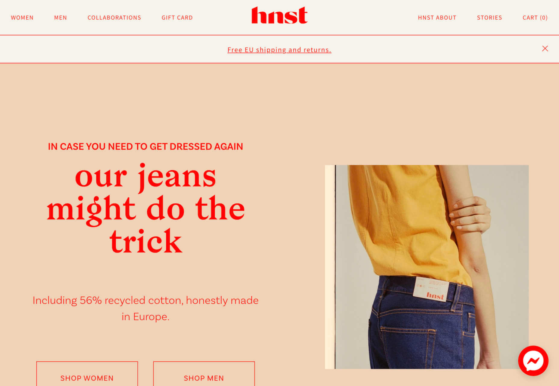
Styllar puts a focus on NFT avatars with a minimal aesthetic that gives plenty of room to individual NFTs. Sit on the website too long, though, and hundreds of options begin to cover the screen. Each visual element has a small text element to match that explains each image. It feels like a modern e-commerce experience that instills trust with users because of clean visual patterns. The site itself is just a gateway to a more traditional marketplace, but the calls to action are large, clear, and easy to follow.

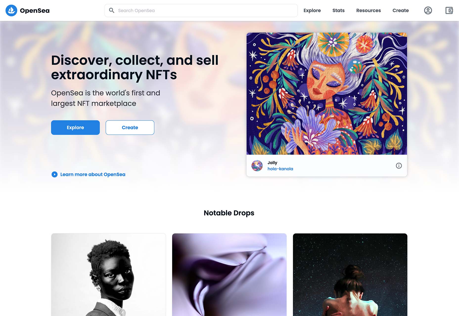
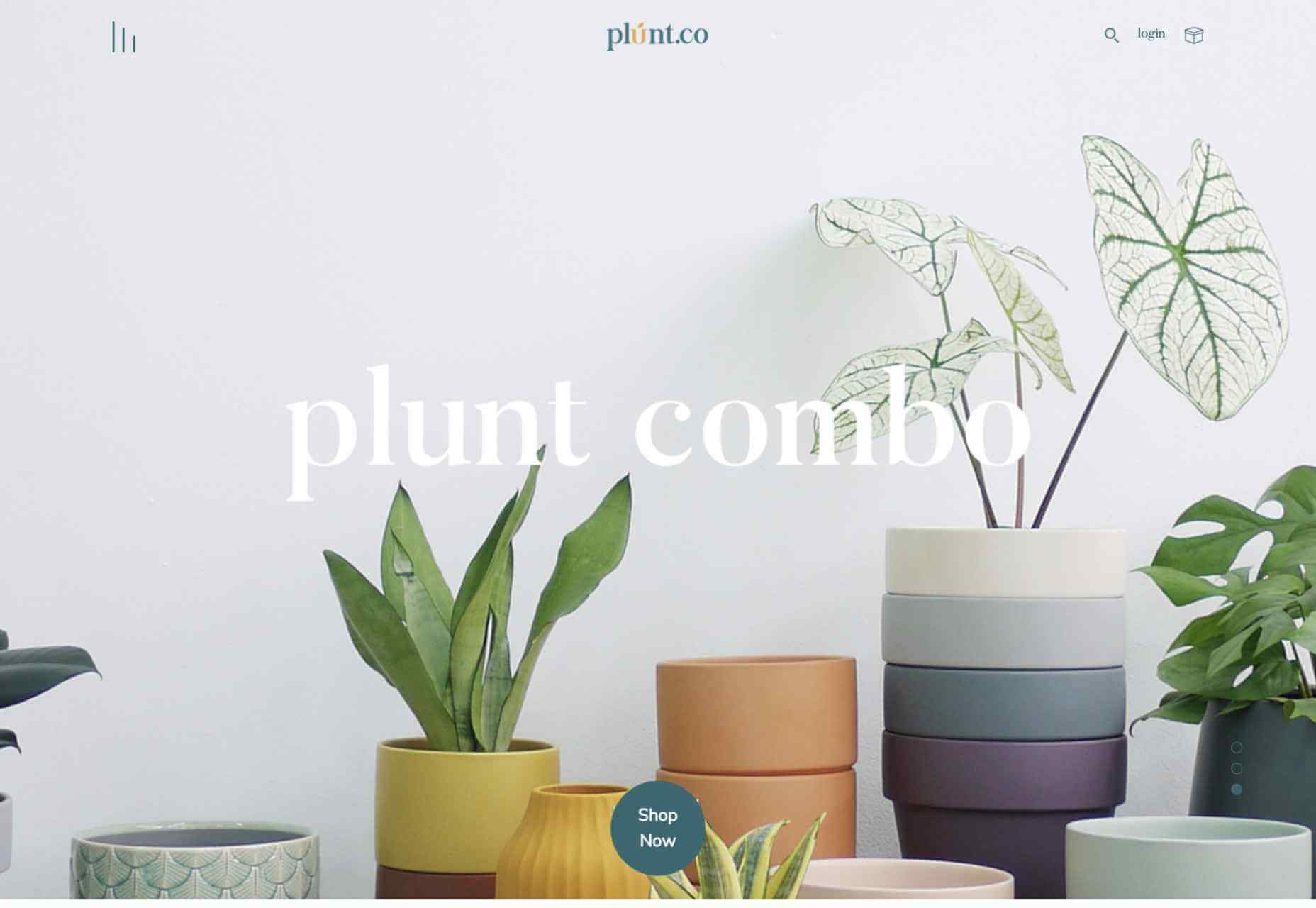
OpenSea treats the NFT marketplace more like an art gallery with card-style buttons to look at different elements and images. Everything about the website design is tailored for the mobile user and quick browsing with large areas to click in the card format and easy-to-read headers that help you find your way through the NFT space, whether you want to buy, create, or sell. The site also does one more thing that’s not as common with e-commerce – it explains how to get started in this new digital territory with plenty of resources.

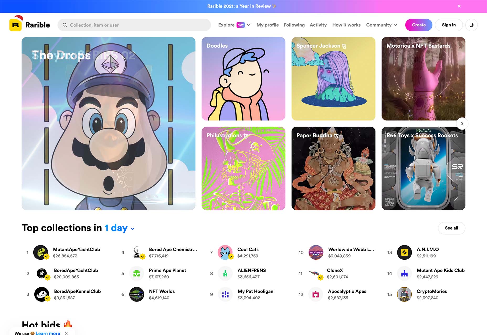
Rarible has an almost social media feel with lots of small blocks showing different NFTs. Digestible content in a grid-based design helps you navigate from images to rankings to what’s trending in NFTs. This site design is set up for high interaction and engagement, also featuring card-style elements and the ability to favorite items before bidding.

The key commonality with NFT website designs is that they are made for mobile users. These sites look good on desktops, but they are highly focused on a mobile, instant gratification user.


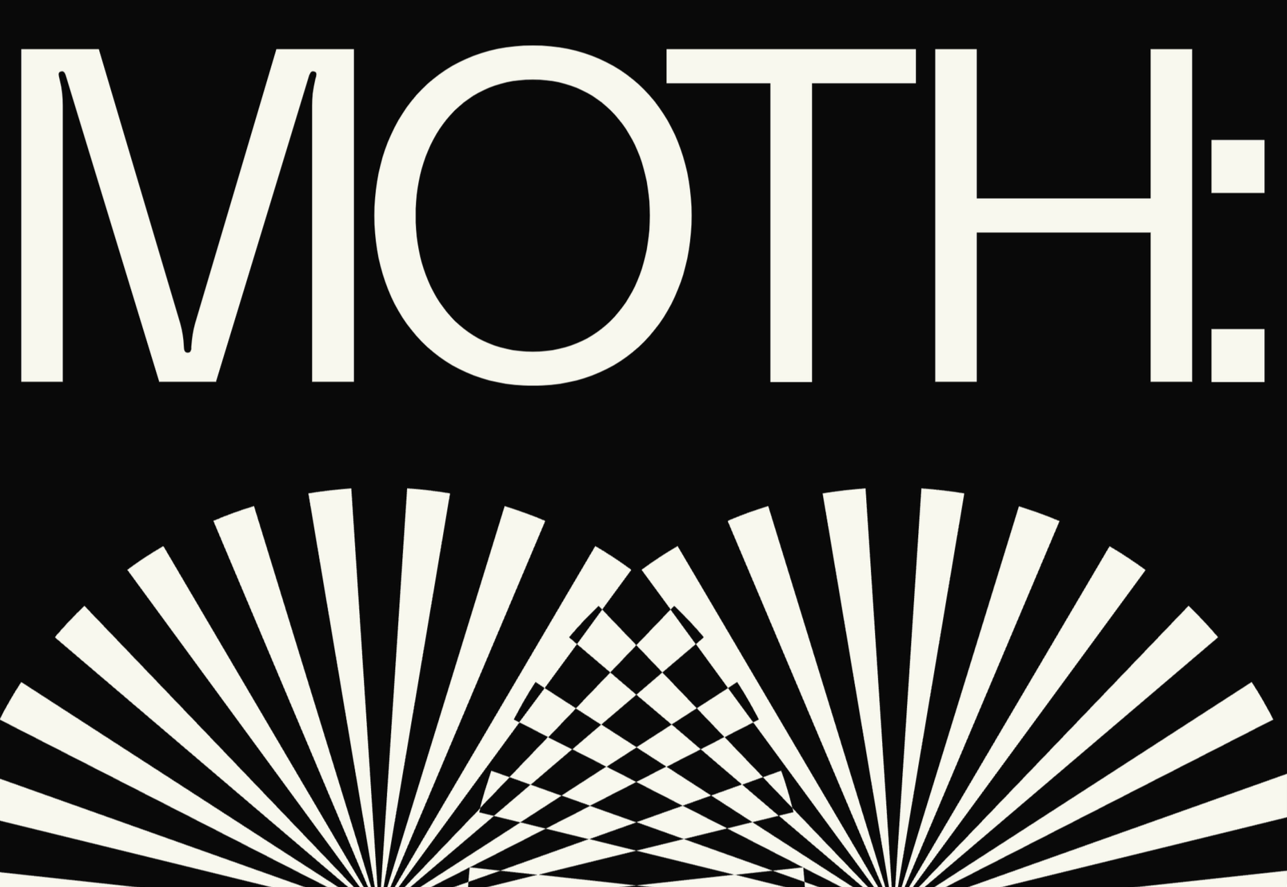
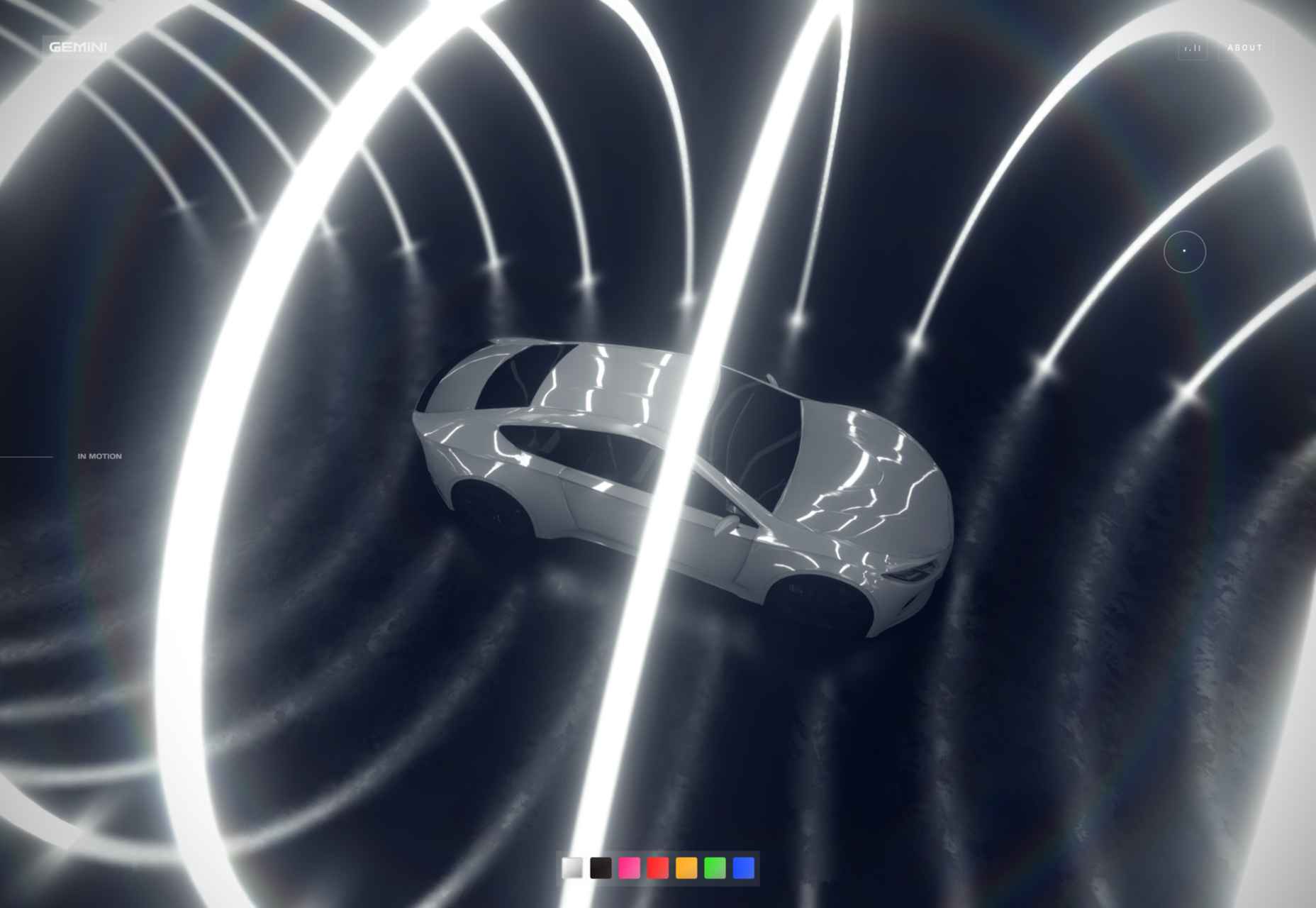
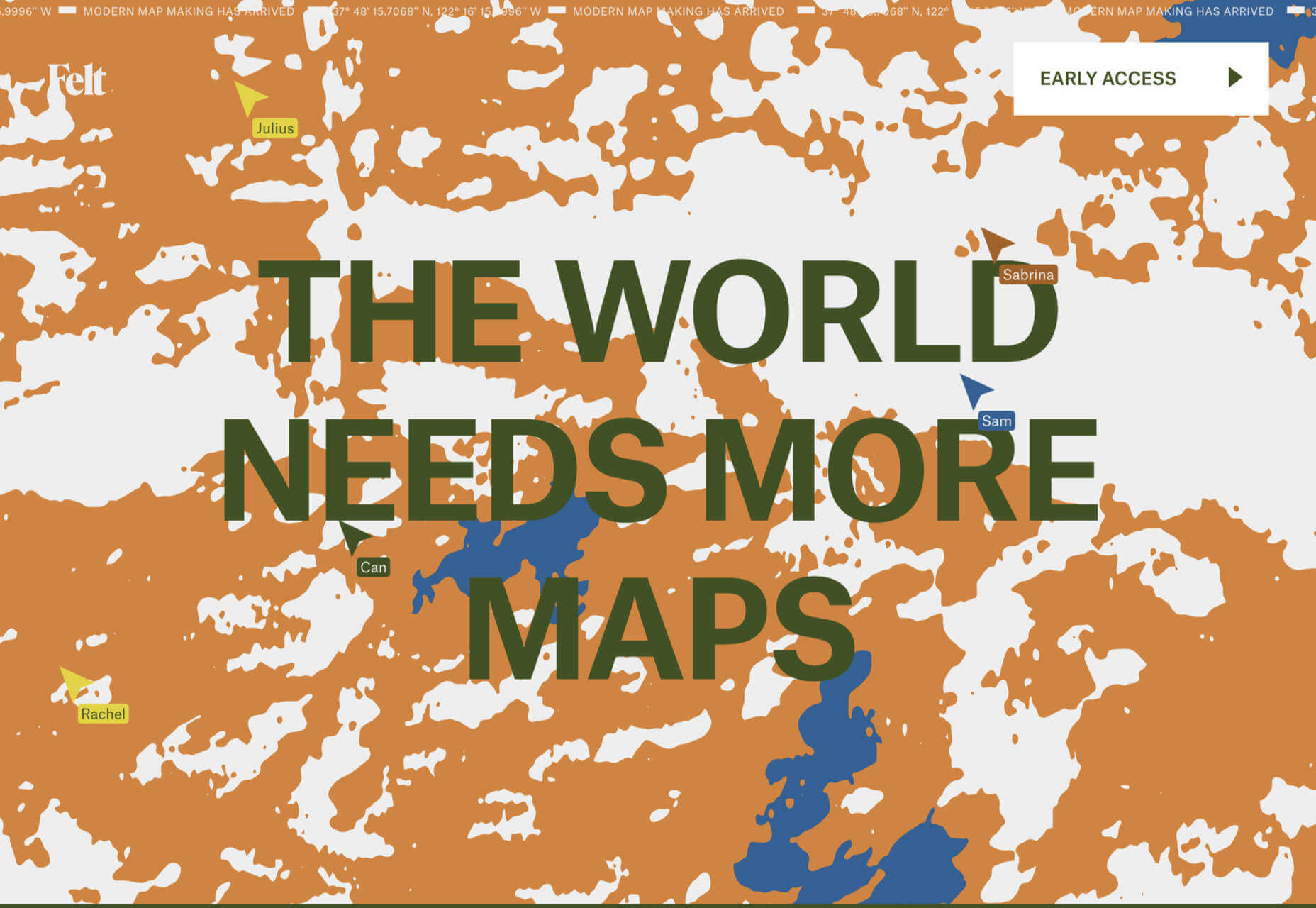
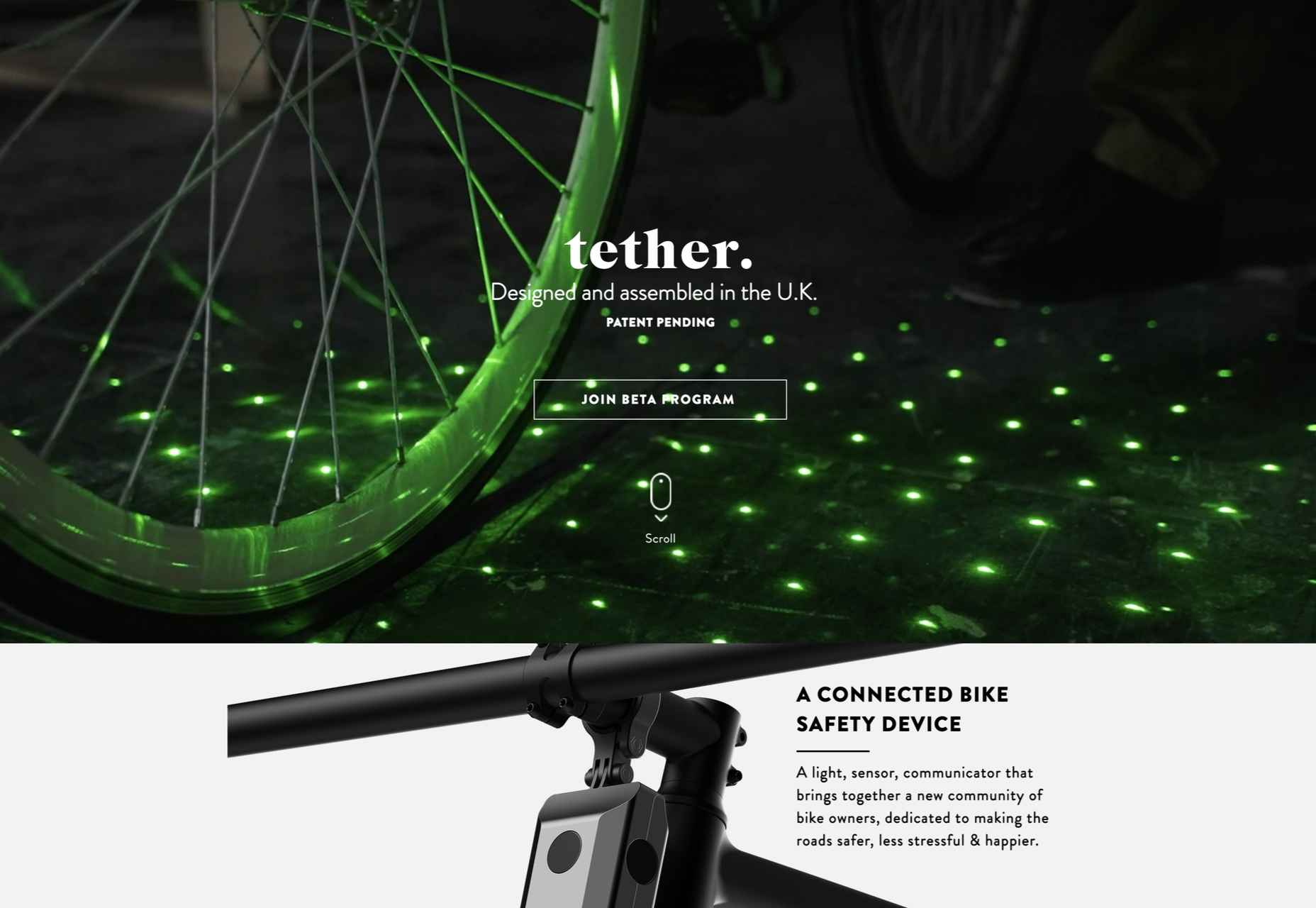
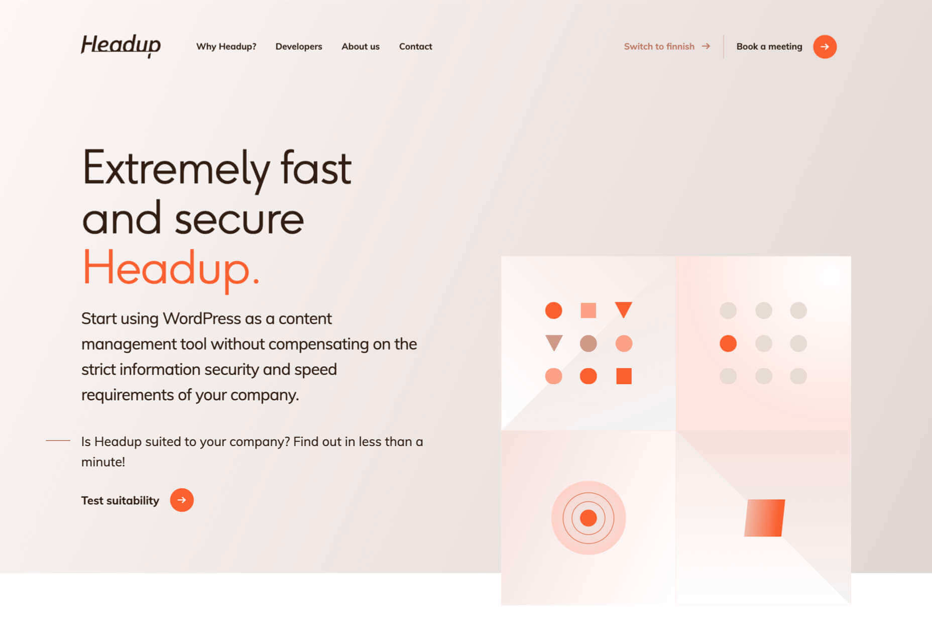
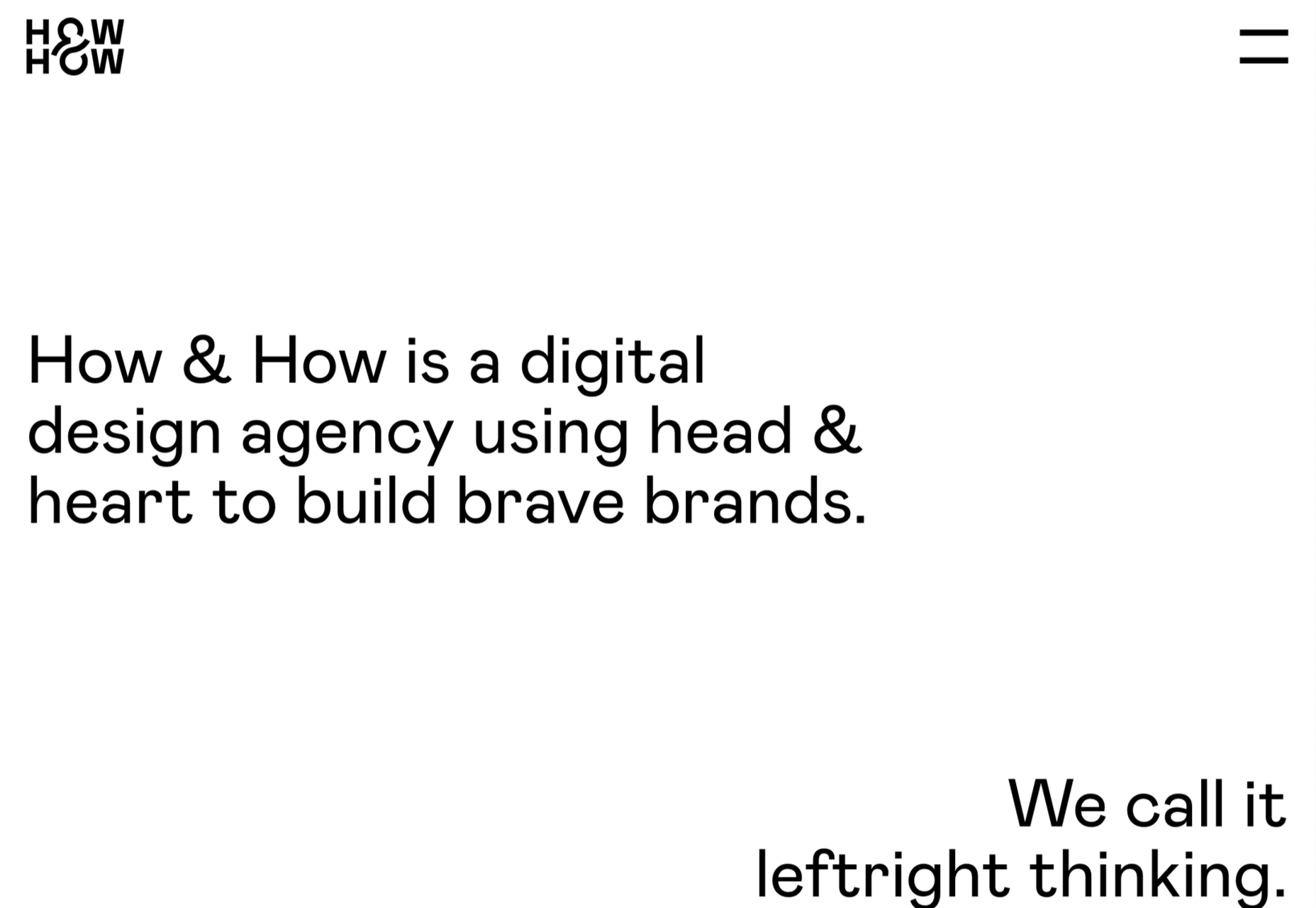
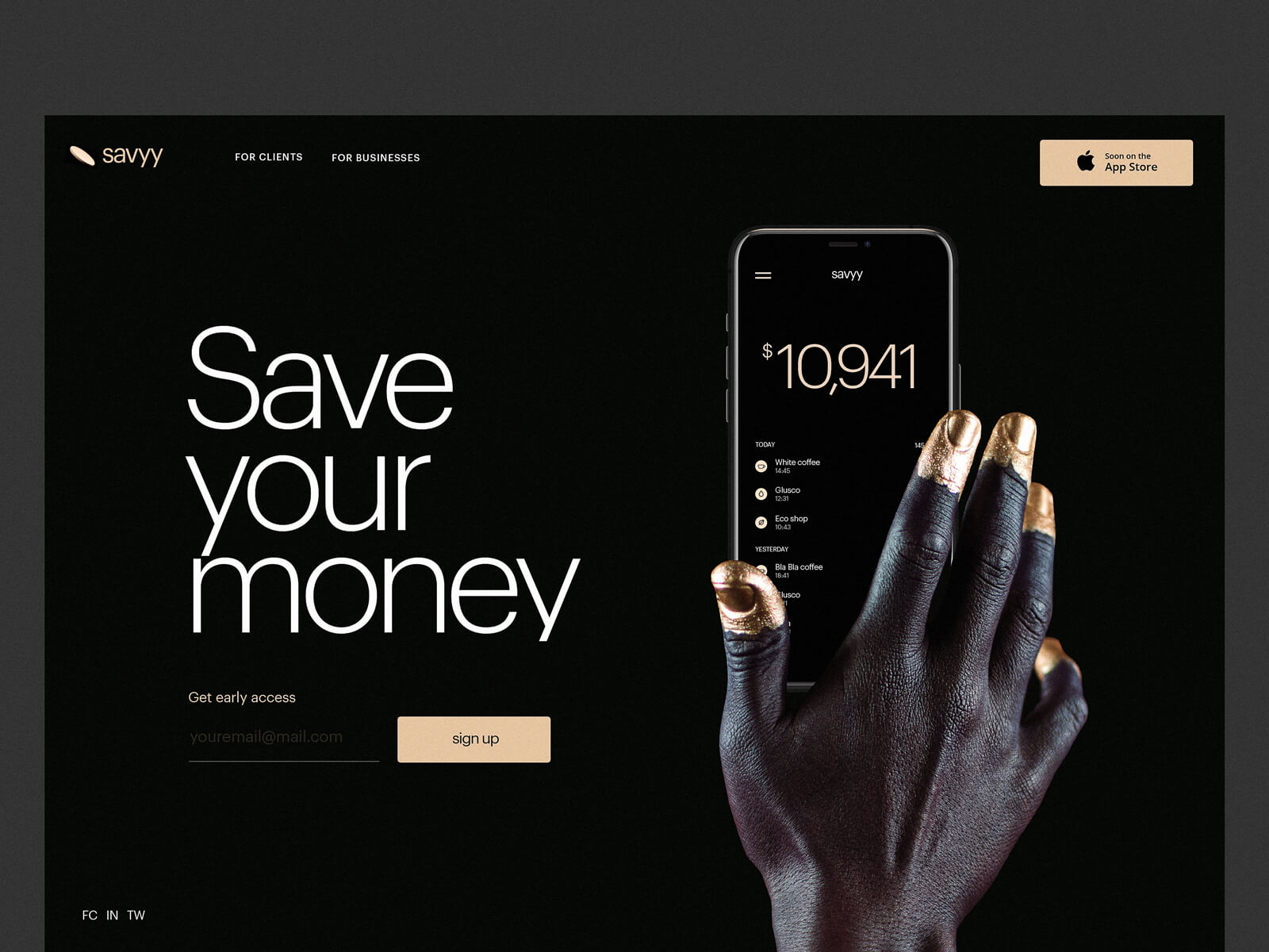
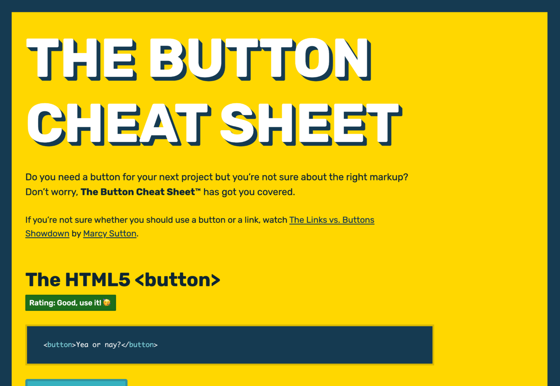
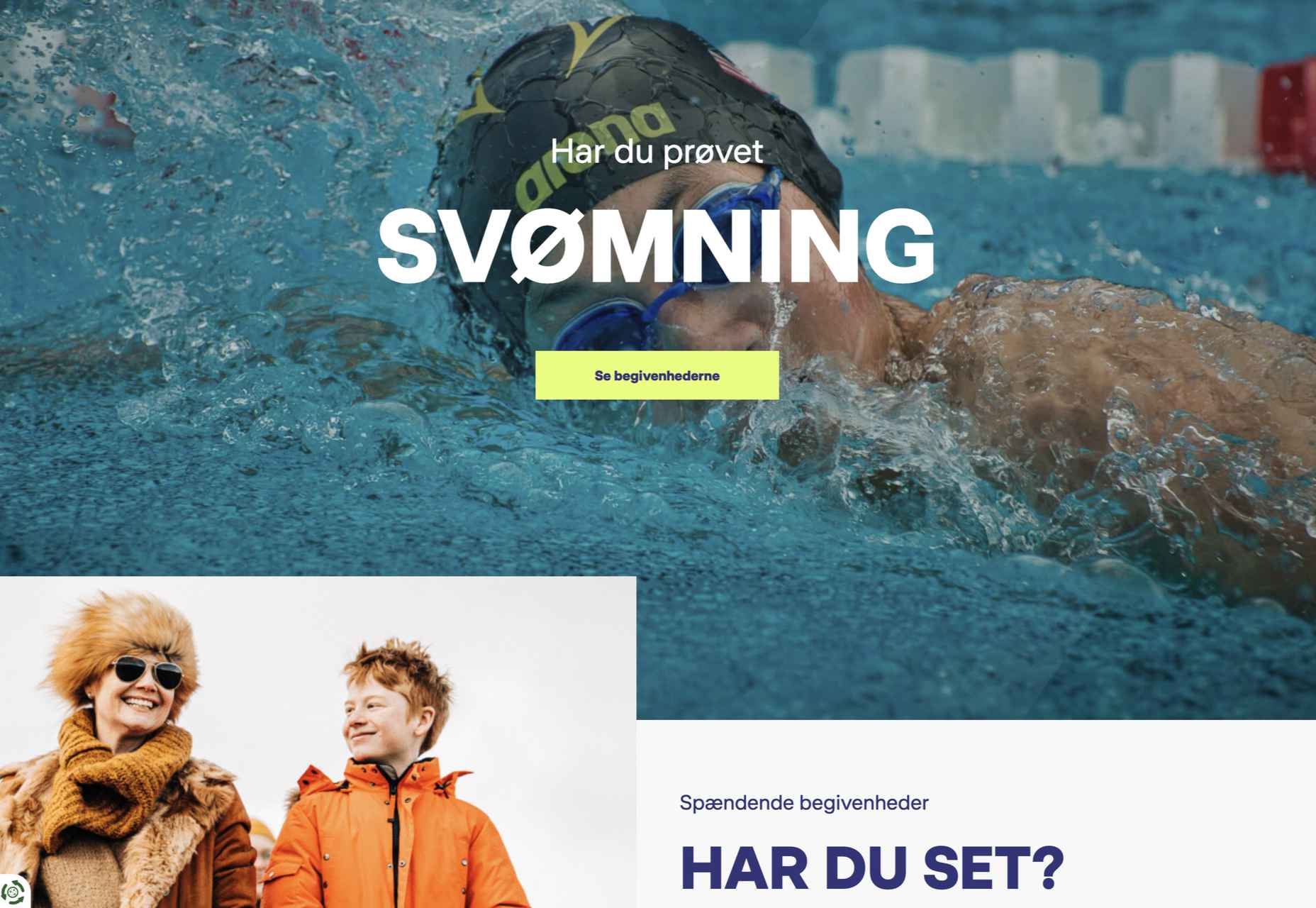
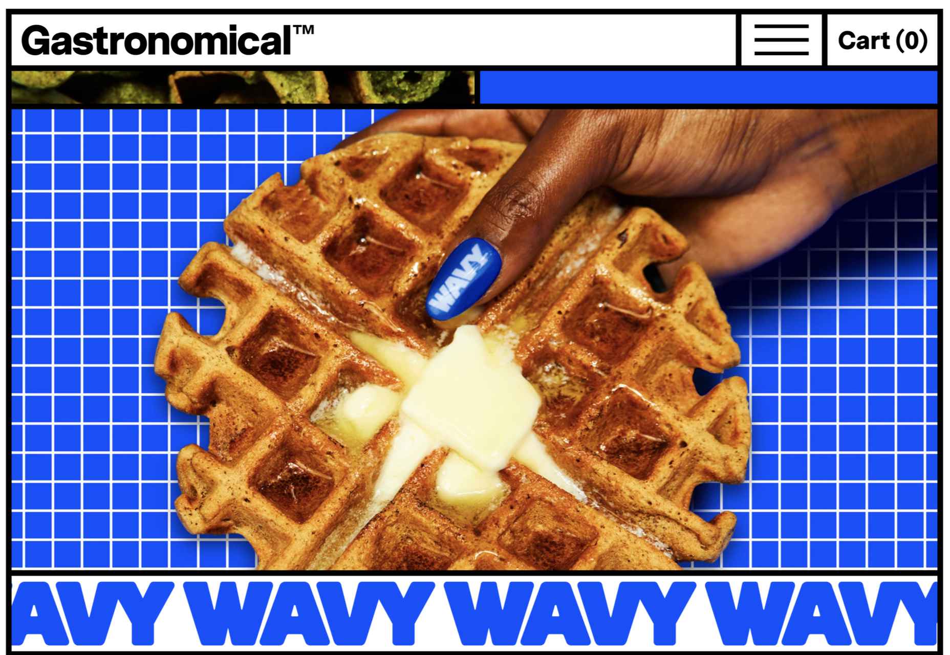
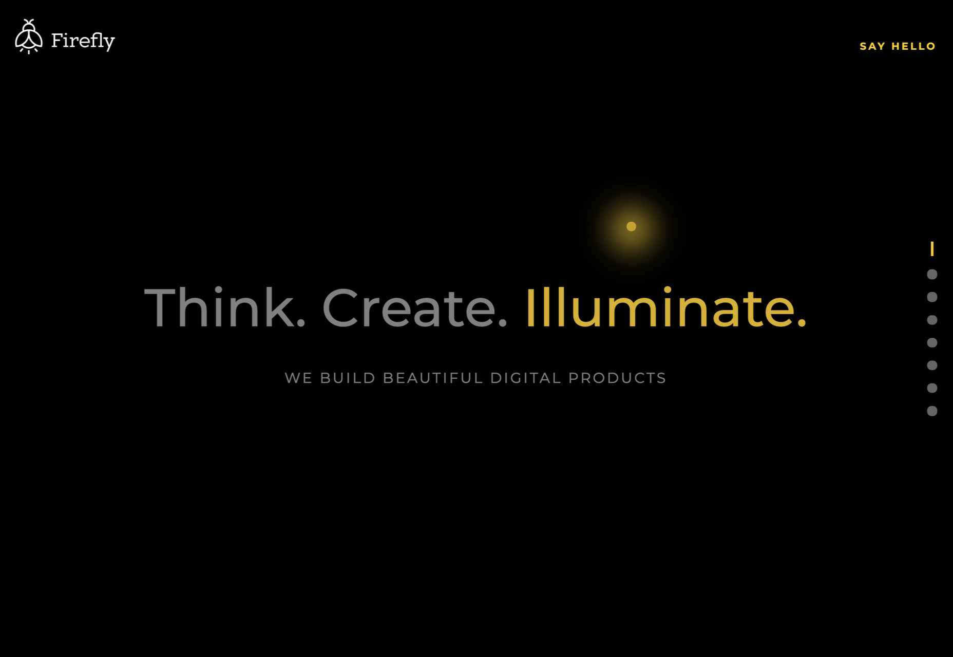
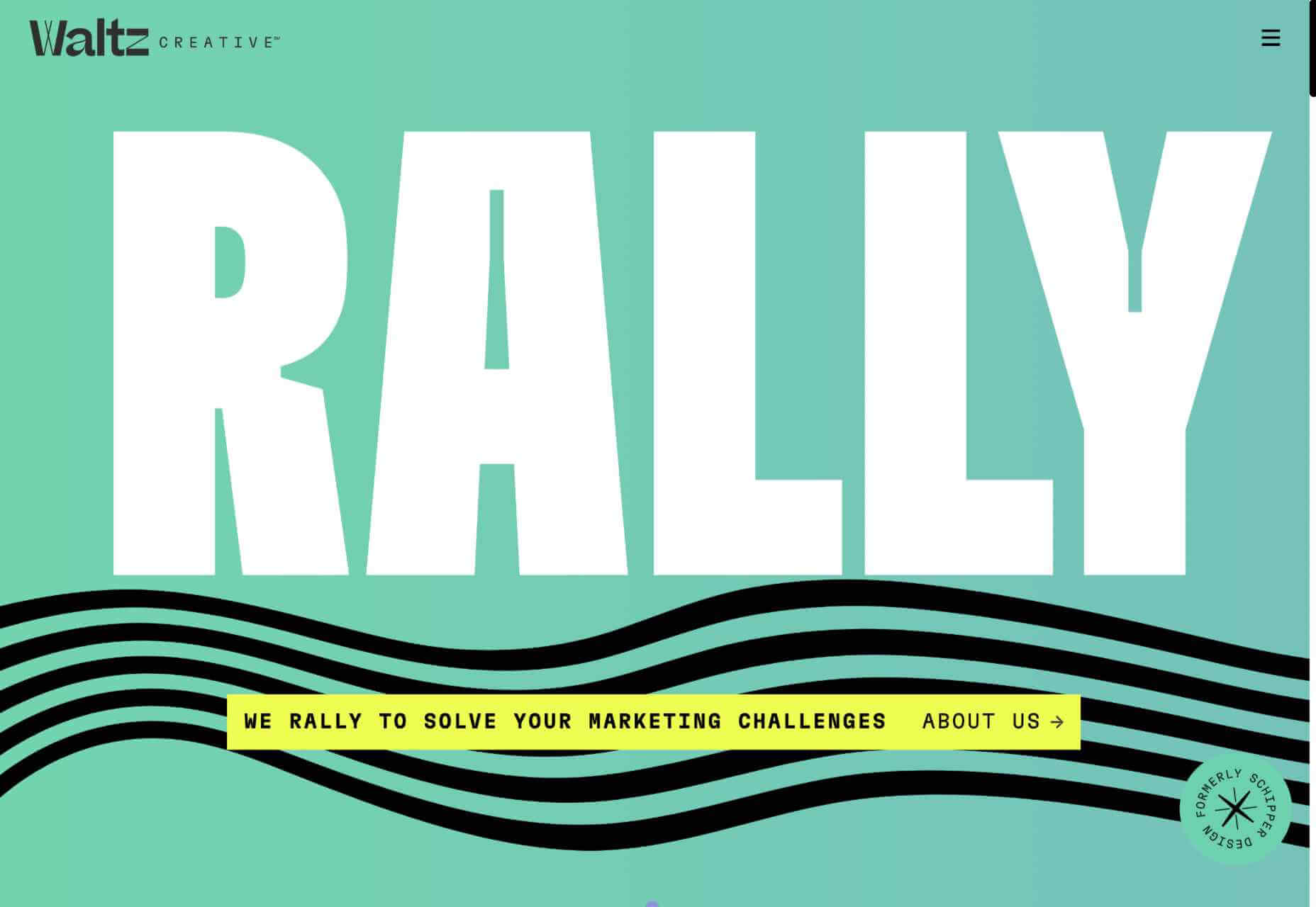
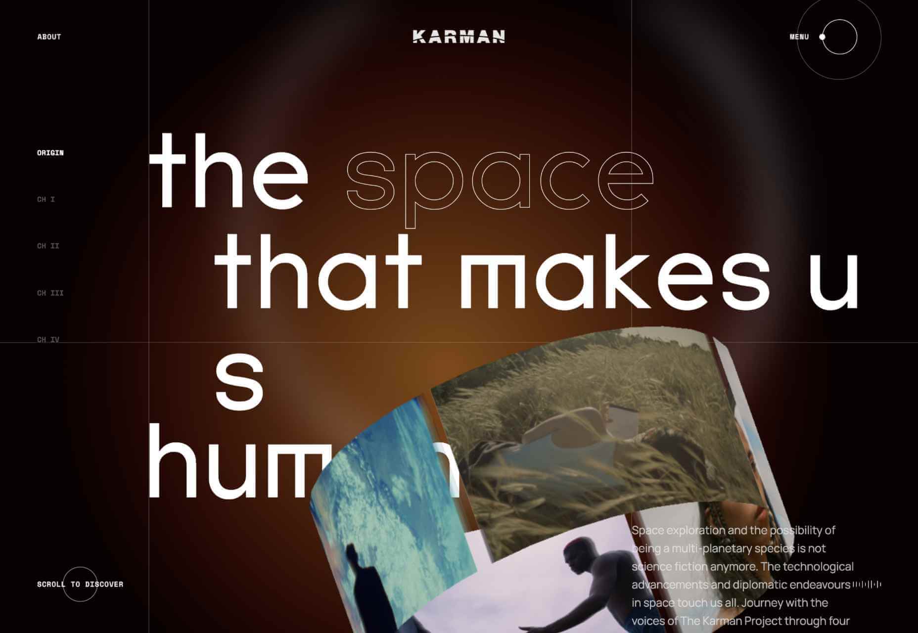
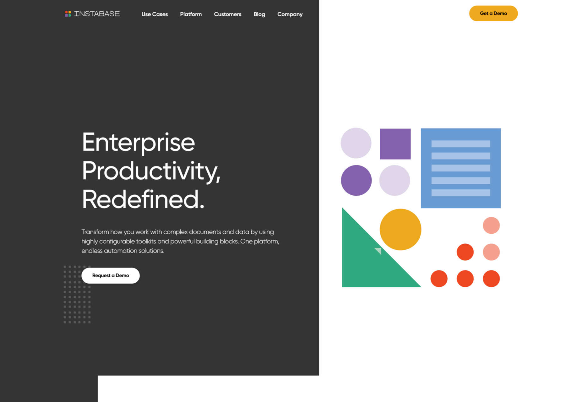
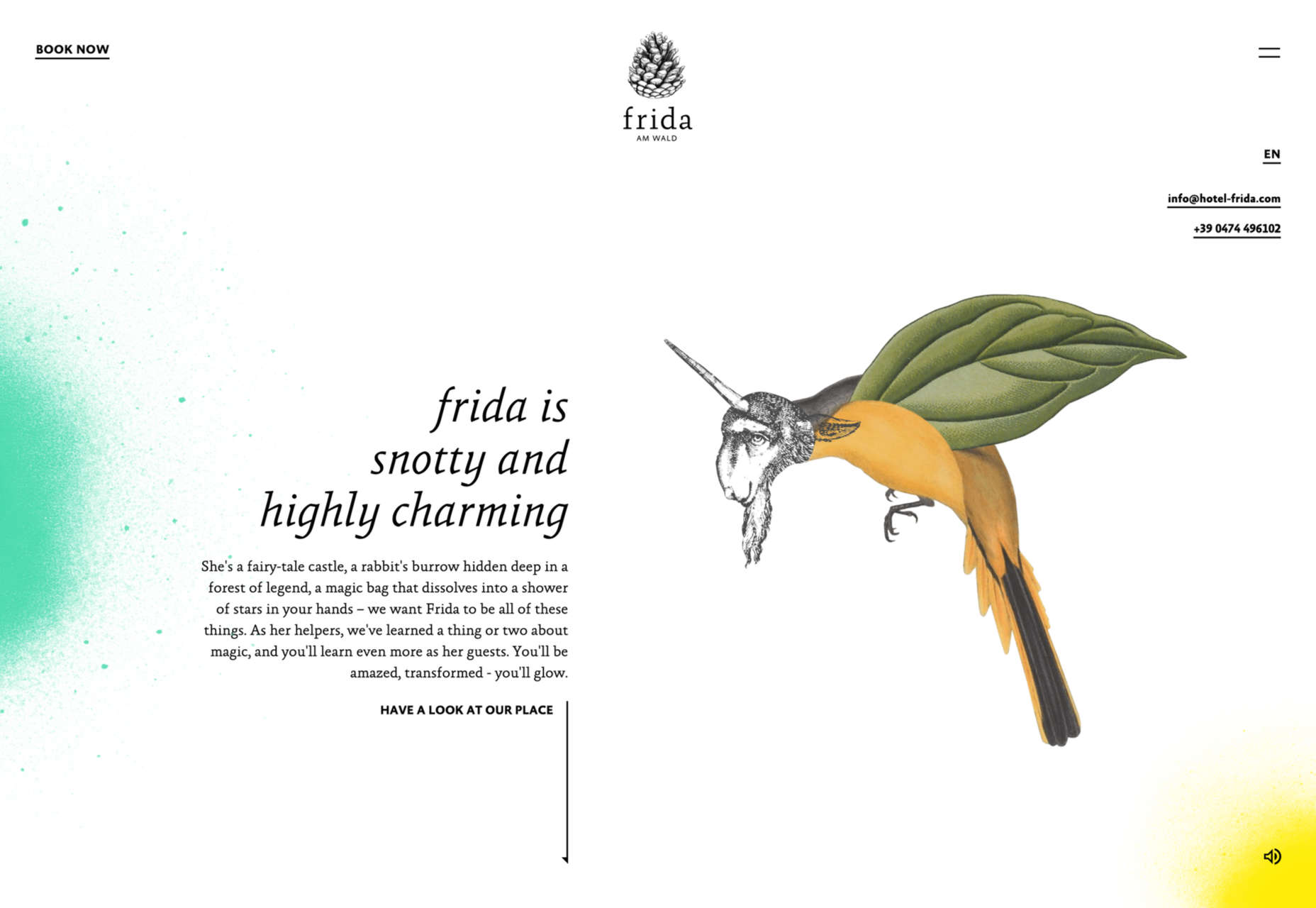
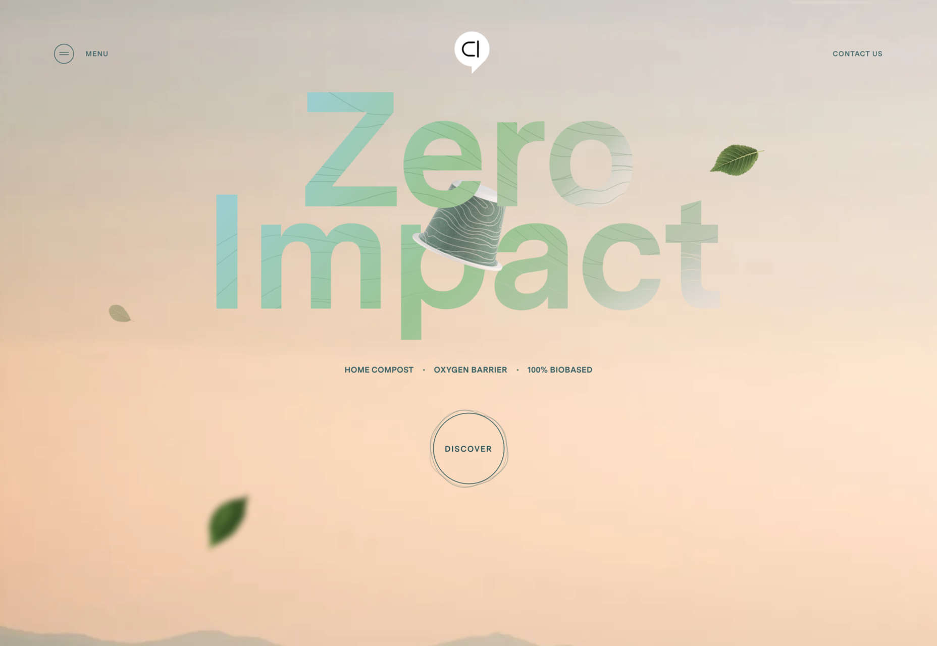
Text-Based Hero Headers

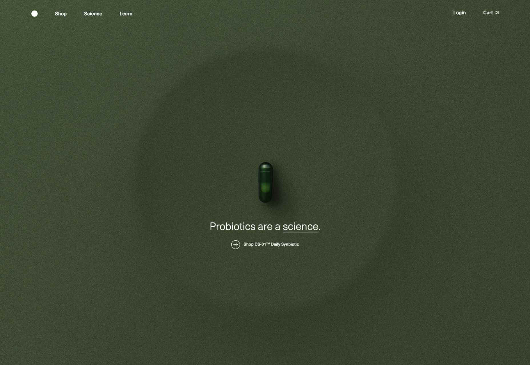
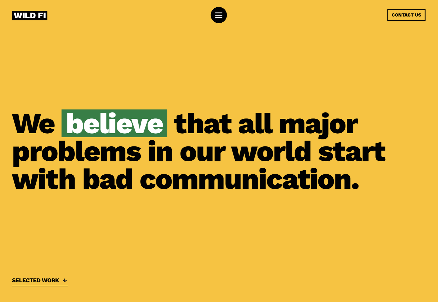
A trend in website design from 2021 is bleeding into 2022 with a lot of popularity: Hero headers that are mostly text. These designs have background texture and color, but for the most part, they don’t have a lot of other visuals.

These designs often rely on powerful language or messaging to help get user engagement. A secondary theme is the use of bright colors to help add focus and attention to the typography.

Font choices seem to be fairly neutral, with a lot of thicker sans serifs for the main headline and something a little lighter for secondary text options.
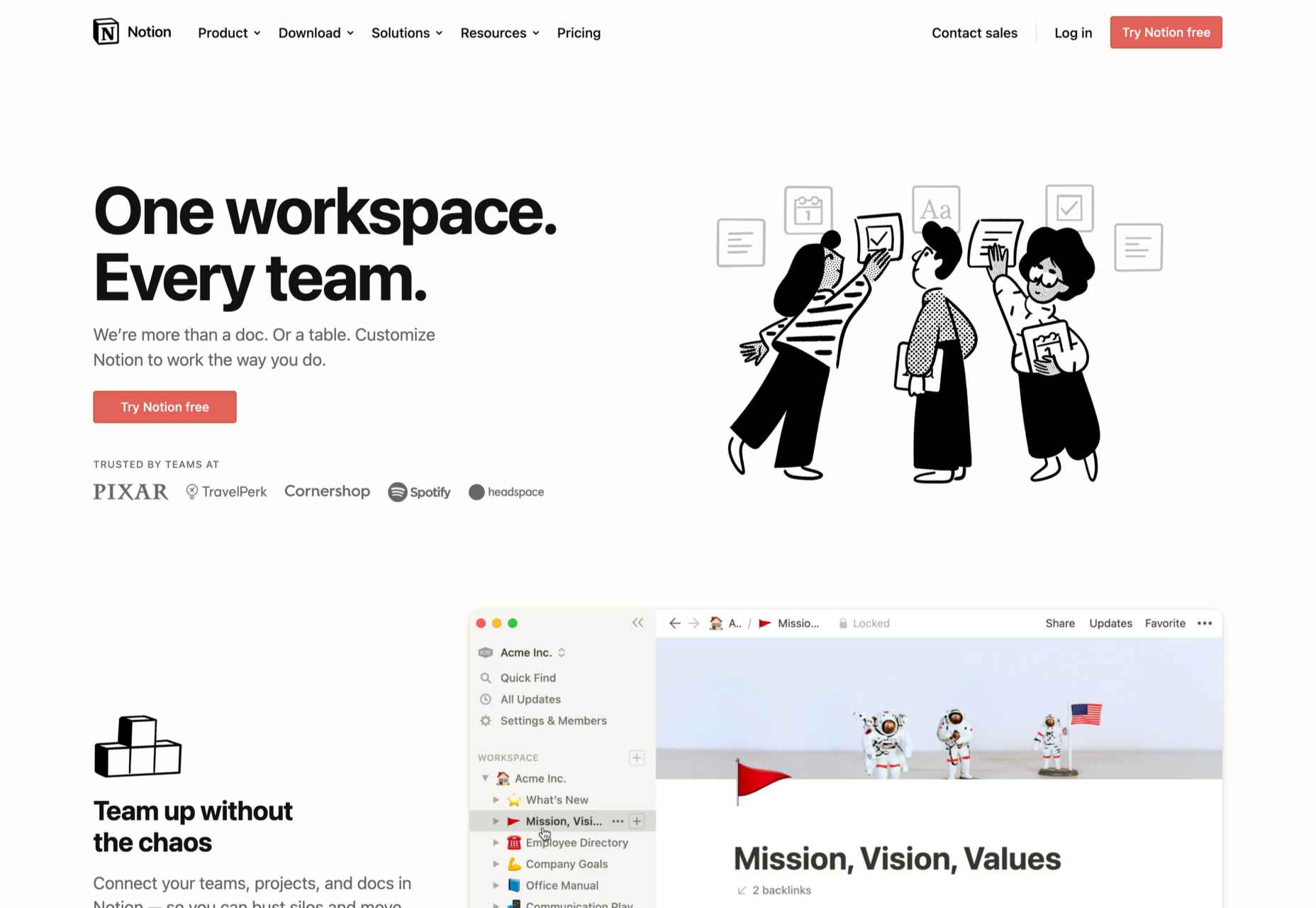
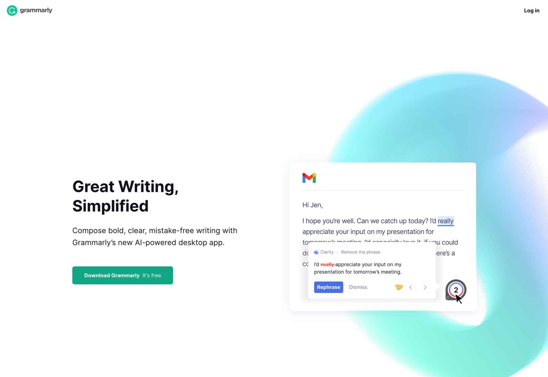
WeTransfer uses a smaller text block with multiple lines to create weight. The off-center placement draws the eye and is interesting even with the neutral background. Stacking elements create a nice focal area that encourages reading.

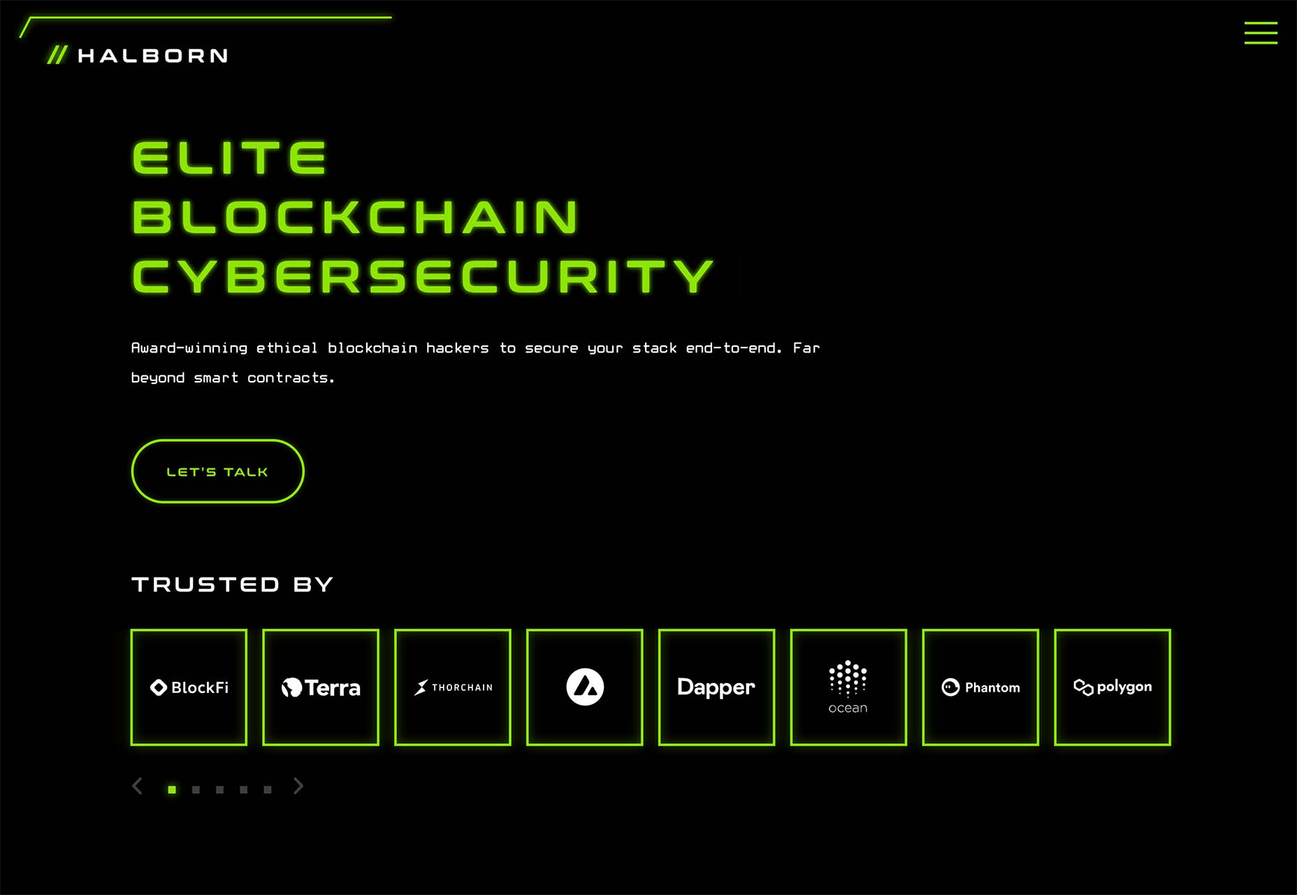
Halborn Blockchain Security goes with a less traditional font option and flips the color to the text to enhance the visual display. This design also uses an off-center, asymmetrical approach to create focus on the text element. The dark counterweight on the screen is an excellent guide to draw you back to the main hero headline.

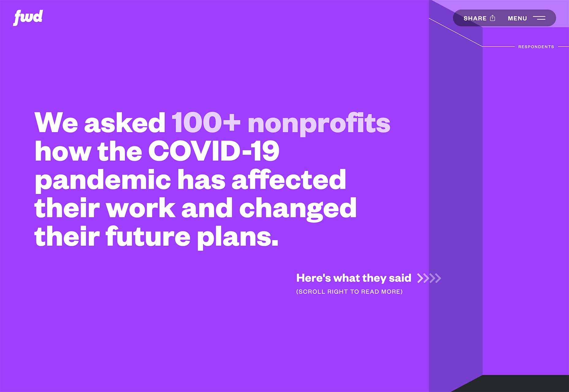
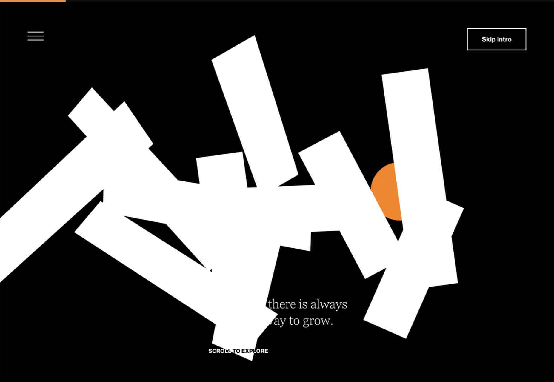
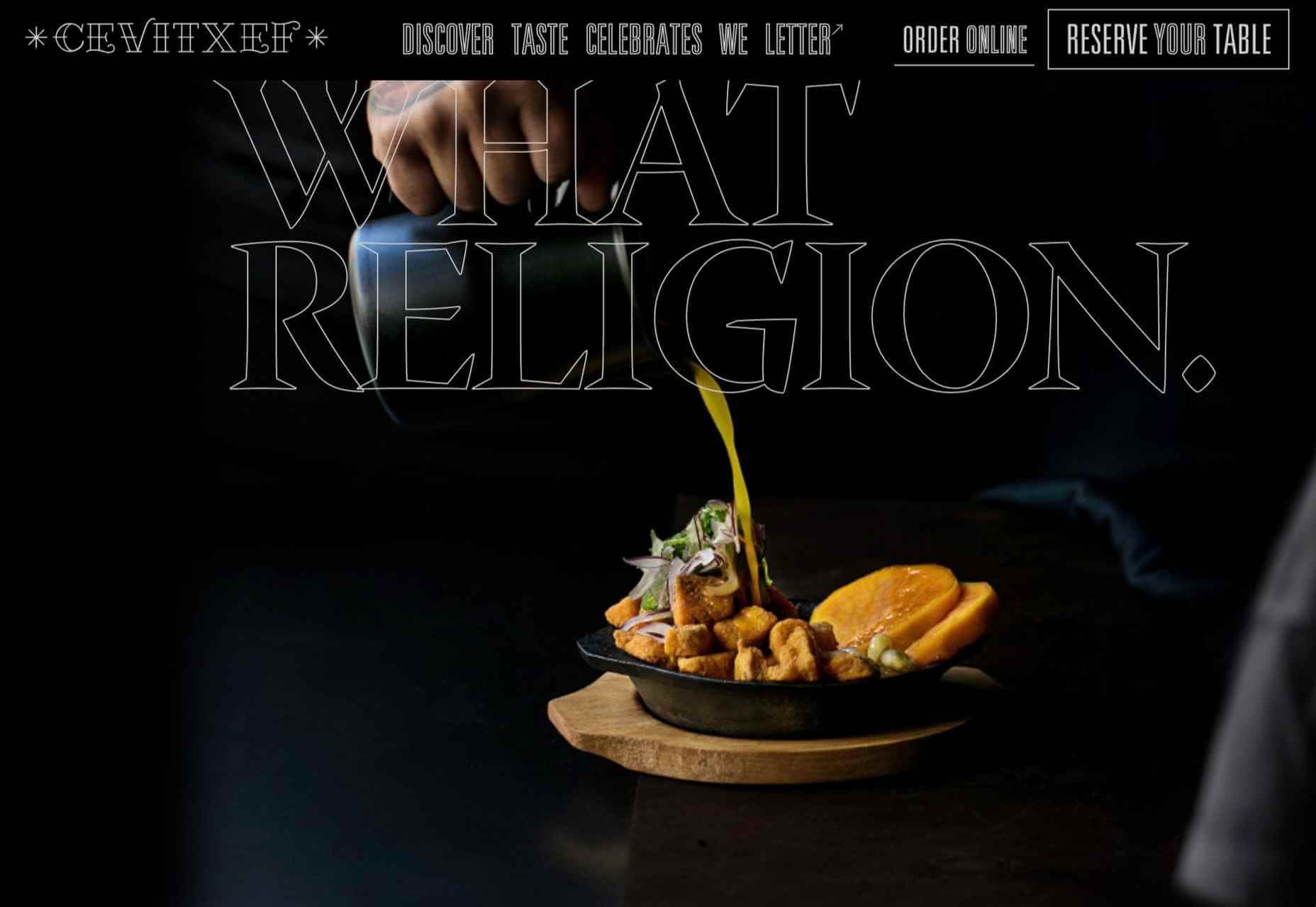
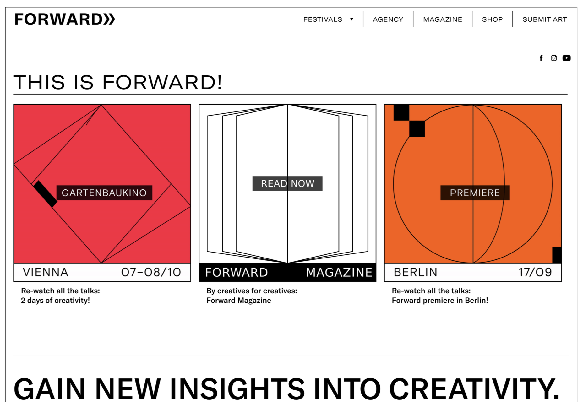
FWD goes with giant oversized text elements to create a strong visual focus with this design. Other than the faint animation of the arrows next to “Here’s what they said,” everything is still and static. The color and blocky depth of the background help draw the eye through the text and to clickable elements so that you know what to do next.


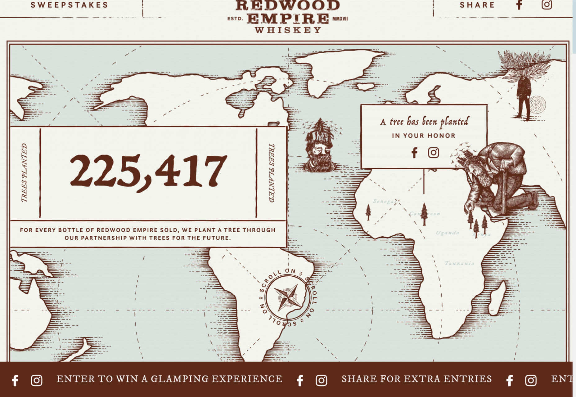
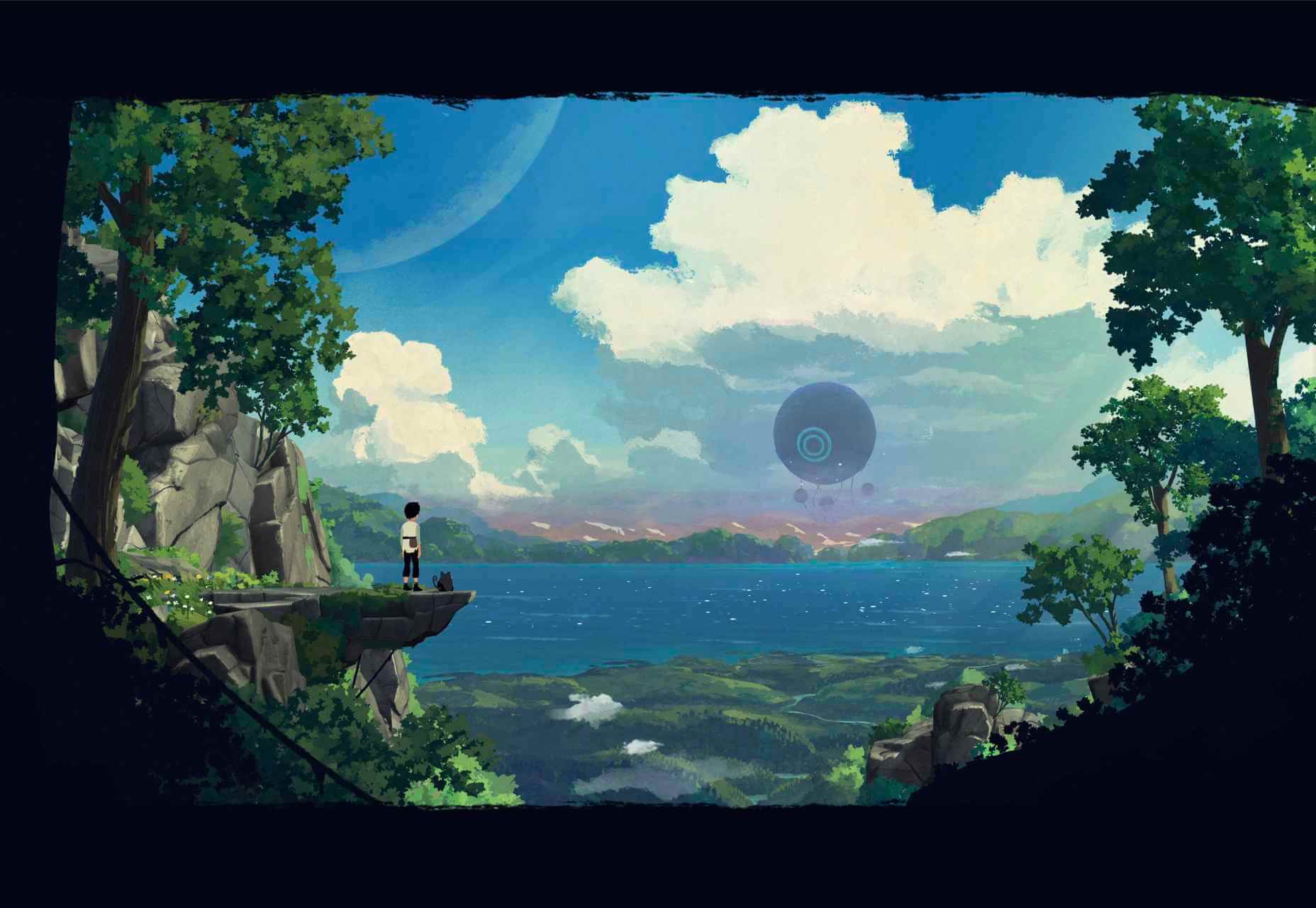
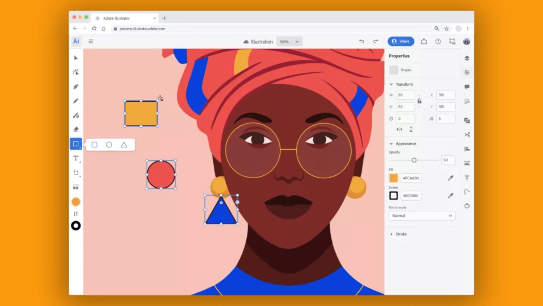
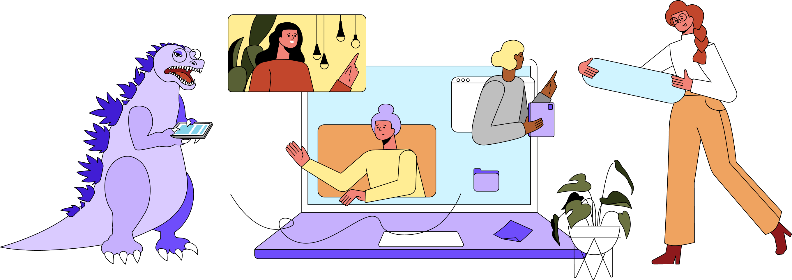
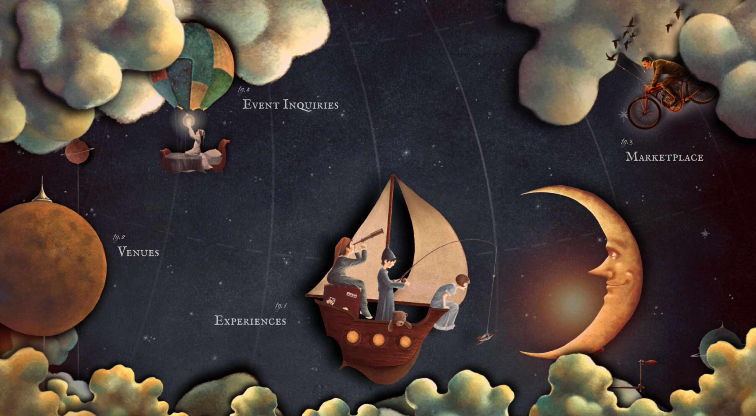
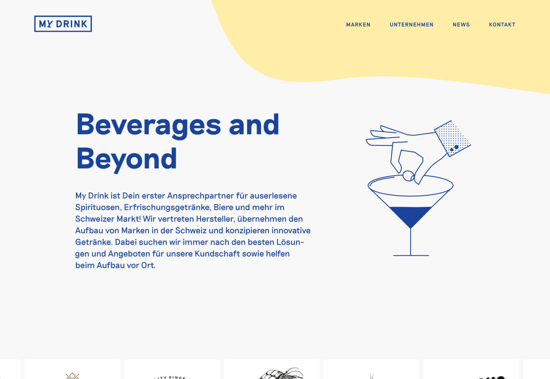
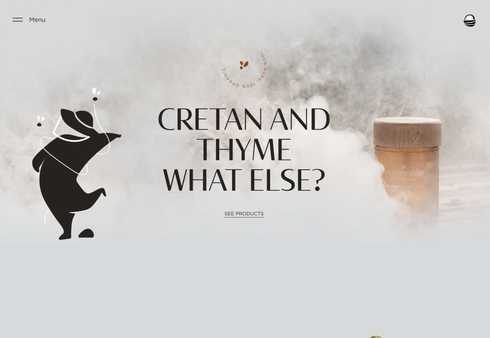
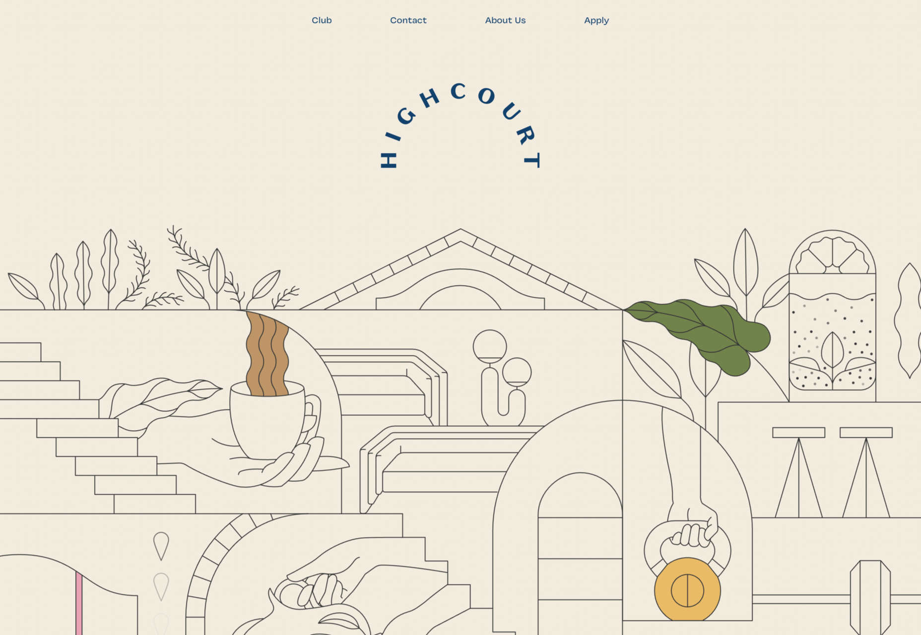
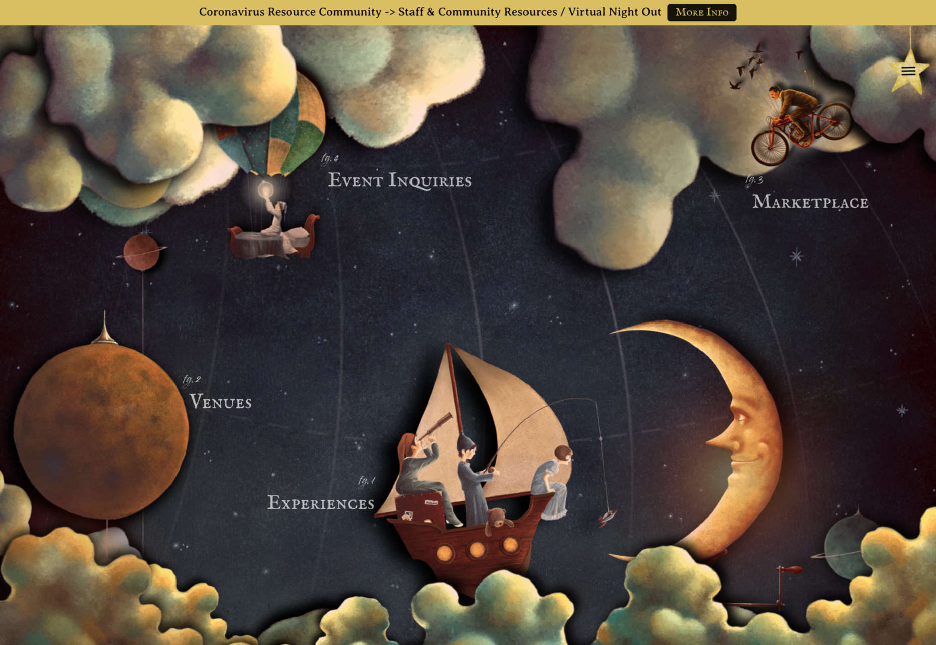
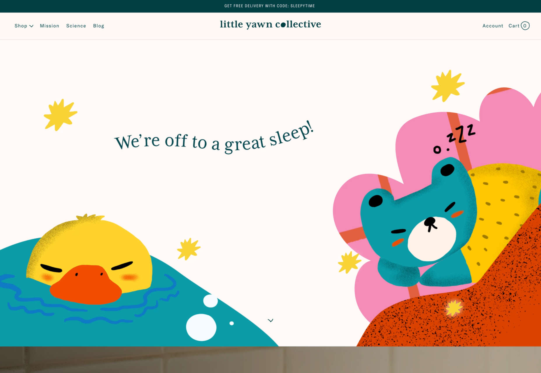
Intricate Illustrations

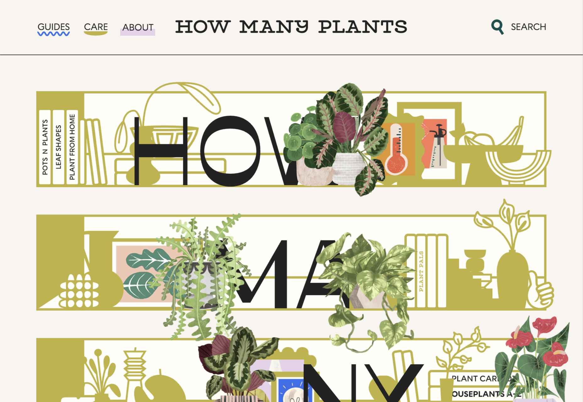
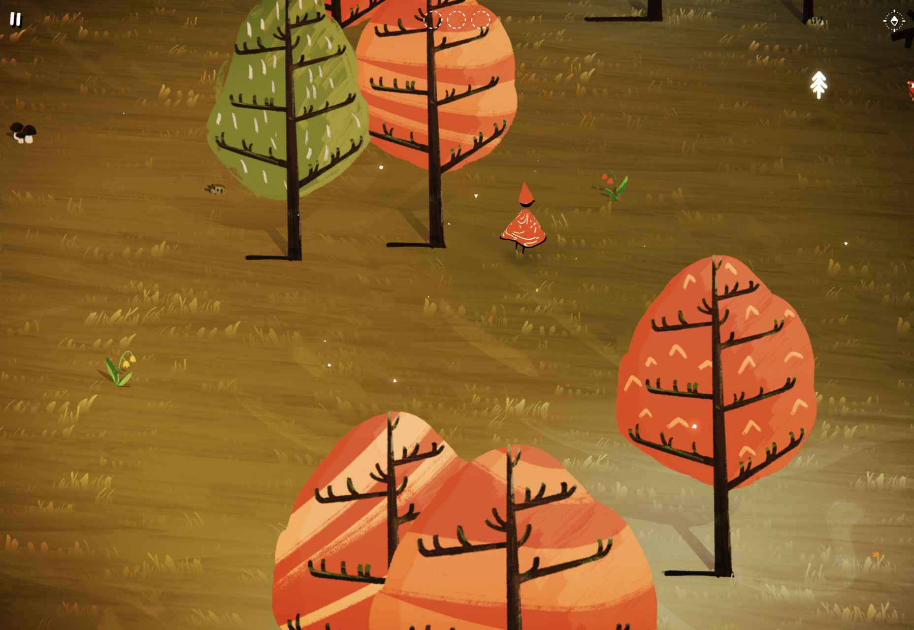
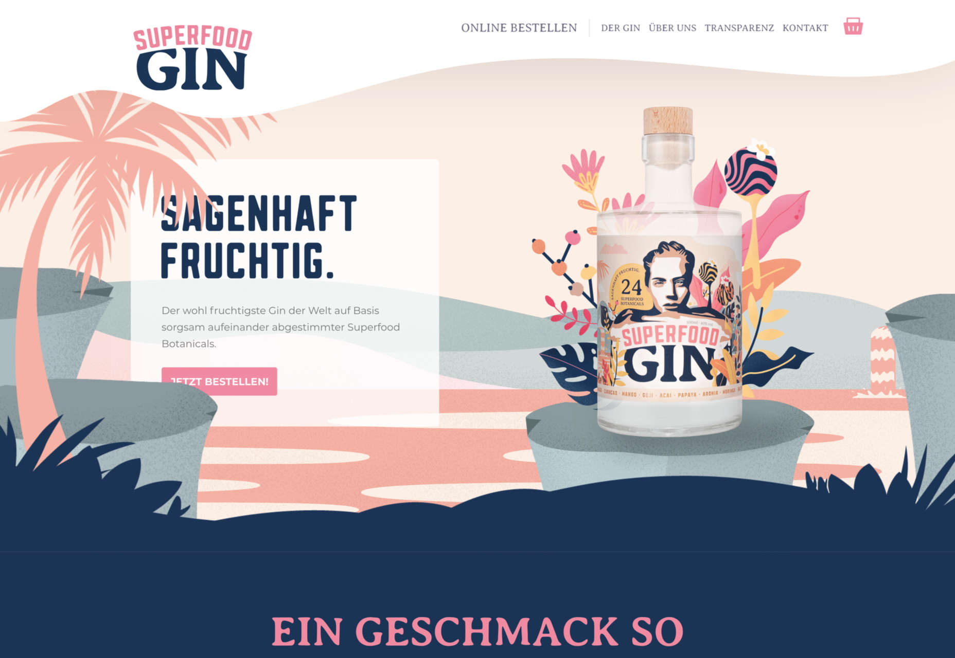
Another trending design element is the use of intricate illustrations on homepages. These highly detailed images can tell a visual story, help add meaning to messaging, or serve as a remarkable visual element when you don’t have a photo or video.

The great thing about this trend is that the only limitation is your imagination.

Once you find someone to create the illustration (if you can’t do it yourself), the world is open to interpretation.

We are seeing three major themes within this trend, as showcased in the examples.

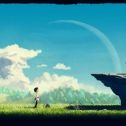
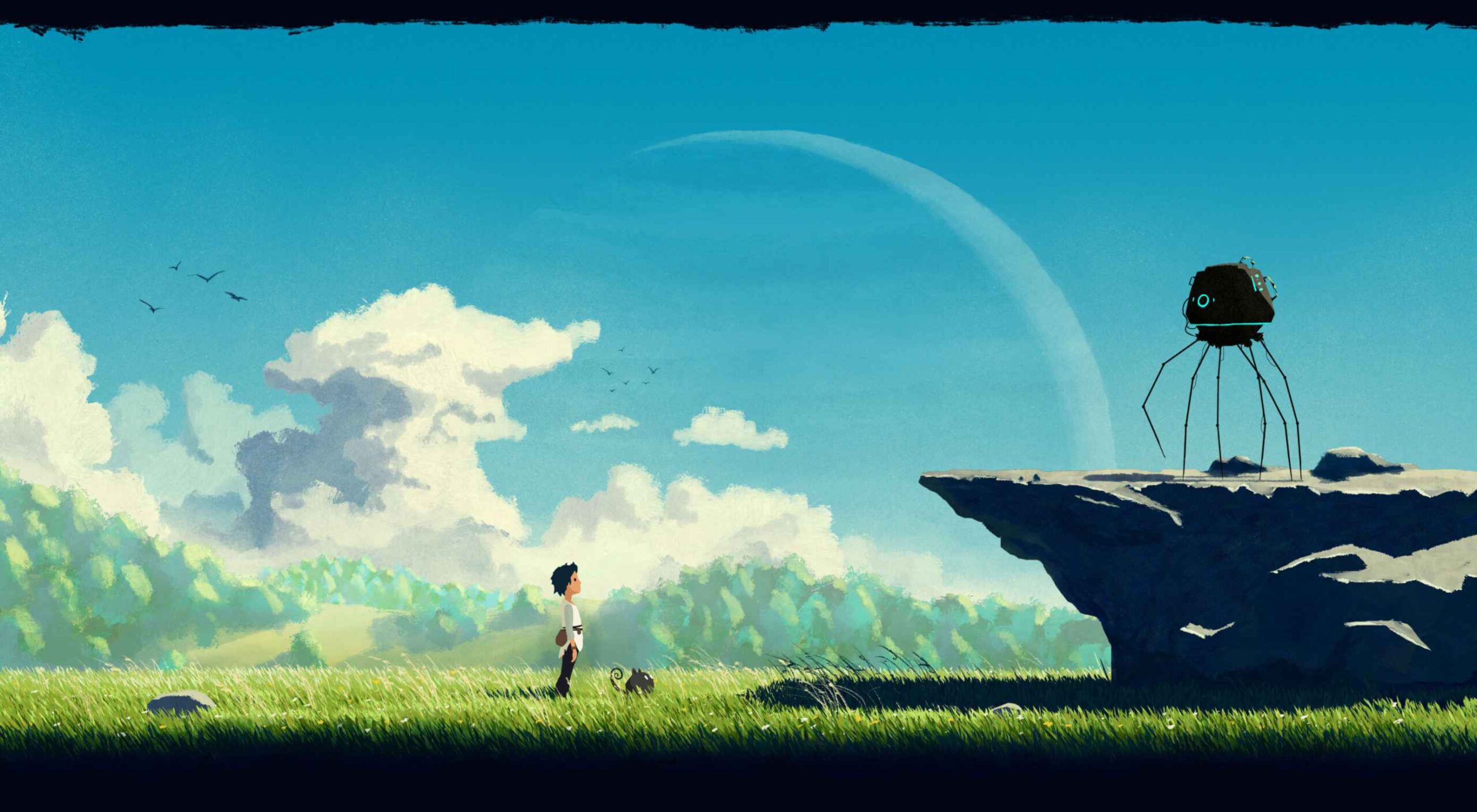
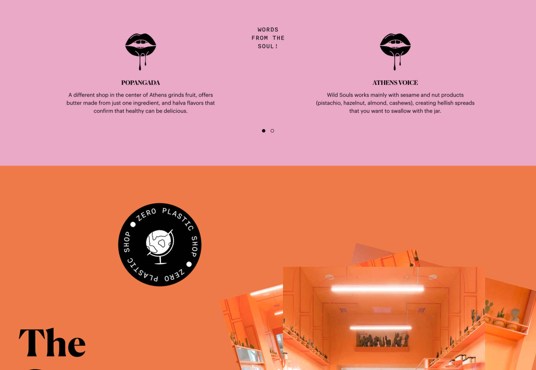
Multi-layer illustrations with hints of animation, such as the one from Highvibe Network. This illustration used lots of colors, layers, unexpected elements within outlines, and a little animation to pull it all together. The effect is rather stunning and provides a lot of interest for the user.

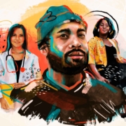
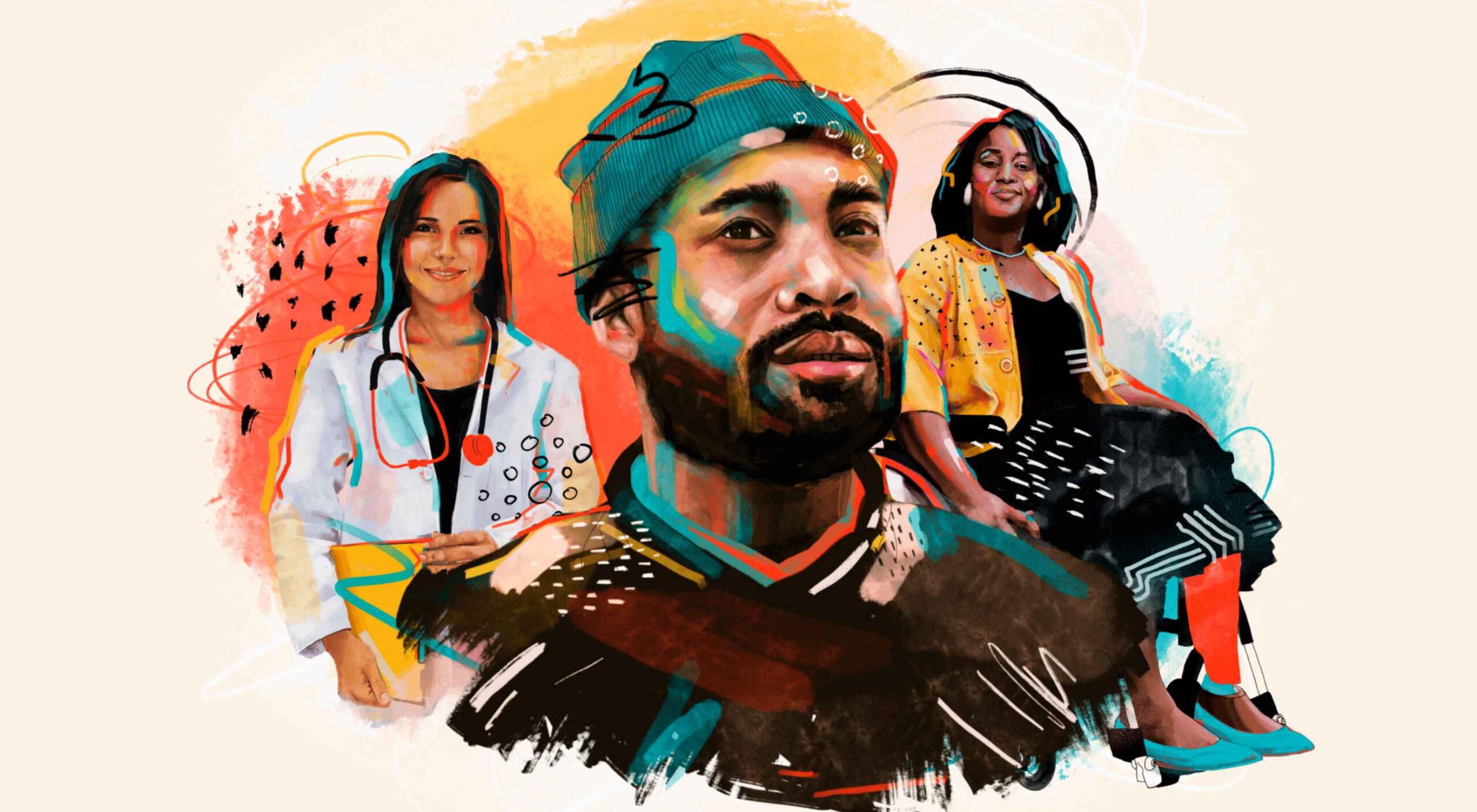
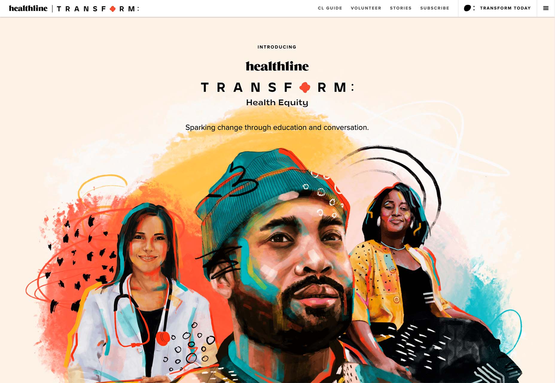
Realistic, painting-style illustrations, such as the one from Healthline, bring the content to life without real people or images. This technique is especially nice for industries where you may want to anonymize people in images. (Perfect for a healthcare website design because you don’t know if the illustrations are of real people or not.)

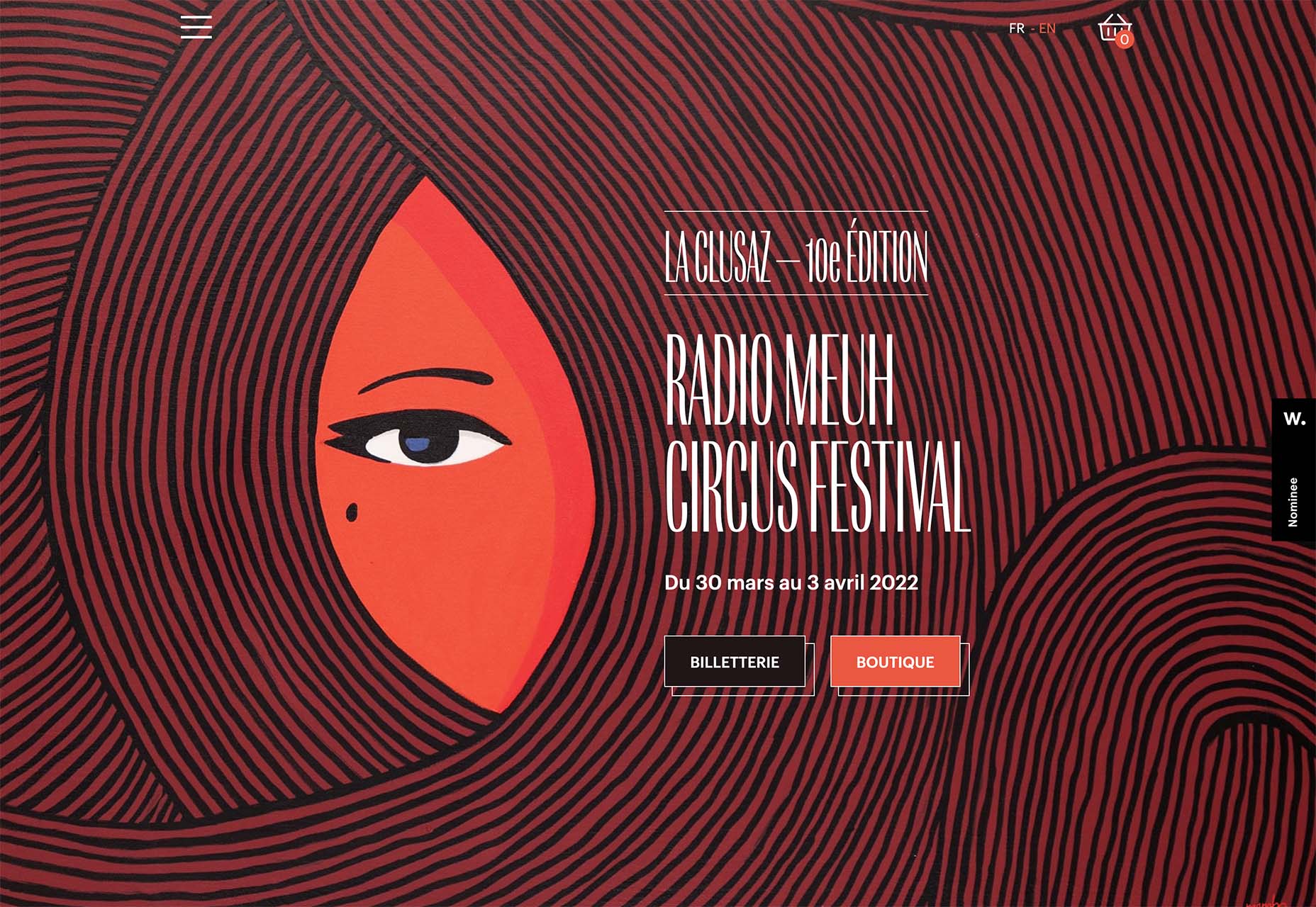
Detailed geo shapes and lines, such as the design from Radio Meuh Circus Festival. With great color and lines that draw the eye, this design can keep you looking and finding new depth for a long time. Color also helps draw you into the striking imagery.


Conclusion

What’s nice about all these design trends is that they have flexible elements that you can use and replicate across industries and projects. The common factor is that they lack traditional dominant imagery, which works exceptionally well.

These trends are likely a result of the worldwide pandemic as well. With less social contact, creating without conducting photo or video shoots is an ideal situation. Good luck trying some of these trending design elements on your own.

Source

The post 3 Essential Design Trends, January 2022 first appeared on Webdesigner Depot.

Source de l’article sur Webdesignerdepot

According to Klipfolio research, users spend on average 52 seconds on a webpage. With minimal time to impress, you must consider how to best help your consumers understand what your product or service does and why they should care about it. It’s not enough to describe your value – great landing pages will go the extra step and show this as well.

One powerful method to do this is by providing a real-life, responsive teaser to show what your product looks like, how it works, and what value it can create. This means incorporating specific elements from your functional, responsive product into the landing page. However, this should be a “mini-product experience” that users can experiment with rather than a freemium version of your product. If done well, the dynamics will pay off in captivating users for longer, increasing their consideration time, and driving your conversion rate as a result.

Building more dynamic landing pages through product experience can change the game completely. These are some strategies to consider.

“Ask & Alter” for Greater Personalization

“Ask & alter” is valuable for services with multiple potential value propositions for different audiences. The simple fix here is to have a pop-up box that asks the visitor which profile they are (and alternatively a few more questions). You can then trigger the page to alter according to their input, ensuring a more customized experience and increasing their chance of conversion. By doing this, you’re taking the onus off the consumer to figure out what’s relevant to them, eliminating any potential confusion.

A great example of this is the Penn Foster University website. It has a developed UX optimized for organizations, high school degree seekers, and upskillers alike. Each has an entirely different, carefully designed interface, matching the diverse needs of visitors. For example, while a high schooler might enjoy browsing the career pathways section, an upskiller is likely to search specific career fields. Such distinction is key to consider, as intentional and strategic user experience can raise conversion rates by as much as 400%.

Real-Time Demos to Hook the User

Real-time demos mean that you take a full instance or version of your product that is clickable and responsive and embed it into the flow of your landing page. This way, the user can get a quick “test drive,” and you easily communicate the value that would otherwise be abstract or difficult for the user to imagine or even visualize. Additionally, users always want to know how a product could personally impact them, and live demos offer them a hands-on experience.

Companies incorporating live demos have proven the power to engage a user’s curiosity and create a strong link with their products or services. Notion, for instance, uses a “templates” section with pre-built pages that can be easily opened and browsed through without needing to register or download anything. This product’s beauty lies in the simplicity and efficiency it offers, rather than overwhelming a user with a self-promotional copy. Even a simple live demo like that can help build considerable trust in the product and encourage users to make a high-value purchase.

Calculators Provide Value

Despite their simplicity, calculators can increase audience engagement by 38%. Their main benefit is undoubtedly providing a personalized solution to users’ actual needs and expectations. ROI and savings calculators can be particularly interesting, especially when they speak of value that isn’t easy to calculate or when the user wouldn’t intuitively know that there are savings to be had by using a particular product.

Butter Payment, uses this tool very effectively. As its customers necessarily don’t know they have an involuntary churn problem that is worth solving for, it uses a calculator on its site to demonstrate the problem and enumerate the value-add to potential customers.

HubSpot, too, has mastered the tool: Its Ad ROI Calculator visually presents the results that its software can bring. Then, HubSpot’s interactive website grader directs the user towards its comprehensive marketing offerings. It is this graphic visualization that companies must adopt to communicate real value.

The Charm of Experiential Interaction

Interactive design is said to drive the responsiveness and real-time interaction of a site through the roof. By incorporating an interactive or experiential page, even if it’s not directly on your landing page, you can craft a unique experience aimed at leaving a lasting, meaningful impression of your product or service.

Calm’s “Do Nothing for two minutes” is a simple yet effective way to show users the value of meditation in their daily life and lead them to download the app.

But it works great for consumer products, too: Nike’s Digital Foot Measurement tool is another excellent feature, allowing users to “try shoes on” with their cameras and scan their feet for the right measurement through AR.

Videos are Attention Magnets

Considering that viewers absorb some 95% of the message while watching videos, compared to only 10% when reading text, there’s no reason why you should avoid incorporating videos into your landing pages. Beyond that, videos can be incredibly straightforward: Insert a graphic illustration or real imagery to explain the product, show the step-by-step process, and convey value with raw, unfiltered footage.

Calendly, for example, has various videos on its landing page, including a 56-second, upbeat, colorful clip showing how simple it is to get started with the product.

Guiding GIFs to Visualize Product Features

As small animations, GIFs represent the perfect middle ground between images and videos. They allow you to show users the value your product adds, providing an engaging glimpse into the actual interface. The small scope of GIFs is both a limitation and a benefit: You can only show a particular feature of your product but can also focus on triggering an exact user emotion.

Grammarly, a grammar correction tool, relies on GIFs to give users a taste of their UX. With a quick overview of the product’s functionality across popular platforms, including email and social media, users can see exactly how the product can make their everyday lives easier. And by incorporating GIFs into the right side of the landing page, the scrolling experience of the user isn’t disrupted.

Interactive product experiences can both entertain and tackle pain points, adding dynamics to an otherwise static page. Particularly when customizing based on user attributes, the key benefit of these features is that the users engaging with them are likely the same people interested in the paid product. To ensure that the product experience doesn’t directly compete with the primary offering, clearly differentiate it and guide the user towards a direct call to action.

Source

The post The Case for Building More Dynamic Landing Pages first appeared on Webdesigner Depot.

Source de l’article sur Webdesignerdepot

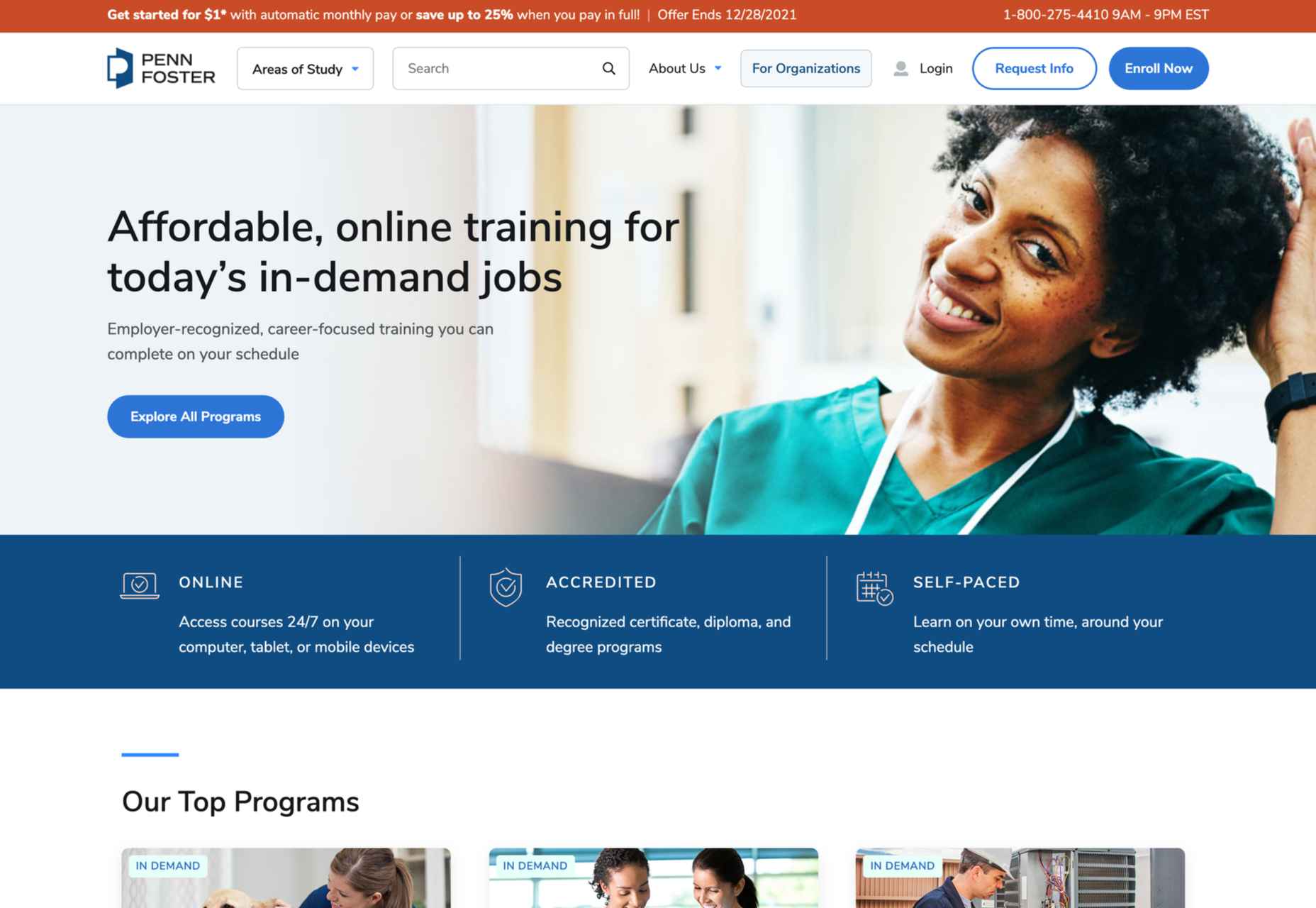
2021 has been both memorable and instantly forgettable. Pop stars were freed from modern-day servitude, some people tried to overthrow democracy, and we all vacationed at home.

Despite the weirdness of the times, the web kept growing, kept changing, and kept on pushing boundaries. We saw a wealth of new sites launch or relaunch with significant updates.

Here are the 50 best sites launched on the web this year. Enjoy!

Crusta C

In April, seafood company Crusta C cleverly used the simple logomark ‘C’ to apply a cutout video effect.

Slow

Slow is a collective of creatives aiming to implement slow movement principles. Its site reflects those aims, creating a sense of calm and deliberation.

hnst

2021 saw tons of brutalist-inspired design. hnst’s take on the style works thanks to the bright red in place of the standard black.

Marram

This site for boutique hotel Marram uses a soft color palette to create an impression of soft golden light and calm.

Levitate

In July, we loved this site for running-blade brand Levitate. The site is clean and light, with a sense of inherent motion in the photography.

Niarra Travel

There’s some beautiful photography on this site for eco-conscious, bespoke travel agency Niarra Travel.

Plunt.co

The core of this site for Plúnt is a combination chooser which feels pleasingly reminiscent of an animal flipbook.

Moth Drinks

Moth makes classic cocktails in a can. The striking black and white graphics and masking effects for its holding page stunned us back in March.

Seed

Selling supplements is hard; people are understandably skeptical. So this site for Seed packs in research and scientific information and avoids the hard-sell.

Wavemaker

Another excellent portfolio site in 2021, this time for creative media agency Wavemaker. The site is uber-confident while still being playful.

Wild Souls

Wild Souls makes nut butters, tahini, and other Greek delicacies. Its site is colorful and warm, and the site typography is soft and appealing.

JUST Egg

JUST Egg produces egg-like food from plant material. The huge photography and bold typography do a great job of making a new concept appealing.

Aalto University

One of the most popular designs of 2021 was Aalto University’s site with its in-depth campus tour. The simple navigation inspired several imitators.

Wisr

Scroll interactions were big in 2021, and Wisr features a Heath Robinson-style machine that ‘runs’ as the user scrolls down the page.

Cevitxef

This site for Cevitxef ceviche restaurant in Bilbao does a great job of making us hungry. Drama is created by oversized text, heavily-styled photography, and lots of movement.

On

The best digital agencies keep their own sites simple, like this site for On digital technology studio that uses black on light blue and adds infinite scrolling.

Acayaba + Rosenberg

We found Acayaba + Rosenberg’s use of architectural photography and subtle scrolling a pleasing browsing experience.

Madre

This site for home linen company Madre uses extraordinary fine-art style still-life photography to enrich a very simple site.

Hyperframe

“Show, don’t tell” is a well-worn mantra. Hyperframe’s site implements it by demonstrating the product’s major selling point on scroll.

Gemini

This exceptional WebGL experiment was built to show what’s possible in the technology. Have a play with the car; it’s a ground-breaking demo.

Felt

In 2021, collaborative mapping tool Felt launched in private beta. Its excellent site does a great job of creating interest while doubling as a recruitment notice.

imNativ

Not every project is exciting, but this excellent site for imNativ uses macro photography to great effect to promote upholstery fabric.

Websmith Studio

Excellently named Websmith Studio uses color to highlight, and the noise effect applied to the background adds subtle interest.

Singita

High-quality photography and a terracotta-based color scheme create an inviting ambiance for Singita, an African eco-tourism and conservation brand.

Fluff

A fullscreen background behind a mobile view for desktop? It sounds like a horrible idea, but this site for cosmetics brand Fluff pulls it off.

Chiwawa

This great site for Chiwawa cantina features wrestling masks, skeletons, and tone-on-tone color to create a lively and distinctly Mexican site.

Nothing

This site for Nothing’s ear(1) earbuds is packed with confidence. Appropriately, it looks even better on mobile.

Chérie Healey

Lots of experts have tried to tell us how to live our lives in the last couple of years, but Chérie Healey’s site manages to stay on the right side of positive without slipping into clichés.

Wayfinder

Wayfinder, a game about our connection to nature using generative code, AI, machine learning, and data mining, could not have been more 2021 if it tried.

Green Angel Syndicate

Not too many investment groups are thought of as ethical, but Green Angel Syndicate specializes in funding companies fighting climate change.

Tether

As the days got darker in the Northern hemisphere, we were wowed by this site for Tether, a cycle safety system using video and illustration to explain its clever approach to bike safety.

Patricia Urquiola

Back in January, we loved the new site for Patricia Urquiola design studio, thanks to its bright, bold colors that we thought inspired confidence.

Headup

Headup’s businesslike approach is created thanks to a pleasing color palette and geometric graphics.

Redwood Empire

For Earth Day on April 22nd, Redwood Empire Whiskey created a microsite promoting a competition styled to match their bottle labels.

GT Super

The one-pager for GT Super has a certain drama in keeping with the font itself and allows you to play around with the size, weight, and style.

Planet of Lana

Due for release in 2022, Planet of Lana is a game from Wishfully Studios, and its teaser page launched back in June has kept us intrigued ever since.

The Longest Road Out

This charming site for The Longest Road Out is a travel map and journal based on the creators’ road trip around Britain, Ireland, and the outlying islands.

Made Thought

Made Thought has a bold aesthetic and approach that explains its outstanding client list.

Miti Navi

Miti Navi makes extraordinary sailing boats. We were attracted to how its site presented a luxury product in an original way.

La Nouvelle

Another powerful digital design agency site was La Nouvelle’s, which used a combination of contrasting and complementary color combinations to catch the eye.

Caleño

Caleño makes non-alcoholic distilled spirits. They relaunched their website in March with bright, joyful colors that reflect the character of the brand.

Capsul’in — Aluminium

This demo site for a coffee pod manufacturer isn’t a site as such, but it demonstrates that even in 2022, there’s room for parallax scrolling.

How Many Plants

Everyone needs a few more houseplants, and How Many Plants is a great guide to how to own and look after them. The illustration style is friendly but efficient.

How & How

One of the most approachable design agency sites of 2021 was How & How’s. It keeps things light and clean, and effective.

The Hiring Chain

Part of a campaign encouraging businesses to employ talented people with Down Syndrome, The Hiring Chain website dispels myths with clearly presented facts.

Virgile Guinard

Back in February, we couldn’t get enough of photographer Virgile Guinard’s portfolio site. Blocks of color pulled from each image hide the image allowing you to focus on one image at a time.

Studio Nanna Lagerman

Studio Nanna Lagermann’s site excels at creating a sense of space and calm. The color palette is soft and neutral. The type is large but clean and sophisticated.

GOOD Meat

Veganism is a growing trend, and one of the sites promoting it with gorgeous colors is this site for lab ‘grown’ meat.

Mama Joyce Peppa Sauce

This one-page site for Mama Joyce Peppa Sauce is big and bold. Click almost anywhere, and two bottles of sauce go into your cart.

Ebb Dunedin

The site bucks the trend for luxury hotel design and instead is styled to complement its interiors. We could have done with time at this boutique hotel in 2021, maybe next year…

Source

The post 50 Best Websites of 2021 first appeared on Webdesigner Depot.

Source de l’article sur Webdesignerdepot

Every day design fans submit incredible industry stories to our sister-site, Webdesigner News. Our colleagues sift through it, selecting the very best stories from the design, UX, tech, and development worlds and posting them live on the site.

The best way to keep up with the most important stories for web professionals is to subscribe to Webdesigner News or check out the site regularly. However, in case you missed a day this week, here’s a handy compilation of the top curated stories from the last seven days. Enjoy!

Supercharge Your Node.js With Rust

Icon Trends in 2021

Material Design 3

5 Pillars of Effective Landing Page Design

Can Include (a Certain HTML Element Within Another Certain HTML Element)

Is Photoshop & Illustrator in the Web the Most Exciting Reveal of Adobe MAX?

Box Shadow Generator – Generate Multilayer CSS3 Box Shadows

Olio – Illustration Constructor with 130+ Characters and Objects

The Button Cheat Sheet

Marvel Character or Font?

Source

The post Popular Design News of the Week: October 25, 2021 – October 31, 2021 first appeared on Webdesigner Depot.


Source de l’article sur Webdesignerdepot

We’re well on our way to Hallowe’en already, and it’s time for another collection of websites that have caught our eye.
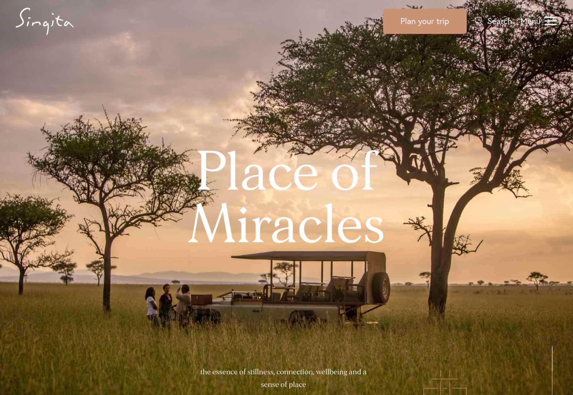
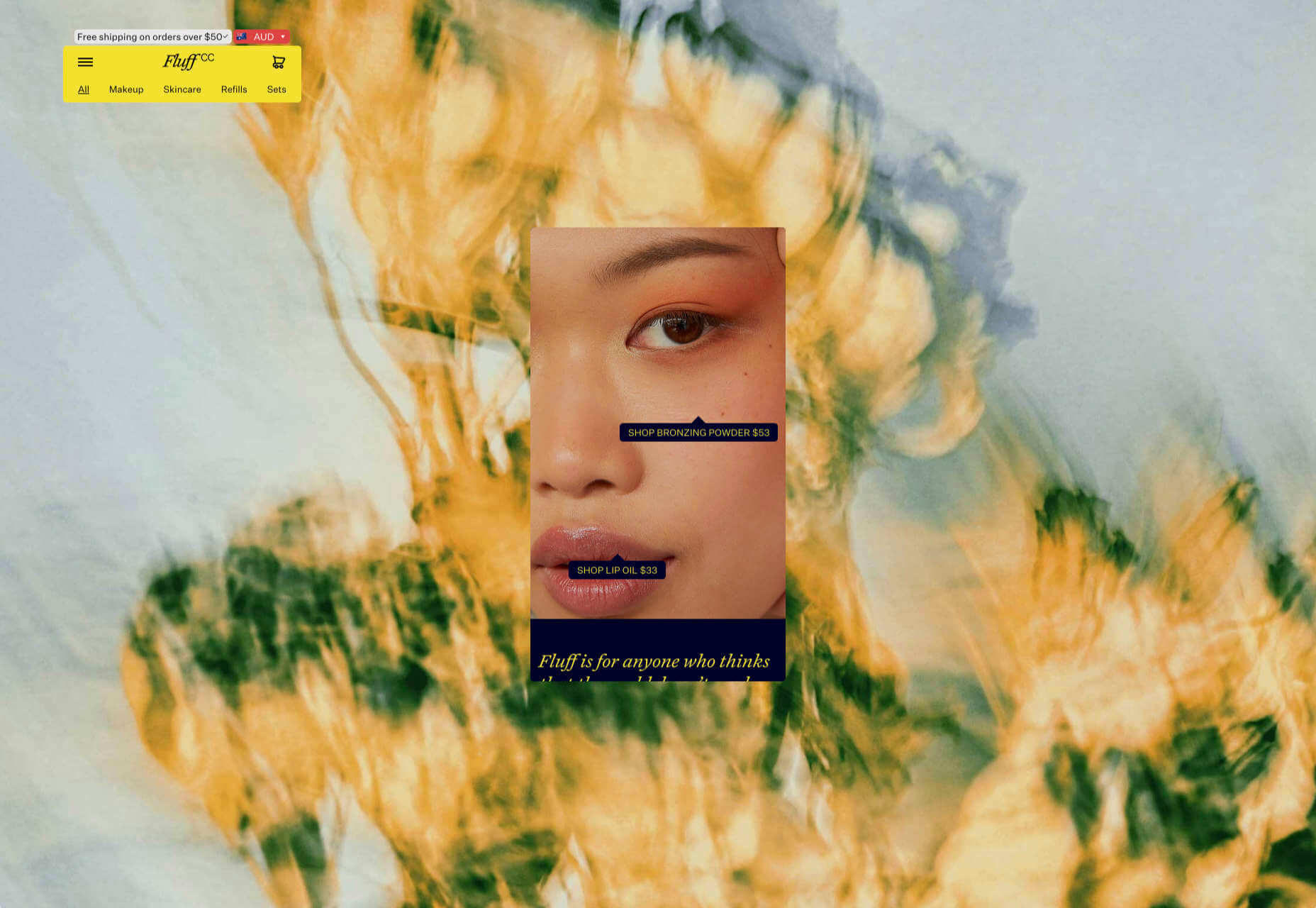
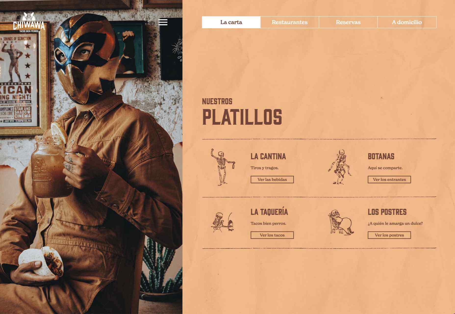
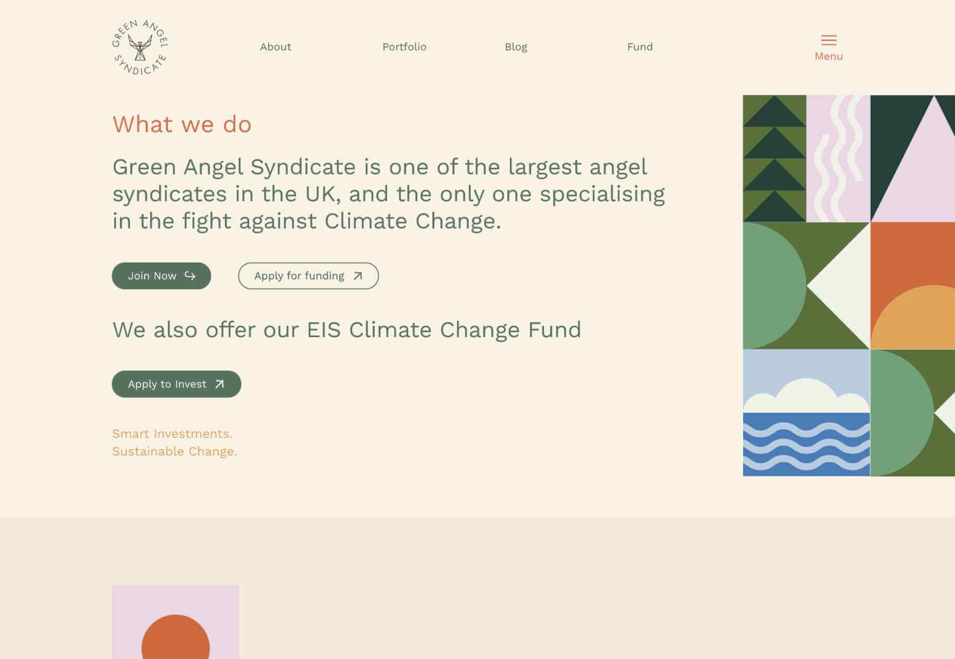
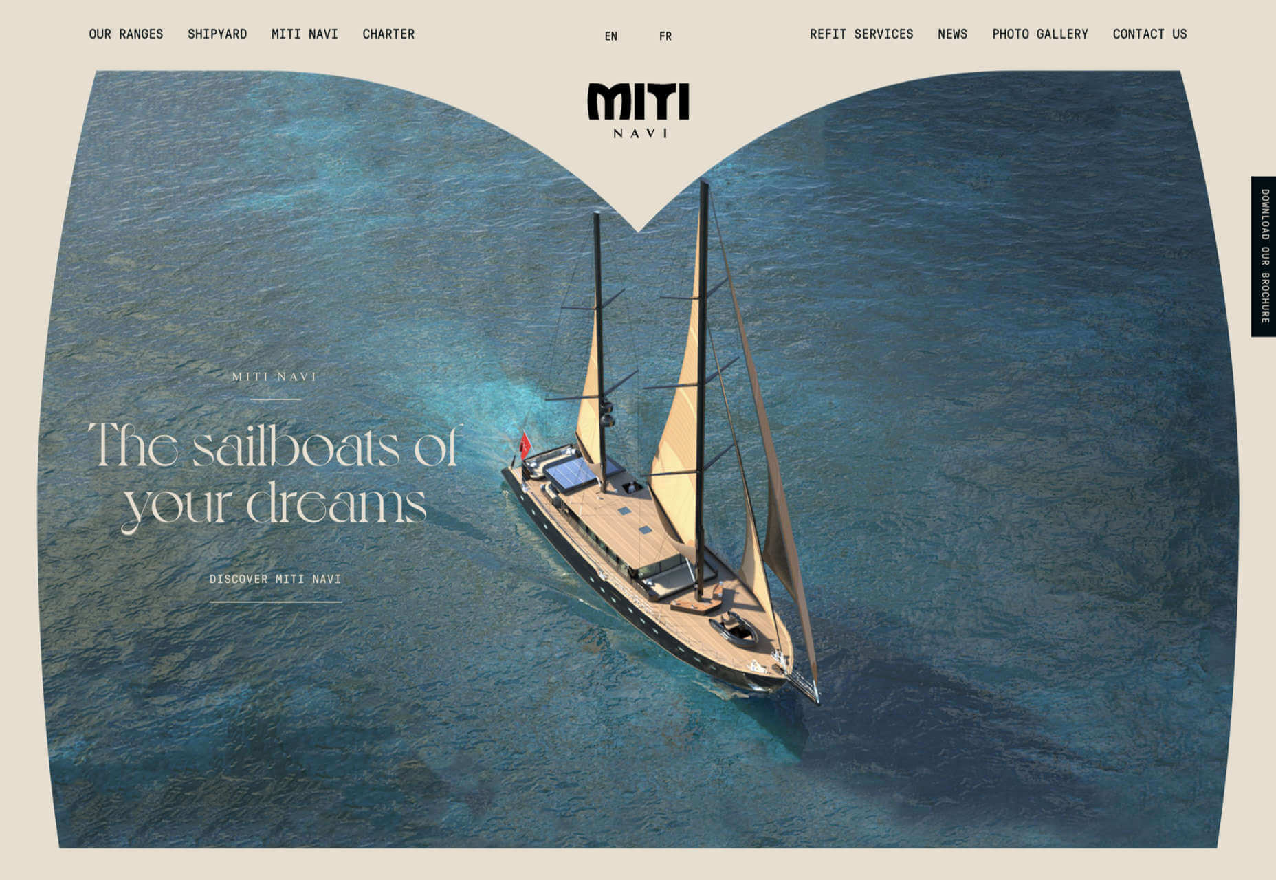
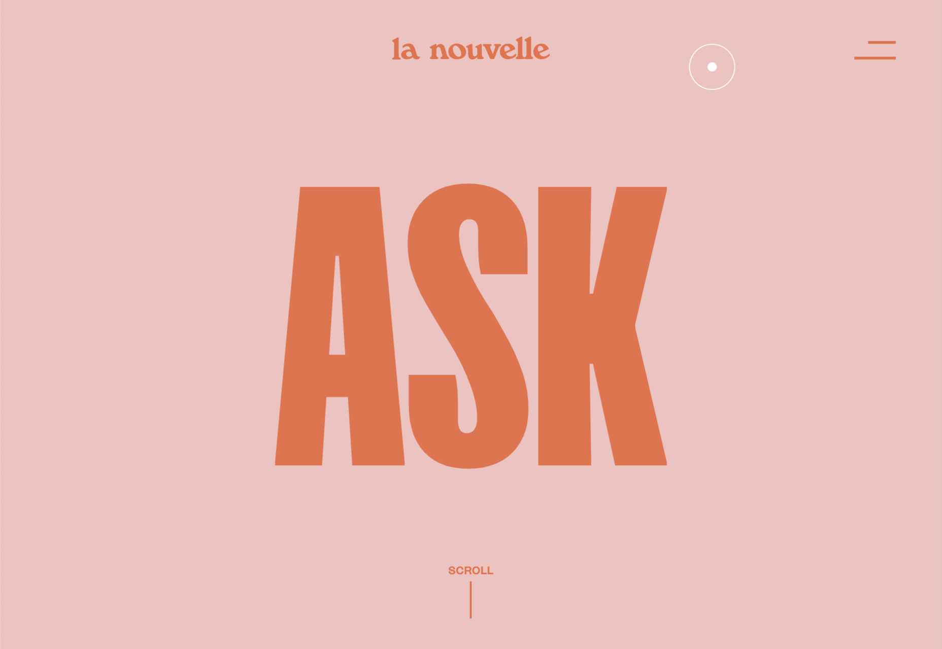
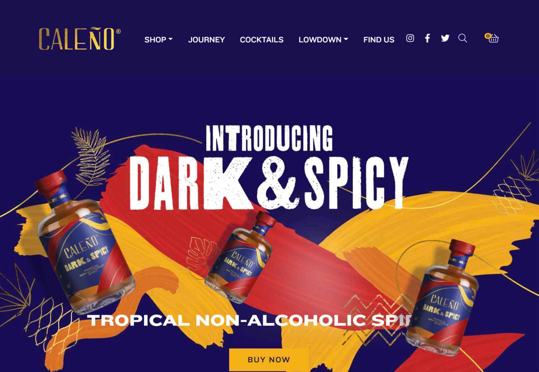
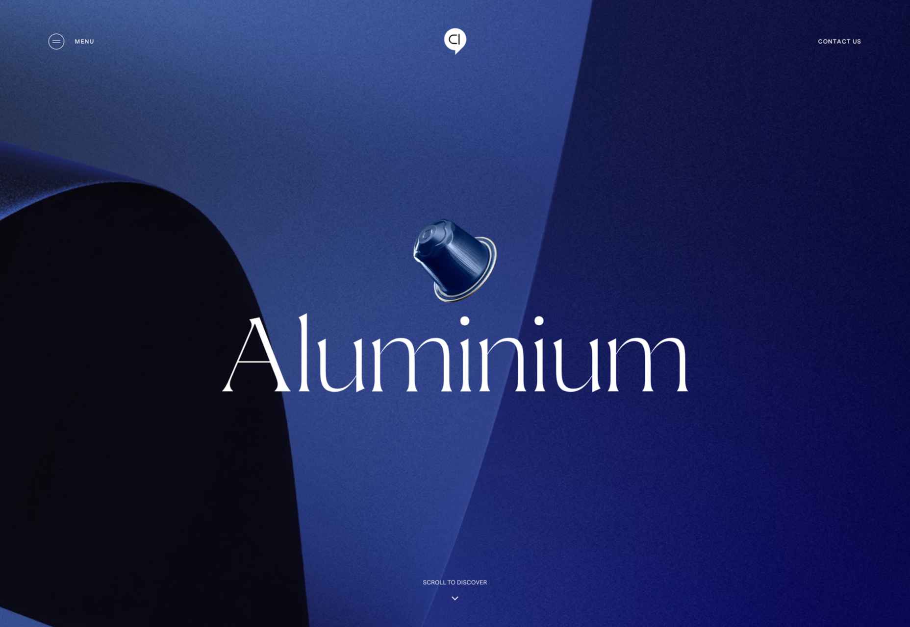
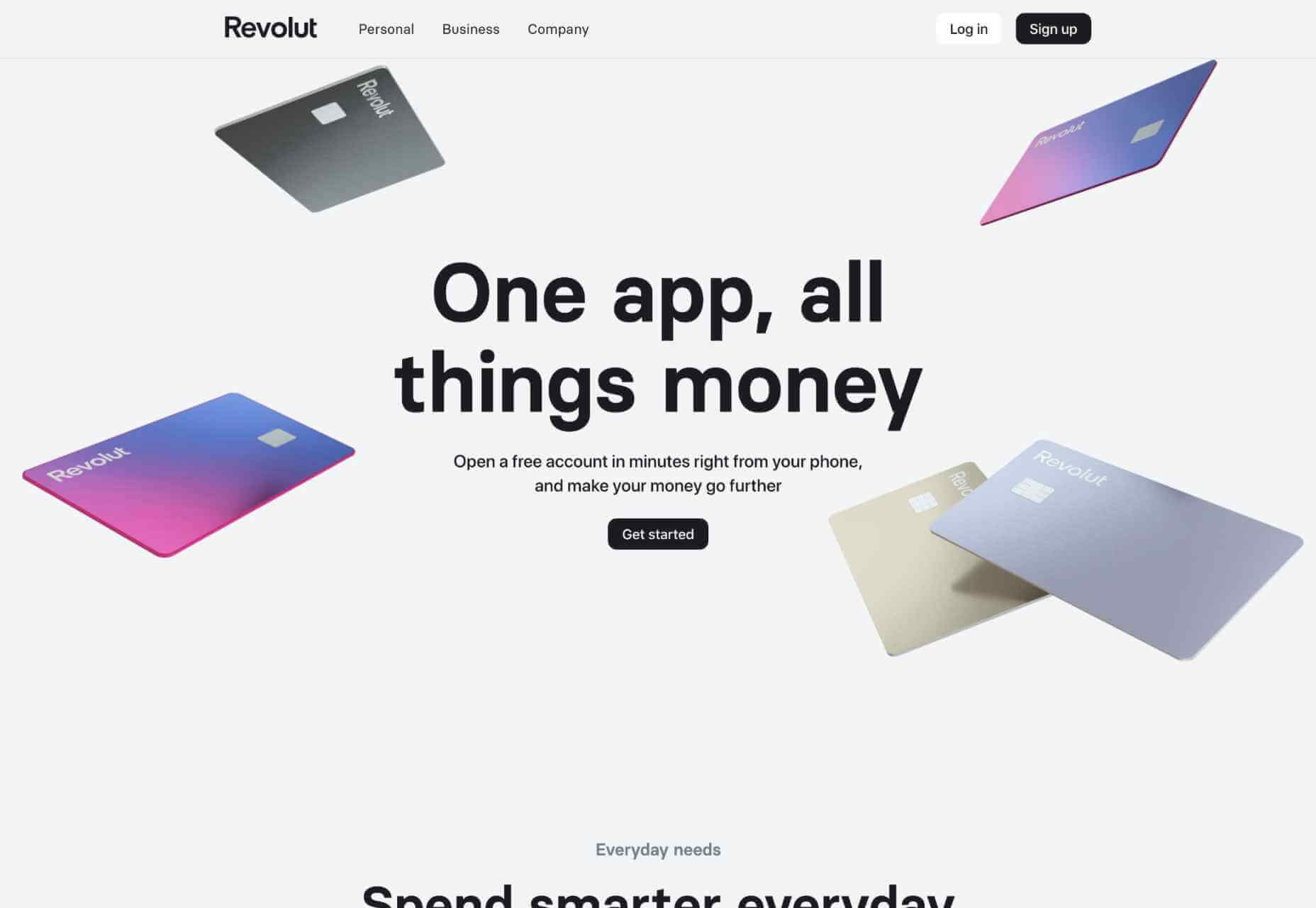
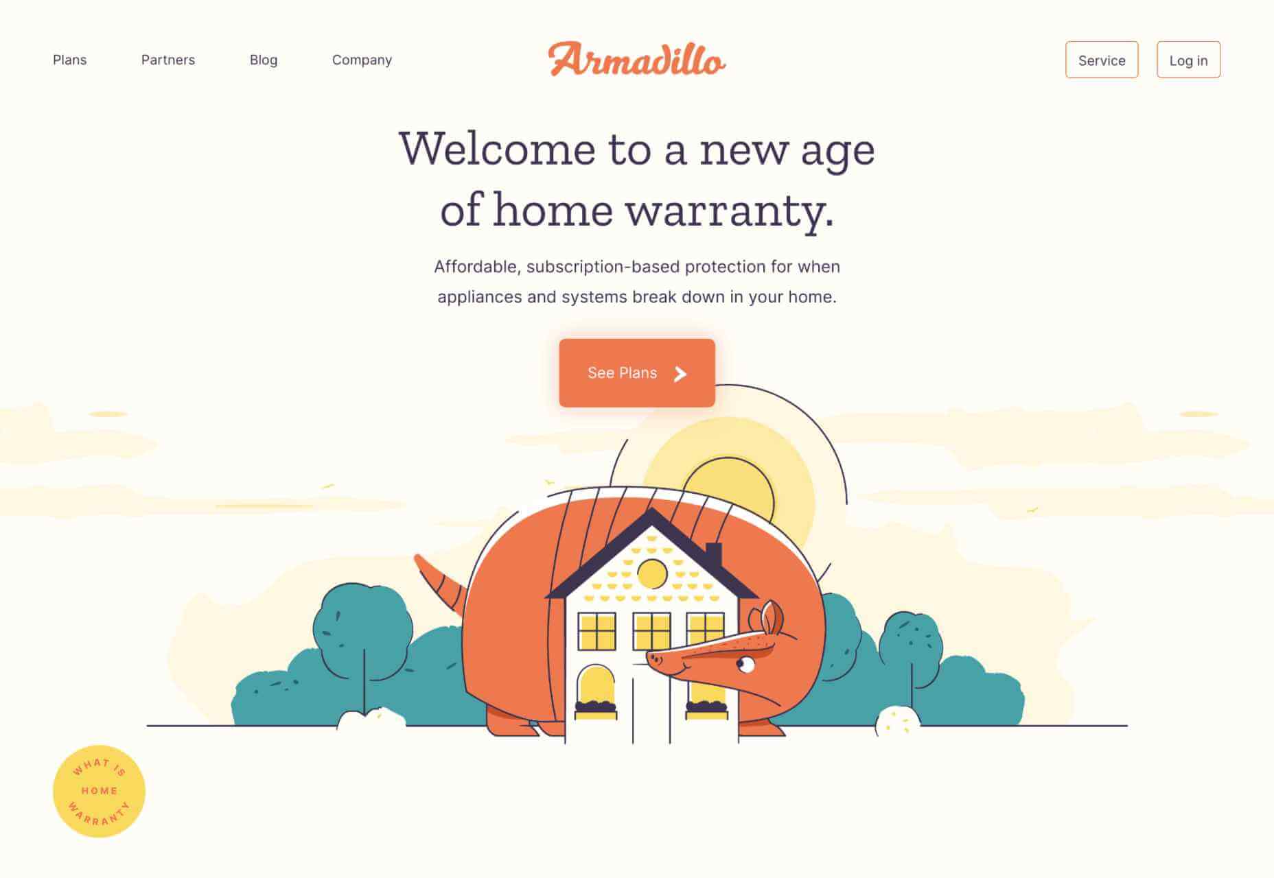
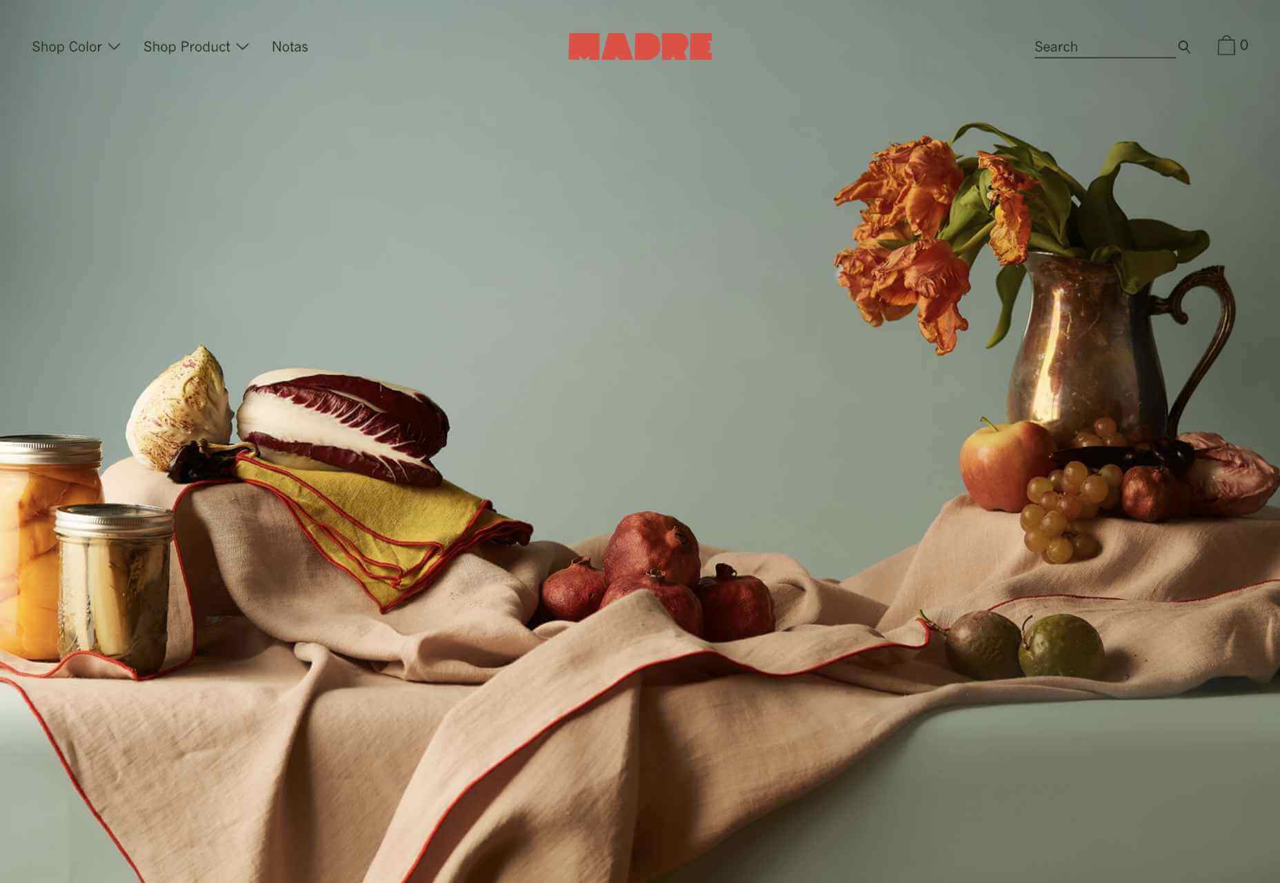
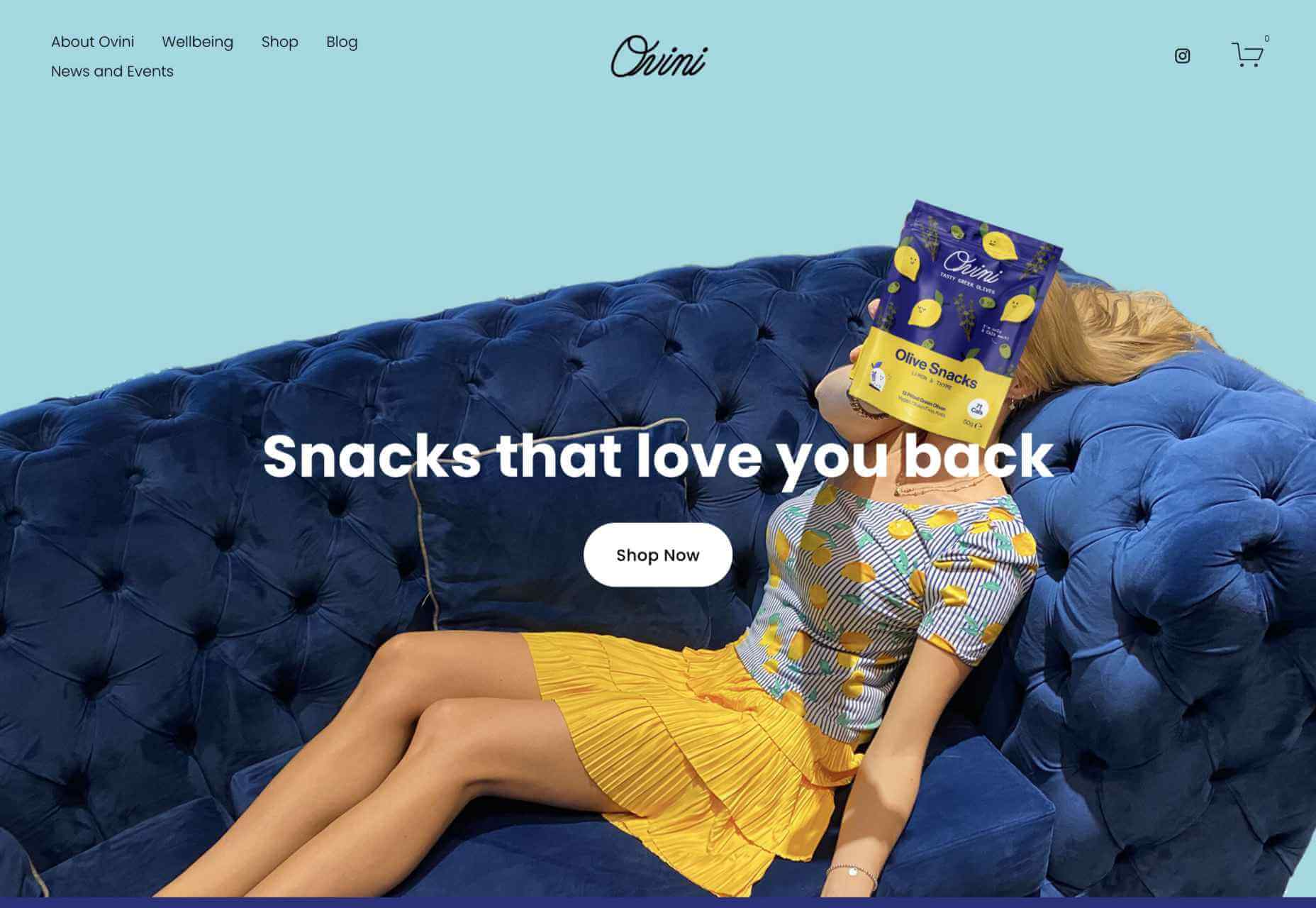
It’s a mixed bag of candy this month, but nothing that should make you scream with fright. Enjoy!

Tether

This single-page site for forthcoming cycle safety system Tether uses a balanced combination of hero video and illustration to explain its features.

Wayfinder 

Wayfinder is a game about our connection to nature that uses generative code, artificial intelligence, machine learning, and data mining to create a new experience each time it is played.

Beechhouse

Beechhouse has a clean, airy feel, with subtle scrolling animation. For a tattoo studio, the overall feel is refreshingly light, without a rose-filled skull to be seen.

edenspiekermann_ 

This is how you do a portfolio site with absolute confidence.

Forward Festival 

Forward Festival is a series of creative conferences run by Forward Creatives design agency. This is an excellent example of a classic magazine site with enough individuality to pull the user in and keep them engaged.

Danmarks Motionsuge 

Denmark’s Exercise Week focuses on a national campaign (in Denmark) to get Danish people to be more active. A fresh color scheme, offset grid, and strong photography all create a dynamic feel. And it is somehow reassuring to the rest of us that even the second happiest population in the world needs to exercise more.

Franco Maria Ricci 

Because we have come to expect load times to be almost nothing, loading screens are not something too many sites bother with. However, this site for publisher Franco Maria Ricci is a pleasing exception.

Pierre Yovanovitch 

Stylishly curated portfolio and catalog site for interior and furniture designer Pierre Yovanovitch.

Gir

Silicone spatulas are probably not the first subject most of us fantasize about designing a site for, but that’s what makes this site for Gir extra good. The ‘add to cart’ footer widget on individual product pages is done well, making sure a buy button is always present but without being over pushy.

Gastronomical 

Bright, bold, and in your face, this site for Gastronomical pancake and waffle mix is about as far from Betty Crocker as it could get, bringing ‘cool’ to home baking.

FC XV

Marking 15 years of Dutch fashion brand Fabienne Chapot, this microsite makes a feature of the illustration style used by the brand for its prints.

Websmith Studio

This is a good, simple portfolio site with good use of color to highlight, and the background noise effect adds subtle interest. Good name too.

Van Gogh Museum

This is definitely one of the better museum websites around. The use of color creates warmth without detracting from the sense of space. The ability to search the collection visually is a welcome feature.

Chérie Healey 

Life coach Chérie Healey’s site manages to stay on the right side of positive and uplifting without tipping over into hippy meme territory.

Kalso 

To mark the launch of the new Earth Shoes website, this microsite traces the history of the original Kalso Earth shoes, starting with their inventor Anne Kalsø herself.

The Order of the Good Death 

The Order of the Good Death is aimed at changing attitudes around a subject that most of us find extremely difficult, in a way that is informative and at the same time appealing. The tone of the content is as essential here as the visual style.

Air Company 

The use of split-screen works well here for Air Company, to show now and future, along with some great photography and video.

Wild Fi 

Wild Fi design agency’s site manages to be colorful but clean at the same time. Bold type and a balance between black on white and white on black make an impact.

Firefly 

This site for Firefly digital design agency has some great little details, notably a glow around the cursor.

StudioBand 

Dark neutral colors provide a calm, muted background for video and photography of work in StudioBand’s portfolio site redesign.

Source

The post 20 Best New Sites, October 2021 first appeared on Webdesigner Depot.


Source de l’article sur Webdesignerdepot

Not so long ago, customers only had a couple of ways to interact with brands. 

If you had an issue with a product or service, you could reach out through the customer service phone number or send an email. Occasionally, sites would introduce dedicated forms on their website that allowed consumers to send support tickets straight to the service desk – but that was it.

The problem with this kind of service was all the waiting. 

Send an email or ticket, and you have no idea when the company is going to get back to you. Customers end up refreshing their inbox all day, waiting for a response. Call the company, and 9 times out of 10, you’ll be placed on hold. You can’t exactly do much when you’re stuck listening to hold music, so customers are gradually getting more frustrated as they wait for a response. 

Fortunately, the evolving digital age has introduced a new solution: live chat.

Transforming Your CX With Live Chat

Live chat is a quick and convenient way for your customers to contact your business and get a response immediately. The result is happier clients, better customer satisfaction scores, and even opportunities for bigger sales. 

More than 41% of customers say they expect to see live chat on a site. 

Even if you don’t have an agent on hand to answer a chat message immediately, you can create an automated system that notifies your customer when someone is available. That means they can go and do other things while they’re waiting for a response. Live chat solutions with bots can even allow your customers to fix problems for themselves. That’s pretty convenient!

Widgets equipped with answers to commonly asked questions can automatically deal with customer queries or help them find solutions to their problems before passing them over to an agent. This means that your customer gets a solution faster, and your agents don’t have as much pressure to deal with. It’s a win-win – as long as you get it right. 

Unfortunately, a lot of companies don’t know how to implement live chat experiences correctly. 

Kayako’s study into 400 customers found that 47% couldn’t remember the last time they’d had a positive experience through a live chat tool.  

How to Upgrade Live Chat CX

The evidence shows that customers love the idea of live chat, but the reality of how businesses implement this technology isn’t always ideal. 

However, since 86% of customers say they’re willing to spend more on a better customer experience, it’s worth figuring out what separates a good live chat interaction from a bad one. 

1. Set Expectations Instantly

Setting the right expectations is crucial if you want to generate better satisfaction for your customers at a later date. When customers know what to expect from your live chat strategy, they can also make more informed decisions about which support channels they’re going to use, and whether they want to hang around for someone to answer their messages. 

The first thing you should do is showcase your agent’s availability. In this example from Help Scout, you can see whether the team is active, online, and ready to talk. The company also sets expectations for how quickly you can get an email response if you don’t want to chat.

Other ways to set expectations include:

  • Showing your opening hours: List when team members are usually available to answer questions if you’re not currently online. 
  • Topics: Offer your customers some topics that they can ask about or use the welcome message on your chat tool to direct your customers to an FAQ page. 
  • Restrictions: If there’s anything you can’t deal with over live chat, like changing a customer’s password, let them know in advance so they don’t waste time.

2. Leverage Pre-Chat Forms

Pre-chat forms are some of the most important parts of the live chat experience. They ask your customer to explain their issue to your chatbot so that they can be directed towards the right agent. Using these forms correctly ensures that your agent has all the information they need to solve a problem fast. 

You can even set up automated systems that direct customers to different agents and teams based on their needs. For instance, the live chat app on Outgrow.co gives customers the option to fill out different forms depending on whether they want answers to a question, a demo, or something else.

The button you click on dictates which professional you’ll get through to. Although filling out a form can seem like an extra friction point for your customer at first, it helps to streamline the customer journey. After all, if you can direct the customer to the right agent the first time, there are fewer chances that they’ll need to explain their issue to various different people. 

Here are a few things you can ask for in the live chat form to make it more effective:

  • The customer’s name: This will help to personalize the conversation. It could also be an opportunity to track down any background information you have about an existing customer and the orders that they may want to speak to you about.
  • An email address: Having an email address will allow you to bring up a customer’s record on your CRM. It also means that you can send any information that the customer needs to their email inbox at the end of the conversation.
  • A brief explanation: Ask your customers to share what they’re reaching out to you about and use keywords in their message to assign the chat to the right agent or professional. You could even add a drop-down menu of topics for them to choose from. 

Remember, don’t ask for too much information straight away, or you’ll risk your clients feeling that the service experience is too complicated. 

3. Make Sure It Works Everywhere

We’ve reached the point now where every customer expects a brand’s website to be responsive on any device. Most web-building templates automatically work on mobile tablets and smartphones. Additionally, it’s becoming increasingly easy for companies to transform their website and online store experiences into dedicated apps too. 

However, while most businesses know that their site needs to be responsive, they often forget about the mobile element when it comes to live chat. If your live chat function is only available on the web browser version of your website, then this is going to end up making your mobile customers pretty unhappy. They don’t want to have to stop browsing on their phone just to connect with you. 

Ideally, you’ll want to create a separate component for your mobile app where your customers can easily access the same live chat functions they’d have on your browser-based site.

If you’re just offering live chat through a mobile version of your website, make sure that it’s easy for your customer to click into the chat section and send messages without accidentally ending up on a different tab or page. It might also be worth setting up functions that allow your chat app to send push notifications to your customer’s phone whenever they get a new message. 

Being able to put their smartphone down or switch to another app while they wait for a response will provide a much more intuitive experience for your audience. 

4. Make Sure You Support All the Right Languages

You’d think that this CX tip for live chat would be obvious, but it’s shocking how many companies fail to offer support for all the languages that their customers might use. If you’re selling your products throughout the world, and you know you have customers in China, then it doesn’t make much sense to only offer live chat in English. 

Some of the available live chat apps on the market today come with features that allow you to automatically translate languages when your agents are talking to foreign customers. For instance, LiveChat currently supports 45 languages

If you’re creating your own chat app from scratch, then you’re going to need to work with your developer or designer to make sure that the right languages are supported. Remember, you don’t have to cover everything, but at least make sure that you can connect with the most common groups of customers in your CRM. 

Ensure that if you are using multiple languages, your customers know how to switch to their preferred option too. Usually, the best way to do this is with a drop-down menu. You could also use little flag icons of the countries that you support. 

5. Find Ways to Reduce First Response Time

Speed is probably one of the biggest advantages of live chat, and the main reason that customers like it so much. According to the CMO council, fast response time is the number one thing that a customer looks at when measuring satisfaction. 

While you might not be able to have someone on-hand to answer your customers 24/7, you can improve the way they perceive your load times in a variety of ways. For instance, start by making it clear when your people are online to talk to your customers. Setting expectations on when you’ll be available to immediately respond should help to avoid frustration.

  • Keep all chats in the same place for agents: Having a combined contact center solution on the back-end makes responding to queries much easier for your agents. If they can see all of your brand’s live chat, social, and email conversations in one place, they don’t have to waste time jumping between different platforms and tabs. 
  • Set routing queues: Use an automated system to send every message you get to the most appropriate agent available. You can intelligently route conversations based on the issues that your customers have or the things they want to discuss. It’s also worth ensuring that your system prioritizes routing conversations to the first agent available. 
  • Send notifications: Make sure that you set your live chat system up to send push notifications to agents when a new message is waiting. It’s also with notifying your customer when they have a response, just in case they’ve switched to another tab. 

The notifications you send to your agents could come with access to a customer’s CRM file, so that your agent can go into a conversation with the context they need. Agents that instantly get context on a conversation don’t have to waste as much time tracking down the right information. Giving your agents context also means that they don’t have to ask repetitive questions, which could annoy your customer. 

6. Make the Chat Experience On-Brand

Every company wants to give their customer a slick experience with live chat. The solution you build needs to be easy to use, and responsive across every device. However, it also needs to be something that your customer associates with your brand. 

Companies generally have a lot of options for how a live chat window can look. You can adjust the appearance to suit your brand by picking specific colors, tweaking button shapes, and even changing the available fonts. 

Working the visual elements of your brand into the design of the live chat experience is the best way to make your customers feel comfortable and confident that they’re dealing with your company. For instance, Hubspot uses matching colors, rounded edges on chat bubbles, and even a fun illustration to make their chat experience more “branded.”

Remember, when you’re creating a Live Chat experience that’s “on brand”, it’s also a good idea to think about things like voice and tone. Infusing live chat with the unique personality of your brand will make the experience more memorable. 

If you usually stick with informal language and use a lot of slang, then it makes sense to continue that in live chat – even when you’re sending automated messages. To make sure your brand identity really shines through:

  • Write scripts for your automated messages in your brand’s tone of voice
  • Write guidance scripts for employees that highlight your tone for agents
  • Provide training on brand tone of voice for your support team
  • Encourage support agents to connect with customers on a personal level
  • Remember to set guidelines on how to use things like gifs, slang, and emojis too!

7. Make a Checklist For Security and Tech Issues

One of the most significant things that will affect the experience your customer has with your live chat service, is technical and security issues. Choose the right developer or designer to help with your app, and the risk of problems dwindle. You can also address the issue of having to constantly maintain, check, and update your live chat experience by using a pre-existing solution, like Intercom.

No matter how you choose to approach live chat, these are the things you’ll need to check for most:

  • Page load times: Page load times are crucial for user experience and SEO, so you should be taking them seriously already. Check your web chat software isn’t dragging down the performance of your page or causing unnecessary problems.
  • Cross-channel conversations: If your website has various subdomains, make sure that moving through these in chat won’t mean you lose the session. Customers don’t want to have to repeat themselves!
  • Functionality with browsers: Your chat app needs to work just as well on every browser and operating system – including mobile devices. 
  • Data management: Under things like GDPR, you need to ensure that you’re controlling user information safely. Ensure you have a DPA in place, and make sure that your web channel doesn’t affect any PCI-DSS compliance systems you have in place. Your chat solution may need to automatically mask credit card information, for instance.

Time to Enhance Your Live Chat Strategy

Ultimately, whether you like it or not, your customers love live chat technology, and they’re not going to stop looking for it on your website. Today’s consumers expect you to serve their interests by delivering customer support on the channels that they choose. Unfortunately, most companies just aren’t living up to expectations.

Following the tips above could help you to transform the way that you interact with your clients and improve your chances of better satisfaction overall.

Source

The post 7 Tips for Transforming CX with Live Chat first appeared on Webdesigner Depot.


Source de l’article sur Webdesignerdepot

Do you ever get bored with design projects? Feel like you keep designing the same things on repeat?

This collection of trends – from fun angles to illustrations where you wouldn’t expect them to cool three-dimensional concepts – is sure to help you think a little more out of the box. It might be just the right inspiration to cure some of that design boredom.

Here’s what’s trending in design this month.

1. Angles for Attention

Working with angles is a fun technique because you can essentially point website visitors to what you want them to see on the screen.

Angles can be aggressive and have an obvious visual goal. They can also have an easier feel without so much direct intent. This trend can look a lot of different ways, making it a versatile option for designers.

Each of the three examples here takes a different approach to angles.

Bake Inc. uses various angles with imagery and whitespace to draw the eye past the visual elements to the brand name at the bottom of the screen. If you click through to the design, you’ll see that there isn’t just one angle-image design, but it’s a collection of changing images and angles that work beautifully in concert.

Instabase uses a collection of animated geometric shapes as the main visual element on the screen. Note the directional pull of the triangle in the bottom left of the group of shapes. It helps lead the user to the “Request a Demo” call to action on the other side of the screen.

Readymag’s Custom Cursor is one of those aggressive angles. The giant cursor is what the design is about, but because of the size and shape of the object, users are directed to the word “cursor” as well. That adds extra emphasis to what the design is about. With the combination and the oversized element and giant angle that are so in your face, you can’t help but get a quick understanding of what the design is about.


2. Unexpected Illustrations

This might be the most fun we’ve seen with a website design trend in a while – projects and companies are using illustrations in some of the most unexpected places.

The design surprise happens when an industry that you don’t expect uses this type of imagery. A simple illustration takes the design to another level, or illustrations mix with other elements to paint a whimsical overall scene. Those are the things you can find with each of these three examples.

Krivitzky is a website for a business law firm. This is not at all the type of website where you’d expect illustrations (including a dragon). While the design is fun to interact with, it’s hard to say if it works. If you needed representation, would this appeal to you? In terms of legal websites, this is a total disruptor and forces your attention. That could be a good thing.

Studio Mesmer is one of those simply understated designs that’s almost perfect. The stark black background makes the simple illustration that much more striking. The eye also has a nice hover animation effect for an added surprise.

Kenn & Kitt mixes an illustration with real imagery to paint a more whimsical scene. What’s nice about the illustrated elements of the website design is that it helps connect the website to the product packaging, which uses illustrations while feeling “real” with the photo of a dog. It’s a bright and sunny combination of photos and illustrations that feels whimsical but has the right vibe for the product category.


3. 3D Depth

The three-dimensional website design trend keeps ebbing and flowing. And right now, it is flowing with full-screen 3D elements for maximum depth that makes you feel like you can almost dive into the screen.

While most of these designs use illustration with animation to create the 3D scene, you don’t have to abide by this example. The goal is to create something that looks and feels immersive so that users will want to take part in the experience.

The Match Maker has an 80s gamer vibe where you can feel yourself going down the tunnel on the screen. Additional hover animations move the screen, even more to help you get into the game.


Hafele Discoveries uses a wide-angle style animation with back and forth motion. The fish-eye style of the design adds an element of depth, which is further magnified by the foreground box with text and call to action elements. The design concept is attention-getting, but the motion can be a little dizzying if you leave it on the screen too long.

FiveT Hydrogen takes a more “traditional” approach to a three-dimensional website design with an illustration/animation that includes elements of depth. This is magnified on the scroll action of the design with shadows and layers and a variety of elements – real and illustrated – that make you feel like part of what’s happening on the screen. It’s an immersive learning experience about clean hydrogen that almost forces users to keep scrolling. The 3D effect is what takes it to another level.


Conclusion

Not every design trend is right for every project. Take a good look at what you are trying to accomplish and match it with a design concept.

If you want to try one of these trends, but they are a little too out there, experiment with a small area of the design or a landing page first. That’s a good place to test ideas and conversion rates to see if the design technique will work for your audience.

Source

The post 3 Essential Design Trends, September 2021 first appeared on Webdesigner Depot.


Source de l’article sur Webdesignerdepot

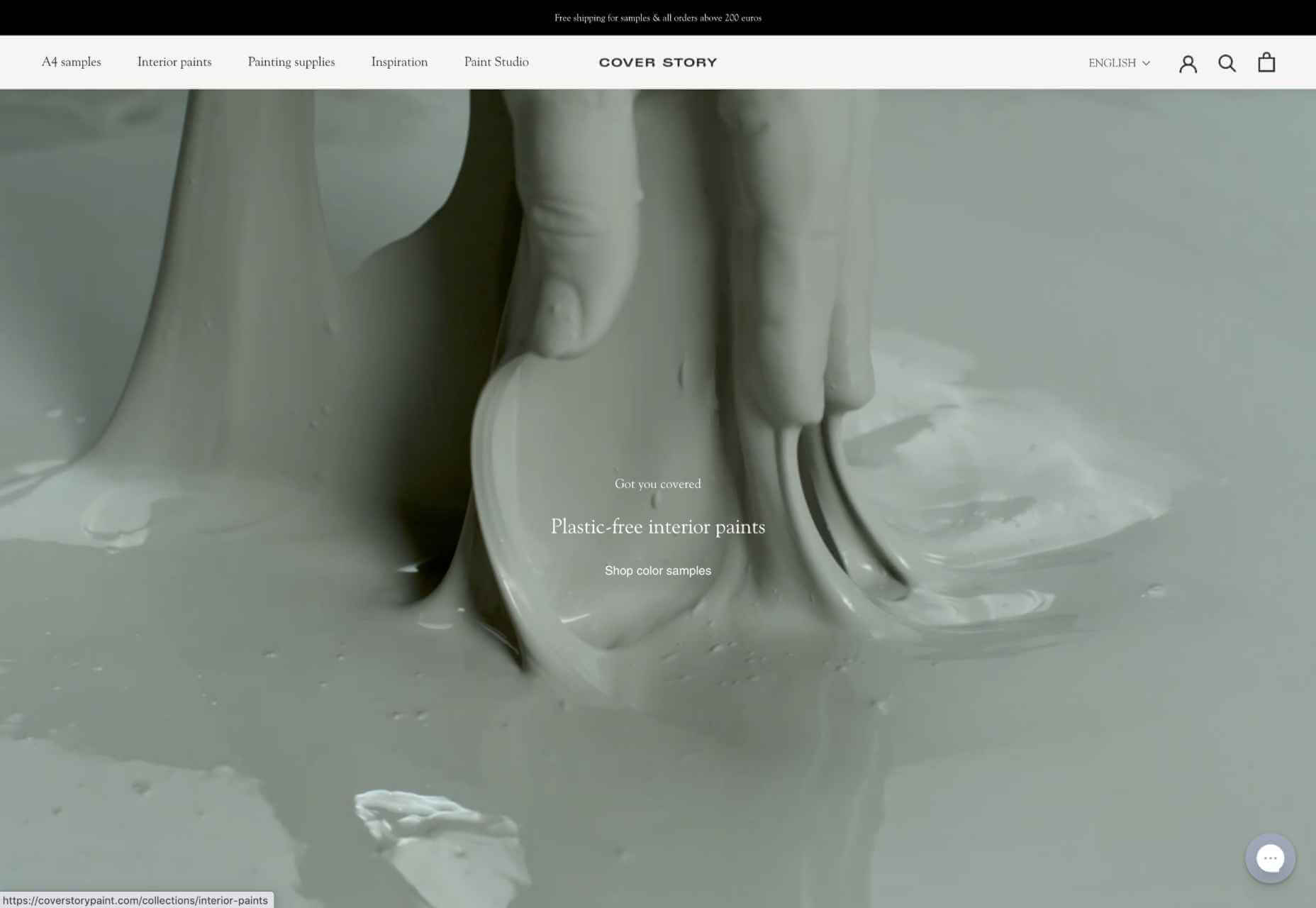
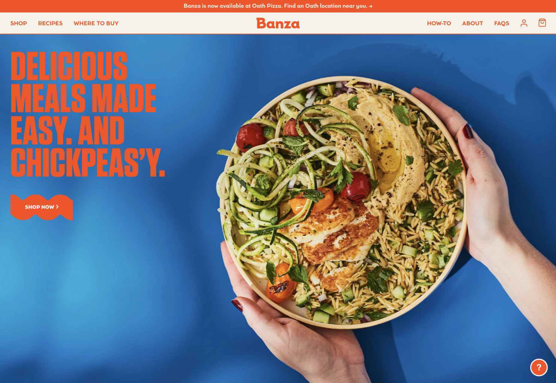
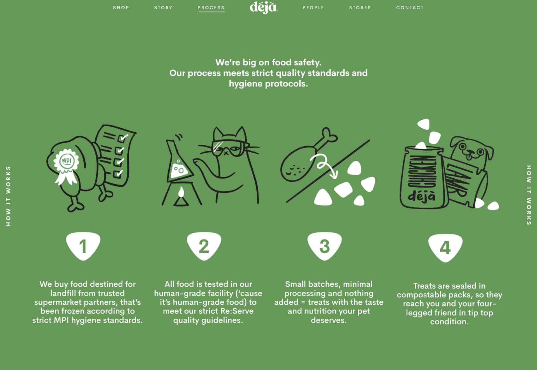
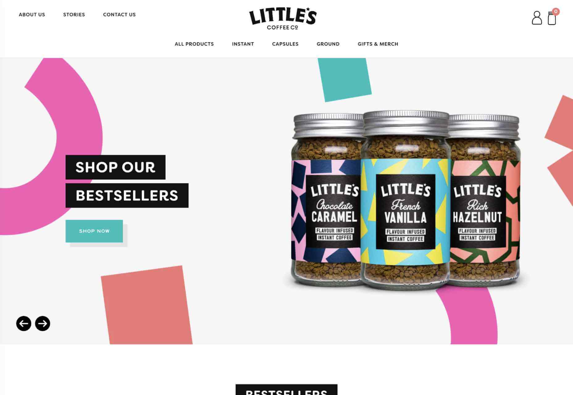
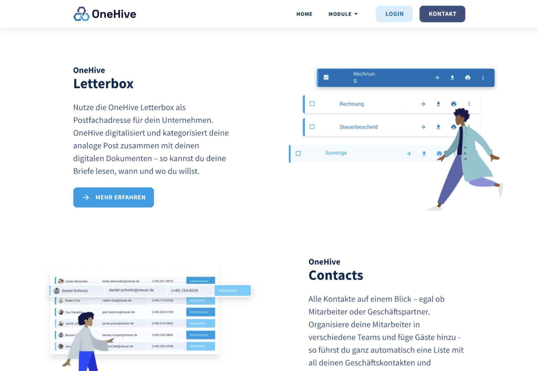
Creating an incredible brand experience for an end-user is about more than just designing the right home page or lining up a series of great product pages. 

Effective website design conveys crucial information about a company, through everything from font styles, to image choices. Nowhere is this representation of brand identity more important than on the about page. 

People frequently confuse the about page with the contact page or fail to leverage it correctly simply because they don’t know what to say. However, creating an about page that speaks to an audience can be immensely powerful. 

What is an About Page?

The first step in designing a great about page is understanding the purpose of the space. This isn’t just a page on a website explaining what a company does. 

The about page is an introduction to a company’s story, its brand essence, and personality. 

Done correctly, this page will demonstrate a crucial sense of affinity between a business and its customers. It will highlight values that resonate with a customer and make it easier for clients to trust businesses.

The Yellow Leaf hammocks company starts its about page with a video.

As you scroll through the interactive site, you discover new elements of the company’s tale, including what prompted the birth of the business to begin with and the brand’s mission. 

Yellow Leaf lets its visitors know what the company is all about by using authentic images of real people to external content and bold quotes. 

There are even snippets from customer case studies for social proof. 

About pages are relevant because they give customers a way to build a real human connection with a business. Harvard professors say that 95% of purchasing decisions are emotional; we don’t buy things just because we need them. Instead, we look for companies that we feel connections with to solve problems. 

Using an about page to convey an attitude, personality, or just what makes a business special is how designers can ensure that end-users will care more about the business. 

How to Make an About Page Stand Out

So, how do you make an about page stand out?

Since every company is different, there’s no one-size-fits-all strategy for everything.  However, there are a few essential steps to consider as you move through the design process. 

Here are some pro tips for successfully attracting attention with the about page…

Step 1: Decide What to Include

It’s tempting to assume that a complicated about page will lead to a stronger relationship between a brand and its customers. After all, the longer the story, the more the customer knows about the company – right?

While it’s essential to include plenty of valuable information in an about page, it’s also worth remembering that today’s customers are short on time. They don’t want to spend hours scrolling through one part of a website. Instead, they want access to quick, convenient snippets of information. 

The Joseph Payton about page is effective because it cuts the story down into bite-sized chunks. Each piece of information highlights valuable insights for the customer. Plus, hand-drawn images and animations make the experience feel like you’re getting to know Joe on a deeper level. 

Before you begin designing, ask yourself:

  • How much text does the page need? How much space does there need to be for copy? How can you spread the content out in a visually engaging way?
  • What sections should the page include? For example, does there need to be a link to the contact us page or a contact form somewhere?
  • How does the page connect to the rest of the website? For example, can you link to things like case studies and reviews with quotes to tie more of the website together?

Step 2: Make the Mission Statement Clear

In a world where emotion influences buyer behavior, clients and customers want to buy from companies they believe in. It’s not enough to have the right product or price point anymore. People want to know that they have a human connection with a business. 

On some about pages, it’s difficult to pinpoint the real mission of the company. It seems like you have to scroll through endless paragraphs of text to make your own assumptions about what matters to the company. However, a well-designed about page puts this crucial info front and center. 

For instance, on the Apptopia about us page, the subheading tells you everything you need to know about the brand. This heading instantly tells the audience whether it’s worth reading on to find out more. 

The best about us pages often include a lot more than just a single sentence of text. But it’s worth pinpointing some of the essential details from these pages and drawing extra attention to them. A larger font or a different font color could be perfect for this purpose. 

Alternatively, if it’s difficult to refine the company’s mission down into one message, it might be worth creating a whole segment at the top of the page dedicated to this information. That’s what the Toms shoe company does.

Step 3: Invest in the Right Trust Elements

People aren’t always sure who they can trust these days. 

There are millions of websites out there and billions of companies. Not all of them are going to appeal to every customer. Since an about page is all about making a crucial human connection between a business and its client, it’s important to implement as much trust as possible. 

The good news is that there are many trust elements you can embed into an about page to make it more reputable. Star ratings taken straight from companies like Trusted Reviews and Google are a great way to show that a company is already impressing its followers. 

Quotes plucked from your customers or segments of case studies that you can place throughout the About Page copy is another great way to show your authenticity. 

You could even take the same approach as Aja Frost here and embed genuine data and graphs into the about page.

One particularly helpful way to make a website’s about page more trustworthy without eating up too much space is to implement trust stickers. Badges that show all the right groups and regulators approve a company are a great start. 

Even showcasing the logos of companies that the business worked for before on a slideshow could be an excellent opportunity to add depth to their authority. 

Step 4: Convey Brand Personality

Brand personality is reflected in the tone of voice that a company uses for its content. You can see a company’s personality in the choice of colors it has on its website. It’s in the fonts that convey a message, and the videos, images, and other unique strategies that each business uses. 

Although a brand personality needs to shine through in everything the company does, it’s imperative on the about page. This is the environment where a customer is getting to know a business for the first time. As a result, the consumer should instantly recognize what kind of brand archetype they’re working with. 

Take a look at the Eight Hour Day about page, for instance. The first thing you see is a picture of two people laughing. That means you instantly get a sense of friendliness.

As you scroll through the page, you’re greeted by friendly, informal copy combined with bright colors and snippets of useful information. Everything feels comfortable and reassuring. 

When you reach the bottom of the page, you find a bunch of data that makes the company seem more trustworthy. There are links to its social media pages and a partial client list showcasing brands like JCPenny, Wired, and Purina.

Using the right combination of font, copy, and imagery, this About page tells you exactly what to expect before you begin interacting with the company. 

Step 5: Take Visitors on a Journey Through Time

Showing customers where a business is going with things like brand mission statements and values are great. However, it’s also worth giving people an insight into where a brand has already been. 

Many of today’s shoppers aren’t comfortable buying from brands that haven’t spent much time in their chosen industry. They want to see that the people they’re working with have experience, heritage, and plenty of background knowledge. 

What better way to demonstrate all of these things than with a timeline of accomplishments? Here’s an example of how Marshall showcases its history by mentioning various crucial historical milestones.

A timeline of events doesn’t have to be this complex, however. If you don’t want to overwhelm visitors with a wall of text, an actual timeline that offers quick and easy insights into what the business has done over the years could be a better option. 

Another option could be to have a few key statements from the company’s timeline, then link out to a separate “History” page for people who want to find out more. 

Step 6: Show the Human Side

People don’t buy from businesses; they buy from other people. 

An about page isn’t just a chance to show customers what a company does. It’s also an introduction to the people behind that organization. Showcasing the team members that contributed to the growth and continued development makes that organization more attractive. 

Obviously, if there are hundreds or thousands of employees in a team, you might not be able to mention them all on an about page. However, the page should generally include some insights into the c-suite and significant members of staff. 

A selection of company photos is a good way to introduce your team. However, you can consider other options too. For instance, to maintain their unique brand, the Tunnel Bear team designed to draw their own bear icons that represented their personalities.

The design is adorable, and it’s a wonderful way to showcase what makes the company so unique. At the same time, using this kind of illustration means you can avoid the hassle of trying to get all of your business photos to look consistent. 

Step 7: Show Values with Visuals

Finally, as we’ve mentioned frequently throughout this guide, an about page is an essential place to showcase the values of your business. These are the core principles that guide you in everything that you do. They help tell customers what matters most to you and prevent you from moving in the wrong direction. 

However, you’re not restricted to highlighting your values through copy and nothing else. You can also introduce customers to the things that matter most to you through visuals too. Graphics or illustrations that highlight important aspects of your business are a great way to share information without relying too heavily on text. 

Videos are another brilliant option, particularly if you have a lot to say but not a lot of time to say it in. That’s what Ben & Jerrys does.

You can also find a stream of “issues” the company cares about on the website too. This means that people can get more information on things like Democracy, Racial Justice, Fair trading, and what Ben & Jerry’s is doing about all of those things. 

Visual elements like this are a great way to give an about page more pizazz. Plus, they appeal to people who want to learn about your company but don’t want to spend forever reading through the text. 

Create Better About Pages

An about page shouldn’t be an afterthought. 

It’s a crucial part of showcasing a company’s unique style and personality. Used correctly, these pages convey crucial information about everything a business stands for. 

Use the tips above to give more meaning to your about page design, and remember to pay attention to how much your traffic and conversions evolve with every update you make. A better about page could even help you to drive more conversions.

Source

The post 7 Essential Design Tips for a Killer “About Us” Page first appeared on Webdesigner Depot.


Source de l’article sur Webdesignerdepot