Articles

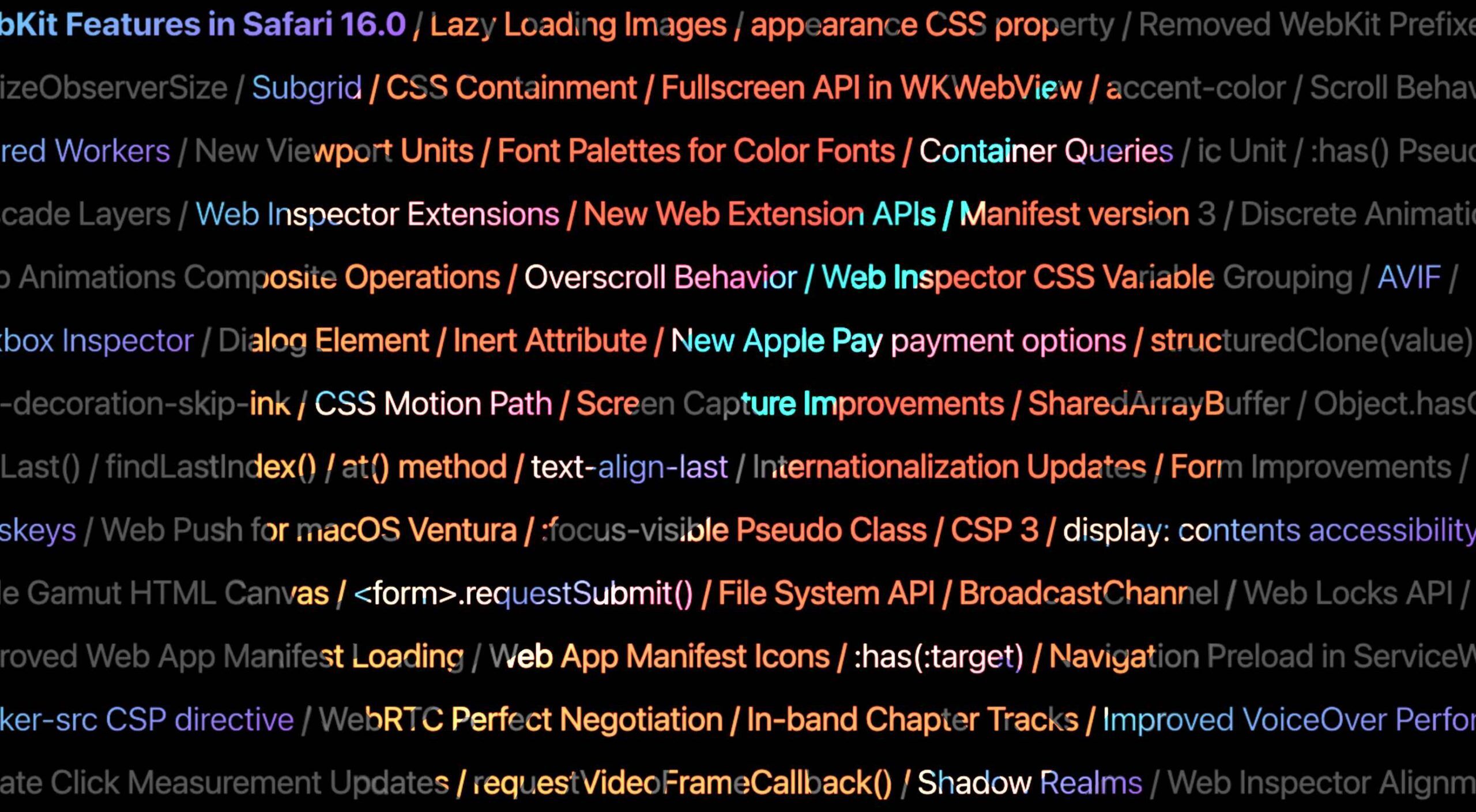
Apple has released an OS update. Packaged in with it is the latest version of Safari, 16.

Expected to be released ahead of next month’s macOS 13, Safari 16 is packed with updates, making it one of the most capable browsers available.

For web designers, the significance is the forward momentum in web technologies that enable freer design work and fewer hacks to achieve complex layouts. Little by little, CSS recommendations are being implemented to the point that using JavaScript for layout is rapidly becoming as unnecessary as it is disliked.

Some of this was announced in June in the Safari 16 beta. But a lot has been added in the last couple of months. So here’s what’s new in Safari 16 today.

CSS Container Queries

The most exciting addition to Safari 16 is CSS Container Queries.

It is hard to understate how in-demand this feature has been; if you imagine an edit button on Twitter that gifted you crypto every time you corrected a typo, you’d be getting close to how popular this feature is.

Until now, media queries have detected the whole viewport. And so, if you have an element like a card, for example, that needs to change at smaller viewports, you need to calculate the available space and adapt the element’s design accordingly. Unfortunately, this frequently gets out of sync with edge cases causing more than a few headaches for front-end developers.

Media queries are severely restrictive to modern layout methods like Grid that wrap elements automatically because there is no way to detect how the elements are laid out.

Container Queries solve this by allowing you to define styles based on the size of the actual containing element; if a div is 300px wide, the contents can have one design, and if it’s 400px wide, they can have a different design—all without caring what size the whole viewport is.

This is dangerously close to OOP (Object Orientated Programming) principles and almost elevates CSS to an actual programming language. (All we need is conditional logic, and we’re there.)

The latest versions of Chrome, Edge, and now Safari (including mobile) support CSS Grid. Even discounting the rapid decline of Twitter, this is way more exciting than any edit button.

CSS Subgrid

Speaking of Grid, if you’ve built a site with it (and if you haven’t, where have you been?), you’ll know that matching elements in complex HTML structures often results in nesting grids. Matching those grids requires careful management, CSS variables, or both. With CSS Subgrid, grids can inherit grid definitions from a grid defined higher up the hierarchy.

CSS Subgrid has been supported by Firefox for a while but is not yet part of Chrome or Edge. Until there’s wider support, it’s not a practical solution, and using a fallback negates any benefit of using Subgrid. However, its introduction in Safari will surely herald rapid adoption by Google and Microsoft and moves the web forward considerably.

CSS Subgrid is likely to be a practical solution within 18 months.

AVIF Support

AVIF is an exceptionally compact image format that beats even WebP in many instances. It even allows for sequences, creating what is essentially an animated GIF but smaller, and for bitmaps.

AVIF is already supported by Chrome, with partial support in Firefox. Safari now joins them.

AVIF support is one of the more valuable additions to Safari 16 because you’re probably already serving different images inside a picture element. If so, your Safari 16 users will begin receiving a smaller payload automatically, speeding up your site and boosting UX and SEO.

Enhanced Animation

Safari 16 introduces some significant improvements in animation, but the one that catches the eye is that you can now animate CSS Grid.

Yes, let that sink in. Combine Container Queries and animation. The possibilities for hover states on elements are tantalizing.

Safari 16 also supports CSS Offset Path — known initially as CSS Motion Path — which allows you to animate elements along any defined path. This enables the kind of animated effect that previously needed JavaScript (or Flash!) to accomplish.

Chrome, Edge, and Firefox all support CSS Offset Path; the addition of Safari means it’s now a practical solution that can be deployed in the wild.

Web Inspector Extensions

Announced as part of the beta release, Web Inspector Extensions allow web developers to create extensions for Safari, just as they would for Chrome.

Web Inspector Extensions — or Safari Extensions as they’re destined to be known — can be built in HTML, CSS, and JS, so the learning curve is shallow. It’s a good route into app development for web designers.

Because the underlying technology is the same as other browser extensions, anyone who has made a Chrome, Edge, or Firefox extension will be able to port it to Safari 16+ relatively easily. As a result, there should be a rapid expansion of the available extensions.

Improved Accessibility

Accessibility is key to an effective and inclusive web. Be like Bosch: everybody counts, or nobody counts.

When testing a design for accessibility, emulators don’t cut it. In my experience, Safari has some of the most reliable accessibility settings, especially when it comes to Media Queries like prefers-reduced-movement.

Further gains in this field mean that Safari continues to be an essential tool for QA tests.

Reduced Resets

Finally, I want to throw up my hands to celebrate the reduced number of non-standard CSS appearance settings.

For years we’ve been prefacing our style sheets with elaborate resets like Normalize, designed to undo all the assumptions browser developers make about design and the UI preferences of their engineers.

Safari 16 has reportedly “Removed most non-standard CSS appearance values.” How effective this is and how much we can rely on it given the other browsers on the market remains to be seen. However, like many of Safari 16’s changes, it’s a step towards a browser that’s on the developers’ side instead of an obstacle to overcome.

Source

The post Exciting New Features in Safari 16 first appeared on Webdesigner Depot.
Source de l’article sur Webdesignerdepot

Inclusive design is often mistaken for accessibility, or even used as an interchangeable term, which is a good indication that most designers don’t know what it means.

Accessibility is a process that seeks to mitigate issues in a design that is not sufficiently universal; inclusive design increases the universality of the design. In real-world terms, an accessible building may replace its front steps with a ramp; an inclusive building is constructed at the same level as the sidewalk.

Accessibility is concerned with objective, measurable improvements. It’s a UI concern. Inclusive design is subjective, more difficult to measure, and is a UX concern. By designing inclusively, we extend our designs to the widest possible user group and contribute to a better society. Here are three ways to get started.

1. You’re the Edge Case

When designing, it’s normal to assume that we are normal. After all, we are the center of our experience of the world. Everything from our preferences to our empathy stems from our individual place in time and space.

When we use the term “edge case,” what we’re referring to is a minority experience, a way of using our design that is uncommon or distinct from our own expectations.

But what would happen if we treat ourselves as the edge case? What if all of the experiences that we deem to be minority experiences are actually the core, common user experience of our design?

If we start from the position that we are the one out-of-step with the design, that most people will not think or act as we do, then we’re eliminating thousands of biased decisions about how our design should be.

Draw From Life

It has always surprised me that in Europe’s dark ages — ranging from the decline of the Roman empire to the Proto-Renaissance — it didn’t occur to anyone to draw from life. Artists drew things the way they thought they should look, which is why so many Byzantine icons of the infant Jesus look like a middle-aged blonde man that has been shrunk.

It’s important to draw from real life as much as possible. That means abandoning personas — which are by definition under-representative and frequently loaded with bias — and engaging with actual users. Most of all, it means taking a step back and opening your eyes.

2. Stop Making Inclusive Design Part of Your Practice

Inclusive design cannot be a part of your practice; it’s an all-encompassing attitude. Your design practice must be inclusive. At least, it should aspire to be…

As human beings, we are biased—all of us. The reason for that is that bias — be it racism, misogyny, nationalism, homophobia, or anything else — is cultural. And we all exist within society. We’re all bombarded with information that reinforces those biases every day.

Accept that you have biases and that your biases will pull your design work away from the inclusive solution you aspire to. But equally, accept that by acknowledging your biases you’re limiting the influence they have over your decision-making.

Do Not Require Users to Self-Identify

It’s divisive and abusive to partition users into groups, especially when the act of doing so perpetuates bias.

One of the most encouraging developments of the last decade has been the introduction of the answer “prefer not to say” in response to personal questions about race, gender, status, and so forth. But if “prefer not to say” is a valid option, in other words if you don’t actually need to know, then why ask at all?

Beware Occam’s Razor

Occam’s Razor is an often misquoted idea that (to paraphrase) states that when making a decision, the one with the least assumptions is the correct choice.

The problem is that Occam’s Razor implies that there is a ‘correct’ decision. But in fact, inclusive design benefits most from a flexible UI and a high tolerance for deviation.

If you can identify the assumptions in a design decision sufficiently to count them, then you’re best served by testing, not comparing, those assumptions.

3. Design Flexibility Into Everything

There is no such thing as a “natural normal,” but there is “perceived normal.” Much of our behavior is governed by the experiences we’ve had since we were very young. Despite existing somewhere on a scale of ability and preference, most of us have inched towards what we have been told is a “normal” range all our lives.

However, it is a physiological fact that every characteristic exists somewhere on a spectrum. There are no black and whites; it’s all grey.

When we design a site or app, we tend to silo certain characteristics into one. Someone who is visually impaired is treated to the same ‘solution’ as someone who is blind, even though visual impairment can range from screen reflections on a sunny day to someone who was born without optic nerves.

There are people who have lost their sight through degeneration or accident and will be able to make visual connections based on remembered visuals. Other people have never seen anything and their conscious mental process isn’t figurative at all.

To accommodate the full gamut of possible interactions with our design, we need to design to a scale, not with absolute values. This means thinking less about set colors and sizes and more in terms of contrast and scale.

Avoid Communicating in Color

Few areas are more indicative of a spectrum of experiences than color.

Color is instantly problematic for designers because quite apart from color blindness, color has deeply personal associations.

Over the last couple of decades, it’s been repeatedly proven that it is contrast, not hue, that increases engagement. Green does not always mean go; red does not always mean stop.

Color involves so many biases and assumptions that it’s simply better to work with contrast than select the ‘right’ hue.

Bigger Typography (Sometimes)

In the first draft of this article, I wrote that increasing the scale of your typography was always good.

My rationale was that some users will benefit from larger type, and zero users will be hindered by it. But that’s not true. Larger type means fewer lines per viewport, which means more scrolling; not a problem for some users, but potentially an issue for those with motor control issues.

That was one of my biases right there.

Congratulations, You’re Now An Inclusive Designer

Good design is self-aware in origin and unselfconscious in execution.

Inclusive design isn’t about enabling access for everyone; it’s about designing for a user experience that is welcoming and respectful. Every one of your users should feel not just enabled but validated.

Inclusive design isn’t a series of items on a checklist; it’s an ideal, like harmony or beauty, that we may struggle to achieve but that we should strive for nonetheless.


Image via Pexels.

Source

The post 3 Ways to Design More Inclusively first appeared on Webdesigner Depot.


Source de l’article sur Webdesignerdepot