 This month’s collection of new tools, resources, and freebies for designers is a smorgasbord of sorts. You’ll find everything from useful APIs to icons to tutorials to fonts.
Let’s get right into it, here’s what new for designers this month:
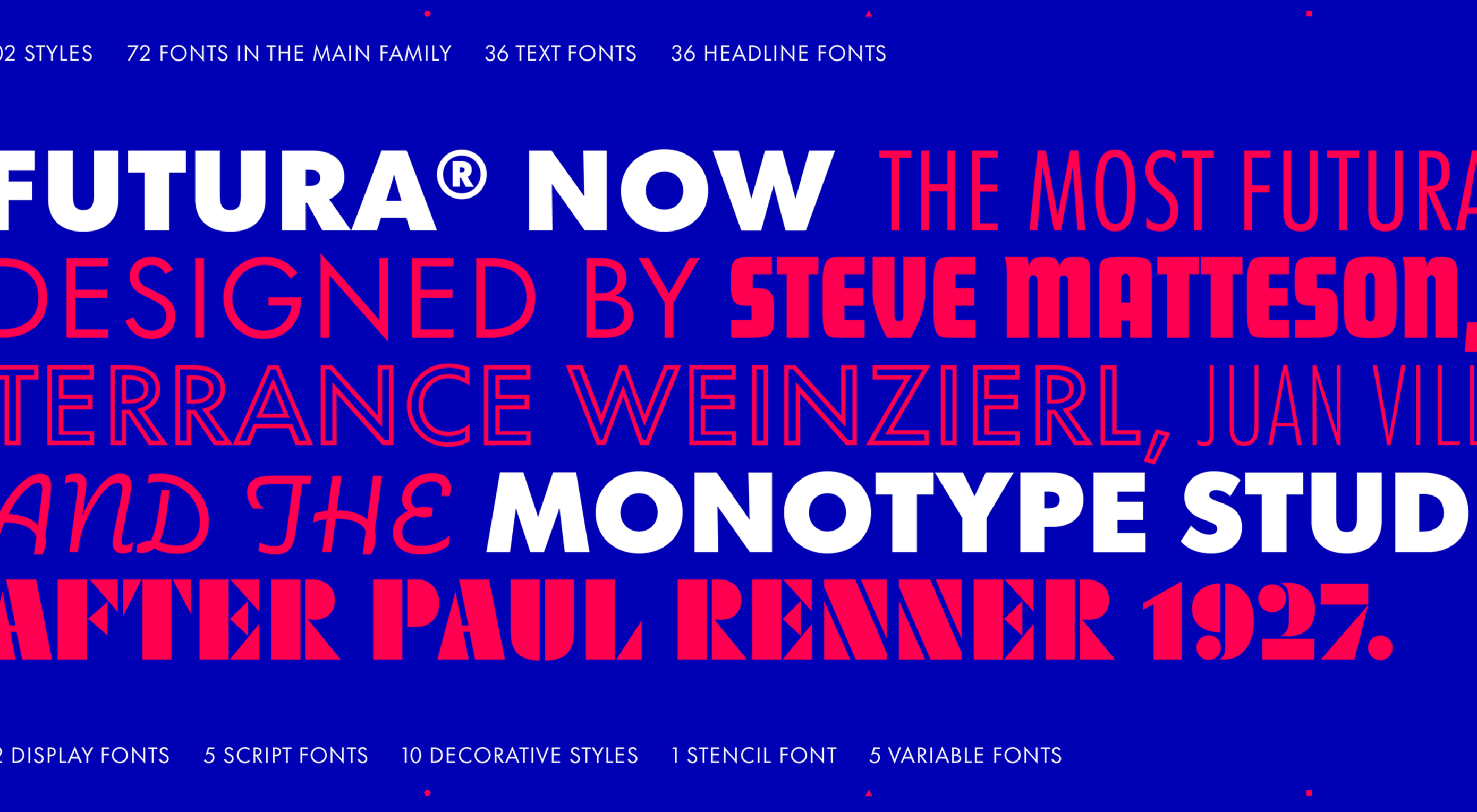
Tooltip Sequence
Now that your app or website is ready, you might need to help users engage with it. Tooltip Sequence is a simple JavaScript package that helps you create a series of small tooltips that will guide users through product features with a small description of what they need to know. It looks great and the best part is this tool saves you from having to create each tooltip description manually on each page and link them together.
Serenade
Serenade allows you to free up your hands with voice coding technology. Use natural speech and stay productive with this tool that allows you to code without typing. It works across multiple coding languages and platforms. It’s as easy as “add function hello” and the tool knows what syntax to use.
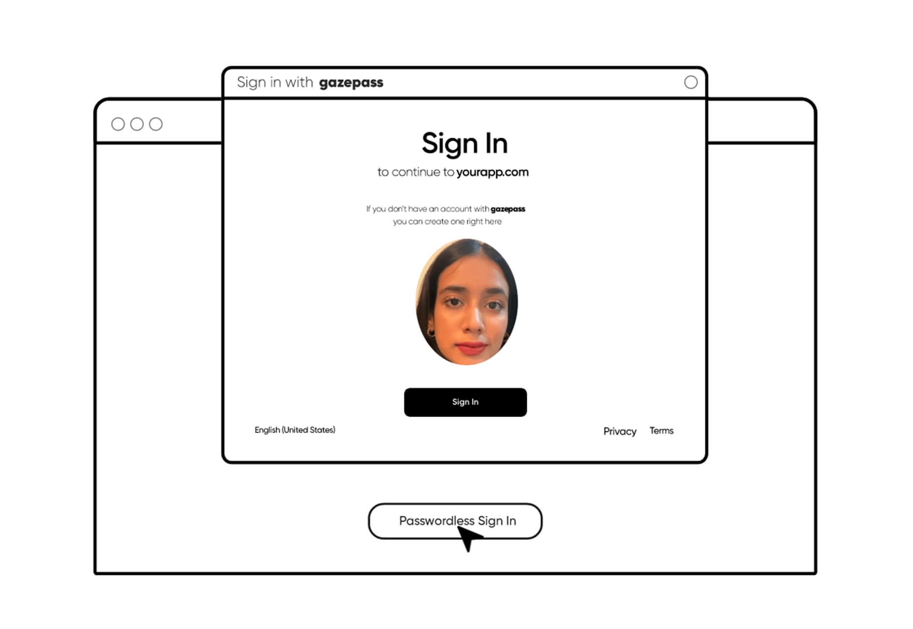
Gazepass
Gazepass, which is still in beta, is a nifty API that allows for passwordless multi-factor authentication for any website or mobile app. It uses biometrics on any device or platform to make getting into apps or websites easier for users.
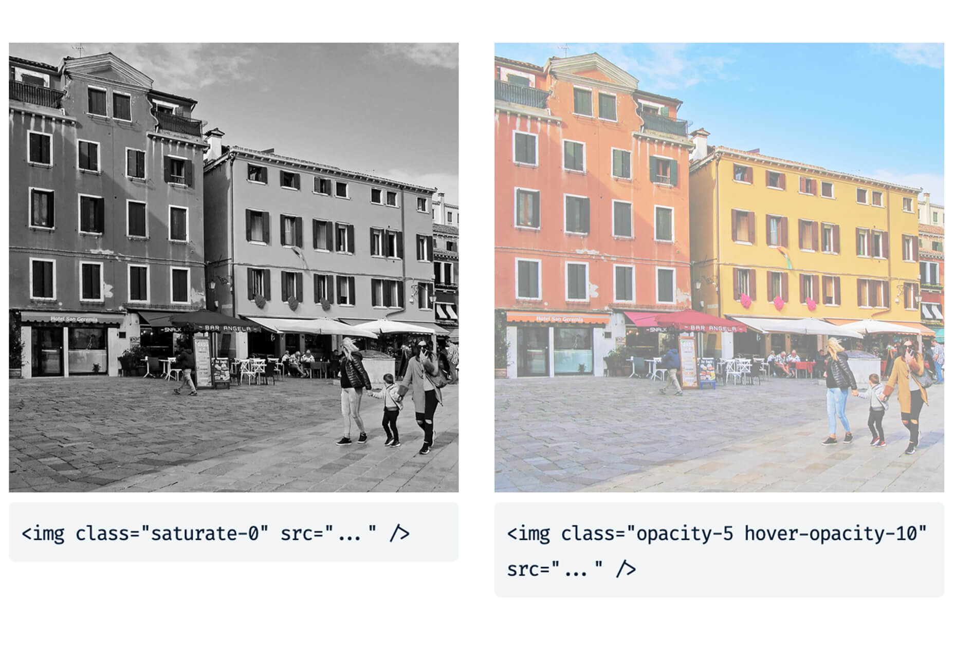
Filters.css
Filters.css is a CSS-only library to apply color filters to website images. Installation only takes three steps and includes a variety of filers, such as blur, grayscale, brightness, contrast, invert, saturate, sepia, and opacity.
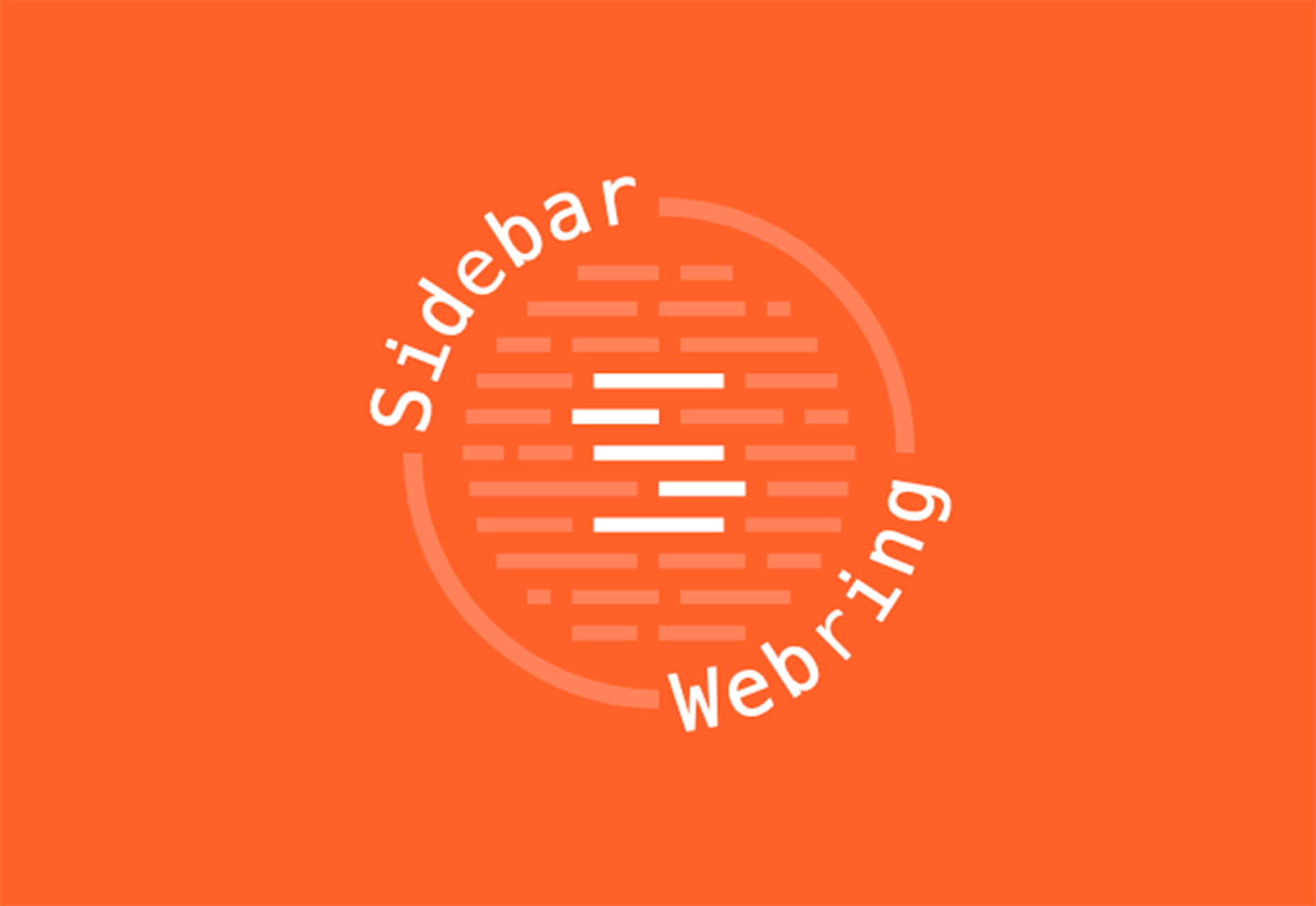
Sidebar Webring
Sidebar Webring is a collection of blogs and websites that are focused on web design. The curated list is handpicked for superb content for designers and developers. But, what’s a webring? It’s a collection of linked websites in a circular structure that are organized around a theme. The term is a throwback to the early days of the web in the 1990s and 2000s.
Wicked Templates
Wicked Templates is a set of responsive HTML templates made with Bulma and Tailwind CSS that you can style and use as you wish. Use these templates to jumpstart projects. Free and paid options available.
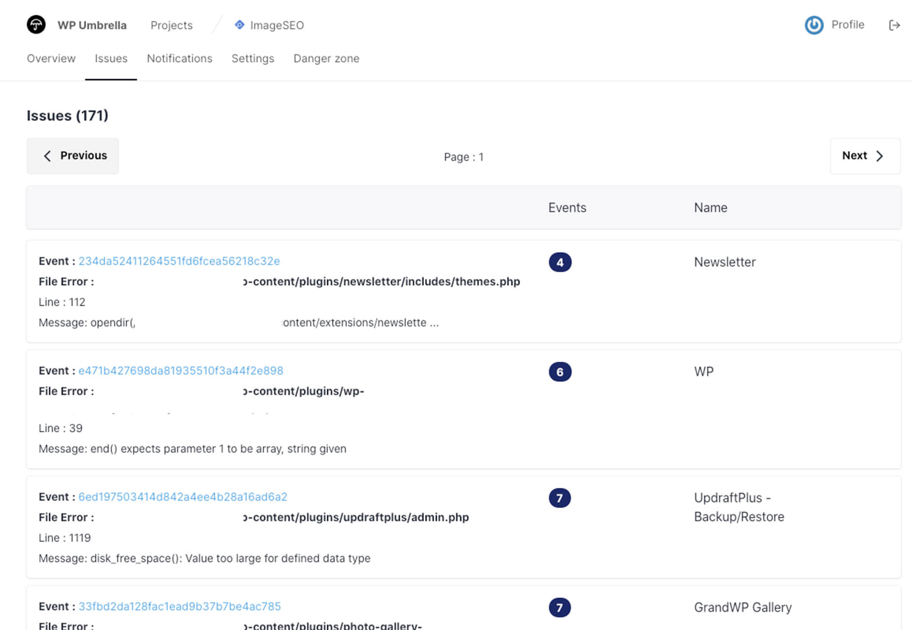
WP Umbrella
WP Umbrella will help you keep sites running in a healthy and safe manner on WordPress. Monitor uptime and performance, PHP errors, and keep up with hundreds of websites from one dashboard.
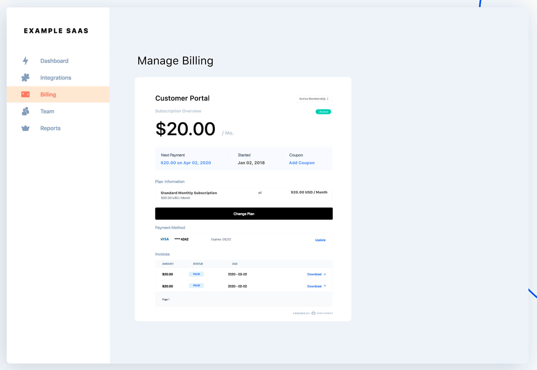
Servicebot
Servicebot helps you create customer-facing embeddable billing pages that work with Stripe payments. This premium tool is quite user-friendly and works with websites or SaaS.
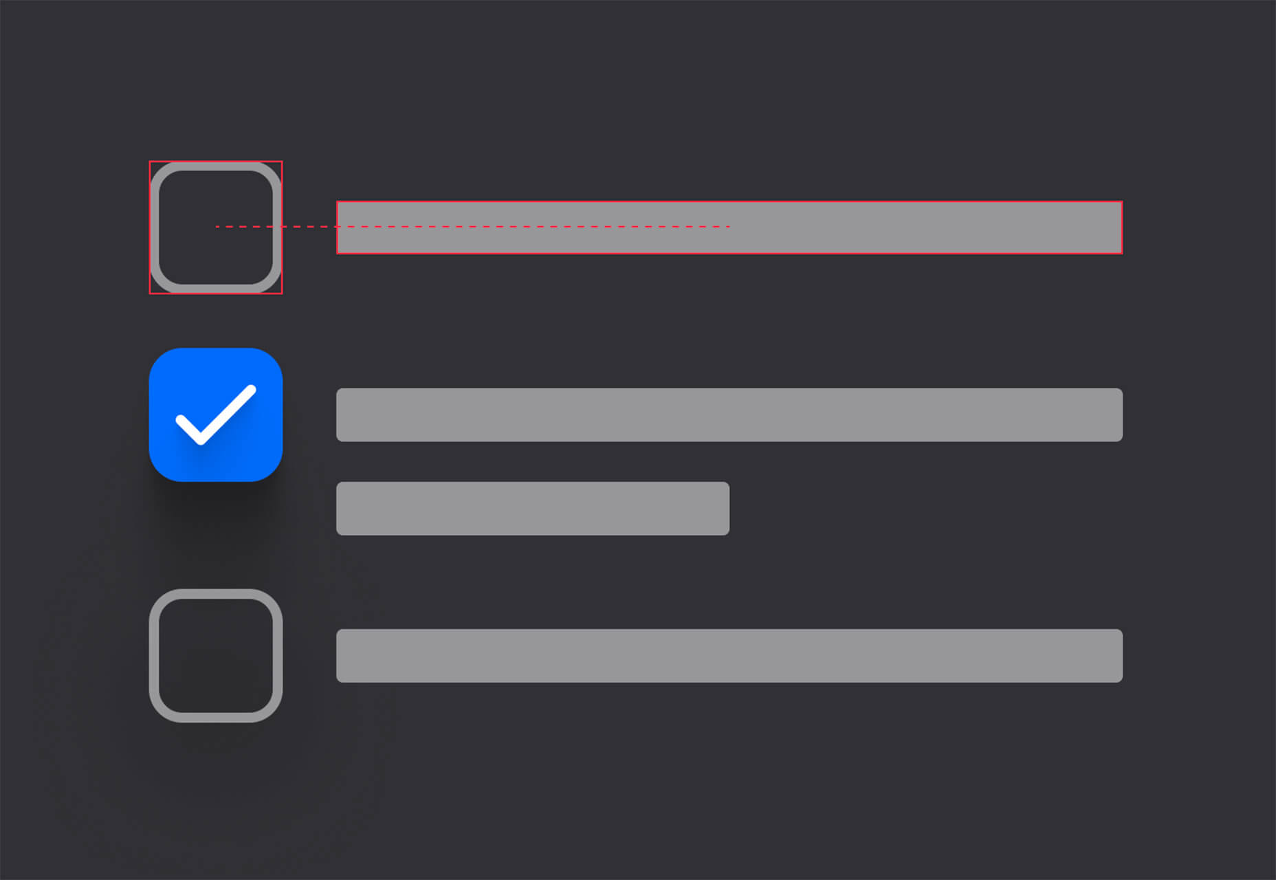
Custom, Accessible Checkboxes with Perfect Alignment
Create custom, accessible checkboxes with perfect alignment every time. This walkthrough shows you how to use CSS to align elements and labels.
Sombras.app
Sombras.app is a nifty tool that creates 3D object shadows. Use the easy on-screen controls to get just the right orientation and shape.
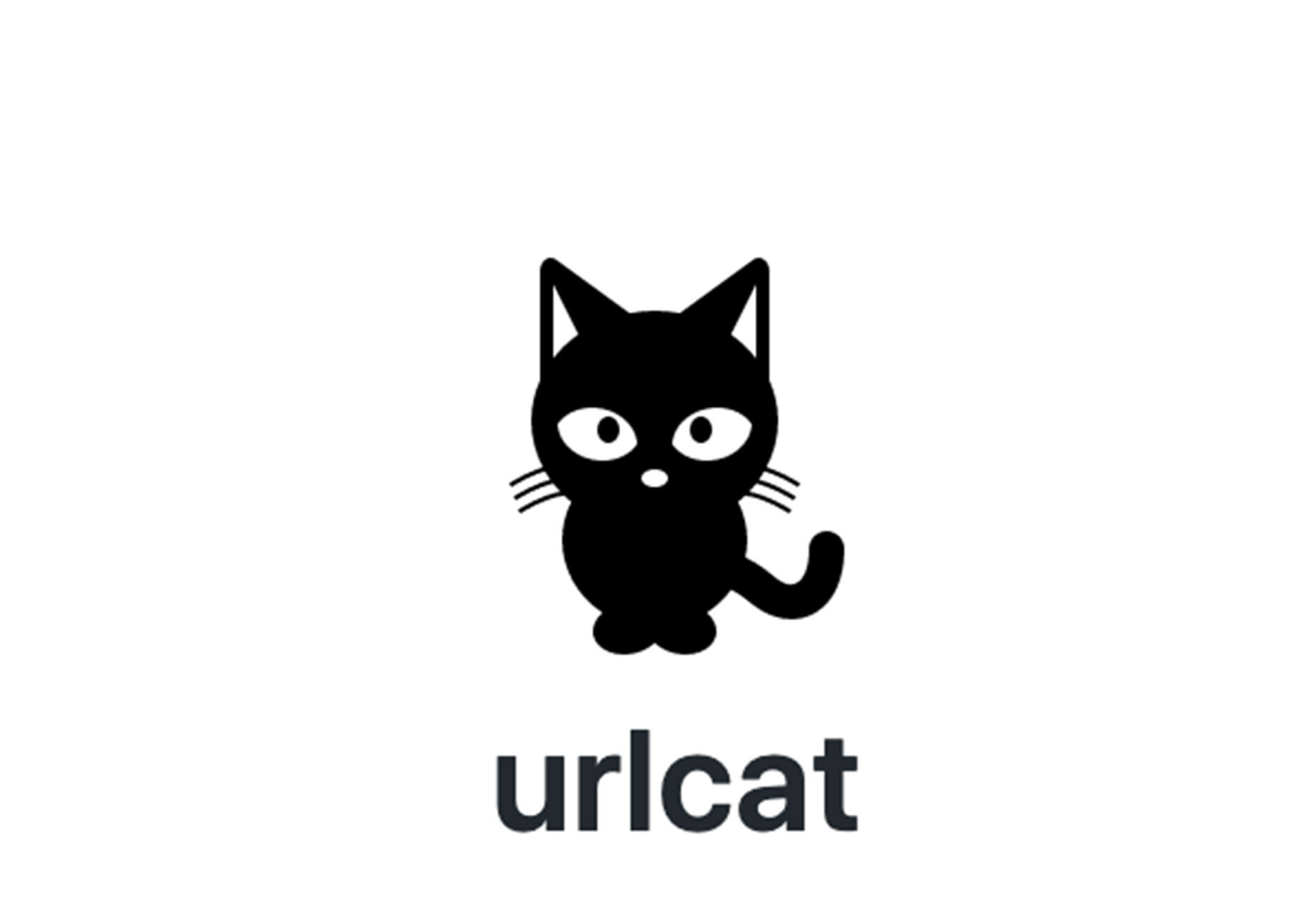
urlcat
Urlcat is a tiny JavaScript library that helps you build URLs with dynamic parameters and without mistakes. The friendly API has no dependencies, includes TypeScript types, and is just 0.8KB minified and gzipped.
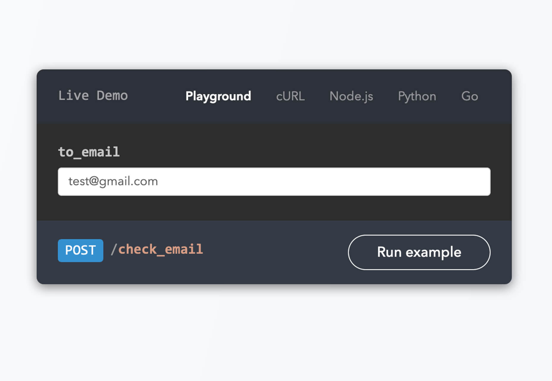
Reacher
Reacher is a real-time email verification API that lets you check the validity of an address before you send the email. Reduce bounce rates in an instant. (The personal version is free.)
Swell
Swell is a most powerful headless ecommerce platform for modern brands, startups, and agencies. Create fast and flexible shopping experiences with the API and headless storefront themes. This is a premium tool but does have a free trial.
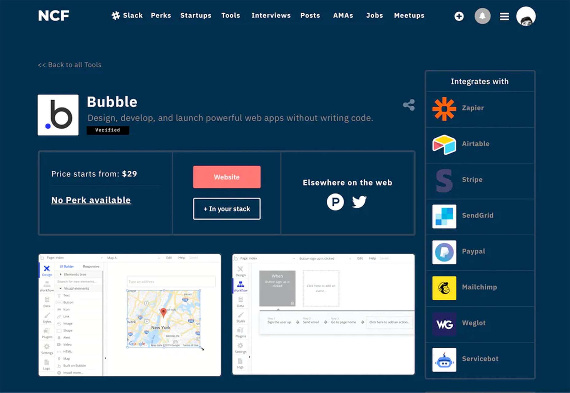
No Code Founders 2.0
No Code Founders 2.0 is a platform for discovering the latest startups built with no-code and the tools used to build them. Browse startups, tools, perks, interviews, jobs, meetups, posts, and more as part of the no-code movement. The community engages on Slack and requires an email to sign up.
How to Pick More Beautiful Colors for Your Data Visualizations
Beautiful color choices will make your data visualizations that much more impactful. This tutorial by Lisa Charlotte Rost will help you make better color choices on the way to better infographics and charts. Plus, it’s well developed, designed, and packed with useful information.
IconPark
IconPark is a collection of more than 1,200 high-quality icons with an interface that allows you to customize them. It uses a single SVG source file that can be transformed into multiple themes. The library includes cross-platform components and is free to use.
Mono Icons
Mono Icons is a simple and consistent open-source icon set that uses mono spacing. The collection includes 136 icons.
BGJar
BGJar is a free SVG background generator for digital projects. Pick a category and customize the result to fit your project or needs.
HitCount
HitCount is almost too simple to be true. This tiny tool lets you add a hit counter to your website that’s as easy as adding an image. Copy the code and make any customizations you want. Then paste it to your design. That’s it!
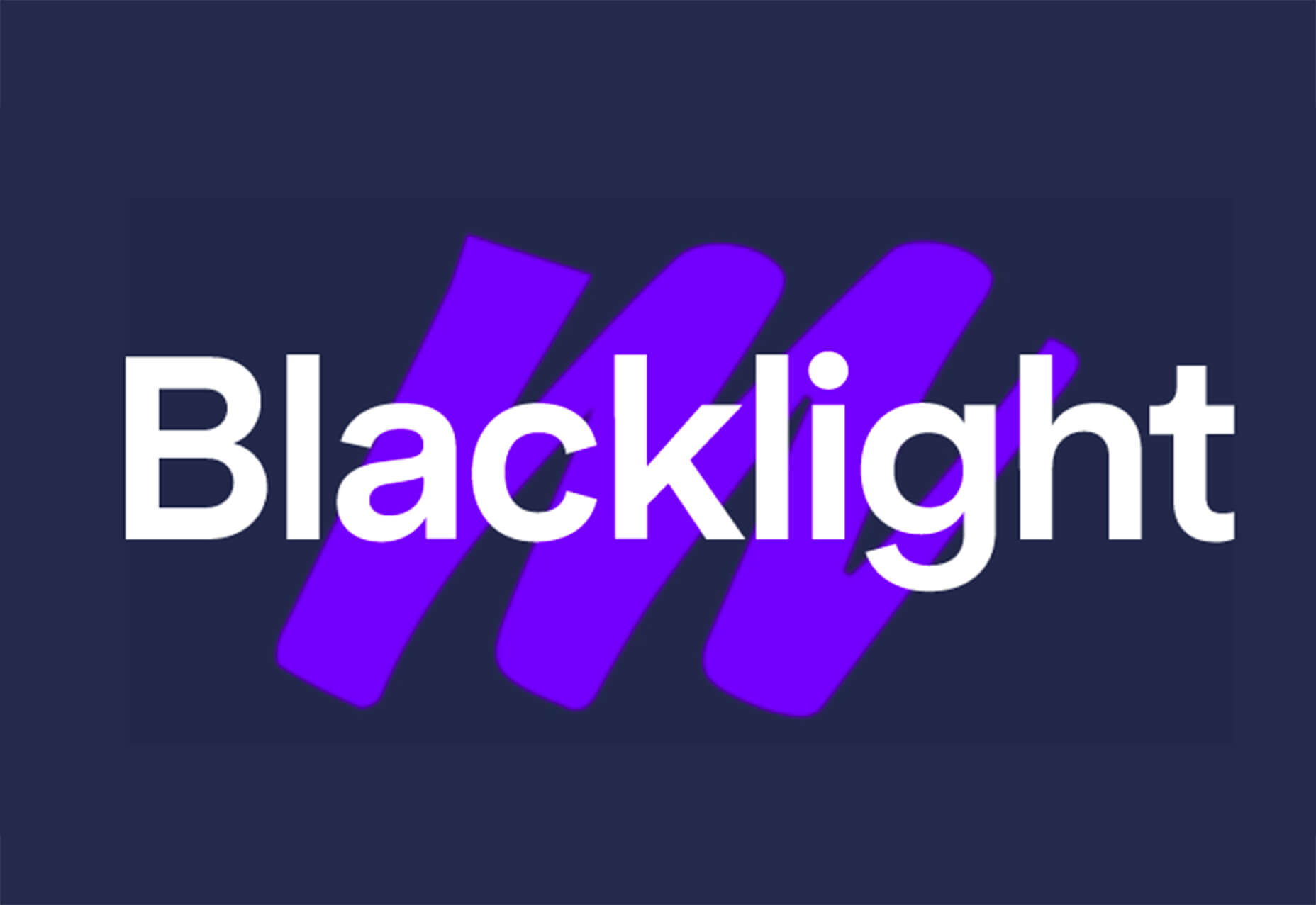
Blacklight
Blacklight is a real-time website privacy inspector. The tool by Surya Mattu scans any website you enter in the scan bar and shows what user-tracking technologies are used on the website. This allows you to see who might be gathering data about your visit.
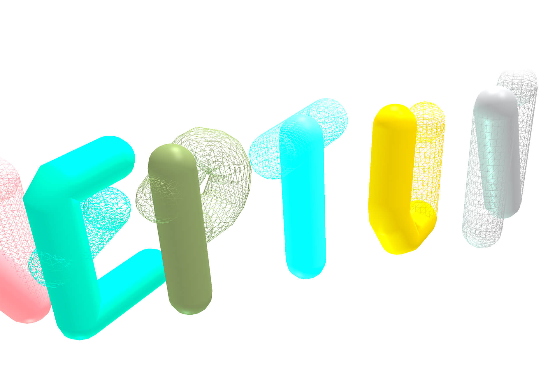
Alter
Alter is a customizable – and experimental – three-dimensional typeface that you can experiment with. It’s as fun to play with as use.
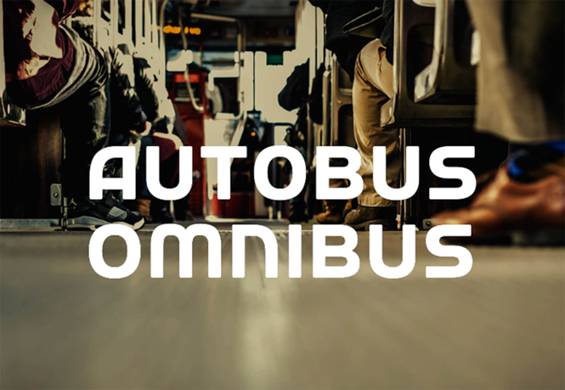
Autobus Omnibus
Autobus Omnibus is a simple all capitals font with new wave styling. The character set has 96 glyphs that are perfect for display use.
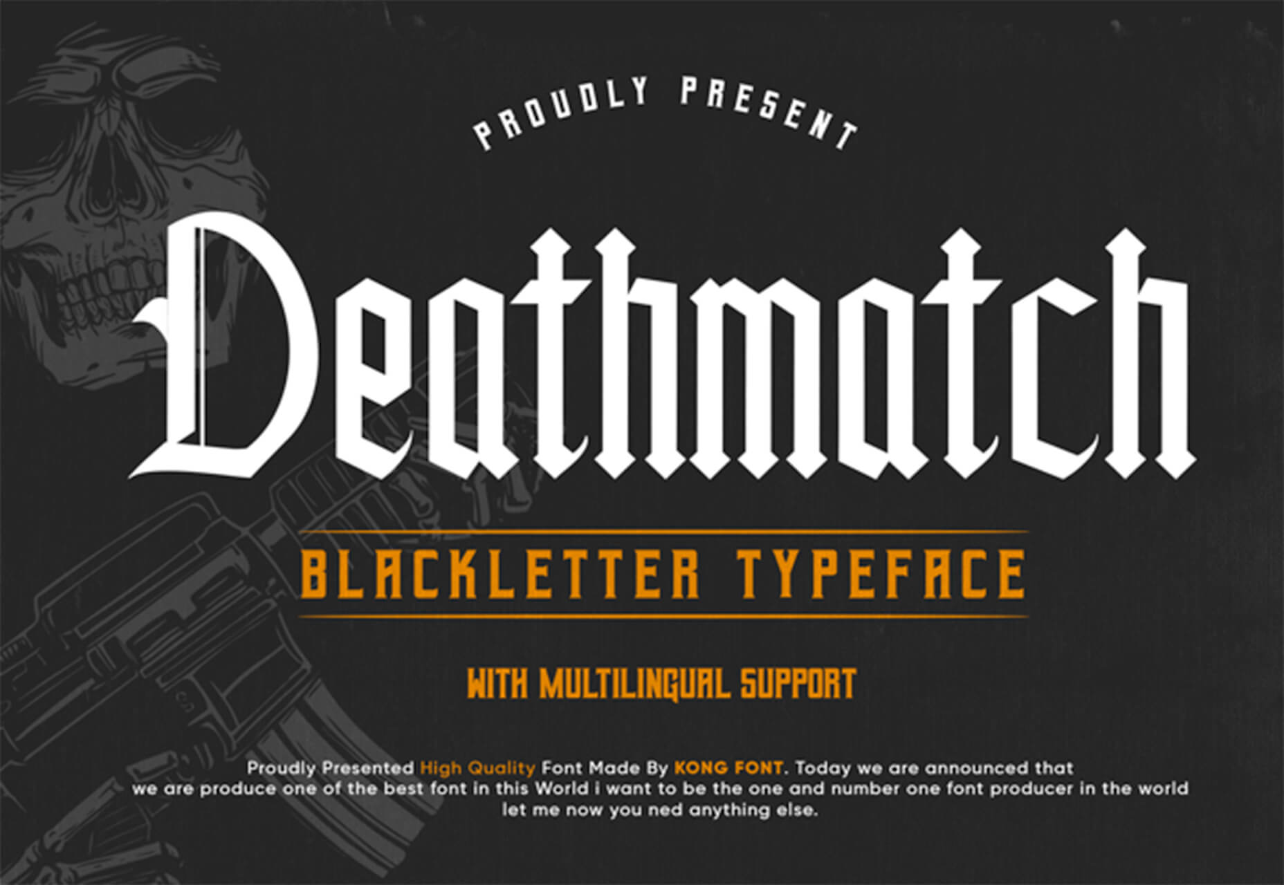
Deathmatch
Deathmatch is a seasonal blackletter font that’s ideal for the upcoming Halloween holiday. The character set includes plenty of options and there’s a full version (paid) for commercial use.
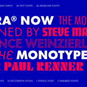
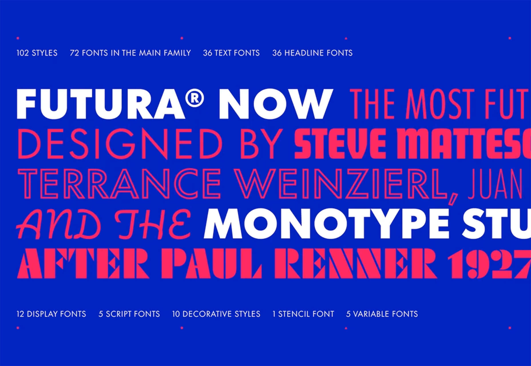
Futura Now
Futura Now is a premium typeface and update to a font you may already know and love. The new version has 107 styles in a massive family.
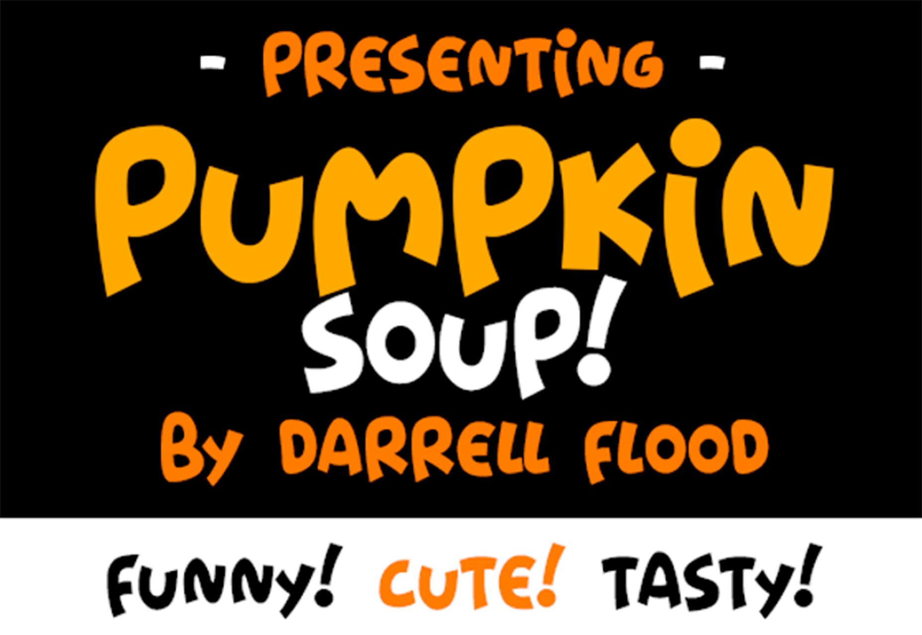
Pumpkin Soup
Pumpkin Soup is a fun almost handwriting style typeface with a cartoonish vibe. It includes a regular and italic style and is most appropriate in limited use.

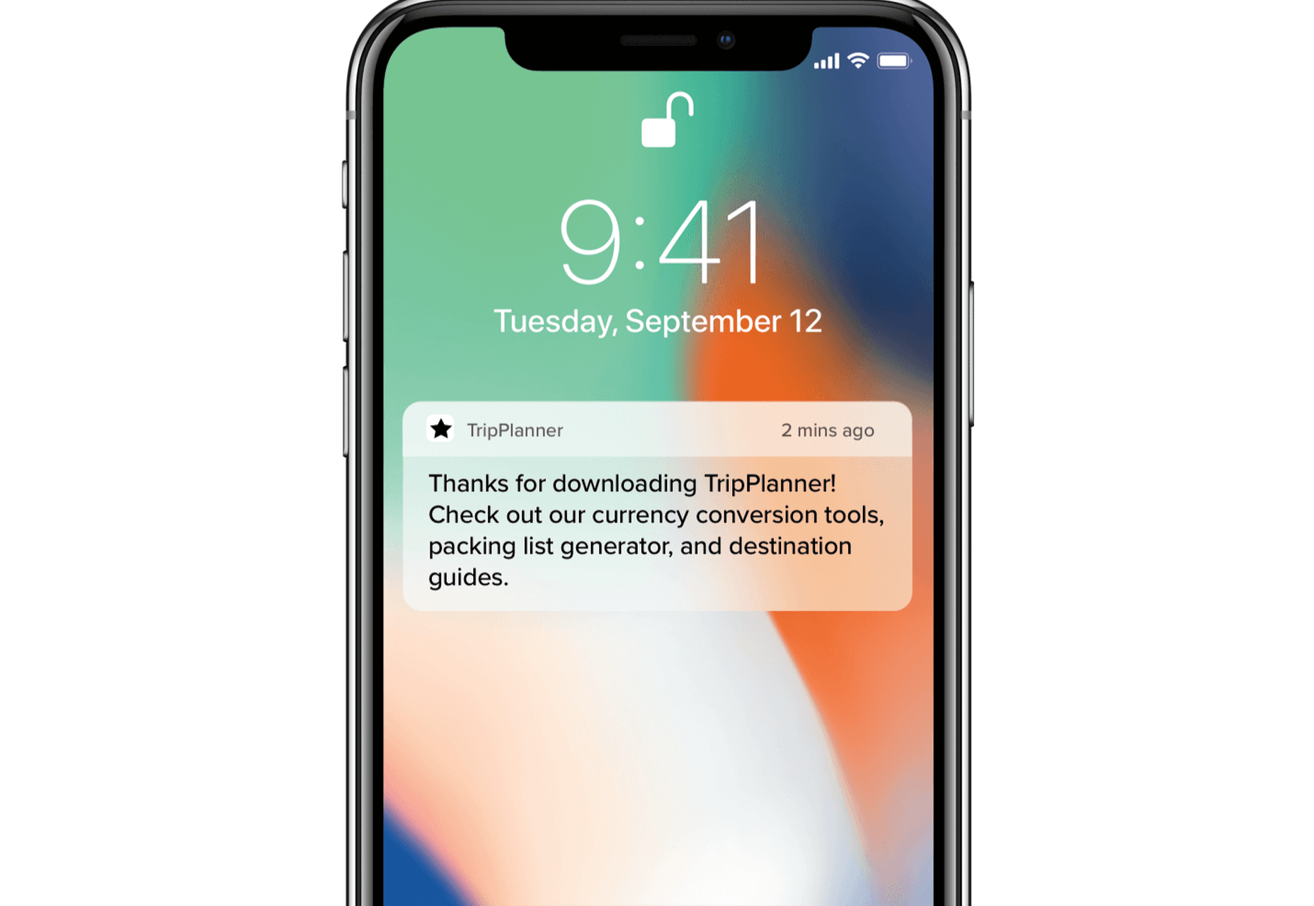
 And it does this 24 hours a day, 7 days a week, 52 weeks a year without ever asking for a pay raise.

 To understand why user onboarding is such an indispensable tool, we need to empathize with the people using our products; we all come from different backgrounds and cultures, we make different assumptions, and we see the world differently.


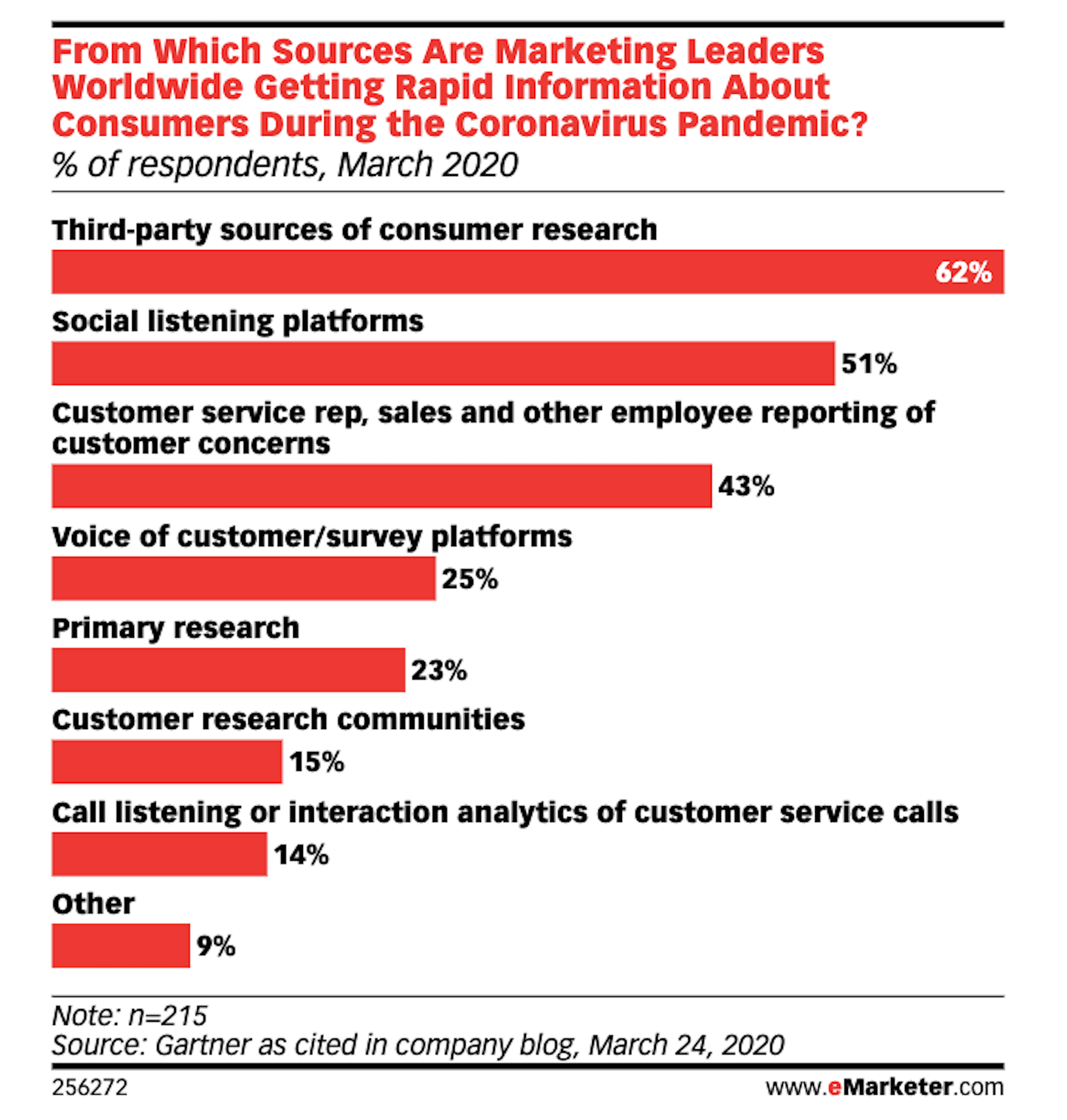
 While a lot of the research for web designers that’s come out this year has to do with COVID-19, we’re starting to see a light at the end of the tunnel. Many of these reports aren’t just looking at the effects of the pandemic on business and marketing today. They’re now looking at what consumers plan to do once the pandemic is gone.
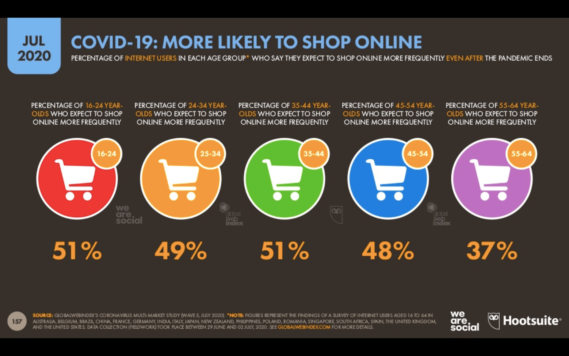
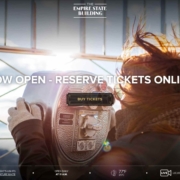
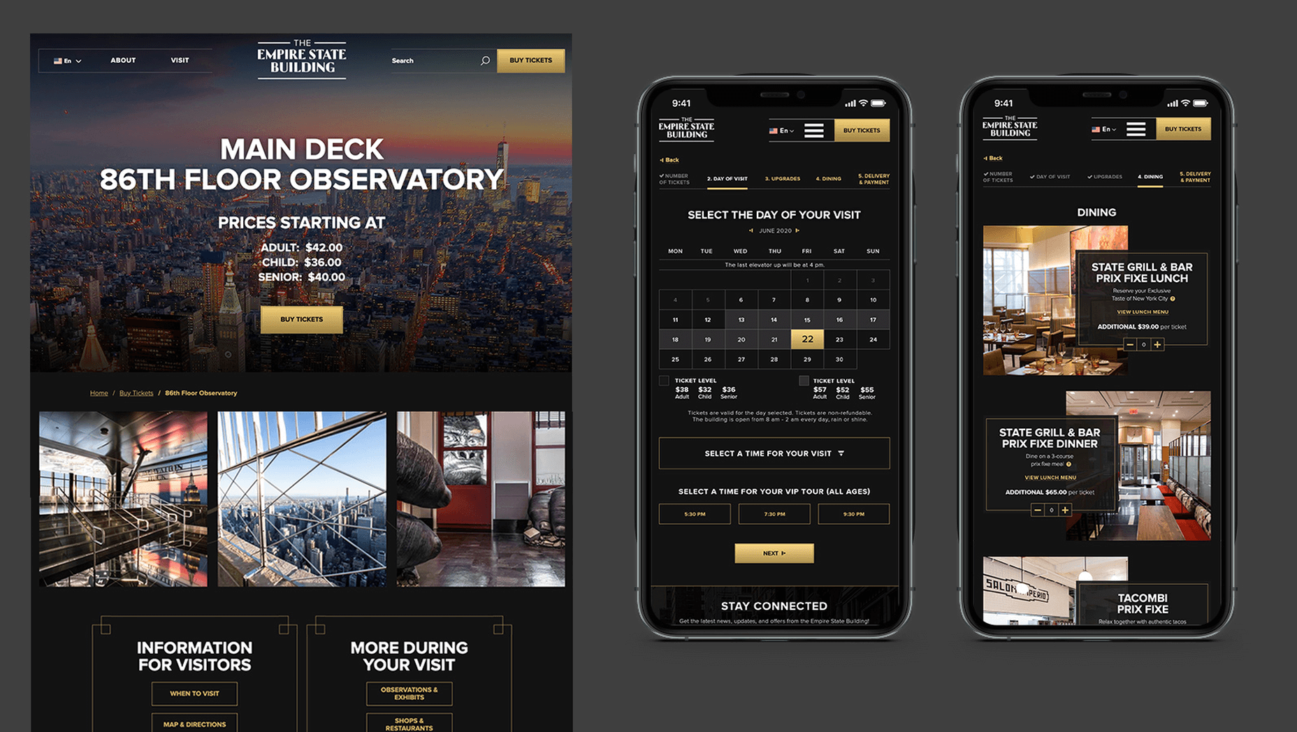
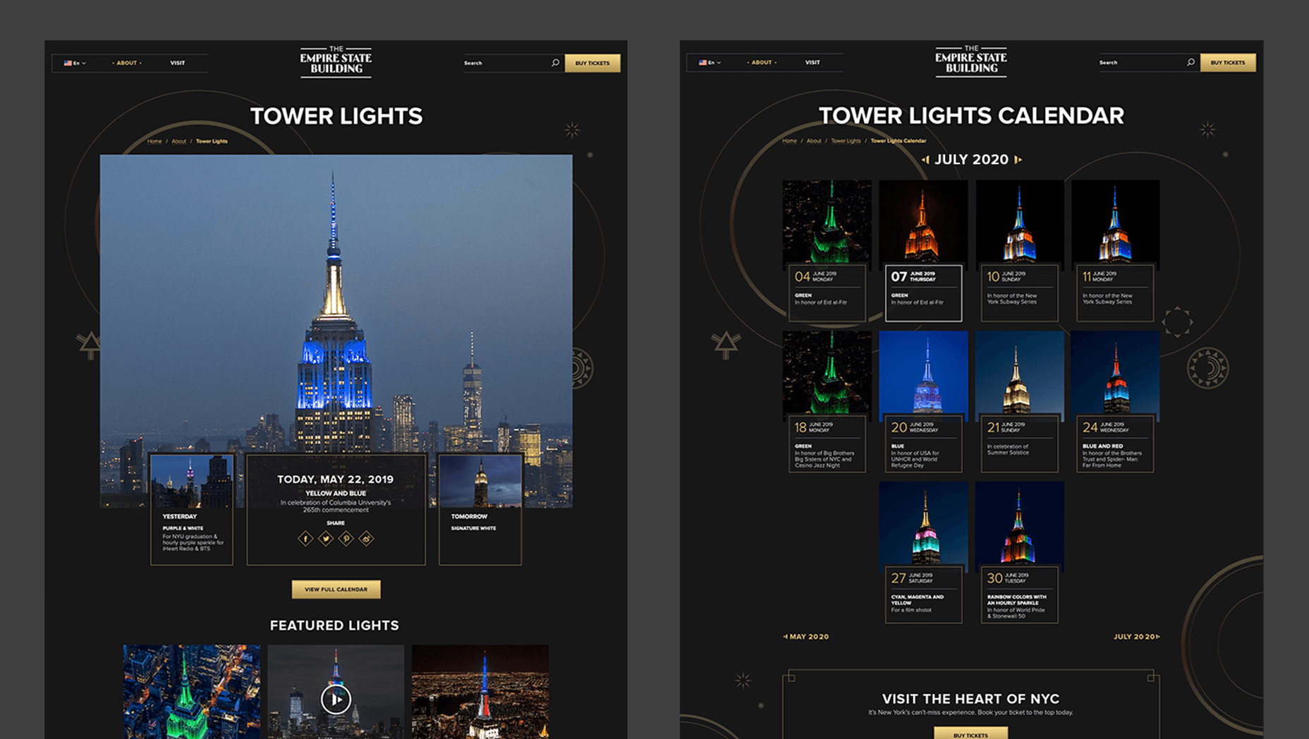
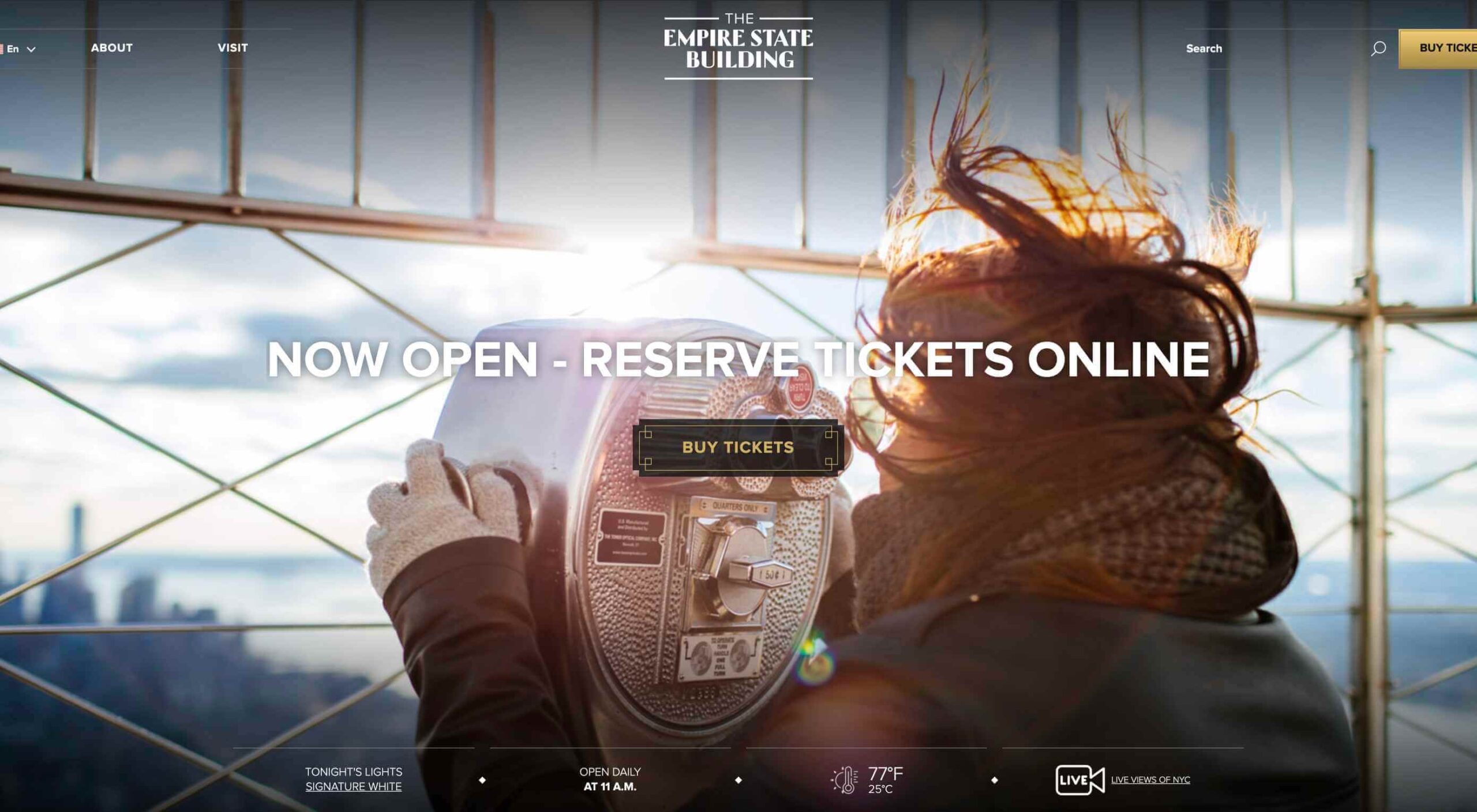 In 2019, to keep pace with an interior redesign of its visitor experience, the
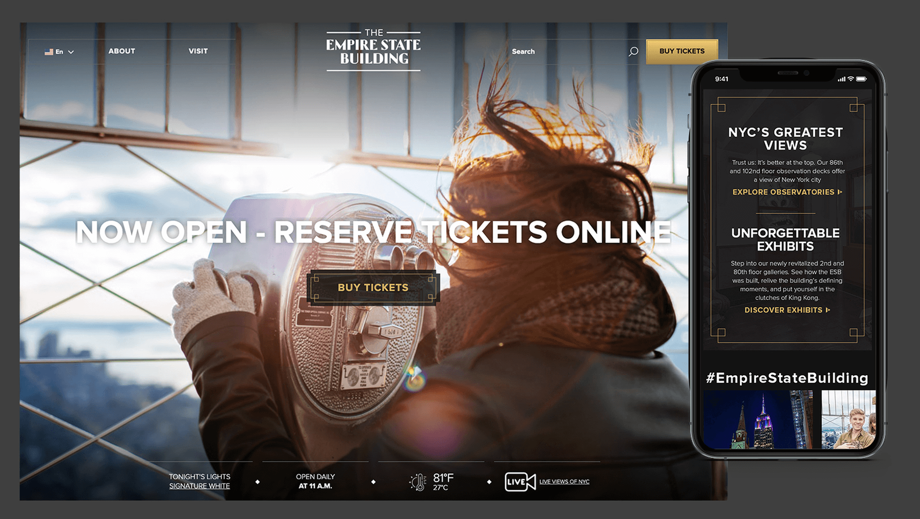

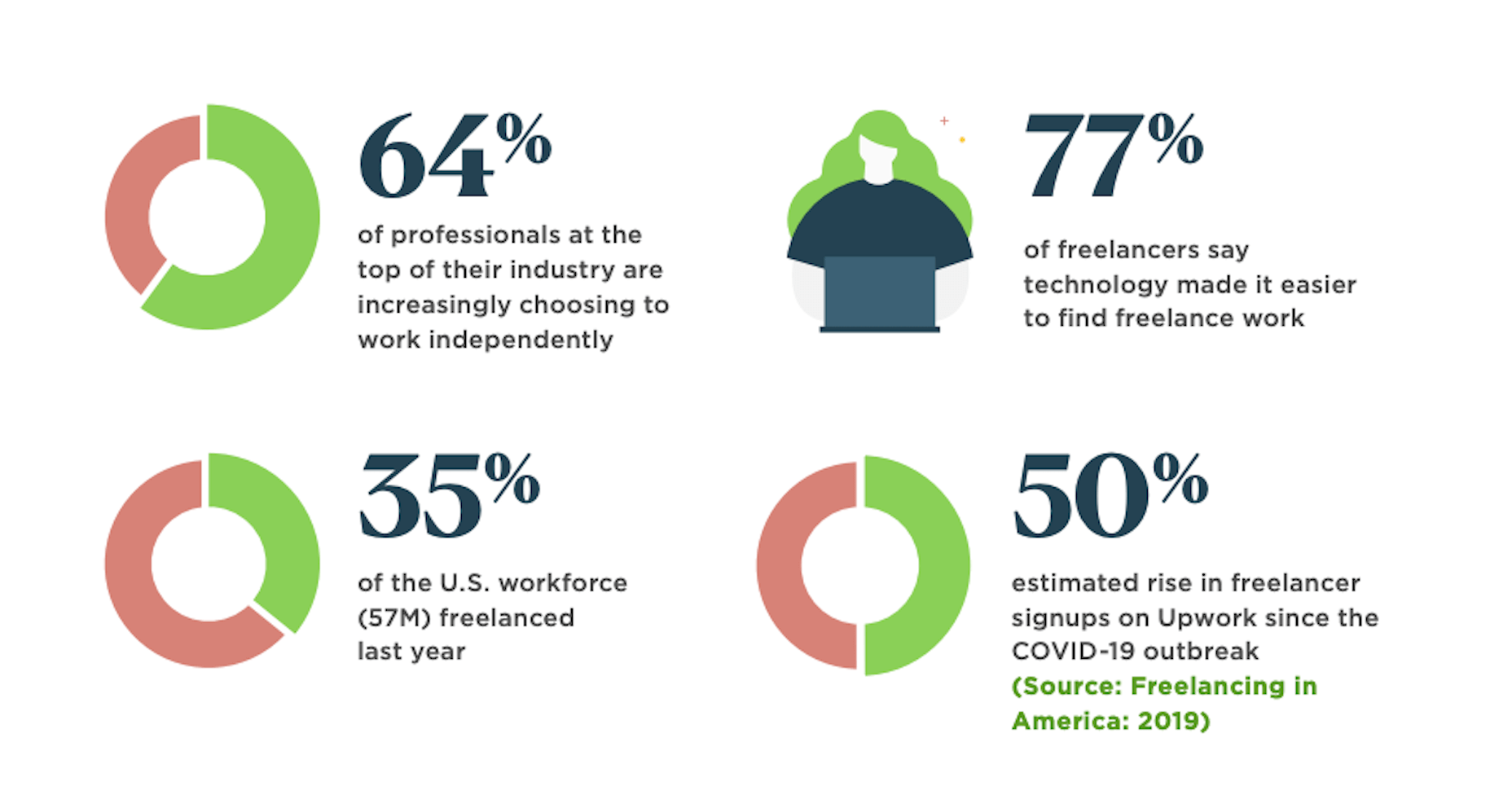
 Many people dream of a career in web design, but it may actually be more attainable than you think.