Articles

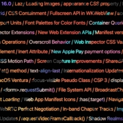
Apple has released an OS update. Packaged in with it is the latest version of Safari, 16.

Expected to be released ahead of next month’s macOS 13, Safari 16 is packed with updates, making it one of the most capable browsers available.

For web designers, the significance is the forward momentum in web technologies that enable freer design work and fewer hacks to achieve complex layouts. Little by little, CSS recommendations are being implemented to the point that using JavaScript for layout is rapidly becoming as unnecessary as it is disliked.

Some of this was announced in June in the Safari 16 beta. But a lot has been added in the last couple of months. So here’s what’s new in Safari 16 today.

CSS Container Queries

The most exciting addition to Safari 16 is CSS Container Queries.

It is hard to understate how in-demand this feature has been; if you imagine an edit button on Twitter that gifted you crypto every time you corrected a typo, you’d be getting close to how popular this feature is.

Until now, media queries have detected the whole viewport. And so, if you have an element like a card, for example, that needs to change at smaller viewports, you need to calculate the available space and adapt the element’s design accordingly. Unfortunately, this frequently gets out of sync with edge cases causing more than a few headaches for front-end developers.

Media queries are severely restrictive to modern layout methods like Grid that wrap elements automatically because there is no way to detect how the elements are laid out.

Container Queries solve this by allowing you to define styles based on the size of the actual containing element; if a div is 300px wide, the contents can have one design, and if it’s 400px wide, they can have a different design—all without caring what size the whole viewport is.

This is dangerously close to OOP (Object Orientated Programming) principles and almost elevates CSS to an actual programming language. (All we need is conditional logic, and we’re there.)

The latest versions of Chrome, Edge, and now Safari (including mobile) support CSS Grid. Even discounting the rapid decline of Twitter, this is way more exciting than any edit button.

CSS Subgrid

Speaking of Grid, if you’ve built a site with it (and if you haven’t, where have you been?), you’ll know that matching elements in complex HTML structures often results in nesting grids. Matching those grids requires careful management, CSS variables, or both. With CSS Subgrid, grids can inherit grid definitions from a grid defined higher up the hierarchy.

CSS Subgrid has been supported by Firefox for a while but is not yet part of Chrome or Edge. Until there’s wider support, it’s not a practical solution, and using a fallback negates any benefit of using Subgrid. However, its introduction in Safari will surely herald rapid adoption by Google and Microsoft and moves the web forward considerably.

CSS Subgrid is likely to be a practical solution within 18 months.

AVIF Support

AVIF is an exceptionally compact image format that beats even WebP in many instances. It even allows for sequences, creating what is essentially an animated GIF but smaller, and for bitmaps.

AVIF is already supported by Chrome, with partial support in Firefox. Safari now joins them.

AVIF support is one of the more valuable additions to Safari 16 because you’re probably already serving different images inside a picture element. If so, your Safari 16 users will begin receiving a smaller payload automatically, speeding up your site and boosting UX and SEO.

Enhanced Animation

Safari 16 introduces some significant improvements in animation, but the one that catches the eye is that you can now animate CSS Grid.

Yes, let that sink in. Combine Container Queries and animation. The possibilities for hover states on elements are tantalizing.

Safari 16 also supports CSS Offset Path — known initially as CSS Motion Path — which allows you to animate elements along any defined path. This enables the kind of animated effect that previously needed JavaScript (or Flash!) to accomplish.

Chrome, Edge, and Firefox all support CSS Offset Path; the addition of Safari means it’s now a practical solution that can be deployed in the wild.

Web Inspector Extensions

Announced as part of the beta release, Web Inspector Extensions allow web developers to create extensions for Safari, just as they would for Chrome.

Web Inspector Extensions — or Safari Extensions as they’re destined to be known — can be built in HTML, CSS, and JS, so the learning curve is shallow. It’s a good route into app development for web designers.

Because the underlying technology is the same as other browser extensions, anyone who has made a Chrome, Edge, or Firefox extension will be able to port it to Safari 16+ relatively easily. As a result, there should be a rapid expansion of the available extensions.

Improved Accessibility

Accessibility is key to an effective and inclusive web. Be like Bosch: everybody counts, or nobody counts.

When testing a design for accessibility, emulators don’t cut it. In my experience, Safari has some of the most reliable accessibility settings, especially when it comes to Media Queries like prefers-reduced-movement.

Further gains in this field mean that Safari continues to be an essential tool for QA tests.

Reduced Resets

Finally, I want to throw up my hands to celebrate the reduced number of non-standard CSS appearance settings.

For years we’ve been prefacing our style sheets with elaborate resets like Normalize, designed to undo all the assumptions browser developers make about design and the UI preferences of their engineers.

Safari 16 has reportedly “Removed most non-standard CSS appearance values.” How effective this is and how much we can rely on it given the other browsers on the market remains to be seen. However, like many of Safari 16’s changes, it’s a step towards a browser that’s on the developers’ side instead of an obstacle to overcome.

Source

The post Exciting New Features in Safari 16 first appeared on Webdesigner Depot.

Source de l’article sur Webdesignerdepot

Modern systems and applications span numerous architectures and technologies — they are also becoming increasingly more dynamic, distributed, and modular in nature. In order to support the availability and performance of their systems, IT operations and SRE teams need advanced monitoring capabilities. This Refcard reviews the four distinct levels of observability maturity, key functionality at each stage, and next steps organizations should take to enhance their monitoring practices.
Source de l’article sur DZONE

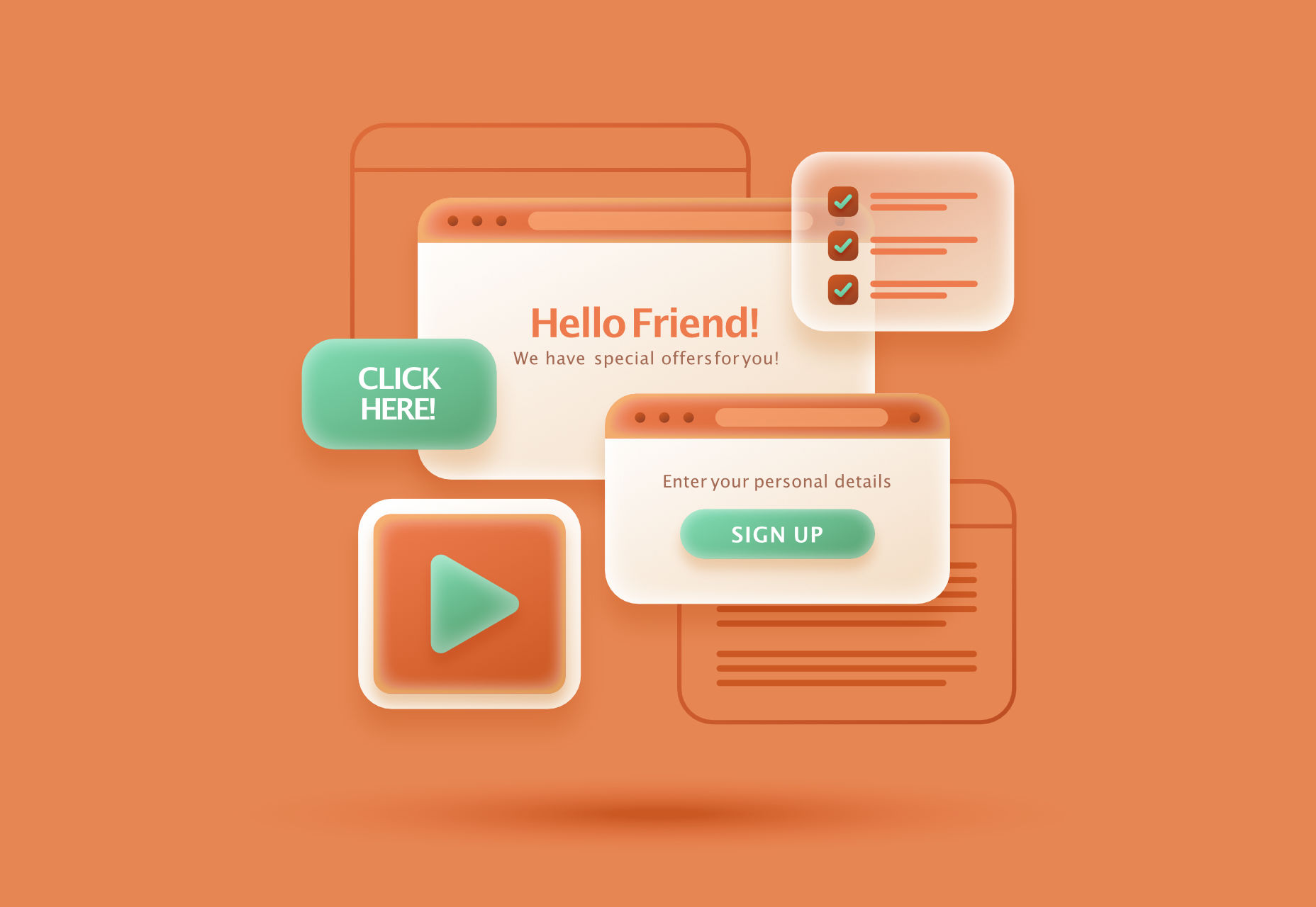
Modals, a nifty little feature that allows you to display different messages at the top of your website, have been touted as extremely useful. Some even claim that they are helpful enough to completely replace the banner ads we all hate so much. But are modals in web design a UX disaster?

If you are unfamiliar with the term, a modal is a dialogue window appearing when a visitor clicks on a hyperlink or hover image.

Suppose you want to collect on-site subscribers or you want visitors to sign up for a freebie. In that case, you can use modals.

However, many web designers – and some website visitors – are against using modals in web design. The main argument is that it affects the user experience. But are modals in web design a UX disaster? Read on to find out.

What Do Modals Do?

Modals often appear as pop-up windows on a web page, requesting a visitor to take action. Most times, they appear following a click on a page element.

Also known as lightboxes, modals isolate the page’s main content. The user will have to complete the action requested by the modal or close it before reassessing the page.

Web designers use modals to capture a visitor’s attention. Since other page contents are inaccessible, a visitor must interact with the modal.

Cons Of Modals In UX

While there are different cons of modals in UX, they all sum up to one con – interruption. When modals appear, they interrupt whatever the user is doing.

Unlike regular pop-ups, users cannot simply ignore the modal and continue browsing. As a result, modals demand immediate attention. 

A user may be interested and decide to interact with the modal. However, if the modal’s content differs from the page’s, the user could forget what they were doing after interacting with the modal.

Furthermore, sometimes modals require action related to information on the page. For example, suppose the user wants to review the information before taking action. In that case, they’ll have to close the modal since the main page is inaccessible.

Statistics show that up to 82% of users dislike pop-ups. Most website visitors aren’t knowledgeable about the technicalities of web design. As a result, they won’t be able to differentiate between regular pop-ups and modals.

After all, modals are a type of pop-up. Some users may consider modals worse since they darken the page’s primary content, making it inaccessible.

Furthermore, people want to visit a website and get what they want immediately. Hence, time is significant. Therefore, modals that require actions that take time can make a website lose visitors.

With all of these cons, you can understand why many web designers say modals are a UX disaster in web design.

Can Modals Be Useful in UX?

In some situations, modals are helpful, and they can improve UX. Many web designers swear on the usefulness of modals, and it’s not difficult to understand why.

Firstly, modals can help simplify a website’s content. For example, a user can immediately exit the page if your website is relatively complex, with lots of content and elements.

You can use a modal to explain the content on the page so that the user doesn’t get confused. Perhaps the modal can display when the user clicks on the back button. The modal can highlight the most critical content on the page and tell the user what to do next.

Secondly, modals are invaluable if you must capture your user’s attention. For example, perhaps you want to display a warning or pass any crucial information that users must know before they continue browsing.

As mentioned before, a user can easily ignore a pop-up, especially if it opens in a new window. However, with modals, the user must at least view the content before they proceed.

Thirdly, a modal can make a web page easier to navigate. It sounds ironic considering the cons, but it’s true if properly implemented. Rather than packing different elements on a web page, you can set some to display as modals.

For example, you can have a page with just text to improve readability. Then, users can click to view visual elements like images and videos as modals.

How To Use Modals the Right Way

Using modals correctly is key to ensuring they don’t negatively affect UX. Here are some ideal situations when you can use modals:

1. Display Warnings

Using modals to give users crucial warnings is ideal, especially if their subsequent actions have serious consequences.

For example, most websites display modals when users click the delete button. Deletion is always critical because, in most cases, it’s irreversible.

A practical example would be an eCommerce website where a user opts to delete items from their cart. You can use a modal to ask the user to confirm before deleting.

2. Input or Collect Information

Modals are effective in prompting users to input information. Sometimes, users must enter specific details before they continue browsing.

A practical example would be a review site where a user wants to submit a review. Before submitting the review, you can use a modal to request the user’s name and other necessary information.

3. Simplify Navigation

As mentioned before, modals can simplify a complex website. In addition, it will help a user navigate better, which is a UX boost.

A practical example would be a news site with many stories and updates. You can use a modal to highlight the day’s trending news stories so that users can visit the web pages with one click.

Conclusion: Are Modals a Disaster in UX?

In conclusion, modals affect a site’s user experience since visitors must interact with them. However, it doesn’t always have to be a negative effect.

Modals become a UX disaster in web design when wrongly used. However, if you follow good practices, modals can improve your website’s user experience.

Generally, only use modals when necessary and in a way that won’t frustrate the users.


Featured image by Freepik.

Source

The post Are Modals In Web Design A UX Disaster? first appeared on Webdesigner Depot.

Source de l’article sur Webdesignerdepot

Organizations are widely beginning to shift away from on-premises boxes for data backups and turning their attention instead to emerging cloud options. There are numerous reasons for this, but security concerns are key among them. Backup-as-a-Service is on the rise in response to this shift, with new providers emerging to specialize in convenient cloud backup services. 

A Case of Security and Convenience

Every organization has their own unique situation, but there are some common threads evident in the growing shift away from on-prem backups. Many organizations start off with on-prem boxes for their backups because they are easier at first and may seem like the simplest solution. Data can be stored offline, but close enough at hand to facilitate data recovery if needed without too much hassle. 

Source de l’article sur DZONE

Learning how to design an MVP webpage or website could be one of the best things you can do as a site creator in today’s digital world.

In a fast-paced landscape, where customer preferences and technology are constantly changing, most companies don’t have time to dedicate months or years to each web project. The longer you take to complete your website, the more likely your creation will be outdated by the time you hit “publish.” That’s why countless creators are beginning to take a different approach.

To avoid wasting time, money, and effort on something that doesn’t deliver a significant return on investment, designers are now building “Minimum Viable Products,” or “MVPs.”

Here’s what you need to know about creating your MVP webpage.

What is MVP Web Design?

Typically, the “MVP” development process is most common in the app or software creation world. It refers to when a developer builds the simplest version of a technology capable of achieving specific goals. For instance, if a company wanted to create an ecommerce app, they would design a simple tool capable of listing products, enabling payments, and tracking orders.

After launching the MVP product, the company or developer would check to ensure it had the right impact on the target market and generated positive results. Using feedback and analytics, the developer would then begin to add new features one at a time.

MVP design aims to ensure you’re developing the best, most valuable product for your audience while getting your solution to market as quickly as possible.

The same strategy in MVP app and software design can also apply to website creation. Rather than building a highly complicated website with multiple features straightaway, the designer would focus on creating a single page equipped with the essential elements.

For instance, instead of building an entire site for your online course, you may develop a single-page website where customers can learn about the system, sign up, and pay for their membership. The great thing about an MVP web page is it allows companies to start advertising their solution, product, or service quickly, with the minimum initial investment.

How to Create an MVP Web Page

Creating an MVP web page is similar to designing any Minimum Viable Product. Throughout the project, the focus will be on keeping the development process simple while collecting as much feedback as possible.

Here’s how you’d get started with an MVP web page.

Step 1: Planning

Planning is an important stage in any web design project. It’s particularly crucial in the MVP landscape, where you need to define the most critical features of your webpage or website to ensure it’s “viable” for your needs. The initial planning stage can sometimes be the lengthiest part of the process, depending on the amount of research you need to do.

For the most part, web designers and companies will begin by conducting market research. This means examining crucial concepts intended to drive your strategy, such as:

  • Your target audience: Who are you trying to target with this web page, and what will they need from your site? A user persona can be helpful if you don’t already have one.
  • Competitors: Who are your main competitors in this space, and what do their web pages offer? Which features do you need to replicate or avoid?
  • Goal setting: What is the main objective of this web page? What do you need it to do, and what might it need to accomplish in the future?

The key to MVP web page planning is ensuring you look holistically at your project without thinking too far ahead. The site you create should be capable of scaling and expanding in the future, but it shouldn’t have too many features from day one.

Step 2: Creating Your Feature List

Once you’ve done your research and formed the foundations of your plan, it’s time to list all the features your MVP web page needs to have. Unfortunately, this is where the process can get a little complicated. It’s easy to start adding capabilities and components that aren’t necessary to make your site more exciting or competitive.

As worrying as it can feel to release a very basic web page, remember your focus is on rapid growth and development. With this in mind, concentrate on narrowing your feature lists down into:

  • Initial must-have capabilities: First, decide what your web page can’t thrive without. If the primary goal of your page is to sell software subscriptions, then you’ll need to implement tools for collecting member information and payments.
  • Next stage functionality: Consider the features you might add once you’ve confirmed your webpage is effective. This will allow you to ensure you’re creating a platform that can expand to suit future needs.
  • Possible future requirements: You can also list features that might be helpful in the future but don’t necessarily need to be implemented immediately. For instance, if you’re selling an online course, you might create a separate page where people can sign up to learn about future lessons.

Step 3: Finding the Right Software

Next, you’ll need to decide how to build your web page. There are several options available to today’s designers. An open-source solution is usually the best route for designers who need to create something specific from scratch. However, if the factor that makes your solution “viable” is unique, you may need access to code to bring your idea to life.

Alternatively, if you’re building a basic webpage capable of something like collecting customer email addresses or facilitating transactions, you might be able to use an off-the-shelf tool. CMS services for web designers can reduce the work and expense involved in creating a minimum viable product.

For instance, you might use a tool like Wix or Squarespace to edit a pre-existing template and simply drag-and-drop the features you need into the right places. On the other hand, if you’re planning on adding more functionality to your site down the line, it’s worth checking if any builder you will use has the right level of flexibility. Many tools will allow you access to code, advanced features, and essential module-based building functions.

Step 4: Implement Your Analytics

One of the essential parts of an MVP workflow is feedback. When you roll out your MVP, you’ll be looking for insights, guidance, and analytics to help you decide what your next steps are going to be. As a result, MVP workflows are based heavily on experimentation.

This means you’re going to need the right analytical tools in place to track crucial information. You can implement tools for collecting customer feedback directly. It’s also worth having a system in place for tracking metrics like:

  • Conversion rate;
  • Traffic numbers;
  • User behavior;
  • Most used/least used features;
  • Technical site performance;
  • Bounce rate;
  • Average time spent on the page.

While Google Analytics is one of the most popular tools for collecting insights in the MVP website design world, various other options are available. You can even find tools with in-built heatmaps to see how people navigate your site more effectively.

It’s also worth having A/B testing components in place. This will allow you to test the different “new” features you add to your web pages over time and examine how they influence your conversions and support your goals. For example, you can use A/B testing to explore the impact of everything from CTA button colors to webpage copy and offers.

Creating Your MVP Web Page

In the fast-paced web development and design world, the old-fashioned and slow approach to designing web pages is growing increasingly less common. Instead, an MVP strategy may be the best bet for companies looking to go to market faster, collect insights from their target audience, and accelerate growth.

Though getting used to this design strategy initially can be challenging, it can save you significant time, resources, and money in the long term.


HTML vector created by vectorjuice – www.freepik.com

Source

The post How to Design an MVP Web Page first appeared on Webdesigner Depot.

Source de l’article sur Webdesignerdepot

Live chat is one of the most powerful tools for customer experience in the current marketplace. 

In a world where customers are constantly connected to the online world, online chat is a reliable way of getting quick solutions to common problems. 

Today’s consumers prefer talking to an agent over chat to calling a contact center, and they often feel that live chat is less frustrating than waiting for the right person to answer the phone. 

Of course, like any digital tool, live chat is only effective when using it correctly. Today, we’re going to show you the crucial KPIs you need to consider if you want to ensure that your chat strategy is delivering a tangible return on investment. 

The Most Important Metrics to Measure for Live Chat

These days, implementing live chat tools is easier than ever. 

You don’t necessarily need to hire a professional developer unless you want a specialist widget with specific functions and unique branding. Many plugins and tools for sites built on Shopify and WooCommerce allow you to instantly access chat functions. 

However, just because implementing live chat is easy doesn’t mean that there aren’t countless ways for your strategy to go wrong. Keeping an eye on these crucial KPIs and metrics ensures you’re making the right impression with your chat strategy. 

1. First Response Time

First response time is a crucial live chat metric. This measures how long customers need to wait before someone responds to them. Technically, this metric only refers to how quickly an actual agent responds to your customer, so automated “thanks for getting in touch” messages don’t count. However, immediately responding with one of those messages can convince your audience to stick around for a little longer. 

The faster your agents can respond to messages and solve problems, the better your brand reputation becomes. The good news is that a good live chat strategy can lead to pretty quick response times. The average time for an agent to see a live chat message is around 2 minutes and 40 seconds.

To improve your FRT statistics, make sure you:

  • Invest in chatbots: AI chatbots can support customers 24/7 with handy, self-service functionality. These tools will also filter out the customers waiting for an agent who can find a solution to their problem on your FAQ page.
  • Prepare canned responses: Quick responses to common queries can help you to address a problem much faster. In addition, preparing canned responses will ensure that your team members can quickly respond to more customers. 
  • Increase your resources: Ensure you have the right hand and enough agents to handle peak demand.

2. Average Resolution Time

The first response rate only looks at how quickly someone responds to a customer’s message for the first time. However, it doesn’t show how rapidly you deal with client problems. Average Resolution Time is the metric that helps to measure customer satisfaction by seeing how long it takes to get to a point where your customer can close the chat. 

If it takes too long for your employees to solve problems, there’s an increased risk of your customers becoming annoyed and frustrated. Additionally, the longer agents take dealing with each individual chat, the more other consumers will have to wait for someone to become available. Finally, the longer it takes to resolve an issue, the more customer satisfaction decreases.

The key to success is ensuring that the right agent deals with the correct customer and that everyone on your team is empowered with the appropriate tools and information. Boost resolution time by:

  • Giving customers a quick self-service solution: For common questions, make sure that you have an FAQ section that you can direct your customers to. In addition, a chatbot that can offer quick canned responses to regular queries can save time. Plus, they’re great for reducing the pressure on your agents’ shoulders. 
  • Integrate CRM tools with live chat: Make sure your agents have access to information about each customer as soon as they start the conversation. This information should include the customer’s name, what they’ve purchased before, and if they’ve issued any support tickets. Integrating with the CRM makes it easier for agents to jump straight into the action without needing the customer to explain everything first. 
  • Keep resources handy: Your team members should have instant access to all the information they need to answer customer questions. Ensure that searchable data repositories are available for everyone on your live chat team. 

Remember, routing tools that automatically send customers to the agent with the proper knowledge or skills will also improve response times and reduce the number of times a customer needs to repeat themselves. 

3. Chat to Conversion Rate 

Live chat tools aren’t just an avenue for problem resolution. Although customers can get excellent service through live chat, they also look to chat to collect information before a potential purchase. Around 38% of customers say that they end up purchasing a positive live chat experience. 

The live chat app on your website can provide real-time assistance for sales queries, converting leads, and maximizing your return on investment. However, to determine how successful your chat system is at encouraging sales, you must look at the chat to conversion rate metric. 

Essentially, you measure the number of chats your company has been involved in, then compare that number to the total number of conversions from those customers. It might be helpful to narrow down your results here by using your data and analytics tools to separate your total number of live chats into those intended for sales information and those requiring assistance. 

If your chat to conversion rate isn’t as high as you would like, there are lots of things you can do to start making a positive impact:

  • Automatically launch a chat: As soon as someone comes to your website, launch a chat window with a bot that asks whether you can help your customer. You can even include a list of commonly asked questions so your customer can get help faster. 
  • Follow up on chat conversations: Make sure you follow up on any questions that customers ask on your chat widget with an email. This is a great way to reach out to customers that may have been distracted and ended up abandoning their cart.
  • Personalize suggestions: Use AI insights and information from your customer management tools to determine which products are most likely to appeal to each customer, then suggest those items. Remember to ensure that your tone of voice in the chat matches your brand too. 

Remember, the faster you can answer customer queries and address their concerns with your live chat strategy, the more likely the chat will lead to a sale. Ultimately, customers are convinced to purchase when they believe they can trust your business to deliver excellent experiences. 

4. Customer Satisfaction Score

The customer satisfaction score is probably one of the most critical metrics in any customer experience strategy. It directly measures customer satisfaction levels and gives you an insight into how well you’re doing from the perspective of your target audience. 

The best way to measure CSAT through live chat is to add a survey to the end of the chat session. For instance, you could ask, “How would you rate this session on a scale of 1 to 10”. Then, based on the score, you’d calculate a “Net Promotion Score.” Each score falls into one of three categories: “Detractors 0-6”, “Passives 6-8,” and “Promotors 9-10”.

The more information you collect about your CSAT score, the easier it will be to determine where you’re going wrong with your live chat strategy. On the other hand, if the score is pretty good after a chat session, you’re probably on the right track. To improve your overall score:

  • Encourage feedback: Getting people to leave feedback, even on a live chat app, can be difficult. Offering customers the chance to win something in exchange for their insights could help you to get more data. 
  • Follow up: Connect with your “detractors” to find out what you did wrong. Follow up in the live chat session by asking if they’d like to leave a more comprehensive review. Alternatively, you can send an email asking for additional information. 
  • Reach out to promotors: Connect with the people who give you the most favorable scores to ask them for their insights. Find out what they enjoyed most about the experience and request a review that you can place on your website for social proof. 

5. Missed Opportunities

The longer someone waits for you to answer their question in a live chat or respond to their initial message, the more likely they’ll give up on the conversation. Unfortunately, this means that your company ends up with missed opportunities. You lose the chance to potentially make a sale, delight a customer, and strengthen your brand reputation.

While you might assume that your customers will know you can’t be available to answer all of their questions immediately, that’s not the case. INC tells us that 51% of consumers believe a business should always be open. So every missed chat is another negative mark against your reputation. 

If you discover that your team is missing a lot of chat chances, this could be a sign that you don’t have enough resources available in this area. However, there are a few ways that you can reduce your chances of missed opportunities, such as:

  • Hiring more team members: If you know that there are times of the year or week when you have peaks in demand, ensure that you have the correct number of staff members available. 
  • Using chatbots: Chatbots won’t be able to answer all customer questions, but they can deliver quick responses to commonly asked queries and reduce the risk of lost opportunities.
  • Provide alternative forms of communication: if your customer can’t reach you on live chat, make sure that there are other options available, like a phone number and email address or a form where your customer can automatically submit a ticket. 

6. Total Number of Chats and Tickets

Keeping track of the total number of tickets your customers submit, alongside the number of chats your employees engage in, will give you helpful information. First, the total number of conversations shows how many customers are taking advantage of your live chat function on the website. 

You’ll also be able to compare your total number of chats to the number of resolved problems you deal with for your customers. For example, comparing your total number of chats to an unlimited number of tickets shows you how many customers have been left to rely on other sources of communication. You can also see how good your employees are at following up with tickets issued by customers. 

When you’re analyzing your number of tickets and chat sessions, you might notice that many of the queries you dealt with were connected to specific questions or topics. If that’s the case, you might be able to create a new FAQ page for your customers or provide your chatbot with extra information that it can use. 

If you’re getting more support tickets through alternative means than live chat, it might be time to ask yourself what’s wrong with your live chat performance and why your customers choose not to use it. 

Improving Live Chat CX for Your Business

Live chat can be a powerful tool for improving customer experience and an excellent way to strengthen your relationship with existing and potential clients.

Step into the shoes of your customer and discover what it feels like to walk through the whole live chat experience, from the moment that you send a request to the live chat team to the moment when you close down the chat with a solution to your problem. Other quick tips include:

  • Getting the software right: Make sure your live chat app is easy for your end customers and your employees. The chat app you use should be convenient and suit your brand. It also needs to collect information effectively without causing problems like GDPR and regulations. Get a developer involved if you think you have a problem with your chat functionality. 
  • Guide your team: Remember that your team needs to know how to use the live chat tools available effectively if they’re going to deliver the best results to your customers. Make sure you give your employees scripts to deal with problems if needed. In addition, chatbots that can quickly grab information from integrated CRM tools and other solutions could make your agents’ lives much more manageable. 
  • Pay attention to feedback: Ask your customers for feedback on their live chat experiences whenever you can. Ensure you pay attention to what they say they like and dislike about the encounter. If you can listen to your customer’s opinions, they’ll give you a lot of helpful information to work with when you’re enhancing and optimizing your live chat strategy. In addition, listening to your audience shows that you have their best interests at heart.

Remember, as well as customer feedback; you might be able to ask your employees for their insights into how you can improve live chat performance too. Employees also work with these tools regularly, so they know which features are more problematic than others. 

Measuring and Improving Live Chat

Live chat functionality isn’t something that you implement into your website and forget about. Instead, like any form of customer service or engagement tool, your live chat solution should be something you test regularly and constantly update to suit your customers’ needs. 

Knowing which metrics to measure when examining live chat functionality and performance will boost the experience you can give your audience and even open the door for better relationships with clients in the long term.

Source

The post How to Measure Live Chat Performance first appeared on Webdesigner Depot.

Source de l’article sur Webdesignerdepot

With the amount of data produced on a daily basis continuing to rise, so too do the number of data points that companies collect. Apache Iceberg was developed as an open table format to help sift through large analytical datasets.

This Refcard introduces you to Apache Iceberg by taking you through the history of its inception, dives into key methods and techniques, and provides hands-on examples to help you get introduced to the Iceberg community.
Source de l’article sur DZONE

UX laws are an invaluable tool, providing guidelines for designers that ensure we don’t have to continually reinvent the wheel when crafting experiences for the web.

However, UX laws tend to be devised by scientists and psychologists — people who are more than comfortable with the exceptions and allowances of academic language. By the time they filter down to us in the trenches, the language has invariably been over-simplified, and the wisdom behind the idea diluted.

Today we’re going to look at seven well-known and commonly cited rules of UX design that too many designers get wrong.

1. Jakob’s Law

Jakob’s Law, named for the UX researcher Jakob Nielsen, states that users spend most of their time on other sites and as a result prefer sites that work the same way as the sites they already know.

Jakob’s Law has often been used to limit experimentation and encourage the adoption of common design patterns in the name of usability.

However, the word ‘prefer’ is hugely loaded. While it’s true that a user will more easily understand a familiar design pattern, they do not necessarily prefer familiar experiences.

It has been widely proved that new experiences boost our mood and that new experiences improve our memory. If your goal is a memorable site that leaves users with a positive impression, introducing novelty is a sound decision.

2. Goal Gradient Hypothesis

The Goal Gradient Hypothesis assumes that the closer users are to their goal, the more likely they are to complete it.

It’s an attractive theory, especially in e-commerce, where it is often used to justify simplifying the initial purchase process and postponing complexity to move users along the funnel — a typical example is leaving shipping charges until the final step.

However, anyone who has studied e-commerce analytics will know that cart abandonment is a huge issue. In North America, shopping cart abandonment is as high as 74%.

We don’t always know what the user’s goals are, and they may not match ours. It may be that users are treating your shopping cart as a bookmark feature, it may be that they have a last-minute change of heart, or they may be horrified by the shipping charges.

While providing a user with an indication of their progress is demonstrably helpful, artificially inflating their proximity to your preferred goal may actually hinder conversions.

3. Miller’s Law

Never in the whole of human history has any scientific statement been as misunderstood as Miller’s Law.

Miller’s Law states that an average person can only hold seven, plus or minus two (i.e., 5–9) items in their working memory. This has frequently been used to restrict UI navigation to no more than five items.

However, Miller’s Law does not apply to items being displayed. While it’s true that too many options can lead to choice paralysis, a human being is capable of considering more than nine different items.

Miller’s Law only applies to UI elements like carousels, which have been widely discredited for other reasons.

4. Aesthetic-Usability Effect

Edmund Burke once said, “Beauty is the promise of happiness.” That belief is central to the Aesthetic-Usability Effect, which posits that users expect aesthetically pleasing designs to be more usable.

Designers often use this as a justification for grey-on-grey text, slick animations, and minimal navigation.

Critical to understanding this is that just because users expect a design to be usable does not mean that it is or that they will find it so. Expectations can quickly be dashed, and disappointment often compounds negative experiences.

5. Peak-End Rule

The Peak-End Rule states that users judge an experience based on how they felt at the peak and the end, rather than an average of the experience.

Designers commonly use the Peak-End Rule to focus design resources on the primary goal of each experience (e.g. adding an item to a cart) and the closing experience (e.g. paying for the item).

However, while the Peak-End Law is perfectly valid, it cannot apply to open experiences like websites when it is impossible to identify a user’s starting or ending point.

Additionally, it is easy to see every interaction on a website as a peak and even easier to make assumptions as to which peak is most important. As such, while designing for peaks is attractive, it’s more important to design for exceptions.

6. Fitts’ Law

In the 1950s, Paul Fitts demonstrated that the distance to, and size of a target, affect the error rate of selecting that target. In other words, it’s harder to tap a small button and exponentially harder to tap a small button that is further away.

UX designers commonly apply this law when considering mobile breakpoints due to the relatively small viewport. However, mobile viewports tend not to be large enough for any distance to affect tap accuracy.

Fitts’ Law can be applied to desktop breakpoints, as the distances on a large monitor can be enough to have an impact. However, the majority of large viewports use a mouse, which allows for positional corrections before tapping.

Tappable targets should be large enough to be easily selected, spaced sufficiently, and tab-selection should be enabled. But distance has minimal impact on web design.

7. Occam’s Razor

No collection of UX laws would be complete without Occam’s Razor; unfortunately, this is another law that is commonly misapplied.

Occam’s Razor states that given any choice, the option with the least assumptions (note: not necessarily the simplest, as it is often misquoted) is the correct choice.

In an industry in which we have numerous options to test, measure, and analyze our user interfaces, you shouldn’t need to make assumptions. Even when we don’t need extensive UX testing, we can make decisions based on other designers’ findings.

Occam’s Razor is a classic design trap: the key to avoiding it is to recognize that it’s not your assumptions that matter, it’s the users’. As such, Occam’s Razor applies to a user’s experience, not a design process.

Source

The post 7 UX Laws You’Re Probably Getting Wrong first appeared on Webdesigner Depot.

Source de l’article sur Webdesignerdepot

Data mesh. This oft-talked-about architecture has no shortage of blog posts, conference talks, podcasts, and discussions. One thing that you may have found lacking is a concrete guide on precisely how to get started building your own data mesh implementation. We have you covered. In this blog post, we’ll show you how to build a data mesh using event streams, highlighting our design decisions, and the key benefits and challenges you’ll need to consider along the way. In fact, we’ll go one better: we’ve built a data mesh prototype for you to check out on your own to see what this would look like in action, or fork to bootstrap a data mesh for your own organization. 

Data mesh is technology agnostic so there are a few different ways you can go about building one. The canonical approach is to build the mesh using event streaming technology that provides a secure, governed, real-time mechanism for moving data between different points in the mesh. 

Source de l’article sur DZONE