Articles

Experienced web designers are always on the lookout for tools or resources that will (1) introduce them to the latest design trends, (2) enable them to incorporate features and functionalities that will make their products more competitive, (3) allow them to improve their workflows or all the above.

Apply one or more of these new design tools and resources. Then you could realize anything from incremental to game-changing improvements. The better the tool or resource, the more you are apt to realize your investment.

The 15 tools and website design resources selected for this article are the best in their respective categories. The degree of improvement you can realize when using one or more of them may depend on your own business needs. Or on the actual needs and wants of your clients as opposed to what you are currently able to deliver.

Browse the list, and you should be able to put your finger on one or more of these products or services. They could lead to improvement in one or more areas of your work. Look closer, and you might come across a genuine game-changer.

Happy shopping!

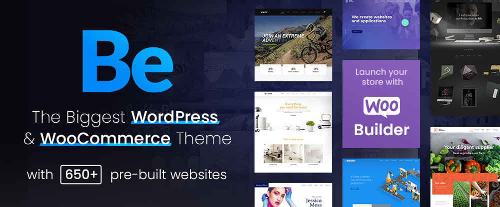
1. Be – The Biggest WordPress and Portfolio WordPress Theme

If your website design activities are proving to be exercises in tediousness, or you’re tired of working around a design tool’s limitations, you need BeTheme.

BeTheme can be a game-changer in that it gives you the flexibility to design what you want. Be makes building a complex high-performance website quick, smooth, and easy.

  • BeTheme’s 650+ customizable pre-built websites are designed to get your website-building project off to a rapid start. They are responsive, UX-ready, importable with a single click, and incorporate the latest design trends.
  • You’ll love working with the recently launched BeBuilder, the fastest and most flexible page builder for WordPress with which you can import from Be’s pre-built website’s 1000+ pages.
  • There’s an absolute gem of a BeBuilder Woo you can work with to create your shop or single product layouts.
  • BeTheme features a wealth of design aids, options, and settings to work with.

BeTheme is Elementor ready and is regularly updated. Click on the banner to find out more about Be’s 40+ powerful core features.

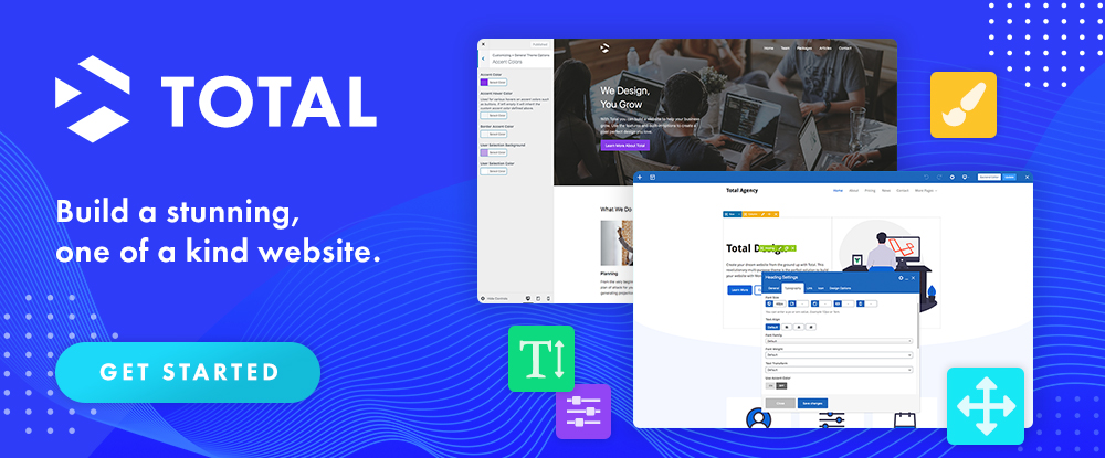
2. Total WordPress Theme

Put Total to work, and 2022 could be a very good year for your website design undertakings.

Total has it all insofar as design aids and options, website-building tools, and design flexibility are concerned regardless of the type or style of website you plan to build:

  • Pick any of Total’s 45+ customizable quick import theme demos, and you are off to a quick start.
  • 90+ section templates, 75+ pre-styled post entry cards, and more than 500 live customer settings give you more design flexibility than you are ever likely to need. 
  • The page builder of choice is an extended version of WPBakery. With it at your fingertips, you can easily drag and drop your way to building precisely the website you have in mind.

Click on the banner to discover everything Total can do for you.
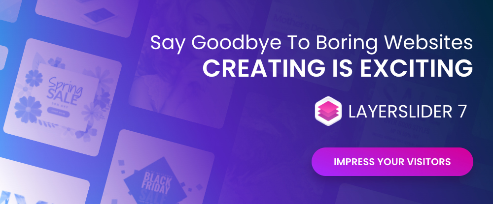
3. LayerSlider

What could LayerSlider do for you to help make 2022 a banner year? Look over any of your past website designs to see if any of them could profit from adding a little spice or pizzazz because that’s what LayerSlider does best. 

LayerSlider is an animation and website-building tool that can be used on any website to transform its look & feel with modern graphics, eye-catching animations, and interactive features. LayerSlider is one of the most established and popular products with millions of active monthly users.

  • LayerSlider has 150+ website, slider, and popup templates. Templates are a great way to learn as well as an ideal starting point for new projects.
  • LayerSlider comes with a very easy-to-use and modern editor interface similar to professional desktop applications. Anyone can use it without prior experience.
  • LayerSlider is not just for sliders. It can also create image galleries, popups, landing pages, animated page blocks, or even full websites.

Click on the banner to see what LayerSlider could do for you.
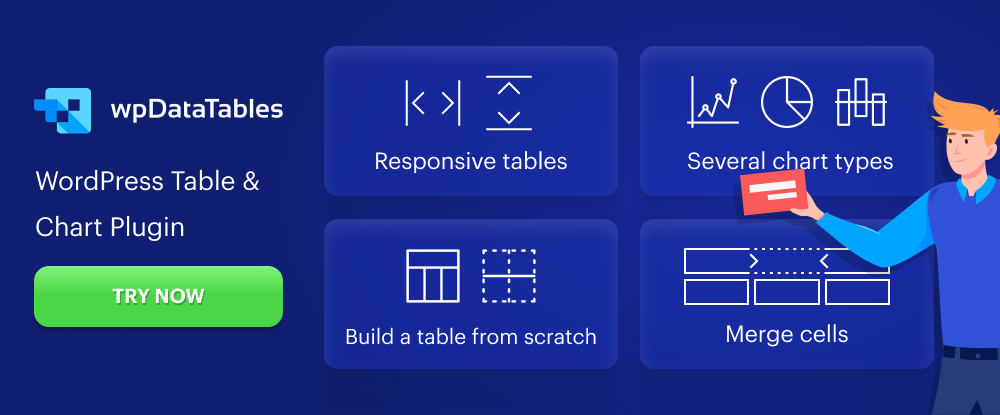
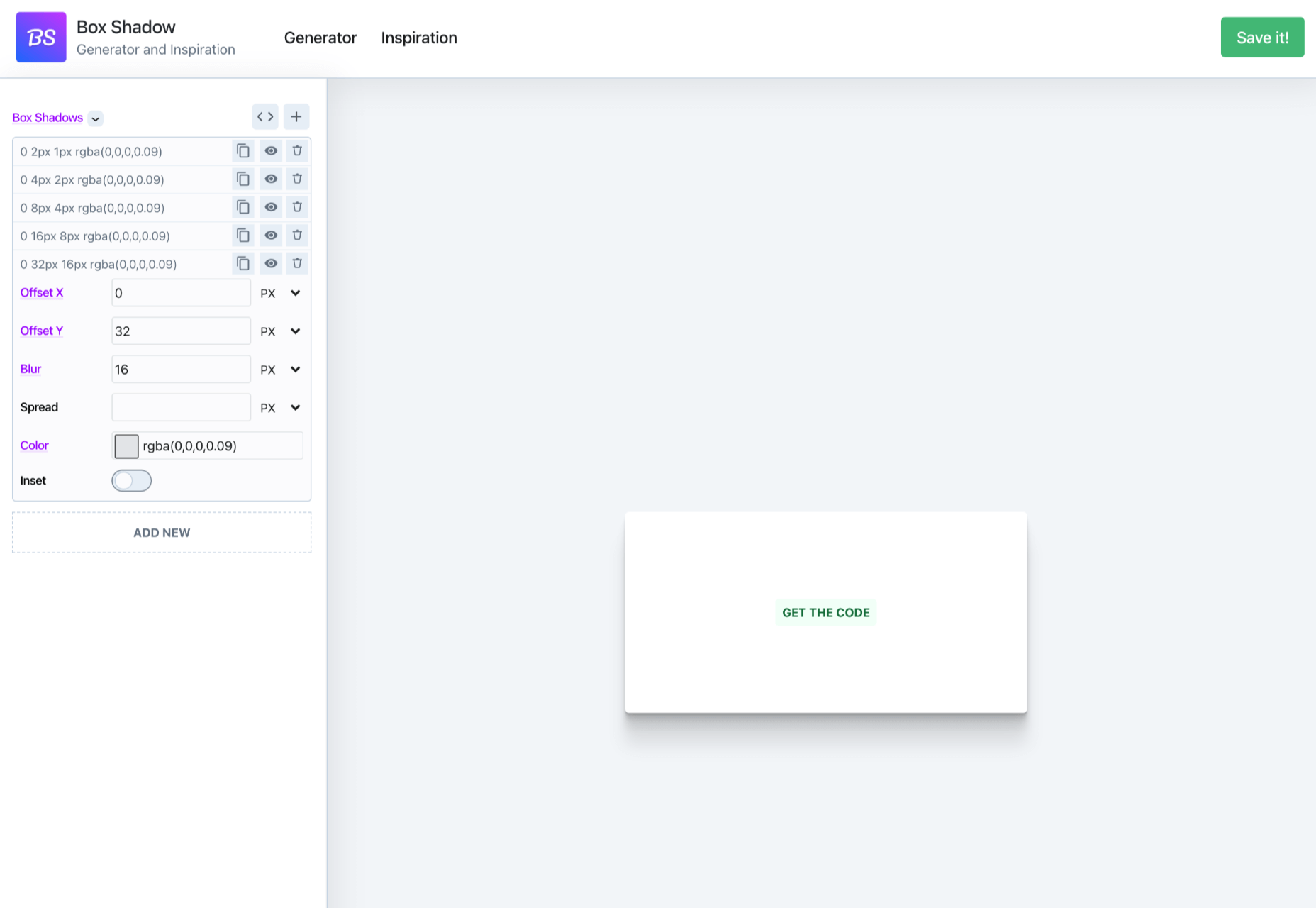
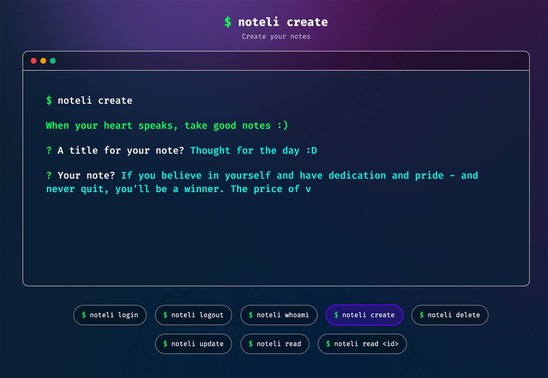
4. wpDataTables

Most table or chart building table plugins on the market either limit the amount of data that can easily be processed or the types of tables or charts that can be produced. wpDataTables has neither of these limitations.

With the wpDataTables premium WordPress plugin, you can –

  • create responsive, interactive, and frontend editable tables and charts
  • process huge amounts of data from various sources and in various formats
  • highlight or color code key data.

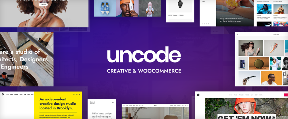
5. Uncode – Creative & WooCommerce WordPress Theme

Uncode is a top-selling pixel-perfect creative and WooCommerce theme. More than 80,000 sales have been made to date to freelancers, bloggers, agencies, and small businesses.

Uncode’s key features include –

  • a suped-up Frontend Page Builder.
  • an advanced WooCommerce builder with supporting capabilities that include a Single Product builder and a host of customer-centric design elements and options.
  • a Wireframes Plugin and 550+ section templates.
  • a gallery of inspirational user-created websites.

6. Trafft

With Trafft, you can schedule meetings, events, on-site and virtual appointments, manage staff schedules, send reminders, and accept payments — all from a single platform.

  • Special features include custom domains, coupons, and custom fields.
  • Trafft also manages group bookings and can serve multiple locations.

This game-changer integrates seamlessly with Google Calendar, Google Meet, Outlook Calendar, Apple Calendar, Zoom, and Mailchimp.
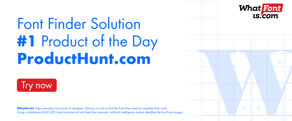
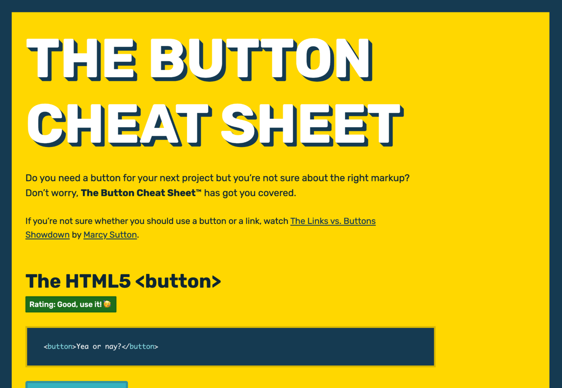
7. WHATFONTIS 

WHATFONTIS is a hidden gem in the world of font identifiers that allows you to find a font from your uploaded image in a matter of seconds.

  • Powerful AI algorithms and a database of 850K+ fonts provide the basis for this app’s impressive search capabilities.
  • Positive identification is achieved 90% of the time. Premium support is on hand should AI yield an awkward result.
  • Cursive fonts can be identified once the letters are separated.

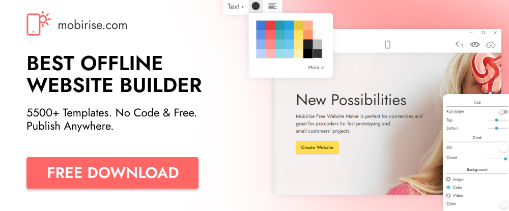
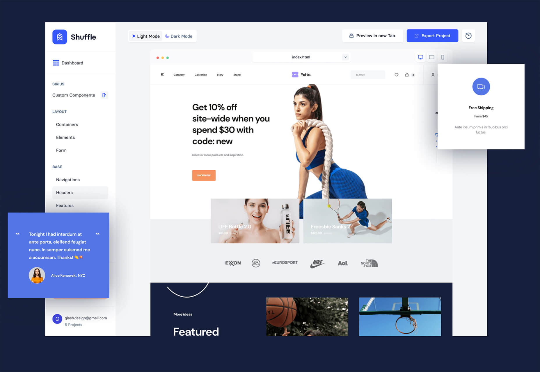
8. Mobirise Website Builder Software

Mobirise is fast, easy to use, and the best offline website builder on the market.

  • Mobirise does not tie you to a specific platform; you can edit your site locally and host it wherever you want.
  • Full access to HTML allows you to code.
  • 4,000+ website blocks and 300+ elegant home page templates are guaranteed to make your website-building adventures short and sweet.

The Mobirise website builder is free for both personal and commercial use.

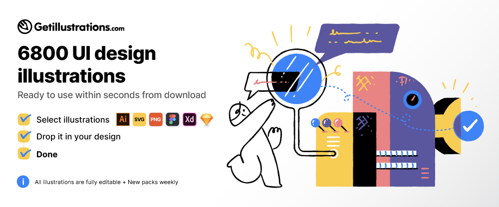
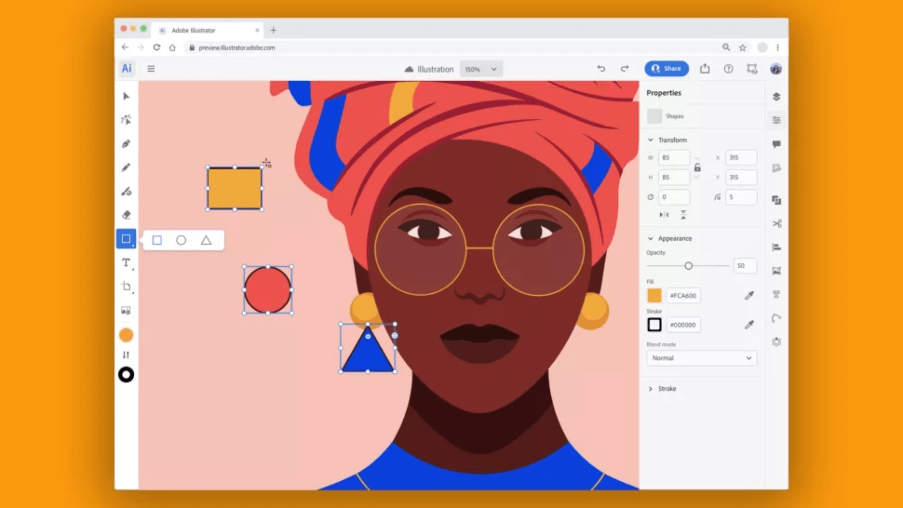
9. GetIllustrations’ Stock Illustrations Bundle

Downloads from this library of premium illustrations can change the way you go about designing your websites, apps, and presentations.

  • GetIllustrations, with its 10,000+ illustrations library, is the biggest of its kind.
  • Featured formats include Vector AI, PNG, Sketch, SVG, Figma, and Adobe XD.

Illustrations you download come with a commercial license and are yours to keep without limitations.

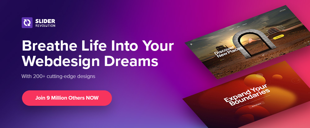
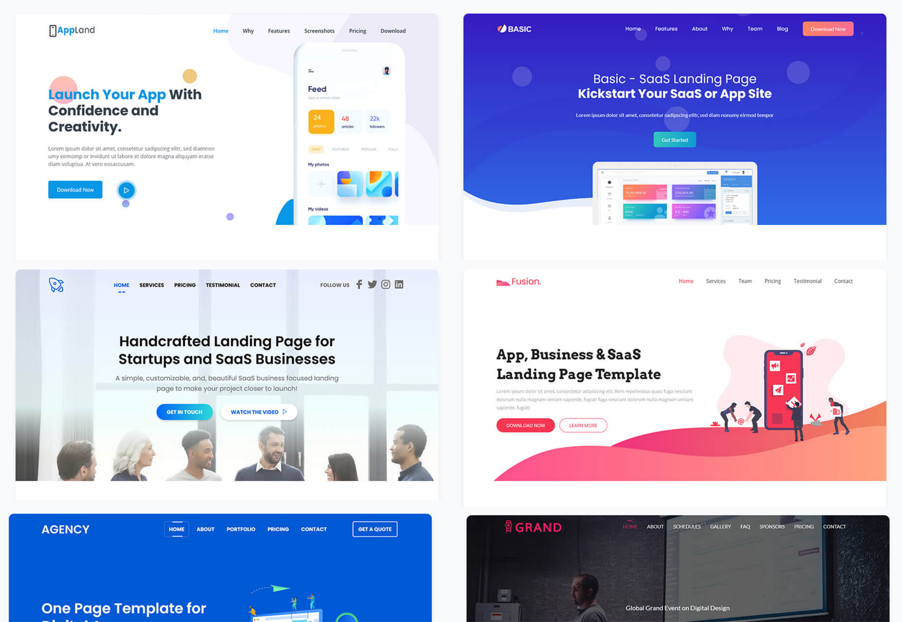
10. Slider Revolution

If you have trouble bridging the gap between what your clients want and what you can provide, Slider Revolution could be exactly what you need to fix the problem.

Slider Revolution is THE cutting-edge WordPress plugin for addressing today’s over-the-top web designs. It features –

  • 200+ awesome website and slider templates.
  • eye-catching WebGL slide animations.
  • 25+ powerful addons.
  • the ability to import dynamic content from social media outlets.
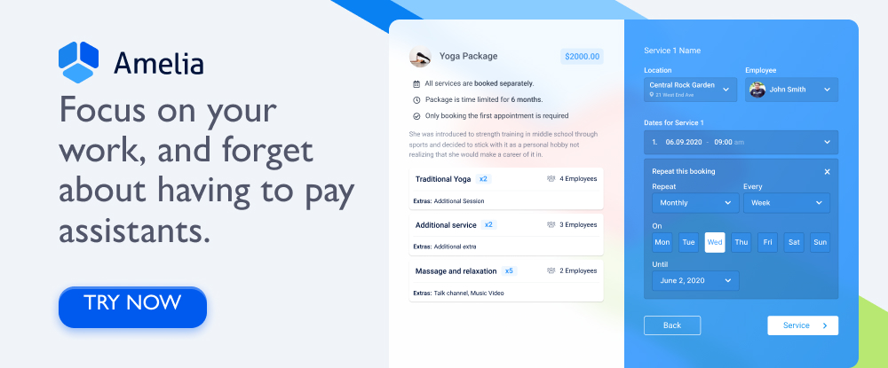
11. Amelia

Amelia offers an automated, highly customizable solution to any business that relies on a manual or semi-automated operation for booking client appointments.

  • Amelia is an excellent choice for beauty, healthcare and fitness, and educational and training enterprises.
  • Clients can make or change appointments online 24/7.
  • Amelia can manage individual and group bookings, events, and employee schedules at multiple locations.
  • Amelia integrates seamlessly with Google Calendar, WooCommerce, and Zoom.

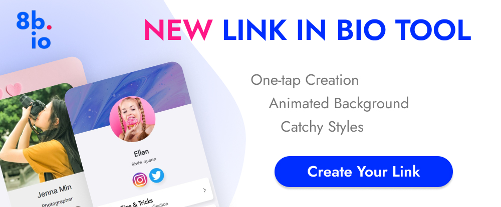
12. 8bio – Link in Bio Tool 

Many social media platforms allow you to include a link that allows followers to visit your website or an important landing page. With 8bio, you can create a link that a visitor can’t resist clicking on.

Your link can – 

  • Present a brief biographical profile of your business or yourself.
  • Feature an image or catchy animated background.
  • Showcase your product or service at no cost.
  • Use your existing domain or a “yourname” .8b.io domain.
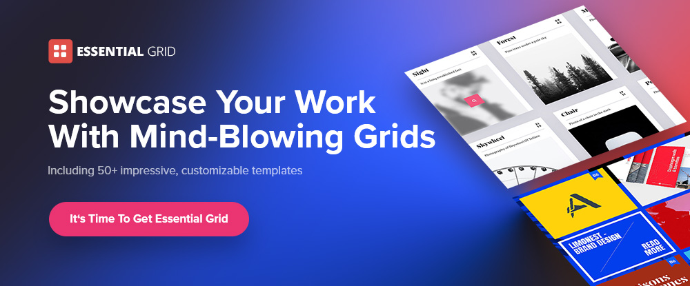
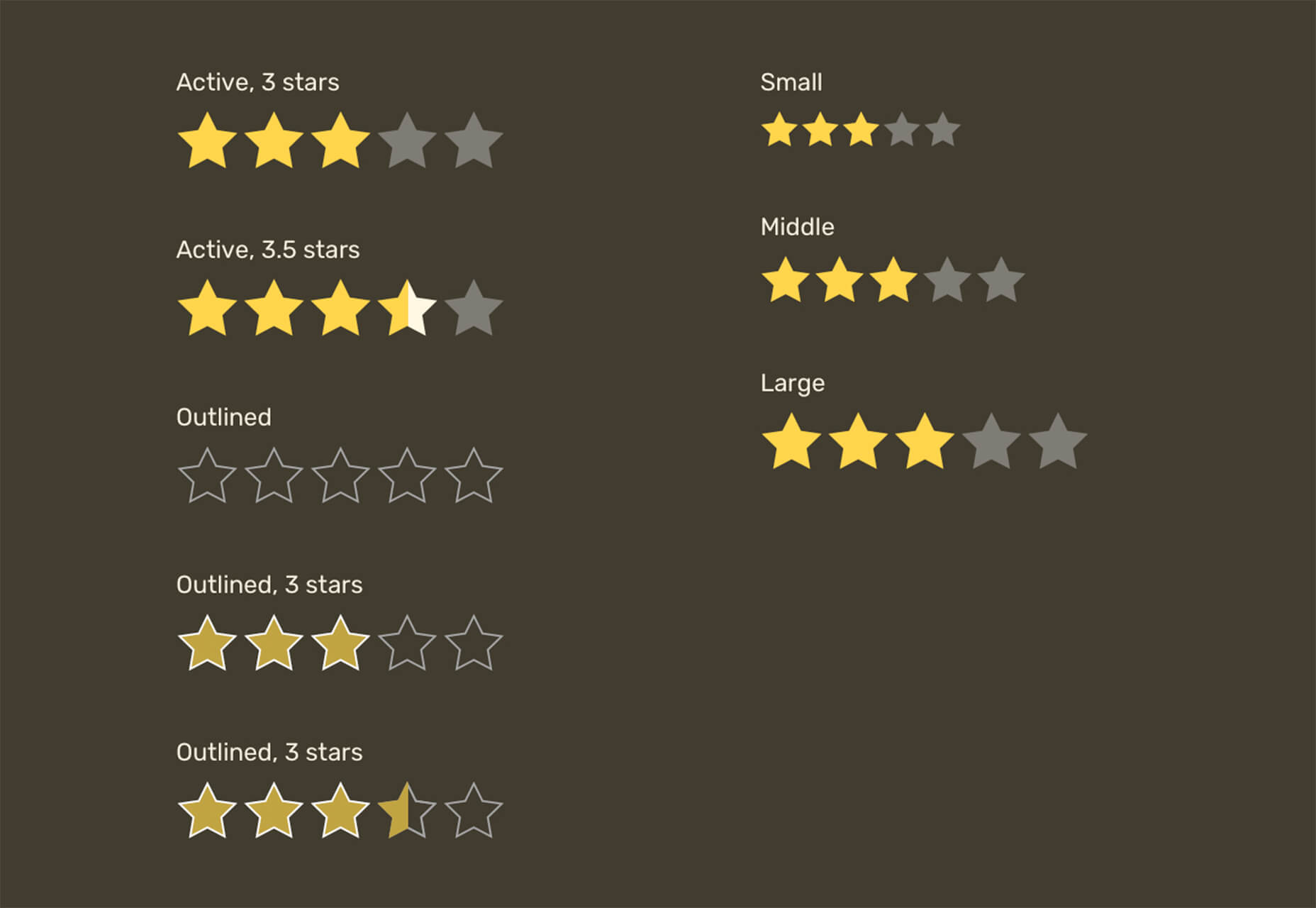
13. Essential Grid

The premium Essential Grid WordPress gallery plugin developers assembled a collection of aesthetic, easy-to-customize plug-and-play templates that make creating a breathtaking portfolio gallery a fun and easy task.

  • Your galleries will load lightning fast.
  • They will display perfectly on all devices.
  • You can choose from a variety of layouts and mix and match adjustable grids to get precisely what you want.

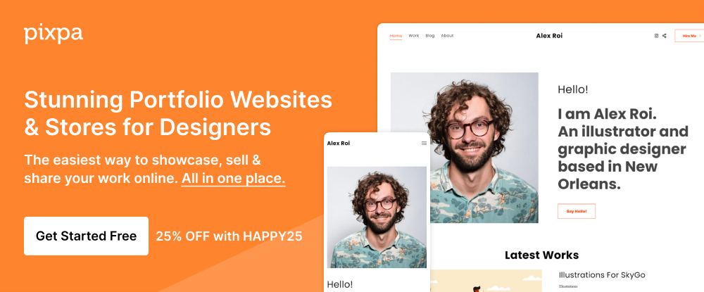
14. Pixpa – Portfolio Websites for Designers

Pixpa provides an all-in-one platform from which creatives can manage their online portfolios, blogs, galleries, and eCommerce sites.

  • Choose among Pixpa’s beautiful and mobile-friendly customizable templates and customize them to achieve exactly what you want. 
  • Put Pixpa’s drag and drop website builder into play to tie everything together, exactly as you want.
  • Add content, connect with your custom domain, and into your social profiles, and you are good to go.

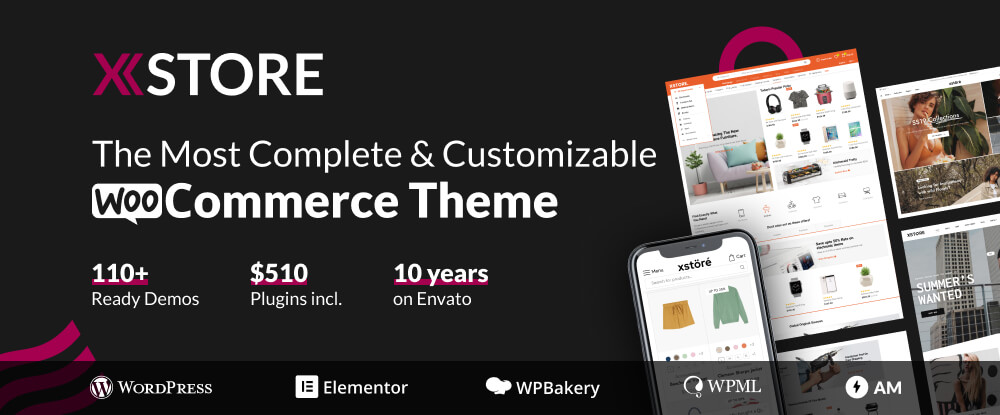
15. XStore – Best WordPress WooCommerce Theme for eCommerce

XStore is a feature-packed Envato WooCommerce theme that is incredibly simple to work with has acquired more than 30,000 enthusiastic customers.

  • XStore’s 110+ customizable shops make creating your own shop as easy as can be.
  • XStore integrates seamlessly with the premium Elementor and WPBakery page builders.
  • $510 worth of carefully handpicked “must-have” premium plugins are included.

There are plenty of tools and resources for designers on the market. You could use them to create websites that are a little better than the ones you have already built or are using.

What you should really be looking for is a special design tool or resource. When using it for a small investment could markedly improve both your productivity and your design efforts to make 2022 by far your best year ever.

That’s the reasoning for publishing this selection of top 15 design tools and resources. Selecting one or more could make your day.


[- This is a sponsored post on behalf of Be -]

Source

The post 15 Instantly Helpful Tools and Resources for Designers and Agencies (Updated for 2022 ) first appeared on Webdesigner Depot.

Source de l’article sur Webdesignerdepot

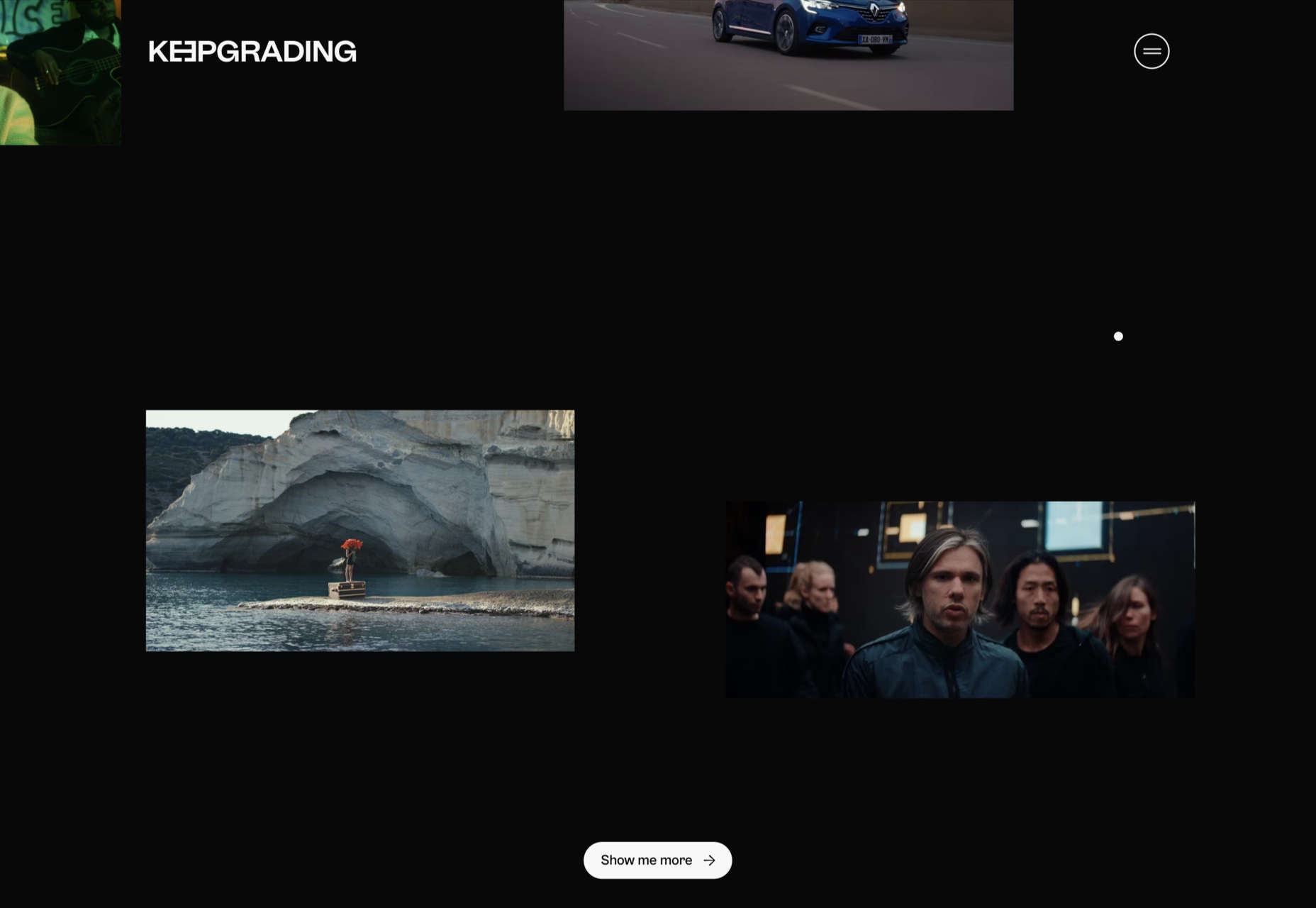
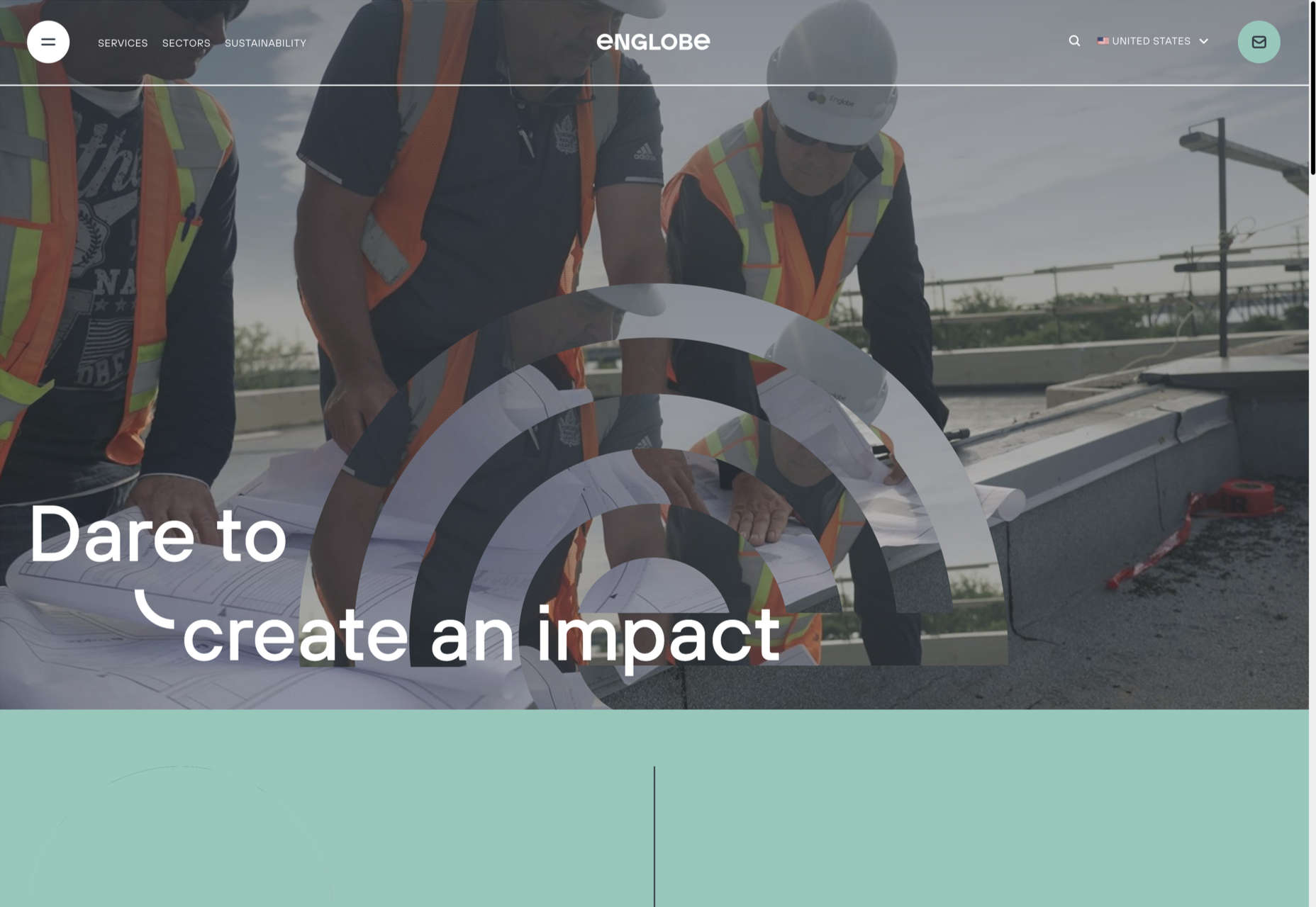
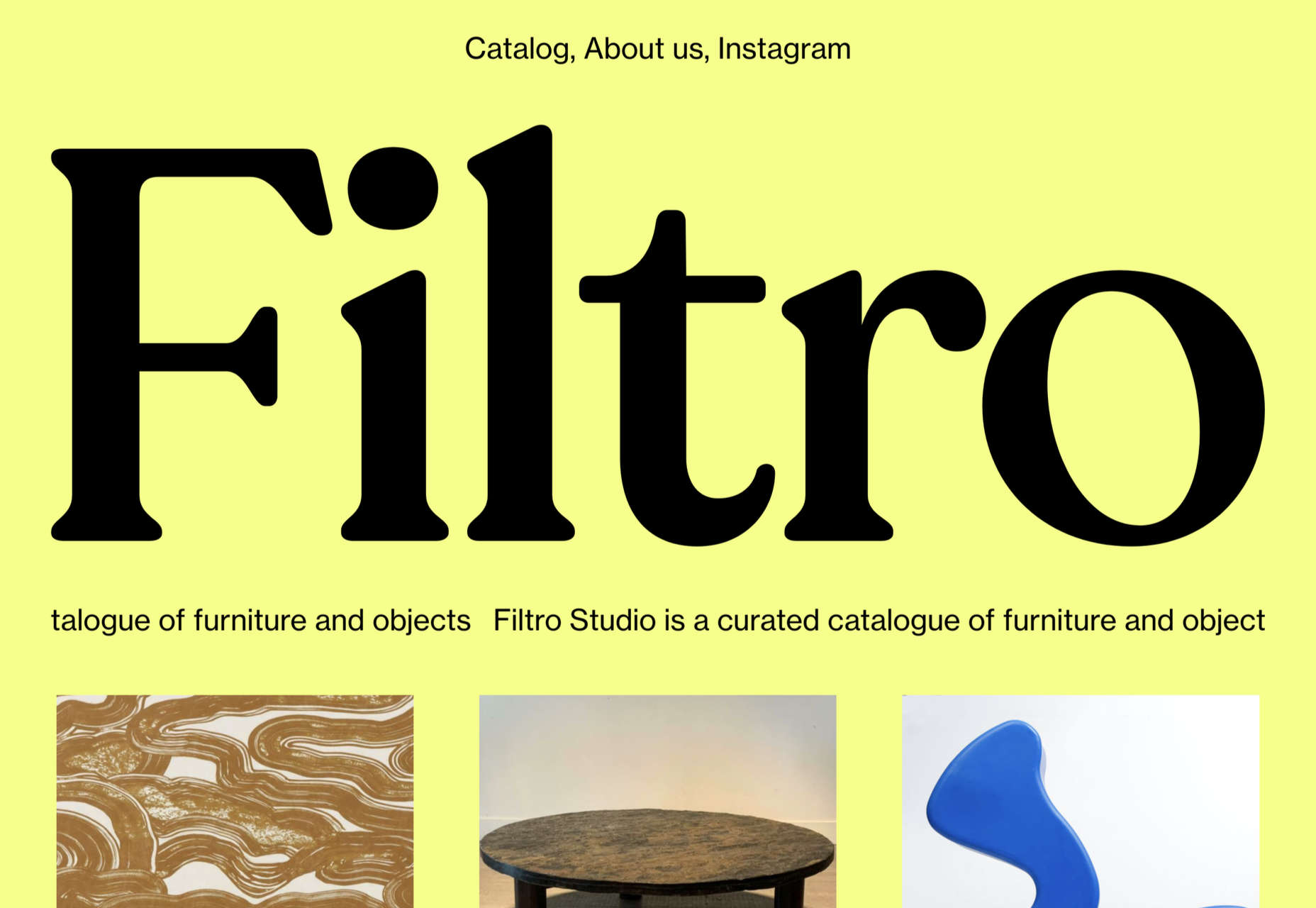
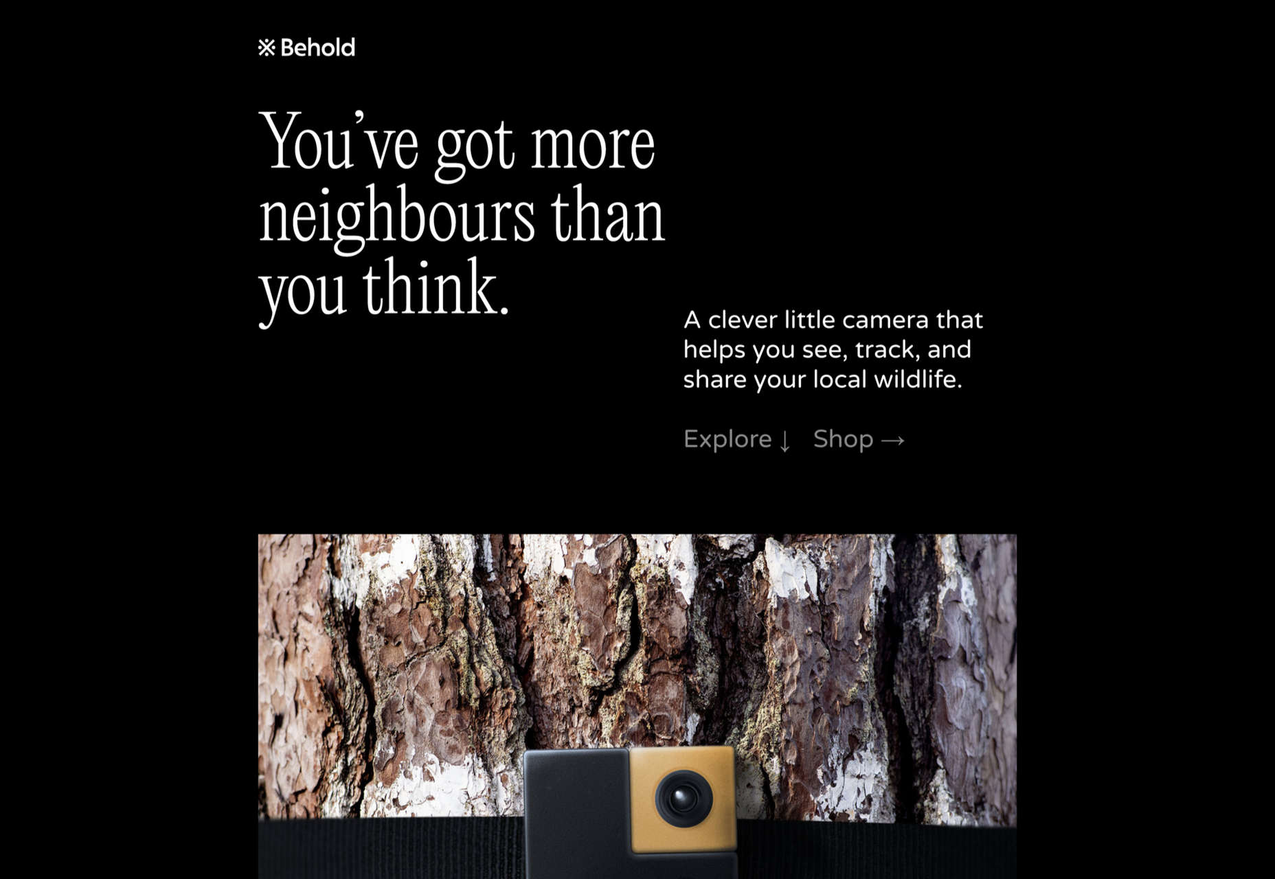
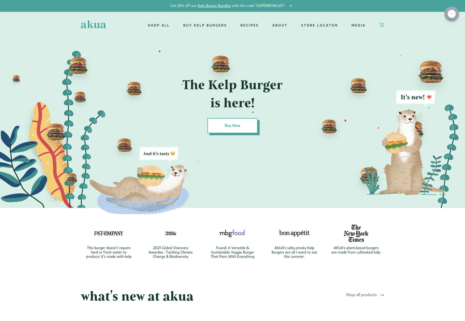
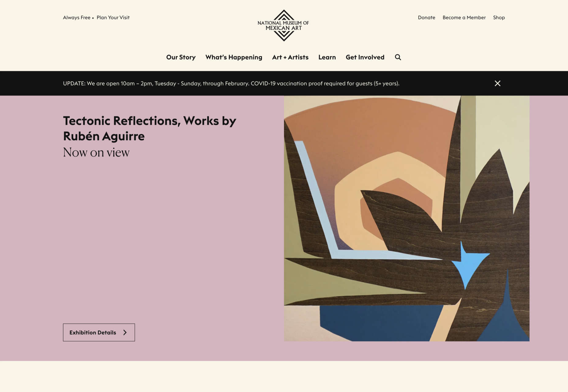
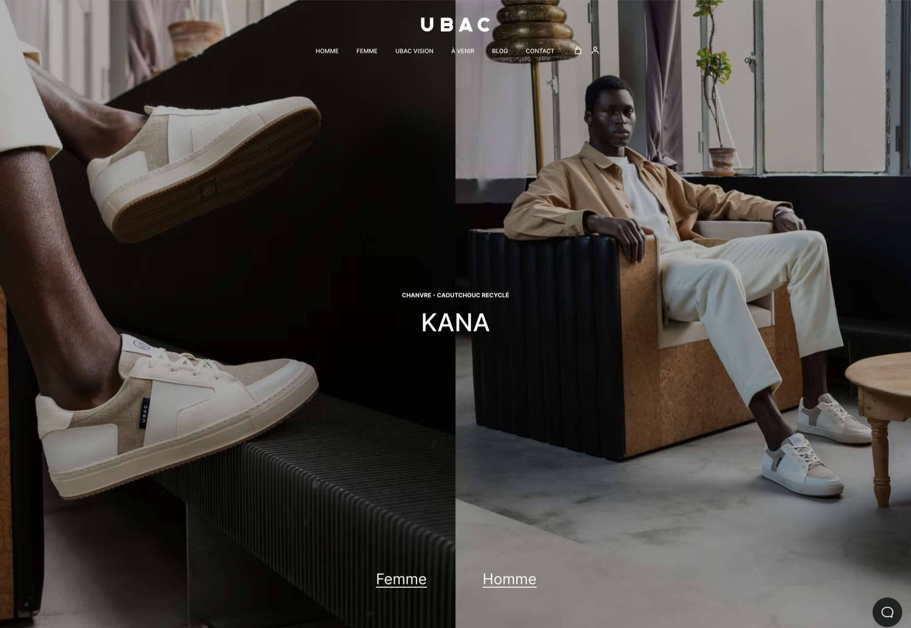
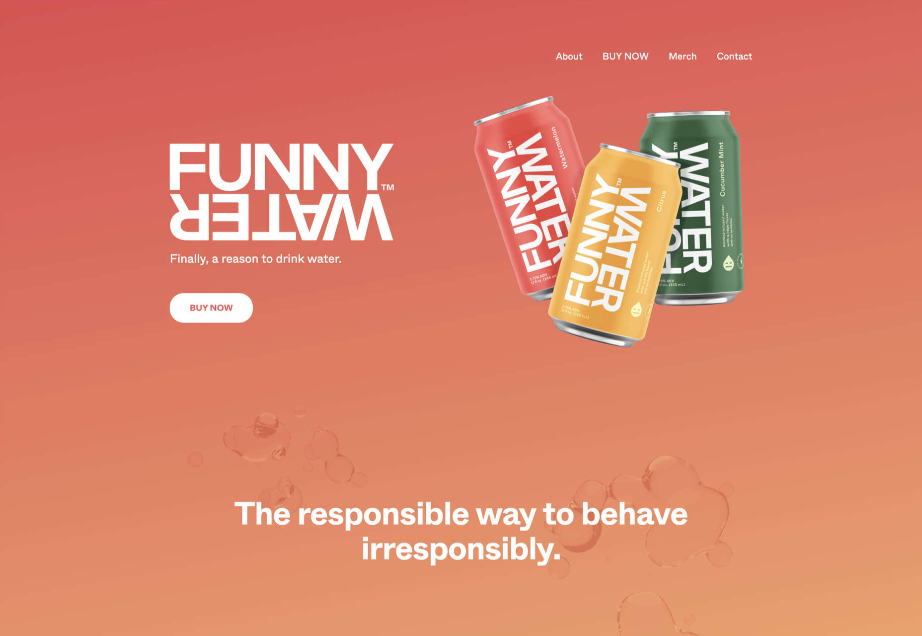
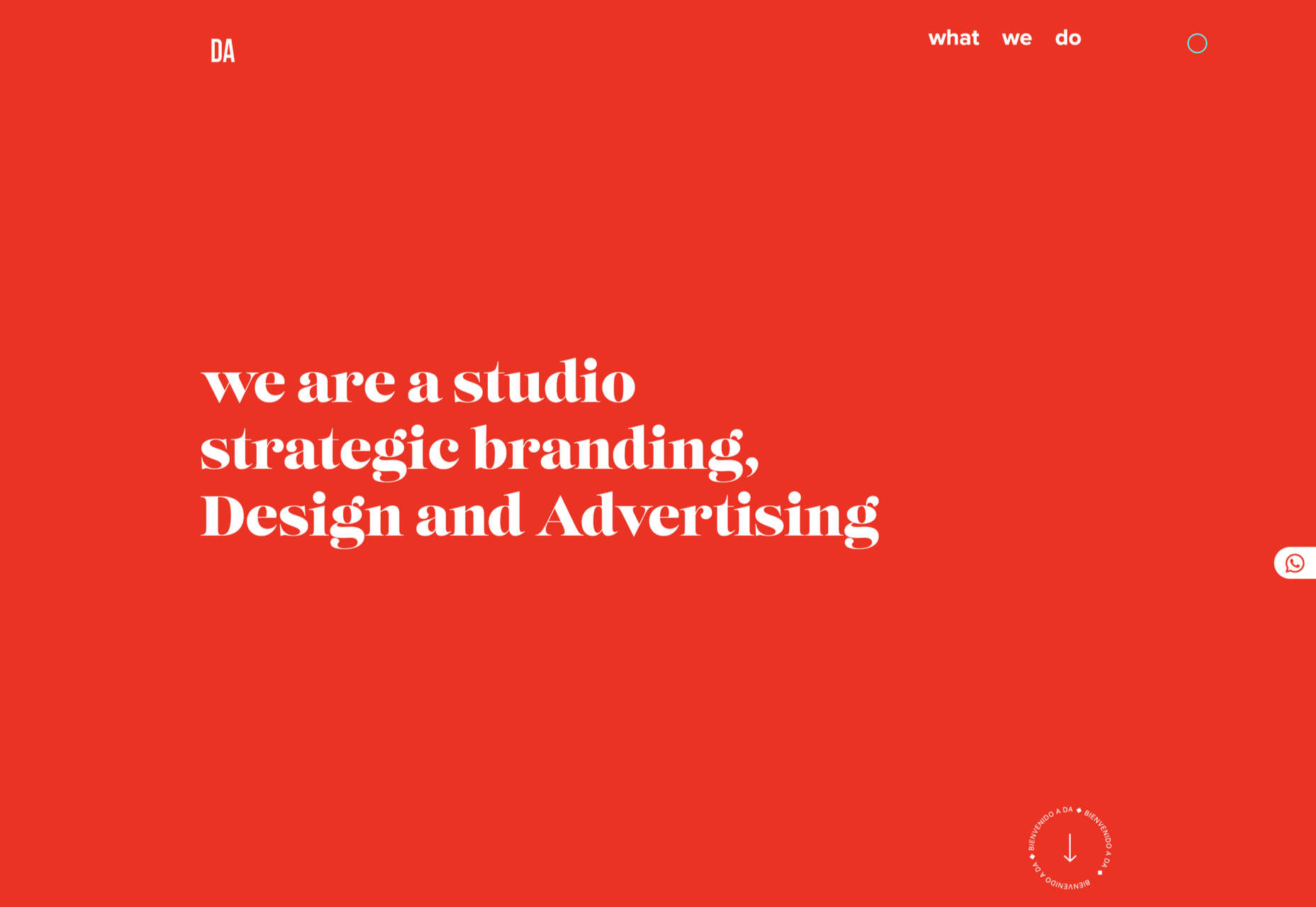
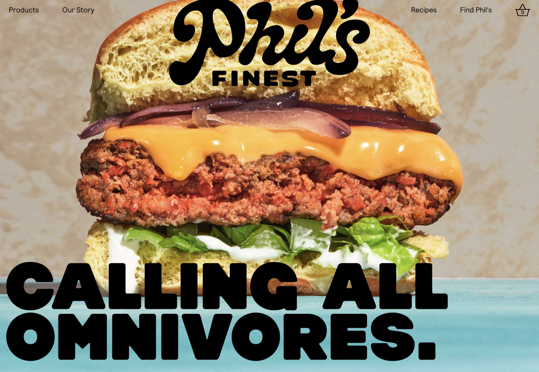
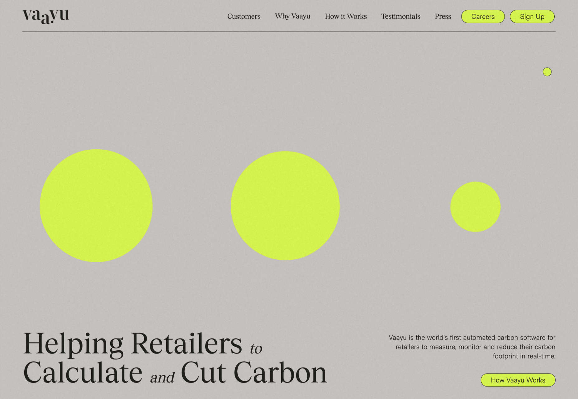
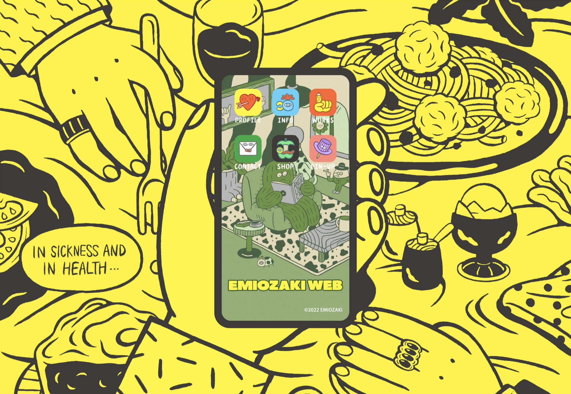
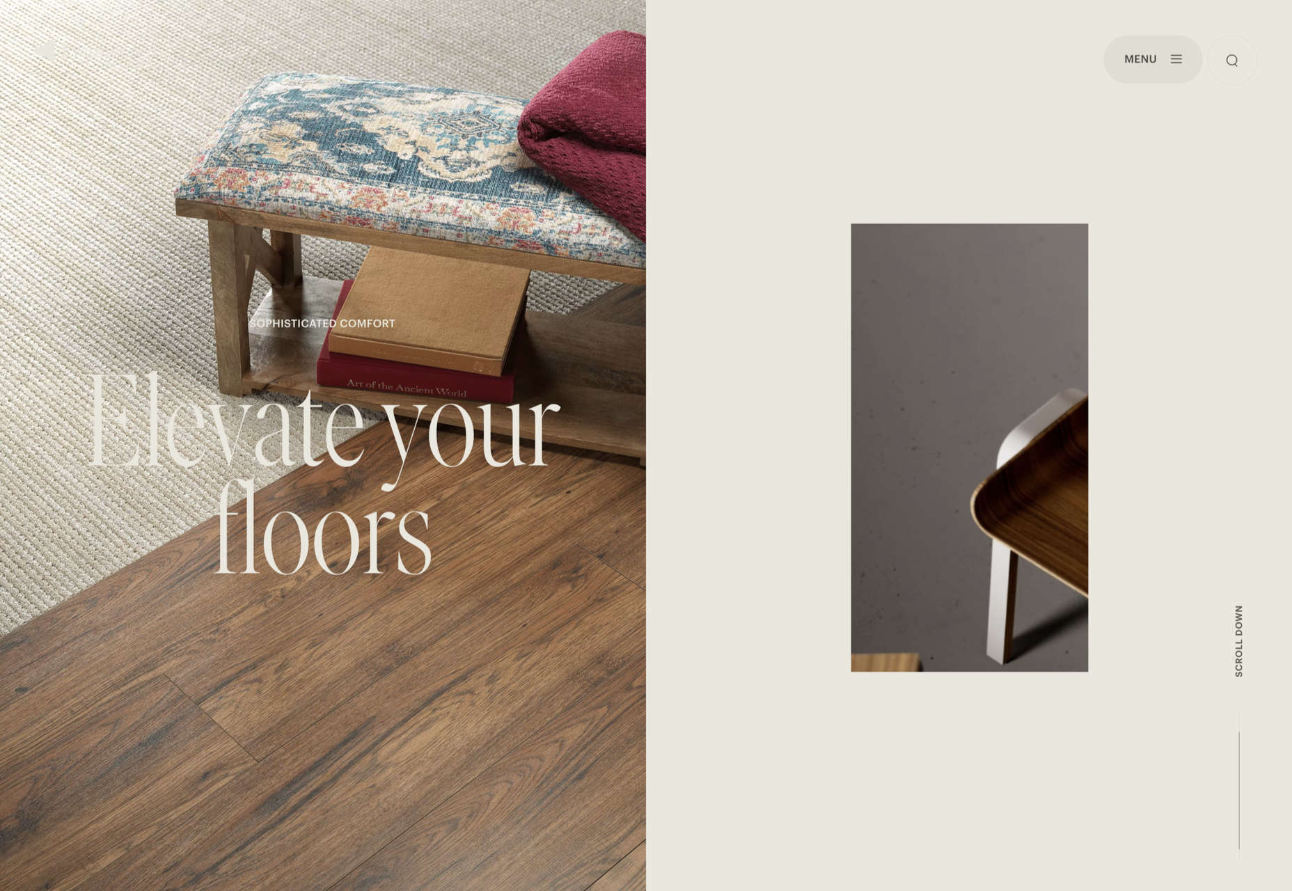
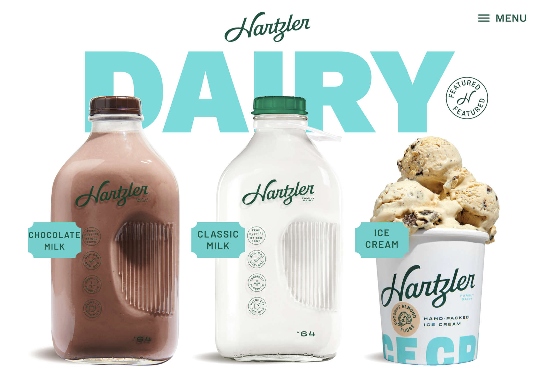
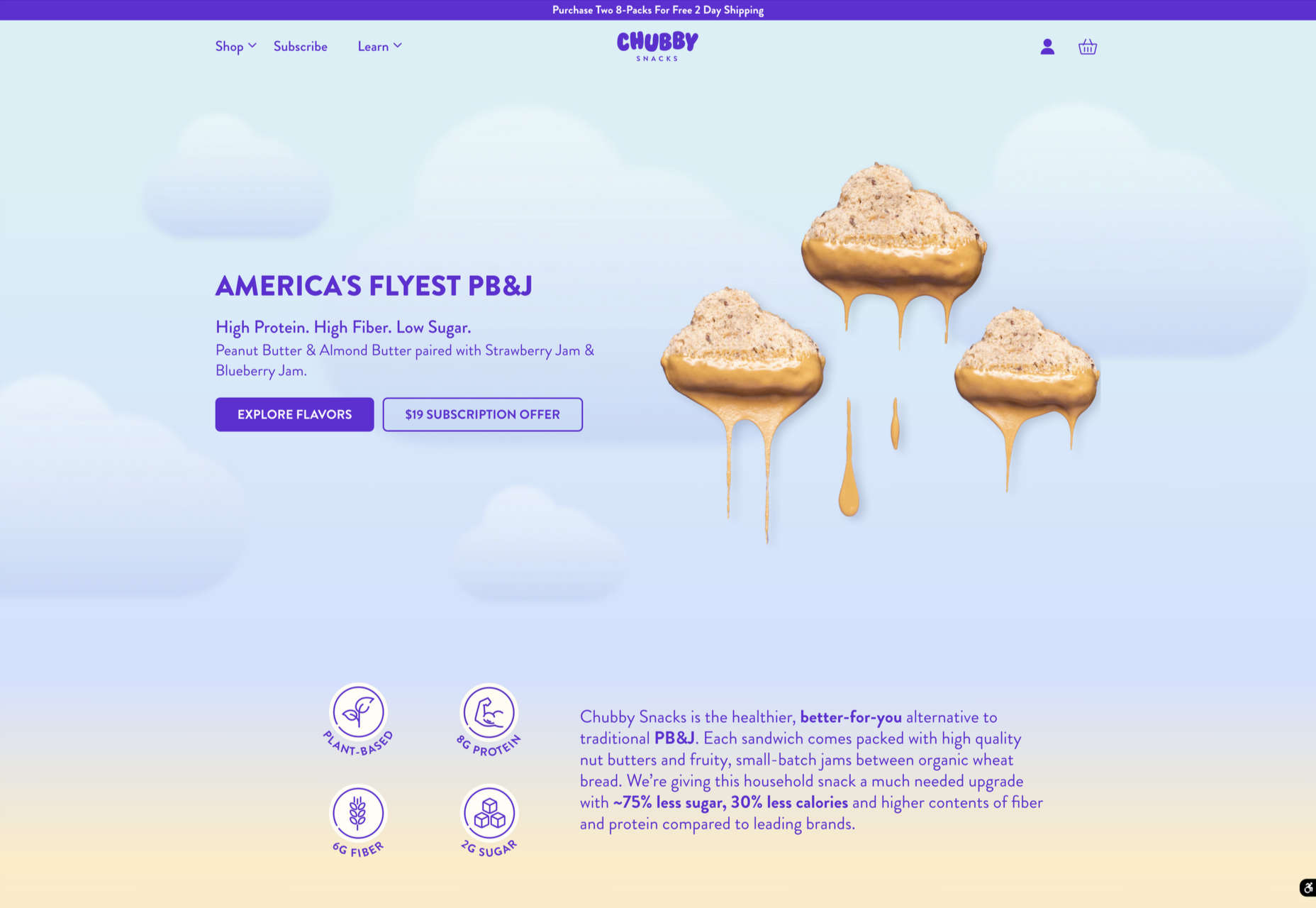
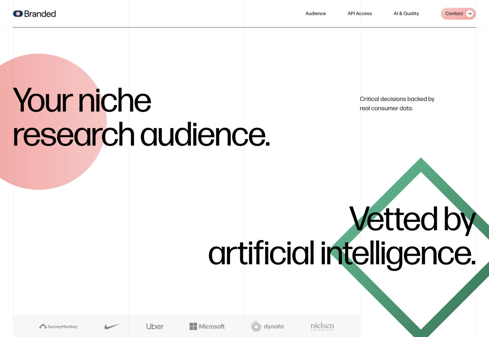
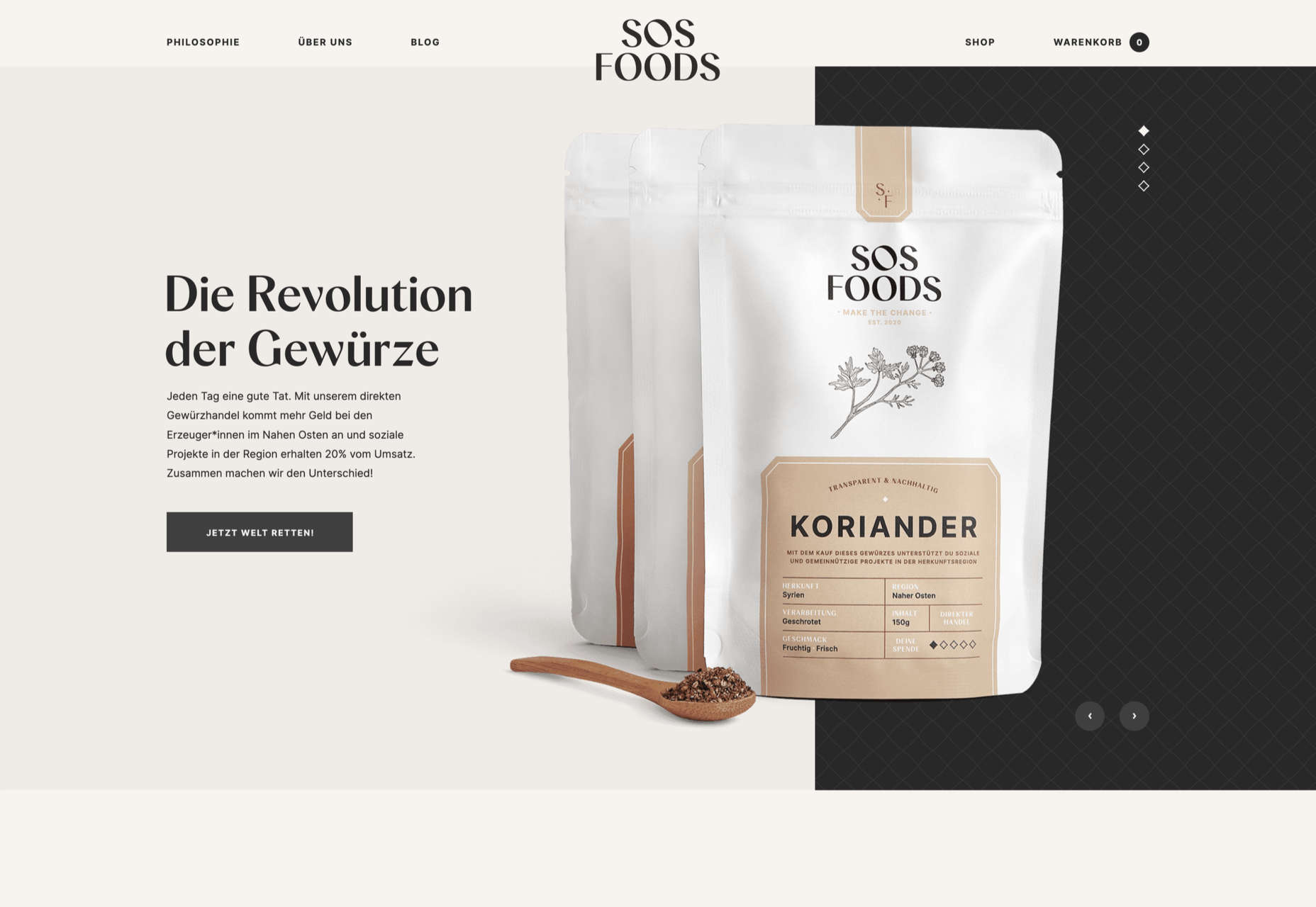
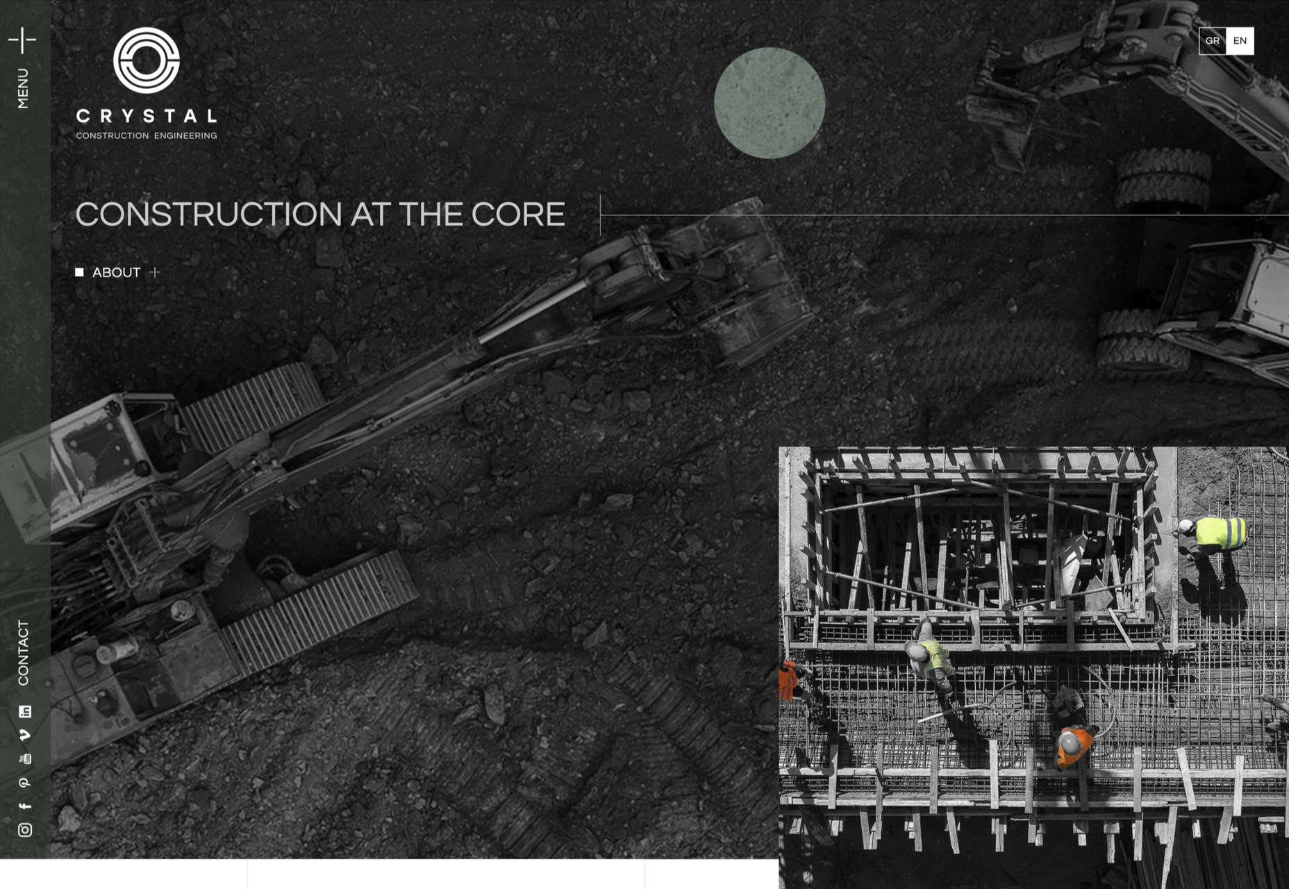
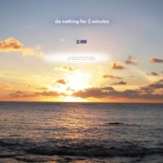
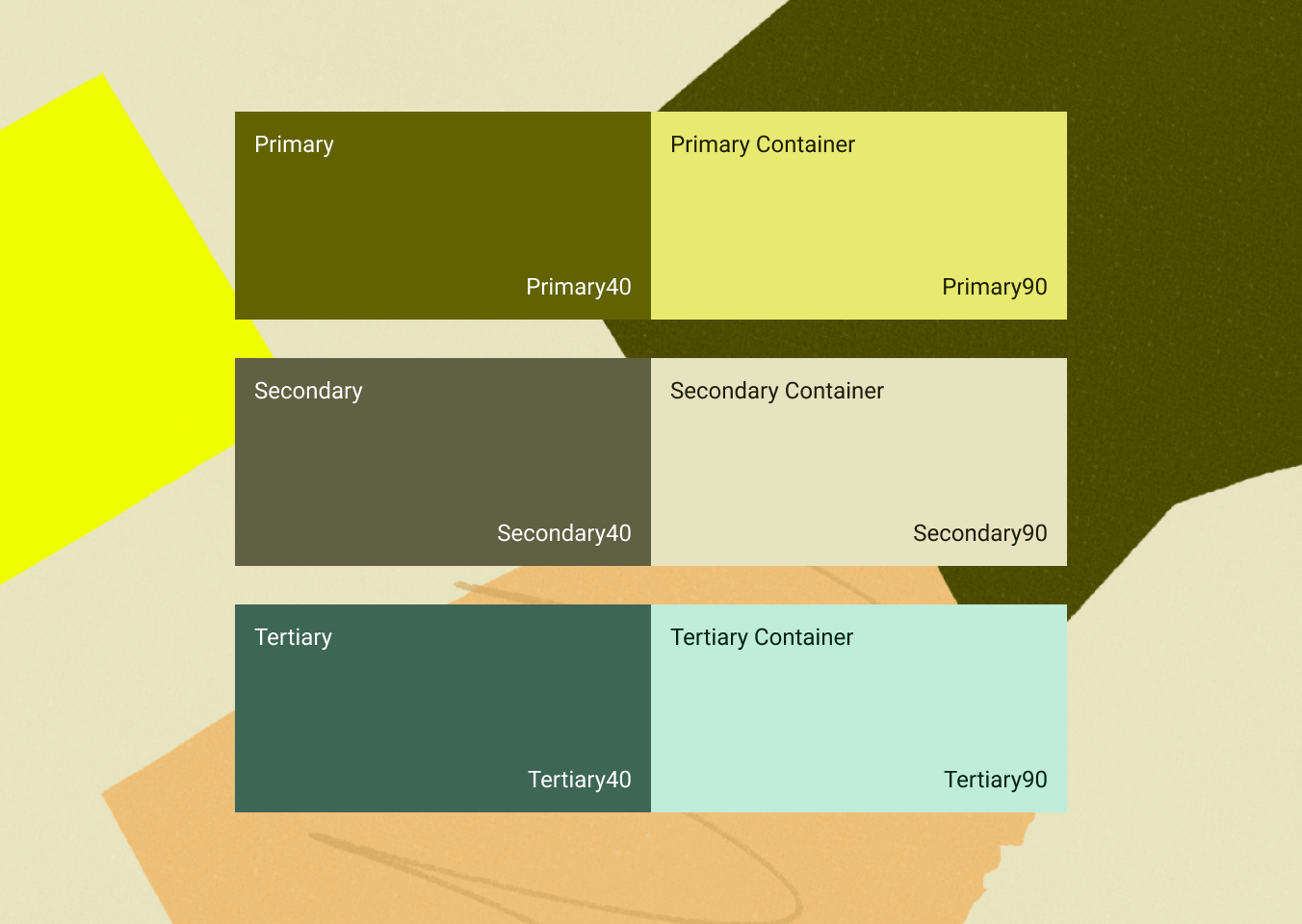
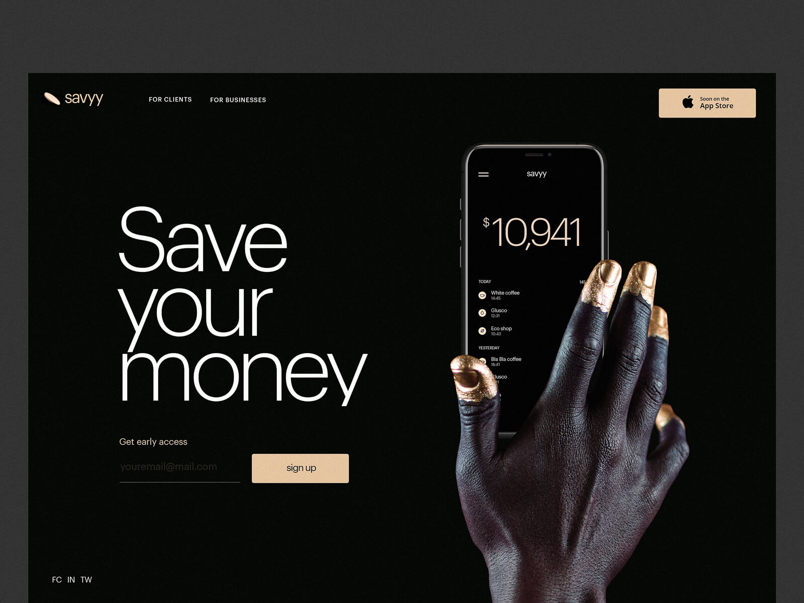
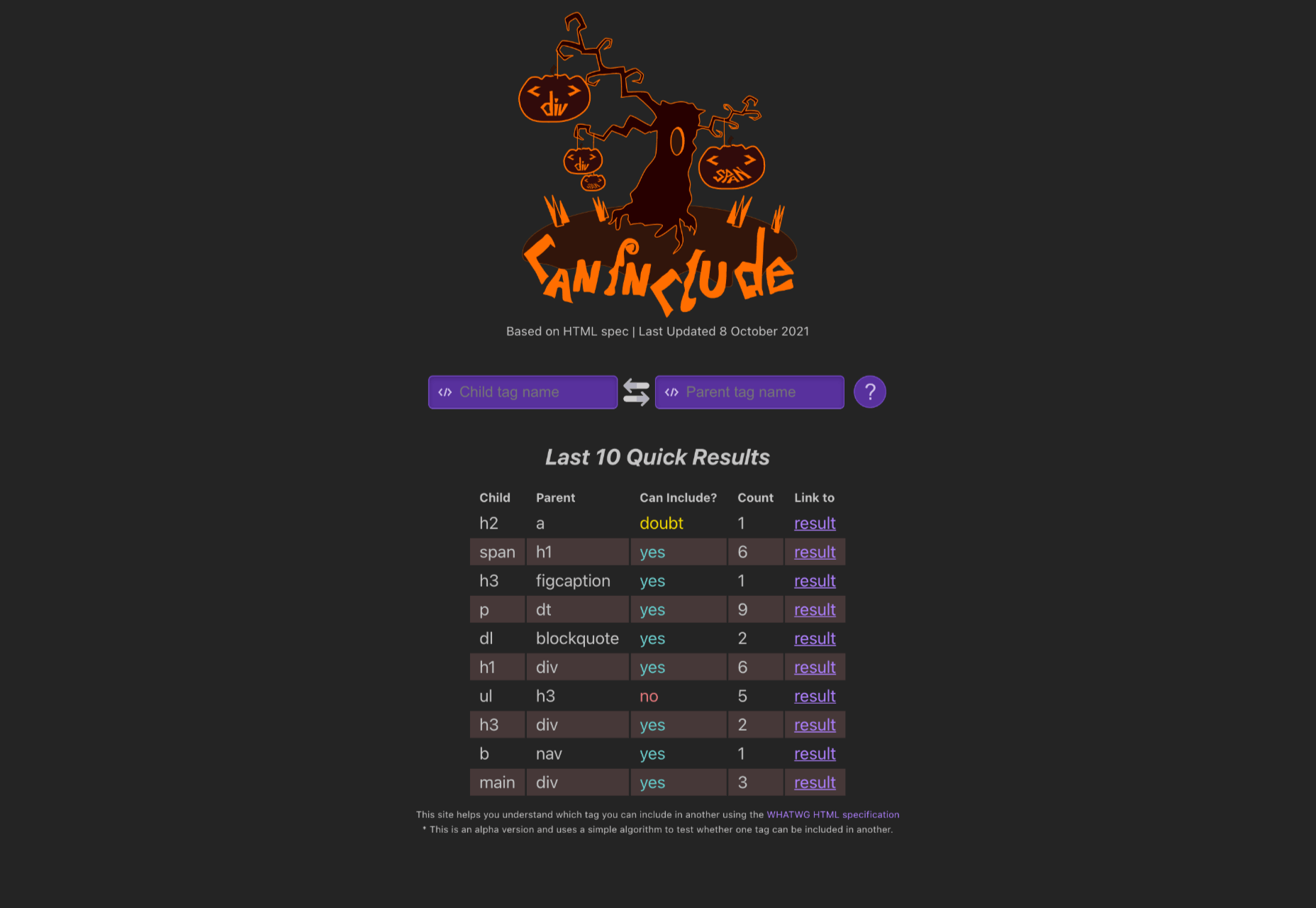
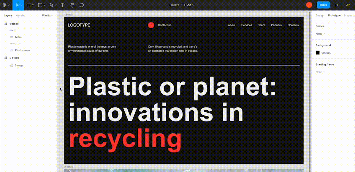
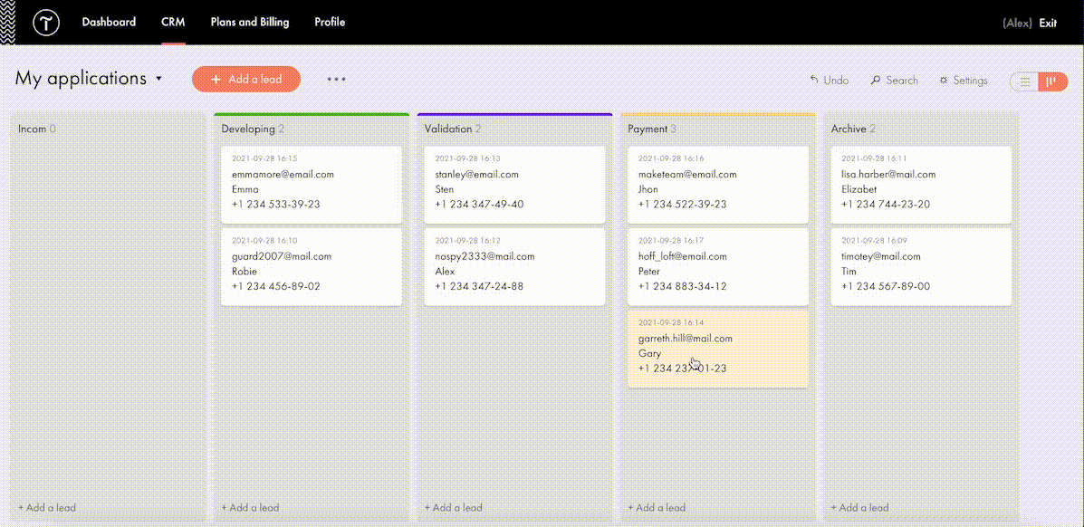
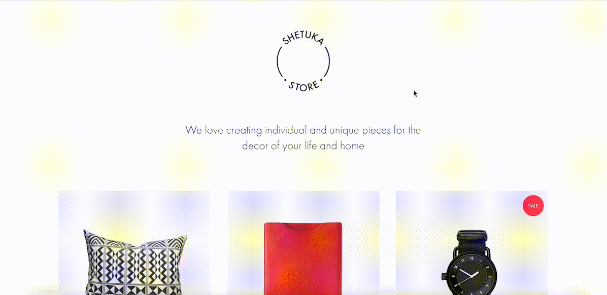
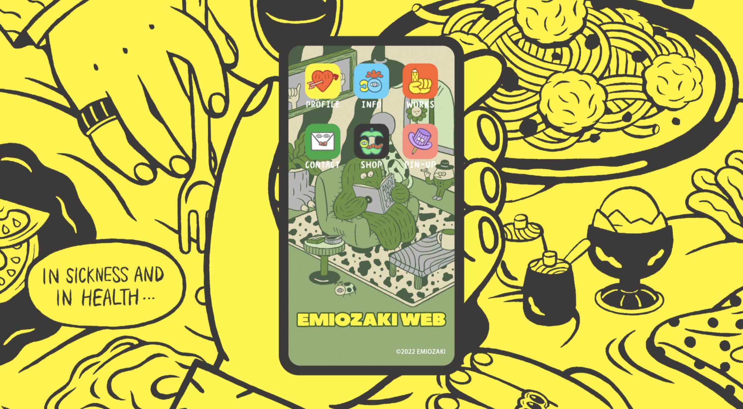
Welcome to the latest edition of our top 20 sites of the month. In this February’s collection, the overall feel is lighthearted and optimistic, as we are seeing the positivity of a new year persisting across the web.

There is a continued inclination towards warmth and personableness and away from a more corporate, impersonal feel. We see this most in the color palettes used and in the use of illustrations as accents to add character and charm. Of course, as always, type plays a big part too. Enjoy!

Woset

Woset has a simple aesthetic and features a charming illustration style on this site for its creative toys. The interactive ‘play’ section is a nice touch.

Graza

This site for Graza olive oil has a fun feel, with comic style illustration and bright splashes of color while making a serious sales pitch.

KeepGrading 

KeepGrading is a post-production color studio. Their portfolio site showcases a lot of work but keeps it well organized and pleasing to navigate.

Englobe

By using soft colors and slightly rounded type, Englobe has managed to portray a warm, friendly, and human aspect with this website, despite being a huge company.

Filtro

Filtro’s design is about as basic as it gets, and yet it has a certain charm to it.

Behold

Behold is a wildlife camera that is currently in development. This landing page does an excellent job of creating interest with just enough information.

Akua

Some rather sweet illustration work creates a good balance with technical information on this site for Akua kelp burgers.

National Museum of Mexican Art

A color scheme of warm, earthy tones and a carefully thought-out type pairing create an inviting presence for the National Museum of Mexican Art.

Ubac

This site for Ubac trainers feels clean and modern with some nice and mostly functional, scroll-activated animation.

Funny Water

The background gradient is really nicely done on Funny Water’s otherwise very minimal site.

DA

DA is a strategic branding, design, and advertising studio, and this site is a good, polished example of a site for such an agency. What stands out is the clever menu text.

Phil’s Finest

Phil’s Finest makes good use of color, oversized type, and occasional illustration mixed in among the well-styled photography.

Vaayu 

Grey and black are enlivened by neon yellow in Vaayu’s minimalist, single-page presentation.

Emi Ozaki

Artist and illustrator Emi Ozaki has created a stylized phone interface for her portfolio site, which showcases her illustration aesthetic.

Engineered Floors 

The home page scrolling is the centerpiece of Engineered Floors’ site, and it works especially well on mobile.

Hartzler Dairy

Hartzler Dairy goes for a nostalgic feel to match the company’s classic mid-20th century style branding.

Chubby Snacks

Chubby Snacks is PB&J in your pocket; it sells itself! Having said that, the site is pretty appealing in its own right.

Branded

Market research company Branded goes down the flat design road for this site, which could feel a little dated but actually works quite nicely here.

SOS Foods 

SOS Foods is an excellent example of a responsible/sustainable goods site, with a design aesthetic aimed at the ethical consumer.

Crystal Construction Engineering

Some nice use of masonry-style layout and overlapping elements create space, but also a pleasing flow in this site for Crystal Construction Engineering.

Source

The post 20 Best New Websites, February 2022 first appeared on Webdesigner Depot.

Source de l’article sur Webdesignerdepot

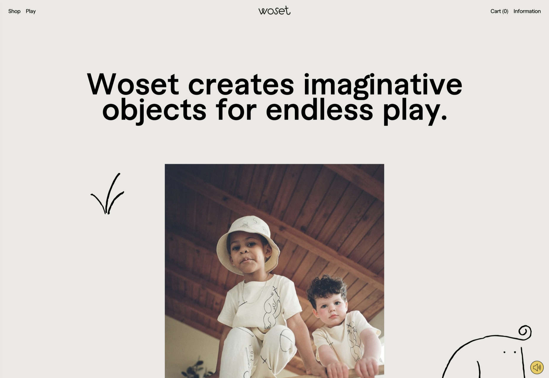
There are a lot of factors that contribute to a better user experience on a website. Pages need to load quickly to give users peace of mind and efficiency. Navigation must be clear and straightforward, with direct pathways for visitors to follow when finding your contact pages, blog posts, and products. Your colors need to work seamlessly together while providing just enough contrast in the areas that need it most.

Excellent user experience needs to be considered for every part of your website that acts as a touchpoint with a potential customer or user.

One of the most significant touchpoints of all is your forms.

All websites need some form of interactive content to thrive. Users need to be able to do something with the site, whether it’s looking for information with a search bar, contacting a team for a quote, making a booking, or completing a purchase. Forms power the majority of the interactive activities available on websites.

If you know how to master great UX on a form, you can contribute to more meaningful interactions between your brands and their customers. But not all web forms are the same. Here are some of the top types of forms you need to master and how you can optimize them.

The “Opt-In” Form

The Opt-in Form is probably the best-known form in the digital landscape. It’s essentially a form that asks visitors to “opt-in” to a specific offer. Sometimes, this means signing up for a webinar; other times, it’ll be agreeing to an email newsletter or a regular series of blog updates.

Opt-in forms grab attention quickly and ask for something specific from the audience. For instance, this example from HuffPost encourages visitors to “Subscribe to the Morning Email.”

Opt-in forms are all about generating action.

Sometimes, they’re placed at the bottom of a landing page after a company has had a chance to explain precisely what they’re offering. Other times, you’ll find the opt-in form situated on a sidebar of a website, constantly enticing people to “sign up” if they like what they see on a blog post or article.

It’s also common for opt-in forms to appear as pop-ups and exit pop-ups on modern websites. For example, a brightly colored opt-in form that promises an immediate benefit to a customer could encourage them to hand over their details before they abandon your website.

How to Design a Great Opt-In Form

So what kind of best practices go into an excellent opt-in form?

  • Start with simplicity: If you’re asking your visitors to do something, don’t overwhelm them with too big of a request straight away. Keep the form short and simple, so it doesn’t seem like too much extra work for the visitor. Something like “Subscribe to our newsletter” should ask for nothing more than an email. 
  • Highlight the benefits: Most customers won’t want to give you a place in their inbox or the opportunity to interact with them further unless you can offer something in return. Even if you’re asking for something small, like an email address, let the customer know what’s in it for them. In the HuffPost example above, the company highlights that you can wake up to the day’s “most important news.” 
  • Give the visitor the power: Let your visitor know they’re in control here. They want to see that they’re getting exactly what they need from you in exchange for their contact details. This means reassuring them that their email address won’t be used for spam, like H&B Sensors does here: 

The Contact Form 

The Contact Form is another crucial part of building an effective UX for your website – but it’s also an element that web designers and business owners often overlook. When customers decide they want to learn more about a business, they need a quick and easy way to get in touch.

Contact forms need to be easy to find and use on any website. Usually, your user will expect to see a link to the contact form situated somewhere at the bottom of your webpage. It might be called “Contact Us” or “Customer Support.” Avoid anything that would go over the user’s head.

Aside from being easy to track down, your contact form also needs to reassure an audience that they’re making the right decision by getting in touch. Therefore, the content needs to be short, sweet, and authoritative—highlight why the user might contact your company and how they can do so.

Avoid any unnecessary information in the contact form. For example, you don’t need to know your client’s age and their job to answer a question about where their nearest physical branch is. Keep form fields to the point, or you’ll chase customers away.

How to Design a Great Contact Form

Design something personalized but straightforward to make the most of your contact form. Use features like smart content and conditional logic, if possible, to adapt the page to the user’s needs. Dynamic content is becoming increasingly valuable these days. Other best practices include:

  • Set the right expectations: Let your customers know how active you are and how quickly they can expect to hear back from you. Imagery and the right fonts can also set expectations about the kind of communication your audience can expect. For example, this contact page from the Marvel app is fun and playful, like the company itself:

  • Provide multiple options: If your customer doesn’t want to use your contact form, give them another way to get in touch. Ensure the contact page includes information like where to find you on social media and your professional phone number. 
  • Simplify things on your end: To ensure that you can contact your audience as quickly as possible, allow your customers to choose a specific subject that their query is connected to. Allowing them to choose “Sales” or “Order issues” means you can automatically direct the message to the right team member on the back-end. 

The Online Payment Form 

Sometimes, when your customers have seen what you have to offer and they’ve checked out the competition, they decide to go ahead with their purchase. To facilitate this, you’re going to need an online payment form. Online forms ensure that your customers can safely enter their credit or debit card details to purchase whatever you have to offer.

Most payment processing companies like PayPal, Square, and Stripe come with payment forms included, so you can easily embed them into a website in minutes. However, there’s always the option to customize those payment forms.

For instance, ideally, you’ll need a payment form that keeps your customer on the same page, so they don’t have to log into another browser to make their purchase. The fewer transitions your client has to make, the safer they’ll feel.

How to Design a Great Payment Form

When designing any payment form, simplicity and security are the two most important factors. Your customer should be able to enter their information quickly and easily and get through the transaction process without worrying about their details.

Remember to:

  • Keep it simple: The fewer fields the visitor has to fill out, the better. Customers still feel uncomfortable sharing personal information and payment details online. Make the experience as painless as possible. If your client already has an account with your business, you might create a system that automatically fills some of the fields, such as their email address, name, and billing address. 
  • Offer the right integrations: The proper payment forms will integrate with the payment services your customers prefer to use. Options include PayPal, Stripe, Square, Verified by Visa, and Mastercard. Get a developer to integrate the right APIs with your form to give your customers the broadest range of options. 
  • Ensure security: Give customers peace of mind by providing as much security evidence as possible. An SSL certificate that places the padlock on the top of the browser next to the URL is a great way to make customers feel more secure. Integrating verification options so your customers can avoid fraud issues is another significant step. Sometimes just putting logos from the card types you accept on the page will make a customer feel more secure. 

Support Forms

Some companies bundle the contact form and the support form together. Others have a separate support form to get their queries routed directly to the people most capable of helping them. If you want to take the second route, it might be a good idea to design a “help” section on your website where you can locate the support form.

The “Help” section on a site often appears alongside other links on the footer. For instance, it could appear alongside “About” links and “Contact” options. Here’s an example of Hubspot’s Customer Support options:

The best customer support pages come with various ways for clients to help themselves and find answers to their most pressing questions. For example, you might have a search bar where your audience can search for the answers to their queries or a knowledge base full of helpful blogs.

Hubspot allows users to choose between a blog, knowledge base, academy training center, community forum, developer discussion board, and assistance from a certified partner.

How to Design a Great Customer Support Form

Designing a good customer support form is about getting your audience the information they need as quickly as possible. Once again, you’ll need to stick to as few form fields as possible here to avoid angering an already frustrated customer. Also, remember to:

  • Ask for the right information: Find out what the query is about by giving the customer a drop-box menu full of possible topics to choose from. If you need a product reference number or something similar, ask for that at the top of the form, then allow the customer to provide extra information about their query underneath. 
  • Set expectations: Let your customers know when they can expect to get a response to their concerns and provide them with advice on what to do next. For instance, you could invite them to check out your knowledge base while they wait for a response. 
  • Keep it simple: Avoid using technical jargon on your support request forms. Be direct in your requests for summaries of the issue at hand, contact information, and other supplemental data. 

Customer Feedback Forms

According to Microsoft, around 96% of customers say that customer service is crucial in determining their loyalty to a specific brand. Another 52% of global customers believe that companies need to respond to the feedback provided by customers.

To ensure your customer service strategies are on-par with what your customers expect, you need to get feedback from your audience. That’s where a feedback form comes in. Customer feedback forms often appear after a client has finished purchasing on the “thank you” screen. They may also occur after a customer has completed a service interaction online.

Here’s an example of an Apple feedback form:

How to Design a Great Customer Feedback Form

By leaving you feedback, your customer is doing you a massive favor. They’re giving you a chance to learn from your mistakes and improve the service you can give next time around. Feedback is one of the best tools for any business that wants to grow and thrive.

If you want your customers to use your feedback forms, you’ll need to make them as simple as possible. Your customers don’t have time to waste on a complex form.

  • Don’t make any fields mandatory: Don’t stop your customers from submitting a form unless they’ve completed every field. Allow them to enter the information they consider to be the most important, and that’s it. You can even fill some of the form out for your customer, if possible, by entering their name and email address if they’re already a member of your site.
  • Make it mobile responsive: Remember there are around 3.5 billion smartphone users worldwide. You can’t afford to lose feedback because your form isn’t responsive. Every form should look and feel incredible on any device. 
  • Include a rating option: If your customers don’t have much to say about your service, or they’re not wordsmiths, they might prefer a rating option instead. A one-to-five rating system that allows your customer to judge your product or service on a scale of poor to wonderful is a great way to gain quick information. Check out the Uber Engineering example here:

Though you can pre-enter some information on a feedback form to make your customer’s life easier, don’t overstep your bounds. Adding your customer’s email address to the form is fine if they’re already a customer with you. Pre-selecting the “very satisfied” rating above would look presumptuous.

Top Tips to Improve Every Form Design

The online form is an essential part of any web design project, but it’s also frequently overlooked. Unfortunately, without a good set of forms, your customers will struggle to interact with your company in a meaningful way.

When creating any form, remember:

  • Reduce friction: Reduce the friction for your customers by asking as few questions as possible. The less your customer has to answer, the better. If you can pre-populate forms with information like your customer’s name and email address, this could help. 
  • Keep it simple: Make sure that the form is clean and easy to use. Your customers shouldn’t be confused about where to click or how to submit their information. A single-column design is often better than a multi-column option.
  • Be clear in error messages: Don’t just tell your visitors that something has gone wrong. Let them know what they need to do to submit the form successfully. If possible, use inline validation with real-time feedback to let your audience know that you recognize the information they’ve submitted.
  • Keep data secure: Make sure your audience feels safe by letting them know how you will use this information and why you’re asking for it. If you’re asking for an email address, make the benefits of entering that information clear. 
  • Make fields optional: Allow your audience to add more information to a form if they want to – but don’t demand it. Give some freedom to the visitor. 

The better your forms are, the more effective your interactions with customers will be. Remember, it’s not just the face-to-face interactions that your customers judge when making decisions about your business and whether to trust you. Today’s digital world has prompted a new demand for more meaningful virtual experiences.

Your form could be the first interaction you have with a client, whether it’s a contact form, a booking form, or something else entirely. Get that right, and you can improve your chances of your customers coming back to interact with you again later.


Featured image via Pexels.

Source

The post The Top 5 Form Types to Use in Your Web Design  first appeared on Webdesigner Depot.

Source de l’article sur Webdesignerdepot

According to Klipfolio research, users spend on average 52 seconds on a webpage. With minimal time to impress, you must consider how to best help your consumers understand what your product or service does and why they should care about it. It’s not enough to describe your value – great landing pages will go the extra step and show this as well.

One powerful method to do this is by providing a real-life, responsive teaser to show what your product looks like, how it works, and what value it can create. This means incorporating specific elements from your functional, responsive product into the landing page. However, this should be a “mini-product experience” that users can experiment with rather than a freemium version of your product. If done well, the dynamics will pay off in captivating users for longer, increasing their consideration time, and driving your conversion rate as a result.

Building more dynamic landing pages through product experience can change the game completely. These are some strategies to consider.

“Ask & Alter” for Greater Personalization

“Ask & alter” is valuable for services with multiple potential value propositions for different audiences. The simple fix here is to have a pop-up box that asks the visitor which profile they are (and alternatively a few more questions). You can then trigger the page to alter according to their input, ensuring a more customized experience and increasing their chance of conversion. By doing this, you’re taking the onus off the consumer to figure out what’s relevant to them, eliminating any potential confusion.

A great example of this is the Penn Foster University website. It has a developed UX optimized for organizations, high school degree seekers, and upskillers alike. Each has an entirely different, carefully designed interface, matching the diverse needs of visitors. For example, while a high schooler might enjoy browsing the career pathways section, an upskiller is likely to search specific career fields. Such distinction is key to consider, as intentional and strategic user experience can raise conversion rates by as much as 400%.

Real-Time Demos to Hook the User

Real-time demos mean that you take a full instance or version of your product that is clickable and responsive and embed it into the flow of your landing page. This way, the user can get a quick “test drive,” and you easily communicate the value that would otherwise be abstract or difficult for the user to imagine or even visualize. Additionally, users always want to know how a product could personally impact them, and live demos offer them a hands-on experience.

Companies incorporating live demos have proven the power to engage a user’s curiosity and create a strong link with their products or services. Notion, for instance, uses a “templates” section with pre-built pages that can be easily opened and browsed through without needing to register or download anything. This product’s beauty lies in the simplicity and efficiency it offers, rather than overwhelming a user with a self-promotional copy. Even a simple live demo like that can help build considerable trust in the product and encourage users to make a high-value purchase.

Calculators Provide Value

Despite their simplicity, calculators can increase audience engagement by 38%. Their main benefit is undoubtedly providing a personalized solution to users’ actual needs and expectations. ROI and savings calculators can be particularly interesting, especially when they speak of value that isn’t easy to calculate or when the user wouldn’t intuitively know that there are savings to be had by using a particular product.

Butter Payment, uses this tool very effectively. As its customers necessarily don’t know they have an involuntary churn problem that is worth solving for, it uses a calculator on its site to demonstrate the problem and enumerate the value-add to potential customers.

HubSpot, too, has mastered the tool: Its Ad ROI Calculator visually presents the results that its software can bring. Then, HubSpot’s interactive website grader directs the user towards its comprehensive marketing offerings. It is this graphic visualization that companies must adopt to communicate real value.

The Charm of Experiential Interaction

Interactive design is said to drive the responsiveness and real-time interaction of a site through the roof. By incorporating an interactive or experiential page, even if it’s not directly on your landing page, you can craft a unique experience aimed at leaving a lasting, meaningful impression of your product or service.

Calm’s “Do Nothing for two minutes” is a simple yet effective way to show users the value of meditation in their daily life and lead them to download the app.

But it works great for consumer products, too: Nike’s Digital Foot Measurement tool is another excellent feature, allowing users to “try shoes on” with their cameras and scan their feet for the right measurement through AR.

Videos are Attention Magnets

Considering that viewers absorb some 95% of the message while watching videos, compared to only 10% when reading text, there’s no reason why you should avoid incorporating videos into your landing pages. Beyond that, videos can be incredibly straightforward: Insert a graphic illustration or real imagery to explain the product, show the step-by-step process, and convey value with raw, unfiltered footage.

Calendly, for example, has various videos on its landing page, including a 56-second, upbeat, colorful clip showing how simple it is to get started with the product.

Guiding GIFs to Visualize Product Features

As small animations, GIFs represent the perfect middle ground between images and videos. They allow you to show users the value your product adds, providing an engaging glimpse into the actual interface. The small scope of GIFs is both a limitation and a benefit: You can only show a particular feature of your product but can also focus on triggering an exact user emotion.

Grammarly, a grammar correction tool, relies on GIFs to give users a taste of their UX. With a quick overview of the product’s functionality across popular platforms, including email and social media, users can see exactly how the product can make their everyday lives easier. And by incorporating GIFs into the right side of the landing page, the scrolling experience of the user isn’t disrupted.

Interactive product experiences can both entertain and tackle pain points, adding dynamics to an otherwise static page. Particularly when customizing based on user attributes, the key benefit of these features is that the users engaging with them are likely the same people interested in the paid product. To ensure that the product experience doesn’t directly compete with the primary offering, clearly differentiate it and guide the user towards a direct call to action.

Source

The post The Case for Building More Dynamic Landing Pages first appeared on Webdesigner Depot.

Source de l’article sur Webdesignerdepot

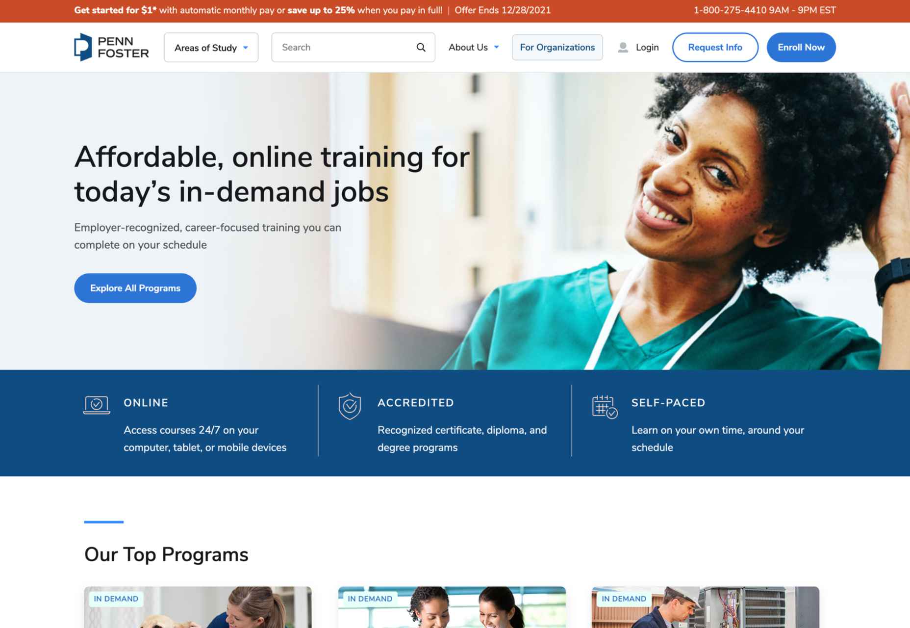
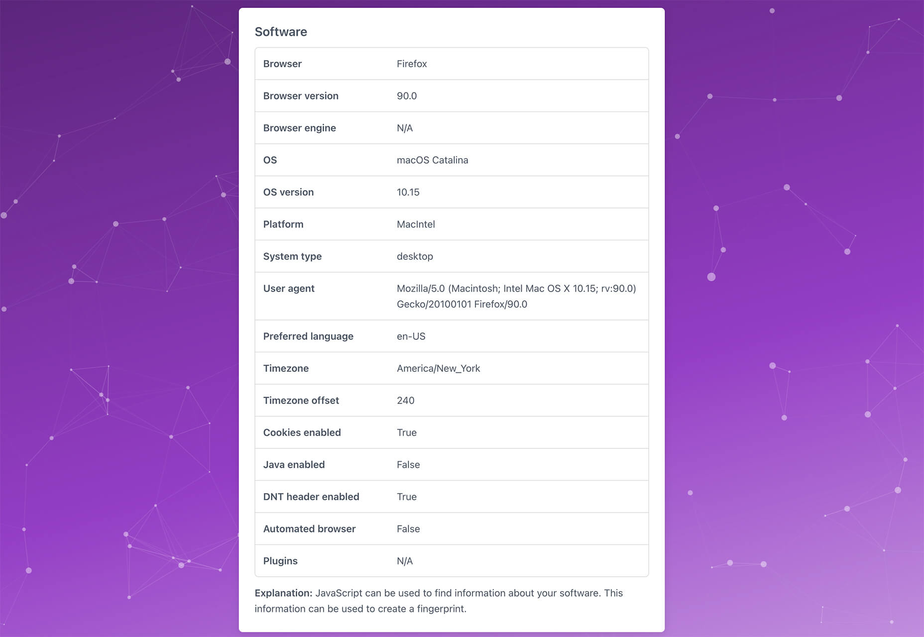
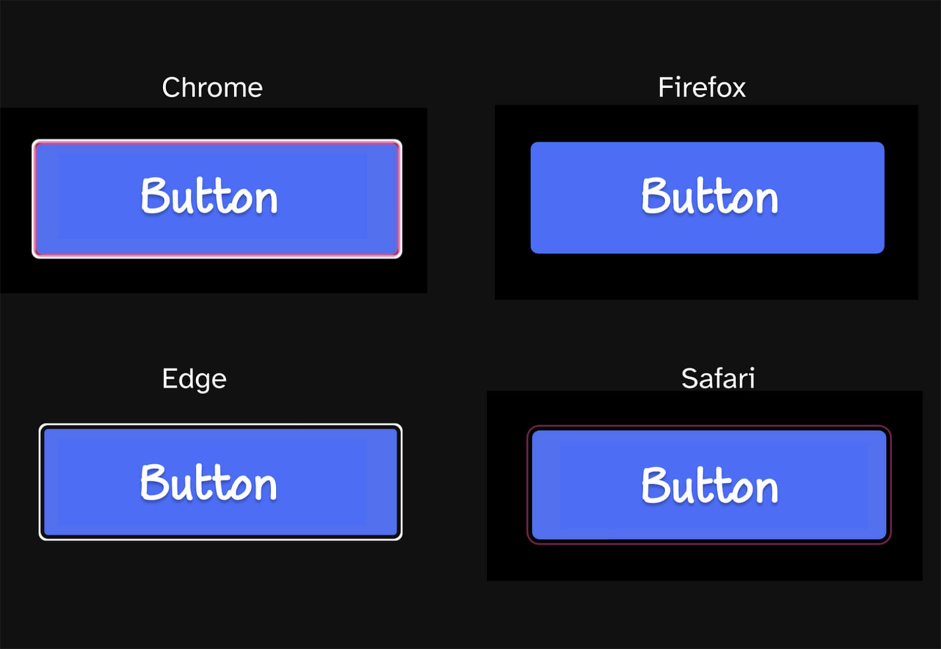
As a web designer, you’re responsible for a lot of things. Your client is relying on you to ensure that their website is user-friendly, accessible, eye-catching, and even good enough on the back-end to capture the attention of the search engines. 

However, what many business leaders and clients don’t realize is that they also have a part to play in ensuring that they get the right results from their site; there’s more to the client and contractor relationship than an exchange of funds. 

Today, we’re going to examine some of the most common mistakes that clients make when they begin working with a website designer for the first time. After all, when a client makes a mistake, it’s up to you to show them how to get back on track. 

Client Mistake 1: Providing Minimal Insight

Creativity, for the most part, is the responsibility of the designer in any web-building project. You know best what you can do for a client. 

When you’re discussing an upcoming project with a business owner, you can walk them through concepts like dark mode design or strategies for digital accessibility. However, you’re still reliant on your client to let you know if there’s anything specific they need. 

An insufficient brief in a web design project usually means that you waste time on a project because you have to go back and forth multiple times, making updates and edits. Getting a brief ironed out properly from day one can reduce misunderstandings and mistakes. 

To get your client started, ask them to share some details like:

  • Who’s the target audience? Do they have a user persona they can share?
  • What specific features does the site need? Landing pages, forms, widgets, etc.?
  • Competitor sites they like: What do they appreciate about those designs?
  • Brand colors and assets: What kind of hues and shades should you use?
  • Technical feature requirements: Does the site need to have its own app, integrate with APIs, or have a checkout solution, for instance?

Client Mistake 2: Underestimating The Workload

Perhaps one of the most common mistakes that clients make when seeking help from a designer is that they have no idea how much work it will take to create the kind of site they want. If they haven’t provided a great brief in the first place, they might not have had a chance to see all the work they’re asking for written down. Walking your client through the brief process can help here. 

On the other hand, if your client has already provided a brief, along with an unrealistic deadline for completion, you might need to have a discussion with them about what you need to do. Walking your client through some of the processes involved in creating their website could give them an insight into how long it will realistically take to bring their ideas to life. 

Additionally, ensuring that your customers fully understand the amount of work you’re taking on could also mean that they can better grasp why you’re charging a certain price for your services. That brings us neatly to the next mistake…

Client Mistake 3: Not Having The Right Budget

Pricing your design services can be a complicated process for web designers. You need to make sure that you’re charging enough to cover the cost of things like essential software and hardware for your company. At the same time, with so many other designers out there, you also need to ensure that your costs are competitive. 

After you’ve gone through the hard work of figuring out what your pricing structure should be, you also need to be capable of justifying that expense to your client. It’s common for many customers to go into their work with a web designer expecting that they’ll be able to get an entire website, blog, and app for less than a couple of hundred dollars. 

Make sure that your client is aware of your pricing immediately to avoid any confusion. If possible, have a pricing page on your website or portfolio which highlights the cost of different packages and precisely what your clients are going to get. 

If your customers can see the value in your services and even equate to an hourly workload or skillset, they might be better equipped to set the proper budget. 

Client Mistake 4: Making Too Many Technology Decisions

You’ll find that you work with many different types of client during your time as a web designer. Sometimes, you’ll have people who come to you not really knowing what they want or need. This means that you may need to spend some time speaking to them about their expectations and discussing what’s possible. 

On the other hand, there’s always a chance that you could work with a client who thinks that they should be making all of the decisions themselves. While it’s true that your client should have some control over things like the style of their website and what features it has, it’s up to you to make technical decisions like what kind of tools you’re going to use. 

If your client tries to dictate everything you do and how you’re going to do it, this could make it difficult for you to deliver your best work. Explain your processes to your customer in advance and find out why they want you to use specific technology. 

For instance, if your client wants to use a specific kind of website builder because they’ve heard it’s “the best,” you can explain what you like most about the product you’re already using. 

Client Mistake 5: Being Too Attached To An Idea

This is a problem that happens in a lot of creative industries. A client goes out and finds something that they like on another website. It might be an attractive landing page or a specific checkout process. They’re so excited by what they see there that they refuse to compromise on that idea when working with their designer – even if the concept isn’t suitable. 

For instance, your client might come to you wanting a website that’s full of dynamic animations and videos. However, if they only have a limited amount of bandwidth from their hosting provider, this could mean that they end up with a slow site that aggravates their customers. 

The best thing you can do when this happens is to present the issue to your client in a way that they can understand. For instance, if you’re worried something will slow down their website, talk to them about how speed is essential to good customer experience. You could even share some page speed stats like: if a page takes more than 3 seconds to load, over half of all visitors will abandon it. 

Seeing the stats for themselves could mean that your clients are more likely to change their minds. 

Client Mistake 6: Working With The Wrong Designer

Finally, one of the biggest mistakes any client can make is working with the wrong website designer. There are a lot of professionals out there, each with their unique skills to offer in things like UX design, ecommerce page creation, and so much more. However, it’s not always easy to know what you need as a business owner getting online for the first time. 

The good news for web design clients is that there’s a lot of information out there that you can use to get informed fast. The bad news for designers is that this means you’re going to need to work at keeping your skills on the cutting edge if you want to attract the widest selection of customers. 

To ensure that you’re more likely to be the right designer for your customers, stay up to date with the latest web design standards, and check out what’s trending in your industry. Webinars, articles, and even TED talks can be an excellent way to brush up your knowledge and make your portfolio much more appealing. 

Strengthen Your Client/Designer Relationships 

Succeeding as a web designer isn’t just about building a robust portfolio full of excellent websites where you can showcase your skills. While it’s true that you need to stay on the cutting edge with your design talents, you also need to make sure that you can create positive relationships with every client that comes to you. 

Like designers, clients can make mistakes too, but not knowing what they want, trying to take too much control, or simply failing to understand the scope of a product. Rather than letting those mistakes hold you back, prove your mettle as a designer by helping your clients navigate these issues. The result will be more streamlined project experiences, happier customers, and better reviews for your company. 


Featured image via Unsplash.

Source

The post Protect Your Design Clients From These 6 Easy Mistakes first appeared on Webdesigner Depot.


Source de l’article sur Webdesignerdepot

Every day design fans submit incredible industry stories to our sister-site, Webdesigner News. Our colleagues sift through it, selecting the very best stories from the design, UX, tech, and development worlds and posting them live on the site.

The best way to keep up with the most important stories for web professionals is to subscribe to Webdesigner News or check out the site regularly. However, in case you missed a day this week, here’s a handy compilation of the top curated stories from the last seven days. Enjoy!

Supercharge Your Node.js With Rust

Icon Trends in 2021

Material Design 3

5 Pillars of Effective Landing Page Design

Can Include (a Certain HTML Element Within Another Certain HTML Element)

Is Photoshop & Illustrator in the Web the Most Exciting Reveal of Adobe MAX?

Box Shadow Generator – Generate Multilayer CSS3 Box Shadows

Olio – Illustration Constructor with 130+ Characters and Objects

The Button Cheat Sheet

Marvel Character or Font?

Source

The post Popular Design News of the Week: October 25, 2021 – October 31, 2021 first appeared on Webdesigner Depot.


Source de l’article sur Webdesignerdepot

Tilda website builder combines everything we liked so much about constructors when we were kids – you can experiment, test out and build myriads of new creative ideas out of ready-to-use blocks. Tilda is that type of constructor that allows you to own your creative process and create pretty much any website: landing page, business website, online store, online course with members area, blog, portfolio, or event promo page.

Founded seven years ago, Tilda is a website builder that completely revamped the way we create websites. Tilda has been the first website builder to introduce block mechanics that allows users to create websites out of pre-designed pieces. This breakthrough technology allowed all users – not only designers – to create professional-looking websites. Just like in kid constructors, you can drag-and-drop and mix-and-match blocks on Tilda to let your creativity flow and build a dazzling website, at extraordinary speed. 

When you ask designers why they love Tilda, they usually say it’s because the platform provides the ultimate balance between choosing from templates and being able to fully customize and create from scratch to bring any creative idea to life. Here’s what else they say:

Tilda has been a game-changer for us. It allows our team to quickly spin up new web pages, make edits, and ship new programs. We left WordPress for Tilda and after being with Tilda for 2 years, I don’t ever want to go back.

~ Andy Page, Executive Director, Forge.

I built my first website in 2001. Since then I’ve used countless platforms and website builders for customer websites and my own business. Tilda is the perfect combination of ease of use with powerful features at an unbeatable value.

~ Robby Fowler, Branding and Marketing Strategist, robbyf.com & The Brand ED Podcast.

Let’s dive deeper into core functionalities you can leverage on Tilda. 

#1 Cut Corners With 550+ Pre-Designed Blocks And 210+ Ready-Made Templates

The beauty of Tilda is that it provides 550+ blocks in the ever-growing Block Library designed by professional designers. Thus, you can quickly build a website out of pre-designed blocks that encompass virtually all elements you might need for your website: menu, about us page, features, contact, pricing, etc. 

Customizing each block is a breeze with Tilda: You can drag-and-drop images, edit text right in the layout, alter block height, background color, padding, select the style of buttons, use custom fonts, and assign ready-made animation effects to specific parts of it. Also, Tilda provides a built-in free image library with 600K+ images, so you can find images that are just right for you without leaving Tilda, add them to your website with just one click, and use them for free.

Finally, all blocks fit together so well that it’s almost impossible to create a bad design on Tilda – even if you are a stranger to website building.

For a quick take-off, you can use 210+ ready-made templates for different kinds of websites and projects: online stores, landing pages, webinar promo pages, multimedia articles, blogs, and more. Each template is a sample of modern web design and consists of blocks. It means that templates don’t limit your creativity: you can modify them to your liking by playing with settings, adding extra or removing existing blocks, and embedding images and text. 

Each of the templates and blocks covers over 90% of use cases you’ll ever require and is mobile-ready, meaning that your website will look great on desktop computers, tablets, and smartphones by default.

#2 Jazz Up Your Site With Zero Block: Professional Editor For Web Designers 

To better meet the demands of a creative brief and unleash your creativity, you can use Tilda’s secret weapon called Zero Block. It is a tool for creating uniquely designed blocks on Tilda.

You can control each element of the block, including text, image, button, or background, and decide on their position, size, and screen resolution on which they’ll appear. For example, you can work with layers to create depth with overlay and opacity techniques or set a transparency level on any element and shadow effects below them. Additionally, you can also insert HTML code to add more complex elements, such as calendars, paywall, comments, social media posts, and so much more.  

Finally, Zero Block allows you to fool around with basic and more advanced step-by-step animation for a more individual look. Here’re some animation examples that you can make on Tilda:

Animation on scroll (position of elements is changing on scroll).

Trigger animation (animation is triggered when pointing at or clicking on an object).

Infinite scrolling text.

#3 Import Designs From Figma To Tilda In Minutes

Creators love using Figma for prototyping, but when you have to transfer every element and rebuild your website design from scratch – that’s what’s killing the party. With Tilda, you can easily turn your static designs into an interactive website in no time. 

All it takes is to prepare your Figma design for import with a few easy steps, paste the Figma API token and your layout URL to Tilda, click import and let the magic happen. Once your design is imported, you can bring your project online just by clicking publish.

#4. Make Search Engines Love Your Website With Built-In SEO Optimization

Thanks to the consecutive positioning of blocks on the page, websites designed on Tilda are automatically indexed well by search engines. There is also a set of SEO parameters you can fine-tune right inside the platform to ensure that your web pages rank high even if you don’t have an SEO specialist in-house. These parameters include the title tag, description and keywords meta tags, reader-friendly URLs, H1, H2, and H3 header tags, alt text for images, and easily customizable social media snippets. 

As an additional value, Tilda provides an SEO Assistant that will show you what errors are affecting the indexing of your website and will help test the website for compliance with the search engines’ main recommendations.

#5. Turn Visitors Into Clients

Tilda gives you the power to set up data capture forms and integrate them with 20+ data capture services, such as Google Sheets, Trello, Notion, Salesforce, Monday.com, etc., to ensure seamless lead generation.

For more fun, Tilda developed its CRM to manage your leads better and keep your business organized right inside of a website builder. This is a very easy-to-use tool that automatically adds leads from forms and allows you to manually add leads you captured outside of the website. There is a kanban board that gives you an overall view of how leads are moving through your sales funnel and allows you to move leads between stages easily.

#6. Build A Powerful Online Store In One Day

Tilda provides a set of convenient features to create a remarkable online shopping experience. The platform gives you the power to sell online using ready-made templates or build an online store completely from scratch, add a shopping cart and connect a payment system of choice — Stripe, PayPal, 2Checkout, etc. — to accept online payments in any currency.

If you are looking to run a large ecommerce business, you should also consider Tilda. Thanks to the built-in Product Catalog, you can add up to 5000 items, import and export products in CSV files, easily manage stock, orders, and keep track of store stats.

And thanks to adaptive design, your store will look good across all devices, including tablets and smartphones. 

#7. Bring Your Project Online For Free

Tilda offers three subscription plans: Free, Personal ($10/month with annual subscription), and Business ($20/month with annual subscription). When you sign up for Tilda, you get a lifetime free account. It allows you to publish a website with a free subdomain and gives you access to a selection of blocks and a limited number of features that offer enough to create an impressive website. 

Personal and Business tariffs allow more advanced options, such as connecting custom domains, adding HTML code, receiving payments, and embedding data collection forms. The business plan also allows users to export their website and create five websites (while personal and free plans allow one website per account). 

To discover all features and templates on Tilda, activate a two-week free trial – no credit card required.

Source

The post Tilda – The Website Builder That Disrupted The Way We Create Websites first appeared on Webdesigner Depot.


Source de l’article sur Webdesignerdepot

Many markets are saturated with competition; it’s no surprise that customers are expecting top-of-the-line experiences. Businesses must keep up with these ever-changing demands to remain competitive and drive forward.

One way to ensure customers have positive experiences is to take a look at your website. Your website is like your digital headquarters, where customers can browse through products or services, have frequently asked questions answered, and be able to reach you if they need direct support.

Making a site user-friendly and customer-centric will assist businesses while they work to build a loyal customer base. Customer happiness is more important now than ever and has the potential to make or break your business. We all know that happier customers spend more, and delighted customers will always come back for more.

Let’s explore some ways you can level up the customer experience on your website to foster customer loyalty and retention, as well as garner brand advocates for your business.

How Important Is CX?

As a site manager, your goal should be to meet customers’ needs. Creating a website is no simple task but can transform CX (customer experience).

Suppose a customer visits your site only to see a buffering symbol or a lag on their desktop or mobile device. This wouldn’t make for a positive experience, would it?

When customers have to spend extra time navigating your website to find what they’re looking for, it can directly lead to site abandonment, where customers leave the site before browsing. It’s vital to consistently monitor your website metrics to see if abandonment rates impact your overall traffic.

Customers who have enjoyable experiences browsing through your site are more likely to appreciate your brand and strongly consider purchasing whatever offerings you have.

Additionally, positive customer reviews can help your business gain new customers — word-of-mouth marketing is still relevant in 2021’s digital marketing landscape. Earning those 5-star reviews can help other potential customers see that they too could have a positive experience with your brand.

As you can see, CX is just as important as the products or services you offer, so keep that in mind as you set out on the journey to improve your website to advocate for your customer base.

Below, we’ll cover some of the most important elements and features of a strong business site so you can implement them.

Valuable Features to Include on Your Website

The features of your website are the foundation of your business. One of the best parts of building a killer website is that you can get as creative as you’d like with all of the features at your disposal.

Whether you use WordPress or another platform to host your website, you can always explore other paid services or offerings online to bring your site to the next level.

For example, the WooCommerce WordPress extension allows e-commerce sites to improve the overall appearance of their site, add customizations and, generally speaking, create a high-quality e-commerce store.

Below are some examples of elements you should consider incorporating into your web design. Offering these features will surely keep your site visible, relevant, and attractive to all types of customers.

1. Add Personalization

Every type of customer can benefit from a personalized experience, and it helps you turn them into loyal customers.

Personalization is becoming more prevalent in web design, whether it’s including past products they’ve viewed on your landing page or making it simple for them to log in to their account.

Maybe you allow your customers to create a wishlist, just as Amazon does. You could also make personalized deals or recommendations for your customers based on their past purchases or search history. When customers see this level of personalization, it may influence their purchasing decisions and make it simpler for them to order products.

2. Include Compelling and Unique Content

Every professional in the digital marketing space knows that content is king. The companies that include the most compelling content garner the most attention and increase the number of customers who make up their customer base. Here are some examples of what your content should look like:

  • Comprehensive
  • Useful
  • Accurate
  • Visually appealing
  • Helpful
  • A direct answer to a search engine query

By following these descriptions, your content will improve. Whether it’s a blog post or a photo or video, quality content is a driving factor in your user engagement. It helps to support your SEO strategy and will undoubtedly keep customers coming back.

3. Prioritize Speed and Usability

Because technology is an integral part of most people’s lives, customers expect to visit a fast, reliable website. No longer will customers wait patiently for a site to load. The dreaded buffering symbol is a clear indicator that your business is not taking customer experience into account.

It’s critical to create a website that loads quickly and is easy to use. Avoid organizing any tabs in a confusing way. Ensure that your website is visually attractive without overwhelming color schemes or photos that take up too much space.

Go for a more modern, contemporary look that’s easy on the eyes. Customers will appreciate this and will likely spend more time browsing your various website pages.

4. Focus on Navigation

Users should be able to access any page on your website with ease. They shouldn’t have to search for the right drop-down menu or type into the search bar unless they’re searching for a specific product or service.

The majority of users on a site, 70% to be exact, spend most of their time navigating freely without using the search bar. This should tell you how vital good navigation is to your business website. Placing menus on the top of your site is common practice — if you would rather place your drop-down menu somewhere else, make sure you’re putting it in a section where it’s easy to find.

Put yourself in your customers’ shoes. See what types of designs you can incorporate into your site to elevate UX and make browsing simple.

5. Make Sharing Simple

One of the best ways to grow your customer advocates is by leveraging your existing customers. Your customers should be able to easily send your product or service descriptions to their friends and family.

Rather than copying a link, include a share feature. If something on your site is worth sharing with other potential customers, make it easy for them to send it.

Social sharing plays a significant role in digital marketing — it helps to garner organic traffic to your website. You can reach a larger number of people than originally intended, which is the most important benefit to reap by making it easy to share links from your site.

6. Incorporate Chatbots

Offering customer support by using chatbots is something major companies are incorporating into their website designs.

Suppose your customer is trying to complete a purchase but runs into a problem with a coupon they’d like to use. Rather than wait on hold on the phone or for an email in their inbox a few days later, an automated chatbot can step in and assist them.

Chatbots are on the rise, and it’ll be critical for your business to include them on your site. Proactive web actions can increase your site’s conversion rates and improve the overall customer experience.

7. Allow Customer Feedback

It shouldn’t come as a surprise that allowing your customers to share their experience with your brand can help you better understand them and the solutions they’re looking for from you.

Did you know that brands with superior customer service can generate 5.7 times more revenue than their competitors? When you’re in touch with your audience, you’re better able to include features they want and need to have a positive experience. By taking advantage of customer feedback, you can make necessary changes to your site to better serve your customers.

Advocate for Your Customer Base

All of the examples listed above can help elevate your site and improve the overall experience for existing and potential customers. Isn’t that the goal of any business, regardless of industry?

To serve your customers effectively means they’ll feel valued and come back for more. Whether that’s ordering more products or requesting more services, you’ll see the benefits of including the elements we’ve covered in this post.

As a recap, here are some steps you can take to advocate for your loyal customers:

  1. Add personalization
  2. Include unique content
  3. Make your site fast and usable
  4. Provide easy navigation
  5. Allow for easy sharing
  6. Leverage chatbots
  7. Be open to feedback

Overall, customer experience will become more important in the future as customer expectations change. Standing out from your competitors is no longer an option but a necessity. So many markets are struggling to do just that — so if you’re able to offer unique features on your site, it could potentially draw more customers in and drive them to purchase.


Featured image via Unsplash.

Source

The post 7 Simple Ways to Boost Your Website’s CX first appeared on Webdesigner Depot.


Source de l’article sur Webdesignerdepot

User experience is one of the most important principles of web design. There’s no doubt that you focus on UX with every page you design on the web, whether it’s a portfolio, a profile page, or an entire website. 

Unfortunately, what many experts forget is that UX doesn’t just apply to digital pages. That means that you need to discover the right UX strategies for everything from your website homepages to your email marketing messages and even your listings on Google. 

Today, we’re going to explore ways you can apply UX principles to your client’s image on search engines. 

Why Your Search Engine Listing Matters

Let’s start with the basics…

89% of customers start their purchasing process with a search engine. 

That means that whether you’re creating a portfolio to sell your services or building a website for a client, the first connection a customer has with your design isn’t on the homepage.

Developers and designers know that first impressions count when it comes to succeeding online. However, they assume that those first impressions happen on a social media channel, a landing page, or a home page. 

The truth is that most of the time, you’re driving a specific experience for an end-user before you even realize it. Before you can wow an audience with a beautiful site design or a fantastic CTA offer, you need to convince them to click on your Google link.

Just as UX on a website is all about giving your audience what they need in an informed and strategic manner, UX in search engine results works the same way. 

How to Make Your Search Listing Stand Out with UX

So, how do you begin to apply the principles of UX to your Google Search results?

It’s much easier than you’d think. 

Step 1: Show Immediate Value 

Delivering an excellent experience on a website often means providing end-users with the information they need as quickly as possible. Imagine designing a landing page; you wouldn’t want your audience to scroll forever to find what they need. Instead, you’d make sure that the value of the page was immediately apparent. 

When creating an image for your search engine listing, you’ll need to take the same approach. This often means thinking carefully about two things:

  • Your headline
  • Your meta description

Around 8 out of 10 users say that they’ll click a title if it’s compelling. That means that before you do anything else to improve your SEO strategy, you need to make sure that the title of your web page is going to grab the audience’s attention. 

The best titles deliver instant value.

Immediately, these titles tell the audience exactly what they’re going to get when they click onto the page. The promise drives action, while clarity highlights the informed nature of the brand. 

The great thing about using an excellent title for a page is that it doesn’t matter where you’re ranked on the search results. Whether you’re number 2 or number 5, your customers will click if they find something they want. 

It’s just like using a CTA on a landing page. Make sure your titles are:

  • Informative: Show your audience value immediately
  • Optimized for mobile: Remember, your audience might not see your full title on some screens. That means that you need to make the initial words count.
  • Easy to read: Keep it short, simple, and straightforward. Speak the end-user’s language

Step 2: Build Trust with Your URLs

Trust factors are another essential part of good UX

When designing a website for a new brand, you know that it’s your job to make visitors feel at ease. Even in today’s digital world, many customers won’t feel comfortable giving their money or details to a new company. 

Within the website that you design, you can implement things like trust symbols, reviews, and testimonials to enhance brand credibility. In the search engines, it all starts with your URL. 

Search-friendly URLs that highlight the nature of the page will put your audience’s mind at ease. When they click on a page about “What is SEO” in the SERPs, they want to see an URL that matches, not a bunch of numbers and symbols

Use search-friendly permalink structures to make your listing seem more authoritative. This will increase the chances of your customer clicking through to a page and make them more likely to share the link with friends. 

Once you decide on a link structure, make sure that it stays consistent throughout the entire site. If a link doesn’t appear to match the rest of the URLs that your audience sees for your website, they may think they’re on the wrong page. That increases your bounce rate. 

Step 3: Be Informative with Your Meta Description

To deliver excellent UX on a website, you ensure that your visitor can find all the answers to their most pressing questions as quickly as possible. This includes providing the right information on each page and using the correct navigational structure to support a visitor’s journey. 

In the SERPs, you can deliver that same informative experience with a meta description. Although meta descriptions often get ignored, they can provide a lot of value and help you or your client make the right first impression. 

To master your meta descriptions:

  • Use the full 160 characters: Make the most of your meta description by providing as much useful information as you can within that small space. 
  • Include a CTA: Just as CTAs help guide customers through the pages on a website, they can assist with pulling in clicks on the SERPs. A call to action like “read about the” or “click here” makes sense when you’re boosting your search image. 
  • Focus on value: Concentrate on providing your customers with an insight into what’s in it for them if they click on your listing.

Don’t forget that adding keywords to your meta description is often helpful too. Keywords will boost your chances of a higher ranking, but they’ll also show your audience that they’re looking at the right result. 

Step 4: Draw the Eye with Rich Snippets

You’ve probably noticed that the search engine result pages have changed quite a bit in the last couple of years. As Google strives to make results more relevant and informative, we’ve seen the rise of things like rich snippets. Rich snippets are excellent for telling your audience where to look. 

On a website, you would use design elements, like contrasting colors and animation, to pull your audience’s attention to a specific space. In search engines, rich snippets can drive the same outcomes. The difference is that instead of telling a visitor what to do next on a page, you’re telling them to click on your site, not a competitor’s. 

When Google introduced rich snippets, it wanted to provide administrators with a way of showcasing their best content. Rich snippets are most commonly used today on product and contact pages because they can show off reviews. 

Install a rich snippet plugin into your site if you’re a WordPress user or your client is. When you enter the content that you need into the website, use the drop-down menu in your Rich snippet tool to configure the snippet.

Ideally, you’ll want to aim for the full, rich snippet if you want to stand out at the top of the search results. Most featured snippets have both text and an image. You need to access both of these by writing great content and combining it with a relevant image. 

Step 5: Provide Diversity (Take Up More of the Results)

As a website designer or developer, you’ll know that different people will often be drawn to different things. Some of your visitors might immediately see a set of bullet-points and use them to search for the answer to their question. Other visitors will want pictures or videos to guide them. So, how do you deliver that kind of diversity in the SERPS?

The easiest option is to aim to take up more of the search result pages. Google now delivers a bunch of different ways for customers to get the answers they crave. When you search for “How to use Google my Business” on Google, you’ll see links to blogs, as well as a list of YouTube Videos and the “People Also Ask” section. 

Making sure that you or a client has different content rankings for the same keywords can significantly improve any customer’s experience on the search engines. Often, the process of spreading your image out across the SERPs is as simple as creating some different kinds of content. 

To access the benefits of video, ask your client to create YouTube videos for some of their most commonly asked questions or most covered topics. If you’re helping with SEO marketing for your client, then make sure they have an FAQ page or a way of answering questions quickly and concisely on articles, so they’re more likely to appear in “People Also Ask”.

Step 6: Add Authority with Google My Business

Speaking of Google My Business, that’s another excellent tool for improving UX in the search results. It allows business owners to manage how information appears in the search results. 

With this service, you can manage a company’s position on Google maps, the Knowledge Graph, and any online reviews. Establishing a company’s location is one of the most important things you can do to help audiences find a business quickly. Remember, half of the customers that do a local search on a smartphone end up visiting the store within the same day. 

Start by setting up the Google Business listing for yourself or your client. All you need to do is hit the “Start Now” button and fill out every relevant field offered by Google. The more information you can add to Google My Business, the more your listing will stand out. Make sure you:

  • Choose a category for a business, like “Grocery store.”
  • Load up high-quality and high-resolution images
  • Ensure your information matches on every platform
  • Use a local number for contact
  • Encourage reviews to give your listing a five-star rating

Taking advantage of a Google My Business listing will ensure that your audience has all the information they need to make an informed decision about your company before they click through to the site. This means that you or your client gets more warm leads and fewer people stumbling onto your website that might not want to buy from you. 

Step 7: Use Structured Data Markup to Answer Questions

If you’re already using rich snippets in your Google listings, you should also have a plan for structured schema markup. Schema markup on Google tells the search engines what your data means. This means that you can add extra information to your listings that will more accurately guide your customers to the support they need. 

Providing additional schema markup information to your listings gives them an extra finishing touch to ensure that they stand out from the competition. For example, you might add something like a “product price” to a product page or information about the product’s availability.

Alternatively, you could provide the people who see a search result with other options. This could be an excellent option if you’re concerned that some of the people who might come across your listing might need slightly different information. 

For instance, you can ask Google to list other pages along with your search results that customers can “jump to” if they need additional insights.

Baking structured data into your design process when you’re working on a website does many positive things. First, it makes the search engine’s job easier so that you can ensure that you or your client ranks higher. Additionally, it means that your web listings will be more thorough and valuable.

Since UX is all about giving your audience the best possible experience with a brand, that starts with making sure they get the information they need in the search results. 

Constantly Improve and Experiment

Remember, as you begin to embed elements of UX into your search engine listings, it’s essential to be aware of relevant evolutions. Ultimately, the needs of any audience can change very rapidly. Paying attention to your customers and what kind of links they click on the most will provide you with lots of valuable data. You can use Google analytics to A/B test things like titles, pictures, featured snippets, and other things that may affect UX. 

At the same time, it’s worth noting that the Google search algorithms are constantly changing too. Running split tests on different pages will give you an insight into what your customers want. However, you’ll need to keep an eye on the latest documentation about Google Search if you want to avoid falling behind the competition. 

Like most aspects of exceptional UX, mastering your SERP position isn’t a “set it and forget it” strategy. Instead, you’ll need to work on constantly expanding your knowledge if you want to show clients that you can combine UX and SEO effectively. 

Make sure you have plenty of tools set up to offer reports and insights into the kind of changes that you may need to make to align with search engine expectations. 

Making the Most of UX in the SERPS

It’s easy to forget that there’s more to UX than making your buttons clickable on mobile devices or ensuring that scrolling feels smooth. For a designer or developer to deliver excellent UX for a brand, they need to consider every interaction that a company and customer has. 

This means starting with the way a website appears when it’s listed on the search engines most of the time. Getting your SEO listing right doesn’t just boost your chances of a good ranking. This strategy also improves your reputation with your audience and delivers more meaningful moments in the buyer journey. 

Don’t underestimate the power of UX in SERPs. 


Featured image via Pexels.

Source

The post 7 UX Principles to Boost SERPs first appeared on Webdesigner Depot.


Source de l’article sur Webdesignerdepot

Since school is back in session, this month’s roundup has a learning focus. In addition to tools, many of the resources include guides, tutorials, and cheat sheets to help make design work easier.

Here’s what’s new for designers this month.

ScrollingMockup.io

ScrollingMockup.io generates high-definition, animated scrolling mockups in minutes. All you have to do is paste your website URL, select from the expanding template gallery, add some music and post. You can create three mockups for free, and then this tool comes with a subscription model. The paid model allows for custom branding for mockups and more.

FilterSS

FilterSS is a curated collection of CSS image filters for use in projects. Upload an image, sort through the list, and then copy the code for the filter you want to use. It’s that easy!

Buttons Generator

Buttons Generator is a fun tool with so many button options in one place. Choose from three-dimensional, gradient, shadow borders, neumorphic, retro, animated, ghost, with arrows, and more all in one place. Click the one you like, and the code is copied right to your clipboard and ready to use in projects.

UI Cheat Sheet: Spacing Friendships

UI Cheat Sheet: Spacing Friendships is a fun – and memorable approach to figuring out spacing. This guide shows how close or far away elements should be based on “friend” circles with a couple of relatable instances. It’s one of the most relatable examples of this concept out there while emphasizing the importance of spacing in design.

PrettyMaps

PrettyMaps is a minimal Python library that allows you to draw customized maps from OpenStreetMap data. This tool can help you take online map design to the next level with cool, unique map visuals. It’s based on osmnx, matplotlib, shapely, and vsketch libraries.

Card.UX/UI

Card.UX/UI is a card-style generator with more than 20 templates and elements to create custom cards. Use the on-screen tools to design it the way you want and then copy the code for easy use.

Couleur.io

Couleur.io is a simple color palette builder tool that lets you pick a starting color and build a scheme around it. One of the best elements of the tool might be the quick preview, which shows your choices using the palette in context and in dark mode. Get it looking the way you want, and then snag the CSS to use in your projects.

CSS Accent-Color

CSS Accent-Color can help you tint elements with one line of CSS. It’s a time-saving trick that allows for greater customization for your brand in website design projects. Plus, it works equally well in dark or light color schemes. It supports checkboxes, radio, range, and progress bars.

Vytal

Vytal shows what traces your browser leaves behind while surfing the web. This scan lets you understand how easy it is to identify and track your browser even while using private mode. In addition, it scans for digital fingerprints, connections, and system info.

Imba

Imba is a programming language for the web that’s made to be fast. It’s packed with time-saving syntax tags and a memorized DOM. Everything compiles to JavaScript, works with Node and npm, and has amazing performance. While the language is still in active development, the community around it is pretty active and growing.

SVG Shape Dividers Creator

SVG Shape Dividers Creator is a tool that allows you to create interesting shapes with SVG so that your colors and backgrounds aren’t always rectangles. You can adjust and side, change the color, axis, and flip or animate it. Then snag the CSS, and you are ready to go.

Image Cropper

Image Cropper is a tool that allows you to crop and rotate images using the flutter plugin. It works for Android and IOS.

Noteli

Noteli is a CLI-based notes application that uses TypeScript, MongoDB, and Auth0. The tool is just out of beta.

Yofte

Yofte is a set of components for Tailwind CSS that help you create great e-commerce stores. The UI Kit is packed with components with clean and colorful designs that are customizable. The code is easy to export and clean. This premium kit comes with a lifetime license or a monthly plan.

UI Deck

UI Deck is a collection of free and premium landing page templates, themes, and UI kits for various projects. This is a premium resource with paid access to all of the tools. It includes access to more than 80 templates.

Star Rating: An SVG Solution

Star Rating: An SVG Solution is a tutorial that solves a common design dilemma: How to create great star rating icons for pages. This code takes you through creating an imageless element that’s resizable, accessible, includes partial stars, and is easy to maintain with CSS. It’s a great solution to a common design need.

Designing Accessible WCAG-Compliant Focus Indicators

Designing Accessible WCAG-Compliant Focus Indicators is another convenient guide/tutorial for an everyday application. Here’s why it is important: “By designing and implementing accessible focus indicators, we can make our products accessible to keyboard users, as well as users of assistive technology that works through a keyboard or emulates keyboard functionality, such as voice control, switch controls, mouth sticks, and head wands, to mention a few.”

Blockchain Grants

Blockchain Grants is a tool for anyone developing blockchain applications and in need of funding. It’s a database of grants from a variety of organizations for different applications. Start looking through this free resource to help secure additional funding for your projects.

Basement Grotesque

Basement Grotesque is a beautiful slab with a great heavy weight and plenty of character. There are 413 characters in the set with plenty of accents, numbers, and variable capitals.

Gadimon

Gadimon is a fun, almost comic book-style layered script. The font package includes a regular and extrude style.

Lagom

Lagom is a sleek and functional serif typeface with 16 styles in the robust family from ultralight to extra bold italic. It’s readable and has a lot of personality.

Striped Campus

Striped Campus fits our back-to-school theme with a fun, scholastic look and feel. The block letters have a thick outline stroke and some fun inline texture.

Source

The post Exciting New Tools for Designers, September 2021 first appeared on Webdesigner Depot.


Source de l’article sur Webdesignerdepot