Articles

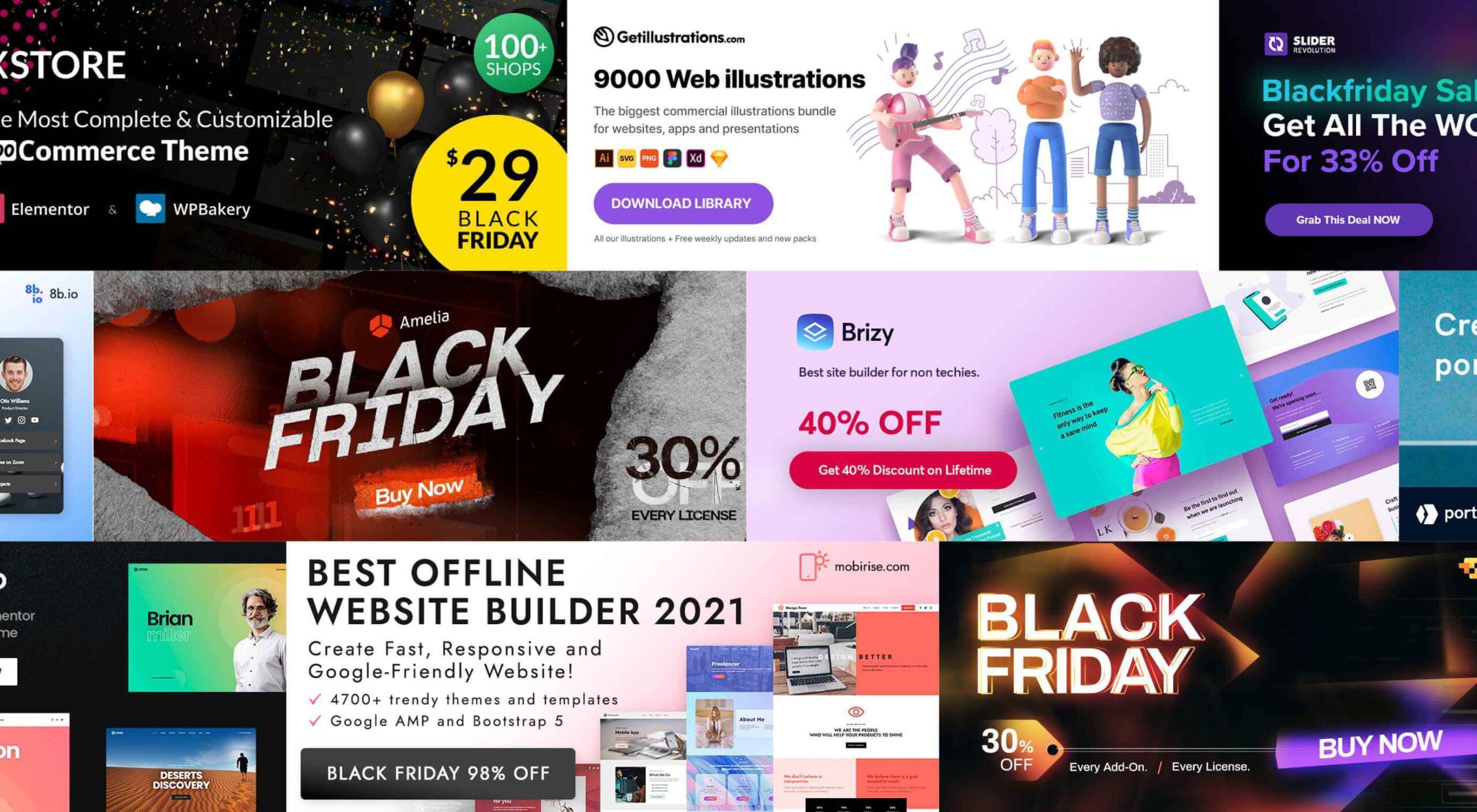
It’s that time again. Black Friday. November 26, to be exact. And the many enticing deals you’ve been looking forward to at this time of the year are here as well.

There are three types of Black Friday shoppers. Those who are successful because they have prepared. Those who are successful because they got lucky. And, those who let some good deals simply slip away.

Your best bet, of course, is to be prepared, which is the purpose of this guide.

As you go down this list, you’ll find discounts, some pretty amazing offers, a few surprises perhaps – and plenty of inspiration.

We’ve been keeping close tabs on the various Black Friday discounts and promotions, and we’ve corralled the best of the bunch for you.

Starting with:

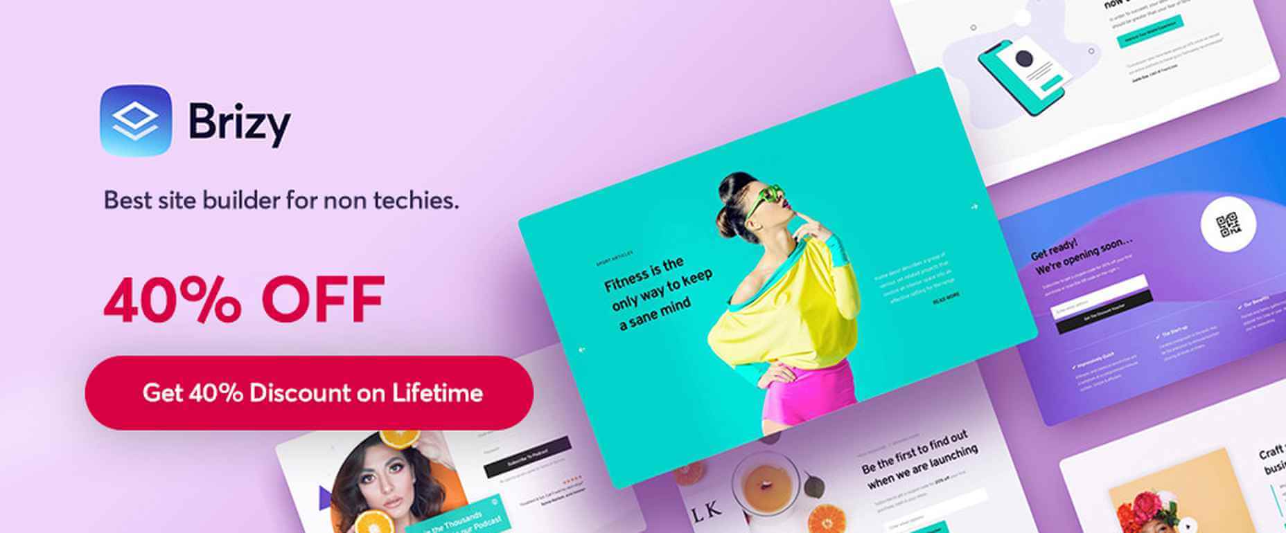
1. Brizy – The No-Code Website Builder For Non-Techies

Brizy is a fast and easy-to-use website builder for designers and agencies. Take advantage of Brizy’s Black Friday special and tap into the skills of a team that has been creating website-building tools for over 11 years.

This premier website builder gets better with each update.

  • Web designers can choose between Brizy for WordPress and the Brizy Cloud website builder, which includes hosting;
  • Agencies can choose among several white-label options;
  • Brizy brings power to the novice; use the pre-made designs or start with a blank page and let the imagination be the guide.

Black Friday is a time to take advantage of great deals, and this year is no different.

  • Big discounts are available on Brizy’s white label agency plans;
  • Participate at no cost to win a MacBook PRO;
  • Partner perks and discounts;
  • And exclusive new designs.

Design or coding experience is not a requirement to use Brizy’s drag and drop visual builder.

Click on the banner to take advantage of these great Black Friday specials.

2. Portfoliobox

A 50% discount on any portfolio website builder would seem like a good deal. On the other hand, getting one at 50% off that enables you to quickly create a portfolio website that reflects your creative personality and will truly set you apart from the crowd is definitely worth taking advantage of.

Portfoliobox offers:

  • Mix and match templates to help achieve a unique look;
  • Powerful eCommerce functionality built right into the platform;
  • Safe and secure private client galleries;
  • An included Domain (custom domain with Pro plans);
  • Fantastic 24/7 support to keep problems to a minimum;
  • Affordable, transparent pricing plans that let you know what you are getting before you buy.

Click on the banner to find out more about this fast, affordable, and easy to work with a portfolio website builder for creatives.
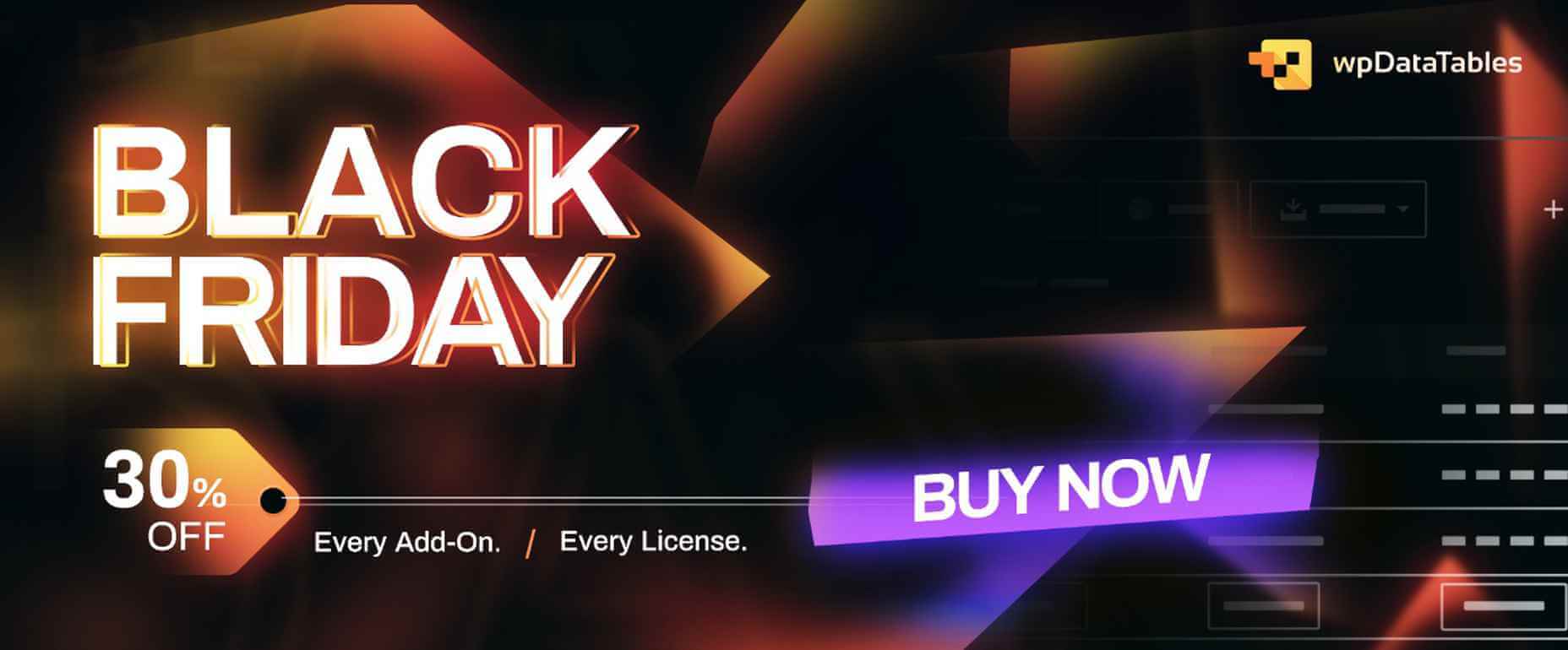
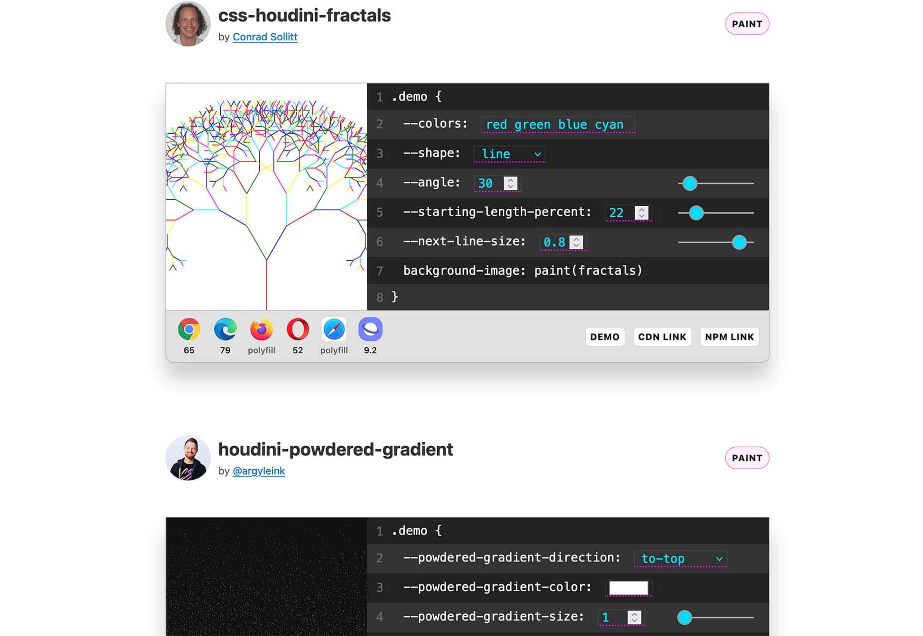
3. wpDataTables

wpDataTables is a popular, power-packed plugin that can manage vast amounts of data in seconds and organize it to build a table or chart the way you want.

  • wpDataTables and charts are responsive, customizable, and easy to edit and maintain;
  • wpDataTables readily accepts data from a variety of data sources, from multiple database connections, and in the most used formats;
  • Tables and charts can be configured to nicely blend in with other website content and a website’s overall design, plus it is easy to add spice to a table or chart by using colors, adjusting font sizes, and highlighting key data using conditional formatting.

wpDataTables features Elementor and Gutenberg integration, provides the ability to connect WordPress tables with Google API, allows cascade data filtering, and much more.

Click on the banner to take advantage of the 30% off Black Friday special.

4. Amelia WordPress Booking Plugin

Amelia can be a genuine time and money saver for a variety of business types. Amelia automates and streamlines a business’s booking process.

  • Amelia relieves business owners and managers from the task of managing multiple appointments and events;
  • Clients and customers love the ability to make and manage their appointments 24/7;
  • Bookings and events are managed from a single platform, even when multiple locations are involved.

Annual and lifetime subscriptions are available.

5. Mobirise Free Website Builder

As it is an offline builder, Mobirise does not tie you to any platform, you can host it anywhere, and you have total control over creating the website you have in mind.

Mobirise:

  • is drag and drop and easy and simple use;
  • is based on the latest Google AMP or Bootstrap 5, so your site will be mobile-friendly and crazy fast;
  • comes with eCommerce, huge selections of themes, blocks and templates, and a shopping cart.

Mobirise is free for both personal and commercial use.

6. Slider Revolution

There is a difference between an “interesting” website and one whose WOW effects cause it to stand far above the competition.

Slider Revolution specializes in WOW effects that can take any website to the next level, and it can be yours on Black Friday at a 33% discount on all licenses.

The Slider Revolution package includes:

  • Innovative templates and add-ons;
  • Advanced automation and special effects tools.

Grab the Black Friday offer now.

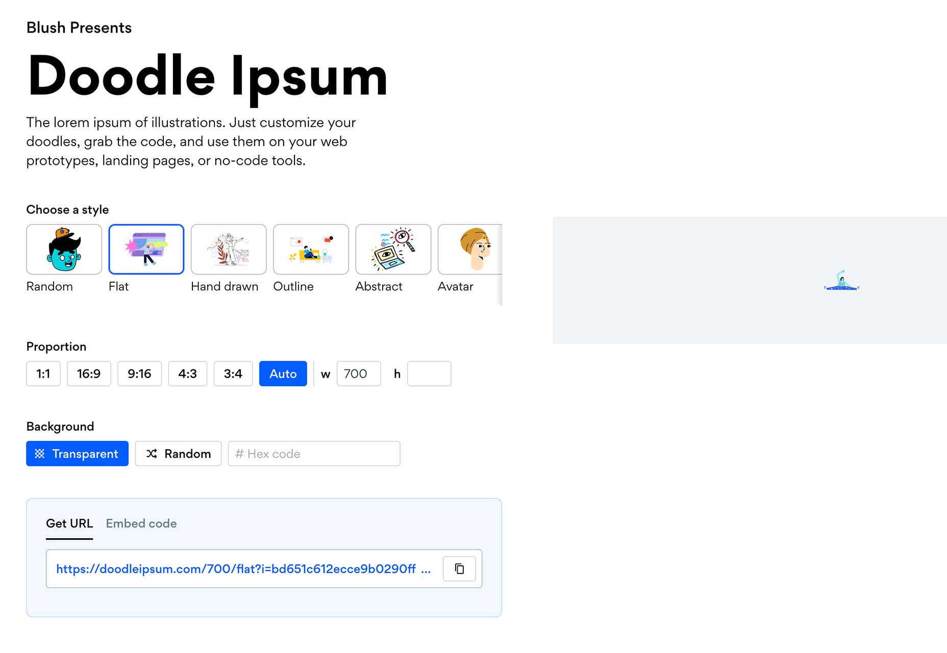
7. Getillustrations Bundle – Commercial illustrations for the web

Digital illustrations help attract attention to and pique interest in your website.

Getillustrations.com features a package of more than 9000 commercial web and app illustrations in a wide range of topics.

  • This package features all the design formats you’re likely to need, e.g., Ai, SVG, PNG, Figma, Sketch, and more;
  • Great illustrations to spice up landing pages are included.

The package is available at a 25% discount. Use coupon code EliteDesingers25.

8. Litho – Multipurpose Elementor WordPress Theme

Litho is a creative, modern, and highly customizable theme that can be used for any type of business niche as well as for creating eCommerce, blog, and portfolio websites.

This multipurpose Elementor WordPress theme’s features include –

  • 36+ ready home pages, 200+ creative elements, and a 300+ template library;
  • One-click demo import;
  • Top loading speed and SEO result capabilities.

Litho also features detailed online documentation and top-of-the-line customer support.

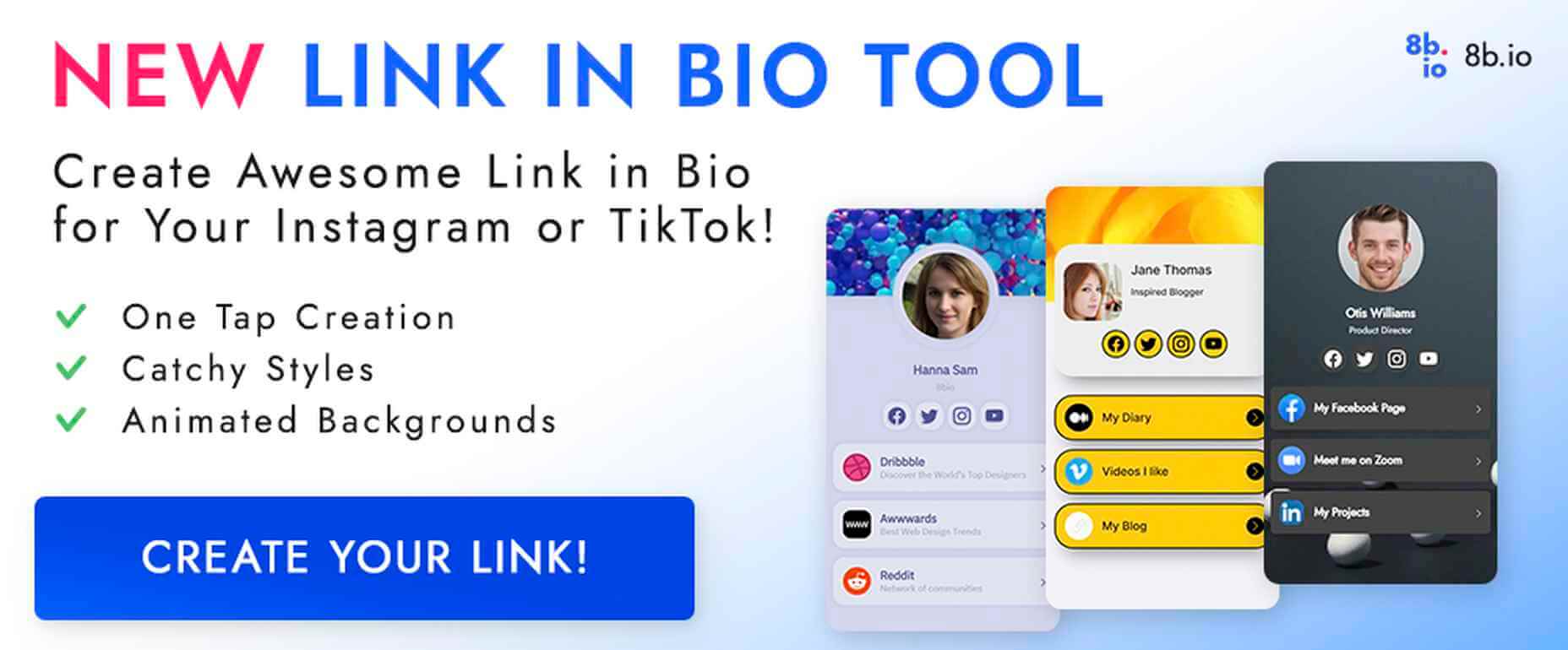
9. 8bio – Linktree Alternative

Instagram and TikTok enthusiasts, take note!

With the 8bio tool at your fingertips, you can add a clickable URL to your social media platform profiles so visitors can visit your website, product page, or any other important page.

8bio offers:

  • Beautiful skins and catchy animated backgrounds;
  • The ability to link to your own domain or to *.8b.io;
  • Powerful SEO and tracking options.

The 8bio tool can also be used for your Twitter, Facebook, and YouTube posts.

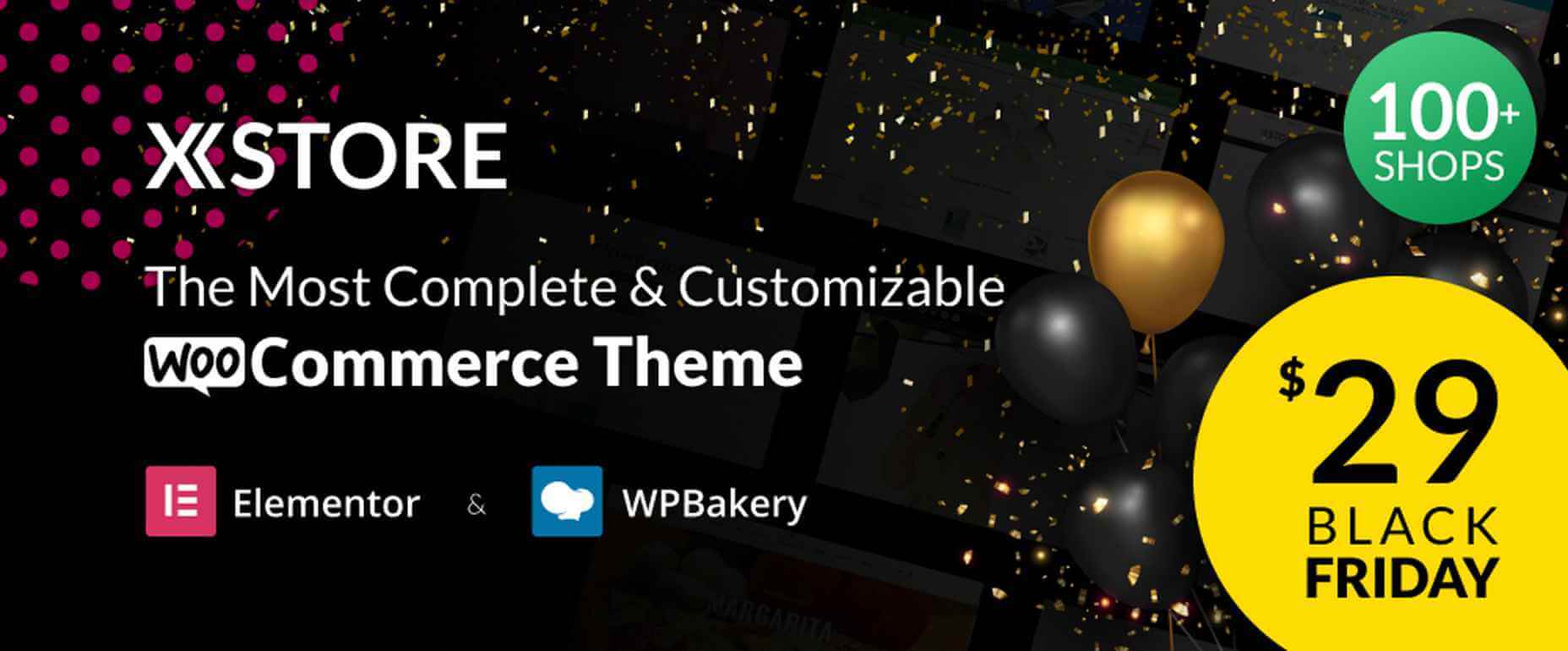
10. XStore – Highly Customizable WordPress WooCommerce Theme

XStore is designed to work with the best page builders on the market and is fully compatible with the Elementor and WPBakery builders.

The XStore package includes

  • $510 worth of carefully handpicked Premium Plugins for WooCommerce;
  • More than 110+ awesome Prebuilt Shops;
  • A built-in AMP for WooCommerce, a Full Ajax Shop, multi-vendor support, and much more.

Become one of XStore’s more than 60,000+ happy customers by taking advantage of the Black Friday special.

Knowing that it’s the early bird that gets the worm, we’ve worked hard to place before you and your fellow website designers and agencies this enticing selection of the best Black Friday offers.

You will no doubt find some of the products familiar. A few might not be. In either case, the opportunities are here for you to get some great deals on some premier products.

Happy shopping!

Source

The post Live Now: Top 10 Black Friday 2021 Deals for Designers and Agencies first appeared on Webdesigner Depot.

Source de l’article sur Webdesignerdepot

As a web designer, you’re responsible for a lot of things. Your client is relying on you to ensure that their website is user-friendly, accessible, eye-catching, and even good enough on the back-end to capture the attention of the search engines. 

However, what many business leaders and clients don’t realize is that they also have a part to play in ensuring that they get the right results from their site; there’s more to the client and contractor relationship than an exchange of funds. 

Today, we’re going to examine some of the most common mistakes that clients make when they begin working with a website designer for the first time. After all, when a client makes a mistake, it’s up to you to show them how to get back on track. 

Client Mistake 1: Providing Minimal Insight

Creativity, for the most part, is the responsibility of the designer in any web-building project. You know best what you can do for a client. 

When you’re discussing an upcoming project with a business owner, you can walk them through concepts like dark mode design or strategies for digital accessibility. However, you’re still reliant on your client to let you know if there’s anything specific they need. 

An insufficient brief in a web design project usually means that you waste time on a project because you have to go back and forth multiple times, making updates and edits. Getting a brief ironed out properly from day one can reduce misunderstandings and mistakes. 

To get your client started, ask them to share some details like:

  • Who’s the target audience? Do they have a user persona they can share?
  • What specific features does the site need? Landing pages, forms, widgets, etc.?
  • Competitor sites they like: What do they appreciate about those designs?
  • Brand colors and assets: What kind of hues and shades should you use?
  • Technical feature requirements: Does the site need to have its own app, integrate with APIs, or have a checkout solution, for instance?

Client Mistake 2: Underestimating The Workload

Perhaps one of the most common mistakes that clients make when seeking help from a designer is that they have no idea how much work it will take to create the kind of site they want. If they haven’t provided a great brief in the first place, they might not have had a chance to see all the work they’re asking for written down. Walking your client through the brief process can help here. 

On the other hand, if your client has already provided a brief, along with an unrealistic deadline for completion, you might need to have a discussion with them about what you need to do. Walking your client through some of the processes involved in creating their website could give them an insight into how long it will realistically take to bring their ideas to life. 

Additionally, ensuring that your customers fully understand the amount of work you’re taking on could also mean that they can better grasp why you’re charging a certain price for your services. That brings us neatly to the next mistake…

Client Mistake 3: Not Having The Right Budget

Pricing your design services can be a complicated process for web designers. You need to make sure that you’re charging enough to cover the cost of things like essential software and hardware for your company. At the same time, with so many other designers out there, you also need to ensure that your costs are competitive. 

After you’ve gone through the hard work of figuring out what your pricing structure should be, you also need to be capable of justifying that expense to your client. It’s common for many customers to go into their work with a web designer expecting that they’ll be able to get an entire website, blog, and app for less than a couple of hundred dollars. 

Make sure that your client is aware of your pricing immediately to avoid any confusion. If possible, have a pricing page on your website or portfolio which highlights the cost of different packages and precisely what your clients are going to get. 

If your customers can see the value in your services and even equate to an hourly workload or skillset, they might be better equipped to set the proper budget. 

Client Mistake 4: Making Too Many Technology Decisions

You’ll find that you work with many different types of client during your time as a web designer. Sometimes, you’ll have people who come to you not really knowing what they want or need. This means that you may need to spend some time speaking to them about their expectations and discussing what’s possible. 

On the other hand, there’s always a chance that you could work with a client who thinks that they should be making all of the decisions themselves. While it’s true that your client should have some control over things like the style of their website and what features it has, it’s up to you to make technical decisions like what kind of tools you’re going to use. 

If your client tries to dictate everything you do and how you’re going to do it, this could make it difficult for you to deliver your best work. Explain your processes to your customer in advance and find out why they want you to use specific technology. 

For instance, if your client wants to use a specific kind of website builder because they’ve heard it’s “the best,” you can explain what you like most about the product you’re already using. 

Client Mistake 5: Being Too Attached To An Idea

This is a problem that happens in a lot of creative industries. A client goes out and finds something that they like on another website. It might be an attractive landing page or a specific checkout process. They’re so excited by what they see there that they refuse to compromise on that idea when working with their designer – even if the concept isn’t suitable. 

For instance, your client might come to you wanting a website that’s full of dynamic animations and videos. However, if they only have a limited amount of bandwidth from their hosting provider, this could mean that they end up with a slow site that aggravates their customers. 

The best thing you can do when this happens is to present the issue to your client in a way that they can understand. For instance, if you’re worried something will slow down their website, talk to them about how speed is essential to good customer experience. You could even share some page speed stats like: if a page takes more than 3 seconds to load, over half of all visitors will abandon it. 

Seeing the stats for themselves could mean that your clients are more likely to change their minds. 

Client Mistake 6: Working With The Wrong Designer

Finally, one of the biggest mistakes any client can make is working with the wrong website designer. There are a lot of professionals out there, each with their unique skills to offer in things like UX design, ecommerce page creation, and so much more. However, it’s not always easy to know what you need as a business owner getting online for the first time. 

The good news for web design clients is that there’s a lot of information out there that you can use to get informed fast. The bad news for designers is that this means you’re going to need to work at keeping your skills on the cutting edge if you want to attract the widest selection of customers. 

To ensure that you’re more likely to be the right designer for your customers, stay up to date with the latest web design standards, and check out what’s trending in your industry. Webinars, articles, and even TED talks can be an excellent way to brush up your knowledge and make your portfolio much more appealing. 

Strengthen Your Client/Designer Relationships 

Succeeding as a web designer isn’t just about building a robust portfolio full of excellent websites where you can showcase your skills. While it’s true that you need to stay on the cutting edge with your design talents, you also need to make sure that you can create positive relationships with every client that comes to you. 

Like designers, clients can make mistakes too, but not knowing what they want, trying to take too much control, or simply failing to understand the scope of a product. Rather than letting those mistakes hold you back, prove your mettle as a designer by helping your clients navigate these issues. The result will be more streamlined project experiences, happier customers, and better reviews for your company. 


Featured image via Unsplash.

Source

The post Protect Your Design Clients From These 6 Easy Mistakes first appeared on Webdesigner Depot.


Source de l’article sur Webdesignerdepot

As the year begins to wind down, there are still plenty of new and evolving website design trends going strong. Much of what you’ll see this month carries over from things we’ve been seeing all year but with fresh touches.

From peek-a-boo designs with neat animated elements to vertical bars to brutalist blocks, there are a lot of highly usable trends to work with.

Here’s what’s trending in design this month.

Peek-a-Boo with Animation

Designers have been experimenting with cut-out and layering elements with animation for some time, which has evolved into full peek-a-boo styles with a lot of visual interest.

How each design comes together is a little different. Some have the animation in the back, others in the front, and some include text as part of the style. There’s almost no set of actual rules to how to make this design trend work.

Each of the examples below does it somewhat differently with varying degrees of success. The commonality here is that it is almost one of those visuals that you either see and love or hate.

Jatco Insurance is the most stunning example here, with a bold color choice and a peek-a-book element inside the oversized “J.” The overall effect is soothing and interesting and naturally draws the user across the screen from the top left to the background video layer. The small tagline, “Individual attention you deserve,” is perfectly placed.

Liron Moran Interiors takes a different approach with the peek-a-boo concept with the letters peeking out from behind an image. The animation is restricted to a hover and scroll effect that adds a liquid element to the image as well as changes to the image and color background. The challenge here is in readability. More of the words show on wider screens, but is it enough?

Melon Fashion also layers text and animated effects for a neat peek-a-book style that almost seems cut out from the background. The overall look appears to have three layers: background video, middle layer for the yellow color block, and text on top. The opacity of text elements with the peeking video is interesting and well pulled together without sacrificing too much readability.

Vertical Bars

Vertical color bars are a design element that keeps popping up in different ways. Designers can use it as a standalone element or container for content, such as navigation or other click actions.

Vertical elements are helpful because they can help create a more consistent and unified user experience from desktop to mobile screens. This shape can also be somewhat disruptive because you don’t see it featured that often. (Although with this style trending that might become less true over time.)

New Classrooms uses a vertical color bar on the left to help you move through the design. The color actually changes as each slide progresses on the homepage.

Serving uses multiple vertical bars as links to different content entry points. Clickability is emphasized with a change from a red overlay to a full-color image. The navigation is also tucked inside a white bar on the left side of the screen with a hamburger menu therein.

TechnoAlpin goes with a skinny vertical navigation menu on the right side of the screen. The icons with menu elements make navigation highly visual and intuitive. The color, which significantly contrasts with the rest of the design, also helps.

Brutalist Blocks

Not many people thought brutalism would stick around when it started trending. Elements of brutalism keep sneaking in, though, although they are much less stark and harsh than some of those original trending website designs.

This version of brutalism focuses on block elements that contain images or text and often click to other pages in the design. The blocks themselves are essentially the buttons that help you navigate to additional content.

The critical question about this design technique is whether this click action is intuitive enough. Will users interact without buttons?

The answer likely depends on your audience base, but if you opt for a style like this, it is essential to keep a close eye on analytics to ensure that users know and understand how to engage.

Milli Agency might be the most intuitive example of the brutalist blocks trend. The homepage is essentially a giant navigation menu. Each block changes from white to yellow on hover and expands, further encouraging clicks.

Sick Agency uses brutalist blocks with experimental typefaces and bold color for an in-your-face design. You can’t help but look at all the different things happening here. The biggest question might be, where should you focus and click next? The cursor provides some visual cues, but it’s not quite as intuitive as you might want it to be.

Mawo mixes brutalist blocks with a big blue cursor to help users click through the design to see more clothing options. Even the images here have a rather stark feel, which isn’t typical for e-commerce. Every block element above the scroll on the homepage includes a click action from the navigation blocks across the top to the “Shop Women” and “Shop Men” images. Further, the blue cursor dot helps show where users can click, and text buttons change to blue on hover as well.

Conclusion

Most of the examples here show trends as homepage elements, but you aren’t limited to that application. Try some of these techniques on landing pages or interior pages that you want to add a little something special to.

This can be an excellent way to test the design and see if your users like the style and know-how to interact with it. If it works, then you can extend the aesthetic to more of the design.

Source

The post 3 Essential Design Trends, November 2021 first appeared on Webdesigner Depot.


Source de l’article sur Webdesignerdepot

Tilda website builder combines everything we liked so much about constructors when we were kids – you can experiment, test out and build myriads of new creative ideas out of ready-to-use blocks. Tilda is that type of constructor that allows you to own your creative process and create pretty much any website: landing page, business website, online store, online course with members area, blog, portfolio, or event promo page.

Founded seven years ago, Tilda is a website builder that completely revamped the way we create websites. Tilda has been the first website builder to introduce block mechanics that allows users to create websites out of pre-designed pieces. This breakthrough technology allowed all users – not only designers – to create professional-looking websites. Just like in kid constructors, you can drag-and-drop and mix-and-match blocks on Tilda to let your creativity flow and build a dazzling website, at extraordinary speed. 

When you ask designers why they love Tilda, they usually say it’s because the platform provides the ultimate balance between choosing from templates and being able to fully customize and create from scratch to bring any creative idea to life. Here’s what else they say:

Tilda has been a game-changer for us. It allows our team to quickly spin up new web pages, make edits, and ship new programs. We left WordPress for Tilda and after being with Tilda for 2 years, I don’t ever want to go back.

~ Andy Page, Executive Director, Forge.

I built my first website in 2001. Since then I’ve used countless platforms and website builders for customer websites and my own business. Tilda is the perfect combination of ease of use with powerful features at an unbeatable value.

~ Robby Fowler, Branding and Marketing Strategist, robbyf.com & The Brand ED Podcast.

Let’s dive deeper into core functionalities you can leverage on Tilda. 

#1 Cut Corners With 550+ Pre-Designed Blocks And 210+ Ready-Made Templates

The beauty of Tilda is that it provides 550+ blocks in the ever-growing Block Library designed by professional designers. Thus, you can quickly build a website out of pre-designed blocks that encompass virtually all elements you might need for your website: menu, about us page, features, contact, pricing, etc. 

Customizing each block is a breeze with Tilda: You can drag-and-drop images, edit text right in the layout, alter block height, background color, padding, select the style of buttons, use custom fonts, and assign ready-made animation effects to specific parts of it. Also, Tilda provides a built-in free image library with 600K+ images, so you can find images that are just right for you without leaving Tilda, add them to your website with just one click, and use them for free.

Finally, all blocks fit together so well that it’s almost impossible to create a bad design on Tilda – even if you are a stranger to website building.

For a quick take-off, you can use 210+ ready-made templates for different kinds of websites and projects: online stores, landing pages, webinar promo pages, multimedia articles, blogs, and more. Each template is a sample of modern web design and consists of blocks. It means that templates don’t limit your creativity: you can modify them to your liking by playing with settings, adding extra or removing existing blocks, and embedding images and text. 

Each of the templates and blocks covers over 90% of use cases you’ll ever require and is mobile-ready, meaning that your website will look great on desktop computers, tablets, and smartphones by default.

#2 Jazz Up Your Site With Zero Block: Professional Editor For Web Designers 

To better meet the demands of a creative brief and unleash your creativity, you can use Tilda’s secret weapon called Zero Block. It is a tool for creating uniquely designed blocks on Tilda.

You can control each element of the block, including text, image, button, or background, and decide on their position, size, and screen resolution on which they’ll appear. For example, you can work with layers to create depth with overlay and opacity techniques or set a transparency level on any element and shadow effects below them. Additionally, you can also insert HTML code to add more complex elements, such as calendars, paywall, comments, social media posts, and so much more.  

Finally, Zero Block allows you to fool around with basic and more advanced step-by-step animation for a more individual look. Here’re some animation examples that you can make on Tilda:

Animation on scroll (position of elements is changing on scroll).

Trigger animation (animation is triggered when pointing at or clicking on an object).

Infinite scrolling text.

#3 Import Designs From Figma To Tilda In Minutes

Creators love using Figma for prototyping, but when you have to transfer every element and rebuild your website design from scratch – that’s what’s killing the party. With Tilda, you can easily turn your static designs into an interactive website in no time. 

All it takes is to prepare your Figma design for import with a few easy steps, paste the Figma API token and your layout URL to Tilda, click import and let the magic happen. Once your design is imported, you can bring your project online just by clicking publish.

#4. Make Search Engines Love Your Website With Built-In SEO Optimization

Thanks to the consecutive positioning of blocks on the page, websites designed on Tilda are automatically indexed well by search engines. There is also a set of SEO parameters you can fine-tune right inside the platform to ensure that your web pages rank high even if you don’t have an SEO specialist in-house. These parameters include the title tag, description and keywords meta tags, reader-friendly URLs, H1, H2, and H3 header tags, alt text for images, and easily customizable social media snippets. 

As an additional value, Tilda provides an SEO Assistant that will show you what errors are affecting the indexing of your website and will help test the website for compliance with the search engines’ main recommendations.

#5. Turn Visitors Into Clients

Tilda gives you the power to set up data capture forms and integrate them with 20+ data capture services, such as Google Sheets, Trello, Notion, Salesforce, Monday.com, etc., to ensure seamless lead generation.

For more fun, Tilda developed its CRM to manage your leads better and keep your business organized right inside of a website builder. This is a very easy-to-use tool that automatically adds leads from forms and allows you to manually add leads you captured outside of the website. There is a kanban board that gives you an overall view of how leads are moving through your sales funnel and allows you to move leads between stages easily.

#6. Build A Powerful Online Store In One Day

Tilda provides a set of convenient features to create a remarkable online shopping experience. The platform gives you the power to sell online using ready-made templates or build an online store completely from scratch, add a shopping cart and connect a payment system of choice — Stripe, PayPal, 2Checkout, etc. — to accept online payments in any currency.

If you are looking to run a large ecommerce business, you should also consider Tilda. Thanks to the built-in Product Catalog, you can add up to 5000 items, import and export products in CSV files, easily manage stock, orders, and keep track of store stats.

And thanks to adaptive design, your store will look good across all devices, including tablets and smartphones. 

#7. Bring Your Project Online For Free

Tilda offers three subscription plans: Free, Personal ($10/month with annual subscription), and Business ($20/month with annual subscription). When you sign up for Tilda, you get a lifetime free account. It allows you to publish a website with a free subdomain and gives you access to a selection of blocks and a limited number of features that offer enough to create an impressive website. 

Personal and Business tariffs allow more advanced options, such as connecting custom domains, adding HTML code, receiving payments, and embedding data collection forms. The business plan also allows users to export their website and create five websites (while personal and free plans allow one website per account). 

To discover all features and templates on Tilda, activate a two-week free trial – no credit card required.

Source

The post Tilda – The Website Builder That Disrupted The Way We Create Websites first appeared on Webdesigner Depot.


Source de l’article sur Webdesignerdepot

There are some spook-tacular finds in this month’s October collection of resources and tools for designers and developers. From interesting tools that can help in the design process to boo-tiful typefaces, there’s something for everyone here.

Here’s what is new for designers this month…

Atropos

Atropos is a lightweight, open-source JavaScript library to create touch-friendly, three-dimensional hover effects. The results are stunning and have a nice parallax style. Everything is highly configurable and customizable. It’s available for JavaScript, React, and Vue.js and has zero dependencies.

CSS Gradient Editor

CSS Gradient Editor helps you create the perfect gradient style – you can start from presets – that you can use in projects. Design a background, fill, or almost any other gradient element you might need, make adjustments or customizations, and then get the CSS with one click so you can use it right away.

Octopus.do

Octopus.do is a fast visual sitemap builder that lets you work in real-time using the content brick method. Share and collaborate in real-time and there’s no signup required to use it.

Pirsch Analytics

Pirsch Analytics is a privacy-friendly, open-source alternative to Google Analytics — lightweight, cookie-free, and easily integrated into any website or directly into your backend. It includes filters to see metrics in the way you want and light and dark modes.

Basic Pattern Repository

Basic Pattern Repository is a collection of simple SVG patterns for projects. Everything is rooted in a simple style to help push projects along quicker. You can get it via GitHub or as a Figma Library.

Blobr

Blobr is a way to get a branded API portal, manage access, and monitor usage all in one place. Customize everything to fit your brand and the tool grows as you do with the ability to increase or change capacity. Plus, it is easy to set up and free to use.

HEXplorer

HEXplorer helps you better understand something you use all the time – HEX colors. This pen by Rob DiMarzo shows how the values for different colors come together to provide greater comprehension when it comes to this color format.

CCCreate

CCCreate is a curated collection of tools and resources for web creators. It includes some tools that have been around for a while as well as some newbies. Everything is grouped and sorted by type of resources – color, icons, type, layouts, animation, shapes, docs, and miscellaneous so you can find what you are looking for faster.

Glass

Glass is a photo-sharing app for photographers. It’s a social network of sorts that lets you share images with the greater photography community without “likes.” Just great images.

Revolt

Revolt is a chat app that’s still in beta and designed for easy communication without having to download apps. It’s an open-source project that is customizable and with an intuitive and recognizable interface. The thing that’s different about this app is that it is built on a privacy-first model.

Doodle Ipsum

Doodle Ipsum is the illustrated version of placeholder elements. Customize your doodles, grab the code, and use them on your web prototypes, landing pages, or no-code tools.

Mechanic

Mechanic is an open-source framework that helps you create custom, web-based tools that export design assets in your browser. The best part is you can try it right on screen using the “poster generator.” If you like what you see, there’s plenty of documentation to help you along the way.

Medio Website Template

Medio is an agency-style website design template for Bootstrap 5. The layout is perfect for a design agency or marketing group but can be adjusted for almost any multi-purpose design. The free template includes a minimal design and includes features such as parallax, popup video, and more.

Tutorial: Simplifying Form Styles with Accent Color

This tutorial is a life-saver when it comes to using and understanding the new CSS accent-color property. This quick lesson will help make your life easier and is simple to use. It starts with setting an accent-color property on the root element and then applying it.

Houdini.how

Houdini.how is a worklet library that is full of CSS and code examples to help you work smarter. See how different elements look cross-browser and learn to adjust the code and put them together in just the way you want. Houdini is a set of low-level APIs that exposes parts of the CSS engine, giving developers the power to extend CSS by hooking into the styling and layout process of a browser’s rendering engine.

Chainstarters

Chainstarters is a powerful, rapid, Web3-enabled platform for software developers. It eliminates the burden of setting up and maintaining a secure and scalable infrastructure, allowing you to focus on creating amazing technology.

Web Vitals Robot

Web Vitals Robot is a search optimization tool that monitors SEO metrics for you – so you can prevent your business from disappearing from Google.

Searchable

Searchable is a unified search tool that looks at local, cloud storage, and apps to find the files you are looking for. It returns results in a jiffy with previews so you don’t have to open every file to find what you are looking for.

Athlone

Athlone is a fun serif with lots of personality. The free demo version includes a limited character set for personal use only and the full version has everything you need for fun display or branding with this typeface.

Capitana

Capitana is a Geometric Sans typeface with humanistic proportions and open apertures. This means that all shapes are constructed from basic forms, the circle, triangle, and square, and are designed according to the classic proportions of the Roman Antiqua. Distinct ascenders and pointed apexes with deep overshoot give it a cool beauty and classic elegance. It includes 784 characters per style in nine weights from Thin to Black, it offers both light and extremely heavy weights for striking headlines.

Colours

Colours is a funky script with just enough texture to keep it interesting. The free version includes a partial character set and is for personal use only.

Flexible

Flexible is a variable typeface that includes 18 styles in the family. It’s made for creativity and display use. This typeface is made for experimenting because there are so many things you can do with this single family.

Singo Sans Serif

Singo Sans Serif is a simple and strong typeface that would make an excellent display option. The free version is for personal use only. Fun fact: Singo means Lion in Indonesia, which is where the name of this strong font comes from.

Source

The post Exciting New Tools For Designers, October 2021 first appeared on Webdesigner Depot.


Source de l’article sur Webdesignerdepot

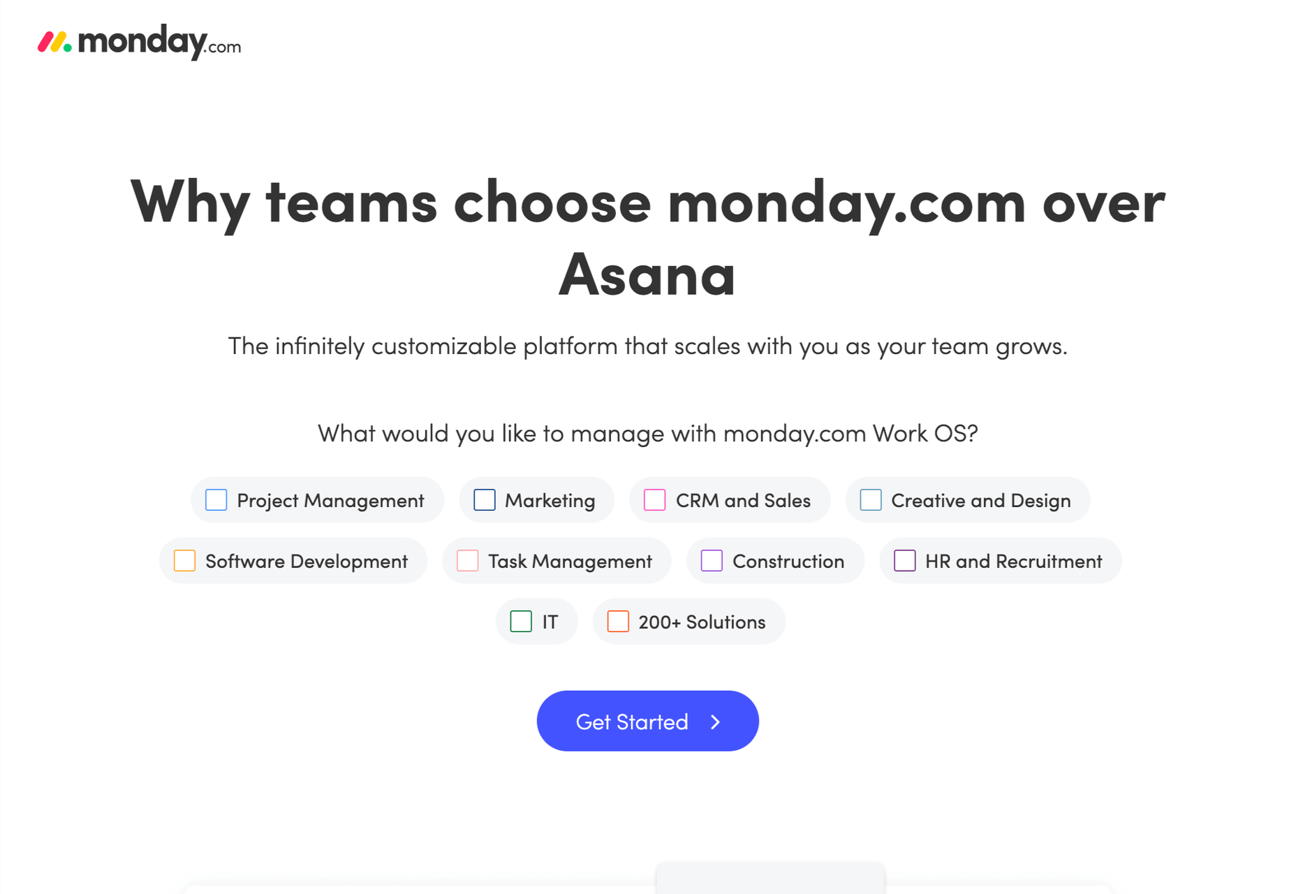
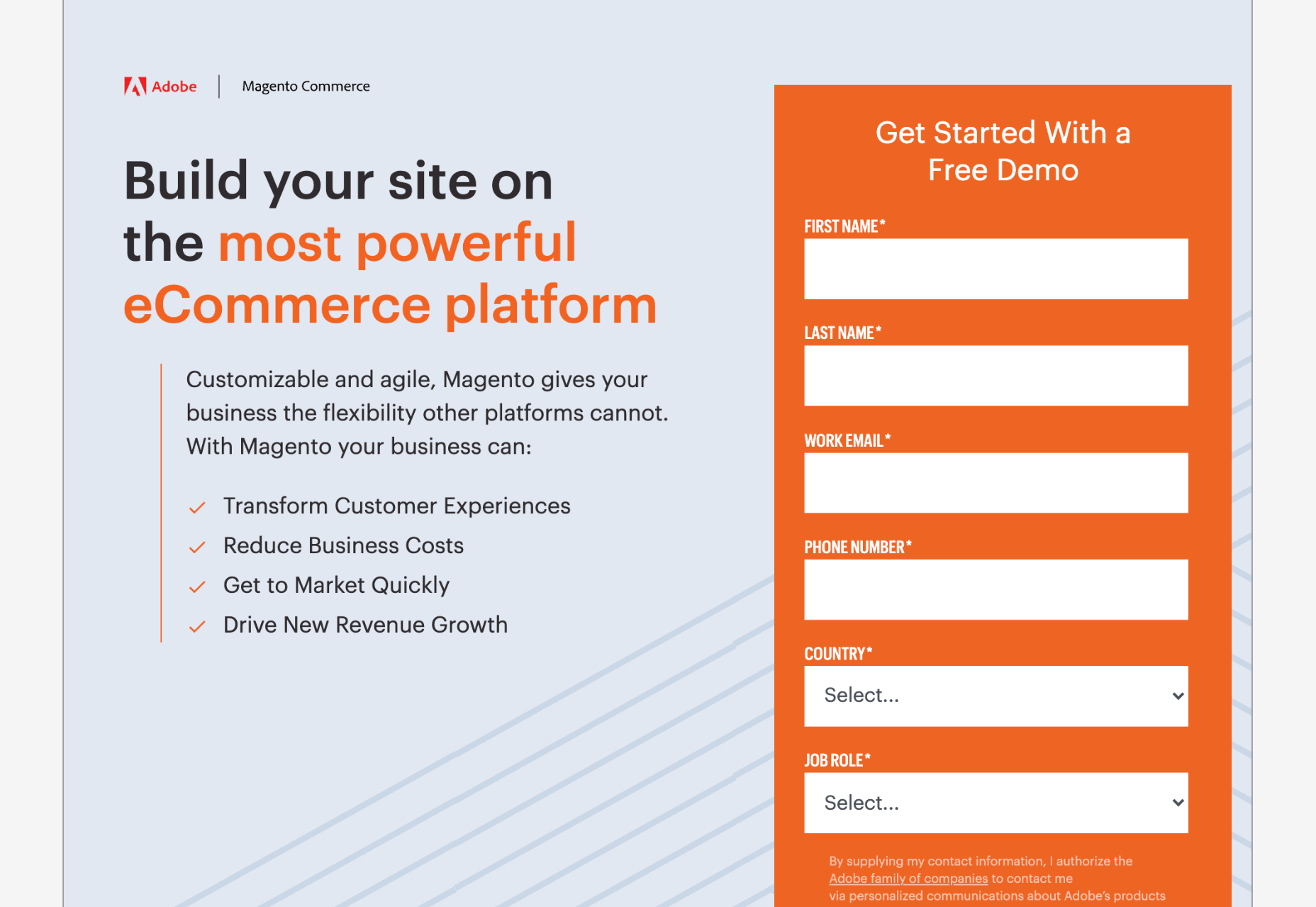
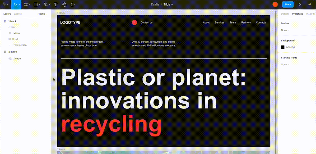
Landing pages are crucial for conversions. User-friendly landing pages rank higher in the search engines and generate the maximum leads.

Interestingly, user behavior changes every year, and new website design trends should be kept in mind to continue acquiring sales from your existing landing pages.

If your high-performing landing pages in 2019 have suddenly started underperforming in 2021, then it is a clear indication that your landing pages need a strategic revamp to record higher conversions.

Landing page revisions are necessary for reduced bounce rate, more visitor time on the page, and better user actions.

This article will discuss some of the top web design trends of 2021 that brands have adopted to revamp their landing page designs. You can learn from the trends and apply your own custom design intelligence to redesign your landing pages for 2022 and convert the maximum number of visitors.

Let’s begin…

Why Landing Page Design Is Crucial For Conversions

Landing pages are the first stop on your consumers’ online buying journey and the first chance to put an impression.

People on the internet are becoming less patient. It takes only about 50 milliseconds for a visitor to form an opinion about a brand and decide whether they want to stay or leave the website.

Convincing modern customers to buy products or fill up query forms on a landing page is not easy with traditional website elements.

In 2021, it is now harder to impress visitors landing on your website than in 2019. Keeping in mind the audience of 2021 and beyond, an ideal landing page should be user-friendly, engaging, innovative and should encourage users to take action.

Here are some of the top reasons why landing page design is so crucial for conversions:

  • You get barely 7 seconds to create a strong impression. It is a time span in which visitors roughly scan the page and make their decisions.
  • Publishing 40+ effective landing pages at regular intervals can generate 12X more leads.
  • The average conversion rate from the landing page across all industries is only 2.35%.
  • Using the right types of targeting and testing can boost landing page conversion rates by up to 300%.

Considering the above stats, it can be easily said that a landing page has to be impressive and quick enough to impact the visitors positively.

7 High Converting Landing Pages & Lessons You Can Learn From Each

Below are some of the best high-converting landing pages, which were just updated recently in 2021. For each page, we list a lesson you can learn to inspire your next design revision in 2021 and ahead:

Example #1 – Replace Boring Customer Info Forms With An Interactive Quiz

Landing Page: Nextiva’s Unified Communications Readiness Quiz Landing Page

Industry: Voice Over IP software

Conversion Measured By: Leads fill out a form if they are interested

Redesign focus: Improve the quantity and quality of leads

Solution: Substitute online form with an interactive quiz

In 2019 and even 2020, many businesses were practicing the trend of including a customer form on their landing pages as a call to action to initiate a quick customer action.

The customer information form was useful for businesses because it helped them generate quick leads. However, at the same time, there was no real reason pushing the customer to fill in the lead forms especially if it consisted of more than 2-3 fields.

Nextiva used its creativity to replace boring lead forms with interactive quizzes. In its 2021 page design, the company added a quiz for visitors to participate in.

The aim is to have interactive pages to keep visitors engaged and persuade them to stay on the page.

Here are the comparisons of both the designs:

2019

2021

Key Takeaways:

  • The 2021 landing page now has a free Unified Communications Readiness Quiz that allows business owners to fill the form interactively. Adding a quiz with the number of pages mentioned at the top tells the user how many steps are left to complete the quiz, making their waiting time easier.
  • The background image is replaced with communication icons to simplify the message of the kind of services they offer.
  • The page looks neater and appears to be easier to scan at a glance.

Example #2 – Emphasize Strong Visuals and Copy that Stresses on Product Details

Landing Page: Western Rise Homepage Variation

Industry: Ecommerce

Conversion Measured By: Apparel purchase

Major redesign focus: Improve the number of leads

Solution: Improve the copy and visuals

Western Rise, a clothing eCommerce company, realized the importance of having impressive images and detailed product information on its landing page.

The 2021 page replaced ordinary product images with strong visuals of the models wearing Western Rise clothing. Also, the product image includes extensive product details, which were missing on the older page.

Here is a clear comparison of the 2019 vs. 2021 landing pages of Western Rise:

2019

2021

Key Takeaways:

  • The new landing page has a powerful headline – Performance Clothing for Travel, Work, and Play. In just a couple of words, the brand tells everything about itself. ‘Performance Clothing’ is their unique selling proposition (USP) that tells the customers that their product is durable. Besides, the caption ‘Travel, Work, and Play’ tells what the product is about. Modern customers like products that fulfill a particular need, and Western Rise made it easier for the users to realize the importance of their products which fulfilled their specific needs.
  • The bold visuals in the new page capture contemporary shots of the models that put a strong impression on the audience. Every image is clicked mindfully to explain the style and quality of the Western Rise clothing line.
  • The products displayed on the new page include every minor detail and feature that often other clothing brands ignore, such as the specialty of the product, occasions to wear, and weight other than colors, fabric, fitting, etc.

Example #3 – Use Strong Social Proof To Increase Conversions

Page: Aura Save 50% Landing Page

Industry: Identity Theft Software

Conversion Measured By: Online registration or an inbound call

Major redesign focus: Improve the number of signups

Solution: Add strong social proof

It is a known fact that social proof on sales pages is essential for increased conversions. But in 2021, the importance of social proof has gone too far.

Aura is an identity theft protection service that aims to build trust with its prospective customers when they first browse their landing page. Take a look at how Aura displays customer reviews above the fold to catch user’s attention.

Unlike others, Aura combined the rating stars and the review to prove customer satisfaction and emphasize their expertise in the field.

BONUS:

Another example of using strong social proof is the Exploding Topics newsletter landing page.

Exploding Topics is a newsletter with a pro subscription for content marketers and anyone interested in trending topics about any topic. It’s an excellent example that uses a lot of social proof on landing pages that give something away for free, like a weekly newsletter or an eBook.

If you could notice, the latest landing page below has multiple forms of social proof on a single page. First, they feature a list of brands that trust Exploding Topics. Secondly, they quote Wired Magazine founder Kevin Kelly’s feedback, followed by the logos and tweets praising the newsletter.

Key Takeaways:

  • Exploding Topics uses several different types of social proof that appeal to different demographics.
  • Their “trusted by” logos of world-renowned companies stand out to potential B2B subscribers.
  • Kevin Kelly’s quote is catching the attention of tech-savvy readers.
  • Despite packing the page with social proof, the opt-in form is still well above the fold. It is the best landing page practice that applies to nearly all pages.
  • The landing page uses actually embedded tweets (not screenshots), which help demonstrate that the tweets are legit.

While Exploding Topics have smartly used social proof on its page, the ideas of leveraging social proof are not limited to this only.

Example #4 – Focus On Visually Appealing Above the Fold Content

Landing Page: Perfect Keto Homepage Variation

Industry: Supplements

Conversion Measured By: Online purchase

Major redesign focus: Improve the number of purchases

Solution: Improve Above The Fold Content

Above the fold content greatly impacts customer’s decision-making. Perfect Keto lacked that appeal on its 2019 landing page design.

Hence, the 2021 design was revamped with better visuals and more professional looks.

The 2021 page received major changes in above-the-fold content, such as the top menu bar with the brand name not losing the user’s attention anymore and an additional menu bar giving a quick overview of what the brand offers.

The older page did have many social proofs, but those were limited to customers only. The 2021 design also highlighted the publications where the brand appeared, which proved exceptional in building customer trust.

Take a look at the two landing pages of Perfect Keto in 2019 and 2021:

2019

2021

Key Takeaways:

  • The 2021 landing page heading is more compelling because it clearly conveys what their product is all about. The older page was missing the actual purpose of the product.
  • An additional section on the new page to educate customers about the Keto diet and how to start it helps visitors understand the product even better.
  • The inclusion of a product image above the fold attracts user attention and makes the product trustworthy. People now know what they will be buying right at first sight of the page.
  • The new page proudly displays the products featured in the publications, such as Women’s Health, Healthline, Reader’s Digest, and Popsugar, which again helped customers trust the brand.
  • The page also features a video of the Perfect Keto founder that is brilliantly working in gaining visitor’s attention and faith.

Example #5 – Make The Call to Action More Compelling

Landing Page: Zendesk HelpDesk Softwage Landing Page

Industry: SaaS

Conversion Measured By: Online registration

Major redesign focus: Improve the number of registrations through the website

Solution: Make The CTA More Compelling

Zendesk did a clever job by replacing the sign-up form with a single button. On the older page, it was unclear to the user if the company has a trial option for free unless they move to linked pages. Such confusions often resulted in traffic bounces.

Adding the start free trial button on the 2021 page makes it easier for the users to understand that the product comes with a free trial. At the time, it helps the user take quick action.

Similarly, the ‘Get started’ button at the top was replaced with ‘Free trial’ with the same intention.

Moreover, chat support was added to guide users at any stage of the buyer journey. Live chats are vital to help visitors better understand the product and move a step ahead in the customer journey.

Take a look at below two images:

2019

2021

Key Takeaways

  • The CTA buttons have more actionable text and look more prominent.
  • The color choice for the button is in contrast with the background but matches the page theme.
  • The older page missed sales support, which is included in the new page for a better customer experience.
  • The tabs in the menu bar were reduced to four to make the page simple to use for users.

Example #6 – Use Contrast To Highlight Specific Copy On The Page

Landing Page: GetResponse Website Building Landing Page

Industry: Online Software

Conversion Measured By: Online signup

Major redesign focus: Improve the number of signups

Solution: Use contrast around important copy on the page

GetResponse focuses on attracting visitors’ attention towards the offerings from their business. Starting from above the fold section, the landing page highlights the texts that are important and need the visitors’ attention.

The infographic on the landing page is the next thing that promises to grab user attention while beautifully describing how this website builder works and is useful to the user.

Key Takeaways:

  • The text highlighted on the landing page draws the user’s attention towards what the business has to offer or unique selling points.
  • The infographics briefly explain the working of the tool in an easy-to-understand manner.
  • The Yellow color is used prominently on the landing page to attract user attention and persuades users to try the tool by listing its advantages.

Summary

Landing pages provide the first opportunity to create an impression in the minds of the consumers. A well-structured and mindfully designed page sets the right tone for your brand message and encourages users to choose your business.

However, the strategy for landing pages needs innovations from time to time for better results. The examples and tips shared above prove how landing pages in 2019 have seen significant improvement in 2021.

In the coming year, use these ideas to create landing pages that influence customer decisions and encourage them to take quick actions.

Source

The post 7 Landing Pages Comparisons To Improve Your Conversions in 2022 first appeared on Webdesigner Depot.


Source de l’article sur Webdesignerdepot

It’s almost time for another season of change. Although the temperatures might not reflect it, this is the time of year where most of us start thinking about what’s next.

This collection of tools and resources for designers is just the spark to propel you forward with work as you think ahead. Here’s what’s new for designers this month.

Gradient.Art

Gradient.Art is a CSS-based gradient generator that’s packed with functionality and customization options. It’s more than just a color selector and is an actual gradient editor that allows you to work with a variety of controls to get just the color variations you want for projects. Create illustrations, patterns, icons, and more with this layer-based tool that’s still in beta.

Wicked Backgrounds

Wicked Backgrounds takes some of the headaches out of creating just the right background for website design projects. It’s another easy and customizable generator designed to help create backgrounds with great color, depth, and balance for various project types. The makers promise more features in the future as well.

Typedream

Typedream is not what you might expect from the name; it’s actually a website-building tool. It’s designed to help put the focus on the words of a design with a simple interface that most people can figure out. You can connect your own domain and then optimize for search with built-in SEO tags. It’s a zippy tool for simple sites.

Orbital

Orbital is a zero-friction, super-interactive, customizable place to gather online. Pop in for meetings, quick chats, open-door office hours, or cowork together through the day – all using the same link. This premium tool has super fun backgrounds and meeting spaces.

Access Guide

Access Guide is your one-stop guide to accessibility information for the web. It’s packed with articles and information to help you understand parts and all of the WCAG 2.1 guidelines, the official standard for accessibility online. (Plus, content is sorted into neat cards that make things easy to search and find.)

InLine

InLine is a free JavaScript library built to create a simple text editor for web applications and mobile apps. The tool claims to be the smallest WYSIWYG editor designed to fit into any layout. The plugin allows you to edit and customize text elements practically anywhere.

3D Bay

3D Bay is a collection of free three-dimensional stock images that you can use for various projects. Collections are searchable. Most of the images are actually 3D scene illustrations, a popular design element with many SaaS website designs.

MeisterNote

MeisterNote is a writing tool for teams. (It’s perfect for the new remote working world.) The interface is sleek and intuitive, and you can create customer workspaces for notes and teams to collaborate. One of the best functions might be the search feature, allowing you to find information in notes easily.

Shapecatcher

Shapecatcher solves an interesting problem. Have you ever visualized an element but don’t know what it is called or how to find it? This tool has a “drawbox” where you can sketch the element, and then it visually searches a database of 11,000-plus Unicode characters in multiple languages to find a close match that you can use online.

Batch Image Processing

Batch Image Processing allows you to edit, crop, and style or add watermarks groups of images all at once. It’s a web-based tool that does everything in a flash and allows you to redownloaded processed images for quick use. (It’s great if you need multiple photos with the same crop or size!)

Integrately

Integrately is an integration automation tool designed to help your apps, tools, and web elements talk back and forth. Connect apps to make tasks run on their own in ways that native software might not do alone. (Pro tip: Use it to connect with your email to send notifications or reports automatically.)

Vechai UI

Vechai UI is a set of high-quality, accessible React UI components with built-in dark mode using Tailwind CSS. Components include pre-designed headless UI and Radix UI.

Style Free HTML Bootstrap 4 Template

Style Free HTML Bootstrap 4 Template is a simple and minimally styled website template for a variety of project types. It’s a great website starter if you need to get a site up and running quickly.

Glass UI CSS Generator

Glass UI CSS Generator helps you create trending neumorphism/soft UI/glass UI style elements. The tool is a CSS generator that allows you to add some of your own elements and then pick styling options while outputting CSS and HTML.

Lineicons

Lineicons is a collection of more than 5,000 line icons that you can use for various projects. Every icon comes with free CDN, regular and light variations, an editor, and more to make it browsable and easy to use. The set has high legibility, and the free set of icons includes more than 500 options.

Carrd

Carrd is a simple, free, and responsive one-page website builder that you can do pretty much anything with. It’s perfect for personal profiles, landing pages, or one-page websites. All it takes is a little imagination.

AdonisJS

AdonisJS includes everything you need to create a fully functional web app or an API server. So stop wasting hours in downloading and assembling hundreds of packages and do it all with this framework for Node.js.

Eastman Condensed

Eastman Condensed is a beautiful and functional sans serif that’s easy to read. The demo version is free for personal use, but a commercial license for the full family is available.

Peachy Rose Font

Peachy Rose Font is a fun novelty option that is fun and light. Plus, it is free for any use, even commercial. The set is fairly large for a free option, with 233 characters.

Selga

Selga is an expressive and complex display font with a retro feel. The swashes and tails are especially nice on this typeface, which is free for personal use.

Source

The post Exciting New Tools For Designers, August 2021 first appeared on Webdesigner Depot.


Source de l’article sur Webdesignerdepot

Every day design fans submit incredible industry stories to our sister-site, Webdesigner News. Our colleagues sift through it, selecting the very best stories from the design, UX, tech, and development worlds and posting them live on the site.

The best way to keep up with the most important stories for web professionals is to subscribe to Webdesigner News or check out the site regularly. However, in case you missed a day this week, here’s a handy compilation of the top curated stories from the last seven days. Enjoy!

40 New Startup Websites and Landing Pages for Inspiration

Is It Time for Web Designers to Retire the Slider?

Exciting New Tools for Designers, July 2021

24 Beautiful Examples of Gradient Websites

Towards Richer Colors on the Web

3 Kinds of Tech Debt

20 Free Psychedelic Fonts All Designers Must Have

10 Graphic Designers Reimagine the Iconic Instagram Logo

What is WordPress 5.8’s Query Loop Block?

Helvetica Now Variable Offers One Million Fonts in a Single File

Source

The post Popular Design News of the Week: July 12 2021 – July 18, 2021 first appeared on Webdesigner Depot.


Source de l’article sur Webdesignerdepot

If you have a WordPress website, you’re obviously aware of the benefits this premier open-source website-building platform brings to the table.

But are you aware of the legion of website and business enhancement tools lying in wait among the thousands of cool WordPress plugins currently on the market; one or more of which could easily take your site or business to the next level?

What’s out there? Quite a bit, obviously. 

Which useful WordPress plugins are “must-haves” for me? It could take you a ton of time to find the answer to that one. 

That’s what we’re here for.

10 essential WordPress plugins are admittedly a small sample size. But these are 10 of the very best, and we’re guessing that one or more of them could be just what you’ve been looking for.

1. Amelia WordPress Booking Plugin

This game-changing booking plugin fully automates your business’s interaction with existing and potential clients and allows you to focus on key business operations instead of having to constantly interrupt your workflow to manage appointments.

  • Installing and configuring Amelia can be done with just a few clicks. You don’t have to know anything about coding.
  • Amelia can manage an unlimited number of appointments for an unlimited number of clients, an unlimited number of employees, and at multiple locations.
  • Clients can book appointments 24/7 and manage their own appointments as well as their profiles from the front end.
  • Amelia accepts deposit payments, sends out appointment reminders, and can charge different rates for different appointments.
  • If you have a global clientele, Amelia takes into account customer time zones as well as manages translated notifications if you have a multilingual site.
  • Amelia also manages event bookings, whether they are recurring or one-time.

In the unlikely event you encounter a problem with Amelia, the customer support team stands ready to help.

2. wpDataTables

The wpDataTables WordPress plugin allows users to quickly and easily create responsive, interactive, and highly customizable tables and charts from large amounts of data.

Key features include:

  • The ability to create tables that allow front-end editing, whether they are created manually or are MySQL-based
  • Advanced filtering capabilities that enable front-end users to filter table data by single or multiple column values
  • Automatic syncing of created and published Google Sheets
  • Simple wpDataTables wizards to access the HighCharts, Chart.js, and Google free charts libraries

wpDataTables’ many other features include:

  • Connection support to MySQL, MS SQL, and PostgreSQL databases
  • Responsive design from any data source
  • Creating tables from CSV, JSON, MySQL, and Excel and Google spreadsheet data
  • Formidable Forms plugin support
  • Sorting by single or multiple columns
  • Data color-coding using conditional formatting

More than 50,000 companies and individuals have placed their trust in wpDataTables.

3. Visual Composer Website Builder

Visual Composer is a new, ReactJS-based intuitive drag and drop website builder that enables you to create a website quickly, easily, and hassle-free.

This website-building popular plugin:

  • Enables business owners to showcase their brand online with its drag and drop editor and professional templates.
  • Its feature-rich design controls enable designers to achieve pixel-perfect perfection as they bring their projects to life.
  • Its top-of-the-line marketing content elements give its users the ability to create high-conversion landing pages, integrate with social platforms, and more.
  • Makes building a beautiful WooCommerce-based online store a piece of cake.
  • Features a library of 500+ content elements and templates that is downloadable from the cloud
  • Offers free and premium versions for business owners to start easily and scale their online presence

Your site will be SEO-friendly, fast, and responsive, and the support is terrific. Free and Premium versions (Starting at $49) are available.

4. Slider Revolution

Slider Revolution can do more than create sliders. A lot more.

  • It can add impressive (read that WOW) effects to an already notable website design.
  • It can give you new and unusual visual editing capabilities without requiring any coding on your part.
  • With its collection of hero blocks, sliders, WooCommerce carousels, and more, it brings beauty to any WordPress website.

5. Logic Hop

Logic Hop lets you customize your site’s content for individual customers or customer types.

  • Logic Hop supports personalizing your site in response to dozens of criteria so you can tailor your content to address a unique audience.
  • Logic Hop works with Gutenberg, Divi, Elementor, Beaver Builder, and every other page builder.

Any design or content element you can customize in WordPress can be customized in Logic Hop in minutes.

6. Stacks

The Stacks drag and drop native mobile app builder offers a full package of features to help you design your website or mobile app without coding.

  • Stacks works perfectly with WooCommerce and WordPress
  • Certificates required for Google Play Store or Apple Appstore are automatically generated
  • It takes but a single click to generate and upload the Android & iOS Application Package (APK & IPA)
  • Notifications to customers are easy to generate and send, and Stacks utilizes WooCommerce payment gateways.

7. Heroic Inbox

The Heroic Inbox plugin enables a business to manage all of its emails in shared inboxes right inside WordPress.

  • Customer data is presented on the sidebar next to your ongoing chat or message.
  • Key performance metrics are tracked so the team and overall company performance can be assessed.
  • Zero Inbox status can be quickly achieved and maintained.

8. Tablesome

This powerful WordPress table plugin allows you to quickly create a table and embed it in a post or page.

  • Tables can be imported from CSV and XLSX files.
  • Types of tables that can be created include large data tables, product catalogs, comparison tables, sports statistics, and more.
  • A shortcode builder for table and table element customizing is included

Tablesome is performance-optimized and SEO friendly and works smoothly with any WordPress theme.

9. Ads Pro Plugin – Multi-Purpose WordPress Advertising Manager

Ads Pro is the best ad manager for WordPress you are likely to come across.

Ads Pro features:

  • An intuitive backend Admin Panel that allows you to manage an unlimited number of ad spaces
  • A frontend User’s Panel from which you can control access to manage ads
  • 25+ user-friendly and responsive Ad Templates in 8 categories
  • 20 ad display options
  • 3 Billing Models (CPC, CPM, CPD) and 4 Payment Methods (PayPal, Stripe, Bank Transfer, WooCommerce)

10. Static Pages

Static pages/sites do not require any web programming or database design.

  • The Static Pages plugin allows you to publish any static page on a WordPress website in a matter of seconds.
  • You can improve sales by adding a beautiful landing page to your existing shop or blog or add a page with a Mailchimp subscribe form.
  • Or use Static Pages as an easy way to test something quickly and easily.

Have you been searching for a top-of-the-line WordPress plugin that will help you take your business to the next level?

There are 58,000+ useful WordPress plugins for you to choose from. That would be good news, except you could easily be overwhelmed trying to find just the right plugin for your website.

This post features a collection of top plugins for WordPress websites. Chances are good, you’ll find something here that will make your day.


[– This is a sponsored post on behalf of BAW media –]

Source

The post 10 Cool WordPress Plugins You Should Check Out first appeared on Webdesigner Depot.


Source de l’article sur Webdesignerdepot