
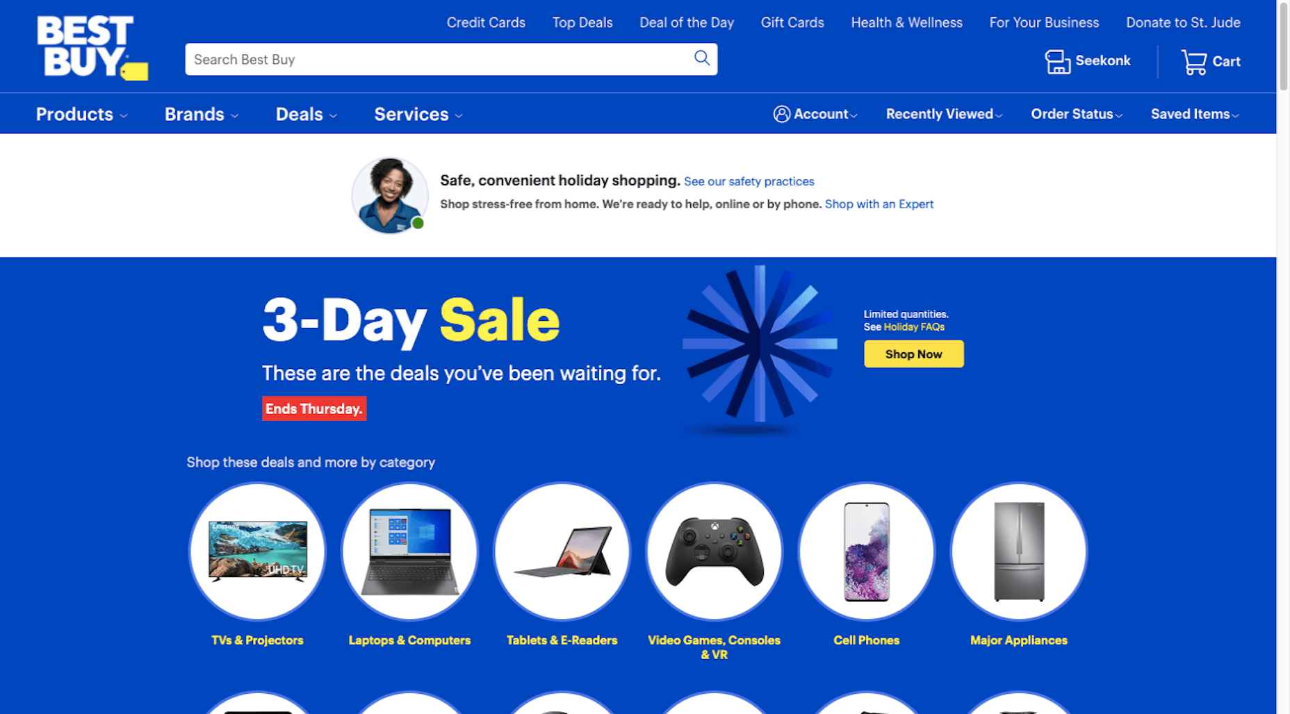
 A key part of designing successful websites for clients is making sure that as many end-users as possible can access and enjoy that site.
So, what if you discovered that around 1 billion people couldn’t enjoy your designs? Even if those people manage to click on a link and visit the website that you create, they might not be able to understand what’s being sold or navigate to the checkout page.
According to statistics from the World Bank, there are 1 billion people with disabilities worldwide. That’s 15% of the total population of the globe.
Despite this, many designers fail to consider customers with differing abilities when creating an engaging app or website. Unless your client explicitly tells you that they’re supporting customers with disabilities, you might even not think about those users at all.
Learning how to embrace the concept of inclusive web design means that you deliver better results to your clients; the more customers your clients can reach, the more praise and positive reviews your designs will get.
So, how do you introduce accessibility in your design choices?
What Is Website Accessibility?
In broad terms, inclusivity refers to activities or behaviors that empower marginalized people in society. Designing for inclusivity means making your content more accessible to anyone dealing with a mental or physical issue that may make it harder for them to use a traditional site.
Ultimately, accessibility is one of the main goals of an inclusive design strategy. When you make websites or applications more accessible, you tweak aspects of your UI and code to make the site as approachable and usable as possible to people with certain limitations.
According to the Web Accessibility Initiative, many modern sites and web tools are designed without the needs of those with disabilities in mind. This creates accessibility barriers that make websites almost impossible for some people to use.
Here are just some of the different types of disability that can affect the way end-users interact with a website or app:
- Cognitive issues: Affecting understanding and making it harder to navigate sites;
- Auditory issues: Preventing customers from listening to videos and audio content;
- Neurological issues: Making certain terms and actions more difficult on your site;
- Physical issues: Making it hard to swipe or tap certain tools;
- Speech problems: A common issue with voice UI designs;
- Visual issues: Preventing a positive experience on highly visual sites.
Web accessibility can also be about making life easier for people who encounter problems in particular situations. For instance, those with muscular problems might have a harder time using buttons and links on a small screen.
So, how do you make your designs more accessible?
Know Your Audience
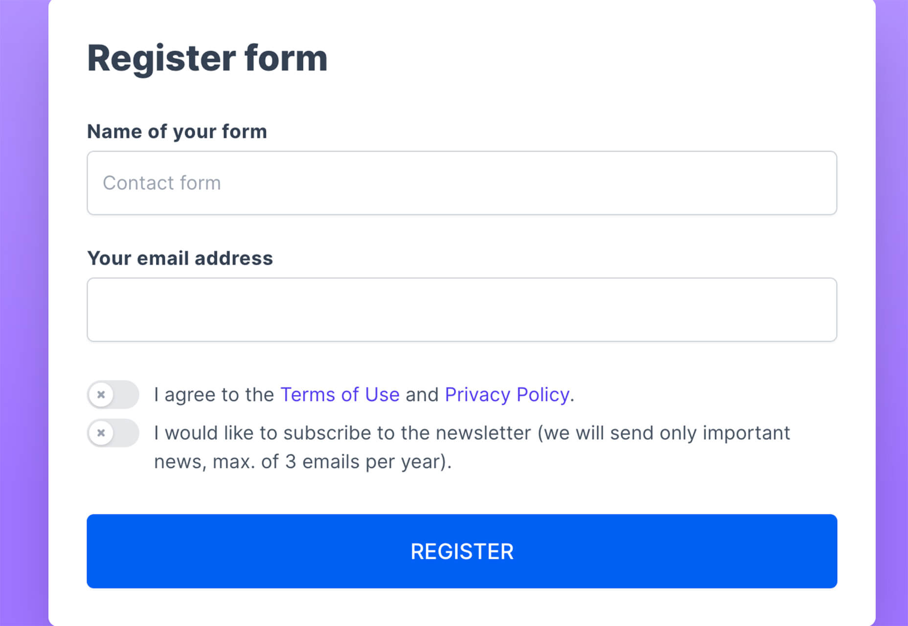
There’s more to inclusive web design than making your fonts a little bigger and hoping for the best. To deliver a truly accessible experience, you need to know the people and groups that your client is targeting. Spending some time going through your customer’s user personas and asking them questions about those with a disability can help you make informed decisions.
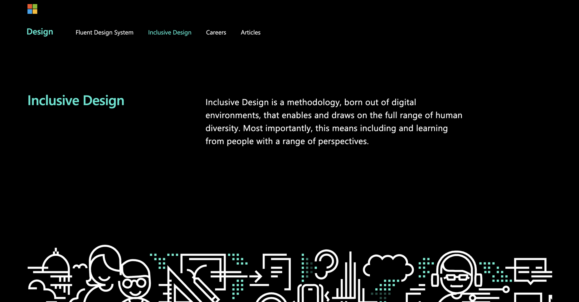
For instance, the Microsoft Inclusive Design toolkit asks designers to recognize exclusion, examining the parts of their website that might be inaccessible, and learn from diversity.
Before designing anything, ask yourself whether you can:
- Address any unique needs, like sight issues or hearing problems;
- Replace traditional solutions with something more unique. For instance, rather than relying on colors to highlight a portion of text, could you use font-weight instead? This might be ideal for someone with color blindness;
- Create something that appeals to both customers with and without disabilities.
Design a Clean and Clear Layout
Any website design should be focused on clarity first.
Whether you’re designing for inclusivity or not, the aim should be to deliver as much of a simple and straightforward experience as possible, avoiding any web design sins along the way.
For instance, no-one likes a messy design full of unreasonable navigational signs. You need a site full of understandable links, buttons that are easy to click on any screen, and large fonts that are easy to read.
Whenever you’re creating a new element for a website or app, ask yourself how you can make life easier for customers from all backgrounds. For instance, Parramatta park uses excellent contrast, clear fonts, and ideal element sizing to ensure that its website feels as easy to use as possible for customers.
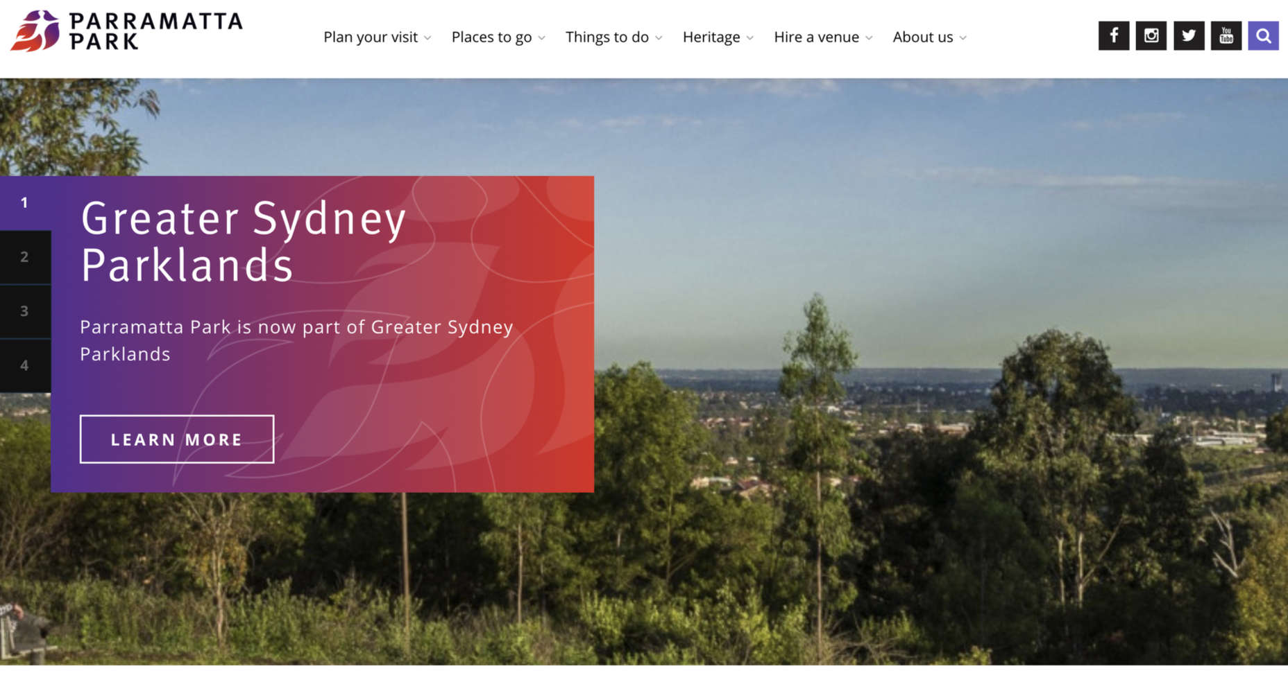
Notice how the buttons are clear and easy to press. The colors are bright and engaging on any screen, and the navigation is simple to follow too. Remember, when you’re designing an inclusive prototype:
- Test navigation options and ensure they’re easy to use;
- Don’t overcrowd the screen, remember that less is more when reducing cognitive load;
- Make sure that your design remains easy to use on any screen.
Simplify Language
The visual elements on an inclusive website need to be as simple and easy to understand as possible. However, it’s important not to forget about the way that you handle the written word too.
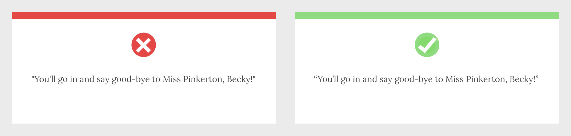
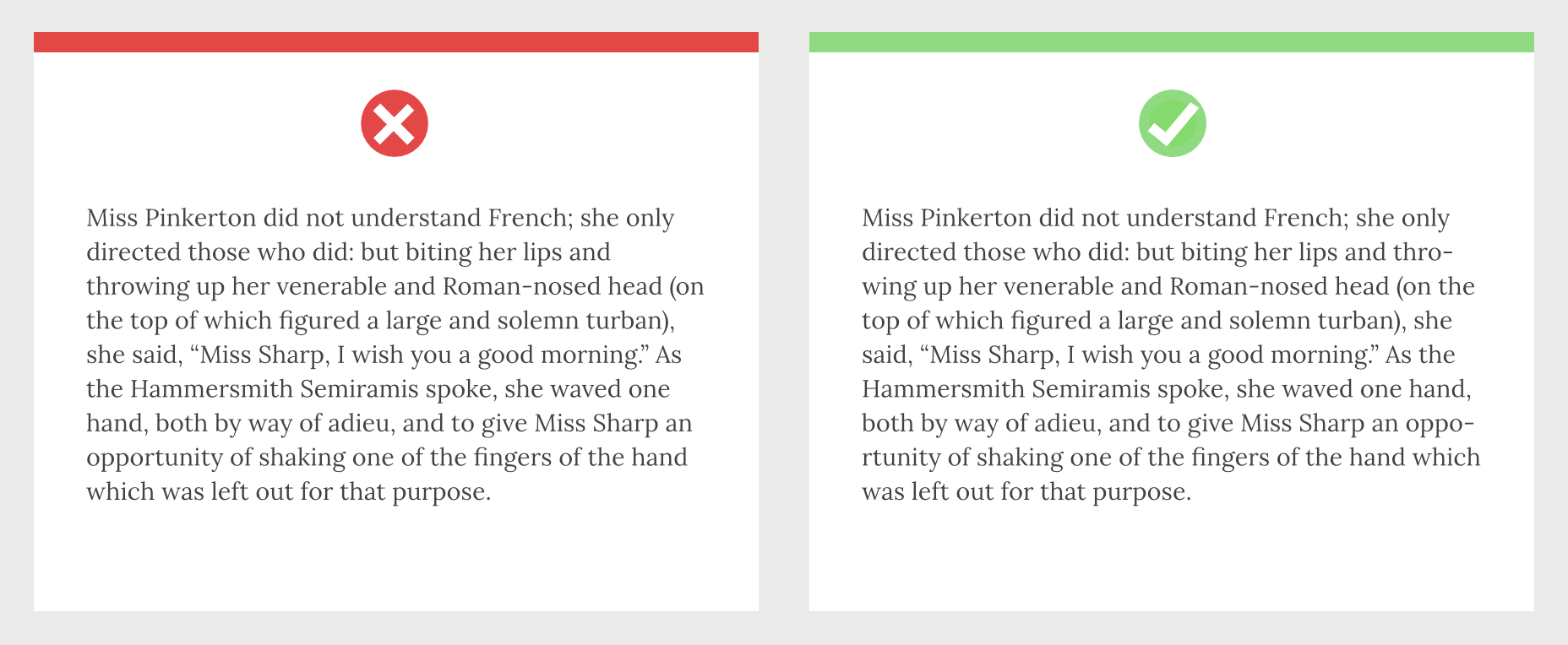
Using simple terms instead of complex industry jargon can make a massive difference to those with reading issues. There’s also typography to think about, from the color and contrast of your words against your chosen background to the font’s clarity.
Remember, suboptimal design with both imagery and language affects those without disabilities too. Following basic rules for simplicity delivers a better experience for anyone that visits your site.
Make sure you:
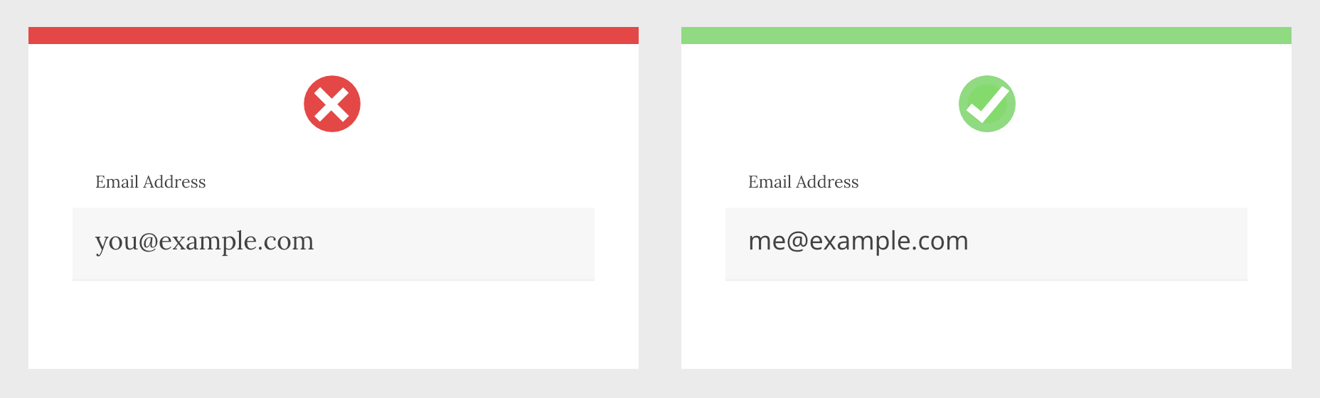
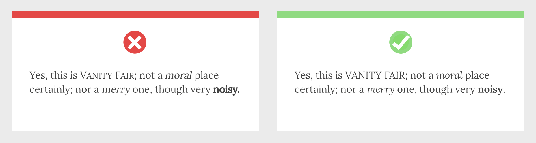
- Underline, bold, or re-size links for visual contrast;
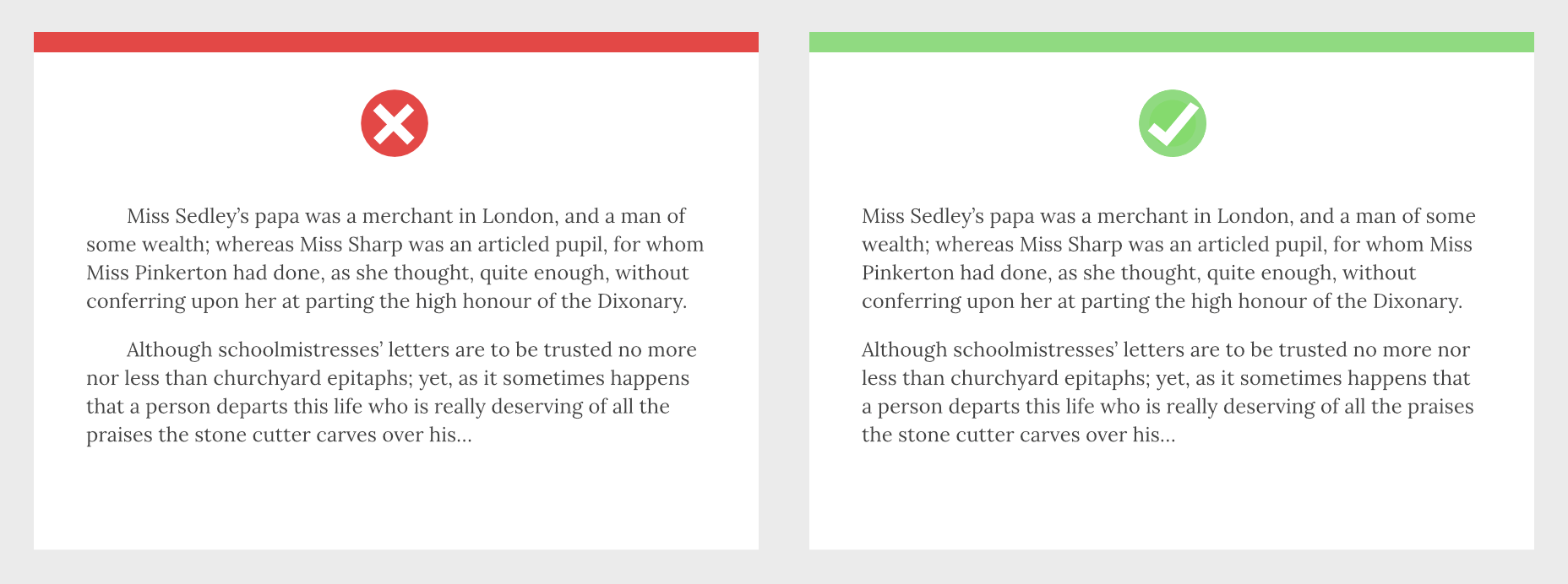
- Enforce proper line spacing with around 1.5x the font size;
- Enable consistent paragraph spacing;
- Use simple language to reduce cognitive load;
- Describe abbreviations when using them;
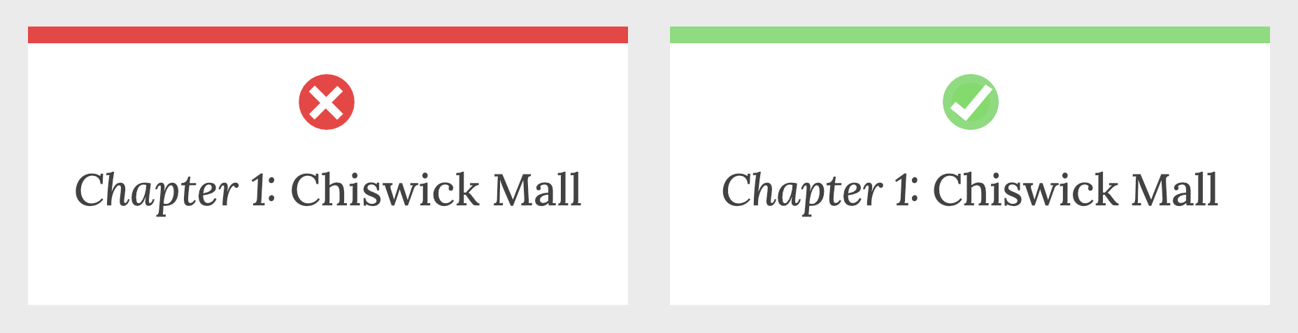
- Use clearly-worded headings to structure content logically;
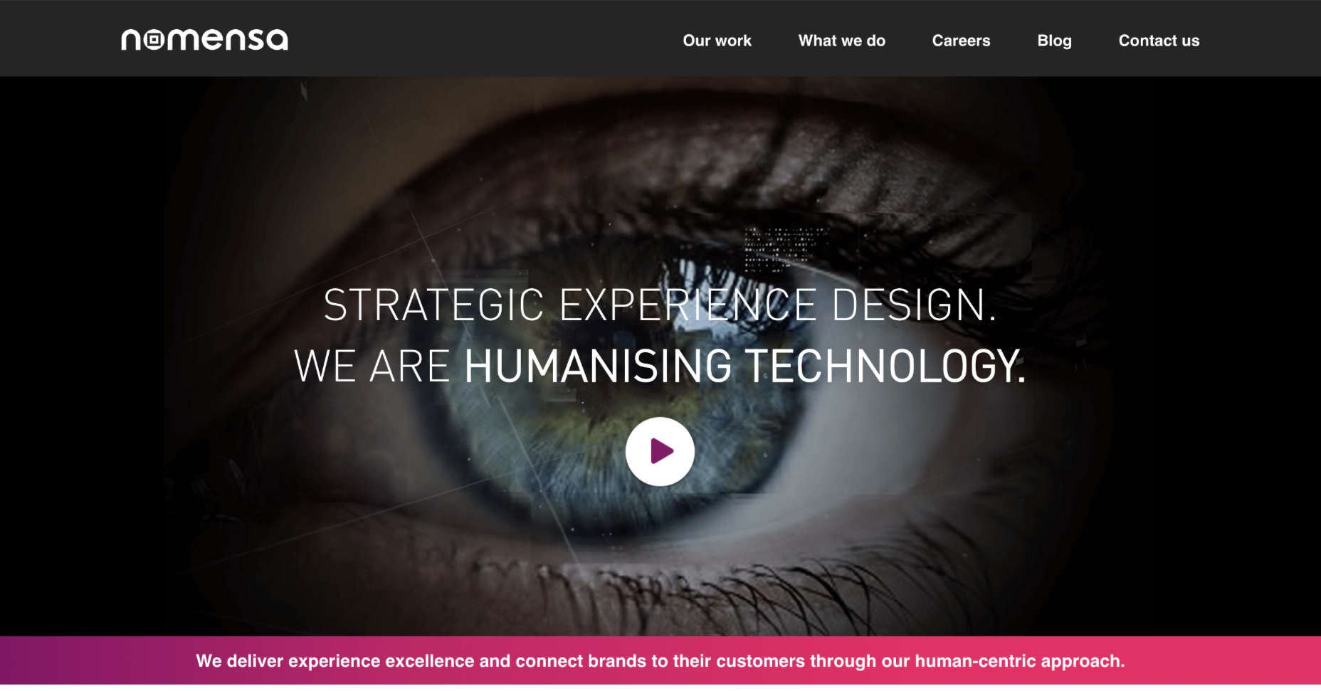
Look at the design choices for text on the Nomensa website, for instance. Plenty of white space makes content easier to read. Simple words are understandable and engaging. Even the font choice mimics the logo while offering readability.
Optimize Web Design Colors
Inclusive web design trends will come and go. However, color and contrast will always be essential to your decisions.
By making sure that your design elements meet the minimum color contrast ratios defined by the WCAG means that you’re supporting readability for visually-impaired users and improving experiences for customers that aren’t visually impaired as well.
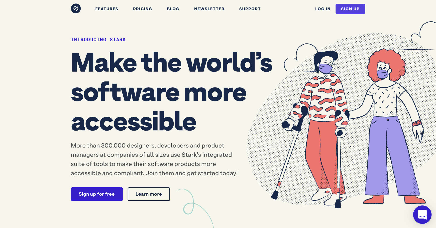
For designers who need extra help in this area, tools like Stark help measure color contrast. This tool also offers a range of other tools intended to support accessibility too.
Remember, the minimum ratio you need to access will depend on the element that you’re designing. The WCAG recommends the following guidelines:
- 3:1 ratio for graphical objects (charts);
- 3:1 ratio for focus, active states, and hover;
- 3:1 ratio for clickable items and form components.
While you’re working on your color contrast strategies with apps like Stark, make sure that you consider the needs of users with color blindness too. 4.5% of the world doesn’t see color the same way as everyone else. If you’re finding it difficult to achieve the right contrast while sticking to your customer’s brand guidelines, try underlining and bolding elements too.
Consider Video and Audio Elements
Finally, these days, more companies are opting to embed video and audio content into their sites. These visual and auditory tools can offer useful information about a brand and what it does. However, you could struggle to deliver vital information to some customers through video and audio alone.
Captions for video content could be essential for those with hearing loss. You may need to think about adding transcripts to pre-recorded videos that people with hearing impairments can access. These transcripts and captions are also helpful for anyone who doesn’t have access to audio on smartphones or computers.
Transcripts can also help those with visual impairments by giving a text-to-speech tool something to describe to your user. That way, everyone gains useful information. Look at this captioned video from the University of Washington, for instance. It ensures that everyone can understand what’s going on in the content. If you add transcripts to your website pages for clients, you could also help them benefit from improved SEO too. Transcripts deliver more keyword-ranking opportunities than videos and podcasts on their own.
Design for Accessibility First
For designers to excel at delivering truly inclusive UI environments, they need to become as good at creating websites for people with disabilities as they are at creating interfaces for people like themselves. As designers, we try to be as inclusive as possible, but it’s easy to get caught up thinking about making a website easier to use for us.
If you can step into the shoes of someone that isn’t like you, and think about uncommon needs first, then you may find that you deliver a stronger, more engaging experience for every user.
For instance, rather than designing a website for someone with the same visual needs as you, then thinking about making tweaks for those with color blindness or vision issues, think about the needs of those with disabilities first.
You can learn more about putting uncommon needs first by checking out Vasilis Van Gemert’s blog post on the “Method of Crisis.”
Accessibility is Good for Business
Inclusive web design, or designing for accessibility, is all about maximizing the potential audience that your clients can earn. Whatever situation end-users find themselves in, you should ensure that you’re taking advantage of inclusive design.
If you can prove to your clients that you can deliver for all customers’ needs, you can unlock a much larger audience and many more opportunities.
The post Getting Started With Inclusive Web Design first appeared on Webdesigner Depot.

 A domain name is an essential element of every project, product, and company. It’s central to a brand and has a disproportionately large impact on user experience. Not only that, but it also impacts SEO and ultimately revenue.
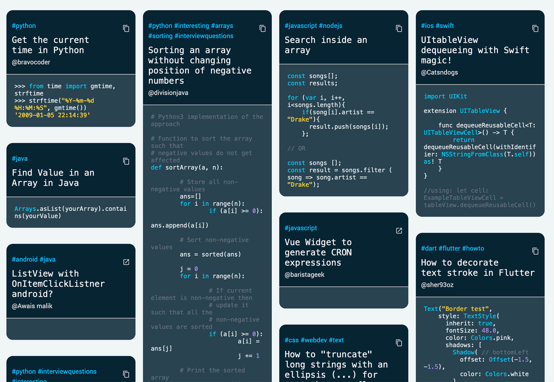
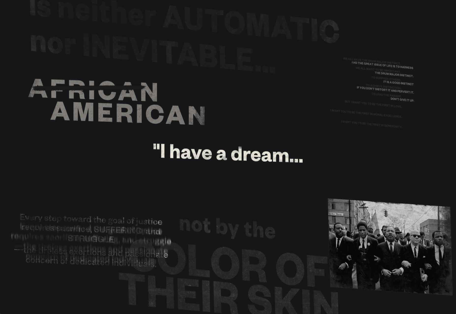
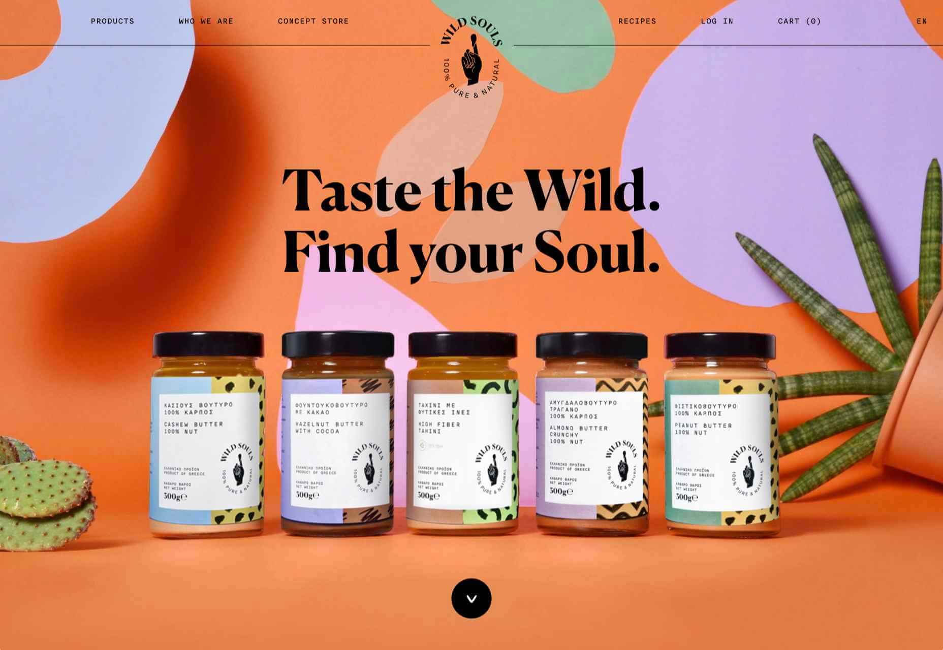
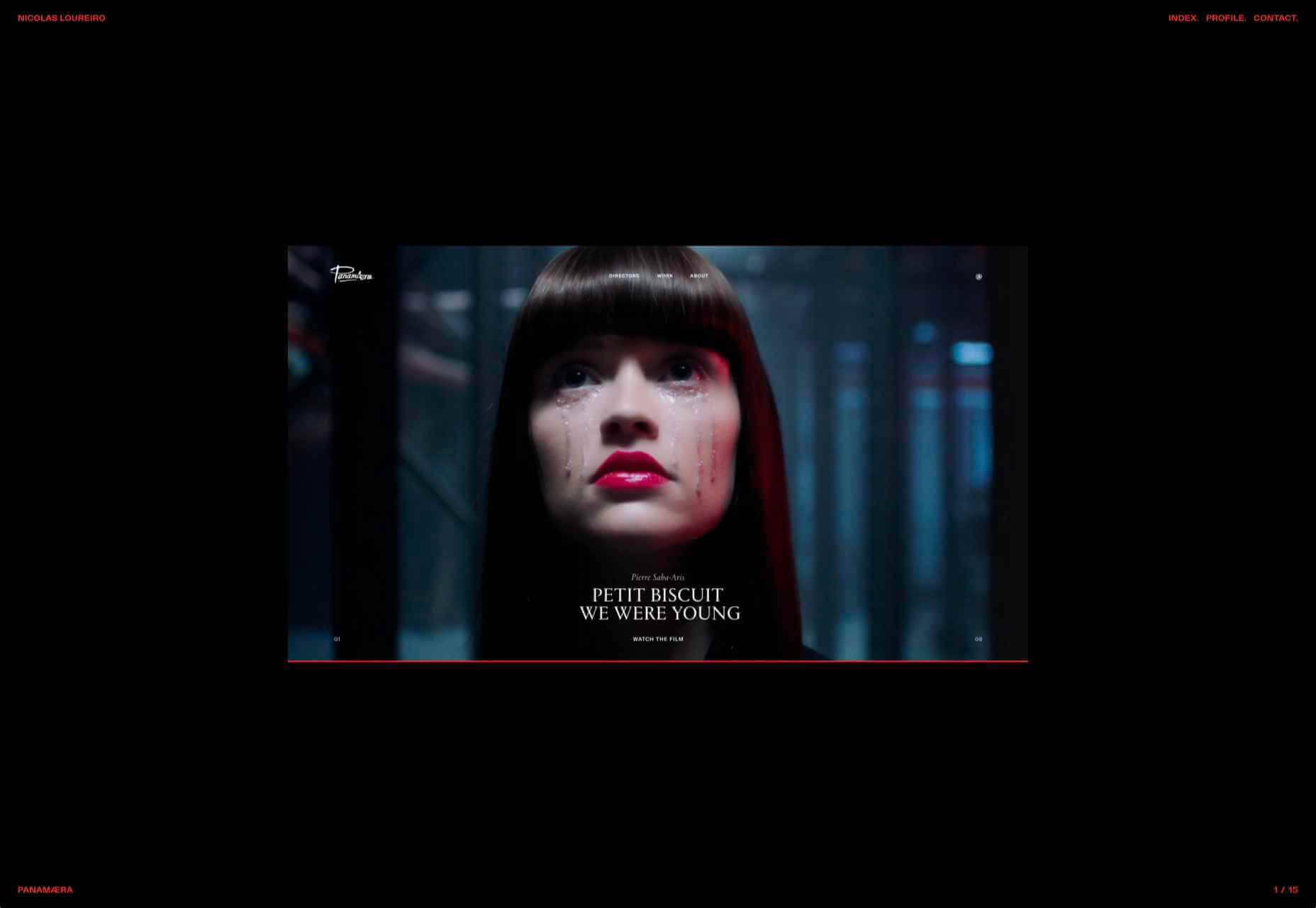
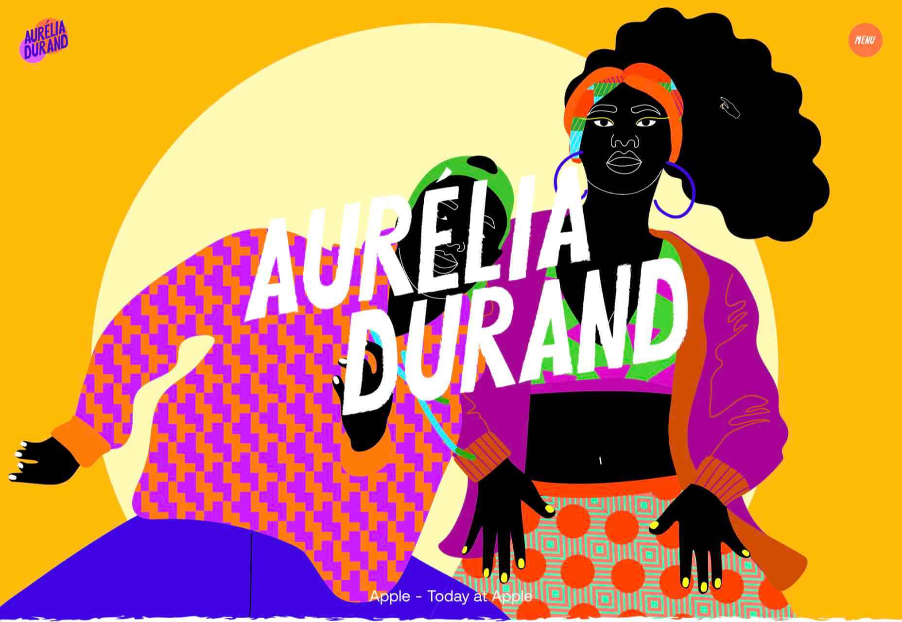
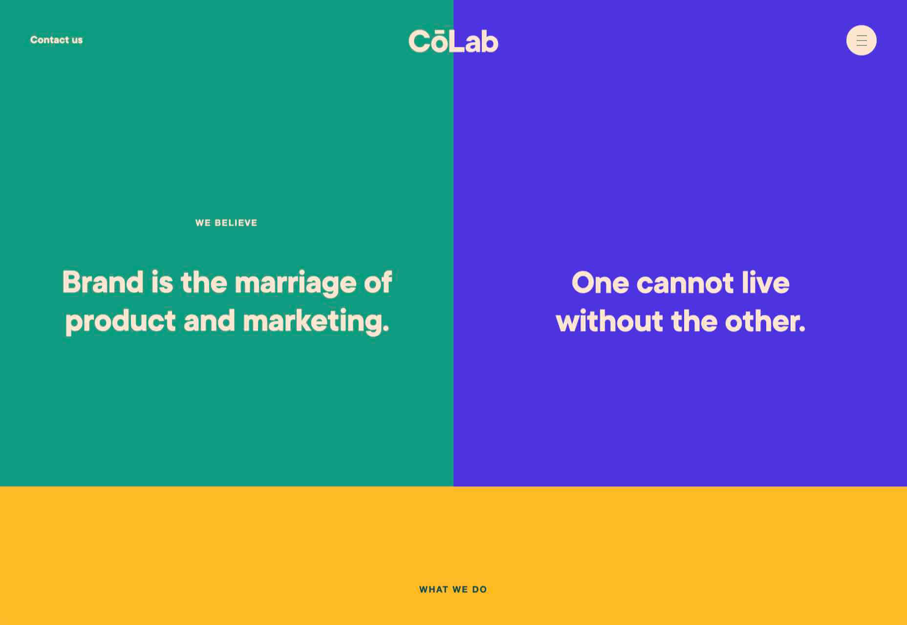
 Looking for something new to get you excited about design work? This list is packed with all kinds of goodies to help you feel inspired and ready to work.


 It’s February, and the spring sun is finally starting to peep through the winter clouds. While many of us are still largely restricted to our homes, the web has kept on growing.


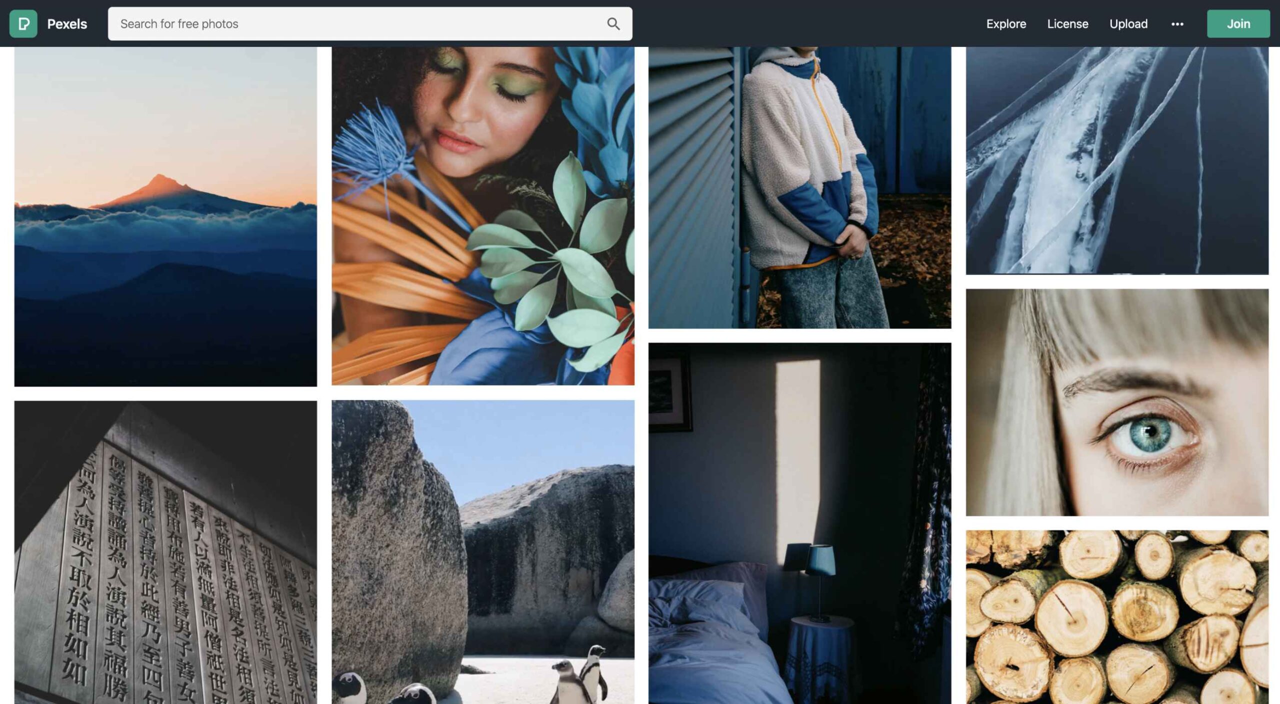 When photographers take images to sell commercially, like every other business, they want to maximize their returns, so they adapt their ideas to meet commercial trends. As a result, stock always looks like stock, and that minor deception introduces a small amount of doubt in users.
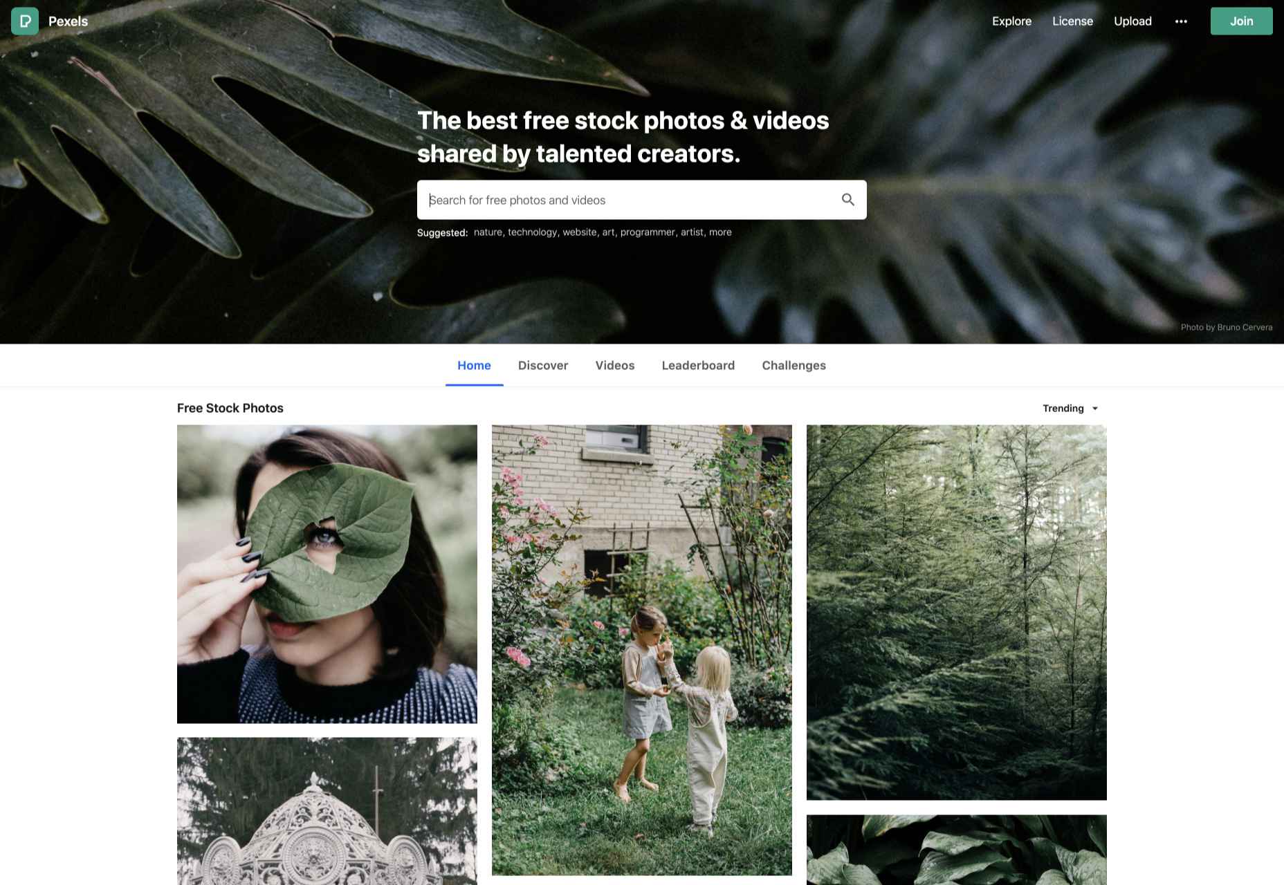

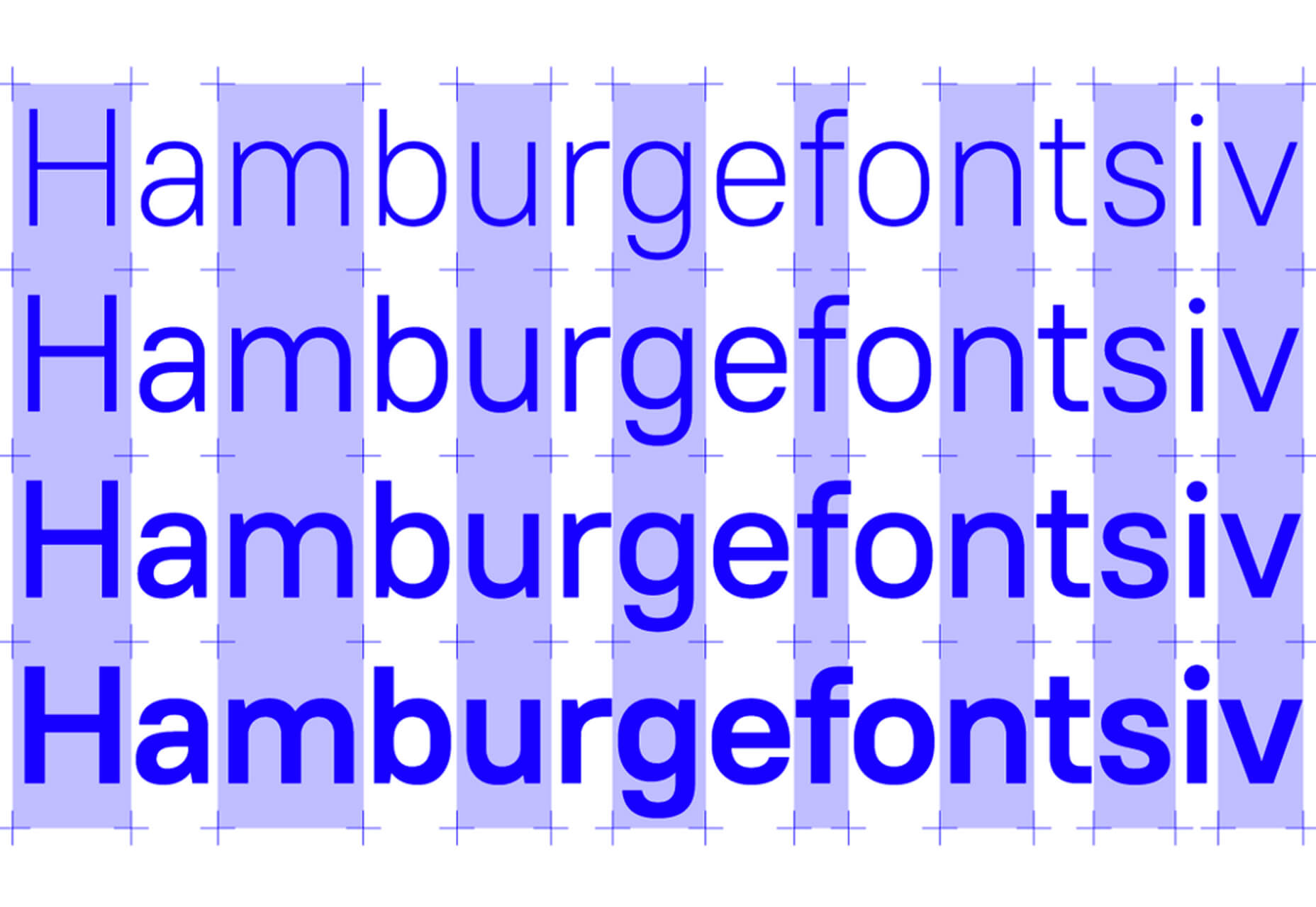
 Typography is one of the most important elements of any site, having a measurably large impact on brand and experience.
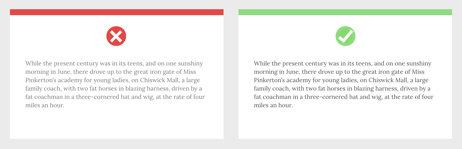

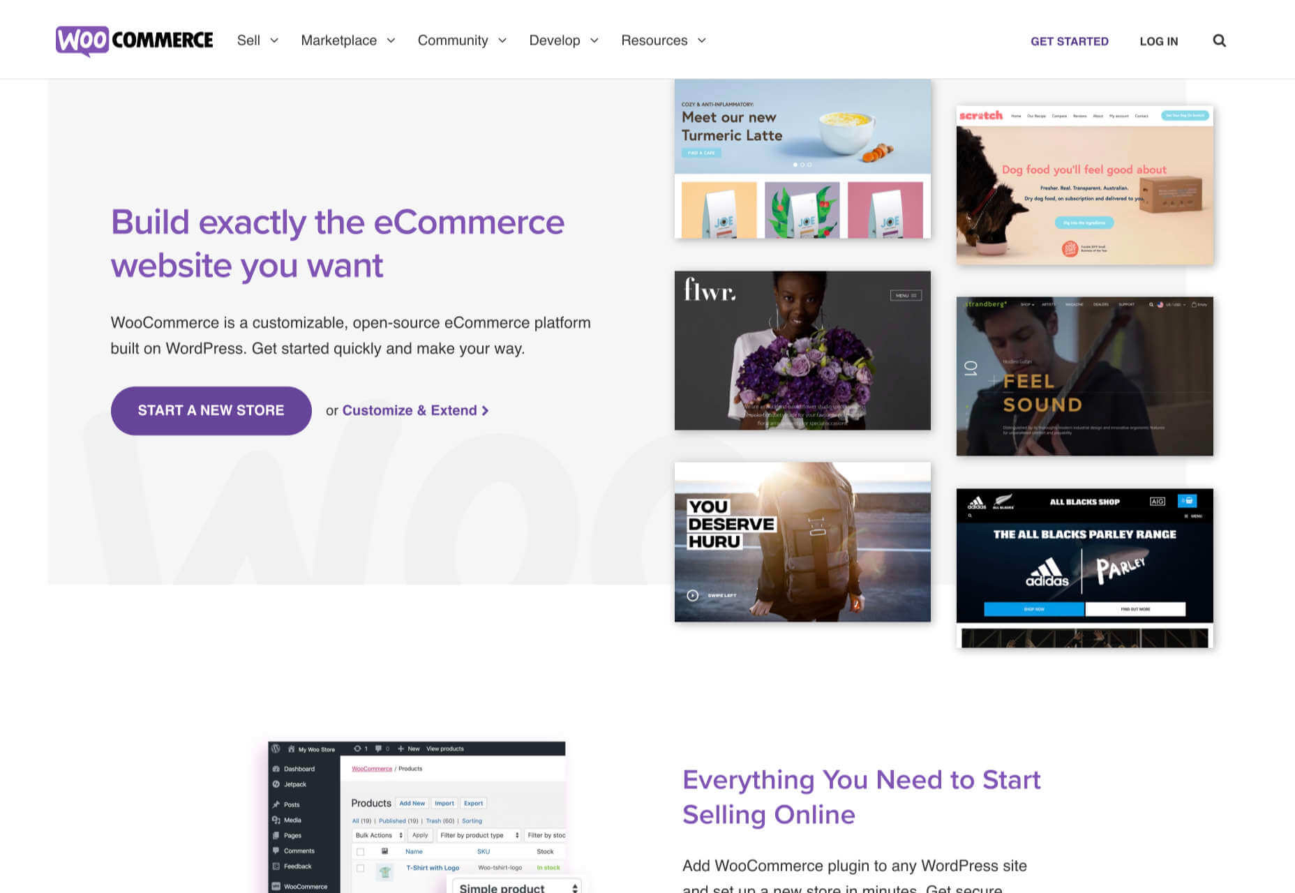
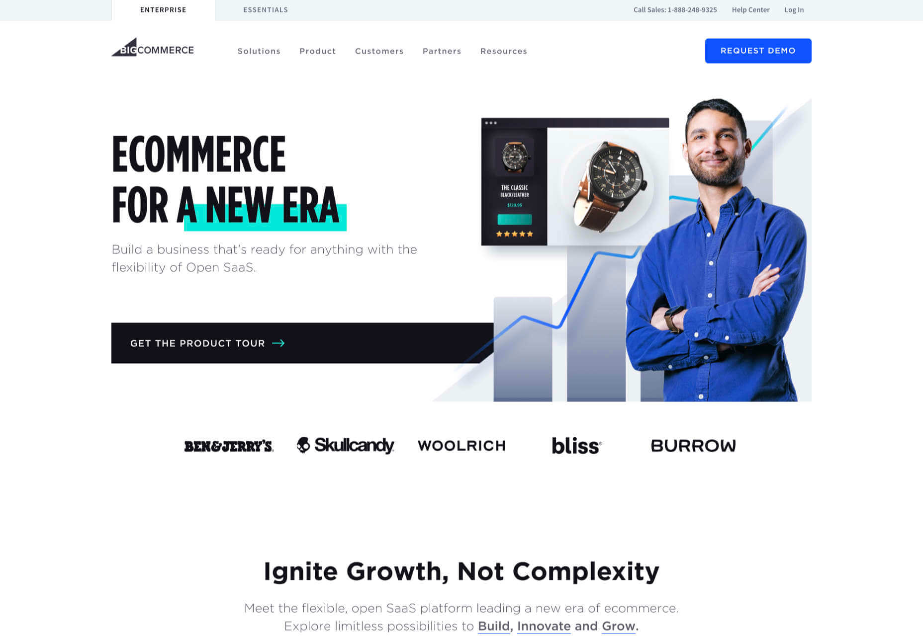
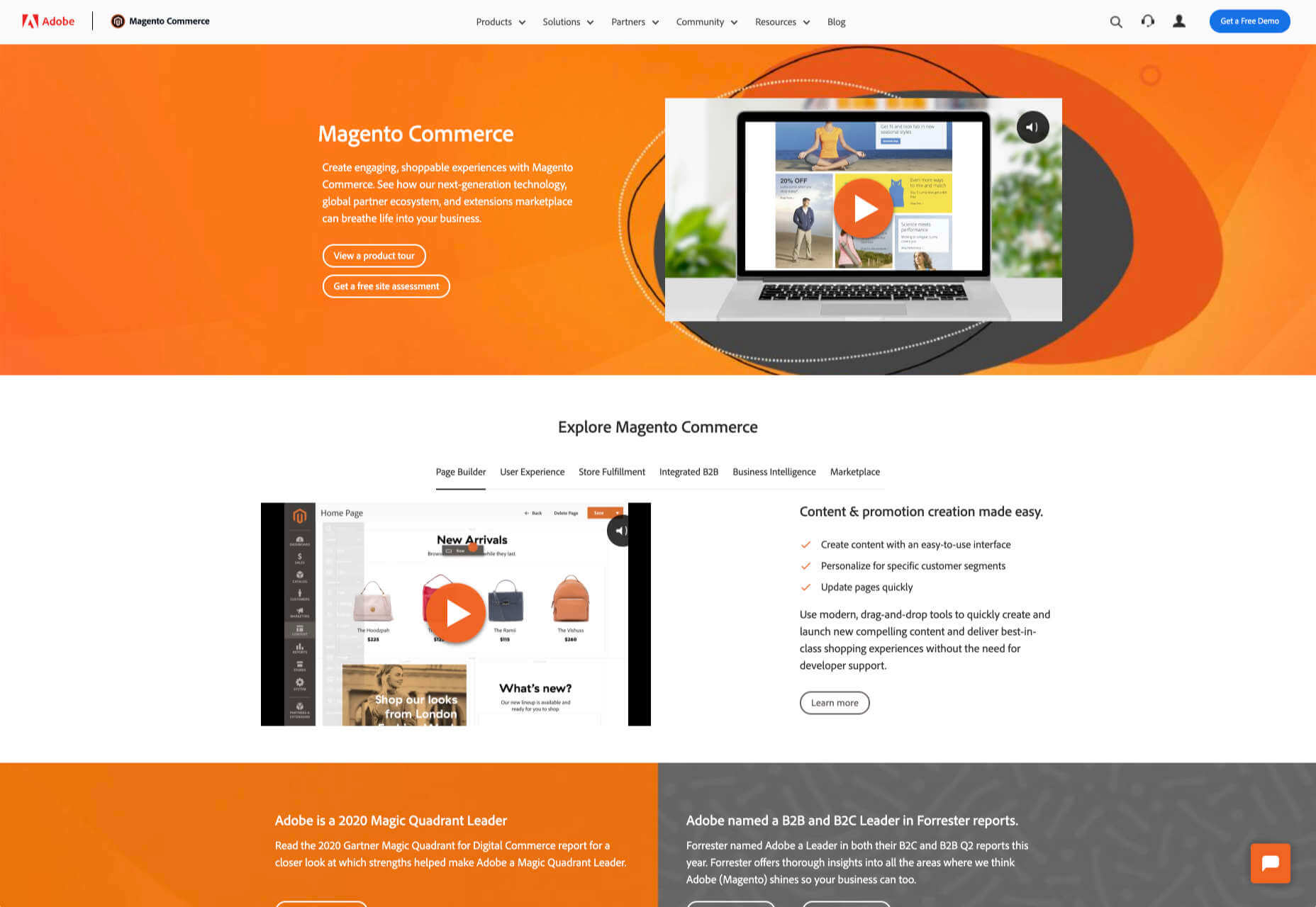
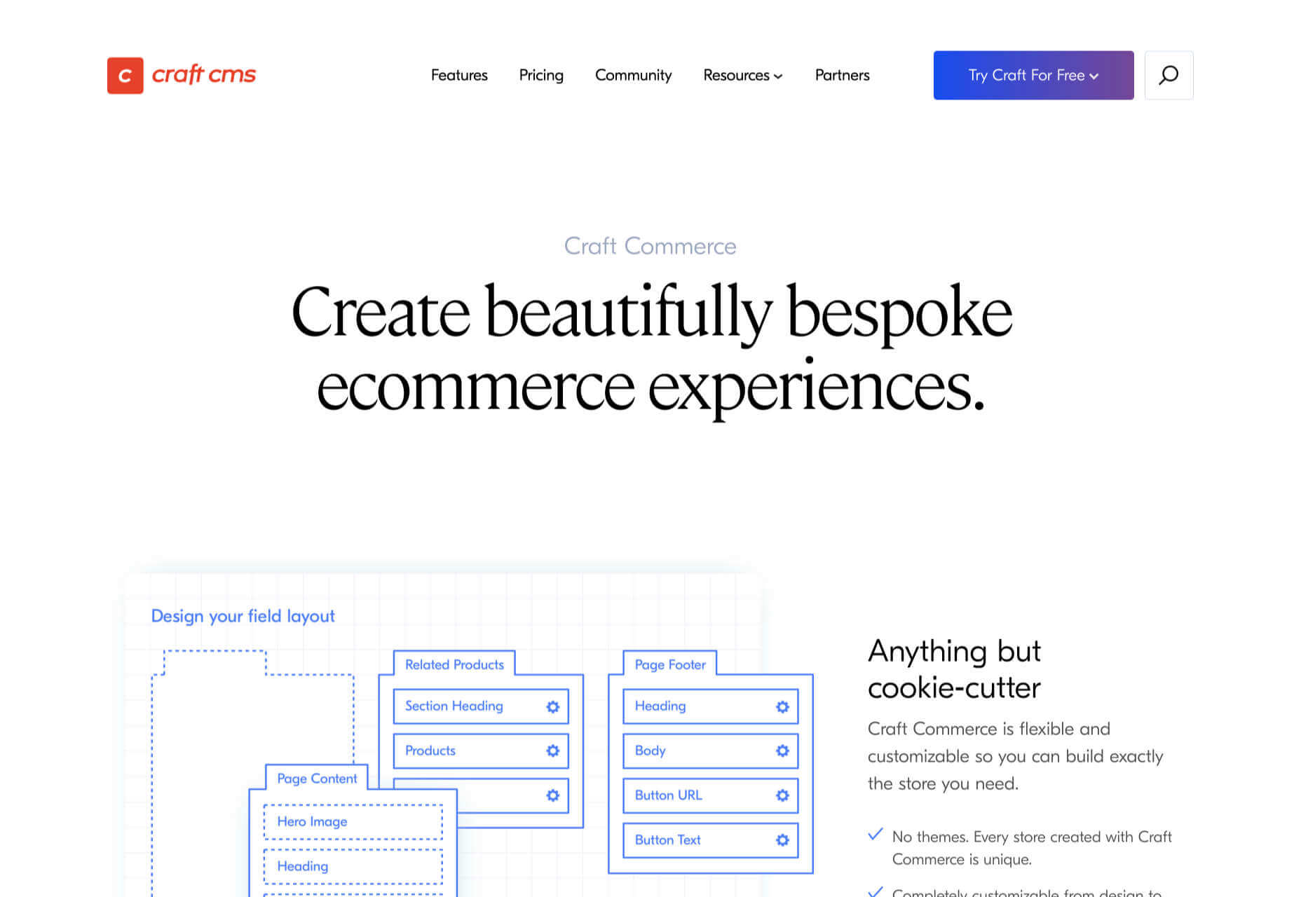
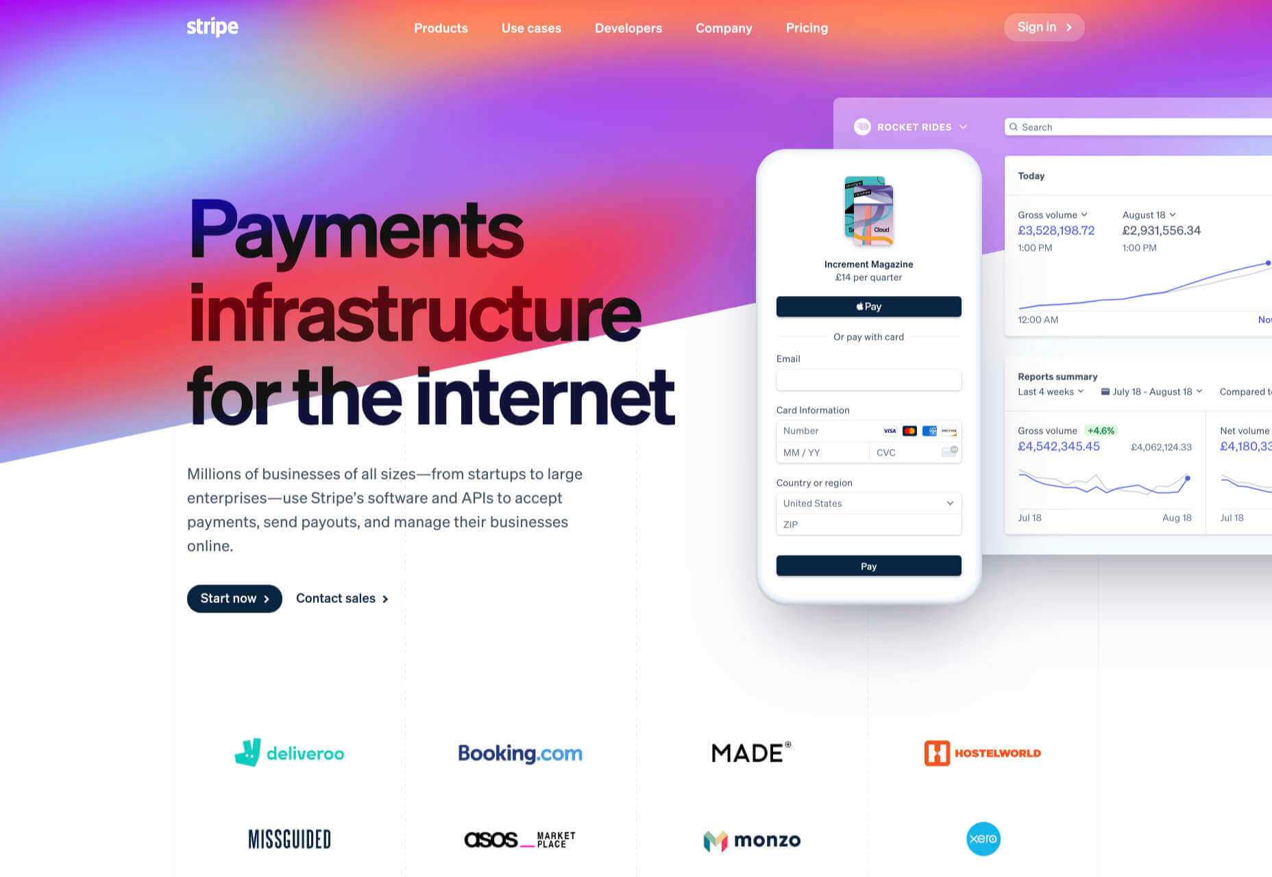
 It’s never been easier to set up an ecommerce store and start selling. There are a dizzying array of ecommerce solutions available in 2021, and most are feature-rich and competitively priced.
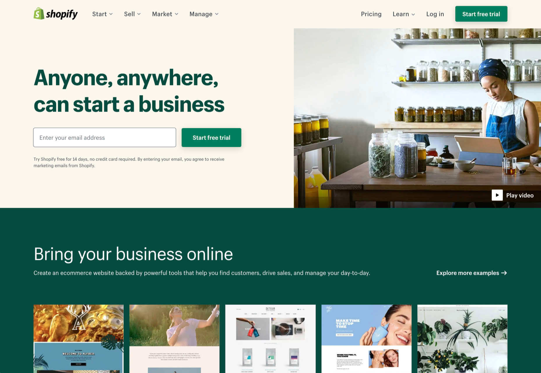
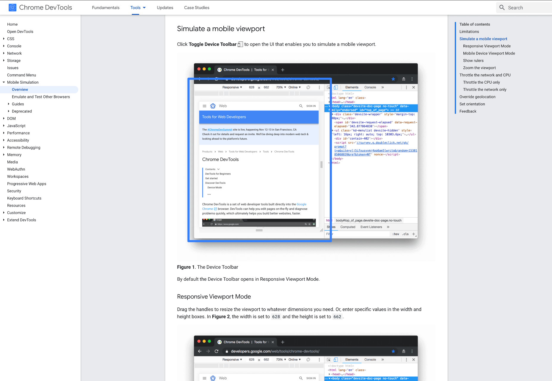
 When creating a website, it’s vital to remember that not only does it need to work and look great on the device you are creating it on, but on all the other devices, it might be used on too.

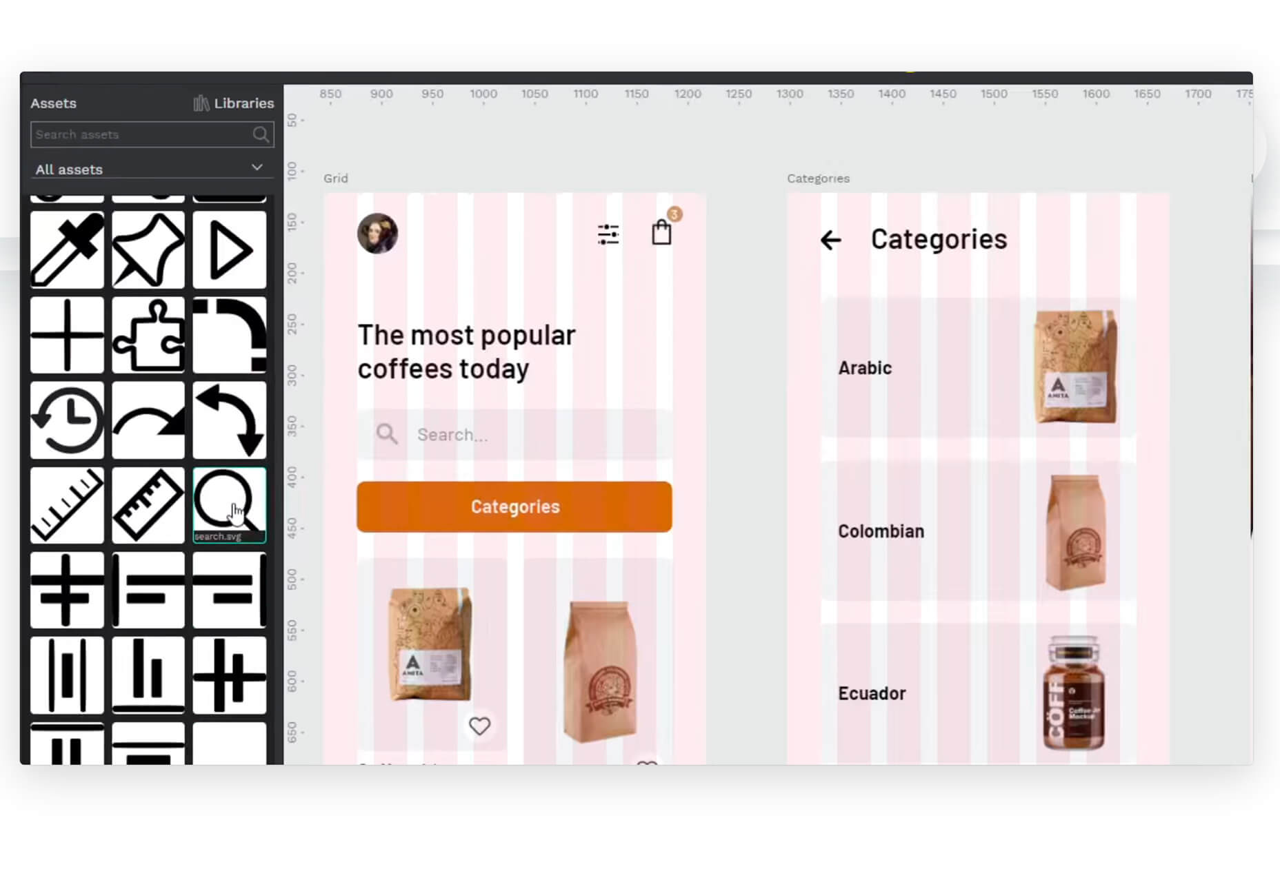
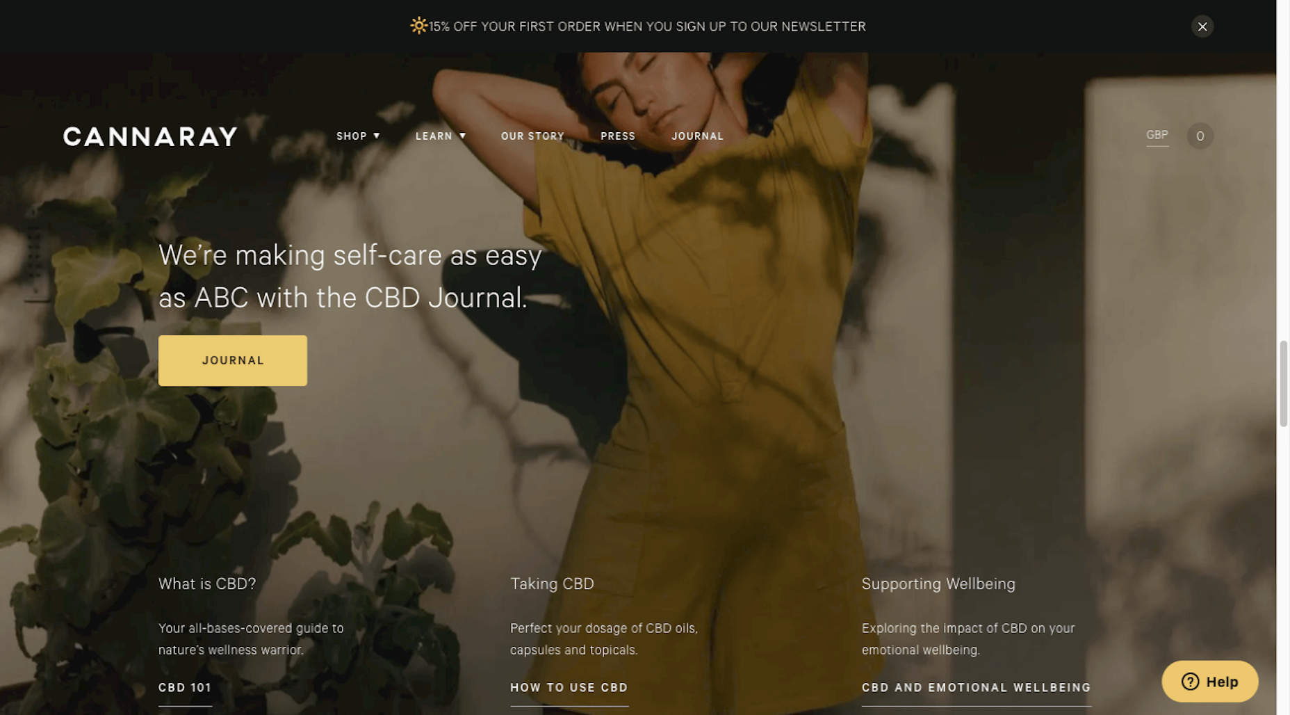
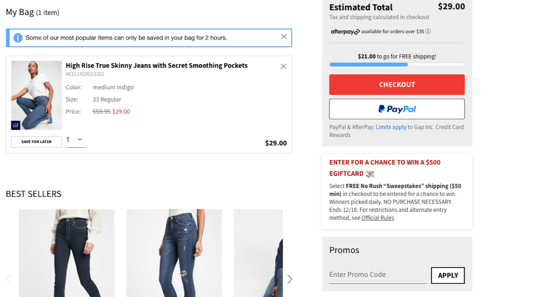
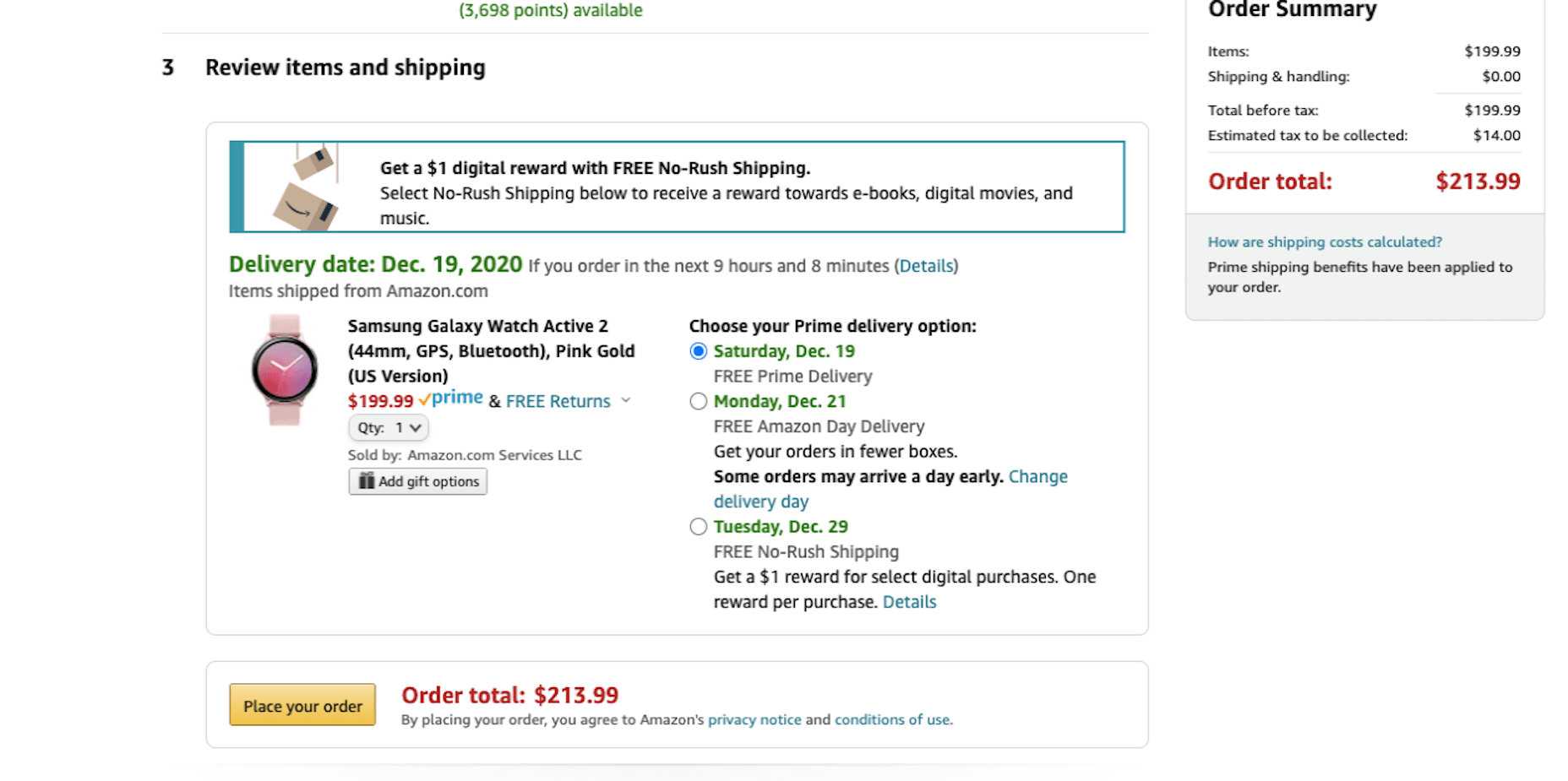
 Ecommerce design may seem fairly straight-forward; you build an online store that showcases a company’s products or services and gives customers a quick and pain-free way to purchase them.

 If you were paying close attention to your IT department around the 8th of December, you might have heard some quiet sobbing and the occasional wail of, “Why? Why?! WHY?!” Now, it was the year 2020, so this might have seemed normal to you, but it’s actually something of a problem that could affect your business: CentOS is pretty much dead.